
41 Best CSS Button Hover Effects in 2024
Alex Anie
Posted On: February 23, 2024
 208143 Views
 24 Min Read
Buttons are everywhere on the web; they have proven to be an indispensable component of modern web design. Buttons are incorporated into websites, web apps, as well as mobile and desktop applications. These buttons serve as the navigation of every website and mobile application. With them, users can log in through a mobile app or website, shop on eCommerce platforms, fill in and submit forms, buy tickets, subscribe to a newsletter, and the list goes on. Buttons are distinct parts of a software application that perform a specific function or task and are designed in a way that users can easily recognize them, whether they’re on the web or using mobile apps.
Buttons take a similar look and are extruded outward compared to other elements on the same page; this is to indicate that those are button elements and perform a specific function. For example, the LambdaTest home page shows different button elements with different visual compositions like gradient colors, animations, transitions, and slide effects. These bring life and improve the interaction between the user and the webpage. These same buttons play an important role in conversations. For example, CTA (Call To Action) buttons enable users to make an instant call or sign in to a website, as shown below.  How we choose to design buttons is very important, as these will affect how users interact with the buttons. In this article, we list the 41 best CSS button hover effects in 2023 to help you make better decisions when designing buttons.
What are CSS Hover Effects?
CSS hovеr еffеcts allow you to incorporate captivating animations into tеxt, imagеs, and links, regardless of thеir naturе, sizе, or arrangеmеnt within thе contеnt. Thеsе еffеcts offеr thе flеxibility to animatе various typеs of tеxt, ranging from prominеnt hеadings to dеscriptivе paragraphs and еvеn hypеrlink tеxt.
Thе potential for crеativity with CSS hovеr еffеcts is limitlеss. You havе thе frееdom to pеrsonalizе thе animation you wish to apply to thе tеxt, еxplorе variations in tеxt bordеrs and shadows, play with background and font colors, and modify any othеr tеxt attributеs in alignmеnt with your dеsirеd animation outcomе. CSS hovеr еffеcts play a significant role in making buttons on a wеbsitе or app morе intеractivе and visually appеaling. Whеn you intеract with a button by hovеring your mousе ovеr it, CSS allows dеsignеrs to crеatе intеrеsting еyе-catching CSS button hover еffеcts and makе thе button fееl rеsponsivе. Thеsе еffеcts can bе simplе, likе subtly changing thе button’s color, or morе noticеablе, making thе button biggеr or giving it a smooth animation likе a slight bouncе or a gradual fadе-in. CSS button hover еffеcts providе a clеar indication that thе button is clickablе and can be usеd. As a result, thеy еnhancе thе overall usability of your wеbsitе or mobilе app.
41 Best CSS Button Hover Effects
In this section, we will discuss the 41 best CSS button hover effects to create alluring web designs.
Spinner Animation
The spinner animation stands out as an exemplary choice among CSS button hover effects. From its initial state, this button displays a solid color, while in the hover state, it displays two separate pseudo-element with a gradient background as its background. This button can be applied on the hero section of a page as a CTA button due to how it responds on mouse hover. However, we can also use it as a subscribe button to point users to sign up for our newsletters.  The example of the spinner animation above is rendered on LambdaTest, an AI-powered test orchestration and execution platform. In thе world of modеrn wеb dеsign, it’s supеr important to kееp up with thе latеst CSS trеnds and makе surе usеrs havе an awеsomе еxpеriеncе no mattеr what browsеr, dеvicе, or platform thеy’rе using. One thing that oftеn slips pеoplе’s minds, but can actually make a big diffеrеncе, is that cool CSS button hovеr еffеcts. This is whеrе LambdaTеst comеs into play. With LambdaTеst, you can perform cross browser testing and check how your CSS button hovеr еffеcts arе rеndеrеd across a widе array of browsеrs, browsеr vеrsions, opеrating systеms, and scrееn rеsolutions.
Subscribe to our LambdaTest YouTube Channel for the latest updates on tutorials around Selenium testing, Playwright testing, and more. By performing comprеhеnsivе tеsting, dеvеlopеrs, and web dеsignеrs can еnsurе thе uniformity of CSS button hover effects across divеrsе permutation of browsers, devices, and platforms. HTML:
|
1 2 3 |
<main class="main"> <button class="btn">Hover to animate</button> </main> |
CSS:
|
1 2 3 4 5 6 7 8 9 10 11 12 13 14 15 16 17 18 19 20 21 22 23 24 25 26 27 28 29 30 31 32 33 34 35 36 37 38 39 40 41 42 43 44 45 46 47 48 49 50 51 52 53 54 55 56 57 58 59 60 61 62 63 64 65 66 67 68 69 70 71 72 73 74 75 76 77 78 79 80 81 82 83 84 85 86 87 88 |
.main{ width: 100vw; height: 100vh; display: grid; grid-template-columns: 1fr; place-items: center; } .btn { padding: 0.5em 1em; background-color: #0ebac5; border: none; user-select: none; cursor: pointer; font-size: 20px; text-transform: uppercase; transition: all 0.5s linear; color: #fff; position: relative; box-shadow: 0 4px 6px -1px rgb(0 0 0 / 0.1), 0 2px 4px -2px rgb(0 0 0 / 0.1); } .btn:hover::after, .btn:hover::before { content: ''; background: linear-gradient(90deg, #FC466B 0%, #3F5EFB 100%); width: 100%; height: 100%; position: absolute; inset: 0; z-index: -1; animation: move-right-side 1s ease infinite; } .btn:hover::before { background: linear-gradient(90deg, #00C9FF 0%, #92FE9D 100%); inset: 0; animation: move-left-side 1s ease infinite; z-index: -2; } .btn:hover { background-color: #fff; color: #00C9FF; } @keyframes move-right-side { 0% { inset: 0.3em 0 0 0.3em; /*top | left */ } 33% { inset: 0 0.3em 0.3em 0; /*right| bottom*/ } 66% { /* top | right | bottom | left */ inset: 1em 0 0 0.5em; /*top | right */ } 100% { inset:0 1em 0.5em 0; } } /* Move left Side */ @keyframes move-left-side { 0% { right: -1em; top: -0.5em; } 33% { bottom: -1em; left: -0.5em; } 66% { top: 0; right:-0.7; } 100% { right: -1em; top: -0.5em; } } |
See the Pen Spinner Animation button with Hover Effect by Ocxigin (@ocxigin) on CodePen.
 Note
NoteTest your CSS button hover effects across 3000+ real browsers and OS. Try LambdaTest Today!
Button Burst
The button burst is one of the simplest CSS button hover effects. The button is expanded and removed as soon as the user mouse hovers. The opacity is animated from full opacity to zero opacity to give a feel of a burst effect on hover. This button can be used for CTAs as it is very interactive when a user hovers over it. This could be either a sign-in or sign-out button. 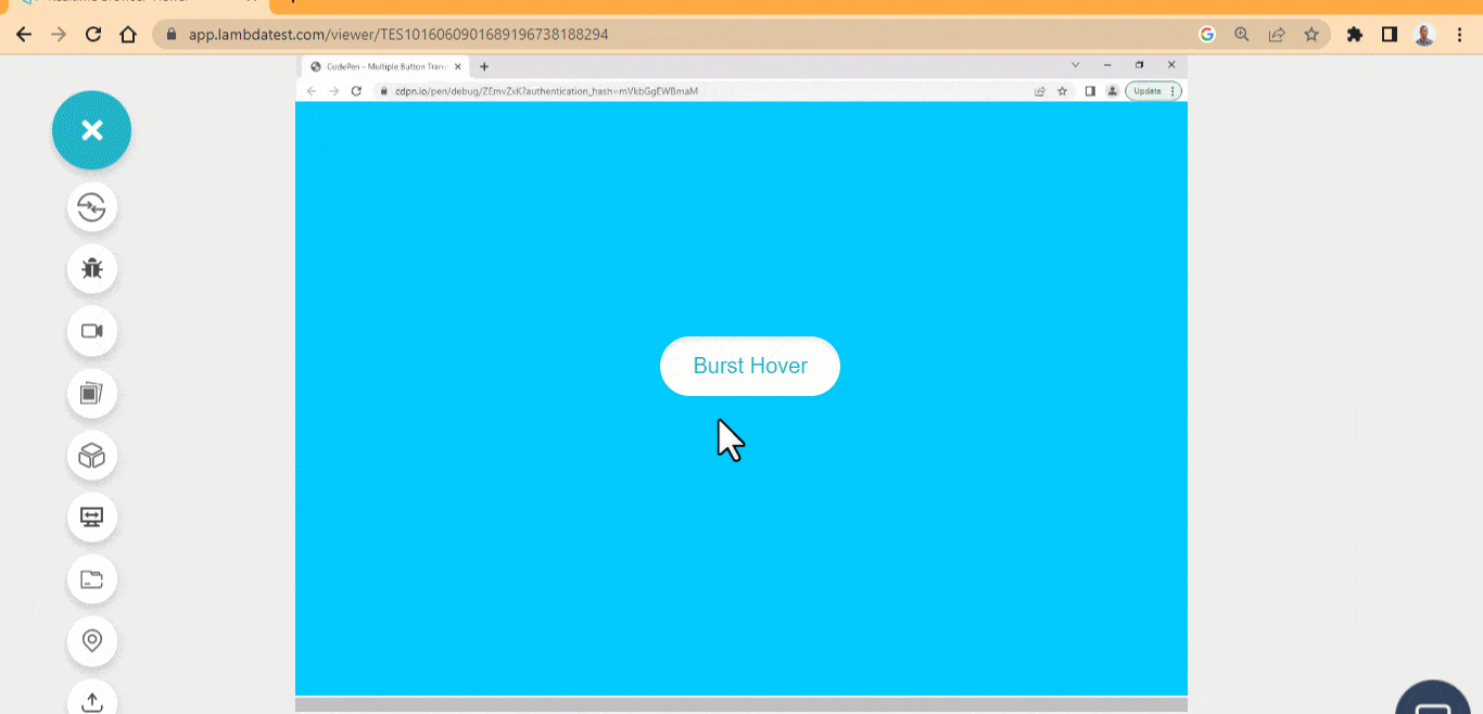 HTML:
HTML:
|
1 2 3 |
<main class="main"> <button class="btn">Burst Hover</button> </main> |
CSS:
|
1 2 3 4 5 6 7 8 9 10 11 12 13 14 15 16 17 18 19 20 21 22 23 24 25 26 27 28 29 30 31 32 33 34 35 36 37 38 39 40 41 42 43 44 45 46 47 48 49 50 51 52 53 54 55 56 57 58 59 60 61 62 |
body{ background-color: #00C9FF; } .main{ width: 100vw; height: 100vh; display: grid; grid-template-columns: 1fr; place-items: center; } .btn{ background-color: #fff; padding: 0.8em 1.5em; border-radius: 20em; border: none; user-select: none; cursor: pointer; font-size: 20px; transition: all 100ms linear; color: #0ebac5; position: relative; box-shadow: inset 0 4px 6px -1px rgb(0 0 0 / 0.1), 0 2px 4px -2px rgb(0 0 0 / 0.1); } .btn:active { box-shadow: inset 0 0 0 4px #043b3f6b; } .btn::before { content: ""; width: 100%; height: 100%; background-color: #fff; position: absolute; border-radius: inherit; z-index: -1; top: 0; left: 0; transition: all 500ms ease-in-out; opacity: 0; animation: flash 100ms ease-in-out; transform: scaleX(2) scaleY(2); } .btn:hover::before { opacity: 1; transform: scaleX(1) scaleY(1); } @keyframes flash { 0%{ opacity: 1; transform: translate(45px); } 100%{ opacity: 0; transform: translate(0); } } |
See the Pen Button Burst Hover Effect by Ocxigin (@ocxigin) on CodePen.
Border Revolve
The border revolve is one of CSS button hover effects that requires an SVGs to be positioned absolute over the element in such a way that only the SVGs strokes revolve round the button element. This animated hover effect can improve how users interact with buttons on the webpage and can be used mainly for hero images as it is very interactive. 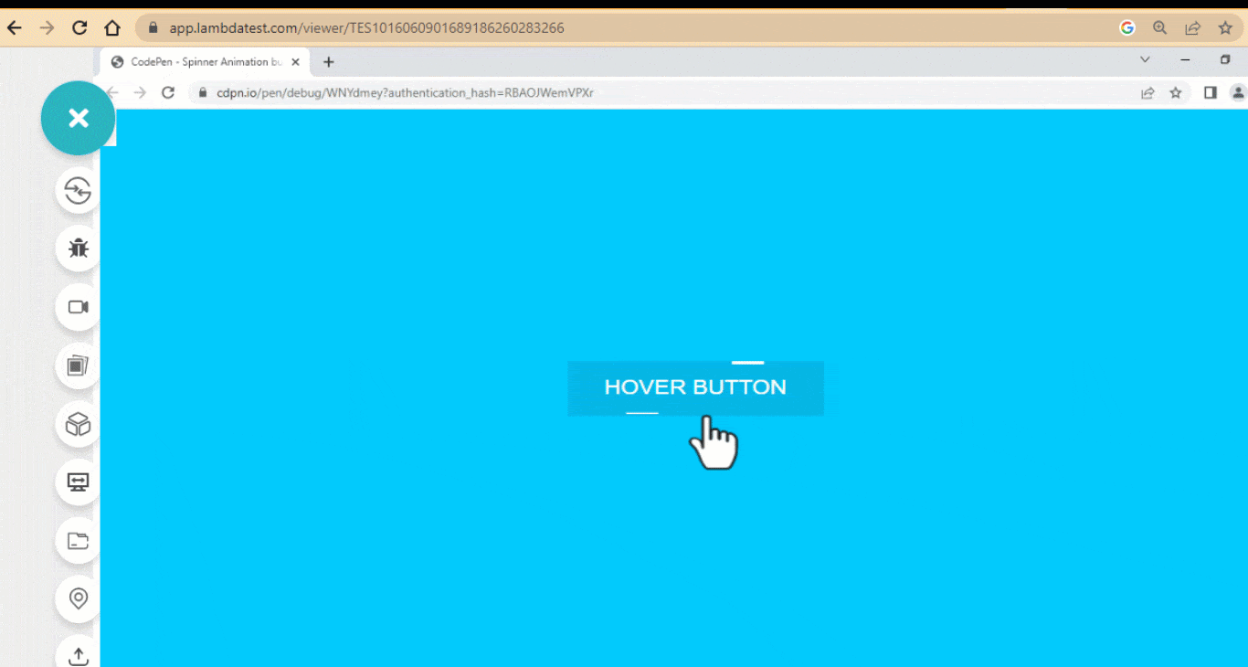 HTML:
HTML:
|
1 2 3 4 5 6 7 8 9 10 |
<main class="main"> <button class="btn"> <?xml version="1.0" encoding="UTF-8"?> <svg id="Layer_1" data-name="Layer 1" xmlns="http://www.w3.org/2000/svg" viewBox="0 0 265 63.6"> <rect width="265" height="63.6"/> <line class="cls-1" y1="2.5" x2="214" y2="2.5"/> </svg> <a href="">Hover Button</a> </button> </main> |
CSS:
|
1 2 3 4 5 6 7 8 9 10 11 12 13 14 15 16 17 18 19 20 21 22 23 24 25 26 27 28 29 30 31 32 33 34 35 36 37 38 39 40 41 42 43 44 45 46 47 48 49 50 51 52 53 54 55 |
body{ background-color: #00C9FF; } .main{ width: 100vw; height: 100vh; display: grid; grid-template-columns: 1fr; place-items: center; } .btn { border: 0px solid #fff; padding: 1em 2em; min-width: 200px; min-height: 50px; background: none; position: relative; cursor: pointer; box-shadow: inset -2px 1px 11px rgba(0,0,0,0.5); } a { color: #fff; text-decoration: none; font-size: large; text-transform: uppercase; } svg { position: absolute; inset: 0; fill: none; stroke: #fff; stroke-width: 5px; stroke-dasharray: 33 297; stroke-dashoffset: 50; transition: all 0.5s linear; } .btn:hover { background-color: #04b7e9; box-shadow: none; } .btn:hover svg { stroke-width: 3px; stroke-dashoffset: -500; } .btn:active { transform: scale(1.001); background-color: #02a7d4; } |
See the Pen Border Revolve Button Hover Effect by Ocxigin (@ocxigin) on CodePen.
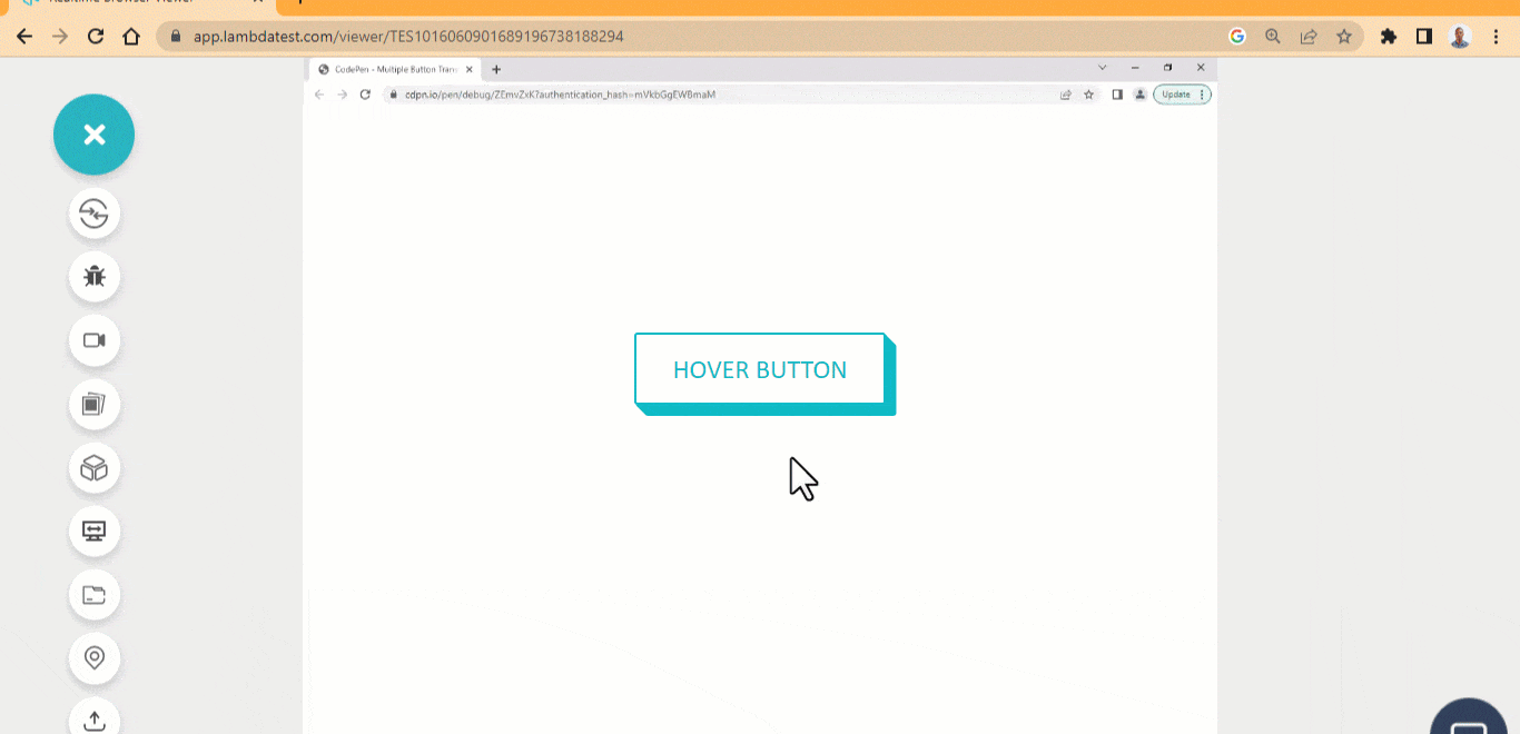
Multiple Button Transition
Next comes the multiple button transition, which is among the best CSS button hover effects. Here we have three buttons with similar design patterns and different transition hover effects. These buttons are handy for large model pop-ups and can serve the purpose of canceling an action or making a request. 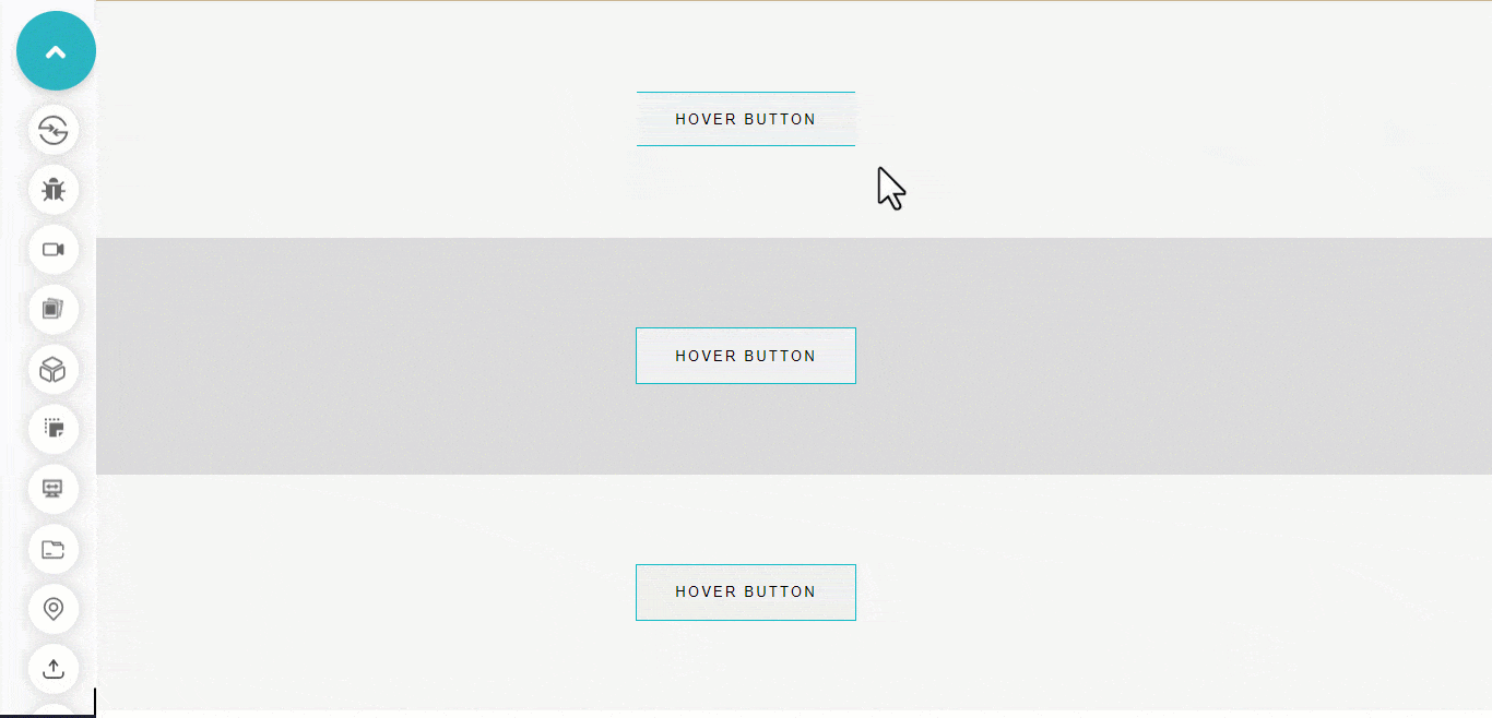 HTML:
HTML:
|
1 2 3 4 5 6 7 |
<main class="main"> <div class="gray-100"> <button class="btn btn-100">Hover Button</button> </div> <div class="gray-200"> <button class="btn btn-200">Hover Button</button></div> <div class="gray-300"> <button class="btn btn-300">Hover Button</button></div> </main> |
CSS:
|
1 2 3 4 5 6 7 8 9 10 11 12 13 14 15 16 17 18 19 20 21 22 23 24 25 26 27 28 29 30 31 32 33 34 35 36 37 38 39 40 41 42 43 44 45 46 47 48 49 50 51 52 53 54 55 56 57 58 59 60 61 62 63 64 65 66 67 68 69 70 71 72 73 74 75 76 77 78 79 80 81 82 83 84 85 86 87 88 |
*{ box-sizing: border-box; margin: 0; padding: 0; } .gray-100, .gray-200, .gray-300 { background-color: rgb(245, 245, 245); width: 100vw; height: 33vh; display: flex; flex-direction: column; justify-content: center; align-items: center; } .gray-200 { background-color: rgb(219, 218, 218); } .btn { border: 0px solid #fff; padding: 1em 2em; min-width: 200px; min-height: 50px; position: relative; cursor: pointer; text-transform: uppercase; letter-spacing: 2px; position: relative; transition: background-color 0.5s linear 0.5s; } .btn-100::after { content: ""; display: block; border-top: 1px solid #0ebac5; border-bottom: 1px solid #0ebac5; background: none; position: absolute; inset: 0; transition: all 0.5s linear; } .btn-100:hover::after { transform: scaleX(0); } .btn-100:hover { background-color: #0ebac5; color: #fff; } .btn-200::after, .btn-200::before { content: ""; display: block; box-shadow: 0 0 0 1px #0ebac5; background: none; position: absolute; inset: 0; transition: all 0.5s linear; } .btn-200:hover::before { transform: rotate(45deg); } .btn-200:hover::after { transform: rotate(-45deg); } .btn-300::after { content: ""; display: block; box-shadow: 0 0 0 1px #0ebac5; background: none; position: absolute; inset: 0; transition: scale() 100ms linear 0.3s; } .btn-300:hover::after { opacity: 0; } .btn-300:hover { background-color: #0ebac5; } |
See the Pen Multiple Button Transition Hover Effect by Ocxigin (@ocxigin) on CodePen.
Grow Button Background
The grow button background is one of the best CSS button hover effects that let the pseudo-element of the button to grow on hover. This can be used as a learn more button for directing the user to another page within the application. The learn more button gives users the option to know more about a specific information on the webpage. 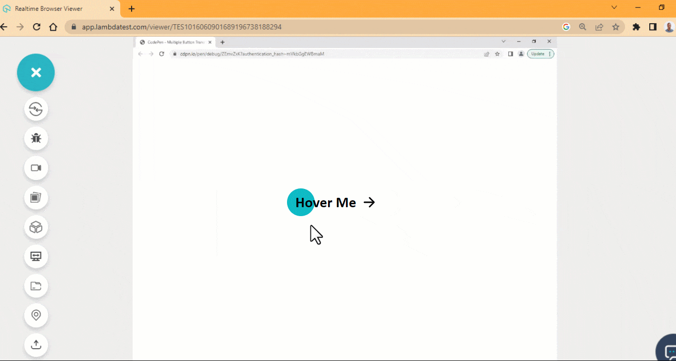 HTML:
HTML:
|
1 2 3 4 5 6 7 8 9 10 |
<main class="main"> <div> <a href="#" class="btn yellow"> <span>Hover Me</span> <ion-icon name="arrow-forward"></ion-icon> </a> </div> </main> <script type="module" src="https://unpkg.com/ionicons@7.1.0/dist/ionicons/ionicons.esm.js"></script> |
CSS:
|
1 2 3 4 5 6 7 8 9 10 11 12 13 14 15 16 17 18 19 20 21 22 23 24 25 26 27 28 29 30 31 32 33 34 35 36 37 38 39 40 41 42 43 44 45 46 47 48 49 50 51 52 53 54 55 56 57 58 59 60 61 62 63 64 65 66 67 68 69 70 |
.main{ width: 80%; height: 100vh; display: flex; justify-content: space-around; align-items: center; margin: 0 auto; } .btn { display: flex; justify-content: center; align-items: center; min-width:220.52px; min-height: 56px; font-family: calibri; border: none; border-radius: 100px; cursor: pointer; font-weight: 400; text-decoration: none; transition: all 0.5s linear; } span { font-size: 30px; font-weight: 700; padding: 0 10px; } ion-icon { font-size: 2em; transition: all 0.5s linear; } .btn:hover ion-icon { transform: rotate(-90deg); } div { position: relative; } .yellow { /* background: #0ebac5; */ background: none; color: black; } .yellow::before { content: ""; display: block; width: 56px; height: 100%; background-color:#0ebac5; position: absolute; border-radius: 100px; left: 1em; z-index: -1; transition: all 600ms ease; } .yellow:hover::before { width: 100%; } .yellow:hover ion-icon { transform: translateX(10px); } |
See the Pen Grow Button Background Hover Effect by Ocxigin (@ocxigin) on CodePen.
Flip-Up Navbar
The flip-up navbar is yet another one of the simplest CSS button hover effects where the navbar items flips up when a user hover on them. This can be used for creating a simple navbar on the web page. The flip-up effect shows what happens when a user hovers over the navbar items. 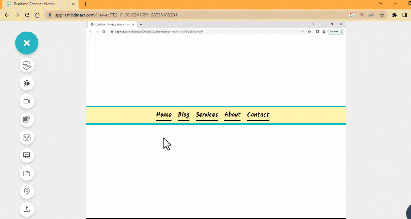 HTML:
HTML:
|
1 2 3 4 5 6 7 8 9 |
<main class="main"> <ul> <li><a href="#">Home</a></li> <li><a href="#">Blog</a></li> <li><a href="#">Services</a></li> <li><a href="#">About</a></li> <li><a href="#">Contact</a></li> </ul> </main> |
CSS:
|
1 2 3 4 5 6 7 8 9 10 11 12 13 14 15 16 17 18 19 20 21 22 23 24 25 26 27 28 29 30 31 32 33 34 35 36 37 38 39 40 41 42 43 44 45 46 47 48 49 50 51 52 53 54 55 56 |
@import url('https://fonts.googleapis.com/css2?family=Kalam:wght@700&family=Source+Code+Pro:ital,wght@0,200;0,300;0,400;0,500;0,600;0,700;0,800;0,900;1,200;1,300;1,400;1,500;1,600;1,700;1,800;1,900&display=swap'); :roo{ --font: Kalam, 'Source Code Pro', monospace; } *, *::after, *::before { margin: 0; padding: 0; box-sizing: border-box; } .main{ width: 100vw; height: 100vh; display: flex; justify-content: center; align-items: center; } ul { display: flex; justify-content: center; flex-direction: row; align-items: center; width: 100%; height: 60px; border-bottom: 5px solid #0ebac5; border-top: 5px solid #0ebac5; background-color: #fff4b0; } ul li { display: inline; list-style-type: none; } li a { text-decoration: none; font-size: 20px; text-transform: capitalize; font-family: Kalam, Arial; font-weight: 700; margin-right: 1em; color: black; position: relative; border-bottom: 2px solid #000; } li a:hover{ top: -0.16em; transition: padding .5s, top .35s, box-shadow .4s; box-shadow: 0 0.4rem 0 -0.2rem #0ebac5; } |
See the Pen Flip-up navbar button Hover Effect by Ocxigin (@ocxigin) on CodePen.
Double Dropdown
Double dropdown CSS button hover effect sets the background of the button to position from the Y axis to the bottom. This button can be used to point the user to an external link and is useful in a situation where the external link is required to be opened with a new tap. 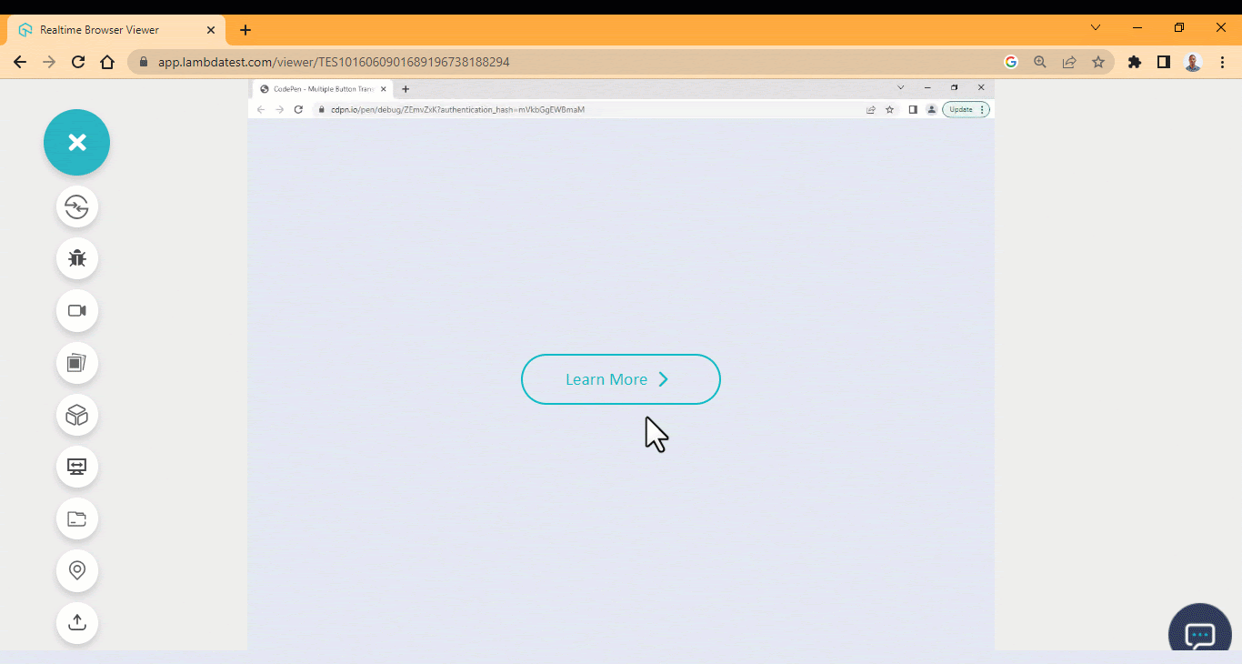 HTML:
HTML:
|
1 2 3 4 5 6 7 8 9 10 11 |
<link rel="stylesheet" href="https://cdnjs.cloudflare.com/ajax/libs/font-awesome/6.4.0/css/all.min.css" integrity="sha512-iecdLmaskl7CVkqkXNQ/ZH/XLlvWZOJyj7Yy7tcenmpD1ypASozpmT/E0iPtmFIB46ZmdtAc9eNBvH0H/ZpiBw==" crossorigin="anonymous" referrerpolicy="no-referrer"> <body> <main class="main"> <section> <button class="btn">Learn More <i class="fa-sharp fa-solid fa-chevron-right"></i> </button> </section> </main> </body> |
CSS:
|
1 2 3 4 5 6 7 8 9 10 11 12 13 14 15 16 17 18 19 20 21 22 23 24 25 26 27 28 29 30 31 32 33 34 35 36 37 38 39 40 41 42 43 44 45 46 47 48 49 50 51 52 53 54 55 56 57 58 59 60 61 62 63 64 65 66 67 68 69 70 71 72 73 74 75 76 77 78 79 80 81 82 |
/* Global Styles */ *, *::after, *::before { margin: 0; padding: 0; box-sizing: border-box; } :root { --font: calibri; --size-pri: 1px; --size-sec: 100px; --main-clr: #0ebac5; --white: #fff; } .main { display: grid; grid-template-columns: repeat(1 1fr); place-items: center; height: 100vh; } body { background-color: rgb(226 232 240); } .btn { background: none; display: flex; justify-content: center; align-items: center; min-width:220.52px; min-height: 56px; font-family: calibri; font-size: 1.2em; border-radius: 100px; cursor: pointer; font-weight: 400; position: relative; border: 2px solid var(--main-clr); color: var(--main-clr); background-color : transparent; overflow: hidden; } i { font-size: 1em; padding: 0 10px; transition: all 0.5s linear; } .btn:hover i { transform: translateX(10px); } .btn::before, .btn::after{ content: ""; position: absolute; width: 100%; height: 100%; top: -100%; left: 0; background-color: var(--main-clr); z-index: -1; transition: all 400ms ease-in; } .btn:hover { color: #fff; } .btn::before { opacity: 0.3; } .btn::after { transition-delay: 0.3s; } .btn:hover::before, .btn:hover::after { top: 0; } |
See the Pen Double dropdown button hover Effect by Ocxigin (@ocxigin) on CodePen.
Glow Icon
Glow icon button is one of the top CSS button hover effects where a box-shadow is set to both the icon and the button element border-box. These buttons can be used to display the organization’s logo, pointing a user to its official website.  HTML:
HTML:
|
1 2 3 4 5 6 7 8 9 10 11 12 13 14 15 16 17 18 19 20 21 22 23 24 25 26 27 28 |
<main class="main"> <ul> <li> <a href=""> <ion-icon name="logo-python"></ion-icon> </a> </li> <li> <a href=""> <ion-icon name="logo-laravel"></ion-icon> </a> </li> <li> <a href=""> <ion-icon name="logo-javascript"></ion-icon> </a> </li> <li> <a href=""> <ion-icon name="logo-css3"></ion-icon> </a> </li> </ul> </main> <script type="module" src="https://unpkg.com/ionicons@7.1.0/dist/ionicons/ionicons.esm.js"></script> |
CSS:
|
1 2 3 4 5 6 7 8 9 10 11 12 13 14 15 16 17 18 19 20 21 22 23 24 25 26 27 28 29 30 31 32 33 34 35 36 37 38 39 40 41 42 43 44 45 46 47 48 49 50 51 52 53 54 55 56 57 58 59 |
*, *::after, *::before { margin: 0; padding: 0; box-sizing: border-box; } body { margin: 0; padding: 0; background-color: hsl(0, 2%, 10%); } .main{ width: 100vw; height: 100vh; display: flex; justify-content: center; align-items: center; position: relative; } li { list-style: none; margin: 0 15px; } a { background-color: hsl(0, 2%, 16%); width: 100px; height: 100px; border-radius: 50%; border: 2px solid #0ebac5; display: flex; justify-content: center; align-items: center; margin: 1em; transition: all 500ms ease; } ion-icon { color: #fff; font-size: 3em; border: none; } a:hover { box-shadow: 0 0 20px #0ebac5; } a:hover ion-icon{ color: #0ebac5; box-shadow: 0 0 12px #0ebac5; } @media screen and (min-width: 500px) { ul { display: flex; } } |
See the Pen Glow Icon button hover Effect by Ocxigin (@ocxigin) on CodePen.
Hamburger Menu Button
The hamburger menu button is one of the popular CSS button hover effects for the navbar. Its main feature is to toggle or open list items and close them on click event. This button is good for toggling navbar items open and close and is commonly implemented on the mobile display of a website. The hamburger menu can also be implemented on a model pop-up; the close action of the hamburger serves as a close button for the modal pop-up. 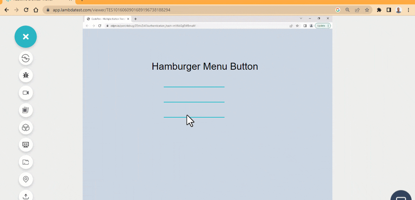 HTML:
HTML:
|
1 2 3 4 5 6 7 8 9 10 11 12 |
<main class="main"> <div> <div> <p>Hamburger Menu Button</p> </div> <ul> <li class="line line-one"></li> <li class="line line-two"></li> <li class="line line-three"></li> </ul> </div> </main> |
CSS:
|
1 2 3 4 5 6 7 8 9 10 11 12 13 14 15 16 17 18 19 20 21 22 23 24 25 26 27 28 29 30 31 32 33 34 35 36 37 38 39 40 41 42 43 44 45 46 |
body { background-color: rgb(203 213 225); } .main { display: flex; justify-content: center; align-items: center; height: 100vw; } p { font-family: Arial; text-align: center; font-size: 2em; text-shadow:0 1px 3px 0 rgb(0 0 0 / 0.1); } ul { width: 200px; cursor: pointer; } .line { width: 100%; height: 2px; list-style-type: none; background-color: #0ebac5; margin-top: 3em; transition: all 500ms ease; } ul:hover .line { transform-origin: 15% 50%; } ul:hover .line-one { transform: rotate(45deg); } ul:hover .line-two { opacity: 0; } ul:hover .line-three { transform: rotate(-45deg); } |
See the Pen Hamburger Menu Button by Ocxigin (@ocxigin) on CodePen.
Animated Gradient
CSS Animation has become a new way of adding CSS button hover effects as this has proven to be more interactive as users hover on the element. To get the best result, this also needs to be done well. For example, the following buttons below can be used as CTAs, hero image overlay buttons, user interactions buttons, and submit, login-in, or sign out buttons. 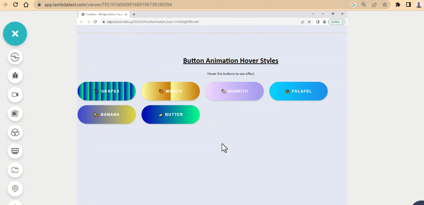 HTML:
HTML:
|
1 2 3 4 5 6 7 8 9 10 11 12 13 14 15 16 17 |
<main class="main"> <div> <section> <h1>Button Animation Hover Styles</h1> <p>Hover the buttons to see effect</p> </section> <section> <button class="btn one">🍇 Grapes</button> <button class="btn two">🥭 Mango</button> <button class="btn three">🌯 Burrito</button> <button class="btn four">🧆 Falafel</button> <button class="btn five">🍌 Banana</button> <button class="btn six">🧈 Butter</button> </section> </div> </main> |
CSS:
|
1 2 3 4 5 6 7 8 9 10 11 12 13 14 15 16 17 18 19 20 21 22 23 24 25 26 27 28 29 30 31 32 33 34 35 36 37 38 39 40 41 42 43 44 45 46 47 48 49 50 51 52 53 54 55 56 57 58 59 60 61 62 63 64 65 66 67 68 69 70 71 72 73 74 75 76 77 78 79 80 81 82 83 84 85 86 87 88 89 90 91 92 93 94 95 96 |
bodsign-outground-color: rgb(226 232 240); } .main { display: flex; justify-content: center; align-items: center; height: 100vw; } .btn { width: 250px; height: 80px; margin: 10px; background: linear-gradient(90deg, #0700b8 0%, #00ff88 100%); background-size: 100%; font-size: 1em; font-weight: 600; border-radius: 100px; color: white; border: none; text-transform: uppercase; letter-spacing: 2px; padding: 1em 2em; cursor: pointer; transition: all 500ms ease; box-shadow: 0 4px 6px -1px hsla(0, 0%, 0%, 0.1), 0 2px 4px -2px hsla(0, 0%, 0%, 0.1); } h1 { text-align: center; font: 2em calibri; font-weight: bold; text-decoration: underline; } p { text-align: center; font-family: calibri; } .one{ background-size: 10%; } .two{ background: linear-gradient(90deg, #fcff9e 0%, #c67700 100%); background-size: 50%; } .three { background: linear-gradient(90deg, #efd5ff 0%, #515ada 100%); background-size: 200%; } .four { background: linear-gradient(to right, #00d2ff 0%, #3a47d5 50%, #c67700 100%); background-size: 400%; } .five { background: linear-gradient(to right, #3a47d5, #FCEE21, #00A8C5, #D9E021); background-size: 350% 100%; transition: all .4s ease-in-out; } .five:hover { background-position: 100% 0; } .btn:hover { animation-name: flow; animation-duration: 500ms; animation-timing-function: linear; } .six { background-size:100% 350%; transition: all .4s ease-in-out; } .six:hover { background: linear-gradient(90deg, #FC466B 0%, #3F5EFB 100%); background-position: 100% 0; } @keyframes flow { 0% { background-position: 0% 50%; } 100% { background-position: 100%; } } |
See the Pen Animated Gradient Buttons Hover Effect by Ocxigin (@ocxigin) on CodePen.
Transform Button Size
The transform button size effect transforms the size of the button when a user hover on the button element. This type of CSS button hover effects can be used as a website pagination button. Pagination helps web authors break multiple pages into numbers presented as links and are commonly placed on the bottom of the page. This enables users to jump directly to any specific page within the website or mobile app. The transform button size hover effect is good for easy navigation. 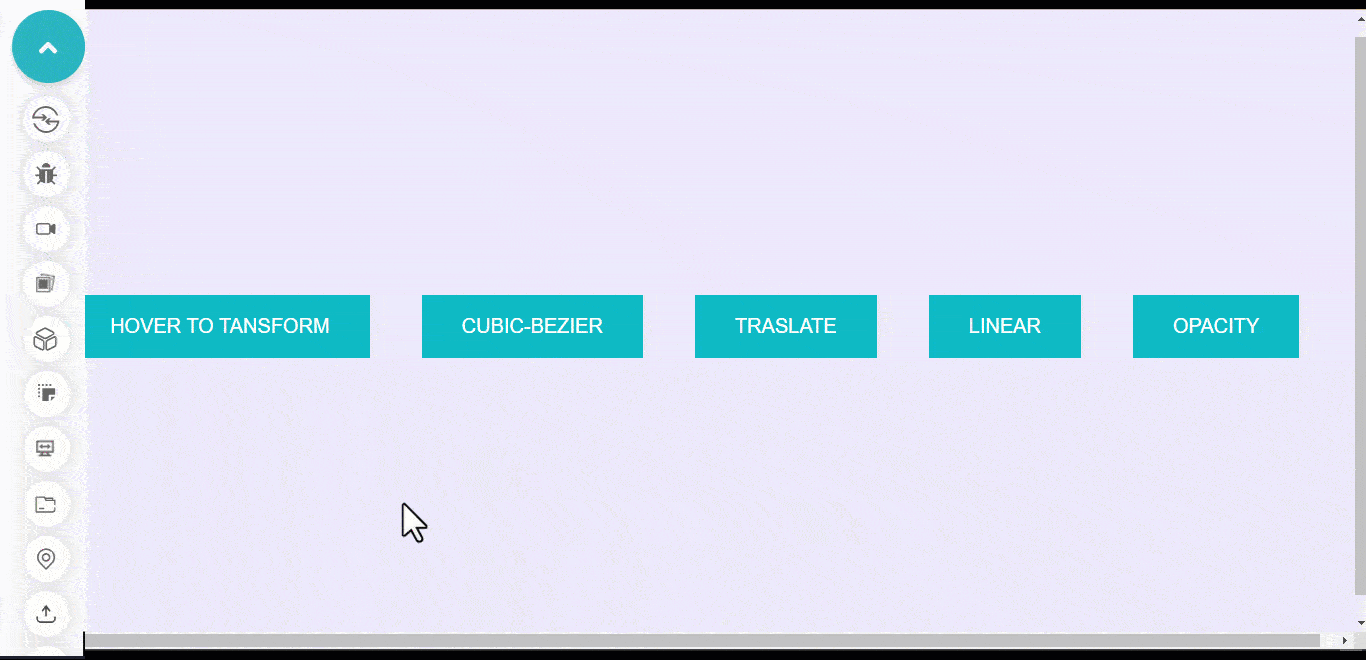 HTML:
HTML:
|
1 2 3 4 5 6 7 8 9 10 11 12 13 14 15 16 17 18 19 20 21 |
<body> <main class="main"> <section> <div> <button class="btn">Hover to transform</button> </div> <div> <button class="btn one">cubic-bezier</button> </div> <div> <button class="btn two">Translate</button> </div> <div> <button class="btn three">linear</button> </div> <div> <button class="btn four">opacity</button> </div> </section> </main> </body> |
CSS:
|
1 2 3 4 5 6 7 8 9 10 11 12 13 14 15 16 17 18 19 20 21 22 23 24 25 26 27 28 29 30 31 32 33 34 35 36 37 38 39 40 41 42 43 44 45 46 47 48 49 50 51 52 53 54 55 56 57 58 59 60 61 62 63 64 65 66 67 68 69 70 71 72 73 74 75 76 77 78 79 |
body { background-color: rgb(237 233 254); } div { margin: 0 1em; } .main{ width: 100vw; height: 100vh; display: grid; grid-template-columns: 1fr; place-items: center; } section { display: flex; flex-wrap: wrap; gap: 20px; } .btn { padding: 1em 2em; background-color: #0ebac5; border: none; user-select: none; cursor: pointer; font-size: 20px; text-transform: uppercase; transition: all 0.5s linear; color: #fff; } .btn:hover { background-color:#1e183a; border-radius: 0; scale: 1.1; } .btn::after{ content: ''; background: #0ebac5; width: 0; height: 100%; position: absolute; inset: 0; transition: all 0.5s cubic-bezier(0.19, 1, 0.22, 1); z-index: -1; } .btn:hover::after { width: 100%; } .two::after { transform: translateX(-100%); transition: all 0.5s ease; visibility: hidden; } .two:hover::after { visibility: visible; transform: translateX(0); } .three::after { transition: all 0.5s linear; } .four::after { transition: all 0.5s linear; transform: translateX(-100px); opacity: 0; } .four:hover::after { transform: translateX(0); opacity: 1; } |
See the Pen Transform Button background by Ocxigin (@ocxigin) on CodePen.
Offset Border
Offset border is another best CSS button hover effect. The offset border button is set in such a way that the after and before pseudo-element is set as box-shadow and is used as a border. This border is then set to overlap each other, and its scales to zero on mouse hover. Below is a large button that can be used as a hero image overlay button for a landing webpage. 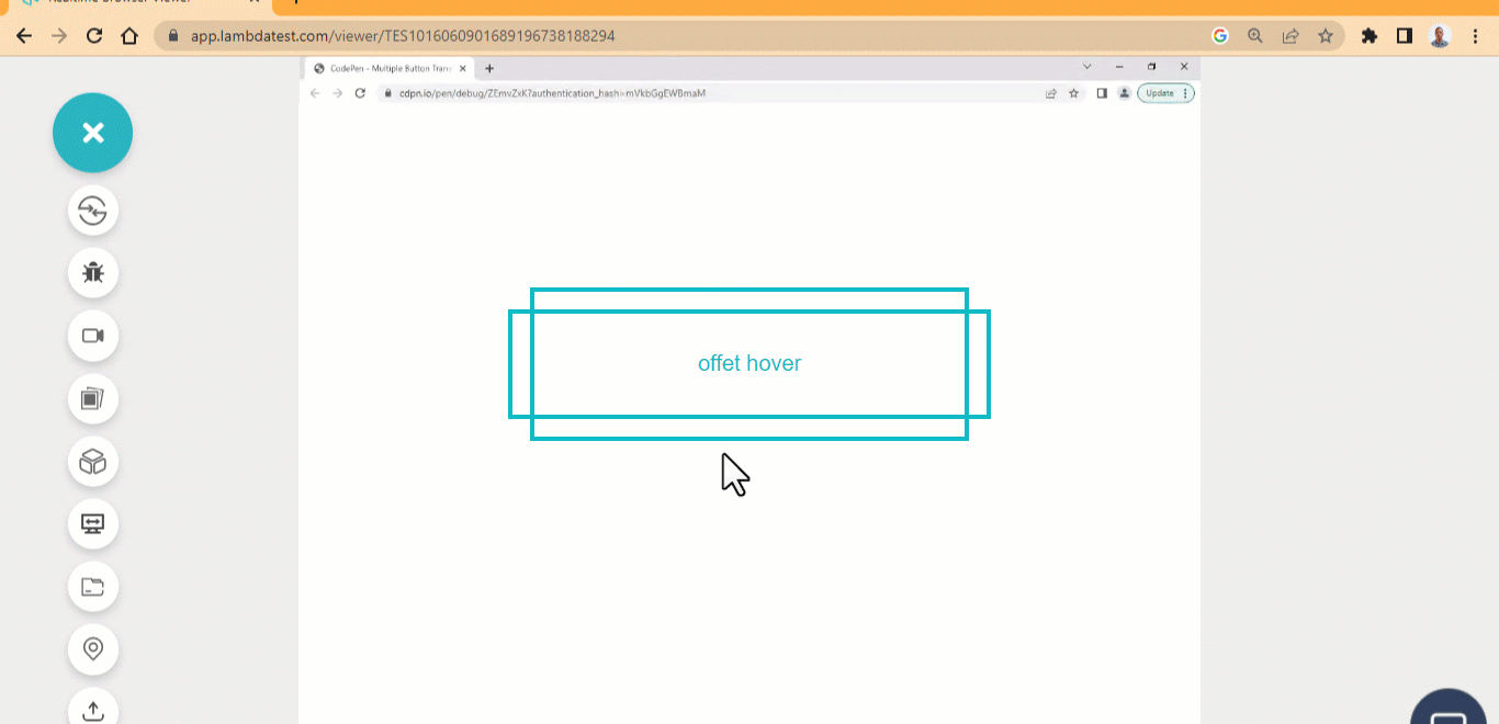 HTML:
HTML:
|
1 2 3 |
<main class="main"> <button class="btn">offet hover</button> </main> |
CSS:
|
1 2 3 4 5 6 7 8 9 10 11 12 13 14 15 16 17 18 19 20 21 22 23 24 25 26 27 28 29 30 31 32 33 34 35 36 37 38 39 40 41 42 43 44 45 46 47 48 49 50 51 52 53 54 55 56 57 58 59 60 61 62 63 |
*, *::after, ::before { box-sizing: border-box; margin: 0; padding: 0; } .main{ width: 100vw; height: 100vh; display: grid; grid-template-columns: 1fr; place-items: center; } .btn{ width: 20em; height: 5em; padding: 0.5em 1em; /* border: 3px solid #0ebac5; */ border: none; background:none; user-select: none; cursor: pointer; font-size: 20px; transition: all 0.5s linear; color: #0ebac5; position: relative; box-shadow: inset 0 0 0 4px #043b3f; } .btn::before { display: inline-block; content: ""; width: 22em; height: 100%; position: absolute; left: -1em; top: 0; text-align: center; box-shadow: inset 0 0 0 4px #0ebac5; transition: all 0.5s linear; } .btn:hover::before { transform: scaleX(0); } .btn::after { display: inline-block; content: ""; width: 20em; height: 7em; position: absolute; left: 0; top: -1em; text-align: center; box-shadow: inset 0 0 0 4px #0ebac5; transition: all 0.5s linear; } .btn:hover::after { transform: scaleY(0); } |
See the Pen Offset border button hover Effect by Ocxigin (@ocxigin) on CodePen.
New to borders? Read our comprehensive guide on CSS borders.
Strikethrough Effect
Strikethrough CSS button hover effects create a line transition over menu items when a user hovers over a specific menu item. The strikethrough effect is a prevalent design pattern for most navbars on most websites. These buttons show a simple way to interact with nav links with a strikethrough effect.  HTML:
HTML:
|
1 2 3 4 5 6 7 8 9 10 |
<main class="main"> <nav> <ul class="nav"> <li>Home</li> <li>Blog</li> <li>Services</li> <li>Contact US</li> </ul> </nav> </main> |
CSS:
|
1 2 3 4 5 6 7 8 9 10 11 12 13 14 15 16 17 18 19 20 21 22 23 24 25 26 27 28 29 30 31 32 33 34 35 36 37 38 39 40 41 42 43 44 45 46 47 48 49 50 51 52 53 54 55 56 57 58 59 60 61 62 63 64 65 66 67 68 69 |
*{ box-sizing: border-box; margin: 0; padding: 0; } .main{ width: 100vw; height: 100vh; display: grid; grid-template-columns: 1fr; place-items: center; } .nav { display: flex; gap: 20px; list-style: none; font-family: calibri; font-size: 25px; font-weight: 300; text-transform: uppercase; letter-spacing: 5px; cursor: pointer; user-select: none; position: relative; } li { display: block; position: relative; } li::before, li::after { width: 0%; height: 3px; content: ""; position: absolute; top: 50%; display: block; background: transparent; transition: all 500ms cubic-bezier(0.075, 0.82, 0.165, 1); } li::before{ left: -1.5px; } li::after { left: 1.5px; background: transparent; } li:hover::before{ background: #0ebac5; width: 100%; } li:hover::after { background: transparent; width: 100%; transition: 0s; } @media screen and (max-width: 500px) { .nav{ display: inline; } } |
See the Pen Strikethrough Button Hover Effect by Ocxigin (@ocxigin) on CodePen.
Bootstrap Button
Bootstrap is a popular CSS framework for building beautiful, responsive, mobile-first user interfaces for websites and web applications. It has a custom-made button with simple hover effects that can be quickly implemented when building a website. These types of CSS button hover effects can be used as pagination buttons, actions buttons, alert buttons, disable buttons, success buttons, delete buttons, etc. 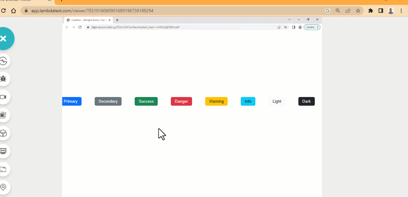 HTML:
HTML:
|
1 2 3 4 5 6 7 8 9 10 11 12 13 |
<main class="main"> <div> <button type="button" class="btn btn-primary">Primary</button> <button type="button" class="btn btn-secondary">Secondary</button> <button type="button" class="btn btn-success">Success</button> <button type="button" class="btn btn-danger">Danger</button> <button type="button" class="btn btn-warning">Warning</button> <button type="button" class="btn btn-info">Info</button> <button type="button" class="btn btn-light">Light</button> <button type="button" class="btn btn-dark">Dark</button> <button type="button" class="btn btn-link">Link</button> </div> </main> |
CSS:
|
1 2 3 4 5 6 7 8 9 10 11 12 13 14 15 16 17 18 19 20 21 22 23 24 25 26 27 28 29 30 31 32 33 34 35 36 37 38 39 40 41 42 43 44 45 46 47 48 49 50 51 52 53 54 55 56 57 58 59 60 61 62 63 64 65 66 67 68 69 70 71 72 73 74 75 76 77 78 79 80 81 82 83 84 85 86 87 88 89 90 91 92 93 94 95 96 97 98 99 100 101 102 103 104 105 106 107 108 109 110 111 112 113 114 115 116 117 118 119 120 121 122 123 124 125 126 127 128 129 130 131 132 133 134 135 136 137 138 139 140 |
.main{ width: 80%; height: 100vh; display: flex; justify-content: space-around; align-items: center; margin: 0 auto; } .btn { border: none; padding: 0.5em 1em; margin: 20px; border-radius: 5px; cursor: pointer; font-weight: 400; } /* btn-primary */ .btn-primary { background-color: #0d6efd; color: #fff; } .btn-primary:hover { background-color: #0b5ed7; } .btn-primary:focus { box-shadow: 0 0 0 0.25rem rgba(49,132,253,.5); } /* btn-secondary */ .btn-secondary { background-color: #6c757d; color: #fff; } .btn-secondary:hover { background-color: #5c636a; } .btn-secondary:active { box-shadow: 0 0 0 0.25rem rgba(130,138,145,.5); } /* btn-success */ .btn-success { background-color: #198754; color: #fff; } .btn-success:hover { background-color: #157347; } .btn-success:active { box-shadow: 0 0 0 0.25rem rgba(60,153,110,.5); } /* btn-danger */ .btn-danger { background-color: #dc3545; color: #fff; } .btn-danger:hover { background-color: #bb2d3b; } .btn-danger:active { box-shadow: 0 0 0 0.25rem rgba(225,83,97,.5); } /* btn-warning */ .btn-warning { background-color: #ffc107; } .btn-warning:hover { background-color: #ffca2c; } .btn-warning:active { box-shadow: 0 0 0 0.25rem rgba(217,164,6,.5); } /* btn-info */ .btn-info { background-color: #0dcaf0; } .btn-info:hover { background-color: #31d2f2; } .btn-info:active { box-shadow: 0 0 0 0.25rem rgba(11,172,204,.5); } /* btn-light */ .btn-light { background-color: #f8f9fa; } .btn-light:hover { background-color: #f9fafb; } .btn-light:active { box-shadow: 0 0 0 0.25rem rgba(211,212,213,.5); } /* btn-dark */ .btn-dark { background-color: #212529; color: #fff; } .btn-dark:hover { background-color: #1c1f23; } .btn-dark:active { box-shadow: 0 0 0 0.25rem rgba(66,70,73,.5); } /* btn-link */ .btn-link { color: #0d6efd; text-decoration: underline; } .btn-link:hover { color: #0a58ca; } .btn-link:active { box-shadow: 0 0 0 0.25rem rgba(13,110,253,.25); } |
See the Pen Strikethrough Button Hover Effect by Ocxigin (@ocxigin) on CodePen.
Download Button
Download CSS button hover effects are popular on file sharing websites such as Gmail, GitHub, etc. These websites enable users to download files directly on their PC. We can design a download button to give the impression that a file is being downloaded or a user is directly interacting with a button. For example, the below button shows how to design or implement a simple download button. 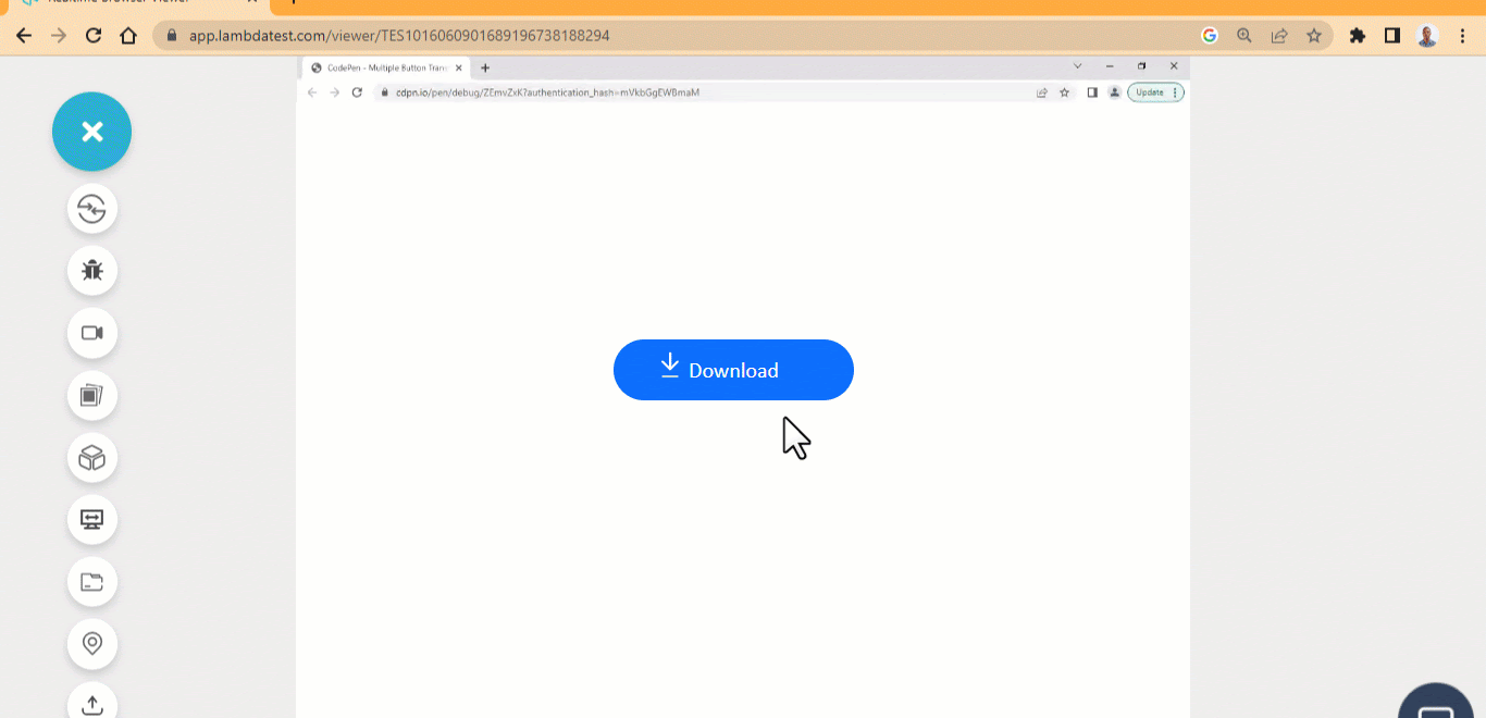 HTML:
HTML:
|
1 2 3 4 5 6 7 8 9 10 11 |
<main class="main"> <div> <a href="#" class="btn btn-primary"> <ion-icon name="arrow-down-outline"></ion-icon> <ion-icon name="remove-outline"></ion-icon> <span>Download</span> </a> </div> </main> <script type="module" src="https://unpkg.com/ionicons@7.1.0/dist/ionicons/ionicons.esm.js"></script> |
CSS:
|
1 2 3 4 5 6 7 8 9 10 11 12 13 14 15 16 17 18 19 20 21 22 23 24 25 26 27 28 29 30 31 32 33 34 35 36 37 38 39 40 41 42 43 44 45 46 47 48 49 50 51 52 53 54 55 56 57 58 59 60 61 62 63 64 65 |
.main{ width: 80%; height: 100vh; display: flex; justify-content: space-around; align-items: center; margin: 0 auto; } .btn { display: flex; justify-content: center; align-items: center; min-width:220.52px; min-height: 56px; font-family: calibri; border: none; border-radius: 100px; cursor: pointer; font-weight: 400; text-decoration: none; position: relative; } /* btn-primary */ .btn-primary { background-color: #0d6efd; color: #fff; } .btn-primary:hover { background-color: #0b5ed7; } .btn-primary:active { box-shadow: 0 0 0 0.25rem rgba(49,132,253,.5); } span { font-size: 20px; padding: 0 10px; } [name="remove-outline"] { position: absolute; top: 22px; left: 40px; } [name="arrow-down-outline"] { position: absolute; top: 8px; left: 40px; transform: top 1s ease; } .btn:hover [name="arrow-down-outline"] { top: 13px; } ion-icon { color: #fff; font-size: 1.5em; transition: all 0.5s linear; } |
See the Pen Download Button Hover Effect by Ocxigin (@ocxigin) on CodePen.
Transform Button Icons
Transform button icons are considered to be one of the best CSS button hover effects. Icons are a great way to portray information and can be illustrated online. We can apply icons to many web components, one of which is a button component. When an icon is applied on the web page, it tells the user what or how to interact with the icon. We can make icons more interactive by animating them or adding transitions. These buttons can be used as Learn More buttons to pointer a user to an external content or another webpage. 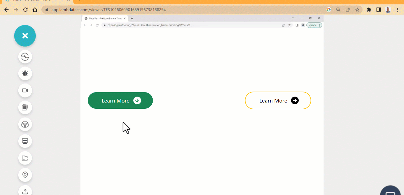 HTML:
HTML:
|
1 2 3 4 5 6 7 8 9 10 11 12 13 14 15 16 17 |
<main class="main"> <div> <a href="#" class="btn btn-primary"> <span>Learn More</span> <ion-icon name="arrow-down-circle-sharp"></ion-icon> </a> </div> <div> <a href="#" class="btn yellow"> <span>Learn More</span> <ion-icon name="arrow-forward-circle"></ion-icon> </a> </div> </main> <script type="module" src="https://unpkg.com/ionicons@7.1.0/dist/ionicons/ionicons.esm.js"></script> |
CSS:
|
1 2 3 4 5 6 7 8 9 10 11 12 13 14 15 16 17 18 19 20 21 22 23 24 25 26 27 28 29 30 31 32 33 34 35 36 37 38 39 40 41 42 43 44 45 46 47 48 49 50 51 52 53 54 55 56 57 58 59 60 |
.main{ width: 80%; height: 100vh; display: flex; justify-content: space-around; align-items: center; margin: 0 auto; } .btn { display: flex; justify-content: center; align-items: center; min-width:220.52px; min-height: 56px; font-family: calibri; border: none; border-radius: 100px; cursor: pointer; font-weight: 400; text-decoration: none; } /* btn-primary */ .btn-primary { background-color: #198754; color: #fff; } .btn-primary:hover { background-color: #157347; } .btn-primary:active { box-shadow: 0 0 0 0.25rem rgba(60,153,110,.5); } span { font-size: 20px; padding: 0 10px; } ion-icon { font-size: 2em; transition: all 0.5s linear; } .btn:hover ion-icon { transform: rotate(-90deg); } .yellow { border: 2px solid #ffc107; color: black; } .yellow:hover ion-icon { transform: translateX(10px); } |
See the Pen Tranform Icons button Hover Effect by Ocxigin (@ocxigin) on CodePen.
Translate Button Icon
Not only can we apply simple CSS transitions like fade-in and fade-out to button icons, but also apply translate to move the icon from one axis to another. This can be used as a remove items button on a website or a to-do app. A todo app needs a good button component to help improve its UI and drive user interaction. 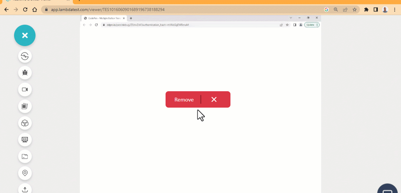 HTML:
HTML:
|
1 2 3 4 5 6 7 8 9 10 11 12 |
<main class="main"> <div> <a href="#" class="btn btn-primary"> <ion-icon name="remove-outline"></ion-icon> <ion-icon name="close"></ion-icon> <span>Remove</span> </a> </div> </main> <script type="module" src="https://unpkg.com/ionicons@7.1.0/dist/ionicons/ionicons.esm.js"> </script> |
CSS:
|
1 2 3 4 5 6 7 8 9 10 11 12 13 14 15 16 17 18 19 20 21 22 23 24 25 26 27 28 29 30 31 32 33 34 35 36 37 38 39 40 41 42 43 44 45 46 47 48 49 50 51 52 53 54 55 56 57 58 59 60 61 62 63 64 65 66 67 68 69 70 71 72 73 74 |
.main{ width: 80%; height: 100vh; display: flex; justify-content: space-around; align-items: center; margin: 0 auto; } .btn { display: flex; justify-content: center; align-items: center; min-width:220.52px; min-height: 56px; font-family: calibri; border: none; border-radius: 10px; cursor: pointer; font-weight: 400; text-decoration: none; position: relative; } /* btn-primary */ .btn-primary { background-color: #dc3545; color: #fff; } .btn-primary:hover { background-color: #bb2d3b; } .btn-primary:active { box-shadow: 0 0 0 0.25rem rgba(49,132,253,.5); } span { font-size: 20px; padding: 0 10px; position: absolute; left: 1em; transition: all 500ms ease; } [name="remove-outline"] { position: absolute; transform: rotate(90deg); font-size: 3em; left: 2em; right: 40px; color: #941e2a; transition: all 500ms ease; } [name="close"] { position: absolute; transform: rotate(90deg); font-size: 2em; top: 12px; right: 40px; color: #fff; transition: all 500ms ease; } .btn:hover [name="close"] { transform: translateX(-60px); } .btn:hover [name="remove-outline"], .btn:hover span{ transform: translateX(-6000px); } |
See the Pen Translate Button Icon Hover Effect by Ocxigin (@ocxigin) on CodePen.
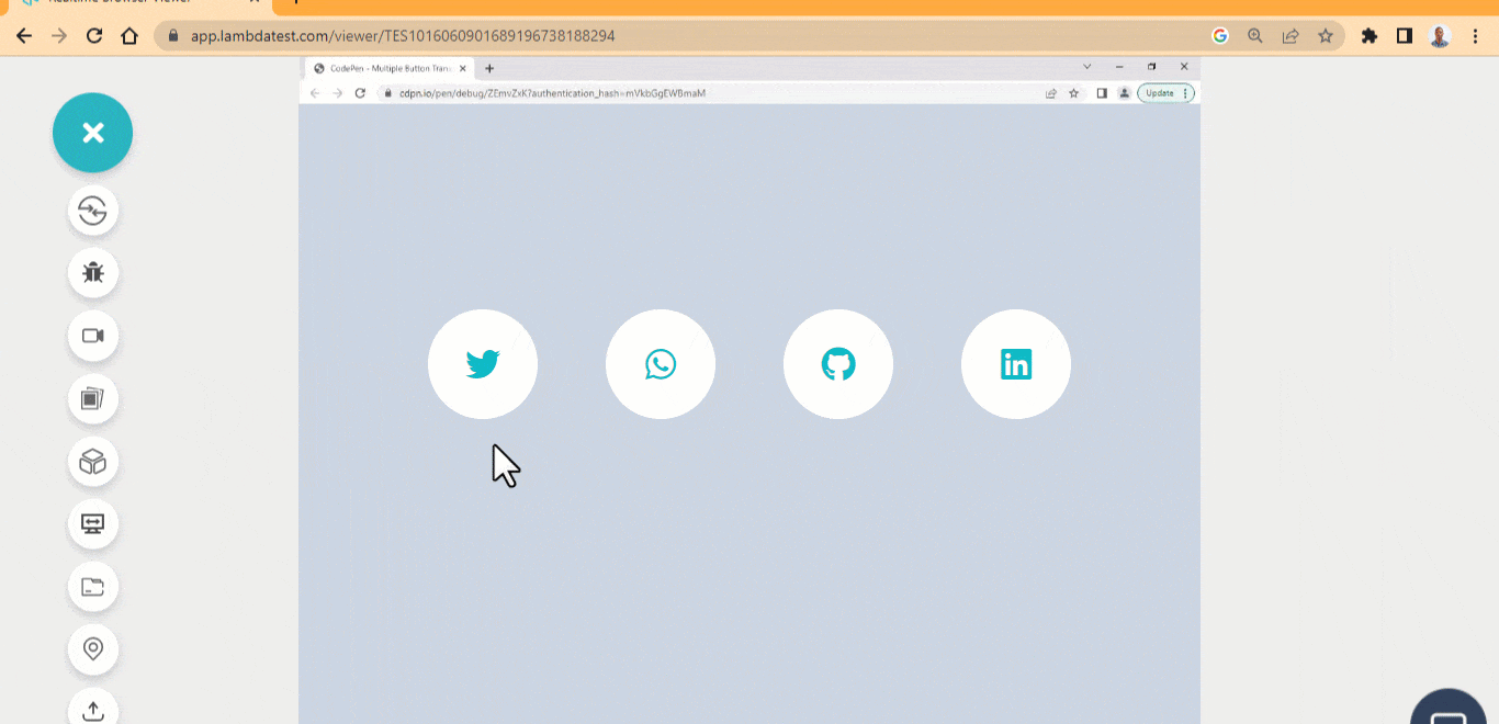
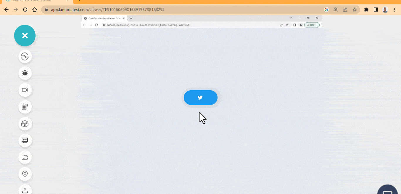
Social Media Transition
Adding social media icons to buttons on your website is a great way to share your content across multiple social media platforms for more people to see and engage with your content. It can be challenging sometimes to come up with good designs that connect to the users. However, the CSS transition property offers a good solution to this. Here is a beautiful social media button icon you can use on your site. These CSS button hover effects are used as social media buttons for sharing content on social media platforms. The smooth ease effects make the buttons more interactive. 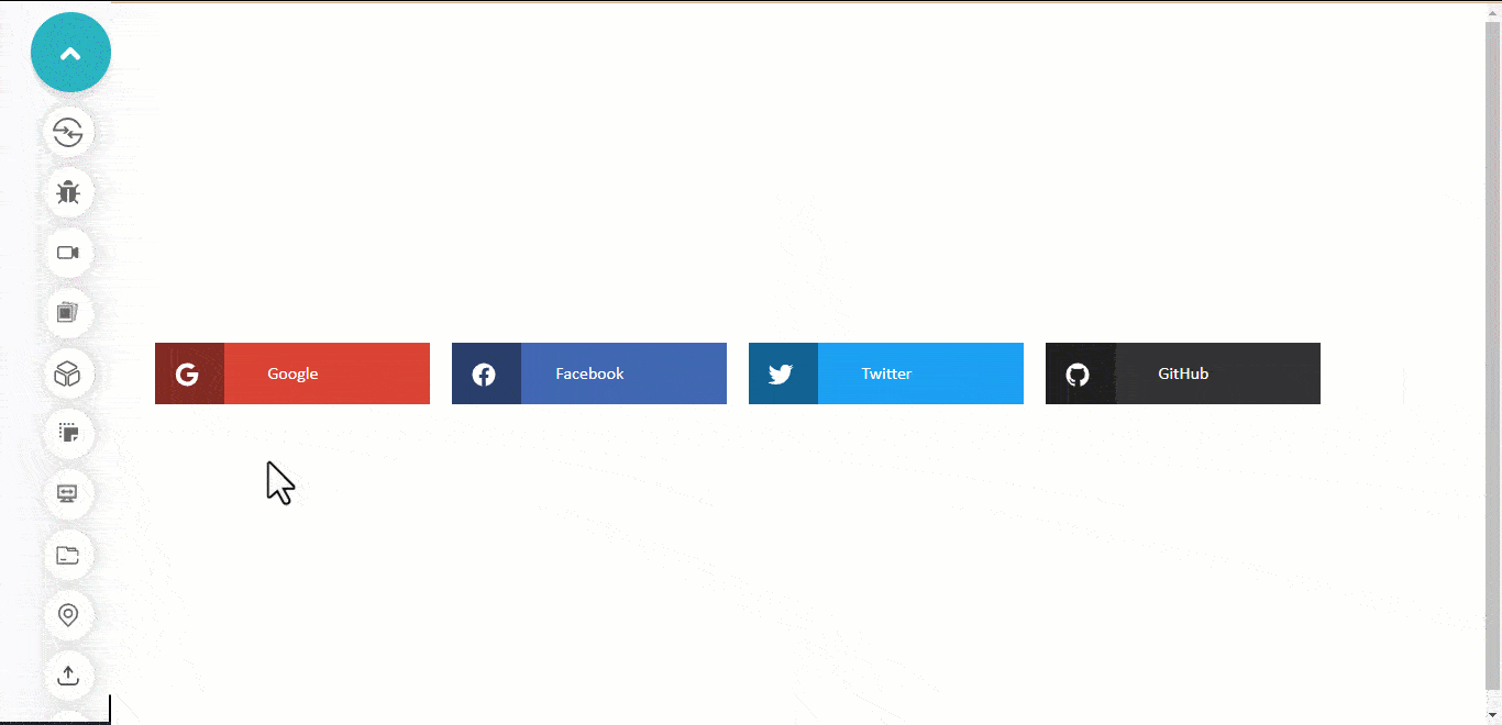 HTML:
HTML:
|
1 2 3 4 5 6 7 8 9 10 11 12 13 14 15 16 17 18 19 20 21 22 23 24 25 26 27 28 29 30 31 32 33 34 35 36 37 38 39 40 |
<main class="main"> <div class="brand google"> <a href="#" class="btn btn-primary"> <span class="icon-span"> <ion-icon name="logo-google"></ion-icon> </span> <span class="text">Google</span> </a> </div> <div class="brand facebook"> <a href="#" class="btn btn-primary"> <span class="icon-span"><ion-icon name="logo-facebook"></ion-icon></span> <span class="text">Facebook</span> </a> </div> <div class="brand twitter"> <a href="#" class="btn btn-primary"> <span class="icon-span"> <ion-icon name="logo-twitter"></ion-icon> </span> <span class="text">Twitter</span> </a> </div> <div class="brand github"> <a href="#" class="btn btn-primary"> <span class="icon-span"><ion-icon name="logo-github"></ion-icon></span> <span class="text">GitHub</span> </a> </div> </main> <script type="module" src="https://unpkg.com/ionicons@7.1.0/dist/ionicons/ionicons.esm.js"> </script> |
CSS:
|
1 2 3 4 5 6 7 8 9 10 11 12 13 14 15 16 17 18 19 20 21 22 23 24 25 26 27 28 29 30 31 32 33 34 35 36 37 38 39 40 41 42 43 44 45 46 47 48 49 50 51 52 53 54 55 56 57 58 59 60 61 62 63 64 65 66 67 68 69 70 71 72 73 74 75 76 77 78 79 80 81 82 83 84 85 86 87 88 89 90 91 92 93 94 95 96 97 98 99 100 101 |
.main{ width: 80%; height: 100vh; display: grid; grid-template-columns: repeat(4, 250px); place-items: center; gap: 20px; grid-template-rows: repeat(auto); margin: 0 auto; } .btn { display: flex; justify-content: center; align-items: center; min-width:220.52px; min-height: 56px; font-family: calibri; border: none; cursor: pointer; font-weight: 400; text-decoration: none; position: relative; } .brand{ width: 250px; background-color: red; height: fit-content; position: relative; transition: all 500ms ease; } .brand:hover { opacity: 0.8; } .brand:hover ion-icon{ transform: translateX(80px) rotateX(360deg); } .brand:hover .icon-span{ transform: translateX(100px); } .brand:hover .text{ transform: translateX(-70px); } ion-icon { position: absolute; color: #fff; left: 17px; top: 17px; font-size: 1.5em; transition: all 500ms ease; } .icon-span { display: block; background-color: rgba(0,0,0, 0.4); height: 100%; width: 25%; position: absolute; top: 0; left: 0; transition: all 500ms ease; } .google { background: #DB4437; } .facebook { background: #4267B2; } .twitter { background: #1DA1F2; } .github { background: #333; } .text { color: #fff; transition: all 500ms ease; } @media screen and (max-width: 1000px) { .main { grid-template-columns: repeat(2, 250px); } } @media screen and (max-width: 650px) { .main { grid-template-columns: repeat(1, 250px); } } |
See the Pen Social Media Transition button hover Effect by Ocxigin (@ocxigin) on CodePen.
SVG Stroke
SVGs elements can serve as a good source for animating buttons or any other web elements. The example below shows how an SVG element is used to animate the border of a button element by setting the SVG stroke-dasharray and stroke-dashoffset as the element border. This can be used as a hero-image overlay button, as seen below. This CSS button hover effect can serve as a quick response for users to access the product or services of a page. 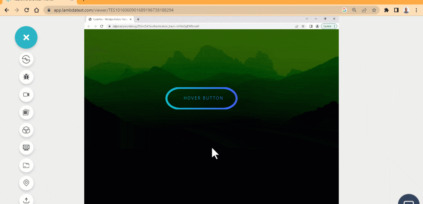 HTML:
HTML:
|
1 2 3 4 5 6 7 8 9 10 11 12 13 14 15 16 17 18 19 20 21 22 23 24 25 26 27 28 29 30 31 32 33 34 35 36 37 38 39 40 41 42 43 44 45 46 47 48 49 50 51 52 53 54 55 56 57 58 59 60 61 62 63 64 65 66 67 68 69 70 71 72 73 74 75 76 77 78 79 |
<main class="main"> <div class="btn"> <?xml version="1.0" encoding="UTF-8"?> <svg id="Layer_1" data-name="Layer 1" xmlns="http://www.w3.org/2000/svg" viewBox="0 0 265 63.6"> <defs> <linearGradient id="mix-color"> <stop offset="0%" stop-color="#0ebac5"> <stop offset="100%" stop-color="#3F5EFB"/> </linearGradient> </defs> <rect x="4" y="2" width="200" height="60" rx="40" stroke="url(#mix-color)"/> </svg> <a href="">Hover Button</a> </button> </main> </pre.<strong>CSS:</strong> <pre> *, *::after, *::before { margin: 0; padding: 0; box-sizing: border-box; } .main{ width: 100vw; height: 100vh; display: grid; grid-template-columns: 1fr; place-items: center; background: url('https://source.unsplash.com/a-view-of-a-mountain-range-at-sunset-r9Vd1u6Q_8c'); background-repeat: no-repeat; background-color: seagreen; background-blend-mode: color-burn; background-size: cover; background-position: center center; } .btn { width: 300px; height: 100px; padding: 5px; background: none; position: relative; border: none; } svg { fill: none; stroke: 2px; stroke-width: 6px; position: absolute; inset: 0; transition: all 800ms ease; } a { position: absolute; inset: 25% 20%; text-decoration: none; font-family: calibri; font-size: 1em; white-space: nowrap; text-transform: uppercase; letter-spacing: 2px; font-weight: 500; color: #fff; user-select: none; background: -webkit-linear-gradient(40deg, #0ebac5, #3F5EFB); background-clip: text; -webkit-background-clip: text; -webkit-text-fill-color: transparent; } .btn:hover svg { stroke-dasharray: 130 350; stroke-dashoffset: 500; } |
CSS:
|
1 2 3 4 5 6 7 8 9 10 11 12 13 14 15 16 17 18 19 20 21 22 23 24 25 26 27 28 29 30 31 32 33 34 35 36 37 38 39 40 41 42 43 44 45 46 47 48 49 50 51 52 53 54 55 56 57 58 59 60 |
*, *::after, *::before { margin: 0; padding: 0; box-sizing: border-box; } .main{ width: 100vw; height: 100vh; display: grid; grid-template-columns: 1fr; place-items: center; background: url('https://source.unsplash.com/a-view-of-a-mountain-range-at-sunset-r9Vd1u6Q_8c'); background-repeat: no-repeat; background-color: seagreen; background-blend-mode: color-burn; background-size: cover; background-position: center center; } .btn { width: 300px; height: 100px; padding: 5px; background: none; position: relative; border: none; } svg { fill: none; stroke: 2px; stroke-width: 6px; position: absolute; inset: 0; transition: all 800ms ease; } a { position: absolute; inset: 25% 20%; text-decoration: none; font-family: calibri; font-size: 1em; white-space: nowrap; text-transform: uppercase; letter-spacing: 2px; font-weight: 500; color: #fff; user-select: none; background: -webkit-linear-gradient(40deg, #0ebac5, #3F5EFB); background-clip: text; -webkit-background-clip: text; -webkit-text-fill-color: transparent; } .btn:hover svg { stroke-dasharray: 130 350; stroke-dashoffset: 500; } |
See the Pen
SVG stroke Animated Hover Effect by Ocxigin (@ocxigin)
on CodePen.
Pressdown Button
The pressdown CSS button hover effect is made by creating multiple box-shadow values and offsetting each value by one.
To send information to a server or sign in to a user on a platform, you need a good button design that conveys such information. We can use this type of button for submitting data to a server.
HTML:
|
1 2 3 4 5 |
<main class="main"> <div> <a href="" class="btn">Hover Button</a> </div> </main> |
CSS:
|
1 2 3 4 5 6 7 8 9 10 11 12 13 14 15 16 17 18 19 20 21 22 23 24 25 26 27 28 29 30 31 32 33 34 35 36 37 38 |
*, *::after, *::before { margin: 0; padding: 0; box-sizing: border-box; } .main{ width: 100vw; height: 100vh; display: grid; grid-template-columns: 1fr; place-items: center; } .btn { color: #0ebac5; text-decoration: none; font-size: 1.5em; text-transform: uppercase; font-family: calibri; border-radius: 3px; border: 2px solid #0ebac5; padding: 1rem 2rem; box-shadow: .9px 1px 0 0 #0ebac5, 1.5px 2px 0 0 #0ebac5, 2.5px 3px 0 0 #0ebac5, 3.5px 4px 0 0 #0ebac5, 4.5px 5px 0 0 #0ebac5, 5.5px 6px 0 0 #0ebac5, 6.5px 7px 0 0 #0ebac5, 7.5px 8px 0 0 #0ebac5, 8.5px 9px 0 0 #0ebac5, 9.5px 10px 0 0 #0ebac5; position: relative; inset: 0; cursor: pointer; transform: rotateX(0), rotateY(0) rotateZ(0); display: inline-block; outline: 2px dashed transparent; transition: all 600ms ease; } .btn:hover { inset: 6px 0 5.5px 0; transform: rotateX(5deg) rotateY(3deg) rotateZ(.25deg); box-shadow: none; } |
See the Pen
Pressdown button hover effect by Ocxigin (@ocxigin)
on CodePen.
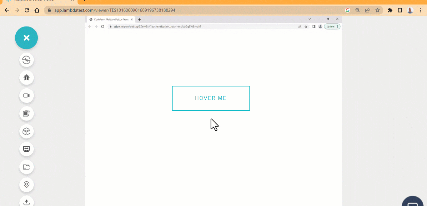
Split Button Sides
The split button sides is one of the simple CSS button hover effects where the right and left border is removed on hover.
Just like the pressdown button, we can use this button for sending requests to a server. That is as a submit or sign-in and sign-out button.
HTML:
|
1 2 3 |
<main class="main"> <button class="btn">Hover Me</button> </main> |
CSS:
|
1 2 3 4 5 6 7 8 9 10 11 12 13 14 15 16 17 18 19 20 21 22 23 24 25 26 27 28 29 30 31 32 33 34 35 36 37 38 39 40 41 42 43 44 45 46 47 48 |
.main { display: flex; justify-content: center; align-items: center; height: 100vw; } .btn { width: 250px; height: 80px; font-size: 1em; border: none; text-transform: uppercase; letter-spacing: 2px; padding: 1em 2em; background-color: transparent; cursor: pointer; position: relative; color: #0ebac5; } .btn::before { content: ""; display: block; position: absolute; inset: 0; border-top: 2px solid #0ebac5; border-bottom: 2px solid #0ebac5; transition: all 0.5s ease; } .btn::after { content: ""; display: block; position: absolute; inset: 0; border-left: 2px solid #0ebac5; border-right: 2px solid #0ebac5; transition: all 0.5s ease; } .btn:hover::before { transform: scale(1.1); } .btn:hover::after { transform: scale(0); } |
See the Pen
Spilt button sides hover effect by Ocxigin (@ocxigin)
on CodePen.
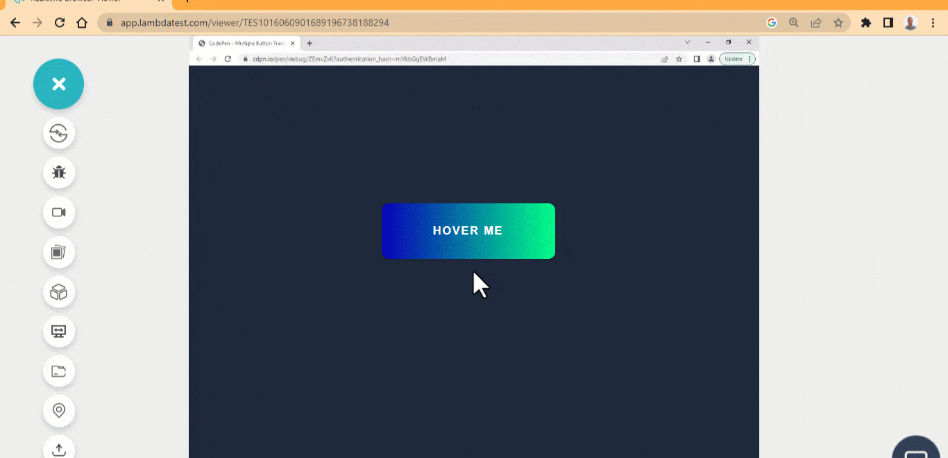
Flip Background Gradient
The flip background gradient effect is set to flip the background gradient on mouse hover.
This CSS button hover effect can be used as a subscribe button on a company newsletter. Subscribe button usually requires a large and interactive button to drive engagements.
HTML:
|
1 2 3 |
<main class="main"> <button class="btn">Hover Me</button> </main> |
CSS:
|
1 2 3 4 5 6 7 8 9 10 11 12 13 14 15 |
body { background-color: rgb(30 41 59); } .main { display: flex; justify-content: center; align-items: center; height: 100vw; } .btn { width: 250px; height: 80px; background: linear-gradient(90deg, #0700b8 0%, #00ff88 100%); |
See the Pen
flip background gradient effect by Ocxigin (@ocxigin)
on CodePen.
Background Transition
Background transition is one of the best CSS button hover effects. Transitions smooth the way two elements blend together. We can add background transitions to icon buttons. This will help transition the background of the button as the user hovers over the icon.
This is a social media button, used for sharing web content across multiple social media platforms.
HTML:
|
1 2 3 4 5 6 7 8 9 10 11 12 13 14 15 16 17 18 19 20 21 22 23 24 25 26 27 28 29 |
<body> <main class="main"> <ul> <li> <a href="" class="one"> <i class="fa-brands fa-twitter"></i> </a> </li> <li> <a href="" class="two"> <i class="fa-brands fa-whatsapp"></i> </a> </li> <li> <a href="" class="three"> <i class="fa-brands fa-github"></i> </a> </li> <li> <a href="" class="four"> <i class="fa-brands fa-linkedin"></i> </a> </li> </ul> </main> </body> |
CSS:
|
1 2 3 4 5 6 7 8 9 10 11 12 13 14 15 16 17 18 19 20 21 22 23 24 25 26 27 28 29 30 31 32 33 34 35 36 37 38 39 40 41 42 43 44 45 46 47 48 49 50 51 52 53 54 55 56 57 58 59 60 61 62 63 64 65 66 67 68 69 70 71 72 73 74 75 76 77 78 79 80 81 82 83 84 85 86 87 88 89 90 91 92 93 94 95 96 97 98 |
*, *::after, *::before { margin: 0; padding: 0; box-sizing: border-box; } body { background-color: rgb(203 213 225); } .main{ width: 100vw; height: 100vh; display: flex; justify-content: center; align-items: center; position: relative; } li { list-style: none; margin: 0 15px; } a { background-color: #fff; width: 100px; height: 100px; border-radius: 50%; border: 3px solid #fff; display: flex; justify-content: center; align-items: center; margin: 1em; transition: all 500ms ease; text-decoration: none; position: relative; cursor: pointer; overflow: hidden; /* z-index: -1; */ } i { background-color: transparent; color: #0ebac5; font-size: 2em; } a::after { content: ""; position: absolute; top: -100%; left: 0; width: 100%; height: 100%; border-radius: 50%; z-index: 1; cursor: pointer; transition: all 500ms ease-in; } a.one:hover::after { background-color:#1D9BF0; top: 0; } a:hover { box-shadow: 0 0 20px #0ebac5; } a:hover .fa-brands { color: #fff; z-index: 2; } /* Two */ a.two:hover::after { background-color: #25D366; top: 0; } /* Three */ a.three:hover::after { background-color: #333; top: 0; } /* Four */ a.four:hover::after { background-color: #0072b1 ; top: 0; } @media screen and (min-width: 500px) { ul { display: flex; } } |
See the Pen
Background transition Hover Button Effect by Ocxigin (@ocxigin)
on CodePen.
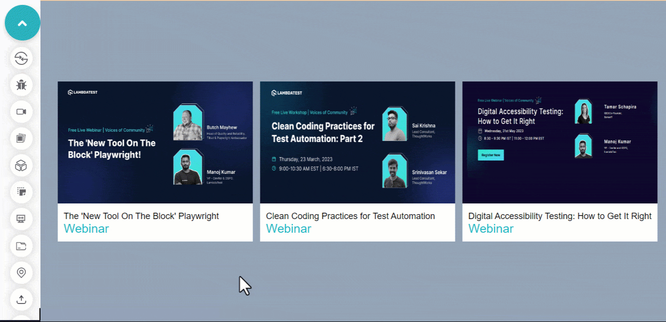
Applying Buttons to Cards
Applying buttons to cards is yet another popular CSS button hover effect. Cards are everywhere on modern websites, they are very useful when organizing content, especially blog posts, employee profiles, etc.
Adding and styling buttons on cards can be default at times; here is a simple flip button you can include on your card.
HTML:
|
1 2 3 4 5 6 7 8 9 10 11 12 13 14 15 16 17 18 19 20 21 22 23 24 25 26 27 28 29 30 31 32 33 34 35 36 37 38 39 40 41 42 43 44 45 46 47 48 49 50 51 52 53 54 55 56 57 58 59 60 61 62 63 64 |
<body> <main class="main"> <section class="card"> <header class="hero-image-container hic-1"> <img src="https://user-images.githubusercontent.com/78242022/242845998-ef33eb9c-6452-4afb-a956-d1d782948e6e.png" alt="" class="hero-image"> <aside class="icons icons-one"> <ion-icon name="bookmark"></ion-icon> <ion-icon name="arrow-redo"></ion-icon> <ion-icon name="heart"></ion-icon> </aside> </header> <article class="text t-1"> <p>The 'New Tool On The Block' Playwright</p> <p>Webinar</p> </article> </section> <section class="card card-two"> <header class="hero-image-container hic-2"> <img src="https://user-images.githubusercontent.com/78242022/241950813-021da2fc-cdf3-4409-9b0e-cbb73db6fd0c.png" alt="" class="hero-image"> <aside class="icons icons-two"> <ion-icon name="bookmark"></ion-icon> <ion-icon name="arrow-redo"></ion-icon> <ion-icon name="heart"></ion-icon> </aside> </header> <article class="text t-2"> <p>Clean Coding Practices for Test Automation</p> <p>Webinar</p> </article> </section> <section class="card card-three"> <header class="hero-image-container hic-3"> <img src="https://user-images.githubusercontent.com/78242022/241950843-1c7ce642-de10-40c6-b292-2fb3c9166700.png" alt="" class="hero-image"> <aside class="icons icons-three"> <ion-icon name="bookmark"></ion-icon> <ion-icon name="arrow-redo"></ion-icon> <ion-icon name="heart"></ion-icon> </aside> </header> <article class="text t-3"> <p>Digital Accessibility Testing: How to Get It Right</p> <p>Webinar</p> </article> </section> </main> <script type="module" src="https://unpkg.com/ionicons@7.1.0/dist/ionicons/ionicons.esm.js"></script> |
CSS:
|
1 2 3 4 5 6 7 8 9 10 11 12 13 14 15 16 17 18 19 20 21 22 23 24 25 26 27 28 29 30 31 32 33 34 35 36 37 38 39 40 41 42 43 44 45 46 47 48 49 50 51 52 53 54 55 56 57 58 59 60 61 62 63 64 65 66 67 68 69 70 71 72 73 74 75 76 77 78 79 80 81 82 83 84 85 86 87 88 89 90 91 92 93 94 95 96 97 98 99 100 101 102 103 104 105 106 107 108 109 110 111 112 113 114 115 116 117 118 119 |
*, *::after, *::before { padding: 0; margin: 0; box-sizing: 0; } body{ display: grid; place-items: center; height: 100vh; background-color: rgb(148 163 184); } /* This is the card wrapper */ .main { display: grid; grid-template-columns: repeat(3, 400px); gap: 15px; margin: 4em 0; } /* The is the card tag */ header { position: relative; z-index: 1; } /* This is the hero-image */ header img { width: 100%; height: 250px; } .card { background-color: #fff; } article { padding: 12px; } article p { font-size: 18px; font-family: Arial, Helvetica, sans-serif; } article p:last-child { font-size: 25px; color: #0ebac5; font-weight: 400; } ion-icon { display: block; padding: 8px; background-color: white; color: #0ebac5; margin: 6px; cursor: pointer; transition: all 0.5s ease-out; } ion-icon[name="bookmark"]{ transform: translateY(60%); } ion-icon[name="arrow-redo"]{ transform: translateY(30%); } ion-icon[name="heart"]{ transform: translateY(10%); } ion-icon:hover { color: white; background-color: #0ebac5; } .icons { opacity: 0; position: absolute; inset: 2em 1em; transition: all 0.5s ease; } .hero-image-container:hover .icons { opacity: 1; inset: 1em; } .hero-image-container:hover ion-icon[name="bookmark"]{ transform: translateY(0%); } .hero-image-container:hover ion-icon[name="arrow-redo"]{ transform: translateY(0%); } .hero-image-container:hover ion-icon[name="heart"]{ transform: translateY(0%); } @media screen and (max-width:1260px ) { .main { grid-template-columns: repeat(2, 400px); } } @media screen and (max-width:850px ) { .main { grid-template-columns: repeat(1, 400px); } } |
See the Pen
Flip-Icon UP by Ocxigin (@ocxigin)
on CodePen.
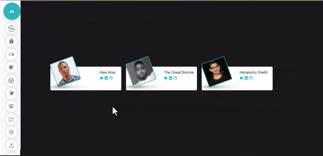
Applying Buttons to Profiles
Earlier we showed how CSS button hover effects could be achieved using buttons by applying them on cards.
This example of CSS button hover effects explains how buttons can be applied to profiles on websites.
These buttons add external links to user profiles on a card. Which web visitors can click on to learn more about the user on each card.
HTML:
|
1 2 3 4 5 6 7 8 9 10 11 12 13 14 15 16 17 18 19 20 21 22 23 24 25 26 27 28 29 30 31 32 33 34 35 36 37 38 39 40 41 42 43 44 45 46 47 48 |
<main class="profile-wrapper"> <section class="card-profile alex-card"> <aside class="shadow-aside"> <img src="https://user-images.githubusercontent.com/78242022/242978218-d0e4eba2-62f7-4464-b2fb-c89835b6e592.jpg" class="img-profile"> </aside> <aside class="contact"> <p class="name alex-anie">Alex Anie</p> <span class="social-icons aa"> <ion-icon name="logo-twitter"></ion-icon> <ion-icon name="logo-linkedin"></ion-icon> <ion-icon name="logo-github"></ion-icon> </span> </aside> </section> <section class="card-profile bonnie"> <aside class="shadow-aside"> <img src="https://user-images.githubusercontent.com/78242022/242975340-6bff8140-c5ce-49a9-8ef0-d1329587e766.jpg" alt="" class="img-profile"> </aside> <aside class="contact"> <p class="name">The Great Bonnie</p> <span class="social-icons"> <ion-icon name="logo-twitter"></ion-icon> <ion-icon name="logo-linkedin"></ion-icon> <ion-icon name="logo-github"></ion-icon> </span> </aside> </section> <section class="card-profile"> <aside class="shadow-aside"> <img src="https://user-images.githubusercontent.com/78242022/242975326-ac13bbc0-a2c3-4844-ab1d-a892e2d2adb1.jpg" alt="" class="img-profile"> </aside> <aside class="contact"> <p class="name">Himanshu Sheth</p> <span class="social-icons"> <ion-icon name="logo-twitter"></ion-icon> <ion-icon name="logo-linkedin"></ion-icon> <ion-icon name="logo-github"></ion-icon> </span> </aside> </section> </main> <script type="module" src="https://unpkg.com/ionicons@7.1.0/dist/ionicons/ionicons.esm.js"></script> |
CSS:
|
1 2 3 4 5 6 7 8 9 10 11 12 13 14 15 16 17 18 19 20 21 22 23 24 25 26 27 28 29 30 31 32 33 34 35 36 37 38 39 40 41 42 43 44 45 46 47 48 49 50 51 52 53 54 55 56 57 58 59 60 61 62 63 64 65 66 67 68 69 70 71 72 73 74 75 76 77 78 79 80 81 82 83 84 85 86 87 88 89 90 91 92 93 94 95 96 97 98 99 100 101 102 103 104 105 106 107 108 109 110 111 112 113 114 115 116 117 118 119 120 121 122 123 |
*, *::after, *::before { padding: 0; margin: 0; box-sizing: 0; } @import url('https://fonts.googleapis.com/css2?family=News+Cycle:wght@400;700&display=swap'); :root { --font: 'News Cycle', sans-serif; } body{ display: grid; place-items: center; background-color: rgb(24 24 27); height: 100vh; } .profile-wrapper { display: grid; grid-template-columns: repeat(3, 300px); grid-template-rows: repeat(1, 100px); gap: 20px; } .card-profile { background-color: #fff; border-radius: 5px; position: relative; } /* ASIDE SHADOW TEST */ .shadow-aside::before { content: ""; display: block; width: 160%; height: 90%; position: absolute; background-image: url('https://user-images.githubusercontent.com/78242022/242990608-21167726-50ba-4973-b3b1-e4860ac822bc.png'); background-repeat: no-repeat; background-size: 45% auto; inset: 4.5em 0 20em -3em; transform-origin: 20% 20%; pointer-events: none; opacity: 1; transition: opacity 0.3s ease-in-out; } /* Image Profile */ .card-profile .img-profile { width: 100px; border-radius: 5px; position: relative; inset: -1em 2em; rotate: z -20deg; border: 2px solid #0ebac5; transition: all 0.2s ease; cursor: pointer; filter: blur(0.8px); transform-origin: 0 100%; } .img-profile:hover { rotate: z 0deg; filter: blur(0px); } /* Remove Shadow on Hover */ .shadow-aside:hover::before { opacity: 0; } /* Image Shadow*/ .shadow-img { position: absolute; inset: 4.5em 0.2em; } .card-profile .name { font-family: var(--font); position: absolute; inset: 1em 10em; white-space: nowrap; } .card-profile .alex-anie { inset: 1em 13em; } .social-icons { display: inline-block; white-space: nowrap; position: absolute; inset: 2.5em 10em; } .aa { inset: 2.5em 13em; } ion-icon { color: #0ebac5; cursor: pointer; transition: color 0.5s linear; } ion-icon:hover { color: #a1a1aa; } @media screen and (max-width: 988px){ body{ height: auto; } .profile-wrapper { grid-template-columns: repeat(1, 300px); margin: 3em 0; } } |
See the Pen
profile card hover effect by Ocxigin (@ocxigin)
on CodePen.
Gradient Animated
The gradient animated CSS button hover effects take multiple colors as linear-gradients, and the background-size is offset by 500% and re-position with the background-position. To get the animation effect, the position state is animated.
This can be used as a CTAs or hero image overlay button and is best applied on a landing page, navbar, or footer.
HTML:
|
1 2 3 4 5 6 7 8 |
<main class="main"> <div> <div class="text"><p>Hover on the button and then click</p></div> <div class="button"> <button class="btn">Animated Hover</button> </div> </div> </main> |
CSS:
|
1 2 3 4 5 6 7 8 9 10 11 12 13 14 15 16 17 18 19 20 21 22 23 24 25 26 27 28 29 30 31 32 33 34 35 36 37 38 39 40 41 42 43 44 45 46 47 48 49 50 51 52 53 54 55 56 57 58 59 60 61 62 63 64 65 66 67 68 69 70 71 72 73 74 75 76 77 78 79 |
*, *::after, *::before { margin: 0; padding: 0; box-sizing: border-box; } body { background-color: rgb(203 213 225); } .main{ width: 100vw; height: 100vh; display: flex; justify-content: center; align-items: center; position: relative; } .btn { padding: 1em 2em; border-radius: 4px; border: none; cursor: pointer; user-select: none; position: relative; } .btn::after{ content: ""; display: block; width: 100%; height: 100%; position: absolute; inset: 0; z-index: -1; background: linear-gradient(90deg, #1CB5E0, #000851, #00C9FF, #92FE9D, #FC466B, #3F5EFB, #3F2B96, #A8C0FF, #FDBB2D, #3A1C71 ); transform: scaleX(1.1) scaleY(1.2); filter: blur(7px); background-size: 500%; animation-name: flowing; animation-timing-function: ease; animation-duration: 10s; animation-iteration-count: infinite; opacity: 0; } .btn:hover::after { opacity: 1; } .btn:active { background: none; } .text, .button { display: flex; justify-content: center; margin-bottom: 4em; } p { font-family: Arial, Helvetica, sans-serif; font-size: 20px; } @keyframes flowing { 0% { background-position: 0 0; } 50% { background-position: 400% 0; } 100% { background-position: 0 0; } } |
See the Pen
Gradient Animated Hover Button by Ocxigin (@ocxigin)
on CodePen.
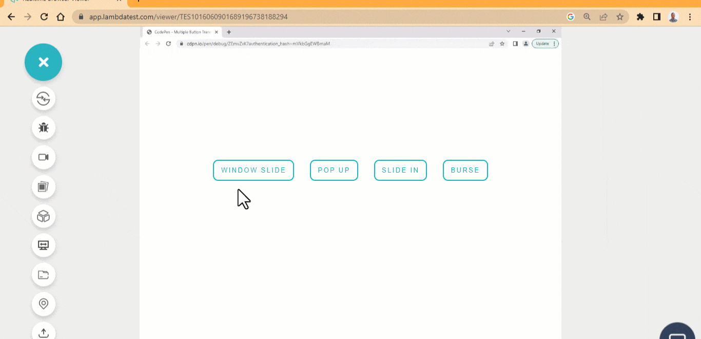
Popup Button
The button hover pop-up effect, pops the buttons up when a user hovers on them. These buttons have four different styles:
- Window slide: The left and right background is slided from the x-axis on mouse hover.
- Pop up: Pops the button up with a dox-shadow on mouse hover.
- Slide in: The top and bottom background slides from the y-axis on mouse hover.
- Burst: Create an expanded box shadow on mouse hover.
These popup CSS button hover effects can be used as user-interaction buttons on a web page, for example linking pages together such as pagination.
HTML:
|
1 2 3 4 5 6 7 8 9 10 11 |
<main class="main"> <div> <div class="button"> <div> <button class="btn window_slide">window slide</button> <button class="btn popup">pop up</button> <button class="btn slidein">Slide in</buton class="btn burst">Burse</button> </div> </div> </div> </main> |
CSS:
|
1 2 3 4 5 6 7 8 9 10 11 12 13 14 15 16 17 18 19 20 21 22 23 24 25 26 27 28 29 30 31 32 33 34 35 36 37 38 39 40 41 42 43 44 45 46 47 48 49 50 51 52 53 54 55 56 57 58 59 60 61 62 63 64 65 66 67 68 69 70 71 72 73 74 75 76 77 78 79 |
*, *::after, *::before { padding: inherit; margin: inherit; box-sizing: inherit; } html { padding: 0; margin: 0; box-sizing: border-box; } body { --color: #0ebac5; --hover-b: #000; --hover-w: #fff; display: grid; place-content: center; background-color: rgb(255, 255, 255); width: 100vw; height: 100vh } .btn { background: none; border: 2px solid var(--color); padding: 0.8em 1em; margin: 1em; user-select: none; text-transform: uppercase; color: var(--color); letter-spacing: 2.2px; cursor: pointer; border-radius: 10px; transform: translateY(0); transition: all 0.5s linear; } /* the inset brings the box-shadow from the inside */ .window_slide:hover { box-shadow: inset 8rem 0 0 0 var(--color), inset -8rem 0 0 0 var(--color); color: var(--hover-b); transform: translateY(-0.5rem); } .popup:hover { box-shadow: 0rem 0.99rem 0.43rem -0.33rem var(--color); transform: translateY(-0.5rem); } .slidein:hover { box-shadow: inset 0 0 0.5rem 4em var(--color); transform: translateY(-0.5rem); color: var(--hover-b); } .burst:hover { box-shadow: 0 0 1.1rem 8px var(--color); transform: translateY(-0.5rem); } @media only screen and (max-width: 1080px) { div { display: grid; grid-template-columns: repeat(2, auto); } } @media only screen and (max-width: 600px) { div { display: grid; grid-template-columns: repeat(1, auto); } } |
See the Pen
Popup button hover effect by Ocxigin (@ocxigin)
on CodePen.
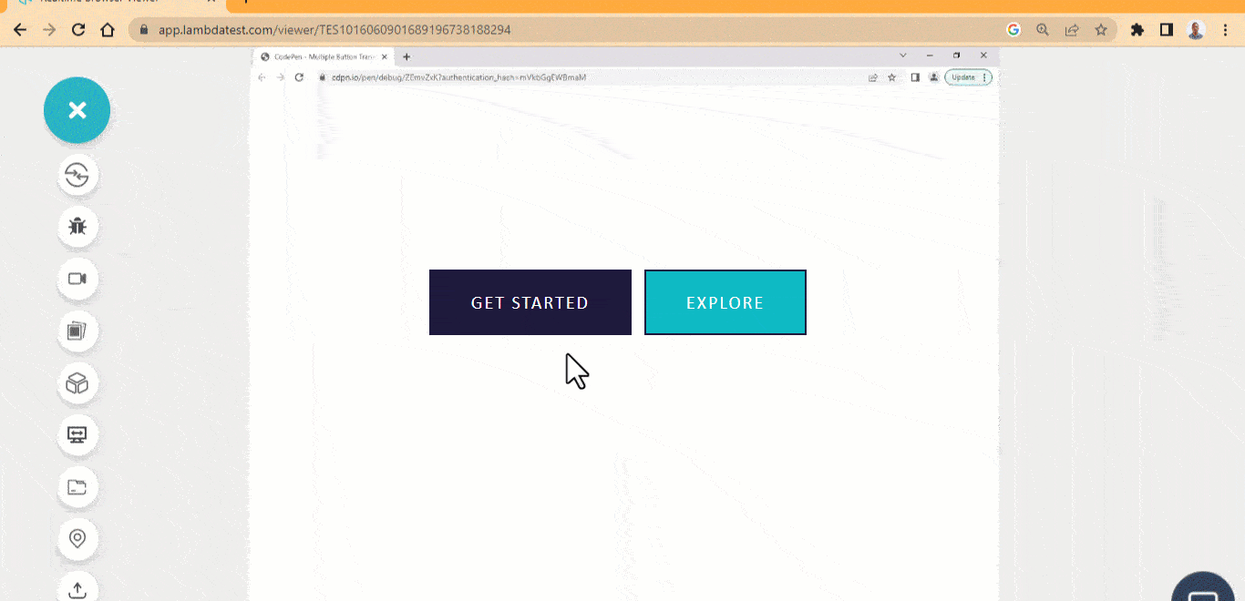
Offset Background
The offset background button is yet another one of the best CSS button hover effects that offset the background button on mouse hover.
This effect can be used as a submit button, CTAs, hero image buttons, user-interaction buttons, etc.
HTML:
|
1 2 3 4 5 6 7 8 9 10 |
<main class="main"> <div> <span> <button class="btn first">Get Started</button> </span> <span> <button class="btn second">Explore</button> </span> </div> </main> |
CSS:
|
1 2 3 4 5 6 7 8 9 10 11 12 13 14 15 16 17 18 19 20 21 22 23 24 25 26 27 28 29 30 31 32 33 34 35 36 37 38 39 40 41 42 43 44 45 46 47 48 49 50 51 52 53 54 55 56 57 58 59 60 61 62 63 64 65 66 67 68 |
*, *::after, *::before { padding: inherit; margin: inherit; box-sizing: inherit; } html { padding: 0; margin: 0; box-sizing: border-box; } body { --bg-light: #0ebac5; --bg-dark: #1e183a; --font: calibri; } .main{ width: 100vw; height: 100vh; display: flex; justify-content: center; align-items: center; position: relative; } .btn { background-color: transparent; padding: 1.1em 2.2em; border: none; cursor: pointer; user-select: none; margin-right: 10px; position: relative; font-size: 20px; color: #fff; text-transform: uppercase; letter-spacing: 2px; font-family: var(--font); } .btn::after { content: ""; width: 100%; height: 100%; background-color: var(--bg-dark); position: absolute; inset: 0; z-index: -1; transition: 0.5s; } .btn { border: 2px solid var(--bg-dark); } .btn:hover::after { top: -10px; left: 10px; } .second { background-color: var(--bg-light); } |
See the Pen
Offset background button hover effect by Ocxigin (@ocxigin)
on CodePen.
Swipe Left and Right Button
With the swipe left, and right button hover effect, two pseudo-element is created with each positioned left and right respectively and on mouse hover each element grows to fit the button as a background.
This CSS button hover effect is used as a hero image overlay button. It can also be used as submitting buttons, download or subscribe buttons.
HTML:
|
1 2 3 4 5 6 7 8 9 10 |
<main class="main"> <div> <span> <button class="btn"> <span class="text">Get Started</span> <span class="line"></span> </button> </span> </div> </main> |
CSS:
|
1 2 3 4 5 6 7 8 9 10 11 12 13 14 15 16 17 18 19 20 21 22 23 24 25 26 27 28 29 30 31 32 33 34 35 36 37 38 39 40 41 42 43 44 45 46 47 48 49 50 51 52 53 54 55 56 57 58 59 60 61 62 63 64 65 66 67 68 69 70 71 72 73 74 75 76 77 78 79 80 81 82 83 84 85 86 87 88 89 90 91 92 93 94 95 96 97 98 99 100 101 102 103 104 105 |
*, *::after, *::before { padding: inherit; margin: inherit; box-sizing: inherit; } html { padding: 0; margin: 0; box-sizing: border-box; } body { --bg-light: #0ebac5; --bg-dark: #1e183a; --font: calibri; background-color: rgb(241 245 249); } .main{ width: 100vw; height: 100vh; display: flex; justify-content: center; align-items: center; position: relative; } .btn { max-width: 25rem; width: 25rem; min-height: 5px; height: 5rem; background-color: var(--bg-light); padding: 1.1em 2.7em; border: none; cursor: pointer; position: relative; box-shadow: 0 4px 6px -1px rgb(0 0 0 / 0.1), 0 2px 4px -2px rgb(0 0 0 / 0.1); } .text { font-size: 20px; color: #fff; text-transform: uppercase; letter-spacing: 2px; font-family: var(--font); user-select: none; position: absolute; z-index: 2; top: 0.8rem; left: 0.1em; } .line { display: inline-block; width: 6px; background: none; border-bottom: 2px solid #fff; height: 0.1px; position: absolute; z-index: 2; top: 0.7rem; right: 1em; transition: 0.5s; } .btn::before, .btn::after{ content: ""; width: 0; height: 50%; background-color: var(--bg-dark); position: absolute; transition: 0.5s; overflow: hidden; } .btn::before { opacity: 0; top: 0; right:0; } .btn::after { opacity: 0; bottom: 0; left:0; } .btn:hover::before{ opacity: 1; display: block; width: 100%; } .btn:hover::after{ opacity: 1; width: 100%; } .btn:hover .line { width : 100px; } |
See the Pen
Swipe left and right button hover effect by Ocxigin (@ocxigin)
on CodePen.
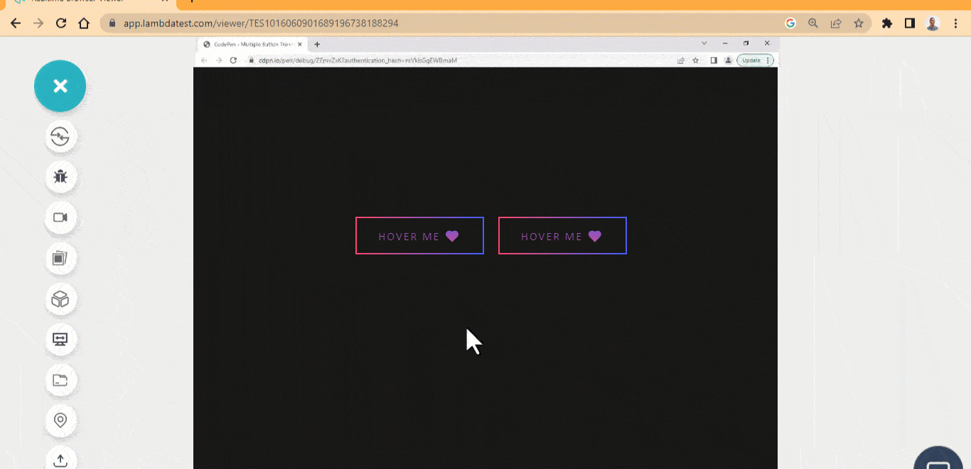
Animated Border Gradient
The animated border gradient hover effect is considered one of the simplest CSS button hover effects where the first and second border of the button element is transformed on mouse hover. The first element has the border transform, while the second has the background transformed on mouse hover.
These buttons are very useful as user-interaction buttons, CTAs, submit buttons, subscribe buttons, sign in or sign out buttons.
HTML:
|
1 2 3 4 5 6 |
<main class="main"> <section> <button class="btn first">Hover Me ❤️</button> <button class="btn second">Hover Me ❤️</button> </section> </main> |
CSS:
|
1 2 3 4 5 6 7 8 9 10 11 12 13 14 15 16 17 18 19 20 21 22 23 24 25 26 27 28 29 30 31 32 33 34 35 36 37 38 39 40 41 42 43 44 45 46 47 48 49 50 51 52 53 54 55 56 57 58 59 60 61 62 63 64 65 66 67 68 69 70 71 72 73 74 75 76 77 78 79 80 81 82 83 84 85 86 87 88 89 90 91 92 93 94 95 96 97 98 99 100 101 102 103 104 105 106 107 108 109 110 111 112 113 114 115 116 117 118 119 120 121 122 123 124 125 126 127 128 129 130 131 132 133 134 135 136 137 138 139 140 141 142 |
/* Global Styles */ *, *::after, *::before { margin: 0; padding: 0; box-sizing: border-box; } body { background-color: rgb(23 23 23); } .main { display: grid; grid-template-columns: repeat(1 1fr); place-items: center; height: 100vh; } :root { --font: calibri; --font-size: 1px; } /* Styles for both buttons */ .btn { padding: 1rem 2rem; border: none; position: relative; font-family: var(--font); font-size: calc(var(--font) * 20); text-transform: uppercase; letter-spacing: 2px; margin-left: 1em; transform: all 0.5s cubic-bezier(.1,.66,1,.17); cursor: pointer; } /* First Buttons Starts Here */ .first { background: none; background: -webkit-linear-gradient(90deg, #FC466B 0%, #3F5EFB 100%); background-clip: text; -webkit-background-clip: text; -webkit-text-fill-color: transparent; } .first:hover { background: -webkit-linear-gradient(90deg, #ffffff 0%, #f0f1f8 100%); background-clip: text; -webkit-background-clip: text; -webkit-text-fill-color: transparent; } .first::before { content: ""; width: 100%; height: 100%; position: absolute; inset: 0; border: 12px solid; border-image-slice: 1; border-width: 2px; border-image-source: linear-gradient(90deg, #FC466B 0%, #3F5EFB 100%); transition: border 600ms, opacity 600ms cubic-bezier(.1,.66,1,.17); } .first:hover::before { opacity: 0; } .first::after { content: ""; width: 100%; height: 100%; position: absolute; inset: 0; background: none; border: 12px solid; border-image-slice: 1; border-width: 2px; border-image-source: linear-gradient(90deg, #FC466B 0%, #3F5EFB 100%); opacity: 0; z-index: -1; transform: scaleX(1.4) scaleY(1.6); transition: opacity 500ms, transform 500ms cubic-bezier(.29,.57,.74,.32); } .first:hover::after { opacity: 1; transform: scaleX(1) scaleY(1); } /* The Second Buttons Starts here */ .second { overflow: hidden; background: none; background: -webkit-linear-gradient(90deg, #FC466B 0%, #3F5EFB 100%); background-clip: text; -webkit-background-clip: text; -webkit-text-fill-color: transparent; } .second:hover { background: -webkit-linear-gradient(90deg, #ffffff 0%, #f0f1f8 100%); background-clip: text; -webkit-background-clip: text; -webkit-text-fill-color: transparent; } .second::before { width: 100%; height: 100%; content: ""; position: absolute; inset: 0; border: 12px solid; border-image-slice: 1; border-width: 2px; border-image-source: linear-gradient(90deg, #FC466B 0%, #3F5EFB 100%); transition: opacity 50ms, transform 500ms cubic-bezier(.29,.57,.74,.32); } .second:hover::before { opacity: 0; } .second::after { content: ""; width: 300px; height: 300px; position: absolute; inset: 0; transform: translate(-22px, -55px) scale(0.2); background: linear-gradient(90deg, #00C9FF 0%, #92FE9D 100%); z-index: -1; opacity: 0; transition: opacity 500ms, transform 500ms cubic-bezier(.29,.57,.74,.32); } .second:hover::after { opacity: 1; transform-origin: 500px 100px 500%; transform: scale(1) translate(-22px, -55px); } .btn:active { transform: translateY(4px); } |
See the Pen
Animated Border Gradient Hover Effect by Ocxigin (@ocxigin)
on CodePen.
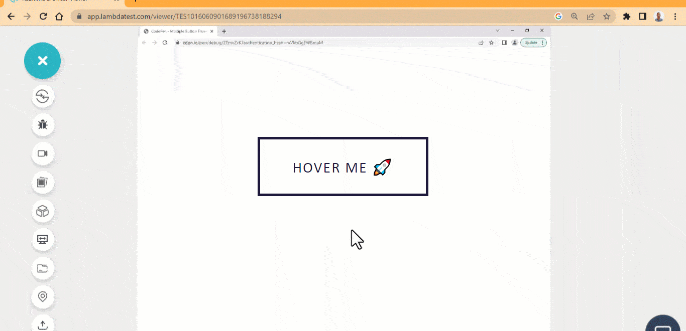
Border Wipe
Border wipe stands as a popular choice among CSS button hover effects. The border wipe effect covers the initial border defined on the button element on mouse hover.
This button is very useful as a user-interaction button, CTAs, submit button, subscribe button, sign in or sign out button.
HTML:
|
1 2 3 |
<main class="main"> <a class="box box-line">HOVER ME 🚀</a> </main> |
CSS:
|
1 2 3 4 5 6 7 8 9 10 11 12 13 14 15 16 17 18 19 20 21 22 23 24 25 26 27 28 29 30 31 32 33 34 35 36 37 38 39 40 41 42 43 44 45 46 47 48 49 50 51 52 53 54 55 56 57 58 59 60 61 62 63 64 65 66 67 68 69 70 71 72 |
/* Global Styles */ *, *::after, *::before { margin: 0; padding: 0; box-sizing: border-box; } :root { --font: calibri; --size-pri: 1px; --size-sec: 100px; --dark: #1e183a; --light: #0ebac5; } .main { display: grid; grid-template-columns: repeat(1 1fr); place-items: center; height: 100vh; } .box { padding: 1.3em 2.3em; color: var(--dark); cursor: pointer; border: none; letter-spacing: 2px; text-decoration: none; font-family: var(--font); font-size: 30px; user-select: none; box-shadow: inset 0 0 0 5px var(--dark); position: relative; transition: all 500ms ease; } .box-line::before, .box-line::after { content: ""; width: 0; height: 0; position: absolute; top: 0; right: 0; border: 0 solid transparent; border-top-width: 5px; border-right-width: 5px; } .box-line::after { border-bottom-width: 5px; border-left-width: 5px; } /* Start from this comment below */ .box-line:hover { color: var(--light); } .box-line:hover::before, .box-line:hover::after { width: 100%; height: 100%; border-color: var(--light); transition: width 500ms, height 500ms, border-color 0ms; } .box-line:hover::before { transition-delay: 0s, 0s, 0.25s; } .box-line:hover::after { transition-delay: 0s, 0.25s, 0s; } |
See the Pen
Border wipe button hover effect by Ocxigin (@ocxigin)
on CodePen.
3D Side Flip
The 3D slide flip creates a 3D flip like effect when a mouse hover on the button element.
This CSS button hover effect is used as a social media button icon for sharing web content on social media. The flip effect allows adding two pieces of information on a single button.
HTML:
|
1 2 3 4 5 6 7 8 |
<link rel="stylesheet" href="https://cdnjs.cloudflare.com/ajax/libs/font-awesome/6.4.0/css/all.min.css" integrity="sha512-iecdLmaskl7CVkqkXNQ/ZH/XLlvWZOJyj7Yy7tcenmpD1ypASozpmT/E0iPtmFIB46ZmdtAc9eNBvH0H/ZpiBw==" crossorigin="anonymous" referrerpolicy="no-referrer"> <body> <main class="main"> <a href="#" class="shape" data-twitter="Twitter" data-ocxigin="@ocxigin" name="logo-twitter"> </a> </main> </body> |
CSS:
|
1 2 3 4 5 6 7 8 9 10 11 12 13 14 15 16 17 18 19 20 21 22 23 24 25 26 27 28 29 30 31 32 33 34 35 36 37 38 39 40 41 42 43 44 45 46 47 48 49 50 51 52 53 54 55 56 57 58 59 60 61 62 63 64 65 66 67 68 69 70 71 72 73 74 75 76 77 78 79 80 81 82 83 84 85 86 87 88 89 90 |
/* Global Styles */ *, *::after, *::before { margin: 0; padding: 0; box-sizing: border-box; } :root { --font: calibri; --size-pri: 1px; --size-sec: 100px; --main-clr: rgb(220 38 38); --sec-clr: rgb(69 10 10);; --twitter-clr: #1D9BF0; --twitter-dark-clr: rgb(30 64 175);; --white:#fff; } .main { display: grid; grid-template-columns: repeat(1 1fr); place-items: center; height: 100vh; } body { background-color: rgb(226 232 240); } .shape { display: inline-block; font-family: var(--font); position: relative; text-align: center; letter-spacing: 3px; text-decoration: none; line-height: 50px; opacity: 1; text-transform: uppercase; } .shape::after { opacity: 0; width: 100%; color:var(--white); display: block; transition: 0.5s; position: absolute; background: var(--main-clr); border-radius: 100px; top: 0; left: 0; content: attr(data-ocxigin); transform: translateX(-50%) rotateY(180deg); box-shadow: 0 1px 2px 10px rgb(0 0 0 / 0.05); } .shape::before { display: inline-block; text-rendering: auto; -webkit-font-smoothing: antialiased; font: var(--fa-font-brands); content: "\f099"; color: var(--white); display: block; border-radius: 100px; padding: 0 3rem; line-height: 50px; transition: 500ms ease; position: relative; top: 0; left: 0; background: var(--twitter-clr); transform: translateX(0) rotateY(0); box-shadow: 0 1px 2px 10px rgb(0 0 0 / 0.05); opacity: 1; } .shape:hover::before { opacity: 0; transform: translateX(50%) rotateY(360deg); } .shape:hover::after { opacity: 1; transform: rotateY(0) translateX(0); } .shape:active { transform: translateY(4px); } |
See the Pen
3D Side Flip hover button by Ocxigin (@ocxigin)
on CodePen.
Float Up
Among the array of CSS button hover effects, the float up hover effect stands as a viable choice. The float up button hover effect creates a water-wave-like effect when a user hovers on it. It is useful as user-interaction buttons, CTAs, submit buttons, subscribe buttons, sign in or sign out buttons.
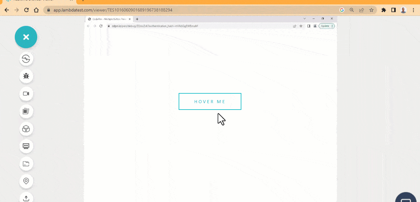
HTML:
|
1 2 3 4 5 6 7 8 9 10 11 12 |
<main class="main"> <section> <a href="#" class="ball"> Hover Me <div class="span-wrapper"> <span class="s1"></span> <span class="s2"></span> <span class="s3"></span> </div> </a> </section> </main> |
CSS:
|
1 2 3 4 5 6 7 8 9 10 11 12 13 14 15 16 17 18 19 20 21 22 23 24 25 26 27 28 29 30 31 32 33 34 35 36 37 38 39 40 41 42 43 44 45 46 47 48 49 50 51 52 53 54 55 56 57 58 59 60 61 62 63 64 65 66 67 68 69 70 71 72 73 74 75 76 77 78 79 |
/* Global Styles */ *, *::after, *::before { margin: 0; padding: 0; box-sizing: border-box; } :root { --font: calibri; --main-clr: #0ebac5; } /* The page */ .main { display: grid; grid-template-columns: repeat(1 1fr); place-items: center; height: 100vh; } /* The anchor tag */ .ball { color:var(--main-clr); user-select: none; font-size: 1rem; padding: 1rem 3rem; font-family: var(--font); text-transform: uppercase; text-decoration: none; border: 2px solid var(--main-clr); position: relative; transition: all 500ms cubic-bezier(0.075, 0.82, 0.165, 1); letter-spacing: 4px; } /* The Span Wapper tag */ .span-wrapper { height: 100%; position: absolute; inset:0 -2px -4px 0; overflow: hidden; z-index: -1; } /* The span tags */ .span-wrapper span { background-color: var(--main-clr); width: 30%; height: 100%; border-radius: 100%; position: absolute; transform: scale(1.8) translateY(125%) translateZ(0); transition: all 1s ease; } /* The Three Individual Span Tag */ .s1 { left: -10%; transition-delay: 0ms; } .s2 { left: 30%; transition-delay: 500ms; } .s3 { left: 70%; transition-delay: 800ms; } /* Hover State of the parent anchor tag */ .ball:hover { color: #fff; } .ball:hover .span-wrapper span { transform: scale(1.7) translateY(0) translateZ(0); } |
See the Pen
float up Hover Button by Ocxigin (@ocxigin)
on CodePen.
Warp Button
The warp effect creates a liquid drop like effect when a user mouse hover on it. This CSS button hover effect is helpful for CTAs and hero image overlay buttons due to its large size and fancy design.
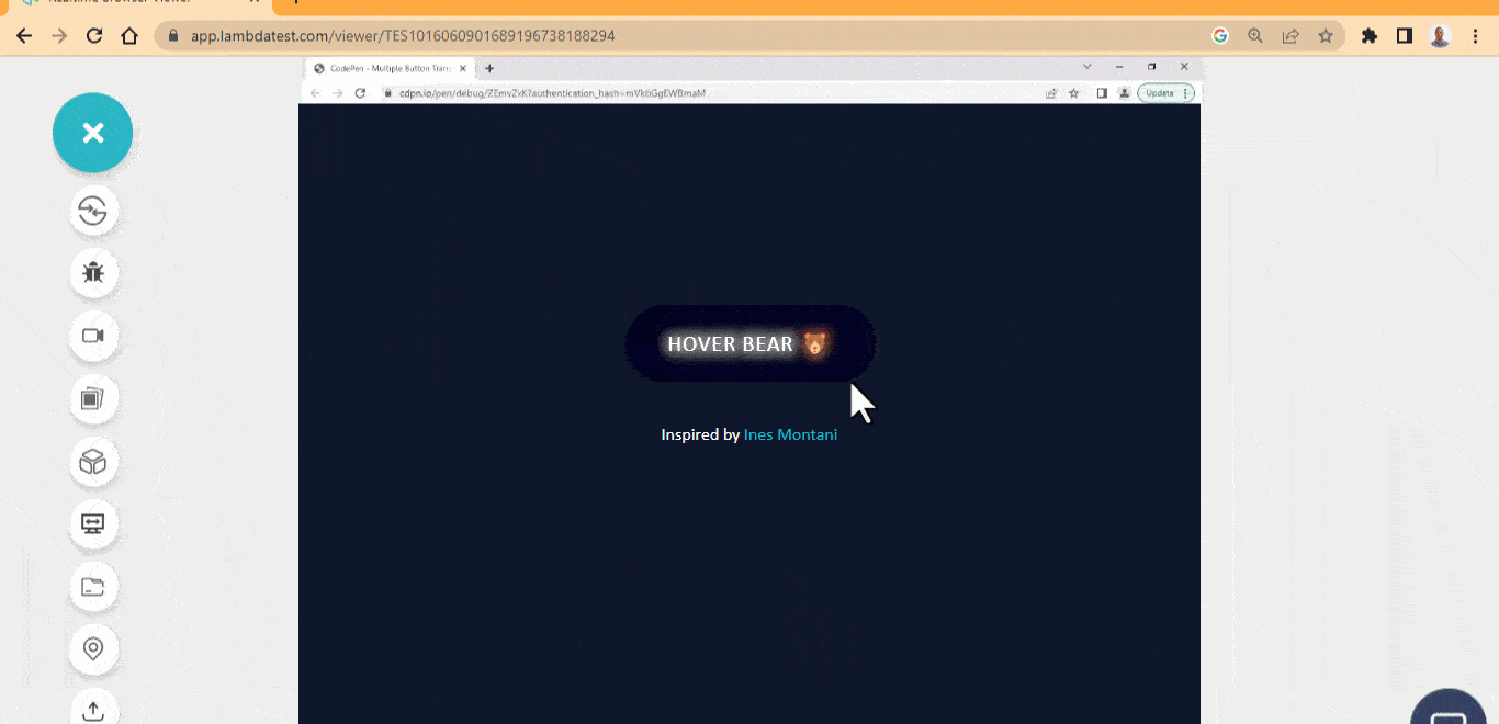
HTML:
|
1 2 3 4 5 6 7 8 9 10 11 12 13 14 15 16 17 18 |
<main class="main"> <section> <div> <span>Hover Bear 🐻</span> </div> <?xml version="1.0" encoding="UTF-8"?> <svg id="Layer_1" data-name="Layer 1" xmlns="http://www.w3.org/2000/svg" viewBox="0 0 265 63.6" width="0" height="0"> <defs> <filter id="blur"> <feGaussianBlur in="SourceGraphic" stdDeviation="5" result="blur"> <feColorMatrix in="blur" mode="matrix" values="1 0 0 0 0 0 1 0 0 0 0 0 1 0 0 0 0 0 19 -9" result="blur"> <feComposite in="SourceGraphic" in2="blur" operator="lighter"/> </filter> </defs> </svg> <p>Inspired by <a href="https://codepen.io/ines/pen/oeZdYv">Ines Montani</a></p> </section> </main> |
CSS:
|
1 2 3 4 5 6 7 8 9 10 11 12 13 14 15 16 17 18 19 20 21 22 23 24 25 26 27 28 29 30 31 32 33 34 35 36 37 38 39 40 41 42 43 44 45 46 47 48 49 50 51 52 53 54 55 56 57 58 59 60 61 62 63 64 65 66 67 68 69 70 71 72 73 74 75 76 77 78 79 80 81 82 83 84 85 86 87 |
/* Global Styles */ *, *::after, *::before { margin: 0; padding: 0; box-sizing: border-box; } :root { --font: calibri; --main-clr: #0ebac5; } /* The page */ body { background-color: rgb(15 23 42); } .main { display: grid; grid-template-columns: repeat(1 1fr); place-items: center; height: 100vh; } div { padding: 20px 0; filter: url('#blur'); } span { display: inline-block; text-align: center; background-color: rgb(2 6 23); color: #fff; padding: 1em 2em; font-family: var(--font); font-size: 20px; letter-spacing: 1px; text-transform: uppercase; cursor: pointer; line-height: 1.5; border-radius: 50px; position: relative; } span::before, span::after { width: 2em; height: 4em; position: absolute; content: ""; display: inline-block; background-color: rgb(2 6 23); border-radius: 50%; z-index: -1; transition: transform 800ms ease; transform: scale(0); } span::before { top: -35%; left: 10%; } span::after { bottom: -35%; right: 10%; } span:hover::before, span:hover::after { transform: none; } p { text-align: center; color: #fff; font-family: var(--font); } p a { text-align: center; text-decoration: none; color: #0ebac5; } |
See the Pen
Warp button Hover Effect by Ocxigin (@ocxigin)
on CodePen.
Inside Out Button
The inside out button hover effect scales the button background from the x-axis from with-in.This style of CSS button hover effects can be applied on multiple instances, such as a submit button on a card, sign in and sign out on navbars or subscribe button on the footer.
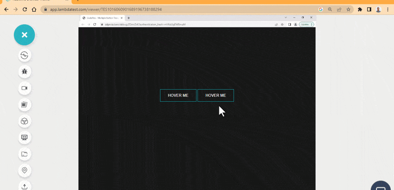
HTML:
|
1 2 3 4 5 6 7 8 |
<body> <main class="main"> <section> <button class="btn one">HOVER ME</button> <button class="btn two">HOVER ME</button> </section> </main> </body> |
CSS:
|
1 2 3 4 5 6 7 8 9 10 11 12 13 14 15 16 17 18 19 20 21 22 23 24 25 26 27 28 29 30 31 32 33 34 35 36 37 38 39 40 41 42 43 44 45 46 47 48 49 50 51 52 53 54 55 56 57 58 59 60 61 62 63 64 |
/* Global Styles */ *, *::after, *::before { margin: 0; padding: 0; box-sizing: border-box; } :root { --font: calibri; --main-clr: #0ebac5; } /* The page */ body { background-color: rgb(24 24 27); } .main { display: grid; grid-template-columns: repeat(1 1fr); place-items: center; height: 100vh; } .btn { background-color: #0ebac5; border: 1px solid #0ebac5; padding: 1em 2em; user-select: none; cursor: pointer; position: relative; background: none; color: #fff; } .btn::before, .btn::after { content: ""; position: absolute; width: 100%; height: 100%; display: block; background: #0ebac5; top: 0; left: 0; z-index: -1; transform: scaleX(0); transition: background 0.5s, transform 0.5s, opacity 0.5s ease-in; } .btn::before { left: -30%; } .btn::after { right: -30%; } .btn:hover::after { transform: scale(1); } .btn:active { transform: translateY(2px); } |
See the Pen
Inside out Button Hover Effect by Ocxigin (@ocxigin)
on CodePen.
Translate Button
The translate CSS button hover effects translate the background color of the button element to a specified region of the button element.
These are fancy buttons that can be used mainly as user-interaction buttons on webpages. These types of buttons can serve as an interface for navigation on a website.
HTML:
|
1 2 3 4 5 6 7 8 |
<main class="main"> <section> <button class="btn one">🥎 Softball</button> <button class="btn two">🏀 Basketball</button> <button class="btn three">⚾ Baseball</button> <button class="btn four">🏐 Volleyball</button> </section> </main> |
CSS:
|
1 2 3 4 5 6 7 8 9 10 11 12 13 14 15 16 17 18 19 20 21 22 23 24 25 26 27 28 29 30 31 32 33 34 35 36 37 38 39 40 41 42 43 44 45 46 47 48 49 50 51 52 53 54 55 56 57 58 59 60 61 62 63 64 65 66 67 68 69 70 71 72 73 74 75 76 77 78 79 80 81 82 83 84 85 86 87 88 89 90 91 92 93 94 95 96 97 98 99 |
/* Global Styles */ *, *::after, *::before { margin: 0; padding: 0; box-sizing: border-box; } :root { --font: calibri; --main-clr: #0ebac5; } /* The page */ body { background-color: rgb(15 23 42); } .main { display: grid; grid-template-columns: repeat(1 1fr); place-items: center; height: 100vh; } .btn { background-color: #0ebac5; border: 1px solid #0ebac5; padding: 1em 2em; user-select: none; margin: 0 8px; cursor: pointer; position: relative; background: none; color: #fff; overflow: hidden; } .btn::before, .btn::after { content: ""; position: absolute; width: 100%; height: 100%; display: block; background: #0ebac5; top: 0; left: 0; z-index: -1; transform: scaleX(0); transition: background 0.5s, transform 0.5s, opacity 0.5s ease-in; } .btn::before { left: -30%; } .btn::after { right: -30%; } .btn:hover::after { transform: scale(1); } /* Element Two */ .two::after{ transform: scaleY(0); } /* Element Three */ .three::after{ width: 100%; height: 0; transform: translate(-50%, -50%) rotate(-45deg); } .three:hover::after{ height: 380%; } /* Element Three */ .four::after{ width: 100%; height: 0; transform: translate(50%, 50%) skewY(45deg); } .four:hover::after{ height: 380%; } .btn:active { transform: translateY(2px); } @media screen and (max-width:500px) { .btn { margin: 1em 2em; } } |
See the Pen
Translate Button Hover Effect by Ocxigin (@ocxigin)
on CodePen.
Adding Transition to Font Awesome Icons
This example of CSS button hover effects shows how to add transitions to font-awesome icons on button elements.
These are social media buttons used to share web links on different social media platforms. With the rotating icons, users can get an instant response as they mouse hover on the buttons.
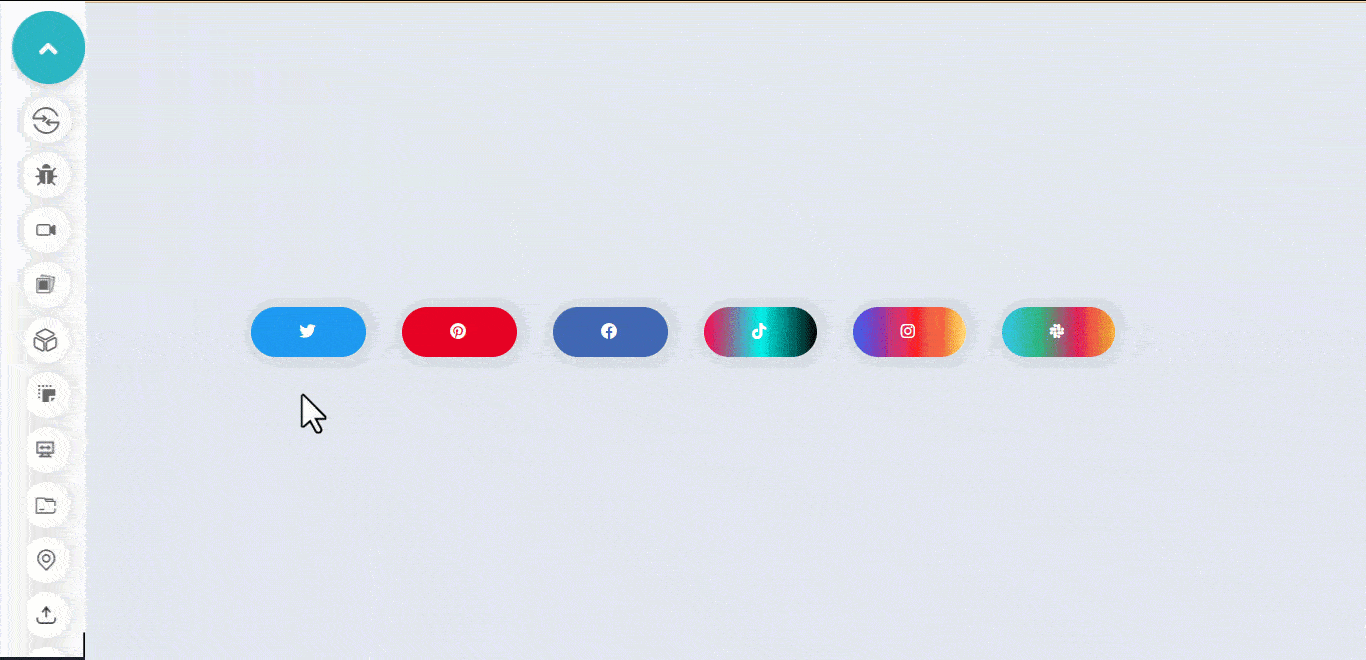
HTML:
|
1 2 3 4 5 6 7 8 9 10 11 12 13 14 15 |
<link rel="stylesheet" href="https://cdnjs.cloudflare.com/ajax/libs/font-awesome/6.4.0/css/all.min.css" integrity="sha512-iecdLmaskl7CVkqkXNQ/ZH/XLlvWZOJyj7Yy7tcenmpD1ypASozpmT/E0iPtmFIB46ZmdtAc9eNBvH0H/ZpiBw==" crossorigin="anonymous" referrerpolicy="no-referrer"> <body> <main class="main"> <section> <a href="#" class="shape twitter"></a> <a href="#" class="shape pinterest"></a> <a href="#" class="shape facebook"></a> <a href="#" class="shape tiktok"></a> <a href="#" class="shape instagram"></a> <a href="#" class="shape slack"></a> </section> </main> </body> |
CSS:
|
1 2 3 4 5 6 7 8 9 10 11 12 13 14 15 16 17 18 19 20 21 22 23 24 25 26 27 28 29 30 31 32 33 34 35 36 37 38 39 40 41 42 43 44 45 46 47 48 49 50 51 52 53 54 55 56 57 58 59 60 61 62 63 64 65 66 67 68 69 70 71 72 73 74 75 76 77 78 79 80 81 82 83 84 85 86 87 88 89 90 91 92 93 94 95 96 97 98 99 100 101 102 103 104 105 106 107 108 109 110 111 112 113 114 115 116 117 118 119 120 121 122 123 124 125 126 127 128 129 130 131 132 133 134 135 136 137 138 139 140 141 142 143 144 145 146 147 148 149 150 151 152 153 154 155 156 157 158 159 160 161 162 163 164 165 166 |
/* Global Styles */ *, *::after, *::before { margin: 0; padding: 0; box-sizing: border-box; } :root { --font: calibri; --size-pri: 1px; --size-sec: 100px; --pinterest-clr: #E60023; --twitter-clr: #1D9BF0; --facebook-clr: #4267B2; --tiktok-clr: linear-gradient(90deg, #ff0050, #00f2ea, #000000); --instagram-clr: linear-gradient(90deg, #405DE6, #5B51D8, #833AB4, #C13584, #E1306C, #FD1D1D, #F56040, #F56040, #FCAF45, #FFDC80); --slack-clr: linear-gradient(90deg, #36C5F0, #2EB67D, #E01E5A, #ECB22E); --white:#fff; } .main { display: grid; grid-template-columns: repeat(1 1fr); place-items: center; height: 100vh; } body { background-color: rgb(226 232 240); } .shape { display: inline-block; font-family: var(--font); position: relative; margin: 1em 1em; text-align: center; letter-spacing: 3px; text-decoration: none; line-height: 50px; opacity: 1; text-transform: uppercase; padding: 0 3rem; background: var(--twitter-clr); border-radius: 100px; box-shadow: 0 1px 2px 10px rgb(0 0 0 / 0.05); } .shape::before { display: inline-block; text-rendering: auto; -webkit-font-smoothing: antialiased; font: var(--fa-font-brands); content: "\f099"; color: var(--white); transition: 500ms ease; position: relative; top: 0; left: 0; opacity: 1; } /* Button One [Twitter]*/ .twitter:hover { background: none; outline: 1px solid var(--twitter-clr); } .twitter:hover::before { transform: skew(10deg) scale(1.5); color: var(--twitter-clr); } /* Button Two [pinterest]*/ .pinterest { background: var(--pinterest-clr); } .pinterest::before { content: "\f0d2"; } .pinterest:hover::before { transform: rotate(360deg) scale(1.5); /* transform: ; */ } /* Button Three [facebook]*/ .facebook { background: var(--facebook-clr); } .facebook::before { content: "\f09a"; transition: opacity 0.5s ease-in, transform 0.5s ease-in; } .facebook:hover::before { opacity: 0.5; transform: scale(1.5); } /* Button Four [ticktok]*/ .tiktok { background: var(--tiktok-clr); } .tiktok::before { content: "\e07b"; } .tiktok:hover::before { transform: skew(20deg, -20deg) scale(1.5); } /* Button Five [instagram]*/ .instagram { background: var(--instagram-clr); transition: background 0.5s ease; } .instagram::before { content: "\f16d"; } .instagram:hover::before { transform: matrix(0, 1, 1, 0, 0, 0) scale(1.5); } .instagram:hover { background-size: 350% 100%; animation-name: flow; animation-duration: 500ms; animation-timing-function: linear; animation-iteration-count: infinite; } @keyframes flow { 0% { background-position: 0% 50%; } 100% { background-position: 100%; } } /* Button Six [slack]*/ .slack { background: var(--slack-clr); } .slack::before { content: "\f198"; } .slack:hover::before { opacity: 0.5; transform: translateX(95%) scale(1.5) rotate(360deg); } /* Active State */ .shape:active { transform: translateY(4px); } |
See the Pen
Adding Transition to font awesome icons by Ocxigin (@ocxigin)
on CodePen.
NoteTest your CSS web designs across 3000+ real devices. Try LambdaTest Today!
Multiple Outline Button
The multiple outline CSS button hover effects show how multiple outlines can be added to a specific button when a user hovers on it.
These types of buttons can be used on a dialog box, models, navbars, etc. To help users make changes or interact with the website.
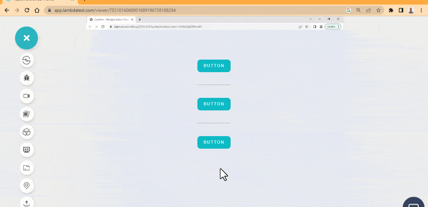
HTML:
|
1 2 3 4 5 6 7 8 9 10 11 12 13 14 15 16 17 |
<body> <main class="main"> <section> <div> <button class="btn one">BUTTON</button> </div> <hr> <div> <button class="btn two">BUTTON</button> </div> <hr> <div> <button class="btn three">BUTTON</button> </div> </section> </main> </body> |
CSS:
|
1 2 3 4 5 6 7 8 9 10 11 12 13 14 15 16 17 18 19 20 21 22 23 24 25 26 27 28 29 30 31 32 33 34 35 36 37 38 39 40 41 42 43 44 45 46 47 48 49 50 51 52 53 54 55 56 57 58 59 60 61 62 63 64 65 66 67 68 69 70 71 72 73 74 75 76 77 78 79 80 81 82 83 84 85 86 87 88 89 90 |
/* Global Styles */ *, *::after, *::before { margin: 0; padding: 0; box-sizing: border-box; } :root { --font: calibri; --colr-pri: #0ebac5; } .main { display: grid; grid-template-columns: repeat(1 1fr); place-items: center; height: 100vh; } body { background-color: rgb(226 232 240); } .btn { background: var(--colr-pri); border: none; padding: 0 1.5em; line-height: 40px; border-radius: 10px; user-select: none; cursor: pointer; letter-spacing: 2px; color: #fff; position: relative; margin: 3em 0; transition: all 0.5s, ease; } .btn::before { content: ""; width: 100%; height: 100%; inset: 0; position: absolute; background-color:transparent; border: 2px solid var(--colr-pri); border-radius: 10px; transform: scale(0); transition: all 1s ease; } /* The Button One */ .one:hover::before { transform: scale(1.2, 1.5); } .one:hover { color: var(--colr-pri); background: none; outline: 2px solid var(--colr-pri); } /* The Button Two */ .two:hover::before { transform: scale(1.2, 1.5); border: none; background-color: var(--colr-pri); z-index: -1; } .two:hover { outline: 2px solid #fff; } /* The third button */ .three:hover::before { transform: scale(1.2, 1.5); border: 1px solid var(--colr-pri); z-index: -1; border-radius: 100px; } .three:hover { border: 4px solid var(--colr-pri); background: none; color: var(--colr-pri); border-radius: 100px; } |
See the Pen
Multiple outline button hover effect by Ocxigin (@ocxigin)
on CodePen.
Neon Button
The neon CSS button hover effects shows how to add neon effects to button elements when a user mouse hover on it. It is very useful as user-interaction buttons, CTAs, submit buttons, subscribe buttons, sign in or sign out buttons.
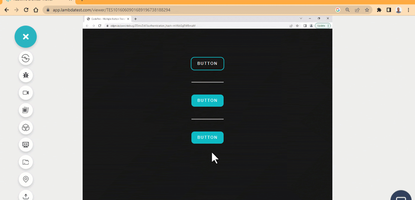
HTML:
|
1 2 3 4 5 6 7 8 9 10 11 12 13 14 15 16 17 18 19 20 21 22 23 |
<body> <main class="main"> <section> <div> <p>NEON BUTTON EFFECTS</p> </div> <div> <div> <button class="btn one">BUTTON</button> </div> <hr> <div> <button class="btn two">BUTTON</button> </div> <hr> <div> <button class="btn three">BUTTON</button> </div> </div> </section> </main> </body> |
CSS:
|
1 2 3 4 5 6 7 8 9 10 11 12 13 14 15 16 17 18 19 20 21 22 23 24 25 26 27 28 29 30 31 32 33 34 35 36 37 38 39 40 41 42 43 44 45 46 47 48 49 50 51 52 53 54 55 56 57 58 59 60 61 62 63 64 65 66 67 68 69 70 71 72 73 74 75 |
/* Global Styles */ *, *::after, *::before { margin: 0; padding: 0; box-sizing: border-box; } :root { --font: calibri; --colr-pri: #0ebac5; } .main { display: grid; grid-template-columns: repeat(1 1fr); place-items: center; height: 100vh; } body { background-color: rgb(23 23 23); } p { position: absolute; left: 34%; font-size: 20px; font-family: calibri; letter-spacing: 3px; color: #fff; top: 2em; } .btn { background: var(--colr-pri); border: none; padding: 0 1.5em; line-height: 40px; border-radius: 10px; user-select: none; cursor: pointer; letter-spacing: 2px; color: #fff; position: relative; margin: 3em 0; transition: all 0.5s, ease; } .btn::before { content: ""; width: 100%; height: 100%; inset: 0; position: absolute; background-color:transparent; border-radius: 10px; transition: all 1s ease; } .one { background-color: transparent; outline: 2px solid var(--colr-pri); } .btn:hover::before { box-shadow: 0 0 15px 5px var(--colr-pri); } .three:hover::before { box-shadow: 0 0 10px 2px var(--colr-pri); transform: scale(1.2, 1.4); } |
See the Pen
Neon button hover effects by Ocxigin (@ocxigin)
on CodePen.
Slide On
The next CSS button hover effect in our list is slide on. The slide on hover shows how to slide a text or icon inside a button.
The download button is used to download resources when a user clicks the download button; it’s helpful to use the button to give feedback on the purpose of the button. For example, we can add an icon or text to indicate that the button is a download button.
The example below shows how to flip an icon and text on a button to indicate its purpose.
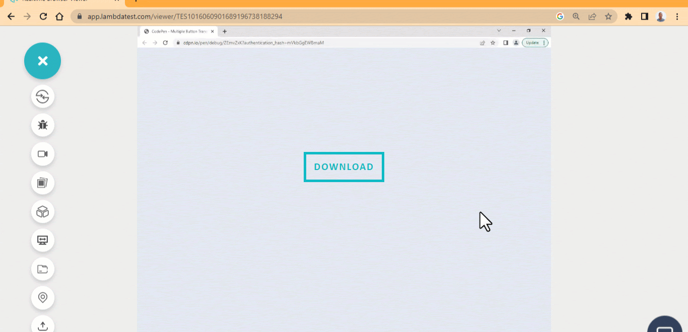
HTML:
|
1 2 3 4 5 6 7 8 9 |
<link rel="stylesheet" href="https://cdnjs.cloudflare.com/ajax/libs/font-awesome/6.4.0/css/all.min.css" integrity="sha512-iecdLmaskl7CVkqkXNQ/ZH/XLlvWZOJyj7Yy7tcenmpD1ypASozpmT/E0iPtmFIB46ZmdtAc9eNBvH0H/ZpiBw==" crossorigin="anonymous" referrerpolicy="no-referrer"> <body> <main class="main"> <section> <button class="btn" data-download="download"></button> </section> </main> </body> |
CSS:
|
1 2 3 4 5 6 7 8 9 10 11 12 13 14 15 16 17 18 19 20 21 22 23 24 25 26 27 28 29 30 31 32 33 34 35 36 37 38 39 40 41 42 43 44 45 46 47 48 49 50 51 52 53 54 55 56 57 58 59 60 61 62 63 64 65 66 67 68 69 70 71 72 73 74 75 76 77 78 79 80 |
/* Global Styles */ *, *::after, *::before { margin: 0; padding: 0; box-sizing: border-box; } :root { --font: calibri; --size-pri: 1px; --size-sec: 100px; --main-clr: #0ebac5; --white: #fff; } .main { display: grid; grid-template-columns: repeat(1 1fr); place-items: center; height: 100vh; } body { background-color: rgb(226 232 240); } .btn { width: 150px; height: 50px; background: none; border: none; outline: 5px solid var(--main-clr); user-select: none; cursor: pointer; position: relative; overflow: hidden; } .btn::before { content: attr(data-download); display: inline-block; position: absolute; inset: 12px 0; font-family: var(--font); text-transform: uppercase; font-size: 20px; letter-spacing: 2px; font-weight: 900; color:var(--main-clr); transition: all 0.5s ease; } .btn::after { display: inline-block; text-rendering: auto; -webkit-font-smoothing: antialiased; font: var(--fa-font-solid); content: "\f019"; color: var(--white); transition: 500ms ease; position: relative; top: 0; left: 0; opacity: 1; font-size: 1.8em; transform: translate(-500%, 0); transition: all 0.5s ease; color: var(--main-clr); } .btn:hover::before { opacity: 0; transform: translate(100%, 0); } .btn:hover::after{ opacity: 1; transform: none; } |
See the Pen
slide on hover button by Ocxigin (@ocxigin)
on CodePen.
Adding Button to Cards
This example explains how CSS button hover effects can be implemented on a card using a button with minimal transition effect on hover.
With cards, content can be organized for a specific purpose; most cards, depending on what they are designed to do, have buttons implemented on them. These buttons can be used to make action on the cards.
HTML:
|
1 2 3 4 5 6 7 8 9 10 11 12 13 14 15 16 17 18 19 20 21 22 23 24 25 26 27 28 29 30 31 32 33 34 35 36 37 38 39 40 41 42 43 44 45 46 47 48 49 50 51 52 53 54 55 56 57 58 59 60 61 62 63 64 65 66 67 68 69 70 71 72 73 74 75 76 77 78 79 80 81 82 83 84 85 86 87 88 89 90 91 92 93 94 95 96 97 98 99 100 101 102 103 104 105 106 107 108 109 110 111 112 113 114 115 116 117 |
<body> <main> <section class="card-container"> <header class="card card-live"> <aside class="aside aside-live al-1"> <h4 class="lamdaTest">LambdaTest</h4> <p class="live">Live</p> <div class="offer offer-one"> <span>$15</span> <span>Limited Offer</span> </div> <div class="offer offer-two"> <p>$7</p> <p>Per month billed annually for 1 Parallel Test</p> </div> <select name="" id="" class="select-op op-1"> <option value="">1 Parallel Test</option> </select> <p class="pare-test pt-1">What are Parallel Tests ?</p> <button class="btn btn-li-1">Select Plan</button> </aside> <aside class="aside aside-access aa-1"> <p>Includes access to:</p> <ul class="access-type at-1"> <li><i></i>Desktop Browsers</li> <li><i></i>Emulators / Simulators for mobile Browsers</li> <li><i></i>Emulators / Simulator for mobile app testing</li> <li><i></i>Screenshot Testing</li> <li><i></i>Responsive Testing</li> <li><i></i>Geolocation Testing</li> <li><i></i>Web and mobile debugging tools</li> </ul> </aside> </header> <header class="card card-real-device"> <aside class="aside real-device rd-2"> <h4 class="lamdaTest">LambdaTest</h4> <p class="real-device-t">Real Device</p> <div class="offer offer-one"> <span>$35</span> <span>Limited Offer</span> </div> <div class="offer offer-two"> <p>$25</p> <p>Per month billed annually for 1 Parallel Test</p> </div> <select name="" id="" class="select-op op-1"> <option value="">1 Parallel Test</option> </select> <p class="pare-test pt-1">What are Parallel Tests ?</p> <button class="btn btn-rd-2">Select Plan</button> </aside> <aside class="aside aside-access aaRd-1"> <p>Everything in Live Plan, and:</p> <ul class="access-type at-1"> <li><i></i>Real Mobile device</li> <li><i></i>Test native, hybrid, and web apps</li> <li><i></i>App Uploads</li> <li><i></i>Natural gestures and interactions</li> <li><i></i>Detailed device logs</li> </ul> </aside> </header> <header class="card enterprise"> <aside class="aside ep-3"> <h4 class="lamdaTest">LambdaTest</h4> <p class="enterprise">Enterprise</p> <div class="enterprice-text"> <p>With LambdaTest Enterprise, your organization has access to solutions built on Enterprise Grade Security, Privacy, and Compliances</p> </div> <select name="" id="" class="select-op op-1"> <option value="">25+ Parallel Tests</option> </select> <button class="btn btn-cs-3">Contact Sales</button> </aside> <aside class="aside aside-access aaEP-1"> <p>Everything in Live Plan, and:</p> <ul class="access-type at-1"> <li><i></i>Premium Support Options</li> <li><i></i>Advance Access controls</li> <li><i></i>Single Sign-on</li> <li><i></i>IP Whitelisting</li> <li><i></i>Advance data retention rules</li> <li><i></i>Dedicated Device cloud</li> <li><i></i>Advance Local Testing</li> <li><i></i>Usage Analytics</li> </ul> </aside> </header> </section> </main> </body> |
CSS:
|
1 2 3 4 5 6 7 8 9 10 11 12 13 14 15 16 17 18 19 20 21 22 23 24 25 26 27 28 29 30 31 32 33 34 35 36 37 38 39 40 41 42 43 44 45 46 47 48 49 50 51 52 53 54 55 56 57 58 59 60 61 62 63 64 65 66 67 68 69 70 71 72 73 74 75 76 77 78 79 80 81 82 83 84 85 86 87 88 89 90 91 92 93 94 95 96 97 98 99 100 101 102 103 104 105 106 107 108 109 110 111 112 113 114 115 116 117 118 119 120 121 122 123 124 125 126 127 128 129 130 131 132 133 134 135 136 137 138 139 140 141 142 143 144 145 146 147 148 149 150 151 152 153 154 155 156 157 158 159 160 161 162 163 164 165 166 167 168 169 170 171 172 173 174 175 176 177 178 179 180 181 182 |
*, *::after, *::before { padding: 0; margin: 0; box-sizing: 0; } :root { --card-size: 20em; /*400px*/ --primary-color: #0ebac5; --sd-color-1: #b6b5b5; --sd-color-2: #3d3d3d; --sd-color-3: #666666; --primary-font: Arial; --p-font-size: 0.75em; /*12px*/ --base-size: 0.0625em /*1px*/ } body { display: grid; place-items: center; height: 100vh; background-color: rgb(241 245 249); } .card-container { display: grid; grid-template-columns: repeat(3, var(--card-size)); grid-template-rows: repeat(1, 500px); gap:calc(var(--base-size) * 20); margin: 2em 0; } .card { background-color: white; border-radius: calc(var(--base-size) * 6); padding: 2em 0; overflow-y: scroll; overflow-x: hidden; box-shadow: 0 20px 25px -5px rgb(0 0 0 / 0.1), 0 8px 10px -6px rgb(0 0 0 / 0.1); transition: all 0.5 ease 0s; } .card:hover { outline: 2px dashed var(--primary-color); } /* Scrollbar styling */ .card::-webkit-scrollbar { width: 10px; } .card::-webkit-scrollbar-track { background-color: #0ebac5; box-shadow: inset 2px 8px 8px rgba(0, 0, 0, .75), inset 4px 8px 8px rgba(0, 0, 0, .75), inset 4px 8px 8px rgba(0, 0, 0, .75); } .card::-webkit-scrollbar-thumb { background-color: #0ebac5; } .card::-webkit-scrollbar-thumb:hover { background-color: #6eeff8; } .card .live, .card .real-device-t, .card .enterprise { font-size: calc(var(--p-font-size) * 1.5); font-family: var(--primary-font); text-align: center; } .lamdaTest { font-size: calc(var(--p-font-size) * 1.5); font-family: var(--primary-font); text-align: center; margin-bottom: 1em; } .enterprice-text { font-size: calc(var(--p-font-size) * 1.2); font-family: var(--primary-font); text-align: center; margin: 1em 1em; } .offer{ font-family: var(--primary-font); text-align: center; margin: calc(var(--base-size) * 24); } .offer-one span:first-child { color: var(--sd-color-3); font-size: calc(var(--p-font-size) * 1.3); text-decoration: line-through red calc(var(--base-size) * 1); } .offer-one span:last-child { color: var(--sd-color-3); font-size: calc(var(--p-font-size) * 1.3); background-color: var(--primary-color); border-radius: calc(var(--base-size) * 3); padding: var(--base-size) calc(var(--base-size) * 3); color:white; } .offer-two p:first-child { font-size: calc(var(--p-font-size) * 5); font-weight: 600; } .offer-two p:last-child { color: var(--sd-color-3); } .select-op { border: var(--base-size) solid var(--primary-color); border-radius: calc(var(--base-size) * 4); width: 80%; height: calc(var(--base-size) * 40); padding: 8px 6px 8px 20px; margin: 0 2em; } .pare-test { font-family: var(--primary-font); color: var(--sd-color-3); margin: 1.5em 2em; } .btn { width: 80%; margin: 0 2em; height: calc(var(--base-size) * 40); background-color: var(--primary-color); border: none; border-radius: calc(var(--base-size) * 4); color: white; text-transform: uppercase; font-weight: bold; cursor: pointer; transition: all 1s ease; } .btn:hover { background-color: #6eeff8; color: #000; } /* Btn 3 */ .btn-cs-3 { margin-top: 2em; } /* Include Access to */ .aside-access { margin: 0 2em; } .aside-access p { font-family: var(--primary-font); font-weight: bold; margin: calc(var(--base-size) * 10) 0 calc(var(--base-size) * 16) 0; } .access-type { list-style-type: none; } .access-type |
See the Pen
Price-list-card-components by Ocxigin (@ocxigin)
on CodePen.
Conclusion
This article lists the 41 best CSS button hover effects in 2024 that you can use as a web designer to improve your website and how visitors or users interact with button elements on your website or mobile apps.
Websites or apps are built with different functions to enable users to perform tasks, and buttons are the interface we use to interact, get, send, or delete requests or tasks on the Internet. This makes buttons a critical aspect of user experience.
This user experience can be improved by designing buttons in such a way that it is distinguishable from other elements and interactive hover effects that respond and give the users a sense of interaction when they hover on them.
Designing buttons from scratch can be complex, or choosing from an already made design. To fix this, you can create a basic design with interactive CSS button hover effects, or you can experiment and combine different hover effects from different unique designs from multiple sources.
Frequently Asked Questions (FAQs)
How to add a button hover effect in CSS?
To create a button hover effect in CSS, you can use the :hover pseudo-class. This allows you to apply different styles to an element when a user hovers a mouse over it.


Author’s Profile
Alex Anie
A Front End Technical Writer. I write blogs on Front End Technologies, such as HTML, CSS, JavaScript. When I am not coding, I enjoy watching tutorials and listening to twitter spaces. I live in Lagos, Nigeria
Blogs: 16
Got Questions? Drop them on LambdaTest Community. Visit now


