 [Live Now] Join the 1-day Testing & QA Summit featuring 15+ Expert Speakers.


Mastering CSS Border Style: A Comprehensive Guide
Alex Anie
Posted On: February 22, 2023
 132901 Views
 24 Min Read
CSS Borders refers to the line outside the padding and inside the margin of the CSS Box Model. This line wraps around the padding and content in every HTML Element. That is both semantic and non-semantic elements.
Borderlines don’t have to be a solid straight line. We can apply different styles to it to change its looks and feel, as you will see as we learn more about it in this blog on CSS Borders.
Understanding how to use CSS Borders can improve our work with web elements. In this blog on CSS Borders, you will learn how to utilize CSS to generate and customize borders.
TABLE OF CONTENTS
Introduction to CSS Borders
Since borders separate between padding and margin, CSS Borders can be used as a good color contrast between a web element and the web page’s background. For instance, if the background color of a web page is light in value, we can simply apply a dark or slightly darker color to a border of a particular web element on the web page. This will help provide a good visual contrast.
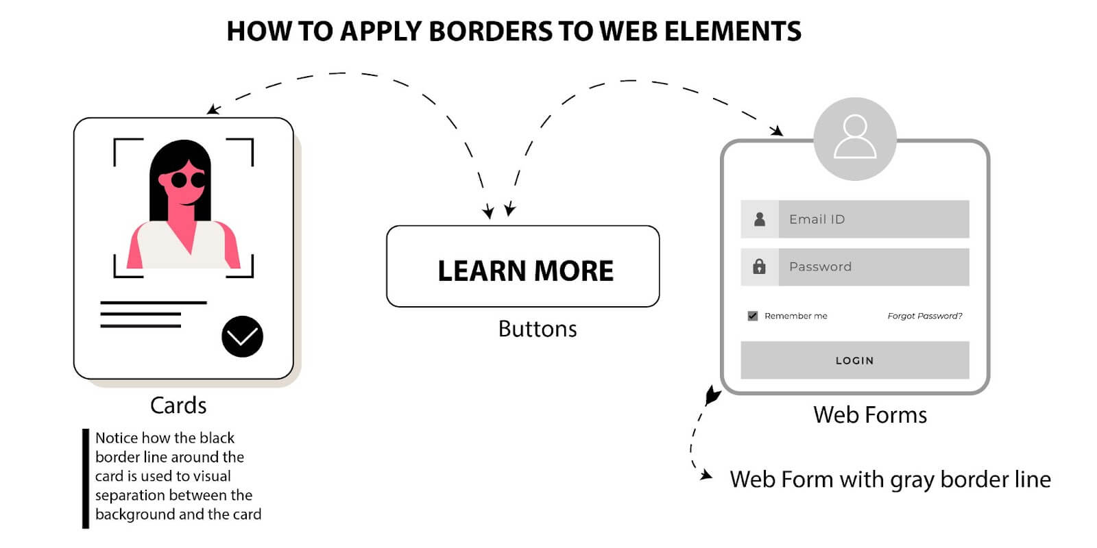
A good example of web elements we can apply borders to are buttons, cards, form fields, etc. The image below shows us how we can work with borders.
A quick look at the CSS Box Model should give us an idea of where the border can be found and what it looks like.
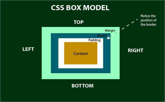
From the above illustration, you will notice that the border sits on top of the padding and, at the same time, below the margin.
As you’ll soon notice, the CSS border property is a shorthand property meant to declare all the border properties in a single instance without including other sub-properties.
For clarity purposes, we’ll learn how to use each property associated with the CSS border property, which includes:
- border-width
- border-color
- border-styles
- border-radius
- border-image
Sub-properties are very useful for targeting individual properties and can improve how you style your web elements; when you understand how it works.
The CSS border property should not be confused with the CSS outline property, THEY ARE NOT THE SAME THING.
Border-style property
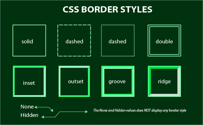
This property is used to set the style or decoration of the border of a web element. This property takes in the predefined values of the following:
- Solid: sets a single straight line around a web element.
- Dashed: sets a series of dashes (short hyphenated straight lines) around a web element.
- Dotted: sets a series of rounded dots around a web element.
- Hidden: hides the border.
- Doubled: sets two straight lines around a web element.
- Groove: sets a carved-out 3D appearance. This is the opposite of the ridge.
- Ridge: sets an extrude in 3D appearance. This is the opposite of the groove.
- Inset: sets an embedded 3D appearance. This is the opposite of the outset.
- Outset: sets an embossed 3D appearance. This is the opposite of the inset.
- None: removes the border. Behaves just like the hidden value.
It’s important to note that without the border-style property defined, other CSS Border properties, such as border-width, border-color, border-radius, etc., will not take effect. So the border should always be defined.
For a better understanding, see the illustration below.
Now let’s see how we can apply this using code.
Type and run the code below.
HTML:
|
1 2 3 4 5 6 7 8 9 10 11 12 13 14 15 16 17 |
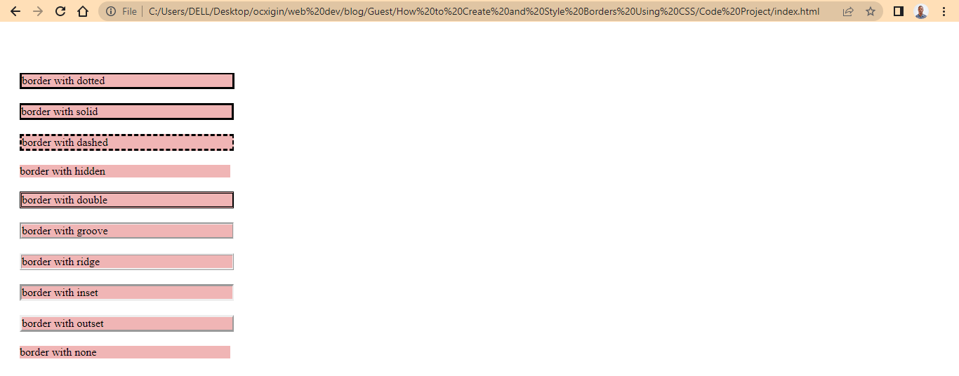
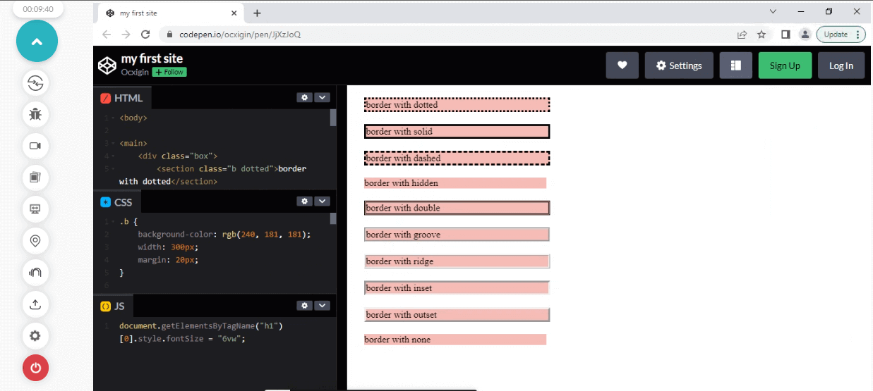
<body> <main> <div class="box"> <section class="b dotted">border with dotted</section> <section class="b solid">border with solid</section> <section class="b dashed">border with dashed</section> <section class="b hidden">border with hidden</section> <section class="b doubled">border with double</section> <section class="b groove">border with groove</section> <section class="b ridge">border with ridge</section> <section class="b inset">border with inset</section> <section class="b outset">border with outset</section> <section class="b none">border with none</section> </div> </main> </body> |
CSS:
|
1 2 3 4 5 6 7 8 9 10 11 12 13 14 15 16 17 18 19 20 21 22 23 24 25 26 27 28 29 30 31 32 33 34 35 36 37 38 39 40 41 42 43 44 45 46 47 48 49 50 51 52 53 54 55 56 57 58 59 60 61 |
.b { background-color: rgb(240, 181, 181); width: 300px; margin: 20px; } .dotted { border-style: solid; border-top-width: 2px; border-color: black; } .bottom { border-style: bottom; border-bottom-width: 2px; } .solid { border-style: solid; border-left-width: 2px; } .dashed{ border-style: dashed; border-right-width: 2px; } .hidden { border-style: hidden; border-right-width: 9px; } .doubled { border-style: double; border-right-width: 2px; } .groove { border-style: groove; border-right-width: 2px; } .ridge { border-style: ridge; border-right-width: 2px; } .inset { border-style: inset; border-right-width: 2px; } .outset { border-style: outset; border-right-width: 2px; } .none { border-style: none; border-right-width: 2px; } |
Browser Output:
Sub properties of border style
The CSS border-style property is a shorthand for the following properties below.
- border-top-style: sets the line style of the web element’s top border.
- border-bottom-style: sets the line style of the web element’s bottom border.
- border-left-style: sets the line style of the web element’s left border.
- border-right-style: sets the line style of the web element’s right border.
When we use the CSS border-style property, any value assigned automatically targets the four corners of the web element’s border, top, bottom, left, and right.
So when we need to style one corner of the web element, we can use the sub-properties designed to handle this task.
Type and run the code below.
HTML:
|
1 2 3 4 5 6 7 8 |
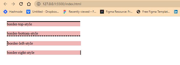
<main> <div class="box"> <section class="b top">border-top-style</section> <section class="b bottom">border-bottom-style</section> <section class="b left">border-left-style</section> <section class="b right">border-right-style</section> </div> </main> |
CSS:
|
1 2 3 4 5 6 7 8 9 10 11 12 13 14 15 16 17 18 19 20 21 |
.b { background-color: rgb(240, 181, 181); width: 300px; margin: 20px; } .top { border-top-style: solid; } .bottom{ border-bottom-style: dashed; } .left { border-left-style: dotted; } .right { border-right-style: double; } |
Browser Output:
Test your CSS Borders across 3000+ real browsers and OS. Try LambdaTest Now!
Border-width property
This property is used to set the size of the border width, and to do this, we can either use the keyword values or length values associated with the CSS border property.
- Keyword Values: thin, medium, thick. (these are predefined values). These values are fixed.
- Length Value: rem, em, pt, %, px (These are CSS units). These values are not fixed. We can be creative and determine how big or small we want the width to appear.
Type and run the code below.
HTML:
|
1 2 3 4 5 6 7 8 9 10 11 |
<main> <div class="box"> <section class="b thin">A border with thin line</section> <section class="b medium">A border with medium line</section> <section class="b thick">A border with thick line</section> <section class="b px">A border using the CSS px unit</section> <section class="b rem">A border using the CSS rem unit</section> <section class="b percentage">A border using the CSS % unit</section> <section class="b no-style">border style is not defined</section> </div> </main> |
CSS:
|
1 2 3 4 5 6 7 8 9 10 11 12 13 14 15 16 17 18 19 20 21 22 23 24 25 26 27 28 29 30 31 32 33 34 35 36 37 38 39 |
.b { background-color: rgb(240, 181, 181); width: 300px; margin: 20px; } .thin { border-style: solid; border-width: thin; } .medium { border-style: solid; border-width: medium; } .thick { border-style: solid; border-width: thick; } .px { border-style: solid; border-width: 7px; } .rem { border-style: solid; border-width: 0.07rem; } .percentage { border-style: solid; border-width: 3%; } .no-style { border-width: 7px; } |
Browser Output:
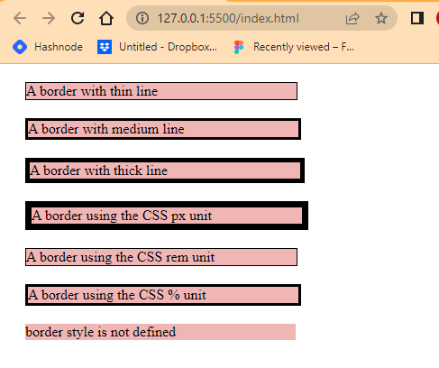
From the browser output, you’ll notice the fourth element has the largest border width on the webpage compared to the others. This is because we will assign it a width of 7px, but we can make it larger if we want, as long as we use CSS units (such as px, rem, em, %, etc.)
Sub properties of border width
While the px CSS unit is absolute, changes from the web element do not directly affect it, unlike the rem and em, which are relative to the HTML root and parent elements. For example, the width of 7px we assigned to our border will still be stuck at 7px if the user by any means decides to increase or decrease the browser font size, but using units like rem and em, which are relative scale better to fit the new adjusted size of the browser. This is great for accessibility and responsive design.
The keyword values (thin, medium, and thick) only give us a fixed width, which has already been predefined.
As you have seen, the last element does not have a border width. This is because we do not assign a CSS border-style to the element. Border-style (border-style) is required to make the border appear in every element.
The CSS border-width property is a shorthand for the following properties below.
- border-top-width: sets the line width of the web element’s top border.
- border-bottom-width: sets the line width of the web element’s bottom border.
- border-left-width: sets the line width of the web element’s left border.
- border-right-width: sets the line width of the web element’s right border.
As we’ve seen before, from the CSS border-style property, any value assigned to CSS border-width automatically targets the four corners of the web element’s border, top, bottom, left, and right respectively.
So to target each corner individually, the border-width sub-properties should be used.
Type and run the code below.
HTML:
|
1 2 3 4 5 6 7 8 |
<main> <div class="box"> <section class="b top">A border top width</section> <section class="b bottom">A border bottom width</section> <section class="b left">A border left width</section> <section class="b right">A border right width</section> </div> </main> |
CSS:
|
1 2 3 4 5 6 7 8 9 10 11 12 13 14 15 16 17 18 19 20 21 22 23 24 25 |
.b { background-color: rgb(240, 181, 181); width: 300px; margin: 20px; } .top { border-style: solid; border-top-width: 9px; } .bottom { border-style: solid; border-bottom-width: 9px; } .left { border-style: solid; border-left-width: 9px; } .right { border-style: solid; border-right-width: 9px; } |
Browser Output:
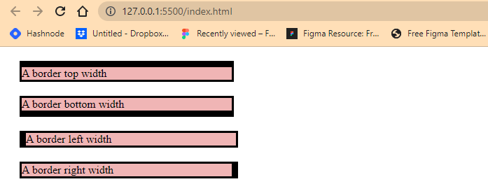
From the browser output we assign a width of 9px to the top, bottom, left and right of each element.
Border-color property
From the browser output we assign a width of 9px to the top, bottom, left and right of each element.
This property is used to set the color of the element’s border.
Type and run the code below.
HTML:
|
1 2 3 4 5 6 7 8 9 10 11 12 13 14 |
<main> <div class="box"> <section class="b green">A border with green color</section> <section class="b red">A border with red color</section> <section class="b rgb1">A border with rgb color value</section> <section class="b rgb2">A border with rgb color value</section> <section class="b hexcode1"> A border with hexcode color value </section> <section class="b hexcode2"> A border with hexcode color value </section> </div> </main> |
CSS:
|
1 2 3 4 5 6 7 8 9 10 11 12 13 14 15 16 17 18 19 20 21 22 23 24 25 26 27 28 29 30 31 32 33 34 35 36 37 38 39 40 41 |
.b { background-color: rgb(240, 181, 181); width: 300px; margin: 20px; } .green { border-style: solid; border-width: 9px; border-color: green; } .red { border-style: solid; border-width: 9px; border-color: red; } .rgb1 { border-style: solid; border-width: 9px; border-color: rgb(32, 113, 128); } .rgb2 { border-style: solid; border-width: 9px; border-color: rgb(231, 248, 76) ; } .hexcode1 { border-style: solid; border-width: 9px; border-color:#1301b3 ; } .hexcode2 { border-style: solid; border-width: 9px; border-color: #0d0b25; } |
Browser Output:
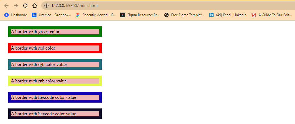
From the browser output, we applied colors to the border of the elements on the web page using color keyword, rgb, and hexcode values.
Sub properties of border color
The CSS border-color property is a shorthand for the following properties below.
- border-top-color: sets the color of the web element’s top border.
- border-bottom-color: sets the color of the web element’s bottom border.
- border-left-color: sets the color of the web element’s left border.
- border-right-color: sets the color of the web element’s right border.
The CSS border-color property, any value assigned to the CSS border-color automatically targets the four corners of the web element’s border, top, bottom, left, and right, respectively.
We use these sub-properties when there is a need to target individual borders and apply different colors.
For better understanding, let’s see this in action.
Type and run the code below.
HTML:
|
1 2 3 4 5 6 7 8 |
<main> <div class="box"> <section class="b top">A border top color</section> <section class="b bottom">A border bottom color</section> <section class="b left">A border left color</section> <section class="b right">A border right color</section> </div> </main> |
CSS:
|
1 2 3 4 5 6 7 8 9 10 11 12 13 14 15 16 17 18 19 20 21 22 23 24 25 26 27 28 29 |
.b { background-color: rgb(240, 181, 181); width: 300px; margin: 20px; } .top { border-style: solid; border-width: 9px; border-top-color: green; } .bottom { border-style: solid; border-width: 9px; border-bottom-color: red; } .left { border-style: solid; border-width: 9px; border-left-color: rgb(32, 113, 128); } .right { border-style: solid; border-width: 9px; border-right-color: rgb(231, 248, 76) ; } |
Browser Output:
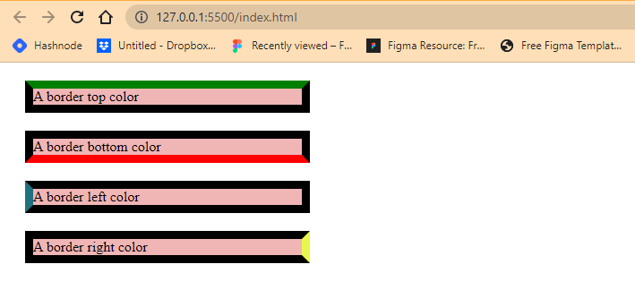
From the browser output, we created four separate div tags, and we applied a CSS border-style of solid, border-width of 9px and different colors to each element’s border.
Also, border-top-color, border-bottom-color, border-left-color, and border-right-color are applied to different corners of each web element, respectively.
Border-radius property
This property is used to apply a round corner effect to an element’s outer edge or border.
Unlike the other CSS border properties, the CSS border-radius property takes effect with or without an element border. You also don’t need to define a CSS border-style property for the CSS border-radius property to work.
The code below shows us how this works.
Type and run the code below.
HTML:
|
1 2 3 4 5 6 7 8 |
<main> <div class="box"> <section class="b square">A square with a border-radius</section> <section class="b cirle">A circle with a border-radius</section> <section class="b rectangle">A rectangle with a border-radius</section> </div> </main> |
CSS:
|
1 2 3 4 5 6 7 8 9 10 11 12 13 14 15 16 17 18 19 20 21 22 23 24 25 26 27 28 29 30 |
.b { background-color: rgb(240, 181, 181); width: 300px; margin: 20px; } .square { width: 150px; height: 150px; color: white; background-color: skyblue; border-radius: 12px; } .circle { width: 150px; height: 150px; color: white; background-color: coral; border-radius: 50%; } .rectangle { width: 400px; height: 100px; color: white; background-color: darkmagenta; border-radius: 0px 20px; border: 9px solid #000; } |
Browser Output:
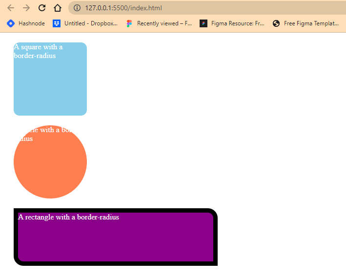
The CSS border-radius property is very different when we apply it to an element. It rounds the four corners of the element even when the said element border is set to hidden or none.
From the browser’s output, you’ll notice that the three elements have different shapes. The first square takes in width and height of 150px on both sides and a CSS border-radius of 12px, leading to a round corner effect.
The second element, which happens to be a circle, is set to the same width and height of 150px but this time, a CSS border-radius of 50% . This creates a circle effect of the element.
While the third one is a rectangle, which takes in a width of 400px and a height of 100px. The CSS border-radius is set to 0px on the top-left and bottom-right while 20px on the top-right and bottom-right.
Also, we introduced a border and set the width to 9px across, a style of solid and a color of black. Notice how this is done in one line of code. In this tutorial on CSS Borders, we’ll explain how this is done in the upcoming chapter.
Sub properties of border radius
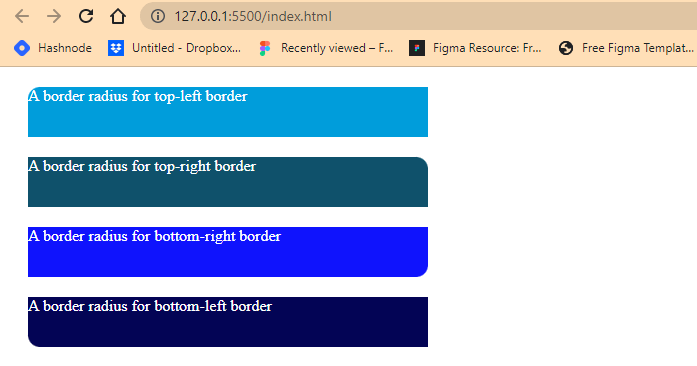
We’ve talked about shorthand property before, the CSS border-radius is a shorthand property for the following properties below.
- border-top-left-radius: sets the radius of the web element’s top-left border.
- border-top-right-radius: sets the radius of the web element’s top-right border.
- border-bottom-right-radius: sets the radius of the web element’s bottom-right border.
- border-bottom-left-radius: sets the radius of the web element’s bottom-left border.
Type and run the code below.
HTML:
|
1 2 3 4 5 6 7 8 9 10 11 12 13 14 15 16 |
<main> <div class="box"> <section class="b top-left"> A border radius for top-left border </section> <section class="b top-right"> A border radius for top-right border </section> <section class="b bottom-right"> A border radius for bottom-right border </section> <section class="b bottom-left"> A border radius for bottom-left border </section> </div> </main> |
CSS:
|
1 2 3 4 5 6 7 8 9 10 11 12 13 14 15 16 17 18 19 20 21 22 23 24 25 26 27 28 29 30 31 32 33 34 35 36 37 |
.b { background-color: rgb(240, 181, 181); width: 300px; margin: 20px; } .top-left { width: 400px; height: 50px; color: white; background-color: rgb(0, 157, 219); border-top-left-radius: 12px; } .top-right { width: 400px; height: 50px; color: white; background-color: rgb(15, 81, 107); border-top-right-radius: 12px; } .bottom-right { width: 400px; height: 50px; color: white; background-color: rgb(15, 19, 252); border-bottom-right-radius: 12px; } .bottom-left { width: 400px; height: 50px; color: white; background-color: rgb(3, 4, 85); border-bottom-left-radius: 12px; } |
Browser Output:
Applying CSS border-radius is very popular in web design and development. Understanding and using this property effectively will improve your design elements.
Border-image property
This property is used to set an image as the border of an element in place of a borderline.
This property can be used to declare all the border image sub-properties in one line of code.
Syntax:
|
1 |
border-image: url("/folder/image.jpg") 16 / 40px / 10px stretch; |
Just like most of the border property, the CSS border-image property is a shorthand property for the following properties.
We will use the following images from Unsplash; you can download them here: Image1, Image2, and Image3.
border-image-source
Used to set the image path to be used.
Type and run the code below.
HTML:
|
1 |
<div class="b two"></div> |
CSS:
|
1 2 3 4 5 6 7 8 9 |
.two { width: 100px; height: 100px; background-color: lime; border-image-source: url("/flower2.jpg"); border-image-width: 40px; border-style: solid; border-color: transparent; } |
Browser Output:
From the code sample above, we use the CSS border-image-source property to apply an image to the element border. We also apply a CSS border-images-width of 40px; we’ll explain how this works shortly.
border-image-width
Used to set the width of the border image. It takes integers as values in four places: the top, bottom, left, and right.
Type and run the code below.
HTML:
|
1 2 3 4 5 6 7 8 |
<main> <div class="box"> <div class="b one"></div> <div class="b two"></div> <div class="b three"></div> <div class="b four"></div> </div> </main> |
CSS:
|
1 2 3 4 5 6 7 8 9 10 11 12 13 14 15 16 17 18 19 20 21 22 23 24 25 26 27 28 29 30 31 32 33 34 35 36 37 38 39 40 41 42 43 44 |
.b { background-color: rgb(240, 181, 181); margin: 10px; } .one { width: 100px; height: 100px; background-color: red; border-image: url("/flower.jpg") 90 repeat stretch; border-image-width: 10px; border-style: dotted; border-color: transparent; } .two { width: 100px; height: 100px; background-color: lime; border-image: url("/flower2.jpg") 40% round ; border-image-width: 30px 10px; border-style: solid; border-color: transparent; } .three { width: 100px; height: 100px; background-color: cyan; border-image: url("/flower3.jpg") 90 repeat stretch; border-image-width: 50px; border-style: double; border-color: transparent; } .four { width: 100px; height: 100px; background-color: cyan; border-image: url("/flower3.jpg") 90 repeat stretch; border-width: 50px; border-style: double; border-color: transparent; } |
Browser Output:
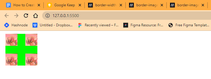
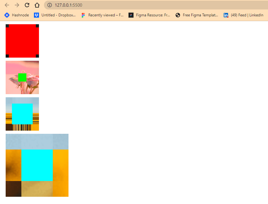
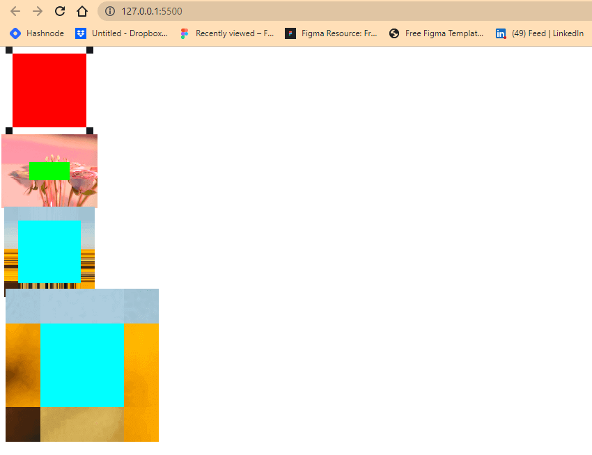
From the code sample above, we created four div tags with a width and height of 100px across. We apply a border image to each div tag. These images are set to a different width with the CSS border-image-width property, which affects the structure of the elements, as you can see from the browser output.
The first element takes in a border-image-width of 10px, this gives the image a 10px width around the element. The next element, which is the second one, takes in 30px for top and bottom and 10px for left and right, while for the third and fourth elements, we applied the same styles to both but different border width properties. The third element takes a CSS border-image-width property, while the four elements take in a CSS border-width property. This is to illustrate the difference between the two properties, so we don’t mistake one for the other.
The block arrow shows us how the CSS border-image-width affects element structure compared to CSS border-width.
border-image-slice
Used to slice up the image used as the border-image into different regions around the element border. It takes integers, keywords, or percentages (%) as values.
Type and run the code below.
HTML:
|
1 2 3 4 5 6 7 8 |
<main> <div class="box"> <div class="b one"></div> <div class="b two"></div> <div class="b three"></div> <div class="b four"></div> </div> </main> |
CSS:
|
1 2 3 4 5 6 7 8 9 10 11 12 13 14 15 16 17 18 19 20 21 22 23 24 25 26 27 28 29 30 31 32 33 34 35 36 37 38 39 40 41 42 43 44 |
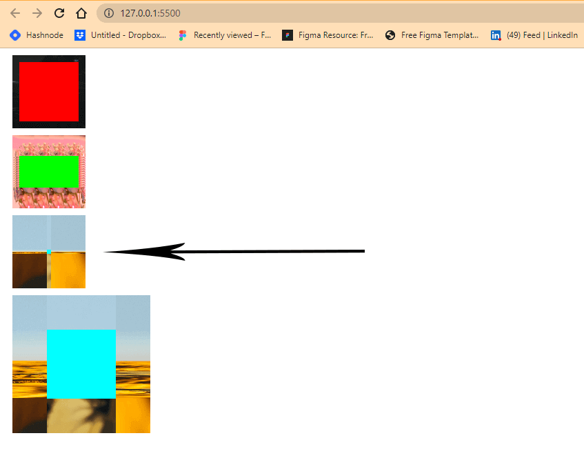
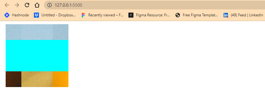
.b { background-color: rgb(240, 181, 181); margin: 10px; } .one { width: 100px; height: 100px; background-color: red; border-image-source: url("/flower.jpg"); border-image-width: 10px; border-style: dotted; border-color: transparent; } .two { width: 100px; height: 100px; background-color: lime; border-image-source: url("/flower2.jpg"); border-image-width: 40px; border-style: solid; border-color: transparent; } .three { width: 100px; height: 100px; background-color: cyan; border-image-source: url("/flower3.jpg"); border-image-width: 50px; border-style: double; border-color: transparent; } .four { width: 100px; height: 100px; background-color: cyan; border-image-source: url("/flower3.jpg"); border-width: 50px; border-style: solid; border-color: transparent; } |
Browser Output:
From the browser output above, this is how the border-image appears without the CSS border-image-slice property.
Now let’s look at how the border-image appears when we assign the CSS border-image-property.
Type and run the code below.
CSS:
|
1 2 3 4 5 6 7 8 9 10 11 12 13 14 |
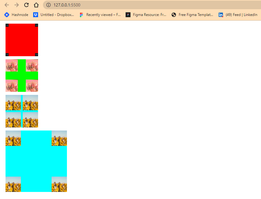
.one { border-image-slice: 5;} .two { border-image-slice: 20%; } .three { border-image-slice: fill; } .four { border-image-slice: 50;; } |
Browser Output:
Apart from the third element, which is assigned a value of fill, all other elements had changed from the cross-like shape they had when we first created them from the previous example.
border-image-repeat
This is used to set how the image is distributed around the element’s border. That is, the images, when assigned their keyword value, will occupy any remaining space around the element’s border by either stretching, rounding, repeating, or spacing.
For better understanding, type and run the code below.
HTML:
|
1 2 3 4 5 6 7 8 |
<main> <div class="box"> <div class="b one"></div> <div class="b two"></div> <div class="b three"></div> <div class="b four"></div> </div> </main> |
CSS:
|
1 2 3 4 5 6 7 8 9 10 11 12 13 14 15 16 17 18 19 20 21 22 23 24 25 26 27 28 29 30 31 32 33 34 35 36 37 38 39 40 41 42 43 44 45 46 47 48 49 50 51 52 |
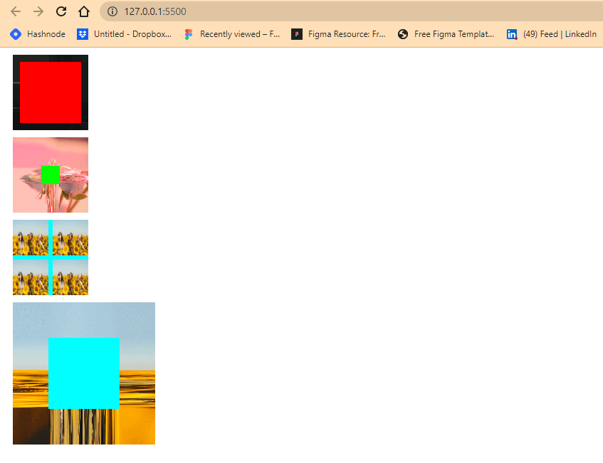
.b { background-color: rgb(240, 181, 181); margin: 10px; } .one { width: 100px; height: 100px; background-color: red; border-image-source: url("/flower.jpg"); border-image-slice: 5; border-image-repeat: space; border-image-width: 10px; border-style: dotted; border-color: transparent; } .two { width: 100px; height: 100px; background-color: lime; border-image-source: url("/flower2.jpg"); border-image-slice: 20%; border-image-repeat: stretch; border-image-width: 40px; border-style: solid; border-color: transparent; } .three { width: 100px; height: 100px; background-color: cyan; border-image-source: url("/flower3.jpg"); border-image-width: 20px; border-image-repeat: round; border-image-slice: 2; border-style: double; border-color: transparent; } .four { width: 100px; height: 100px; background-color: cyan; border-image-source: url("/flower3.jpg"); border-image-slice: 20; border-image-repeat: repeat; border-width: 50px; border-style: solid; border-color: transparent; } |
Browser Output:
Notice from the browser output the different distribution or repetition of the image across the element’s border. The first element has a value of space, which results in space being applied to separate the image into squares. The second element takes a value of stretch, which results in the image stretching across the element’s border. The third element takes a value of round, which results in the rounding of the image across the element’s border, while the four elements take a value of repeat, which results in the image repeating in a square-like manner across the border image.
We can also assign more than one value to the CSS border-image-repeat property in one line of code.
Try this example below.
HTML:
|
1 |
<div class="b four"></div> |
CSS:
|
1 2 3 4 5 6 7 8 9 10 11 |
.four { width: 100px; height: 100px; background-color: cyan; border-image-source: url("/flower3.jpg"); border-image-slice: 20; border-image-repeat: repeat space; border-width: 50px; border-style: solid; border-color: transparent; } |
Brower Output:
From the browser output, we added another value of space to the fourth element, which resulted in spaces being added to the element left and right side while the top and bottom retain its initial value of repeat.
border-image-outset
This is used to set the distance between the border-image and the element border box.
Type and run the code below.
HTML:
|
1 2 3 4 5 6 7 8 |
<main> <div class="box"> <div class="b one"></div> <div class="b two"></div> <div class="b three"></div> <div class="b four"></div> </div> </main> |
CSS:
|
1 2 3 4 5 6 7 8 9 10 11 12 13 14 15 16 17 18 19 20 21 22 23 24 25 26 27 28 29 30 31 32 33 34 35 36 37 38 39 40 41 42 43 44 45 46 47 48 49 50 51 52 53 54 55 56 |
.b { background-color: rgb(240, 181, 181); margin: 10px; } .one { width: 100px; height: 100px; background-color: red; border-image-source: url("/flower.jpg"); border-image-slice: 15; border-image-repeat: space; border-image-outset: 10px; border-image-width: 10px; border-style: dotted; border-color: transparent; } .two { width: 100px; height: 100px; background-color: lime; border-image-source: url("/flower2.jpg"); border-image-slice: 20%; border-image-repeat: stretch; border-image-outset: 0 1rem; border-image-width: 40px; border-style: solid; border-color: transparent; } .three { width: 100px; height: 100px; background-color: cyan; border-image-source: url("/flower3.jpg"); border-image-width: 20px; border-image-repeat: round; border-image-outset: 4; border-image-slice: 2; border-style: double; border-color: transparent; } .four { width: 100px; height: 100px; background-color: cyan; border-image-source: url("/flower3.jpg"); border-image-slice: 20; border-image-repeat: repeat; border-image-outset: 10px; border-width: 50px; border-style: dotted; border-color: transparent; } |
Browser Output:
From the browser out, the first element gives us a perfect example of how the CSS border-image-outset property works, as you can see how the four square boxes shoot out from the border box.
Border (Shorthand property)
This sets all the border sub-properties in one line of code.
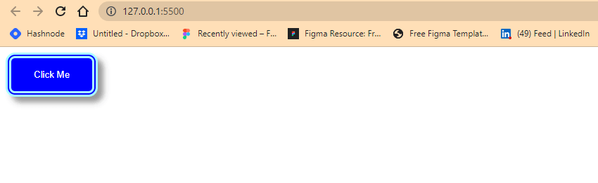
The example below shows us how this works. By creating a simple Click Me button project, we can see how we can assign multiple values in one line of code using the border shorthand property.
Type and run the code below.
HTML:
|
1 2 3 4 5 |
<main> <div class="b box"> <button>Click Me</button> </div> </main> |
Browser Output:
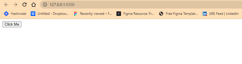
From the browser output, you’ll notice the thin line surrounding the Click Me text, this is what we refer to as a border line. By default the HTML button tag has it turned on. So we will set it to double and add other border sub-properties to make it look nice.
CSS:
|
1 2 3 4 5 6 7 8 9 10 11 12 13 |
.b { background-color: rgb(240, 181, 181); margin: 10px; } .box button{ background-color: blue; color: white; padding: 1rem 2rem; border: 0.5rem double #aff; border-radius: 1em; box-shadow: 8px 8px 8px 0 rgba(0,0,0, 0.4); } |
Browser Output:
From the browser output, we added a border-width of 0.5rem, a border-style of double, a border-color of hex #aff, and a border-radius of 1rem. We also added a box shadow to create an emphasis on the border.
Testing CSS Borders
So far, we’ve talked about borders and border sub-properties, their uses, and how we can implement them. In this section, we will see how we can test CSS Borders.
CSS Borders are essential to web design, as they help define a website’s layout and visual appearance. Testing CSS Borders is important to ensure they appear as intended, function correctly, and prevent user experience issues. In other words, testing CSS Borders ensures visual consistency, accessibility, layout and positioning, and user interaction.
Testing your CSS Borders with cloud testing platforms like LambdaTest can help you ensure that your web pages display correctly across multiple browsers and devices, improving user experience and enhancing the overall quality of your website or application.
LambdaTest is a cloud-based testing platform that allows you to test your website or application on a wide range of browsers and devices, including real device cloud, Android Emulators, and iOS Simulators.
With the LambdaTest Real Time Testing feature, you can quickly and easily identify any issues related to your CSS Borders and address them before they impact the user experience. This saves you time and effort in manually testing your website on multiple devices and browsers and ensures that your web pages look consistent and professional across all platforms.
Subscribe to the LambdaTest YouTube Channel and stay updated with the latest tutorials around Selenium testing, Cypress testing, and more.
How to test CSS Borders on the cloud?
The code of our created button has already been uploaded on CodePen.
To get started with Real Time Testing with LambdaTest, follow these steps.
- Sign up for free and log in to your LambdaTest account.
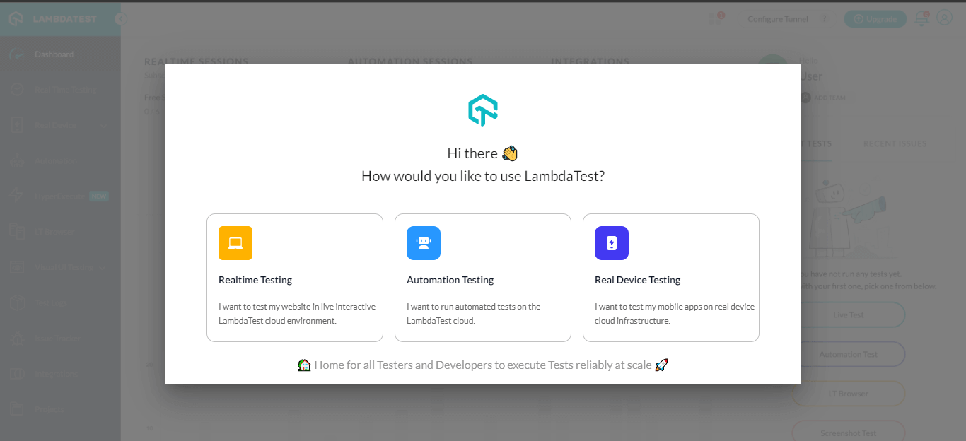
- A dialog box should pop up. Click Realtime Testing.
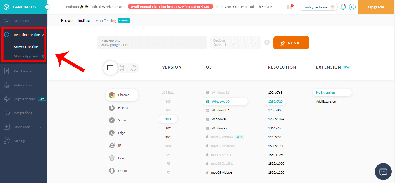
- This should open up the LambdaTest Real Time Browser Testing Dashboard, where you can start testing.
- Choose the browser you would like to test on (in our case, we’ll go with Chrome).
- Select the version, and we’ll choose version 103.
- Select the OS you like to test on. In this case, we’ll choose Windows 10.
- Select a screen resolution. In this case, we’ll go with 1280 x 720.
- In the provided field, paste the website URL you’d like to run the test on. In this case, we’ll paste the URL from the CodePen we created earlier.
- Click on the START button.


You should see a loading screen; wait to let it load.
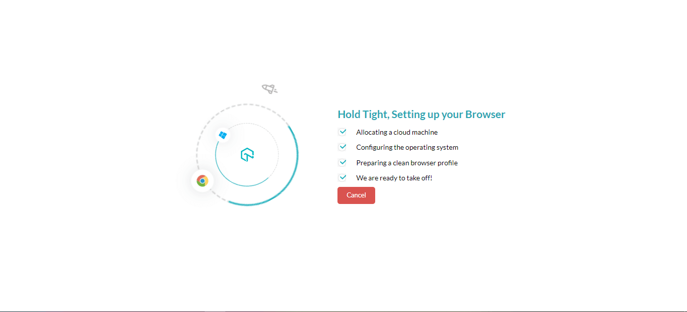
This will open the Real Time Browser Viewer hosted on the cloud running a real operating system.
This is where you can perform real time testing. This console lets you change resolutions, debug our website and share a screenshot with your teammates.
Summary
You have learned how to create and style borders using CSS. We covered the following border properties.
Border-width, Border-styles, Border-colors, Border-radius, Border-image, and their shorthand border properties.
Thanks for taking the time to read this blog on CSS Borders to completion. Feel free to ask questions. I’ll gladly reply. You can find me on Twitter and other social media @ocxigin.
#Cheers
Frequently Asked Questions (FAQs)
What is a CSS Border?
In web development, a CSS Border is a style applied to the edges of an HTML element, such as a div, a paragraph, or an image. It is used to separate the element’s content from the surrounding elements visually or to emphasize the element.
The CSS Border property can define the border’s thickness, style, and color. The thickness is defined in pixels, ems, or other units, while the style can be set to one of several values, such as solid, dashed, dotted, double, groove, ridge, inset, or outset. The color can be specified using named colors, RGB, hexadecimal, or HSL values.
How do you draw a border in CSS?
To draw a border in CSS, you can use the border property. This property sets an element’s border’s width, style, and color.
How do I style a text border in CSS?
You can add a border to text in CSS by wrapping the text in a container element (e.g., a < span >) and then applying the border property to that container.
What is the syntax of border property in CSS?
The syntax for the border property in CSS is as follows:
border: [border-width] [border-style] [border-color];
This means that the border property can take up to three values: the border width, border style, and border color.
What is border top style in CSS?
The border-top-style property in CSS specifies the style of the top border of an element. It determines whether the border is solid, dashed, dotted, or has other decorative styles. It allows for customization and enhances the visual presentation of web content.
What is border outline CSS?
The border outline CSS property is used to create a visible outline around an element, typically when it receives focus. It is different from the regular border property as it does not take up space or affect the layout of the element.
What is CSS margin?
CSS margin is a property that defines the space between an element’s border and adjacent elements. It controls the external spacing of an element, providing visual separation. Margin values can be adjusted to create whitespace and control the layout and positioning of elements on a webpage.
How many types of border styles are in CSS?
CSS provides a range of border styles that can be applied to elements. There are eight primary border styles: none, hidden, dotted, dashed, solid, double, groove, and ridge. Each style offers distinct visual representations, allowing designers to tailor the appearance of borders according to their requirements.
What is the total width in CSS?
The “width” property in CSS defines the horizontal dimension of an element. It specifies the total space an element occupies, including content, padding, and borders. It is used to ensure precise layout control and is measured in pixels, percentages, or other units of measurement.
What is the default border style in CSS?
The default border style in CSS is “none” or “initial.” When no border style is explicitly specified, the browser applies the default style, which is typically no visible border. However, this can vary depending on the browser and its default settings.


Author’s Profile
Alex Anie
A Front End Technical Writer. I write blogs on Front End Technologies, such as HTML, CSS, JavaScript. When I am not coding, I enjoy watching tutorials and listening to twitter spaces. I live in Lagos, Nigeria
Blogs: 16
Got Questions? Drop them on LambdaTest Community. Visit now