
CSS Accent Color: The Key to Stunning Form Design – A Complete Guide
Ravi Kumar
Posted On: December 20, 2022
 29150 Views
 20 Min Read
The web paradigm has changed considerably over the last few years. Web 2.0, a term coined way back in 1999, was one of the pivotal moments in the history of the Internet. UGC (User Generated Content), ease of use, and interoperability for the end-users were the key pillars of Web 2.0. Consumers who were only consuming content up till now started creating different forms of content (e.g., text, audio, video, etc.).
Online businesses, irrespective of the scale/size, had to adapt to the rapid shift in technology. We have witnessed how web development has played a pivotal role in the evolution of online commerce (or e-commerce). Web pages that were earlier created and styled with HTML now became a thing of the past. CSS (Cascading Style Sheets) & other front-end technologies like React, Angular, etc., are now mainly used for styling purposes.
Styling and performance have become ultra-important for improving all the essential KPIs of the website. Talking about styling, how can we ignore web forms – a medium that captures user input? For example, you will have to create an account on Gmail to use Google’s mail functionality. The same principles also apply to all forms of businesses (e.g., e-commerce, SaaS, etc.).
In this blog, we dive deep into styling aspects of input forms by making the ideal use of the CSS accent color property.
TABLE OF CONTENTS
The Color Theory: Color Wheel
As discussed so far, colors play an important role in web design. A wrong choice of color or widespread usage of multiple colors could shy users away from your product.
Let’s dive deep into what are primary, secondary, and tertiary colors.
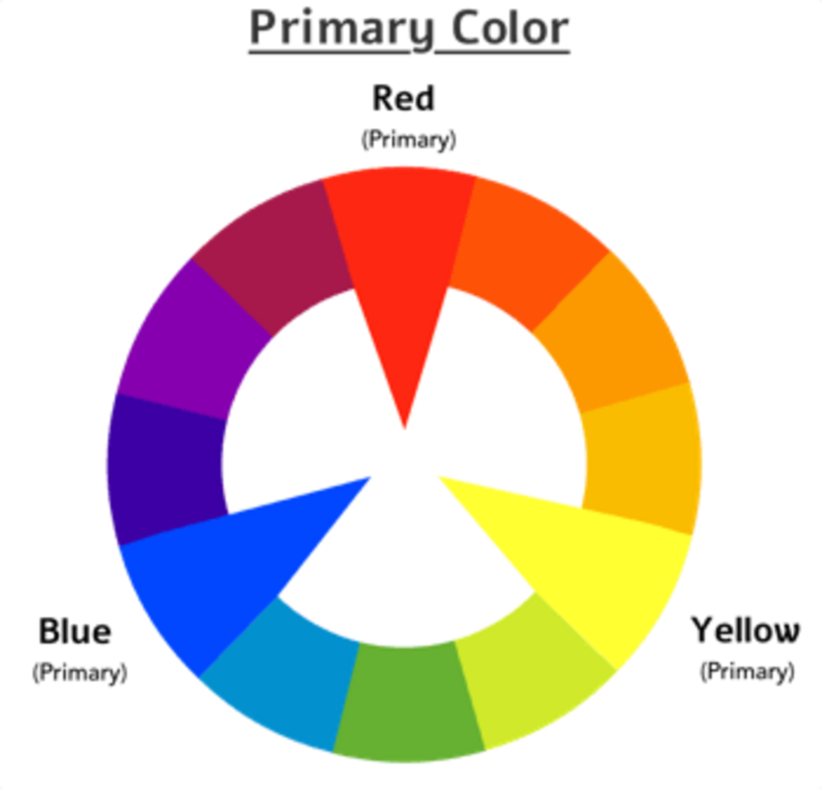
Primary Colors
Primary colors are the standard/source of the wheel. These colors are not created by other colors. These colors are RGB (Red, Green, and Blue) in format.
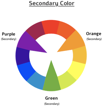
Secondary Colors
Secondary colors are created by mixing two standard colors in equal proportions. A few examples are shown below:
- Red + Blue = Purple
- Red + Yellow = Orange
- Blue + Yellow = Green
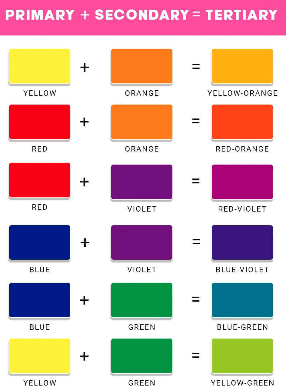
Tertiary Colors
Tertiary colors are created by mixing primary and secondary colors in equal proportions.
- Red + Orange = Red-Orange
- Red + Purple = Red-Purple
- Yellow + Orange = Yellow-Orange
- Yellow + Green = Yellow-Green
- Blue + Green = Blue-Green
- Blue + Purple = Blue-Purple
Color Model
Color model is a system that uses primary, secondary, and tertiary colors to produce an extensive range of colors.
Many models can produce a variety of colors so they can fulfill different purposes.
RGB Model
The RGB (Red, Green, Blue) model is based on the science of light, i.e., how our eyes interpret the colors. Colors can take a range of values from 0 – 255. Because of good color combinations, this model is used in video or screen-based design, e.g., TV and video games.

CMYK Model
CMYK (Cyan, Magenta, Yellow, Black) is primarily used in mainstream publications, e.g., books, magazines, etc.
The combination of Color Wheel and Color Model helps in evaluating the best color scheme for your website. The combination of Color Wheel and Color Model is also referred to as Color Harmony.
Color Harmony
The best way of selecting a color variety or palette is by using the color wheel and applying the principle of analogous, complementary, monochromatic, and triad color.
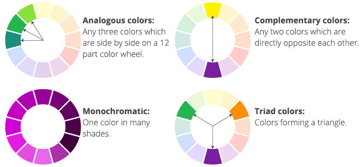
Analogous
Depending on your needs, select any three consecutive colors on a 12-part wheel.
Complementary
Choose any two colors which are directly opposite to each other.
Monochromatic
Select any one color and then use their tints (different shades).
Triad
Choose a color that makes a triangle in the color wheel.
How to choose a Color?
The selection of color depends on the looks of the website or personality.
We can classify all these websites into different categories like e-commerce websites, small businesses, personal, portfolios, etc. Similarly, we can categorize different websites’ personality traits based on what they want to offer.
Here are the seven major categories (or traits) of websites.
Serious / Elegant
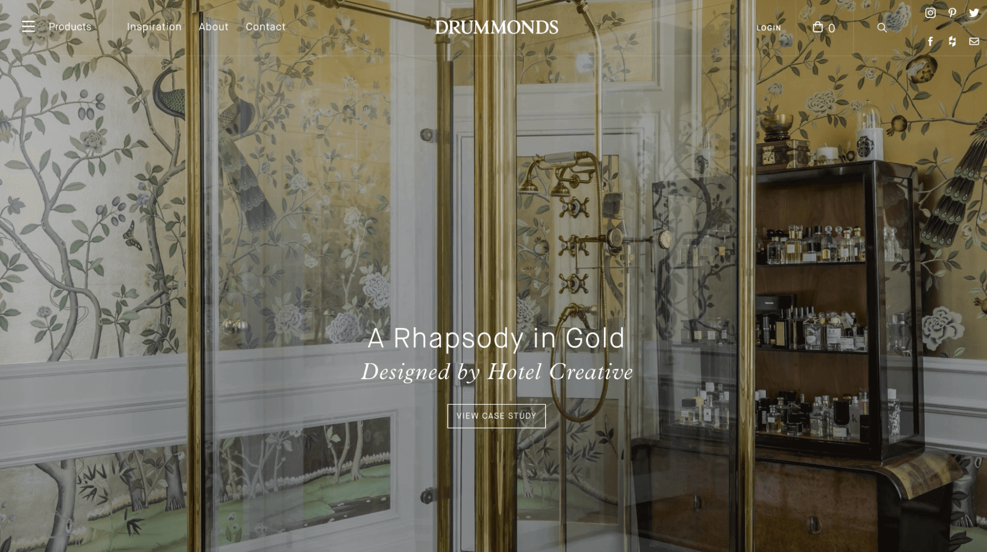
Websites with this personality type follow a classy web design that exudes luxury. Web page design based on thin serif-typefaces, golden, pastel, black, dark blue (or gray colors), and big-high-quality images are characteristics of this type of personality.
These websites best suit the following industries:
- Real Estate
- High Fashion
- Jewelry
- Luxury brands, and services
Example:
Minimalist / Simple
Usually, a single color is used throughout the design.
Websites with this personality type follow a simple web design with very few resources (e.g., images, buttons, etc.). The overall design is based on the essential text content and uses small (or medium-sized) Sans-serif black text, lines, and a few images and icons. Such websites use a black or dark gray color on a pure white background.
These websites best suit the following industries.
- Fashion
- Portfolios
- Software Startups

Plain / Neutral
Websites with this type of personality follow a design that gets out of the way by using very neutral and plain web design. It is based on using small typefaces and a boxy, structured, and condensed layout. They used safe colors, nothing too bright or too washed-out. Blues and blacks are commonly used in these cases.
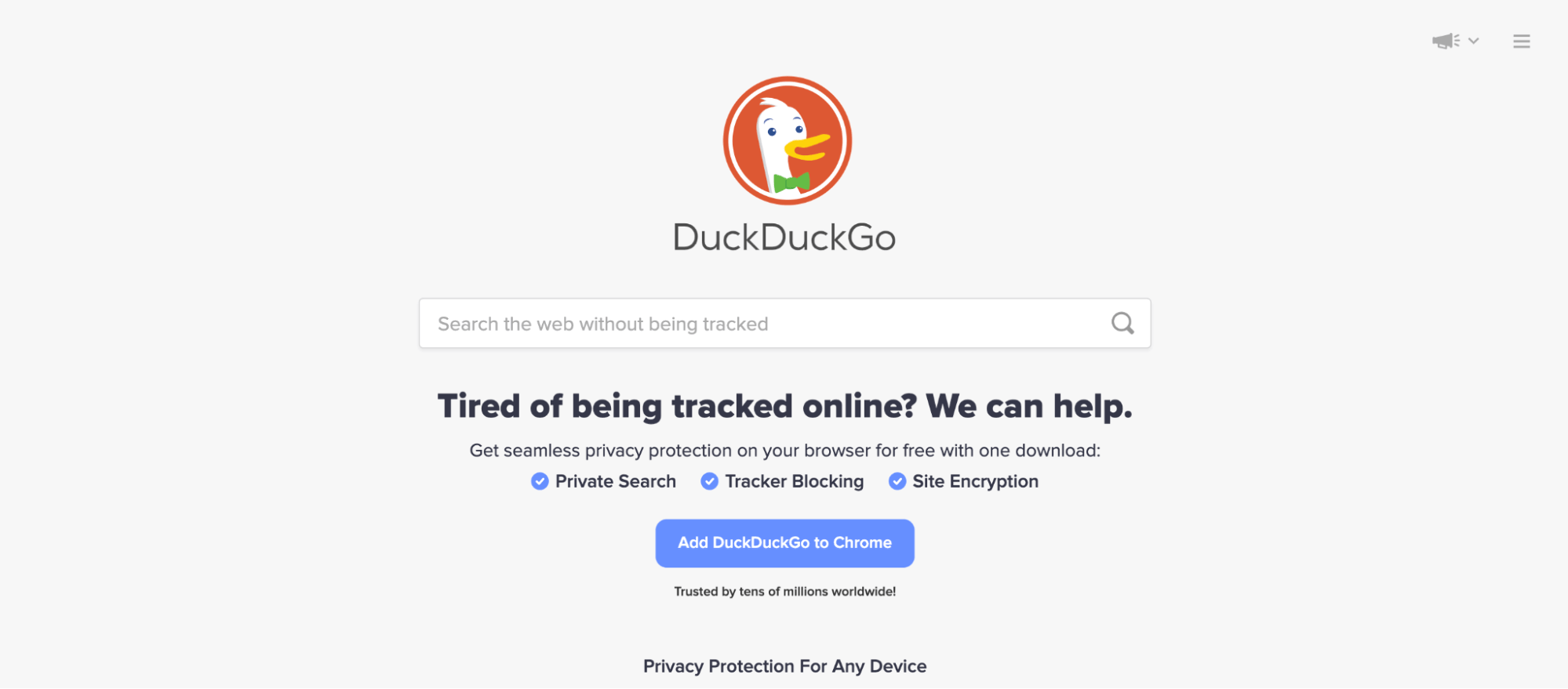
Such an approach is best-suited when you want the major focus to be on the respective product (or service). For example, the Google Search page or DuckDuckGo Search Page focuses only on the core functionality – Search.
Bold / Confident
Websites designed keeping an old/confident personality in mind follow more prominent and bold typography. That is paired with the confident use of multiple big bright colors. Big color blocks/sections are used to draw attention.
These websites best suit the following industries:
- Digital agencies
- Travel

Calm / Peaceful
Websites with this type of personality focus on consumer well-being (e.g., health and wellness businesses). You would see wide use of calming pastel/washed-out colors like light oranges, yellows, browns, greens, blues, and soft serif headings.
The colors provide a strong message that the respective business holds strong values and truly cares a lot about its customers.
These websites are best suited for the following industries:

Startup / Upbeat
Websites with this personality type follow a modern web design that shows technology and 3D illustrations. Web page design is based on medium-sized Sans-serif typefaces, light-gray backgrounds, Blues, greens, and purples.
There is extensive use of gradients and light backgrounds.
The website design of many software startups is based on the said personality. Grammarly and Stripe use this personality.

Playful / Fun
Websites with this type of personality follow a fun web design that shows love and affection to the users. Kids websites, online pet stores, etc., use this personality.
The design is based on colorful and rounded designs. You would find extensive usage of creative elements like hand-drawn icons or illustrations and CSS animations.

What are Accent Colors?
When we develop a website, we always need to think about the brand or message that we want to convey through websites. Brand colors are fundamental since they become a large medium of brand recall to its current & prospective customers.
One approach to realize this is choosing a brand color and sprinkling it on important parts of the website in a very subtle way. This also enhances the website experience. This method is called “Accent” color because it sets the website’s accent.
We can do this by showing brand colors in the title of the websites, hyperlinks, and different HTML elements like text inputs, checkboxes, radio, slider, progress bar, etc.
Let’s take an example and see the default way to style the input elements on a form.
HTML:
|
1 2 3 4 5 6 7 8 9 10 11 12 13 14 15 16 17 18 19 20 21 22 23 24 25 26 27 28 29 30 31 32 33 34 35 36 37 38 39 40 41 |
<html> <head> <link rel="stylesheet" href="form.css" /> <title>Simple Form Elements</title> </head> <body> <form> <fieldset> <legend><h1>Demo Form</h1></legend> <br /> <label> Checkbox <fieldset class="rd"> <input type="checkbox" name="accented-demo" /> <input type="checkbox" name="accented-demo" /> <input type="checkbox" name="accented-demo" /> </fieldset> </label> <br /> <label> Radio Buttons <fieldset class="rd"> <input type="radio" name="accented-demo" /> <input type="radio" name="accented-demo" /> <input type="radio" name="accented-demo" /> </fieldset> </label> <br /> <label> Range Slider <input type="range" /> </label> <br /> <label> Progress element <progress max="100" value="50">50%</progress> </label> </fieldset> </form> </body> </html> |
CSS:
|
1 2 3 4 5 6 7 8 9 10 11 12 13 14 15 16 17 18 19 20 21 22 23 24 25 26 27 28 29 30 31 32 33 34 35 36 |
label { display: flex; align-items: center; justify-content: space-between; gap: 4rem; } fieldset { padding: 8; } fieldset.rd { border: none; padding: 8; } * { box-sizing: border-box; margin: 0; } html { block-size: 100%; color-scheme: light; } h1 { color: #112d31; } body { min-block-size: 100%; font-family: system-ui, sans-serif; font-size: 1.5rem; color: #112d31; display: grid; place-content: center; gap: 2rem; } |
See the Pen
code_1 by ravi kumar (@ravikumar7210)
on CodePen.
As we see in this example the color of the input elements is Blue, but we styled it as per the requirement of the brand color. Another reason is that default colors don’t align with the brand color.
Traditionally we do not have any methods to style it, so developers use a well-known approach by removing the default input elements and creating a new one by using pseudo properties like :before and :after. These properties help in customizing the components.
HTML:
|
1 2 3 4 5 6 7 8 9 10 11 12 13 14 15 16 17 18 19 20 21 22 23 24 25 26 27 28 |
<!DOCTYPE html> <html> <head> <link rel="stylesheet" href="new.css" /> <title>Simple Form Elements</title> </head> <body> <form action=""> <h1>Custom Radio and Checkbox</h1> <label class="form-control"> <input type="checkbox" name="checkbox" /> Checkbox </label> <label class="form-control"> <input type="checkbox" name="checkbox-checked" checked /> Checkbox in checked state </label> <label class="form-control"> <input type="radio" name="radio" /> Radio </label> <label class="form-control"> <input type="radio" name="radio" checked /> Radio in checked state </label> </form> </body> </html> |
CSS:
|
1 2 3 4 5 6 7 8 9 10 11 12 13 14 15 16 17 18 19 20 21 22 23 24 25 26 27 28 29 30 31 32 33 34 35 36 37 38 39 40 41 42 43 44 45 46 47 48 49 50 51 52 53 54 55 56 57 58 59 60 61 62 63 64 65 66 67 68 69 70 71 72 73 74 75 76 77 78 79 80 81 82 83 84 85 86 87 88 89 90 91 |
:root { --form-control-color: rgba(177, 54, 33, 0.979); } *, *:before, *:after { box-sizing: border-box; } body { margin: 0; } form { display: grid; place-content: center; min-height: 100vh; } .form-control { font-family: system-ui, sans-serif; font-size: 2rem; line-height: 1.1; color: #112d31; display: grid; grid-template-columns: 1em auto; gap: 0.6em; } h1 { font-size: 4rem; color: #112d31; } fieldset { padding: 8px; } .form-control + .form-control { margin-top: 1em; } input[type="checkbox"], input[type="radio"] { /* Add if not using autoprefixer */ -webkit-appearance: none; /* Remove most all native input styles */ appearance: none; /* Not removed via appearance */ margin: 0; font: inherit; color: currentColor; width: 1.15em; height: 1.15em; border: 0.15em solid currentColor; border-radius: 0.15em; transform: translateY(-0.075em); display: grid; place-content: center; } input[type="checkbox"]::before { content: ""; width: 0.65em; height: 0.65em; clip-path: polygon(14% 44%, 0 65%, 50% 100%, 100% 16%, 80% 0%, 43% 62%); transform: scale(0); transform-origin: bottom left; transition: 120ms transform ease-in-out; box-shadow: inset 1em 1em var(--form-control-color); } input[type="checkbox"]:checked::before, input[type="radio"]:checked::before { transform: scale(1); } input[type="radio"] { border-radius: 50%; } input[type="radio"]::before { content: ""; width: 0.65em; height: 0.65em; border-radius: 50%; transform: scale(0); transition: 120ms transform ease-in-out; box-shadow: inset 1em 1em var(--form-control-color); } |
See the Pen
Code_2 by ravi kumar (@ravikumar7210)
on CodePen.
This approach can be used when you want to fully customize input elements with animation, shadow, or any other effects. In many cases, no fancy styling is required, instead, you just need to apply the brand color and style to other elements.
You require good knowledge of CSS to make the most out of this approach.
Having said that, let’s start with styling HTML Input elements with CSS accent color properties.
CSS Accent Color property
accent-color is a property used to customize HTML forms with controls like radio, progress, checkbox, and category. The color of this property is blue by default.
Syntax
accent-color: auto|color|initial|inherit;
Values:
- Initial value: auto (default value. The browser chooses the CSS accent color). The property applies to all elements
- Inherit: yes (Inherits this property from its parent element)
- Computed value: auto is computed as specified, and
values are computed as defined for the color property. - Animation type: Computed value type
Working with specific form controls
Only four specific form controls to support the accent-color property:
- checkboxes (
< input type="checkbox" >) - radio buttons (
< input type="radio" >) - range (
< input type="range" >) - progress (
< progress >)
Let’s take an example and apply CSS accent color property in all the input elements. We can do this by applying CSS accent color in the root section to apply the same color on all the web pages.
HTML:
|
1 2 3 4 5 6 7 8 9 10 11 12 13 14 15 16 17 18 19 20 21 22 23 24 25 26 27 28 29 30 31 32 33 34 35 36 37 38 39 40 41 |
<html> <head> <link rel="stylesheet" href="form.css" /> <title>Simple Form Elements</title> </head> <body> <form> <fieldset> <legend><h1>Demo Form</h1></legend> <br /> <label> Checkbox <fieldset class="rd"> <input type="checkbox" name="accented-demo" checked /> <input type="checkbox" name="accented-demo" /> <input type="checkbox" name="accented-demo" /> </fieldset> </label> <br /> <label> Radio Buttons <fieldset class="rd"> <input type="radio" name="accented-demo" checked /> <input type="radio" name="accented-demo" /> <input type="radio" name="accented-demo" /> </fieldset> </label> <br /> <label> Range Slider <input type="range" /> </label> <br /> <label> Progress element <progress max="100" value="50">50%</progress> </label> </fieldset> </form> </body> </html> |
CSS:
|
1 2 3 4 5 6 7 8 9 10 11 12 13 14 15 16 17 18 19 20 21 22 23 24 25 26 27 28 29 30 31 32 33 34 35 36 37 38 39 40 |
:root { accent-color: #e01919; } label { display: flex; align-items: center; justify-content: space-between; gap: 4rem; } fieldset { padding: 8; } fieldset.rd { border: none; padding: 8; } * { box-sizing: border-box; margin: 0; } html { block-size: 100%; color-scheme: light; } h1 { color: #112d31; } body { min-block-size: 100%; font-family: system-ui, sans-serif; font-size: 1.5rem; color: #112d31; display: grid; place-content: center; gap: 2rem; } |
See the Pen
code_3 by ravi kumar (@ravikumar7210)
on CodePen.
Different CSS Accent Color on a different form of the same web page
That’s not all; we can also apply different CSS accent colors to different forms of the same webpage. Let’s look at an example.
HTML:
|
1 2 3 4 5 6 7 8 9 10 11 12 13 14 15 16 17 18 19 20 21 22 23 24 25 26 27 28 29 30 31 32 33 34 35 36 37 38 39 40 41 42 43 44 45 46 47 48 49 50 51 52 53 54 55 56 57 58 59 60 61 62 63 64 65 66 67 68 69 70 71 72 73 74 75 76 77 |
<html> <head> <link rel="stylesheet" href="form.css" /> <title>Simple Form Elements</title> </head> <body> <form1> <fieldset> <legend><h1>Demo Form</h1></legend> <br /> <label> Checkbox <fieldset class="rd"> <input type="checkbox" name="accented-demo" checked /> <input type="checkbox" name="accented-demo" /> <input type="checkbox" name="accented-demo" /> </fieldset> </label> <br /> <label> Radio Buttons <fieldset class="rd"> <input type="radio" name="accented-demo" checked /> <input type="radio" name="accented-demo" /> <input type="radio" name="accented-demo" /> </fieldset> </label> <br /> <label> Range Slider <input type="range" /> </label> <br /> <label> Progress element <progress max="100" value="50">50%</progress> </label> </fieldset> </form1> <form2> <fieldset> <legend><h1>Demo Form</h1></legend> <br /> <label> Checkbox <fieldset class="rd"> <input type="checkbox" name="accented-demo" checked /> <input type="checkbox" name="accented-demo" /> <input type="checkbox" name="accented-demo" /> </fieldset> </label> <br /> <label> Radio Buttons <fieldset class="rd"> <input type="radio" name="accented-demo" checked /> <input type="radio" name="accented-demo" /> <input type="radio" name="accented-demo" /> </fieldset> </label> <br /> <label> Range Slider <input type="range" /> </label> <br /> <label> Progress element <progress max="100" value="50">50%</progress> </label> </fieldset> </form2> <!-- only one Radio button can work because it is unique for the pages so in this example there is two form in the single page so only one will work --> </body> </html> |
CSS:
|
1 2 3 4 5 6 7 8 9 10 11 12 13 14 15 16 17 18 19 20 21 22 23 24 25 26 27 28 29 30 31 32 33 34 35 36 37 38 39 40 41 42 43 |
form1 { accent-color: #e01919; } form2 { accent-color: #ec6868e7; } label { display: flex; align-items: center; justify-content: space-between; gap: 4rem; } fieldset { padding: 8; } fieldset.rd { border: none; padding: 8; } * { box-sizing: border-box; margin: 0; } html { block-size: 100%; color-scheme: light; } h1 { color: #112d31; } body { min-block-size: 100%; font-family: system-ui, sans-serif; font-size: 1rem; color: #112d31; display: grid; place-content: center; gap: 2rem; } |
See the Pen
code_4 by ravi kumar (@ravikumar7210)
on CodePen.
CSS Accent Color on individual form elements
We can also apply accent-color to individual form elements, let’s see an example.
HTML:
|
1 2 3 4 5 6 7 8 9 10 11 12 13 14 15 16 17 18 19 20 21 22 23 24 25 26 27 28 29 30 31 32 33 34 35 36 37 38 39 40 41 |
<html> <head> <link rel="stylesheet" href="form.css" /> <title>Simple Form Elements</title> </head> <body> <form1> <fieldset> <legend><h1>Demo Form</h1></legend> <br /> <label> Checkbox <fieldset class="rd"> <input type="checkbox" name="accented-demo" checked /> <input type="checkbox" name="accented-demo" /> <input type="checkbox" name="accented-demo" /> </fieldset> </label> <br /> <label> Radio Buttons <fieldset class="rd"> <input type="radio" name="accented-demo" checked /> <input type="radio" name="accented-demo" /> <input type="radio" name="accented-demo" /> </fieldset> </label> <br /> <label> Range Slider <input type="range" /> </label> <br /> <label> Progress element <progress max="100" value="50">50%</progress> </label> </fieldset> </form1> </body> </html> |
CSS:
|
1 2 3 4 5 6 7 8 9 10 11 12 13 14 15 16 17 18 19 20 21 22 23 24 25 26 27 28 29 30 31 32 33 34 35 36 37 38 39 40 41 42 43 44 45 46 47 48 49 |
input[type="checkbox"] { accent-color: #e01919; } input[type="radio"] { accent-color: #b30e0ee7; } input[type="range"] { accent-color: #7c4040; } progress { accent-color: rgb(199, 184, 184); } label { display: flex; align-items: center; justify-content: space-between; gap: 4rem; } fieldset { padding: 8; } fieldset.rd { border: none; padding: 8; } * { box-sizing: border-box; margin: 0; } html { block-size: 100%; color-scheme: light; } h1 { color: #112d31; } body { min-block-size: 100%; font-family: system-ui, sans-serif; font-size: 1rem; color: #112d31; display: grid; place-content: center; gap: 2rem; } |
CodePen:
See the Pen
code_5 by ravi kumar (@ravikumar7210)
on CodePen.
Smart Feature of CSS Accent Color
The CSS accent color property has an interesting feature whereby the browser automatically finds the best color for the checkmark, range, and progress bar elements on the page. This is done to ensure the best color contrast is derived automatically, due to which no additional code is required on the styling front.
In the below example, we apply different CSS accent colors to the different forms.
HTML:
|
1 2 3 4 5 6 7 8 9 10 11 12 13 14 15 16 17 18 19 20 21 22 23 24 25 26 27 28 29 30 31 32 33 34 35 36 37 38 39 40 41 42 43 44 45 46 47 48 49 50 51 52 53 54 55 56 57 58 |
<html> <head> <link rel="stylesheet" href="code.css" /> <title>Simple Form Elements</title> </head> <body> <form1> <fieldset> <legend><h1>Demo Form 1</h1></legend> <br /> <label> Checkbox <fieldset class="rd"> <input type="checkbox" name="accented-demo" checked /> <input type="checkbox" name="accented-demo" /> <input type="checkbox" name="accented-demo" /> </fieldset> </label> <br /> <label> Range Slider <input type="range" /> </label> <br /> <label> Progress element <progress max="100" value="50">50%</progress> </label> </fieldset> </form1> <form2> <fieldset> <legend><h1>Demo Form 2</h1></legend> <br /> <label> Checkbox <fieldset class="rd"> <input type="checkbox" name="accented-demo" checked /> <input type="checkbox" name="accented-demo" /> <input type="checkbox" name="accented-demo" /> </fieldset> </label> <br /> <label> Range Slider <input type="range" /> </label> <br /> <label> Progress element <progress max="100" value="50">50%</progress> </label> </fieldset> </form2> </body> </html> |
CSS:
|
1 2 3 4 5 6 7 8 9 10 11 12 13 14 15 16 17 18 19 20 21 22 23 24 25 26 27 28 29 30 31 32 33 34 35 36 37 38 39 40 41 42 43 |
form1 { accent-color: lime; } form2 { accent-color: red; } label { display: flex; align-items: center; justify-content: space-between; gap: 4rem; } fieldset { padding: 8; } fieldset.rd { border: none; padding: 8; } * { box-sizing: border-box; margin: 0; } html { block-size: 100%; color-scheme: light; } h1 { color: #112d31; } body { min-block-size: 100%; font-family: system-ui, sans-serif; font-size: 1rem; color: #112d31; display: grid; place-content: center; gap: 2rem; } |
CodePen:
See the Pen
demo_6 by ravi kumar (@ravikumar7210)
on CodePen.
As seen in the output, we have dark color in the first form whereas the other form has a white color.
These results are dependent on the rendering engine used by the browser as well as the user preferences set in the browser. It also depends on the choice of CSS accent color.
If we choose a light color like Green (#00FF00), we get a dark background. However, we get a light background if we choose a dark color like Red (#FF0000).
Working with color schemes
The CSS accent color property also supports the color scheme property. For example, if a user sets the web page or OS system color scheme to light, the browser evaluates the CSS accent color value and determines the appropriate color scheme for the UI.
With this approach, color contrast between the browser’s UI and accent- colors are perfectly set!
Each browser has its way of calculating the UI color (which color to use). Color scheme property helps to set user preference for light and dark modes. We can do that with the help of a color scheme media query.
|
1 2 3 4 5 6 |
@media (prefers-color-scheme: dark) { body { background-color: #000000; color: #ffffff; } } |
There are two color schemes – one is dark mode, and the other is light mode.
Why light and dark modes?
Light and dark modes will be synonymous for mobile phone users, and it is known that the light emitted from screens can harm your vision. This is where dark mode comes into the picture. The dark mode reduces the light emitted by the device screen while ensuring that the minimum color contrast ratios are maintained for readability. That’s not all, usage of dark colors (particularly black) extends the battery life.
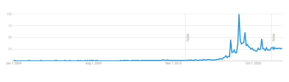
As per the worldwide search trends report, the “dark mode” phrase gained significant momentum when it was released on Android and iOS. It peaked in 2019!
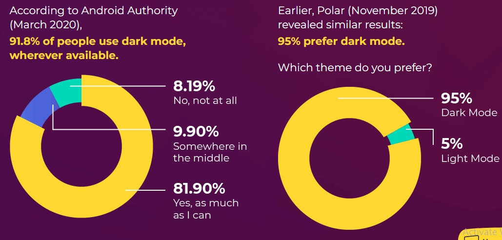
As per a survey report by Android Authority, close to 95% of the participants prefer dark mode on their system.
Usage of dark mode results in reduced eye strain, owing to which users tend to spend more time on their devices. This, in turn, also benefits the websites that have options to switch to dark mode since that might result in an increased time spent on the website. Better engagement means higher chances of conversions!
However, the dark mode may also provide accessibility benefits for users with photophobia, keratoconus, or other conditions that cause light sensitivity. To keep your apps and websites accessible to everyone, consider giving users the option to switch between light and dark modes, allowing them to select the setting that best suits their needs.
The best part is that accent-color works like a charm with dark and light modes. Hence, you do not need to have separate implementations for different modes.
CSS Accent Color with Color scheme
Above we already discussed various modes of color scheme. Let’s start understanding the working of color schemes with CSS accent colors. The color of web page elements changes according to the theme of the web page.
We can use a color scheme according to the user’s preference if the user chooses or sets a dark mode. In that case, we will use a media query (prefer-color-scheme property) that is set to the user’s choice, like in the dark or light.
Let’s look into the example:-
If the user’s preference is set to ‘dark,’ this renders white text on a black background:
|
1 2 3 4 5 6 |
@media (prefers-color-scheme: dark) { body { background-color: #000000; color: #ffffff; } } |
If the user’s preference is set to ‘light,’ this renders white text on a black background
|
1 2 3 4 5 6 |
@media (prefers-color-scheme: light) { body { background-color: #ffffff ; color: #000000; } } |
By this method, we can set the UI color with the user’s preference. This method only toggles between dark and white mode, so we also need to use the CSS accent color property to apply color on the form controls (checkboxes, radio, etc.) We can do this by applying the CSS accent property to the root method to all page elements.
|
1 2 3 |
:root { color-scheme: light dark; } |
Alternatively, we can apply it in the HTML using the meta tag.
|
1 |
<meta name="color-scheme" content="light dark"> |
This method is the most preferred way of applying a color scheme because HTML renders before the CSS, and it is swift, so there is no delay in showing the color and style of the UI.
Color scheme affects the user preference styles. Suppose we use it without providing other background colors or text color styles for the page. In that case, the default colors of the page are going to be inverted if the user selects a dark combination — therefore, the default background color is black, and also the text color is white. In practice, we’ll likely want to override these with CSS. For this, we can use color-scheme alongside the prefers-color-scheme media query
Sometimes in our design, there are some areas where we want to retain a specific color scheme, regardless of whether a light mode or dark mode is toggled in that condition, we use a color-scheme property alone.
|
1 2 3 |
.dark-form { color-scheme: dark; } |
We already know that CSS accent colors support color schemes to tint both the light and dark elements according to their calculation.
So let’s look at the example of form controls. In the following example, the user has one dark theme and one light theme active, the page uses color-scheme: light and uses the same accent-color: deeppink (#ff1493) for dark-themed deep pink tinted controls. Let’s look at the below example.
HTML
|
1 2 3 4 5 6 7 8 9 10 11 12 13 14 15 16 17 18 19 20 21 22 23 24 25 26 27 28 29 30 31 32 33 34 35 36 37 38 39 40 41 42 43 44 45 46 47 48 49 50 51 52 53 54 55 56 57 58 59 60 61 62 63 64 65 66 67 68 69 70 71 72 73 74 75 76 77 78 79 80 81 82 83 84 85 86 87 88 89 90 91 92 93 94 |
<html> <head> <link rel="stylesheet" href="form.css" /> <title>Simple Form Elements</title> </head> <body> <form1> <br /> <label> Checkbox <fieldset class="rd"> <input type="checkbox" name="accented-demo" checked /> <input type="checkbox" name="accented-demo" /> <input type="checkbox" name="accented-demo" /> </fieldset> </label> <br /> <label> Range Slider <input type="range" /> </label> <br /> <label> Progress element <progress max="100" value="50">50%</progress> </label> </form1> <form2> <br/> <label> Checkbox <fieldset class="rd"> <input type="checkbox" name="accented-demo" checked /> <input type="checkbox" name="accented-demo" /> <input type="checkbox" name="accented-demo" /> </fieldset> </label> <br /> <label> Range Slider <input type="range" /> </label> <br /> <label> Progress element <progress max="100" value="50">50%</progress> </label> </form2> <form3> <br /> <label> Checkbox <fieldset class="rd"> <input type="checkbox" name="accented-demo" checked /> <input type="checkbox" name="accented-demo" /> <input type="checkbox" name="accented-demo" /> </fieldset> </label> <br /> <label> Range Slider <input type="range" /> </label> <br /> <label> Progress element <progress max="100" value="50">50%</progress> </label> </form3> <form4> <br /> <label> Checkbox <fieldset class="rd"> <input type="checkbox" name="accented-demo" checked /> <input type="checkbox" name="accented-demo" /> <input type="checkbox" name="accented-demo" /> </fieldset> </label> <br /> <label> Range Slider <input type="range" /> </label> <br /> <label> Progress element <progress max="100" value="50">50%</progress> </label> </form4> </body> </html |
CSS
|
1 2 3 4 5 6 7 8 9 10 11 12 13 14 15 16 17 18 19 20 21 22 23 24 25 26 27 28 29 30 31 32 33 34 35 36 37 38 39 40 41 42 43 44 45 46 47 48 49 50 51 52 53 54 55 56 57 58 59 60 61 62 63 64 |
:root { color-scheme: light; } form1{ color-scheme: light; padding: 1rem; } form2,form4{ color-scheme: dark; background: black; color: #fff; padding:1.5rem; } form3{ accent-color: deeppink; } form4{ accent-color: hsl(328 100% 80%); } [color-scheme="dark"] { color-scheme: dark; } label { display: flex; align-items: center; justify-content: space-between; gap: 4rem; } fieldset { padding: 8; } fieldset.rd { border: none; padding: 8; } * { box-sizing: border-box; margin: 0; } html { block-size: 100%; color-scheme: light; } h1 { color: #112d31; } body { min-block-size: 100%; font-family: system-ui, sans-serif; font-size: 1rem; color: #112d31; display: grid; place-content: center; gap: 2rem; } |
CodePen:
See the Pen
code_7 by ravi kumar (@ravikumar7210)
on CodePen.
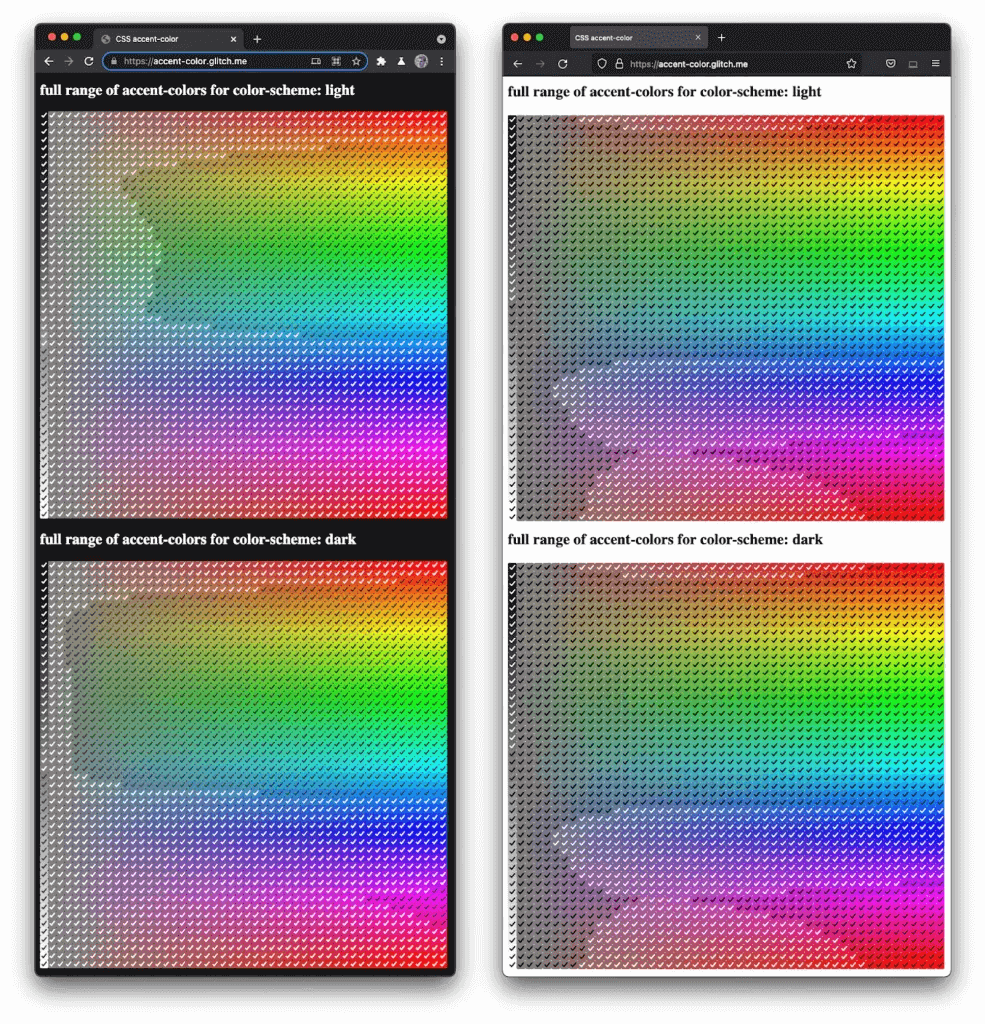
In the above example we get different contrast in the various modes, so to prevent inaccessible elements from existing, browsers with CSS accent color have to determine an eligible contrast color to be used alongside the custom accent. Below could be a screenshot demonstrating how Chrome (L) and Firefox (R) differ in their algorithms:
Different approach to style other form controls
As we know, only four elements support CSS accent color, so we need to think about other ways to style other elements because it takes time to enhance the working of CSS accent color. Therefore, another way of styling the checkbox or radio button is to hide the default property using the -webkit-appearance: none property. After that, we can create our checkboxes and style them using our methods.
Another approach is that we do not have to return to the traditional approach, thanks to Adam Argyle and Joey Arhar. They created a code snippet that helps to style popular form controls like markers, selection, and visible focus: property
|
1 2 3 4 5 6 7 8 9 10 11 12 13 14 15 16 17 18 |
HTML { --brand: hotpink; scrollbar-color: hotpink Canvas; } :root { accent-color: var(--brand); } :focus-visible { outline-color: var(--brand); } ::selection { background-color: var(--brand); } ::marker { color: var(--brand); } :is( ::-webkit-calendar-picker-indicator, ::-webkit-clear-button, ::-webkit-inner-spin-button, ::-webkit-outer-spin-button ) { color: var(--brand); } |
Let’s take an example to see this in action:
HTML:
|
1 2 3 4 5 6 7 8 9 10 11 12 13 14 15 16 17 18 19 20 21 22 23 24 25 26 27 28 29 30 31 32 33 34 35 36 37 38 39 40 41 42 |
<html> <head> <link rel="stylesheet" href="form.css" /> <title>Simple Form Elements</title> </head> <body> <form> <fieldset> <legend> <h1>Demo Form</h1> </legend> <div class="container"> <input type="date"></br> <input type="number" min=0 max=10 value=0></br> <input type="text" list="city" placeholder="city"></br> <input type="search" list="city" placeholder="Search..."></br> <details> <summary>Details</summary> <p>This is a demo form</p> </details> <ul> <li>Accent</li> <li>color</li> <li>demo</li> <li>List</li> </ul> <datalist id="city"> <option>Delhi</option> <option>Banglore</option> <option>Mumbai</option> </datalist> </div> </fieldset> </form> </body> </html> |
CSS:
|
1 2 3 4 5 6 7 8 9 10 11 12 13 14 15 16 17 18 19 20 21 22 23 24 25 26 27 28 29 30 31 32 33 34 35 36 37 38 39 40 41 42 43 44 45 46 47 48 49 50 51 52 53 54 55 56 57 58 59 |
* { box-sizing: border-box; margin: 0; } html { --brand: #C0392B ; scrollbar-color: hotpink Canvas; block-size: 100%; color-scheme: light; } :root { accent-color: var(--brand) } :focus-visible { outline-color: var(--brand) } ::selection { background-color: var(--brand) } ::marker { color: var(--brand) } ::-webkit-calendar-picker-indicator { color: var(--brand) } ::-webkit-clear-button { color: var(--brand); } ::-webkit-inner-spin-button, ::-webkit-outer-spin-button { color: var(--brand); } body { min-block-size: 100%; font-family: system-ui, sans-serif; min-block-size: 100%; font-family: system-ui, sans-serif; font-size: 1.5rem; color: #112d31; display: grid; place-content: center; gap: 2rem; } h1 { color: #112d31; } .container{ margin-left:5%; } input{ display: inline-block; width:90%; } li{ list-style-type: square; } |
CodePen:
See the Pen
code_8 by ravi kumar (@ravikumar7210)
on CodePen.
Accessibility for CSS Accent Color
The CSS accent color property is very helpful for browser accessibility.
The Web Content Accessibility Guidelines (WCAG) describe how to make web content more accessible to individuals with impairments. These guidelines are defined by the Web Accessibility Initiative (WAI) of the World Wide Web Consortium (W3C).
Before that, we should take care before changing the focus style when using the hiding property, which can change the default appearance of form controls.
Now with the CSS accent color, we should not have to think about this because it is accessible to the browser. That is why it should not hide the browser defaults and preserve accessibility.
The CSS accent color property is well-supported in the latest Chrome and Firefox versions.
In the upcoming future, with the increment of technology support or additional work with this property, it is well supported in the future. If your browser doesn’t support CSS accent color, it will get the browser defaults, so it works great as a progressive enhancement.
Browser compatibility testing of CSS Accent Color
Once you have designed your web app using CSS accent color, it’s imperative to test it on different browsers and OS combinations for cross-browser compatibility. A cross-browser-compatible website is a website that renders perfectly across browsers and operating system combinations.
Performing tests across different browser-OS combinations can be time-consuming and expensive if you build your in-house test infrastructure. However, cloud-based testing platforms like LambdaTest make your life easier. It lets you perform manual and automated cross-browser testing on an online browser farm of 3000+ real browsers, devices, and OS combinations. In addition, you can also perform accessibility testing of your CSS web apps that uses CSS accent color property.
Shown below is the rendering of the CSS accent color on LambdaTest’s Real Time Testing.
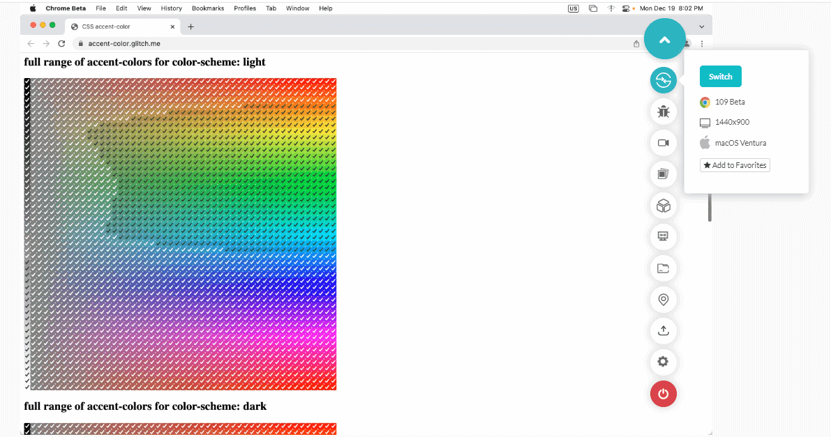
Check out the tutorial below and get started with real-time testing on the LambdaTest platform.
Subscribe to LambdaTest YouTube Channel and get detailed tutorials around Selenium automation testing, Cypress testing, and more.
Limitations of CSS Accent Color
The CSS accent color helps developers ease their work. As we discussed in the blog, many elements do not support accent colors, but this property might be helpful in the future. Another point is that we are limited to applying color to checkboxes and radio buttons. We do not consider the color schemes from which we can style checkbox borders, but we can still not fully customize these forms’ controls.
It would be great if we customized the border radius and border color of the checkboxes and the thickness of the input in its unchecked state. Now accent colors are only limited to work only in the checked state. It would be great to change its style to an unchecked state. Also, it would be very helpful to add animation to it. It would be great if border property could take the value of its parents (inherited property). We are very far from this upgrade on this property.
Currently, the accent color is only limited to four form controls, so it would be great if the accent color properties extended beyond form controls like video controls and the other form control elements. For a developer, creating custom controls is very difficult and takes a lot of time. So, for the betterment of the UI and to ease the developer’s work, accent color properties need to be modified.
Conclusion
In this article, we discussed the traditional methods of styling form controls and how difficult it is to style a form. To make our job easier, a new property called CSS accent color comes, which helps us to style checkboxes and radio buttons more quickly.
We also discussed the color scheme and how it helps to improve accent color and form control styles. So, in the end, the CSS accent color property is essential and helpful for developers to style the form controls and make their work easier. So definitely use this new property and style form controls and create new beautiful forms.
Frequently Asked Questions (FAQs)
What is CSS accent color?
The CSS accent color property uses a custom color value to re-tint the accented color of form controls provided by the browser’s default styles.
Can I use CSS accent color?
Yes, you can use the CSS accent color for the web page to specify a color used by form controls rather than the built-in default color.


Author’s Profile
Ravi Kumar
Ravi has been working as a System Engineer at Infosys for the past six months. In addition to his full-time job, Ravi also does freelance projects in frontend development and technical writing. For more than six months, Ravi has been sharing technical content about web development and helping people become professional developers. He has built a community of more than 7000 developers on Twitter. Ravi is passionate about meeting new people in the tech community and learning from them. He also enjoys traveling and hopes to visit every part of India one day.
Blogs: 3
Got Questions? Drop them on LambdaTest Community. Visit now


