CSS Color-Contrast(): A Step-By-Step Guide
Aman Mandal
Posted On: March 3, 2023
![]() 216615 Views
216615 Views
![]() 17 Min Read
17 Min Read
Have you ever come across a website and literally got frustrated because you were having trouble using it? Maybe because the text size was too small, or perhaps it’s using some WebGL/Three.js technology that your browser doesn’t support, or the font color and contrast were too weird.
If you think back to these annoying experiences where you could not navigate through a website correctly, there’s a high probability that you’ve experienced inaccessibility in one form or another. It creates an overlap between unpleasant user experience and inaccessibility.
For example, if you found yourself struggling to read small texts on a particular website, the chances are a visually impaired person wouldn’t be able to read at all.
And somehow, if you are a designer and manage to design a website with a better font size, you would improve the experience and accessibility for all the users, including those with visual impairments. To build and launch an accessible website, the CSS color-contrast() feature can help developers provide adequately contrasting and accessible user interfaces where everyone can easily access and use information and services.
By considering the needs of visually impaired and disabled individuals during the design process, we can build websites that are easy to navigate and understand for everyone. This means using clear and concise language, providing alternative text for images, and using structured layouts that are easy to understand.
By following these principles, we can create an inclusive web accessible to all users and promote equality and inclusivity. And in this guide, we particularly see how the CSS color-contrast() helps us to create accessible user interfaces.
TABLE OF CONTENTS
What is Accessibility?
The term ‘Accessibility,’ sometimes shortened to Ally, means the web design that works for everyone despite their language, location, ability, or hardware (device). Accessible design is not just about accommodating attention to people with permanent disabilities but creating a seamless experience for all users regardless of their abilities. It’s about designing a website that is easy to navigate, understand, and use for everyone, including those with physical impairments.
Accessibility is crucial for creating a positive user experience for all individuals, including those with impairments. By ensuring that all users can easily navigate and access the information they need, we are promoting inclusivity and equality in the digital space. This benefits those with special needs and enhances the overall user experience. Check our tutorial on accessibility testing to learn more.
According to a survey by the World Health Organization, approximately 16% of the world’s population lives with some form of disability, which is expected to increase with an aging population. This means that a significant proportion of internet users may have difficulties accessing traditional websites.
By designing for accessibility, we can not only make the internet a more inclusive place for people with disabilities but also create new opportunities for businesses. Accessible websites can increase the potential customer base, provide a better user experience, and improve the brand reputation.
One way to achieve this is by adhering to the Web Content Accessibility Guidelines (WCAG) developed by the World Wide Web Consortium (W3C). These guidelines provide specific recommendations for creating accessible digital content, including guidelines for text contrast.
The WCAG recommends a minimum contrast ratio of 4.5:1 between text and its background to ensure that text is easy to read for all users, including those with visual impairments. By following these guidelines, designers can create websites that are accessible and user-friendly for all users, regardless of their abilities.
So, considering the contrast ratio of text and background will not only enhance the user experience of visually impaired people and all users in general. And this ease of use, specifically considering visually impaired individuals, is the foundation for creating accessible modern web designs.
Why is Web Accessibility important?
Many designers used to think that accessibility is a ‘nice to have’ feature when designing, but now accessibility is no longer considered an optional feature and has become a necessity for many organizations.
According to a report by the WebAIM organization, 96.8% of home pages studied had WCAG2 failures. Having accessibility at the top of the mind while designing a user interface (UI) will improve the user experience for not only disabled individuals but also for the general user as well.
By the way, It’s one thing to require alt text on an image element or a label for an input element, but enforcing color palettes is entirely different. So, now let’s look at how this CSS color-contrast() will help us with that!
Subscribe to the LambdaTest YouTube Channel and stay updated with the latest tutorials around Selenium testing, Playwright, Appium, and more.
Overview of CSS color-contrast() function
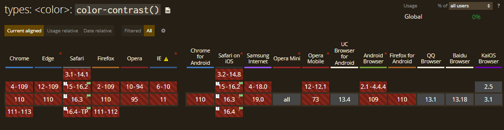
While writing this article, CSS color-contrast() is an experimental feature, and it’s a part of CSS Color Module Level 5.
Currently, the CSS color-contrast() feature is only available in Safari (TP). And you can turn on the feature in the Develop and Experimental Features menus.
Note: Below are CodePen examples that may not work if you are not using the above-recommended browser.
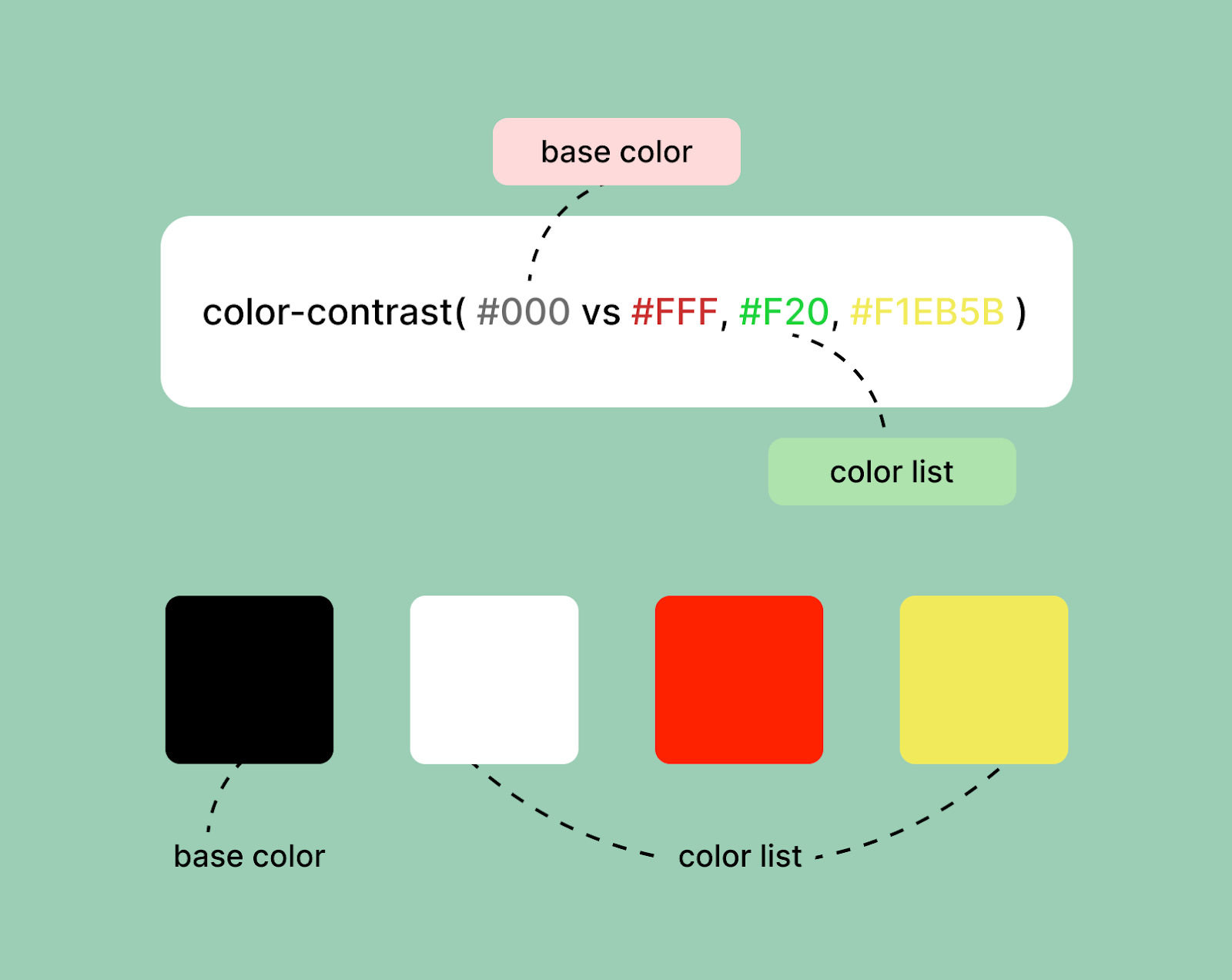
The main purpose of this feature is to select the ideal contrasting color from a list when compared against a base color.
Syntax:
|
1 |
color: color-contrast(#505050 vs #fff, #000 ) |
Our article refers to the first parameter as the “base color” and the second parameter as the “color list.” The CSS color-contrast() function can accept any browser-supported CSS color formats like
- Hexadecimal (#ff3300)
- RGB (rgb(255, 0, 0))
- RGBA (rgba(25, 32, 65, 0.86))
- HSL colors (hsl(120, 100%, 125%))
There’s also a third parameter to the function which is target contrast, but we will talk about it in the later part of this blog.
Getting Started with CSS color-contrast()
The CSS color-contrast() function ensures that text on a webpage has enough contrast with its background for easy readability. This is particularly important for visually impaired users who may struggle to read text with low contrast.
From Rachel Andrew’s talk at AxeCon 2022, New CSS With Accessibility in Mind, we come to know how big of an impact a CSS feature can have in the world of accessible design.
Rachel also demoed the new feature by dynamically defining text colors based on the background colors. Here is the CodePen example for CSS color-contrast().
So, let’s take a quick look at this feature by setting some background colors and text colors.
|
1 2 3 4 5 6 7 8 9 10 11 |
:root { --primary-background: #1e1e1e; } .content { Background-color: var(--primary-background); color: color-contrast(var(--primary-background) vs #fff, #000); } |
In the above code block, we defined the –primary-background custom property as a shade of dark grey, #1e1e1e. And then, we used the same property as the base color in the color-contrast () function and compared it against each item in the color list to find the highest contrasting value.
Now let’s take it a little further and try to experiment with the function. We can effectively chain the color-contrast () functions by simply using the result of the base color of another function. This sounds tough, but let’s take the previous example of .content only and try to chain it!
|
1 2 3 4 5 6 7 8 9 10 11 12 13 14 15 16 17 18 19 20 21 |
:root { --primary-background: #5e5c5c; --primary-color: color-contrast( var(--primary-background) vs #fff, #000 ); } .content { background-color: var(--primary-background); color: var(--primary-color); } .content > p { color: color-contrast(var(--primary-color) vs #fff, #000); } |
In the above code block, we defined the –primary-background custom property as a shade of dark grey, and we use the same custom property as the base color in the color-contrast() function and then compared it with the items in the color list, i.e., white and black and stored it in a custom variable called –primary-color. Then in the .content class, we used the background color and the color as variables, but here comes the interesting part!
Inside the content class, we changed the text color of all the paragraphs (p tag) by chaining the color-contrast () function. We simply used the –primary-color variable, i.e., a color derived using the color-contrast () we defined earlier in the root as the base color. We compared it with the items in the color list.
Here’s the complete example.
HTML:
|
1 2 3 4 5 6 7 8 9 10 11 12 13 14 15 16 17 18 19 20 21 22 23 24 |
<!DOCTYPE html> <html lang="en"> <head> <meta charset="UTF-8" /> <meta http-equiv="X-UA-Compatible" content="IE=edge" /> <meta name="viewport" content="width=device-width, initial-scale=1.0" /> <title>Blog</title> </head> <body> <div class="container"> <h2>CSS color-contrast() demo</h2> <div class="content"> <p> A simple paragraph example for the css color contrast function! Lorem ipsum, dolor sit amet consectetur adipisicing elit. Minima molestias ullam voluptas et obcaecati sapiente veritatis fugit exercitationem dolorem illo quidem sit soluta, tempore </p> </div> </div> </body> </html> |
CSS:
|
1 2 3 4 5 6 7 8 9 10 11 12 13 14 15 16 17 18 19 20 21 22 23 24 25 26 27 28 29 30 31 32 33 34 35 36 37 38 39 40 41 42 43 44 |
:root { --primary-background: #505050; --primary-color: color-contrast( var(--primary-background) vs #fff, #000 ); /* --primary-color: white; */ } body { margin: 0; padding: 0; } .container { width: 450px; margin: 0 auto; margin-top: 50px; border: 1px solid gray; font-family: "Franklin Gothic Medium", "Arial Narrow", Arial, sans-serif; } .container > h2 { padding-left: 20px; font-size: 2rem; } .content { background-color: var(--primary-background); color: var(--primary-color); padding: 20px; } .content > p { line-height: 1.4rem; font-size: 1.2rem; margin: 0; color: color-contrast(var(--primary-color) vs #fff, #000); } |
See the Pen
Simple Demo (color-contrast) by Aman Mandal (@aman-mandal)
on CodePen.
The above code is an example of how to use the CSS color-contrast() function to ensure that text color meets the minimum recommended contrast ratio as defined in the WCAG. It uses the CSS color-contrast() function to compare the contrast ratio of the text color against the background color and assigns a new class to the text if the contrast ratio is not met. This helps ensure that text is legible for all users, including those with visual impairments.
By using the CSS color-contrast() function, the code can automate the process of checking for contrast ratios and enhance the user experience for all users. The above code is an example of how to implement accessibility features in a website. It adds value to accessibility by providing a simple and efficient way to ensure that text is legible for all users, including those with visual impairments.
But we can take it further using the ::selection pseudo-element. Here’s how we can implement it.
HTML:
|
1 2 3 4 5 6 7 8 9 10 11 12 13 14 15 16 17 18 19 20 21 22 23 24 25 |
<div class="container"> <h1>CSS Color-Contrast() ::Selection</h1> <article class="article article-top"> <h2>Selenium Test Automation Cloud</h2> <p> A reliable, scalable, secure, and high performing test execution cloud that empowers development and testing teams to accelerate their release cycles. Test in parallel and cut down test execution by more than 10x. </p> </article> <article class="article article-bottom"> <h2>Cypress Automation Testing</h2> <p> Run end-to-end tests on a blazing fast Cypress test execution cloud. A reliable, scalable, secure and high performing test execution platform built for scale. Test on 40+ different browser and browser versions including headless versions. </p> </article> </div> |
CSS:
|
1 2 3 4 5 6 7 8 9 10 11 12 13 14 15 16 17 18 19 20 21 22 23 24 25 26 27 28 29 30 31 32 33 34 35 36 37 38 39 40 41 42 43 44 45 46 47 48 49 50 51 52 53 54 55 56 57 58 59 60 61 62 63 64 65 66 67 68 69 70 71 72 73 74 75 76 77 78 79 80 81 82 83 84 85 86 87 88 89 90 91 92 93 94 95 96 97 98 99 100 101 |
.content { --content-bg: #eef5ff; --content-color: color-contrast(var(--content-bg) vs #fff, #000); background: var(--content-bg); color: var(--content-color); padding: 0.5rem 1rem; border: 1px solid black; border-radius: 12px; margin-bottom: 12px; } .content:last-of-type { --content-bg: #4992af; } .content::selection { @supports (background: color-contrast(#000 vs #fff, #eee)) { background: color-contrast(var(--content-color) vs #8fc8de, #595959); } } :root { --body-base: #fbf8cc; --color-primary: #8fc8de; --scrollbar-bg: #222; } body::-webkit-scrollbar { width: 10px; } body { scrollbar-width: thin; scrollbar-color: var(--color-primary) var(--scrollbar-bg); } body::-webkit-scrollbar-track { background: var(--scrollbar-bg); } body::-webkit-scrollbar-thumb { background-color: var(--color-primary); border-radius: 6px; border: 3px solid var(--scrollbar-bg); } html, body { color: #000; font-family: "Lucida Sans", "Lucida Sans Regular", "Lucida Grande", "Lucida Sans Unicode", Geneva, Verdana, sans-serif; font-size: 100%; letter-spacing: 0.25px; line-height: 1.75; margin: 0; padding: 0; } body { background: rgb(194, 226, 228); block-size: 100%; display: grid; min-block-size: 100vh; place-items: center; } a { color: #c8553d; text-decoration: underline 1px dashed; text-underline-offset: min(5px, 1em); } a:focus { outline: 1px solid currentColor; outline-offset: 3px; } a:hover { color: #131313; } h1, h2 { font-family: "Gill Sans", "Gill Sans MT", Calibri, "Trebuchet MS", sans-serif; line-height: 1.25; } .container { inline-size: min(750px, 50vw); } |
See the Pen
color-contrast() :: selection by Aman Mandal (@aman-mandal)
on CodePen.
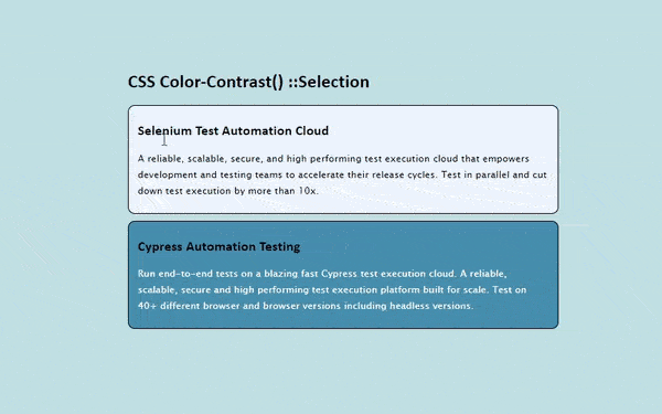
In the above code block, we used the CSS color-contrast() function with the ::selection pseudo-element, and as you can see how effective it is!
But the color-contrast() function isn’t limited to only comparing HEX codes (#000000). The previous example can be tweaked to use different color types simultaneously while returning the same results.
|
1 2 3 4 5 6 7 8 9 10 11 12 13 14 15 16 17 18 19 20 21 |
:root { --content-bg: rgb(43, 23, 244); --content-color: color-contrast( var(--content-bg) vs #fff, hsl(0, 100%, 12%) ); } .content { background-color: var(--content-bg); color: var(--content-color); } .content::selection { background: color-contrast( var(--article-color) vs hsl(0, 1%, 26%), white ); } |
The color-contrast() function can simply chain HSL colors, RGBA colors, RGB colors, etc. at the same time without giving any potential errors. So, because of this particular feature, working with contrasts will be easier and more accessible.
CSS Color-Contrast() with Pseudo Classes
We have used the ::selection pseudo-element with CSS color-contrast() function, and setting colors dynamically while selecting fonts is fascinating. But it’s more of a static thing, like text colors and backgrounds won’t change after they are rendered.
So, let’s look at something much more intriguing, i.e., changing contrasts on interactive elements and their CSS pseudo-classes.
When navigating through a website, we sometimes use only our keyboard, and there are a variety of tab stops along the way, like buttons, input elements, links inside the body, and maybe a linked image or a card. While each element must have a compliant focus indicator, it’s not easy to create a focus pseudo-element for all the elements present. And here, color-contrast() can help!
|
1 2 3 4 5 6 7 8 9 10 11 12 13 14 15 16 17 18 19 20 21 22 23 24 25 26 27 28 29 30 31 32 |
:root { --background-primary: #737272; --background-button: #1a73e8; --button-text-color: color-contrast( var(--background-button) vs #fff, #000 ); --button-hover: #13427e; --color-list: var( var(--background-button), var(--button-text-color), rgb(158, 113, 113), rgb(93, 88, 88) ); } .rounded-btn { background: var(--background-button); color: var(--button-text-color); } .rounded-btn:hover { background-color: var(--button-hover); } .rounded-btn:focus { box-shadow: 2px 1px 23px 3px color-contrast(var(--background-primary) vs var(--color-list)); } |
Let’s see what is going on in the above snippet.
The —background-button custom property is used as the base color in the color-contrast() function for selecting the value of —button-text-color. Anytime the —background-button changes, the custom —button-text-color will also change because they are chained. Then we defined —button-hover custom property for the :hover pseudo-element.
Now comes one of the most important pseudo-element when talking about accessibility, the :focus element. The :focus style is where the color-contrast() function can be expanded by using the —background-primary custom property as the base color in the function. It’s compared to the current style of button, which provides the ability to have contextually-aware focus styles.
Let’s take a look at the example and try to understand it better.
HTML:
|
1 2 3 4 5 6 7 8 9 10 11 12 13 14 15 16 17 18 19 20 21 22 23 24 |
<!DOCTYPE html> <html lang="en"> <head> <meta charset="UTF-8" /> <meta http-equiv="X-UA-Compatible" content="IE=edge" /> <meta name="viewport" content="width=device-width, initial-scale=1.0" /> <title>Blog</title> </head> <body> <h1>CSS Color-Contrast() :hover & :focus pseudo-classes</h1> <div class="container"> <h3>Selenium Test Automation Cloud</h3> <p> A reliable, scalable, secure, and high performing test execution cloud that empowers development and testing teams to accelerate their release cycles. Test in parallel and cut down test execution by more than 10x. browser. </p> <button class="btn">Test Online</button> </div> </body> </html> |
CSS:
|
1 2 3 4 5 6 7 8 9 10 11 12 13 14 15 16 17 18 19 20 21 22 23 24 25 26 27 28 29 30 31 32 33 34 35 36 37 38 39 40 41 42 43 44 45 46 47 48 49 50 51 52 53 54 55 56 57 58 59 60 61 62 63 64 65 66 67 68 69 70 71 72 73 74 75 76 77 78 79 80 81 82 83 84 85 86 87 88 89 90 91 92 93 94 95 96 97 |
:root { --body-base: #131e25; --color-primary: rgba(255, 124, 0, 1); --scrollbar-bg: #222; } html, body { color: #fff; font-family: "Barlow", sans-serif; font-size: 100%; letter-spacing: 0.25px; line-height: 1.75; margin: 0; padding: 0; } .container { width: 500px; border: 1px solid lightgray; padding: 20px; border-radius: 12px; background-color: #2d043a; } .container > h3 { color: rgb(181, 210, 212); font-size: 1.5rem; } .btn { --btn-base: #76d8ff; --btn-color: color-contrast(var(--btn-base) vs #fff, #000); --btn-gradient: linear-gradient( 180deg, rgb(94, 150, 223) 0%, rgb(27, 83, 87) 100% ); background: var(--btn-base); background: var(--btn-gradient); border: 5px solid var(--body-base); border-radius: 12px; color: var(--btn-color); padding: 1em 2em; font-size: 14px; } .btn:hover { --btn-base: #0079b1; --btn-gradient: linear-gradient( 180deg, rgb(38, 88, 196) 0%, rgb(2, 53, 112) 100% ); background: var(--btn-base); background: var(--btn-gradient); cursor: pointer; } .btn:focus { box-shadow: 0 0 1px 3px color-contrast(var(--body-base) vs var(--btn-base), #bbb); } .btn:active { opacity: 0.95; transform: scale(0.98); transform-origin: center; } body { background: #96a1a8; block-size: 100%; display: grid; min-block-size: 100vh; place-items: center; } h1, h2 { font-family: "Segoe UI", Tahoma, Geneva, Verdana, sans-serif; line-height: 1.25; } section { inline-size: min(750px, 50vw); } |
See the Pen
color-contrast() :hover & :focus by Aman Mandal (@aman-mandal)
on CodePen.
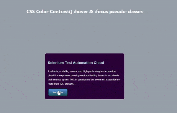
As you can see in the above example, we have used the color-contrast() function with pseudo-classes. Stephanie Eckle’s presentation on “Modern CSS Upgrades To Improve Accessibility” provides a detailed and clear overview of various CSS upgrades that can improve accessibility for users. The presentation covers topics such as CSS color-contrast(), semantic HTML, and responsive design and offers clear examples to illustrate the concepts. The presentation is a great resource for those looking to improve the accessibility of their websites.
Target Contrast Ratio
In the beginning of this article, I talked about the optional third parameter for the CSS color-contrast() function. Now let’s dig deeper into this feature.
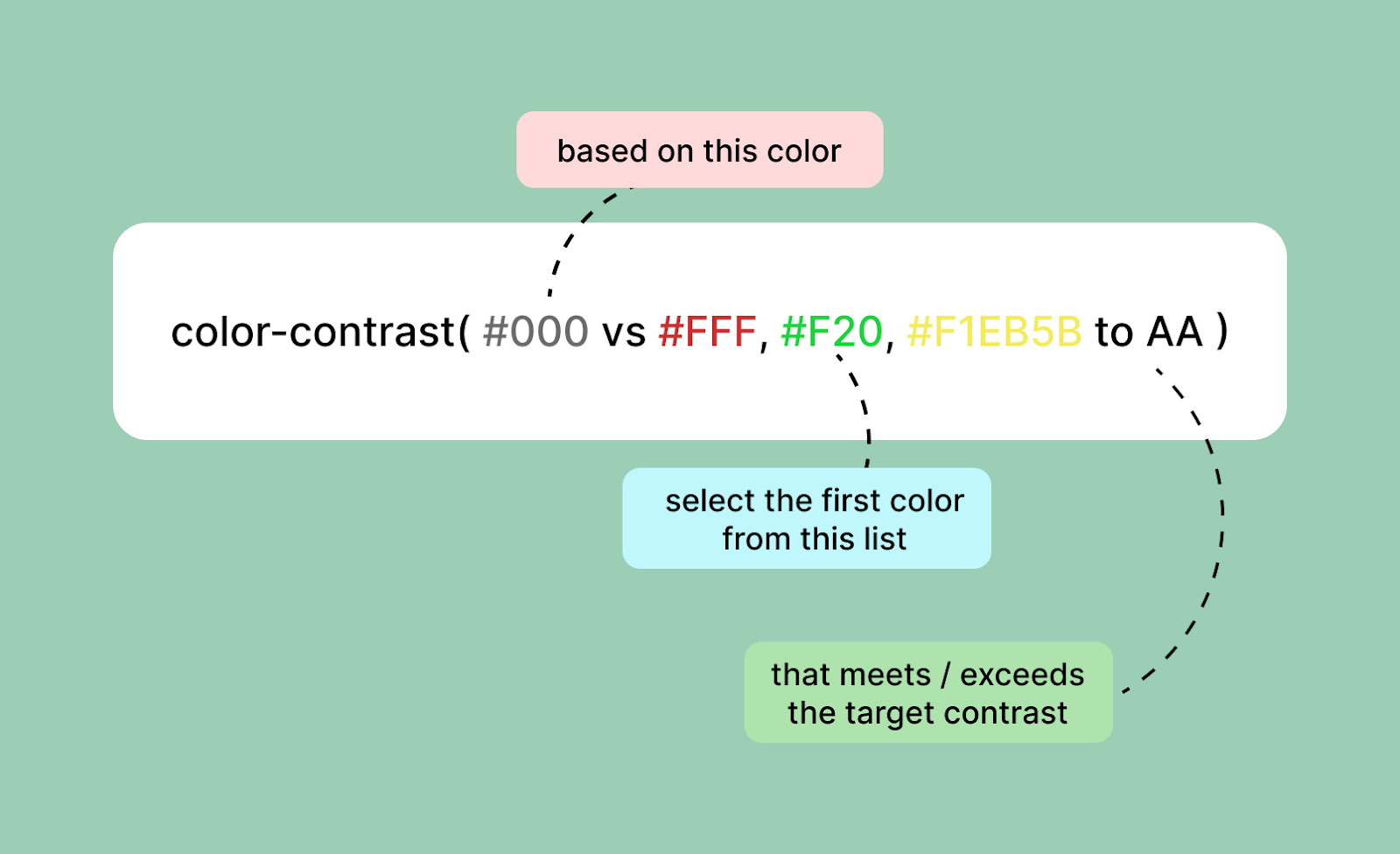
The optional third parameter for the color-contrast() function defines a target contrast ratio. The parameter accepts either a keyword — AA, AA-large, AAA, and AAA-large – or a number. When a target contrast is defined, the first color from the color list that meets or exceeds it is selected.
Let’s take a look at an example to understand the feature properly.
HTML:
|
1 2 3 4 5 6 7 8 9 10 11 12 13 14 15 16 17 18 19 20 21 22 23 24 25 26 27 28 29 30 31 32 33 34 35 36 37 38 39 40 41 42 43 44 |
<body> <section class="container"> <h1>Target Contrast Ratio</h1> <p> CSS color-contrast() function is having a third parameter called as <span style="color: red">Target contrast ratio</span> . This feature is only available in Safari Browser right now, so if you are using any other browser this won't work! </p> <div class="sample-block"> <p>Target Ratio: <span>AA (4.5)</span></p> </div> <form> <label> Ratio Keywords <select id="ratios"> <option value="AA (4.5)" selected>AA (4.5)</option> <option value="AA-Large (3)">AA-Large (3)</option> <option value="AAA (7)">AAA (7)</option> <option value="AAA-Large (4.5)">AAA-Large (4.5)</option> </select></label > <label> Custom Ratio <input id="slider" type="range" min="0" max="20" value="4.5" step="0.1" /> </label> </form> </section> <style> |
CSS:
|
1 2 3 4 5 6 7 8 9 10 11 12 13 14 15 16 17 18 19 20 21 22 23 24 25 26 27 28 29 30 31 32 33 34 35 36 37 38 39 40 41 42 43 44 45 46 47 48 49 50 51 52 53 54 55 56 57 58 59 60 61 62 63 64 65 66 67 68 69 70 71 72 73 74 75 76 77 78 79 80 81 82 83 84 85 86 87 88 89 90 91 92 93 94 95 96 97 98 99 100 101 102 103 104 105 106 107 108 109 110 111 112 113 114 115 116 117 118 119 120 121 122 123 124 125 126 127 128 |
body { --contrast-target: AA; } .sample-block { --color-set: #001908, #005f73, #b5e62e, #bff5e3, #544107, #ee9b00; --base: color-contrast( var(--body-base) vs var(--color-set) to var(--contrast-target) ); background: var(--base); display: grid; padding: 0.75em 1em; place-items: center; } .sample-block { background-color: whitesmoke; border-radius: 20px; margin-bottom: 30px; } .sample-block > p { color: black; } /* .sample-block > p { color: color-contrast( var(--base) vs var(--color-set), #fff to AA-Large ); } */ body::-webkit-scrollbar { display: none; } html, body { color: #fff; font-family: "Barlow", sans-serif; font-size: 100%; letter-spacing: 0.25px; line-height: 1.75; margin: 0; padding: 0; } body { block-size: 100%; display: grid; min-block-size: 100vh; place-items: center; } .container { background: rgb(24, 40, 52); padding: 20px; border-radius: 20px; } .container > h1 { text-align: center; margin-bottom: 30px; padding-bottom: 30px; } a { color: #e9d8a6; text-decoration: underline 1px dashed; text-underline-offset: min(5px, 1em); } a:hover { color: #ffe8d6; } a:focus { outline: 1px solid currentColor; outline-offset: 3px; } h1, h2 { line-height: 1.25; } section { inline-size: min(750px, 50vw); } form { display: grid; grid-gap: 2rem; grid-template-columns: 1fr 1fr; padding-block-end: 1rem; } label { display: grid; font-size: 1.2rem; font-weight: 600; } select, input { display: block; } |
JavaScript:
|
1 2 3 4 5 6 7 8 9 10 11 12 13 |
document .querySelector("#ratios") .addEventListener("change", (e) => { document.body.style.setProperty("--contrast-target", e.target.value); document.querySelector(".sample-block span").innerHTML = e.target.value; }); document.querySelector("#slider").addEventListener("input", (e) => { document.body.style.setProperty("--contrast-target", e.target.value); document.querySelector(".sample-block span").innerHTML = e.target.value; }); |
See the Pen
Target Contrast Ratio by Aman Mandal (@aman-mandal)
on CodePen.
When the target contrast ratio is defined, the color-contrast() function will return the very first value from the color list that meets the target. However, when no value in the color list meets the target contrast, that’s where the magic happens!
|
1 2 3 |
h1{ color: color-contrast(#000 vs #111, #222 to AA); } |
As you can see in the above code snippet, the base color is black(#000), and the color list consists of two dark shades of grey, but no value would meet the AA(4.5) target contrast. So what will happen then?
CSS will fill in the blanks if the color list doesn’t contain a value that meets the target contrast – either black or white. In this case, color-contrast() could enable designers to enforce a specific level of accessibility.
|
1 2 3 4 5 6 7 8 9 10 11 12 13 |
.background-primary { --background: #000; --color-list: #111, #222; } .background-primary { background: var(--background); color: color-contrast(var(--background) vs var(--color-list)); } .background-primary.with-target-ratio { color: color-contrast(var(--background) vs var(--color-list) to AA); } |
Let’s have a look at the above code snippet and try to understand the target ratio.
The base .background-primary class does not use a target contrast. And this results in the color being defined as #222, the highest contrasting value from the color list relative to the base color, black. But is the color #222 (another black shade) accessible here? The clear answer is a NO!
Now let’s compare this to when the .background-primary and the .with-target-ratio classes are combined, and a target contrast is specified. The results are very different despite using the same base color and color list. If none of the colors in the color list meet the AA contrast target, the function chooses the color that does. In this case, White!
Run Screen Reader Compatibility Test on 3000+ real browsers.
Try LambdaTest Now!
Inevitable Drawbacks of CSS color-contrast()
As we know, the CSS color-contrast() function is still an experimental feature, so there are many improvements at the time of writing this article. Let’s look at what they are and how to deal with them!
- Visual Contrasts and Colors are not the same
- Highest contrast doesn’t mean the accessible one
- No Gradients support as of now
When using the color-contrast() function, it’s just comparing the text color with the background color. Yes! Just exactly that. It’s not considering the other properties or styles that affect visual contrasts, e.g., font-size, opacity, font-weights, etc.
This means that it’s possible to have a correct color contrast but still inaccessible because of the other styles and properties. For example, if a website has a white background and black text, the color contrast is technically correct.
However, if the font size is very small, it will be difficult for visually impaired users to read the text. Similarly, if the text has a very low opacity, it will be difficult to read for all users. In both cases, even though the color contrast is technically correct, the text is not accessible due to other typography issues.
As we mentioned earlier, the CSS color-contrast() function can control the color and themes but still, there are limitations at this very moment that can’t be ignored. When the function compares the base color and the colors from the color list and no target ratio (third parameter) is specified, it will simply select the highest contrasting color from the list.
Just because the two colors, i.e., the base color and the color selected from the list, provide an excellent contrast ratio, it doesn’t mean it’s accessible.
In this above code snippet, we have used black (#000) as the background color, and it is compared to the two darker shades of gray, i.e., #1e1e1e and #222. And as we know, the #222 color would be selected by the color-contrast() function for having the highest contrast, but does this color an accessible one? NO! But as we haven’t used the third parameter, there’s no other choice.
At the time of writing this article, the Gradients are not supported in the color-contrast() function. Which also makes sense. Imagine, if there’s a background color with a gradient of green to yellow, what would be the base color? And how will you decide on colors for the color list?
However, a small codepen below by Michelle Barker has experimented using the color-mix() and color-contrast() functions together to support the use case.
See the Pen
color-mix + color-contrast (Safari TP only) by Michelle Barker (@michellebarker)
on CodePen.
It’s a Wrap!
That was a lot to take in, but let’s quickly review what we’ve learned about the CSS color-contrast() function.
So, the color-contrast() function is an experimental feature that selects the greatest contrasting color. It takes three arguments: the base color, the color list, and the target contrast ratio (optional). The CSS color-contrast() simply compares the base color to the color list and returns the highest contrasting color, which helps to improve accessibility on the web on a much larger scale.
Once the spec has been implemented and supported by browsers, the color-contrast() function can be the game-changing feature. There are plenty of unexplored areas and use cases for CSS color-contrast(). In the near future, we are hoping to see this feature on all browsers so that we all can start using it. Until then, keep experimenting and keep building.
Frequently Asked Questions (FAQs)
What is color contrast in CSS?
Color-contrast() in CSS compares a color value with a list of other color values, selecting the one with the highest contrast.
What is the color contrast AA vs. AAA?
Level AA needs a minimum contrast ratio of 4.5:1 for normal text and 3:1 for larger text. Further, it requires a contrast ratio of at least 3:1 for GUI components. On the other hand, Level AAA requires at least a contrast ratio of 7:1 for normal text and 4.5:1 for larger text.


Author’s Profile
Aman Mandal
Aman Mandal is a front-end developer and technical writer. He writes blogs on front end technologies like HTML, CSS, and JavaScript. When not coding, he participates in Twitter spaces. He is based out of Mumbai, India.
Blogs: 3
Got Questions? Drop them on LambdaTest Community. Visit now