
CSS Gap Property: A Beginner’s Guide To Perfectly Spaced Layouts
Dun Yan
Posted On: April 13, 2023
 277446 Views
 28 Min Read

With the rise of mobile devices, websites must be optimized for different screens and devices. Web developers need the appropriate tools to create responsive designs that fit various screen sizes. For users to remain engaged and conversion rates to rise, a seamless and consistent user experience is essential.
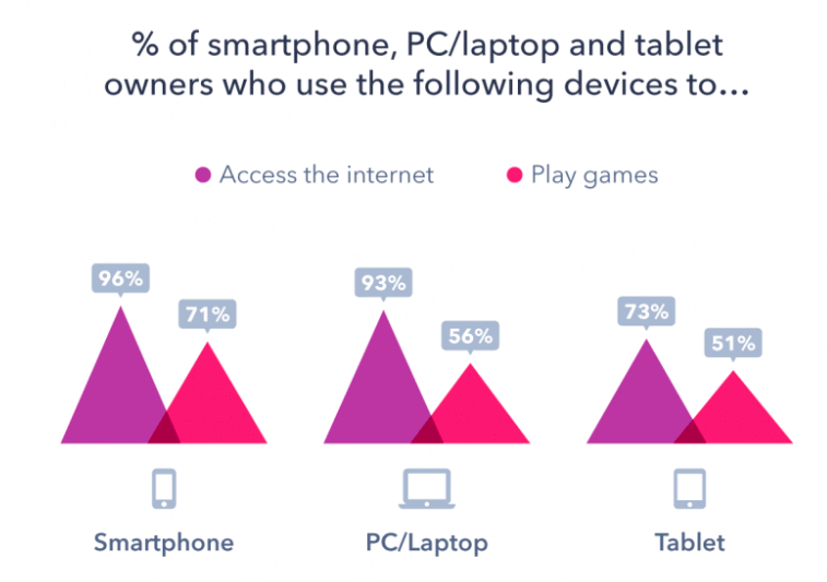
According to the GlobalWebIndex survey 2018, over 87,000 smartphone, PC, and Tablet owners showed that many consumers access the internet from multiple devices. The survey found that 95% of respondents used smartphones, 93% used PCs or Desktops, and 73% used Tablets to access the internet. This highlights the importance of having a responsive design that provides a consistent user experience across all devices.
The CSS Gap property, also known as “grid-gap” and “gap,” is a potent tool that aids in creating responsive web layouts and is one of many CSS tips and tricks. This effective tool makes it simpler to design aesthetically pleasing and user-friendly layouts by allowing developers to control the spacing between elements in a grid or flex container.
With the help of the CSS Gap property, designers can create layouts that adjust to various screen sizes, giving users the best experience possible regardless of the device they’re using. Additionally, without using any additional complex CSS hacks, it enables developers to quickly control the spacing between items in a grid or flex container.
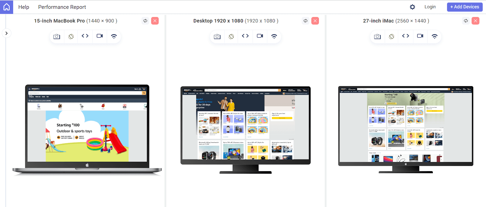
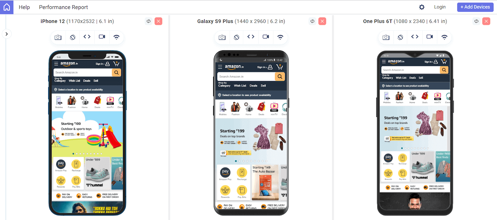
Amazon is one of the best examples of a website that effectively uses the CSS Gap property to design a responsive and attractive layout. It is simple to browse and navigate through the website’s various sections thanks to the CSS Gap property, which adds space between the products. The screenshots below demonstrate how the website controls the distance between products using gaps in its grid layout system, giving it a neat and organized appearance.
Desktop View:
Mobile View:
Besides creating visually appealing layouts, the CSS Gap property can also improve the user experience on a website. By controlling the spacing between elements, the developer can create a more intuitive and easy-to-use interface. This can lead to increased user engagement and, ultimately, better conversion rates for the business.
Research from Forbes has shown that a 1-second delay in page load time can lower conversion rates by 34%. This emphasizes the importance of optimizing the website for speed and performance, as even the slightest delay can significantly impact user behavior and conversion rates across all devices.
In this article, we’ll go over the CSS Gap property in great detail and demonstrate how to apply it to create aesthetically pleasing, responsive, and user-friendly layouts. In addition, we will discuss some typical issues that developers may encounter when utilizing the property and provide workarounds for them.
By the end of this blog, you will have developed a thorough understanding of the effective usage of CSS Gap property. So, without wasting any more time, let’s get started.
TABLE OF CONTENTS
- A Brief History of CSS Gap Property
- Issues with Negative Margins
- Issues with additional HTML Pseudo-elements
- CSS Gap Property – One-stop Solution
- Values of CSS Gap property
- CSS Gap Property with Flexbox
- Alternative Method – Row-gap & Column Gap Property
- CSS Gap Property with Flex-wrap
- CSS Gap Property with Flex-direction
- CSS Gap property with Grid
- Using CSS Gap property with Grid-template-areas
- Using CSS Gap Property with Grid-template-columns and rows
- CSS Gap property with Multi-Column Layout
- Creating Responsive Designs with Media Queries and CSS Gap Property
- Browser Support for the CSS Gap Property
- Frequently Asked Questions (FAQs)
A Brief History of CSS Gap Property
CSS Grid Layout is a powerful tool for designing complex layouts on the web, but it has one major limitation: gaps between grid or flex items. Historically, developers have used workarounds like negative margins and HTML pseudo-elements to create gaps, but these methods were often hacky and difficult to maintain.
Before the introduction of the CSS Gap property, developers had to rely on these methods to create spaces between grid or flex items. But in 2020, the CSS Working Group introduced the CSS Gap property as part of the CSS Grid Layout specification.
This CSS Gap property allows developers to specify the spacing between grid items easily, and it has quickly become a popular and widely supported feature in modern browsers. Its introduction marks a significant milestone in the evolution of CSS layout and has made designing complex grid-based layouts more straightforward and intuitive than ever before.
Here are some of the issues that arose because of conventional methods:
Issues with Negative Margins
The main reason behind using negative margins instead of positive margins is that it allows developers to create spaces between items by pulling them closer rather than pushing them apart.
This can be useful when creating complex layouts, as it enables developers to overlap items in a controlled way. Additionally, negative margins can be helpful when working with a fixed-width layout, allowing developers to “squeeze” items into a smaller space.
However, using negative margins to create spaces between grid or flex items can be challenging to manage because it requires a lot of manual calculations and can be prone to errors. Negative margins can also cause layout issues if the size of the grid or flex items changes, as the negative margins may no longer align correctly with the items.
Additionally, negative margins can create unexpected behavior when the layout is viewed on different screen sizes or devices, as the layout may not be consistent across different viewports. Let’s begin with some code samples.
HTML:
|
1 2 3 4 5 6 |
<div class="grid-container"> <div class="grid-item">Cross Browser Testing Cloud</div> <div class="grid-item">Cross Browser Testing Cloud</div> <div class="grid-item">Cross Browser Testing Cloud</div> <div class="grid-item">Cross Browser Testing Cloud</div> </div> |
CSS:
|
1 2 3 4 5 6 7 8 9 10 11 12 |
.grid-container { display: grid; grid-template-columns: repeat(4, 1fr); margin-top: 1rem; } .grid-item { background-color: #f1f1f1; margin-right: -10px; margin-bottom: -10px; padding: 1rem; } |
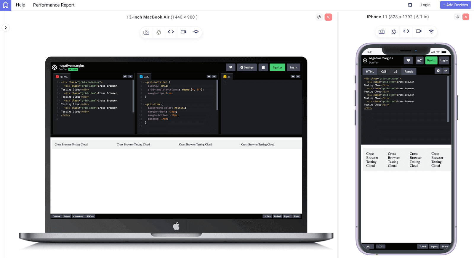
This will create a grid of 4 items with no gap between them but with a negative margin of -10px on the right and bottom of each item. This will pull the items closer together, creating the appearance of a gap between them.
See the Pen
negative margins by Dun Yan (@dun_yan_)
on CodePen.
Output:
Here, I have used LT Browser 2.0, a dev-friendly Chromium-based browser by LambdaTest, a cloud-based digital experience testing platform that enables developers and testers to test their websites or web apps over 3000+ browser and OS configurations. LT Browser 2.0 provides 50+ pre-installed device viewports for mobile, tablet, desktop, and laptops to perform responsive testing on your websites and web applications.
However, as mentioned in the statement, using negative margins can be difficult to manage, especially when working with a dynamic layout that can change in size or when viewed on different screen sizes or devices.
Apart from mentioned features, LT Browser 2.0 also offers attributes like side-by-side view, scroll sync, instant debugging, network throttling, hot reloading, etc. Additionally, it generates performance reports powered by Google Lighthouse. It can be integrated with various project management tools, like Jira, Asana, etc., to help developers and testers scale up their development process.
If you are intrigued to know more about LT Browser 2.0, refer to our LT Browser 2.0 tutorial to get started with the responsiveness test right away.
However, you can also subscribe to our LambdaTest YouTube Channel for more information on software testing tools and tutorials around Selenium testing, Playwright, Appium, etc.
Issues with additional HTML Pseudo-elements
Using additional HTML pseudo-elements, such as empty divs, to create spaces between grid or flex items can be a labor-intensive solution, requiring the developer to add extra HTML code for each space. In addition, using empty divs can increase the complexity of the HTML code and make it more challenging to maintain and update the layout.
Furthermore, it can also increase the number of DOM elements, which can harm the website’s performance. Let’s dive into code examples again.
HTML:
|
1 2 3 4 5 6 7 8 9 |
<body> <div class="grid-container"> <div class="grid-item">Cross Browser Testing Cloud</div> <div class="spacer"></div> <div class="grid-item">Cross Browser Testing Cloud</div> <div class="spacer"></div> <div class="grid-item">Cross Browser Testing Cloud</div> </div> </body> |
CSS:
|
1 2 3 4 5 6 7 8 9 10 11 12 13 14 15 16 17 18 |
body { background-color: #eef5ff; } .grid-container { display: grid; grid-template-columns: repeat(3, 1fr); } .spacer { width: 3rem; } .grid-item { margin-top: 1rem; background-color: white; padding: 1rem; border-radius: 1rem; } |
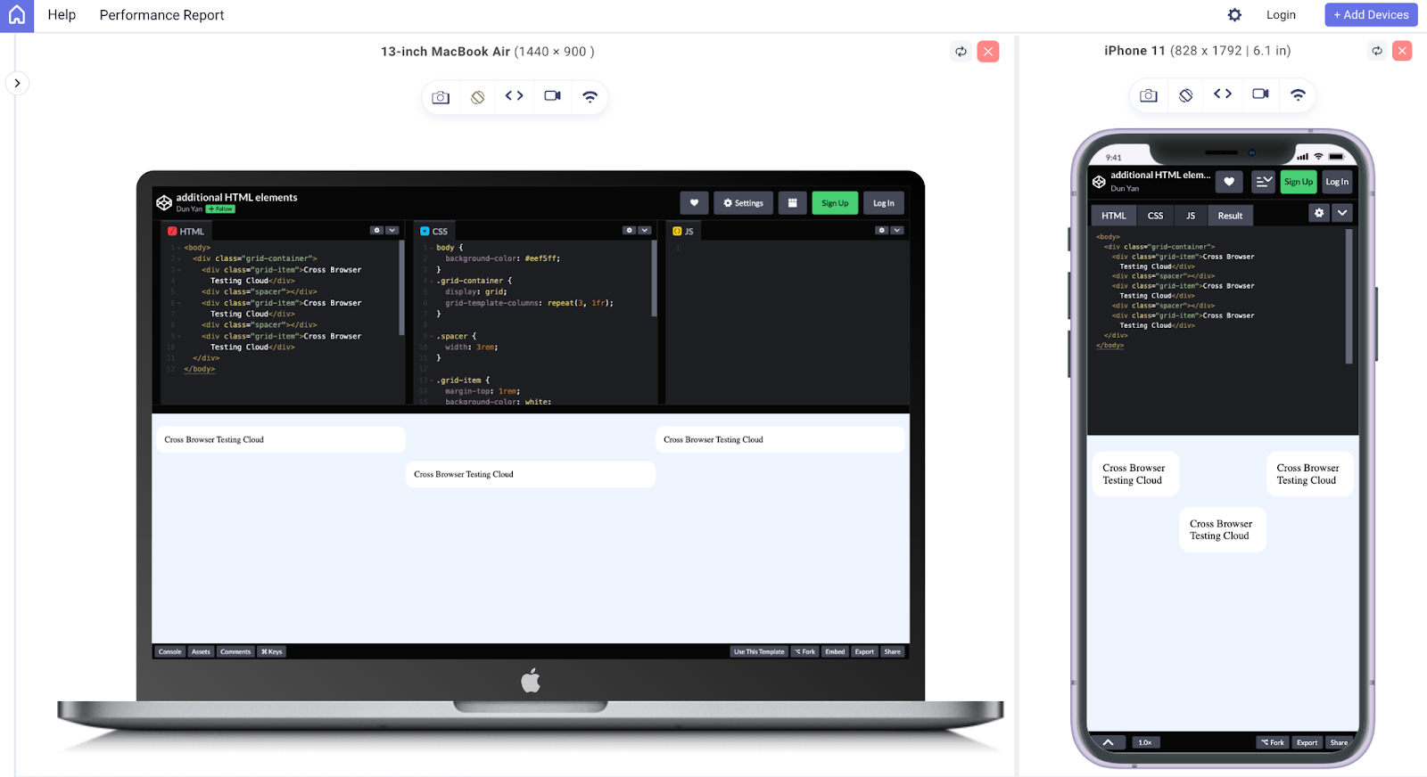
As you can see, for each space between grid items, an extra HTML element (a div with the class “spacer”) and corresponding CSS styles are added, which can make the code more complex and challenging to maintain.
See the Pen
additional HTML elements by Dun Yan (@dun_yan_)
on CodePen.
Output:
CSS Gap Property – One-stop Solution
The CSS Gap property is a relatively new addition to the CSS specification. It was first introduced as part of the CSS Grid Layout module and published as a working draft by the World Wide Web Consortium(W3C) in 2011.
The Gap property in CSS allows developers to create gutters or spaces between grid or flex items without additional HTML elements or complicated CSS tricks.
Values of CSS Gap property
The Gap property in CSS determines the space between elements in a grid, multi-column, or flex layout. The property can accept different values to specify the gap size:
- Normal: This is the default value, and it sets the gap to 1em for multi-column layouts and 0px for other layouts.
- Length: This value can be any non-negative CSS length, such as pixels, ems, rems, or percentages.
- Percentage: This value sets the gap size as a non-negative percentage relative to the element’s dimension.
- Initial: This value resets the gap to its default setting, “normal”
- Inherit: This value inherits the gap value from the parent element.
- Unset: This value removes the gap from the element.
When designing responsive layouts, it is recommended to use relative units (e.g., ems, rems, or percentages) for the CSS Gap property instead of absolute units (e.g., pixels) to improve the design’s flexibility and adaptability to different screen sizes and resolutions.
Perform a responsive web design test with LT Browser 2.0. Download Now!
CSS Gap Property with Flexbox
CSS Flexbox is a powerful layout tool for creating responsive and flexible grid layouts. One of the most valuable features of Flexbox is the ability to use the CSS Gap property to control the spacing between flex items.
A question may arise in your mind: how do you create flex layouts using CSS Gap property with Flexbox?
The first step to creating a grid layout with Flexbox and the CSS Gap property is to set the parent container to display: flex. Once this is done, you can use the CSS Gap property to control the spacing between the flex items.
Syntax:
|
1 2 3 |
.container { display: flex; } |
The Gap property in CSS can be added to the parent container to set the space between the rows and columns of the grid. For example, if you want to create a grid with 3 columns and a gap of 2 rem between each column, you would use the following code:
CSS:
|
1 2 3 4 5 6 7 8 9 10 11 12 13 14 15 16 17 18 19 20 |
body { background-color: black; } .container { display: flex; flex-wrap: wrap; margin-top: 2rem; gap: 2rem; } .grid-item { width: 80%; max-width: 200px; margin: 0 auto; background-color: orange; border-radius: 1rem; padding: 1rem; flex: 1; /* this will make each item take up equal width */ } |
You can also use the column-gap and row-gap properties to set the gap between columns and rows separately. Once the gap is set, you can add flex items to the grid, and the CSS Gap property will automatically space them apart.
You can adjust the gap sizes by changing the gap attribute. As always, it is better to use relative CSS units such as rem and em.
HTML:
|
1 2 3 4 5 6 7 8 9 10 11 12 13 14 15 16 17 |
<body> <div class="container"> <div class="grid-item"> <h2>LambdaTest</h2> <p>Browser & app testing cloud to perform both exploratory and automated testing across 3000+ different browsers, real devices, and operating systems.</p> </div> <div class="grid-item"> <h2>LambdaTest</h2> <p>Browser & app testing cloud to perform both exploratory and automated testing across 3000+ different browsers, real devices, and operating systems.</p> </div> <div class="grid-item"> <h2>LambdaTest</h2> <p>Browser & app testing cloud to perform both exploratory and automated testing across 3000+ different browsers, real devices, and operating systems.</p> </div> </div> </div> </body> |
See the Pen
1st example for flexbox gap by Dun Yan (@dun_yan_)
on CodePen.
Alternative Method – Row-gap & Column Gap Property
Another way to set the gap between flex items is to use the row-gap and column-gap properties. These properties allow you to set the gap between rows and columns separately. Here is the syntax format:
Syntax:
|
1 2 3 4 5 |
.flex-container { display: flex; row-gap: yourValue; column-gap: yourValue; } |
Imagine you have an eCommerce site that displays product cards in a grid format. Each card has a title, image, description, and price. With the row-gap and column-gap properties, the cards would be placed closely together, making it easier for users to differentiate between them.
Here is an example for the demonstration:
CSS:
|
1 2 3 4 5 6 7 8 9 10 11 12 13 14 15 16 17 18 19 20 21 22 23 24 |
body { background-color: #eef5ff; } img { width: 100%; height: auto; object-fit: cover; } .container { display: flex; flex-wrap: wrap; margin-top: 2rem; row-gap: 1rem; /* sets the gap between rows to 1 rem */ column-gap: 1rem; /* sets the gap between columns to 1 rem */ } .card { width: 30%; background-color: white; padding: 1rem; box-shadow: 0px 0px 10px #ccc; } |
HTML:
|
1 2 3 4 5 6 7 8 9 10 11 12 13 14 15 16 17 18 19 20 21 22 23 24 |
<body> <div class="container"> <div class="card"> <img src="https://images.unsplash.com/photo-1493612276216-ee3925520721?ixlib=rb-4.0.3&ixid=MnwxMjA3fDB8MHxwaG90by1wYWdlfHx8fGVufDB8fHx8&auto=format&fit=crop&w=928&q=80" alt="Product 1"> <h2>Product 1</h2> <p>Description of Product 1</p> <p>$20</p> </div> <div class="card"> <img src="https://images.unsplash.com/photo-1474631245212-32dc3c8310c6?ixlib=rb-4.0.3&ixid=MnwxMjA3fDB8MHxwaG90by1wYWdlfHx8fGVufDB8fHx8&auto=format&fit=crop&w=1448&q=80" alt="Product 2"> <h2>Product 2</h2> <p>Description of Product 2</p> <p>$30</p> </div> <div class="card"> <img src="https://images.unsplash.com/photo-1661956602868-6ae368943878?ixlib=rb-4.0.3&ixid=MnwxMjA3fDF8MHxwaG90by1wYWdlfHx8fGVufDB8fHx8&auto=format&fit=crop&w=1770&q=80" alt="Product 2"> <h2>Product 3</h2> <p>Description of Product 3</p> <p>$90</p> </div> </div> </body> |
See the Pen
2nd example of flex gap by Dun Yan (@dun_yan_)
on CodePen.
CSS Gap Property with Flex-wrap
The flex-wrap property is used to specify whether items in a flex container should be wrapped onto multiple lines. When set to wrap, items will wrap onto multiple lines if the total width of the items exceeds the width of the container.
Syntax:
|
1 2 3 4 5 |
.container { display: flex; flex-wrap: wrap; gap: 1em; } |
To use the Gap property in CSS with flex-wrap, you can add the gap to the container element and set the value to the desired size using the rem unit. The CSS Gap property will add equal space between each item in the container and between the items and the edges of the container.
This makes it easier for users to view and interact with the content. Here’s an example code:
CSS:
|
1 2 3 4 5 6 7 8 9 10 11 12 13 |
.container { display: flex; flex-wrap: wrap; gap: 1rem; margin-top: 2rem; } .item { width: 20%; background-color: lightgreen; padding: 1rem; border-radius: 1rem; } |
HTML:
|
1 2 3 4 5 6 7 8 9 10 11 12 13 14 15 16 17 18 19 20 21 22 23 24 25 26 |
<div class="card-list"> <div class="card"> <h3>Article 1</h3> <p>Browser & app testing cloud to perform both exploratory and automated testing across 3000+ different browsers, real devices, and operating systems.</p> </div> <div class="card"> <h3>Article 2</h3> <p>Browser & app testing cloud to perform both exploratory and automated testing across 3000+ different browsers, real devices, and operating systems.</p> </div> <div class="card"> <h3>Article 2</h3> <p>Browser & app testing cloud to perform both exploratory and automated testing across 3000+ different browsers, real devices, and operating systems.</p> </div> <div class="card"> <h3>Article 2</h3> <p>Browser & app testing cloud to perform both exploratory and automated testing across 3000+ different browsers, real devices, and operating systems.</p> </div> <div class="card"> <h3>Article 2</h3> <p>Browser & app testing cloud to perform both exploratory and automated testing across 3000+ different browsers, real devices, and operating systems.</p> </div> <div class="card"> <h3>Article 2</h3> <p>Browser & app testing cloud to perform both exploratory and automated testing across 3000+ different browsers, real devices, and operating systems.</p> </div> </div> |
The CSS flex-wrap property can be demonstrated in a relatable way by showing its usage in creating a responsive article list. For example, in an article list, the flex-wrap property can be used to wrap the cards or articles to the next line if the screen size is smaller instead of having them all squished together.
See the Pen
flex-wrap property by Dun Yan (@dun_yan_)
on CodePen.
CSS Gap Property with Flex-direction
The flex-direction property is a CSS property that sets the direction of the flex items within a flex container. It can be set to row, row-reverse, column, or column-reverse. The default value is row.
Here are what the values do:
row: aligns flex items horizontally from left to right.
row-reverse: aligns flex items horizontally from right to left.
column: aligns flex items vertically from top to bottom.
column-reverse: aligns flex items vertically from bottom to top.
Syntax:
|
1 2 3 4 |
.container { display: flex; flex-direction: row | row-reverse | column | column-reverse; } |
When using the CSS Gap property in combination with the flex-direction property, it is essential to understand that the Gap property in CSS will affect the spacing between flex items in the direction specified by the flex-direction property.
For instance, if flex-direction is set to row, the CSS Gap property will add spacing between the flex items horizontally. If flex-direction is set to column, the CSS Gap property will add spacing between the flex items vertically.
CSS:
|
1 2 3 4 5 6 7 8 9 10 11 12 13 14 15 16 17 18 19 |
.blog-container { display: flex; flex-direction: row; flex-wrap: wrap; gap: 1rem; margin: 1rem; } img { max-width: 100%; height: auto; } .blog-card { background-color: #ddd; border-radius: 1rem; padding: 1rem; width: 30%; } |
HTML:
|
1 2 3 4 5 6 7 8 9 10 11 12 13 14 15 16 17 18 19 20 21 22 23 24 25 26 27 28 29 30 31 32 |
<div class="blog-container"> <div class="blog-card"> <img src="https://www.Lambdatest.com/resources/images/main/home_banner.webp" alt="your-image-description"> <h2>Cross Browser Testing Cloud</h2> <p>Browser & app testing cloud to perform both exploratory and automated testing across 3000+ different browsers, real devices, and operating systems.</p> </div> <div class="blog-card"> <img src="https://www.Lambdatest.com/resources/images/main/home_banner.webp" alt="your-image-description"> <h2>Cross Browser Testing Cloud</h2> <p>Browser & app testing cloud to perform both exploratory and automated testing across 3000+ different browsers, real devices, and operating systems.</p> </div> <div class="blog-card"> <img src="https://www.Lambdatest.com/resources/images/main/home_banner.webp" alt="your-image-description"> <h2>Cross Browser Testing Cloud</h2> <p>Browser & app testing cloud to perform both exploratory and automated testing across 3000+ different browsers, real devices, and operating systems.</p> </div> <div class="blog-card"> <img src="https://www.Lambdatest.com/resources/images/main/home_banner.webp" alt="your-image-description"> <h2>Cross Browser Testing Cloud</h2> <p>Browser & app testing cloud to perform both exploratory and automated testing across 3000+ different browsers, real devices, and operating systems.</p> </div> <div class="blog-card"> <img src="https://www.Lambdatest.com/resources/images/main/home_banner.webp" alt="your-image-description"> <h2>Cross Browser Testing Cloud</h2> <p>Browser & app testing cloud to perform both exploratory and automated testing across 3000+ different browsers, real devices, and operating systems.</p> </div> <div class="blog-card"> <img src="https://www.Lambdatest.com/resources/images/main/home_banner.webp" alt="your-image-description"> <h2>Cross Browser Testing Cloud</h2> <p>Browser & app testing cloud to perform both exploratory and automated testing across 3000+ different browsers, real devices, and operating systems.</p> </div> </div> |
See the Pen
flex-direction-row property by Dun Yan (@dun_yan_)
on CodePen.
What if the value of flex-direction is a column? The flex items will be arranged vertically in a column, and the CSS Gap property will add spacing between the flex items vertically.
CSS:
|
1 2 3 4 5 6 7 8 9 10 11 12 13 14 15 16 17 18 |
.blog-container { display: flex; flex-direction: column; /* Change to column */ gap: 1rem; margin-top: 1rem; } img { max-width: 100%; height: auto; } .blog-card { background-color: #ddd; border-radius: 1rem; padding: 1rem; width: 30%; } |
Note that the flex-wrap property is no longer necessary as the items are stacking vertically. The width property on the .blog-card class can also be removed or adjusted as desired since the blog cards will automatically fill the full width of the parent container in a column layout.
HTML:
|
1 2 3 4 5 6 7 8 9 10 11 12 13 14 15 16 17 18 19 20 21 22 23 24 25 26 27 28 29 30 31 32 |
<div class="blog-container"> <div class="blog-card"> <img src="https://www.Lambdatest.com/resources/images/main/home_banner.webp" alt="your-image-description"> <h2>Cross Browser Testing Cloud</h2> <p>Browser & app testing cloud to perform both exploratory and automated testing across 3000+ different browsers, real devices, and operating systems.</p> </div> <div class="blog-card"> <img src="https://www.Lambdatest.com/resources/images/main/home_banner.webp" alt="your-image-description"> <h2>Cross Browser Testing Cloud</h2> <p>Browser & app testing cloud to perform both exploratory and automated testing across 3000+ different browsers, real devices, and operating systems.</p> </div> <div class="blog-card"> <img src="https://www.Lambdatest.com/resources/images/main/home_banner.webp" alt="your-image-description"> <h2>Cross Browser Testing Cloud</h2> <p>Browser & app testing cloud to perform both exploratory and automated testing across 3000+ different browsers, real devices, and operating systems.</p> </div> <div class="blog-card"> <img src="https://www.Lambdatest.com/resources/images/main/home_banner.webp" alt="your-image-description"> <h2>Cross Browser Testing Cloud</h2> <p>Your blog summary or excerpt</p> </div> <div class="blog-card"> <img src="https://www.Lambdatest.com/resources/images/main/home_banner.webp" alt="your-image-description"> <h2>Cross Browser Testing Cloud</h2> <p>Browser & app testing cloud to perform both exploratory and automated testing across 3000+ different browsers, real devices, and operating systems.</p> </div> <div class="blog-card"> <img src="https://www.Lambdatest.com/resources/images/main/home_banner.webp" alt="your-image-description"> <h2>Cross Browser Testing Cloud</h2> <p>Browser & app testing cloud to perform both exploratory and automated testing across 3000+ different browsers, real devices, and operating systems.</p> </div> </div> |
See the Pen
flex-direction-column property by Dun Yan (@dun_yan_)
on CodePen.
As always, it is recommended to play around with the values to understand these concepts well.
CSS Gap property with Grid
Besides using Flexbox, we can use CSS Grid. The CSS Grid Layout module provides a powerful way to create flexible and responsive grid-based layouts. In this blog section, we will explore how to use the CSS Gap property to create more visually appealing and usable grid-based layouts. We will also look at some examples and best practices for using the CSS Gap property.
A question may arise in your mind: how do you create flex layouts using CSS Gap property with Grid?
First, let’s create a basic grid layout using the grid container and grid items. In the HTML file, we will create a container element with the class “grid” and several child elements with the class “grid-item”.
Syntax:
|
1 2 3 4 |
.container { display: grid; grid-gap: gap_width; } |
Here, we created a grid with 3 columns and 2 rows and set the grid-gap to 1rem. This will add 1rem of space between each grid item.
CSS:
|
1 2 3 4 5 6 7 8 9 10 11 12 13 14 15 16 17 |
body { background-color: black; } .grid { display: grid; grid-template-columns: repeat(3, 1fr); grid-template-rows: repeat(2, 1fr); grid-gap: 1rem; margin-top: 2rem; } .grid-item { background-color: bisque; padding: 1rem; border-radius: 1rem; } |
Next, in the CSS file, we defined the grid layout using the grid-template-columns and grid-template-rows properties. We will also set the grid-gap property to a value of 1 rem to add space between the grid items.
HTML:
|
1 2 3 4 5 6 7 8 9 10 11 12 13 14 15 16 17 18 19 20 21 22 23 24 25 26 27 28 |
<body> <div class="grid"> <div class="grid-item"> <h2>LambdaTest</h2> <p>Browser & app testing cloud to perform both exploratory and automated testing across 3000+ different browsers, real devices, and operating systems.</p> </div> <div class="grid-item"> <h2>LambdaTest</h2> <p>Browser & app testing cloud to perform both exploratory and automated testing across 3000+ different browsers, real devices, and operating systems.</p> </div> <div class="grid-item"> <h2>LambdaTest</h2> <p>Browser & app testing cloud to perform both exploratory and automated testing across 3000+ different browsers, real devices, and operating systems.</p> </div> <div class="grid-item"> <h2>LambdaTest</h2> <p>Browser & app testing cloud to perform both exploratory and automated testing across 3000+ different browsers, real devices, and operating systems.</p> </div> <div class="grid-item"> <h2>LambdaTest</h2> <p>Browser & app testing cloud to perform both exploratory and automated testing across 3000+ different browsers, real devices, and operating systems.</p> </div> <div class="grid-item"> <h2>LambdaTest</h2> <p>Browser & app testing cloud to perform both exploratory and automated testing across 3000+ different browsers, real devices, and operating systems.</p> </div> </div> </body> |
See the Pen
create grid layouts using CSS Gap and Grid by Dun Yan (@dun_yan_)
on CodePen.
Besides that, you can also use grid-row-gap and grid-column-gap properties to set the gap for rows and columns separately. This gives you more control over the spacing between the grid items and can help create more complex grid layouts with custom spacing.
Here is the CSS syntax for grid-row-gap and grid-column-gap properties.
Syntax
|
1 2 3 4 5 |
.container { display: grid; grid-row-gap: yourValue; grid-column-gap: yourValue; } |
Now, similar to the previous example, instead of having a 1rem gap for each item, it will result in a grid with a 1rem gap between columns and a 2rem gap between rows.
CSS:
|
1 2 3 4 5 6 7 8 9 10 11 12 13 14 15 16 17 18 |
body { background-color: black; } .grid { display: grid; grid-template-columns: repeat(3, 1fr); grid-template-rows: repeat(2, 1fr); grid-column-gap: 1rem; grid-row-gap: 2rem; margin-top: 2rem; } .grid-item { background-color: bisque; padding: 1rem; border-radius: 1rem; } |
HTML:
|
1 2 3 4 5 6 7 8 9 10 11 12 13 14 15 16 17 18 19 20 21 22 23 24 25 26 27 28 |
<body> <div class="grid"> <div class="grid-item"> <h2>LambdaTest</h2> <p>Browser & app testing cloud to perform both exploratory and automated testing across 3000+ different browsers, real devices, and operating systems.</p> </div> <div class="grid-item"> <h2>LambdaTest</h2> <p>Browser & app testing cloud to perform both exploratory and automated testing across 3000+ different browsers, real devices, and operating systems.</p> </div> <div class="grid-item"> <h2>LambdaTest</h2> <p>Browser & app testing cloud to perform both exploratory and automated testing across 3000+ different browsers, real devices, and operating systems.</p> </div> <div class="grid-item"> <h2>LambdaTest</h2> <p>Browser & app testing cloud to perform both exploratory and automated testing across 3000+ different browsers, real devices, and operating systems.</p> </div> <div class="grid-item"> <h2>LambdaTest</h2> <p>Browser & app testing cloud to perform both exploratory and automated testing across 3000+ different browsers, real devices, and operating systems.</p> </div> <div class="grid-item"> <h2>LambdaTest</h2> <p>Browser & app testing cloud to perform both exploratory and automated testing across 3000+ different browsers, real devices, and operating systems.</p> </div> </div> </body> |
As you can see, this will still create the same effect as the previous CodePen above. The gap between the rows is slightly greater because we have doubled the grid-row-gap to 2rem.
See the Pen
create grid layouts using CSS Gap and Grid(separate) by Dun Yan (@dun_yan_)
on CodePen.
Using CSS Gap property with Grid-template-areas
The grid-area property is a powerful tool for visually appealing, structured layouts with minimal CSS code. When used in conjunction with the grid-template-areas property, it allows developers to easily define the layout of their grid and place elements within it.
You may change the value depending on your desired class names or CSS layout.
Syntax:
|
1 2 3 4 5 6 7 |
.container { display: grid; grid-template-areas: "header header header" "sidebar main main" "footer footer footer"; gap: 1em; } |
Here is an example of how to use the CSS Gap property with grid-template-areas:
HTML:
|
1 2 3 4 5 6 7 8 9 10 11 12 13 14 15 16 17 18 19 20 21 22 23 24 25 26 27 28 29 |
<body> <div class="grid-container"> <div class="header"> <h1>The Best Burgers Website</h1> </div> <div class="side-content"> <h2>Our Specials</h2> <img src="https://cdn-icons-png.flaticon.com/512/3679/3679566.png" alt="Specials"> <ul> <li>Bacon Cheeseburger</li> <li>Mushroom Swiss Burger</li> <li>Barbecue Burger</li> </ul> </div> <div class="main-content"> <h2>Our Menu</h2> <img src="https://cdn-icons-png.flaticon.com/512/9574/9574722.png" alt="Menu"> <ul> <li>Classic Burger</li> <li>Veggie Burger</li> <li>Turkey Burger</li> <li>Chicken Sandwich</li> </ul> </div> <div class="footer"> <p>© 2023 The Best Burgers Website</p> </div> </div> </body> |
In this simple burger website, we’ve created a grid container with four grid items: header, special menu, main menu, and footer. We’ve then used grid-template-areas to define the layout of these items within the grid, with the header and sidebar taking up two columns and the main content and footer taking up the remaining two columns.
Further in this blog on the CSS Gap property, we have also discussed the Multi-Column concept for better understanding.
CSS:
|
1 2 3 4 5 6 7 8 9 10 |
.grid-container { display: grid; grid-template-columns: 1fr 2fr; grid-template-rows: auto; Grid-template-areas: "header header" "side-content main-content" "footer footer"; gap: 1rem; } |
We’ve also set a grid gap of 1rem, which adds a 1 rem gap between all rows and columns in the grid. This gives our layout some breathing room and makes it easier to read.
See the Pen
gap property with grid-template-areas by Dun Yan (@dun_yan_)
on CodePen.
With this simple example, you can see how the CSS Gap property can be used to improve the aesthetics of a grid layout when used in conjunction with grid-template-areas. Remember that rem units are used in the example; it adapts to the user’s browser’s font size settings.
Using CSS Gap Property with Grid-template-columns and rows
With grid-template-columns and grid-template-rows, you can define the number of columns and rows respectively in your grid and the size of each column or row.
The “fr” unit is a flexible unit of measurement in CSS Grid, representing a fraction of the available space in the grid container. This informs the browser to divide the available space evenly among the columns and rows. We could also use pixel values, percentages, or other units to define the columns and rows.
Here’s an example code that creates a 2-column and 2-row grid. In this example, we’ve used the “fr” unit, which stands for “fraction”, to define the columns and rows.
Syntax:
|
1 2 3 4 5 6 |
.grid-container { display: grid; grid-template-columns: 1fr 1fr; grid-template-rows: 1fr 1fr; gap: 1rem; } |
A dashboard web page provides a clear illustration of the importance of CSS grid-template-columns and grid-template-rows in defining a grid layout.
CSS:
|
1 2 3 4 5 6 7 |
.grid-container { display: grid; grid-template-columns: 1fr 2fr; grid-template-rows: auto 1fr auto; grid-gap: 1rem; height: 100vh; } |
In the example code, the grid-container class is set to display as a grid using the display: grid property. The grid-template-columns property is set to 1fr 2fr to create two columns, with the first column taking up 1 fraction of the available space and the second column taking up 2 fractions of the available space.
Similarly, the grid-template-rows property is set to auto 1fr auto to create three rows, with the first and last rows having a height determined by their content (auto) and the middle row taking up 1 fraction of the available space.
HTML:
|
1 2 3 4 5 6 7 8 9 10 11 12 13 14 15 16 |
<body> <div class="grid-container"> <div class="header">Header</div> <div class="sidebar"> <h3>Sidebar</h3> <p>This section provides additional information and links related to the main content of the website.</p> </div> <div class="main"> <img src="https://www.history.com/.image/t_share/MTU3ODc3NjU2NzUxNTgwODk1/this-day-in-history-05011931---empire-state-building-dedicated.jpg" alt="empire state building" /> <p>The Empire State Building is a world-famous skyscraper located in New York City. Standing at 1,454 feet tall, it was the tallest building in the world when it was completed in 1931 and held that title for nearly 40 years.</p> </div> <div class="footer"> <h3>Footer</h3> </div> </div> </body> |
The grid-gap property is then used to add a gap between the cells in the grid. In this example, the grid-gap property is set to 1 rem to add a gap of 1 rem between the cells.
See the Pen
grid-template-columns and grid-template-rows by Dun Yan (@dun_yan_)
on CodePen.
CSS Gap property with Multi-Column Layout
The CSS Gap property plays a crucial role in creating a visually appealing and user-friendly website design. This property can be beneficial when combined with multi-column layouts, as seen on the UNICEF website. In this section, we will explore how the CSS Gap property can enhance the design of multi-column layouts and improve the user experience.
Here’s the code format for combining the CSS Gap property with a multi-column layout in CSS.
The column count specifies the number of columns to split the content into. It can be a positive integer or the keyword auto. The column-gap attribute specifies the gap, or space, between each column. It can be a length value like 10px/2em or the normal keyword, which is the default value.
Syntax:
|
1 2 3 4 |
.container { column-count: number; column-gap: length | normal; } |
We are done with the code syntax. Let’s dive into an example.
CSS:
|
1 2 3 4 5 |
.cards-container { column-count: 3; gap: 2rem; margin-top: 2rem; } |
The CSS code creates a multi-column layout for a set of Pokemon cards by using the column-count property. The value of 3 means the cards will be displayed in 3 columns. The CSS Gap property defines the space between the columns, in this case, 2 rem.
HTML:
|
1 2 3 4 5 6 7 8 9 10 11 12 13 14 15 16 17 18 19 20 21 22 23 |
<body> <h1>Pokemon Cards</h1> <div class="cards-container"> <div class="card"> <img src="https://images.unsplash.com/photo-1645800823876-b126ae346b96?ixlib=rb-4.0.3&ixid=MnwxMjA3fDB8MHxwaG90by1wYWdlfHx8fGVufDB8fHx8&auto=format&fit=crop&w=774&q=80" alt="Pikachu"> <h2>Pikachu</h2> <p>#25</p> <div class="type">Electric</div> </div> <div class="card"> <img src="https://images.unsplash.com/photo-1637164011965-635d3e762a38?ixlib=rb-4.0.3&ixid=MnwxMjA3fDB8MHxwaG90by1wYWdlfHx8fGVufDB8fHx8&auto=format&fit=crop&w=1770&q=80" alt="Charizard"> <h2>Charizard</h2> <p>#6</p> <div class="type">Fire/Flying</div> </div> <div class="card"> <img src="https://images.unsplash.com/photo-1647893977169-40183c5f064e?ixlib=rb-4.0.3&ixid=MnwxMjA3fDB8MHxwaG90by1wYWdlfHx8fGVufDB8fHx8&auto=format&fit=crop&w=1770&q=80" alt="Venusaur"> <h2>Venusaur</h2> <p>#3</p> <div class="type">Grass/Poison</div> </div> </div> </body> |
See the Pen
CSS Gap property with Multi-column layout by Dun Yan (@dun_yan_)
on CodePen.
In essence, if you need a simple layout that organizes content into columns, then column count would be a good choice. If you need a more complex and dynamic layout, a grid would be a better option. If you need a flexible layout that automatically adjusts the size and position of items, then Flex would be the best choice.
Creating Responsive Designs with Media Queries and CSS Gap Property
Creating responsive designs with media queries and the CSS Gap property is a technique used to ensure that a website or application looks and functions well on various devices and screen sizes.
CSS Media queries are the feature that allows developers to apply different CSS styles based on the characteristics of the device or screen being used to view the website. On the other hand, the CSS Gap property allows developers to create flexible flex and grid layouts.
Together, media queries and the CSS Gap property can be used to create designs that adapt to the user’s specific needs, providing an optimal viewing experience on any device. We will explore the basics of using media queries and the CSS Gap property to create responsive designs that look and function well on various devices and screen sizes.
CSS Gap Property with Flexbox
As previously discussed, Flexbox is an effective way to utilize the CSS Gap property for creating responsive grid layouts, allowing for optimal display on various device sizes. Now, let’s dive into a code example to see how it can be implemented in practice.
CSS:
|
1 2 3 4 5 6 7 8 9 10 11 12 13 14 15 16 17 18 19 20 21 22 23 24 25 26 27 |
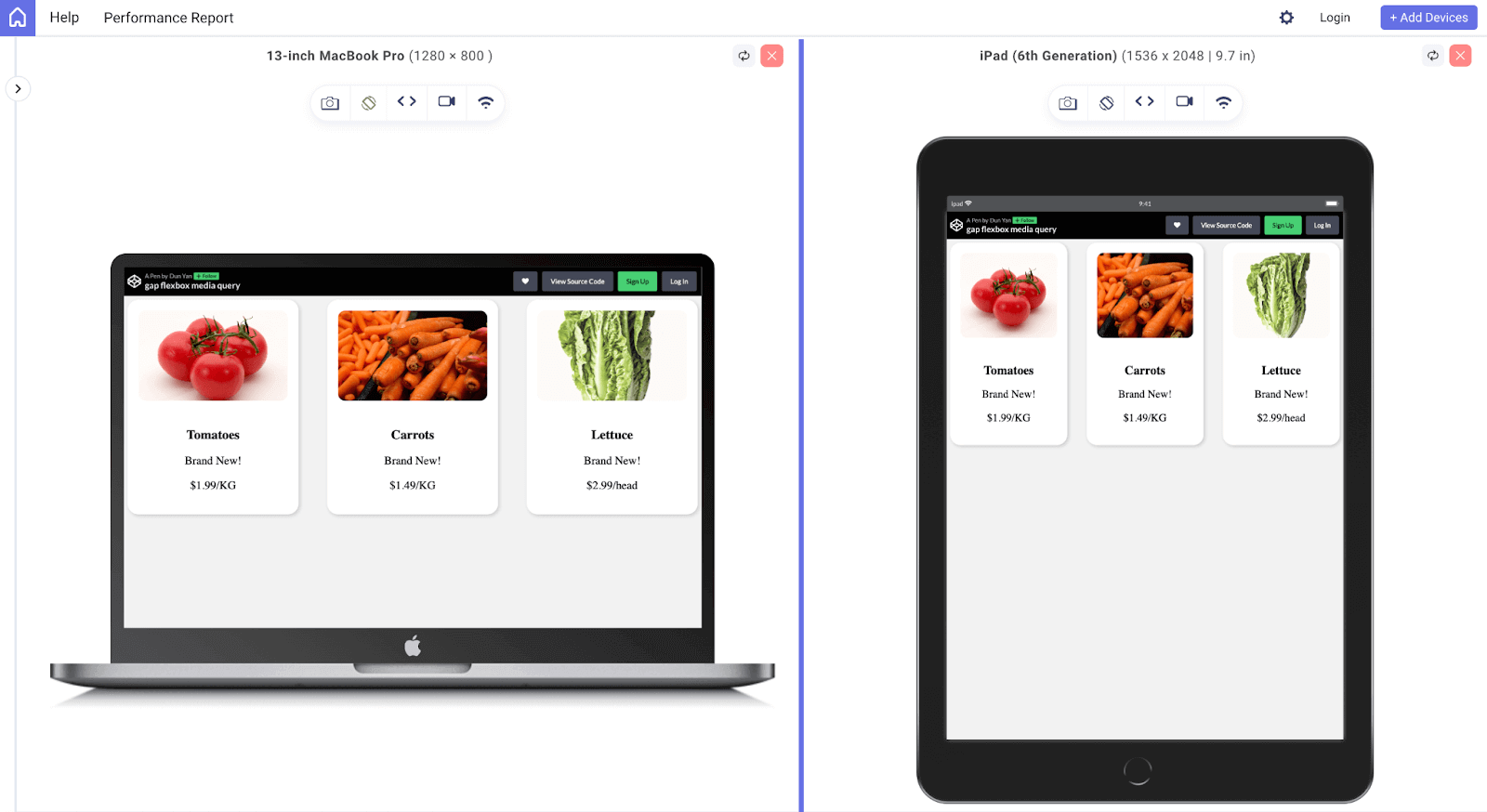
.card-container { display: flex; flex-wrap: wrap; justify-content: space-between; gap: 1.5rem; } .card { width: 30%; box-sizing: border-box; padding: 1.5rem; background-color: #ffffff; box-shadow: 0.2rem 0.2rem 0.5rem #ccc; text-align: center; border-radius: 1.5rem; overflow: hidden; } @media (max-width: 768px) { .card { width: 100%; margin-bottom: 1.5rem; } .card-container { gap: 1rem; } } |
This media query checks the maximum width of the viewport and applies the styles inside it if the viewport is 768 pixels or less. In this case, it sets the gap size of the .card-container to 1rem, which is smaller than the default 1.5rem.
HTML:
|
1 2 3 4 5 6 7 8 9 10 11 12 13 14 15 16 17 18 19 20 |
<div class="card-container"> <div class="card"> <img src="https://images.unsplash.com/photo-1571624436279-b272aff752b5?ixlib=rb-4.0.3&ixid=MnwxMjA3fDB8MHxwaG90by1wYWdlfHx8fGVufDB8fHx8&auto=format&fit=crop&w=1772&q=80"> <h3>Rental office 1</h3> <p>Brand New!</p> <p>$5/day</p> </div> <div class="card"> <img src="https://images.unsplash.com/photo-1606857521015-7f9fcf423740?ixlib=rb-4.0.3&ixid=MnwxMjA3fDB8MHxwaG90by1wYWdlfHx8fGVufDB8fHx8&auto=format&fit=crop&w=1770&q=80" alt="Vegetable 3"> <h3>Rental office 2</h3> <p>Brand New!</p> <p>$10/day</p> </div> <div class="card"> <img src="https://images.unsplash.com/photo-1606836591695-4d58a73eba1e?ixlib=rb-4.0.3&ixid=MnwxMjA3fDB8MHxwaG90by1wYWdlfHx8fGVufDB8fHx8&auto=format&fit=crop&w=1771&q=80" alt="Vegetable 3"> <h3>Rental office 3</h3> <p>Brand New!</p> <p>$3/day</p> </div> </div> |
Besides that, this code snippet creates a card container with three cards inside. The cards are spaced apart using the CSS Gap property in the Flexbox container. In laptop mode, the cards are displayed in three columns with a width of 30%. In phone mode, the cards are displayed in one column with a width of 100% using the media query.
See the Pen
gap flexbox media query by Dun Yan (@dun_yan_)
on CodePen.
Output:
CSS Gap Property with Grid
To create a responsive design using CSS Grid and the CSS Gap property, you will first need to set up a basic HTML structure with a container element and multiple child elements. In this example, we will use a “grid-container” class for the container element and a “grid-item” class for the child elements.
HTML:
|
1 2 3 4 5 6 7 8 9 10 11 12 13 14 15 16 17 18 19 20 21 22 23 24 25 26 27 28 29 30 31 32 |
<div class="container"> <div class="card"> <img src="https://images.unsplash.com/photo-1558494949-ef010cbdcc31?ixlib=rb-4.0.3&ixid=MnwxMjA3fDB8MHxwaG90by1wYWdlfHx8fGVufDB8fHx8&auto=format&fit=crop&w=2234&q=80" alt="image"> <h3>LambdaTest - Real Device Cloud with Android & iOS Smartphones</h3> <p>Test your applications using our real device cloud. Eliminate the need for an internal device library and reduce operational costs instantly.</p> </div> <div class="card"> <img src="https://images.unsplash.com/photo-1565273601018-d1da7cfed4f7?ixlib=rb-4.0.3&ixid=MnwxMjA3fDB8MHxwaG90by1wYWdlfHx8fGVufDB8fHx8&auto=format&fit=crop&w=2711&q=80" alt="image"> <h3>LambdaTest - Real Device Cloud with Android & iOS Smartphones</h3> <p>Test your applications using our real device cloud. Eliminate the need for an internal device library and reduce operational costs instantly.</p> </div> <div class="card"> <img src="https://images.unsplash.com/photo-1584169417032-d34e8d805e8b?ixlib=rb-4.0.3&ixid=MnwxMjA3fDB8MHxwaG90by1wYWdlfHx8fGVufDB8fHx8&auto=format&fit=crop&w=2209&q=80" alt="image"> <h3>LambdaTest - Real Device Cloud with Android & iOS Smartphones</h3> <p>Test your applications using our real device cloud. Eliminate the need for an internal device library and reduce operational costs instantly.</p> </div> <div class="card"> <img src="https://images.unsplash.com/photo-1484557052118-f32bd25b45b5?ixlib=rb-4.0.3&ixid=MnwxMjA3fDB8MHxwaG90by1wYWdlfHx8fGVufDB8fHx8&auto=format&fit=crop&w=1769&q=80" alt="image"> <h3>LambdaTest - Real Device Cloud with Android & iOS Smartphones</h3> <p>Test your applications using our real device cloud. Eliminate the need for an internal device library and reduce operational costs instantly.</p> </div> <div class="card"> <img src="https://images.unsplash.com/photo-1597138804456-e7dca7f59d54?ixlib=rb-4.0.3&ixid=MnwxMjA3fDB8MHxwaG90by1wYWdlfHx8fGVufDB8fHx8&auto=format&fit=crop&w=1770&q=80" alt="image"> <h3>LambdaTest - Real Device Cloud with Android & iOS Smartphones</h3> <p>Test your applications using our real device cloud. Eliminate the need for an internal device library and reduce operational costs instantly.</p> </div> <div class="card"> <img src="https://images.unsplash.com/photo-1564457461758-8ff96e439e83?ixlib=rb-4.0.3&ixid=MnwxMjA3fDB8MHxwaG90by1wYWdlfHx8fGVufDB8fHx8&auto=format&fit=crop&w=2232&q=80" alt="image"> <h3>LambdaTest - Real Device Cloud with Android & iOS Smartphones</h3> <p>Test your applications using our real device cloud. Eliminate the need for an internal device library and reduce operational costs instantly.</p> </div> </div> |
The grid-template-columns property is set to repeat(3, 1fr), meaning that the grid will have three columns, each with a width of 1 fraction of the total width. The grid-gap property is set to 2rem, which defines the gap size between the columns. The padding property is set to 2rem, which adds space within the container.
CSS:
|
1 2 3 4 5 6 7 8 9 10 11 12 13 14 15 16 17 18 19 20 |
.container { display: grid; grid-template-columns: repeat(3, 1fr); grid-gap: 2rem; padding: 2rem; } @media (max-width: 900px) { .container { grid-template-columns: repeat(2, 1fr); grid-gap: 1.5rem; } } @media (max-width: 600px) { .container { grid-template-columns: 1fr; grid-gap: 0.5rem; } } |
The two @media blocks define breakpoints for different screen sizes. When the maximum width of the screen is 900px, the grid-template-columns will change to repeat(2, 1fr), so the grid will have two columns instead of three, and the grid-gap property will change to 1.5rem.
When the maximum width of the screen is 600px, the grid-template-columns will change to 1fr, meaning that the grid will have a single column, and the grid-gap property will change to 0.5rem. This adjusts the size of the gaps between the columns according to the size of the screen, creating a more responsive design.
See the Pen
CSS Gap with Grid, media query by Dun Yan (@dun_yan_)
on CodePen.
Output:
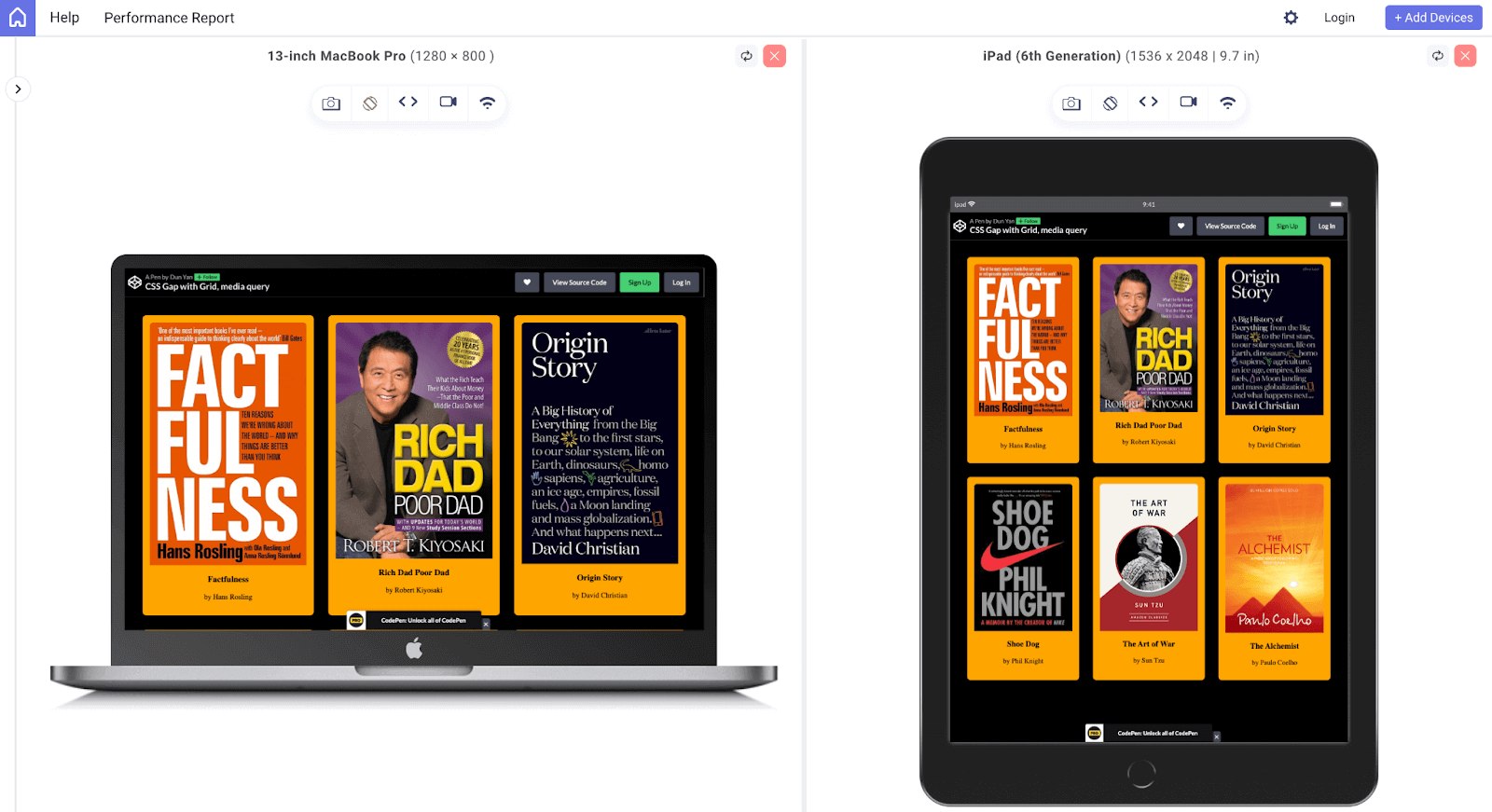
With this approach, the grid will adjust its gap size based on the screen size, creating a more visually pleasing and user-friendly responsive design.
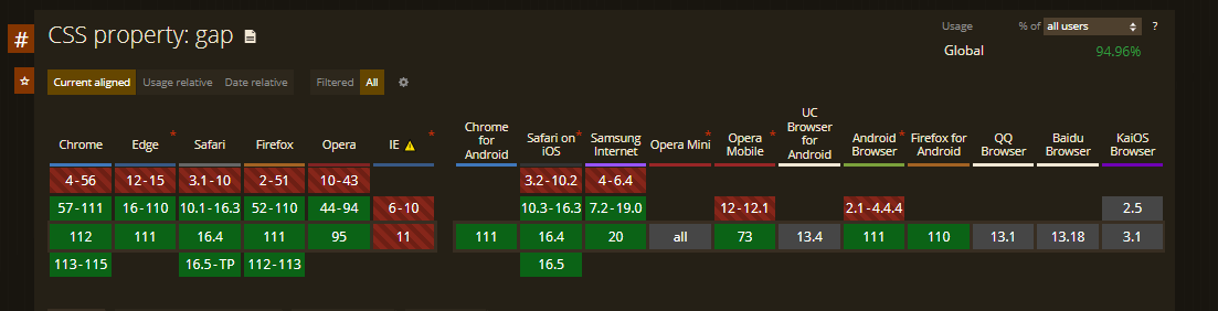
Browser Support for the CSS Gap Property
In 2016, the CSS Gap property was formally added to the CSS Grid Layout specification. Since then, it has gained widespread acceptance among contemporary browsers like Chrome, Firefox, Safari, and Edge. However, some older browsers still do not support the CSS Gap property.
Therefore, it is strongly advised that you take the required actions to guarantee that the CSS Gaps are consistently appealing across all browsers. One efficient way to do this is to use cloud-based digital experience testing platforms like LambdaTest, which provide access to more than 3000+ real browsers, devices, and operating systems.
These platforms not only facilitate the testing process but also allow for automation testing procedures and the capability to conduct accessibility testing for web applications that utilize properties like CSS Gap property, like the screenshot above.
Perform accessibility testing of your website over 3000+ environments. Try LambdaTest Now!
In other words, by using these cloud-based testing platforms, you can ensure that your website’s spacing will look decent across all browsers and that your web apps are accessible to the appropriate level.
Wrapping Up!
For building aesthetically pleasing and well-organized layouts on web pages, the CSS Gap property is a potent tool. It enables developers to create spaces between elements in a container to make separating and grouping content easier. It also allows the creation of intricate designs combined with Flexbox, Grid, and multi-column layouts.
Additionally, it can be used in conjunction with media queries to create responsive designs that change according to the screen size. Modern web browsers widely support the CSS Gap property, making it a valuable addition to any developer’s toolkit.
In a nutshell, the CSS Gap property is a helpful tool that can enhance your website’s design and is worth learning more about. It’s time to put your newly acquired proficiency in using the CSS Gap property to the test by getting started on projects and honing your abilities.
Frequently Asked Questions (FAQs)
What is CSS Gap property?
The CSS Gap property defines the space between rows and columns in a grid or flex container. It allows you to set a consistent gap between items without adding margin or padding to each element.
Why is there a gap in CSS?
The purpose of the gap in CSS is to create separation between grid or flex items, making it simpler to design layouts with uniform spacing. Ensuring that each item is clearly defined helps to avoid problems caused by overlapping elements.
Does Gap work with Flex?
Yes, the CSS Gap property can be used with Flexbox. It allows you to set the space between flex items in the same way as with a Grid.
What is the default value of the gap in CSS?
The default value of the gap property in CSS is 0, meaning there is no space between items.
How do I close a gap in CSS?
The gap value can be set to 0, or the property can be entirely removed in CSS to close a gap. The gap between Grid or Flex items will be cleared in this manner.
How to create space in CSS?
To create space in CSS, you can use the margin or padding properties on elements. You can also use the CSS Gap property in grid or flex containers to set a consistent space between items.
How do you create a gap in HTML?
The CSS Gap property on a Grid or Flex container can be used to insert a gap into HTML. This will separate the items in the container without impacting them. To add space around specific elements, you can use margin or padding.
What is the gap property in CSS?
The gap property in CSS is a shorthand for row-gap and column-gap. It’s used to set space, or ‘gap’, between rows and columns in a CSS grid or flex container. It provides an intuitive way to create space between elements, without having to manipulate margins or padding.
Why is there a gap in CSS?
The gap in CSS is used to create space between elements in grid or flex layouts. It is particularly useful in responsive design as it allows for consistent spacing between elements, irrespective of the viewport size.
What is the gap between two columns in CSS?
The gap between two columns in CSS can be set using the column-gap property or the gap property, when working with CSS grid or flex layouts. This property sets the space between columns, enhancing the readability and aesthetic of the layout.


Author’s Profile
Dun Yan
Dun Yan is a developer based in Kuala Lumpur who specializes in NextJS, JavaScript, ReactJS, and Tailwind. He also has experience with NodeJS and Express. He is always looking for new challenges and opportunities to grow as a developer
Blogs: 4
Got Questions? Drop them on LambdaTest Community. Visit now


