
Different Ways To Style CSS Box Shadow Effects
Tahera Alam
Posted On: December 29, 2022
 34233 Views
 16 Min Read
Have you ever visited a website that only has plain text and images? Most probably, no. It’s because such websites do not exist now. But there was a time when websites only had plain text and images with almost no styling. For the longest time, websites did not focus on user experience. For instance, this is how eBay’s homepage looked in 1999.
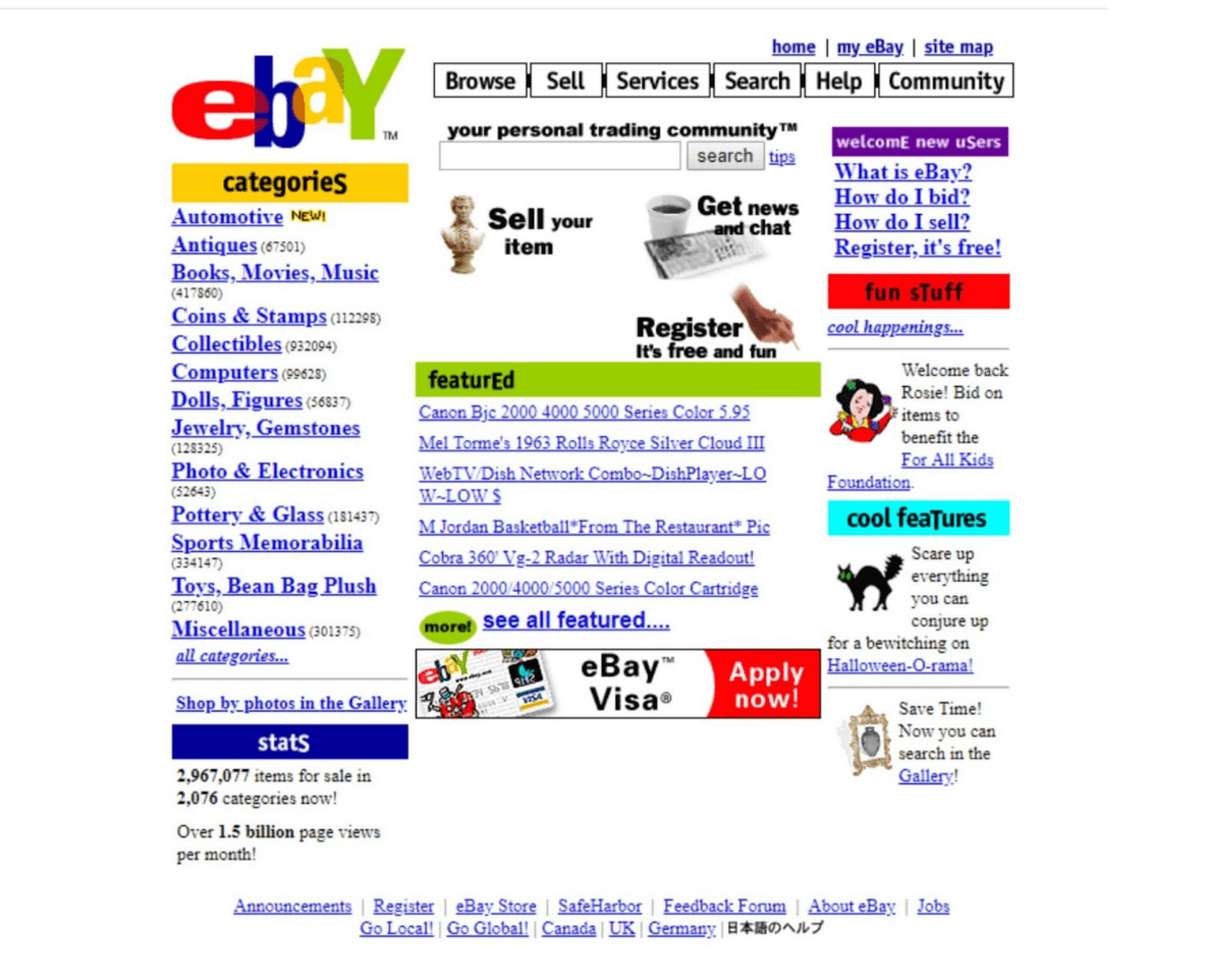
Looking at the picture, we can say that the Internet has evolved, and so has the website needs. Modern websites need colors, animations, shadows, and other such effects to take users on a pleasing journey. This keeps the visitor on your website and helps improve the website’s key KPIs (i.e bounce rate, average session duration, etc.).
As per this report, 75% of website credibility comes from its design. That means people prefer to read something beautifully designed than something plain. Best websites are often the ones that have a visible “real” quality to them. Box shadow plays an integral role in making a website look realistic. They have become an absolute necessity in designing modern websites.
I often find myself staring at a website wondering how to make the website feel realistic. CSS box-shadow comes in as a crucial answer to this question.
Box shadow provides depth to the content. Depth makes the content appear as if it has shadows just like the shadows we see in the real world. This illusion brings realism into the user’s online experience.
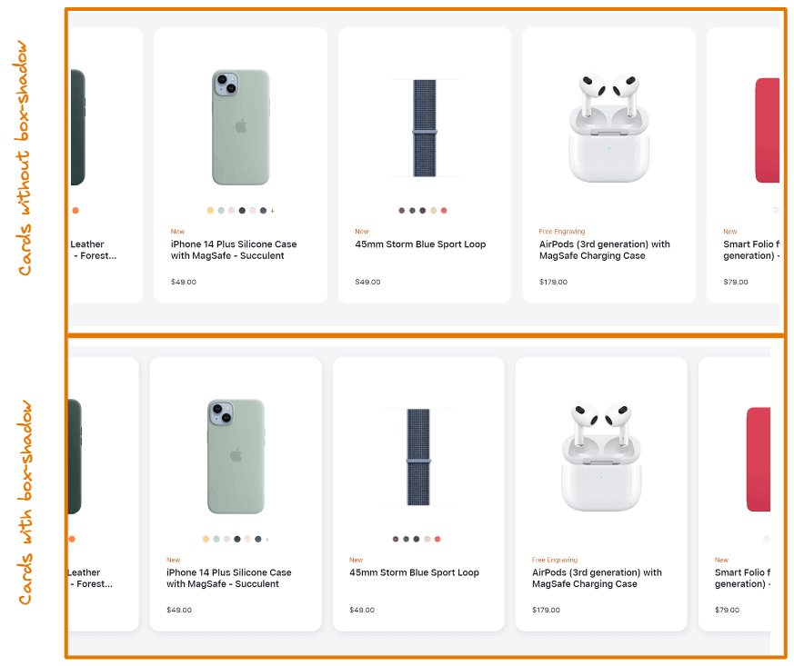
Look at the cards in the first and second rows. Could you notice any difference between them? The cards in the first row are bland and boring. They have no shadow around them.
But notice the second row that has a subtle shadow around each card. This simple effect makes the cards look more realistic. This is exactly how CSS box-shadow helps you make your web content appealing.
There are different ways to style CSS box-shadow effects. Each style is better suited for a particular type of design than others. So, it is critical to understand which type of shadow to implement for which design. For example, a neon shadow would be more suitable if the website has a dark theme.
In this blog on CSS box-shadow effects, we dive deep into the CSS box-shadow property and the different ways to style the CSS box-shadow effects. This will help you design your web content to stand out, providing the users with a more appealing experience.
Why even use shadows?
In my experience, we understand something better when we know the problem it attempts to solve. So, before we get to the fun part of creating shadows, let’s take a step back to understand why shadows exist in CSS. Knowing the why will help you decide when to use shadows and when to avoid using them.
Shadows provide elevation. So, larger shadows mean extensive elevation. Using shadows properly creates a sense of depth, as if the objects are floating above the background at different levels. You want your websites to feel tangible and genuine. Shadows will help achieve exactly that.
See the Pen
box shadow demo by Tahera Alam (@alam_tahera)
on CodePen.
You might want to use shadows in either of the two cases.
- When you want your web content to feel realistic.
- When you want to draw the user’s attention to something specific.
Our attention is naturally drawn to the objects that are closest to us. In the above example, we applied different shadows on the navbar and the modal box, and by elevating the modal box, we give the idea that the modal box is closer to us than the header. As a result, the user is more likely to focus on the modal box first.
What is CSS box-shadow property?
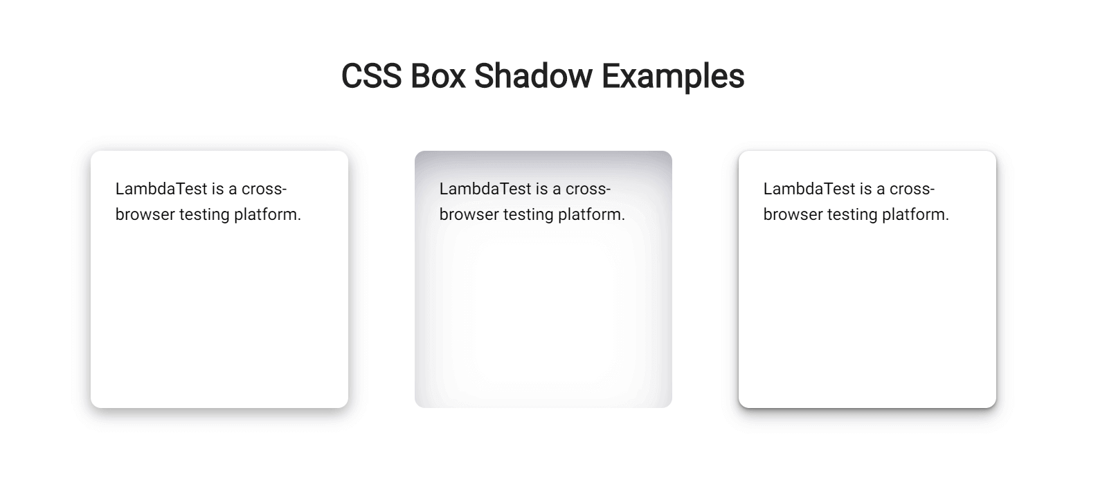
The CSS box-shadow property allows you to add a shadow to an element. You can add multiple shadow effects to an element by separating them with commas.
Here’s another example of how it looks:
Now that you know what a CSS box shadow looks like on an element, let’s move to the next part to understand how you can apply that.
Values of the CSS box-shadow property
The CSS box shadow of an element is defined by X and Y offsets relative to the element, blur radius, spread radius, and color. Too complicated to understand? Don’t worry! Let’s understand this very simply.
- x-offset: The x-offset represents the horizontal shadow of the element. This value is required and can either be positive or negative. A positive value puts the shadow on the right side of the element, while a negative value puts the shadow on the left side.
- y-offset: The y-offset represents the vertical shadow of the element. The y-offset value is also required. It can be defined using a positive or negative value. A positive value puts the shadow below the element, while a negative value puts the shadow above the element.
- blur-radius: The blur-radius sets the blur. The larger this value, the bigger the blur, so the shadow becomes bigger and lighter. Negative values are not allowed. If the value is not specified, it will be 0, making the shadow’s edge sharp.
- spread-radius: The spread-radius specifies the spread of the shadow. This value is optional and can either be positive or negative. A positive value will cause the shadow to grow bigger, and a negative value will cause the shadow to shrink. If the value is not specified, it will be 0, i.e., the size of the shadow will be the same as that of the element.
- color: The color sets the color of the shadow. The values can be the same as color values in CSS. Look at CSS Color Values for a list of possible values. If the value is not specified, it will be the same as the text color.
There’s another optional value, i.e., inset. We specify it as the first value of the CSS box-shadow property. This value is not specified by default, so the shadow is considered a drop shadow. Specifying this value moves the shadow inside the element’s frame, resulting in an inner shadow.
Now that we understand the values required to make a CSS box shadow of an element, let’s concrete this knowledge with a few quick examples.
Test your websites on real desktop & mobile browsers. Try LambdaTest Now!
Examples of the CSS box-shadow property
CSS box shadow effects can be created in many different ways. You can create a typical CSS box shadow using just three values or create a smoother shadow effect by combining multiple shadows separated by a comma.
A bottom-right box shadow using XY offset, blur radius, and color:
CSS:
|
1 2 3 4 |
div{ /* offset-x | offset-y | blur-radius | color */ box-shadow: 8px 6px 10px rgba(0, 0, 0, 0.3); } |
Output:
See the Pen
box-shadow by Tahera Alam (@alam_tahera)
on CodePen.
In this example, we set offset-x to 8px and offset-y to 6px, resulting in a shadow on the right and bottom sides of the box. The third value sets the blur radius to 10px, and the fourth value specifies the color of the shadow. You can also use spread radius, but we are not using it in this example.
An inner box shadow using inset, XY offset, blur, spread, and color:
CSS:
|
1 2 3 4 5 |
div{ /*inset | offset-x | offset-y | blur-radius | spread-radius | color */ box-shadow: inset 0px 10px 20px 2px #3a86ff; } |
Output:
See the Pen
inset box shadow by Tahera Alam (@alam_tahera)
on CodePen.
Here we set inset as the first value that makes the shadow inner. Then we set the vertical offset to 10px, blur radius to 20px, and spread to 2px, resulting in an inner shadow from the top direction. Finally, the last value sets the color.
A smooth box shadow combining multiple shadows separated by a comma:
CSS:
|
1 2 3 4 |
div{ /* offset-x | offset-y | blur-radius | color, offset-x | offset-y | blur-radius | color, */ box-shadow: 0px 3px 6px rgba(0, 0, 0, 0.16), 0px 3px 6px rgba(0, 0, 0, 0.23); } |
Output:
See the Pen
multiple box shadow by Tahera Alam (@alam_tahera)
on CodePen.
In this example, we create a smooth shadow effect by adding two shadows separated by a comma. We specify x and y-offsets to be consistent in both the shadows and the blur radius to be sharper by defining a value of 6px.
Different ways to style CSS box-shadow effects
You can style CSS box-shadow effects in various ways. We will look into three different ways of styling it.
Layered Shadows
This shadow will be the one you notice more frequently than others. This is created by combining multiple shadows separated by a comma and increasing the offset and blur for every shadow. Using this method, you can produce eye-catching shadows that seamlessly integrate into the page.
Let’s look at an example of how a layered shadow is created:
HTML:
|
1 2 |
<div class="box-one">This is a box with a default box shadow.</div> <div class="box-two">This is a box with a layered box shadow.</div> |
CSS:
|
1 2 3 4 5 6 7 8 9 10 |
.box-one{ box-shadow:0 5px 5px rgba(0,0,0,0.2); } .box-two{ box-shadow: 0px 1px 2px rgba(0,0,0,0.2), 0px 2px 4px rgba(0,0,0,0.2), 0px 4px 8px rgba(0,0,0,0.2), 0px 8px 16px rgba(0,0,0,0.2) } |
Output:
See the Pen
layered box shadow by Tahera Alam (@alam_tahera)
on CodePen.
In this example, we have two boxes. Notice how the layered shadow on the right box differs from the default shadow on the left. Layered shadow creates a smooth, subtle effect that the default shadow does not.
This layering method allows you to have more control over how shadows are rendered on the page and adjust the shadows’ spread, distance, and sharpness.
Neon Shadows
Up until now, we have only seen gray or black shadows. However, shadows can also have colors. Neon shadows are just those shadows that have a glowing effect on them. This type of shadow is best suited for a dark-themed website. Since dark-themed websites are gaining popularity, the usage of neon shadows is also increasing.
You can create a neon shadow by changing the color value of the CSS box-shadow property.
Let’s look at an example of a neon shadow.
HTML:
|
1 |
<div>This is a box with neon shadow</div> |
CSS:
|
1 2 3 |
div{ box-shadow: 0px 2px 14px 2px #64ffda; } |
Output:
See the Pen
neon box shadow by Tahera Alam (@alam_tahera)
on CodePen.
In this example, we set the color value to a bluish shade and the y offset to 2px, blur radius to 14px, and spread radius to 2px. As a result, the card has a glowing neon effect.
You can apply multi-layer shadows for a more vibrant and smooth neon effect, much like we did in the previous example.
Neumorphic Shadows
The concept of neumorphic shadows comes from neumorphism, an adaptation of skeuomorphic design combined with flat design. It is a visual effect that attempts to replicate user interface elements exactly as they would appear in real life.
Neumorphic UI elements appear to be placed inside the background or directly on the background, in contrast to other web design trends that make items appear above the background. They are also called soft UI because soft shadows create the effect.
To better understand the nuemorphic UI, let’s compare it to a material design card component.
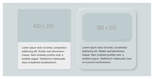
Notice how the material design card on the left looks like it floats above the background, while the neumorphic card on the right appears inside the background.
Now let’s see an example of how CSS implements it.
HTML:
|
1 |
<div>This is a card with neumorphic shadow on the top-left.</div> |
CSS:
|
1 2 3 4 |
div{ box-shadow: -6px -6px 10px rgba(255,255,255,0.45), 6px 6px 10px rgba(94,104,121,0.3); } |
Output:
See the Pen
neumorphic box shadow by Tahera Alam (@alam_tahera)
on CodePen.
We created two shadows separated by a comma. The most important thing to note is that using two shadows – a light shadow and a dark shadow is the fundamental component of creating neumorphic elements, as we did in this example. One serves as a highlight, and the other serves as the direction of the light source to create the neomorphic effect.
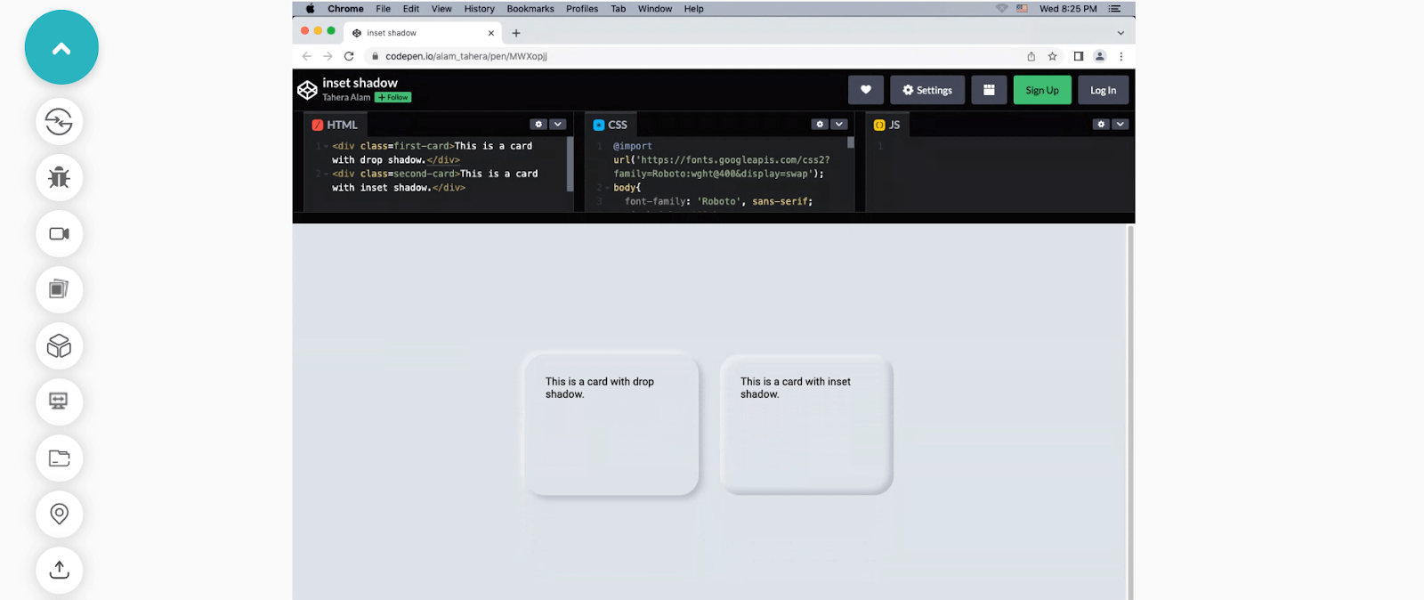
In the previous section of this blog on CSS box-shadow effects, we looked at how to use the inset keyword to make an inner shadow. Unlike drop shadows that make an element appear raised from beneath the background, an inset shadow gives the impression that the element is being pressed into it.
Let’s look at an example by just toggling the inset option to see the difference.
HTML:
|
1 2 |
<div class=first-card>This is a card with a drop shadow.</div> <div class=second-card>This is a card with an inset shadow.</div> |
CSS:
|
1 2 3 4 5 6 7 |
.first-card{ box-shadow: -6px -6px 10px rgba(255,255,255,0.45), 6px 6px 10px rgba(94,104,121,0.3); } .second-card{ box-shadow: inset 6px 6px 10px rgba(255,255,255,0.45), inset -6px -6px 10px rgba(94,104,121,0.3); } |
Output:
See the Pen
inset shadow by Tahera Alam (@alam_tahera)
on CodePen.
Important points to note for neomorphic shadows:
- The background color of the neomorphic elements must be the same (or very close) as the parent element’s background color.
- Elements need to have two types of shadows: one light and one dark.
- Rounded edges are a distinguishing feature of neomorphic elements.
Tips for applying styling CSS box-shadow
Box shadow is a great way to make your web content look appealing, but we can easily overdo it, which can ruin the look of our website. That’s why keeping a few points in mind while working with shadows is important.
Let’s look at them:
- Create consistent shadows
- Use animations only when necessary
- Use a shadow layering tool
Make them consistent. If our goal is to create the illusion of depth, we need every shadow to match. Otherwise, it will look like a bunch of blurry borders.
Use animations only when necessary. Performance decreases when we animate CSS box shadow effects. So, it’s best to avoid complex animations. However, you can use simple CSS animations like hover to transition.
Use a shadow layering tool. If you don’t feel like writing multiple lines of code to apply box shadow, don’t worry. You can leverage third-party tools like https://shadows.brumm.af/, which helps you create layered shadows quickly.
It allows you to add as many as ten layers of shadow to your object. With this tool, there is no need to enter multiple values to get the ideal shadow manually. Set the properties, preview the box shadow, and copy-paste the code into your project. Voila! You have your layered CSS box shadow effects!
Browser compatibility for CSS box-shadow property
While most browsers support the box-shadow property; there are very few that do not fully support it.
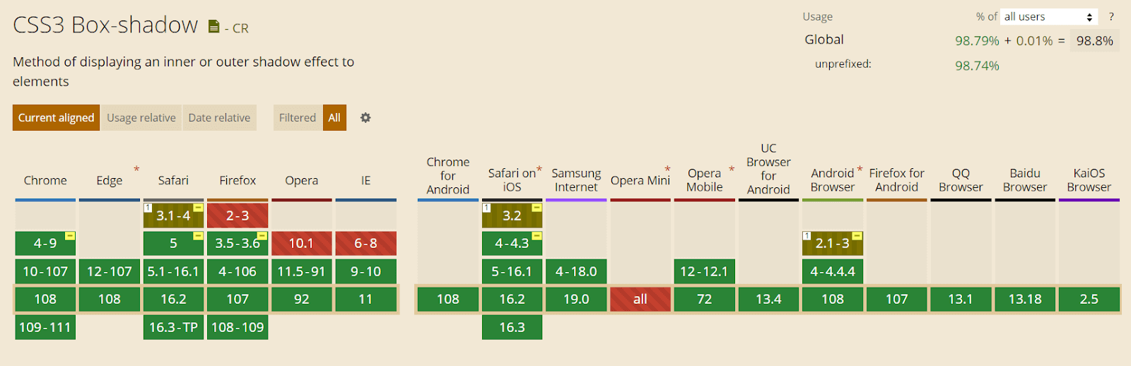
This property is supported in Chrome from version 4 to 9 using the prefix -webkit- and fully supported from version 10.
|
1 |
-webkit-box-shadow: 8px 6px 10px rgba(0, 0, 0, 0.3); |
Mozilla Firefox versions 2 and 3 do not support CSS box-shadow. Version 3.5 and 3.6 support the box shadow with the prefix -moz-. And from version 4, this property is fully supported.
|
1 |
-moz-box-shadow: 8px 6px 10px rgba(0, 0, 0, 0.3); |
For the Safari browser, versions 3.1 and 4 partially support this feature with the prefix -webkit- but version 5 completely supports it.
Opera browser also supports the box-shadow property except for version 10.1.
The CSS properties you use in your website must be cross-browser compatible. This is why you must check the browser compatibility of your features.
To check that, you can use a cloud-based testing platform like LambdaTest that offers an online browser farm of 3000+ real browsers and operating systems combinations to test your websites (and web apps). It lets you perform tests at scale to detect cross browser compatibility issues in HTML/CSS and fix them so that your website (or web app) works seamlessly across different browsers & OS combinations.
Subscribe to LambdaTest YouTube Channel and get detailed tutorials around Selenium automation testing, Cypress testing, and more.
The following is an example of testing browser support for CSS box-shadow:
Wrapping it Up
As the quest for improving user experience is increasing rapidly in the developer and designer community, features such as CSS box shadows effects have started to play a mainstream role in website design. They help us to bring realism to the user’s online experience.
In this blog on CSS box shadow effects, we have discussed why to use CSS box shadow, what is CSS box shadow, and how to implement CSS box shadow effects. Moreover, we have also discussed the different ways of styling CSS box shadow effects that include layered, neon, and neomorphic shadows.
With this summary, I hope you have gained a firm grasp of CSS box shadow effects. Practice is the key to mastering a skill. So go and use box shadows on your website. Remember to experiment with different colors and key values to see what works and what does not.
Happy styling!!
Frequently Asked Questions (FAQs)
How do you put a shadow inside a box?
To add a shadow inside a box, you can use the CSS box-shadow property. This property allows you to specify the shadow effect to be applied to an element, and it can be used to add a shadow inside a box by setting all four values of the box-shadow property to positive values.
How do you add a box shadow to all sides in CSS?
To add a box shadow to all sides of an element in CSS, you can use the box-shadow property and specify values for all four parameters: offset-x, offset-y, blur-radius, and spread-radius. The offset-x and offset-y values control the position of the shadow relative to the element, and the blur-radius and spread-radius values control the blur and spread of the shadow.


Author’s Profile
Tahera Alam
Tahera is a front-end developer who loves developing seamless frontends and efficient backends. She has skills in React, JavaScript, Nextjs, Tailwind, MongoDB, Solidity, and more. She loves to learn new technologies and finds writing about them to be a great way to share knowledge with others. In her free time, she enjoys reading thrillers and engaging with the tech community on Twitter.
Blogs: 11
Got Questions? Drop them on LambdaTest Community. Visit now


