
The Ultimate Guide to CSS Keyframes Animation
Adarsh M
Posted On: April 22, 2024
 125392 Views
 35 Min Read
The saying “first impression is the last impression” holds true, especially for online user experience. According to Forbes, nearly 94% of a website’s initial impression is influenced by its web design.
With animations in Cascading Style Sheets (CSS), users receive feedback while navigating the site, like when they click a button or scroll down with a downward arrow animation. CSS keyframes animation, a technique that interpolates between styles, plays a crucial role in providing these dynamic transitions.
Thanks to the CSS @keyframes property, achieving such effects only requires a few lines of code. This enhances the overall user experience, making the website more engaging and visually appealing.
In this blog, we will delve deeper into CSS keyframes animation, exploring how they work and their practical applications.
- Overview of CSS Animations
- What are CSS Keyframes Animation?
- Easing and Timing Functions of CSS Keyframes Animation
- Keyframes Animation Using CSS Transformations
- CSS Keyframes Animation Using Motion Path
- Keyframes Animation Using CSS Sprites
- CSS Variables for Dynamic Animations
- Maximizing Performance for CSS Animations and Keyframes
- Minimize Layout and Paint Operations
- Making Your CSS Keyframes Animation Accessible
- Debugging CSS Keyframes Animation
- Testing the Responsiveness of CSS Keyframes Animation
- CSS Keyframes Animation Best Practices
- Frequently Asked Questions (FAQs)
Overview of CSS Animations
Having some cool transitions and eye-catching animations shows that CSS animations have been used for hooking the users.
CSS animations are the means by which we can animate the transition from one state of CSS properties to another. It provides a simpler way for creating the illusion of motion and interactivity. CSS animations are typically more efficient in terms of performance because they can be offloaded to the browser’s GPU. This allows for smoother animations with minimal impact on CPU usage.
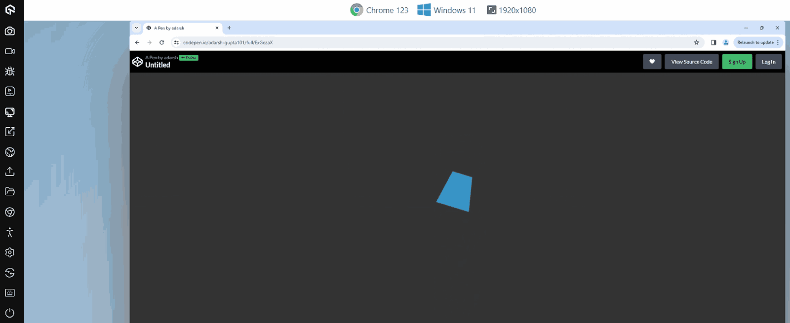
Let’s now see an example of a simple CSS animation where the element undergoes various translations, transformations, etc.
HTML:
|
1 2 3 4 5 6 7 8 9 10 11 12 13 14 |
<!DOCTYPE html> <html lang="en"> <head> <meta charset="UTF-8"> <meta name="viewport" content="width=device-width, initial-scale=1.0"> <title>Creative CSS Animation</title> </head> <body> <div class="ball-container"> <div class="ball"></div> </div> </body> </html> |
CSS:
|
1 2 3 4 5 6 7 8 9 10 11 12 13 14 15 16 17 18 19 20 21 22 23 24 25 26 27 28 29 30 31 32 33 34 35 36 37 38 39 40 41 42 43 44 45 46 47 48 49 50 51 52 53 54 55 56 57 58 59 60 61 62 63 64 65 66 67 68 69 70 71 72 73 74 |
body { background-color: #333; display: flex; justify-content: center; align-items: center; height: 100vh; margin: 0; } .ball-container { width: 100px; height: 100px; position: relative; animation: bounce 2s infinite; } .ball { width: 100px; height: 100px; background-color: #3498db; position: absolute; animation: spin 3s linear infinite, colorChange 5s infinite alternate, circleToTriangle 5s ease-in-out infinite alternate; } @keyframes circleToTriangle { 0%,100% { clip-path: circle(50% at 50% 50%); } 50% { clip-path: polygon(50% 0%, 100% 100%, 0% 100%); } 75%{ clip-path: polygon(20% 0%, 80% 0%, 100% 100%, 0% 100%); } } @keyframes bounce { 0%, 100% { transform: translateY(0); } 25% { transform: translateY(-200px); } 75%{ transform: translateY(200px); } } @keyframes spin { 0% { transform: rotate(0deg); } 100% { transform: rotate(360deg); } } @keyframes colorChange { 0% { background-color: #3498db; } 50% { background-color: #e74c3c; } 100% { background-color: #3498db; } } |
See the Pen
Untitled by adarsh (@adarsh-gupta101)
on CodePen.
In the above example, you can observe a series of transformations, translations, and visual changes in the webpage. CSS animations open a door for creativity, allowing the use of several animation properties to create eye-catching user experiences.
Talking about browser compatibility, almost all modern browsers have good support for CSS animations.
Even though CSS animations are compatible with most modern browsers, achieving smooth animations across various screen sizes and devices can be a nuanced task.
To thoroughly test your CSS animations across different browsers, versions, devices, and platforms, you can leverage the Real Time Testing feature provided by LambdaTest.
Testing on AI-powered test orchestration and execution platforms like LambdaTest can give you a better insight about how end users see your web application. You can test on a remote test lab of 3000+ real browsers and operating systems.
Subscribe to the LambdaTest YouTube Channel. Get the latest updates on various automation testing tutorials covering mobile app testing, real device cloud, and more.
Now, let’s delve deeper into the CSS keyframes animation.
 Note
NoteTest CSS keyframes animation across 3000+ real environments. Try LambdaTest Today!
What are CSS Keyframes Animation?
CSS animations consist of two fundamental components, animation styles and keyframes of the animation. These components work together to bring life and interactivity to web elements.
Let’s explore each of these components in-depth.
@keyframes Rule
The @keyframes rule allows you to specify a sequence of keyframes, each with its own set of CSS properties and values. These keyframes define the intermediate steps of an animation so that you can have better control over the animation at each timeline.
Here is a breakdown:
|
1 2 3 4 5 6 7 8 9 10 11 12 13 14 15 16 17 |
@keyframes animationName { 0% { /* Styles at the start of the animation */ } 25% { /* Styles at 25% progress */ } 50% { /* Styles at 50% progress */ } 75% { /* Styles at 75% progress */ } 100% { /* Styles at the end of the animation */ } } |
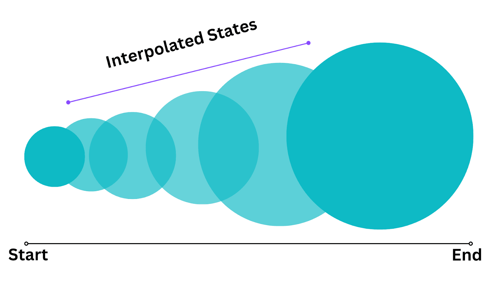
When you set an animation duration, you can segment the behavior of an element into different points along the timeline using percentage values. The percentage values (0%, 25%, 100%, etc., in this case) represent the progress of the animation, and you can add as many intermediate steps as needed.
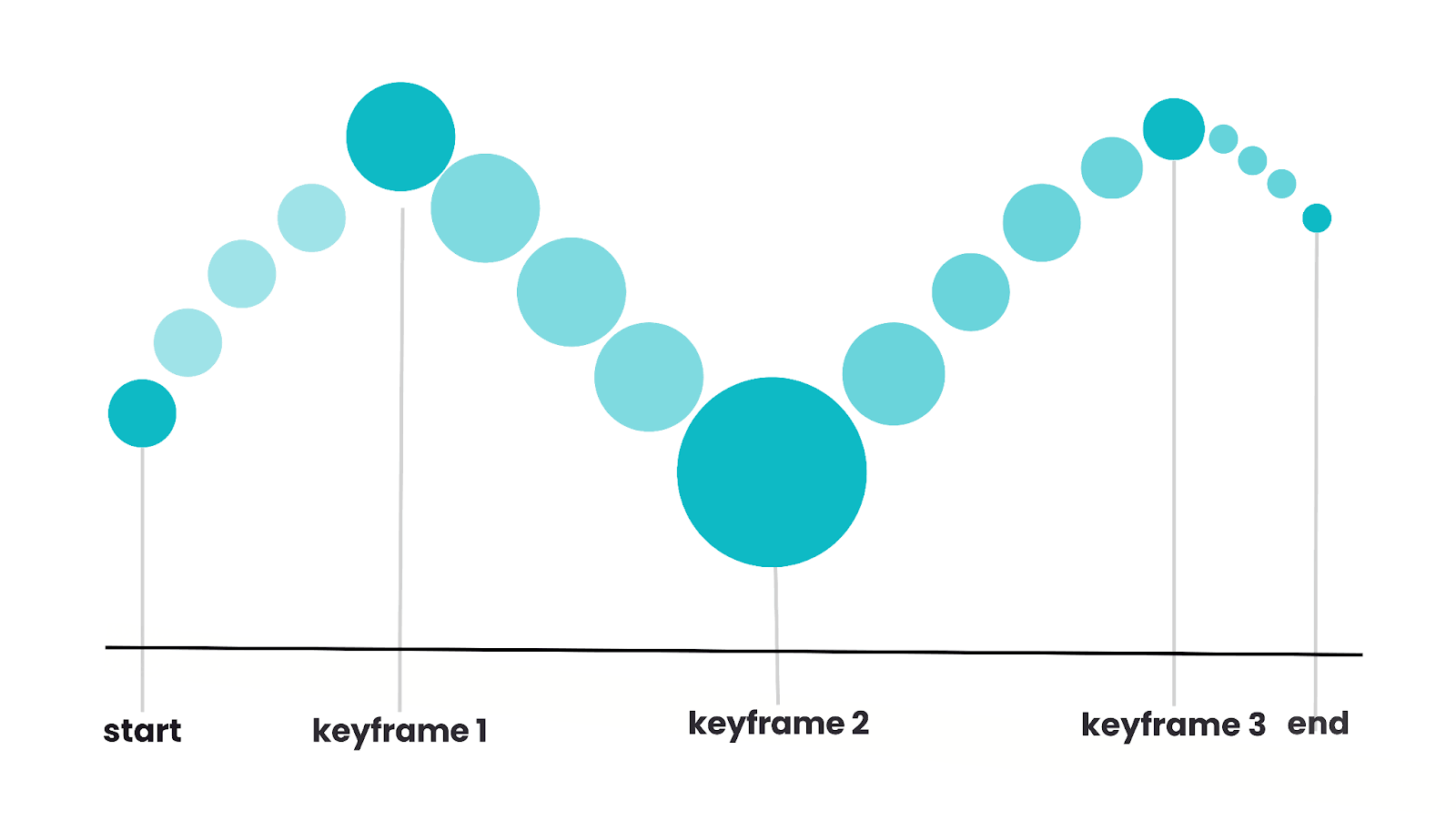
Alternatively, in CSS keyframes animation, you have the option to use from and to keywords to specify the animation’s initial and final states concisely. The from keyword defines the animation’s starting point, while to keyword signifies its ending point, simplifying the control of CSS keyframes animation behavior.
Within each keyframe, you can specify CSS properties and values that define how an element should appear at that point in the animation. You can animate almost all the CSS properties, such as opacity, transform, color, and more, depending on your custom use case.
Between the CSS keyframes, the browser automatically interpolates the styles, ensuring a smooth transition between them. This interpolation creates the illusion of continuous motion.
You can also control keyframes animation with JavaScript, allowing you to trigger animations in response to user interactions or specific events like mouse movements.
JavaScript enables you to start, pause, or dynamically modify animations, opening the door to creating dynamic animations, such as mouse movement-based animations and more.
Here is how you can listen to a click event on an element to control the state of the animation.
JavaScript:
|
1 2 3 4 5 6 7 8 9 10 11 |
const Example__Element = document.querySelector('#Example__Element'); const Example__Element__2= document.querySelector('#Example__Element__2'); Example__Element.addEventListener("click", () => { element.style.animationPlayState = "running"; // Start the animation }); Example__Element__2.addEventListener("click", () => { element.style.animationPlayState = "paused"; // Pause the animation }) |
Let’s now discuss various CSS keyframes animation properties.
Animation Styles
Animation styles, also known as animation properties, define the overall behavior of the animation. These styles dictate various aspects of the animation, including its duration, timing function, delay, and more.
Here’s a breakdown of these CSS keyframes animation properties:
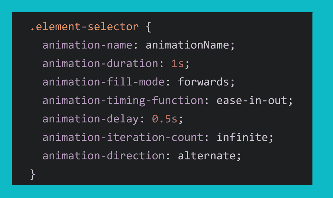
animation-name
The CSS property animation-name is used to indicate the specific animation to apply to an element. It can reference one or more @keyframes rules, which describe the animation’s behavior. You can specify multiple @keyframes rules by separating their names with commas.
Syntax:
|
1 2 3 |
.element__name { animation-name: myAnimation; } |
In the above syntax, the animation-name property is set to myAnimation, which refers to a previously defined CSS @keyframes rule. In cases where the provided name doesn’t match any existing @keyframes rule, no properties will undergo animation.
Here is an example of using the same CSS keyframes animation for multiple elements.
HTML:
|
1 2 3 4 5 6 7 8 9 10 11 12 13 14 15 16 17 18 19 20 21 22 23 24 25 26 27 28 29 30 31 32 |
<html> <body> <div class="blog-container"> <!-- Blog Post --> <div class="blog-post"> <div class="skeleton"> <div class="skeleton-image"></div> <div class="skeleton-title"></div> <div class="skeleton-description"></div> <div class="skeleton-writer"> <div class="skeleton-writer-photo"></div> <div class="skeleton-writer-name"></div> </div> </div> </div> <!-- Blog Post --> <div class="blog-post"> <div class="skeleton"> <div class="skeleton-image"></div> <div class="skeleton-title"></div> <div class="skeleton-description"></div> <div class="skeleton-writer"> <div class="skeleton-writer-photo"></div> <div class="skeleton-writer-name"></div> </div> </div> </div> </div> </body> </html> |
CSS:
|
1 2 3 4 5 6 7 8 9 10 11 12 13 14 15 16 17 18 19 20 21 22 23 24 25 26 27 28 29 30 31 32 33 34 35 36 37 38 39 40 41 42 43 44 45 46 47 48 49 50 51 52 53 54 55 56 57 58 59 60 61 62 63 64 65 66 67 68 69 70 71 72 73 74 75 76 77 78 79 80 81 82 83 84 85 86 87 88 89 90 91 92 93 94 95 96 97 98 99 100 101 102 103 |
* { box-sizing: border-box; } body { margin: 0; font-family: 'Arial', sans-serif; background-color: #f0f0f0; } .blog-container { max-width: 800px; margin: 20px auto; padding: 20px; background-color: #f0f0f0; } .blog-post { background-color: #fff; border-radius: 8px; padding: 15px; margin-bottom: 20px; box-shadow: 0 3px 4px 0 rgba(0, 0, 0, .14), 0 3px 3px -2px rgba(0, 0, 0, .2), 0 1px 8px 0 rgba(0, 0, 0, .12); } .skeleton { display: flex; flex-direction: column; align-items: center; } .skeleton-image { width: 100%; height: 200px; border-radius: 8px; background: linear-gradient(-90deg, #ddd 25%, #eee 50%, #ddd 75%); background-size: 200% 100%; animation: skeletonLoading 1.5s infinite; margin-bottom: 15px; } .skeleton-title { width: 80%; height: 20px; background: linear-gradient(-90deg, #ddd 25%, #eee 50%, #ddd 75%); background-size: 200% 100%; animation: skeletonLoading 1.5s infinite; margin-bottom: 10px; } .skeleton-description { width: 90%; height: 12px; background: linear-gradient(-90deg, #ddd 25%, #eee 50%, #ddd 75%); background-size: 200% 100%; animation: skeletonLoading 1.5s infinite; margin-bottom: 10px; } .skeleton-writer { display: flex; align-items: center; } .skeleton-writer-photo { width: 75px; height: 75px; border-radius: 50%; background: linear-gradient(-90deg, #ddd 25%, #eee 50%, #ddd 75%); background-size: 200% 100%; animation: skeletonLoading 1.5s infinite; margin-right: 10px; } .skeleton-writer-name { width: 90px; height: 12px; background: linear-gradient(-90deg, #ddd 25%, #eee 50%, #ddd 75%); background-size: 200% 100%; animation: skeletonLoading 1.5s infinite; } @keyframes skeletonLoading { 0% { background-position: 200% 0; } 100% { background-position: -200% 0; } } |
See the Pen
Untitled by adarsh (@adarsh-gupta101)
on CodePen.
In the above example, you can see the skeleton loading animation that is being applied to various elements. Similarly, you can also have multiple animations for the same element by specifying the animation names, as well as the @keyframe rule for it.
You might have also noticed the use of another property called animation-duration here in the example. Let’s now look into that.
animation-duration
The animation-duration property defines the duration of time required for an animation to execute a full cycle, from its initial state to its final state and back to the beginning.
You can specify the animation-duration in either seconds (s) or milliseconds (ms). The value must be a non-negative number, and it’s essential to include the unit.
Syntax:
|
1 2 3 4 5 6 7 8 9 10 11 12 |
/* Using seconds (s) */ .element { animation-name: example; animation-duration: 2s; } /* Using milliseconds (ms) */ .element:hover { animation-name: example; animation-duration: 5000ms; } |
Here’s an example of three different loading CSS keyframes animation with varying durations.
HTML:
|
1 2 3 4 5 6 7 8 9 10 11 12 13 14 15 |
<!DOCTYPE html> <html lang="en"> <head> <meta charset="UTF-8" /> <meta name="viewport" content="width=device-width, initial-scale=1.0" /> <title>CSS duration example</title> </head> <body> <div class="wrapper"> <div class="loader1 loader"></div> <div class="loader2 loader"></div> <div class="loader3 loader"></div> </div> </body> </html> |
CSS:
|
1 2 3 4 5 6 7 8 9 10 11 12 13 14 15 16 17 18 19 20 21 22 23 24 25 26 27 28 29 30 31 32 33 34 35 36 37 38 39 40 41 42 43 44 45 46 47 48 49 50 51 52 53 54 55 56 57 |
body{ background: #111; } .loader{ margin:2cm; } .wrapper{ padding:16px; display:flex; align-items:center; justify-content:center; height:70vh } /* Loader 1 */ .loader1 { width: 50px; height: 50px; border: 8px solid #3498db; border-top: 8px solid transparent; border-radius: 50%; animation: spin 1s linear infinite; } /* Loader 2 */ .loader2 { width: 50px; height: 50px; border: 8px solid #e74c3c; border-top: 8px solid transparent; border-radius: 50%; animation: spin 2s linear infinite; } /* Loader 3 */ .loader3 { width: 50px; height: 50px; border: 8px solid #27ae60; border-top: 8px solid transparent; border-radius: 50%; animation: spin1 3s linear infinite; } @keyframes spin { 0% { transform: rotate(0deg); } 100% { transform: rotate(360deg); } } |
See the Pen
Untitled by adarsh (@adarsh-gupta101)
on CodePen.
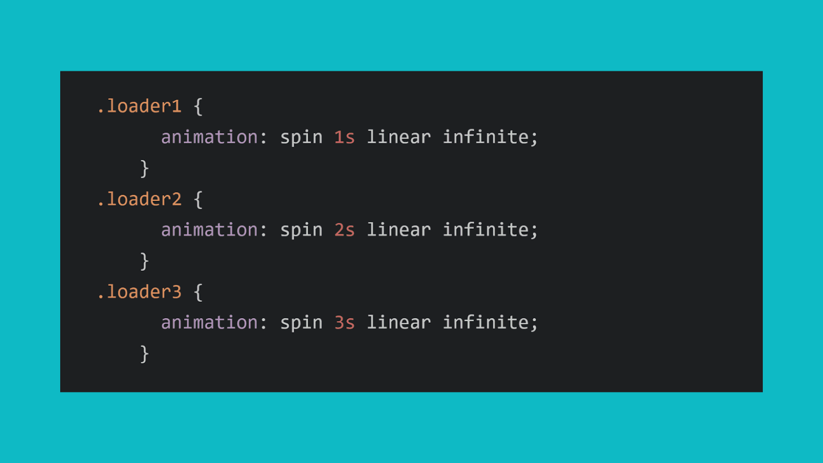
Each loader is a spinning animation with a different duration. The loader1 has a duration of 1 seconds, loader2 has a duration of 2 seconds, and so on. You can observe the varying speeds when viewing the webpage.
animation-timing-function
The animation-timing-function CSS property defines how an animation progresses through its keyframes over time. It specifies the pacing of the animation by determining the rate of change in the animated properties during each part of the animation cycle.
The animation-timing-function defines the speed curve, defining whether the animation begins slowly and accelerates, maintains a consistent speed, or follows a unique progression.
Syntax:
|
1 2 3 4 5 6 7 8 |
animation-timing-function: | linear | ease | ease-in | ease-out | ease-in-out | cubic-bezier(<number>, <number>, <number>, <number>) | steps(<integer> [, <step-position>]); |
The timing functions represent the type of easing function you want to apply to the animation. The timing functions in CSS are:
- linear: A linear easing function means that the animation progresses at a constant speed.
- ease: A standard easing function that starts slow, speeds up in the middle, and slows down at the end for smooth transitions.
- ease-in: An ease-in function means that it starts slow and gradually accelerates.
- ease-out: An ease-out function means that it starts fast and gradually decelerates.
- ease-in-out: An ease-in-out function that combines ease-in and ease-out behaviors.
- cubic-bezier(<number>, <number>, <number>, <number>): A custom cubic-bezier easing function is defined by four numeric values between 0 and 1. These values control the acceleration and deceleration of the animation.
- steps(<integer> [, <step-position>]): A step-based easing function with an integer value representing the number of discrete steps in the animation. You can also optionally specify the step position as start, end, or none to control when the step occurs.
Let’s now take an example and see how these animation timing functions work.
HTML:
|
1 2 3 4 5 6 7 8 9 10 11 12 13 14 15 16 17 18 19 20 21 22 |
<!DOCTYPE html> <html lang="en"> <head> <meta charset="UTF-8" /> <meta name="description" content="CSS Animation Timing Functions"/> <meta name="viewport" content="width=device-width, initial-scale=1.0" /> <title>CSS Animation Timing Functions</title> </head> <body> <h1>CSS Animation Timing Functions</h1> <div class="container"> <div class="box ease">Ease</div> <div class="box ease-in">Ease In</div> <div class="box ease-out">Ease Out</div> <div class="box ease-in-out">Ease In Out</div> <div class="box custom">Custom (Cubic Bezier)</div> <div class="box steps">Steps</div> </div> </body> </html> |
CSS:
|
1 2 3 4 5 6 7 8 9 10 11 12 13 14 15 16 17 18 19 20 21 22 23 24 25 26 27 28 29 30 31 32 33 34 35 36 37 38 39 40 41 42 43 44 45 46 47 48 49 50 51 52 53 54 55 56 57 58 59 60 61 62 63 64 65 66 67 68 69 70 71 72 73 74 75 76 77 78 79 80 81 82 83 84 85 |
* { padding: 0; margin: 0; box-sizing: border-box; } body { font-family: Arial, Helvetica, sans-serif; text-align: center; background-color: #f2f2f2; } h1 { margin-top: 20px; color: #3497db; } .container { display: flex; flex-wrap: wrap; justify-content: center; margin-top: 20px; } .box { width: 100px; height: 100px; background: #1498db; margin: 20px; display: flex; align-items: center; justify-content: center; color: white; font-weight: bold; font-size: 18px; animation-duration: 4s; animation-iteration-count: infinite; } .ease { animation-name: Movement; animation-timing-function: ease; } .ease-in { animation-name: Movement; animation-timing-function: ease-in; } .ease-out { animation-name: Movement; animation-timing-function: ease-out; } .ease-in-out { animation-name: Movement; animation-timing-function: ease-in-out; } .custom { animation-name: Movement; animation-timing-function: cubic-bezier(0.25, 0.5, 0.75, 1); } .steps { animation-name: Movement; animation-timing-function: steps(4, start); } @keyframes Movement { 0%, 100% { transform: translateY(0); } 50% { transform: translateY(700px); } } |
See the Pen
Untitled by adarsh (@adarsh-gupta101)
on CodePen.
You can see that all six boxes have the same animation named Movement but they all behave differently depending on the timing function.
Apart from the timing function, we can also set a delay to the animations, let’s now look into the animation-delay property.
animation-delay
The animation-delay property, as the name suggests, specifies the amount of time that an animation needs to wait before starting an animation. It accepts values in seconds(s) or milliseconds (ms).
The animation-delay property can also accept negative values. The negative value means that the animation will start before its scheduled start time. So, it will effectively appear as if the animation has already been in progress when it’s triggered.
Syntax:
|
1 2 3 4 5 6 7 8 9 10 11 12 13 14 |
.some-element { /* Delay the animation by 1 second */ animation-delay: 1s; } /* Start the animation immediately (no delay) */ .some-other-element { animation-delay: 0s; } /* Start the animation 500 milliseconds (0.5 seconds) earlier */ .another-element { animation-delay: -0.5s; } |
Here’s an example that showcases the use of the animation-delay property to create a delayed animations for a group of elements:
HTML:
|
1 2 3 4 5 6 7 8 9 10 11 12 13 |
<!DOCTYPE html> <html lang="en"> <head> <meta charset="UTF-8" /> <meta name="viewport" content="width=device-width, initial-scale=1.0" /> <title>CSS duration example</title> </head> <body> <div class="fade-in"></div> <div class="fade-in"></div> <div class="fade-in"></div> </body> </html> |
CSS:
|
1 2 3 4 5 6 7 8 9 10 11 12 13 14 15 16 17 18 19 20 21 22 23 24 25 26 27 28 29 30 31 32 33 34 35 36 37 38 39 40 41 42 43 44 45 46 47 48 49 50 |
.fade-in { width: 100px; height: 100px; background-color: lightblue; margin: 10px; opacity: 0; /* Initially, elements are invisible */ animation-name: fadeIn, MoveRight; animation-duration: 1s,3s; animation-fill-mode: both; } .fade-in:nth-child(1) { animation-delay: 0.5s; /* Start first element after 0.5 seconds */ } .fade-in:nth-child(2) { animation-delay: 1s; /* Start second element after 1 second */ } .fade-in:nth-child(3) { animation-delay: 1.5s; /* Start third element after 1.5 seconds */ } @keyframes fadeIn { 0% { opacity: 0; } 100% { opacity: 1; } } @keyframes MoveRight { 0%,100% { transform: translateX(0px); } 50% { transform: translateX(500px); } } button{ background:#111; color:white } |
See the Pen
Untitled by adarsh (@adarsh-gupta101)
on CodePen.
We have three <div> elements with the class .fade-in, and each element has a delay set using the animation-delay property. The animation-delay creates a sequence where each element starts fading in after a specific delay, resulting in a staggered fade-in effect along with a translation in the +X direction
Thus, the animation-delay property can be used for creating animation sequences by staggering the start times of different animations.
animation-direction
The animation-direction property is used to determine how an animation should play. It controls the direction in which the animation progresses between its keyframes, such as forward or reverse. The animation-direction property is really useful for controlling the playback of CSS keyframes animation.
Syntax:
|
1 2 3 |
.element{ animation-direction: normal | reverse | alternate | alternate-reverse; } |
The animation-direction property accepts the following values:
- normal: It is the default value, and it plays the animation in the forward direction as specified in the keyframes. After that, it restarts from the initial position. The animation starts from the beginning and finishes at the last keyframe.
- reverse: The reverse animation plays backward from the end to the beginning. Then, it restarts from the end. Here, the animation begins with the last keyframe and then goes back to the first keyframe.
- alternate: The animation plays in a forward direction from the beginning to the end. Then, it reverses from the end to the beginning. It creates a ping-pong like effect. It alternates between forward and reverse cycles.
- alternate-reverse: The alternate-reverse is similar to the alternate property, but it starts by playing the animation backward from the end to the beginning.
Here’s an example of using the animation-direction property to create animations with different directions:
HTML:
|
1 2 3 4 5 6 7 8 9 10 11 12 13 14 |
<!DOCTYPE html> <html lang="en"> <head> <meta charset="UTF-8" /> <meta name="viewport" content="width=device-width, initial-scale=1.0" /> <title>CSS duration example</title> </head> <body> <div class="box normal">Normal</div> <div class="box reverse">Reverse</div> <div class="box alternate">Alternate</div> <div class="box alternate-reverse">Alternate-Reverse</div> </body> </html> |
CSS:
|
1 2 3 4 5 6 7 8 9 10 11 12 13 14 15 16 17 18 19 20 21 22 23 24 25 26 27 28 29 30 31 32 33 34 35 36 37 38 39 40 41 42 43 44 45 46 47 48 49 50 |
.box { width: 100px; height: 100px; background-color: #3498db; margin: 20px; display: flex; align-items: center; justify-content: center; color: white; font-weight: bold; font-size: 18px; animation-duration: 2s; animation-iteration-count: infinite; } /* Apply different animation directions */ .normal { animation-name: moveNormal; animation-direction: normal; } .reverse { animation-name: moveNormal; animation-direction: reverse; } .alternate { animation-name: moveNormal; animation-direction: alternate; } .alternate-reverse { animation-name: moveNormal; animation-direction: alternate-reverse; } /* Keyframes for the animations */ @keyframes moveNormal { 0% { transform: translateX(0) rotate(0); } 100% { transform: translateX(400px) rotate(180deg); } } |
See the Pen
Untitled by adarsh (@adarsh-gupta101)
on CodePen.
We have four boxes with different animation directions: normal, reverse, alternate, and alternate–reverse. Each box uses a different animation direction by setting the animation-direction property accordingly.
animation-iteration-count
The animation-iteration-count property sets the number of times an animation should play. It accepts a numerical value to determine the iteration count. This property is useful for creating repetitive animations like loading animations etc.
Syntax:
|
1 2 3 |
.element { animation-iteration-count: infinite | <number> | initial | inherit; } |
- infinite: Setting animation-iteration-count to infinite causes the animation to repeat infinitely, creating a continuous loop.
- <number>: You can specify a particular number, such as 2, 3, or 5 to determine the exact count of animation repetitions.
- initial: This initial value will set the iteration count to its default value.
- inherit: The inherit value inherits the iteration count from the parent element.
Let’s take an example to visualize this property
HTML:
|
1 2 3 4 5 6 7 8 9 10 11 12 13 14 15 16 |
<!DOCTYPE html> <html lang="en"> <head> <meta charset="UTF-8"> <meta name="viewport" content="width=device-width, initial-scale=1.0"> <link rel="stylesheet" href="styles.css"> <title>Animation Example</title> </head> <body> <h1> Animation iteration count </h1> <div class="box example1">Animate 3 times</div> <div class="box example2">Animates indefinitely </div> <div class="box example3">initial (default is 1)</div> <div class="box example4">inherit</div> </body> </html> |
CSS:
|
1 2 3 4 5 6 7 8 9 10 11 12 13 14 15 16 17 18 19 20 21 22 23 24 25 26 27 28 29 30 31 32 33 34 |
.box { width: 150px; height: 150px; background-color: skyblue; margin: auto; margin-top:15px; animation-name: moveBox; animation-duration: 2s; animation-timing-function: ease; color:white } h1{ text-align:center } @keyframes moveBox { 0% { transform: translateX(0); } 100% { transform: translateX(200px); } } .example1 { animation-iteration-count: 3; /* Repeats the animation 3 times */ } .example2 { animation-iteration-count: infinite; /* Repeats the animation indefinitely */ } .example3 { animation-iteration-count: initial; /* Resets to default value (1) */ } .example4 { animation-iteration-count: inherit; /* Inherits value from parent element */ } |
See the Pen
Untitled by adarsh (@adarsh-gupta101)
on CodePen.
In the above example, you can see that we have four boxes moving horizontally. The animation-iteration-count property controls how many times the animation iterates based on the value assigned to the iteration count property.
animation-fill-mode
The animation-fill-mode property specifies how an element should be styled before and after an animation is played. It determines whether or not the element retains the styles applied during CSS keyframes animation when the animation is not actively running.
Syntax:
|
1 2 3 |
.example{ animation-fill-mode: none | forwards | backwards | both | initial | inherit; } |
The animation-fill-mode property can take the following values:
- none: The element does not retain any styles from the animation before or after it runs. It is the default value.
- forwards: The element retains the final keyframe styles after the animation completes. In other words, it sticks to the end state.
- backwards: The element retains the styles from the first keyframe when the animation is not running (before it starts).
- both: The element retains styles from both the first keyframe (before the animation starts) and the last keyframe (after the animation completes).
Here’s an example.
HTML:
|
1 2 3 4 5 6 7 8 9 10 11 12 13 14 15 |
<!DOCTYPE html> <html lang="en"> <head> <meta charset="UTF-8"> <meta name="viewport" content="width=device-width, initial-scale=1.0"> <link rel="stylesheet" href="styles.css"> <title>Animation Example</title> </head> <body> <div class="box none">None</div> <div class="box forwards">Forwards</div> <div class="box backwards">Backwards</div> <div class="box both">Both</div> </body> </html> |
CSS:
|
1 2 3 4 5 6 7 8 9 10 11 12 13 14 15 16 17 18 19 20 21 22 23 24 25 26 27 28 29 30 31 32 33 34 35 36 37 38 39 40 41 42 43 44 45 46 47 48 49 50 51 52 53 54 55 |
.box { width: 100px; height: 100px; background-color: #3498db; margin: 20px; display: flex; align-items: center; justify-content: center; color: white; font-weight: bold; font-size: 18px; animation-name: move; animation-duration: 2s; animation-iteration-count: 1; } /* Keyframes for the animation (0% and 100% separately defined) */ @keyframes move { 0% { transform: translateX(0); background-color: #3498db; } 50% { transform: translateX(200px); background-color: #e74c3c; } 100% { transform: translateX(400px); background-color: #27ae60; } } /* Apply different animation fill modes */ .none { animation-fill-mode: none; } .forwards { animation-fill-mode: forwards; } .backwards { animation-fill-mode: backwards; } .both { animation-fill-mode: both; } |
See the Pen
Untitled by adarsh (@adarsh-gupta101)
on CodePen.
In the above example, you can see how the animation-fill-mode property determines how an element should be styled both before and after the animation is executed.
Easing and Timing Functions of CSS Keyframes Animation
In the earlier section of the blog on CSS keyframes animation, we discussed a little bit about easing and timing functions. Let’s now take a deep dive into this.
Easing
Easing is like giving animations a natural touch. Think of it this way, when an object moves from point A to point B at a constant speed, it can seem a bit robotic, easing makes it smoother.
Without easing, it would move in a straight line, which often looks unnatural in user interfaces.
Easing functions provide a way to control the rate of change of an animation over its duration. These functions define the speed curve, determining how quickly or slowly an animation starts and ends.
Let’s take a look at some of the readily available easing functions in CSS:
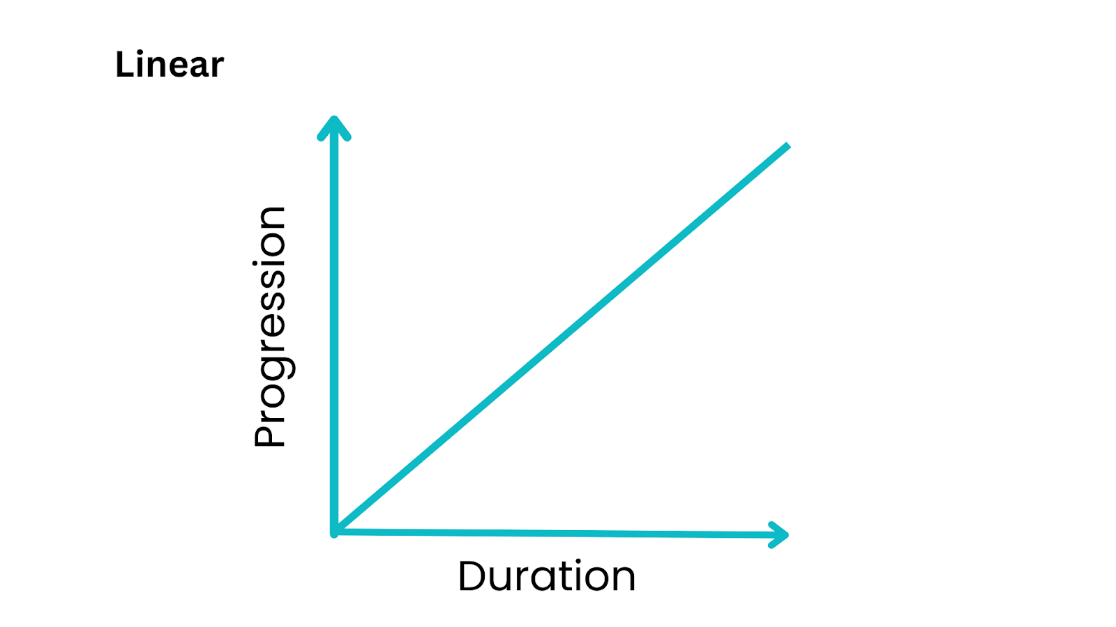
linear
The linear timing function is the simplest and most straightforward of all timing functions. It creates a constant rate of change throughout the animation, meaning that the property being animated changes uniformly from the start value to the end value.
The animation occurs at a constant speed, and there are no sudden accelerations or decelerations. The speed curve will be a straight line graph.
Let’s take an example and visualize the linear timing function.
HTML:
|
1 2 3 4 5 6 7 8 9 10 11 12 13 14 15 |
<!DOCTYPE html> <html lang="en"> <head> <meta charset="UTF-8"> <meta name="viewport" content="width=device-width, initial-scale=1.0"> <link rel="stylesheet" href="styles.css"> <title>Moving Circle with Path</title> </head> <body> <div class="container"> <div class="path"></div> <div class="circle"></div> </div> </body> </html> |
CSS:
|
1 2 3 4 5 6 7 8 9 10 11 12 13 14 15 16 17 18 19 20 21 22 23 24 25 26 27 28 29 30 31 32 33 34 35 36 37 38 39 40 41 42 43 44 45 46 47 48 49 50 51 52 53 54 55 56 57 58 59 60 61 62 |
body { background-color: #f0f0f0; display: flex; justify-content: center; align-items: center; height: 100vh; margin: 0; overflow: hidden; } .container { position: relative; width: 100%; height: 100px; } .path { width: 100%; height: 2px; background-color: #ccc; position: absolute; top: 50%; animation: movePath 5s linear infinite; } .circle { width: 40px; height: 40px; background-color: #3498db; border-radius: 50%; position: absolute; top: 50%; left: 0; animation: moveCircle 5s linear infinite; } @keyframes movePath { 0% { left: 0; transform: translateY(-50%); } 100% { left: 100%; transform: translateY(-50%); } } @keyframes moveCircle { 0% { left: 0; transform: translateY(-50%); } 100% { left: 100%; transform: translateY(-50%); } } |
See the Pen
Untitled by adarsh (@adarsh-gupta101)
on CodePen.
In this example, we have a linear animation where the circle moves in the positive X direction without any acceleration or deceleration.
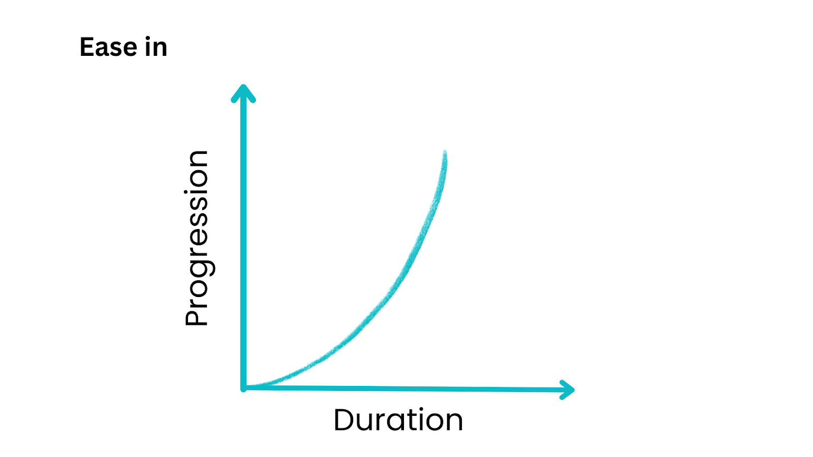
ease-in
The ease-in timing function is one of the predefined timing functions available in CSS animations and transitions. It is a common choice when you want to create an animation that starts slowly and gradually accelerates as it progresses.
The shape of the speed curve resembles a smooth, concave curve that starts gently and then becomes steeper as it progresses.
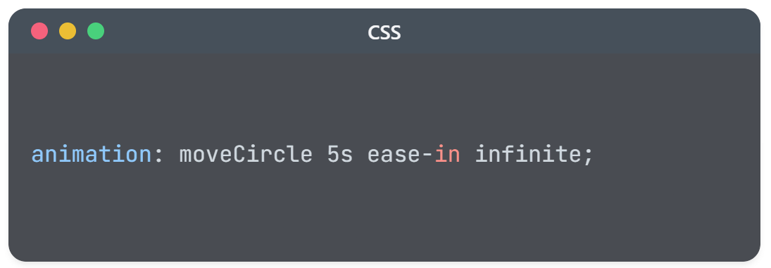
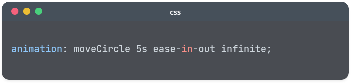
Let’s take the previous example and update the timing function from linear to ease-in and see the difference.
See the Pen
Untitled by adarsh (@adarsh-gupta101)
on CodePen.
As you can see the path or the line goes in a linear fashion, whereas the circle starts slowly and gradually increases its speed of propagation.
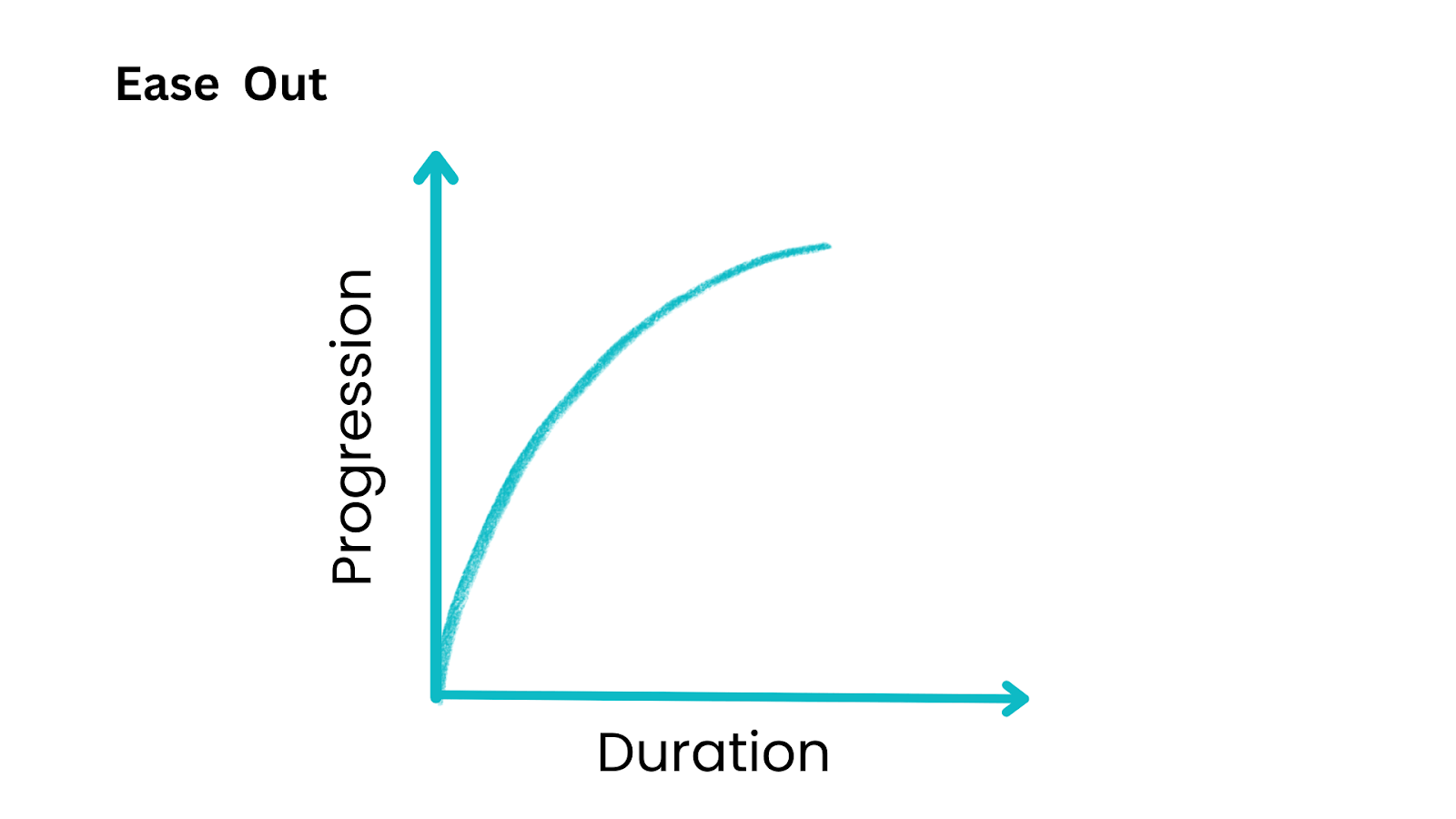
ease-out
The ease-out timing function is another predefined timing function available in CSS keyframes animation and transitions. Unlike ease-in, which starts slowly and accelerates, ease-out does the opposite. It begins with a faster animation speed and then gradually decelerates as it reaches its end.
The speed time graph here resembles a smooth curve that starts quickly and then gradually levels off, giving the impression of a gradual slowdown.
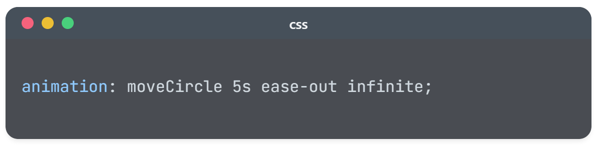
Let’s add the ease-out property to the previous example now.
See the Pen
Untitled by adarsh (@adarsh-gupta101)
on CodePen.
ease-in-out
The ease-in-out timing function is a commonly used predefined timing function in CSS keyframes animation and transitions.
As the name suggests, ease-in-out combines elements of both ease-in and ease-out, creating an animation that starts slowly, accelerates in the middle, and then decelerates as it approaches the end.
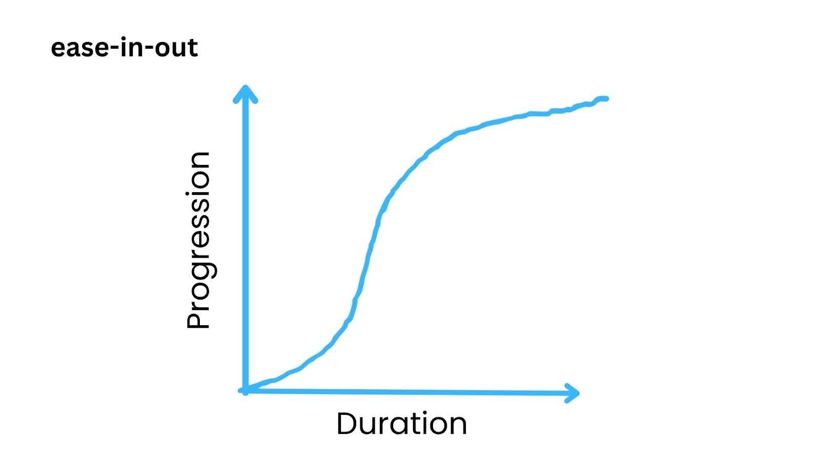
Let’s now update the previous example with an ease-in-out timing function.
See the Pen
Untitled by adarsh (@adarsh-gupta101)
on CodePen.
In this example, you can see that the animations start slow, speed up in the middle, and end slowly.
Let’s combine all the predefined timing functions in a single example and see how it looks.
HTML:
|
1 2 3 4 5 6 7 8 9 10 11 12 13 14 15 16 17 18 19 20 21 22 23 24 25 26 27 28 29 30 31 32 33 34 35 36 37 |
<!DOCTYPE html> <html lang="en"> <head> <meta charset="UTF-8"> <meta name="viewport" content="width=device-width, initial-scale=1.0"> <link rel="stylesheet" href="styles.css"> <title>Animated Circles</title> </head> <body> <div class="container"> <div class="label">Linear</div> <div class="path"></div> <div class="circle linear"></div> </div> <div class="container"> <div class="label">Ease-In</div> <div class="path"></div> <div class="circle ease-in"></div> </div> <div class="container"> <div class="label">Ease-Out</div> <div class="path"></div> <div class="circle ease-out"></div> </div> <div class="container"> <div class="label">Ease-In-Out</div> <div class="path"></div> <div class="circle ease-in-out"></div> </div> </body> </html> |
CSS:
|
1 2 3 4 5 6 7 8 9 10 11 12 13 14 15 16 17 18 19 20 21 22 23 24 25 26 27 28 29 30 31 32 33 34 35 36 37 38 39 40 41 42 43 44 45 46 47 48 49 50 51 52 53 54 55 56 57 58 59 60 61 62 63 64 65 66 67 68 69 70 71 72 73 74 75 76 77 78 79 80 81 82 83 84 85 86 87 88 |
body { background-color: #f0f0f0; display: flex; justify-content: center; align-items: center; height: 100vh; margin: 0; overflow: hidden; } .container { display: flex; flex-direction: column; align-items: center; margin: 20px; } .label { font-size: 16px; margin-bottom: 10px; } .path { width: 100%; height: 2px; background-color: #ccc; animation: movePath 5s ease-in-out infinite; } .circle { width: 40px; height: 40px; background-color: #3498db; border-radius: 50%; animation: moveCircle 5s linear infinite, easeInOut 5s linear infinite; } .ease-in { animation-timing-function: ease-in; } .ease-out { animation-timing-function: ease-out; } .ease-in-out { animation-timing-function: ease-in-out; } @keyframes movePath { 0% { transform: scaleX(0); } 100% { transform: scaleX(1); } } @keyframes moveCircle { 0% { transform: translateX(0); } 100% { transform: translateX(100%); } } @keyframes easeInOut { 0% { transform: translateX(0); } 50% { transform: translateX(50%); } 100% { transform: translateX(100%); } } |
See the Pen
Untitled by adarsh (@adarsh-gupta101)
on CodePen.
From the output above, you can see how the animation behaves differently with respect to various timing functions. By selecting the right timing function, you can achieve effects that range from smooth and gradual transitions to bouncy, elastic movements.
Timing
The steps() function allows you to create CSS keyframes animation with defined steps rather than smoothly transitioning between values. This function can create frame-by-frame animations and show the changes in the property being animated.
Syntax:
|
1 2 3 |
.element { animation-timing-function: steps(value); } |
The value defines the number of intervals or steps the animation is divided into, and as an optional parameter, we can specify whether the steps start at the beginning (start) or end (end) of each interval.
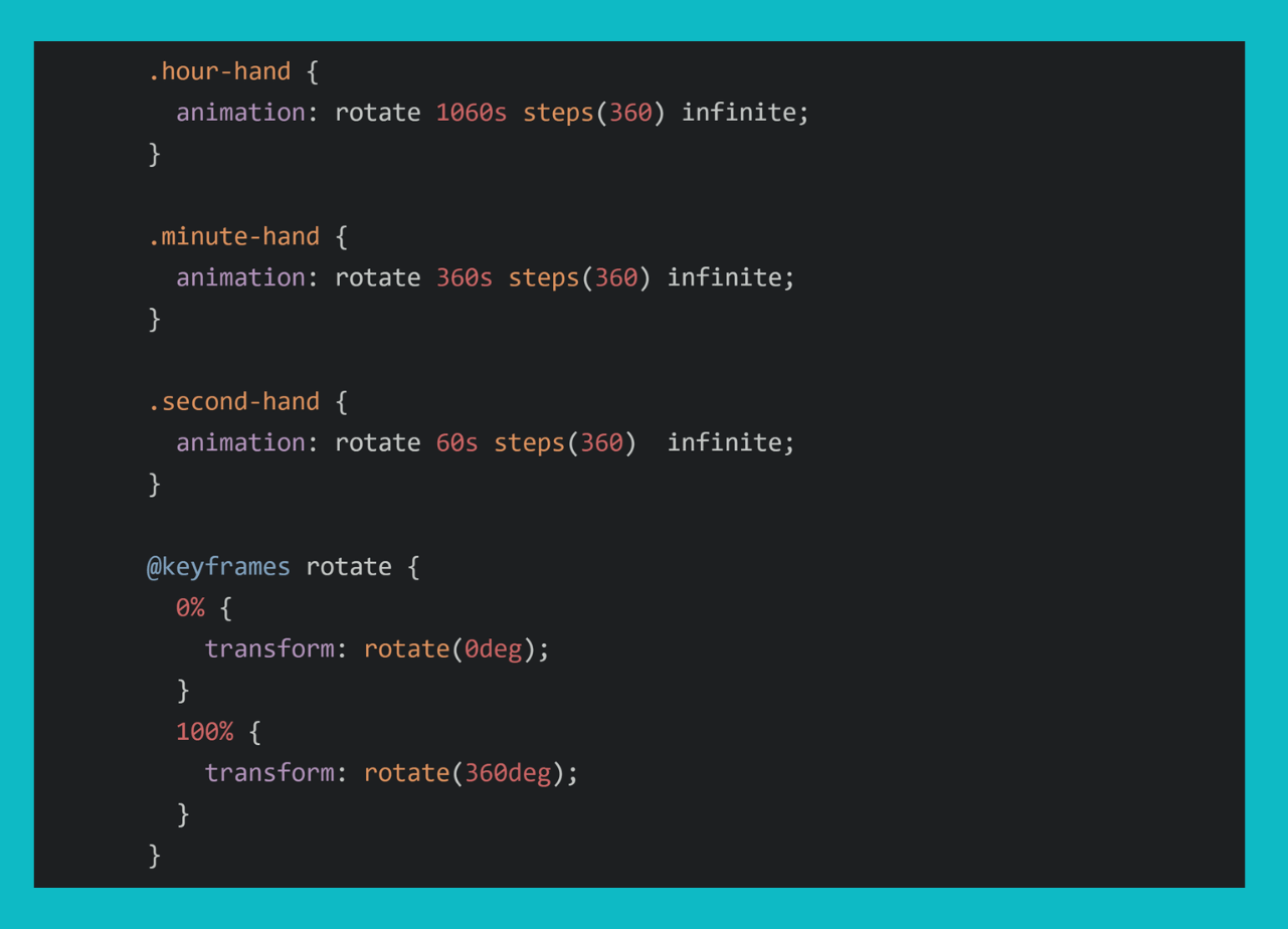
Let’s now consider an example for demonstrating steps() function in animation by creating an animated clock movement.
See the Pen
Untitled by adarsh (@adarsh-gupta101)
on CodePen.
In this example, you can observe that the animation durations are set to correspond to the full rotation for hours, minutes, and seconds. The steps() function is used to create a discrete step animation.
However, you might be wondering how to create custom timing functions for CSS keyframes animation. You are not limited to the predefined timing functions mentioned above, you can also create timing functions depending on your specific needs.
Let’s explore that now.
cubic-bezier() function
To achieve a natural and realistic finish in CSS keyframes animation, relying solely on a constant speed animation may not be ideal. For example, consider an animation where an object is dropped to the floor: it should first accelerate downward and then rebound after making contact with the floor. This nuanced effect can be accomplished through the use of cubic bezier curves.
The cubic-bezier() timing function is a cubic Bézier curve defined by four control points, which influence the acceleration and deceleration of animation over time.
The cubic-bezier() function specifies the timing of CSS keyframes animation, allowing you to create custom motion curves beyond standard timing functions like ease, linear, ease-in, and ease-out.
Syntax:
|
1 |
animation-timing-function: cubic-bezier(P0, P1, P2, P3) |
P0 and P3 represent the starting and ending points, respectively. They must be the coordinates (0, 0) and (1, 1). P1 and P2 are the control points, each with values between 0 and 1. P1 influences the curve’s initial acceleration. P2 influences the curve’s deceleration towards the end.
Let’s check out some simple animation timings created using the cubic-bezier() function.
HTML:
|
1 2 3 4 5 6 7 8 9 10 11 12 13 14 15 16 17 18 19 20 21 22 23 24 25 26 27 28 29 30 31 32 33 34 35 36 37 38 39 40 41 42 |
<!DOCTYPE html> <html lang="en"> <head> <meta charset="UTF-8" /> <meta name="viewport" content="width=device-width, initial-scale=1.0" /> <link rel="stylesheet" href="styles.css" /> <title>Cubic Bezier Animations</title> </head> <body> <h1>Cubic Bezier Animations</h1> <div class="wrap"> <span>ease | cubic-bezier(0.25, 0.1, 0.25, 1)</span> <div class="container"> <div class="box cb-0"></div> </div> <span>cubic-bezier(0.8, 0.1, 1, 0.04)</span> <div class="container"> <div class="box cb-1"></div> </div> <span>cubic-bezier(0.1, 0.9, 0.9, 0.1)</span> <div class="container"> <div class="box cb-2"></div> </div> <span>cubic-bezier(0.6, 1.5, 0.6, 1)</span> <div class="container"> <div class="box cb-3"></div> </div> <span>cubic-bezier(0.68, -0.55, 0.265, 1.55)</span> <div class="container"> <div class="box cb-4"></div> </div> </div> </body> </html> |
CSS:
|
1 2 3 4 5 6 7 8 9 10 11 12 13 14 15 16 17 18 19 20 21 22 23 24 25 26 27 28 29 30 31 32 33 34 35 36 37 38 39 40 41 42 43 44 45 46 47 48 49 50 51 52 53 54 55 56 57 58 59 60 61 62 63 64 65 66 67 68 69 70 71 72 73 74 75 76 77 78 79 80 81 82 83 84 85 86 87 88 89 |
body { background-color: #F5F5F5; color: #555; font-size: .9em; font-family: Consolas, monaco, monospace; } .wrap { margin: 30px auto 100px; max-width: 740px; } .container { padding: 0.1em; margin-bottom: 2.5em; border: 1px solid #333; background-color: white; } span { font-weight: medium; display: inline-block; margin-bottom: .8em; } .box { padding: 1em; width: 15px; height: 15px; background-color: purple; animation-duration: 3s; animation-name: moveCB; animation-iteration-count: infinite; animation-timing-function: cubic-bezier(.8, .1, 1, .04); } .cb-0{ animation-name: moveCB; animation-timing-function: cubic-bezier(0.25, 0.1, 0.25, 1) } .cb-1 { animation-timing-function: cubic-bezier(0.8, 0.1, 0.1, 0.04) } .cb-2 { animation-timing-function: cubic-bezier(.1, .9, .9, .1); } .cb-3 { animation-timing-function: cubic-bezier(0.6, 1.5, 0.6, 1); } .cb-4 { animation-timing-function: cubic-bezier(0.68, -0.85, 0.265, 1.55); } .cb-5 { animation-timing-function: cubic-bezier(0.5, 3.0, 0.5, -2.0); } @keyframes moveCB { to { transform: translateX(635px); } } |
See the Pen
Untitled by adarsh (@adarsh-gupta101)
on CodePen.
You can play around with the cubic-bezier() function to see the different curves that can be made.
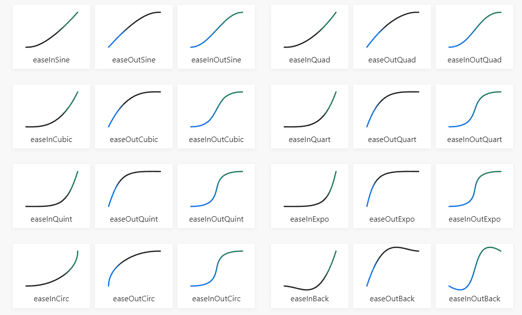
The following are some of the most common timing functions you can use depending on your need for the CSS keyframes animation.
Now that we’ve covered CSS keyframes animation basics and timing functions, let’s dive into specific properties that we can adjust to create better CSS keyframes animation.
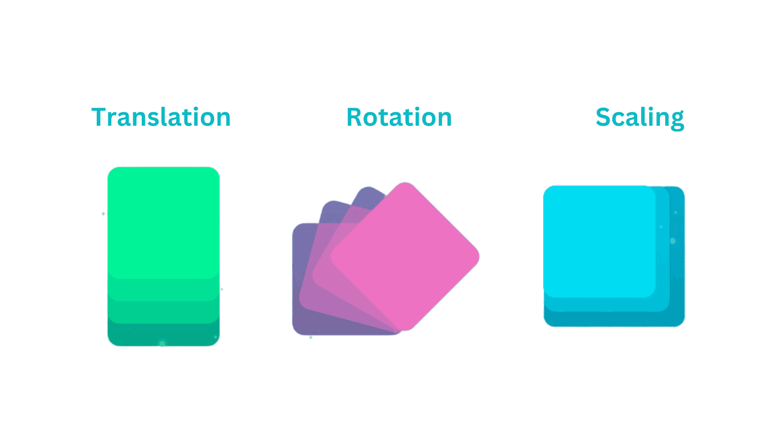
Keyframes Animation Using CSS Transformations
CSS transformations are a set of properties and functions that allow you to manipulate the visual rendering of HTML elements. They provide a way to change how HTML elements look and behavior on the webpage.
With transformations, you can make web elements bigger or smaller, move them around, rotate them, or even make them look like they’re slanted, all without changing the actual content of your web page.
Combining transformation with CSS keyframes animation can bring a new creative visual experience to the web. You can also use them to create 3D effects that bring depth to your web designs.
Let’s look at each of the transform functions available in CSS:
translate()
The translate() function allows one to move an element from one position to another along either the horizontal (x) or vertical (y) axis. It allows you to change the element’s location on the web page without altering its size, rotation, or other visual properties.
Syntax:
|
1 2 3 |
.element{ transform: translate(X, Y); } |
The X value specifies the distance to move the element along the horizontal (x) axis. It can be a positive or negative value, indicating rightward or leftward movement, respectively. Similarly, the Y value specifies the distance to move the element along the vertical (y) axis.
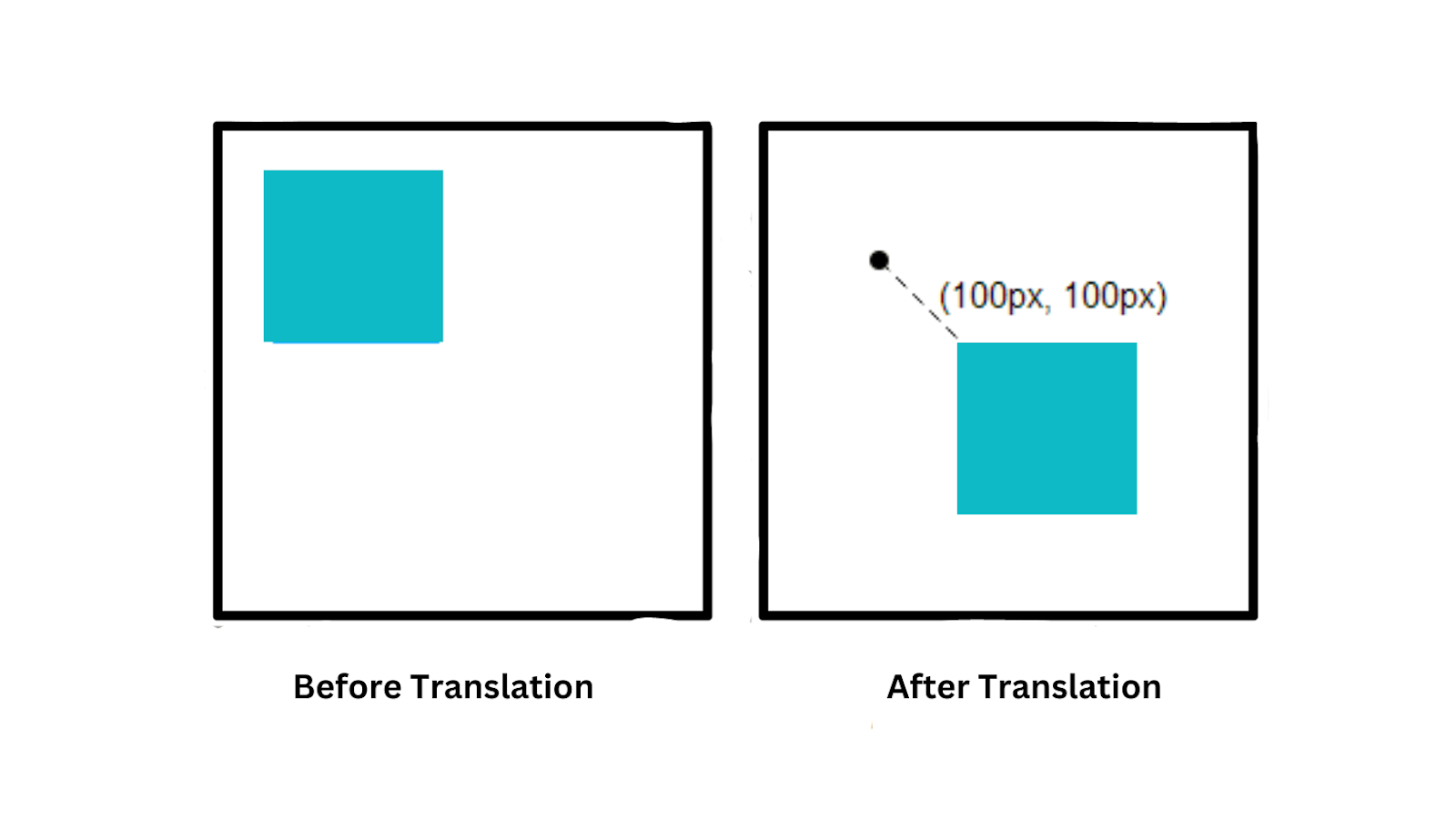
You can use either pixel values or percentage values for X and Y, depending on your design requirements. You can also use translateX() and translateY() functions separately if you only want to move the element along one axis.
In this example, we will try to translate the car in X direction. You can be creative and add more life-like animations to the website.
See the Pen
Untitled by adarsh (@adarsh-gupta101)
on CodePen.
You can also use percentage (%) values inside the translate property, and it is a really useful way. When a percentage value is used to translate an object, that percentage refers to the element’s own size, not the available space within the parent container.
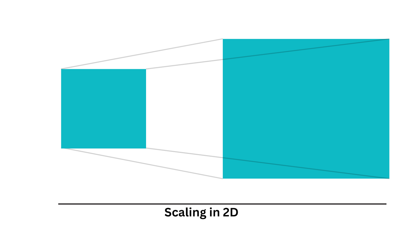
scale()
The scale() function in CSS defines a transformation that allows you to resize an element on the 2D plane. This can be useful in scenarios where we need CSS keyframes animation like creating zoom-in effects, transitions, or responsive designs.
Syntax:
|
1 2 3 |
.element{ transform: scale(X, Y); } |
The X value specifies the horizontal scaling factor. Values that are less than 1 make the element narrower, while a value greater than 1 makes it wider. Similarly, Y value specifies the vertical scaling factor. The values are unitless.
Let’s take an example to see it in action.
HTML:
|
1 2 3 4 5 6 7 8 9 10 11 12 13 14 15 16 17 18 19 20 21 22 23 24 25 26 27 28 29 |
<!DOCTYPE html> <html lang="en"> <head> <meta charset="UTF-8"> <meta name="viewport" content="width=device-width, initial-scale=1.0"> <link rel="stylesheet" href="styles.css"> <title>Image Zoom Effect</title> </head> <body> <div class="image-container i1"> <p>Scale X & Y</p> <img src="https://images.pexels.com/photos/15295967/pexels-photo-15295967/free-photo-of-food-light-water-leaf.jpeg?auto=compress&cs=tinysrgb&w=1260&h=750&dpr=1" alt="Image 1"> </div> <div class="image-container i2"> <p>Scale X </p> <img src="https://images.pexels.com/photos/15295967/pexels-photo-15295967/free-photo-of-food-light-water-leaf.jpeg?auto=compress&cs=tinysrgb&w=1260&h=750&dpr=1" alt="Image 1"> </div> <div class="image-container i3"> <p>Scale Y </p> <img src="https://images.pexels.com/photos/15295967/pexels-photo-15295967/free-photo-of-food-light-water-leaf.jpeg?auto=compress&cs=tinysrgb&w=1260&h=750&dpr=1" alt="Image 1"> </div> </body> </html> |
CSS:
|
1 2 3 4 5 6 7 8 9 10 11 12 13 14 15 16 17 18 19 20 21 22 23 24 25 26 27 28 29 30 31 32 33 34 35 36 37 38 39 40 41 42 43 44 45 |
body { margin: 0; padding: 0; display: flex; justify-content: center; align-items: center; height: 100vh; background-color: #f0f0f0; } .image-container { width: 300px; height: 200px; overflow: hidden; position: relative; transition: transform 0.3s ease; margin:25px } img { width: 100%; height: 100%; object-fit: cover; } .i1:hover { transform: scale(1.2); /* Zoom in by 20% on hover */ } .i2:hover { transform: scaleX(1.2); /* Zoom in by 20% on hover on Y */ } .i3:hover { transform: scaleY(1.2); /* Zoom in by 20% on hover on Y */ } |
See the Pen
Untitled by adarsh (@adarsh-gupta101)
on CodePen.
As you can see in the example, the image scales in response to the scale factor. This effect is often used in hover animations to provide users with a sense of interaction.
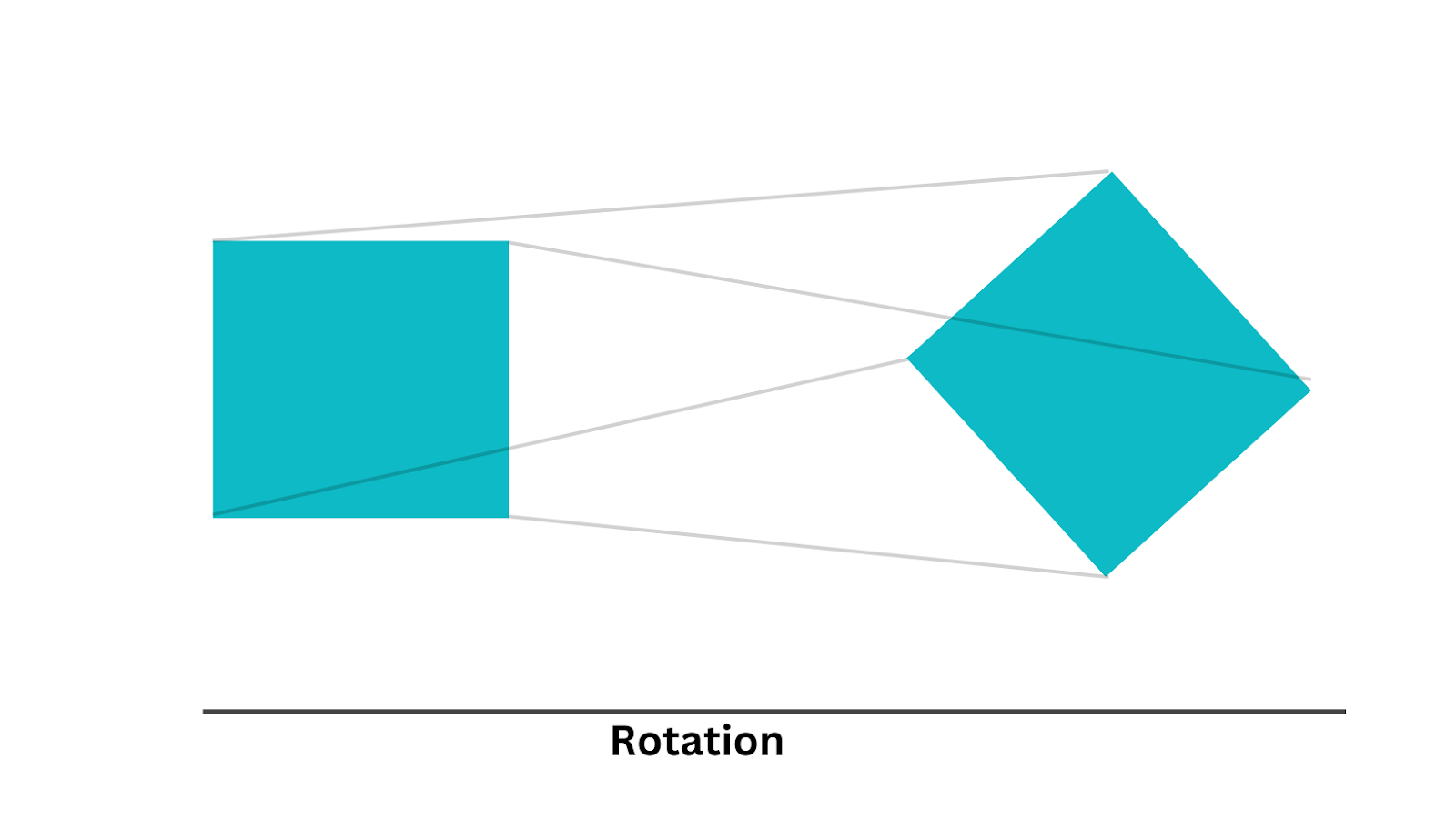
rotate()
The rotate() transformation function in CSS allows you to rotate elements, such as text or images, by a specified angle.
Syntax:
|
1 2 3 |
.element{ transform: rotate(angle); } |
The angle here specifies the angle of rotation in degrees. Positive values rotate the element clockwise, and negative values rotate counterclockwise.
Here is an example.
HTML:
|
1 2 3 4 5 6 7 8 9 10 11 12 13 14 15 16 17 18 19 20 21 22 23 |
<!DOCTYPE html> <html lang="en"> <head> <meta charset="UTF-8"> <meta name="viewport" content="width=device-width, initial-scale=1.0"> <link rel="stylesheet" href="styles.css"> <title>Card Flip Animation</title> </head> <body> <div class="card"> <div class="card-inner"> <div class="card-front"> <p>Test Your Web Or Mobile Apps On 3000+ Browsers</p> <img class="lambdatest" src="https://www.lambdatest.com/blog/wp-content/uploads/2023/05/Dashboard.png"/> </div> <div class="card-back"> <p class="sign">Sign Up</p> </div> </div> </div> </body> </html> |
CSS:
|
1 2 3 4 5 6 7 8 9 10 11 12 13 14 15 16 17 18 19 20 21 22 23 24 25 26 27 28 29 30 31 32 33 34 35 36 37 38 39 40 41 42 43 44 45 46 47 48 49 50 51 52 53 54 55 56 57 58 59 60 61 62 63 64 65 66 67 68 69 70 71 72 73 74 75 76 77 78 79 |
body { margin: 0; padding: 0; display: flex; justify-content: center; align-items: center; height: 100vh; background-color: #333; } .card { width: 200px; height: 300px; } .card-inner { width: 100%; height: 100%; position: relative; transform-style: preserve-3d; /* Preserve 3D transforms on child elements */ transition: transform 1s; /* Add a smooth transition for the flip effect */ } .card:hover .card-inner { transform: rotateY(180deg); /* Rotate the card 180 degrees on hover */ } .card-front, .card-back { height: 100%; width: 100%; position: absolute; backface-visibility: hidden; /* Hide the back of the card when it's flipped */ display: flex; flex-direction: column; justify-content: center; align-items: center; color: white; font-size: 24px; background: linear-gradient( 0deg, hsla(0, 0%, 100%, 0.3), hsla(0, 0%, 100%, 0.3) ), linear-gradient( 120.74deg, #ffb4b7 -1.19%, #deb5e7 29.65%, #84b5ff 62.61%, #c68cff 93.58% ); box-shadow: 0 4px 8px rgba(0, 0, 0, 0.2); /* Add a box shadow for depth */ border-radius: 10px; overflow: hidden; } .lambdatest { width: 150px; } p { color: black; font-weight: 800; padding: 16px; } .card-back { transform: rotateY(180deg); /* Rotate the back of the card initially */ } .sign { border: 2px solid black; margin: 5px; padding: 12px; } |
See the Pen
Untitled by adarsh (@adarsh-gupta101)
on CodePen.
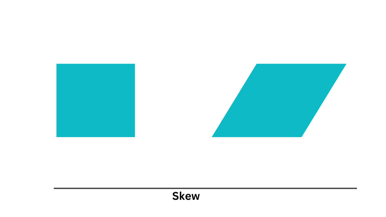
skew()
The skew() function distorts an element by skewing it along the x-axis, y-axis, or both. Skewing creates a parallelogram-like effect.
Syntax:
|
1 2 3 |
.element{ transform: skew(20deg, 10deg); } |
You can either pass a single value so that both x and y take the same value or pass two values to specify x and y separately. You can also use the skewX() and skewY() functions to determine the skewing along specific axes.
Let’s take an example to see an example skew animation.
HTML:
|
1 2 3 4 5 6 7 8 9 10 11 12 13 14 15 16 17 18 19 20 21 22 23 24 25 |
<!DOCTYPE html> <html lang="en"> <head> <meta charset="UTF-8" /> <meta name="viewport" content="width=device-width, initial-scale=1.0" /> <title>Document</title> </head> <body> <h1>Your Credit Card Wallet</h1> <div class="cards"> <div class="card"> <p>3872 4888 9812 0128</p> </div> <div class="card"> <p>9463 2378 1449 0548</p> </div> <div class="card"> <p>4554 4455 1738 0199</p> </div> <div class="card"> <p>5444 9583 4444 4463</p> </div> </div> </body> </html> |
CSS:
|
1 2 3 4 5 6 7 8 9 10 11 12 13 14 15 16 17 18 19 20 21 22 23 24 25 26 27 28 29 30 31 32 33 34 35 36 37 38 39 40 41 42 43 44 45 46 47 48 49 50 51 52 53 54 55 56 57 58 59 60 61 62 63 64 65 66 67 68 69 70 71 72 73 74 75 76 |
body { display: flex; height: 100vh; justify-content:center; align-items:center; background-color: #222; padding:15px; } h1{ color:white; font-family: monospace; font-size:24px; text-align; } .cards { display: flex; margin: auto; transform:rotate(270deg) } .card { position: relative; border-radius: 0.75rem; width: 8rem; height: 16rem; margin-left: -3rem; background-size: cover; cursor: pointer; box-shadow: inset 32px 32px 40px #ffffff30, inset 1px 1px 1px #ffffffaa, -24px 16px 32px #141418aa; transform: skewY(10deg); transition: all 0.25s ease-in-out; } .card:hover { transform: skewY(-15deg) translateY(-4rem); z-index:100 } .card p { position: absolute; bottom: 45%; right: 20%; transform: rotate(90deg); width: max-content; color: #ffffff90; font-family: monospace; text-shadow: 1px 1px 10px #fff; user-select: none; } .card:nth-child(1) { background-image: url("https://images.unsplash.com/photo-1596436950209-65ef85e9679c?ixlib=rb-4.0.3&ixid=M3wxMjA3fDB8MHxwaG90by1wYWdlfHx8fGVufDB8fHx8fA%3D%3D&auto=format&fit=crop&w=1288&q=80"); } .card:nth-child(2) { background-image: url("https://images.unsplash.com/photo-1676893140106-1df79a4a7842?crop=entropy&cs=srgb&fm=jpg&ixid=M3wzMjM4NDZ8MHwxfHJhbmRvbXx8fHx8fHx8fDE2ODc5NTExNzd8&ixlib=rb-4.0.3&q=85") } .card:nth-child(3) { background-image: url("https://images.unsplash.com/photo-1573788583117-2f62b3ddc08d?ixlib=rb-4.0.3&ixid=M3wxMjA3fDB8MHxwaG90by1wYWdlfHx8fGVufDB8fHx8fA%3D%3D&auto=format&fit=crop&w=1287&q=80") } .card:nth-child(4) { background-image: url("https://plus.unsplash.com/premium_photo-1669863283269-7f1841a60648?ixlib=rb-4.0.3&ixid=M3wxMjA3fDB8MHxwaG90by1wYWdlfHx8fGVufDB8fHx8fA%3D%3D&auto=format&fit=crop&w=1288&q=80") } |
See the Pen
Credit cards by adarsh (@adarsh-gupta101)
on CodePen.
As you can see in the above example, skewing can produce a tilting effect on an element. This is useful for showing depth perception or achieving real-world-like visual effects.
Now that you have good knowledge of CSS keyframes animation using transformation effects let’s build an entire landing page with several animations.
HTML:
|
1 2 3 4 5 6 7 8 9 10 11 12 13 14 15 16 17 18 19 20 21 22 23 24 25 26 27 28 29 30 31 32 33 34 35 36 37 38 39 40 41 42 43 44 45 46 47 48 49 50 51 52 53 54 55 56 57 58 59 60 61 62 63 64 65 66 67 68 69 70 71 72 73 74 75 76 77 78 79 80 81 82 83 84 85 86 87 88 89 90 91 92 93 94 95 96 97 98 99 100 101 102 103 104 105 106 107 108 109 110 111 112 113 114 115 116 117 118 119 120 121 122 123 124 125 126 127 128 129 130 131 132 133 134 135 136 137 138 139 140 141 142 143 144 145 146 147 148 149 150 151 152 153 154 155 156 157 158 159 160 161 162 163 164 165 166 167 168 169 170 171 172 173 174 175 176 177 178 179 180 181 182 183 184 185 186 187 188 189 190 191 192 193 194 195 196 197 198 199 200 201 202 |
<!DOCTYPE html> <html lang="en"> <head> <meta charset="UTF-8" /> <meta name="viewport" content="width=device-width, initial-scale=1.0" /> <title>Full Animated Website Example</title> <link rel="stylesheet" href="style.css" /> </head> <body data-colorMode="dark"> <div class="loader-wrapper"> <div class="loader"> <h3>#LambdaTest your Apps</h3> </div> </div> <nav> <div class="nav__logo"> <img src="https://www.lambdatest.com/resources/images/logos/logo.svg" alt="Lambdatest Logo" /> </div> <div class="nav__menu"> <div class="nav__burger" onclick="toggleMenu()"> <div class="bar line1"></div> <div class="bar line2"></div> <div class="bar line3"></div> </div> <ul class="nav__ul"> <li>Platform</li> <li>Enterprise</li> <li>Resources</li> <li>Developers</li> <li>Pricing</li> </ul> </div> <div class="nav__btns"> <button class="nav__signin">Upgrade</button> <button class="nav__signup">Book a Demo</button> </div> </nav> <div class="banner"> <div class="circle-container"> <img class="img_icon" alt="" src="https://cdn-icons-png.flaticon.com/128/2540/2540023.png?track=ais"/> <img class="img_icon" alt="" src="https://cdn-icons-png.flaticon.com/128/535/535160.png?track=ais"/> <img class="img_icon" alt="" src="https://cdn-icons-png.flaticon.com/128/5968/5968890.png?track=ais"/> <img class="img_icon" alt="" src="https://upload.wikimedia.org/wikipedia/commons/thumb/5/5d/Opera_Mini_2015_icon.svg/512px-Opera_Mini_2015_icon.svg.png"/> <img class="img_icon" alt="" src="https://seeklogo.com/images/B/brave-logo-F5E1D99D9E-seeklogo.com.png"/> </div> <h2>The Complete Testing Solution for the Internet</h2> <p> Deliver unparalleled digital experience with our next-gen AI-powered testing cloud platform. Ensure exceptional user experience across all devices and browsers. </p> <div class="arrow" onclick=""> <!-- svg of an down arrow --> <svg id="scrl-icon" xmlns="http://www.w3.org/2000/svg" viewBox="0 0 24 38.9"><path class="scrl-body" d="M12.8 38.4h-1.6C5.2 38.4.4 33.6.4 27.6V11.2C.4 5.2 5.2.4 11.2.4h1.6c6 0 10.8 4.8 10.8 10.8v16.5c0 5.9-4.8 10.7-10.8 10.7z"/><path class="scrl-wheel" d="M12 13.9a4.2 4.2 0 01-4.2-4.2V4.2C7.8 1.9 9.7 0 12 0c2.3 0 4.2 1.9 4.2 4.2v5.4a4.1 4.1 0 01-4.2 4.3z"/></svg> </svg> </div> </div> <div class="video__banner"> <video loop="true" autoplay src="/HyperExecute.webm" /> </div> <div class="features"> <h3>Why Lambdatest?</h3> <div class="features__container"> <div class="card slide-left"> <h3>Online Cross Browser Testing Tool</h3> <p> Perform live interactive cross browser testing of your public or local websites on 3000+ real mobile and desktop browsers running on real operating systems. </p> </div> <div class="card slide-right"> <h3>Online Selenium Grid</h3> <p> A reliable, scalable, secure, and high performing test execution cloud that empowers development and testing teams to accelerate their release cycles. </p> </div> <div class="card slide-left"> <h3>HyperExecute</h3> <p> HyperExecute platform comes with feature-packed hosted runners for every major OS including Windows, MacOS, and Linux containers </p> </div> </div> </div> <footer> #LambdaTest your Apps </footer> </body> <script defer> function toggleMenu() { const navUl = document.querySelector(".nav__ul"); navUl.classList.toggle("show"); } const navLinks = document.querySelector(".nav__ul"); const links = document.querySelectorAll("li"); const hamburger = document.querySelector(".nav__burger"); hamburger.addEventListener("click", () => { //Animate Links navLinks.classList.toggle("toggle"); console.log(navLinks); links.forEach((link) => { link.classList.toggle("fade"); }); //Hamburger Animation hamburger.classList.toggle("toggle"); }); const cards = document.querySelectorAll(".card"); console.log(cards); cards.forEach((card) => { card.addEventListener("mousemove", (e) => { const rect = card.getBoundingClientRect(); const left = e.clientX - rect.left; const top = e.clientY - rect.top; console.log(left, top); card.style.setProperty("--left", `${left}px`); card.style.setProperty("--top", `${top}px`); }); }); document.addEventListener("DOMContentLoaded", function () { // Show the loader document.querySelector(".loader-wrapper").style.visibility = "visible"; document.querySelector(".loader-wrapper").style.opacity = "1"; // Set a timeout to hide the loader after 3 seconds setTimeout(function () { document.querySelector(".loader-wrapper").style.visibility = "hidden"; document.querySelector(".loader-wrapper").style.opacity = "0"; }, 3000); }); document.addEventListener('DOMContentLoaded', function() { const cards = document.querySelectorAll('.card'); function checkScroll() { cards.forEach((card, index) => { const cardPosition = card.getBoundingClientRect().top; const screenPosition = window.innerHeight / 1.3; // Adjust the position based on your preference if (cardPosition < screenPosition) { card.classList.add('show'); } }); } // Initial check when the page loads checkScroll(); // Check again when the user scrolls window.addEventListener('scroll', checkScroll); }); </script> </html> |
CSS:
|
1 2 3 4 5 6 7 8 9 10 11 12 13 14 15 16 17 18 19 20 21 22 23 24 25 26 27 28 29 30 31 32 33 34 35 36 37 38 39 40 41 42 43 44 45 46 47 48 49 50 51 52 53 54 55 56 57 58 59 60 61 62 63 64 65 66 67 68 69 70 71 72 73 74 75 76 77 78 79 80 81 82 83 84 85 86 87 88 89 90 91 92 93 94 95 96 97 98 99 100 101 102 103 104 105 106 107 108 109 110 111 112 113 114 115 116 117 118 119 120 121 122 123 124 125 126 127 128 129 130 131 132 133 134 135 136 137 138 139 140 141 142 143 144 145 146 147 148 149 150 151 152 153 154 155 156 157 158 159 160 161 162 163 164 165 166 167 168 169 170 171 172 173 174 175 176 177 178 179 180 181 182 183 184 185 186 187 188 189 190 191 192 193 194 195 196 197 198 199 200 201 202 203 204 205 206 207 208 209 210 211 212 213 214 215 216 217 218 219 220 221 222 223 224 225 226 227 228 229 230 231 232 233 234 235 236 237 238 239 240 241 242 243 244 245 246 247 248 249 250 251 252 253 254 255 256 257 258 259 260 261 262 263 264 265 266 267 268 269 270 271 272 273 274 275 276 277 278 279 280 281 282 283 284 285 286 287 288 289 290 291 292 293 294 295 296 297 298 299 300 301 302 303 304 305 306 307 308 309 310 311 312 313 314 315 316 317 318 319 320 321 322 323 324 325 326 327 328 329 330 331 332 333 334 335 336 337 338 339 340 341 342 343 344 345 346 347 348 349 350 351 352 353 354 355 356 357 358 359 360 361 362 363 364 365 366 367 368 369 370 371 372 373 374 375 376 377 378 379 380 381 382 383 384 385 386 387 388 389 390 391 392 393 394 395 396 397 398 399 400 401 402 403 404 405 406 407 408 409 410 411 412 413 414 415 416 417 418 419 420 421 422 423 424 425 426 427 428 429 430 431 432 433 434 435 436 437 438 439 440 441 442 443 444 445 446 447 448 449 450 451 452 453 454 455 456 457 458 459 460 461 462 463 464 465 466 467 468 469 470 471 472 473 474 475 476 477 478 479 480 481 482 483 484 485 486 487 488 489 490 491 492 493 494 495 496 497 498 499 500 501 502 503 504 505 506 507 508 509 510 511 512 513 514 515 516 517 518 519 520 521 522 523 524 525 526 527 528 529 530 531 532 533 534 535 536 537 538 539 540 541 542 543 544 545 546 547 548 549 550 551 552 553 554 555 556 557 558 559 560 561 562 563 564 565 566 567 568 569 570 571 572 573 574 575 576 577 578 579 580 581 582 583 584 585 586 587 588 589 590 591 592 593 594 595 596 597 598 599 600 601 602 603 604 605 606 607 608 609 610 611 612 613 614 615 616 617 618 619 620 621 622 623 624 625 626 627 628 629 630 631 632 633 634 635 636 637 638 639 640 641 642 643 644 645 646 647 648 649 650 651 652 653 654 655 656 657 658 659 660 661 662 663 664 665 666 667 668 669 670 671 672 673 674 |
@import url("https://fonts.googleapis.com/css2?family=Inter:wght@400;500;600;700;800;900&display=swap"); * { margin: 0; padding: 0; box-sizing: border-box; } body { /* dark mode */ background-color: #0e0505; color: #fff; font-family: inter, san-serif; padding: 16px; background: #000; } @keyframes pageLoad { 0% { background: #000; } 50% { background: #0ebac5; } 100% { background: #000; } } .loader-wrapper { position: fixed; top: 0; left: 0; width: 100%; height: 100%; background: #000; z-index: 1000000; display: flex; align-items: center; justify-content: center; visibility: hidden; opacity: 0; transition: visibility 0s, opacity 0.5s linear; } .loader { width: 400px; height: 400px; display: flex; align-items: center; justify-content: center; position: relative; } .loader > h3 { position: absolute; top: 50%; left: 50%; transform: translate(-50%, -50%); font-size: 2rem; font-weight: 800; margin-bottom: 1rem; text-align: center; padding: 16px; align-items: center; color: #0ebac5; } .loader::before { content: ""; width: 400px; height: 400px; position: absolute; top: 0; left: 0; border-radius: 50%; animation: ring 1s linear 4; } #scrl-icon { --clr: #ccc; display: block; width: 20px; height: auto; overflow: visible; margin: 10px auto; bottom: 50px; position: absolute; } .scrl-body { fill: none; stroke: var(--clr); stroke-linecap: round; stroke-miterlimit: 10; stroke-width: 3.5; animation: scroll-parallax 1.5s cubic-bezier(0.41, 0.07, 0.83, 0.67) infinite running; } @keyframes scroll-parallax { 25% { transform: translateY(0); } 75% { transform: translateY(-20%); } } .scrl-wheel { fill: var(--clr); transform-origin: bottom; animation: scroll-animation 1.5s linear infinite running; will-change: transform; } @keyframes scroll-animation { 0% { transform: translateY(-90%) scale(0.7, 0.1); } 10% { transform: translateY(-90%) scaleY(0.3); } 25% { transform: translateY(-20%) scaleY(1); } 75% { transform: translateY(40%) scaleY(1); } 100% { transform: translateY(20%) scale(0.8, 0.1); } } @keyframes ring { 0% { transform: rotate(0deg); box-shadow: 0px 5px 5px #ff2121; } 25% { transform: rotate(90deg); box-shadow: 0px 5px 5px #fffb21; } 50% { transform: rotate(180deg); box-shadow: 0px 5px 5px #21c0ff; } 75% { transform: rotate(270deg); box-shadow: 0px 5px 5px #bc21ff; } 100% { transform: rotate(360deg); box-shadow: 0px 5px 5px #ff2121; } } @keyframes spin { 0% { transform: rotate(0deg); } 100% { transform: rotate(360deg); } } .nav__logo > img { filter: invert(1); } .nav__logo { flex: 0.1; } nav { display: flex; justify-content: space-between; align-items: center; } .nav__menu { display: flex; align-items: center; } .nav__burger { display: none; flex-direction: column; cursor: pointer; margin-right: 10px; } .bar { width: 25px; height: 3px; background-color: #fff; margin: 2px 0; animation: fadeIn 0.4s forwards; transition: all 0.3s ease-in-out; } @keyframes fadeIn { from { opacity: 0; } to { opacity: 1; } } .navbar li { opacity: 0; } li.fade { opacity: 1; transition: opacity 0.4s ease-in-out; } .toggle .line1 { transform: rotate(45deg) translate(5px, -6px); transition: all 0.7s ease; } .toggle .line2 { transition: all 0.7s ease; width: 0; } .toggle .line3 { transform: rotate(-45deg) translate(15px, -5px); transition: all 0.7s ease; } .nav__ul { display: flex; justify-content: space-between; align-items: center; flex: 0.7; list-style-type: none; z-index: 11; } .nav__ul li { margin-right: 20px; cursor: pointer; } .nav__btns { display: flex; } .nav__btns > button { margin: 0 10px; padding: 10px 20px; border-radius: 5px; border: none; cursor: pointer; font-size: 1rem; font-weight: 600; transition: all 0.3s ease-in; } @media (max-width: 768px) { .nav__burger { display: flex; } .nav__btns { display: none; } .nav__ul { display: flex; flex-direction: column; justify-content: center; position: absolute; top: 60px; left: 0; width: 100%; min-height: 90vh; background-color: #0ebac5; clip-path: circle(10px at 100% -30%); transition: all 0.8s ease-in; } .nav__ul.show { display: flex; clip-path: circle(100vh at 10% 10%); } .open { background-color: #0ebac5; clip-path: circle(100vh at 10% 10%); /* width: 100%; height: 100%; */ pointer-events: all; } .nav__ul li { margin: 0; padding-top: 45px; text-align: center; font-weight: font-bold; } } /* Banner text */ .circle-container { position: relative; animation: rotate 8s ease-in infinite; top: 30%; transform: scale(2.5) skew(100deg); filter: hue-rotate(10deg); } @keyframes rotate { 0% { transform: rotate(0deg); } 100% { transform: rotate(360deg); } } .img_icon { width: 25px; height: 25px; position: absolute; top: 70%; left: 50%; transition: transform 4s ease-out; } .img_icon:nth-child(1) { transform: translate(-50%, -50%) rotate(0deg) translate(-250px) rotate(0deg); } .img_icon:nth-child(2) { transform: translate(-50%, -50%) rotate(72deg) translate(-250px) rotate(-72deg); } .img_icon:nth-child(3) { transform: translate(-50%, -50%) rotate(144deg) translate(-250px) rotate(-144deg); } .img_icon:nth-child(4) { transform: translate(-50%, -50%) rotate(216deg) translate(-250px) rotate(-216deg); } .img_icon:nth-child(5) { transform: translate(-50%, -50%) rotate(288deg) translate(-250px) rotate(-288deg); } .banner { height: 80vh; display: flex; flex-direction: column; justify-content: center; align-items: center; } @keyframes moveRound { 0% { transform: rotate(0deg) translate(0px, 0px); } 50% { transform: rotate(180deg) translate(25px, -250px); } 100% { transform: rotate(360deg) translate(0px, 0px); } } h2 { font-size: 5rem; font-weight: 800; margin-bottom: 1rem; text-align: center; padding: 16px; width: 70%; z-index: 10; align-items: center; background: linear-gradient(to right, #0ebac5, #ff1b6b); background-position: 100% 50%; -webkit-background-clip: text; -webkit-text-fill-color: transparent; background-clip: text; transition: all 0.1s ease-in; animation: gradientChange 2s infinite cubic-bezier(0.4, 0, 0.2, 1); } .banner > p { font-size: 1.2rem; font-weight: 300; margin-bottom: 1rem; text-align: center; padding: 16px; align-items: center; width: 60%; } @keyframes gradientChange { 0% { background: linear-gradient(to right, #0ebac5, #ff1b6b); -webkit-background-clip: text; } 50% { background: linear-gradient(to right, #ff1b6b, #0ebac5); -webkit-background-clip: text; } 100% { background: linear-gradient(to right, #0ec542, #7f2ef0); -webkit-background-clip: text; } } /* video banner */ .video__banner { display: flex; justify-content: center; align-items: center; margin: 0 auto; padding: 0 2rem; height: 90vh; width: 100%; } .video__banner > video { width: 70%; height: 80%; object-fit: contain; } @media (max-width: 768px) { h2 { font-size: 3rem; margin: 2px; width: 100%; } .banner > p { font-size: 1rem; margin: 2px; width: 100%; } .video__banner { height: 90vh; width: 100%; margin-top: 50px; } .video__banner > video { width: 100%; height: 100%; } } /* features */ .features { height: 90vh; width: 100%; margin-top: 50px; overflow-x: hidden; } .features > h3 { font-size: 2rem; font-weight: 800; margin-bottom: 1rem; text-align: center; padding: 16px; align-items: center; color: #0ebac5; } .features__container { display: flex; /* flex-direction: column; */ justify-content: center; align-items: center; flex-wrap: wrap; margin: 0 auto; padding: 0 2rem; } .card:hover { /* make backgoud a shade of blue */ /* background-color: #0000ff; */ /* make image a shade of blue */ /* filter: brightness(80%); */ transition: all 0.5s ease-in; } .card { transition-timing-function: ease-in-out; border: 1px double #dddddd59; cursor: pointer; } .card::before { content: ""; background: #0ebac5; /* pink gradient */ width: 18em; height: 18em; position: absolute; z-index: -1; transform: translate(-50%, -50%) scale(1); transition-timing-function: cubic-bezier(0.445, 0.05, 0.55, 0.95); filter: blur(100px); top: var(--top); left: var(--left); border-radius: 50%; opacity: 0; transition: opacity 0.5s ease-in-out; /* Added transition for opacity */ } .card:hover::before { opacity: 1; /* z-index: 10; */ } .card { width: 35%; height: 35%; margin: 10px; padding: 20px; z-index: 1000; position: relative; overflow: hidden; border-radius: 10px; opacity: 0; /* box-shadow: 0 0 10px rgba(0,0,0,0.5); */ transform: translateX(0); transition: opacity 0.5s, transform 0.5s; } @media (max-width: 768px) { .features { height: 100%; width: 100%; margin-top: 50px; } .features > h3 { font-size: 1.5rem; margin: 2px; width: 100%; } .features__container { display: flex; flex-direction: column; justify-content: center; align-items: center; flex-wrap: wrap; margin: 0 auto; padding: 0 2rem; } .card { width: 100%; height: 100%; } } .slide-left { transform: translateX(-100%); } .slide-right { transform: translateX(100%); } .card.show { opacity: 1; transform: translateX(0); } .card > h3 { font-size: 1.5rem; font-weight: 800; margin-bottom: 1rem; text-align: center; padding: 16px; align-items: center; } .card > p { font-size: 1rem; font-weight: 400; margin-bottom: 1rem; text-align: center; padding: 16px; align-items: center; } footer { height: 10vh; width: 100%; background-color: #0ebac5; display: flex; justify-content: center; align-items: center; flex-wrap: wrap; margin: 0 auto; padding: 0 2rem; |
See the Pen
Untitled by adarsh (@adarsh-gupta101)
on CodePen.
In the above example, you can see that multiple CSS keyframes animation catch the user’s attention. For instance, the mouse wheel animation can lead the user to scroll down to see the rest of the content.
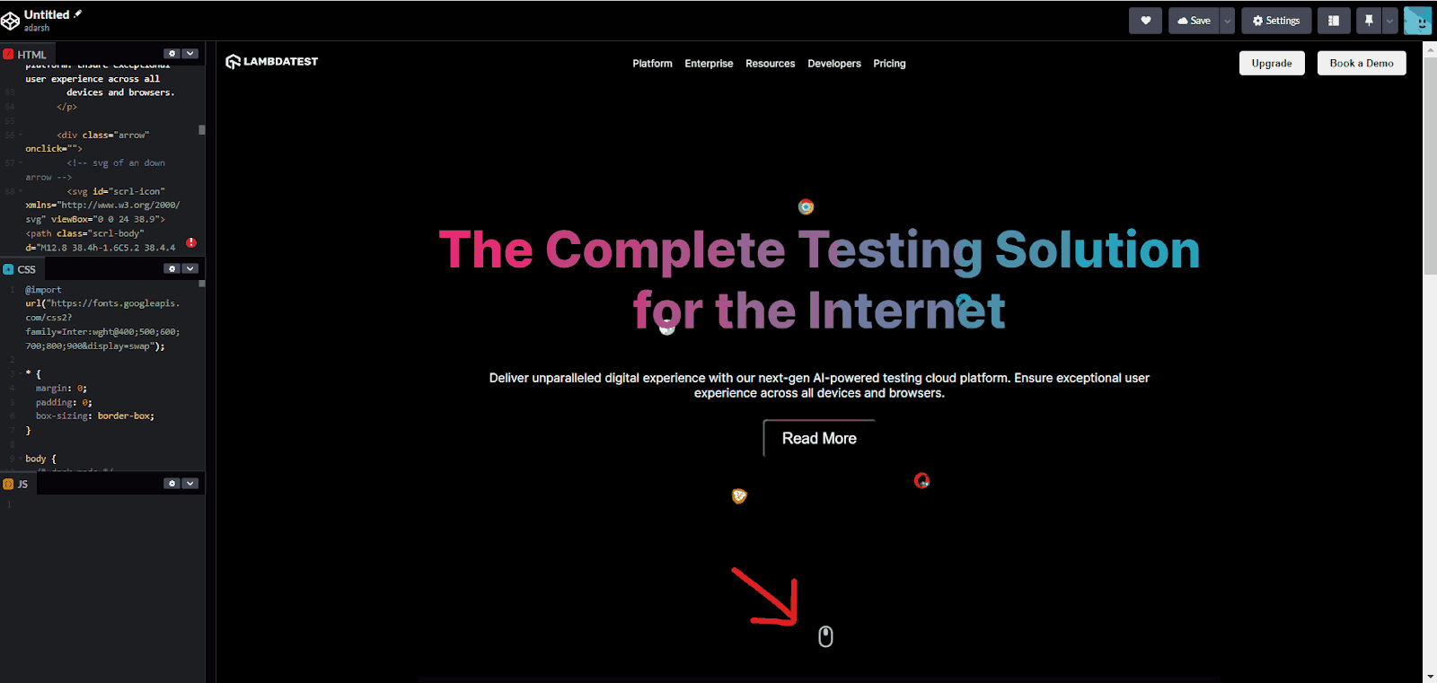
On mobile view, the navigation bar turns into a hamburger icon with a smooth reveal animation, providing a seamless user experience without sudden changes on the website.
Let’s now learn how to create some advanced CSS keyframes animation using motion paths.
CSS Keyframes Animation Using Motion Path
In the earlier section of this blog on CSS keyframes animation, you saw how to translate objects in a straight line. This is useful for simple animations, like hover effects. However, there are scenarios where we might want to move objects along a specific trajectory or path. That’s when we can use the CSS motion path.
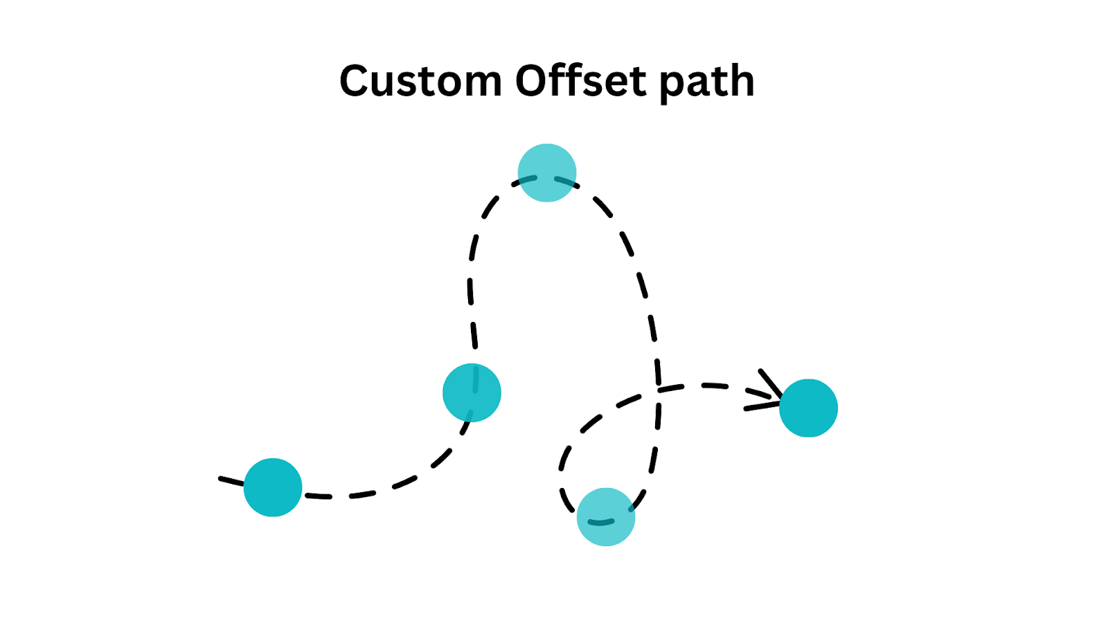
The CSS motion path feature allows you to animate any web element along a specified path, giving you more control over the motion and animation of elements on a webpage. It enables elements to move along a predefined path.
In the following example, the circle is moving through a predefined path.
See the Pen
Untitled by adarsh (@adarsh-gupta101)
on CodePen.
To understand the CSS motion path, let’s start with the basics.
The motion-path or offset-path property specifies the exact path through which an element should move. It accepts various values, such as geometric shapes (circles, ellipses, or polygons) or path data defined using SVG commands.
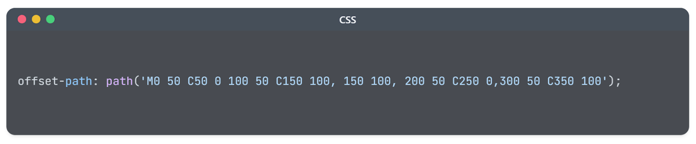
The path we want to translate can be defined using the path() function. Alternatively, you can use the predefined geometric shapes, such as circle(), ellipse(), polygon(), and inset() property.
Let’s take an example and see how it moves through different paths, such as circular, triangular, etc.
HTML:
|
1 2 3 4 5 6 7 8 9 10 11 12 13 14 15 16 17 18 19 |
<!DOCTYPE html> <html lang="en"> <head> <meta charset="UTF-8"> <meta name="viewport" content="width=device-width, initial-scale=1.0"> <link rel="stylesheet" href="styles.css"> <title>CSS Motion Path Example</title> </head> <body> <div class="container"> <div class="path-circle"></div> <div class="path-square"></div> <div class="path-triangle"></div> <div class="circle"></div> <div class="square"></div> <div class="triangle"></div> </div> </body> </html> |
CSS:
|
1 2 3 4 5 6 7 8 9 10 11 12 13 14 15 16 17 18 19 20 21 22 23 24 25 26 27 28 29 30 31 32 33 34 35 36 37 38 39 40 41 42 43 44 45 46 47 48 49 50 51 52 53 54 55 56 57 58 59 60 61 62 63 64 65 66 67 68 69 70 71 72 73 74 75 76 77 78 79 80 81 82 83 84 85 86 87 88 89 90 91 92 93 94 95 96 97 98 99 100 101 102 103 104 105 |
body { margin: 0; overflow: hidden; display: flex; justify-content: center; align-items: center; height: 100vh; background-color: #f0f0f0; } .container { position: relative; width: 200px; height: 200px; } .circle { width: 50px; height: 50px; position: absolute; background-color: #3498db; border-radius: 50%; animation: moveCircle 4s linear infinite; offset-path: circle(100px at 100px 100px); } .path-circle{ width: 200px; height: 200px; position: absolute; border: 2px dashed #3498db; border-radius: 50%; } .path-square{ width: 300px; height: 300px; position: absolute; border: 2px dashed red; } .square { width: 50px; height: 50px; position: absolute; background-color: #e74c3c; animation: moveSquare 4s linear infinite; offset-path: polygon(0 0, 150% 0, 150% 150%, 0 150%); } .triangle { width: 0; height: 0; border-left: 50px solid transparent; border-right: 50px solid transparent; border-bottom: 87px solid #27ae60; position: absolute; animation: moveTriangle 4s linear infinite; offset-path: polygon(50% 0%, 0% 100%, 100% 100%); } @keyframes moveCircle { 0% { offset-distance: 0%; } 100% { offset-distance: 100%; } } @keyframes moveSquare { 0% { offset-distance: 0%; } 100% { offset-distance: 100%; } } @keyframes moveTriangle { 0% { offset-distance: 0%; } 100% { offset-distance: 100%; } } |
See the Pen
Untitled by adarsh (@adarsh-gupta101)
on CodePen.
As you can see in the example, you can combine offset-path with other animation properties to create dynamic effects. The offset-path property sets the path for an element’s motion, while offset-distance controls the position along the path. You can use percentages to precisely position the element.
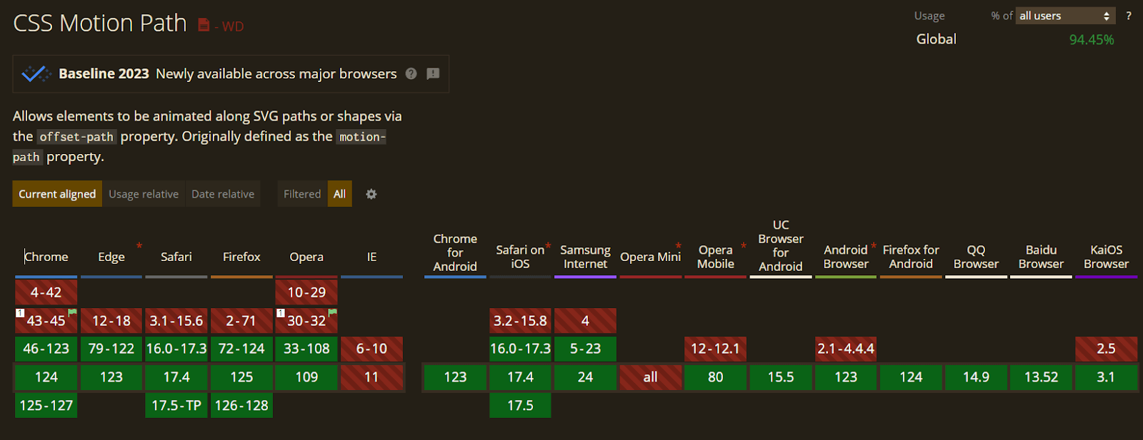
One drawback of using CSS motion path is that a few browsers still don’t have support for this property, which can lead to a negative experience for some users. While modern browsers have good support, it may not work in older versions as expected. Therefore, it’s important to consider fallback options.
Keyframes Animation Using CSS Sprites
One of the underrated ways to create clean keyframes animation is using CSS sprites. Sprite animation is a powerful technique used to create smooth and efficient animations on the web by combining several images into a single sprite sheet and then using CSS to display specific frames of the sprite.
The idea behind CSS sprite animation is that by using CSS, specific frames can be displayed at different times, creating the illusion of motion.
Let’s recreate the Twitter retweet button and its animation using a CSS sprite as an example. The following is the sprite image, our goal is to move through each part one by one.

HTML:
|
1 2 3 4 5 6 7 8 9 10 11 12 13 14 15 16 17 18 |
<!DOCTYPE html> <html lang="en"> <head> <meta charset="UTF-8" /> <meta name="viewport" content="width=device-width, initial-scale=1.0" /> <title>Twitter Retweet button</title> <link type="text/css" rel="stylesheet" href="style.css" /> </head> <body> <div class="sprite-container" id="sprite"></div> <script defer> const spriteContainer = document.getElementById("sprite"); spriteContainer.addEventListener("click", function () { spriteContainer.classList.toggle("start-animation"); }); </script> </body> </html> |
CSS:
|
1 2 3 4 5 6 7 8 9 10 11 12 13 14 15 16 17 18 19 20 21 22 23 24 25 26 27 28 29 30 31 32 33 34 35 36 37 38 39 40 41 42 43 44 45 46 47 48 49 50 51 52 53 54 55 56 57 58 59 60 61 62 63 64 65 |
body { background-color: #06858e; color: #fff; font-family: sans-serif; font-size: 1.5rem; text-align: center; margin: 0; padding: 0; display: flex; flex-direction: column; justify-content: center; align-items: center; height: 100vh; } h1 { font-size: 3rem; margin-bottom: 2rem; } .sprite-container { transform: scale(8) !important; width: 43px; height: 43px; /* margin: 150px; positioning tweak */ background: url("https://assets.codepen.io/605876/sprite.svg") no-repeat 0 10%; cursor: pointer; filter: invert(1); } .sprite-container:hover { filter: grayscale(1) blur(0.5) invert(1) brightness(1.5) contrast(1.5); } .start-animation { animation-name: sprite; animation-duration: 5.5s; animation-timing-function: steps(10); animation-iteration-count: 1; } /* remove caret */ input[type="checkbox"] { -webkit-appearance: none; -moz-appearance: none; appearance: none; outline: none; border: none; background: none; cursor: pointer; User-select: none } @keyframes sprite { 0% { background-position: 0 0%; filter: invert(1); } 100% { background-position: 100% 0%; filter: invert(1); } } |
See the Pen
Untitled by adarsh (@adarsh-gupta101)
on CodePen.
In the above example, you can see that we can create sprite animations where a series of images or frames are combined into a single sprite sheet. These frames represent different stages of an animation or different states of an object.
CSS Variables for Dynamic Animations
CSS variables allow you to create dynamic and customizable animations. These variables allow you to change animation properties on the fly, enabling you to create interactive animations. CSS variables are declared using the — prefix, and they can be declared at various levels, from global (document-wide) to scoped (within specific elements or selectors).
|
1 2 3 |
.element { --custom-animation-duration: 200; } |
Let’s take an example and see it in action.
HTML:
|
1 2 3 4 5 6 7 8 9 10 11 12 13 14 15 16 17 18 19 20 21 22 23 24 25 26 27 28 29 30 31 32 33 34 35 36 37 38 39 40 41 42 43 44 45 46 47 48 49 50 51 52 53 54 55 56 57 58 59 60 61 62 63 64 65 66 67 68 69 70 71 72 73 74 75 76 |
<!DOCTYPE html> <html lang="en"> <head> <meta charset="UTF-8" /> <meta name="viewport" content="width=device-width, initial-scale=1.0" /> <title>Document</title> <link type="text/css" rel="stylesheet" href="style.css" /> </head> <body> <main class=" flow"> <h1 class="headline"> Get The Unified Testing Platform </h1> <h2>#LambdaTestYourApps</h2> <div class="main cards"> <div class="cards__inner"> <div class="cards__card card card-1"> <!-- Add a unique class (e.g., card-1) --> <h2 class="card__heading">Free </h2> <p class="card__price">$0/month</p> <ul role="list" class="card__bullets flow"> <li>Live real time testing</li> <li>200+ Desktop Browsers</li> <li>10 Screenshot Tests per month</li> </ul> <a href="#starter" class="card__cta cta cta_1">Get Started</a> </div> <div class="cards__card card card-2"> <h2 class="card__heading">Pro Plan</h2> <p class="card__price">$15 /month billed annually</p> <ul role="list" class="card__bullets flow"> <li>3000+ Desktop Browsers</li> <li>Priority Email and Chat support</li> <li>Unlimited Screenshot Testing</li> </ul> <a href="#pro" class="card__cta cta">Upgrade to Pro</a> </div> <div class="cards__card card card-3"> <h2 class="card__heading"> Real Device </h2> <p class="card__price">$25.99/month</p> <ul role="list" class="card__bullets flow"> <li>Access to all premium features</li> <li>Test native, hybrid, and web apps</li> <li>Detailed device and app/crash logs</li> <li>Advanced analytics and reporting</li> </ul> <a href="#enterprise" class="card__cta cta">Go Enterprise</a> </div> </div> <div class="overlay cards__inner"></div> </div> </main> <script defer> const cards = document.querySelectorAll(".card"); cards.forEach((card) => { card.addEventListener("mousemove", (e) => { const rect = card.getBoundingClientRect(); const left = e.clientX - rect.left; const top = e.clientY - rect.top; card.style.setProperty("--left", `${left}px`); card.style.setProperty("--top", `${top}px`); }); }); </script> </body> </html> |
CSS:
|
1 2 3 4 5 6 7 8 9 10 11 12 13 14 15 16 17 18 19 20 21 22 23 24 25 26 27 28 29 30 31 32 33 34 35 36 37 38 39 40 41 42 43 44 45 46 47 48 49 50 51 52 53 54 55 56 57 58 59 60 61 62 63 64 65 66 67 68 69 70 71 72 73 74 75 76 77 78 79 80 81 82 83 84 85 86 87 88 89 90 91 92 93 94 95 96 97 98 99 100 101 102 103 104 105 106 107 108 109 110 111 112 113 114 115 116 117 118 119 120 121 122 123 124 125 126 127 128 129 130 131 132 133 134 135 136 137 138 139 140 141 142 143 144 145 146 147 148 149 150 151 152 153 154 155 156 157 158 159 160 161 162 163 164 165 166 167 168 169 170 171 172 173 174 175 176 177 178 179 180 181 182 183 184 185 |
@import url("https://fonts.googleapis.com/css2?family=Poppins:wght@400;500;600;700;800;900&display=swap"); *, *::after, *::before { box-sizing: border-box; margin: 0; padding: 0; } html, body { height: 100%; min-height: 100vh; } body { display: grid; place-items: center; font-family: "Poppins", system-ui, sans-serif; font-size: 1.1rem; line-height: 1.2; background-color: #223; color: #ddd; } h2{ text-align:center; padding:25px } ul { list-style: none; } .main { max-width: 75rem; padding: 16px; } .headline { font-weight: 600; font-size: 48px; margin-bottom: 0.75em; text-align: center; color: yellow; } .cards { position: relative; } .cards__inner { display: flex; flex-wrap: wrap; gap: 2.5em; } .card { flex: 1 1 14rem; padding: 1.5em 2em; display: grid; grid-template-rows: auto auto auto 1fr; align-items: start; gap: 1.25em; color: gray; border: 2px solid white; border-radius: 15px; position: relative; cursor: pointer; } .card::before { content: ""; background: var(--before-color, #581c87); /* Default color */ width: 8em; height: 7em; position: absolute; z-index: -10; transform: translate(-50%, -50%) scale(1.2); filter: blur(90px); top: var(--top); left: var(--left); opacity: 0; } .card:hover::before { opacity: 1; } .card-1 { --before-color: #581c87; /* Color for card-1 */ } .card-1::hover{ border:2px solid #581c87; } .card-2 { --before-color: orange; /* Color for card-2 */ } .card-3 { --before-color: #2ecc71; /* Color for card-3 */ } .card__bullets { line-height: 1.4; } .card__bullets li::before { display: inline-block; content: "👉"; transform: translateY(0.25ch); margin-right: 0.1cm; } .cta_1::hover{ background-color:#581c87 } .card__heading { font-size: 24px; font-weight: 700; color: white; } .card__price { font-size: 1.75em; font-weight: 700; color: white; } .flow > * + * { margin-top: 12px; } .cta { display: block; align-self: end; margin: 1em 0 0.5em 0; text-align: center; text-decoration: none; color: #fff; background-color: #0d0d0d; padding: 0.7em; border-radius: 50px; font-size: 1rem; font-weight: 600; } .overlay { position: absolute; inset: 0; pointer-events: none; } |
See the Pen
Untitled by adarsh (@adarsh-gupta101)
on CodePen.
You can see that we are using JavaScript to send the mouse position, and in the CSS, we are taking the value via the CSS variable. This opens up a way for various other animations that can be built using CSS variables.
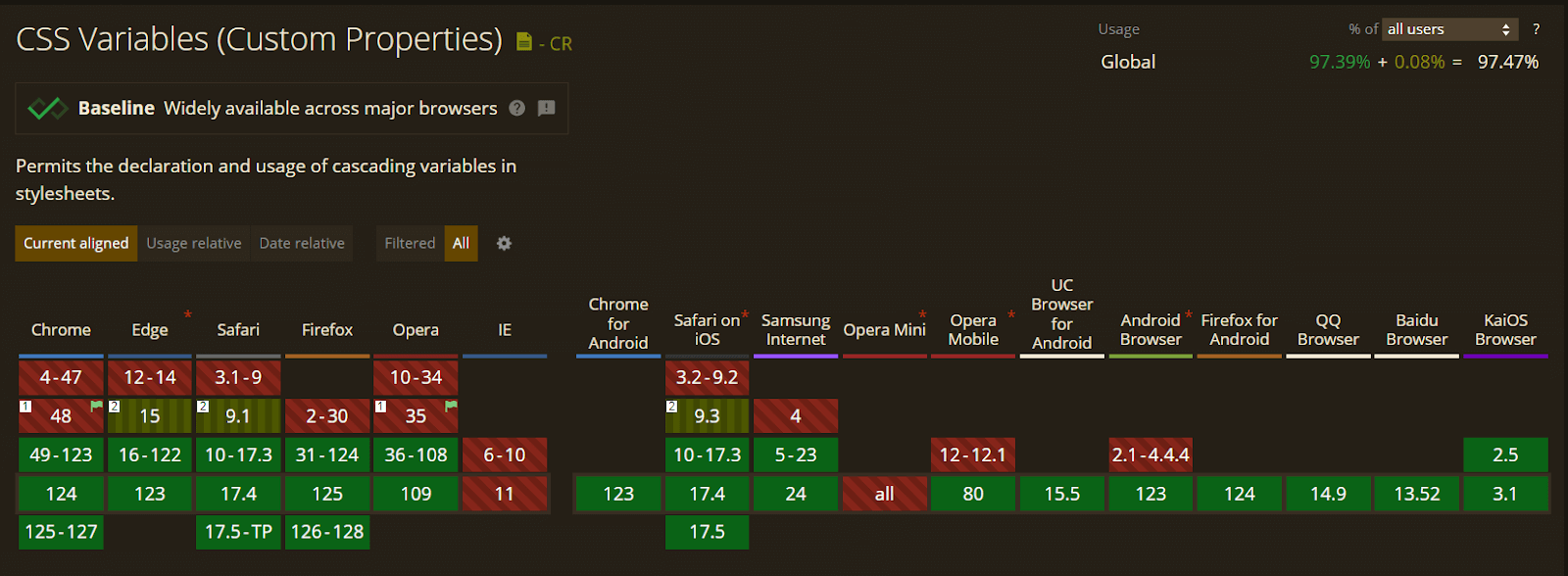
However, while working with CSS variables, some browsers and older versions of some browsers don’t have support for CSS variables. This may lead to unexpected behavior, so consider implementing fallback options.
Maximizing Performance for CSS Animations and Keyframes
Animations play a vital role in the user interface and user experience. But they are a double-edged sword. Unnecessary or resource-heavy animations can harm user experience, so optimizing all animations for better performance is important.
Modern browsers are good at animating two CSS properties: transform and opacity. For all other properties, achieving a consistently smooth 60 Frames Per Second (FPS) can be more challenging.
Smooth web animations typically aim for a 60 Frames Per Second (FPS) rate. If each frame takes more than about 16.7 milliseconds (1000ms divided by 60 ≈ 16.7), users will notice a delay in the animation.
One way to improve CSS performance is by using CSS Hardware Acceleration. Although CSS animations, transforms, and transitions are not GPU accelerated by default, specific CSS properties force the browser to use hardware acceleration instead of executing it on slower software rendering engines.
3D animations always use hardware acceleration, so even if you are not using any kind of 3D animations or transformations, you can still use hardware acceleration to improve the overall performance of the animation. You can use properties like:
|
1 2 3 4 5 |
element{ transform: translate3d(0, 0, 0); transform: scale3d(1, 1, 1); transform: translateZ(0) } |
The above properties essentially do nothing, but the remaining part of the animations will be accelerated by hardware, which can improve the performance in desktop and mobile browsers.
Minimize Layout and Paint Operations
An efficient web performance is a top priority without that, all your heavy CSS keyframes animation are simply not worth it. One key aspect of achieving this goal is minimizing layout and paint operations while rendering web pages.
According to Chrome developers, to display some elements on a webpage, the browser follows a series of steps:
- Style: The browser calculates the styles that apply to each element on the page. This includes determining properties like fonts, colors, and positioning.
- Layout: After computing styles, the browser proceeds to generate the layout. This involves determining the size, position, and geometry of each element. It creates a blueprint for how elements will be arranged on the page.
- Painting: Once the layout is established, the browser paints the pixels onto separate layers. This process includes filling in the content of each element with the appropriate colors and images.
- Composite Rendering: Finally, the browser composites or combines these layers and draws the resulting composition to the screen. This step results in the visual representation of the webpage that users see and interact with.
Layout (reflow) and paint (repaint) operations can be resource-intensive and slow down your web page. So when you use properties like left:10px, it will trigger the browser to reflow, which can be a performance-intensive task.
Red Flag:
|
1 2 3 4 5 6 7 8 |
.element { transition: left 0.5s ease-in-out; position: relative; } .element:hover { left: 100px; } |
Green Flag:
|
1 2 3 4 5 6 7 |
.element { transition: transform 0.5s ease-in-out; } .element:hover { transform: translateX(100px); } |
Using CSS transform properties can minimize layout changes and have better performance during animations. In the same way, instead of directly updating the values of width, height, top, left, right properties of an element, using transforms can result in better performance.
You can also optimize browser performance with will-change property. This property hints to the browser which properties will change and need optimization. This can improve performance by allowing the browser to prepare for the animation.
|
1 2 3 4 5 6 7 |
.element { will-change: transform; } .element:hover { transform: translateX(100px); } |
Although will-change can enhance the performance by reducing the impact of layout changes and repaints, you have to use it only on properties that are expected to change, to avoid unnecessary overhead.
Making Your CSS Keyframes Animation Accessible
As we already know, most websites these days have some kind of CSS keyframes animation, but it is crucial to ensure that these CSS keyframes animation don’t affect the user experience of people who need special support.
Some users with vestibular motion disorders will have a hard time interpreting some animations. But if they have turned off animation effects on their device, the media feature prefers-reduce-motion query that will be triggered, and they can have less animation.
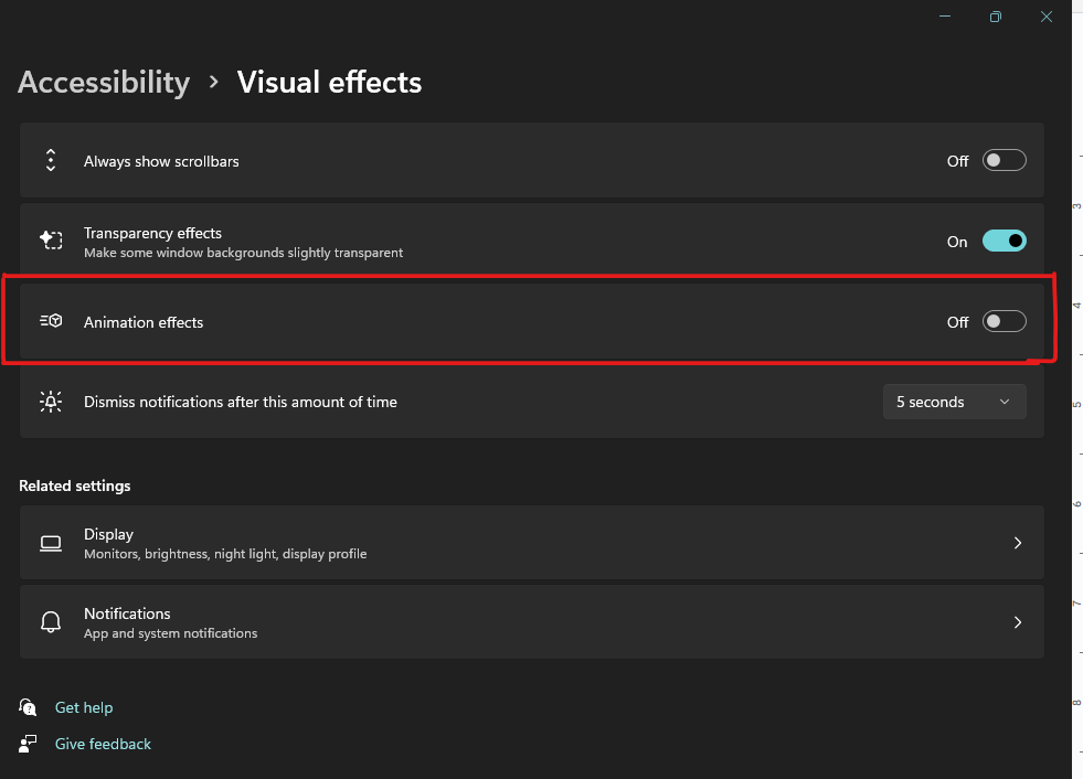
The animation will display as expected on the webpage for normal users. However, if you’ve chosen to disable animation effects on your device, the following code will detect and remove the applied animations on the element:
|
1 2 3 4 5 6 |
/* Media query to reduce animation when prefers-reduced-motion is set to reduce */ @media (prefers-reduced-motion: reduce) { .animated-element { animation: none; } } |
This will improve the accessibility and overall user experience for those who can’t tolerate or interpret CSS keyframes animation.
Debugging CSS Keyframes Animation
The browser developer tools significantly help debugging CSS keyframes animation. Chrome Developer Tools has a number of features that can help you diagnose and resolve CSS keyframes animation issues.
You can do this by opening the Developer Tools panel. Now, navigate to the Animations tab in the Developer Tools panel.
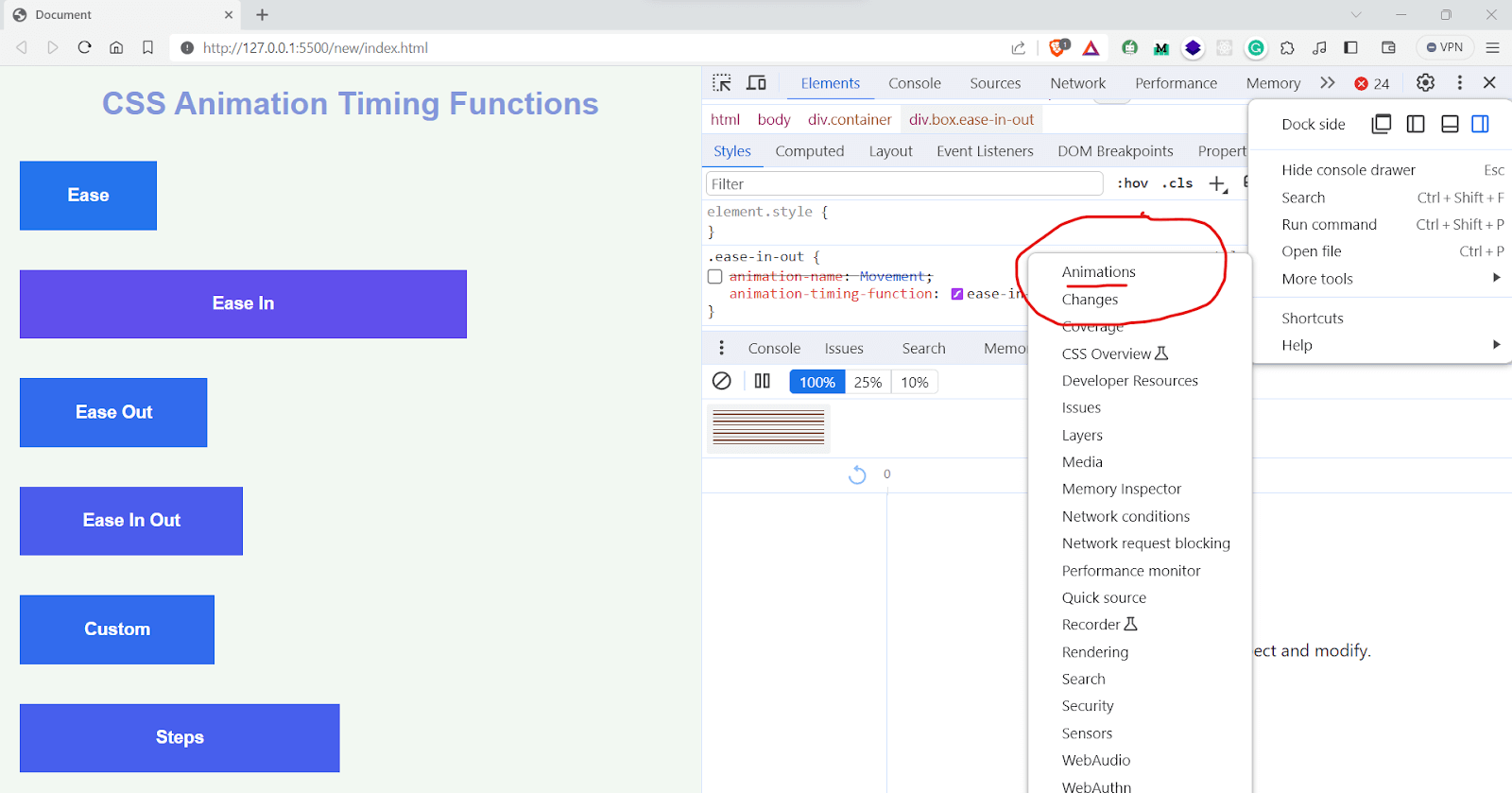
The Animations tab in Chrome Developer Tools serves a dual purpose. First, it enables you to inspect animations closely. You can slow down the animation, replay it, and examine its source code, providing valuable insights into its behavior.
Additionally, the Animations tab allows you to modify CSS keyframes animation. This means you can make adjustments to the timing, delay, duration, or keyframe offsets of an animation group, providing you with control over its execution.
Let’s take the following example and see how to use the Animations tab. Here we have two animations, one for changing the color and another for increasing the width of an element
|
1 2 3 4 5 6 7 8 9 10 11 12 13 14 15 16 17 18 19 20 21 22 23 24 25 26 27 28 29 30 31 32 33 34 35 36 37 38 39 40 41 42 43 44 45 46 47 48 49 50 51 52 53 54 55 56 57 58 59 60 61 62 63 64 65 66 67 68 69 70 71 72 73 74 75 76 77 78 79 80 81 82 83 84 85 86 87 88 89 90 91 92 93 94 95 96 97 98 99 100 101 102 103 104 105 106 107 108 109 110 111 112 113 114 115 116 |
* { padding: 0; margin: 0; box-sizing: border-box; } body { font-family: Arial, Helvetica, sans-serif; text-align: center; background-color: #f2f8f2; } h1 { margin-top: 20px; color: #8497db; } .container { display: flex; flex-direction:column; flex-wrap: wrap; justify-content: center; margin-top: 20px; } .box { width: 100px; height: 70px; background: #1498db; margin: 20px; display: flex; align-items: center; justify-content: center; color: white; font-weight: bold; font-size: 18px; animation: changeColor 8s linear infinite, Movement 8s linear infinite; } .ease { /* animation-name: Movement; */ animation-timing-function: ease; } .ease-in { /* animation-name: Movement; */ animation-timing-function: ease-in; } .ease-out { /* animation-name: Movement; */ animation-timing-function: ease-out; } .ease-in-out { /* animation-name: Movement; */ animation-timing-function: ease-in-out; } .custom { /* animation-name: Movement; */ animation-timing-function: cubic-bezier(0.25, 0.5, 0.75, 1); } .steps { /* animation-name: Movement; */ animation-timing-function: steps(4, start); } @keyframes Movement { 0%, 100% { width:100px; } 50% { width:1000px } } @keyframes changeColor{ 0%,100%{ background-color:#0A85ED; } 25%{ background-color:#ffb703; } 50%{ background-color:#ef233c; } 75%{ background-color:#8338ec; } } |
Once you open the Animations tab, hover over its thumbnail in the Overview pane to view a preview of it.
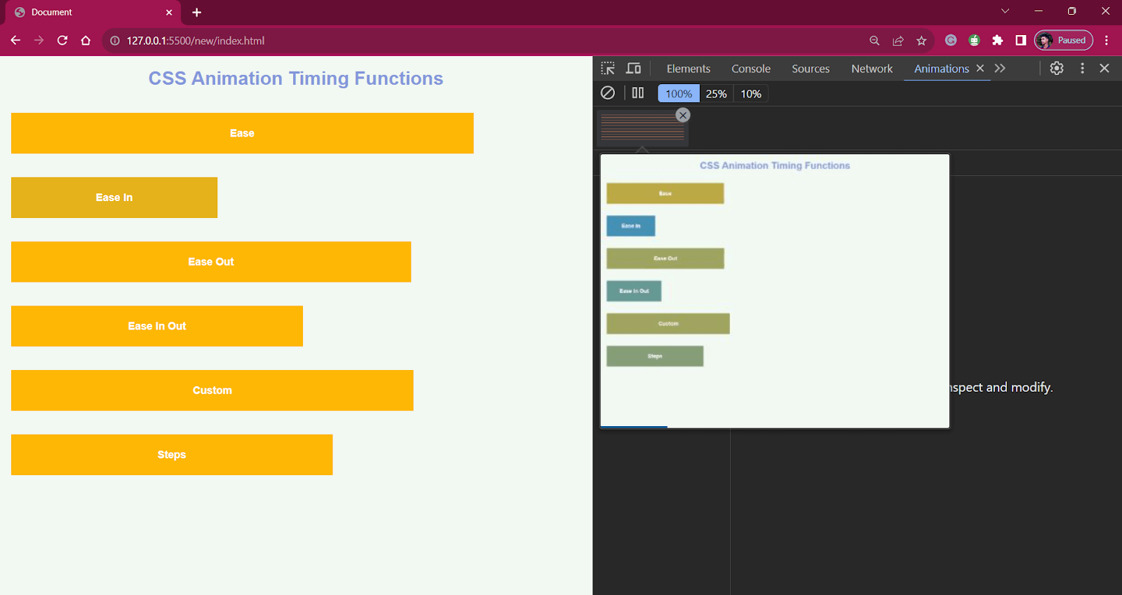
With the Animations tab, you can slow down animations, replay them frame by frame, and even delve into the source code behind the animation groups.
You can also see the styles and animation properties by clicking on it, which will take you to the styles box of the developer tool.
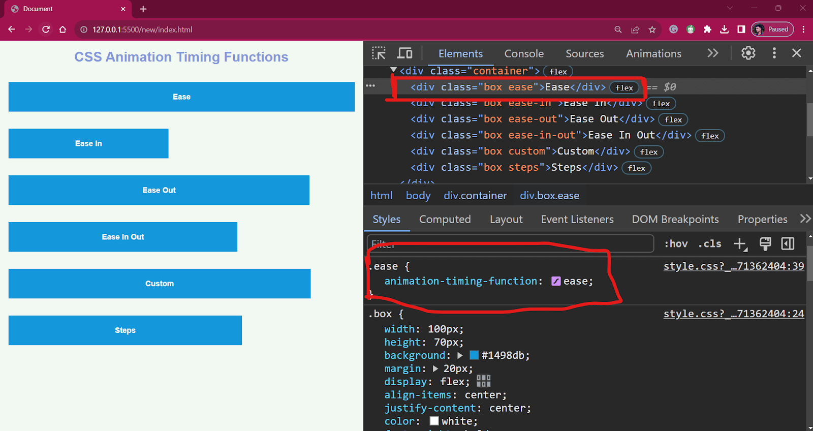
By clicking on the ease symbol, you will get a modal where you can alter the timing functions, just like shown in the output below:
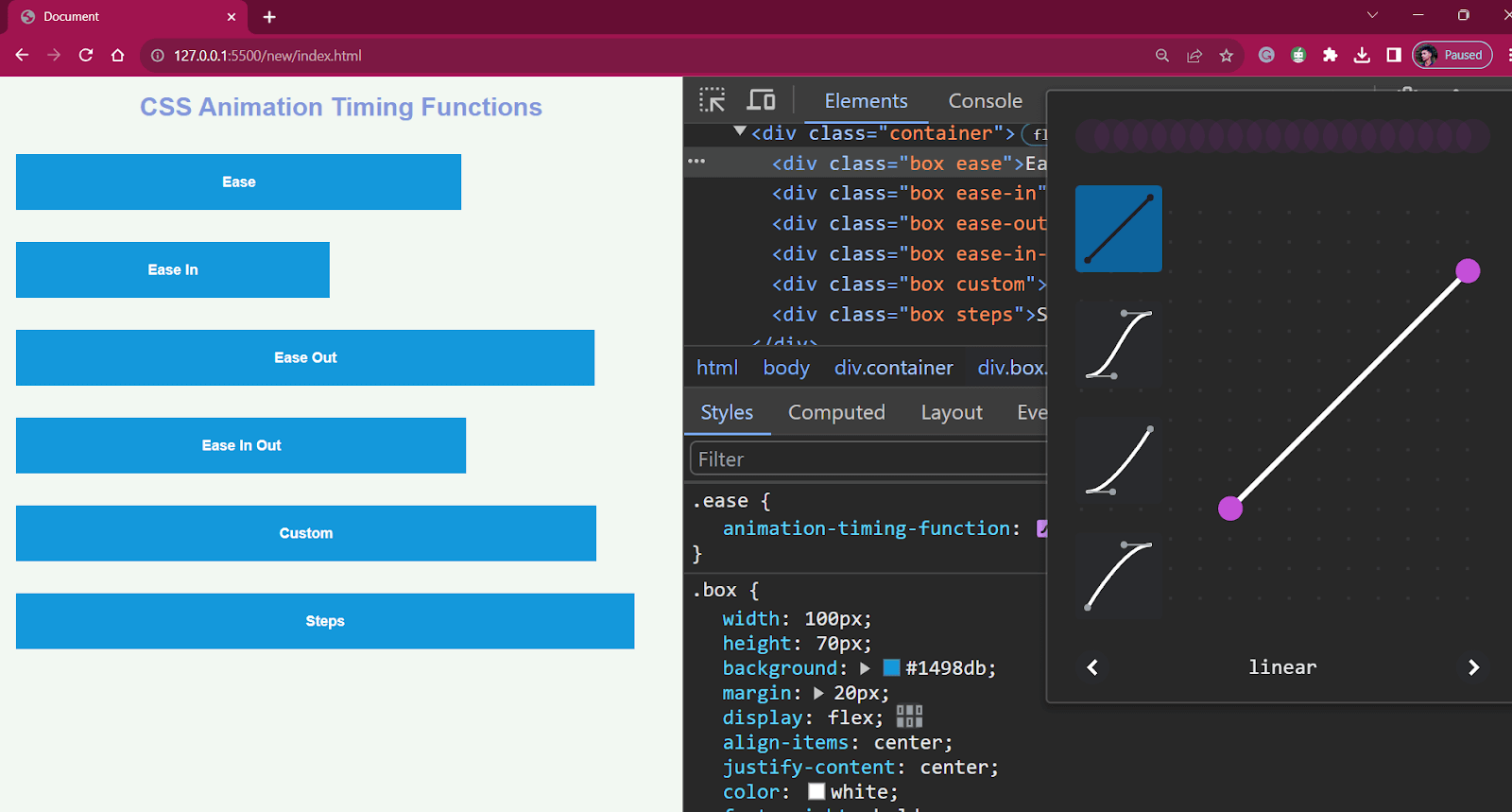
You can select the timing function, which is predefined, or you can even play around to find the best cubic-bezier curve that fits your animation.
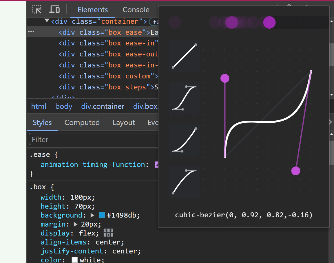
You can even change the keyframe rules and use them to find the best value for the property.
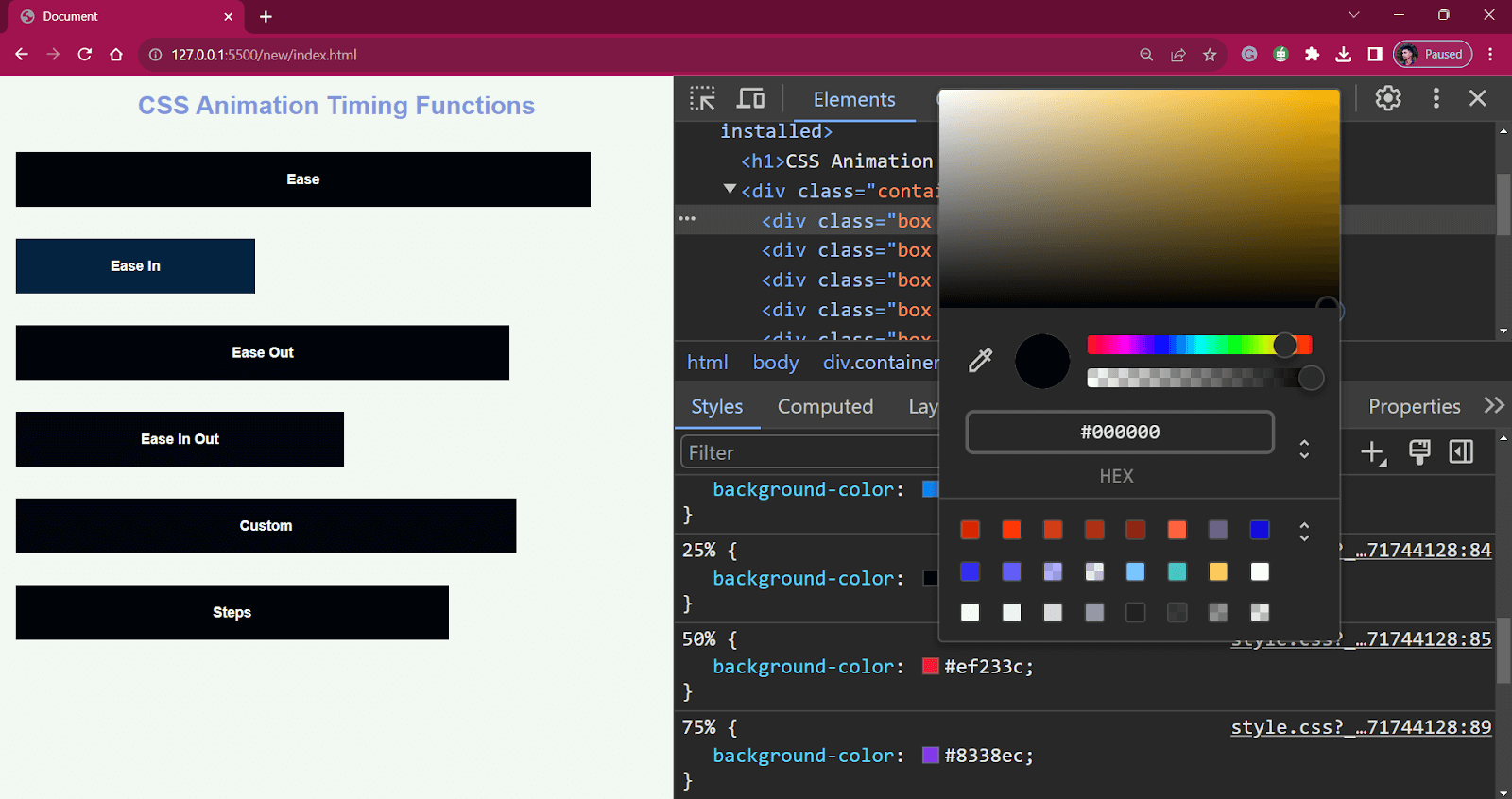
The Chrome Developer Tools also allows you to analyze the performance of an animation. The Performance tab provides a timeline of events, including script execution, rendering, and painting.
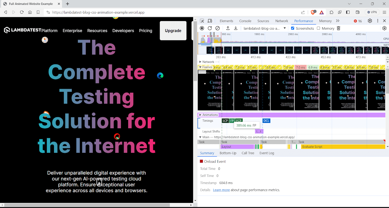
Look for spikes or prolonged periods in the timeline, which may indicate performance bottlenecks during CSS keyframes animation.
Testing the Responsiveness of CSS Keyframes Animation
Once you’ve come up with the design for your CSS keyframes animation, you need to test it to ensure that it provides the same user experience across the web.
Can it be any more better?
Recently @lambdatesting announced their all-in-one browser for web developers.
It's the only responsive testing tool that you ever need🤖
Detailed thread🧵 pic.twitter.com/J7rRFtXz2n
— Adarsh Gupta ✨ (@Adarsh____gupta) January 4, 2023
You can test the responsiveness of your websites and web apps that use CSS keyframes animation on different viewports with LT Browser, which allows you to select multiple device viewports simultaneously and run tests on your web applications.
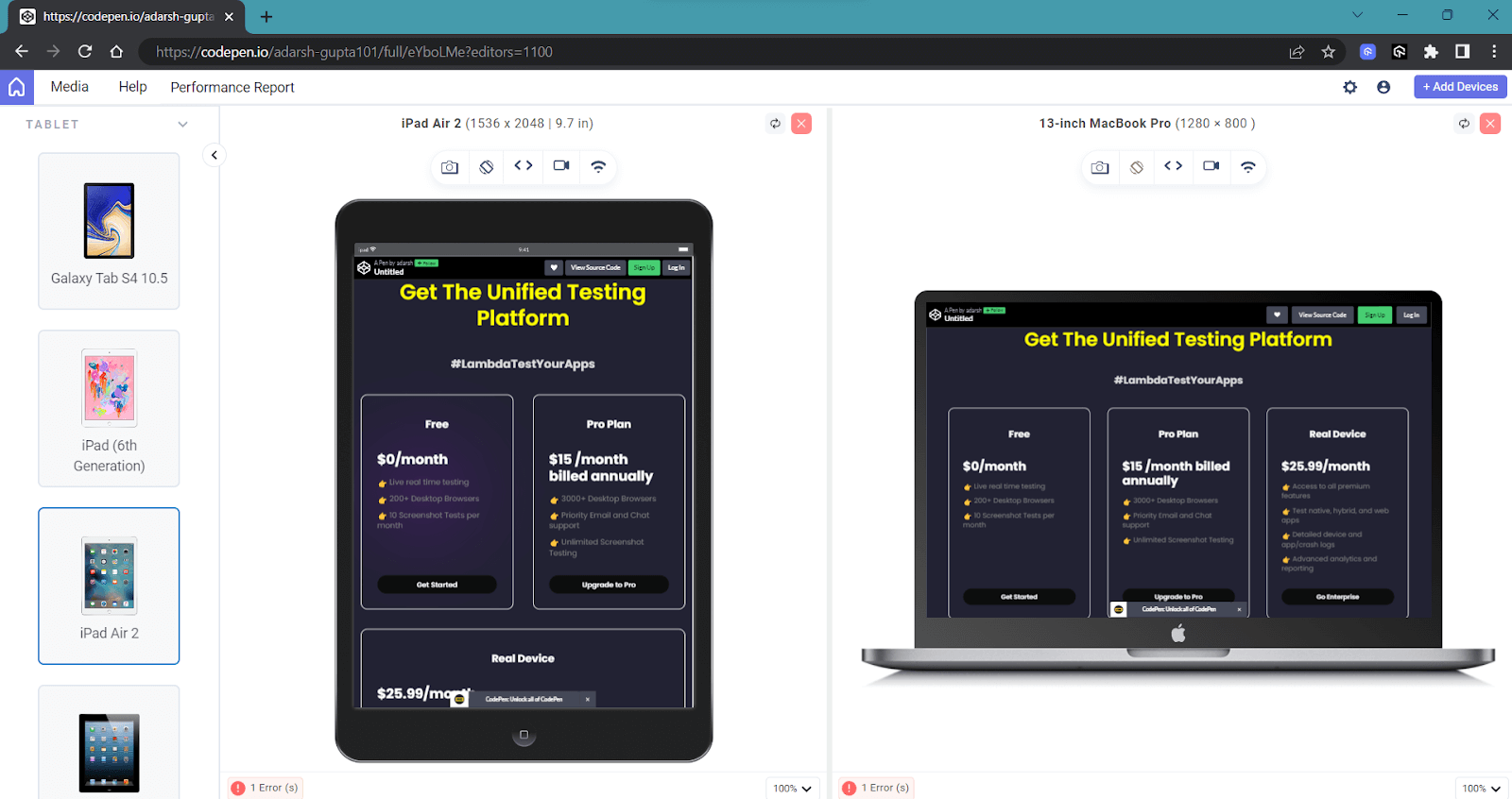
One notable feature is the ability to perform mobile website testing on multiple device viewports simultaneously, reducing the need to manually resize the browser window.
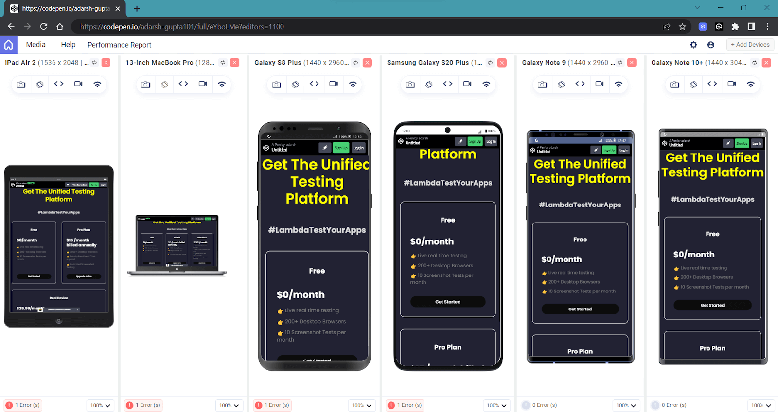

Here is a quick rundown of the LT Browser:
CSS Keyframes Animation Best Practices
CSS keyframes animation gives life to a website, but having too much can be a problem as it will make the user uncomfortable while using the web app.
Here are some key best practices for CSS keyframes animation:
- Minimize Animations for User Experience: Having multiple CSS keyframes animation can make it difficult for the user to decide where to focus. Ensure your animations serve a purpose, such as guiding user attention or providing feedback.
- Use GPU-Accelerated Properties: As mentioned earlier, specific CSS properties, such as transform and opacity, are hardware-accelerated by the GPU. Utilizing these properties in CSS keyframes animation is more efficient and leads to smoother transitions, especially on modern devices.
- Browser Compatibility: Different browsers may interpret CSS keyframes animation slightly differently. Thoroughly test your animations across various browsers to ensure they work as expected. Although vendor prefixes are less common today, they may still be necessary for older browsers.
- Use the transform Property: The transform property is hardware-accelerated on modern browsers, making it highly efficient. Utilize it for CSS keyframes animation involving translation, rotation, scaling, and skewing.
- Avoid Animating Layout Properties: Layout properties, such as width, height, margin, and padding, are responsible for determining the position and size of elements on the page. Animating these properties can trigger layout recalculations, leading to reflows, which are computationally expensive and can significantly slow down your web page.
- Avoid Animating Root Elements: It is recommended to avoid animating root elements, which is another important best practice for CSS keyframes animation. The root elements typically include <html> and <body> tags and should remain static. Making the whole page animated would hardly provide good value to your UX.
Animations should serve to enhance the user experience, not just for the sake of aesthetics. Consider the specific goals of your CSS keyframes animation, whether a simple hover button or a sliding animation that reveals subcategories, creating a logical and smooth flow of information.
Combine multiple transformations into a single transform rule whenever possible. This reduces the number of reflows and repaints, leading to smoother animations.
Wrapping Up
CSS keyframes animation bring life and interactivity to web elements, enhancing the overall user experience and adding a touch of dynamism to web design. With some creativity, they can turn your vision into a digital masterpiece.
In this blog, we have covered almost everything about CSS keyframes animation that you need to know to create an engaging web experience.
From understanding key concepts like @keyframes and animation properties to exploring advanced techniques like timing functions and sprite animations, you are now ready to start building the web experience that your end user expects.
Frequently Asked Questions (FAQs)
What are CSS keyframes?
CSS keyframes define the exact styles an element will have at specific points in the animation sequence, like at the beginning, middle, or end. This lets you create smooth transitions and complex animations with just CSS.
What is a 0 to 100 keyframe?
In CSS animations, 0% and 100% are special keyframes representing the beginning and end of the animation, respectively. They define the starting and ending styles of the animation. In between these points, you can add additional keyframes to create smooth transitions or define changes throughout the animation.


Author’s Profile
Adarsh M
Adarsh is a full-stack JavaScript developer based out of India. He loves creating meaningful technical content on Twitter, where he connects with like-minded individuals and developer communities. He shares his knowledge on Twitter through insightful threads!
Blogs: 12
Got Questions? Drop them on LambdaTest Community. Visit now


