
Cracking the Code of CSS Specificity: A Developer’s Toolkit
Clinton Joy Fimie
Posted On: December 5, 2023
 325591 Views
 23 Min Read
Cascading Style Sheets (CSS) is the backbone behind every pixel-perfect layout, beautifully styled button, and color scheme. It is more like the system that shapes the web designs we navigate daily. In CSS, there’s a hidden factor that has confused even the most seasoned developer—it’s known as CSS specificity.
Now, imagine you’re building your own website. You pick the right fonts, line everything up perfectly, and choose colors that fit just right. It all looks great, but then, out of nowhere, things on your webpage ignore your design choices. You wonder, why aren’t the styles I set working?
And the reason is CSS specificity. It decides which style choices are most important on your webpage. If you’ve ever found yourself frustrated by unexpected styling conflicts, inconsistent application of your styles, or felt like your CSS is missing important pieces, then this CSS tutorial will come in handy.
We will discuss CSS specificity in depth, from the fundamental principles to the more advanced ones, using real-world applications to tackle them.
TABLE OF CONTENTS
What is CSS Specificity?
CSS specificity is the concept used to determine which CSS rules apply to a specific HTML element whenever there are conflicting styles. It is a way to decide which style should take precedence when multiple styles or rules target a particular element.
It’s based on a hierarchy: IDs override classes and element selectors, which, in turn, override basic element styles. Inline styles hold the highest precedence. This concept helps browsers decide which style to apply. Understanding specificity ensures predictable styling and aids in writing efficient, maintainable code. Developers must prevent unintended style overrides and ensure desired styles are consistently applied.
The Importance of CSS Specificity
Precision is paramount in modern web development. Every element, from the text and images to the layout and colors, is crucial in creating a seamless user experience. These elements have a general or specific CSS style to change their appearance on a webpage. This is done either to create uniqueness or just to change the overall aesthetic of the element or the web page at large.
Here are some reasons why CSS specificity matters for developers:
Resolving Styling Conflicts
In web development, it’s common to have multiple CSS rules targeting the same HTML element. These rules may come from different sources, such as external stylesheets, internal styles, or inline styles. When conflicts arise between these rules, CSS specificity determines which styles take precedence.
Avoiding Unintended Consequences
CSS specificity is also critical in preventing unintended results in your styles. With a clear grasp of specificity, you can carefully manage your styles to ensure a consistent and delightful experience on your website, avoiding unintentional changes that could lead to unexpected results. Also, you gain control over which styles are applied and can create a predictable and maintainable codebase.
Enhancing Code Maintainability
In large-scale web development projects, maintaining code can be a daunting task. CSS specificity helps developers write cleaner and more maintainable code by reducing the need for overly specific selectors and convoluted workarounds.
Boosting development Efficiency
Efficiency is the cornerstone of effective web development. Developers proficient in CSS specificity can work more efficiently by quickly identifying and resolving styling issues. This proficiency leads to faster development cycles and allows developers to focus on creating exceptional user experiences.
Role of Selectors in CSS Specificity
When it comes to specificity, CSS selectors are the building blocks. CSS selectors are patterns or rules that define which HTML elements should receive specific styling rules or properties. CSS selectors help you control the presentation and layout of your web content, as they are in charge of choosing which element gets which style.
Selectors consist of three main parts, and they include:
- Element: This is the HTML element you want to style; it could be a div, p, h1, or a.
- ID: It is an optional unique identifier for an HTML element, denoted by a hash symbol (#). IDs should be unique within a page.
- Class: A class selector, denoted by (.), allows you to target multiple elements with the same class attribute. Classes can be applied to multiple elements on a page.
To demonstrate the use of the basic CSS selectors, let’s consider this example.
|
1 2 3 4 5 6 7 8 9 10 11 12 13 14 15 16 17 18 19 20 21 22 23 24 25 26 27 28 29 30 31 32 33 34 35 36 37 38 39 40 41 42 43 44 45 46 47 48 49 50 |
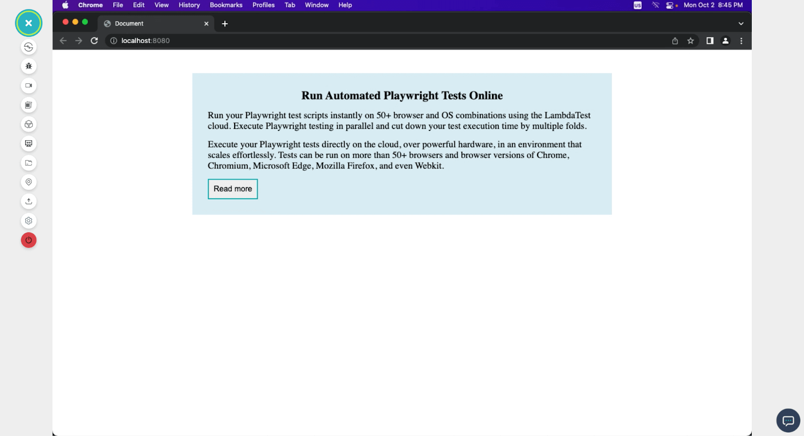
<!DOCTYPE html> <html lang="en"> <head> <meta charset="UTF-8" /> <meta name="viewport" content="width=device-width, initial-scale=1.0" /> <title>Document</title> </head> <style> * { margin: 0; padding: 0; } #card { max-width: 800px; width: 80vw; margin: 3rem auto; padding: 2rem; background-color: rgb(220, 235, 245); } p { font-size: 1.2rem; } h3 { padding-bottom: 1rem; text-align: center; font-size: 1.5rem; } .readmore { padding: 10px; font-size: 1rem; border: 2px solid rgb(20, 159, 171); margin-top: 1rem; } </style> <body> <div id="card"> <h3>Run Automated Playwright Tests Online</h3> <p> Run your Playwright test scripts instantly on 50+ browser and OS combinations using the LambdaTest cloud. Execute Playwright testing in parallel and cut down your test execution time by multiple folds. </p> <button class="readmore">Read more</button> </div> </body> </html> |
In the code above, we used the three basic CSS selectors (tag, id, and class) to select and style HTML elements. This is a very basic example that shows how selection and styling work. We have some styles for the p tag, the h3 tag, the id of the card, and the class of readmore. These styles are general and will affect any HTML element.
Here is the output of the above code.
Values of CSS Specificity
CSS specificity values are used by web browsers to decide which styles to apply when conflicts arise. In this section, we will be discussing how these values apply.
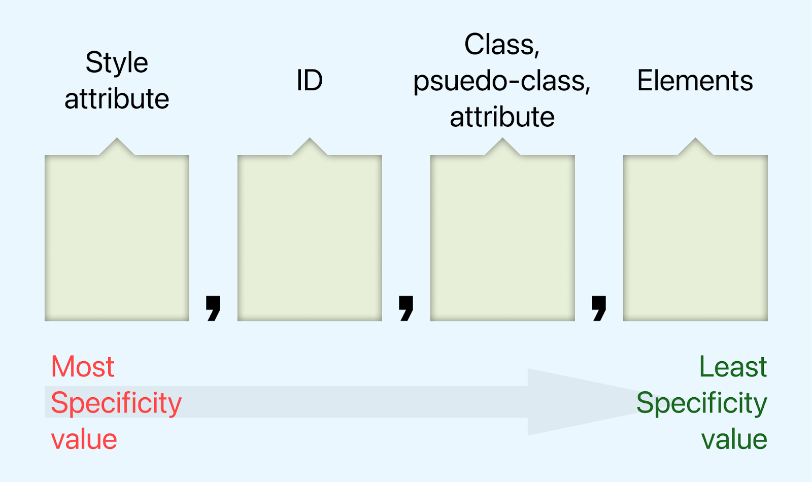
There is a unique technique used in calculating CSS specificity. Specificity values are represented using a four-part notation, and the technique is often referred to as the Specificity Triplet. The four parts are:
- Inline Styles: This sits at the highest level of CSS specificity. Styles that are applied to elements directly using the style attribute are inline styles, and regardless of how every class, ID, or tag is styled, they will always obey the styles set in the style attribute. Inline styles are represented as 1, 0, 0, 0.
- ID Selectors: ID selectors are next when it comes to CSS specificity. IDs are not intended for reuse and, hence, have a high specificity. Each ID should be unique to a particular page. ID selectors are represented as 0,1,0,0. Always bear in mind that the more the ID selector, the higher the specificity.
- Class and Attribute Selectors: Class and attribute selectors are on the same level of specificity. They are represented as 0, 0, 1, 0. They are used in multiples to increase their specificity.
- Element Type Selectors: Elements are the lowest in terms of specificity. They are represented as 0, 0, 0, 1.
Remember that this four-part notation can change depending on combining multiple selectors to target a specific element. For instance, if we had a rule with an ID selector and an element type selector, the specificity value would be 0, 1, 0, 1.
Or if we have an ID selector and a class selector, the specificity value would be 0, 1, 1, 0.
The Cascade in CSS
This fundamental concept in CSS determines how styles are applied to HTML elements when multiple conflicting rules target the same element.
The cascade, often abbreviated as CSS, is a process that browsers use to decide which styles should be applied to an HTML element when there are conflicting rules. It follows a specific order of precedence to determine the final style for an element. This order consists of several levels:
User Agent Stylesheets
The lowest level of specificity is the default styling provided by the user agent (browser). Every browser has its own set of default styles for HTML elements. These styles serve as a baseline and can be overridden by more specific rules.
Let’s consider this code to see the user agent stylesheet in action.
|
1 2 3 4 5 6 7 8 |
<!DOCTYPE html> <html lang="en"> <head> </head> <body> <h1>LambdaTest</h1> <p>Next-Generation Mobile Apps and Cross Browser Testing Cloud</p> </body> </html> |
In the code above, we have an h1 and a p tag with no CSS attached. Here is the result of the code.
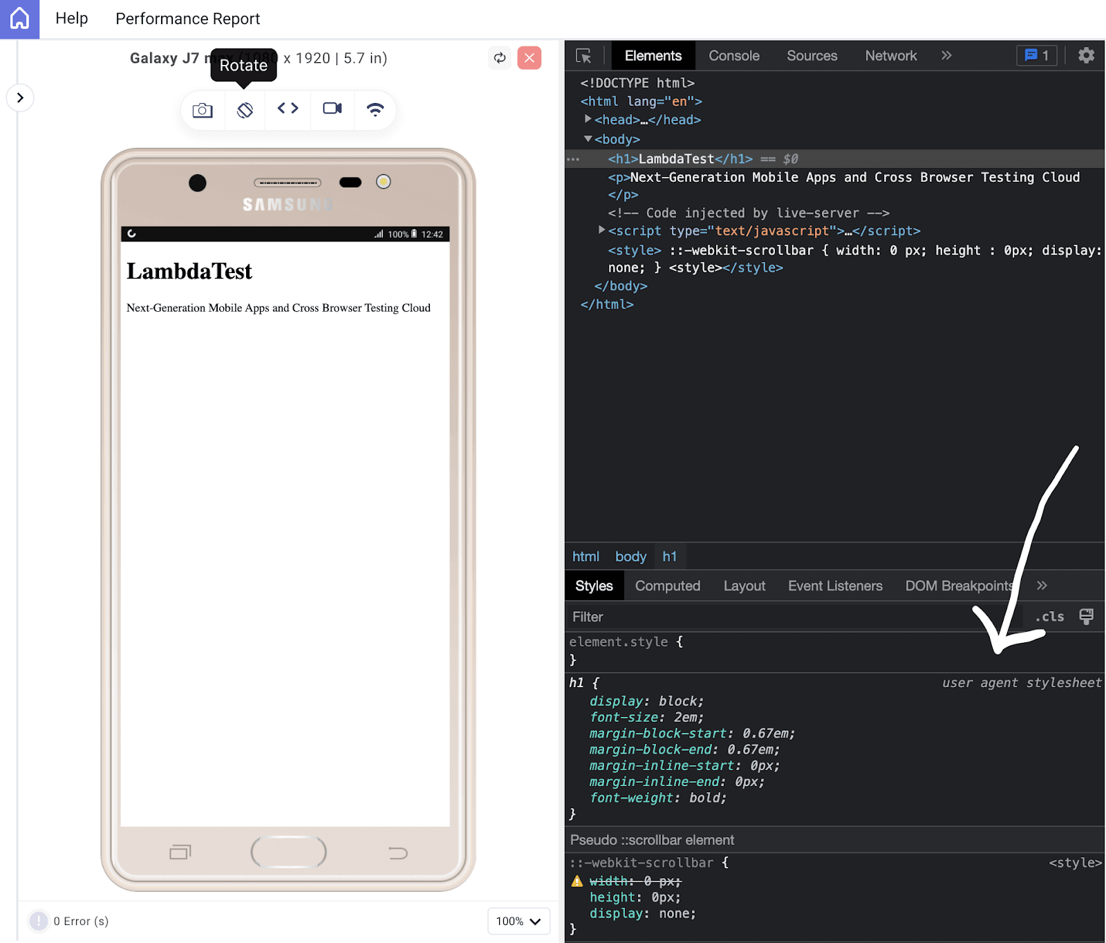
The above output is rendered on LT Browser. It is developed by LambdaTest for website testing and debugging. It enables you to perform responsive testing on your websites and various web applications across numerous device viewports, with the capability to test up to six viewports simultaneously. LT Browser offers over 53 viewports to test on, spanning mobile, tablet, and desktop devices.
For continuous tutorials on automation testing, mobile app testing, and more, subscribe to our LambdaTest YouTube Channel.
From the code output on LT Browser, we can see that even without a CSS code, the user agent stylesheet kicks in, giving the design a bit of the default style. You can see the margin around the elements and the increased font-size and font-weight of the h1 tag. All this is solely from the user agent stylesheet.
Author Stylesheets
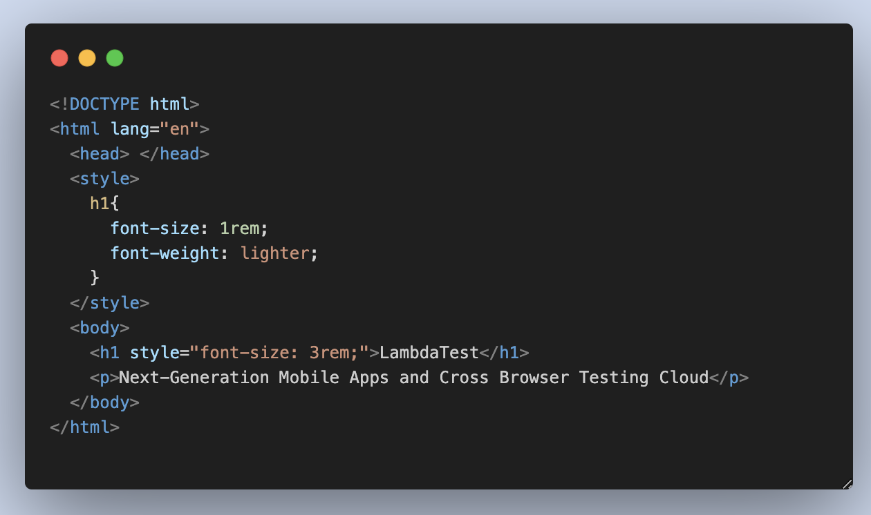
These are the styles defined by the web developer in their CSS files. Author styles take precedence over user agent styles and are applied unless overridden by more specific rules. Let’s add some style to the previous code to override the user agent design.
|
1 2 3 4 5 6 7 8 9 10 11 12 13 14 |
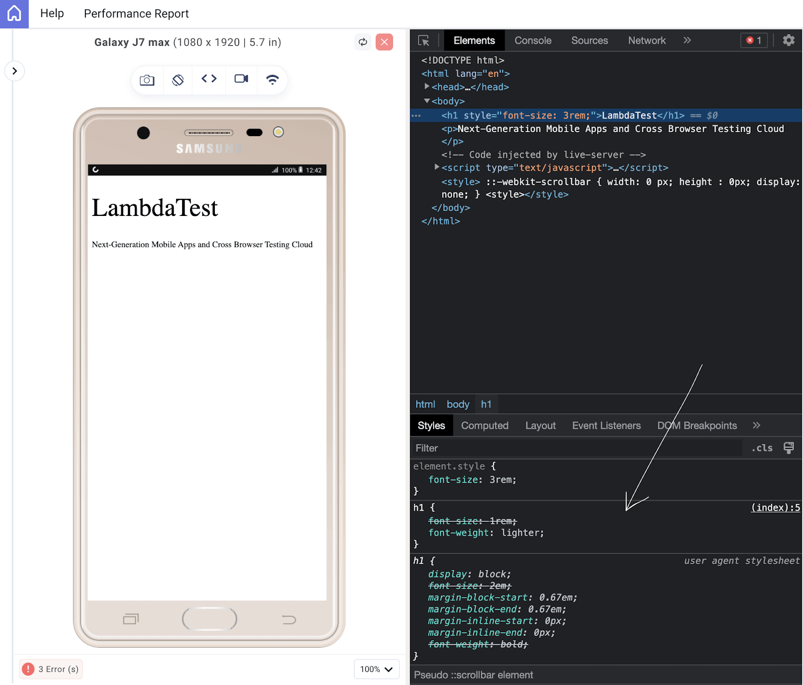
<!DOCTYPE html> <html lang="en"> <head> </head> <style> h1{ font-size: 1rem; font-weight: lighter; } </style> <body> <h1>LambdaTest</h1> <p>Next-Generation Mobile Apps and Cross Browser Testing Cloud</p> </body> </html> |
From the above code, we have set the h1 tag to have a font-size of 1rem and a font-weight of lighter. This is different from the user agent style, which sets the h1 font-weight to bold and the font-size to 2em. Here is the output:
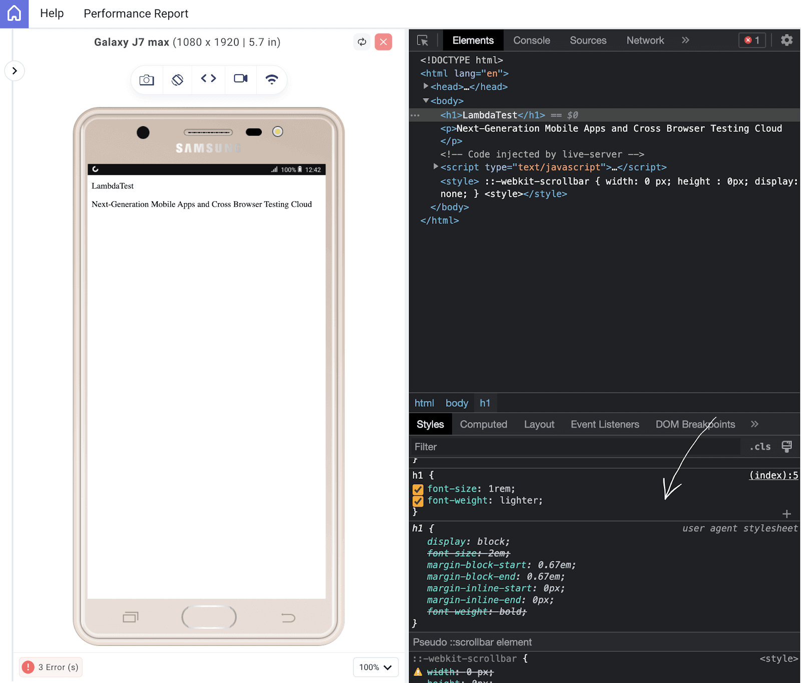
From the image above, you can see that the user agent stylesheet has some of its style stroked through; those are the styles replaced by the author’s style sheet.
User Stylesheets
Some users may apply their own custom styles to web pages using browser extensions or settings. These user-defined styles have higher specificity than author styles but lower specificity than inline styles.
For instance, users can adjust their font-size to make text more readable, or as many users love dark mode, they may set their phones to dark mode, and the user stylesheet can implement the dark mode theme on certain websites that initially did not offer this feature.
The primary purpose of the user style sheet is to provide a level of customization and accessibility to enhance the website’s usability for a range of users.
Inline Styles
Styles defined directly within an HTML element using the style attribute have the highest specificity. They override all other styles for that particular element. Let’s see this in action.
We added an inline style to the h1 element, giving it a font size of 3rem, despite previously setting the h1 to a font size of 1rem in the author stylesheet.
See the output below. This is how it affects the code.
As you can see, the inline style overrides both the author’s and the user agent’s styles.
Specificity
If there are multiple conflicting author stylesheets or inline styles, CSS specificity determines which style should be applied. Specificity is a calculated value based on the combination of selectors used in a CSS rule.
If two rules have the same specificity, the rule that appears later in the stylesheet takes precedence and overrides the earlier rule. This concept is known as the “last rule wins.”
Let’s consider this code to see the concept of last run wins in action.
|
1 2 3 4 5 6 7 8 9 10 11 12 13 14 15 16 |
<!DOCTYPE html> <html lang="en"> <head> </head> <style> h1{ color: red; } h1{ color: green; } </style> <body> <h1>LambdaTest</h1> <p>Next-Generation Mobile Apps and Cross Browser Testing Cloud</p> </body> </html> |
Browser Output
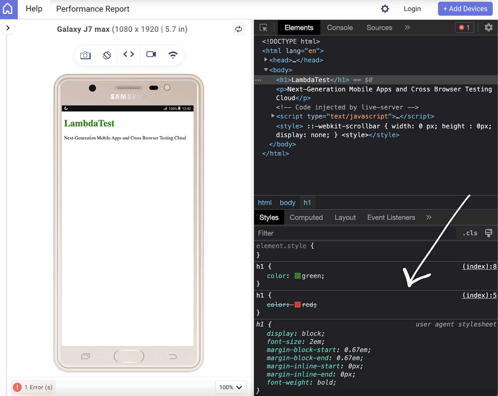
We can see that the h1 obeys the last rule, setting the color to green, which overrides the first h1 style. You can check out this Specificity Calculator by Keegan, which will further expand your knowledge on CSS specificity.
Real-World Examples of CSS Specificity
There are several common web design scenarios where CSS specificity plays a crucial role. In this section, we will be looking at some of these scenarios using a real-world design.
Creating a Navigation Bar
Let’s say you have a navigation bar on your website with buttons and links that you want to style differently. Buttons should have a different style than links.
If you apply a broad selector like a for links and a button for buttons, you might run into specificity conflicts. Let’s discuss how to write more specific selectors to target each element appropriately.
HTML:
|
1 2 3 4 5 6 7 8 9 10 11 12 13 14 15 16 17 18 19 20 21 22 23 24 25 26 27 28 29 30 31 32 33 34 35 36 37 38 39 40 41 42 43 44 45 46 47 |
<!DOCTYPE html> <html lang="en"> <head> <meta charset="UTF-8" /> <meta name="viewport" content="width=device-width, initial-scale=1.0" /> <title>Document</title> <link rel="stylesheet" href="./style.css" /> </head> <body> <nav> <h3> <a href="https://www.lambdatest.com/" ><img class="logo" src="https://www.lambdatest.com/resources/images/logos/logo.svg" alt="logo" /></a> </h3> <ul class="nav-items"> <li><a href="https://www.lambdatest.com/feature">Platform</a></li> <li><a href="https://www.lambdatest.com/enterprise">Enterprise</a></li> <li><a href="https://www.lambdatest.com/blog/">Resources</a></li> <li> <a href="https://www.lambdatest.com/support/docs/getting-started-with-lambdatest-automation/" >Developers</a > </li> <li><a href="https://www.lambdatest.com/pricing">Pricing</a></li> <li> <a class="upgrade-btn" href="https://billing.lambdatest.com/billing/plans" >Upgrade</a > </li> </ul> <img class="hamburger" src="https://www.lambdatest.com/resources/images/icons/toggle_menu.svg" alt="" /> </nav> </body> </html> |
As seen above, we have the HTML of the design, which consists of six navigation links, one of which we will be converting to a button using the class name upgrade-btn for CSS specificity.
CSS:
|
1 2 3 4 5 6 7 8 9 10 11 12 13 14 15 16 17 18 19 20 21 22 23 24 25 26 27 28 29 30 31 32 33 34 35 36 37 38 39 40 41 42 43 44 45 46 47 48 49 50 51 52 53 54 55 56 |
@import url("https://fonts.googleapis.com/css2?family=Nunito:wght@400;700&display=swap"); * { margin: 0; padding: 0; } body { background-color: #ffffff; font-family: "Nunito", sans-serif; } /* Nav bar */ nav img { width: 200px; } .nav-items { list-style: none; gap: 2rem; display: flex; align-items: center; } nav a:hover { color: #56bbc6; } nav { display: flex; justify-content: space-between; align-items: center; padding: 1rem; font-size: 1.2rem; background-color: white; box-shadow: 0px 0px 25px #888888; position: relative; } nav a { color: #000000; text-decoration: none; } .hamburger { display: none; } @media screen and (max-width: 952px) { .hamburger { display: block; width: 30px; } .nav-items { display: none; } } |
Here is the result of the design with the CSS in place.
Just a simple nav bar, but we can change the appearance of the upgrade link using CSS specificity to target the nav link with the exact class of upgrade-btn.
|
1 2 3 4 5 6 7 8 9 10 11 |
nav .upgrade-btn { background: linear-gradient(90deg, #3532ec, #800080); color: white; border: none; border-radius: 5px; padding: 10px 20px; } nav .upgrade-btn:hover { background: linear-gradient(90deg, #211f98, #5b075b); color: white; } |
Here is the output we get:
As seen, despite the style given to the nav links, CSS specificity made styling the upgrade button differently possible. As you can see, although they are all nav links, the upgrade button is styled differently.
See the Pen
Untitled by Clinton Joy (@Cejay101)
on CodePen.
Creating a Detail Page
Browsers often have default styles for various HTML elements. You’ll need to override these styles to create a consistent look and feel for your website. With this example, we will see how CSS specificity comes into play when trying to override default styles and how using specific selectors can ensure your styles are applied.
HTML:
|
1 2 3 4 5 6 7 8 9 10 11 12 13 14 15 16 17 18 19 20 21 22 23 24 25 26 27 28 29 30 31 32 33 34 35 36 37 38 39 40 41 42 43 44 45 46 47 48 49 50 51 52 53 54 55 56 57 58 59 60 61 62 63 64 65 66 67 68 69 |
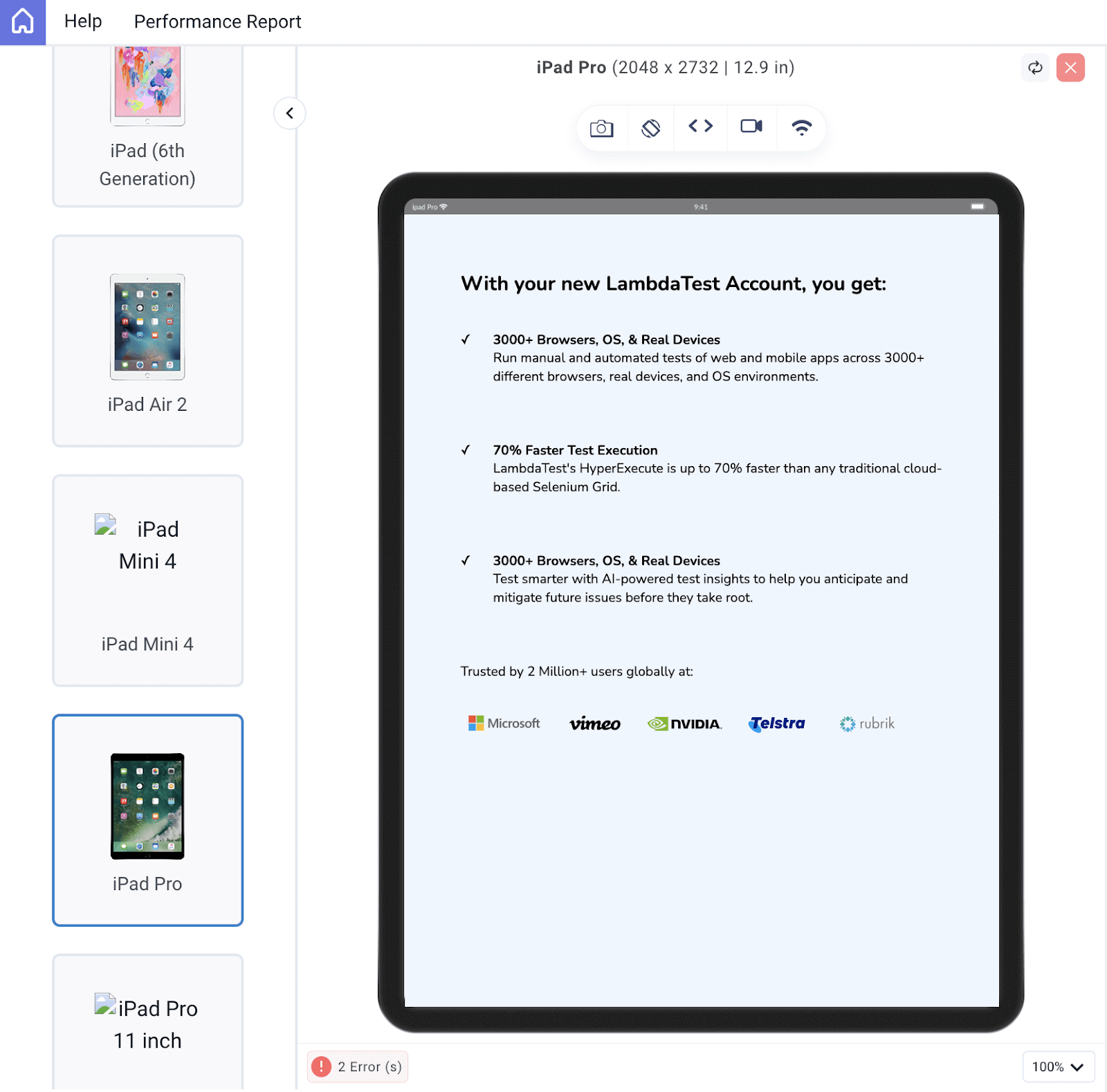
<!DOCTYPE html> <html lang="en"> <head> <meta charset="UTF-8" /> <meta name="viewport" content="width=device-width, initial-scale=1.0" /> <title>Document</title> <link rel="stylesheet" href="./style.css" /> </head> <body> <div class="lamdatest-info"> <h3>With your new LambdaTest Account, you get:</h3> <div class="offer"> <p>✓</p> <div> <h4>3000+ Browsers, OS, & Real Devices</h4> <p> Run manual and automated tests of web and mobile apps across 3000+ different browsers, real devices, and OS environments. </p> </div> </div> <div class="offer"> <p>✓</p> <div> <h4>70% Faster Test Execution</h4> <p> LambdaTest's HyperExecute is up to 70% faster than any traditional cloud-based Selenium Grid. </p> </div> </div> <div class="offer"> <p>✓</p> <div> <h4>3000+ Browsers, OS, & Real Devices</h4> <p> Test smarter with AI-powered test insights to help you anticipate and mitigate future issues before they take root. </p> </div> </div> <p>Trusted by 2 Million+ users globally at:</p> <div class="companies"> <img src="https://accounts.lambdatest.com/icons/logos/logo1.svg" alt="" /> <img src="https://accounts.lambdatest.com/icons/logos/logo2.svg" alt="" /> <img src="https://accounts.lambdatest.com/icons/logos/logo3.svg" alt="" /> <img src="https://accounts.lambdatest.com/icons/logos/logo4.svg" alt="" /> <img src="https://accounts.lambdatest.com/icons/logos/logo5.svg" alt="" /> </div> </div> </body> </html> |
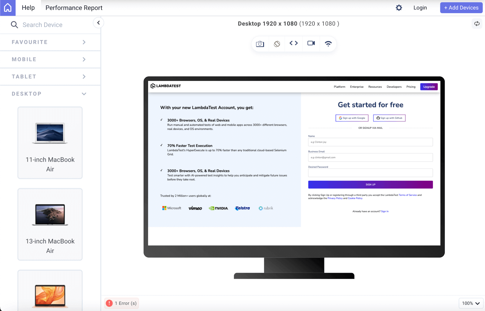
There you have it, a basic design. Let’s see the output with just the User Agent style in place.
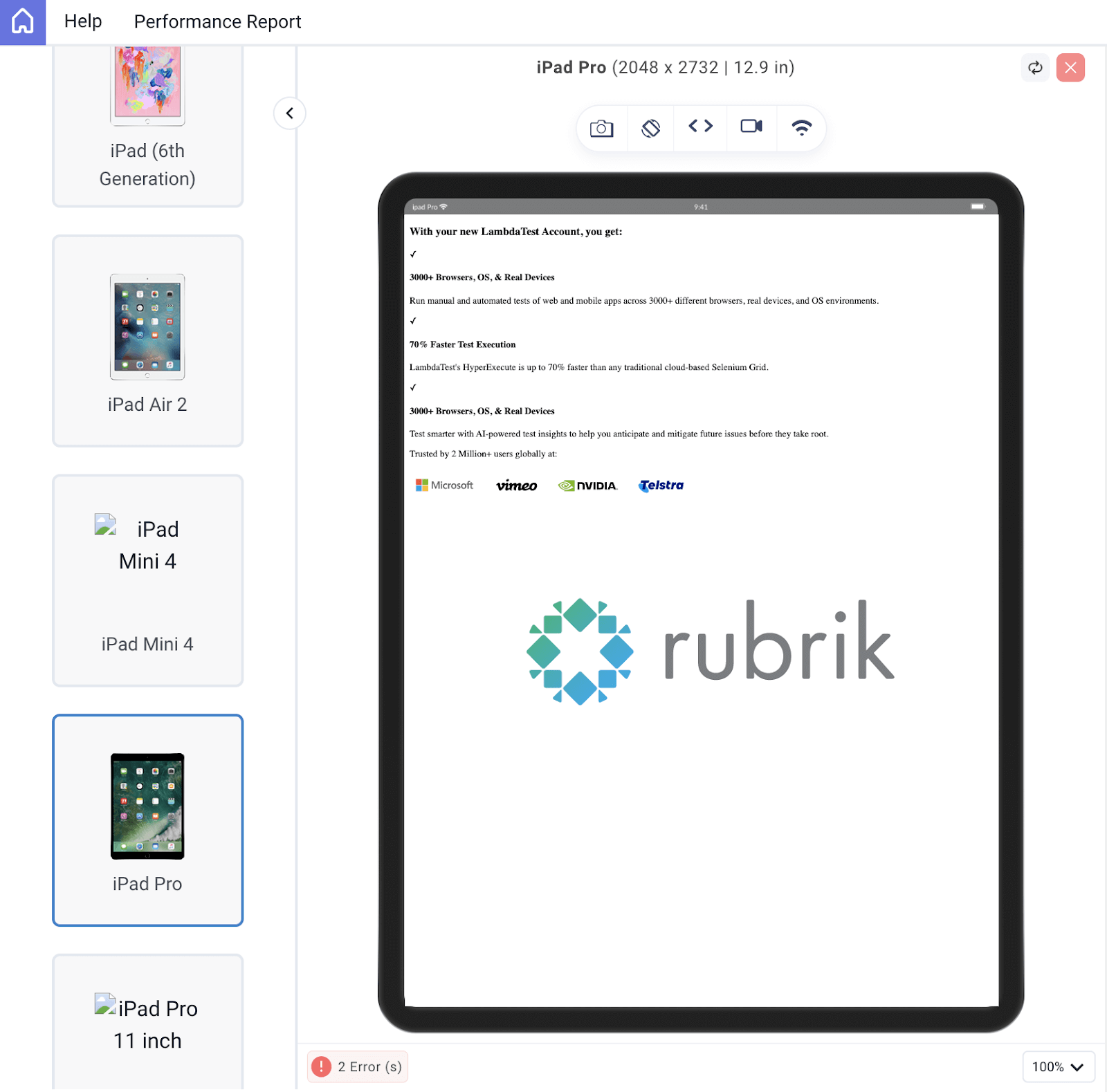
The user agent style provides a basic style to make your design look worth something; just in case the author stylesheet isn’t present, it directly affects your design if not reset.
Before applying CSS, what I do most of the time is use a universal selector to reset some of the values that have been set by the user agent style.
CSS:
|
1 2 3 4 5 6 7 8 9 10 11 12 13 14 15 16 17 18 19 20 21 22 23 24 25 26 27 28 29 30 31 32 33 34 35 36 37 38 39 40 41 42 43 44 45 46 47 48 49 50 51 |
@import url("https://fonts.googleapis.com/css2?family=Nunito:wght@400;700&display=swap"); /* Reset */ * { margin: 0; padding: 0; background-color: #eef5fe; font-family: "Nunito", sans-serif; font-size: 1.2rem; } /* Info Style */ .lamdatest-info { padding: 5rem; } .lamdatest-info h3 { font-size: 1.8rem; margin-bottom: 3rem; } .offer { display: flex; gap: 2rem; font-size: 1.5rem; margin-bottom: 3rem; } .lamdatest-info p { font-size: 1.2rem; margin-bottom: 2rem; } .companies img { width: 150px; } @media screen and (max-width: 502px) { .lamdatest-info { padding: 2rem 1rem; } .lamdatest-info h3 { font-size: 1.5rem; } .offer { gap: 1rem; font-size: 1.2rem; margin-bottom: 1rem; } .lamdatest-info p { font-size: 1rem; } .companies img { width: 100px; } } |
Browser Output:
See the Pen
Creating an information page by Clinton Joy (@Cejay101)
on CodePen.
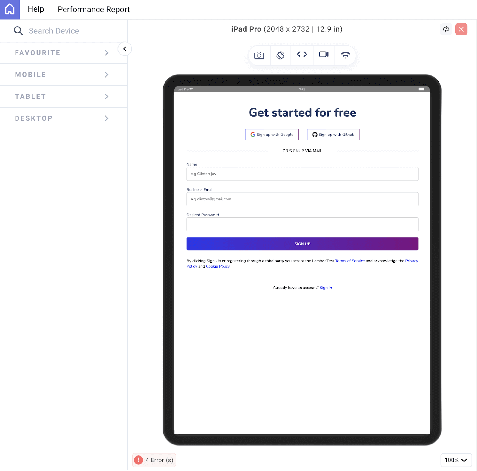
A Sign-Up Form
A sign-up form is another real-world example that can show how CSS specificity works. Specification can be used to style different input fields depending on their attributes and also different buttons depending on their class. Let’s consider this sign-up form design.
HTML:
|
1 2 3 4 5 6 7 8 9 10 11 12 13 14 15 16 17 18 19 20 21 22 23 24 25 26 27 28 29 30 31 32 33 34 35 36 37 38 39 40 41 42 43 44 45 46 47 48 49 50 51 52 53 54 55 56 57 58 59 60 61 62 63 64 65 66 67 68 69 70 71 72 73 74 75 76 77 |
<!DOCTYPE html> <html lang="en"> <head> <meta charset="UTF-8" /> <meta name="viewport" content="width=device-width, initial-scale=1.0" /> <title>Document</title> <link rel="stylesheet" href="./style.css" /> </head> <body> <div id="signup"> <form id="form"> <h2>Get started for free</h2> <div class="platforms"> <a href="https://accounts.google.com/o/oauth2/auth/oauthchooseaccount?client_id=706758774682-bjrjup3sgcqmqm1n4dq62pk72mvu8mhn.apps.googleusercontent.com&redirect_uri=https%3A%2F%2Faccounts.lambdatest.com%2Flogin%2Fgoogle%2Fcallback&scope=openid%20profile%20email&response_type=code&state=Kz4s0sM1i5Sa8v74vOBkteLIljh1cDn4YQpcvnSG&service=lso&o2v=1&theme=glif&flowName=GeneralOAuthFlow" class="platform-button" target="_blank" > <img src="https://raw.githubusercontent.com/Cejay101/LamdaTestImages/e863498d271de5c15fcce14ee75bad4aad55bc7d/images/google-color-svgrepo-com.svg" alt="google icon" />Sign up with Google</a > <a href="https://github.com/login/oauth/authorize?client_id=b41139b9749e27d4487b&redirect_uri=https%3A%2F%2Faccounts.lambdatest.com%2Flogin%2Fgithub%2Fcallback%2Fv1&scope=user%3Aemail&response_type=code&state=mA5eziVBDxkmH1LwCJT9k1uID3mSVm3W8Jf8ohJo" class="platform-button" target="_blank" ><img src="https://raw.githubusercontent.com/Cejay101/LamdaTestImages/e863498d271de5c15fcce14ee75bad4aad55bc7d/images/github-142-svgrepo-com.svg" alt="Github icon" />Sign up with Github</a > </div> <div class="alt-text"> <div></div> <p>OR SIGNUP VIA MAIL</p> <div></div> </div> <div class="field"> <label for="name">Name </label> <input type="name" id="name" placeholder="e.g Clinton joy" /> </div> <div class="field"> <label for="email">Business Email</label> <input type="email" id="email" placeholder="e.g clinton@gmail.com" /> </div> <div class="field"> <label for="password">Desired Password</label> <input type="password" id="password" /> </div> <div class="field"> <input type="submit" id="submit" value="SIGN UP"/> </div> By clicking Sign Up or registering through a third party you accept the LambdaTest <a href="https://www.lambdatest.com/legal/terms-of-service" >Terms of Service </a >and acknowledge the <a href="https://www.lambdatest.com/legal/privacy">Privacy Policy</a> and <a href="https://www.lambdatest.com/legal/cookie">Cookie Policy</a> </p> <p class="signin-text"> Already have an account? <a href="https://accounts.lambdatest.com/login?_gl=1*cz6gbh*_gcl_au*MTU1OTQzNjIzMS4xNjg5ODI4OTQ5" >Sign In</a > </p> </form> </div> </body> </html> |
CSS:
|
1 2 3 4 5 6 7 8 9 10 11 12 13 14 15 16 17 18 19 20 21 22 23 24 25 26 27 28 29 30 31 32 33 34 35 36 37 38 39 40 41 42 43 44 45 46 47 48 49 50 51 52 53 54 55 56 57 58 59 60 61 62 63 64 65 66 67 68 69 70 71 72 73 74 75 76 77 78 79 80 81 82 83 84 85 86 87 88 89 90 91 92 93 94 95 96 97 98 99 100 101 102 103 104 105 106 107 108 109 110 111 |
@import url("https://fonts.googleapis.com/css2?family=Nunito:wght@400;700&display=swap"); * { margin: 0; padding: 0; font-family: "Nunito", sans-serif; } a { text-decoration: none; } #form { padding: 3rem; max-width: 100vw; } img { width: 20px; } h2 { font-size: 3rem; color: rgb(36, 54, 96); text-align: center; } .platforms { display: flex; gap: 2rem; margin: 2rem; justify-content: center; } .platforms a { display: flex; gap: 5px; } .platform-button { background: none; color: rgb(36, 54, 96); border: 2px solid transparent; border-image: linear-gradient(90deg, #0000ff, #800080); border-image-slice: 1; border-image-width: 2px; border-image-outset: 0; border-radius: 0px; padding: 10px 20px; cursor: pointer; } .platform-button:hover { background: linear-gradient(90deg, #e2e2f1, #f1d3f1); } .alt-text { text-align: center; display: flex; justify-content: space-between; align-items: center; margin: 2rem 0; } .alt-text div { background-color: rgba(198, 198, 198, 0.383); height: 2px; display: inline-table; width: 35%; } .field { margin-bottom: 1.5rem; position: relative; } label { font-size: 1rem; color: rgb(36, 54, 96); } input { display: block; padding: 1rem; width: 100%; font-family: "Nunito", sans-serif; box-sizing: border-box; font-size: 1rem; border: 1px solid rgb(188, 188, 188); border-radius: 5px; } input[type="submit"] { margin-bottom: 2rem; font-family: "Nunito", sans-serif; width: 100%; background: linear-gradient(90deg, #3532ec, #800080); color: white; border: none; border-radius: 5px; padding: 15px 20px; cursor: pointer; } input[type="submit"]:hover { background: linear-gradient(90deg, #1e1cbf, #5b0b5b); } input:hover { background-color: rgb(232, 236, 239); } .signin-text { margin-top: 4rem; text-align: center; } @media screen and (max-width: 502px) { #form h2 { font-size: 2rem; } .platforms { flex-direction: column; } .alt-text div { width: 20%; } } |
We started our CSS process with a crucial reset, incorporating the universal selector. This reset involved erasing default margins and padding while enforcing a universal Nunito font family across all elements on the page. This provides a clean slate for consistent styling.
Even when dealing with input tags, we maintained the ability to target elements based on their distinct attribute values. Notably, by utilizing the type attribute with a value of submit, we were able to pinpoint and style the submit button distinctly. This works because attributes hold a higher specificity value than tag names. Consequently, the submit button adheres to the attribute-specific style rather than the generic element style.
See the Pen
Untitled by Clinton Joy (@Cejay101)
on CodePen.
CSS Specificity Best Practices
CSS specificity allows you to target and style elements precisely on your web page. On the other hand, it can lead to complex and hard-to-maintain code if not used wisely. To help you navigate this, here are some best practices for working with CSS specificity.
Keep It Simple
Whenever possible, favor simplicity over complexity. Avoid overly specific selectors and use the simplest selector that gets the job done. This makes your code more readable and maintainable.
Use Classes and IDs Frugally
While IDs have high specificity and can be helpful for unique elements, they should be used frugally because they can easily lead to specificity conflicts. Classes are generally preferred for styling elements.
Avoid Inline Styles
Inline styles (styles defined directly in HTML elements) have the highest specificity and can make your code hard to manage. Reserve them for exceptional cases where no other option is feasible.
Use BEM (Block Element Modifier)
BEM is a naming convention for CSS classes that helps avoid specificity issues. It promotes a clear and consistent naming structure for your CSS classes, making your code more predictable.
Use Specificity as a Last Resort
Only increase specificity when you have exhausted all other options. It’s usually better to refactor your HTML or CSS structure than to rely on high specificity.
Combine Selectors Wisely
Instead of creating extremely specific selectors, combine multiple classes or use descendant selectors to achieve the desired style. This maintains readability and lowers specificity.
Organize Your CSS
Keep your CSS organized and well-structured. Use comments and separate stylesheets for different components or sections of your website. This makes it easier to locate and manage styles.
Avoid !important
The !important declaration should be used infrequently. It can make it difficult to override styles later and should be reserved for critical cases where no other solution is possible.
Regularly Review and Refactor
As your project grows, periodically review your CSS to identify and eliminate unnecessary specificity. Refactoring your styles can help prevent specificity-related issues from piling up.
Document Your Code
Use comments to document the purpose of specific styles, especially when dealing with complex or high-specificity rules. This helps other developers (and your future self) understand the reasoning behind your choices.
By following these best practices, you can strike a balance between precision and maintainability in your CSS code. Understanding specificity and applying these guidelines will contribute to cleaner, more efficient stylesheets and a smoother development process.
 Note
NoteTest your websites for CSS specificity on real devices. Try LambdaTest Today!
Advanced CSS Specificity
CSS specificity is more than just the use of regular selectors like IDs, classes, and tags; there is a whole lot attached to it, and in this section, we will see the use of some advanced CSS specificity techniques, like the use of selectors combination, pseudo-classes, inheritance, etc.
Selector Combinators
CSS provides several combinator operators that enable you to select elements based on their relationship to other elements in the document tree. These include:
- Descendant Selector ( ): Selects an element that is a descendant of another element. For example, ul li selects all li elements that are descendants of ul elements.
- Child Selector (>): Selects an element that is a direct child of another element. For example, ul > li selects all li elements that are immediate children of ul elements.
- Adjacent Sibling Selector (+): Selects an element that is immediately preceded by a specified element. For example, h2 + p selects all p elements that directly follow an h2 element.
- General Sibling Selector (~): Selects elements that are siblings of a specified element. For example, h2 ~ p selects all p elements that are siblings of an h2 element.
Combining multiple selectors and combinator operators allows you to create complex selector combinations. For instance, div .class > p selects all p elements that are direct children of elements with class class, which themselves are descendants of div elements.
When you combine selectors, the specificity of the resulting selector is determined by the cumulative specificity of its constituent parts. This means that if you have a selector like div .class > p, its specificity is influenced by the specificities of div, .class, and p.
It’s important to note that the order of selectors can also affect specificity. In p.class, the class selector has a higher specificity than the type selector p.
Combining selectors is especially useful when you need to target specific elements in complex layouts or when you want to apply styles to a specific subset of elements. While combining selectors can be powerful, using them judiciously is crucial to avoid unnecessarily high specificity, leading to unintended styling conflicts and making your code more challenging to maintain. Consider using class names and IDs to target elements where possible, as they have lower specificity and are easier to manage.
Pseudo-classes
Pseudo-classes are special keywords that allow you to select and style elements. They are very useful when it comes to CSS specificity, as they only target based on their state or position within the document.
Here are some of the top pseudo-classes and how they work:
:hover, :active, and :focus
The :hover targets elements when a user hovers the mouse pointer over them. Whereas :active selects elements when a user actively clicks or interacts. On the other hand, the :focus targets elements when they receive keyboard or mouse focus (e.g., through the Tab key).
:nth-child() and :nth-of-type()
With these pseudo-classes, you can select a particular element to style based on its position in a parent container.
The :nth-child() lets you select elements based on their position among all children of the same parent. While the :nth-of-type() selects elements based on their position among elements of the same type.
:not()
The :not() pseudo-class lets you exclude specific elements from being selected. You can use it to create exceptions in your CSS rules, preventing certain elements from receiving particular styles.
:first-child and :last-child
These pseudo-classes target the first and last child elements of a parent. It is useful for applying styles to elements at the beginning or end of a list or container. Pseudo-classes take the game of CSS specificity to another level and, thus, cannot be neglected.
!important and Specificity
!important is a CSS declaration that can be added to a property-value pair in a CSS rule. When !important is used, it gives that particular declaration the highest level of specificity, effectively overriding any conflicting styles, regardless of their specificity values. This can be good when used judiciously, but it can also lead to maintainability and debugging challenges if overused.
Let’s consider this code to see how the !important declaration affects CSS specificity works.
|
1 2 3 4 5 6 7 8 9 10 11 12 13 14 15 16 17 18 19 20 21 |
<!DOCTYPE html> <html> <head> <style> /* Base styles for headings */ h1 { color: blue; } h2 { color: green !important; } .heading { color: red; } </style> </head> <body> <h1>This is a blue heading.</h1> <h2 class="heading">This is an important heading, colored green.</h2> </body> </html> |
In the code above we have the h1 and h2 tag both having different colors. The !important keyword is used in the h2 style rule, giving it the highest priority. Therefore, the color: red; rule from the .heading class is ruled out, and the h2 takes precedence over the base style for h2.
Browser Output:
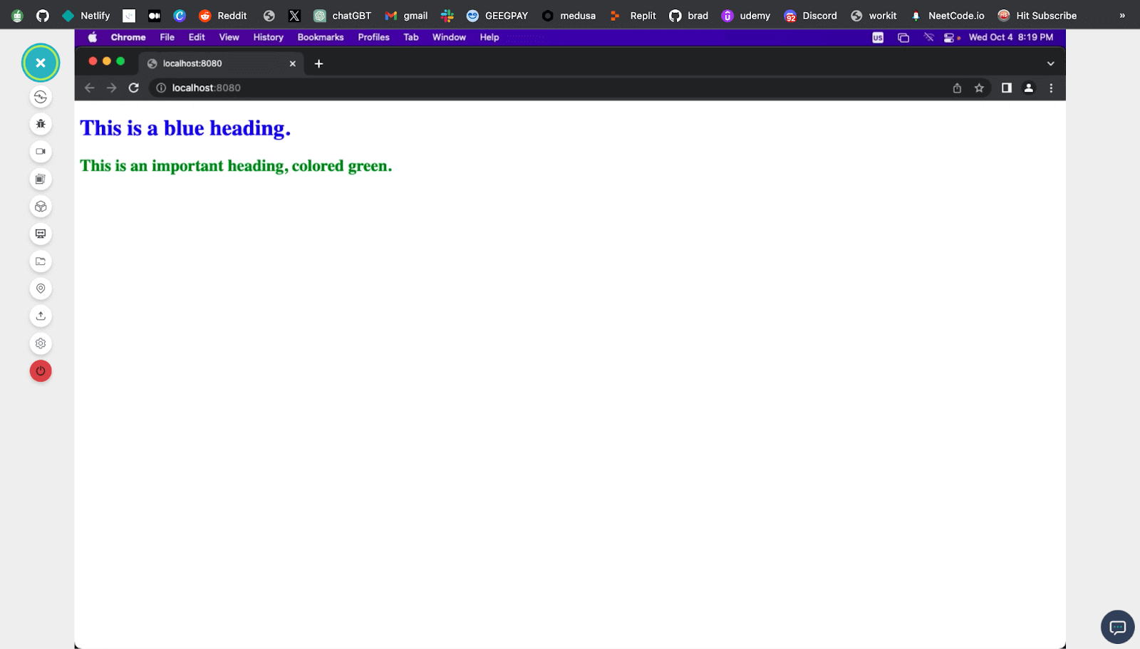
When !important is applied to a CSS declaration, it takes precedence over any other declaration for the same property, regardless of specificity. This means that even if a lower-specificity rule comes later in the stylesheet, the !important rule will win.
!important is typically reserved for exceptional cases where you need to forcefully override a style, such as when working with third-party libraries or dealing with browser-specific issues.
Common use cases include changing styles dynamically in JavaScript or addressing critical accessibility concerns.
One of the biggest pitfalls of !important is its potential for abuse. Overusing !important can lead to poor predictability in your stylesheets, challenging debugging and maintaining your code. It’s recommended to use !important sparingly and only when other methods of achieving the desired styling effect are not feasible.
Media Queries
Media queries are a fundamental aspect of responsive web design, allowing developers to apply different styles based on the characteristics of the user’s device or viewport. However, they also introduce specific considerations regarding CSS specificity.
Therefore, developers have to be mindful of specificity when nesting rules inside of media queries. If you are careful, you may avoid overriding rules you do not intend to override.
Take this code, for example.
HTML:
|
1 2 3 4 5 6 7 8 9 10 11 12 13 14 15 16 17 18 19 20 21 22 23 24 25 26 27 28 29 30 31 32 33 34 35 36 37 38 39 40 41 42 43 44 45 46 47 48 49 50 51 52 53 54 55 56 57 58 59 60 61 62 63 64 65 66 67 68 69 70 71 72 73 74 75 76 77 78 79 80 81 82 83 84 85 86 87 88 89 90 91 92 93 94 95 96 97 98 99 100 101 102 103 104 105 106 107 108 109 110 111 112 113 114 115 116 117 118 119 120 121 122 123 124 125 126 127 128 129 130 131 132 133 134 135 136 137 138 139 140 141 142 143 144 145 146 147 148 149 150 151 152 153 154 155 156 157 158 159 160 161 162 163 164 165 166 167 168 169 170 171 172 173 |
<!DOCTYPE html> <html lang="en"> <head> <meta charset="UTF-8" /> <meta name="viewport" content="width=device-width, initial-scale=1.0" /> <title>Document</title> <link rel="stylesheet" href="./style.css" /> </head> <body> <nav> <h3> <a href="https://www.lambdatest.com/" ><img class="logo" src="https://www.lambdatest.com/resources/images/logos/logo.svg" alt="logo" /></a> </h3> <ul class="nav-items"> <li><a href="https://www.lambdatest.com/feature">Platform</a></li> <li><a href="https://www.lambdatest.com/enterprise">Enterprise</a></li> <li><a href="https://www.lambdatest.com/blog/">Resources</a></li> <li> <a href="https://www.lambdatest.com/support/docs/getting-started-with-lambdatest-automation/" >Developers</a > </li> <li><a href="https://www.lambdatest.com/pricing">Pricing</a></li> <li> <a class="upgrade-btn" href="https://billing.lambdatest.com/billing/plans" >Upgrade</a > </li> </ul> <img class="hamburger" src="https://www.lambdatest.com/resources/images/icons/toggle_menu.svg" alt="" /> </nav> <div class="signup"> <div class="lamdatest-info"> <h3>With your new LambdaTest Account, you get:</h3> <div class="offer"> <p>✓</p> <div> <h4>3000+ Browsers, OS, & Real Devices</h4> <p> Run manual and automated tests of web and mobile apps across 3000+ different browsers, real devices, and OS environments. </p> </div> </div> <div class="offer"> <p>✓</p> <div> <h4>70% Faster Test Execution</h4> <p> LambdaTest's HyperExecute is up to 70% faster than any traditional cloud-based Selenium Grid. </p> </div> </div> <div class="offer"> <p>✓</p> <div> <h4>3000+ Browsers, OS, & Real Devices</h4> <p> Test smarter with AI-powered test insights to help you anticipate and mitigate future issues before they take root. </p> </div> </div> <p>Trusted by 2 Million+ users globally at:</p> <div class="companies"> <img src="https://accounts.lambdatest.com/icons/logos/logo1.svg" alt="" /> <img src="https://accounts.lambdatest.com/icons/logos/logo2.svg" alt="" /> <img src="https://accounts.lambdatest.com/icons/logos/logo3.svg" alt="" /> <img src="https://accounts.lambdatest.com/icons/logos/logo4.svg" alt="" /> <img src="https://accounts.lambdatest.com/icons/logos/logo5.svg" alt="" /> </div> </div> <form id="form"> <h2>Get started for free</h2> <div class="platforms"> <a href="https://accounts.google.com/o/oauth2/auth/oauthchooseaccount?client_id=706758774682-bjrjup3sgcqmqm1n4dq62pk72mvu8mhn.apps.googleusercontent.com&redirect_uri=https%3A%2F%2Faccounts.lambdatest.com%2Flogin%2Fgoogle%2Fcallback&scope=openid%20profile%20email&response_type=code&state=Kz4s0sM1i5Sa8v74vOBkteLIljh1cDn4YQpcvnSG&service=lso&o2v=1&theme=glif&flowName=GeneralOAuthFlow" class="platform-button" target="_blank" > <img src="https://raw.githubusercontent.com/Cejay101/LamdaTestImages/e863498d271de5c15fcce14ee75bad4aad55bc7d/images/google-color-svgrepo-com.svg" alt="google icon" />Sign up with Google</a > <a href="https://github.com/login/oauth/authorize?client_id=b41139b9749e27d4487b&redirect_uri=https%3A%2F%2Faccounts.lambdatest.com%2Flogin%2Fgithub%2Fcallback%2Fv1&scope=user%3Aemail&response_type=code&state=mA5eziVBDxkmH1LwCJT9k1uID3mSVm3W8Jf8ohJo" class="platform-button" target="_blank" ><img src="https://raw.githubusercontent.com/Cejay101/LamdaTestImages/e863498d271de5c15fcce14ee75bad4aad55bc7d/images/github-142-svgrepo-com.svg" alt="Github icon" />Sign up with Github</a > </div> <div class="alt-text"> <div></div> <p>OR SIGNUP VIA MAIL</p> <div></div> </div> <div class="field"> <label for="name">Name </label> <input type="name" id="name" placeholder="e.g Clinton joy" /> </div> <div class="field"> <label for="email">Business Email</label> <input type="email" id="email" placeholder="e.g clinton@gmail.com" /> </div> <div class="field"> <label for="password">Desired Password</label> <input type="password" id="password" /> </div> <div class="field"> <input type="submit" id="submit" value="SIGN UP"/> </div> By clicking Sign Up or registering through a third party you accept the LambdaTest <a href="https://www.lambdatest.com/legal/terms-of-service" >Terms of Service </a >and acknowledge the <a href="https://www.lambdatest.com/legal/privacy">Privacy Policy</a> and <a href="https://www.lambdatest.com/legal/cookie">Cookie Policy</a> </p> <p class="signin-text"> Already have an account? <a href="https://accounts.lambdatest.com/login?_gl=1*cz6gbh*_gcl_au*MTU1OTQzNjIzMS4xNjg5ODI4OTQ5" >Sign In</a > </p> </form> </div> </body> </html> |
CSS:
|
1 2 3 4 5 6 7 8 9 10 11 12 13 14 15 16 17 18 19 20 21 22 23 24 25 26 27 28 29 30 31 32 33 34 35 36 37 38 39 40 41 42 43 44 45 46 47 48 49 50 51 52 53 54 55 56 57 58 59 60 61 62 63 64 65 66 67 68 69 70 71 72 73 74 75 76 77 78 79 80 81 82 83 84 85 86 87 88 89 90 91 92 93 94 95 96 97 98 99 100 101 102 103 104 105 106 107 108 109 110 111 112 113 114 115 116 117 118 119 120 121 122 123 124 125 126 127 128 129 130 131 132 133 134 135 136 137 138 139 140 141 142 143 144 145 146 147 148 149 150 151 152 153 154 155 156 157 158 159 160 161 162 163 164 165 166 167 168 169 170 171 172 173 174 175 176 177 178 179 180 181 182 183 184 185 186 187 188 189 190 191 192 193 194 195 196 197 198 199 200 201 202 203 204 205 206 207 208 209 210 211 212 213 214 215 216 217 218 219 220 221 222 223 224 |
@import url("https://fonts.googleapis.com/css2?family=Nunito:wght@400;700&display=swap"); * { margin: 0; padding: 0; } body { background-color: #ffffff; font-family: "Nunito", sans-serif; } a { text-decoration: none; } /* Nav bar */ nav img { width: 200px; } .nav-items { list-style: none; gap: 2rem; display: flex; align-items: center; } nav a:hover { color: #56bbc6; } nav { display: flex; justify-content: space-between; align-items: center; padding: 1rem; font-size: 1.2rem; background-color: white; box-shadow: 0px 0px 25px #888888; position: relative; } nav a { color: #000000; text-decoration: none; } nav .upgrade-btn { background: linear-gradient(90deg, #3532ec, #800080); color: white; border: none; border-radius: 5px; padding: 10px 20px; } nav .upgrade-btn:hover { background: linear-gradient(90deg, #211f98, #5b075b); color: white; } .hamburger { display: none; } .signup { display: flex; } /* Lambdatest info */ .lamdatest-info { padding: 5rem; background-color: #eef5fe; } .lamdatest-info h3 { font-size: 1.8rem; margin-bottom: 3rem; } .offer { display: flex; gap: 2rem; font-size: 1.5rem; margin-bottom: 3rem; } .lamdatest-info p { font-size: 1.2rem; margin-bottom: 2rem; } .companies img { width: 150px; } /* Form */ #form { padding: 3rem; max-width: 100vw; } img { width: 20px; } h2 { font-size: 3rem; color: rgb(36, 54, 96); text-align: center; } .platforms { display: flex; gap: 2rem; margin: 2rem; justify-content: center; } .platforms a { display: flex; gap: 5px; } .platform-button { background: none; color: rgb(36, 54, 96); border: 2px solid transparent; border-image: linear-gradient(90deg, #0000ff, #800080); border-image-slice: 1; border-image-width: 2px; border-image-outset: 0; border-radius: 0px; padding: 10px 20px; cursor: pointer; } .platform-button:hover { background: linear-gradient(90deg, #e2e2f1, #f1d3f1); } .alt-text { text-align: center; display: flex; justify-content: space-between; align-items: center; margin: 2rem 0; } .alt-text div { background-color: rgba(198, 198, 198, 0.383); height: 2px; display: inline-table; width: 35%; } .field { margin-bottom: 1.5rem; position: relative; } label { font-size: 1rem; color: rgb(36, 54, 96); } input { display: block; padding: 1rem; width: 100%; font-family: "Nunito", sans-serif; box-sizing: border-box; font-size: 1rem; border: 1px solid rgb(188, 188, 188); border-radius: 5px; } input[type="submit"] { margin-bottom: 2rem; font-family: "Nunito", sans-serif; width: 100%; background: linear-gradient(90deg, #3532ec, #800080); color: white; border: none; border-radius: 5px; padding: 15px 20px; cursor: pointer; } input[type="submit"]:hover { background: linear-gradient(90deg, #1e1cbf, #5b0b5b); } input:hover { background-color: rgb(232, 236, 239); } .signin-text { margin-top: 4rem; text-align: center; } @media screen and (max-width: 1252px) { .hamburger { display: block; width: 30px; } .nav-items { display: none; } .signup { flex-direction: column-reverse; } } @media screen and (max-width: 502px) { .lamdatest-info { padding: 2rem 1rem; } .lamdatest-info h3 { font-size: 1.5rem; } .offer { gap: 1rem; font-size: 1.2rem; margin-bottom: 1rem; } .lamdatest-info p { font-size: 1rem; } .companies img { width: 100px; } #form h2 { font-size: 2rem; } .platforms { flex-direction: column; } .alt-text div { width: 20%; } } |
Browser Output:
As seen, media queries and CSS specificity can interact indirectly when used in combination to create responsive designs.
When a media query condition is met (e.g., the screen width is within a specific range), it can cause a set of CSS rules to be applied or overridden. These rules, like any other CSS rules, may have selectors with varying specificity.
If there are conflicting CSS rules within the styles the media query applies, CSS specificity will determine which rules take precedence. The rule with higher specificity will override rules with lower specificity.
Whenever you combine media queries with additional CSS rules, be mindful of potential issues with specificity. For instance, selector overlap with existing rules may result in specificity conflicts when a media query modifies an element’s styles. By modifying your selector techniques or, where necessary, utilizing more precise selectors, you can learn how to handle specificity conflicts in media queries.
Conclusion
CSS specificity, a vital concept in web development, determines the priority of styles when conflicting CSS rules target the same HTML element. It works on a hierarchy where IDs carry more weight than classes and element selectors, while inline styles hold the highest precedence. This guides browsers in deciding which style declarations to apply, ensuring predictable and consistent styling across web pages.
Understanding specificity is crucial for developers to maintain clean, efficient code and avoid unintended style conflicts. It allows for better management of styles in complex web projects, enabling the creation of maintainable stylesheets and preventing unexpected style overrides.
Frequently Asked Questions (FAQs)
What is specificity in CSS?
Specificity in CSS refers to the set of rules that determine which style declarations are applied to an HTML element when multiple conflicting styles are defined. It’s based on the combination of selectors used to target an element and assigns a numerical value to determine which rule takes precedence.
What is the specificity of not in CSS?
The specificity of the not pseudo-class in CSS is relatively low. When you use :not(selector) to exclude specific elements from a rule, it doesn’t significantly impact the overall specificity of the rule. It’s often used to fine-tune styles without significantly altering specificity.


Author’s Profile
Clinton Joy Fimie
Clinton Joy is a front-end developer and technical writer with 3 years of experience in the tech field. With diverse experience ranging from graphic design to front-end development, back-end development, and technical writing, he loves creating visually appealing, user-friendly solutions and communicating technical concepts in the clearest way possible.
Blogs: 6
Got Questions? Drop them on LambdaTest Community. Visit now


