 Test your AI Agents with the all-new Agent to Agent Testing
Platform.
Test your AI Agents with the all-new Agent to Agent Testing
Platform. 

How To Use CSS Grid Scheduler [CSS Tutorial]
Aakash Rao
Posted On: October 12, 2022
28 Min


Before begining this blog on building a CSS grid scheduler, let’s understand the significance of a CSS grid.
During the past few years, the Internet has witnessed a rapid shift in how content is displayed and consumed. The content displayed by a company or individual reveals a lot about them. Therefore, it is crucial to have a basic understanding of displaying content on different platforms and screen sizes.
When it comes to the web, you can leverage CSS to display and style the content. In recent years, device fragmentation has been a significant problem for developers.
It is the inability to “write once and run anywhere,” which means on any version of browser or devices and to create a visually pleasing layout that could adapt to any viewport.
Some properties like floats and positions used earlier made it difficult for developers to create responsive layouts. You all know how vital website responsiveness is in today’s hyper-competitive times!
But today, you have more good and modern solutions like CSS flexbox and grid.
It makes creating excellent and responsive layouts to display the content much easier. Also, it can now adapt to any viewport and device.
Not only do these solutions reduce the amount of code, but it also saves time for creating custom and complex designed layouts for web pages.
According to the State of CSS 2021 report, many developers are adopting CSS grids and using their power to create websites and responsive layouts. In the past few years, the CSS grid has evolved, and the grid is now being used in all websites to structure the content. So as a developer, it becomes essential to learn and understand the CSS grid.
In this blog on CSS grid scheduler, you will look at how to build a conference with CSS grid scheduler.
Building a conference scheduler with CSS grid will help put all the learnings about CSS grid properties into action. It will also help in developing the understanding about the working of each property, including subgrid, gaps, and grid-template.

If that sounds fun, let’s get right into it.
TABLE OF CONTENTS
- Introduction to CSS Grid
- Getting Started with CSS Grid
- The fr-unit and the repeat() function
- What is a Subgrid?
- Difference between the Explicit and Implicit Grids
- What is the minmax() function?
- Difference between auto-fill and auto-fit in CSS Grid
- Advanced way of creating Grid layouts
- Getting started with building Conference Schedule with CSS Grid Scheduler
- Testing Responsiveness of CSS Grid Scheduler
Introduction to CSS Grid
To build a conference with a CSS grid scheduler, let’s quickly understand what a grid is.
A grid is a bunch of lines that cross each other and form a series of rectangles and squares. In simple terms, lets visualize it as a group of horizontal lines or rows and vertical lines or columns with gaps, also called gutters, intersecting each other and forming cells.
The same logic applies to the CSS grid. You can place the design elements or blocks within those cells and display the content.
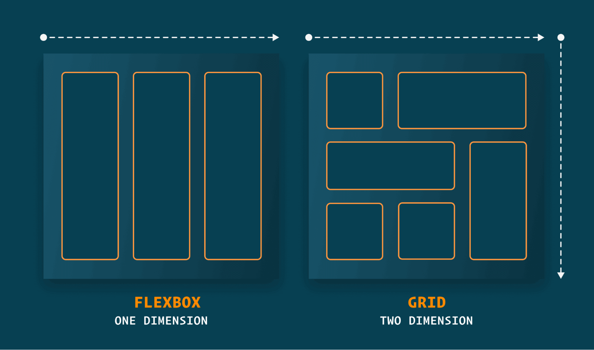
While flexbox allows us to create a layout in a single dimension (i.e., a row or column), CSS grid provides the flexibility to define layouts in both directions. This makes it easier to create or design complex web pages.
What is a Grid Container?
A grid container is just like a regular container set as a grid to place grid items or content in rows and columns along with some gaps or gutters.
You can apply grid value to the display property to define a grid. It enables a standard container to behave like a grid container in which we can use different grid properties for the rows and columns. The direct children to the container become the grid items.
By applying the grid, the element inside the container will stay the same as it looks, while inside the grid container, it removes the margin collapsing between two elements. You have to define the rows and columns using the grid-template property to see a visual change.
Syntax to define a grid with a sample layout of a CSS grid container:

Browser Support for CSS Grid
While learning about the CSS grid scheduler, it’s crucial to know its browser support of CSS grid. Different browsers use different engines to render the layout and JavaScript on the web.
Some examples of rendering engines to render the CSS:
- Blink: Used by browsers like Chrome and Opera
- Webkit: Used by the Safari browser
- Gecko: Used by the Firefox browser
The rendering engine is responsible for rendering the layout, animations, color, and content displayed, while the JavaScript engine is responsible for running JavaScript inside of it. A combination of these is responsible for rendering the web page on the browser.
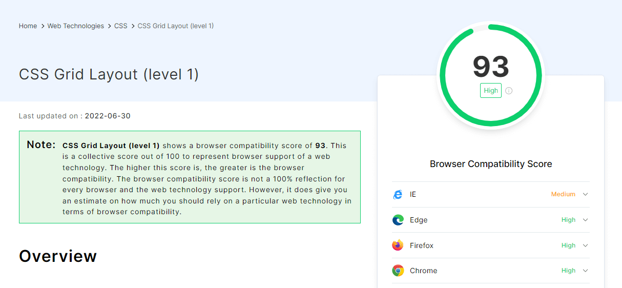
While having so many different engines for different browsers, it’s also essential to know about cross browser compatibility to check if the page works seamlessly across different browsers. As per LambdaTest Web Technologies Compatibility, all modern browsers support CSS grids, making it easier and safer to apply grids on websites.
Test your CSS grids across real desktop and mobile devices. Try LambdaTest Now!
Advantages of CSS Grid
Till now in this tutorial on CSS grid scheduler, we have covered the essentials of the CSS grid and how the layout structure is defined for the CSS grid layouts. Let’s deep dive into some of its advantages:
- Grid makes it easy to create fabulous layouts. It allows us to leverage the rows and columns to create powerful user interfaces.
- It helps to visualize each element of the website or web page with grid lines.
- We can easily make the grid layout responsive by changing the requisite property values.
- Easy to implement and allows us to speed up the development process.
- It makes it easy to create prototypes and is super powerful when used with the grid-areas property.
- CSS grid also helps to reduce the file size of the CSS code as there is no need to apply libraries like Bootstrap. Learn more about CSS grid vs. Bootstrap.
So by now, it is evident how the CSS grid has changed the overall process of creating the user interface. Once we learn how to utilize them for the layouts, it becomes handy.
You can also check out the best CSS grid layout generators for quick prototyping and front-end CSS layout design for your projects.
Getting Started with CSS Grid
Before building the conference the CSS grid scheduler, we will look at how CSS grid layouts are made by applying different properties to be able to visualize the layout.
We will start by learning essential concepts and back that up with a basic layout example to practice a few important properties of the CSS grid.
Lines and tracks – An easy way to visualize the grid
To visualize the placement of an element inside a grid container, we can use lines, also referred to as grid lines or tracks, depending on which the content is placed. We can quickly check it out by inspecting the grid container.
- Open the Netlify link on the browser. Use the shortcut on the Keyboard Ctrl + Shift + I to open the inspect tab.
- On the inspect tab, inside the HTML go the
< body >element. - Inside the
< body >, you’ll see an< div >element with the “container” class. - Click on the grid option on the right side of that
< div >element. - It will enable the grid lines, and you can see the grid tracks or lines in the browser.
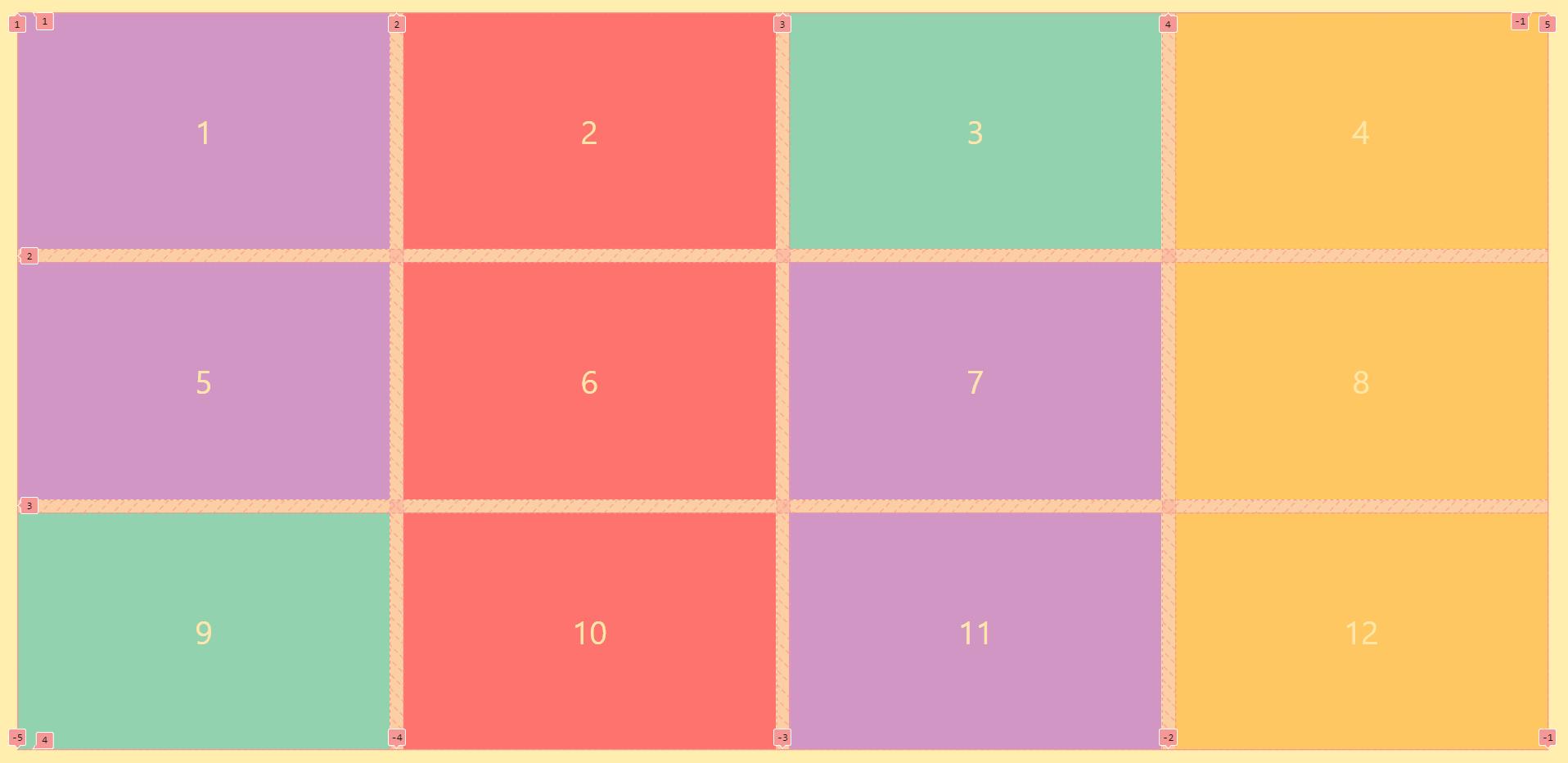
The layout showcases an example of a responsive grid container, which uses auto-fit and grid-template-columns property.
The number of lines and numbers in the vertical direction at the top reflects the number of columns, whereas the lines and numbers in the horizontal direction show us the number of rows of the grid container.
Creating and Structuring the grid layout
As discussed above, we can create a grid container by applying the grid value to the display property. To make rows and columns, we can use the grid-template-columns and grid-template-rows properties for the container element.
- grid-template-columns: It defines the size and the number of columns for a grid container
- grid-template-rows: It specifies a grid container’s size and the number of rows
- grid-template: It is the shorthand property for grid-template-columns and the grid-template-rows properties
- grid-gap: It defines the gap between the grid items or children inside the grid container. It is a shorthand property of grid-column-gap and grid-row-gap. If one value is specified, it applies to both columns and rows.
As the number of devices and browser versions increases, developing web applications that work seamlessly across devices, browsers, and platforms is crucial for businesses to capitalize on their online presence in a highly fragmented environment.
Therefore, after applying the different grid properties in your CSS grid scheduler, you can use LambdaTest – a cross browser testing platform, to test them with its real-time web testing feature across different desktop and mobile browsers.
Let’s see an example by applying all these properties for a quick layout to understand how each property works.
HTML and CSS:
CodePen:
See the Pen
Creating and Structuring the grid layout v1 by Aakash Rao (@aakash_codes)
on CodePen.
Output:
The following examples show the grid-template-columns property in which two columns are defined with a size of 200px each. Similarly, the grid-gap applies a gap between the grid items of 13px.
We can also apply the grid-template-rows property to define the number of rows and their sizes.
HTML and CSS:
CodePen:
See the Pen
Creating and Structuring the grid layout v2 by Aakash Rao (@aakash_codes)
on CodePen.
Output:
The above example shows the two rows defined by the grid-template-rows property with a value of 150px each. To understand how each property works fully, it is important to experiment with these values.
How to use the grid-row and grid-column properties?
For now, we know how to create a grid container with columns and rows; let’s understand how to structure the grid items using the two essential properties, i.e., grid-row and grid-column.
We can leverage the grid-row and grid-column properties to specify and change the location of the grid item.
For example, we can change the position of the first grid item from its first column location and pass it to the last column using grid-column.
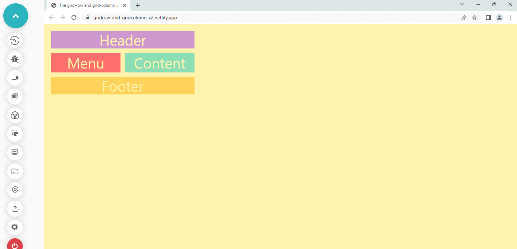
- grid-row: It is a shorthand property of grid-row-start and grid-row-end that allows us to specify the grid item’s size and location within a row.
- grid-column: It is a shorthand property of grid-column-start and grid-column-end that allows us to specify the grid item’s size and location within a column.
Let’s see how these properties work in action. We can apply the changes by taking the same layout example as before by adding a few changes to it to see how grid-row and grid-column work with the layout.
HTML and CSS:
CodePen:
See the Pen
The grid-row and grid-column property v1 by Aakash Rao (@aakash_codes)
on CodePen.
Output:
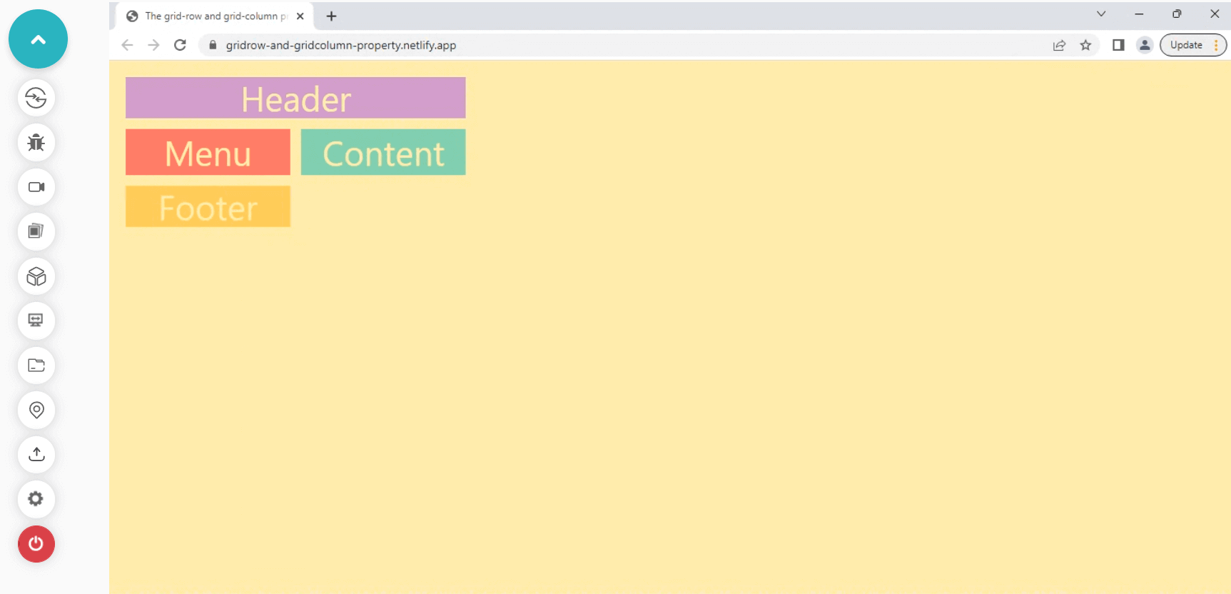
The grid-column property is a shorthand that defines the grid-column-start, and grid-column-end values, which makes the < div > with .header class take up the two-column width.
Similarly, we can apply the same rules for the footer element to cover and take up the entire two-column width.
HTML and CSS:
CodePen:
See the Pen
The grid-row and grid-column property v2 by Aakash Rao (@aakash_codes)
on CodePen.
Output:
Now, as we get familiar with the primary grid properties, let’s understand some more essential concepts about CSS grid which will later help us to make a responsive CSS grid scheduler.
The fr-unit and the repeat() function
The fr or fraction unit represents a fraction of available space inside a grid container. It is used in the CSS grid to make the elements take up the available space to grow and shrink.
The syntax of the fr unit for a grid container:
The nearest function to the CSS grid, widely used, is the repeat() function. The function repeats the number of values when we want to apply them to an element.
For example, in a CSS grid, we can use it to create the number of tracks and their sizes more compactly, so we don’t have to repeat the recurring pattern of rows and column values.
The repeat() function takes two values separated by commas; the first value specifies the number of times we want to repeat the value, and the second value determines the size or value with a unit we want to repeat.
Below is the code example of the repeat() function with the grid-template-columns property. Without using the repeat() function, we have to specify the same value 12 times to create 12 columns with the 1fr value.
Now, as we get familiar with the syntax, let’s move on to the next concept and try to understand more about the CSS grid.
What is CSS Subgrid?
In this section of building a CSS grid scheduler, let’s talk about the role of CSS subgrid.
The subgrid is a level 2 specification of the CSS grid, a value provided to the grid-template-columns and the grid-template-rows properties. In simple terms, it is applied to the children’s item or the second level of the grid container.
It lets you use the same track lines from the parent grid for the dynamic placement of the items inside the second grid container.
When we apply display: grid to a container, all its direct children become the grid items. We can nest grids by making a grid item into a grid container.
However, these new nested grid containers will be independent of their parent for the track lines. However, we can leverage the subgrid to use the same track lines for the nested grid if we set the value of grid-template-columns and grid-template-rows to the subgrid.
It will pass the same grid lines from the parent grid to the child’s grid container, which is very handy in some cases. Another significant advantage of the subgrid is that it not only passes the track lines from the parent grid but also allows us to apply the same grid-gap from the parent grid container.
The only disadvantage of the subgrid for now is that it is currently not supported by all modern browsers, but in the future, it will become accessible on all major browsers.
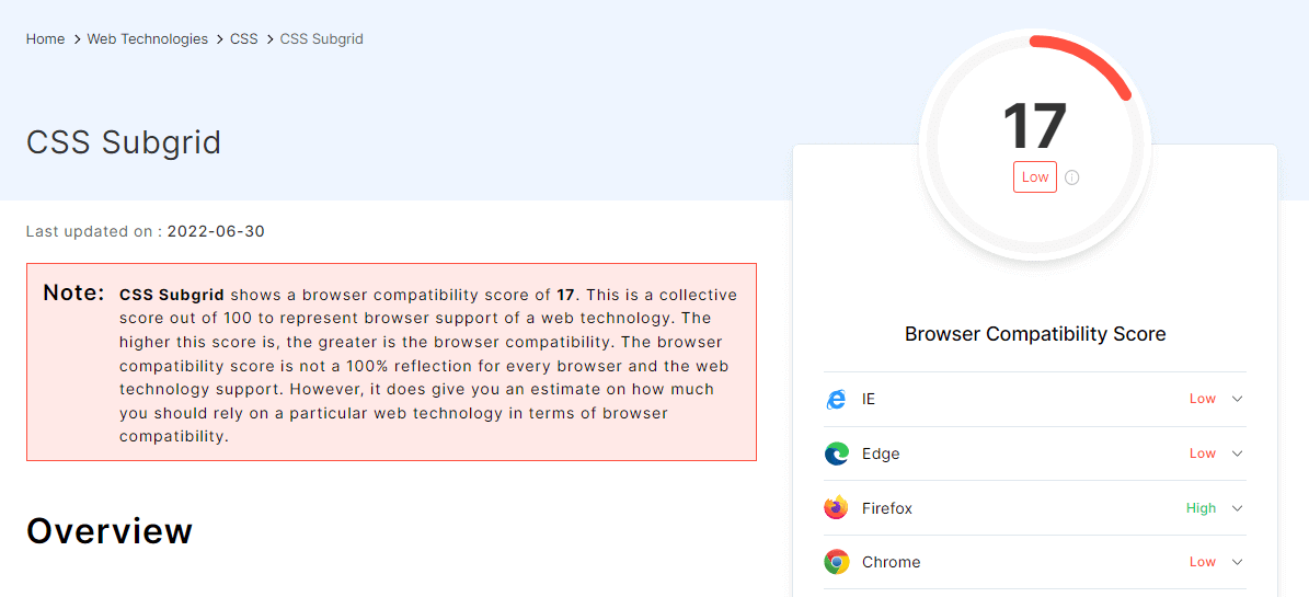
Currently, it is only supported by Firefox v71+ and Safari Technology preview.
Get 60 minutes of live interactive testing each month for FREE. Try LambdaTest Now!
Difference between the Explicit and Implicit grids
The CSS grid provides the facility to define grid cells with rows and columns and place content inside them. Before this, we learned how to define rows and columns and place and/or change the location of the element or content inside a grid container.
Another prominent feature of the CSS grid is that we don’t need to manually specify each grid line or track and place the grid item. The CSS grid module is flexible enough to adapt to their items.
Let’s first try to understand the difference between these two grid types.
- Explicit grid: The tracks and lines we define manually for a grid container using grid-template and grid-template-areas properties are called an explicit grid.
- Implicit grid: If the grid container has more items than the number of tracks and lines we define manually or when a grid item is placed outside the explicit grid, the grid container automatically generates grid tracks by adding grid lines to the container.
This explicit grid, together with these new tracks and grid lines, forms an Implicit grid.
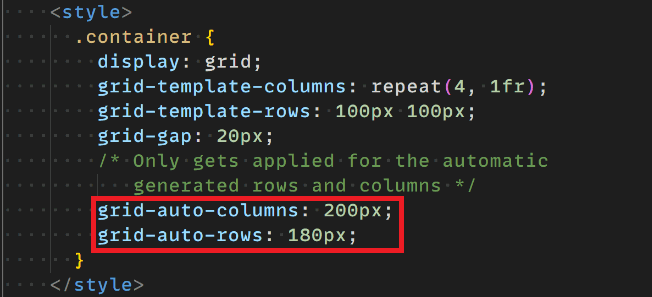
Although the width and height of these implicit tracks are set automatically, the CSS grid has given us the power to change the sizing of these tracks using grid-auto-rows and grid-auto-columns properties.
- grid-auto-rows: It defines the size of an implicit grid rows track or pattern.
- grid-auto-columns: Similar to grid-auto-row, it helps to specify the size of implicitly created column tracks of the grid container.
Another valuable property that helps specify the auto-placement of grid items in implicitly created tracks is grid-auto-flow. By default, the auto-placement algorithm places new things by filing rows sequentially.
But with grid-auto-flow, we can specify how the items flowed into a grid container. Now that we understand the difference between the grid types let’s see both in action with a quick sample layout.
HTML and CSS:
CodePen:
See the Pen
Difference between explicit and implicit grid starter by Aakash Rao (@aakash_codes)
on CodePen.
Output:
Let’s start by defining the grid with the .container class and applying grid-template-columns and grid-template-rows to create an explicit grid container.
HTML and CSS:
CodePen:
See the Pen
Difference between explicit and implicit grid final by Aakash Rao (@aakash_codes)
on CodePen.
Output:
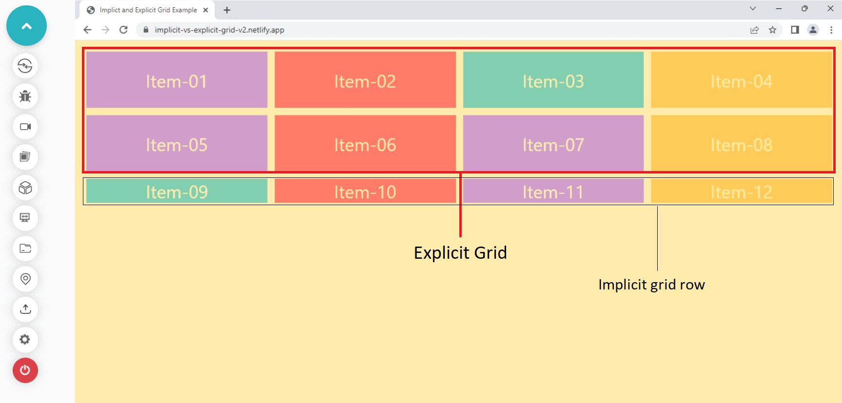
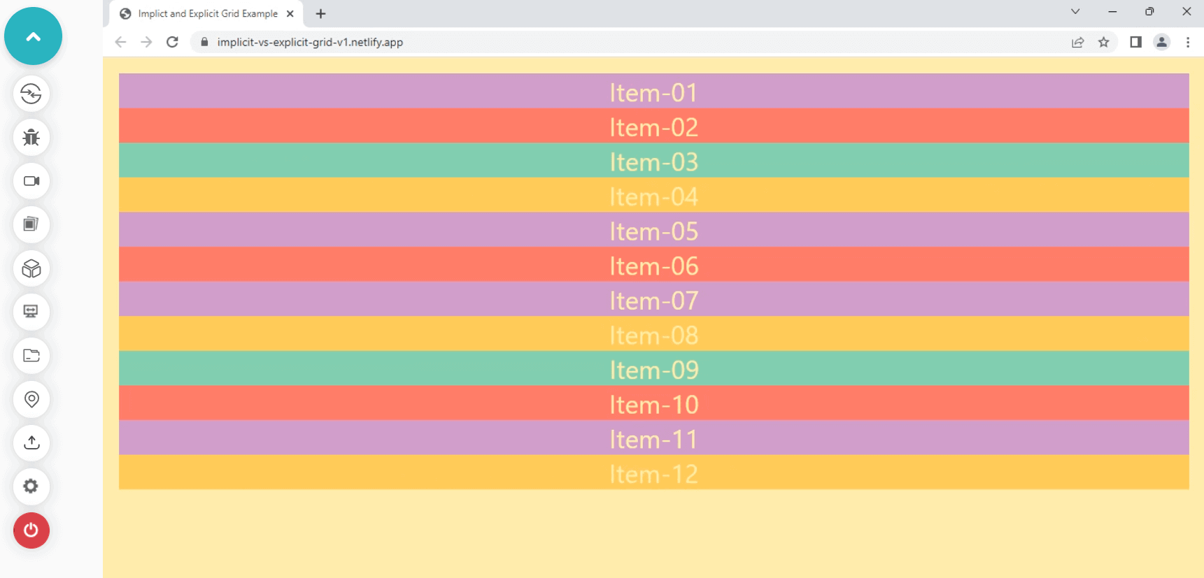
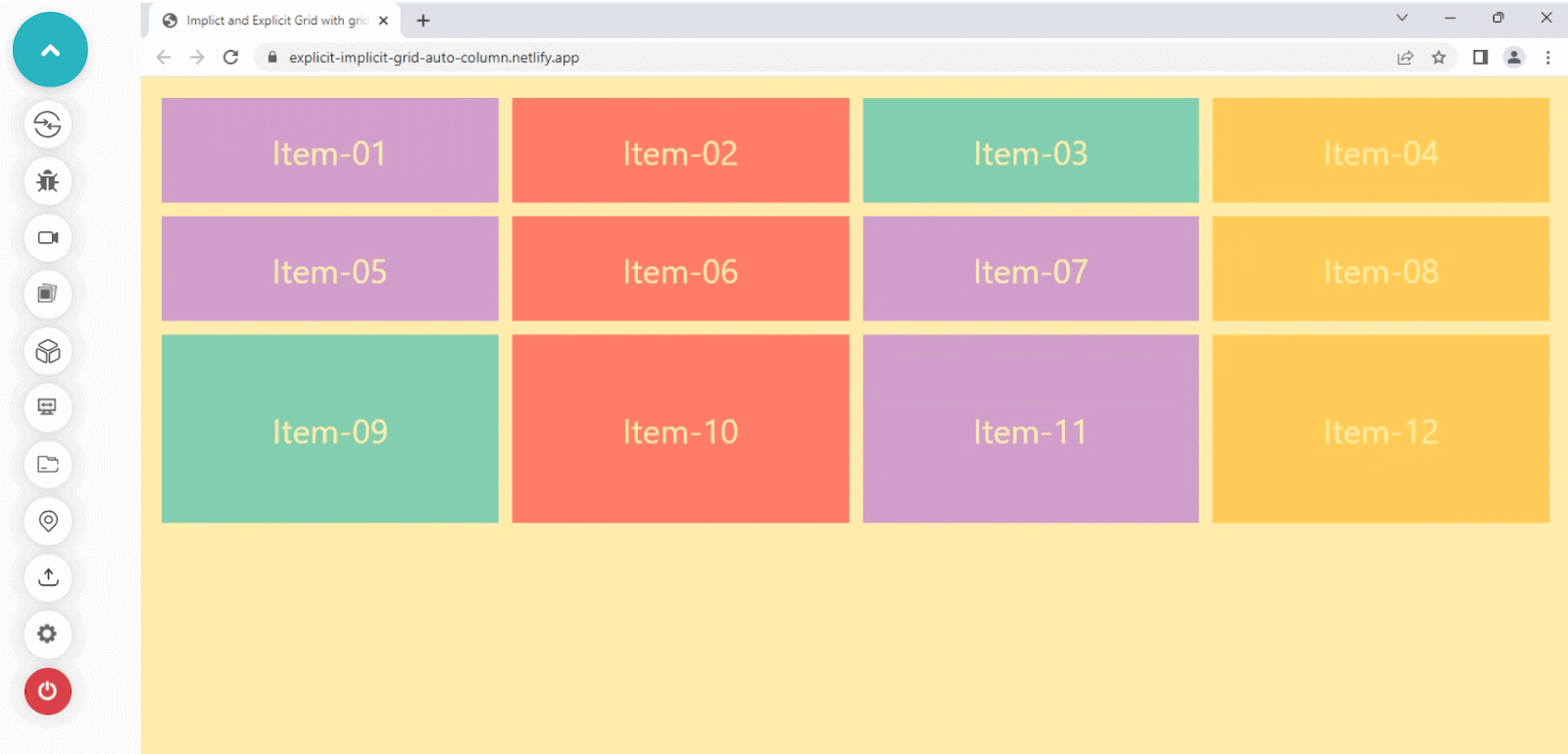
In the example above, we have specified four columns and two rows, creating an explicit grid version.
But after these two rows, the grid algorithm made a new row and added the rest of the grid items inside it. This was an example of how the Implicit and Explicit grid works together to ensure that there is no content overflow.
The second important thing is to notice how the fraction unit on the columns equally divides the available space for its grid items and makes them fit inside the grid container.
Let’s now change the repeating values of the grid-template-columns and grid-template-rows with the repeat() function. You can also apply the template shorthand, but for simplicity, we will use both the values of rows and columns individually.
Apply the changes to the .container class inside HTML to see how grid-auto-rows and grid-auto-columns work in action.
HTML and CSS:
CodePen:
See the Pen
Explicit and implicit grid with grid-auto-row and grid-auto-column by Aakash Rao (@aakash_codes)
on CodePen.
Output:
Here we have applied grid-auto-rows with the value of 180px, which only gets into action when the grid items specified are more than the rows and columns specified for those items.
In the next section of the CSS grid scheduler, we will see some more advanced features that the CSS grid offers.
What is the minmax() function?
Another great and helpful feature introduced with the CSS grid layout specification is the minmax() function. It allows us to set dynamic values for the tracks and provide both the minimum and the maximum values.
Just like the repeat() function, the minmax() function accepts two values that are the minimum and the maximum value specified inside of it. If the maximum fixed value is less than the minimum value, it will try to ignore it, and the function is treated as purely offering the minimum value.
The minmax() function can accept various values like:
- A percentage
- An absolute or relative length
- Flexible length like fr
- min-content
- max-content
- auto
It’s time to see how it works in action with a quick example.
HTML & CSS:
CodePen:
See the Pen
The minmax() function-starter by Aakash Rao (@aakash_codes)
on CodePen.
Output:
The above example has three rows, and four columns explicitly created.
Apply the changes highlighted below and try to shrink or reduce the browser’s window size horizontally to see the minmax() function in action.
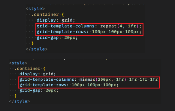
HTML & CSS:
CodePen:
See the Pen
The minmax() function for CSS Grid Layouts-final by Aakash Rao (@aakash_codes)
on CodePen.
Output:
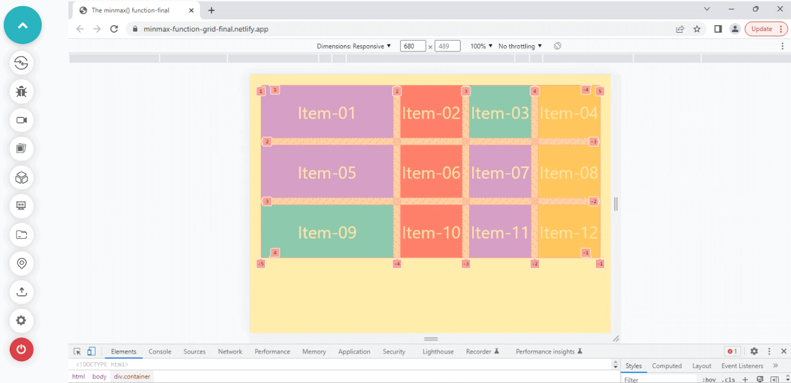
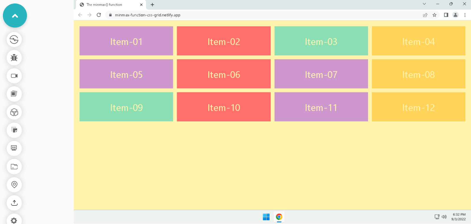
It’s visible how the grid is shrinking the other column values as it is defined as 1fr or one fraction, allowing it to take the available space.
And the minmax() value specified for the first column creates a minimum value of 250px and a maximum of 1fr, which looks equal with other columns when it is maximum and stops to reduce its size when it gets a minimum of 250px.
Difference between auto-fill and auto-fit in CSS grid
We’ve already covered many features that the CSS grid provides and some advanced concepts, but a few more features allow us to make responsive layouts with the grid that are essential to learning.
One of the great features of the CSS grid is auto-sizing rows and columns to adapt different viewports.
In the previous topic, we’ve seen how the minmax() function works with the columns. But if we reduce the screen or viewport size, the other column starts to reduce its width and overflows the content at one point. The columns were not wrapping themselves to create a new row for the items.
To achieve wrapping like flex-wrap in flexbox, we can use auto-fit or auto-fill keywords. Using these keywords, we instruct the browser to take care of element wrapping and column scaling for us, causing items to wrap into rows that might otherwise get overflowed.
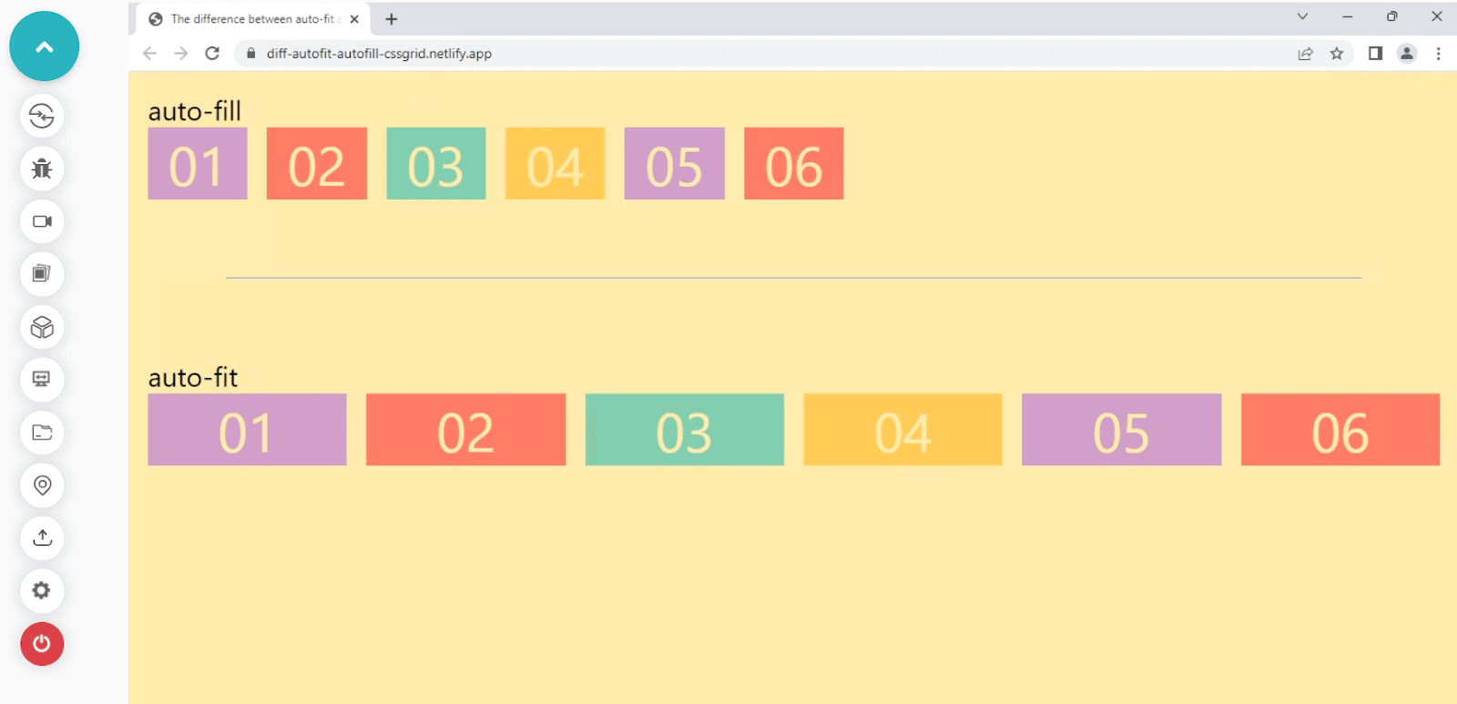
- auto-fill: It tries to fill the content with new columns and rows even if there is not enough content to fill the space; after that, it creates empty rows and columns.
- auto-fit: It tries to fit the content and divides the available space equally so that no column or row should remain empty.
Let’s try to visualize this behavior with a simple example.
HTML & CSS:
CodePen:
See the Pen
The difference between auto-fit and auto-fill by Aakash Rao (@aakash_codes)
on CodePen.
Output:
Run the code on the live server on your local machine and open the elements tab using the keyboard shortcut Ctrl + Shift + I. Go to the < div > where the grid option is highlighted inside your < body >.
Click on the grid option to highlight the grid tracks and columns, and try to resize the browser window to see the change between the auto-fill and auto-fit elements.
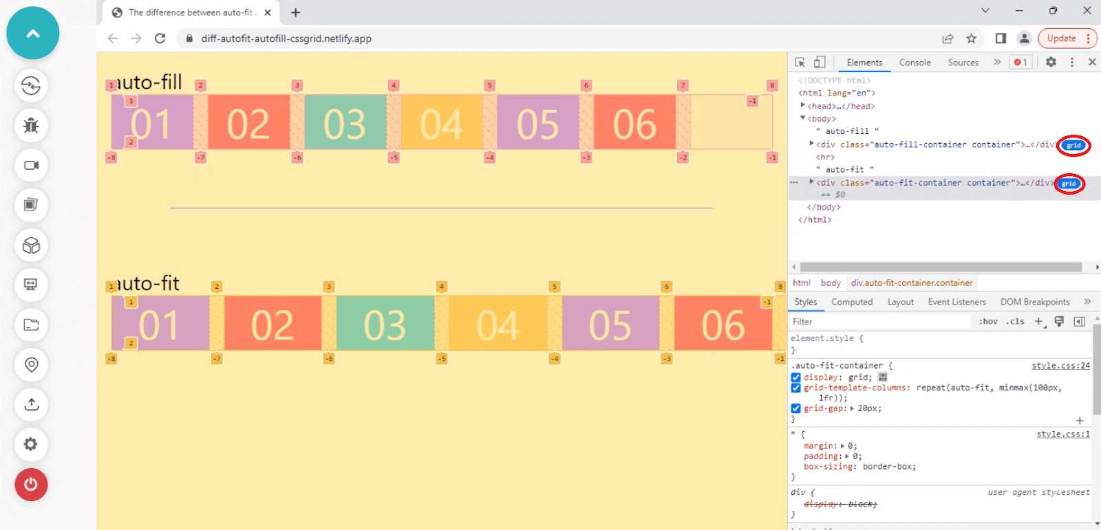
As you can see in the example above, the auto-fill tries to fill the columns with empty spaces, whereas the auto-fit property tries to fit the content so that the column does not remain empty.
We’ve learned how auto-fill and auto-fit work with CSS grid.
Let’s take a quick look at one more great feature the CSS grid offers.
The grid-auto-flow property
It’s now clear how we can leverage the minmax() function with auto-fit and auto-fill keywords to create responsive grid layouts.
Let’s look at the more advanced auto-placement feature for grid items provided by the CSS grid layout specification. An image gallery is an excellent example of dense grid items, which is done using this property.
grid-auto-flow: This allows us to control the flow of implicitly created grid items and fill the leftover space with smaller items.
Below is the syntax to define the grid-auto-flow property for a grid container.
Let’s see how grid-auto-flow works in action by comparing two layouts.
In the example below of a grid layout, we can visualize how the grid-auto-flow property uses the auto-placement algorithm to place items inside a grid container.
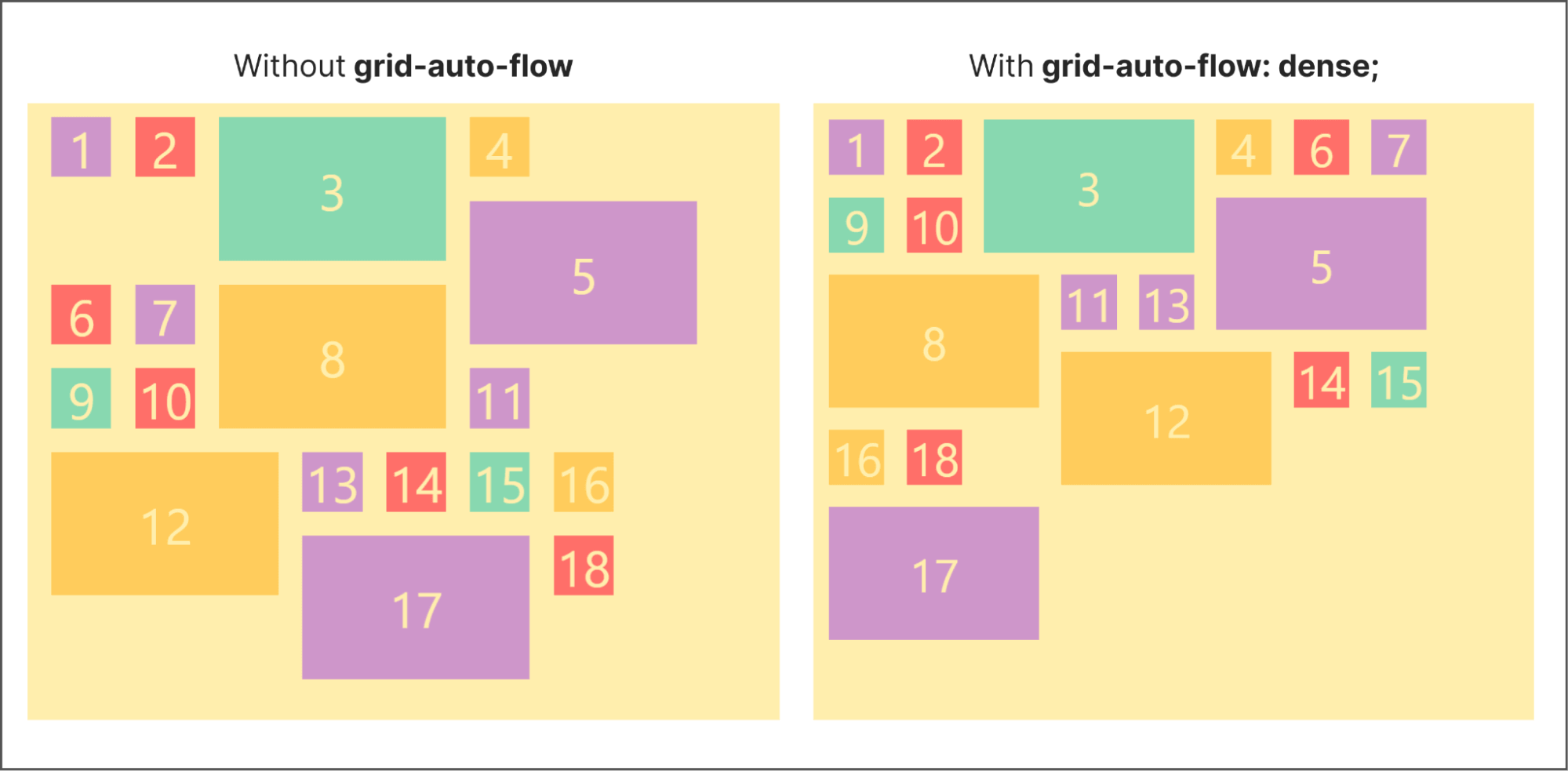
Try with the source code to run it by yourself and play with the values to understand how it changes the layout in action entirely.
HTML & CSS:
CodePen:
See the Pen
The Grid auto flow property by Aakash Rao (@aakash_codes)
on CodePen.
By now, we are almost done with the grid layouts, and we can start working on the final project, which is to build a CSS grid scheduler.
But before we jump and start building a CSS grid scheduler, let’s explore another great feature provided by CSS grid layout specification that allows us to create layouts more simply and quickly.
Advanced way of creating Grid layouts
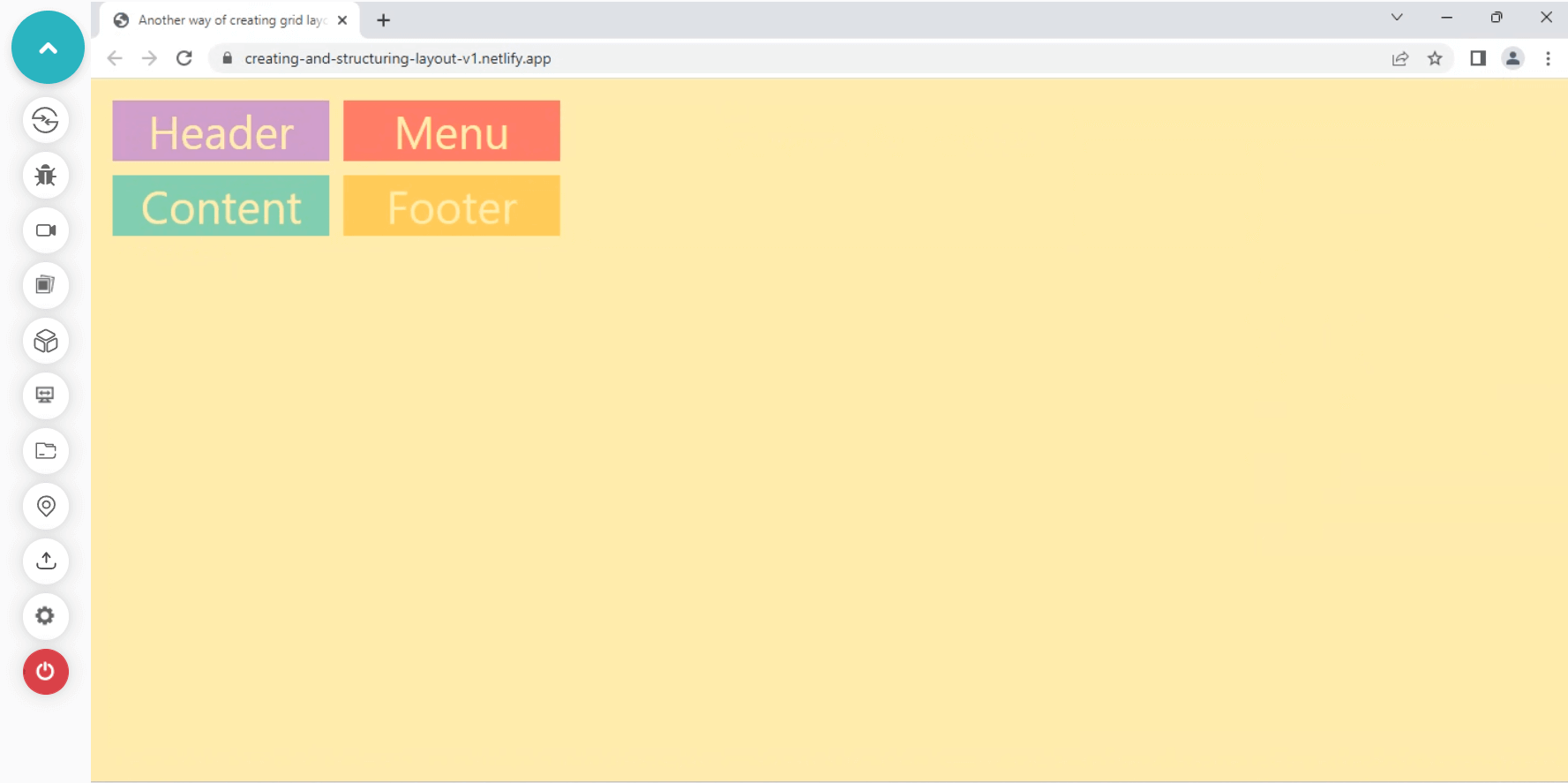
We’ve seen how the CSS grid offers so many features under the hood. Another helpful feature of CSS grid is creating quick mock layouts effortlessly using the grid-template-areas property.
It holds a string of values we can later apply to the grid items using the grid-area property. It is also supported by all modern browsers, which provides us with the flexibility to use it for layouts.
Let’s now see how it works with a quick layout example.
HTML & CSS:
CodePen:
See the Pen
Advanced way of creating grid layouts-starter by Aakash Rao (@aakash_codes)
on CodePen.
Output:
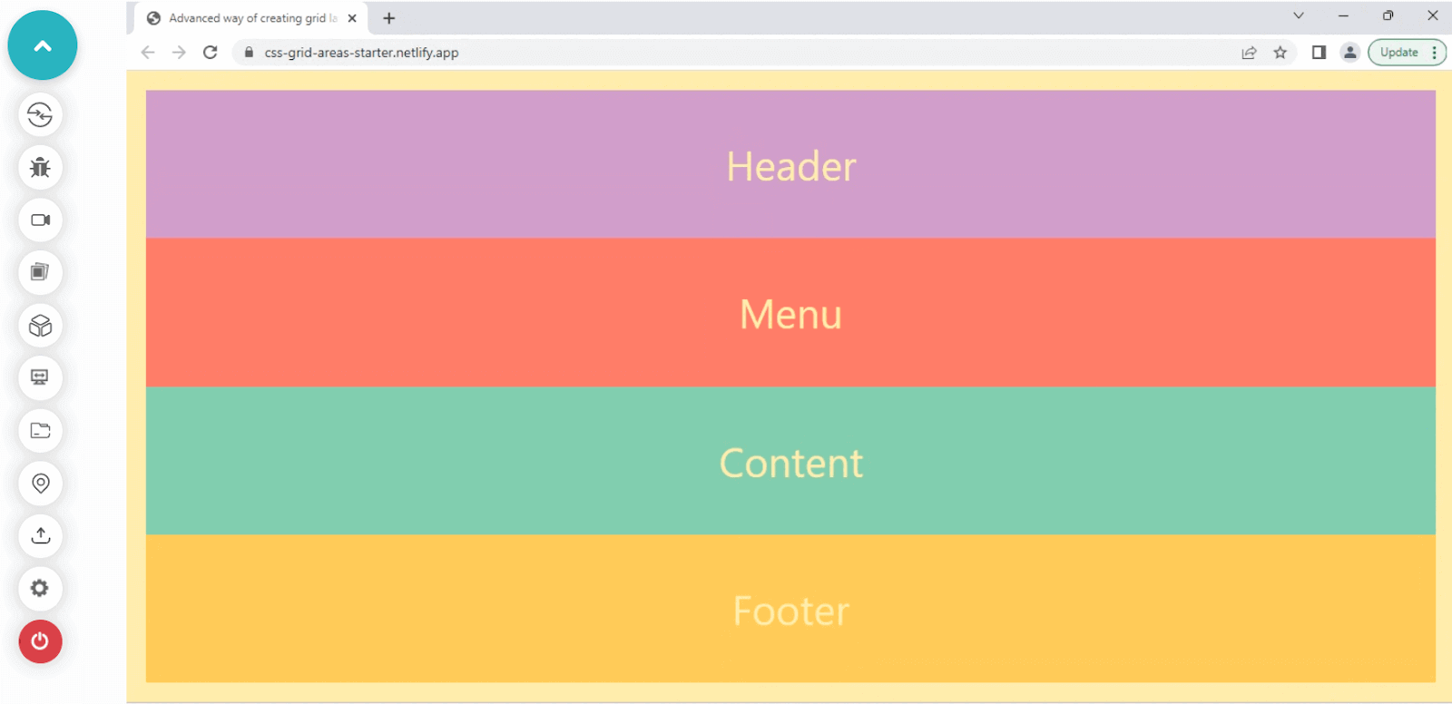
Here we are illustrating a mock website layout with several elements like a header, menu, content, and footer.
The layout has no columns and rows defined, but we can leverage the grid-template-areas property to specify it explicitly. Let’s visualize the layout first and try to understand how we can structure it for a website.
At the top, we want the header to take the full width; at the bottom, we have the footer, which also carries the entire width or row. In the middle, we have a menu, and the content < div >, in which we want the menu to take only ⅓ of the entire width, and the rest will get covered by the content.
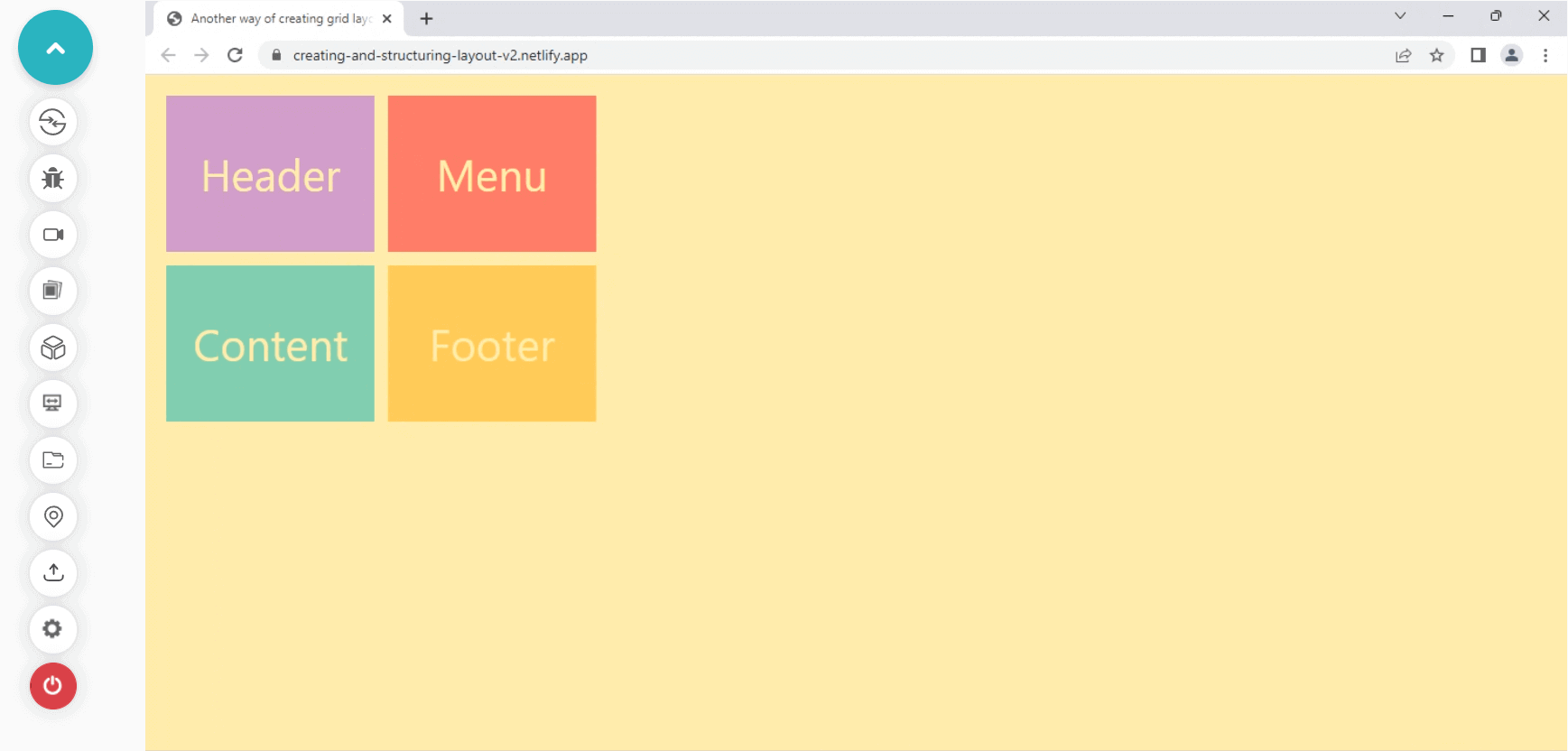
Let’s start by applying the same to the string value inside the grid-template-areas property.
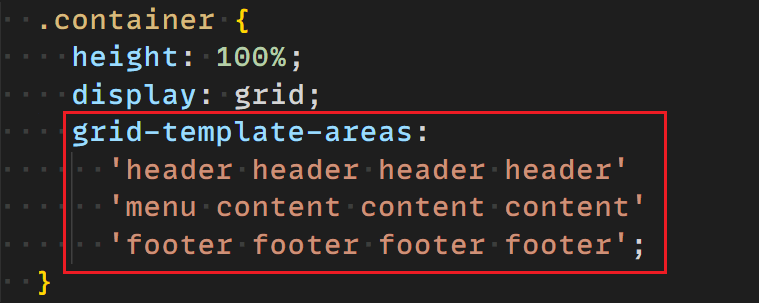
We’ve just defined four columns and three rows for the grid structure. Let’s apply the grid-area property to the grid items to finish the layout.
HTML & CSS:
CodePen:
See the Pen
Advanced way of creating grid layouts-final by Aakash Rao (@aakash_codes)
on CodePen.
Output:
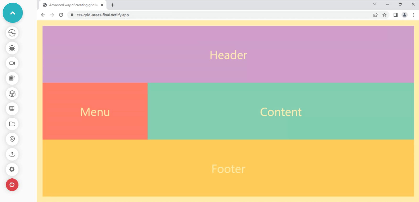
The CSS grid has given us the power to create layouts using strings to visualize the layout in the code. It’s a great and helpful feature inside the grid specification module. We can leverage this technique to showcase quick mockup layouts or apply it to create the layout structure.
We’ve completed all the essential CSS grid topics and are ready to build the CSS grid scheduler. So let’s apply all of the CSS grid knowledge we’ve learned till now and use it in an actual project.
Getting started with building Conference Schedule with CSS Grid Scheduler
Let’s now start by building the conference with a CSS grid scheduler. To begin with the project, you can create a new .html and .css file and start with the starter code.

HTML & CSS:
Output:
See the Pen
Conference Scheduler-Starter by Aakash Rao (@aakash_codes)
on CodePen.
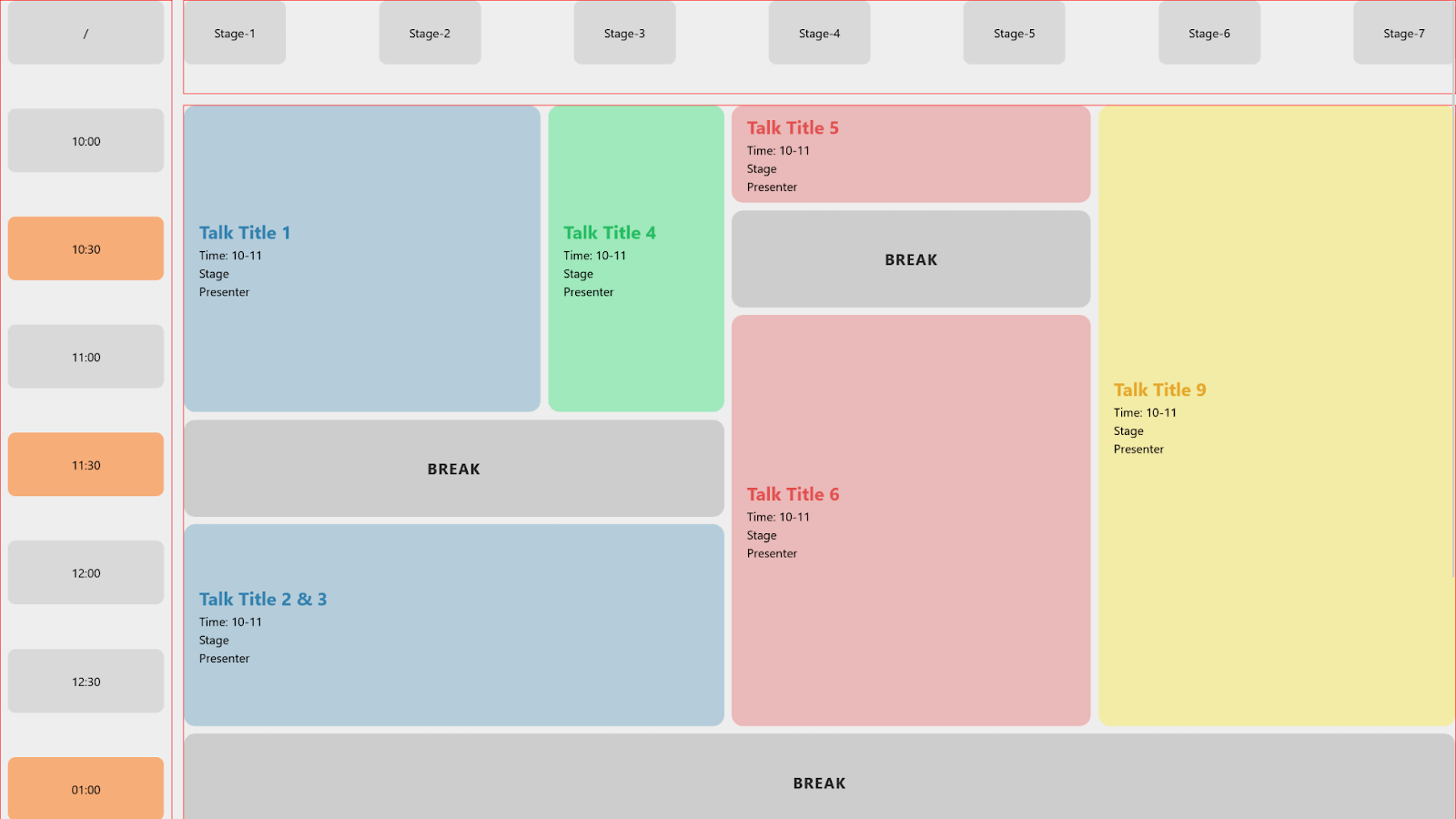
Following are the following steps to build a conference scheduler with CSS grid.
- When it comes to layout, the first thing we should follow is to visualize the layout structure in our minds and try to make it simple. Let’s start by visualizing the tracks, columns, and rows required for the layout.
- Starting with creating the markup for the layout. Create a
< div >element with a class of ”main-container”. It would be the main grid container that holds the complete Interface. - Let’s split the design into small blocks and try to visualize it. We can divide the layout into three blocks, breaking the Interface into rows and columns.
The first row at the top shows us the number of stages, the time block column shows us the timings, and the middle contains the main container with different slots.
- We start with the stage container row at the top. Let’s add all the stages with their numbers, as previously shown in the design.
- Starting with another
< div >below the “stages-container-row”, give it a class of “timing-container-column”. Inside that< div >, add another< div >with a class of “timings” containing all of the conference timings. - Create a
< div >below the “timing-container-row” and give it a class of “subgrid-main-ui”. Add another< div >element inside it and give it a class of “slot” containing the title and other details. - Now inside the “subgrid-main-ui”
< div >, go to the bottom and add three more< div >elements with a class of break which will be the break slots. - Here markup is completed. It’s time for styling and adding some CSS to the layout. The “main container” is the primary grid element. Let’s add some styling to it and try to see the changes.
- It’s time for the “stages-container-row” to go and sit at the top. Add changes to the code below so we have all the stages at the top and the timings in the left column.
- Next, we have the timings columns; let’s add some styling to them. Add the changes and try to compare the differences.
- Let’s now fix the interface by adding styles to the “subgrid-main-ui”
< div >element. - It’s time for the prominent element styling; apply the changes below.
- It’s time to add the styling for the slots, and then we can apply styling for the blue-background slots.
- Let’s now work on the green and red background slots. And finally, the yellow and the break slots. After adding the changes to the CSS code shown below, we’ve already completed the layout.

HTML & CSS:
Output:
See the Pen
Conference Scheduler-Starter by Aakash Rao (@aakash_codes)
on CodePen.
HTML & CSS:
Output:
See the Pen
Step-4 at conference building interface by Aakash Rao (@aakash_codes)
on CodePen.
Now we have the stages, let’s move on to the timings column.
HTML:
Output:
See the Pen
Step-5 at conference building interface by Aakash Rao (@aakash_codes)
on CodePen.
Next, we have a subgrid containing all the conference slots.
HTML:
Output:
See the Pen
Step-6 at conference building interface by Aakash Rao (@aakash_codes)
on CodePen.
HTML:
HTML & CSS:
Output:
See the Pen
Step-8 at conference building interface by Aakash Rao (@aakash_codes)
on CodePen.
We can notice, after defining columns, that the three < div > inside the “main-container” is now placed into three different columns.
HTML & CSS:
Output:
See the Pen
Step-9 at conference building interface by Aakash Rao (@aakash_codes)
on CodePen.
HTML & CSS:
Output:
See the Pen
Step-10 at conference building interface by Aakash Rao (@aakash_codes)
on CodePen.
CSS:
Output:
See the Pen
Step-11 at conference building interface by Aakash Rao (@aakash_codes)
on CodePen.
The layout has already started to look good. Let’s now add some more styling to the slots.
CSS:
Output:
See the Pen
Step-12 at conference building interface by Aakash Rao (@aakash_codes)
on CodePen.
HTML & CSS:
Codepen:
See the Pen
Conference Scheduler-Final by Aakash Rao (@aakash_codes)
on CodePen.
Output:
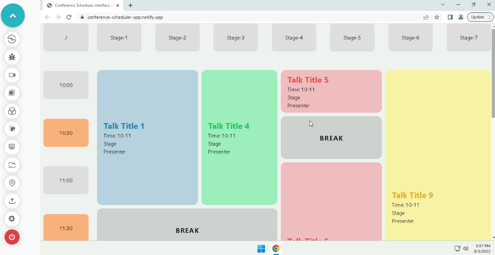
You can tweak some values, see how the layout has been made, and change some code according to your preference.
You can try to run the code on your local machine or preview the final version from the Netlify link. Try to understand the layout structure; you can also rebuild it if it’s not 100% clear.
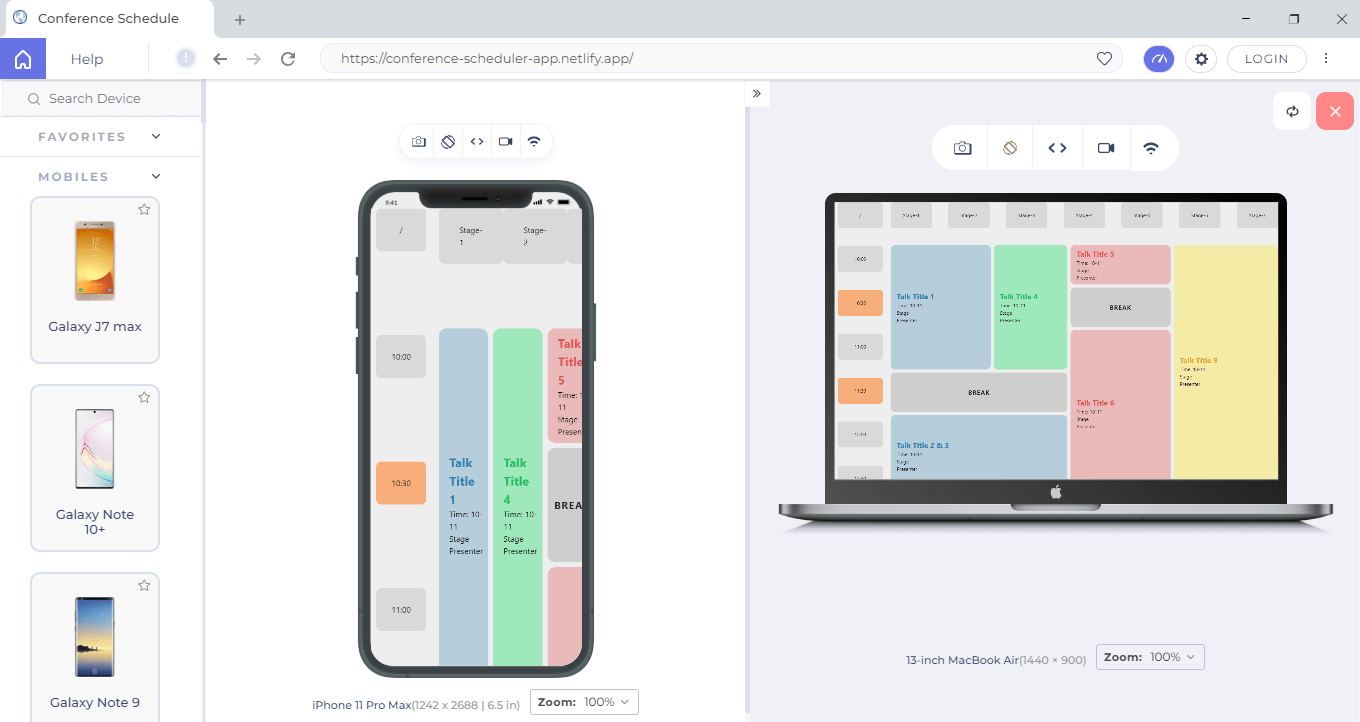
Testing Responsiveness of CSS Grid Scheduler
CSS grid, since its release, started to get attention as it became an easy and quick way to create two-dimensional layouts with rows and columns, which was very hard to do before the grid and flexbox. CSS grid is highly responsive to develop responsive designs that fit any device screen.
Once you have built the conference with a CSS grid scheduler, you must run its responsiveness test to ensure your CSS grid scheduler is working properly across different screen sizes.
Subscribe to the LambdaTest YouTube Channel to see our latest tutorials about Selenium automation, Appium automation, Playwright automation, and more.
Continuous quality testing platforms like LambdaTest come with a mobile friendly tester known as LT Browser. It gives you 50+ pre-installed mobile, tablet, desktop, and laptop viewports. With its advanced developer tools, you can test and debug your mobile websites on the go.
Shown below is the mobile and laptop view of the CSS grid scheduler.
Check out the following tutorial to kick-start responsive testing of your CSS grid scheduler using LT Browser.
Wrapping up
By far, we’ve learned almost everything about the CSS grid and its features, including its advantages for using it to build layouts. CSS grid has a lot of power, and it provides us with the simplicity to create complex designed layouts just with a few lines of code.
In this detailed blog, we’ve created a conference with a CSS grid scheduler to apply various properties of the CSS grid. Now by reading this tutorial, you know how to use the grid to create awesome layouts.
Author
Aakash Rao is a Community Contributor with over 2 years of experience in frontend development and developer-focused content creation. He has contributed to 20+ technical blogs, tutorials, and documentation pieces, with hands-on expertise in HTML, CSS, JavaScript, React, Tailwind, Three.js, and tools like Git, Firebase, Figma, and Playwright. Aakash has worked with multiple clients on Upwork, delivering full-stack and backend projects with integrated documentation and automated testing using Jest and Playwright. He focuses on end-to-end content workflows from research to publishing, with a strong emphasis on clarity, developer experience, and UI/UX. Through real-world freelance projects, he has adopted a test-first mindset, ensuring quality by embedding testing early in the development cycle. He has completed a Diploma in Electronics & Telecommunication, which laid the foundation for his technical journey across both writing and development.
Blogs: 6


