
How to Set CSS Media Query For Portrait Orientation
Clinton Joy Fimie
Posted On: April 18, 2024
 124242 Views
 23 Min Read
When it comes to web design, CSS media queries are crucial for creating responsive layouts. They enable developers to adjust how a website appears depending on factors like screen size and whether the device is in portrait or landscape mode.
Websites that can adapt to portrait mode offer a smoother user experience. For example, trying to fill out a signup form with tiny buttons and text that require zooming and scrolling can be hectic. However, this can be eliminated by implementing the CSS media query for portrait orientation in your websites.
These media queries make it easier for users to perform actions like signing up, making transactions, and more when using the device in portrait mode.
In this blog, we delve into CSS media query for portrait orientation, exploring innovative techniques, best practices, and strategies for crafting immersive and visually stunning websites.
TABLE OF CONTENTS
- Introduction to CSS Media Queries
- Different Breakpoints in Responsive Web Design
- Specific Conditions of CSS Media Queries
- Importance of Portrait Orientation in Responsive Design
- CSS Media Query for Portrait Orientation
- Setting CSS Media Query for Portrait Orientation
- Mobile-First vs. Desktop-First Approach
- Testing and Debugging CSS Media Queries
- Best Practices for Using CSS Media Query for Portrait Orientation
- Frequently Asked Questions (FAQs)
Introduction to CSS Media Queries
Media queries in CSS are the fundamental components of responsive web design. They are used by developers to apply different CSS styles to different elements or components of our website based on specific conditions.
It consists of a set of rules that specify certain conditions under which particular CSS styles should be applied to our website. These conditions can target various aspects, such as screen size, aspect ratio, device orientation, device capabilities, and more.
Media queries use a specific format to determine when certain styles should be applied. Think of it like a set of rules that tells the browser when to use particular styles.
Here’s a simple example of how a media query is structured.
|
1 2 3 |
@media screen and (max-width: 768px) { /* CSS styles to be applied when the viewport width is 768 pixels or less */ } |
Now, let’s look at the role of breakpoints in CSS, where layout adjustments take place to accommodate different screen sizes.
Different Breakpoints in Responsive Web Design
CSS breakpoints are commonly used in responsive web design. And just as the name implies, it’s a specific point of screen width where the layout or web design changes to ensure the content is displayed in a user-friendly manner on different screen sizes, such as large monitors, desktop computers, laptops, tablets, and mobile phones.
➂ Media Queries
▧ With media queries, we can define completely different styles for different browser sizes.
It can be used to check many things, such as:
⤷ width & height of the viewport
⤷ width & height of the device
⤷ orientation
⤷ resolution pic.twitter.com/bRq89aIxY3— Aakash Rao (@Aakash_codes) April 3, 2023
The above tweet shows the most common breakpoints in web design. To change the layout of web designs, we use media queries on different breakpoints to set different CSS styles to archive a certain layout.
Refer to this blog on common CSS breakpoints used in media queries.
In the next section, we will look at specific conditions that can be targeted with media queries. It explores various parameters developers can set, such as screen size, aspect ratio, and device orientation.
Specific Conditions of CSS Media Queries
CSS media query conditions are the specifications used when applying styles. This helps set different styles for web design at different screen orientations, sizes, etc.
Here are some of these conditions:
Screen Dimensions
These are some of the most popular conditions used to set media queries. If you have experience creating responsive websites, you may have used this condition. With this condition, you can apply styles when the viewport width or height hits a certain dimension.
Let’s consider this code snippet:
|
1 2 3 4 5 6 7 8 9 10 11 12 13 |
@media screen and (min-width: 768px) { /*Styles for screens with a width of 768px or more */ } @media screen and (max-height: 724px) { /* Styles for screens with a height of 724px or less */ } @media screen and (min-width: 480px) and (max-width: 768px) { /* Styles for screens with a width between 480px and 768px */ } |
From the code above, we can use properties like min-width, max-width, min-height, and max-height to set conditions for our media queries.
Device Orientations
With this approach, you can easily specify when a particular style should be applied based on the screen’s orientation. Two options are available when working with this condition: portrait and landscape orientations.
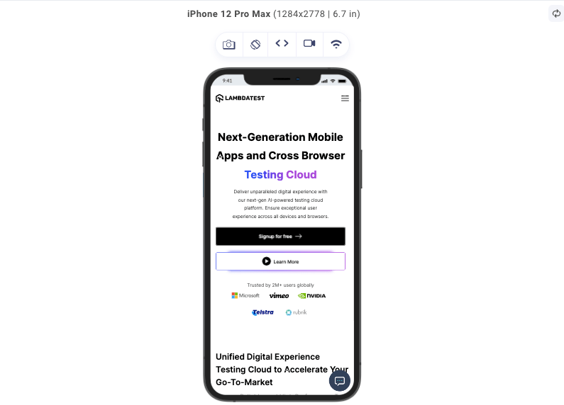
Portrait orientation:
Landscape orientation:
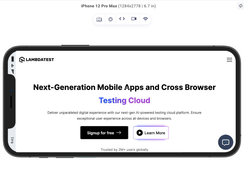
In the images above, we can see the portrait and landscape orientations of an iPhone 12 Pro Max. Same device, different orientation, and we can already notice how differently the same content is presented on both devices.
When using the landscape orientation, the specified styles will be applied when the screen width exceeds its height. On the other hand, when using portrait orientation, the designated styles will be applied when the screen height is greater than its width.
This is how you can style in portrait mode and landscape mode:
|
1 2 3 4 5 6 7 8 |
@media (orientation: landscape) { /* Styles for landscape orientation */ } @media (orientation: portrait) { /* Styles for portrait orientation */ } |
Aspect Ratios
This is the relationship between the width and height of a display. It is not the same as display size, which refers to the physical dimensions of the screen; rather, it indicates how the width and height of a screen relate.
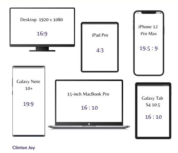
This condition helps us apply the style based on the ratio of the width and height of the viewport. To use this condition, you can set various properties like aspect-ratio and min-aspect-ratio.
|
1 2 3 4 5 6 |
@media (aspect-ratio: 16/9) { /* Styles for a 16:9 aspect ratio */ } @media (min-aspect-ratio: 5/4) { /* Styles for a 5:4 or wider aspect ratio */ } |
This first media query style sets in when the viewport aspect ratio is 16/9, a common widescreen aspect ratio, and is common on monitor displays, where the screen width dimension is almost double the dimension of the screen height.
The second media query helps accommodate older display formats for devices that are a bit square-like, that is, there is little difference between the screen height dimension and the screen width dimension.
There are other conditions as well that can used to set CSS media queries, like:
- Device pixel density: This CSS media query condition allows us to target devices based on pixel density or resolution.
- Device feature: This enables us to apply styles based on the presence or absence of certain device features such as hover, pointer, etc.
Despite all these CSS media query conditions we have listed so far, we will focus on using the ones tailored to define our CSS media queries for portrait orientation.
In the next section, we will discuss the importance of considering portrait orientation in responsive design to know how users commonly interact with devices in portrait mode.
Importance of Portrait Orientation in Responsive Design
Understanding the importance of portrait orientation can elevate the user experience and ensure that websites and applications adapt to the needs and preferences of users.
Because of the widespread use of smartphones and tablets, portrait mode has become more prominent. This orientation corresponds to the natural grip of the human hand, making it the favored option for browsing and engaging with content on mobile devices. So it’s crucial to optimize websites and apps for portrait mode to deliver a user-friendly and intuitive experience.
The portrait layout offers a more comfortable content presentation, enabling users to digest information effortlessly. Text, images, and other visuals can be showcased in a larger and more readable format, minimizing the necessity for excessive scrolling and zooming and eliminating the overflow of content.
In addition, portrait orientation allows for creative and engaging user experiences. Using the vertical layout, developers can experiment with innovative navigation patterns, interactive elements, and storytelling techniques. Users can seamlessly explore content through vertical scrolling, making the browsing experience intuitive and immersive.
This approach allows for the creation of visually appealing designs that captivate and hold users’ attention, resulting in increased engagement and improved conversion rates.
In this section, we will discuss CSS media query for portrait orientation, but to fully discuss portrait orientation, we also need to consider landscape orientation.
CSS Media Query for Portrait Orientation
Portrait orientation simply refers to the orientation of a device where the content is displayed in a taller-than-wide format. This means the screen’s height will be greater than the width.
In building websites, most developers consider desktop views first before considering mobile devices. And as we already know, the desktop has a landscape orientation, which is different from the orientation of mobile devices (portrait). Hence there is a need for CSS media queries for portrait orientation.
Let’s look at the brief comparison between portrait orientation and landscape orientation:
| Aspect | Portrait Orientation | Landscape Orientation |
|---|---|---|
| Screen Alignment | Vertical | Horizontal |
| Height vs. Width Ratio | Height is greater than width. | Width is greater than height. |
| Device Usage | Holding a device upright. | Holding a device horizontally. |
| Popular Use Cases | Reading, consumption of information. | Watching videos, playing games, viewing wide content. |
| Natural Hand Position | Natural for one-handed use, with the thumb at the side. | Natural for two-handed use, with hands on the sides. |
| Content Layout | Taller and narrower layout. | Wider and shorter layout. |
| User Experience | Emphasizes vertical scrolling and easy readability. | Emphasizes horizontal space and wide content presentation. |
Now that we know about both portrait and landscape orientations, For a more realistic illustration of the potential of each of these components, let’s take this code example.
HTML:
|
1 2 3 4 5 6 7 8 9 10 11 12 13 14 15 16 17 18 19 20 21 22 23 24 25 26 27 28 29 30 31 32 33 34 35 36 37 38 39 40 41 42 43 44 45 46 47 48 49 50 51 52 53 54 55 56 57 58 59 60 61 62 63 64 65 66 |
<html lang="en"> <head> <link rel="preconnect" href="https://fonts.googleapis.com" /> <link rel="preconnect" href="https://fonts.gstatic.com" crossorigin /> <link href="https://fonts.googleapis.com/css2?family=Fraunces:wght@600&family=Manrope:wght@600;700&display=swap" rel="stylesheet" /> <meta charset="UTF-8" /> <meta name="viewport" content="width=device-width, initial-scale=1.0" /> <link href="/style.css" rel="stylesheet" /> <title>LambdaTest</title> </head> <body> <header> <div id="header"> <nav> <img id="logo" src="https://www.lambdatest.com/resources/images/logos/logo.svg" alt="LambdaTest logo" /> <p>Book a Demo</p> </nav> <div id="title"> <h1> Next-Generation Mobile Apps and Cross Browser <span>Testing Cloud</span> </h1> <button>Learn More</button> </div> </div> <div id="features"> <div id="features-group"> <div class="feature"> <p>1</p> <h2>24/7 Support</h2> <span> Got questions? Throw them to our 24/7 in-app customer chat support or email us on support@lambdatest.com. </span> </div> <div class="feature"> <p>2</p> <h2>Third-Party Integrations</h2> <span> With a single click, push bugs in your choice of project management tools, directly from LambdaTest platform. </span> </div> <div class="feature"> <p>3</p> <h2>Documentation</h2> <span> Step-by-step documentation for various test automation frameworks to help you run your first Selenium script. </span> </div> </div> </div> </header> </body> </html> ; |
From the code above, we can see a decent markup for a landing page on a website.
We have a header tag that is divided into two parts. The first part contains the nav, some text, and a button. The second part, which has an id of feature, contains divs that list the website’s features.
Let’s add some style so it all makes sense.
CSS:
|
1 2 3 4 5 6 7 8 9 10 11 12 13 14 15 16 17 18 19 20 21 22 23 24 25 26 27 28 29 30 31 32 33 34 35 36 37 38 39 40 41 42 43 44 45 46 47 48 49 50 51 52 53 54 55 56 57 58 59 60 61 62 63 64 65 66 67 68 69 70 71 72 73 74 75 76 77 78 79 80 81 82 83 84 85 86 87 88 89 90 91 92 93 94 95 96 97 98 99 100 101 102 103 104 105 106 107 108 109 |
* { margin: 0; padding: 0; list-style: none; border: 0; color: black; } header { height: 100vh; } #header { height: 50%; background-color: rgb(228, 237, 247); } nav { display: flex; justify-content: space-between; align-items: center; box-sizing: border-box; padding: 2rem; } nav p { font-size: 18px; font-family: "Fraunces", sans-serif; border-bottom: #56bbc6 solid 3px; } #title { text-align: center; } #title h1 { font-family: "Fraunces", sans-serif; max-width: 735px; font-size: 60px; margin: auto; } #title h1 span { border-bottom: #56bbc6 solid 3px; } #title button { position: absolute; bottom: 50%; right: 50%; transform: translate(50%, 50%); background-color: #56bbc6; width: 150px; height: 60px; font-weight: 700; font-size: 18px; } #features { height: 50vh; width: 100%; } #features-group { margin: 0 auto; display: flex; flex-direction: row; align-items: center; justify-content: space-evenly; padding: 4rem; } .feature { width: 28%; align-content: center; text-align: center; background-color: #56bbc613; padding: 20px 5px; border-radius: 10px; } .feature :first-child { font-family: "Fraunces", sans-serif; font-weight: 600; font-size: 24px; border: dotted 1px #0a6069; border-radius: 50%; height: 56px; width: 56px; margin: 0 auto 30px; display: flex; align-items: center; justify-content: center; } .feature h2 { font-family: "Fraunces", sans-serif; font-size: 24px; line-height: 40px; text-align: center; margin-bottom: 18px; } .feature span { font-family: "Manrope", sans-serif; height: 128px; font-style: normal; font-weight: 400; font-size: 18px; line-height: 32px; text-align: center; color: #222; } /* Media Queries */ @media screen and (max-height: 650px) { #header { height: 100vh; } #title button { bottom: 0%; right: 50%; transform: translate(50%, -20%); } |
In the above CSS code, which we used to style our design. To effectively explain the steps taken to create our portrait orientation view, the above was tailored toward a perfect desktop view. And we will gradually define our CSS media query for portrait orientation.
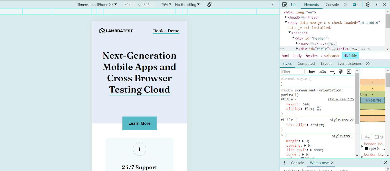
We used LT Browser – a mobile site tester to assess responsiveness across mobile, tablet, and desktop viewports, ensuring a developer-friendly approach to testing the website.

LT Browser is a developer-friendly browser for responsive testing of websites across 53+ screen sizes and resolutions. It allows developers to perform web device testing on different screen resolutions, including smartphones and tablets. This ensures a consistent user experience across a wide range of devices, helping developers identify and fix any issues related to responsiveness and layout.
This is what our design looks like now on different device viewports:
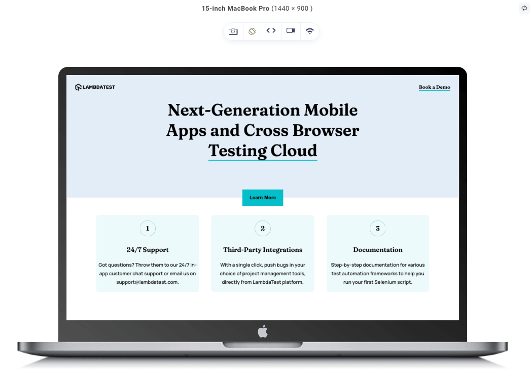
Desktop:

In the image above, we can see our design in desktop view—a nice minimalistic design for a landscape-oriented view.
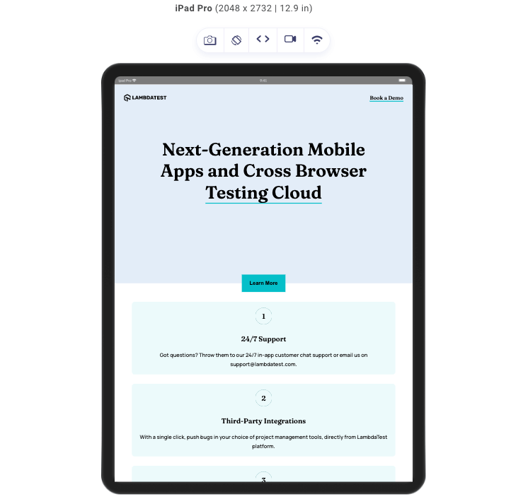
Tablet:
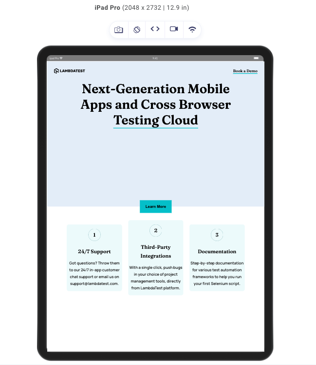
Same style but on a different device (an iPad). In the image above, we can see that the device is portrait-oriented and looks as though it is out of balance. We will fix this shortly by defining the CSS media query for portrait orientation.
Mobile:
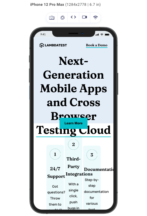
The more portrait-oriented the screen gets, the more the design falls apart. Here, we can see that the screen width is now way too small to accommodate the features that are flexed in the row direction. We can also see that the font size is now too big for a small screen. Necessary adjustments need to be made to ensure a responsive design that looks good on devices regardless of their screen orientation.
Setting CSS Media Query for Portrait Orientation
In this section, let’s look at the process of implementing CSS media query for portrait orientation. It provides hands-on tips and examples to help you effectively integrate responsive design techniques into your web projects.
In our HTML, we have this code:
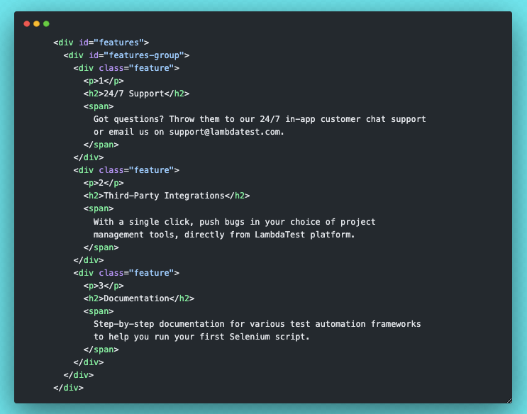
As seen in the code, we have a div with an id of features-group, and in that div are 3 divs with a class of feature. In our CSS code, we set the features-group to display flex, and we set the flex-direction property to a value of row. This arranges each of the features in row format.
This is because our default CSS was for desktop view, with a larger width than height, but for portrait-oriented screens, we will be changing the flex-direction to column since the height of the device will now be greater than the width. We want all those features to be displayed well and not cluttered due to the small width.
Here is the code to set the CSS media query for portrait orientation.
|
1 2 3 4 5 6 7 8 9 10 11 12 13 14 15 16 17 18 19 20 |
@media screen and (orientation: portrait) { #title { height: 60%; display: flex; } #features-group { flex-direction: column; gap: 2rem; } .feature { width: 100%; } } @media screen and (max-width: 700px) and (orientation:portrait) { #title h1 { font-size: 40px; } } |
With the styles above in place this is how our design looks on different devices:
Desktop view with CSS media queries:
This is how our desktop looks; as we already know, the CSS media query for portrait orientation was added, and the desktop is simply landscape-oriented; therefore, the desktop view remains exactly the way it was.
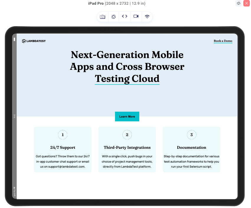
Tablet view with CSS media queries:
For the iPad, the portrait view looks good, and we can see all the changes that have been applied. The features are now stacked one after the other due to the flex-direction value (row) we specified in the style for portrait orientation, which makes the overall user experience a lot better.
Mobile view with CSS media queries:
You can also notice that the features are now stacked due to the flex-direction value (row), which applies to every portrait-oriented screen just as it did to the iPad. That is not the only change; you can also see that the title font size has also been reduced because the screen font size is set with a width of less than 700px to 40px while in portrait orientation.
Mobile landscape-oriented view:
Take a look at the above output. We will notice that it’s the same iPhone, just with a different orientation (landscape). Notice how all the CSS media query for portrait orientation, which we added, don’t apply to this. Rather, we still see our features in a column arrangement. Also, the font-size of our title is no more 40px.
All this is simply because the portrait orientation style doesn’t apply to this landscape-oriented view. This means that when styling our projects, we must always consider not just different devices or just the portrait orientation but also the landscape orientation.
So, the next step to archiving a fully responsive design is to set some CSS media queries for different screen widths.
|
1 2 3 4 5 6 7 8 9 10 11 12 13 14 15 16 17 18 19 20 21 22 23 24 |
@media screen and (max-height: 650px) { #header { height: 100vh; } #title button { bottom: 0%; right: 50%; transform: translate(50%, 50%); } } @media screen and (max-width: 1100px) { #features-group { flex-direction: column; gap: 2rem; } .feature { width: 80%; } #title h1 { font-size: 55px; } } |
With the styles above, we will adjust various elements so it looks good on different devices with different screens. As you may have noticed, the screen-dimensions condition is used as it is the best way to target specific groups of devices such as tablets, mobile phones, etc.
Here are our final results for this design on different devices with different screen orientations.
Desktop view:

As we can see, the media queries we added still don’t affect our desktop final result. This is because the MacBook Pro has a width of 1440px, but the CSS media queries were set for a maximum width of 1100px.
Tablet portrait view:
Just as in the desktop view, nothing changes, not because the screen width is greater than 1100px but because we already set the style for our portrait-oriented screen.
Tablet landscape view:
We can see here that we have our features arranged in rows, with a slightly reduced font size for the title than in the desktop view.
Mobile portrait view:
Just like the tablet portrait-oriented view, nothing changes. For the same reason, we have already styled the portrait view by defining the CSS media query for portrait orientation.
Mobile landscape view:
We saw the mobile landscape-oriented view before, and it wasn’t looking nearly as good as this, but with the help of our screen dimension conditions, we could style our design to achieve the look above.
And with that being said that will be all of that design.
Refer to this live project to view the CSS media query for portrait orientation in action.
Desktop-First vs. Mobile-First Approach
When approaching CSS media query for portrait orientation, you have two primary strategies: mobile-first approach and desktop-first approach. So, in this subsection, let’s look at the differences between these two approaches.
| Aspect | Desktop-first Approach | Mobile-first Approach |
|---|---|---|
| Initial Focus | Designing and developing styles for desktop or larger screens first | Designing and developing base styles for mobile devices first |
| Progressive Enhancement | Adjusting the layout for smaller screens using media queries | Progressively enhancing the layout for larger screens |
| Core Philosophy | Emphasizing the desktop experience or adapting existing layouts for mobile | Prioritizing essential content and simplicity for smaller screens |
| Screen Real Estate | Challenges in retrofitting designs for portrait orientation | Efficient use of screen real estate, focusing on smaller screens |
| Suitability | Projects where the desktop experience is crucial or existing layouts need adaptation for mobile devices | Projects targeting mobile users or where mobile experience is paramount |
Choosing between the two approaches depends on factors such as project goals, user behavior, and the complexity of your design. In many cases, the mobile-first approach is recommended, as it promotes a user-centric experience, better performance, and greater adaptability for portrait-oriented screens. At the end of the day, it still boils down to preference; some people just prefer a desktop-first approach.
 Note
NoteTest your media queries on real Android and iOS devices. Try LambdaTest Today!
Testing and Debugging CSS Media Queries
Testing and debugging the CSS media query for portrait orientation is crucial to ensure consistent and reliable responsiveness across various devices and screen sizes.
Here are ways to test and debug the CSS media query for portrait mode:
- Utilize browser developer tools: Modern web browsers provide robust developer tools, including features for inspecting and testing the CSS media query for portrait. These tools emulate different screen sizes, orientations, and devices to see how the styles respond to various conditions.
- Cross device testing: Browser tools are helpful, but testing designs on different devices is equally essential to validate the performance of media queries. There are two options for cross device testing: real or virtual-device testing. Virtual device testing utilizes device emulators to simulate the experience on different devices. Both work great to achieve the same goal, which is responsiveness. To perform cross device testing, it’s best to leverage cloud testing platforms like LambdaTest.
- Breakpoint testing and fine-tuning: It is recommended to pay close attention to the breakpoints in the CSS media query for portrait and test how things change when you go from one breakpoint to another. If the design doesn’t look right or work as expected, you can change the breakpoints to make everything work perfectly. Font size, images, and some other content are things we always adjust when dealing with media queries.
- Error handling and fallbacks: Good CSS media query for portrait mode accounts for scenarios where media queries are unsupported or fail to load correctly. As a developer, providing appropriate fallback styles or alternative layouts to ensure the content remains accessible and readable even if the media queries do not function as intended is very important.
- Regularly review and update media queries: Things tend to change quickly in this technological era. As new devices and screen sizes emerge, you must periodically review and update the CSS media query for portrait mode to accommodate these changes. Stay informed about the latest trends, devices, and browser capabilities to ensure that your code remains relevant and effective in the ever-evolving landscape of portrait-oriented web design.
Testing on cloud-based testing platforms comes with numerous benefits, especially with respect to scalability and reliability.
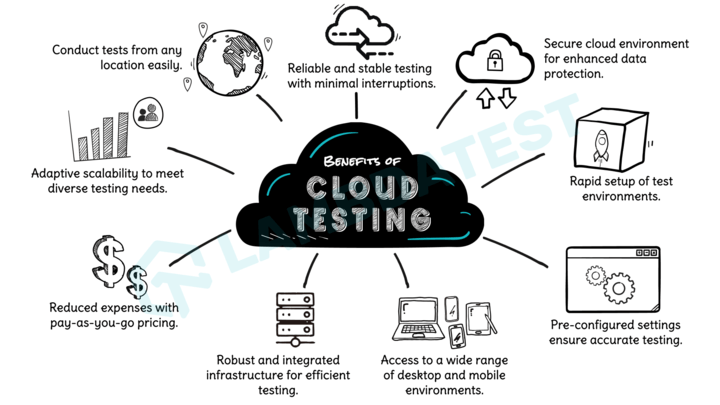
LambdaTest is an AI-powered test orchestration and execution platform that offers cross device testing on a device farm of real and virtual Android and iOS devices. You can test your CSS media queries for portrait orientation across 3000+ real desktop and mobile environments at scale.
Subscribe to the LambdaTest YouTube Channel. Get the latest updates on various automation testing tutorials covering mobile app testing, real device cloud, and more.
You can also refer to this blog on media queries for standard devices to tailor CSS media queries to your specific devices.
Best Practices for Using CSS Media Query for Portrait Orientation
When it comes to defining CSS media query for portrait orientation, there are certain best practices that we need to follow, and prioritizing them is crucial to ensure that the layout adapts seamlessly across various devices. Otherwise, you might be doing the right thing but the wrong way, therefore getting an unexpected result.
Here are some best practices you can implement to optimize your CSS media queries for portrait orientation.
- Start with the mobile-first approach: If portrait orientation is your priority, following the mobile-first approach to styling should be your go-to method. In this design approach, we start by styling our design for mobile devices, and we gradually use CSS media queries to style for larger screens. This helps ensure a solid foundation for responsiveness and allows for a uniform experience between different screen sizes.
- Use min-width instead of max-width: When defining the CSS media query for portrait, it’s generally recommended to use min-width instead of max-width. It was stated above that the mobile-first approach is the best way to go when considering the CSS media query for portrait orientation. If that is the case, we should focus on progressive enhancement, ensuring that styles are applied as the viewport expands. It also prevents unexpected styling conflicts as devices switch between different orientations.
- Consider the content and design requirements: Before implementing the CSS media query for portrait, analyze the content and design elements critical for the user experience in portrait orientation. Prioritize the styles and features that enhance readability, user interactions, and visual presentation in this orientation. By identifying the key components, you can create media queries that prioritize their display and functionality.
- Text and typography: Text is a critical component of many websites, and in all orientations, it’s important to ensure that the text remains readable and well-formatted. Adjust font sizes, line heights, and margins to ensure screen readability.
- Image and media display: Images and media elements often contribute to the visual impact of a website. For portrait orientation, optimizing the display of images and media by adjusting their sizes and aspect ratios or even hiding certain non-essential elements to ensure a seamless viewing experience.
- Form inputs and controls: If your website includes forms, it’s important to ensure that form inputs and controls are optimized for portrait orientation. Consider adjusting their sizes, spacing, and alignment to make them more accessible and user-friendly on smaller screens.
- Call-to-Action (CTA) buttons: Call-to-Action buttons are crucial for guiding user interactions and conversions. In portrait orientation, it might be necessary to reposition or resize these buttons to ensure they remain prominent and easily clickable.
- Avoid excessive media query nesting: While nesting media queries can provide granular control over styles, excessive nesting can lead to complex and hard-to-maintain code. Instead, try focusing on creating media queries that target specific screen ranges or breakpoints rather than individual devices.
- Leverage relative units for flexibility: Instead of relying solely on fixed pixel values, consider using relative units such as percentages, em, or rem. The dynamic nature of relative CSS units helps us prevent excessive media query nesting. Relative units enable the layout to adapt fluidly to different screen sizes and orientations. They ensure that elements scale appropriately and maintain relative proportions.
The desktop-first approach works exceptionally well in special design cases, such as streaming pages or gaming platforms, where optimal utilization of larger-screen real estate is crucial for delivering an engaging user experience. However, if portrait orientation is the priority, the mobile-first approach may be more suitable.
Here are a few examples of content and design elements that may require special attention when considering portrait orientation:
Final Thoughts!
In this blog, we explored the CSS media query for portrait orientation and its significance in responsive design. We began by introducing CSS media queries and providing an overview of their purpose in adapting styles based on different device characteristics. We then delved into the various CSS media query conditions targeting specific viewport aspects, such as screen width, height, orientation, aspect ratio, device features, etc.
We also built a project to explain and illustrate this fully, and then we looked at the best practices for using the CSS media query for portrait orientation. To crown it all, we discussed how to test and debug our CSS media query for portrait mode, where we talked about using browser developer tools, testing on real devices and across different browsers, using responsive design testing, and more.
Frequently Asked Questions (FAQs)
Can I use an orientation media query?
Yes, you can use the orientation media query in your CSS code. This query allows you to apply styles based on the device’s orientation, whether portrait (vertical) or landscape (horizontal).
What is the difference between @media and @media screen CSS?
The main difference is that @media screen targets all devices with screens, while @media alone targets all media types.
What is the use of @media in CSS?
@media in CSS is used to apply styles based on different media types or device characteristics like screen size, orientation, and print settings.


Author’s Profile
Clinton Joy Fimie
Clinton Joy is a front-end developer and technical writer with 3 years of experience in the tech field. With diverse experience ranging from graphic design to front-end development, back-end development, and technical writing, he loves creating visually appealing, user-friendly solutions and communicating technical concepts in the clearest way possible.
Blogs: 6
Got Questions? Drop them on LambdaTest Community. Visit now


