
CSS Margins: All You Need to Know
Adarsh M
Posted On: April 19, 2024
 125610 Views
 21 Min Read
Imagine having a website where the texts are so close to each other and feel cluttered. It will be hard to read, and users will probably ignore the rest. Approximately 38% of individuals are inclined to discontinue their interaction with a website with unappealing content and layout – Forbes. So, it is crucial to have a good UI layout, design, and overall experience on the web.
This is where the CSS margin property comes into play, allowing the content to be placed properly and for the layout to be consistent throughout the software application. Thus, you will have an organized layout that will make it more appealing to visitors.
In this blog, we will walk you through all the concepts you should know about CSS margins and how to provide apt margins to give your website that finishing touch.
Overview of CSS Box Model
Before we understand margins in CSS, the CSS box model is the most important concept you should learn. We can even say that the box model is the foundation of CSS.
If you are a web developer, you will first hear, “Everything inside CSS is a box”. The CSS box model is fundamental to modern web design and development. Every item on a webpage is placed inside its invisible rectangle, which decides how big it is, where it goes, and how it stacks up with other items.
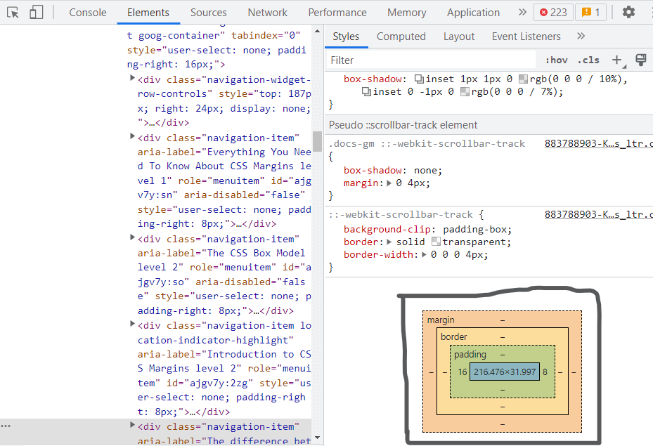
The content, padding, border, and margin are the four components of the box model.
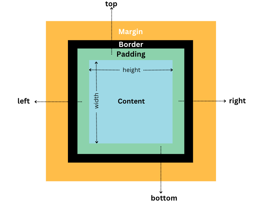
- Content: The space inside the box containing the text and images is its content.
- Padding: The area surrounding the content that divides it from the border is known as padding.
- Border: The border around the padding and content. The padding and content are surrounded by a border that can be styled with properties like color and thickness.
- Margin: The area outside the border that divides an element on a page from other components.
These properties define the size, position, and appearance of the element in the document tree. By default, the width and height of an element are determined by its content. However, developers can use the padding, border, and margin properties to adjust the size of the element and its position on the page.
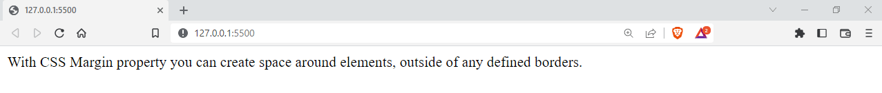
Let’s see an example to figure things out. We have an HTML file with just a div and some text inside it.
HTML:
|
1 2 3 4 5 6 7 8 9 10 11 12 |
<!DOCTYPE html> <html lang="en"> <head> <link rel="stylesheet" href="style.css" /> </head> <body> <div> With CSS Margin property you can create space around elements, outside of any defined borders. </div> </body> </html> |
By using the above code, you will only see the provided text on the web page.
We can now add some custom margin, padding, and border to this text element, i.e., a div.
CSS:
|
1 2 3 4 5 6 7 8 9 10 11 12 13 14 |
div{ background-color: #000; color: #fff; font-size: 16px; font-family: Arial, Helvetica, sans-serif; padding: 15px; margin: 10px; border: 10px solid rgb(200, 19, 19); border-radius: 5px; box-shadow: 0 0 5px #fff; width: 200px; height: 200px; text-align: center; } |
Output:
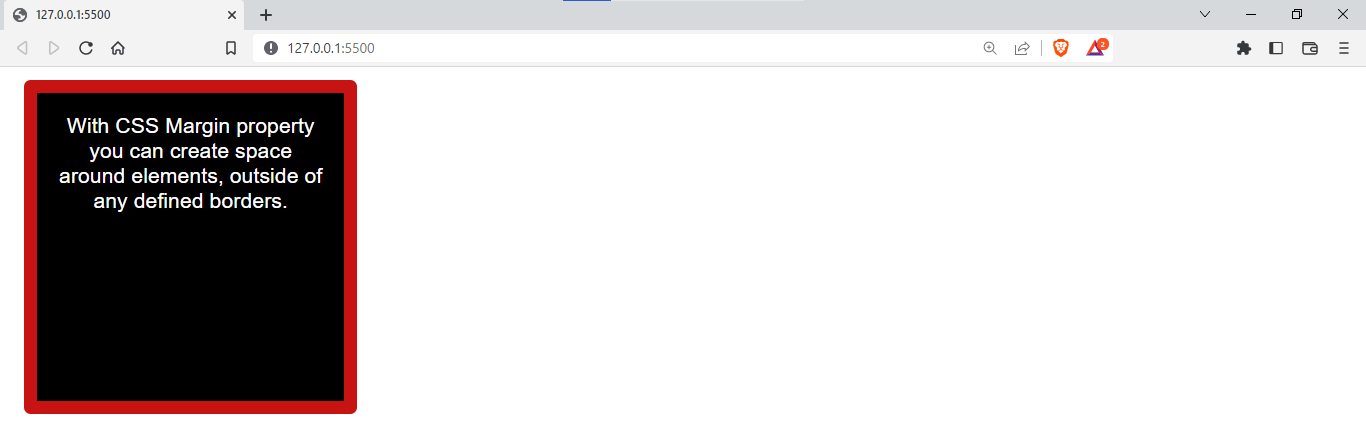
You can see that adding certain CSS properties completely changed the layout of this element. As I mentioned earlier, the box model determines the layout, position, and size of the element, i.e., content.
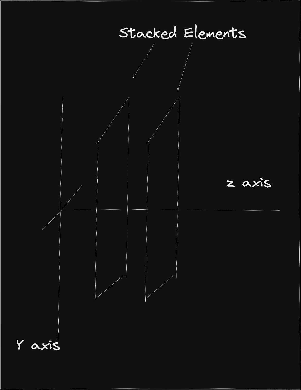
You now know that the box model can do much more than just determine the position of an element. By using the z-index property, developers can specify the stacking order of elements.
Now that we understand how the CSS box model works, let’s look into one of the most essential concepts in a box model: CSS margins.
What Are CSS Margins?
As mentioned above, everything inside CSS is a box; the outermost layer is the component that separates two different elements in CSS, and it is called the margin property.
CSS margins are used to create space around the elements on a webpage, to add space outside of the border of an element, or to create space between elements on a web page.
Syntax of the margin property:
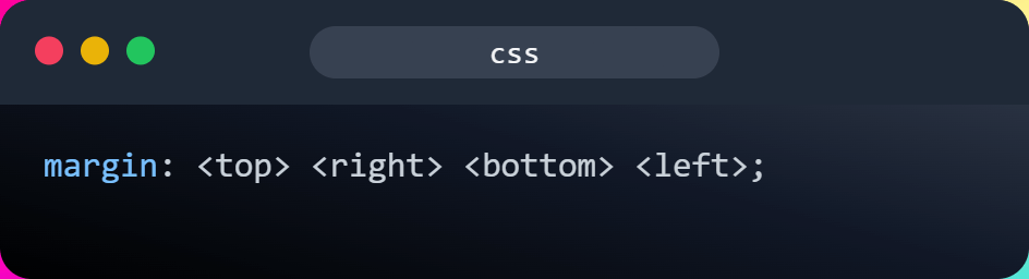
The margin property can take up to 4 values depending on how you want to specify the margin. The syntax is self-explanatory, and specifying every 4 values will give the element a specific value on each side.
We will look into the number of arguments we give and how they will affect the margin.
Before we add numeric values to certain CSS properties, you should be well aware of the different units of measurement as well as how they work to give appropriate values.
CSS Margins Measurement Units
Using various units of measurement will provide greater versatility and precision in determining the dimensions, distances, and alignment of elements on a webpage.
There are several CSS units of measurement, such as pixels, em, rem, and percentages. We’ll explore popular units and understand their appropriate use.
- Pixels: They are the commonly used measurement unit for margins. Pixels represent a fixed measurement unit. A single pixel on a computer display is almost equivalent to 1/96th of an inch.
- em: It is a unit of measurement that is relative to the font size of the element. One em corresponds to the size of the font of the element.
- rem: It is also a relative unit of measurement, but it is relative to the font size of the root element, which is typically the element. One rem is equal to the font size of the root element.
- Percentages: Percentage is a measurement unit that is relative to its parent element as it is a relative measure. A fraction of 1/100th of the parent element’s height or width is represented by a percentage.
Let’s look at a real-world example of how these units affect the actual behavior of elements.
HTML:
|
1 2 3 4 5 6 7 8 9 10 11 12 13 14 15 16 17 18 19 20 21 22 23 24 25 26 27 28 29 30 31 32 |
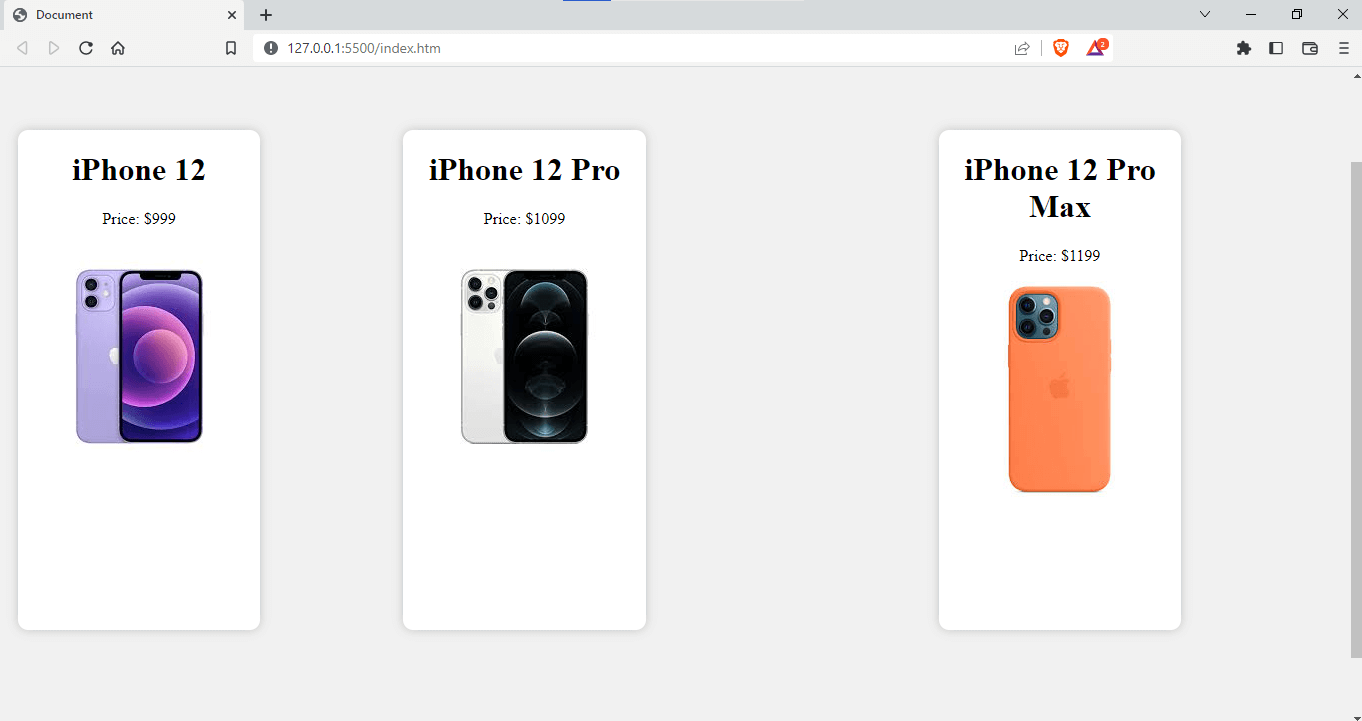
<!DOCTYPE html> <html lang="en"> <head> <meta charset="UTF-8" /> <meta http-equiv="X-UA-Compatible" content="IE=edge" /> <meta name="viewport" content="width=device-width, initial-scale=1.0" /> <title>Document</title> <link rel="stylesheet" href="index.css" /> </head> <body> <!-- create 3 divs with different phone and its price --> <div class="container"> <div class="phone p1"> <h1>iPhone 12</h1> <p>Price: $999</p> <img src="./12.jfif" alt="" /> </div> <div class="phone p2"> <h1>iPhone 12 Pro</h1> <p>Price: $1099</p> <img src="./12pro.jfif" alt="" /> </div> <div class="phone p3"> <h1>iPhone 12 Pro Max</h1> <p>Price: $1199</p> <img src="./12pm.jfif" alt="" /> </div> </div> </body> </html> |
CSS:
|
1 2 3 4 5 6 7 8 9 10 11 12 13 14 15 16 17 18 19 20 21 22 23 24 25 26 27 28 29 |
body{ background-color: #f1f1f1; } .container{ width: 100%; height: 100%; display: flex; justify-content: center; align-items: center; background-color: #f1f1f1; } .phone{ width: 300px; height: 500px; background-color: #fff; border-radius: 10px; box-shadow: 0 0 10px rgba(0,0,0,0.2); position: relative; text-align: center; } .p1{ margin: 10px; } .p2{ margin:10%; } .p3{ margin: 10em; } |
In this example, we have used different units to give margins. The margin for the element with the class .p1 is set to 10px. The margin for the element with the class name .p2 is set to 10%. This will add a margin equivalent to 10% of the element’s width.
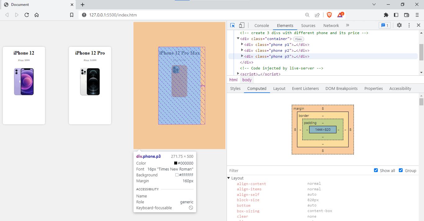
For the element with the class .p3, the margin is set to 10em. If the font size for the element is 16 pixels, the margin will be 160 pixels, i.e., 10em*16 pixels.
From the output given below, you can see how different units contribute accordingly.
Now that we know how different measurement units work in CSS let’s get back to how different values or numbers of values affect the margin of an element.
Using CSS Margin Shorthand Property
CSS properties like margin-left, margin-right, margin-top, and margin-bottom are used to set the margins for the left, right, top, and bottom separately when defining specific margins for each side.
The margin property, on the other hand, allows you to simultaneously adjust the top, bottom, left, and right margins. It is a concise method of indicating the amount of space to add around an element.
Here is an example of how to use the margin shorthand property in CSS:
HTML:
|
1 2 3 4 5 6 7 8 |
<div class="phone p3"> <h1>iPhone 12 Pro Max</h1> <p>Price: $1199</p> <img src="./12pm.jfif" <em>alt</em>=" iphone 12 pro max mobile" /> </div> |
CSS:
|
1 2 3 4 5 6 7 |
<em>.p3</em>{ margin: 250px 35px 125px 150px; } |
Output:
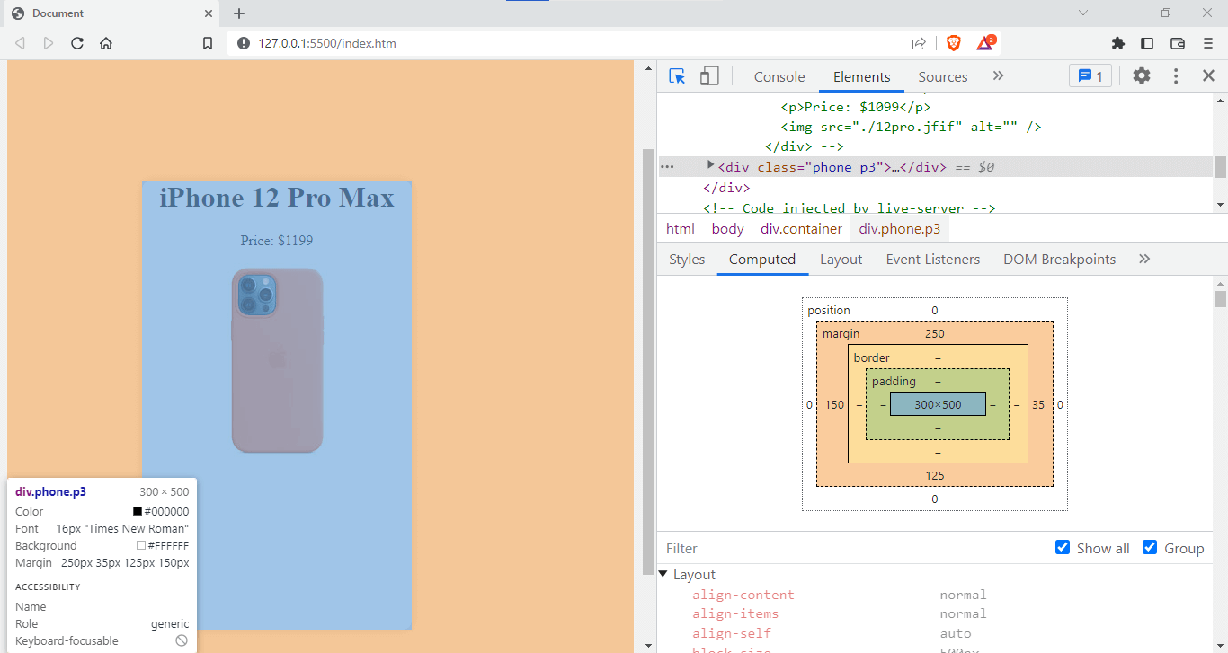
The above shorthand code is equivalent to setting the individual margin-top, margin-bottom, margin-left, and margin-right properties separately, as shown below:
|
1 2 3 4 5 6 7 8 9 10 11 12 13 14 15 16 |
p3 { margin-top: 250px; margin-bottom: 125px; margin-left: 150px; margin-right: 35px; } |
You can see that using the margin shorthand property is more concise and improves the code readability, which you can see here.
Currently, we have only used positive margin values, but negative margin values are also possible. Here’s where the real fun begins. Let’s learn about these negative values in the next section.
Negative Margins in CSS
An element with a positive margin will push other elements away from it, whereas an element with a negative margin will pull another element closer to it.
Negative margins can be helpful in various situations, such as creating advanced layouts, correcting spacing issues, creating CSS art, or creating visual effects.
Here is an example of how to use a negative margin in CSS.
HTML:
|
1 2 3 4 5 6 7 8 9 10 11 12 13 14 15 16 17 18 19 20 21 22 23 24 25 26 27 28 29 30 31 32 33 34 35 36 37 38 |
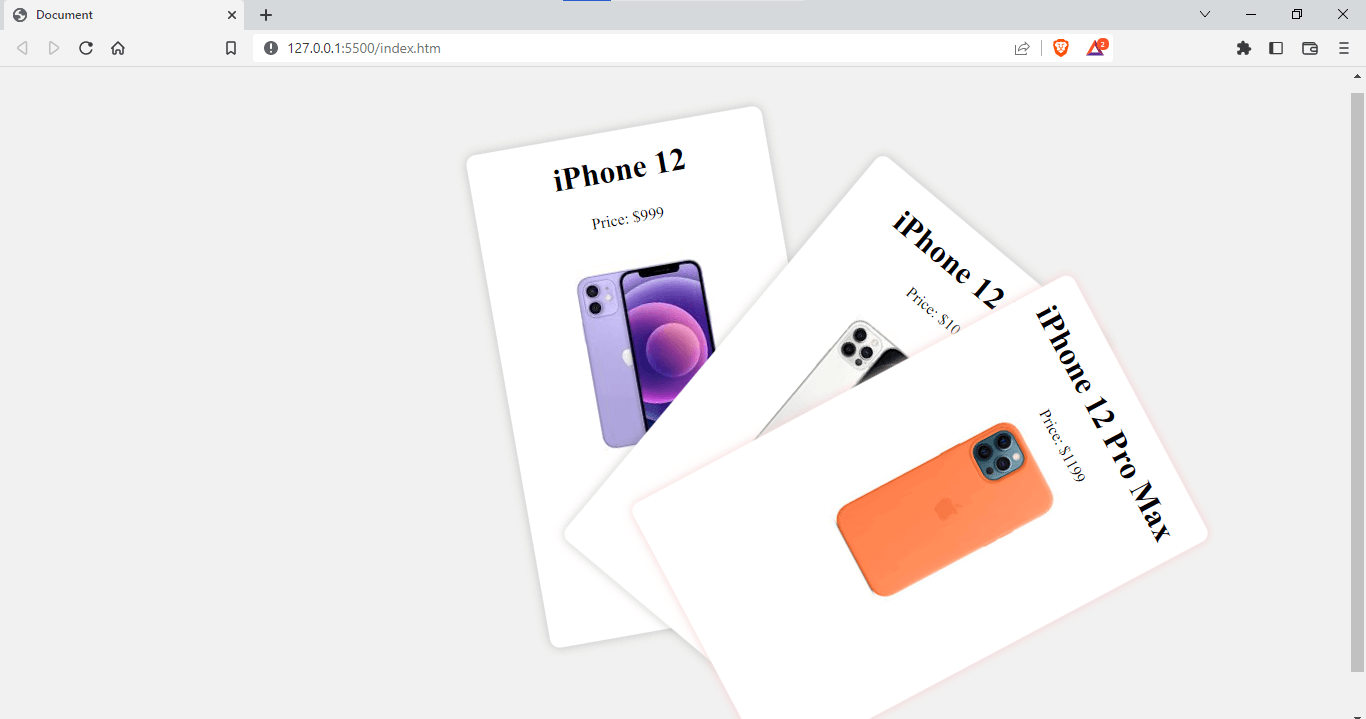
<!DOCTYPE html> <html lang="en"> <head> <meta charset="UTF-8"> <meta http-equiv="X-UA-Compatible" content="IE=edge"> <link rel="stylesheet" href="index.css" /> <body> <!-- create 3 divs with different phone and its price --> <div class="container"> <div class="phone p1"> <h1>iPhone 12</h1> <p>Price: $999</p> <p>Great Indian Festival offer</p> <img src="./12.jfif" alt="" /> </div> <div class="phone p2"> <h1>iPhone 12 Pro</h1> <p>Price: $1099</p> <p>Great Indian Festival offer</p> <img src="./12pro.jfif" alt="" /> </div> <div class="phone p3"> <h1>iPhone 12 Pro Max</h1> <p>Price: $1199</p> <p>Great Indian Festival offer</p> <img src="./12pm.jfif" alt="" /> </div> </div> </body> </html> |
CSS:
|
1 2 3 4 5 6 7 8 9 10 11 12 13 14 15 16 17 18 19 20 21 22 23 24 25 26 27 28 29 30 31 32 33 34 35 36 37 38 39 40 41 42 43 44 45 46 47 48 49 50 |
body{ background-color: #f1f1f1; } .container{ width: 100%; height: 100%; display: flex; justify-content: center; align-items: center; background-color: #f1f1f1; } .phone{ width: 300px; height: 500px; background-color: #fff; border-radius: 10px; box-shadow: 0 0 10px rgba(0,0,0,0.2); position: relative; text-align: center; } .p1{ margin: 10px; transform: rotate(-10deg); } .p2{ margin-left: -130px; margin-top: 126px; transform: rotate(40deg); } .p3{ margin: -216px; margin-top: 74px; transform: rotate(62deg); box-shadow: #f5d2d2 0 0 10px; } |
We created three cards here and used the CSS transform property to rotate them, after which we used a combination of negative and positive margins to position them like Tinder cards.
Output:
See the Pen
Untitled by adarsh (@adarsh-gupta101)
on CodePen.
There are endless possibilities and use cases for negative margins with which we can create advanced layouts. The above example is one of the simplest, where we can tilt these cards and position them accordingly using negative margins.
However, it’s important to note that using negative margins can cause issues with your page layout. Negative margins can lead to elements overlapping unexpectedly and disrupt the page layout flow.
Here is an example of overlapping elements using negative margins.
HTML:
|
1 2 3 4 5 6 7 8 9 10 11 12 13 14 15 16 17 18 19 20 21 22 23 24 25 26 27 28 29 |
<!DOCTYPE html> <html lang="en"> <head> <meta charset="UTF-8"> <meta http-equiv="X-UA-Compatible" content="IE=edge"> <meta name="viewport" content="width=device-width, initial-scale=1.0"> <link rel="stylesheet" href="index.css" /> </head> <body> <style> .container { position: relative; } .overlap { position: absolute; margin-left: -20px; } </style> <div class="container"> <div class="overlap">I will overlap the element to my left</div> <div>I am the element to the left</div> </div> </body> </html> |
Output:
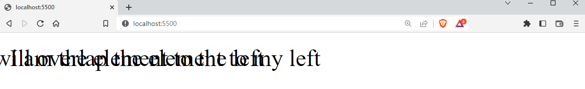
In the above example, we can see that the texts collide and make them difficult to read, so it is important to use negative margins appropriately. When negative margins are not used appropriately, elements on a webpage may overlap and cover text. This overlap can make it harder for users to read and understand the content.
While dealing with negative margins, have you ever considered what would happen if two different elements’ margins overlapped or were in close proximity to one another? This is where the idea of a collapsing margin comes into play.
Collapsing Margins in CSS
In the previous section, we have seen that negative margins are used when we need to adjust the position of an element outside of its parent element. So you might be confused about what will happen if two or more margins overlap or technically collapse, right?
When a situation like this occurs in your web layout, i.e., if the margins of two or more elements collapse, the larger margin is typically considered. Let’s look at an example that will help you understand this properly:
HTML:
|
1 2 3 4 5 6 7 8 9 10 11 12 13 14 15 16 17 18 19 20 21 22 23 24 25 26 27 28 29 30 31 32 |
<!DOCTYPE html> <html lang="en"> <head> <meta charset="UTF-8" /> <meta http-equiv="X-UA-Compatible" content="IE=edge" /> <meta name="viewport" content="width=device-width, initial-scale=1.0" /> <title>Document</title> <link rel="stylesheet" href="index.css" /> </head> <body> <!-- 2divs with different phone and its price --> <div class="phone p1"> <h1>iPhone 12</h1> <p>Price: $999</p> <p>Buy this amazing <span>iPhone 12</span> and get a free <span>iPhone 12 Pro</span> </p> <img src="./12.jfif" alt="" /> </div> <div class="phone p2"> <h1>iPhone 12 Pro</h1> <p>Price: $1099</p> <p>Great Indian Festival offer</p> <img src="./12pro.jfif" alt="" /> </div> </body> </html> |
CSS:
|
1 2 3 4 5 6 7 8 9 10 11 12 13 14 15 16 17 18 19 20 21 22 23 24 25 26 27 28 29 30 31 32 33 |
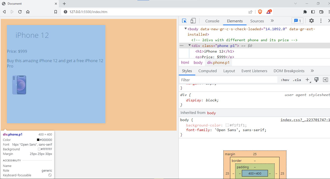
body{ background-color: #f1f1f1; } h1{ margin: 0; } img { width: 100px; height: 100px; } .phone { width: 300px; height: 300px; background-color: #fff; box-shadow: 0 0 10px rgba(0, 0, 0, 0.2); text-align: center; } /* collapsing margin */ .p1 { margin-bottom: 30px; } .p2 { margin-top: 25px; } |
Output:
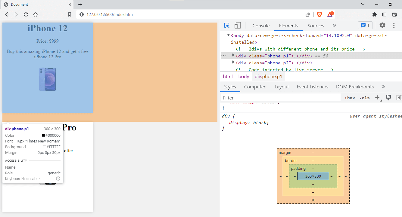
In this example, the .p1 class has a bottom margin of 30px, and the .p2 class has a top margin of 25px. These margins will collapse, and the larger two margins will be applied. As a result, the distance between the two phone elements will be 30 pixels.
One thing to remember about margin collapse is that it only occurs vertically, not horizontally. Margin collapse only happens between elements that are floated or absolutely positioned or between elements placed one after the other in the HTML.
One thing that will come to mind while going through margin collapse is child elements inheriting margin values from their parent elements, right? Actually, it doesn’t work that way 🙂
Margin Inheritance in CSS
While working with CSS, you may have come across the CSS inherit concept.
Inheritance in CSS refers to how values for certain properties, such as colors or fonts, are inherited from parent elements to child elements.
Margins are not inherited by the child elements, so if you specify a margin for your container element, they will not inherit it.
Let’s look at an example to understand this.
HTML:
|
1 2 3 4 5 6 7 8 9 10 11 12 13 14 15 16 17 18 19 20 21 22 |
<!DOCTYPE html> <html lang="en"> <head> <meta charset="UTF-8"> <meta http-equiv="X-UA-Compatible" content="IE=edge"> <meta name="viewport" content="width=<div class="image-grid"> <link rel="stylesheet" href="index.css" /> </head> <body> <!-- divs with different phone and its price --> <div class="phone p1"> <h1>iPhone 12</h1> <p>Price: $999</p> <p>Buy this amazing <span>iPhone 12</span> and get a free <span>iPhone 12 Pro</span> </p> <img src="./12.jfif" alt="" /> </body> </html> |
CSS:
|
1 2 3 4 5 6 7 8 9 10 11 12 13 14 15 16 17 18 19 20 21 22 23 24 25 26 27 28 29 30 31 32 33 34 35 36 37 38 39 |
body{ background-color: #f1f1f1; font-family: 'Open Sans', sans-serif; } img { width: 100px; height: 100px; } .phone { width: 400px; height: 400px; background-color: #fff; box-shadow: 0 0 10px rgba(0, 0, 0, 0.2); margin: 25px; } h1{ font-size: 30px; font-weight: 300; color: #333; margin: 35px; padding: 0; padding-top: 20px; } /* collapsing margin */ .p1 { margin-bottom: 30px; } .p2 { margin-top: 25px; } |
Output:
See the Pen
Untitled by adarsh (@adarsh-gupta101)
on CodePen.
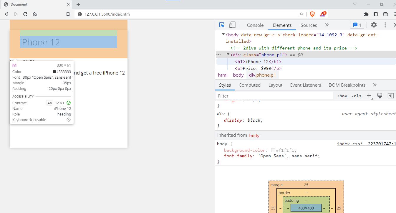
You can see that the parent container has a margin of 25px and a margin-bottom of 30px, but it is not inherited by its child element. Take the example of the text iPhone 12, the h1 element, which has a margin of 35px, that means that it didn’t inherit the values from the parent container.
You now know that by default, child components never inherit the value, but we can specify the margin to be inherited by using the inherit property.
|
1 2 3 4 5 6 7 8 9 10 11 12 13 14 15 16 17 18 19 20 21 22 |
h1{ font-size: 30px; font-weight: 300; color: #333; margin: inherit; padding: 0; padding-top: 20px; } |
As you can see, we used the inherit value here; now, let’s look at how it affects the margin in our example.
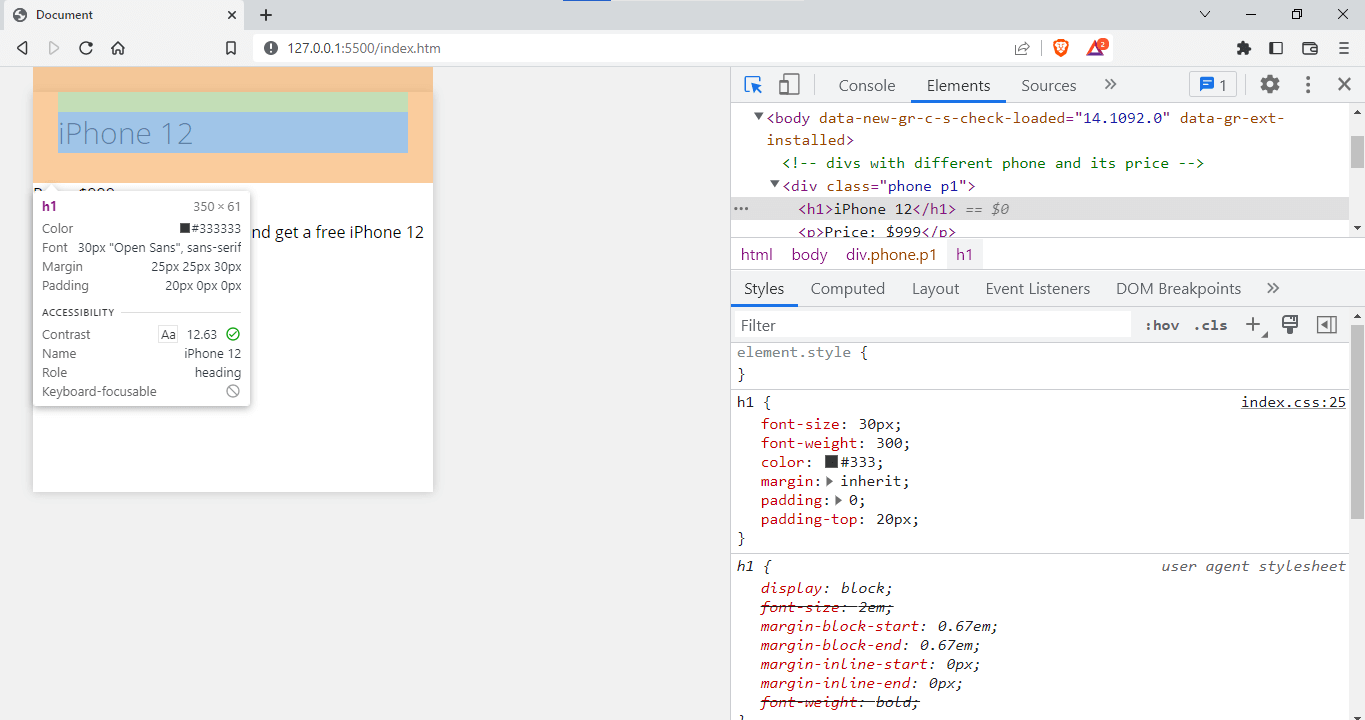
On the inspect tool, you can see that it shows margin: inherit, and the margin of the h1 element is just the same as the parent element. Thus, we can say that by using the inherit property, we can inherit the values from the parent container.
So far, you have seen the most important topics we should know about CSS margins, but you might think that margin is the same as padding since both are used to create space between elements, right? But both are different, and we will look into them right away.
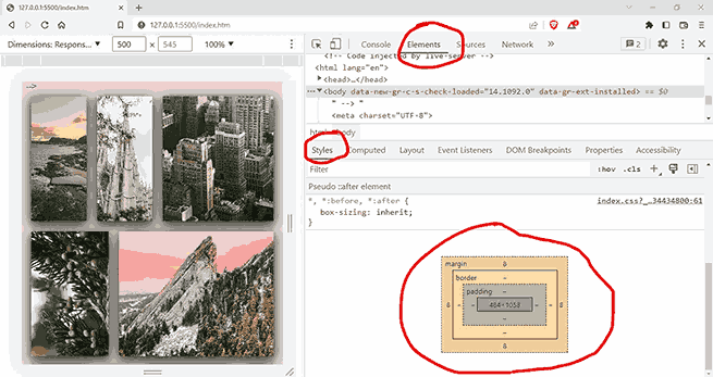
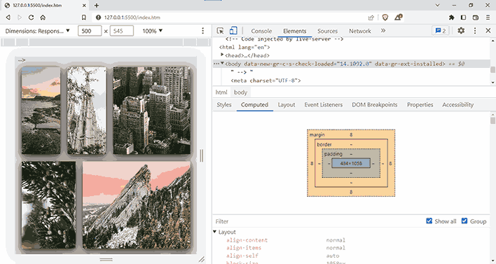
CSS Margins and CSS Padding: Differences
Although CSS margins and padding appear similar, their internal workings and use cases are different, and as a web developer, you should understand how they differ.
Both margin and padding are utilized in CSS to generate space around the elements. CSS margins create space outside of an element, whereas CSS padding creates space inside an element.
To get a good understanding of margin and padding, check out the following visuals:
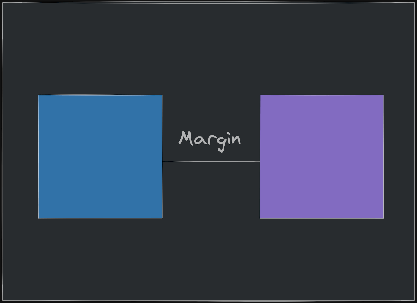
You can see that the margin prevents the two boxes from touching each other but pushes them away from each other.
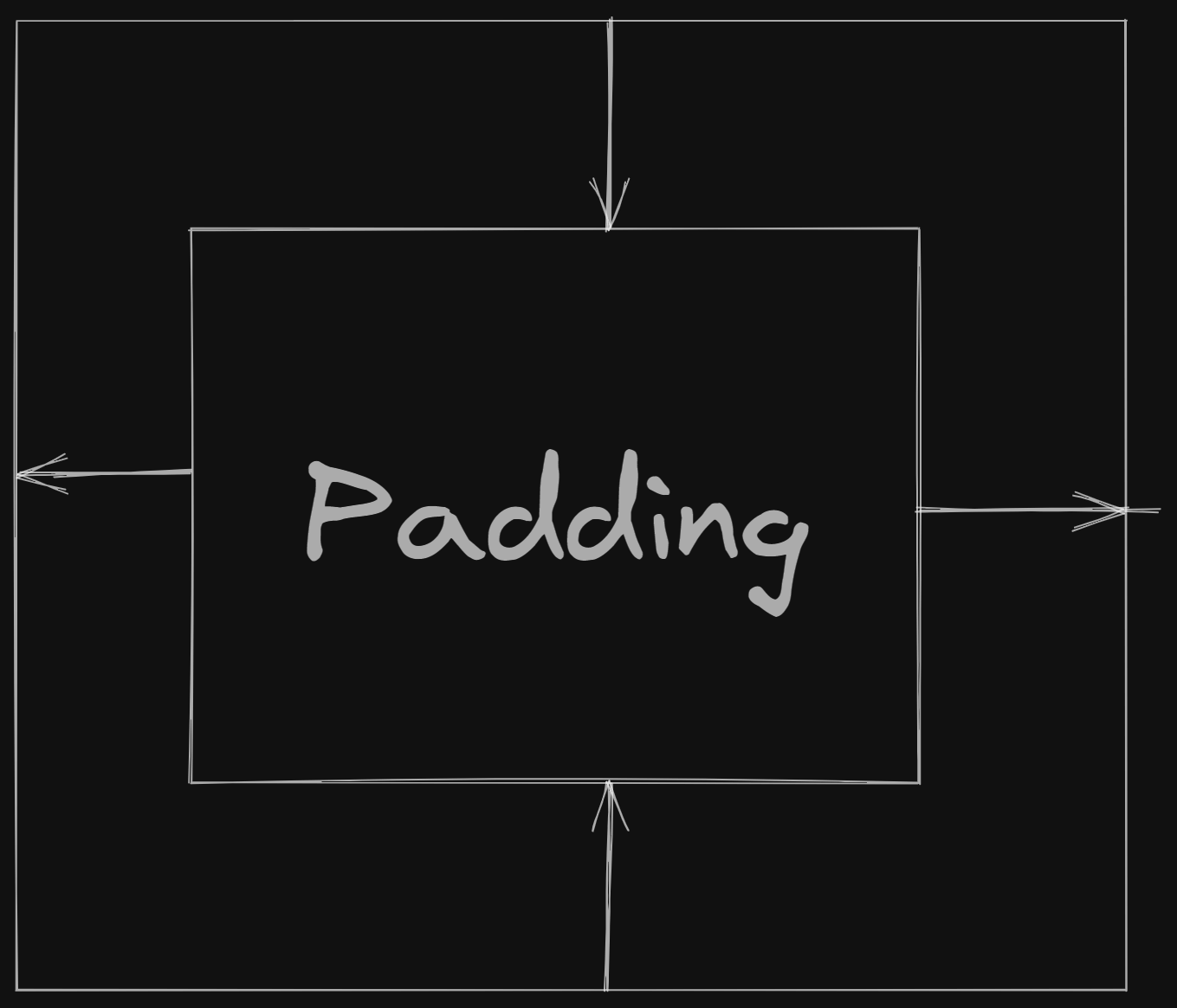
Padding, on the other hand, pushes the content from the box rather than pushing other elements near it, thus creating space around the content to make it visually appealing.
Here’s an example to illustrate the difference between margins and padding.
HTML:
|
1 2 3 4 5 6 7 8 9 10 11 12 13 14 15 16 17 18 19 20 21 22 23 24 25 26 27 28 29 30 31 32 33 34 35 36 37 38 39 40 |
<!DOCTYPE html> <html lang="en"> <head> <meta charset="UTF-8" /> <meta http-equiv="X-UA-Compatible" content="IE=edge" /> <meta name="viewport" content="width=device-width, initial-scale=1.0" /> <title>Document</title> <link rel="stylesheet" href="index.css" /> </head> <body> <!-- divs with different phone and its price --> <div class="container" > <div class="phone p1"> <h1>Android</h1> <p>Starting Price: $499</p> <p> Android is a mobile operating system developed by Google, based on a </p> <img src="./n-lg.png" alt="" /> </div> <div class="phone p2"> <h1>iPhone</h1> <p>Starting Price: $699</p> <p> iPhone is a line of smartphones designed and marketed by Apple Inc. The </p> <img src="./12pm.jfif" alt="" /> </div> <div class="phone p3"> <h1>Windows</h1> <p>Starting Price: $399</p> <p> Windows Phone is a family of discontinued mobile operating systems </p> <img src="./win.jpg" alt="" /> </div> </body> </html> |
CSS:
|
1 2 3 4 5 6 7 8 9 10 11 12 13 14 15 16 17 18 19 20 21 22 23 24 25 26 27 28 29 30 31 32 33 34 35 36 37 38 39 40 41 42 43 44 45 46 47 48 |
body{ background-color: #f1f1f1; font-family: 'Open Sans', sans-serif; } .container{ width: 100%; height: 100%; display: flex; justify-content: center; align-items: center; flex-wrap: wrap; margin: 0; padding: 0; margin-top: 50px; margin-bottom: 50px; } img { width: 200px; height: 200px; object-fit: cover; } .phone { width: 250px; min-height: 300px; background-color: #fff; box-shadow: 0 0 10px rgba(0, 0, 0, 0.2); } h1{ font-size: 30px; font-weight: 300; color: #333; margin: inherit; padding: 0; padding-top: 20px; } |
Output:
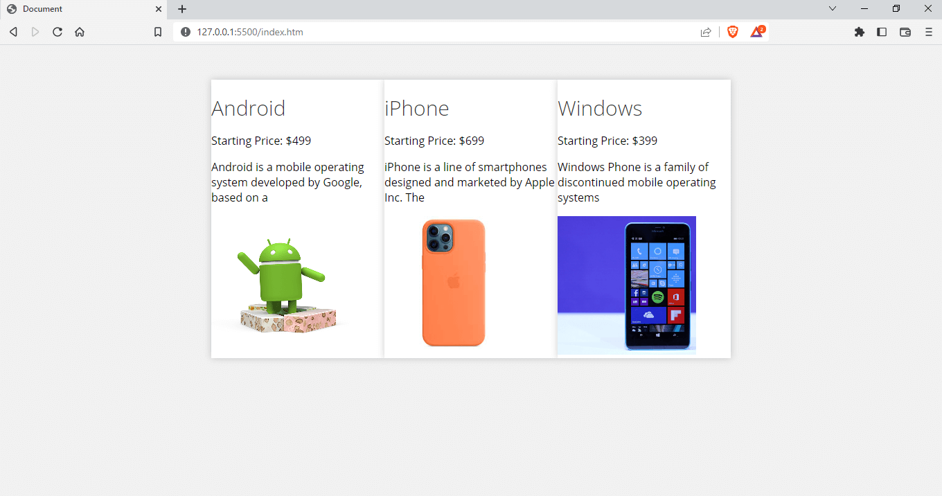
Here, we have a simple container with a Flexbox layout with elements. You can see that the spacing around the items is not good. We can use CSS margin and padding properties to make the content look good.
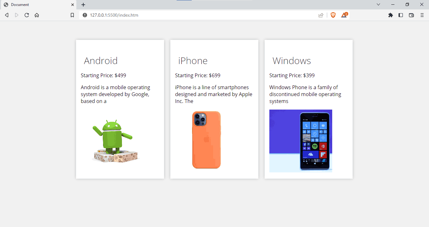
Let’s add some margin and see how the content looks:
|
1 2 3 |
.phone { margin: 10px; } |
Output:
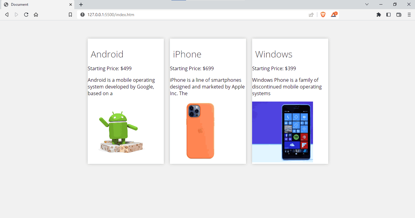
We have added a margin of 10px, which is much better than the previous one with no space. Let’s now add some padding to create some space around the box and the content.
|
1 2 3 |
.phone{ padding: 15px; } |
Output:
You can see that the UI looks much better than the first, and creating the space around and over the element can significantly impact the user interface and the user experience.
So far, we have never considered responsiveness with respect to margins, and it is important to use responsive margins, or else the layout might break on devices, usually mobile versions.
However, you may have noticed that I said Flexbox here, which is correct; we use layouts such as Grid and Flexbox to determine the overall layout of our website. Let’s look at how we can create responsive margins.
Responsive Margins in CSS
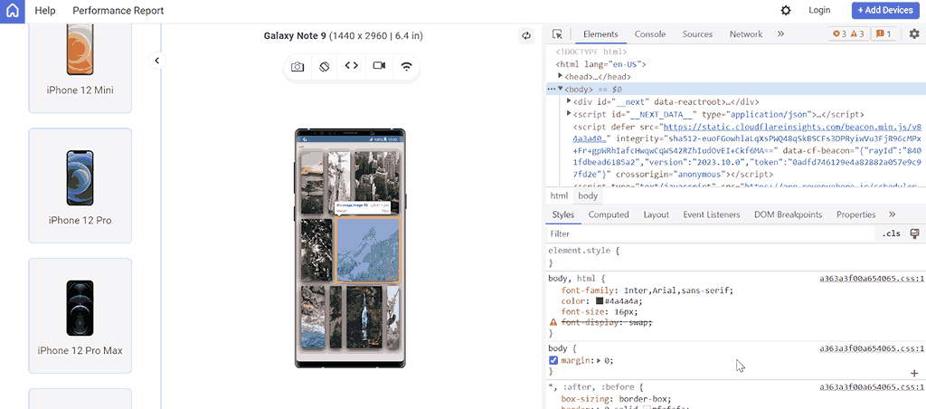
Almost all businesses have started using mobile-first design to ensure a unified experience across all devices, screen resolutions, and platforms. Therefore, it’s crucial to perform mobile testing of your websites that use the CSS margin property across different screen sizes.
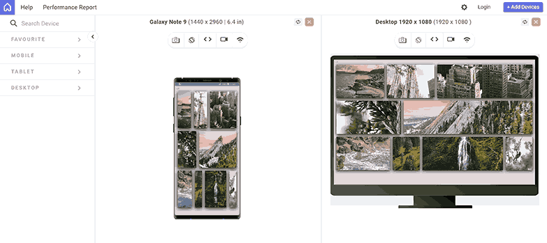
In the case of the CSS margin property, we also have to consider responsiveness across different viewports like mobile, tablets, desktop, and even laptops, or else the layout might break, just like in the below example:
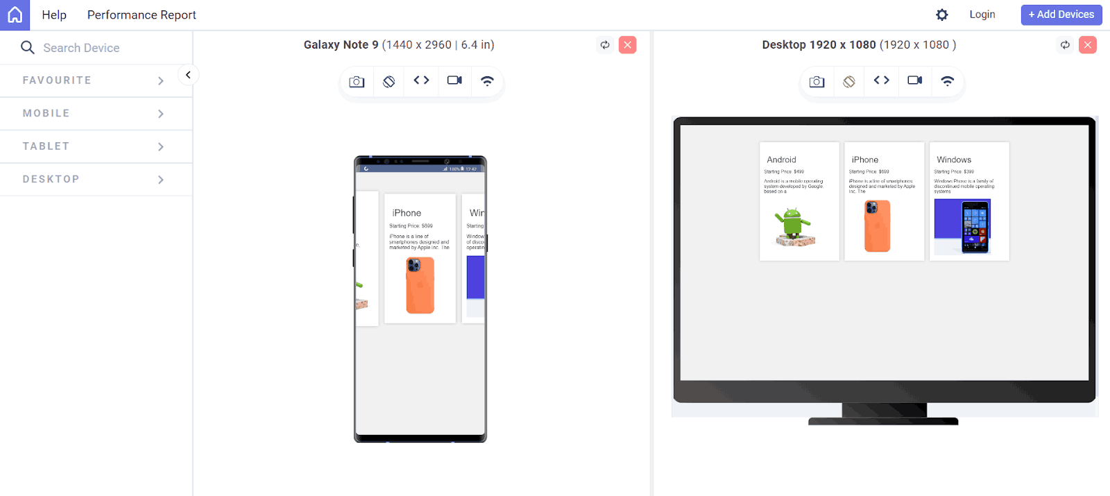
The above output is previewed on the LT Browser – a mobile site tester offered by LambdaTest.
LT Browser is a desktop application for web developers to build, test, and debug mobile websites for responsiveness across various devices. It’s a Chromium-based browser with features that make it easier to ensure your website looks good and functions correctly on a wide range of screen sizes and resolutions.
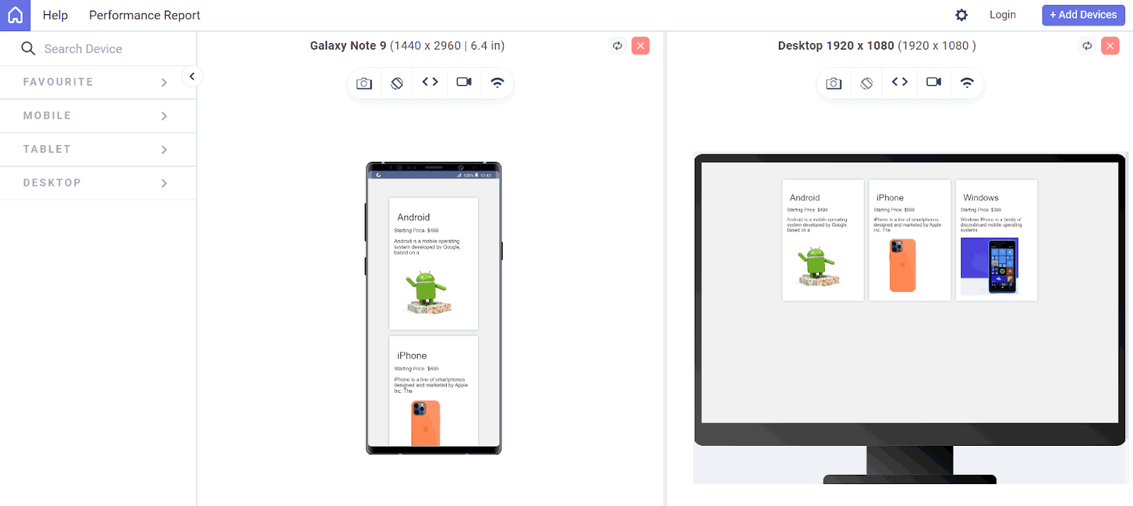
You can see that our web page breaks in the mobile version. We can use the flex-wrap property to overcome this.
|
1 2 3 4 5 6 7 8 |
.container{ width: 100%; height: 100%; display: flex; ... flex-wrap: wrap; } |
CSS Margins and Layouts
Believe me, when you are starting your web development career, you will always have this tendency to use CSS margins and padding to make the entire layout, and that’s a strict No!
Although CSS margins are used to create spaces and position elements, positioning a whole website using margin or box model properties is more complex and less recommended since we are using fixed values, and it might cause the website to be less responsive.
Some of the most commonly used layouts include CSS Grid and CSS Flexbox. Margins play an important role in creating space between the items with respect to these layouts.
Margin can be used to create space between grid items and between the Grid itself and other elements on the page. Users can navigate and interact with content more easily by making a clear separation between elements.
Let’s see an example of using a Grid layout.
HTML:
|
1 2 3 4 5 6 7 8 9 10 11 12 13 14 15 16 17 18 19 20 21 22 23 24 |
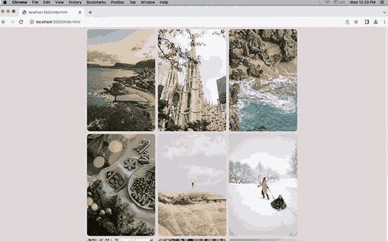
<!DOCTYPE html> <html lang="en"> <head> <meta charset="UTF-8"> <meta http-equiv="X-UA-Compatible" content="IE=edge"> <meta name="viewport" content="width=<div class="image-grid"> <link rel="stylesheet" href="index.css" /> </head> <div class="grid"> <img src="https://images.pexels.com/photos/9613720/pexels-photo-9613720.jpeg?auto=compress&cs=tinysrgb&w=1260&h=750&dpr=1" alt=""> <img src="https://images.pexels.com/photos/4451425/pexels-photo-4451425.jpeg?auto=compress&cs=tinysrgb&w=1260&h=750&dpr=1" alt=""> <img src="https://images.unsplash.com/photo-1604927737867-9f413dac3d08?ixid=MnwxMjA3fDB8MHx0b3BpYy1mZWVkfDYwfDZzTVZqVExTa2VRfHxlbnwwfHx8fA%3D%3D&ixlib=rb-1.2.1&auto=format&fit=crop&w=500&q=60" alt=""> <img src="https://images.pexels.com/photos/14747076/pexels-photo-14747076.jpeg?auto=compress&cs=tinysrgb&w=600&lazy=load" alt=""> <img src=" https://images.pexels.com/photos/8206884/pexels-photo-8206884.jpeg?auto=compress&cs=tinysrgb&w=600&lazy=load" alt=""> <img src="https://images.pexels.com/photos/6617798/pexels-photo-6617798.jpeg?auto=compress&cs=tinysrgb&w=600&lazy=load" alt=""> <img src="https://images.pexels.com/photos/4451425/pexels-photo-4451425.jpeg?auto=compress&cs=tinysrgb&w=1260&h=750&dpr=1" alt=""> <img src="https://images.unsplash.com/photo-1604927737867-9f413dac3d08?ixid=MnwxMjA3fDB8MHx0b3BpYy1mZWVkfDYwfDZzTVZqVExTa2VRfHxlbnwwfHx8fA%3D%3D&ixlib=rb-1.2.1&auto=format&fit=crop&w=500&q=60" alt=""> <img src="https://images.pexels.com/photos/9613720/pexels-photo-9613720.jpeg?auto=compress&cs=tinysrgb&w=1260&h=750&dpr=1" alt=""> </div> </head> <body> </body> </html> |
CSS:
|
1 2 3 4 5 6 7 8 9 10 11 12 13 14 15 16 17 18 19 20 21 22 23 24 25 26 27 28 29 30 31 32 33 34 35 36 37 38 39 40 41 42 43 44 45 46 47 48 49 50 51 52 53 54 55 56 57 58 59 60 61 62 63 64 |
html { box-sizing: border-box; } *, *:before, *:after { box-sizing: inherit; } body { background-color: #e0d5d5; } .grid{ display: grid; place-content: center; place-items: center; grid-template-columns: 250px 250px 250px; } img{ width: 250px; height: 100%; /* object-fit: cover; */ border-radius: 10px; } .image-row { display: flex; flex-wrap: wrap; margin: 0 -10px; } .image-row .image { flex-basis: 33.33%; padding: 10px; } .image-row .image img { width: 100%; height: 100%; object-fit: cover; border-radius: 10px; } @media screen and (max-width: 400px) { .image-row { flex-direction: column; } .image-row .image { flex-basis: auto; } } |
Output:
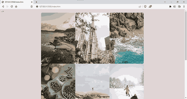
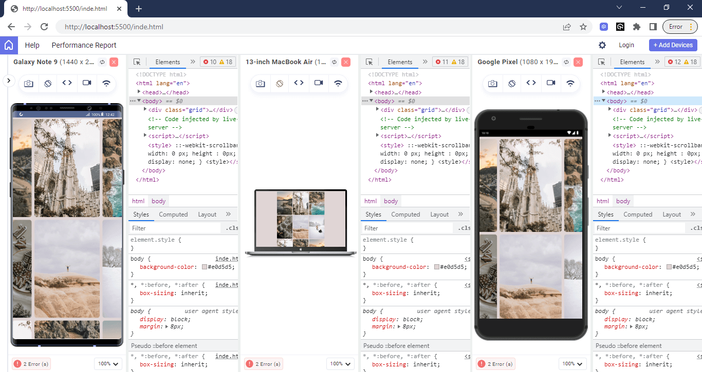
You can see the Grid items without space in the above picture. Let’s add some spacing by putting a margin of 30px to the images.
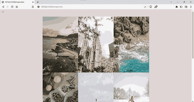
You may have noticed that the margin did not create spaces between the items. This is because margins are not applied directly to Grid items when using the CSS Grid layout. Instead, the CSS margins will be applied to the Grid items themselves, increasing their size and potentially causing them to overlap with other items in the Grid.
To make space between the items, you can make use of the grid-gap property.
|
1 2 3 4 5 6 7 |
.grid{ display: grid; place-content: center; place-items: center; grid-template-columns: 250px 250px 250px; grid-gap: 10px; } |
The above code will give us the desired output.
In Flexbox layouts, margins can be used to create space around items inside the flex container and between the flex container and other elements on the page.
Let’s see an example of using Flexbox as well as the margin for spacing elements:
HTML:
|
1 2 3 4 5 6 7 8 9 10 11 12 13 14 15 16 17 18 19 20 21 22 23 24 25 26 27 28 29 30 |
<!DOCTYPE html> <html lang="en"> <head> <meta charset="UTF-8"> <meta http-equiv="X-UA-Compatible" content="IE=edge"> <meta name="viewport" content="width=<div class="image-grid"> <link rel="stylesheet" href="index.css" /> </head> <div class="image-row"> <div class="image image-01"></div> <div class="image image-02"></div> <div class="image image-03"></div> </div> <div class="image-row"> <div class="image image-04"></div> <div class="image image-05"></div> </div> <div class="image-row"> <div class="image image-06"></div> <div class="image image-07"></div> <div class="image image-08"></div> <div class="image image-09"></div> </div> </div> </head> <body> </body> </html> |
CSS:
|
1 2 3 4 5 6 7 8 9 10 11 12 13 14 15 16 17 18 19 20 21 22 23 24 25 26 27 28 29 30 31 32 33 34 35 36 37 38 39 40 41 42 43 44 45 46 47 48 49 50 51 52 53 54 55 56 57 58 59 60 61 62 63 64 65 66 67 68 69 70 71 72 73 74 75 76 77 78 79 80 81 82 83 |
html { box-sizing: border-box; } *, *:before, *:after { box-sizing: inherit; } body { background-color: #e0d5d5; } .image-row { display: flex; flex-wrap: wrap; } .image-row .image { margin: 15px; height: 240px; } .image { background-repeat: no-repeat; background-size: cover; background-position: center center; box-shadow: 0 6px 20px rgba(0, 0, 0, 0.3), 0 6px 20px rgba(0, 0, 0, 0.15), 0 6px 20px rgba(0, 0, 0, 0.7); } .image-01 { background-image: url("https://images.pexels.com/photos/9613720/pexels-photo-9613720.jpeg?auto=compress&cs=tinysrgb&w=1260&h=750&dpr=1"); flex: 1; } .image-02 { background-image: url("https://images.pexels.com/photos/4451425/pexels-photo-4451425.jpeg?auto=compress&cs=tinysrgb&w=1260&h=750&dpr=1"); flex: 1; } .image-03 { background-image: url("https://images.pexels.com/photos/4451434/pexels-photo-4451434.jpeg?auto=compress&cs=tinysrgb&w=1260&h=750&dpr=1"); flex: 2; } .image-04 { background-image: url('https://images.unsplash.com/photo-1568602048381-2285db7095c6?ixid=MnwxMjA3fDB8MHx0b3BpYy1mZWVkfDI1fDZzTVZqVExTa2VRfHxlbnwwfHx8fA%3D%3D&ixlib=rb-1.2.1&auto=format&fit=crop&w=600&q=60'); flex: 1; } .image-05 { background-image: url('https://images.unsplash.com/photo-1580319204908-eff9d6f0bd68?ixid=MnwxMjA3fDB8MHx0b3BpYy1mZWVkfDMxfDZzTVZqVExTa2VRfHxlbnwwfHx8fA%3D%3D&ixlib=rb-1.2.1&auto=format&fit=crop&w=1000&q=60'); flex: 2; } .image-06 { background-image: url('https://images.unsplash.com/photo-1604927737867-9f413dac3d08?ixid=MnwxMjA3fDB8MHx0b3BpYy1mZWVkfDYwfDZzTVZqVExTa2VRfHxlbnwwfHx8fA%3D%3D&ixlib=rb-1.2.1&auto=format&fit=crop&w=500&q=60'); flex: 2; } .image-07 { background-image: url('https://images.unsplash.com/photo-1614191663579-8780442c043b?ixid=MnwxMjA3fDB8MHx0b3BpYy1mZWVkfDk3fDZzTVZqVExTa2VRfHxlbnwwfHx8fA%3D%3D&ixlib=rb-1.2.1&auto=format&fit=crop&w=500&q=60'); flex: 1; } .image-08 { background-image: url('https://images.unsplash.com/photo-1605812466869-dab071e96c35?ixid=MnwxMjA3fDB8MHx0b3BpYy1mZWVkfDExNnw2c01WalRMU2tlUXx8ZW58MHx8fHw%3D&ixlib=rb-1.2.1&auto=format&fit=crop&w=1000&q=60'); flex: 3; } .image-09 { background-image: url(' https://images.unsplash.com/photo-1617292801457-b108c1672a3d?ixid=MnwxMjA3fDB8MHx0b3BpYy1mZWVkfDExMnw2c01WalRMU2tlUXx8ZW58MHx8fHw%3D&ixlib=rb-1.2.1&auto=format&fit=crop&w=500&q=60'); flex: 1; } @media screen and (max-width: 400px) { .image-row { flex-direction: column; |
Output:
You can see we have a responsive layout using CSS Flexbox and margins.
Another good way to create responsive margins is using the calc() function. You can calculate the responsive margin for the viewport height and viewport width using the calc() function.
Suppose you want to set the left and right margins of an element to 10% of the viewport width. You can use the following CSS rule to achieve this:
|
1 2 3 4 |
p { margin-left: calc(10vw); margin-right: calc(10vw); } |
The left and right margins are set at 10% of the viewport width. Therefore, margins will be automatically sized according to the device.
Another approach for creating responsive margins is to use CSS media queries. Media queries allow you to apply different styles based on the viewport dimension.
For instance, you can use a media query to specify different margin values for various screen sizes:
|
1 2 3 4 5 6 7 8 9 10 11 12 13 14 |
/* Set a margin of 20px for screens smaller than 500px wide */ @media screen and (max-width: 500px) { body { margin: 20px; } } /* Set a margin of 50px for screens 500px wide or larger */ @media screen and (min-width: 500px) { body { margin: 50px; } } |
If your screen is 500 pixels wide or wider, the margin will be 20px. However, for screens larger than 500 pixels, the margin jumps to 50px. This trick helps adjust the margins to fit the screen size perfectly.
You can get even more specific with media queries. These let you pick out certain devices or types of devices. For instance, you can set different margins for devices of specific widths using the min-width and max-width queries. You can also use the orientation query to adjust margins for either portrait or landscape mode.
So far, so good; let’s see some of the best practices we should use while working with CSS margins.
Best Practices for Using CSS Margins
It is entirely up to you as a developer to tweak the values when creating a web application, but there are some industry standards that you should look into.
Here are some of the best practices that can help you ensure consistent and effective box styling:
Set a Default Margin Value
First and foremost, it is important to set a default margin value. This helps to ensure that all elements have a consistent amount of space around them, regardless of the browser being used.
|
1 2 3 4 5 |
*{ box-sizing: border-box; margin: 0; padding: 0; } |
Consider Element Height and Width
While considering the total width of the container and the items contained, we should consider that the total width and height of the element is the sum of padding, margin, border, and the actual content.
Consider this example: four elements with a width of 25% will not fit on one line within the constraints of their parent container if they have left or right padding, margin, or left or right border by default.
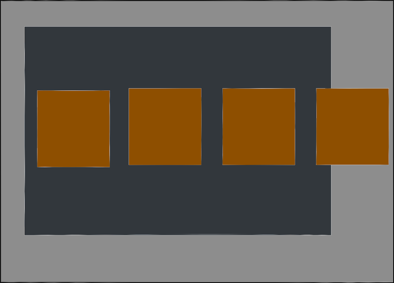
You can see that the miscalculation resulted in having elements pushed away from the container. This is a serious issue that we should consider, or it will affect the overall layout of content inside the website.
Use Uniform Unit Types
Using the same unit type for all margin values is also important to avoid inconsistencies. The result is an easier-to-navigate and more predictable layout, making it easier for users to interact with the site.
The CSS margins should also be responsive and able to adapt to different screen sizes and devices. This helps to ensure that all content is easily readable and accessible, regardless of the device being used.
 Note
NoteTest your websites on real Android and iOS devices. Try LambdaTest Today!
Debugging CSS Margin Issues
It is common for your content to overflow with other images or be positioned unintentionally. Still, it happens, and I’ve been in a situation where I knew I made a mistake but wasn’t sure how to fix it. This section will guide you on how to troubleshoot your styling.
Using LT Browser
One of the best ways to debug margin issues is using LT Browser. As mentioned, this tool makes mobile website testing a breeze and helps you simulate your web application on different screen sizes.
LT Browser is powered by the latest native Chromium rendering engine, and it will take your responsive testing to the next level. You can test and interact with up to four devices with a handful of Android, iOS, and desktop devices to test on. You can view all the changes in real time, and now we developers don’t need to switch browser resolutions repeatedly.
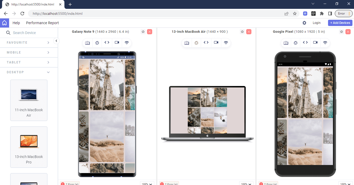
You can also enhance your debugging experience with multiple DevTools options, and the best part is that you can now have DevTools separate for every device viewport and debug them simultaneously.
Check out this video to get a rundown of LT Browser:
Catch up on the latest testing tutorials – subscribe to the LambdaTest YouTube Channel.
Using Google Chrome Developer Tools
Additionally, you make use of the Google Chrome Developer Tools to troubleshoot margin errors:
- Visit your website in Google Chrome and open Developer Tools by right-clicking on the page and selecting the Inspect option.
- Click the Elements tab in the Developer Tools window. This will display the HTML code and CSS styles used on your page. Identify the element with a margin error by hovering over the HTML elements in the Elements tab. You will notice the highlighted element on the page.
- In the Styles pane on the right side of the Developer Tools window, you will see all the CSS styles applied to the selected element.
You can also use the Computed tab to see a list of all of the computed styles for the selected element, including any margin values that have been inherited from parent elements.
Sometimes, you need to test the website on multiple devices and then tweak the value; for that, you can also use developer tools to debug design issues for a specific device dimension within the LT Browser.
Finally, if you are still experiencing margin issues, try using a CSS reset to remove any default margin values that may be causing problems.
That’s a Wrap!
Congratulations on reaching this far! You’re a fantastic reader!
In this blog, we looked into different ways to use CSS margins, their best practices, and how to debug issues related to margins using tools like LT Browser. Whether you are a beginner or an experienced CSS developer, this has something for everyone.
Frequently Asked Questions (FAQs)
What is the margin under CSS?
In CSS, margins are used to control the amount of space around an element outside of its border. It’s essentially a transparent area that separates the element from its surroundings.
How do I set margin values in CSS?
In CSS, margins control space around elements. You can set them using individual properties like margin-top for specific sides or use the shorthand margin property for all sides at once. Values can be in pixels (px), percentages (%), or other units.


Author’s Profile
Adarsh M
Adarsh is a full-stack JavaScript developer based out of India. He loves creating meaningful technical content on Twitter, where he connects with like-minded individuals and developer communities. He shares his knowledge on Twitter through insightful threads!
Blogs: 12
Got Questions? Drop them on LambdaTest Community. Visit now


