
A Complete Guide To CSS Box Model
Clinton Joy Fimie
Posted On: July 6, 2023
 165616 Views
 23 Min Read
In the vast landscape of web design, understanding the CSS box model is crucial. The box model serves as the foundation for layout and positioning in CSS, dictating how elements are rendered, sized, and spaced within a webpage.
Take some time to imagine building a house without understanding how the foundations, walls, roof, and every other component that makes up the house interact. The same can be said for building a website without properly comprehending the CSS box model. Like a house, every webpage is built upon a complex system of boxes. These invisible foundations dictate how every element interacts on your screen.
Yet, understanding these boxes isn’t just crucial for creating a layout. It is essential for crafting a website that offers an exceptional user experience. As per one of the reports, 1 in 4 visitors leaves the website if it takes more than 4 seconds to load. If your elements are not loading correctly due to improper box model handling, you risk losing visitors to your site, drastically affecting your business.
In the digital world, where user experience is king, a deep understanding of the CSS box model isn’t just a luxury; it’s a necessity. In this complete guide, we will unravel the intricacies of the CSS box model, shedding light on all of its components, how they interact, and how you can manipulate them for optimal website performance and a great user experience.
From the core elements; content, padding, border, and margin to the critical box-sizing property and even into the realm of responsive web design, this blog will be your roadmap to mastering the CSS box model.
Whether you’re a beginning developer hoping to lay a strong foundation or an expert programmer looking to further your expertise, this blog has something for you.
Join me on this journey as I demystify one of the most fundamental aspects of CSS that makes our websites tick. Because, after all, knowing the box model is not just about coding; it’s about delivering a seamless and smooth web experience for all users on all devices.
Are you new to CSS? Here is our ultimate CSS Cheat Sheet.
Let’s dive in!
TABLE OF CONTENTS
Introduction to CSS Box Model
The CSS box model is a fundamental concept in web design and layout that plays a major role in how elements are rendered on our web page and how each of those elements interact. It is simply the structure and dimensions of an element, visualized as a rectangular box that consists of several layers or components.
The CSS box model comprises four major components. Let’s briefly discuss the components.
Content
This layer represents the actual content of an element, such as text, images, or other media. It is often called the core of the CSS box model, and that’s because it lies at the heart of the CSS box model.
Padding
The padding is the area surrounding the content, and it provides space between the content and the element’s borders. The padding property controls it and affects the overall dimensions of the element.
Border
I consider this the bridge between the padding and the margin. The border area encloses the padding and content areas and defines the visible boundary of the element. The border properties control the border.
Margin
The margin is the area surrounding the entire box, and it creates space between adjacent elements. It controls the space between elements and is defined by the margin property.
Test your CSS-based web apps on real devices. Try LambdaTest Now!
Why Understanding CSS Box Model is Essential?
The CSS box model’s components work together, and the total dimension of an element is determined by the total dimensions of each of the individual components of the CSS box model. Understanding how to manipulate the CSS box model to your advantage is essential for precise control over the layout and spacing of web page elements.
By adjusting the dimensions and properties of each layer, web designers and developers can achieve desired effects and layouts. For example, you can create a nice minimalist design by increasing the white space on your vital elements, giving it a very classy look.
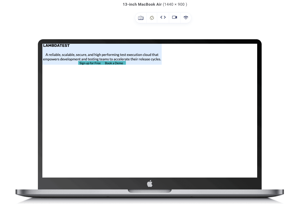
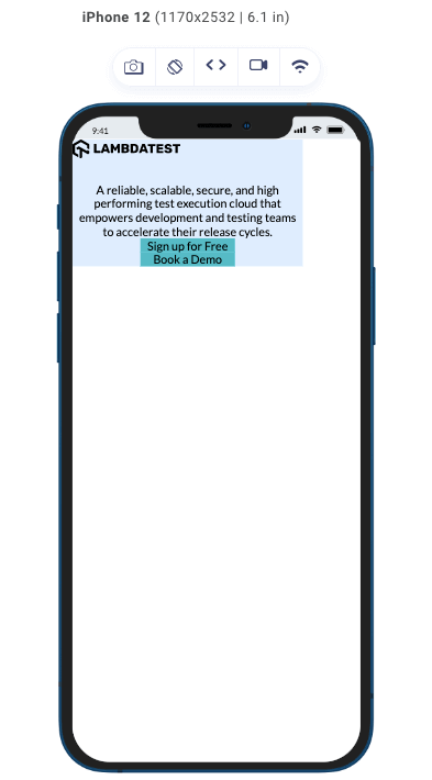
Take this image for example:

Simple yet detailed, at a glance, you know exactly what the page is about, and attention is also drawn to the explore button.
This is an example of a minimalist design, and it can be done by controlling the spacing between elements by modifying the margin or adding visual effects by manipulating the border properties.
Additionally, the CSS box model provides flexibility in designing responsive layouts, allowing elements to adapt to different screen sizes and devices.
Components of the CSS Box Model
In the introduction, I have already talked briefly about the components that make up the CSS box model, which include the content, padding, border, and margin.
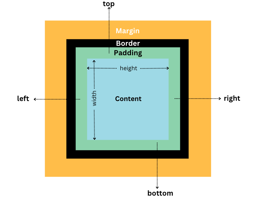
The image above is a perfect illustration of the CSS box model. At the core, we have the content, followed by the padding, which gives internal spacing to the element. Next, we have the border and the margin for external spacing.
For a more realistic illustration of the potential of each of these components, let’s take this code example.
|
1 2 3 4 5 6 7 8 9 10 11 12 13 14 15 16 17 18 19 20 21 22 23 24 25 26 27 28 29 30 31 32 33 34 35 36 37 38 39 40 41 42 43 44 45 46 47 48 49 50 51 52 53 54 55 56 57 58 59 60 61 62 63 64 65 66 67 68 69 70 71 72 73 74 75 76 77 78 79 80 81 82 83 84 85 86 87 88 89 90 91 92 93 94 95 96 97 98 99 100 101 102 103 104 105 106 107 108 |
<!DOCTYPE html> <html> <head> <style> @import url("https://fonts.googleapis.com/css2?family=Lato:wght@400&display=swap"); * { padding: 0; margin: 0; } body { background-color: #fff; text-align: center; font-family: "Lato", sans-serif; } .container { margin: 10rem auto; width: 800px; background-color: #deedfe; padding: 3rem; } .container img { display: block; margin: auto; margin-bottom: 2rem; transform: scale(1.5); } p { margin: 1rem 0; font-size: 1.5rem; } .buttons { display: flex; justify-content: center; } .button { background-color: #56bbc6; margin: 1rem; padding: 1rem; width: 10rem; font-size: 1.3rem; text-align: center; border: solid black 2px; border-radius: 50px; } @media (max-width: 600px) { .container { width: 80%; margin: 5rem auto; padding: 1.5rem; } .container img { transform: scale(1); } p { font-size: 1rem; } .buttons { flex-direction: column; align-items: center; } .button { width: 8rem; font-size: 1rem; margin: 0.5rem; } } </style> </head> <body> <div class="container"> <img src="https://www.lambdatest.com/resources/images/logos/logo.svg" alt="lambdatest header" /> <p> A reliable, scalable, secure, and high performing test execution cloud that empowers development and testing teams to accelerate their release cycles. </p> <div class="buttons"> <div class="button">Sign up for Free</div> <div class="button">Book a Demo</div> </div> </div> </body> </html> |
See the Pen
Untitled by Clinton Joy (@Cejay101)
on CodePen.
In the above code, we have different elements (img, p, and divs). Each of these elements possesses at least one of the four components of the CSS box model, and these components all work together to affect how the elements of our design are presented.
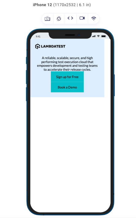
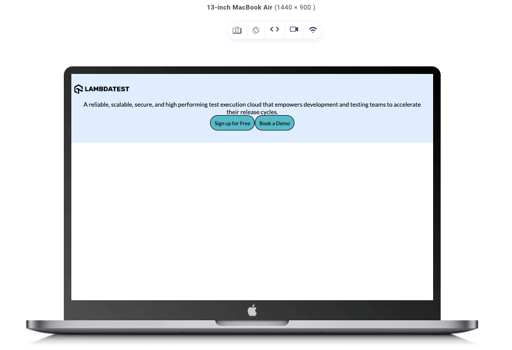
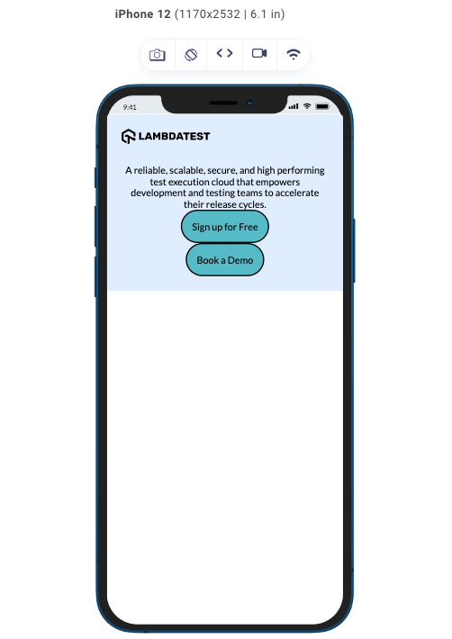
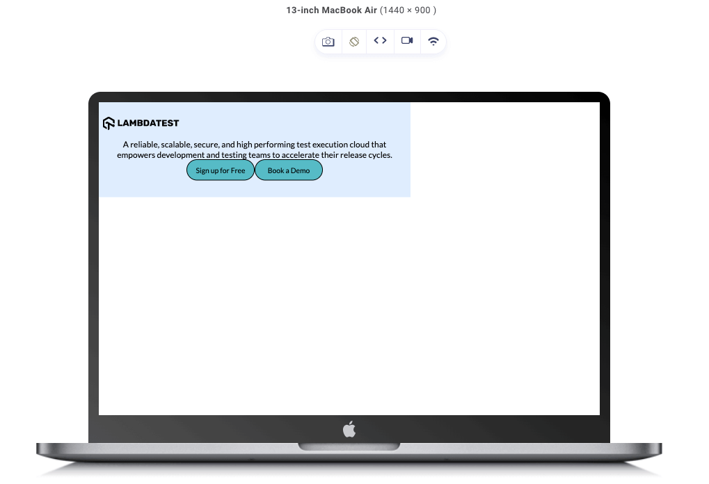
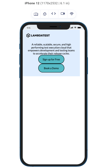
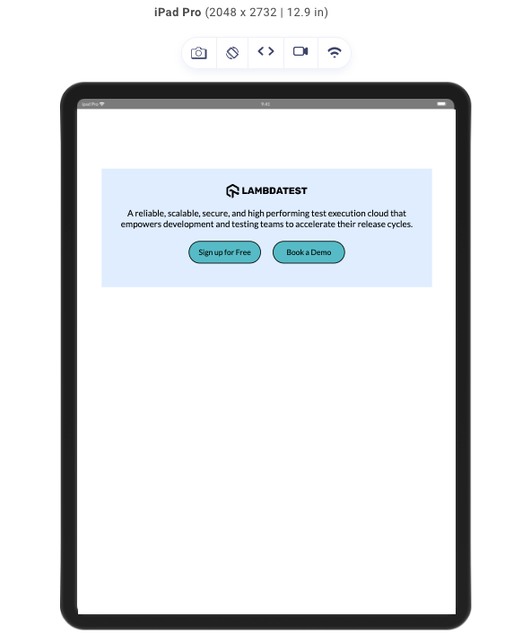
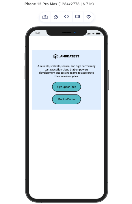
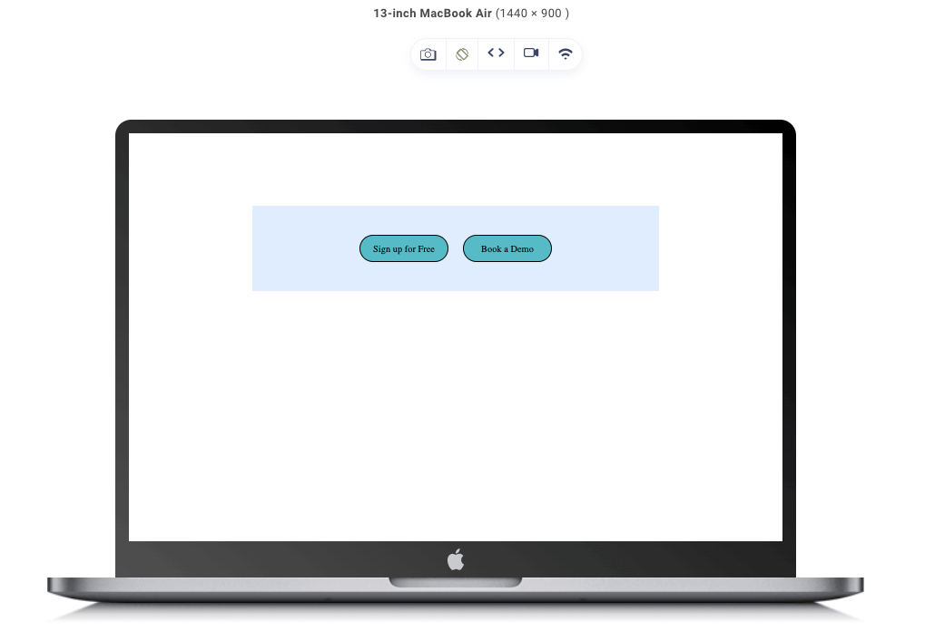
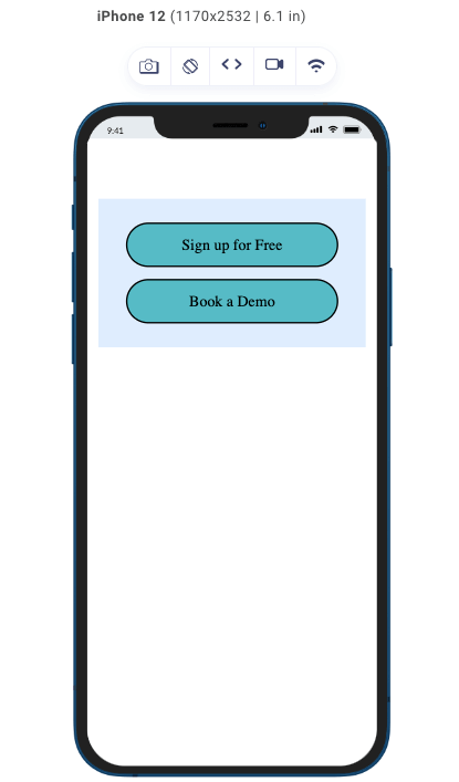
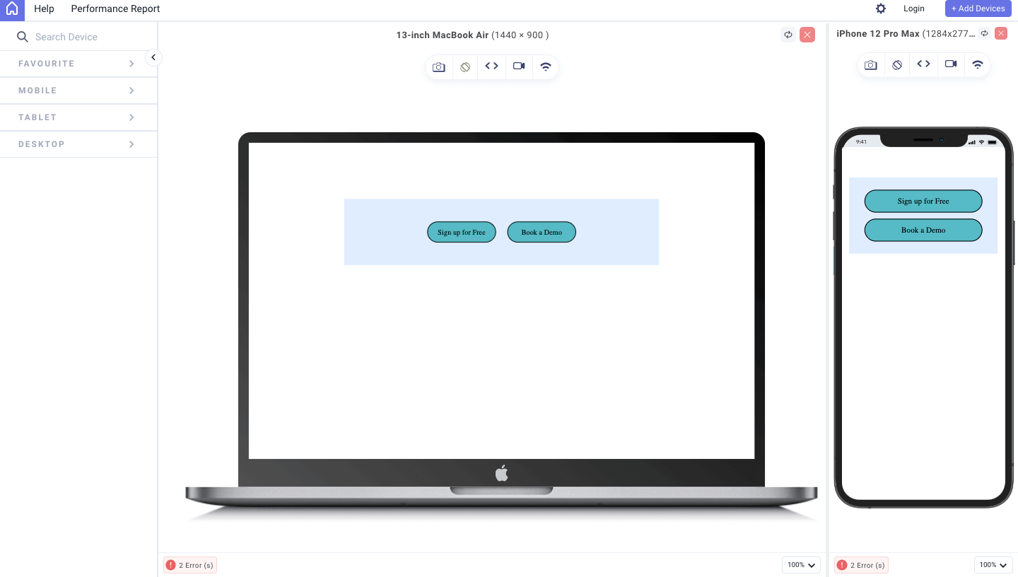
With LT Browser 2.0 by LambdaTest, you get access to a plethora of device viewports to choose from. Test the mobile view of your website across 50+ device viewports. Here is the output of viewing in a browser on both desktop and mobile with LT Browser 2.0:
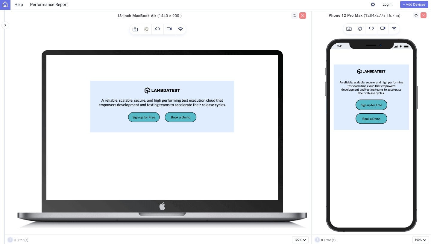
To get additional details about LT Browser 2.0, refer to our below video tutorial.
Catch up on the latest testing tutorials around Selenium automation, Cypress testing, and more. Subscribe to the LambdaTest YouTube Channel for quick updates.
The simple design you see above looks that way because of the four CSS box model components and the values we assigned to these components. Let’s discuss them individually now, starting from the core (content) to the external part (margin).
Content Component
Just as the name implies, this component holds the actual content of the element, which may be text, an image, or even a nested element. Two major properties can affect the dimensions of the content component, which are the height and width properties. When set, these two properties affect not just the size of the content component but also the size of the box.
The content component has a very dynamic default nature as it expands and contracts to fit the size of its content. But when the height and width properties are defined, it simply follows the defined dimensions, irrespective of the size of its content.
Initially, I held doubts about it. Nevertheless, upon careful consideration, one realizes that it possesses the invaluable qualities of ensuring a cohesive layout and facilitating precise element alignment within our design.
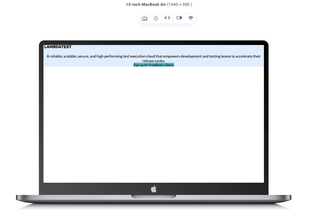
To illustrate how the content would look without all other CSS box model components and fixed dimensions, let’s edit the stylesheet of our previous code.
|
1 2 3 4 5 6 7 8 9 10 11 12 13 14 15 16 17 18 19 20 21 22 23 24 25 26 27 28 29 30 31 32 33 34 35 36 37 38 39 40 41 42 43 44 45 46 47 48 49 50 51 52 53 54 55 56 57 58 59 60 61 62 |
@import url("https://fonts.googleapis.com/css2?family=Lato:wght@400&display=swap"); * { padding: 0; margin: 0; } body { background-color: #fff; text-align: center; font-family: "Lato", sans-serif; } .container { background-color: #deedfe; } .container img { display: block; transform: scale(1.5); } p { font-size: 1.5rem; } .buttons { display: flex; justify-content: center; } .button { background-color: #56bbc6; font-size: 1.3rem; text-align: center; } @media (max-width: 600px) { .container img { transform: scale(1); } p { font-size: 1rem; } .buttons { flex-direction: column; align-items: center; } .button { font-size: 1rem; } } |
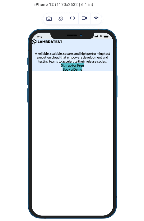
From the code above, we have no CSS box model properties, just regular styles like the font-size of the elements, alignment, background colors, etc. With no margin, padding, height, or width properties set, this is how it would look on different devices.
Now, let’s throw in some height and width to see how the dimensions of the content adjust.
|
1 2 3 4 5 6 7 8 9 10 11 12 13 14 15 16 17 18 19 20 21 22 23 24 25 26 27 28 29 30 31 32 33 34 35 36 37 38 39 40 41 42 43 44 45 46 47 48 49 50 51 52 53 54 55 56 57 58 59 60 61 62 63 64 65 66 67 68 69 |
@import url("https://fonts.googleapis.com/css2?family=Lato:wght@400&display=swap"); * { padding: 0; margin: 0; } body { background-color: #fff; text-align: center; font-family: "Lato", sans-serif; } .container { width: 800px; background-color: #deedfe; } .container img { display: block; transform: scale(1.5); } p { font-size: 1.5rem; } .buttons { display: flex; justify-content: center; } .button { background-color: #56bbc6; font-size: 1.3rem; text-align: center; } @media (max-width: 600px) { .container { width: 80%; } .container img { transform: scale(1); } p { font-size: 1rem; } .buttons { flex-direction: column; align-items: center; } .button { width: 8rem; font-size: 1rem; } } |
With the height and width set, this is the result we get on our devices.
As it relates to the CSS box model, the content component is just one piece of the box model puzzle; let’s advance to the next piece, which is padding.
Padding Component
This plays a crucial role in an element’s overall structure and visual appearance, just like every other component does. Just like its name suggests, this component controls the internal space of an element, it defines the space between the content and its outer edges. This space, known as padding, is defined by the padding property.
The padding component also affects the dimensions of the element. By increasing or decreasing the padding values on any side, be it left, right, top, or bottom, you can effectively expand or contract the size of the element’s box.
Let’s add some padding to our previous code and take note of the changes on different devices.
|
1 2 3 4 5 6 7 8 9 10 11 12 13 14 15 16 17 18 19 20 21 22 23 24 25 26 27 28 29 30 31 32 33 34 35 36 37 38 39 40 41 42 43 44 45 46 47 48 49 50 51 52 53 54 55 56 57 58 59 60 61 62 63 64 65 66 67 |
@import url("https://fonts.googleapis.com/css2?family=Lato:wght@400&display=swap"); * { padding: 0; margin: 0; } body { background-color: #fff; text-align: center; font-family: "Lato", sans-serif; } .container { background-color: #deedfe; padding: 3rem; } .container img { display: block; transform: scale(1.5); } p { font-size: 1.5rem; } .buttons { display: flex; justify-content: center; } .button { background-color: #56bbc6; font-size: 1.3rem; text-align: center; padding: 1rem; } @media (max-width: 600px) { .container { padding: 1.5rem; } .container img { transform: scale(1); } p { font-size: 1rem; } .buttons { flex-direction: column; align-items: center; } .button { font-size: 1rem; } } |
Output:
Above is the result we get when we add padding to our elements without specifying the width and height of the elements. As you can see in the image above, the button widths are not equal, and because the width wasn’t specified, it took the dimensions of the padding and content combined for each of the buttons, which is why they are unequal.
Let’s change that by adding width and height properties.
|
1 2 3 4 5 6 7 8 9 10 11 12 13 14 15 16 17 18 19 20 21 22 23 24 25 26 27 28 29 30 31 32 33 34 35 36 37 38 39 40 41 42 43 44 45 46 47 48 49 50 51 52 53 54 55 56 57 58 59 60 61 62 63 64 65 66 67 68 69 70 71 |
@import url("https://fonts.googleapis.com/css2?family=Lato:wght@400&display=swap"); * { padding: 0; margin: 0; } body { background-color: #fff; text-align: center; font-family: "Lato", sans-serif; } .container { background-color: #deedfe; padding: 3rem; width: 800px; } .container img { display: block; transform: scale(1.5); } p { font-size: 1.5rem; } .buttons { display: flex; justify-content: center; } .button { background-color: #56bbc6; font-size: 1.3rem; text-align: center; padding: 1rem; width: 10rem; } @media (max-width: 600px) { .container { padding: 1.5rem; width: 80%; } .container img { transform: scale(1); } p { font-size: 1rem; } .buttons { flex-direction: column; align-items: center; } .button { width: 8rem; font-size: 1rem; } } |
For elements with height and width properties defined:

In our results, we can notice that the size of the box increases as the internal spacing is added. Also, remember that we can add padding to specific corners just by specifying properties such as:
- padding-top
- padding-bottom
- padding-left
- padding-right
Border Component
The border component defines the outer boundary of an element; it surrounds the padding and encapsulates its content. Along with its main purpose, which is to visually separate elements from their surroundings, it is also used to add aesthetics to enhance the appearance of our design. Three main properties can be used to customize the border component:
- border-width
- border-style
- border-color
The border component also affects the size of the element’s box, and this can be done by specifying the border-width property, which is used to control the border’s thickness. There are different styles that a border can attain to fit our design aesthetics; some of these styles are solid, dashed, dotted, or double, among others, and are set with the border-style property.
Furthermore, to improve the visual appearance of our border, the border-color property allows us to define the color of the border, allowing for endless creative possibilities.
Most often, rather than stating all these properties explicitly, developers simply use the CSS border property to define the values of all three main border properties, just like this: border: 2px solid black; and for the purpose of this article, we will be using the border property.
Moving on with our previous code, let’s add some borders to the buttons:
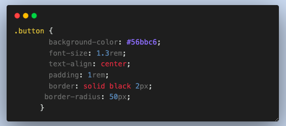
From the code above, you can see we added a border with a width of 2px, a style of solid, and a color of black. We also threw in a border-radius of 50px to curve the edges of the button.
And this is what our result looks like without defining the width and height properties of the elements.
From the image above, you can see the borders added just the way we specified them in the code, having a size of 2px, a style of solid, and a color black. Also, observe the curve at the edges of the border due to the border-radius property we added.
Let’s now examine the outcomes for the case where the width and height attributes are given values.
Below is the result we get when the dimensions of our elements are defined.
Margin Component
This component is almost like the padding component. Still, while the padding works on the internal spacing, the margin works on the external spacing of an element. This component is used to dictate the distance between elements. And just as the name suggests, it is defined by the margin property.
Despite the margin being on the outside, it also impacts the dimensions of an element’s box. By adjusting the margin values on any side, whether the left, right, top, or bottom, you can effectively expand or contract the size of the element’s containing box. While the margin doesn’t extend the background color of an element, manipulating the margin allows for the positioning of the element within its layout and contributes to the overall balance and spacing of the design.
Just like we did for the other components, let’s set a margin for our code.
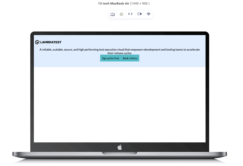
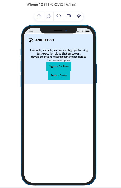
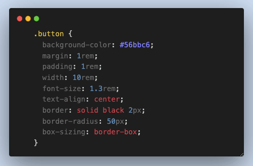
Adding the margin property to our code will be the final step to completing our design so it looks just like the initial code we provided.
|
1 2 3 4 5 6 7 8 9 10 11 12 13 14 15 16 17 18 19 20 21 22 23 24 25 26 27 28 29 30 31 32 33 34 35 36 37 38 39 40 41 42 43 44 45 46 47 48 49 50 51 52 53 54 55 56 57 58 59 60 61 62 63 64 |
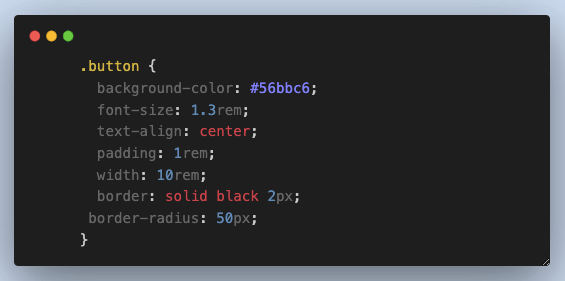
@import url("https://fonts.googleapis.com/css2?family=Lato:wght@400&display=swap"); * { padding: 0; margin: 0; } body { background-color: #fff; text-align: center; font-family: "Lato", sans-serif; } .container { margin: 10rem auto; width: 800px; background-color: #deedfe; padding: 3rem; } .container img { display: block; margin: auto; margin-bottom: 2rem; transform: scale(1.5); } p { margin: 1rem 0; font-size: 1.5rem; } .buttons { display: flex; justify-content: center; } .button { background-color: #56bbc6; margin: 1rem; padding: 1rem; width: 10rem; font-size: 1.3rem; text-align: center; border: solid black 2px; border-radius: 50px; } @media (max-width: 600px) { .container { width: 80%; margin: 5rem auto; padding: 1.5rem; } .container img { transform: scale(1); } p { font-size: 1rem; } .buttons { flex-direction: column; align-items: center; } .button { width: 8rem; font-size: 1rem; margin: 0.5rem; } } |
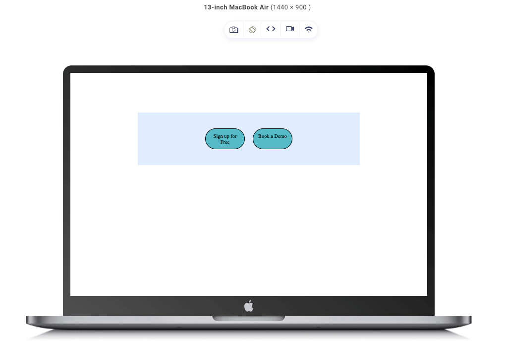
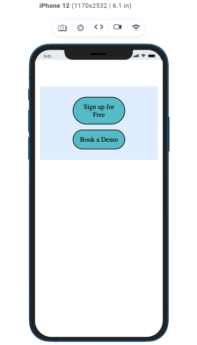
We have just added a margin property to every element that requires it to achieve our desired design; let’s see what difference it makes and how it looks on various designs.
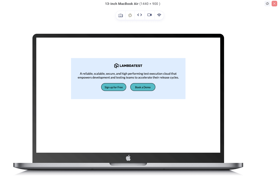
As seen in the image above, there is an adequate amount of space on the external and internal parts of the element. It is a huge change between when we only had the content component and when we had all the other CSS box model components added. Our model is responsive on all screen sizes due to the media queries we added.
Box-sizing Property
Now that we are done with the CSS box model components, I would like to introduce you to the box-sizing property, which is a fundamental CSS property. The box-sizing property is a major factor that determines how the total dimensions of an element are calculated.
It affects how the web browser calculates the dimensions of the element box. By box, I mean all the components we have discussed previously, with the exception of the margin component. In this case, the margin component is considered separate from the box dimension as it controls the external spacing.
The default value for the box-sizing property is content-box. Just as the name implies, the element’s size (width and height) only applies to the content component. This insinuates that the padding and border components will increase the total width and height. In all our previous codes, we have seen this repeatedly occur.
The second box-sizing property is the border-box property; if you understand the content-box property, you should know where this is going. Here, the width and height of an element include all but the margin components (content, padding, and border).
This means if the width property is set to a value, as long as the total of the padding and border component values doesn’t exceed that of the width and height of the element, the box won’t increase. This behavior is beneficial when working with responsive designs or creating consistent grid-based layouts.
Let’s illustrate the differences between the two box-sizing properties.
Content-box
The box-sizing property’s default value is the content-box. Here is the example code.
|
1 2 3 4 5 6 7 8 9 10 11 12 13 14 15 16 17 18 19 20 21 22 23 24 25 26 27 28 29 30 31 32 33 34 35 36 37 38 39 40 41 42 43 44 45 46 47 48 49 50 51 52 53 54 55 56 57 58 |
<!DOCTYPE html> <html> <head> <style> * { padding: 0; margin: 0; } .buttons { display: flex; justify-content: center; background-color: #deedfe; margin: 10rem auto; width: 800px; padding: 3rem; } .button { background-color: #56bbc6; margin: 1rem; padding: 1rem; width: 10rem; font-size: 1.3rem; text-align: center; border: solid black 2px; border-radius: 50px; } @media (max-width: 600px) { .buttons { flex-direction: column; align-items: center; margin: 5rem auto; width: 80%; padding: 1.5rem; } .button { width: 80%; margin: 0.5rem; } } </style> </head> <body> <div class="buttons"> <div class="button button1">Sign up for Free</div> <div class="button button2">Book a Demo</div> </div> </body> </html> |
This is the result of our code when we run it in the browser of different devices.
As seen in the image above, we have two divs with a width of 10rem, padding of 1rem, and a border of 2 px. With 1rem being equal to 16px, the total width dimension of our divs box is 178px.
Now let’s look at the box-sizing property with the value border-box.
Border-box
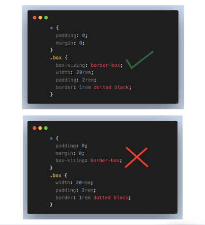
Let’s edit our code and the border-box value to the box-sizing property so that we can see the difference.
As seen in the code above, we have a width of 10rem, padding of 1rem, border size of 2px, and a box-sizing of border-box.
The border-box value of the box-sizing property makes the total dimension of the box equal to the value of the width property, in this case, 10rem, which is equivalent to 160px.
This is what our result looks like.
I know from this illustration you would say the content-box value presented the design better, but the border-box property is very useful and has lots of use cases.
Here is a table to briefly distinguish between the two box-sizing properties.
| Property Value | content-box | border-box |
|---|---|---|
| Calculation | Width and height based on and only on content | Width and height include content, padding, border |
| Total Size | Excludes padding and border | Includes padding and border |
| Responsive Design | Padding and border increase size | Consistent size regardless of padding/border |
| Layout Precision | More complex calculations required | Easier to achieve precise layouts |
| Form Inputs | Inconsistent dimensions with padding/border | Consistent dimensions with padding/border |
Common Layout Issues Due to Misunderstanding the CSS Box Model
It’s simple to misinterpret the CSS box model, particularly if you haven’t thoroughly studied it. But I’ve got you covered; listed here are some of the most typical layout problems you could run across.
Overflowing Content
This is a common issue. Most of the time, it is a result of having the box dimension greater than the viewport, which leads to having either horizontal or vertical scrollbars or causing content to be cut off depending on the value of the overflow property.
To prevent this, we must account properly for the dimensions of box components when setting the width and height of the element.
Misaligned Elements
We have seen the two box-sizing properties in action. Whenever those two properties are used on different elements, it can cause the dimension of their box to be calculated differently if the width and height properties are specified, thereby causing an inconsistency in dimension values, which may lead to misalignment.
Spacing Errors
The CSS box model consists of four components; each component contributes to the overall dimension, but the padding and margin contribute to the internal and external spacing, respectively, and must be set correctly.
When using the border-box value for the box-sizing property, our spacing tends to go haywire, especially when the padding is significantly large. This causes the content to be placed unevenly since the padding and border also takes its fair share of the specified width and height properties. That’s something you have to look out for.
Best Practices of the CSS Box Model
Let’s look at some best practices we can follow when dealing with the CSS box model to ensure consistency and compatibility across different browsers and devices.
Here are some recommended practices:
Use CSS Reset or Normalizer
At the start of your CSS stylesheet, it is a good practice to do a CSS Reset. This helps to build a solid foundation for working with the CSS box model, as it ensures consistent styles across different browsers, as different browsers have different styles and behavior for different HTML elements.
Here is a code example of the CSS Normalizer:
|
1 2 3 4 5 6 7 8 9 10 11 12 13 14 15 16 17 18 19 20 21 22 23 24 25 26 27 28 29 30 31 |
/* Remove default margin and padding */ body, h1, h2, h3, h4, h5, h6, p, ol, ul, li, blockquote, { margin: 0; padding: 0; } /* Set default font size and line height */ body { font-size: 16px; line-height: 1.5; } /* Remove list styles (bullets/numbers) */ ol, ul { list-style: none; } |
As you can see from the code, we have assigned custom values to various properties in various elements. This gives them a consistent appearance across a range of devices without relying on the default style given by the browsers.
Understand the box-sizing property
I have discussed the box-sizing property in this article. Still, it would do you a lot of good if you took the time to understand and familiarize yourself with the box-sizing and its values (content-box and border-box).
Here is a tip: Use the border-box for a more intuitive and consistent sizing behavior, as it includes padding and a border in the specified width and height.
Avoid Global CSS Box Model Changes
If you don’t know what the universal selector is, it is denoted by the asterisk sign (*), and it is used to target all elements in a webpage. This selector allows you to style every element on your webpage.
Avoid using the universal selector to set the box-sizing property. Modifying the CSS box model behavior globally can lead to unexpected layout issues.
Always Use Semantic HTML
Semantic HTML structure reflects the correct meaning of the contents on our web page. This plays a role in deciding the styling of elements within the CSS box model.
Here are a few examples of the most popular semantic tags: header, nav, section, main, section, etc. These tags give a clear representation of what the content of the tag is about.
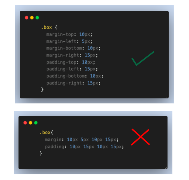
Separate CSS Box Model Properties
This might be a bit controversial, but avoid shorthand properties like padding and margin when you need to set different values for each side of an element. Instead, use individual properties (margin-top, margin-right, margin-bottom, margin-left, etc.) to explicitly define values for specific sides. This makes it easier to read and prevents unwanted side effects.
Use Relative Units
Always keep the responsive design in mind. Try as much as possible to stick to relative units such as %, em, and rem for sizing and adjusting CSS box model components to ensure elements adapt well to different screen sizes and devices.
|
1 2 3 4 5 6 7 8 9 10 11 12 13 14 15 16 17 18 19 20 21 22 23 24 25 26 27 28 29 30 31 32 33 34 35 36 37 38 39 40 41 42 43 |
<!DOCTYPE html> <html> <head> <style> .container { width: 90%; margin: 0 auto; background-color: aliceblue; } .box { background-color: rgb(125, 221, 221); padding: 1rem; margin-bottom: 1rem; font-size: 3rem; box-sizing: border-box; } .em { width: 7em; } .percentage { width: 50%; } .rem { width: 7rem; } </style> </head> <body> <div class="container"> <div class="box em">em</div> <div class="box percentage">%</div> <div class="box rem">rem</div> </div> </body> </html> |
In the code above, you can see the top relative units in use, and below you will see the code for each of these units.
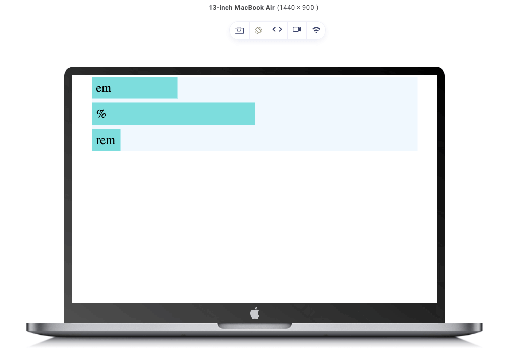
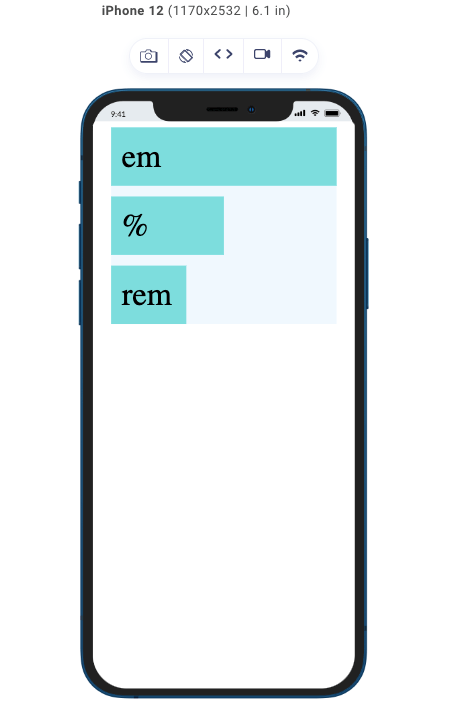
In the result above, we see that the em and rem elements, which were assigned the same values for the width property, now differ. This is because the em, which stands for the emphasized unit, is relative to the font-size of its nearest parent. While the rem stands for root emphasized, it is relative to the font-size of the root element (HTML).
Here is where the difference comes in: The font-size of em’s nearest parent is 3rem, while the font-size of the root element is 1rem. Hence, the em box is three times the width of the rem box.
As for the percentage box, it simply takes the specified percentage of the width of its parent container. As seen, despite the size of the screen, the width of the percentage box remains 50% of whatever the width of its container is.
Use Media Queries
You have seen me utilize CSS media queries throughout this blog post to make sure my layout is perfect on both large and small displays, and you have seen me regularly display the results on both mobile and desktop devices. I applied different CSS component values to devices with various screen sizes using media queries.
 Note
NoteTest your CSS media queries on over 3000 browsers. Try LambdaTest Today!
Just to reiterate, let’s consider this code.
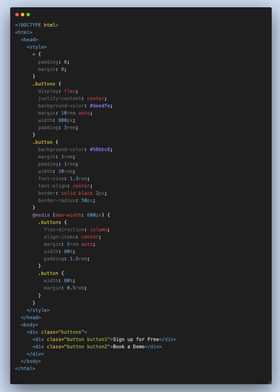
See the Pen
Untitled by Clinton Joy (@Cejay101)
on CodePen.
You can see from the code above that the padding was decreased for devices with a width of 600px from 3rem to 1.5rem and the margin for the button was decreased from 10rem to 5rem. Also, you see that we changed the width of the buttons from having a fixed width of 10rem to having a width that occupies 80% of the width of their container, which gives us this outcome on different devices.
As you can see, it is visible on the mobile device that the margin changes and the buttons are set to 80% of the container.
Cross Browser and Cross-Device Compatibility
I just talked about the relevance of media queries, right? To ensure your media queries work perfectly and look great on different devices, you must always test your designs and layouts across multiple browsers and devices to ensure the consistent behavior of your CSS box model.
Ensuring a consistent appearance and functionality across various web browsers is extremely important in web development. Like other CSS properties, the concept of cascade layers, browser support, and fallbacks plays a vital role in achieving this objective.
By conducting tests to check browser compatibility and providing appropriate fallback options, you can effectively address potential issues related to rendering and functionality. This leads to a strong and dependable web experience.
To test browser compatibility, you can utilize a digital experience testing platform, LambdaTest. This platform offers an online browser farm consisting of numerous real browsers and operating system combinations. It allows you to conduct tests on a large scale, detecting and resolving cross-browser issues. As a result, your website or web application will function seamlessly across different combinations of browsers and operating systems.
Conclusion
In conclusion, the CSS box model is a fundamental concept in web development and plays a crucial role in creating a nice layout and design for web elements. To be a good front-end developer, you must understand its components and master how they interact. This is essential for creating visually pleasing and well-structured web design.
In this blog, we have discussed the different CSS box model components, which include the content, padding, border, and margin. We have also seen how these components relate and combine to form the CSS box model. Furthermore, we talked about the significance of the box-sizing property, which influences how the browser calculates the dimensions of an element’s box.
I also gave some layout issues and best practices when working with the CSS box model to overcome those issues. Always remember to leverage the power of the CSS box model to its fullest potential. Practice makes perfect; the more conscious you are when styling elements and placing the CSS box model at the back of your mind, the better you get at it.
Lastly, always remember to test your design on different devices, either using your browser’s developer tool or a responsive test tool like LT Browser 2.0.
Frequently Asked Questions (FAQs)
What are the properties of a CSS box model?
Every box is composed of four parts:
- The content edge
- Padding edge
- Border edge
- Margin edge
What is CSS box modeling?
The phrase “box model” is used in CSS when discussing design and layout. The CSS box model is essentially a box that wraps around every HTML element.


Author’s Profile
Clinton Joy Fimie
Clinton Joy is a front-end developer and technical writer with 3 years of experience in the tech field. With diverse experience ranging from graphic design to front-end development, back-end development, and technical writing, he loves creating visually appealing, user-friendly solutions and communicating technical concepts in the clearest way possible.
Blogs: 6
Got Questions? Drop them on LambdaTest Community. Visit now


