
Best 20 CSS Libraries for Developers and Designers [2024]
Tahera Alam
Posted On: November 30, 2023
 92794 Views
 62 Min Read
In software development, there’s a famous saying: Don’t reinvent the wheel. This means that it is often smarter to use existing solutions, such as frameworks and libraries, rather than starting from scratch.
When it comes to web development, CSS plays a pivotal role in shaping the visual aspects of the web. It defines how the content of a website should look. According to a report by W3Techs, CSS is used by 97.3% of all existing sites. But, despite its crucial role in web development, CSS is one of those technologies that gets a lot of criticism because of its tricky nature.
Writing and maintaining CSS can be complex and time-consuming, especially for dynamic and large-scale websites. Developers often get challenges such as repetitive styling, unorganized code, browser issues, responsiveness issues, long lines of code, unexpected errors, and design-breaking issues. These challenges can lead to increased development time and frustration.
CSS libraries can help developers and designers overcome these challenges by providing pre-written code and reusable components for common elements of websites. This can save time and effort, produce more organized and maintainable code, and help avoid common CSS pitfalls, making the development process faster and more efficient.
In this blog, we’ll explore the best 20 CSS libraries you can leverage today. These CSS libraries cover a wide range of use cases, from helping you create amazing web designs to ensuring a uniform user experience across browsers, from providing beautiful animations to ensuring your website renders seamlessly across devices – these CSS libraries cover it all. We’ll also explore libraries with specific use cases, such as helping you create sleek demo sites or beautiful retro UIs.
We will explore each of these CSS libraries, covering their features and use cases along with practical examples. So, let’s dive in.
TABLE OF CONTENTS
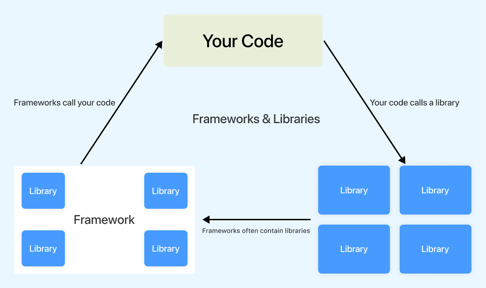
What are CSS Libraries?
CSS libraries are pre-written collections of CSS code and styles you can use to quickly and easily style your web projects. They are reusable components created by other developers to help solve common issues. It typically includes styles for common elements such as buttons, forms, and navigation bars. They may also have styles for more specialized elements, such as graphs, charts, animations, etc.
The term “library” is often used interchangeably with “framework”. While both aim to make development efficient by providing pre-built solutions for common tasks, they differ. Let’s take a look at them.
Libraries vs Frameworks
As freeCodeCamp defines it best,
Libraries are like going to Ikea: Imagine you have a house but need some furniture. You don’t want to build everything from scratch, so you go to Ikea. At Ikea, you can choose different furniture pieces like tables, chairs, and shelves. You’re in control of what you want to use, and you can arrange the furniture in your home however you like.
Frameworks are like building a model home: Suppose you want to build a brand new house. You have a set of plans or blueprints and must follow some specific rules and designs. You don’t get to decide everything. There’s a contractor in charge who follows those plans closely. They’ll tell you where you can make changes, but they mostly control how the house is built.
In a nutshell:
- CSS libraries give you individual pieces to use as you want, like furniture from Ikea.
- Frameworks provide a structured plan, and you work within that plan, like building a model home with a contractor in charge.
Using a library gives you more control over your application’s flow. You can choose which functions to use from the library, when, and where to use them. But, when using a framework, you must follow its conventions and predefined structure. The framework controls the main flow of execution and dictates how the code should be structured.
For instance, take jQuery and Ruby on Rails as examples. jQuery is a JavaScript library, while Ruby on Rails is an open-source full-stack framework. jQuery doesn’t care where you use it in your JavaScript code or how the codebase is organized in terms of files. But this isn’t the case with Ruby on Rails. You will have to follow Rails’ conventions and structure, which dictates how files, dependencies, functions, etc., should be organized.
The difference between a library and a framework is that a library is a collection of code you can use to add specific features to your website. In contrast, a framework is a collection of code that you can use to build your website from scratch. Frameworks provide a complete structure and control the flow of the program, unlike libraries.
Here is a table that summarizes the key differences between libraries and frameworks:
| Feature | Library | Framework |
|---|---|---|
| Purpose | Provides reusable code for specific tasks | Provides a complete structure for building software applications |
| Control | Developer controls the flow of the application | Framework controls the flow of the application |
| Flexibility | More flexible. | Less flexible, follows prescribed conventions. |
| Opinionated | Less opinionated | More opinionated |
| Consistency | Varies depending on how it's used. | Enforces consistency and best practices. |
Advantages of Using CSS Libraries
CSS libraries offer an array of advantages over writing custom CSS. They provide a solid foundation for building visually appealing, responsive, and user-friendly websites while saving time, reducing errors, and promoting design consistency, ultimately reducing maintenance costs.
Here are some of its advantages:
- Faster development: One of the primary benefits of using CSS libraries is that it significantly reduces the time to get up and running with a project. Instead of coding everything from scratch, you can use prebuilt components for different page elements. This significantly speeds up the development process.
For example, you can use a CSS library like Picnic instead of writing complex CSS code to create a responsive navigation menu. Picnic’s navbar component provides a fully responsive navigation bar with just a few lines of HTML and CSS classes. This saves you time and effort, letting you focus on more important things.
- Consistency: CSS libraries often come with consistently designed elements and style guidelines. This ensures a cohesive look and feel across a website, which is crucial for branding and user experience.
For instance, you can use CSS libraries like Blaze UI to ensure that buttons look and behave the same throughout your website, enhancing the overall user experience.
- Responsive design: CSS libraries often include responsive design features, making creating websites that adapt to different screen sizes and devices easier. This is essential for modern web development, where mobile devices generate more than 60% of global website traffic – similarweb.
- Performance optimization: At a time when one in four visitors would leave a website if it takes more than four seconds to load, optimizing the performance of websites has become more important than ever. –Source
Many CSS libraries are designed with performance in mind. They use techniques like minification and efficient CSS code to ensure that web pages load quickly. This reduces the file size and enhances the website’s loading speed, leading to a better user experience and improved SEO rankings.
For example, here are the file sizes of a few popular CSS libraries, minified and gzipped:
- Improved accessibility: Another significant advantage of utilizing CSS libraries is their focus on accessibility. Many CSS libraries prioritize accessibility, ensuring that their styles and components comply with accessibility standards such as WCAG (Web Content Accessibility Guidelines).
These CSS libraries often incorporate best practices such as using semantic HTML, maintaining proper color contrast, and using descriptive labels for form fields. These practices are essential for creating web content that is accessible to all users, including those with disabilities. So, by using these CSS libraries, you can ensure that your website is more inclusive and usable by a wider audience.
- Cross Browser Compatibility
Cross browser compatibility is a significant advantage of using CSS libraries. These libraries are typically tested, providing CSS code that works consistently across web browsers. This eliminates the need to debug and fix browser-specific issues, which can be time-consuming and frustrating.
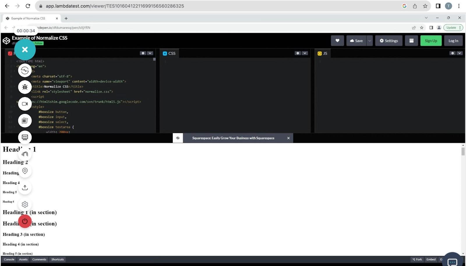
For instance, consider the CSS library Normalize.css. It’s designed to reset and normalize the default styles of various HTML elements, ensuring a consistent starting point for your web design. Using Normalize.css helps ensure that default styles are consistent across different web browsers and operating systems.
For example, below is a demo showcasing the implementation of Normalize.css.
For example, you can use a CSS library like Pure CSS with a responsive grid
system. Applying grid classes to your HTML elements allows you to create layouts that adapt to different screen sizes easily.
Below is a demonstration of a responsive layout using Pure CSS.
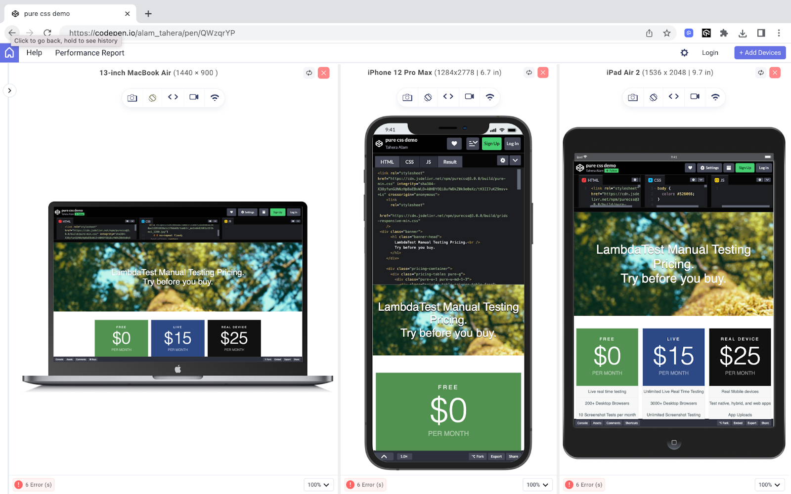
To test the responsiveness of the layout, we used LT Browser, a free and easy-to-use tool that lets you preview your website on various device viewports and screen sizes. This means you can see how your website will look and function on different devices before it goes live, ensuring a great user experience for everyone.
LT Browser comes with 50+ pre-installed device viewports with different screen resolutions, so you can easily test your designs in different screen sizes. You can also create custom viewports to test specific devices or screen sizes.
To use the LT Browser, you can check out the tutorial below.
For more such tutorials around responsive testing, mobile app testing, and more, subscribe to the LambdaTest YouTube Channel.
| CSS Libraries | File Size (Minified & Gzipped) | Website |
|---|---|---|
| Pure CSS | 3.5 KB | https://purecss.io/ |
| Water.css | 3.27 KB | https://watercss.kognise.dev/ |
| Picnic CSS | 10 KB | https://picnicss.com |
| Skeleton | 4.2 KB | http://getskeleton.com/ |
| Destyle.css | ~0.95 KB | https://nicolas-cusan.github.io/destyle.css/ |
The Top 20 CSS Libraries
CSS libraries are the secret sauce behind some of the most captivating and user-friendly websites on the Internet. But, choosing ideal CSS libraries for your application can be challenging. There are many factors to consider, such as ease of use, responsiveness, popularity, and accessibility.
Here is a list of the best CSS libraries widely known for these qualities:
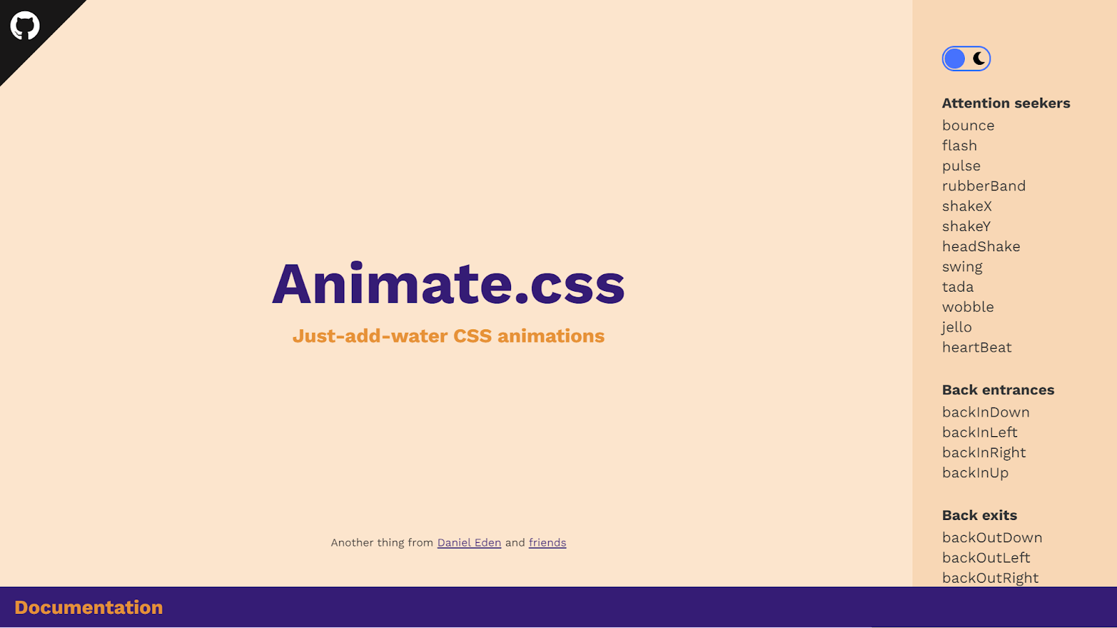
Animate.css
Animations make a website feel alive. In a world with short attention spans, animations can draw users’ attention, highlight important information, guide users visually through a process, or simply make their experience more engaging.
For example, you can use a slide-in animation like below to make content pop up nicely as a user scrolls through a page. This helps keep the user engaged and enhances their experience.
Output:
See the Pen
Parallax Scrolling animations by Sonia Grant (@webwitch)
on CodePen.
However, creating animations like this can be time-consuming and complex. That’s where Animate.css comes in. It makes the process of adding animations simpler than ever before.
Animate.css provides a collection of pre-made CSS animations that can be easily integrated into a project. It allows you to add animations by simply adding CSS classes to HTML elements, making it easy to incorporate eye-catching animations without having to write extensive CSS code from scratch.
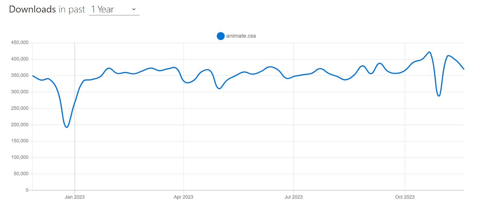
It is among the most popular CSS libraries, with over 79k+ Stars on GitHub and a staggering 360k+ weekly downloads on npm trends.
According to W3Techs, Animate.css is used in about 39.5% of all websites with a known CSS framework. That’s a big deal because it means nearly 10% of all the existing websites use Animate.css for their animations. Let’s now look at an example of using Animate.css.
HTML:
|
1 2 3 4 5 6 7 8 9 10 11 12 13 14 15 |
<link rel="stylesheet" href="https://cdnjs.cloudflare.com/ajax/libs/animate.css/4.1.1/animate.min.css" /> <div class="container"> <h1 class="animate__animated animate__bounce">LambdaTest</h1> <p> Discover the next-generation mobile apps and cross-browser testing cloud. </p> <button class="replay-button" onclick="replayAnimation()"> Replay Animation </button> |
CSS:
|
1 2 3 4 5 6 7 8 9 10 11 12 13 14 15 16 17 18 19 20 21 22 23 24 25 26 27 28 29 30 31 32 33 34 35 36 37 38 39 40 41 42 43 44 |
body { display: flex; justify-content: center; align-items: center; height: 100vh; margin: 0; background-color: #eef5ff; font-family: Work Sans, sans-serif; } .container { text-align: center; } h1 { font-size: 72px; margin: 0; color: #191919; } p { font-size: 1.1rem; color: #666666; } .replay-button { background-color: #0ebac5; color: #ffffff; border: none; padding: 10px 20px; font-size: 1rem; margin-top: 20px; border-radius: 5px; cursor: pointer; } .replay-button:hover { background-color: #0c9ea7; /* Darker blue on hover */ } |
Output:
See the Pen
Animate.css Demo by Tahera Alam (@alam_tahera)
on CodePen.
In the example above, we used the bounce animation from Animate.css to add a bouncing effect to the < h1 > element.
To do it, we first included Animate.css in our project by linking its CDN in the HTML document:
|
1 2 3 |
<link rel="stylesheet" href="https://cdnjs.cloudflare.com/ajax/libs/animate.css/4.1.1/animate.min.css" /> |
Next, we applied the animation by adding the animate__bounce class to the < h1 > element, with the animate__animated prefix. That’s it. This will give our < h1 > element a smooth, bouncing animation.
By default, animations will trigger when the page loads and the element becomes visible in the viewport. However, you can control when animations occur using JavaScript or dynamically adding additional classes.
For example, we used JavaScript to trigger the animation when the replay button is clicked:
|
1 2 3 |
<button class="replay-button" onclick="replayAnimation()"> Replay Animation </button> |
|
1 2 3 4 5 6 |
function replayAnimation() { const header = document.querySelector("h1"); header.classList.remove("animate__animated", "animate__bounce"); void header.offsetWidth; // Trigger reflow to restart the animation header.classList.add("animate__animated", "animate__bounce"); } |
Animate.css is a great choice for adding animations to web projects, especially when you need quick and simple animations without having to code them from scratch. However, using CSS animations judiciously is important, as excessive use can clutter and distract users.
Advantages of Animate.css:
- Ease to use: Animate.css is incredibly easy to use. You simply include the library, apply the appropriate class to an HTML element, and the animation is ready to go. This makes it accessible to both beginners and experienced developers.
- Cross-browser compatible: It is cross-browser compatible, so you can be sure your animations function perfectly on all latest and legacy browsers.
- Lightweight: Animate.css is very lightweight, so that it won’t add a lot of bloat to your website.
- Customizable: You can customize the animations by changing the duration, delay, and easing.
Limitations of Animate.css:
- Lack of specific import options: There is no way to import only the necessary animation classes. To use just a few animations across your app, you would need to install the entire collection.
CSS Wand
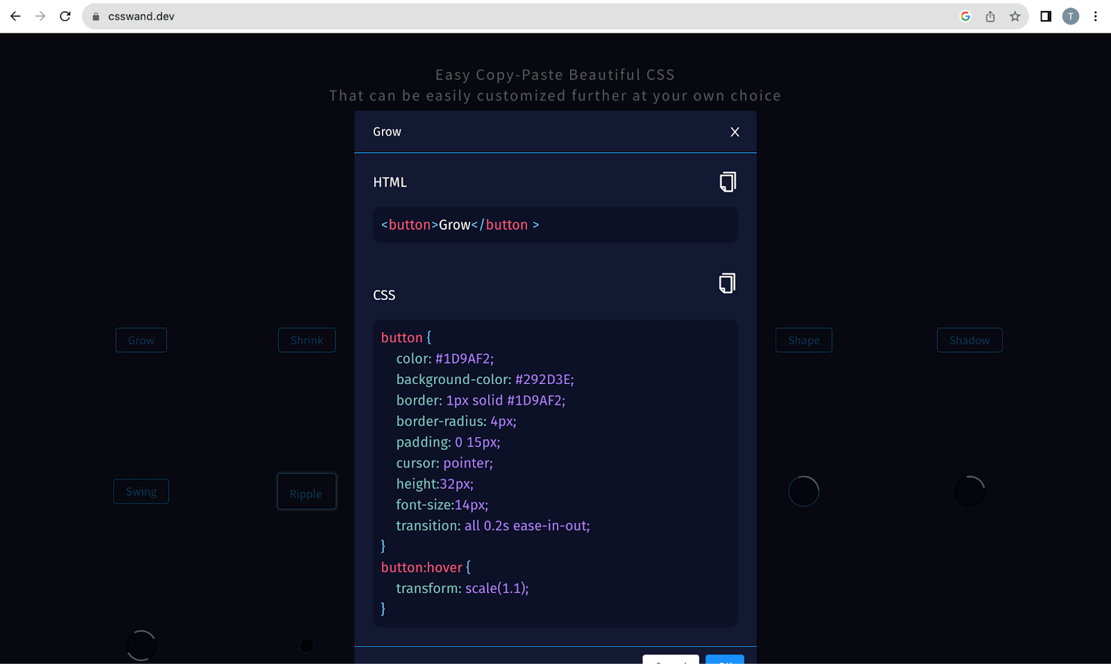
CSS Wand is another versatile CSS library that offers an array of stunning animations you can easily incorporate into your project. It is a simple and intuitive tool that anyone can use, even if they don’t have any prior experience with CSS.
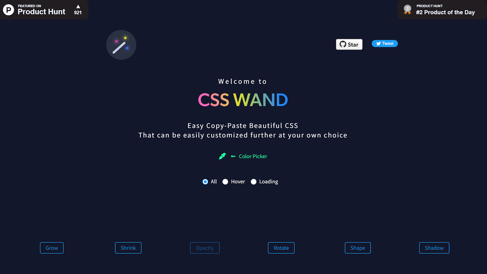
The best thing about CSS Wand is that it provides the CSS code for all the effects, which you can simply copy and paste into a project. You don’t need to install or write specific classes to apply those animations. All it takes is just the code provided by CSS Wand.
As you can see below, clicking on the grow animation presents ready-made code to add to your project easily.
CSS Wand provides a wide variety of animation effects, including
- Hover animations
- Loading animations
- Growing and shrinking animations
- Opacity animations
- Rotation animations
- Shape animations
- Shadow animations
- Swing animations
- Ripple animations
- Press-down animations
Below is an example of using the Grow animation from CSS Wand that we incorporated into a card:
HTML:
|
1 2 3 4 5 6 7 8 9 10 11 12 13 14 |
<div class="card"> <div class="card-content"> <h2 class="card-title">Cross-Browser Testing Made Easy</h2> <p class="card-description"> LambdaTest is a cloud-based cross-browser testing platform that helps you ensure your website or web application looks and functions correctly across multiple browsers and devices. </p> </div> <div class="card-footer"> Learn more at <a href="https://www.lambdatest.com/" target="_blank">LambdaTest</a> </div> </div> |
CSS:
|
1 2 3 4 5 6 7 8 9 10 11 12 13 14 15 16 17 18 19 20 21 22 23 24 25 26 27 28 29 30 31 32 33 34 35 36 37 38 39 40 41 42 43 44 45 46 47 48 49 50 51 52 53 54 55 56 57 58 |
body { font-family: Arial, sans-serif; } /* Style for the card container */ .card { width: 300px; border: 1px solid #e0e0e0; border-radius: 10px; box-shadow: 0 4px 8px rgba(0, 0, 0, 0.1); margin: 30px auto; padding: 20px; background-color: #ffffff; text-align: center; transition: all 0.2s ease-in-out; /* copied from CSS Wand*/ } .card:hover { box-shadow: 0 8px 16px rgba(0, 0, 0, 0.2); transform: scale(1.1); /* copied from CSS Wand*/ } /* Style for the card title */ .card-title { font-size: 24px; margin-bottom: 10px; color: #333; } /* Style for the card description */ .card-description { font-size: 16px; color: #666; line-height: 1.5; } /* Style for the card footer */ .card-footer { margin-top: 20px; text-align: center; } /* Style for the link in the card footer */ .card-footer a { text-decoration: none; color: #007bff; font-weight: bold; transition: color 0.2s ease-in-out; } .card-footer a:hover { color: #0056b3; } |
Output:
See the Pen
grow animation demo by Tahera Alam (@alam_tahera)
on CodePen.
In this example, we used the “Grow” animation from CSS Wand. The animation is applied to the .card class, which is used to style the card container. The animation makes the card grow in size when the user hovers over it.
The important part of the CSS code is the transition: all 0.2s ease-in-out; and transform: scale(1.1); rules. The transition rule specifies that the animation will take 0.2 seconds to complete and use the ease-in-out timing function. While the transform rule specifies that the card will scale by 1.1 when the user hovers over it.
Now that we have considered an example let’s move on to the advantages and limitations of CSS Wand.
Advantages of CSS Wand:
- Customizable: CSS Wand is highly customizable. You can customize the animations to your liking by adjusting the properties of the CSS code. This makes it easy to create animations that are unique and eye-catching.
- Easy to use: It is very easy to incorporate. Simply hover your mouse over the elements to see the effect and click on the one you like. CSS Wand will then generate the CSS code for that animation.
Limitations of CSS Wand:
- Limited number of animations: CSS Wand is very limited in its animations, as it only provides styles for hover states and spinners.
Destyle.css
Different browsers have different default styles for HTML elements, which can lead to inconsistencies in how web pages are displayed across browsers. This can make achieving a consistent look and feel for a website challenging.
That’s exactly where Destyle.css comes into play. It’s a lightweight CSS reset library that removes the default styles for HTML elements. This allows you to start from a clean slate and apply your custom styles to all browsers.
Destyle.css removes all of the default styles added by browsers, such as margins, padding, and font sizes, so you can be sure that your styles will look the same in all browsers. Destyle.css is a popular reset library choice with over 30k+ monthly downloads on Yarn and 9k+ weekly downloads on npm trends. It is also maintained, with 540+ Forks and 752+ Stars on GitHub, and regularly updated to support new browsers and features.
Let’s look at an example to understand how an HTML page would look like when using Destyle.css:
HTML:
|
1 2 3 4 5 6 7 8 9 10 11 |
<link href=" https://cdn.jsdelivr.net/npm/destyle.css@4.0.0/destyle.min.css " rel="stylesheet"> <h1>This is a Heading</h1> <p>This is a paragraph of text.</p> <ul> <li>Item 1</li> <li>Item 2</li> <li>Item 3</li> </ul> <a href="#">This is a link</a> |
Output:
See the Pen
destyle.css demo by Tahera Alam (@alam_tahera)
on CodePen.
In the example above, we have some HTML elements that represent a heading, a paragraph, an unordered list, and a link.
Without Destyle.css, these elements would have default styles applied to them, such as margins, padding, and font sizes. However, because we have Destyle.css imported using the CDN, these elements will have no default styles applied to them.
This means that the heading will have no margin or padding, the paragraph will have the default font size and color, the unordered list will have no bullets, and the link will have no underline.
Advantages of Destyle.css:
- Ensures consistency: Destyle.css helps ensure browser consistency. You simply add a link to the Destyle.css file in your HTML, and it will automatically remove the default styles for all HTML elements. This ensures that your web page will look consistent across all browsers.
- Saves time and effort: Destyle.css eliminates the need to remove the default styles for each browser manually. This can save you time and effort, especially if you are working on a large-scale website.
- Small in size: It is made for modern browsers only, which means that it is small in size (~0.95KB). This makes it a lightweight CSS file that can be easily integrated into any website using a CDN or importing.
Shortcomings of Destyle.css:
- Can be too restrictive: Destyle.css removes all of the default styles for HTML elements, which can be too restrictive for some websites. If you need to retain some of the default styles, you will need to manually add them back in.
- Not as customizable as other CSS reset files: Other CSS reset files offer more customization options than Destyle.css.
- Can break some websites: Destyle.css can break some websites relying on the default HTML elements styles. If you are unsure whether Destyle.css is compatible with your website, it is best to test it on a staging environment first.
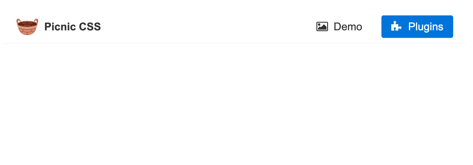
Picnic CSS
Picnic CSS is one of the most popular recent libraries out there, with popular websites like Dribble, CodePen, and Product Hunt using it. Picnic CSS is a lightweight CSS library that is perfect for creating modern and responsive websites. It provides a set of neatly styled components ranging from buttons to cards, forms to tables, modals to navigation bars that you can easily incorporate into your project.
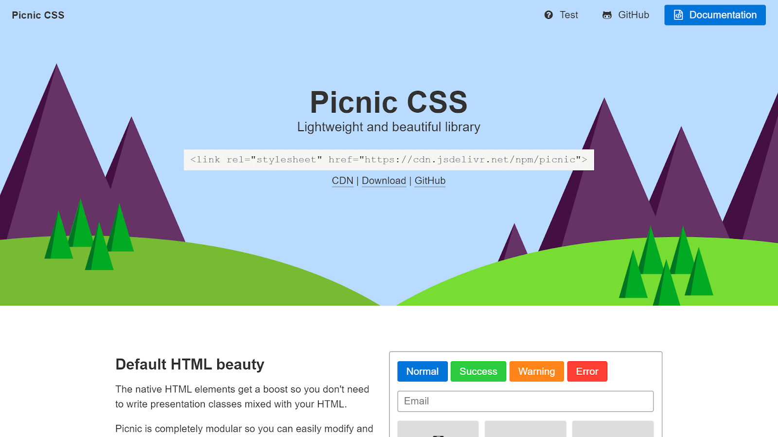
It is built on top of Normalize.css, providing a solid foundation for your HTML5 markup. It is a great choice when you want to create professional and performant websites without having to write a lot of CSS code. It is also an ideal choice when you want to start a project quickly and easily, letting a library handle the UI components.
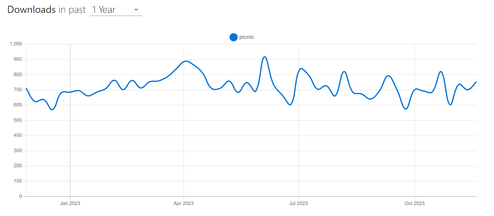
Despite being released just two years ago, Picnic CSS has rapidly gained popularity. It has over 3.7k Stars on GitHub and receives over 600 weekly downloads via npm trends.
Let’s now look at an example of using Picnic CSS to create an image tab.
HTML:
|
1 2 3 4 5 6 7 8 9 10 11 12 13 14 15 16 17 18 19 20 21 22 23 24 25 26 27 28 29 30 31 32 33 34 35 36 37 38 39 40 41 42 43 44 45 46 47 48 49 50 |
<link href=" https://cdn.jsdelivr.net/npm/picnic@7.1.0/picnic.min.css " rel="stylesheet" /> <div class="tabs four"> <input id="tabC-1" type="radio" name="tabGroupC" checked /> <input id="tabC-2" type="radio" name="tabGroupC" /> <input id="tabC-3" type="radio" name="tabGroupC" /> <input id="tabC-4" type="radio" name="tabGroupC" /> <div class="row"> <div> <img src="https://images.unsplash.com/photo-1448375240586-882707db888b?ixlib=rb-4.0.3&ixid=M3wxMjA3fDB8MHxzZWFyY2h8Mnx8Zm9yZXN0fGVufDB8fDB8fHww&auto=format&fit=crop&w=600&q=60" /> </div> <div> <img src="https://images.unsplash.com/photo-1509773896068-7fd415d91e2e?ixlib=rb-4.0.3&ixid=M3wxMjA3fDB8MHxzZWFyY2h8MTZ8fGxha2V8ZW58MHx8MHx8fDA%3D&auto=format&fit=crop&w=600&q=60" /> </div> <div> <img src="https://plus.unsplash.com/premium_photo-1661884752233-eac0b5efe655?ixlib=rb-4.0.3&ixid=M3wxMjA3fDB8MHxzZWFyY2h8MTN8fGFpciUyMGJhbG9vbnN8ZW58MHx8MHx8fDA%3D&auto=format&fit=crop&w=600&q=60" /> </div> <div> <img src="https://images.unsplash.com/photo-1470252649378-9c29740c9fa8?ixlib=rb-4.0.3&ixid=M3wxMjA3fDB8MHxzZWFyY2h8MTZ8fHN1bnNldHxlbnwwfHwwfHx8MA%3D%3D&auto=format&fit=crop&w=600&q=60" /> </div> </div> <label for="tabC-1" ><img src="https://images.unsplash.com/photo-1448375240586-882707db888b?ixlib=rb-4.0.3&ixid=M3wxMjA3fDB8MHxzZWFyY2h8Mnx8Zm9yZXN0fGVufDB8fDB8fHww&auto=format&fit=crop&w=600&q=60" /></label> <label for="tabC-2" ><img src="https://images.unsplash.com/photo-1509773896068-7fd415d91e2e?ixlib=rb-4.0.3&ixid=M3wxMjA3fDB8MHxzZWFyY2h8MTZ8fGxha2V8ZW58MHx8MHx8fDA%3D&auto=format&fit=crop&w=600&q=60" /></label> <label for="tabC-3" ><img src="https://plus.unsplash.com/premium_photo-1661884752233-eac0b5efe655?ixlib=rb-4.0.3&ixid=M3wxMjA3fDB8MHxzZWFyY2h8MTN8fGFpciUyMGJhbG9vbnN8ZW58MHx8MHx8fDA%3D&auto=format&fit=crop&w=600&q=60" /></label> <label for="tabC-4" ><img src="https://images.unsplash.com/photo-1470252649378-9c29740c9fa8?ixlib=rb-4.0.3&ixid=M3wxMjA3fDB8MHxzZWFyY2h8MTZ8fHN1bnNldHxlbnwwfHwwfHx8MA%3D%3D&auto=format&fit=crop&w=600&q=60" /></label> </div> |
Output:
See the Pen
Picnic CSS Demo by Tahera Alam (@alam_tahera)
on CodePen.
In the example, we created a simple and mobile-friendly image tab component. When you click on one of the tab images, it will seamlessly switch the main image to the corresponding tab, regardless of the screen size.
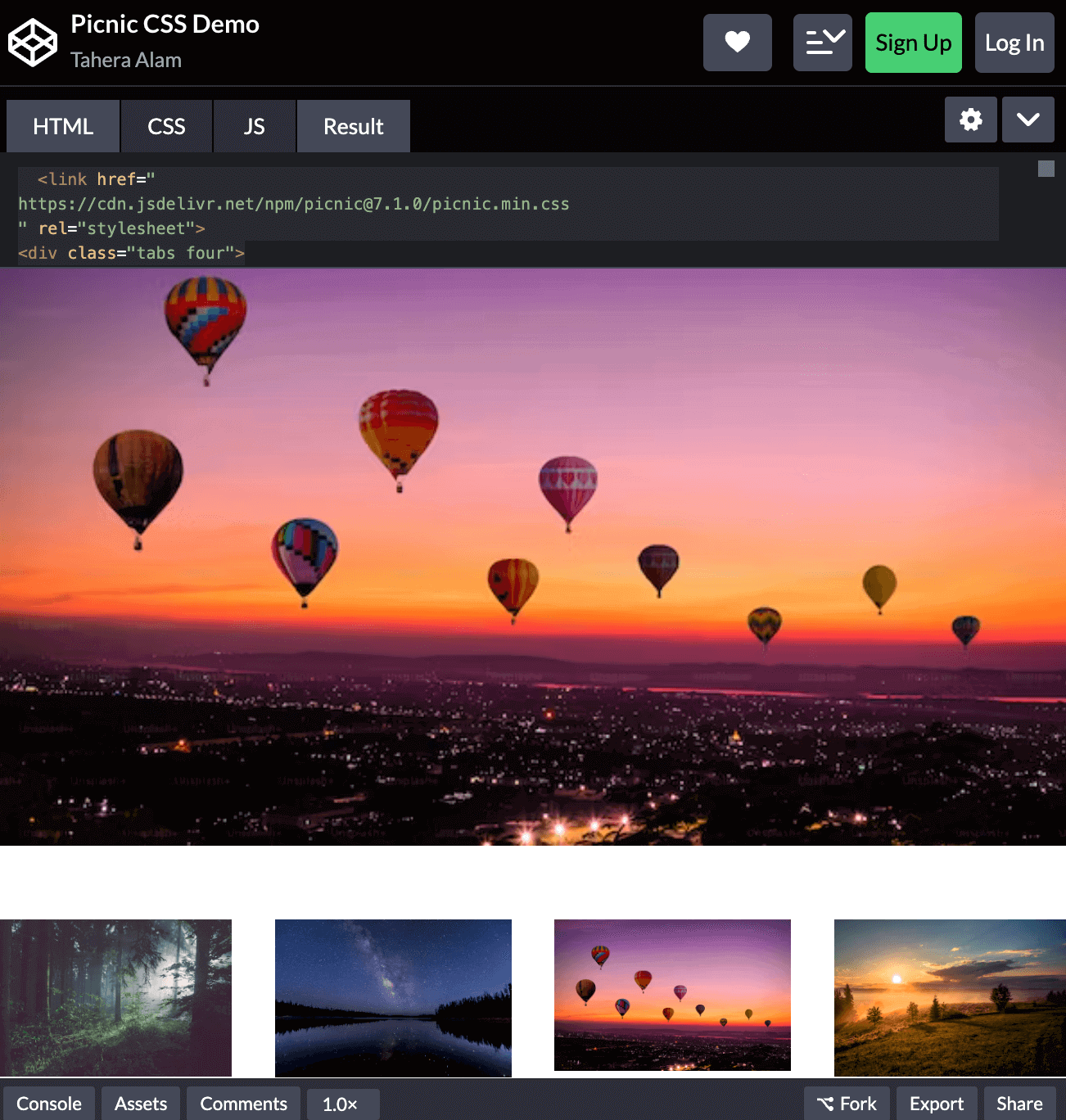
This component is implemented using a div element with the class tabs four, which tells Picnic CSS to create a tab component with four tabs.
|
1 2 3 4 5 |
<div class="tabs four"> <input id="tabC-1" type="radio" name="tabGroupC" checked /> <input id="tabC-2" type="radio" name="tabGroupC" /> <input id="tabC-3" type="radio" name="tabGroupC" /> <input id="tabC-4" type="radio" name="tabGroupC" /> |
Inside the tabs element, there are four input elements with the type radio and the name tabGroupC. These input elements represent the different tabs in the tab component.
Next, there is a div element with the class row. This class tells Picnic CSS to create a row of tabs. Inside the row element, there are four div elements, each containing an image. The images represent the content of each tab.
|
1 2 3 4 5 6 |
<div class="row"> <div> <img src="https://images.unsplash.com/photo-1448375240586-882707db888b?ixlib=rb-4.0.3&ixid=M3wxMjA3fDB8MHxzZWFyY2h8Mnx8Zm9yZXN0fGVufDB8fDB8fHww&auto=format&fit=crop&w=600&q=60" /> </div>.. |
Finally, there are four label elements, each with the for attribute set to one of the input elements. These labels represent the tab labels.
|
1 2 3 4 |
<label for="tabC-1" ><img src="https://images.unsplash.com/photo-1448375240586-882707db888b?ixlib=rb-4.0.3&ixid=M3wxMjA3fDB8MHxzZWFyY2h8Mnx8Zm9yZXN0fGVufDB8fDB8fHww&auto=format&fit=crop&w=600&q=60" /></label>.. |
Advantages of Picnic CSS:
- Lightweight and mobile-friendly: Picnic CSS is lightweight and mobile-friendly, with a compressed size of only 10kb for a better and faster mobile load. This makes it a great choice for building mobile-first websites.
- Responsive: It is responsive, so your website will look great on all devices, from desktops to mobile phones. This is important for ensuring that your website is accessible to everyone.
- Documented: Picnic CSS has comprehensive documentation that makes it easy to learn and use. The documentation includes tutorials, examples, and references, making it easy to find the information you need to start with Picnic CSS.
Limitations of Picnic CSS:
- Limited features: Picnic CSS is a lightweight library, so it does not have all of the features of a full-featured CSS framework. As you may have already noticed, this library is similar to Bootstrap except that it is less versatile and less flexible.
- Not as widely used as other frameworks: Picnic CSS is a relatively new library, so it is not as widely used as other frameworks.
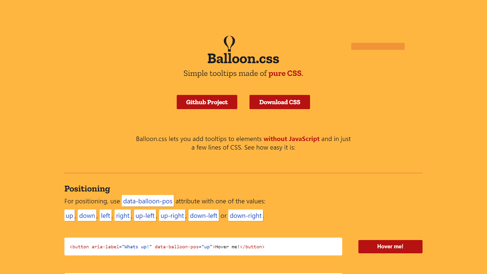
Balloon.css
Balloon.css is a tooltip library that lets you add tooltips to elements without writing any JavaScript code.
Tooltips are important because they provide additional information about a UI element by explaining its function or purpose. They are a lightweight way to communicate information about a button, icon, or other element without adding a lot of text to the page.
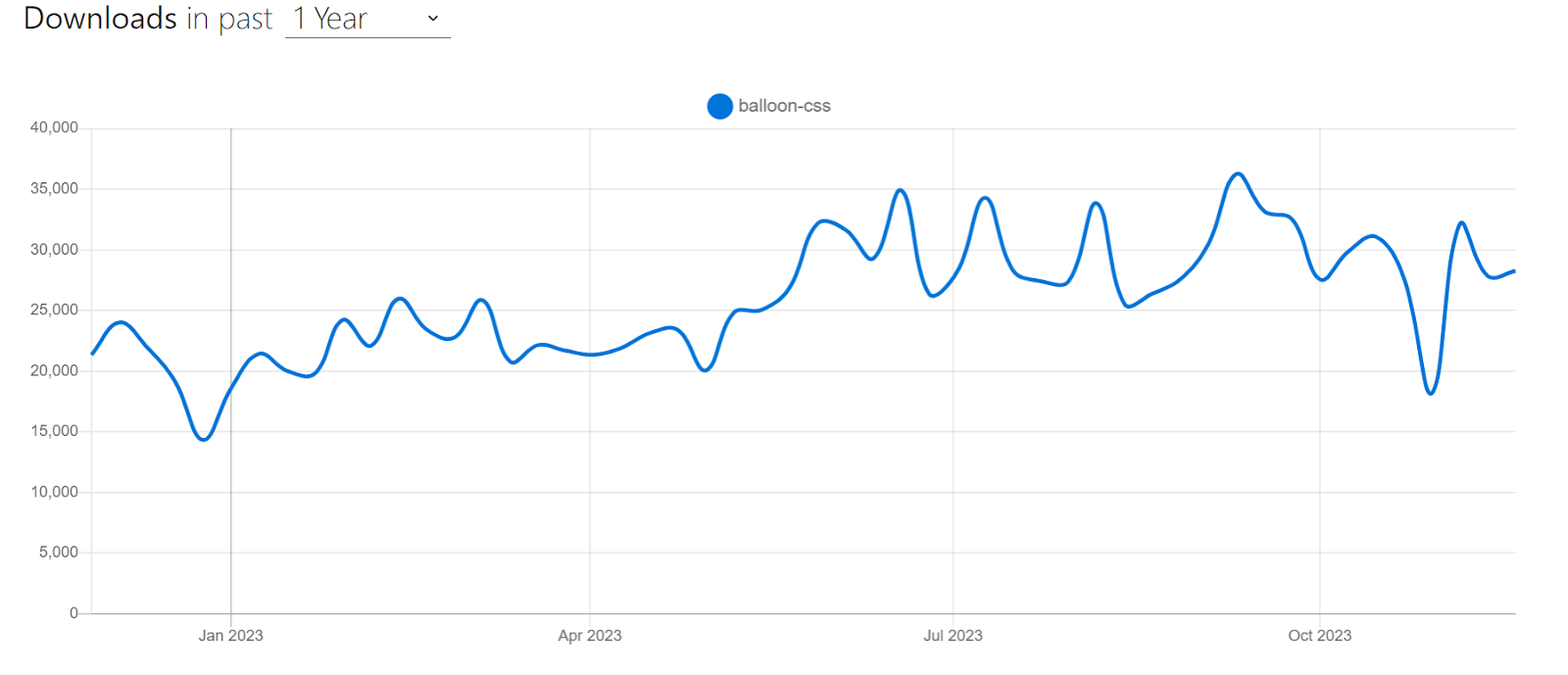
Balloon.css makes the creation of tooltips simpler than ever before. With Balloon.css, you just need to add an attribute to your preferred tooltip element, and it’s done. You can easily customize the tooltip’s position with properties like up, down, left, right, up-left, up-right, etc. You can also customize its color, length, font size, etc. Balloon.css is open-source and is one of the most popular tooltip libraries with over 5k+ Stars on GitHub and a staggering 30k+ weekly downloads on npm trends. It is also maintained, with 460+ Forks on GitHub.
Let’s look at an example of using Balloon.css:
HTML:
|
1 2 3 4 5 6 7 8 9 |
<link rel="stylesheet" href="https://unpkg.com/balloon-css/balloon.min.css" /> <div class="container"> <button aria-label="Whats up!" data-balloon-pos="up" class="button"> Hover me! </button> </div> |
CSS:
|
1 2 3 4 5 6 7 8 9 10 11 12 13 14 15 16 17 18 |
/* Style the button */ button { padding: 10px 45px; background-color: #b71212; color: #ffffff; border: none; font-size: 1rem; font-weight: bold; border-radius: 5px; cursor: pointer; } /* Center the button */ .container { display: flex; justify-content: center; align-items: center; height: 100vh; } |
Output:
See the Pen
Balloon.css Demo by Tahera Alam (@alam_tahera)
on CodePen.
Advantages of Balloon.css:
- Lightweight: Balloon.css is a lightweight library, weighing only about 1.1KB when minified, which helps keep your load times fast.
- Documentation: Balloon.css is documented with a detailed explanation of how to use the library. This makes it easy to start with Balloon.css, even if you are unfamiliar with CSS.
- Pure CSS, so no JavaScript dependencies: It is a pure CSS library, meaning it does not require any JavaScript. This makes it a good choice for websites that want to avoid using JavaScript.
- Highly customizable: Balloon.css is highly customizable, with various options available to change the appearance of the tooltips. This includes the ability to change the color, font size, position of the tooltips, etc.
- Programmatic control: It allows you to programmatically show tooltips even when user interaction isn’t happening, providing flexibility in tooltip display.
Limitations of Balloon.css:
- Limited compatibility with self-closing elements: Balloon.css relies on pseudo-elements to render tooltips. However, self-closing elements such as < img >, < input >, and < hr > do not support pseudo-elements. This means you can not use Balloon.css if you want tooltips for these elements.
- Potential conflicts with existing pseudo-elements: If an element already uses pseudo-elements for other purposes, integrating Balloon.css tooltips may lead to conflicts. This is because Balloon.css also uses pseudo-elements. In such cases, careful consideration and testing are required to ensure proper functionality.
- Limited complexity: Balloon.css is designed for simple tooltips and may not be suitable for more complex tooltip requirements, such as tooltips with interactive content.
Water.css
If you’re building a simple static web page or a quick demo site and don’t want to style it manually, you might want to consider using Water.css.
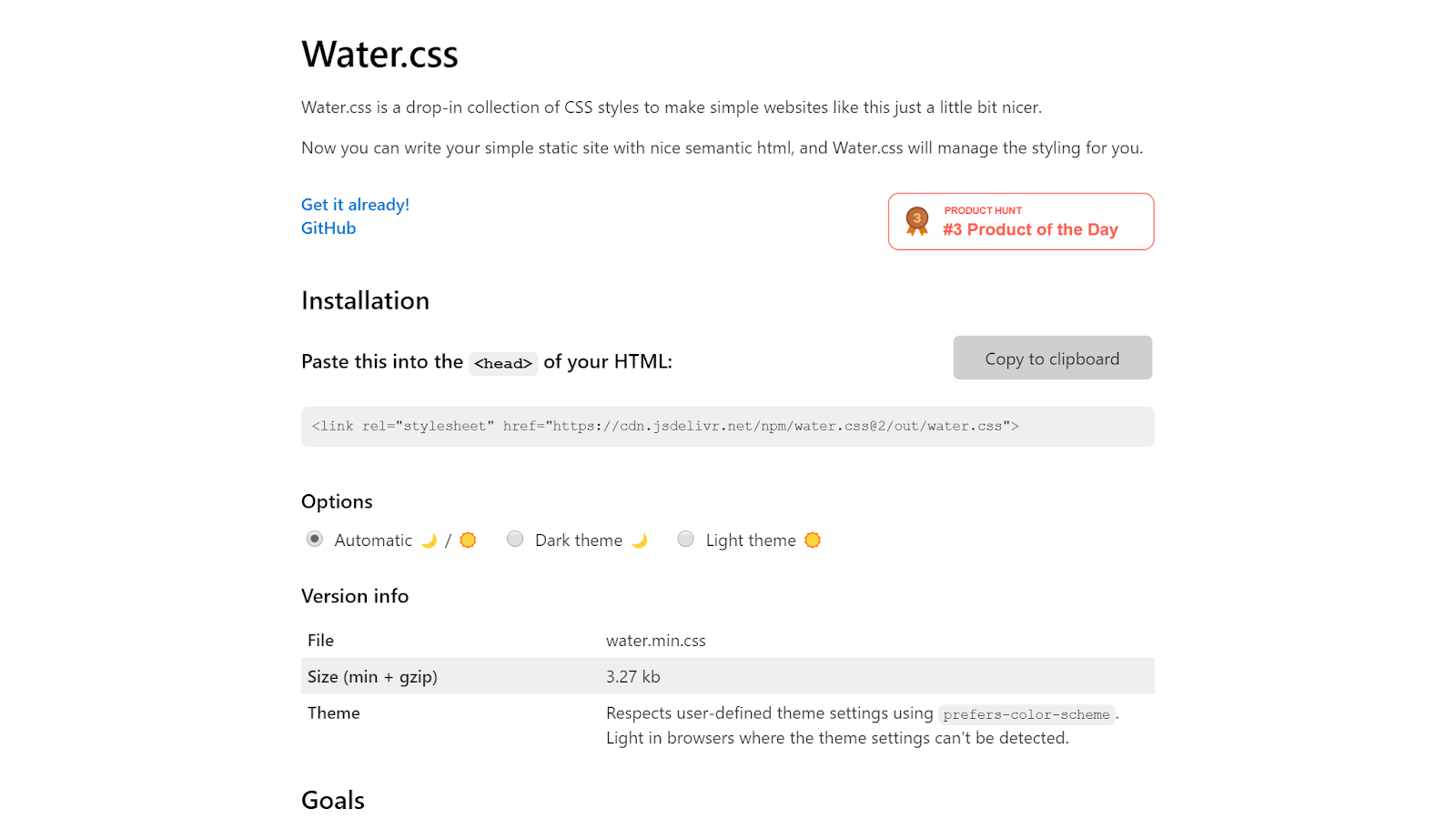
Water.css is a lightweight and minimalistic CSS framework designed to enhance the styling of simple websites without requiring you to write additional CSS classes. It’s an ideal choice when you don’t want to spend time styling a page but also don’t want the ugliness of default styles.
The best thing about Water.css is that it doesn’t require any classes. You just include it in your HTML < head >, and it silently makes everything nicer.
Water.css is a very popular choice for making simple websites, and it has almost 8k stars on GitHub. Let’s take a look at an example of using Water.css to create a page:
HTML:
|
1 2 3 4 5 6 7 8 9 10 11 12 13 14 15 16 17 18 19 20 21 22 23 24 25 26 27 28 29 30 31 32 33 34 35 36 37 38 39 40 41 42 43 44 |
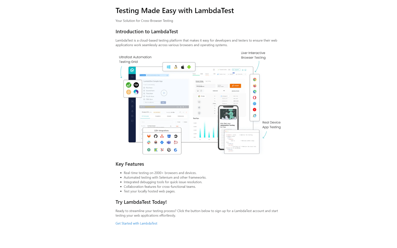
<link rel="stylesheet" href="https://cdn.jsdelivr.net/npm/water.css@2/out/light.min.css" /> </head> <body> <header> <h1>Testing Made Easy with LambdaTest</h1> <p>Your Solution for Cross-Browser Testing</p> </header> <div class="main-content"> <h2>Introduction to LambdaTest</h2> <p> LambdaTest is a cloud-based testing platform that makes it easy for developers and testers to ensure their web applications work seamlessly across various browsers and operating systems. </p> <img src="https://www.lambdatest.com/resources/images/main/home_banner.webp" alt="lambdatest-home-banner" /> <h2>Key Features</h2> <ul> <li>Real-time testing on 2000+ browsers and devices.</li> <li>Automated testing with Selenium and other frameworks.</li> <li>Integrated debugging tools for quick issue resolution.</li> <li>Collaboration features for cross-functional teams.</li> <li>Test your locally hosted web pages.</li> </ul> <h2>Try LambdaTest Today!</h2> <p> Ready to streamline your testing process? Click the button below to sign up for a LambdaTest account and start testing your web applications effortlessly. </p> <a href="https://www.lambdatest.com/" class="btn" target="_blank" >Get Started with LambdaTest</a > </div> </body> |
Output:
See the Pen
demo of using water.css by Tahera Alam (@alam_tahera)
on CodePen.
In the example above, we just included Water.css CDN in < head > and boom! All the styles become incredibly neat and nicer without writing a single line of CSS! Isn’t it incredible?
To surprise you even more, Water.css is fully responsive, so you get a responsive page that works seamlessly on all devices without writing any media queries.
To help you visualize better, below are two screenshots of the above demo with and without using Water.css.
Advantages of Water.css:
- Easy to use: Water.css is easy to use, even for beginners. You don’t need to incorporate any classes or dependencies for using water.css. You just stick one of these in HTML , and you are done.
- Lightweight: Water.css is only 2 KB in size, which means it will not slow down your website.
- Responsive: Water.css comes with out-of-the-box responsiveness, so your pages look great on any device.
- Dark mode support: Water.css supports dark mode so that you can choose the preferred mode.
| Theme | Link |
|---|---|
| 🌙 Automatic Theme | <link rel="stylesheet" href="https://cdn.jsdelivr.net/npm/water.css@2/out/water.min.css"> |
| 🌙 Dark Theme | <link rel="stylesheet" href="https://cdn.jsdelivr.net/npm/water.css@2/out/dark.min.css"> |
Limitations of Water.css:
- Not ideal for complex websites: Water.css can only be used for simple/static websites. Unfortunately, building complex, interactive websites is not possible with this library.
Hover.css
Hover effects are a great way to enhance user experience and add interactivity to a website.
When a user hovers their mouse over an element, having a subtle effect can provide immediate visual feedback, indicating that the element is interactive. This feedback helps users understand that they can click, tap, or interact with that element, which is crucial for user interface design.
However, creating neat hover effects for various elements can be time-consuming. That’s where Hover.css comes into play. Hover.css is a collection of pre-designed animations and transitions that you can easily apply to elements like links, buttons, logos, SVGs, images, and more.
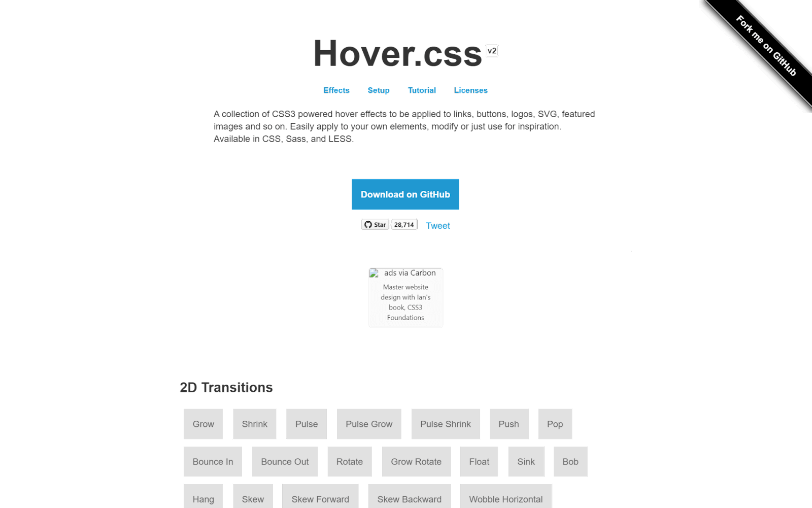
With Hover.css, you can effortlessly make buttons grow when hovered over, images zoom in, backgrounds change color from left to right, navigation menus dynamic with a bounce, form inputs respond to user actions with a subtle pulse, and even add flair to social media icons.
When it comes to incorporating Hover.css in your project, you have more than one option of adding it. You can either copy and paste a specific effect’s CSS code into your stylesheet or reference the entire Hover.css stylesheet.
When to opt for which?
- Copy and Paste an Effect: If you only plan to use a few effects, it’s a good practice to copy and paste the effect into your own stylesheet, reducing the need for users to download the entire Hover.css file.
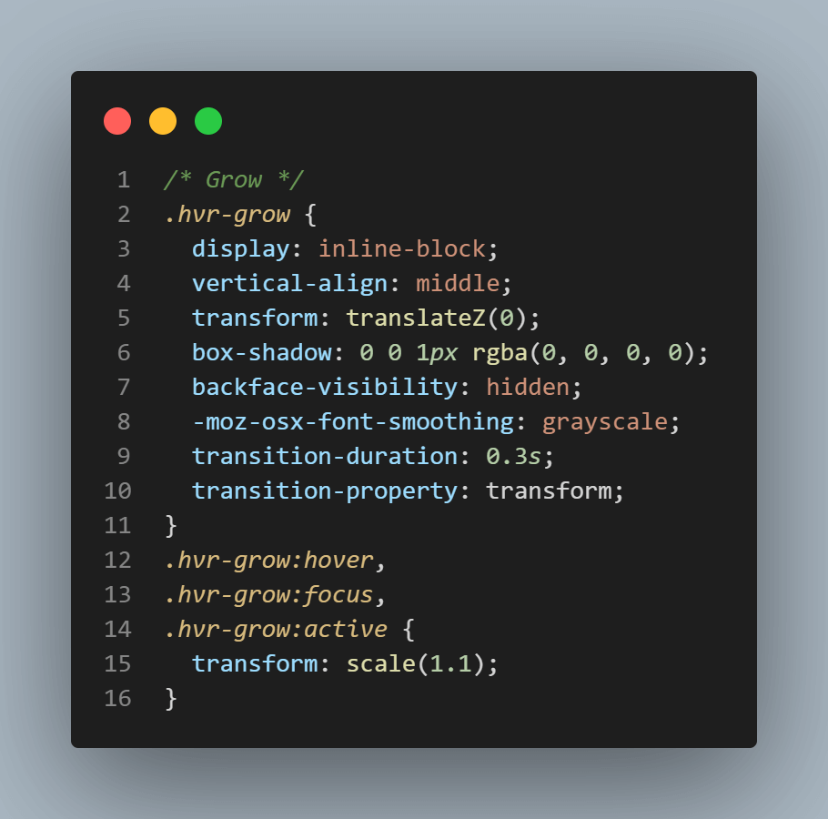
For example, let’s say you want to use the “Grow” effect:
- Download Hover.css.
- In css/hover.css, find the Grow CSS code, which is clearly marked with a comment.
- Copy the effect and paste it into your own stylesheet.
- In your HTML file where you want the effect to appear, add the class “.hvr-grow” to the chosen element:
|
1 |
<button class="hvr-grow">Submit</button> |
- Reference Hover.css: If you plan to use many Hover.css effects, it is ideal to reference the entire Hover.css stylesheet.
- Download hover-min.css.
- Add hover-min.css to your website’s files, typically in a directory named css.
- Link the hover-min.css in the < head > section of the HTML page where you want to apply the Hover.css effects.
- Assuming you want to use the Grow effect in the HTML file, add the class of .hvr-grow to your chosen element.
|
1 2 3 |
<head> <link href="css/hover-min.css" rel="stylesheet" /> </head> |
Hover.css is among the most popular CSS libraries, with over 28.9k+ Stars on GitHub and almost 4,000 weekly downloads through npm trends.
Let’s now look at an example of using Hover.css in a navigation menu:
HTML:
|
1 2 3 4 5 6 7 8 9 10 11 12 13 14 15 16 17 18 19 20 21 22 23 24 25 26 27 28 29 30 31 32 33 34 35 36 37 38 39 40 41 42 43 44 45 46 47 48 49 50 51 52 53 54 55 56 57 58 59 60 61 62 63 64 65 66 67 68 69 70 71 72 73 74 75 76 77 78 79 80 |
<nav class="navbar"> <div class="navbar-logo"> <img src="https://www.lambdatest.com/resources/images/logos/logo.svg" alt="lambdatest" /> </div> <ul class="navbar-items"> <li class="navbar-item hvr-underline-from-center"> <a href="https://www.lambdatest.com/feature" class="navbar-link" target="_blank" >Platform</a > </li> <li class="navbar-item hvr-underline-from-center"> <a href="https://www.lambdatest.com/enterprise" class="navbar-link" target="_blank" >Enterprise</a > </li> <li class="navbar-item hvr-underline-from-center"> <a href="https://www.lambdatest.com/blog" class="navbar-link" target="_blank" >Resources</a > </li> <li class="navbar-item hvr-underline-from-center"> <a href="https://www.lambdatest.com/support/docs/getting-started-with-lambdatest-automation/" class="navbar-link" target="_blank" >Developers</a > </li> <li class="navbar-item hvr-underline-from-center"> <a href="https://billing.lambdatest.com/billing/plans" class="navbar-link" target="_blank" >Pricing</a > </li> </ul> <ul class="navbar-items"> <li class="navbar-item hvr-underline-from-center"> <a href="https://accounts.lambdatest.com/dashboard" class="navbar-link" target="_blank" >Dashboard</a > </li> <li class="navbar-item"> <a href="https://billing.lambdatest.com/billing/plans" class="navbar-button" target="_blank" id="upgrade" >Upgrade</a > </li> <li class="navbar-item"> <a href="https://www.lambdatest.com/demo" target="_blank" class="navbar-button" id="bookDemo" >Book a Demo</a > </li> </ul> </nav> </body> </html> |
CSS:
|
1 2 3 4 5 6 7 8 9 10 11 12 13 14 15 16 17 18 19 20 21 22 23 24 25 26 27 28 29 30 31 32 33 34 35 36 37 38 39 40 41 42 43 44 45 46 47 48 49 50 51 52 53 54 55 56 57 58 59 60 61 62 63 64 65 66 67 68 69 70 71 72 73 74 75 76 77 78 79 80 81 82 83 84 85 86 87 88 89 90 91 92 93 94 95 96 97 98 99 100 101 102 103 104 105 |
* { padding: 0; margin: 0; box-sizing: border-box; } ul { list-style: none; padding: 0; margin: 0; } /* Navbar styles */ .navbar { display: flex; justify-content: space-between; align-items: center; padding: 15px 20px; font-family: Arial, sans-serif; color: #333333; background-color: #eef5ff; } .navbar-logo { margin-right: 20px; } img { height: 35px; } .navbar-items { display: flex; align-items: center; } .navbar-item { margin-right: 20px; } .navbar-item:last-child { margin-right: 0; } .navbar-link { text-decoration: none; color: inherit; padding: 0 5px; } .navbar-button { text-decoration: none; font-weight: bold; color: inherit; padding: 12px 16px; border-radius: 5px; } #bookDemo { background-color: linear-gradient(91.88deg, #2c57f3 0.88%, #a506d8 98.71%); background-image: linear-gradient( 91.88deg, rgb(44, 87, 243) 0.88%, rgb(165, 6, 216) 98.71% ); background-position-x: initial; background-position-y: initial; background-size: initial; background-attachment: initial; background-origin: initial; background-clip: initial; color: #fff; } #upgrade { border: 1.5px solid #2c57f3; padding: 10px 16px; } /* Underline From Center */ .hvr-underline-from-center { display: inline-block; position: relative; padding-bottom: 7px; } .hvr-underline-from-center:before { content: ""; position: absolute; bottom: 0; left: 50%; transform: translateX(-50%); background: #333333; height: 3px; width: 0; transition: width 0.3s ease-out; } .hvr-underline-from-center:hover:before, .hvr-underline-from-center:focus:before, .hvr-underline-from-center:active:before { width: 100%; } |
Output:
See the Pen
demo of using hover.css by Tahera Alam (@alam_tahera)
on CodePen.
In the example above, we have a navbar with a few links inside it. On hovering over each link element, we want to show an underline that transitions from the center. So, we utilized the underline from the center effect from Hover.css.
However, in the original effect, there’s no space between the element and the underline, so we customized the effect to fit our needs where we have some space between the element and the underline. This ability to customize styles makes Hover.css an excellent choice for adding unique effects that apply to our own project requirements.
Advantages of Hover.css:
- Easy to use: Hover.css is a self-contained library, so you can easily copy and paste the effects you want to use in your own stylesheet.
- Wide browser support: Hover.css supports a wide range of browsers, including Chrome, Firefox, Safari, Edge, and Opera.
- Customizable: You can customize the hover effects to fit your needs.
Limitations of Hover.css:
- Not all effects are supported in older browsers: Some of the hover effects in Hover.css rely on CSS3 features that are not supported in older browsers.
- Performance issue: While Hover.css simplifies adding animations, too many hover effects on a single page can increase the page’s load time. It can also make your website look cluttered and distracting.
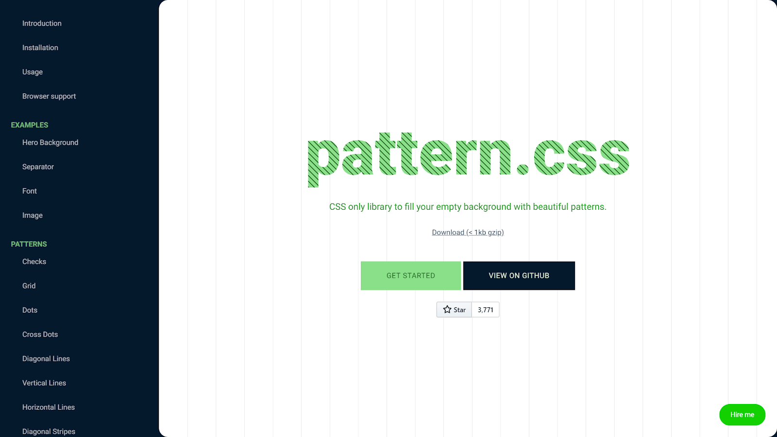
pattern.css
pattern.css is a collection of stunningly beautiful patterns that you can easily incorporate into your projects. You can apply those patterns as hero backgrounds, text fills, separators, and more.
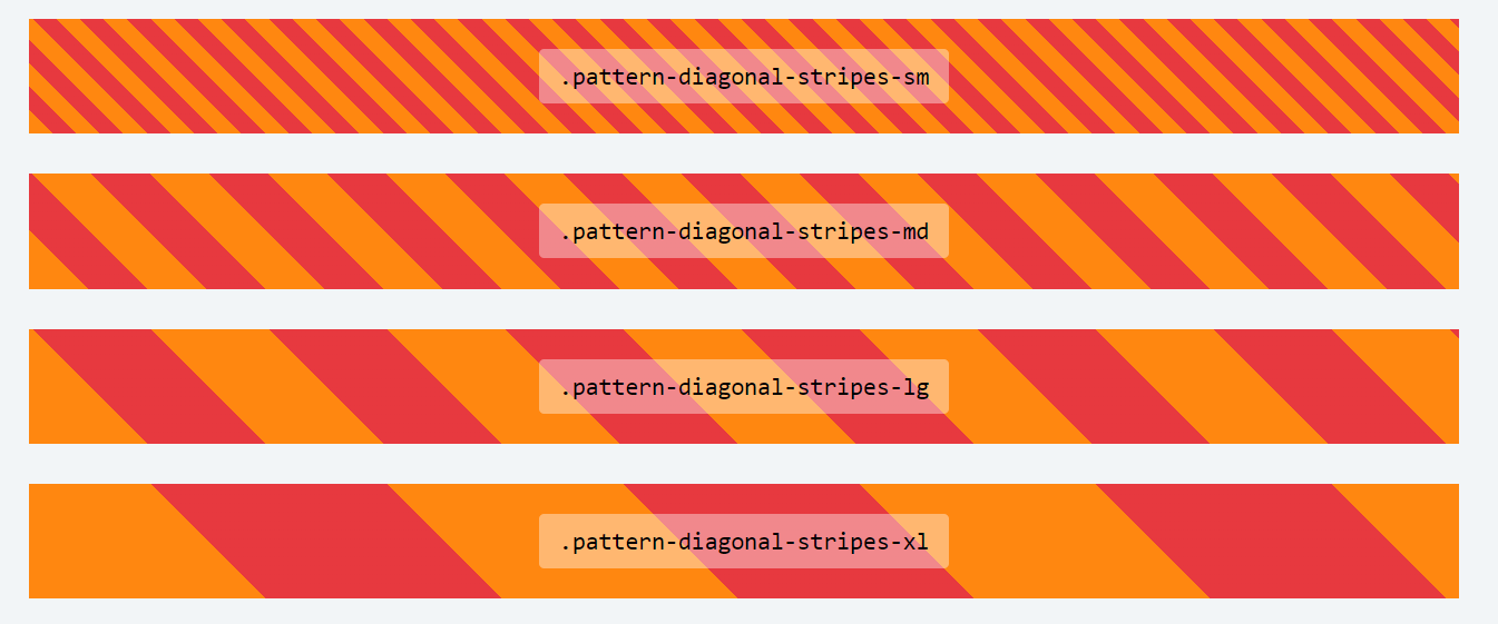
It provides various patterns, including horizontal and vertical lines, checks, zigzags, dots, cross dots, grids, diagonal patterns, horizontal stripes, vertical stripes, etc. It is also highly customizable and allows you to change the size of each pattern with Bootstrap-like classes such as sm, md, lg, xl, etc.
Note that pattern.css is built with two colors only – transparent and currentColor. currentColor is the current active text color inside an element. To change the color, just change the text color property. To change the other color, just change the background color, and the background color will be visible through a transparent color
pattern.css is open source, with over 3.8k Stars and 100+ Forks on GitHub. It also has 900+ weekly downloads, according to npm trends.
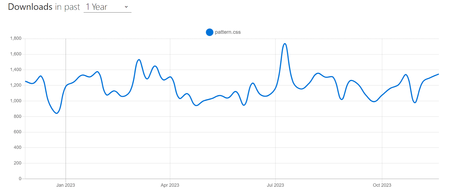
Let’s consider an example of using pattern.css to create a hero page:
HTML:
|
1 2 3 4 5 6 7 8 9 10 11 12 13 14 15 |
<link href="https://unpkg.com/pattern.css" rel="stylesheet" /> <div class="container pattern-vertical-lines-md"> <h1 class=""> Next-Generation Mobile Apps and <br /> Cross Browser <span>Testing Cloud</span> </h1> <p> Deliver unparalleled digital experience with our next-gen AI-powered testing cloud platform. Ensure exceptional user experience across all devices and browsers. </p> <button> <a href="https://www.lambdatest.com/" target="_blank">Try now</a> </button> </div> |
CSS:
|
1 2 3 4 5 6 7 8 9 10 11 12 13 14 15 16 17 18 19 20 21 22 23 24 25 26 27 28 29 30 31 32 33 34 35 36 37 38 39 40 41 42 43 44 45 46 47 48 49 50 51 52 53 54 |
* { margin: 0; padding: 0; box-sizing: border-box; } body { font-family: Roboto, sans-serif; } .container { color: #fde482; background-color: #facb0e; padding: 4em; display: flex; justify-content: center; align-items: center; flex-direction: column; } h1 { font-size: 3rem; color: #000; text-align: center; margin-bottom: 20px; line-height: 1.4; } span { background: linear-gradient(180deg, rgba(250, 255, 255, 0) 50%, #00b4d8 50%); } p { color: #333; width: 60%; text-align: center; line-height: 1.4; font-size: 1.1rem; margin-bottom: 25px; } button { padding: 15px; width: 200px; font-size: 1rem; background-color: #111111; color: #fff; border: none; border-radius: 4px; cursor: pointer; text-transform: capitalize; } a { text-decoration: none; color: inherit; } |
Output:
See the Pen
pattern.css demo by Tahera Alam (@alam_tahera)
on CodePen.
In the example above, we utilized pattern.css to add vertical lines pattern background to our hero page. To begin with, we first imported the pattern.css library using a CDN within the HTML document.
|
1 2 |
<link href="https://unpkg.com/pattern.css" rel="stylesheet" /> <div class="container pattern-vertical-lines-md"> |
The main HTML content is enclosed in the < div > element with the class .container. To generate a background with vertical lines, we use the pattern.css pattern-vertical-lines-md class on the container element. This class applies a vertical line pattern to the element with a medium size.
To define the color of the pattern, we set color and background-color properties to the container element.
|
1 2 3 |
.container { color: #fde482; background-color: #facb0e; |
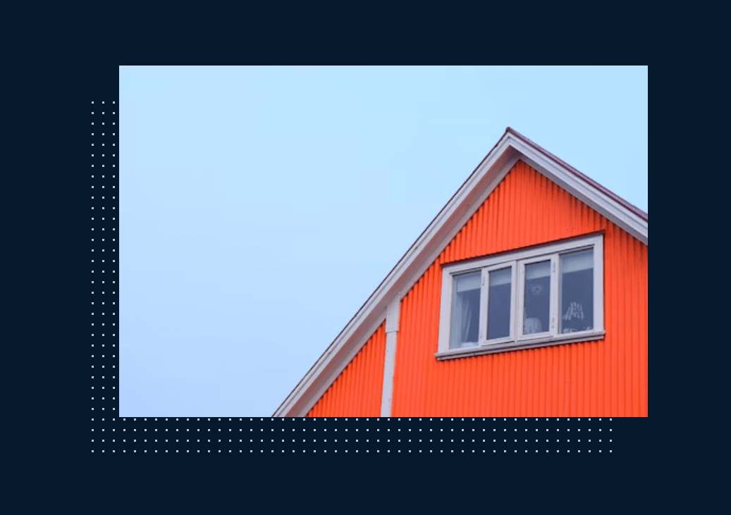
As we mentioned earlier, you can also use patterns to fill texts, to make separators, or to create a subtle border effect around images. Here’s an example of a border around the image:
Advantages of pattern.css:
- Easy to use: It is easy to use, even if you have no prior knowledge of CSS. Simply include the pttern.css stylesheet in your HTML document and add pattern.css classes to your HTML elements to apply the desired patterns.
- Compatible with frameworks like Bootstrap: It can be used alongside CSS frameworks, such as Bootstrap. This allows the mixing and matching of different CSS components to create unique and custom designs.
- Dynamic patterns: pattern.css patterns are not static PNG files but CSS code. This means you can customize the patterns to match your preferences, such as color, size, and opacity.
Limitations of pattern.css:
- Limited compatibility with other CSS frameworks: pattern.css does not support or with other popular CSS frameworks, such as Tailwind CSS. This can be a limitation for users who want to use pattern.css in conjunction with other CSS frameworks.
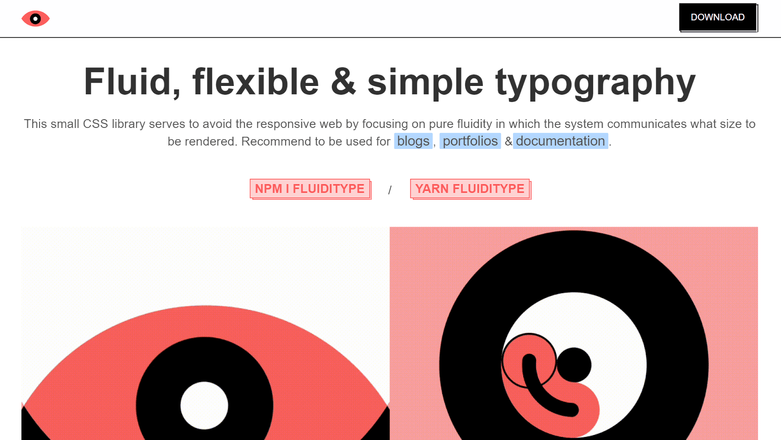
Fluiditype
In today’s digital landscape, the significance of responsive web design cannot be emphasized. It plays a pivotal role in ensuring that websites adjust seamlessly to an array of screen sizes and devices.
A key aspect of this responsive design is typography in CSS. You want to make sure that the text on your website is always readable, regardless of the screen size. This is especially important for text-based websites like blogs, documentation, and eCommerce websites.
Traditional CSS methods for setting font size using fixed values, such as with pixels, can make it challenging to achieve responsive typography. This is because the same font size may be too large or too small on different devices and screen sizes.
That’s where Fluiditype comes in. It is a small CSS library that helps you create fluid typography. Fluid typography is a design approach that allows the size of your text to adapt based on the viewport’s width. This means that your text will always be readable, regardless of the device or screen size on which your users view your website.
Fluiditype works by using the vw unit, which stands for viewport width. The vw unit is a relative unit, meaning that when you set the font size of an element to 1vw, it will be equal to 1% of the viewport width.
An important thing to note is that Fluiditype works only on elements that are directly linked to the typography on your page. For example, elements like headings (h1 – h6), paragraphs, text styles (blockquotes, bold, underline), lists (ordered and unordered), code snippets, links, and hyperlinks will be affected by Fluiditype.
Below is an example of using Fluiditype:
See the Pen
Fluiditype by Boris Kirov (@bkirov)
on CodePen.
Hamburgers
Hamburger menus are a popular way to display navigation links on mobile devices and smaller screens. They are also becoming increasingly popular on desktop websites, as they can be used to create a more compact and minimalistic navigation bar.
However, creating hamburger menus with beautiful, subtle animations can be time-consuming. That’s where Hamburgers library comes in.
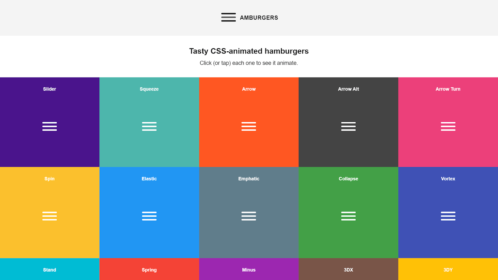
Hamburgers provide a collection of animated hamburgers that you can use to create a beautiful and responsive hamburger menu for your website. The subtle animation of the hamburger can significantly enhance the user experience of your website.
Additionally, Hamburgers is modular and customizable, so you can easily change the appearance of your hamburger menu to match your website’s design.
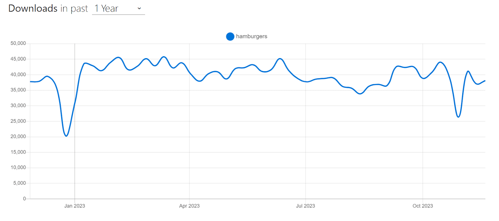
Hamburgers are popular for creating animated hamburgers with over 16k+ weekly downloads on npm trends and almost 8k Stars on GitHub.
Let’s look at an example of using Hamburgers.
HTML:
|
1 2 3 4 5 6 7 8 9 10 11 12 13 14 15 16 17 18 19 20 21 22 23 24 25 26 27 28 29 30 31 32 33 34 35 36 37 38 39 40 41 42 43 44 45 46 47 48 49 50 51 52 53 54 55 56 57 58 59 60 61 62 63 64 65 66 67 68 69 70 71 72 73 74 75 |
<nav class="navbar"> <button class="hamburger hamburger--squeeze" type="button"> <span class="hamburger-box"> <span class="hamburger-inner"> </span> </span> </button> <div class="navbar-logo"> <img src="https://www.lambdatest.com/resources/images/logos/logo.svg" alt="lambdatest" /> </div> <ul class="navbar-items"> <li class="navbar-item hvr-underline-from-center"> <a href="https://www.lambdatest.com/feature" class="navbar-link" target="_blank" >Platform</a > </li> <li class="navbar-item hvr-underline-from-center"> <a href="https://www.lambdatest.com/enterprise" class="navbar-link" target="_blank" >Enterprise</a > </li> <li class="navbar-item hvr-underline-from-center"> <a href="https://www.lambdatest.com/blog" class="navbar-link" target="_blank" >Resources</a > </li> <li class="navbar-item hvr-underline-from-center"> <a href="https://www.lambdatest.com/support/docs/getting-started-with-lambdatest-automation/" class="navbar-link" target="_blank" >Developers</a > </li> <li class="navbar-item hvr-underline-from-center"> <a href="https://billing.lambdatest.com/billing/plans" class="navbar-link" target="_blank" >Pricing</a > </li> </ul> <ul class="navbar-items" id="second-list"> <li class="navbar-item hvr-underline-from-center"> <a href="https://accounts.lambdatest.com/dashboard" class="navbar-link" target="_blank" >Dashboard</a > </li> <li class="navbar-item btn" id="upgrade"> <a href="https://billing.lambdatest.com/billing/plans" target="_blank" >Upgrade</a > </li> <li class="navbar-item btn" id="bookDemo"> <a href="https://www.lambdatest.com/demo" target="_blank" >Book a Demo</a > </li> </ul> </nav> |
CSS:
|
1 2 3 4 5 6 7 8 9 10 11 12 13 14 15 16 17 18 19 20 21 22 23 24 25 26 27 28 29 30 31 32 33 34 35 36 37 38 39 40 41 42 43 44 45 46 47 48 49 50 51 52 53 54 55 56 57 58 59 60 61 62 63 64 65 66 67 68 69 70 71 72 73 74 75 76 77 78 79 80 81 82 83 84 85 86 87 88 89 90 91 92 93 94 95 96 97 98 99 100 101 102 103 104 105 106 107 108 109 110 111 112 113 114 115 116 117 118 119 120 121 122 123 124 125 126 127 128 129 130 131 132 133 134 135 136 137 138 139 140 141 142 143 144 145 146 147 148 149 150 151 152 153 154 155 156 157 158 159 160 161 162 163 164 165 166 167 168 169 170 171 172 173 174 175 176 177 178 179 180 181 182 183 184 185 186 187 188 189 190 191 192 193 194 195 196 197 198 199 200 201 202 203 204 205 206 207 208 209 210 211 212 213 214 215 216 |
* { padding: 0; margin: 0; box-sizing: border-box; } ul { list-style: none; padding: 0; margin: 0; } /* Navbar styles */ .navbar { display: flex; justify-content: space-between; align-items: center; padding: 15px 20px; font-family: Arial, sans-serif; color: #333333; background-color: #eef5ff; } .navbar-logo { margin-right: 20px; } img { height: 35px; } .navbar-items { display: flex; align-items: center; } .navbar-item { margin-right: 20px; } .navbar-item:last-child { margin-right: 0; } .navbar-link { text-decoration: none; color: inherit; padding: 0 5px; } .btn { text-decoration: none; font-weight: bold; color: inherit; padding: 12px 16px; border-radius: 5px; } .btn a { text-decoration: none; color: inherit; } #bookDemo { background-color: linear-gradient(91.88deg, #2c57f3 0.88%, #a506d8 98.71%); background-image: linear-gradient( 91.88deg, rgb(44, 87, 243) 0.88%, rgb(165, 6, 216) 98.71% ); background-position-x: initial; background-position-y: initial; background-size: initial; background-attachment: initial; background-origin: initial; background-clip: initial; color: #fff; } #upgrade { border: 1.5px solid #2c57f3; padding: 10px 16px; } /* hamburger menu */ .hamburger { padding: 15px 15px; display: none; cursor: pointer; transition-property: opacity, filter; transition-duration: 0.15s; transition-timing-function: linear; font: inherit; color: inherit; text-transform: none; background-color: transparent; border: 0; margin: 0; overflow: visible; position: absolute; right: 0; top: 6px; } .hamburger:hover { opacity: 0.7; } .hamburger.is-active:hover { opacity: 0.7; } .hamburger.is-active .hamburger-inner, .hamburger.is-active .hamburger-inner::before, .hamburger.is-active .hamburger-inner::after { background-color: #000; } .hamburger-box { width: 40px; height: 24px; display: inline-block; position: relative; } .hamburger-inner { display: block; top: 50%; margin-top: -2px; } .hamburger-inner, .hamburger-inner::before, .hamburger-inner::after { width: 40px; height: 4px; background-color: #000; border-radius: 4px; position: absolute; transition-property: transform; transition-duration: 0.15s; transition-timing-function: ease; } .hamburger-inner::before, .hamburger-inner::after { content: ""; display: block; } .hamburger-inner::before { top: -10px; } .hamburger-inner::after { bottom: -10px; } .hamburger--squeeze .hamburger-inner { transition-duration: 0.075s; transition-timing-function: cubic-bezier(0.55, 0.055, 0.675, 0.19); } .hamburger--squeeze .hamburger-inner::before { transition: top 0.075s 0.12s ease, opacity 0.075s ease; } .hamburger--squeeze .hamburger-inner::after { transition: bottom 0.075s 0.12s ease, transform 0.075s cubic-bezier(0.55, 0.055, 0.675, 0.19); } .hamburger--squeeze.is-active .hamburger-inner { transform: rotate(45deg); transition-delay: 0.12s; transition-timing-function: cubic-bezier(0.215, 0.61, 0.355, 1); } .hamburger--squeeze.is-active .hamburger-inner::before { top: 0; opacity: 0; transition: top 0.075s ease, opacity 0.075s 0.12s ease; } .hamburger--squeeze.is-active .hamburger-inner::after { bottom: 0; transform: rotate(-90deg); transition: bottom 0.075s ease, transform 0.075s 0.12s cubic-bezier(0.215, 0.61, 0.355, 1); } @media only screen and (max-width: 768px) { .hamburger { display: inline-block; } .navbar { flex-direction: column; align-items: flex-start; justify-content: flex-end; } .navbar-logo { margin-right: 0; margin-bottom: 20px; } .navbar-items { flex-direction: column; align-items: start; display: none; } .navbar-items.menu-active { display: flex; } .navbar-item { margin-right: 0; margin-bottom: 10px; } } |
JavaScript:
|
1 2 3 4 5 6 7 8 9 10 11 12 13 14 15 |
// select .hamburger const hamburger = document.querySelector(".hamburger"); // Select menu container const menuContainer = document.querySelectorAll(".navbar-items"); // On click hamburger.addEventListener("click", function () { // Toggle class "is-active" hamburger.classList.toggle("is-active"); // Toggle 'menu-active' class on the menu container to show/hide it menuContainer.forEach(function (container) { container.classList.toggle("menu-active"); }); }); |
See the Pen
demo of using hover.css by Tahera Alam (@alam_tahera)
on CodePen.
In this example, we used the squeeze hamburger from Hamburgers library, which is a responsive hamburger menu that collapses into a three-line icon on smaller screens, to display the navigation links.
To use Hamburgers, we first need to download and include the CSS file in the < head > of the HTML document like this:
|
1 |
<link href="dist/hamburgers.css" rel="stylesheet" /> |
Note that, for the purpose of this example, I just copied related CSS from the dist folder.
Once we have linked the file, we will add the base hamburgers markup to the HTML, followed by the class name of the type of hamburger we want to use:
|
1 2 3 4 5 |
<button class="hamburger hamburger--squeeze" type="button"> <span class="hamburger-box"> <span class="hamburger-inner"> </span> </span> </button> |
In this case, we wanted to use the “Squeeze” hamburger, so we added hamburger–squeeze to it. Next, we modify the navbar style for smaller screens using properties like flex-direction: column; which will make navbar items stack vertically.
Lastly, we toggle the active class on click of the hamburger icon using JavaScript:
|
1 2 3 4 |
// On click hamburger.addEventListener("click", function () { // Toggle class "is-active" hamburger.classList.toggle("is-active"); |
With this, we have an animated hamburger menu that will be visible on smaller screens, which users can toggle to see the navigation links.
Advantages of Hamburgers:
- Sass and Rails support: The Hamburgers library provides source files for Sass, a popular CSS precompiler. It is also available as a Ruby gem for Rails applications.
- Modular: The Hamburgers library is modular, so you can download and include only the library parts you need.
- Easy to use and customize: The Hamburgers library is easy to use and customize. It includes various hamburger types to choose from, and you can easily change the appearance of your hamburger to match your website’s design.
Limitations of Hamburgers:
- Can be challenging to debug: If something goes wrong with your hamburger menu, it can be difficult to debug the issue. This is because the Hamburgers library uses a lot of CSS animations, which can be challenging to track down and fix.
- No JavaScript: The Hamburgers library only provides the CSS styling for the hamburger menu. You will need to write your own JavaScript to toggle the menu open and close.
- Limited browser support: The Hamburgers library is not supported in older browsers like Internet Explorer 9 and Opera Mini.
Pure CSS
Pure CSS is a lightweight library that provides a set of basic CSS modules for building responsive, accessible, cross-browser-compatible websites and web applications. It is a good choice for projects where speed and performance are important, or you need complete control over the CSS.
Pure CSS uses a mobile-first approach, which makes it an excellent choice for projects where you need to focus on mobile devices. It includes modules for forms, buttons, menus, tables, navigation bars, etc. These modules come with out-of-box responsiveness, automatically adapting to various screen sizes and devices. Pure CSS is built on top of Normalize.css, which will fix cross-browser compatibility issues for you.
The best thing about Pure CSS is that it’s incredibly lightweight, weighing just 3.5KB when minified and gzipped. This means that it will not slow down your website. Pure CSS is also very unopinionated, so you can easily customize it to match your design.
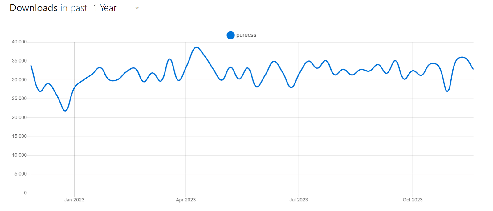
Pure CSS is one of the most popular choices for building fast and performant websites, with over 23.2k+ Stars on GitHub and 21k+ weekly downloads on npm trends. It’s also used by several websites, such as Speedtest, Flickr, and Pixaby.
Let’s look at an example of using Pure CSS to create a pricing page:
HTML:
|
1 2 3 4 5 6 7 8 9 10 11 12 13 14 15 16 17 18 19 20 21 22 23 24 25 26 27 28 29 30 31 32 33 34 35 36 37 38 39 40 41 42 43 44 45 46 47 48 49 50 51 52 53 54 55 56 57 58 59 60 61 62 63 64 65 66 67 68 69 70 71 72 73 74 75 76 77 78 79 80 81 82 83 84 85 86 87 88 89 90 91 92 93 94 95 96 97 98 99 100 101 102 103 104 105 106 107 108 109 110 111 112 113 114 115 116 117 118 119 120 121 |
<link rel="stylesheet" href="https://cdn.jsdelivr.net/npm/purecss@3.0.0/build/pure-min.css" integrity="sha384-X38yfunGUhNzHpBaEBsWLO+A0HDYOQi8ufWDkZ0k9e0eXz/tH3II7uKZ9msv++Ls" crossorigin="anonymous" /> <link rel="stylesheet" href="https://cdn.jsdelivr.net/npm/purecss@3.0.0/build/grids-responsive-min.css" /> <div class="banner"> <h1 class="banner-head"> LambdaTest Manual Testing Pricing.<br /> Try before you buy. </h1> </div> <div class="pricing-container"> <div class="pricing-tables pure-g"> <div class="pure-u-1 pure-u-md-1-3"> <div class="pricing-table pricing-table-free"> <div class="pricing-table-header"> <h2>Free</h2> <span class="pricing-table-price"> $0 <span>per month</span> </span> </div> <ul class="pricing-table-list"> <li>Live real time testing</li> <li>200+ Desktop Browsers</li> <li>10 Screenshot Tests per month</li> <li>10 Responsive Test per month</li> <li>3 sessions of Native App Testing on Emulators/Simulators</li> </ul> <a class="button-choose pure-button" href="https://www.lambdatest.com/pricing" target="_blank" >Choose</a > </div> </div> <div class="pure-u-1 pure-u-md-1-3"> <div class="pricing-table pricing-table-biz pricing-table-selected"> <div class="pricing-table-header"> <h2>Live</h2> <span class="pricing-table-price"> $15 <span>per month </span> </span> </div> <ul class="pricing-table-list"> <li>Unlimited Live Real Time Testing</li> <li>3000+ Desktop Browsers</li> <li>Unlimited Screenshot Testing</li> <li>Unlimited Responsive Testing</li> <li>Emulators / Simulators for web and app testing</li> <li>Geolocation Testing</li> <li>Web and mobile debugging tools</li> <li>Integrate with JIRA, Asana, Slack</li> </ul> <a class="button-choose pure-button" href="https://www.lambdatest.com/pricing" target="_blank" >Choose</a > </div> </div> <div class="pure-u-1 pure-u-md-1-3"> <div class="pricing-table pricing-table-enterprise"> <div class="pricing-table-header"> <h2>Real Device</h2> <span class="pricing-table-price"> $25 <span>per month </span> </span> </div> <ul class="pricing-table-list"> <li>Real Mobile devices</li> <li>Test native, hybrid, and web apps</li> <li>App Uploads</li> <li>Natural gestures and interactions</li> <li>Network Throttling</li> <li>Detailed device and app/crash logs</li> <li> Integrate with AppStore,PlayStore, AppCenter and TestFlight </li> <li>GPS based geolocation testing and more</li> </ul> <a class="button-choose pure-button" href="https://www.lambdatest.com/pricing" target="_blank" >Choose</a > </div> </div> </div> </div> |
CSS:
|
1 2 3 4 5 6 7 8 9 10 11 12 13 14 15 16 17 18 19 20 21 22 23 24 25 26 27 28 29 30 31 32 33 34 35 36 37 38 39 40 41 42 43 44 45 46 47 48 49 50 51 52 53 54 55 56 57 58 59 60 61 62 63 64 65 66 67 68 69 70 71 72 73 74 75 76 77 78 79 80 81 82 83 84 85 86 87 88 89 90 91 92 93 94 95 96 97 98 99 100 101 102 103 104 105 106 107 108 109 110 111 112 113 114 115 116 117 118 119 120 121 122 123 124 125 126 127 128 129 130 131 132 |
body { color: #526066; } h2, h3 { letter-spacing: 0.25em; text-transform: uppercase; font-weight: 600; } /* styles for banner */ .banner { background: transparent url("https://24.media.tumblr.com/ccb268832580ac12951828a1c179de69/tumblr_mo2xbk8JUK1st5lhmo1_1280.jpg") 0 0 no-repeat fixed; text-align: center; background-size: cover; height: 200px; width: 100%; margin-bottom: 3em; display: table; } .banner-head { display: table-cell; vertical-align: middle; margin-bottom: 0; font-size: 2em; color: white; font-weight: 500; text-shadow: 0 1px 1px black; } /*pricing table wrapper*/ .pricing-tables { max-width: 980px; margin: 0 auto; margin-bottom: 3.125em; text-align: center; } .pricing-table { border: 1px solid #ddd; margin: 0 0.5em 2em; padding: 0 0 3em; } .pricing-table-free .pricing-table-header { background: #519251; } .pricing-table-biz .pricing-table-header { background: #2c4985; } .pricing-table-header { background: #111; color: #fff; } .pricing-table-header h2 { margin: 0; padding-top: 2em; font-size: 1em; font-weight: normal; } /* * -- PRICING TABLE PRICE -- * Styles for the price and the corresponding <span>per month</span> */ .pricing-table-price { font-size: 6em; margin: 0.2em 0 0; font-weight: 100; } .pricing-table-price span { display: block; text-transform: uppercase; font-size: 0.2em; padding-bottom: 2em; font-weight: 400; color: rgba(255, 255, 255, 0.5); } .pricing-table-list { list-style-type: none; margin: 0; padding: 0; text-align: center; } /* * -- PRICING TABLE LIST ELEMENTS -- * Styles for the individual list elements within each pricing table */ .pricing-table-list li { padding: 0.8em 0; background: #f7f7f7; border-bottom: 1px solid #e7e7e7; } /* PRICING TABLE BUTTON */ .button-choose { border: 1px solid #ccc; background: #fff; color: #333; border-radius: 2em; font-weight: bold; position: relative; bottom: -1.5em; } @media (min-width: 767px) { .banner-head { font-size: 4em; } .pricing-table { margin-bottom: 0; } } @media (min-width: 480px) { .banner { height: 400px; } .banner-head { font-size: 3em; } } |
Output:
See the Pen
pure css demo by Tahera Alam (@alam_tahera)
on CodePen.
In the example above, we used Pure CSS to create a pricing page that has three pricing cards.
To begin with, we include Pure CSS in our project using the CDN. Notice that we are linking two CDNs, this is because the grid system is not part of the base Pure CSS library. This means that if you want to use the grid system, you need to include the separate grids CSS file.
|
1 2 3 4 5 6 7 8 9 10 |
<link rel="stylesheet" href="https://cdn.jsdelivr.net/npm/purecss@3.0.0/build/pure-min.css" integrity="sha384-X38yfunGUhNzHpBaEBsWLO+A0HDYOQi8ufWDkZ0k9e0eXz/tH3II7uKZ9msv++Ls" crossorigin="anonymous" /> <link rel="stylesheet" href="https://cdn.jsdelivr.net/npm/purecss@3.0.0/build/grids-responsive-min.css" /> |
In the above snippet, the first < link > tag includes the base Pure CSS framework and the second < link > tag includes the grid system CSS file.
The Pure CSS components we use in this example are the grid system and button – grid is for the responsive pricing cards layout, and the button component is for the choose button inside each pricing card.
To create the grid layout, we first add the .pure-g class to the .pricing-tables element, which lays out the child elements inside it in a grid layout. This .pricing-tables element has three child elements responsible for the three pricing cards.
To control the positioning of these child elements, we utilize two pure classes in these individual card elements. The first class is the .pure-u-1, which creates a column that spans the full width of the grid. This makes each card take the full width of the grid and stack vertically on smaller screens.
The second class we apply is .pure-u-md-1-3, which makes a column take one-third of the width on medium and large screens. So, in medium and large screens, the grid’s width gets divided into 3 columns, allowing the three pricing cards to take one-third of the grid layout.
The last Pure CSS component we use is the buttons. To add a pure button, we just need to add a .pure-button class to any < a/ > or < button />. In our case, we add it to the anchor tag of each pricing card.
|
1 2 3 4 5 |
<a class="button-choose pure-button" href="https://www.lambdatest.com/pricing" target="_blank" >Choose</a > |
Note that in addition to the Pure CSS components, we also added a few more style rules to enhance the visual appearance of the page.
Advantages of Pure CSS:
- Lightweight: Pure CSS is very lightweight, with the entire set of modules weighing just 3.5KB minified and gzipped. This means that websites built with Pure CSS will load quickly and efficiently.
- Accessible: It is designed to be accessible to all users, including users with disabilities. Pure CSS uses CSS best practices and follows the W3C’s Web Content Accessibility Guidelines (WCAG).
- Flexible and customizable: Pure CSS is designed to be unopinionated, allowing you to customize it to match your design requirements.
- Responsive: Pure CSS includes a responsive grid system that will automatically adjust to different screen sizes and devices.
- Cross-browser compatible: It is cross-browser compatible, so your website will look good and function on all browsers.
Limitations of Pure CSS:
- Less features than other CSS frameworks: Pure CSS is a lightweight framework, so it does not have as many features as some other CSS frameworks, such as Bootstrap and Foundation.
Three Dots
Loading states are an essential part of any website. When users request data from remote sources, there is a delay between sending and receiving the request. This delay is known as the loading state
In a loading state, to retain the user’s attention and prevent them from abandoning the page, designers often use eye-catching loading animations. Three Dots makes creating and implementing these loading animations for your website easy.
Three Dots brings you a wide range of loading animations that you can easily incorporate into your project. All you need is a single element and a class from Three Dots.
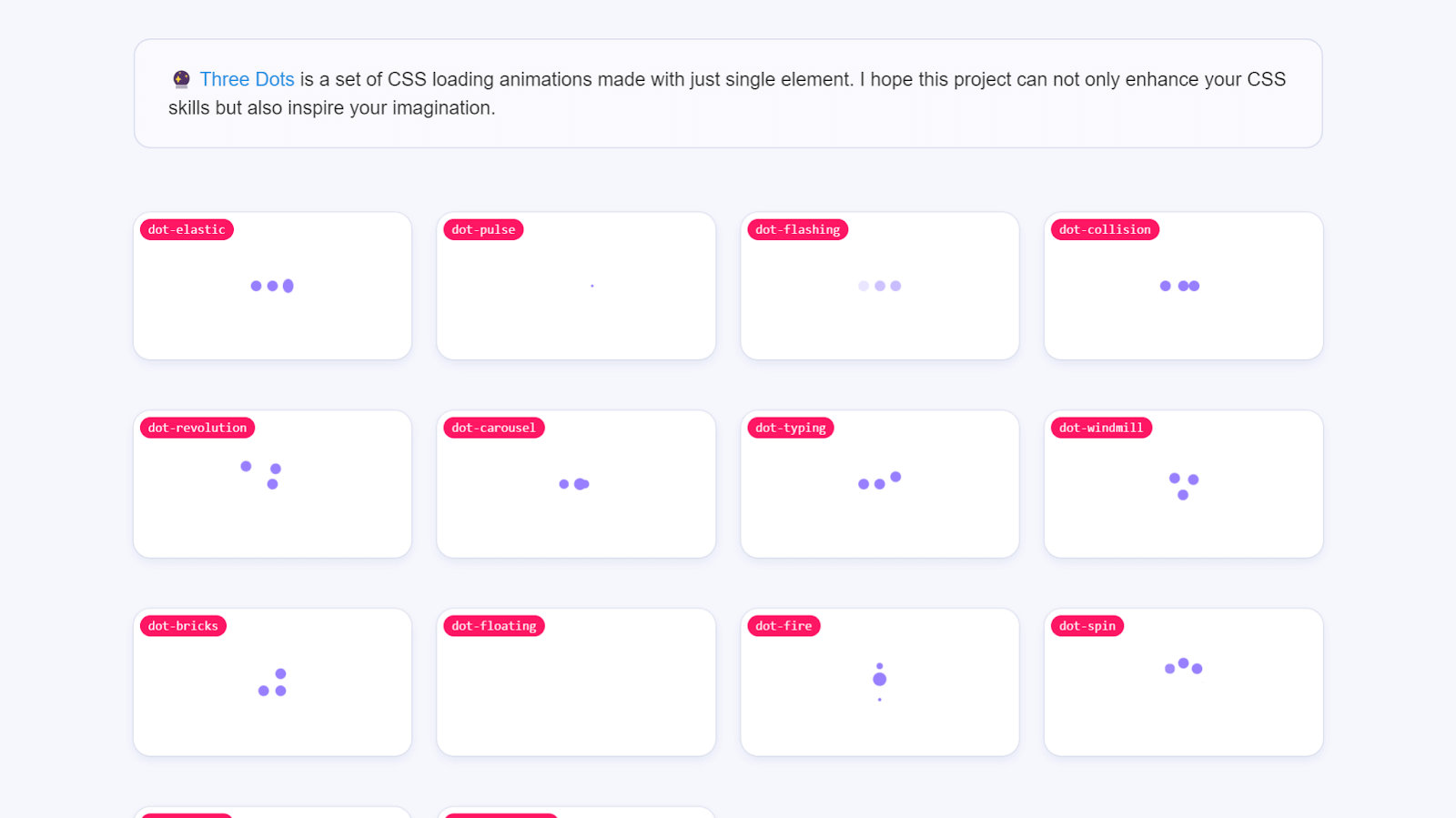
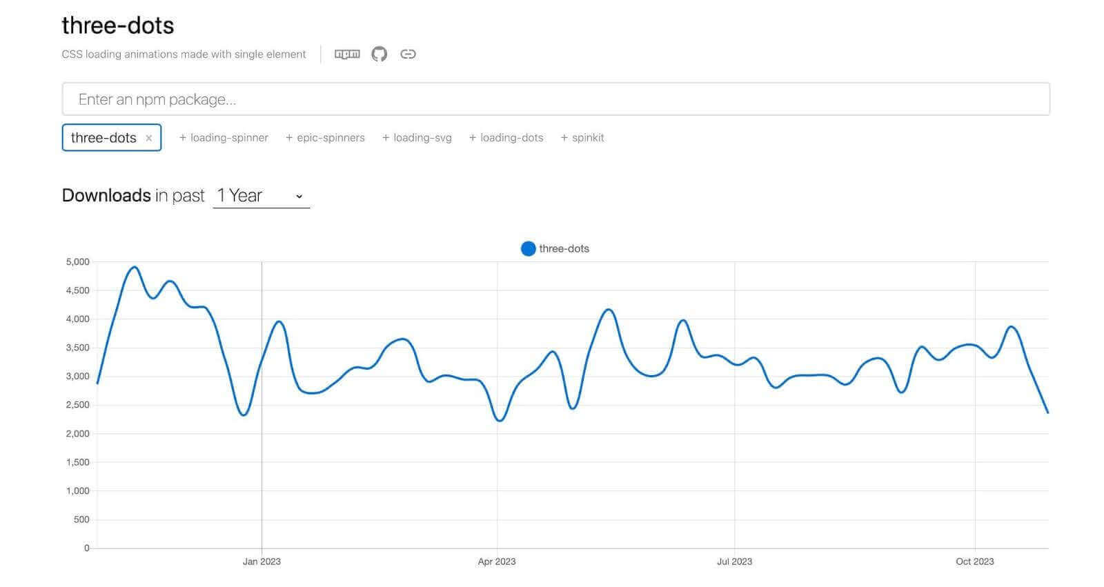
Three Dots has 1.3k Stars on GitHub and 2000+ weekly downloads through npm trends.
Let’s look at an example of using Three Dots:
HTML:
|
1 2 3 4 5 6 7 8 9 |
<link href=" https://cdn.jsdelivr.net/npm/three-dots@0.3.2/dist/three-dots.min.css " rel="stylesheet" /> <div class="container"> <div class="dot-bouncing"></div> </div> |
CSS:
|
1 2 3 4 5 6 7 8 9 |
body { background-color: #010617; } .container { height: 100vh; display: flex; align-items: center; justify-content: center; } |
Output:
See the Pen
Three Dots Demo by Tahera Alam (@alam_tahera)
on CodePen.
In this example, we added Three Dots library using the CDN and then applied a bouncing dots loading animation by adding the class .dot-bouncing to a div element. The CSS we have just sets a background color and centers the loader.
Advantages of Three Dots:
- Easy to incorporate: Three Dots is extremely easy to incorporate in a project. You just need to install the library and add your preferred loading animation class to an element. For instance, to add a falling dot animation, you would add the .dot-falling class to an element.
- Customizable with Dart Sass API: With the Dart Sass API, you can change the default values for the style variables and customize the loading animations to suit your preferences
- Can add bloat to a website: Three Dots does not provide the option to install and import only the required loading animation. So, for an app that may need only one loader, you would have to install the entire library, which can result in increasing bloat of your app.
- Not easily customizable: Three Dots does not provide an easy way to customize the loaders that can be a consideration when you want loader color to be the same as your brand color.
Limitations of Three Dots:
Magic CSS
Magic CSS is a lightweight animation library that allows you to add unique and complex animation effects to your websites. Magic CSS has a lot of animations that are unique to it, which sets it apart from the animated CSS libraries we have covered so far.
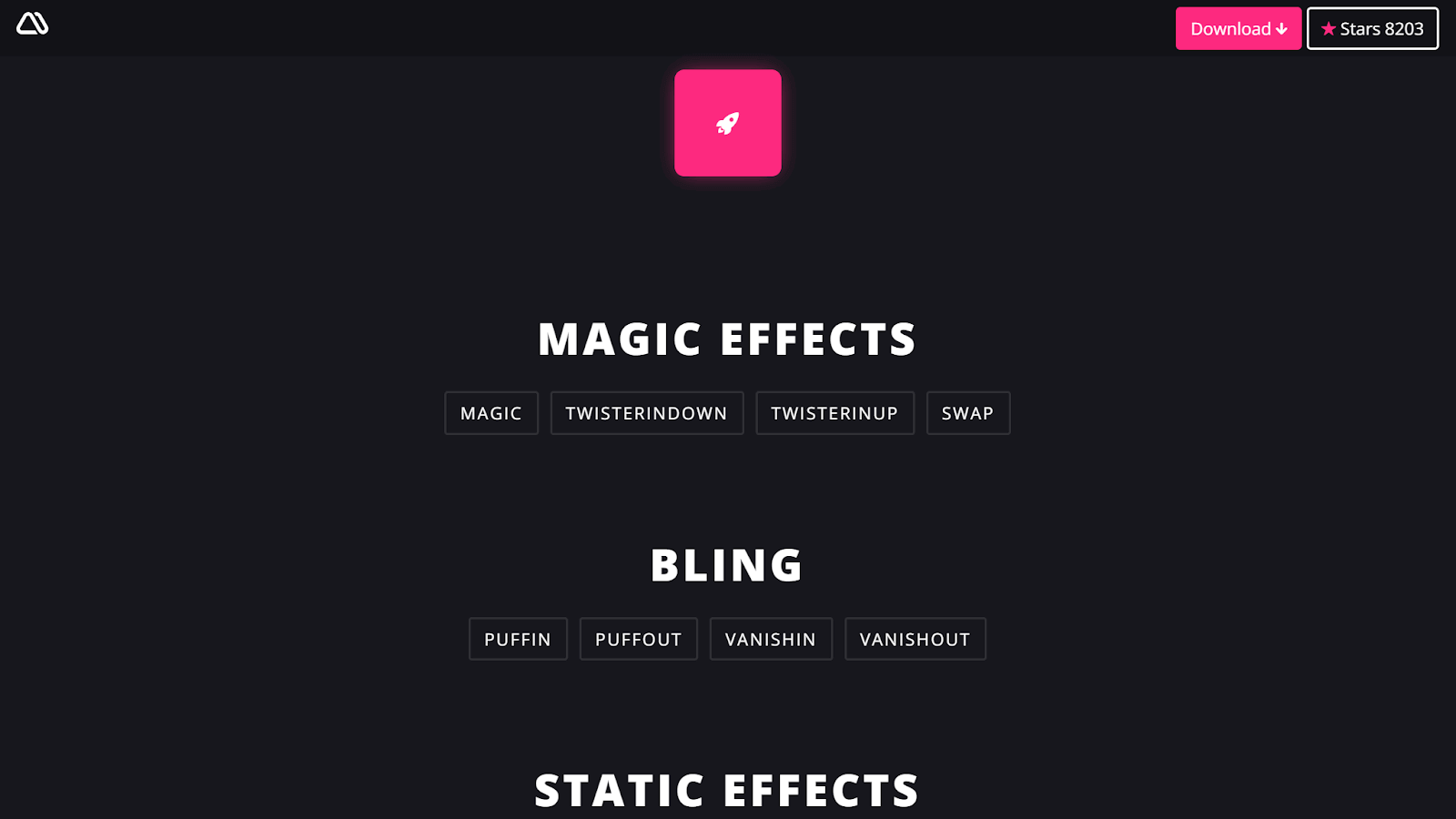
With Magic CSS, you can incorporate animations that are not very straightforward.
Magic CSS uses JavaScript and jQuery to apply animations to elements. You just need to copy the animation name from the library and paste it into your JavaScript code.
Here’s an example of adding a Puffin animation from Magic CSS:
HTML:
|
1 2 3 4 5 6 7 8 9 10 11 |
<link href=" https://cdn.jsdelivr.net/npm/magic.css@1.4.8/dist/magic.min.css " rel="stylesheet" /> <div class="container"> <div class="element"></div> </div> |
CSS:
|
1 2 3 4 5 6 7 8 9 10 11 12 |
.container { display: flex; align-items: center; justify-content: center; height: 100vh; } .animated-element { width: 150px; height: 150px; border-radius: 4px; background-color: rgb(235, 19, 116); } |
JavaScript:
|
1 2 |
const selector = document.querySelector(".element"); selector.classList.add("magictime", "puffIn"); |
Output:
See the Pen
Magic CSS Demo by Tahera Alam (@alam_tahera)
on CodePen.
In this example, we are adding a Puffin animation to a < div/ > element on load. To do that, we first link the Magic CSS CDN and then use the querySelector() method to select the < div > element with the class .animated-element.
Next, we add the animation using classList.add() method which adds two classes to the < div > element – magictime and puffIn. The magictime class is required for all Magic CSS animations, and the puffIn class is the animation name we want.
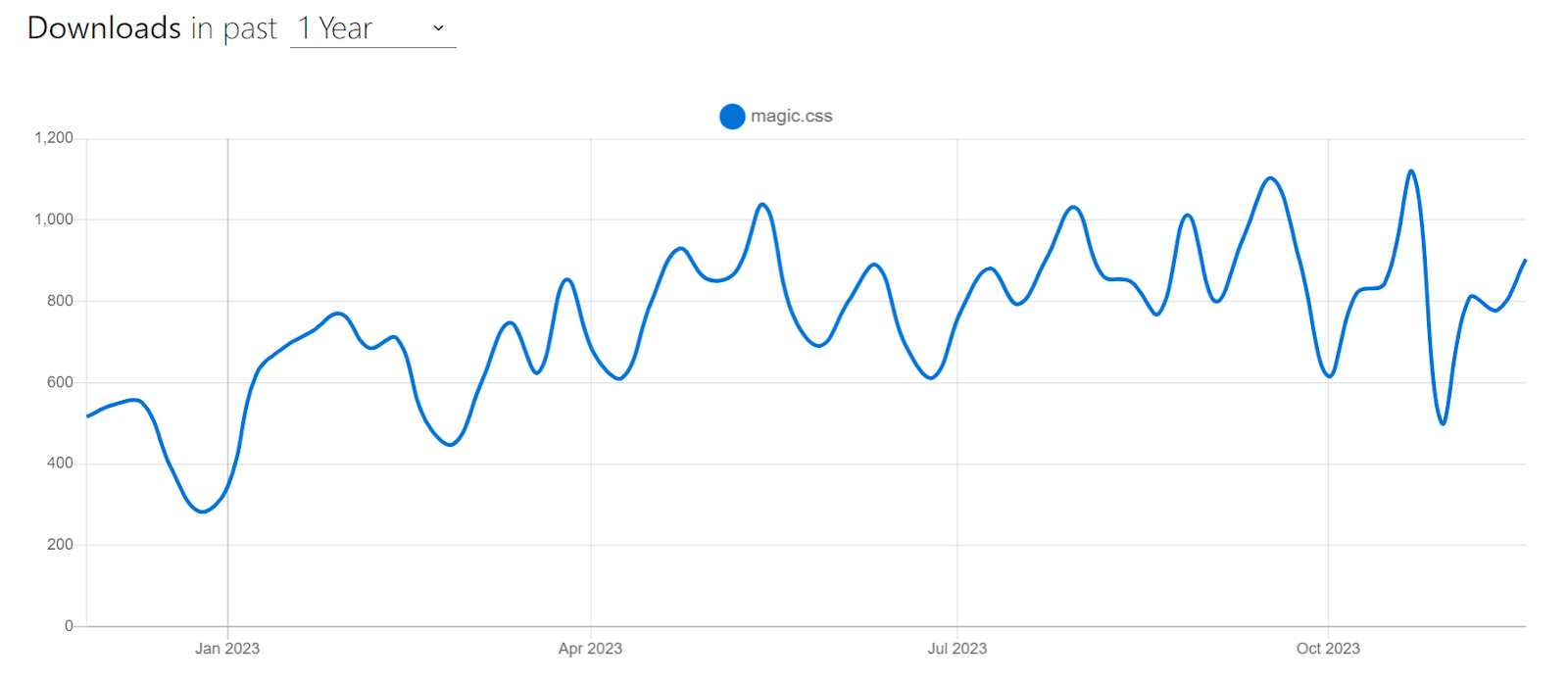
Magic CSS is a popular choice in animation libraries because of its easy-to-use nature. It has 8.2k Stars on GitHub and 1000+ weekly downloads through npm trends.
Advantages of Magic CSS:
- Wide range of options: Magic CSS provides a wide range of animations for you to choose from. Be it fades, flips, slides, rotations, or complex animations like perspectives or space-outs, Magic CSS has it all.
- Customizable: It allows you to customize the duration of the animations using CSS, which can be very handy in certain scenarios.
Limitations of Magic CSS:
- Does not support Opera Mini: Magic CSS does not support Opera Mini, which is a popular mobile browser with a market share of 2.7%. So, if you need to support users of Opera Mini, you might want to consider using an alternative.
Spectrum CSS
Spectrum CSS is an open-source CSS library developed by Adobe. It includes components and resources to make web applications more cohesive. Spectrum is used by all of Adobe’s products, including Creative Cloud, Document Cloud, and Acrobat. It is also used by other organizations, including The New York Times, Slack, and Airbnb.
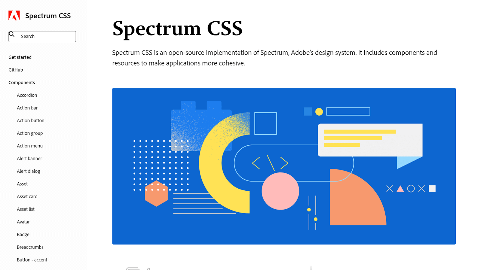
It is a CSS-only library, meaning that it does not require any JavaScript to use. It provides a wide range of components, including buttons, menus, modals, tables, and forms that you can easily incorporate into your project. Spectrum CSS also includes a variety of utilities, such as typography, colors, and spacing.
With Spectrum CSS, you can quickly and efficiently create consistent and aesthetically pleasing user interfaces without spending excessive time on design and styling.
Advantages of Spectrum CSS:
- Comprehensive: Spectrum CSS is an all-in-one library that gives you everything you need to build a modern web application. From buttons to menus, modals to tables, cards to forms, date pickers to calendars, Spectrum CSS has it all.
- Modular: It is highly modular, with each component released on NPM as a separate package. This means you can use only the components you need for your project without installing everything. This makes your project smaller and faster and your code reusable and maintainable.
- Documented: Spectrum CSS is well-documented with clear and concise examples of using the library. This makes it easy to learn and incorporate into a project.
Limitations of Spectrum CSS:
- Opinionated: Spectrum CSS comes with limitations, especially if you need to significantly customize your application’s look and feel.
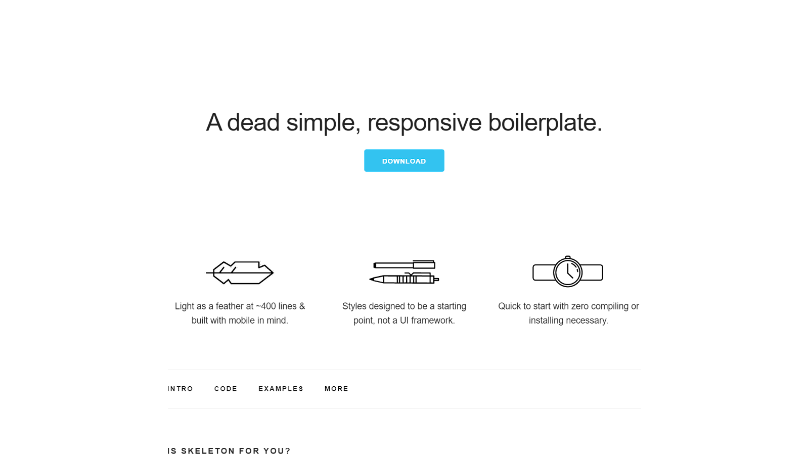
Skeleton
Skeleton is a minimal and lightweight CSS library that provides a basic set of styles and layout templates for building responsive web pages. It is designed to be a starting point for your project rather than a complete UI library that provides pre-built components to build a page from end to end.
UI libraries often provide a wide range of components and styles, which can be useful for saving time and effort. However, this can also make them less flexible and customizable.
Skeleton, on the other hand, is designed to be more lightweight and flexible.
With Skeleton, you have a simple set of styles that will help you build a web page quickly while providing the flexibility to customize and create your unique design.
Skeleton includes a number of classes for styling typography, buttons, forms, and other common elements of a webpage. It is a good choice for developers who want to have complete control over the styling of their websites or for websites where performance is a critical concern. Skeleton is a popular lightweight library choice with over 18.9k+ Stars and 3.2k+ Forks on GitHub. However, it’s been inactive for the last few years, with its last update in 2014.
Using Skeleton is incredibly straightforward. To get started, simply download the Skeleton boilerplate and leverage the provided Foundation to build your web projects. Let’s look at an example of using Skeleton to create a landing page:
HTML:
|
1 2 3 4 5 6 7 8 9 10 11 12 13 14 15 16 17 18 19 20 21 22 23 24 25 26 27 28 29 30 31 32 33 34 35 36 37 38 39 40 41 42 43 44 45 46 47 48 49 50 51 52 53 54 55 56 57 58 59 60 61 |
<!DOCTYPE html> <html lang="en"> <head> <!-- Basic Page Needs –––––––––––––––––––––––––––––––––––––––––––––––––– --> <meta charset="utf-8" /> <title>Skeleton: Responsive CSS Boilerplate</title> <meta name="description" content="" /> <meta name="author" content="" /> <!-- Mobile Specific Metas –––––––––––––––––––––––––––––––––––––––––––––––––– --> <meta name="viewport" content="width=device-width, initial-scale=1" /> <!-- FONT –––––––––––––––––––––––––––––––––––––––––––––––––– --> <link href="//fonts.googleapis.com/css?family=Raleway:400,300,600" rel="stylesheet" type="text/css" /> <!-- CSS –––––––––––––––––––––––––––––––––––––––––––––––––– --> <link rel="stylesheet" href="./css/normalize.css" /> <link rel="stylesheet" href="./css/skeleton.css" /> <link rel="stylesheet" href="./css/custom.css" /> </head> <body> <div class="section hero"> <div class="container"> <div class="row"> <div class="one-half column"> <h4 class="hero-heading"> Stop relying on dev tools for ensuring responsiveness. Transform how you make responsive websites. </h4> <a class="button button-primary" href="https://www.lambdatest.com/lt-browser" >Try LT Browser</a > </div> <div class="one-half column phones"> <img class="phone" src="http://getskeleton.com/examples/landing/images/iphone.png" /> <img class="phone" src="http://getskeleton.com/examples/landing/images/iphone.png" /> </div> </div> </div> </div> </body> </html> |
CSS:
|
1 2 3 4 5 6 7 8 9 10 11 12 13 14 15 16 17 18 19 20 21 22 23 24 25 26 27 28 29 30 31 32 33 34 35 36 37 38 39 40 41 42 43 44 45 46 47 48 49 50 51 52 53 54 55 56 57 58 59 60 61 62 63 64 65 66 67 68 69 70 71 72 73 74 75 76 77 78 79 80 81 82 83 84 85 86 87 88 89 90 91 92 93 94 95 96 97 98 99 100 101 102 103 104 |
.button { border-radius: 100px; } .section { padding: 8rem 0 7rem; text-align: center; } .section-heading, .section-description { margin-bottom: 1.2rem; } .phones { position: relative; } .phone { position: relative; max-width: 80%; margin: 3rem auto -12rem; } .phone + .phone { display: none; } @media (min-width: 550px) { .section { padding: 12rem 0 11rem; } .hero { padding-bottom: 12rem; text-align: left; height: 165px; } .phone { position: absolute; top: -7rem; right: 3rem; max-height: 362px; z-index: 3; } .phone + .phone { top: -6rem; display: block; max-width: 73.8%; right: 0; z-index: 2; max-height: 338px; } .hero-heading { font-size: 2.4rem; } } @media (min-width: 750px) { .hero { height: 190px; } .hero-heading { font-size: 2.6rem; } .section { padding: 14rem 0 15rem; } .hero { padding: 16rem 0 14rem; } .phone { top: -14rem; right: 5rem; max-height: 510px; } .phone + .phone { top: -12rem; max-height: 472px; } } @media (min-width: 1000px) { .section { padding: 20rem 0 19rem; } .hero { padding: 22rem 0; } .hero-heading { font-size: 3rem; } .phone { top: -16rem; max-height: 615px; } .phone + .phone { top: -14rem; max-height: 570px; } } |
Output:
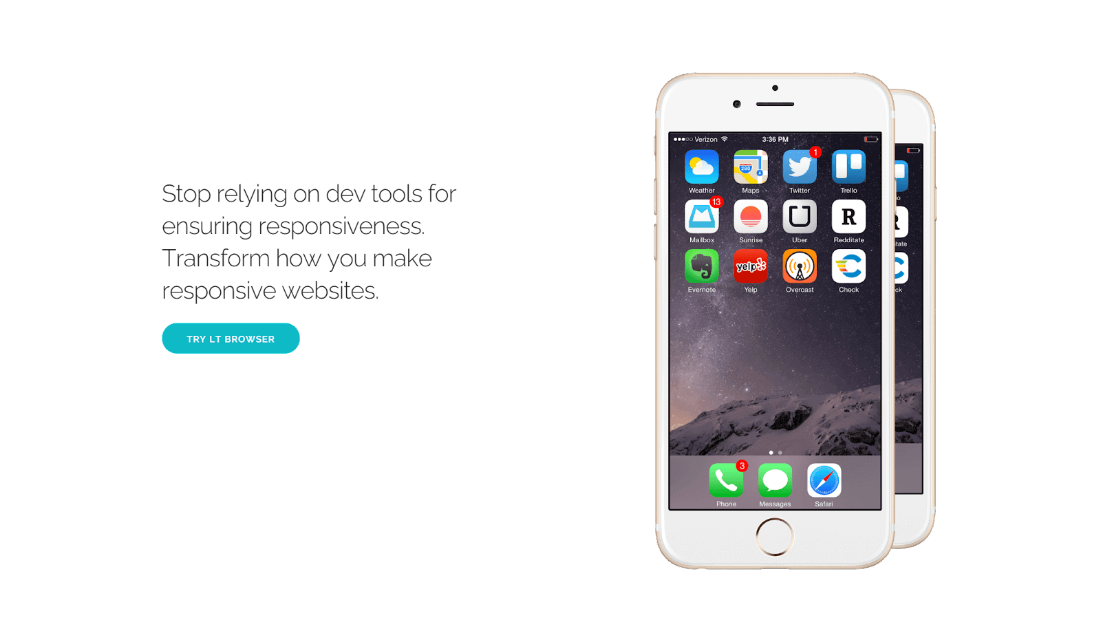
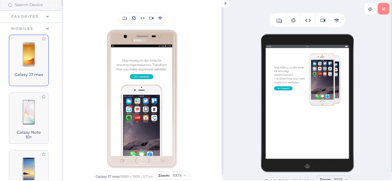
In this example, we created a landing page with an image on the right and some text followed by a CTA button on the left. In smaller screens, both text and image stack vertically, and in larger screens, both stack side by side.
To do this, we used Skeleton as a boilerplate, which provides an index.html file and a folder called css. We changed the content of index.html and created a new file inside the css folder where we added the above lines of CSS.
These custom CSS styles are applied to enhance the page’s visual appeal. Buttons are styled with rounded edges, sections have padding and alignment, and phone images are positioned with specific dimensions. We also used media queries to adjust the minor details of the layout, like padding, height, and font size based on the screen width.
In the HTML markup, we used Skeleton classes like row to create a row, one-half column to create a column that takes half of the space of the row, and button-primary with the button prefix to generate a primary button.
Advantages of Skeleton:
- Lightweight: Skeleton is very lightweight. The minified and gzipped CSS file is only 4.2KB, which will load quickly and not slow down your website.
- Easy to customize: Skeleton is easy to customize. The library is documented and provides many classes that you can use to style your website. You can also override any default styles to create your custom look.
- Responsive: Skeleton includes a grid system and other features that make it easy to create responsive websites. This means that your website will look good and function properly on all devices, including desktop computers, laptops, tablets, and smartphones.
Limitations of Skeleton:
- Not suitable for larger projects: Skeleton provides a boilerplate that might not be suitable for larger projects with complex file structures.
Basscss
Basscss is a lightweight and modular CSS library that provides a set of utility classes to help you quickly and easily style your web projects. It follows the principle of utility-first CSS, which means that instead of writing custom CSS rules for each element and component, you use predefined utility classes to apply styles directly to the HTML elements.
These predefined utility classes typically have names that describe their purpose, such as .bg-blue for setting a blue background color or .m1 for adding a margin to an element.
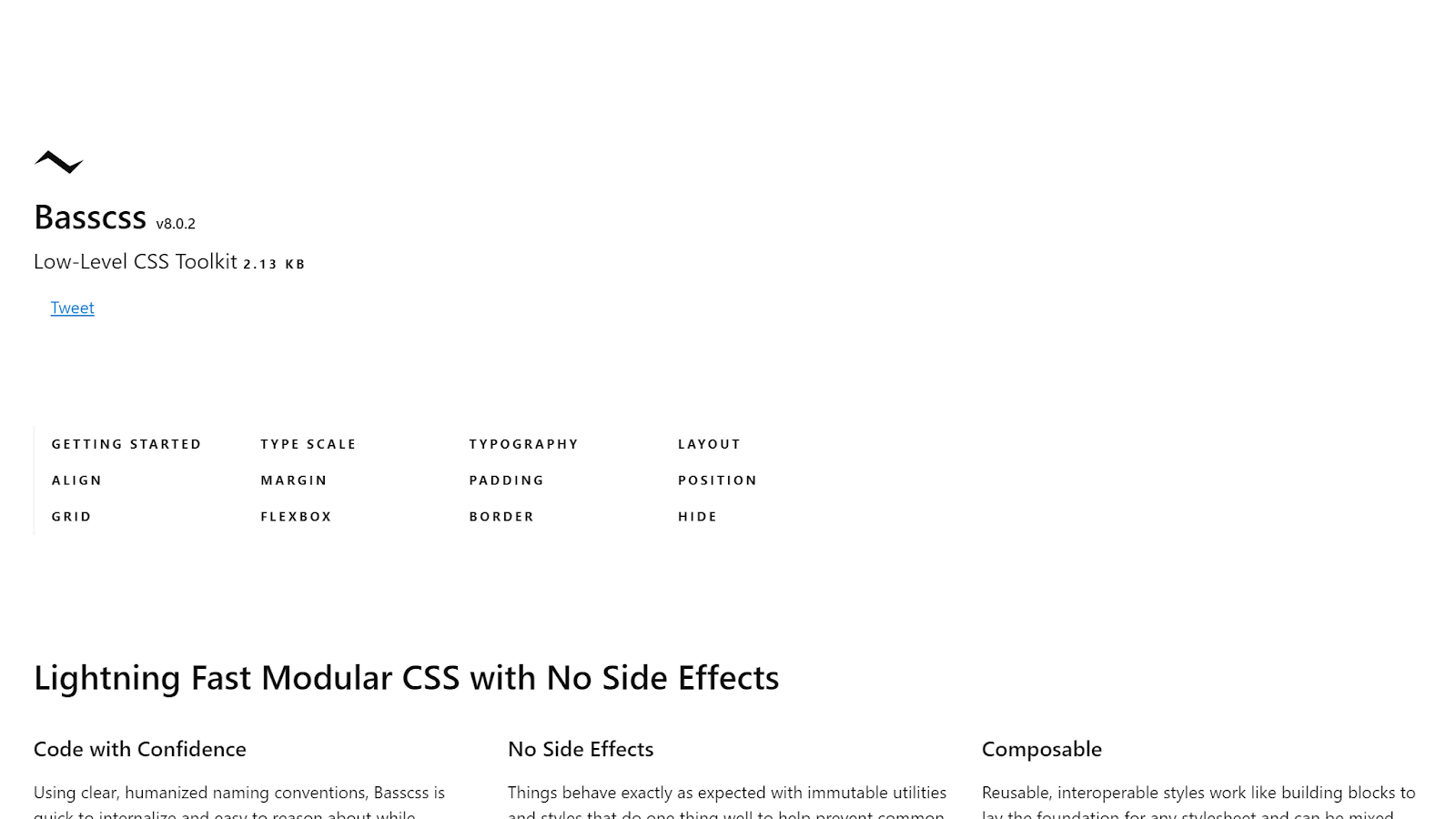
One of the best things about Basscss is that it’s modular. You can choose which parts of the library you want to use, so you don’t end up with a lot of unnecessary code. It’s a flexible and straightforward way to make your web pages look great without the complexity of larger CSS libraries.
Basscss has 5.8k Stars and 300+ Forks on GitHub. It also has 7000+ weekly downloads according to npm trends.
Let’s look at an example of using Basscss.
HTML:
|
1 2 3 4 5 6 7 8 9 10 11 12 13 14 15 16 17 18 19 20 21 22 23 |
<link href="https://unpkg.com/basscss@8.0.2/css/basscss.min.css" rel="stylesheet" /> <div class="p2 m2 border rounded" style="border-color: #ccc"> <p class="bold">Bold</p> <p class="regular">Regular</p> <p class="italic">Italic</p> <p class="caps">Caps</p> <p class="left-align">Left align</p> <p class="center">Center</p> <p class="right-align">Right align</p> <p class="justify"> Justify Bacon ipsum dolor sit amet chuck prosciutto landjaeger ham hock filet mignon shoulder hamburger pig venison. </p> <p class="nowrap">No wrap</p> <p class="underline">Underline</p> <p class="truncate">Truncate</p> <p class="font-family-inherit">Font Family Inherit</p> <p class="font-size-inherit">Font Size Inherit</p> <a class="text-decoration-none">Text Decoration None</a> </div> |
Output:
Advantages of Basscss:
- Modularity: Basscss is designed with a modular approach, so you can pick and choose which parts of the framework to include in your project. This reduces bloat and allows for faster load times.
- Responsive design: It includes responsive design classes that allow you to create layouts that adapt to different screen sizes and devices.
- Speed and clarity: Basscss provides clear, humanized naming conventions that make it quick to internalize and easy to reason about. This can lead to faster development times and more readable code.
- Flexibility and control: Basscss provides basic building blocks that can be used to create any design. This gives you complete control over your CSS and allows you to create custom designs that meet your specific needs.
- No side effects: Basscss utilities are immutable, meaning they can be used without worrying about unexpected behavior.
Limitations of Basscss:
- Limited component library: Unlike more extensive CSS libraries like Foundation, Basscss does not have a library of pre-designed UI components (e.g., modals, navigation menus). You’ll need to build or style these components from scratch.
- Learning curve: While using utility classes can be efficient, it may have a learning curve, especially for developers who are used to writing custom CSS. It can take time to become proficient in using the utility classes effectively.
- Community and updates: The popularity and maintenance of Basscss may not be as extensive as some larger CSS frameworks, which could impact the availability of community support and updates over time.
98.css
98.css is a CSS library for building interfaces that look like Windows 98. It is a design system that provides a set of consistent styles for all of the common elements of a web UI, such as buttons, menus, forms, and dialog boxes.
Many developers want to build retro UIs but don’t have the time or expertise to create their own styles. 98.css solves this challenge by providing a ready-made set of styles that can be used to create any kind of retro UI.
98.css is built on the principles of accessibility and semantic HTML. This means that it is easy to use 98.css to create websites accessible to people with impairments, and it is also easy to customize the styles of your website without breaking the overall design. 98.css is a relatively new CSS library that has quickly gained popularity. It has 8.2k Stars on GitHub and 3000+ weekly downloads on npm trends.
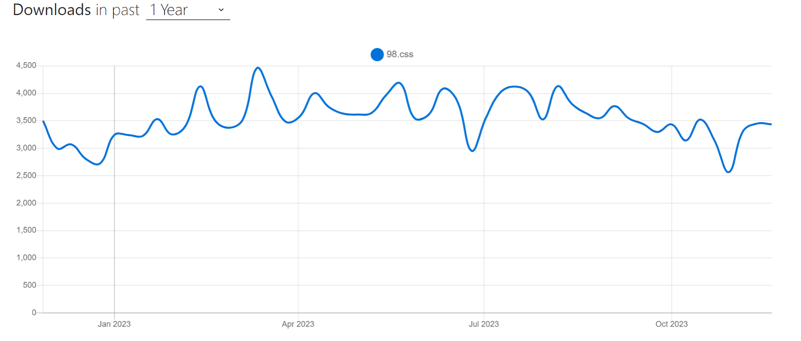
Let’s look at an example of using 98.css.
HTML:
|
1 2 3 4 5 6 7 |
<link rel="stylesheet" href="https://unpkg.com/98.css" /> <div class="container"> <h1 class="title">An example of using 98.css</h1> <button>Click me</button> <input type="submit" /> <input type="reset" /> </div> |
CSS:
|
1 2 3 4 |
.container { text-align: center; /* Center the content horizontally */ height: 100vh; /* This centers the content vertically within the viewport */ } |
Output:
See the Pen
98.CSS Demo by Tahera Alam (@alam_tahera)
on CodePen.
Advantages of 98.css:
- Unique: 98.css is one of the few CSS libraries that help you create retro UIs. This makes it a unique and valuable resource for developers who want to build UIs with a retro look and feel.
- Accessibility and Semantic HTML: 98.css is built on the principles of accessibility and semantic HTML. This means that websites built with 98.css will be accessible to people with disabilities.
- Compatible with any front-end framework: It is compatible with any front-end framework. This means developers can use 98.css to build retro UIs with their favorite front-end frameworks, such as React, Vue.js, or Angular.
Limitations of 98.css:
- Limited use cases: It is only suitable for building UIs with a retro look and feel. This means that it has a limited use case and is unsuitable for building all types of websites.
Blaze UI
Building websites is easy, but building scalable and maintainable websites is not.
Blaze UI tackles this challenge by providing a solid structure for building websites quickly with a scalable and maintainable foundation. It does this by providing a set of consistent CSS styles for all of the common elements of a web UI. It also offers several features that make it easy to customize the look and feel of a website without breaking it.
The best thing about the Blaze UI is its flexibility. It is a framework-free UI toolkit, meaning you can use it with or even without any JavaScript framework. This makes it a great choice for projects where you want complete control over the code and build custom solutions.
Blaze UI has 1.6k Stars on GitHub and 300+ weekly downloads through npm trends.
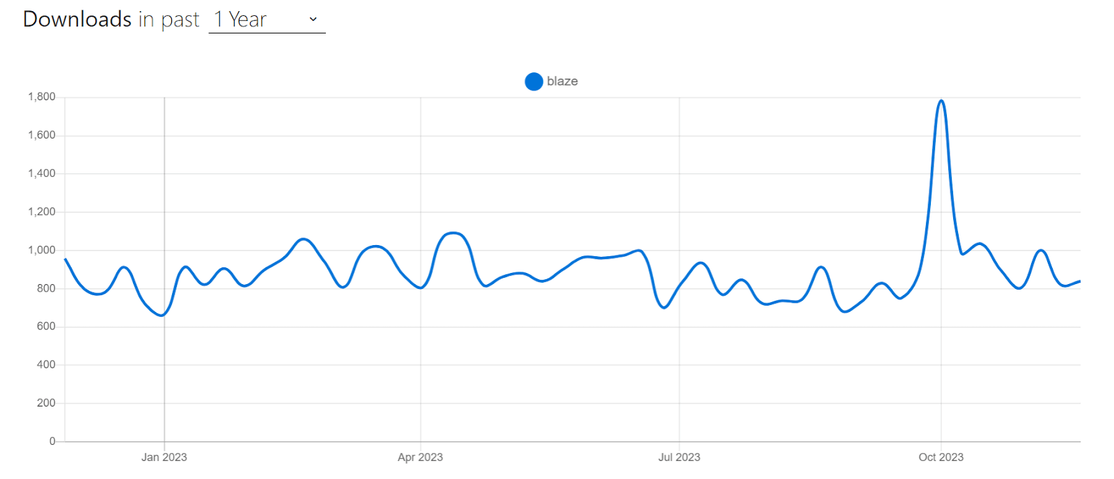
Let’s look at an example of using Blaze UI.
HTML:
|
1 2 3 4 5 6 7 8 9 10 11 12 13 14 15 16 17 18 19 20 21 22 23 24 25 26 27 28 29 30 31 32 33 34 35 36 37 38 39 40 41 42 43 |
<link rel="stylesheet" href="https://unpkg.com/@blaze/css@x.x.x/dist/blaze/blaze.css" /> <ul class="o-timeline o-timeline--alternate o-timeline--loading"> <li class="c-timeline-item c-timeline-item--left"> <div class="c-timeline-item__body">Nothing</div> </li> <li class="c-timeline-item c-timeline-item--brand"> <div class="c-timeline-item__body"> Big bang <p class="c-paragraph u-text--quiet u-small"> Widely considered to be how the universe began </p> </div> </li> <li class="c-timeline-item c-timeline-item--info c-timeline-item--left"> <div class="c-timeline-item__body">Galaxies go everywhere</div> </li> <li class="c-timeline-item c-timeline-item--warning"> <div class="c-timeline-item__body">Solar systems form</div> </li> <li class="c-timeline-item c-timeline-item--success c-timeline-item--left" > <div class="c-timeline-item__body">Earth appears</div> </li> <li class="c-timeline-item c-timeline-item--error"> <div class="c-timeline-item__body">Human infestation occurs!</div> </li> <li class="c-timeline-item c-timeline-item--left c-timeline-item--last"> <div class="c-timeline-item__body"> All this has happened before, and will happen again </div> </li> <li class="c-timeline-item c-timeline-item--loading"> <div class="c-timeline-item__body">...Evolution</div> </li> </ul> |
Output:
See the Pen
Blaze Ui Demo by Tahera Alam (@alam_tahera)
on CodePen.
In this example, we used Blaze UI to create a timeline. Timelines are often used to illustrate a connected set of events that have happened or are planned to happen. However, creating a timeline using CSS requires much work, as you need to style each element individually.
With the Blaze UI timeline component, we can create timelines with just a few lines of code. The timeline component is also fully responsive and will look good on all devices.
Advantages of Blaze UI:
- Accessible: All of the components in Blaze UI are accessible so that everyone can use your website.
- Framework-free: Blaze UI is not tied to any specific framework, so you can use it with or without your favorite JavaScript library or framework. This gives you the flexibility to choose the best tools for your project.
- Scalable: It is designed to be scalable, so you can use it to build small websites or large complex web applications.
- Responsive: All of the components in Blaze UI are responsive, so your website will look great on any device.
Limitations of Blaze UI:
- Small community: Blaze UI has a smaller community than some other CSS libraries, so less support and resources may be available.
Woah.css
Woah.css is an animation library that is designed to be fun and unique. It comes with various fun and showy CSS3-powered animations that can be easily applied to HTML elements.
Woah.css provides various animation classes, including
- wowsers: A flashy animation that makes your element appear to explode from the page.
- comeInStyle: A smooth animation that makes your element slide into view from the top left corner of the page.
- rotateComplex: A complex animation that makes your element rotate and flip in place.
- flyOut: An animation that makes your element fly out of the page to the right.
- flyIn: An animation that makes your element fly into the page from the left.
- blackMirror: An animation that makes your element glitch and flicker, like from the TV show Black Mirror.
- spin3D: An animation that makes your element spin 360 degrees on the Y axis.
- simpleEntrance: A simple animation that makes your element fade in from 0% to 100% opacity.
- scaleOut: An animation that makes your element scale down to 0%.
- starWars: An animation that makes your element appear to fly through space like a Star Wars ship.
- blazingStar: An animation that makes your element appear like a blazing star.
- pulse: An animation that makes your element pulse in and out.
- shaker: An animation that makes your element shake back and forth.
Woah.css is a great choice for developers who want to add excitement to their websites. Many of the animations it provides are unconventional and out of the box, which can be ideal for projects where you want to add some playful touch.
Below is an example of Woah.css animations.
See the Pen
Woah.css by Chris Coyier (@chriscoyier)
on CodePen.
Advantages of Woah.css:
- Easy to use: Woah.css comes with a variety of pre-built animations that can be applied to HTML elements with just a few lines of code.
- Lightweight: It is a relatively small library, which makes it a good choice for websites that need to minimize their file size.
- Flexible: Woah.css animations can be combined to create custom animations, and they can also be easily customized to match the specific needs of a website
Limitations of Woah.css:
- Limited number of animations: Woah.css has fewer animations than some other CSS animation libraries.
- Relatively new library: Woah.css is a relatively new library, so it may not be as fully supported.
RaisinCSS
RaisinCSS is a utility-first CSS library that provides a wide range of pre-built utility classes that can be used to build custom and responsive websites.
Utility classes are small, specific, and reusable CSS classes that can be used to style any element on a page. For example, a utility class might add a margin to an element, change its font color, or make it responsive.
RaisinCSS is modular, which allows developers to pick and choose only the components they need, reducing the overall file size and improving the loading speed of web pages. It is also documented and beginner-friendly, making it a great choice for developers of all skill levels.
Advantages of RaisinCSS:
- Supports CSS grid and flexbox: RaisinCSS supports modern layout techniques like CSS grid and CSS flexbox, ensuring your projects align with contemporary web design practices. This allows you to create complex layouts with ease and flexibility.
- Highly customizable: RaisinCSS is highly customizable because of its modular structure. So you can quickly adapt styles and components to match your needs and project requirements.
- Lightweight: It is a lightweight library that does not add unnecessary bloat to your website.
- Easy to use: RaisinCSS is easy to learn and use, even for developers who are new to CSS.
- Documentation: RaisinCSS comes with clear and concise documentation that is easy to follow.
Limitations of RaisinCSS:
- Limited number of components: RaisinCSS does not come with a lot of pre-built components, such as navigation bars and forms. However, there are a number of third-party RaisinCSS components available online.
- Relatively new library: It is relatively new, so it may not be as fully supported as other CSS libraries.
Normalize.css
Normalize.css is a lightweight CSS library that helps make the default styles of web browsers more consistent and in line with modern standards. Normalize.css is one of the most popular CSS libraries with over 50k Stars on GitHub and is used by thousands of websites, including some renowned names like Twitter, GitHub, Medium, etc.
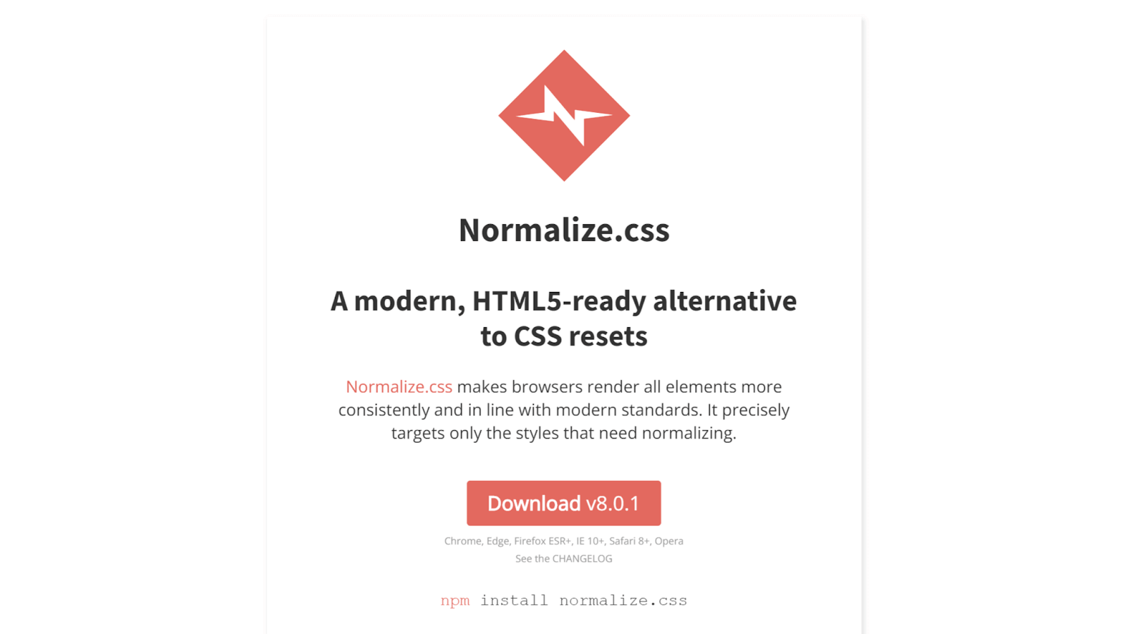
It is a modern alternative to traditional CSS resets. Unlike a traditional CSS reset, Normalize.css does not remove all default styles. Instead it preserves useful defaults and tries to normalize only the necessary styles across browsers. This makes it a good starting point for any web development project, as it can significantly help reduce cross-browser compatibility issues.
Normalize.css is also maintained and regularly updated, making it a reliable and trustworthy choice for developers. It has 11k Forks on GitHub and a staggering million+ weekly downloads through npm trends.
The below CodePen shows the usage of Normalize.css with various HTML elements.
See the Pen
Example of Normalize CSS by dfdumaresq (@dfdumaresq)
on CodePen.
Advantages of Normalize.css:
- Improves cross-browser consistency: Normalize.css helps to ensure that your website looks the same across all major browsers. This can save you a lot of time and effort, as you don’t have to manually test your website on every browser.
- Fixes common browser bugs: Normalize.css fixes common desktop and mobile browser bugs that can affect the appearance of your website. This includes bugs related to HTML5 elements, preformatted text, SVG overflow, and forms.
- Doesn’t use multiple selectors: Normalize.css uses targeted styles and avoids using multiple selectors in rulesets. This makes it easier to debug your CSS and identify the source of any issues.
- Modular and easy to customize: Normalize.css is broken down into relatively independent sections. This means you can easily add or remove specific styles depending on your needs.
Limitations of Normalize.css:
- Lack of opinionated styles: Normalize.css focuses on resetting or normalizing default styles without providing opinionated design choices. While this is a strength for flexibility, you’ll need to write your own custom CSS to create a unique design.
- Maintenance: It requires updating with evolving web standards and browser changes. You may need to update it periodically to address new issues or changes in browser behavior.
Criteria for Selecting CSS Libraries
Selecting the best CSS libraries for your project is crucial for efficiency, maintainability, and achieving your design goals. However, with a plethora of CSS libraries available, it can be challenging to pick the best one for your specific needs.
Note that the best library for your project will vary depending on your specific project requirements. However, to assist you in making an informed choice, here are some key criteria to consider when selecting the right CSS libraries:
- Performance considerations
- Compatibility and browser support
- Wider audience: Every web browser has its own group of users. By ensuring compatibility across these browsers, you can reach a broader audience.
- User experience: Users have different preferences and expect your website to work without glitches on their preferred browser. A website that functions flawlessly across different browsers improves user experience.
- Search Engine Optimization(SEO): Search engines like Google consider user experience an important ranking factor. A website with good browser compatibility will likely rank higher, improving its visibility.
- Ease of use and documentation
- Customizability and flexibility
One of the most important things you should consider when choosing a library is its performance.
Look for libraries that are optimized for speed and efficiency. A good library should not add unnecessary bloat to your website, which could slow it down. Check if the library’s code is minified or compressed, as smaller file sizes load faster.
Also, check if the library follows best practices for reducing render-blocking resources, which can improve page load times.
If you don’t know what render-blocking resources are, they are elements like stylesheets and scripts that can slow down the loading of a web page. When a browser encounters these resources, it often stops rendering the page temporarily to fetch and process them. This pause can make the page appear slower to users.
To prevent it, some libraries follow practices like loading only the necessary parts first and deferring the rest until after the page is visible. So, when a library follows such best practices, it helps the web page load faster.
The success of your website depends heavily on its ability to function flawlessly across a wide range of browsers and devices. So, ensuring the CSS library you pick works with popular web browsers is crucial. This is important for several reasons:
So, when choosing CSS libraries, selecting one that prioritizes compatibility and browser support is important.
To ensure your libraries are compatible with the latest browser versions, you can test your website using a cross browser testing platform like LambdaTest. LambdaTest is an AI-powered test orchestration and execution platform that allows you to test your website on an online browser farm of 3,000+ browsers and operating systems. You can also test your website on mobile phones, tablets, and more.
The documentation should provide clear step-by-step instructions, examples, and practical usage guidelines. This way, you can quickly understand how to maximize the library’s capabilities without hassle. A good library will simplify your development and save you time.
Every project has its unique design requirements. A good CSS library should allow for customization and flexibility.
Check if the library provides variables, mixins, or other mechanisms for you to tailor the styles to match your project’s branding and design needs. Highly customizable libraries enable you to create a unique and visually appealing user interface while benefiting from pre-built components and functionality.
To recap, when selecting the best CSS libraries, consider factors like performance, compatibility, ease of use, and customization. A library that excels in these areas will help you build efficient, cross-browser-compatible, and visually appealing websites while saving you time and effort in the development process.
Wrap it up!
CSS libraries are a robust way of building modern and inclusive websites. By choosing the right library for your web project, you can streamline your workflow, produce high-quality, maintainable code, and deliver a seamless user experience worldwide.
However, with the vast number of CSS libraries available, choosing the right one for your project can be challenging. So, in this blog, we have handpicked the best 20 CSS libraries for you to leverage. While choosing these libraries, we considered factors like ease of use, popularity, use cases, clear documentation, browser support, and flexibility.
Hope this blog has been helpful to you and helped you discover some useful CSS libraries. Until next time, happy coding!
Frequently Asked Questions (FAQs)
What are libraries in CSS?
CSS libraries are collections of pre-written CSS codes that offer common styling elements like buttons and forms to speed up web development.
Which is the best CSS library?
The best CSS library depends on project needs; popular choices include Bootstrap for its extensive components, Foundation for flexibility, and Materialize for material design aesthetics.
Is Bootstrap a library for CSS?
Yes, Bootstrap is a widely-used CSS library known for its comprehensive set of ready-to-use components for responsive web design.


Author’s Profile
Tahera Alam
Tahera is a front-end developer who loves developing seamless frontends and efficient backends. She has skills in React, JavaScript, Nextjs, Tailwind, MongoDB, Solidity, and more. She loves to learn new technologies and finds writing about them to be a great way to share knowledge with others. In her free time, she enjoys reading thrillers and engaging with the tech community on Twitter.
Blogs: 11
Got Questions? Drop them on LambdaTest Community. Visit now


