
A Complete Guide On CSS Typography And Encoding
Aman Mandal
Posted On: August 22, 2022
 28629 Views
 22 Min Read
Have you ever stumbled on a website and asked yourself questions like, Who made this ??? How can I read this ???
Then you proceed to another site, and you are like WOWWW !! This is so cool !!. Now let’s ask ourselves two questions:
- What made the first website so unreadable and awful to you?
- What made the second website so enjoyable and cool?
For the second website, you might just scroll and keep scrolling, probably without actually reading anything, but you marvel at the developer’s creation.
There are a lot of factors that determine if a site is readable/enjoyable or not, but we will talk about CSS Typography today! It is only logical to say that a designer should get good training in the main discipline of shaping written information, in other words: CSS Typography.
This is intended as a practical guide to learning CSS typography and encoding. We’ll cover a range of practical and useful topics, like how to choose and use fonts. We will discuss some usability aspects if proper fonts are not used, but more importantly, how to create a pleasant user experience. We’ll go over the principles of CSS typography and the properties that control them.
Let’s begin with our CSS typography tutorial!
TABLE OF CONTENTS
What is Typography?
Typography is the art of arranging letters and text to make the website legible, clear, and visually appealing to the reader. Typography involves font style, appearance, and structure, which aims to bring out certain emotions and convey specific messages.
Type is the user interface for conveying information on the web. We can pull many levers to affect the usability of reading text, and that’s how we can create a pleasant user experience.
After usability, typography is all about emotion. Do letters complement your content or contradict it? Do they amplify your brand’s personality or dampen it? Different types will make people feel different things applied to the same text.
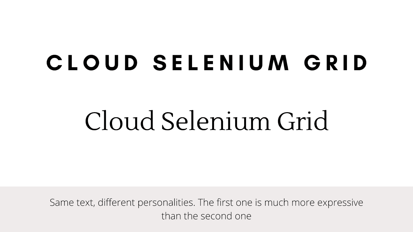
Typography isn’t an exact science. Good guidelines will get you most of the way there, but you’ll need to apply a little intuition too. Luckily, we’ve been reading text our whole life – books, magazines, the Internet – so we have much more instinct than we think!
Fonts and Typefaces: Differences
There’s some confusion surrounding the difference between typefaces and fonts, with many treating the two as synonyms. A typeface is a design style comprising various characters of varying sizes and weights, whereas a font is a graphical representation of text characters.
Put simply, a typeface is a family of related fonts, while fonts refer to the specific size, weight, or style of a typeface.
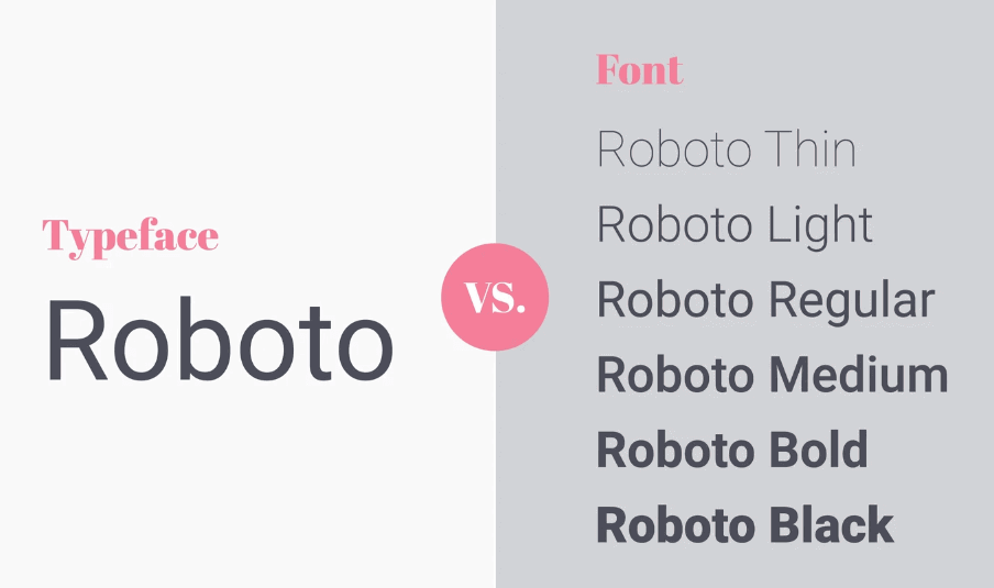
In essence, a typeface is like a song, and the font is like its MP3 file. Both terms are used in typography literature, so it’s worth knowing the distinction. But, more recently, you can use both terms interchangeably, and designers will understand what you mean.
Categorization of Fonts
The broadest split is between serif and sans-serif typefaces. You’ve likely come across these terms just by seeing some typeface name floating around.
Serif
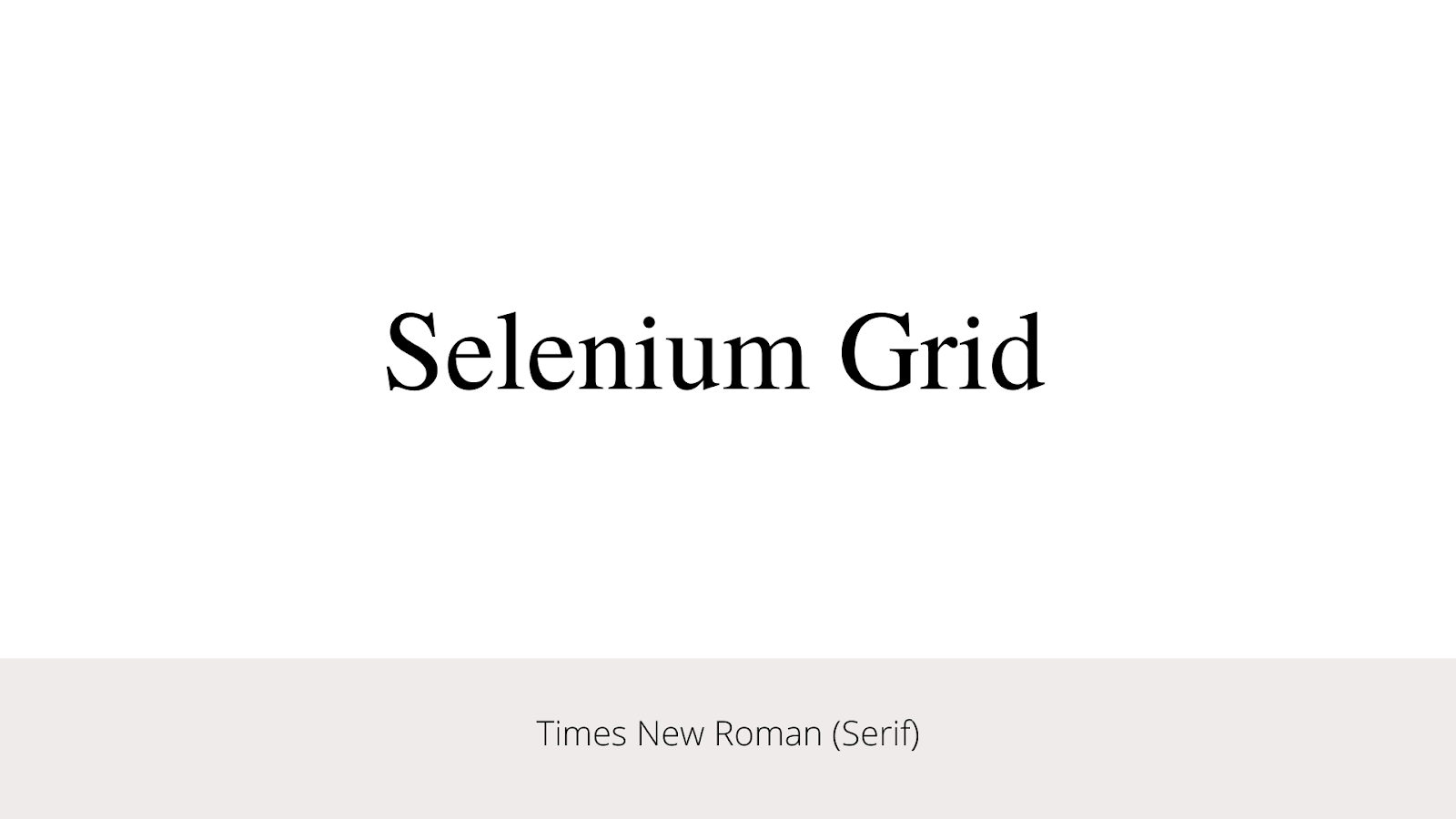
A “serif” is a small stroke attached to the ends of letters, giving them a traditional feel. Most books and newspapers are set in serif typefaces. The ‘serif’ category includes sub-categories such as Old Style, Classical, Neo-Classical, Transitional, Clarendon, etc.
Below is what the “Times New Roman” font looks like. Notice the tiny feet present at the tops and bottoms of each letter.
Sans Serif
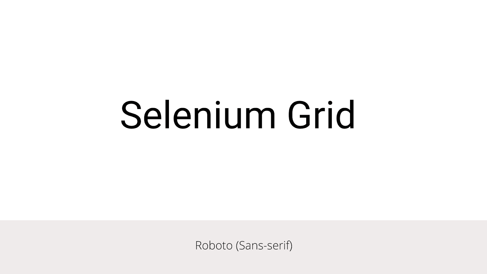
“Sans” comes from the French “without.” As the name states, sans-serif typefaces don’t have these extra strokes, giving them a smooth, modern feel. It includes humanist, geometric and grotesk, etc., as sub-categories.
Below is the font called “Roboto” in the Sans Serif category. Again, notice the clean and straight lines compared to the serif fonts.
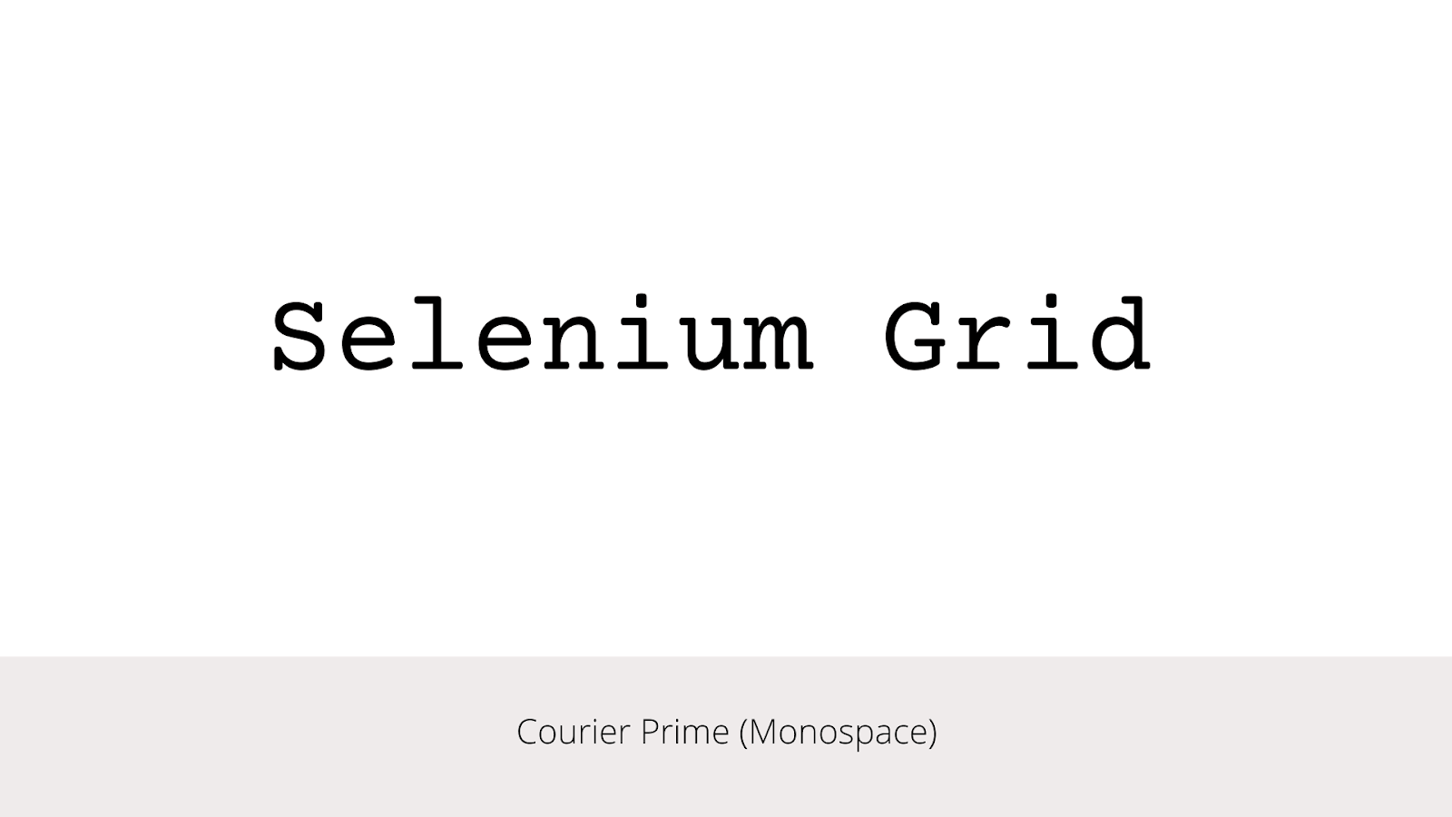
Monospace
Monospace fonts are a noteworthy category all on their own. Each glyph (i.e., letter/number.symbol) in a monospace font has the same width (hence the mono spacing terminology), so it’s possible to arrange them into visual structures.
You may be well familiar with monospace because we developers see it often when writing code, whether it’s helpful to make brackets and indents line up visually.
Below is the font called “Courier Prime” in the Monospace category. Again, notice how the width between the letters are same (mono) compared to the other fonts.
“Web safe” Fonts vs Custom Fonts
A font is “web safe” if most computers have it installed already, and they don’t have to download it separately when visiting your site. Examples include Arial, Times New Roman, Courier, Georgia, Verdana, and many more.
A website can declare a custom font as a resource, just like CSS, images, or JavaScript. The visiting browser will download the font and apply it to the texts on the website.
Another significant way to shed some of the weight of custom web fonts is to use a service that will host and serve them for you. The core benefit here is that third-parties store the files on a CDN (e.g., Cloudflare, StackPath, etc.), optimize them, and serve them to your site via a JavaScript snippet that gets dropped into the document head.
Let’s see how it is to use a hosted service,
|
1 2 3 4 5 6 7 8 9 |
<html> <head> <link href="https://fonts.googleapis.com/css?family=Roboto" rel="stylesheet"> <style> body { font-family: 'Roboto', sans-serif; } </style> </head> |
The above example is from Google Fonts – the most popular hosted service. It’s free to use and has a catalog of more than 1000 font families. It has fonts with beautiful design, different weights, bold/italics, and many advanced features.
Another trendy one is Adobe Fonts. It comes with more than 1500 fonts. These are typically high-quality fonts which are paid ones.
There are many other options like Fontspring, MyFonts by Monotype, etc.
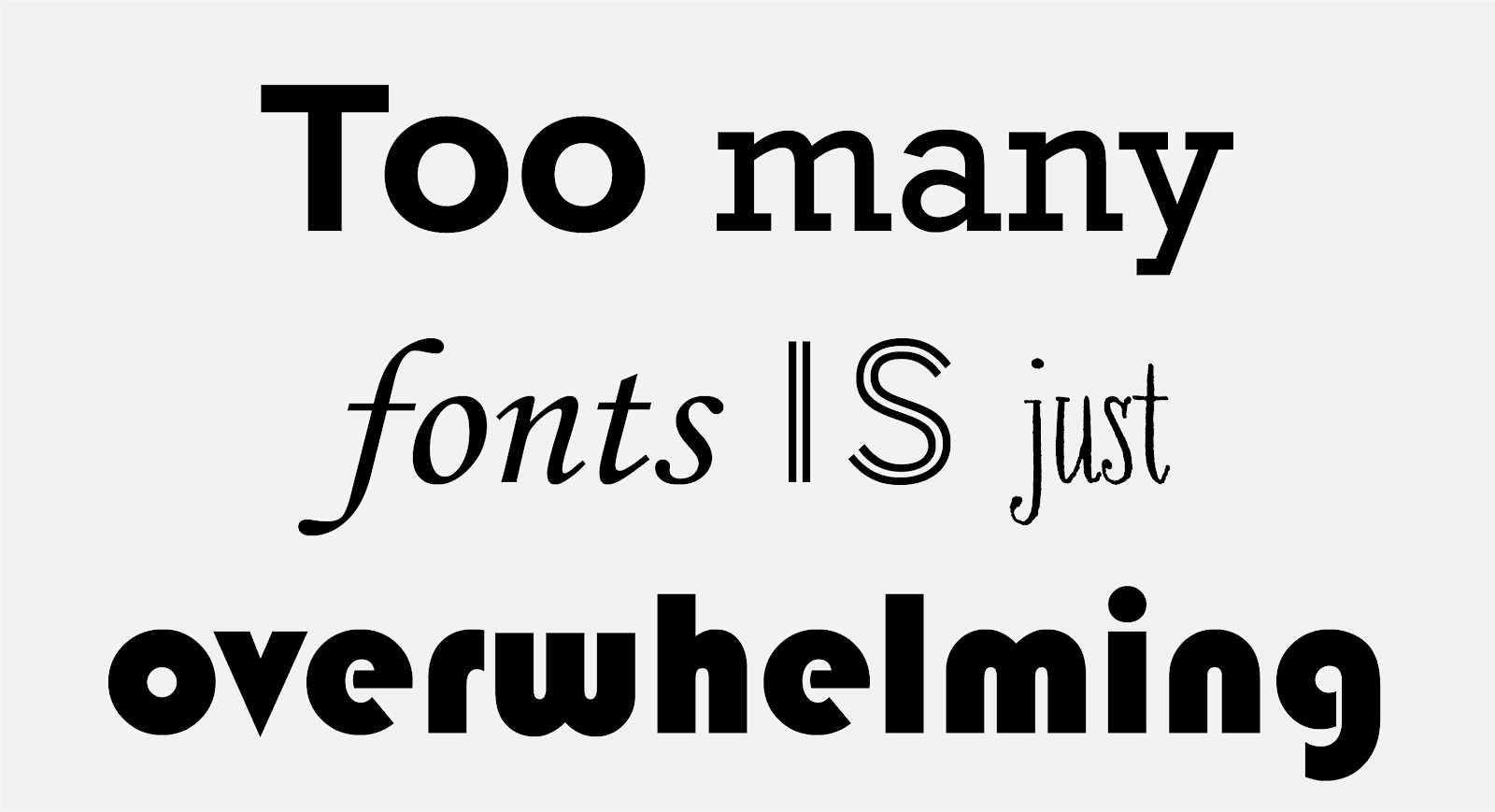
One wrong choice leads to another hassle
Many websites and applications are made to be used by many people to indulge in purchasing activities such as buying services or products online, consuming content, etc. They catalyze the process of creating a brand identity. Therefore, one wrong choice in selecting typography could lead to hassle and severe problems for the brand later.
While selecting typography for a website/application, a small mistake might lead to a domino effect. This is why it is important to avoid making unsure decisions. There are some common errors the designers tend to commit, such as misjudged text line lengths, wrongly paired typefaces, poor body font choices, bad color choices, and wrongly chosen line height between two lines of text. All of these should be given utmost attention as they are prominent parts of helping users read fluently.
Improper spacing, instability, and rare alignments in the selection of font families, sizes, and colors can ruin the overall brand image.
Test your CSS Typography and Encoding for browser compatibility. Try LambdaTest Now!
CSS and Typography
Ok, so far, we have covered almost all the fundamentals and concepts of topography. Now let’s move on to the intersection of design and development. Now we can turn our attention to what properties we have to manipulate and style fonts, specifically with CSS.
Font Sizing
Changing font size is something inevitable in a project. The font-size property in CSS is used to specify the height and size of the font. It affects the size of the text of an element. This property accepts values, percentages, and a handful of keyword values. We use different units to measure fonts in CSS. Those are mainly divided into two categories, ‘Absolute’ and ‘Relative.’
The actual size of an element expressed in relative units depends on other parts (e.g., parent element, or size of the viewport, etc.) of the page, while the actual size of an element expressed in absolute units is always the same. And as you might expect, that difference is important because they serve different functions, depending on design needs. Px (pixels), em, rem, and percentage are mainly used.
Example: Font Size (specified in px)
Below is an example of how you could specify the font sizes in absolute units (i.e., pixels).
HTML:
|
1 |
<p class="box">A text with font size 20px </p> |
CSS:
|
1 2 3 4 5 6 7 8 9 10 11 12 |
body{ text-align:center; } .box{ background: #EEEEEE; margin : 40px auto; width : 250px; font-size : 20px; padding: 40px 20px; border : 1px solid; } |
Output :
See the Pen
Font Size (px) by Aman Mandal (@aman-mandal)
on CodePen.
In the above code sample, the font size of the text is set to 20 px. We used the ‘px,’ an absolute unit, but we should avoid using absolute units like px and instead use relative units like ‘em’ or ‘rem’ as much as possible.
Example: Font Size (specified in rem)
Let’s look at the same example above, but we will use the relative unit ‘rem’ this time. It is important to note that rem depends upon the size of the root element of the HTML (1 rem = 16px).
HTML:
|
1 |
<p class="box">A text with font size 2 rem </p> |
CSS:
|
1 2 3 4 5 6 7 8 9 10 11 12 |
body{ text-align:center; } .box{ background: #EEEEEE; margin : 40px auto; width : 250px; font-size : 2rem; padding: 40px 20px; border : 1px solid; } |
Output:
See the Pen
Font Size (rem) by Aman Mandal (@aman-mandal)
on CodePen.
Font Weight
Font weight is the “value” placed on your font to determine how bold or light your text will appear. There are many “values” that you can use depending upon your requirement. The weights available depend on the ‘font-family’ that is currently set.
Different weights are used for different purposes on our website. Designers mostly prefer bold/bolder weights for the heading and the sub-headings and normal (300-600) weights for the content.
Let’s take a look at the syntax:
|
1 2 3 4 5 6 7 8 9 10 11 12 13 14 15 16 17 18 19 20 21 22 23 24 25 |
/* Global values */ font-weight: inherit; font-weight: initial; font-weight: revert; Font-weight: revert-layer; font-weight: unset; /* Keyword values */ font-weight: normal; font-weight: bold; /* Keyword values relative to the parent */ font-weight: lighter; font-weight: bolder; /* Numeric keyword values */ font-weight: 100; font-weight: 200; font-weight: 300; font-weight: 400;// normal font-weight: 500; font-weight: 600; font-weight: 700;// bold font-weight: 800; font-weight: 900; |
The ‘font-weight’ property is specified using any one of the values listed below:
- Normal: Normal font weight. Same as 400
- Bold: Bold font weight. Same as 700
- Lighter: A relative font weight. Lighter than the parent element
- Bolder: A relative font weight. Bolder than the parent element
HTML:
|
1 2 3 4 5 6 7 8 9 |
<h3>Font Weights</h3> <div class="container"> <p>Text with the font-weight of parent.</p> <p class="normal">Text with the font-weight 'normal'</p> <p class="bold">Text with the font-weight 'bold'</p> <p class="lighter">Text with the font-weight 'lighter'</p> <p class="bolder">Text with the font-weight 'bolder'</p> </div> |
CSS:
|
1 2 3 4 5 6 7 8 9 10 11 12 13 14 15 16 17 18 19 20 21 22 23 24 25 |
body { text-align: center; font-weight: 600; } .container { font-size: 20px; background: #eeeeee; margin: 40px auto; width: 400px; padding: 40px 20px; border: 1px solid; } .normal { font-weight: normal; } .bold { font-weight: bold; } .lighter { font-weight: lighter; } .bolder { font-weight: bolder; } |
Output:
See the Pen
Font-Weight by Aman Mandal (@aman-mandal)
on CodePen.
In the above code example, all the texts are given different classes concerning their different font weights. The text with the class ‘normal’ has a normal font weight (400). The text with the class of ‘bold’ has a font weight of bold (700).
The text with the class of ‘lighter’ has a font weight of lighter, i.e., a relative unit. It makes the font lighter than the parent’s font weight. And the last text with a class of bolder (a relative unit) makes the font bolder than the parent’s font.
Line Height
Line height is one of the most important factors affecting readability. It’s controlled by the line-height property in CSS, best expressed as a unit-less number corresponding to multiple of the defined font size.
When applied to a block-level element, the line-height property defines, as its name suggests. The line-height property uses the following units:
- px
- em
- %
- unitless numbers (e.g., 1.5)
The unitless values act like percentages. So 150% is equal to 1.5. The purpose of the line height is to define a readable line spacing for your text. Because readability depends upon the text’s size, it is recommended to use a dynamic value relative to the text’s size.
Using ‘px’ is not recommended because it defines a static value. The recommended method is to use unitless numbers.
Syntax:
|
1 2 3 |
p { line-height: 1.5; } |
- For body text, a line height of 1.4 or 1.5 times the size of the text is recommended.
- For headings, a line height of 1.2 is recommended.
HTML:
|
1 2 3 4 5 6 |
<h4>Line Height</h4> <div class="container"> <p class='first'>An aim is a goal or objective to achieve in life. In order to succeed in life, one must have a goal. My aim in life is to be a teacher. Teaching is a noble and responsible profession. I have come to know that the ever-increasing misery and distress, are </p> <p class='second'>An aim is a goal or objective to achieve in life. In order to succeed in life, one must have a goal. My aim in life is to be a teacher. Teaching is a noble and responsible profession. I have come to know that the ever-increasing misery and distress, are </p> </div> |
CSS:
|
1 2 3 4 5 6 7 8 9 10 11 12 13 14 15 16 17 18 19 20 21 22 23 |
body{ font: 15px Georgia, serif; text-align: center; } .container{ text-align: left; background: #EEEEEE; padding: 20px 20px; border: 1px solid; margin: 30px auto; display: flex; width: 30rem; gap: 30px; } .first{ line-height: 1.2; } .second{ line-height:1.5; } |
Output:
See the Pen
Line Height by Aman Mandal (@aman-mandal)
on CodePen.
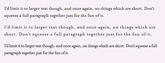
As you can see in the above code example, the left paragraph has a line height of 1.2, and the right side paragraph has a line height of 1.5. Line height plays a significant role in typography. So here are some guidelines to define a good line height:
- Increase line height for thick fonts.
- Increase line height when fonts are a dark color.
- Increase line height for long-form content.
Letter Spacing
Letter spacing is one of the most important factors affecting readability. It is controlled by the CSS letter-spacing property. The letter-spacing property controls the space between each letter in a given element or block of text. Values supported by letter-spacing include font-relative values (em, rem), absolute values (px), and the normal property, which resets to the font’s default.
Using font-relative values is recommended so that the letter-spacing increases or decreases appropriately when the font size is changed, either by design or by user behavior.
In general, you only need to worry about the letter spacing for text elements that are particularly big or small because most fonts are spaced well at typical paragraph size.
Syntax:
|
1 2 3 |
p { letter-spacing: 1em; } |
The most important point to note when using letter-spacing is that the specified value does not change the default – it is added to the browser’s default spacing.
Note: letter-spacing also supports negative values, which will tighten the appearance of text rather than loosening it. Let’s have a look at the below code example.
HTML:
|
1 2 3 4 5 6 |
<h3>Letter Spacing</h3> <div class="container"> <p>A sentence with no additional spacing</p> <p class="loose">A sentence with little loose spacing of <span>2px</span></p> <p class="tight">A sentence with little tight spacing of <span>-1.5px</span></p> </div> |
CSS:
|
1 2 3 4 5 6 7 8 9 10 11 12 13 14 15 16 17 18 |
body{ font: 15px Georgia, serif; text-align: center; } .loose { letter-spacing: 2px; } .tight { letter-spacing: -1.5px; } .container { font-size: 20px; background: #eeeeee; margin: 40px auto; width: 350px; padding: 30px 20px; border: 1px solid; } |
Output:
See the Pen
Letter Spacing by Aman Mandal (@aman-mandal)
on CodePen.
In the above code example, the sentence with the class ‘loose’ has a letter-spacing of 2px, and the sentence with the class ‘tight’ has a letter-spacing of -1.5px. You can see how much difference a horizontal space can make in the CSS typography.
Let’s take a look at letter-spacing with another example,
In the above image, the top one has no letter-spacing, whereas the second has a letter-spacing of 1px and the bottom one letter-spacing is -1px. It’s not a giant change, but I think it’s obvious which is easiest to read.
Text Alignment
The text-align property in CSS is used to specify the horizontal alignment of text in an element. It is used to set the alignment of the content horizontally inside a block element. It plays a major role in CSS typography because of its nature.
Syntax:
|
1 2 3 |
p { text-align: center; } |
These are the traditional values for text-align:
- left
The default value. The content aligns along the left side.
HTML:
12<h4>Text Align (Left)</h4><p class='box'>The text is left aligned!</p>CSS:
12345678910111213body{font:15px Georgia, serif;text-align: center;}.box{text-align: left;border: 1px solid;width: 300px;margin : 20px auto;padding: 30px 0;background: #EEEEEE;}Output:
See the Pen
Text Align (Left) by Aman Mandal (@aman-mandal)
on CodePen. - right
The content aligns along the right side.
HTML:
12<h4>Text Align (Right)</h4><p class='box'>The text is right aligned!</p>CSS:
12345678910111213body{font:15px Georgia, serif;text-align: center;}.box{text-align: right;border: 1px solid;width: 300px;margin : 20px auto;padding: 30px 0;background: #EEEEEE;}Output:
See the Pen
Text Align (Right) by Aman Mandal (@aman-mandal)
on CodePen. - center
Content centers between left and right edges, and the white spacing on each line’s left and right sides should be equal.
HTML:
12<h4>Text Align (Center)</h4><p class='box'>The text is center aligned!</p>CSS:
12345678910111213body{font:15px Georgia, serif;text-align: center;}.box{text-align: center;border: 1px solid;width: 300px;margin : 20px auto;padding: 30px 0;background: #EEEEEE;}Output:
See the Pen
Text Align (Center) by Aman Mandal (@aman-mandal)
on CodePen. - justify
Content spaces out so that as many blocks fit onto one line as possible, the first word on that line is along the left edge, and the last word is along the right edge.
HTML:
12345<h4>Text Align (justify)</h4><p class="box">I'm justified. I fill the space exactly (except on the last line), even ifI have to stretch a bit at times</p>CSS:
12345678910111213body {font: 15px Georgia, serif;text-align: center;}.box {text-align: justify;border: 1px solid;width: 300px;margin: 20px auto;padding: 30px 5px;background: #eeeeee;}Output:
See the Pen
Text Align (Justify) by Aman Mandal (@aman-mandal)
on CodePen. - inherit
The value will be inherited from the parent element.
HTML:
1234<h4>Text Align (inherit)</h4><p class="box">I inherit the alignment of my parent. In this case, that means left.</p>CSS:
1234567891011121314body {font: 15px Georgia, serif;}h4 {text-align: center;}.box {text-align: inherit;border: 1px solid;width: 300px;margin: 20px auto;padding: 30px 5px;background: #eeeeee;}Output:
See the Pen
Text Align (Inherit) by Aman Mandal (@aman-mandal)
on CodePen.
Test your CSS Typography and Encoding on the cloud. Try LambdaTest Now!
Pseudo Elements in CSS
A pseudo-element in CSS is a keyword added to a selector that lets you style a specific part of the selected elements. For example, styling the first letter or line of an element.
Pseudo-elements are like virtual elements that we can treat like regular HTML elements. They don’t exist in the document tree or DOM, which means we don’t type pseudo-elements in HTML but rather create them with CSS. Also, the double colon(::) and the single colon(:) difference is merely a visual distinction between CSS2 and CSS3 pseudo-elements. You are free to use either.
In short, inserting content before or after the content of an element can be done using Pseudo Elements in CSS.
Syntax:
|
1 2 3 |
selector::pseudo-element { property: value; } |
There are many Pseudo Elements in CSS, but the ones which are most commonly used are,
- :: first-line Pseudo-element
- :: first-letter Pseudo-element
First-Line Pseudo Element
::first-line Pseudo-element applies styles to the first line of a block-level element. Note that the length of the first line depends on many factors, including the width of the element, the width of the document, and the font size of the text.
Note that only a few properties are applied for first-line pseudo-element like font properties, color properties, background properties, word-spacing, letter-spacing, text-decoration, vertical-align, line-height, etc.
HTML:
|
1 2 3 4 5 6 |
<h3>First-Line Pseudo Element</h3> <p class='box'> This is a paragraph using first-line pseudo-element <br /> to style first line of the paragraph. Content in the first line turns red and becomes bold. </p> |
CSS:
|
1 2 3 4 5 6 7 8 9 10 11 12 13 14 15 16 |
body { background-color: whitesmoke; text-align: center; } .box { background: #eeeeee; margin: 20px auto; width: 400px; border: 1px solid; padding: 20px 10px; } p::first-line { color: Red; font-weight: bold; } |
Output:
See the Pen
First-Line Pseudo by Aman Mandal (@aman-mandal)
on CodePen.
In the above code example, ::first-line pseudo-element for the
tag is set with the red color, which makes the first line of the paragraph red.
First-Letter Pseudo Element
::first-letter Pseudo-element
applies styles to the first letter of the first line of a block-level element, but only when not preceded by other content (such as images).
Note that only a few properties are applied for first-line pseudo-element like font properties, color properties, background properties, word-spacing, letter-spacing, text-decoration, vertical-align, line-height, etc.
HTML:
|
1 2 3 4 5 6 |
<h3>First-Letter Pseudo Element</h3> <p class='box'> This is a paragraph using first-letter pseudo-element <br /> to style first letter of the paragraph. Content in the first letter turns red and becomes bold. </p> |
CSS :
|
1 2 3 4 5 6 7 8 9 10 11 12 13 14 15 16 |
body { background-color: whitesmoke; text-align: center; } .box { background: #eeeeee; margin: 20px auto; width: 400px; border: 1px solid; padding: 20px 10px; } p::first-letter { color: Red; font-weight: bold; } |
Output:
See the Pen
First-Letter Pseudo by Aman Mandal (@aman-mandal)
on CodePen.
In the above code example, ::first-letter pseudo element is used on the
tag, which turns the first letter into bold and red.
Deep dive into Character Encoding
If you use anything other than the most basic English text, people may not be able to read the content you create unless you say what ‘character encoding’ you used. Not only does a lack of character encoding information spoil the readability of displayed text, but it may mean that your data cannot be found by a search engine.
So what’s a character encoding?
Words and sentences in text are created from characters. Examples of characters include the Chinese ideograph ‘诶‘ or the Devanagari character ‘ख’. Characters needed for a specific purpose are grouped into a character set. The characters are stored in the computer as one or more bytes.
Basically, you can visualize this by assuming that all characters are stored in computers using a special code. A character encoding provides the key to unlock (i.e., crack) the code. It is a set of mappings between the bytes in the computer and the characters in the character set. Without the key, the data looks like garbage.
So when you input text using a keyboard or in some other way, the character encoding maps characters. You choose specific bytes in computer memory. Then, it reads the bytes back into characters to display the text.
How to declare a Character Encoding?
You should always specify the encoding used for an HTML page. If you don’t, you risk that characters in your content are incorrectly interpreted. This is not just an issue of human readability. Due to the increase in machines, they need to understand your data too.
Declaring character encodings in HTML provides quick recommendations for everyone who just wants to be told what to do and more information for those who need it.
Declaring character encoding in CSS provides information for CSS.
Byte-Order Mark (BOM)
The byte-order mark or BOM is something you will come across when using a Unicode-based character encoding, such as UTF-8 and UTF-16. Most of the time, you will not have to worry about the byte-order mark in UTF-8.
In HTML5, browsers are required to recognize the UTF-8 and use it to detect the encoding of the page, and recent versions of major browsers handle the BOM as expected when used for UTF-8 encoded pages.
Using Character Escapes
Character escapes are a way of writing a character in markup using only ASCII code points. They are useful if you cannot type in the actual character or want to clearly show invisible characters.
Using only ASCII characters, you can use a character escape to represent any character from the Unicode character set in HTML or CSS.
Character Encoding Best Practices
In this tutorial on CSS typography, let’s look at some of the best practices of character encoding.
Content is composed of a sequence of characters. Characters represent letters of the alphabet, punctuations, etc. But content is stored in a computer as a sequence of bytes, in numeric form. Sometimes to represent a single character, more than one byte is used. The way that the sequence of bytes is converted to character depends on what key is used to encode the text, and that key is called character coding. Let’s have a look at some best practices to follow,
- Always save your pages as UTF-8.
- Always declare the encoding of your document. Use the HTTP header if you can. You can use
@charsetto declare the encoding of your style sheet, but you only need to do so if your style sheet contains non-ASCII characters. Use the HTTP header if you can. - Try to avoid using the BOM (Byte-Order Mark) in UTF-8.
|
1 |
<meta charset="UTF-8"> |
Using LT Browser to test CSS Typography and Encoding
If you’re a web designer or front-end developer, chances are you’ve used the popular Android devices to check your site’s layout. We don’t really think about any other devices at all when we’re in the midst of a project. That is, until we come across a problem that only occurs in iPhone or Samsung (you know, like that one image that refuses to display properly).
If you can’t figure out what’s going on with it in Android, your only recourse is to switch over and test it on another device. When it comes to testing the mobile view of CSS typography and encoding of your site, however, there’s a better way than switching back and forth between devices all day long: LT Browser from LambdaTest.
LT Browser is a one-of-a-kind mobile-friendly testing tool with cutting-edge capabilities. It comes loaded with 50+ preloaded viewports for mobile, tablets, desktop, and laptops to simulate various resolutions and device orientations, along with advanced display and network controls to perform responsive testing of your website.
LT Browser is a complementary tool for web developers offered by LambdaTest platform. LambdaTest is a cloud-based cross browser testing solution that is the modern way to test your web experience. It allows you to automatically produce bug-free, responsive applications that work across 3000+ devices and browsers.
By leveraging LambdaTest’s online browsers, you can perform browser compatibility testing of your CSS typography and encoding and ensure they are working correctly on every major browsers and OS combinations.
You can also Subscribe to the LambdaTest YouTube Channel and stay updated with the latest tutorials around automated browser testing, Selenium automation, Cypress automation, CI/CD, and more.
It’s a Wrap!
CC typography and encoding are often overlooked, but they are crucial to user interface design. Mastering the skill of CSS typography will see you well on your way to becoming a fantastic UI designer and a better developer.
In this tutorial on CSS typography and CSS encoding, we had a detailed discussion about typography and how we can use CSS to make it better by using some of the CSS properties like font-weight, font-size, line-height, etc. Still, this is not an exhaustive guide, but something I hope will encourage you to take control of CSS typography in your future projects.
I hope you liked this article on CSS typography and CSS encoding. Feel free to share with your friends and other developers. Any retweets and or LinkedIn shares are always welcome.
Happy Styling!
Frequently Asked Questions (FAQs)
What is the importance of typography in CSS?
Typography is an essential component of a website’s design. The importance of CSS typography from the fact that it is easier to control and modify than HTML, as it requires fewer tags. Furthermore, this control over text allows you to showcase information on your webpages better.
What encoding does CSS use?
When you are creating a website and you are using CSS, you should always use UTF-8 as the character encoding of your style sheets and your HTML pages, and then declare it in your HTML.


Author’s Profile
Aman Mandal
Aman Mandal is a front-end developer and technical writer. He writes blogs on front end technologies like HTML, CSS, and JavaScript. When not coding, he participates in Twitter spaces. He is based out of Mumbai, India.
Blogs: 3
Got Questions? Drop them on LambdaTest Community. Visit now


