
Introduction to Tailwind CSS: A Complete Guide
Anurag Gharat
Posted On: November 29, 2023
 141779 Views
 52 Min Read
Businesses always look for new ways to improve their online presence. Having a good website is important for this. Making websites work better, load faster on all devices, and easier to build are big goals. Hence, there is a constant search for solutions to replace the outdated mainstream approach and bring products to meet this dynamic market.
Websites play a pivotal part in establishing a strong online presence for businesses. Consequently, enhancing website performance, making them responsive, and streamlining their development process have become crucial objectives.
CSS is a crucial element for web development in making websites visually appealing. However, managing long lines of CSS code, maintaining it over time, and handling responsive design can often pose challenges. That’s why CSS frameworks were introduced. Tailwind CSS is a new-age CSS framework for rapidly building modern websites by eliminating the traditional CSS writing process from scratch.
Before CSS frameworks were introduced, writing CSS was a time-consuming process. Developers had to write every CSS rule from scratch and maintain these rules and properties over time. As codebases expanded, refactoring CSS and optimizing it became challenging.
CSS frameworks solved this problem by eliminating the need to write CSS code manually. CSS frameworks provided ready-to-use component classes that developers could directly plug into their HTML code. This sped up the development process since writing anything from scratch was unnecessary.
However, these frameworks did come with design constraints. Each of these frameworks included predefined components and styles. Developers had to work within the guidelines and design system provided by the frameworks. Hence, any website built using these frameworks would appear the same.
The level of customization and control for the developers was very low. If developers needed to customize, they had to overwrite the existing styling with new styles, which was not easy. As a result, a new kind of framework called Tailwind CSS became popular among developers.
Tailwind is a utility-based CSS framework used for building websites quickly. Tailwind operates differently than the existing frameworks in the market. Instead of giving fixed component-based classes, it provides utility-based classes that developers can use to style their web pages from scratch. With Tailwind, developers are not restricted to any styles; they are free to style however they want. It’s like Writing CSS without actually writing CSS.
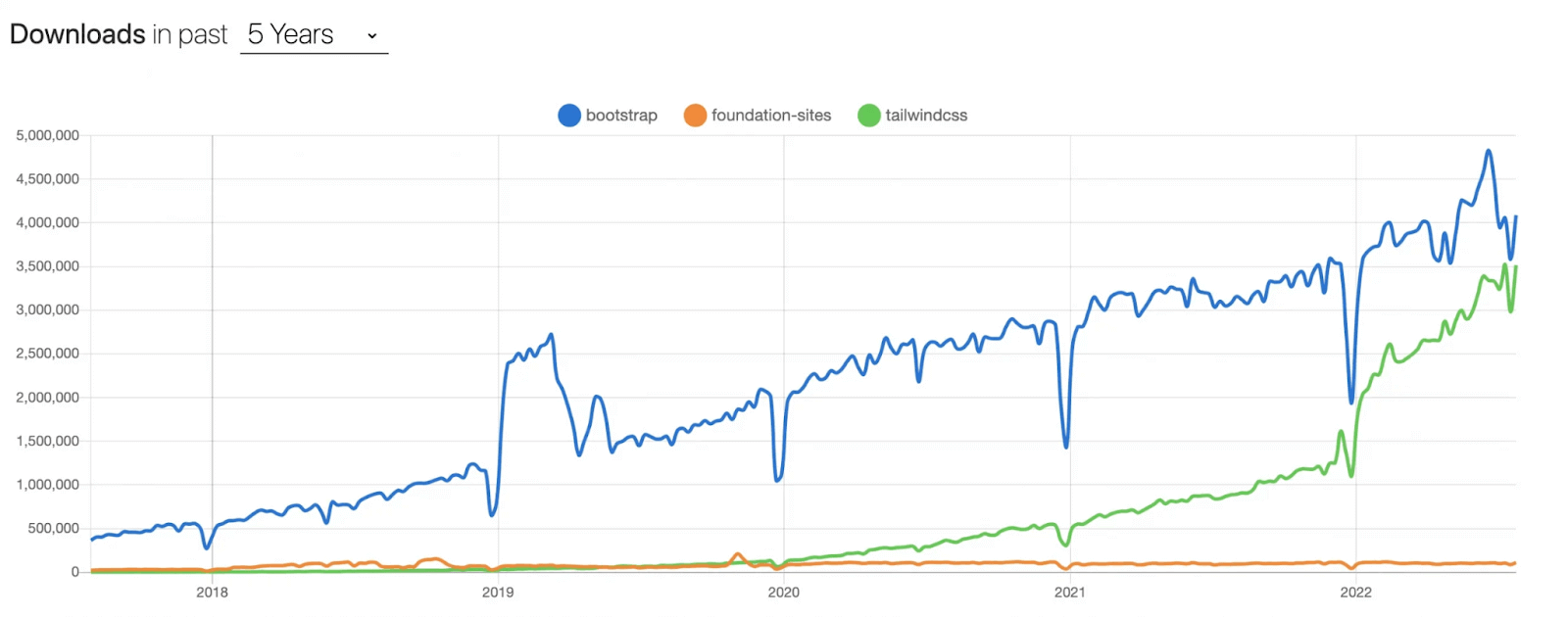
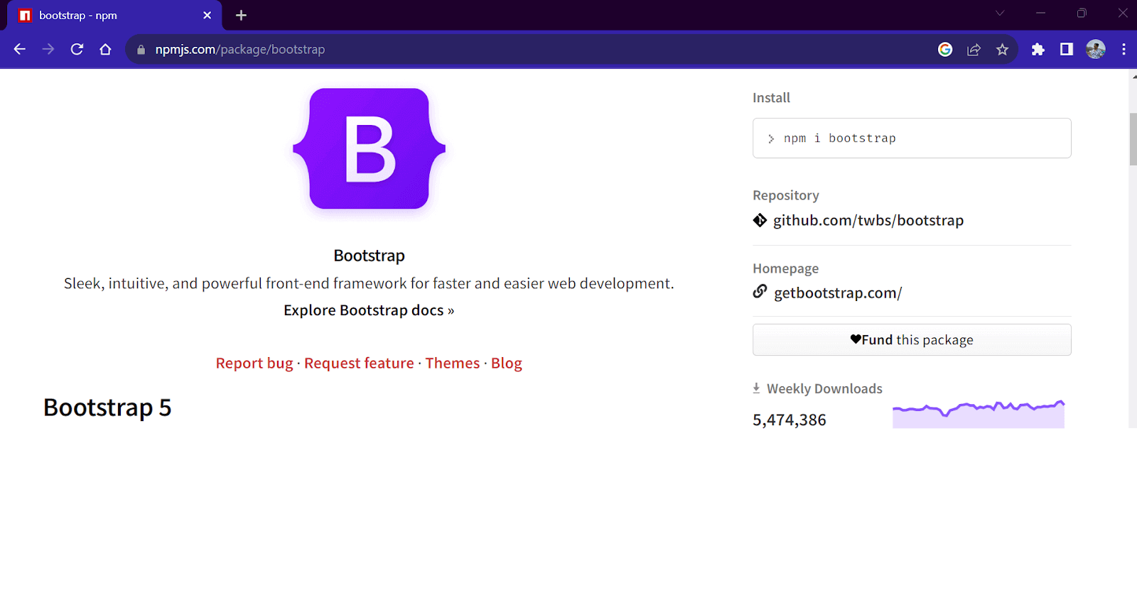
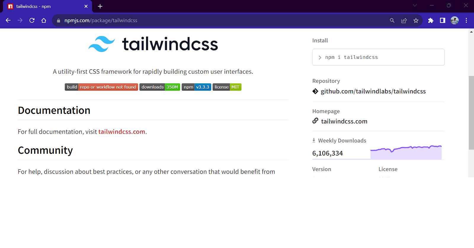
As seen in the graph above, Tailwind’s download numbers significantly increased between 2021 and 2022. If we talk about weekly downloads, Tailwind currently stands at 6M+ weekly downloads, more than Bootstrap’s 5.4M downloads, making it the market leader. It’s surprising to learn that a year ago, downloads of Tailwind were only around one-third of what they are now. This is clear evidence of how rapidly the popularity of Tailwind CSS has expanded.
In this blog, we will explore Tailwind CSS and how it differs from other frameworks. We will also learn how to use the wide variety of classes Tailwind offers. After that, we will build a Developer Portfolio website by applying our newfound Tailwind expertise.
TABLE OF CONTENTS
- What is Tailwind CSS?
- Features of Tailwind CSS
- Advantages of Using Tailwind CSS
- Disadvantages of Using Tailwind CSS
- How to use Tailwind CSS?
- Exploring Tailwind CSS Classes
- Using Modifiers for Handling States of Elements
- Functions and Directives
- Media Queries Using Tailwind CSS
- Customizing Default Tailwind CSS classes
- Arbitrary Values in Tailwind CSS
- Demo: Building Developer Portfolio Using Tailwind CSS
- Final Take on Tailwind CSS
- Tailwind CSS vs Bootstrap: What’s the Difference?
- Wrapping Up
- Frequently Asked Questions (FAQs)
What is Tailwind CSS?
Tailwind is a utility-first CSS framework comprising single-purpose utility classes that can be used to style an HTML webpage. In contrast to other frameworks, Tailwind doesn’t come with predefined CSS component classes. Instead, it consists of CSS utility or helper classes resembling CSS properties. Tailwind covers almost all the CSS properties in the form of utility classes.
By combining multiple utility classes, we can create any component from scratch. Using variations of the same utility class, we can further fine-tune the styles to match the design requirements. In short, it provides you with all the building blocks to create your own components.
Consider Tailwind as a vast collection of CSS classes, each of which is set up with a single CSS attribute. Use a class from this sizable CSS file to apply a CSS style. For instance, all we need to do to bold a text is add the class of .font-bold to our HTML element. Tailwind CSS automatically creates a class with the name .font-bold for us with the CSS attribute font-weight: bold; it is inside our CSS output file. Tailwind allows us to use all the CSS properties without writing any CSS code ourselves.
Tailwind CSS is like writing CSS, without actually writing CSS!✅
— Anurag (@anurag_gharat) May 26, 2023
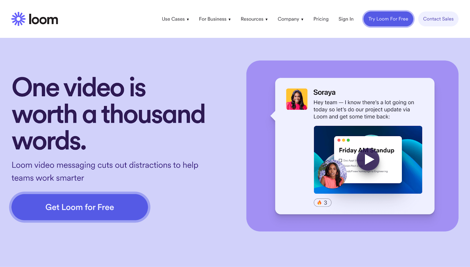
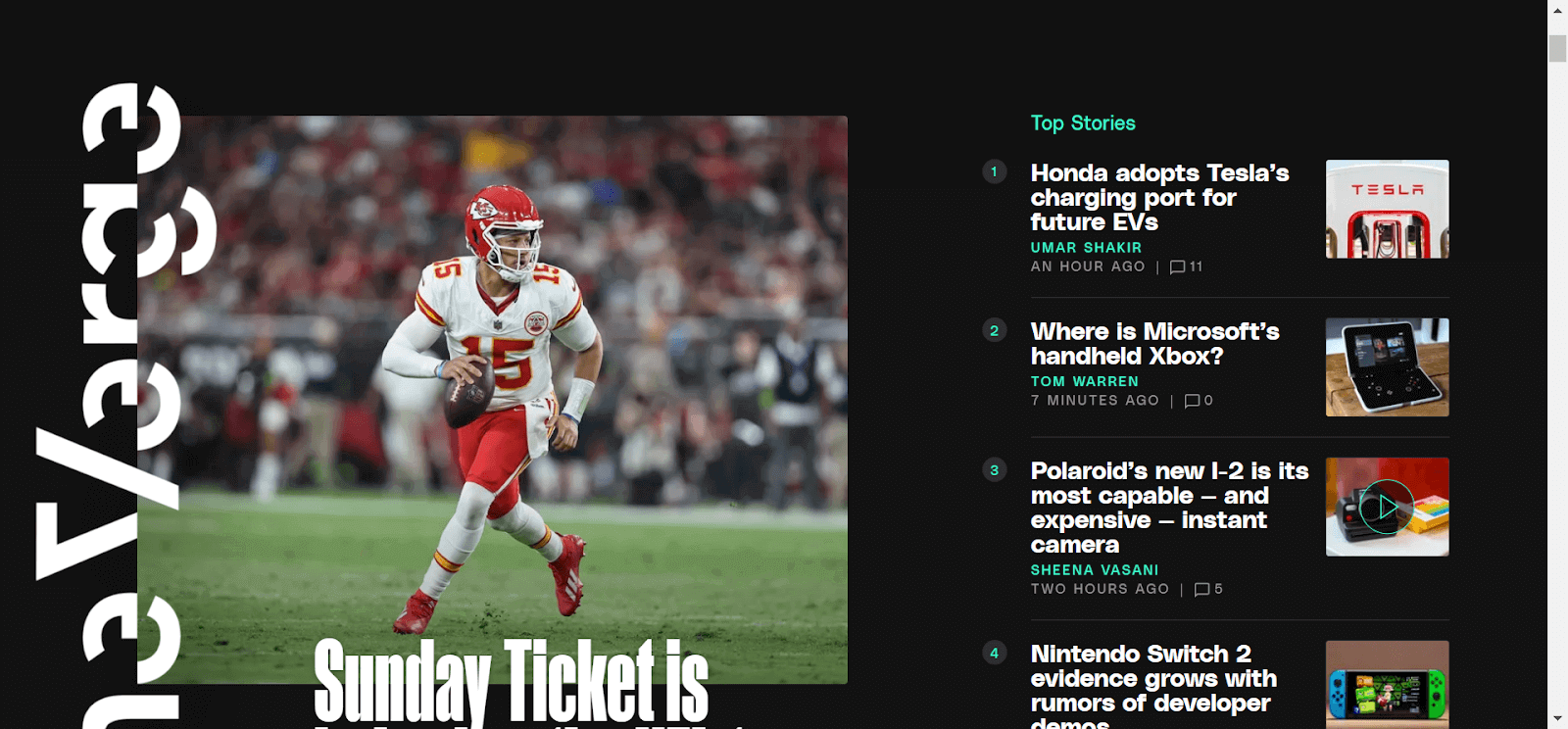
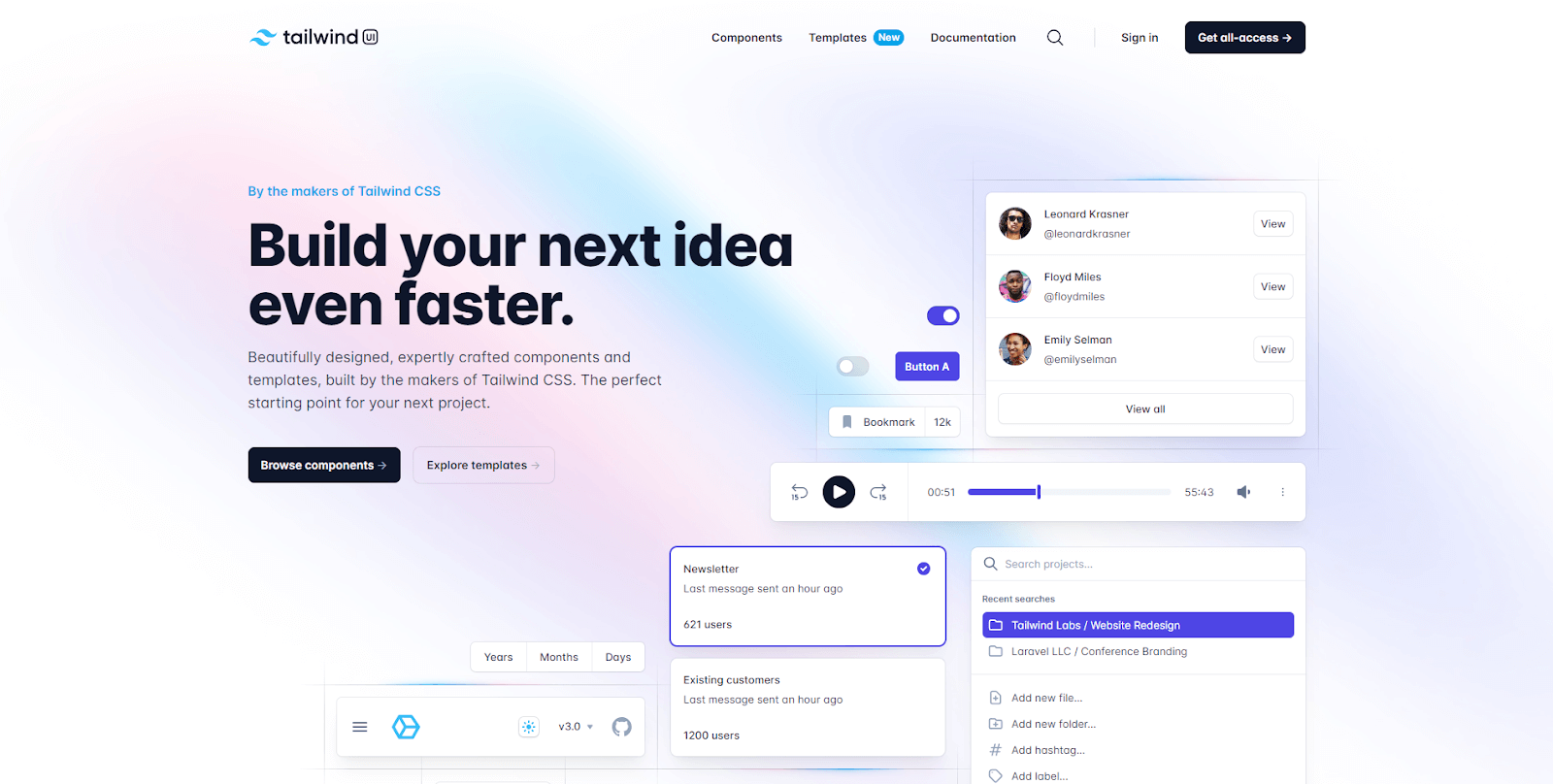
Since Tailwind became popular among the developer community, eCommerce giants like Shopify and new-age startups like Lemon Squeezy have incorporated it into their web design. Some organizations that use Tailwind CSS are:
Shopify

OpenAI

Lemon Squeezy

Netflix

Loom
Verge
Generally, CSS frameworks can be divided into two groups based on their nature.
- Utility-based frameworks
- Component-based frameworks.
Utility-based framework
In a utility-based framework, each class is a single-purpose utility class that handles one primary CSS property. The name of the class also resembles the property that it carries. For example, a .flex-row class will have only one CSS property assigned to it, which is flex-direction: row.
Popular websites like Kickstarter, Clubhouse, and Medium use their utility-based CSS framework, which fits their brand design style.
Component-based framework
In the component-based framework, most classes carry the names of components like cards, navbar, footer, etc. This means a .card CSS class will contain CSS properties like border, background color, padding, etc., making it look like a card.
Many brands have their in-house CSS component framework built while keeping their brand design system in mind. Organizations like Forbes, Udemy, Spotify, and Walmart use their own CSS component framework.
Features of Tailwind CSS
Tailwind stands out in web development with its unique features, making it a preferred choice for developers seeking efficiency and flexibility in their projects. Here are some key features of Tailwind.
Utility First Fundamentals
As discussed earlier, Tailwind follows the utility’s first fundamentals. Every class in Tailwind is a utility class for a single CSS property. Each class has a single responsibility and acts as a building block for creating websites.
With the help of such classes, it is possible to style a component from scratch without writing any CSS. The only downside of this approach is that the HTML elements will look crowded because of multiple class names. The table below shows one of the important Tailwind classes and their corresponding CSS properties.
| Tailwind CSS Class Names | CSS property |
| .w-1/2 | width: 50%; |
| .bg-red-900 | background-color: #7f1d1; |
| .rounded | border-radius: 0.25rem; |
| .h-screen | height: 100vw; |
Classes for Interactions and Element States
Along with utility classes, Tailwind has numerous modifiers like .bg: , .dark: , .md: etc. which can be used as a prefix for applying conditional classes. One such set of modifiers is used to apply styles based on the element’s current state or user interactions.
For example, a .bg-black will set the background color as back for an element, but hover:bg-black will only set the background color as black when the user hovers the cursor over the element. We will learn more about such interactions later in this blog.
| Modifier | CSS Property |
| .hover: | element:hover{} |
| .focus: | element:focus{} |
| .visited: | element:visited{} |
| .before | element::before{} |
| .after | element::after{} |
| .first-line: | element::first-line{} |
| .placeholder: | element::placeholder{} |
Customizing Styles
Tailwind already provides us the freedom to style the website as we want. But in some situations, the already preconfigured styles require more customization. In such cases, we can make use of the tailwind.config.js file. This is a configuration file provided by Tailwind to change the values of the existing classes.
For example, we can change the value of the blue color(.bg-blue), or we can even change the breakpoint values for screen modifiers(.lg:).
|
1 2 3 4 5 6 7 8 |
/** @type {import('tailwindcss').Config} */ module.exports = { content: [], theme: { extend: {}, }, plugins: [], }; |
We will see how we can customize and extend Tailwind later in a separate section.
Dark Mode
In recent times, dark mode has surged in popularity, becoming a must-have feature for websites and apps. Due to this, many designers and developers now make a dark version of the website and app along with the default design. Dark mode in Tailwind is implemented using utility classes. Using the dark: prefix, we can now write conditional classes that will only be applied if the color schema of the browser is set to dark mode.
| Class | Description |
| .bg-black: | Apply a black background color across all screen sizes. |
| .dark:bg-black | Apply a background color of black only when the user has set the system preference theme as dark. |
Responsiveness Across All Screen Sizes
Tailwind CSS uses the mobile-first approach for its utility classes, which means it prioritizes the experience of mobile users over desktop users. A general and common approach is to write CSS styles for large devices first and then modify them using media queries for smaller devices.
But in the mobile-first approach, we write styles for smaller devices first and then use media queries to modify these styles for larger devices. In Tailwind, all the classes target all screen sizes by default, but by attaching prefixes, they can be made conditional based on screen size.
For example, a .w-full class will add a width: 100% property on all screen sizes, but by changing the class name to .lg:width-full, the width: 100% property will be only applied on large screen sizes ( screen sizes >1024px ).
| Class | Description |
| .bg-black | Apply a background color of black across all screen sizes. |
| .lg:bg-black | Apply a background color of black only when screen size >= 1024px. |
Support for Functions and Directives
Functions and directives are useful features while working on a huge code base. Tailwind CSS provides a few sets of functions that we can use in our custom CSS files. These functions are evaluated during the build time and are replaced by static values in the output CSS file.
Functions in Tailwind:
|
1 2 3 |
.container { height: calc(100vh - theme(spacing.20)); } |
Directives are custom Tailwind CSS at-rules that can be used to add extra functionality or Tailwind properties inside our custom CSS file.
Directives in Tailwind:
|
1 2 3 |
@media screen(md) { /*will be applied for min-width = 640px */ } |
Community Support and Plugins
Plugins allow the developers to extend the functionalities of the Tailwind CSS framework by adding custom utilities, functions, styles, and components. Tailwind supports both official and third-party plugins.
To add plugins to the project, first install them using a package manager before putting them in the tailwind.config.js file. Tailwind offers support for both official and third-party plugins.
As Tailwind CSS is popular among developers, you will always find some projects and libraries built on top of it. Also, it is well-maintained, so if you ever find yourself stuck on an issue, hundreds of developers will always be ready to help you!
Support for Third-Party Libraries
Since Tailwind is a utility-based CSS framework. There are a lot of parties that provide pre-built and configured UI components that are built on top of Tailwind.
Tailwind UI, created by the Tailwind team, includes a vast library of free and premium components and templates that anybody may utilize to avoid building anything from the start. There are plenty of third-party websites as well that provide pre built UI components and templates to work with.
If you are still in two minds about using Tailwind, here is a list of advantages and disadvantages of using Tailwind that will help you make your decision.
Advantages of Using Tailwind CSS
Using Tailwind offers several advantages that make it a popular choice among web developers. These advantages stem from its unique approach to styling and its focus on utility classes. Here are some key benefits:
- Tailwind enables faster development with the help of the extensive list of utility classes. These classes get directly added inside the HTML, eliminating the need to write any custom CSS.
- Every CSS property is available in the form of classes. Further, these classes have variants that can be further used to finetune the design.
- Maintaining and scaling can be done effortlessly since all the classes provide consistent design. Also, since the name of the classes stays the same, upgrading the version in the future won’t cause any breaking changes.
- Highly performant because the Tailwind compiler generates an output CSS file that contains the minimized and optimized version of the CSS. Hence, you only have to ship your CSS code, resulting in faster page load time.
- Since all the classes in Tailwind are single-purpose-utility classes, you get more freedom and control over the styling of the website.
- Using modifiers makes it easy to make your website responsive across all screen sizes.
- Along with the existing utility classes, Tailwind also provides a configuration file that you can use to customize the classes or extend them to add new ones.
- Tailwind CSS has a vast community of developers and designers who are constantly working to improve the experience. Plenty of resources are built upon Tailwind to make the development process easy.
- Tailwind easily integrates into modern JavaScript frontend frameworks like React, Angular, Vue, Ember, etc.
Disadvantages of Using Tailwind CSS
While Tailwind offers numerous advantages, it’s important to acknowledge that it may not be the perfect fit for every project or developer. Here are some potential disadvantages of using Tailwind.
- Tailwind is a utility-based CSS framework with no component classes. As a result, the development process begins from zero.
- Before using Tailwind, it is necessary to have prior knowledge of CSS.
- All the CSS classes are directly added inside HTML. Hence, HTML files can appear to be cluttered.
Installing Tailwind CSS
Installing Tailwind in your project is a straightforward process, but it requires some initial setup. Here’s a general guide on how to install Tailwind.
Using Tailwind CLI
There are multiple ways of using Tailwind. In this guide, we will see the most common way of installing Tailwind CSS. Before installing Tailwind, ensure your system has
- Node.js
- Node package manager (npm)
If you don’t have either of them, you can install them from the official Node.js website. When you install Node.js, it will automatically install npm.
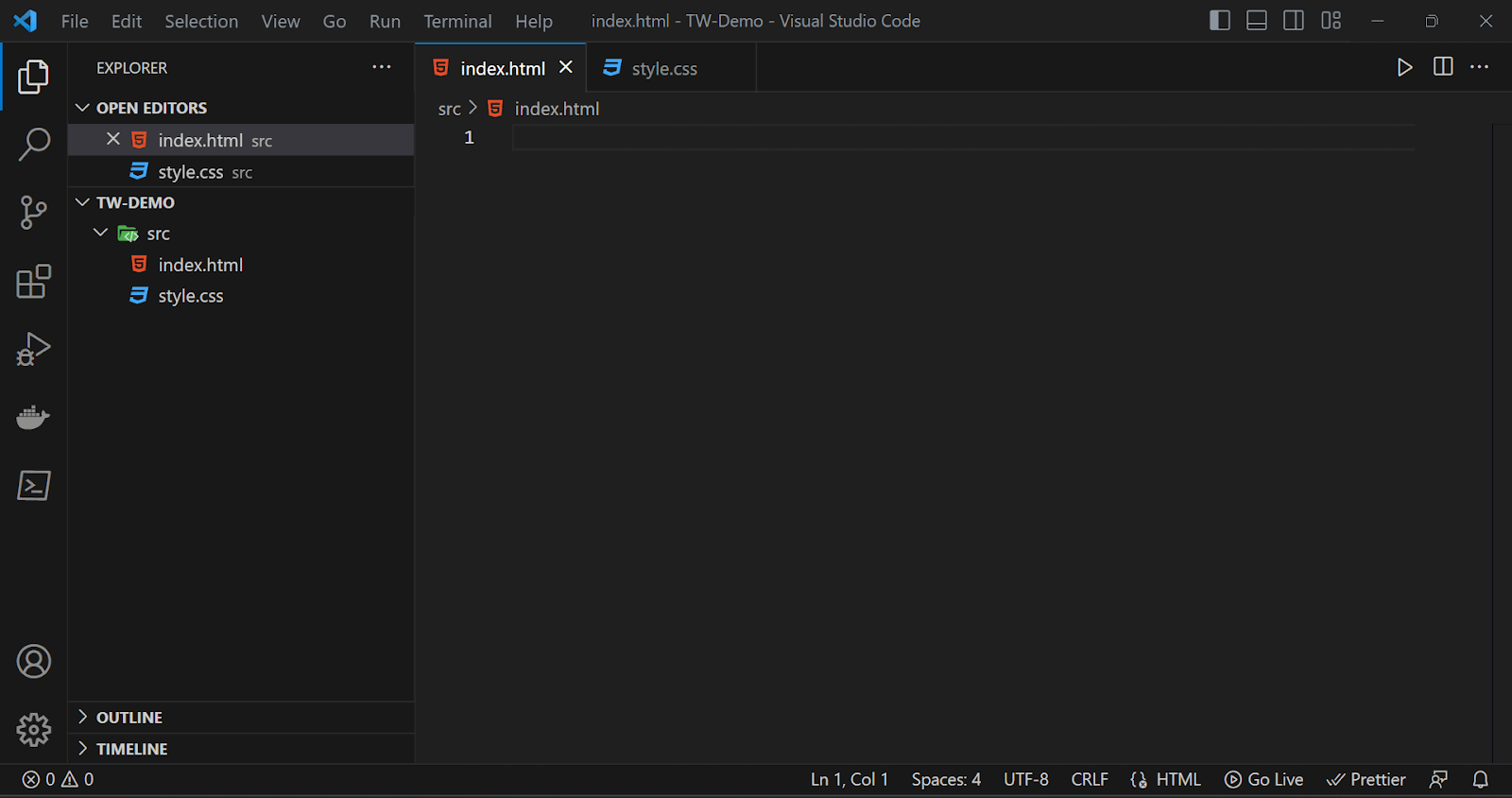
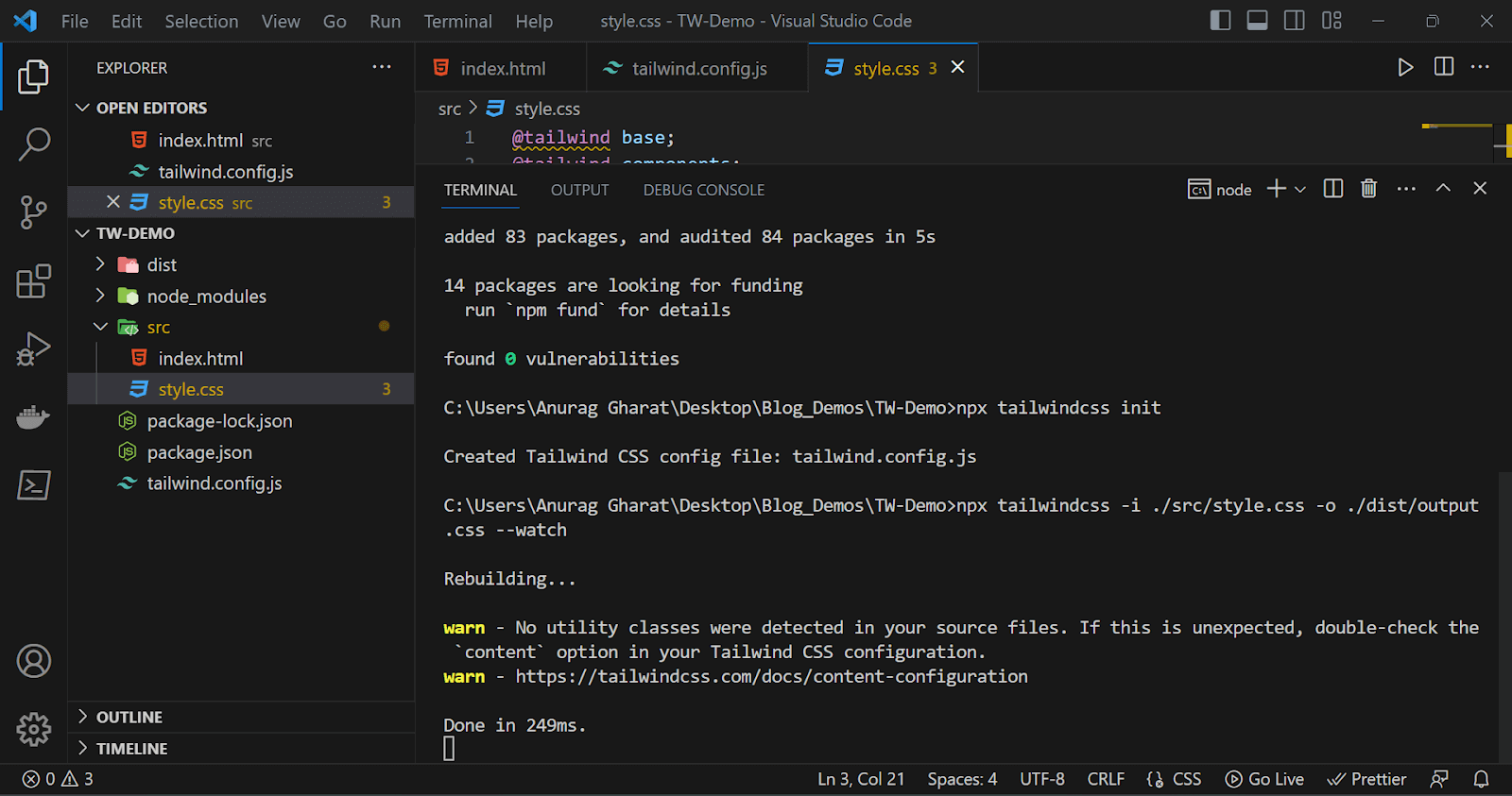
To install Tailwind, we will create a folder for our project and open it in our code editor. I have created a folder by the name TW-Demo and opened it in VS Code.
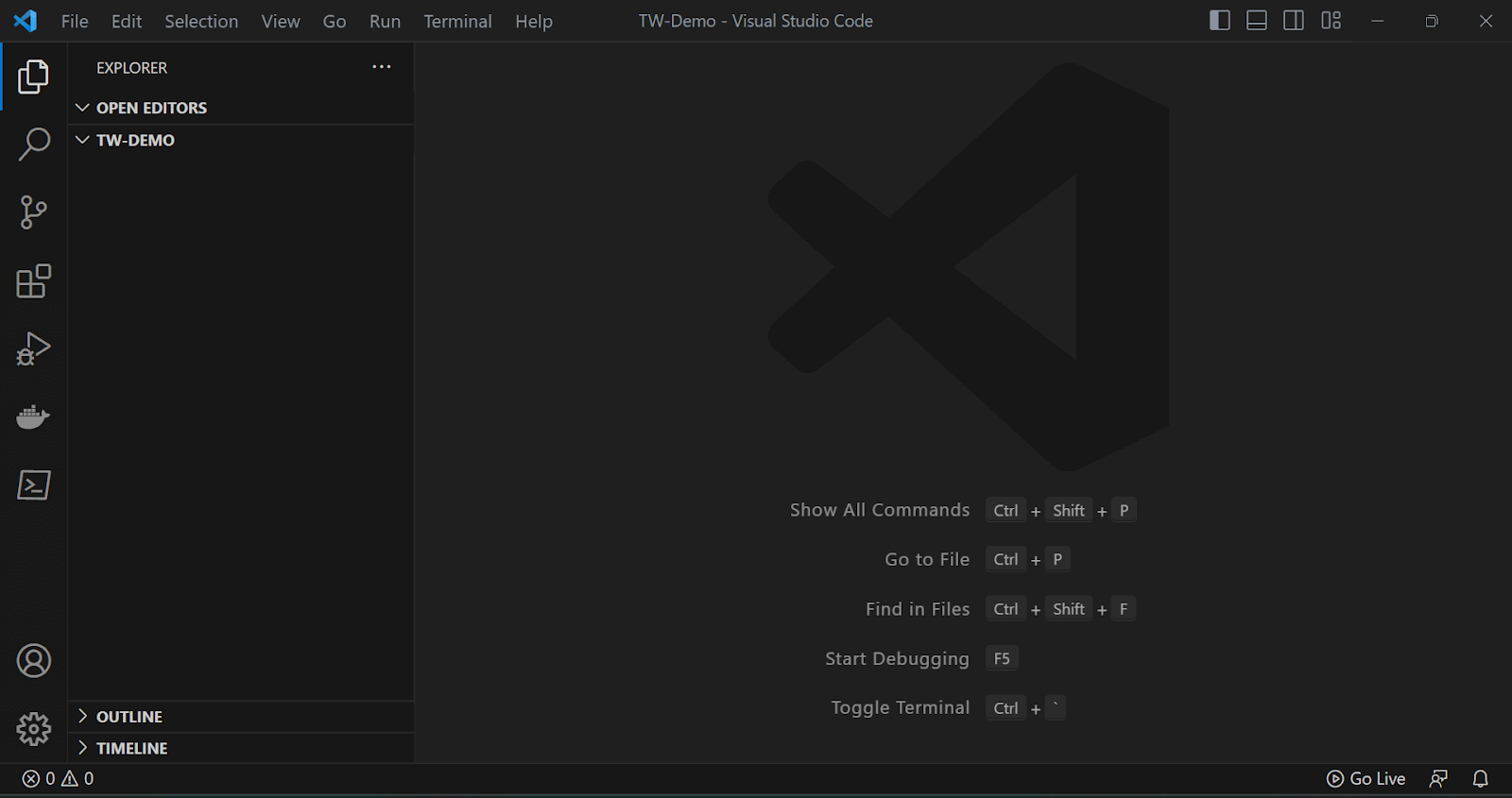
Now, we will create our HTML and CSS files. We will create a src folder, and inside that, we will create index.html and style.css files, as shown in the image below.
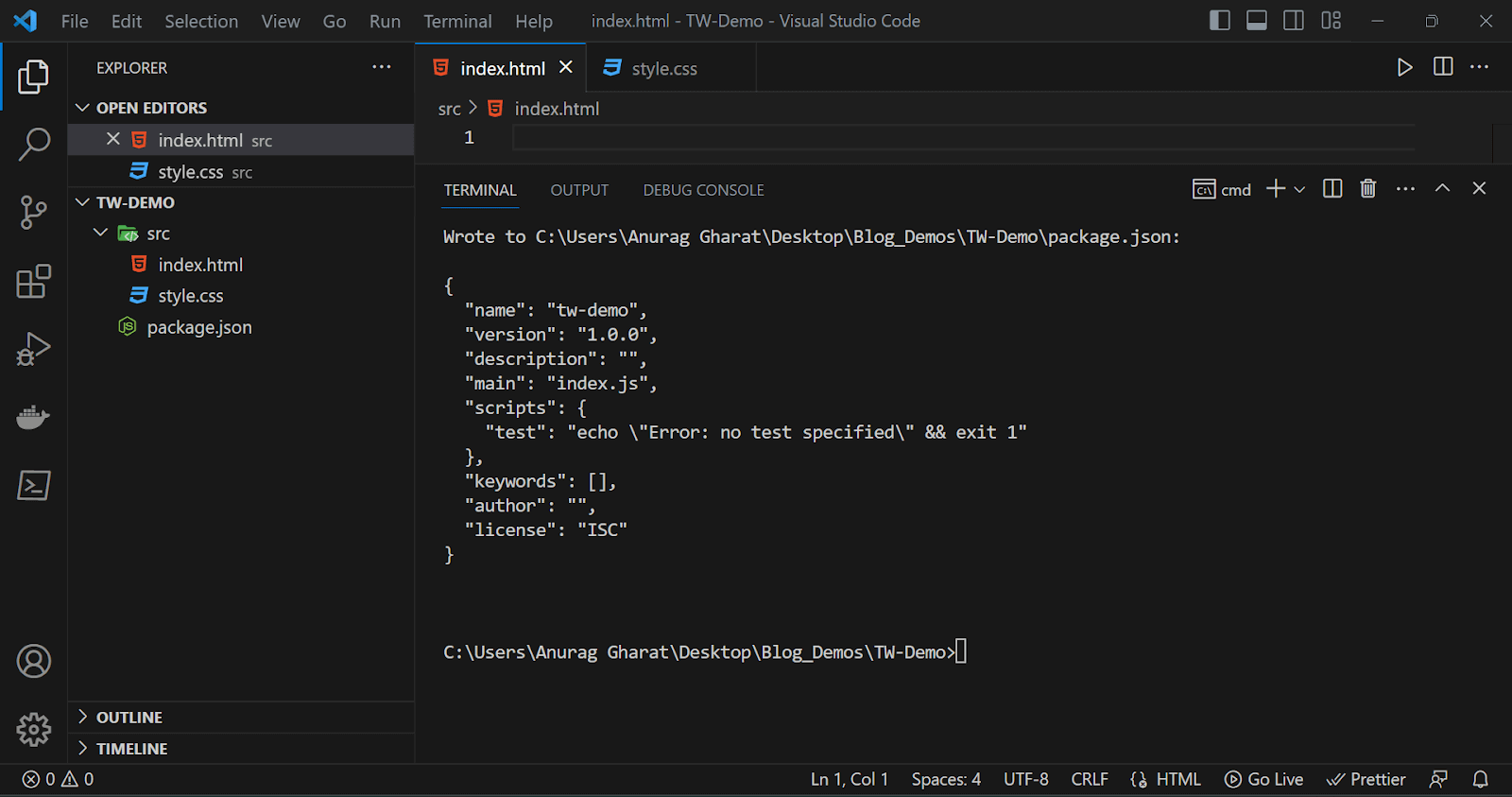
Now, we will initialize the project using the command below.
|
1 |
> npm init - y |
The above command will generate a package.json file. The package.json file contains all the metadata about the project, author, version number, and installed dependencies.
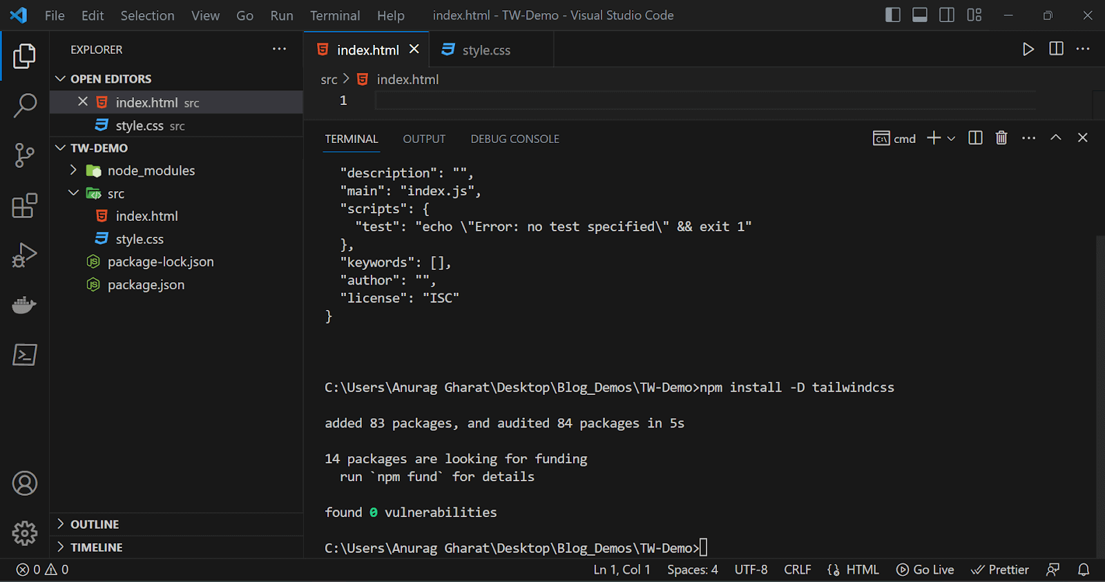
With our project initialized, we can now install Tailwind and start working. Run the following command in your terminal. This command will install Tailwind in our project as a dev dependency.
|
1 |
> npm install - D tailwindcss |
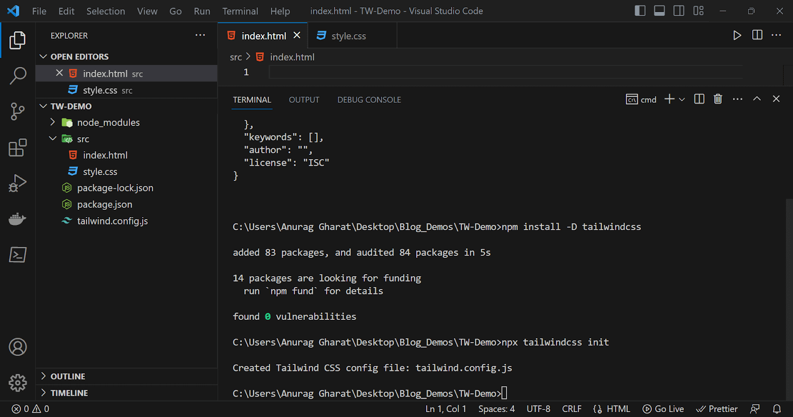
The next step is creating a configuration file for handling all our Tailwind CSS configurations. Running the following command will generate a tailwind.config.js file in our project.
|
1 |
> npx tailwindcss init |
Now, we need to add the location of all our template files (HTML, JavaScript) in the configuration file. After adding the paths, our configuration file should look like this.
tailwind.config.js:
|
1 2 3 4 5 6 7 8 |
/** @type {import('tailwindcss').Config} */ module.exports = { content: ["./src/**/*.{html,js}"], theme: { extend: {}, }, plugins: [], }; |
By making the above change, we are denoting that all the files ending with the ‘.html / .js’ extension inside the src folder are template files.
Now that we have finished the configuration process, we can add the three Tailwind directives to import base, component, and utility styles. We will add these import statements inside our style.css file from the src folder.
style.css:
|
1 2 3 |
@tailwind base; @tailwind components; @tailwind utilities; |
The final step is generating the CSS code using a build process. This build process will scan all the classes from template files and generate CSS code for them.
The following command will run the build process in watch mode. In this command, we mention the style.css file from the src folder as our input file and output.css from the dist folder as the output file.
|
1 |
> npx tailwindcss - i ./src/style.css - o. /dist/output.css --watch |
The final output is generated in the output.css file inside the dist folder. Hence, we need to add this path inside our HTML file.
index.html:
|
1 2 3 4 5 6 7 8 9 10 11 12 13 14 15 16 17 18 |
<!DOCTYPE html> <html lang="en"> <head> <meta charset="UTF-8"> <meta http-equiv="X-UA-Compatible" content="IE=edge"> <meta name="viewport" content="width=device-width, initial-scale=1.0"> <title>Tailwind CSS Demo</title> <!-- Link to the CSS file generated after build process --> <link href="/dist/output.css" rel="stylesheet"> </head> <body> </body> </html> |
Since our build process is running in watch mode, any change in the HTML or CSS file will reflect in the output CSS file automatically.
Let’s add some HTML code and check if our setup process was a success. We will create a simple heading tag and add some text styling classes.
index.html:
|
1 2 3 4 5 |
<body> <h1 class="text-6xl text-red-400"> An Introduction to Tailwind CSS </h1> </body> |
Now open your HTML file in your browser and check if the styles are applied or not. You can either open it directly or use a live server extension, as I did. The output should be similar to the below screenshot.
Output:
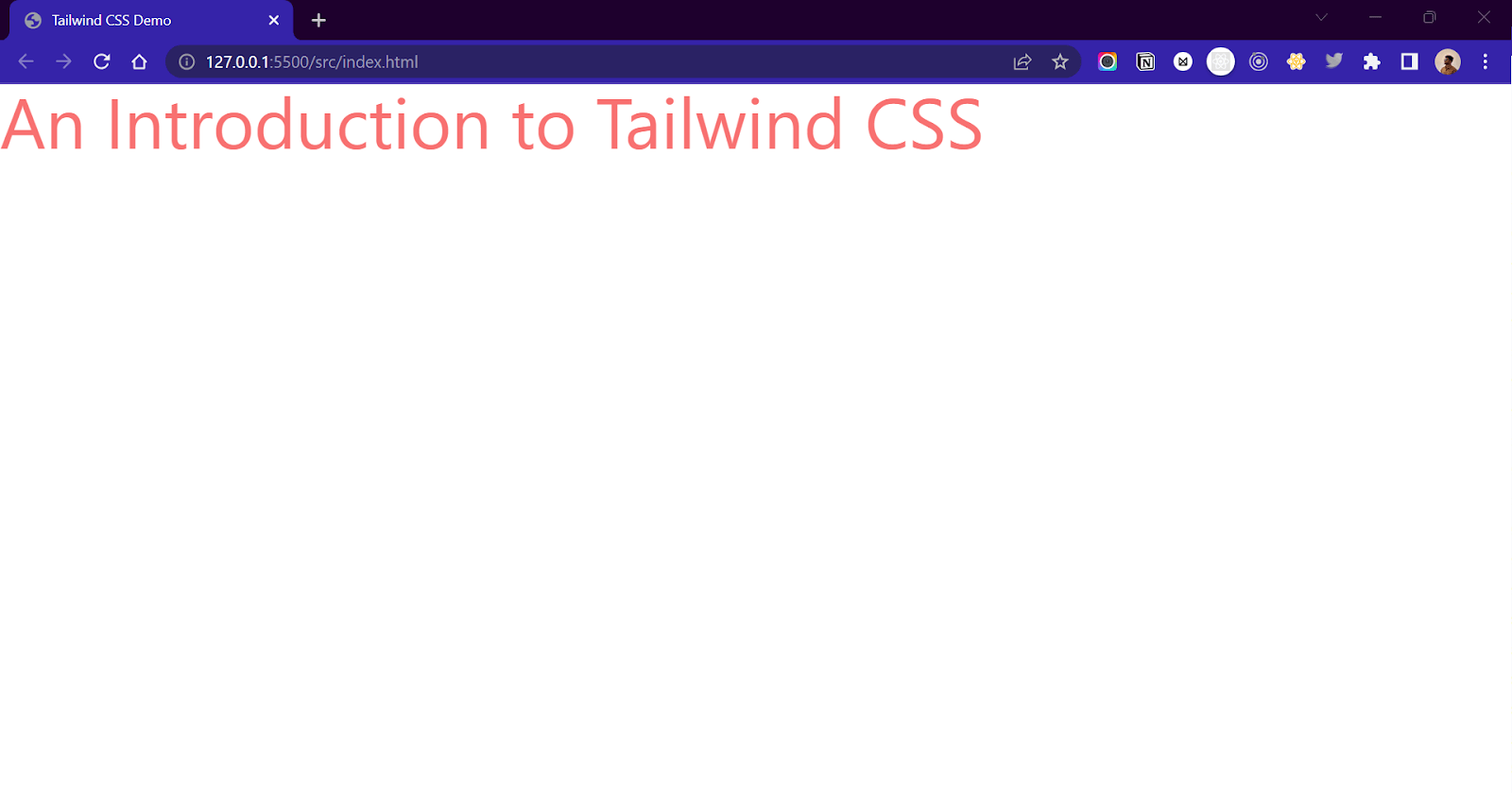
Great! We have now successfully set up Tailwind in our project.
Using CDN
The CDN method adds the Tailwind inside a webpage in just one step. In this method, a CDN link that contains the Tailwind file is added with the help of the < script > tag in the head section of this website. The CDN method skips the entire installation and setup procedure and provides us a link to the Tailwind CSS file.
|
1 2 3 4 5 6 7 8 9 10 11 12 13 14 15 16 17 18 |
<!DOCTYPE html> <html lang="en"> <head> <meta charset="UTF-8"> <meta http-equiv="X-UA-Compatible" content="IE=edge"> <meta name="viewport" content="width=device-width, initial-scale=1.0"> <title>Tailwind CSS Demo</title> <!-- Link to the Tailwind CSS CDN file --> <script src="https://cdn.tailwindcss.com"></script> </head> <body> </body> </html> |
For configuration changes, we can create a tailwind.config object inside the script tags.
|
1 2 3 4 5 6 7 |
<script> tailwind.config= { content: [], theme: {}, plugins: [], }; </script> |
Although this is the fastest and easiest way of adding Tailwind, it is not the recommended one!
The CDN link injects the entire Tailwind file into the webpage. This might affect the page load speeds. Also, the Tailwind file is hosted over the CDN. Hence, at times, the website can experience downtime and disruptions. The other downside of this approach is security risks, no control over the version, and less room for adding customization and local debugging.
How to use Tailwind CSS?
Using Tailwind can be compared to writing inline styles in a more efficient and shorter way. Like inline styles, we add CSS properties through the style attribute. In Tailwind, we add the same styles in the form of classes through the class attribute. Consider it as using CSS properties in the form of classes.
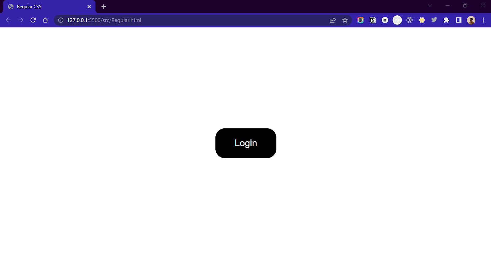
Let’s create a button with regular CSS and then use Tailwind to understand the difference.
Regular CSS Approach
We will create a simple HTML button element and give a class myButton to it. We will then style this button by adding a few CSS properties to myButton class.
index.html:
|
1 2 3 |
<body> <button class="myButton">Login</button> </body> |
style.css:
|
1 2 3 4 5 6 7 8 |
.myButton{ padding:25px 50px; border: none; background-color: black; color: white; border-radius:25px; font-size: 24px; } |
Output:
Tailwind CSS Approach
Now, let’s see the Tailwind approach.
index.html:
|
1 2 3 4 5 6 |
<body> <button class="bg-black text-white rounded-3xl px-12 py-6 text-2xl"> Login </button> </body> |
Output:
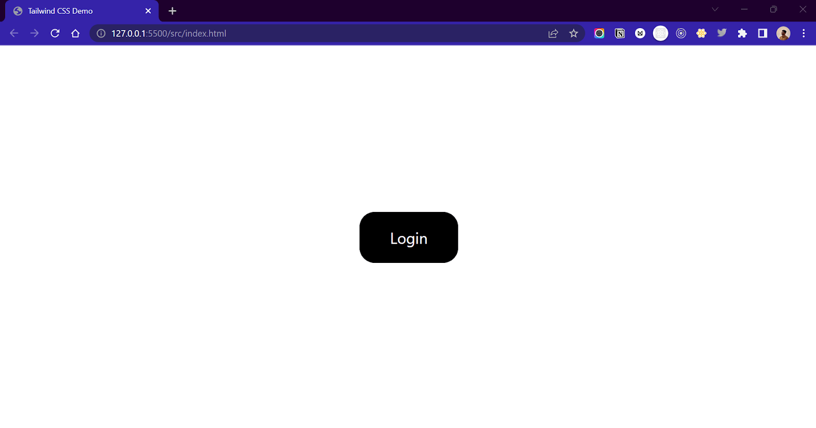
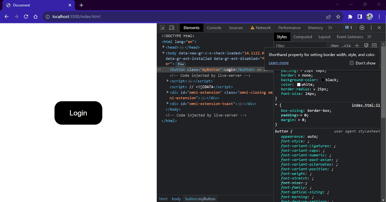
As you can see, we obtained the same result without writing any CSS. We used the Tailwind utility classes to apply CSS properties to our button element.
To understand this, open the Chrome Developer tools by pressing ‘Ctrl + Shift + I’ and move to the Elements tab. Now select our button element to see all the styles applied to it.
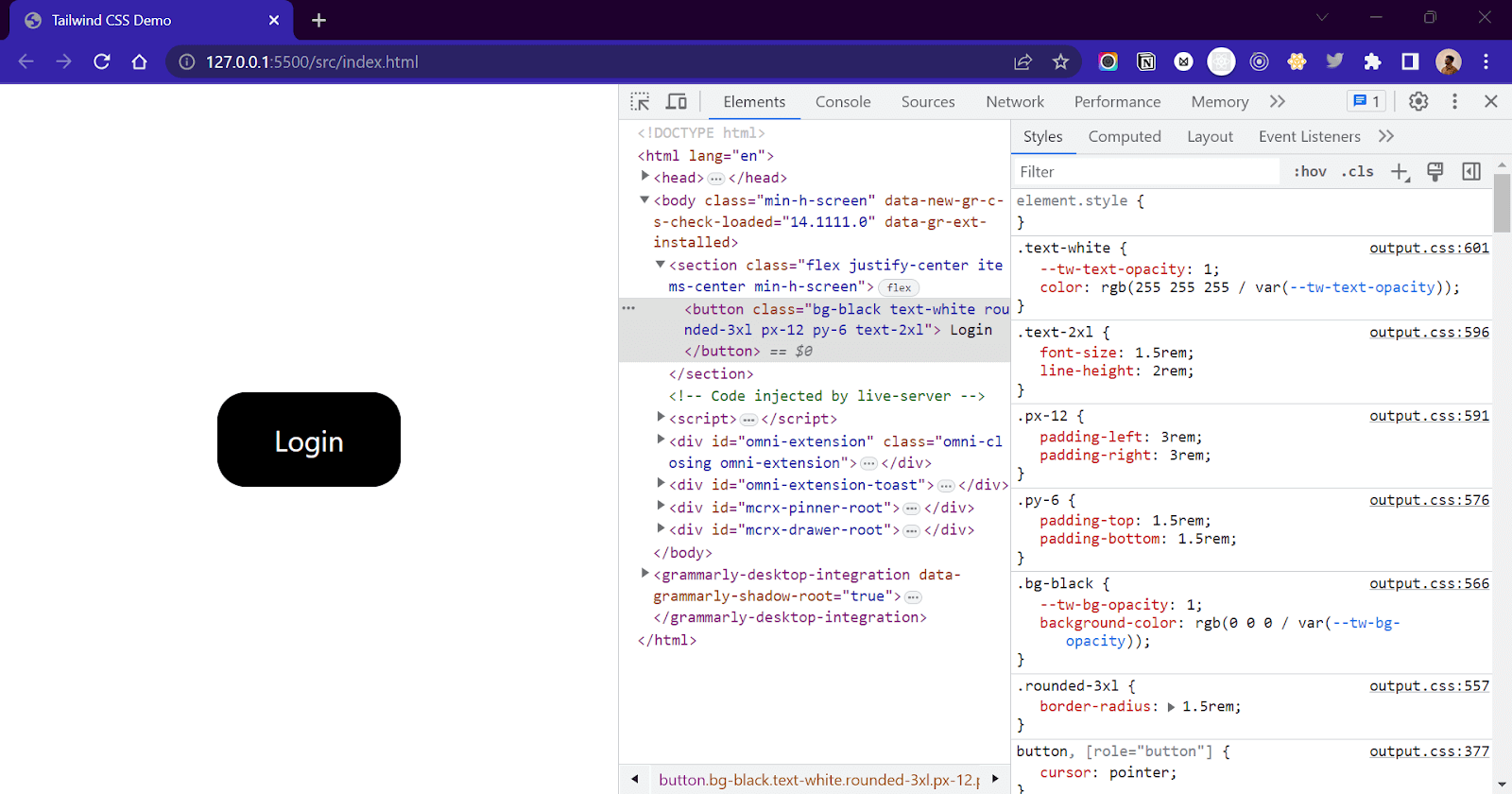
As you can see, a few CSS properties were applied to our button element through the classes we added. Tailwind applies these CSS properties behind the scenes by using the utility classes that we gave.
Now that we have successfully run Tailwind CSS let’s explore some common and important classes using examples.
Exploring Tailwind CSS Classes
Tailwind has a lot of utility classes, and covering all of them in one blog is not possible. In this section, we will cover only the common and most used classes. For the entire list, check the official Tailwind documentation.
Colors
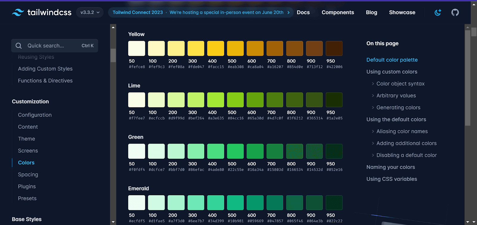
Tailwind has a variety of predefined color classes to choose from. Each color further has different sets of variants, which are denoted by a numbered value(50,100,150,900). where 50 means the lightest and 900 means the darkest.
For background colors, we can use the bg-{color-name}-{variant-value} class, and for text color, we can use text-{color-name}-{variant-value}.
Example:
|
1 2 3 |
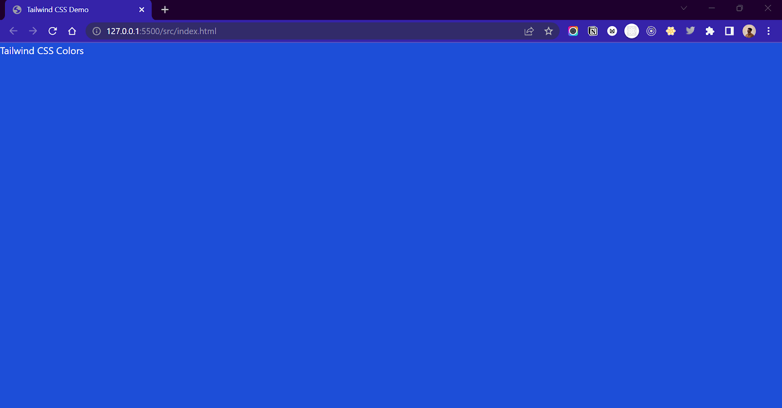
<body class="bg-blue-700"> <h1 class="text-white">Tailwind CSS Colors</h1> </body> |
The above code will add a blue background color to the body and a white text color to the h1 element.
Output:
The entire list of colors and their variants are available on the official Tailwind documentation.
Sizing
In Tailwind, the height and width properties are denoted by the .h-{number} and .w-{number} classes. The number denotes the value for height and width in rem/px. A value of 1 corresponds to 0.24rem or 4px. Hence a class of .w-1 will add a style of width: 4px; or width: 0.25rem.
| Syntax | CSS Property |
| .w-2 | width: 0.5rem; or width: 8px; |
| .w-4 | width: 1rem; or width: 16px; |
| .w-48 | width: 12rem; or width: 192px; |
| .w-96 | width: 24rem; or width:3848px; |
index.html:
|
1 |
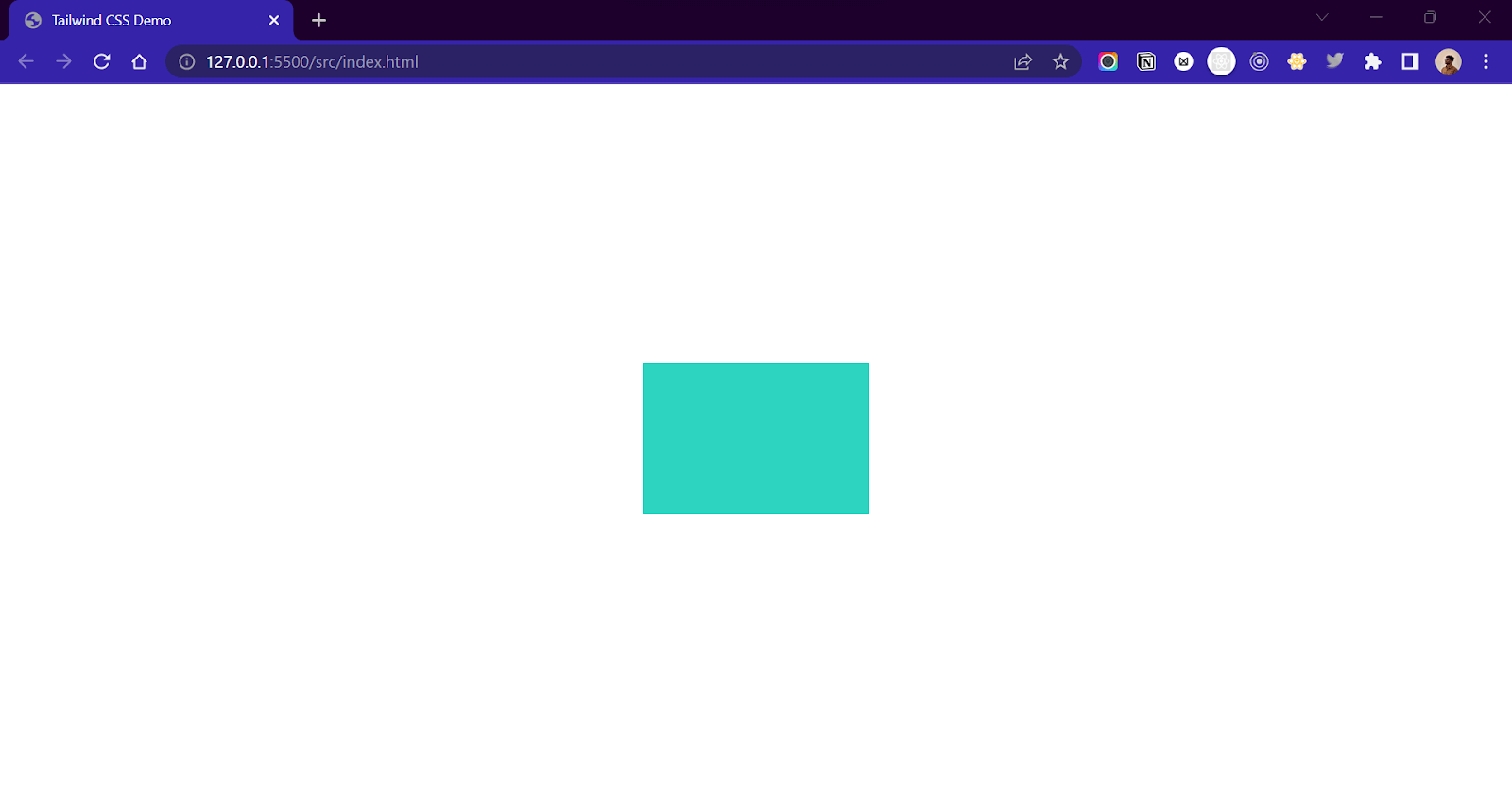
<div class="w-48 h-32 bg-teal-400"></div> |
The above code will create a teal-colored div element of width = 12rem (192px) and height = 8rem (128px).
Output:
Utility classes to set height and width using relative units like percentage and screen sizes are also available. Here’s a list of a few such classes.
| Tailwind CSS Class Names | CSS Property |
| .w-1/2 | width: 50%; |
| .w-1/6 | width: 16.66667%; |
| .w-full | width: 100%; |
| .w-screen | width: 100vw; |
| .w-auto | width: auto; |
Similar classes are available as well for setting height.
| Tailwind CSS Class Names | CSS Property |
| .h-1/2 | height: 50%; |
| .h-1/6 | height: 16.66667%; |
| .h-full | height: 100%; |
| .h-screen | height: 100vw; |
| .h-auto | height: auto; |
Margins and Paddings
Margins and padding properties are important for maintaining the consistency of the design. Tailwind offers tons of classes to add margins and paddings to the element.
The syntax of margins is .m-{value}
| Syntax | CSS Property |
| .m-{value} | margin of {value} across the whole element. |
| .mx-{value} | margin of {value} horizontally. |
| .my-{value} | margin of {value} vertically. |
| .ml-{value} | margin of {value} on left. |
| .mt-{value} | margin of {value} on top. |
| .mr-{value} | margin of {value} on right. |
| .mb-{value} | margin of {value} on bottom. |
For padding, we use a .p prefix instead of .m prefix. So, just like margins, .p-{value} is a padding of {value} across the whole element.
To apply margins and paddings, we need to pass an appropriate number as a value. This number is similar to what we pass for width and height. For example, a class of .p-4 denotes a CSS property of padding: 16px; or padding: 1rem;
Example:
|
1 2 3 4 5 |
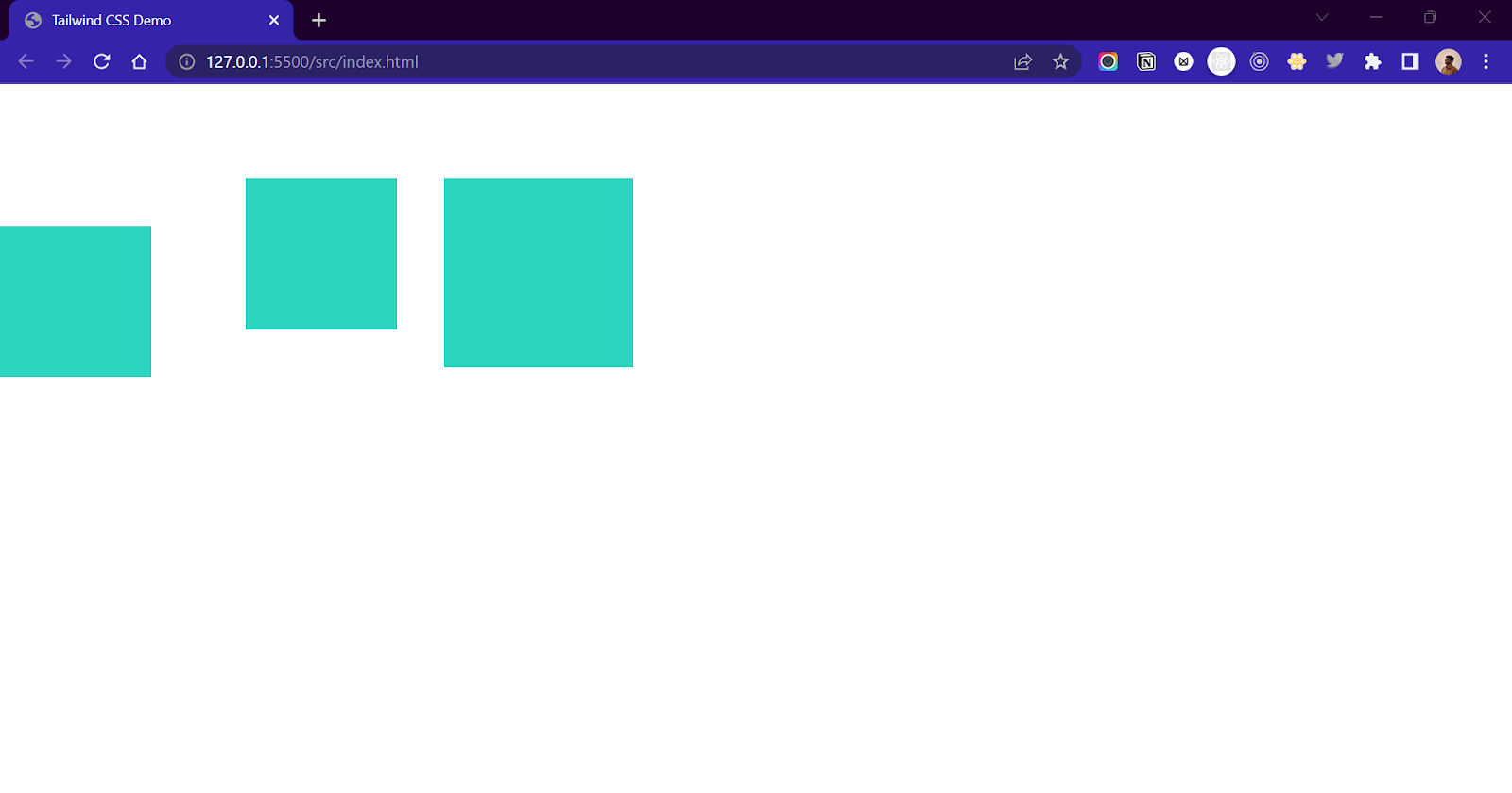
<section class=" flex h-screen pt-20"> <div class="w-32 h-32 bg-teal-400 mt-10"></div> <div class="w-32 h-32 bg-teal-400 ml-20"></div> <div class="w-32 h-32 bg-teal-400 ml-10 p-20"></div> </section> |
Output:
The below table shows some standard margin classes and the CSS properties that they represent. For padding, use ‘p’ instead of ‘m’.
| Tailwind CSS Class Names | CSS Property |
| .m-auto | margin: auto |
| .m-4 | margin: 1rem; or margin: 16px; |
| .me-auto | margin-inline-end: auto; |
| .ms-auto | margin-inline-start: auto; |
Flexbox
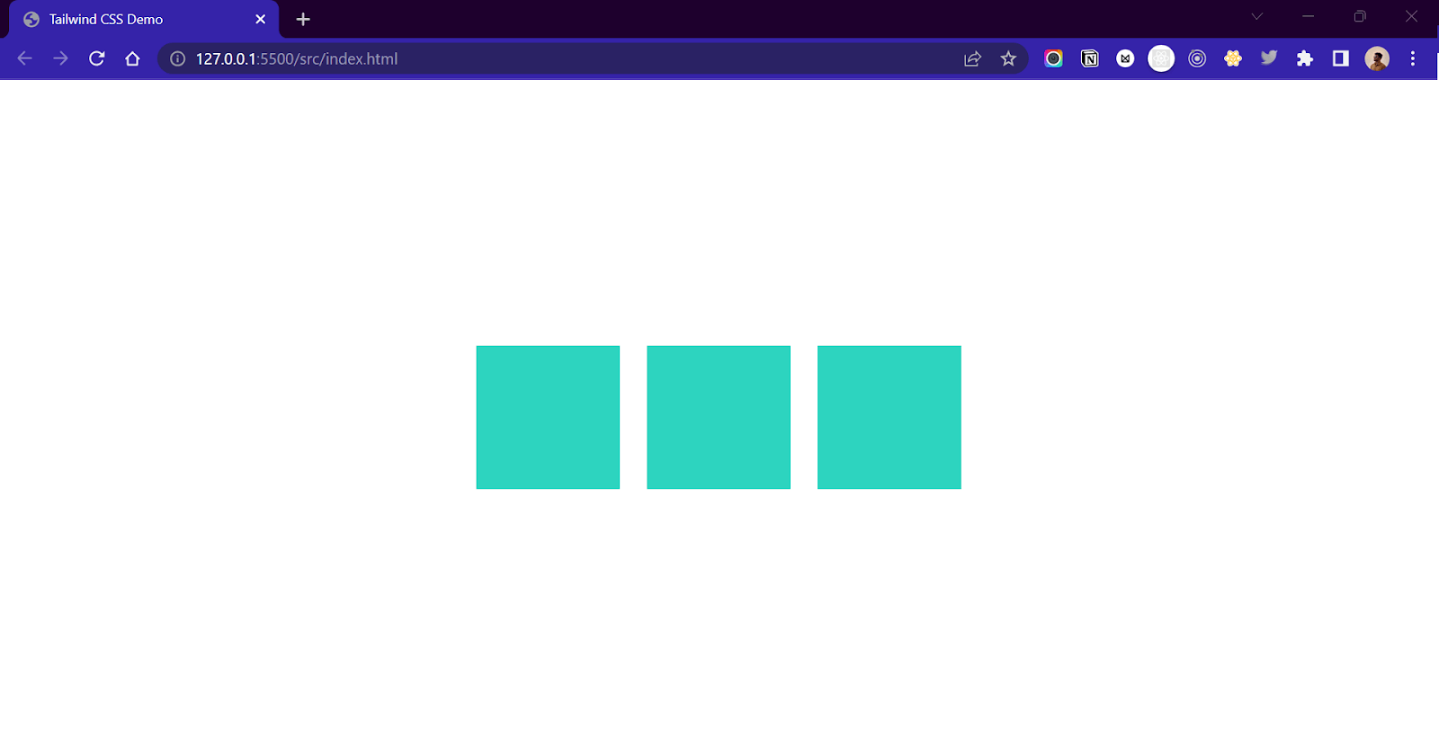
CSS Flexbox is a layout model in CSS that is used for creating website layouts, alignments, and distributing elements across the webpage. Flexbox plays a major role in adding responsive behavior to the website. To use Flexbox in Tailwind, we need to use the .flex class to add the display: flex; property. We can then define the flex-direction using the .flex-row and .flex-col classes.
Example:
|
1 2 3 4 5 |
<div class=" flex flex-row gap-6"> <div class="w-32 h-32 bg-teal-400"></div> <div class="w-32 h-32 bg-teal-400"></div> <div class="w-32 h-32 bg-teal-400"></div> </div> |
Output:
The table below shows some standard Flexbox classes and the CSS properties that they represent.
| Tailwind CSS Class Names | CSS Property |
| .flex | display: flex; |
| .flex-row | flex-direction: row; |
| .flex-col | flex-direction: column; |
| .flex-row-reverse | flex-direction: row-reverse; |
| .flex-col-reverse | flex-direction: column-reverse; |
Flexbox Content Alignment
Just like we have classes for Flexbox, we have classes to control how content inside the flexbox is laid out. The .justify-content property in CSS is used to align the content along the main axis ( if flex-direction = row, then main axis = x-axis, flex-direction = column, then main axis = y-axis).
Tailwind contains .justify-{direction} class to denote the justify-content CSS property. The direction value determines the direction in which the content inside the flexbox will be positioned. So .justify-center is justify-content: center; and similarly .justify-between is justify-content: between;
Example:
|
1 2 3 4 5 6 7 8 9 10 11 12 13 14 15 16 17 18 19 20 21 22 23 24 25 26 27 28 29 30 31 32 33 34 35 36 37 38 39 40 41 42 43 44 45 46 47 48 49 50 51 52 53 54 55 56 |
<section class="flex flex-col min-h-screen"> <div class="p-4 text-xl"> justify-start </div> <div class="flex flex-row justify-start bg-slate-200 p-4 gap-12"> <div class="w-12 h-12 bg-teal-400 rounded-md"></div> <div class="w-12 h-12 bg-teal-400 rounded-md"></div> <div class="w-12 h-12 bg-teal-400 rounded-md"></div> <div class="w-12 h-12 bg-teal-400 rounded-md"></div> </div> <div class="p-4 text-xl"> justify-center </div> <div class="flex flex-row justify-center bg-slate-200 p-4 gap-12"> <div class="w-12 h-12 bg-teal-400 rounded-md"></div> <div class="w-12 h-12 bg-teal-400 rounded-md"></div> <div class="w-12 h-12 bg-teal-400 rounded-md"></div> <div class="w-12 h-12 bg-teal-400 rounded-md"></div> </div> <div class="p-4 text-xl"> justify-end </div> <div class="flex flex-row justify-end bg-slate-200 p-4 gap-12"> <div class="w-12 h-12 bg-teal-400 rounded-md"></div> <div class="w-12 h-12 bg-teal-400 rounded-md"></div> <div class="w-12 h-12 bg-teal-400 rounded-md"></div> <div class="w-12 h-12 bg-teal-400 rounded-md"></div> </div> <div class="p-4 text-xl"> justify-between </div> <div class="flex flex-row justify-between bg-slate-200 p-4 gap-12"> <div class="w-12 h-12 bg-teal-400 rounded-md"></div> <div class="w-12 h-12 bg-teal-400 rounded-md"></div> <div class="w-12 h-12 bg-teal-400 rounded-md"></div> <div class="w-12 h-12 bg-teal-400 rounded-md"></div> </div> <div class="p-4 text-xl"> justify-around </div> <div class="flex flex-row justify-around bg-slate-200 p-4 gap-12"> <div class="w-12 h-12 bg-teal-400 rounded-md"></div> <div class="w-12 h-12 bg-teal-400 rounded-md"></div> <div class="w-12 h-12 bg-teal-400 rounded-md"></div> <div class="w-12 h-12 bg-teal-400 rounded-md"></div> </div> <div class="p-4 text-xl"> justify-evenly </div> <div class="flex flex-row justify-evenly bg-slate-200 p-4 gap-12"> <div class="w-12 h-12 bg-teal-400 rounded-md"></div> <div class="w-12 h-12 bg-teal-400 rounded-md"></div> <div class="w-12 h-12 bg-teal-400 rounded-md"></div> <div class="w-12 h-12 bg-teal-400 rounded-md"></div> </div> </section> |
Output:
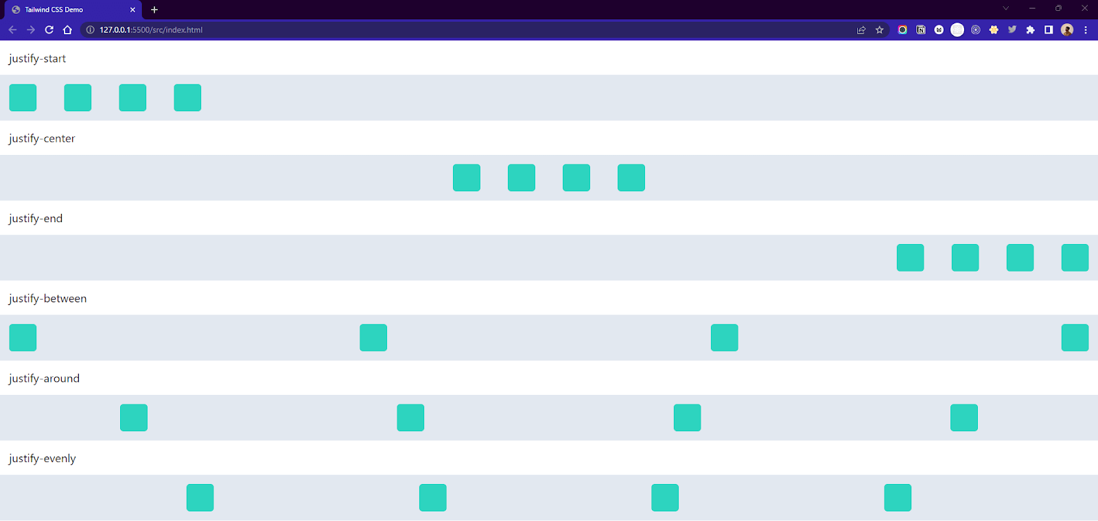
Here is a list of all the justify-content property class names.
| Tailwind CSS Class Names | CSS Property |
| .justify-normal | justify-content: normal; |
| .justify-start | justify-content: start; |
| .justify-end | justify-content: end; |
| .justify-between | justify-content: between; |
| .justify-around | justify-content: around; |
| .justify-evenly | justify-content: evenly; |
| .justify-stretch | justify-content: stretch; |
Similar to the justify-content property, the align-items property is used to align context across the cross-axis ( if flex-direction = row, then cross-axis = y-axis, flex-direction = column, then cross-axis = x-axis). The table below contains all the classes that denote the align-items property.
Example:
|
1 2 3 4 5 6 7 8 9 10 11 12 13 14 15 16 17 18 19 20 21 22 23 24 25 26 27 28 29 |
<section class="flex flex-col min-h-screen"> <div class="p-4 text-xl"> items-start </div> <div class="flex flex-row items-start bg-slate-200 p-4 gap-12"> <div class="w-24 h-12 bg-teal-400"></div> <div class="w-24 h-20 bg-teal-400"></div> <div class="w-24 h-32 bg-teal-400"></div> <div class="w-24 h-28 bg-teal-400"></div> </div> <div class="p-4 text-xl"> items-center </div> <div class="flex flex-row items-center bg-slate-200 p-4 gap-12"> <div class="w-24 h-12 bg-teal-400"></div> <div class="w-24 h-20 bg-teal-400"></div> <div class="w-24 h-32 bg-teal-400"></div> <div class="w-24 h-28 bg-teal-400"></div> </div> <div class="p-4 text-xl"> items-end </div> <div class="flex flex-row items-end bg-slate-200 p-4 gap-12"> <div class="w-24 h-12 bg-teal-400"></div> <div class="w-24 h-20 bg-teal-400"></div> <div class="w-24 h-32 bg-teal-400"></div> <div class="w-24 h-28 bg-teal-400"></div> </div> </section> |
Output:
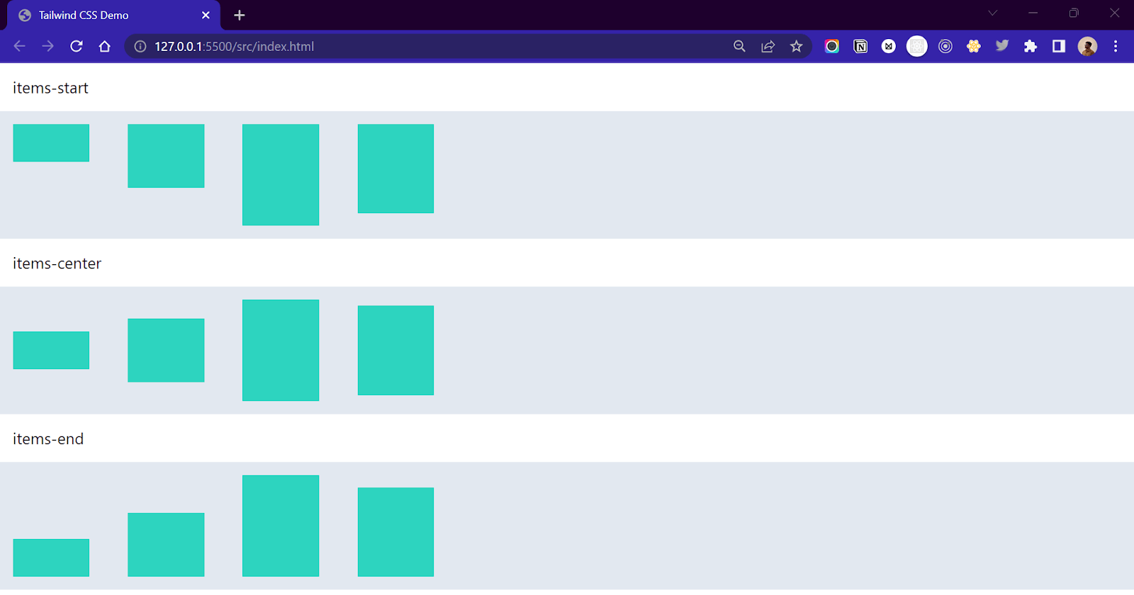
| Tailwind CSS Class Names | CSS Property |
| items-start | align-items: flex-start |
| items-end | align-items: flex-end |
| items-center | align-items: center |
| items-baseline | align-items: baseline |
| items-stretch | align-items: stretch |
Grids
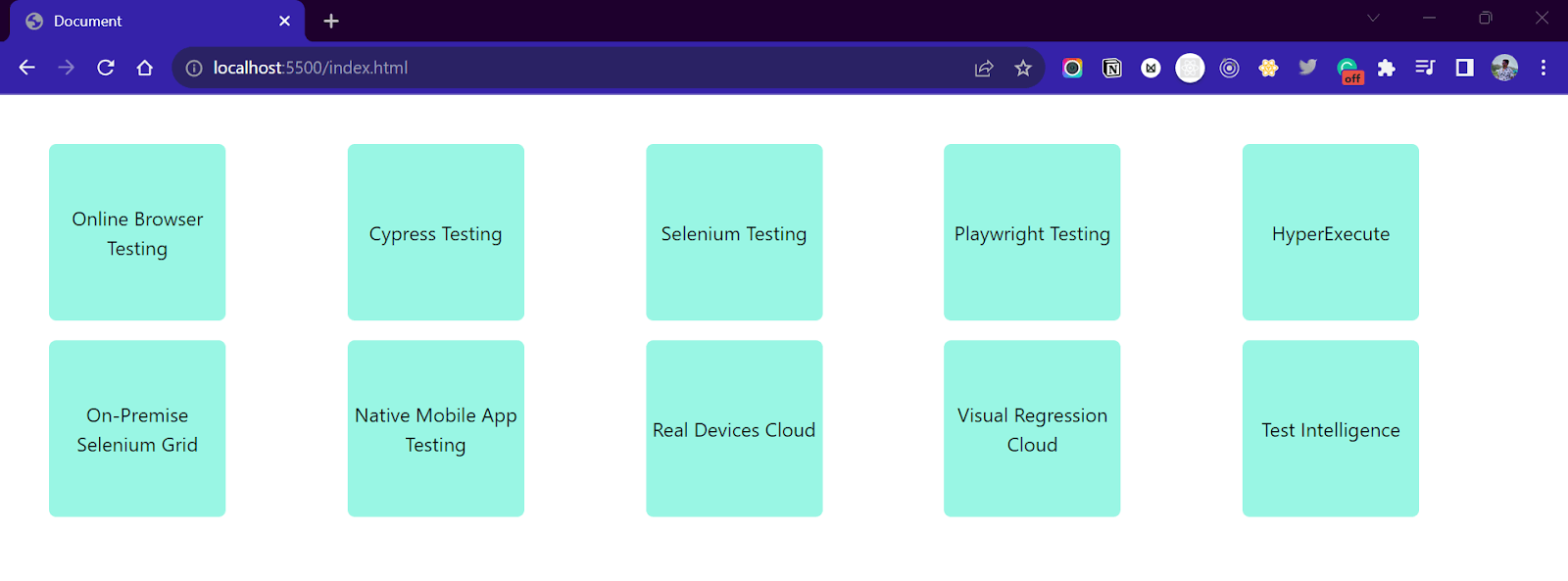
Many developers avoid CSS grids and use flexboxes while designing the layout of their websites due to the complexity. Tailwind simplifies the working of the grid and provides simple and easy-to-use classes for developers.
Using the .grid-cols-{number} class, we can define the number of columns inside a grid layout. So .grid-cols-2 will create a two-column layout inside a grid container. For specifying the gap between columns, .gap-{number} is an important utility. The .gap-{x} class represents the gap property in CSS, which controls gutters between grids and flexbox. Let’s see an example to understand.
Column Grid Example:
|
1 2 3 4 5 6 7 8 9 10 11 12 13 14 15 16 17 18 19 20 21 22 23 24 25 26 27 28 29 30 31 32 |
<section class="grid grid-cols-5 gap-4 p-10"> <div class="w-36 h-36 bg-teal-200 rounded-md flex justify-center items-center text-center"> Online Browser Testing </div> <div class="w-36 h-36 bg-teal-200 rounded-md flex justify-center items-center text-center"> Cypress Testing </div> <div class="w-36 h-36 bg-teal-200 rounded-md flex justify-center items-center text-center"> Selenium Testing </div> <div class="w-36 h-36 bg-teal-200 rounded-md flex justify-center items-center text-center"> Playwright Testing </div> <div class="w-36 h-36 bg-teal-200 rounded-md flex justify-center items-center text-center"> HyperExecute </div> <div class="w-36 h-36 bg-teal-200 rounded-md flex justify-center items-center text-center"> On-Premise Selenium Grid </div> <div class="w-36 h-36 bg-teal-200 rounded-md flex justify-center items-center text-center"> Native Mobile App Testing </div> <div class="w-36 h-36 bg-teal-200 rounded-md flex justify-center items-center text-center"> Real Devices Cloud </div> <div class="w-36 h-36 bg-teal-200 rounded-md flex justify-center items-center text-center"> Visual Regression Cloud </div> <div class="w-36 h-36 bg-teal-200 rounded-md flex justify-center items-center text-center"> Test Intelligence </div> </section> |
Output:
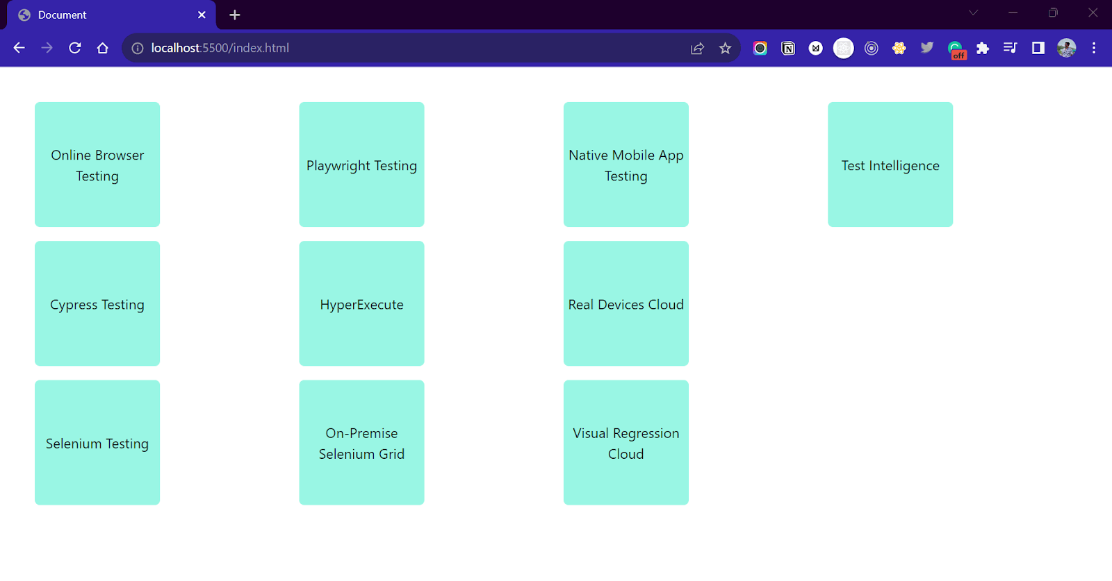
Row Grid Example:
|
1 2 3 4 5 6 7 8 9 10 11 12 13 14 15 16 17 18 19 20 21 22 23 24 25 26 27 28 29 30 31 32 |
<section class="grid grid-rows-3 grid-flow-col gap-4 p-10"> <div class="w-36 h-36 bg-teal-200 rounded-md flex justify-center items-center text-center"> Online Browser Testing </div> <div class="w-36 h-36 bg-teal-200 rounded-md flex justify-center items-center text-center"> Cypress Testing </div> <div class="w-36 h-36 bg-teal-200 rounded-md flex justify-center items-center text-center"> Selenium Testing </div> <div class="w-36 h-36 bg-teal-200 rounded-md flex justify-center items-center text-center"> Playwright Testing </div> <div class="w-36 h-36 bg-teal-200 rounded-md flex justify-center items-center text-center"> HyperExecute </div> <div class="w-36 h-36 bg-teal-200 rounded-md flex justify-center items-center text-center"> On-Premise Selenium Grid </div> <div class="w-36 h-36 bg-teal-200 rounded-md flex justify-center items-center text-center"> Native Mobile App Testing </div> <div class="w-36 h-36 bg-teal-200 rounded-md flex justify-center items-center text-center"> Real Devices Cloud </div> <div class="w-36 h-36 bg-teal-200 rounded-md flex justify-center items-center text-center"> Visual Regression Cloud </div> <div class="w-36 h-36 bg-teal-200 rounded-md flex justify-center items-center text-center"> Test Intelligence </div> </section> |
Output:
A list of commonly used grid column and row layout classes is mentioned below.
| Tailwind CSS Class Names | CSS Property | Description |
| .grid-cols-none | grid-template-columns: none; | Generate no grid layout. |
| .grid-cols-1 | grid-template-columns: repeat(1, minmax(0, 1fr)); | Generate 1 column grid layout. |
| .grid-cols-2 | grid-template-columns: repeat(2, minmax(0, 1fr)); | Generate 2 column grid layout. |
| .grid-rows-none | grid-template-rows: none; | Generate no grid layout |
| .grid-rows-1 | grid-template-rows: repeat(1, minmax(0, 1fr)); | Generate a 1-row grid layout. |
| .grid-rows-1 | grid-template-rows: repeat(2, minmax(0, 1fr)); | Generate a 2-row grid layout. |
Background
The utility classes provided by Tailwind to control the background styles start with .bg-{property-name}. For example, .bg-fixed is for background-attachment: fixed; property. Similarly, .bg-red-400 is for setting the background color as the red of variant 400. Let’s see a simple example to understand how to use background properties.
Example:
|
1 2 3 4 5 6 |
<section class="flex bg-gray-200 gap-10 flex-row justify-center min-h-screen"> <div class="w-2/3 bg-center bg-cover bg-no-repeat bg-[url('https://www.lambdatest.com/resources/images/icons/banner1.webp')]"> </div> </section> |
Output:
In the above example, I am setting the background image by passing in an arbitrary value. We will discuss this feature in the later part of the tutorial. The table below contains all the important background properties provided by Tailwind.
| Tailwind CSS Class Names | CSS property | Description |
| .bg-fixed | background-attachment: fixed; | Make the background image fixed |
| .bg-bottom | background-position: bottom; | Specifies the background image position as the bottom. |
| .bg-repeat | background-repeat: repeat; | Repeat the background image. |
| .bg-no-repeat | background-repeat: no-repeat; | Avoid repetition of the background image. |
| .bg-auto | background-size: auto; | Sets the background image size as auto. |
| .bg-cover | background-size: cover; | Resize the background image to cover the area. |
| .bg-contain | background-size: contain; | Resize the background image to make it fully visible. |
| .bg-none | background-image: none; | Remove the background. |
Text and Font
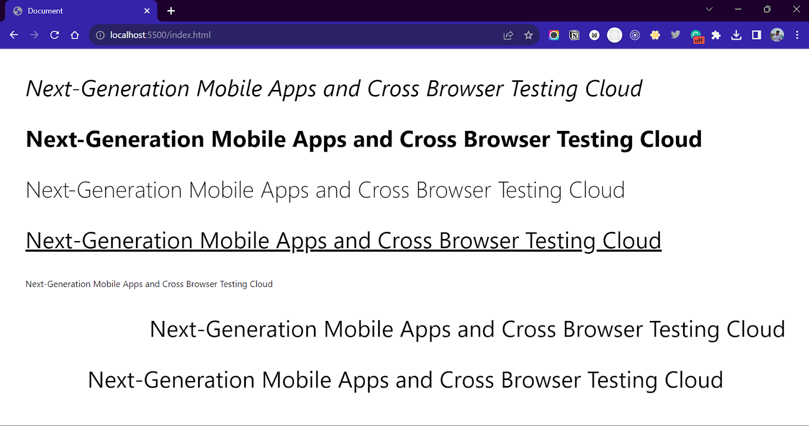
Tailwind has tons of utilities for controlling the font and text styling for the textual elements. All the classes that control the font properties start with .font-{property-name}, and the ones that control the text properties start with .text-{property-name}.
Example:
|
1 2 3 4 5 6 7 8 9 |
<section class=" flex flex-col gap-10 p-10 text-4xl min-h-screen"> <p class="italic">Next-Generation Mobile Apps and Cross Browser Testing Cloud</p> <p class="font-bold">Next-Generation Mobile Apps and Cross Browser Testing Cloud</p> <p class="font-thin">Next-Generation Mobile Apps and Cross Browser Testing Cloud</p> <p class="underline">Next-Generation Mobile Apps and Cross Browser Testing Cloud</p> <p class="text-sm">Next-Generation Mobile Apps and Cross Browser Testing Cloud</p> <p class="text-right">Next-Generation Mobile Apps and Cross Browser Testing Cloud</p> <p class="text-center">Next-Generation Mobile Apps and Cross Browser Testing Cloud</p> </section> |
Output:
Check the below list of a few common and popular Tailwind CSS classes and the properties that they represent.
| Tailwind CSS Class Names | CSS Property |
| .italic | font-style: italic; |
| .font-thin | font-weight: 500; |
| .font-medium | font-weight: 500; |
| .font-bold | font-weight: 700; |
| .font-black | font-weight: 900; |
| .text-xs | font-size: 0.75rem;
line-height: 1rem; |
| .text-sm | font-size: 0.875rem; line-height: 1.25rem; |
| .text-base | font-size: 1rem; line-height: 1.5rem; |
| .text-lg | font-size: 1.125rem; line-height: 1.75rem; |
| .text-black | color: rgb(0, 0, 0); |
| .text-white | color: rgb(255, 255, 255); |
| .text-green-500 | Color: rgb(34, 197, 94); |
| .underline | text-decoration-line: underline; |
| .text-left | text-align: left; |
| .text-center | text-align: center; |
| .text-right | text-align: right; |
Positions
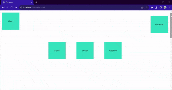
CSS position property controls the nature of the position of the element inside the DOM. The value of the position property can either be static, sticky, fixed, absolute, or relative(default). In Tailwind, each value keyword resembles the CSS position property. For example, for setting the position of an element as position: fixed, give it a class name of .fixed.
The position property is often combined with top/right/left/bottom values to provide the placement for the element. Check the example below for a better understanding.
Example:
|
1 2 3 4 5 6 7 8 9 10 11 12 13 14 15 16 17 |
<section class=" flex min-h-screen gap-20 justify-center items-center bg-blue-100"> <div class="w-32 h-32 flex justify-center items-center bg-teal-400 static "> Static </div> <div class="w-32 h-32 bg-teal-400 flex justify-center items-center fixed top-4 left-4"> Fixed </div> <div class="w-32 h-32 bg-teal-400 flex justify-center items-center absolute top-10 right-4"> Absolute </div> <div class="w-32 h-32 bg-teal-400 flex justify-center items-center sticky top-0 left-0"> Sticky </div> <div class="w-32 h-32 bg-teal-400 flex justify-center items-center relative"> Relative </div> </section> |
Output:
Transforms
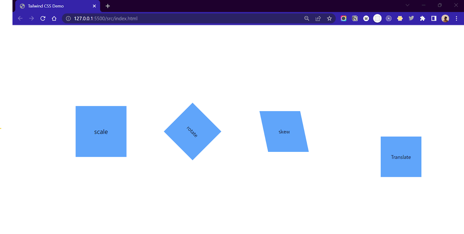
The transform property in CSS allows us to play move, scale, rotate, or skew elements on the web page. The name of the classes in Tailwind CSS starts with the transformation type and ends with a value. For example, .scale-50 corresponds to CSS property transform: scale(0.5). Similarly, .rotate-45 corresponds to transform: rotate(45deg);
Example:
|
1 2 3 4 5 6 7 8 9 10 11 12 13 14 15 16 17 |
<section class="flex flex-row justify-center items-center min-h-screen gap-40"> <div class="w-32 h-32 flex flex-row justify-center items-center bg-blue-400 scale-125"> scale </div> <div class="w-32 h-32 flex flex-row justify-center items-center bg-blue-400 rotate-45"> rotate </div> <div class="w-32 h-32 flex flex-row justify-center items-center bg-blue-400 skew-x-12"> skew </div> <div class="w-32 h-32 flex flex-row justify-center items-center bg-blue-400 translate-x-20 translate-y-20"> Translate </div> </section> |
Output:
Here’s a list of common Tailwind CSS transformation classes
| Tailwind CSS Class Names | CSS Property |
| .scale-x-0 | transform: scaleX(0); |
| .scale-y-0 | transform: scaleY(0); |
| .scale-0 | transform: scale(0); |
| .rotate-0 | transform: rotate(0deg); |
| .rotate-90 | transform: rotate(90deg); |
| .translate-x-0 | transform: translateX(0px); |
| .translate-y-0 | transform: translateY(0px); |
| .skew-x-0 | transform: skewX(0deg); |
| .skew-y-0 | transform: skewY(0deg); |
| .origin-center | transform-origin: center; |
| .origin-top | transform-origin: top; |
| .origin-top-right | transform-origin: top right; |
Transition
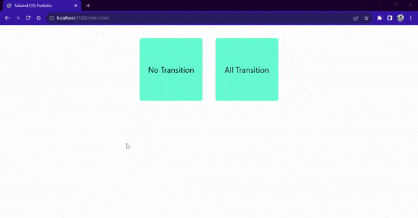
The transition property in CSS is used to specify how a property change transition effect will occur. Tailwind CSS uses the .transition-{property-name} class to denote the transition property.
Example:
|
1 2 3 4 5 6 7 8 9 |
<section class="flex flex-row justify-center gap-10 p-10 text-2xl"> <div class="w-48 h-48 bg-teal-300 rounded-md flex justify-center items-center hover:bg-red-400 transition-none"> No Transition </div> <div class="w-48 h-48 bg-teal-300 rounded-md flex justify-center items-center transition-all duration-500 ease-linear hover:bg-red-400"> All Transition </div> </section> |
Output:
Here’s a list of all the important and most used transition classes in Tailwind CSS.
| Tailwind CSS Class names | CSS Property |
| .transition-none | transition-property: none;
transition-timing-function: cubic-bezier(0.4, 0, 0.2, 1); transition-duration: 150ms; |
| .transition-all | transition-property: all;
transition-timing-function: cubic-bezier(0.4, 0, 0.2, 1); transition-duration: 150ms; |
| .transition-colors | transition-property: colors;
transition-timing-function: cubic-bezier(0.4, 0, 0.2, 1); transition-duration: 150ms; |
| .transition-opacity | transition-property: opacity;
transition-timing-function: cubic-bezier(0.4, 0, 0.2, 1); transition-duration: 150ms; |
| .transition-shadow | transition-property: shadow;
transition-timing-function: cubic-bezier(0.4, 0, 0.2, 1); transition-duration: 150ms; |
| .transition-transform | transition-property: transform;
transition-timing-function: cubic-bezier(0.4, 0, 0.2, 1); transition-duration: 150ms; |
Each transition property comes with a default easing function and duration property. But Tailwind CSS allows us to change them by overriding them using the .ease-{timing-function} and .duration-{time}, respectively.
For example, the .ease-linear class will override the default timing function property with the new transition-timing-function: linear; property. Similarity .duration-500 will override the default value of 150 ms duration with a 500 ms value.
Animations
Animations are an important part of any website. Tailwind CSS has a few preconfigured utility classes that can be used to add CSS animations to any elements on the screen. Behind the scenes, these classes use keyframes to create animations.
Example Code:
|
1 2 3 4 5 6 7 8 9 10 11 12 13 14 15 |
<section class="flex min-h-screen gap-20 justify-center items-center"> <div class="w-32 h-32 bg-teal-400 rounded-md animate-spin"> </div> <div class="w-32 h-32 bg-teal-400 rounded-full animate-ping"> </div> <div class="w-32 h-32 bg-teal-400 rounded-full animate-pulse"> </div> <div class="w-32 h-32 bg-teal-400 rounded-full animate-bounce"> </div> </section> |
Output:
Using Modifiers for Handling States of Elements
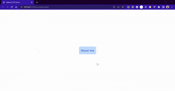
Each and every utility class in Tailwind can be applied conditionally using a modifier prefix. The conditions can be a specific element state like hover, active, disabled, or a pseudo-element like first-child, placeholder text, markers, etc.
For example, a bg-black class will set the background color as black for an element, but the hover:bg-black class will only set the background color as black when the user hovers the cursor over the element. Similarly, using the text-red-500 class over an anchor tag element will make the link red. But the visited:text-red-500 variation will make the link red only if it has been visited.
Tailwind contains modifiers for all CSS pseudo-classes, pseudo-elements, media queries, feature queries, and attribute selectors. In the below table, you can find modifiers for all the important pseudo-classes and pseudo-elements.
| Modifier | CSS Property |
| .hover: | element:hover{} |
| .focus: | element:focus{} |
| .visited: | element:visited{} |
| .before | element::before{} |
| .after | element::after{} |
| .first-line: | element::first-line{} |
| .placeholder: | element::placeholder{} |
Example:
|
1 2 3 |
<button class="bg-blue-200 text-blue-600 p-4 rounded-lg text-2xl font-medium hover:bg-blue-600 hover:text-white focus:bg-white focus:border-2 focus:border-blue-600 focus:text-blue-600"> Hover me </button> |
Output:
Functions and Directives
Since we already talked about what functions and directives are, let’s see how we can use them. Two of the common Tailwind CSS functions are theme() and screen().
The theme() function provides access to the custom values that we set in the tailwind.config.js file.
|
1 2 3 |
.container { height: calc(100vh - theme(spacing.20)); } |
Similarly, the screen() function is used to address breakpoints by name rather than by screen size value.
|
1 2 3 |
@media screen(md) { /*will be applied for min-width = 640px */ } |
Directives can be used in the custom CSS file to reference an existing Tailwind CSS property. For example, a @tailwind directive is used to inject Tailwind CSS classes, while an @apply directive is used to apply Tailwind CSS properties to custom classes.
|
1 2 3 4 5 6 |
/* Importing Basic Tailwind CSS classes */ @tailwind base; @tailwind components; @tailwind utilities; |
In the following example, we are applying CSS properties from the .bg-red-900 class to the body of the website and .shadow-lg, .border-2, and .border-gray-200 class properties to the .myButton class.
|
1 2 3 4 5 6 7 8 9 10 |
/* Applying Tailwind CSS properties to */ body{ @apply bg-red,-900 } .myButton{ @apply shadow-lg @apply border-2 border-gray-200 } |
Media Queries Using Tailwind CSS
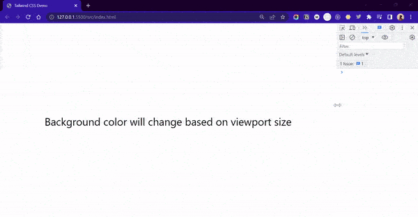
Along with good styling, modern web applications must be responsive on all screens. Responsive web design is an approach to designing and developing websites that work seamlessly across all screen sizes without compromising accessibility and performance. The layouts of responsive websites change based on the size of the target device in a user-friendly way.
However, making the websites responsive for all screen sizes can be quite a bit of a task for any developer. Tailwind contains responsive utility variants of the classes that simplify the process of making websites responsive. Each and every utility class in Tailwind can be conditionally applied at different screen breakpoints using modifiers. Using a breakpoint prefix, we can conditionally call apply a class. To make a class conditional for a breakpoint, add a prefix like ‘sm, md, lg, xl, 2xl’ followed by ‘:’ and the class name.
For example, a .w-1/2 class will make a width of 50% across all the sizes. But a .lg:w-1/2 class will only make the width as 50% for screens with a width of more than 1024px.
Here’s the table for all the breakpoint prefixes. Width and CSS media query
| Breakpoint Prefix | Target Width | Media Query |
| sm | 640px | @media (min-width:640px) {…} |
| md | 768px | @media (min-width:768px) {…} |
| lg | 1024px | @media (min-width:1024px) {…} |
| xl | 1280px | @media (min-width:1280px) {…} |
| 2xl | 1536px | @media (min-width:1536px) {…} |
In the below example, we are conditionally setting the background color property of the body element based on the viewport size.
Example:
|
1 2 3 |
<section class="flex flex-row justify-center items-center min-h-screen lg:bg-white md:bg-blue-300 sm:bg-green-300 bg-red-300 text-4xl"> <h1>Background color will change based on viewport size</h1> </section> |
Output:
Customizing Default Tailwind CSS classes
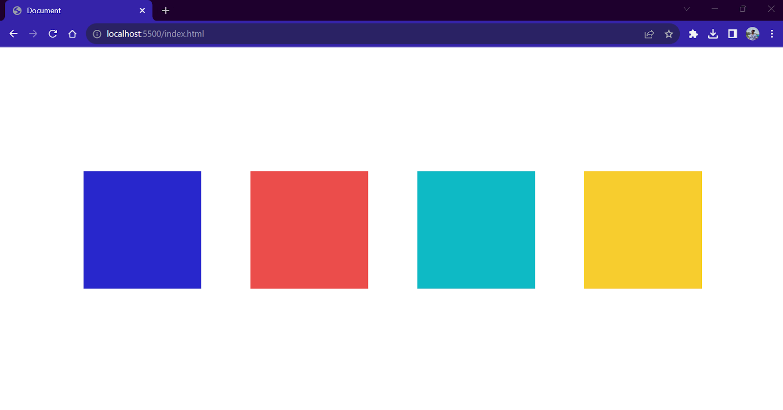
Tailwind has its own design system. All the classes and their variants follow a fixed set of values, which are predefined and configured according to the design system. Tailwind CSS uses a specific design system where all class styles and variations have predetermined values, ensuring everything looks consistent. But what if the project demands different styles or values that are absent in Tailwind?
In such cases, we can customize the existing styles with our own values defined inside the tailwind.config.js file. We can either redefine the default values again for classes or create entirely new values.
To create custom values, we first define the values inside the tailwind.config.js file. We will add four custom colors inside a colors object and add them inside the theme object.
Once the tailwind.config.js file is configured, we can use these values inside our HTML file like other classes. Here, we are applying a background color of our custom values.
|
1 2 3 4 5 6 7 8 9 10 11 12 13 14 15 16 17 |
<div class="w-48 h-48 bg-myBlue"> </div> <div class="w-48 h-48 bg-myRed"> </div> <div class="w-48 h-48 bg-myGreen"> </div> <div class="w-48 h-48 bg-myYellow"> </div> |
Output:
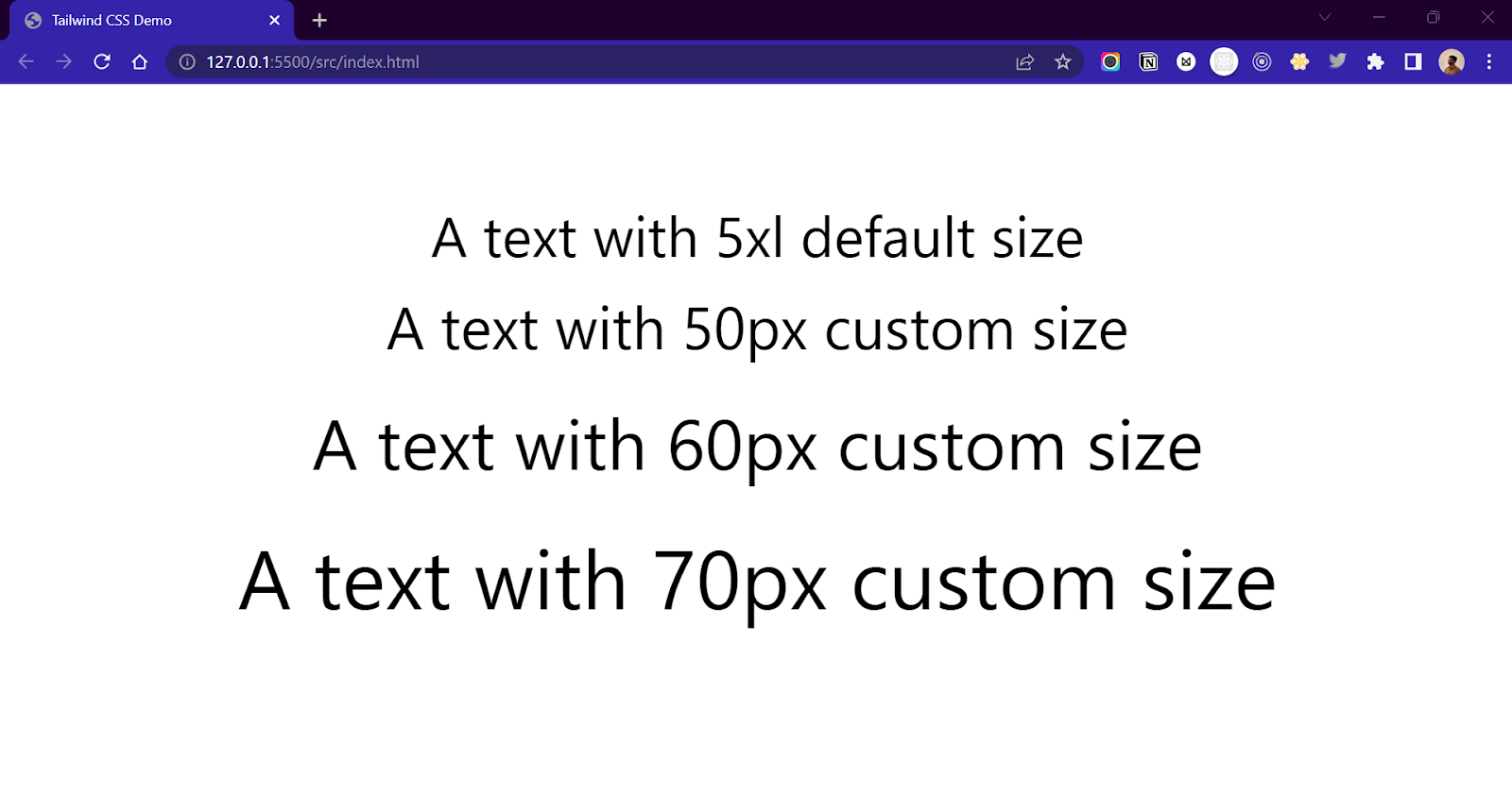
And it doesn’t stop here! We can also extend the existing list of values by adding our new ones. For example, we can add a new font-size value in the already existing list of values like sm,md, …., xl, 2xl up to 9xl, etc.
The new values to be extended must be added inside the extend object in the tailwind.config.js file.
|
1 2 3 4 5 6 7 8 9 10 11 12 13 14 15 16 17 18 19 20 21 22 |
/** @type {import('tailwindcss').Config} */ module.exports = { content: ["./src/**/*.{html,js}"], theme: { colors: { myBlue: "#2827CC", myRed: "#EB4D4B", myGreen: "#4DD637", myYellow: "#F7CD2E", }, extend: { fontSize: { 50: "50px", 60: "60px", 70: "70px", }, }, }, plugins: [], }; |
Once declared inside the configuration file, we can use them like other classes in our HTML file.
|
1 2 3 4 5 6 7 8 |
<h1 class="text-5xl">A text with 5xl default size</h1> <h1 class="text-50">A text with 50px custom size</h1> <h1 class="text-60">A text with 60px custom size</h1> <h1 class="text-70">A text with 70px custom size</h1> |
Output:
Creating a custom theme completely replaces Tailwind’s default configured values. Hence, by declaring our own values, we won’t be able to use the already existing Tailwind values. But by extending the Tailwind CSS values, we can preserve the existing ones while adding new ones of our own.
This customization feature of Tailwind makes it a game changer and a preferred framework as compared to the other frameworks.
Arbitrary Values in Tailwind CSS
In some cases, we might run into a situation where we need a custom value just once. In such cases, defining a new variable inside the configuration file might be an overkill. In such cases, we can make use of the Just in Time (JIT) compilation feature of Tailwind CSS to pass custom values directly to the classes.
This feature allows us to break out of the existing design system using custom values. To use custom values in classes, add the value inside the square brackets and then attach it to the class.
Example:
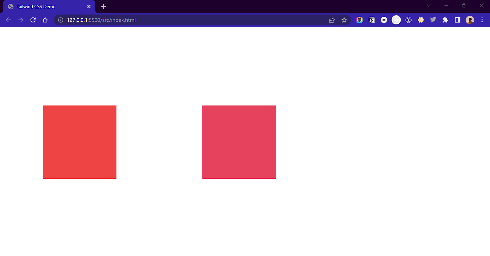
.bg-red-500 is a class that carries Tailwind CSS-defined values. But using the .bg-[#123123], we can give a custom color value of #123123 to the .bg class. Similarly, we can pass arbitrary values to all sorts of classes like .w-[50px], .m-[2px], .text-[#222], etc.
HTML:
|
1 2 3 4 5 6 7 8 9 10 11 |
<!--Red Color variant provided by Tailwind CSS--> <div class="w-48 h-48 bg-red-500"> </div> <!--Custom Red Color variant--> <div class="w-48 h-48 bg-[#E6425E]"> </div> |
Output:
Behind the scenes, the Just In Time compiler of Tailwind CSS generates the CSS code from arbitrary values provided to the classes. While using this feature, passing the values that the CSS property can recognize is necessary.

Demo: Building Developer Portfolio Using Tailwind CSS
As a developer, it is essential to have your own Portfolio website to showcase your work and skills, and publish blogs. Your Portfolio website can be very useful for building an identity online. If you are applying for a job role, a well-designed portfolio website will greatly impact the recruiter.
In this part of the blog, we will create a modern minimalist Portfolio website using HTML, Tailwind CSS, and JavaScript. Now that we know about Tailwind CSS and how to use it, building a Portfolio website will be good practice and give us much-needed hands-on experience.
Here’s what we are making. You can check this live version.
We will be making a single-page Portfolio website. The website will be divided into 7 sections.
- Home
- About
- Work Experience
- Projects or Works
- Services
- Blogs
- Contact
Additionally, we will have a navbar at the top and a footer at the bottom of the page. We will make sure our website is responsive across all devices. In the end, we will add a button to switch between the light theme and the dark theme for our website. The theme toggler feature will be the highlight of our website. So let’s get started!
Folder Structure
First, let’s create the folder structure for our Portfolio website. We will create a folder with the name Portfolio. We will create a src folder in the Portfolio folder containing our HTML file, CSS files, and assets. The entire code for the Portfolio website can be found on my GitHub. For just the boilerplate code, switch to the GitHub starter branch.
If you want to make your folder structure, modify the build commands and link tags as per your folder structure.
To set up Tailwind CSS inside this folder, we will follow the steps discussed in the Setting up Tailwind CSS section.
- Initialize a new project using
- Install Tailwind CSS using
- Initialize Tailwind CSS using
- Update the tailwind.config.js file with template file extensions.
- Inject the Tailwind CSS base, component, and utilities inside style.css.
- Generate the output.css file in watch mode.
|
1 |
> npm init - y |
|
1 |
> npm install - D tailwindcss |
|
1 |
> npx tailwindcss init |
|
1 2 3 4 5 6 7 8 |
/** @type {import('tailwindcss').Config} */ module.exports = { content: ["./src/**/*.{html,js}"], theme: { extend: {}, }, plugins: [], }; |
|
1 2 3 |
@tailwind base; @tailwind components; @tailwind utilities; |
We will not create a separate dist folder for the output.css file. Instead, we will generate the output file inside the src folder itself. This will make it easy for us to host our website on a hosting platform later. So, the command for generating the output file will contain the src folder instead of the dist folder.
|
1 |
> npx tailwindcss - i ./src/style.css - o ./src/output.css --watch |
Talking about the fonts and icons, we will use a Poppins font. You are free to use your favorite font. We need to include Poppins as a font inside our configuration file. Once included, we can apply it using the @layer directive inside the style.css file. This will set the default font family of the website to Poppins.
tailwind.config.js:
|
1 2 3 4 5 6 7 8 9 10 11 12 |
/** @type {import('tailwindcss').Config} */ module.exports = { content: ["./src/**/*.{html,js}"], theme: { extend: { fontFamily:{ 'poppins':['Poppins','sans-serif'] } }, }, plugins: [], }; |
style.css:
|
1 2 3 4 5 6 7 8 9 10 11 12 13 |
@tailwind base; @tailwind components; @tailwind utilities; @layer base { html { scroll-behavior: smooth; } body{ @apply font-poppins } } |
For icons, we will use Remix icons which are easy to use and look elegant on the UI. We will import these icons using the link tag inside the head section.
We will build the website with one section at a time; let’s start by creating the structure for our website. We will use < section > tags for our 7 content sections, < navbar > for the top navigation bar, and < footer > for the footer. This will help us maintain consistent styling and follow HTML semantic principles.
At the end of the file, we will add a < script > tag to put our JavaScript code. We will need JavaScript to build a menu toggle button and theme switch to toggle between dark and light modes. Here’s what the structure of the site looks like.
|
1 2 3 4 5 6 7 8 9 10 11 12 13 14 15 16 17 18 19 20 21 22 23 24 25 26 27 28 29 30 31 32 33 34 35 36 37 38 39 40 41 42 43 44 45 46 47 48 49 50 51 52 53 54 55 56 57 58 59 60 61 62 63 64 65 66 67 68 69 70 71 72 73 74 75 76 77 78 79 80 81 82 83 84 85 86 87 88 89 90 91 |
<!DOCTYPE html> <html lang="en"> <head> <meta charset="UTF-8"> <meta http-equiv="X-UA-Compatible" content="IE=edge"> <meta name="viewport" content="width=device-width, initial-scale=1.0"> <title>Tailwind CSS Portfolio</title> <!-- Link to the CSS file generated after build process --> <link href="./output.css" rel="stylesheet"> <!-- CDN for Remix icons --> <link href="https://cdn.jsdelivr.net/npm/remixicon@3.4.0/fonts/remixicon.css" rel="stylesheet"> <!-- Add your Meta tags here --> </head> <body> <!-- navbar component --> <nav> </nav> <!-- main content section --> <main> <!-- Home section --> <section> </section> <!-- About Section --> <section> </section> <!-- Work Experience section --> <section> </section> <!-- Works section --> <section> </section> <!-- What I offer section --> <section> </section> <!-- Blogs Section --> <section> </section> <!-- Contact section --> <section> </section> <!-- footer component --> <footer> </footer> </main> </body> </html> <!-- JavaScript for Menu togglers and Dark Mode functionality --> <script> //JavaScript goes here </script> |
Setting the Alignment and Width
Before we start creating our section, let’s fix the size of our website. For our website, we will give it a maximum width of 1152px or 72rem. This is to restrict the width of website content on extra-large screens. We will apply the maximum width class of max-w-6xl to the main element.
|
1 2 3 4 5 6 |
<main class="max-w-6xl dark:text-white"> <!--Add Content here--> </main> |
We will also make all the elements inside the body tag as flex-direction: column and place them horizontally at center. We will also set the background color of the body as white and position as relative.
|
1 2 3 4 5 6 7 8 9 |
<body class="relative flex flex-col items-center bg-white"> <!--Add Content here--> </body> |
Navbar
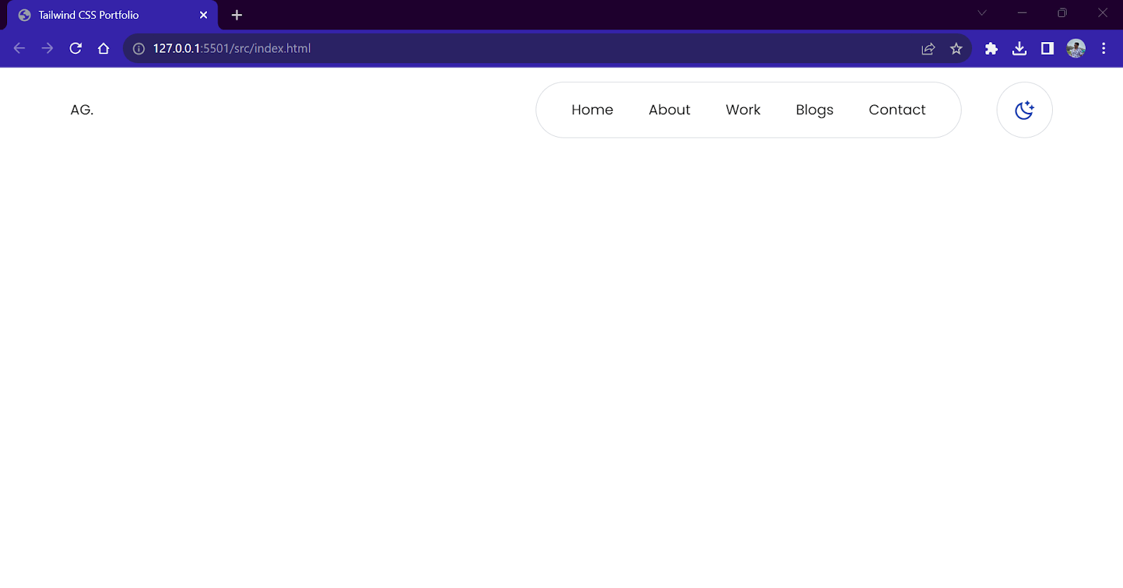
Let’s start by creating our navbar component that will be fixed at the top. The navbar will be divided into three parts. The left part will contain the brand name or logo for the website, the middle part will contain all the links to navigate, and the right part will contain the theme toggler button and menu button.
Here are some features of the navbar:
- The navbar will be fixed on top.
- A transparent background will give a glass effect on scrolling.
- Theme toggler button, which will change from sun icon to moon icon while toggling
- Horizontal links tab, which will get hidden on small screens.
- The menu button will create a drop-down for links on smaller screens.
Right now, while building the website, we will add styles for dark mode as well. We will activate these classes when working on the dark mode feature.
Here’s what the code for the navbar looks like.
|
1 2 3 4 5 6 7 8 9 10 11 12 13 14 15 16 17 18 19 20 21 22 23 24 25 26 27 28 29 30 31 32 33 34 35 |
<!-- navbar component --> <nav class="fixed backdrop-blur-md bg-white dark:bg-[#121212] bg-opacity-60 w-full flex flex-row justify-center z-20"> <div class="flex flex-row justify-between items-center w-[72rem] p-4 "> <div class="flex dark:text-white"> <p>AG.</p> </div> <div class="flex flex-row justify-end md:justify-between w-full md:w-auto gap-4 md:gap-10"> <!--Links component - Visible on large screens and not on small screens--> <ul class="hidden md:flex flex-row items-center text-sm md:text-base gap-4 md:gap-10 border border-gray-300 dark:border-gray-600 bg-white dark:bg-[#121212] dark:text-white rounded-full px-6 md:px-10 w-auto h-12 md:h-16 "> <li> <a href="#" rel="noopener noreferrer" class="hover:text-purple-600">Home</a> </li> <li> <a href="#about" rel="noopener noreferrer" class="hover:text-purple-600">About</a> </li> <li> <a href="#work" rel="noopener noreferrer" class="hover:text-purple-600">Work</a> </li> <li> <a href="#blogs" rel="noopener noreferrer" class="hover:text-purple-600">Blogs</a> </li> <li> <a href="#contact" rel="noopener noreferrer" class="hover:text-purple-600">Contact</a> </li> </ul> <!--Button to change theme--> <button onclick="toggleTheme()" class=" flex bg-white w-12 h-12 md:w-16 md:h-16 flex-row justify-center items-center border-gray-300 dark:border-gray-600 dark:bg-[#121212] dark:text-white border rounded-full"> <i id="theme-toggler-moon" class="ri-moon-clear-line text-blue-800 ri-xl" id="sun-icon"></i> </button> </div> </div> </nav> |
Output:
Home Section
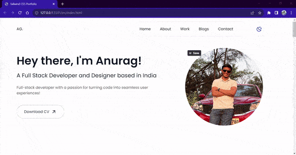
The home section (or hero section) is a two-column layout. On one side, we will have a headline, name, and what we do. On the other side, we will have a display picture. We will also add a button pointing to the drive link for our resume or CV.
We will build this two-column layout using a flexbox. On large screens, this layout will be horizontal, while on smaller screens, we will stack them on top of each other in a single-column layout.
index.html:
|
1 2 3 4 5 6 7 8 9 10 11 12 13 14 15 16 17 18 19 20 21 22 23 24 |
<!-- Home section --> <section class="flex flex-col w-full h-auto min-h-screen justify-center relative px-6 md:px-4"> <div class="flex flex-col-reverse md:flex-row flex-wrap gap-10 md:gap-0"> <div class="w-full md:w-3/5 flex flex-col justify-center items-start dark:text-white"> <h1 class="text-4xl md:text-5xl font-semibold">Hey there, I'm Anurag!</h1> <h2 class="text-lg md:text-2xl my-2 md:my-6">A Full Stack Developer and Designer based in India</h2> <p class="text-sm md:text-base dark:text-neutral-300 text-neutral-600">Full-stack developer with a passion for turning code into seamless user experiences!</p> <button class="mt-10 flex flex-row items-center gap-2 border border-gray-400 dark:border-gray-600 py-4 px-8 hover:border-purple-600 rounded-full hover:bg-purple-600 hover:text-white transition-all ease-in-out duration-300"> Download CV <i class="ri-arrow-right-up-line ri-xl"></i> </button> </div> <div class="w-full md:w-2/5 flex flex-row justify-center items-center"> <img class="w-2/4 md:w-3/4 rounded-full" src="https://www.anuraggharat.tech/images/anurag.jpg" /> </div> </div> </section> |
Output:

About Section
The about section of the website will contain our personal details like education, history, interests, etc. It will also contain a list of skills for which we will use a pill shape design. Here, I am using my personal details; you can use yours.
HTML:
|
1 2 3 4 5 6 7 8 9 10 11 12 13 14 15 16 17 18 19 20 21 22 23 24 25 26 27 28 29 30 31 32 33 34 35 36 37 38 39 40 41 42 43 44 45 46 47 48 49 50 51 52 53 54 55 56 57 58 59 60 61 62 63 64 65 66 67 68 69 70 71 72 73 74 75 76 77 |
<!-- About Section --> <section class="w-full py-20 px-6 md:px-4" id="about"> <h1 class="text-4xl font-semibold">About</h1> <p class="mt-10 dark:text-gray-300"> Lorem ipsum dolor sit amet consectetur adipisicing elit. Pariatur saepe fugiat nesciunt fuga. Maxime est nisi nulla inventore ab beatae maiores ipsum esse! Quibusdam blanditiis earum ratione harum incidunt vitae sunt cum officiis illum, qui vel totam consectetur voluptates enim voluptatum nemo, voluptatem porro ut sequi et vero quis cumque. Nulla inventore ab beatae maiores ipsum esse! Quibusdam blanditiis earum ratione harum incidunt vitae sunt cum officiis illum. </p> <p class="mt-10 dark:text-gray-300"> Lorem ipsum dolor sit amet consectetur adipisicing elit. Pariatur saepe fugiat nesciunt fuga. Maxime est nisi nulla inventore ab beatae maiores ipsum esse! Quibusdam blanditiis earum ratione harum incidunt vitae sunt cum officiis illum, qui vel totam consectetur voluptates enim voluptatum nemo, voluptatem porro ut sequi et vero quis cumque. </p> <div class="flex flex-row justify-start gap-2 flex-wrap"> <ul class="text-sm flex flex-row gap-2 flex-wrap mt-10"> <li class="px-5 py-2 border border-gray-200 dark:border-gray-600 rounded-full hover:bg-purple-600 hover:text-white transition-all duration-300 ease-in-out "> HTML</li> <li class="px-5 py-2 border border-gray-200 dark:border-gray-600 rounded-full hover:bg-purple-600 hover:text-white transition-all duration-300 ease-in-out"> CSS</li> <li class="px-5 py-2 border border-gray-200 dark:border-gray-600 rounded-full hover:bg-purple-600 hover:text-white transition-all duration-300 ease-in-out"> SASS</li> <li class="px-5 py-2 border border-gray-200 dark:border-gray-600 rounded-full hover:bg-purple-600 hover:text-white transition-all duration-300 ease-in-out"> Bootstrap</li> <li class="px-5 py-2 border border-gray-200 dark:border-gray-600 rounded-full hover:bg-purple-600 hover:text-white transition-all duration-300 ease-in-out"> Tailwind CSS</li> <li class="px-5 py-2 border border-gray-200 dark:border-gray-600 rounded-full hover:bg-purple-600 hover:text-white transition-all duration-300 ease-in-out"> JavaScript</li> <li class="px-5 py-2 border border-gray-200 dark:border-gray-600 rounded-full hover:bg-purple-600 hover:text-white transition-all duration-300 ease-in-out"> TypeScipt</li> <li class="px-5 py-2 border border-gray-200 dark:border-gray-600 rounded-full hover:bg-purple-600 hover:text-white transition-all duration-300 ease-in-out"> React</li> <li class="px-5 py-2 border border-gray-200 dark:border-gray-600 rounded-full hover:bg-purple-600 hover:text-white transition-all duration-300 ease-in-out"> Next.js</li> <li class="px-5 py-2 border border-gray-200 dark:border-gray-600 rounded-full hover:bg-purple-600 hover:text-white transition-all duration-300 ease-in-out"> Angular</li> <li class="px-5 py-2 border border-gray-200 dark:border-gray-600 rounded-full hover:bg-purple-600 hover:text-white transition-all duration-300 ease-in-out"> Express</li> <li class="px-5 py-2 border border-gray-200 dark:border-gray-600 rounded-full hover:bg-purple-600 hover:text-white transition-all duration-300 ease-in-out"> Node</li> <li class="px-5 py-2 border border-gray-200 dark:border-gray-600 rounded-full hover:bg-purple-600 hover:text-white transition-all duration-300 ease-in-out"> MongoDB</li> <li class="px-5 py-2 border border-gray-200 dark:border-gray-600 rounded-full hover:bg-purple-600 hover:text-white transition-all duration-300 ease-in-out"> MySQL</li> <li class="px-5 py-2 border border-gray-200 dark:border-gray-600 rounded-full hover:bg-purple-600 hover:text-white transition-all duration-300 ease-in-out"> Figma</li> <li class="px-5 py-2 border border-gray-200 dark:border-gray-600 rounded-full hover:bg-purple-600 hover:text-white transition-all duration-300 ease-in-out"> Docker</li> <li class="px-5 py-2 border border-gray-200 dark:border-gray-600 rounded-full hover:bg-purple-600 hover:text-white transition-all duration-300 ease-in-out"> AWS</li> </ul> </div> </section> |
Output:

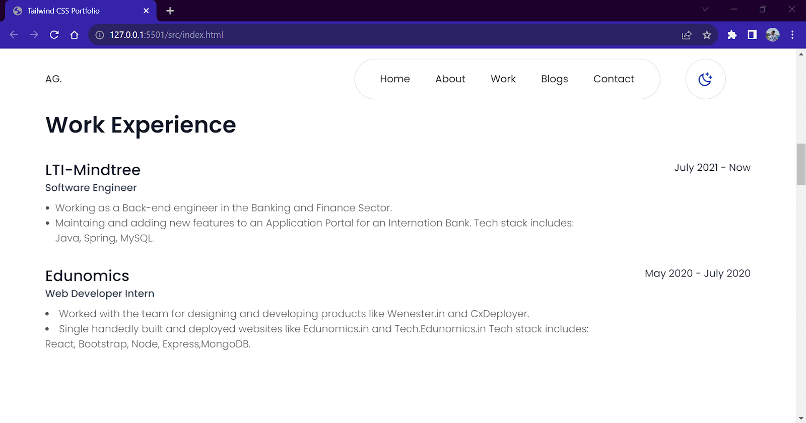
Work Experience Section
This section includes details about your work history. We will create a simple one-column layout that will display details like place of work, duration, and tasks performed during that work period.
To maintain the hierarchy among texts, we use different combinations of color and size. For example, the heading contains bold and dark (.text-neutral-900) colored text, while the subheading has a lighter shade of grey (.text-neutral-600) with normal size.
HTML:
|
1 2 3 4 5 6 7 8 9 10 11 12 13 14 15 16 17 18 19 20 21 22 23 24 25 26 27 28 29 30 31 32 33 34 35 36 |
<!-- Work Experience section --> <section class="w-full py-20"> <div class="mb-5 px-6 md:px-4"> <h1 class="text-4xl font-semibold mb-5">Work Experience</h1> </div> <div class="flex flex-col p-6 md:p-4"> <div class="flex flex-row justify-between"> <div> <h3 class="text-2xl font-medium">LTI-Mindtree</h3> <p class="text-base font-medium text-gray-700 dark:text-gray-200">Software Engineer</p> </div> <p>July 2021 - Now</p> </div> <ul class="text-base list-disc list-outside px-4 mt-2 font-light max-w-4xl dark:text-neutral-300 text-neutral-600"> <li> Working as a Back-end engineer in the Banking and Finance Sector. </li> <li>Maintaining and adding new features to an Application Portal for an International Bank. Tech stack includes: Java, Spring, MySQL.</li> </ul> </div> <div class="flex flex-col p-6 md:p-4"> <div class="flex flex-row justify-between"> <div> <h3 class="text-2xl font-medium">Edunomics</h3> <p class="text-base font-medium text-gray-700 dark:text-gray-200">Web Developer Intern</p> </div> <p>May 2020 - July 2020</p> </div> <ul class="text-base list-disc list-inside mt-2 font-light dark:text-neutral-300 text-neutral-600 max-w-4xl"> <li> Worked with the team for designing and developing products like Wenester.in and CxDeployer. </li> <li>Single-handedly built and deployed websites like Edunomics.in and Tech.Edunomics.in Tech stack includes: React, Bootstrap, Node, Express, MongoDB.</li> </ul> </div> </section> |
Output:
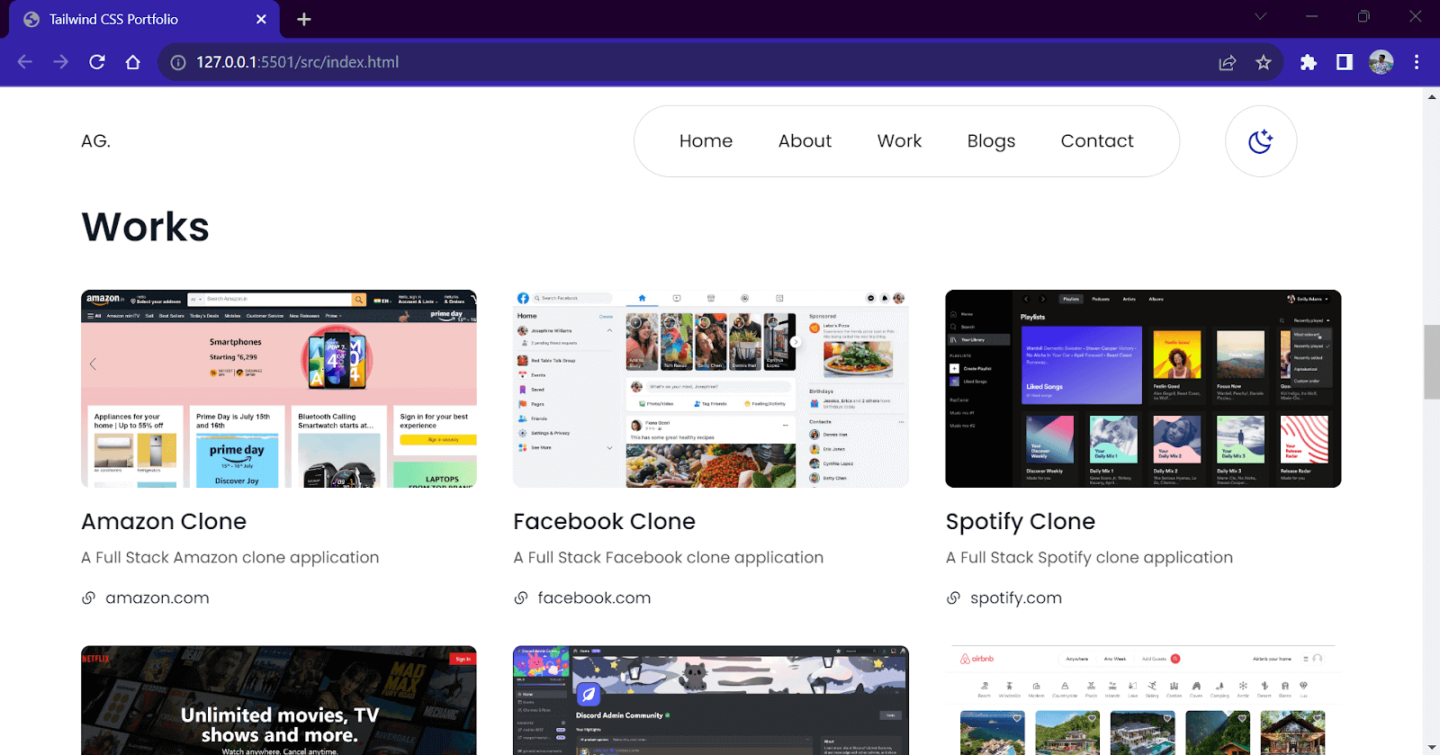
Works/Projects Section
This is the most important and highlighted section of the website. This section will contain images of all our projects along with the name, a short description, and a link to visit.
To display these projects, we will create a 3-column layout consisting of cards. On small screens, we will collapse the 3-column layout into a single-column layout. We will add a hover animation where once the user hovers the mouse above the project, we will change the background color of the card and slightly move it to the top. This adds a 3D elevation effect to the card.
For project images, you can use your own or find the images from the GitHub repository of this project.
HTML:
|
1 2 3 4 5 6 7 8 9 10 11 12 13 14 15 16 17 18 19 20 21 22 23 24 25 26 27 28 29 30 31 32 33 34 35 36 37 38 39 40 41 42 43 44 45 46 47 48 49 50 51 52 53 54 55 56 57 58 59 60 61 62 63 64 65 66 67 |
<!-- Works section --> <section class="w-full py-20" id="work"> <div class="mb-5 px-6 md:px-4"> <h1 class="text-4xl font-semibold mb-5">Works</h1> </div> <div class="flex flex-col md:flex-row flex-wrap"> <div class="flex flex-col items-start w-full md:w-1/3 p-6 md:p-4 hover:-translate-y-1 hover:bg-gray-100 dark:hover:bg-[#222] rounded-lg transition-all duration-300 ease-in-out cursor-pointer"> <img src="./amazon.jpg" class="rounded-lg" /> <h1 class="text-xl font-medium mt-4">Amazon Clone</h1> <p class="text-sm mt-2 dark:text-neutral-300 text-neutral-600">A Full Stack Amazon clone application</p> <a href="#" target="_blank" rel="noopener noreferrer" class="mt-4 flex flex-row items-center text-sm gap-2 rounded-full hover:text-purple-600"> <i class="ri-links-fill"></i> amazon.com </a> </div> <div class="flex flex-col items-start w-full md:w-1/3 p-6 md:p-4 hover:-translate-y-1 hover:bg-gray-100 dark:hover:bg-[#222] rounded-lg transition-all duration-300 ease-in-out cursor-pointer"> <img src="./facebook.jpg" class="rounded-lg" /> <h1 class="text-xl font-medium mt-4">Facebook Clone</h1> <p class="text-sm mt-2 dark:text-neutral-300 text-neutral-600">A Full Stack Facebook clone application</p> <a href="#" target="_blank" rel="noopener noreferrer" class="mt-4 flex flex-row items-center text-sm gap-2 rounded-full hover:text-purple-600"> <i class="ri-links-fill"></i> facebook.com </a> </div> <div class="flex flex-col items-start w-full md:w-1/3 p-6 md:p-4 hover:-translate-y-1 hover:bg-gray-100 dark:hover:bg-[#222] rounded-lg transition-all duration-300 ease-in-out cursor-pointer"> <img src="./spotify.png" class="rounded-lg" /> <h1 class="text-xl font-medium mt-4">Spotify Clone</h1> <p class="text-sm mt-2 dark:text-neutral-300 text-neutral-600">A Full Stack Spotify clone application</p> <a href="#" target="_blank" rel="noopener noreferrer" class="mt-4 flex flex-row items-center text-sm gap-2 rounded-full hover:text-purple-600"> <i class="ri-links-fill"></i> spotify.com </a> </div> <div class="flex flex-col items-start w-full md:w-1/3 p-6 md:p-4 hover:-translate-y-1 hover:bg-gray-100 dark:hover:bg-[#222] rounded-lg transition-all duration-300 ease-in-out cursor-pointer"> <img src="./netflix.jpg" class="rounded-lg" /> <h1 class="text-xl font-medium mt-4">Netflix Clone</h1> <p class="text-sm mt-2 dark:text-neutral-300 text-neutral-600">A Full Stack Netflix clone application</p> <a href="#" target="_blank" rel="noopener noreferrer" class="mt-4 flex flex-row items-center text-sm gap-2 rounded-full hover:text-purple-600"> <i class="ri-links-fill"></i> netflix.com </a> </div> <div class="flex flex-col items-start w-full md:w-1/3 p-6 md:p-4 hover:-translate-y-1 hover:bg-gray-100 dark:hover:bg-[#222] rounded-lg transition-all duration-300 ease-in-out cursor-pointer"> <img src="./discord.png" class="rounded-lg" /> <h1 class="text-xl font-medium mt-4">Discord Clone</h1> <p class="text-sm mt-2 dark:text-neutral-300 text-neutral-600">A Full Stack Discord clone application</p> <a href="#" target="_blank" rel="noopener noreferrer" class="mt-4 flex flex-row items-center text-sm gap-2 rounded-full hover:text-purple-600"> <i class="ri-links-fill"></i> discord.com </a> </div> <div class="flex flex-col items-start w-full md:w-1/3 p-6 md:p-4 hover:-translate-y-1 hover:bg-gray-100 dark:hover:bg-[#222] rounded-lg transition-all duration-300 ease-in-out cursor-pointer"> <img src="./airbnb.jpg" class="rounded-lg" /> <h1 class="text-xl font-medium mt-4">AirBnb Clone</h1> <p class="text-sm mt-2 dark:text-neutral-300 text-neutral-600">A Full Stack AirBnb clone application</p> <a href="#" target="_blank" rel="noopener noreferrer" class="mt-4 flex flex-row items-center text-sm gap-2 rounded-full hover:text-purple-600"> <i class="ri-links-fill"></i> airbnb.com </a> </div> </div> </section> |
Output:
What I offer Section
This mini section contains a 3-column layout displaying our services. The 3-column layout collapses into a single column on small screens. We will use our purple accent color for icons.
HTML:
|
1 2 3 4 5 6 7 8 9 10 11 12 13 14 15 16 17 18 19 20 21 22 23 |
<!-- What I offer section --> <section class="w-full py-20"> <div class="mb-5 px-6 md:px-4"> <h1 class="text-4xl font-semibold mb-5">What I offer</h1> </div> <div class="flex flex-col md:flex-row justify-between flex-wrap"> <div class="flex flex-col items-start w-full md:w-1/3 p-6 md:p-4"> <i class="ri-paint-brush-line ri-3x text-purple-600"></i> <h1 class="text-xl font-medium mt-4">UI/UX Design</h1> <p class="text-sm mt-2 dark:text-neutral-300 text-neutral-600">Complete User Interface design of a website or an App.</p> </div> <div class="flex flex-col items-start w-full md:w-1/3 p-6 md:p-4"> <i class="ri-quill-pen-line ri-3x text-purple-600"></i> <h1 class="text-xl font-medium mt-4">Technical Writing</h1> <p class="text-sm mt-2 dark:text-neutral-300 text-neutral-600">Writing blogs, guide, or any short content related to Tech.</p> </div> <div class="flex flex-col items-start w-full md:w-1/3 p-6 md:p-4"> <i class="ri-terminal-box-line ri-3x text-purple-600"></i> <h1 class="text-xl font-medium mt-4">Website Development</h1> <p class="text-sm mt-2 dark:text-neutral-300 text-neutral-600">Developing a website from scratch with all the modern tools.</p> </div> </div> </section> |
Output:
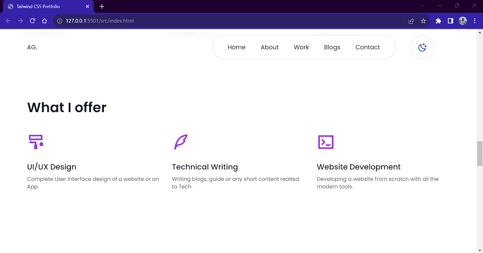
Blogs Section
The blogs section will contain cards similar to the project section. We will add a read more button to make it look different from the project cards. We will implement the same elevation effect and 3-column layout as we did in the project card. For images, we will be using stock photos from Unsplash.
HTML:
|
1 2 3 4 5 6 7 8 9 10 11 12 13 14 15 16 17 18 19 20 21 22 23 24 25 26 27 28 29 30 |
<!-- Blogs Section --> <section class="w-full py-20" id="blogs"> <div class="p-6 md:p-4 mb-5"> <h1 class="text-4xl font-semibold mb-5">Blogs</h1> </div> <div class="flex flex-row flex-wrap"> <div class="flex flex-col items-start w-full md:w-1/3 p-6 md:p-4 hover:-translate-y-1 hover:bg-gray-100 dark:hover:bg-[#222] rounded-lg transition-all duration-300 ease-in-out cursor-pointer"> <img src="https://images.pexels.com/photos/2440024/pexels-photo-2440024.jpeg?auto=compress&cs=tinysrgb&w=1600" class="rounded-lg" /> <h1 class="text-xl font-medium mt-4">How to be more Productive at Work?</h1> <p class="text-sm mt-2 dark:text-neutral-300 text-neutral-600">10 Tips on how to work done and be productive.</p> <a href="#" target="_blank" rel="noopener noreferrer" class="mt-4 px-4 py-2 border border-gray-200 dark:border-gray-600 flex flex-row items-center text-sm gap-2 rounded-full hover:bg-purple-600 hover:text-white transition-all duration-300 ease-in-out"> Read more <i class="ri-arrow-right-up-line ri-lg"></i> </a> </div> <div class="flex flex-col items-start w-full md:w-1/3 p-6 md:p-4 hover:-translate-y-1 hover:bg-gray-100 dark:hover:bg-[#222] rounded-lg transition-all duration-300 ease-in-out cursor-pointer"> <img src="https://images.pexels.com/photos/6224/hands-people-woman-working.jpg?auto=compress&cs=tinysrgb&w=1600" class="rounded-lg" /> <h1 class="text-xl font-medium mt-4">How better designs help to solve problems</h1> <p class="text-sm mt-2 dark:text-neutral-300 text-neutral-600">Know about User Experience and how it helps to solve problems.</p> <a href="#" target="_blank" rel="noopener noreferrer" class="mt-4 px-4 py-2 border border-gray-200 dark:border-gray-600 flex flex-row items-center text-sm gap-2 rounded-full hover:bg-purple-600 hover:text-white transition-all duration-300 ease-in-out"> Read more <i class="ri-arrow-right-up-line ri-lg"></i> </a> </div> <!-- Add the remaining blog entries with similar structure --> </div> </section> |
Output:

Contact Section
The contact section will be a 2-column layout which will contain contact details on one side and a contact form on the other side. We will have 3 rows, which will consist of 3 contact options.
In the form, we will add a name, email input fields, message text area field, and a button to submit it. Similar to previous sections, on smaller screens, the 2-column layout will collapse into a single-column layout. We will add an accent color to the buttons and icons of this section.
HTML:
|
1 2 3 4 5 6 7 8 9 10 11 12 13 14 15 16 17 18 19 20 21 22 23 24 25 26 27 28 29 30 31 32 33 34 35 36 37 38 39 40 41 42 43 44 45 46 |
<!-- Contact section --> <section class="w-full py-20" id="contact"> <div class="p-6 md:p-4"> <h1 class="text-4xl font-semibold mb-5">Contact</h1> <p class="dark:text-neutral-300 text-neutral-600"> I would love to hear from you. Whether you have a question about my services, want to discuss a potential project, or simply want to say hello, don't hesitate to get in touch. I am here to help and excited to start a conversation. </p> </div> <div class="flex flex-col-reverse md:flex-row flex-wrap"> <div class="w-full md:w-1/2 flex flex-col flex-wrap justify-center gap-4"> <div class="w-full md:w-2/3 rounded-xl p-6 flex flex-col bg- gap-4"> <i class="ri-mail-line ri-xl text-purple-600"></i> <p>anuraggharat55@email.com</p> </div> <div class="w-full md:w-2/3 rounded-xl p-6 flex flex-col bg- gap-4"> <i class="ri-phone-line ri-xl text-purple-600"></i> <p>+91-1010101010</p> </div> <div class="w-full md:w-2/3 rounded-xl p-6 flex flex-col bg- gap-4"> <i class="ri-map-pin-line ri-xl text-purple-600"></i> <p>Mumbai - India.</p> </div> </div> <div class="flex flex-col justify-start items-start gap-4 w-full md:w-1/2 p-6 md:p-10"> <h2 class="font-medium text-xl">Send me a Message</h2> <input type="email" name="name" id="email" class="cursor-pointer block w-full border border-gray-300 dark:border-gray-600 rounded-xl bg-transparent py-4 px-6 text-gray-900 placeholder:text-gray-400 hover:border-gray-700 hover:dark:border-gray-300 focus:ring-0 sm:text-sm sm:leading-6" placeholder="Your Name" /> <input type="email" name="email" id="email" class="cursor-pointer block w-full border border-gray-300 dark:border-gray-600 rounded-xl bg-transparent py-4 px-6 text-gray-900 placeholder:text-gray-400 hover:border-gray-700 hover:dark:border-gray-300 focus:ring-0 sm:text-sm sm:leading-6" placeholder="Your Email" /> <textarea rows="3" name="message" id="message" class="cursor-pointer block w-full border border-gray-300 dark:border-gray-600 rounded-xl bg-transparent py-4 px-6 text-gray-900 placeholder:text-gray-400 hover:border-gray-700 hover:dark:border-gray-300 focus:ring-0 sm:text-sm sm:leading-6" placeholder="Your Message"></textarea> <button class="flex flex-row items-center gap-4 px-4 py-2 bg-purple-600 text-white rounded-lg text-lg"> Send <i class="ri-send-plane-2-line"></i> </button> </div> </div> </section> |
Output:
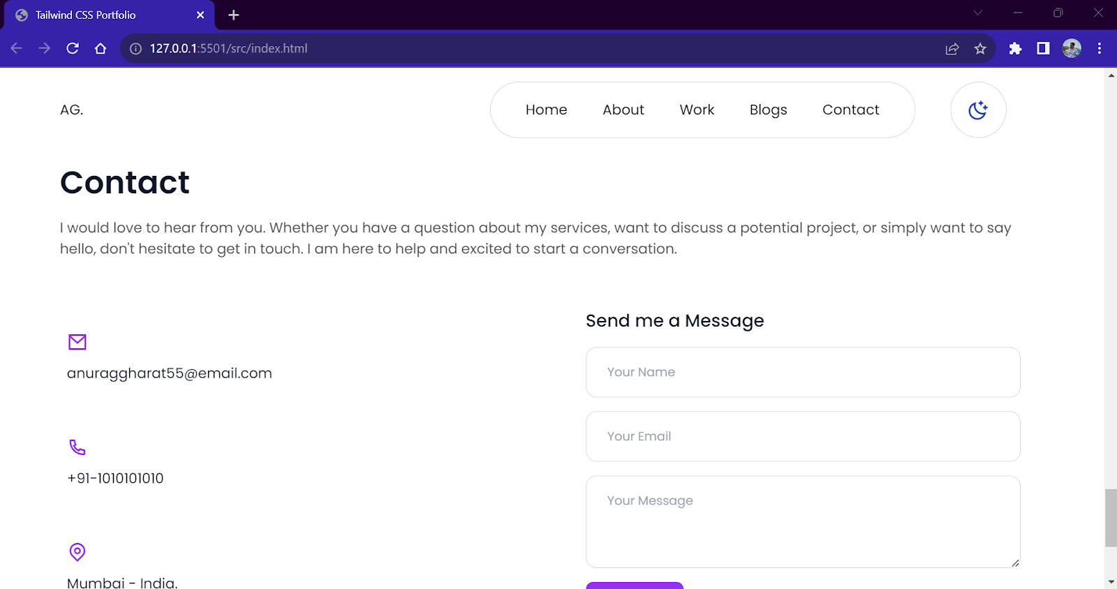
Footer Component
Our footer component will be placed at the bottom of the webpage. This component will have copyright text on one end and social media icons on the other. We will use flexbox to create this layout.
We will change the background color and position of the icons on hover to add some hover animations. We will use our accent color in the hover effect on Icons. The icons are enclosed within < a > tags. We will paste our social media link for the href=”link” attribute of < a > tags.
HTML:
|
1 2 3 4 5 6 7 8 9 10 11 12 13 14 15 16 17 18 19 20 21 22 23 24 |
<!-- footer section --> <footer class="flex flex-col-reverse md:gap-0 gap-4 md:flex-row justify-between items-center w-full max-w-6xl border-t border-t-gray-300 py-10"> <p> © 2023 anurag gharat </p> <div class="flex flex-row gap-2 text-xl"> <a href="http://" target="_blank" rel="noopener noreferrer" class="flex flex-row justify-center items-center w-12 h-12 border-[1px] border-gray-300 dark:border-gray-600 bg-gray-200 dark:bg-[#222] rounded-full hover:bg-purple-600 hover:text-white hover:-translate-y-2 transition-all ease-in-out duration-300 "> <i class="ri-facebook-line"></i> </a> <a href="http://" target="_blank" rel="noopener noreferrer" class="flex flex-row justify-center items-center w-12 h-12 border-[1px] border-gray-300 dark:border-gray-600 bg-gray-200 dark:bg-[#222] rounded-full hover:bg-purple-600 hover:text-white hover:-translate-y-2 transition-all ease-in-out duration-300 "> <i class="ri-twitter-line"></i> </a> <a href="http://" target="_blank" rel="noopener noreferrer" class="flex flex-row justify-center items-center w-12 h-12 border-[1px] border-gray-300 dark:border-gray-600 bg-gray-200 dark:bg-[#222] rounded-full hover:bg-purple-600 hover:text-white hover:-translate-y-2 transition-all ease-in-out duration-300 "> <i class="ri-instagram-line"></i> </a> <a href="http://" target="_blank" rel="noopener noreferrer" class="flex flex-row justify-center items-center w-12 h-12 border-[1px] border-gray-300 dark:border-gray-600 hover:bg-purple-600 bg-gray-200 dark:bg-[#222] rounded-full hover:text-white hover:-translate-y-2 transition-all ease-in-out duration-300 "> <i class="ri-youtube-line"></i> </a> </div> </footer> |
Output:
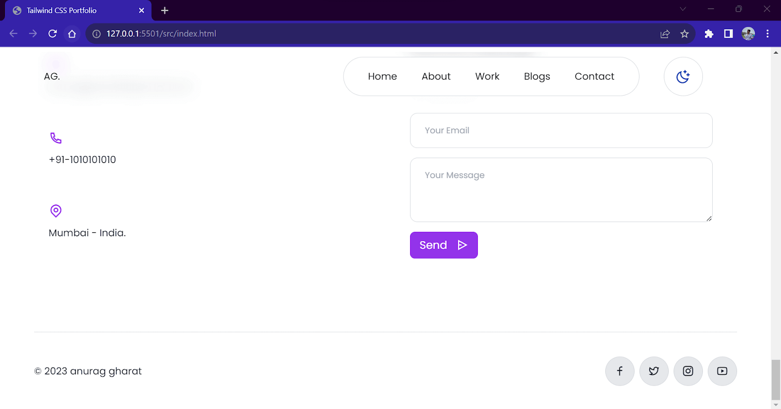
Menu List Toggle Component
We have now finished the styling for all the website sections. All the sections are responsive for all screen sizes except the navbar. Let’s start by understanding the logic behind the behavior of our navbar.
For larger screens, we have our horizontally placed links inside our navbar with logo and theme switch buttons on either side. This is the ideal or normal state of our navbar.
Here are the steps we will follow:
- Display the links horizontally on larger screens and hide them on smaller ones.
- Create a new drop-down component for the links.
- Add a menu button in place of the links on smaller screens.
- Display the drop-down links component when the user clicks on the menu button.

Let’s start with Step 1. To hide the links on smaller screens, we will use Tailwind CSS breakpoint modifiers. In the < ul > element of the links component, add a class of .hidden and modify the .flex class to .md:flex. This hides the menu links on smaller screens (<786px) and unhides them on bigger screens (>786px)
|
1 2 3 4 5 6 7 |
<!--Links component - Visible on large screens and not on small screens -–> <ul class="hidden md:flex (..all other classes)"> <!--Links -–> </ul> |
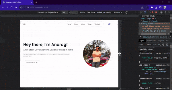
Now, for Step 2, let’s create a copy of the original links component. This will be the same as the original, but instead of .flex-row, we will use the .flex-col class to make the links vertical.
|
1 2 3 4 5 6 7 8 9 10 11 12 13 14 15 16 17 18 19 20 21 22 |
<ul id="menu-list" class="flex flex-col items-center text-sm md:text-base gap-4 md:gap-10 dark:border-gray-600 dark:text-white rounded-sm p-6 md:px-10 w-full h-auto bg-white dark:bg-[#121212] transition-all duration-500 ease-out"> <li> <a href="#" rel="noopener noreferrer" class="hover:text-purple-600">Home</a> </li> <li> <a href="#about" rel="noopener noreferrer" class="hover:text-purple-600"> About</a> </li> <li> <a href="#work" rel="noopener noreferrer" class="hover:text-purple-600">Work</a> </li> <li> <a href="#blogs" rel="noopener noreferrer" class="hover:text-purple-600">Blogs</a> </li> <li> <a href="#contact" rel="noopener noreferrer" class="hover:text-purple-600">Contact</a> </li> </ul> |
Instead of a simple hide-show effect, we will add a slide-down effect to this component whenever we click the button. For this, we will first push the component at the top outside the viewport. Then, once the user clicks the button, we will return it to the viewport. This will create a nice animation of sliding in and out.
To achieve the slide-down effect, we will use placement and position classes from Tailwind. We will add a .fixed class to fix our links in one place and then push it outside the viewport using the .-top-80 and .right-0 classes. Due to the negative value links will be above the visible viewport and hence hidden to the user.
|
1 2 3 4 5 6 7 8 9 |
<!-- Drop Down component for Links (Not visible on Large screens) --> <ul id="menu-list" class="fixed flex -top-80 right-0 flex-col items-center text-sm .. <!-- Code for links --> </ul> |
To make these links visible to the user we will change the .-top-80 class to .top-20 class with the help of JavaScript. We will create a JavaScript function that will perform this task of changing the classes. Before writing the JavaScript, let’s create the menu button.
|
1 2 3 |
<button class="flex md:hidden bg-white w-12 h-12 md:w-16 md:h-16 flex-row justify-center items-center border-gray-300 dark:border-gray-600 dark:bg-[#121212] dark:text-white border rounded-full"> <i id="menu-toggler" class="ri-menu-line ri-xl"></i> </button> |
This button will be displayed on the right of theme switch button only on small screens. On large screens, we will hide it using the .hidden class.
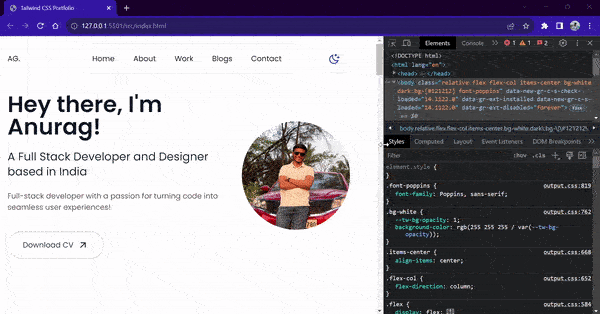
Now, let’s write a toggleMenu() function to add functionality to the drop-down list.
index.html:
|
1 2 3 4 5 6 7 8 9 10 11 12 13 14 15 16 |
<script> //toggle menu on small screens function toggleMenu() { //create variables for button and list const menuButton = document.getElementById('menu-toggler'); const menuList = document.getElementById('menu-list'); //toggle class to bring menu inside viewport menuList.classList.toggle('-top-80'); menuList.classList.toggle('top-20'); //toggle class to change menu icon to cross icon menuButton.classList.toggle('ri-menu-line'); menuButton.classList.toggle('ri-close-line'); } |
The above toggleMenu() function toggles between the .-top-80 and top-20 classes. Along with replacing the classes for the menu list, the function also changes the icon for the toggler button.
By default, we will show a three-horizontal line menu icon. Once the drop-down menu is visible, we will show a cross icon. The toggleMenu() function is attached to the onclick=”” handler of the menu button.
|
1 2 3 4 5 |
<button onclick="toggleMenu()" class="flex md:hidden bg-white w-12 h-12 md:w-16 md:h-16 flex-row justify-center items-center border-gray-300 dark:border-gray-600 dark:bg-[#121212] dark:text-white border rounded-full"> <i id="menu-toggler" class="ri-menu-line ri-xl"></i> </button> |
Final Output:
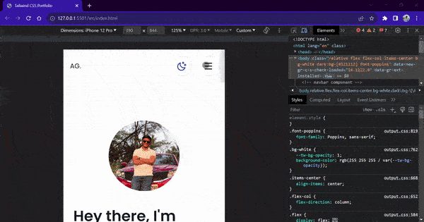
Theme Switcher feature
Now, with all the components and sections of our website setup, let’s create a dark mode feature. Dark mode in websites and user interfaces is important because it reduces eye strain, saves device battery, improves accessibility, and offers a modern look. All modern websites and apps support the dark mode feature, where the user can choose between the light and dark mode.

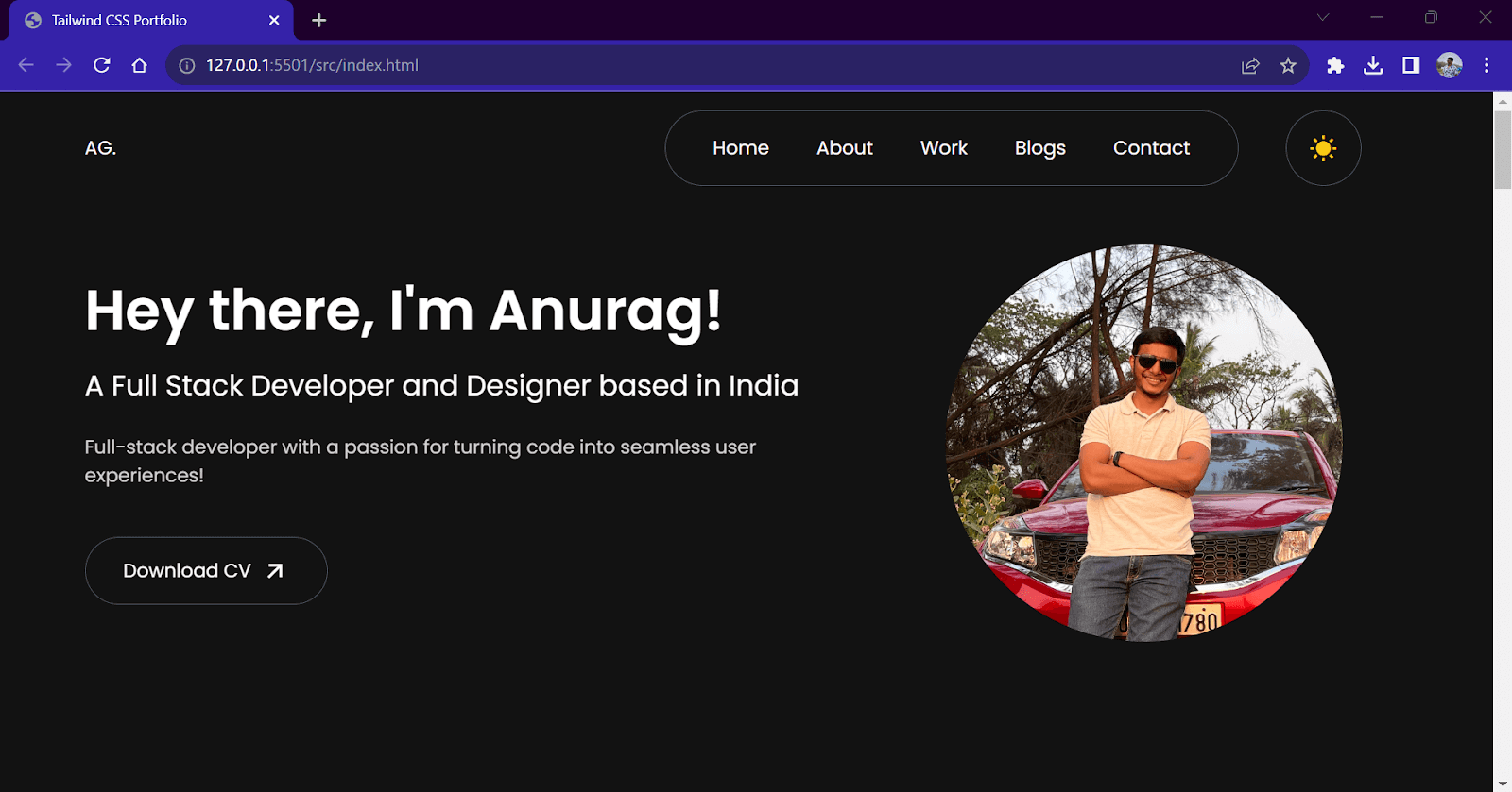
Currently, our website uses the user’s system preference for setting up the website theme. Hence, if you use a browser with a light mode preference, all the light mode classes will be activated, and you will see a light mode website on your browser. But if your preference is set to dark, the website will automatically activate dark variants of the classes, and a dark mode website will be shown to you.
Along with this automatic switching, we also want to add a manual switch to toggle between themes. For this, we first need to modify the Tailwind configuration file. Open your tailwind.config.js file and add darkMode: “class” line inside the module.exports object.
tailwind.config.js:
|
1 2 3 4 5 6 7 8 9 |
/** @type {import('tailwindcss').Config} */ module.exports = { darkMode: "class", content: ["./src/**/*.{html,js}"], theme: { extend: {}, }, plugins: [], }; |

For the theme switch button, we will have two variations in the form of icons. A Sun icon will be used in the dark mode and act as a button to switch to light mode. Similarly, a Moon icon will be used in the light mode and act as a button to switch to dark mode.
Now, let’s write some JavaScript code to toggle the dark classes based on the user’s preference and at the click of a button.
These are the three functionalities that we need for our feature.
-
-
- Set an initial theme based on the user system preference value.
- Allow manual switching between dark and light modes using a button.
- Change the Icon used for the button to differentiate between both modes.
-
We create three JavaScript functions to handle these three functionalities.
index.html:
|
1 2 3 4 5 6 7 8 9 10 11 12 13 14 15 16 17 18 19 20 21 22 23 24 25 26 27 28 29 30 31 32 33 34 35 36 37 38 39 40 41 |
// JavaScript for Menu togglers and Dark Mode functionality // initialize variables for icons const moonIcon = document.querySelector('#theme-toggler-moon'); const sunIcon = document.querySelector('#theme-toggler-sun'); // function to toggle the state of icons function toggleIcons() { moonIcon.classList.toggle('hidden'); sunIcon.classList.toggle('hidden'); } // set initial theme based on local storage and user preference function setInitialTheme() { if (localStorage.getItem('theme') === 'dark' || (!('theme' in localStorage) && window.matchMedia('(prefers-color-scheme: dark)').matches)) { document.documentElement.classList.add('dark'); moonIcon.classList.add('hidden'); localStorage.setItem('theme', 'dark'); } else { document.documentElement.classList.remove('dark'); sunIcon.classList.add('hidden'); localStorage.setItem('theme', 'light'); } } // toggle theme manually function toggleTheme() { if (localStorage.theme === 'dark') { document.documentElement.classList.remove('dark'); localStorage.theme = 'light'; toggleIcons(); } else { document.documentElement.classList.add('dark'); localStorage.theme = 'dark'; toggleIcons(); } } // calling function to set initial theme setInitialTheme(); </script> |
Before we test, let’s add a Moon icon inside the button tag of the theme toggler button. Now, our theme toggler button will contain two icons. With the help of the JavaScript code we wrote earlier, we will toggle one based on the current theme.
HTML:
|
1 2 3 4 |
<button onclick="toggleTheme()" class="flex bg-white w-12 h-12 md:w-16 md:h-16 flex-row justify-center items-center border-gray-300 dark:border-gray-600 dark:bg-[#121212] dark:text-white border rounded-full"> <i id="theme-toggler-sun" class="ri-sun-fill text-yellow-400 ri-xl" id="sun-icon"></i> <i id="theme-toggler-moon" class="ri-moon-clear-line text-blue-800 ri-xl" id="sun-icon"></i> </button> |
Output:
Responsive Testing
Before we finish our demo, let’s test if our website is responsive across all devices. For responsive testing, we will be using the LT Browser by LambdaTest. LT Browser allows us to test our website on 50+ device viewports, including smartphones, tablets, and desktops. The inbuilt performance analyzer makes it easy to analyze the performance metrics of our website.
Catch up with the latest tutorials on mobile app testing, real device testing, and more — Subscribe to the LambdaTest YouTube Channel.
Before testing, follow the best practices below to improve your score.
- Add alt property for all < img > elements.
- Set loading=’lazy’ to all < img > elements.
- Use webp image format instead of png and jpeg.
- Add all the necessary meta tags in < head >
Now, let’s test our website on different device viewports. I am choosing a desktop and mobile phone to check if my website is responsive simultaneously.
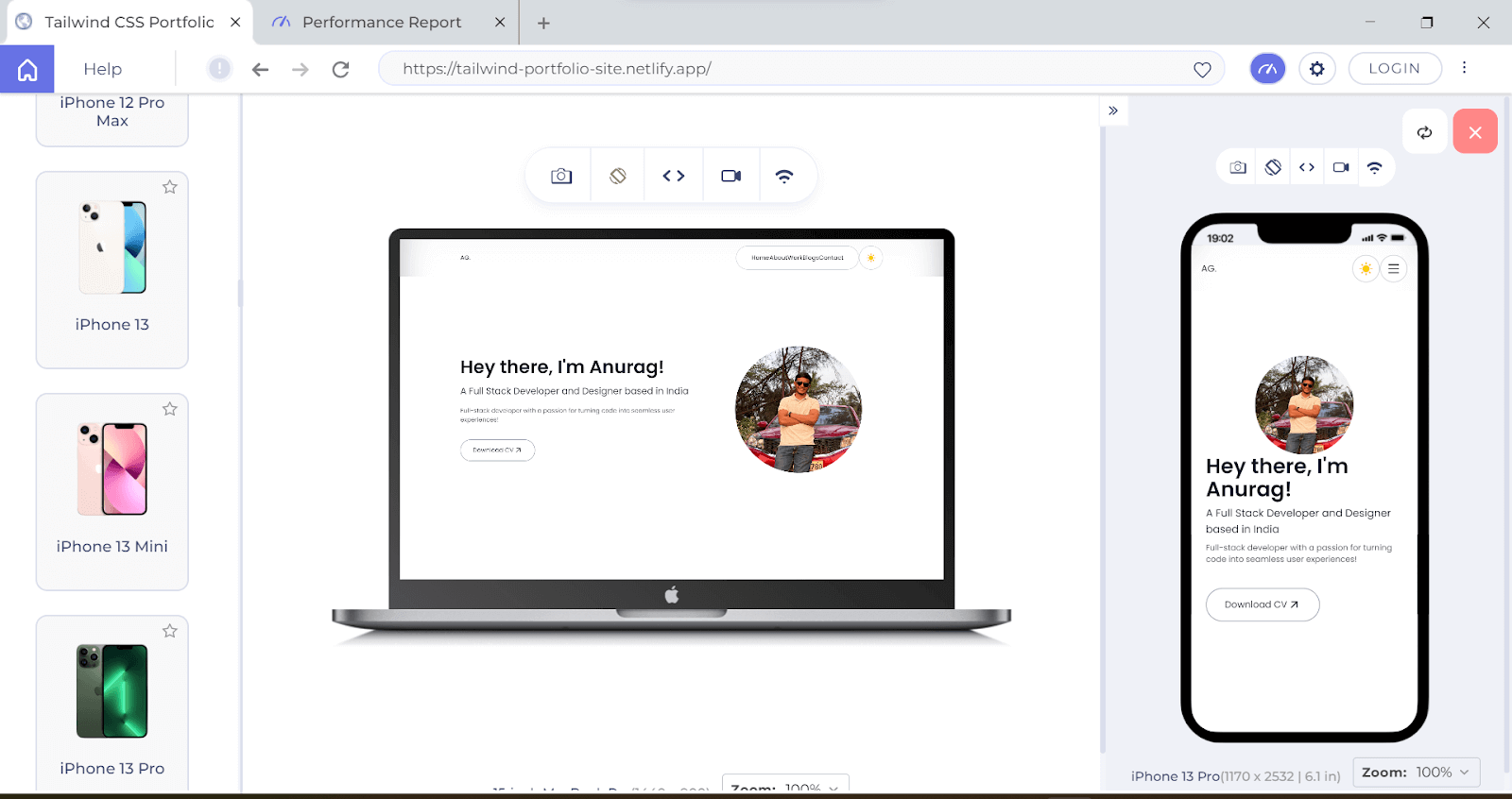
Similarly, let’s check our website performance report.
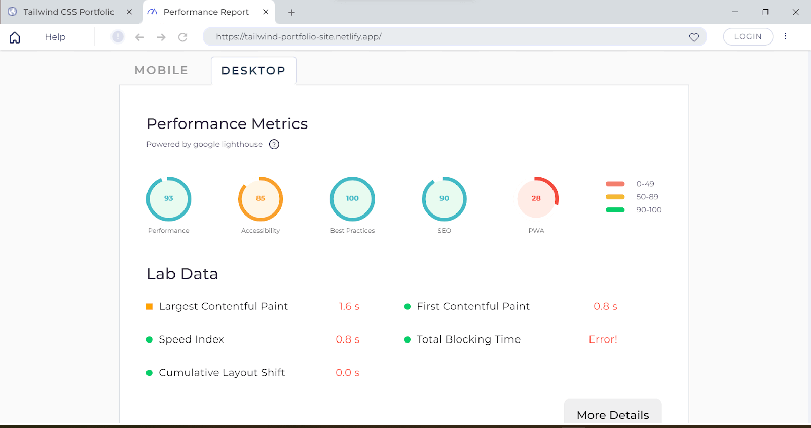
You can further increase your website performance by adding PWA functionality and accessibility practices.
With that, we finished our demo of the Developer Portfolio website. We completed the entire design using Tailwind classes without writing any CSS code. This website is responsive across all devices and supports the dark mode feature.
 Note
NoteTest your Tailwind-based websites across 3000+ real browsers. Try LambdaTest Today!
Final Take on Tailwind CSS
In my opinion, Tailwind is one of the best frameworks for CSS out there and can be used almost everywhere. But then, should we use it everywhere?
Well, it depends. Tailwind will work great for the majority of the use cases. It is a perfect fit for web applications where the developer needs more control over the styling and is ready to spend enough time creating and customizing the components from scratch.
But in the case of applications where styling is not a big factor and developers don’t want to spend time creating components from scratch, Tailwind might not be the ideal solution.
Tailwind could be a great alternative to writing your own CSS. It will speed up your development process. Also, it is fast! Tailwind generates an output file for only the classes that we use. Hence, we only ship the CSS code that we use.
At the core, Tailwind CSS is nothing but regular CSS in the form of classes. Hence, having a thorough knowledge of CSS skills is essential. Tailwind CSS has almost all the CSS properties we need for your project. In addition, if we want anything extra, you can always extend and customize it as per our needs.
While it might take some time to get used to Tailwind CSS in the beginning, the payoff for the efforts is worth it!
So, should we learn Tailwind CSS? Yes absolutely! Tailwind CSS is one of the hottest technologies in the market, and many organizations use it. Hence, knowing Tailwind CSS could be a huge bonus for your career.
Tailwind CSS vs Bootstrap: What’s the Difference?
Tailwind CSS vs. Bootstrap: which one’s better? It is the most popular argument on the internet. Let’s first understand the main differences between both and what points you should consider while choosing one for your next project.
Bootstrap is a popular component-based CSS framework for creating fast and responsive websites. Bootstrap comes with predefined component classes that can be used to create components like cards, navbars, and forms. This makes the website styling process easy and fast because all the components are preconfigured. However, since the components are prebuilt, the level of customization is low. All the components carry fixed styling, which might not go with all UI designs.
Whereas, in Tailwind, you have plenty of utility classes to customize your application. You are not confined within the styles already provided by the framework. You have plenty of options even if you don’t have a suitable style. You can always extend it.
Bootstrap has certain limits to customization and offers less flexibility than Tailwind CSS. Bootstrap also generates a large output file by default consisting of all the CSS and JavaScript code, whether we use it or not. This can affect the performance of the website.
But then how do you choose? See, the answer to this question is pretty simple. If, as a developer, you want something that is quick to set up and comes with components already built for you. Go with Bootstrap! Bootstrap will save a lot of time because it will handle a lot of UI-side things behind the scenes.
If you want customization and freedom to style however you want, go for Tailwind CSS. You will have to build everything from scratch, but then you will have more control over the styling of your website.
Wrapping Up
That’s a wrap for this blog. Thank you for reading. I hope this blog helped you get familiar with Tailwind CSS and how to use it in a project. In this blog, we explored Tailwind CSS, why we need it, and how to use it. In the end, we also created a beautiful Portfolio website using Tailwind, which you can use as your personal Developer Portfolio.
I hope you enjoyed this tutorial and are now comfortable creating your websites using Tailwind CSS. So go ahead and show your creativity.
Frequently Asked Questions (FAQs)
What is different between Tailwind CSS and Regular CSS?
Tailwind is like a ready-made huge CSS file with every CSS property defined in the form of a class. We have to use these classes directly inside our HTML. Unlike regular CSS, Tailwind CSS removes the pain of writing hundreds of lines of CSS codes.
How can I avoid building every component from scratch?
Since Tailwind contains Utility CSS classes, you need to build every component from scratch. To prevent multiple websites from offering pre-built Tailwind components, you can copy the code directly or customize it as per your needs. Tailwind UI is my favorite website for free Tailwind CSS components.
What is Tailwind CSS?
Tailwind is a utility-first CSS framework that can help you rapidly build websites without touching CSS. Tailwind CSS contains atomic CSS classes, i.e., single-purpose CSS classes that replicate CSS properties. Along with CSS classes, Tailwind CSS comes with multiple customization options, configuration capabilities, and a CLI tool.
What are some other CSS frameworks apart from Tailwind CSS and Bootstrap?
There are plenty of CSS frameworks available in the market. Some popular component-based CSS frameworks are Materialize CSS, Bulma CSS, Foundation UI, Semantic UI, and Skeleton. In utility-based CSS frameworks, we have Tachyons, Shed CSS, Basscss, Expressive CSS, and Open Props.


Author’s Profile
Anurag Gharat
Anurag Gharat is a Full Stack Developer, Freelancer, and Technical Writer based in India. He is currently working as a Software Engineer in one leading IT services company.
Blogs: 8
Got Questions? Drop them on LambdaTest Community. Visit now


