
Mastering CSS Units: A Complete Guide
Anurag Gharat
Posted On: February 23, 2024
 72551 Views
 18 Min Read
In today’s world, where the Internet is accessed over various devices with different screen sizes, making the website responsive should be our first priority.
Responsive web design ensures that your website adapts to every screen size, device type, and browser without sacrificing usability and accessibility. A responsive website enhances the user experience and performance. CSS units play an important role in achieving website responsiveness.
This blog explores CSS units and all the available ones in CSS. We will look at two categories of CSS units – absolute and relative. Also, we will study each unit from both the categories and their use case scenarios.
TABLE OF CONTENTS
What is a CSS Unit?
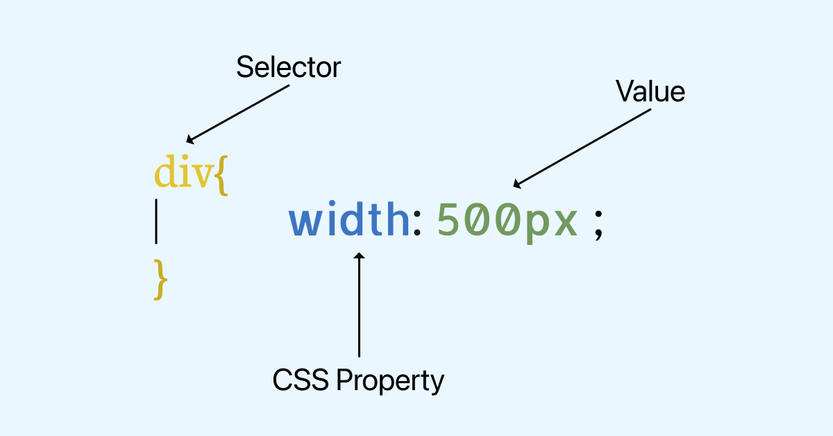
CSS, which stands for Cascading Style Sheets, is a rule-based language used to control the presentation and styling of HTML documents. A CSS file contains multiple CSS rules that specify how all the elements on the webpage are to be styled.
A CSS rule has three parts: a selector, a property, and a value for that CSS property. Many CSS properties, like width, height, margins, padding, etc., accept a value and a proper unit. If an incorrect unit is passed to a CSS property, that CSS property is discarded.
A unit is a standardized quantity used to denote or measure physical quantities. In the real world, we use units like km or mile to measure distance, grams or pounds to measure weight, and seconds, minutes, or hours to measure time. In the CSS context, properties like width, height, margin, padding, font size, border, etc., related to sizing or dimensions require a unit.
A CSS unit is a measurement of length, size, or quantity used to express the amount of quantity for a CSS property. CSS provides plenty of options to work with units, like pixels, centimeters, millimeters, percentages, etc..
The units in CSS are grouped into two categories.
- Absolute units
- Relative units
In the next section, we will explore in detail the different types of CSS units.
Introduction to Absolute Units
Absolute CSS units are fixed measurements that do not change based on external factors like screen or browser sizes. These units stay consistent and the same across all device sizes. This means that an element, when set to an absolute value, will remain the same on large desktops and handheld devices.
Here are some common absolute units in CSS.
Pixel Unit (px)
Pixels or px are the most common absolute length units used in CSS. 1 pixel stands for 1 single dot on the screen. However, don’t confuse the CSS pixel with actual pixels. A CSS pixel is not necessarily equal to one physical screen pixel.
1 pixel is defined as 1/96 of an inch. But this was defined when the computer monitors had a resolution of 1024×768 px and a DPI( Dots/Pixels per inch) of 96.
Today, modern computer monitors with the latest high-density screens have a DPI of almost 3 times the old monitors. The same thing applies to mobile phones or any screen-related device. The image below shows a comparison between the 1st generation of iPhone and the latest model (i.e., iPhone 15 Pro) in terms of resolution.
As you can see, the screens have become denser; hence, 1 pixel of a CSS unit is no longer equal to 1 physical pixel.
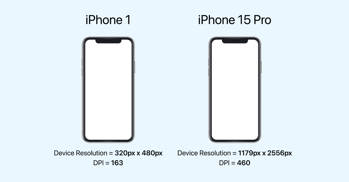
To summarize, CSS pixels are logical pixels used to define values for CSS properties, and device pixels are the physical screen pixels. So hereafter, whenever we discuss pixels, we refer to CSS pixels (not physical screen pixels).
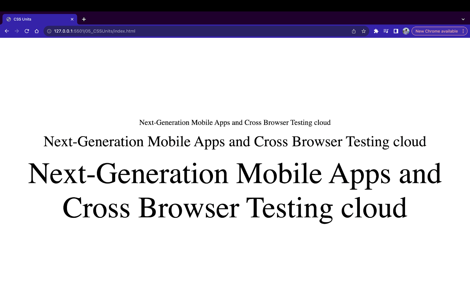
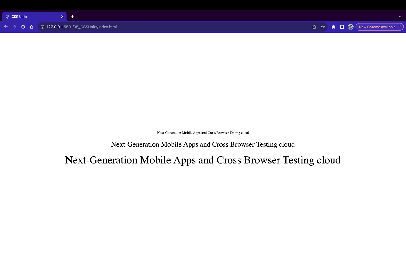
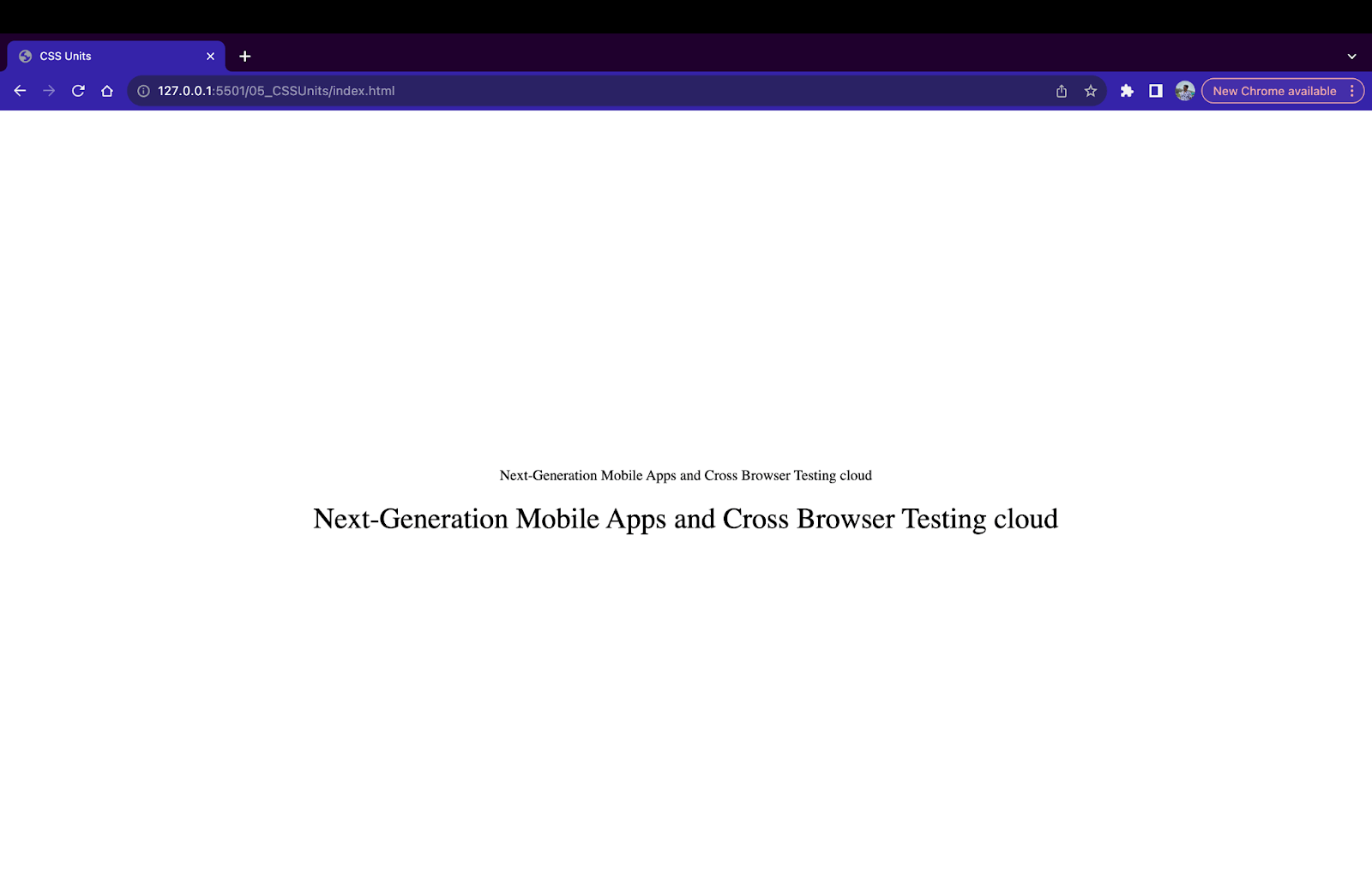
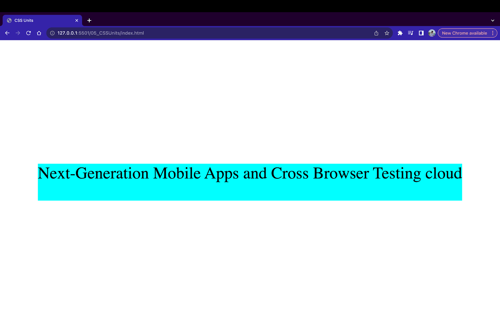
In the below example, we have three texts in < p > tags with font sizes of 16px, 20px and 24px respectively.
|
1 2 3 4 5 6 7 8 9 10 11 |
<div> <p style="font-size: 16px;"> Next-Generation Mobile Apps and Cross Browser Testing cloud </p> <p style="font-size: 20px;"> Next-Generation Mobile Apps and Cross Browser Testing cloud </p> <p style="font-size: 24px;"> Next-Generation Mobile Apps and Cross Browser Testing cloud </p> </div> |
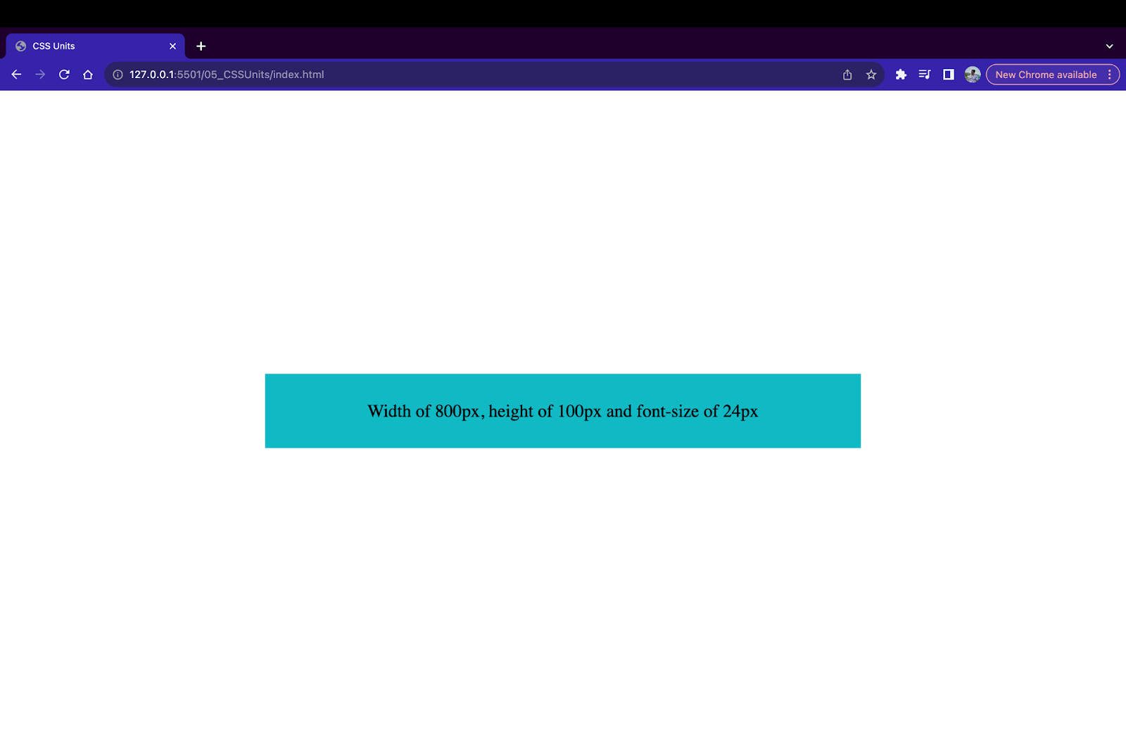
Although the pixel unit is mostly used in font-related properties, we can also use it for specifying widths, heights, margins, paddings, etc. In the example below, we provide a width of 800px and a height of 100px for a < div > element.
|
1 2 3 4 5 6 |
<div style="width: 800px; height: 100px; background-color: #0ebac5; font-size: 24px;"> Width of 800px, height of 100px and font-size of 24px </div> |
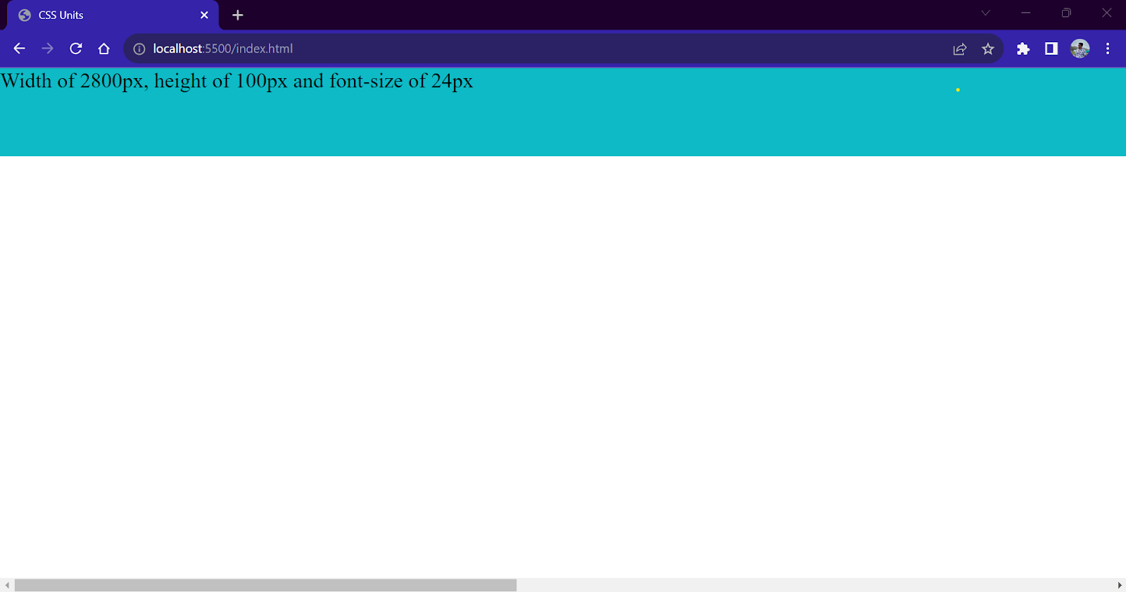
Pixels (px) are the most popular and go-to unit while providing measurements in CSS. However, pixel units can present challenges during responsive behavior due to their fixed-size nature. If the provided value exceeds the screen size, the browser will add a scroll bar to fit the content on the page.
|
1 2 3 4 5 6 |
<div style="width: 2800px; height: 100px; background-color: #0ebac5; font-size: 24px;"> Width of 2800px, height of 100px and font-size of 24px </div> |
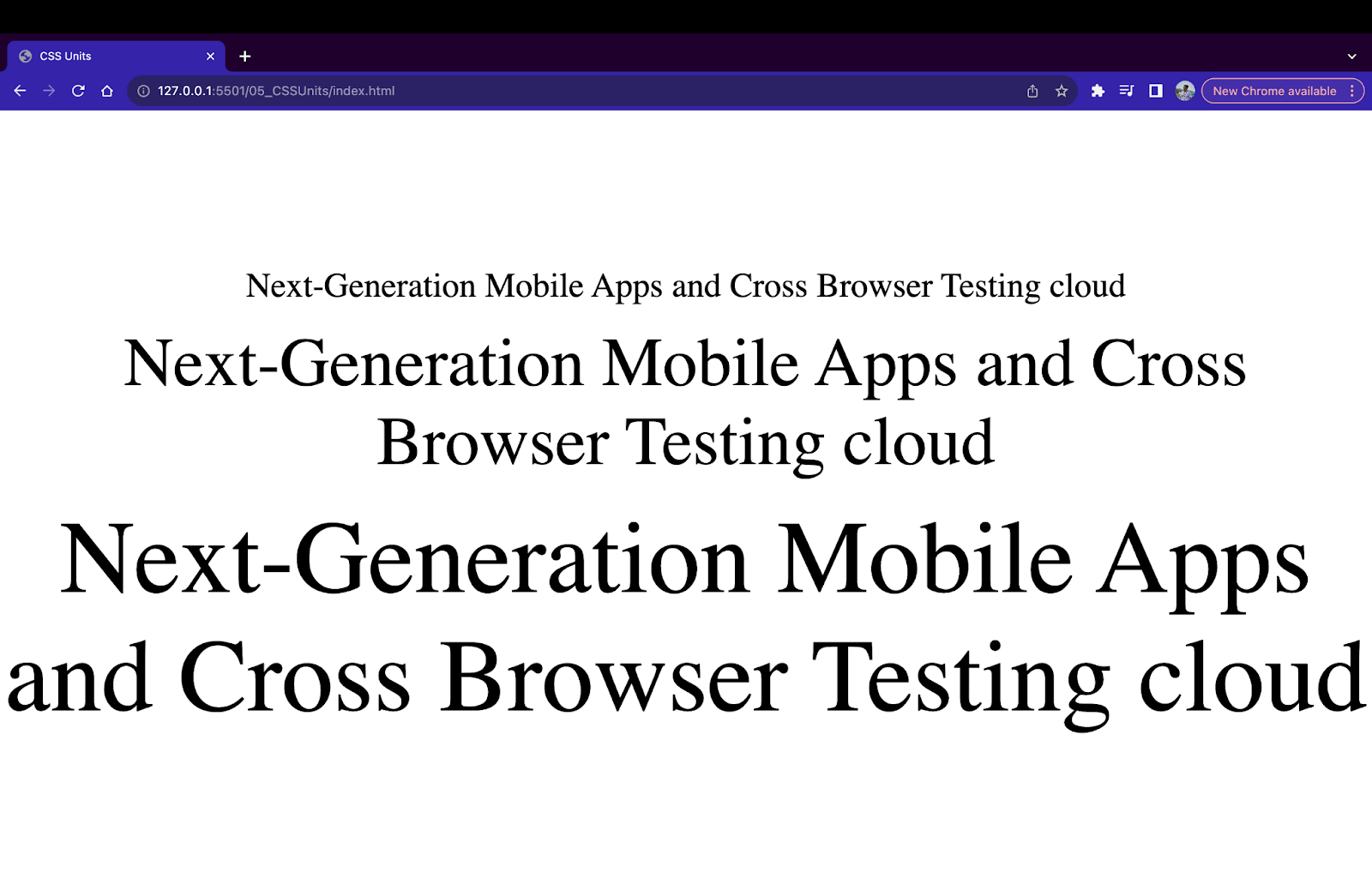
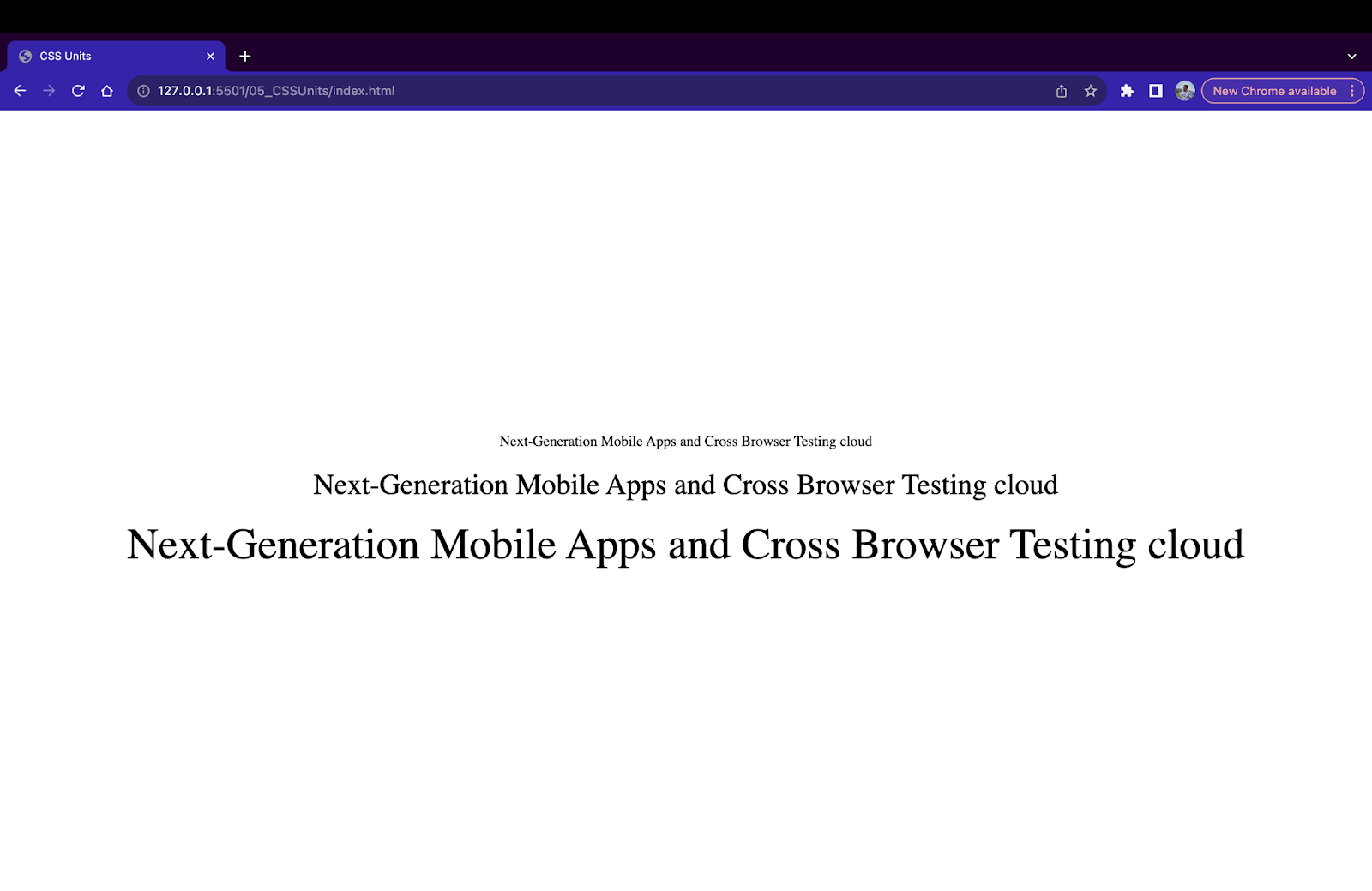
Inches Unit (in)
In CSS, the inch unit is equivalent to 96px, i.e., 1in = 96px. Similar to pixels, 1 inch in CSS is not equal to 1 physical inch.
|
1 2 3 4 5 6 7 8 9 10 11 |
<div> <p style="font-size: 0.25in;"> Next-Generation Mobile Apps and Cross Browser Testing cloud </p> <p style="font-size: 0.5in;"> Next-Generation Mobile Apps and Cross Browser Testing cloud </p> <p style="font-size: 1in;"> Next-Generation Mobile Apps and Cross Browser Testing cloud </p> </div> |
Centimeter Unit (cm)
In CSS, a 1-centimeter unit or 1cm equals 25.2/64 inches or 37.8px. The cm unit is used to specify length values in centimeters. Similar to pixels, 1cm in CSS is not equal to 1cm in real life.
|
1 2 3 4 5 6 7 8 9 10 11 |
<div> <p style="font-size: 1cm;"> Next-Generation Mobile Apps and Cross Browser Testing cloud </p> <p style="font-size: 2cm;"> Next-Generation Mobile Apps and Cross Browser Testing cloud </p> <p style="font-size: 3cm;"> Next-Generation Mobile Apps and Cross Browser Testing cloud </p> </div> |
Millimeter Unit (mm)
The millimeter unit or 1mm is an absolute CSS unit where 1mm equals 3.78px or 1/10 of 1 cm. Generally, the centimeter (cm) and millimeter (mm) units are rarely used and have minimal use cases.
|
1 2 3 4 5 6 7 8 9 10 11 |
<div> <p style="font-size: 5mm;"> Next-Generation Mobile Apps and Cross Browser Testing cloud </p> <p style="font-size: 10mm;"> Next-Generation Mobile Apps and Cross Browser Testing cloud </p> <p style="font-size: 15mm;"> Next-Generation Mobile Apps and Cross Browser Testing cloud </p> </div> |
Quarter Millimeter Unit (q)
A quarter millimeter unit or 1q roughly equals 0.944px or 1/4 of 1mm unit. This is one of the smallest measurements available in CSS and is only used in cases where minute adjustments of spacing (or lengths) are required.
|
1 2 3 4 5 6 7 8 9 10 11 |
<div> <p style="font-size: 10q;"> Next-Generation Mobile Apps and Cross Browser Testing cloud </p> <p style="font-size: 25q;"> Next-Generation Mobile Apps and Cross Browser Testing cloud </p> <p style="font-size: 50q;"> Next-Generation Mobile Apps and Cross Browser Testing cloud </p> </div> |
Points Unit (pt) and Picas Unit (pc)
Points (pt) and Picas (pc) units are two additional units that are used alongside the pixel unit. In CSS, 1 point unit or 1pt is equivalent to 1.33px or 1/72 inch, and 1 picas or 1pc is equivalent to 16px or 1/6 inch. These units are used when precise control over sizing and layout is required.
|
1 2 3 4 5 6 7 8 9 10 11 |
<div> <p style="font-size: 10pt;"> Next-Generation Mobile Apps and Cross Browser Testing cloud </p> <p style="font-size: 20pt;"> Next-Generation Mobile Apps and Cross Browser Testing cloud </p> <p style="font-size: 30pt;"> Next-Generation Mobile Apps and Cross Browser Testing cloud </p> </div> |
|
1 2 3 4 5 6 7 8 9 10 11 |
<div> <p style="font-size: 1pc;"> Next-Generation Mobile Apps and Cross Browser Testing cloud </p> <p style="font-size: 2pc;"> Next-Generation Mobile Apps and Cross Browser Testing cloud </p> <p style="font-size: 3pc;"> Next-Generation Mobile Apps and Cross Browser Testing cloud </p> </div> |
To summarize,
| Name | Unit | Equal to |
|---|---|---|
| Pixel | px | 1/96 of 1 inch or 1 dot on the screen |
| Inch | in | 96px |
| Centimeter | cm | 37.8px or 25.2/64in |
| Millimeter | mm | 3.78px or 2.52/64in or 1/10cm |
| Quarter-Millimeter | q | 0.944px or 1/4mm |
| Points | pt | 1.33px or 1/72in |
| Picas | pc | 16px or 1/6in |
When to Use Absolute Units?
Absolute CSS units should be considered in cases where an HTML element should carry a fixed size regardless of factors like screen size, orientation, or parent element size. Generally, absolute units are used to denote small fixed values. Here are some use cases where you can consider using absolute units.
Printing Stylesheets
CSS has a special rule allowing you to define styles for printing a web page. This rule is a part of the CSS media queries rule that conditionally applies or modifies styles when the webpage is printed on paper.
|
1 2 3 4 5 6 7 8 9 |
@media print { /* Styles will only be added while printing a web page*/ body { font-size: 20px; } .container{ width: 1000px; } } |
During the printing process, it is necessary to attain pixel-perfect measurements so that the printed output matches the dimensions of the paper used for printing. Using absolute CSS units like pixels or inches, we can attain maximum accuracy since these units are closest to physical measurements. Hence, as a standard practice, using absolute CSS units while writing styles for web page printing is always recommended.
Attaining Pixel Perfect Design
Developers follow a UI design while creating a webpage. These designs are crafted with utmost precision and fixed measurements, which all the developers must follow. Absolute units are ideal for achieving pixel-perfect designs since they specify fixed measurements that don’t change based on external factors.
Absolute CSS units can also be considered in cases where maintaining responsive design is not a requirement. For example, while building desktop apps that only run on a single device with fixed dimensions that cannot be resized. Since the app does not change dimensions, we can use absolute units to define the size of elements to attain a pixel-perfect design.
Sizing of Images and Icons
Along with textual content, the webpage comprises multimedia items like images, SVGs, icons, etc. In most cases, these assets don’t scale the same way as other elements. These assets have a fixed set of measurements that must be followed per the screen size. In such cases, using absolute CSS units, we can specify a fixed sizing and position of icons or images so that they don’t stretch or compress when the webpage is resized.
In the below example, we have styled a logo using absolute units. We have placed it at the top left and provided sizing using pixel measurements.
|
1 2 3 4 5 6 7 8 9 10 11 12 13 14 15 16 17 |
<body> <nav style="background-color: #dfdfdf; position: relative; height: 150px;"> <img style="position: fixed; width: 200px; height: 50px; top: 50px; left: 50px;" src="https://www.lambdatest.com/resources/images/logos/logo.svg" > </nav> </body> |
Specifying Small Spacing and Lengths
One of the most useful use cases of absolute units is to provide specific CSS spacing while providing margins and paddings. Margins and padding properties in CSS require exact values to keep the entire design consistent.
Also, absolute CSS units make fine-tuning spacing easier since we get a wide range of units to make even the smallest adjustments.
|
1 2 3 4 5 |
div{ margin: 1px 0.5px; padding: 1.5px; border: 1cm solid red; } |
When to Avoid Using Absolute Units?
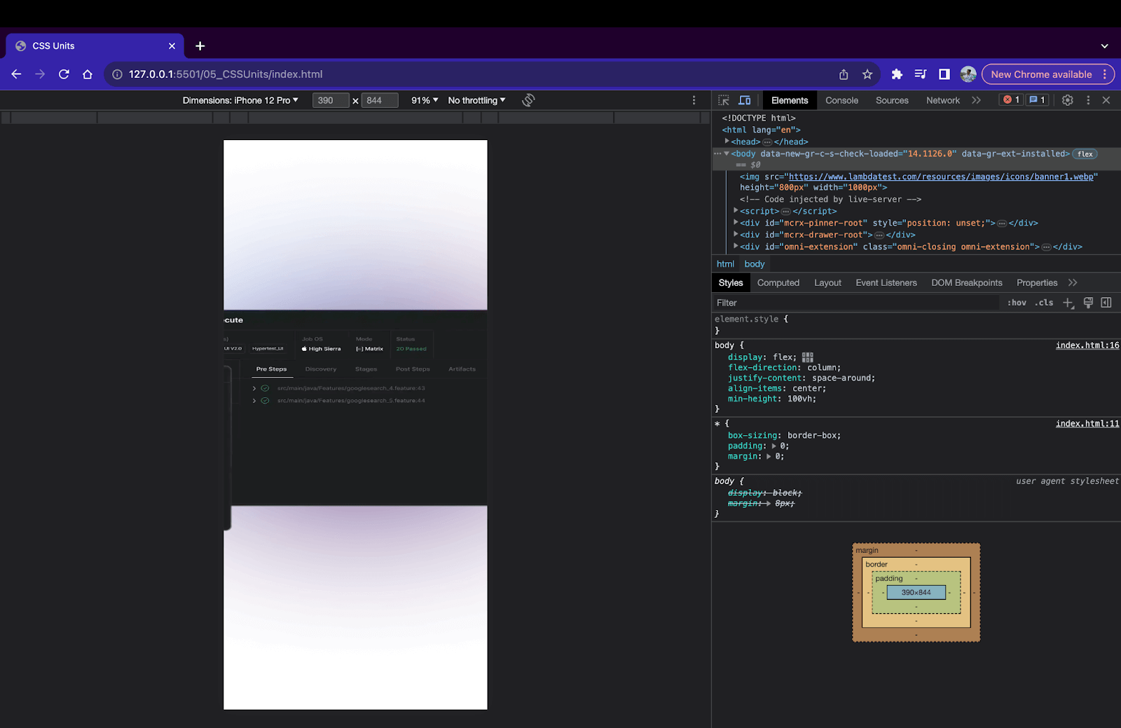
Absolute units provide fixed values that do not change based on screen sizes. Hence, this fixed nature makes it difficult to maintain responsiveness across all screens. For example, in the below output, we have an image with a width of 1000px and a height of 800px. On displays larger than 1000px, the image will be shown properly on the screen. But on devices with screen sizes less than 1000px, only a part of the image will be visible, and a horizontal scrollbar will be added to fit the image on the screen.
Using absolute CSS units should be avoided when measuring relative to external factors such as device viewports, parent elements, and default browser settings.
Introduction to Relative Units
The relative units are measured in relation to external criteria such as parent element size, viewports, browser default size, etc. Relative units are calculated units that are calculated values that are calculated during the layout operation of the website. The browser uses inheritance and cascading rules to arrive at the final value. Relative units fluctuate as external factors such as viewport size and parent element change.
Here are some common relative CSS units:
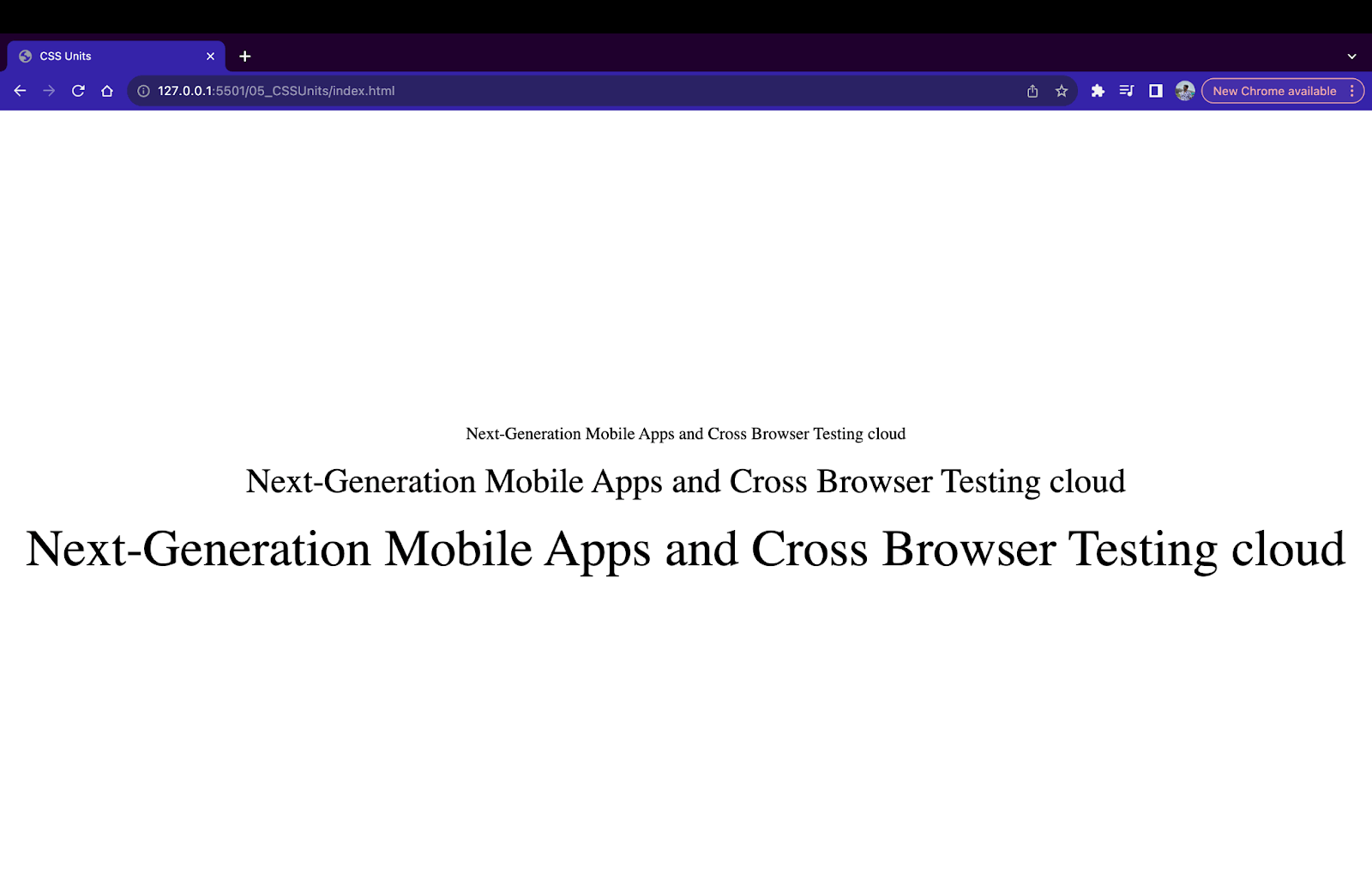
EM Unit (em)
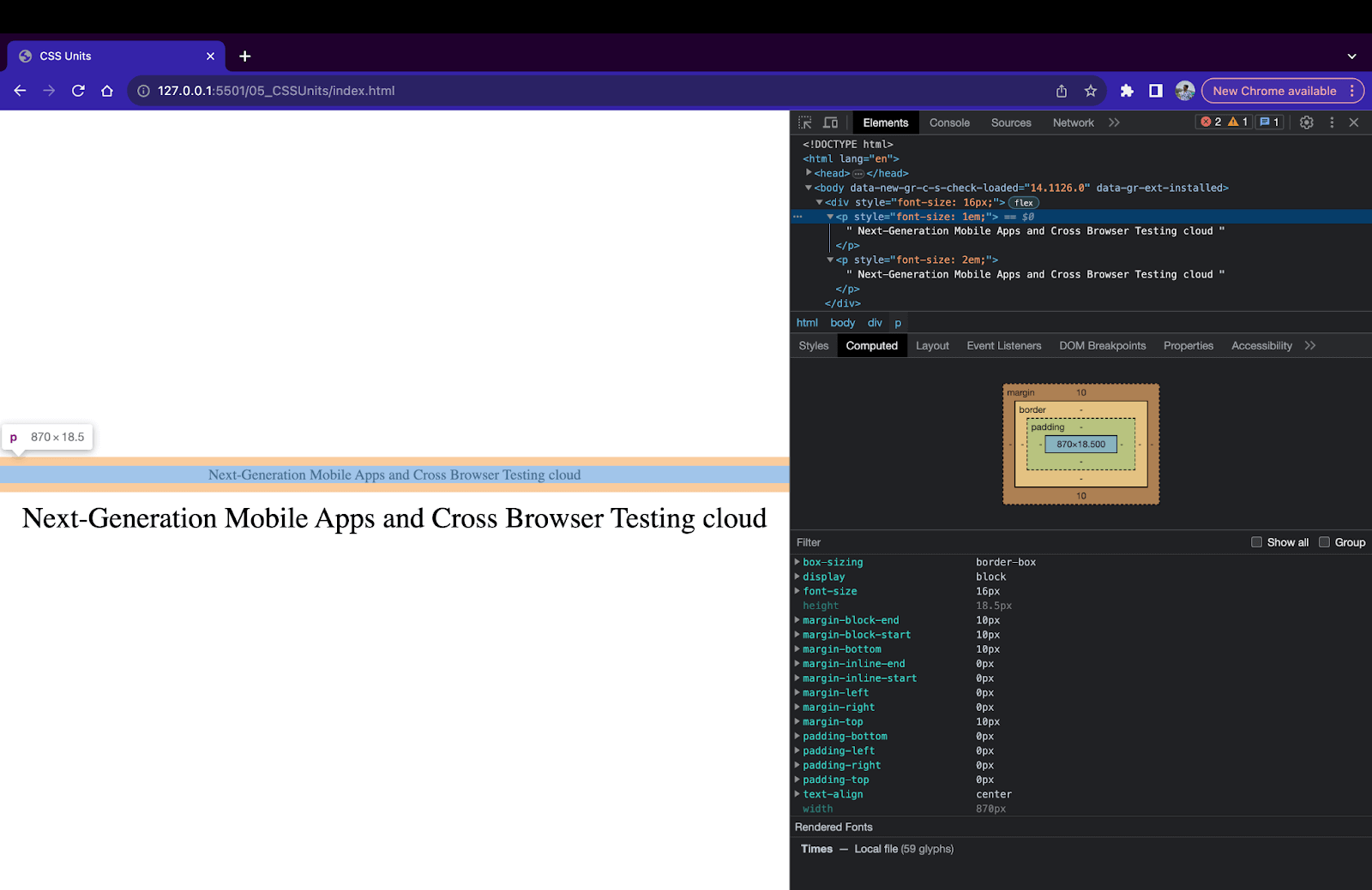
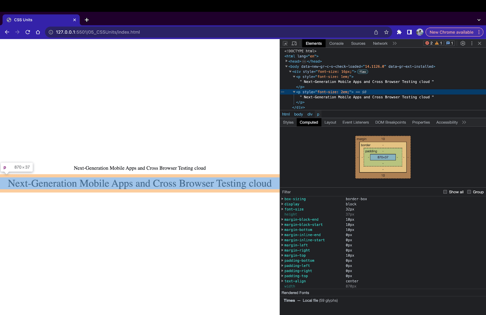
The em unit is a popular relative unit used mainly for specifying lengths for font-related properties in CSS. em units are calculated based on the font size of the parent element. The em unit inherits the value of the parent element. Let’s understand this with the help of the example below.
|
1 2 3 4 5 6 7 8 |
<div style="font-size: 16px;"> <p style="font-size: 1em;"> Next-Generation Mobile Apps and Cross Browser Testing cloud </p> <p style="font-size: 2em;"> Next-Generation Mobile Apps and Cross Browser Testing cloud </p> </div> |
In the above example, the parent div element has a font size of 16rem, and two children < p > elements have a font size of 1em and 2em respectively. Hence, the computed value for these child < p > tags will be
1em = 1 X font-size of parent = 1 X 16px = 16px
2em = 2 X font-size of parent = 2 X 16px = 32px
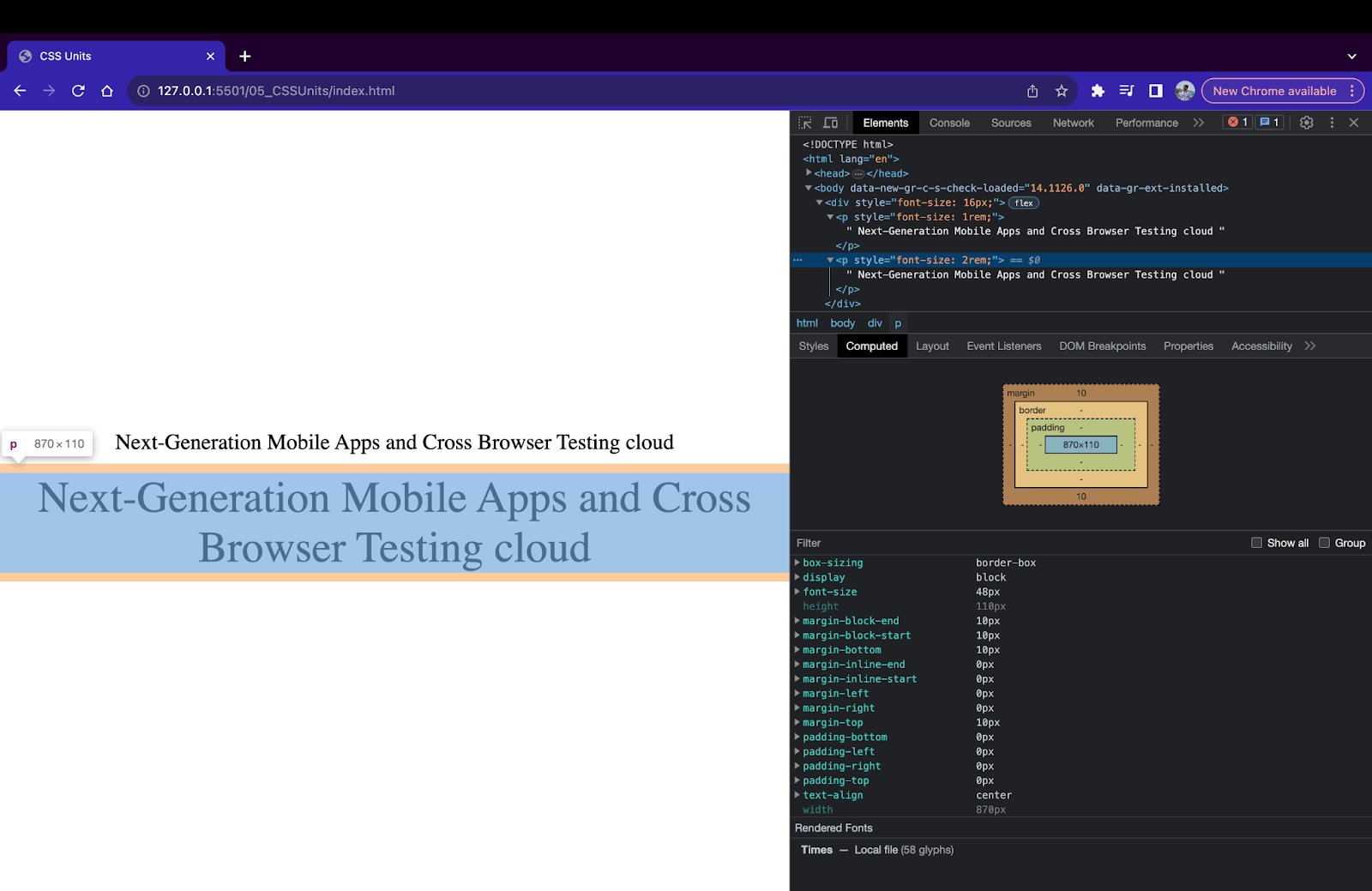
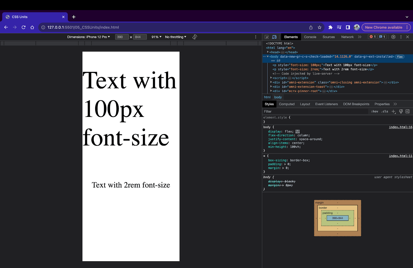
To cross-check if the computed values are working correctly we can open the Chrome DevTools and click on the < p > element. Move to the computed styles tab to open the styles for < p > tag. You can find the style applied to the selected element.
REM Unit (rem)
The rem unit, also called the root em unit, is an em counterpart. Instead of inheriting the value from the parent, the value is inherited from the root element, i.e., < html > element. Similar to em, the computed value is based on the value set to the root element in CSS. If no value is set to the root element, CSS uses the browser’s default values to calculate the computed values.
|
1 2 3 |
html{ font-size: 24px; } |
|
1 2 3 4 5 6 7 8 |
<div style="font-size: 16px;"> <p style="font-size: 1rem;"> Next-Generation Mobile Apps and Cross Browser Testing cloud </p> <p style="font-size: 2rem;"> Next-Generation Mobile Apps and Cross Browser Testing cloud </p> </div> |
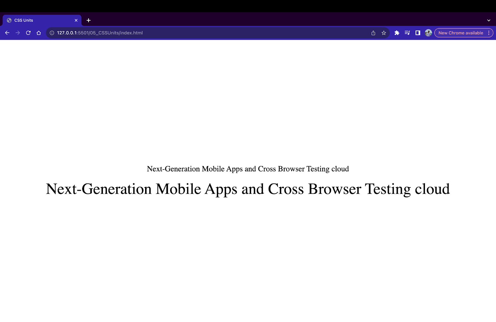
In the above example, we have a root element < html > with a font size of 24px and parent < div > with font size of 16px. Inside the parent element, we have 2 child paragraph elements < p > with font sizes of 1rem and 2rem, respectively. Since we use rem instead of em, the final value is calculated based on root element sizing. Hence, the computed value of the font size property of p tags is as follows:
1rem = 1 X font-size of root = 1 X 24 = 24px
2rem = 2 X font-size of root = 2 X 24 = 48px
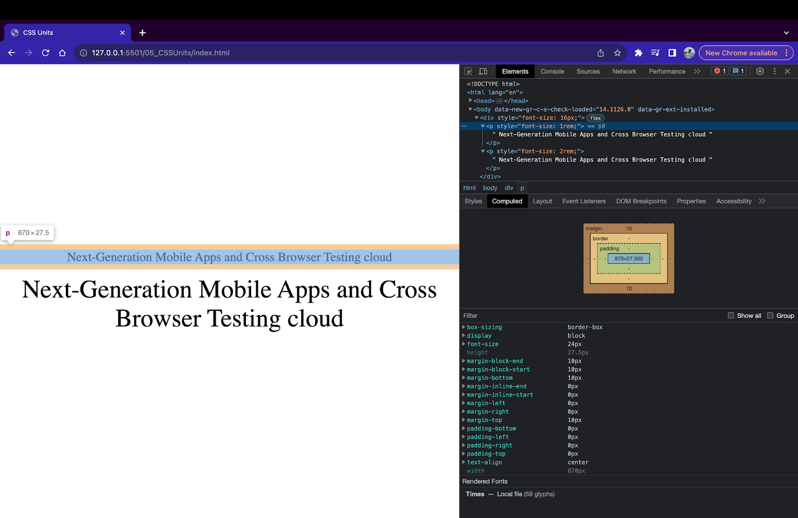
CH Unit (ch)
In CSS, the ch unit stands for character unit. A ch unit in CSS is defined as the width of the character ‘0’ of the font. So, a width of 10ch will be equal to the width of 10 ‘0’ characters of the font used on the website. This unit is useful when the requirement is to size an element based on the width of the characters of the font.
One important point to remember is the ch unit will change if the font of the element is changed since the size of the character ‘0’ does not stay the same in all the fonts.
|
1 2 3 4 5 6 7 8 9 10 11 12 13 14 |
<div> <p style="font-size: 50px; width: 10ch; background-color: aqua;"> Next-Generation Mobile Apps and Cross Browser Testing cloud </p> <p style="font-size: 50px; width: 10ch; background-color: aqua;"> 0000000000 </p> </div> |
EX Unit (ex)
ex stands for x-height unit in CSS. An ex unit in CSS is defined as the height of the lowercase character ‘x’ measured from the baseline. Similar to ch, ex is also relative since the height of character ‘x’ changes based on the font.
|
1 2 3 4 5 6 7 |
<div> <p style="font-size: 50px; height: 5ex; background-color: aqua;"> Next-Generation Mobile Apps and Cross Browser Testing cloud </p> </div> |
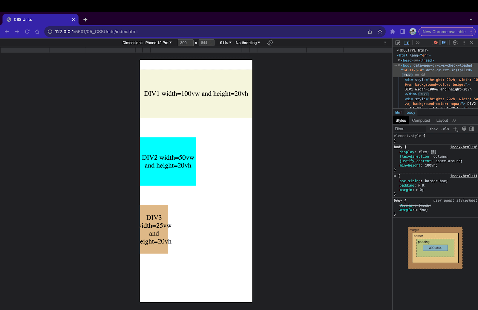
Device Viewport Unit (vw and vh)
Device viewport units consist of two different units, vw (view width) and vh (view height). 1vw is equal to 1% of the viewport width. Similarly, 1vh is equal to 1% of the viewport height. So if a device has a viewport of 1920 X 1080 pixels (width X height), then 1vh = 108 pixels and 1vw = 192 pixels.
|
1 2 3 4 5 6 7 8 9 10 11 12 13 |
<div style="height: 20vh; width: 100vw; background-color: beige;"> DIV1 width=100vw and height=20vh </div> <div style="height: 20vh; width: 50vw; background-color: aqua;"> DIV2 width=50vw and height=20vh </div> <div style="height: 20vh; width: 25vw; background-color: burlywood;"> DIV3 width=25vw and height=20vh </div> |
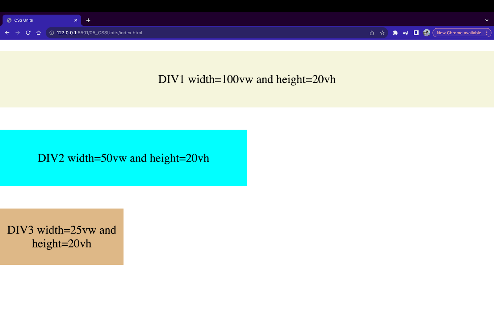
In the above example of CSS viewport units, we have created three div containers with a width of 100vw, 50vw, and 25vw respectively, and a height of 20vh. These measurements will change when the screen is resized.
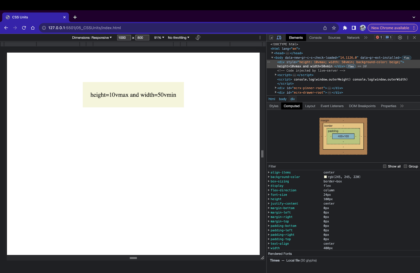
Device Viewport Maximum and Minimum Units (vmax, vmin)
The vmin and vmax units are based on the values of vw and vh. By definition, in CSS, 1vmin is 1% of the viewport’s smallest dimensions, and 1vmax is 1% of the viewport’s largest dimensions. For example, if a browser is 1000 pixels in width and 600 pixels in height, then 1vmin is equal to 6px since 600 pixels < 1000 pixels. Similarly, 1vmax is equal to 10px since 1000 pixels > 600 pixels.
|
1 2 3 |
<div style="height: 10vmax; width: 50vmin; background-color: beige;"> height=10vmax and width=50vmin </div> |
The vmin and vmax units are extremely helpful when the device’s orientation is changed. In such cases, the values for vmin and vmax are automatically changed.
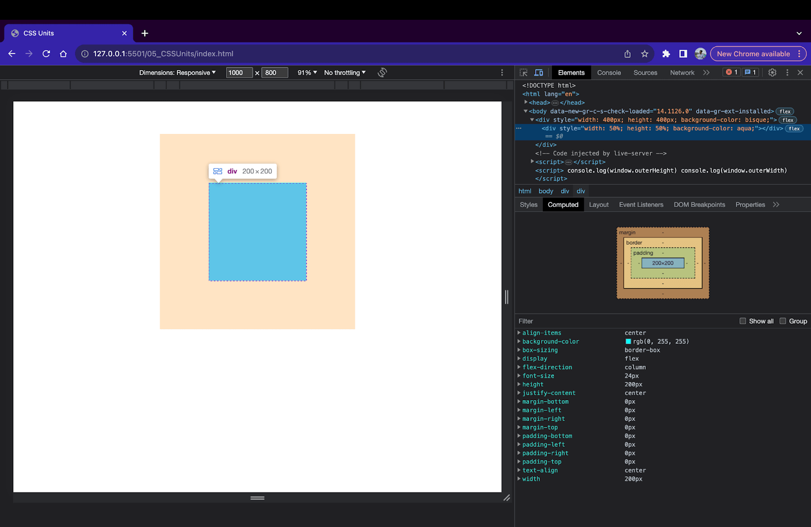
Device Percentage Unit (%)
Percentage unit (%) is a relative unit calculated based on the parent element’s size. For example, if the width of a parent < div > element is 400px and the width of a child div inside the parent div is set to 50%. Then, the width of the child < div > will be 200px since 50% of 400 is 200.
|
1 2 3 4 |
<div style="width: 400px; height: 400px; background-color: bisque;"> <div style="width: 50%; height: 50%; background-color: aqua;"> </div> </div> |
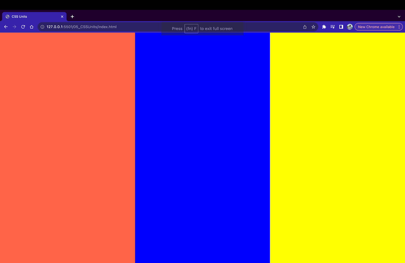
Percentage units work with all kinds of CSS properties like fonts, borders, etc., but are mostly used while creating responsive layouts. Here’s an example of a responsive 3-column layout using percentage units.
|
1 2 3 4 5 6 7 8 9 10 11 12 13 14 15 16 17 18 19 |
<div style="display: flex; flex-direction: row; justify-content: start; width: 100vw; height: 100vh; background-color: beige;"> <div style="width: 33.33%; height: 100%; background-color: tomato;"> </div> <div style="width: 33.33%; height: 100%; background-color: blue;"> </div> <div style="width: 33.33%; height: 100%; background-color: yellow;"> </div> </div> |
To summarize relative units,
| Name | Unit | Equal To |
|---|---|---|
| em | em | Size of the direct parent. |
| rem | rem | Size of the root or browser default. |
| ch | ch | Width of character ‘0’ in the font. |
| ex | ex | Height of character ‘x’ in the font. |
| Viewport Height | vh | Height of the device viewport. |
| Viewport Width | vw | Width of the device viewport. |
| Viewport Min | vmin | Min value from the width and height of the viewport. |
| Viewport Max | vmax | Max value from the width and height of the viewport. |
| Parent Percentage | % | Percentage value of the direct parent. |
When to Use Relative Over Absolute CSS Units?
Here are a few cases where we can consider using Relative units over Absolute units.
Responsive Web Design
The most important use case of relative units is responsive web design. It is possible to size the HTML elements using relative CSS units based on the parent of device dimensions. This makes it easy to change sizing based on screen size.
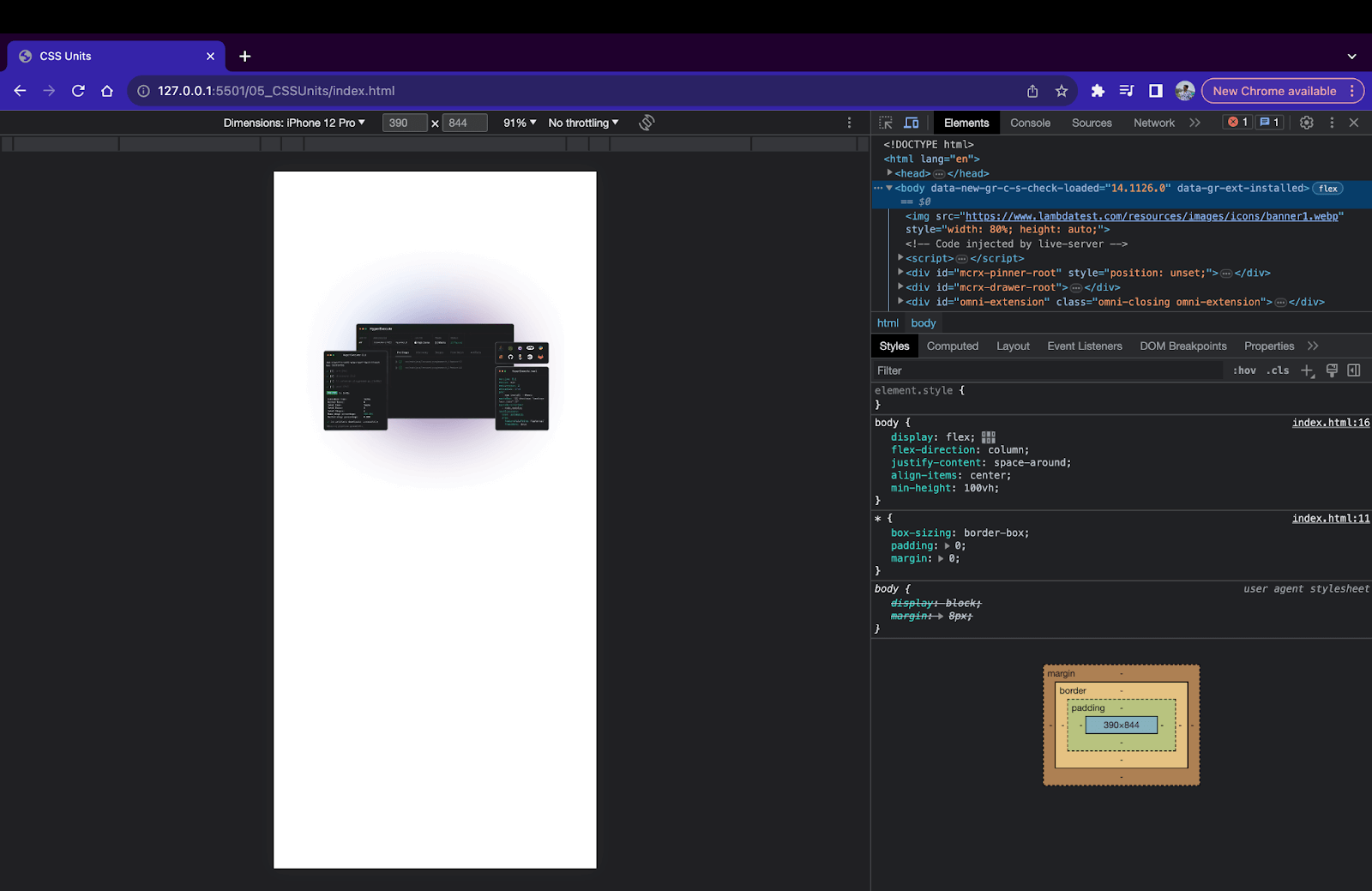
Previously, we discussed how using Absolute units for images causes issues with responsive web design. Let’s fix this problem using Relative units.
|
1 2 3 4 5 |
<img src="https://www.lambdatest.com/resources/images/icons/banner1.webp" style="width: 80%; height: auto;" > |
Relative units like vw, vh, and %, along with CSS media queries, can be used to create responsive and flexible web pages.
|
1 2 3 4 5 6 7 8 9 10 11 12 13 14 15 16 17 18 19 20 21 22 23 24 25 26 27 28 29 30 31 32 33 34 35 36 37 38 39 40 41 42 43 44 45 46 47 48 49 50 51 52 53 54 55 56 57 58 59 60 61 62 63 64 65 66 67 68 69 70 71 |
<!DOCTYPE html> <html lang="en"> <head> <meta charset="UTF-8"> <meta name="viewport" content="width=device-width, initial-scale=1.0"> <title> CSS Units </title> </head> <style> *{ box-sizing: border-box; padding: 0; margin: 0; } body{ display: flex; flex-direction: column; justify-content: space-around; align-items: center; min-height: 100vh; } .parent{ display: flex; flex-direction: row; justify-content: start; width: 100vw; height: 100vh; background-color: beige; } .child1{ width: 33.33%; height: 100%; background-color: tomato; } .child2{ width: 33.33%; height: 100%; background-color: blue; } .child3{ width: 33.33%; height: 100%; background-color: yellow; } @media only screen and (max-width: 600px) { .child1,.child2,.child3{ width: 100%; height: 33.33%; } .parent{ flex-direction: column; } } </style> <body> <div class="parent"> <div class="child1"></div> <div class="child2"></div> <div class="child3"></div> </div> </body> </html> |
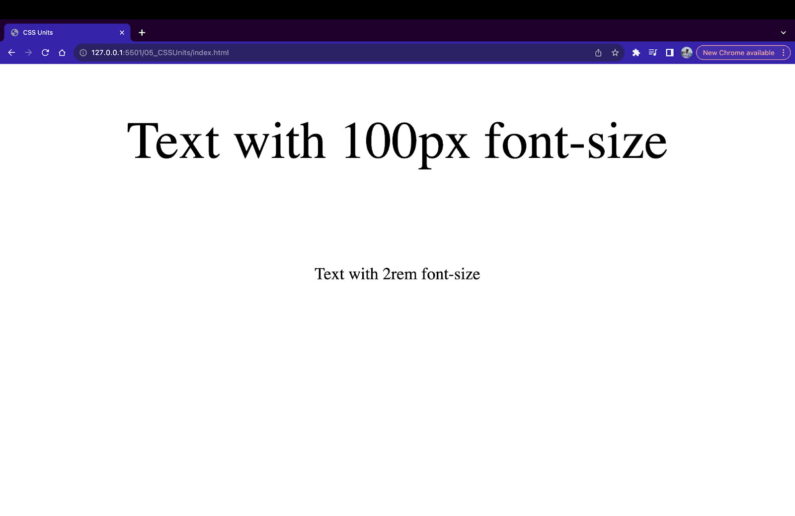
Font Sizing
Relative units like em and rem are perfect for specifying size for font-related properties. Since these units are related to the parent or root element’s size, they allow the font to scale and adapt if the screen is resized. Since em and rem are directly related to the root or parent element, the text using these values remains readable even when the screen size changes.
|
1 2 |
<p style="font-size: 100px;">Text with 100px font-size</p> <p style="font-size: 2rem;">Text with 2rem font-size</p> |
Layouts
Using relative CSS units like %, vh, and vw, creating layouts is quick and easy. It is super simple to create fluid designs where the size of the child element is set based on the parent element. These layouts stay responsive and adapt when the screen is resized.
|
1 2 3 4 5 6 7 8 9 10 11 12 13 14 15 16 17 18 19 20 21 22 23 24 25 26 27 28 29 30 31 32 33 34 35 36 37 38 39 40 41 42 43 44 45 46 47 48 49 50 51 52 53 54 55 56 57 58 59 60 61 62 63 64 65 66 67 68 69 70 71 72 73 74 75 76 77 78 79 80 81 82 83 84 85 86 87 88 89 90 91 92 93 94 95 96 97 98 99 100 101 102 103 104 105 106 107 108 109 110 111 112 113 114 115 116 117 118 119 120 121 122 123 124 125 126 127 128 129 130 131 132 133 134 135 |
<!DOCTYPE html> <html lang="en"> <head> <meta charset="UTF-8"> <meta name="viewport" content="width=device-width, initial-scale=1.0"> <title> CSS Units </title> </head> <style> *{ box-sizing: border-box; padding: 0; margin: 0; font-family: 'Lucida Sans', 'Lucida Sans Regular', 'Lucida Grande', 'Lucida Sans Unicode', Geneva, Verdana, sans-serif; } body{ min-height: 100vh; } div{ display: flex; flex-direction: row; justify-content: center; align-items: center; font-size: 20px; } img{ width: 50%; } .parent{ display: flex; flex-direction: row; flex-wrap: wrap; justify-content: start; width: 100vw; height: 100vh; } .child1{ padding: 10px; width: 100%; height: 20%; font-size: 30px; background-color: aqua; } .child2{ padding: 10px; width: 20%; height: 80%; background-color: beige; } .child3{ padding: 10px; width: 30%; height: 80%; background-color: lightcyan; } .child4{ flex-direction: column; width: 50%; height: 80%; } .grandchild1{ padding: 10px; width: 100%; height: 50%; background-color: tomato; } .grandchild2{ padding: 10px; width: 100%; height: 50%; background-color: yellow; } @media only screen and (max-width: 600px) { .parent{ flex-direction: column; } .child1{ width: 100%; height: 10%; } .child2{ width: 100%; height: 60%; } .child3{ width: 100%; height: 20%; } .child4{ width: 100%; height: 10%; flex-direction: row; } .grandchild1,.grandchild2{ height: 100%; width: 50%; } } </style> <body> <div class="parent"> <div class="child1"> LambdaTest </div> <div class="child2"> <ul> <li>Live Testing</li> <li>Automated Testing</li> <li>Mobile Testing</li> <li>HyperExecute Testing</li> <li>Visual Regression Cloud</li> <li>AI Powered Test Analytics</li> <li>Smart TV Testing</li> </ul> </div> <div class="child3">Next-Generation Mobile Apps and Cross Browser Testing Cloud </div> <div class="child4"> <div class="grandchild1"> <img src="https://www.lambdatest.com/resources/images/selenium-parallel-testing-index.png" alt=""> </div> <div class="grandchild2"> <img src="https://www.lambdatest.com/resources/images/selenium-parallel-testing-index.png" alt=""> </div> </div> </div> </body> </html> |
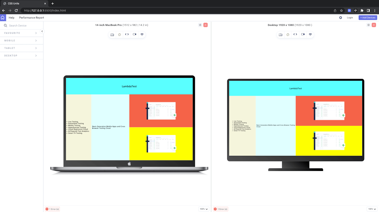
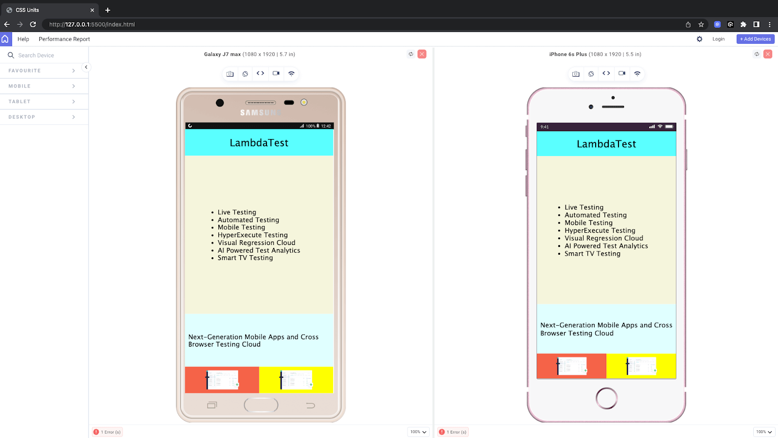
For checking the layout on various screen sizes we will use LT Browser from LambdaTest. LT Browser is a free, Chromium-based desktop application designed specifically for web developers to help them build, test, and debug their websites and web applications, particularly for mobile responsiveness.
It supports 53+ multiple device viewports of varying screen sizes to test the responsiveness of a website. We will use this browser to check how our responsive web page performs on all screen sizes.
Check out this tutorial to explore different features of LT Browser that you can use to test responsive web designs.
Subscribe to our LambdaTest YouTube Channel for the latest updates on tutorials around mobile app testing, real device cloud, and more.
When to Avoid Using Relative Units?
It is best not to use relative units when small measurements and adjustments are required. Since relative CSS units keep changing, it is difficult to attain consistency. Also, in some cases, old browsers may not fully support relative units. In such cases, we can choose relative units and add absolute units as a fallback.
 Note
NoteTest your viewport units across real desktop and mobile browsers. Try LambdaTest Today!
Wrapping Up
That’s all for the blog. I hope you liked the blog and learned about CSS units. We discussed briefly all the popular units in CSS, along with examples.
We understood the right use case for each unit and when it should be avoided. It’s very unlikely that you would ever need to use all the CSS units, but knowing all the available options makes it easier to choose the best one for the job. Every unit type has its own use case and works like a charm if used correctly.
Happy Coding!
Frequently Asked Questions (FAQs)
What are CSS size units?
CSS size units are used to define the dimensions of elements in a web page. These units specify how wide, tall, thick, or spaced an element should be. CSS provides various size units to accommodate different design needs and responsiveness requirements.
What is the best unit for sizing CSS?
The best unit for sizing CSS depends on the specific design requirements. For responsive design and scalability, relative units like em, rem, and percentages are often preferred. However, for fixed layouts or when pixel precision is necessary, px (pixels) may be suitable. The choice ultimately depends on the design goals and the nature of the layout.


Author’s Profile
Anurag Gharat
Anurag Gharat is a Full Stack Developer, Freelancer, and Technical Writer based in India. He is currently working as a Software Engineer in one leading IT services company.
Blogs: 8
Got Questions? Drop them on LambdaTest Community. Visit now


