How To Perform Mobile Web Browser Testing
Harish Rajora
Posted On: March 8, 2022
![]() 124603 Views
124603 Views
![]() 23 Min Read
23 Min Read
The first website was launched in 1991, but no one could have predicted that these websites would not be just confined to desktops or laptops. However, with the emergence of mobile devices, people preferred to view their websites (or web pages) on mobile rather than a laptop or a desktop.
As per a survey, more than 54% of internet traffic comes from mobile devices. This 50% mark was crossed in 2017 and has been consistent enough to provide solid evidence of how people love mobile browser exploration. Therefore, it’s become important to conduct mobile web browser testing for an ultimate mobile experience.

The ripple effect of this user preference towards mobiles can be seen on mobile manufacturers, browser developers, search engine developers, business strategists, and everything that depends on a website. As mobile screens have minimal space, you need to select critical elements that your users require the most while eliminating fluff while designing for them. Therefore, web developers are adopting the mobile-first design.
Developing excellent websites for desktops and mobile devices has become increasingly important for organizations. A further step in thorough testing is to analyze both various aspects and their impact on mobile web browser testing and how to do it.
In this guide, we discuss the basics and importance of mobile web browser testing, its different approaches, and how to perform mobile website tests.
TABLE OF CONTENTS
What is a Mobile web?
A mobile web or website, like every website, is made up of browser-based HTML pages that are linked together and accessible over the web. However, the mobile website is intended for smaller screen sizes and touch-screen interaction. In such cases, responsive web design is quickly becoming the new benchmark for mobile-friendly websites and scales to any size screen – from desktop to tablet to smartphone.
Furthermore, mobile websites can show texts, data, images, and videos. They can also include mobile-specific capabilities like accessing a phone number or location-based services.
In the United States, the following are the most viewed mobile web applications besides Google and YouTube.
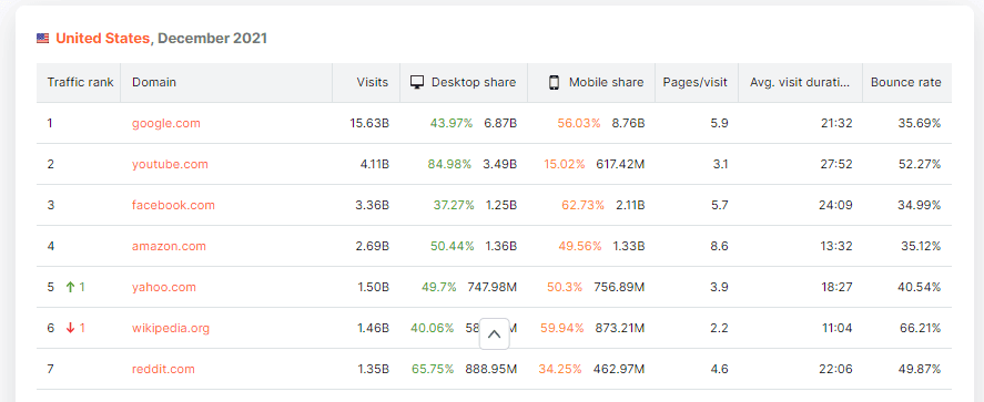
All of them have more than one billion page visits each month. They transform their applications as soon as some new research pops up. It might also not be wrong to say that people still jump right back when the glitches are rectified, even if they somehow make a mistake.
Why is Mobile web browser testing a must?
According to a survey, a poorly designed website deters 57% of internet users from recommending a business. Another survey shows – the first 50 milliseconds count to make a good impression! An opinion can be formed within 50 milliseconds, giving us no more than a blink to keep the user on the website. That’s a major challenge, especially for individuals, small businesses, and startups.
Today’s highly fragmented world is one of the primary reasons that demand mobile web browser testing. According to a survey, global statistics show the Android operating system is in the hands of nearly 70% of all mobile device users.

If you dig into the Android fragmentation or version distribution, you will find that all the customers (end-users) are not at the same level. This is because many users do not upgrade their devices so frequently (if they receive the latest updates).
According to the following stats, only 37% use the latest Android version.

It is not just Android that is fragmented; iOS also suffers version fragmentation, especially with the introduction of iPad OS.
Read More – How To Deal With iOS Version Fragmentation?
In short, what we’ve discussed above is not an abrupt turn of events but rather the outcome of a consistent preference towards a single domain of devices. Mobile device growth is unparalleled to any of the other devices. International data corporation projects this consistent growth to move further up with more than 1.5 billion smartphones shipping in 2025.

Such factors raise a need to have a mobile-friendly website as it will turn out to be the biggest source of your traffic.
Read – Ultimate Guide To Building A Mobile Friendly Website
Other than the mobile devices and their direct impact on business, being visible in search engines is another major factor for conducting mobile website tests.
In 2017, Google announced mobile-first indexing to the public. This was not a separate index, but Google prioritized mobile-friendly websites. Ultimately, it improves the browsing experience for visitors.
A website that is not mobile-friendly, specifically one that hasn’t been tested for mobile web, won’t be prioritized and will, consequently, appear at the bottom of the results. So if you are just starting, this would pose an irreversible risk to your business.
Focus areas for Mobile web browser testing
Mobile web browser testing requires a thorough analysis of many segments that can affect the final render on the screen. The following areas are generally under focus during mobile website tests for anomalies.
Screen size
To satiate different users’ requests, manufacturers aim at providing mobile devices with different screen sizes in the same model. It has been a good strategy to increase sales and cover a larger audience. Although it can be considered a primary step in mobile web testing, it is not a major concern for the testers. Mobile devices generally come in predefined screen sizes from all the manufacturers. This helps the manufacturers create a reference point for their next purchase.
However, we may also consider tablets and other devices that fall between tablets and desktops, such as Microsoft’s Surface Pro. But you can easily cover the comprehensive list for testing quickly.
Resolution
The next phase to test is the resolution of the device. It is often shown in the format as
The most severe effect of a web page on the resolution is when developers define absolute numbers for their elements.
For example, defining the width of a div element as follows –
|
1 2 3 |
div { width: 150px; } |
On a display of 300 pixels widths, the element may take 50% of the space, while on a 450px resolution, it will go as far as ⅓ of the width. This undeterminable rendering of elements can create complex issues on the web page. When one of these elements is used, other elements can be displaced from their respective locations. For example, CTA buttons can be displaced from their intended positions.
The following table researched by Worship shows the most popular resolutions we need to keep in mind while performing mobile web testing.
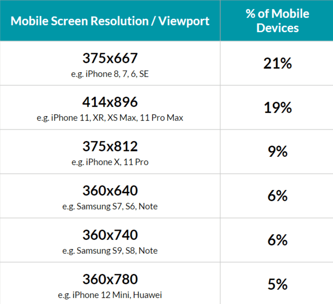
While this can be taken as an excellent reference. As a tester, you should always analyze your own website’s analytics if it has already been published. If not, these resolutions can cover a major segment of mobile devices.
For tablets, Statcounter brings out the most popular tablet sizes in January 2022. Therefore, these tables can suffice for this mobile web browser testing segment.

Operating System
Luckily the mobile device market is dominated by only two operating systems – Android and iOS. Naturally, this reduces the operating system combination until we realize that they both release a new version frequently to their users.
With every new version of an operating system, the company deprecates a few of the functionalities due to multiple reasons.
For instance, in API level 24 of Android, Google deprecated the assertHorizontalCenterAligned function. Such functions primarily affect the native applications rather than web ones. But since web applications run through browsers native to the device, any of these effects can be connected to the mobile web.
Therefore, it becomes crucial for developers to keep track of the deprecations and test the website for all the previous APIs in previous versions, etc.
Also, read – Difference Between Web vs Hybrid vs Native Apps
Browsers
The most time-consuming part is to test on web browsers. Unlike operating system versions, browser versions are released more frequently, with an average cycle of four weeks.
Also, there does not exist only a couple of browsers in the market. Even if you take out Google Chrome which has more than 60% of the market share, other browsers too hold a considerable market under their reach.

Regarding market share, browser fragmentation is much more concerning than the operating system. With a 63% share in the market, the following image shows how Google chrome’s version competes with the users.
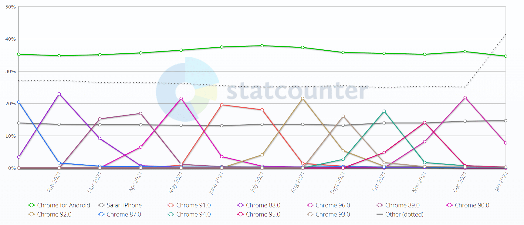
The fact that all the users do not update their browsers as frequently as maybe you and I do our work even more hectic than before.
With each version, you can expect some features to be introduced and some deprecated. This part is similar to operating systems. As a tester, we need to be careful about testing our mobile web app in these browsers. The main thing we are looking at here is property support removal. For example, a CSS function filter() is supported only in Mozilla’s Firefox browser. If the developers have kept Firefox as their primary browser for development, you may expect a few surprises while testing.
Impact on hardware systems
In terms of impacting hardware systems, much of what is covered under mobile web browser testing can be summarized under this section.
When rendered on a mobile device, our web application takes help from the device’s hardware. For instance, your WiFi or cellular network may impact the loading time. And many times, we can improve this from our end. For example, applying custom fonts on the server might take some time to download. If the end-user is on a 2G network, the time can extend to two or three times more than we expect.
Read – How To Test Mobile Websites On Different Network Conditions?
Watch this video to learn how to emulate network conditions in Selenium WebDriver by using the ChromeDevTools Protocol.
Google Analytics can better understand what your users use to access the website. However, it is not always accurate. For example, let’s say your web app performs poorly on a 2G network. The users will navigate away from the page, and you will not retain them as recurring customers. Due to their low engagement in Google Analytics, they may not be shown in the list.
Is the battery drain an issue? This may be more of an issue when testing native apps, but it is also an issue when testing mobile web. Stanford conducted research into the relationship between battery drain and the mobile web a few years ago. While most people anticipated that advertisements and hardware were to blame, the research concluded with the result as “poor coding choices.”
Accessibility
The World Wide Web Consortium (W3C) has declared in its standard specification that a website should be accessible to everyone, including those with various disabilities. According to the document, these disabilities might fall into the following categories:
- Auditory-Visual
- Speech
- Cognitive
- Neurological
- Physical
These rules were also stated in the Americans with Disabilities Act in 1990. Since mobile traffic surpasses desktop traffic, testing mobile web accessibility becomes even more critical. Therefore, businesses should also involve such criteria while discussing the web application before its development.
Many people refer to mobile web browser testing with a single process. These include browser responsive tests or just visual UI testing etc. However, a mobile website test is much more than that, and a web tester should carefully focus on each segment described in this section.
Read More – Responsive Web Design Testing Checklist
Benefits of Mobile web browser testing
Mobile web browser testing checks the responsiveness of your web app across numerous devices and browsers and provides some specific benefits.
- Since Google considers mobile-friendly websites a ranking factor, having a responsive mobile version of your website can help you rank better in search engines and receive more visitors to help your business develop.
- Mobile web testing lets you verify that your web app works as intended across the targeted devices that people use to access it.
- It is critical to conduct mobile website tests and responsive testing of your app for speed and accuracy to give users immediate access to your website.
- A mobile-friendly website gives users a better experience than a desktop website since they can view all of your website’s information on a small and compatible device. It helps you get more users, but it also promotes user trust.
- You can ensure an appealing appearance and feel for your website across mobile phones by doing device-specific responsiveness testing. Users enjoy it and return to it whenever they require any valuable information or service from your company’s website.
Learn How to View Desktop Site On Android.
Different approaches for Mobile web browser testing
The enhancement in testing technologies has resulted in multiple options available for mobile website tests. These are outlined in this section.
Using Desktop browsers
Using desktop browsers for mobile web testing is one of the cheapest but least efficient approaches.
Developer tools options in all the browsers provide the tester with pre-defined resolutions of various mobile devices.
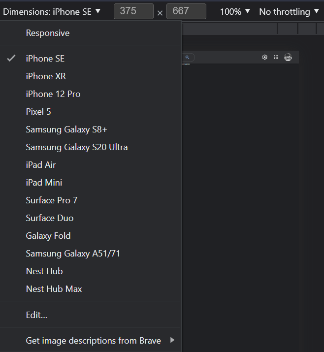
You can also adjust the screen freely using the side panel holder.
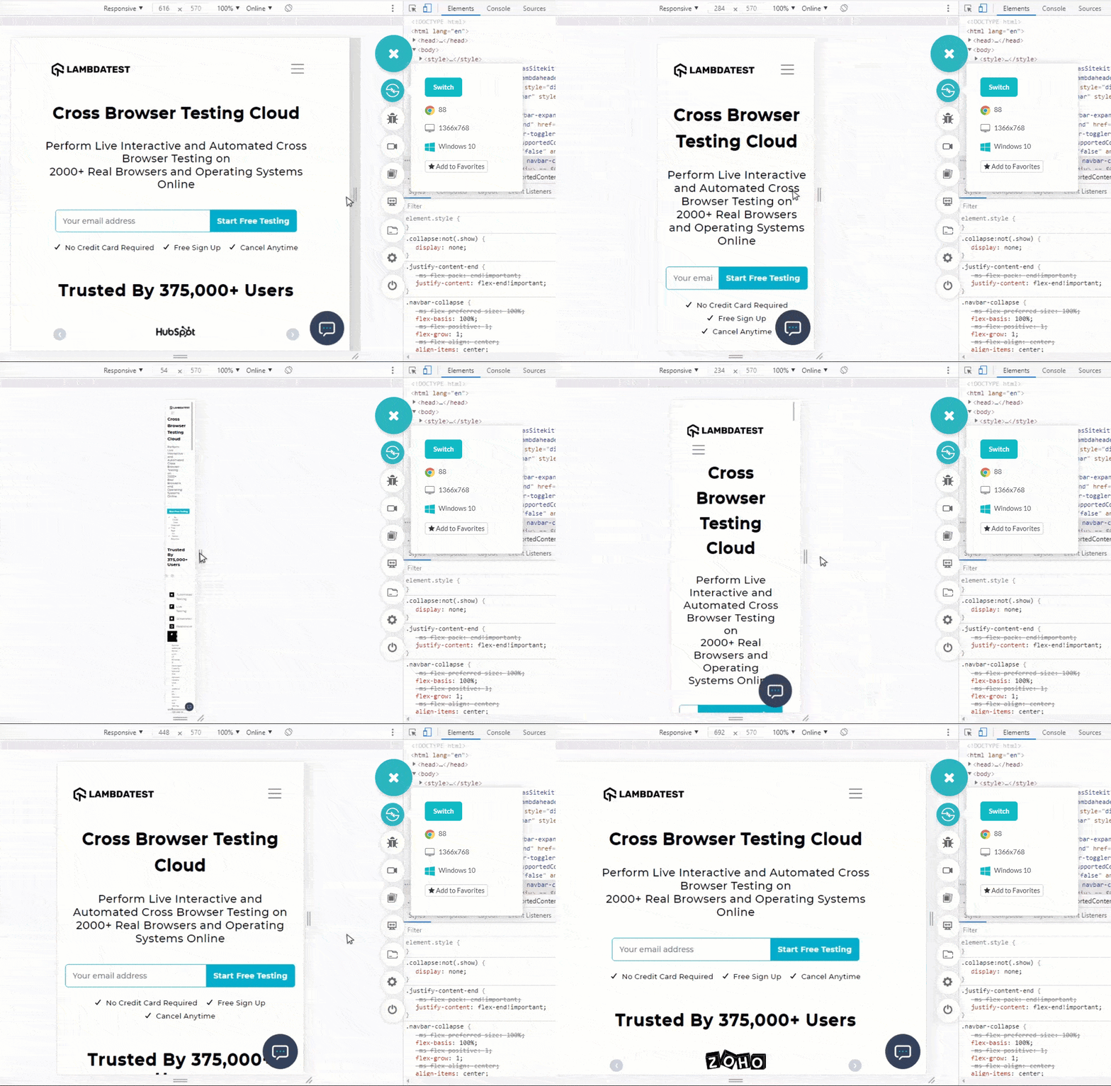
The problem with this approach is that it does not consider hardware when resizing the web page. In addition, since you are on a desktop, you are using a desktop’s far more enhanced resources than mobile devices.
Another problem with this approach is the absence of a mobile operating system and the inability to switch between various browser versions.
What would you do if you wanted to check for Chrome 80? That is something to think about here.
Testing on emulators and simulators
In a mobile world, emulators and simulators are built to mimic the behavior of a mobile device without actually using one physically.
Since simulators do not consider hardware part of their behavior, you should ignore it. On the other hand, emulators are a feasible option. They consider hardware easy to install, readily available, and maintenance is zero.
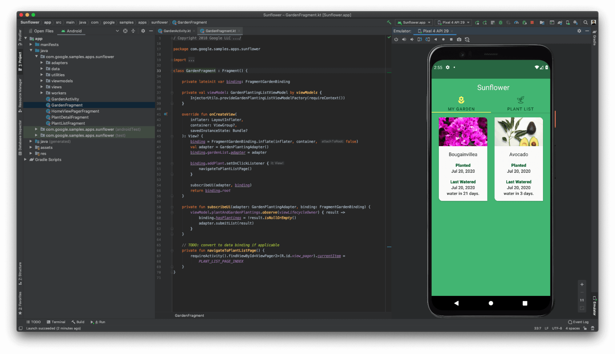
Emulators started implementing features like network throttling to vary the bandwidth, support for device hardware such as a camera, prompting the web app with notifications, etc. Using emulators can help you understand the behavior of your mobile web app very quickly.
The problem with emulators is – they are not real devices. They may give you a rough idea about the device, but they cannot provide accurate analysis. What actual hardware presents is unique and unpredictable. For example, emulators cannot switch quickly between 2G, 4G, and then no network. This is an actual condition and is faced by users in situations when they are traveling.
It is better to use emulators for UI testing and render them once to get an idea of the web app. However, it’s not recommended to rely on them for testing other functionalities.
Read More – Emulator vs Simulator For Mobile Testing: Differences & Setup
Testing on Real devices
The most naive method of starting mobile web browser testing is purchasing or renting real device cloud and manually testing them. Testing on a real device is one of the best options for testing mobile web applications in real-world scenarios to get accurate results. Here you have got two options – either go one by one manually or set them up as a lab and connect with a centralized system. This way, you can test on mobile devices from a single system.
Without sharing any precise statistics, our findings of mobile device fragmentation in the preceding sections demonstrate how tough this decision might be. Moreover, purchasing mobile devices is an expensive venture in and of itself.
On top of procuring the devices, maintenance takes a lot of time and money. Mobile device operating systems and browsers are constantly releasing different versions. You need to test device X with operating system Y and browser Z with version ABC. Repeat with a different version. Then repeat the whole browser cycle with a different operating system and so on.
Cloud-based testing
To overcome the challenges arising in the above-discussed methods, people have come up with a better solution. Therefore, a feasible option is to choose a cloud-based solution often popularized as a cross browser testing platform.
Cloud-based cross browser testing platforms like LambdaTest offer to run mobile website tests on the cloud and, therefore, eliminate the hassle of maintaining the in-house device labs. It also provides a real device cloud lab and mobile emulator for browser testing and an iOS simulator for browser testing. Both of these will have their use cases and will solve different problems. For example, using a real device cloud to verify the user interface is not spending your money thoughtfully. On the other hand, emulators today hardly give any different results when UI is in focus.
Apart from the actual testing process, cloud-based solutions also bring out features that save time and costs for the company—for example, embedding extensive reports, geolocation testing, integrating multiple tools, etc. You can explore all these features and learn their benefits as a tester.
Mobile friendly testing
Browsers made just for mobile devices are also a good and feasible choice to consider in running mobile website tests. These browsers provide device views with pre-defined specification sheets built into them. They also bring most of the functionalities of conventional cloud-based solutions into them, including reports and debuggers.
Mobile friendly testers like LT Browser help you perform mobile friendly tests across different pre-installed viewports for mobiles, tablets, desktops, and laptops. You can refer to our article on why developers should use LT Browser to know more about its out-of-the-box features.
How to perform Mobile web browser testing?
In the above section, we have explored the different approaches to run mobile website tests. Now let’s look at how to perform mobile web testing using the above-discussed approaches.
Mobile web testing with Desktop browsers
You can test the mobile view of websites utilizing the developer tools for popular desktop browsers like Chrome, Firefox, Safari, Edge, etc., for mobile emulation. In this section, we run a mobile website test using developer tools for the browsers – Chrome, Firefox, Safari, and Edge.
Google Chrome Dev tools
- Open Chrome and visit the website you want to test.
- From the custom and Google control button on the top-left corner, go to More tools > Developer tools.
- Click the Device toggle bar icon as highlighted in the below screenshot.
- From the dropdown, select any Android or iOS device.
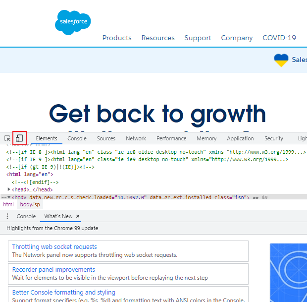
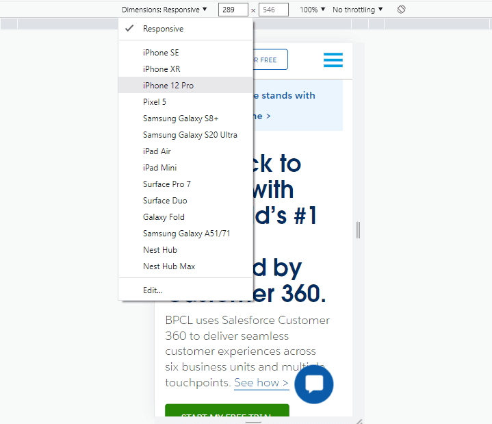
On selecting the device, the entered website will open up on the selected device. You can now run your mobile web test on Chrome and can even debug mobile websites on the go using the inspect tools.

Mozilla Firefox Dev tools
- Open Firefox and visit the website you want to test.
- From the Application menu on the top-left corner, go to More tools > Web Developer Tools.
- Click the Responsive Design Mode icon as highlighted in the below screenshot.
- From the dropdown, select any Android or iOS device.
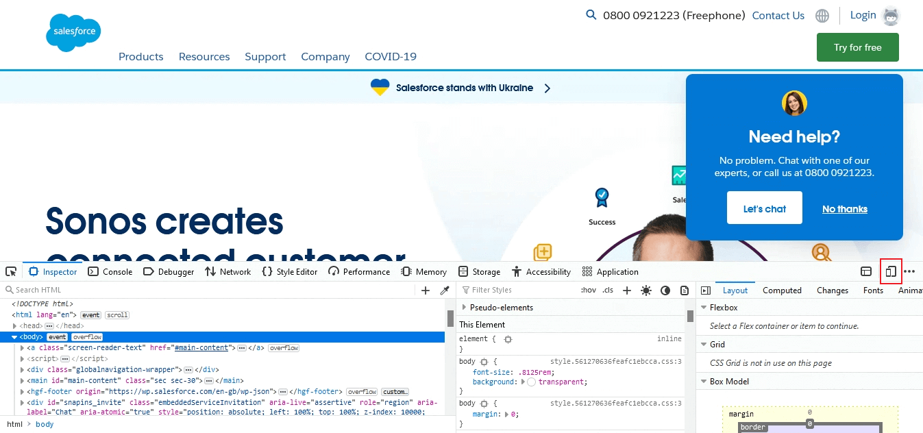
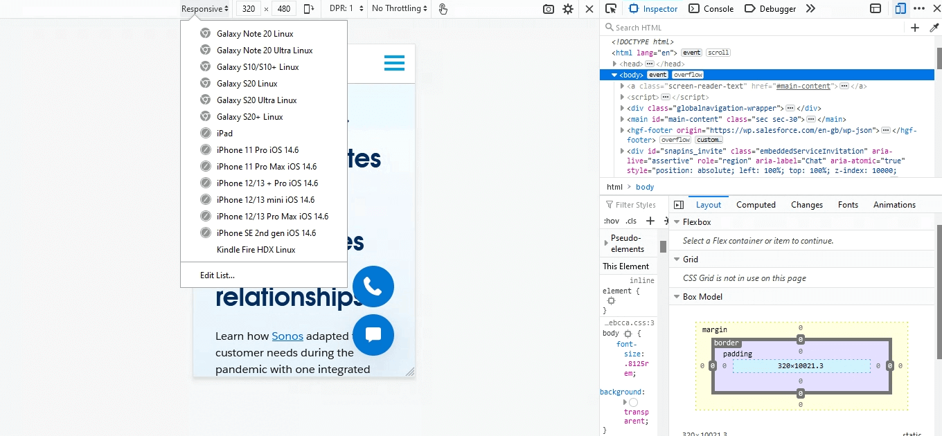
On selecting the device, the entered website will open up on the selected device. You can now run your mobile web test on Firefox and can even debug mobile websites using web developer tools.

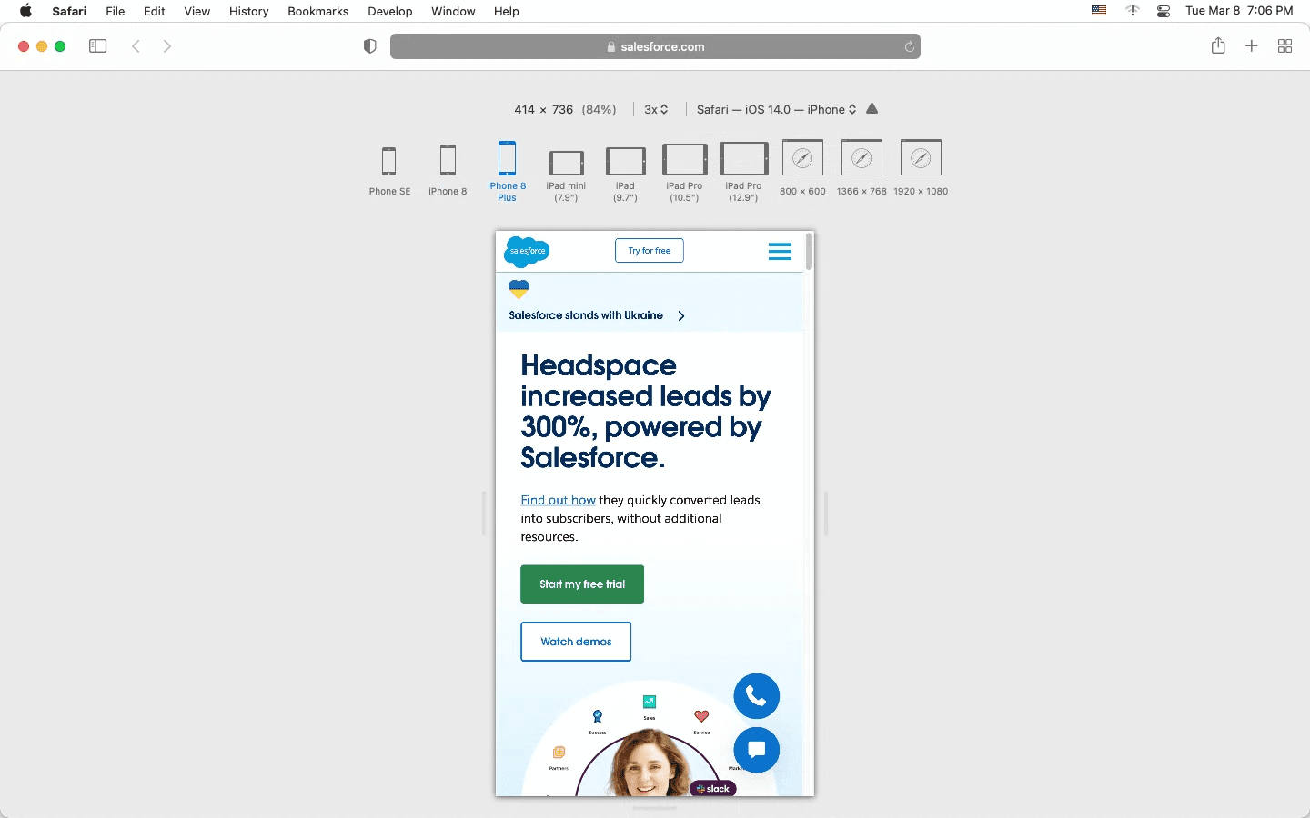
Safari Dev tools
- Open Safari and visit the website you want to test.
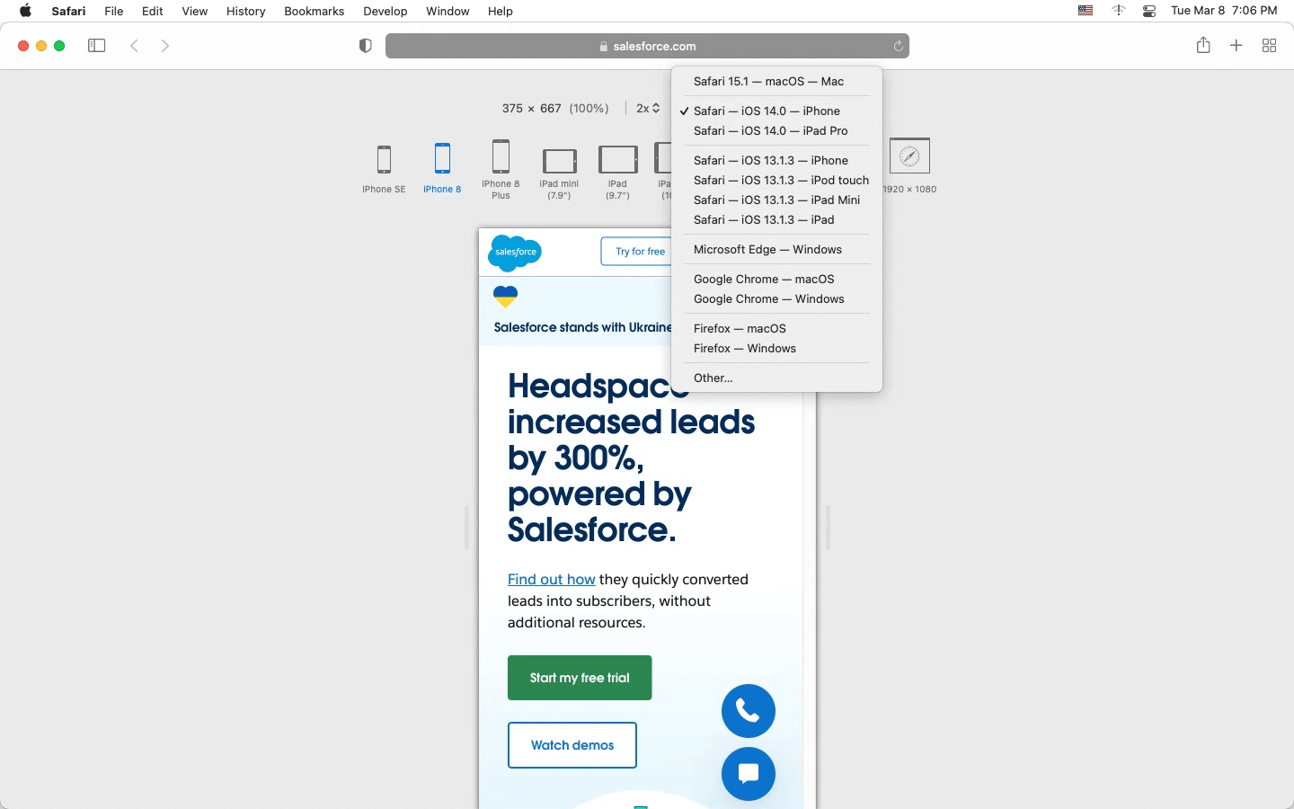
- From the Safari menu bar, go to Develop > Enter Responsive Design Mode.
- A mobile device will show up. You can either choose the device from the dropdown or the device menu to test on Safari.
- On selecting the device, the entered website will open up on the selected device.
Microsoft Edge Dev tools
- Open Edge and visit the website you want to test.
- From the settings menu on the top-left, go to More tools > Developer tools.
- Click the Toggle device emulation icon as highlighted in the below screenshot.
- From the dropdown, select any Android or iOS device.

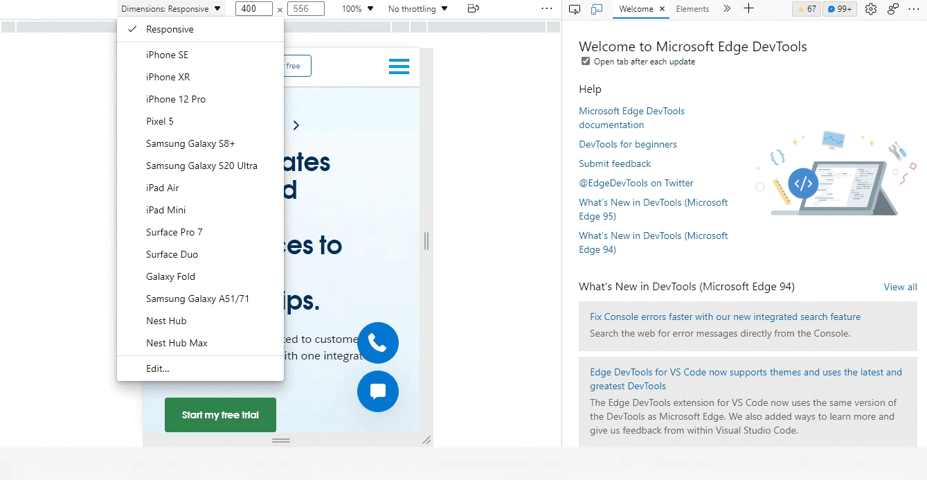
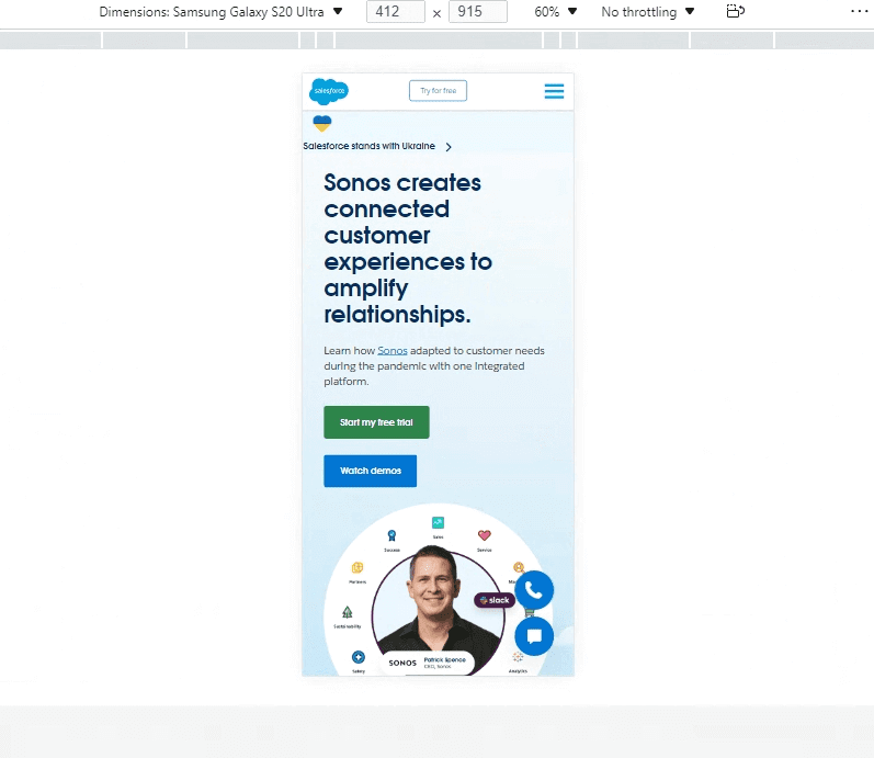
On selecting the device, the entered website will open up on the selected device. You can now run your mobile web test on Microsoft Edge.
Read – Are You Testing Your Website On Microsoft Edge?
Live-interactive Mobile web browser testing using LambdaTest
Mobile emulator for browser testing is the cost-effective approach to test websites. Using it will significantly reduce your load and time. However, you may need to wipe out an entire emulator from time to time and start over. You’d also need to clean the cache for a new test suite so that there’s no reliance on prior test case results. This can become both strenuous and time-consuming. An alternate and more reliable way to test your mobile web applications is using a real device cloud.
Cloud-based testing platforms like LambdaTest supports mobile web testing on both Android emulators and iOS simulators, and a real device cloud. It enables you to test websites and web apps for live-interactive cross browser compatibility across the latest and legacy Android and iOS mobile browsers on the cloud. In addition, LambdaTest also offers real devices to test mobile websites across real Android and iOS devices for accurate testing results.
Below are the steps to perform live-interactive mobile web browser testing –
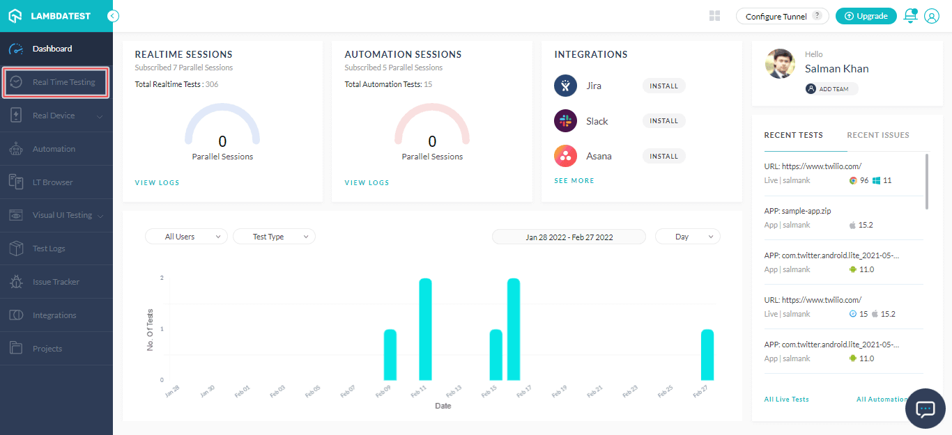
- Make sure you have a LambdaTest account. In case you don’t have one, register on LambdaTest.
- The dashboard will appear after you log into LambdaTest.
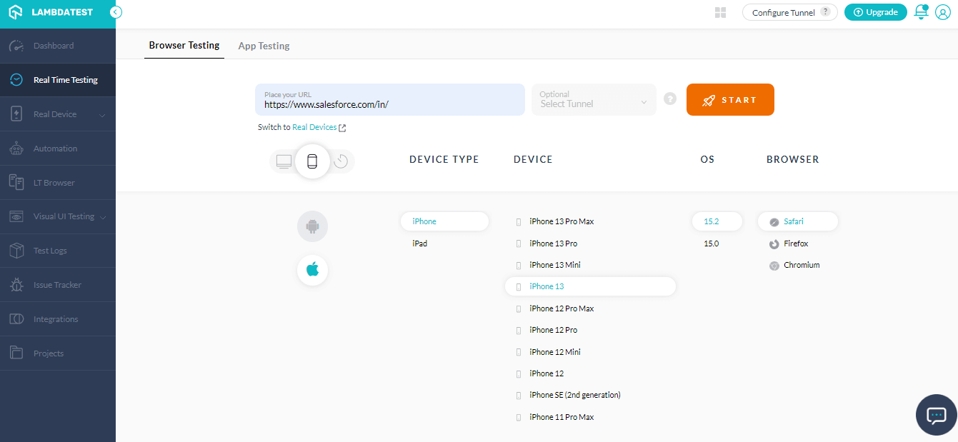
- Select Real Time Testing from the left menu if you want to test on emulators and simulators. However, to test on real devices, choose Real Time from the Real Device dropdown.
- Enter a test URL and specify the operating system type (Desktop or Mobile), DEVICE TYPE, DEVICE, OS, and BROWSER. Then, click START.
- A new virtual machine will launch based on the selected configuration.
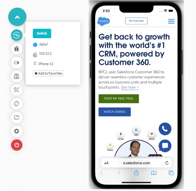
You can now run mobile website tests on the above-selected iPhone simulator for browser testing. You can use LambdaTest to test your website and app on Vivo devices directly on the device, without having to install any additional software.
Here is a quick video tutorial on the real-time browser testing.
For more such videos around automated browser testing, responsive testing, and web testing, do subscribe to the LambdaTest YouTube channel.
Mobile-friendly testing with LT Browser
Customers are acquired or lost in seconds in this rapidly online world – especially on mobile, where customers are time-starved. Organizations must convert these users into sales to give them a flawless experience. If people find your website easy to access on different mobile screen sizes changing networks, they are more likely to return. Therefore, it is vital to perform your website’s mobile-friendly test to make it user-friendly and accessible across a range of small screen sizes and network speeds.
LT Browser is a responsive design checker that helps you perform mobile-friendly testing across different viewports like mobiles, tablets, desktops, and laptops. In addition, it comes with rich features like side-by-side mobile view of websites, generating performance reports powered by Google Lighthouse, integrations with third-party tools, network throttling, capture screenshots, video recording, and much more.
Check out the video tutorial of LT Browser.
Shown below are the mobile and tablet views of a website.
- Download and install LT Browser.
- Launch the LT Browser and select the device viewports from the left device panel.
- Enter the website URL in the search box and press Enter
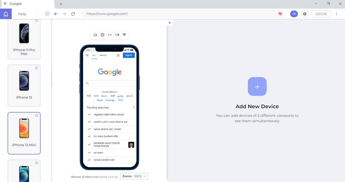
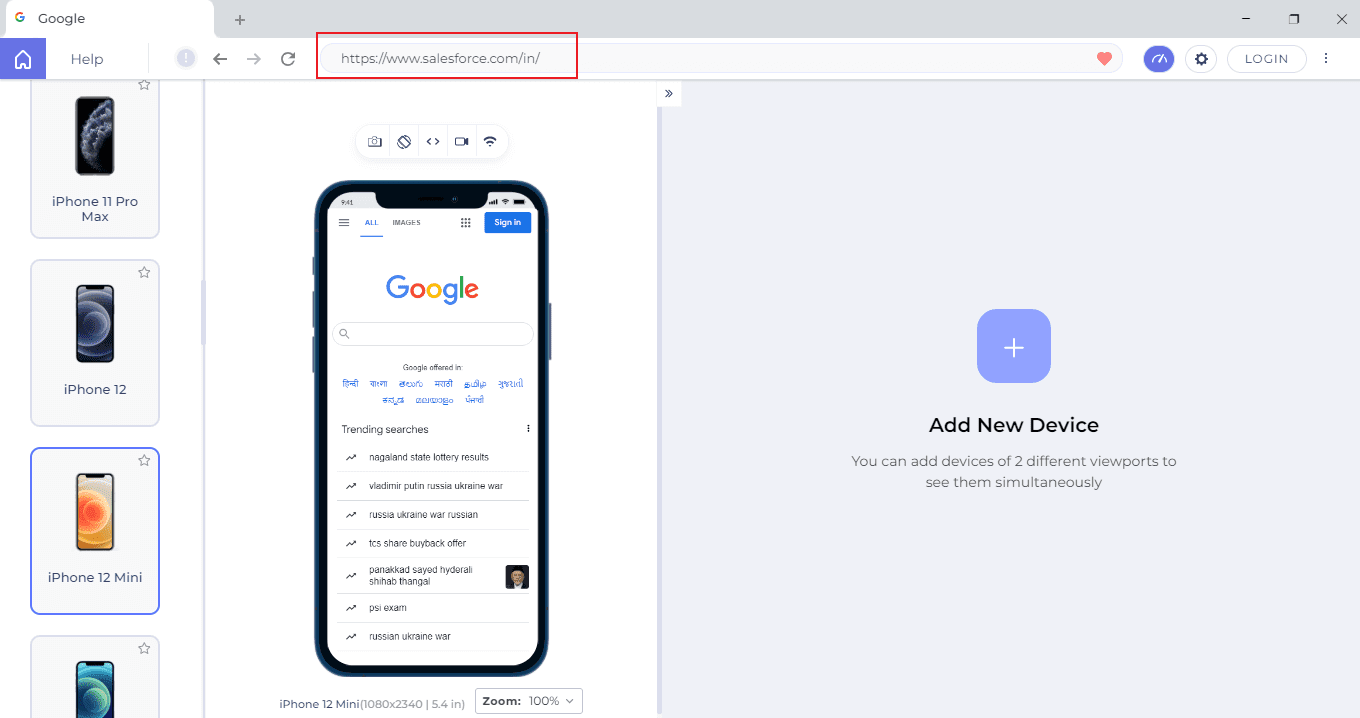
The particular website will launch on the selected device viewport.

This way, you can kick start your mobile website test with LT Browser.
Best practices for Mobile web browser testing
Now that you understand how to test your mobile website on various mobile devices. Let’s look at some of the best practices you should follow when testing a mobile website.
- Ensure all established business goals and customer expectations are achieved to optimize the testing process.
- Decide on the devices and mobile browsers you will use to test the responsiveness of your website.
- List the browsers’ testing priorities based on user patterns, maximum traffic, and accessibility. Also, include browsers that users hardly use.
- Create a testing approach that allows you to comply with the rules and adhere to the standards to assure quality and consistency.
- Consider how much time it will take to test all of the application’s components on all devices.
- Verify that each screen size and navigation flow is thoroughly validated.
- By expanding or contracting the browser window, you may define your breakpoints based on the content and design of the web application.
- Specify what to expect when a test scenario is run while having all changes in mind during the sprint so that you can quickly update the test cases.
- To assess the website’s scalability and adaptability, test its performance on various network speeds and internet connections.
Note: Now you can perform online cross browser testing on Brave Browsers to make sure your websites and web apps are compatible with all versions.
Wrapping Up!
Today, mobile devices are a priority. Kwo Ding, a QA strategist, revealed a new mobile testing pyramid a few years ago. This pyramid focuses exclusively on the testing of mobile web and mobile applications. In addition, a mobile-first design asks developers to build the web app using a mobile-first strategy. This proves how important the mobile web is to businesses, individuals, and small companies.
As a developer, I perceive there is much more to come in mobile web testing. In contrast to desktop web testing, mobile web browser testing is not as refined and profound as it should be. However, things are changing. Mobile traffic will certainly incline toward the mobile web if you get more than desktop traffic. Comment below with your thoughts on this and what you want to see in the future of mobile web testing.
Frequently Asked Questions (FAQs)
What is mobile web application testing?
Mobile web application testing is the process of testing websites to ensure they are completely functional and bug-free across a variety of browsers and devices.
How can I test my mobile browser?
It’s easy to test mobile browsers, as various developer tools like Google Chrome can be used to perform the task. One can also go for cloud-based testing platforms to test their mobile browsers on emulators and simulators as well as on real mobile devices.
How can I test my local website on mobile?
To test local websites on mobile, you need to understand the local website URL’s IP address and port number. After that, you can open the local websites on mobile emulators or simulators to test them. In addition, you can also perform local testing on mobile devices with any cross browser testing platform.
Got Questions? Drop them on LambdaTest Community. Visit now


