
How To Resize Images Using object-fit in CSS
Peter Junior Ejembi
Posted On: April 9, 2024
 129922 Views
 20 Min Read
Images and videos are fundamental aspects of modern-day websites; you can hardly see a website that contains just text and not images or videos. They help improve the visual appeal of a website and also help you present information in a visually engaging manner.
Therefore, as a web developer, you must know how to add images and videos and ensure they are presented on your website. A very effective solution for controlling how your images are presented in any container or inside of any element is using the object-fit CSS property.
In this blog, we will cover the object-fit CSS property, understand its basics, different values that can be attached to the CSS object-fit property, a practical implementation, and its use case in modern web design. Lastly, we will look at some tips and tricks that will come in handy when working with the object-fit CSS property.
TABLE OF CONTENTS
Basics of object-fit CSS Property
The object-fit CSS property is renowned for its role in determining the size and display of media components such as images and videos. While conventional methods like specifying height and width properties have been prevalent, the object-fit property is a property that offers a notably more adaptable alternative to the rigid constraints of traditional sizing techniques.
One of the standout advantages of the object-fit CSS property lies in its versatility. Unlike the height and width properties, object-fit presents a diverse array of values that can be applied to images, profoundly impacting their presentation. These values can either help preserve the aspect ratio of images or manipulate them to meet our desired requirements.
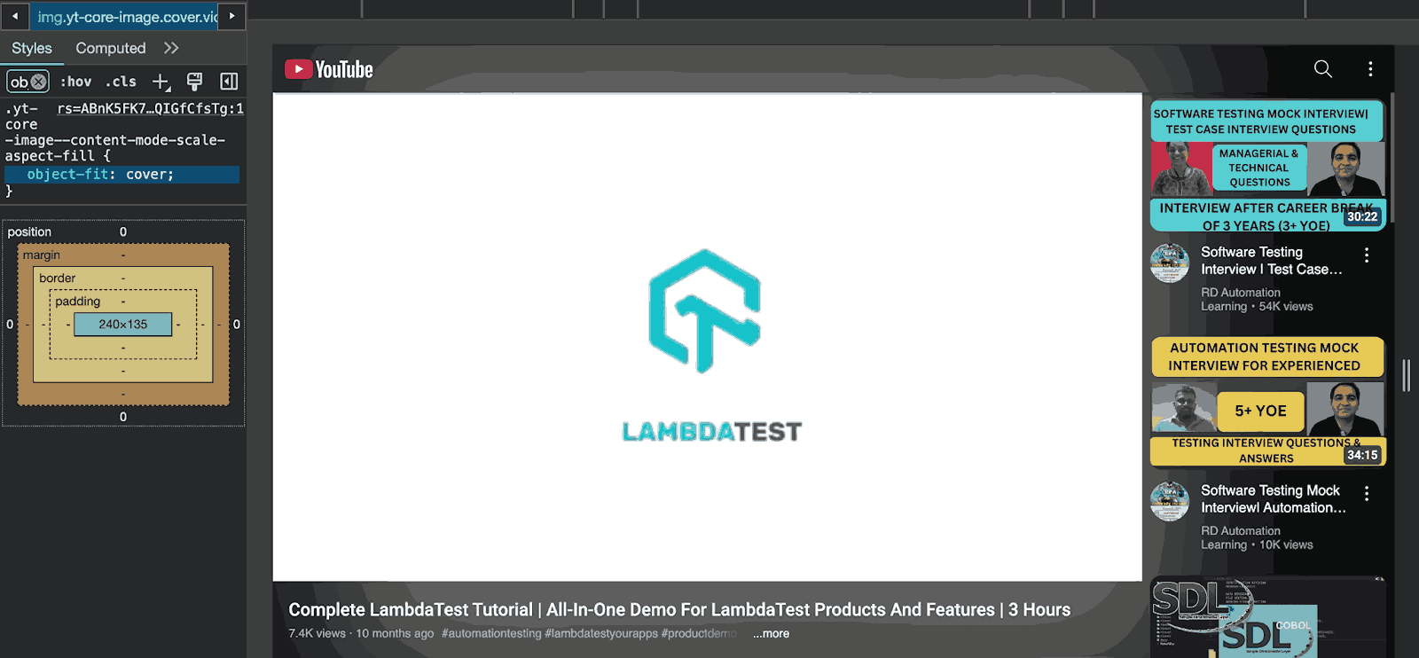
From the image above, you can see that YouTube, the number one online video-sharing platform where users can upload, view, rate, share, and comment on videos, uses the object-fit property to position videos in their container.
Furthermore, it’s imperative to note that the object-fit property is specifically tailored to work within the confines of two HTML tags: <img> and <video>
Different Values of object-fit CSS Property
Each value of the object-fit CSS property has its distinct method of defining how images or videos are displayed within their containers. object-fit property offers a range of five primary values, each serving as a directive for presenting our image in its container.
| Value | Description |
|---|---|
| none | The replaced content is not resized or cropped. It may overflow the content box. |
| cover | The replaced content is scaled to maintain its aspect ratio while filling the entire content box. Overflow is clipped. |
| contain | The replaced content is scaled to maintain its aspect ratio while fitting within the content box's constraints. |
| fill | The replaced element is stretched to fill the entire content box. The aspect ratio might not be preserved. |
| scale-down | The content is sized as if none or contain, whichever results in a smaller concrete object size. |
In this section, we will explore these object-fit values in CSS. We will discuss their individual functionalities and how they play a key role in the visual representation of images within containers while also looking at the best use case for them. To understand, we will also see the practical example, demonstrating the behavior of each object-fit value within a specific context.
HTML:
|
1 2 3 4 5 6 7 8 9 10 11 12 13 14 15 16 17 18 19 20 21 22 23 24 25 26 27 28 29 30 31 32 33 34 35 36 37 38 39 40 41 |
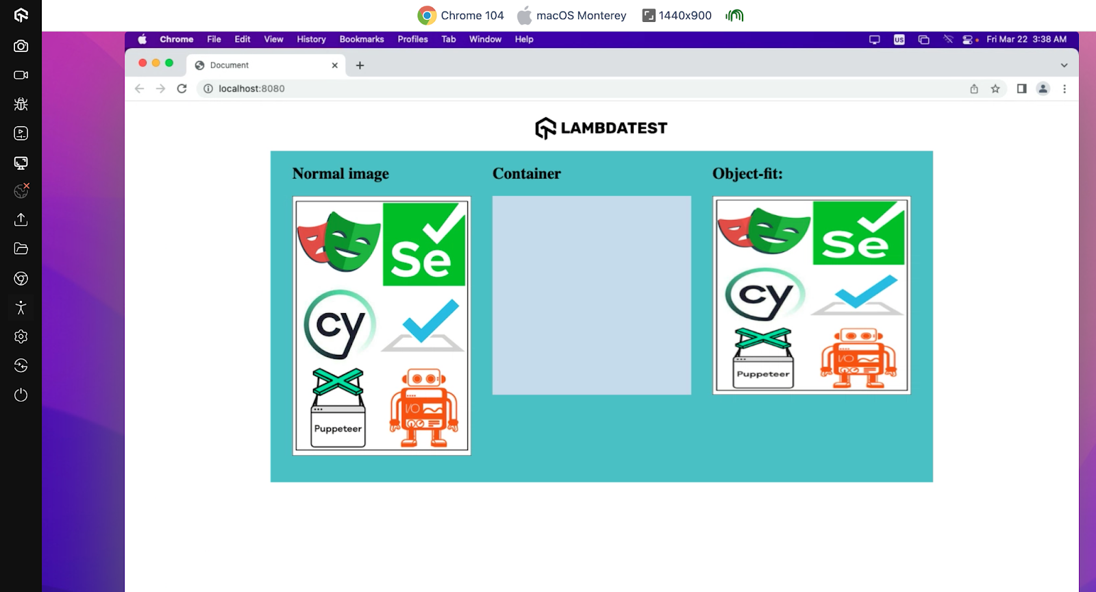
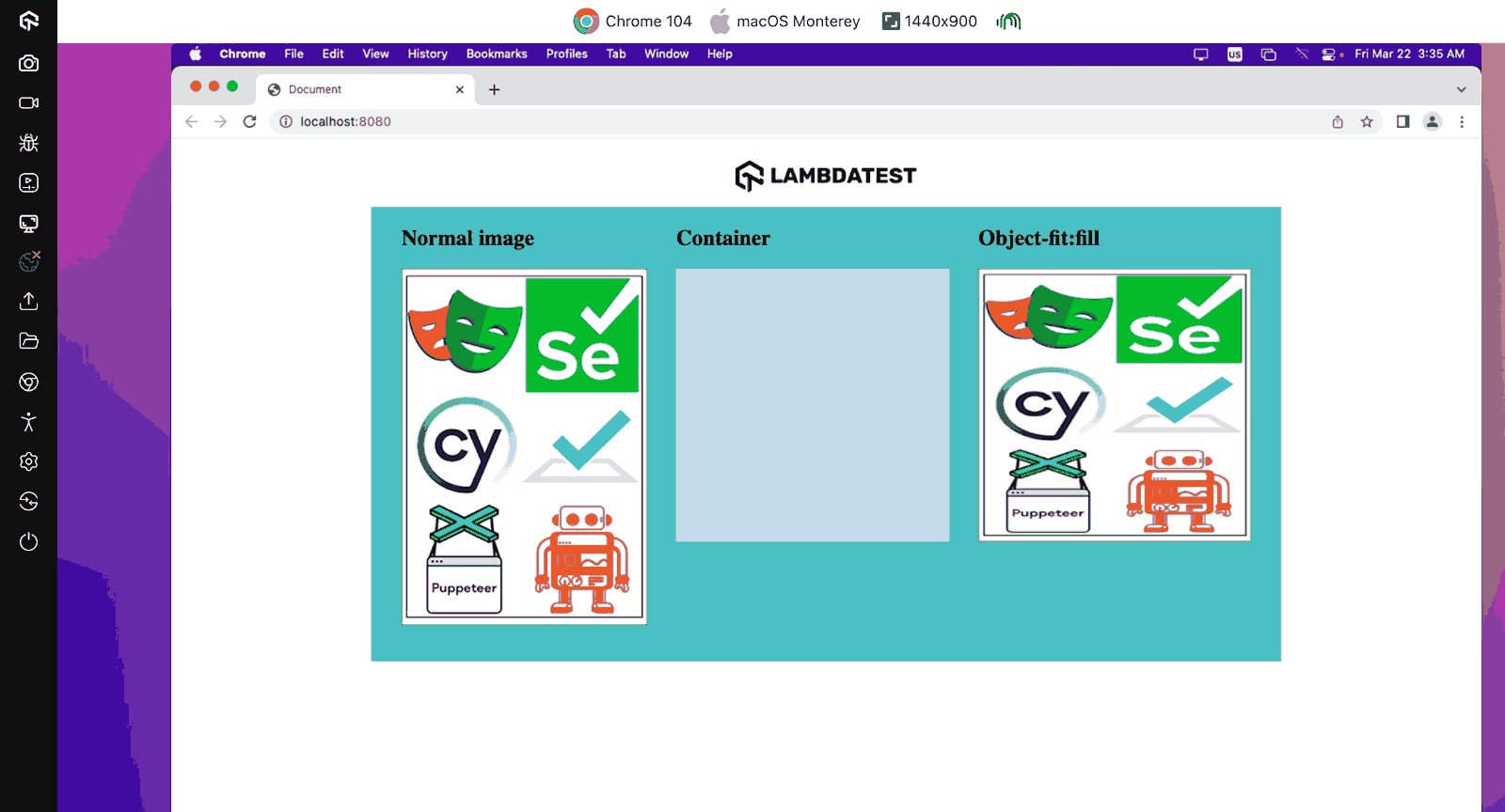
<!DOCTYPE html> <html lang="en"> <head> <meta charset="UTF-8" /> <meta name="viewport" content="width=device-width, initial-scale=1.0" /> <link rel="stylesheet" href="./style.css" /> <title>Document</title> <style> </style> </head> <body> <img class="lambdatest-logo" src="https://www.lambdatest.com/resources/images/logos/logo.svg" alt="" /> <div class="object-fit"> <div> <h2>Normal image</h2> <img class="image" src="https://github.com/Jaypedev/LambdaTest/blob/main/images/Beige%20Grey%20Minimalist%20Aesthetic%20Inspiration%20Moodboard%20Photo%20Collage%20(1).png?raw=true" alt="Hyperexecute image" /> </div> <div> <h2>Container</h2> <div class="container"></div> </div> <div> <h2>Object-fit: </h2> <div class="image-in-container"> <img src="https://github.com/Jaypedev/LambdaTest/blob/main/images/Beige%20Grey%20Minimalist%20Aesthetic%20Inspiration%20Moodboard%20Photo%20Collage%20(1).png?raw=true" alt="Hyperexecute image" /> </div> </div> </div> </body> </html> |
From the code above, you can see we have a markup for our design. Our main focus will be on the div with a class of object-fit, which contains three child divs. These divs contain the image, a container, and the image in a container, respectively. With the object-fit CSS property and its different values, we can see how the values affect the image inside the container.
CSS:
|
1 2 3 4 5 6 7 8 9 10 11 12 13 14 15 16 17 18 19 20 21 22 23 24 25 26 27 28 29 30 31 32 33 34 35 36 |
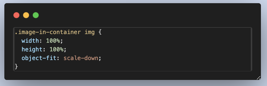
body { display: flex; flex-direction: column; justify-content: center; align-items: center; } .lambdatest-logo { width: 200px; padding: 1rem; } .object-fit { display: flex; background-color: #56bbc6; justify-content: center; align-items: start; width: 1000px; height: 500px; gap: 2rem; } .container, .image-in-container { width: 300px; height: 300px; background-color: #c9d9ec; } .image-in-container img { object-fit: ; width: 100%; /* Ensure the image takes up the full space of its container */ height: 100%; } |
With the style above, we have improved the aesthetic of our design. With the none object-fit value used for our image and just the traditional width and height properties, here is what our image looks like.
Output:
The output is showcased on LambdaTest, – a cloud-based testing platform that tests websites on different web browsers online.
LambdaTest is an AI-powered test orchestration and execution platform that enables developers and testers to test websites for browser compatibility on a remote test lab of 3000+ real browsers, devices, and platforms.
Subscribe to the LambdaTest YouTube Channel. Get the latest updates on various automation testing tutorials covering Selenium, automation testing, and more.
Now, while discussing the different values we can use with the object-fit property, we will see how this design can be transformed using the different object-fit property values.
See the Pen
Untitled by Peter Ejembi (@Peter-Ejembi)
on CodePen.
none
The none value is the object-fit value used to ensure the content retains its original dimensions and aspect ratio, regardless of the container’s size. This can result in overflow if the content is larger than the container or empty space if the content is smaller.
A good use of the none value is when you want to overlay an image or video on top of other content within a layout, such as decorative elements or visual effects. This value allows the content to retain its original dimensions and aspect ratio, enabling precise positioning within the container without resizing or cropping.
Let us edit our previous code to see the result of our image in its container when the object-fit value is none.
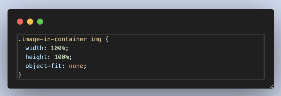
Output:

Just as we discussed, we can see that with the none value, the image maintains its aspect ratio and dimension, though the overflow is not visible due to the size of the container.
cover
The cover value resizes the content to cover the entire container and, at the same time, maintains its aspect ratio. It helps ensure that the content completely fills the container while at the same time cropping any excess content that doesn’t fit within the container’s dimensions.
The cover value is used when creating image galleries or carousel sliders where you want images to fill the available space while maintaining a uniform appearance.
Moving on with our previous example, let’s set the object-fit value to cover and see the outcome.
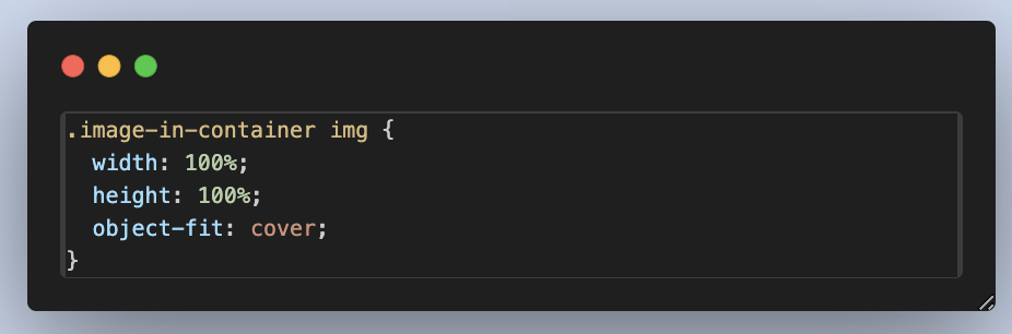
Output:
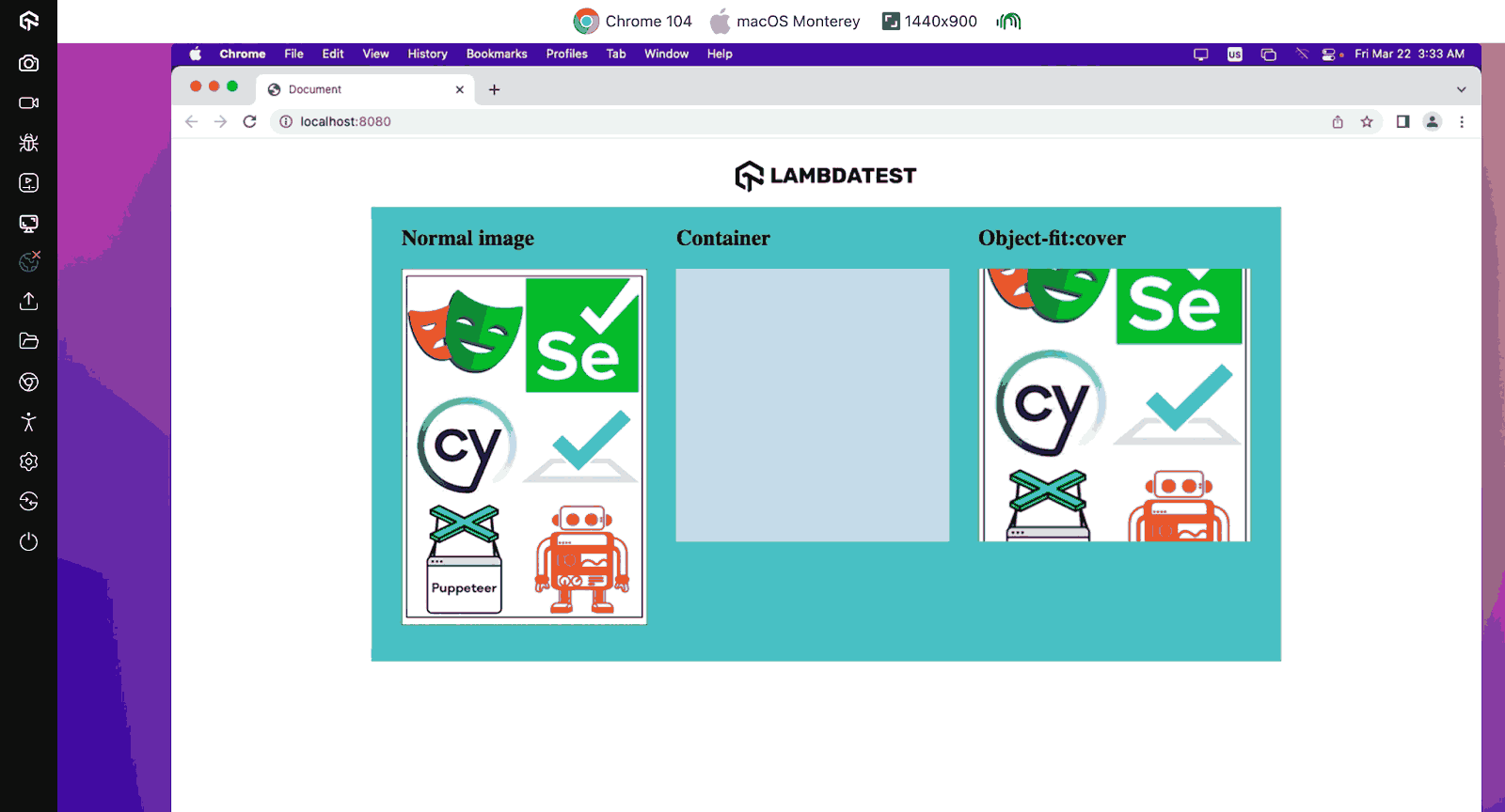
As you can see, the image expands in size over the container, but the aspect ratio of the image is maintained. Hence, some parts of the image that overflow are not visible.
contain
The contain value is used to resize the content to fit within the container while preserving the aspect ratio. It ensures the entire content is visible without distorting its aspect ratio. The contain value is mostly used when displaying images within a layout where preserving the original aspect ratio is crucial.
For example, when displaying product thumbnails on an eCommerce website. This value ensures the maintenance of consistency in image presentation. Specifically, when it comes to resizing images for eCommerce websites, to streamline the process, you can use Image API for image size and format optimization at scale.
As we have done using the previous object-fit value, let us edit our previous code to see the output of our image in its container when the object-fit value is contain.
Output:
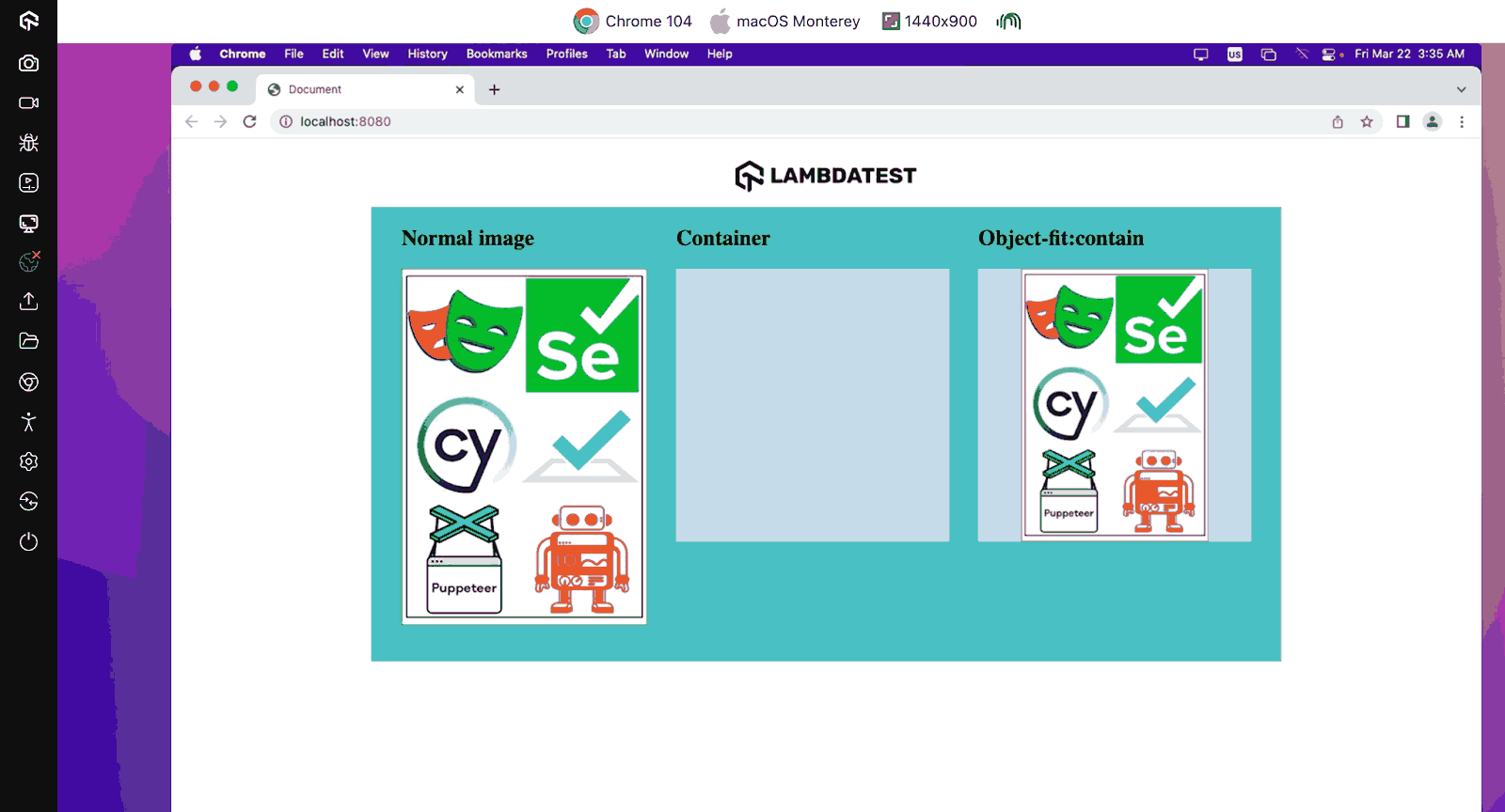
Just as we have discussed, the aspect ratio of our image is maintained, and all parts of our image are visible, leaving us with some white space in our container due to the aspect ratio of our content and our container not being equal.
fill
The fill value of the object-fit CSS property stretches the content to fill the container’s dimensions; this value disregards the aspect ratio of the content. It just ensures that the content completely covers the container presented. This could potentially distort the content if the content and container aspect ratios differ.
The best use case for the fill value is when you have a background image or video that must completely cover its container, such as a hero banner on a website. This value ensures that the entire container is filled with the content, regardless of the content’s aspect ratio, providing a visually immersive experience.
Let us edit our previous code to see the output of our image in its contents when the object-fit value is none.
Output:
The fill value is almost similar to the cover value, but with the fill, we can see that the aspect ratio of our image was not maintained, and the whole image is displayed.
scale-down
The scale-down value behaves similarly to contain, but it chooses the smaller of contain or none, ensuring that the content fits within the container without exceeding its original dimensions. The scale-down value is useful when the content’s natural size is smaller than the container, preventing unnecessary upscaling.
The scale-down value is used in incorporating dynamic content where the size of the content may vary. For instance, user-generated images or videos in a social media feed. The scale-down value helps ensure the content fits within the container without exceeding its natural dimensions, optimizing space utilization while preserving image quality.
Lastly, for our previous example, let’s set the object-fit value to scale-down and see the output.
Output:

Just like we discussed, the scale-down is a mix of the contain and none values, maintaining the content’s aspect ratio and also resizing the dimension to fit the container.
 Note
NoteTest your website across 3000+ browsers for object-fit CSS property.Try LambdaTest Today!
Browser Compatibility of object-fit CSS Property
The object-fit CSS property has a wide range of browser support. However, it may lack support in older browser versions. So, it is important to establish fallback mechanisms to accommodate users who access your website from unsupported platforms.
Explore alternative CSS properties like background to replicate desired effects in such scenarios. The background-size and the background-position property are the two properties you can use to replicate the effect of the object-fit CSS property on images.
Practical Implementation of object-fit CSS Property
Now that we know each object-fit value, what they do, and their effect on our image in a container, let’s discuss the practical implementation of the object-fit CSS property and some of its values in real-world scenarios. In this section, we will focus on the real-life use case of the object-fit property and its value. We will see some practical scenarios where the object-fit property comes in handy.
Some of the common real-world uses of the object-fit property include:
- Image Gallery Design
- Hero Image Design
- Responsive Image and Thumbnail Design
Now let’s look at some real-world uses of the object-fit CSS property, it is time to practically implement some of these real-world uses.
Image Gallery Design
To further discuss the practical implementation of the object-fit CSS property, we will create an image gallery design. In this design, we will see the use of the object-fit and some of its values to archive this web design.
HTML:
|
1 2 3 4 5 6 7 8 9 10 11 12 13 14 15 16 17 18 19 20 21 22 23 24 25 26 27 28 29 30 31 32 33 34 35 36 37 38 39 40 41 42 43 44 45 46 47 48 49 50 51 52 53 54 55 56 57 58 59 60 61 62 63 64 65 66 67 68 69 70 71 72 73 74 75 |
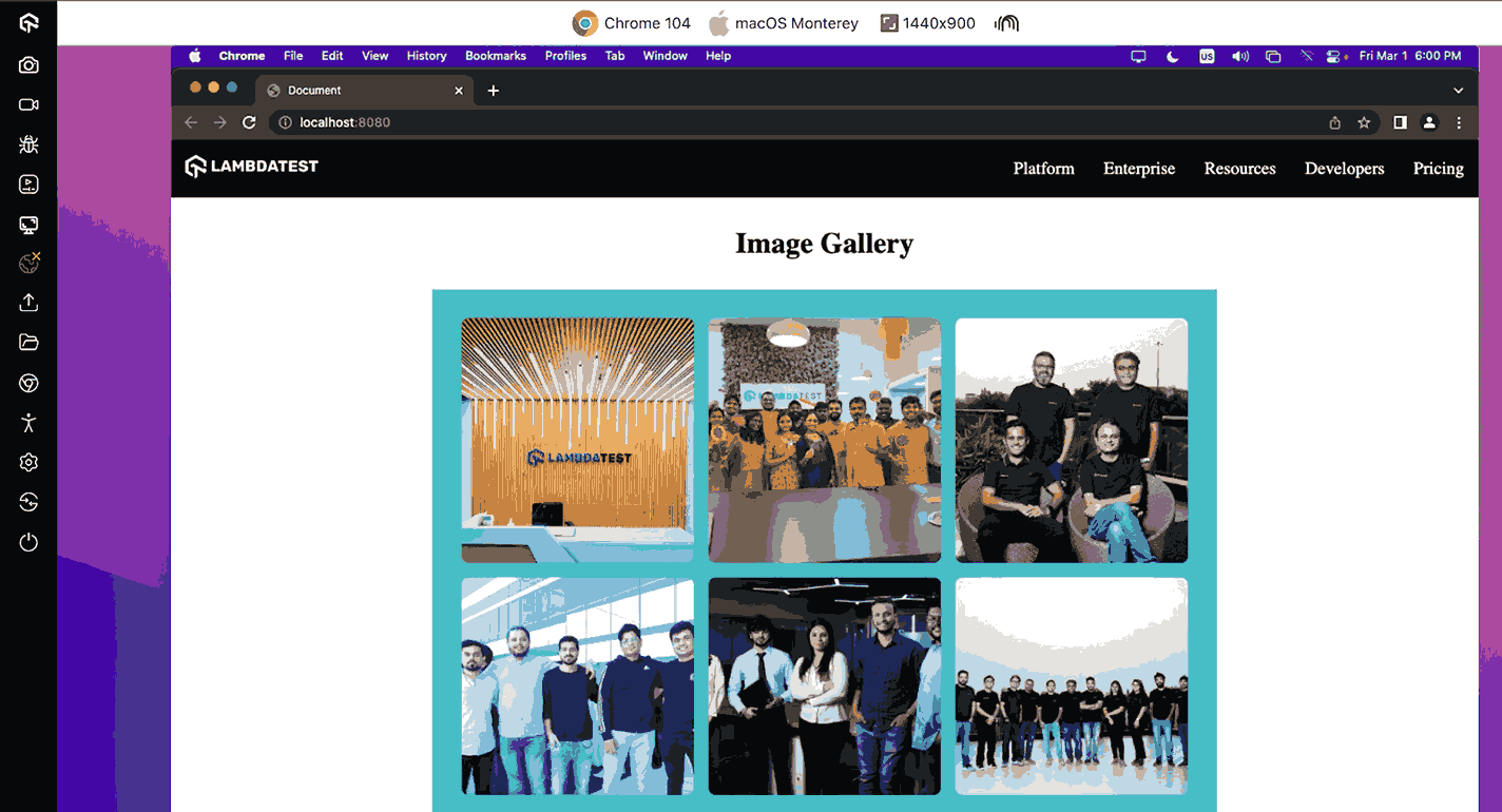
<!DOCTYPE html> <html lang="en"> <head> <meta charset="UTF-8" /> <meta name="viewport" content="width=device-width, initial-scale=1.0" /> <link rel="stylesheet" href="./style.css" /> <title>Document</title> <style></style> </head> <body> <nav> <h3> <a href="https://www.lambdatest.com/" ><img class="logo" src="https://www.lambdatest.com/resources/images/logos/logo.svg" alt="logo" /></a> </h3> <ul class="nav-items"> <li><a href="https://www.lambdatest.com/feature">Platform</a></li> <li><a href="https://www.lambdatest.com/enterprise">Enterprise</a></li> <li><a href="https://www.lambdatest.com/blog/">Resources</a></li> <li> <a href="https://www.lambdatest.com/support/docs/getting-started-with-lambdatest-automation/" >Developers</a > </li> <li><a href="https://www.lambdatest.com/pricing">Pricing</a></li> </ul> <img class="hamburger" src="https://www.lambdatest.com/blog/wp-content/themes/blog/images/sticky-humburger.png" alt="" /> </nav> <h3>Image Gallery</h3> <div class="gallery"> <img src="https://raw.githubusercontent.com/Jaypedev/LambdaTest/main/images/lambdatest%201.webp" alt="Image 1" /> <img src="https://raw.githubusercontent.com/Jaypedev/LambdaTest/main/images/lambdatest%202.webp" alt="Image 2" /> <img src="https://raw.githubusercontent.com/Jaypedev/LambdaTest/main/images/lambdatest%203.webp" alt="Image 3" /> <img src="https://raw.githubusercontent.com/Jaypedev/LambdaTest/main/images/lambdatest%204.webp" alt="Image 4" /> <img src="https://raw.githubusercontent.com/Jaypedev/LambdaTest/main/images/lambdatest%205.webp" alt="Image 5" /> <img src="https://raw.githubusercontent.com/Jaypedev/LambdaTest/main/images/lambdatest%206.webp" alt="Image 6" /> </div> </body> </html> |
The HTML code above creates a basic webpage featuring the image gallery and a navigation menu. The main content is an image gallery displayed within a <div> element, showcasing a series of images with corresponding alternate text for accessibility.
CSS:
|
1 2 3 4 5 6 7 8 9 10 11 12 13 14 15 16 17 18 19 20 21 22 23 24 25 26 27 28 29 30 31 32 33 34 35 36 37 38 39 40 41 42 43 44 45 46 47 48 49 50 51 52 53 54 55 56 57 58 59 60 61 62 63 64 65 66 67 68 69 70 71 |
body { margin: 0; padding: 0; } a { color: white; text-decoration: none; } /* nav */ nav { display: flex; justify-content: space-between; align-items: center; background-color: black; height: 3rem; padding: 0.5rem 1rem; } .nav-items { list-style: none; gap: 2rem; font-size: 1.2rem; display: flex; } .logo { filter: invert(180); } .hamburger { display: none; margin-left: 1rem; } h3 { font-size: 2rem; text-align: center; } .gallery { display: grid; grid-template-columns: repeat(auto-fill, minmax(200px, 1fr)); gap: 1rem; padding: 2rem; max-width: 800px; background-color: #56bbc6; margin: 0 auto; } .gallery img { box-sizing: border-box; width: 100%; height: 100%; object-fit: cover; border-radius: 8px; transition: transform 0.3s ease-in-out; cursor: pointer; } .gallery img:hover { transition: 1s; transform: scale(1.2); object-fit: contain; } @media screen and (max-width: 1024px) { .hamburger { display: block; } .nav-items { display: none; } } |
With the CSS, you can see the basic structure of our design. With the object-fit property, we can control how different images with different dimensions and aspect ratios fit into the given dimensions to maintain a uniform image gallery. With the cover value, irrespective of the dimensions of the different images, we have them fit into the container provided, and with the contain value, we can now see the images in their respective aspect ratios.
Also, on the right side of the image, you can see that using the contain value of the object-fit property, we can see the images in their default aspect ratio, showing the true potential of the object-fit property.
Output:
See the Pen
Image gallery : Object- fit property by Peter Ejembi (@Peter-Ejembi)
on CodePen.
Hero Image Design
Earlier, we mentioned hero images as one of the use cases where the object-fit CSS property is implemented. It is usually a big background image that is used to capture the attention of site visitors. It serves as the primary visual element and often spans the full width of the viewport, making it one of the first things visitors see when they land on a webpage.
Let’s see all this in action with this design.
HTML:
|
1 2 3 4 5 6 7 8 9 10 11 12 13 14 15 16 17 18 19 20 21 22 23 24 25 26 27 28 29 30 31 32 33 34 35 36 37 38 39 40 41 42 43 44 45 46 47 48 49 50 |
<!DOCTYPE html> <html lang="en"> <head> <meta charset="UTF-8" /> <meta name="viewport" content="width=device-width, initial-scale=1.0" /> <title>Hero Image</title> <link rel="stylesheet" href="style.css" /> </head> <body> <nav> <h3> <a href="https://www.lambdatest.com/" ><img class="logo" src="https://www.lambdatest.com/resources/images/logos/logo.svg" alt="logo" /></a> </h3> <ul class="nav-items"> <li><a href="https://www.lambdatest.com/feature">Platform</a></li> <li><a href="https://www.lambdatest.com/enterprise">Enterprise</a></li> <li><a href="https://www.lambdatest.com/blog/">Resources</a></li> <li> <a href="https://www.lambdatest.com/support/docs/getting-started-with-lambdatest-automation/" >Developers</a > </li> <li><a href="https://www.lambdatest.com/pricing">Pricing</a></li> </ul> <img class="hamburger" src="https://www.lambdatest.com/blog/wp-content/themes/blog/images/sticky-humburger.png" alt="" /> </nav> <header class="background-container"> <div class="background-text"> <h3>Hyperexecute</h3> <h2>AI-Powered Blazing Fast, End-to-End orchestration Cloud</h2> </div> <img src="https://www.lambdatest.com/resources/images/icons/banner1.webp" alt="" /> </header> </body> </html> |
From the above HTML code, we have a <header> element with a class of background-container and an image element within; the image represents the image that we will be using as our hero image.
CSS:
|
1 2 3 4 5 6 7 8 9 10 11 12 13 14 15 16 17 18 19 20 21 22 23 24 25 26 27 28 29 30 31 32 33 34 35 36 37 38 39 40 41 42 43 44 45 46 47 48 49 50 51 52 53 54 55 56 57 58 59 60 61 62 63 64 65 66 67 68 69 70 71 72 73 74 75 76 77 78 79 80 81 82 83 84 85 86 87 |
body { margin: 0; padding: 0; font-family: "Gill Sans", "Gill Sans MT", Calibri, "Trebuchet MS", sans-serif; background-color: #000000; } a { color: rgb(0, 0, 0); text-decoration: none; } /* Nav bar */ .logo { width: 180px; } nav { display: flex; justify-content: space-between; align-items: center; background-color: rgb(255, 255, 255); padding: 0rem 1rem; box-shadow: 2px 2px 10px rgb(103, 110, 111); } .nav-items { list-style: none; gap: 2rem; font-size: 1.3rem; display: flex; } .nav-items li a:hover { color: rgb(25, 173, 214); } .hamburger { display: none; margin-left: 1rem; } .background-container { width: 100vw; height: 100vh; position: relative; } .background-text { position: absolute; /* top: 0%; */ left: 50%; transform: translate(-50%, -0%); } .background-container h3 { text-transform: uppercase; text-align: center; color: rgb(55, 163, 182); margin: 1rem; letter-spacing: 3px; } .background-container h2 { font-size: 2.5rem; text-align: center; color: #fff; } .background-container img { object-fit: cover; width: 100%; height: 100%; } /* Media Queries */ @media screen and (max-width: 1024px) { .hamburger { display: block; } .nav-items { display: none; } .background-container img { object-fit: contain; } .background-container h3 { margin: 2rem; } .background-container h2 { font-size: 1.5rem; } } |
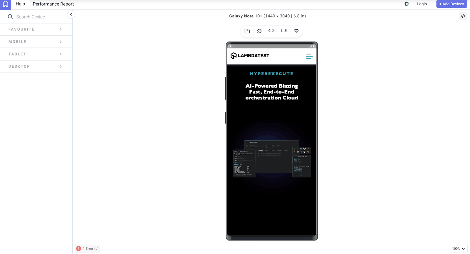
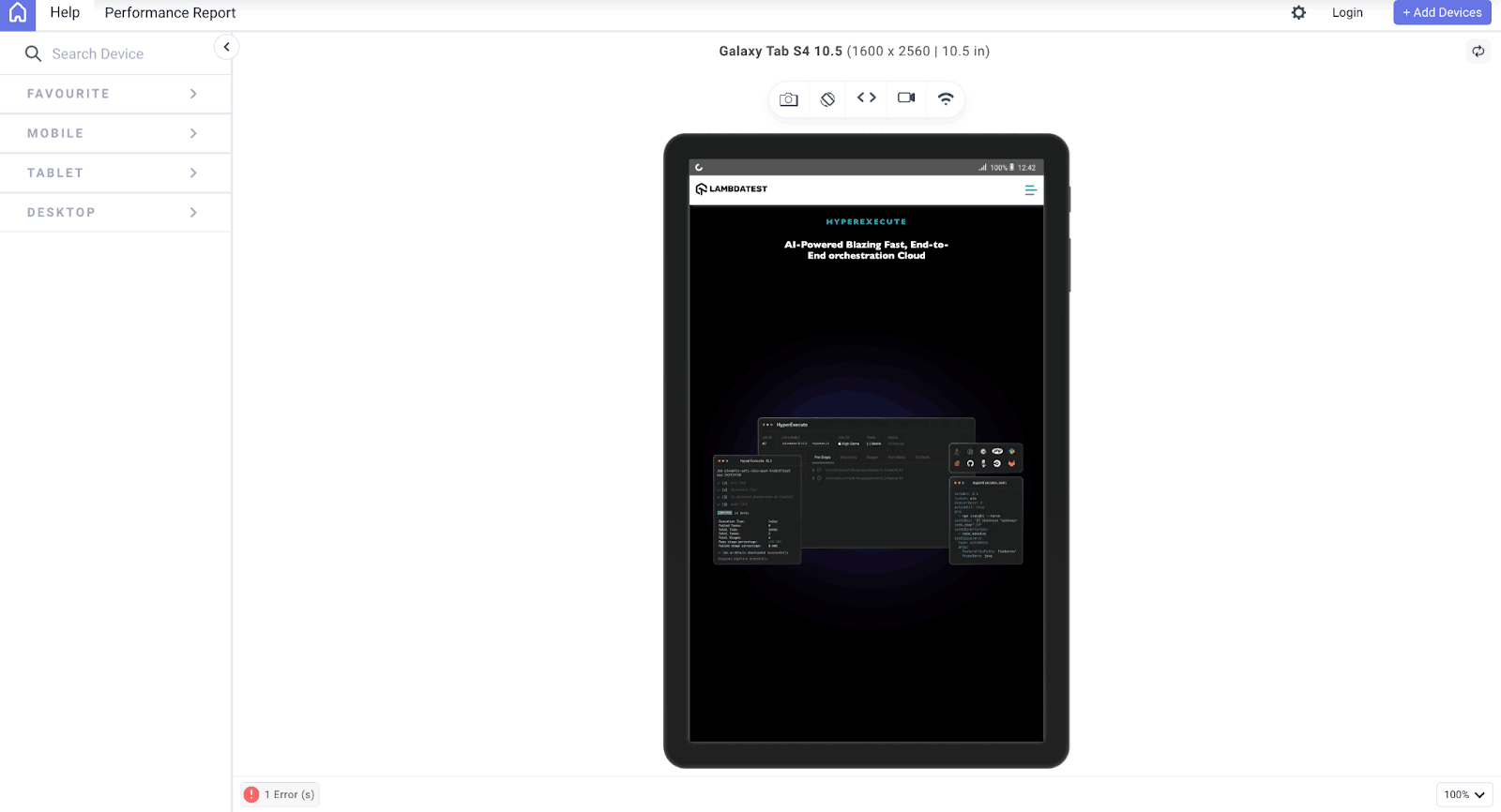
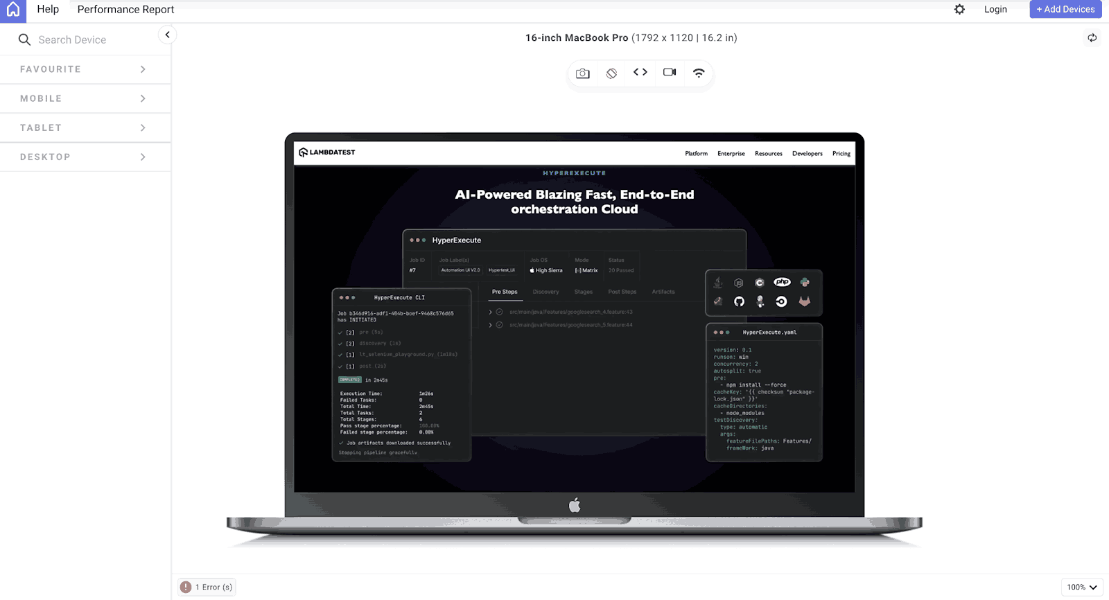
From the above CSS code, we used the object-fit property to determine how our hero image is presented. As you can see, we used the cover value for when the viewport is above 1024px and the contain property for when the viewport width is less than 1024px. This ensures that our hero image is completely responsive on different devices, no matter the dimension of the device.
Mobile:
Tablet:
Desktop:
Responsive Image and Thumbnail Design
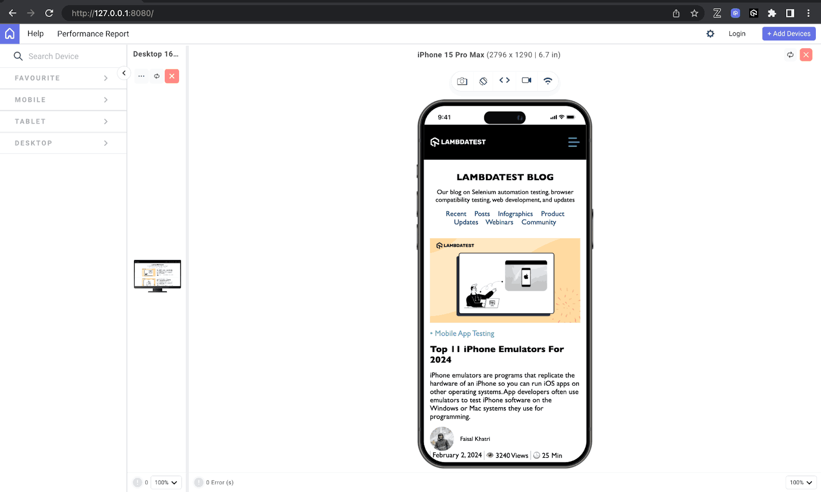
Responsive image design is yet another area where the object-fit property shines. For example, we will be looking at a simple clone of the LambdaTest Blog page, where we will recreate a somewhat similar look while using the object-fit CSS property to fit the images in their containers while maintaining responsiveness and also seeing how a large image can be converted to a thumbnail, which is a smaller version of the image, while still maintaining image integrity.
HTML:
|
1 2 3 4 5 6 7 8 9 10 11 12 13 14 15 16 17 18 19 20 21 22 23 24 25 26 27 28 29 30 31 32 33 34 35 36 37 38 39 40 41 42 43 44 45 46 47 48 49 50 51 52 53 54 55 56 57 58 59 60 61 62 63 64 65 66 67 68 69 70 71 72 73 74 75 76 77 78 79 80 81 82 83 84 85 86 87 88 89 90 91 92 93 94 95 96 97 98 99 100 101 102 103 104 105 106 107 108 109 110 111 112 113 114 115 116 117 118 119 120 121 122 123 124 125 126 127 |
<html lang="en"> <head> <meta charset="UTF-8" /> <meta http-equiv="X-UA-Compatible" content="IE=edge" /> <meta name="viewport" content="width=device-width, initial-scale=1.0" /> <title>Object fit.</title> <link rel="stylesheet" href="./style.css" /> <script defer src="./script.js"></script> </head> <body> <nav> <h3> <a href="https://www.lambdatest.com/" ><img class="logo" src="https://www.lambdatest.com/resources/images/logos/logo.svg" alt="logo" /></a> </h3> <ul class="nav-items"> <li><a href="https://www.lambdatest.com/feature">Platform</a></li> <li><a href="https://www.lambdatest.com/enterprise">Enterprise</a></li> <li><a href="https://www.lambdatest.com/blog/">Resources</a></li> <li> <a href="https://www.lambdatest.com/support/docs/getting-started-with-lambdatest-automation/" >Developers</a > </li> <li><a href="https://www.lambdatest.com/pricing">Pricing</a></li> </ul> <img class="hamburger" src="https://www.lambdatest.com/blog/wp-content/themes/blog/images/sticky-humburger.png" alt="" /> </nav> <header> <h2>LAMBDATEST BLOG</h2> <p> Our blog on Selenium automation testing, browser compatibility testing, web development, and updates </p> <p class="filter"> Recent Posts Infographics Product Updates Webinars Community </p> </header> <main> <div class="blog"> <div class="blog-image"> <img src="https://github.com/Jaypedev/LambdaTest/blob/main/images/Step-By-Step-Guide.png?raw=true" alt="" /> </div> <div class="content"> <h4 class="category"> • Web Development • LambdaTest Experiments </h4> <h3>CSS Image Resizing : Step-By-Step Guide</h3> <p> In the modern web landscape, the significance of images cannot be overstated. They enhance the aesthetic appeal of websites, captivate users by drawing their attention, convey emotions, and create a strong first impression. </p> <div class="info"> <div class="writer"> <div class="writer-image"> <img src="https://github.com/Jaypedev/LambdaTest/blob/main/images/jaypee.jpeg?raw=true" alt="" /> </div> <div class="name">Peter Ejembi</div> </div> <div class="blog-info"> <div></div> <p class="date">October 23, 2023 </p> <div></div> <p class="view">👁 63456 Views </p> <div></div> <p class="min">🕒 25 Min Read</p> </div> </div> </div> </div> <hr /> <div class="blog"> <div class="blog-image"> <img src="https://github.com/Jaypedev/LambdaTest/blob/main/images/Cracking-the-Code.png?raw=true" alt="" /> </div> <div class="content"> <h4 class="category"> • Web Development • LambdaTest Experiments •Tutorial </h4> <h3>Cracking the Code of CSS Specificity: A Developer’s Toolkit</h3> <p> Cascading Style Sheets (CSS) is the backbone behind every pixel-perfect layout, beautifully styled button, and color scheme. It is more like the system that shapes the web designs we navigate daily. </p> <div class="info"> <div class="writer"> <div class="writer-image"> <img src="https://github.com/Jaypedev/LambdaTest/blob/main/images/clinton.jpeg?raw=true" alt="" /> </div> <p class="name">Clinton Joy</p> </div> <div class="blog-info"> <div></div> <p class="date">December 5, 2023</p> <div></div> <p class="view">👁 314375 Views</p> <div></div> <p class="min">🕒 23 Min Read</p> </div> </div> </div> </div> </main> </body> </html> |
The HTML code above contains the structure and styling of a blog webpage. The webpage has a navigation bar at the top, a header, and a main section that contains two blog posts, each with an image of a different dimension, which we will use to demonstrate the object-fit property.
CSS:
|
1 2 3 4 5 6 7 8 9 10 11 12 13 14 15 16 17 18 19 20 21 22 23 24 25 26 27 28 29 30 31 32 33 34 35 36 37 38 39 40 41 42 43 44 45 46 47 48 49 50 51 52 53 54 55 56 57 58 59 60 61 62 63 64 65 66 67 68 69 70 71 72 73 74 75 76 77 78 79 80 81 82 83 84 85 86 87 88 89 90 91 92 93 94 95 96 97 98 99 100 101 102 103 104 105 106 107 108 109 110 111 112 113 114 115 116 117 118 119 120 121 122 123 124 125 126 127 128 129 130 131 132 133 134 135 136 137 138 139 140 141 142 143 144 145 146 147 148 149 150 151 152 153 154 155 156 157 158 159 160 161 162 163 164 165 166 167 168 169 170 171 172 173 174 175 176 177 178 179 180 181 182 183 |
* { margin: 0; padding: 0; } body { font-family: "Gill Sans", "Gill Sans MT", Calibri, "Trebuchet MS", sans-serif; background: #ffffff; } ul { list-style: none; } a { text-decoration: none; color: #fff; } a:hover { color: #56bbc6; } /* Navbar */ .logo { filter: invert(180); } nav { display: flex; justify-content: space-between; align-items: center; background-color: black; padding: 1.1rem; } .nav-items { list-style: none; gap: 2rem; font-size: 1.2rem; display: flex; } .hamburger { display: none; margin-left: 1rem; } header { text-align: center; margin-top: 2rem; } h2 { font-size: 2.5rem; } header p { font-size: 1.1rem; padding: 1rem; } .filter { padding: 0 1rem; word-spacing: 1rem; color: rgb(9, 63, 116); font-size: 1.2rem; } /* Main */ .blog { display: flex; gap: 3rem; padding: 2rem; max-width: 1300px; width: 100%; margin: 2rem auto; overflow: hidden; box-sizing: border-box; } .blog-image { width: 40%; } .content { width: 60%; } .blog-image img { object-fit: contain; width: 100%; height: 100%; } .category { font-size: 1.3rem; font-weight: 400; color: #56bbc6; } h3 { font-size: 2rem; font-weight: 700; padding: 1rem 0; } .content p { font-size: 1.2rem; } .info { display: flex; justify-content: space-between; align-items: center; padding: 1rem 0; width: 100%; min-width: 400px; } .writer { display: flex; align-items: center; gap: 1rem; } .writer-image { width: 4rem; height: 4rem; } .writer img { border-radius: 50%; object-fit: cover; width: 100%; height: 100%; } .blog-info { display: flex; gap: 5px; overflow-wrap: break-word; } .blog-info div { width: 2px; height: 1.5rem; background-color: rgba(71, 71, 71, 0.264); } @media screen and (max-width: 1024px) { .hamburger { display: block; } .nav-items { display: none; } main { margin: 1rem; } .blog { display: flex; flex-direction: column; gap: 3rem; max-width: 1024px; margin: 2rem auto; } .blog-image { width: 100%; } .content { width: 100%; } } @media screen and (max-width: 724px) { header h2 { font-size: 1.5rem; } .filter { /* width: 100px; */ flex-direction: column; gap: 0; } .blog { gap: 1rem; } h3 { font-size: 1.5rem; } .info { flex-direction: column; align-items: normal; } .writer { align-items: left; } } |
In our CSS, you can see that the object-fit property was used with different values for our thumbnail and response blog post image. Using the contain value on our blog post image, we made the image visible and maintained the aspect ratio, as we didn’t want the image to be distorted. However, for the writer’s image, we used the cover because we wanted the image to be completely visible without any white space.
Mobile:
Tablet:
Desktop:
See the Pen
Object-fit by Peter Ejembi (@Peter-Ejembi)
on CodePen.
Common Uses of object-fit in Web Design
In the above section of our blog, we delved into the practical application of the object-fit CSS property, shedding light on its implementation. Expanding on this discussion, let’s explore the diverse scenarios where leveraging the object-fit property proves indispensable.
Maintaining Aspect Ratio
An important quality in the application of object-fit lies in preserving the original aspect ratios of images and videos within designated containers, which we have displayed using values like none, cover, contain, and scale-down. This functionality becomes paramount in responsive design paradigms, where content must adapt to varying screen sizes and orientations without distortion.
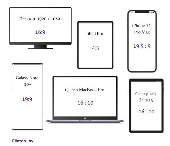
From the image above, we can see the different aspect ratios of various devices. These aspect ratios are important as they also let you know which object-fit property will be most appropriate for your design.
Preventing Overflow
The challenge of handling images or videos with disparate dimensions often leads to overflow complications, resulting in undesired cropping or stretching. The object-fit CSS property empowers us to confine content within its container boundaries, mitigating overflow while upholding the visual integrity of the assets.
Creating Consistent Image Grids
Creating grids of images with uniform dimensions presents its own set of challenges, especially when contending with images of varying sizes and aspect ratios. The object-fit property comes to the rescue by seamlessly integrating images into grid cells without disrupting the layout, fostering a more cohesive and polished design aesthetic.
Optimizing Thumbnail Display
Thumbnails serve as pivotal previews for larger images or videos, requiring meticulous resizing to fit specific dimensions sans distortion. The object-fit property facilitates this process, ensuring thumbnails retain their visual allure while conserving precious layout space.
Enhancing User Experience in Image Carousels
Image carousels serve as dynamic showcases for multiple images within constrained spaces. The object-fit CSS property gives designers granular control over how images populate the carousel, whether by covering the entire space, preserving aspect ratios, or snugly fitting without cropping. Such versatility enhances user experience by delivering seamless CSS transitions and uniform image presentation.
Dynamic Image Scaling
When it comes to dynamic web content, images often undergo size alterations based on user interactions or device characteristics. The object-fit property proves invaluable in this context. It enables designers to dynamically scale images while upholding their aspect ratios, thereby ensuring a visually pleasing and consistent experience across diverse contexts.
Flexible Video Integration
The integration of videos into web pages necessitates careful attention to layout and presentation. With object-fit property, we can showcase videos within their containers, whether by encompassing the entire space, maintaining aspect ratios, or snugly fitting without cropping. This ensures a uniform and immersive video viewing experience for users.
Tips and Tricks to Use object-fit CSS Property
In this section, There are some tips and tricks we should be aware of when considering the use of the object-fit property, from selecting the right object-fit value to optimizing the performance of our design.
Comprehensive Content Assessment
This is the process of evaluating your content, that is, your image or video, before using the object fit property. This process involves understanding the individual characteristics of our images or videos, knowing their aspect ratios and dimensions, and then considering how they should seamlessly integrate within our design framework.
Select Appropriate Values
After content assessment comes appropriate value selection. The object-fit property provides a range of values, as we have discussed. Choosing the most fitting value depends on your specific requirements. There are no specific rules to determine which values should be used for what task. Still, by having a comprehensive content assessment and evaluating our needs, we can determine the appropriate value that fits that need.
Prioritize Responsiveness
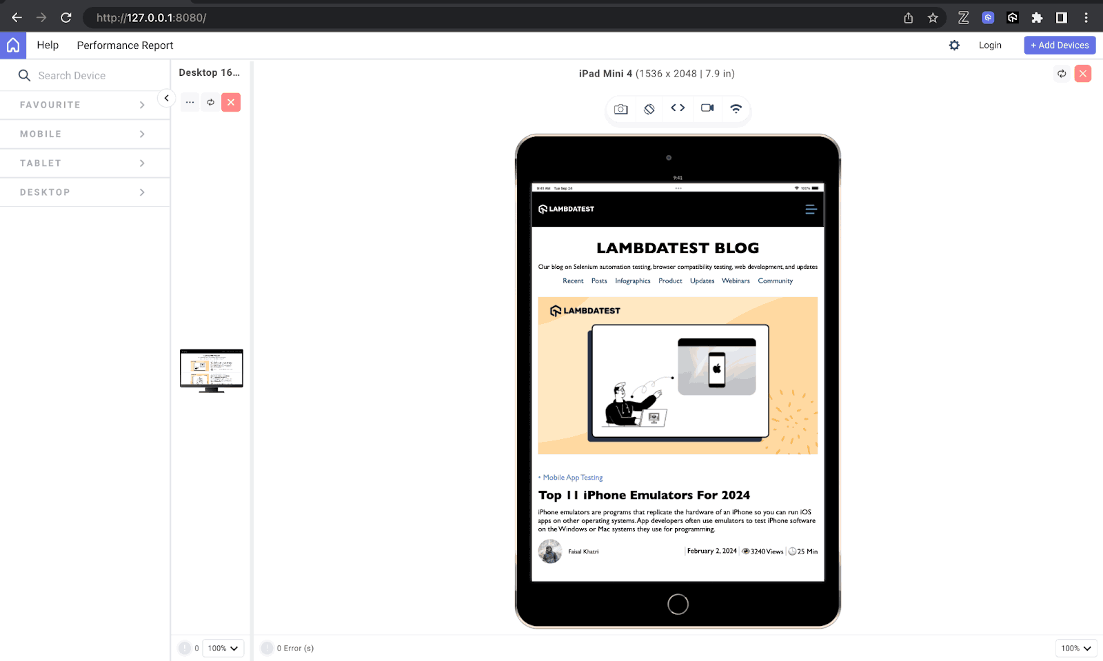
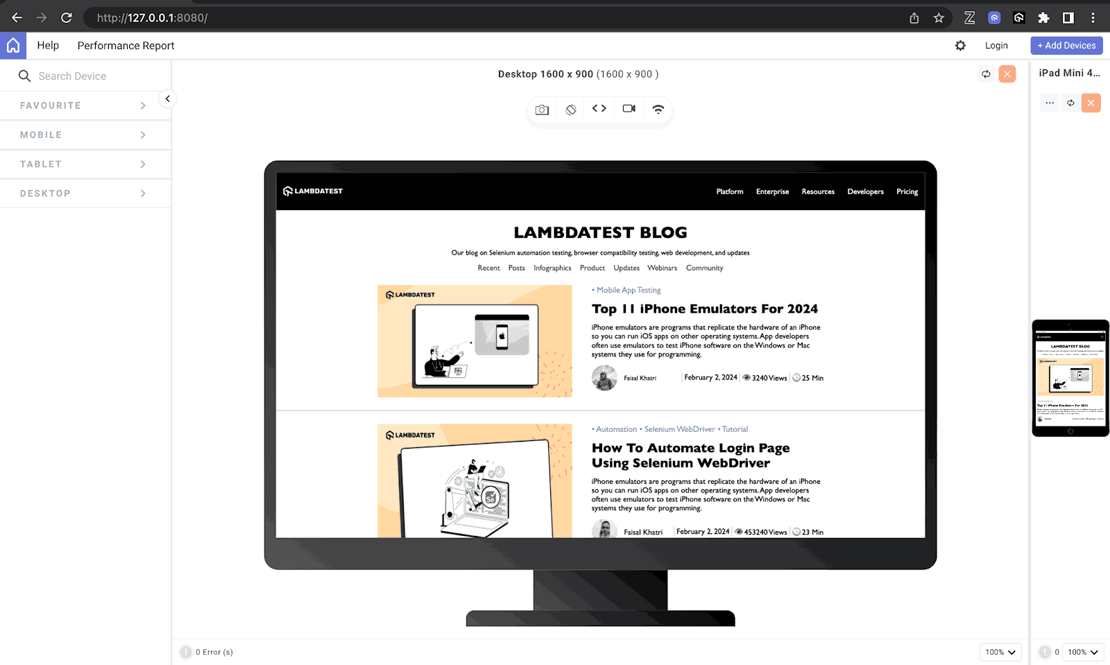
Testing is an essential part of web development, and it is no different when working with the object-fit property. As you may have noticed in our previous designs, we displayed our results across multiple devices to ensure they are presented appropriately and the behavior of object-fit remains consistent across various devices and breakpoints.
With the help of mobile site tester tools like LT Browser, you can test for responsiveness across different device viewports.

LT Browser allows you to perform responsive testing of websites and web apps that use the object-fit CSS property across 53+ pre-installed device viewports, including mobile, tablet, desktop, and laptop.
Use CSS Media Queries
We can also leverage CSS media queries to adjust object-fit settings based on screen dimensions or device characteristics. This is sometimes required because, depending on the aspect ratio of different devices, one object-fit value might not be able to serve an optimal content presentation across a spectrum of devices and viewport sizes, hence the need to carry out a responsive test and integrate media queries when needed.
To create responsive web design using media queries, refer to this blog on media queries for standard devices.
Conclusion
In this blog, we have seen how the object fit property gives us precision in controlling how our images and videos are displayed in their containers. We started by understanding the basics and then exploring the different values, like the cover, none, contain, etc., that can be used with the object-fit CSS property.
We also looked at different practical implementations of the other values using different design scenarios, like creating stunning image galleries, captivating hero images, or ensuring responsive and polished thumbnail designs, as we covered some techniques and applications for using the object-fit property.
We also discussed some common use cases of the object-fit property and gave some invaluable tips and tricks for effective utilization.
Frequently Asked Questions (FAQs)
What is object-fit in CSS?
The object-fit property in CSS controls how an image or video resizes to fit within its container element. It dictates how the content (the image or video) scales to fit the available space.
Is there an object-fit function?
There isn’t a separate object-fit function in CSS. It’s a property that you can apply directly to elements containing images or videos.
What’s the default object-fit?
The default value for object-fit is contain. This means the image or video scales to fit the container while preserving its aspect ratio. If the content’s aspect ratio doesn’t match the container’s perfectly, there will be empty space around the image or video.


Author’s Profile
Peter Junior Ejembi
Peter is passionate about crafting exceptional digital experiences through the art of web development. With a keen eye for design and a knack for transforming creative ideas into beautiful, functional websites, he is dedicated to enhancing the user’s online journey.
Blogs: 3
Got Questions? Drop them on LambdaTest Community. Visit now


