
Media Queries for Standard Devices: Complete Guide
Adarsh M
Posted On: February 20, 2024
 99350 Views
 40 Min Read
The ever-increasing use of mobile devices has reshaped user behavior, raising expectations for seamless experiences regardless of screen size. To achieve a seamless responsive experience, developers follow many strategies, such as mobile-first design, progressive web apps, and single-page applications. While these approaches are beneficial to some extent, it is also important to consider the viewport, screen resolutions, and other device types.
One way to focus on particular viewports, screen resolutions, and device features is by using CSS media queries for standard devices. Media queries allow us to apply styles that suit specific viewport sizes.
In this tutorial, we will walk you through all the aspects and provide you with a thorough understanding of how media queries work in detail. We will explore how to use media queries for standard devices and breakpoints, allowing you to create responsive designs that adapt seamlessly across various screen sizes.
TABLE OF CONTENTS
- Why Responsive Web Design Matters?
- What are Media Queries for Standard Devices?
- Common Device Breakpoints
- Benefits of CSS Media Queries for Standard Devices
- Getting Started: Media Queries for Standard Devices
- Using LT Browser to Test Media Queries for Standard Devices
- Best Practices for Using Media Queries for Standard Devices
- Frequently Asked Questions (FAQs)
Why Responsive Web Design Matters?
Web applications bridge the gap between businesses and a global audience. Every user wishes to have a seamless experience throughout the application, and according to web credibility research, more than 75% of customers admit to judging an organization’s credibility based on the design of their website.
Developers are encountering a substantial rise in workload due to the rapid growth of mobile devices with varying sizes, resolutions, and other aspects. With the ever-growing variety of devices, it becomes essential for developers to craft websites and mobile applications that offer a seamless user experience across all devices.
The rise of innovative smartphones like foldable, curved display, and rollable devices introduces complexity. Adhering to responsive design principles becomes essential to ensure seamless user experiences across these unique display sizes and form factors.
Responsive design in CSS is the fundamental pillar of modern web design. Responsive websites ensure that potential customers don’t encounter frustrating navigation issues or content misalignments when accessing your platform on different devices.
An enhanced user experience leads to higher engagement, reduces bounce rates, and increases conversion rates. Users who can easily browse and interact with your content are likely to stay on your site longer, explore your offerings, and make purchases.
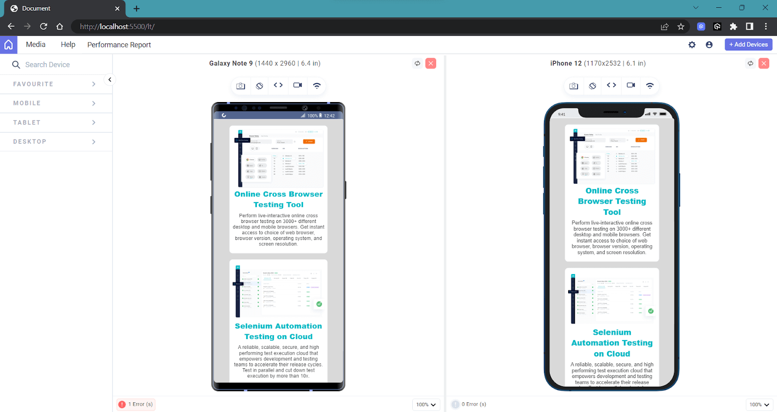
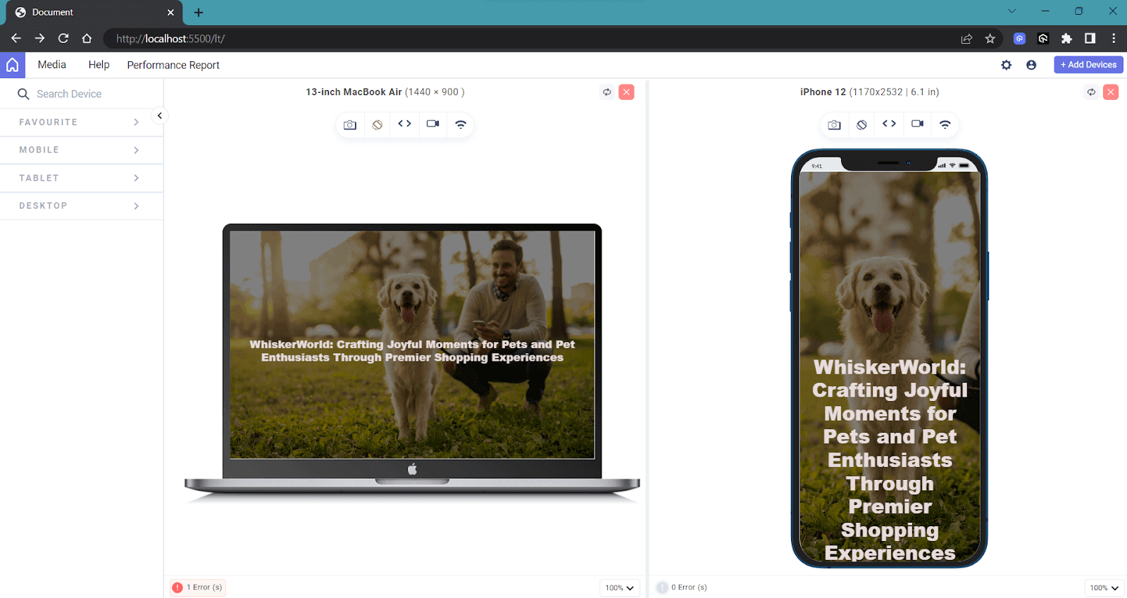
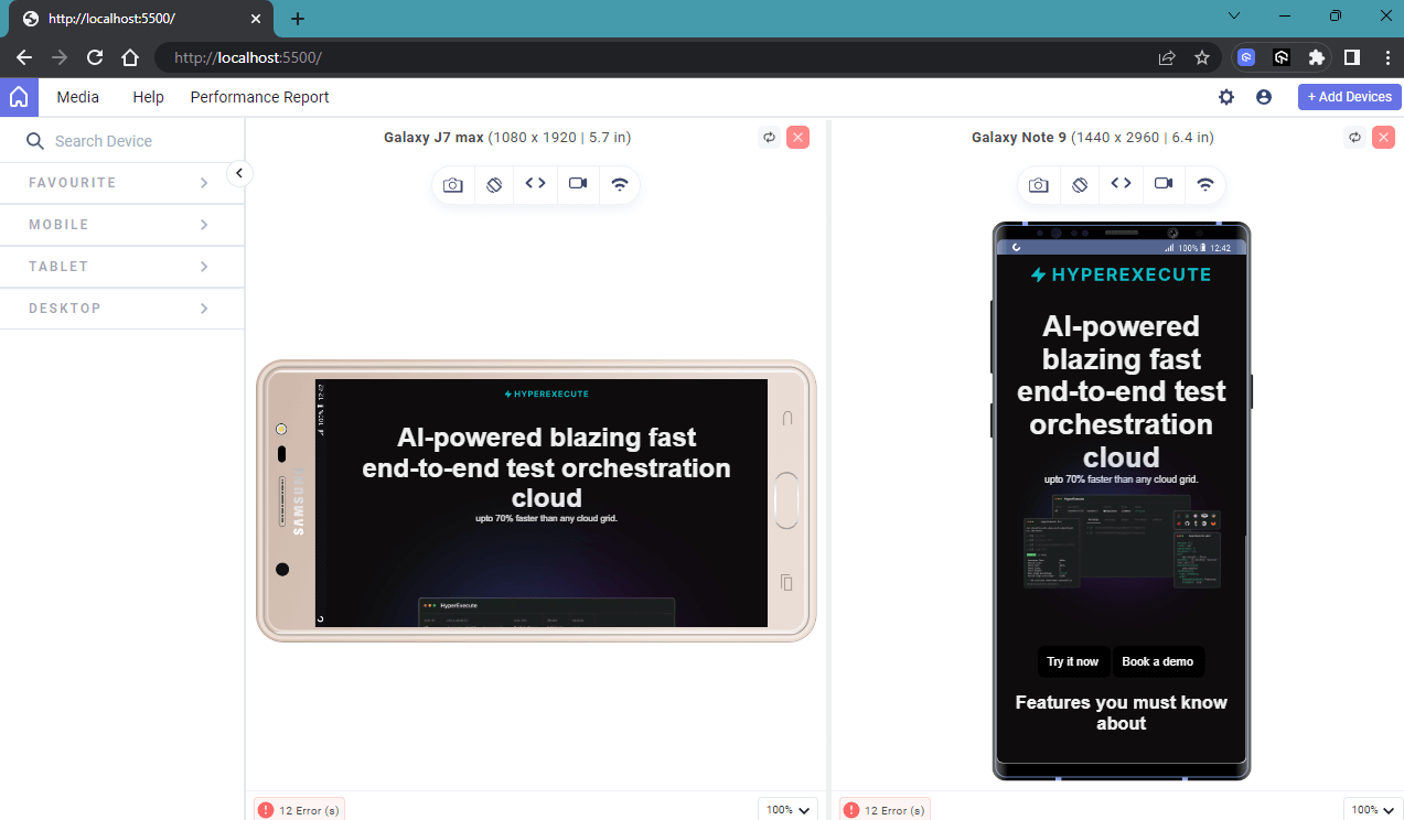
End users never want a website that looks non-responsive and has broken content, just like this example.
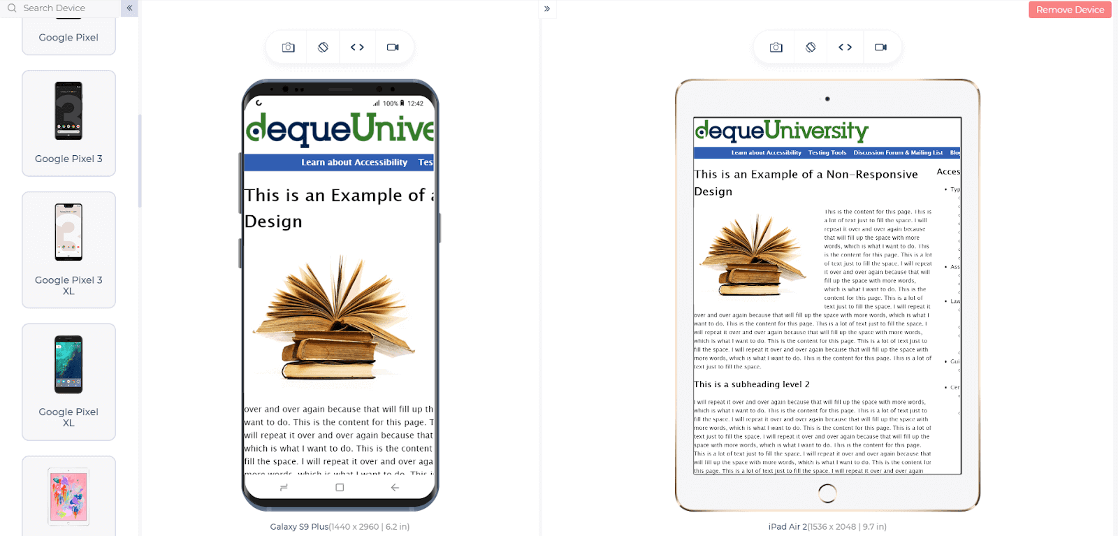
We used LT Browser to check the responsiveness on mobile and tablet viewports. It is a developer-friendly browser that tests responsive websites across different screen sizes.
They want a consistent user experience throughout the entire website, regardless of the variety of devices they use to access it. Whether browsing on smartphones, tablets, laptops, or desktop computers, they expect the website to adapt seamlessly to their screen size and resolution.
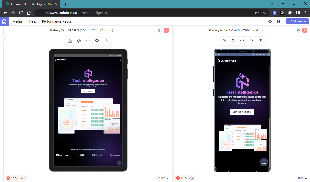
For example, the webpage below looks much better as it adapts well to different viewports.
Today, responsiveness goes beyond tweaking font sizes or colors. It’s all about giving you, the user, a better experience. For instance, when you visit your favorite shopping app on a larger device, it treats you with a visually appealing carousel of the latest fashion trends and stylish product images in a neat grid layout.
Now, switch to shopping on the same website but on your smartphone. The magic happens – the website instantly adjusts to fit your tiny mobile screen. The big carousel eventually becomes a touch-friendly slider, letting you effortlessly swipe through the latest trends.
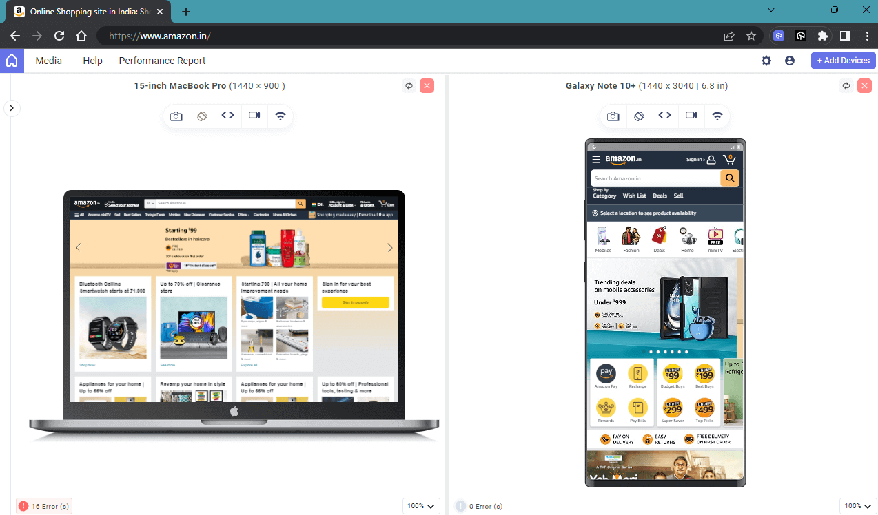
You can see that the same website shows different content with respect to its viewport. In the same way, we can adjust the look and feel of the web application to ensure a consistent user experience, regardless of the device viewport.
When a website is responsive, it means it can adapt and display properly on various devices, including desktop computers, tablets, and mobile phones. This can also contribute to Search Engine Optimization, and it is a critical factor in SEO rankings, as mobile-friendliness is now a significant consideration for search engines like Google.
Google predominantly uses the mobile version of a website for indexing and ranking in search results. If your site is not mobile-friendly, it may not rank as high in search results, resulting in reduced organic traffic.
All these accounts for the fact that we cannot compromise on the responsiveness of a website. Responsive websites can increase conversion rates and customer satisfaction, as visitors can easily navigate and interact with the content. CSS media queries for standard devices enable responsive web design, allowing us to target specific viewports for optimal user experiences.
What are Media Queries for Standard Devices?
Media queries are a feature in CSS in which the content adapts to follow certain styles or rules based on specific conditions or characteristics of the user’s device or viewport. Media rules were introduced with CSS3, aiming to create responsive web designs that adapt to different devices and screen sizes.
With the help of media queries for standard devices, we can create a custom set of styles based on conditions regarding width, height, aspect ratio, resolution, or any other device-specific features. This allows the website to adapt according to various devices, providing an optimal layout and user experience for each screen type.
Most of the time, we rely on CSS Grid and CSS Flexbox to create custom layouts. They have revolutionized how we design web pages, allowing us to develop complex and responsive designs efficiently.
However, even with the advantages offered by CSS Grids and Flexbox, there are instances where additional fine-tuning is necessary, especially for smaller viewports such as those on mobile devices and tablets.
By using media queries for standard devices, we can define specific rules that trigger changes in the layout and styling of a website based on the screen size or other characteristics of the user’s device.
Let’s take an example. We use the flex-wrap property to wrap the flex items into multiple rows, allowing content to flow smoothly and preventing overcrowding on narrower screens.
HTML:
|
1 2 3 4 5 6 7 8 9 10 11 12 13 14 15 16 17 18 19 20 21 22 23 24 25 26 27 28 29 30 31 32 33 34 35 36 37 38 39 40 41 42 43 44 45 46 47 48 49 50 51 52 53 54 55 56 57 58 |
<!DOCTYPE html> <html lang="en"> <head> <meta charset="UTF-8" /> <meta name="viewport" content="width=device-width, initial-scale=1.0" /> <title>Document</title> <link rel="stylesheet" href="index2.css" /> </head> <body> <div class="wrapper"> <div class="cards"> <img src="https://www.lambdatest.com/resources/images/real-time-browsers.png" /> <h1>Online Cross Browser Testing Tool</h1> <p> Perform live-interactive online cross browser testing on 3000+ different desktop and mobile browsers. Get instant access to choice of web browser, browser version, operating system, and screen resolution. </p> </div> <div class="cards"> <img src="https://www.lambdatest.com/resources/images/automation/selenium-parallel-testing.png" /> <h1>Selenium Automation Testing on Cloud</h1> <p> A reliable, scalable, secure, and high performing test execution cloud that empowers development and testing teams to accelerate their release cycles. Test in parallel and cut down test execution by more than 10x. </p> </div> <div class="cards"> <img src="https://www.lambdatest.com/resources/images/cypress-browser-testing.png" /> <h1>Cypress Automation Testing Online</h1> <p> Run end-to-end tests on a blazing fast Cypress test execution cloud. A reliable, scalable, secure and high performing test execution platform built for scale. Test on 40+ different browser and browser versions including headless versions. </p> </div> </div> </body> </html> |
CSS:
|
1 2 3 4 5 6 7 8 9 10 11 12 13 14 15 16 17 18 19 20 21 22 23 24 25 26 27 28 29 30 31 32 33 34 35 36 37 38 39 40 41 42 43 44 45 46 47 48 49 50 51 52 53 54 55 56 57 58 59 60 61 62 63 |
* { margin: 0; padding: 0; box-sizing: border-box; font-family: "Roboto", sans-serif; background-color: transparent; cursor: pointer; } body { background-color: #0c0101; color: #333; } .cards { display: flex; flex-direction: column; justify-content: center; align-items: center; width: 30%; background-color: #ffffff; padding: 10px; margin: 10px; border-radius: 10px; } .cards > img { width: 100%; height: 100%; object-fit: cover; border-radius: 10px; } .cards > h1 { font-size: 24px; font-weight: 800; text-align: center; color: #0ebac5; } .cards > p { font-size: 16px; font-weight: 400; margin: 10px 0; text-align: center; } .wrapper { display: flex; flex-wrap: wrap; justify-content: center; align-items: center; width: 100%; height: 100%; padding: 10px; } @media screen and (max-width: 1024px) { .cards { width: 80%; } } |
Here you can see that the cards take around 30% width on larger devices and around 80% width on smaller devices. We use media queries for standard devices to achieve that, along with the flex-wrap property, so that the content is displayed in a user-friendly manner.
Desktop Preview:
Mobile Preview:
Alternatively, we can change the flex-direction to column on small devices using media queries to achieve the same output more effectively. Combining CSS Grids, CSS Flexbox, and media queries for standard devices helps frontend developers build versatile and user-friendly interfaces for various device viewports.
Common Device Breakpoints
Before we learn about breakpoints, you must know the difference between viewport and window dimensions to understand how media queries for standard devices work.
Differences: Viewport and Browser Window Dimensions
- Viewport Dimensions: Viewport dimension is the actual visible area of a web page within the browser window. It represents the portion of the web page that users can see without scrolling. Responsive web design uses these viewport dimensions to adjust the layout and styles of the web page to fit within the available screen space.
- Browser Window Dimensions: Browser window dimensions represent the total width and height of the browser window, including the viewport and any additional browser elements such as bookmarks, address bars, navigation buttons, and scrollbars.
Let’s see an example of how viewports work.
The code for the above HTML file is as follows:
HTML:
|
1 2 3 4 5 6 7 8 9 10 11 12 13 14 15 16 17 18 19 20 21 22 23 24 25 26 27 28 29 30 31 32 33 34 35 36 37 38 39 40 41 42 43 44 45 46 47 48 49 50 51 52 53 54 55 56 57 58 59 60 61 62 63 64 65 66 67 |
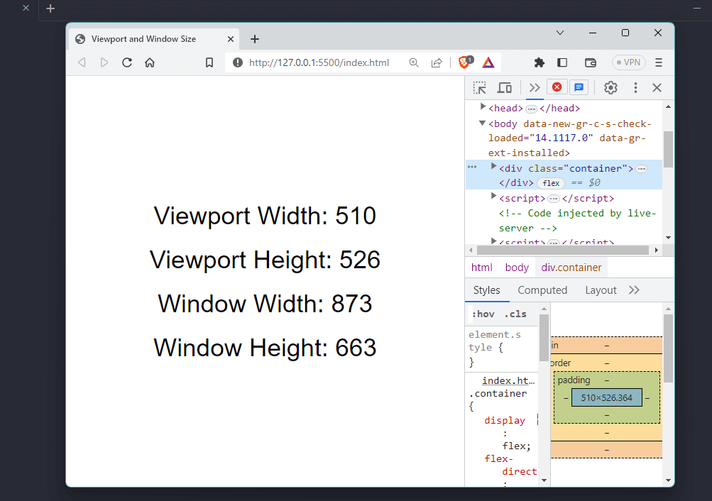
<!DOCTYPE html> <html lang="en"> <head> <meta charset="UTF-8" /> <title>Viewport and Window Size</title> <style> body { margin: 0; padding: 0; font-family: sans-serif; } .container { display: flex; flex-direction: column; align-items: center; justify-content: center; height: 100vh; } .container > div { margin: 10px; } .container > div > span { font-size: 2rem; } </style> </head> <body> <div class="container"> <div> <span>Viewport Width: </span> <span id="viewport-width"></span> </div> <div> <span>Viewport Height: </span> <span id="viewport-height"></span> </div> <div> <span>Window Width: </span> <span id="window-width"></span> </div> <div> <span>Window Height: </span> <span id="window-height"></span> </div> </div> <script> const viewportWidth = document.getElementById("viewport-width"); const viewportHeight = document.getElementById("viewport-height"); const windowWidth = document.getElementById("window-width"); const windowHeight = document.getElementById("window-height"); function setViewportSize() { viewportWidth.textContent = window.innerWidth; viewportHeight.textContent = window.innerHeight; windowWidth.textContent = window.outerWidth; windowHeight.textContent = window.outerHeight; } window.addEventListener("resize", setViewportSize); setViewportSize(); </script> </body> </html> |
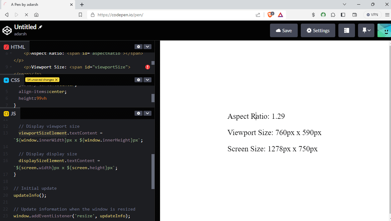
As you can see, what’s interesting here is that we have to focus on the viewport size rather than the actual window size because our goal is to make the website look responsive in all viewports. You can use this code to resize your browser and see how viewport width and height values are changed.
The viewport is not a fixed value for any device, and it can change based on various factors, including
- Device Screen Size: Different devices, such as smartphones, tablets, laptops, and desktops, have varying screen sizes. The viewport adjusts to fit the screen size of the device.
- Orientation: Devices can be used in both portrait and landscape orientations. When a user switches from portrait to landscape, the viewport’s dimensions change accordingly.
- Browser Window Size: The viewport size can change on desktop browsers if the user resizes the browser window. This can affect how the web content is displayed and the application of responsive design principles.
To obtain the current dimensions of the viewport in JavaScript, you can use the window.innerWidth property to get the width and the window.innerHeight property to get the height.
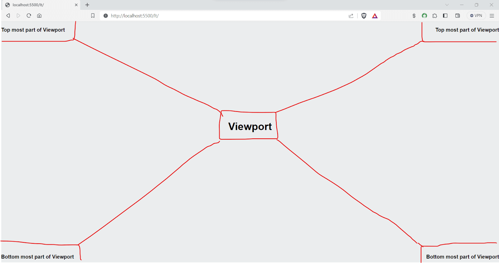
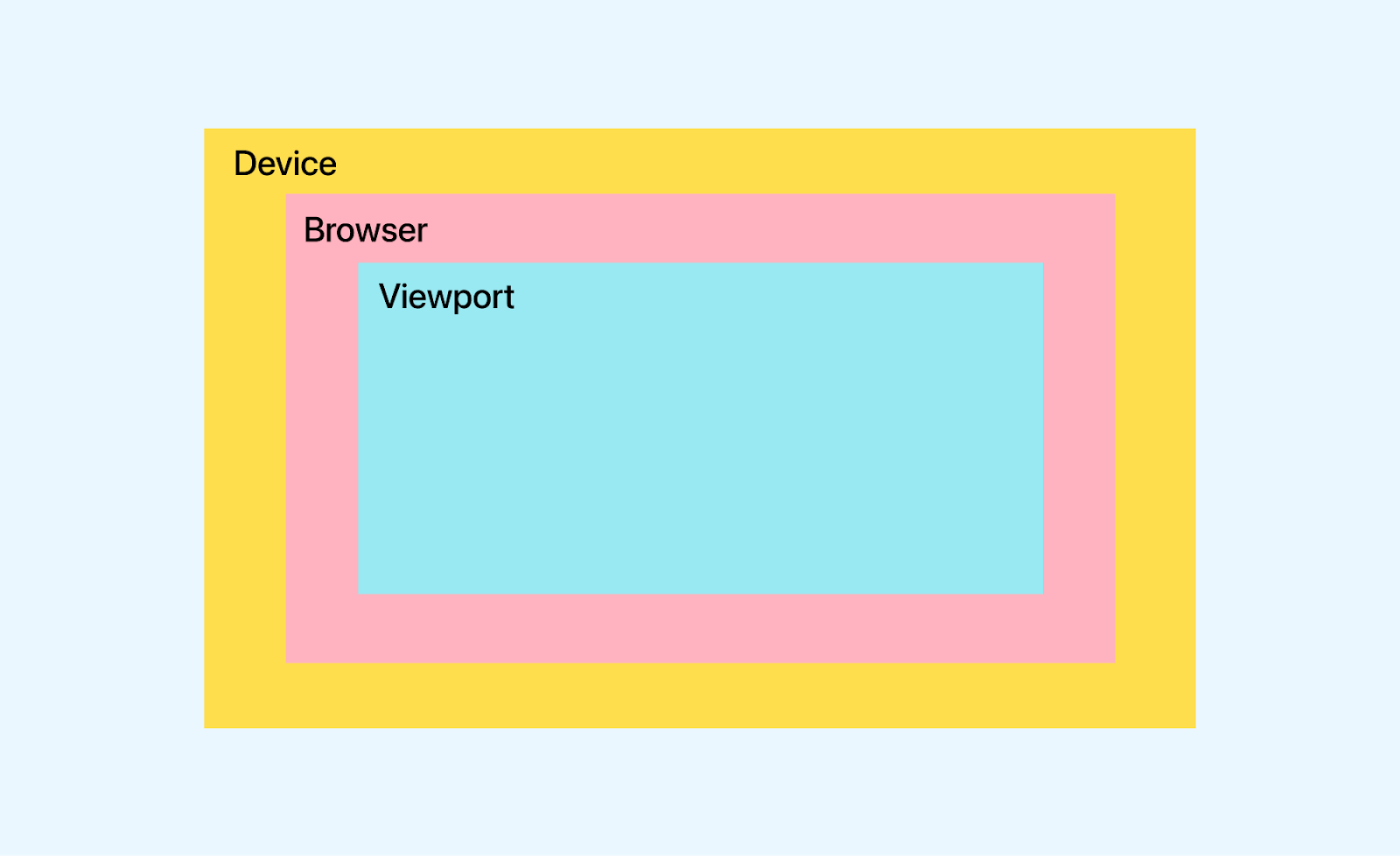
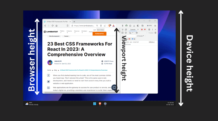
The image below shows the differentiation between browser, device, and viewport heights.
A typical mobile-optimized site contains the following line of code, which calculates the viewport and automatically adjusts the website elements to scale accordingly.
|
1 |
<meta name="viewport" content="width=device-width, initial-scale=1" /> |
Mobile browsers display pages in a virtual viewport around 980px wide, wider than the screen, and then scale it down for full visibility. Users can zoom and pan for different parts of the page.
For instance, a site might be displayed in a 980px virtual viewport on a 320px-wide screen, making it hard to read. The above meta tag specifies the browser to use the viewport width instead of the default 980px as the screen’s width.
Key Attributes of the < meta > Viewport Tag
Let’s discuss in detail the key attributes of the < meta > viewport tag.
- Width: The width property is used to control the viewport’s size, and it can be specified in pixels (e.g., width=600) or set to device-width to fit the entire viewport width (100vw or 100% width).
- Height: The height property in the viewport meta tag controls the size of the viewport. It can be set to a specific number of pixels, like height=500, or you can use device-height to match 100vh or 100% of the viewport height.
- Initial Scale: The initial scale attribute in the viewport meta tag determines the default zoom level when the web page is first loaded. It helps ensure the content is displayed appropriately, providing a comfortable and readable view for users without requiring them to zoom in or out manually.
- Minimum Scale: With the minimum scale attribute, you can define the smallest allowed zoom level during user interaction. By setting this property, you can prevent users from zooming out too much, ensuring the content remains readable and avoiding potential visual distortions.
- Maximum Scale: The maximum scale attribute lets you specify the maximum allowed zoom level when users interact with the web page. Setting this property helps maintain the website’s visual integrity and prevents excessive zooming, ensuring the content doesn’t become pixelated or stretched beyond its intended design.
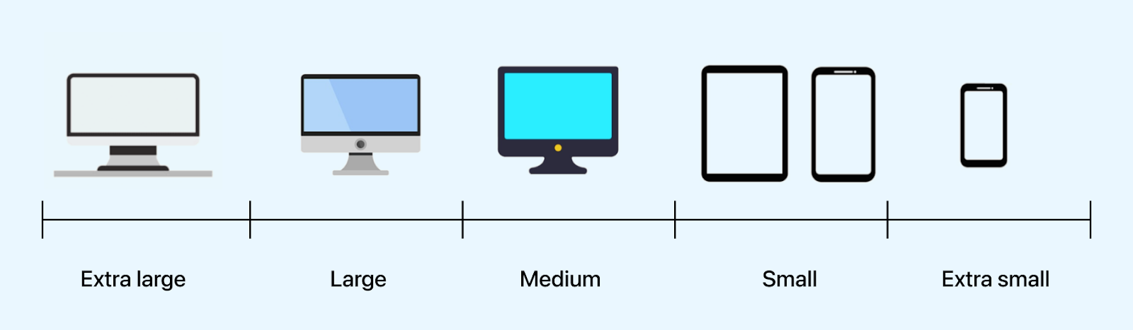
- Extra Large Screen: These devices have widths in the range of 1200px and 1920px (or greater) and usually have higher resolutions and larger screens, offering a more expansive viewing area than smaller devices like smartphones.
- Large Screen: These devices have viewport widths in the range of 1024px to 1200px. These devices are typically the personal laptops that you use.
- Medium Devices: These devices have viewport widths in the range of 768px and 1024px. This category includes larger smartphones, tablets, and some smaller laptops.
- Small Devices: These devices have viewport widths in the range of 480px and 768px. This category includes most modern smartphones and smaller tablets.
- Extra Small Devices: These devices have viewport widths in the range of up to 480px. This category includes small smartphones and older feature phones.
We often use width=”device-width” in the < viewport > meta tag. This value allows the website’s content to automatically adjust to the width of the user’s device, regardless of the screen size or resolution.
Syntax:
|
1 2 3 4 5 6 7 8 9 10 11 12 13 14 15 16 17 18 |
<!-- Set the width to a specific number of pixels --> <meta name="viewport" content="width=600"> <!-- Fit the entire viewport width (100vw or 100% width) --> <meta name="viewport" content="width=device-width"> <!-- Set the width to the width of the device screen in CSS pixels --> <meta name="viewport" content="width=screen-width"> <!-- Set the width to the width of the layout viewport in CSS pixels --> <meta name="viewport" content="width=layout-width"> <!-- Set the width to device width and disable zooming --> <meta name="viewport" content="width=device-width, user-scalable=no"> |
The default height in the viewport meta tag is indeed set to device-height, and it is less likely to change it to a specific pixel value.
Syntax:
|
1 2 3 4 5 6 7 8 9 10 11 12 13 14 15 16 17 18 |
<!-- Set the height to a specific number of pixels --> <meta name="viewport" content="height=800"> <!-- Fit the entire viewport height (100vh or 100% height) --> <meta name="viewport" content="height=device-height"> <!-- Set the height to the height of the device screen in CSS pixels --> <meta name="viewport" content="height=screen-height"> <!-- Set the height to the height of the layout viewport in CSS pixels --> <meta name="viewport" content="height=layout-height"> <!-- Set both width and height and disable user scaling --> <meta name="viewport" content="width=device-width, height=device-height, user-scalable=no"> |
Syntax:
|
1 2 |
<!-- Set initial scale to 1.0 (no initial zoom) --> <meta name="viewport" content="initial-scale=1.0"> |
Syntax:
|
1 2 |
<!-- Set minimum scale to a specific value (e.g., 0.8) --> <meta name="viewport" content="minimum-scale=0.8"> |
|
1 2 |
<!-- Set maximum scale to 2.0 (allow zooming in up to twice the original size) --> <meta name="viewport" content="maximum-scale=2.0"> |
Now, let’s look into some commonly used device breakpoints.
Syntax:
|
1 2 3 |
@media (min-width: 1200px) and (max-width: 1920px) { /* CSS styles for devices with widths between 1200px and 1920px (inclusive) */ } |
Let’s look into an example.
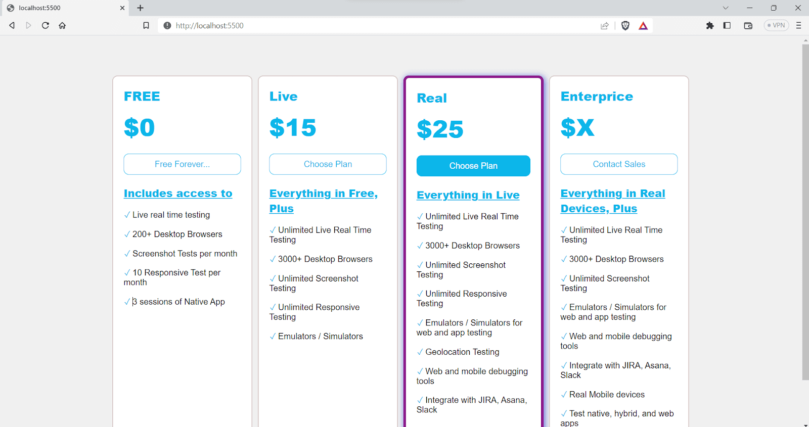
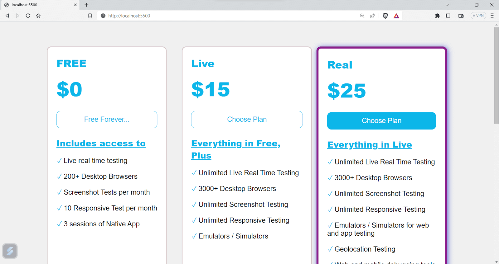
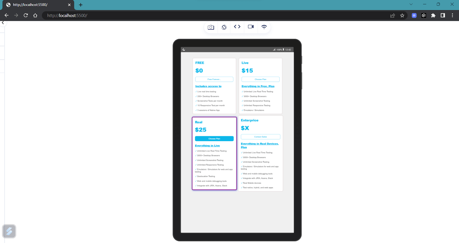
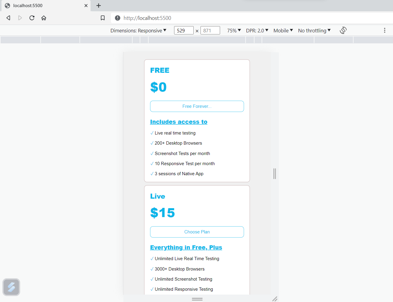
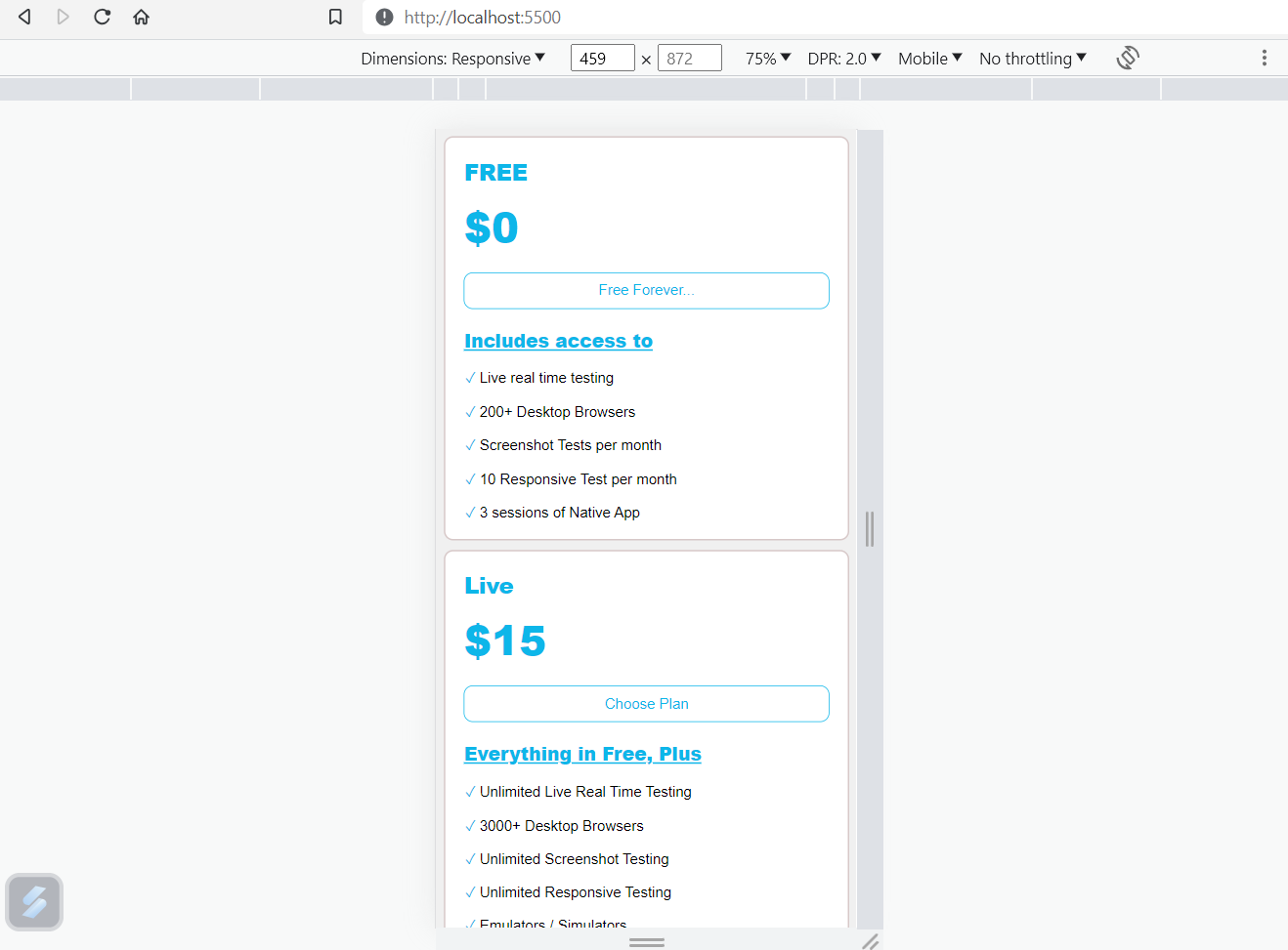
Example: Suppose we have a pricing page, and we want to display different pricing plans. On large-screen devices, we aim to show all four plans using grid template columns. Additionally, we can utilize media queries for standard devices that trigger when the viewport width goes below 1200 pixels to ensure a responsive layout.
HTML:
|
1 2 3 4 5 6 7 8 9 10 11 12 13 14 15 16 17 18 19 20 21 22 23 24 25 26 27 28 29 30 31 32 33 34 35 36 37 38 39 40 41 42 43 44 45 46 47 48 49 50 51 52 53 54 55 56 57 58 59 60 61 62 63 64 65 66 67 68 69 70 71 72 73 74 75 76 77 78 79 80 81 82 83 84 85 86 87 |
<!DOCTYPE html> <html> <head> <meta name="viewport" content="width=device-width, initial-scale=1.0" /> <link rel="stylesheet" href="index.css" /> </head> <body> <div class="grid-container"> <div class="item"> <h2>FREE</h2> <p class="price">$0</p> <button>Free Forever...</button> <p class="features">Includes access to</p> <ul> <li>Live real time testing</li> <li>200+ Desktop Browsers</li> <li>Screenshot Tests per month</li> <li>10 Responsive Test per month</li> <li>3 sessions of Native App Testing on Emulators/Simulators</li> </ul> </div> <div class="item"> <h2>Live</h2> <p class="price">$15</p> <button>Choose Plan</button> <p class="features">Everything in Free, Plus</p> <ul> <li>Unlimited Live Real Time Testing</li> <li>3000+ Desktop Browsers</li> <li>Unlimited Screenshot Testing</li> <li>Unlimited Responsive Testing</li> <li>Emulators / Simulators for web and app testing</li> </ul> </div> <div class="item common"> <h2>Real</h2> <p class="price">$25</p> <button>Choose Plan</button> <p class="features">Everything in Live</p> <ul> <li>Unlimited Live Real Time Testing</li> <li>3000+ Desktop Browsers</li> <li>Unlimited Screenshot Testing</li> <li>Unlimited Responsive Testing</li> <li>Emulators / Simulators for web and app testing</li> <li>Geolocation Testing</li> <li>Web and mobile debugging tools</li> <li>Integrate with JIRA, Asana, Slack</li> </ul> </div> <div class="item"> <h2>Enterprice</h2> <p class="price">$X</p> <button>Contact Sales</button> <p class="features">Everything in Real Devices, Plus</p> <ul> <li>Unlimited Live Real Time Testing</li> <li>3000+ Desktop Browsers</li> <li>Unlimited Screenshot Testing</li> <li>Emulators / Simulators for web and app testing</li> <li>Web and mobile debugging tools</li> <li>Integrate with JIRA, Asana, Slack</li> <li>Real Mobile devices</li> <li>Test native, hybrid, and web apps</li> </ul> </div> </div> </body> </html> |
CSS:
|
1 2 3 4 5 6 7 8 9 10 11 12 13 14 15 16 17 18 19 20 21 22 23 24 25 26 27 28 29 30 31 32 33 34 35 36 37 38 39 40 41 42 43 44 45 46 47 48 49 50 51 52 53 54 55 56 57 58 59 60 61 62 63 64 65 66 67 68 69 70 71 72 73 74 75 76 77 78 79 80 81 82 83 84 85 86 87 88 89 90 91 92 93 94 95 96 97 98 99 100 101 102 103 104 105 106 107 108 109 110 111 112 113 114 115 116 117 118 119 120 121 122 123 124 |
body { background-color: #f0f0f0 !important; font-family: "Roboto", sans-serif; background-color: transparent; cursor: pointer; margin: 5%; } .grid-container { width: 80%; display: grid; grid-template-columns: 1fr 1fr 1fr 1fr; /* Three columns in a row */ gap: 10px; /* Gap between grid items */ margin: auto !important; } .item { background-color: #ffffff; text-align: left; font-size: 18px; border: 2px solid rgb(215, 200, 200); border-radius: 10px; padding: 20px; max-width: fit-content; } .item > h2 { font-size: 24px; font-weight: 800; color: rgb(13, 182, 233); margin: auto; } .item > button { background-color: rgb(255, 255, 255); color: rgb(13, 182, 233); padding: 10px; border-radius: 10px; border: 1px solid rgb(13, 182, 233); cursor: pointer; font-size: 16px; font-weight: 400; margin: 10px 0; text-align: center; width: 100%; } .item > button:hover { background-color: rgb(13, 182, 233); color: rgb(255, 255, 255); transition: cubic-bezier(0.075, 0.82, 0.165, 1); } .common { font-size: 16px; font-weight: 400; text-align: left; border: 5px solid rgba(133, 17, 133, 0.942); box-shadow: 2px 2px 12px rgb(89, 101, 211); } .common > button { background-color: rgb(13, 182, 233); color: rgb(255, 255, 255); } .item > ul { list-style-type: none; margin: 0px; padding: 0; width: 100%; } .item > ul > li { font-size: 16px; font-weight: 400; text-align: left; margin-top: 15px; } .item > .features { font-size: 20px; font-weight: 800; margin: 10px 0; text-align: left; color: rgb(13, 182, 233); text-decoration: underline; } .item > ul > li::before { content: "✓"; color: rgb(13, 182, 233); display: inline-block; width: 1em; margin-left: 1px; } .item > .price { font-size: 45px; font-weight: 800; margin: 10px 0; text-align: left; color: rgb(13, 182, 233); } /* Media Query for Tablets (max-width: 768px) */ @media screen and (max-width: 768px) { .grid-container { grid-template-columns: 1fr 1fr; /* Two columns in a row */ } } /* Media Query for Mobile Phones (max-width: 480px) */ @media screen and (max-width: 1200px) { .grid-container { grid-template-columns: 1fr 1fr 1fr; /* One column in a row */ } } |
You can see in the output below that we have four columns when the viewport width is greater than 1200px.
Output:
When the viewport width gets below 1200px, a custom media rule comes into effect, requiring us to display three columns instead of four. The fourth item will be moved to the first column of the next row as we now have three columns instead of four columns.
See the Pen
Untitled by adarsh (@adarsh-gupta101)
on CodePen.
In the same way, we can adjust the appearance for all the common device breakpoints. Alternatively, we can use another approach called content-based breakdown, which will be covered in the upcoming sections.
Syntax:
|
1 2 3 |
@media (min-width: 1024px) and (max-width: 1200px) { /* CSS styles for devices with viewport widths between 1024px and 1200px (inclusive) */ } |
Let’s now take the same example and add some styling for large screen devices:
|
1 2 3 4 5 6 |
@media (min-width: 1024px) and (max-width: 1200px) { .grid-container { grid-template-columns: 1fr 1fr 1fr; /* Three columns in a row */ width: 90%; } } |
Here we have defined a media rule that applies when the width is between 1024px and 1200px, changing the grid to have 3 rows instead of 4 rows.
Output:
You can also add more CSS rules to ensure that the website provides a seamless experience throughout all devices.
Syntax:
|
1 2 3 4 |
/* Media query for devices with viewport width between 768px and 1024px */ @media screen and (min-width: 768px) and (max-width: 1024px) { /* Your CSS styles for these devices go here */ } |
Let’s add a new media rule for devices with a width between 768px and 1024px to the previous example.
|
1 2 3 4 5 6 |
@media screen and (min-width: 768px) and (max-width: 1024px) { .grid-container { grid-template-columns: 1fr 1fr ; /* Three columns in a row */ width: 90%; place-items: center; }} |
Output:
Syntax:
|
1 2 3 |
@media screen and (min-width: 480px) and (max-width: 768px) { /* Your CSS styles for these devices go here */ } |
Let’s add the media query for this case. Since we have small devices, we can fix the number of columns to one.
|
1 2 3 4 5 6 7 8 9 |
@media screen and (min-width: 480px) and (max-width: 768px) { .grid-container { grid-template-columns: 1fr; /* Two columns in a row */ } } |
Output:
Syntax:
|
1 2 3 4 |
/* Media query for devices with viewport width up to 480px */ @media screen and (max-width: 480px) { /* Your CSS styles for these devices go here */ } |
Most of the time, the styles for small devices and extra-small devices will be almost the same. However, we can add custom styles for this width if needed.
In the previous example, let’s add a custom rule: whenever the width is less than 480px, each card should take 90% of the width.
|
1 2 3 4 5 6 7 8 9 10 |
@media screen and (max-width: 480px) { .grid-container { grid-template-columns: 1fr; /* one columns in a row */ margin: 1px !important; width: 100%; } .item { width: 90%; } } |
Output:
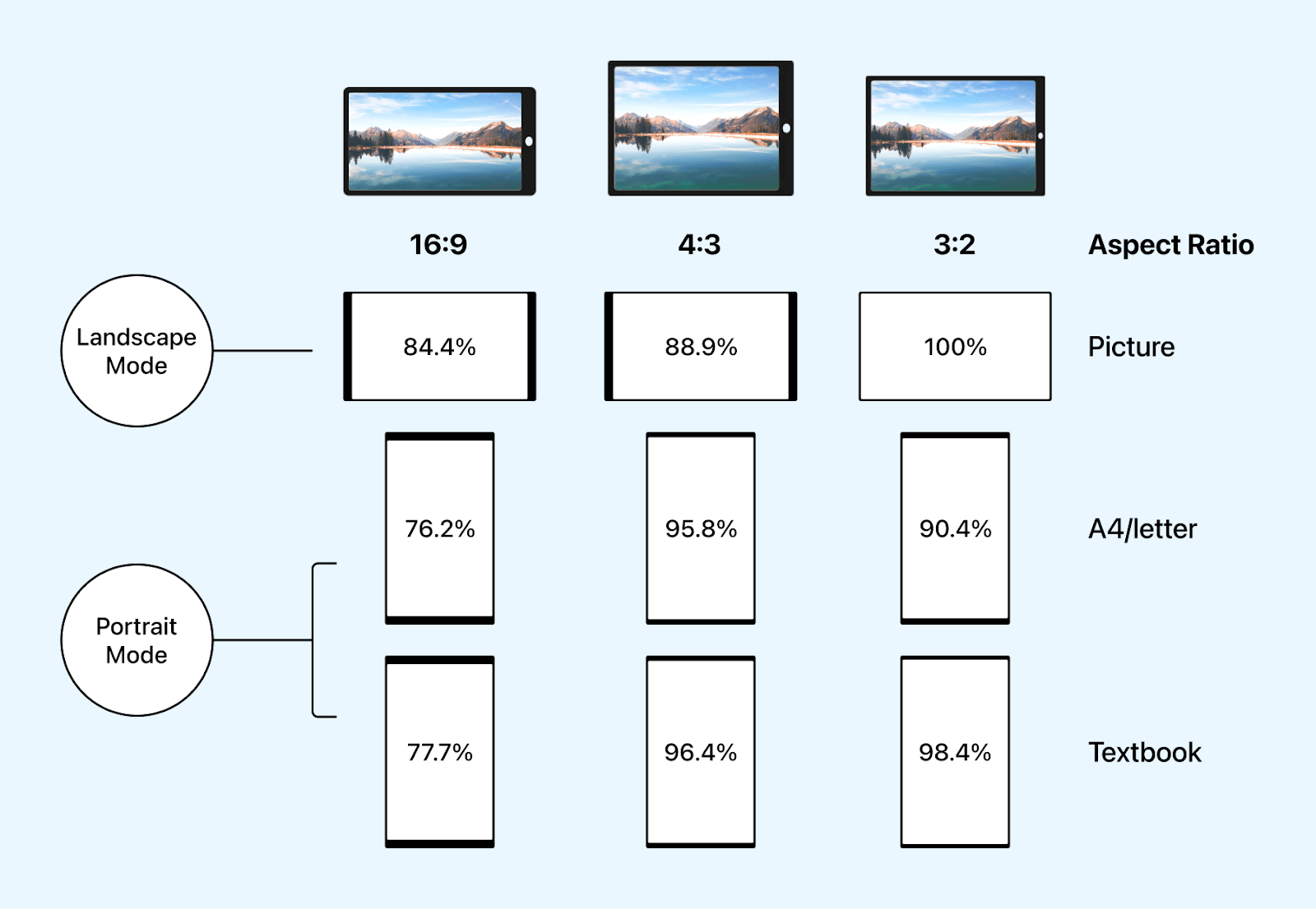
Note that these breakpoints are not standard but these are some of the commonly used breakpoints. A general idea about all the breakpoints is shown in the image below.
CSS Media Queries in one shot 🔥 pic.twitter.com/I2d2rAJk5w
— Adarsh Gupta ✨ (@Adarsh____gupta) March 14, 2022
Differences: Device Width and Content-Based Breakpoints
There are mainly two types of breakpoints for responsiveness: Device-width based breakpoints and content-based breakpoints, let now learn about them.
- Content-Based Breakpoints: In content-based breakpoints, the breakpoints are chosen based on the website’s actual content and design elements. The main aim is to make the user experience better by adjusting the layout whenever the content becomes hard to read, view, or interact with, regardless of the device size.
- Device-Based Breakpoints: In device-based breakpoints, we group devices based on screen resolutions and choose common breakpoints for each group. This makes it easier to style the design with CSS, as the rules apply to most devices within each group. The result is a responsive design that looks great on different devices.
Simply put, we focus on the content itself to decide where the design needs to adapt, rather than using fixed width. This way, we ensure that users can easily access and enjoy the content on any screen size.
HTML:
Example: Let’s take an example and visualize it.
|
1 2 3 4 5 6 7 8 9 10 11 12 13 14 15 16 17 18 19 20 21 22 23 24 25 26 27 28 29 30 31 32 33 34 35 36 37 38 39 40 41 42 43 44 45 46 47 48 49 50 51 52 53 54 55 56 57 58 59 60 61 62 63 64 65 66 67 68 69 70 71 72 73 74 75 76 77 78 79 80 81 82 83 84 85 86 87 88 89 90 91 92 93 94 95 96 97 98 99 100 101 102 103 104 105 106 107 108 109 110 111 112 113 114 115 116 117 118 119 120 121 |
<!DOCTYPE html> <html lang="en"> <head> <meta charset="UTF-8" /> <meta name="viewport" content="width=device-width, initial-scale=1.0" /> <title>Document</title> <link rel="stylesheet" href="index.css" /> </head> <body> <div class="grid__container"> <div class="blog"> <div> <img class="blog__image" src="https://www.lambdatest.com/blog/wp-content/uploads/2021/04/image5-81.png" alt="Web" /> </div> <div> <span class="blog__type">Web development</span> <h2 class="blog__title"> 24 Best CSS Frameworks To Look Forward In 2023 </h2> <p class="blog__preview"> If you are into software development, one of the most common pieces of advice is to Don’t Repeat Yourself (DRY). This is the same case in front-end development, and there is no need to start everything from scratch when you develop the application. </p> </div> </div> <div class="blog"> <div> <img class="blog__image" src="https://www.lambdatest.com/blog/wp-content/uploads/2021/04/image5-81.png" alt="Web" /> </div> <div> <span class="blog__type">Web development</span> <h2 class="blog__title"> 23 Best CSS Frameworks For React In 2023: A Comprehensive Overview </h2> <p class="blog__preview"> When you first started learning how to code, one of the most common clichés you heard was, “Don’t reinvent the wheel.” This is the same case in web development, and there’s no need to start from scratch every time you build a website or web application. </p> </div> </div> <div class="blog"> <div> <img class="blog__image" src="https://www.lambdatest.com/blog/wp-content/uploads/2021/04/image5-81.png" alt="Web" /> </div> <div> <span class="blog__type">Web development</span> <h2 class="blog__title">A Complete Guide to CSS Refactoring</h2> <p class="blog__preview"> Being a front-end developer is like having the magical power to shape reality after it’s been created. You can change the way things look, feel, and behave. You can make things appear and disappear. </p> </div> </div> <div class="blog"> <div> <img class="blog__image" src="https://www.lambdatest.com/blog/wp-content/uploads/2021/04/image5-81.png" alt="Web" /> </div> <div> <span class="blog__type">Web development</span> <h2 class="blog__title"> Migrating Test Automation Suite To Cypress 10 </h2> <p class="blog__preview"> There are times when developers get stuck with a problem that has to do with version changes. Trying to run the code or test without upgrading the package can result in unexpected errors. </p> </div> </div> <div class="blog"> <div> <img class="blog__image" src="https://www.lambdatest.com/blog/wp-content/uploads/2021/04/image5-81.png" alt="Web" /> </div> <div> <span class="blog__type">Web development</span> <h2 class="blog__title">How To Style And Write CSS In React</h2> <p class="blog__preview"> React is an extensively preferred frontend UI library used in nearly 50 million projects every month. Backed by Facebook, React has had its dominance in the web development space for over nine years and has several notable customers (ranging from startups to Fortune 500 companies). </p> </div> </div> </div> </body> </html> |
CSS:
|
1 2 3 4 5 6 7 8 9 10 11 12 13 14 15 16 17 18 19 20 21 22 23 24 25 26 27 28 29 30 31 32 33 34 35 36 37 38 39 40 41 42 43 44 45 46 47 48 49 50 51 52 53 54 55 56 57 58 59 60 61 62 63 64 65 66 67 68 |
body { background-color: #edecec; color: #333; font-family: system-ui, -apple-system, BlinkMacSystemFont, "Segoe UI", Roboto, Oxygen, Ubuntu, Cantarell, "Open Sans", "Helvetica Neue", sans-serif; } .grid__container { display: grid; grid-template-columns: 1fr 1fr 1fr; /* Three columns in a row */ grid-gap: 1px; } .blog { display: flex; flex-direction: column; justify-content: center; align-items: center; background-color: #ffffff; padding: 15px; margin: 10px; border-radius: 10px; } .blog__image { width: 100%; height: 100%; object-fit: cover; border-radius: 10px; } .blog__type { font-size: 18px; font-weight: 800; text-align: center; color: rgb(11, 227, 220); } .blog__type::before { content: "•"; font-size: 24px; font-weight: 800; color: rgb(11, 227, 220); } @media (max-width:900px) { .grid__container { grid-template-columns: 1fr 1fr; } } @media (max-width: 600px) { .grid__container { grid-template-columns: 1fr; } } |
In this example, you can see that we have defined CSS rules that are applied to the content. The primary objective is creating a design that dynamically adjusts and optimizes based on the content and the user’s viewing experience.
On devices around 900px width, we set the grid template columns to 1fr 1fr, which means two columns of equal width. For widths less than 600px, we have 1fr, i.e., one column takes up the entire width.
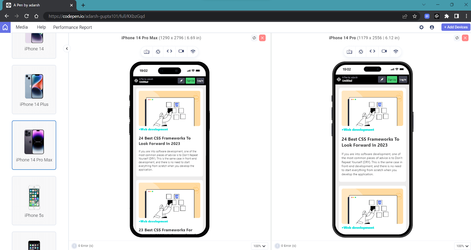
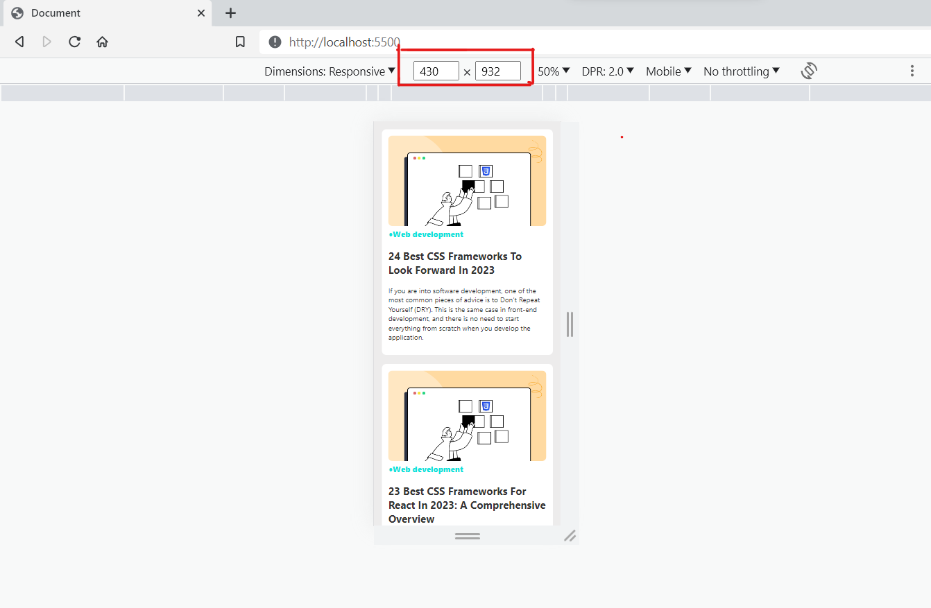
Example: Let’s take the previous example and add some device-based breakpoints.
CSS:
|
1 2 3 4 5 6 7 8 |
/* 932 x 430 pixels*/ @media only screen and (width: 430px) and (height: 932px) { .grid__container { grid-template-columns: 1fr; // (1 FR fraction is 100% of the available space.) } } |
Here, we target a specific device with particular dimensions and apply styles tailored to that device. The advantage of this approach is that it allows us to fine-tune the design for optimal presentation for a specific device.
There is a plethora of devices with varying dimensions and hardware configurations, making it not feasible to target each device separately.
One effective approach for device-based breakdown is to group devices based on their screen width. By categorizing devices into specific groups, we can assign common CSS breakpoints for each group.
Benefits of CSS Media Queries for Standard Devices
CSS media queries for standard devices are an integral part of creating websites compatible with the diverse range of devices and orientations users use to access content today. Let’s take a look at some of the reasons why media queries for standard devices are necessary these days.
Consistent User Experience
Proliferation of smartphones with varying hardware configurations and screen sizes has underscored the significance of upholding a consistent user experience across these diverse devices. If the user experience becomes inconsistent, it can potentially lead visitors to bounce out from your website, thereby directly impacting your Key Performance Indicators (KPIs).
Let’s take an example. Often, we use bold text to capture attention. However, if we use a fixed font size for the text, it can sometimes appear too large on mobile devices or even break the flow of the website, which can negatively impact the user experience.
As you can see, the desktop version of our webpage is visually appealing, and challenges arise when accessing it on smaller devices. The negative experience on mobile devices can result in a higher bounce rate. Hence, it is crucial to focus on responsive design for a better user experience.
Adaptability
As mentioned earlier, your potential customer can use a device of their choice with varying viewport sizes, resolutions, and other characteristics. It is important to have a responsive design for an optimal user experience.
Let’s take an example first.
HTML:
|
1 2 3 4 5 6 7 8 9 10 11 12 13 14 15 16 17 18 19 20 21 22 23 24 25 26 27 28 29 30 31 32 33 34 35 36 37 38 39 40 41 42 |
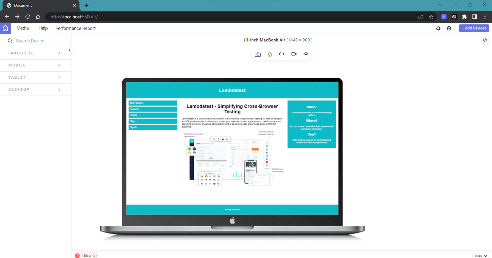
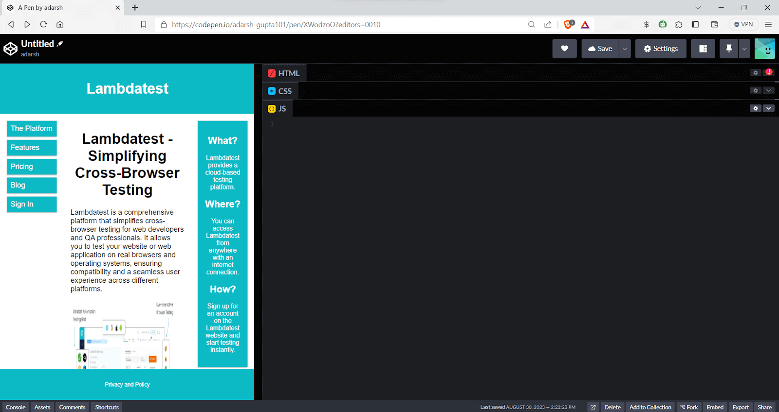
<!DOCTYPE html> <html> <head> <meta name="viewport" content="width=device-width, initial-scale=1.0"> <link rel="stylesheet" href="index.css"> </head> <body> <div class="header"> <h1>Lambdatest</h1> </div> <div class="row"> <div class="column-3 menubar"> <ul> <li>The Platform</li> <li>Features</li> <li>Pricing</li> <li>Blog</li> <li>Sign In</li> </ul> </div> <div class="column-6"> <h1>Lambdatest - Simplifying Cross-Browser Testing</h1> <p>Lambdatest is a comprehensive platform that simplifies cross-browser testing for web developers and QA professionals. It allows you to test your website or web application on real browsers and operating systems, ensuring compatibility and a seamless user experience across different platforms.</p> </div> <div class="column-3 right"> <div class="aside"> <h2>What?</h2> <p>Lambdatest provides a cloud-based testing platform.</p> <h2>Where?</h2> <p>You can access Lambdatest from anywhere with an internet connection.</p> <h2>How?</h2> <p>Sign up for an account on the Lambdatest website and start testing instantly.</p> </div> </div> </div> <div class="footer"> <p>Privacy and Policy </p> </div> </body> </html> |
Let’s now style this page without using media queries for standard devices and see how it looks.
CSS:
|
1 2 3 4 5 6 7 8 9 10 11 12 13 14 15 16 17 18 19 20 21 22 23 24 25 26 27 28 29 30 31 32 33 34 35 36 37 38 39 40 41 42 43 44 45 46 47 48 49 50 51 52 53 54 55 56 57 58 59 60 61 62 63 64 65 66 67 68 69 70 71 72 73 74 |
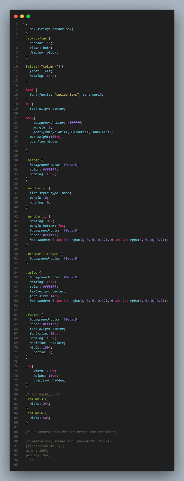
* { box-sizing: border-box; } .row::after { content: ""; clear: both; display: block; } [class*="column-"] { float: left; padding: 15px; } html { font-family: "Lucida Sans", sans-serif; } h1{ text-align: center; } .header { background-color: #166890; color: #ffffff; padding: 15px; } .menubar ul { list-style-type: none; margin: 0; padding: 0; } .menubar li { padding: 8px; margin-bottom: 7px; background-color: #1586af; color: #ffffff; box-shadow: 0 1px 3px rgba(0,0,0,0.12), 0 1px 2px rgba(0,0,0,0.24); } .menubar li:hover { background-color: #0099cc; } .aside { background-color: #1d6b88; padding: 15px; color: #ffffff; text-align: center; font-size: 14px; box-shadow: 0 1px 3px rgba(0,0,0,0.12), 0 1px 2px rgba(0,0,0,0.24); } .footer { background-color: #2c7892; color: #ffffff; text-align: center; font-size: 12px; padding: 15px; } /* For desktop: */ .column-3 {width: 25%;} .column-6 {width: 50%;} |
The output on the desktop version looks clean as expected.
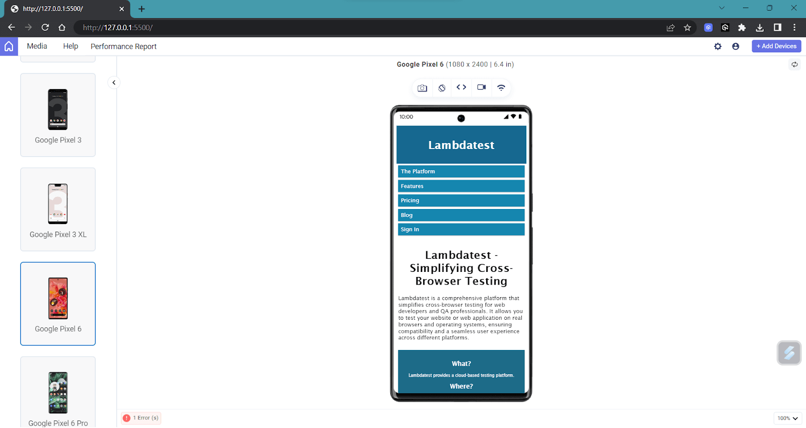
But when the width of the viewport gets reduced, the website starts to break, as we can see in the below image.
See the Pen
Untitled by adarsh (@adarsh-gupta101)
on CodePen.
As you can see, the mobile view is distorted and will give an unpleasant experience for your user. Here is one situation where media queries for standard devices will solve the situation.
We can add the following CSS media query to our code.
|
1 2 3 4 5 |
@media only screen and (max-width: 768px) { [class*="column-"] { width: 100%; padding: 5px; } |
Here, we set the width of our column as 100% when the device viewport width is less than 768px.
As you can see, now the mobile version looks better. Here, only one media rule has been applied. However, in the real scenario, we might use multiple media queries for standard devices (with different screen sizes) to have a seamless experience.
Accessibility
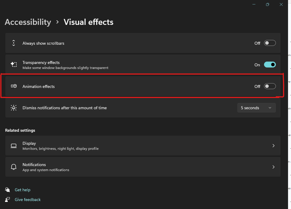
Media queries for standard devices play a significant role in making websites accessible to users who are differently abled. We can customize our web page depending on the user’s preference, providing a uniform experience throughout.
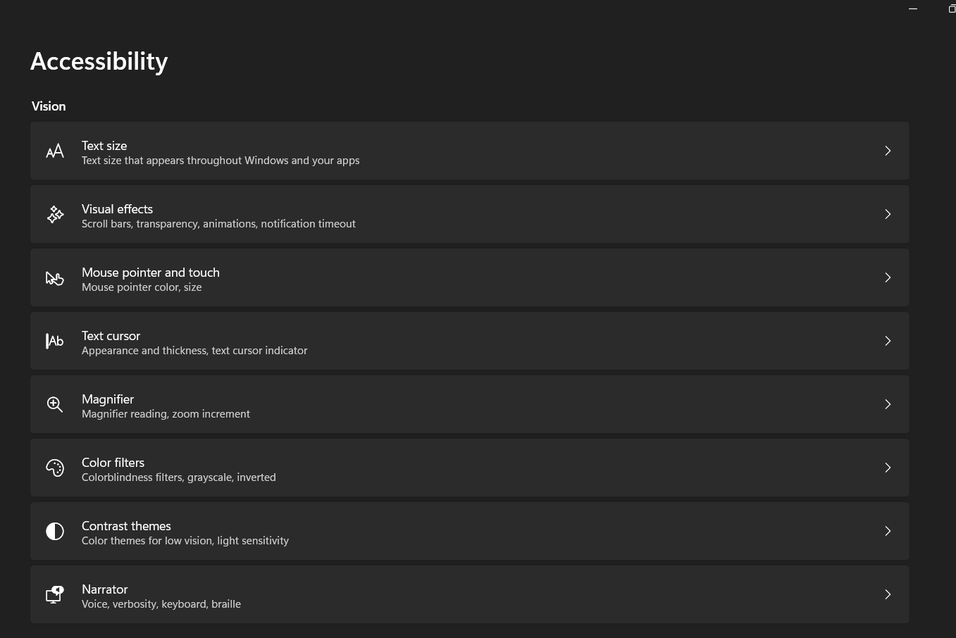
Users can personalize device settings to cater to their specific needs, particularly if they have impairments. Additionally, for enhanced accessibility, they can choose specific preferences that suit their requirements. The image below displays some of the available accessibility options in the Windows OS.
Example: Let’s see an example of adjusting the website based on user preference.
HTML:
|
1 2 3 4 5 6 7 8 9 10 11 12 13 14 15 16 17 18 19 20 21 22 23 24 25 26 27 28 29 30 31 32 33 34 35 36 37 38 39 40 41 42 43 44 45 46 47 48 49 50 51 52 53 54 55 56 57 58 59 60 61 62 63 64 |
<!DOCTYPE html> <html> <head> <meta name="viewport" content="width=device-width, initial-scale=1.0" /> <link rel="stylesheet" href="index.css" /> </head> <body> <div class="animation">Some animations</div> </body> </html> .animation { animation: pulse 1s linear infinite both; background-color: rgb(16, 208, 218); } @media (prefers-reduced-motion) { .animation { animation: reduce 4s linear infinite both; background-color: green; text-decoration: overline; } } .animation { color: #000000; font: 1.2em sans-serif; width: 10em; padding: 1em; border-radius: 1em; text-align: center; } @keyframes pulse { 0% { transform: scale(1); } 50% { transform: scale(1); } 75% { transform: scale(1.1); } 100% { transform: scale(1); } } @keyframes reduce { 0% { opacity: 1; } 50% { opacity: 0.3; } 100% { opacity: 1; } } |
Here a simple CSS animation is added and for a normal user it will show the pulse animation.
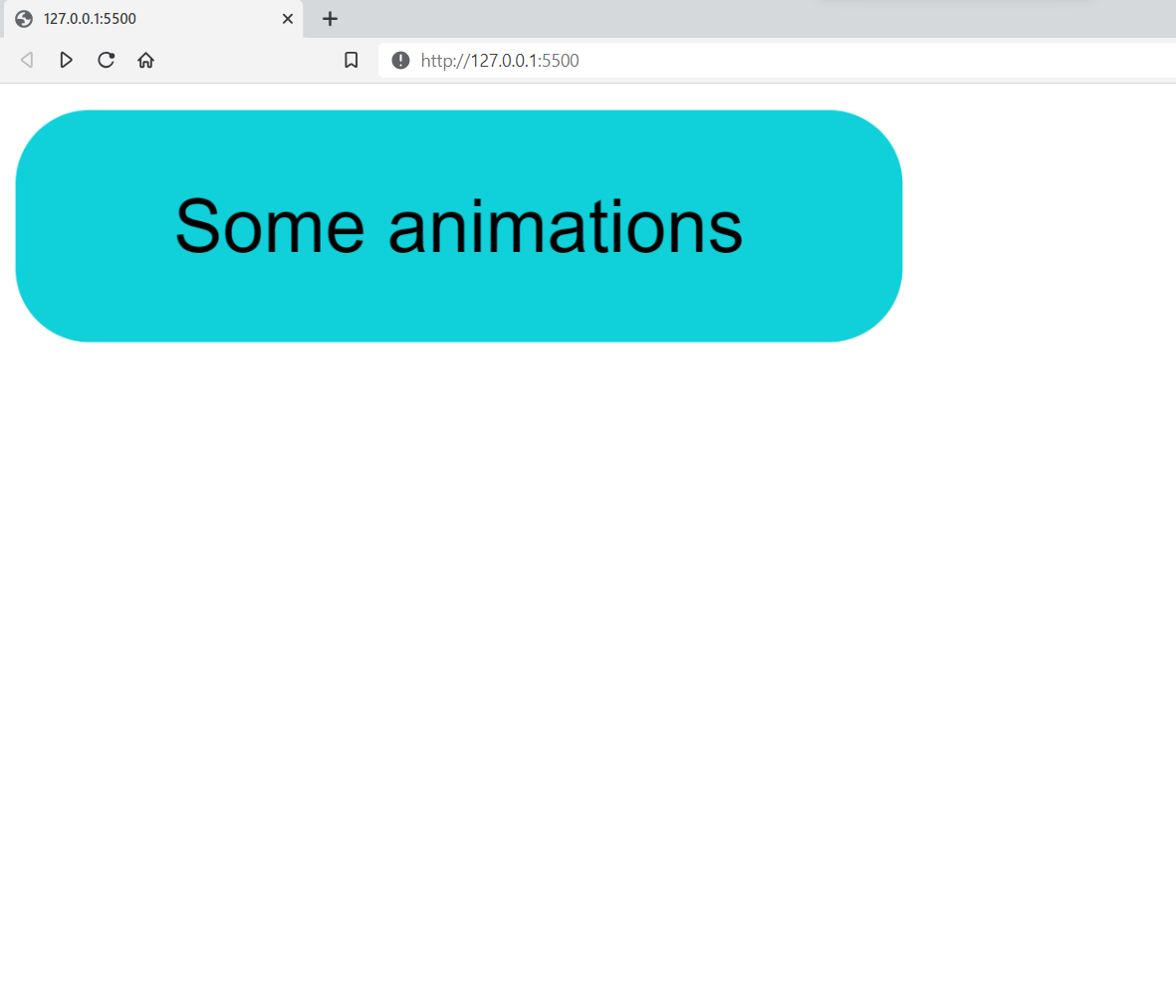
Some users with vestibular motion disorders will have a hard time reading this. But if they have turned off animation effects on their device, the media feature prefers-reduced-motion will be triggered, and they can have lesser animation.
You can toggle these animation settings on your device and see a different animation.
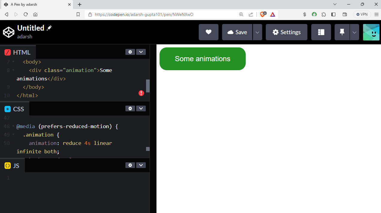
See the Pen
Untitled by adarsh (@adarsh-gupta101)
on CodePen.
There are many other media rules other than those which are mentioned above, which we will look at in the coming sections of this tutorial on media queries for standard devices that can help developers improve the experience of all users and create a more inclusive and accessible website.
Getting Started: Media Queries for Standard Devices
The first thing that comes to mind when someone hears about media queries for standard devices is responsiveness. A media query applies specific styles to a web document when certain criteria of the user agent or device displaying the page are met.
User agents (like web browsers) re-evaluate media queries when changes occur in the user environment. For example, suppose the device switches from landscape to portrait orientation. In that case, the user agent adjusts the behavior of the web page elements based on the media queries used in the CSS code.
Let’s now look at the general syntax of the media query.
|
1 2 3 |
@media media-type and (media-feature) { /* CSS rules to apply when the media query conditions are met */ } |
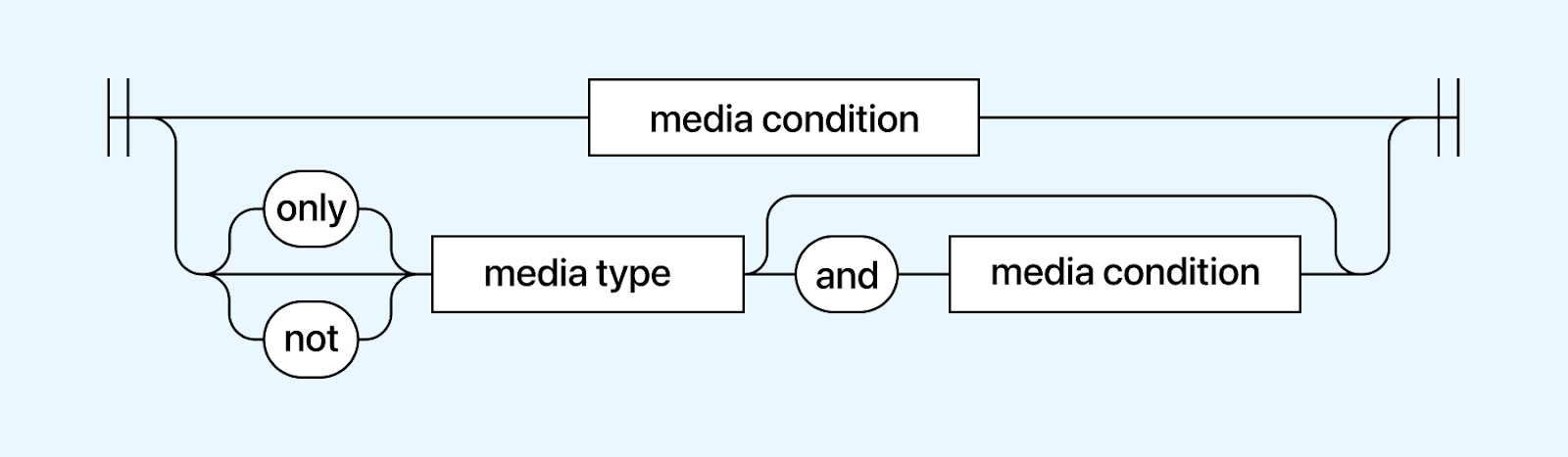
The media query is executed in two cases: first, when the specified media type matches the device where the user agent is running, and second, when the media condition is true.
Now, we can break down the components of a media query statement and examine each part individually.
Targeting Media Types
One of the features that the media rule allows is the ability to target special devices, such as printers and screen readers. Media types define the general category of a device.
There are mainly 3 media types that can be targeted using media queries for standard devices:
Screen
The screen media type is used to target devices with screens, such as desktops, laptops, tablets, and smartphones. Styles targeted for the screen media type are designed to be displayed on a visual screen.
Syntax:
|
1 2 3 4 5 6 7 |
@media screen { .target_element{ /* target style */ /* Add more styles for screens here */ } } |
The print media type is used specifically for print output, targeting devices such as printers or PDF generators. Styles defined for the print media type control how the content will be presented on printed pages.
For example, you can adjust font sizes, remove unnecessary elements, and ensure proper page breaks for a more printer-friendly layout.
Syntax:
|
1 2 3 4 5 6 7 8 9 10 11 12 13 |
@media print { /* Adjust the styles accordingly */ body { font-size: 12pt; line-height: 1.5; } /* Remove unnecessary elements that shouldn't be printed */ .no-print { display: none; } } |
All
If no media type is specified, it will use the all type, which is the default for all devices. However, it’s important to note that some media types, like TV, braille, etc., have been deprecated and are no longer in use.
Syntax:
|
1 2 3 |
@media all { /* Styles for all media types go here */ } |
Targeting Media Features
Media queries for standard devices are triggered and executed once particular pre-defined conditions are met. These conditions usually depend on certain features of the user’s device or screen, called media features.
Media feature is a part of a media query where it checks for specific characteristics of a user’s device. Media features allow developers to apply CSS styles based on certain conditions, such as screen size, device orientation, resolution, aspect ratio, or user preferences.
Let’s look at some of the most used media features:
Width
The width media feature is by far one of the most used media features and is used to test the viewport width. Whenever a certain condition is met depending on the width, it applies the styles defined inside the media query.
When talking about width, there are three main ways we can target the width of a device.
- width: The media feature width is used to apply a specific style when the viewport’s width matches the specified value exactly.
- max-width: The media feature max-width is used to apply a specific style when the viewport’s width is equal to or less than the specified value.
- min-width: The media feature min-width is used to apply a specific style when the viewport’s width is equal to or greater than the specified value.
You can also combine the above-mentioned ways to get the desired output.
Syntax:
|
1 2 3 4 5 6 7 8 9 10 11 12 13 14 15 16 17 18 19 |
/* Apply styles when the viewport width is 1024 pixels or narrower */ @media (max-width: 1024px) { /* CSS rules here */ } /* Apply styles when the viewport width is 768 pixels or wider */ @media (min-width: 768px) { /* CSS rules here */ } @media (width: 600px) { /* CSS rules here */ } /* Apply styles when the viewport width is between 600px and 1024px (inclusive) */ @media (min-width: 600px) and (max-width: 1024px) { /* CSS rules here */ } |
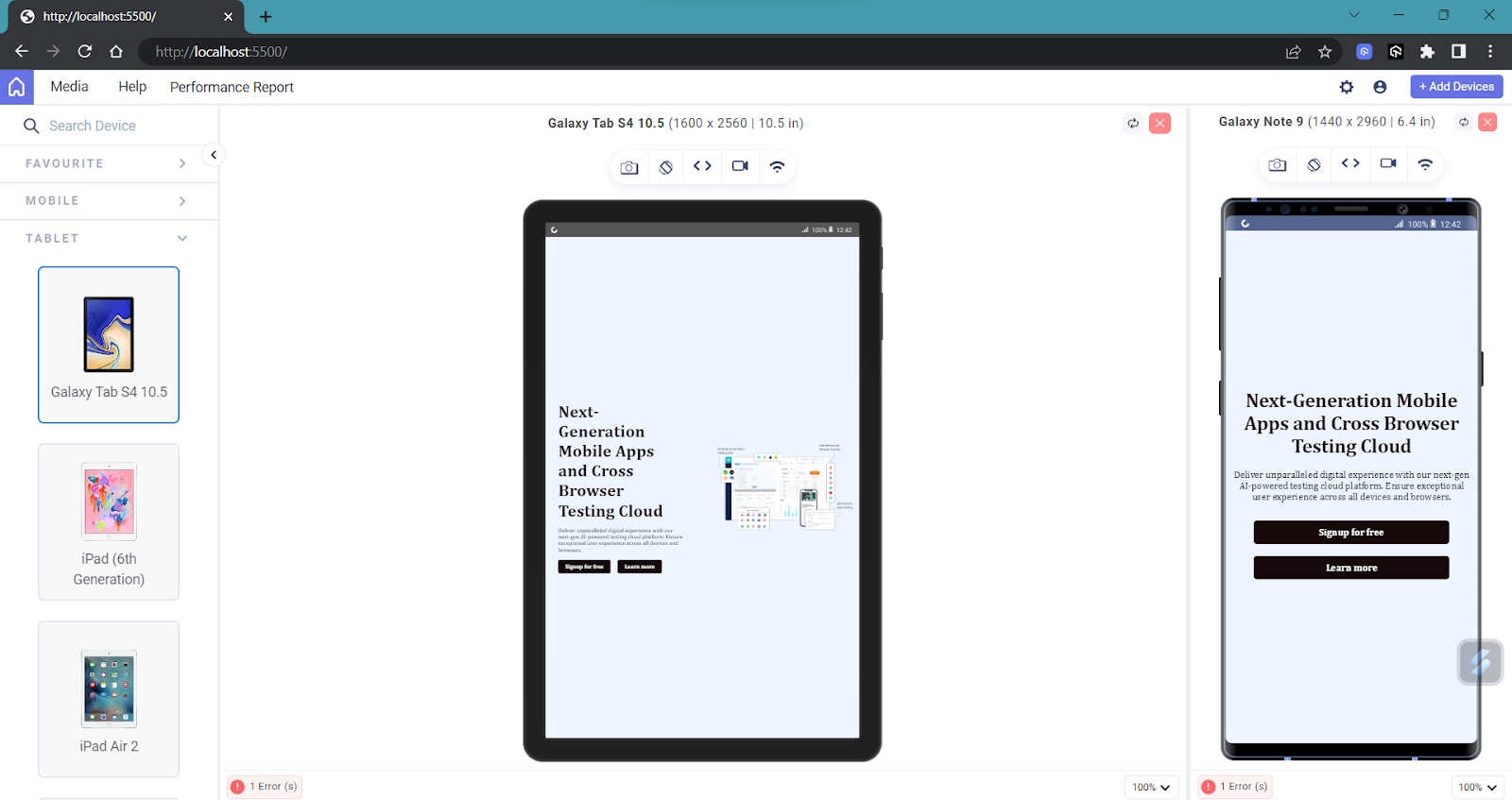
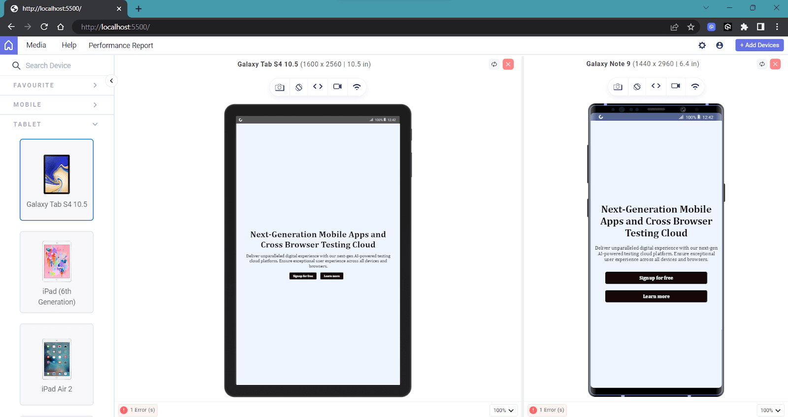
Example: Let’s look at the below example to understand.
HTML:
|
1 2 3 4 5 6 7 8 9 10 11 12 13 14 15 16 17 18 19 20 21 22 23 24 25 26 27 28 29 30 31 |
<!DOCTYPE html> <html> <head> <meta name="viewport" content="width=500, initial-scale=0.8" /> <link rel="stylesheet" href="index.css" /> </head> <body> <div class="banner"> <div class="banner__section"> <h2>Next-Generation Mobile Apps and Cross Browser Testing Cloud</h2> <p> Deliver unparalleled digital experience with our next-gen AI-powered testing cloud platform. Ensure exceptional user experience across all devices and browsers. </p> <div class="banner__buttons"> <button>Signup for free</button> <button>Learn more</button> </div> </div> <div class="banner__section"> <img class="banner_image" src="https://www.lambdatest.com/resources/images/main/home_banner.webp" /> </div> </div> </body> </html> |
CSS:
|
1 2 3 4 5 6 7 8 9 10 11 12 13 14 15 16 17 18 19 20 21 22 23 24 25 26 27 28 29 30 31 32 33 34 35 36 37 38 39 40 41 42 43 44 45 46 47 48 49 50 51 52 53 |
* { font-family: Cambria, Cochin, Georgia, Times, "Times New Roman", serif; } .banner { display: flex; justify-content: center; align-items: center; height: 100vh; background-color: #eef5ff; } img { width: 100%; height: 100%; object-fit: cover; margin: 18px; } .banner__section { margin: 4%; } .banner__section > h2 { font-size: 3rem; font-weight: 700; color: #160909; text-align: left; margin-bottom: 20px; } .banner__buttons { display: flex; justify-content: start; align-items: center; margin-top: 20px; } .banner__buttons > button { padding: 10px 20px; margin-right: 20px; border: none; outline: none; border-radius: 5px; cursor: pointer; font-size: 1rem; font-weight: 600; color: #fff; background-color: #160909; transition: all 0.3s ease; } |
In this example, we have not yet used media queries for standard devices, and let’s see how it looks on the desktop version.
Without Media Queries
On the desktop version, it looks as expected, but whenever the viewport size gets reduced, you can see that the design starts to break.
Right now, the UI on the mobile looks not so friendly, and it’s the perfect time to add some media queries.
To make this responsive, first, we can remove the image on the mobile version and then make the text section take up the full width of the screen.
|
1 2 3 4 5 6 7 8 9 10 11 12 13 14 15 16 17 18 19 20 21 22 23 24 25 26 27 28 29 30 |
@media only screen and (max-width: 768px) { .banner__image { display: none; } .banner__section { margin: 0; padding-top: 20px; text-align: center; padding: 5px; /* width: 100%; */ } .desktop__only{ display: none; } .banner__section > h2 { font-size: 2rem; text-align: center; } .banner__buttons { display: flex; flex-direction: column; justify-content: center; align-items: center; } .banner__buttons > button { margin: 10px; width: 80%; text-align: center; } } |
With Media Queries
Now, you can see that there has been a significant improvement in the UI for the mobile version. We have applied additional styles to the media query whenever the viewport width goes below 768px.
Still, you can see that the design hasn’t achieved an optimal appearance for devices with widths between 768px and 1024px, such as tablets and small devices.
In this scenario, we can combine two media features: one for a device width greater than 768px and another for a width less than 1024px.
|
1 2 3 4 5 6 7 8 9 10 11 12 13 14 15 16 17 18 19 20 21 22 23 24 25 26 |
@media only screen and (min-width: 768px) and (max-width:1024px) { .desktop__only { display: none; } .banner__buttons { display: flex; justify-content: center; align-items: center; } .banner__section{ text-align: center; font-size: 1.5rem; } .banner__section>h2{ font-size: 3rem; text-align: center; } } |
As you can see, we can apply constraints like this within the width media feature to build a responsive application. This approach allows us to adapt the UI to different screen sizes effectively, ensuring an optimal user experience across various devices.
Let’s compare everything side by side for more clarity:
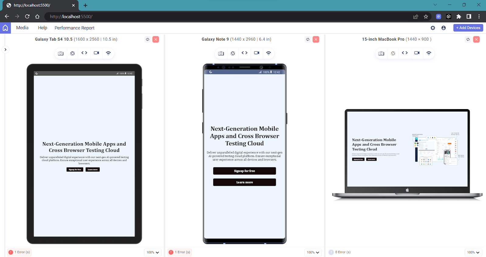
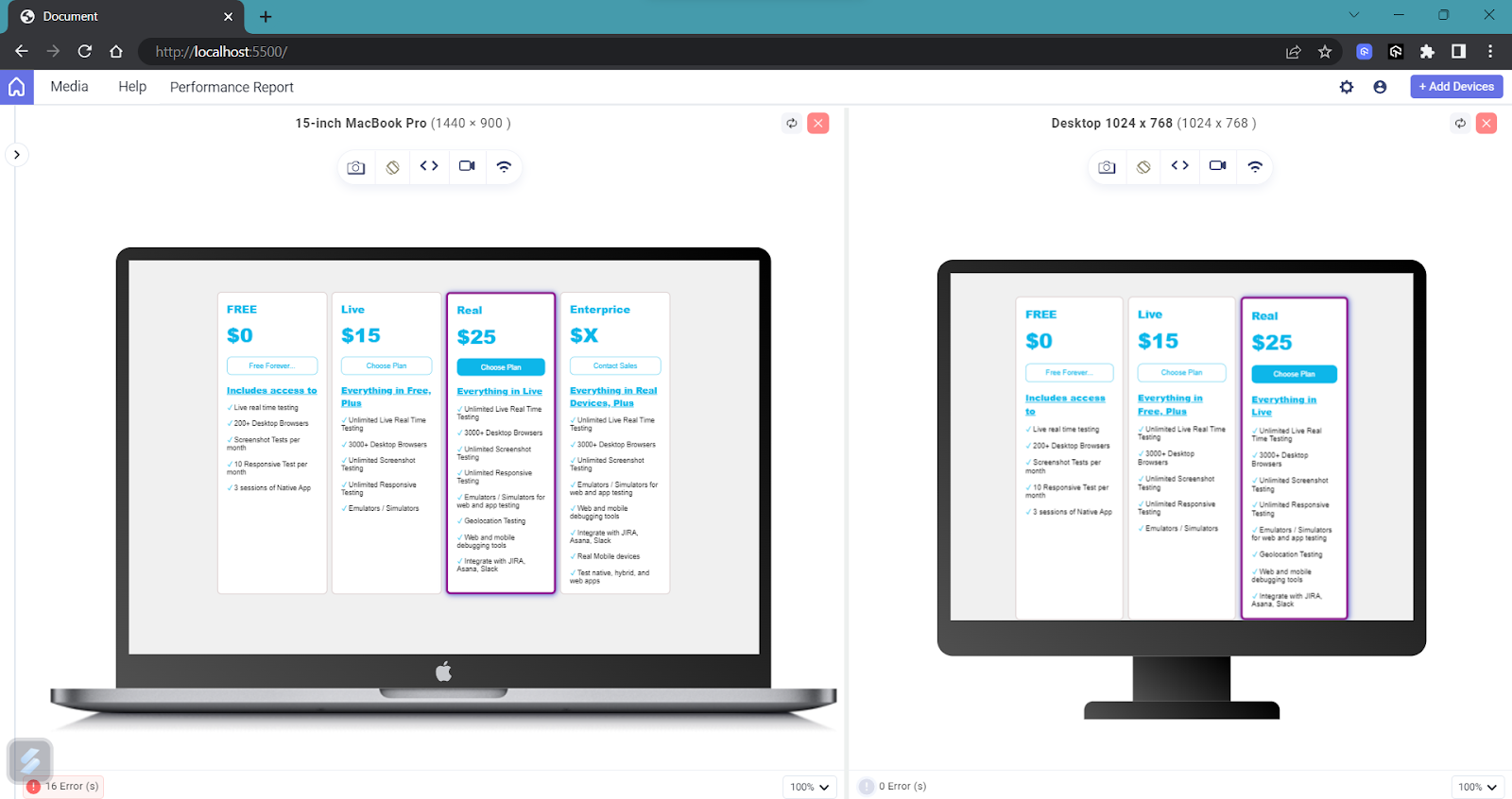
You can see how the page acts differently with multiple screen viewports and make it as responsive as possible.
Now, let’s look at some of the other common media features:
Height
Height is another media feature effectively that is used to apply style based on the height of the viewport. It is useful in scenarios like adjusting the hero section’s height to make sure it looks visually appealing on various devices, as it is the prominent area displayed at the top of the homepage.
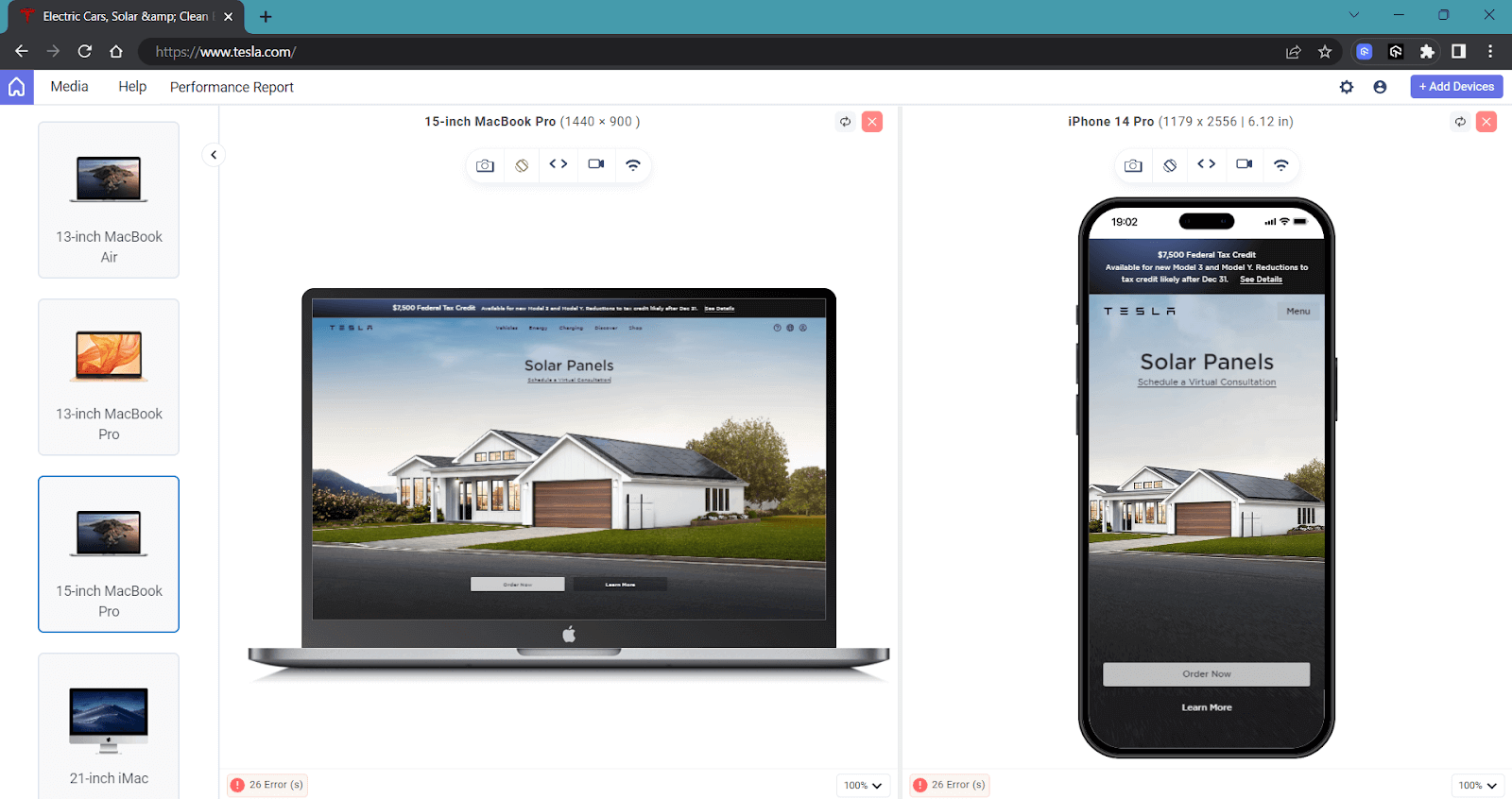
In the above example of Tesla’s homepage, you can observe that the image spans the entire width on larger screens. On mobile devices, the image is resized, using the object-fit property. On smaller devices, object-fit is set to cover to ensure the image keeps its aspect ratio and fills the given dimension
Just like the case of width, there are also three main ways we can target the height of a device.
- height: The media feature height is used to apply a specific style when the viewport’s height matches the specified value.
- min-height: The media feature min-height is used to apply a specific style when the viewport’s height is equal to or greater than the specified value.
- max-height: The media feature max-height is used to apply a specific style when the viewport’s height is equal to or less than the specified value.
Syntax:
|
1 2 3 4 5 6 7 8 9 10 11 12 13 14 15 16 |
/* Apply styles when the viewport height is 600 pixels or taller */ @media (min-height: 600px) { /* CSS rules here */ } /* Apply styles when the viewport height is 800 pixels or shorter */ @media (max-height: 800px) { /* CSS rules here */ } /* Apply styles when the viewport height is between 400px and 800px (inclusive) */ @media (min-height: 400px) and (max-height: 800px) { /* CSS rules here */ } |
There is a better and more efficient way to target devices using the new operators: >, <=, >, >=, and =. These operators offer greater flexibility in defining media queries for standard devices, allowing us to precisely target specific screen sizes and create more responsive designs.
Syntax:
|
1 2 3 4 5 6 7 8 9 10 11 12 13 |
/* Greater than or equal to 1000px */ @media (width >= 1000px) { } /* Less than or equal to 700px */ @media (width <= 700px) { } /* Between 700px and 1000px */ @media (700px <= width <= 1000px) { } |
The new syntax simplifies writing media queries for standard devices, making them easier to read and understand and seems more logical.
One advantage here is that it will solve some edge cases. Let’s take an example:
|
1 2 3 4 |
@media (min-width: 500px) { } @media (max-width: 500px) { } |
When the viewport size is exactly 500px, both the first and second media queries will be triggered, potentially causing issues in your code due to conflicting styles. This is where range selectors come to the rescue for handling tricky edge cases.
By using the new operators, less than or equal to (<=) and greater than or equal to (>=), we can now address this issue and achieve more precise matching for our media queries for standard devices.
Aspect Ratio
The aspect-ratio media feature is used to apply CSS styles based on the aspect ratio of the viewport or device.
The aspect ratio is the ratio of the width to the height of the viewport. This media feature is useful for creating responsive designs that adapt to different aspect ratios, providing optimal layout and content presentation across various screen sizes.
The aspect-ratio media feature in CSS allows you to target specific styles based on the aspect ratio of the viewport or device. This is particularly useful for adjusting the layout and appearance of your website or web application to ensure that it looks good on various devices, such as desktop monitors, laptops, tablets, and smartphones.
You can try the following example, resize it, and observe to understand how aspect ratios really work.
See the Pen
Untitled by adarsh (@adarsh-gupta101)
on CodePen.
Syntax:
|
1 2 3 4 5 6 7 8 9 |
@media (aspect-ratio: width / height) { /* CSS rules to be applied when the aspect ratio matches the specified width-to-height ratio */ } /* Apply styles when the aspect ratio is between 4:3 and 16:9 (inclusive) */ @media (aspect-ratio: 4/3) and (aspect-ratio: 16/9) { /* CSS rules here */ } |
Display Mode
The display-mode CSS media feature is used to test the display mode of a web application. It allows differentiation between the website’s display modes, such as accessing it in a browser or using it as a progressive web app.
This feature can be useful when playing web-based games to give users a native feel.
Syntax:
|
1 2 3 |
@media (display-mode: value) { /* CSS rules to be applied when the display mode matches the specified value */ } |
Some of the values that we can use here include:
- browser: Indicates that the web application is launched from the browser URL.
- minimal-ui: Indicates that the web application is launched in a minimal user interface mode.
- standalone: Indicates that the web application is installed as a standalone progressive web app and launched from a desktop icon or app launcher.
- fullscreen: Indicates that the web application is launched in fullscreen mode.
Syntax:
|
1 2 3 |
@media (display-mode: browser) { /* Your CSS rules for browser mode */ } |
Syntax:
|
1 2 3 |
@media (display-mode: minimal-ui) { /* Your CSS rules for minimal UI mode */ } |
Syntax:
|
1 2 3 |
@media (display-mode: standalone) { /* Your CSS rules for standalone mode */ } |
Syntax:
|
1 2 3 |
@media (display-mode: fullscreen) { /* Your CSS rules for fullscreen mode */ } |
Prefers Color Scheme
The prefers-color-scheme CSS media feature is used to detect if a user prefers a light or dark color theme for their device’s operating system or browser. Users indicate their preference through system or user agent settings, such as light or dark mode.
Syntax:
|
1 2 3 |
@media (prefers-color-scheme: light | dark) { /* CSS rules to be applied when the user prefers the specified color scheme */ } |
Let’s take an example and see how this works.
HTML:
|
1 2 3 4 5 6 7 8 9 10 11 12 13 14 15 16 17 18 19 20 21 22 23 24 25 26 27 28 29 30 31 32 33 34 35 36 37 38 39 40 41 42 43 44 45 46 47 48 49 50 51 52 53 54 55 56 57 58 59 60 61 62 63 64 65 66 67 68 69 70 |
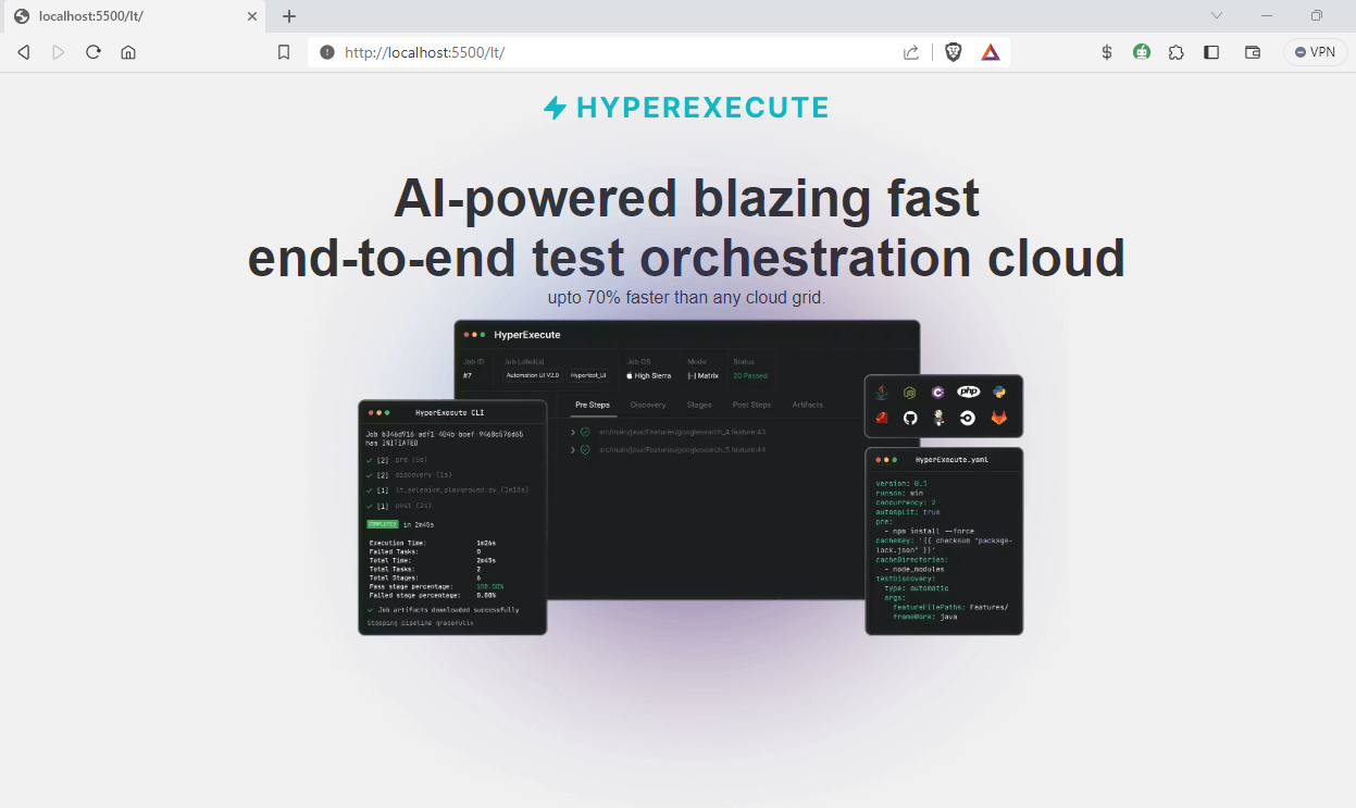
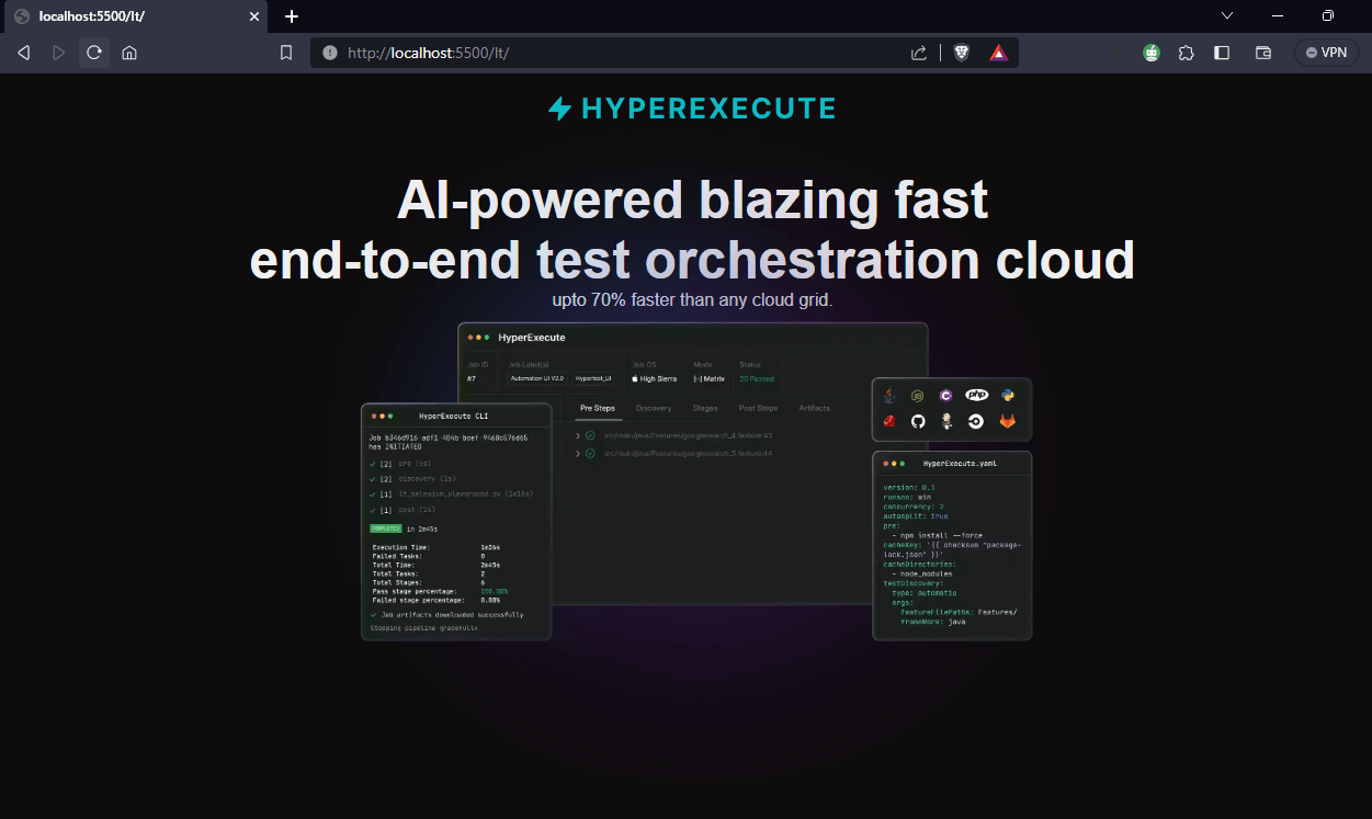
<!DOCTYPE html> <html> <head> <meta name="viewport" content="width=500, initial-scale=0.8" /> <link rel="stylesheet" href="index.css" /> </head> <body> <div class="content"> <div class="sidebar"> <div class="product"> <img src="https://www.lambdatest.com/resources/images/hyperexecute/hyperlogo.svg" alt="" class="logo" /> </div> </div> <main> <h1> AI-powered blazing fast <br /> end-to-end test orchestration cloud </h1> <p class="info-text"> upto <span>70% faster</span> than any cloud grid. </p> <img src="https://www.lambdatest.com/resources/images/icons/banner1.webp" class="banner_image"/> <div class="buttons"> <a href="https://hyperexecute.lambdatest.com/quickstart?origin=try-now" class="button" id="tryNow" target="_blank" >Try it now</a > <a href="https://www.lambdatest.com/demo?type=Hyperexecute" class="button" id="bookDemo" target="_blank" >Book a demo</a > </div> </main> <h2 class="features">Features you must know about</h2> <div class="cards"> <div class="card"> <h3 class="heading"> Runs on Linux containers, macOS and Windows </h3> <p> HyperExecute platform comes with feature-packed hosted runners for every major OS including Windows, MacOS, and Linux containers. The runners come with pre-installed support for all major programming languages and frameworks including Java, Node.js, Python, PHP, GO, C#, Rust, and Ruby. </p> <a href="https://hyperexecute.lambdatest.com/hyperexecute" class="button" target="_blank" >Try it now</a > </div> </div> </main> </div> </body> </html> |
CSS:
|
1 2 3 4 5 6 7 8 9 10 11 12 13 14 15 16 17 18 19 20 21 22 23 24 25 26 27 28 29 30 31 32 33 34 35 36 37 38 39 40 41 42 43 44 45 46 47 48 49 50 51 52 53 54 55 56 57 58 59 60 61 62 63 64 65 66 67 68 69 70 71 72 73 74 75 76 77 78 79 80 81 82 83 84 85 86 87 88 89 90 91 92 93 94 95 96 97 98 |
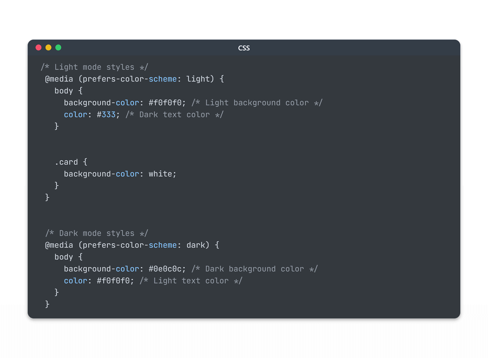
* { margin: 0; padding: 0; box-sizing: border-box; } .content { text-align: center; padding: 20px; font-family: Arial, sans-serif; } h1 { font-size: 48px; font-weight: bolder; padding-top: 40px; z-index: 10; } p { font-size: 16px; } .banner_image { width: 700px; margin-top: -205px; height: 80%; object-fit: contain; } .card { width: 45%; margin: auto; height: fit-content; margin-top: 45px; background-color: #1c1919; padding: 25px; border-radius: 10px; } .card > p { font-size: 15px; margin: 40px; } .features { font-size: 30px; font-weight: bolder; margin-top: 40px; } a { margin-top: 20px; text-decoration: none; color: white; font-size: 20px; background-color: black; padding: 15px; padding-right: 20px; border-radius: 10px; } /* Light mode styles */ @media (prefers-color-scheme: light) { body { background-color: #f0f0f0; /* Light background color */ color: #333; /* Dark text color */ } .card { background-color: white; } } /* Dark mode styles */ @media (prefers-color-scheme: dark) { body { background-color: #0e0c0c; /* Dark background color */ color: #f0f0f0; /* Light text color */ } } @media screen and (max-width: 600px) { .banner_image { width: 100%; height: 100%; margin-top: -100px; } .card { width: 90%; } } |
The following code handles the case for dark and light mode:
If you’ve aligned the browser’s appearance with the OS defaults for dark and light mode, the web application will adapt its color scheme accordingly. If not, it will follow the color scheme set by the browser itself.
If you have opted for light mode on your device or browser, you will see the below output, where the webpage is displayed in light mode.
And if you have opted for dark mode on your device or browser, the web page will be displayed in dark mode.
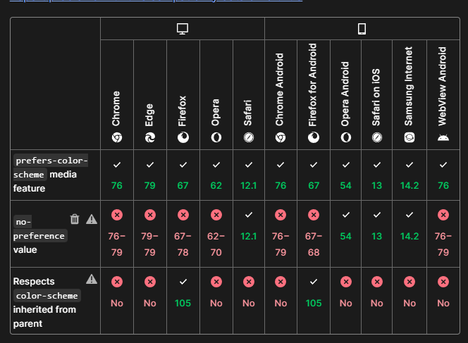
This is a useful media feature as we can apply an adaptive interface and a seamless user experience. Also, the no-preference option, previously available for the prefers-color-scheme property, has been recently eliminated from the specification. As a result, only dark or light are now the two possible values for this property.
Orientation
The CSS media feature orientation allows you to target different screen orientations and apply specific styles accordingly.
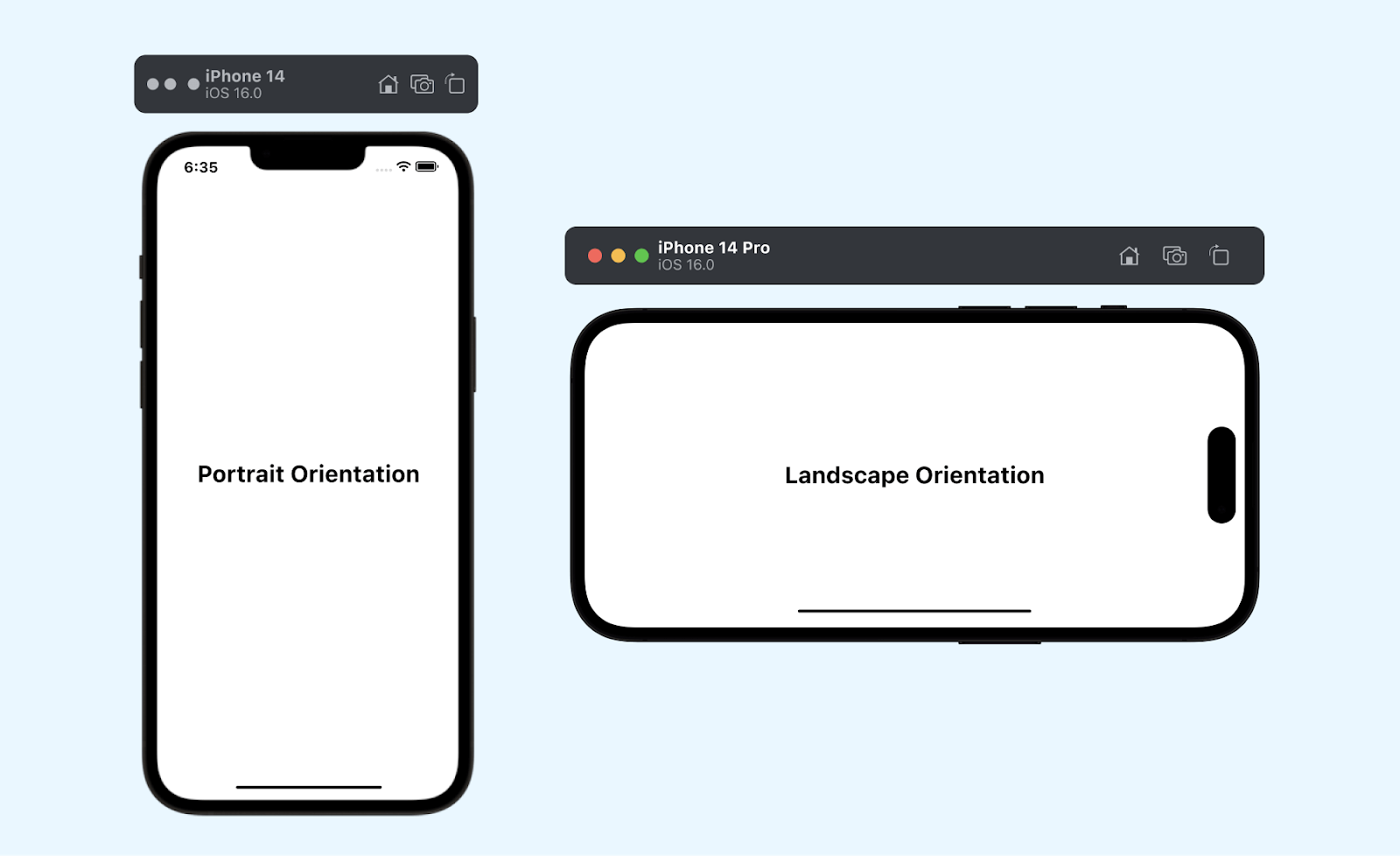
The two primary orientations are portrait and landscape
- portrait: This orientation is typical of devices held vertically, such as smartphones and tablets. Here, the height of the screen is greater than its width.
- landscape: The landscape orientation is associated with devices held horizontally, like most desktop monitors and some tablets when rotated. Here, in landscape mode, the width of the screen is greater than its height.
Syntax:
|
1 2 3 4 5 6 7 8 9 10 11 |
@media (orientation: portrait) { /* CSS styles for portrait orientation */ /* ... */ } /* Example of a media query for devices in landscape orientation */ @media (orientation: landscape) { /* CSS styles for landscape orientation */ /* ... */ } |
Example: Let’s take an example and see how this feature works. We will take the same example as above with some small changes.
CSS:
|
1 2 3 4 5 6 7 8 9 10 11 12 13 14 15 16 17 18 19 20 21 22 23 24 25 26 27 28 29 30 |
@media screen and (orientation: landscape) { h1 { font-size: 48px; } .logo { width: 20%; height: 10%; } } @media screen and (orientation: portrait) { .logo { width: 80%; height: 30%; } h1 { font-size: 28px; margin: 5px; } .banner_image { margin-top: 15px; } } |
Here, in landscape mode, the font size of the heading is set as 48px, and the size of the logo is reduced by setting its width and height to 20% and 10%, respectively. In portrait mode, the width and height of the logo are increased and set as 80% and 30%, respectively.
You can see the difference in how both look with the help of the LT Browser output.
The important thing that you have to keep in mind is that the orientation media feature in CSS is not always reliable for detecting the physical orientation of the device, especially in scenarios where the keyboard opens in portrait mode.
When the keyboard is opened in portrait orientation, the viewport width becomes wider than its actual height, causing the browser to use landscape styles while the device stays in portrait mode. This can lead to unintended layout shifts and visual issues on the webpage.
Media Query Modifiers (Logical Operators)
Often, we might need to combine two or more media features to achieve a specific condition. A good example is that you have product images on your website and want to ensure that the product images are presented optimally based on screen size and device orientation.
By combining two media features, max-width, and orientation, you can create a match for both cases.
|
1 2 3 4 5 6 7 8 9 10 11 12 13 14 15 16 17 18 19 20 |
/* When screen width is smaller than a certain value and in portrait mode */ @media (max-width: 768px) and (orientation: portrait) { /* Apply styles for mobile layout */ .product-image { /* Vertical stacking of images */ display: block; margin-bottom: 10px; } } /* When screen width is larger and in landscape mode */ @media (min-width: 769px) and (orientation: landscape) { /* Apply styles for tablet landscape layout */ .product-image { /* Side-by-side arrangement */ display: inline-block; width: 50%; /* Each image takes half of the screen width */ vertical-align: top; } } |
This allows you to add conditional logic to your media queries for standard devices, providing greater flexibility and control over how styles are applied based on various conditions.
not Modifier
The not modifier is used to negate a media query, targeting devices that do not match the specified media feature. It functions similarly to the CSS :not() selector. It will target devices not matching the specified media feature, like viewport size or any other device feature.
Example:
|
1 2 3 4 5 6 7 |
/* Apply styles when the viewport width is not greater than 768px */ @media not (max-width: 768px) { .main-content { width: 80%; /* Wider content area for larger viewports */ margin: 0 auto; /* Center the content horizontally */ } } |
In this example, the styles within the not media query block will apply to all devices that are not greater than 768px. The not modifier negates the entire media query here
only Modifier
The only modifier is used for legacy browser support. It doesn’t affect the media query’s result but ensures that legacy browsers parse the media query correctly. It specifies the unknown media type only, and modern browsers ignore it.
Example:
|
1 2 3 4 5 6 |
/* Target only screen devices (for legacy browser support) */ @media only screen { body { font-size: 16px; /* Default font size for screen devices */ } } |
In this example, the styles within the only screen media query block will target only screen devices, helping legacy browsers parse the media query correctly and apply the default font size of 16px for screen devices.
and Modifier
The and modifier allows you to combine multiple media features in a single media query. It helps you create more complex conditions by evaluating multiple features together.
Example:
|
1 2 3 4 5 6 7 8 |
/* Target screen devices with a minimum width of 800px and a maximum width of 1200px */ @media screen and (min-width: 800px) and (<em>max-width: 1200px</em> ) { body { background-color: #f0f0f0; /* Light background color for screen devices within the specified width range */ color: #333; /* Dark text color for screen devices within the specified width range */ } } |
In this example, the styles within the screen and (min-width: 800px) and (max-width: 1200px) media query block will apply to screen devices with a width between 800px and 1200px, providing a light background and dark text color within that width range.
, (comma) Modifier
The , (comma) is not exactly a media query modifier, but it allows you to include a list of media queries for standard devices separated by commas, acting similarly to a logical OR operator. The styles inside any media query separated by commas will be applied if that specific media query matches.
Example:
|
1 2 3 4 5 6 7 |
/* Target screen devices with a minimum width of 800px OR print devices with a minimum width of 1000px */ @media screen and (min-width: 800px), print and (min-width: 1000px) { body { font-size: 18px; /* Larger font size for screen devices with width >= 800px OR print devices with width >= 1000px */ } } |
In this example, the styles within the screen and (min-width: 800px), print and (min-width: 1000px) media query block will target screen devices with a minimum width of 800px or print devices with a minimum width of 1000px. If either of the conditions is met, the font size of 18px will be applied.
Media Queries Using window.matchMedia() in JavaScript
While CSS media queries for standard devices are effective in adjusting styles based on the device’s characteristics, there might be cases where we need to go beyond just style changes. For instance, you might want to:
Load Resources Conditionally
Imagine you have an e-commerce website, and you want to provide higher resolution product images for devices with larger screens. By using JavaScript and media queries for standard devices, you can conditionally load different image files based on the user’s device capabilities.
|
1 2 3 4 5 6 7 8 |
const imageContainer = document.getElementById("product-image"); if (window.matchMedia("(min-width: 768px)").matches) { imageContainer.innerHTML = `<img src="high-res-image.jpg" alt="Product Image">`; } else { imageContainer.innerHTML = `<img src="standard-image.jpg" alt="Product Image">`; } |
In this example, if the user’s screen width is at least 768px, the script loads a high-resolution image. Otherwise, it loads a standard-resolution image. This ensures a better viewing experience on devices that can handle higher-quality visuals.
Performing Actions with Media Queries
Now, let’s take another example, suppose you have a blog, and you want to display a pop-up subscription form when users are reading on larger screens. By utilizing JavaScript and media queries for standard devices, you can trigger the pop-up to appear when the screen width crosses a certain threshold.
|
1 2 3 4 5 6 7 8 9 10 11 12 13 14 |
const subscriptionPopup = document.getElementById("subscription-popup"); const mediaQuery = window.matchMedia("(min-width: 1024px)"); function showPopup(e) { if (e.matches) { subscriptionPopup.style.display = "block"; } else { subscriptionPopup.style.display = "none"; } } mediaQuery.addListener(showPopup); |
Dynamically Adjusting Content/Layout:
Consider a news website that wants to present articles in a grid layout on larger screens but as a single column on smaller screens. Using JavaScript and media queries for standard devices, you can dynamically modify the layout to match the device characteristics.
|
1 2 3 4 5 6 7 8 9 10 11 12 13 14 |
const articleContainer = document.getElementById("article-container"); const mediaQuery = window.matchMedia("(max-width: 768px)"); function adjustLayout(e) { if (e.matches) { articleContainer.classList.add("single-column"); } else { articleContainer.classList.remove("single-column"); } } mediaQuery.addListener(adjustLayout); |
By combining JavaScript and media queries for standard devices, we can achieve these functionalities and make the web applications user-friendly.
To work with media queries for standard devices in JavaScript, we can use the window.matchMedia() method. This method allows us to check if a specific media query matches the user’s device and execute the desired JavaScript code accordingly.
Let’s take a real-world example now.
HTML:
|
1 2 3 4 5 6 7 8 9 10 11 12 13 14 15 16 17 18 19 20 21 22 23 24 25 26 27 28 29 30 31 32 33 34 35 36 37 38 39 40 41 42 43 44 45 46 47 48 49 50 51 52 53 54 55 56 57 58 59 60 61 62 63 64 65 66 67 68 69 70 71 72 73 74 75 76 77 78 79 80 81 82 83 84 85 86 87 88 89 90 91 92 93 94 95 96 97 98 99 100 101 |
<!DOCTYPE html> <html lang="en"> <head> <meta charset="UTF-8" /> <meta name="viewport" content="width=device-width, initial-scale=1.0" /> <title>Document</title> <link href="style.css" rel="stylesheet" /> </head> <body> <h1>Why HyperExecute?</h1> <p class="subtitle"> Get the best of both worlds—speed of a local setup and the smartness of a cloud grid—with HyperExecute. </p> <div class="wrapper"> <div class="content__box"> <img src="https://www.lambdatest.com/resources/images/hyperexecute/Smart-Workflows.svg" /> <h2>AI-Powered Workflows</h2> <p> HyperExecute comes with AI-powered smart workflow capabilities out-of-the-box. You can set up automatic sequencing, static and dynamic test discovery, static data splitting and more. And best of all, set up intelligent retries of tests. </p> </div> <div class="content__box"> <img src="https://www.lambdatest.com/resources/images/hyperexecute/Caching.svg" /> <h2>Dependency Caching</h2> <p> HyperExecute intelligently caches all environment and framework-level dependencies that will ensure all your subsequent test runs do not require configuration or even installation steps. This further cuts down your test times. </p> </div> <div class="content__box"> <img src="https://www.lambdatest.com/resources/images/hyperexecute/CLB.svg" /> <h2>Command Line Binary</h2> <p> Hyper Execute CLI, the HyperExecute's command line binary client, allows you to trigger tests on HyperExecute cloud from your local system and CI alike. Uniform user experience makes it intuitive to adopt and integrate HyperExecute in any environment. </p> </div> <div class="content__box"> <img src="https://www.lambdatest.com/resources/images/hyperexecute/SmartCI.svg" /> <h2>AI Based CI features</h2> <p> HyperExecute helps you fast-track your testing efforts by intelligently hitting the right APIs, preparing the test data, and generating post-testing analytics, among other AI based features, so that you can be assured of a swift go-to-market. </p> </div> <div class="content__box"> <img src="https://www.lambdatest.com/resources/images/hyperexecute/GBOFF.svg" /> <h2>Go Big or Fail Fast</h2> <p> HyperExecute’s AI Enabled smart workflow capabilities include automatic sequencing, static and dynamic test discovery, static data splitting, and intelligent retries of tests. These features ensure that your tests are completed quickly or fail fast, thereby saving time and money. </p> </div> <div class="content__box"> <img src="https://www.lambdatest.com/resources/images/hyperexecute/Smart-Workflows.svg" /> <h2>Automatic Tunnel Management</h2> <p> HyperExecute comes with automatic tunnel management for private websites through a dedicated NAT (Network Address Translation) instance so as to ensure the highest security. Rest assured that your data is protected. </p> </div> </div> </body> </html> |
CSS:
|
1 2 3 4 5 6 7 8 9 10 11 12 13 14 15 16 17 18 19 20 21 22 23 24 25 26 27 28 29 30 31 32 33 34 35 36 37 38 39 40 41 42 43 44 45 46 |
body { background-color: #0c0101; color: #ffffff; font-family: system-ui, -apple-system, BlinkMacSystemFont, "Segoe UI", Roboto, Oxygen, Ubuntu, Cantarell, "Open Sans", "Helvetica Neue", sans-serif; margin: 5px; } h1 { text-align: center; font-size: 50px; font-weight: 800; color: #ffffff; margin: 10px; } .subtitle { text-align: center; font-size: 18px; font-weight: 200; color: #ffffff; margin: 10px; } .wrapper { display: grid; grid-template-columns: 1fr 1fr 1fr; /* Three columns in a row */ grid-gap: 10px; /* 10px gap between columns */ padding: 15px; margin: 10px; border-radius: 10px; } .content__box { display: flex; flex-direction: column; justify-content: center; align-items: center; background-color: #000000; padding: 15px; margin: 10px; border-radius: 10px; text-align: center; } |
Above is the desktop version of the webpage, and so far, we haven’t used media queries for standard devices here.
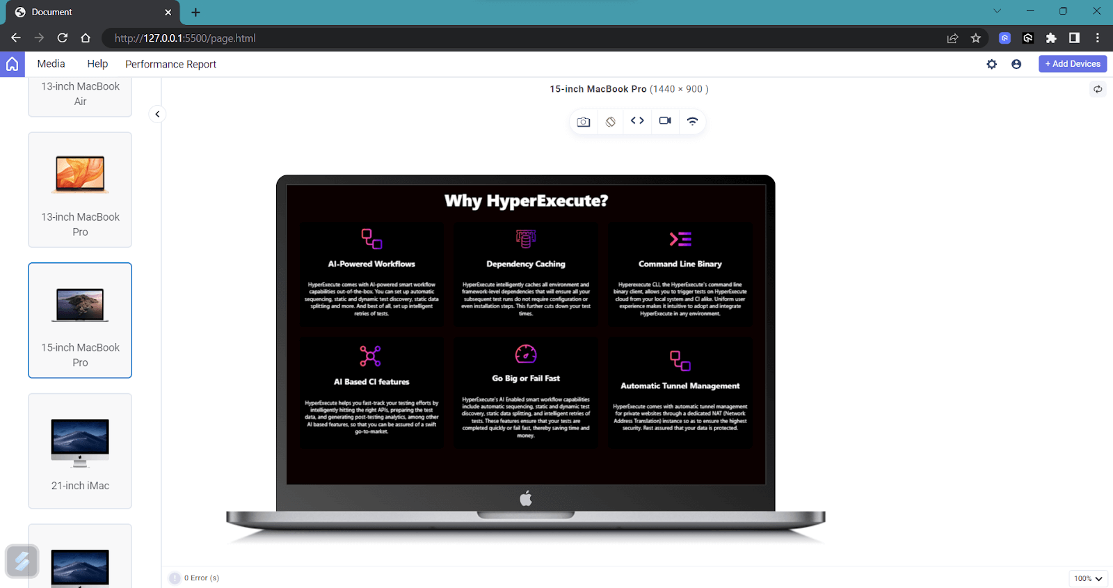
The goal is to have a unique pop-up window shown only on the desktop version. This modal is not intended to show up on mobile devices.
The code for modal is given below:
HTML:
|
1 2 3 4 5 6 7 8 9 10 11 12 13 14 15 16 17 18 19 20 21 22 23 24 25 26 27 28 29 30 31 32 33 34 35 36 37 38 39 40 41 42 43 44 45 46 47 48 49 50 51 |
<div class="modal" id="customModal"> <div class="modal-content"> <!-- Modal content goes here --> <span class="close-btn" onclick="closeModal()">×</span> <h3>Real-time Cross Browser Testing on 3000+ Environments</h3> <p> Perform live-interactive online cross browser testing on 3000+ different desktop and mobile browsers. Get instant access to choice of web browser, browser version, operating system, and screen resolution. </p> <div class="model-features"> <div class="feature"> <img src="https://www.lambdatest.com/resources/images/automation/vector.svg" /> <h3>Plugins & Extensions</h3> <p> Dedicated WordPress plugin and Chrome Extension to help you perform cross-browser testing and capture full-page screenshots. </p> </div> <div class="feature"> <img src="https://www.lambdatest.com/resources/images/automation/local.svg" /> <h3>Plugins & Extensions</h3> <p> Local hosted web testing to help you test in dev environments and save your website or app from after deployment bugs. </p> </div> <div class="feature"> <img src="https://www.lambdatest.com/resources/images/automation/globe.svg" /> <h3>Geolocation testing</h3> <p> Test your website or mobile app from different geoIPs to make sure your users get the perfect experience across all locations. </p> </div> <button>Try LambdaTest Now !!</button> </div> </div> </div> |
CSS:
|
1 2 3 4 5 6 7 8 9 10 11 12 13 14 15 16 17 18 19 20 21 22 23 24 25 26 27 28 29 30 31 32 33 34 35 36 37 38 39 40 41 42 43 44 45 46 47 48 49 50 51 52 53 54 55 56 57 58 59 60 61 62 63 64 65 66 67 68 69 70 71 72 73 74 75 76 77 78 79 80 81 82 83 84 85 86 87 88 89 90 91 92 93 94 95 96 97 98 99 100 101 102 103 104 105 106 |
.modal { display: block; /* Hidden by default */ position: fixed; /* Stay in place */ z-index: 1; /* Sit on top */ left: 0; top: 0; width: 100%; height: 100%; overflow: auto; /* Enable scroll if needed */ /* background-color: rgba(0, 0, 0, 0.5); Black background with transparency */ color: #000000; } .modal-content { background-color: white; margin: 15% auto; /* 15% from the top and centered */ padding: 20px; border: 1px solid #888; width: 80%; /* Could be more or less, depending on screen size */ color: #000000; } .modal-content > h3 { text-align: center; font-size: 40px; font-weight: 800; color: #000000; margin: 10px; } .modal-content > p { text-align: center; font-size: 20px; font-weight: 200; color: #000000; margin: 10px; } .model-features > .feature { display: flex; flex-direction: row; justify-content: center; align-items: center; background-color: #000000; padding: 15px; margin: 10px; border-radius: 10px; text-align: center; color: #ffffff; } .model-features > .feature > h3 { text-align: center; font-size: 20px; font-weight: 800; color: #ffffff; margin: 10px; } .model-features > .feature > img { width: 100px; height: 100px; margin: 10px; filter: invert(100%); } .model-features > button { background-color: #0cbdee; color: #ffffff; border: none; border-radius: 10px; padding: 10px; margin: 10px; font-size: 24px; font-weight: 600; cursor: pointer; outline: none; } .model-features > button::after { content: ">"; margin-left: 10px; } /* Style the close button */ .close-btn { color: #aaa; float: right; font-size: 28px; font-weight: bold; } .close-btn:hover, .close-btn:focus { color: black; text-decoration: none; cursor: pointer; } |
JavaScript:
|
1 2 3 4 5 6 7 8 9 10 11 12 13 14 15 16 17 18 19 20 21 |
function closeModal() { const modal = document.getElementById("customModal"); modal.style.display = "none"; } function checkViewportWidth(mediaQuery) { const modal = document.getElementById("customModal"); if (mediaQuery.matches) { modal.style.display = "none"; // Hide the modal on smaller devices } else { modal.style.display = "block"; // Show the modal on larger devices } } const mediaQuery = window.matchMedia("(max-width: 768px)"); checkViewportWidth(mediaQuery); // Check initial viewport width mediaQuery.addListener(checkViewportWidth); // Check on viewport width change |
Now, you can see that whenever the size goes beyond 768px, a custom modal will be shown to users. This means that whenever a user visits a web page using a desktop or a similar-sized device, the modal will be displayed.
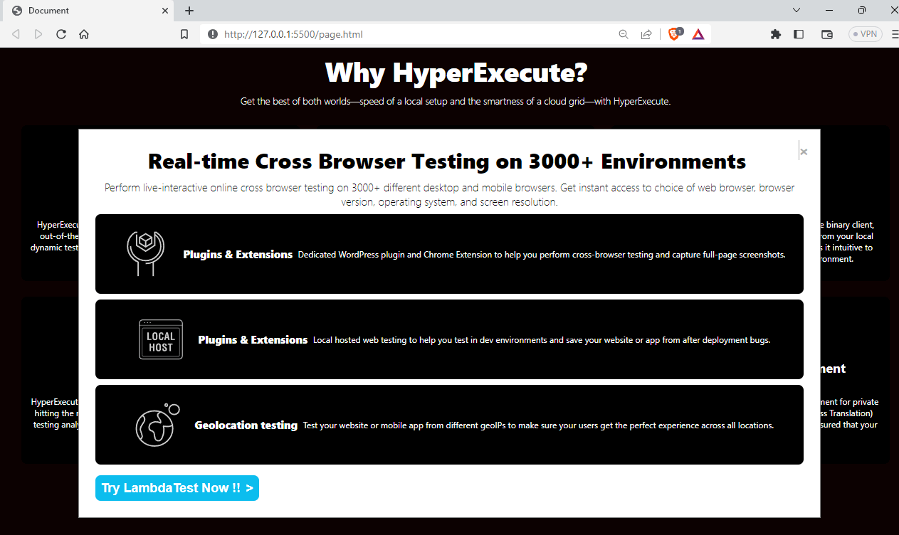
On mobile devices, as intended the pop-up is not shown as we used the window.matchMedia property to avoid showing the pop-up on devices that are less than 768px width.
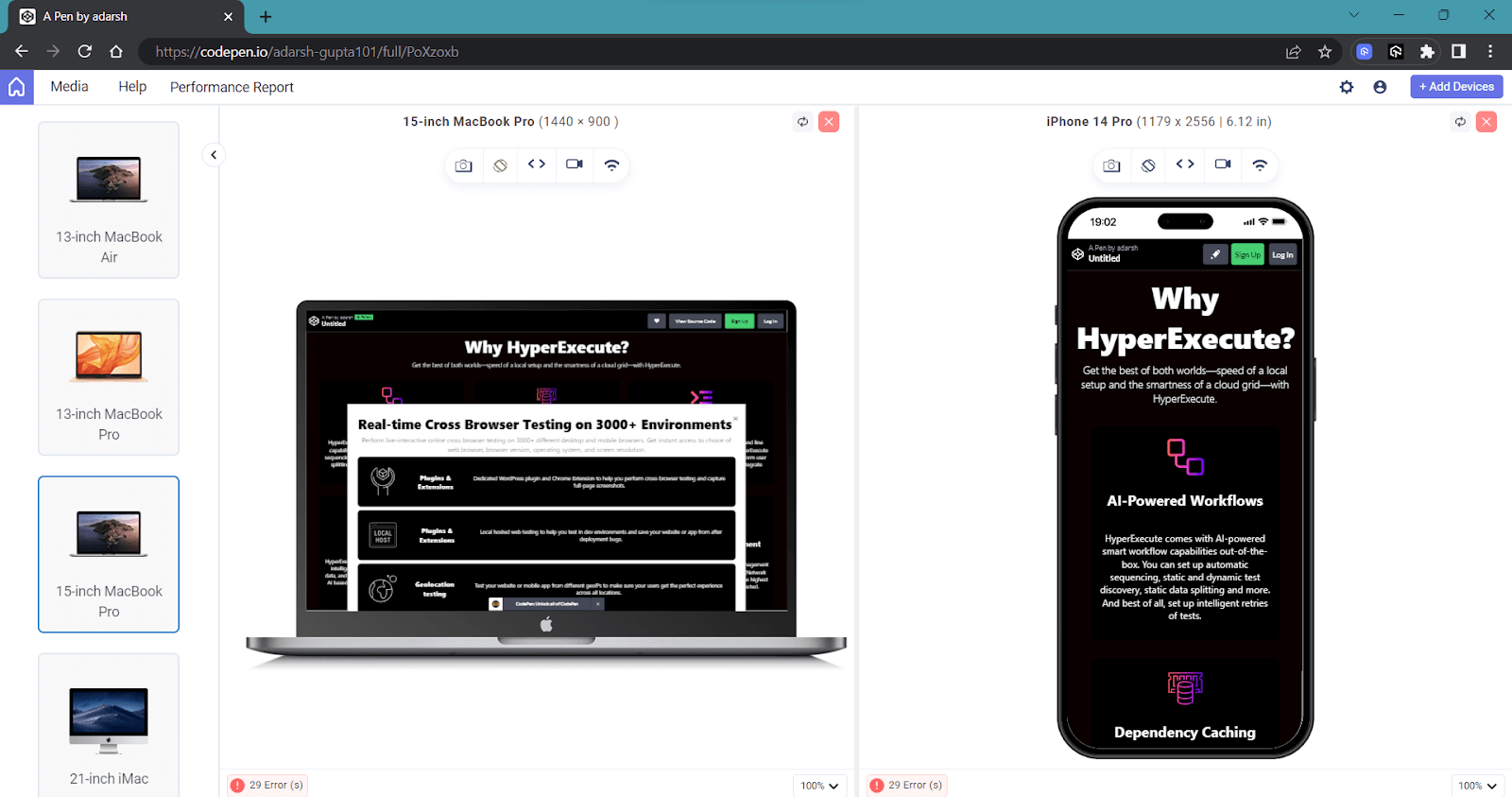
Cross-Browser Compatibility for CSS Media Queries
Browsers are constantly evolving, and even a minor change in a feature or its removal can impact millions of users. That’s why it’s crucial to ensure that media queries for standard devices, which control the responsive design, are thoroughly tested and compatible with various browsers.
According to caniuse.com, most modern browsers widely support the latest CSS3 media queries for standard devices.
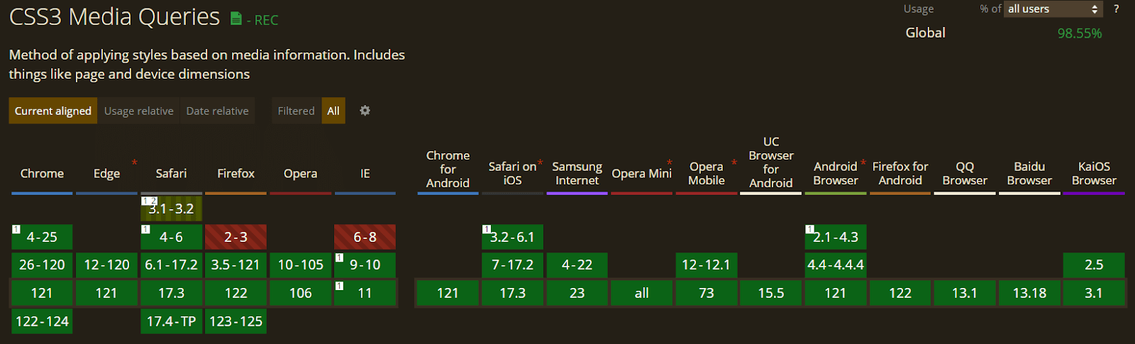
Media queries for standard devices are supported by nearly all major browsers, such as Chrome, Safari, and Firefox. However, some media features aren’t entirely compatible with all browsers, and specific media rules have been deprecated. For instance, media features like color-scheme are no longer recommended, and several new experimental features might not be available on all devices.
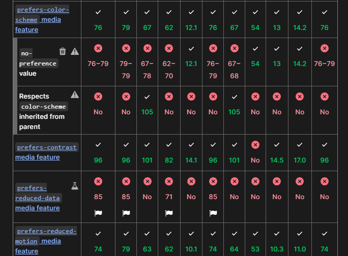
You can find the comprehensive list of browser compatibility for various media features on MDN docs.
When working with media queries for standard devices, it’s crucial to remember the standard syntax laid out by the W3C. This means avoiding vendor-specific prefixes like -webkit- or -moz-, which can lead to inconsistencies. Adhering to the standardized format ensures a more reliable and smoother experience across various browsers.
Utilizing the standard syntax in your media queries for standard devices is recommended for improved cross-browser compatibility and a consistent design. An example is using @media screen and (max-width: 768px) { … } as this ensures smoother compatibility and uniformity across different browsers.
It’s always a good practice to test the website or application on various browsers. This ensures cross-browser compatibility and provides a seamless user experience for all visitors. For this, you can leverage cloud-based testing platforms such as LambdaTest. It is an AI-powered test orchestration and execution platform that allows developers and testers to perform cross-browser compatibility testing at scale across various real browsers, devices, and platforms.
Using LT Browser to Test Media Queries for Standard Devices
Responsive design ensures your website adapts to different screen sizes for optimal user experience across devices. Media queries for standard devices in CSS are crucial in achieving this. However, testing them thoroughly is essential to make sure they work as intended.
Let’s now see how we can use a responsiveness testing tool called LT Browser (as mentioned earlier) to test the responsiveness of our websites.
Developed by LambdaTest, LT Browser is one of the most handy responsive testing tools to help you simulate web applications on various screen sizes. LT Browser is powered by the latest native Chromium rendering engine, taking your responsive testing to the next level.
Want more such videos? Subscribe to the LambdaTest YouTube Channel.
With LT Browser, you can test and interact with up to six devices simultaneously, including Android, iOS, and desktop. Real-time previewing of all changes saves developers from the hassle of repeatedly switching browser resolutions.
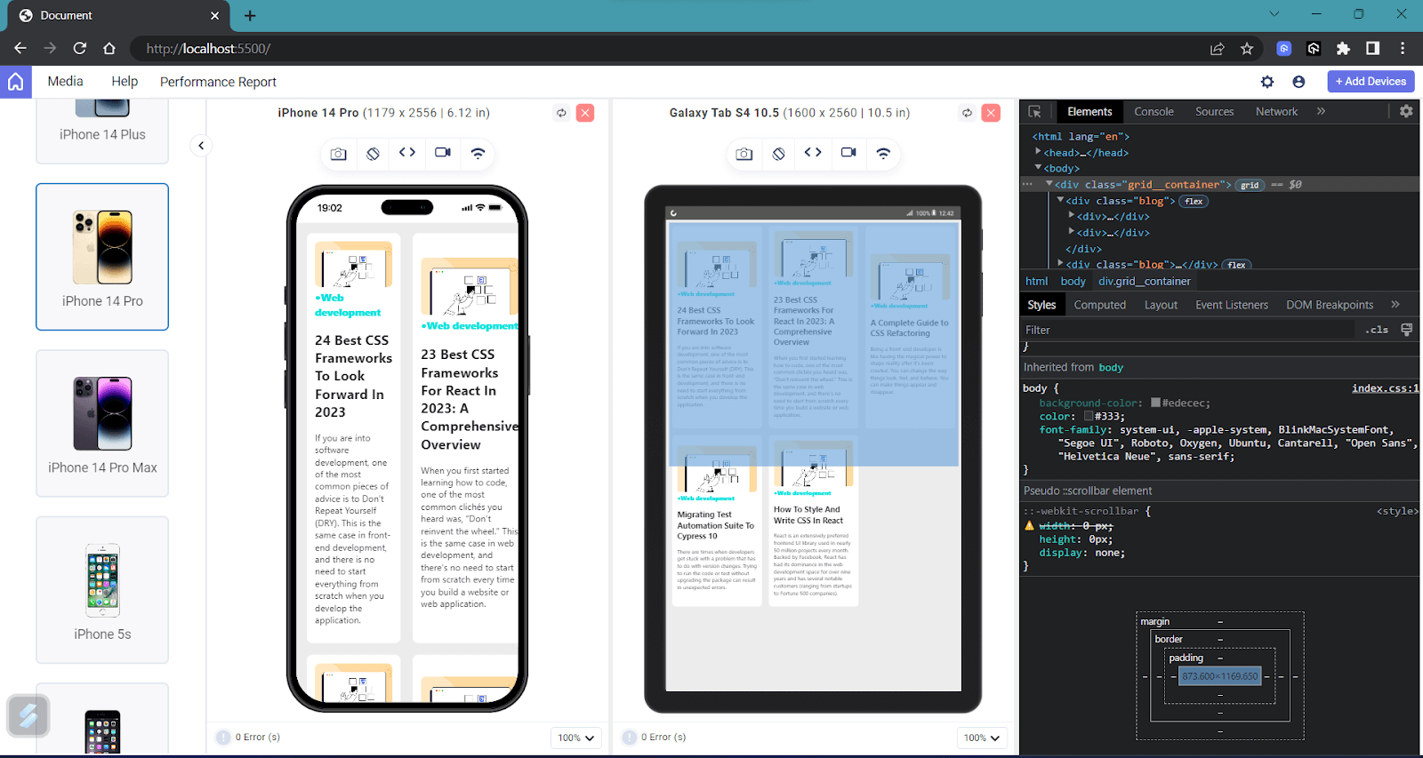
You can also improve your debugging experience by using multiple DevTool options, and the best part is that you can now use different DevTools for each device and debug them all at the same time. Additionally, you can use LT Debug, an easy-to-use developer tool with over nine unique features that web developers and testers regularly use during debugging.
LambdaTest also provides access to more than 100+ free online developer tools that developers and testers often use.
Best Practices for Using Media Queries for Standard Devices
So far, we have explored nearly all aspects of media queries for standard devices. Let’s now take some time to understand some best practices that can be followed when using media queries for standard devices.
Follow Mobile-First Approach
The mobile-first approach has become a trend, and most CSS frameworks also implement it. Starting with mobile-first forces you to simplify your design, focusing on crucial content and functionality for mobile users.
After refining the mobile layout, you can progressively enhance it for desktop users, avoiding the need to remove elements later. This approach ensures a seamless user experience across all devices.
Use Logical Breakpoints
When selecting breakpoints, think logically about your content and design rather than solely relying on device dimensions. You must prioritize the content flow and readability to ensure a smooth and enjoyable user experience across various screen sizes.
Combine Multiple Media Queries
Grouping similar breakpoints in media queries for standard devices is a smart way to tidy up your code and make your website faster. When you combine related media queries for standard devices, your CSS becomes more organized and efficient, resulting in a smoother and more responsive design on various screen sizes.
Optimize Performance
To optimize performance and create a more responsive website. It is important to minimize the heavy utilization of media queries for standard devices and avoid an excessive number of them on a single page. By doing so, you can significantly enhance the loading speed, resulting in a smoother user experience and improved overall performance.
Consider Accessibility
Make sure your design is accessible to all users. Some people depend on assistive technologies like screen readers, and it is our duty to ensure that the website is easy to use and navigate.
Test on Real Devices
Test your website on real devices to ensure it looks and functions smoothly on different screen sizes. This way, you can be confident that your design works well for all users, regardless of the device they are using.
To achieve scalability and reliability, you can use the real device cloud that LambdaTest offers to perform mobile app testing in real-world scenarios. You can test your website on different combinations of operating systems, browsers, screen resolutions, etc.
Finally, you might have doubts in your mind that there are several frameworks that accomplish the same task in a much simpler way. The point is that these frameworks solve the common responsiveness problem. However, when building an application that will eventually scale to millions of users, you need to have a deeper understanding of media queries and implement customized solutions.
Wrapping Up
In this tutorial, we have covered everything about media queries for standard devices, discussed various media features, and highlighted the significance of media queries in web development. Responsiveness has become necessary, and compromising on it is not an option. Having a good knowledge of media queries for standard devices can help you build responsive and adaptive websites.
Frequently Asked Questions (FAQs)
How do I set media queries on different devices?
To set a media query, you use the @media rule in your CSS. This rule takes a media type and a media feature as its arguments. The media type can be screen, print, or all. The media feature can be a variety of things, such as the width of the screen, the height of the screen, or the orientation of the device.
What media queries should I use for mobile?
For mobile web design, ditch targeting specific devices and focus on screen sizes. Start with styles for very small phones (480px) using a mobile-first approach, then add queries for larger phones (767px & 991px) and tablets (1024px).
Consider orientation (portrait/landscape) for specific layouts. Use viewport units (vw, vh) for responsive elements and test on various devices, adjusting queries as needed. Frameworks like Bootstrap offer pre-defined options for a quicker start. Remember, the best queries depend on your project and audience, so adapt these based on your specific needs.


Author’s Profile
Adarsh M
Adarsh is a full-stack JavaScript developer based out of India. He loves creating meaningful technical content on Twitter, where he connects with like-minded individuals and developer communities. He shares his knowledge on Twitter through insightful threads!
Blogs: 12
Got Questions? Drop them on LambdaTest Community. Visit now


