
CSS Transitions: A Detailed Guide With Examples
Alex Anie
Posted On: April 2, 2024
 128740 Views
 20 Min Read
Modern web design isn’t just static pages. It’s about creating interactive experiences for visitors. This includes effects like buttons that change color on hover, pop-up windows (modals) that appear, and elements that fade in or out as you scroll.
These dynamic elements are often in different states. CSS transitions allow you to smoothly change an element’s appearance between these states (hover, active, and focus). Using these state transitions effectively can create a more engaging and user-friendly website experience, guiding visitors and helping them focus on what matters most.
With the help of CSS transitions, an element’s change of state doesn’t have to be laggy, as we can apply micro-animations that enable smooth and easy changes of state as the user interacts with the element.
In this blog, we will explore what CSS transitions are with detailed examples of each property and how to use them to create stunning effects on the web.
TABLE OF CONTENTS
What are CSS Transitions?
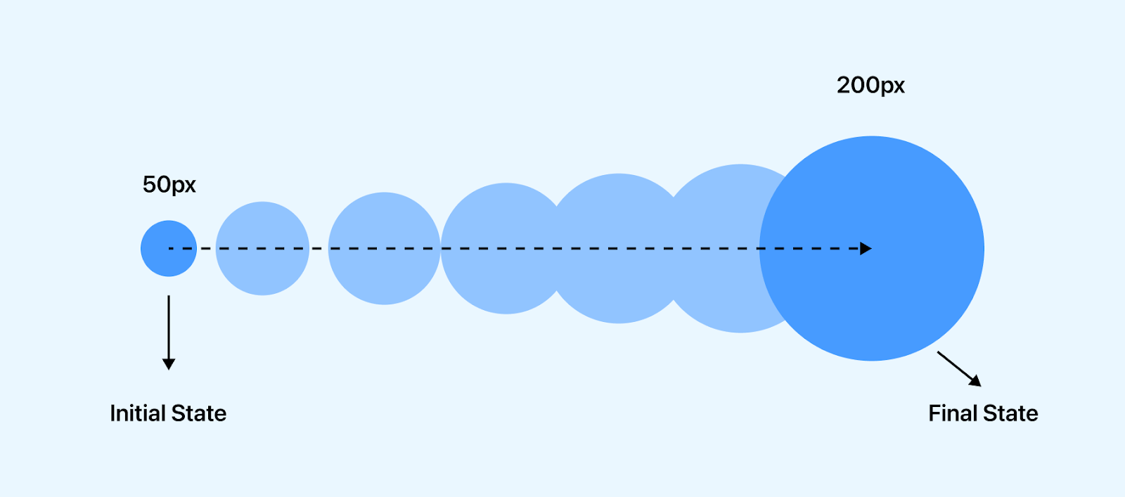
CSS transitions allow the smooth changes of CSS property values over a specified period of time.
By default, Cascading Style Sheets (CSS) is a declarative language; any style applied to a certain element takes immediate effect. This is very useful when we only need to style how the web page looks or feels when it first loads on the page.
However, some elements might require changes (state), which might be for aesthetics or to indicate that an element is clickable, such as a button, forms, cards, navbar links, user profile, or modal that performs a specific function.
For example, the LambdaTest home page shows interesting use cases for transitions.
A simple use case showing how CSS transition can be applied to different web elements, components, ranging from buttons, forms, cards, navbar links, user profiles, modals, etc. CSS transitions can be applied to these elements for smooth and easy state change while users interact with them.
How Does CSS Transition Work?
Transition works by specifying which CSS property or properties should be changed when a user trigger occurs, which results in a change in state. This change in state moves from the initial state to the final state.
CSS transition only takes place when a user trigger occurs and is commonly used with hover effects. However, other CSS pseudo-classes such as focus, active and JavaScript events can trigger CSS transitions.
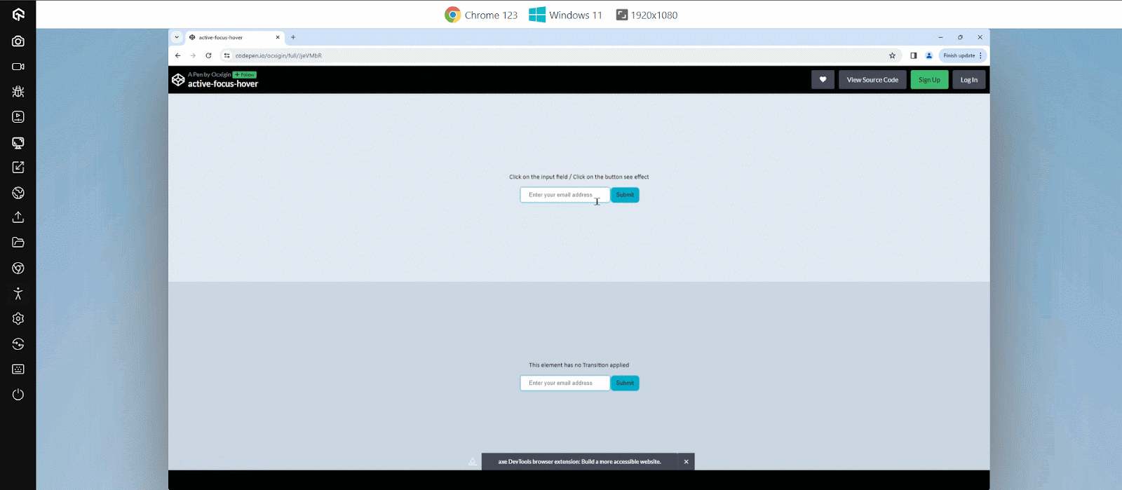
Here is an example below that shows how the transition effect applies to hover, active, and focus state.
HTML:
|
1 2 3 4 5 6 7 8 9 10 11 12 13 14 15 16 17 18 19 20 21 22 23 24 25 26 27 |
<body> <main class="main"> <main> <!-- Transition --> <section class="t"> <div class="text"> <p>Click on the input field / Click on the button see effect</p> </div> <div> <input type="text" placeholder="Enter your email address " class="transition"> <input type="submit" class="transition"> </div> </section> <!-- No Transition --> <section class="no-t"> <div class="text"> <p>This element has no Transition applied</p> </div> <div> <input type="text" placeholder="Enter your email address"> <input type="submit"> </div> </section> </main> </main> </body> |
CSS:
|
1 2 3 4 5 6 7 8 9 10 11 12 13 14 15 16 17 18 19 20 21 22 23 24 25 26 27 28 29 30 31 32 33 34 35 36 37 38 39 40 41 42 43 44 45 46 47 48 49 50 51 52 53 54 55 56 57 58 59 60 61 62 63 64 65 66 67 68 69 70 71 72 73 74 75 76 |
*, *::before, *::after { padding: 0; margin: 0; box-sizing: border-box; } body { overflow: hidden; } .t { display: flex; flex-direction: column; justify-content: center; align-items: center; height: 50vh; width: 100vw; background-color: rgb(226 232 240); } .no-t { display: flex; flex-direction: column; justify-content: center; align-items: center; height: 50vh; background-color: rgb(203 213 225); width: 100vw; } /* Input Email Button */ [type="text"]{ padding: 10px 20px; border: 1px solid #0ebac5; border-radius: 5px; outline: none; } /* Focus State */ [type="text"]:focus{ box-shadow: inset 0 0 6px 2px #0ebac5; } /* Submit Button */ [type="submit"]{ line-height: 30px; background-color: #0ebac5; padding: 0 10px; border-radius: 5px; border: 0; user-select: none; cursor: pointer; box-shadow: 0 0 0 3px #0ebac5; } .transition { transition: all 0.3s; } [type="submit"]:hover{ background-color: white; } [type="submit"]:active{ box-shadow: 0 0 0px 0px #0ebac5; transform: translateY(2px); } /* Text */ p { font-size: 15px; font-family: calibri; margin-bottom: 1em; } |
From the code sample above, we have two separate elements created. The first element is an input tag that allows us to provide an email address, and beside it, we have a submit button that sends the email to a database.
The input tag is set to a focus state of box-shadow, which helps indicate that the input tag is activated. While on the submit button, the background is removed, leaving only the outline properties. This action is seen when we hover on the button element.
However, hover is not enough to set interactivity on a button, so we set the active state to transform:translateY(2px) to position the button down when a user clicks on it, and the box-shadow is completely removed. This gives the button element a bounce effect when activated (clicked).
The second input, like the first, possesses identical style properties; however, it lacks any applied transitions, resulting in lag compared to the first one.
See the Pen
active-focus-hover by Ocxigin (@ocxigin)
on CodePen.
CSS Transition Properties (Longhand)
The CSS transition longhand properties are used to determine which properties should be transitioned, the time frame the transition should occur, the flow of the transition, and whether or not the transition should wait before it starts to apply the transition effect.
The CSS transition longhand properties consist of four properties, which include;
- transition-property
- transition-duration
- transition-timing-function
- transition-delay
Example:
|
1 2 3 4 5 6 7 8 9 10 |
.element { transition-property: background-color; transition-duration: 500ms; transition-timing-function: linear; transition-delay: 200ms; } .element:hover { background-color: cyan; } |
transition-property
The CSS transition-property is a longhand property used to set properties that need to be transitioned. This property takes one or more properties as values and is separated by a comma.
The property(ies) specified in the transition-property are transitioned. However, the all keyword can be used to transition every property applied to the element.
Example:
|
1 2 3 4 5 6 7 8 9 10 11 12 13 14 15 16 17 18 |
.element { /* Single value*/ transition-property: width; /* Multiple Values value*/ transition-property: width, background-color, opacity, transform; /* Keyword values */ transition-property: none; transition-property: all; /* Global values */ transition-property: initial; transition-property: unset; transition-property: revert; transition-property: revert-layer; transition-property: inherit; } |
Here, the first element has no transition applied. As a result, the width size bumps as it grows, while the second element only has a change of background-color transition on hover, the third element, on the other hand, has background-color and scale on transition, and the fourth element has the all property set on transition.
HTML:
|
1 2 3 4 5 6 7 8 9 10 11 12 13 14 15 16 17 18 19 20 21 22 23 |
<body> <main class="main"> <!-- Transition None --> <div class="none element"> <p>Transition: <code>none</code></p> </div> <!-- Transition None --> <div class="single element"> <p>Transition: <code>background-color</code></p> </div> <!-- Transition Background-color --> <div class="multiple element"> <p>Transition: <code>background-color, scale</code></p> </div> <!-- Transition all --> <div class="all element"> <p>Transition: <code>all</code></p> </div> </section> </main> </body> |
CSS:
|
1 2 3 4 5 6 7 8 9 10 11 12 13 14 15 16 17 18 19 20 21 22 23 24 25 26 27 28 29 30 31 32 33 34 35 36 37 38 39 40 41 42 43 44 45 46 47 48 49 50 51 52 53 54 55 56 57 58 59 60 61 62 63 64 65 66 67 68 69 70 71 72 73 74 75 76 |
*, *::before, *::after { padding: 0; margin: 0; box-sizing: border-box; } p { font-family: calibri; } .main { display: flex; justify-content: center; align-items: center; width: 100vw; height: 100vh; } .element { width: 100px; height: 100px; background-color: #0ebac5; margin: 10px; border-radius: 5px; user-select: none; cursor: pointer; padding: 5px; box-shadow: 0 20px 25px -5px rgb(0 0 0 / 0.1), 0 8px 10px -6px rgb(0 0 0 / 0.1); } code { color: white; font-weight: 400; } /* No Transition */ .none:hover { background-color: salmon; opacity: 0.8; background-color: peru; width: 200px; box-shadow: none; } /* Single Transition */ .single, .multiple, .all { transition-property: background-color; transition-duration: 500ms; transition-timing-function: linear; } .single:hover { background-color: orange; } /* Multiple Transition */ .multiple { transition-property: background-color, scale; } .multiple:hover { background-color: tomato; scale: 0.9; } /* all Transition */ .all { transition-property:all; } .all:hover { opacity: 0.8; background-color: peru; width: 200px; box-shadow: none; } |
See the Pen
transition-property by Ocxigin (@ocxigin)
on CodePen.
transition-duration
The CSS transition-duration sets the time interval that the transition needs in order to move from its initial state to the final state.
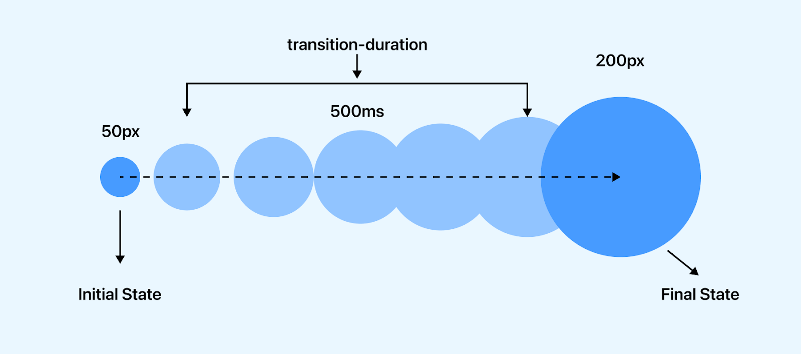
The transition-duration property takes a number value. This number is measured in seconds (s) and milliseconds (ms), where 1000ms means 1s (one second) and 0.5s (zero point five seconds) means 500ms.
By default, the value is set to 0s, which means no transition will occur.
It’s common to specify one value. However two or more values can be specified in one declaration. This is used when we specify different transition-duration values based on the multiple properties defined in the CSS transition-property.
Example:
|
1 2 3 4 5 6 7 8 9 10 11 12 13 14 15 16 |
.element { /* Single value*/ transition-duration: 0.5s; /* 500 milliseconds*/ transition-duration: 200ms; /* 0.2 seconds*/ /* Multiple Values */ transition-duration: 1s, 500ms; /* one second & 500 milliseconds*/ transition-duration: 4s, 2s, 100ms; /* 4 seconds , 2 seconds & 100 milliseconds*/ /* Global values */ transition-duration: initial; transition-duration: unset; transition-duration: revert; transition-duration: revert-layer; transition-duration: inherit; } |
Here, from the browser preview each card moves according to the transition-duration set on them.
HTML:
|
1 2 3 4 5 6 7 8 9 10 11 12 13 14 15 16 17 18 19 20 21 22 23 24 25 26 27 28 29 |
<main class="main"> <aside> <div class="text">Click on the play Icon to toggle the effect on and off </div> <div class="card one"> <img src="https://user-images.githubusercontent.com/78242022/241960972-8df69d68-13b8-41a1-9a8f-610b32f1ba1d.png" alt=""> <span>0.5 seconds</span> </div> <div class="card two"> <img src="https://user-images.githubusercontent.com/78242022/241960972-8df69d68-13b8-41a1-9a8f-610b32f1ba1d.png" alt=""> <span>1 seconds</span> </div> <div class="card three"> <img src="https://user-images.githubusercontent.com/78242022/241960972-8df69d68-13b8-41a1-9a8f-610b32f1ba1d.png" alt=""> <span>2 seconds</span> </div> <div class="card four"> <img src="https://user-images.githubusercontent.com/78242022/241960972-8df69d68-13b8-41a1-9a8f-610b32f1ba1d.png" alt=""> <span>5 seconds</span> </div> <button id="btn" class="play">▶ Play</button> </aside> </main> |
CSS:
|
1 2 3 4 5 6 7 8 9 10 11 12 13 14 15 16 17 18 19 20 21 22 23 24 25 26 27 28 29 30 31 32 33 34 35 36 37 38 39 40 41 42 43 44 45 46 47 48 49 50 51 52 53 54 55 56 57 58 59 60 61 62 63 64 65 66 67 68 69 70 71 72 73 74 75 76 77 78 79 80 81 82 83 84 85 86 87 88 89 90 91 92 93 |
*, *::before, *::after { padding: 0; margin: 0; box-sizing: border-box; } .main { width: 80%; height: 100vh; display: flex; align-items: center; margin: 0 auto; } .one { transition-duration: 500ms; } .two { transition-duration: 1s; } .three { transition-duration: 2s; } .four { transition-duration: 5s; } .translate__icon { transform: translateX(500px); } .play { display: block; background: #0ebac5; border: none; cursor: pointer; line-height: 40px; padding: 0 50px; border-radius: 100px; -webkit-user-select: none; user-select: none; box-shadow: 0 0 0 4px #0ebac5; transition: all 0.5s ease; margin: 2em 0; } .play:hover { background: white; } .play:active { box-shadow: none; transform: translateY(2px); } .text { font-family: calibri; text-align: center; } span { display: block; font-family: calibri; font-size: 20px; background-color: #0ebac5; white-space: nowrap; padding: 1px; position: absolute; top: 2; left: 0; } /* Card */ .card { width: 90px; height: 90px; margin-top: 20px; background: #0ebac5; padding: 5px; border-radius: 5px; position: relative; transition-property: transform; transition-timing-function: ease; } img{ width: 80%; margin-left: 10px; } |
JavaScript:
|
1 2 3 4 5 6 7 8 9 |
const btn = document.getElementById('btn'); btn.addEventListener('click', move) function move(){ const cardEle = document.querySelectorAll('.card'); for(const card of cardEle){ card.classList.toggle('translate__icon') } } |
See the Pen
transition-duration by Ocxigin (@ocxigin)
on CodePen.
transition-timing-function
The CSS transition-timing-function property sets the speed of the transition curve based on the value defined on the transition-duration property.
The transition-timing-function takes in keyword values that determine how fast or slow the transition should start, end, or move in between the transitions.
Example:
|
1 2 3 4 5 6 7 8 9 10 11 12 13 14 15 16 17 18 19 20 21 22 |
/* Keyword values */ transition-timing-function: ease; transition-timing-function: ease-in; transition-timing-function: ease-out; transition-timing-function: ease-in-out; transition-timing-function: linear; transition-timing-function: step-start; transition-timing-function: step-end; /* Function Values */ transition-timing-function: cubic-bezier(0.165, 0.84, 0.44, 1); transition-timing-function: steps(4, jump-end); /* Multiple Values */ transition-timing-function: linear, step-start, cubic-bezier(0.23, 1, 0.320, 1); /* Global values */ transition-timing-function: initial; transition-timing-function: unset; transition-timing-function: revert; transition-timing-function: revert-layer; transition-timing-function: inherit; |
Values of transition-timing-function
With the transition-timing-function values, we can specify the flow and speed of the transition curve as the element transitions.
These values are mainly keyword values with an additional value called cubic-bezier()
for specifying custom values.
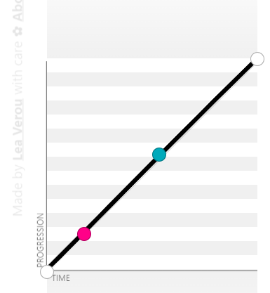
linear
The linear value moves the transition along a straight line from the initial state to the final state. There is simply no curve along the linear graph, and it’s equal to the same cubic-bezier(0.0, 0.0, 1.0, 1.0).
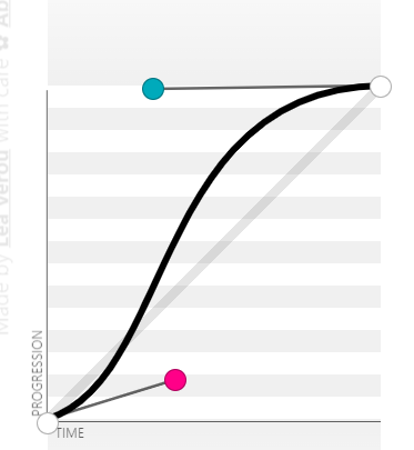
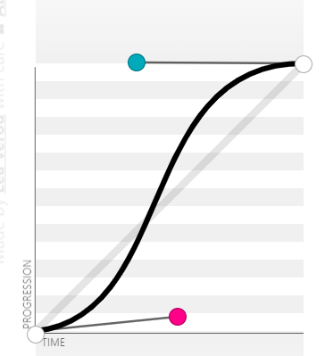
ease
The ease value is the default value. When specified, it starts faster and then moves slowly towards the middle and to the end. It is equal to the same cubic-bezier(0.25, 0.1, 0.25, 1.0).
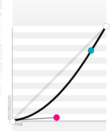
ease-in
The ease-in value starts slowly and then moves faster towards the end. It is equal to the same cubic-bezier(0.42, 0, 1.0, 1.0).
ease-out
The ease-out value starts fast and then moves slowly towards the end. The ease-out is the direct opposite of the ease-in timing-function. It is equal to the same cubic-bezier(0, 0, 0.58, 1.0).

ease-in-out
The ease-in-out value starts slowly and then moves fast towards the middle and then moves slowly again towards the end. It is equal to the same cubic-bezier(0.42, 0, 0.58, 1.0).
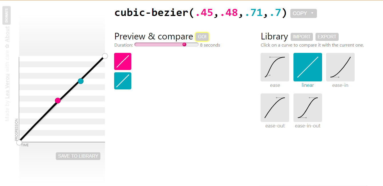
cubic-bezier()
The cubic-bezier() function value sets a custom timing function on transitions. The values of a cubic-bezier are very complex and are usually generated instead of being created by the author. This makes cubic-bezier values unique and responds differently to transitions.
To generate a cubic-bezier, set the transition and specify any of the keyword timing functions, For example, ease. Then open your DevTools by clicking F12 on Windows or Shift + ⌘(ctrl) + J on macOS.
This should open up your DevTools, then do the following;
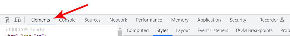
- Select the Elements tab.
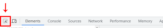
- Click on the inspect icon and then select the element with a transition applied to it.
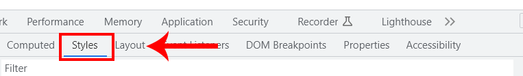
- Navigate to the Styles panel.
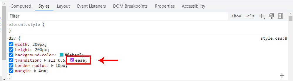
- Click on the ease icon. This should open up a dialog box.
- Drag and adjust the anchor points on the curve to change the value to a cubic-bezier.
- Copy the generated cubic-bezier code and paste it to replace the ease timing-function in your text editor.
- hover
- active
- focus
- visited
- scroll
- click
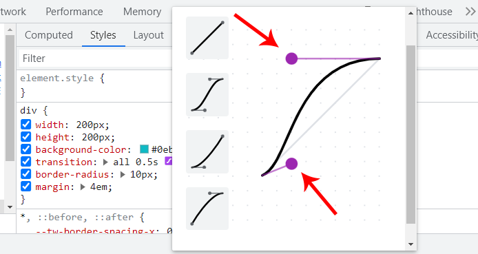
The DevTools cubic-bezier panel is a very convenient way to generate a cubic-bezier.
The browser preview below shows how the transition-timing-function values affect the transition speed.
From the browser preview, each list item is set to a different transition-timing-function values.
HTML:
|
1 2 3 4 5 6 7 8 9 10 11 12 13 14 15 16 17 18 19 20 21 22 |
<main class="main" id="play"> <section> <section> <div> <p class="text">Click on the play button to animate items and click on the reset button to set items to default</p> <a href="#play" class="play">▶Play</a> <a href="#reset" class="play reset">reset</a> </div> </section> <section> <ul> <li class="linear"><a href="#grow">linear</a></li> <li class="ease"><a href="#grow">ease</a></li> <li class="ease-in"><a href="#grow">ease-in</a></li> <li class="ease-out"><a href="#grow">ease-out</a></li> <li class="ease-in-out"><a href="#grow">ease-in-out</a></li> <li class="cubic-bezier"><a href="#grow">cubic bezier</a></li> </ul> </section> </section> </main> |
CSS:
|
1 2 3 4 5 6 7 8 9 10 11 12 13 14 15 16 17 18 19 20 21 22 23 24 25 26 27 28 29 30 31 32 33 34 35 36 37 38 39 40 41 42 43 44 45 46 47 48 49 50 51 52 53 54 55 56 57 58 59 60 61 62 63 64 65 66 67 68 69 70 71 72 73 74 75 76 77 78 79 80 81 82 83 84 85 |
*, *::before, *::after { padding: 0; margin: 0; box-sizing: border-box; } .main { width: 80%; height: 100vh; margin: 4em auto; } .text { font: 18px calibri; } .play { display: inline-block; color: white; background-color: #0ebac5; padding: 4px 16px; border-radius: 100px; -webkit-user-select: none; user-select: none; text-decoration: none; background-color: black; margin: 2em 0; } /* .reset {font: 20px calibri} */ .play:hover{background-color: #0a8e97;} .play:active {transform: translateY(2px);} a[href="#grow"]{ font: 20px calibri; color: white; text-decoration: none; } html { scroll-padding-top: 5em; } li { background-color: #0ebac5; margin: 4px; width: 9em; padding: 10px; list-style: none; text-align: center; transition-property: width; transition-duration: 2s; } #play:target li{ width: 100%; } /* transition-timing-function declaration*/ .linear { transition-timing-function: linear; } .ease { transition-timing-function: ease; } .ease-in { transition-timing-function: ease-in; } .ease-out { transition-timing-function: ease-out; } .ease-in-out { transition-timing-function: ease-in-out; } .cubic-bezier { transition-timing-function: cubic-bezier(0.25, 0.46, 0.45, 0.94); } |
See the Pen
transition-timing-function by Ocxigin (@ocxigin)
on CodePen.
steps()
The steps() function is another value of the transition-timing-function; unlike the previous values that follow a certain acceleration curve in a smooth direction, the steps() function does something different instead; it jumps from one point to another based on the steps provided.
For example, if a value of 6 is parsed as an argument into the steps() function, it will jump six times from the initial state to the final state. However, if a different value is parsed, it will jump based on the number of that value parsed.
The steps() function takes in two arguments, the first being the number of steps the transition should jump while the send argument is optional, but when specified, it determines how the jump behaves during the transition.
Syntax:
|
1 2 3 |
/* Steps function keyword steps(value, position[optional]) */ transition-timing-function: steps(6); transition-timing-function: steps(6, jump-both); |
The steps optional argument includes; jump-start, jump-end, jump-both, jump-none, start, end, step-start, and step-ends. This determines how the jump behaves during the CSS transition.
Now let’s see what the steps look like when implemented.
From the browser preview, we have 10 elements, with a size of 90px width each and a box element of 90px by 90px pixels width and height respectively.
The box element is set to jump 9 times across each element, so a max value of transform: translateX(810px) is assigned to the target element when the state is changed. However, the 810px is 90px multiplied by 9. This will make the box element jump 9 times at 90px per frame.
If you are wondering why 9 times instead of 10, since we have 10 elements, well the box will start jumping from the second frame (second element), which is 90px apart from the first one.
See the Pen
transition-timing-function steps() by Ocxigin (@ocxigin)
on CodePen.
Specifying a lower or higher value instead of 9 with the same max value of 810px at state change, the jumping transition will overlap and not jump in place.
HTML:
|
1 2 3 4 5 6 7 8 9 10 11 12 13 14 15 16 17 18 19 20 21 22 23 24 |
<body> <main class="main" id="move"> <section> <section class="action"> <p class="text">Click the buttons below to toggle the box forward and backward</p> <a href="#move" class="btn">move box</a> <a href="#nomove" class="btn">reset box</a> </section> <section class="step-container"> <div class="step step-1">step 1</div> <div class="step step-2">step 2</div> <div class="step step-3">step 3</div> <div class="step step-4">step 4</div> <div class="step step-5">step 5</div> <div class="step step-6">step 6</div> <div class="step step-7">step 7</div> <div class="step step-8">step 8</div> <div class="step step-9">step 9</div> <div class="step step-10">step 10</div> <div class="box"></div> </section> </section> </main> </body> |
CSS:
|
1 2 3 4 5 6 7 8 9 10 11 12 13 14 15 16 17 18 19 20 21 22 23 24 25 26 27 28 29 30 31 32 33 34 35 36 37 38 39 40 41 42 43 44 45 46 47 48 49 50 51 52 53 54 55 56 57 58 59 60 61 62 63 64 65 66 67 68 69 70 71 |
*, *::before, *::after { padding: 0; margin: 0; box-sizing: border-box; } html { scroll-padding-top: 2em; } .step-container { display: grid; grid-template-columns: repeat(10, 90px); place-items: center; height: 100vh; position: relative; white-space: no-spaces; margin-left: 6em; } .text { font-family: calibri; margin-bottom: 2em; } .action { margin: 2em 6em; } .btn { color: black; background-color: #0ebac5; line-height: 40px; display: inline-block; text-decoration: none; padding: 0 10px; border-radius: 100px; -webkit-user-select: none; user-select: none; } .btn:hover {background-color: #0dd7f1 ;} .btn:active {transform: translateY(2px);} #move:target .box { -webkit-transform: translateX(810px); transform: translateX(810px); } .step, .box { width: 90px; background-color: #0ebac5; line-height: 90px; text-align: center; outline: 2px solid #03545a; -webkit-user-select: none; user-select: none; } .box { height: 90px; outline: 2px solid #c45a03; background-color:rgba(2, 40, 43, 0.445); position: absolute; left: 0; transition-property: transform; transition-duration: 3s; transition-timing-function: steps(9, start); } |
So, we’ve seen what the steps() function can do. However, in a real-world project, you won’t necessarily be animating elements over other groups of elements.
So here is a good use case where the steps() function can be useful.
Below is a simple stop motion effect, whereby we move the group of eight static images of size 90px each and offset the background position by -630px on the X-axis and 0 on the Y-axis, and then we set the steps() to jump seven times over each image creating a frame by frame animation (stop motion).
This is a cool way of creating an animation in CSS using the steps() function.
HTML:
|
1 2 3 4 5 6 7 8 9 10 11 12 13 |
<body> <main class="main" id="frame"> <section class="center-content"> <div> <a href="#frame" class="btn">▶ Play</a> <a href="#noframe" class="btn">◀◀ Backward</a> </div> <div> <div class="image_frames"></div> </div> </section> </main> </body> |
CSS:
|
1 2 3 4 5 6 7 8 9 10 11 12 13 14 15 16 17 18 19 20 21 22 23 24 25 26 27 28 29 30 31 32 33 34 35 36 37 38 39 40 41 42 43 44 45 46 47 48 49 |
*, *::before, *::after { padding: 0; margin: 0; box-sizing: border-box; } .btn { display: inline-block; margin: 2em 10px; text-decoration: none; background-color: #0ebac5; color: #fff; padding: 0 16px; line-height: 40px; border-radius: 100px; -webkit-user-select: none; user-select: none; } .btn:active {transform: translateY(2px);} .btn:hover {background-color: black;} #frame:target .image_frames { background-position: -630px 0; } .center-content { display: flex; justify-content: center; flex-direction: column; align-items: center; height: 100vh; } .image_frames { width: 80px; height: 90px; background: url('https://user-images.githubusercontent.com/78242022/259878192-b94f55d2-47a0-4747-9366-eed5b975231b.png'); background-size:cover; background-repeat: no-repeat; background-origin: border-box; border: 2px solid #000; box-shadow: 5px 5px 13px 4px rgba(0,0,0,0.4); transition-property: all; transition-duration: 3s; transition-timing-function: steps(7); } |
See the Pen
stop motion in CSS by Ocxigin (@ocxigin)
on CodePen.
transition-delay
The CSS transition-delay sets how long the transition should wait before the effect is transitioned.
By default transition-delay is set to 0, meaning no delay is specified. Transition delay, accepts number values with a time unit of s (seconds) and ms (milliseconds) respectively.
From the browser preview, the red circle does not wait, it kick-off immediately because no delay was set, while the orange circle has to wait for two sections before the transition kicks off. The blue and purple circles wait 500 milliseconds and 200 milliseconds, respectively.
HTML:
|
1 2 3 4 5 6 7 8 9 10 11 12 13 |
<body> <main class="main"> <section> <div class="text"><p>hover on the square box to move the circle</p></div> <main class="circle-wrapper"> <div class="circle red"></div> <div class="circle blue"></div> <div class="circle orange"></div> <div class="circle purple"></div> </main> </section> </main> </body> |
CSS:
|
1 2 3 4 5 6 7 8 9 10 11 12 13 14 15 16 17 18 19 20 21 22 23 24 25 26 27 28 29 30 31 32 33 34 35 36 37 38 39 40 41 42 43 44 45 46 47 48 49 50 51 52 53 54 55 56 57 58 59 60 61 62 63 64 65 66 67 68 69 70 71 72 73 74 75 76 77 |
*, *::before, *::after { padding: 0; margin: 0; box-sizing: border-box; } .main { display: flex; justify-content: center; align-items: center; height: 100vh; } .text { display: flex; justify-content: center; margin-bottom: 2em; } p { font: 20px calibri; } .circle-wrapper { display: flex; justify-content: center; align-items: end; gap: 16px; flex-wrap: wrap; width: 400px; height: 400px; border: 2px dotted black; transition-property: all; transition-duration: 1s; transition-timing-function: ease; cursor: pointer; } .circle { width: 50px; height: 50px; background-color: black; border-radius: 100%; transition-property: all; transition-duration: 1s; transition-timing-function: ease; } .circle-wrapper:hover { box-shadow: 0 0 1px 1px #0ebac5; border: 3px dotted #0ebac5; } .circle-wrapper:hover .circle{ transform: translateY(-340px); } .red{ background-color: red; transition-delay: 0; } .blue{ background-color: blue; transition-delay: .5s; } .orange{ background-color: orange; transition-delay: 2s; } .purple{ background-color: purple; transition-delay: 200ms; } |
See the Pen
transition delay in css by Ocxigin (@ocxigin)
on CodePen.
CSS Transition Properties (Shorthand)
The CSS transition is a shorthand property for transition-property, transition-duration, transition-timing-function, and transition-delay.
With these shorthand properties, we can specify all transition longhand properties in a single declaration. This is very useful for writing short, simple, and maintainable code.
Example:
|
1 2 3 4 5 6 7 8 9 10 11 12 13 14 15 16 17 18 19 20 |
.element { /* property name | duration | easing function | delay */ transition: width 500ms ease 1s; /* property name | duration | easing function */ transition: width 500ms ease; /* Apply to 2 properties */ transition: width .5s, opacity, cubic-bezier(0.075, 0.82, 0.165, 1); /* Apply to all changed properties */ transition: all 300ms ease; /* Global values */ transition: initial; transition: inherit; transition: revert; transition: revert-layer; transition: unset; } |
Let’s look at a real-case scenario where the transition shorthand property can be used.
From the browser preview, each button has a transition effect specified by the transition shorthand property, which makes the social icons move and rotate smoothly within the buttons.
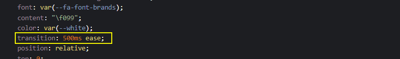
For example, the shape before the pseudo-element is set to a transition of 500ms ease.
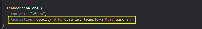
While on Facebook, before the pseudo-element is set to a transition of opacity 0.5s ease-in, transform 0.5s ease-in, this is a perfect example of how two or more properties can be declared in a single line using the transition shorthand property.
For more understanding, try the code example below:
HTML:
|
1 2 3 4 5 6 7 8 9 10 11 12 13 14 |
<link rel="stylesheet" href="https://cdnjs.cloudflare.com/ajax/libs/font-awesome/6.4.0/css/all.min.css" integrity="sha512-iecdLmaskl7CVkqkXNQ/ZH/XLlvWZOJyj7Yy7tcenmpD1ypASozpmT/E0iPtmFIB46ZmdtAc9eNBvH0H/ZpiBw==" crossorigin="anonymous" referrerpolicy="no-referrer" /> <body> <main class="main"> <section> <a href="#" class="shape twitter"></a> <a href="#" class="shape pinterest"></a> <a href="#" class="shape facebook"></a> <a href="#" class="shape tiktok"></a> <a href="#" class="shape instagram"></a> <a href="#" class="shape slack"></a> </section> </main> </body> |
CSS:
|
1 2 3 4 5 6 7 8 9 10 11 12 13 14 15 16 17 18 19 20 21 22 23 24 25 26 27 28 29 30 31 32 33 34 35 36 37 38 39 40 41 42 43 44 45 46 47 48 49 50 51 52 53 54 55 56 57 58 59 60 61 62 63 64 65 66 67 68 69 70 71 72 73 74 75 76 77 78 79 80 81 82 83 84 85 86 87 88 89 90 91 92 93 94 95 96 97 98 99 100 101 102 103 104 105 106 107 108 109 110 111 112 113 114 115 116 117 118 119 120 121 122 123 124 125 126 127 128 129 130 131 132 133 134 135 136 137 138 139 140 141 142 143 144 145 146 147 148 149 150 151 152 153 154 155 156 157 158 159 160 161 162 163 164 |
/* Global Styles */ *, *::after, *::before { margin: 0; padding: 0; box-sizing: border-box; } :root { --font: calibri; --size-pri: 1px; --size-sec: 100px; --pinterest-clr: #E60023; --twitter-clr: #1D9BF0; --facebook-clr: #4267B2; --tiktok-clr: linear-gradient(90deg, #ff0050, #00f2ea, #000000); --instagram-clr: linear-gradient(90deg, #405DE6, #5B51D8, #833AB4, #C13584, #E1306C, #FD1D1D, #F56040, #F56040, #FCAF45, #FFDC80); --slack-clr: linear-gradient(90deg, #36C5F0, #2EB67D, #E01E5A, #ECB22E); --white:#fff; } .main { display: grid; grid-template-columns: repeat(1 1fr); place-items: center; height: 100vh; } body { background-color: rgb(226 232 240); } .shape { display: inline-block; font-family: var(--font); position: relative; margin: 1em 1em; text-align: center; letter-spacing: 3px; text-decoration: none; line-height: 50px; opacity: 1; text-transform: uppercase; padding: 0 3rem; background: var(--twitter-clr); border-radius: 100px; box-shadow: 0 1px 2px 10px rgb(0 0 0 / 0.05); } .shape::before { display: inline-block; text-rendering: auto; -webkit-font-smoothing: antialiased; font: var(--fa-font-brands); content: "\f099"; color: var(--white); transition: 500ms ease; position: relative; top: 0; left: 0; opacity: 1; } /* Button One [Twitter]*/ .twitter:hover { background: none; outline: 1px solid var(--twitter-clr); } .twitter:hover::before { transform: skew(10deg) scale(1.5); color: var(--twitter-clr); } /* Button Two [pinterest]*/ .pinterest { background: var(--pinterest-clr); } .pinterest::before { content: "\f0d2"; } .pinterest:hover::before { transform: rotate(360deg) scale(1.5); /* transform: ; */ } /* Button Three [facebook]*/ .facebook { background: var(--facebook-clr); } .facebook::before { content: "\f09a"; transition: opacity 0.5s ease-in, transform 0.5s ease-in; } .facebook:hover::before { opacity: 0.5; transform: scale(1.5); } /* Button Four [ticktok]*/ .tiktok { background: var(--tiktok-clr); } .tiktok::before { content: "\e07b"; } .tiktok:hover::before { transform: skew(20deg, -20deg) scale(1.5); } /* Button Five [instagram]*/ .instagram { background: var(--instagram-clr); transition: background 0.5s ease; } .instagram::before { content: "\f16d"; } .instagram:hover::before { transform: matrix(0, 1, 1, 0, 0, 0) scale(1.5); } .instagram:hover { background-size: 350% 100%; animation-name: flow; animation-duration: 500ms; animation-timing-function: linear; animation-iteration-count: infinite; } @keyframes flow { 0% { background-position: 0% 50%; } 100% { background-position: 100%; } } /* Button Six [slack]*/ .slack { background: var(--slack-clr); } .slack::before { content: "\f198"; } .slack:hover::before { opacity: 0.5; transform: translateX(95%) scale(1.5) rotate(360deg); } /* Active State */ .shape:active { transform: translateY(4px); } |
See the Pen
Adding Transition to font awesome icons by Ocxigin (@ocxigin)
on CodePen.
In the next section, we will look at how to apply the CSS transition effects.
How to Apply CSS Transitions?
Now, let’s explore other techniques to create stunning and staggering effects with CSS transitions.
CSS Transitions on Cards
Adding transitions to card elements can improve the user experience. Subcard components such as buttons, images, and pop-ups can all be transitioned for smooth and easy user interaction.
Here, we build a card component with a user profile. Each card has an image to display the image of the user, the name and about section, and links for social media.
We have used LT Browser to render the output on different device viewports.
LT Browser enables developers and testers to perform responsive testing and debugging. It simulates various mobile experiences on viewports for mobile, tablet, desktop, and laptop. Each viewport comes equipped with dedicated Chrome DevTools, allowing you to inspect and fix issues specific to each mobile layout. This streamlines the testing process and empowers you to deliver a flawless mobile experience.

Beyond responsiveness, LT Browser helps you account for real-world scenarios. Test your website’s performance under different network speeds (fast 3G, slow 3G) to ensure it functions smoothly even with limited bandwidth.
To make things even more interactive, the transition is applied to each button, image, and pop.
HTML:
|
1 2 3 4 5 6 7 8 9 10 11 12 13 14 15 16 17 18 19 20 21 22 23 24 25 26 27 28 29 30 31 32 33 34 35 36 37 38 39 40 41 42 43 44 45 46 47 48 49 50 51 52 53 54 55 56 57 58 59 60 61 62 63 64 65 66 67 68 69 70 71 72 73 74 75 76 77 78 79 80 81 82 83 84 85 86 87 88 89 90 91 92 93 94 95 96 97 98 99 100 101 102 103 104 105 106 |
<link rel="stylesheet" href="https://cdnjs.cloudflare.com/ajax/libs/font-awesome/6.4.0/css/all.min.css" integrity="sha512-iecdLmaskl7CVkqkXNQ/ZH/XLlvWZOJyj7Yy7tcenmpD1ypASozpmT/E0iPtmFIB46ZmdtAc9eNBvH0H/ZpiBw==" crossorigin="anonymous" referrerpolicy="no-referrer" /> <link rel="stylesheet" href="main.css"> </head> <body> <main class="main"> <!-- Card one --> <section> <aside class="card"> <div class="header__profile"> <div class="profile__img"> <div class="img__wrap"> <img src="https://user-images.githubusercontent.com/78242022/242978218-d0e4eba2-62f7-4464-b2fb-c89835b6e592.jpg" alt=""> </div> <div class="social__icons"> <i class="fa-brands fa-twitter"></i> <i class="fa-brands fa-github"></i> <i class="fa-brands fa-linkedin"></i> </div> </div> <div class="profile__dec"> <h3>Alex Anie</h3> <h4>Web Developer</h4> <p>A Front End Technical Writer. I write blogs on Front End Technologies, such as HTML, CSS, JavaScript.</p> </div> </div> <div class="text__description"> <p> When I am not coding, I enjoy watching tutorials and listening to twitter spaces. I live in Lagos, Nigeria</p> </div> <div class="card__footer"> <span>Technical Writer</span> <span>@lambdatesting</span> </div> </aside> </section> <!-- Card Two --> <section> <aside class="card"> <div class="header__profile"> <div class="profile__img"> <div class="img__wrap"> <img src="https://user-images.githubusercontent.com/78242022/241950895-841a3927-52c0-4f1b-a4c7-4f0b506e34d3.png" alt=""> </div> <div class="social__icons"> <i class="fa-brands fa-twitter"></i> <i class="fa-brands fa-github"></i> <i class="fa-brands fa-linkedin"></i> </div> </div> <div class="profile__dec"> <h3>Manoj Kumar</h3> <h4>Web Developer</h4> <p>VP, Developer Relations - LambdaTest | Committer and Project Leadership committee - Selenium </p> </div> </div> <div class="text__description"> <p>Engineering leadership, Developer Relations, Legacy Modernization- Digital Transformation, Cloud, Quality</p> </div> <div class="card__footer"> <span>VP DevRel</span> <span>@lambdatesting</span> </div> </aside> </section> <!-- Card Third --> <section> <!-- Card one --> <aside class="card"> <div class="header__profile"> <div class="profile__img"> <div class="img__wrap"> <img src="https://user-images.githubusercontent.com/78242022/242975326-ac13bbc0-a2c3-4844-ab1d-a892e2d2adb1.jpg" alt=""> </div> <div class="social__icons"> <i class="fa-brands fa-twitter"></i> <i class="fa-brands fa-github"></i> <i class="fa-brands fa-linkedin"></i> </div> </div> <div class="profile__dec"> <h3>Himanshu Sheth</h3> <h4>Lead Dev. Evangelist</h4> <p>Himanshu Sheth is a seasoned technologist and blogger with more than 15+ years of diverse working experience.</p> </div> </div> <div class="text__description"> <p> He currently works as the 'Lead Developer Evangelist' and 'Senior Manager [Technical Content Marketing]' at LambdaTest</p> </div> <div class="card__footer"> <span>Lead Dev. Evangelist</span> <span>@lambdatesting</span> </div> </aside> </section> </main> </body> |
CSS:
|
1 2 3 4 5 6 7 8 9 10 11 12 13 14 15 16 17 18 19 20 21 22 23 24 25 26 27 28 29 30 31 32 33 34 35 36 37 38 39 40 41 42 43 44 45 46 47 48 49 50 51 52 53 54 55 56 57 58 59 60 61 62 63 64 65 66 67 68 69 70 71 72 73 74 75 76 77 78 79 80 81 82 83 84 85 86 87 88 89 90 91 92 93 94 95 96 97 98 99 100 101 102 103 104 105 106 107 108 109 110 111 112 113 114 115 116 117 118 119 120 121 122 123 124 125 126 127 128 129 130 131 132 133 134 135 136 137 138 139 140 141 142 143 144 145 146 147 148 149 150 151 152 153 154 155 156 157 158 159 160 161 162 163 164 165 166 167 168 169 170 171 172 173 174 175 176 177 178 179 180 181 182 |
*, *::before, *::after { padding: 0; margin-top: 0; box-sizing: border-box; } :root{ --brand-color: #0ebac5; --base-size: 0.3125rem; /*5px*/ --pri-size: 6.25rem; /*100px*/ --stone-001: rgb(12 10 9); --stone-002: rgb(28 25 23); --stone-003: rgb(41 37 36); --stone-004: rgb(68 64 60); --stone-005: rgb(87 83 78); --stone-006: rgb(120 113 108); --stone-007: rgb(168 162 158); --stone-008: rgb(214 211 209); --stone-009: rgb(231 229 228); --stone-010: rgb(245 245 244); --stone-011: rgb(250 250 249); } body { background: var(--stone-001); } .main { display: flex; justify-content: center; align-items: center; height: 100vh; gap: 50px; flex-wrap: wrap; margin: 2em 0; } .card { width: 350px; height: 300px; background: var(--stone-002); border-radius: calc(var(--base-size) * 2); box-shadow: 0 20px 25px -5px rgb(0 0 0 / 0.1), 0 8px 10px -6px rgb(0 0 0 / 0.1); position: relative; transition: all 0.5s ease; } .card:hover { box-shadow: 0 0 5px 1px var(--brand-color); } /* Images */ .profile__img img { width: 140px; border-radius: calc(var(--base-size)); cursor: pointer; transition: all 0.5s ease; position: absolute; } .header__profile { padding: calc(var(--base-size) * 2.5); position: relative; } /* Triangle */ .header__profile::before { content: ""; position: absolute; width: 0; height: 0; top: 30px; left: 160px; border-style: solid; border-width: 12px 12px 12px 0; border-color: transparent var(--stone-003) transparent transparent; opacity: 0; transition: all 0.5s ease 0.2s; } .header__profile img:hover { transform: rotate(10deg); } /* Flip up bio on hover */ .card:hover .profile__dec { opacity: 1; top: -1px; } .card:hover .header__profile::before { opacity: 1; } /* Icons Styling */ .social__icons { position: absolute; bottom: 0; } .fa-brands { color: var(--brand-color); cursor: pointer; user-select: none; margin: calc(var(--base-size)) 0; transition: 0.5s ease; padding-left: 1em; } .fa-brands:hover { color: var(--stone-005); } /* Profile Bio */ .profile__dec { width: 70%; height: fit-content; background-color: var(--stone-003); border-radius: calc(var(--base-size)); padding: calc(var(--base-size) * 2.5); position: relative; top: 10px; right: -160px; opacity: 0; transition: all 0.5s ease; } .profile__dec h3, .profile__dec h4, .profile__dec p { font-family: 'Open Sans', Arial, sans-seri; color: var(--stone-007); margin: 0; } .profile__dec h3 { font-size: calc(var(--base-size) * 4.5); color: var(--stone-009); font-weight: 500; margin: 5px 0; } .profile__dec h4 { font-size: calc(var(--base-size) *2.8); color: var(--stone-005); font-weight: 500; margin: 5px 0; } .profile__dec p { font-size: calc(var(--base-size) *2.5); } .text__description { font-size: calc(var(--base-size) * 3); color: var(--stone-009); font-weight: 500; padding: calc(var(--base-size) * 2.5); font-family: 'Open Sans', Arial, sans-seri; color: var(--stone-007); position: absolute; bottom: 30px; } .card__footer { display: flex; justify-content: space-between; background-color: var(--stone-004); padding: calc(var(--base-size) * 2.5); border-bottom-left-radius: calc(var(--base-size) * 2); border-bottom-right-radius: calc(var(--base-size) * 2); position: absolute; left: 0; bottom: 0; width: 100%; } .card__footer span { color: var(--stone-009); font-family: 'Open Sans', Arial, sans-seri; } |
See the Pen
Card Transition in CSS by Ocxigin (@ocxigin)
on CodePen.
CSS Transitions on Images
Images are important resources on the web and help to convey useful information that can not be described with text or audio. With CSS transitions, we can add some cool effects on how users interact with images on the webpage.
From the above browser preview, we set four different transitions on the images on hover. The first image rotates and scales, the second is transitioned from a square to a circle, the third is an overlay of the pseudo-element on transition, while in the fourth image, we scale out the image from the outside.
HTML:
|
1 2 3 4 5 6 7 8 9 10 11 12 13 14 15 16 17 18 19 20 21 22 23 24 25 26 27 28 29 30 31 32 33 34 35 36 37 38 39 40 41 42 43 44 45 46 47 48 49 50 51 52 53 54 55 56 57 58 59 |
<body> <main class="main"> <!-- Card one --> <section> <aside class="card c-1"> <div class="header h-1"> <img src="https://user-images.githubusercontent.com/78242022/241950871-a97f1ba2-792d-48c1-8486-30f75fb87525.svg"> </div> <div class="text t-1"> <h5>CSS Transform</h5> <p>Hover on the card to <code>`rotate`</code> the header element by <code>`-5deg`</code> and scale it by <code>`1.1`</code> of it initial size</p> </div> </aside> </section> <!-- Card Two --> <section> <aside class="card c-2"> <div class="header h-2"> <img src="https://user-images.githubusercontent.com/78242022/241950871-a97f1ba2-792d-48c1-8486-30f75fb87525.svg"> </div> <div class="text t-2"> <h5>CSS Transform</h5> <p>Hover on the card to transform the element<code>`border`</code> </code> to <code>`50%`</code> </code> circle from it initial size</p> </div> </aside> </section> <!-- Card Three --> <section> <aside class="card c-3"> <div class="header h-3"> <img src="https://user-images.githubusercontent.com/78242022/241950888-2a539490-0eda-4fb9-b2f9-3c1b3b2db1d5.svg"> </div> <div class="text t-3"> <h5>CSS Transform</h5> <p>Hover on the card to move <code>`height`</code> of the pseudo-element from <code>`0`</code> to <code>`100%`</code> of it initial size</p> </div> </aside> </section> <!-- Card Four --> <section> <aside class="card c-4"> <div class="header h-4"> <img src="https://user-images.githubusercontent.com/78242022/241950871-a97f1ba2-792d-48c1-8486-30f75fb87525.svg"> </div> <div class="text t-4"> <h5>CSS Transform</h5> <p>Hover on the card to <code>`transition`</code>the background from <code>`plum`</code> to <code>`coral`</code> and scale it by <code>`1.1`</code> of it initial size</p> </div> </aside> </section> </main> </body> |
CSS:
|
1 2 3 4 5 6 7 8 9 10 11 12 13 14 15 16 17 18 19 20 21 22 23 24 25 26 27 28 29 30 31 32 33 34 35 36 37 38 39 40 41 42 43 44 45 46 47 48 49 50 51 52 53 54 55 56 57 58 59 60 61 62 63 64 65 66 67 68 69 70 71 72 73 74 75 76 77 78 79 80 81 82 83 84 85 86 87 88 89 90 91 92 93 94 95 96 97 98 99 100 101 102 103 104 105 106 107 108 109 110 111 112 113 114 115 116 117 118 119 120 121 122 123 124 125 126 127 128 129 130 131 132 133 134 135 136 137 138 139 140 141 142 143 144 145 146 147 148 149 150 151 152 153 154 155 156 157 158 159 160 161 |
*, *::before, *::after { padding: 0; margin-top: 0; box-sizing: border-box; } :root{ --brand-color: #0ebac5; --base-size: 0.3125rem; /*5px*/ --pri-size: 6.25rem; /*100px*/ --card-size: 15rem; /*240px*/ --stone-001: rgb(12 10 9); --stone-002: rgb(28 25 23); --stone-003: rgb(41 37 36); --stone-004: rgb(68 64 60); --stone-005: rgb(87 83 78); --stone-006: rgb(120 113 108); --stone-007: rgb(168 162 158); --stone-008: rgb(214 211 209); --stone-009: rgb(231 229 228); --stone-010: rgb(245 245 244); --stone-011: rgb(250 250 249); } body { background: var(--stone-008); } .main { display: flex; justify-content: center; align-items: center; height: 100vh; gap: 50px; flex-wrap: wrap; margin: 2em 0; } .card { width: var(--card-size); height: fit-content; padding: calc(var(--base-size) * 2); border-radius: calc(var(--base-size) * 2); background-color: var(--stone-011); cursor: pointer; box-shadow: 0 4px 6px 2px rgb(0 0 0 / 0.1), 0 2px 4px 3px rgb(0 0 0 / 0.1); } .header { display: flex; justify-content: center; align-items: center; width: 100%; height: var(--card-size); border-radius: var(--base-size); /* border-radius: 50%; */ box-shadow: 0 4px 6px 2px rgb(0 0 0 / 0.1), 0 2px 4px 3px rgb(0 0 0 / 0.1); background-color: yellow; transition: all 0.5s cubic-bezier(0.445, 0.05, 0.55, 0.95); } code { color: red; font-family: consolas; } .c-1:hover .header { transform: rotate(-5deg) scale(1.1); box-shadow: none; } .header img { width: 80%; height: fit-content; } .text h5, .text p { margin: 0; font-family: calibri; } .text { margin-top: 15px; } .text h5 { color: var(--brand-color); } /* Card Two */ .h-2 { background-color: var(--brand-color); } .c-2:hover .h-2 { border-radius: 50%; box-shadow: none; } /* Card Three */ .h-3 { background-color: red; } .h-3{ position: relative; } .h-3::before, .h-3::after { content: ""; width: 100%; height: 0; border-radius:var(--base-size); background-color: rgba(0,0,0, 0.7); position: absolute; bottom: 0; left: 0; transition: all 0.5s ease; } .h-3::after { background: none; content: "LambdaTest"; color: #fff; bottom: 0; left: 25%; font-size: 1.2em; font-family: calibri; text-transform: uppercase; opacity: 0; transition: all 0.5s ease 0.2s; } .c-3:hover .h-3::before { height: 100%; } .c-3:hover .h-3::after { opacity: 1; bottom: 140px; } /* Card Four */ .h-4 { background-color: plum; transition: all 0.5s ease; } .h-4 img { transition: all 0.5s ease; } .c-4:hover .h-4 img { transform: scale(1.1); } .c-4:hover .h-4 { background-color: coral; } |
See the Pen
Image Transition in CSS by Ocxigin (@ocxigin)
on CodePen.
CSS Transitions on Multiple Elements
Here, we apply multiple transitions to elements within a card component. This is very useful where we need to apply the transition to different elements within the same card component.
HTML:
|
1 2 3 4 5 6 7 8 9 10 11 12 13 14 15 16 17 18 19 20 21 22 23 24 25 |
<body> <main class="main"> <section class="section"> <aside class="card"> <div><h1 class="heading heading__top">Unified Digital Experience Testing Cloud to Accelerate Your Go-To-Market</h1></div> <div class="text__container"> <div><h1 class="heading heading__box"> Automated Testing</h1></div> <span>Live Testing</span> <div class="scroll"> <p class="text text__one"> Perform live interactive cross browser testing of your public or locally hosted websites and web apps on 3000+ real mobile and desktop browsers running on real operating systems. </p> <p class="text text__two"> Perform automated browser tests on a scalable, secure, and reliable automation cloud. Run Selenium, Cypress, Appium, Hyperexecute, Playwright and Puppeteer tests at scale on 3000+ browsers and devices. </p> <div class="btn-wrapper"> <a href="https://www.lambdatest.com/?fp_ref=nghia30" target="_blank">Learn More <i class="fa-solid fa-arrow-right"></i></a> </div> </div> </div> </aside> </section> </main> </body> |
CSS:
|
1 2 3 4 5 6 7 8 9 10 11 12 13 14 15 16 17 18 19 20 21 22 23 24 25 26 27 28 29 30 31 32 33 34 35 36 37 38 39 40 41 42 43 44 45 46 47 48 49 50 51 52 53 54 55 56 57 58 59 60 61 62 63 64 65 66 67 68 69 70 71 72 73 74 75 76 77 78 79 80 81 82 83 84 85 86 87 88 89 90 91 92 93 94 95 96 97 98 99 100 101 102 103 104 105 106 107 108 109 110 111 112 113 114 115 116 117 118 119 120 121 122 123 124 125 126 127 128 129 130 131 132 133 134 135 136 137 138 139 140 141 142 143 144 145 146 147 148 149 150 151 152 153 154 155 156 157 158 159 160 161 162 163 164 165 166 167 168 169 170 171 172 173 174 175 176 177 178 179 180 181 182 183 184 185 186 187 188 189 190 191 192 193 |
*,*::before, *::after { box-sizing: border-box; margin: 0; padding: 0; } :root { --base-size: 5px; } body { width: 100vw; height: 100vh; background: rgb(161 161 170); } .main { display: flex; justify-content: center; align-items: center; height: 100%; } .section { width: 0 80%; } .card { background: rgba(0,0,0,0.4); color: #fff; width: 30rem; height: 30rem; padding: calc(var(--base-size) * 5); font-family: calibri; position: relative; overflow: hidden; cursor: pointer; user-select: none; box-shadow: 0 25px 50px -12px rgb(0 0 0 / 0.25); transition: all 0.5s; } .card::before { content: ""; width: 100%; height: 30px; position: absolute; background-color: #0ebac5; top: 0; left: 0; transition: opacity 0.5s, height 0.5s ease; } .heading { font-size: calc(var(--base-size) * 4); margin: 8px 0 0; text-transform: uppercase; transition: all 0.5s ease 0.1s; } .text__container { height: 100%; background: url("https://user-images.githubusercontent.com/78242022/254052317-34b1a599-728f-48ca-b2a5-1a5d6eb62f97.png"); background-repeat: no-repeat; background-size: cover; background-position: center center; color: #000; transform: translate(50px, 30px); padding: calc(var(--base-size) * 2); transition: all 0.5s; } .text__container::before { width: 100%; height: 100%; position: absolute; content: ""; background: linear-gradient(180deg, rgba(255,255,255,1) 0%, rgba(195,195,195,0) 100%); z-index: -1; top: 0; left: 0; } .text { width: 90%; letter-spacing: 1px; line-height: 1.2; margin: 2em 0; } span { display: inline-block; background-color: #000; color: #fff; padding: var(--base-size); border-right: 20px solid #0ebac5; transform: translateY(-30%); transition: all 0.5s; } /* Btn */ .btn-wrapper { display: flex; justify-content: center; transform: translateY(1000px); transition: all 0.5s ease 0.3s; } /* Btn */ a { display: inline-block; line-height: 20px; background: none; border: 2px solid #000000; padding: 1em 2em; border-radius: 100px; color: #000000; text-align: center; text-decoration: none; letter-spacing: 2px; text-transform: uppercase; } a, i { transition: all 0.5s ease-in; } a:hover { background-color: #0ebac5; border: none; } a:hover i { transform: translateX(10px); } /* Hidden Content */ .heading__box { transition: all 0.5s; transform: translateX(-1000px); } .text__two { transform: translateX(1000px); transition: all 0.5s; } /* Hover Effect */ .card:hover { padding: calc(var(--base-size) * 2); position: relative; } .card:hover::before { height: 0; opacity: 0; } .card:hover .heading__top { transform: translateX(-1000px); } .card:hover .text__container { transform: translate(0); } .card:hover .heading__box { transform: translateX(10px); } .card:hover .text__two { display: block; transform: translateX(10px); } .card:hover span { display: none; } .card:hover .text__one { display: none; } .card:hover .btn-wrapper { transform: translateY(0); } |
See the Pen
Multiple Element Transition by Ocxigin (@ocxigin)
on CodePen.
CSS Transitions on Navbars
Applying transitions on the navbar is very common in modern web design. Navbars play an important role in how users navigate pages on websites.
We can add transitions on menu items that respond to user events like:
HTML:
|
1 2 3 4 5 6 7 8 9 10 11 12 13 14 15 16 17 18 19 20 21 22 23 24 25 26 27 28 29 30 31 32 33 34 35 36 37 38 39 40 41 42 43 44 45 46 47 48 49 50 |
<body> <main class="main"> <header id="header"> <nav class="navbar"> <!-- Logo --> <section class="logo"> <img src="https://user-images.githubusercontent.com/78242022/254639406-5c1ce0dd-448b-4d20-a6a5-d2dbccf5f0df.svg" alt=""> </section> <!-- links --> <section class="nav__links" id="navLinks"> <ul> <li class="list"> <a href="">Platform</a> <i class="fa-solid fa-chevron-down"></i> </li> <li class="list"> <a href="">Enterprise</a> <i class="fa-solid fa-chevron-down"></i> </li> <li class="list"><a href="">Resources</a></li> <li class="list"><a href="">Developer</a></li> <li class="list"><a href="">platform</a></li> </ul> </section> <!-- Buttons --> <section class="nav__btn"> <ul> <button class="btn dashboard d-1">Dashboard</button> <button class="btn upgrade">Upgrade</button> <button class="btn demo">Book a Demo</button> </ul> </section> <section class="nav__hamburger__btn"> <div> <i id="hamburger" class="fa-solid fa-bars"></i> </div> </section> </nav> </header> <section2> <div class="w-1"></div> <div class="w-2"></div> <div class="w-3"></div> </section2 </main> </body> |
CSS:
|
1 2 3 4 5 6 7 8 9 10 11 12 13 14 15 16 17 18 19 20 21 22 23 24 25 26 27 28 29 30 31 32 33 34 35 36 37 38 39 40 41 42 43 44 45 46 47 48 49 50 51 52 53 54 55 56 57 58 59 60 61 62 63 64 65 66 67 68 69 70 71 72 73 74 75 76 77 78 79 80 81 82 83 84 85 86 87 88 89 90 91 92 93 94 95 96 97 98 99 100 101 102 103 104 105 106 107 108 109 110 111 112 113 114 115 116 117 118 119 120 121 122 123 124 125 126 127 128 129 130 131 132 133 134 135 136 137 138 139 140 141 142 143 144 145 146 147 148 149 150 151 152 153 154 155 156 157 158 159 160 161 162 163 164 165 166 167 168 169 170 171 172 173 174 175 176 177 178 179 180 181 182 183 184 185 186 187 188 189 190 191 192 193 194 195 196 197 198 199 200 201 202 203 204 205 206 207 208 209 210 211 |
*, *::before, *::after { padding: inherit; margin: inherit; box-sizing: inherit; } html{ padding: 0; margin: 0; box-sizing: border-box; } header { position: sticky; top: 0; background-color: #fff; padding: 3px 0; } header.add-box-shadow { background-color: #0ebac5; box-shadow: 0 5px 8px 3px rgb(0 0 0 / 0.1), 0 4px 8px 3px rgb(0 0 0 / 0.1); transition: background-color, box-shadow, 0.5s ease-in; } .navbar { display: flex; justify-content: space-around; } .nav__links ul{ display: flex; flex-direction: row; justify-content: space-evenly; gap: 50px; } .w-1 { width: 100vw; height: 100vh; background-color: powderblue; } .w-2 { width: 100vw; height: 100vh; background-color: salmon; } .w-3 { width: 100vw; height: 100vh; background-color: rebeccapurple; } .fa-solid { display: inline-block; font-size: 10px; } .list a { font-family: Arial, Helvetica, sans-serif; color: #000; font-size: 14px; letter-spacing: 1px; cursor: pointer; user-select: none; position: relative; } header.add-box-shadow .list a { color: white; transition: color 0.5s ease; } .list a::after{ content: ""; width: 100%; height: 1.5px; background-color: #000; position: absolute; bottom: -8px; left: 0; transform: scale(0); transition: all 0.5s ease; } .list:hover a::after { transform: scale(1); } li { list-style: none; } a { text-decoration: none; } /* Nav Buttons */ .btn { line-height: 30px; padding: 0 1em; border-radius: 5px; background: none; border-image-slice: 1; border: none; cursor: pointer; transition: all 0.5s ease; } /* first button */ .d-1 { position: relative; } .dashboard::after{ content: ""; width: 100%; height: 1.5px; background-color: #000; position: absolute; bottom: -3px; left: 0; transform: scale(0); transition: all 0.5s ease; } .dashboard:hover::after { transform: scale(1); } /* second btn */ .upgrade { position: relative; transition: all 0.5s ease; } .upgrade:hover { outline: 4px solid #a506d8; } .upgrade::before { content: ""; width: 100%; height: 100%; position: absolute; inset: 0; border: 12px solid; border-image-slice: 1; border-width: 2px; border-image-source: linear-gradient(90deg, #FC466B 0%, #3F5EFB 100%); transition: border 600ms, opacity 600ms cubic-bezier(.1,.66,1,.17); } .demo { background: linear-gradient(91.88deg,#2c57f3 .88%,#a506d8 98.71%); color: #fff; font-weight: bold; } .demo:hover { background: linear-gradient(91.88deg, #a506d8 .88%,#2c57f3 98.71%); color: #fff; } header.add-box-shadow .btn { color: white; transition: color 0.5s ease; } header.add-box-shadow .fa-solid { color: white; transition: color 0.5s ease; } .nav__hamburger__btn .fa-solid { font-size: 1.6em; display: none; cursor: pointer; user-select: none; } /* Mobile Tablet */ @media (max-width: 1100px) { .nav__btn { display: none; } .nav__hamburger__btn .fa-solid { display: block; } } /* Mobile Size */ @media (max-width: 700px) { .nav__btn { display: none; } .nav__hamburger__btn .fa-solid { display: block; } .nav__links{ display: none; } } |
See the Pen
Navbar Transition by Ocxigin (@ocxigin)
on CodePen.
Best Practices to Implement CSS Transitions
Applying transition not appropriately might lead to poor user interaction. However, there are best practices that can be implemented for the smooth transitioning of properties from the initial state to its final state for better user interaction.
In this section, we’ll explain why and where transitions are meant to be defined within your CSS rules. To prevent lagging animation that might lead to poor user interaction within the webpage.
Hover States
Transitions should not be applied directly on the hover state as this will lead to an unpleasant user experience. As soon as the user hovers out of the element, a sudden break will occur, stopping the transition from rendering.
Consider the example below:
Here, from the browser preview, the first element breaks due to the hover being defined on the hover state, so as soon as you hover out, the transition stops. However, on the second element, the transition continues to fade out as soon as you hover out of the element.
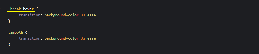
Also, avoid declaring transitions directly on the hover state as indicated above, instead, declare it on the element.
HTML:
|
1 2 3 4 |
<div class="parent"> <p class="el break">Break</p> <p class="el smooth">Smooth</p> </div> |
CSS:
|
1 2 3 4 5 6 7 8 9 10 11 12 13 14 15 16 17 18 19 20 21 |
.el { margin: 2em 0 0 4em; display: inline-block; width: 200px; line-height: 80px; text-align: center; font-size: 20px; background-color: aqua; cursor: pointer; } .break:hover { transition: background-color 3s ease; } .smooth { transition: background-color 3s ease; } .el:hover { background-color: blueviolet; } |
See the Pen
Performance Consideration: Hover State by Ocxigin (@ocxigin)
on CodePen.
Layout
Applying CSS transitions on properties such as width, height, visibility and display can have a negative impact on elements around them.
Properties such as width and height affect the structure of the page. This is because they determine the size of the element in the Document Object Model (DOM) tree. Applying a transition to width and height will result in the browser computing a new position for the surrounding element.
The visibility property will remain in the DOM it will not have the time to transition if set to hidden.
Here, the example above from the browser preview shows surrounding elements can be affected by a change in the size of a particular element.
When transition is applied to elements that affect the stacking order of the DOM or their surrounding element. The browser computes a new position to the surrounding element by moving the surrounding element to a new position.
HTML:
|
1 2 3 4 5 |
<div class="box h">Height</div> <div class="parent"> <p class="el break">Visibility</p> </div> <div class="box w">Width</div> |
CSS:
|
1 2 3 4 5 6 7 8 9 10 11 12 13 14 15 16 17 18 19 20 21 22 23 24 25 26 27 28 29 30 31 32 33 34 35 36 37 38 39 40 41 |
body { width: 80%; margin: 2em auto; } .box { padding-top: 1em; width: 200px; height: 50px; background-color: orangered; text-align: center; transition: all .5s ease; } .el { width: 200px; line-height: 80px; text-align: center; font-size: 20px; background-color: aqua; cursor: pointer; transition: all .5s ease; } /* Hover State */ .h:hover { height: 200px; } .w:hover { width: 300px; } .break:hover { visibility: hidden; } .el:hover { visibility: hidden; } |
See the Pen
Best practice Layout one by Ocxigin (@ocxigin)
on CodePen.
To avoid elements from bumping or flickering into each other, try implementing elements that are easily interpolated.
Consider the example below:
Here, the width, height, and display properties have been replaced with the CSS transform property. The transform property does not affect the stacking context of the surrounding elements. This enables smooth transitioning on the element being transitioned.
Also, the visibility property is replaced with the opacity property for easy fading.
HTML:
|
1 2 3 4 5 6 |
<div class="box h">Scale</div> <div class="parent"> <p class="el break">Opacity</p> <p class="el smooth">Translate Y</p> </div> <div class="box w">Translate X</div> |
CSS:
|
1 2 3 4 5 6 7 8 9 10 11 12 13 14 15 16 17 18 19 20 21 22 23 24 25 26 27 28 29 30 31 32 33 34 35 36 37 38 39 40 |
body { width: 80%; margin: 2em auto; } .box { padding-top: 1em; width: 200px; height: 50px; background-color: orangered; text-align: center; transition: all .5s ease; } .el { width: 200px; line-height: 80px; text-align: center; font-size: 20px; background-color: aqua; cursor: pointer; transition: all .5s ease; } /* Hover State */ .h:hover { transform: scale(1.1); } .w:hover { transform: translateX(10px); } .break:hover { opacity: 0.5; } .smooth:hover{ transform: translateY(10px); } |
See the Pen
Performance Consideration: Layout 2 by Ocxigin (@ocxigin)
on CodePen.
Duration and Delay
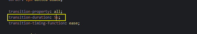
Duration is the time taken for a particular transition to complete, while delay is the time the transition needs to wait before it starts transitioning.
However, when the transition takes too much time to complete or wait before it starts transitioning. Users might lose interest in interacting with the website due to being perceived as slow.
A transition duration of 5 seconds:
A transition delay of 5 seconds:
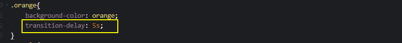
The above code sample shows a transition duration and delay of five seconds each. This type of transition usually leads to low user interaction due to being perceived as slow. Transitions are meant to improve the user’s interaction, so they must be used judiciously.
The example above provides a visual guide on how duration and delay impact the speed of the transition.
See the Pen
transition delay in css by Ocxigin (@ocxigin)
on CodePen.
Browser Compatibility of CSS Transition
The CSS transition property has good support on major browsers and does not require vendor prefixes.
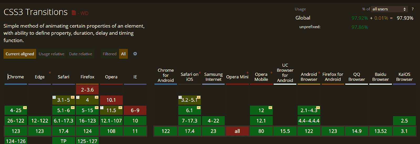
However, CSS transitions might not behave exactly the same way on every browser. Therefore, it’s important to ensure browser compatibility of websites that use CSS transition properties. For this, you can leverage cloud-based testing platforms like LambdaTest.
It is an AI-powered test orchestration and execution platform that allows you to test your website on a remote test lab of 3000+ real browsers and operating systems. This helps identify any inconsistencies in how your transitions render across different platforms, ensuring a consistent user experience.
Watch the video below to learn how to perform Real Time Browser Testing using LambdaTest.
Catch up on the latest testing tutorials – subscribe to the LambdaTest YouTube Channel for quick updates.
Conclusion
CSS transitions allow the smooth changes of CSS property values over a specified period of time. It consists of four longhand properties which include transition-property, transition-duration, transition-timing-function, and transition-delay.
The shorthand property transition sets the longhand properties of CSS transition in a single declaration. This helps to write small, clean, and maintainable code.
Using CSS transitions can improve the user experience of the web pages and how users interact with elements and web icons.
Frequently Asked Questions (FAQs)
What are CSS transitions best used for?
CSS transitions are best used for creating smooth animations or effects when there’s a change in CSS properties, such as color, size, or position.
What is the difference between transition and transform in CSS?
The difference between transition and transform in CSS is that transition is used to smoothly animate changes in CSS properties over time, while transform is used to modify the appearance and position of elements without affecting the layout flow.


Author’s Profile
Alex Anie
A Front End Technical Writer. I write blogs on Front End Technologies, such as HTML, CSS, JavaScript. When I am not coding, I enjoy watching tutorials and listening to twitter spaces. I live in Lagos, Nigeria
Blogs: 16
Got Questions? Drop them on LambdaTest Community. Visit now


