 Test your AI Agents with the all-new Agent to Agent Testing
Platform.
Test your AI Agents with the all-new Agent to Agent Testing
Platform. 
A Complete Guide To CSS Headers
Ayush Thakur
Posted On: September 21, 2022
21 Min


One of the integral aspects of a web product is to build an ever-lasting mesmerizing experience. When you open any website, your first touch point is the website’s header. Whether making an eCommerce business, SaaS business, or a simple portfolio website, you want the header to do the talking for you.
Does this mean that the content, footer, and other aspects are unimportant? Well, they are! If all these integral elements of the website are well-presented to the end users, it will surely make a lasting impression. This guide will discuss building a responsive CSS header.
In my experience, the header plays an integral role in devising a challenging user journey. Time spent on site, page, returning visitors, etc., are some key metrics that provide a glimpse of the website’s performance. If I were to compare, it is equivalent to comparing the footfalls in a shopping mall; the higher the footfall, the better our chances of generating sales.
Your website is similar to an outlet in a shopping mall where the visitors have several choices up their sleeves. According to a report, a delay of one second in the page load time causes a close to 16% decrease in customer satisfaction and an 11% reduction in page views. All of this can cause a dent in the overall conversion rate.
With so much at stake, it is imperative to focus on designing a website with a header, content, footer, and other elements that yield maximum website stickiness. CSS is the secret sauce that can be used with JavaScript and HTML to develop WOWsome websites.
This CSS tutorial focuses on building super responsive CSS headers that can work seamlessly across different browsers and devices.
So, let’s get started!
TABLE OF CONTENTS
Introduction to CSS Header
The CSS header is a collection of several CSS and HTML properties that helps in the structuring of a website header. Everything in the CSS header, like the logo, text, menu, etc., are just blocks.
In fact, the CSS header is a block itself, and these blocks can be styled with the CSS header properties.
Here are examples of desktop and mobile views of website headers spanning various industries.
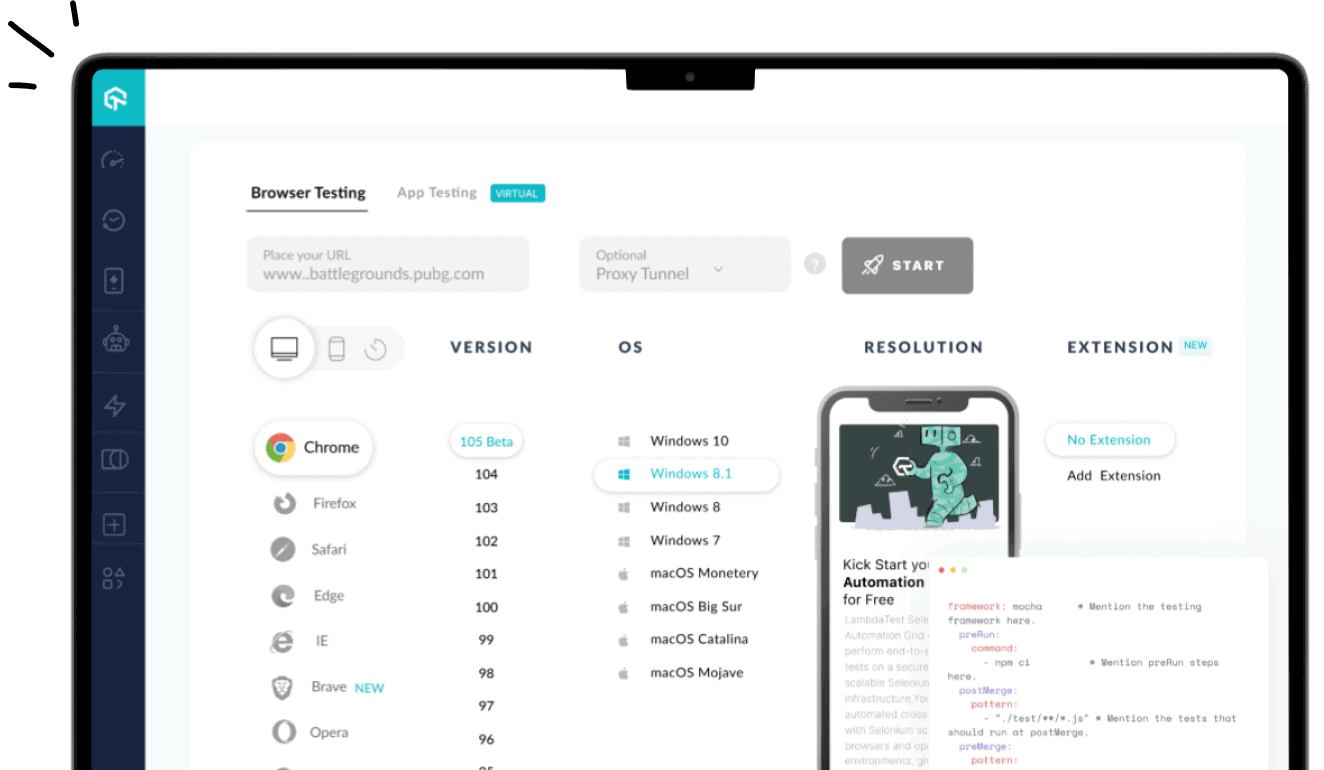
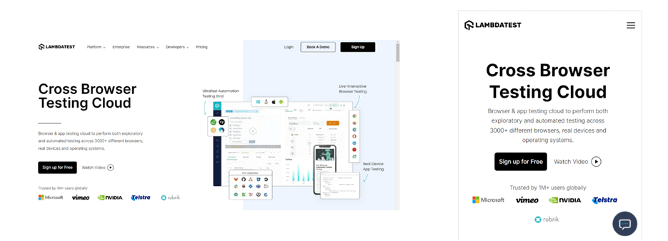
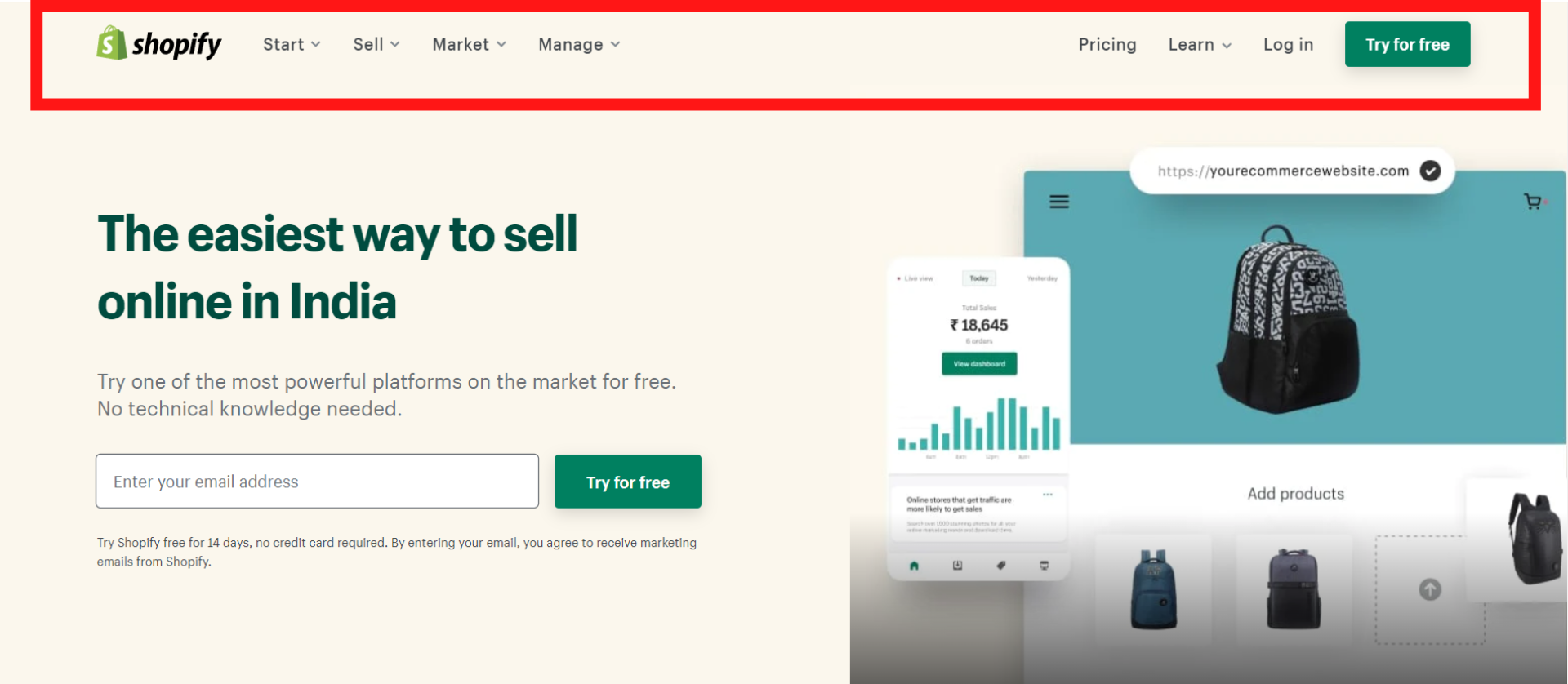
Example 1 – LambdaTest (Software-As-A-Service)
Example 2 – Shopify (E-Commerce)

Example 3 – Nvidia (Semiconductors)

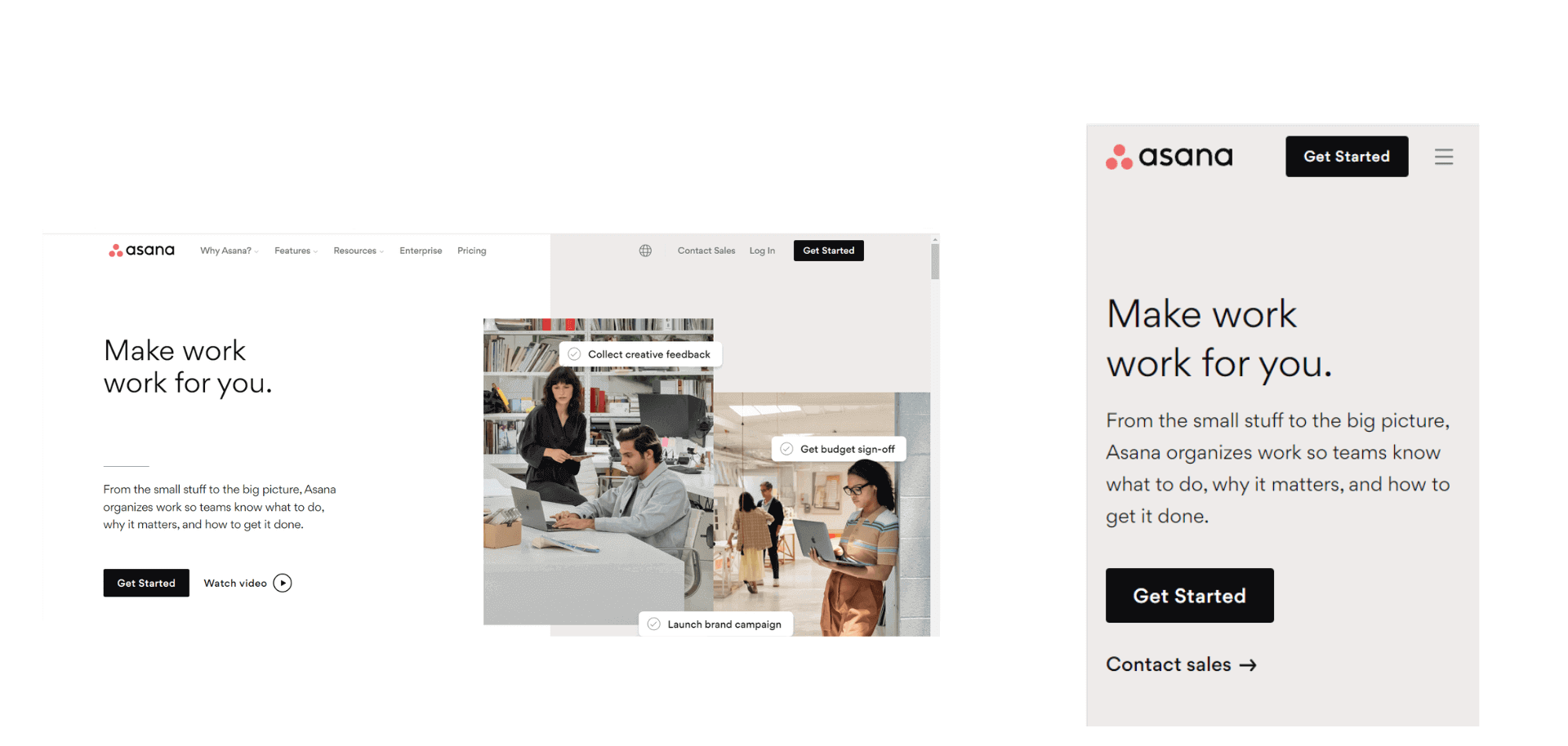
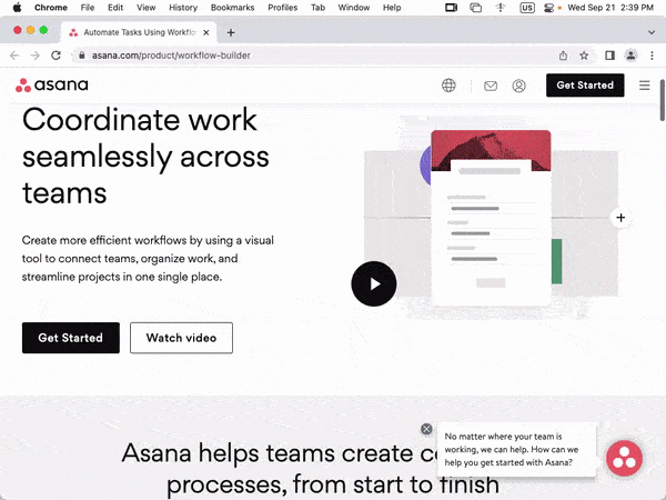
Example 4 – Asana (Work management platform)
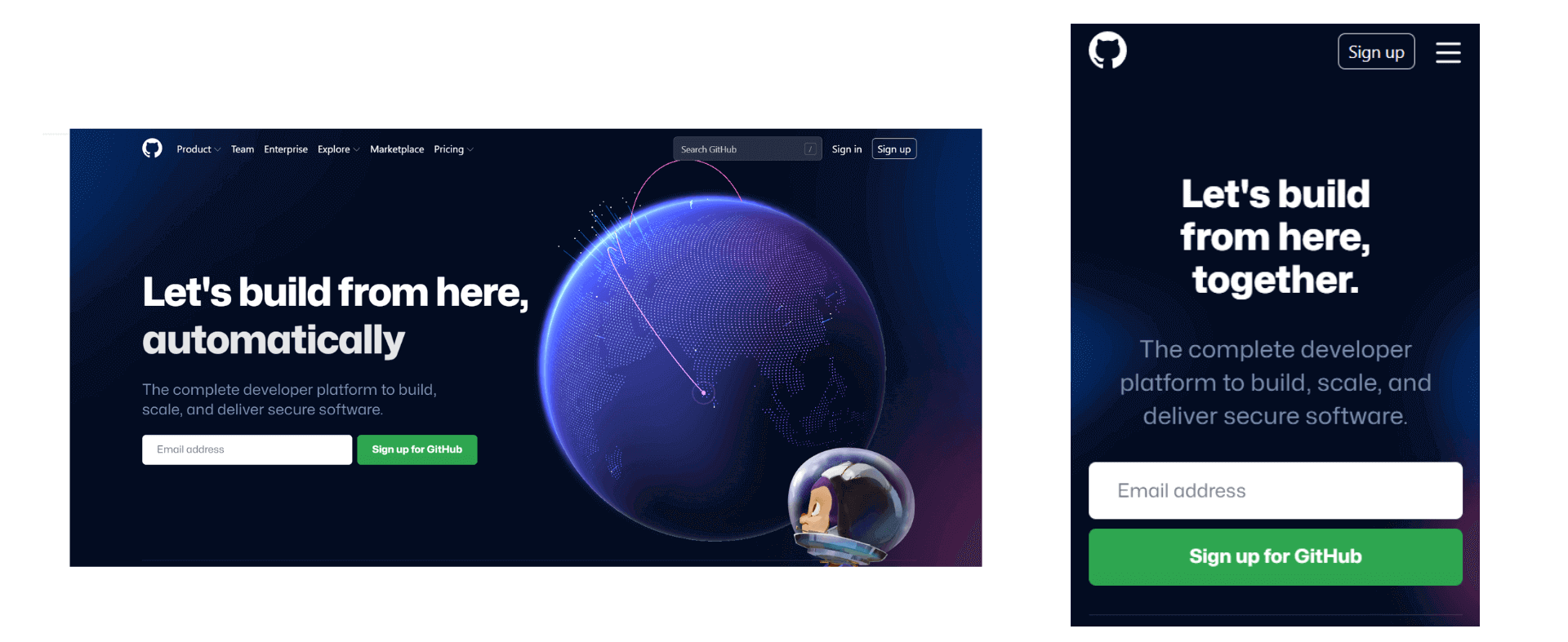
Example 5 – GitHub (Web hosting service)
As you can see, the headers of every website (listed above) have a unique menu design. Clicking on the menu and submenus takes you to the particular product’s pillar page or provides the reader with more information about what’s in store for them on that very page.
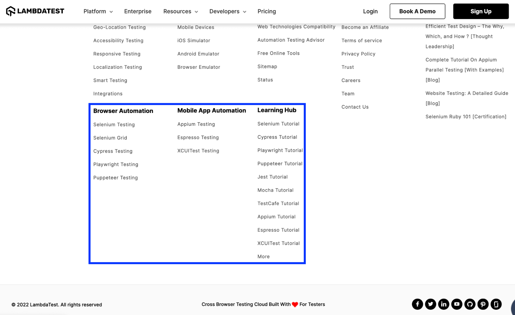
Akin to the header, the footer is also an integral part of any website. Though the items listed in the footer might vary from industry to industry, some of the everyday items that must be a part of the footer are Sitemap, Privacy Statement, Copyright notice, links to pages that are important for conversions (or lead generation), etc.
Take the case of the footer on the website of LambdaTest – a continuous quality testing platform. Apart from the links to Careers, Status (that indicates the operational status of each product), etc., there are links to pillar pages that let the visitors perform browser automation testing and mobile automation testing. Links to LambdaTest Learning Hub navigates the visitor to the appropriate hub so that s/he can get a glimpse into the technical aspects of CI/CD, Selenium, Cypress, and more.
With the platform all set, let’s dive deep into the essential aspects of CSS headers and footers. Most of the blog is focused on CSS header, a post in which we would touch upon CSS footer.
Components Of CSS header properties
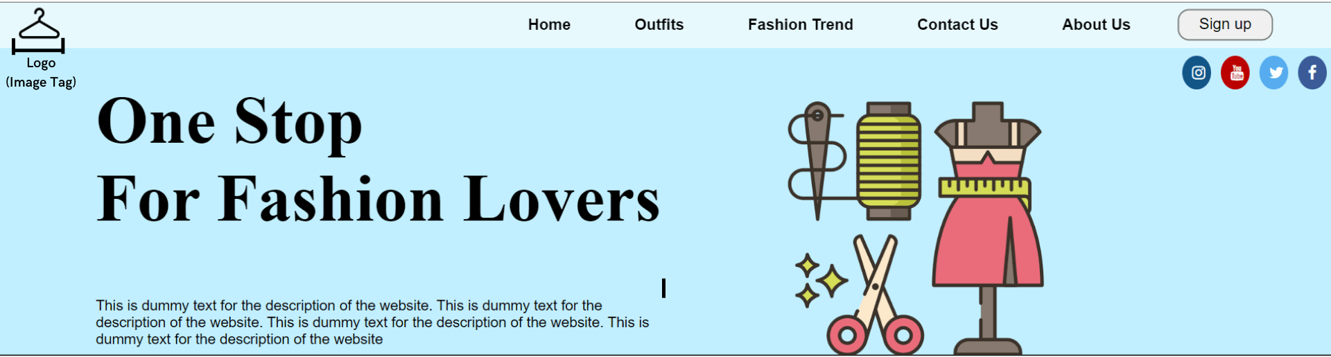
As you might have noticed from the examples cited in the previous section, a header consists of textual content, relevant tags, logo, images, social media icons, and more.
Some of the most critical components of the CSS header are mentioned below.
Header Tag
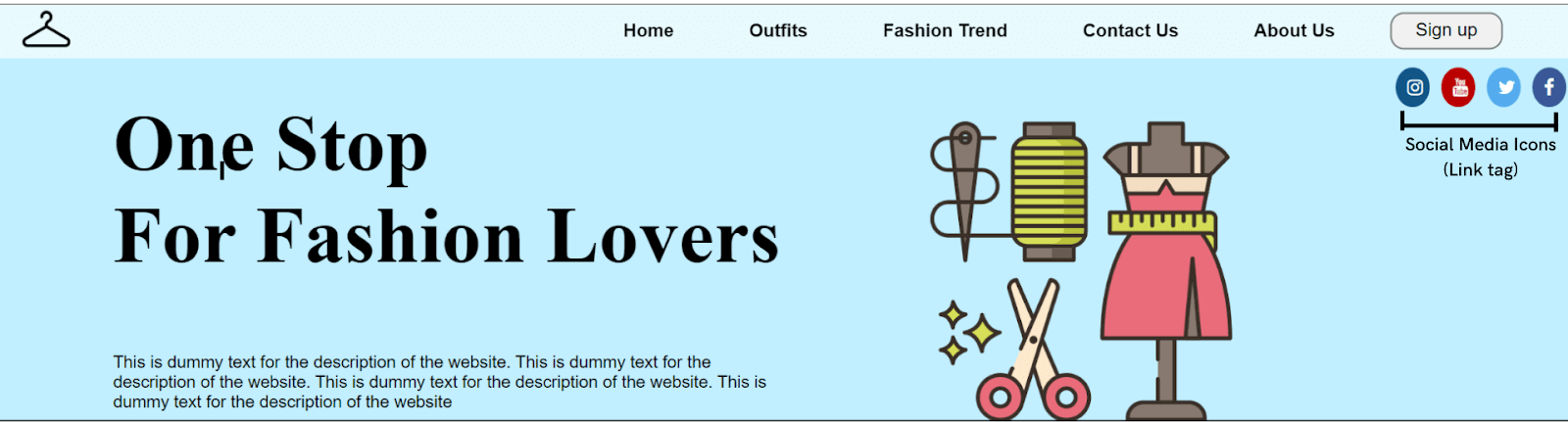
Just like every organization, its name is integral to it. The website header also features the organization’s name as its primary text. CSS header property comprises a feature known as Header tags < header > that lets you insert the organization’s name in the header.
Optimal usage of the < header > tag will significantly impact the SEO (Search Engine Optimization) rankings! I have covered those aspects in later sections of this guide.
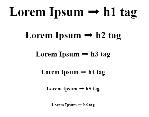
Header tags are of 6 different types (H1-H6), with six different font sizes. Let’s see the header tags in action with the help of an example.
As seen below, the biggest font size and the size continuously decreases with the tags until the H6 tag, whose font size is the smallest.
Another use of header tags in the CSS header is to insert a tagline. A tagline is like a short phrase that communicates the core aspects of your business. Many businesses use taglines as a way of communicating with their customers.
A tagline is the first thing that your potential customers notice when they find out about your brand. Therefore, it’s crucial to ensure that your tagline must define what your business does and why someone should choose it. In addition, incorporating a CTA can help increase your leads and conversions.
In many cases, you will observe that instead of the organization’s title, taglines are the major text on the header, and the organization’s title is used in the logo. Therefore, the primary use of header tags is to insert the tagline in the header. However, when it comes to putting up the logo, we will discuss it later in this blog.
See the Pen
Untitled by Ayush Thakur (@tsayush)
on CodePen.
The header tags act as a marker and help the browser recognize and read the important keywords and rank the website for that keywords. Therefore, using at least one header tag (out of H1-H6) on the webpage is always suggested.
Header tags make it easier for search engine bots to crawl across the webpage, understand the keywords, and then rank the webpage based on the crawled information.
Crawling a whole long paragraph is a bit difficult task for the bot, and the header tags make it easy by marking up the few critical keywords for the bot, thereby positively impacting the SEO.
Paragraph Tag
After the tagline, the next major component of the website header is a short description of the company. By reading this description, visitors get an indication of the services and/or products the business offers.
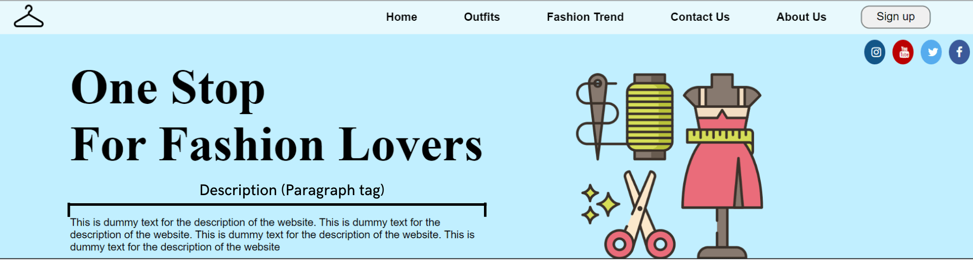
The font size of the description text is smaller than the tagline text, and to get the desired result, CSS header properties have a component named Paragraph tag (< p >).
See the Pen
Untitled by Ayush Thakur (@tsayush)
on CodePen.
You can notice in the above example that we have inserted a description just below the tagline (which is in H1) because this makes the user immediately read the description just after reading the tagline. In some sense, content in the < p > is a logical extension of what is mentioned under < h1 > tag.
You may wonder why we cannot use the H6 tag instead of the paragraph tag
since both have small font sizes. You can do it. However, header tags are relatively heavier than paragraph tags.
Using a paragraph tag will give the same result and significantly reduce the weight of the website header. Using these best practices further helps in reducing the page load time.
Test on real desktops and mobile browsers. Try LambdaTest Now!
Header Background
As the largest component of any website header, the header background is the most visible and the first thing a visitor comes in contact with whenever s/he lands on the website. You can insert either a media or color in the background. First, let’s talk about the media.
In media, you have the options of images, videos, and gifs to fill in the header background. Using an image as the background is always good practice. Sometimes an image can also be used as a mode to convey a message, tell a story, or sometimes invoke specific emotions in the user’s mind.
Sometimes, the user feels personally connected with the image, which further connects the user to your business.
We have the background-image property in the CSS header properties to set an image as the background. Let’s understand it with the help of an example.
See the Pen
Untitled by Ayush Thakur (@tsayush)
on CodePen.
As you can see, the background-image property has been used in the CSS file and is assigned to the URL address of the image within brackets. If you are planning to use an image in the background, then there are a few things you have to take care of.
When inserting an image, it’s always a good practice to use lightweight images. Heavy images increase the website’s weight, significantly increasing the website’s loading time. This will eventually result in a bad user experience for the users. An increase in loading time also results in a higher bounce rate.
Google search engine takes loading time as an essential factor in the website’s ranking. Therefore, an increase in the loading time will have an impact even on the ranking of the website. We all know the repercussions if the site is not ranking well on Google.
Although you can insert images of any format, the ideal recommendation is to use Webp image format. WebP image format provides lossless and lossy compression for images on the web. Compared to PNG images, the Webp image format is 26% smaller. In short, Webp image format offers all the features that other format images do at a much smaller size.
Because of the same reason, it’s always advisable to avoid using gifs and videos on the website.
Now, let’s discuss the case of colored header backgrounds.
Like an image, the colors also play a vital role in inviting emotions into the user’s mind. This is where Color Psychology comes into play. Color Psychology studies color and how a human brain reacts to the colors on the screen.
Organizations are very well aware of the importance of colors and use them to play with our minds psychologically. Businesses choose the color that best matches the brand personality and triggers the desired emotion in the visitor’s mind.
A real-life example of this is the company’s logos. You may have noticed many social media organizations use the blue color in their logos. That is because the blue color triggers refreshing, friendly, and inviting emotions in the user’s mind, and that’s exactly what social media sites want.
Similarly, many food-tech organizations use red and yellow colors in their logos – survey. This is because the red color triggers hunger and appetite emotion in humans, and yellow triggers the emotion of happiness and friendliness.
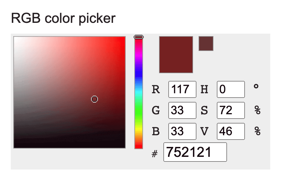
It is suggested that you use bright colors if you have a personal blog or website and a professional business website, then go with deep-toned colors like #752121, 035039, etc.
The color you choose can change the impact of your website on the users.
CSS background-color property can be used to set the color of the header background. In the background-color property, the color can be set in three different ways:
- Color name [e.g., red].
- Hex value of color [e.g., #FF0000].
- RGB value [e.g., rgb(255, 0, 0)].
See the Pen
Untitled by Ayush Thakur (@tsayush)
on CodePen.
As you can see in the example, the three ways of defining background color have been shown. In all three divs, three different ways of assigning color have been shown – Hex value in 1st < div >, color name in 2nd < div >, and RGB value in 3rd < div >.
Let’s add a background color to the sample code we created earlier to demonstrate the usage of < header > and < p > tags.
See the Pen
Untitled by Ayush Thakur (@tsayush)
on CodePen.
Here, you can notice that we have added the background color in the header using the hex value of color.
Now, how many colors should one use on his website header? As per the source, you can use the utmost two or three colors on your website. It’s always recommended to use at most two colors in the website header, whether a professional website or a personal blog while keeping the text in white or black.
One exceptional case of this is if you want to use white color in the header. White is the default color in the elements, so if you plan to add a white color to the background, you don’t need to define the background color. Just make sure that the header background should suit the other elements of the header.
Company’s logo
A logo is a graphic symbol that can help your business stand out from its competitors. A logo represents an organization’s identity and vision and should express the core elements of the business. The human brain memorizes images much faster and longer than plain text. As per research, the human brain memorizes images 60,000 times faster than text, benefiting the business.
These factors help in having a faster brand recall, a factor that is so integral in today’s hyper-competitive business environment.
Using a logo in the header has many benefits:
- Increase user (or customer) stickiness.
- Brand Recall.
- Foster brand loyalty.
- Foundation of brand’s identity.
- Gain competitive advantage.
CSS header properties have an inbuilt feature known as an Image tag (
Let’s understand it’s working with the help of an example.
See the Pen
Untitled by Ayush Thakur (@tsayush)
on CodePen.
As you can see above, we have inserted the logo in the top-left corner using the image tag. The image tag demands two attributes – src and alt. In the src, the path where the image is stored is inserted and if the image is uploaded online, then simply put the image address.
The second attribute is the alt, an alternative text that plays a crucial role in the website’s SEO ranking. It can be any keyword for which you want your website to rank.
The image tag supports the following image formats:
- jpeg.
- png.
- apng.
- svg.
- bmp.
- bmp ico.
- png ico.
Now the question arises, where should you put the palace logo in the header? And the left side of the website header. It is the best and most suggested position to place the logo. As per the research, the chances of visitors recalling the logo on the left side is 89% more than on the right one.
In case you have an animated logo or a gif logo, then you can insert it too through the image tag. Just make sure it should be of small size. The steps to insert a gif are the same as an image.
See the Pen
Untitled by Ayush Thakur (@tsayush)
on CodePen.
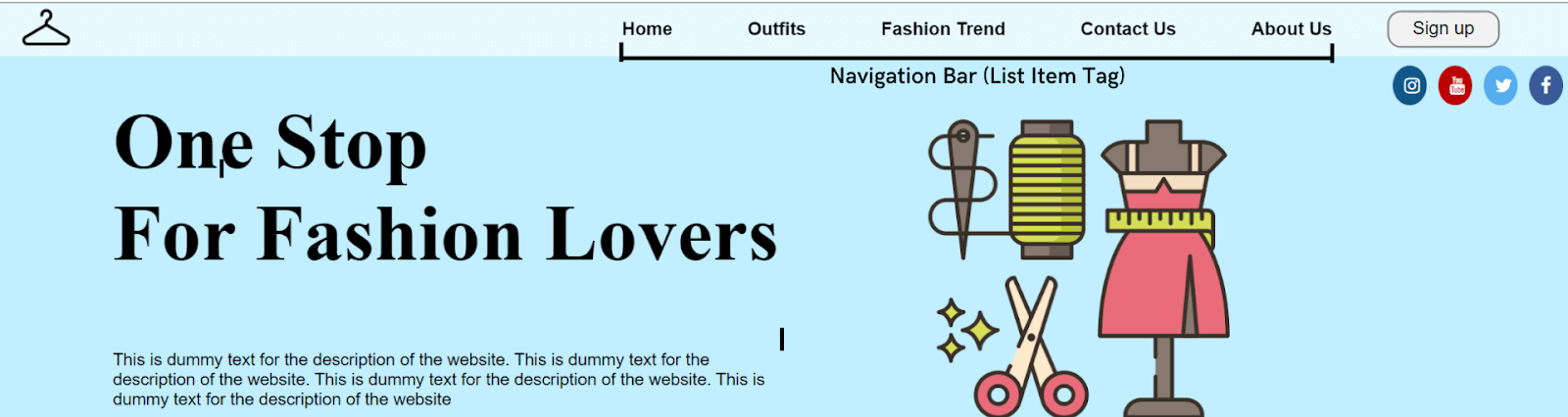
Menu
Now comes with one of the most important elements of the header, “Menu” (or Navigation Bar). As the name suggests, the navigation bar works as a navigator for the visitors who have landed on the web page and helps them navigate to the relevant section on the site.
Without a navigation bar, the visitors will get confused about what they should do if they want to avail of any offer or buy (or try) a product. It will be like a person traveling to reach a destination, but he doesn’t know the route. He’ll surely get confused; the same happens to the visitor when he does not get the navigation bar on the header.
So to do that, there are some factors that one should follow when creating the navigation bar:
- Easy navigation
- Avoid information overload
- Maintain consistent spacing
- Clean and simple aesthetic looks
- Easily noticeable
Just like the logo and other key elements of the header are placed on the left side, the same rule is applied to the navigation bar. The most important options on the navigation bar should be on the left side, and the reason behind that is the same as other header components.
To insert the menu, the list item tag (
Let’s see the construction of both navigation bars and how they work.
See the Pen
Untitled by Ayush Thakur (@tsayush)
on CodePen.
Here, you can notice that we have inserted the horizontal navigation bar using the list item tag. It’s more like a horizontal strip containing all the menu options.
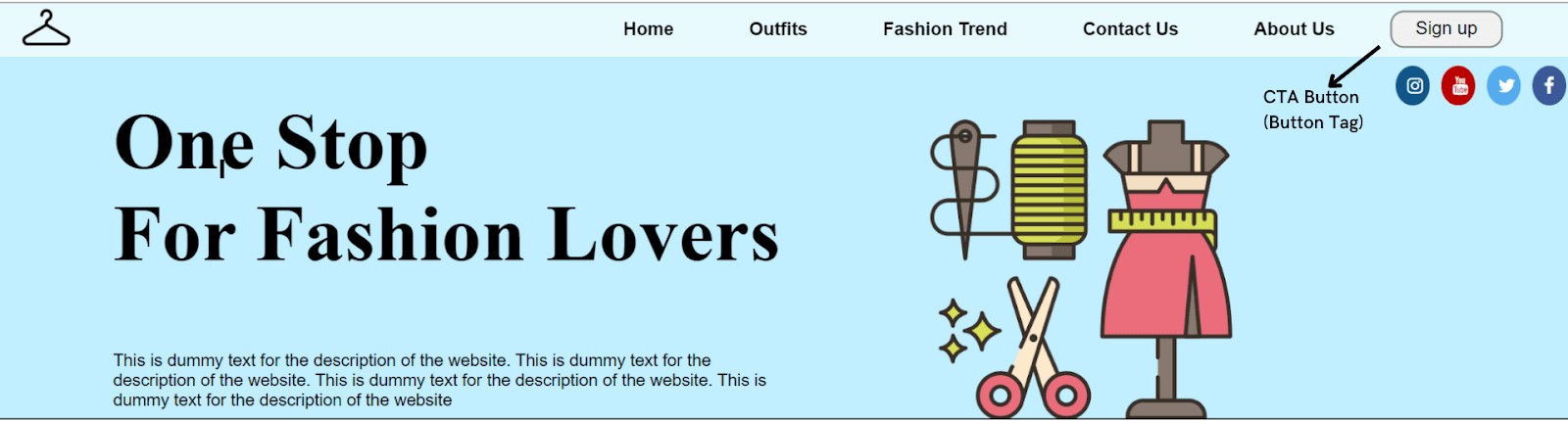
Call to Action
A Call to Action or CTA is like a signpost that helps the user know what action to take next. CTA encourages the visitor to take immediate action. Many businesses want their users to take instant action without overthinking, and that’s where CTA comes into play.
Through CTA, you can make your visitors perform any action through CTA – signing up or registering on the site, filling up a form, reading more, or something else.
Many organizations also offer some free services to users if they register on the website. The free service can be a free pdf, a free demo of the product, a premium service trial, etc., and the users take the required action.
As per a report by HubSpot, there was an increase in conversion rates by 121% because of CTAs.
A CTA could be anything like a button, a clickable link, or anything else unless it makes the user take a specific action. When inserting a CTA, CSS header properties offer the Button tag (< button >) tag.
Let’s see the working of button tags with the help of an example.
See the Pen
Untitled by Ayush Thakur (@tsayush)
on CodePen.
As you can observe, we have created a CTA button for Sign Up in the above example. Similarly, you can make any CTA button for your website header.
Social Media Icons
Having a social media presence is as important as having a website for the business. Social media pages create trust in the user’s mind regarding the business.
People feel more connected to the business when they land on its social media pages of the business. Linking your website header to its social media pages increases its brand exposure.
There are numerous social media platforms where you can create your business page. But there are some social media platforms that experts widely suggest boost the business’s growth. These social media platforms include Instagram, Twitter, YouTube, and Facebook.
Linking the social media pages to the header via social media icons is a great way to increase the trust in the visitor’s mind.
CSS header properties allow us to add social media icons to the website header through the Link tag (< a >). The link tag demands a linking attribute, ‘ahref,’ where the link is added.
Several predefined free social media icon libraries are available on the internet, making it much easier to insert social media icons at the header. You just need to add the class name of the desired icon in the line tag.
Let’s see this in action.
See the Pen
Untitled by Ayush Thakur (@tsayush)
on CodePen.
In the above example, we have inserted circular social media icons. A free social media icon library has been used, as shown in the .
Sticky Navigation
You will notice that the navigation bar of many websites is sticky, irrespective of the fold in which the visitor is currently in! This is the feature that many organizations use on their website to make it easy for their visitors to always have access to the navigation bar.
Many organizations like to keep the website’s navigation bar sticky, and many do not. It varies from company to company whether they want to keep the navigation bar sticky or not. Making the navigation bar sticky is independent of the type of the navigation bar.
A sticky navigation bar has many advantages, such as
- Quicker navigation.
- Reduce the chances of the user getting distracted.
- Reminds the visitor to take immediate action.
- Screen time on the website increases.
- The user has access to the navigation bar all the time
As per the report, once a major business website made a minor change in their website by making the navigation bar sticky. This slight change made the visitors pay extra attention to each product listed on the website.
This eventually increased the screen time of the website. As a result, the company saw a significant reduction in the bounce rate and an increase in conversion rate of 10%.
CSS position property helps in making the header sticky. You just need to add a single line of code in the CSS file to make your navigation bar sticky. Just add the position property to the navbar element and assign it to the sticky attribute.
Here’s an example showing how to create a sticky navigation bar.
See the Pen
Untitled by Ayush Thakur (@tsayush)
on CodePen.
Here is the final code that takes into account the various CSS components that we described so far (i.e. < header >, < p >, < img >, etc.)
See the Pen
Untitled by Ayush Thakur (@tsayush)
on CodePen.
Responsive web design
Nowadays, the number of mobile users is much higher than the number of desktop users. As per the report, 58% of online visits came from mobile users in 2021. And these numbers will keep on increasing.
Therefore, you must create a responsive web design to ensure a mind-blowing experience across different screen sizes and resolutions. Thankfully, CSS has got a solution for this too. It comes up with the feature of CSS media queries that will help you to make your website header responsive.
This feature allows you to assign the different styling of the components depending upon the screen size. For a phone, you can assign different styling; for a tablet, you can assign different styling for the desktop or PC.
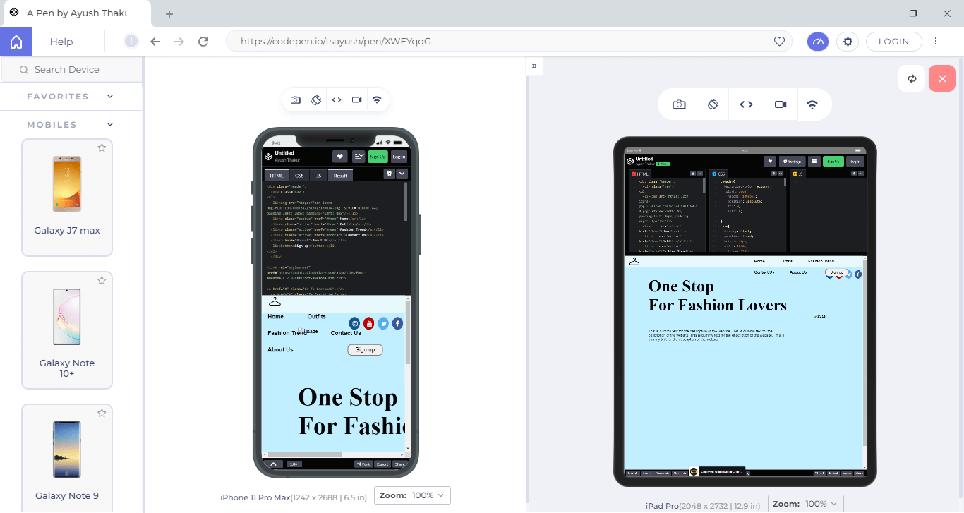
Once you have designed the web page, you must run a responsiveness test of your CSS header.
However, testing responsiveness can be tedious as owning all devices of different screen sizes and resolutions is impractical. This is mobile-friendly testers tools like LT Browser becomes a helping hand. It is a responsive testing tool offered by LambdaTest platforms; LT Browser offers 50+ pre-installed viewports for Mobiles, Tablets, Desktops, and Laptops.
Need more reasons why you should use LT Browser? Here are the reasons why developers should use LT Browser.
Intrigued to know more about LT Browser, watch the below tutorial.
Subscribe to the LambdaTest YouTube Channel and get the latest tutorial around test automation, Selenium, Cypress, Playwright browser testing, Mobile app testing, and more.
Wrapping up
In this CSS tutorial, we discussed the CSS header in detail, including the different components of the CSS header with real-time examples. We also discussed why responsive web design is important for your organizations and how to perform responsive testing of CSS headers using web development tools like LT Browser.
I hope this CSS guide has given you a comprehensive understanding of the CSS header. Got any questions? Feel free to drop them in the comments section.
Frequently Asked Questions (FAQs)
What is header in CSS?
The < header > element is like a container containing introductory content or navigational links. It typically contains one or more heading elements (< h1 > - < h6 >).
Author
I’m a 22 year old Software Engineer. Completed my Btech in Information Technology field in 2021. I have a keen interest in Web Development field and currently learning and exploring the field of Frontend Web Development. Love to get my hands dirty on JavaScript And React. Also working as a Web Development Freelancer. Alongside, I’m also working as a Content Creator and I create content on Web Development niche to share my knowledge with others and help them in their tech journey. Also loves to write blogs and articles on tech niche. A huge lover of video games, read books in my spare time, and to maintain fitness, I play football and badminton.
Blogs: 6


