
Introduction to Bootstrap Dropdowns And Bootstrap Collapse [Bootstrap Tutorial: Part I]
Mbaziira Ronald
Posted On: August 16, 2023
 386231 Views
 12 Min Read
At the heart of modern web design lies the art of displaying just the right-to-the-point information at the right moment. As users explore a website, presenting them with an overwhelming flow of content can lead to disengagement and frustration. However, when you show data as of when the users need it, they will likely stay on the website longer due to the pleasant user experience.
At the same time, you do not want the users to be overwhelmed with a lot of information on the website. Using the right set of components (e.g., dropdowns, buttons, text boxes, text areas, etc.) can help combat the menace of information overload. Dropdowns and collapse components allow you to neatly organize information and allow users to access specific details when they need them the most.
By keeping lesser-used options hidden until requested, dropdowns and collapse components maintain a clean and clutter-free interface, enhancing user focus and overall satisfaction. And this is one of the reasons why dropdowns are in use on different websites like eCommerce, OTA, etc., such as eBay and Expedia, for features like FAQs and user preferences.
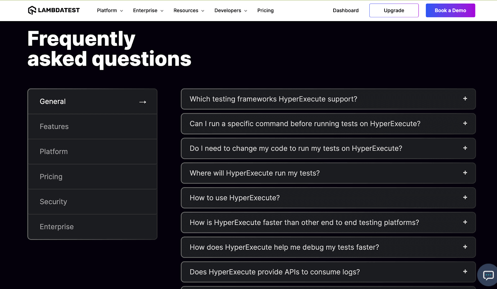
For instance, LambdaTest lists the FAQ for its products (e.g., HyperExecute) in a subtle drop-down list to provide better readability & ease of navigation.
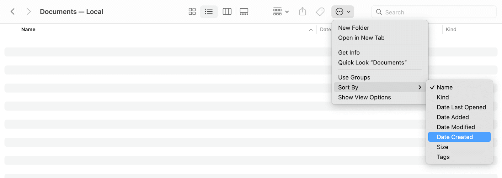
The below example shows how Apple uses a nested dropdown on a MacBook’s Finder app for performing different tasks on selected items. Sorting folders and files isn’t an action a user will do regularly. However, it is a crucial enough task that needs to be somewhere easily accessible when needed, and this is where a dropdown came to the rescue.
In this Bootstrap tutorial Part I, we will delve into the inner workings of Bootstrap dropdowns and Bootstrap collapse components. You will learn how to use them to enclose periodically used content and render it when required to create a uniform user experience on your website.
TABLE OF CONTENTS
Bootstrap Dropdowns and Collapse: An Overview
Before we get into the nitty gritty of Bootstrap dropdowns and Bootstrap collapse, let me give you an overview of these Bootstrap features so that you get a better picture of what we are about to explore.
Bootstrap Dropdowns
Bootstrap dropdowns are toggleable overlays or floats that can render a list of links, buttons, forms, or any other information. They have click-based user interaction. The dropdown consists of a trigger (toggler) and a dropdown menu that shows up when you click the trigger.
Bootstrap provides several classes and attributes for styling and controlling the behavior of the dropdowns. The classes enrich your dropdowns with features such as headers and dividers. Dropdowns in Bootstrap have a click-based user interaction.
The classes and attributes include
- dropdown
- dropdown-item
- data-bs-auto-close
- drop-up
- dropdown-header
- drop-up
As of writing this tutorial on Bootstrap dropdowns and Bootstrap collapse, Bootstrap v5.3 uses the PopperJS library to add interactivity to the dropdowns.
Bootstrap Collapse
Bootstrap’s collapse plugin enables you to hide and show content. It uses buttons or anchors as triggers that map to the content sections you want to toggle. Bootstrap also provides classes like collapse to hide content and show to show the content. The plugin allows both horizontal and vertical collapsing.
Users can click the trigger (button or anchor) to expand or collapse the content section. There is an animation during the expansion and collapse.
 Note
NoteTest your Bootstrap dropdowns & collapse on a real device cloud. Try LambdaTest Today!
Applications of Bootstrap Dropdowns and Collapse
Dropdowns and collapsible content find use in various areas of modern web design. Below, we’ll explore applications of Bootstrap dropdowns and collapse where they are used and why.
Responsive Menus and Layouts
We typically use dropdown menus and collapse components to offer responsive features to website users, particularly on mobile devices. These components show and hide navigation options under a menu icon, enhancing the user experience and optimizing screen space.
Forms
Forms, one of the usual components of a website, usually have a dropdown as a feature that renders a set of predefined choices. The dropdowns are handy for information on a form with a fixed set of options, such as a state, region, or language.
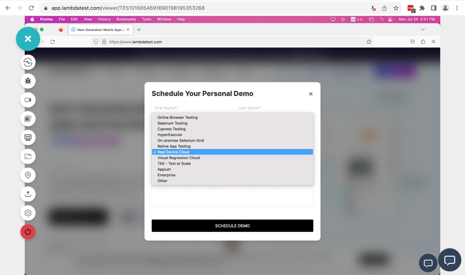
The above image shows a dropdown of a predefined set of options in LambdaTest’s Schedule Your Personal Demo form.
Accordions
We frequently utilize collapsible content in accordion-style components. Accordions let users expand or collapse content sections, showing or hiding additional sections/subsections.
Trending examples of the use of accordions include FAQs and product descriptions.
The above example shows how Netflix uses collapsible content in its FAQs accordions. This feature enables users to quickly pick the desired question as it doesn’t bombard them with all the questions and their answers.
It also saves screen space by putting several FAQs in the same place without overcrowding.
Filters and Search Results
Filtering and sorting data is another application of Bootstrap dropdowns, especially in eCommerce and remote jobs websites. Users can pick specific criteria from dropdowns to polish search results, filter data by category, or sort data with different parameters like location.
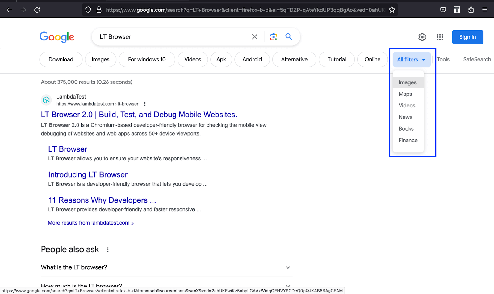
As shown above, Google uses a dropdown to enable users to filter and optimize search results.
In the above example of Remote OK, users can use dropdown options to optimize and filter data results using parameters like location, salary, and benefits for a particular job search.
User Preferences
User preferences are a common area where Bootstrap dropdowns are in use. Users can access a dropdown with all the setting preferences for their accounts when they click on their profile image or name. The Bootstrap dropdowns provide a better user experience and save screen space.
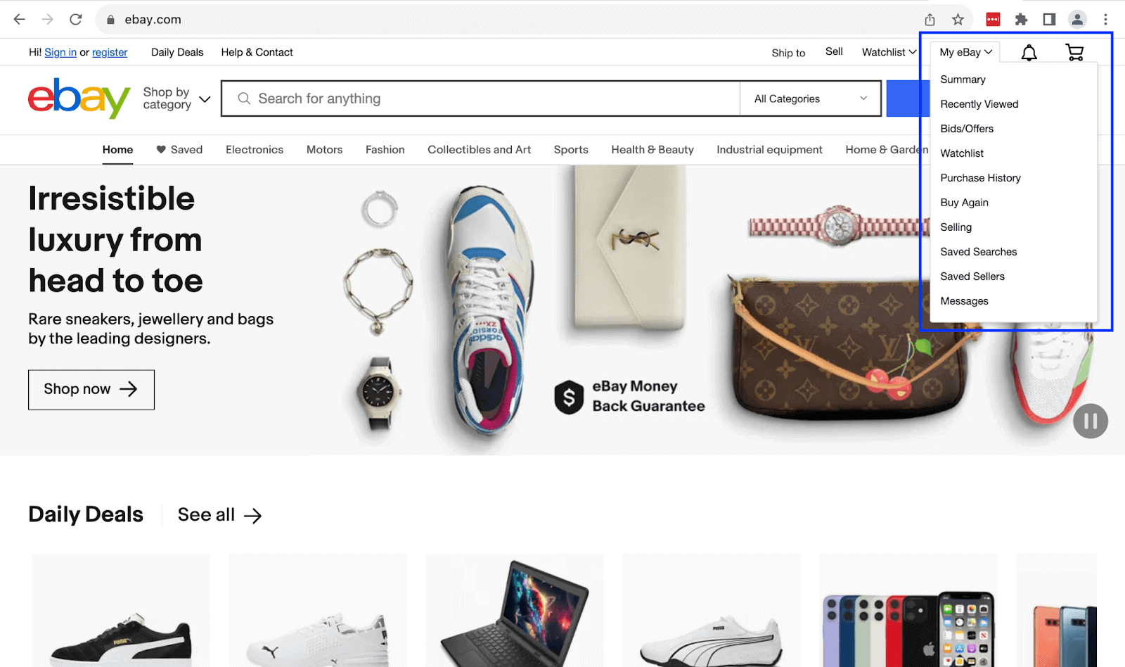
Shown above is an example of how eBay uses a dropdown to enable users to change their preferences like Bids/Offers. It is right there for the users to change their profile or view their purchase history when they require the same.
Use Cases of Bootstrap Dropdowns
Bootstrap dropdowns are toggle-able features that we usually use to display a list of options or pieces of text. They help us create multi-level menus and save screen real estate.
To interact with dropdowns, users can click or hover on them. Bootstrap dropdowns are click-based by default.
The example below shows how Payoneer maximizes the available space to still offer all its services to mobile device users by making the menu multi-level using dropdowns.
Creating a Bootstrap Dropdown Using Button and Anchor Elements
You can turn any button or anchor into a dropdown by wrapping them and the dropdown menu in the dropdown class, with the button being the recommended choice.
Code:
|
1 2 3 4 5 6 7 8 9 10 11 12 13 14 15 16 17 18 19 20 21 22 23 24 25 26 27 28 29 30 31 32 33 34 35 36 37 38 39 40 41 42 43 44 45 46 47 |
<!DOCTYPE html> <html lang="en"> <head> <meta charset="UTF-8" /> <meta http-equiv="X-UA-Compatible" content="IE=edge" /> <meta name="viewport" content="width=device-width, initial-scale=1.0" /> <link rel="stylesheet" href="./node_modules/bootstrap/dist/css/bootstrap.min.css" /> <title>Bootstrap CSS Dropdowns - Single button</title> </head> <body class="py-5 bg-light"> <div class="container"> <h1 class="fs-2">Dropdown</h1> <div class="d-flex gap-5"> <!-- Dropdown button --> <div class="dropdown mt-4"> <button class="btn btn-success dropdown-toggle" data-bs-toggle="dropdown" aria-expanded="false"> Dropdown button </button> <ul class="dropdown-menu"> <li><a class="dropdown-item" href="#">Platform</a></li> <li><a class="dropdown-item" href="#">Resources</a></li> <li><a class="dropdown-item"href="#">Pricing</a></li> <li><a class="dropdown-item" href="#">Developers</a></li> </ul> </div> <!-- Dropdown link --> <div class="dropdown mt-4"> <a class="btn btn-dark dropdown-toggle" href="#" role="button" data-bs-toggle="dropdown" aria-expanded="false"> Dropdown link </a> <ul class="dropdown-menu"> <li><a class="dropdown-item" href="#">Online browser testing</a></li> <li><a class="dropdown-item" href="#">Selenium testing</a></li> <li><a class="dropdown-item"href="#">Cypress testing</a></li> <li><a class="dropdown-item" href="#">Playwright testing</a></li> </ul> </div> </div> </div> <script src="./node_modules/bootstrap/dist/js/bootstrap.bundle.min.js"></script> </body> </html> |
Browser output:
The above browser output shows a button and anchor dropdown. The toggles (button and anchor) should have the attribute data-bs-toggle with its value set to dropdown. For the basic styling of your dropdown items, you can wrap them in a dropdown-item class.
See the Pen
Bootstrap CSS dropdowns – Single button by Mbaziira Ronald (@mbaziraofug)
on CodePen.
Creating Bootstrap Dropdowns With Split Buttons
You can create Bootstrap dropdowns with split buttons by adding the class dropdown-toggle-split to the toggle button or anchor.
Code:
|
1 2 3 4 5 6 7 8 9 10 11 12 13 14 15 16 17 18 19 20 21 22 23 24 25 26 27 28 29 30 31 32 33 34 35 36 37 38 39 40 41 42 43 44 45 46 47 48 49 50 51 52 53 54 55 56 57 58 59 60 61 62 63 64 65 66 67 68 |
<!DOCTYPE html> <html lang="en"> <head> <meta charset="UTF-8" /> <meta http-equiv="X-UA-Compatible" content="IE=edge" /> <meta name="viewport" content="width=device-width, initial-scale=1.0" /> <link rel="stylesheet" href="./node_modules/bootstrap/dist/css/bootstrap.min.css" /> <title>Bootstrap CSS Dropdowns - Split button</title> </head> <body class="py-5 bg-light"> <div class="container"> <h1 class="fs-2">Bootstrap CSS Dropdowns</h1> <p class="fs-5">Split buttons</p> <div class="d-flex gap-5"> <!-- Dropdown button 1 --> <div class="btn-group mt-4"> <button class="btn btn-info">Tools</button> <button class="btn btn-info dropdown-toggle " data-bs-toggle="dropdown" aria-expanded="false"></button> <ul class="dropdown-menu"> <li><a class="dropdown-item" href="#">LT Browser</a></li> <li><a class="dropdown-item" href="#">Tunnel Binary</a></li> <li><a class="dropdown-item"href="#">Underpass</a></li> <li><a class="dropdown-item" href="#">LT Debug</a></li> </ul> </div> <!-- Dropdown button 2 --> <div class="btn-group mt-4"> <button class="btn btn-success">Learning hub</button> <button class="btn btn-success dropdown-toggle" data-bs-toggle="dropdown" aria-expanded="false"></button> <ul class="dropdown-menu"> <li><a class="dropdown-item" href="#">WebDriver Tutorial</a></li> <li><a class="dropdown-item" href="#">Software Quality Management</a></li> <li><a class="dropdown-item"href="#">UI Testing Tutorial</a></li> <li><a class="dropdown-item" href="#">Manual Testing Tutorial</a></li> </ul> </div> <!-- Dropdown button 3 --> <div class="btn-group mt-4"> <button class="btn btn-primary">Test on browsers</button> <button class="btn btn-primary dropdown-toggle" data-bs-toggle="dropdown" aria-expanded="false"></button> <ul class="dropdown-menu"> <li><a class="dropdown-item" href="#">Chrome</a></li> <li><a class="dropdown-item" href="#">Firefox</a></li> <li><a class="dropdown-item"href="#">Safari</a></li> <li><a class="dropdown-item" href="#">Edge</a></li> </ul> </div> <!-- Dropdown button 4 --> <div class="btn-group mt-4"> <button class="btn btn-dark">Pricing</button> <button class="btn btn-dark dropdown-toggle" data-bs-toggle="dropdown" aria-expanded="false"></button> <ul class="dropdown-menu"> <li><a class="dropdown-item" href="#">Free</a></li> <li><a class="dropdown-item" href="#">Live</a></li> <li><a class="dropdown-item"href="#">Real Device</a></li> <li><a class="dropdown-item" href="#">Enterprise</a></li> </ul> </div> </div> </div> <script src="./node_modules/bootstrap/dist/js/bootstrap.bundle.min.js"></script> </body> </html> |
Browser output:
See the Pen
Bootstrap CSS dropdowns – Split button by Mbaziira Ronald (@mbaziraofug)
on CodePen.
Dropdown Dividers
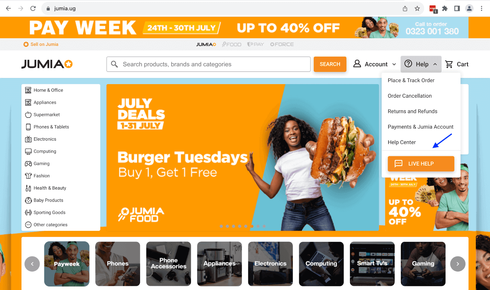
Dropdown dividers separate groups of related content or items in the dropdown menu. They help in the visual organization of dropdown menus by breaking the items into digestible sections.
We can also use dividers to help users determine which dropdown menu content is actionable such as buttons and links, or information.
In the first of two examples below, the JUMIA website uses a divider to separate informational dropdown menu items from the actionable option button of LIVE HELP.
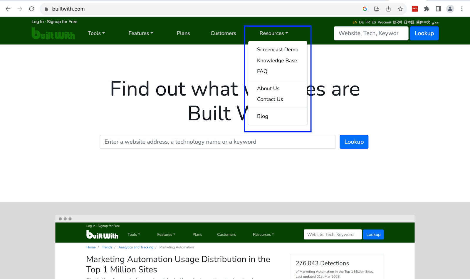
The second example shows how the BuiltWith website uses dividers to turn dropdown menu items into absorbable sections.
To create a divider, create a < li > with the class divider and add an < hr > inside it.
Code:
|
1 2 3 4 5 6 7 8 9 10 11 12 13 14 15 16 17 18 19 20 21 22 23 24 25 26 27 28 29 30 31 32 33 34 35 36 37 38 39 40 41 42 43 44 45 46 47 48 49 50 51 52 53 54 55 56 57 |
<!DOCTYPE html> <html lang="en"> <head> <meta charset="UTF-8" /> <meta http-equiv="X-UA-Compatible" content="IE=edge" /> <meta name="viewport" content="width=device-width, initial-scale=1.0" /> <link rel="stylesheet" href="./node_modules/bootstrap/dist/css/bootstrap.min.css" /> <title>Bootstrap CSS Dropdowns - Dropdown divider</title> </head> <body class="py-5 bg-dark"> <div class="container text-white"> <h1 class="fs-2">Bootstrap CSS Dropdowns</h1> <p class="fs-4">Dropdown dividers</p> <div class="d-flex gap-5"> <div class="dropdown mt-3"> <p>Has no dropdown dividers</p> <button class="btn btn-success dropdown-toggle" data-bs-toggle="dropdown" aria-expanded="false"> Learning hub </button> <ul class="dropdown-menu mt-2"> <li><a class="dropdown-item" href="#">WebDriver Tutorial</a></li> <li><a class="dropdown-item" href="#">Software Quality Management</a></li> <li><a class="dropdown-item" href="#">UI Testing Tutorial</a></li> <li><a class="dropdown-item" href="#">Manual Testing Tutorial</a></li> <li><a class="dropdown-item" href="#">Automation Testing</a></li> <li><a class="dropdown-item" href="#">Cross Browser Testing</a></li> <li><a class="dropdown-item" href="#">Real Device Cloud</a></li> <li><a class="dropdown-item" href="#">Mobile App Testing</a></li> </ul> </div> <div class="dropdown mt-3"> <p>Has dropdown dividers</p> <button class="btn btn-info dropdown-toggle" data-bs-toggle="dropdown" aria-expanded="false"> Learning hub </button> <ul class="dropdown-menu mt-2"> <li><a class="dropdown-item" href="#">WebDriver Tutorial</a></li> <li><a class="dropdown-item" href="#">Software Quality Management</a></li> <li><a class="dropdown-item" href="#">UI Testing Tutorial</a></li> <li><a class="dropdown-item" href="#">Manual Testing Tutorial</a></li> <li><hr class="dropdown-divider"></li> <li><a class="dropdown-item" href="#">Automation Testing</a></li> <li><a class="dropdown-item" href="#">Cross Browser Testing</a></li> <li><a class="dropdown-item" href="#">Real Device Cloud</a></li> <li><a class="dropdown-item" href="#">Mobile App Testing</a></li> </ul> </div> </div> </div> <script src="./node_modules/bootstrap/dist/js/bootstrap.bundle.min.js"></script> </body> </html> |
Browser output:
See the Pen
Bootstrap CSS dropdowns – dropdown dividers by Mbaziira Ronald (@mbaziraofug)
on CodePen.
Dropdown Offsets
Dropdown offsets define the location of the dropdown menu. You can also think of it as defining the distance between the dropdown toggle and the dropdown menu. Bootstrap dropdowns can have a horizontal offset, a vertical offset, or both.
To create an offset, define a data-bs-offset attribute on the dropdown toggle, and populate it. The attribute takes in two values, one for the horizontal offset and another for the vertical.
Code:
|
1 2 3 4 5 6 7 8 9 10 11 12 13 14 15 16 17 18 19 20 21 22 23 24 25 26 27 28 29 30 31 32 33 34 35 36 37 38 39 40 41 42 43 44 45 46 47 48 49 50 51 52 53 54 55 56 57 58 59 60 61 62 63 64 65 66 67 68 69 70 71 72 73 74 75 76 |
<!DOCTYPE html> <html lang="en"> <head> <meta charset="UTF-8" /> <meta http-equiv="X-UA-Compatible" content="IE=edge" /> <meta name="viewport" content="width=device-width, initial-scale=1.0" /> <link rel="stylesheet" href="./node_modules/bootstrap/dist/css/bootstrap.min.css" /> <title>Bootstrap CSS Dropdowns - Dropdown Offsets</title> </head> <body class="py-5 bg-dark"> <div class="container text-white"> <h1 class="fs-2">Bootstrap CSS Dropdowns</h1> <p class="fs-4">Dropdown offsets</p> <div class="d-flex gap-5"> <!-- Dropdown 1 --> <div class="dropdown mt-3"> <p>Has no dropdown offset</p> <button class="btn btn-primary dropdown-toggle" data-bs-toggle="dropdown" aria-expanded="false"> Learning hub </button> <ul class="dropdown-menu"> <li><a class="dropdown-item" href="#">WebDriver Tutorial</a></li> <li><a class="dropdown-item" href="#">Software Quality Management</a></li> <li><a class="dropdown-item" href="#">UI Testing Tutorial</a></li> <li><a class="dropdown-item" href="#">Manual Testing Tutorial</a></li> </ul> </div> <!-- Dropdown 2 --> <div class="dropdown mt-3"> <p>Has horizontal dropdown offset</p> <button class="btn btn-danger dropdown-toggle" data-bs-toggle="dropdown" aria-expanded="false" data-bs-offset="100,0"> Learning hub </button> <ul class="dropdown-menu"> <li><a class="dropdown-item" href="#">WebDriver Tutorial</a></li> <li><a class="dropdown-item" href="#">Software Quality Management</a></li> <li><a class="dropdown-item" href="#">UI Testing Tutorial</a></li> <li><a class="dropdown-item" href="#">Manual Testing Tutorial</a></li> </ul> </div> <!-- Dropdown 3 --> <div class="dropdown mt-3"> <p>Has vertical and horizontal dropdown offset</p> <button class="btn btn-info dropdown-toggle" data-bs-toggle="dropdown" aria-expanded="false" data-bs-offset="25,40"> Learning hub </button> <ul class="dropdown-menu"> <li><a class="dropdown-item" href="#">WebDriver Tutorial</a></li> <li><a class="dropdown-item" href="#">Software Quality Management</a></li> <li><a class="dropdown-item" href="#">UI Testing Tutorial</a></li> <li><a class="dropdown-item" href="#">Manual Testing Tutorial</a></li> </ul> </div> <!-- Dropdown 4 --> <div class="dropdown mt-3"> <p>Has vertical dropdown offset</p> <button class="btn btn-success dropdown-toggle" data-bs-toggle="dropdown" aria-expanded="false" data-bs-offset="0,40"> Learning hub </button> <ul class="dropdown-menu"> <li><a class="dropdown-item" href="#">WebDriver Tutorial</a></li> <li><a class="dropdown-item" href="#">Software Quality Management</a></li> <li><a class="dropdown-item" href="#">UI Testing Tutorial</a></li> <li><a class="dropdown-item" href="#">Manual Testing Tutorial</a></li> </ul> </div> </div> </div> <script src="./node_modules/bootstrap/dist/js/bootstrap.bundle.min.js"></script> </body> </html> |
Browser output:
The browser output above shows the four dropdowns with different offsets. To set only the horizontal offset, the value for the vertical offset should be 0, and the reverse is true.
See the Pen
Bootstrap CSS dropdowns – dropdown offsets by Mbaziira Ronald (@mbaziraofug)
on CodePen.
Dropdown Headers
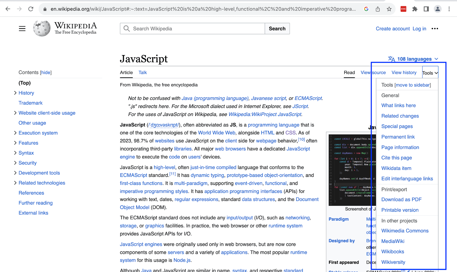
Dropdown headers act as labels or identifiers for sections and groups of items in the dropdown menu. They help users identify related dropdown items, thus saving time and making decision-making easier.
In the below example, Wikipedia uses the dropdown header of Print/export as a label for dropdown items relating to printing or downloading the page as a document. It saves users the precious time of looking through the entire list to identify them.
Code:
|
1 2 3 4 5 6 7 8 9 10 11 12 13 14 15 16 17 18 19 20 21 22 23 24 25 26 27 28 29 30 31 32 33 34 35 36 37 38 39 |
<!DOCTYPE html> <html lang="en"> <head> <meta charset="UTF-8" /> <meta http-equiv="X-UA-Compatible" content="IE=edge" /> <meta name="viewport" content="width=device-width, initial-scale=1.0" /> <link rel="stylesheet" href="./node_modules/bootstrap/dist/css/bootstrap.min.css" /> <title>Bootstrap CSS Dropdowns - Dropdown headers</title> </head> <body class="py-5 bg-light"> <div class="container"> <h1 class="fs-2">Bootstrap CSS Dropdowns</h1> <p class="fs-4">Dropdown headers</p> <div class="dropdown mt-3"> <button class="btn btn-primary dropdown-toggle" data-bs-toggle="dropdown" aria-expanded="false" data-bs-offset="0,10"> Learning hub </button> <ul class="dropdown-menu"> <li><h2 class="dropdown-header">Tutorials</h2></li> <li><a class="dropdown-item" href="#">WebDriver Tutorial</a></li> <li><a class="dropdown-item" href="#">Software Quality Management</a></li> <li><a class="dropdown-item" href="#">UI Testing Tutorial</a></li> <li><a class="dropdown-item" href="#">Manual Testing Tutorial</a></li> <li><h2 class="dropdown-header">Products</h2></li> <li><a class="dropdown-item" href="#">Automation Testing</a></li> <li><a class="dropdown-item" href="#">Cross Browser Testing</a></li> <li><a class="dropdown-item" href="#">Real Device Cloud</a></li> <li><a class="dropdown-item" href="#">Mobile App Testing</a></li> </ul> </div> </div> <script src="./node_modules/bootstrap/dist/js/bootstrap.bundle.min.js"></script> </body> </html> |
Browser output:
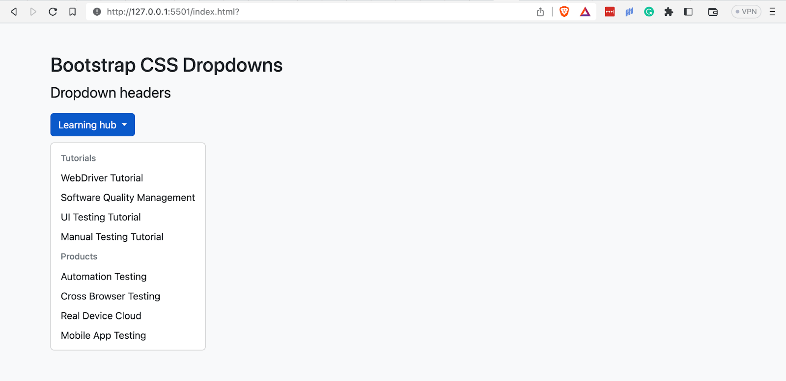
The above browser output features a dropdown with the name Learning hub. The dropdown has two sections, one for Tutorials and another for Products. We have used dropdown headers to indicate each section.
See the Pen
Bootstrap CSS Dropdowns – Dropdown headers by Mbaziira Ronald (@mbaziraofug)
on CodePen.
Dropdown Forms
With Bootstrap dropdown forms, you can put forms inside a dropdown menu and style them.
Code:
|
1 2 3 4 5 6 7 8 9 10 11 12 13 14 15 16 17 18 19 20 21 22 23 24 25 26 27 28 29 30 31 32 33 34 35 36 37 38 39 40 41 42 |
<!DOCTYPE html> <html lang="en"> <head> <meta charset="UTF-8" /> <meta http-equiv="X-UA-Compatible" content="IE=edge" /> <meta name="viewport" content="width=device-width, initial-scale=1.0" /> <link rel="stylesheet" href="./node_modules/bootstrap/dist/css/bootstrap.min.css" /> <title>Bootstrap CSS Dropdowns - Dropdown forms</title> </head> <body class="py-5 bg-dark"> <div class="container text-white"> <h1 class="fs-2">Bootstrap CSS Dropdowns</h1> <p class="fs-4">Dropdown forms</p> <div class="dropdown"> <button class="btn btn-info dropdown-toggle" data-bs-toggle="dropdown" aria-expanded="false" data-bs-offset="0,20"> Login </button> <form class="dropdown-menu p-3" action="" style="width: 30rem;"> <!-- Labels and inputs --> <div> <div class="mb-3"> <label for="email" class="form-label">Email address</label> <input type="email" class="form-control" placeholder="email@example.com"> </div> <div class="mb-3"> <label for="password" class="form-label">Password</label> <input type="password" class="form-control" placeholder="Min 8 chars"> </div> </div> <!-- Submit button --> <button class="btn btn-success w-100" type="submit">Sign in</button> </form> </div> </div> <script src="./node_modules/bootstrap/dist/js/bootstrap.bundle.min.js"></script> </body> </html> |
Browser output:
See the Pen
Bootstrap CSS Dropdowns – Dropdown forms by Mbaziira Ronald (@mbaziraofug)
on CodePen.
Dropdown Auto Close Behavior
Dropdown menu closes when the user clicks inside or outside them by default. You can, however, change this behavior by using the attribute data-bs-auto-close attribute.
The below example shows you how you can achieve this through auto-close behavior.
Code:
|
1 2 3 4 5 6 7 8 9 10 11 12 13 14 15 16 17 18 19 20 21 22 23 24 25 26 27 28 29 30 31 32 33 34 35 36 37 38 39 40 41 42 43 44 45 46 47 48 49 50 51 52 53 54 55 56 57 58 59 60 61 62 63 64 65 66 67 68 |
<!DOCTYPE html> <html lang="en"> <head> <meta charset="UTF-8" /> <meta http-equiv="X-UA-Compatible" content="IE=edge" /> <meta name="viewport" content="width=device-width, initial-scale=1.0" /> <link rel="stylesheet" href="./node_modules/bootstrap/dist/css/bootstrap.min.css" /> <title>Bootstrap CSS Dropdowns - Dropdown autoclose behavior</title> </head> <body class="py-5 bg-dark"> <div class="container text-white"> <h1 class="fs-2">Bootstrap CSS Dropdowns</h1> <p class="fs-4">Dropdown autoclose behavior</p> <div class="d-flex gap-5 mt-4"> <!-- Dropdown 1 --> <div> <p class="fs-5">Default dropdown</p> <button class="btn btn-info dropdown-toggle" data-bs-toggle="dropdown" data-bs-offset="0,20" type="button" data-bs-auto-close="true" aria-expanded="false">Tutorials</button> <ul class="dropdown-menu"> <li><a class="dropdown-item" href="">WebDriver Tutorial</a></li> <li><a class="dropdown-item" href="">Software Quality Management</a></li> <li><a class="dropdown-item" href="">UI Testing </a></li> <li><a class="dropdown-item" href="">Manual Testing Tutorial</a></li> </ul> </div> <!-- Dropdown 2 --> <div> <p class="fs-5">Click inside to close dropdown</p> <button class="btn btn-info dropdown-toggle" data-bs-toggle="dropdown" data-bs-offset="0,20" type="button" data-bs-auto-close="inside" aria-expanded="false">Tools</button> <ul class="dropdown-menu"> <li><a class="dropdown-item" href="">LT Browser</a></li> <li><a class="dropdown-item" href="">Tunnel Binary</a></li> <li><a class="dropdown-item" href="">Underpass</a></li> <li><a class="dropdown-item" href="">LT Debug</a></li> </ul> </div> <!-- Dropdown 3 --> <div> <p class="fs-5">Click outside to close dropdown</p> <button class="btn btn-info dropdown-toggle" data-bs-toggle="dropdown" data-bs-offset="0,20" type="button" data-bs-auto-close="outside" aria-expanded="false">Test-on browsers</button> <ul class="dropdown-menu"> <li><a class="dropdown-item" href="">Chrome</a></li> <li><a class="dropdown-item" href="">Firefox</a></li> <li><a class="dropdown-item" href="">Safari</a></li> <li><a class="dropdown-item" href="">Edge</a></li> </ul> </div> <!-- Dropdown 4 --> <div> <p class="fs-5">Manual close dropdown</p> <button class="btn btn-info dropdown-toggle" data-bs-toggle="dropdown" data-bs-offset="0,20" type="button" data-bs-auto-close="false" aria-expanded="false">Pricing</button> <ul class="dropdown-menu"> <li><a class="dropdown-item" href="">Free</a></li> <li><a class="dropdown-item" href="">Live</a></li> <li><a class="dropdown-item" href="">Real Device</a></li> <li><a class="dropdown-item" href="">Enterprise</a></li> </ul> </div> </div> </div> <script src="./node_modules/bootstrap/dist/js/bootstrap.bundle.min.js"></script> </body> </html> |
Browser output:
The data-bs-auto-close attribute takes in four values:
- true
- false
- inside
- outside
The above browser output shows four dropdowns; the first is the default dropdown where the attribute’s value is true, and the value is set to inside outside, , and false for the second, third, and last dropdowns.
See the Pen
Bootstrap CSS Dropdowns – Dropdown auto-close behavior by Mbaziira Ronald (@mbaziraofug)
on CodePen.
Changing the Direction of Dropdowns
Bootstrap allows you to change the direction of the dropdown from the default to several others. These include:
- centered
- dropup
- dropend
- dropstart
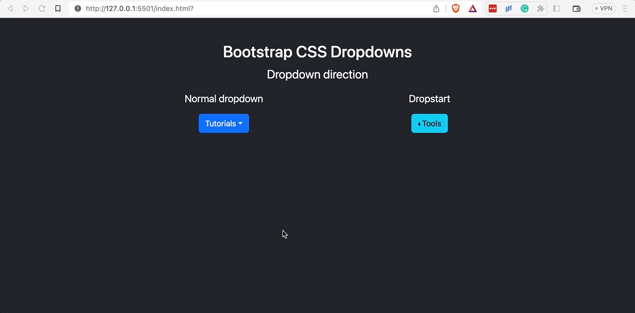
Centered
To center your dropdown menu directly under the dropdown toggle or trigger, define the dropdown-center class on the trigger.
Code:
|
1 2 3 4 5 6 7 8 9 10 11 12 13 14 15 16 17 18 19 20 21 22 23 24 25 26 27 28 29 30 31 32 33 34 35 36 37 38 39 40 41 42 43 44 45 46 |
<!DOCTYPE html> <html lang="en"> <head> <meta charset="UTF-8" /> <meta http-equiv="X-UA-Compatible" content="IE=edge" /> <meta name="viewport" content="width=device-width, initial-scale=1.0" /> <link rel="stylesheet" href="./node_modules/bootstrap/dist/css/bootstrap.min.css" /> <title>Bootstrap CSS Dropdowns - Dropdown direction</title> </head> <body class="py-5 bg-dark"> <div class="container text-white"> <h1 class="fs-2">Bootstrap CSS Dropdowns</h1> <p class="fs-4">Dropdown direction</p> <div class="d-flex gap-5"> <!-- Normal dropdown --> <div class="dropdown"> <p class="fs-5">Normal dropdown</p> <button class="btn btn-info dropdown-toggle" data-bs-toggle="dropdown" type="button" data-bs-auto-close="true" aria-expanded="false">Tutorials</button> <ul class="dropdown-menu"> <li><a class="dropdown-item" href="">WebDriver Tutorial</a></li> <li><a class="dropdown-item" href="">Software Quality Management</a></li> <li><a class="dropdown-item" href="">UI Testing </a></li> <li><a class="dropdown-item" href="">Manual Testing Tutorial</a></li> </ul> </div> <!-- Centered dropdown --> <div class="dropdown-center"> <p class="fs-5">Dropdown centered</p> <button class="btn btn-info dropdown-toggle" data-bs-toggle="dropdown" type="button" data-bs-auto-close="true" aria-expanded="false">Tools</button> <ul class="dropdown-menu"> <li><a class="dropdown-item" href="">LT Browser</a></li> <li><a class="dropdown-item" href="">Tunnel Binary</a></li> <li><a class="dropdown-item" href="">Underpass</a></li> <li><a class="dropdown-item" href="">LT Debug</a></li> </ul> </div> </div> </div> <script src="./node_modules/bootstrap/dist/js/bootstrap.bundle.min.js"></script> </body> </html> |
Browser output:
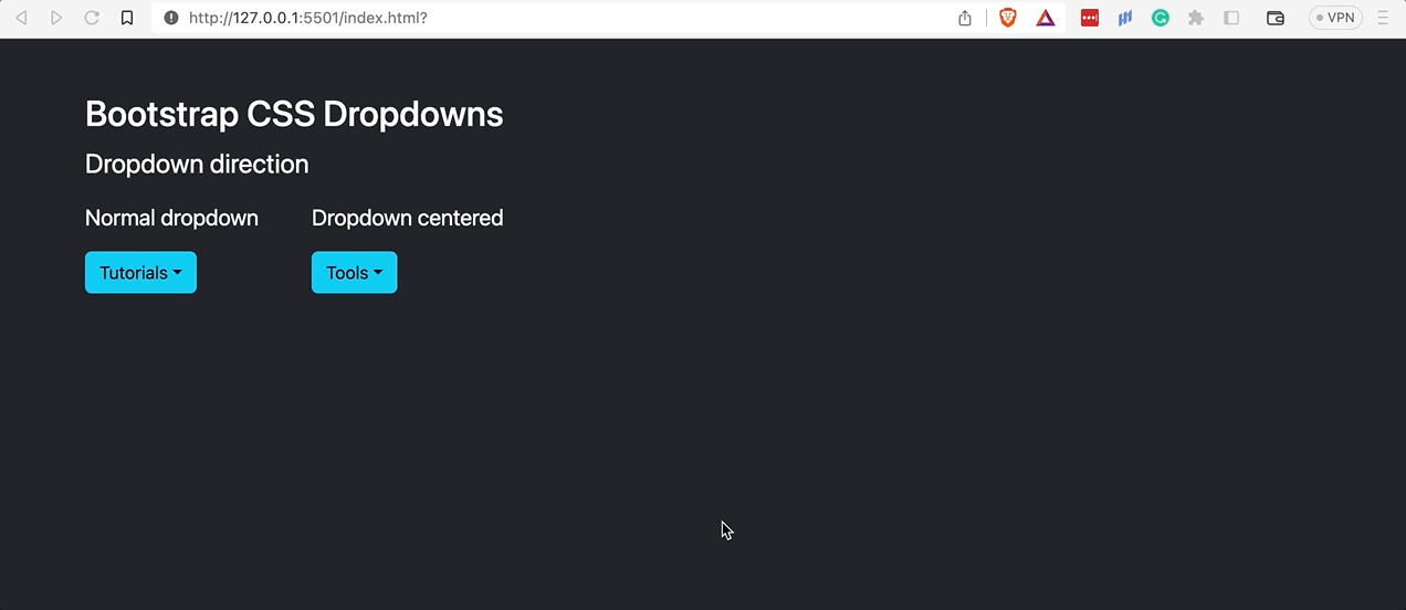
The above browser output shows the difference between the normal and centered dropdown menus. While the normal dropdown has its menu aligned following the start of the trigger, the centered dropdown has its menu directly centered under it.
See the Pen
Bootstrap CSS Dropdowns – Dropdown direction by Mbaziira Ronald (@mbaziraofug)
on CodePen.
Dropup
A dropup appears at the top of its trigger rather than down. To create a dropup, define the class on the dropdown menu parent element. Dropups are usually used when there is limited or no space for a dropdown to occupy.
Code:
|
1 2 3 4 5 6 7 8 9 10 11 12 13 14 15 16 17 18 19 20 21 22 23 24 25 26 27 28 29 30 31 32 33 34 35 36 37 38 39 40 41 42 43 44 45 46 |
<!DOCTYPE html> <html lang="en"> <head> <meta charset="UTF-8" /> <meta http-equiv="X-UA-Compatible" content="IE=edge" /> <meta name="viewport" content="width=device-width, initial-scale=1.0" /> <link rel="stylesheet" href="./node_modules/bootstrap/dist/css/bootstrap.min.css" /> <title>Bootstrap CSS Dropdowns - Dropdown direction</title> </head> <body class="py-5 bg-dark"> <div class="container text-white"> <h1 class="fs-2">Bootstrap CSS Dropdowns</h1> <p class="fs-4">Dropdown direction</p> <div class="d-flex gap-5"> <!-- Normal dropdown --> <div class="dropdown"> <p class="fs-5">Normal dropdown</p> <button class="btn btn-info dropdown-toggle" data-bs-toggle="dropdown" type="button" aria-expanded="false">Tutorials</button> <ul class="dropdown-menu"> <li><a class="dropdown-item" href="">WebDriver Tutorial</a></li> <li><a class="dropdown-item" href="">Software Quality Management</a></li> <li><a class="dropdown-item" href="">UI Testing </a></li> <li><a class="dropdown-item" href="">Manual Testing Tutorial</a></li> </ul> </div> <!-- Dropup --> <div class="dropup"> <p class="fs-5">Dropup</p> <button class="btn btn-info dropdown-toggle" data-bs-toggle="dropdown" type="button" aria-expanded="false">Tools</button> <ul class="dropdown-menu"> <li><a class="dropdown-item" href="">LT Browser</a></li> <li><a class="dropdown-item" href="">Tunnel Binary</a></li> <li><a class="dropdown-item" href="">Underpass</a></li> <li><a class="dropdown-item" href="">LT Debug</a></li> </ul> </div> </div> </div> <script src="./node_modules/bootstrap/dist/js/bootstrap.bundle.min.js"></script> </body> </html> |
Browser output:
See the Pen
Bootstrap CSS Dropdowns – Dropup by Mbaziira Ronald (@mbaziraofug)
on CodePen.
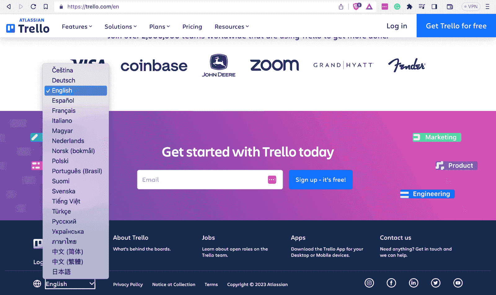
The below example shows how Trello uses a dropup for its dropdown menu for choosing the user’s country and language in the footer.
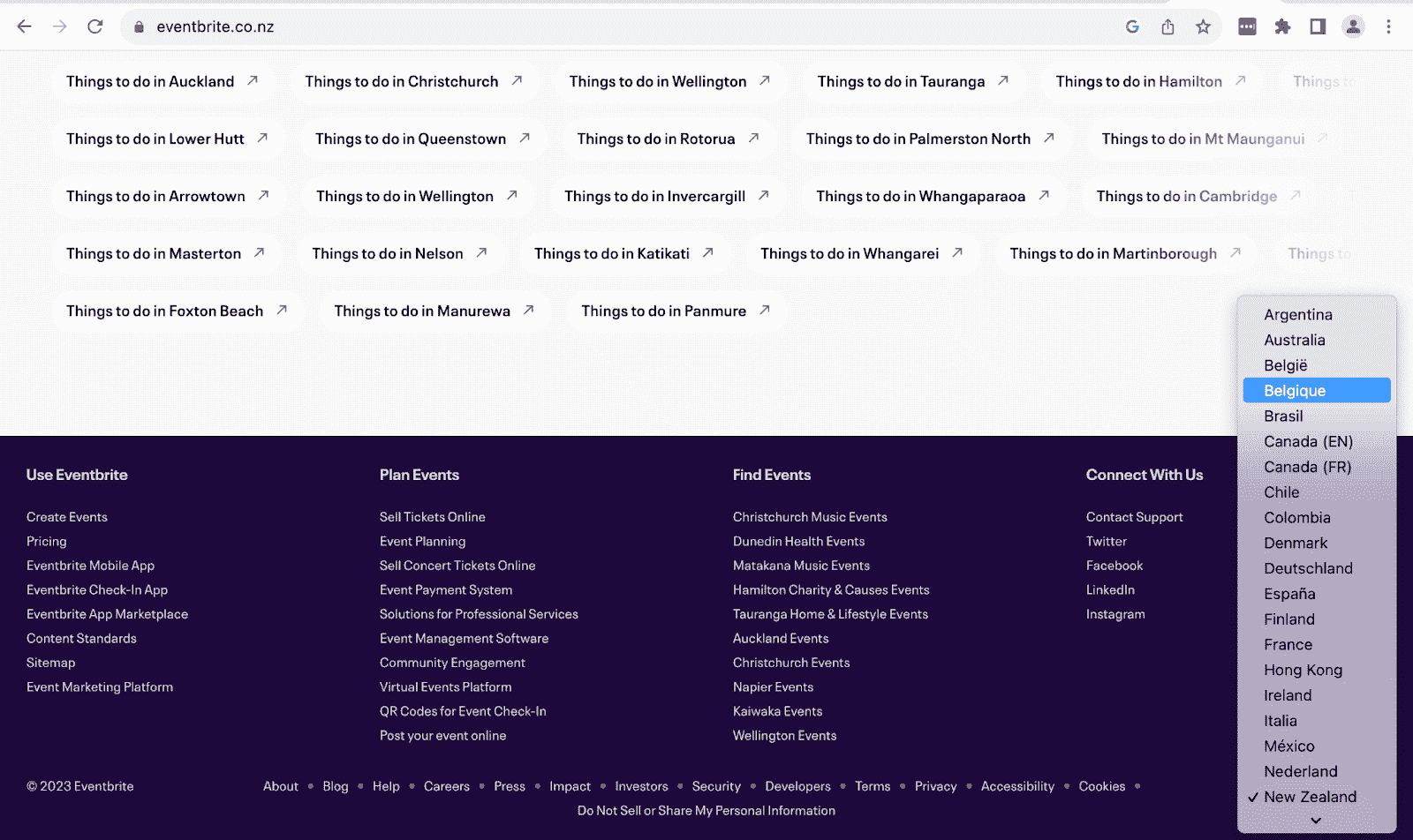
Eventbrite also uses a dropup for the user’s country and language selection in the footer.
Dropstart
A dropstart menu appears at the left end of the dropdown trigger. To create a dropstart, define the class dropstart on the parent element of the dropdown menu.
Code:
|
1 2 3 4 5 6 7 8 9 10 11 12 13 14 15 16 17 18 19 20 21 22 23 24 25 26 27 28 29 30 31 32 33 34 35 36 37 38 39 40 41 42 43 44 45 46 |
<!DOCTYPE html> <html lang="en"> <head> <meta charset="UTF-8" /> <meta http-equiv="X-UA-Compatible" content="IE=edge" /> <meta name="viewport" content="width=device-width, initial-scale=1.0" /> <link rel="stylesheet" href="./node_modules/bootstrap/dist/css/bootstrap.min.css" /> <title>Bootstrap CSS Dropdowns - Dropdown direction</title> </head> <body class="py-5 bg-dark"> <div class="container text-center text-white"> <h1 class="fs-2">Bootstrap CSS Dropdowns</h1> <p class="fs-4">Dropdown direction</p> <div class="d-flex justify-content-evenly"> <!-- Normal dropdown --> <div class="dropdown"> <p class="fs-5">Normal dropdown</p> <button class="btn btn-primary dropdown-toggle" data-bs-toggle="dropdown" type="button" aria-expanded="false">Tutorials</button> <ul class="dropdown-menu"> <li><a class="dropdown-item" href="#">WebDriver Tutorial</a></li> <li><a class="dropdown-item" href="#">Software Quality Management</a></li> <li><a class="dropdown-item" href="#">UI Testing </a></li> <li><a class="dropdown-item" href="#">Manual Testing Tutorial</a></li> </ul> </div> <!-- Dropstart --> <div class="dropstart"> <p class="fs-5">Dropstart</p> <button class="btn btn-info dropdown-toggle" data-bs-toggle="dropdown" type="button" aria-expanded="false">Tools</button> <ul class="dropdown-menu"> <li><a class="dropdown-item" href="#">LT Browser</a></li> <li><a class="dropdown-item" href="#">Tunnel Binary</a></li> <li><a class="dropdown-item" href="#">Underpass</a></li> <li><a class="dropdown-item" href="#">LT Debug</a></li> </ul> </div> </div> </div> <script src="./node_modules/bootstrap/dist/js/bootstrap.bundle.min.js"></script> </body> </html> |
Browser output:
See the Pen
Bootstrap CSS Dropdowns – Dropstart by Mbaziira Ronald (@mbaziraofug)
on CodePen.
Dropend
A dropend menu appears at the right end of the dropdown trigger. To create a dropend, define the class dropend on the parent element of the dropdown menu.
Code:
|
1 2 3 4 5 6 7 8 9 10 11 12 13 14 15 16 17 18 19 20 21 22 23 24 25 26 27 28 29 30 31 32 33 34 35 36 37 38 39 40 41 42 43 44 45 46 |
<!DOCTYPE html> <html lang="en"> <head> <meta charset="UTF-8" /> <meta http-equiv="X-UA-Compatible" content="IE=edge" /> <meta name="viewport" content="width=device-width, initial-scale=1.0" /> <link rel="stylesheet" href="./node_modules/bootstrap/dist/css/bootstrap.min.css" /> <title>Bootstrap CSS Dropdowns - Dropdown direction</title> </head> <body class="py-5 bg-dark"> <div class="container text-white"> <h1 class="fs-2">Bootstrap CSS Dropdowns</h1> <p class="fs-4">Dropdown direction</p> <div class="d-flex gap-5"> <!-- Normal dropdown --> <div class="dropdown"> <p class="fs-5">Normal dropdown</p> <button class="btn btn-primary dropdown-toggle" data-bs-toggle="dropdown" type="button" aria-expanded="false">Tutorials</button> <ul class="dropdown-menu"> <li><a class="dropdown-item" href="#">WebDriver Tutorial</a></li> <li><a class="dropdown-item" href="#">Software Quality Management</a></li> <li><a class="dropdown-item" href="#">UI Testing </a></li> <li><a class="dropdown-item" href="#">Manual Testing Tutorial</a></li> </ul> </div> <!-- Dropend --> <div class="dropend"> <p class="fs-5">Dropend</p> <button class="btn btn-info dropdown-toggle" data-bs-toggle="dropdown" type="button" aria-expanded="false">Tools</button> <ul class="dropdown-menu"> <li><a class="dropdown-item" href="#">LT Browser</a></li> <li><a class="dropdown-item" href="#">Tunnel Binary</a></li> <li><a class="dropdown-item" href="#">Underpass</a></li> <li><a class="dropdown-item" href="#">LT Debug</a></li> </ul> </div> </div> </div> <script src="./node_modules/bootstrap/dist/js/bootstrap.bundle.min.js"></script> </body> </html> |
Browser output:
See the Pen
Bootstrap CSS Dropdowns – Dropend by Mbaziira Ronald (@mbaziraofug)
on CodePen.
Use Cases of Bootstrap Collapse
Bootstrap collapse allows website users to visually show (or hide) the content on a webpage. It can simplify complex interfaces by offering information only when needed, thus reducing clutter or overwhelming users with information overload. Furthermore, they can increase the website’s load time since content is loaded and rendered when required.
Expedia uses a collapsible feature to offer information to its users on items like Flights and Hotels only when they need it.
Bootstrap uses buttons and anchors as triggers to toggle content. The buttons and anchors are required to have the attribute data-bs-toggle=”collapse” Toggling the content is done by animating the content’s height from its current value to 0 and vice versa when you click the trigger.
NGINX uses the same collapsible feature on its dropdown for languages below with a visually pleasing smooth animation.
Code:
|
1 2 3 4 5 6 7 8 9 10 11 12 13 14 15 16 17 18 19 20 21 22 23 24 25 26 27 28 29 30 31 32 33 34 35 36 37 38 39 40 41 42 43 44 45 46 47 48 49 50 51 52 53 54 55 56 57 |
<!DOCTYPE html> <html lang="en"> <head> <meta charset="UTF-8" /> <meta http-equiv="X-UA-Compatible" content="IE=edge" /> <meta name="viewport" content="width=device-width, initial-scale=1.0" /> <link rel="stylesheet" href="./node_modules/bootstrap/dist/css/bootstrap.min.css" /> <title>Bootstrap CSS Toggles</title> </head> <body class="py-5 bg-light"> <div class="container"> <div> <h3 class="fs-2">Toggle</h3> </div> <div> <!-- Toggles --> <div class="d-flex gap-5"> <!-- link --> <div> <p class="fs-5">Toggling content - Using an anchor tag</p> <a class="btn btn-primary" data-bs-toggle="collapse" role="button" aria-expanded="false" href="#collapse-example" aria-controls="collapse-example"> Click and collapse content </a> </div> <!-- button --> <div> <p class="fs-5">Toggling content - Using a button</p> <button type="button" class="btn btn-success" data-bs-toggle="collapse" data-bs-target="#collapse-example" aria-expanded="false" aria-controls="collapse-example"> Click and collapse content </button> </div> </div> <!-- Content to toggle --> <div class="collapse mt-4" id="collapse-example"> <div class="card card-body fs-5"> <p class="lh-lg"> System testing, also known as system-level testing, involves evaluating how the various components of an application interact in a fully integrated system. It is carried out on the entire system under either functional or design requirements. </p> <p class="lh-lg"> It helps you find flaws, gaps, or needs that are lacking from the software application's overall functionality. It validates the design, behavior, and customer expectations of the system. Software Requirements Specification (SRS) is necessary to function the system outside the specified restrictions. </p> <p> Functional and non-functional System testing can be performed by your company internally. However, you can hire professionals with in-depth knowledge of the complete procedure. It is important to note that System testing is performed by a separate team from the development team. It aims to measure the quality of the system objectively. </p> </div> </div> </div> </div> <script src="./node_modules/bootstrap/dist/js/bootstrap.bundle.min.js"></script> </body> </html> |
Browser output:
The triggers are supplied with a class collapse which hides or shows content when clicked. For anchors, the value for the href attribute should match the value of the id attribute for the content to be collapsed, and for the button, it should match the value in the data-bs-target attribute.
See the Pen
Bootstrap CSS Toggles – Toggling content by Mbaziira Ronald (@mbaziraofug)
on CodePen.
The toggles can collapse different content on the same page. You can do this by giving the content unique ids that the toggles will target.
Code:
|
1 2 3 4 5 6 7 8 9 10 11 12 13 14 15 16 17 18 19 20 21 22 23 24 25 26 27 28 29 30 31 32 33 34 35 36 37 38 39 40 41 42 43 44 45 46 47 48 49 50 51 52 53 54 55 56 57 58 59 60 61 62 63 64 65 66 67 68 69 70 |
<!DOCTYPE html> <html lang="en"> <head> <meta charset="UTF-8" /> <meta http-equiv="X-UA-Compatible" content="IE=edge" /> <meta name="viewport" content="width=device-width, initial-scale=1.0" /> <link rel="stylesheet" href="./node_modules/bootstrap/dist/css/bootstrap.min.css" /> <title>Bootstrap CSS Toggles</title> </head> <body class="py-5 bg-light"> <div class="container"> <div> <h3 class="fs-2">Toggle</h3> </div> <div> <!-- Toggles --> <div class="d-flex gap-5"> <!-- link --> <div> <p class="fs-5">Toggling content - Using an anchor tag</p> <a class="btn btn-primary" data-bs-toggle="collapse" role="button" aria-expanded="false" href="#new"> Click and collapse content </a> </div> <!-- button --> <div> <p class="fs-5">Toggling content - Using a button</p> <button class="btn btn-success" data-bs-toggle="collapse" data-bs-target="#collapse-example"> Click and collapse content </button> </div> </div> <!-- Content to toggle --> <div class="collapse mt-4" id="collapse-example"> <div class="card card-body fs-5"> <p class="lh-lg card-text"> System testing, also known as system-level testing, involves evaluating how the various components of an application interact in a fully integrated system. It is carried out on the entire system under either functional or design requirements. </p> <p class="lh-lg card-text"> It helps you find flaws, gaps, or needs that are lacking from the software application's overall functionality. It validates the design, behavior, and customer expectations of the system. Software Requirements Specification (SRS) is necessary to function the system outside the specified restrictions. </p> <p class="lh-lg card-text"> Functional and non-functional System testing can be performed by your company internally. However, you can hire professionals with in-depth knowledge of the complete procedure. It is important to note that System testing is performed by a separate team from the development team. It aims to measure the quality of the system objectively. </p> </div> </div> <div class="collapse mt-4" id="new"> <div class="card card-body lh-lg fs-5"> <p class="lh-lg card-text"> End-to-end testing, or E2E testing, as the name suggests, is the testing methodology that validates a software workflow from start to end. The primary goal of E2E testing is to simulate an end user's application journey and ensure that all integrated components, dependencies, and other integrated pieces work as expected. </p> <p class="lh-lg card-text"> While this looks obvious that the testing has to be done with all components attached, end-to-end testing is the last stage of testing and is usually done infrequently. This is especially so if the application under test is extensive, i.e., it has hundreds of components and thousands of dependencies. </p> <p class="lh-lg card-text"> End-to-end testing is time consuming, requires more infrastructure than unit testing and integration testing, and it is relatively difficult to pinpoint exact breakage with this methodology. </p> </div> </div> </div> </div> <script src="./node_modules/bootstrap/dist/js/bootstrap.bundle.min.js"></script> </body> </html> |
Browser output:
To make toggles collapse different content, match the ids of the content to collapse to match that of the data-bs-target or href attributes of the toggles.
See the Pen
Bootstrap CSS toggles – Toggling content with different ids by Mbaziira Ronald (@mbaziraofug)
on CodePen.
Toggling Content Horizontally
Similarly to toggling content vertically, you can also toggle content horizontally. Bootstrap does this by animating the current value of the width of the content to 0 and vice-versa.
Code:
|
1 2 3 4 5 6 7 8 9 10 11 12 13 14 15 16 17 18 19 20 21 22 23 24 25 26 27 28 29 30 31 32 33 34 35 36 37 38 39 40 41 42 43 44 45 46 |
<!DOCTYPE html> <html lang="en"> <head> <meta charset="UTF-8" /> <meta http-equiv="X-UA-Compatible" content="IE=edge" /> <meta name="viewport" content="width=device-width, initial-scale=1.0" /> <link rel="stylesheet" href="./node_modules/bootstrap/dist/css/bootstrap.min.css" /> <title>Bootstrap CSS Toggles - Toggling content horizontally</title> </head> <body class="py-5 bg-light"> <div class="container"> <div> <h3 class="fs-2">Toggle</h3> <p class="fs-4">Collapsing content horizontally</p> </div> <div> <!-- Toggle --> <div class="d-flex gap-5"> <button class="btn btn-success" data-bs-toggle="collapse" data-bs-target="#collapse-example"> Click and collapse content </button> </div> <!-- Content to toggle --> <div class="collapse collapse-horizontal mt-4" id="collapse-example"> <div class="card card-body fs-5" style="width: 70rem;"> <p class="lh-lg card-text"> System testing, also known as system-level testing, involves evaluating how the various components of an application interact in a fully integrated system. It is carried out on the entire system under either functional or design requirements. </p> <p class="lh-lg card-text"> It helps you find flaws, gaps, or needs that are lacking from the software application's overall functionality. It validates the design, behavior, and customer expectations of the system. Software Requirements Specification (SRS) is necessary to function the system outside the specified restrictions. </p> <p class="lh-lg card-text"> Functional and non-functional System testing can be performed by your company internally. However, you can hire professionals with in-depth knowledge of the complete procedure. It is important to note that System testing is performed by a separate team from the development team. It aims to measure the quality of the system objectively. </p> </div> </div> </div> </div> <script src="./node_modules/bootstrap/dist/js/bootstrap.bundle.min.js"></script> </body> </html> |
Browser output:
See the Pen
Bootstrap CSS Toggles – Toggling content horizontally by Mbaziira Ronald (@mbaziraofug)
on CodePen.
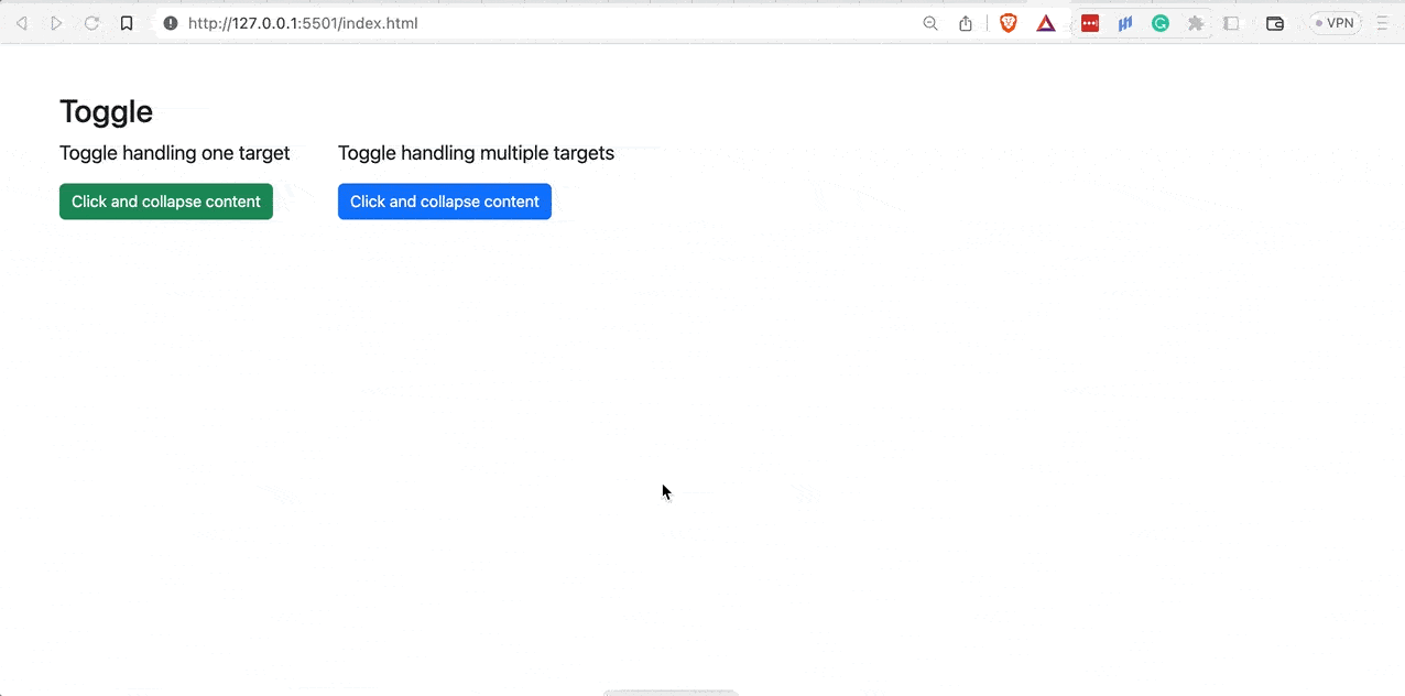
Handling Multiple Toggles and Targets
Buttons and anchors can simultaneously manage multiple targets by referencing them in their data-bs-target and href attributes.
Code:
|
1 2 3 4 5 6 7 8 9 10 11 12 13 14 15 16 17 18 19 20 21 22 23 24 25 26 27 28 29 30 31 32 33 34 35 36 37 38 39 40 41 42 43 44 45 46 47 48 49 50 51 52 53 54 55 56 57 58 59 60 61 62 63 64 65 66 67 68 69 70 71 |
<!DOCTYPE html> <html lang="en"> <head> <meta charset="UTF-8" /> <meta http-equiv="X-UA-Compatible" content="IE=edge" /> <meta name="viewport" content="width=device-width, initial-scale=1.0" /> <link rel="stylesheet" href="./node_modules/bootstrap/dist/css/bootstrap.min.css" /> <title>Bootstrap CSS Toggles - Handling multiple targets</title> </head> <body class="py-5 bg-light"> <div class="container"> <h3 class="fs-2">Toggle</h3> <div> <!-- Toggles --> <div class="d-flex gap-5"> <div> <p class="fs-5">Toggle handling one target</p> <button class="btn btn-success" data-bs-toggle="collapse" data-bs-target="#collapse-example" aria-expanded="false"> Click and collapse content </button> </div> <div> <p class="fs-5">Toggle handling multiple targets</p> <button class="btn btn-primary" data-bs-toggle="collapse" data-bs-target=".all-collapse" aria-expanded="false" aria-controls="collapse-example testing"> Click and collapse content </button> </div> </div> <!-- Content to toggle --> <div class="row"> <div class="col"> <div class="collapse all-collapse mt-4" id="collapse-example"> <div class="card card-body fs-6"> <p class="lh-lg card-text"> System testing, also known as system-level testing, involves evaluating how the various components of an application interact in a fully integrated system. It is carried out on the entire system under either functional or design requirements. </p> <p class="lh-lg card-text"> It helps you find flaws, gaps, or needs that are lacking from the software application's overall functionality. It validates the design, behavior, and customer expectations of the system. Software Requirements Specification (SRS) is necessary to function the system outside the specified restrictions. </p> <p class="lh-lg card-text"> Functional and non-functional System testing can be performed by your company internally. However, you can hire professionals with in-depth knowledge of the complete procedure. It is important to note that System testing is performed by a separate team from the development team. It aims to measure the quality of the system objectively. </p> </div> </div> </div> <div class="col"> <div class="collapse all-collapse mt-4" id="testing"> <div class="card card-body lh-lg fs-6"> <p class="lh-lg card-text"> End-to-end testing, or E2E testing, as the name suggests, is the testing methodology that validates a software workflow from start to end. The primary goal of E2E testing is to simulate an end user's application journey and ensure that all integrated components, dependencies, and other integrated pieces work as expected. </p> <p class="lh-lg card-text"> While this looks obvious that the testing has to be done with all components attached, end-to-end testing is the last stage of testing and is usually done infrequently. This is especially so if the application under test is extensive, i.e., it has hundreds of components and thousands of dependencies. </p> <p class="lh-lg card-text"> End-to-end testing is time consuming, requires more infrastructure than unit testing and integration testing, and it is relatively difficult to pinpoint exact breakage with this methodology. </p> </div> </div> </div> </div> </div> </div> <script src="./node_modules/bootstrap/dist/js/bootstrap.bundle.min.js"></script> </body> </html> |
Browser output:
In the above preview, the toggle on the left handles only one target, while the toggle on the right handles two targets it references in its data-bs-target attribute.
See the Pen
Bootstrap CSS Toggles – Handling multiple toggles and targets by Mbaziira Ronald (@mbaziraofug)
on CodePen.
Combining Bootstrap Dropdowns and Bootstrap Collapse
You can combine the Bootstrap dropdown and Bootstrap collapse components to create features that offer a unique user experience to website visitors. Let’s look at some of the features you can make by combining the Bootstrap dropdowns and Bootstrap collapse components.
Cascading Dropdowns
Cascading dropdowns are a series of dependent dropdowns in which the selection of one dropdown depends on the selection made in the parent or previous dropdowns. These dropdowns are usually catering to make hierarchical data more organized and user-friendly.
You can combine multiple dropdowns, each behaving as a filter for the following one, and where the selected options in each dropdown display or update the content in a collapsible section on the fly.
Collapse Panel With Nested Dropdown
You can create a collapsed panel containing any information you want the user to view, and where applicable, you can nest it within a dropdown. You can typically leverage it for collapsible panels of FAQs.
Nested Dropdown Navigation
You can nest dropdowns within each other for related hierarchical content. You will see this commonly with nested menu dropdowns. Mastercard uses a nested dropdown menu on small screen devices to enable users to navigate and access all the menu options easily without affecting user experience.
Here is an example of Mateusz Bieniaszczyk’s aesthetically pleasing Dribble creation.
The below browser output shows a collapse panel with a nested dropdown form created for one of our FAQs.
See the Pen
Bootstrap dropdown nested in collapse panel by Mbaziira Ronald (@mbaziraofug)
on CodePen.
Advanced Tricks: Combining Dropdowns and Collapse
Let’s now look at the advanced CSS tricks that will help you ensure consistency, readability, proper maintenance, and seamless integration of your Bootstrap dropdown and Bootstrap collapse features.
Ensure Responsiveness and Compatibility
Earlier on, we saw how a large number of dropdown options, though not favored in many situations, may be unavoidable. However, when applicable, it is best to carry out certain types of Bootstrap testing, such as usability testing and cross browser testing, so as not to impact user experience and ensure that browsers render your features as intended.
After ensuring the accessibility of your Bootstrap collapse and Bootstrap dropdown components, you may need to do responsive testing to ensure their responsiveness on several of your users’ devices. The responsiveness of your Bootstrap collapse and Bootstrap dropdown features directly affects the bounce rate of your website.
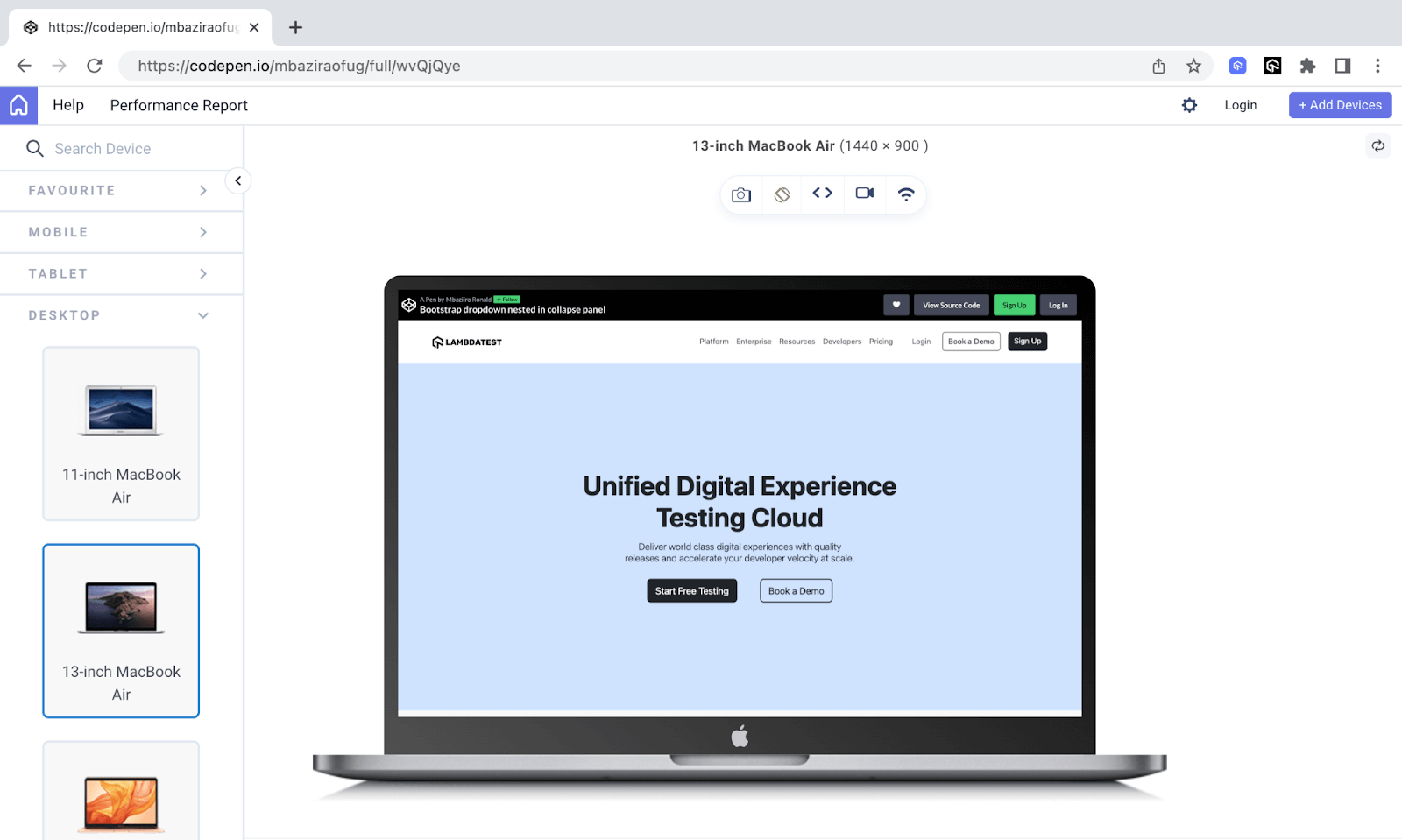
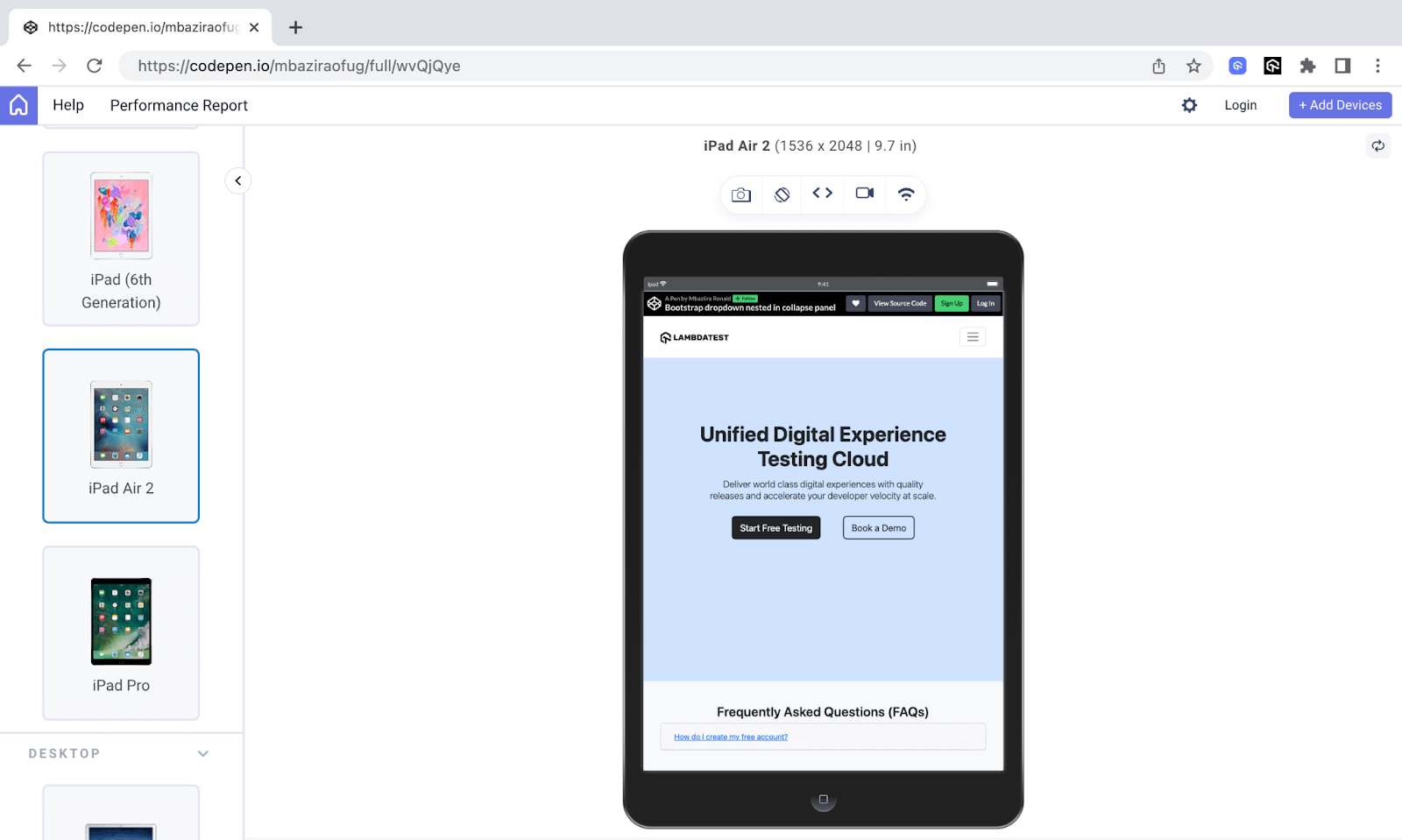
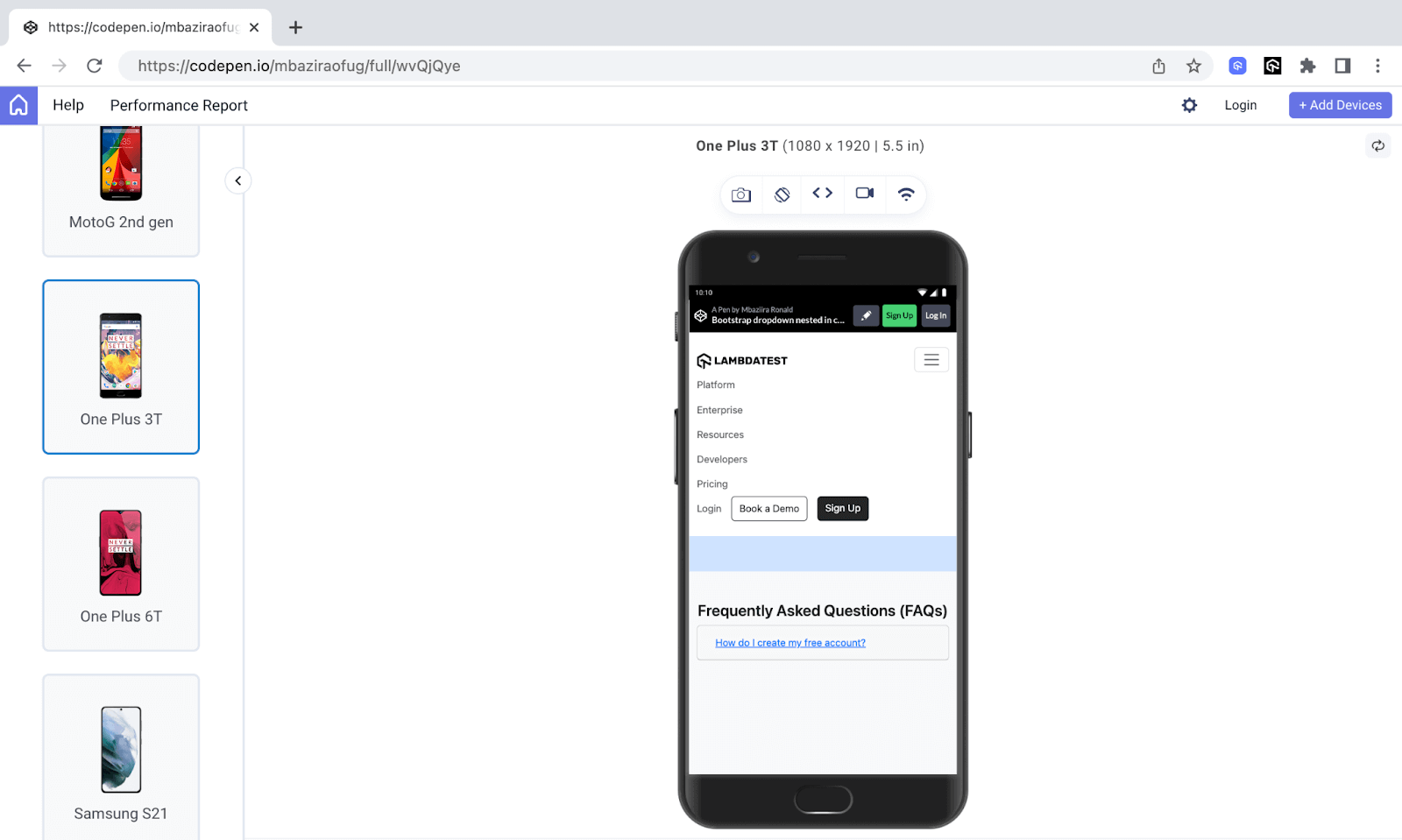
Let’s take a preview of our website created in the previous section and see how responsive it is on different devices in terms of Bootstrap dropdowns and collapse.
I will use LT Browser 2.0 to render the website on different devices’ viewports. The LT Browser 2.0 is a dev-friendly mobile next-generation Chromium-based browser built by LambdaTest that enables developers and testers to perform responsive testing of Bootstrap dropdown, and Bootstrap collapse on over 50+ viewports, including mobiles, tablets, and desktops.
Subscribe to our LambdaTest YouTube Channel for the latest updates on tutorials around Selenium testing, Playwright testing, and more.
Desktop Preview:
Tablet Preview:
Mobile Preview:
Visit the documentation to get started with LT Browser 2.0.
Prioritize Accessibility
Ensuring accessibility entails ensuring that your website’s features are usable and meaningful to everyone, regardless of how they interact with them. You can secure accessibility by using ARIA attributes, using semantic HTML, or carrying out accessibility testing.
For example, you can use the ARIA attribute of role=”button” when you use an anchor element as a dropdown button to show that the link is acting as a button. You can also check out Bootstrap accessibility guidelines on how to make Bootstrap dropdowns more accessible.
NotePerform accessibility testing across 3000+ real desktop browsers. Try LambdaTest Today!
Use Bootstrap Classes
Use Bootstrap classes and attributes for styling your Bootstrap collapse and Bootstrap dropdown features. Bootstrap provides several classes and attributes, such as dropend and data-bs-offset.
For example, you can use the data-bs-offset attribute to give your Bootstrap dropdown menu a vertical offset.
|
1 |
<button class="btn dropdown-toggle" data-bs-toggle="dropdown" data-bs-offset="0,30">Resources</button> |
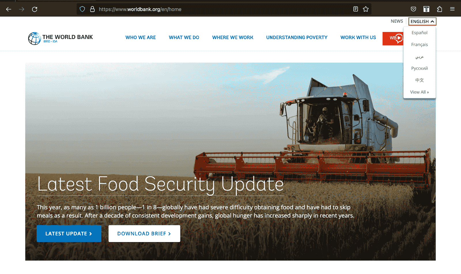
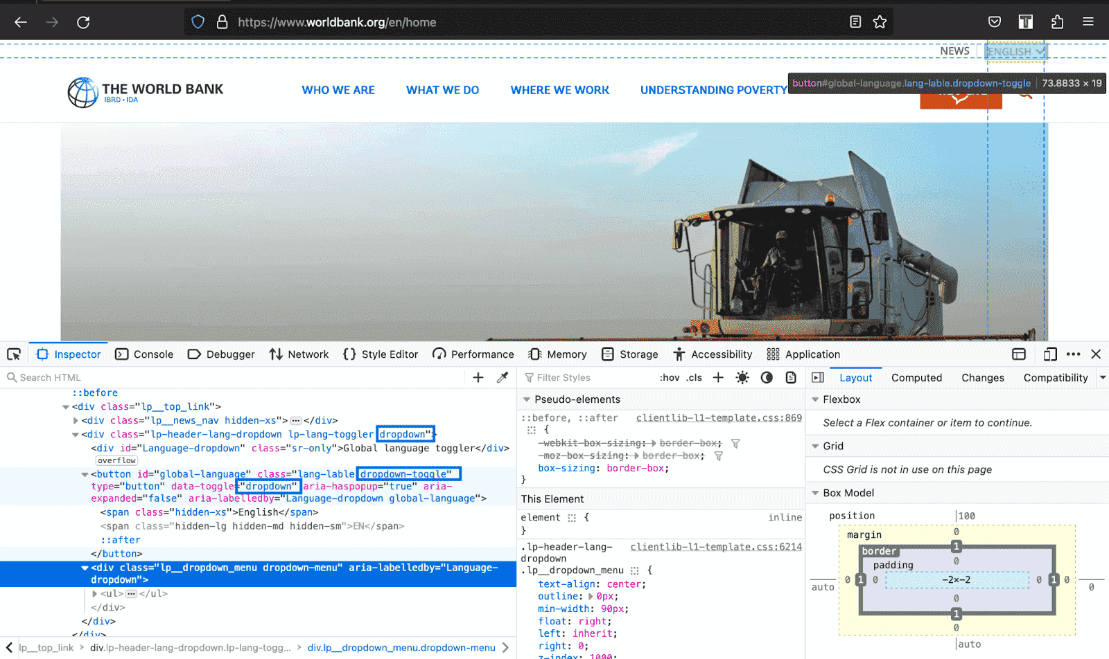
The World Bank uses Bootstrap classes to style its dropdown as shown in the images below.
Provide Clear and Concise Content
For collapsible content, ensure it is concise and clear to spare users from excessive text and redundant information.
With Bootstrap dropdowns, though, the number of options depends on the specific use cases and the complexity of choices; where possible, keep the options around 5 to 10. It will make the dropdown easy to scan and navigate.
It may not be applicable where a long list of options is necessary, such as when you need languages, regions, or countries. However, consider using categories or sub-menus to organize them.
The below example shows how the edclub website provides digestible and clear informational dropdown menu items.

Conclusion
There are more use cases for Bootstrap dropdowns and Bootstrap collapse components. You can make creative combinations of the dropdowns and collapse to capture users’ attention and give them a unique user experience.
In this Bootstrap Tutorial Part I, you have learned the nitty and gritty of Bootstrap dropdown and Bootstrap collapse components and how to use them to create a lasting impression on users by providing the information they need when needed.
You can now go and put the knowledge you have gained into practice. As we wind up with this tutorial on Bootstrap dropdowns and Bootstrap collapse, remember this is not the end but the beginning of a journey with endless possibilities. Cheers!
Frequently Asked Questions (FAQs)
How can I align the dropdown menu to the right side of the screen?
Yes! You can disable specific Bootstrap dropdown options by applying the disabled class on those items.
How can I align the dropdown menu to the right side of the screen?
Use the class format .dropdown-menu-{breakpoint}-end to align the dropdown menu to the right of the screen based on a breakpoint.


Author’s Profile
Mbaziira Ronald
Mbaziira Ronald is a software developer and technical writer. He has expertise in technologies like Tailwind CSS, JavaScript, and WordPress. He frequently dabbles with Figma to improve his design skills.
Blogs: 7
Got Questions? Drop them on LambdaTest Community. Visit now


