CSS Content-Visibility: A Game-Changer For Web Page Loading Speed
Anurag Gharat
Posted On: April 20, 2023
![]() 309632 Views
309632 Views
![]() 22 Min Read
22 Min Read

The adage “First Impression is the Last Impression” is one that I’m pretty sure you’ve heard before. Well, I don’t know if it’s true in the case of people, but it applies to websites. A visitor’s first impression of a website is generally based on how fast the site loads and how smoothly it interacts. A slow or sluggish website stays in the visitors’ minds and might affect their decision to revisit the site.
According to developer Mozilla documentation, visitors on a website generally expect a website to load within a couple of seconds and abandon the site if it takes more than 3 seconds. Hence as a developer, we need to make a maximum impact in the minimum time to make the visitor stay on the site.
Website performance is an essential factor in determining whether the visitors stay on our website or move to another one. With so many businesses going online, a website becomes a focal point for gaining customers and creating an online identity. In such cases, a poorly performing website can negatively impact the business. Whereas a highly performant and optimized website results in better conversion rates and better customer retention.
Hence as a developer, improving the performance of our website must be our topmost priority. Web Optimization is a process of improving the performance and experience on a site using optimization techniques, strategies, and technologies to drive more audience and meet the business goals.
Website Optimization techniques can be performed on the client and server sides. Techniques such as lazy loading images, improving database read/write times, and caching JavaScript files are popular among developers. As per the HubSpot survey, you can reduce your website’s initial render time by more than 80% using a single line of CSS code.
The new CSS content-visibility property directly interacts with the browser’s rendering process to improve the website’s performance. In this blog, we will understand how to leverage the CSS content-visibility property to enhance the website’s performance.
TABLE OF CONTENTS
- Why does website performance matter?
- Introduction to CSS content-visibility property
- Using CSS content-visibility property to Improve Website’s Performance
- Difference between Content-Visibility and Lazy Loading
- How to use CSS content-visibility property?
- Before using the CSS content-visibility property
- After using the CSS content-visibility property
- The ‘contain-intrinsic-size’ property
- Browser Support
- Frequently Asked Questions (FAQs)
Why does Website Performance matter?
Having a website that works well is beneficial. An interactive website with quick responses draws visitors more readily. Visitors will go to another website if yours takes longer to load. A user will trust a website that loads quickly. One finding is that a fast website has a higher rate of customer retention.
Here are some reasons website performance matters:
- User experience: Users expect websites to load swiftly and without interruption. High bounce rates can result from users becoming impatient with a slow or poorly functioning website. As a result, users may be less likely to revisit your website, harming your brand’s reputation.
- Search engine rankings: Website speed affects rankings on search engines like Google. In addition to making it more difficult for users to find your site, a slow website can harm your search engine rankings.
- Conversion rates: Having a website that loads quickly and responds to user input can increase conversion rates. Visitors are more likely to purchase or complete the desired action on a website that is quick and simple to use.
- Mobile responsiveness: Website performance is increasingly important as mobile users use these devices to access websites. Mobile users anticipate quick page loads and seamless browsing.
- Optimize images: Your website may load slowly if the images are large. Make sure to optimize your images by minimizing their file size without compromising on quality.
- Minimize HTTP requests: Every file request made by a website takes time to load. You can minimize HTTP requests by combining multiple files into one, using CSS sprites, and using browser caching.
- Use a content delivery network (CDN): A CDN can help improve website performance by caching content on multiple servers worldwide, reducing the distance between the server and the user.
- Minify CSS and JavaScript: Minifying CSS and JavaScript files by removing whitespace and comments can reduce file sizes and speed up website load times.
- Use a fast and reliable web hosting service: The speed of a website can be significantly impacted by its web host. Use a fast, dependable web hosting service that can manage the traffic to your website.
- Implement lazy loading: Your website may load slowly if the images are large. Make sure to optimize your images by minimizing their file size without compromising on quality.
- Use responsive design: Your website must have a responsive design to look good and work properly across all platforms, including desktops, tablets, and mobile phones.
- Test your website regularly: Regularly testing your website’s performance can help you identify and fix issues before they become significant problems.
Here are some tips to improve website performance:
By implementing these tips, you can enhance the functionality of your website, which will raise user engagement, boost search engine rankings, and increase conversion rates.
Perform a responsive design test with LT Browser 2.0. Download Now!
If you are intrigued to know more about LT Browser 2.0, refer to our LT Browser 2.0 tutorial.
Meanwhile, you can also go through the below LT Browser 2.0 tutorial.
Introduction to CSS content-visibility property
The CSS content-visibility property introduced in Chromium 85 is one of the most impactful properties for improving a website’s performance. This property allows the developers to decide which part of the webpage should render and which part should be skipped on the initial render.
When we talk about content on websites, we can divide it into two parts or sections. One section is directly visible and accessible to the user on the initial load, and the other is only visible after user interaction, like scrolling down.
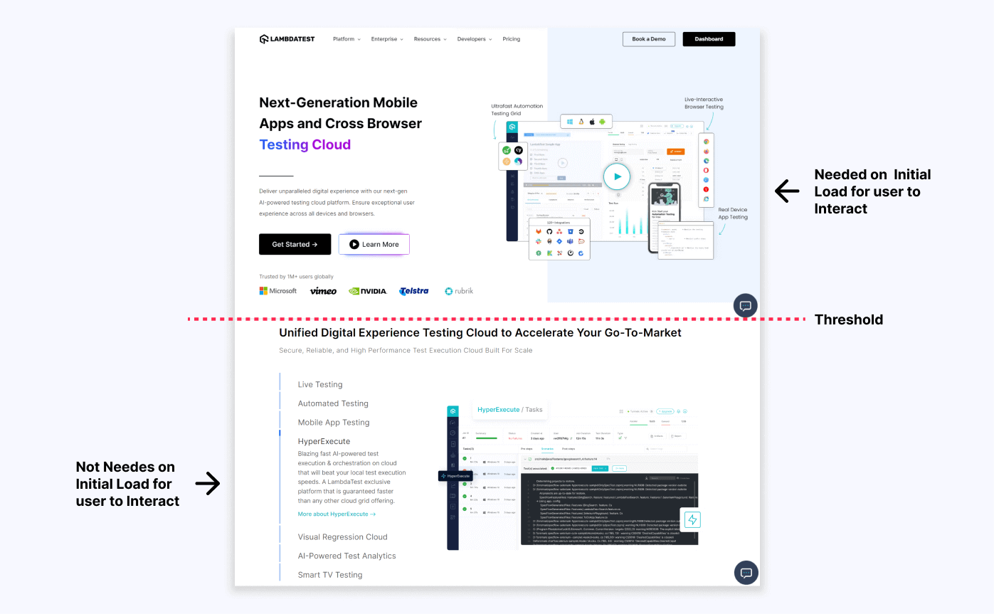
Here I have taken a screenshot of the LambdaTest website. As shown in the above image, the section above the red threshold is directly visible to the user whenever he opens the website. All the HTML elements present in this section of the website can be called onscreen elements.
Whereas the section below the red threshold line is not directly visible to the user. The user has to scroll down to view it. The HTML elements in this section of the website that are not visible directly can be called offscreen elements.
Hence by only rendering the content above the threshold and delaying the rendering process of the content present below the threshold, we can speed up the overall rendering of the website. A reduced rendering time will result in better load times and better performance on the initial render.
This is exactly what the CSS content-visibility property is all about. Using this property, a browser can skip the rendering of a part of the webpage which is not present directly in the user’s viewport. This indicates that if the element is present in the user’s viewport at the time of the first load, it is rendered; otherwise, it is skipped until the element is brought into the user’s viewport. We can think of this as a lazy load for all the content on the website.
The CSS content-visibility property allows browsers to defer the layout and rendering work of off-screen elements, making the initial page load faster. Our offscreen content will only be loaded once we visit it. This results in improved initial load time, and our on-screen content is quickly available for the user to interact with.
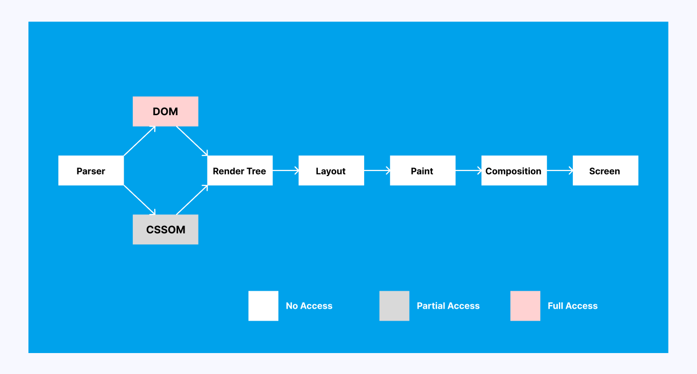
A Critical Rendering Path in a browser is a series of stages, like layout, styling, painting, etc., that a browser goes through to convert the HTML, CSS, and JavaScript into pixels on the screen. The CSS content-visibility property reduces the number of elements to be rendered during the render phase of the critical rendering path.
The CSS content-visibility property accepts one of the below three values.
|
1 |
content-visibility: [visible | auto | hidden]; |
content-visibility: visible
|
1 2 3 |
.container{ content-visibility: visible; } |
This is the default value and does not affect the rendering of the webpage. The entire webpage is loaded on the initial load.
content-visibility: hidden
|
1 2 3 |
.container{ content-visibility: visible; } |
This CSS content-visibility value is the perfect mixture of two different CSS properties – visibility: hidden and display: none. Using content-visibility: hidden, the browser hides the element, but the render state is still preserved in the cache. As a result, whenever the property changes, the browser does not have to re-render the element, reducing load time.
We can use this property when showing an element that is initially hidden but has to be shown quickly on screen after some user interaction. A modal would be a perfect use case for content-visibility: hidden property.
content-visibility: auto
|
1 2 3 |
.container{ content-visibility: auto; } |
If this property is applied to the element and the element is not present in the user’s viewport, the browser simply skips the rendering of that element. This property turns on layout, style, and paint containment.
But unlike CSS content-visibility: hidden, the element is still available to the user on screen. Hence search and find operations can still be performed on the elements.
Using CSS content-visibility property to Improve Website’s Performance
Normally, the browser loads the entire webpage on the initial load. This means that all the elements on the webpage go through the scripting, rendering, layout, and painting stages in the Critical Rendering Path. Hence the browser takes a lot of time to load the website for the first time. The load time can increase more if the website is multimedia-heavy and has a lot of scripts running in the background.
The CSS content-visibility: auto property solves this problem for us. When CSS content-visibility is set as auto for an element, the browser skips the rendering phase of that element on the initial load. The element is only loaded when it enters the user’s viewport. Until then, the browser only calculates the dimensions of the elements. Hence only the elements that are required on the initial load and visible to the user are rendered.
This boosts the website performance because the browser can now defer the rendering of the elements until they are required.
Even after using the CSS content-visibility: auto property, our content is still available in the DOM tree. Therefore we can still search for our content and navigate to it before it even loads without sacrificing the performance.
Difference between Content-Visibility and Lazy Loading
A website’s images are an essential component. In some cases, they even account for the bulk of the website’s content. Although necessary and unavoidable, images also contribute to the website’s lag time. Bulky images can make it take longer for the page to load overall.
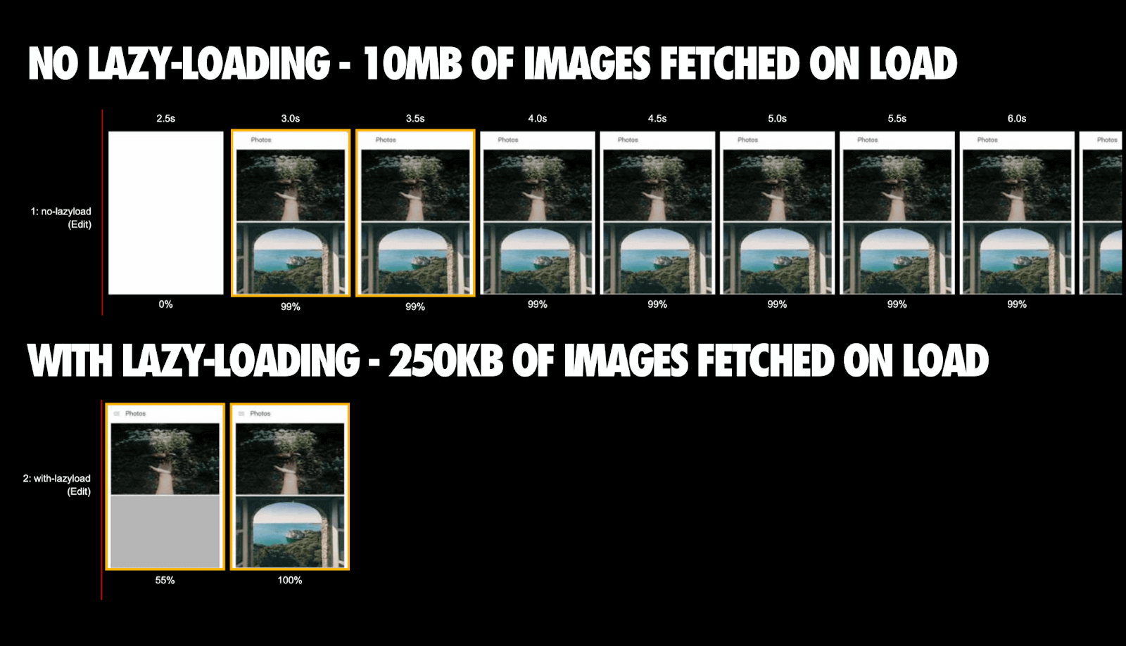
The above image is taken from Addy Osmani and perfectly demonstrates the difference between default behavior vs. when the lazy load is applied. Instead of fetching all the images together, only the required images are fetched; hence the page load is completed in half the time.
The Lazy loading technique is used in websites to improve performance by delaying the fetch request of the images present on the site. Hence, images not directly present in the user’s viewport can be fetched later using the loading=”lazy” attribute.
|
1 |
<img src="link-to-image" loading="lazy"> |
Although the CSS content-visibility and lazy loading properties are both website optimization techniques and sound similar, there is a lot of difference between them.
- Lazy loading can only be applied to the images, while CSS content-visibility can be applied to any HTML element.
- Lazy loading delays the request of images, whereas CSS content-visibility requests the data but delays the rendering until it’s needed.
- Lazy loading is an HTML image tag attribute, whereas CSS content-visibility is a property.
How to use CSS content-visibility property?
Before using the CSS content-visibility property, we must first identify which parts of the website are directly visible to the user and which are accessible only after the scroll. The parts directly in the user’s viewport can usually be rendered. In contrast, for the ones which are off-screen and not directly visible to the user, we can apply content-visibility: auto.
In this section, we will take an existing website and analyze its performance using Chrome DevTools. Then we will add the CSS content-visibility property and check the improvement in the rendering time.
In an example or demo, we will use a CodePen example of a dummy travel blog website from Una Kravets. This is a pretty simple Single Page Website (SPA) with lots of images and content, which is perfect for our demo.
Before using the CSS content-visibility property
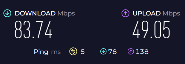
Before measuring the performance, it is essential to note that the final output of the website’s performance might vary depending on your Internet speeds. The following numbers were achieved on my browser with the Internet speed, as shown below.
Let’s check the initial performance of the website without any optimization. To check the website performance, we will load our website in the Chrome browser and open the DevTools using Ctrl + Shift + I. Now we will switch to the performance tab to calculate the performance.
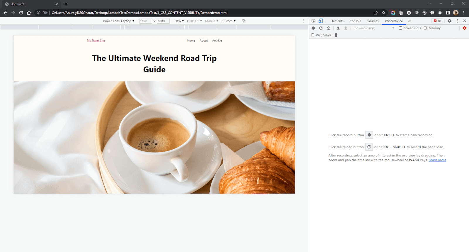
Click on the reload button to record the page load statistics. The browser will run the initial load for the website. Here is what the website performance looks like in my browser without applying any optimizations.
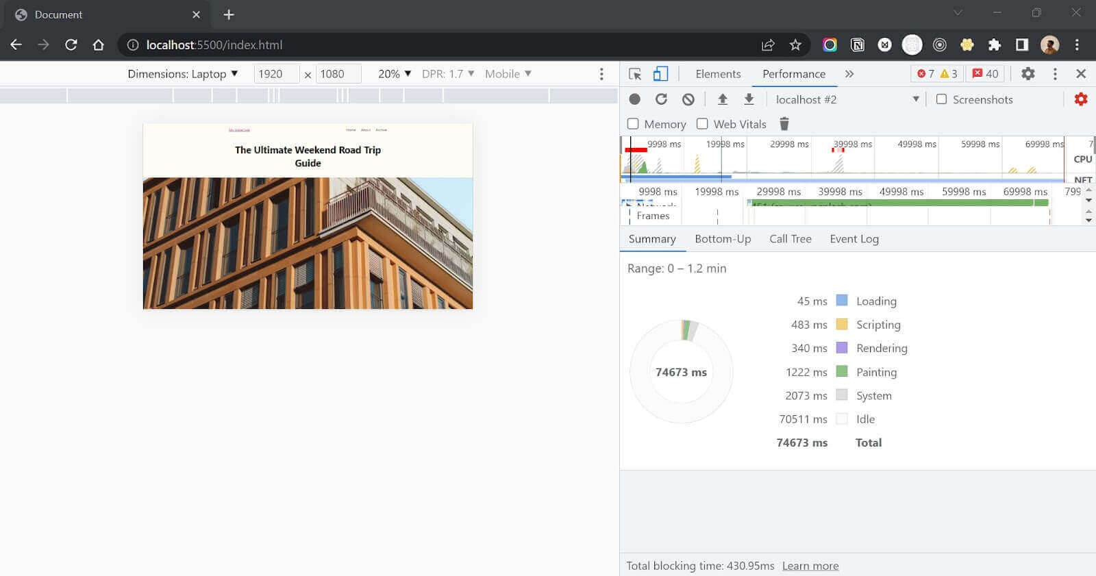
Now, checking for the initial render time, we got these values.
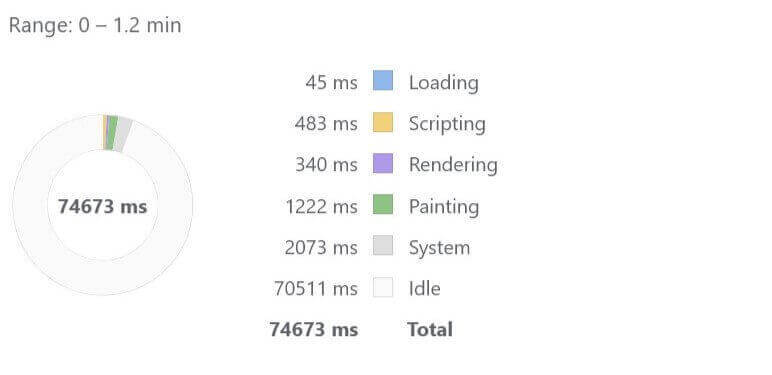
As shown in the image above, the rendering time is 340 ms, and the total load time is
74673 ms. Let’s understand what happens behind the screen.
The server receives a request from the browser and returns a webpage consisting of an HTML file. This HTML file is parsed, and a DOM and CSSOM are generated. Later on, during the rendering stage of the process, a render tree is created by combining the DOM and CSSOM. Once the render tree is generated, the browser performs the remaining layout and painting operations and displays the webpage on the screen.
During the rendering stage of the process, the browser does not check if the content is visible to the user or if the content is needed by the user on the initial load. It continues the operation until the entire webpage is loaded and resources are downloaded.
The rendering time will be even more if our webpage has even more images and content since it will take more time for the assets to be downloaded from the network and placed in their place.
Now let’s see how we can improve the performance of our webpage using the CSS content-visibility property.
First, we will break down the page into two parts –
- Visible to the user
- Not visible to the user
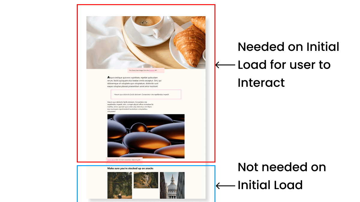
In the above image, we have broken down the page into parts/sections. If we analyze the website properly, we can see that we only need the first fold and the main section on the initial load. All the other content below it can be rendered later once the user scrolls since they don’t fall directly into the user’s viewport on the initial load.
After using the CSS content-visibility property
We will add an off-screen class to all the div tags we want to skip during the render stage. For all these off-screen elements, we will set the CSS content-visibility as auto-using the off-screen class.
|
1 2 3 |
.off-screen{ content-visibility: auto; } |
Now, let’s measure the web page’s performance after using the CSS content-visibility property.
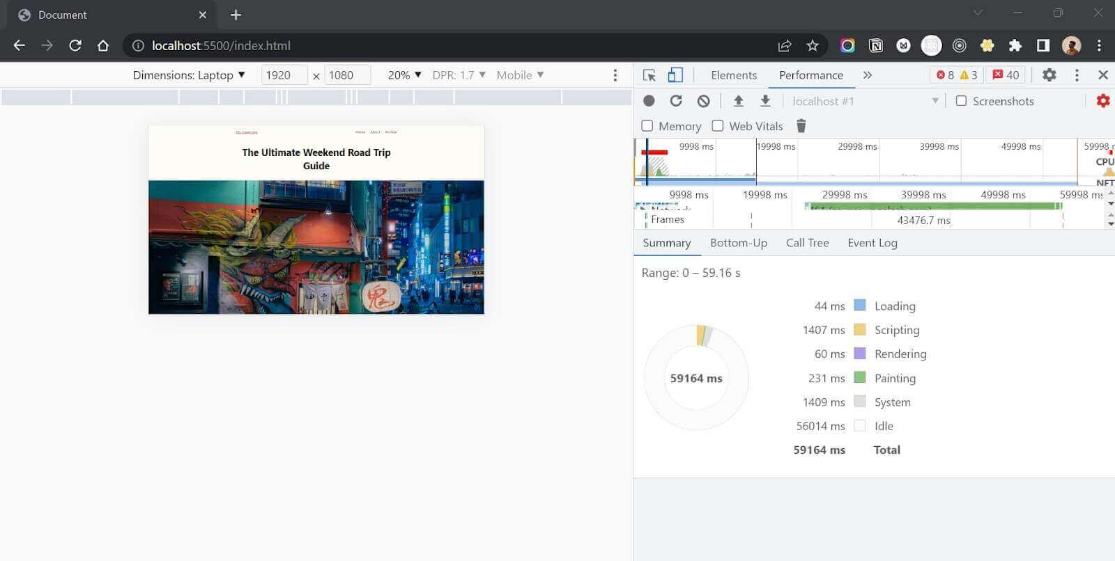
Now here, measuring the performance of the travel blog after optimization using the CSS content-visibility property.
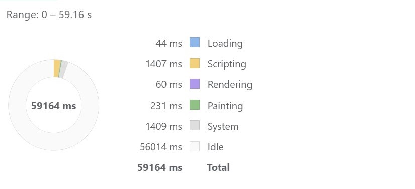
That’s an 8X performance boost using a single line of CSS code. We brought the initial render time down from 340 ms to 60 ms. We reduced the render time by almost 80%! But what caused such a huge impact?
Here the browser still performs the same operations as it did before. The entire web page goes through the Critical Rendering Path as it did before. But the only difference is during the rendering stage. During the rendering stage, once the browser encounters the CSS content-visibility property applied to the element, it simply skips the rendering of that element.
The browser will render only the elements on-screen, i.e., visible to the users. The other elements (with class ‘off-screen’) only go through the styling and layout stage and will only be rendered on the screen once they appear in the user’s viewport. Using this technique, rendering of a large portion of the webpage is skipped, and hence we get such a big jump in rendering time and overall performance.
HTML:
|
1 2 3 4 5 6 7 8 9 10 11 12 13 14 15 16 17 18 19 20 21 22 23 24 25 26 27 28 29 30 31 32 33 34 35 36 37 38 39 40 41 42 43 44 45 46 47 48 49 50 51 52 53 54 55 56 57 58 59 60 61 62 63 64 65 66 67 68 69 70 71 72 73 74 75 76 77 78 79 80 81 82 83 84 85 86 87 88 89 90 91 92 93 94 95 96 97 98 99 100 101 102 103 104 105 106 107 108 109 110 111 112 113 114 115 116 117 118 119 120 121 122 123 124 125 126 127 128 129 130 131 132 133 134 135 136 137 138 139 140 141 142 143 144 145 146 147 148 149 150 151 152 153 154 155 156 157 158 159 160 161 162 163 164 165 166 167 168 169 170 171 172 173 174 175 176 177 178 179 180 181 182 183 184 185 186 187 188 189 190 191 192 193 194 195 196 197 198 199 200 201 202 203 204 205 206 207 208 209 210 211 212 213 214 215 216 217 218 219 220 221 222 223 224 225 226 227 228 229 230 231 232 233 234 235 236 237 238 239 240 241 242 243 244 245 246 247 248 249 250 251 252 253 254 255 256 257 258 259 260 261 262 263 264 265 266 267 268 269 270 271 272 273 274 275 276 277 278 279 280 281 282 283 284 285 286 287 288 289 290 291 292 293 294 295 296 297 298 299 300 301 302 303 304 305 306 307 308 309 310 311 312 313 314 315 316 317 318 319 320 321 322 323 324 325 326 327 328 329 330 331 332 333 334 335 336 337 338 339 340 341 342 343 344 345 346 347 348 349 350 351 352 353 354 355 356 357 358 359 360 361 362 363 364 365 366 367 368 369 370 371 372 373 374 375 376 377 378 379 380 381 382 383 384 385 386 387 388 389 390 391 392 393 394 395 396 397 398 399 400 401 402 403 404 405 406 407 408 409 410 411 412 413 414 415 416 417 418 419 420 421 422 423 424 425 426 427 428 429 430 431 432 433 434 435 436 437 438 439 440 441 442 443 444 445 446 447 448 449 450 451 452 453 454 455 456 |
<!-- Website --> <nav> <a href="#">My Travel Site</a> <ul class="grid-3"> <li>Home</li> <li>About</li> <li>Archive</li> </ul> </nav> <article> <h1>The Ultimate Weekend Road Trip Guide</h1> <figure class="hero"> <img src="https://source.unsplash.com/1600x980" alt=""> <figcaption>This Demo Uses Images from the <a href="https://unsplash.com">Unsplash</a> API.</figcaption> </figure> <p class="leading">Atque similique quia eos cupiditate, repellat quibusdam rerum, facilis quisquam eius beatae omnis excepturi. Sint, qui doloremque sit voluptate quis voluptatum, distinctio sunt eaque voluptas placeat praesentium amet error nostrum!</p> <blockquote>Harum quo <i>distinctio facilis</i> dolorem. Consectetur iste repellendus impedit</blockquote> <p>Harum quo distinctio facilis dolorem. Consectetur iste repellendus impedit, odio, corrupti aliquid officia molestiae hic mollitia, omnis aperiam quos enim alias doloribus sint libero ipsa numquam reprehenderit laudantium voluptatibus voluptates!</p <figure> <img src="https://source.unsplash.com/random/1600x920" alt=""> <figcaption><a href="#">Lorem ipsum</a> dolor sit amet consectetur, adipisicing elit. Doloremque, praesentium.</figcaption> </figure> <h2>Make sure you're stocked up on snacks</h2> <div class="off-screen"> <div class="grid-3"> <figure> <img src="https://source.unsplash.com/random/410" alt=""> </figure> <figure> <img src="https://source.unsplash.com/random/411" alt=""> </figure> <figure> <img src="https://source.unsplash.com/random/430" alt=""> </figure> </div> <p>Atque similique quia eos cupiditate, repellat quibusdam rerum, facilis quisquam eius beatae omnis excepturi. <i>Sint, qui doloremque sit voluptate quis voluptatum</i>, distinctio sunt eaque voluptas placeat praesentium amet error nostrum!</p> <iframe src="https://codepen.io" style="width: 100%; height: 500px" frameborder="0"></iframe> <p>Ex provident eos expedita odio quas, et rem nemo voluptatibus necessitatibus ab, voluptatum nam nesciunt impedit sint repellendus, dolorem cumque vero! Ipsa minus perspiciatis dolores! Magnam assumenda quidem itaque totam?</p> <ul> <li>Lorem ipsum dolor sit amet consectetur, adipisicing elit.</li> <li>Aut expedita magni, provident tenetur non voluptatem culpa nesciunt deleniti dolor amet ducimus a quis veniam nisi odit ex cupiditate sunt.</li> <li>Fugit illo illum sapiente neque id soluta sunt error harum nulla qui blanditiis, nemo perspiciatis nesciunt, voluptate voluptates excepturi ipsa sequi vero vitae.</li> <li>Debitis aperiam ipsa hic quibusdam animi ipsum.</li> </ul> <p><a href="#">Atque similique</a> quia eos cupiditate, repellat quibusdam rerum, facilis quisquam eius beatae omnis excepturi. Sint, qui doloremque sit voluptate quis voluptatum, distinctio sunt eaque voluptas placeat praesentium amet error nostrum!</p> <div class="grid-2"> <figure> <img src="https://source.unsplash.com/random/620" alt=""> <figcaption>Facilis nesciunt perferendis porro incidunt, doloremque debitis deleniti blanditiis eum ab fuga magnam asperiores provident.</figcaption> </figure> <figure> <img src="https://source.unsplash.com/random/610" alt=""> <figcaption>Facilis nesciunt perferendis porro incidunt, doloremque debitis deleniti blanditiis eum ab fuga magnam asperiores provident.</figcaption> </figure> </div> <figure> <img src="https://source.unsplash.com/random/800x400" alt=""> <figcaption>Facilis nesciunt perferendis porro incidunt, <a href="#">doloremque debitis</a> deleniti blanditiis eum ab fuga magnam asperiores provident.</figcaption> </figure> <figure> <img src="https://source.unsplash.com/random/1600x900"> <figcaption>Perspiciatis modi reprehenderit quisquam suscipit ipsum totam labore, voluptatibus illum adipisci inventore quos dolorum velit!</figcaption> </figure> <p>Lorem ipsum dolor sit amet consectetur, adipisicing elit. Quam modi tempora perferendis. Repellendus, facere accusamus. Distinctio, sit! Cupiditate voluptatibus at id eos nulla consequuntur, dicta animi aut, reiciendis minus hic?</p> </div> <h2>Don't forget to plan your stay</h2> <div class="off-screen"> <p>Quo sed quis <a href="#">fuga atque</a> aliquid iste optio sunt voluptatum, laudantium enim dicta explicabo animi ipsa necessitatibus itaque hic ab rem dolor temporibus harum iure? Itaque minima quos architecto quia. Velit soluta error, fugiat placeat deleniti tempore voluptatum consectetur repudiandae. Sit sed nihil numquam itaque facere labore earum neque, officia reiciendis non ea deserunt magnam tenetur! Magnam officiis vitae quidem?</p> <figure> <img src="https://source.unsplash.com/random/1200x800" alt=""> <figcaption>Sunt dignissimos impedit corrupti aliquam adipisci quisquam est reprehenderit illum aspernatur alias, commodi neque ipsam eveniet odio amet nemo harum hic voluptatem optio quod culpa. Fugiat totam eaque excepturi amet. </figcaption> </figure> <blockquote>Minus accusamus explicabo voluptatum at exercitationem aliquam aspernatur odit corrupti!</blockquote> <p>Velit ipsum eum quos? Voluptatum, quidem veniam repellat rerum impedit ducimus! <b>Provident perferendis</b>, nostrum dolorum nesciunt earum amet dicta repellat ad vitae, laudantium iste assumenda fuga mollitia nobis, consequatur adipisci?</p> <div class="p-group-flex"> <p>Recusandae, eveniet? Pariatur voluptatibus voluptatem ad aut iusto rem officia eum, facere ratione ipsum id cumque molestias placeat laboriosam quis iure excepturi suscipit quia maiores, provident beatae.</p> <p>Lorem ipsum dolor, sit amet consectetur adipisicing elit. Asperiores placeat corrupti vel harum. Omnis inventore, eum quo obcaecati at iusto voluptate explicabo soluta, nisi quisquam asperiores ratione, possimus ea totam?</p> </div> <p>Velit ipsum eum quos? Voluptatum, quidem veniam repellat rerum impedit ducimus! <b>Provident perferendis</b>, nostrum dolorum nesciunt earum amet dicta repellat ad vitae, laudantium iste assumenda fuga mollitia nobis, consequatur adipisci?</p> <iframe src="https://css-tricks.com" style="width: 100%; height: 500px" frameborder="0"></iframe> <div class="grid-3"> <figure> <img src="https://source.unsplash.com/random/650" alt=""> </figure> <figure> <img src="https://source.unsplash.com/random/400" alt=""> </figure> <figure> <img src="https://source.unsplash.com/random/350" alt=""> </figure> <figure> <img src="https://source.unsplash.com/random/700" alt=""> </figure> <figure> <img src="https://source.unsplash.com/random/600" alt=""> </figure> <figure> <img src="https://source.unsplash.com/random/550" alt=""> </figure> </div> <figure> <img src="https://source.unsplash.com/random/1200x600" alt=""> <figcaption>Facilis nesciunt perferendis porro incidunt, doloremque debitis deleniti blanditiis eum ab fuga magnam asperiores provident.</figcaption> </figure> <figure> <img src="https://source.unsplash.com/random/1200x700" alt=""> <figcaption>Perspiciatis modi reprehenderit quisquam suscipit ipsum totam labore, voluptatibus illum adipisci inventore quos dolorum velit!</figcaption> </figure> <p>Atque similique quia eos cupiditate, repellat quibusdam rerum, facilis quisquam eius beatae omnis excepturi. Sint, qui doloremque sit voluptate quis voluptatum, distinctio sunt eaque voluptas placeat praesentium amet error nostrum!</p> <p>Recusandae, eveniet? Pariatur voluptatibus voluptatem ad aut iusto rem officia eum, repudiandae facere ratione ipsum id cumque molestias placeat laboriosam quis iure excepturi suscipit quia maiores, provident beatae. Lorem ipsum dolor, sit amet consectetur adipisicing elit. Asperiores placeat corrupti vel harum. Omnis inventore, eum quo obcaecati at iusto voluptate explicabo soluta, nisi quisquam asperiores ratione, possimus ea totam?</p> </div> <h2>Choose your travel partners wisely</h2> <div class="off-screen"> <div class="grid-2"> <figure> <img src="https://source.unsplash.com/random/670" alt=""> <figcaption>Facilis nesciunt perferendis porro incidunt, doloremque debitis deleniti blanditiis eum ab fuga magnam asperiores provident.</figcaption> </figure> <figure> <img src="https://source.unsplash.com/random/600" alt=""> <figcaption>Facilis nesciunt perferendis porro incidunt, doloremque debitis deleniti blanditiis eum ab fuga magnam asperiores provident.</figcaption> </figure> </div> <p>Recusandae, eveniet? Pariatur voluptatibus voluptatem ad aut iusto rem officia eum, repudiandae facere ratione ipsum id cumque molestias placeat laboriosam quis iure excepturi suscipit quia maiores, provident beatae. Temporibus, eum!</p> <p>Lorem ipsum dolor, sit amet consectetur adipisicing elit. Asperiores placeat corrupti vel harum. Omnis inventore, eum quo obcaecati at iusto voluptate explicabo soluta, nisi quisquam asperiores ratione, possimus ea totam?</p> <div class="grid-3"> <figure> <img src="https://source.unsplash.com/random/300" alt=""> </figure> <figure> <img src="https://source.unsplash.com/random/301" alt=""> </figure> <figure> <img src="https://source.unsplash.com/random/302" alt=""> </figure> </div> <figure> <img src="https://source.unsplash.com/random/1600x910" alt=""> <figcaption>Facilis nesciunt perferendis porro incidunt, doloremque debitis deleniti blanditiis eum ab fuga magnam asperiores provident.</figcaption> </figure> <figure> <img src="https://source.unsplash.com/random/1600x940" alt=""> <figcaption>Perspiciatis modi reprehenderit quisquam suscipit ipsum totam labore, voluptatibus illum adipisci inventore quos dolorum velit!</figcaption> </figure> <p>Recusandae, eveniet? Pariatur voluptatibus voluptatem ad aut iusto rem officia eum, repudiandae facere ratione ipsum id cumque molestias placeat laboriosam quis iure excepturi suscipit quia maiores, provident beatae. Temporibus, eum!</p> <p>Lorem ipsum dolor, sit amet consectetur adipisicing elit. Asperiores placeat corrupti vel harum. Omnis inventore, eum quo obcaecati at iusto voluptate explicabo soluta, nisi quisquam asperiores ratione, possimus ea totam?</p> <p>Recusandae, eveniet? Pariatur voluptatibus voluptatem ad aut iusto rem officia eum, repudiandae facere ratione ipsum id cumque molestias placeat laboriosam quis iure excepturi suscipit quia maiores, provident beatae. Lorem ipsum dolor, sit amet consectetur adipisicing elit. Asperiores placeat corrupti vel harum. Omnis inventore, eum quo obcaecati at iusto voluptate explicabo soluta, nisi quisquam asperiores ratione, possimus ea totam?</p> <figure> <img src="https://source.unsplash.com/random/1200x700" alt=""> <figcaption><a href="#">Lorem ipsum</a> dolor sit amet consectetur, adipisicing elit. Doloremque, praesentium.</figcaption> </figure> <div class="grid-3"> <figure> <img src="https://source.unsplash.com/random/650" alt=""> </figure> <figure> <img src="https://source.unsplash.com/random/680" alt=""> </figure> <figure> <img src="https://source.unsplash.com/random/690" alt=""> </figure> </div> <p>Perferendis accusamus asperiores nihil repudiandae, dignissimos sint natus, cumque consectetur maxime ducimus voluptates, nesciunt repellat! Rerum in totam voluptatibus quidem numquam perspiciatis fugiat delectus laboriosam praesentium explicabo, officiis, magnam perferendis?</p> <blockquote>Lorem ipsum dolor sit amet consectetur adipisicing elit. Cum, nemo veritatis.</blockquote> </div> <h2>Don't forget to take photos!</h2> <div class="off-screen"> <p>Corporis deleniti consequuntur corrupti dolor sit tempora assumenda, quia quos modi aliquam, ex exercitationem asperiores est magni iste repellendus voluptatibus, alias maxime? Amet nostrum voluptates nam odio eius reprehenderit accusantium!</p> <div class="grid-2"> <figure> <img src="https://source.unsplash.com/random/530" alt=""> <figcaption>Facilis nesciunt perferendis porro incidunt, doloremque debitis deleniti blanditiis eum ab fuga magnam asperiores provident.</figcaption> </figure> <figure> <img src="https://source.unsplash.com/random/535" alt=""> <figcaption>Facilis nesciunt perferendis porro incidunt, doloremque debitis deleniti blanditiis eum ab fuga magnam asperiores provident.</figcaption> </figure> </div> <div class="p-group-flex"> <p>Recusandae, eveniet? Pariatur voluptatibus voluptatem ad aut iusto rem officia eum, repudiandae facere ratione ipsum id cumque molestias placeat laboriosam quis iure excepturi suscipit quia maiores, provident beatae. Temporibus, eum!</p> <p>Lorem ipsum dolor, sit amet consectetur adipisicing elit. Asperiores placeat corrupti vel harum. Omnis inventore, eum quo obcaecati at iusto voluptate explicabo soluta, nisi quisquam asperiores ratione, possimus ea totam?</p> </div> <figure> <img src="https://source.unsplash.com/random/1600x950" alt=""> <figcaption><a href="#">Lorem ipsum</a> dolor sit amet consectetur, adipisicing elit. Doloremque, praesentium.</figcaption> </figure> <figure> <img src="https://source.unsplash.com/random/1200x600" alt=""> <figcaption>Lorem ipsum dolor sit amet consectetur, adipisicing elit. <a href="#">Doloremque</a>, praesentium.</figcaption> </figure> <p>Recusandae, eveniet? Pariatur voluptatibus voluptatem ad aut iusto rem officia eum, repudiandae facere ratione ipsum id cumque molestias placeat laboriosam quis iure excepturi suscipit quia maiores, provident beatae.</p> <iframe src="https://smashingmagazine.com" style="width: 100%; height: 500px" frameborder="0"></iframe> <p>Lorem ipsum dolor, sit amet consectetur adipisicing elit. Asperiores placeat corrupti vel harum. Omnis inventore, eum quo obcaecati at iusto voluptate explicabo soluta, nisi quisquam asperiores ratione, possimus ea totam?</p> <figure> <img src="https://source.unsplash.com/random/1600x900" alt=""> <figcaption><a href="#">Lorem ipsum</a> dolor sit amet consectetur, adipisicing elit. Doloremque, praesentium.</figcaption> </figure> <div class="grid-3"> <figure> <img src="https://source.unsplash.com/random/450" alt=""> </figure> <figure> <img src="https://source.unsplash.com/random/450" alt=""> </figure> <figure> <img src="https://source.unsplash.com/random/450" alt=""> </figure> </div> <p>Recusandae, eveniet? Pariatur voluptatibus voluptatem ad aut iusto rem officia eum, repudiandae facere ratione ipsum id cumque molestias placeat laboriosam quis iure excepturi suscipit quia maiores, provident beatae.</p> <p>Lorem ipsum dolor, sit amet consectetur adipisicing elit. Asperiores placeat corrupti vel harum. Omnis inventore, eum quo obcaecati at iusto voluptate explicabo soluta, nisi quisquam asperiores ratione, possimus ea totam?</p> </div> <h2>Hello World</h2> <div class="off-screen"> <div class="p-group-flex"> <p>Recusandae, eveniet? Pariatur voluptatibus voluptatem ad aut iusto rem officia eum, facere ratione ipsum id cumque molestias placeat laboriosam quis iure excepturi suscipit quia maiores, provident beatae.</p> <p>Lorem ipsum dolor, sit amet consectetur adipisicing elit. Asperiores placeat corrupti vel harum. Omnis inventore, eum quo obcaecati at iusto voluptate explicabo soluta, nisi quisquam asperiores ratione, possimus ea totam?</p> </div> <p>Velit ipsum eum quos? Voluptatum, quidem veniam repellat rerum impedit ducimus! <b>Provident perferendis</b>, nostrum dolorum nesciunt earum amet dicta repellat ad vitae, laudantium iste assumenda fuga mollitia nobis, consequatur adipisci?</p> <iframe src="https://css-tricks.com" style="width: 100%; height: 500px" frameborder="0"></iframe> <div class="grid-3"> <figure> <img src="https://source.unsplash.com/random/650" alt=""> </figure> <figure> <img src="https://source.unsplash.com/random/400" alt=""> </figure> <figure> <img src="https://source.unsplash.com/random/350" alt=""> </figure> <figure> <img src="https://source.unsplash.com/random/700" alt=""> </figure> <figure> <img src="https://source.unsplash.com/random/600" alt=""> </figure> <figure> <img src="https://source.unsplash.com/random/550" alt=""> </figure> </div> <figure> <img src="https://source.unsplash.com/random/1200x700" alt=""> <figcaption>Facilis nesciunt perferendis porro incidunt, doloremque debitis deleniti blanditiis eum ab fuga magnam asperiores provident.</figcaption> </figure> <figure> <img src="https://source.unsplash.com/random/1200x700" alt=""> <figcaption>Perspiciatis modi reprehenderit quisquam suscipit ipsum totam labore, voluptatibus illum adipisci inventore quos dolorum velit!</figcaption> </figure> <p>Atque similique quia eos cupiditate, repellat quibusdam rerum, facilis quisquam eius beatae omnis excepturi. Sint, qui doloremque sit voluptate quis voluptatum, distinctio sunt eaque voluptas placeat praesentium amet error nostrum!</p> <p>Recusandae, eveniet? Pariatur voluptatibus voluptatem ad aut iusto rem officia eum, repudiandae facere ratione ipsum id cumque molestias placeat laboriosam quis iure excepturi suscipit quia maiores, provident beatae. Lorem ipsum dolor, sit amet consectetur adipisicing elit. Asperiores placeat corrupti vel harum. Omnis inventore, eum quo obcaecati at iusto voluptate explicabo soluta, nisi quisquam asperiores ratione, possimus ea totam?</p> <div class="grid-2"> <figure> <img src="https://source.unsplash.com/random/621" alt=""> <figcaption>Facilis nesciunt perferendis porro incidunt, doloremque debitis deleniti blanditiis eum ab fuga magnam asperiores provident.</figcaption> </figure> <figure> <img src="https://source.unsplash.com/random/620" alt=""> <figcaption>Facilis nesciunt perferendis porro incidunt, doloremque debitis deleniti blanditiis eum ab fuga magnam asperiores provident.</figcaption> </figure> </div> <p>Recusandae, eveniet? Pariatur voluptatibus voluptatem ad aut iusto rem officia eum, repudiandae facere ratione ipsum id cumque molestias placeat laboriosam quis iure excepturi suscipit quia maiores, provident beatae. Temporibus, eum!</p> </div> <h2>Travel Together</h2> <div class="off-screen"> <p>Lorem ipsum dolor, sit amet consectetur adipisicing elit. Asperiores placeat corrupti vel harum. Omnis inventore, eum quo obcaecati at iusto voluptate explicabo soluta, nisi quisquam asperiores ratione, possimus ea totam?</p> <div class="grid-3"> <figure> <img src="https://source.unsplash.com/random/611" alt=""> </figure> <figure> <img src="https://source.unsplash.com/random/609" alt=""> </figure> <figure> <img src="https://source.unsplash.com/random/610" alt=""> </figure> </div> <figure> <img src="https://source.unsplash.com/random/1620x910" alt=""> <figcaption>Facilis nesciunt perferendis porro incidunt, doloremque debitis deleniti blanditiis eum ab fuga magnam asperiores provident.</figcaption> </figure> <figure> <img src="https://source.unsplash.com/random/1610x940" alt=""> <figcaption>Perspiciatis modi reprehenderit quisquam suscipit ipsum totam labore, voluptatibus illum adipisci inventore quos dolorum velit!</figcaption> </figure> <p>Recusandae, eveniet? Pariatur voluptatibus voluptatem ad aut iusto rem officia eum, repudiandae facere ratione ipsum id cumque molestias placeat laboriosam quis iure excepturi suscipit quia maiores, provident beatae. Temporibus, eum!</p> <p>Lorem ipsum dolor, sit amet consectetur adipisicing elit. Asperiores placeat corrupti vel harum. Omnis inventore, eum quo obcaecati at iusto voluptate explicabo soluta, nisi quisquam asperiores ratione, possimus ea totam?</p> <p>Recusandae, eveniet? Pariatur voluptatibus voluptatem ad aut iusto rem officia eum, repudiandae facere ratione ipsum id cumque molestias placeat laboriosam quis iure excepturi suscipit quia maiores, provident beatae. Lorem ipsum dolor, sit amet consectetur adipisicing elit. Asperiores placeat corrupti vel harum. Omnis inventore, eum quo obcaecati at iusto voluptate explicabo soluta, nisi quisquam asperiores ratione, possimus ea totam?</p> <figure> <img src="https://source.unsplash.com/random/1240x700" alt=""> <figcaption><a href="#">Lorem ipsum</a> dolor sit amet consectetur, adipisicing elit. Doloremque, praesentium.</figcaption> </figure> <div class="grid-3"> <figure> <img src="https://source.unsplash.com/random/689" alt=""> </figure> <figure> <img src="https://source.unsplash.com/random/681" alt=""> </figure> <figure> <img src="https://source.unsplash.com/random/691" alt=""> </figure> </div> <p>Perferendis accusamus asperiores nihil repudiandae, dignissimos sint natus, cumque consectetur maxime ducimus voluptates, nesciunt repellat! Rerum in totam voluptatibus quidem numquam perspiciatis fugiat delectus laboriosam praesentium explicabo, officiis, magnam perferendis?</p> <blockquote>Lorem ipsum dolor sit amet consectetur adipisicing elit. Cum, nemo veritatis.</blockquote> <p>Corporis deleniti consequuntur corrupti dolor sit tempora assumenda, quia quos modi aliquam, ex exercitationem asperiores est magni iste repellendus voluptatibus, alias maxime? Amet nostrum voluptates nam odio eius reprehenderit accusantium!</p> <div class="grid-2"> <figure> <img src="https://source.unsplash.com/random/603" alt=""> <figcaption>Facilis nesciunt perferendis porro incidunt, doloremque debitis deleniti blanditiis eum ab fuga magnam asperiores provident.</figcaption> </figure> <figure> <img src="https://source.unsplash.com/random/604" alt=""> <figcaption>Facilis nesciunt perferendis porro incidunt, doloremque debitis deleniti blanditiis eum ab fuga magnam asperiores provident.</figcaption> </figure> </div> <div class="p-group-flex"> <p>Recusandae, eveniet? Pariatur voluptatibus voluptatem ad aut iusto rem officia eum, repudiandae facere ratione ipsum id cumque molestias placeat laboriosam quis iure excepturi suscipit quia maiores, provident beatae. Temporibus, eum!</p> <p>Lorem ipsum dolor, sit amet consectetur adipisicing elit. Asperiores placeat corrupti vel harum. Omnis inventore, eum quo obcaecati at iusto voluptate explicabo soluta, nisi quisquam asperiores ratione, possimus ea totam?</p> </div> <figure> <img src="https://source.unsplash.com/random/1602x950" alt=""> <figcaption><a href="#">Lorem ipsum</a> dolor sit amet consectetur, adipisicing elit. Doloremque, praesentium.</figcaption> </figure> <figure> <img src="https://source.unsplash.com/random/1234x640" alt=""> <figcaption>Lorem ipsum dolor sit amet consectetur, adipisicing elit. <a href="#">Doloremque</a>, praesentium.</figcaption> </figure> <p>Recusandae, eveniet? Pariatur voluptatibus voluptatem ad aut iusto rem officia eum, repudiandae facere ratione ipsum id cumque molestias placeat laboriosam quis iure excepturi suscipit quia maiores, provident beatae.</p> </div> <h2>Fruit and Food for the Road</h2> <div class="off-screen"> <iframe src="https://smashingmagazine.com" style="width: 100%; height: 500px" frameborder="0"></iframe> <p>Lorem ipsum dolor, sit amet consectetur adipisicing elit. Asperiores placeat corrupti vel harum. Omnis inventore, eum quo obcaecati at iusto voluptate explicabo soluta, nisi quisquam asperiores ratione, possimus ea totam?</p> <figure> <img src="https://source.unsplash.com/random/1601x900" alt=""> <figcaption><a href="#">Lorem ipsum</a> dolor sit amet consectetur, adipisicing elit. Doloremque, praesentium.</figcaption> </figure> <div class="grid-3"> <figure> <img src="https://source.unsplash.com/random/452" alt=""> </figure> <figure> <img src="https://source.unsplash.com/random/453" alt=""> </figure> <figure> <img src="https://source.unsplash.com/random/451" alt=""> </figure> </div> <p>Recusandae, eveniet? Pariatur voluptatibus voluptatem ad aut iusto rem officia eum, repudiandae facere ratione ipsum id cumque molestias placeat laboriosam quis iure excepturi suscipit quia maiores, provident beatae.</p> <p>Lorem ipsum dolor, sit amet consectetur adipisicing elit. Asperiores placeat corrupti vel harum. Omnis inventore, eum quo obcaecati at iusto voluptate explicabo soluta, nisi quisquam asperiores ratione, possimus ea totam?</p> </div> </article> <footer> Footer. Thank you! </footer> |
CSS:
|
1 2 3 4 5 6 7 8 9 10 11 12 13 14 15 16 17 18 19 20 21 22 23 24 25 26 27 28 29 30 31 32 33 34 35 36 37 38 39 40 41 42 43 44 45 46 47 48 49 50 51 52 53 54 55 56 57 58 59 60 61 62 63 64 65 66 67 68 69 70 71 72 73 74 75 76 77 78 79 80 81 82 83 84 85 86 87 88 89 90 91 92 93 94 95 96 97 98 99 100 101 102 103 104 105 106 107 108 109 110 111 112 113 114 115 116 117 118 119 120 121 122 123 124 125 126 127 128 129 130 131 132 133 134 135 136 137 138 139 140 141 |
html { font-size: 20px; } .off-screen { content-visibility: auto; contain-intrinsic-size: 100px 1000px; } body { background: #fdfbf5; margin: 0 auto; padding: 0 2rem; font-family: 'system-ui', sans-serif; box-sizing: border-box; max-width: 1000px; line-height: 1.4; } blockquote { padding: 2rem; border: 3px double hotpink; } p { max-width: 52ch; } h1 { text-align: center; font-size: 2.75rem; } a { color: mediumvioletred; } ul { list-style: none; } nav { display: flex; justify-content: space-between; align-items: center; } nav ul { list-style: none; } figure { width: 100%; margin: 0; } img { width: 100%; } ul { list-style: circle; } .grid-3 { display: grid; grid-template-columns: repeat(3, 1fr); gap: 1rem; margin-top: 1rem; margin-bottom: 1rem; } .grid-2 { display: grid; grid-template-columns: repeat(2, 1fr); gap: 1rem; margin-top: 1rem; margin-bottom: 1rem; } .grid-2 figcaption { float: none; margin: -1rem auto 1rem; } .leading { font-size: 120%; } .leading::first-letter { font-size: 150%; font-weight: 800; } .hero { width: 100vw; position: relative; left: 50%; right: 50%; margin-left: -50vw; margin-right: -50vw; } .hero figcaption { margin: -1rem auto 0; } figcaption { font-size: 80%; background: mistyrose; padding: 1rem; margin: -1rem 0 1rem -1rem; z-index: 1; position: relative; width: 80%; max-width: 400px; } figure + figure figcaption { float: right; margin: -1rem -1rem 1rem 0; } figure img:not(.hero) { background: pink; } footer { font-style: italic; text-align: center; padding: 3rem; color: gray; } .p-group-flex { display: flex; } .p-group-flex p { margin: 1rem; } |
See the Pen
Content-visibility Blog by Anurag Gharat (@anurag-gharat)
on CodePen.
This CSS content-visibility property is very useful for improving the performance of blog pages, news articles, or any webpage that is long and has a lot of images and content.
When we use CSS content-visibility: auto, a large portion of our webpage is not rendered. Hence the browser considers the webpage to be smaller than the actual length. This makes a snappy scrollbar effect where the scrollbar adjusts the position every time we scroll down. Because as we scroll down, new content is rendered, and hence the length is recalculated.
This problem can be easily solved using the contain-intrinsic-size property.
The ‘contain-intrinsic-size’ property
The contain-intrinsic-size property is a CSS shorthand property for the contain-intrinsic-width and contain-intrinsic-height properties. This property applies size containment to the element. In simple words, this property is used to provide the estimated size for the elements that the browser has not rendered yet.
|
1 2 3 4 5 6 |
/* contain-intrinsic-size: width height; */ .container { contain-intrinsic-size: 100px 1000px; } |
The contain-intrinsic-size property is combined with CSS content-visibility to provide a fallback size for all the elements whose render phase is skipped. Hence the browser knows the length of the web page, and hence the scrollbar does not reposition itself when we scroll down.
For our example, we will give a rough estimate of 100px width and 1000px height for all the off-screen elements.
|
1 2 3 4 |
.off-screen { content-visibility: auto; contain-intrinsic-size: 100px 1000px; } |
Run your test scripts across real desktop and mobile browsers.. Try LambdaTest Now!
Browser Support
The content-visibility property was added in Chromium 85 and is currently available in all the latest Chrome, Edge, and Opera versions. This property is still in the consideration stage for Firefox and Safari.
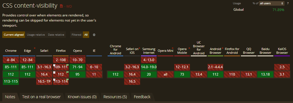
So if you plan to use ‘content-visibility: hidden’ in the production website, don’t forget to use feature detection and combine it with the ‘display: hidden’ property. On the other hand, ‘content-visibility: auto’ enhances the performance of your website and has no negative impact if the browser does not support it. Hence you can use this property without worrying about its support.

The ‘contain-intrinsic-size’ property supports newer versions of Chrome, Edge, Firefox, and Opera. It is still in the preview phase on Safari Browser.
To test your website or web app’s working or functionality on different browsers, LambdaTest is a unified intelligent digital experience testing platform that allows developers and testers to perform cross browser compatibility testing over more than 3000+ different browsers and OS combinations.
Furthermore, LambdaTest also provides powerful features, such as automated screenshot testing, visual regression testing, and geolocation testing. These features allow developers to test their websites in different scenarios and identify any issues that may impact browser compatibility.
To get started with LambdaTest, you just need to follow these simple steps:
- Register for free and sign in to your LambdaTest account.
- Choose a Realtime Testing card from the modal box.
- Enter the test URL, choose your preferred browser’s version, OS, and resolution, and select either web or mobile tab. Then click START.
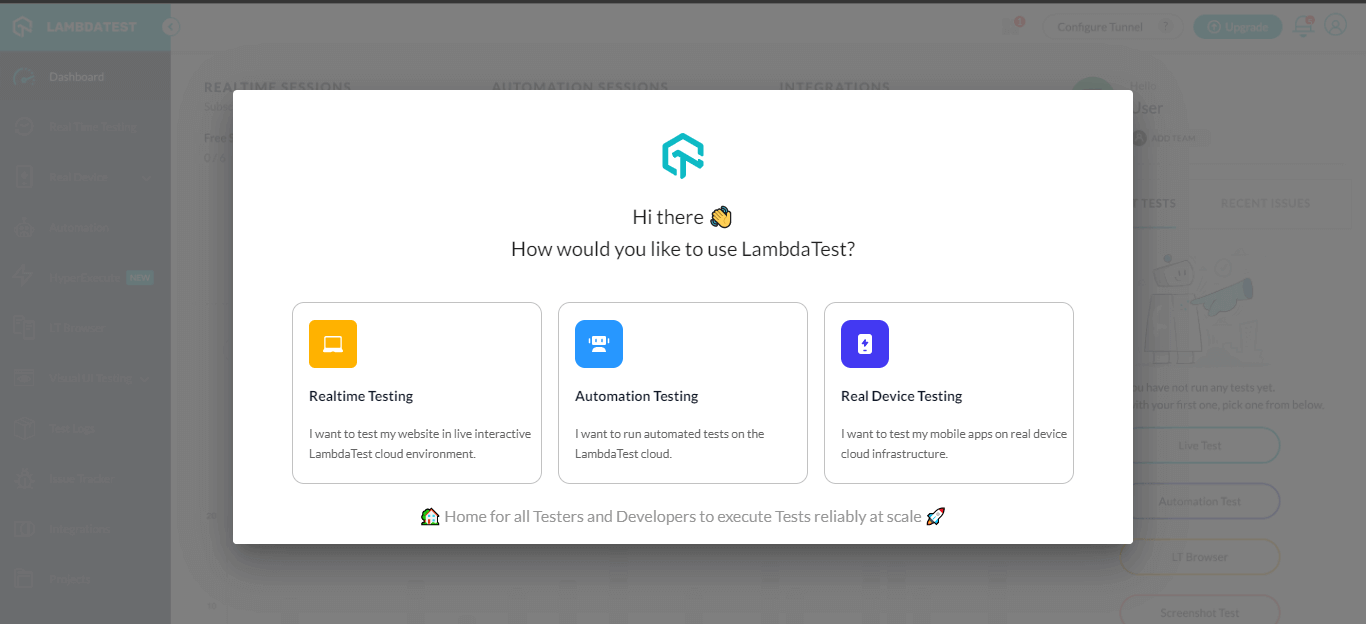
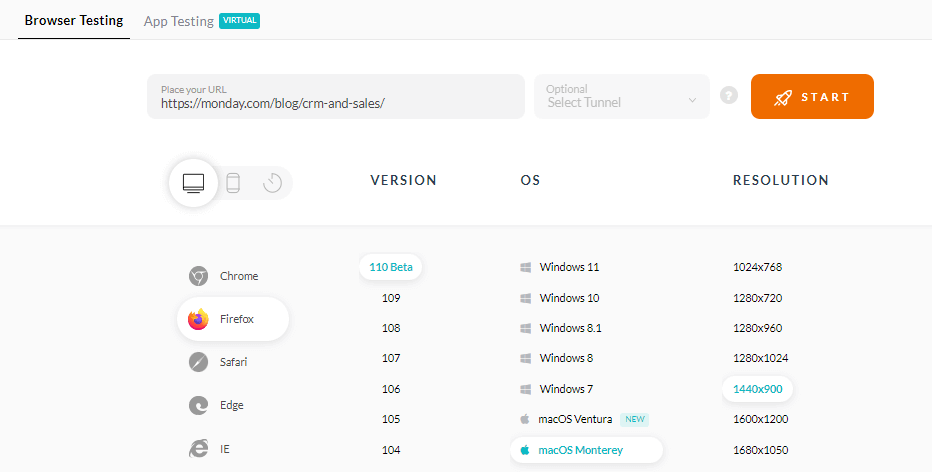
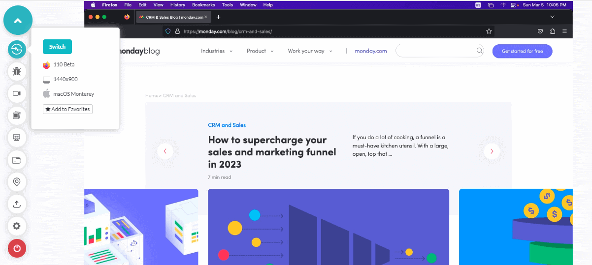
It will launch a cloud-based machine that runs on the operating system and real browsers. Now, you can test your website by leveraging powerful features like one-click bug logging, video recording, different network conditions, and others.
Refer to the below video to get started with real-time testing on LambdaTest.
You can also subscribe to our LambdaTest YouTube Channel to stay up-to-date on software testing topics around Selenium testing, Cypress testing, Playwright, and more.
Wrapping Up!
It’s almost magic how one single line of CSS code can make such a huge impact on a website’s performance. If you want to make your website more performant, don’t miss out on the CSS content-visibility property.
In this blog, we understand why website performance is important. We checked the new CSS content-visibility property and its values and saw how by using this property, we can boost our website performance. We then applied the property to an existing blog page and brought the rendering time down by 80%. I hope you found it helpful.
Frequently Asked Questions (FAQs)
What is content-visibility in CSS?
CSS content-visibility is a property that allows web developers to control the visibility of an element and its content on a web page. When content-visibility is applied to an element, the browser can skip rendering it until it becomes necessary, which can improve the page load time and user experience.
How to use content-visibility in CSS?
You can apply the CSS property content-visibility to the element you want to optimize. Auto, visible, and hidden are the three possible values for the property. The browser will display the element and its content normally if the default value is set to auto. The other two additional values instruct the browser on how to render the element and its content to enhance performance.
How do you make content invisible in CSS?
CSS’s content-visibility property can be set to hide to make content invisible. With this value, the browser is instructed to skip rendering the element and its content until it is required. Other methods, like applying the display: none property or making the element’s opacity 0, can also be used, but their effects on performance may vary.
What is the difference between content-visibility and lazy loading?
Although content-visibility and lazy loading are techniques used to enhance web page performance, they function differently. While lazy loading holds off on loading an element until it is required, content-visibility allows the browser to render an element and its content before it is required. Any element on a page can use content-visibility, whereas lazy loading is typically applied to images and videos.
Got Questions? Drop them on LambdaTest Community. Visit now


