 TestMu Conference is Back! Future of Testing + AI

Build A Mobile Friendly Website: A Complete Guide
Harish Rajora
Posted On: May 3, 2024
 170752 Views
 32 Min Read
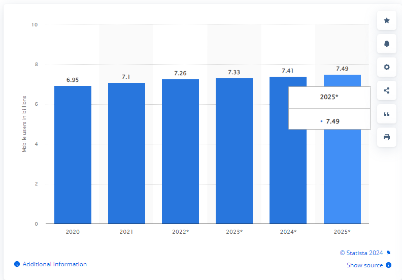
According to Statista, active mobile users are expected to reach 7.41 billion in 2024, highlighting the indispensability of mobile devices for accessing the Internet. By 2025, this number will increase to approximately 7.49 billion mobile users. You’re missing out on numerous potential leads if you operate an online business without a mobile friendly website.
However, the need for a mobile friendly website extends beyond potential leads. Google has implemented a mobile first indexing algorithm, prioritizing the mobile version of website content over desktop websites. To improve your Google ranking, a goal for many businesses is to have a mobile friendly website.
In this blog, we will cover the various aspects needed to build a mobile friendly website and also see why it is essential to have a mobile friendly website and various ways to test the website’s responsiveness and validate its functionality across various browsers.
TABLE OF CONTENTS
What Does a Mobile User Want?
When it comes to a mobile friendly website, the perspective of your customers is important. While the website might appear visually appealing, it’s essential to consider how it appears and functions on a mobile device. If your customers aren’t satisfied with the mobile view, it’s not truly mobile friendly.
To ensure your website meets the needs of mobile users, it’s crucial to identify the metrics and areas that matter most to them. Mobile users are typically goal-oriented, seeking quick access to relevant information. Unlike desktop websites, mobile sites require concise and focused content optimized for limited screen space. As developers, we must prioritize content placement and design to accommodate mobile constraints effectively.
By understanding what mobile users seek from a website, we can create a better user experience and improve customer satisfaction.
Mobile users expect instant results and quick access to the information they need. They don’t spend time browsing entire websites; instead, they want to find what they’re looking for immediately, often within seconds of landing on a page.
To serve the needs of mobile users, it’s crucial to focus on key design elements that capture their attention and keep them engaged:
- Fast Loading Times: Mobile users are impatient and won’t wait for a slow website to load. Ensure your website loads quickly to prevent users from bouncing.
- Presentable Design: A visually appealing and well-organized design is essential. Users are likely to stay on your site if it looks professional and is easy to navigate.
- Content Placement: Important elements should be placed prominently on the page, within easy reach of the user. Avoid burying critical content deep within the site.
By prioritizing these design points, website owners can create a mobile friendly website, creating a positive user experience for mobile users and potentially leading to increased engagement and customer satisfaction.
 Note
NoteTest your mobile websites across 53+ device viewports. Try the LT Browser now!
What is a Mobile Friendly Website?
A mobile friendly website is designed and optimized to display and function effectively on mobile devices, such as smartphones and tablets. This ensures a seamless user experience when accessing the website on smaller screens, with the text and images adjusting appropriately to different screen sizes and resolutions.
Mobile friendly websites include best design practices, including responsive design elements, easy navigation, support for various network conditions, fast loading times, and more.
In the next section of this blog, we will learn some of the best practices for building a mobile friendly website.
Best Practices for Building a Mobile Friendly Website
Creating a mobile friendly website is crucial in today’s digital world, where users increasingly access the Internet on their mobile devices. Implementing best practices for responsive websites ensures your website delivers a seamless user experience across various mobile devices, enhancing user engagement and satisfaction.
Here are some of the best practices you must consider when building a mobile friendly website:
Appearance
The mobile view of your website is crucial for driving conversions. The content you display to customers on mobile devices can significantly impact their decision-making process.
Here’s a checklist to ensure your website is optimized for mobile:
Replace the Navigation Bar
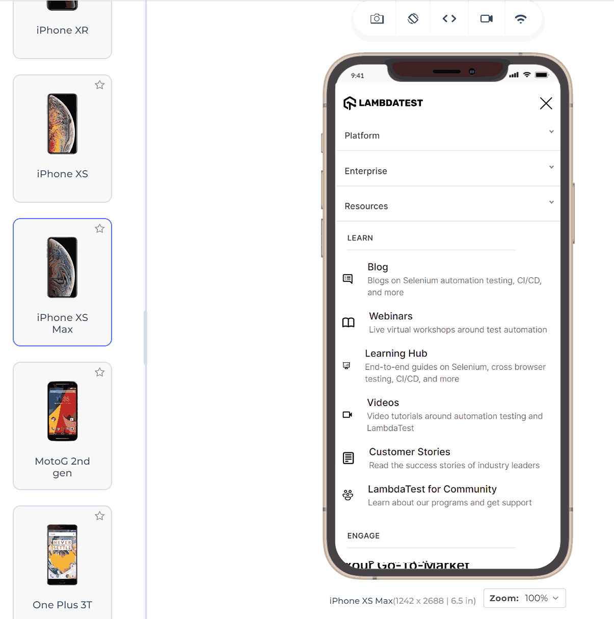
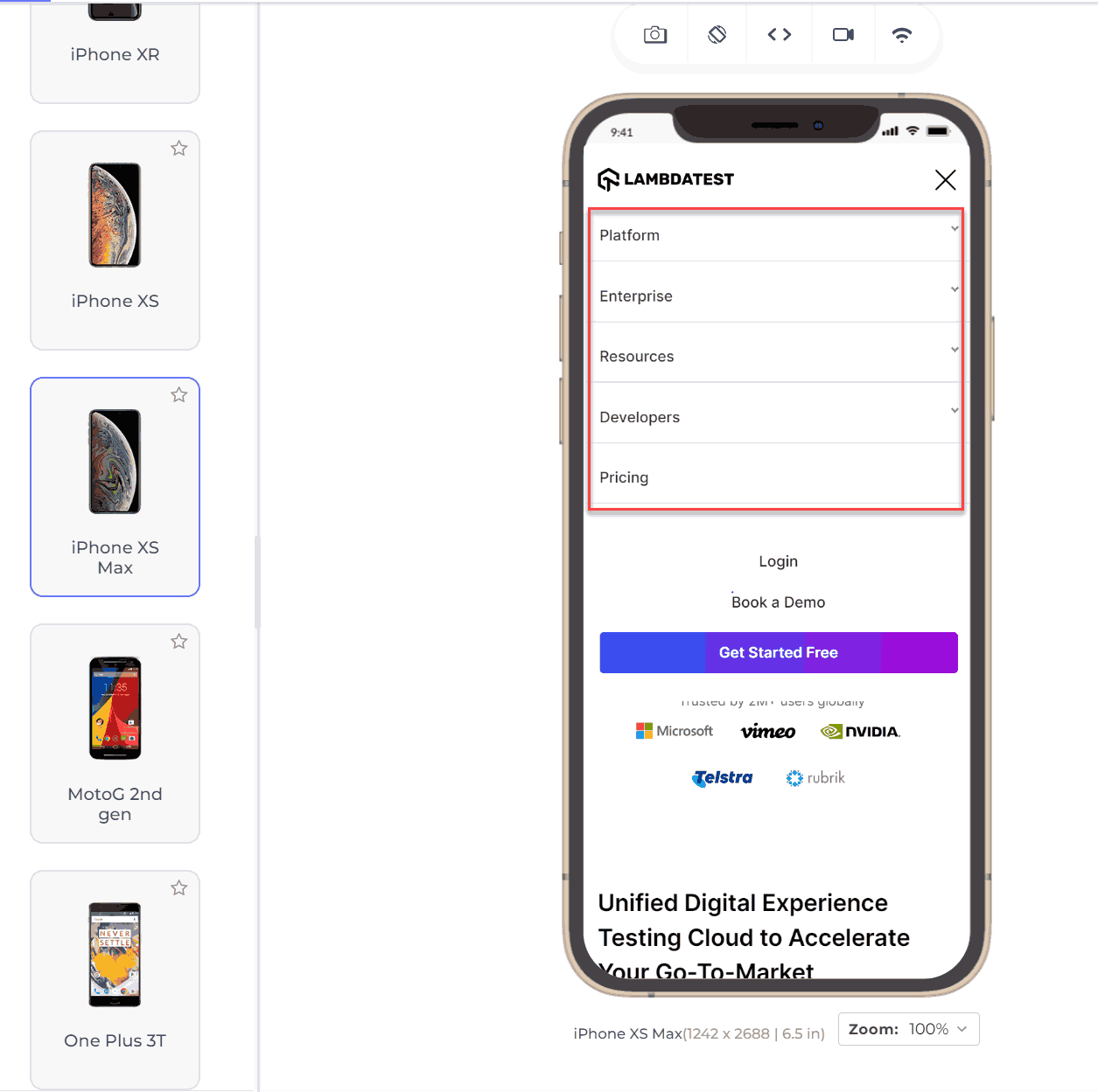
The first and foremost design suggestion for a user-friendly mobile website is to replace the navigation bar. The navigation bar is beneficial from the user’s point of view, but only on desktops. The mobile navigation bar is so small, and the links are so close that it makes no sense for users to apply it on mobile devices. But we need to provide the links somewhere. A better choice for a mobile friendly website would be to create a hamburger menu and incorporate every link from the navigation bar into the menu.
The above image demonstrates the difference between a bigger screen (with a navbar) and a smaller mobile screen (hamburger menu). Suppose the developer wants to provide even more links (which is not recommended). In that case, scrollable menus work great where tapping on the main heading opens up more links as a subheading, which is demonstrated below:
Keep the Menu Short for Mobile View of Your Website
The user on a mobile device is not interested in scrolling through a long list of menu options and selecting what he wants. In the worst case, he might leave the website after being irked by the user experience. You don’t need to provide an extensive menu for your website’s mobile. Just link the pivotal web pages in the menu and keep it short.
Keep Secondary Tasks in the Menu
Apart from the navigation links, keeping all the secondary tasks inside the menu (only if required) and displaying just the primary ones on the main page is better.
For instance, on an eCommerce website, placing the “My Account” tab under the menu might be more practical than placing it on the main page. It is because users typically do not need to edit their profiles frequently—sometimes not for months.
Prefer Vertical Scrolling
Developers sometimes implement horizontal scrolling on websites to make them look or feel different or because a component requires it. However, from a user perspective, vertical scrolling is generally preferred on mobile devices. Horizontal scrolling can disrupt the user experience, especially on smaller screens. Unless horizontal scrolling is crucial for a specific element, it’s best to stick with vertical scrolling for a smoother mobile experience.
Prompt for the Rotation
Certain components on your website, such as images, are best viewed in landscape orientation. However, users often do not rotate their phones to optimize the viewing experience. To improve the overall reputation of your mobile website and provide a better user experience, consider providing a prompt on these elements. This prompt can suggest that users rotate their mobile devices for an enhanced viewing experience.
Go for Single Column Layout
Unlike multi-column layouts on desktop websites, a single-column layout presents all content in a single vertical column. While leveraging screen size by using multiple columns is effective on desktops, it can lead to elements shrinking too small on mobile devices.
Fitting everything into a single column ensures that elements are displayed in a better size and font, making them visible on the website. An example of this approach can be seen on the FedEx website, where the locations list is displayed in multiple columns on desktop but switches to a single-column layout on mobile devices.
Desktop:
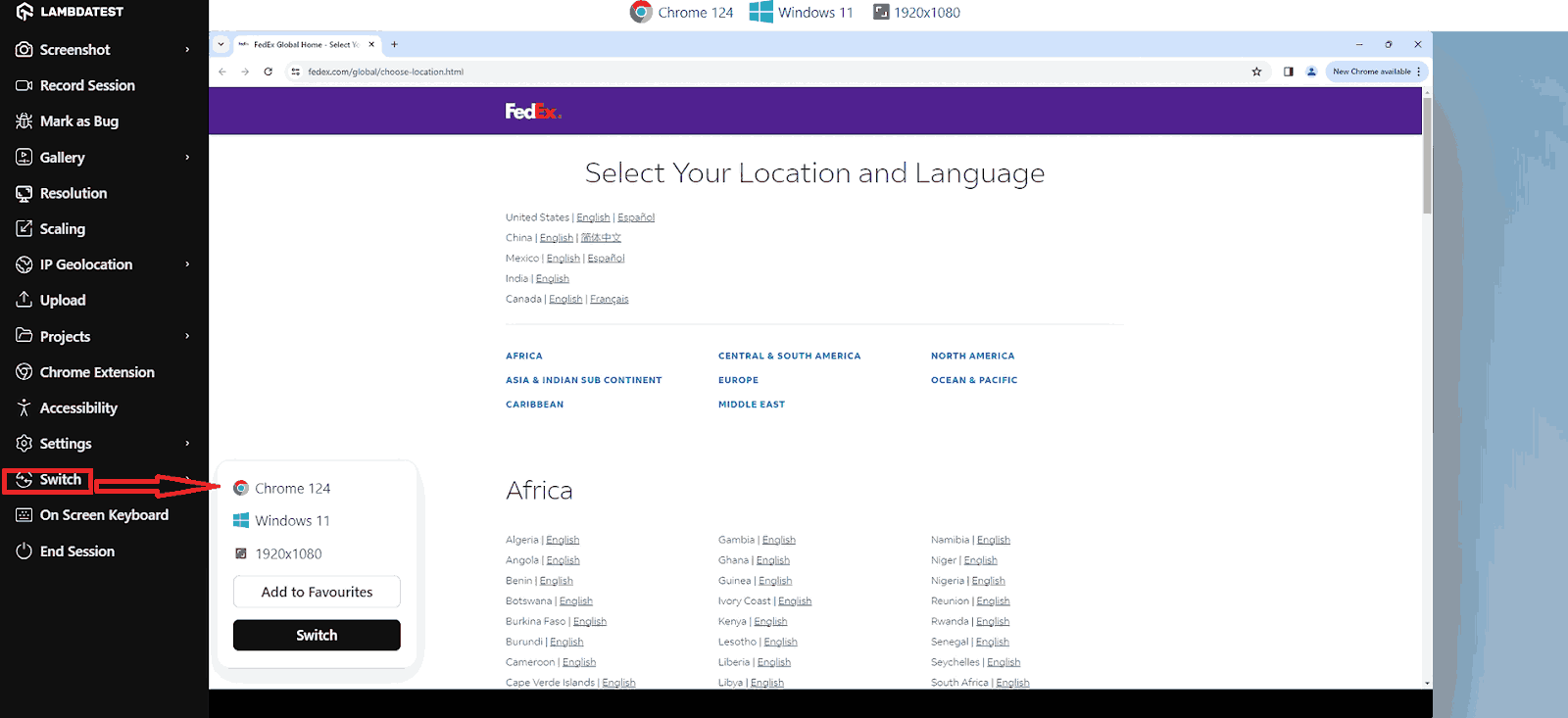
Mobile and Tablet:
Avoid Pop-Ups
Pop-ups have become very popular when it comes to presenting something very important, such as a new sale on an eCommerce website or an upcoming webinar or event on any platform. Pop-ups are highly successful in getting clicks and achieving the target for which they are designed.
The problem with pop-ups is that people have started to use pop-ups for financial purposes and enable ads on the pop-up. A developer must know that pop-ups hurt the user experience (ads or otherwise) and annoy the user.
These should not be used on mobile websites, especially full-page pop-ups. Using pop-ups can hinder user access to content, and search engines are starting to penalize websites that use them, potentially lowering their search rankings. Instead, consider using a sticky footer to display important messages without interrupting the user experience.
Use High-Resolution Zoomable Images
When a website displays a product, it should always be open to provide the best-resolution images and satisfy the user before purchasing. This also increases the overall chances of buying the product from your website.
When shopping for clothes online, customers often want to closely examine the fabric and details before purchasing. It’s essential to provide clickable, high-resolution images that can be viewed in larger sizes. This allows users to analyze the product thoroughly, helping them build confidence that what they see online is what they will receive.
Prefer Symmetry With Minimal Content
People are naturally drawn to symmetrical designs, which applies to web applications, especially those on larger screens. When an element is symmetrical, it’s best to arrange the content inside it symmetrically along the x-axis or y-axis to attract maximum attention.
However, it’s crucial also to use whitespace effectively. When elements or content inside a symmetrical element are cluttered, the symmetry loses its impact. To maintain the magic of symmetry, keep elements and content to a minimum and arrange them as symmetrically as possible.
Mobile Networks
Mobile networks have evolved drastically over the years. This evolution from 2G to 5G networks has been a major factor behind rising mobile Internet users. However, not every website visitor would have the same network carrier or network bandwidth. Countries worldwide are still working to implement 5G on a country-wide scale.
In remote areas, accessing high-speed Internet can be challenging, potentially excluding customers from these regions. Additionally, as previously mentioned, ensuring your website loads quickly is crucial. Faster loading times can improve your website’s ranking, particularly with Google’s Speed update algorithm.
In this section, we will learn the necessary design practices that should be adopted to save the user’s network usage. Since a mobile user is highly concerned about the network and speed of the website, these practices are of utmost importance.
Optimize Image Compression for Non-Essential Images
A mobile website often includes various images, such as logos, carousel images, etc., which are important but not crucial for users to zoom in and view fine details. These images do not need to be in high resolution. Using high-quality images in these cases can waste bandwidth, which mobile users are particularly cautious about. It can also create an imbalance between the amount of data to be downloaded and the bandwidth the network provides. This can frustrate customers and lead them to exit the website before fully exploring it.
Provide Minimum Downloadable Element
As we mentioned, a mobile user is concerned with network connectivity and favors a website that loads faster and does not beat around the bush. A mobile user aims at specific content for which he is looking and is not interested in trivial elements on the website. Therefore, the best practice is to write a minimum and provide a minimum of other downloadable elements such as videos, images, written content, etc.
For example, if your mobile website always witnesses thousands of comments on a single post, it is better to load the comments only when the user reaches the comment part. It shows that the user is interested in reading the comments. For such huge content, using multiple pages (with pagination in CSS) and AJAX to load the element only when required is better.
Use HTTP Cache
Caching saves certain information on the client browser rather than on a server or remote database. The most popular cache would be sign-in information that lets the user enter the web application without signing in for each session. However, there are certain lesser-known but effective cache storage options as well. For instance, the web app’s logo remains the same and should be saved in the cache to avoid fetching it whenever a user goes through a page.
HTTP cache is the best mechanism to save network bandwidth. Since the app just needs to find it inside the browser, no files flow through the network, saving time for everyone. However, remember that saving the cache comes with its disadvantages and, therefore, should only be done for the bits that are required frequently (like the logo image).
Use Optimized Third-Party Libraries
A mobile site’s code often includes components from various third-party libraries. With the complexities of modern development, it’s impractical for developers to create everything from scratch. Instead, they utilize free, pre-written code from third-party libraries. This approach saves time and effort, as developers can simply call the libraries’ functions.
However, because these libraries are open-source, their primary goal is often to implement a feature rather than to provide the most optimized code. As a result, using these libraries can sometimes impact a mobile site’s performance, leading to longer load times and other network issues.
To mitigate this risk, developers should research a library online and check the community’s feedback to determine if it provides optimized code. This additional step can save developers many hours in the long run.
User Experience
The key to a successful mobile friendly website is providing an optimal mobile user experience.
In this section, we will learn various strategies for enhancing user experience and design techniques to help you create a more mobile friendly website.
Reorganize the Content
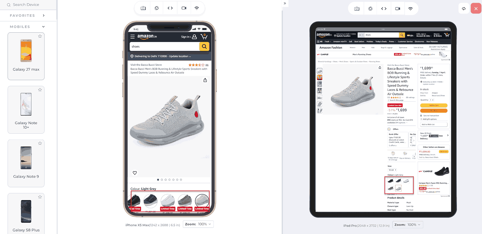
In desktop website versions, content is often laid out in a horizontal grid to utilize the screen size efficiently and minimize vertical scrolling. However, this layout needs to be reorganized for mobile websites due to the smaller screen size. Content should be prioritized for larger viewing sizes, which may involve placing content below elements like profile pictures that take up less space.
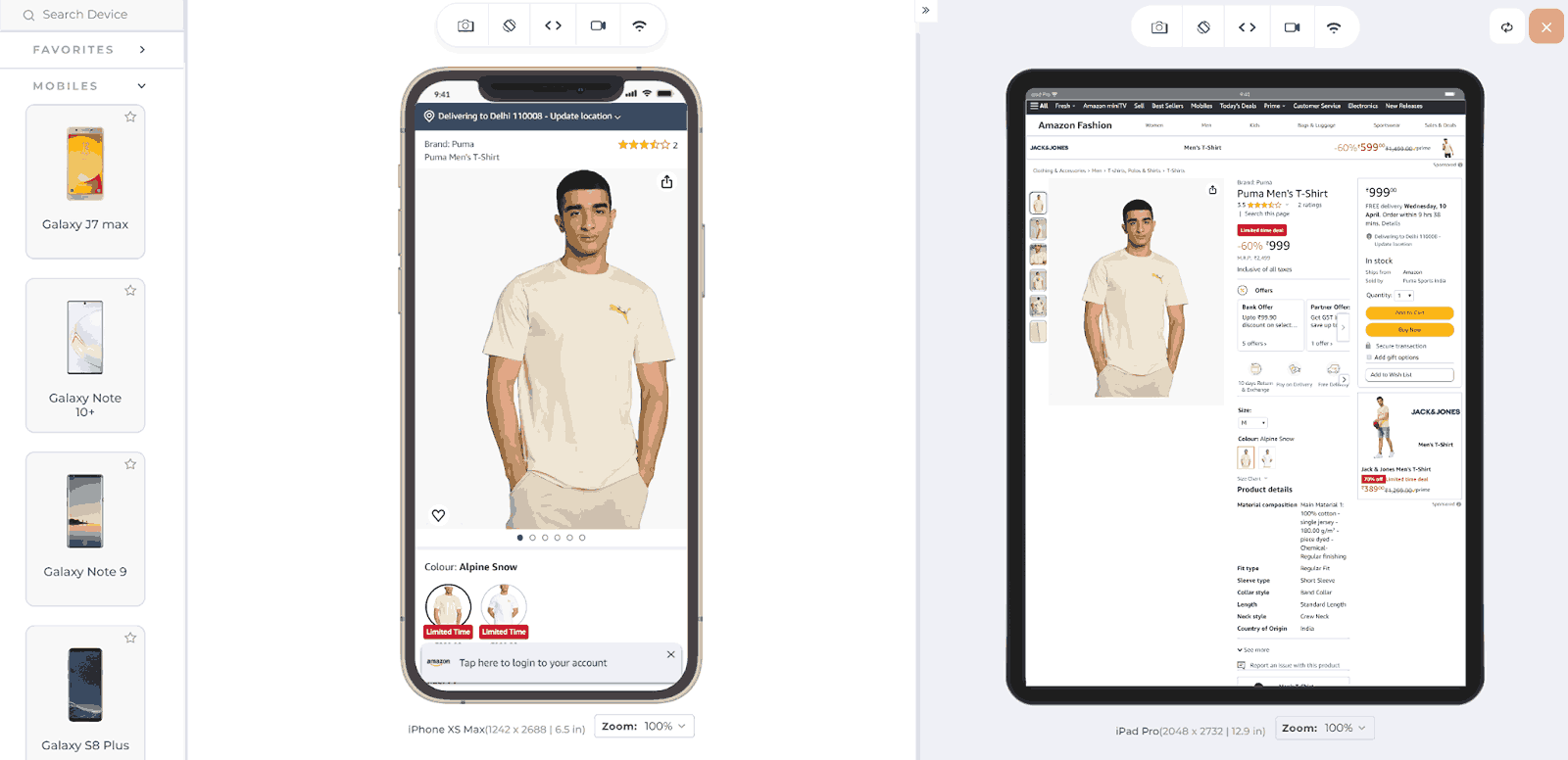
Notice in the above image how Amazon moves the content from the right to below, with the button being of a larger size.
Use Bigger Clickable Elements
Many mobile users interact with websites using their fingers, to interact with the mobile view of a website through their screen rather than thumbs. Because fingers are much thicker than mouse pointers, clickable elements on mobile screens should be larger. This includes buttons, forms, and other interactive elements.
Provide Appropriate Space Between Elements
Developers should provide adequate space between clickable elements to prevent accidental clicks and improve user experience. Insufficient spacing can lead to users inadvertently pressing the wrong button. This issue often occurs when developers try to fit multiple elements into a single row without enough space between them.
Keep Important Elements Within Reach
To accommodate users who operate their mobile devices with one hand, developers should ensure that important elements are easily reachable. This is particularly important as mobile device screen sizes vary. For example, reaching the top-left corner of the screen with one hand can be inconvenient. Developers should minimize clickable elements in these hard-to-reach areas to improve usability.
The main area of the target should be the middle area, as seen in the image below:
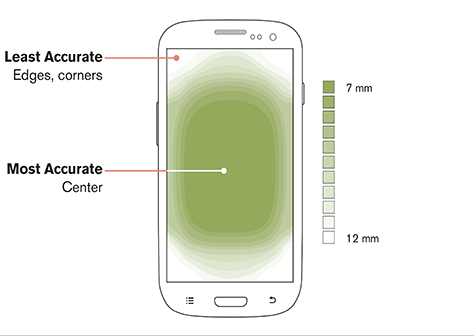
This contributes to a better user experience, even though users may not explicitly appreciate it. However, they are less likely to become annoyed by it.
Provide a Home Button On All Pages
There can be many reasons for users to return to the home page during their website sessions frequently. For instance, users may need to return to a page with a form, but re-submitting the form is impossible, leading to the same message being displayed repeatedly. Additionally, users often navigate deep into a website, making it inconvenient to press the back button repeatedly.
To enhance user experience, it’s advisable to include a home button that allows users to return to the home page with a single click. Many developers of mobile friendly websites now embed the home page link into the company logo, which is considered a clean, convenient, and effective design approach.
Usability
Usability and user experience are often confused, but they are distinct concepts. Usability refers to how easily and effectively a user can accomplish tasks on a website. On the other hand, user experience encompasses the overall feel of the website, including how pleasant and satisfying it is to use.
For example, the ease with which a user can log in, fill out forms, and navigate the website relates to usability. Meanwhile, the overall impression of the website’s design, layout, and responsiveness contributes to the user experience. You can perform usability testing that will help validate the efficiency and effectiveness of the application based on the user’s actions, while UI testing will help validate the application design aspects.
Provide Click-To-Call Buttons for Phone Numbers
Websites often display phone numbers, such as support numbers for eCommerce sites or reception numbers for hotels, as plain text. Instead of presenting phone numbers as plain text, which requires users to copy and paste them into their dialer manually, a better approach is to design them as click-to-call buttons.
This allows users to simply click the number, automatically opening the dialer with the number pre-typed. The same design method applies to email addresses, which can open the default mail client on click, and locations, which can open directly in mapping applications like Google Maps.
To boost your website’s conversion rate, it’s crucial to design effective CTAs. Follow this guide to get CTA design tips that drive better conversions.
Disable Multiple Tab System
Remember the target= _blank property of the <a> tag in HTML? It helps in opening a new tab when a link is clicked. While this is useful for users on desktop browsers to move back and forth between tabs, it is exactly the opposite for mobile users. Mobile browsers typically stack tabs on top of each other, making it cumbersome to switch between them. To create a more mobile friendly website, developers should consider disabling the opening of links in new tabs and instead open them in the same tab.
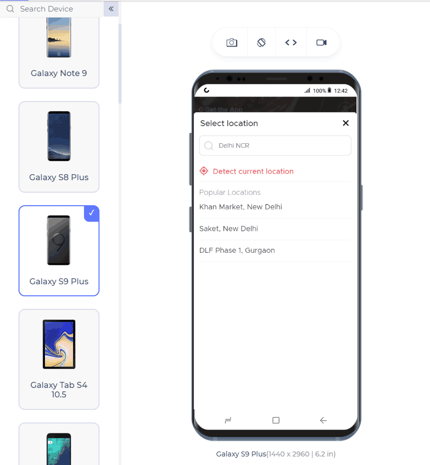
Do Not Use Location Always
Many websites use geolocation services to enhance user experience, such as automatically detecting a user’s location for relevant search results. However, relying solely on geolocation can sometimes lead to confusion and frustration for users.
For example, a hotel booking website that automatically shows search results based on the user’s current location may be confused if the user intends to search for hotels in a different city. In such cases, providing an input field for users to enter the desired city name manually can improve the user experience.
Additionally, including a call-to-action button, such as Find Near Me, can allow users to quickly find locations based on their current location while still allowing them to specify a different location if needed. This approach gives users more control and can help prevent misunderstandings and frustration.
You can perform geolocation testing to validate functionality, such as changing locations by entering a different city name. Additionally, you can verify if the Find Near Me feature correctly identifies nearby options based on the user’s location.
.
Avoid Adobe Flash Player
During a time when Internet speed increased and developers began incorporating heavy data such as videos into their websites, Adobe Flash Player was commonly used.
However, it required users to download and install it to view content, which was often cumbersome. Moreover, Adobe Flash Player posed security risks and was not supported on Apple devices. Today, Adobe Flash Player is rarely used, with many websites opting to embed YouTube links directly. As a web developer, it’s advisable to avoid using Adobe Flash Player on your website.
Avoid Large Images
Developers often design websites on desktops, where large images are used to maintain focus and detail. However, if these images are not optimized for different devices, they can appear excessively long and ugly on mobile devices, spanning multiple pages and leading to a poor user experience. It’s crucial for developers to ensure that images are responsive and optimized for all platforms.
Moreover, you can follow this guide on making responsive images using basic HTML, CSS, and other website developer tools like WordPress. This will help you deliver a site that is responsive across different devices.
Forms
Forms are vital in most online businesses, serving purposes like login, registration, and scheduling demos. Since they are crucial for data collection, ensuring they are mobile friendly is important.
This section explores design tactics that web developers should follow when creating forms on the website.
Move Automatically in Forms
Forms are essential on websites, appearing in various contexts like account registration and address entry. Lengthy forms, such as those on job-seeking portals, can be cumbersome. Instead of requiring users to manually move to the following field after filling each one, a better practice is to automatically move to the next field when the user presses “Go” or the enter key. This improves the form-filling experience, making it faster and more efficient.
Validate Form Inputs in Real-Time
If your website contains forms, they must include form validation. The timing of this validation is crucial. For instance, if a long form with 15 inputs is only validated after the user has filled out the entire form and pressed submit, they may have to repeat the process if there are errors. This can be frustrating.
Real-time validation, on the other hand, checks each input as soon as it’s filled, showing errors immediately. This approach provides users with greater convenience and a smoother experience.
Moreover, it’s important to validate the form functionality across various browsers to check if the form works as expected. You can check this guide on developing cross-browser compatible forms.
Use Appropriate HTML Input Field Types
The input element in HTML contains an attribute type, which describes the input expected within the form. Although the developer can define every input as text, providing the correct input type helps in other ways.
First, it is easy to validate if the input type is defined. Secondly, the browser takes advantage of this element to auto-fill the values rather than prompting the user to manually enter the values. For example, if I have mentioned the value as phone, the browser expects this value to be a phone number, and phone numbers do not change daily, so the browser fills this field automatically.
Provide Visual Graphic Calendar
Website owners often require users to input dates, such as their date of birth or the date of a journey. However, many developers use placeholders for the expected format and leave the work to the user, which is not mobile friendly. Instead, developers should use a graphic calendar available in CSS for such input values.
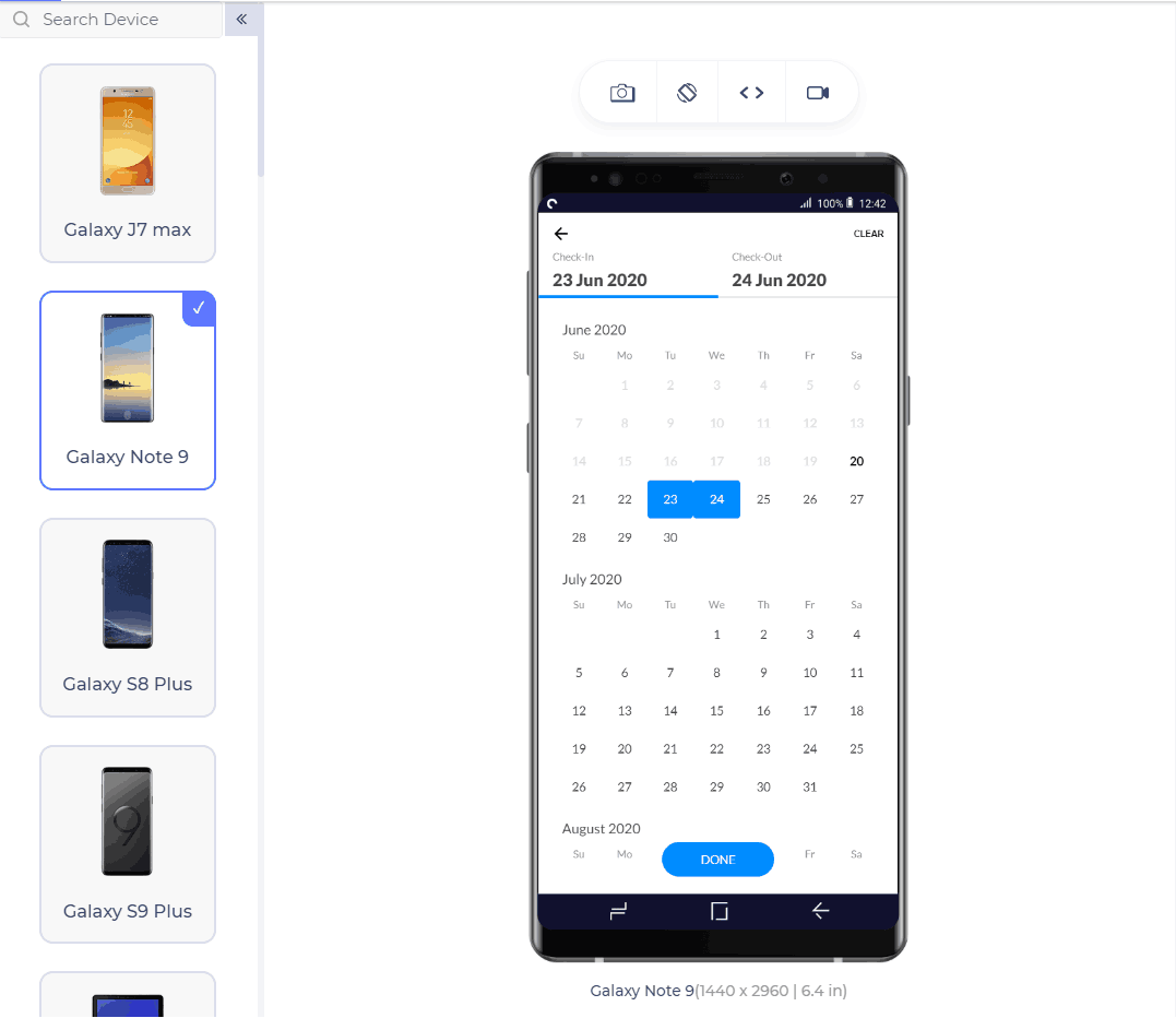
Check the Calendar Alignment
After implementing the code to open the calendar when needed, it’s crucial to ensure it is aligned correctly. Browsers render elements based on their understanding, sometimes leading to issues such as the calendar opening at the bottom of the page. This can cause confusion for users. To prevent this, always implement the calendar to open exactly where the input element is located.
To learn how browsers render elements on webpages, follow this tutorial on rendering engines. Gain insights into popular rendering methods and valuable information about the rendering process.
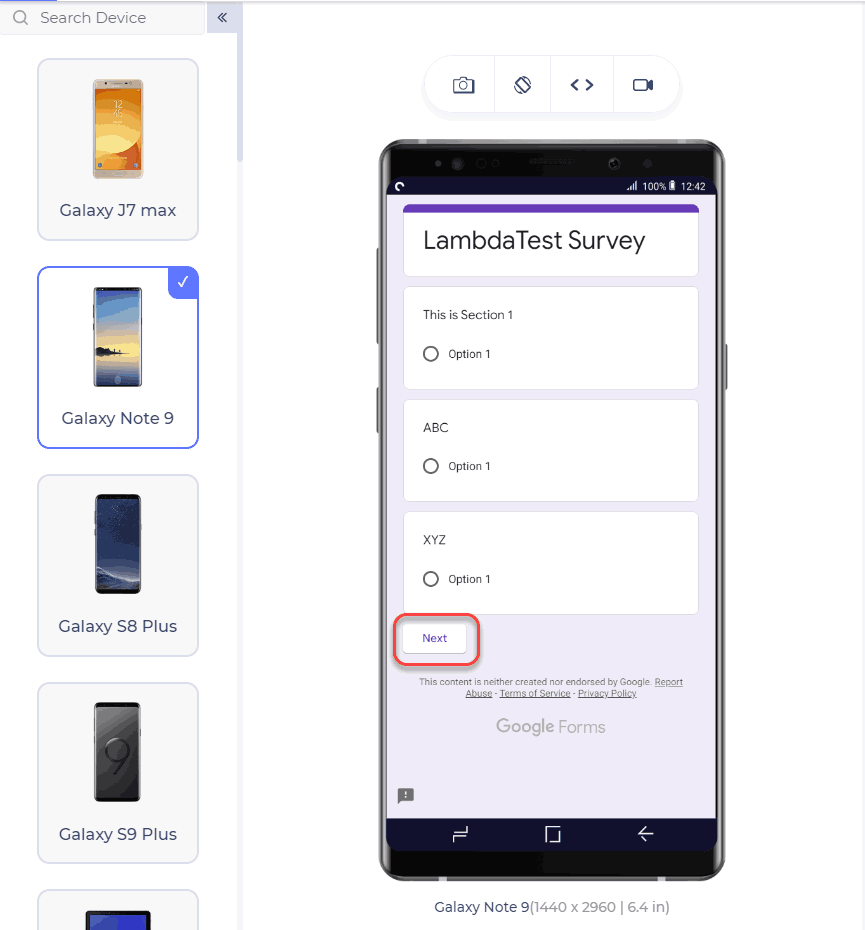
Break the Form Into Multiple Segments
The user may get irritated by looking at the size of the form. Let’s say we need to fill 12 fields in a form. This will look overwhelming for the user, who tends to leave the website altogether. But if we divide the forms into three segments with four questions each (hiding the segments currently not in consideration) and now ask the user to fill them, he would probably not recognize he filled 12 questions. Several modern form embedding tools create this feature such as Google Forms.
Form elements are essential for any website, from login forms to search boxes and buttons. However, they are often overlooked in design, leading to a dull UI. To enhance the appearance of form elements like text fields and buttons, consider using CSS. Follow this guide on CSS forms to learn how to style form elements effectively.
Search
This section explores the key points we should consider while building the search functionality for our mobile friendly website.
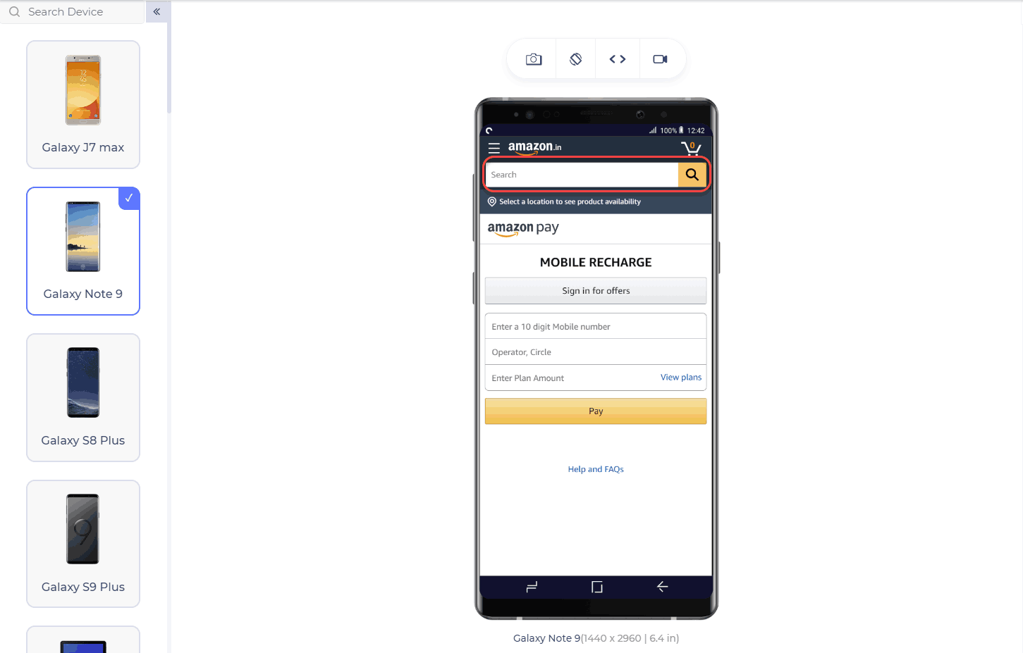
Provide Search Button
The search button is crucial in helping users find what they are looking for on a website. While it may not be necessary for every website, it should always be on mobile websites, especially those with many products. Additionally, ensure the search button is available on all website pages, not just the home page.
Do Not Hide the Search Button
Once you have provided the search button on your website, ensure it is always visible. A common convention is to place it at the top-right corner, as most users tend to look there first when searching. Avoid placing the search button in the menu or at the bottom of the website.
Show Search Results From All Pages
Once you have put the search button in a good place, remember to implement the search operation on all your web pages. The user obviously does not know on which page he will find the element he is searching for. Therefore, your results should appear on all the pages.
Implement Autocorrect for Search
The user does not necessarily know the spelling of his search query and often makes some mistakes while typing. To improve the user experience in this area, autocorrect the words, correct their spellings, and suggest relevant queries. Tools are available for that, the most popular one being Google Custom Search.
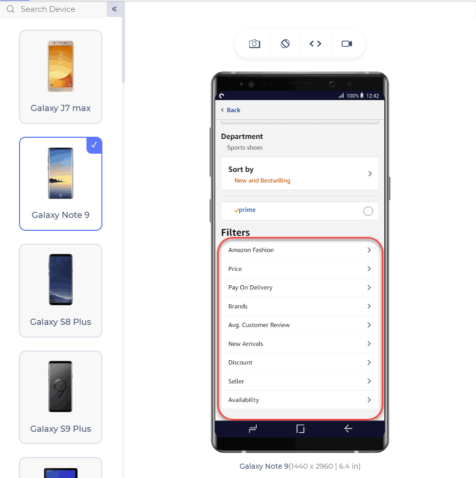
Use Filters
Mobile users often always abandon websites where there are too many products and no filters. A mobile-friendly website always contains filters the user can rely on to narrow down their search results. Implement as many filters as necessary to provide the most accurate results the user wants.
Ask Questions Before Searching
If your website is too vast and/or there are too many segments on your website with vast varieties, it is better to ask a couple of questions from the user before searching. This would provide correct and narrowed-down results with better accuracy, increasing user engagement.
Registrations
In this section, we will learn registration-related design methods, which are crucial in making a mobile friendly website. Many users are hesitant to register on multiple websites, so understanding their needs is essential in creating a user-friendly registration process.
Do Not Prioritize Registration
We have noticed many websites that prompt registration before continuing to explore their website. It is understandable that a website needs to show its user base to increase its value. But, a user does not prefer such an arrangement. This forces the user to abandon the mobile website and find an alternate one.
Provide an Option for Guest Checkout
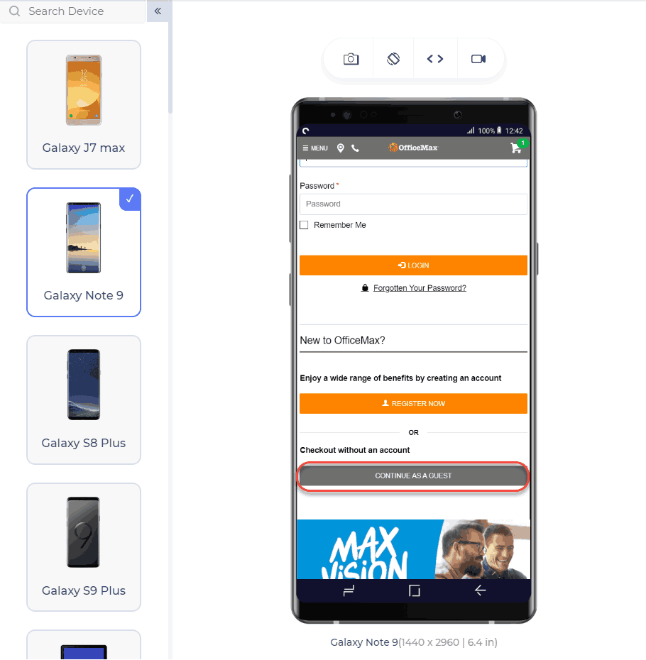
Guest checkout is an operation that checks out without registration. This option is very convenient for the user, and usually, if given an option, a user prefers guest checkout by just filling in one primary key value, such as email ID or contact number. This key helps the user see his orders without registering on the website. Registration should only be available on the websites where it is necessary from a security and monetary point of view.
Provide Third-Party Registration
OAuth 2.0 allows developers to implement third-party registration systems securely through trusted applications.
These applications are commonly used, and there is a high chance that users have already registered on them. Instead of requiring users to repeat the registration process, developers can obtain the necessary information with a single click. For example, websites like Facebook and Gmail have a high probability of containing the user account being signed up for. This mechanism saves time for developers and improves the user experience.
Make Use of Website Analytics
Website analytics helps you identify the weak and strong areas of your mobile friendly website, along with great statistics. For example, what screen size is used most while opening your website, or which operating system or browser is used mostly for your website? These statistics, if worked upon, can help align the components according to the correct audience and provide them with a better experience.
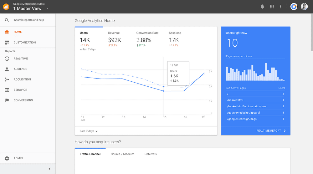
Using UX analytical tools will help you understand your users’ behavior and make informed decisions about pages with high bounce rates, leading to better practices for optimizing your website and enhancing user experience.
Responsiveness
Responsive websites automatically adjust to different screen sizes, catering to the needs of millions of users. In contrast, non-responsive websites require zooming, leading to small elements, particularly buttons, which users find frustrating. Responsive websites are well-received by users and are not difficult to create or convert into a mobile friendly format.
The above image reflects how a website adjusts itself on a smaller mobile screen (left) and shows a different view on a bigger screen (right).
Responsive images help relay your message and engage readers. If you’re not using images in the right places, your website might be missing something important. Instead of lengthy content, include images to dramatically reduce your bounce rate. For a mobile website, calculate the device’s screen size and adjust your images accordingly. Use the viewport meta tag for best results.
The viewport of a device is the visible area of the screen. New developers often make the mistake of using hardwired values for elements, such as width:100px. Considering the varying sizes of devices, a 100px width element on a mobile screen is too large. Therefore, developers should use relative values according to the viewport, such as width: 25%, to ensure proper fitting.
Mobile Friendly Website vs Responsive Web Design
A mobile friendly website design is different from a responsive website design. Before you decide to choose one over the other, take a look at how they are different.
| Aspects | Mobile Friendly Websites | Responsive Website Design |
|---|---|---|
| Layout | Stays the same regardless of screen size. | Changes based on screen size. |
| Functionality | Not dependent on the user’s device. | Depending on the user’s device. |
| Dynamic Content | Only the scale of the website changes. | Has dynamic content that changes per device. |
| Usability | May limit some features for ease of use on mobile. | Improves usability by adapting to different devices. |
Why Have a Separate Mobile Website?
Converting a desktop site to a mobile friendly one by simply improving responsiveness may not always suffice. Providing a separate mobile website allows developers to present elements in a more mobile friendly manner. Similarly, offering a “lite” website version gives users a native app-like experience. The focus is on providing a user experience similar to a native application rather than a website.
To enhance your web development skills and stay updated on the latest trends and technologies in the IT industry, follow this blog on the latest web development trends. Keeping yourself updated with the latest developments is essential for staying competitive.
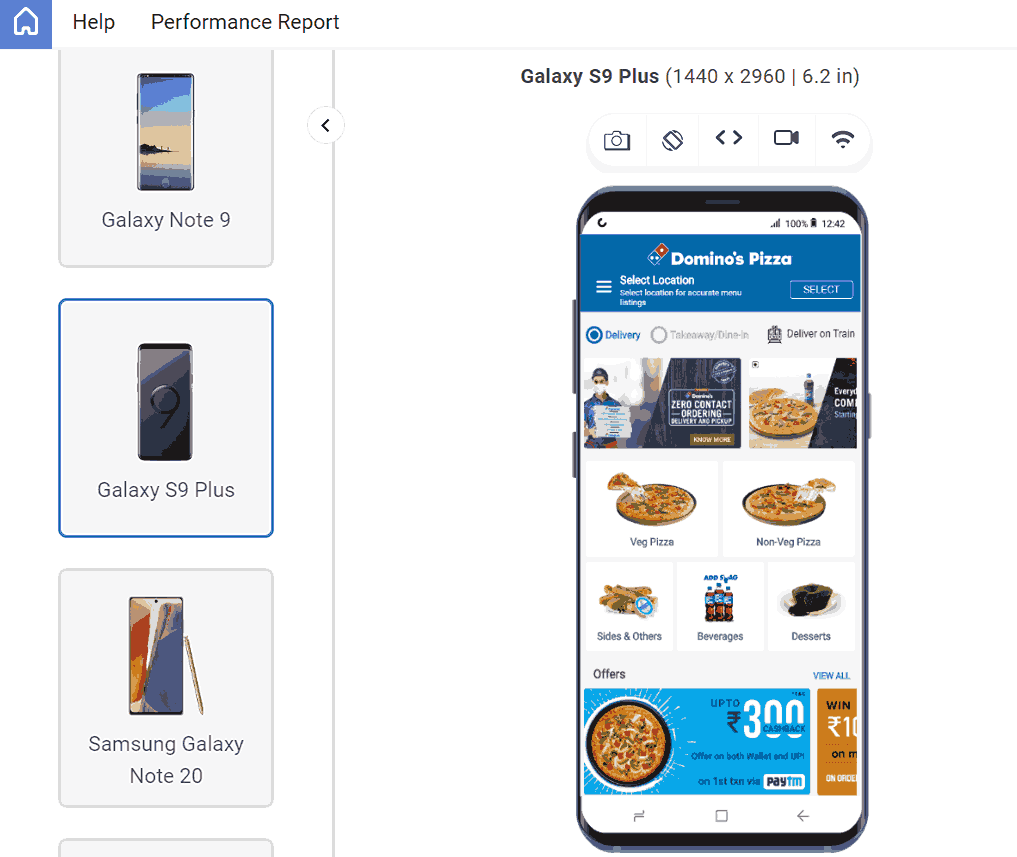
The above image is of the mobile website of Domino’s Pizza. But it resembles the native application a lot.
How to Test Mobile Friendly Websites?
Once you have implemented the components according to the best design practices, the most crucial step is website testing. Testing helps uncover issues that may have been impossible to detect during development and gives you confidence in your website before it goes live online.
In this section of this blog on mobile friendly websites, we will learn two ways to validate if your website is responsive and ensure that it appears consistent across various browsers and browser versions, including previous versions.
Perform Responsive Testing
Performing responsive testing is crucial for ensuring that your website remains mobile friendly. However, it can be challenging to do so accurately without investing in an expensive device lab. Developer tools may not always provide accurate results.
So, what is the right way to perform responsive testing?
The best way to answer this question is by using a cloud-based platform that offers a range of features for responsive testing and cross-browser compatibility testing. This allows you to validate the functionality, appearance, and visual aspects of your website, ensuring it is mobile friendly.
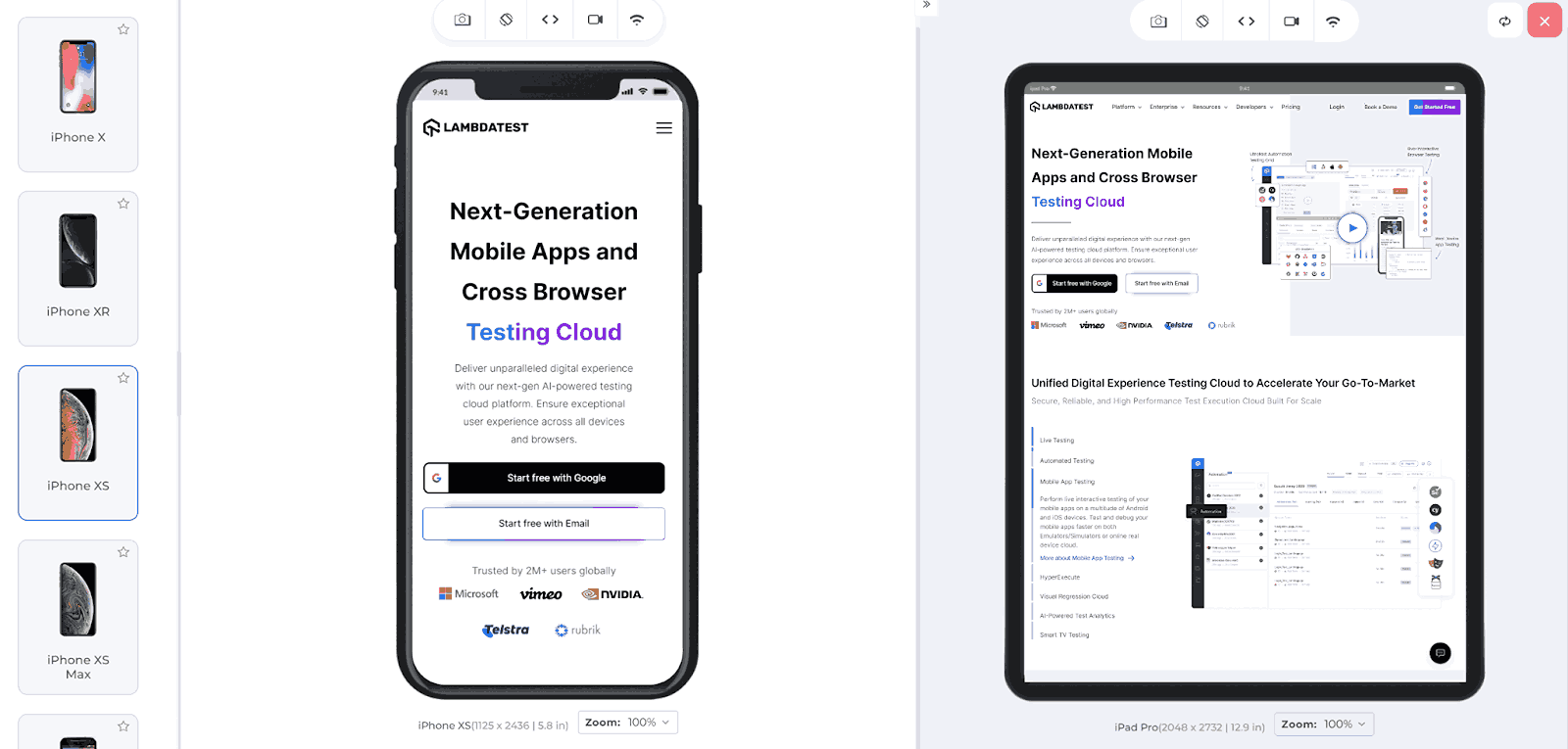
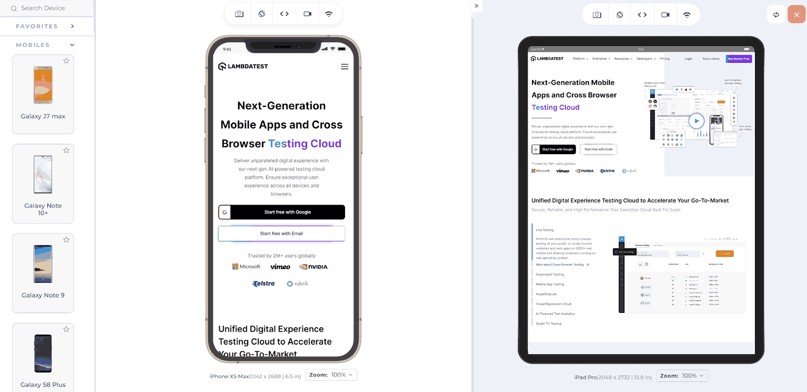
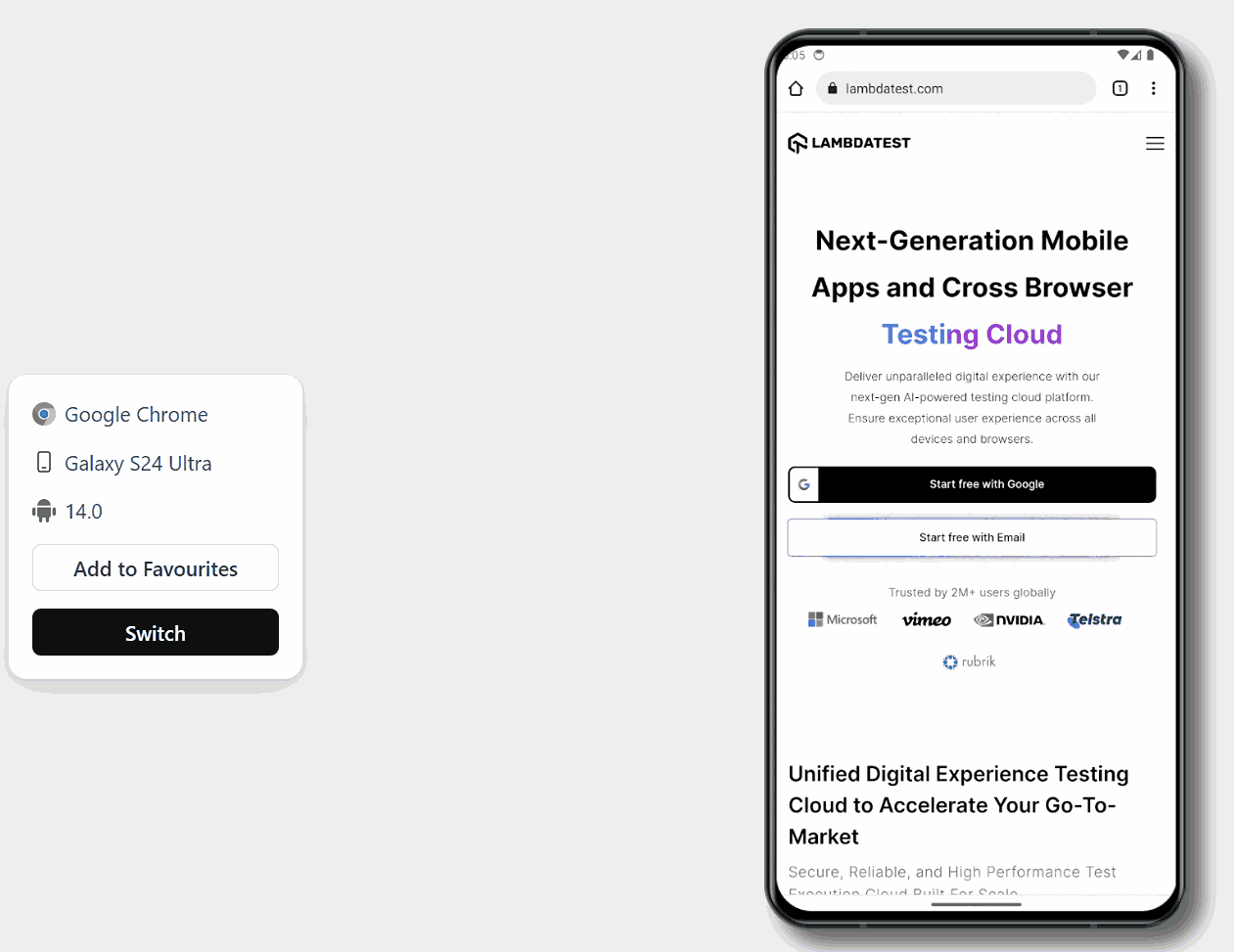
One such cloud-based platform is LambdaTest. It is an AI-powered test orchestration and execution platform that lets you run manual and automated tests at scale with over 3000+ real devices, browsers, and OS combinations.
This platform allows users to conduct tests on real devices, including native mobile applications for both Android and iOS. Alternatively, users can also choose to use emulators and simulators that support a variety of configurations.
This platform offers a range of features that help developers and testers debug and test their websites across various browsers. Features such as Responsive Testing and LT Browser make the work of developers and testers easier.
- Responsive Testing: LambdaTest offers a Responsive Testing feature that allows you to test how your website appears on different devices and screen sizes. This is important to ensure that your website provides a good user experience across all platforms.
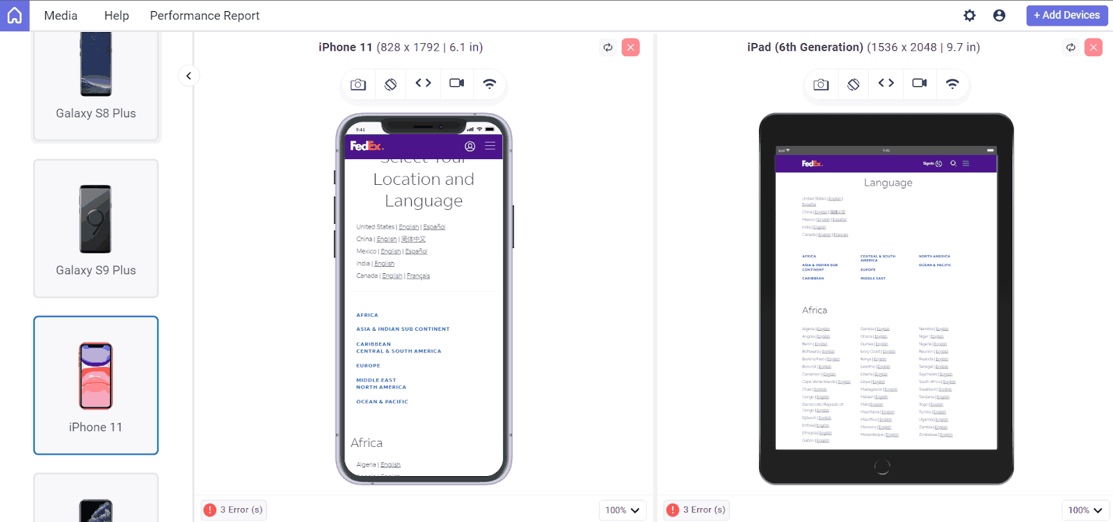
- LT Browser: It is a developer-friendly browser that lets you preview how a website appears on various mobile devices. With over 53+ device viewports, you can compare them side by side and synchronize interactions like scrolling, clicking, and navigation. It also offers pre-installed device viewports, including mobile, tablets, desktops, and laptops.
You can run responsive screen tests on Android and iOS devices, including Samsung Galaxy Note 9, Google Pixel 3XL, iPhone XS Max, and more.
To use LT Browser and validate the responsiveness of your application, simply click the download button below. Once the .exe file is downloaded, run it to access the LT Browser feature and explore its capabilities.

Watch the video tutorial and get detailed insights on how to use the LT browser.
Subscribe to the LambdaTest YouTube Channel for more video tutorials on automation testing for mobile and web applications. Explore tutorials on mobile website testing, web device testing, and more.
Perform Cross Browser Testing
Once we have made the website responsive to accommodate customers using devices with varying screen sizes, it’s crucial to ensure it functions correctly on these devices. This involves performing cross-browser testing to identify and address compatibility issues.
The effort put into creating a mobile friendly website is wasted if all users cannot access it. Therefore, cross-browser testing is necessary, and there are several ways to perform it.
There are several methods to validate the functionality of your mobile friendly website across different browsers and operating systems to ensure compatibility. Follow this guide on the importance of cross-browser testing and understand how it helps achieve a better UX.
Conclusion
Designing a mobile website is crucial due to market competition. Mobile users tend to have less patience, and if they encounter any annoyance, they will likely abandon the website. There are numerous factors on which users judge a website, often unintentionally.
A well-designed website not only enhances user experience but also signals to Google that users appreciate your site, potentially boosting its search ranking and attracting more traffic. These design principles can help you create a more convenient and user-friendly mobile website.
Frequently Asked Questions (FAQs)
How can I improve the mobile loading speed of my website?
You can improve mobile loading speed by optimizing images and videos, minifying CSS and JavaScript files, enabling browser caching, and using a content delivery network (CDN).
How do I ensure my mobile website is easy to navigate?
Ensure that your mobile website has a clear and concise navigation menu, use large touch-friendly buttons, and prioritize important content to make it easy for users to find what they want.
What are some common mistakes to avoid when building a mobile friendly website?
Common mistakes include using non-responsive design, having intrusive interstitials, using small font sizes, and not optimizing images and content for mobile devices.


Author’s Profile
Harish Rajora
I am a computer science engineer. I love to keep growing as the technological world grows. I feel there is no powerful tool than a computer to change the world in any way. Apart from my field of study, I like reading books a lot and write sometimes on https://www.themeaninglesslife.com .
Blogs: 88
Got Questions? Drop them on LambdaTest Community. Visit now