 TestMu Conference is Back! Future of Testing + AI

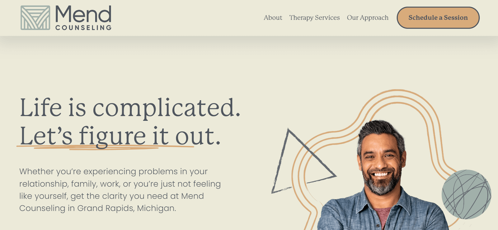
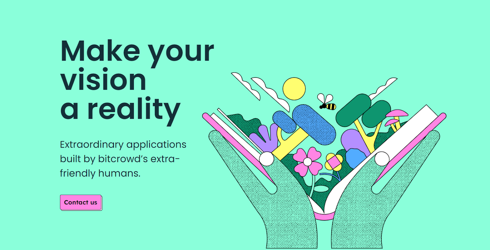
33 Best Web Design Trends to Follow in 2024
Harish Rajora
Posted On: May 20, 2024
 251466 Views
 18 Min Read
Your website is the face of your business, so it’s important to update it regularly to stay in line with current web design trends. Developers should research other sites to understand current layouts and trends during development. This helps adapt these trends to create a user-friendly, unique, and impressive site that engages users. Incorporating the latest web design trends ensures your site looks fresh.
In this blog, you will learn about various web design trends that you can adapt to deliver a user-friendly, engaging, and unique site.
Let’s begin to uncover the best web design trends for 2024!
TABLE OF CONTENTS
List of Web Design Trends
In this blog section, you will discover various web design trends that can enhance your web development skills. Implementing these trends will help you deliver unique-looking websites for organizations, boosting user engagement and business growth.
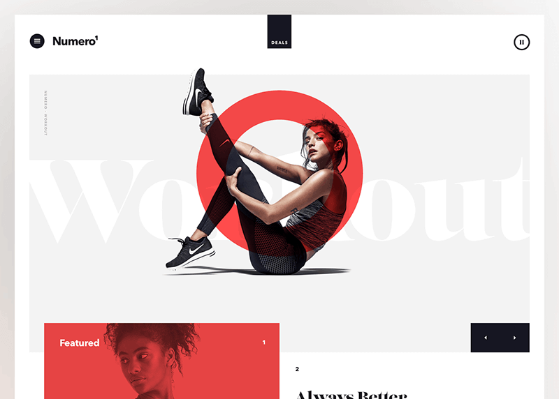
Organic Shapes
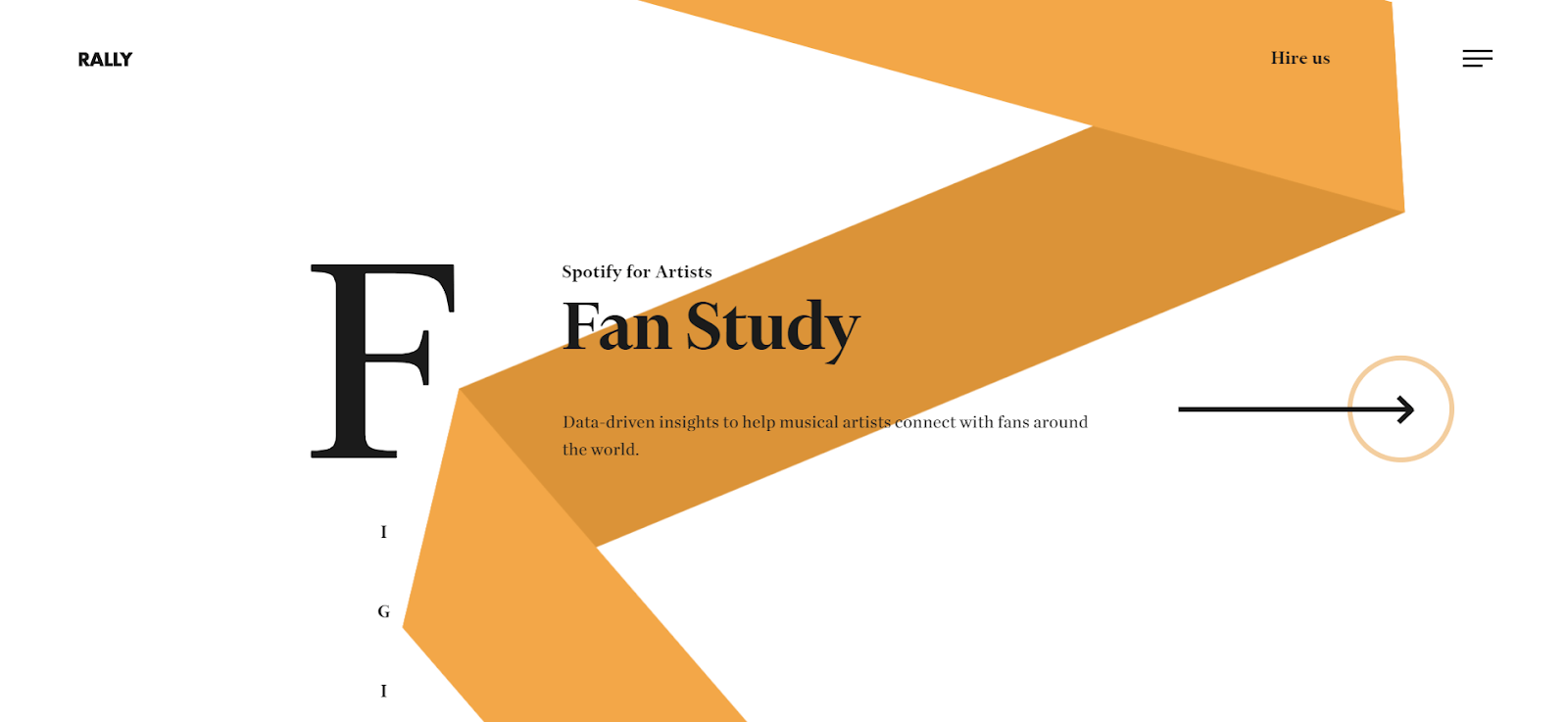
Organic shapes are a recent web design trend that has gained popularity among web developers and designers. While geometric shapes were widely used until 2020, modern web design favors organic or fluid shapes. These shapes can be asymmetrical and inspired by natural elements such as rivers, mountains, or raindrops.
Incorporating organic shapes into content adds personality without detracting from the content itself. It also creates a more classic and less rigid appearance for the website.
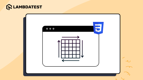
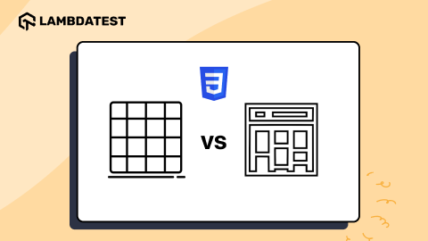
Uneven Grids
Grids are a fantastic way to provide symmetry and maintain consistent spacing for a clean design on web pages. This approach has been popular since its inception because humans naturally prefer symmetry, and grids are straightforward. However, current web design trends change this concept and provide different grid layouts on the web pages.
Grid System
Is the grid system becoming obsolete in 2024? Despite being less conspicuous due to overlapping sections and animated elements, grids remain essential for ensuring the adaptability and responsiveness of website layouts across different screen sizes. Developers utilize breakpoints and CSS classes to control how elements are displayed on various screen dimensions.
Example of Grid Usage: Shrine from Google’s Material Studies
You can use CSS Grid and Flexbox, one of the best and most widely used web design technologies that have revolutionized how grids are used. CSS Grid allows for complex grid layouts with ease, while CSS Flexbox offers a more flexible approach to layout design. When combining this technology, web developers can create dynamic and visually appealing grid-based layouts.
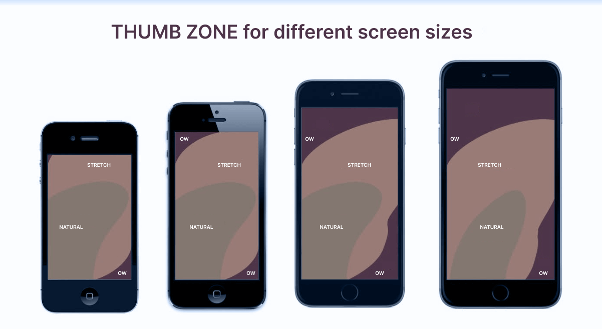
Thumb-Friendly Design
Designing websites to be thumb-friendly is crucial for mobile users. When holding a mobile device, our fingers are wrapped around it, and the thumb typically performs most tasks. This means that icons, menus, and buttons should be positioned in a way that is easily accessible to the user’s thumb. This approach ensures a more user-friendly experience on mobile devices, enhancing usability and engagement.
 Note
NoteTest your web designs for responsiveness on 53+ screen sizes. Try LambdaTest Today!
Playing With Navigations
Navigations have always been simple and designed in a single line for a better user experience. They have been this way since the start, and we still see the same pattern on most websites. However, that doesn’t mean this can’t be changed. With the evolution of other web elements, navigation bars have not been spared. You can also play with such patterns, and the best thing is that symmetry may not always be necessary in this case, making development and designing easier.
Animated Main Content
Web design trends for the main content of the page always focus on ways to capture the user’s attention quickly. One such trend is to provide animation to the main content so that it differs from other content and images on a web page.
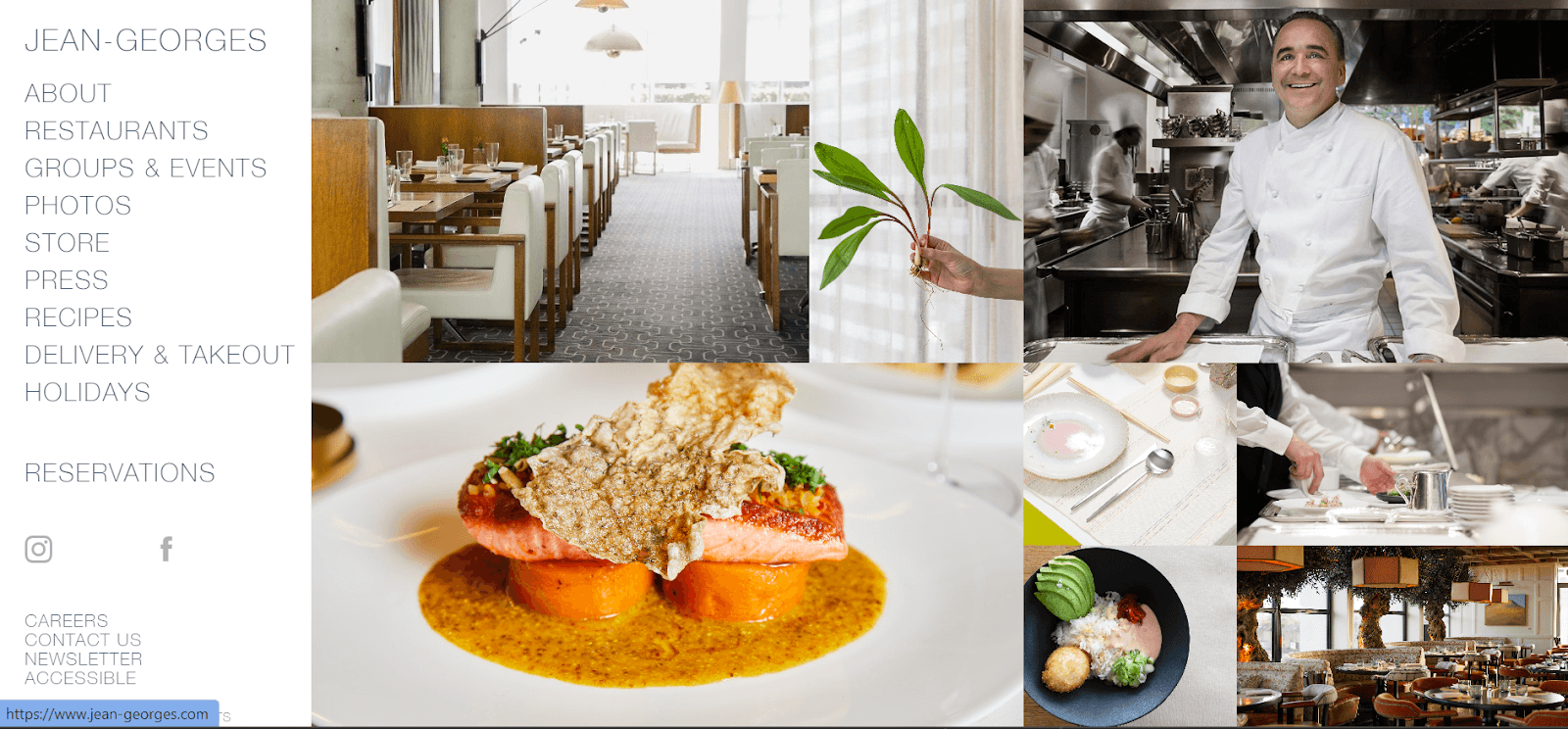
Extreme Product Photography
Earlier web design trends wanted to show their products subtly arranged in their respective sections. They did not want the website to be too flashy, where a few products overrule the others just because they were on the landing page. Now, brands have started to change this trend while putting out their products with flashy images and effective photography.
Typography
People avoid getting entertained by formal-looking websites; they want some creative touch. And modern web designers are breaking every rule of traditional typography and using it as the center of attention. It is among the popular web design trends for 2024.
Here are some ideas to keep your typography game top-notch:
- Kinetic Typography: This is a moving text or animation of text on your webpage that holds the attention of users and helps them absorb the content or message of your brand.
- Emotive Typography: This means the font of text will be connected with the emotional representation of that word. For example, “Anger” is written in red, and the design uses fire elements. It can help viewers to connect emotionally with your webpage content.
- Typographic Hero Page: This typography involves no image and video but only text on the hero page. The modern trend is showering love on this type of hero page. It makes your message bold and straight without distractions from images or elements.
For more information about the significance of typography, follow this detailed guide to CSS typography.
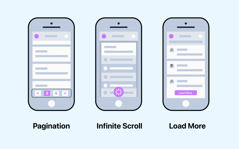
Content Loading Techniques
Many websites today are weighed down by heavy elements and integrations, leading to slow loading times. However, there are ways to create smarter websites that load only necessary content. Techniques like lazy loading and infinite scrolling, which are popular on social networks, can improve user experience. Adopting these approaches can give you a competitive edge, enhancing conversion rates and search rankings. Lazy loading, for example, downloads only visible content, saving server resources and reducing loading times for unseen content. It makes sense to load content as users scroll, conserving resources for the content they see.
Dark Mode
Dark mode is not a new concept. In the 1970s, it was a default feature on any desktop computer. As the white background and user interface grew more prominent, dark mode became old-fashioned.
Once again, it became one of the top web design trends. The dark mode is now available on the most prominent social media platforms and browsers, and it has become an aesthetic that is all its own. Additionally, it reduces eye strain so users can focus better on web content.
Frosted Glass Effects
The frosted glass effect has recently become one of the popular web design trends in a designer’s toolkit and has increasingly been used as a background in place of gradients.
In recent years, web technology has made it possible to create websites with frosted glass effects easily. While adding color to an area, the blurry appearance of elements behind the frosted glass overlay also makes text or objects visible over the image.
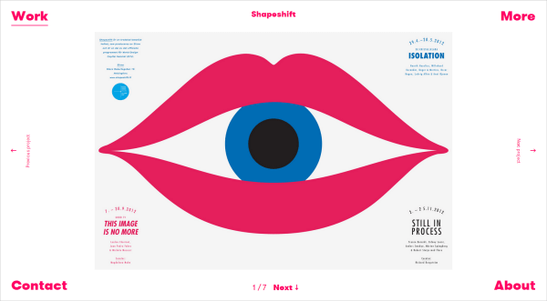
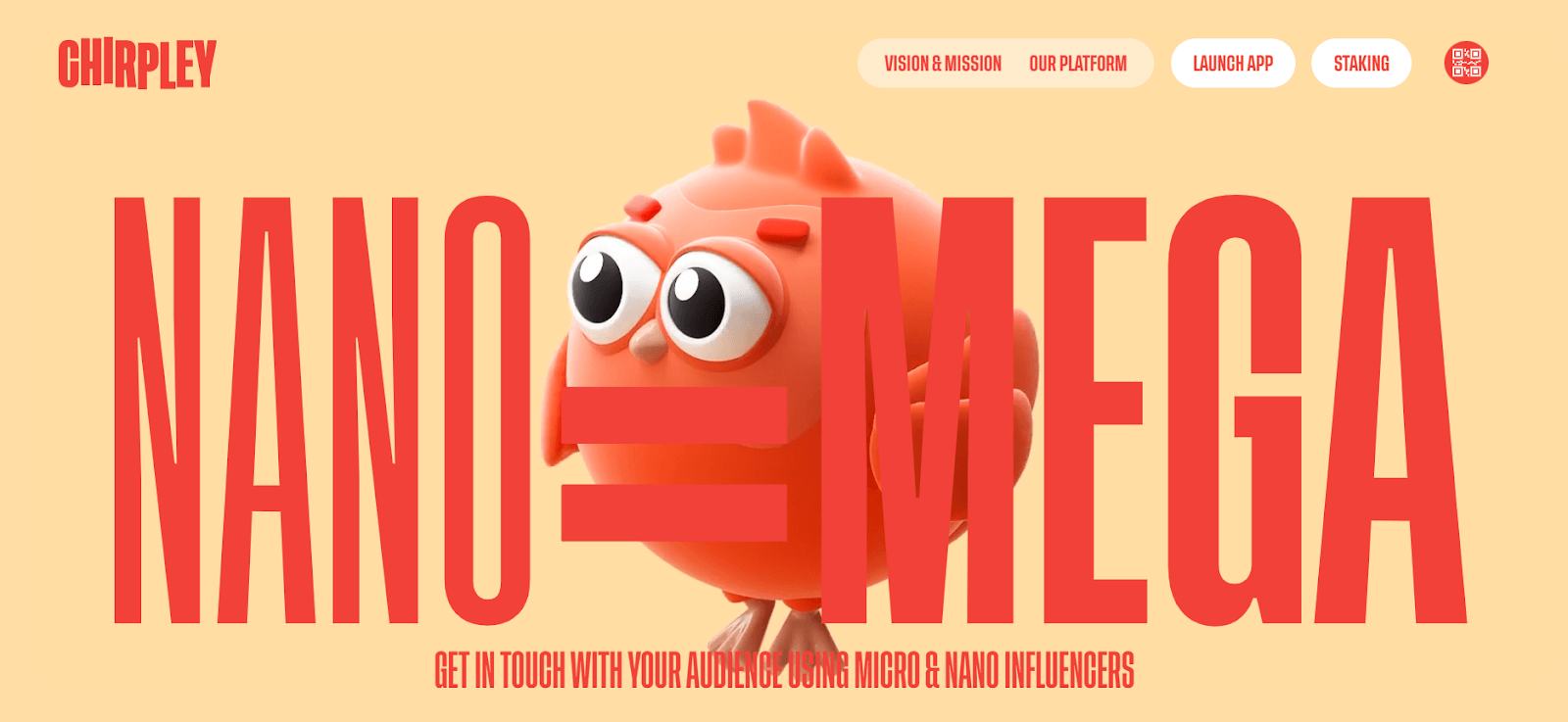
2D Characters
2D characters are one of the popular web design trends for creating visually appealing content while keeping the web page lightweight. This trend is also prominent in recent conceptual videos, helping to gather attention effectively.
3D Visuals
With the improvement of desktop and mobile screen resolutions, 3D visuals have become a compelling way to optimize user experience. Websites featuring moving three-dimensional elements tend to captivate users, offering them new experiences with each interaction, keeping them engaged and curious.
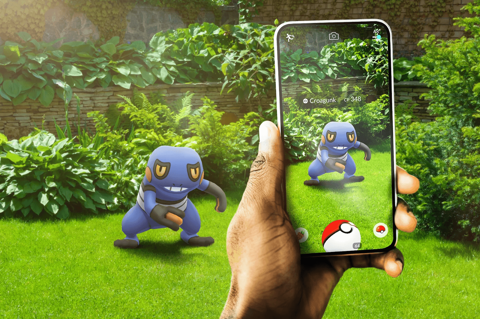
Augmented Reality (AR)
Augmented Reality (AR) technology seamlessly blends digital content with the real world, enriching website user interactions. Examples include Snapchat and Google Arts & Culture use of AR for stickers and filters. This technology offers significant advantages for eCommerce websites, providing users with immersive shopping experiences. For instance, AR can help users visualize how a sofa would look in their living room or try on virtual glasses, aiding in better decision-making and increasing the likelihood of completing a purchase. One of the best examples is the Pokemon Go mobile game.
Virtual Reality (VR)
Virtual Reality (VR) is a major trend shaping the future of web design, offering immersive experiences that allow users to virtually try products like sunglasses and earphones from anywhere. This trend is expected to grow significantly in the future.
Notable examples of VR applications include Viture, Showroom by Little Workshop, and Hubs by Mozilla.
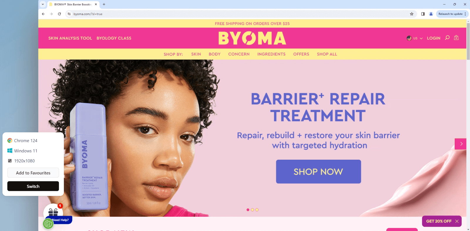
Contrasting Colors
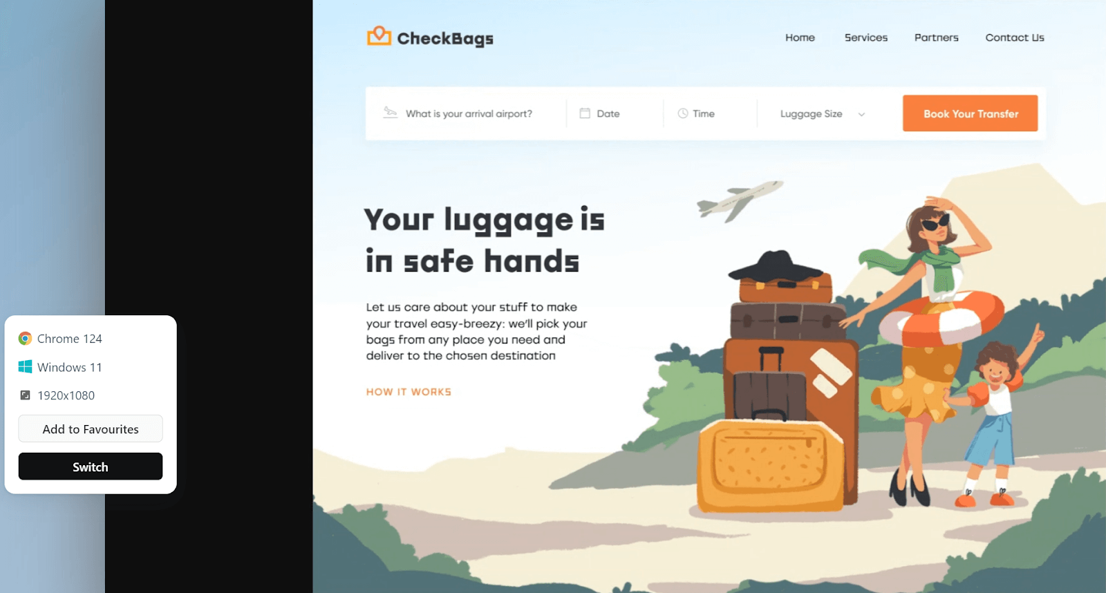
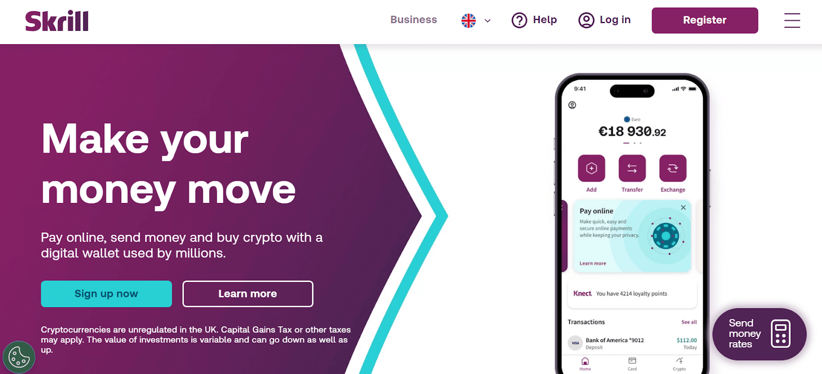
Contrasting colors are often used in web design to make elements stand out and grab the user’s attention. This trend is especially noticeable in contrasting colors between background and foreground elements. However, contrasting colors can also be used strategically, as demonstrated by Skrill, where adjacent elements are designed to complement each other while still standing out.
Muted Color
Muted colors refer to low-saturation, soft colors that create a subtle and calming effect. Unlike bright, vibrant colors, which can be visually stimulating, muted colors provide a more relaxed and gentle visual experience. Incorporating muted colors into web design can help create a soothing and appealing aesthetic for users.
Micro Interaction
Micro-interactions are small animations that provide visual feedback in response to user actions, enhancing the user experience. For example, changing the color of a link when a user hovers over it indicates that it is clickable. Similarly, using stickers, GIFs, or animated emojis on social media expresses emotions and adds fun. In web design, micro-interactions can be used for various purposes, such as animating a delete button to open and reveal deleted files.
Smart Videos
Videos have become integral to modern web design, offering a dynamic and engaging way to communicate with users. They can convey complex information quickly and effectively, making them ideal for showcasing products, explaining concepts, or telling a brand’s story. However, videos must be carefully planned and embedded to be effective, ensuring they align with your brand’s message and tone.
Placing a video on the loading page can be particularly impactful, as it is one of the first things users see when they visit your site. A well-crafted video can deliver your brand message in a memorable way, helping to create a strong first impression and capture the user’s attention from the start.
Micro Animations
Micro animations add movement to web elements, making the page more engaging and giving content a personality that users can connect emotionally. These animations also serve a functional purpose by showing users how to interact with the website. They are popular web design trends for enhancing user experience and providing shoppers with a dynamic view of products.
Minimalist Design
Minimalist design is a popular approach in web design, favored for its clean and elegant appearance. It can improve the user’s decision-making process by presenting information in a clear and concise manner. It focuses on simplicity, often reducing clutter and distractions to help users focus on key content or actions. This approach can lead to faster user interactions and a more enjoyable browsing experience.
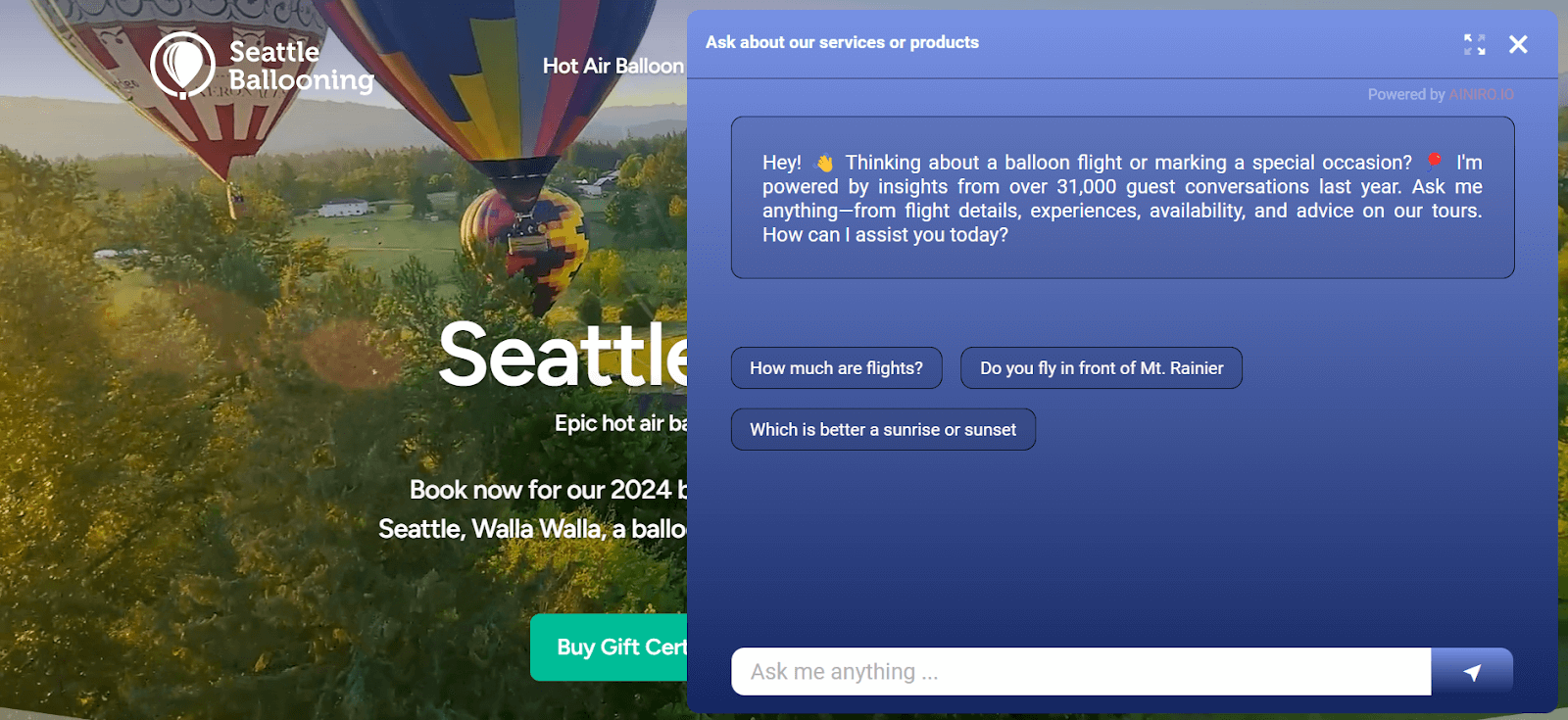
Chatbots
Chatbots are one of the popular web design trends for making online chatting and support processes more interactive and intelligent. Web developers use highly personalized and intelligent chatbots to respond to website service requests. When you hear a pleasant voice on a website, it’s likely a chatbot, even though it may seem like you’re chatting with a real person. The advantage of using chatbots is that they make your website more responsive and interactive and yield results faster.
Neomorphic and Monochromatic Design
The neomorphic design combines hyperrealism and minimalism using a monochromatic color scheme, low contrast, and shadows. While it requires more technical skills due to the low contrast, when done correctly, it adds a luxurious charm to your website and provides an unforgettable user experience. This web design trend is expected to grow in the coming years with new subtle experiments.
Monochromatic web design uses a single base color for designing and incorporates different tones and shades of the same color. This style is effective for brands emphasizing interaction with Call-To-Action (CTA) elements.
Scrolling Effects
Scrolling increases user exploration, leading to more interactions on a website. Providing a memorable scrolling experience can be achieved through various methods:
- Parallax Scrolling: Inspired by 2D vintage video games, parallax scrolling involves moving two layers at different speeds to create depth on the webpage. This technique can engage users and encourage them to scroll more out of curiosity.
- Horizontal Scrolling: While vertical scrolling is common, horizontal scrolling adds a unique dimension to a webpage. Implementing horizontal scrolling can be challenging as users must be informed, but it can be integrated into video or image galleries for a more organized layout.
- Scroll-Triggered Animations: This technique combines graphic and web design elements to create animations triggered as users scroll. These animations can add visual interest and engagement to the website.
The advantage of scrolling effects is that it increases time spent on the page and engagement by giving users new animation every time they interact with the webpage.
Custom Illustration
The custom illustrations are one of the popular web design trends, moving from the back pages of notebooks to the front pages of websites. These freehand designs create a sense of connection with users because they are imperfect and relatable, unlike more polished designs. As modern startups aim to be more playful and connected with their audience, these web design trends are expected to grow in popularity.
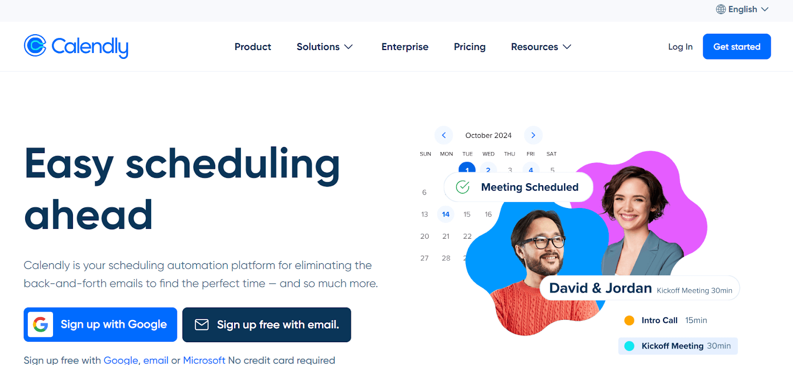
Dynamic and Responsive Landing Pages
Many modern websites employ dynamic and responsive landing pages to captivate their audience. Keeping users engaged on a static landing page can be challenging, so integrating responsive web design elements like animations and interactive features can prolong user interaction.
For instance, the water ripple effect on Weberous, a Los Angeles-based web design and marketing firm’s website, demonstrates how creative UX web design trends can transform a dull landing page into a dynamic and engaging experience.
Dynamic Cursors
A creative approach to enhance user experience on websites is by customizing how they interact with web elements, such as their cursors. These web design trends have captivated users with their unexpected subtlety. By changing the cursor’s appearance or introducing animations triggered by the cursor, visitors can enjoy engaging with various scrolling behaviors or on-click actions.
Gradients
While gradients are not new, their usage continues to evolve with new creative applications. They can serve as striking backgrounds, add depth, or subtly enhance texture in illustrations. Gradients are also used in typography, with more extensive and bolder applications emerging. This trend in web design is expected to continue evolving, offering exciting possibilities for designers.
Wondering how to implement the gradient effect on your website to make it look more appealing and unique? Follow this guide on CSS gradients to learn how to use gradients effectively.
White Space
White space gives your content room to breathe without cramming it onto the screen. This approach leads to a more relaxing experience for website visitors, enhances content visibility, and improves readability. White space refers to the space between elements, and despite its name, it doesn’t necessarily have to be white. This space is also known as negative space.
To maintain consistent spacing between web elements, you can utilize CSS padding and CSS margin properties. These properties help ensure the uniform spacing among content and elements, creating a clean and presentable layout.
Text-Only Hero Images
Newspapers strategically place their most attention-grabbing and vital information “above the fold” to boost sales. Similarly, websites have a hero section at the top of the page, aimed at capturing users’ attention immediately. A modern trend to engage internet users bombarded with various web pages is replacing the typical background image in the hero section with eye-catching typography. A bold and unique font can quickly draw a user’s attention to key information.
Blending Photos with Graphical Elements
You may have observed overlapping graphics on images in your social media feed. This blending technique adds a creative and fun element to ordinary images. This web design trend is also gaining popularity in website design. Combining photography with graphics can strengthen your brand identity and captivate website visitors, keeping them engaged with your content.
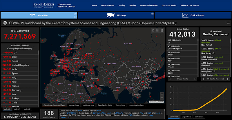
Data Visualization
Communicating data in an engaging way can be difficult. However, taking advantage of the fact that humans are visual creatures and creating images from your data can be a great way to ensure your reader knows what you’re talking about. Infographics and graphs are some of the most popular ways people have brought data to life.
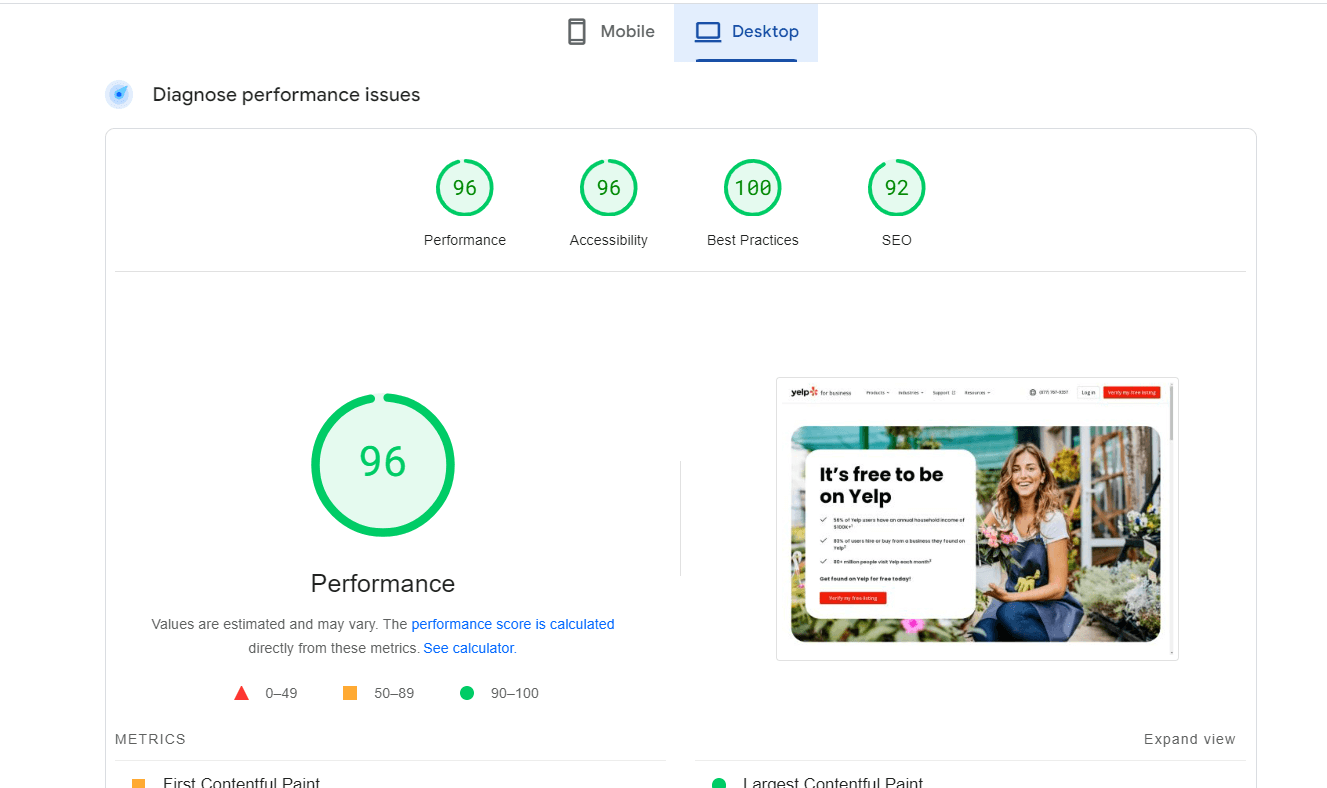
Website Load Speed
When it comes to website design and development, load speed remains a critical factor. Studies suggest that page speed significantly influences users’ willingness to purchase online. For example, Yelp for Business improved its conversion rates by reducing page load time and enhancing user experience. While users may not consciously count seconds, their perception of your website is greatly influenced by its speed.
Below is an example of the load speed test of Yelp for Business for desktop via the Page Insights feature of Google.
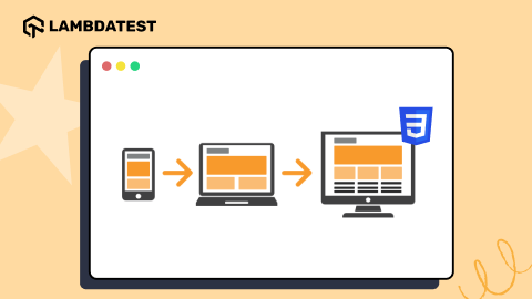
It is important to keep up with the latest trends when creating your web designs. However, it is also crucial to check if they are compatible across different screen sizes like smartphones, tablets, desktops, and laptops. To build a responsive web design, it’s imperative to perform responsive testing.
In the next section of this blog, we will learn to check if the web design is responsive.
How to Check if Your Web Design Is Responsive?
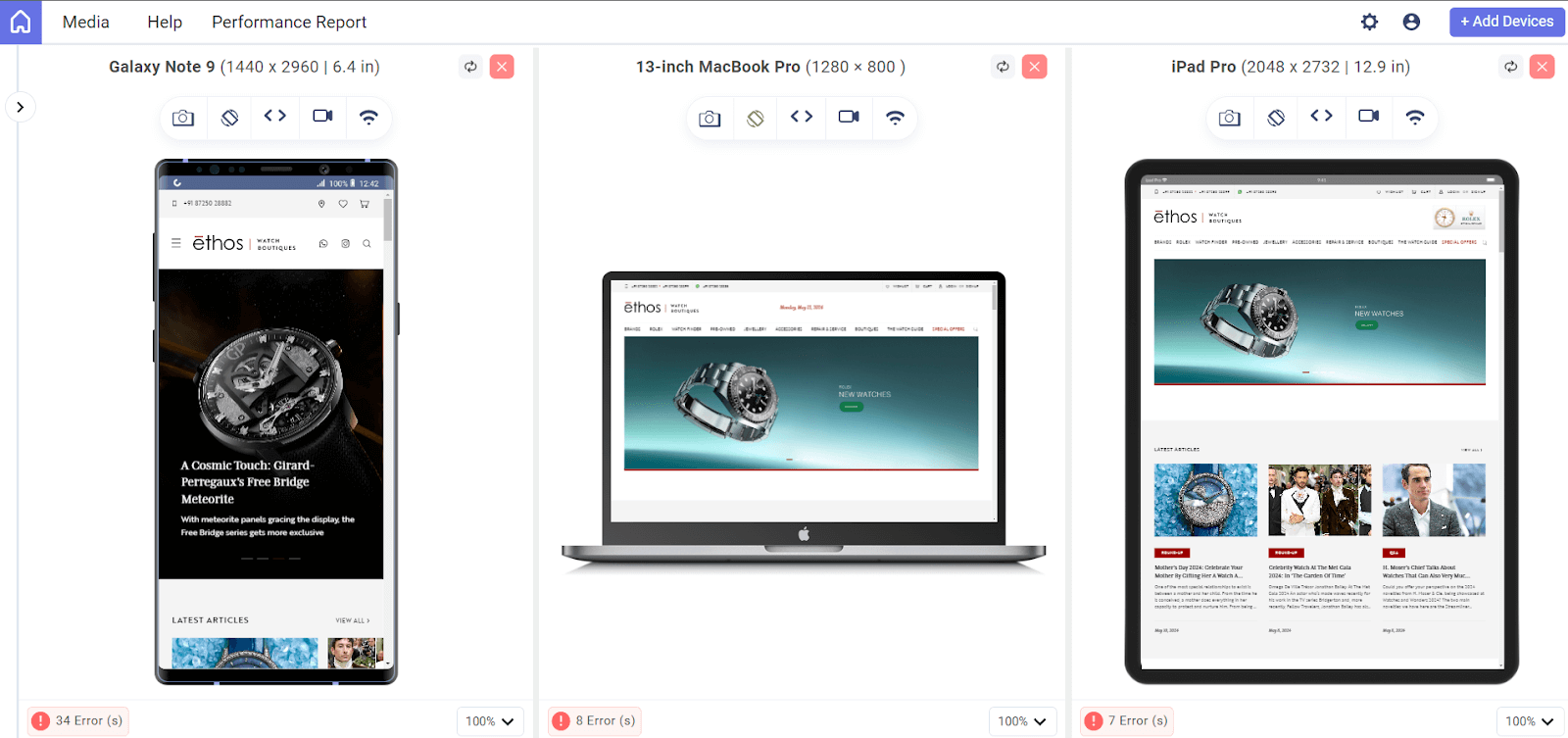
Testing responsiveness with manual techniques can be time-consuming and expensive. Therefore, a feasible approach is using smart solutions like LT Browser, a mobile website testing tool that LambdaTest offers. LambdaTest is an AI-powered test orchestration and execution platform that lets you run manual and automated tests at scale with over 3000+ real devices, browsers, and OS combinations.
LT Browser offers a comprehensive preview of your website on various devices with over 53+ pre-installed viewports, including mobiles, tablets, desktops, and laptops. It provides features like custom device resolutions, network simulation, and performance reports powered by Google Lighthouse. Additionally, you can view your application side-by-side for comparison and synchronized interactions like scrolling, clicking, and navigation.
If you wish to use LT Browsers to validate the responsiveness of your websites, click on the Download button below.

Watch the video tutorial given below and get insights on LT Browser functionalities.
Subscribe to the LambdaTest YouTube Channel and get the latest updates on various tutorials on automation testing, web device testing, cross-device testing, browser compatibility, and more.
Conclusion
Web design is an ever-evolving art influenced by changing visitor interests. We never know if what’s out of style today will be popular again tomorrow; and tomorrow some new technology may come along and change everything in the industry.
So it’s important to keep up with the web design trends and stay on top of things—but it’s also your canvas; serve the Internet with your art!
Frequently Asked Questions (FAQs)
What is the future of web design?
The limits of what was previously thought to be achievable are being pushed by the future of web design. With the help of new technology and interactive aspects, static websites have come to life. HTML is now routinely used by designers, while CSS allows them to perform things only possible in science fiction ten years ago.
What are the 3 types of web design?
There are three main types of web design: static, dynamic, and eCommerce.


Author’s Profile
Harish Rajora
I am a computer science engineer. I love to keep growing as the technological world grows. I feel there is no powerful tool than a computer to change the world in any way. Apart from my field of study, I like reading books a lot and write sometimes on https://www.themeaninglesslife.com .
Blogs: 88
Got Questions? Drop them on LambdaTest Community. Visit now