
The Ultimate Guide to CSS Padding
Anurag Gharat
Posted On: May 7, 2024
 101872 Views
 17 Min Read
When building a modern website, it’s crucial to maintain a clean and presentable appearance with consistent spacing between content and UI elements. Achieving a clean and presentable appearance often involves careful use of CSS padding.
Cascading Style Sheets (CSS) is vital in modern web design, improving user experience through proper content placement and spacing around HTML elements.
In the image below, you can observe how the CSS padding property influences the appearance of your website. Incorrect use of CSS padding can make it challenging for users to navigate or stay on your website. While CSS padding may seem like a minor aspect of CSS design, it plays a crucial role.

In this blog, we will learn the CSS padding property, which proves very handy when adding spacing between HTML elements on the webpage. We will also learn how to use the CSS padding property to create spacing to give their website a clean and aligned look.
TABLE OF CONTENTS
What is CSS Padding?
Padding refers to the space between an HTML Document Object Model (DOM) element and its outer edge or border. In CSS, the padding property defines the area that separates the element’s content from its border, providing some space within the component. Similar to the padding property, the margin and border properties are also used to generate space for the element.
CSS padding plays an important role in the overall design and experience of the website. Lack of padding will affect the overall appearance and readability of the content, making it look cluttered. Big brands utilize padding between elements to improve their website’s overall design and experience.
Let’s take a look at how Amazon uses padding on its website.

The Amazon website is well-designed and provides a smooth experience for the user. An important aspect of this brilliantly designed website is how well the elements are placed around the screen, with just enough space between them. Every element box has sufficient space that makes reading the content easier and distinguishes it from other elements, creating a sense of separation.

Now, take a look at Amazon’s product page. This webpage is filled with a lot of content like images, text, icons, buttons, etc. But even after that, the page does not appear crowded and cluttered. This is because every element has been provided with sufficient padding, making it readable for the user. Amazon’s website is a perfect example of how we can use padding to generate space, separation, and hierarchy between various types of content.
To learn more about CSS properties, follow this guide on Advanced CSS. Become familiar with all the CSS properties and master making your website look clean and appealing.
 Note
NoteTest your website across 3000+ browsers and OS combinations. Try LambdaTest Today!
To understand how the padding gets applied to an HTML element, it is necessary to understand the CSS Box Model and how it affects the overall sizing of the HTML element.
The CSS Box Model
The CSS Box Model is a core concept in CSS that essentially means that every HTML element on a web page has a box that wraps around it. Each box comprises four parts: the content, padding, border, and margin.
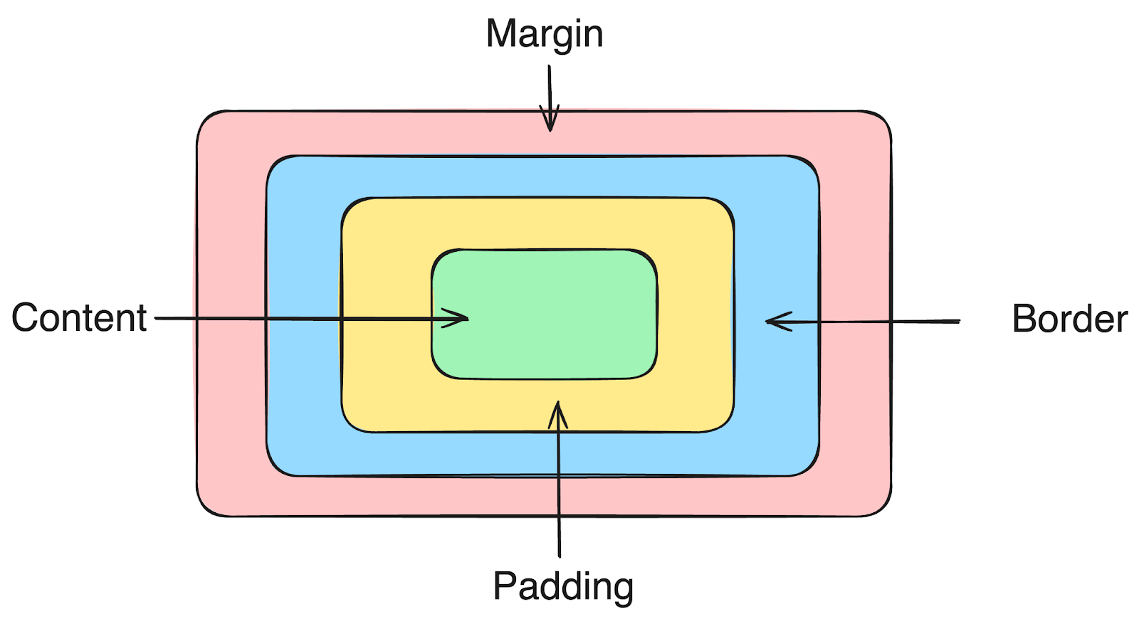
Content Area
The content area is the value of the HTML Document Object Model element. This content can be a text, icon, image, or video. This content is the innermost part and forms the core of the Box Model. All the other parts, like the padding area, border area, and margin area, wrap around the content area. CSS properties like width, height, and font-size specify the content area’s size.
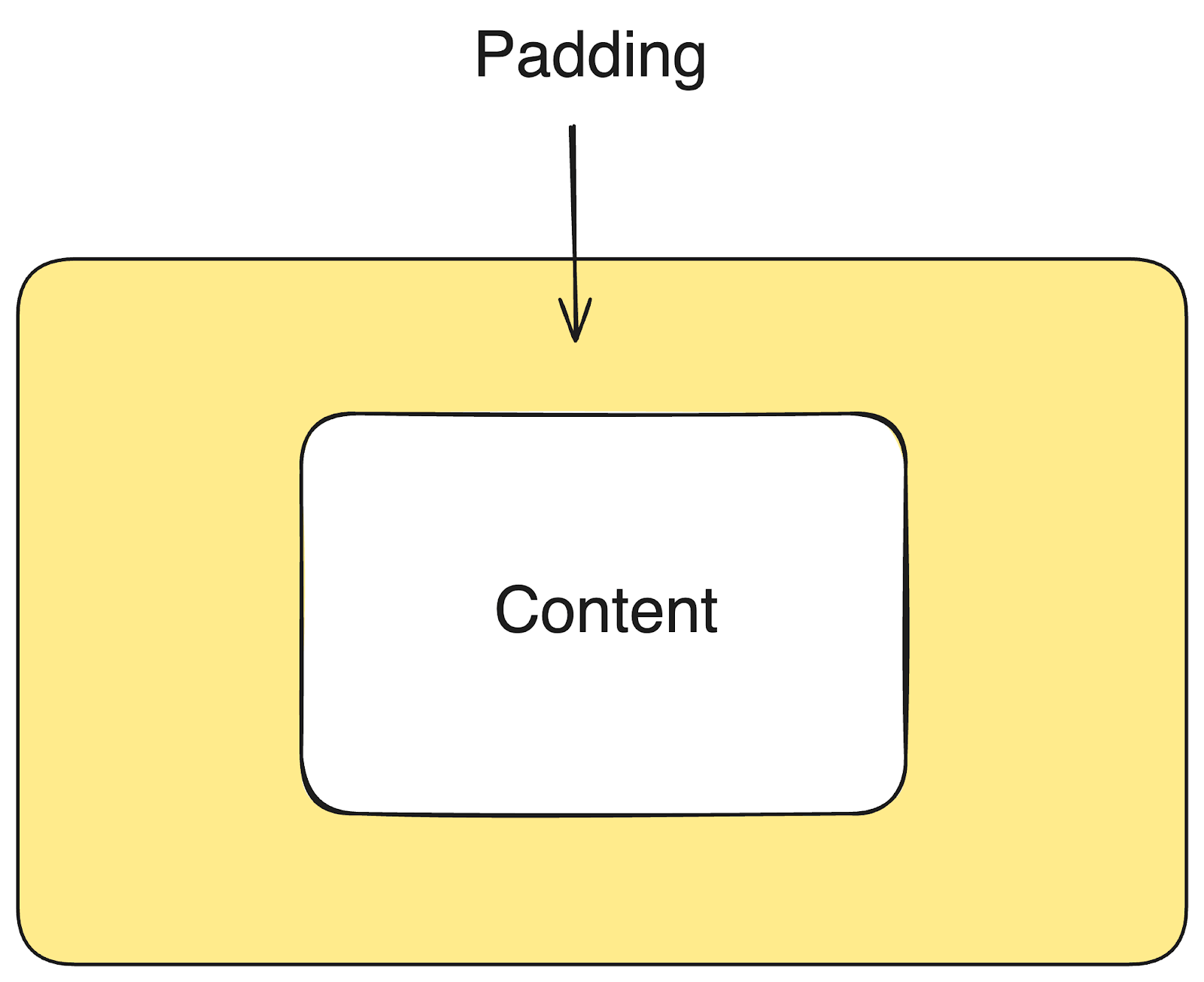
Padding Area
The area surrounding the content is the padding area defined by the CSS padding property. This area separates the actual content from its border. By default, the padding area contributes to the total dimensions of an element and is added on top of the element’s actual dimensions.
Border Area
The border area is a barrier between the HTML and other elements. This area is handled using the CSS border property. Most HTML elements have no predefined border except for a few exceptions like the < button > element. Similar to the padding area, the border area also contributes to the overall dimensions of the element and is added on top of the actual dimensions.
Margin Area
The margin area is an invisible area around the element used to create space between the elements and other layout elements. Similar to the padding area, the margin area can be adjusted using the CSS margin property. The margin area is not part of the element and, hence, does not contribute to the overall dimensions of an element.
In the below section of this blog on CSS padding, we will learn how calculating the width of an HTML element helps us make a web element look perfect on the website.
Calculating The Width of An Element
Since the padding area and border area contribute to the element’s total dimensions, the final dimensions of the element will always vary from the actual dimensions. Hence, it is important to know how the browser calculates the dimensions of an element.
We might assume that a CSS property of width: 100px guarantees an element of width 100px will be rendered on screen. No! That’s the tricky part! CSS sizing does not work this way, and this is why so many developers fail to create an accurately sized layout for their web pages.
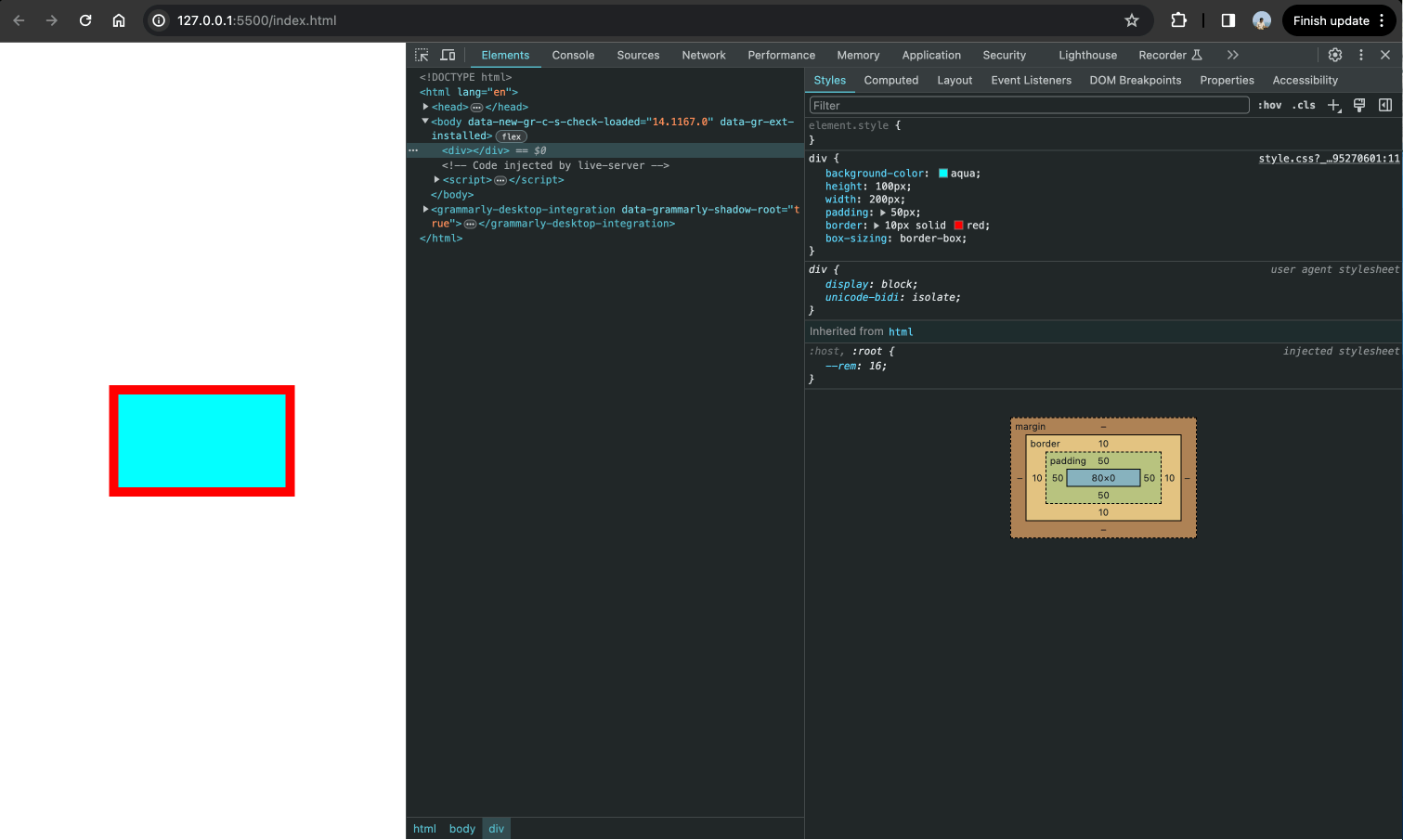
Let’s say we create a < div > element with a height of 100px and a width of 200px. We also specify a padding of 50px and a border of 10px on all sides. What will the actual width of the element be rendered on screen? 200px? No, it will be 320px. But why? Let’s understand what’s happening behind the scenes.
|
1 2 3 4 5 6 7 |
div{ background-color: aqua; height: 100px; width: 200px; padding: 50px; border: 10px solid red; } |
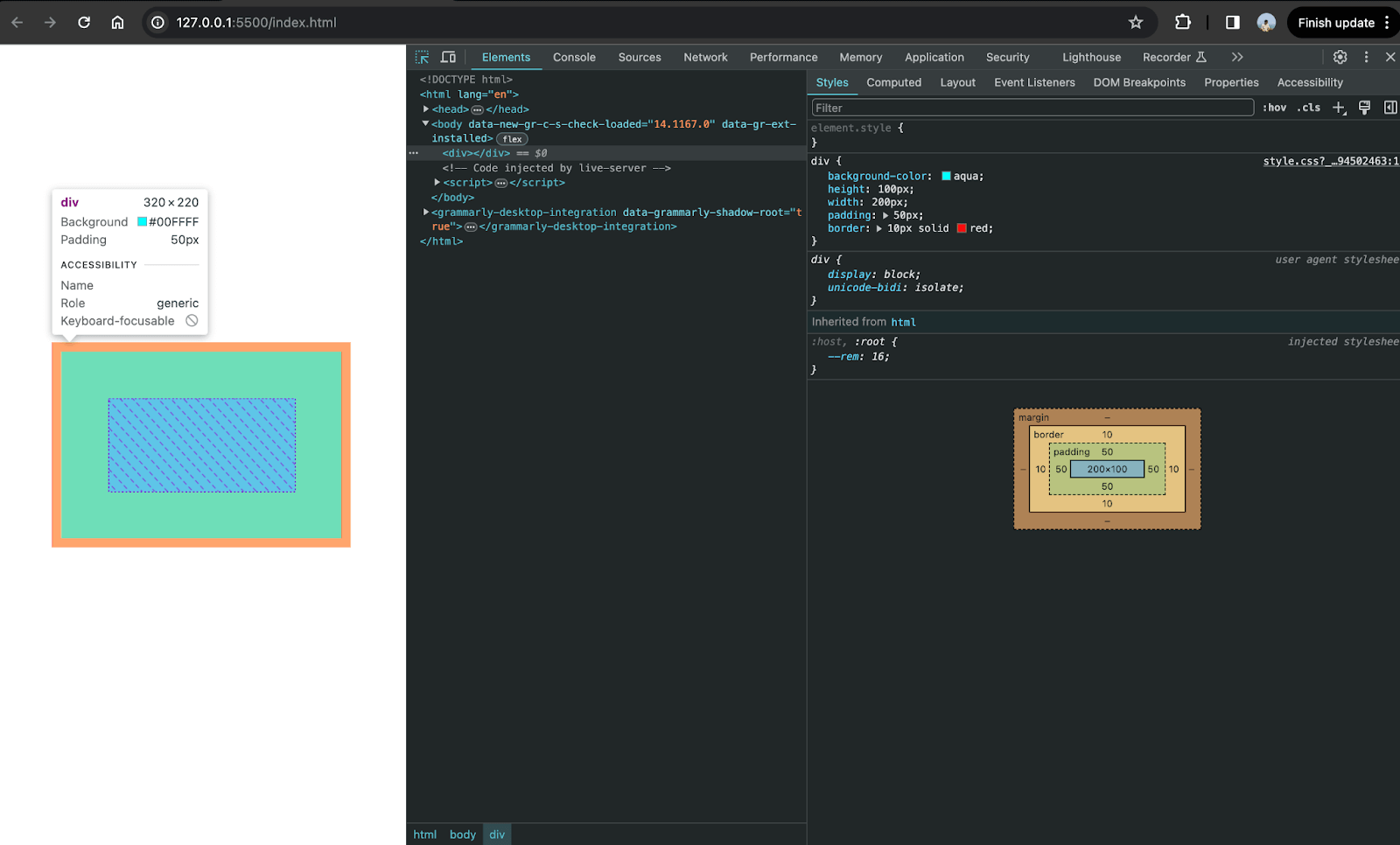
Observing the above screenshot, by selecting the < div > element, we can see the dimensions to be 320px X 220px and not 200px X 100px. As discussed in the CSS Box Model section, every HTML element has a box that wraps around it. Hence, any padding or border added to any HTML element gets added to the actual element area, increasing its actual dimensions.
Look at the screenshot of the actual box model of the < div > element we created. You can see the padding and border area boxes surrounding the content area boxes.
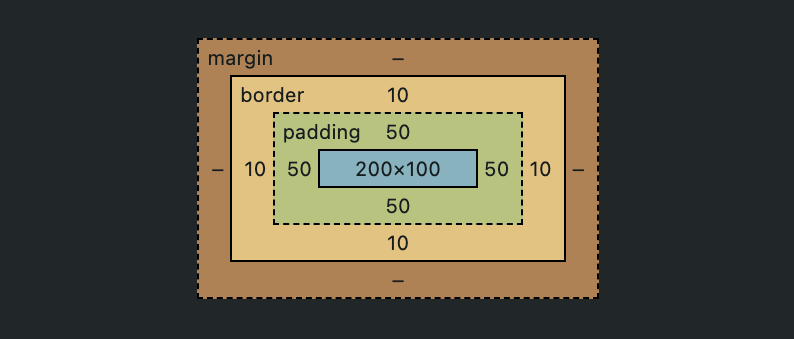
So, by the above understanding, we can say that:
Final width = element’s actual width + padding on right + padding on left + border on right + border on left
For the < div > , Final width of 320px = 200px + 50px + 50px + 10px + 10px
Final height = element’s actual height + padding on top + padding on bottom + border on top + border on bottom
For the < div > , Final height of 220px = 100px + 50px + 50px + 10px + 10px
This is the reason why the final dimensions of the < div > element were 320px X 220px and not 200px X 100px. This can often cause undesirable results to the overall sizing of an element and results in recalculating the width every time the padding or border area changes. To avoid this behavior, we can use the CSS box-sizing property.
The CSS box-sizing property controls the width and height of the element. This property decides whether to include the padding area and border area inside the element’s actual size or on top of it. By setting the box-sizing: border-box property on an element, the browser treats the padding area or border area as a part of the total content area, making it a part of the original dimensions. This avoids adding extra height and width to the element’s total width.
|
1 2 3 4 5 6 7 8 |
div{ background-color: aqua; height: 100px; width: 200px; padding: 50px; border: 10px solid red; box-sizing: border-box; } |
Output:
As you can see in the above image, the total height and width of the element stayed the same even after we added a border of 10px and padding of 50px. This is because of the box-sizing: border-box; a property that treats the padding and border as part of the element’s content area.
This property is very important in making responsive design and creating fixed-size layouts. When an HTML element doesn’t appear as expected on a website, developers can perform debugging and understand how the browser resolves style calculations in the actual layout context.
To create fixed-size layouts and maintain the consistency of your web elements, ensure that buttons, images, and other elements have consistent spacing. You can perform visual testing, UI testing, and responsive testing to validate the UI alignment and ensure that your website is responsive no matter which device port is being viewed.
How to Use The CSS Padding Property?
The CSS padding property can be applied to any HTML element. This property can take Absolute and Relative CSS units as a value. The default value is always 0, and it does not accept a negative value, unlike its counterpart CSS margin.
There are multiple ways to apply padding to an element. We can use the individual properties to apply padding on all four sides of the element. Or we can use the shorthand syntax.
Regular Syntax
In the regular syntax, CSS provides four separate properties to control padding in all four directions. These properties are
| CSS Property | Description |
|---|---|
| padding-top: < value >; | Applies a padding of <value> between the top border and the content. |
| padding-right: < value >; | Applies a padding of <value> between the right border and the content. |
| padding-bottom: < value >; | Applies a padding of <value> between the bottom border and the content. |
| padding-left: < value >; | Applies a padding of <value> between the left border and the content. |
Using these properties, we can provide specific padding values for all four sides.
|
1 2 3 4 5 6 |
div{ padding-top: 20px; padding-right: 40px; padding-bottom: 60px; padding-left: 80px; } |
Shorthand Syntax
In this syntax, we use just one property called padding: value to provide padding on all four sides. This property accepts one to four values. Based on the number of values provided, the browser applies the padding to the element.
If all four values are provided, the padding is applied in a clockwise manner, i.e., the first value represents the padding at the top, the second value represents padding on the right, the third value represents the padding on the bottom, and the fourth value represents padding on the left.
Syntax:
|
1 2 3 |
div { padding: <top> || <right> || <bottom> || <left>; } |
Here’s an example of a shorthand property
|
1 2 3 |
div{ padding: 10px 20px 30px 40px; } |
Here’s what it would look like in the regular form
|
1 2 3 4 5 6 |
div{ padding-top: 10px; padding-right: 20px; padding-bottom: 30px; padding-left: 40px; } |
If three values are provided, the first value represents the padding to the top, the second value represents padding to the left and right, and the third value represents the padding to the bottom.
Syntax:
|
1 2 3 |
div{ padding: <top> || <left, right> || bottom; } |
Here’s an example of a shorthand property
|
1 2 3 |
div{ padding: 10px 20px 30px; } |
Here’s what it would look like in regular form
|
1 2 3 4 5 6 |
div{ padding-top: 10px; padding-right: 20px; padding-left: 20px; padding-bottom: 30px; } |
If two values are provided, the first value represents the vertical padding, i.e., padding at the top and bottom, and the second value represents the horizontal padding, i.e., the padding on the left and right.
Syntax:
|
1 2 3 |
div{ padding: <top, bottom> || <left, right> ||; } |
Here’s an example of a shorthand property
|
1 2 3 |
div{ padding: 20px 50px; } |
Here’s what it would look like in regular form
|
1 2 3 4 5 6 |
div{ padding-top: 20px; padding-bottom: 20px; padding-right: 50px; padding-left: 50px; } |
If only a single value is provided, then the value represents an equal amount of padding on all sides of the element.
Syntax:
|
1 2 3 |
div{ padding: <top, bottom, left, right>; } |
Here’s an example of a shorthand property
|
1 2 3 |
div{ padding: 100px; } |
Here’s what it would look like in regular form
|
1 2 3 4 5 6 |
div{ padding-top: 100px; padding-right: 100px; padding-bottom: 100px; padding-left: 100px; } |
As we understand the core concept of CSS padding property, we will learn how CSS padding and CSS margin differ in the section below.
Difference Between CSS Padding And Margin
CSS padding and margin are fundamental concepts in CSS for controlling the spacing around elements. Padding refers to the space between an element’s content and its border, while margin is used to create space outside the border of an element. This section aims to clarify any remaining confusion by explaining their differences.
| Padding | Margin |
|---|---|
| Space between the element and its border | Space between the element’s border and other elements. |
| It represents the inner space. | It represents the outer space around the element. |
| It can take either 0 or positive values. | It can take either 0, negative, or positive values. |
| It cannot be set to auto. | It can be set to auto. |
To learn more about spacing in CSS and how it contributes to displaying the content in an aligned fashion for easy readability and better user experience, follow this guide on using CSS spacing in detail.
In the below section, we will look into the demonstration using the CSS padding property to understand its working thoroughly.
Demonstration With The CSS Padding Property
Now that we have understood the CSS padding property and how to use it, let’s build a small web component to test our knowledge. For demonstration purposes, we will try to replicate the landing page of the LambdaTest website.
During this example, we will apply the CSS padding property to all the HTML elements we add to the webpage.
HTML:
|
1 2 3 4 5 6 7 8 9 10 11 12 13 14 15 16 17 18 19 20 21 22 23 24 25 26 27 28 29 30 31 32 33 34 35 36 37 38 39 40 41 42 43 44 45 46 47 48 49 50 51 52 53 54 55 56 57 58 59 |
<!DOCTYPE html> <html lang="en"> <head> <meta charset="UTF-8"> <meta name="viewport" content="width=device-width, initial-scale=1.0"> <title>Document</title> <link rel="stylesheet" href="style.css"> </head> <body> <section> <nav> <div> <img class="logo" src="https://www.lambdatest.com/resources/images/logos/logo.svg" alt=""> <ul> <li> Platform </li> <li> Enterprise </li> <li> Resources </li> <li> Developers </li> <li> Pricing </li> </ul> </div> <div> <p>Login</p> <button class="button-secondary">Book a Demo</button> <button class="button-primary">Get Started Free</button> </div> </nav> <main> <div> <h1> Digital Experience Testing Cloud Built For Enterprises </h1> <p> Our Unified Testing Cloud enables you to deliver world class digital experience with quality releases and help accelerate your release velocity. </p> <button class="button-primary">Contact Us</button> </div> <div class="hero"> <img src="https://www.lambdatest.com/resources/images/enterprise.webp" alt="" srcset=""> </div> </main> </section> </body> </html> |
CSS:
|
1 2 3 4 5 6 7 8 9 10 11 12 13 14 15 16 17 18 19 20 21 22 23 24 25 26 27 28 29 30 31 32 33 34 35 36 37 38 39 40 41 42 43 44 45 46 47 48 49 50 51 52 53 54 55 56 57 58 59 60 61 62 63 64 65 66 67 68 69 70 71 72 73 74 75 76 77 78 79 80 |
*{ margin: 0; padding: 0; box-sizing: border-box; } body{ height: 100%; width: 100%; } section{ height: 100vh; } nav{ display: flex; flex-direction: row; width: 100%; justify-content: space-between; padding: 20px 40px; } nav div{ display: flex; flex-direction: row; align-items: center; gap: 20px; } ul{ display: flex; flex-direction: row; } ul li{ list-style-type: none; padding: 0 10px; } main{ display: flex; flex-direction: row; height: 100%; } main div{ width: 50%; height: 100%; padding: 50px; display: flex; flex-direction: column; justify-content: center; align-items: self-start; gap: 10px; } main div img{ width: 80%; } .hero{ justify-content: center; align-items: center; } main div button{ width: auto; } h1{ font-size: 3.5rem; } p{ font-size:1.5rem; } button{ padding: 10px 20px; border-radius: 5px; border: none; } .button-primary{ background: linear-gradient(91.88deg,#2c57f3 .88%,#a506d8 98.71%); color: white; } .button-secondary{ border: 1px solid black; } |
See the Pen
CSS Padding – Lambdatest by Anurag Gharat (@anurag-gharat)
on CodePen.
Result:

To display the result, we used the LT Browser feature offered by LambdaTest.
LT Browser lets you preview how a website appears on various mobile devices. With over 53+ device viewports, you can compare them side by side and synchronize interactions like scrolling, clicking, and navigation. It offers pre-installed device viewports for mobiles, tablets, desktops, and laptops.
To use LT Browser and validate the responsiveness of your application, click the download button below. Once the .exe file is downloaded, run it to access its features and capabilities.

Watch the video tutorial below and familiarize yourself with LT Browser features and functionalities.
Subscribe to the LambdaTest YouTube Channel and get the latest updates on various automation testing tutorials covering Selenium testing, cross-device testing, Browser compatibility, and more.
Browser Support for CSS Padding Property
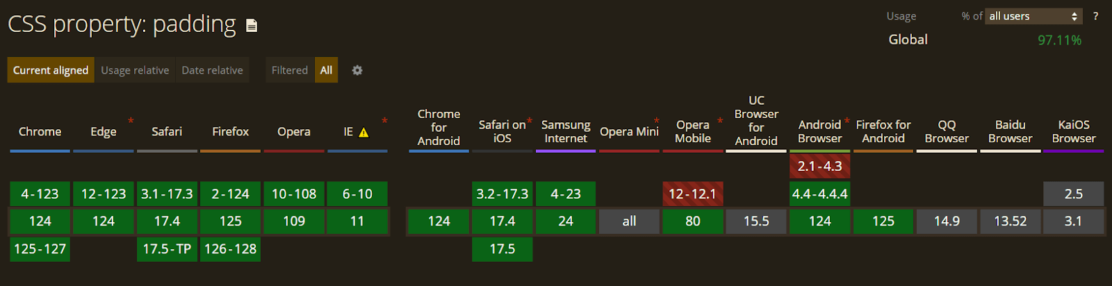
The padding property in CSS is one of the most frequently used properties. Therefore, it is extensively supported by all old and modern browsers. We can freely use this property without worrying about a fallback; ensuring that your web designs are pixel-perfect across various browsers and devices is essential.
To validate it, you can use cloud-based platforms like LambdaTest, an AI-powered test orchestration and execution platform that lets you run manual and automated tests at scale with over 3000+ real devices, browsers, and OS combinations. It provides a comprehensive cross-browser testing platform that allows you to test your website or web application across a wide range of browsers, including older versions.
You can confidently use CSS padding property without worrying about fallbacks, knowing your design will be consistent across all browsers. This platform helps ensure that your web design looks and functions as expected, no matter where it is viewed.
Conclusion
The CSS padding property is crucial for creating clean and aligned designs by adding spacing between HTML elements. Proper padding can greatly enhance a website’s overall appearance and readability, making it more appealing to users. Mastering the CSS padding property and its application within the context of the CSS Box Model is essential for becoming a proficient web designer. By using CSS padding effectively, designers can improve their websites’ overall look and feel, leading to a better user experience.
Frequently Asked Questions (FAQs)
What values does the CSS padding property accept?
The padding property takes a numerical value with either a relative unit or an absolute unit but not a negative value. By default, padding has 0 value.
Is padding included with the width of the element?
By default, padding is added to the element’s original width. But using the CSS box-sizing: border-box; property, we can allow the padding and border to be included with the width and height of the element.
For what use cases should I use the padding property?
Padding on a webpage can be used to achieve the following results:
- Create space between the element and its border.
- Separate the content from its border or edge.
- Create spacious layouts.
- Build a hierarchy of levels for reading the content.
- Align or place the content in a required position.
What is CSS margin?
CSS margin is the space outside the border of an element. It creates space between elements.
What is z-index in CSS?
z-index in CSS controls the vertical stacking order of elements that overlap. An element with a higher z-index value will appear above elements with lower z-index values.


Author’s Profile
Anurag Gharat
Anurag Gharat is a Full Stack Developer, Freelancer, and Technical Writer based in India. He is currently working as a Software Engineer in one leading IT services company.
Blogs: 8
Got Questions? Drop them on LambdaTest Community. Visit now


