
Creating a 12 Column CSS Grid: A Complete Tutorial
Tahera Alam
Posted On: September 29, 2023
 142969 Views
 30 Min Read
Creating layouts has always been the most important aspect of web design because they determine how a website looks across different devices. Be it mobiles, tablets, laptops, or desktops, the way your web app looks across these devices is mainly controlled by the structure of your layout.
In the earlier days of the Internet, things like tables and positioning were used to create layouts. But they were mere hacks rather than actual layout modules.
With the introduction of CSS Grid, we had our first actual layout creation module. With CSS Grid, we can create complex, grid-based layouts that adapt seamlessly to different screen sizes and devices. As grid-based layouts gained popularity, a framework called a 12 column CSS grid came into the picture.
Today, popular platforms like Twitter, Medium, Stripe, Dribble, etc., use a 12 column CSS grid on their websites. But what exactly is a 12 column layout?
A 12 column CSS grid is a layout system that divides the width of a container into 12 equal columns, providing a framework for arranging content and elements on a webpage.
The concept behind a 12 column CSS grid is to break down the horizontal space into a set number of columns, allowing developers and designers to allocate different numbers of columns to different sections or elements within the layout. This system provides a consistent and structured approach to organizing content, regardless of the device or screen size used.
With a 12 column CSS grid, each column typically occupies a fraction of the container’s width. For example, if a container is 1200 pixels wide, each column would be 1/12th of that width, resulting in columns that are 100 pixels wide. We can then assign any number of columns to an element using CSS classes.
A 12 column CSS grid revolutionizes the way we approach layout creation. It has become a widespread choice due to its flexibility, ease of implementation, and compatibility with responsive design principles.
In this blog, we look at creating a 12 column CSS grid layout that adapts gracefully to various screen sizes and devices. By the end of this blog, you will have a solid understanding of how to create a 12 column CSS grid, allocate different widths to specific elements within the grid, or rearrange columns for smaller screens.
So, let’s get started!
TABLE OF CONTENTS
What is a 12 Column CSS Grid?
A 12 column CSS grid refers to a layout system that divides a web page into 12 equal-width columns, providing a framework for creating flexible and responsive designs. In this system, the horizontal space is divided into 12 equal columns, and you can then use those columns to position elements within the layout.
By default, each column gets a width of 1fr, which means it takes up 1 fraction of the container’s total width. This means if a grid is 1200 pixels wide, each column would be 1/12th of that width, resulting in columns that are 100 pixels wide.
This allows for flexibility in designing the layout, as the columns can be combined or resized according to the specific needs of the webpage. For example, you can have a single element spanning the entire width of the grid by using all 12 columns, or you can divide the space into multiple smaller sections by assigning different numbers of columns to each element.
This way of organizing content provides a convenient and efficient framework for creating responsive designs that adapt to different screen sizes and devices.
Real-World Examples of 12 Column CSS Grid
Because of its flexibility and versatility, the 12 column CSS grid has become popular in modern web design. Let’s take a look at some famous names that utilize the 12 column CSS grid system in their website layouts:
- Airbnb
- The New York Times
- Bootstrap
- Amazon
- Adobe
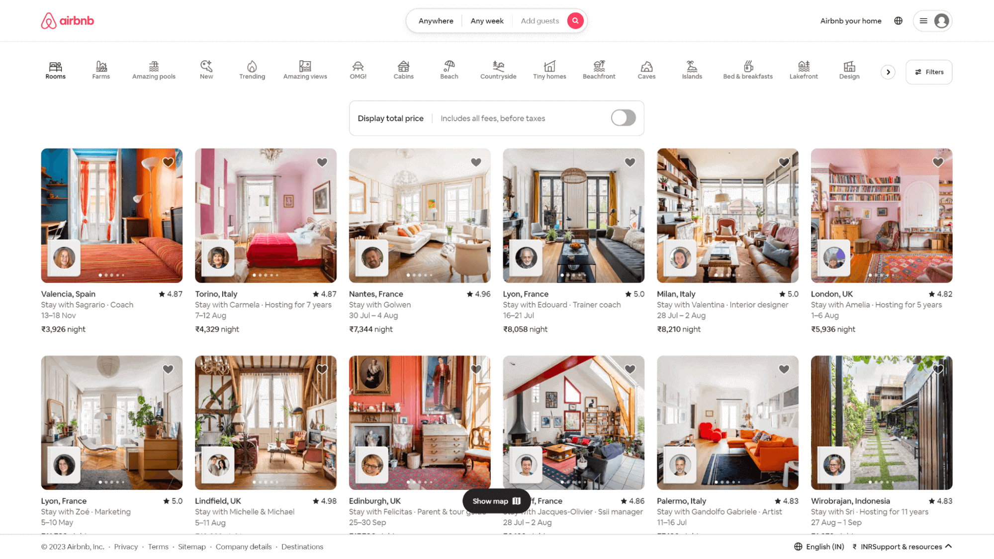
Airbnb, a popular online marketplace for vacation rentals and lodging, utilizes the 12 column CSS grid in its layout to organize property listings, search results, and filters, allowing users to navigate and explore available accommodations easily.
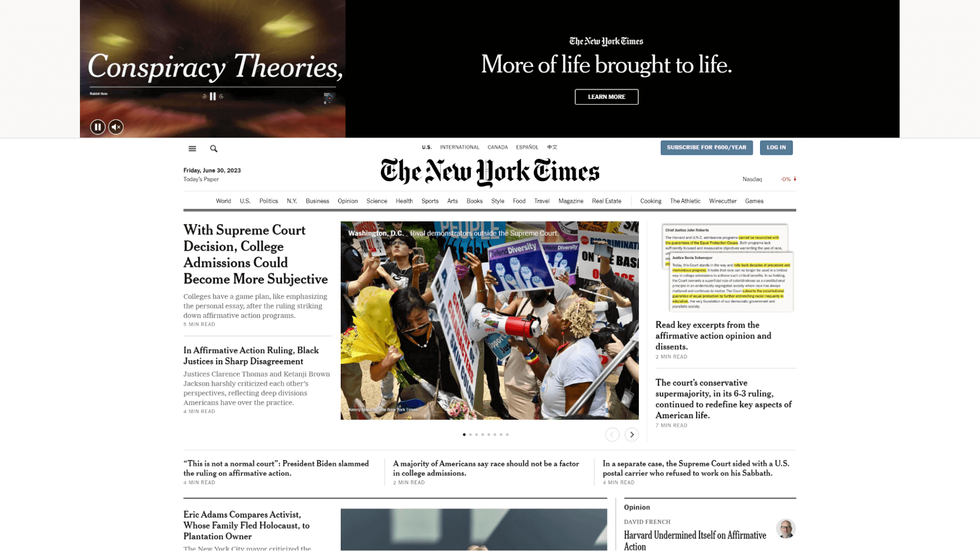
The New York Times, a prominent news organization, uses the 12 column CSS grid system to arrange its articles, advertisements, and various sections, ensuring a cohesive and responsive design.
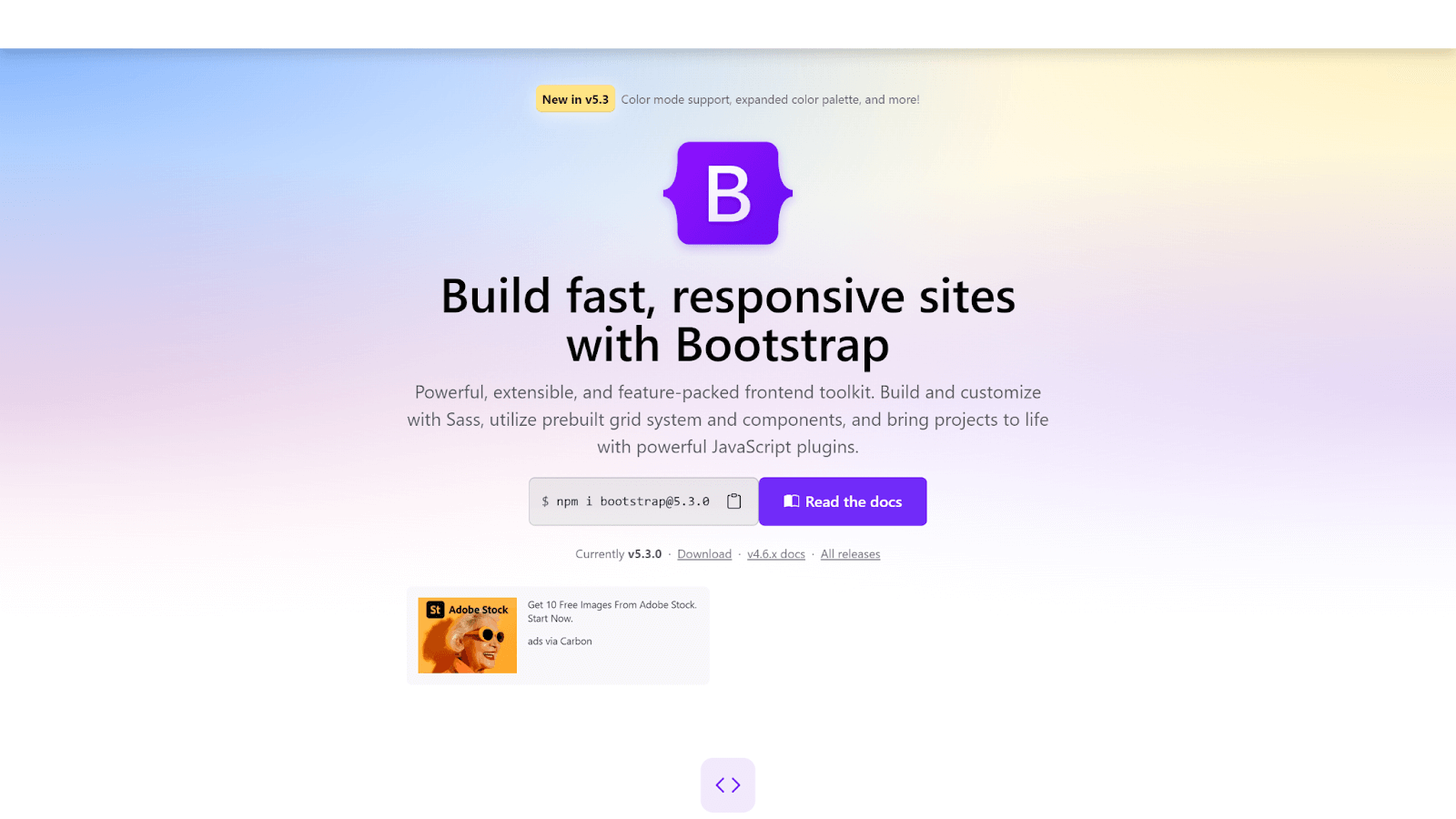
Bootstrap, a widely popular front-end framework, employs the 12 column CSS grid system to create responsive and flexible website designs.
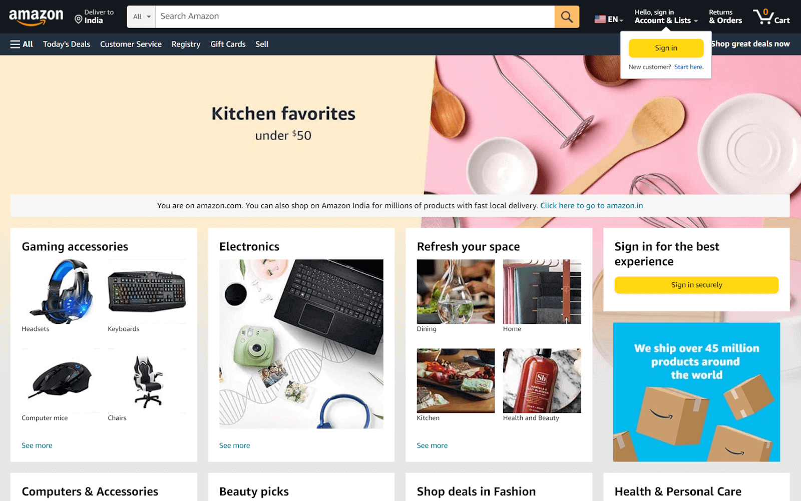
Amazon, one of the largest eCommerce platforms globally, incorporates the 12 column CSS grid layout to organize its products.
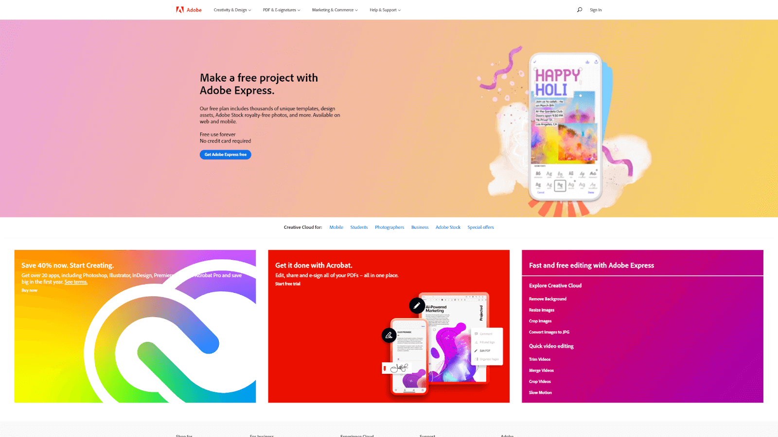
Adobe, a leading organization known for its creative tools, utilizes the 12 column CSS grid on its website to provide a clear and structured presentation of its various products, tutorials, and resources.
 Note
NoteTest your 12 column CSS grid across 3000+ real environments. Try LambdaTest Today!
Browser Compatibility of CSS Grid Layout
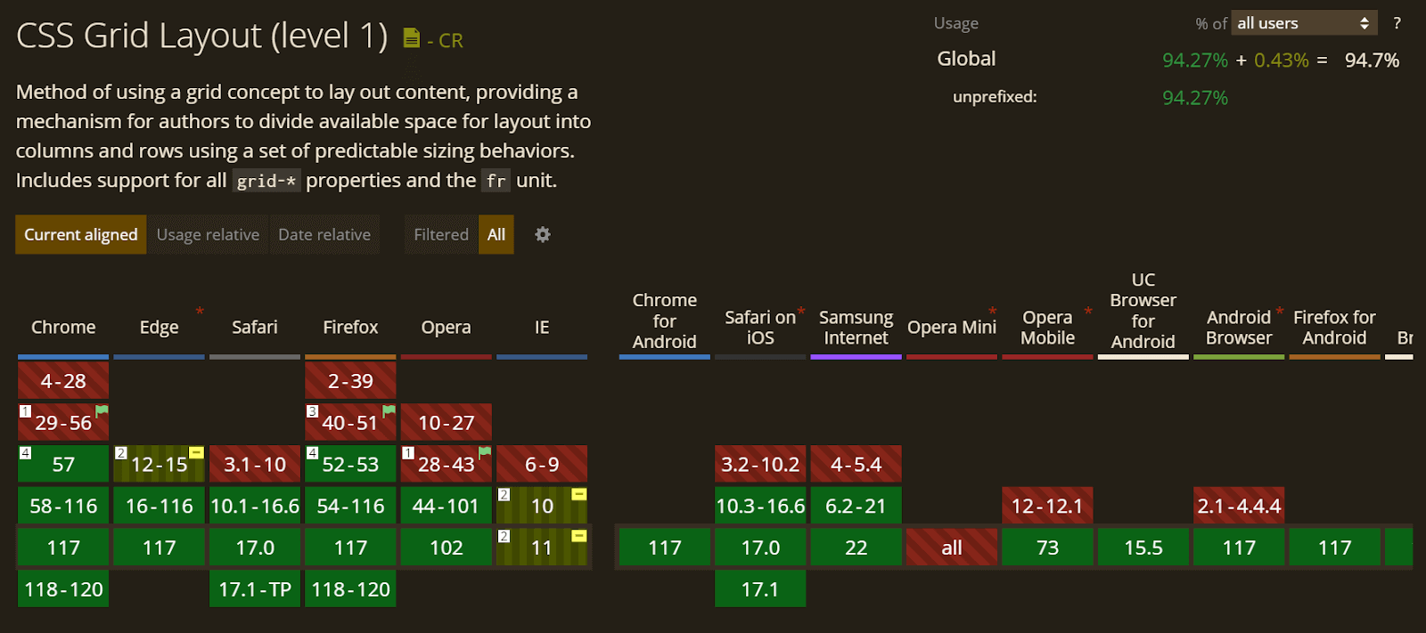
We know that browser compatibility is an important aspect of web development. Every property we use to develop a website should be tested to ensure compatibility across browsers.
When it comes to CSS Grid, most major browsers have support for CSS Grid. Chrome offers full support starting from version 57, Firefox from version 52, Safari from version 10.1, and Edge from version 16.
The below visualization provides a detailed overview of the support for CSS Grid:
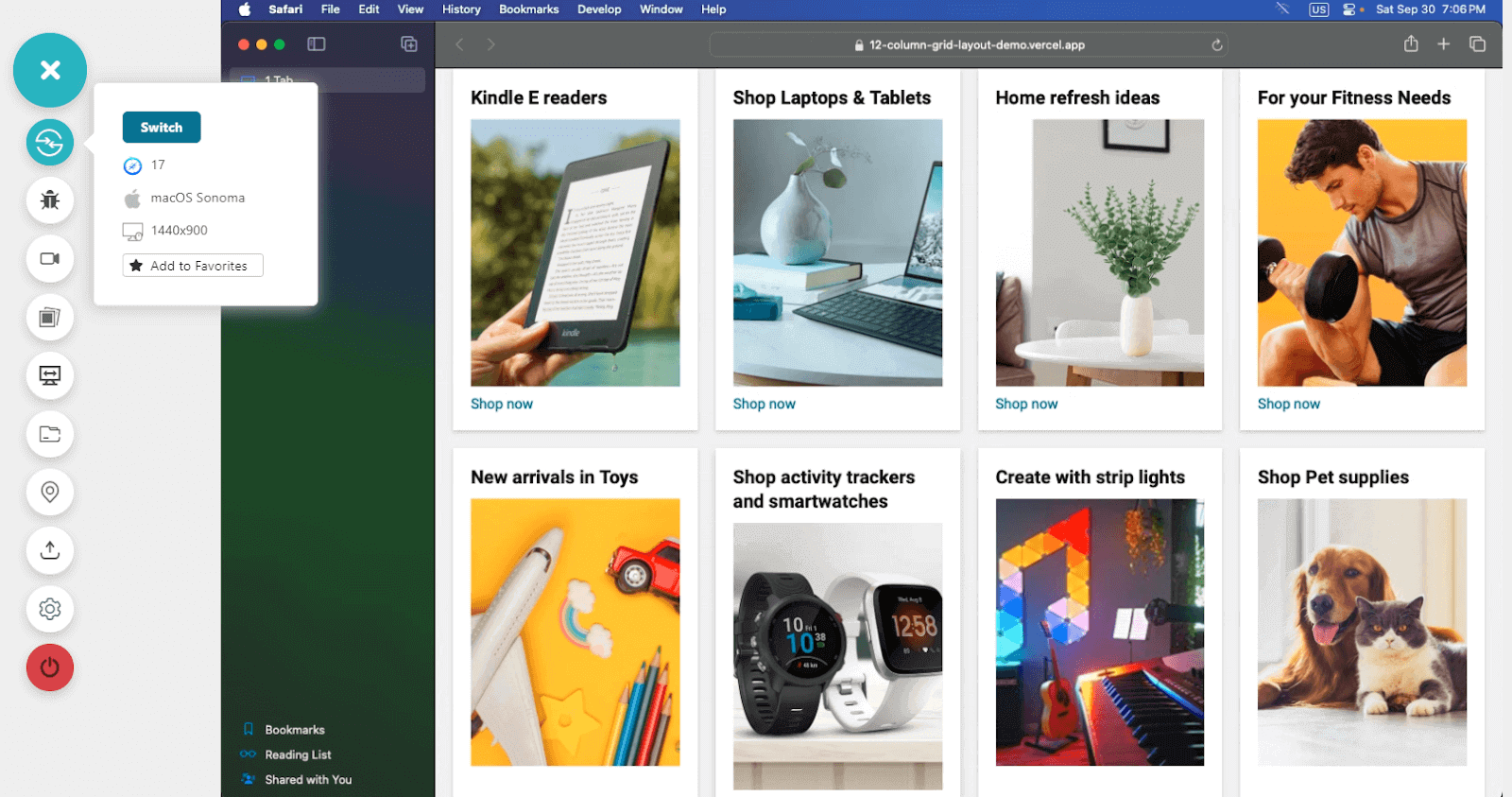
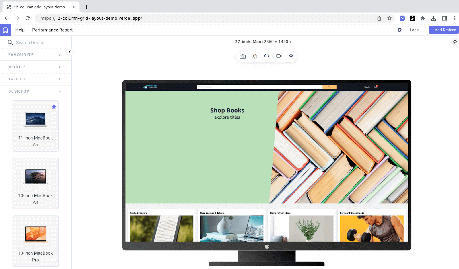
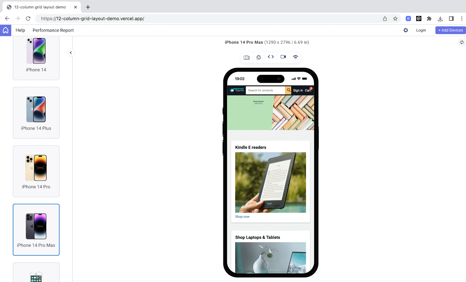
Once you create a 12 column CSS grid, you can test its browser compatibility across different browsers, browser versions, devices, and platforms. For this, you can leverage cloud testing platforms like LambdaTest.
LambdaTest is an AI-powered test orchestration and execution platform that allows you to perform browser testing of your 12 column CSS grid for compatibility on an online browser farm of 3000+ browsers, devices, and OS combinations.
Here is a sample screenshot of a browser compatibility test done on macOS Sonoma running Safari 17.
Quick Recap: Basics of CSS Grid
To understand how to create a 12 column CSS grid, we first need a basic understanding of CSS Grid fundamentals.
In this section, let’s do a quick recap of the fundamentals of CSS Grid. This will provide a solid foundation for building the 12 column CSS grid layout you will learn in this blog.
Additionally, if you want to master CSS Grid and learn it in detail, I recommend checking out this comprehensive guide on CSS Grid.
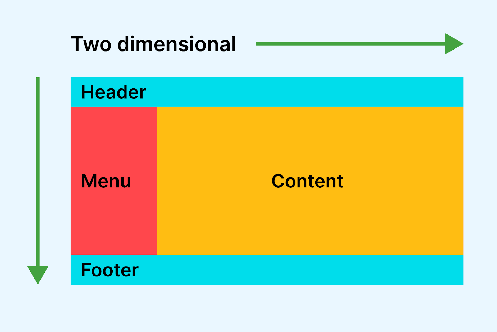
CSS Grid is a grid-based layout system that allows us to create two-dimensional layouts on the web. It utilizes rows and columns for controlling the layout. This two-dimensional structure of the grid enables us to have precise control over the placement and alignment of elements.
The specification for CSS Grid introduced several new terminologies that are important to understand to work with grid-based layouts. Let’s take a look at them:
Grid Container
A grid container is an HTML element used to create a grid layout. It establishes a grid formatting context and allows you to organize child elements into a grid structure. It serves as the parent element that contains the grid items.
To create a grid container, you can use the display property with the value grid or inline-grid. Here’s an example of creating a basic grid container:
|
1 2 3 |
.grid-container { display: grid; } |
Grid Item
Grid items refer to the individual elements that are direct children of a grid container. They are the building blocks of the grid structure and are positioned within the horizontal (grid columns) and vertical (grid rows) tracks defined by the grid container.
By default, a container has one grid item for each grid cell. However, using various grid properties, you can control the number of cells a grid item occupies.
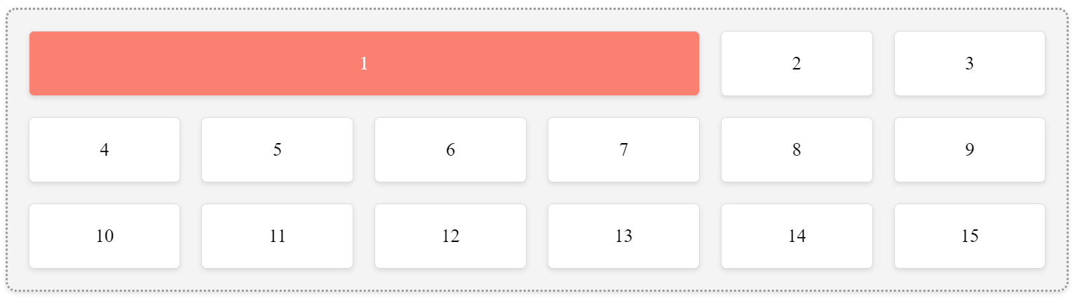
Below is an example of a grid container with 15 grid items where item one spans four columns:
HTML:
|
1 2 3 4 5 6 7 8 9 10 11 12 13 14 15 16 17 |
<div class="grid-container"> <div class="first-grid-item">1</div> <div>2</div> <div>3</div> <div>4</div> <div>5</div> <div>6</div> <div>7</div> <div>8</div> <div>9</div> <div>10</div> <div>11</div> <div>12</div> <div>13</div> <div>14</div> <div>15</div> </div> |
CSS:
|
1 2 3 4 5 6 7 8 9 10 11 12 13 14 15 16 17 18 19 20 21 22 23 24 25 26 27 28 29 |
.grid-container { background-color: #f4f4f4; padding: 20px; display: grid; grid-gap: 20px; grid-template-columns: repeat(6, 1fr); width: 80%; margin: 0 auto; border: 2px dotted #999; box-sizing: border-box; border-radius: 10px; box-shadow: 0 2px 4px rgba(0, 0, 0, 0.1); } .first-grid-item { background-color: salmon !important; grid-column: 1 / 5; color: white; } .grid-container > div { background-color: #ffffff; padding: 20px; text-align: center; font-size: 18px; border: 1px solid #dddddd; border-radius: 5px; box-shadow: 0 2px 4px rgba(0, 0, 0, 0.1); } |
See the Pen
grid-items-demo by Tahera Alam (@alam_tahera)
on CodePen.
Grid Lines
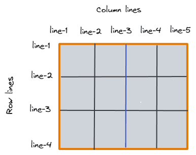
Grid lines are the dividing horizontal and vertical lines created when we define the grid. They are used to position elements within the grid.
The lines in the grid are numbered starting from 1 at the start edge of the grid. The numbering follows the writing style and direction of the document or component. This means that in a left-to-right language like English, column line 1 will be on the left side, while in a right-to-left language like Arabic, it will be on the right.
There are two types of grid lines: column lines and row lines. The lines between columns are called column lines, and the lines between rows are called row lines.
Grid Tracks
Grid tracks define the columns and rows in a grid container. Each row track represents the space between two row lines, and similarly, each column track represents the space between two column lines.
These tracks are made by giving them a size when we create our grid. Here’s how we can create grid tracks:
HTML:
|
1 2 3 4 5 6 7 8 9 10 11 12 13 14 15 16 17 18 19 20 21 22 23 24 25 26 27 28 29 30 31 32 33 34 |
<div class="grid-container"> <div class="grid-item"> <h3>Testimonial by Ben Pritchard</h3> <p> Super top notch customer support from @lambdatesting - just throwing it out there if you're looking for a decent browser testing platform, they get my full double thumbs up. Thumbs upThumbs up :-) </p> </div> <div class="grid-item"> <h3>Testimonial by Faisal Khatri</h3> <p> Thank you LambdaTest for providing free open source license to run the web and mobile tests of our open source projects for free on Lambdatest platform. </p> </div> <div class="grid-item"> <h3>Testimonial by Michael Horne</h3> <p> Really superb customer service from Arpit @lambdatesting tricky Automation problem using Selenium in Python and they talked me through it and got me up-and-running. Awesome. :-) </p> </div> <div class="grid-item"> <h3>Testimonial by Mat Gargano</h3> <p> LambdaTest is fantastic. Cross browser and device testing frustration is minimized. You can't get rid of clients that need ie11 nor can you own every device but LambdaTest bridges that gap. </p> </div> </div> |
CSS:
|
1 2 3 4 5 6 7 8 9 10 11 12 13 14 15 16 17 18 19 20 21 22 23 24 25 26 27 28 29 30 31 32 |
body { background-color: #222; font-family: Arial, sans-serif; } .grid-container { display: grid; grid-template-columns: 1fr 1fr 1fr; /* Creates three equal columns */ grid-template-rows: 200px 300px; /* First row 200 pixels, second row 300 pixels */ gap: 10px; /* Gap of 10 pixels between grid items */ } .grid-item { background-color: #333; border-radius: 5px; padding: 20px; color: #fff; } .grid-item h3 { margin-top: 0; font-size: 18px; } .grid-item p { margin-bottom: 0; font-size: 14px; } |
See the Pen
grid-tracks-demo by Tahera Alam (@alam_tahera)
on CodePen.
In this example, we have a grid container with three columns and two rows. We use grid-template-columns and grid-template-rows properties to specify the size and number of rows and columns of the grid.
These properties can be set to a length value, a percentage value, or a fr value. The fr value is a special value representing a fraction of the available space in the grid.
In our example, the grid-template-columns property sets the width of each column using the 1fr unit, which divides the available space equally among the columns. Similarly, the grid-template-rows property specifies the height of the rows, with the first row being 200px and the second row being 300px.
The .grid-item class represents the individual items within the grid. In this example, we have four grid items, each having a background color of #333 and some basic styles defined.
In addition to specifying track sizes individually, the CSS Grid layout module provides a convenient way to repeat track patterns using the repeat function. The repeat function allows us to define a repeated pattern for grid tracks in a shorter syntax.
In the above grid layout, instead of specifying three equal columns using 1fr 1fr 1fr, we can use repeat(3, 1fr). This will repeat the 1fr value three times, resulting in the same effect of three equal columns.
|
1 2 3 4 |
.grid-container { display: grid; grid-template-columns: repeat(3, 1fr); } |
Grid Area
A grid area is a named region in a grid layout. The grid-area property assigns grid items to named grid areas within the grid container. By defining named grid areas, we can easily position and place grid items in specific grid areas.
Let’s look at an example:
HTML:
|
1 2 3 4 5 6 7 |
<div class="container"> <header>Header</header> <main>main</main> <nav>nav</nav> <aside>aside</aside> <footer>footer</footer> </div> |
CSS:
|
1 2 3 4 5 6 7 8 9 10 11 12 13 14 15 16 17 18 19 20 21 22 23 24 25 26 27 28 29 30 31 32 33 34 35 36 37 38 39 40 |
* { box-sizing: border-box; margin: 0; padding: 0; } header { grid-area: header; } nav { grid-area: nav; } main { grid-area: main; } aside { grid-area: sidebar; } footer { grid-area: footer; } header, footer, main, aside, nav { background-color: #3a86ff; color: #fff; border: 1px solid #fff; padding: 20px; } .container { display: grid; grid-template-areas: "header header header" "nav main sidebar" "nav footer footer"; grid-template-columns: 1fr 3fr 1fr; grid-template-rows: 70px 2fr 50px; height: 100vh; } |
See the Pen
grid area demo by Tahera Alam (@alam_tahera)
on CodePen.
In this example, we have a grid container with three columns and three rows. We use the grid-area property to assign specific grid areas to the grid items. The grid-template-areas property defines a named grid area layout, where each row represents a grid line, and each area name is enclosed in quotation marks.
The area names defined in grid-template-areas match the grid-area values assigned to the elements. This association automatically allows the elements to occupy designated areas within the grid layout.
Grid Cell
A grid cell is the smallest unit within the grid layout, representing a space bordered by two neighboring rows and two neighboring column grid lines. If you create a grid but don’t place any items in it, each grid cell will automatically be filled with one item.
Gaps
Gaps refer to the space between grid items. They can be easily controlled using the grid-gap property, which allows us to define the gap size between rows and columns in a grid. (Note that this property was renamed “gap” in CSS3).
New to CSS3? Check out this complete CSS3 tutorial.
The grid-gap property serves as a shorthand for the grid-row-gap and grid-column-gap properties. The grid-row-gap property is responsible for controlling the size of the gap between rows, while the grid-column-gap property controls the size of the gap between columns.
Note that the grid-row-gap and grid-column-gap properties were renamed to row-gap and column-gap respectively.
|
1 2 3 |
.container { row-gap: 20px; /* sets the gap between rows*/ } |
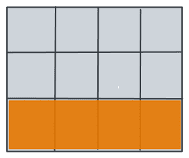
Below is a visualization of a 20-pixel row gap in a grid layout:
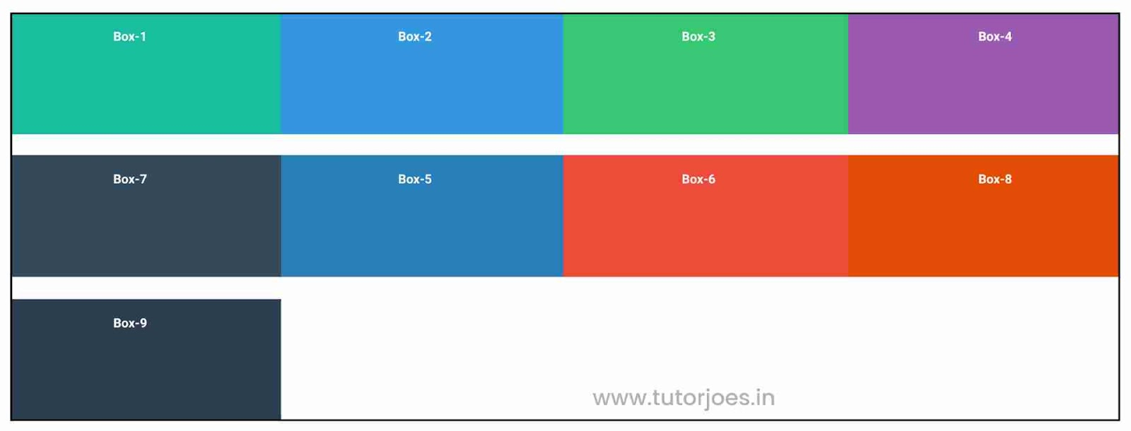
|
1 2 3 |
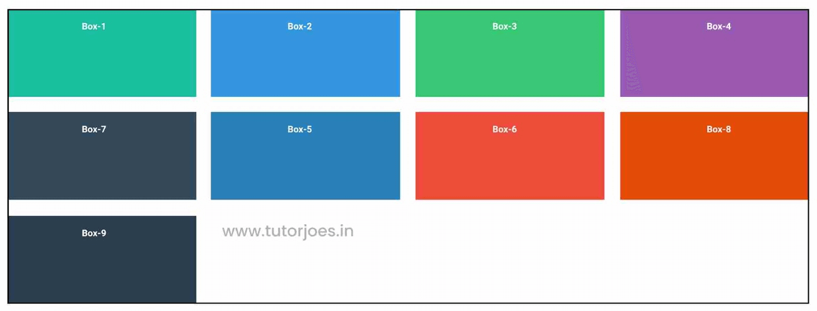
.container { gap: 20px; /* sets both row gap and columns gap*/ } |
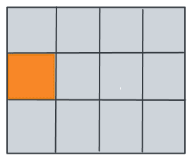
Here’s another visualization with a 20-pixel gap between both rows and columns:
How to Create a 12 Column Grid With CSS
In the previous sections, we explored the concept of a 12 column CSS grid, its significance, and the essential considerations before getting started. We also looked at its browser compatibility and saw examples of popular websites that use it in their layouts.
In this section, let’s dive into the practical implementation steps and create the 12 column CSS grid.
To demonstrate this, we will create a web page with a header, a product page, and a featured product section. We will also make it responsive to ensure it renders seamlessly across various devices and screen sizes.
One of the key considerations for responsiveness is the effective use of CSS media queries. Media queries allow us to define specific CSS rules that will be triggered when certain screen widths are met.
In our implementation, we will define CSS breakpoints at various screen widths to address common device categories like mobile phones, tablets, and desktops. By adjusting our CSS rules within these breakpoints, we can optimize the layout for each device category.
But before we proceed, here’s a sneak peek of our webpage:
We will create a 12 column CSS grid clone of a popular eCommerce website. The website is implemented keeping responsiveness and cross-browser & cross-platform compatibility in mind.
Here are some of the renders captured on different view-port sizes using LT Browser.
Desktop view:
Mobile view:
In case you want to get your hands dirty by experimenting with the responsive eCommerce website, feel free to download the source code.

Demo: Creating a 12 Column CSS Grid
Now, let’s move on to setting up the HTML structure for our webpage. The HTML structure serves as the foundation for our layout and content. It provides the necessary elements and tags that will define the structure and organization of our page.
Our page will have a header, a section containing some products, followed by a section with a featured product. (Please note that in this context, by the term “section,” we refer to a general area of content rather than the specific HTML < section > element.)
See the Pen
12-column css grid demo by Tahera Alam (@alam_tahera)
on CodePen.
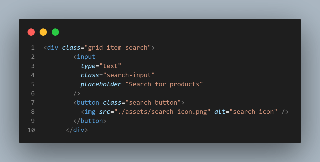
First, we have a header that contains the logo, search input, and some nav links, including a cart.
|
1 2 3 4 5 6 7 8 9 10 11 12 13 14 15 16 17 18 19 20 21 22 23 24 25 26 |
<header> <div class="grid-item-brand"> <a href="#" class="logo"> <img src="./assets/logo.svg" alt="LambdaTest" /> </a> </div> <div class="grid-item-search"> <input type="text" class="search-input" placeholder="Search for products" /> <button class="search-button"> <img src="./assets/search-icon.png" alt="search-icon" /> </button> </div> <div class="grid-item-account"> <a href="#" class="nav-link">Sign in</a> <a href="#" class="nav-link cart-link"> Cart <span class="cart-count">0</span> </a> </div> </header> |
In the above HTML, we divided our header items into three sections. The first section is the logo, the second section is the search-related elements, and the third is account-related elements like sign-in and the cart.
So, in CSS, when we make the header element a grid, each section will be a grid item because they are direct children of the header. We can then style our grid items to occupy the desired space.
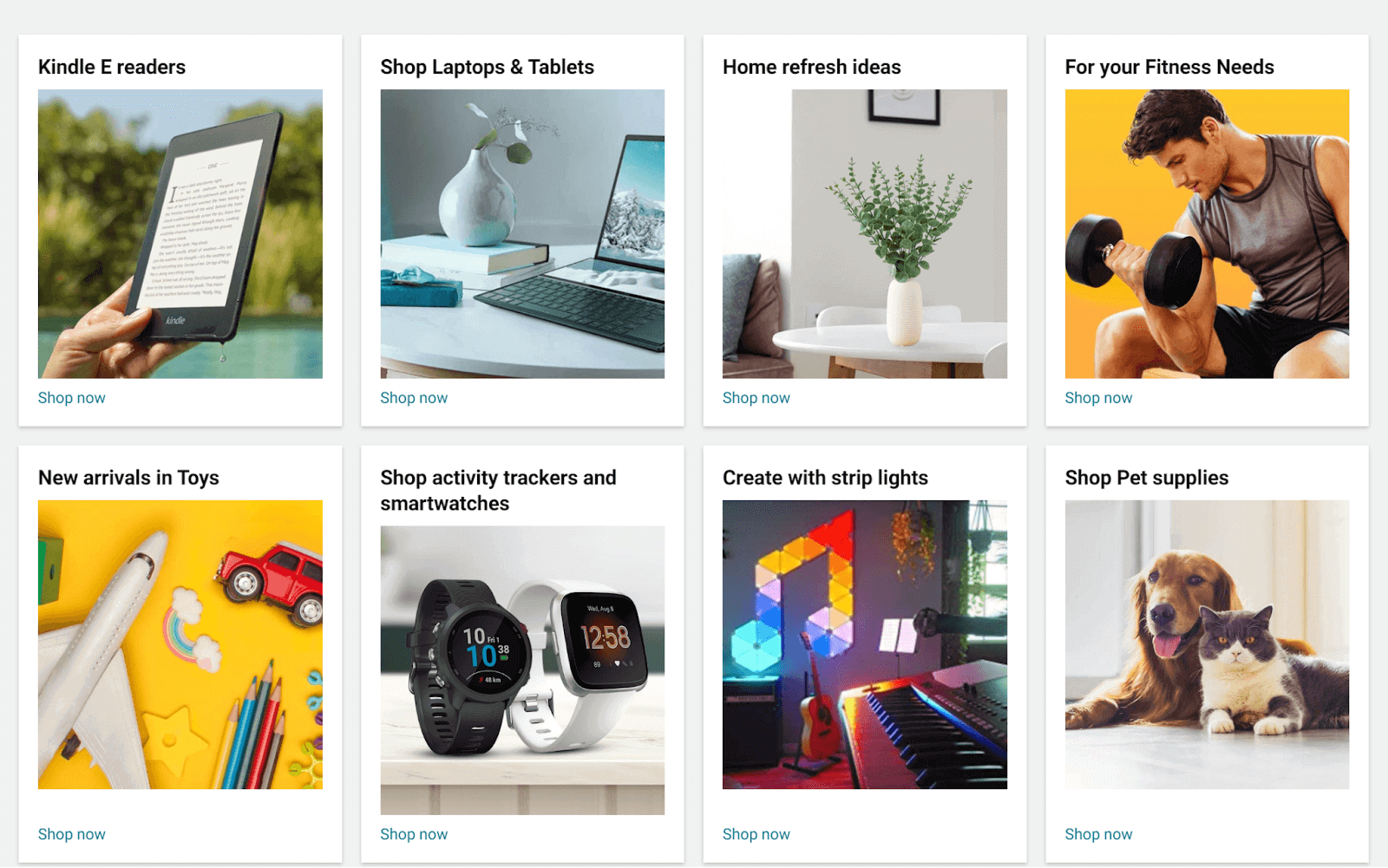
After the header element, we have our main element, which contains a theme image, a section on the products, and a section on the featured product. Let’s first look at the products section structure:
|
1 2 3 4 5 6 7 8 9 10 11 12 13 14 15 16 17 18 19 20 21 22 23 24 25 26 27 28 29 30 31 32 33 34 35 36 37 38 39 40 41 42 43 44 45 46 47 |
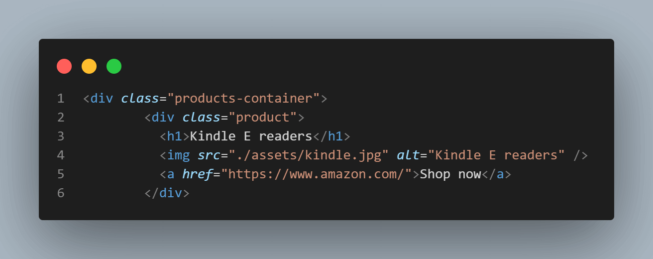
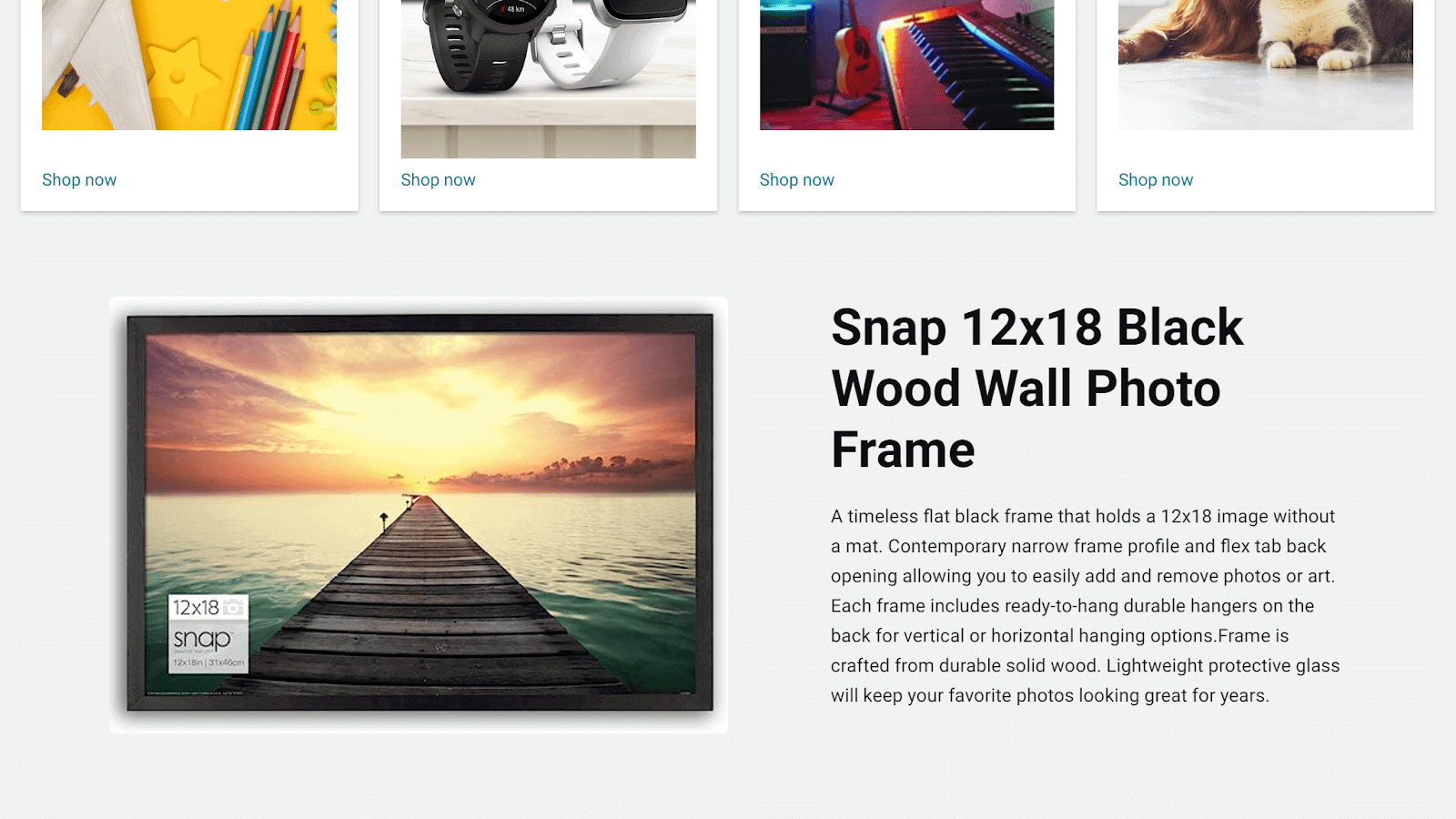
<main> <img class="theme-image" src="./assets/theme-img.jpg" alt="Theme Image" /> <div class="products-container"> <div class="product"> <h1>Kindle E readers</h1> <img src="./assets/kindle.jpg" alt="Kindle E readers" /> <a href="https://www.amazon.com/">Shop now</a> </div> <div class="product"> <h1>Shop Laptops & Tablets</h1> <img src="./assets/laptops.jpg" alt="Shop Laptops & Tablets" /> <a href="https://www.amazon.com/">Shop now</a> </div> <div class="product"> <h1>Home refresh ideas</h1> <img src="./assets/homeRefreshIdeas.jpg" alt="Home refresh ideas" /> <a href="https://www.amazon.com/">Shop now</a> </div> <div class="product"> <h1>For your Fitness Needs</h1> <img src="./assets/fitness.jpg" alt="For your Fitness Needs" /> <a href="https://www.amazon.com/">Shop now</a> </div> <div class="product"> <h1>New arrivals in Toys</h1> <img src="./assets/toys.jpg" alt="New arrivals in Toys" /> <a href="https://www.amazon.com/">Shop now</a> </div> <div class="product"> <h1>Shop activity trackers and smartwatches</h1> <img src="./assets/smartwatch.jpg" alt="Shop activity trackers and smartwatches" /> <a href="https://www.amazon.com/">Shop now</a> </div> <div class="product"> <h1>Create with strip lights</h1> <img src="./assets/light.jpg" alt="Create with strip lights" /> <a href="https://www.amazon.com/">Shop now</a> </div> <div class="product"> <h1>Shop Pet supplies</h1> <img src="./assets/pets.jpg" alt="Shop Pet supplies" /> <a href="https://www.amazon.com/">Shop now</a> </div> </div> |
In the above HTML, we have a main element, and within that element, we have a theme image and a products section with the class .products-container, which lists all our products.
Inside that container, we have 8 products with the class .product. Each product has an h1, an image, and an anchor tag. That’s it about our products section.
Let’s look at the second section of the main element, which has our featured product.
|
1 2 3 4 5 6 7 8 9 10 11 12 13 14 15 16 |
<div class="featured-section"> <img src="./assets/featured-product.jpg" alt="featured-product" /> <div class="banner-text"> <h1>Snap 12x18 Black Wood Wall Photo Frame</h1> <p> A timeless flat black frame that holds a 12x18 image without a mat. Contemporary narrow frame profile and flex tab back opening allowing you to easily add and remove photos or art. Each frame includes ready-to-hang durable hangers on the back for vertical or horizontal hanging options.Frame is crafted from durable solid wood. Lightweight protective glass will keep your favorite photos looking great for years. </p> </div> </div> </main> |
In the above HTML, we have a parent div with the class .featured-section. Inside that section, we have an image followed by a div element with the class .banner-text that introduces the product. Finally, we close our main tag that started from the products section.
Now that we have our HTML structure in place, let’s move to the fun part of building the 12 column CSS grid layout to style our page.
Building the 12 Column Grid Layout
Before we proceed to write any style, let’s first reset the browser defaults using the below lines:
|
1 2 3 4 5 |
* { margin: 0; padding: 0; box-sizing: border-box; } |
This will set the margin to , 0 padding to 0, and box-sizing to border-box on every element of the page.
Next, we will enhance the body element by adding a background color, font color, and font style to it:
|
1 2 3 4 5 |
body { background-color: #f0f2f2; color: #0f1111; font-family: "Roboto", sans-serif; } |
Header: 12 Column CSS Grid
Now, let’s begin with our actual layout. The first section of our layout is the header.

In the header, we have 3 main sections. First is the logo, second is the search element, and third is the account-related elements. Notice how the search input is centered, taking the most space.
To achieve this layout, we will make the header element a 12 columns CSS grid and then divide these columns between the 3 items accordingly to make them take up the needed space. Let’s look at the entire code first, and then we will break it down.
|
1 2 3 4 5 6 7 8 9 10 11 12 13 14 15 16 17 18 19 20 21 22 23 24 25 26 27 28 29 30 31 32 33 34 35 36 37 38 39 40 41 42 43 44 45 46 47 48 49 50 51 52 53 54 55 56 57 58 59 60 61 62 63 64 65 66 67 68 69 70 71 72 73 74 75 76 77 78 79 80 81 82 83 84 85 86 87 88 89 90 91 92 93 94 95 96 |
/* header styles */ header { display: grid; grid-template-columns: repeat(12, 1fr); grid-gap: 10px; align-items: center; background-color: #131921; color: #fff; padding: 10px; } /* Logo wrapper styles */ .grid-item-brand { grid-column: span 2; justify-self: center; } /* Logo img */ .logo img { height: 45px; } /* Search input wrapper styles */ .grid-item-search { display: flex; align-items: center; grid-column: 4 / span 6; } /* Search input styles */ .search-input { flex: 1; padding: 12px; font-size: 14px; outline: none !important; border: none; border-top-left-radius: 3px; border-top-right-radius: 3px; border-top-right-radius: 0; border-bottom-right-radius: 0; } /* Search button styles */ .search-button { background-color: #f8c06c; color: #fff; font-size: 14px; border: none; cursor: pointer; width: 10%; padding: 8.2px; outline: none !important; border-top-right-radius: 3px; border-bottom-right-radius: 3px; } .search-button img { width: 20px; object-fit: contain; } /* Account wrapper styles */ .grid-item-account { grid-column: span 3; justify-self: center; } /* Navigation link styles */ .nav-link { color: #fff; text-decoration: none; margin-right: 30px; font-size: 16px; } /* Cart link styles */ .cart-link { position: relative; } .cart-count { position: absolute; top: -8px; right: -8px; display: inline-block; background-color: #ff4444; color: #fff; border-radius: 50%; width: 16px; height: 16px; font-size: 12px; text-align: center; line-height: 16px; } |
Let’s break down the important parts of the code and understand how we are laying out the header elements using a 12 column CSS grid.
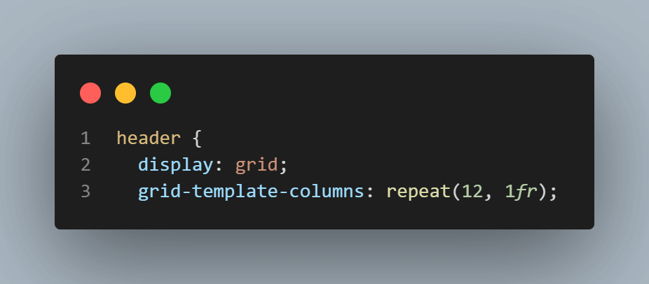
First, we set up the grid on the header element using the display: grid property. This makes the header a grid container. Next, we define the grid to be 12 columns using the grid-template-columns: repeat(12, 1fr) property. This creates 12 columns, each having an equal fraction of the available space (1fr means one fraction). So, the grid now gets divided into 12 equal-width columns.
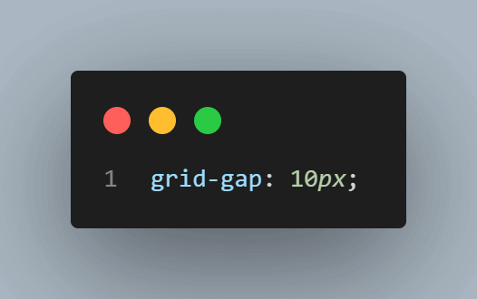
To create spacing between the grid items, we set the grid-gap property to 10px. This adds a 10-pixel gap between the grid items both horizontally and vertically. So, when you want to add space in grid items, you can use this property in the grid container.
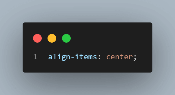
Next, we want to vertically align the items within the grid container. The align-items: center property ensures that the items are centered vertically.
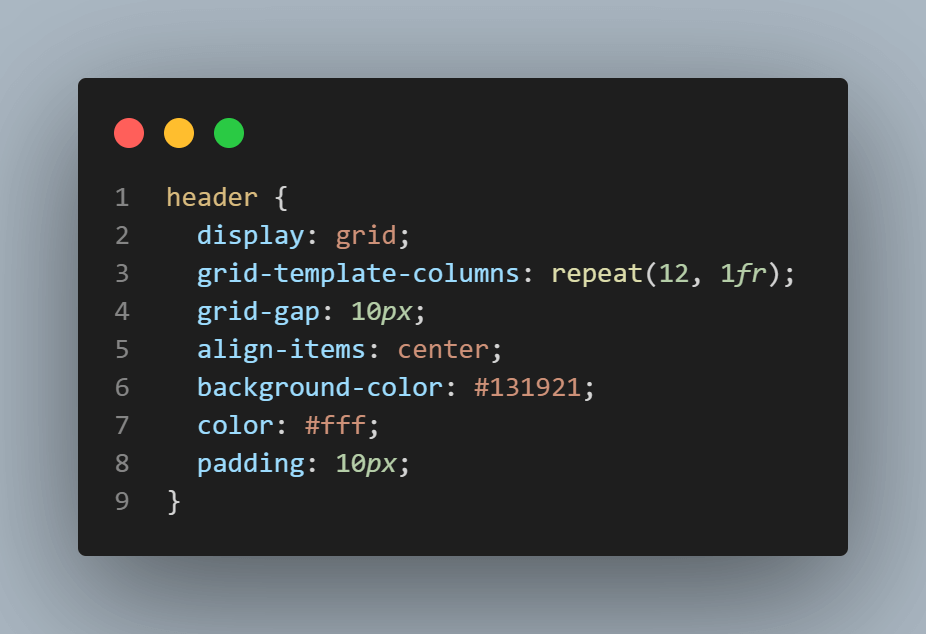
We also specify some visual styles for the header, such as setting the background-color to #131921 (a dark color) and the text color to #fff. Additionally, we add padding: 10px to create some space inside the header.
Moving on to the grid items within the header, the first item is the logo with the class .grid-item-brand.
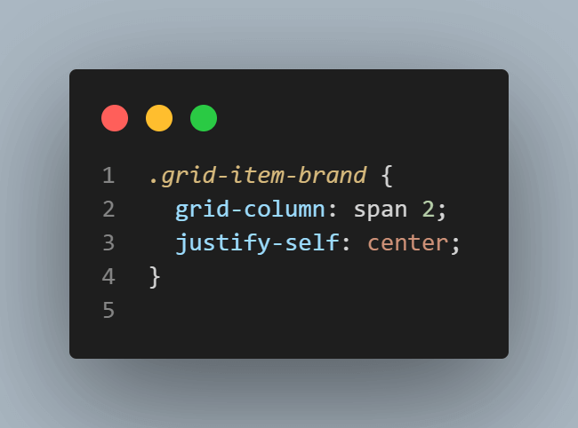
To add content in grid columns, you can use the grid-column property. In this case, we make the .grid-item-brand element span 2 columns using the grid-column: span 2 property. So, out of our 12 columns header, we allocate 2 columns to the logo.
To ensure the logo is visually centered within these two columns, we apply the justify-self: center property. This brings symmetry to the layout by aligning the logo horizontally.
The next item in the header is the search container with the class .grid-item-search. It has an input and a button element within it.
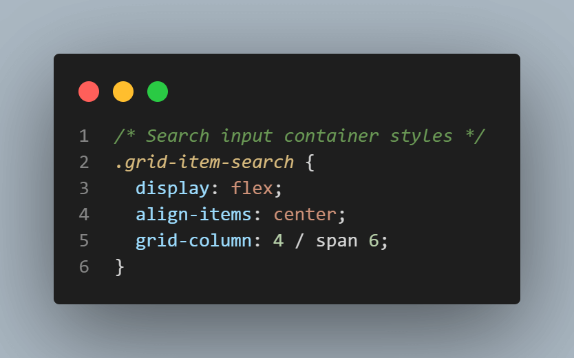
This container is set to span 6 columns starting from the 4th column using grid-column: 4 / span 6. If you are confused about what’s happening here, let’s break it down.
We know that our logo took 2 columns out of 12, so next, we skipped column 3 to have a space and then started the search container from column 4 and spanned it across 6 columns. That means the logo takes 2 columns, the search container takes 6 columns, and skipping 1 column adds up making 9 columns occupied. Now we have 3 columns left.
You may also have noticed the display: flex on the search container. This makes the container a flex container, allowing us to align its contents easily. We could have achieved the same using just the grid, but since combining both CSS Flexbox and grid in creating layouts is a common practice, it’s good to know where this might fit in.
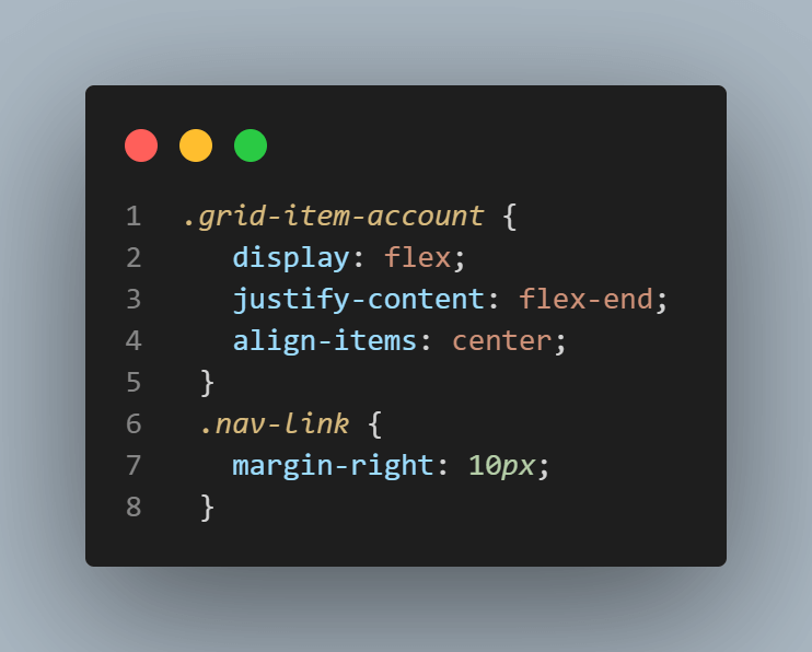
The last element in our grid is the grid item with the class .grid-item-account, which has two anchor tags inside it.
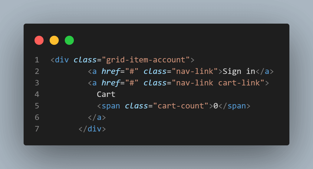
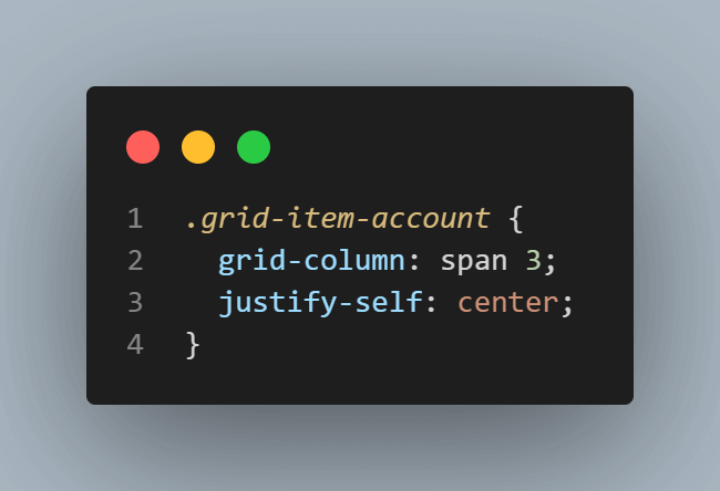
It spans 3 columns using grid-column: span 3; and is centered horizontally within the allocated columns using justify-self: center.
Main Container: Theme Image
Now that we are done with creating and styling the header layout. Let’s move on to the next element of the page, which is our main container. The main container has 3 sections. First is a theme image, second is the product container, and third is a featured product section.
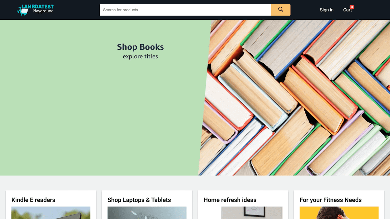
Let’s start by laying out the theme image.
|
1 2 3 |
main .theme-image { width: 100%; } |
In this case, we simply set the image’s width to 100%. Here, using a grid is unnecessary. One of the essential principles of writing CSS is to avoid unnecessary complexity. If a task can be accomplished without a grid, keeping the code concise and efficient is considered best practice.
Products: 12 Column CSS Grid
The next element in our main container is the products section. It has 4 cards in each row with a subtle gap between each of them.
Here is how we have created the layout:
|
1 2 3 4 5 6 7 8 9 10 11 12 13 14 15 16 17 18 19 20 21 22 23 24 25 26 27 28 29 30 31 32 33 34 35 36 37 38 39 40 41 42 43 44 45 46 47 48 49 50 51 |
.products-container { display: grid; grid-template-columns: repeat(4, 1fr); grid-gap: 20px; padding: 0 20px; margin: 3em 0; } .product { background-color: #fff; padding: 20px; box-shadow: 0 2px 4px rgba(0, 0, 0, 0.2); display: flex; flex-direction: column; transition: box-shadow 0.3s ease; } .product:hover { box-shadow: 0 4px 8px rgba(0, 0, 0, 0.2); } .product h1 { margin-bottom: 10px; font-size: 21px; line-height: 27.3px; } .product img { width: 100%; height: 300px; /* Set a fixed height of 300px for the images */ object-fit: cover; margin-bottom: 10px; } .product a { display: block; margin-top: auto; color: #007185; text-decoration: none; } .product a:hover { text-decoration: underline; color: #ff9900; } |
Let’s break down the code:
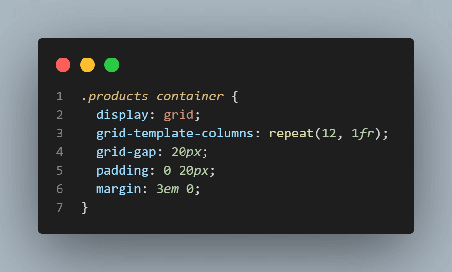
In the above snippet, we first set up the grid on the div element that has the class . products-container by using display:grid. This tells the browser to treat this container as a grid element.
Next, we define the columns of our grid using the grid-template-columns property. In this case, we use repeat(4, 1fr), which means we want four columns, each occupying an equal fraction of available space (1fr). This ensures that our grid can accommodate four product item cards in a single row. Each column will dynamically adjust its width to evenly distribute the available space.
Then, we add some spacing between grid items using the grid-gap property. By setting it to 20px, we create a gap of 20 pixels between each grid item.
Moving on, we have div elements with the class .product, representing each item within the products container grid. This class is responsible for styling individual product elements within the layout.
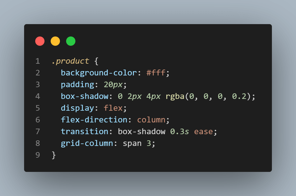
Firstly, we set the background color of each product element to white (#fff) and apply a padding of 20px to create some space inside the element. To give the elements a subtle shadow effect, we use the box-shadow property with specific values.
Next, we utilize flexbox properties to control the layout of the product elements. By setting the display to flex and flex-direction to column, we ensure that the content within each product is arranged vertically.
Finally, we set the grid-column property with the value span 3, which indicates that each product element will occupy three columns of the 12 column grid container. This means that we will have a total of four products placed horizontally in each row of our grid layout.
Within each product, we have an h1 element for the title, an image element for the product image, and an anchor element for the link. To ensure a harmonious design, we apply some basic styles to these elements. For instance, the h1 element receives a margin-bottom of 10px, a font size of 21px, and a line height of 27.3px.
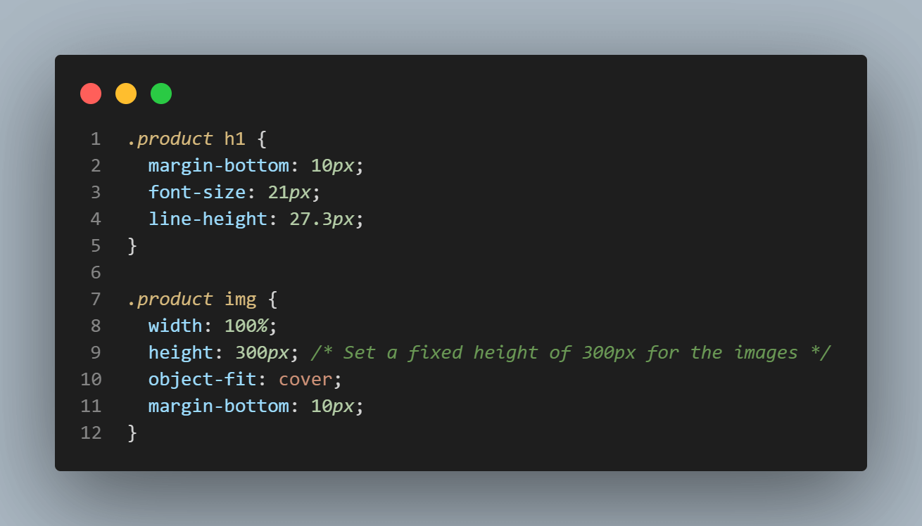
Similarly, we set the img element to occupy the full width of its container using width: 100% while maintaining a fixed height of 300px. The object-fit property is applied with the value of “cover” to ensure the image retains its aspect ratio and fits neatly within the allocated space. Additionally, we add a bottom margin of 10px to provide a subtle spacing between the image and the anchor element.
Next, we style the anchor tags by setting a color, removing the text decoration, and adding the margin-top: auto. Note that this margin top is crucial in positioning the links within each product card. It ensures that the links are consistently aligned at the bottom of each card, regardless of the content inside.
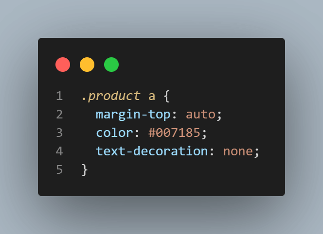
Without this property, the links would be positioned in different vertical locations within each card, resulting in an uneven layout.
With these styles in place, we are done creating and styling the layout for the second section of our main container.
Featured Products: 12 Column CSS Grid
Now, we can move on to the last and final part which is designing the featured products section. This section is relatively straightforward, so let’s dive right in.
We have the product image on the left and some text on the right. Below is our CSS to achieve this:
|
1 2 3 4 5 6 7 8 9 10 11 12 13 14 15 16 17 18 19 20 21 22 23 24 25 26 27 28 29 |
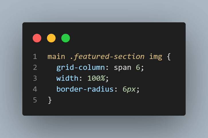
main .featured-section { display: grid; grid-template-columns: repeat(12, 1fr); max-width: 1200px; margin: 60px auto; padding: 20px; } main .featured-section img { grid-column: span 6; width: 100%; border-radius: 6px; } main .featured-section .banner-text { grid-column: 8 / span 5; } main .featured-section .banner-text h1 { margin-bottom: 20px; font-size: 3rem; } main .featured-section .banner-text p { line-height: 28px; font-size: 1.1rem; } |
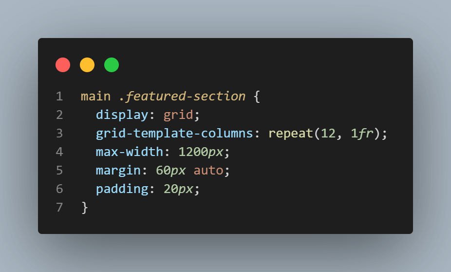
To begin with, we establish a grid container on the .featured-section class element. Then, we define the columns of the grid by setting the grid-template-columns: repeat(12, 1fr) property. This creates 12 equally sized columns using the repeat() function.
Next, to control the overall width of the featured section, we set the max-width to 1200px. This limits the container width to 1200 pixels. Then we set the margin: 60px auto, which centers the section horizontally within its container, creating some space around it. Additionally, we apply a padding of 20px to add some space between the content and the edges of the section.
The featured section contains an image that occupies half of the container’s width. To achieve this visually, we assigned the image to span six columns using grid-column: span 6. By doing so, the image effectively takes up 50% of the available space within the 12 column grid.
Next to the image, we have the banner text represented by the class .banner-text. To position it correctly, we skip column 7 and allocate five columns starting from the eighth column of the grid. This ensures the banner text occupies columns 8 to 12, using the available space.
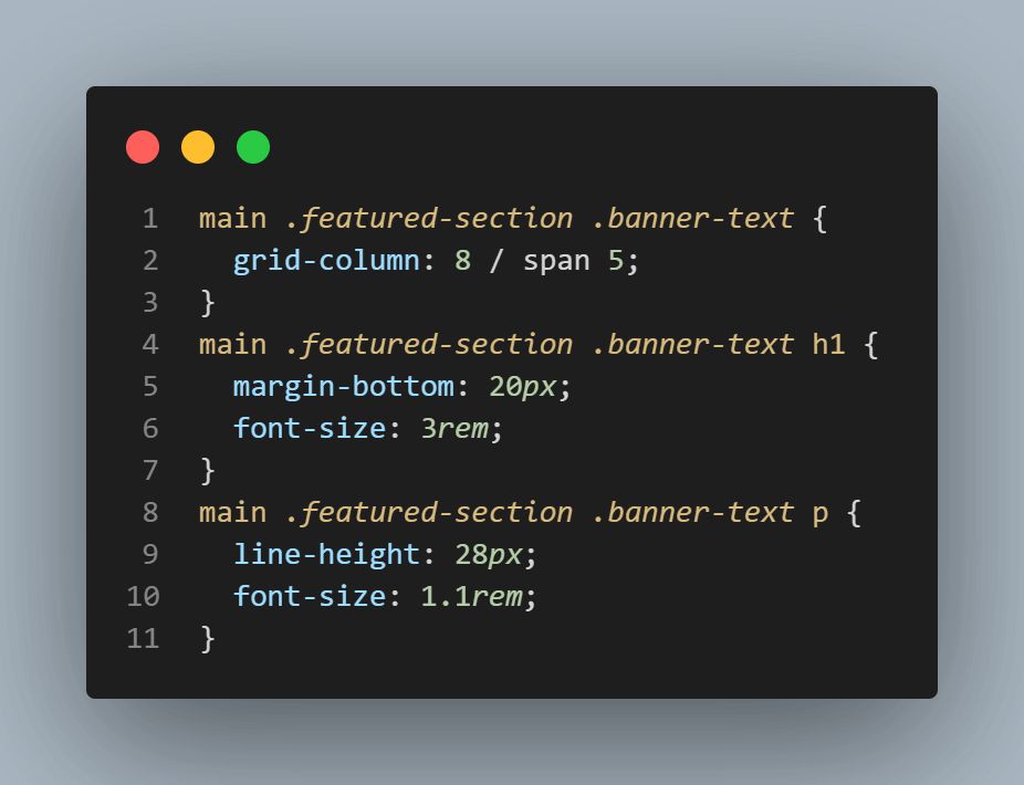
Lastly, we provide some basic styles to the h1 and the p tag of the .banner-text element to enhance their appearance.
With the completion of this section, we have successfully built and styled the 12 column CSS grid layout for our web page.
However, we must address an important aspect that’s currently missing. Its responsiveness! Right now, our layout is not optimized for smaller screens, resulting in a not-so-seamless experience.
So, in the next section, we will dive right into making web pages responsive. The best part? It’s remarkably simple! By implementing a few changes, we’ll ensure our web page looks seamless on every device.
NoteTest your 12 column CSS grid on a real device cloud. Try LambdaTest Today!
Responsiveness in 12 Column CSS Grid
In this section, we focus on making the layout more adaptable in smaller screen sizes. To achieve this, we will utilize media queries, which allow us to apply specific styles based on the screen width.
Realizing Responsive Header
Let’s begin with the header.
|
1 2 3 4 5 6 7 8 9 10 11 12 13 14 15 16 17 18 19 20 21 22 23 24 25 26 27 28 |
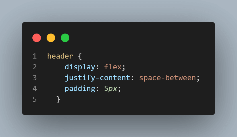
@media screen and (max-width: 868px) { header { display: flex; padding: 5px; justify-content: space-between; } .logo img { height: 25px; } .grid-item-search { flex: 1; align-items: end; } .search-input { width: 100%; } .search-button { width: 30px; } .grid-item-account { display: flex; justify-content: flex-end; align-items: center; } .nav-link { margin-right: 10px; } } |
In the above code snippet, we use a media query to target screens with a maximum width of 868 pixels or less. Within this media query, we made a few changes to enhance the layout of the header to make it more adaptable on smaller screens.
Firstly, we reduced the padding of the header to 5 pixels. This adjustment helps in conserving space and creates a more compact appearance.
Secondly, we switched from a grid layout to a flexbox by setting the header’s display property to flex. By doing so, the header items are aligned in a row, allowing them to better fit within the limited space.
To ensure optimal positioning of the items, we set justify-content: space-between. This aligns the items at the beginning and end of the header, creating space between them and effectively placing them on opposite sides.
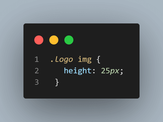
Next, we’ll decrease the logo image height from 45px to 25px and apply some simple styles to the search container to ensure it occupies less space.
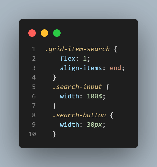
Moving on to the account section, we targeted the element with the class .grid-item-account and changed its display property to flex, enabling its contents to be displayed in a row instead of occupying separate grid columns. We also set justify-content to the end and align-items to the center. These adjustments optimize the presentation of account elements on smaller screens, efficiently using the available space.
We also reduce the margin-right of individual items to 10 pixels.
If there were multiple items in this section, we could implement a menu to allow the user to toggle between them. However, since we only have two items, a menu is unnecessary for our case.
Realizing Products Section Responsiveness
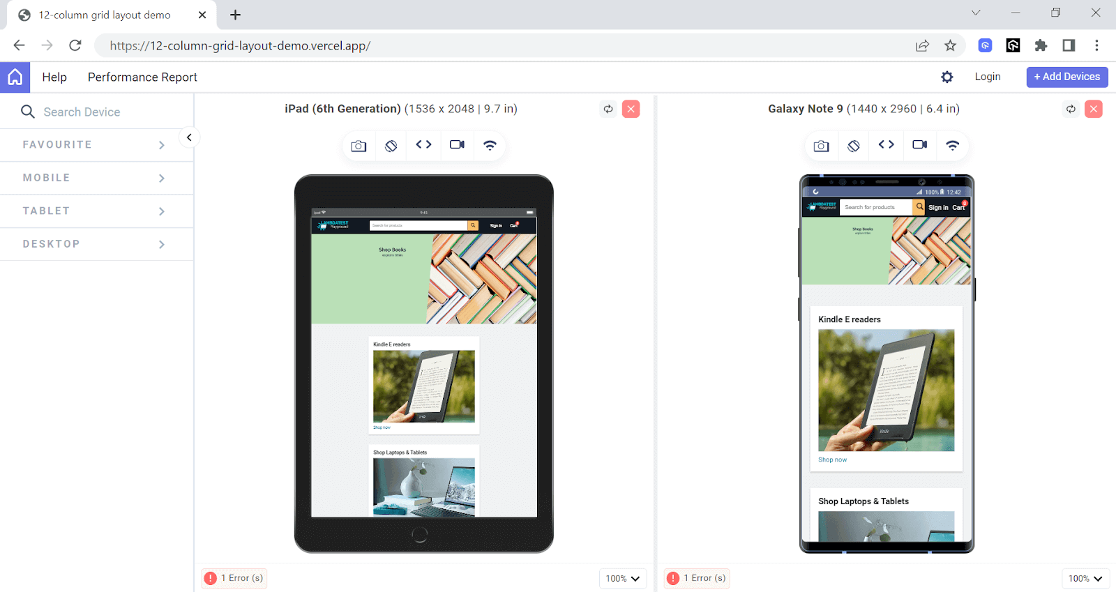
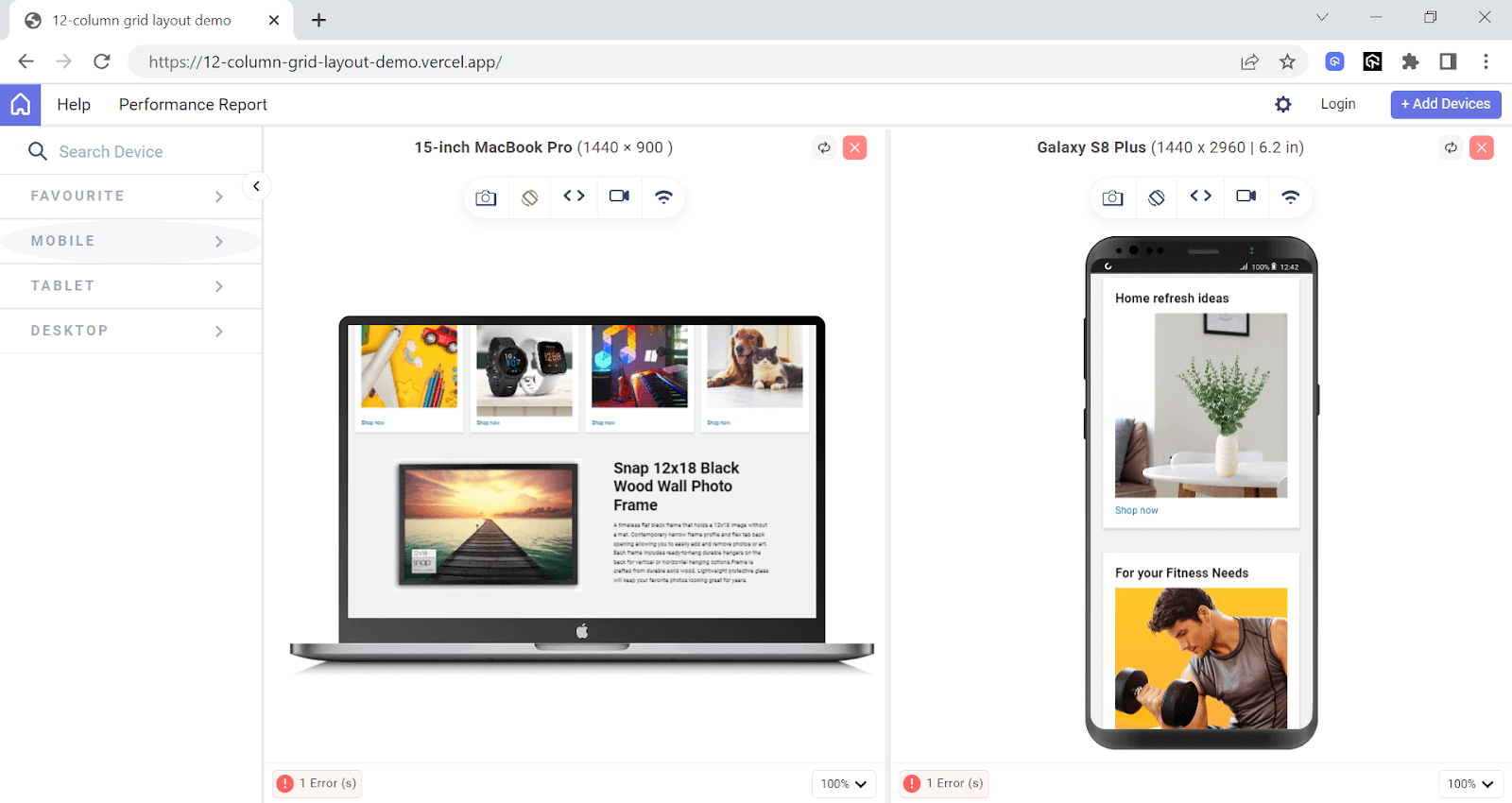
Now that we are done with making our header responsive, let’s move on to the next section of our web page, i.e., the products section.
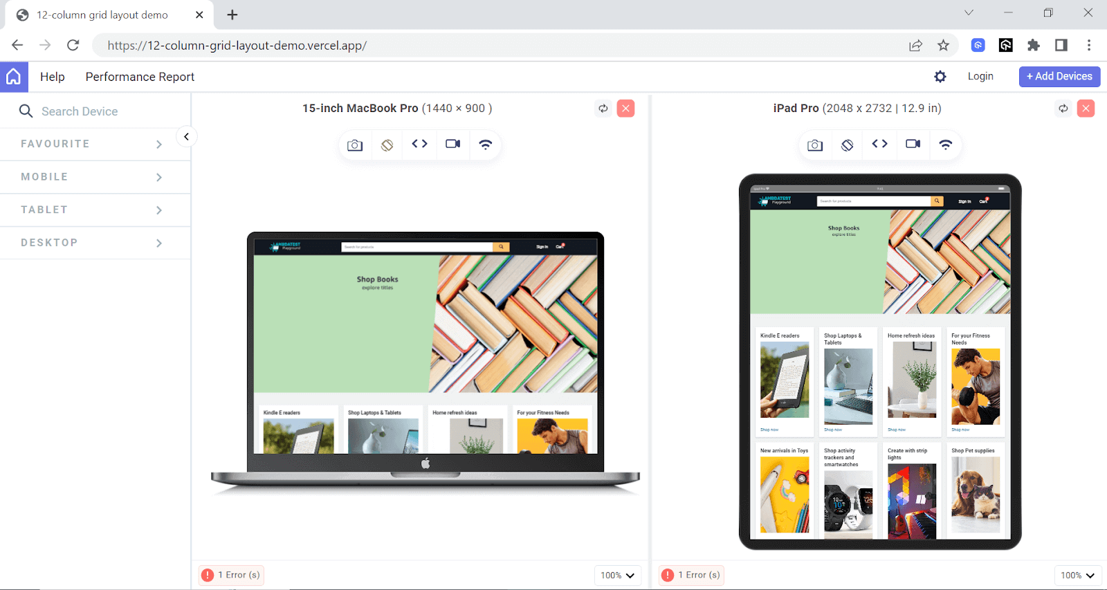
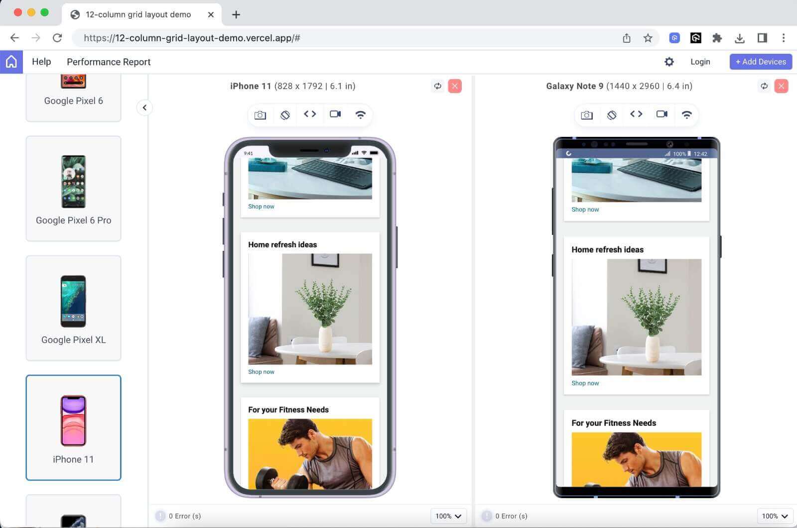

The above screenshots were rendered using LT Browser – a responsive website checker by the LambdaTest platform.
LT Browser is a responsive testing tool for testing mobile-friendliness. It enables you to conduct responsiveness tests on webpages to ensure they function flawlessly on various screen sizes. With LT Browser, you can access over 50 different device viewports.
Catch up on the latest testing tutorials around Selenium automation, Cypress testing, and more. Subscribe to the LambdaTest YouTube Channel for quick updates.
These viewports can be used to assess and fine-tune the responsiveness of your webpage. LT Browser provides viewports for both Android and iOS device viewports, allowing you to test and optimize your 12 column CSS grids.
Check the documentation – Getting Started With LT Browser.
|
1 2 3 4 5 6 7 8 9 |
@media screen and (max-width: 968px) { .products-container { max-width: 100%; width: 500px; margin: 3em auto; gap: 40px; grid-template-columns: 1fr; } } |
For the products section, we target all the screens with a width of 968px or less.
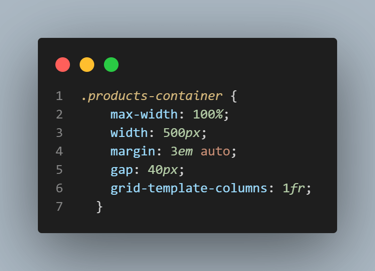
To begin with, we select the .products-container and set a max-width of 500 pixels to it. This ensures that our container doesn’t take more than 500 pixels width on smaller screens. Next, we adjust the margin to 3em auto. This adds a margin of 3em on top and bottom and auto on the left and right, which centers the container horizontally.
Additionally, we increase the spacing between the items by setting the gap to 40px. Next, we change our layout from 12 columns to 1 column.
By doing this, we ensure that each product takes up the entire container width, allowing it to stack vertically rather than being arranged horizontally. Lastly, we define the columns to be 1fr, which specifies that the grid container should have a single column with a flexible width that occupies the entire available space.
Realizing responsiveness of the ‘Featured Product’
Moving on to the next section of our web page, we have the featured product section.
To optimize its display for smaller screen sizes, let’s add a responsive breakpoint.
|
1 2 3 4 5 6 7 8 9 10 11 12 13 14 15 16 17 18 19 20 21 22 23 |
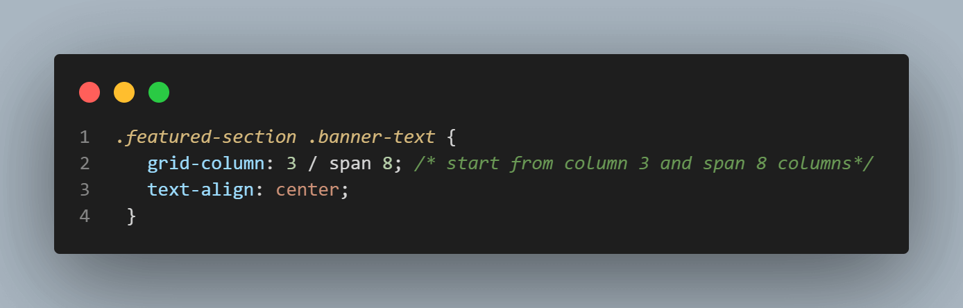
@media screen and (max-width: 868px) { .featured-section img { grid-column: 2 / span 10; /* start at column 2 and span 10 columns*/ margin-bottom: 20px; } .featured-section .banner-text { grid-column: 3 / span 8; /* start at column 3 and span 8 columns*/ text-align: center; } .featured-section .banner-text h1 { font-size: 2rem; } .featured-section .banner-text p { line-height: 24px; font-size: 1rem; } } |
Similar to our header breakpoint, this code snippet also utilizes a media query to target screens with a width of 868 pixels or less. Let’s break it down:
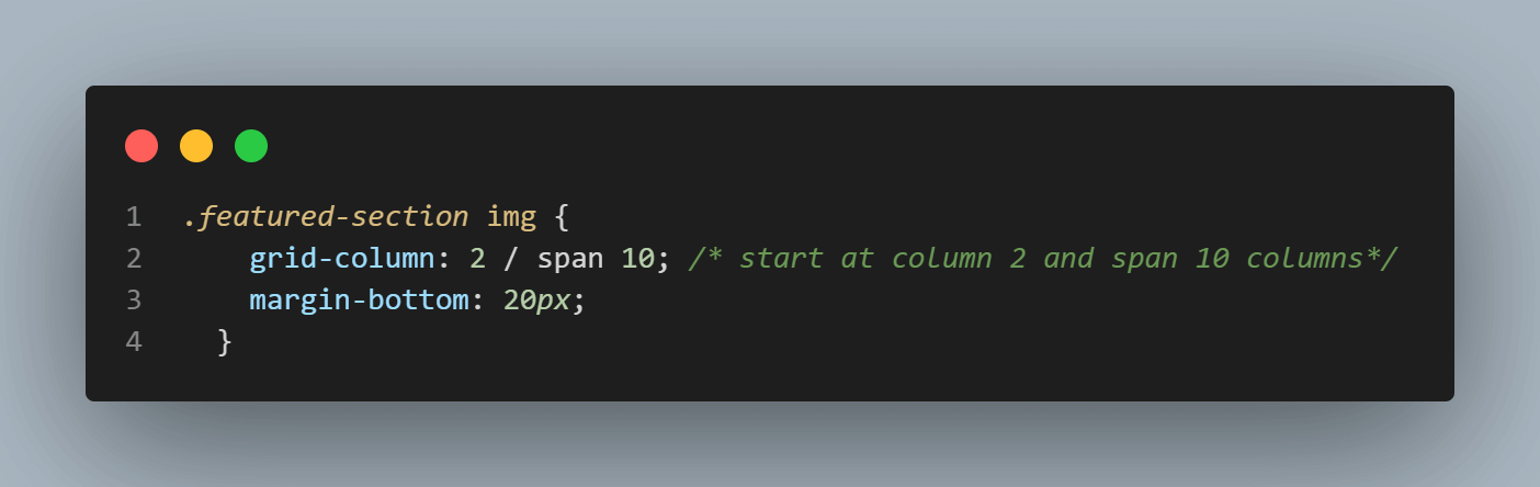
Within this media query, we start by targeting the image element within the featured section. We use the grid-column property to specify that the image should start at column 2 and span across 10 columns. This adjustment ensures that the image occupies a significant portion of the available space, making it more prominent on smaller screens.
Additionally, we add a 20px margin at the bottom of the image, creating spacing between the image and the text.
Next, we modify the styles of the banner text element. Using the grid-column property again, we set it to start from column 3 and span across 8 columns. By doing this, we allocate a narrower space for the text content, allowing it to fit more appropriately within the smaller screen size. To ensure better alignment, we also apply the text-align: center property to center the text horizontally.
In order to further optimize the typography within the banner text, we have made some additional adjustments. The font size of the h1 heading is set to 2rem, which ensures it is appropriately sized for smaller screens. To enhance readability, we have also reduced the line height of the paragraph (p) to 24px, which reduces the spacing between lines.
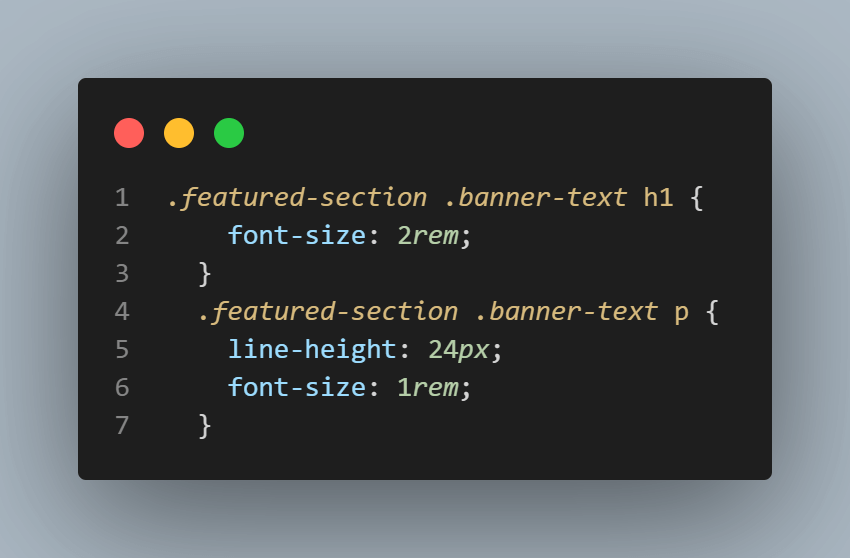
Furthermore, we have adjusted the font size of the paragraph to 1rem, ensuring it remains small and legible on smaller screens.
With these modifications in place, our 12 column CSS grid layout is now fully responsive and adapts seamlessly to all screen sizes.
Wrap it up!
A 12 column CSS grid is a powerful tool for creating modern, flexible, and responsive layouts. In this tutorial, we learned everything you need to know about 12 column CSS grids, from the basics of CSS grids to how to create a responsive 12 column grid layout.
We started by discussing what a 12 column grid is, and some real-world examples that use 12 column CSS grids. Then we discussed the prerequisites for 12 column CSS grids. With a 12 column grid layout, we built a fully responsive web page. Additionally, we learned how to make these layouts responsive for different devices. We also discussed browser support for CSS Grids to ensure our grid layout works across all browsers.
I hope this blog has given you a thorough understanding of the 12 column CSS grid and equipped you with the ability to create them.
It’s time for you to make some amazing websites utilizing the power of this incredible layout module!
Until next time, happy coding!
Frequently Asked Questions (FAQs)
What is the 12 column grid structure?
The 12 column grid structure is a design framework used in web development. It divides a webpage into 12 equal-width columns, providing a flexible layout system. Designers can assign different numbers of columns to various page elements, making it easy to create responsive and visually pleasing layouts.


Author’s Profile
Tahera Alam
Tahera is a front-end developer who loves developing seamless frontends and efficient backends. She has skills in React, JavaScript, Nextjs, Tailwind, MongoDB, Solidity, and more. She loves to learn new technologies and finds writing about them to be a great way to share knowledge with others. In her free time, she enjoys reading thrillers and engaging with the tech community on Twitter.
Blogs: 11
Got Questions? Drop them on LambdaTest Community. Visit now


