
Common CSS Breakpoints For Media Queries
Ayush Thakur
Posted On: July 27, 2023
 230880 Views
 22 Min Read
As technology is growing every day, the diversification in the types of electronic devices is also expanding. In the present time, a wide range of electronic devices exist, including tablets, laptops, desktops, smartphones, and even smartwatches.
Tech giants are spending millions of dollars in their research and development to introduce new and improved electronic devices daily in the market. This has resulted in the daily continuous increase in the catalog of electronic devices.
From a user’s viewpoint, the extensive range of electronic devices provides them numerous choices for their daily needs. However, this proliferation has become frustrating for web and app developers.
Developers now face a significantly increased workload due to the exponential growth of mobile devices. This surge in device diversity necessitates that developers design websites and applications to function seamlessly across all electronic devices.
They must ensure that the entire user interface of a website is responsive, enabling flawless performance and preserving the user experience. When discussing responsiveness, it is imperative not to overlook the importance of CSS Media queries.
CSS Media queries play a crucial role in implementing responsive behavior in web applications. By incorporating CSS Media queries into the styling, we can customize the appearance of various devices with varying screen sizes.
One thing that is mandatory for the CSS Media queries to show their impact is the common CSS breakpoints. As the name suggests, common CSS breakpoints are the points (or measurements) such that when the screen width matches the breakpoint, the CSS Media queries come into effect and apply the defined CSS styling to the user interface.
In this blog, let’s deep-dive into the nitty-gritty of common CSS breakpoints with practical examples.
TABLE OF CONTENTS
What are CSS Media Queries?
When creating a responsive website, developers immediately think of CSS Media queries. These inbuilt CSS properties enable styling adjustments for various screen sizes or viewports.
Ensuring precise alignment and styling of every element in the web page’s user interface is crucial for providing users with a seamless experience.
HTML:
|
1 2 3 4 5 6 7 8 9 10 11 12 13 14 15 16 17 18 19 20 21 22 23 24 25 26 27 28 29 30 31 32 33 34 |
<ul> <li><a href="#about">Home</a></li> <li><a class="active" href="#home">Terms</a></li> <li><a class="active" href="#home">Services</a></li> <li><a class="active" href="#home">Careers</a></li> <li><a class="active" href="#home">About</a></li> <li><a href="#news">Contact</a></li> <li><a href="#contact">News</a></li> </ul> ul { list-style-type: none; margin: 0; padding: 0; overflow: hidden; } li { float: right; } li a { display: block; color: #0fbbc3; text-align: center; padding: 14px 16px; text-decoration: none; font-size: 20px; } li a:hover { background-color: #0fbbc3; color: black; } |
See the Pen
Untitled by Ayush Thakur (@tsayush)
on CodePen.
CSS:
|
1 2 3 4 5 6 7 8 9 10 11 12 13 14 15 16 17 18 19 20 21 22 23 24 25 |
ul { list-style-type: none; margin: 0; padding: 0; overflow: hidden; } ul { float: right; } li a { display: block; color: #0fbbc3; text-align: center; padding: 14px 16px; text-decoration: none; font-size: 20px; } li a:hover { background-color: #0fbbc3; color: black; } |
See the Pen
Untitled by Ayush Thakur (@tsayush)
on CodePen.
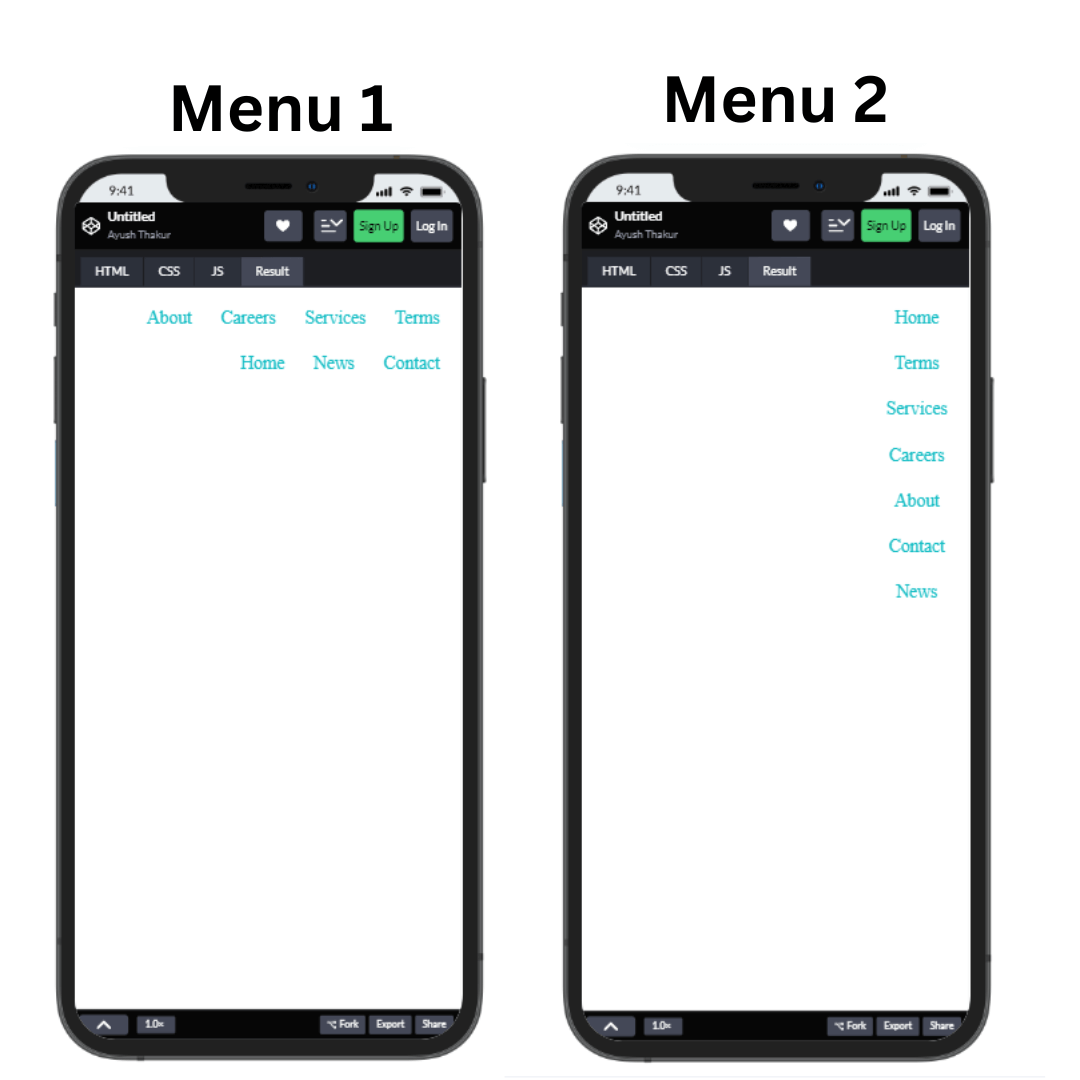
If we take the above example, we have considered 2 Menus of different styles. The first is the traditional horizontal menu, and the second is a vertical menu. We can observe that Menu 2 is much easier to navigate for the users, and the user interface of Menu 2 is eye-comforting too.
Menu 1 looks slightly cluttered; plus, no one likes a 2-row menu bar. Media queries assist us in twitching our code so that a horizontal menu gets converted to a vertical one instinctively when a user switches from a large screen to a smaller one.
Having a good user experience is not the only factor that media queries help us to achieve. The responsiveness of the webpage directly impacts the SEO (Search Engine Optimization) ranking of the webpage too. You can say responsiveness is directly proportional to the website’s ranking.
Many popular browsers, including Google Chrome, Mozilla Firefox, Microsoft Edge, etc., count responsiveness as an integral part of their site ranking algorithm. This is why many websites have a page called amp (accelerated mobile page) for a highly responsive mobile page.
Google explicitly endorses this practice in its guidelines. If you disregard these guidelines, your website may not achieve optimal rankings in Google Search – report.
The syntax of media queries looks something like this:
|
1 2 3 4 5 6 7 8 9 10 11 12 13 14 15 16 17 18 19 20 21 |
@media only screen and (max-width: viewportSize (in pixels)) { // applied CSS styling } // for mobile view @media only screen and (max-width: 481px) { // applied CSS styling } // for tablet view @media only screen and (max-width: 769px) { // applied CSS styling } // for laptop view @media only screen and (max-width: 1026px) { // applied CSS styling } |
Till now, we have been using pixel units in the media queries to define the screen size, but it is not mandatory. You can also use other measuring units, including em, rem, etc.
One thing that is mandatory to make media queries show their effect is the viewpoint.
Viewport size is the exact point from where the media queries start showing their effects. These points are termed “breakpoints”.
When the screen’s width matches the common CSS breakpoints condition(s), the media query gets activated and starts showing its effect. As you can observe in the above example, the common CSS breakpoints in the media queries are defined with reference to the screen’s width. But it’s the developer’s call regarding what he wants to define common CSS breakpoints.
The size of the width differs from device to device, whether it’s a smartphone, tablet, desktop, laptop, television, or any other device; therefore, common CSS breakpoints also differ for these devices. The bigger the screen’s width, the bigger the breakpoint gets.
Since there is no fixed rule to extract the breakpoints or no fixed breakpoints to embed them into the code. But some most commonly used breakpoints work in the majority of the scenarios.
These common CSS breakpoints make it possible to make an adaptive user interface, which adapts itself depending on the device the user is using. Please refer to our blog on CSS breakpoints for responsive design to know more about breakpoints.
CSS libraries such as Bootstrap and Tailwind, which are highly popular in the developer’s community, avoid the extra work of defining common CSS breakpoints as these libraries come with pre-defined breakpoints. The pre-defined common CSS breakpoints in these libraries are in the form of a collection of keywords. These keywords and their corresponding breakpoints are-
| Breakpoint | Keyword | Dimension |
|---|---|---|
| Small | sm | ≥576px |
| Medium | md | ≥768px |
| Large | lg | ≥992px |
| Extra large | xl | ≥1200px |
| Extra extra large | xxl | ≥1400px |
There is absolutely no doubt that these pre-defined common CSS breakpoints make the whole work quite easy. Still, they have got a negative side too. We will discuss these pre-defined common CSS breakpoints later in the blog.
Till now, we discussed the media query breakpoints having some fixed value to make the web pages responsive. But apart from that, CSS media query offers us other ways to define common CSS breakpoints. Let’s understand the multiple ways to define breakpoints.
Although the fixed breakpoints we have listed above in the blog for different devices cover most of the proliferation of devices. Anyone can use them to make the webpage responsive enough. But most of the developer community avoids using these fixed breakpoint values and uses the other way to define common CSS breakpoints.
These two approaches are-
- Content-based breakpoints
- Device-based breakpoints
 Note
NoteTest CSS Media Queries across 3000+ browser environments. Try LambdaTest Today!
Content-based breakpoints
While assigning the breakpoints for responsiveness, it is always advisable to give importance to the content of the user interface rather than using the predefined fixed breakpoints. And this approach is all about considering content for defining the breakpoints.
In this method, a new breakpoint is fixed at every point where the content on the layout gets displaced from its position and breaks the whole layout. This advanced CSS technique makes assigning common CSS breakpoints much easier.
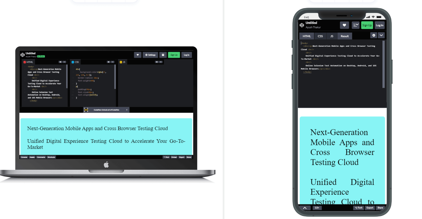
Suppose a web page in the desktop view consists of a main section featuring a paragraph of text. Since it is in the desktop view, users can easily read that text paragraph. But as the width of the screen reduces, that text paragraph will start falling out of the layout, making it difficult for the users to read it and destroying the user experience.
HTML:
|
1 2 3 4 5 6 7 8 9 10 11 12 13 |
<body> <div> <p> Next-Generation Mobile Apps and Cross Browser Testing Cloud <br /> <br /> Unified Digital Experience Testing Cloud to Accelerate Your Go-To-Market <br /> <br /> Online Selenium Test Automation on Desktop, Android, and iOS Mobile Browsers </p> </div> </body> |
CSS:
|
1 2 3 4 5 6 7 8 9 10 11 12 13 14 15 16 17 18 19 20 21 22 |
div { background-color: rgba(17, 233, 236, 0.5); border-radius: 10px; font-weight: 400; } p { padding: 50px; font-size: 40px; text-align: justify; } div { background-color: rgba(17, 233, 236, 0.5); border-radius: 10px; font-weight: 400; } p { padding: 50px; font-size: 40px; text-align: justify; } |
Browser Preview:
See the Pen
Untitled by Ayush Thakur (@tsayush)
on CodePen.
In this example, the desktop view is quite good, making it easier for the reader to read the text. But when it comes to mobile view, the paragraph becomes too long. The user has to scroll down the page to read the text, directly impacting the user experience negatively.
To make the layout work without disturbing the user experience, we can add a breakpoint at each point where the text paragraph starts showing abnormalities in the layout. This would make it easier for the user to read the content.
Although we discussed it for the decreasing width, the same method applies to increasing width. Let’s take a look at some examples—
CSS:
|
1 2 3 4 5 6 7 8 9 10 11 12 13 14 15 16 17 18 19 20 21 22 23 24 25 26 27 28 29 30 31 32 33 34 35 36 37 38 39 40 41 42 43 44 45 46 47 48 49 50 51 52 53 54 55 56 57 58 59 60 61 62 63 64 65 66 67 68 69 70 71 |
* { font-family: Arial, sans-serif; } h1 { font-size: 50px; } h3 { font-size: 50px; } .pricing-heading { padding-top: 40px; margin: 0; } .container { display: grid; grid-template-columns: repeat(1, 1fr); gap: 10px; } .box-details { padding-top: 20px; font-weight: bold; } .btn { margin-top: 30px; padding: 5px; font-size: 20px; padding-left: 30px; padding-right: 30px; border-radius: 5px; background-color: black; color: white; } .pricing { font-decoration: none; font-size: 20px; margin: 0; } .btn:hover { background-color: white; color: black; } .section { text-align: center; } .box { background-color: #eef5ff; border: 1px solid #ddd; padding: 10px; border-radius: 5px; text-align: center; height: 400px; } @media (min-width: 480px) { .container { grid-template-columns: repeat(4, 1fr); } } |
Browser Preview:
See the Pen
Untitled by Ayush Thakur (@tsayush)
on CodePen.
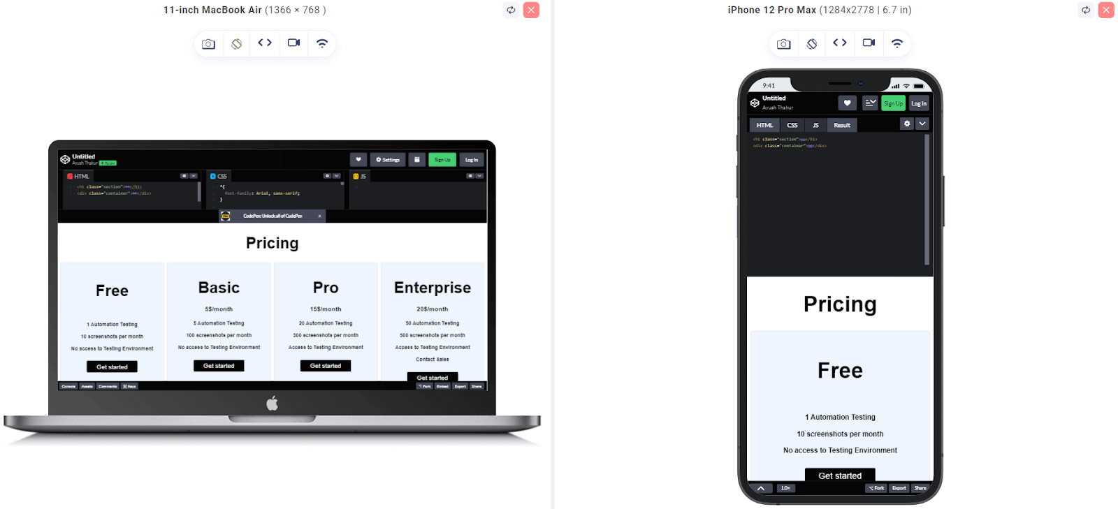
In this example, the breakpoint is applied for the screen width of higher or equal to 480 pixels. Above 480px screen width, there will be four columns in a row and, otherwise, 1 column in a row.
|
1 2 3 4 5 |
@media only screen and (min-width: 480px) and (max-width: 768px) { .container { grid-template-columns: repeat(2, 1fr); } } |
Browser Preview:
See the Pen
Untitled by Ayush Thakur (@tsayush)
on CodePen.
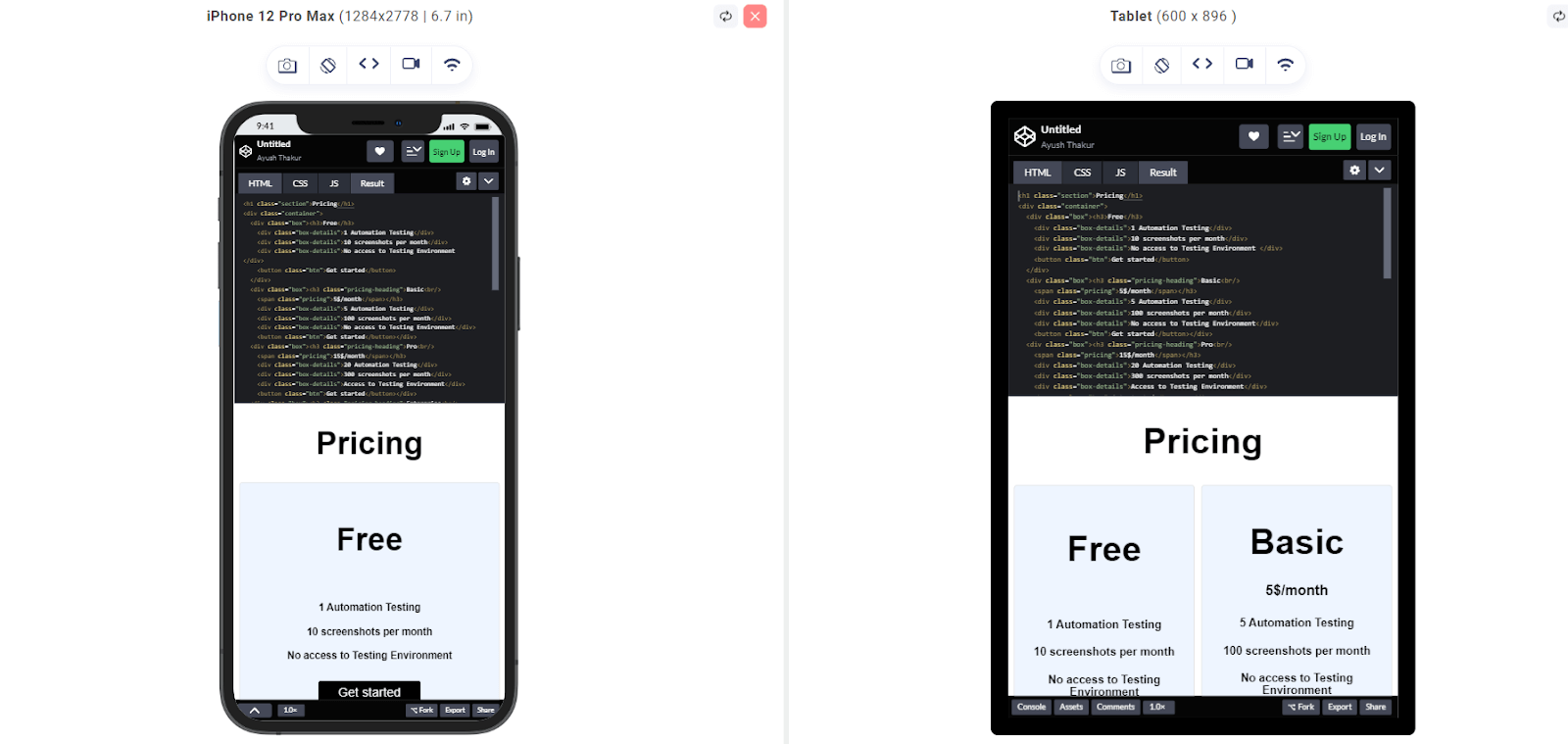
In this example, the breakpoint is applied for the screen width of higher or equal to 480 pixels and lower or equal to 768 pixels. At the screen width below 768 px and above 480 px, there will be 2 columns in a row and, otherwise, 1 column in a row.
Device-based breakpoints
In this approach, we categorize or group the devices depending on the screen resolution. After this, a common breakpoint is selected for the whole group, and CSS styling is applied to that breakpoint. This makes the CSS media query styling applied to most of the devices under that specific group.
Let’s look at some examples of the common CSS breakpoints of some popular devices:
|
1 2 3 4 5 6 7 8 9 10 11 |
/* ----------- iPhone 14 pro max ----------- */ /* 932 x 430 pixels*/ @media only screen and (device-width: 430px) and (device-height: 932px) and (-webkit-device-pixel-ratio: 3) { /* ----------- CSS Styling ----------- */ } |
|
1 2 3 4 5 6 7 8 9 10 |
/* ----------- Google Pixel 7 ----------- */ /* 732 x 412 pixels*/ @media only screen and (device-width: 412px) and (device-height: 732px) and (-webkit-device-pixel-ratio: 3) { /* ----------- CSS Styling ----------- */ } |
|
1 2 3 4 5 6 7 8 9 10 |
/* ----------- OnePlus 11 ----------- */ /* 915 x 412 pixels*/ @media only screen and (device-width: 412px) and (device-height: 915px) and (-webkit-device-pixel-ratio: 3) { /* ----------- CSS Styling ----------- */ } |
In this method, devices could be grouped based on the screen width, and then common CSS breakpoints can be assigned collectively for that group. Also, we have used -webkit-device-pixel-ratio to target specific device pixel ratios. This CSS feature is used by WebKit rendering engine to power browsers like Safari and some older versions of Chrome. Let’s see some examples of it.
|
1 2 3 4 5 6 7 8 9 10 11 12 13 14 15 16 17 18 19 20 21 22 23 24 25 26 27 28 |
/* For very small screen devices (500px and below) */ @media only screen and (max-width: 500px){ /* CSS Styling */ } /* Small screen devices (600px and above) */ @media only screen and (min-width: 600px) { /* CSS Styling */ } /* Medium screen devices (700px and above) */ @media only screen and (min-width: 700px) { /* CSS Styling */ } /* Big screen devices (900px and above) */ @media only screen and (min-width: 900px) { /* CSS Styling */ /* Extra big screen devices (1200px and above) */ @media only screen and (min-width: 1200px) { /* CSS Styling */ } |
Min-width and Max-width
In every example we have discussed till now, you may have observed that along with the common CSS breakpoints, we have used min-width and/or max-width. In some examples, we’ve employed min-width, max-width, and a combination of both to demonstrate different scenarios.
But a question arises, which one to use when?
Majorly two scenarios can take place. Let’s discuss them
- If you are designing the webpage firstly for large screens like laptops, televisions, etc.; then you should take advantage of the max-width function and assign styling to it. After that, you can do the required configurations in the code to make it work even on a small screen.
- The second scenario is that if you are designing the webpage firstly for mobile viewers, then you should use min-width and assign styling to it. Later, you can make the required changes in the code to make it work even for large screens.
Taking an example:
HTML:
|
1 2 3 4 5 6 7 8 9 10 11 12 13 14 15 16 17 18 19 20 21 22 23 24 25 26 27 28 29 30 31 32 33 34 35 36 37 38 39 40 41 |
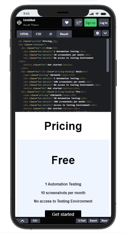
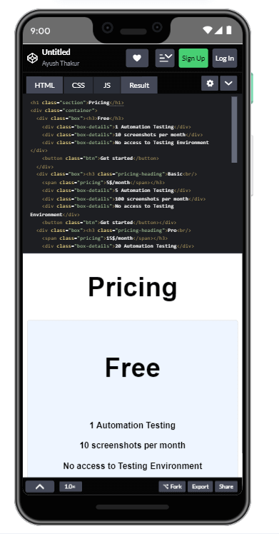
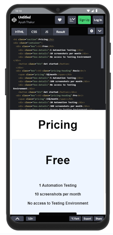
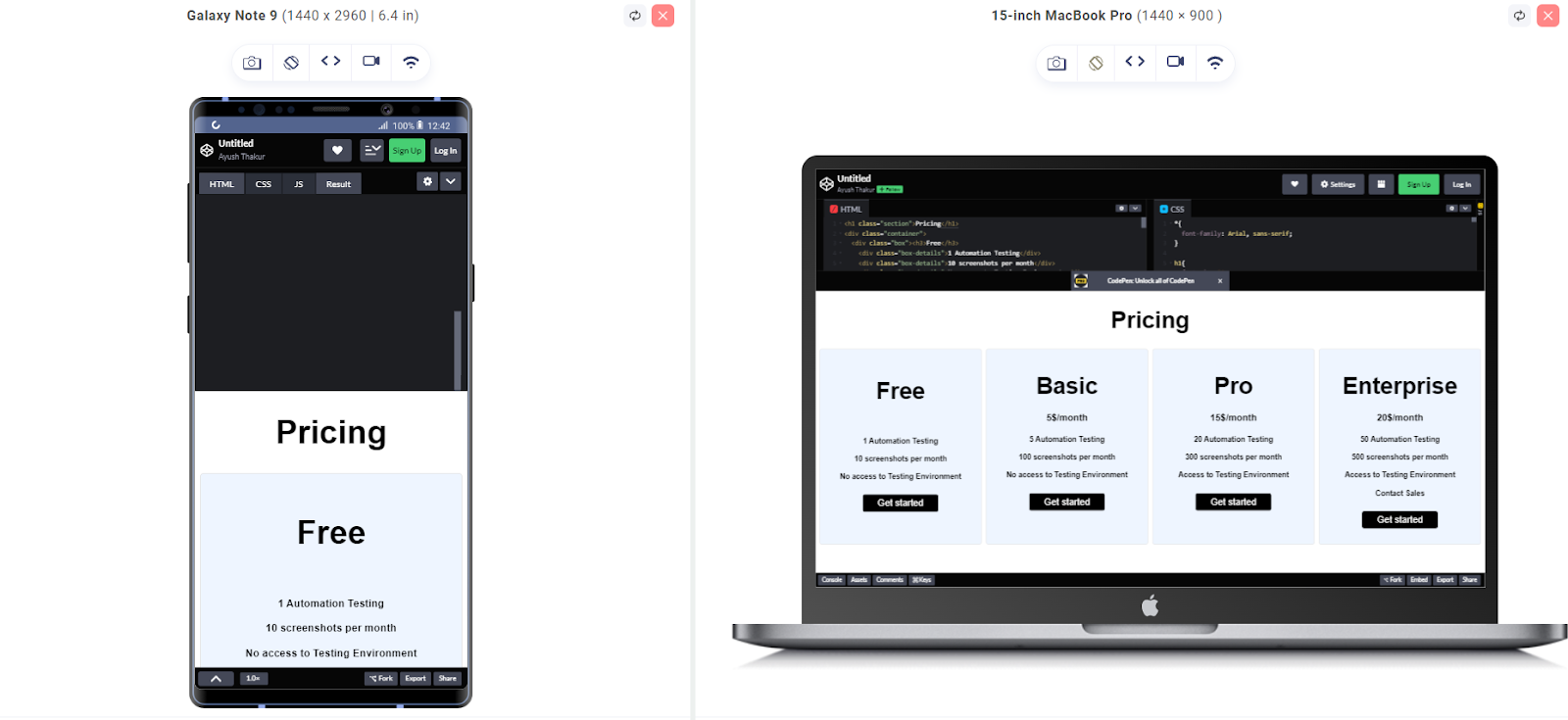
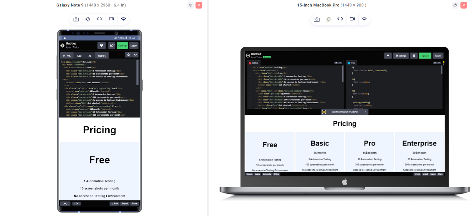
<h1 class="section">Pricing</h1> <div class="container"> <div class="box"> <h3>Free</h3> <div class="box-details">1 Automation Testing</div> <div class="box-details">10 screenshots per month</div> <div class="box-details">No access to Testing Environment</div> <button class="btn">Get started</button> </div> <div class="box"> <h3 class="pricing-heading"> Basic<br /> <span class="pricing">5$/month</span> </h3> <div class="box-details">5 Automation Testing</div> <div class="box-details">100 screenshots per month</div> <div class="box-details">No access to Testing Environment</div> <button class="btn">Get started</button> </div> <div class="box"> <h3 class="pricing-heading"> Pro<br /> <span class="pricing">15$/month</span> </h3> <div class="box-details">20 Automation Testing</div> <div class="box-details">300 screenshots per month</div> <div class="box-details">Access to Testing Environment</div> <button class="btn">Get started</button> </div> <div class="box"> <h3 class="pricing-heading"> Enterprise<br /> <span class="pricing">20$/month</span> </h3> <div class="box-details">50 Automation Testing</div> <div class="box-details">500 screenshots per month</div> <div class="box-details">Access to Testing Environment</div> <div class="box-details">Contact Sales</div> <button class="btn">Get started</button> </div> </div> |
CSS:
|
1 2 3 4 5 6 7 8 9 10 11 12 13 14 15 16 17 18 19 20 21 22 23 24 25 26 27 28 29 30 31 32 33 34 35 36 37 38 39 40 41 42 43 44 45 46 47 48 49 50 51 52 53 54 55 56 57 58 59 60 61 62 63 64 65 66 67 68 69 70 71 72 73 74 75 76 77 78 |
* { font-family: Arial, sans-serif; } h1 { font-size: 50px; } h3 { font-size: 50px; } .pricing-heading { padding-top: 40px; margin: 0; } .container { display: grid; grid-template-columns: repeat(4, 1fr); gap: 10px; } .box-details { padding-top: 20px; font-weight: bold; } .btn { margin-top: 30px; padding: 5px; font-size: 20px; padding-left: 30px; padding-right: 30px; border-radius: 5px; background-color: black; color: white; } .pricing { font-decoration: none; font-size: 20px; margin: 0; } .btn:hover { background-color: white; color: black; } .section { text-align: center; } .box { background-color: #eef5ff; border: 1px solid #ddd; padding: 10px; border-radius: 5px; text-align: center; height: 400px; } @media (max-width: 769px) { .container { grid-template-columns: repeat(2, 1fr); } } @media (max-width: 480px) { .container { grid-template-columns: repeat(1, 1fr); } } |
Browser Preview:
See the Pen
Untitled by Ayush Thakur (@tsayush)
on CodePen.
In this example, we have created a container div displaying a grid form. I assigned it 4 columns and one div in each column. We have initialized the max-width property in the @media query and assigned viewports 769 px and 480 px to it. As the size of the viewport will equal to or less than 769 px, the number of columns will decrease to two, and in the case of a 480 px viewport, it will be reduced to 1 column.
The cherry on the cake is that media queries also come with the capability to use both the minimum and maximum screen width styling simultaneously. So media queries allow us to define the styling considering both the minimum and maximum width of the screen.
CSS:
|
1 2 3 4 5 6 7 8 9 10 11 12 |
@media (max-width: 480px) { .container { grid-template-columns: repeat(1, 1fr); } } @media (min-width: 769px) { .container { grid-template-columns: repeat(4, 1fr); } } |
Browser Preview:
See the Pen
Untitled by Ayush Thakur (@tsayush)
on CodePen.
In this example, you can observe that we have used both the min-width and max-width together in this example. So if the screen width is above 769 px, there will be 4 columns, and if the screen width is below 480 px, the number of columns will be reduced to 2.
There may arise some situations where you have to capture a specific range in the screen width and define styling for it. For e.g., the screen width of tablets is not too small like smartphones and neither too big like laptops or tv. In such situations, you can use the combination of both min-width and max-width to capture that screen width range and assign styling for it.
In the above, we have discussed that instead of just pixels, other measuring units such as em, rem, and percentage could be used to define common CSS breakpoints.
The pixel unit is fully independent and is not affected by other factors such as screen width and font size. Pixel unit is a static unit, and therefore pixel unit does not play any role when it comes to responsiveness.
Other measuring units, such as em and percentage, get affected when there is any change in another factor, such as the parent element’s font size and width of the screen. This adds a natural responsiveness to the webpage and reduces the need for media queries in the code to make the webpage responsive.
NoteExperience the full potential of your CSS-based web applications on real devices. Try LambdaTest Today!
Breakpoints with Sass
Sass is a stylesheet exactly like CSS. Sass helps the CSS to be more maintainable and efficient. Sass offers extra features like nested rules, mixins, and variables to the CSS.
Sass files have two types of extensions – .sass and .scss. Despite the fact that Sass introduces some additional features to the CSS, it is still compatible to work with traditional CSS. This behavior of Sass is one of the reasons for its high popularity among the web developer community.
Sass comes with every feature and method that CSS has, and this list includes the use of common CSS breakpoints too. In addition, Sass supports all the CSS at-rules too. Sass offers this support to CSS at-rule to make it compatible even with future versions of CSS.
Sass offers some different syntaxes to create CSS at-rule. These syntax are @< tag1 >< tag2 >, @< tag >{…}, or @< tag1 >< tag2 >{…}.
|
1 2 3 4 5 6 7 8 9 10 |
@image { width: 30px; src: url("#image_link"); } @title { font-family: "Sarif"; color: "red"; } |
The CSS style and CSS at-rule shows the behavior of exchanging each other places when the CSS styling rule resides inside the CSS at-rule. This makes it possible for the developer to add some conditional styling to the output without changing the selector that has selected the captured style.
After successfully installing Sass in your workspace, you are free to assemble the CSS rules by taking advantage of the commands of Sass. For example, imagine you have a file containing all the Sass rules. Then that pre-processed Sass file can be handled with the help of input.scss command and then assembled into the CSS output file with the help of the output.css command.
@supports
The @supports CSS at-rule allows us to assign a condition for the support of the feature on the browser. In order words, @supports allows us to assign a conditional block where the condition is a CSS style property. This will check whether the browser supports the CSS styling or not. If the condition comes out to be true, then the CSS styling will be applied to the output else not.
Here is the syntax of the @support at-rule:
|
1 2 3 |
@supports (condition to be applied) { // CSS Styles to be applied } |
Let’s look at an example of it:
|
1 2 3 4 5 6 7 8 |
@supports (display: grid) { .classname { display: grid; grid-template-rows: repeat(4, 1fr); grid-template-columns: repeat(4, 1fr); grid-gap: 3rem; } } |
In this example, you can observe the display: gird is the defined condition. Although almost every modern-day browser supports CSS Grid, many older versions of browsers still do not natively support CSS Grid. Apple’s Safari was not fully compatible with all the properties of CSS Grid until Safari 10 was launched.
@media
The @media CSS at-rule is the most popular and commonly practiced CSS feature to embed responsiveness in the code. This CSS at-rule allows the developer to define different styling depending upon the screen width of different media devices such as smartphones, tablets, laptops, desktops, television, etc.
The @media CSS at-rule is famous for its agility to create different user interfaces of a website depending upon the screen resolution of devices that is much more responsive and eye-soothing to the user. The @media majorly examines some specific factors of the device, including width, height, orientation (landscape/portrait), and resolution.
Not just this, the @media comes in very handy when there is a need to define different stylings for screen readers or printed documents.
Syntax of @media is mentioned below:
|
1 2 3 |
@media only screen and (max-width: viewportSize (in pixels)) { // applied CSS styling } |
For the example part of @media, you can take a look at some of the examples explained earlier in this blog.
@keyframes
The @keyframes CSS at-rule is responsible for most of the animation you witness on any web page. The @keyframes are used to add animation styling to the webpage. Changeable CSS styles work as a key factor when it comes to adding animation. From the name, you can get an idea that changeable CSS styles is the styling that keeps changing many times during the animation CSS property.
When defining the Changeable CSS styling, we have to assign the starting and ending situations of that styling in some sort of manner. For this, we can use the percentage value 0% and 100%, where 0% denotes the starting position of styling and 100% denotes the ending position.
The developer has full control over the appearance behavior of the animation. The in-built animation properties allow to manipulate the appearance of the animation. Additionally, animation properties make it possible to add animation selectors. One important thing to remember is that the use of @keyframes CSS at-rule prevents the effect of !important rule in CSS.
Here is the syntax of @keyframes at-rule:
|
1 |
@keyframes animation-name {keyframes-selector {css-styles;}} |
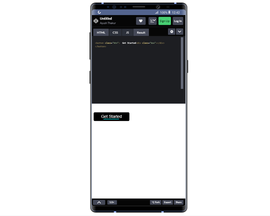
Here’s an example of @keyframes:
|
1 2 3 4 |
<button class="btn"> Get Started <div class="box"></div> </button> |
CSS:
|
1 2 3 4 5 6 7 8 9 10 11 12 13 14 15 16 17 18 19 20 21 22 23 24 25 26 27 28 29 30 31 32 33 34 35 36 37 38 39 40 41 42 43 44 45 46 47 48 49 50 51 52 53 54 55 56 57 58 59 60 61 62 63 64 65 66 67 68 69 70 71 72 73 74 |
.btn { margin-top: 30px; padding: 5px; padding-left: 30px; border: 3px solid black; font-size: 18px; padding-right: 30px; border-radius: 5px; background-color: black; color: white; } .box { width: 20px; margin-left: 35px; height: 2px; background-color: #11e9ec; animation: animate 2s infinite; } @keyframes animate { from { transform: scale(1, 1); } to { transform: scale(4.5, 1); } } .btn:hover { background-color: white; color: black; font-weight: 400; } .btn { margin-top: 30px; padding: 5px; padding-left: 30px; border: 3px solid black; font-size: 18px; padding-right: 30px; border-radius: 5px; background-color: black; color: white; } .box { width: 20px; margin-left: 35px; height: 2px; background-color: #11e9ec; animation: animate 2s infinite; } @keyframes animate { from { transform: scale(1, 1); } to { transform: scale(4.5, 1); } } .btn:hover { background-color: white; color: black; font-weight: 400; } |
See the Pen
Untitled by Ayush Thakur (@tsayush)
on CodePen.
Browser Preview:
If we break it down this example, then we get:
- @keyframes is the keyword to define a new frame,
- animate is the name of the frame,
- from represents the starting point of the frame
- to represents the endpoint of the frame
In the from block, scale(1,1) will begin the animation with the height and width in the same ratio. Since we have kept the width as 4.5x in scale() in to block, the width of the element will be increased to 4.5x.
Note: To apply this animation over an element, we need to use a couple of CSS animation properties, including animate-name, animation-timing-function, and animation-duration on the targeted element.
Common CSS Breakpoints for Media Queries
Every device, whether a laptop, desktop, tablet, smartphone, or any other device, has a screen width different from any other device. So, every device demands a different breakpoint for itself. It is almost an impractical practice to assign different common CSS breakpoints for every device in the market.
Therefore, to ease this task, some specific breakpoints are selected depending upon the webpage content that will work in most of the devices available in the market.
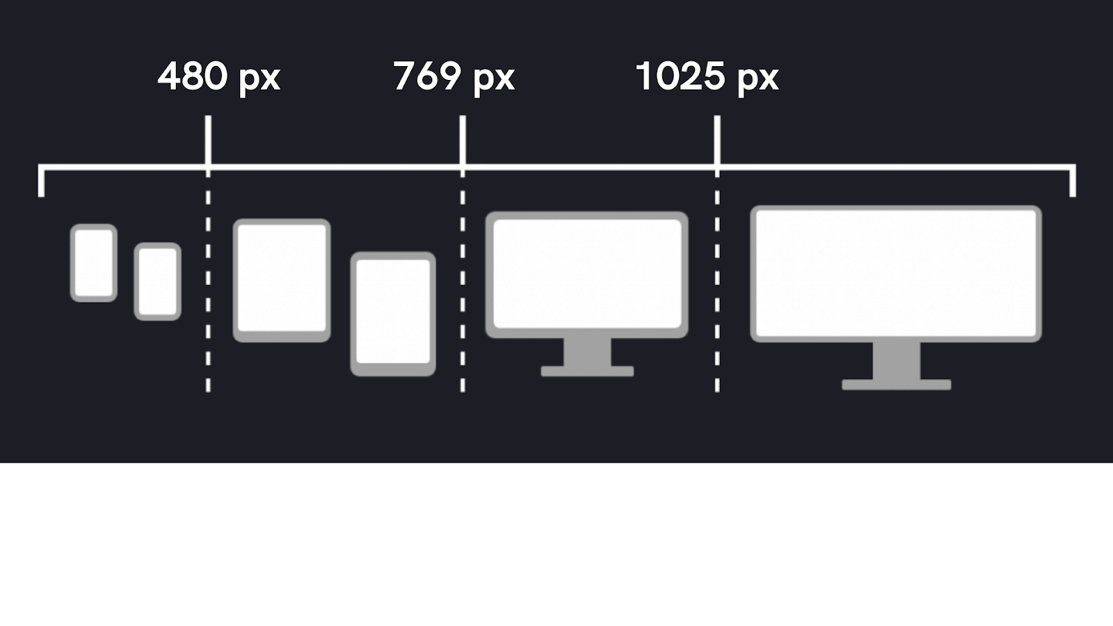
I have listed below these common CSS breakpoints-
- For mobile devices: 320 px – 480 px
- For tablets: 480 px – 768 px
- For small screens and laptops: 769 px – 1024 px
- For desktops and large screens: 1025 px – 1200 px
- For TVs and extra large screens: 1201 px – more
This is a list to have an idea of what screen widths should be used for different devices.
Anyone can easily use these defined common CSS breakpoints in their project and add responsiveness with each device respectively.
Although many websites use old traditional CSS styling methods for styling purposes. But in many projects and apps, developers tend to lean towards using CSS frameworks because of their easy-to-use advantage. Because of the very popularity of CSS frameworks amongst the developer community, CSS frameworks also support the use of media query breakpoints.
Breakpoints of some popular CSS frameworks have been listed below-
- Bulma – 768px, 769px, 1024px, 1216px, and 1408px
- Foundation – 40em and 64em
- Bootstrap – 576px, 768px, 992px, and 1200px
Creating a Responsive Navigation Menu
Now, we will discuss how we can create a Responsive Navigation Menu with the backing of CSS Media queries and common CSS breakpoints that we have addressed thus far.
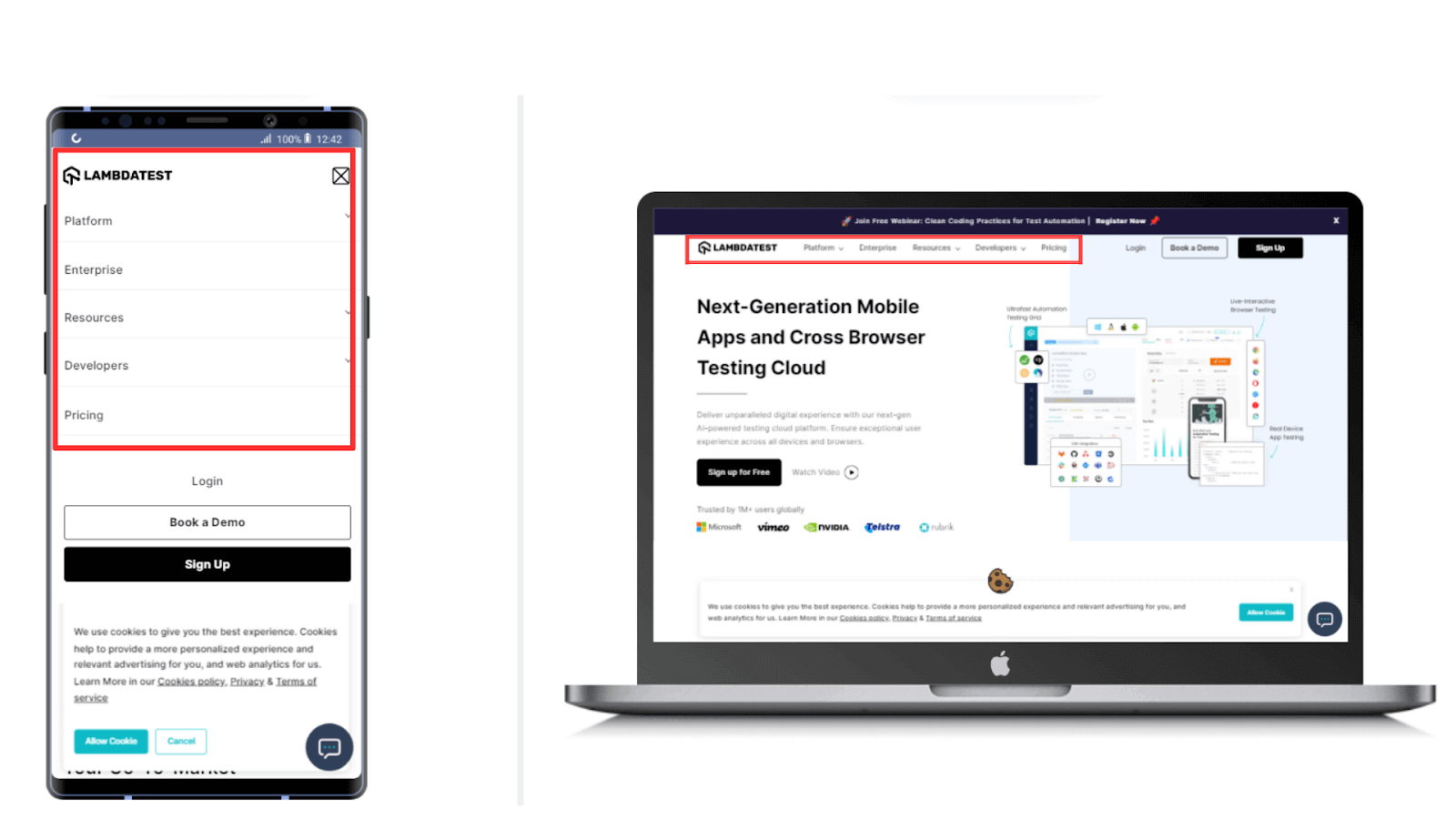
The Responsive Navigation Menu we will create will look like this on a Mobile Device and a laptop, as shown above in the image. On a big screen (laptop and desktop), the Navigation Menu will be in the shape of a horizontal bar. As the screen width gets reduced, the horizontal menu will transform into a vertical menu.
The vertical menu will be hidden under a hamburger icon and will only come into view when the user clicks on the hamburger icon.
HTML:
|
1 2 3 4 5 6 7 8 9 10 11 12 13 14 15 16 |
<nav> <div class="hamburger"> <div class="line1"></div> <div class="line2"></div> <div class="line3"></div> </div> <ul class="nav-links"> <li><a href="#">Home</a></li> <li><a href="#">About Us</a></li> <li><a href="#">Our team</a></li> <li><a href="#">Careers</a></li> <li><a href="#">Contact Us</a></li> <li><button class="login-button" href="#">Login</button></li> <li><button class="join-button" href="#">Sign Up</button></li> </ul> </nav> |
CSS:
|
1 2 3 4 5 6 7 8 9 10 11 12 13 14 15 16 17 18 19 20 21 22 23 24 25 26 27 28 29 30 31 32 33 34 35 36 37 38 39 40 41 42 43 44 45 46 47 48 49 50 51 52 53 54 55 56 57 58 59 60 61 62 63 64 65 66 67 68 69 70 71 72 73 74 75 76 77 78 79 80 81 82 83 84 85 86 87 88 89 90 91 92 93 94 95 96 97 98 99 100 101 102 103 104 105 106 107 108 109 110 111 112 113 114 115 116 117 118 119 120 121 122 123 124 125 126 127 128 129 130 131 132 133 134 135 136 137 138 139 140 141 142 143 144 145 146 147 148 149 150 151 152 153 154 155 156 157 158 159 160 161 162 163 164 165 166 167 168 169 170 171 172 173 174 175 176 177 178 179 180 181 182 183 184 185 186 187 188 189 190 191 192 193 194 195 196 197 198 199 200 201 202 |
* { margin: 0; padding: 0; color: black; font-weight: bold; font-family: sans-serif; } body { overflow-x: hidden; } nav { height: 6rem; width: 100vw; background-color: #0ebac5; box-shadow: 0 3px 20px rgba(0, 0, 0, 0.2); display: flex; position: fixed; z-index: 10; } .logo { padding: 1vh 1vw; text-align: center; } .logo img { height: 5rem; width: 5rem; } .nav-links { display: flex; list-style: none; width: 88vw; padding: 0 0.7vw; justify-content: space-evenly; align-items: center; text-transform: uppercase; } .nav-links li a { text-decoration: none; margin: 0 0.7vw; } .nav-links li a:hover { color: #61dafb; } .nav-links li { position: relative; } .nav-links li a::before { content: ""; display: block; height: 3px; width: 0%; background-color: #61dafb; position: absolute; transition: all ease-in-out 250ms; margin: 0 0 0 10%; } .nav-links li a:hover::before { width: 80%; } .login-button { background-color: white; border: 1.5px solid white; border-radius: 15px; padding: 0.6rem 0.8rem; margin-left: 2vw; font-size: 1rem; cursor: pointer; } .login-button:hover { background-color: transparent; border: 2px solid white; color: #131418; transition: all ease-in-out 350ms; } .join-button { color: #131418; background-color: transparent; border: 1.5px solid #61dafb; border-radius: 15px; padding: 0.6rem 0.8rem; font-size: 1rem; cursor: pointer; } .join-button:hover { color: #f2f5f7; background-color: transparent; border: 1.5px solid #f2f5f7; transition: all ease-in-out 350ms; } .hamburger div { width: 30px; height: 3px; background: #f2f5f7; margin: 5px; transition: all 0.3s ease; } .hamburger { display: none; } @media screen and (max-width: 800px) { nav { position: fixed; z-index: 3; } .hamburger { display: block; position: absolute; cursor: pointer; right: 5%; top: 50%; transform: translate(-5%, -50%); z-index: 2; transition: all 0.7s ease; } .nav-links { position: fixed; background: #0ebac5; height: 100vh; width: 100%; flex-direction: column; clip-path: circle(50px at 90% -20%); -webkit-clip-path: circle(50px at 90% -10%); transition: all 1s ease-out; pointer-events: none; } .nav-links.open { clip-path: circle(1000px at 90% -10%); -webkit-clip-path: circle(1000px at 90% -10%); pointer-events: all; } .nav-links li { opacity: 0; } .nav-links li:nth-child(1) { transition: all 0.5s ease 0.2s; } .nav-links li:nth-child(2) { transition: all 0.5s ease 0.4s; } .nav-links li:nth-child(3) { transition: all 0.5s ease 0.6s; } .nav-links li:nth-child(4) { transition: all 0.5s ease 0.7s; } .nav-links li:nth-child(5) { transition: all 0.5s ease 0.8s; } .nav-links li:nth-child(6) { transition: all 0.5s ease 0.9s; margin: 0; } .nav-links li:nth-child(7) { transition: all 0.5s ease 1s; margin: 0; } li.fade { opacity: 1; } } .toggle .line1 { background-color: black; transform: rotate(-45deg) translate(-5px, 6px); } .toggle .line2 { background-color: black; transition: all 0.7s ease; width: 0; } .toggle .line3 { background-color: black; transform: rotate(45deg) translate(-5px, -6px); } const hamburger = document.querySelector(".hamburger"); const navLinks = document.querySelector(".nav-links"); const links = document.querySelectorAll(".nav-links li"); hamburger.addEventListener('click', ()=>{ navLinks.classList.toggle("open"); links.forEach(link => { link.classList.toggle("fade"); }); hamburger.classList.toggle("toggle"); }); |
Browser Preview:
See the Pen
Untitled by Ayush Thakur (@tsayush)
on CodePen.
In the output, you can notice that as we gradually decrease the width of the screen, the horizontal menu transforms itself into a vertical menu.
First of all, we created the base template using the HTML code. In that, we have majorly used a div tag, and inside it, we have used three div tags to create three lines for the hamburger icon. Also, to add the navigation menu elements, we have initialized a ul tag and defined the desired menu elements in it using li tag.
To make the Navigation Menu appear captivating, we have assigned some CSS styling also. You can also observe that to add the responsive nature, we have also applied the Media query in the CSS code. A breakpoint of 800 pixels paired with the max-width property has also been used in the media query condition.
In the end, to add the click functionality on the hamburger icon, which will expand the vertical menu, we have created a JavaScript code for that. When the user clicks on the hamburger icon, the vertical menu will come into view, and again, clicking on the icon will collapse the menu. To add this kind of functionality, we have used the toggle property of the classList method.
Best Practices for Common CSS Breakpoints
Here are some best practices for common CSS breakpoints for media queries.
- Creating webpages for small-screen devices such as smartphones is difficult compared to large screens. Therefore, it is always suggested first to prioritize the device use and then start designing the page.
- Many block-level elements like headings, paragraphs, sections, and divs are capable of resizing depending on the device’s screen width. So, the need to use common CSS breakpoints gets reduced for these elements.
- The use of minified HTML, CSS, and JavaScript is always preferred to reduce page load time significantly.
- Keeping in mind both the desktop and mobile versions of the webpage, prioritizing the functions could help a lot.
Responsive Testing of CSS Media Queries Breakpoints
Media query breakpoints are specific width (and sometimes height) values at which a website’s layout or style will change to accommodate different screen sizes. They ensure that content is displayed optimally, whether viewed on a desktop, tablet, or smartphone.
Till now, we have dug deep into the media query breakpoints, how you can use them in your projects, what benefits they offer to us, breakpoints in CSS frameworks, and much more. After the media query breakpoints have been utilized in the webpage code to add responsiveness, we cannot just directly publish it without testing.
Several testing platforms and tools are present in the market. You can choose any of them to carry out the testing of your web project.
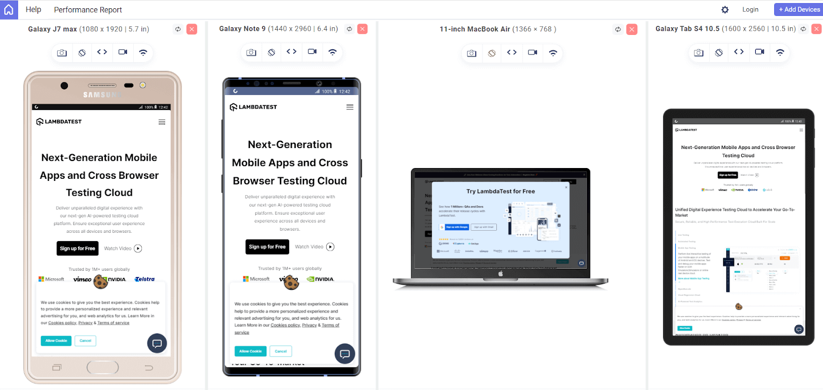
LT Browser 2.0 by LambdaTest is a mobile-friendly test tool that allows us to perform responsiveness tests over webpages to examine whether the webpage is working perfectly in every screen width device.
With LT Browser, you get access to over 50+ viewports of different devices. You can use these viewports to test your webpage and inspect its responsiveness. LT Browser has both Android and iOS devices viewports for you to use them.
In addition, LT Browser has a unique feature that allows you to test your webpage across 6 viewports simultaneously.
Not just this, LT Browser comes with a ton of other features also that come in very handy while performing any responsiveness test on the webpage. To get additional details about LT Browser 2.0, refer to the below video tutorial.
Catch up on the latest testing tutorials around Selenium automation, Cypress testing, and more. Subscribe to the LambdaTest YouTube Channel for quick updates.
Summarizing it:
In this blog, we discussed the importance of common CSS breakpoints in making our web pages responsive. We also discussed how common CSS breakpoints differ from device to device based on the width of the screen. It’s not enough to simply add the breakpoints and assume that the webpage will work perfectly, we need to perform testing also. For the testing purpose, a cross browser platform could become a life savior that can help us throughout the testing process.
Frequently Asked Questions (FAQs)
How many breakpoints should I use?
While there is no universal set of breakpoints or best practices, you should use at least 3 breakpoints for the most device flexibility.
Why use CSS media queries?
Media queries are a key part of responsive web design, as they allow you to create different layouts depending on the viewport size.


Author’s Profile
Ayush Thakur
I’m a 22 year old Software Engineer. Completed my Btech in Information Technology field in 2021. I have a keen interest in Web Development field and currently learning and exploring the field of Frontend Web Development. Love to get my hands dirty on JavaScript And React. Also working as a Web Development Freelancer. Alongside, I’m also working as a Content Creator and I create content on Web Development niche to share my knowledge with others and help them in their tech journey. Also loves to write blogs and articles on tech niche. A huge lover of video games, read books in my spare time, and to maintain fitness, I play football and badminton.
Blogs: 6
Got Questions? Drop them on LambdaTest Community. Visit now


