
Advanced CSS Tutorial: Level Up Your Web Development Skills
Dun Yan
Posted On: April 9, 2024
 114265 Views
 27 Min Read
Cascading Style Sheets (CSS) is a cornerstone for building modern websites and web apps. According to a survey by W3Techs, almost all websites, like 96.8%, use CSS. That shows just how crucial CSS is for web development.
Lots of developers know the basics of CSS, like how to select things and use properties. But if you want to take your skills up a notch, you have to learn some more advanced stuff. Getting good at these advanced CSS tricks takes time and practice, just like anything else.
At first, learning CSS might feel tough as you figure out the basics. But as you keep at it, things get easier, and you can start to try out advanced CSS techniques.
This CSS tutorial covers those advanced CSS concepts so you can become a pro-CSS coder.
TABLE OF CONTENTS
Prerequisites for Advanced CSS
Before you start learning about the more complicated aspects of CSS, it’s really important for developers to understand some basic ideas first. These include things like Flexbox, Grid, animations, and media queries.
Flexbox helps you arrange things neatly inside a box on a webpage. Grid lets you create organized layouts for your webpage. With CSS animations, you can add movements to your webpage to make it more interesting. And media queries can change how your webpage looks depending on what device someone uses to view it.
If you need to brush up on these concepts, there are some helpful tutorials you can check out:
Once you’ve got a good handle on those, you can start learning about the more advanced CSS concepts.
What is Advanced CSS?
Advanced CSS refers to the more complex and specialized concepts and techniques that can be used to create highly customized and visually appealing web pages. These advanced CSS concepts often build upon the foundational knowledge of CSS, including selectors, properties, and units of measurement, to create more advanced designs and animations.
Understanding and mastering advanced CSS concepts can enable web developers to create web pages that are not only beautiful but also efficient, accessible, and user-friendly. In this advanced CSS tutorial, we will explore five specific advanced CSS concepts, including:
- Pseudo-Classes
- z-index
- User Interface
- Blend Modes
- Minification
We will also look at practical examples of how they can be implemented in web development projects.
Pseudo-Classes
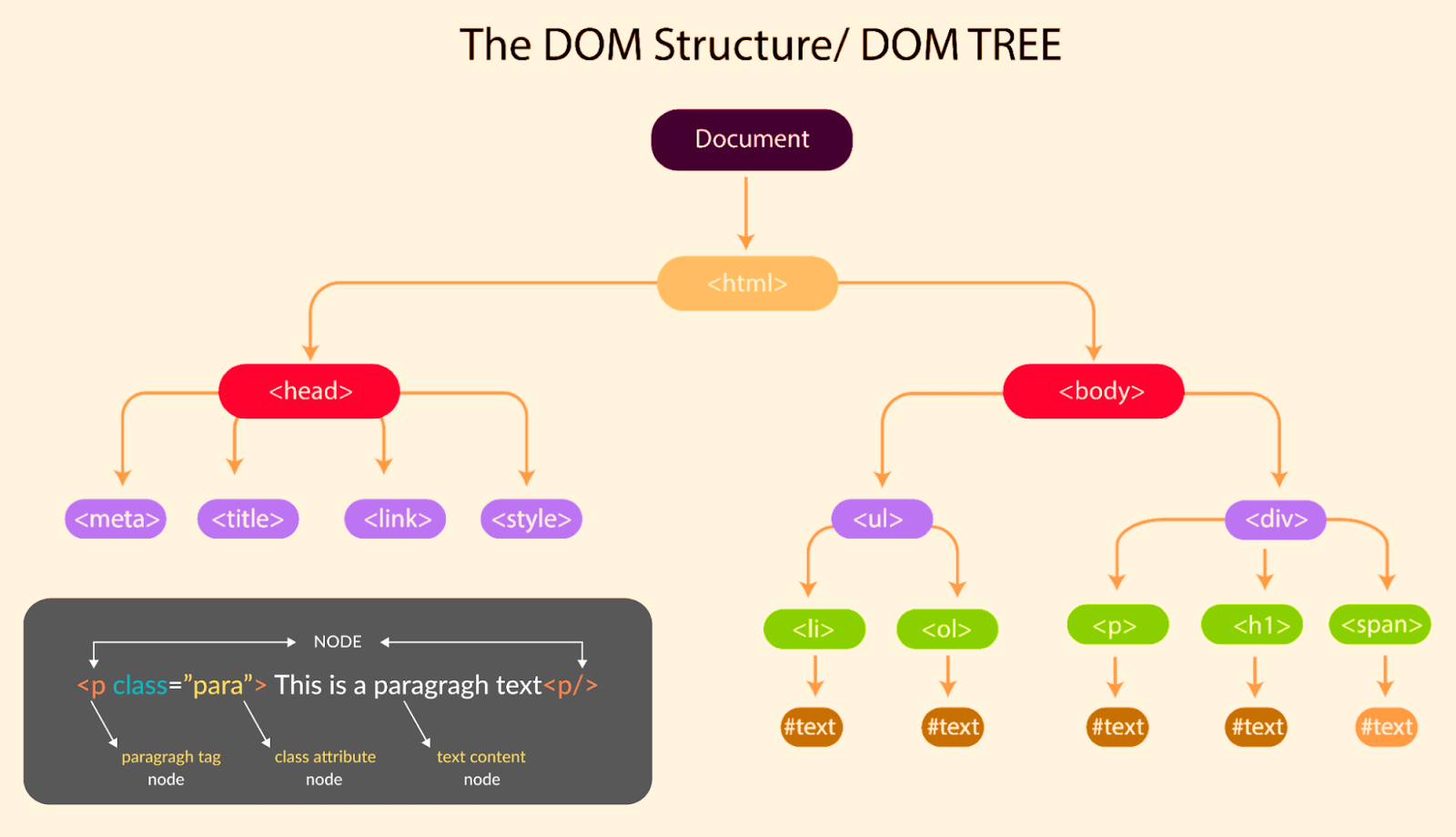
A pseudo-class is an advanced CSS concept that enables you to select and style HTML elements based on their position or state within the Document Object Model (DOM), representing the HTML document as a tree-like structure.
Rather than relying solely on class or attribute selectors, CSS pseudo-classes allow you to create more dynamic and interactive web pages with targeted styles for specific scenarios. Hence, the webpages can increase engagement and stand out from competitors.
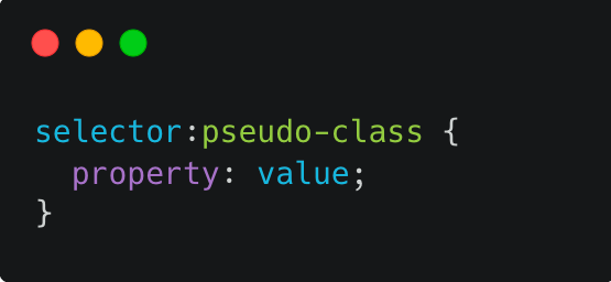
Pseudo-classes are denoted by a colon (:) followed by a keyword that indicates the state or position of the element being selected.
Here is the syntax format for using pseudo-classes:
Here are some examples of commonly used pseudo-classes, along with their potential values:
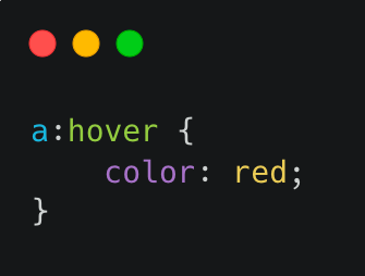
hover
When you work with CSS, you can use the pseudo-class to style elements based on hover events. While using CSS hover effects, you can change properties like:
- color: Determines the text color and accepts different inputs like named colors (e.g., red, blue), RGB, or HEX values.
- background-color: Specifies the background color of an element using named colors, RGB or HEX values, or functional color values.
- text-decoration: Adds effects such as underlines or strikethroughs to text is possible with this advanced CSS property. You can set it to options like none, underline, overline, line-through, or blink.
- font-size: Controls the size of the font within an element. You can choose absolute sizes like 10px or relative ones like smaller or larger.
Syntax:
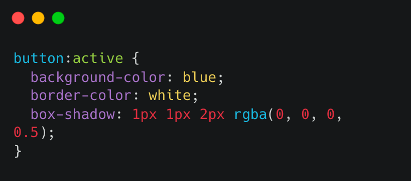
active
This pseudo-class is used to select an element when it is being activated by the user, such as when a button is being clicked. Potential values include:
- background-color
- border-color
- box-shadow
Syntax:
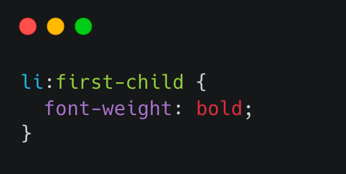
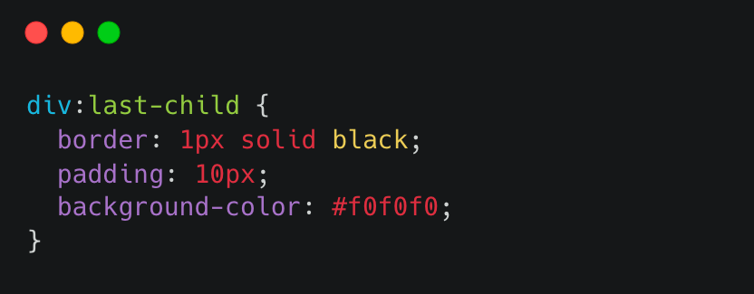
first-child and last-child
The pseudo-classes :first-child and :last-child do not come with set values to apply. Instead, they pinpoint the initial and final child elements within a parent element.
Consider an unordered list ( < ul >) containing multiple list items (< li >); you can use the :first-child pseudo-class to style the first < li > element uniquely. Likewise, using the :last-child pseudo-class, you can target the last < li > element within the list.
first-child Syntax:
last-child Syntax:
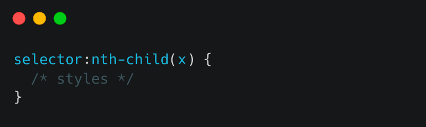
nth-child()
The :nth-child() pseudo-class in CSS allows you to target elements based on their position in a parent container. The x in :nth-child() represents the specific position of the element you want to target.
Syntax:
In the selector field, you would enter the element you want to target within its parent container. For example, if you wanted to target every other paragraph element within a div container, your selector would be div p:nth-child(2n).
The x field specifies the child element position you want to target. This can be a number, a formula, or one of several keywords:
- even targets all even-numbered child elements.
- odd targets all odd-numbered child elements.
- n targets every nth child element.
- n + x targets every nth child element starting at x.
- n + x targets the first x child elements.
focus
When talking about the :focus pseudo-class in web design, the reference is to selecting an element that’s currently being interacted with by the user. This interaction can happen through either keyboard navigation or mouse clicks. Designers commonly utilize the :focus pseudo-class along with the :hover pseudo-class to craft engaging and interactive web experiences that respond to user actions.
Syntax:
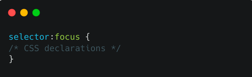
In this syntax, the selector refers to the element you wish to style when it receives focus, and the :focus pseudo-class is used to target that element. Below are some potential values that can be used with :focus.
- outline: Applies a border around the element when it’s in focus. Typically, the border appears as a dotted or dashed line encircling the element’s boundary.
- box-shadow: Adds a shadow effect around the element when it’s in focus. You can customize this shadow effect using properties such as box-shadow-color, box-shadow-blur, and box-shadow-offset.
- background-color: Changes the background color of the element when it’s in focus. This property draws attention to the element or indicates its current state.
Here is an example of using :focus in CSS to add an outline around a text input field when it is in focus:
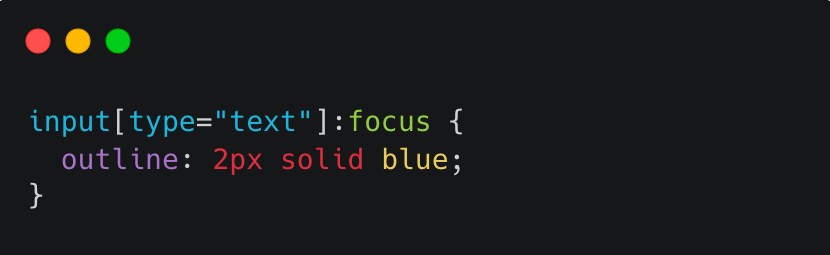
In this example, the input[type=”text”] selector is used to select all text input fields, and the :focus pseudo-class is used to style the input.
target
The :target selector is used to target an element referred to in the URL fragment identifier, also known as the hash. The hash is the part of a URL that follows the # symbol and typically identifies a specific section of a web page.
Syntax:
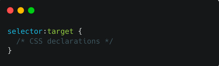
The selector can be any valid CSS selector, such as a class, ID, or element selector. The :target pseudo-class is then added to the end of the selector, followed by the CSS declarations within the curly braces.
The :target selector can be combined with other selectors to apply specific styles to the targeted element. Here are some potential values that can be used with :target.
- background-color: Sets the background color of the targeted element.
- color: Sets the text color of the targeted element.
- display : Sets the display property of the targeted element.
- border: Sets the border of the targeted element.
- opacity: Sets the opacity of the targeted element.
- transform: Applies a transformation to the targeted element.
Combining Pseudo-Classes
In web development, pseudo-classes allow developers to add interactivity and style to their projects. By combining multiple pseudo-classes, the possibilities for creating unique and engaging designs are endless. Next, we will explore combining pseudo-classes to take your basic projects to the next level, adding style and functionality.
The first rule selects any button element that is currently being hovered over by the user or has keyboard focus:
|
1 2 3 4 5 6 |
button:hover, button:focus { background-color: white; color: black; border: 2px solid black; } |
The :hover pseudo-class is used to apply styles to an element when the user hovers over it with their mouse. In this case, the background-color of the button is set to white, the color of the text is set to black, and a black border with a width of 2px is added around the button. This creates a visual feedback effect when the user interacts with the button.
The second rule selects any element with the class card that is currently being hovered over by the user:
|
1 2 3 4 5 |
.card:hover { background-color: black; color: white; border: 2px solid #fff; } |
It’s worth noting that the first rule uses two selectors, button:hover and button:focus, to apply the same styles to both states of the button. This advanced CSS technique applies styles to multiple states of an element without repeating the same styles twice.
HTML:
|
1 2 3 4 5 6 7 8 9 10 11 12 13 14 15 16 17 18 19 20 21 22 23 24 25 26 27 28 29 30 31 32 |
<body> <h1>Combining CSS pseudo-classes!</h1> <ul> <li> <div class="card"> <h2>Basic</h2> <p>1000 Screenshort Tests/month</p> <p>Unlimited Automation Testing</p> <p>5 Test Environments</p> <button>Get started</button> </div> </li> <li> <div class="card"> <h2>Pro</h2> <p>5000 Screenshort Tests/month</p> <p>Unlimited Automation Testing</p> <p>10 Test Environments</p> <button>Get started</button> </div> </li> <li> <div class="card"> <h2>Enterprise</h2> <p>10000 Screenshort Tests/month</p> <p>Unlimited Automation Testing</p> <p>15 Test Environments</p> <button>Get started</button> </div> </li> </ul> </body> |
See the Pen
Welcome to my page by Dun Yan (@dun_yan_)
on CodePen.
Here is another example for demonstration:
|
1 2 3 |
nav li:first-child a { border-radius: 5px 0 0 5px; } |
Firstly, it targets the first child element within the nav element to create a rounded corner on the left side by applying a border-radius property with values of 5px 0 0 5px.
|
1 2 3 |
nav li:last-child a { border-radius: 0 5px 5px 0; } |
Then, it targets the last child element within the nav element to create a rounded corner on the right side by applying a border-radius property with values of 0 5px 5px 0.
|
1 2 3 4 5 6 7 8 9 10 11 |
nav li a:hover { background-color: #E5E5E5; color: #333; } nav li a:active, nav li a:focus { background-color: #D5D5D5; color: #333; } |
The CSS code also adds styles for the hover, active, and focus states of the a elements within the nav element. When the hover state is triggered, the background color changes to #E5E5E5 and the text color changes to #333. When the active or focus state is triggered, the background color changes to #D5D5D5 and the text color changes to #333.
|
1 2 3 |
nav li a:target { background-color: #C5C5C5; } |
Additionally, the CSS code targets any a elements with a target attribute and changes the background color to #C5C5C5 when the link is targeted.
HTML:
|
1 2 3 4 5 6 7 8 9 10 11 12 13 14 15 16 17 18 19 20 21 22 23 24 25 26 27 28 29 30 31 32 33 34 35 36 37 38 39 40 41 |
<body> <nav> <ul> <li><a href="#home">Home</a></li> <li><a href="#about">About</a></li> <li><a href="#services">Services</a></li> <li><a href="#contact">Contact</a></li> </ul> </nav> <main> <section id="home"> <h1>Welcome to the Cloud Platform</h1> <p>We deliver unparalleled digital experience with our next-gen AI-powered testing cloud platform. Ensure exceptional user experience across all devices and browsers.</p> </section> <section id="about"> <h2>About Us</h2> <p>On a mission to be the go-to cloud test orchestration and execution platform for millions of testers and developers, enterprises, SMBs, small teams, and open source projects to enable them to go-to-market faster.</p> </section> <section id="services"> <h2>Our Services</h2> <ul> <li>Online Selenium Test</li> <li>Reliable Mobile App Testing</li> <li>Visual regression cloud</li> <li>Automated Testing</li> </ul> </section> <section id="contact"> <h2>Contact Us</h2> <p>See us in action as one of our experts guides you through the platform in our weekly, live demo. You’ll also have an opportunity to have your questions answered during the interactive Q&A segment.</p> </section> </main> <footer> <p>© 2023 My Website</p> </footer> </body> |
See the Pen
Combining pseudo classes ex2 by Dun Yan (@dun_yan_)
on CodePen.
z-index
The z-index property is useful because it allows you to control the visual stacking order of HTML elements on a webpage. Without the z-index property, HTML elements are displayed in the order they appear in the HTML source code, with later elements appearing on top of earlier ones. However, this may not always be desirable, especially with overlapping elements.
An analogy to understand the concept of z-index is to imagine a deck of cards. When you stack cards on top of each other, the card on top covers the card underneath it. Similarly, when you have multiple elements on a web page that overlap, the element with the higher z-index value will be displayed on top of the element with the lower z-index value.
The syntax format for the z-index property is:
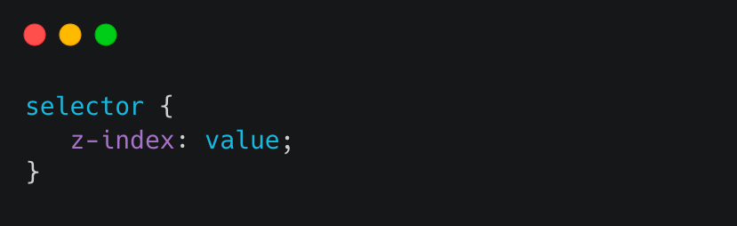
Here, the selector refers to the HTML element(s) to which you want to apply the property, and the value is a numerical value that determines the stacking order. The default value is 0.
Here are some potential word values for the z-index property:
- auto: This is the default value, and it means that the browser determines the stacking order automatically based on the order of the HTML elements in the document.
- number: Determines the stacking order of the element. A higher value will appear on top of a lower value.
- initial: Sets the property to its default value.
- inherit: Specifies that the value of the property should be inherited from the parent element.
Note: The maximum value for the CSS z-index property is 2,147,483,647. This is because the z-index property is a 32-bit integer with a maximum value of 2^31-1, or 2147483647.
It’s worth mentioning that using very high z-index values can lead to unexpected behavior and potential performance issues, so it’s generally best to use lower values when possible. In addition, relying heavily on z-index for layout can be a sign of overly complex code, and it’s often better to re-think the layout instead of relying on z-index as a workaround.
Here is an example of how you can use the z-index property in your HTML and CSS code:
|
1 2 3 4 5 6 7 8 9 10 |
.overlay { position: absolute; top: 0; left: 0; margin-left: 3rem; width: 70%; height: 100%; text-align: start; z-index: 1; } |
In this example, the overlay div is positioned absolutely within the banner container and has a z-index value of 1. This places the overlay div on top of the img element, which has no z-index specified and, therefore, has a default value of 0.
Without the z-index property, the overlay div would still be positioned on top of the img element. Still, it could potentially be obscured by other elements within the container. By setting the z-index value of the overlay div to 1, we ensure it is always displayed on top of the img element.
HTML:
|
1 2 3 4 5 6 7 8 9 |
<div class="banner"> <img src="https://github.com/dunyanong/Tech-Images/blob/main/Advanced-CSS/Z-index/phone.png?raw=true" alt="Banner Image"> <div class="vertical-center"> <div class="overlay"> <h1>Z-Index</h1> <p>Now, we can use CSS to position the overlay on top of the image and apply the filter effect. We can also use z-index property to specify the order in which the elements should be displayed, with higher values being displayed on top of lower values.</p> </div> </div> </div> |
See the Pen
CSS Z-index by Dun Yan (@dun_yan_)
on CodePen.
User Interface
CSS user interface is a category of CSS properties used to style and modify the behavior of user interface elements. UI elements are components that users interact with directly on a webpage or application, such as form controls, buttons, and links.
For example, the resize property can be used to allow users to adjust the size of a text area input, making it more comfortable for them to enter and edit text. The outline-offset property can be used to create a visual gap between the outline of a focused UI element and its border, making it easier for users to see which element they are interacting with.
The following are the user interface properties used in advanced CSS:
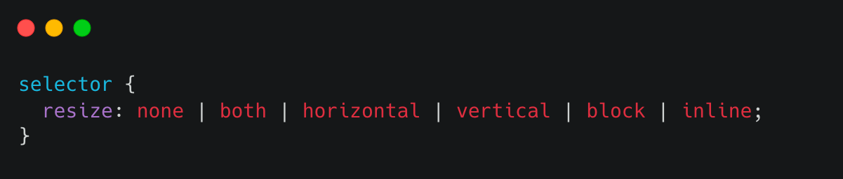
- resize: This advanced CSS property allows you to control whether an element is resizable by the user. You can specify one or two values to control the horizontal and vertical resizing independently.
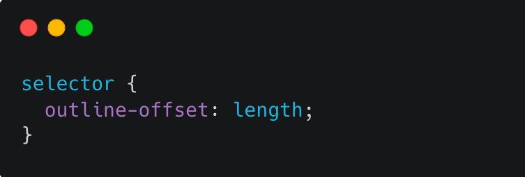
- outline-offset: This advanced CSS property allows you to set the distance between the outline and the border of an element.
- normal: No blending occurs. The element’s content is drawn on top of the background.
- multiply: Multiplies the color of the element with the background color, resulting in a darker color. This is useful for creating shadows or applying tints to images.
- screen: Inverts the colors of the element and the background, multiplies them together, and then inverts them again. This results in a lighter color. This is useful for creating highlights or lighting up images.
- overlay: Multiplies or screens the colors, depending on the background color. This creates a contrast effect, similar to how photography is enhanced with dodging and burning techniques.
- darken: Selects the darker of the element and background colors.
- lighten: Selects the lighter of the element and background colors.
- color-dodge: Brightens the background color to reflect the element color. This is useful for creating a glowing effect.
- color-burn: Darkens the background color to reflect the element color. This is useful for creating a burnt or charred effect.
- color: Uses the hue and saturation of the element with the luminosity of the background to create a new color.
- saturation: Uses the saturation of the element with the hue and luminosity of the background to create a new color.
- luminosity: Uses the luminosity of the element with the hue and saturation of the background to create a new color.
- normal: No blending occurs. The element’s content is drawn on top of the underlying element.
- multiply: Multiplies the colors of the element and the underlying element together, resulting in a darker color. This is useful for creating shadows or applying tints to images.
- screen: Inverts the colors of the element and the underlying element, multiplies them together, and then inverts them again. This results in a lighter color. This is useful for creating highlights or lighting up images.
- overlay: Multiplies or screens the colors, depending on the underlying element color. This creates a contrast effect, similar to how photography is enhanced with dodging and burning techniques.
- darken: Selects the darker of the element and underlying element colors.
- lighten: Selects the lighter of the element and underlying element colors.
- hard-light: Multiplies or screens the colors, depending on the element color. This creates a strong contrast effect.
- soft-light: Darkens or lightens the colors, depending on the element color. This creates a subtle contrast effect.
- difference: Subtracts the color of the underlying element from the color of the element, resulting in a high-contrast effect.
- hue: Uses the hue of the element with the saturation and luminosity of the underlying element to create a new color.
- saturation: Uses the saturation of the element with the hue and luminosity of the underlying element to create a new color.
- uglifycss
- YUICompressor
- CSS Minifier & Compressor
- Install Node.js on your machine if not already installed.
- Open an empty folder in your Integrated Development Environment (IDE).
- To create a package.json file to keep track of our dependencies, run this command in your command line interface:
- Open your Command Prompt or terminal and run the following command to install uglifycss:
- Run the following command to minify your CSS file:
- After the minification, style.css is the name of your original CSS file, and style.min.cssis the name of the minified CSS file that uglifycss will create.
- Next, change the file path from style.css to style.min.css and delete the original style.css file to save up more storage.
- Download YUICompressor from its official GitHub website.
- Click the file with the .zip extension to download the compressor.
- Extract the downloaded file to your desired working directory on the code editor.
- If you have already set your code editor to the desired folder, you don’t need to use the cd command to navigate to the directory where you extracted the YUICompressor files.
- However, if you haven’t set your code editor to the desired folder, you need to use the cd command to navigate to the directory where the YUICompressor files are extracted
- To compress a CSS file, enter the following command:
- Replace x.y.z with the version number of the YUICompressor you downloaded. In this case, it’s 2.4.8.
- Replace the input.css with the name of the CSS file you want to compress.
- Replace the output.css with the name of the compressed CSS file you want to create.
- Lastly, change the file path from style.css to your new file path and delete the original old CSS file to save up more storage.
- Copy your code from your IDE.
- Visit the CSS Minify online tool and paste the codes in the minifier input. Then, click on CSS Minify.
- Congratulations, you have successfully minimized the size of your code in just two simple steps.
Here is the syntax format for the :resize selector:
Here is the syntax format for the outline-offset selector:
Let’s look at two examples of using resize and outline-offset properties to style a simple web page:
This code defines the style of a textarea element in HTML commonly used to create a multi-line input field on a web page. With a textarea, users can enter large amounts of text conveniently.
|
1 2 3 4 5 |
textarea { background-color: #1a1a1a; resize: all; width: 80%; } |
The line resize: all enables the resizing of the textarea element using the handles that appear on the bottom right corner of the element. The all value allows for resizing both horizontally and vertically. If you set the value to vertical or horizontal, it will restrict resizing to a single direction. Alternatively, setting it to none will disable resizing completely.
HTML:
|
1 2 3 4 5 6 7 8 9 10 11 12 13 14 15 16 17 18 19 20 |
<body> <div class="review-page"> <div class="movie-info"> <img src="https://images.unsplash.com/photo-1635863138275-d9b33299680b?ixlib=rb-4.0.3&ixid=MnwxMjA3fDB8MHxwaG90by1wYWdlfHx8fGVufDB8fHx8&auto=format&fit=crop&w=2231&q=80g" alt="Movie Poster" class="movie-poster"> <div class="movie-details"> <h1 class="movie-title">Iron Man</h1> <p class="release-date">Released Date: 2008</p> <p class="movie-rating">Rating: 7.9/10</p> <p class="movie-cast">Cast: Robert Downey Jr., Gwyneth Paltrow, Terrence Howard</p> <p class="movie-description">After being held captive in an Afghan cave, billionaire engineer Tony Stark creates a unique weaponized suit of armor to fight evil.</p> </div> </div> <h2 class="section-title">Reviews</h2> <div class="comment-section"> <div class="comment-box"> <textarea placeholder="Write your review here"></textarea> </div> </div> </div> </body> |
See the Pen
CSS resize by Dun Yan (@dun_yan_)
on CodePen.
Now let’s dive into the second example of using the outline-offset property:
|
1 2 3 4 5 6 |
img { width: 32%; height: auto; outline: 5px solid #c04000; outline-offset: 10px; } |
The outline property sets a solid red border with a width of 5px around the image to create an outline effect. The outline-offset property is set to 10px, which moves the outline away from the edge of the image by 10px. This advanced CSS property is useful when you want to create an outline effect around an element without affecting the layout or positioning of other elements.
HTML:
|
1 2 3 4 5 6 7 8 9 10 11 12 13 14 15 |
<body> <header> <h1>Welcome to the Retro Page</h1> </header> <main> <div class="image-container"> <img src="https://images.unsplash.com/photo-1623910270913-3e0294a1c765?ixlib=rb-4.0.3&ixid=MnwxMjA3fDB8MHxwaG90by1wYWdlfHx8fGVufDB8fHx8&auto=format&fit=crop&w=774&q=80" alt="Retro Image 1"> <img src=" https://images.unsplash.com/photo-1575584803762-e75aa6231f8a?ixlib=rb-4.0.3&ixid=MnwxMjA3fDB8MHxwaG90by1wYWdlfHx8fGVufDB8fHx8&auto=format&fit=crop&w=870&q=80" alt="Retro Image 2"> <img src="https://images.unsplash.com/photo-1516962126636-27ad087061cc?ixlib=rb-4.0.3&ixid=MnwxMjA3fDB8MHxwaG90by1wYWdlfHx8fGVufDB8fHx8&auto=format&fit=crop&w=774&q=80" alt="Retro Image 3"> <img src="https://images.unsplash.com/photo-1535992165812-68d1861aa71e?ixlib=rb-4.0.3&ixid=MnwxMjA3fDB8MHxwaG90by1wYWdlfHx8fGVufDB8fHx8&auto=format&fit=crop&w=780&q=80" alt="Retro Image 4"> <img src="https://images.unsplash.com/photo-1495627009230-9e30e647c7cc?ixlib=rb-4.0.3&ixid=MnwxMjA3fDB8MHxwaG90by1wYWdlfHx8fGVufDB8fHx8&auto=format&fit=crop&w=850&q=80" alt="Retro Image 5"> <img src="https://images.unsplash.com/photo-1620657062553-53d1db610916?ixlib=rb-4.0.3&ixid=MnwxMjA3fDB8MHxwaG90by1wYWdlfHx8fGVufDB8fHx8&auto=format&fit=crop&w=618&q=80" alt="Retro Image 6"> </div> </main> </body> |
See the Pen
outline-offset property example by Dun Yan (@dun_yan_)
on CodePen.
Visual learning is essential to mastering advanced CSS, so I recommend using a simulator to gain hands-on experience. With that in mind, here is an outline offset simulator that you can use to hone your skills.
See the Pen
outline-offset property simulator by Dun Yan (@dun_yan_)
on CodePen.
Next, we will move to the CSS blend modes.
Blend Modes
CSS blend modes in web design refer to mixing two or more colors to create a new color. In art design, this is achieved by using the color property and various CSS color functions, such as RGB, HSL, and HEX, to specify the colors to be blended.
In CSS, color blending can be achieved using the mix-blend-mode and background-blend-mode property, which specifies how an element’s content should blend with its background.
Color blending can also create contrast and balance in a design. For example, by blending two colors with the overlay blending mode, you can create a vibrant and eye-catching effect that draws the viewer’s attention. On the other hand, by blending two colors with the multiply blending mode, you can create a more subdued and balanced effect.
Moreover, the use of color blending can evoke certain moods and emotions. For instance, blending warm colors together can create a feeling of warmth and comfort, while blending cool colors can create a feeling of calmness and tranquility.
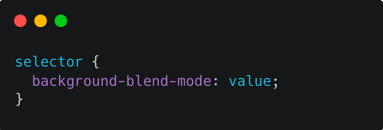
background-blend-mode
This property blends the background of an element with the content of the element itself or with another element on top of it. The blending occurs at the point where the background image and the element content meet.
Here’s the syntax format for the CSS background-blend-mode property:
Here are some potential values for the value parameter:
Here is a good example of how to use background-blend-mode at the right time:
In the given code, two classes are defined that set the background-blend-mode property. The hard-light class sets the blend mode to hard-light, and the color-burn class sets the blend mode to color-burn.
Here’s how the hard-light class is defined:
|
1 2 3 |
.hard-light { background-blend-mode: hard-light; } |
And here’s how the color-burn class is defined:
|
1 2 3 |
.color-burn { background-blend-mode: color-burn; } |
When these classes are applied to an element that has a background image and a background color, the blending mode specified in the class is applied to blend the two together.
For example, in the given HTML code, the first image element has the class image1, which has a background image and a background color defined. If we apply the hard-light class to this element, the resulting style would look like this:
|
1 2 3 4 5 6 7 |
.image1 { background-image: url('https://images.unsplash.com/photo-1614578409958-e414cc6f1064?ixlib=rb-4.0.3&ixid=MnwxMjA3fDB8MHxwaG90by1wYWdlfHx8fGVufDB8fHx8&auto=format&fit=crop&w=774&q=80'); background-color: black; } .hard-light { background-blend-mode: hard-light; } |
This would cause the background image and background color to blend together using the hard-light blending mode. Similarly, if we apply the color-burn class to the third image element, the resulting style would look like this:
|
1 2 3 4 5 6 7 |
.image3 { background-image: url('https://images.unsplash.com/photo-1660304755591-8c5ca028f8ee?ixlib=rb-4.0.3&ixid=MnwxMjA3fDB8MHxwaG90by1wYWdlfHx8fGVufDB8fHx8&auto=format&fit=crop&w=1770&q=80'); background-color: pink; } .color-burn { background-blend-mode: color-burn; } |
This would cause the background image and background color to blend together using the color-burn blending mode.
HTML:
|
1 2 3 4 5 6 7 8 9 10 11 12 13 14 15 |
<body> <h1>Background Blend Mode</h1> <h3 class="heading">Before</h3> <div class="row"> <div class="image image1"></div> <div class="image image2"></div> <div class="image image3"></div> </div> <h3 class="heading">After</h3> <div class="container"> <div class="image hard-light image1"></div> <div class="image hard-light image2"></div> <div class="image color-burn image3"></div> </div> </body> |
See the Pen
CSS Background Blend Mode ex1 by Dun Yan (@dun_yan_)
on CodePen.
Describing colors through words can be a challenging task, much like trying to capture the essence of an idea through a mere quote. However, to showcase the distinctions between colors with different background blend modes, a simulator can effectively convey their unique characteristics.
See the Pen
CSS Background Blend Mode Simulator by Dun Yan (@dun_yan_)
on CodePen.
mix-blend-mode
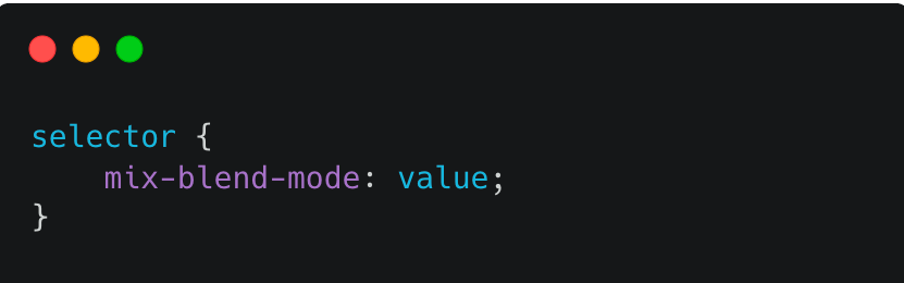
This advanced CSS property blends the content of an element with the content of the element behind it. It does not affect the background of the element.
Here’s the syntax format for the CSS mix-blend-mode property:
Here are some potential values for the value parameter:
Here is a suitable scenario for using mix-blend-mode at the right time:
|
1 2 3 4 5 6 7 8 9 |
.background { min-height: 100vh; background-image: url("https://images.unsplash.com/photo-1494645009625-cc17363a5f20?ixlib=rb-4.0.3&ixid=MnwxMjA3fDB8MHxwaG90by1wYWdlfHx8fGVufDB8fHx8&auto=format&fit=crop&w=2780&q=80"); background-size: cover; color: white; display: flex; justify-content: right; isolation: isolate; } |
The first section of code creates a div element with the class background. It sets the min-height property to 100vh, which means the element will take up the entire viewport’s height. It also sets a background image using the background-image property with an Unsplash image URL.
|
1 2 3 4 5 6 |
.background-intro { width: 40%; padding: 2em; padding-top: min(15vh, 10rem); position: relative; } |
Next, this code uses a pseudo-element ::after on the background-intro class. It sets the content property to an empty string, which is required for the pseudo-element to be displayed.
|
1 2 3 4 5 6 7 8 9 |
.background-intro::after { content: ""; position: absolute; inset: 0; z-index: -1; background: #355f08; opacity: .5; mix-blend-mode: multiply; } |
The background property sets the background color of the pseudo-element to a green color. The opacity property is set to 0.5, which makes the pseudo-element semi-transparent. The z-index property is set to -1, which positions the pseudo-element behind the parent element.
Finally, the mix-blend-mode property is set to multiply, which blends the color of the pseudo-element with the color of the element behind it using the multiply blend mode.
HTML:
|
1 2 3 4 5 6 |
<div class="background"> <div class="background-intro"> <h1><code>mix-blend-mode</code> is cool</h1> <p>Here is an example of the mix blend mode. The property is mix-blend-mode: multiply</p> </div> </div> |
See the Pen
CSS Mix Blend Mode ex1 by Dun Yan (@dun_yan_)
on CodePen.
To gain a better understanding of the colors produced by the min blend mode, we can utilize a simulator similar to the one used for background blending. Here is the simulator:
See the Pen
CSS Mix Blend Mode simulator by Dun Yan (@dun_yan_)
on CodePen.
Minification
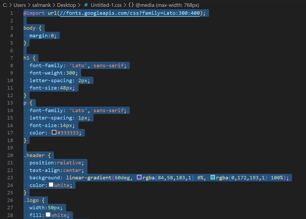
CSS minification is a crucial step in optimizing website performance, especially regarding page load speed. In addition to reducing the file size of the CSS by removing unnecessary characters such as whitespaces, comments, and newlines, minification can also help improve the overall website performance on slower or unreliable network connections.
By compressing the CSS code, the browser can download and parse the stylesheet more quickly, leading to faster page load times and a better user experience. Additionally, minification can help to reduce server load and bandwidth usage, which can ultimately save money and improve website scalability.
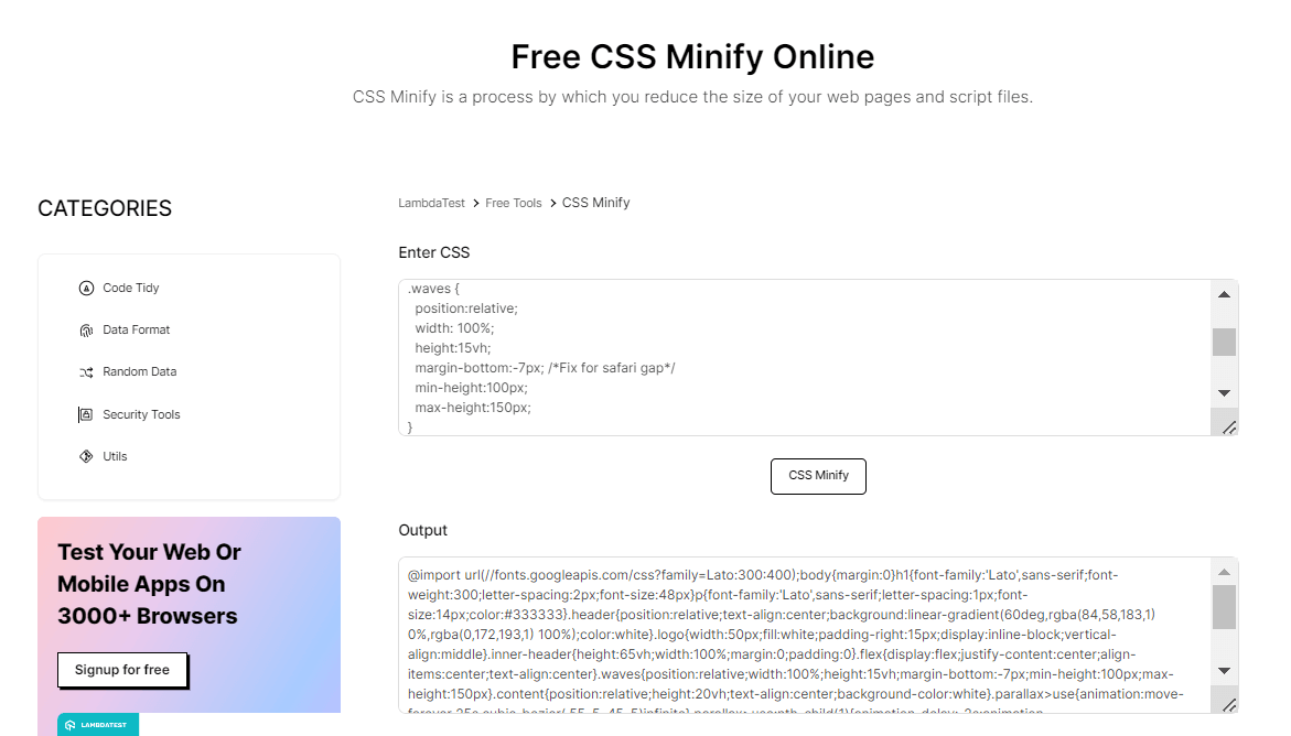
Here is an example of minified CSS code:
|
1 |
body{background:#f0f0f0;color:#333;font-family:Arial,sans-serif}h1{font-size:2em;margin-bottom:.5em}p{margin-bottom:1em} |
To minify CSS code, you can use a CSS minification tool, such as:
uglifycss
To use uglifycss, you can install it on your machine or use an online tool. To demonstrate the use of uglifycss, we will use this CodePen example by Goodkatz. Here’s how to use uglifycss on the command line:
|
1 |
npm init -y |
|
1 |
npm install uglifycss -g |
|
1 |
uglifycss style.css > style.min.css |
YUICompressor
YUICompressor is a tool for minifying and compressing CSS and JavaScript files written in Java. Here’s how to use it:
|
1 |
java -jar yuicompressor-x.y.z.jar input.css -o output.css |
CSS Minifier and Compressor
CSS Minifier allows you to enter your CSS code, which is compressed and minified to reduce the file size and improve page load times. Additionally, it also offers additional features, such as the ability to optimize images and JavaScript files.
See the Pen
Before CSS Minification: Wave example by Dun Yan (@dun_yan_)
on CodePen.
The above CodePen is inspired by Goodkatz. Now, let’s see the steps to minify the CSS.
In this section of the advanced CSS tutorial, we will look at the difference between using and not using CSS minification. We will compare the before vs after scenario to demonstrate how using CSS minification can significantly reduce the load time and improve the overall user experience on your website.
Here, we have used LT Browser, a mobile site tester offered by the LambdaTest platform, to check the performance of the web pages.
LT Browser helps developers and testers with responsive testing and debugging. It lets you experience how websites look on different pre-installed device viewports like mobiles, tablets, desktops, and laptops.
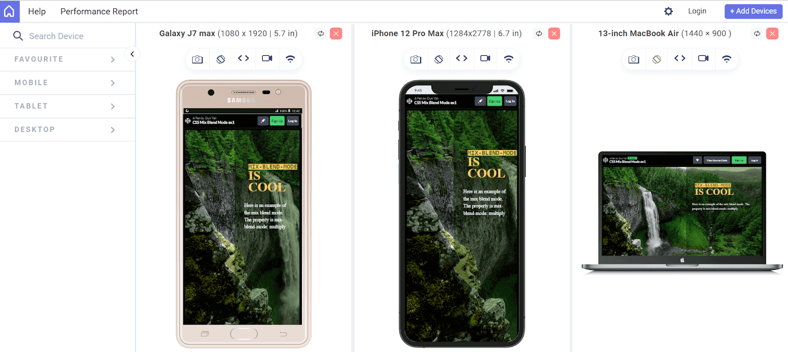
Each device view has its own Chrome DevTools, so you can easily find and debug issues tailored to each device’s layout. This makes testing easier and gives you the confidence to create a seamless mobile website testing experience.
Catch up on the latest testing tutorials – subscribe to the LambdaTest YouTube Channel.
In addition, AI-powered test orchestration and execution platforms like LambdaTest offer 100+ free online developers tools to help devs streamline their workflow and development of websites. Also, LambdaTest enables developers and testers to test browser compatibility of websites and web applications that use advanced CSS concepts like pseudo-classes, blend modes, animations, and more.
Now, let’s see the difference between using and not using CSS minification.
Before minification:
See the Pen
Before CSS Minification: Wave example by Dun Yan (@dun_yan_)
on CodePen.
After minification:
See the Pen
After CSS Minification: Wave example by Dun Yan (@dun_yan_)
on CodePen.
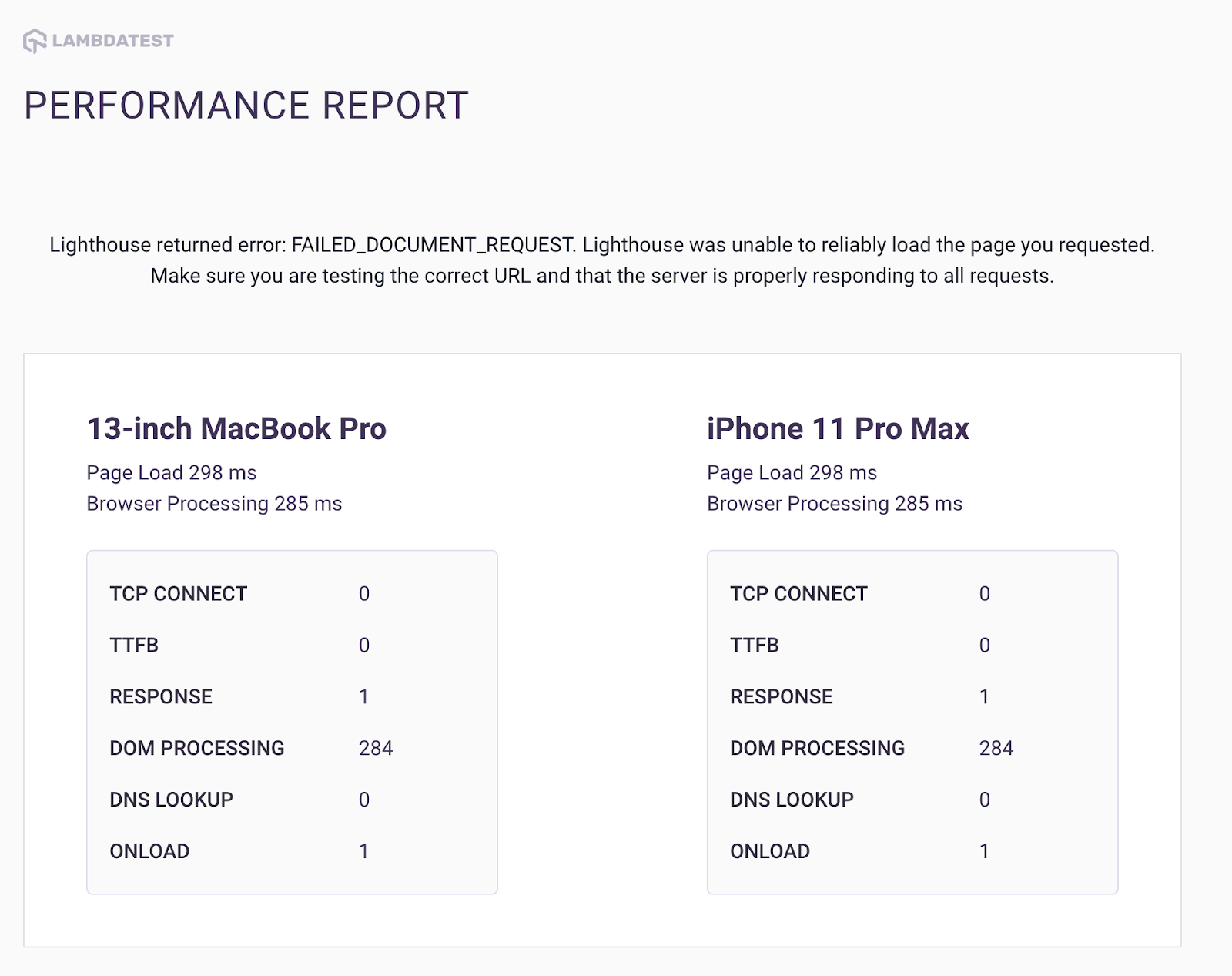
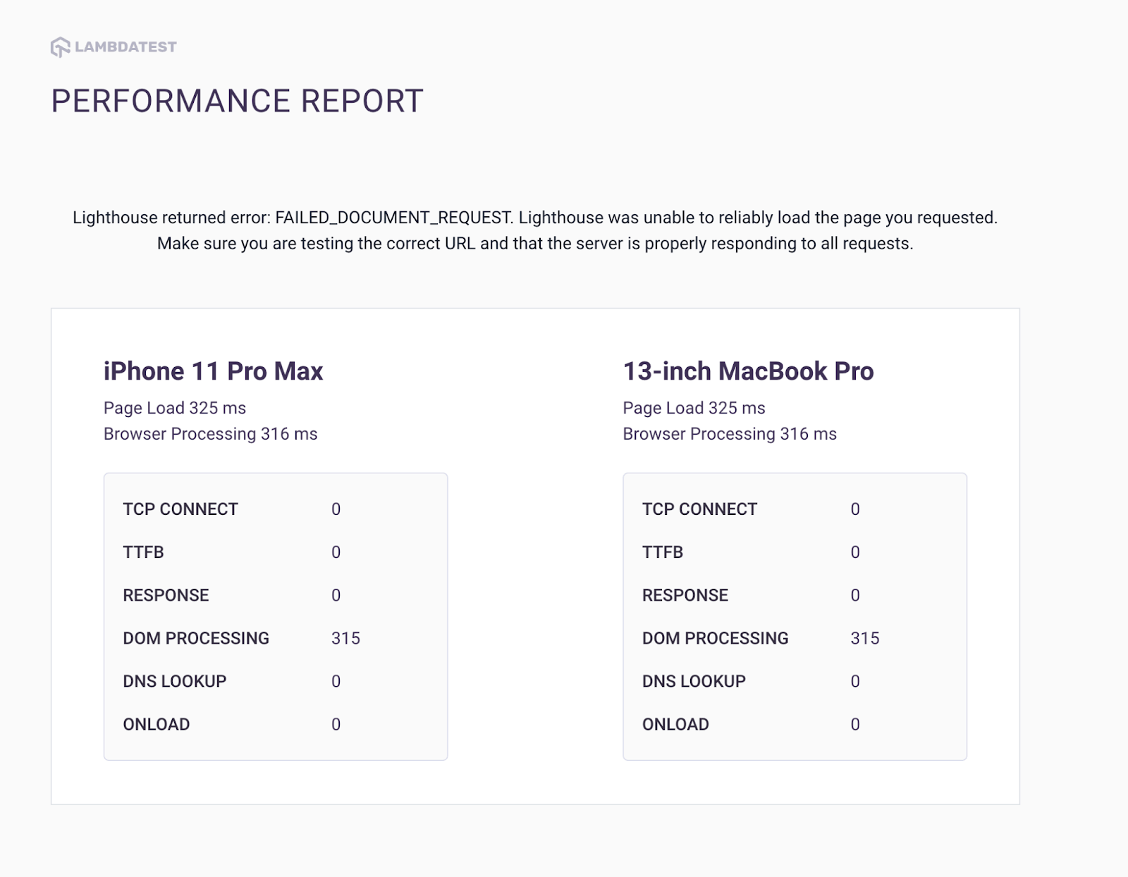
To measure the performance difference between a website’s CSS file before and after minification, a series of tests were conducted using LT Browser. The results revealed that the DOM processing speed improved from 315ms before minification to 284ms after minification.
For those unfamiliar with the term, DOM processing speed refers to the time it takes for a browser to parse and render the HTML and CSS files of a webpage. Essentially, when a browser loads a webpage, it must analyze the HTML and CSS files to understand the layout and style of the page. The faster the browser can parse and render these files, the faster the page will load for the user.
Overall, optimizing a website’s performance is crucial for providing a positive user experience. Slow loading times can lead to frustration and cause users to abandon the site altogether.
 Note
NoteTest your websites in real-user conditions. Try LambdaTest Today!
Conclusion
In conclusion, mastering advanced CSS concepts is essential for creating modern and visually appealing web pages. By incorporating advanced CSS techniques such as pseudo-classes, z-index, minification, maskings, and blend modes, web developers can create efficient, accessible, and user-friendly designs.
While the learning curve for advanced CSS can be steep, the payoff is worth it. With practice and perseverance, you can become a CSS expert and take your web development skills to the next level. Hope this advanced CSS tutorial has provided you with valuable insights and inspiration to start exploring advanced CSS concepts.
Frequently Asked Questions (FAQs)
What is an advanced CSS?
Advanced CSS refers to using complex techniques and features to style web pages, such as animations, transitions, and grid layouts.
Is advanced CSS hard?
Advanced CSS can be challenging initially, but with practice and patience, it becomes manageable. It requires a deeper understanding of CSS principles and properties.
What is CSS3 vs CSS?
CSS3 is the latest version of CSS, introducing new features like rounded corners, gradients, and animations, building upon the capabilities of CSS. It brings more flexibility and creativity to web design compared to previous versions of CSS.


Author’s Profile
Dun Yan
Dun Yan is a developer based in Kuala Lumpur who specializes in NextJS, JavaScript, ReactJS, and Tailwind. He also has experience with NodeJS and Express. He is always looking for new challenges and opportunities to grow as a developer
Blogs: 4
Got Questions? Drop them on LambdaTest Community. Visit now


