
CSS Blend Modes: Basics and Getting Started
Alex Anie
Posted On: October 30, 2023
 160824 Views
 19 Min Read
Blending images together is not new in the design world, but when it comes to the web, things can be tricky or complex, depending on your chosen approach.
Previously, designers and developers relied on manually creating blended images using image editing software like Photoshop or Illustrator. However, this is no longer necessary, as CSS now allows for blending modes to be applied directly.
With the use of CSS blend modes, web designers can create stunning and eye-catching visual effects that can improve the website’s user interface and how users interact with it. However, blend modes can also serve as a good source of contrast.
For example, we can apply CSS blend modes to hero images on website landing pages to provide visual contrast from element content and its parent background. This can be done using the different available blend mode values such as multiply, screen, overlay, darken, and others.
In this tutorial, we will focus on CSS blend modes, background-blend-mode, and mix-blend-mode properties in detail and how to implement them to create a visually appealing and stunning website.
TABLE OF CONTENTS
What are CSS Blend Modes?
CSS blend modes (compositing) refer to how two or multiple element layers are combined together to form a single layer. Layers, in this case, refer to the element’s background color, background image, or the element content.
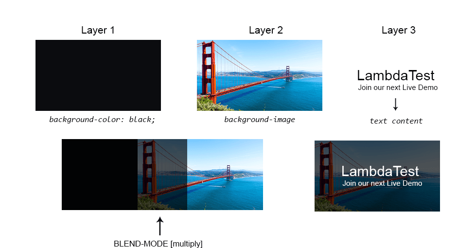
This can be very useful when we need to blend an element background-image(s) with the element background-color; in this case, we use the CSS background-blend-mode property. However, when we need to blend the element’s content with the background of its parent element and content, we use the CSS mix-blend-mode property.
Here are some of the real-world websites that effectively use CSS blend mode.

Here, the background-image and background-color are blended together, as seen on the CodeinWP website. This makes the background-color an overlay of the background-image and simultaneously creates a contrast between the content on the website from its overlay background.
Furthermore, below is another use case is where CSS blend mode is used:

The Infosys website uses CSS blend modes to blend the background-image with the background-color, which can be done using CSS background-blend-mode
to improve the readability of text and enhance the website contrast.
This is very useful when separating content from its background or making images appear faint so that text can be visible.
However, Netflix also provides a good use case for how CSS blend modes can be implemented. The example here indicates the use of mix-blend-mode to add blend modes to a background image that is separate or independent of its parent.

This can be used in areas where the content and the background of the parent need to be separated to provide a good contrast and improve readability.
Navigating websites that implement good uses of CSS blend mode on images and hero images can improve readability and make it more accessible to users with poor visuals.
Values of CSS Blend Mode
CSS blend mode values are keyword values used to set how an element’s layers should be blended.
| Values | Definitions |
|---|---|
| normal | This is the default blend mode. No changes or blend mode is applied. |
| multiply | The multiply blend mode multiplies the darker areas of the layers. Depending on the colors of the layers, the white layers are turned to transparent, and lighter colors are reduced. |
| screen | The screen blend mode increases the lighter areas of the layers and completely removes or reduces the darker parts of the layers. It behaves like the opposite of multiply. |
| overlay | It is based on the colors of the layers. The overlay can either function as a screen or multiply, then the result is increased. |
| darken | The darker parts of the layers are increased, while the whites become transparent or fade. |
| lighten | The lighter parts of the layers are increased while the darks are removed. |
| color-dodge | It removes all blacks or darker colors and increases the lighter color. Lighter colors become brighter, and darks are removed. |
| color-burn | Lighter parts of the layers are removed. Darker parts are multiplied and concentrated. |
| hard-light | Its result is darker if the top layer is dark or lighter if the layer is light. However, the lightness is increased.
The hard-light function is based on the colors in the layers and how they appear. |
| soft-light | It might either brighten the colors and remove the darker areas or darken the colors and remove the lighter areas. |
| difference | It subtracts the background-color layer from the background-image color layer or the color in the background-image from the background-color. If the background-color is white, it inverts, and if the background-color is black, no change is made to the background-image. |
| exclusion | It behaves similarly like difference but with less contrast. |
| hue | It takes the hue from the background-color and applies it to the saturation and luminosity of the background-image. |
| saturation | It takes the saturation from the background-color and applies it to the hue and luminosity of the background-image. |
| color | It takes the saturation and hue from the background-color and applies it to the luminosity of the background-image. |
| luminosity | It takes the luminosity of the background-color and applies it to the hue and saturation of the background-image. |
HTML:
|
1 2 3 4 5 6 7 8 9 10 11 12 13 14 15 16 17 18 19 20 21 22 23 24 25 26 27 28 29 30 31 32 33 34 35 36 37 38 39 40 41 42 43 44 45 46 47 48 49 50 51 52 53 54 55 56 57 58 59 60 61 62 63 64 65 66 67 68 69 70 71 72 73 74 75 76 77 78 79 80 81 82 83 84 85 86 87 88 89 90 91 92 93 94 95 96 97 98 99 100 101 102 103 104 105 106 107 108 109 110 111 112 113 114 115 116 117 118 119 120 121 122 123 124 125 126 127 128 129 130 131 132 133 134 135 136 137 138 139 140 141 142 143 144 145 146 147 148 149 150 151 152 153 154 155 156 157 158 |
<!DOCTYPE html> <html lang="en"> <head> <meta charset="UTF-8"> <meta name="viewport" content="width=device-width, initial-scale=1.0"> <title>blend modes</title> <link rel="stylesheet" href="main.css"> </head> <body> <main class="main"> <section> <!-- Card Normal --> <aside class="card c1"> <div class="img-container" data-blendMode="normal"> </div> <span class="s1"> <h4>normal</h4> </span> </aside> <!-- Card multiply --> <aside class="card c2"> <div class="img-container" data-blendMode="multiply"> </div> <span class="s1"> <h4>multiply</h4> </span> </aside> <!-- Card screen --> <aside class="card c3"> <div class="img-container" data-blendMode="screen"> </div> <span class="s1"> <h4>screen</h4> </span> </aside> <!-- Card overlay --> <aside class="card c4"> <div class="img-container" data-blendMode="overlay"> </div> <span class="s1"> <h4>overlay</h4> </span> </aside> <!-- Card darken --> <aside class="card c5"> <div class="img-container" data-blendMode="darken"> </div> <span class="s1"> <h4>darken</h4> </span> </aside> <!-- Card lighten --> <aside class="card c6"> <div class="img-container" data-blendMode="lighten"> </div> <span class="s1"> <h4>lighten</h4> </span> </aside> <!-- Card color-dodge --> <aside class="card c7"> <div class="img-container" data-blendMode="color-dodge"> </div> <span class="s1"> <h4>color-dodge</h4> </span> </aside> <!-- Card color-burn --> <aside class="card c8"> <div class="img-container" data-blendMode="color-burn"> </div> <span class="s1"> <h4>color-burn</h4> </span> </aside> <!-- Card hard-light --> <aside class="card c9"> <div class="img-container" data-blendMode="hard-light"> </div> <span class="s1"> <h4>hard-light</h4> </span> </aside> <!-- Card soft-light --> <aside class="card c10"> <div class="img-container" data-blendMode="soft-light"> </div> <span class="s1"> <h4>soft-light</h4> </span> </aside> <!-- Card difference --> <aside class="card c11"> <div class="img-container" data-blendMode="difference"> </div> <span class="s1"> <h4>difference</h4> </span> </aside> <!-- Card exclusion --> <aside class="card c12"> <div class="img-container" data-blendMode="exclusion"> </div> <span class="s1"> <h4>exclusion</h4> </span> </aside> <!-- Card hue --> <aside class="card c13"> <div class="img-container" data-blendMode="hue"> </div> <span class="s1"> <h4>hue</h4> </span> </aside> <!-- Card saturation --> <aside class="card c14"> <div class="img-container" data-blendMode="saturation"> </div> <span class="s1"> <h4>saturation</h4> </span> </aside> <!-- Card color --> <aside class="card c15"> <div class="img-container" data-blendMode="color"> </div> <span class="s1"> <h4>color</h4> </span> </aside> <!-- Card luminosity --> <aside class="card c16"> <div class="img-container" data-blendMode="luminosity"> </div> <span class="s1"> <h4>luminosity</h4> </span> </aside> </section> </main> </body> </html> |
CSS:
|
1 2 3 4 5 6 7 8 9 10 11 12 13 14 15 16 17 18 19 20 21 22 23 24 25 26 27 28 29 30 31 32 33 34 35 36 37 38 39 40 41 42 43 44 45 46 47 48 49 50 51 52 53 54 55 56 57 58 59 60 61 62 63 64 65 66 67 68 69 70 71 72 73 74 75 76 77 78 79 80 81 82 83 84 85 86 87 88 89 90 91 92 93 94 95 96 97 98 99 100 101 102 103 104 105 106 107 108 109 110 111 112 113 114 115 116 117 118 119 120 121 122 123 124 125 126 127 128 129 130 131 132 133 134 135 136 137 138 139 140 141 142 143 |
*, *::after, *::before { padding: 0; margin: 0; box-sizing: 0; } body{ background-color: #d9e1eb; } .main { width: 100vw; height: 100vh; display: grid; place-items: center; } section { display: grid; grid-template-columns: repeat(6, 150px); gap: 10px; } .card { box-shadow: 0 1px 3px 0 rgba(0, 0, 0, 0.1), 0 1px 2px 0 rgba(0,0,0,.06); background-color: white; } .card .img-container { height: 150px; background: url(https://user-images.githubusercontent.com/78242022/270114982-02bad30f-4506-412f-8ef9-7738a4c0c571.png); -webkit-user-select: none; background-color: #0a8e97; user-select: none; background-size: cover; background-repeat: no-repeat; background-position: center center; } [data-blendMode="normal"]{ background-blend-mode: normal; } [data-blendMode="multiply"]{ background-blend-mode: multiply; } [data-blendMode="screen"]{ background-blend-mode: screen; } [data-blendMode="overlay"]{ background-blend-mode: overlay; } [data-blendMode="darken"]{ background-blend-mode: darken; } [data-blendMode="lighten"]{ background-blend-mode: lighten; } [data-blendMode="color-dodge"]{ background-blend-mode: color-dodge; } [data-blendMode="color-burn"]{ background-blend-mode: color-burn; } [data-blendMode="hard-light"]{ background-blend-mode: hard-light; } [data-blendMode="soft-light"]{ background-blend-mode: soft-light; } [data-blendMode="difference"]{ background-blend-mode: difference; } [data-blendMode="exclusion"]{ background-blend-mode: exclusion; } [data-blendMode="hue"]{ background-blend-mode: hue; } [data-blendMode="saturation"]{ background-blend-mode: saturation; } [data-blendMode="color"]{ background-blend-mode: color; } [data-blendMode="luminosity"]{ background-blend-mode: luminosity; } h4 { font: 18px monospace; } @media screen and (max-width: 1000px) { section { margin: 3em 0; grid-template-columns: repeat(5, 150px); } } @media screen and (max-width: 860px) { section { margin: 3em 0; grid-template-columns: repeat(4, 150px); } } @media screen and (max-width: 700px) { section { margin: 3em 0; grid-template-columns: repeat(3, 150px); } } @media screen and (max-width: 560px) { section { grid-template-columns: repeat(2, 150px); } } |
Preview:
See the Pen
blend mode values by Ocxigin (@ocxigin)
on CodePen.
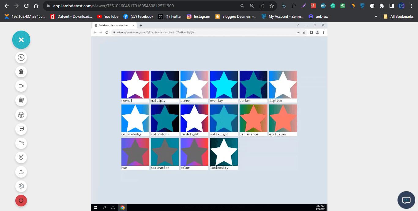
From the browser preview, we created sixteen elements and applied a background image of a white star with a gradient background.
Each element takes a different CSS blend mode within its container, determining how the image is rendered. For example, the multiply blend mode completely removes the white from the star, making it transparent and revealing the teal background color. The gradient color becomes darker.
The third element screen does the opposite; it increases the brightness of the gradient by making it lighter and then keeps the white color on the star.
However, to make the element responsive, we implement CSS media queries to add different breakpoints on different screen sizes. By defining breakpoints in CSS, you can apply unique styles and layouts for small screens (mobile devices), medium-sized screens (tablets), and larger screens (desktop monitors).
CSS background-blend-mode Property
The CSS background-blend-mode property is used to set how the background images and background color of the same element should blend based on the CSS blend mode value provided.
Syntax:
|
1 2 3 4 5 6 7 8 9 10 11 12 13 14 |
.element { /* single value */ background-blend-mode: multiply; /* Two values, one per background */ background-blend-mode: exclusion, hue; /* Global values */ background-blend-mode: unset; background-blend-mode: inherit; background-blend-mode: initial; background-blend-mode: revert; background-blend-mode: revert-layer; } |
To apply a background-blend-mode to an element, the specified element takes in the background image(s), background-color (which can either be a solid color or gradient), and then the background-blend-mode property with a CSS blend mode value.
Preview:
See the Pen
background blend mode by Ocxigin (@ocxigin)
on CodePen.
HTML:
|
1 2 3 4 5 6 7 8 9 10 11 12 13 14 15 16 17 18 19 20 21 22 23 24 25 26 27 28 29 30 31 32 33 34 35 36 37 38 39 40 41 42 43 44 45 46 47 48 49 50 51 52 53 54 55 56 57 58 59 60 61 62 63 64 65 66 67 68 69 70 71 72 73 74 75 76 77 78 79 80 |
<!DOCTYPE html> <html lang="en"> <head> <meta charset="UTF-8"> <meta name="viewport" content="width=device-width, initial-scale=1.0"> <link rel="stylesheet" href="style.css"> <title>Switch blend mode</title> </head> <body> <main class="main" id="backgroundImage"> <header> <!-- Navbar --> <nav> <!-- Nav Link --> <ul class="nav__links"> <li class="active-state">Red</li> <li>Blue</li> <li>Green</li> </ul> </nav> </header> <!-- LambdaTest Section --> <section class="lambdaTest"> <aside> <div class="logo"> <img src="https://user-images.githubusercontent.com/78242022/241950888-2a539490-0eda-4fb9-b2f9-3c1b3b2db1d5.svg" alt="" > </div> <div> <h1 class="Lt">LambdaTest</h1> <p>Integrate LambdaTest with your favorite tool and save yourself from manually managing bugs and tasks. <br />Also fits with your CI/CD pipeline. </p> </div> <!-- CSS blend mode section --> <section> <section> <!-- Content section --> <article> <div class="content"> <div class="btn-wrapper"> <button type="button">Image One</button> <button type="button">Image Two</button> <button type="button">Image Three</button> </div> </div> <p id="result"></p> </article> <!-- Select Option --> <div class="blend-mode"> <label for="blendModeList">Select blend Mode</label> <select nselectame="" id="blendModeList"> <option value="normal">normal</option> <option value="multiply">multiply</option> <option value="screen">screen</option> <option value="overlay">overlay</option> <option value="darken">darken</option> <option value="lighten">lighten</option> <option value="color-dodge">color-dodge</option> <option value="color-burn">color-burn</option> <option value="hard-light">hard-light</option> <option value="soft-light">soft-light</option> <option value="difference">difference</option> <option value="exclusion">exclusion</option> <option value="hue">hue</option> <option value="saturation">saturation</option> <option value="color">color</option> <option value="luminosity">luminosity</option> </select> </div> </section> </section> </aside> </section> </main> </body> </html> |
CSS:
|
1 2 3 4 5 6 7 8 9 10 11 12 13 14 15 16 17 18 19 20 21 22 23 24 25 26 27 28 29 30 31 32 33 34 35 36 37 38 39 40 41 42 43 44 45 46 47 48 49 50 51 52 53 54 55 56 57 58 59 60 61 62 63 64 65 66 67 68 69 70 71 72 73 74 75 76 77 78 79 80 81 82 83 84 85 86 87 88 89 90 91 92 93 94 95 96 97 98 99 100 101 102 103 104 105 106 107 108 109 110 111 112 113 114 115 116 117 118 119 120 121 122 123 124 125 126 127 128 129 130 131 132 133 134 135 136 137 138 139 140 141 142 |
*, *::after, *::before { margin: 0; padding: 0; box-sizing: border-box; } body { overflow-x: hidden; } .main { width: 100vw; height: 100vh; background: url(https://user-images.githubusercontent.com/78242022/265640237-dd3aff00-7707-4452-a8f8-3b17b688edde.jpg); background-color: red; background-blend-mode: normal; background-repeat: no-repeat; background-size: cover; background-position: center center; } .lambdaTest { display: flex; justify-content: center; align-items: center; height: 100%; } .lambdaTest aside { width: 100px; display: flex; align-items: center; flex-direction: column; } .lambdaTest aside .Lt { font: 40px Arial; color: #fff; text-align: center; margin: 10px; } .logo { width: 100px; } /* Navbar */ /* Navbar: background */ .nav__links { display: flex; background-color: red; padding-left: 2em; box-shadow: 1px 0 10px 6px rgba(0, 0, 0, 0.3); } /* Navbar: items */ .nav__links li { list-style-type: none; color: #fff; font-family: Arial; font-weight: 600; font-size: 1.5em; padding: 8px; cursor: pointer; -webkit-user-select: none; user-select: none; } /* Navbar: hover */ .nav__links li:hover { background-color: black; } p { font: 13px Arial; font-weight: lighter; padding-block: 5px; color: white; white-space: nowrap; text-align: center; } /* button */ button { /* width: fit-content; */ white-space: nowrap; background-color: transparent; color: #fff; border: 2px solid white; line-height: 30px; padding: 0 10px; -webkit-user-select: none; user-select: none; cursor: pointer; text-transform: uppercase; transition: background-color 1s ease; } .btn-wrapper { margin-top: 3em; display: flex; justify-content: center; gap: 10px; } button:hover { background-color: #0ebac5; color: #fff; } button:active { transform: translateY(2px); } /* Blend Mode */ .blend-mode { display: flex; align-items: center; flex-direction: column; margin-top: 2em; } label { display: block; font: 15px Arial; font-weight: lighter; padding-block: 5px; color: #fff; text-align: center; } select { width: 12em; padding: 10px 12px; border-radius: 10px; text-align: center; } .active-state { background-color: rgba(39, 37, 37, 0.76); } |
JavaScript:
|
1 2 3 4 5 6 7 8 9 10 11 12 13 14 15 16 17 18 19 20 21 22 23 24 25 26 27 28 29 30 31 32 33 34 35 36 37 38 39 40 41 42 43 44 45 46 47 48 49 50 51 52 53 54 55 56 57 58 59 60 61 62 63 64 65 66 67 68 69 70 71 72 73 74 75 76 77 78 79 80 81 82 83 84 85 |
// Change Background Blend Mode function blendMode(){ // selects the "select" const blendItems = document.querySelector('select'); // add event listener blendItems.addEventListener('change', (e) =>{ // target the tag where the where the image is specified const backgroundImage = document.querySelector('#backgroundImage') // use the value on the option tag as value for the blend mode backgroundImage.style.backgroundBlendMode = `${e.target.value}` }) } blendMode() // Change Blend Color function changeColor(){ const listItems = document.querySelectorAll('li'); listItems.forEach((items)=> { // console.log(items) items.addEventListener('click', (e)=>{ const navBarBgColor = document.querySelector('.nav__links') const blendModeColor = document.querySelector('#backgroundImage') // const blendModeColor = document.querySelector('#backgroundImage') let returnColor = `${e.target.textContent.toLowerCase()}` // Change the background color of the navbar navBarBgColor.style.backgroundColor = returnColor; // Change the background Color of the blend Mode blendModeColor.style.backgroundColor = returnColor; // Here we are removing the native-state class from any other element on the page that has it. the ? make it so that it does not return any error if no active state is found. document.querySelector('.active-state')?.classList.remove('active-state'); // Here we are adding a class of active to the active element. e.target.classList.add('active-state'); }) }) } changeColor(); function switchImage(){ const listItems = document.querySelectorAll('[type="button"]'); const backgroundImage = document.querySelector('#backgroundImage') listItems.forEach((btn)=>{ // console.log(btn) btn.addEventListener('click', (e)=>{ // destructuring the button content in an array const [one,two,three] = ['Image One', 'Image Two', 'Image Three']; // return the text content of the target button let buttonText = e.target.textContent // if the target button matches the button content: the background should change. switch(buttonText){ case one : backgroundImage.style.backgroundImage = `${imgData.oneImg}` break; case two : backgroundImage.style.backgroundImage = `${imgData.twoImg}` break; case three : backgroundImage.style.backgroundImage = `${imgData.threeImg}` break; default: console.log('default is set') } }) }) } switchImage(); const imgData = { oneImg:'url(https://user-images.githubusercontent.com/78242022/260737945-83df4595-19ef-4833-9a7b-9472c48bc5f6.jpg)', twoImg:'url(https://user-images.githubusercontent.com/78242022/260738566-06b0c27a-1665-43f0-89e1-10c4b3f1bd19.jpg)', threeImg:'url(https://user-images.githubusercontent.com/78242022/260738162-572e7c69-d6be-42d8-b31b-d50c021cd616.jpg)' } |
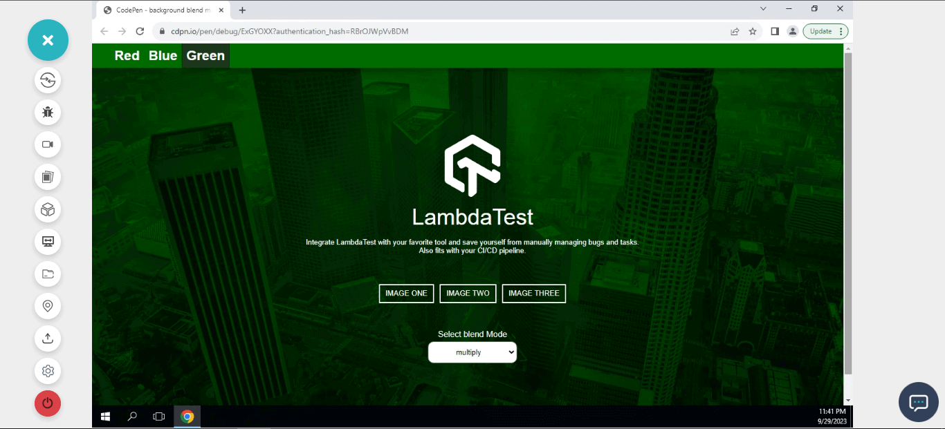
From the code example above, we created a simple landing page with three buttons for changing different background images and another button for changing CSS blend modes.
When you click on the image button, it changes and updates the background-image from the imgData object.
The blend button changes the CSS blend mode value when a new value is selected from the listed option.
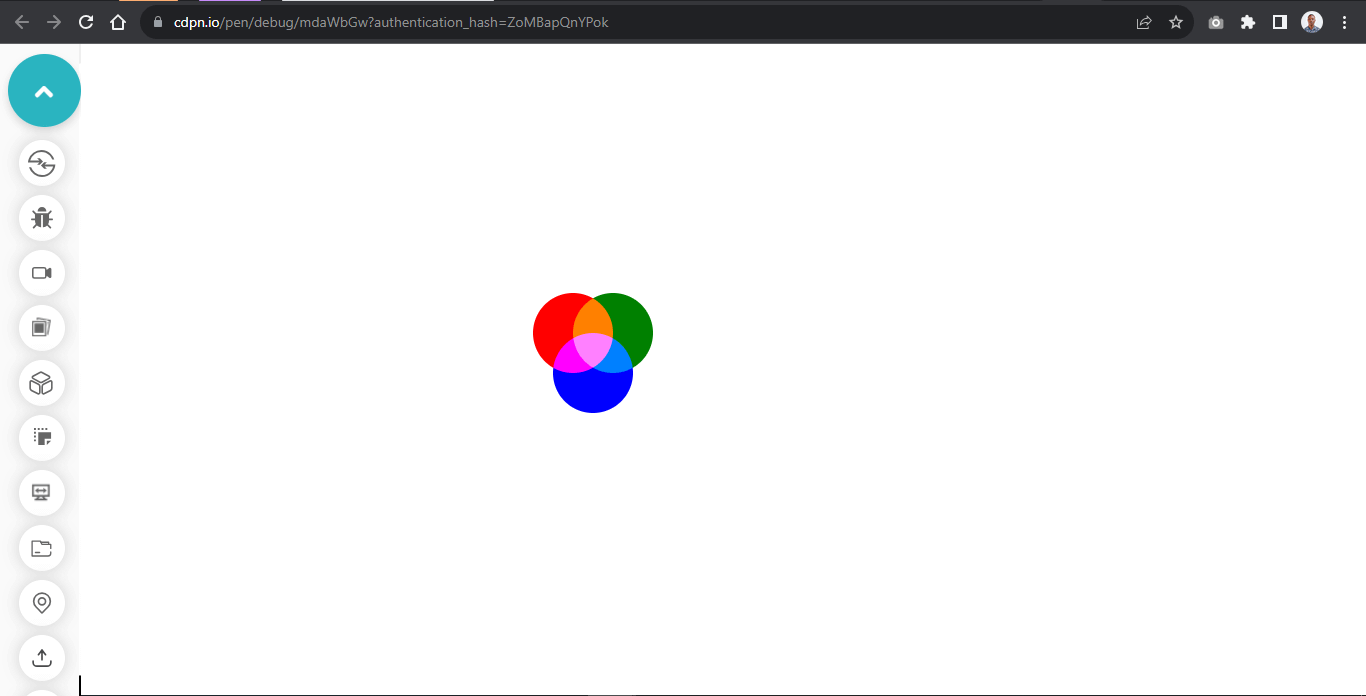
Blending Solid Colors With background-blend-mode
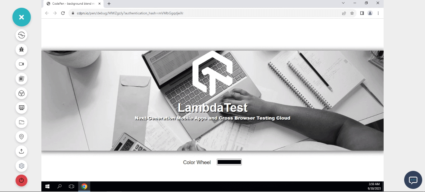
Solid colors are assigned with a single value, this can either be red, blue, purple or hex code (#800080) value or rgb(red, green, blue) values. These colors do not have an alpha channel (transparency).
The background-color and the CSS blend mode value applied will determine how the image will render. For example, a background-color of black and a blend mode of luminosity will make a color image render as a grayscale image. And if the specified blend mode is multiply, the background color will multiply, making the image render darker or completely black if transparency is not added to the background-color. However, if specified, the screen blend mode value will completely wipe out the black or dark areas of the image.
See the Pen
background blend mode and color wheel by Ocxigin (@ocxigin)
on CodePen.
Here, we have a grayscale image, change the background-color and toggle the color wheel to experiment with different CSS blend modes.
HTML:
|
1 2 3 4 5 6 7 8 9 10 11 12 13 14 15 16 17 18 19 20 21 22 23 24 25 26 27 28 29 |
<!DOCTYPE html> <html lang="en"> <head> <meta charset="UTF-8"> <meta name="viewport" content="width=device-width, initial-scale=1.0"> <title>Color Wheel</title> <link rel="stylesheet" href="main.css"> </head> <body> <main class="main"> <section> <div class="text"></div> <div class="blend"> <img src="https://user-images.githubusercontent.com/78242022/241950888-2a539490-0eda-4fb9-b2f9-3c1b3b2db1d5.svg" alt=""> <h1>LambdaTest</h1> <p>Next-Generation Mobile Apps and Cross Browser Testing Cloud</p> </div> <div class="color-wheel"> <div> <label for="ColorWheel">Color Wheel</label> <input type="color" id="ColorWheel"> </div> </div> </section> </main> </body> </html> |
CSS:
|
1 2 3 4 5 6 7 8 9 10 11 12 13 14 15 16 17 18 19 20 21 22 23 24 25 26 27 28 29 30 31 32 33 34 35 36 37 38 39 40 41 42 43 44 45 46 47 48 49 50 51 52 53 54 55 56 57 58 59 60 61 62 63 64 65 66 |
*, *::after, *::before { padding: 0; margin: 0; box-sizing: 0; } .main { width: 100vw; height: 100vh; display: grid; place-items: center; } .blend { width: 100vw; height: 25em; background-color: black; box-shadow: 0 2px 15px 5px rgba(0,0,0, 0.5); background-image: url(https://user-images.githubusercontent.com/78242022/260794838-a811c17d-1ea5-4e00-a3a0-f2361d11ba1f.jpg); background-repeat: no-repeat; background-size: cover; background-position: center center; background-blend-mode: luminosity; } img { display: block; width: 10em; margin: 4em auto 20px auto; } h1 { font: 3em Arial; font-weight: 700; text-align: center; text-shadow: 2px 2px #000; color: white; } p { font: 18px Arial; font-weight: 900; text-align: center; color: white; text-shadow: 2px 2px #000; } .color-wheel { display: flex; justify-content: center; margin-top: 2em; } label{ display: inline-block; padding-right: 1em; font: 20px Arial; } input { display: inline-block; width: 100px; } |
JavaScript:
|
1 2 3 4 5 6 7 8 9 |
function getColorWheel(){ const colorWheel = document.querySelector('input'); const blend = document.querySelector('.blend'); colorWheel.addEventListener('input', (e)=>{ blend.style.backgroundColor = `${e.target.value}`; }) } getColorWheel() |
Blending Gradient Colors With background-blend-mode
We’ve talked about blending solid colors. However, gradient colors can also be blended with background-blend-mode. This is very useful when blending multiple colors with a specified image or images of an element.
See the Pen
background blend mode gradient by Ocxigin (@ocxigin)
on CodePen.
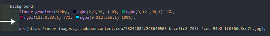
Here, the CSS blend mode of color is specified with a linear-gradient to give a gradient blending mode.
To apply gradient blend mode, apply the linear-gradient with a background image on the background property.
HTML:
|
1 2 3 4 5 6 7 8 9 10 11 12 13 14 15 16 17 18 19 20 21 22 |
<!DOCTYPE html> <html lang="en"> <head> <meta charset="UTF-8"> <meta name="viewport" content="width=device-width, initial-scale=1.0"> <title>gradient color</title> <link rel="stylesheet" href="main.css"> </head> <body> <main class="main"> <section> <div class="text"></div> <div class="blend"> <img src="https://user-images.githubusercontent.com/78242022/241950888-2a539490-0eda-4fb9-b2f9-3c1b3b2db1d5.svg" alt=""> <h1>LambdaTest</h1> <p>Next-Generation Mobile Apps and Cross Browser Testing Cloud</p> </div> </section> </main> </body> </html> |
CSS:
|
1 2 3 4 5 6 7 8 9 10 11 12 13 14 15 16 17 18 19 20 21 22 23 24 25 26 27 28 29 30 31 32 33 34 35 36 37 38 39 40 41 42 43 44 45 46 47 48 |
*, *::after, *::before { padding: 0; margin: 0; box-sizing: 0; } .main { width: 100vw; height: 100vh; display: grid; place-items: center; } .blend { width: 100vw; height: 25em; background: linear-gradient(90deg, rgba(2,0,36,1) 0%, rgba(9,121,88,1) 35%, rgba(135,8,83,1) 77%, rgba(0,212,255,1) 100%), url(https://user-images.githubusercontent.com/78242022/265773528-e35beb5e-3137-47ed-8e84-84a54d061cfb.jpg); box-shadow: 0 2px 15px 5px rgba(0,0,0, 0.5); background-repeat: no-repeat; background-size: cover; background-position: center center; background-blend-mode: color; } img { display: block; width: 10em; margin: 4em auto 20px auto; } h1 { font: 2em Arial; font-weight: 700; text-align: center; color: #fff; } p { font: 18px Arial; text-align: center; color: #fff; } |
Blending Multiple Images With multiple blend-mode
If it’s possible to add linear gradients using the background property, it’s also possible to add multiple images with the background property and then blend it with specified CSS blend mode or multiple CSS blend modes.
See the Pen
background-blend-mode- with multiply images by Ocxigin (@ocxigin)
on CodePen.
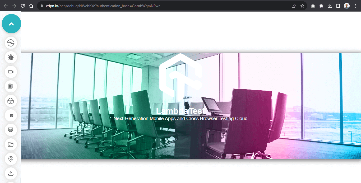
Here, from the above browser preview, we use the image of an office with the image of a city and then apply a blend mode of overlay.
You can specify more than two images with multiple CSS blend mode values. However, if the number of blend modes exceeds the number of images, the CSS blend mode values are truncated to fit the number of images specified.
HTML:
|
1 2 3 4 5 6 7 8 9 10 11 12 13 14 15 16 17 18 19 20 21 22 |
<!DOCTYPE html> <html lang="en"> <head> <meta charset="UTF-8"> <meta name="viewport" content="width=device-width, initial-scale=1.0"> <title>blending multiple images</title> <link rel="stylesheet" href="main.css"> </head> <body> <main class="main"> <section> <div class="text"></div> <div class="blend"> <img src="https://user-images.githubusercontent.com/78242022/241950888-2a539490-0eda-4fb9-b2f9-3c1b3b2db1d5.svg" alt=""> <h1>LambdaTest</h1> <p>Next-Generation Mobile Apps and Cross Browser Testing Cloud</p> </div> </section> </main> </body> </html> |
CSS:
|
1 2 3 4 5 6 7 8 9 10 11 12 13 14 15 16 17 18 19 20 21 22 23 24 25 26 27 28 29 30 31 32 33 34 35 36 37 38 39 40 41 42 43 44 45 46 47 |
*, *::after, *::before { padding: 0; margin: 0; box-sizing: 0; } .main { width: 100vw; height: 100vh; display: grid; place-items: center; } .blend { width: 100vw; height: 25em; background: linear-gradient(90deg, rgba(2,0,36,1) 0%, rgba(0,212,255,1) 100%), url(https://user-images.githubusercontent.com/78242022/265773573-a8ab85fe-900d-4d05-82da-6ecf179f1d5c.jpg), url(https://user-images.githubusercontent.com/78242022/265773640-3e662339-f658-4cfb-b2d9-1a106da04828.jpg); box-shadow: 0 2px 15px 5px rgba(0,0,0, 0.5); background-repeat: no-repeat; background-size: cover; background-position: center center; background-blend-mode: overlay, soft-light; } img { display: block; width: 10em; margin: 4em auto 20px auto; } h1 { font: 2em Arial; font-weight: 700; text-align: center; color: #fff; } p { font: 18px Arial; text-align: center; color: #fff; } |
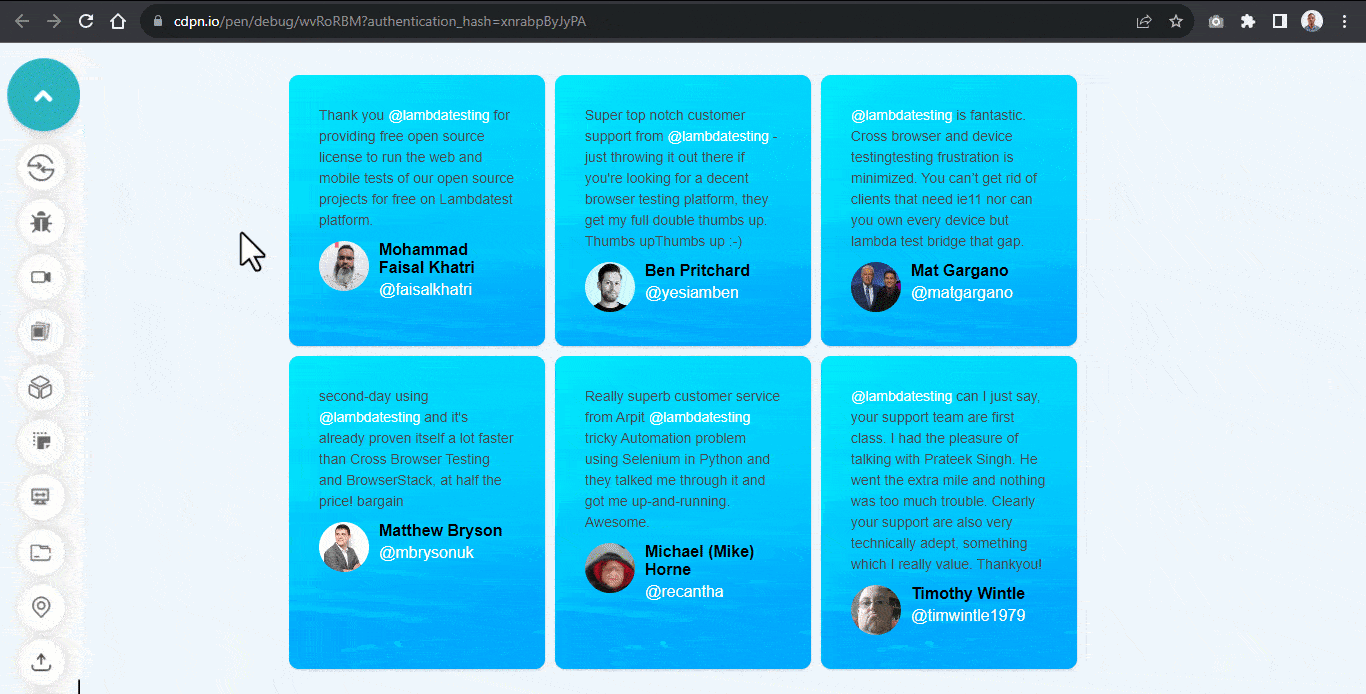
Applying Hover Effect to background-blend-mode
The background-blend-mode can also be changed on hover. This allows the use of different CSS blend mode values on state change.
It can be handy when changing the CSS blend mode as the user hovers over the element, improving user interaction.
See the Pen
Hover effect on background-blend-mode by Ocxigin (@ocxigin)
on CodePen.
Here, we apply a background-image with a background-color of blue and set the CSS blend mode to overlay while in a hover state. We set the blend mode to normal to display the original image without a blend mode.
HTML:
|
1 2 3 4 5 6 7 8 9 10 11 12 13 14 15 16 17 18 19 20 21 22 23 24 25 26 27 28 29 30 31 32 33 34 35 36 37 38 39 40 41 42 43 44 45 46 47 48 49 50 51 52 53 54 55 56 57 58 59 60 61 62 63 64 65 66 67 68 69 70 71 72 73 74 75 76 77 78 79 80 81 82 83 84 85 86 87 88 89 90 91 92 93 94 95 96 97 98 |
<!DOCTYPE html> <html lang="en"> <head> <meta charset="UTF-8"> <meta name="viewport" content="width=device-width, initial-scale=1.0"> <title>blending multiple images</title> <link rel="stylesheet" href="main.css"> </head> <body> <main class="main"> <section> <!-- Card One --> <aside class="card c1"> <p class="text">Thank you <em>@lambdatesting</em> for providing free open source license to run the web and mobile tests of our open source projects for free on Lambdatest platform.</p> <div> <span class="s1"> <img src="https://user-images.githubusercontent.com/78242022/266013783-757ea2d1-e396-4d56-ade8-8b641f78ce71.png" alt=""> </span> <span class="s2"> <h4>Mohammad Faisal Khatri</h4> <p class="at">@faisalkhatri</p> </span> </div> </aside> <!-- Card Two --> <aside class="card c1"> <p class="text">Super top notch customer support from <em>@lambdatesting</em> - just throwing it out there if you're looking for a decent browser testing platform, they get my full double thumbs up. Thumbs upThumbs up :-) </p> <div> <span class="s1"> <img src="https://user-images.githubusercontent.com/78242022/266013790-4d674d96-a311-47c3-9b7c-03feaa36c948.png" alt=""> </span> <span class="s2"> <h4>Ben Pritchard</h4> <p class="at">@yesiamben</p> </span> </div> </aside> <!-- Card Three --> <aside class="card c1"> <p class="text"><em>@lambdatesting</em> is fantastic. Cross browser and device testingtesting frustration is minimized. You can't get rid of clients that need ie11 nor can you own every device but lambda test bridge that gap.</p> <div> <span class="s1"> <img src="https://user-images.githubusercontent.com/78242022/266013776-40ac50f1-31f8-4250-acb2-05f16d683baa.png" alt=""> </span> <span class="s2"> <h4>Mat Gargano</h4> <p class="at">@matgargano</p> </span> </div> </aside> <!-- Card Four --> <aside class="card c1"> <p class="text">second-day using <em>@lambdatesting</em> and it's already proven itself a lot faster than Cross Browser Testing and BrowserStack, at half the price! bargain</p> <div> <span class="s1"> <img src="https://user-images.githubusercontent.com/78242022/266013762-54201d6a-0923-4969-948c-790dec804253.png" alt=""> </span> <span class="s2"> <h4>Matthew Bryson</h4> <p class="at">@mbrysonuk</p> </span> </div> </aside> <!-- Card Five --> <aside class="card c1"> <p class="text">Really superb customer service from Arpit <em>@lambdatesting</em> tricky Automation problem using Selenium in Python and they talked me through it and got me up-and-running. Awesome.</p> <div> <span class="s1"> <img src="https://user-images.githubusercontent.com/78242022/266013745-c09f21ff-cb29-49df-9110-d5e90810b5b9.png" alt=""> </span> <span class="s2"> <h4>Michael (Mike) Horne</h4> <p class="at">@recantha</p> </span> </div> </aside> <!-- Card Six --> <aside class="card c1"> <p class="text"><em>@lambdatesting</em> can I just say, your support team are first class. I had the pleasure of talking with Prateek Singh. He went the extra mile and nothing was too much trouble. Clearly your support are also very technically adept, something which I really value. Thankyou!</p> <div> <span class="s1"> <img src="https://user-images.githubusercontent.com/78242022/266013732-785b0223-9774-4918-964f-ce75f11138f2.png" alt=""> </span> <span class="s2"> <h4>Timothy Wintle</h4> <p class="at">@timwintle1979</p> </span> </div> </aside> </section> </main> </body> </html> |
CSS:
|
1 2 3 4 5 6 7 8 9 10 11 12 13 14 15 16 17 18 19 20 21 22 23 24 25 26 27 28 29 30 31 32 33 34 35 36 37 38 39 40 41 42 43 44 45 46 47 48 49 50 51 52 53 54 55 56 57 58 59 60 61 62 63 64 65 66 67 68 69 70 71 72 73 74 75 76 77 78 79 80 81 82 83 84 85 86 87 88 89 90 91 92 93 94 |
*, *::after, *::before { padding: 0; margin: 0; box-sizing: 0; } body{ background-color: #EEF5FF; } .main { width: 100vw; height: 100vh; display: grid; place-items: center; } section { display: grid; grid-template-columns: repeat(3, 16rem); gap: 10px; margin: 2em 0; } .card { padding: 30px; background: url(https://user-images.githubusercontent.com/78242022/265640237-dd3aff00-7707-4452-a8f8-3b17b688edde.jpg); background-color: #007bff; box-shadow: 0 1px 3px 0 rgba(0,0,0,.1), 0 1px 2px 0 rgba(0,0,0,.06); -webkit-user-select: none; user-select: none; cursor: pointer; border-radius: 10px; background-blend-mode: overlay; } .card:hover { background-blend-mode: normal; } .card:hover .at, .card:hover em { color: #007bff; } .card .text { font: 14px Arial; color: #4a4a4a; line-height: 21px; } .card h4 { font: 16px Arial; font-weight: 600; color: black; } .card .at { font: 16px Arial; font-weight: 400; color: #fff; margin-top: 4px; } .card img { width: 50px; height: 50px; border-radius: 50px; } .card div { display: flex; margin: 10px 0 0; gap: 10px; } em { font-style: normal; color: #fff; } @media screen and (max-width: 860px) { section { margin: 3em 0; grid-template-columns: repeat(2, 16rem); } } @media screen and (max-width: 560px) { section { grid-template-columns: repeat(1, 16rem); } } |
Desktop preview:
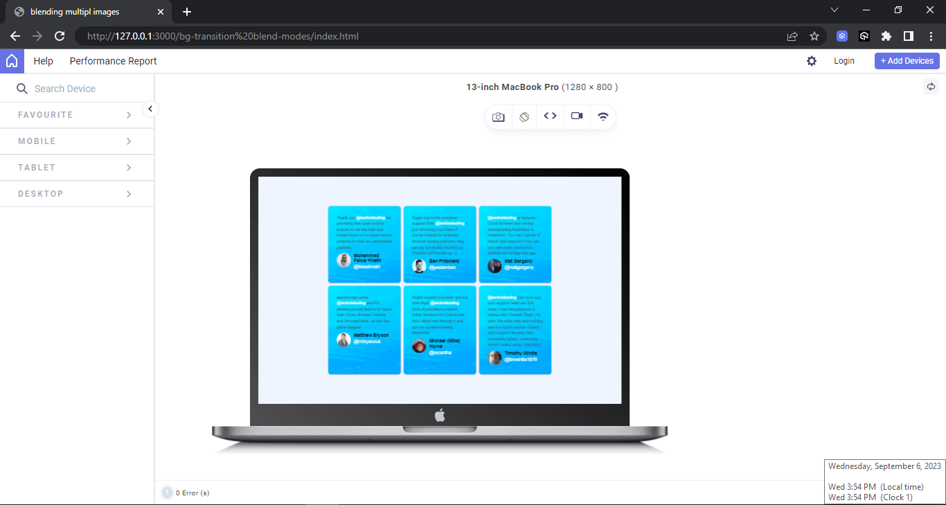
The above browser preview is rendered with LT Browser for developer- next-gen browser to build, test & debug.
LT Browser is a free, open-source, Chromium-based, developer-friendly browser for testing and debugging mobile-friendly websites and web apps across 50+ device viewports. It is developed by LambdaTest, an AI-powered test orchestration and execution platform.
LT Browser offers several features that make it ideal for web developers, including:
- Responsive testing: Test your website on various device viewports for responsiveness, including smartphones, tablets, and laptops, without owning them physically.
- Network throttling: Test your website on different network conditions, such as slow 3G or offline mode. This can help you to identify and fix any performance issues.
- Side-by-side view: View your website on multiple screen sizes side-by-side, making it easy to compare the different renderings.
- Screenshot and video recording: Capture screenshots and record videos of your testing sessions. This can be useful for sharing with other developers or for debugging purposes.
To get started, check out the documentation – Getting Started With LT Browser.
Check out the below tutorial on LT Browser to get started.
Catch up with the latest tutorials on mobile app testing, automation testing, and more — Subscribe to the LambdaTest YouTube Channel.
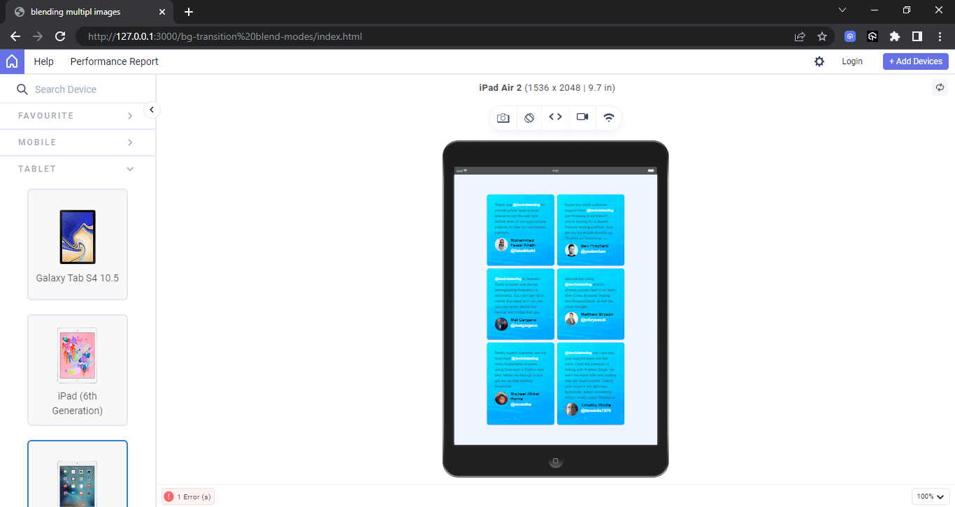
Tablet preview:
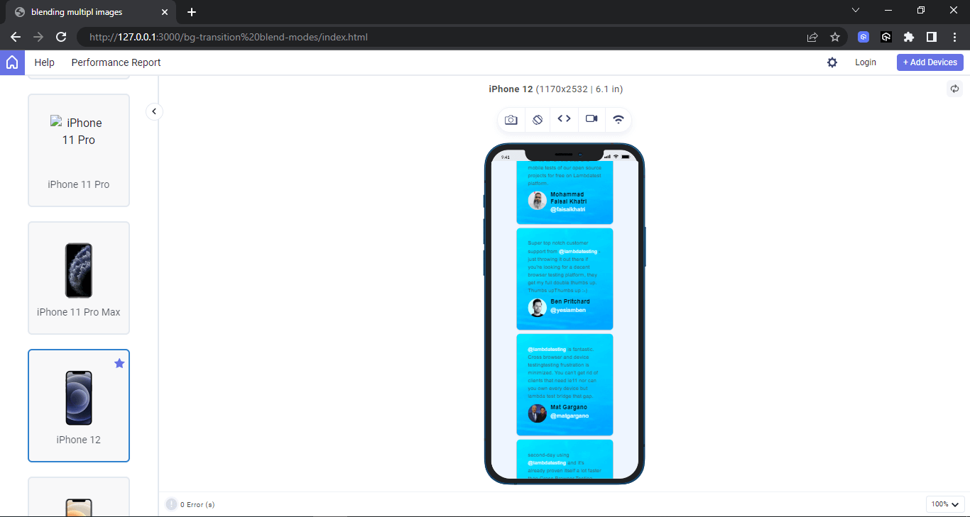
Mobile preview:
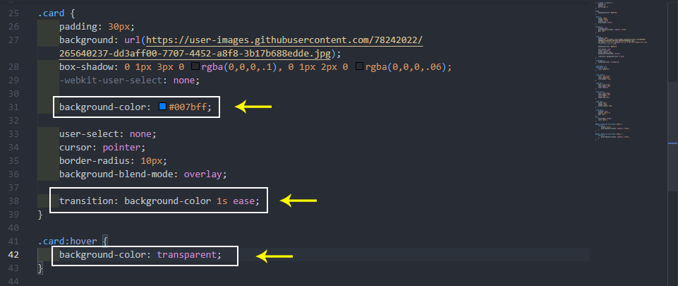
Applying Transitions to background-blend-mode
At the time of writing this CSS tutorial, by default, the background-blend-mode is not animatable. This also means it can not be transitioned. However, we can apply transition to the background-color of the element. This will help fade and transition the blend mode when a user hover on it.
See the Pen
Transition to background-blend-mode by Ocxigin (@ocxigin)
on CodePen.
Here, instead of changing the CSS blend mode value on hover state as we did earlier, we change the background-color from a solid blue to a transparent value. This will help create a subtle transition of the CSS blend mode when a user hover on it.
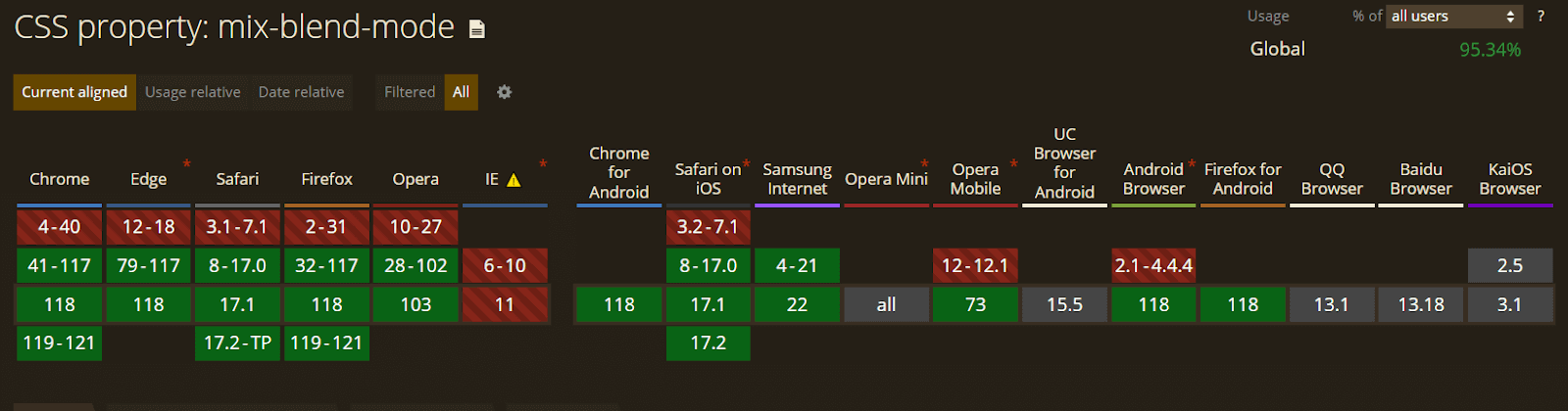
Browser Compatibility of background-blend-mode
The background-blend-mode is widely supported in the latest versions of modern web browsers. However it’s not supported in earlier versions of most browsers.
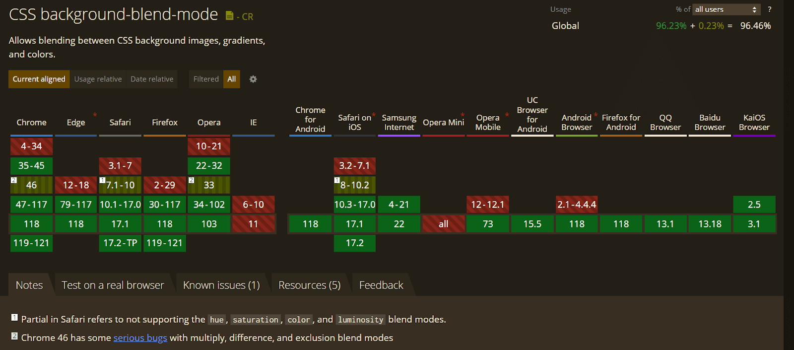
To ensure that your website’s background-blend-mode compatibility is up to par, it is important to test it across a wide range of browsers and devices. LambdaTest is an AI-powered test orchestration and execution platform that allows you to do just that.
With LambdaTest, you can easily test your website’s background-blend-mode compatibility across an online browser farm of 3000+ real browsers, devices, and platforms. This gives you the confidence that your website will look and function as expected for all users, regardless of their browser or device. You can even test your web apps on a mobile device lab of real Android and iOS devices.
Check the documentation to get started – Real Time Browser Testing.
CSS mix-blend-mode Property
The CSS mix-blend-mode property sets how the element’s content should blend with the parent content and background.
Syntax:
|
1 2 3 4 5 6 7 8 9 10 11 |
.element { /* Single Value */ mix-blend-mode: luminosity; /* Global values */ mix-blend-mode: inherit; mix-blend-mode: initial; mix-blend-mode: revert; mix-blend-mode: revert-layer; mix-blend-mode: unset; } |
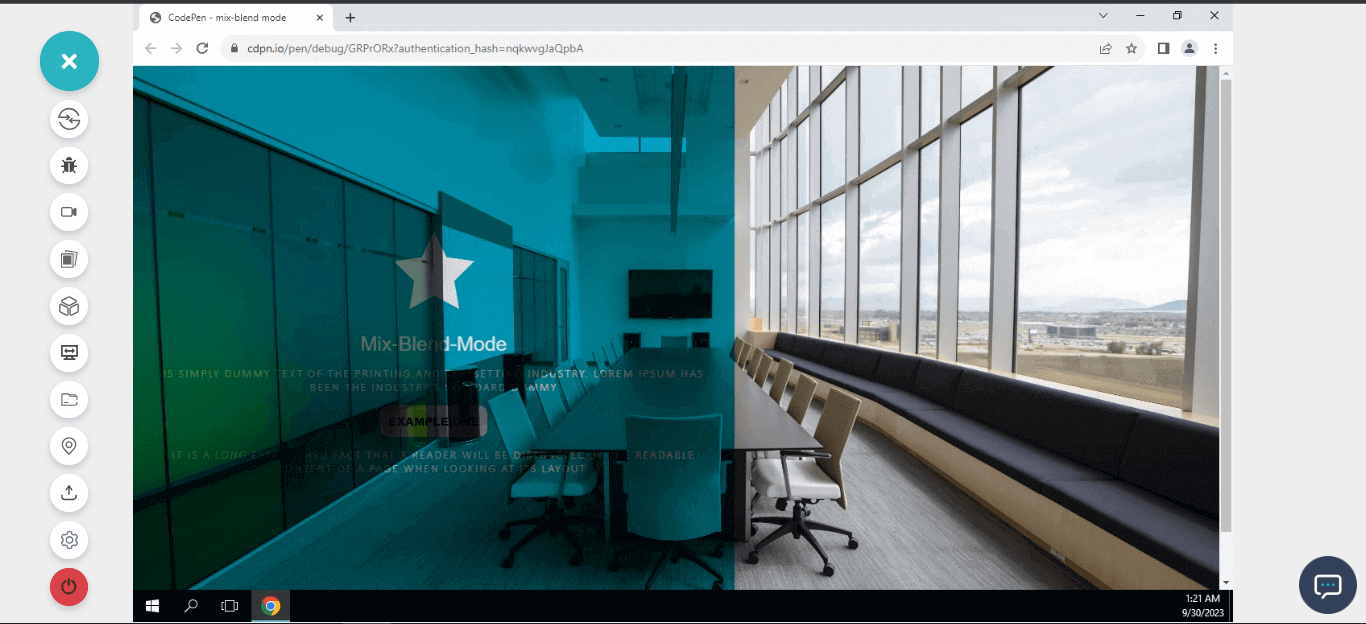
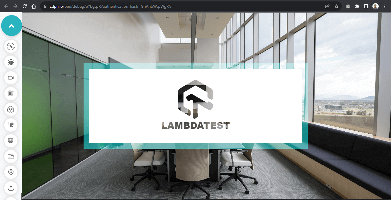
When mix-blend-mode is applied to an element, it blends the text content with the background of the parent element. And if the specified element has a background color set and depending on the color set on the background, the text context may invert, fade, or appear not visible.
Below is an example where blending is improper and compromises the overall readability.
See the Pen
mix-blend mode by Ocxigin (@ocxigin)
on CodePen.
In the above image, the text content and logo are not visible. This is due to the mix-blend-mode blending the element’s content, that is, the text, logo, and background-color with the parent background image.
HTML:
|
1 2 3 4 5 6 7 8 9 10 11 12 13 14 15 16 17 18 19 20 21 |
<html lang="en"> <head> <meta charset="UTF-8"> <meta name="viewport" content="width=device-width, initial-scale=1.0"> <title>mix blend-mode</title> <link rel="stylesheet" href="main.css"> </head> <body> <main class="main"> <section> <div class="logo"> <img src="https://user-images.githubusercontent.com/78242022/241967951-8f0102f2-caa7-4124-8009-b1460401d3e2.png" alt=""> </div> <h1 class="Lt">Mix-Blend-Mode</h1> <p class="title">is simply dummy text of the printing and typesetting industry. Lorem Ipsum has been the industry's standard dummy</p> <h2>Example one</h2> <p>It is a long established fact that a reader will be distracted by the readable content of a page when looking at its layout.</p> </section> </main> </body> </html> |
CSS:
|
1 2 3 4 5 6 7 8 9 10 11 12 13 14 15 16 17 18 19 20 21 22 23 24 25 26 27 28 29 30 31 32 33 34 35 36 37 38 39 40 41 42 43 44 45 46 47 48 49 50 51 52 53 54 55 56 57 58 59 60 61 62 63 64 |
*, *::after, *::before { padding: 0; margin: 0; box-sizing: 0; } body{ overflow-x: hidden; } .main { width: 100vw; height: 100vh; background: url(https://user-images.githubusercontent.com/78242022/265773341-b73f6d2f-b0a0-4d51-93d6-22b5c6fe2d6d.jpg); background-position: center center; background-size: cover; background-repeat: no-repeat; } .logo img { width: 100px; } section { width: 50%; height: 100%; display: flex; flex-direction: column; justify-content: center; align-items: center; position: relative; padding: 2em; background-color: #0ebac5; mix-blend-mode: multiply; } h1.Lt { font: 25px Arial; color: white; margin-top: 1em; } p { text-align: center; font: 14px calibri; color: white; margin-top: 1em; letter-spacing: 2px; font-weight: lighter; text-transform: uppercase; } h2 { font: 14px Arial; margin-top: 1em; background: white; padding: 10px; text-transform: uppercase; font-weight: 900; text-align: center; border-radius: 10px; } |
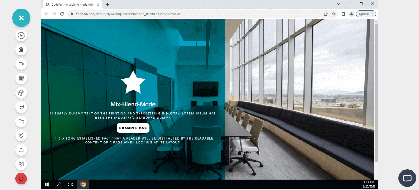
Applying mix-blend-mode to pseudo-element
From the previous example, we saw how the mix-blend-mode blends both the content of the element with the background of the parent element.
While this may hamper readability and accessibility, we can use pseudo-element as the CSS blend mode and isolate the pseudo-element from the background of the parent so it will serve as an overlay for the element’s content.
Here is an example of the same.
See the Pen
mix blend mode with pseudo-element by Ocxigin (@ocxigin)
on CodePen.
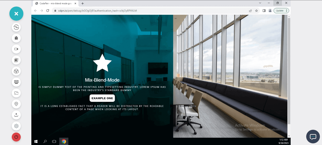
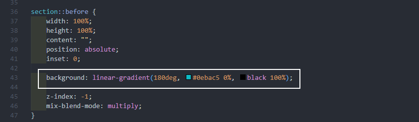
We created a pseudo-element and set it to inherit the properties of its parent, specifically in terms of width and height. We applied a background color and set the CSS blend mode to multiply to increase the darkness of the background-color and translucency.
However, with the z-index of -1, the pseudo-element was positioned at the back of the background-image, and to bring it to the foreground of the background-image, we set the isolate property for isolation.
HTML:
|
1 2 3 4 5 6 7 8 9 10 11 12 13 14 15 16 17 18 19 20 21 22 |
<!DOCTYPE html> <html lang="en"> <head> <meta charset="UTF-8"> <meta name="viewport" content="width=device-width, initial-scale=1.0"> <title>mix blend-mode</title> <link rel="stylesheet" href="main.css"> </head> <body> <main class="main"> <section> <div class="logo"> <img src="https://user-images.githubusercontent.com/78242022/241967951-8f0102f2-caa7-4124-8009-b1460401d3e2.png" alt=""> </div> <h1 class="Lt">Mix-Blend-Mode</h1> <p class="title">is simply dummy text of the printing and typesetting industry. Lorem Ipsum has been the industry's standard dummy</p> <h2>Example one</h2> <p>It is a long established fact that a reader will be distracted by the readable content of a page when looking at its layout.</p> </section> </main> </body> </html> |
CSS:
|
1 2 3 4 5 6 7 8 9 10 11 12 13 14 15 16 17 18 19 20 21 22 23 24 25 26 27 28 29 30 31 32 33 34 35 36 37 38 39 40 41 42 43 44 45 46 47 48 49 50 51 52 53 54 55 56 57 58 59 60 61 62 63 64 65 66 67 68 69 70 71 72 |
*, *::after, *::before { padding: 0; margin: 0; box-sizing: 0; } body{ overflow-x: hidden; } .main { width: 100vw; height: 100vh; background: url(https://user-images.githubusercontent.com/78242022/265773573-a8ab85fe-900d-4d05-82da-6ecf179f1d5c.jpg); background-position: center center; background-size: cover; background-repeat: no-repeat; isolation: isolate; } .logo img { width: 100px; } section { width: 50%; height: 100%; display: flex; flex-direction: column; justify-content: center; align-items: center; position: relative; padding: 2em; } section::before { width: 100%; height: 100%; content: ""; position: absolute; inset: 0; background-color: #0ebac5; z-index: -1; mix-blend-mode: multiply; } h1.Lt { font: 25px Arial; color: white; margin-top: 1em; } p { text-align: center; font: 14px calibri; color: white; margin-top: 1em; letter-spacing: 2px; font-weight: lighter; text-transform: uppercase; } h2 { font: 14px Arial; margin-top: 1em; background: white; padding: 10px; text-transform: uppercase; font-weight: 900; text-align: center; border-radius: 10px; } |
Blending Gradient Colors With mix-blend-mode
We can also blend gradient colors with mix-blend-mode, this can be very useful when we want to improve the user interface to something much more beautiful or add contrast to content from the blended background.
See the Pen
mix-blend mode gradient by Ocxigin (@ocxigin)
on CodePen.
From the example above, we added contrast to the text content below by using linear-gradient to add black to the base color from the design.
Applying Hover Effect to mix-blend-mode
Applying the hover effect to mix-blend-mode can improve how users interact with elements on state change.
This is when a user moves their mouse over an element on the web page. However, the mix-blend-mode is not animatable, which means it can’t also be transitioned.
To learn more about hover effects, check out this tutorial – CSS Hover Effects.
Applying hover effects to properties that are not animatable, such as mix-blend-mode can lead to a laggy transition during a state change. This can be improved by applying the hover effect to animatable properties that directly affect the property that needs transition.
The example below explains how this is done.
See the Pen
mix-blend-mode hover effect by Ocxigin (@ocxigin)
on CodePen.
Here, from the above example, we applied transition and hover to the height property so that the mix-blend-mode can transition with the height property.
HTML:
|
1 2 3 4 5 6 7 8 9 10 11 12 13 14 15 16 17 18 19 20 21 22 23 24 25 26 27 28 29 30 31 32 33 34 35 36 37 38 39 40 41 42 43 44 45 46 47 48 49 50 51 52 53 54 55 56 57 58 59 60 61 62 63 64 65 66 67 68 69 70 71 72 73 74 75 76 77 78 79 80 81 |
<!DOCTYPE html> <html lang="en"> <head> <meta charset="UTF-8"> <meta name="viewport" content="width=device-width, initial-scale=1.0"> <title>mix blend-mode</title> <link rel="stylesheet" href="main.css"> </head> <body> <main class="main"> <section> <!-- Card One --> <aside class="card c1"> <div> <span class="aside__menu__icon"> <svg width="50" height="50" viewBox="0 0 16 16" fill="none" xmlns="http://www.w3.org/2000/svg"> <path d="M2.4 3.8C1.525 4.969 1 6.425 1 8C1 11.864 4.136 15 8 15C11.864 15 15 11.864 15 8C15 4.136 11.864 1 8 1C6.999 1 6.04 1.21 5.179 1.595" stroke="#fff" stroke-linecap="square" stroke-linejoin="round"></path> <path d="M7.41797 4.5V8L10.918 10.9167" stroke="#fff"></path> </svg> </span> </div> <div> <em>LambdaTest</em> <h1>Live Testing</h1> <p class="text">Perform live interactive cross browser testing of your public or locally hosted websites and web apps on 3000+ real mobile and desktop browsers running on real operating system.</p> </div> </aside> <!-- Card Two --> <aside class="card c2"> <div> <span class="aside__menu__icon"> <svg width="18" height="18" viewBox="0 0 18 18" fill="none" xmlns="http://www.w3.org/2000/svg"> <path fill-rule="evenodd" clip-rule="evenodd" d="M13.9645 9.3477H3.48828L3.48828 8.36571V1.98251V1H13.9645V1.98251V8.36571V9.3477Z" stroke="#E9ECEC"></path> <path d="M3.48828 17.002C3.48828 13.6286 3.48828 12.8281 3.48828 12.8281H13.9645C13.9645 12.8281 13.9645 13.6286 13.9645 17.002" stroke="#E9ECEC" stroke-linecap="square"></path> <path d="M6.44141 4.28125V6.64066" stroke="#E9ECEC"></path> <path d="M11.0117 4.28125V6.64066" stroke="#E9ECEC"></path><path d="M16.7266 3.10156V7.82039" stroke="#E9ECEC"></path> <path d="M0.726562 3.10156V7.82039" stroke="#E9ECEC"></path> </svg> </span> </div> <div> <em>LambdaTest</em> <h1>Automated Testing</h1> <p class="text">Perform automated browser tests on a scalable, secure, and reliable automation cloud. Run Selenium, Cypress, Appium, Hyperexecute, Playwright and Puppeteer tests at scale on 3000+ browsers and devices.</p> </div> </aside> <!-- Card Three --> <aside class="card c3"> <div> <span class="aside__menu__icon"> <svg width="17" height="16" viewBox="0 0 17 16" fill="none" xmlns="http://www.w3.org/2000/svg"> <path d="M3.72656 1H13.7266V15H3.72656V1Z" stroke="#E9ECEC"></path> <path d="M6.22656 7.5L8.49929 9L11.7266 5" stroke="white"></path> <path d="M6.72656 12H10.7266" stroke="#E9ECEC" stroke-linecap="square"></path> </svg> </span> </div> <div> <em>LambdaTest</em> <h1>Mobile App Testing</h1> <p class="text">Perform live interactive testing of your mobile apps on a multitude of Android and iOS devices. Test and debug your mobile apps faster on both Emulators/Simulators or online real device cloud.</p> </div> </aside> <!-- Card Four --> <aside class="card c3"> <div> <span class="aside__menu__icon"><svg width="16" height="16" viewBox="0 0 16 16" fill="none" xmlns="http://www.w3.org/2000/svg"><rect x="1" y="1" width="14" height="14" stroke="#e9ecec"></rect><path d="M7.99869 7.80001H9.89802L8.37823 9.76965L8.49538 8.75751L8.5599 8.20002H7.99869H6.09937L7.61916 6.23037L7.50201 7.24252L7.43748 7.80001H7.99869Z" stroke="#e9ecec" stroke-linecap="round"></path></svg></span> </div> <div> <em>LambdaTest</em> <h1>HyperExecute</h1> <p class="text">Blazing fast AI-powered test execution & orchestration on cloud that will beat your local test execution speeds. A LambdaTest exclusive platform that is guaranteed faster than any other cloud grid offering.</p> </div> </aside> </section> </main> </body> </html> |
CSS:
|
1 2 3 4 5 6 7 8 9 10 11 12 13 14 15 16 17 18 19 20 21 22 23 24 25 26 27 28 29 30 31 32 33 34 35 36 37 38 39 40 41 42 43 44 45 46 47 48 49 50 51 52 53 54 55 56 57 58 59 60 61 62 63 64 65 66 67 68 69 70 71 72 73 74 75 76 77 78 79 80 81 82 83 84 85 86 87 88 89 90 91 92 93 94 95 96 97 98 99 100 101 102 103 104 105 106 107 108 109 110 111 112 113 114 115 116 117 118 119 120 121 122 123 124 125 126 127 128 129 130 131 |
*, *::after, *::before { padding: 0; margin: 0; box-sizing: 0; } body{ overflow-x: hidden; background-color: #EEF5FF; } .main { width: 100vw; height: 100vh; } section { display: grid; grid-template-columns: repeat(4, 250px); align-items: center; justify-content: center; height: inherit; gap: 1em; margin: 2em 0; } .card { box-shadow: 0 4px 6px -1px rgb(0 0 0 / 0.1), 0 2px 4px -2px rgb(0 0 0 / 0.1); border-radius: 10px; padding: 10px; display: flex; flex-direction: column; justify-content: center; align-items: center; outline: 2px solid #0ebac5; color: white; position: relative; isolation: isolate; background: url(https://user-images.githubusercontent.com/78242022/265773285-9675f405-257f-451e-8dd2-8bee7a1c22c1.jpg); transition: color 0.5s ease; cursor: pointer; background-position: center center; background-repeat: no-repeat; background-size: cover; } .card:hover { color: black; } .card svg { width: 50px; height: 50px; } .card svg path, .card svg rect { stroke: white; transition: stroke 0.5s ease; } .card:hover svg path { stroke: black; } .card:hover svg rect { stroke: black; } .card::before { content: ""; width: 100%; height: 0%; /* height: 100%; */ background-color: #0ebac5; /* background-color: wheat; */ bottom: 0; left: 0; position: absolute; z-index: -1; mix-blend-mode:screen; transition: height 0.5s ease; } .card:hover::before { height: 100%; } .card h1 { text-align: center; font: 25px Arial; margin-top: 10px; } .card p { text-align: center; font: 16px calibri; margin-top: 10px; } em { display: block; font: 16px calibri; background-color: white; padding: 3px; border-radius: 5px; text-align: center; margin-top: 10px; color: black; } @media screen and (max-width: 1070px) { section { grid-template-columns: repeat(3, 250px); } } @media screen and (max-width: 840px) { section { grid-template-columns: repeat(2, 250px); } } @media screen and (max-width: 570px) { section { grid-template-columns: repeat(1, 250px); } } |
Desktop preview:
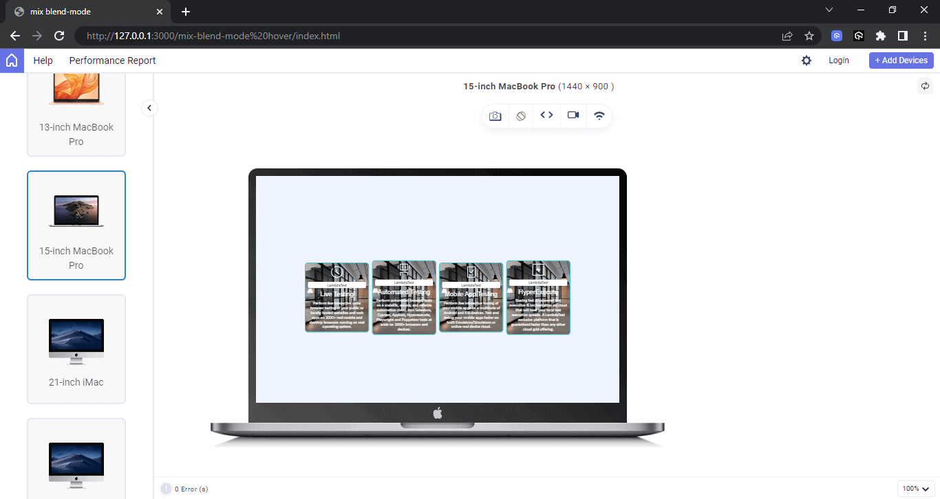
We apply media queries to the above elements to make it responsive and functional across different screen sizes and devices, which range from desktops, tablets, and mobile phones.
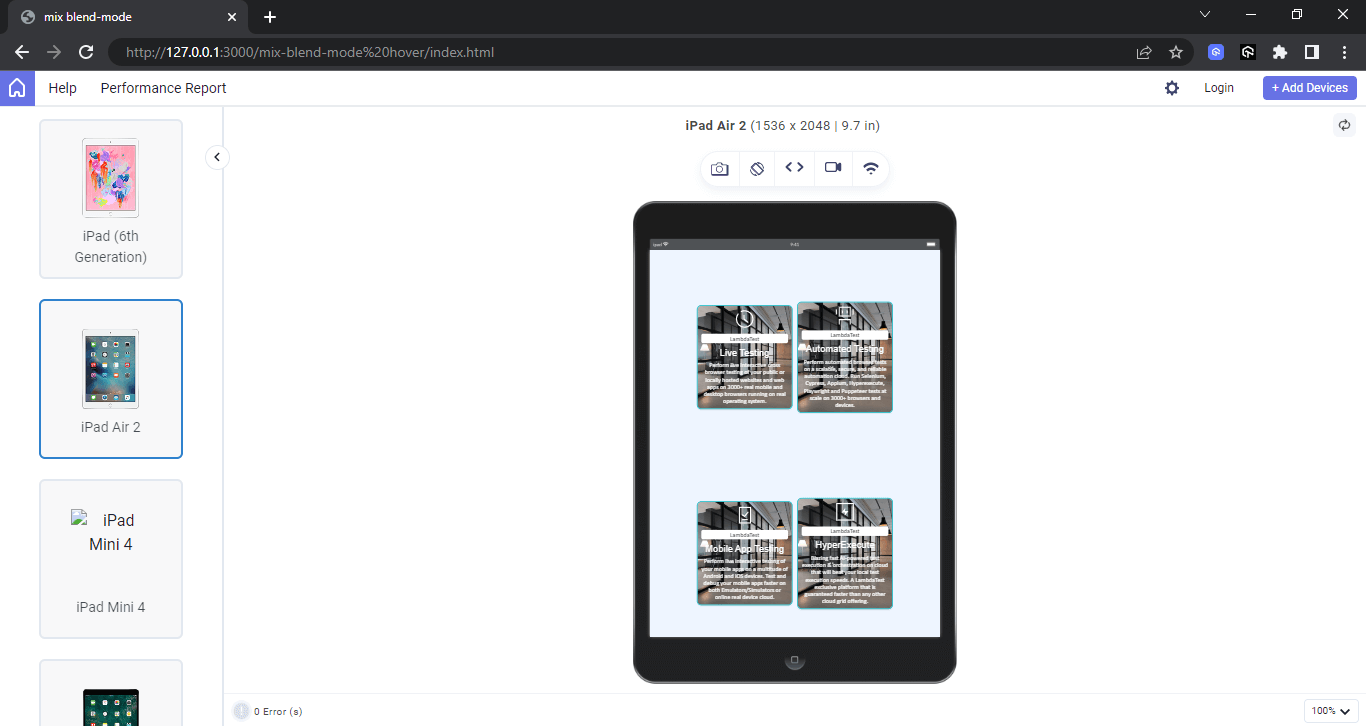
This is very useful for modern websites and web apps that run on multiple screen sizes on the web. The example below shows how media queries are rendered on a tablet device.
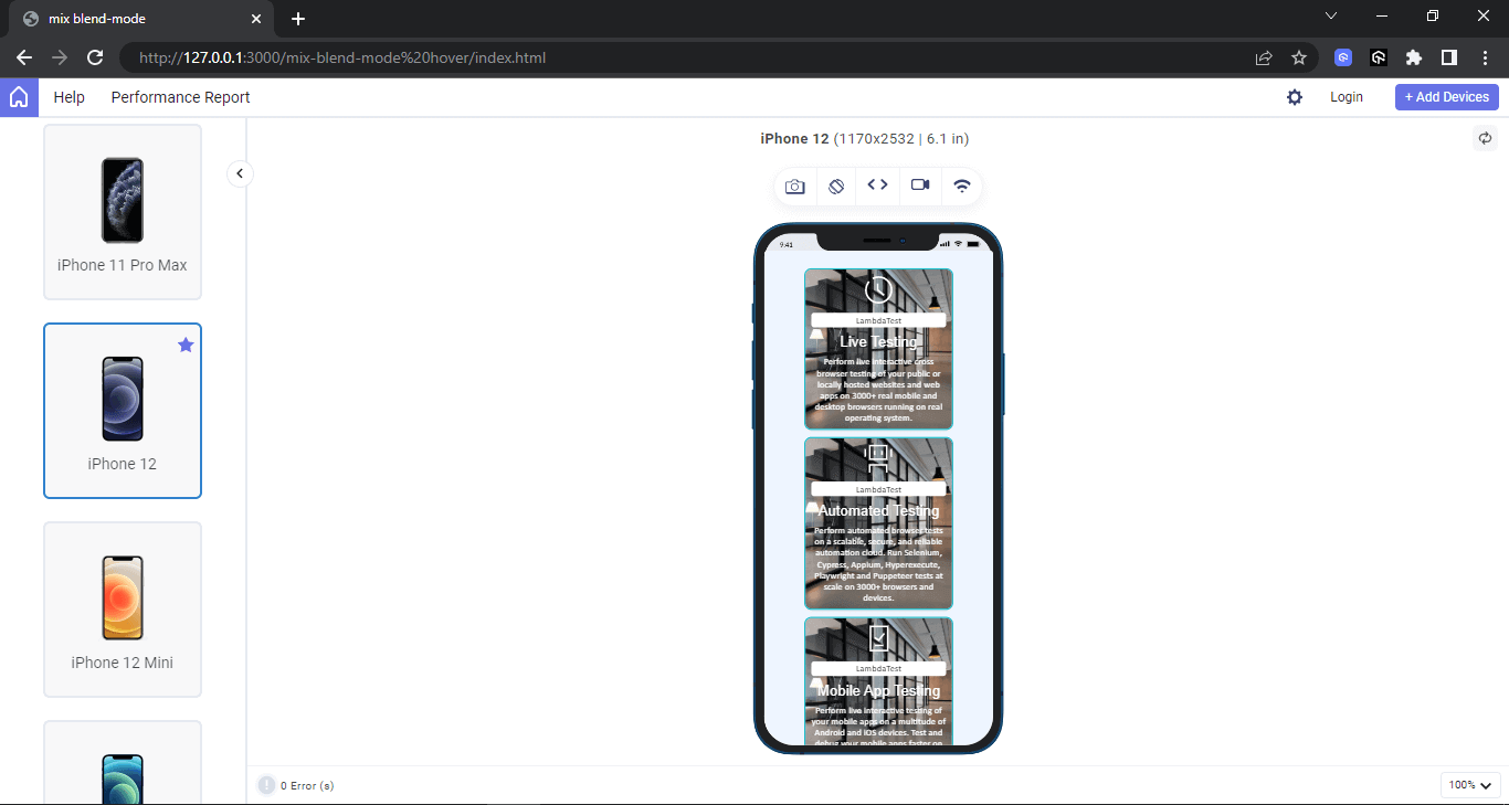
Mobile preview:
Cut-Out Effect With mix-blend-mode
We’ve seen many code examples of what CSS blend modes can do. However, the example here shows how to create a cut-out effect using the mix-blend-mode property.
See the Pen
cut-out effect with blend-mode by Ocxigin (@ocxigin)
on CodePen.
Here, both the logo and the text color are blended out. This is due to the black color applied to both the logo and the text and a blend screen mode.
However, the border only becomes transparent. It will be blended out if a black color is applied to the border.
HTML:
|
1 2 3 4 5 6 7 8 9 10 11 12 13 14 15 16 17 |
<!DOCTYPE html> <html lang="en"> <head> <meta charset="UTF-8"> <meta name="viewport" content="width=device-width, initial-scale=1.0"> <title>mix blend-mode</title> <link rel="stylesheet" href="main.css"> </head> <body> <main class="main"> <section> <img src="https://user-images.githubusercontent.com/78242022/241950871-a97f1ba2-792d-48c1-8486-30f75fb87525.svg" alt=""> <h1>LambdaTest</h1> </section> </main> </body> </html> |
CSS:
|
1 2 3 4 5 6 7 8 9 10 11 12 13 14 15 16 17 18 19 20 21 22 23 24 25 26 27 28 29 30 31 32 33 34 35 36 37 38 39 40 41 42 43 44 45 46 47 48 49 |
*, *::after, *::before { padding: 0; margin: 0; box-sizing: 0; } body{ overflow-x: hidden; } .main { width: 100vw; height: 100vh; background: url(https://user-images.githubusercontent.com/78242022/265773573-a8ab85fe-900d-4d05-82da-6ecf179f1d5c.jpg); background-position: center center; background-size: cover; background-repeat: no-repeat; isolation: isolate; display: flex; justify-content: center; align-items: center; } section { width: 50%; height: 200px; background-color: white; display: flex; flex-direction: column; align-items: center; justify-content: center; padding: 30px; border: 20px solid teal; mix-blend-mode: screen; } h1 { font: 2em Arial; font-weight: 900; text-align: center; text-transform: uppercase; } img { width: 120px; } |
Applying mix-blend-mode to SVG Elements
Scalable Vector Graphics (SVG) are powerful vector graphics that can scale and still maintain resolutions across different screen sizes or devices such as desktop, tablet and mobile phones.
Using SVGs can improve website performance and optimization. This is why SVGs are so useful and can be implemented as buttons, icons and complex illustrations, SVGs can take different forms which makes it a perfect fit for small and large graphics.
SVGs can also be blended using the mix-blend-mode. The mix-blend-mode can enhance how different elements render on the page. SVGs can also be useful for creating effects such as transitions and animation that respond to user interactions on state change, such as hover state.
However, SVGs load faster since they can be embedded directly on web pages without fetching images from the server. This will help to boost performance and load time.
See the Pen
mix-blend-mode svg by Ocxigin (@ocxigin)
on CodePen.
In the above browser preview, the CSS blend mode occurs where each circle intersects.
HTML:
|
1 2 3 4 5 6 7 8 9 10 11 12 13 14 15 16 17 18 19 20 |
<!DOCTYPE html> <html lang="en"> <head> <meta charset="UTF-8"> <meta name="viewport" content="width=device-width, initial-scale=1.0"> <title>mix-blend-mode</title> <link rel="stylesheet" href="main.css"> </head> <body> <main class="main"> <section> <svg> <circle cx="40" cy="40" r="40" fill="red"/> <circle cx="80" cy="40" r="40" fill="green"/> <circle cx="60" cy="80" r="40" fill="blue"/> </svg> </section> </main> </body> </html> |
CSS:
|
1 2 3 4 5 6 7 8 9 10 11 12 13 14 15 16 17 18 19 20 21 |
*, *::after, *::before { padding: 0; margin: 0; box-sizing: 0; } body{ overflow-x: hidden; } .main { width: 100vw; height: 100vh; display: flex; justify-content: center; align-items: center; } svg circle { mix-blend-mode: screen; } |
Browser Compatibility of mix-blend-mode
The mix-blend-mode is widely supported in latest versions of modern browsers. However it’s not supported in earlier versions of most browsers.
 Note
NoteTest your web apps for compatibility across 3000+ real browsers. Try LambdaTest Today!
Differences: background-blend-mode and mix-blend-mode
The background-blend-mode and mix-blend-mode function similarly, but there are some key differences. Understanding these differences can help you decide which one to use when working on your next project.
| Property | background-blend-mode | mix-blend-mode |
| Definitions | Blends the background color with the background images of the same element | Blends the element’s content with the parent content and background. |
| Values | blend modes | blend modes |
| Initial | normal | normal |
| Applies to | All HTML elements | All elements. In SVG, it applies to container elements, graphics elements, and graphics referencing elements. |
| Inherited | No | No |
| Isolation property | No | Yes |
| Computed value | As specified | As specified |
| Animatable | No | No |
Depending on your work, the background-blend-mode, and mix-mode-mode are meant to solve the same problems, adding blending to web elements.
But at times, they both can be confusing since the two properties take on the same values. The background-blend-mode is used for blending the background color with the background images of the same element; it does not affect the content of the element or parent background, while the mix-blend-mode is used to blend the element’s content with the parent content and background.
Conclusion
CSS blend modes can be useful on websites or mobile applications. The background-blend-mode and mix-blend-mode behave the same way but do different things.
With the background-blend-mode, the background-color and background-images can be blended together as a single image. However, the mix-blend-mode makes it possible to blend the content of an element with the content of the parent and its background.
Frequently Asked Questions (FAQs)
What is blend mode in CSS?
CSS blend mode is a feature that allows you to control how an element’s content should blend with the content behind it. This feature is typically used in the context of two or more overlapping elements, where the blending mode determines the visual effect of their interaction.
How do you set blend mode in CSS?
To set a CSS blend mode, you can use the mix-blend-mode and background-blend-mode properties to blend the content of one element with the content behind it.
What are blend modes used for?
CSS blend modes are used to control how the content of one element blends or interacts with the content or background of another element. They are primarily used for creative and visual effects in web design.


Author’s Profile
Alex Anie
A Front End Technical Writer. I write blogs on Front End Technologies, such as HTML, CSS, JavaScript. When I am not coding, I enjoy watching tutorials and listening to twitter spaces. I live in Lagos, Nigeria
Blogs: 16
Got Questions? Drop them on LambdaTest Community. Visit now


