
A Deep Dive Into Bootstrap Display and Visibility [Bootstrap Tutorial: Part III]
Mbaziira Ronald
Posted On: November 30, 2023
 291864 Views
 23 Min Read
Today, web development and design, in general, is comparable to putting together a puzzle that fits on screens of various sizes and devices. As users access websites on a multitude of devices, such as phones, tablets, and laptops, the need for dynamic, responsive web layouts has become not just a trend but a necessity.
However, web designers and developers face the intricate challenge of accommodating everything from pocket-sized smartphones to expansive desktop screens. From the smallest smartphones like the Unihertz Jelly Pro and Soyes S7 with 2.45 inches and 2.5 inches of screen size to the largest display monitor and video screen, the curved Samsung Odyssey Ark and Venetian Resort sphere, with respective sizes of 55 inches and 6192 inches.

As the demand for responsive and accessible web layouts continues to rise, web developers and designers must leverage the power of Bootstrap display and visibility properties to create experiences that adapt and excel in this ever-changing landscape. Bootstrap is a free, versatile, powerful, and open-source frontend toolkit that empowers developers to produce products that smoothly respond to the unpredictable changing terrain of screen sizes and devices.
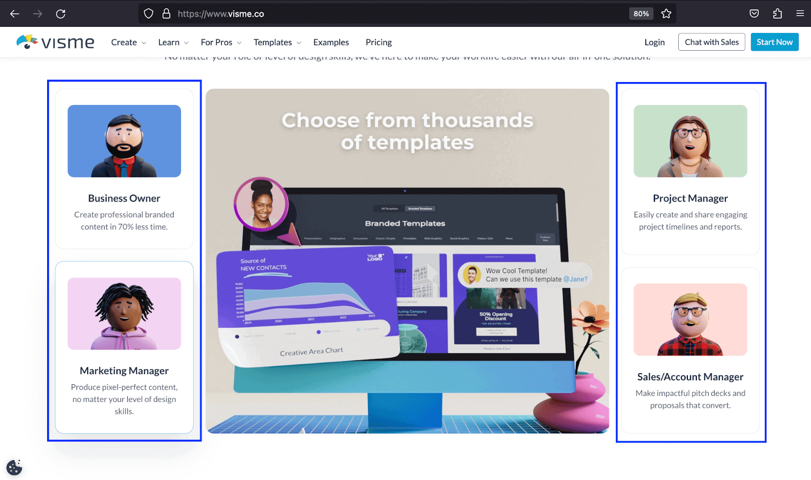
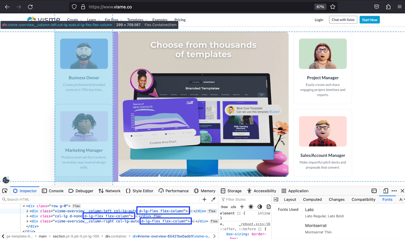
Websites such as Visme, AnyDesk, and LogRocket have harnessed the Bootstrap display and visibility properties to create unforgettable experiences with responsiveness for their website users. The example below shows how the Visme website utilized Bootstrap flex to produce responsive cards that stuck vertically once they hit the lg breakpoint, making more content accessible to a broader audience.
In our previous Bootstrap tutorial series, we looked at Bootstrap Dropdowns and Collapse and then explored Bootstrap Buttons and Badges. Using the skills and knowledge gained from these tutorials, we’ll explore more features of the Bootstrap toolkit.
In this Bootstrap tutorial part III, we’ll traverse the world of Bootstrap display property and visibility utility. We will analyze how they work and how you can use their potential to improve the responsiveness of your website to make it more accessible and provide a better user experience.
TABLE OF CONTENTS
- Introduction to Bootstrap Display and Bootstrap Visibility
- Key Role of Element Visibility and Layout in Responsive Design
- Deep Diving Into Bootstrap Display Property
- Deep Diving Into Bootstrap Visibility Utility
- Responsive Layout Techniques with Bootstrap Display and Visibility
- Key Aspects to Consider for Bootstrap Visibility and Display
- Frequently Asked Questions (FAQs)
Introduction to Bootstrap Display and Bootstrap Visibility
Let’s first have an introduction and overview of the Bootstrap display and visibility. This section will set the stage for what follows by providing an essential foundation for understanding Bootstrap visibility utility and display property and what they contain.
Bootstrap Display
The Bootstrap display property has a set of display utility classes. This comprises a portion of the values of the CSS display property itself.
The utility classes apply across all the Bootstrap breakpoints: xs, sm, md, lg, xl, and xxl. The classes, in regards to breakpoints, are named using two formats: d-{value} for xs and d-{breakpoint}-{value} for all other breakpoints.
The value in the format stands for all display property values that Bootstrap supports, such as inline, inline-block, table, and grid.
Bootstrap display property is among the ways you can use to create responsive web designs alongside Bootstrap grid system and flexbox.
Bootstrap Visibility
The Bootstrap visibility utility modifies the visibility of elements without affecting the value of the Bootstrap display property.
The Bootstrap visibility has two classes: invisible and visible. These classes do not affect the page’s layout. Elements with the invisible class still occupy space in the layout but cannot be visually seen. They are also hidden visually and from assistive technologies like screen readers.
The most common use of Bootstrap visibility is toggling the visibility of elements between being visible and hidden.
 Note
NoteTest your Bootstrap websites across 3000+ desktop and mobile browsers. Try LambdaTest Today!
Key Role of Element Visibility and Layout in Responsive Design
For many factors, there are times when it is reasonable to display some elements on specific breakpoints and hide them on others. Let’s look at the relevance of managing the visibility of elements in responsive design.
Ensuring Responsive Web Layouts
The look of different layouts varies from one screen size to another. An image with large dimensions can look great on large screen sizes and vice versa. If a large image were to be displayed as it is on smaller screen sizes, it could refuse to adapt to the screen and, in turn, make the surrounding elements unresponsive, too.
As such, showing and hiding certain elements on different screen sizes and devices can improve the responsiveness of the web page. Keeping a given element on a given screen size can prove very challenging to make the page or section responsive.
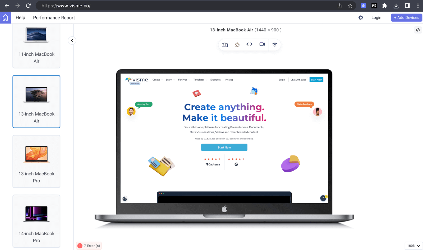
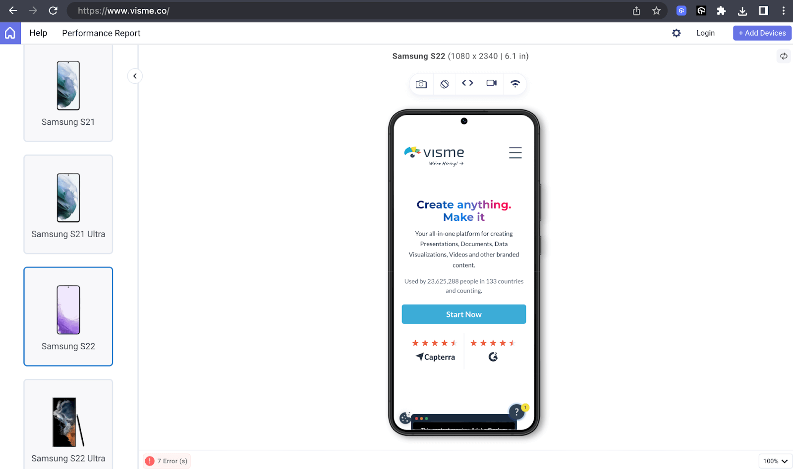
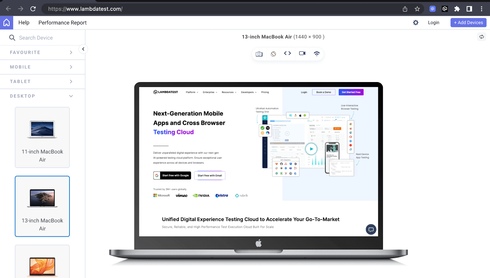
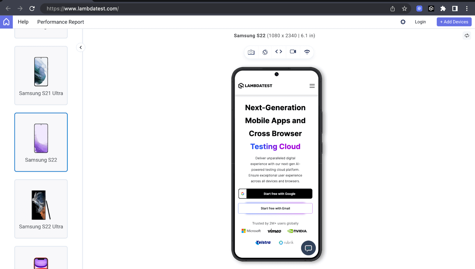
For example, in the below images, Visme displays the images surrounding the text in the hero section on laptops. It, however, hides them when it comes to mobile phones, thus making handling the responsiveness of the section less complicated on such small screen sizes.
For the above previews, I used the LT Browser. It is a next-generation browser built by LambdaTest for testing and debugging websites. It allows you to carry responsive testing for your websites and other web applications on multiple device viewports with up to 6 simultaneously, in addition to 53+ viewports, including mobile, tablet, and desktop.
You can check out the LT Browser documentation to get started and ease the task of testing the responsiveness of your web designs on various devices.
For continuous tutorials on automation testing, mobile app testing, and more, subscribe to our LambdaTest YouTube Channel.
Improving Accessibility
Among the many things responsive design caters to is user accessibility. Correctly controlling the visibility of elements enables screen readers and other assistive technologies to provide accurate information to differently-abled users.
According to Itamar Medeiros, a UX Researcher and interaction designer, in an edition on Ask UXmatters, “Creating Websites that work with different devices is, in my opinion, a good start for accessibility… Some of the responsive design frameworks—like Bootstrap and Foundation—already provide out-of-the-box compliance to coding best practices.”
Web page elements irrelevant to screen readers, like decorative images, can be hidden using techniques like display:none or aria-hidden:true. This ensures that screen readers don’t interpret these elements, thus preventing confusion.
Reducing Clutter
When it comes to screen real estate, small screen devices have less of it compared to larger ones. Therefore, it makes it more sound to display the most critical elements on small screens to utilize the inadequate space. This prevents content from cluttering the web page, which can confuse users on how to interact with it.
In the example below, LambdaTest displays an explainer image alongside the content on large-screen devices like laptops and hides on small mobile screens. This enables users to focus on what is crucial and make quicker decisions while on the website.
Expediting Loading Times
The size of the markup or web page elements like images directly influences the loading time of a web page. The larger the markup size, the longer a page may take to load, or in the case of images, the heavier they are, the slower a page may load.
According to ClickZ, one of the largest digital marketing agencies in the UK, the average size of a mobile webpage is 2.2MB, and images account for 68% of this size. Mobile phones usually have slower Internet connections than larger-screen devices like laptops. Hence, hiding elements such as images is essential to reduce the amount of data needed to load the page. This speeds up the page loading time compared to how it would be with the now hidden elements still showing.
As we head into Bootstrap display property and Bootstrap visibility, mastering the control of element visibility is crucial for crafting adaptive and user-friendly designs.
Deep Diving Into Bootstrap Display Property
The Bootstrap display property is a set of utility classes that supports most of the values of the CSS display property. It provides a responsive and flexible way to manage the display of elements based on screen size. Bootstrap supports different values of the CSS display property. The display classes use the format of d-{breakpoint}-{value}, except for breakpoint xs, which follows the format d-{value}.
Below are some Bootstrap display classes and what they do.
| Class | Description |
| d-none | Hides an element on all breakpoints. |
| d-inline | Displays the element as an inline. |
| d-block | Displays the element as a block. |
| d-flex | Displays the element as flex. |
| d-inline-flex | The element behaves as an inline element but lays its content using flex. |
| d-grid | Displays the element as a grid. |
| d-inline-grid | The element behaves as an inline element but lays its content using a grid. |
Responsive Display Classes
Bootstrap also has responsive classes for the display ones, and they follow the pattern of d-{breakpoint}-{value}. Below are some of the responsive classes.
| Class | Description |
| d-sm-none | Hides the element on the sm breakpoint. |
| d-md-block | Displays the element as a block on the md breakpoint. |
| d-lg-flex | Displays the element as flex on the lg breakpoint. |
| d-xl-inline | Displays the element as inline on the xl breakpoint. |
| d-xxl-block | Displays the element as a block on the xxl breakpoint. |
Display None
The d-none class hides elements visually from the webpage, and they no longer occupy any space in the document flow. You can use the class for all breakpoints to cater to web page responsiveness.
Shown below are the use cases of the display none:
- Responsive web design: Concerning responsive web design, display none enables you to hide elements as the web page hits different breakpoints.
- Tabbed navigation: Tabbed navigation is a navigation style that arranges content in separate sections represented by tabs where users can alternate between them.
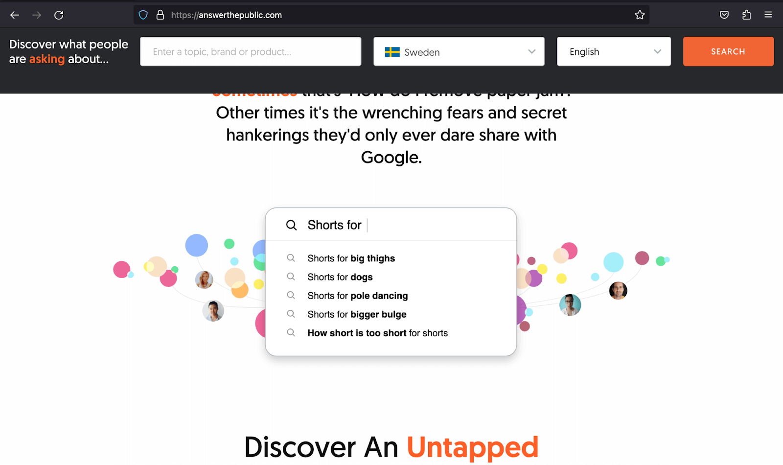
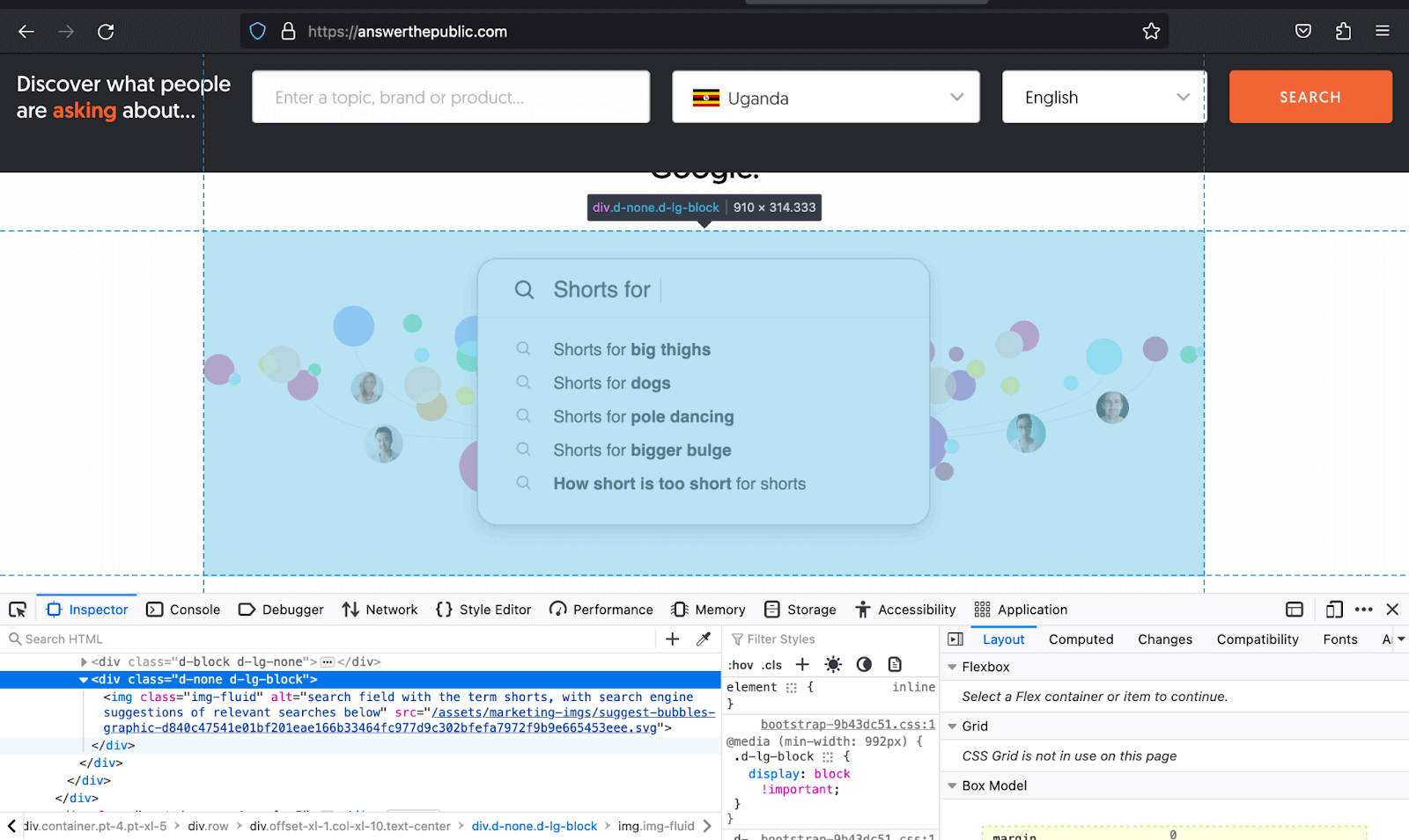
The example below shows how AnswerThePublic uses d-none to hide the image on other breakpoints and then shows it once it hits the lg breakpoint. This significantly improves the page load time for people on small-screen devices, enhancing the overall user experience.
|
1 2 3 4 5 6 7 8 9 10 11 12 13 14 15 16 17 18 19 20 21 22 23 24 25 26 27 28 29 30 31 32 33 34 35 36 37 38 39 40 41 42 43 44 45 46 47 48 49 50 51 52 53 54 55 56 57 58 59 60 61 62 63 64 65 66 67 68 69 70 71 72 73 74 75 76 77 78 79 80 81 82 83 84 85 86 87 88 89 90 91 92 93 94 95 96 97 98 99 100 101 102 103 104 105 106 107 108 109 110 111 112 113 114 115 116 117 118 119 120 121 122 123 124 125 126 127 128 129 130 131 132 133 134 135 |
<!DOCTYPE html> <html lang="en"> <head> <meta charset="UTF-8"> <meta http-equiv="X-UA-Compatible" content="IE=edge"> <meta name="viewport" content="width=device-width, initial-scale=1.0"> <link href="https://cdn.jsdelivr.net/npm/bootstrap@5.3.1/dist/css/bootstrap.min.css" rel="stylesheet" integrity="sha384-4bw+/aepP/YC94hEpVNVgiZdgIC5+VKNBQNGCHeKRQN+PtmoHDEXuppvnDJzQIu9" crossorigin="anonymous"> <title>Bootstrap Display property -> d-none</title> <style> body::before { display: block; content: ''; height: 70px; } .automation-img { height: auto; width: 650px; } .img { height: auto; width: 25px; } </style> </head> <body class="bg-light"> <nav class="navbar navbar-expand-lg bg-white py-4 fixed-top"> <div class="container ms-auto"> <a class="navbar-brand" href="#"> <img src="https://www.lambdatest.com/resources/images/logos/logo.svg" alt="LambdaTest Logo" /> </a> <button class="navbar-toggler" type="button" data-bs-toggle="collapse" data-bs-target="#navbar-menu"> <span class="navbar-toggler-icon"></span> </button> <div class="collapse navbar-collapse" id="navbar-menu"> <ul class="navbar-nav ms-auto"> <li class="nav-item"><a href="" class="nav-link">Platform</a></li> <li class="nav-item"><a href="" class="nav-link">Enterprise</a></li> <li class="nav-item"><a href="" class="nav-link">Resources</a></li> <li class="nav-item"><a href="" class="nav-link">Developers</a></li> <li class="nav-item"><a href="" class="nav-link">Pricing</a></li> <li class="d-flex gap-3 ms-lg-4 ms-md-0 ms-sm-0"> <a href="" class="nav-link">Login</a> <!-- Modal trigger --> <button class="btn btn-outline-dark" data-bs-toggle="modal" data-bs-target="#bookdemo" type="button"> Book a Demo </button> <!-- Modal trigger end --> <a class="btn btn-dark" href="#" role="button">Sign Up</a> </li> </ul> </div> </div> </nav> <!-- --> <section class="py-5 bg-light" style="min-height: 100vh;"> <div class="container"> <div class="row justify-content-center text-center"> <h2 class="fs-1">Features of LambdaTest Enterprise Cloud</h2> <p class="fs-5 text-secondary"> LambdaTest fits perfectly in your CI/CD pipelines. Test early, debug accurately, and release faster with LambdaTest </p> <img class="automation-img d-lg-block d-md-block d-sm-none d-none" src="https://www.lambdatest.com/resources/images/all-mobile-frameworks.png" alt="Appium Automation testing"> </div> <div class="row row-cols-sm-1 row-cols-md-3 row-cols-lg-3 row-cols-1 justify-content-center g-5 mt-2 px-4"> <div> <img src="https://www.lambdatest.com/resources/images/automation/Click-icon-button.svg" alt=""> <p class="fs-3 mt-3 mb-4">One-Click Upload</p> <p class="fs-5 text-secondary mb-5"> Upload your .apk, .ipa, .app, or .zip files directly on the LambdaTest platform and start testing instantly. </p> <a class="link-info link-underline-opacity-0" style="font-size: 1.25rem;" href="#"> Contact Sales → </a> </div> <div> <img src="https://www.lambdatest.com/resources/images/automation/TunnelandLocalTesting1.svg" alt=""> <p class="fs-3 mt-3 mb-4">Test Locally or Privately</p> <p class="fs-5 text-secondary mb-5"> Test your privately or locally hosted apps for compatibility before pushing them to a live environment. </p> <a class="link-info link-underline-opacity-0" style="font-size: 1.25rem;" href="#"> Contact Sales → </a> </div> <div> <img class="img" src="https://www.lambdatest.com/resources/images/automation/vector.svg" alt=""> <p class="fs-3 mt-3 mb-4">Seamless Integration</p> <p class="fs-5 text-secondary mb-5"> Integrate end to end with all your complete test stack. </p> <a class="link-info link-underline-opacity-0" style="font-size: 1.25rem;" href="#"> Contact Sales → </a> </div> <div> <img src="https://www.lambdatest.com/resources/images/automation/logs-logo.svg" alt=""> <p class="fs-3 mt-3 mb-4">Enhanced Debugging With Real Time Logs</p> <p class="fs-5 text-secondary mb-5"> Identify and debug native apps in real-time using device logs, network logs, app logs, screenshots and videos. Identify UI anomaly using inspect element. </p> <a class="link-info link-underline-opacity-0" style="font-size: 1.25rem;" href="#"> Contact Sales → </a> </div> <div> <img src="https://www.lambdatest.com/resources/images/automation/Analyticslogo1.svg" alt=""> <p class="fs-3 mt-3 mb-4">Mark Bugs</p> <p class="fs-5 text-secondary mb-5"> Assign bugs directly from the LambdaTest platform or integrate with a project management tool of your choice. </p> <a class="link-info link-underline-opacity-0" style="font-size: 1.25rem;" href="#"> Contact Sales → </a> </div> <div> <img src="https://www.lambdatest.com/resources/images/automation/ManageDatalogo.svg" alt=""> <p class="fs-3 mt-3 mb-4">Test Logs and Detailed Insights</p> <p class="fs-5 text-secondary mb-5"> Increase test execution speed and productivity with one-click bug logging, detailed test logs and insights that will help you deliver quality builds faster. </p> <a class="link-info link-underline-opacity-0" style="font-size: 1.25rem;" href="#"> Contact Sales → </a> </div> </div> </div> </section> <script src="https://cdn.jsdelivr.net/npm/bootstrap@5.3.1/dist/js/bootstrap.bundle.min.js" integrity="sha384-HwwvtgBNo3bZJJLYd8oVXjrBZt8cqVSpeBNS5n7C8IVInixGAoxmnlMuBnhbgrkm" crossorigin="anonymous"></script> </body> </html> |
Browser output:
In the above browser output, we have used the d-sm-none class to hide the image once the page hits the sm breakpoint. This makes the layout more responsive and reduces clutter on small-screen devices.
See the Pen
Bootstrap Visibility Utility & Display Property – Display: none by Mbaziira Ronald (@mbaziraofug)
on CodePen.
Display Inline
The d-inline class is a utility class part of the Bootstrap display property. The class makes none inline elements on the web page display as inline. The elements with the d-inline class will allow the next elements to be on the same line if there is enough space; otherwise, they will begin on a new line.
As inline elements, they exhibit some of the following characteristics:
- They don’t start on a new line.
- Height and width properties can’t apply to them. They take up as much space as their content occupies.
- Horizontal margins and paddings are respected but not the vertical.
- Inline elements allow other elements to be on the same line as theirs.
Bootstrap has inline classes that you can use to create responsive layouts based on different breakpoints. Below are some classes.
| Class | Description |
| d-sm-inline | Displays the element as inline when the page hits the sm breakpoint. |
| d-md-inline | Displays the element as inline when the page hits the md breakpoint. |
| d-lg-inline | Displays the element as inline when the page hits the lg breakpoint. |
Below are some common use cases of display inline:
- Responsive web layouts: These are layouts that adapt to different devices and screen sizes.
- Copyright information: These are details on the legal rights and intellectual property ownership of original works, usually put in the footer of a website.
- Breadcrumb navigation: Breadcrumb navigation is a path of hierarchical links showing users their current location on a website.
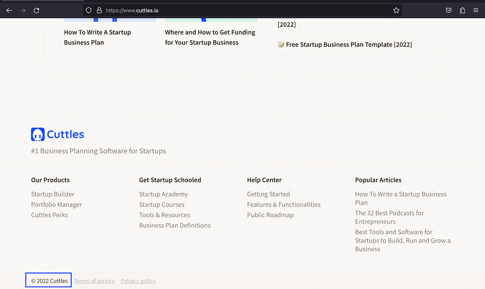
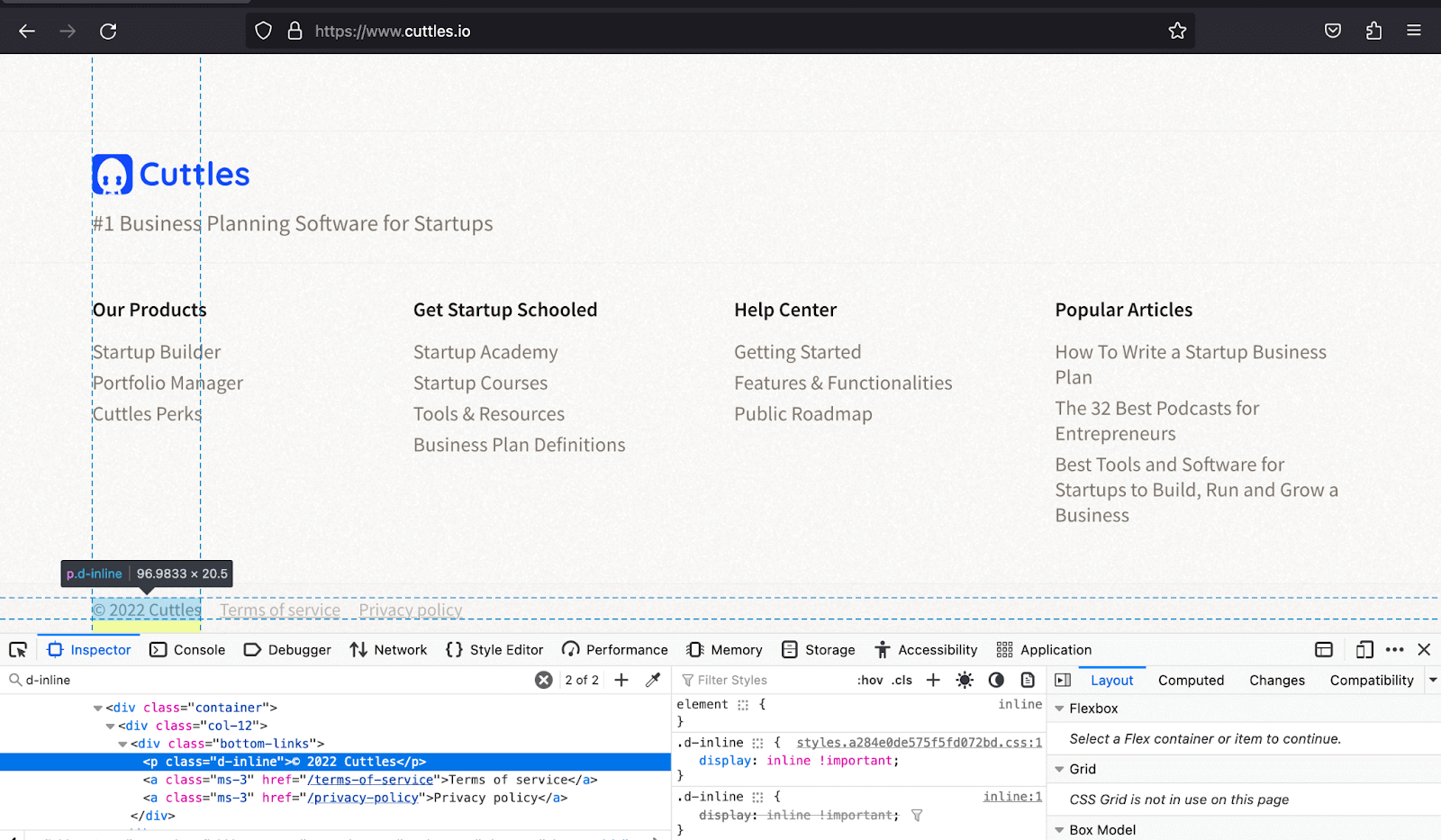
The example below shows how Cuttles uses the d-inline class to fit the copyright paragraph on the same line with the Terms of Service and Privacy Policy in the limited space at the bottom of the footer.
|
1 2 3 4 5 6 7 8 9 10 11 12 13 14 15 16 17 18 19 20 21 22 23 24 25 26 27 28 29 30 31 32 33 34 35 36 37 38 39 40 41 42 43 44 45 46 47 |
<!DOCTYPE html> <html lang="en"> <head> <meta charset="UTF-8" /> <meta http-equiv="X-UA-Compatible" content="IE=edge" /> <meta name="viewport" content="width=device-width, initial-scale=1.0" /> <link rel="stylesheet" href="./node_modules/bootstrap/dist/css/bootstrap.min.css" /> <title> Bootstrap CSS Display property - display inline </title> </head> <body class="py-4"> <div class="container"> <h1 class="text-center mt-4 fs-5"> Bootstrap CSS Display property - Display inline </h1> <!-- Before Display Inline --> <p class="text-center mt-4"><strong>Before Display inline</strong></p> <div> <p class="bg-primary p-4 text-white text-center"> Online Selenium Test Automation </p> <p class="bg-info p-4 text-center">Real Device Testing</p> <p class="bg-dark text-white p-4 text-center">Cross Browser Testing</p> </div> <!-- After Display inline --> <p class="text-center mt-5 mb-5"><strong>After Display inline</strong></p> <div> <p class="bg-primary p-4 text-white text-center text-center d-inline"> Online Selenium Test Automation </p> <p class="bg-info p-4 text-center d-inline">Real Device Testing</p> <p class="bg-dark text-white p-4 text-center d-inline"> Cross Browser Testing </p> </div> </div> <script src="./node_modules/bootstrap/dist/js/bootstrap.bundle.min.js"></script> </body> </html> |
Browser output:
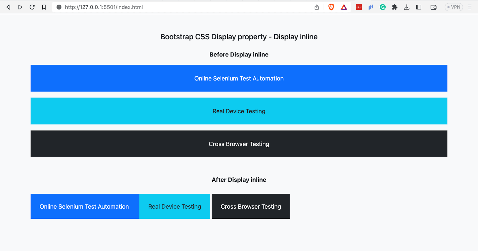
The browser output above shows the paragraphs displaying as inline elements after applying the class d-inline on them.
See the Pen
Bootstrap CSS Display property- Display inline by Mbaziira Ronald (@mbaziraofug)
on CodePen.
Display Inline Block
The class d-inline-block makes elements behave like inline elements while retaining some properties of block elements. Inline-block elements showcase the following characteristics:
- Elements do not begin on a new line.
- Properties of width and height are respected.
- Elements can have vertical margins and paddings.
Below are some of Bootstrap’s responsive classes for d-inline-block:
| Class | Description |
| d-lg-inline-block | Displays the element as inline-block when the page hits the lg breakpoint. |
| d-md-inline-block | Displays the element as inline-block when the page hits the md breakpoint. |
| d-xl-inline-block | Displays the element as inline-block when the page hits the xl breakpoint. |
Below are some common use cases of display inline-block:
- Button-like links: These are links styled to resemble buttons, making them visually eye-catching and encouraging user interaction.
- Menu items: Navigation elements found in menus guide users to different sections or pages within a website or mobile application.
- Horizontal lists: List items arranged horizontally enable websites to utilize little space where vertical lists could, such as in the footer to display items like navigation menus, social media icons, tags, and labels.
- Links with inline icons or images: Links with small icons or images integrated directly with the link text serve as visual cues and prompt user interaction.
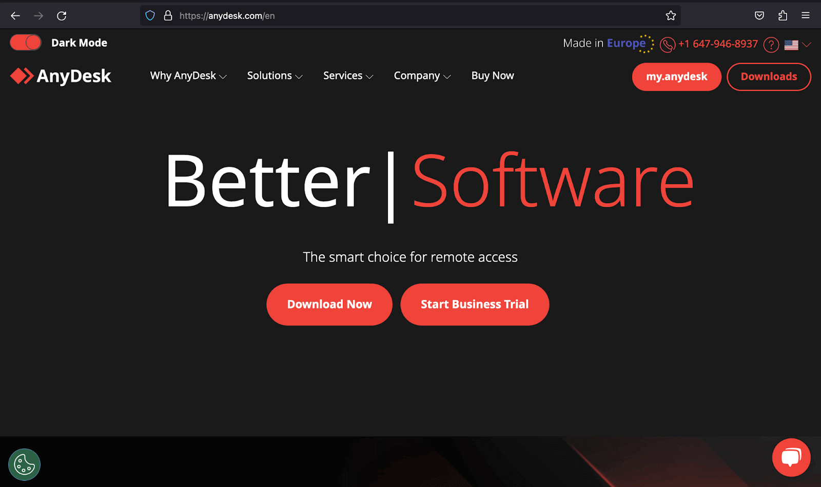
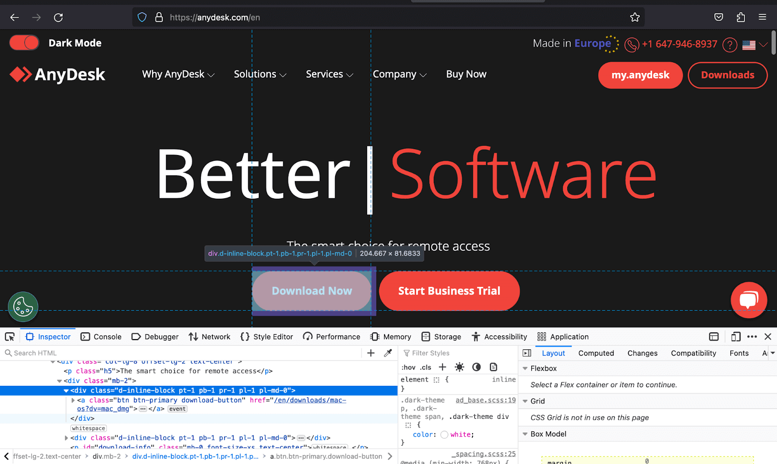
The example below shows how AnyDesk uses the d-inline-block class to create a button-like link to Download Now. This is because, unlike the d-inline, which does not respect vertical margin and padding, and the d-block, which does not allow other elements to be placed along it, the d-inline-block caters to both.
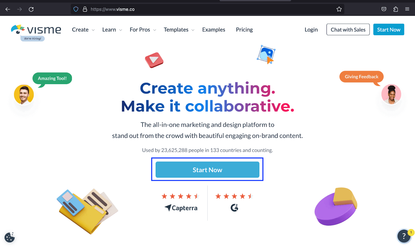
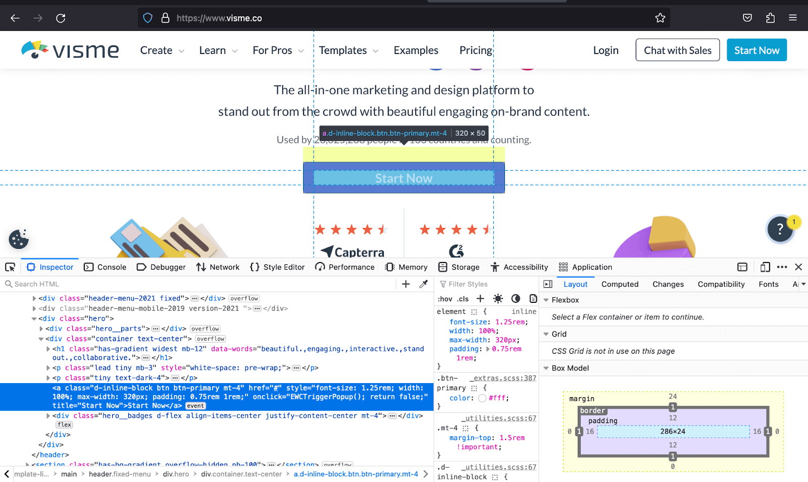
Visme uses the same class of d-inline-block to give the button-like links of Start Now a maximum width of 320px and vertical padding.
|
1 2 3 4 5 6 7 8 9 10 11 12 13 14 15 16 17 18 19 20 21 22 23 24 25 26 27 28 29 30 31 32 33 34 35 36 37 38 39 40 41 42 43 44 45 46 47 48 49 50 51 52 53 54 55 56 57 58 59 60 61 62 63 64 65 66 67 68 69 70 71 72 73 74 75 76 77 78 79 80 81 82 83 84 85 86 87 88 89 90 91 92 93 94 95 96 97 98 |
<!DOCTYPE html> <html lang="en"> <head> <meta charset="UTF-8"> <meta http-equiv="X-UA-Compatible" content="IE=edge"> <meta name="viewport" content="width=device-width, initial-scale=1.0"> <link href="https://cdn.jsdelivr.net/npm/bootstrap@5.3.1/dist/css/bootstrap.min.css" rel="stylesheet" integrity="sha384-4bw+/aepP/YC94hEpVNVgiZdgIC5+VKNBQNGCHeKRQN+PtmoHDEXuppvnDJzQIu9" crossorigin="anonymous"> <title>Bootstrap Display property -> d-inline-block</title> <style> body::before { display: block; content: ''; height: 90px; } </style> </head> <body class="bg-light"> <nav class="navbar navbar-expand-lg bg-white py-4 fixed-top"> <div class="container ms-auto"> <a class="navbar-brand" href="#"> <img src="https://www.lambdatest.com/resources/images/logos/logo.svg" alt="LambdaTest Logo" /> </a> <button class="navbar-toggler" type="button" data-bs-toggle="collapse" data-bs-target="#navbar-menu"> <span class="navbar-toggler-icon"></span> </button> <div class="collapse navbar-collapse" id="navbar-menu"> <ul class="navbar-nav ms-auto"> <li class="nav-item"><a href="" class="nav-link">Platform</a></li> <li class="nav-item"><a href="" class="nav-link">Enterprise</a></li> <li class="nav-item"><a href="" class="nav-link">Resources</a></li> <li class="nav-item"><a href="" class="nav-link">Developers</a></li> <li class="nav-item"><a href="" class="nav-link">Pricing</a></li> <li class="d-flex gap-3 ms-lg-4 ms-md-0 ms-sm-0"> <a href="" class="nav-link">Login</a> <!-- Modal trigger --> <button class="btn btn-outline-dark" data-bs-toggle="modal" data-bs-target="#bookdemo" type="button"> Book a Demo </button> <!-- Modal trigger end --> <a class="btn btn-dark" href="#" role="button">Sign Up</a> </li> </ul> </div> </div> </nav> <!-- --> <section class="py-5"> <div class="container"> <div class="d-flex flex-column align-items-center text-center"> <h1> Next-Generation Mobile Apps and <br> Cross Browser Testing Cloud </h1> <p class="lead"> Deliver unparalleled digital experience with our next-gen AI-powered testing cloud platform. <br> Ensure exceptional user experience across all devices and browsers. </p> </div> <section class="d-flex-column d-md-flex d-sm-flex-column px-4 px-md-none px-lg-none px-xl-none px-xxl-none pt-5 gap-3"> <div class="mb-5 mb-md-0"> <h3 class="h4"> Online Selenium Test Automation on Desktop, Android, and iOS Mobile Browsers </h3> <p> Run your Selenium test automation scripts across online Selenium Grid of desktop, Android and iOS mobile browsers. Develop, test, and deliver faster every time with automated cross browser testing using LambdaTest online Automation Browser Testing Grid. </p> <a class="d-inline-block pt-4 link-info link-underline-opacity-0" style="font-size: 1.25rem; color: #0FBAC5;" href="#"> Get Started <img src="https://www.lambdatest.com/resources/images/right_arrow.svg" alt=""> </a> </div> <div class="mb-5 mb-md-0"> <h3 class="h4">Real Device Cloud for Reliable Mobile App Testing</h3> <p> Test your native hybrid of web mobile apps using LambdaTest's online real device cloud and virtual mobile device platform of emulators and simulators. Eliminating your in-house device labs and bring high scalability to your mobile app testing. </p> <a class="d-inline-block link-info link-underline-opacity-0 pt-4" style="font-size: 1.25rem; color: #0FBAC5;" href="#"> See more <img src="https://www.lambdatest.com/resources/images/right_arrow.svg" alt=""> </a> </div> <div> <h3 class="h4">Cross Browser Testing On Desktop And Mobile Browsers</h3> <p>You can choose from a wide range of Windows and Mac operating systems, along with all legacy and latest browsers. Also test your website or web app on latest mobile browsers with Android and iOS mobile operating systems.</p> <a class="d-inline-block link-info link-underline-opacity-0 pt-4" style="font-size: 1.25rem; color: #0FBAC5;" href="#">All Browser and Devices <img src="https://www.lambdatest.com/resources/images/right_arrow.svg" alt=""> </a> </div> </section> </div> </section> <script src="https://cdn.jsdelivr.net/npm/bootstrap@5.3.1/dist/js/bootstrap.bundle.min.js" integrity="sha384-HwwvtgBNo3bZJJLYd8oVXjrBZt8cqVSpeBNS5n7C8IVInixGAoxmnlMuBnhbgrkm" crossorigin="anonymous"></script> </body> </html> |
Browser output:
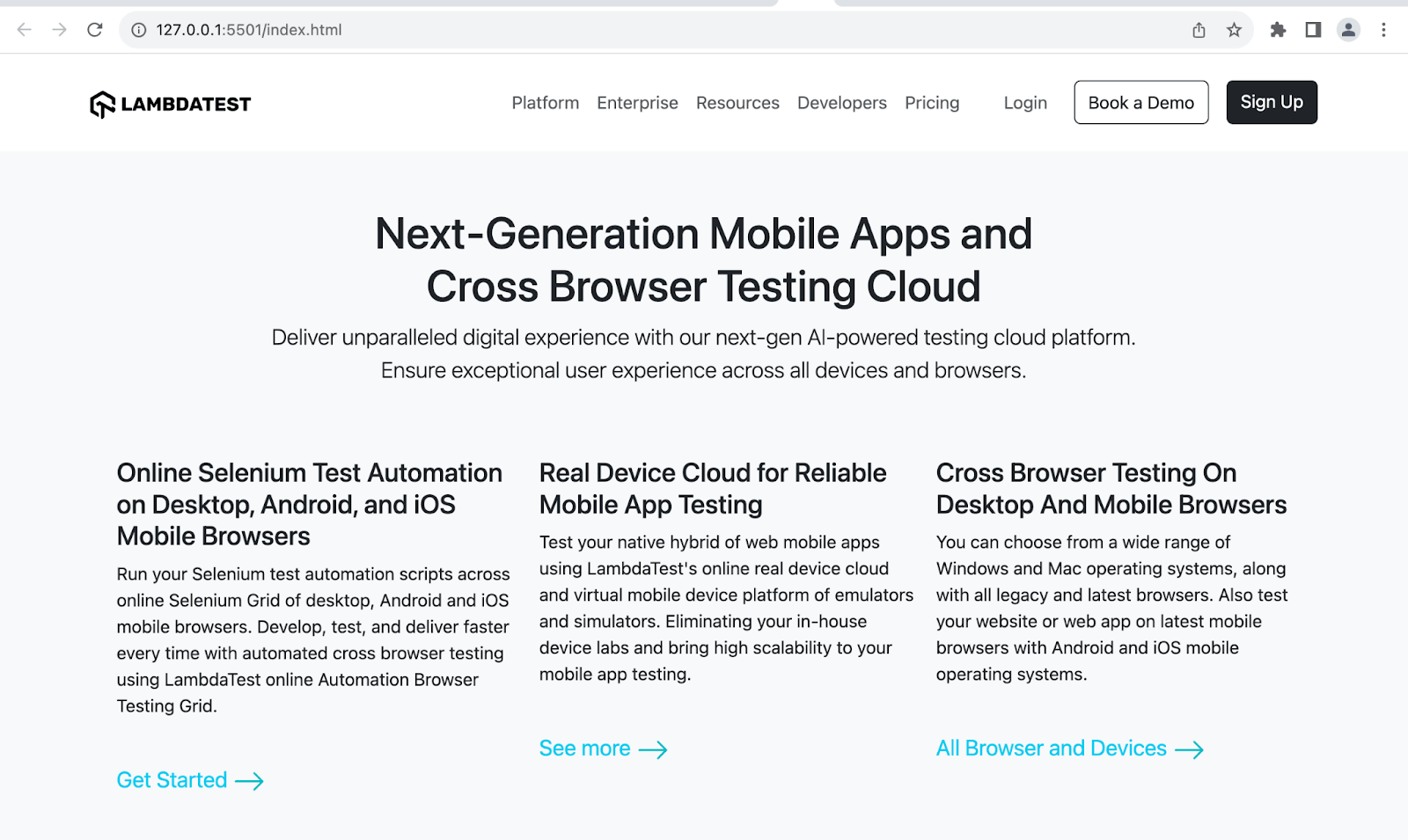
In the output above, we have used d-inline-block to place an arrow image alongside our links and give them a top padding of 4.
See the Pen
Display inline-block – Bootstrap Display property by Mbaziira Ronald (@mbaziraofug)
on CodePen.
Display Block
The class d-block makes non-block elements display as block elements. The table below shows the responsive classes associated with the d-block class.
| Class | Description |
|---|---|
| d-sm-block | Displays the element as a block once the page hits the sm breakpoint. |
| d-md-block | Displays the element as a block once the page hits the md breakpoint. |
| d-lg-block | Displays the element as a block once the page hits the lg breakpoint. |
Common use cases of display block are block buttons, responsive web layouts, modals, pop ups, overlays, and form buttons.
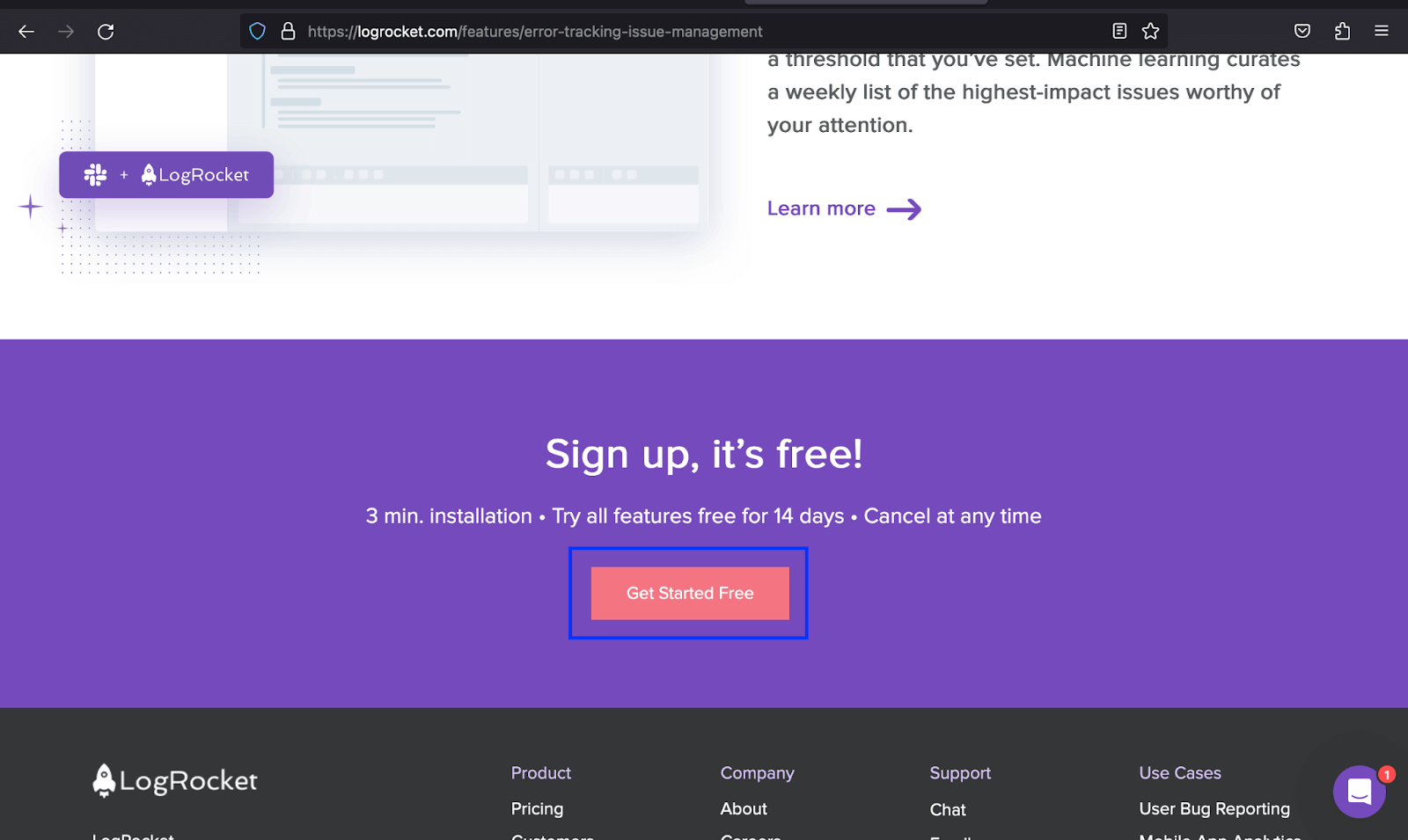
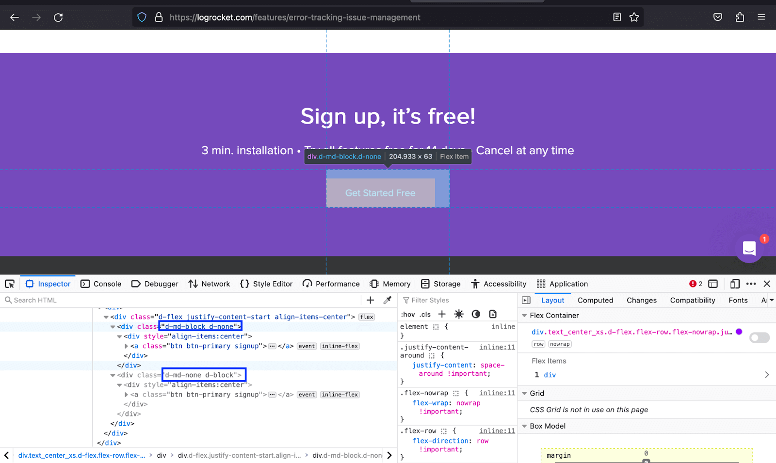
LogRocket uses the d-md-block class to show the Request a Demo button once the page hits the md breakpoint and hides it on other breakpoints. One is shown on the screens below the md breakpoint, and the other on those above.
|
1 2 3 4 5 6 7 8 9 10 11 12 13 14 15 16 17 18 19 20 21 22 23 24 25 26 27 28 29 30 31 32 33 34 35 36 37 38 39 40 41 42 43 44 45 46 47 48 49 50 51 52 53 54 55 56 57 58 59 60 61 62 63 64 65 66 67 68 69 70 71 72 73 74 75 76 77 78 79 80 81 82 83 84 85 86 87 88 89 90 91 92 93 94 95 96 97 98 99 100 101 102 |
<!DOCTYPE html> <html lang="en"> <head> <meta charset="UTF-8"> <meta http-equiv="X-UA-Compatible" content="IE=edge"> <meta name="viewport" content="width=device-width, initial-scale=1.0"> <link href="https://cdn.jsdelivr.net/npm/bootstrap@5.3.1/dist/css/bootstrap.min.css" rel="stylesheet" integrity="sha384-4bw+/aepP/YC94hEpVNVgiZdgIC5+VKNBQNGCHeKRQN+PtmoHDEXuppvnDJzQIu9" crossorigin="anonymous"> <title>Bootstrap Display property -> d-block</title> <style> body::before { display: block; content: ''; height: 100px; } .img { height: auto; width: 350px; } </style> </head> <body class="bg-light"> <nav class="navbar navbar-expand-lg bg-white py-4 fixed-top"> <div class="container ms-auto"> <a class="navbar-brand" href="#"> <img src="https://www.lambdatest.com/resources/images/logos/logo.svg" alt="LambdaTest Logo" /> </a> <button class="navbar-toggler" type="button" data-bs-toggle="collapse" data-bs-target="#navbar-menu"> <span class="navbar-toggler-icon"></span> </button> <div class="collapse navbar-collapse" id="navbar-menu"> <ul class="navbar-nav ms-auto"> <li class="nav-item"><a href="" class="nav-link">Platform</a></li> <li class="nav-item"><a href="" class="nav-link">Enterprise</a></li> <li class="nav-item"><a href="" class="nav-link">Resources</a></li> <li class="nav-item"><a href="" class="nav-link">Developers</a></li> <li class="nav-item"><a href="" class="nav-link">Pricing</a></li> <li class="d-flex gap-3 ms-lg-4 ms-md-0 ms-sm-0"> <a href="" class="nav-link">Login</a> <!-- Modal trigger --> <button class="btn btn-outline-dark" data-bs-toggle="modal" data-bs-target="#bookdemo" type="button"> Book a Demo </button> <!-- Modal trigger end --> <a class="btn btn-dark" href="#" role="button">Sign Up</a> </li> </ul> </div> </div> </nav> <section class="text-center py-5"> <div class="container"> <h1 class="display-3 fw-bold"> Secure Localhost Testing With UnderPass </h1> <p class="text-secondary lead">A GUI application that helps you test locally hosted pages or privately <br/> hosted projects on 3000+ browsers for desktop and mobile.</p> </div> <button class="btn btn-dark mt-3" type="button">DOWNLOAD UNDERPASS</button> </section> <section class="py-5 bg-white"> <div class="container"> <div class="d-flex align-items-center"> <div class="order-1 ps-lg-5 ms-lg-5"> <h2 class="display-6 fw-semibold">One Click Launch To Trigger LambdaTest Tunnel</h2> <p>No need to launch tunnel through CLI anymore. UnderPass will automatically execute the tunnel binary to establish a secure connection for testing locally hosted pages on LambdaTest.</p> <button class="btn btn-dark">Underpass documentation</button> </div> <img class="img d-none d-none d-sm-none d-xxl-block d-xl-block d-lg-block" src="https://www.lambdatest.com/resources/images/One_Click.png" alt=""> </div> </div> </section> <section class="py-5 bg-light"> <div class="container"> <div class="d-flex align-items-center"> <div class="pe-lg-5 me-lg-5 me-0 pe-0"> <h2 class="display-6 fw-semibold">Test Websites with Private Certificate</h2> <p>Underpass enable MITM (Man-in-the-middle) for website with self signed certificates. You can now test locally hosted or privately hosted websites using self signed certificates on your own system or internal network.</p> </div> <img class="img d-none d-none d-sm-none d-xxl-block d-xl-block d-lg-block" src="https://www.lambdatest.com/resources/images/MITM_Toggle.png" alt=""> </div> </div> </section> <section class="py-5 bg-white"> <div class="container"> <div class="d-flex align-items-center"> <div class="order-1 ps-lg-5 ms-lg-5 ms-0 ps-0"> <h2 class="display-6 fw-semibold">Localhost Testing Behind Proxy</h2> <p>Perform Localhost testing to test websites hosted behind proxies. You can define PROXY HOST, PROXY PORT, PROXY USER and PROXY PASSWORD for your remote server, office network or even a local machine. </p> <button class="btn btn-dark">Underpass documentation</button> </div> <img class="img d-none d-none d-sm-none d-xxl-block d-xl-block d-lg-block" src="https://www.lambdatest.com/resources/images/Proxy_Server.png" alt=""> </div> </div> </section> <script src="https://cdn.jsdelivr.net/npm/bootstrap@5.3.1/dist/js/bootstrap.bundle.min.js" integrity="sha384-HwwvtgBNo3bZJJLYd8oVXjrBZt8cqVSpeBNS5n7C8IVInixGAoxmnlMuBnhbgrkm" crossorigin="anonymous"></script> </body> </html> |
Browser output:
In the example above, once the page hits the md and lower breakpoints, the images are hidden and vice versa once they hit the lg breakpoint and above.
See the Pen
Bootstrap Display Property -> d-block by Mbaziira Ronald (@mbaziraofug)
on CodePen.
Display Flex
To give HTML containers or wrappers a display of flex, use the d-flex class. Below are some classes that go along with Bootstrap’s d-flex.
| Class | Description |
|---|---|
| flex-row | Displays the content of the element based on flex |
| flex-column | Displays the content of the element as flex column |
| flex-*-row | This class format enables displaying the contents of an element as flex depending on the breakpoint. The * denotes the breakpoints. | flex-*-column | This class format enables displaying the contents of an element as flex, depending on the breakpoint. The * denotes the breakpoints. |
Common use cases of display flex in web development are image galleries, responsive nav menus, blog cards, footer menus, and responsive web layouts.
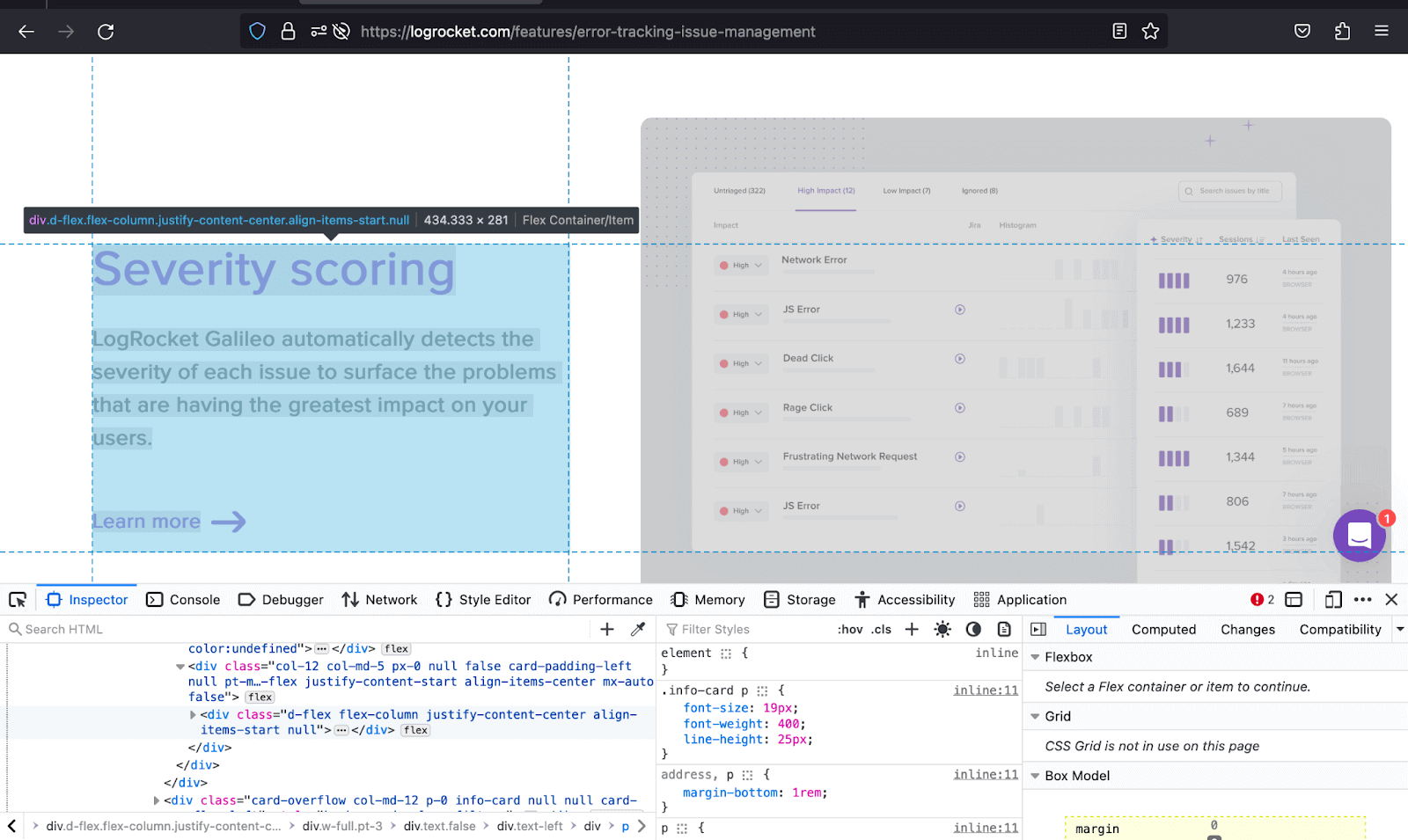
LogRocket, in the example below, uses the d-flex, flex-column, and its associated classes to utilize the space to cater to both the text content and the image by displaying text content in a column layout.
|
1 2 3 4 5 6 7 8 9 10 11 12 13 14 15 16 17 18 19 20 21 22 23 24 25 26 27 28 29 30 31 32 33 34 35 36 37 38 39 40 41 42 43 44 45 46 47 48 49 50 51 52 53 54 55 56 57 58 59 60 61 62 63 64 65 66 67 68 69 70 71 72 73 74 75 76 77 78 79 80 81 82 83 84 85 86 87 88 89 90 91 92 93 94 95 96 97 98 99 100 101 102 103 104 105 106 107 108 109 110 111 112 113 114 115 116 117 118 119 120 121 122 123 124 |
<!DOCTYPE html> <html lang="en"> <head> <meta charset="UTF-8"> <meta http-equiv="X-UA-Compatible" content="IE=edge"> <meta name="viewport" content="width=device-width, initial-scale=1.0"> <link href="https://cdn.jsdelivr.net/npm/bootstrap@5.3.1/dist/css/bootstrap.min.css" rel="stylesheet" integrity="sha384-4bw+/aepP/YC94hEpVNVgiZdgIC5+VKNBQNGCHeKRQN+PtmoHDEXuppvnDJzQIu9" crossorigin="anonymous"> <title>Bootstrap Display property -> d-flex</title> <style> body::before { display: block; content: ''; height: 100px; } .section2 p { color: #808791; } .img { height: auto; width: 300px; } </style> </head> <body style="background: #000;" class="pb-5"> <nav class="navbar navbar-expand-lg bg-white py-4 fixed-top"> <div class="container ms-auto"> <a class="navbar-brand" href="#"> <img src="https://www.lambdatest.com/resources/images/logos/logo.svg" alt="LambdaTest Logo" /> </a> <button class="navbar-toggler" type="button" data-bs-toggle="collapse" data-bs-target="#navbar-menu"> <span class="navbar-toggler-icon"></span> </button> <div class="collapse navbar-collapse" id="navbar-menu"> <ul class="navbar-nav ms-auto"> <li class="nav-item"><a href="" class="nav-link">Platform</a></li> <li class="nav-item"><a href="" class="nav-link">Enterprise</a></li> <li class="nav-item"><a href="" class="nav-link">Resources</a></li> <li class="nav-item"><a href="" class="nav-link">Developers</a></li> <li class="nav-item"><a href="" class="nav-link">Pricing</a></li> <li class="d-flex gap-3 ms-lg-4 ms-md-0 ms-sm-0"> <a href="" class="nav-link">Login</a> <!-- Modal trigger --> <button class="btn btn-outline-dark" data-bs-toggle="modal" data-bs-target="#bookdemo" type="button"> Book a Demo </button> <!-- Modal trigger end --> <a class="btn btn-dark" href="#" role="button">Sign Up</a> </li> </ul> </div> </div> </nav> <!-- --> <section class="container"> <div class="p-5 text-white" style="background: #171a21;"> <div class="d-flex align-items-center justify-content-between"> <div> <h1>LambdaTest Support and <br/> Knowledge Base</h1> <p class="lead pt-3 text-secondary">Helping you test web and mobile apps at scale.</p> </div> <div> <img class="img d-none d-lg-block d-md-block d-sm-none" src="https://www.lambdatest.com/support/assets/images/Illustration-cc7032867d0192b6e025a30cdffef9b2.png" alt=""> </div> </div> </div> <section class="pt-5 section2"> <p class="text-white h4 pb-3">AUTOMATION</p> <div class="d-flex gap-4 d-lg-flex d-md-flex d-sm-flex d-flex-column gap-4 px-3 px-sm-0 px-md-0 px-lg-0 px-xl-0"> <div> <div class="border border-bottom-0 border-start-0 border-end-0 border-top-2 border-secondary py-4"> <h6 class="text-white">Selenium Testing</h6> <p>Learn how to start Selenium Automation Testing across multitude of desktop and mobile browsers.</p> </div> <div class="border border-bottom-0 border-start-0 border-end-0 border-top-2 border-secondary py-4"> <h6 class="text-white">Playwright Testing</h6> <p>Conduct online Playwright Testing of your websites across 40+ browser versions.</p> </div> <div class="border border-bottom-0 border-start-0 border-end-0 border-top-2 border-secondary py-4"> <h6 class="text-white">Appium Testing</h6> <p>Test your web and native mobile apps on Appium mobile device cloud of 3000+ real devices.</p> </div> <div class="border border-bottom-0 border-start-0 border-end-0 border-top-2 border-secondary py-4"> <h6 class="text-white">XCUI Testing</h6> <p>Run app test automation of your iOS applications on XCUI automation cloud.</p> </div> <div class="border border-bottom-0 border-start-0 border-end-0 border-top-2 border-secondary py-4"> <h6 class="text-white">HyperExecute Testing.</h6> <p>Learn how to leverage smart test orchestration and accelerated End-to-End Selenium test execution with HyperExecute</p> </div> </div> <!-- 2nd group --> <div> <div class="border border-bottom-0 border-start-0 border-end-0 border-top-2 border-secondary py-4"> <h6 class="text-white">Cypress Testing</h6> <p>Run & analyze Cypress test scripts across 40+ browser versions on cloud.</p> </div> <div class="border border-bottom-0 border-start-0 border-end-0 border-top-2 border-secondary py-4"> <h6 class="text-white">Test LocalHost</h6> <p>Test your locally hosted or privately hosted pages on LambdaTest platform.</p> </div> <div class="border border-bottom-0 border-start-0 border-end-0 border-top-2 border-secondary py-4"> <h6 class="text-white">Espresso Testing</h6> <p>Automate your mobile apps on Espresso automation cloud of 3000+ real devices.</p> </div> <div class="border border-bottom-0 border-start-0 border-end-0 border-top-2 border-secondary py-4"> <h6 class="text-white">Test At Scale</h6> <p>Explore how to use Test At Scale to expedite your testing, cut job times, and get faster feedback on code commit.</p> </div> <div class="border border-bottom-0 border-start-0 border-end-0 border-top-2 border-secondary py-4"> <h6 class="text-white">List of Browsers</h6> <p>List of all desktop and mobile browsers available at LambdaTest platform.</p> </div> </div> </div> </section> </section> <script src="https://cdn.jsdelivr.net/npm/bootstrap@5.3.1/dist/js/bootstrap.bundle.min.js" integrity="sha384-HwwvtgBNo3bZJJLYd8oVXjrBZt8cqVSpeBNS5n7C8IVInixGAoxmnlMuBnhbgrkm" crossorigin="anonymous"></script> </body> </html> |
Browser output:
In the output above, we have used d-flex and other classes like d-flex-column to present the various forms of automation into two columns adaptable to different screen sizes as they hit different breakpoints.
The adaptability of the layout offers a cohesive user experience to site visitors, thus making the user more likely to spend a greater duration interacting with the website.
See the Pen
Bootstrap Display Property -> d-flex by Mbaziira Ronald (@mbaziraofug)
on CodePen.
Deep Diving Into Bootstrap Visibility Utility
The Bootstrap visibility utility controls the visibility of elements without modifying their display. It has two classes, invisible and visible. The two classes are based on the CSS property of visibility, which enables hiding an element without changing the webpage layout.
Following are the common use cases of the Bootstrap visibility utility:
- Transitions and animations
- Overlay menus
- Tooltips
CSS transitions and CSS animations enable control over the smooth and gradual change of an element’s property values and properties over a specified duration and allow the creation of features like loading spinners.
This is a type of navigational menu that displays a list of options or links by covering part or all of the existing content.
A tooltip is a small contextual informative message that provides additional information about a particular subject when a user clicks or hovers over the element.
|
1 2 3 4 5 6 7 8 9 10 11 12 13 14 15 16 17 18 19 20 21 22 23 24 25 26 27 28 29 30 31 32 33 34 35 36 37 38 |
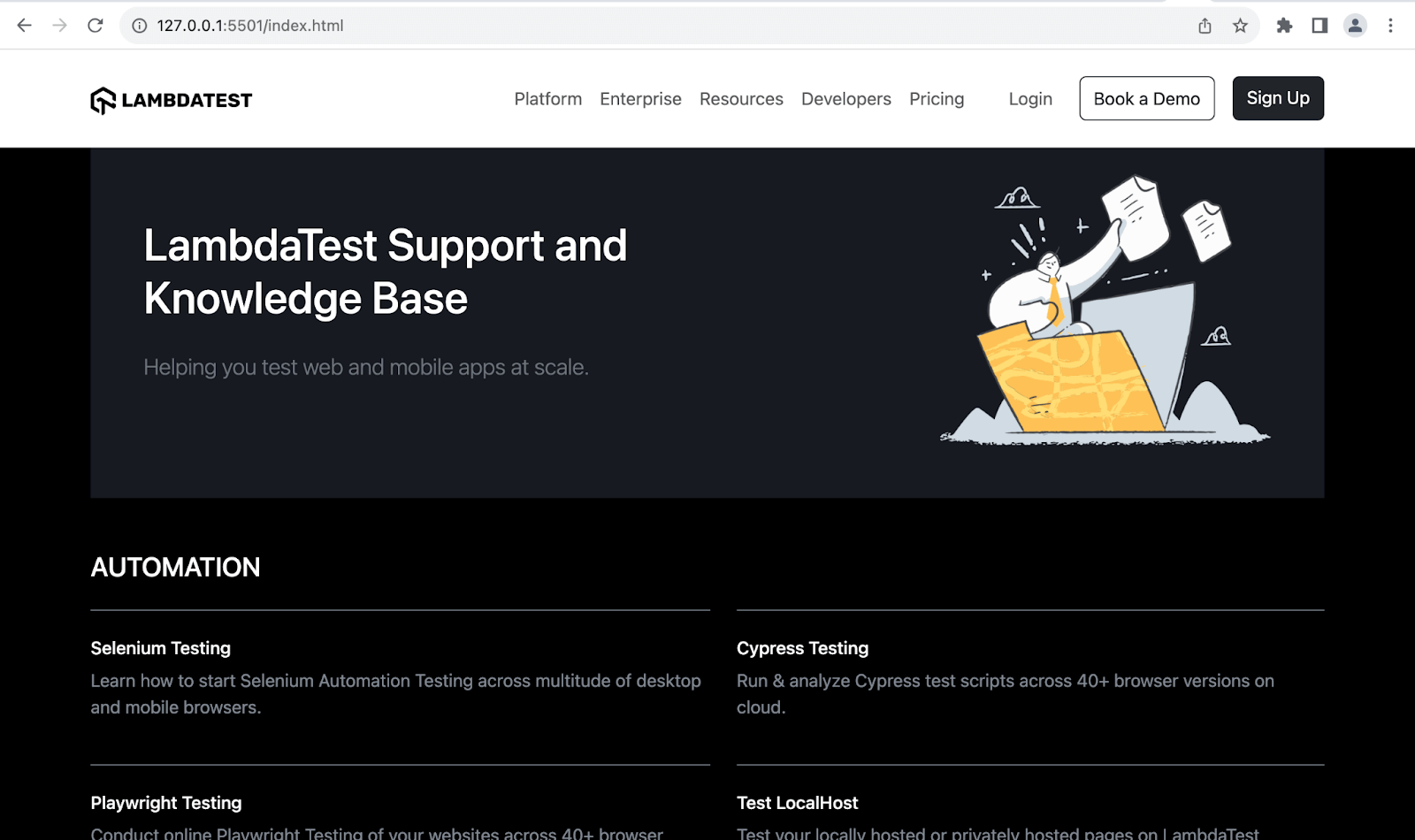
<!DOCTYPE html> <html lang="en"> <head> <meta charset="UTF-8" /> <meta http-equiv="X-UA-Compatible" content="IE=edge" /> <meta name="viewport" content="width=device-width, initial-scale=1.0" /> <link rel="stylesheet" href="./node_modules/bootstrap/dist/css/bootstrap.min.css" /> <title>Visibility Utility Bootstrap CSS - Invisible class</title> </head> <body> <p class="text-center mt-4"> <strong>Visibility Utility Bootstrap CSS - Invisible class</strong> </p> <div class="container"> <p class="bg-light m-4 p-4 border-start border-5 border-primary"> Run your Selenium test automation scripts across online Selenium Grid of desktop, Android and iOS mobile browsers. Develop, test, and deliver faster every time with automated cross browser testing using LambdaTest online Automation Browser Testing Grid. </p> <p class="bg-light m-4 p-4 border border-4 border-success invisible"> Test your native hybrid of web mobile apps using LambdaTest’s online real device cloud and virtual mobile device platform of emulators and simulators. Eliminating your in-house device labs and bring high scalability to your mobile app testing. </p> <p class="bg-light m-4 p-4 border-top border-bottom border-5 border-info"> Perform live interactive testing of your mobile apps on a multitude of Android and iOS devices. Test and debug your mobile apps faster on both Emulators/Simulators or online real device cloud. </p> </div> <script src="./node_modules/bootstrap/dist/js/bootstrap.bundle.min.js"></script> </body> </html> |
Browser output:
As shown in the above image, we have seen that the invisible class makes the second paragraph on the web page invisible or disappears while still taking up space in the layout. We still have it in our source code, but it is visible visually.
See the Pen
Bootstrap CSS Visibility Utility – Invisible class by Mbaziira Ronald (@mbaziraofug)
on CodePen.
To wrap up with Bootstrap display property and visibility, the dynamic duo empowers you with a comprehensive set of tools to manage visibility and layout, creating a solid foundation for crafting responsive websites. Thus, in our next section, we will see some of the responsive layout techniques you can achieve with Bootstrap display and visibility.
Responsive Layout Techniques with Bootstrap Display and Visibility
We will look at the techniques you can use for Bootstrap visibility utility and Bootstrap display property to create web pages that adapt effectively to ensure a seamless user experience across different screen sizes and devices. Below are some of them;
- Element reordering: Element reordering is a responsive layout technique that involves rearranging the order of elements in the user interface from the one in the HTML Markup to make the elements adapt better to different screens and devices or the UI more captivating.
- Web image handling: This refers to optimizing, manipulating, and managing images for use on the web. It involves executing ways that improve a website’s responsiveness, user experience, and performance.
- Multi-column layout: Multi-column layouts refer to a technique where content is organized into multiple columns, providing a structured and efficient way to present information.
It also improves the readability of the content by changing its flow, which enables users to consume information more reasonably. To achieve element reordering, you can use the Bootstrap display properties – d-flex and order-* classes.
To demonstrate one of the responsive layout techniques, we will use the multi-column layout technique in our demo website. We will divide the content into two or more vertical columns. This will allow for a more balanced distribution of information, especially as we deal with lengthy text or numerous items.
The Bootstrap display property classes of d-flex, flex-column, gap-*, and flex-md-column are some of the classes we will use.
|
1 2 3 4 5 6 7 8 9 10 11 12 13 14 15 16 17 18 19 20 21 22 23 24 25 26 27 28 29 30 31 32 33 34 35 36 37 38 39 40 41 42 43 44 45 46 47 48 49 50 51 52 53 54 55 56 57 58 59 60 61 62 63 64 65 66 67 68 69 70 71 72 73 74 75 76 77 78 79 80 81 82 83 84 85 86 87 88 89 90 91 92 93 94 95 96 97 98 99 100 101 102 103 104 105 106 107 108 109 110 111 112 113 114 115 116 117 118 119 120 121 122 123 124 125 126 127 128 129 130 131 132 133 134 135 136 137 138 139 140 141 142 143 144 145 146 147 148 149 150 151 152 153 154 155 156 157 158 159 160 161 162 |
<!DOCTYPE html> <html lang="en"> <head> <meta charset="UTF-8"> <meta http-equiv="X-UA-Compatible" content="IE=edge"> <meta name="viewport" content="width=device-width, initial-scale=1.0"> <link href="https://cdn.jsdelivr.net/npm/bootstrap@5.3.1/dist/css/bootstrap.min.css" rel="stylesheet" integrity="sha384-4bw+/aepP/YC94hEpVNVgiZdgIC5+VKNBQNGCHeKRQN+PtmoHDEXuppvnDJzQIu9" crossorigin="anonymous"> <title>Responsive page with Bootstrap Visibility and Display Property</title> <style> body::before { display: block; content: ''; height: 100px; } .enterprise { background: linear-gradient(91.42deg,#2b56f3 18.38%,#a505d8 62.2%); -webkit-background-clip: text; -webkit-text-fill-color: transparent; } .img { height: auto; width: 400px; } .icon { height: auto; width: 55px; } </style> </head> <body class="bg-light"> <nav class="navbar navbar-expand-lg bg-white py-4 fixed-top"> <div class="container ms-auto"> <a class="navbar-brand" href="#"> <img src="https://www.lambdatest.com/resources/images/logos/logo.svg" alt="LambdaTest Logo" /> </a> <button class="navbar-toggler" type="button" data-bs-toggle="collapse" data-bs-target="#navbar-menu"> <span class="navbar-toggler-icon"></span> </button> <div class="collapse navbar-collapse" id="navbar-menu"> <ul class="navbar-nav ms-auto"> <li class="nav-item"><a href="" class="nav-link">Platform</a></li> <li class="nav-item"><a href="" class="nav-link">Enterprise</a></li> <li class="nav-item"><a href="" class="nav-link">Resources</a></li> <li class="nav-item"><a href="" class="nav-link">Developers</a></li> <li class="nav-item"><a href="" class="nav-link">Pricing</a></li> <li class="d-flex gap-3 ms-lg-4 ms-md-0 ms-sm-0"> <a href="" class="nav-link">Login</a> <!-- Modal trigger --> <button class="btn btn-outline-dark" data-bs-toggle="modal" data-bs-target="#bookdemo" type="button"> Book a Demo </button> <!-- Modal trigger end --> <a class="btn btn-dark" href="#" role="button">Sign Up</a> </li> </ul> </div> </div> </nav> <!-- --> <!-- Secttion 1 --> <section class="text-center py-5 container"> <h1 class="fw-bolder display-4">Digital Experience Testing Cloud <br/> Built For <span class="enterprise">Enterprises</span></h1> <p class="text-secondary lead">Our Unified Testing Cloud enables you to deliver <br/> world class digital experience with quality releases and help accelerate your release velocity.</p> </section> <!-- section 2 --> <section class="bg-white py-5"> <div class="container"> <div class="d-flex align-items-center gap-5"> <div class="px-3 px-md-2 px-lg-5 px-sm-2"> <h2 class="display-6 fw-bold">Real Device Cloud To Test Mobile Experience</h2> <p class="lead">LambdaTest's Real Devices Testing Cloud, enables you to test unhandled errors, UI/UX, performance, and functionality of your apps even before they get released into production. Test on widest range of mobile and OTT devices <span class="fw-bold">(iOS, Android, iPad, Amazon Fire TV, Roku TV & Apple TV).</span> </p> </div> <img class="img d-none d-sm-none d-md-none d-lg-block d-xl-block d-xxl-block" src="https://www.lambdatest.com/resources/images/real_device_cloud_ep.webp" alt=""> </div> <!-- Div 2 --> <div class="pt-3 d-flex align-items-center gap-5"> <div class="px-3 px-md-2 px-lg-5 px-sm-2 order-1"> <h2 class="display-6 fw-bold">Continuous Testing Cloud For Quality Digital Experience</h2> <p class="lead">LambdaTest's Continuous Testing Cloud allows enterprises to rapidly test and deploy changes to their web and mobile applications up to 70% faster, which helps to accelerate development process and improve time-to-market.</span> </p> </div> <img class="img d-none d-sm-none d-md-none d-lg-block d-xl-block d-xxl-block" src="https://www.lambdatest.com/resources/images/browser_image.webp" alt=""> </div> <!-- Div 3 --> <div> <div class="pt-3 d-flex align-items-center gap-5"> <div class="px-3 px-md-2 px-lg-5 px-sm-2"> <h2 class="display-6 fw-bold">Deliver Visually Perfect Digital Experience</h2> <p class="lead">LambdaTest's Visual Regression Cloud ensures that the visual appearance and functionality of your web applications remain consistent and error-free, ultimately improving the digital experience and business performance.</p> </div> <img class="img d-none d-sm-none d-md-none d-lg-block d-xl-block d-xxl-block" src="https://www.lambdatest.com/resources/images/visual_image.webp" alt=""> </div> </div> </div> </section> <!-- Why Businesses Love LambdaTest section --> <section class="container py-5"> <h1 class="text-center display-6 fw-bold">Why Do Digital Businesses Love <br/> LambdaTest?</h1> <div class="container py-5"> <div class="row row-cols-1 row-cols-xxl-3 row-cols-xl-3 row-cols-lg-3 row-cols-md-2 row-cols-sm-1 gy-4 gx-4"> <!-- 1 --> <div class="col"> <img class="icon" src="https://www.lambdatest.com/resources/images/multi_channel.svg" alt=""> <div class="pt-3"> <p class="h5 fw-bold">Multi-channel Support</p> <p class="lead">Access our free in-product training modules, detailed support documentation, learning hub resources, connect with your dedicated account manager or leverage our 24x7 customer support to quickly get up to speed and experience our platform's full potential.</p> </div> </div> <!-- 2 --> <div class="col"> <img class="icon" src="https://www.lambdatest.com/resources/images/powerful_integrations.svg" alt=""> <div class="pt-3"> <p class="h5 fw-bold">Powerful Integrations</p> <p class="lead">From CI/CD, project management, codeless automation to test management and reporting tools, we've got them all. Our 120+ out-of-the-box integrations will ensure increased productivity and seamless collaboration between your teams.</p> </div> </div> <!-- 3 --> <div class="col"> <img class="icon" src="https://www.lambdatest.com/resources/images/single_sign_on.svg" alt=""> <div class="pt-3"> <p class="h5 fw-bold">Single Sign-On</p> <p class="lead">Easily enable Single Sign-On (SSO). Integrate LambdaTest with identity and access management tools Okta, Active Directory, and OneLogin to seamlessly onboard your teams.</p> </div> </div> <!-- 4 --> <div class="col"> <img class="icon" src="https://www.lambdatest.com/resources/images/tailor_made.svg" alt=""> <div class="pt-3"> <p class="h5 fw-bold">Tailor-made Plans to Suit Your Needs</p> <p class="lead">Every business has unique requirements and we understand that. Businesses can pick and choose the features they want. No questions asked.</p> </div> </div> <!-- 5 --> <div class="col"> <img class="icon" src="https://www.lambdatest.com/resources/images/high_perfromance.svg" alt=""> <div class="pt-3"> <p class="h5 fw-bold">High Performance Infrastructure</p> <p class="lead">Our VMs are designed to be single-use to ensure the perfect testing conditions each time. No need to depend on expensive and daunting-to-maintain in-house infrastructure anymore!</p> </div> </div> <!-- 6 --> <div class="col"> <img class="icon" src="https://www.lambdatest.com/resources/images/ep_insights.svg" alt=""> <div class="pt-3"> <p class="h5 fw-bold">Actionable Insights</p> <p class="lead">Gain access to comprehensive reports on test runs, browser and OS coverage, platform utilization, execution logs, and videos, among others. Integrate with the analytics tool of your choice to create your own insight repo.</p> </div> </div> </div> </div> </section> <script src="https://cdn.jsdelivr.net/npm/bootstrap@5.3.1/dist/js/bootstrap.bundle.min.js" integrity="sha384-HwwvtgBNo3bZJJLYd8oVXjrBZt8cqVSpeBNS5n7C8IVInixGAoxmnlMuBnhbgrkm" crossorigin="anonymous"></script> </body> </html> |
Mobile Preview:
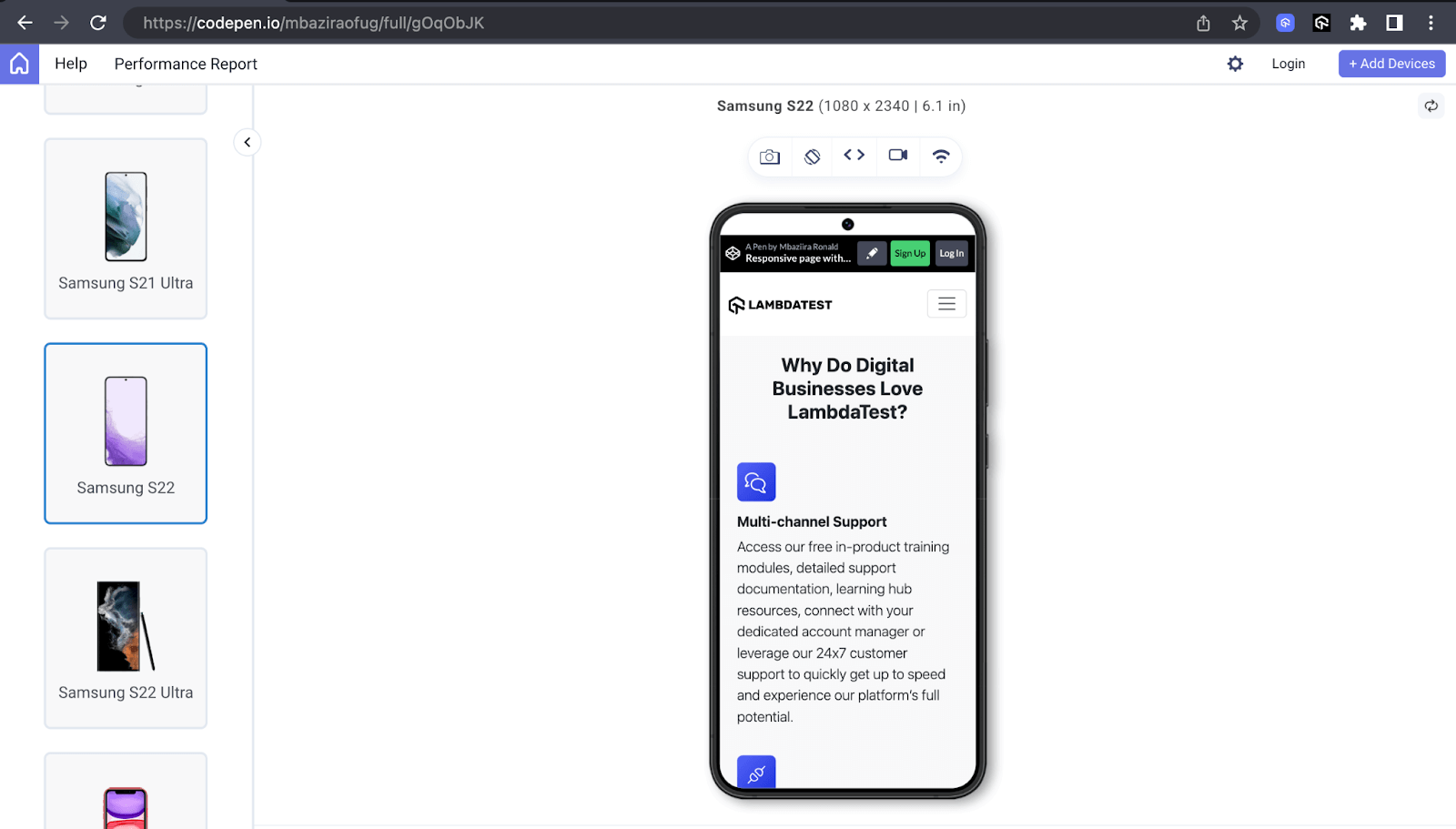
Tablet Preview:
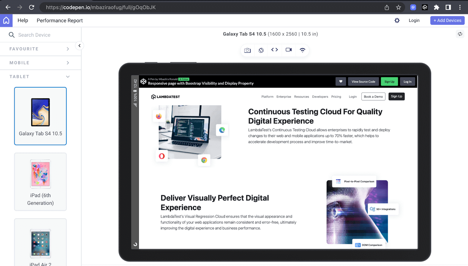
Desktop Preview:
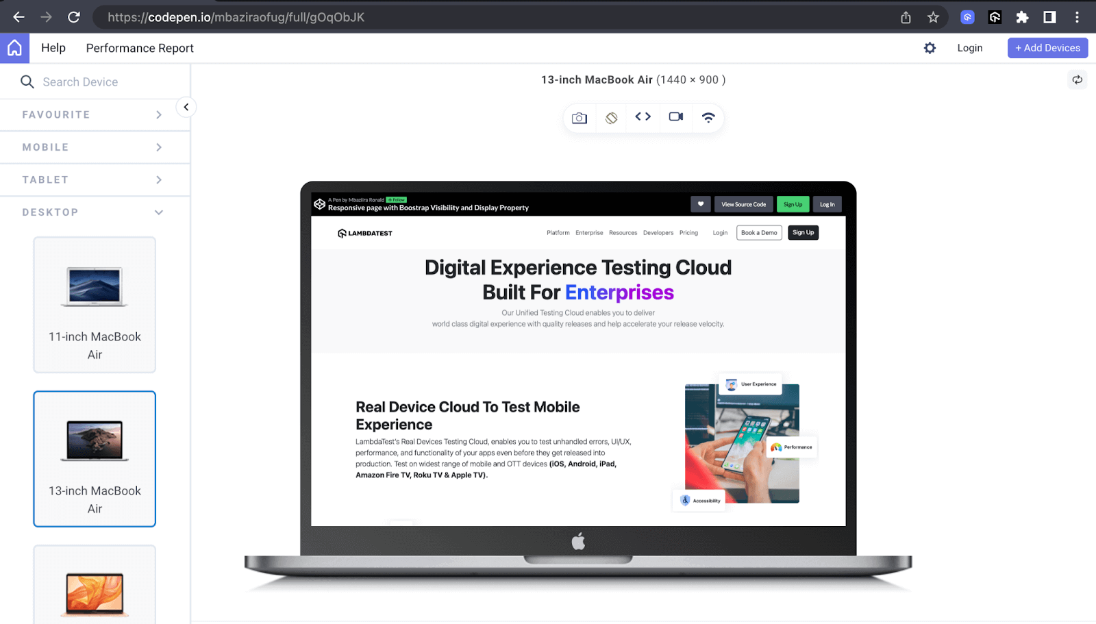
The above previews show how the demo website we created responds to different devices with varying screen sizes, including mobile, tablet, and desktop previews.
We have leveraged the LT Browser to check responsiveness, which has again come in handy when doing responsive testing on our demo website.
See the Pen
Responsive page with Boostrap Visibility and Display Property by Mbaziira Ronald (@mbaziraofug)
on CodePen.
Key Aspects to Consider for Bootstrap Visibility and Display
We have looked at how Bootstrap visibility utility and Bootstrap display property work and how you can harness their capabilities to improve your website’s overall look and responsiveness.
Nonetheless, working with these two powerful Bootstrap features comes with its challenges. Let’s look at them and how you can overcome them.
Accessibility concerns
When creating websites, we want them to be as accessible to as many as a wide audience as possible. According to a fact sheet by the WHO, 1.3 billion people are differently-abled, representing about 16% of the world’s population.
However, when we use the Bootstrap display property class of d-none or d-md-none, it makes that content inaccessible to people who rely on screen readers and other assistive technologies.
One way to address this is by using WAI-ARIA roles like aria-hidden on the element. When you set the aria-hidden role to true, the element is not only hidden visually but no longer in the accessibility tree. This improves the user experience of screen readers.
Additionally, to take things to the next level, you can carry out accessibility testing for your website. This enables you to detect and address barriers restricting people with impairments from using your website.
Testing responsiveness
The ability of a website to adapt to different screen sizes and devices can mean the difference between a user buying a product, subscribing to a service, or abandoning the website. It is this vitality that responsiveness plays that makes testing the responsiveness of a website crucial.
After making the website flexible using Bootstrap classes like d-flex, d-lg-block, and d-flex-md-row. You can do responsive testing to see how your website adapts to various screen sizes and devices. You can use tools like the LT Browser by LambdaTest, where you can simultaneously interact and test with up to six device viewports.
Cross browser compatibility
One other key challenge you may encounter when using Bootstrap display property and Bootstrap visibility is achieving consistency across different web browsers.
Although Bootstrap is designed to give a uniform experience, the reality is that different browsers like Chrome, Firefox, and Safari interpret CSS and JavaScript differently. This variation can lead to inconsistencies in the behavior of elements on the web page depending on which browser the page is in view.
The solution is to conduct browser testing to ensure your website renders as expected on different browsers. This enables you to Identify and fix any incidents. For this, you can harness an online browser farm offering cloud-based testing platforms like LambdaTest.
It is an AI-powered test orchestration and execution platform that allows you to perform manual and automated testing of websites and mobile applications across different permutations of real browsers, devices, and platforms. And you can do all this without setting up a local test infrastructure.
Conclusion
In this Bootstrap tutorial Part III, we delved into Bootstrap display property and visibility utility and their examples. We have learned what classes to use and their different use cases in web development.
Bootstrap comprehensive range of classes opens up a world of layout possibilities, ensuring that elements align and stack harmoniously across different viewport sizes.
I encourage you to explore more possibilities you can do with Bootstrap visibility and display utilities. Thank you for taking the time to read. See you in the next one!
Frequently Asked Questions (FAQs)
How do I hide elements on specific screen sizes with Bootstrap?
You can use the class formats of d-{value} and d-{breakpoint}-{value} to hide elements on specific breakpoints or screen sizes in Bootstrap.
The d-{value} class format hides elements on the xs breakpoint while the d-{breakpoint}-{value} hides elements on the sm, md, lg, xl, and xxl breakpoints.
What is the difference between the d-none and invisible classes in Bootstrap?
The d-none class removes an element from the document flow entirely. The element is neither visible nor occupies space on the page. The invisible class, on the other hand, visually hides the element while preserving the space it occupies on the page.
How do I hide text in Bootstrap?
You can use the d-none class to hide the text entirely from the website layout. Optionally, you can use the invisible class to hide the text visually but keep the space it occupies in the layout.


Author’s Profile
Mbaziira Ronald
Mbaziira Ronald is a software developer and technical writer. He has expertise in technologies like Tailwind CSS, JavaScript, and WordPress. He frequently dabbles with Figma to improve his design skills.
Blogs: 7
Got Questions? Drop them on LambdaTest Community. Visit now


