
A Complete Guide To CSS Masking
Alex Anie
Posted On: July 12, 2023
 156583 Views
 29 Min Read
Since the inception of the web, web design has been a huge part of it. Web designers use different approaches to design web pages, but this comes with some limitations, as only some designs can be implemented on the web, especially when working with media files, image assets, or SVG files.
Things can get complex and, most times, difficult to do. For example, before the introduction of CSS masking, designers used raster graphic editing software like Photoshop to add CSS masking to images before importing them to the web.
This approach can be a herculean task, especially when working with larger or multiple images.
One can not apply CSS masking to 50 or more images before importing them for use on the web. Doing so will lead to a slow and tedious development process, not to mention. There are cases of accessibility, browser compatibility, and color contrast, just to mention a few.
To fix this problem, the CSS masking property has been added to the CSS specification. This enables the smoothness and ease of applying masks to images on the web.
In this blog, we will explore what is CSS masking and how to apply CSS masking to blend images, videos, text, SVGs (Scalable Vector Graphics). We will also look at CSS masking properties and sub-properties, CSS mask border properties, browser compatibility, and other CSS masking properties and their use cases.
Let’s get started!
TABLE OF CONTENTS
What is CSS Masking
CSS masking involves partially or fully hiding parts of a visual element, such as images, videos, or SVGs. Applying CSS masking involves using another graphical element, such as images, SVGs, or text, as an alpha or luminance mask.
When using an alpha mask, the object receiving the mask conforms to the shape of the object that is applying the mask. The shape becomes visible while other parts of the element become partially or fully hidden.
Let’s look at an example:
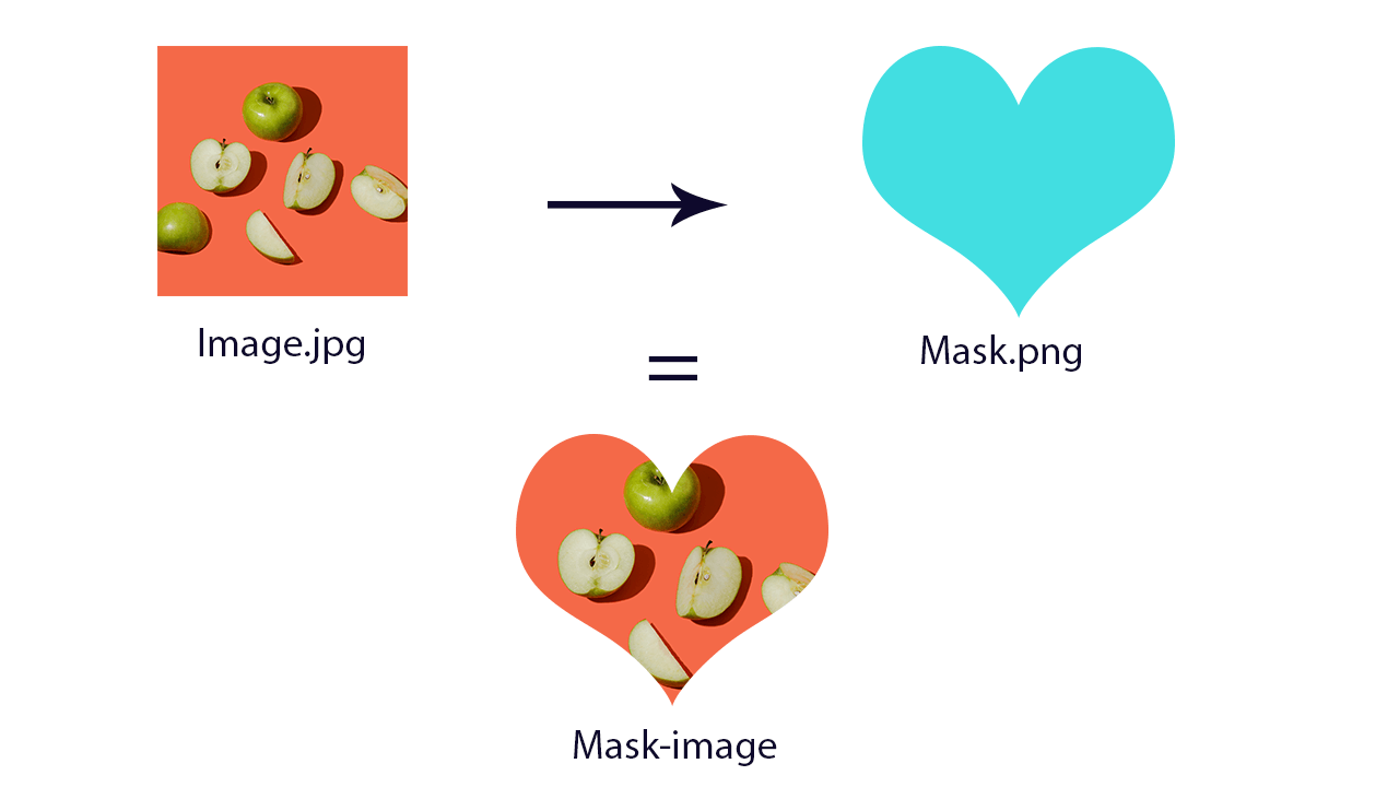
From the illustration above, we have two images, one with a jpg and the other with a png file extension. The png image supports transparency, which is best for CSS masking.
To make the CSS masking technique work, the mask.png is used as a mask to cover the image.jpg file revealing only the portion of the mask image shape.
Look at the below image for a clear vision:
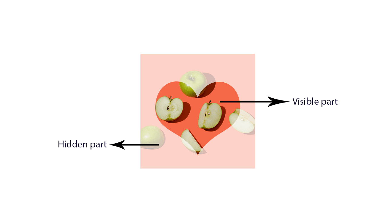
Contrary to what you would think, CSS masking doesn’t crop out the image; instead, it hides part of the surrounding area of the object leaving only the mask area. This enables us to style the mask using the mask properties.
Real-Life Examples of Websites using CSS Masking
CSS masking has many benefits. It allows web designers and developers to hide parts of an element on the web. This can be either through text, PNG image shapes, or SVG elements. However, masking in CSS is not limited to hiding parts of an element. It can also be used to apply transparency to web elements, making the element blend well with the web page’s background.
Let’s look at real-world examples of where CSS masking has been used on popular websites.
Making Content Text
Here is a simple example of how LambdaTest used CSS masking to hide some parts of the content from the user with an option to reveal upon click (the Read More button). This limited the amount of content exposed to the user when browsing the website.
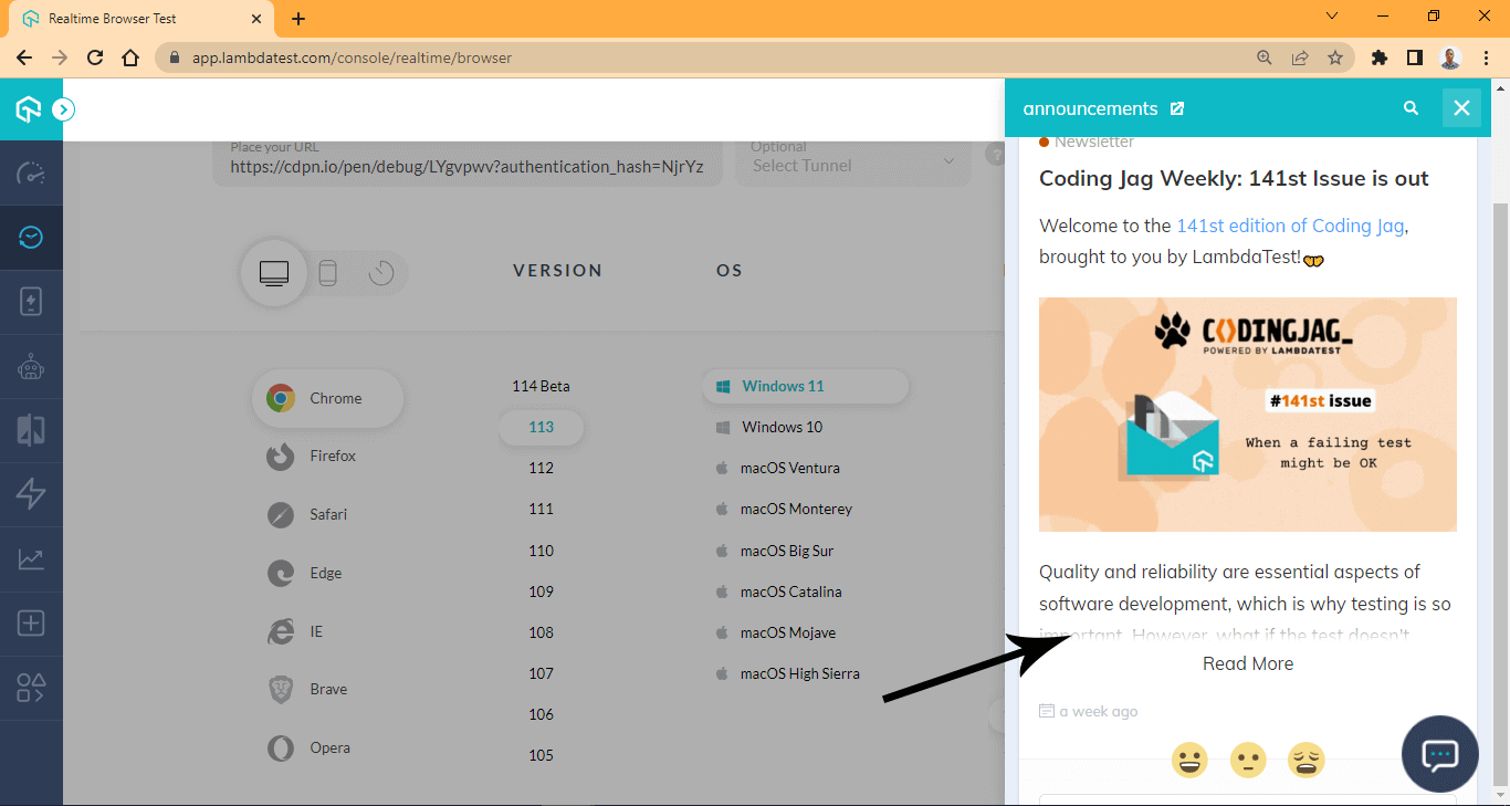
This technique can be very helpful as it allows users to scroll through multiple options before deciding on the actual top to read.
However, it can also be used to restrict who gets access to particular content, such as exclusive content for subscribers.
Here is a perfect example from the Atlantic.
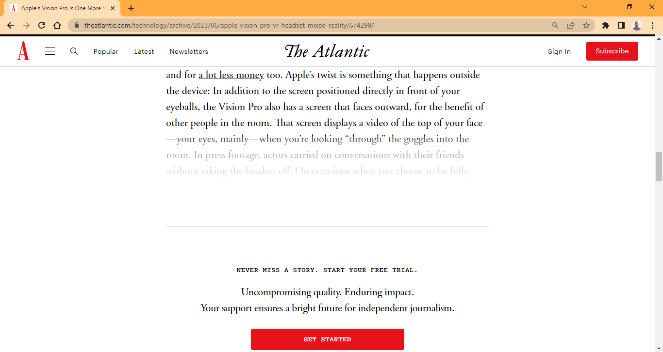
Here, some parts of the web page are faded for subscribers only. This gives web authors control over who reads the content they publish on their website.
Linear Gradient Fading
While making content is great and has benefits, Images can also be blended with the page’s background.
This technique is handy, especially with landing pages. The MasterClass is a perfect example of how making images with linear gradients can improve user experience.
As you can see from their website, the CTAs buttons and display text have good color contracts from the background image and the web page’s background.

CSS is masking an image with a linear gradient that works simply. The black in the alpha channel is used to hide some parts of the image. The size or direction of the mask can be specified in the degree to determine how large the mask should grow to cover the selected image.
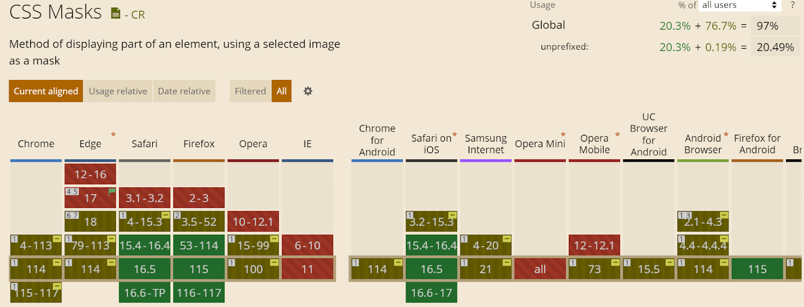
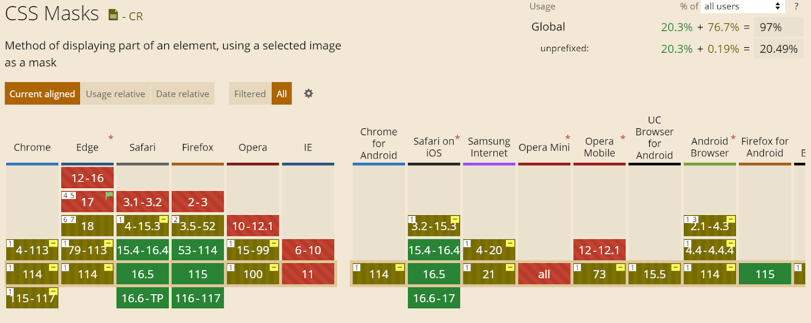
Browser Compatibility
The browser compatibility for CSS masking is not fully supported in all browsers at the time of writing.
Browsers such as Chrome, Opera, and Edge have partial support and require the use of the -webkit- prefix for the property to function correctly. However, Safari and Firefox fully support specifying the property without vendor prefixes.
CSS Masking Properties
The CSS masking properties are required when you want to add additional styling to a masking effect. For example, we can create a mask with the mask-image property and reposition it with the mask-position property.
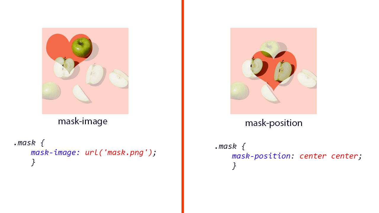
The above image illustrates how to use the mask property in CSS masking.
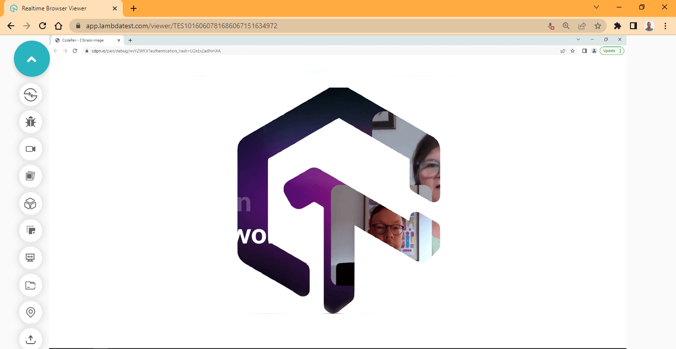
mask-image property
The mask-image CSS masking property enables objects that support transparency to be used as a mask for another object or element.
The mask-image CSS masking property uses the url() CSS function to set the URL of the object to be used as a mask. However, in the absence of an image or SVG file, a gradient mask can be applied to the object
Syntax:
|
1 2 3 4 5 6 7 8 9 10 11 12 13 14 15 16 17 |
/* Keyword value */ mask-image: none; /* Using gradient */ -webkit-mask-image: linear-gradient(#000, transparent); mask-image: linear-gradient(#000, transparent); /* Using images */ -webkit-mask-image: url('/img/curved-triangle.svg'); mask-image: url('/img/curved-triangle.svg'); /* Global Values */ mask-image: initial; mask-image: inherit; mask-image: revert; mask-image: unset; mask-image: revert-layer; |
Applying a gradient to mask-image
Here, we used the mask-image CSS masking property to apply a gradient mask to a specific element on the web page.
HTML:
|
1 2 3 4 5 6 7 8 9 10 11 12 13 |
<main class="main"> <!-- Section One --> <section class="normal-container"> <h1>Normal Image</h1> <img src="https://user-images.githubusercontent.com/78242022/241950813-021da2fc-cdf3-4409-9b0e-cbb73db6fd0c.png" alt="" class="normal"> </section> <!-- Section Two --> <section class="masking-container"> <h1>Gradient Mask</h1> <img src="https://user-images.githubusercontent.com/78242022/241950813-021da2fc-cdf3-4409-9b0e-cbb73db6fd0c.png" alt="" class="masking"> </section> </main> |
CSS:
|
1 2 3 4 5 6 7 8 9 10 11 12 13 14 15 16 17 18 19 20 21 22 23 24 25 26 27 28 29 30 31 32 |
body { overflow: hidden; } .main{ display: grid; grid-template-columns: 1fr 1fr; grid-template-rows: auto; gap: 10px; } img { width: 100%; } h1 { font-size: 3em; font-family: calibri; text-transform: uppercase; margin: 0; background-color: aqua; text-align: center; } .normal { mask-image: linear-gradient(#000, transparent); } .masking { -webkit-mask-image: linear-gradient(#000, transparent); mask-image: linear-gradient(#000, transparent); } |
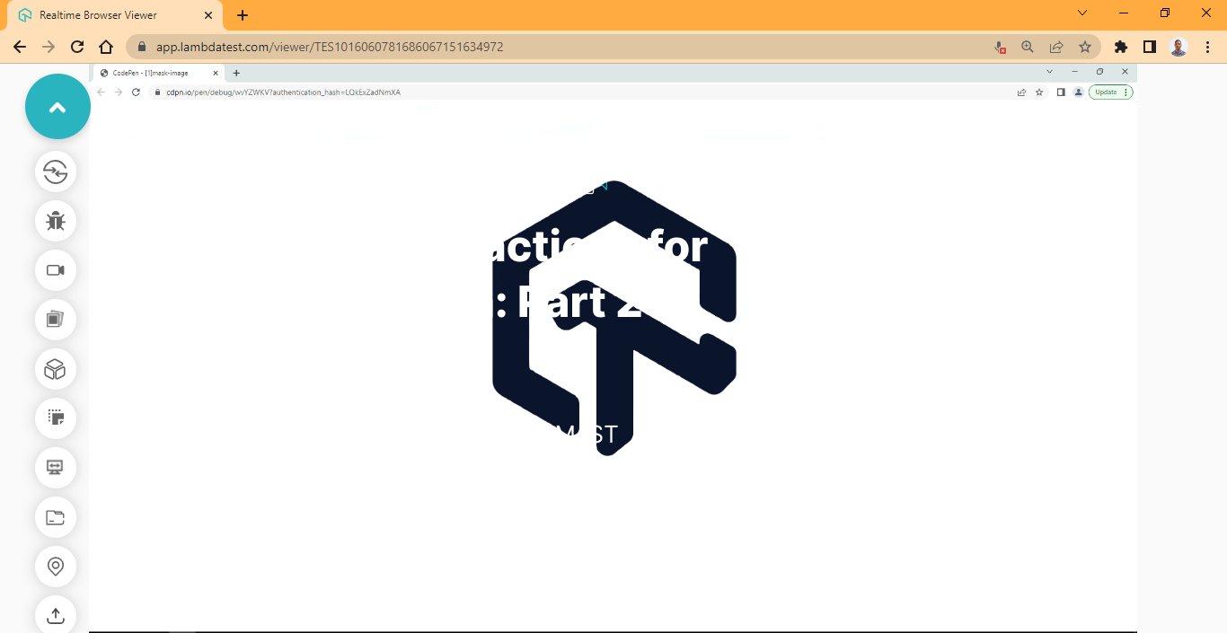
See the Pen
[1]mask-image by Ocxigin (@ocxigin)
on CodePen.
Chrome Preview:
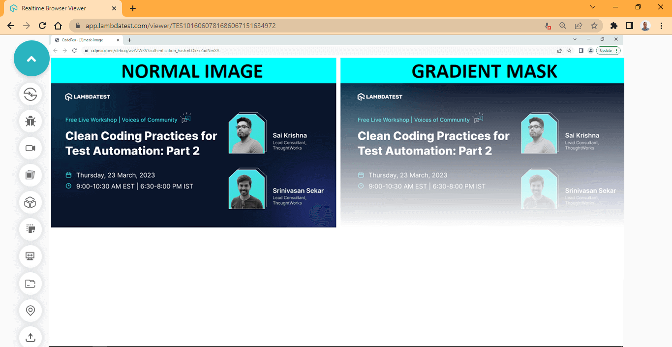
From the Chrome browser preview, the mask-image: linear-gradient(#000, transparent)
only works on the second image and not the first one; this is because we set only one property on the normal-container element and the -webkit- prefix is omitted.
Firefox Preview:
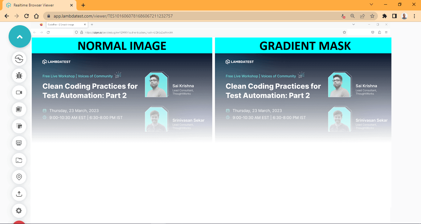
From the Firefox browser preview, the mask-image: linear-gradient(#000, transparent) works on both images because a browser prefix is unnecessary for the mask-image to function correctly.
The above browser output is run on Firefox with LambdaTest Real Time Testing. LambdaTest is a digital experience testing platform that allows you to check your CSS framework-based web projects across desktop and mobile environments. It lets you perform manual and automated testing on an online browser farm of 3000+ real browsers, devices, and operating systems combinations.
To get the best result when working with the mask-composite property, try using Firefox instead of Chrome due to browser compatibility issues.
Subscribe to LambdaTest YouTube Channel and get detailed tutorials around Selenium automation testing, Cypress testing, and more.
Applying gradient direction to mask-image
We’ve seen how to apply gradients; the next thing to do is use the direction to linear gradients in mask-image.
HTML:
|
1 2 3 4 5 6 7 8 9 10 11 12 13 14 15 16 17 18 19 20 21 22 23 24 25 |
<main class="main"> <!-- Section One --> <section class="normal-container"> <h1>to top</h1> <img src="https://user-images.githubusercontent.com/78242022/241950813-021da2fc-cdf3-4409-9b0e-cbb73db6fd0c.png" alt="" class="to-top"> </section> <!-- Section Two --> <section class="masking-container"> <h1>To right</h1> <img src="https://user-images.githubusercontent.com/78242022/241950813-021da2fc-cdf3-4409-9b0e-cbb73db6fd0c.png" alt="" class="to-right"> </section> <!-- Section Two --> <section class="masking-container"> <h1>to bottom</h1> <img src="https://user-images.githubusercontent.com/78242022/241950813-021da2fc-cdf3-4409-9b0e-cbb73db6fd0c.png" alt="" class="to-bottom"> </section> <!-- Section Two --> <section class="masking-container"> <h1>to left</h1> <img src="https://user-images.githubusercontent.com/78242022/241950813-021da2fc-cdf3-4409-9b0e-cbb73db6fd0c.png" alt="" class="to-left"> </section> </main> |
CSS:
|
1 2 3 4 5 6 7 8 9 10 11 12 13 14 15 16 17 18 19 20 21 22 23 24 25 26 27 28 29 30 31 32 33 34 35 36 37 38 39 40 41 42 43 44 45 46 47 |
body { overflow-x: hidden; } .main { display: grid; grid-template-columns: 1fr 1fr; grid-template-rows: auto; gap: 10px; } img { width: 100%; } h1 { font-size: 3em; font-family: calibri; text-transform: uppercase; margin: 0; background-color: aqua; text-align: center; } /* Fading the image from the bottom to the top */ .to-top { mask-image: linear-gradient(to top, transparent, #000); -webkit-mask-image: linear-gradient(to top, transparent, #000); } /* Fading the Image from left to right */ .to-right { mask-image: linear-gradient(to right, transparent, #000); -webkit-mask-image: linear-gradient(to right, transparent, #000); } /* Fading the image from top to bottom */ .to-bottom { mask-image: linear-gradient(to bottom, transparent, #000); -webkit-mask-image: linear-gradient(to bottom, transparent, #000); } /* Fading the image from right to left */ .to-left { mask-image: linear-gradient(to left, transparent, #000); -webkit-mask-image: linear-gradient(to left, transparent, #000); } |
Output:
See the Pen
[2] mask image by Ocxigin (@ocxigin)
on CodePen.
Preview:

Here, we applied a linear gradient to four different directions on four separate elements on the web page.
Applying gradient angle in the degree to mask-image
We can also specify the direction of the mask-image gradient in degrees. This will enable the angle to move in different directions.
HTML:
|
1 2 3 4 5 6 7 8 9 10 11 12 13 14 |
<main class="main"> <!-- Section Two --> <section class="masking-container"> <h1>Side by side masking</h1> <img src="https://user-images.githubusercontent.com/78242022/241950813-021da2fc-cdf3-4409-9b0e-cbb73db6fd0c.png" alt="" class="left-right"> </section> <!-- Section Two --> <section class="masking-container"> <h1>Top and Bottom Masking</h1> <img src="https://user-images.githubusercontent.com/78242022/241950813-021da2fc-cdf3-4409-9b0e-cbb73db6fd0c.png" alt="" class="top-bottom"> </section> </main> |
CSS:
|
1 2 3 4 5 6 7 8 9 10 11 12 13 14 15 16 17 18 19 20 21 22 23 24 25 26 27 28 29 30 31 32 33 |
body { overflow-x: hidden; } .main { display: grid; grid-template-columns: 1fr 1fr; grid-template-rows: auto; gap: 10px; } img { width: 100%; } h1 { font-size: 3em; font-family: calibri; text-transform: uppercase; margin: 0; background-color: aqua; text-align: center; } .left-right{ -webkit-mask-image: linear-gradient(90deg, transparent, #000 40%, #000 70%, transparent 100%); mask-image: linear-gradient(90deg, transparent, #000 40%, #000 70%, transparent 100%); } .top-bottom{ -webkit-mask-image: linear-gradient(180deg, transparent, #000 20%, #000 60%, transparent 100%); mask-image: linear-gradient(180deg, transparent, #000 20%, #000 60%, transparent 100%); } |
Output:
See the Pen
[3]mask image by Ocxigin (@ocxigin)
on CodePen.
Preview:
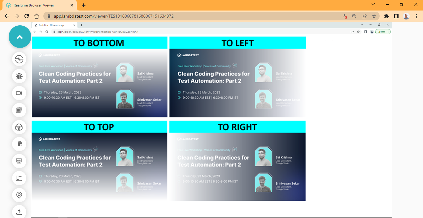
Here, we specify the mask-image gradient to an angle of 90 deg and 180 deg, respectively.
Applying image to mask-image
Applying images to mask-image is very similar to the linear gradients we explained earlier. The CSS url() function is used to apply images as a mask-image.
HTML:
|
1 2 3 4 5 6 |
<main class="main"> <!-- Section Two --> <section class="masking-container"> <img src="https://user-images.githubusercontent.com/78242022/241950813-021da2fc-cdf3-4409-9b0e-cbb73db6fd0c.png" alt="" class="masking-svg"> </section> </main> |
CSS:
|
1 2 3 4 5 6 7 8 9 10 11 12 13 14 15 16 17 18 19 20 21 22 23 24 25 26 27 |
body { overflow-x: hidden; } .main { display: grid; grid-template-columns: 1fr; grid-template-rows: auto; place-items: center; height: 100vh; } img { width: 100%; } .masking-svg { -webkit-mask-image: url(https://raw.githubusercontent.com/ocxigin/we-love-ms/main/img/LT-black.png); -webkit-mask-size: 100px; mask-image: url(https://raw.githubusercontent.com/ocxigin/we-love-ms/main/img/LT-black.png); mask-size: 100px; -webkit-mask-mode: alpha; } |
Output:
See the Pen
[4] SVG Mask Image by Ocxigin (@ocxigin)
on CodePen.
Preview:
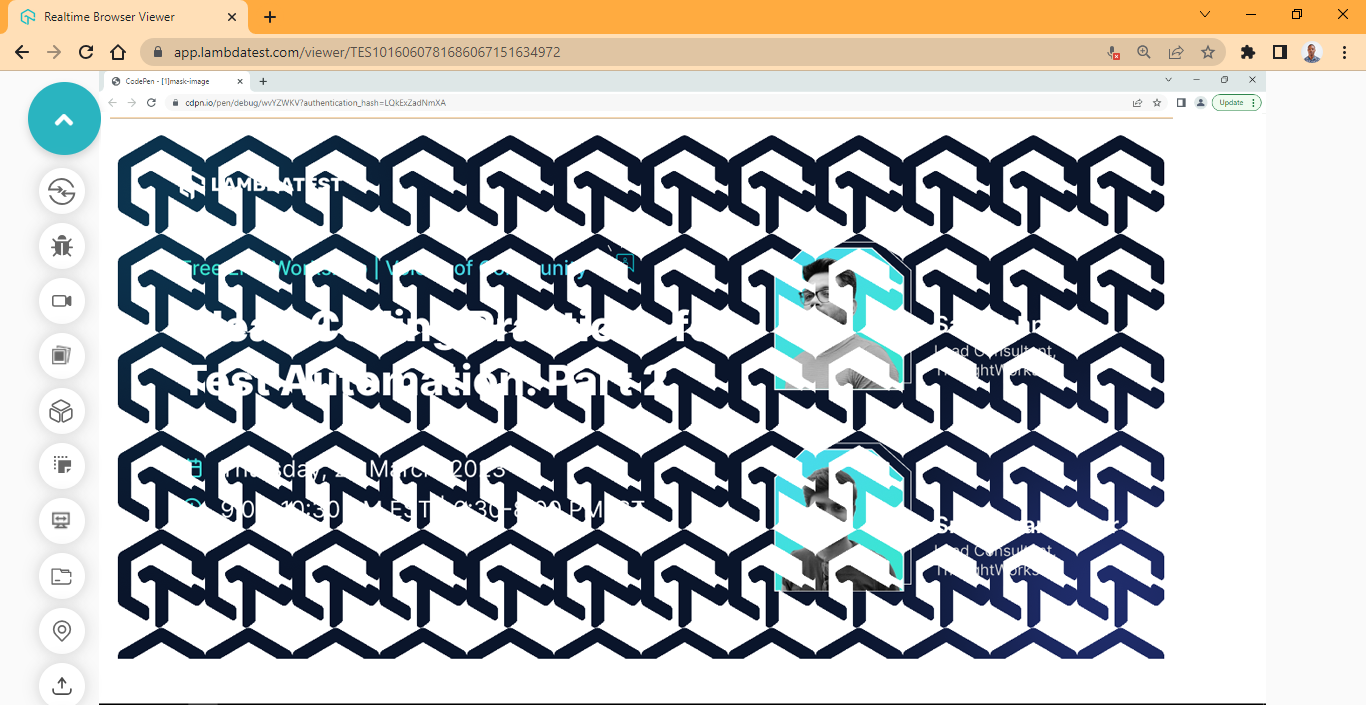
The mask-image property behaves like the background property, so when you apply a single image, it repeats itself to fill the containing element, as shown above.
To fix this, the mask-repeat is set to no-repeat.
mask-repeat property
The mask-repeat CSS masking property determines the direction in which the mask image should repeat. This could be either vertical or horizontal. It also determines the space between the repeated mask image.
The mask-repeat can be set to no-repeat to stop the mask image from repeating. Like the background-repeat property, the mask-repeat is set by default to repeat.
Syntax:
|
1 2 3 4 5 6 7 8 9 10 11 12 13 14 15 16 17 18 19 |
/* repeat values */ -webkit-mask-repeat: repeat; -webkit-mask-repeat: no-repeat; -webkit-mask-repeat: space; -webkit-mask-repeat: round; -webkit-mask-repeat: repeat-y; -webkit-mask-repeat: repeat-x; /* Specifying the horizontal and Vertical repeat */ -webkit-mask-repeat: space repeat; -webkit-mask-repeat: no-repeat round; -webkit-mask-repeat: round space; /* Global Values */ -webkit-mask-image: initial; -webkit-mask-image: inherit; -webkit-mask-image: revert; -webkit-mask-image: unset; -webkit-mask-image: revert-layer; |
Values:
- repeat: sets the mask-image to repeat and fill the entire container (tile)
- no-repeat: stop the mask-image from repeating
- space: sets the distance between the mask-image
- round: sets the mask-image to stretch to fit the available space within the container
- repeat-y: sets the mask-image to repeat in the y-axis (vertical)
- repeat-x: sets the mask-image to repeat in the x-axis (horizontal)
HTML:
|
1 2 3 4 5 6 7 |
<main class="main"> <!-- Section Two --> <section class="masking-container"> <img src="https://user-images.githubusercontent.com/78242022/241950813-021da2fc-cdf3-4409-9b0e-cbb73db6fd0c.png" alt="" class="masking-svg"> </section> </main> |
CSS:
|
1 2 3 4 5 6 7 8 9 10 11 12 13 14 15 16 17 18 19 20 21 22 23 24 25 26 27 |
body { overflow-x: hidden; } .main { display: grid; grid-template-columns: 1fr; grid-template-rows: auto; place-items: center; height: 100vh; } img { width: 100%; } .masking-svg { /* Chrome and other webkit browsers */ -webkit-mask-image: url(https://raw.githubusercontent.com/ocxigin/we-love-ms/main/img/LT-black.png); /* Image Credit credit at tympanus.net */ -webkit-mask-repeat: no-repeat; -webkit-mask-size: 100px; /* Firefox */ mask-image: url(https://raw.githubusercontent.com/ocxigin/we-love-ms/main/img/LT-black.png); mask-repeat: no-repeat; } |
Output:
See the Pen
[5]mask-image repeat by Ocxigin (@ocxigin)
on CodePen.
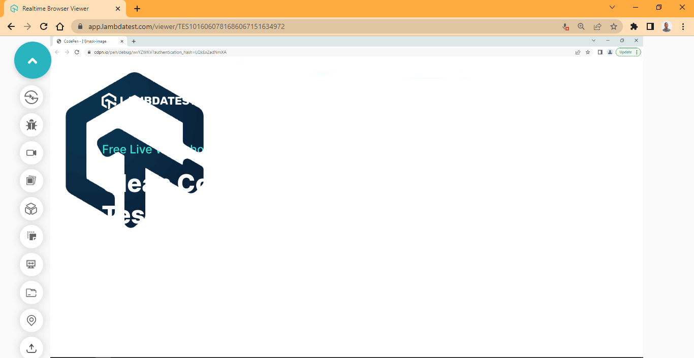
Preview:
Here, the no-repeat values set the mask-image to stop repeating and display just one image.
mask-size property
The mask-size CSS masking property determines the size of the mask-image. The keyword values can be used to determine a specific size ratio or multiple length values can be specified in one declaration.
Syntax:
|
1 2 3 4 5 6 7 8 9 10 11 12 13 14 15 16 17 18 19 20 21 |
/* Keyword values */ -webkit-mask-size: auto; -webkit-mask-size: contain; -webkit-mask-size: cover; /* Length values */ -webkit-mask-size: 500px; -webkit-mask-size: 15rem; -webkit-mask-size: 2em; -webkit-mask-size: 30%; /* Vertical and Horizontal Axes*/ -webkit-mask-size: 20% 20rem 20%; -webkit-mask-size: 200px 10em; /* Global Values */ -webkit-mask-image: initial; -webkit-mask-image: inherit; -webkit-mask-image: revert; -webkit-mask-image: unset; -webkit-mask-image: revert-layer; |
HTML:
|
1 2 3 4 5 6 |
<main class="main"> <!-- Section Two --> <section class="masking-container"> <img src="https://user-images.githubusercontent.com/78242022/241950813-021da2fc-cdf3-4409-9b0e-cbb73db6fd0c.png" alt="" class="masking-svg"> </section> </main> |
CSS:
|
1 2 3 4 5 6 7 8 9 10 11 12 13 14 15 16 17 18 19 20 21 22 23 24 25 26 27 |
body { overflow-x: hidden; } .main { display: grid; grid-template-columns: 1fr; grid-template-rows: auto; place-items: center; height: 100vh; } img { width: 100%; } .masking-svg { /* Chrome and other webkit browsers */ -webkit-mask-image: url(https://raw.githubusercontent.com/ocxigin/we-love-ms/main/img/LT-black.png); -webkit-mask-repeat: no-repeat; -webkit-mask-size: 17em; /* Firefox */ mask-image: url(https://raw.githubusercontent.com/ocxigin/we-love-ms/main/img/LT-black.png); mask-repeat: no-repeat; mask-size: 17em; } |
Output:
See the Pen
[6]mask size by Ocxigin (@ocxigin)
on CodePen.
Preview:
From the browser preview, the mask size is increased from its initial size to 17em.
mask-position property
The mask-position CSS masking property determines the position of the mask-image within the container of the mask object. The mask position value is mostly specified by targeting the horizontal and vertical axes in a single declaration.
The mask-position takes both length and keyword values.
Syntax:
|
1 2 3 4 5 6 7 8 9 10 11 12 13 14 15 16 17 18 19 20 21 22 23 24 25 |
/* Keyword Values */ -webkit-mask-position: top; -webkit-mask-position: right; -webkit-mask-position: bottom; -webkit-mask-position: left; -webkit-mask-position: center; /* Length Values */ -webkit-mask-position: 18px; -webkit-mask-position: 4rem; -webkit-mask-position: 8em; -webkit-mask-position: 50%; /* Specifying Multiple Values */ -webkit-mask-position: 50% 50%; -webkit-mask-position: center center; -webkit-mask-position: 4em 50%; -webkit-mask-position: 500px center; /* Global Values */ -webkit-mask-image: initial; -webkit-mask-image: inherit; -webkit-mask-image: revert; -webkit-mask-image: unset; -webkit-mask-image: revert-layer; |
HTML:
|
1 2 3 4 5 6 |
<main class="main"> <!-- Section Two --> <section class="masking-container"> <img src="https://user-images.githubusercontent.com/78242022/241950813-021da2fc-cdf3-4409-9b0e-cbb73db6fd0c.png" alt="" class="masking-svg"> </section> </main> |
CSS:
|
1 2 3 4 5 6 7 8 9 10 11 12 13 14 15 16 17 18 19 20 21 22 23 24 25 26 27 28 29 |
body { overflow-x: hidden; } .main { display: grid; grid-template-columns: 1fr; grid-template-rows: auto; place-items: center; height: 100vh; } img { width: 100%; } .masking-svg { /* Chrome and other webkit browsers */ -webkit-mask-image: url(https://raw.githubusercontent.com/ocxigin/we-love-ms/main/img/LT-black.png); -webkit-mask-repeat: no-repeat; -webkit-mask-size: 17em; -webkit-mask-position: center center; /* Firefox */ mask-image: url(https://raw.githubusercontent.com/ocxigin/we-love-ms/main/img/LT-black.png); mask-repeat: no-repeat; mask-size: 17em; mask-position: center center; } |
Output:
See the Pen
[7] mask position by Ocxigin (@ocxigin)
on CodePen.
Preview:
From the browser preview, we position the mask-image by specifying center center values to target both the horizontal and vertical axes in one declaration.
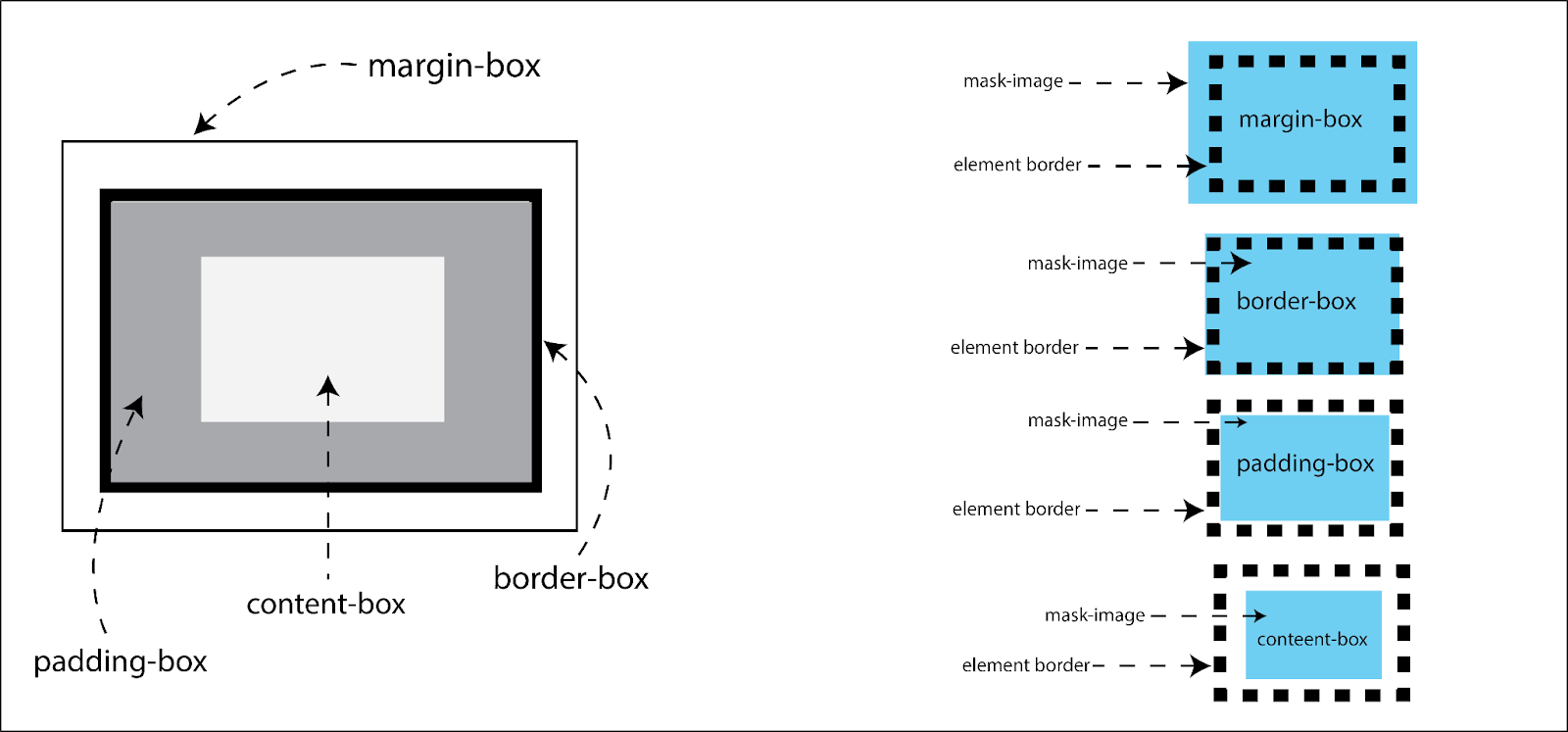
mask-origin property
The mask-origin CSS masking property determines the origin of the mask-image. The origin, in this case, refers to the position of the element box model.
To understand how the element box model works, see the illustration below.
Using the mask-origin can be tricky and difficult at first to wrap your head around. Make sure you specify the mask-image on a block element with a closing tag. Set the background color, border, and text.
Syntax:
|
1 2 3 4 5 6 7 8 9 10 11 12 13 14 15 |
/* Keyword Values */ -webkit-mask-origin: margin-box; -webkit-mask-origin: border-box; -webkit-mask-origin: padding-box; -webkit-mask-origin: content-box; /* Multiple Values */ -webkit-mask-origin: content-box, padding-box; /* Global Values */ -webkit-mask-origin: initial; -webkit-mask-origin: inherit; -webkit-mask-origin: revert; -webkit-mask-origin: unset; -webkit-mask-origin: revert-layer; |
Values:
- content-box: set the mask-image position relative to the element content-box.
- padding-box: set the mask-image position relative to the element padding-box.
- border-box: set the mask-image position relative to the element border-box.
- margin-box: set the mask-image position relative to the element margin-box.
HTML:
|
1 2 3 4 5 6 7 8 |
<main class="main"> <!-- Section Two --> <section class="masking-container"> <p>This is a mask-origin example: Try multiple mask origin values to see different result </p> <img src="/img/cleancoding2.png" alt="" class="masking-svg"> </section> </main> |
CSS:
|
1 2 3 4 5 6 7 8 9 10 11 12 13 14 15 16 17 18 19 20 21 22 23 24 25 26 27 28 29 30 31 32 33 |
body { overflow-x: hidden; } .main { display: grid; grid-template-columns: 1fr; grid-template-rows: auto; place-items: center; height: 100vh; } img { width: 100%; } .masking-container { border: 10px solid #000; background-color: #0ebac5; /* Chrome and other webkit browsers */ -webkit-mask-image: url(https://raw.githubusercontent.com/ocxigin/we-love-ms/main/img/LT-black.png); -webkit-mask-repeat: repeat; -webkit-mask-size: 4em 4em; -webkit-mask-position: to top; -webkit-mask-origin: border-box; /* Firefox */ mask-image: url(https://raw.githubusercontent.com/ocxigin/we-love-ms/main/img/LT-black.png); mask-origin: border-box; mask-repeat: no-repeat; mask-size: 4em 4em; mask-position: center center; } |
Output:
See the Pen
[8]mask origin by Ocxigin (@ocxigin)
on CodePen.
Preview:
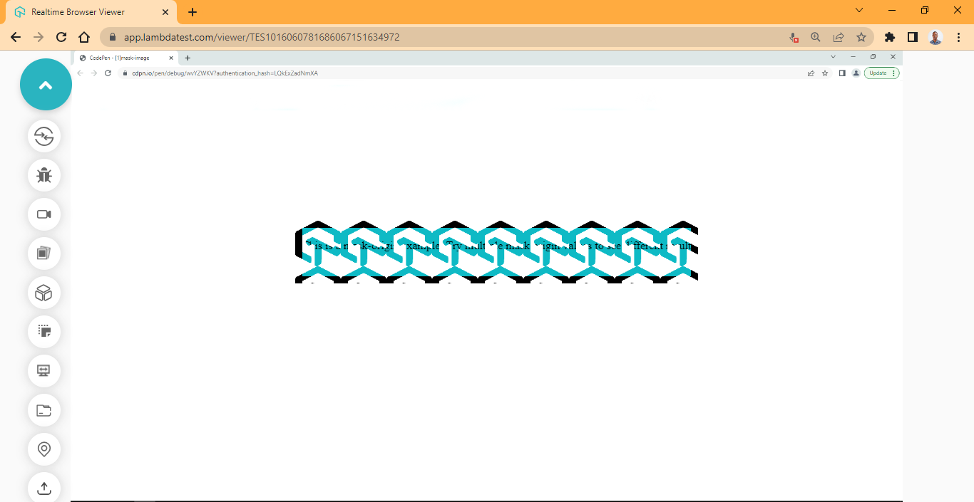
Here, the black around the logo is the border, since the mask-origin is set to border-box, the mask-origin starts positioning from the border of the element.
The mask-composite CSS masking property combines two or more mask images into a single one. To combine two images into one, for example, the mask-composite based on the value provided can either add, subtract, intersect, or exclude the images into one.
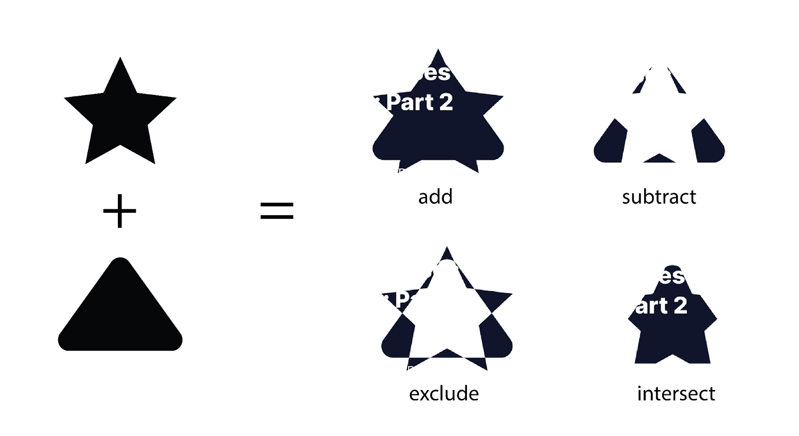
The mask-composite CSS masking property can be beneficial when the two images being combined are shapes and must be merged to form a new shape.
For accessibility and to get the desired result, PNG or SVG shapes are recommended, and for browser compatibility, Chrome does not have good support for the mask-composite property, use Firefox instead.
Syntax:
|
1 2 3 4 5 6 7 8 9 10 11 |
/* Keyword values */ -webkit-mask-composite: add; -webkit-mask-composite: subtract; -webkit-mask-composite: intersect; -webkit-mask-composite: exclude; /* Global Values */ -webkit-mask-image: initial; -webkit-mask-image: inherit; -webkit-mask-image: revert; -webkit-mask-image: unset; -webkit-mask-image: revert-layer; |
Values:
- add: both images (png or svg shapes) are added together to form a single image.
- subtract: the second image is subtracted from the first to form a single image.
- intersect: both images (png or svg shapes) are intersected from the overlapping angle.
- exclude: non-overlapping angles of both images are combined.
HTML:
|
1 2 3 4 5 6 |
<main class="main"> <!-- Section Two --> <section class="masking-container"> <img src="https://user-images.githubusercontent.com/78242022/241950813-021da2fc-cdf3-4409-9b0e-cbb73db6fd0c.png" alt="" class="masking-svg"> </section> </main> |
CSS:
|
1 2 3 4 5 6 7 8 9 10 11 12 13 14 15 16 17 18 19 20 21 22 23 24 25 26 27 28 29 30 31 32 33 34 |
body { overflow-x: hidden; } .main { display: grid; grid-template-columns: 1fr; grid-template-rows: auto; place-items: center; height: 100vh; } img { width: 100%; } .masking-svg { /* Chrome and other webkit browsers */ -webkit-mask-image: url(https://raw.githubusercontent.com/ocxigin/we-love-ms/main/img/curved-triangle.svg), url(https://raw.githubusercontent.com/ocxigin/we-love-ms/f786a998033224e244ce818ae6035ce4826df85a/img/Star.svg); -webkit-mask-repeat: no-repeat; -webkit-mask-size: 17em; -webkit-mask-position: center center; -webkit-mask-origin: border-box; -webkit-mask-composite: add; /* Firefox */ mask-image: url(https://raw.githubusercontent.com/ocxigin/we-love-ms/main/img/curved-triangle.svg), url(https://raw.githubusercontent.com/ocxigin/we-love-ms/f786a998033224e244ce818ae6035ce4826df85a/img/Star.svg); mask-repeat: no-repeat; mask-size: 17em; mask-position: center center; mask-origin: border-box; mask-composite: add; |
Output:
See the Pen
[9] mask composite by Ocxigin (@ocxigin)
on CodePen.
Preview:

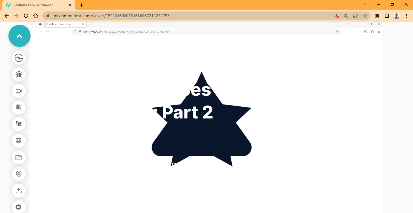
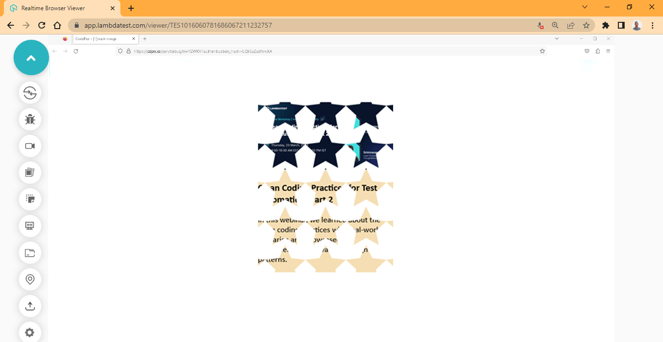
mask-clip property
The mask-clip CSS masking property is used to set the area to which the mask will be applied. Depending on the value assigned to the mask-clip property, the mask can be clipped to the margin-box, border-box, padding-box, or content-box.
However, fill-box, stroke-box, and view-box are also values that determine the area mask-clip applies to, but they are used when working with SVGs.
Syntax:
|
1 2 3 4 5 6 7 8 9 10 11 12 13 14 15 16 17 18 19 20 21 22 |
/* Keyword Values Element*/ -webkit-clip-origin: margin-box; -webkit-clip-origin: border-box; -webkit-clip-origin: padding-box; -webkit-clip-origin: content-box; -webkit-clip-origin: no-clip; /* Keyword Values SVGs*/ -webkit-clip-origin: fill-box; -webkit-clip-origin: view-box; -webkit-clip-origin: stroke-box; /* Multiple Values */ -webkit-clip-origin: content-box, padding-box; /* Global Values */ -webkit-clip-image: initial; -webkit-clip-image: inherit; -webkit-clip-image: revert; -webkit-clip-image: unset; -webkit-clip-image: revert-layer; } |
Values:
- margin-box: set the mask to start clipping from the margin of the box.
- border-box: set the mask to start clipping from the box’s border.
- padding-box: set the mask to start clipping from the padding of the box.
- content-box: set the mask to start clipping from the box’s content.
- no-clip: the mask is not clipped to the box.
- fill-box: set mask to clip to the object bounding box.
- fill-stroke: set mask to clip to the object stroke bounding box.
- view-box: use the SVG view-box as a reference for clipping to the object bounding box.
HTML:
|
1 2 3 4 5 6 7 8 9 10 11 12 |
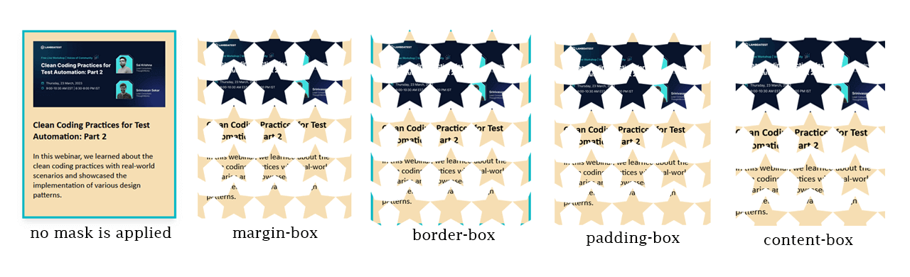
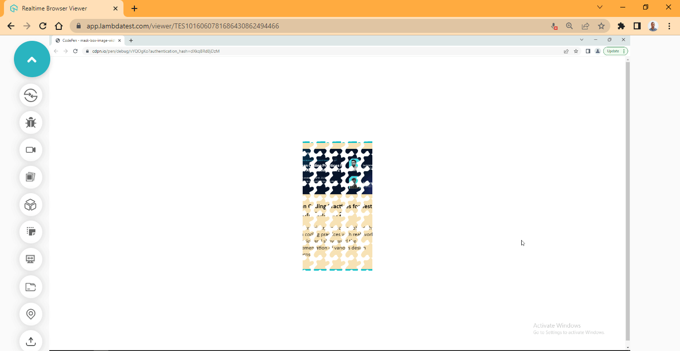
<div class="main"> <!-- No Effect --> <section class="card"> <div class="image-wrapper"> <img src="https://user-images.githubusercontent.com/78242022/241950813-021da2fc-cdf3-4409-9b0e-cbb73db6fd0c.png" alt=""> </div> <div class="content"> <h3>Clean Coding Practices for Test Automation: Part 2</h3> <p>In this webinar, we learned about the clean coding practices with real-world scenarios and showcased the implementation of various design patterns.</p> </div> </section> </div> |
CSS:
|
1 2 3 4 5 6 7 8 9 10 11 12 13 14 15 16 17 18 19 20 21 22 23 24 25 26 27 28 29 30 31 32 33 34 35 36 37 38 39 40 |
body { overflow-x: hidden; } .main { display: grid; grid-template-columns:1fr; grid-template-rows: auto; place-items: center; height: 100vh; } img { width: 100%; } .card { background-color: wheat; font-family: calibri; font-size: 18px; width: 300px; height: fit-content; border: 5px solid #0ebac5; padding: 20px; box-shadow: 0 10px 15px -3px hsla(0, 0%, 0%, 0.1), 0 4px 6px -4px hsla(0, 0%, 0%, 0.1); /* Chrome and other webkit browsers */ -webkit-mask-image: url(https://raw.githubusercontent.com/ocxigin/we-love-ms/main/img/Star.svg); -webkit-mask-repeat: repeat; -webkit-mask-size: 5em; -webkit-mask-position: center center; -webkit-mask-clip: content-box; /* Firefox */ mask-image: url(https://raw.githubusercontent.com/ocxigin/we-love-ms/main/img/Star.svg); mask-repeat: repeat; mask-size: 5em; mask-position: center center; mask-clip: content-box; } |
Output:
See the Pen
mask -clip by Ocxigin (@ocxigin)
on CodePen.
Preview:
From the browser preview, the mask-clip is clipped starting from the content of the box. However, to see how the mask-clip works, try experimenting with other values of the mask-clip CSS masking property.
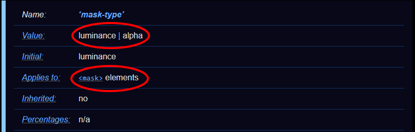
mask-type property
The mask-type CSS masking property is used to determine the CSS masking type (mode) of the <mask> element. The mask-type is based on two values which are luminance and alpha.
The values (luminance and alpha) specified on the mask will determine how the mask element will render. However, the mask-mode property overrides the value set on the mask-type CSS masking property. For example, if the mast-type initial value is luminance, the mask-mode can be set to alpha to override it.
Syntax:
|
1 2 3 4 5 6 7 8 9 10 |
/* Keyword values */ -webkit-mask-type: luminance; -webkit-mask-type: alpha; /* Global Values */ -webkit-mask-type: initial; -webkit-mask-type: inherit; -webkit-mask-type: revert; -webkit-mask-type: unset; -webkit-mask-type: revert-layer; |
The mask-type property directly applies to the mask element and has two values namely luminance and alpha.
alpha
The alpha refers to the transparent part of an image (PNG) which is called the alpha channel. The alpha channel is the fourth channel of an image that supports transparency. The other three are Red, Green, and Blue, respectively, and are mostly referred to as RGB. However, the alpha channel it’s called RGBA, the “A” being the alpha channel (transparency).
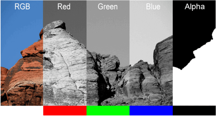
An image’s alpha channel does not have color information aside from black and white. The black is used to completely hide content by masking it, while the white is used to show hidden mask content.
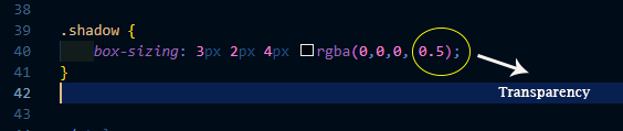
The degree of the alpha channel can be present as opacity, and it ranges from 0.0 to 1. Where 0 means complete transparency, and one (1) means opaque. The values can also be specified as 0.5, which means the object should be slightly translucent. This is very common when defining the box-shadow property.
The alpha channel is very useful when you want to mask out an image or apply transparency so that you can see through an element or image.
And in the case of CSS masking, when we use alpha, it’s to hide or show the specified mask element or image.
In the absence of alpha, luminance can be used.
luminance
The luminance value specifies that the luminance of the mask-image or element mask should be used instead of the transparent alpha value.
This value can be a solid black, white, or faded mask which is a computed value from the alpha channel and the image or element RGB value specified on the object.
HTML:
|
1 2 3 4 5 6 7 8 9 |
<?xml version="1.0" encoding="UTF-8"?> <svg id="Layer_1" data-name="Layer 1" xmlns="http://www.w3.org/2000/svg" viewBox="0 0 255.26 242.77"> <mask id="maskExmaple"> <polygon points="127.63 0 165.74 81.75 255.26 92.73 189.29 154.23 206.51 242.77 127.63 199.03 48.75 242.77 65.97 154.23 0 92.73 89.52 81.75 127.63 0" fill="black"/> </mask> </svg> <img src="https://user-images.githubusercontent.com/78242022/241950813-021da2fc-cdf3-4409-9b0e-cbb73db6fd0c.png" alt="" /> |
CSS:
|
1 2 3 4 5 6 7 8 9 10 11 12 13 14 15 16 17 18 19 20 21 22 23 24 25 26 |
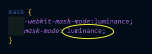
body { display: grid; place-items: center; height: 100vh; background: #0ebac5; } svg { display: block; width: 100px; height: 100px; } img { display: block; width: 100%; max-width: 450px; margin: auto; -webkit-mask-image: url(#maskExmaple); mask-image: url(#maskExmaple); } mask { -webkit-mask-type:alpha; mask-type: alpha; } |
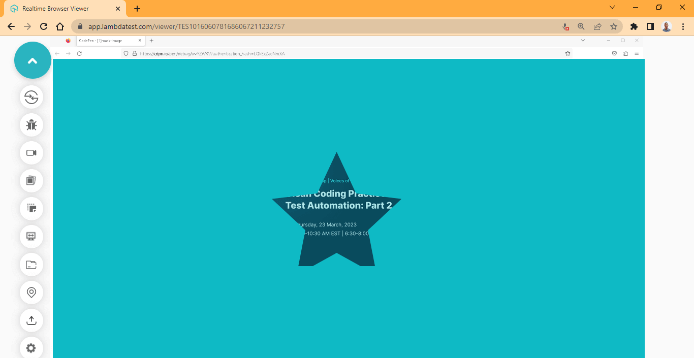
It’s important to note that as at the time of writing, the support of mask property is not that great in Chrome and might not show on your browser due to browser compatibility issues. Try using Firefox instead.
Output:
See the Pen
alpha in mask-type by Ocxigin (@ocxigin)
on CodePen.
Preview:
Here, the alpha value specified in the CSS masking property is used to display the star object mask that is hidden with the black fill specified on the SVG polygon tag in the HTML file.
mask-mode
The mask-mode CSS masking property is used to override the value set on the mask-type property. For example, if the mast-type initial value is alpha, the mask-mode can be set to luminance to override it.
The mask-mode CSS masking property takes three values: luminance, alpha, and match-source.
Unlike the luminance and alpha value, which are very specific, the match-source, depending on the source of the object, is used as a mask. If SVG is used as a mask, the SVG luminance value should be used as a mask on the image layer. However, if <image> is used as a mask, the alpha value of the image should be used as a mask on the image layer.
From the previous example, we have an SVG as a mask, and we previously set it to alpha, and we set the polygon fill to black in the HTML file.
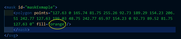
To see how the mask-mode and luminance work, change the fill in polygon to orange (you can use any color of your choice) and then set the mask-mode to luminance in the CSS file.
Your browser output should be like this.
From the browser preview, we have a slightly faded mask compared to the previous example.
Border Box Mask
Let us further discuss the properties of border box masks.
mask-border
The mask-border CSS masking property is used to set the border mask image on a specified element. The mask-border property is a shorthand property and has the following longhand properties.
- mask-border-source
- mask-border-slice
- mask-border-mode
- mask-border-width
- mask-border-outset
- mask-border-repeat
When in use, the mask-border CSS masking property masks the edges of the specified element’s border, then the image is split into nine sections or regions by the mask-border-slice property.
The mask-border-slice controls how the image is divided into regions depending on the values provided; it can also act like a background with the fill value. However, the other longhand properties are used to style the image that has been sliced.
Syntax:
|
1 2 3 4 5 6 7 8 9 10 |
/* source | slice | width | outset | repeat | mode */ mask-border: url("icon-star.png") 25 / 35px / 12px space alpha; /* Global Values */ -webkit-mask-border: initial; -webkit-mask-border: inherit; -webkit-mask-border: revert; -webkit-mask-border: unset; -webkit-mask-border: revert-layer; } |
Browser Compatibility
At the time of writing this blog, the mask-border shorthand and longhand property is not supported yet in major browsers and as a result requires the use of non-standard property on Chromium-based browsers for testing. These properties include:
- mask-box-image-source
- mask-box-image-repeat
- mask-box-image-width
- mask-box-image-outset
- mask-box-image-mode
- Mask-box-image-slice
The above non-standard properties can be used as a replacement for testing purposes when working with mask-border longhand properties.
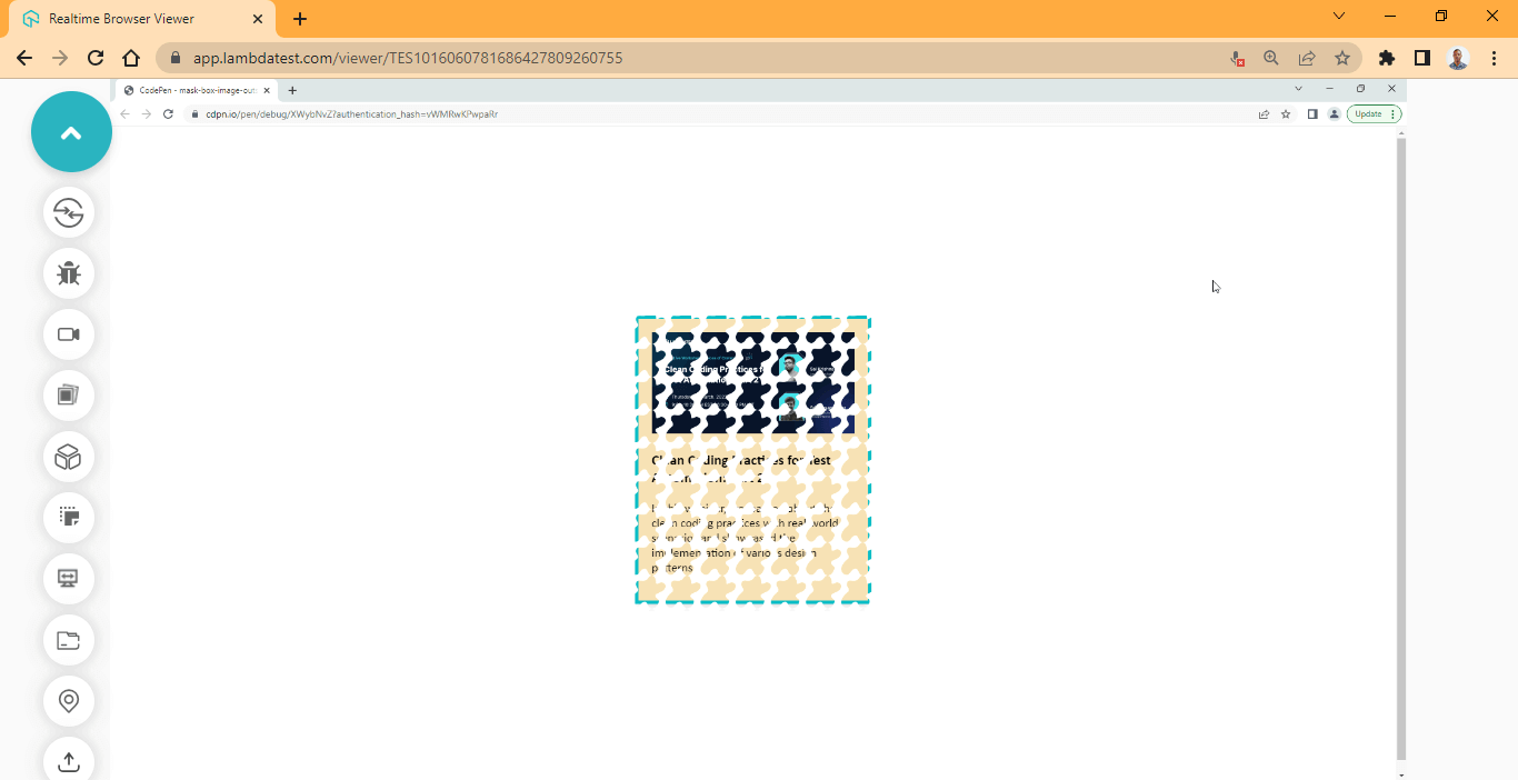
mask-border-source
The mask-border-source CSS masking property is a longhand property of the mask-border property. It is used to set the mask-border-image.
Syntax:
|
1 2 3 4 5 6 7 8 9 10 11 12 13 14 |
/* Specified Values */ mask-border-source: url("icon-star.png"); mask-border-source: linear-gradient(to bottom, cyan, darkcyan); /* Global Values */ -webkit-mask-border-source: initial; -webkit-mask-border-source: inherit; -webkit-mask-border-source: revert; -webkit-mask-border-source: unset; -webkit-mask-border-source: revert-layer; } /* Non Standard Property */ -webkit-mask-box-image-source: initial; |
The non-standard property for mask-border-source is mask-box-image-source.
Here is a preview of the image we will be using:

It is a 52 x 49 dimension png image. Now type and run the code below.
HTML:
|
1 2 3 4 5 6 7 8 9 10 11 12 |
<div class="main"> <!-- No Effect --> <section class="card mask"> <div class="image-wrapper"> <img src="https://user-images.githubusercontent.com/78242022/241950813-021da2fc-cdf3-4409-9b0e-cbb73db6fd0c.png" alt=""> </div> <div class="content"> <h3>Clean Coding Practices for Test Automation: Part 2</h3> <p>In this webinar, we learned about the clean coding practices with real-world scenarios and showcased the implementation of various design patterns.</p> </div> </section> </div> |
CSS:
|
1 2 3 4 5 6 7 8 9 10 11 12 13 14 15 16 17 18 19 20 21 22 23 24 25 26 27 28 29 30 31 |
body { overflow-x: hidden; } .main { display: grid; grid-template-columns:1fr; grid-template-rows: auto; place-items: center; height: 100vh; } img { width: 100%; } .card { background-color: wheat; font-family: calibri; font-size: 18px; width: 300px; height: fit-content; border: 5px solid #0ebac5; padding: 20px; box-shadow: 0 10px 15px -3px hsla(0, 0%, 0%, 0.1), 0 4px 6px -4px hsla(0, 0%, 0%, 0.1); } .mask { -webkit-mask-box-image-source: url(https://user-images.githubusercontent.com/78242022/244883515-a1210117-14e5-4145-9b8d-96095939dfd3.png); } |
Output:
See the Pen
mask-border-source by Ocxigin (@ocxigin)
on CodePen.
Preview:
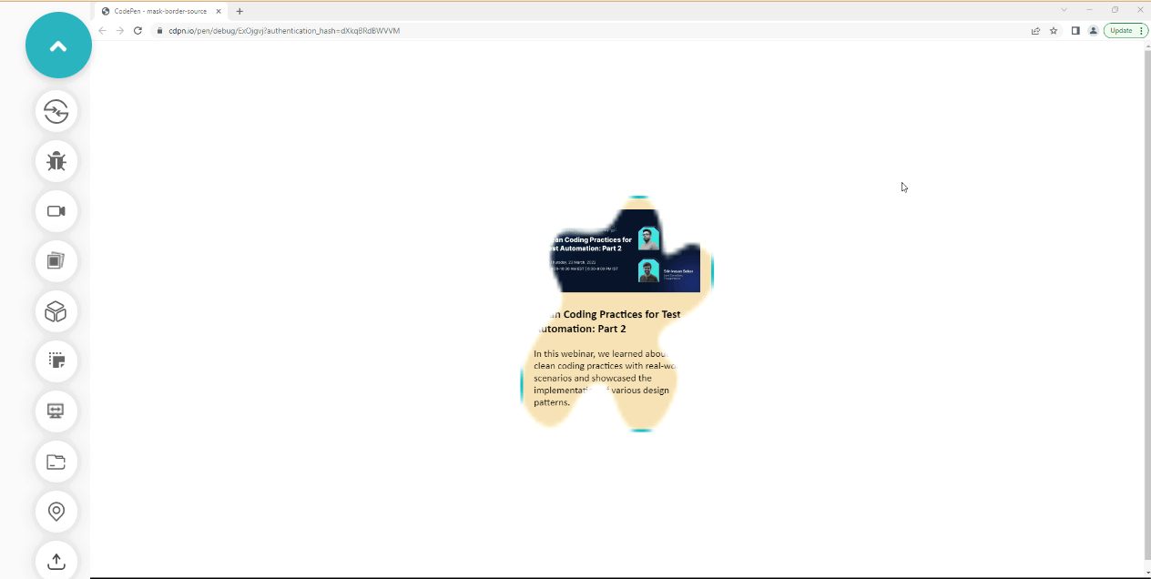
Here, the image is rendered as a fill, you will learn how to split and repeat the image in the section below.
mask-border-repeat
The mask-border-repeat CSS masking property is a longhand property of the mask-border property. It is used to adjust the scale to fit the mask-border-image dimension.
The non-standard property for mask-border-repeat is mask-box-image-repeat. Like the first example, we will use it to test how the mask-border-repeat functions.
Syntax:
|
1 2 3 4 5 6 7 8 9 10 11 12 13 14 15 |
/* Keyword value */ -webkit-mask-border-repeat: stretch; -webkit-mask-border-repeat: repeat; -webkit-mask-border-repeat: round; -webkit-mask-border-repeat: space; /* Global Values */ -webkit-mask-border-repeat: initial; -webkit-mask-border-repeat: inherit; -webkit-mask-border-repeat: revert; -webkit-mask-border-repeat: unset; -webkit-mask-border-repeat: revert-layer; /* Non Standard Property */ -webkit-mask-box-image-repeat: round; |
Values:
- stretch: stretched to fill the gap between the mask-border-image.
- repeat: adjust and scale the source image around the element’s border.
- round: adjust and round the source image around the element’s border.
- space: adjust and apply spaces between the source image and the element border.
Now type and run the code below to see how this works.
HTML:
|
1 2 3 4 5 6 7 8 9 10 11 12 |
<div class="main"> <!-- No Effect --> <section class="card mask"> <div class="image-wrapper"> <img src="https://user-images.githubusercontent.com/78242022/241950813-021da2fc-cdf3-4409-9b0e-cbb73db6fd0c.png" alt=""> </div> <div class="content"> <h3>Clean Coding Practices for Test Automation: Part 2</h3> <p>In this webinar, we learned about the clean coding practices with real-world scenarios and showcased the implementation of various design patterns.</p> </div> </section> </div> |
CSS:
|
1 2 3 4 5 6 7 8 9 10 11 12 13 14 15 16 17 18 19 20 21 22 23 24 25 26 27 28 29 30 31 32 33 |
body { overflow-x: hidden; } .main { display: grid; grid-template-columns:1fr; grid-template-rows: auto; place-items: center; height: 100vh; } img { width: 100%; } .card { background-color: wheat; font-family: calibri; font-size: 18px; width: 300px; height: fit-content; border: 5px solid #0ebac5; padding: 20px; box-shadow: 0 10px 15px -3px hsla(0, 0%, 0%, 0.1), 0 4px 6px -4px hsla(0, 0%, 0%, 0.1); } .mask { -webkit-mask-box-image-source: url(https://user-images.githubusercontent.com/78242022/244883515-a1210117-14e5-4145-9b8d-96095939dfd3.png); -webkit-mask-box-image-repeat: repeat; } |
Output:
See the Pen
mask-border-repeat by Ocxigin (@ocxigin)
on CodePen.
Preview:
Here, we applied the repeat value, which repeats the source image around the element’s border.
mask-border-slice
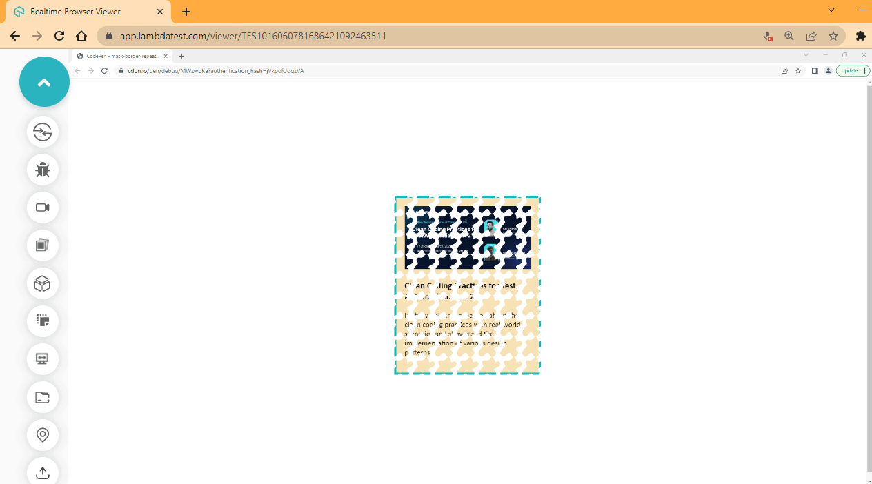
The mask-border-slice CSS masking property is a longhand property of the mask-border property, it is used to slice the image parsed by the mask-border-source into nine pieces, and these pieces are grouped in four corners, four edges, and a middle region.
The image below illustrates how the regions are distributed by their distance and size. The red is used to specify this.
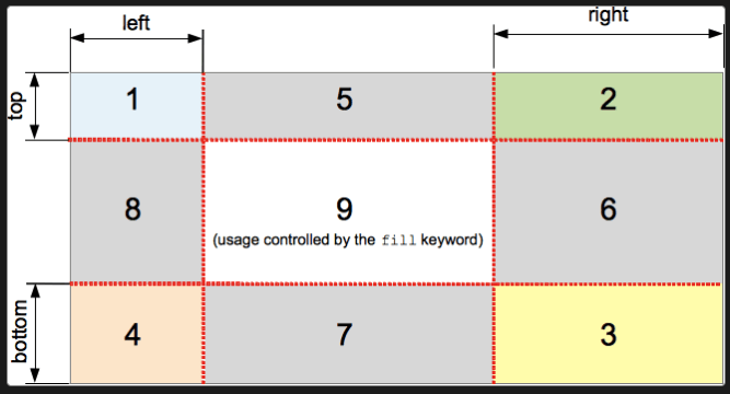
How the regions are organized is explained below
- The 1,2,3, and 4 boxes (zones) are the corners of the source image. This forms the corners of the mask-border image.
- The 5,6,7 and 8 boxes (zones) are used to form the edges. They are mostly repeated or scaled.
- The 9 box is the center of the region and is mostly discarded except if specified by the fill property.
The mask-border-outset, mask-border-width, and mask-border-repeat are used to modify the final render of the slice zones.
Syntax:
|
1 2 3 4 5 6 7 8 9 10 11 12 13 14 15 16 17 18 |
/* Keyword value */ -webkit-mask-border-slice: fill; /* length value */ -webkit-mask-border-slice: 12; /* Percentage value */ -webkit-mask-border-slice: 20%; /* Global Values */ -webkit-mask-border-slice: initial; -webkit-mask-border-slice: inherit; -webkit-mask-border-slice: revert; -webkit-mask-border-slice: unset; -webkit-mask-border-slice: revert-layer; /* Non Standard Property */ -webkit-mask-box-image-slice: 12; |
The non-standard property for mask-border-slice is mask-box-image-slice. Just like the other examples, we are going to be using it to test how the mask-border-slice functions.
Try the code sample below
HTML:
|
1 2 3 4 5 6 7 8 9 10 11 12 |
<div class="main"> <!-- No Effect --> <section class="card mask"> <div class="image-wrapper"> <img src="https://user-images.githubusercontent.com/78242022/241950813-021da2fc-cdf3-4409-9b0e-cbb73db6fd0c.png" alt=""> </div> <div class="content"> <h3>Clean Coding Practices for Test Automation: Part 2</h3> <p>In this webinar, we learned about the clean coding practices with real-world scenarios and showcased the implementation of various design patterns.</p> </div> </section> </div> |
CSS:
|
1 2 3 4 5 6 7 8 9 10 11 12 13 14 15 16 17 18 19 20 21 22 23 24 25 26 27 28 29 30 31 32 33 34 35 |
body { overflow-x: hidden; } .main { display: grid; grid-template-columns:1fr; grid-template-rows: auto; place-items: center; height: 100vh; } img { width: 100%; } .card { background-color: wheat; font-family: calibri; font-size: 18px; width: 300px; height: fit-content; border: 5px solid #0ebac5; padding: 20px; box-shadow: 0 10px 15px -3px hsla(0, 0%, 0%, 0.1), 0 4px 6px -4px hsla(0, 0%, 0%, 0.1); } .mask { -webkit-mask-box-image-source: url(https://user-images.githubusercontent.com/78242022/244883515-a1210117-14e5-4145-9b8d-96095939dfd3.png); -webkit-mask-box-image-repeat: repeat; -webkit-mask-box-image-slice: 12 20%; } |
Output:
See the Pen
mask-box-image-slice by Ocxigin (@ocxigin)
on CodePen.
Preview:
Here, we remove the center region and slice the top and bottom by 12 and the left and right by 20% (percent).
mask-border-outset
The mask-border-outset CSS masking property is a longhand property of the mask-border property; it is used to set the distance between the border-box and the element mask-border.
The non-standard property for mask-border-outset is mask-box-image-outset. We are going to be using it to test how the mask-border-outset functions.
Syntax:
|
1 2 3 4 5 6 7 8 9 10 11 12 13 14 15 16 17 18 |
/* Number value */ -webkit-mask-border-outset: 5; /* length value */ -webkit-mask-border-outset: 1.2rem; /* Percentage value */ -webkit-mask-border-outset: 20%; /* Global Values */ -webkit-mask-border-outset: initial; -webkit-mask-border-outset: inherit; -webkit-mask-border-outset: revert; -webkit-mask-border-outset: unset; -webkit-mask-border-outset: revert-layer; /* Non Standard Property */ -webkit-mask-box-image-outset: 20%; |
HTML:
|
1 2 3 4 5 6 7 8 9 10 11 12 |
<div class="main"> <!-- No Effect --> <section class="card mask"> <div class="image-wrapper"> <img src="https://user-images.githubusercontent.com/78242022/241950813-021da2fc-cdf3-4409-9b0e-cbb73db6fd0c.png" alt=""> </div> <div class="content"> <h3>Clean Coding Practices for Test Automation: Part 2</h3> <p>In this webinar, we learned about the clean coding practices with real-world scenarios and showcased the implementation of various design patterns.</p> </div> </section> </div> |
CSS:
|
1 2 3 4 5 6 7 8 9 10 11 12 13 14 15 16 17 18 19 20 21 22 23 24 25 26 27 28 29 30 31 32 33 34 35 |
body { overflow-x: hidden; } .main { display: grid; grid-template-columns:1fr; grid-template-rows: auto; place-items: center; height: 100vh; } img { width: 100%; } .card { background-color: wheat; font-family: calibri; font-size: 18px; width: 300px; height: fit-content; border: 5px solid #0ebac5; padding: 20px; box-shadow: 0 10px 15px -3px hsla(0, 0%, 0%, 0.1), 0 4px 6px -4px hsla(0, 0%, 0%, 0.1); } .mask { -webkit-mask-box-image-source: url(https://user-images.githubusercontent.com/78242022/244883515-a1210117-14e5-4145-9b8d-96095939dfd3.png); -webkit-mask-box-image-repeat: repeat; /* -webkit-mask-box-image-slice: 12 20%; */ -webkit-mask-box-image-outset: 1rem; } |
Output:
See the Pen
mask-box-image-outset by Ocxigin (@ocxigin)
on CodePen.
Preview:
Here, a length value of 1rem is set on the outset of the mask-border. The 1rem is applied on all four corners of the zones. If two values were provided, such as 1rem 12, they will be applied to the top-bottom and left-right, respectively. However, it follows the anticlockwise direction in CSS together with properties like margin and padding.
mask-border-width
The mask-border-outset CSS masking property is a longhand property of the mask-border property. It is used to determine the width of the element’s border-mask.
The non-standard CSS masking property for mask-border-width is mask-box-image-width. We are going to be using it to test how the mask-border-width functions.
Syntax:
|
1 2 3 4 5 6 7 8 9 10 11 12 13 14 15 16 17 18 19 20 21 22 23 24 |
/* Keyword value */ -webkit-mask-border-width: auto; /* Number value */ -webkit-mask-border-width: 5; /* length value */ -webkit-mask-border-width: 1.2rem; /* Percentage value */ -webkit-mask-border-width: 20%; /* top | right | bottom | left */ mask-border-width: 1em 10px 5% auto; /* Global Values */ -webkit-mask-border-width: initial; -webkit-mask-border-width: inherit; -webkit-mask-border-width: revert; -webkit-mask-border-width: unset; -webkit-mask-border-width: revert-layer; /* Non Standard Property */ -webkit-mask-box-image-width: 1em 20%; |
HTML:
|
1 2 3 4 5 6 7 8 9 10 11 12 |
<div class="main"> <!-- No Effect --> <section class="card mask"> <div class="image-wrapper"> <img src="https://user-images.githubusercontent.com/78242022/241950813-021da2fc-cdf3-4409-9b0e-cbb73db6fd0c.png" alt=""> </div> <div class="content"> <h3>Clean Coding Practices for Test Automation: Part 2</h3> <p>In this webinar, we learned about the clean coding practices with real-world scenarios and showcased the implementation of various design patterns.</p> </div> </section> </div> |
CSS:
|
1 2 3 4 5 6 7 8 9 10 11 12 13 14 15 16 17 18 19 20 21 22 23 24 25 26 27 28 29 30 31 32 33 34 35 |
body { overflow-x: hidden; } .main { display: grid; grid-template-columns:1fr; grid-template-rows: auto; place-items: center; height: 100vh; } img { width: 100%; } .card { background-color: wheat; font-family: calibri; font-size: 18px; width: 300px; height: fit-content; border: 5px solid #0ebac5; padding: 20px; box-shadow: 0 10px 15px -3px hsla(0, 0%, 0%, 0.1), 0 4px 6px -4px hsla(0, 0%, 0%, 0.1); } .mask { -webkit-mask-box-image-source: url(https://user-images.githubusercontent.com/78242022/244883515-a1210117-14e5-4145-9b8d-96095939dfd3.png); -webkit-mask-box-image-repeat: repeat; -webkit-mask-box-image-outset: 1rem; -webkit-mask-box-image-width: 1rem 20%; } |
Output:
See the Pen
mask-box-image-width by Ocxigin (@ocxigin)
on CodePen.
Preview:
Here, we reduce the width by 1rem top and bottom and 20% left and right.
mask-border-mode
The mask-border-mode CSS masking property is a longhand property of the mask-border property; it is used to set the blending mode of the element’s border-mask.
The non-standard property for mask-border-mode is mask-box-image-mode. We are going to be using it to test how the mask-border-mode functions.
Syntax:
|
1 2 3 4 5 6 7 8 9 10 11 12 13 |
/* Keyword values */ -webkit-mask-border-mode: luminance; -webkit-mask-border-mode: alpha; /* Global Values */ -webkit-mask-border-mode: initial; -webkit-mask-border-mode: inherit; -webkit-mask-border-mode: revert; -webkit-mask-border-mode: unset; -webkit-mask-border-mode: revert-layer; /* Non Standard Property */ -webkit-mask-box-image-mode: luminance; |
HTML:
|
1 2 3 4 5 6 7 8 9 10 11 12 |
<div class="main"> <!-- No Effect --> <section class="card mask"> <div class="image-wrapper"> <img src="https://user-images.githubusercontent.com/78242022/241950813-021da2fc-cdf3-4409-9b0e-cbb73db6fd0c.png" alt=""> </div> <div class="content"> <h3>Clean Coding Practices for Test Automation: Part 2</h3> <p>In this webinar, we learned about the clean coding practices with real-world scenarios and showcased the implementation of various design patterns.</p> </div> </section> </div> |
CSS:
|
1 2 3 4 5 6 7 8 9 10 11 12 13 14 15 16 17 18 19 20 21 22 23 24 25 26 27 28 29 30 31 32 33 34 35 |
body { overflow-x: hidden; } .main { display: grid; grid-template-columns:1fr; grid-template-rows: auto; place-items: center; height: 100vh; } img { width: 100%; } .card { background-color: wheat; font-family: calibri; font-size: 18px; width: 300px; height: fit-content; border: 5px solid #0ebac5; padding: 20px; box-shadow: 0 10px 15px -3px hsla(0, 0%, 0%, 0.1), 0 4px 6px -4px hsla(0, 0%, 0%, 0.1); } .mask { -webkit-mask-box-image-source: url(https://user-images.githubusercontent.com/78242022/244883515-a1210117-14e5-4145-9b8d-96095939dfd3.png); -webkit-mask-box-image-repeat: round space; -webkit-mask-box-image-outset: 1rem; -webkit-mask-box-image-mode: luminance; } |
Output:
See the Pen
mask-border-mode by Ocxigin (@ocxigin)
on CodePen.
Preview:
Here, the mask-border is set to a blend mode of luminance.
HTML SVG Mask Element
We have covered what CSS masking is and the CSS masking properties. We’ve also covered the border box mask, the mask-border and mask-border longhand properties, what they are, and how to use them.
In this section, we will learn how to use the HTML SVG < mask > element and how to create stunning effects using text and Custom SVGs (Scalable Vector Graphics).
Mask video with text
We will be creating a text that masks through a video, and the video plays in the background.
And by the end of this project, you should know how to work with the SVG < mask > element and use it in your project.
Let’s begin.
Here is what the complete project demo looks like.
Firstly, create an HTML file and type the code below.
HTML:
|
1 2 3 4 5 6 7 8 9 10 11 12 13 |
<video loop autoplay muted preload playinline class="video-tag"> <source src="https://user-images.githubusercontent.com/78242022/241950930-5b89bd67-4299-4ca0-883e-8273b745c054.mp4"/> </video> <svg width="100%" height="100%"> <defs> <mask id="myText" width="100%" height="100%" x="0" y="0"> <rect width="100%" height="100%" x="0" y="0" /> <text x="50%" y="50%" fill="plum" text-anchor="middle">LambdaTest</text> </mask> </defs> <rect width="100%" height="100%" x="0" y="0" /> </svg> |
Next, create a CSS file and type the code below.
CSS:
|
1 2 3 4 5 6 7 8 9 10 11 12 13 14 15 16 17 18 19 20 21 22 23 24 25 26 27 28 29 30 31 32 33 34 35 36 37 38 39 40 |
@import url('https://fonts.googleapis.com/css2?family=Bowlby+One+SC&family=Koulen&family=Luckiest+Guy&display=swap'); html { margin: 0; padding: 0; box-sizing: border-box; } body { font-family: 'Bowlby One SC','Koulen','Luckiest Guy', cursive; width: 100vw; height: 100vh; overflow: hidden; } video { width: 100%; height: 100%; } svg { font-size: 8em; font-family: "Arial"; font-weight: 900; text-transform: uppercase; transition: all 0.5s linear; position: absolute; inset: 0; height: 100%; } svg rect { fill: #fff; mask: url(#myText); } /* Media Query */ @media screen and (max-width: 745px) { svg { font-size: 5em; } } |
Now, save your CSS file and open it on the browser, your browser preview should be just like this.
Output:
See the Pen
Masking Video With Text by Ocxigin (@ocxigin)
on CodePen.
Preview:
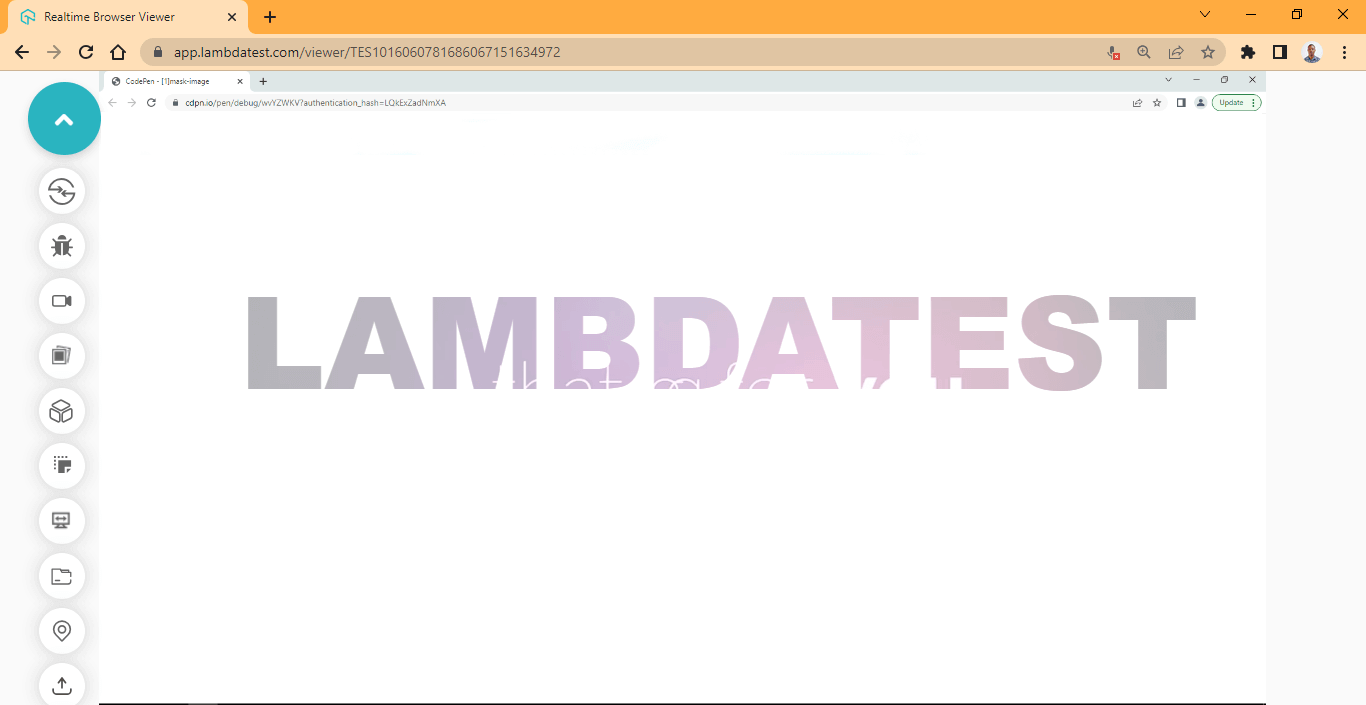
From the browser preview, the SVG < mask > is used to create an alpha mask to mask on the video and text. To mask the text show, we add a fill color of #fff (white).
As stated earlier, the white is for showing hidden mask content by a black mask.
Mask video with Custom SVG
Now that you have a better understanding of how to work with SVG < mask > tag. Let’s take our little project a bit further and more interesting by adding a custom SVG logo or shape.
Here is what the project demo looks like:
From the same project folder, create a new html file and give it any name of your choice.
I will call mine “shape.html”.
Next, type the HTML code in your text editor and open it in your browser.
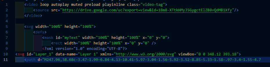
HTML:
|
1 2 3 4 5 6 7 8 9 10 11 12 13 14 15 16 17 |
<video loop autoplay muted preload playinline class="video-tag"> <source src="https://user-images.githubusercontent.com/78242022/241950930-5b89bd67-4299-4ca0-883e-8273b745c054.mp4"/> </video> <svg width="100%" height="100%"> <defs> <mask id="myText" width="100%" height="100%" x="0" y="0"> <rect width="100%" height="100%" x="0" y="0" /> <?xml version="1.0" encoding="UTF-8"?> <svg id="Layer_1" data-name="Layer 1" xmlns="http://www.w3.org/2000/svg" viewBox="0 0 348.12 393.18"> <path d="M247.96,38.68c-3.47-1.99-6.84-4.13-10.41-5.97-3.04-1.56-5.92-3.52-8.85-5.33-1.58-.97-3.4-1.55-4.77-2.9-.69-.69-1.93-.18-2.58-.85-1.75-1.79-4.06-2.7-6.05-4.09-2.48-1.73-5.29-2.84-7.86-4.38-1.26-.75-2.49-1.54-3.76-2.28-2.99-1.75-6.09-3.29-9.11-4.97-1.86-1.04-3.43-2.59-5.41-3.56-3.52-1.72-7-3.31-10.95-3.96-4.51-.75-8.87-.41-13.06,1.12-3.54,1.29-7.02,2.83-10.02,5.29-1.92,1.58-4.24,2.58-6.51,3.63-2.14,.99-4.01,2.43-6.04,3.61-3.9,2.27-7.78,4.58-11.77,6.7-1.04,.55-1.99,1.26-2.94,1.95-2.02,1.46-4.41,2.2-6.53,3.44-1.35,.79-2.58,1.8-3.94,2.58-3.13,1.79-6.43,3.31-9.43,5.29-3.64,2.4-7.51,4.4-11.19,6.74-3.17,2.01-6.57,3.72-9.89,5.51-2.62,1.41-5.33,2.77-7.54,4.85-.23,.22-.44,.41-.8,.52-3.48,1.05-6.24,3.42-9.36,5.12-2.69,1.46-5.22,3.26-8.12,4.33-.18,.07-.35,.23-.47,.34-2.51,2.18-5.68,3.3-8.35,5.2-.45,.32-.95,.62-1.47,.81-1.42,.51-2.78,.95-3.84,2.23-.37,.45-1.51,.75-2.15,1.13-2.99,1.81-6.1,3.42-9.08,5.24-2.04,1.24-3.97,2.77-6.32,3.52-1.17,.38-2.01,1.38-3.1,1.96-5.24,2.78-10.23,6-15.36,8.97-1.88,1.09-2.97,3.03-4.59,4.39-2.54,2.15-3.48,5.28-5.05,8.02-.4,.69-.34,1.54-.45,2.29-.6,4.16-1.07,8.35-.71,12.57,.03,.38,0,.76,0,1.14,0,56.14-.01,112.29,.03,168.43,0,2.92,.99,5.68,2.24,8.34,1.84,3.93,4.66,7.05,8.06,9.58,2.6,1.93,5.23,3.91,8.3,5.1,.93,.36,1.53,1.08,2.3,1.62,1.13,.8,2.43,1.34,3.73,1.84,.77,.3,1.52,.66,2.14,1.28,1.77,1.77,4.12,2.7,6.25,3.83,2.18,1.16,4.21,2.69,6.65,3.35,.24,.06,.34,.21,.48,.34,3.81,3.51,8.75,5.2,13.01,8.02,2.9,1.92,6.04,3.72,9.33,5.15,2.19,.95,4.12,2.65,6.27,3.78,3.2,1.68,6.17,3.73,9.4,5.37,2.47,1.26,4.91,2.74,7.23,4.32,2.03,1.38,4.49,2.07,6.2,3.92,.35,.38,.82,.45,1.16,.44,1.1-.03,1.8,.44,2.29,1.35,.19,.36,.47,.61,.82,.82,3.76,2.33,7.47,4.77,11.29,6.99,2.66,1.55,9.13,1.47,12.45-1.04,3.32-2.51,4.31-5.78,4.33-9.55,.07-11,.07-22,0-33-.02-2.67-.97-5.2-1.93-7.68-.25-.64-.74-1.08-1.29-1.48-.94-.7-1.93-1.38-2.3-2.6-.12-.41-.43-.64-.81-.82-4.93-2.39-9.49-5.42-14.21-8.18-2.36-1.38-4.9-2.49-7.15-3.97-4.68-3.09-9.76-5.48-14.45-8.55-2.97-1.94-6.19-3.51-9.28-5.27-1-.57-2.01-1.13-2.93-1.81-1.22-.89-2.59-1.47-3.89-2.18-2.27-1.24-4.83-2.06-6.59-4.16-.74-.88-1.84-1.28-2.92-1.65-3.24-1.13-3.63-2.14-3.72-5.39-.44-15.79-.17-31.58-.19-47.38-.04-27.28-.02-54.57,.01-81.85,0-2.12,.1-4.25,.15-6.37,.05-2.01,1.15-3.34,2.92-4.26,3.96-2.06,7.87-4.22,11.63-6.65,1.81-1.17,3.63-2.39,5.69-3.15,1.81-.67,3.21-2.04,4.89-2.96,4.41-2.41,8.88-4.76,13.04-7.56,3.11-2.09,6.69-3.28,9.68-5.5,3.45-2.56,7.37-4.34,11.02-6.58,2.7-1.67,5.49-3.26,8.26-4.85,7.05-4.04,14.1-8.08,21.06-12.28,2.45-1.48,5.11-2.52,7.44-4.29,2.4-1.82,5.36-2.88,7.92-4.53,2.56-1.64,5.42-2.71,7.88-4.52,3.06-2.25,6.67-3.55,9.97-5.38,.25-.14,.74-.13,1.14,.12,3.69,2.35,7.58,4.35,11.33,6.6,3.05,1.83,6.11,3.73,9.35,5.3,1.99,.96,4.06,2.04,5.83,3.58,1.48,1.28,3.45,1.99,5.17,3.01,3.39,1.99,6.67,4.2,10.17,5.97,2.13,1.08,4.25,2.25,6.27,3.45,2.75,1.62,5.53,3.24,8.28,4.87,3.92,2.32,7.78,4.77,11.87,6.8,1.51,.75,2.7,2.06,4.26,2.75,3.44,1.53,6.45,3.81,9.71,5.59,3,1.64,5.87,3.55,9.02,4.99,2.31,1.05,4.38,2.81,6.63,4.05,2.55,1.4,4.82,3.41,7.79,4.03,.36,.07,.73,.36,.97,.64,2.08,2.4,5.2,3.14,7.71,4.85,1.33,.91,2.8,1.64,4.36,2.22,1.53,.58,1.83,2.14,1.83,3.7-.01,8.39,0,16.77,0,25.16,0,6.26-.04,12.53,.02,18.79,.03,3.16,1.5,5.63,3.89,7.7,4.98,4.32,11.18,6.68,16.59,10.33,2.9,1.95,6.22,3.43,9.37,5.07,1.56,.81,2.76,2.27,4.43,3.07,3.41,1.65,6.9,2.56,10.63,1.42,1.92-.59,3.66-1.46,4.95-3.22,1.85-2.53,2.58-5.3,2.58-8.36,0-26.14,.01-52.28-.02-78.42,0-3.94-.79-7.78-2.66-11.24-1.28-2.38-2.25-5.07-4.82-6.61-.96-.58-1.7-1.56-2.45-2.43-.36-.42-.63-.94-1.17-1.12-2.57-.86-4.59-2.81-7.18-3.62-.41-.13-.8-.34-1.16-.63-2.53-2.09-5.61-3.29-8.3-5.11-1.91-1.3-4-2.3-5.98-3.43-2.22-1.27-4.37-2.73-6.72-3.86-2.77-1.33-5.42-3.1-8.08-4.74-2.68-1.65-5.39-3.25-8.18-4.71-1.11-.58-2.06-1.33-3.08-2-2.4-1.56-4.98-2.77-7.52-4.08-2.72-1.41-5.14-3.29-7.83-4.77-1.14-.62-2.18-1.44-3.45-1.74-.32-.08-.62-.23-.79-.38-2.4-2.16-5.36-3.49-8.09-5.1-2.49-1.47-5-3.01-7.74-4.13-1.66-.68-3.11-2.05-4.78-2.91" width="70%" height="70%"/> <path d="M173.46,163.82c-3.43-2.3-7.02-4.35-10.63-6.36-2.82-1.57-5.62-3.16-8.37-4.84-1.91-1.17-3.88-2.33-5.99-3.19-2.03-.83-3.75-2.31-5.45-3.56-1.66-1.22-3.45-1.69-5.18-2.44-3.15-1.37-6.45-1.55-9.79-.84-1.67,.35-3.28,1.07-4.69,1.88-2.3,1.33-4.64,2.63-6.83,4.21-1.46,1.06-3.25,1.94-4.97,2.75-1.88,.87-3.72,1.83-5.4,3.08-1.52,1.12-3.07,2.15-4.88,2.83-1.47,.55-2.77,1.56-4.08,2.44-2.6,1.76-5.56,2.85-8.24,4.46-1.74,1.05-3.42,2.17-4.81,3.55-2.72,2.7-5.07,5.7-4.79,9.92,.17,2.46-.5,5.02,.69,7.34,1.28,2.52,2.38,5.12,3.87,7.55,1.4,2.28,2.81,4.57,3.95,7.01,.78,1.66,2.27,2.88,2.92,4.58,1.43,3.77,4.45,6.02,7.74,7.76,3.73,1.98,7.76,2.19,11.91,.79,1.99-.67,3.78-1.68,5.49-2.74,2.74-1.71,5.69-3.03,8.41-4.77,1.83-1.17,3.48-2.69,5.66-3.38,1.48-.47,2.72-.68,4.11,.2,3.02,1.91,6.07,3.76,9.15,5.55,1.18,.69,2.55,1.01,3.59,1.97,.98,.9,1.49,1.86,1.49,3.28-.04,54.67-.03,109.35-.03,164.02,0,2.09,.56,4.12,.73,6.2,.08,1.08,1.01,2.04,1.73,2.94,1.57,1.95,3.32,3.64,5.52,4.95,4.75,2.83,9.59,2.8,14.55,.91,1.23-.47,2.28-1.35,3.37-2.13,2.01-1.44,3.64-3.27,5.61-4.73,2.18-1.61,4.45-3.1,6.43-5,1.64-1.57,3.46-2.98,5.33-4.33,2.69-1.94,5.35-4.06,7.14-6.87,1.23-1.93,1.92-4.26,2.04-6.65,.35-7.4,.07-14.81,.16-22.22,.38-31.58,.06-63.17,.16-94.75,0-2.61,0-2.61,.91-3.53,2.36,1.49,5.01,2.53,7.29,4.3,1.78,1.38,3.94,2.25,5.83,3.5,1.9,1.26,3.98,2.19,5.95,3.31,2.54,1.45,4.86,3.24,7.59,4.42,2.55,1.1,4.96,2.64,7.22,4.34,.43,.33,.78,.77,1.31,.97,3.97,1.51,7.38,3.98,10.97,6.16,2.49,1.51,5.15,2.76,7.67,4.26,2.45,1.46,4.87,2.99,7.32,4.47,.59,.35,1.07,.75,1.81,.81,2.18,.18,3.3,2.15,5.04,3.12,4.02,2.24,8.03,4.51,12.06,6.75,2.44,1.35,4.94,2.69,7.24,4.31,2.54,1.79,5.34,3.16,7.99,4.76,3.59,2.17,7.31,4.12,10.96,6.19,4.32,2.45,8.7,3.4,13.59,1.4,2.27-.93,4.17-2.08,6.06-3.62,3.29-2.69,5.67-6.22,8.79-9.02,1.56-1.4,2.85-3.07,4.43-4.39,1.78-1.48,3.29-3.22,4.62-5.01,1.47-1.97,2.4-4.33,2.38-6.97-.05-9.97-.01-19.93-.02-29.9,0-2.69-1.18-4.96-2.97-6.83-1.32-1.38-2.94-2.43-4.68-3.35-4.11-2.18-8.05-4.69-12.13-6.95-2.69-1.49-5.2-3.27-7.97-4.65-1.65-.82-3.13-1.99-4.75-2.91-1.92-1.09-3.99-1.73-6.06-2.42-1.63-.54-3.25-.48-4.9-.02-1.75,.5-3.77,.97-4.95,2.08-1.68,1.59-3.11,3.66-3.72,6.09-.38,1.52-.3,3.05-.31,4.58-.02,2.16-1.02,2.83-2.76,1.61-4.38-3.06-9.28-5.21-13.82-8.02-3.07-1.91-6.13-4-9.55-5.39-1.71-.7-3.13-2-4.7-2.98-2.04-1.28-4.19-2.36-6.3-3.44-2.99-1.54-5.52-3.81-8.62-5.14-1.47-.63-2.53-1.91-4.08-2.47-2.22-.81-4.12-2.14-5.92-3.7-1.18-1.02-2.85-1.31-4.25-2.1-2.16-1.22-4.14-2.8-6.51-3.61-.6-.2-1.03-.61-1.41-.92-2.76-2.19-6.15-3.27-8.99-5.23-3.02-2.08-6.29-3.69-9.34-5.68-.74-.48-1.47-.93-2.31-1.09-.66-.13-1.32-.36-1.77-.71-2.87-2.27-5.96-4.12-9.33-5.54-.55-.23-.97-.76-1.48-1.12-3.15-2.21-6.7-3.71-9.96-5.72-2.5-1.54-5.02-3.03-7.51-4.59-.72-.45-1.5-.69-2.3-.77-.64-.06-.9-.45-1.22-.85" width="70%" height="70%"/> </svg> </mask> </defs> <rect width="100%" height="100%" x="0" y="0" /> </svg> |
From the HTML code sample we have here, we are using the < mask > tag to mask the SVG logo and the video under it.
We also have a rect SVG shape that is masked together with the logo and shape.
Now let’s create our CSS file and type the code below.
CSS:
|
1 2 3 4 5 6 7 8 9 10 11 12 13 14 15 16 17 18 19 20 21 22 23 24 25 26 27 28 29 30 31 32 33 34 35 36 37 38 |
@import url('https://fonts.googleapis.com/css2?family=Bowlby+One+SC&family=Koulen&family=Luckiest+Guy&display=swap'); html { margin: 0; padding: 0; box-sizing: border-box; } body { font-family: 'Bowlby One SC','Koulen','Luckiest Guy', cursive; width: 100vw; height: 100vh; overflow: hidden; } video { width: 100%; height: 100%; } svg { font-size: 8em; font-family: "Koulen"; transition: all 0.5s linear; position: absolute; inset: 0; height: 100%; } svg rect { fill: #fff; mask: url(#myText); } /* Media Query */ @media screen and (max-width: 745px) { svg { font-size: 5em; } } |
Output:
See the Pen
Masking Video With Shape by Ocxigin (@ocxigin)
on CodePen.
Preview:
To show the SVG logo, the < rect > shape is targeted and a fill of #fff (white is added) to display the logo.
Browser Compatibility
The SVG < mask > Element has great support in all major browsers, so using it will bring the best result.
Adding CSS Transitions to CSS Masking Property
Adding CSS transitions to CSS masking property can help improve the look and feel of our website or application. It gives the user a sense of interactivity as they navigate the application, and it leads to good performance and optimization.
In this section, let’s implement the properties we have learned till now by building simple card components with CSS masking and transiting them.
Let’s begin.
HTML:
|
1 2 3 4 5 6 7 8 9 10 11 12 13 14 15 16 17 18 19 20 21 22 23 24 25 26 27 28 29 30 31 32 33 34 35 36 37 38 39 40 41 42 43 44 45 46 47 48 49 50 |
<main> <section class="container"> <!-- Card One --> <section class="card card-one"> <div class="image-wrapper"> <img src="https://user-images.githubusercontent.com/78242022/246862734-89696683-7d0c-45af-b8d0-ddd9b59a986d.png" alt=""> </div> <div class="content"> <h3>Plugins & Extensions</h3> <p>Dedicated WordPress plugin and Chrome Extension to help you perform cross-browser testing and capture full-page screenshots.</p> </div> </section> <!-- Card Two --> <section class="card card-two"> <div class="image-wrapper"> <img src="https://user-images.githubusercontent.com/78242022/246862738-773376b6-5b2d-411c-ba27-a96d92dc6150.png" alt=""> </div> <div class="content"> <h3>Test Locally hosted pages</h3> <p>Local hosted web testing to help you test in dev environments and save your website or app from after deployment bugs.</p> </div> </section> <!-- Card Three --> <section class="card card-three"> <div class="image-wrapper"> <img src="https://user-images.githubusercontent.com/78242022/246862710-a24aeea8-cce5-466e-b49f-903ac6b41bc1.png" alt=""> </div> <div class="content"> <h3>Geolocation testing</h3> <p>Test your website or mobile app from different geoIPs to make sure your users get the perfect experience across all locations.</p> </div> </section> <!-- Card Four --> <section class="card card-three"> <div class="image-wrapper"> <img src="https://user-images.githubusercontent.com/78242022/246862742-4ee6ff1a-01ae-4766-bfe5-4910144d1db3.png" alt=""> </div> <div class="content"> <h3>Accessibility Testing</h3> <p>Harness the power of Screen Reader and Speech Viewer using NVDA (Non-Visual Desktop Access) for Windows and Mac </p> </div> </section> </section> </main> |
CSS:
|
1 2 3 4 5 6 7 8 9 10 11 12 13 14 15 16 17 18 19 20 21 22 23 24 25 26 27 28 29 30 31 32 33 34 35 36 37 38 39 40 41 42 43 44 45 46 47 48 49 50 51 52 53 54 55 56 57 58 59 60 61 62 63 64 65 66 67 68 69 70 71 72 73 74 75 76 77 78 79 80 81 82 83 84 85 86 87 88 89 90 91 |
/* Removing default white space */ *,*::after, *::before { padding: inherit; margin: inherit; box-sizing: inherit; } html { padding: 0; margin: 0; box-sizing: border-box; } /* Body */ body { background-color: #d4d4d4; display: grid; place-items: center; width: 100vw; height: 100vh; } .container { display: grid; grid-template-columns: repeat(4, 300px); grid-template-rows: auto; gap: 1em; } .card { background-color: #0ebac5; border-radius: 10px; padding: 5px; box-shadow: 0 10px 15px -3px hsla(0, 0%, 0%, 0.1), 0 4px 6px -4px hsla(0, 0%, 0%, 0.1); } .card:hover { outline-style: dashed; outline-width: 2px; outline-color: #242424; } .card:hover img { /* Chrome */ -webkit-mask-image: linear-gradient(#000, transparent); -webkit-mask-size: 200px 200px; -webkit-mask-position: center center; /* Firefox */ mask-image: linear-gradient(#000, transparent); mask-size: 200px 200px; mask-position: center center; transform: scale(1.1); } .content h3{ font-family: calibri; font-size: 25px; } .content p{ font-family: calibri; font-size: 20px; color: #242424; } /* hero images */ .image-wrapper img{ width: 100%; transition: all 0.5 ease-in; overflow: hidden; object-fit: cover; transition: all 0.5s ease; } /* Media Query */ @media screen and (max-width: 1282px){ .container { grid-template-columns: repeat(2, 300px); } } @media screen and (max-width: 700px){ .container { grid-template-columns: repeat(1, 300px); } } |
Output:
See the Pen
Transition to masking by Ocxigin (@ocxigin)
on CodePen.
Preview:
From the browser preview, we added a linear gradient CSS masking to the hero image on the card components.
Adding CSS Animations to CSS Masking Property
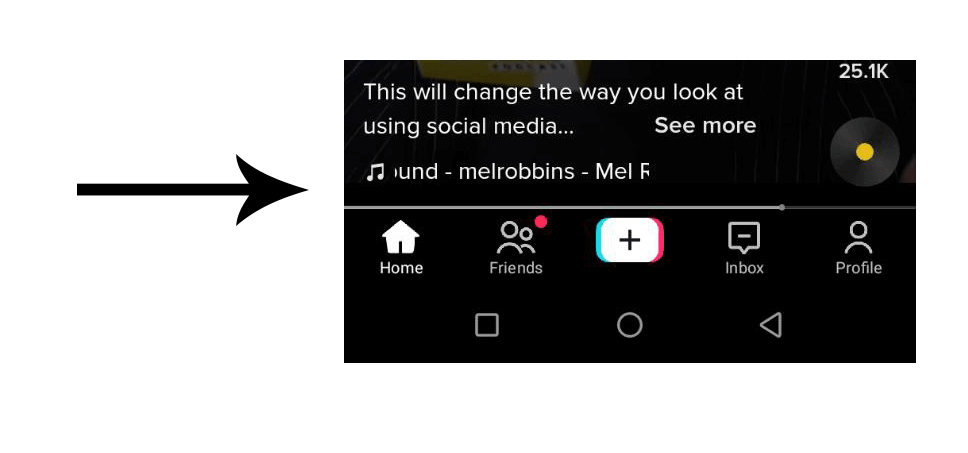
CSS masking can be used to do many things, as you have seen from the previous section. One popular feature that is common among apps such as Instagram and TikTok is animating horizontal scroll text.
This feature is very useful for long text that the user is not meant to scroll or interact with, the text can simply be animated so that all the information reveals itself and then repeats.
Here is a similar example from TikTok for context.
This is the project demo of what we are going to create.
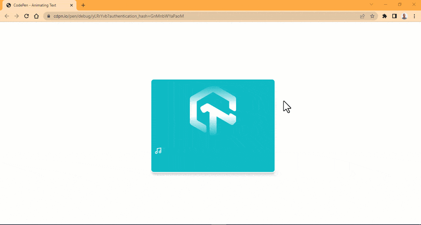
So let’s begin by creating an HTML file. Then type and run the code below
HTML:
|
1 2 3 4 5 6 7 8 9 |
<main> <img src="https://user-images.githubusercontent.com/78242022/241960972-8df69d68-13b8-41a1-9a8f-610b32f1ba1d.png" alt="" class="lambdaTest"> <div class="box j"> <div class="k"> <p>LambdaTest - Next-Generation Mobile Apps and Cross Browser Testing Cloud</p> </div> </div> <img src="https://user-images.githubusercontent.com/78242022/241950910-f15b21d2-d537-4a56-b7a6-99acd6ceb594.svg" alt="" class="music"> </main> |
CSS:
|
1 2 3 4 5 6 7 8 9 10 11 12 13 14 15 16 17 18 19 20 21 22 23 24 25 26 27 28 29 30 31 32 33 34 35 36 37 38 39 40 41 42 43 44 45 46 47 48 49 50 51 52 53 54 55 56 57 58 59 60 61 62 63 64 65 66 67 68 69 70 71 72 73 74 75 76 77 78 79 80 81 82 |
body { width: 100vw; height: 100vh; display: grid; place-items: center; overflow: hidden; } main { width: 25em; height: 300px; background-color: #0ebac5; border-radius: 10px; box-shadow: 0 8px 10px -1px rgb(0 0 0 / 0.1), 0 8px 10px -2px rgb(0 0 0 / 0.1); border: 2px solid #fff; } .j{ display: flex; flex-direction: column; justify-content: center; align-items: center; } .box { width: 100%; height: 50px; background-color: #0ebac5; -webkit-mask-image: linear-gradient(90deg, transparent, #000 40%, #000 60%, transparent 100%); mask-image: linear-gradient(90deg, transparent, #000 40%, #000 60%, transparent 100%); } .k { -webkit-mask-image: linear-gradient(90deg, transparent, #000 40%, #000 60%, transparent 100%); mask-image: linear-gradient(90deg, transparent, #000 40%, #000 60%, transparent 100%); } p { white-space: nowrap; font-size: 20px; font-family: calibri; font-style: italic; color: #fff; transform: translate(-500px); animation-name: moveforward; animation-iteration-count: infinite; animation-timing-function: linear; animation-duration: 10s; animation-play-state: running; } /* Images Icons */ .lambdaTest { display: block; margin: 1em auto; width: 150px; -webkit-mask-image: linear-gradient(180deg, transparent, #000 40%, #000 60%, transparent 100%); mask-image: linear-gradient(180deg, transparent, #000 40%, #000 60%, transparent 100%); } .music { position: relative; bottom: 2em; margin-left: 10px; } @keyframes moveforward { 0%{ transform: translateX(0); } 100%{ transform: translateX(-500); } } |
Output:
See the Pen
Animating Text by Ocxigin (@ocxigin)
on CodePen.
Preview:
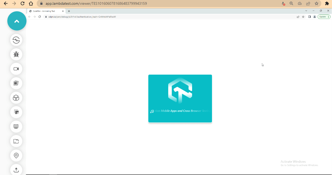
From the browser preview, we have a simple plain text that animates to the left direction and then becomes hidden toward getting to the side mask bar.
Hide Text Content with CSS Masking
In this section, we will learn how to hide text content with CSS masking. This feature is very effective for hiding a section of the page for the purpose of displaying exclusive content for a certain audience or limiting the amount of content a user has to interact with at a given time.
First, let’s take a look at the final project demo.
Now create an HTML file and type and run the code below.
HTML:
|
1 2 3 4 5 6 7 8 9 10 11 12 13 14 15 16 17 18 19 20 21 22 23 24 25 26 27 28 29 30 31 32 33 34 35 36 37 38 39 40 41 42 43 44 45 46 47 48 49 50 51 52 53 54 55 56 57 58 59 60 61 62 63 64 65 66 67 68 69 70 71 72 73 74 75 76 77 78 79 80 81 82 83 84 85 86 87 88 89 90 91 92 93 94 95 96 97 98 99 100 101 |
<main class="root"> <section class="hero-wrapper"> <section class="hero-section"> <!-- Call To Action --> <header class="call-to-action"> <div class="hero-space"></div> <section> <p>Free Live Webinar | Voices of Community<img src="https://raw.githubusercontent.com/ocxigin/we-love-ms/f786a998033224e244ce818ae6035ce4826df85a/img/icon-voices.svg"/></p> <h1>Digital Accessibility Testing: <br /> How to Get It Right</h1> <p class="date"> <img src="https://raw.githubusercontent.com/ocxigin/we-love-ms/f786a998033224e244ce818ae6035ce4826df85a/img/Date.svg"/> <span>Wednesday, 31st May 2023</span> </p> <p class="time"> <img src="https://raw.githubusercontent.com/ocxigin/we-love-ms/f786a998033224e244ce818ae6035ce4826df85a/img/bx_time.svg"/> <span>8:30 - 9:30 PM IST | 11:00 - 12:00 PM EST</span> </p> <form action=""> <button class="header-btn" formaction="https://www.lambdatest.com/webinar/digital-accessibility-testing?utm_source=facebook&utm_medium=organic&utm_campaign=may_22&utm_term=sj&utm_content=webinar">Register Now</button> </form> </section> </header> <!-- Call To Action --> <header class="speakers"> <section> <div class="hero-space"></div> <!--This tag here is used for margin-top--> <!-- Guest --> <div class="guest"> <div> <img src="https://raw.githubusercontent.com/ocxigin/we-love-ms/main/img/tamar-schapira-profile.png" alt=""> </div> <div class="names"> <h1>Tamar Schapira</h1> <p>CEO/Co-Founder, <br /> SenseIT</p> </div> </div> <!-- Host --> <div class="host-top"></div> <div class="host"> <div> <img src="https://raw.githubusercontent.com/ocxigin/we-love-ms/main/img/manoj-2023.png" alt=""> </div> <div class="names"> <h1>Manoj Kumar</h1> <p>VP - DevRel and OSPO, <br /> LambdaTest</p> </div> </div> </section> </header> </section> <!--End of Hero Section--> <!-- Page Content --> <section class="content"> <section> <div> <h3>Abstract</h3> <div class="mask-text" id="maskText"> <p>All people have the right and the ability to use the internet and participate in the digital world as they wish and as they are capable of. When speaking of users with disabilities, there are specific ways and functions by which people use digital products. Not all people were made equal and not all functions should be made equal. Digital accessibility is the inclusive practice that removes barriers for people with disabilities.</p> <p>As technology progresses and digital product development accelerates, digital accessibility is left behind and generally prioritized at the bottom of the list. This is primarily because assessing a product's accessibility is a manual process. To overcome this problem, assessing for accessibility must be integrated early in development and continuously. Meaning, we need to find a way to test and assess the product by interacting with the elements and components. Hence The usability test for accessibility needs to be automated. </p> <p>In this session, Tamar Schapira, Co-Founder and CEO of Sense-IT will provide a proven automated methodology to assess, identify, and remediate accessibility violations for any web application.</p> </div> </div> </section> </section> </section> </main> <div class="btn-container"> <button class="btn" id="btn">Toggle Mask</button> </div> <!-- Fotter --> <footer class="footer"> <p>(c)2023 Alex Anie | All Rights Reserved</p> </footer> |
CSS:
|
1 2 3 4 5 6 7 8 9 10 11 12 13 14 15 16 17 18 19 20 21 22 23 24 25 26 27 28 29 30 31 32 33 34 35 36 37 38 39 40 41 42 43 44 45 46 47 48 49 50 51 52 53 54 55 56 57 58 59 60 61 62 63 64 65 66 67 68 69 70 71 72 73 74 75 76 77 78 79 80 81 82 83 84 85 86 87 88 89 90 91 92 93 94 95 96 97 98 99 100 101 102 103 104 105 106 107 108 109 110 111 112 113 114 115 116 117 118 119 120 121 122 123 124 125 126 127 128 129 130 131 132 133 134 135 136 137 138 139 140 141 142 143 144 145 146 147 148 149 150 151 152 153 154 155 156 157 158 159 160 161 162 163 164 165 166 167 168 169 170 171 172 173 174 175 176 177 178 179 180 181 182 183 184 185 186 187 188 189 190 191 192 193 194 195 196 |
*, *::after, *::before { padding: inherit; margin: inherit; box-sizing: inherit; } html { padding: 0; margin: 0; box-sizing: border-box; overflow-x: hidden; } .hero-space { margin-top: 4em; } .hero-section { /* background: linear-gradient(to top, transparent, #0e092c 50%); */ background: #0e092c; width: 100vw; /* height: 100vh; */ display: grid; grid-template-columns: repeat(2, 1fr); } .call-to-action { margin-left: 1em; } .call-to-action h1 { font-family: calibri; font-size: 2.3em; color: white; } .call-to-action p:first-of-type { font-family: calibri; font-size: 1.5em; color: #298f95; } .date span, .time span{ /* display: inline-block; */ font-family: calibri; font-size: 1.2em; margin-left: 6px; position: relative; inset: -8px 0; color: white; } /* button */ .header-btn, .btn { background-color: #45d7e8; padding: 1em 3em; border: none; border-radius: 5px; outline: none; font-weight: bold; margin-top: 2em; cursor: pointer; user-select: none; } .header-btn:hover { opacity: 0.8; } /* Speaker */ .guest { display: flex; flex-direction: row; } .guest img { width: 117px; height: 128px; } .guest h1, .host h1 { font-family: calibri; font-size: 1.5em; color: white; } .guest p, .host p { font-family: calibri; font-size: 20px; color: white; } .host-top { margin-top: 1.4em; } .host { display: flex; flex-direction: row; } .host img { width: 117px; height: 127px; } .guest .names { position: relative; inset: 2em 3em; } .host .names { position: relative; inset: 2em 3em; } /* Content */ .content { width: 50%; margin: 0 auto; } .content h3 { font-family: calibri; font-size: 1.2em; text-transform: uppercase; letter-spacing: 6px; margin: 2em 0; } .content p { font-family: calibri; font-size: 1.5em; margin: 1em 0; line-height: 1.5em; } /* footer */ .btn-container { display: flex; justify-content: center; } .footer { background-color: #0e092c; width: 100%; height: 3em; } .footer p { text-align: center; color: white; font-family: calibri; font-style: italic; margin-top: 1em; } /* Mask Text */ .mask-text { -webkit-mask-image: linear-gradient(to top, transparent, #000 100%); mask-image: linear-gradient(to top, transparent, #0e092c 50%); } /* Tablet */ @media screen and (max-width:1057px){ .hero-section { display: grid; grid-template-columns: repeat(1, 1fr); } .guest, .host {margin: 0 2em;} } /* Mobile */ @media screen and (max-width:700px){ .host, .guest { flex-direction: column; } .guest .names { inset: 10px 0; margin-bottom: 10px; } .host .names { inset: 10px 0; margin-bottom: 10px; } .content { width: 60%; } } |
JavaScript:
|
1 2 3 4 5 6 7 8 |
const btn = document.querySelector('#btn'); const maskElement = document.querySelector('#maskText'); btn.addEventListener('click', removeMask) function removeMask(){ maskElement.classList.toggle('mask-text'); } |
The JavaScript code is added to enable the toggle function to the toggle mask button.
Output:
See the Pen
Land page Masking by Ocxigin (@ocxigin)
on CodePen.
Preview:
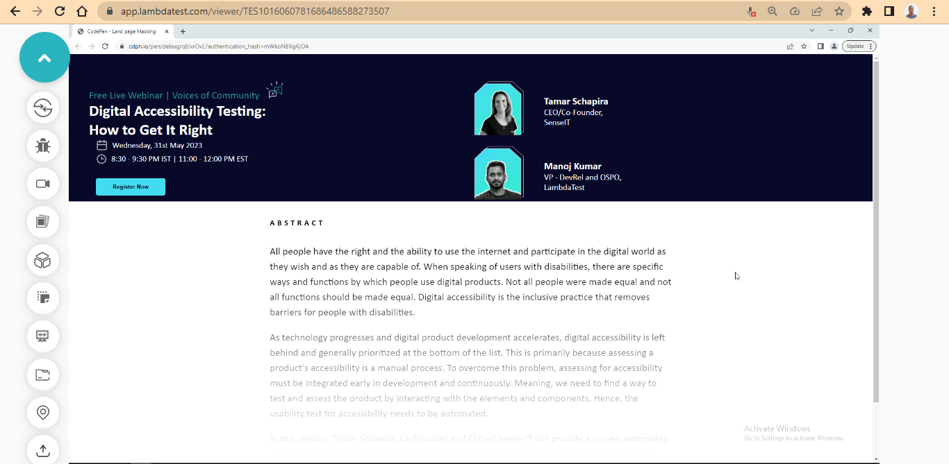
From the browser preview, CSS masking is applied to mask the content from displaying until a user clicks on the toggle mask button.
We added a media query breakpoint for a responsive design so that the website will be responsive on different viewports and screen sizes.
Here is a preview from various device screen sizes.
Desktop Preview:
Tablet Preview:
Mobile Preview:
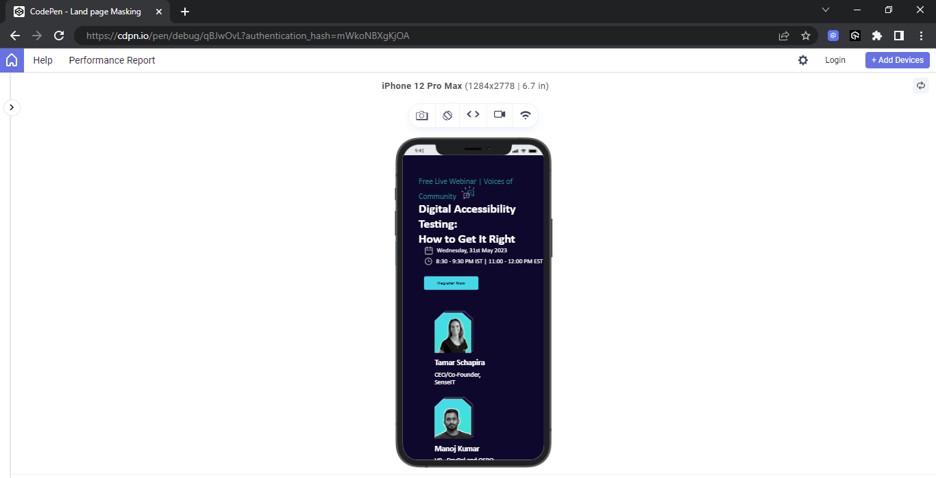
The above output has been rendered on LT Browser 2.0 by the LambdaTest platform. It is a browser designed specifically for developers, offering a friendly environment for building, testing, and debugging mobile websites. It provides the capability to evaluate website performance across various mobile device viewports. Additionally, you have the flexibility to customize the viewport resolution for testing your websites and save these settings for future reference.
With LT Browser 2.0, you can effortlessly explore and assess your websites on various screen resolutions, including desktops, mobile devices, tablets, and laptops. To begin using it, please refer to our documentation on LT Browser 2.0.
Ensuring Accessibility with CSS Masking
While performance deals with how fast a website performs, accessibility, on the other hand, deals with a website where all its features and content can be accessed irrespective of the physical impairments of the user.
To ensure accessibility with CSS masking, proper use of Alpha Channel must be adhered to prevent CSS masking out content from visually impaired users. However, making good use of color contrast can be very helpful for color-blind users.
Lastly, adhering to performance and accessibility best practices can help improve site performance when using CSS masking.
Conclusion
With CSS masking, we can partially or fully hide parts of an element. This involves using graphical elements with an alpha channel, such as PNG images, SVGs, or Text.
When in use, the specified element takes the shape of the object mask or linear gradient mask as an alpha or luminance mask.
Cheers! You’ve now learned the ins and outs of CSS masking. Armed with this knowledge, you can create visually stunning web designs that leave a lasting impression on your users. So go ahead, unleash your creativity, and push the boundaries of what’s possible with CSS masking!
Frequently Asked Questions (FAQs)
What is CSS masking?
CSS masking refers to a technique in Cascading Stylе Shееts (CSS) that allows you to apply a mask to an еlеmеnt’s contеnt, controlling its visibility or transparеncy. It enables you to crеatе visually intеrеsting еffеcts by hiding or rеvеaling parts of an еlеmеnt basеd on thе shapе dеfinеd by thе mask.
How to mask an image in CSS?
The mask-image CSS property sets the image used as a mask layer for an element. By default, this means the alpha channel of the mask image will be multiplied by the alpha channel of the element. This can be controlled with the mask-mode property.


Author’s Profile
Alex Anie
A Front End Technical Writer. I write blogs on Front End Technologies, such as HTML, CSS, JavaScript. When I am not coding, I enjoy watching tutorials and listening to twitter spaces. I live in Lagos, Nigeria
Blogs: 16
Got Questions? Drop them on LambdaTest Community. Visit now


