
A Beginner’s Guide To CSS Scale Property
Shreya Trivedi
Posted On: May 30, 2023
 211474 Views
 30 Min Read
As a web developer, your job is to create responsive and user-friendly websites. Creating a visually appealing layout, selecting the right fonts, and designing stunning images took hours. However, when you test your website on different screens, some elements appear too small or large, ruining the aesthetic you worked so hard on.
Perhaps you’ve come across a situation where the font size was correct on the desktop version but is too small on the mobile version or where the logo is too large on the desktop version and suddenly appears too huge. By combining responsive web design principles with properties like CSS scale, web developers can create responsive and visually appealing websites, providing users with a seamless experience across devices with different screen sizes.
The importance of having flexible web designs that adjust to various screen sizes has increased as an increased number of mobile users are now using their hand-held devices to access their favorite websites or apps on the Internet. A responsive design enables you to resize web page items without altering their proportions, making it easier to develop responsive designs that function seamlessly on any device.
In this blog, we’ll look at how the CSS scale property works and how to use it to create dynamic and responsive web designs that deliver a flawless user experience.
TABLE OF CONTENTS
What is CSS Scale Property?
The CSS scale property lets you resize elements on your website without affecting the dimensions. It works by defining a scaling factor that specifies how much the element is scaled- up or down.
When you apply the CSS scale property to an element, it affects only its visual appearance, not its size or position in the document flow. This means that other elements on the page will not be affected by the scaling of the element.
To use the CSS scale property, apply the transform property to the element that has to be scaled and set the value to scale() followed by one or two values. The first value represents the horizontal axis scaling factor, whereas the second value (if present) represents the vertical axis scaling factor.
The transform property in CSS lets you change the shape, position, and size of an element on a webpage, creating movement and visual interest. By applying the transform property with the scale function to the image, you can change its size while maintaining its aspect ratio. The transform-origin property sets the point from which the transformation will occur.
Getting into the nitty-gritty of transforming property is beyond the scope of this blog. Hence we will have the content limited to CSS scale property. In a nutshell, CSS scale refers to the process of adjusting the size of elements on a web page relative to the size of the viewport or other elements on the page. Both proportional and non-proportional scaling techniques are available. When an item is scaled proportionately, its aspect ratio is maintained, which causes it to be increased or decreased equally in both dimensions.
Contrarily, non-proportional scaling merely modifies the size of an item in one dimension, leaving the other unaffected. As a result, the dimension of an object may be distorted. For instance, if an item is non-proportionally scaled to twice its original size in only the horizontal dimension, its width will increase by two, but its height stays the same.
The CSS scale property is valuable in web development, enabling developers to resize web page items without altering the dimensions. With this property, it’s possible to scale an item in the X-axis, Y-axis, or both axes simultaneously, providing greater flexibility and control over the presentation of web content.
The scaling factor is specified as a unitless number. This means that you do not need to include any units of measurement (such as pixels or ems) when specifying the scaling factor.
CSS Scale in X-Axis
CSS scale in the X-axis is a technique used to resize an element horizontally without changing its height or any other dimensions. This can be achieved by setting the transform property of the element to scaleX() and specifying the desired scaling factor.
For example, suppose you have a div element with a width of 200 pixels, and you want to scale it to be 50% wider. You could accomplish this with the following CSS rule:
|
1 2 3 |
div { transform: scaleX(1.5); } |
This will stretch the div horizontally by 50%, resulting in a final width of 300 pixels. Note that the height and other dimensions of the div remain unchanged.
Scaling in the X-axis is particularly useful for adjusting the layout of elements on a web page, such as when you want to make a navigation menu wider or adjust the spacing between elements. By scaling elements horizontally, you can make more efficient use of screen real estate and create a more visually appealing layout.
CSS Scale in Y-Axis
CSS scale in the Y-axis is a technique used to resize an element vertically without changing its width or any other dimensions. This can be achieved by setting the transform property of the element to scaleY() and specifying the desired scaling factor.
For example, suppose you have an image element with a height of 300 pixels, and you want to scale it to be 50% taller. You could accomplish this with the following CSS rule:
|
1 2 3 |
mg { transform: scaleY(1.5); } |
This will stretch the image vertically by 50%, resulting in a final height of 450 pixels. Note that the width and other dimensions of the image remain unchanged.
Scaling in the Y-axis is particularly useful for adjusting the size and spacing of text and other content within elements on a web page. By scaling elements vertically, you can improve your content’s readability and visual appeal. Additionally, scaling can create interesting visual effects and animations, such as stretching or compressing text as it scrolls across the screen.
CSS Scale in X and Y-Axes
CSS scale in both the X and Y-axis is an advanced feature of Cascading Style Sheets (CSS) that enables web developers to create flexible and responsive web designs. With this technique, developers can resize HTML elements horizontally and vertically without changing their aspect ratio or other dimensions, providing greater control over the presentation of web content on different devices and screen sizes.
This feature is handy for creating responsive images that adjust their size based on the viewport without losing their aspect ratio. For example, designers can use scaling to create images that fill the entire screen width while maintaining their original aspect ratio. This technique can also be used to adjust the spacing and alignment of elements, create dynamic visual effects and animations, and more.
If two values are specified, the first value represents the scaling factor on the X-axis, while the second value represents the scaling factor on the Y-axis.
Here’s an example of CSS scale in both the X and Y-axis:
HTML:
|
1 2 3 4 5 6 7 8 |
<nav> <ul> <li id ="scale"><a href="#">Home</a></li> <li><a href="#">About</a></li> <li><a href="#">Services</a></li> <li><a href="#">Contact</a></li> </ul> </nav> |
CSS:
|
1 2 3 4 5 6 7 8 9 10 11 12 13 14 15 16 17 18 19 20 21 22 23 24 25 26 27 28 29 30 31 32 33 34 35 36 37 38 39 40 41 42 43 44 |
nav { background-color: #0ebac5; color: #fff; text-align: center; } nav ul { list-style: none; margin: 0; padding: 0; display: inline-block; } nav ul li { display: inline-block; } nav ul li a { display: block; padding: 10px 20px; color: #fff; text-decoration: none; } nav ul li a:hover { background-color: #555; } #scale:hover{ transform: scale(1.5 ,1.5); } @media (max-width: 600px) { nav ul { flex-direction: column; } nav ul li { margin: 10px 0; } } |
In this example, only the “Home” link will scale both in the x and y dimensions when hovered over, while the other links will not exhibit the scaling effect.
Output :
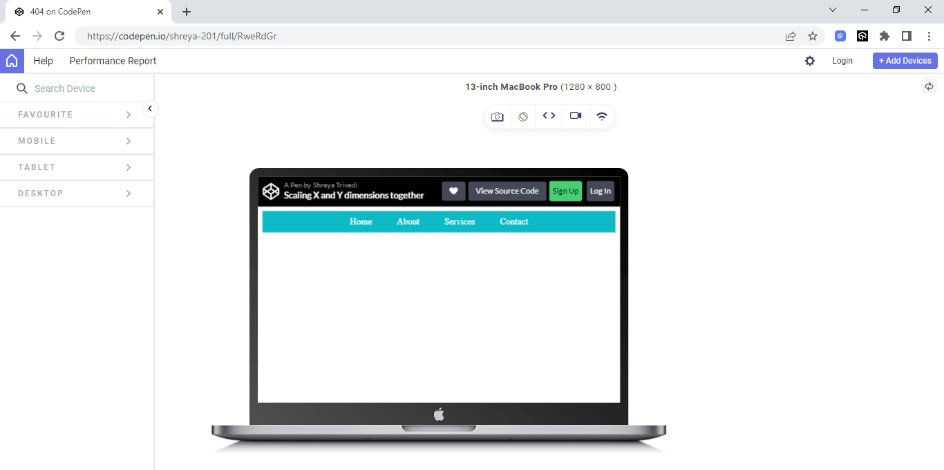
See the Pen
Scaling X and Y dimensions together by Shreya Trivedi (@shreya-201)
on CodePen.
Another example could be scaling a container with text to create a more readable layout on smaller screens.
If only one value is specified, the element will be scaled equally in both directions. This is useful when you want to scale an element proportionally in both directions, for example, when zooming in or out on an image.
|
1 2 3 |
.container { transform: scale(0.8); } |
In this case, the transform property is set to scale(0.8), which reduces the size of the container by 20% in both the X and Y-axis. This can be useful for improving the readability of text on smaller screens by reducing the amount of white space and increasing the font size.
Major Use Cases of CSS Scale Property
The CSS scale property is a fundamental feature of Cascading Style Sheets that enables developers to modify the size of HTML elements. This property can be used to make images larger or smaller, increase or decrease the size of text, and create exciting layout designs.
Additionally, the CSS scale property can be used in conjunction with other CSS properties to create dynamic and engaging web experiences.
Accessibility
The World Wide Web has become an integral aspect of our daily lives, serving as a global platform for information dissemination and service delivery. However, it is important to recognize that not all individuals can effortlessly access web content, particularly those with disabilities. To tackle this challenge head-on, the World Wide Web Consortium (W3C) has crafted a comprehensive framework known as the Web Content Accessibility Guidelines (WCAG).
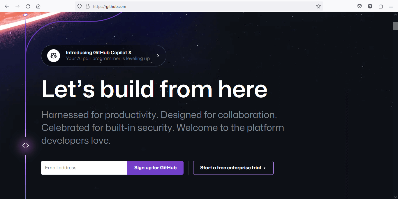
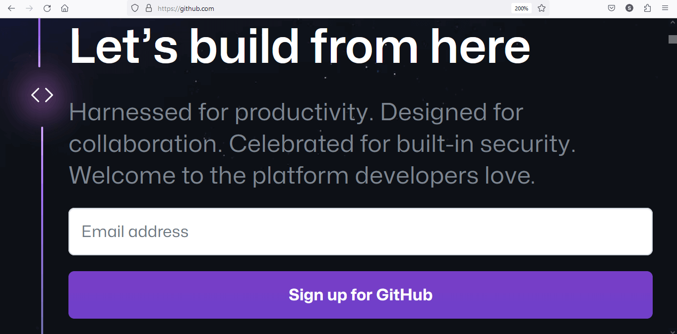
The 1.4.4 guideline by WCAG specifies that text can be resized up to 200% without losing content or functionality. The purpose of this guideline is to ensure that people with visual impairments can easily access and read content on websites.
To illustrate this point, let’s use the GitHub website as an example. Initially, the content remains unchanged, and as shown in the image, it doesn’t resize.
However, when we resize the GitHub website to 200%, the content appears differently, as shown below.
One way to achieve this requirement is by using the CSS scale property. By following this guideline and implementing CSS scale, website owners can improve the accessibility of their website and ensure that everyone can access their content.
HTML:
|
1 2 3 4 5 6 7 8 9 10 11 12 13 14 15 |
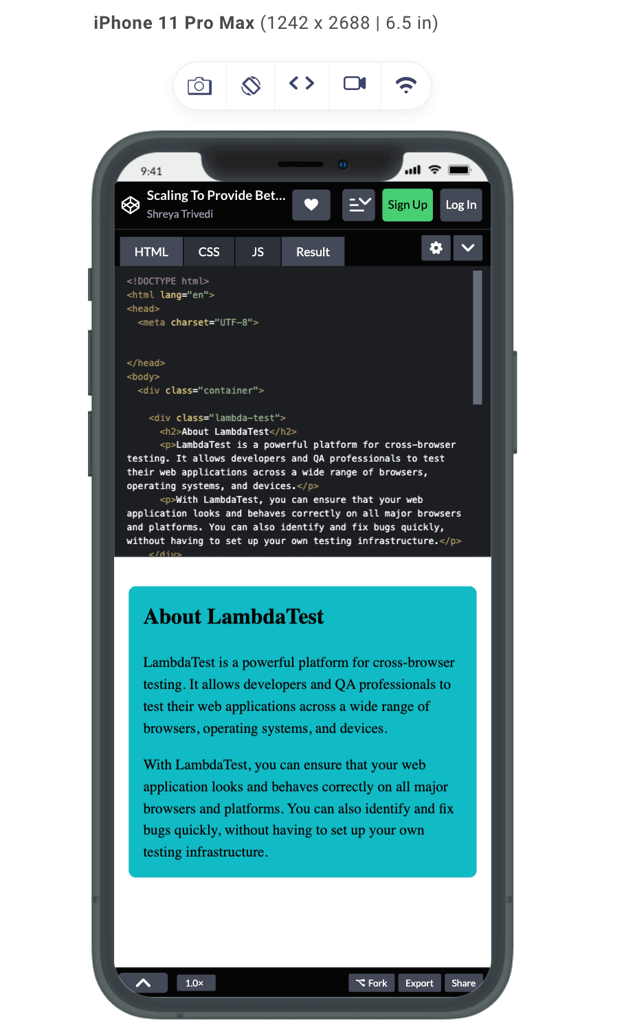
<!DOCTYPE html> <html lang="en"> <head> <meta charset="UTF-8"> </head> <body> <div class="container"> <div class="lambda-test"> <h2>About LambdaTest</h2> <p>LambdaTest is a powerful platform for cross-browser testing. It allows developers and QA professionals to test their web applications across a wide range of browsers, operating systems, and devices.</p> <p>With LambdaTest, you can ensure that your web application looks and behaves correctly on all major browsers and platforms. You can also identify and fix bugs quickly, without having to set up your own testing infrastructure. </p> </div> </div> </body> </html> |
CSS:
|
1 2 3 4 5 6 7 8 9 10 11 12 13 14 15 16 17 18 19 20 21 22 23 24 25 26 27 28 29 30 31 32 33 34 35 36 37 38 |
body { margin: 0; padding: 0; font-size: 16px; line-height: 1.5; } .container { max-width: 100%; padding: 1rem; box-sizing: border-box; margin: 0 auto; text-align: center; } @media screen and (min-width: 768px) { .container { max-width: 768px; transform: scale(1.25); transform-origin: top left; } } .lambda-test { background-color: #0ebac5; padding: 1rem; margin-top: 1rem; border-radius: 0.5rem; text-align: left; } .lambda-test h2 { margin-top: 0; } .lambda-test p { margin-bottom: 0; } |
Output:
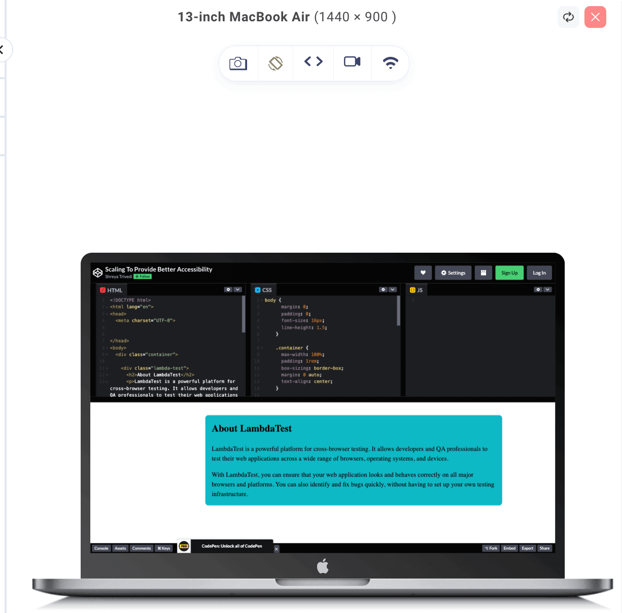
See the Pen
Scaling To Provide Better Accessibility by Shreya Trivedi (@shreya-201)
on CodePen.
The use of the CSS scale property in the above example can help to improve accessibility for users who may have difficulty reading small text on their devices. By using CSS media queries and a scaling transformation, the font size is increased on larger screens while maintaining the same layout and design.
The media query sets a minimum screen width of 768 pixels and applies a transformation that scales up the font size by 25%. This ensures that users with visual impairments or other disabilities can still read and interact with the website’s content since it complies with WCAG accessibility guidelines.
Additionally, the container holding the content has a maximum width, ensuring that the content remains easy to read and does not become too wide on larger screens, which could also affect accessibility.
By using scaling to make text, images, and other content more accessible to users with impairments, you can create a more inclusive and user-friendly accessible website that serves a broader audience.
Scaling
Scaling is a common technique used in UI design to draw the user’s attention to visual elements on the screen. When an element is scaled, its size dynamically changes; thereby creating a visual illusion that garners the attention of the website visitors.
For example, in the case of a progress bar, scaling can be used to create a subtle animation that makes the progress bar stand out when the user interacts with it. Adding a scale transform on hover creates the illusion that the progress bar is expanding as the user moves his mouse. By using this effect, the user can better understand how the progress bar works and feel more engaged with it.
HTML:
|
1 2 3 4 |
<div class="progress-bar"> <div class="progress-bar-fill" style="width: 50%;"></div> </div> <div class="progress-bar-text">Progress Bar</div> |
CSS:
|
1 2 3 4 5 6 7 8 9 10 11 12 13 14 15 16 17 18 19 20 21 22 23 24 25 26 27 28 29 30 31 |
.progress-bar { height: 12px; background-color: #f2f2f2; border-radius: 20px; margin: 50px; position: relative; } .progress-bar-fill { height: 100%; border-radius: 20px; background: linear-gradient(to right, #007bff, #6c757d); transform-origin: left center; } .progress-bar-fill:hover { transform: scale(1.2); } .progress-bar-text { color: #6c757d; font-size: 14px; font-weight: bold; text-align: center; margin-top: 8px; position: absolute; top: 50%; left: 50%; transform: translate(-50%, -50%); } |
Output:
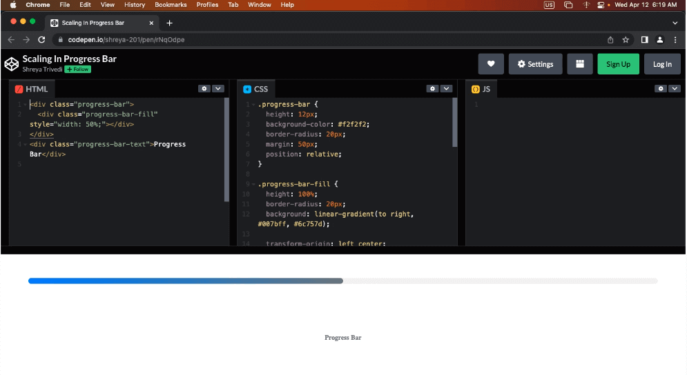
For example, when the user interacts with the progress bar by hovering over it, the scale transform can make it easier to see the current progress by temporarily enlarging it. This can help the user better understand how the progress bar works and make it easier for them to track their progress.
Overall, scaling is a useful technique that can be used to create a more engaging and visually appealing progress bar by adding visual interest, interactivity, and clarity to the UI.
By using CSS scaling in this way, Netflix can provide a more responsive and accessible user experience for its visitors. The website adapts to different screen sizes and makes it easier for users to read the content, regardless of the device they are using.
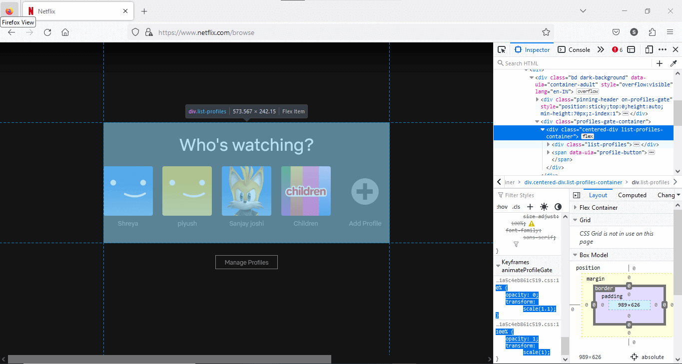
In the Netflix Profile List section, scaling is used along with an animation called Keyframe Animation. This is how it has been done.
Let’s break it down.
|
1 2 3 4 |
0% { opacity: 0; transform: scale(1.1); } |
This block of code sets the initial state of the animation, which starts at 0% of the total duration. In this state, the element will have an opacity of 0, making it completely transparent, and 1.1 times its original size will scale it up.
|
1 2 3 4 |
100% { opacity: 1; transform: scale(1); } |
This block of code sets the final state of the animation, which occurs at 100% of the total duration. In this state, the element will have an opacity of 1, making it fully visible, and its scale will be set to the original size (scale of 1).
When you apply this animation to an element in your CSS, it will gradually transition from the initial state (0% keyframe) to the final state (100% keyframe) over the specified duration, resulting in a smooth animation. The opacity will gradually change from 0 to 1, making the element fade in, and the scale will transition from 1.1 to 1, making the element shrink back to its original size.
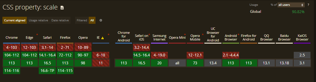
Browser Compatibility of CSS Scale Property
Modern web browsers, including Chrome, Firefox, Safari, and Edge, widely support the CSS scale property. It is supported in IE9 and later versions but with limited functionality. However, checking the specific browser versions you need to support and conducting thorough cross browser testing to ensure consistent behavior across different browsers is always recommended.
LambdaTest is a cloud-based digital experience testing platform that allows you to test websites for cross browser compatibility on an online browser farm of real browsers, devices, and operating systems. You can choose to test from a variety of Windows, macOS, Android, and iOS versions running the latest and legacy browsers.
Using LambdaTest’s Real Time Browser Testing feature, you can perform cross browser testing of your CSS scale property across different browser and OS combinations. For more information, check out this documentation: Real Time Browser Testing.
Catch up on the latest testing tutorials around Selenium automation, Cypress testing, and more. Subscribe to the LambdaTest YouTube Channel for quick updates.
Different Ways of using CSS Scale Property
In this section, we will look at the different ways to implement CSS scale property.
Units relative to the size
CSS provides measurement units relative to the size of other elements. Examples include em, rem, and %. By employing these units instead of fixed values, developers may construct items that scale according to the viewport size or other elements on the page.
An example of how to use em units with calc() function to scale the font size of the text inside a container:
HTML:
|
1 2 3 4 5 6 7 8 9 10 11 12 13 14 15 16 17 18 |
<div class="container-1"> <h1> Using Units Relative to size </h1> <div class="col-md-6"> <p class="scaled-text"><span>Runs on Linux containers, macOS and Windows</span> </br></br> <span class="text">HyperExecute platform comes with feature-packed hosted runners for every major OS including Windows, MacOS, and Linux containers. The runners come with pre-installed support for all major programming languages and frameworks including Java, Node.js, Python, PHP, GO, C#, Rust, and Ruby </span> </p> </div> </div> <div class="container-2"> <h1>Not Using Units Relative to size </h1> <div class="col-md-6"> <p class="not-scaled-text"><span>Runs on Linux containers, macOS and Windows </span> </br></br> <span class=" text">HyperExecute platform comes with feature-packed hosted runners for every major OS including Windows, MacOS, and Linux containers. The runners come with pre-installed support for all major programming languages and frameworks including Java, Node.js, Python, PHP, GO, C#, Rust, and Ruby. </span> </p> </div> </div> |
CSS:
|
1 2 3 4 5 6 7 8 9 10 11 12 13 14 15 16 17 18 19 20 21 22 23 24 25 26 27 28 29 30 31 32 33 34 35 36 37 38 39 40 41 42 43 |
.container-1, .container-2 { display: inline-block; width: 45vw; /* Use 45% of the viewport width */ vertical-align: top; padding: 2vh; /* Use 2% of the viewport height for padding */ box-sizing: border-box; } .container-1 { background-color: #0ebac5; color: black; max-width: 800px; margin: 0 auto; } .container-2 { background-color: #0ebac5; color: black; padding: 20px; border: 1px solid #dcdcdc; width: 90vw; max-width: 800px; margin: 20px auto; } .col-md-6 { width: 100%; } .scaled-text { font-size: calc(1em + 0.5vw); /* Use em units to scale the font size */ } .not-scaled-text { font-size: 1em; } span{ color: black; } .text{ color: dark grey; } |
By using units relative to size, such as calc and vw, in the CSS for container-1, the text within it is scaling and adapting to different screen sizes. This means that the text remains readable and visually appealing on devices of different sizes, from desktops to mobile phones, without the need for media queries.
On the other hand, container-2 does not use units relative to size in its CSS. As a result, the text within it does not scale or adapt to different screen sizes as effectively as container-1. Instead, it maintains a fixed size, which can result in the text being too small or too large on devices of different sizes, making it less readable and visually appealing.
Output:
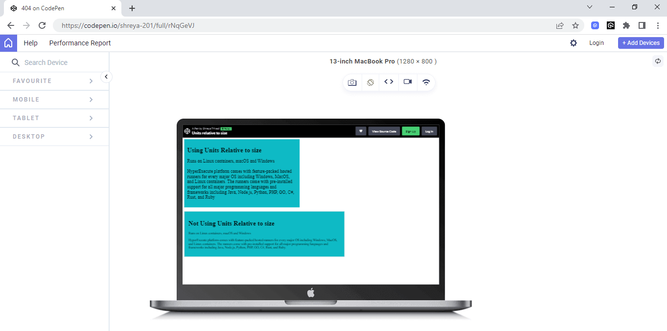
See the Pen
Units relative to size by Shreya Trivedi (@shreya-201)
on CodePen.
Media Queries
Nowadays, responsive design is a fundamental part of web development. It encompasses techniques and principles that enable websites to adjust and present their content across a wide range of devices, including smartphones, tablets, laptops, and desktop computers, as well as varying screen sizes and orientations.
A mobile first design is also important, as it allows you to prioritize the needs of mobile users, who make up a significant portion of internet traffic. Meanwhile, fluid layouts ensure that your website can expand or contract to fill the available screen space, no matter the device being used.
By implementing responsive design best practices, you can create a website that looks great, functions seamlessly, and delivers an optimal user experience across all devices.
LT Browser 2.0 by LambdaTest is a great way to perform responsiveness tests across different screen sizes. LT Browser 2.0 is a Chromium-based mobile-friendly browser that allows you to build, test, and debug mobile websites for responsiveness across 50+ pre-installed device viewports, including mobile, tablet, desktop, and laptop.
Web developers use breakpoints in CSS to define different screen sizes at which the website will adjust its layout. These breakpoints vary based on the device being used to render the website.
- Mobile devices have a screen size ranging from 320px to 480px.
- Tablets range from 481px to 768px.
- Small screens and laptops range from 769px to 1024px.
- Desktops and large screens range from 1025px to 1200px
- Extra-large screens, such as TVs, have a screen size of 1201px (or more)
➂ Media Queries
▧ With media queries, we can define completely different styles for different browser sizes.
It can be used to check many things, such as:
⤷ width & height of the viewport
⤷ width & height of the device
⤷ orientation
⤷ resolution pic.twitter.com/bRq89aIxY3— Aakash Rao (@Aakash_codes) April 3, 2023
These breakpoints are used in combination with media queries and scaling techniques to ensure that the website’s content and layout remain responsive and visually appealing.
By using media queries, web developers can apply custom styles to a page depending on the device used to render it. Scaling techniques can also be used to adjust the scaling behavior based on different screen sizes.
For instance, web developers may want to apply a different scaling factor to elements on smaller screens to ensure responsiveness and better user experience. By prioritizing these factors, web developers can develop websites that seamlessly adapt to different devices and screen sizes, ensuring that users can access and interact with the website without any compromise in functionality or design, delivering a cohesive and uninterrupted online experience.
Let’s take an example where we take a box element, and it has been given a fixed width and height, as well as a background color and some additional CSS to center the text within the box. The transition property has been added to create a smooth scaling effect when the user hovers over the box.
To add a media query in CSS, you use the @media rule followed by the query conditions in parentheses. Inside the curly braces, you define the styles you want to apply when those conditions are met.
A media query has also been added to adjust the size of the box and the font size when the screen size is less than or equal to 768px. In this case, the width and height of the box have been set to 200px and 100px, respectively, and the font size has been set to 14px.
HTML:
|
1 2 3 4 5 6 7 8 |
<div class="box"> <h2>Real Device Cloud for Reliable Mobile App Testing</h2> <p>Test your native hybrid of web mobile apps using LambdaTest’s online real device cloud and virtual mobile device platform of emulators and simulators. Eliminating your in-house device labs and bring high scalability to your mobile app testing.</p> </div> |
CSS:
|
1 2 3 4 5 6 7 8 9 10 11 12 13 14 15 16 17 18 19 20 21 22 23 24 25 26 27 28 29 30 31 32 33 34 35 36 37 38 39 40 41 42 43 44 45 46 47 48 49 50 51 52 53 |
body { display: flex; justify-content: center; align-items: center; height: 100vh; } .box { width: 80%; max-width: 800px; margin: 0 auto; padding: 20px; background-color: #0ebac5; border: 1px solid #ddd; border-radius: 10px; box-shadow: 0 5px 10px rgba(0, 0, 0, 0.1); overflow: hidden; transform-origin: center center; text-align: center; } .box:hover { transform: scale(0.9); opacity: 0.8; box-shadow: 0 10px 20px rgba(0, 0, 0, 0.2); } h2 { font-size: 28px; margin-bottom: 10px; } p { font-size: 18px; line-height: 1.5; } @media screen and (max-width: 767px) { .box { width: 90%; } } @media screen and (min-width: 768px) and (max-width: 1023px) { .box { width: 70%; } } @media screen and (min-width: 1024px) { .box { width: 50%; } } |
Output:
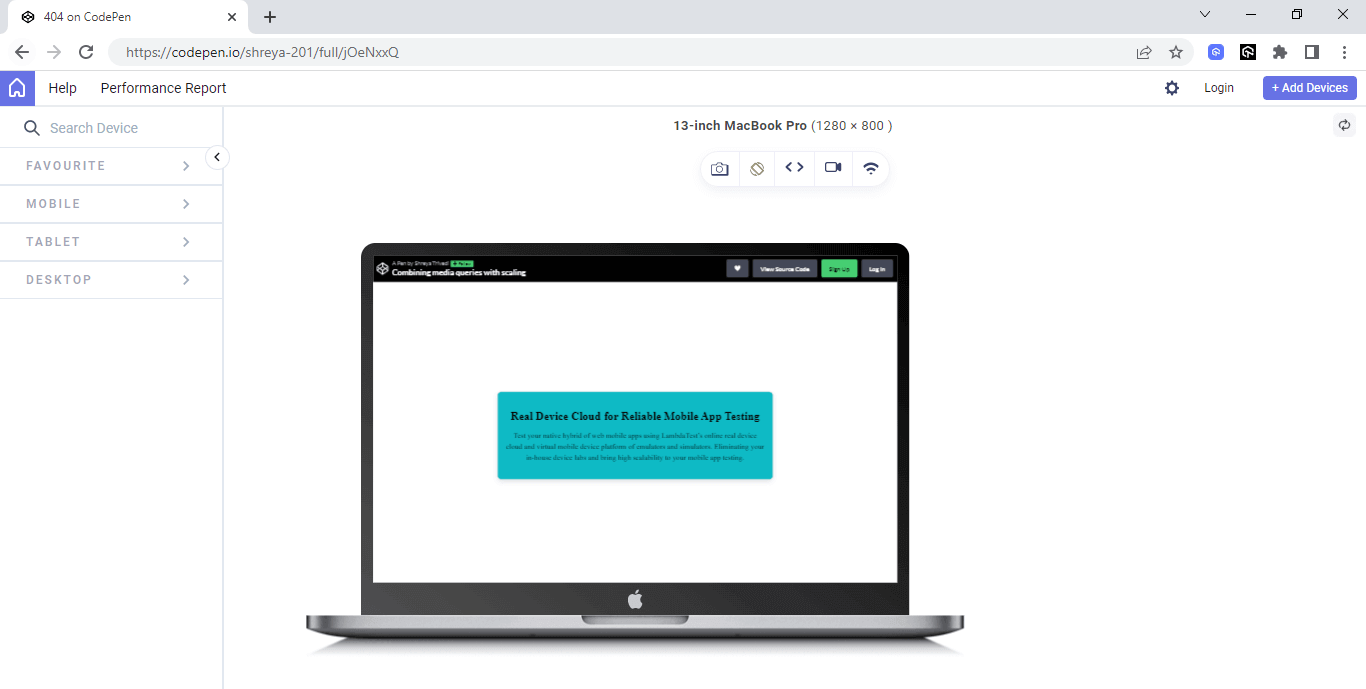
See the Pen
Combining media queries with scaling by Shreya Trivedi (@shreya-201)
on CodePen.
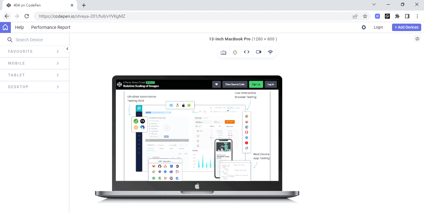
Relative Scaling of Images
As more and more users access websites from a variety of devices with different screen sizes, it’s important to ensure that images are correctly displayed and don’t disrupt the layout of the page. However, it’s not practical to manually resize each of the images of different sizes and aspect ratios. One solution to ensure that images are scaled appropriately is to use CSS. We can set a maximum width or height for the images and enable them to scale proportionally within those limits using the max-width and max-height properties.
Shown below is a simple snippet that showcases the usage of max-width and max-height properties:
|
1 2 3 4 5 6 7 8 9 10 |
@media screen and (max-width: 767px) { .box { width: 90%; } } @media screen and (min-width: 768px) and (max-width: 1023px) { .box { width: 70%; } } |
This ensures that the images do not exceed the specified dimensions and maintain their aspect ratio while scaling (up or down). Additionally, we can use relative units (i.e., percentages or em units) to ensure that the images are scaled relative to the size of the parent element, making them responsive to different screen sizes.
CSS allows for the scaling of images by setting a maximum width or height and enabling the image to scale proportionally within those limits.
Here is an example that demonstrates how to use the transform:scale property to scale images.
HTML:
|
1 2 3 |
<div class="image-container"> <img loading=”lazy” src="https://www.lambdatest.com/resources/images/main/home_banner.webp"> </div> |
CSS:
|
1 2 3 4 5 6 7 8 9 10 11 12 13 14 15 16 17 18 19 20 |
max-width: 100%; overflow: hidden; display: flex; justify-content: center; align-items: center; height: 100vh; } img { max-width: 100%; height: auto; transform-origin: top left; max-height: 100%; box-shadow: 0px 0px 10px rgba(0, 0, 0, 0.5); } img:hover { transform: scale(0.9); opacity:0.8; } |
Output:
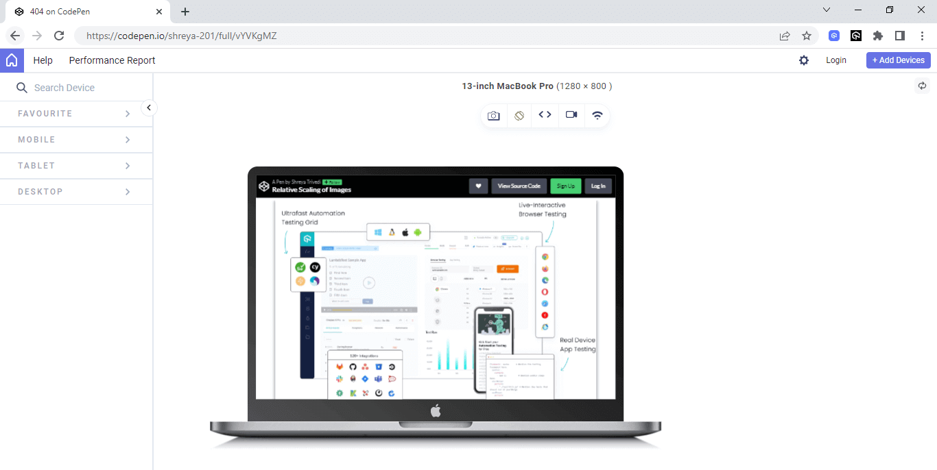
See the Pen
Relative Scaling of Images by Shreya Trivedi (@shreya-201)
on CodePen.
The code creates an image container with a responsive design that scales the image proportionally with the container. The CSS scaling effect is used to provide a subtle hover effect that enhances the user experience.
Adaptable Grid Systems
Building a website that looks great and functions well on different screen sizes and devices can be a challenge for developers. Fortunately, CSS Grid systems provide developers with a powerful tool for creating responsive layouts based on a grid of columns and rows.
By defining a grid of columns and rows, developers can easily adjust the layout of a web page to suit different screen sizes without having to rely on complex calculations or media queries. This approach provides greater flexibility and control over the placement of content.
CSS Grid systems also offer developers a comprehensive set of tools for managing layout, including the ability to specify the size and placement of individual grid items, define the size of rows and columns, and add padding and margins for visual hierarchy and spacing. This level of control allows developers to create visually appealing and functional web pages.
Below is an example to understand this,
HTML:
|
1 2 3 4 5 6 7 8 9 10 11 12 13 14 15 16 17 18 19 20 |
<div class="grid-container"> <div class="grid-item"> <div class="content">Samsung Galaxy S21</div> </div> <div class="grid-item"> <div class="content">Apple iPhone 13</div> </div> <div class="grid-item"> <div class="content">Sony PlayStation 5</div> </div> <div class="grid-item"> <div class="content">Nintendo Switch</div> </div> <div class="grid-item"> <div class="content">Bose QuietComfort 35 II headphones</div> </div> <div class="grid-item"> <div class="content">Fitbit Charge 5</div> </div> </div> |
To make the grid items scale down proportionally as the width of the browser window decreases, we can apply the CSS scale property to the grid-item elements using the following code:
CSS:
|
1 2 3 4 5 6 7 8 9 10 11 12 13 14 15 16 17 18 19 20 21 22 23 24 25 26 27 28 29 30 31 32 33 |
.grid-container { max-width: 960px; margin: 0 auto; display: flex; justify-content: center; align-items: center; flex-wrap: wrap; } .grid-item { width: 33.33%; float: left; position: relative; height: 100px; background-color: #ffffff; border: 1px solid #dddddd; } .content { height: 100%; display: flex; align-items: center; justify-content: center; font-size: 24px; text-align: center; } .grid-item:hover .content { transform: scale(0.9); opacity:0.8; background-color: #0ebac5; } |
In this example, we’ve set the width of each grid-item element to 33.33% to create a three-column grid. We’ve also set the position property of the grid-item elements to relative to ensure that the content elements are positioned within their respective grid items.
To scale down the content elements when the user hovers over the grid-item elements, we’ve applied the CSS scale property to the content elements using the transform property. We’ve also added a CSS transition effect to smoothly animate the scaling of the content elements when the user hovers over the grid-item elements.
This combination of a simple grid layout and CSS scaling can help you create responsive layouts that adapt to different screen sizes and user interactions.
Output:
See the Pen
Scaling on adaptable grid systems by Shreya Trivedi (@shreya-201)
on CodePen.
Diving Deeper into CSS Scale Property
As we continue our exploration of scaling in CSS, it’s important to dive deeper into the various techniques and functions that allow for fine-tuning and precise control over the size and proportions of elements
By understanding its usage and potential applications, you’ll be well-equipped to create dynamic and visually appealing designs. Now, let’s move forward and uncover the intricacies of scaling in CSS.
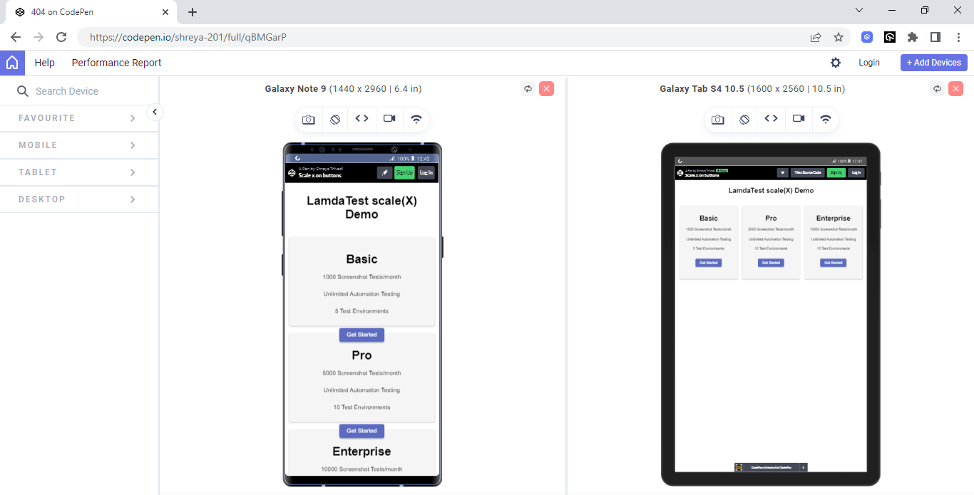
scaleX()
When designing a website, it’s often necessary to adjust the size of various elements to achieve the desired visual effect. The scaleX() function in CSS is a useful property for scaling an element along the x-axis, which can help you to adjust its width without affecting its height or position on the page.
This can be particularly helpful when trying to create a design responsive to different screen sizes and devices. By using scaleX() along with other CSS transformations and media queries, you can create a website that looks great and functions uniformly & seamlessly across a range of devices.
Let's explore how CSS enables responsiveness and enhances the usability of websites 🔥
— Shreya Trivedi (@_Shreya_Trivedi) May 24, 2023
Let’s look at the following example to understand it in detail.
HTML and CSS:
|
1 2 3 4 5 6 7 8 9 10 11 12 13 14 15 16 17 18 19 20 21 22 23 24 25 26 27 28 29 30 31 32 33 34 35 36 37 38 39 40 41 42 43 44 45 46 47 48 49 50 51 52 53 54 55 56 57 58 59 60 61 62 63 64 65 66 67 68 69 70 71 72 73 74 75 76 77 78 79 80 81 82 83 84 85 86 87 88 89 90 91 92 93 94 95 96 97 98 99 100 101 102 103 104 105 106 107 108 109 110 111 112 113 114 115 116 117 118 119 120 121 122 123 124 125 126 127 128 129 130 131 132 133 134 135 136 137 138 139 140 141 142 143 144 145 146 147 148 149 150 151 152 153 154 155 156 157 158 159 160 161 162 163 164 165 166 167 168 169 170 171 172 173 174 175 176 177 178 179 180 181 182 183 184 185 186 187 188 189 190 191 192 193 194 195 196 197 198 199 200 201 202 203 204 205 206 207 208 209 210 211 212 213 214 215 216 |
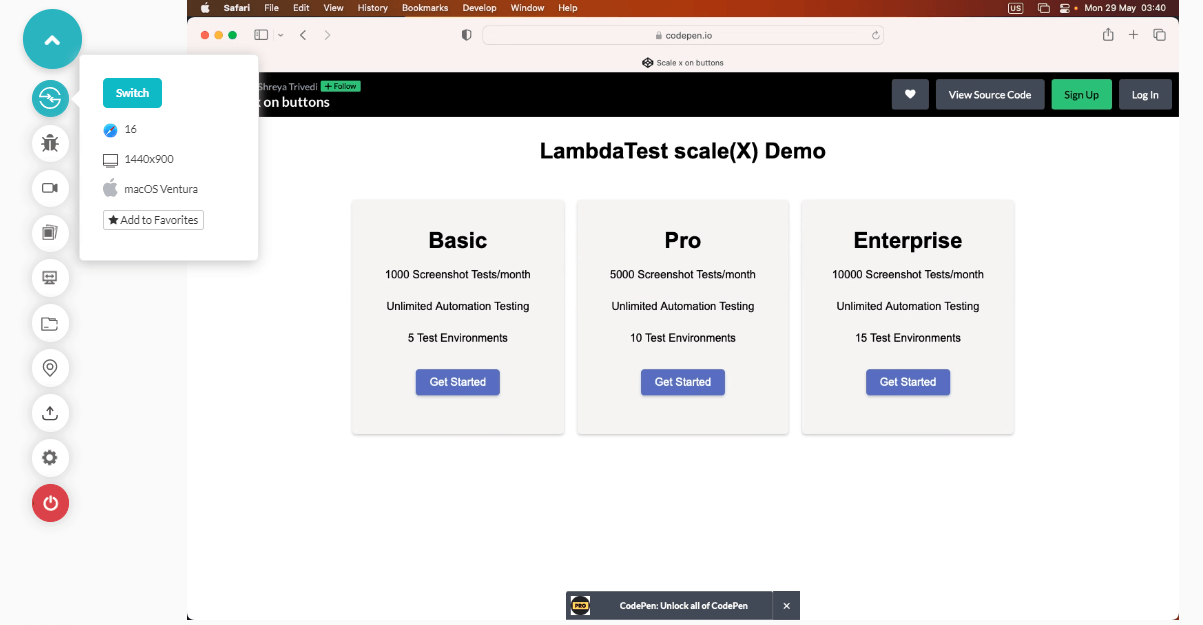
<!DOCTYPE html> <html> <head> <title>lambdaTest Pricing</title> <meta name="viewport" content="width=device-width, initial-scale=1"> <style> body { font-family: Arial, sans-serif; margin: 0; padding: 0; } header { color: black; padding: 10px; text-align: center; } .container { max-width: 960px; margin: 0 auto; padding: 20px; } .row { display: flex; flex-wrap: wrap; margin: 0 -10px; } .col { flex: 1; padding: 0 10px; margin-bottom: 20px; } .card { background-color: #F5F5F5; border-radius: 5px; box-shadow: 0 2px 4px rgba(0, 0, 0, 0.2); padding: 20px; text-align: center; height: 300px; } .card ul { list-style: none; padding: 0; margin-top: 20px; } .card li { margin-bottom: 10px; } .btn { display: inline-block; background-color: #5C6BC0; color: white; padding: 10px 20px; border-radius: 5px; text-decoration: none; transition: all 0.3s; cursor: pointer; box-shadow: 0 2px 4px rgba(0, 0, 0, 0.2); transform: scaleX(1); font-size: 16px; margin-top: 20px; } .btn:hover { transform: scaleX(1.1); } @media (max-width: 768px) { .container { padding: 10px; } .col { flex-basis: 100%; } .card { height: 200px; } } </style> </head> <body> <header> <h1>scale(X) Demo</h1> </header> <div class="container"> <div class="row"> <div class="col"> <div class="card"> <ul> <h1> Basic </h1> <li>1000 Screenshot Tests/month</li></br> <li>Unlimited Automation Testing</li></br> <li>5 Test Environments</li> </ul> <a href="#" class="btn">Get Started</a> </div> </div> <div class="col"> <div class="card"> <ul> <h1> Pro </h1> <li>5000 Screenshot Tests/month</li></br> <li>Unlimited Automation Testing</li></br> <li>10 Test Environments</li> </ul> <a href="#" class="btn">Get Started</a> </div> </div> <div class="col"> <div class="card"> <ul> <h1> Enterprise </h1> <li>10000 Screenshot Tests/month</li></br> <li>Unlimited Automation Testing</li></br> <li>15 Test Environments</li> </ul> <a href="#" class="btn">Get Started</a> </div> </div> <style> body { font-family: Arial, sans-serif; margin: 0; padding: 0; } header { color: black; padding: 10px; text-align: center; } .container { max-width: 960px; margin: 0 auto; padding: 20px; } .row { display: flex; flex-wrap: wrap; margin: 0 -10px; } .col { flex: 1; padding: 0 10px; margin-bottom: 20px; } .card { background-color: #F5F5F5; border-radius: 5px; box-shadow: 0 2px 4px rgba(0, 0, 0, 0.2); padding: 20px; text-align: center; height: 300px; } .card ul { list-style: none; padding: 0; margin-top: 20px; } .card li { margin-bottom: 10px; } .btn { display: inline-block; background-color: #5C6BC0; color: white; padding: 10px 20px; border-radius: 5px; text-decoration: none; transition: all 0.3s; cursor: pointer; box-shadow: 0 2px 4px rgba(0, 0, 0, 0.2); transform: scaleX(1); font-size: 16px; margin-top: 20px; } .btn:hover { transform: scaleX(1.1); } @media (max-width: 768px) { .container { padding: 10px; } .col { flex-basis: 100%; } .card { height: 200px; } } </style> |
See the Pen
Scale x on buttons by Shreya Trivedi (@shreya-201)
on CodePen.
Output:
In the above example, the buttons have been subjected to scaling along the X-axis. Whenever the user hovers over these buttons, they undergo a horizontal expansion, creating an interactive visual effect.
This dynamic scaling enhances the user experience by adding an element of motion and responsiveness to the interface. It provides a sense of interactivity and engagement, making the user’s interaction with the buttons more visually stimulating and intuitive.
scaleY()
Websites and digital designs can remarkably transform and adapt to various screen sizes seamlessly, captivating users with their fluidity and responsiveness. Behind this seemingly effortless magic lies a fascinating method known as scaleY(), which plays a crucial role in achieving these dynamic visual transformations.
The scaleY() method allows you to scale an element vertically. It is part of the CSS transform property, which provides various transformation capabilities to manipulate the appearance of elements on a web page. When applied to an element, the scaleY() method modifies the element’s height or vertical size without affecting its width.
Here’s an example to illustrate the usage of scaleY():
HTML:
|
1 2 3 4 5 6 7 8 9 10 11 12 13 14 15 16 17 18 19 20 21 22 23 24 25 26 27 28 29 30 31 32 33 34 35 36 37 38 39 40 41 42 |
<!DOCTYPE html> <html> <head> <meta name="viewport" content="width=device-width, initial-scale=1" /> <link rel="stylesheet href="https://cdnjs.cloudflare.com/ajax/libs/font-awesome/4.7.0/css/font-awesome.min.css" /> </head> <body> <div class="navbar"> <a href="#"><span><strong>LAMBDATEST</strong></span></a > <a href="#home">Platform</a> <a href="#news">Enterprise</a> <div class="dropdown"> <button class="dropbtn"> Resources <i class="fa fa-caret-down"></i> </button> <div class="dropdown-content"> <a href="#">Online Browser</a> <a href="#">Selenium Testing</a> <a href="#">Cypress Testing</a> <a href="#">Playwright Testing</a> </div> </div> <div class="dropdown"> <button class="dropbtn"> Developers <i class="fa fa-caret-down"></i> </button> <div class="dropdown-content"> <a href="#">Online Browser</a> <a href="#">Selenium Testing</a> <a href="#">Cypress Testing</a> <a href="#">Playwright Testing</a> </div> </div> <a href="#news">Pricing</a> </div> </body> </html> <!DOCTYPE html> |
CSS:
|
1 2 3 4 5 6 7 8 9 10 11 12 13 14 15 16 17 18 19 20 21 22 23 24 25 26 27 28 29 30 31 32 33 34 35 36 37 38 39 40 41 42 43 44 45 46 47 48 49 50 51 52 53 54 55 56 57 58 59 60 61 62 63 64 65 66 67 68 69 70 71 72 73 74 75 76 77 78 79 80 81 82 83 84 85 86 87 88 |
body { font-family: Arial, Helvetica, sans-serif; } .navbar { overflow: hidden; background-color: white; display: flex; align-items: center; } .navbar a { font-size: 16px; color: black; text-align: center; text-decoration: none; padding: 14px 8px; /* Adjusted padding */ } .dropdown { float: left; overflow: hidden; } .dropdown .dropbtn { font-size: 16px; border: none; outline: none; color: black; padding: 14px 16px; background-color: inherit; font-family: inherit; margin: 0; } .navbar a:hover, .dropdown:hover .dropbtn { background-color: grey; } .dropdown-content { display: none; position: absolute; background-color: #f9f9f9; min-width: 160px; box-shadow: 0px 8px 16px 0px rgba(0, 0, 0, 0.2); z-index: 1; } .dropdown-content a { float: none; color: black; padding: 12px 16px; text-decoration: none; display: block; text-align: left; } .dropdown-content a:hover { background-color: #ddd; transform: scaleY(1.2); } .dropdown:hover .dropdown-content { display: block; } /* Media query for responsiveness */ @media (max-width: 768px) { .navbar { flex-direction: column; align-items: flex-start; } .navbar a { width: 100%; text-align: left; padding: 10px 16px; } .navbar li { margin: 10px 0; } } |
Output:
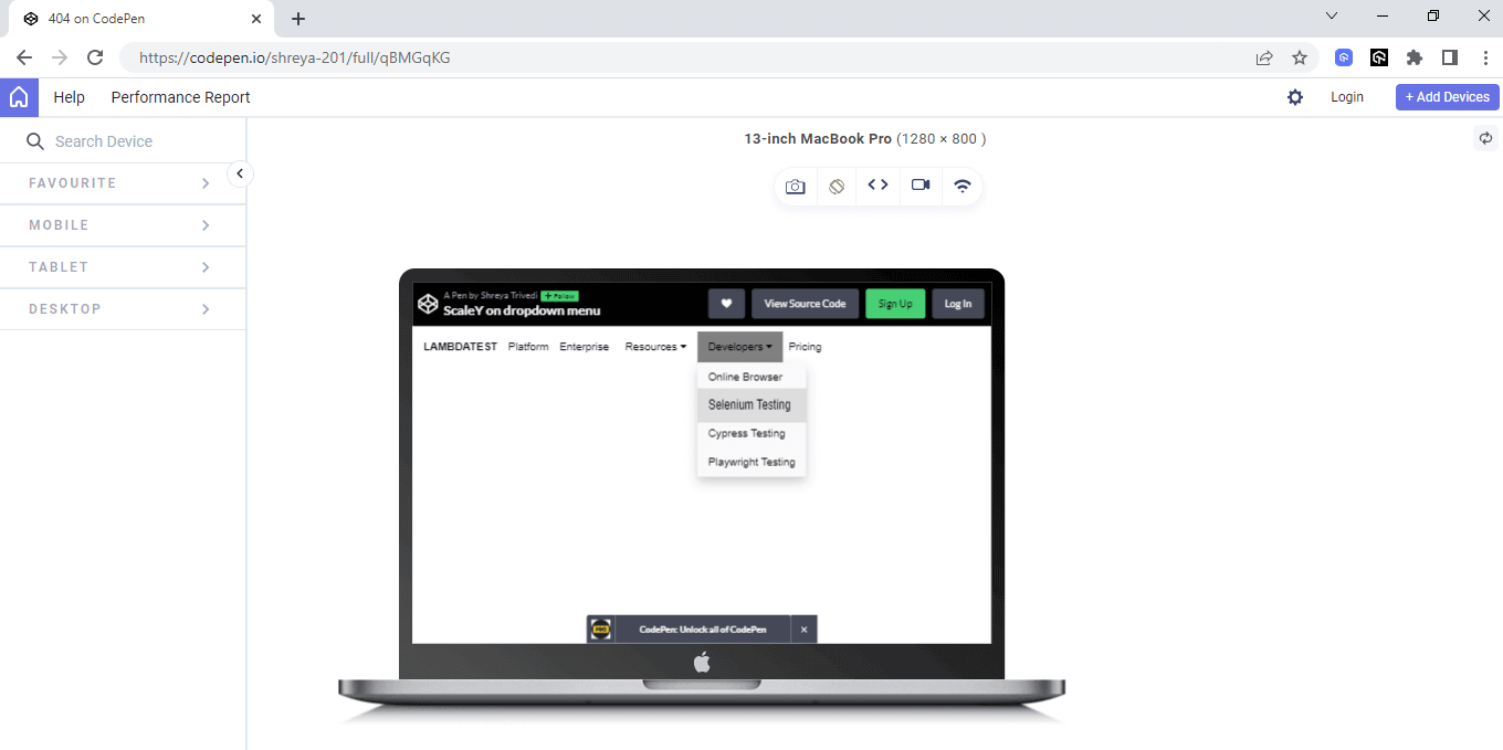
In the above example, the dropdown elements of the navigation bar exhibit vertical scaling along the Y-axis when they are hovered over.
By scaling vertically upon hover, the navigation bar provides clear and engaging visual feedback to the user, indicating the active state of the dropdown elements and improving the overall navigation usability.
See the Pen
ScaleY on dropdown menu by Shreya Trivedi (@shreya-201)
on CodePen.
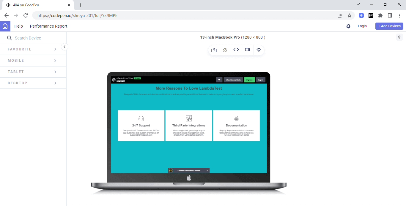
scaleZ()
In the world of web design, scaleZ() helps designers create the illusion of depth on a webpage. It allows them to make elements appear closer or farther away, giving a sense of perspective.
By using scaleZ(), designers can change the size of an element along the “z-axis,” which is like the imaginary line that goes from the screen toward you. They can make elements bigger or smaller along this line to create the feeling of depth.
You can also manipulate the size of an element along the z-axis. When the scaling factor is less than 1 (e.g., scaleZ(0.8)), the element will appear farther away along the z-axis.
On the other hand, a scaling factor greater than 1 (e.g., scaleZ(1.2)) will enlarge the element along the z-axis, making it seem closer.
It’s important to note that scaleZ() operates in a three-dimensional space, so it requires a 3D context to have a visible effect. If an element or its parent elements do not have any 3D transformations applied to them, scaleZ() will have no visible impact, and the element will appear unaffected.
Here is an example of scaleZ()
HTML:
|
1 2 3 4 5 6 7 8 9 10 11 12 13 14 15 16 17 18 19 20 21 22 23 24 25 26 27 28 29 30 31 32 33 34 35 36 37 38 39 40 41 42 43 44 45 46 |
<!DOCTYPE html> <html lang="en"> <head> <meta charset="UTF-8"> <meta name="viewport" content="width=device-width, initial-scale=1.0"> <title>LambdaTest Replica</title> </head> <body> <h1> More Reasons To Love LambdaTest </h1> <p> Along with 3000+ browsers and devices combinations to test we provide you additional features to make sure you give your users a perfect experience. </p> <!-- Support Section --> <section class="support"> <div class="container"> <div class="section-content"> <div> <imgsrc="https://www.lambdatest.com/resources/images/headset.svg" id="icons"> <h2>24/7 Support</h2> <p>Got questions? Throw them to our 24/7 in-app customer chat support or email us on support@lambdatest.com </p> </div> <!-- Integration Section --> <div> <imgsrc="https://www.lambdatest.com/resources/images/Integration-logo.svg" id="icons"> <h2>Third Party Integrations</h2> <p>With a single click, push bugs in your choice of project management tools, directly from LambdaTestplatform..</p> </div> <!-- Documentation—-> <imgsrc="https://www.lambdatest.com/resources/images/header/LambdaTest-Documentation.svg" id="icons"> <h2>Documentation</h2> <p>Step by Step documentation for various test automation frameworks to help you run your first Selenium script.</p> </div> </div> </div> </section> </body> </html> |
CSS:
|
1 2 3 4 5 6 7 8 9 10 11 12 13 14 15 16 17 18 19 20 21 22 23 24 25 26 27 28 29 30 31 32 33 34 35 36 37 38 39 40 41 42 43 44 45 46 47 48 49 50 51 52 53 54 55 56 57 58 59 60 61 62 63 64 65 66 67 68 69 70 71 72 73 74 75 76 77 78 79 80 81 82 83 84 85 86 87 88 89 90 91 92 93 94 95 96 97 |
body { font-family: Inter,Arial,sans-serif; color: #4a4a4a; font-size: 16px; background-color: #0ebac5;; } /* CSS for the sections */ .support, .integration, .documentation { display: flex; align-items: center; /* Update this property */ justify-content: center; /* Update this property */ padding: 100px 0; } /* CSS for text and other elements within the sections */ h2 { text-align: center; } .container { width: 960px; margin: 0 auto; padding: 0 10px; display: flex; /* Add this property */ justify-content: center; /* Add this property */ align-items: center; / } .section-content { display: flex; align-items: center; justify-content: space-between; } .section-content div { flex: 1; border: 1px solid white; padding: 40px; margin: 5px; background-color: white; text-align: center; height: 100%; } .section-content :hover { transform: scaleZ(3) perspective(1000px); /* Apply the scaleZ transformation on hover */ background-color: rgba(0, 0, 0, 0.1); } .section-content p { width: 300px; margin: 0 auto; } .section-content p :hover{ transform: scaleZ(1.5) perspective(1000px); /* Apply the scaleZ transformation on hover */ background-color: #0ebac5;; } h1,p{ text-align:center; } #icons { display: block; margin: 0 auto; width: 50px; /* Adjust the width as needed */ } /* Media queries for responsiveness */ @media (max-width: 767px) { .section-content { flex-direction: column; } .section-content div { flex: 0 0 100%; max-width: 100%; } } |
Output:
See the Pen
scaleZ() by Shreya Trivedi (@shreya-201)
on CodePen.
scale3d()
In the realm of CSS transformations, there exists a remarkable method called scale3d(). This method allows you to scale an element not only in one or two dimensions but in three dimensions simultaneously, opening up a world of possibilities for creating immersive and dynamic designs.
The scale3d() method takes three parameters: scale3d(x, y, z), where each parameter represents the scaling factor along the respective axis. Adjusting these values lets you control the element’s transformation in all three dimensions. Values less than 1 shrink the element, while values greater than 1 enlarge it.
Here’s an example of working with scale3d()
HTML:
|
1 2 3 4 5 6 7 8 9 10 11 12 13 14 15 16 17 18 19 20 21 22 23 24 25 26 27 28 29 30 31 32 33 34 35 36 37 |
<div class="pricing-cards"> <div class="card"> <h2>Basic</h2> <div class="price">$19<span>/mo</span></div> <ul> <li>1 User</li> <li>10 Projects</li> <li>100 GB Storage</li> <li>Email Support</li> </ul> <a href="#" class="btn">Choose Plan</a> </div> <div class="card featured"> <h2>Pro</h2> <div class="price">$39<span>/mo</span></div> <ul> <li>5 Users</li> <li>Unlimited Projects</li> <li>500 GB Storage</li> <li>Email & Phone Support</li> </ul> <a href="#" class="btn">Choose Plan</a> </div> <div class="card"> <h2>Enterprise</h2> <div class="price">$99<span>/mo</span></div> <ul> <li>Unlimited Users</li> <li>Unlimited Projects</li> <li>1 TB Storage</li> <li>24/7 Support</li> </ul> <a href="#" class="btn">Choose Plan</a> </div> </div> |
CSS:
|
1 2 3 4 5 6 7 8 9 10 11 12 13 14 15 16 17 18 19 20 21 22 23 24 25 26 27 28 29 30 31 32 33 34 35 36 37 38 39 40 41 42 43 44 45 46 47 48 49 50 51 52 53 54 55 56 57 58 59 60 61 62 63 64 65 66 67 68 69 70 71 72 73 74 75 76 77 78 79 80 81 82 83 84 85 86 87 88 89 90 91 92 93 94 95 96 97 98 99 100 101 102 103 104 105 106 107 |
/* Reset styles */ * { box-sizing: border-box; margin: 0; padding: 0; } /* Styles for the pricing cards container */ .pricing-cards { display: flex; flex-wrap: wrap; justify-content: center; max-width: 100%; margin: 0 auto; padding: 40px; } /* Styles for the pricing cards */ .card { position: relative; width: 300px; margin: 20px; padding: 20px; border: 1px solid #ddd; text-align: center; transition: transform 0.3s; } .card:hover { transform: scale3d(1.1, 1.1, 1.1); } .card.featured { border-color: #007bff; } .card.featured h2 { color: #007bff; } /* Styles for the pricing cards heading */ .card h2 { margin-bottom: 20px; font-size: 32px; font-weight: 600; color: #333; } /* Styles for the pricing cards price */ .card .price { display: flex; justify-content: center; align-items: center; margin-bottom: 20px; font-size: 48px; font-weight: 600; color: #007bff; } .card .price span { font-size: 24px; font-weight: 400; color: #333; margin-left: 5px; } /* Styles for the pricing cards features list */ .card ul { list-style: none; margin-bottom: 20px; } .card ul li { padding: 10px 0; font-size: 18px; font-weight: 400; color: #333; } /* Styles for the pricing cards CTA button */ .card .btn { display: inline-block; padding: 12px 20px; background-color: #007bff; color: #fff; font-size: 18px; font-weight: 600; border: none; border-radius: 30px; cursor: pointer; transition: background-color 0.3s; } .card .btn:hover { background-color: #0062cc; } /* Media queries for responsive design */ @media (max-width: 992px) { .pricing-cards { padding: 20px; } .card { width: 100%; } } |
Output:
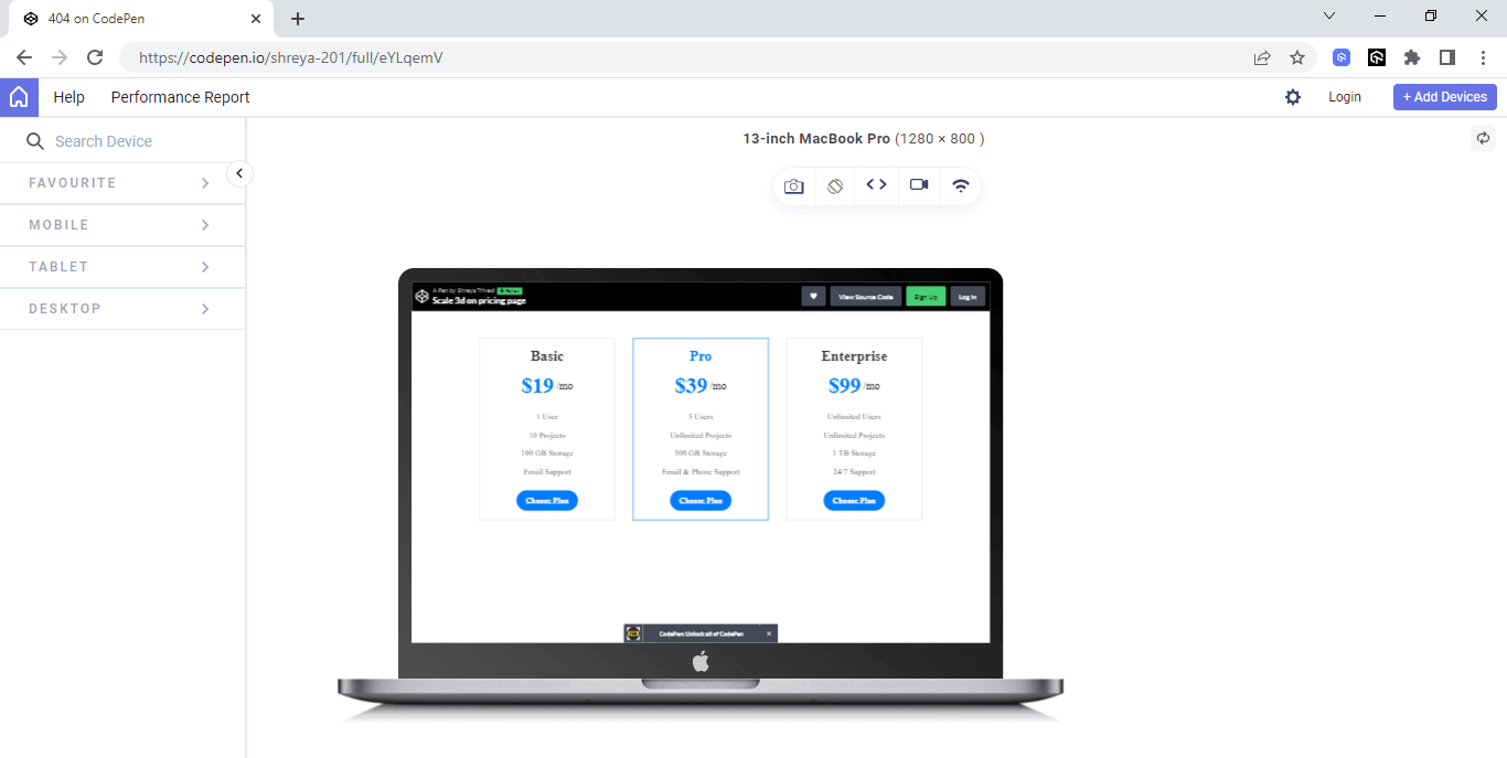
In the above example, when the pricing section is hovered over, it undergoes three-dimensional scaling. As depicted in the output, specifically when hovering over the Pro pricing panel, it scales while the remaining sections remain unchanged, maintaining their original size and dimensions.
This three-dimensional scaling effect adds a dynamic and interactive element to the pricing section, drawing attention to the highlighted panel and providing a visually engaging experience for the user.
See the Pen
Scale 3d on pricing page by Shreya Trivedi (@shreya-201)
on CodePen.
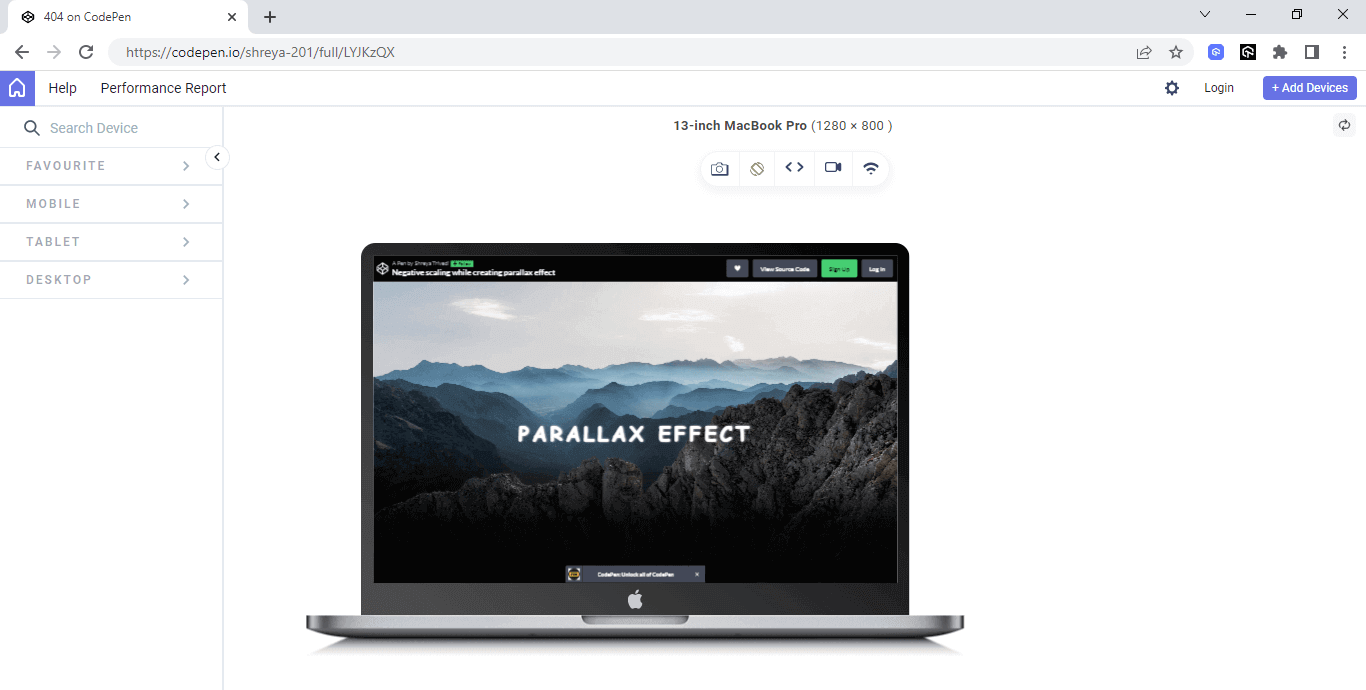
Negative Scaling
Negative scaling is a concept in CSS where an element appears flipped or mirrored along its axis. By applying a negative scaling factor to the transform property using the scale() method, the element may appear inverted or mirrored.
The syntax for applying negative scaling to an element in CSS is as follows:
|
1 2 3 |
selector { transform: scale(-n); } |
In the above syntax:
- The selector refers to the element or elements to which you want to apply the negative scaling.
- The scale(-n) is the transformation function, where -n represents the negative scaling factor. Replace n with the desired value.
Here is an example of negative scaling
HTML:
|
1 2 3 4 5 6 7 8 9 10 11 12 13 14 15 16 17 18 19 20 21 22 23 24 25 |
<!DOCTYPE html> <html> <head> <meta charset="UTF-8"> <meta name="viewport" content="width=device-width, initial-scale=1.0"> <title>Ready To Get Started</title> <link rel="stylesheet" type="text/css" href="styles.css"> </head> <body> <section class="ready-section"> <div class="container"> <h2 class="section-title"> <strong>Ready To Get Started? </strong> </h2> <p class="section-description">Signup to use LambdaTest, it's completely free to get started with</p> <div class="signup-form"> <input type="email" id="email" placeholder="Enter your email" class="input-field"> <button> <span>Start Free Testing </span> </button> </div> </div> </section> </body> </html> |
CSS:
|
1 2 3 4 5 6 7 8 9 10 11 12 13 14 15 16 17 18 19 20 21 22 23 24 25 26 27 28 29 30 31 32 33 34 35 36 37 38 39 40 41 42 43 44 45 46 47 48 49 50 51 52 53 54 55 56 57 58 59 60 61 62 63 64 65 66 67 68 69 70 71 72 73 74 75 76 77 78 79 80 81 82 83 84 85 86 87 88 89 90 91 92 93 94 95 96 97 98 99 100 101 102 103 104 105 106 107 108 109 110 111 112 113 114 115 116 117 118 119 120 121 122 123 124 125 126 127 128 129 130 131 132 133 134 135 136 137 138 139 140 141 142 143 144 145 146 147 148 149 150 151 152 153 154 155 156 157 158 159 160 161 162 163 |
html, body { margin: 0; padding: 0; } .ready-section { padding: 80px 0; background-color: #f9f9f9; } .container { max-width: 800px; margin: 0 auto; text-align: center; } .section-title { font-size: 36px; margin-bottom: 20px; color: #333; } .section-description { font-size: 18px; margin-bottom: 40px; color: #777; } .signup-form { display: flex; justify-content: center; align-items: center; } .input-field { padding: 12px; font-size: 16px; border-radius: 4px 0 0 4px; border: 1px solid #ccc; } button { outline: 0; border: 0; font-size: 18px; letter-spacing: 0.1em; font-weight: bold; background-color: #0ebac5; overflow: hidden; border: 0.05em solid #000; cursor: pointer; } button span { display: block; padding: 0.5em 1em; color: #fff; position: relative; overflow: hidden; transform: translateZ(0); } button span:before { content: ""; position: absolute; left: 0; top: 0; width: 50%; height: 100%; background: linear-gradient(90deg, transparent, rgba(255, 255, 255, 0.4)); } button:hover span:before { transform: scale(-80); } .button:hover { background-color: #0ebac5; } /* CSS for responsiveness */ /* Styles for screens up to 600px */ /* CSS for responsiveness */ /* Styles for screens up to 600px */ @media only screen and (max-width: 600px) { .container { max-width: 100%; padding: 0 20px; } .section-title { font-size: 24px; margin-bottom: 10px; } .section-description { font-size: 16px; margin-bottom: 20px; } .signup-form { flex-direction: column; align-items: stretch; } .input-field { border-radius: 4px; margin-bottom: 10px; } button { width: 100%; } } /* Styles for screens between 601px and 800px */ @media only screen and (min-width: 601px) and (max-width: 800px) { .container { max-width: 100%; padding: 0 40px; } .section-title { font-size: 30px; } .section-description { font-size: 16px; margin-bottom: 30px; } } /* Styles for screens above 800px */ @media only screen and (min-width: 801px) { .container { max-width: 800px; } } |
In the above example, when the user hovers over the signup button, the button undergoes a visual effect where its background color is scaled negatively. This means that the button’s color is inverted or transformed in a way that creates a contrasting effect. This dynamic change in the background color helps to draw the user’s attention and create an interactive and engaging experience.
Output:
See the Pen
Negative scaling while creating parallax effect by Shreya Trivedi (@shreya-201)
on CodePen.
Best Practices of CSS Scale Property
Here are some best practices you can incorporate into web designs using CSS scale property.
- Animations: When using the CSS scale property, CSS Animations can be applied to create smooth transitions and engaging effects. By defining keyframes with different scale values, you can create animations that gradually scale an element over time.
- Accessibility: Accessibility is an essential consideration when using the CSS scale property. Scaling can potentially impact the readability and usability of the content, mainly when applied to text. It’s crucial to ensure that scaled elements remain accessible to all users, including those with visual impairments.
- Media queries: Utilize CSS media queries to apply different scale values or adjust the layout based on specific screen sizes or devices. This ensures that the scaling effect and overall design remain optimal across various breakpoints.
- Relative units: Use relative units like percentages or viewport-based units (e.g., vw, vh) when applying the scale property. This ensures that the scaling remains responsive across different screen sizes and devices.
- Adaptable grid systems: When working with the scale property, it’s beneficial to have an adaptable grid system in place. Grid systems like CSS Grid allow you to create responsive layouts that automatically adjust the positioning and alignment of elements as the viewport size changes.
This is particularly useful when implementing scaling effects in response to user interactions, such as hover or click events. By incorporating animations, you can enhance the user experience and add visual interest to the scaling effect.
To achieve this, it’s recommended to perform accessibility testing of the legibility of scaled text across different scaling factors and ensure that it remains readable. Consider using appropriate color contrast and font sizes to maintain readability and avoid excessive scaling that may distort typography or hinder readability.
Additionally, provide alternative text or other accessible elements when scaling affects the visibility or functionality of interactive elements like buttons or links. By prioritizing accessibility, you can ensure that scaled elements are usable and understandable for all users.
This is particularly useful when combining the scale property with other transformations or when applying scale to elements within a grid layout. By using an adaptable grid system, you can ensure that scaled elements are appropriately positioned and maintain a visually pleasing design across different screen sizes.
Conclusion
CSS scaling serves as a fundamental technique for creating dynamic and visually striking web designs. By leveraging the power of transformation, web developers can breathe life into their user interfaces, enhancing the overall user experience. It not only adds a layer of interactivity but also serves as a visual cue, guiding users toward important elements and actions.
By incorporating scaling effects into buttons, menus, and interactive components, developers can establish a clear hierarchy and provide intuitive feedback, ultimately improving usability.
Moreover, responsive design has become necessary in today’s multi-device landscape, and CSS scale plays a pivotal role in achieving fluidity across different screen sizes. By employing media queries and flexible scaling techniques, developers can ensure that their designs remain aesthetically pleasing and functional, regardless of the device being used.
CSS scale property empowers developers to craft immersive and adaptable web interfaces. With its ability to create dynamic visual effects and optimize responsiveness, CSS scaling opens up a realm of design possibilities while catering to the demands of modern digital experiences. By mastering the art of scaling, developers can captivate and engage users, fostering an enjoyable journey through their websites or applications.
Frequently Asked Questions (FAQs)
What is the scale in CSS?
Scale() is a CSS function used to resize elements in 2D space. The amount of scaling is determined by a vector, so the horizontal and vertical dimensions can be resized at different scales.
What is the scale property in CSS3?
The scale property in CSS3 allows you to change the size of an element. In the x- and y-directions, the scale property specifies how much an element has been scaled. In addition, you can specify the amount by which an element is scaled in the z-direction. There are three possible scale values: one, two, and three.


Author’s Profile
Shreya Trivedi
Shreya is a Frontend Developer and Technical Content Writer driven by a deep passion for crafting captivating web experiences that seamlessly combine visually stunning designs with valuable content for users. With expertise in technical content writing, Shreya possesses the unique ability to produce informative and engaging articles that both educate and inspire readers. Her strength lies in simplifying complex technical concepts, making them accessible to a wide audience and positioning her as an excellent fit for technical writing positions.
Blogs: 3
Got Questions? Drop them on LambdaTest Community. Visit now


