
Mastering Cypress Viewport: Testing Your Responsive Designs
Anshita Bhasin
Posted On: September 14, 2023
 157346 Views
 27 Min Read
In the modern digital landscape, the responsiveness of web applications is of paramount importance. As the user base for mobile devices and iPads continues to expand, websites are increasingly embracing responsive designs to guarantee an exceptional user experience.
As per Statista, there were 7.1 billion mobile users globally as of 2021, and predictions indicated that this figure would likely increase to 7.26 billion by 2022. By 2025, the global mobile user count is anticipated to reach 7.49 billion.

Responsive web design involves creating and developing websites that dynamically adjust and adapt to various user behaviors based on the screen size. By implementing responsive design principles, websites deliver a consistent and user-friendly experience across different devices.
By testing on smartphones, tablets, and desktop computers, you can detect any design or functionality discrepancies that may arise. For example, specific features or elements may not be displayed correctly on mobile devices but work fine on bigger screens like laptops. These issues can be addressed effectively through targeted troubleshooting.
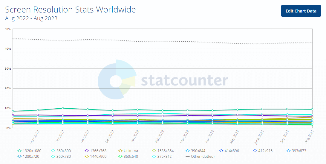
As per the below stats from Statcounter, some of the most popular screen resolutions are 1920*1080, 360*800, 1366*768, and 393*878:
As an automation tester, validating the web application across various viewports is crucial to ensure device compatibility and address resolution-specific issues. To automate the viewports, Cypress provides a straightforward approach to automate different viewports through your scripts.
In this blog on mastering Cypress viewport, I have explained how to test different resolutions in Cypress. Whether you are testing on a compact mobile device or a spacious desktop monitor, Cypress offers built-in commands that allow you to assess the responsiveness of your designs precisely.
By following the steps outlined in this blog on mastering Cypress viewport, you can seamlessly incorporate viewport testing into your Cypress automation workflow, ensuring an optimal user experience across diverse device viewports.
TABLE OF CONTENTS
- What are Viewports?
- Using cy.viewport() with Width and Height
- Using cy.viewport() with Presets
- Using cy.viewport() with Orientation
- Configuring Viewport at the Project Level
- Overriding the Viewport Configuration
- Overriding Viewport Options at the Run Time
- Testing Viewport using Environment Variables
- Testing Viewport in Cypress using LambdaTest
- Testing on Full-Screen
- Frequently Asked Questions (FAQs)
What are Viewports?
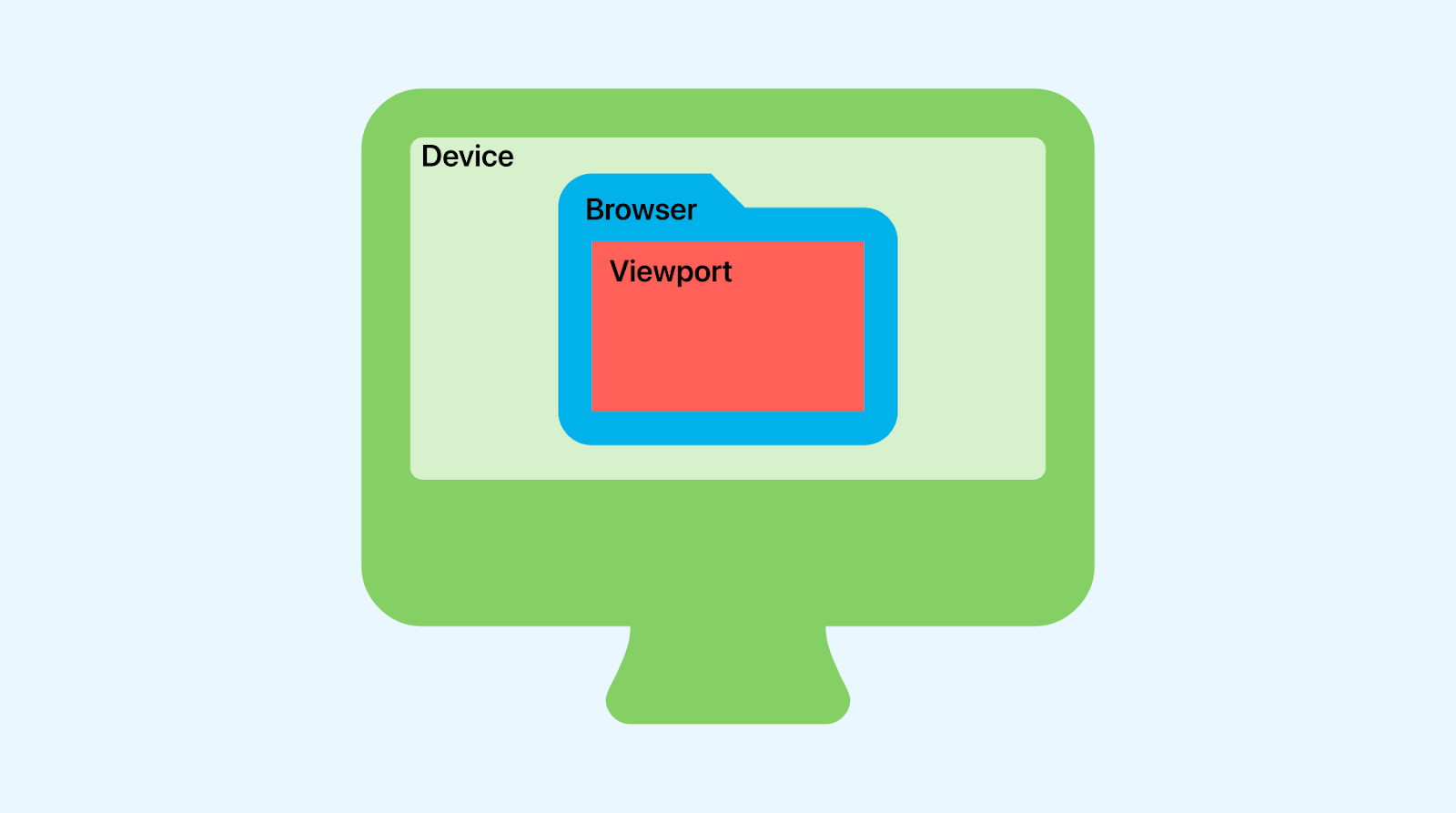
A viewport refers to the visible area of a web page that is displayed within the browser window. It represents the portion of the web page that a user can see without scrolling. Viewport dimensions are determined by the user’s device screen size and resolution. It can vary depending on the size and dimensions of the screen and is scaled to fit different device screens.
In responsive web design, adjusting the viewport allows web developers to ensure that websites and web applications adapt to different screen sizes and orientations, providing an optimal user experience across various devices, such as desktop computers, laptops, tablets, and mobile phones. Viewport management is essential for creating websites that are both visually appealing and functional websites across a wide range of devices and screen sizes.
By understanding the viewport, you can evaluate if the design elements are properly positioned and if UI components like images and text are appropriately sized and placed within the visible area.
Following are some common reasons why testing different viewports is important:
- User Experience
- Responsive Design
- Scroll Experience
The viewport directly impacts the user experience. By testing the viewport, you can ensure that the content is displayed optimally within the visible area, avoiding cut-off text, overlapping elements, or the need for excessive scrolling. This improves usability and enhances user satisfaction, resulting in a positive and enjoyable experience.
As mobile devices and screen sizes vary, it is important to ensure that a website or application is responsive. Testing the viewport ensures content and layout adapt well to diverse screen sizes, guaranteeing user-friendly viewing and interaction across devices.
A seamless scroll experience is crucial for a satisfactory user experience. When testing the viewport, it’s important to assess the scroll behavior. This involves ensuring that scrolling is smooth and efficient, enabling users to access all the content on the page without encountering any glitches or unexpected behavior.
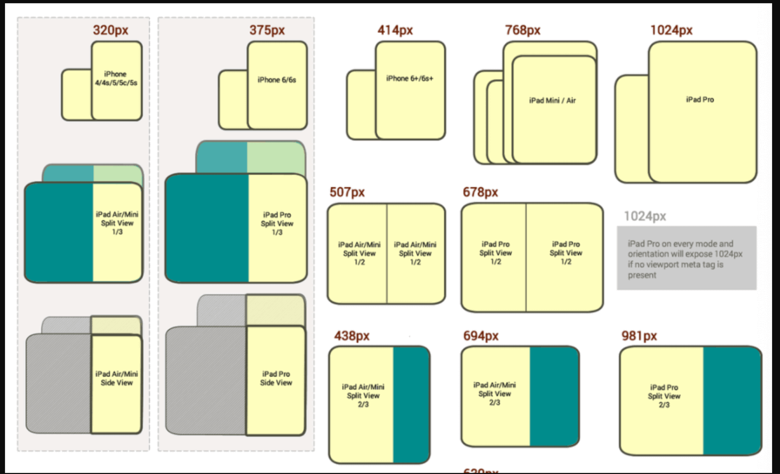
Here is an example of different viewports:
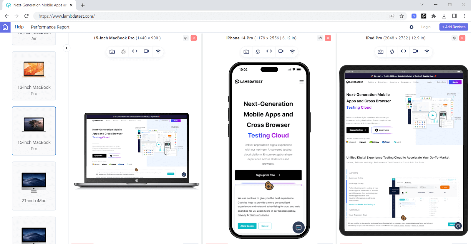
The below screenshot shows how the same website looks on different viewports.
In Cypress, it is very easy to test on different viewports and verify how your website behaves across different screen sizes by specifying the desired dimensions.
Learn about Cypress viewport in this easy-to-follow video guide – perfect for beginners!
Subscribe to the LambdaTest YouTube Channel for the latest updates on tutorials around Selenium testing, Cypress e2e testing, Appium, and more.
By default, Cypress sets the width to 1000 and height to 660 pixels, but you can change the viewports in Cypress (width and height) by passing parameters in the command cy.viewport() in your test case.
This command lets you dynamically adjust the web application’s viewport in Cypress based on your specific requirements, controlling its orientation and size.
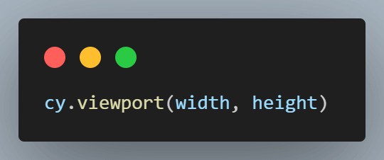
To set the width and height of the browser viewport in Cypress, use the below syntax:
In Cypress, you can either pass the customized width and height in your test case or choose from various presets. The defined presets are the string values assigned for specific width and height.
Example:
For width 768 and Height 1024, preset ipad-2 is already defined in Cypress. So, if you want to test for 768*1024 resolution, you can directly pass the preset ipad-2 instead of passing both width and height.
Below are some of the available presets in Cypress. For the whole list, you can refer to the Cypress official documentation.
| Preset | Width | Height |
| ipad-2 | 768 | 1024 |
| ipad-mini | 768 | 1024 |
| iphone-3 | 320 | 480 |
| iphone-4 | 320 | 480 |
| iphone-5 | 320 | 568 |
| iphone-6 | 375 | 667 |
| iphone-6+ | 414 | 736 |
| iphone-7 | 375 | 667 |
| iphone-8 | 375 | 667 |
| iphone-x | 375 | 812 |
| iphone-xr | 414 | 896 |
| iphone-se2 | 375 | 667 |
| macbook-11 | 1366 | 768 |
| macbook-13 | 1280 | 800 |
| macbook-15 | 1440 | 900 |
| macbook-16 | 1536 | 960 |
| samsung-note9 | 414 | 846 |
| samsung-s10 | 360 | 760 |
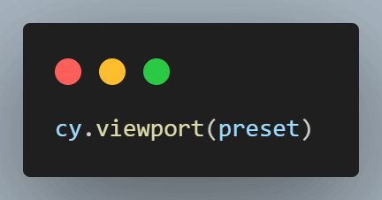
To set the size of the viewport in Cypress based on the above presets, use the below syntax:
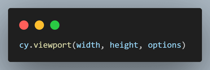
You can also set the width and height of the browser viewport in Cypress with options (Example: without displaying it in Cypress Command Log), using the below syntax:
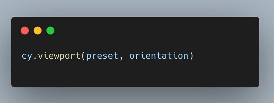
When testing web applications, it’s important to consider that some applications may provide a better user experience when used in portrait mode, while others may be more optimized for landscape mode.
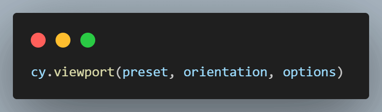
Testing both portrait and landscape orientations ensures a positive user experience, accommodating diverse user preferences. To conduct orientation testing in Cypress, utilize the following syntax:
 Note
NoteRun Cypress tests in parallel and reduce developer feedback Try LambdaTest Today!
Using cy.viewport() with Width and Height
You can simulate different viewports in Cypress using the cy.viewport() command. By specifying the width and height parameters, you can test how your website responds to various screen sizes.
To configure the width and height in pixels using the cy.viewport() command, you must provide a non-negative and finite number as the width and height.

Below is an example of using cy.viewport() command with width, height, and options:
Test Case 1
|
Implementation
|
1 2 3 4 5 6 7 8 |
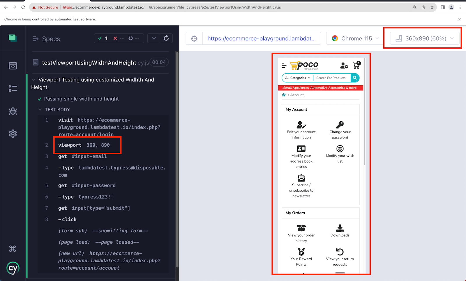
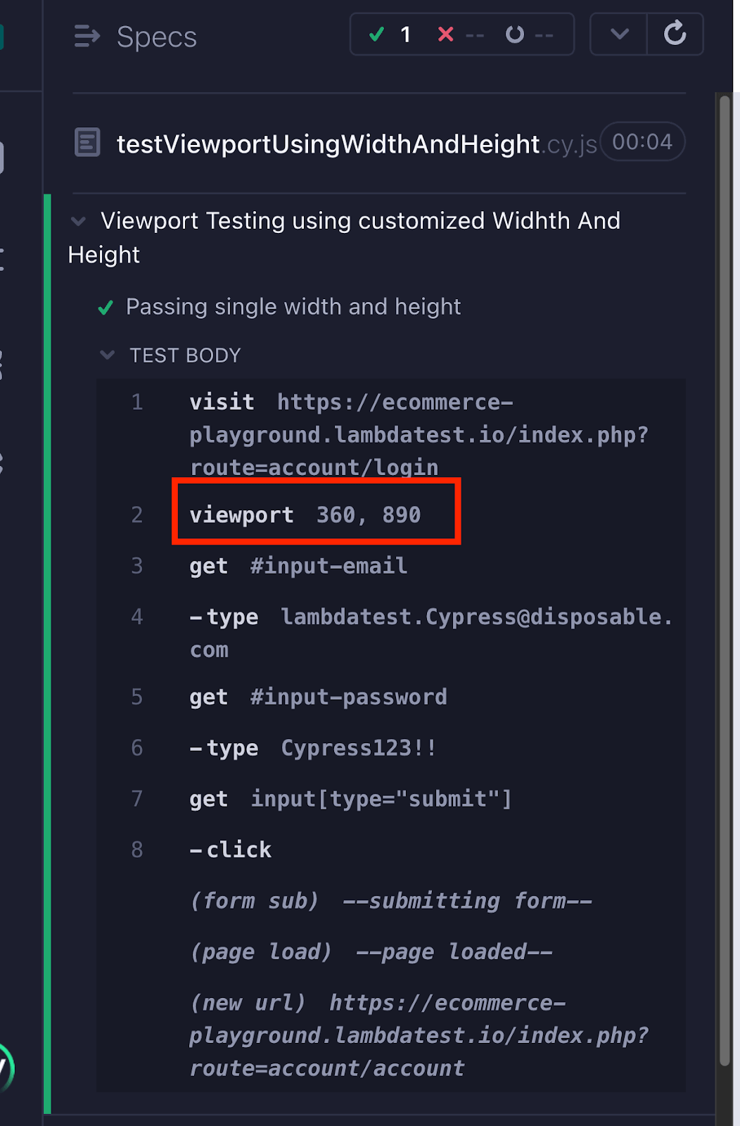
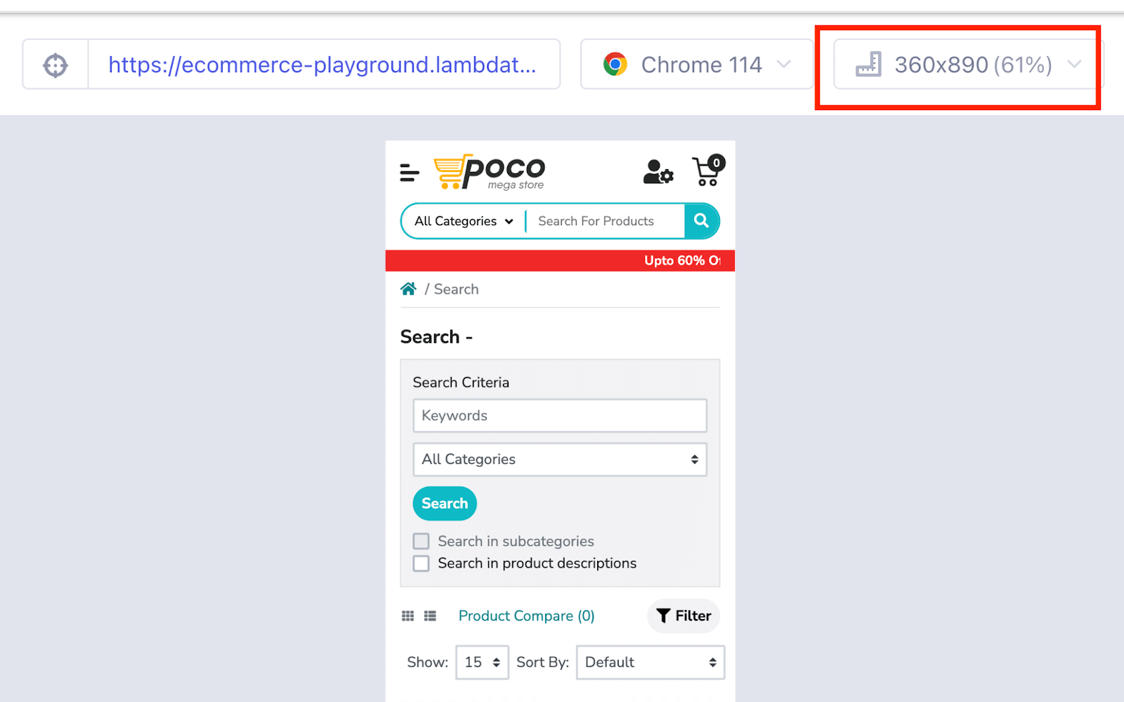
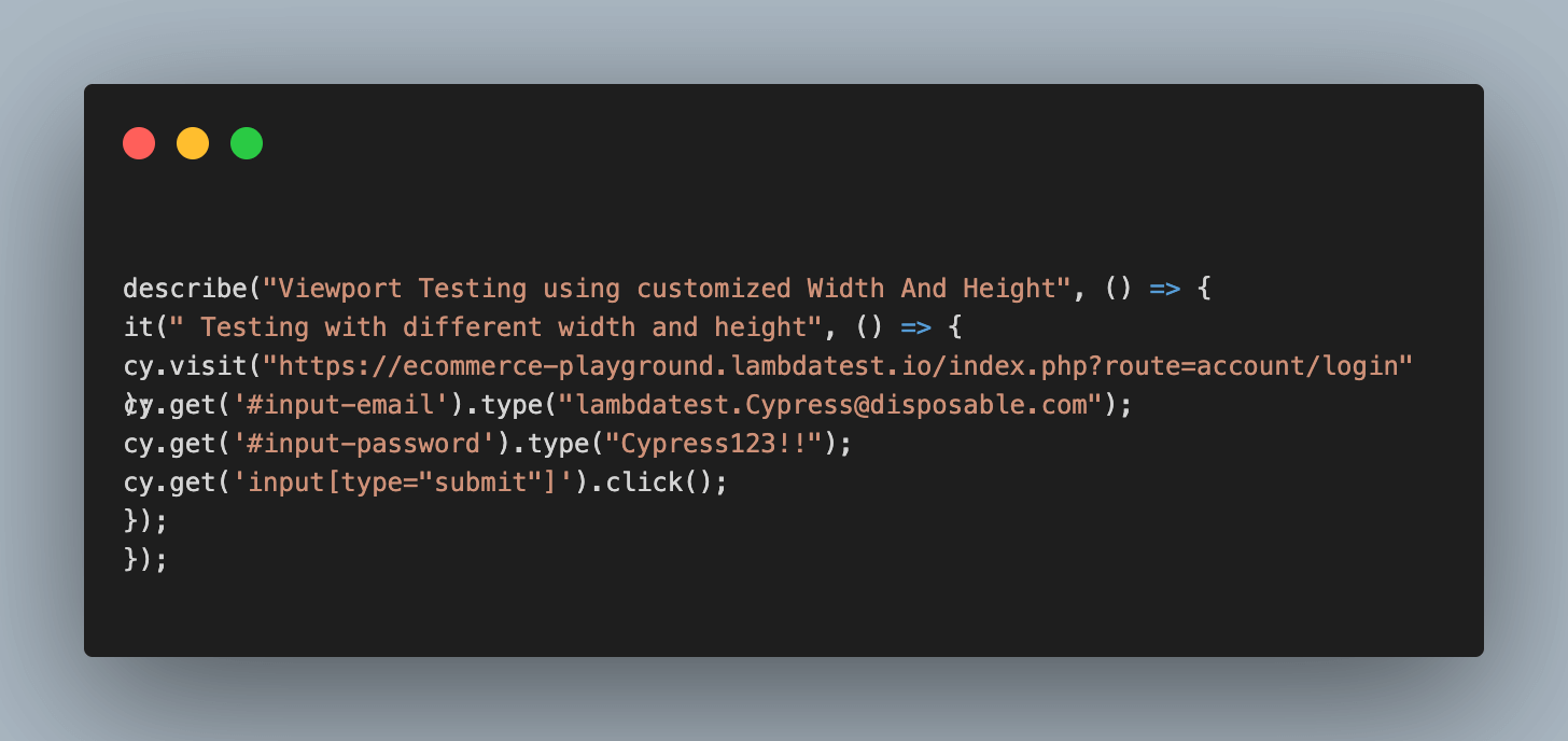
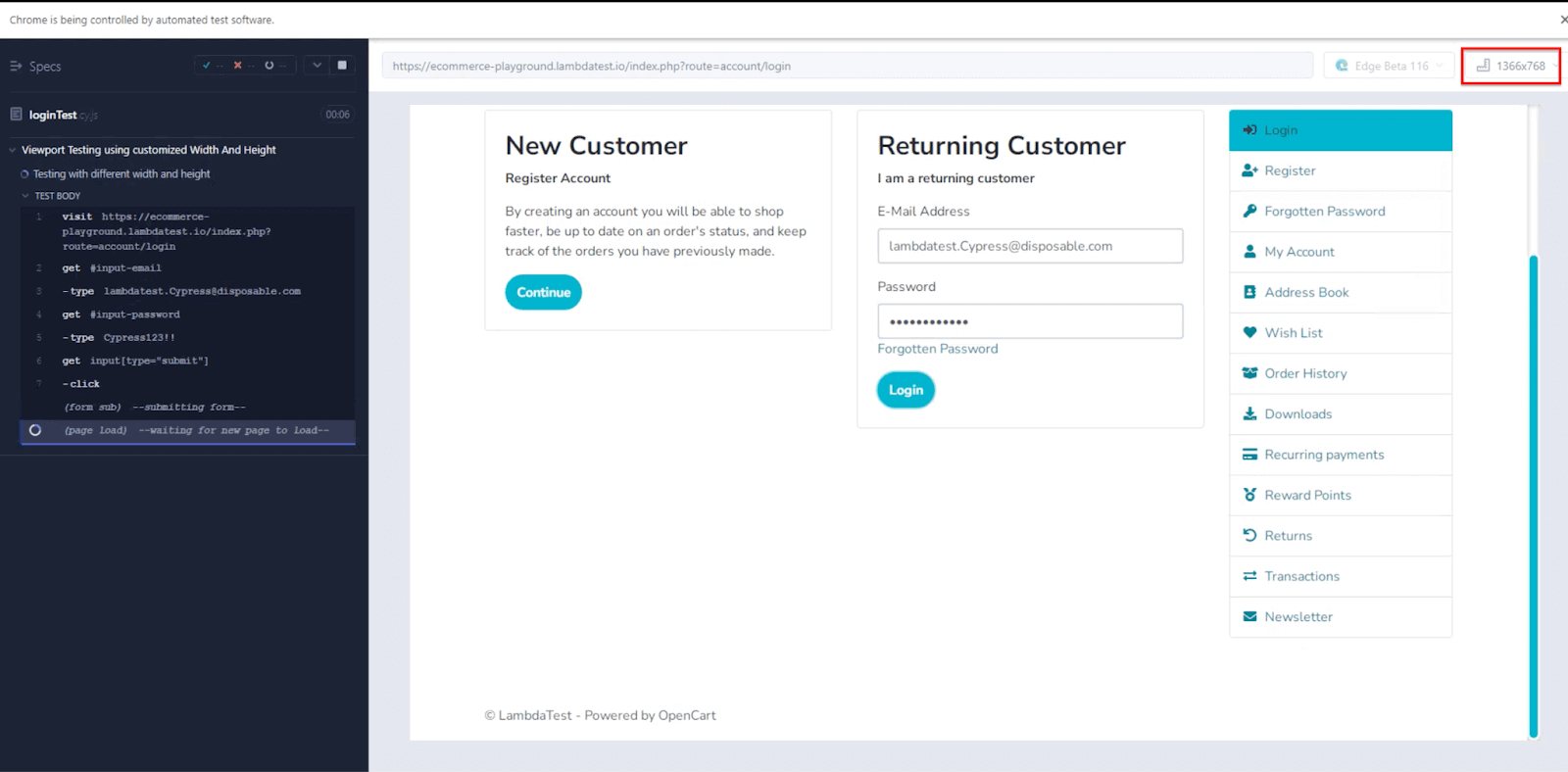
describe("Viewport Testing using customized Width And Height", () => { it("Passing single width and height", () => { cy.visit("https://ecommerce-playground.lambdatest.io/index.php?route=account/login"); cy.viewport(360, 890); cy.get('#input-email').type("lambdatest.Cypress@disposable.com"); cy.get('#input-password').type("Cypress123!!"); cy.get('input[type="submit"]').click(); }); }); |
Code Walkthrough
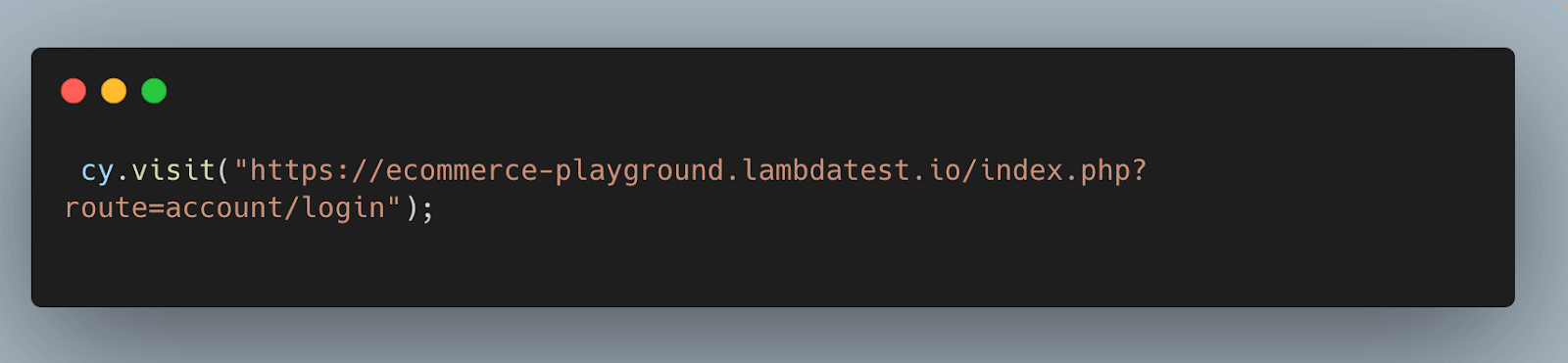
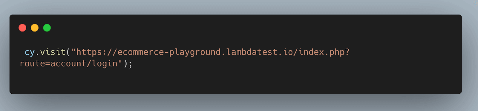
Step 1: Open the website using the cy.visit() command.
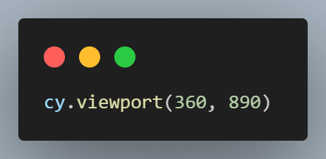
Step 2: Set the viewport in Cypress by passing width as 360 and height as 890.
Step 3: Entering username and password.
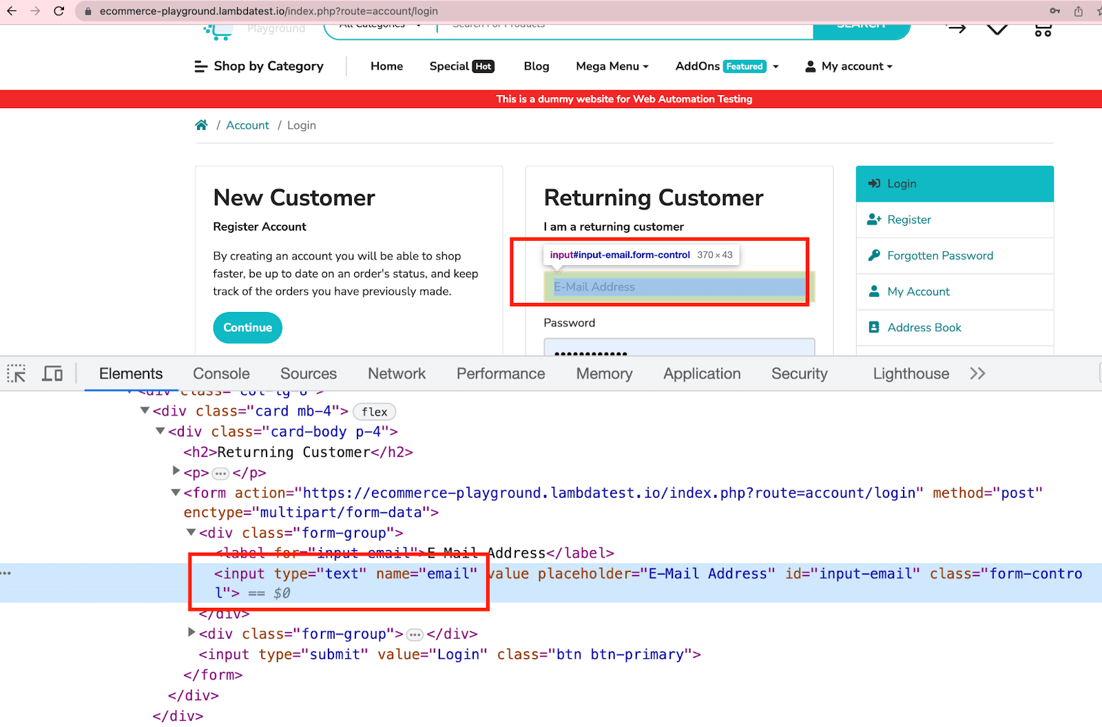
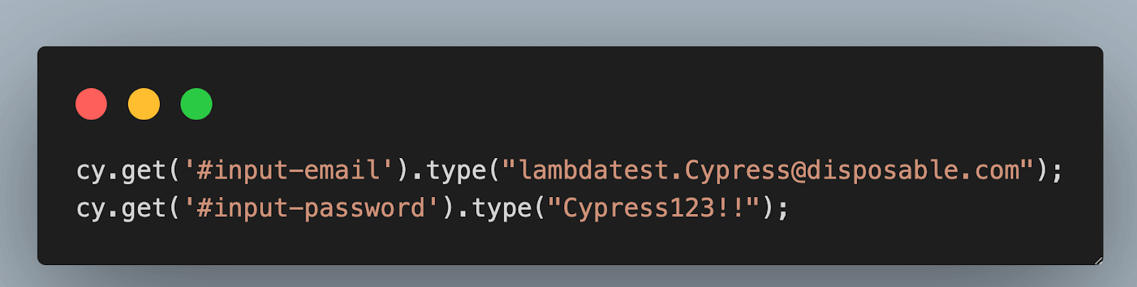
The below code locates the email input field with the ID “input-email” and the password input field with the ID “input-password.” It then types the email “lambdatest.Cypress@disposable.com” into the email field and the password “Cypress123!!” into the password field using the cy.get().type() command.

As shown below, you can locate elements using attribute names and utilize them in a Cypress test case using the cy.get() command.
Step 4: Click the Submit button.
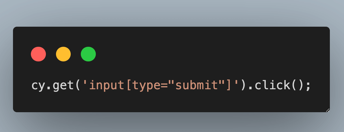
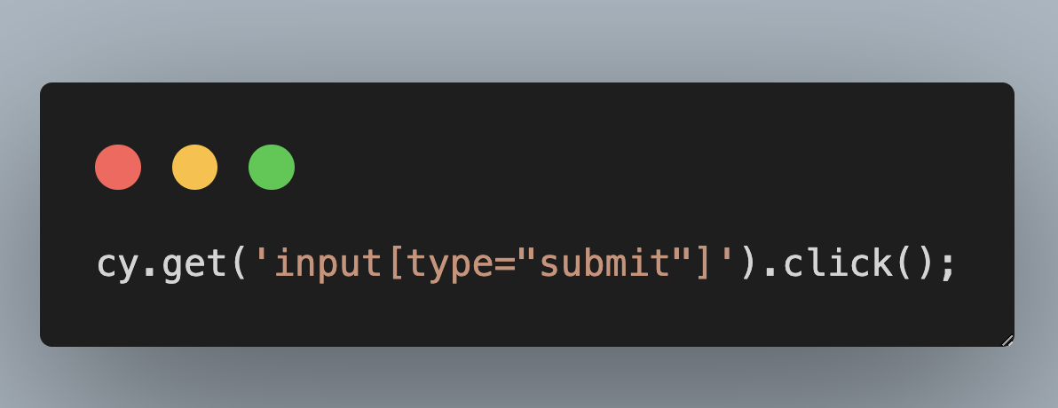
The below code locates the Submit button using an attribute selector (input[type=”submit”]) and clicks on it using the cy.get().click() command. This action simulates submitting the login form.

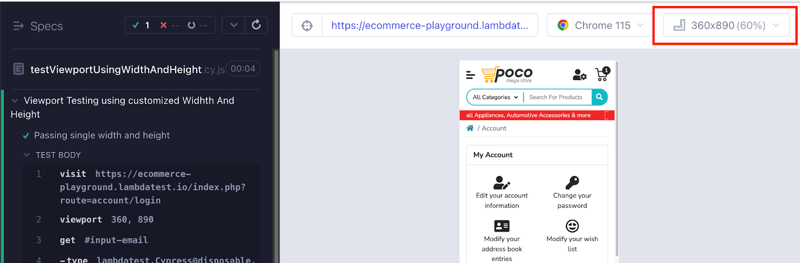
Execution
Test Case 2
With the rapid increase in the number of devices, it is essential for testers to go beyond testing on a single viewport in Cypress. To ensure optimal user experience, verifying that your web application adapts to various screen sizes is important, as end users can access it through different devices.
In Cypress testing, achieving this is possible by providing a list of different viewports in your test case. You can pass different widths and heights in a single test case.
Let’s try to understand the below test scenario.
|
Implementation
|
1 2 3 4 5 6 7 8 9 10 11 12 13 14 15 16 |
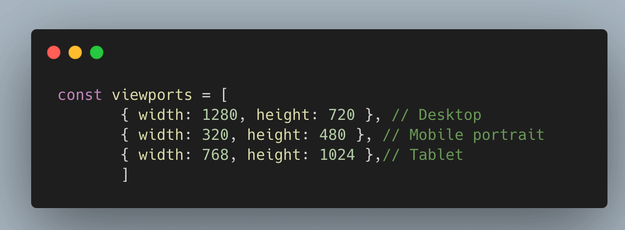
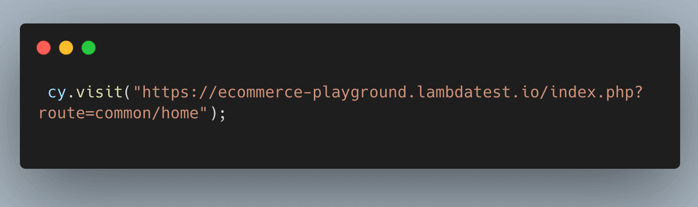
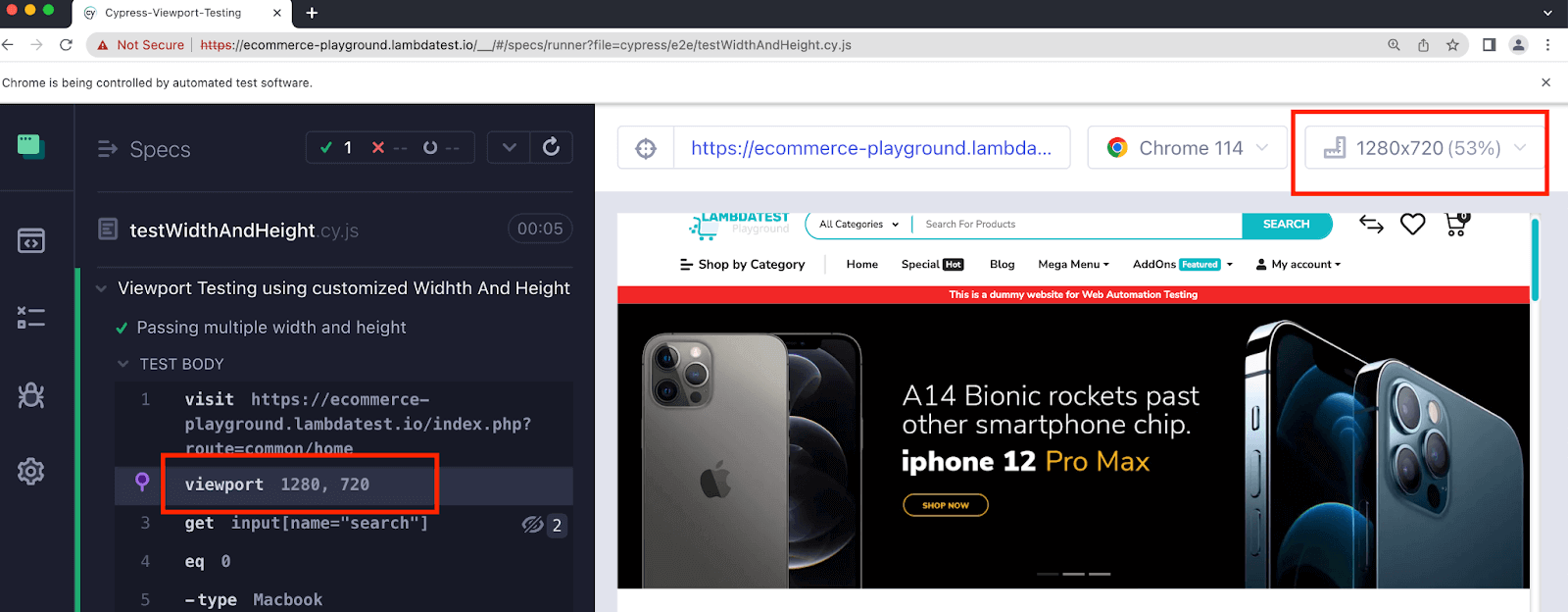
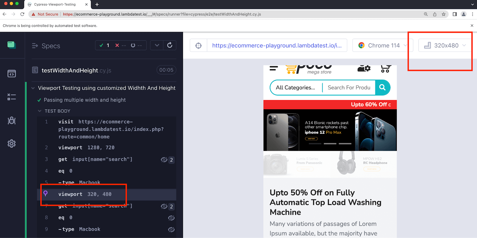
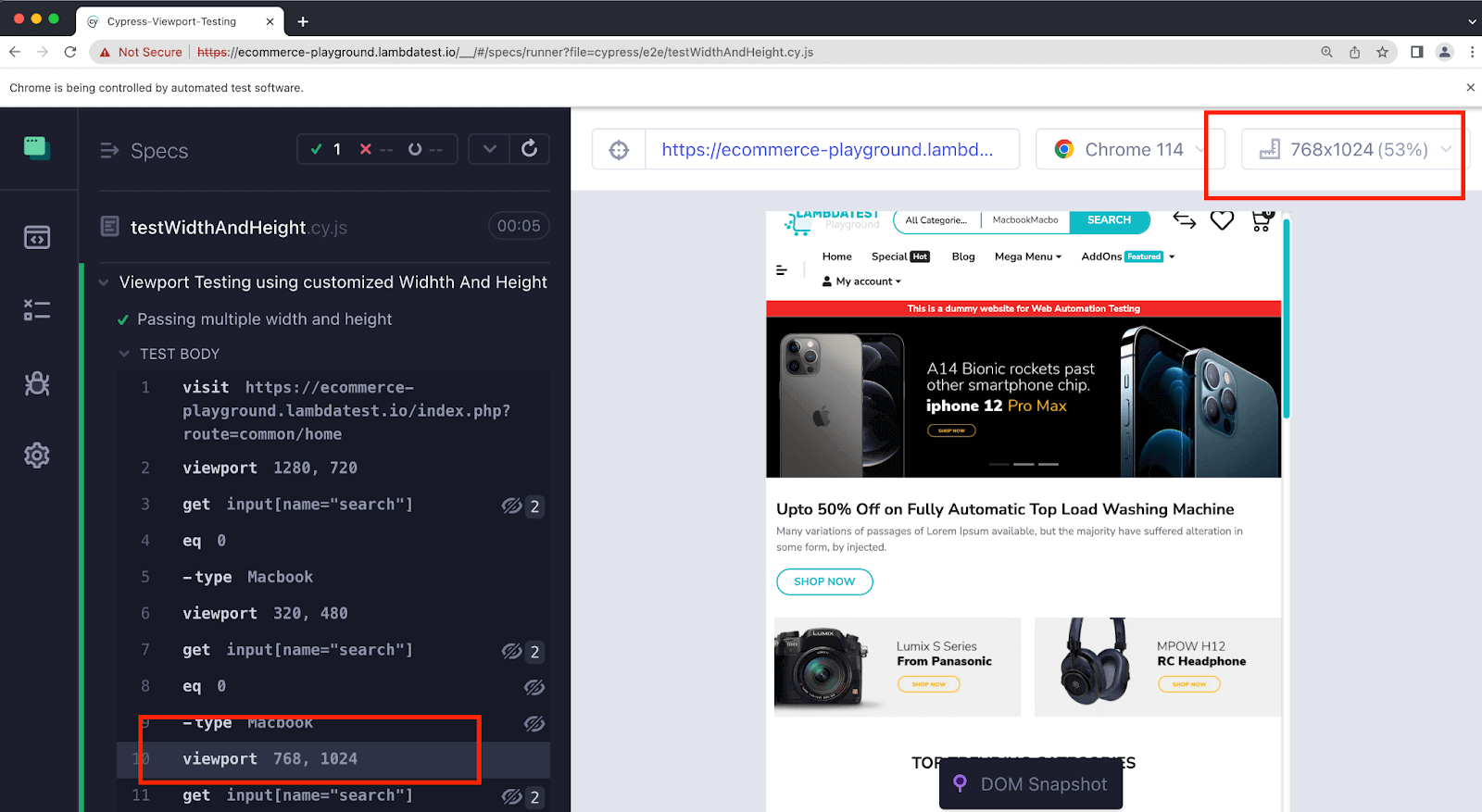
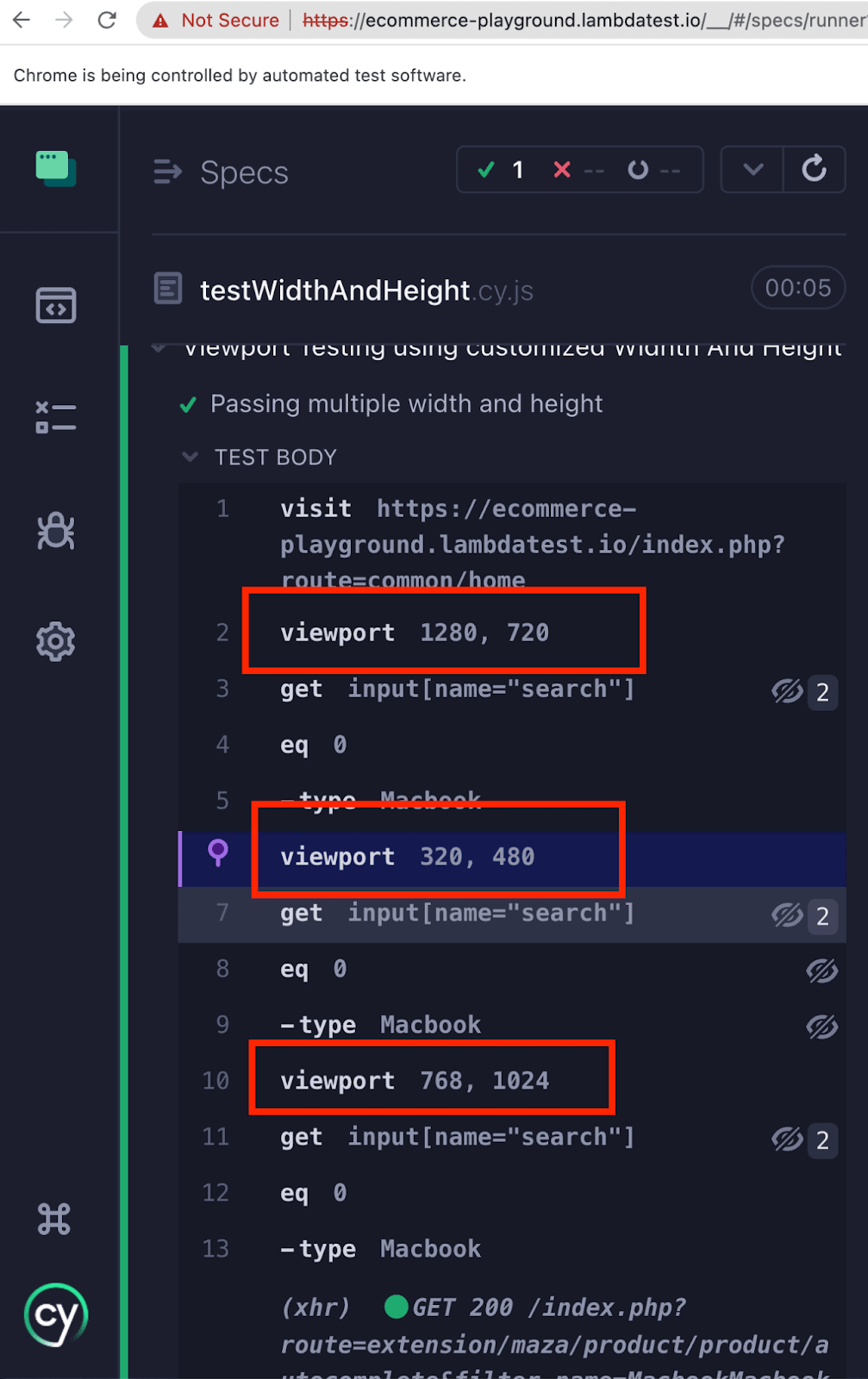
describe("Viewport Testing using customized Width And Height", () => { const viewports = [ { width: 1280, height: 720 }, // Desktop { width: 320, height: 480 }, // Mobile portrait { width: 768, height: 1024 },// Tablet ]; it(`Passing multiple width and height`, () => { cy.visit("https://ecommerce-playground.lambdatest.io/index.php?route=common/home"); viewports.forEach((viewport) => { cy.viewport(viewport.width, viewport.height); cy.get('input[name="search"]').eq(0).type("Macbook"); }) }); }); |
Code Walkthrough
Step 1: The viewports constant is an array that stores different viewport configurations. Each configuration object within the array specifies the width and height values for a specific viewport in Cypress.
In this example, the viewports array contains three configurations:
- Desktop viewport with a width of 1280 and height of 720.
- Mobile portrait viewport with a width of 320 and height of 480.
- Tablet viewport with a width of 768 and height of 1024.
Step 2: Open the website using the cy.visit() command.
Step 3: Search for the product Macbook using the .type() command.

Execution
Using cy.viewport() with Presets
To make Cypress test automation even more efficient, Cypress provides preset options for popular devices, including iPhones, iPads, etc. Using these presets, you can quickly test the responsiveness of your website on specific devices without manually specifying width and height values.
You can pass the preset as a parameter (string) in the cy.viewport() command. As mentioned earlier, Cypress provides a wide range of presets. So, instead of providing width and height, you can provide the defined presets in your test case.

Let’s understand with a few examples
Test Scenario 1
|
Implementation
|
1 2 3 4 5 6 7 8 9 10 |
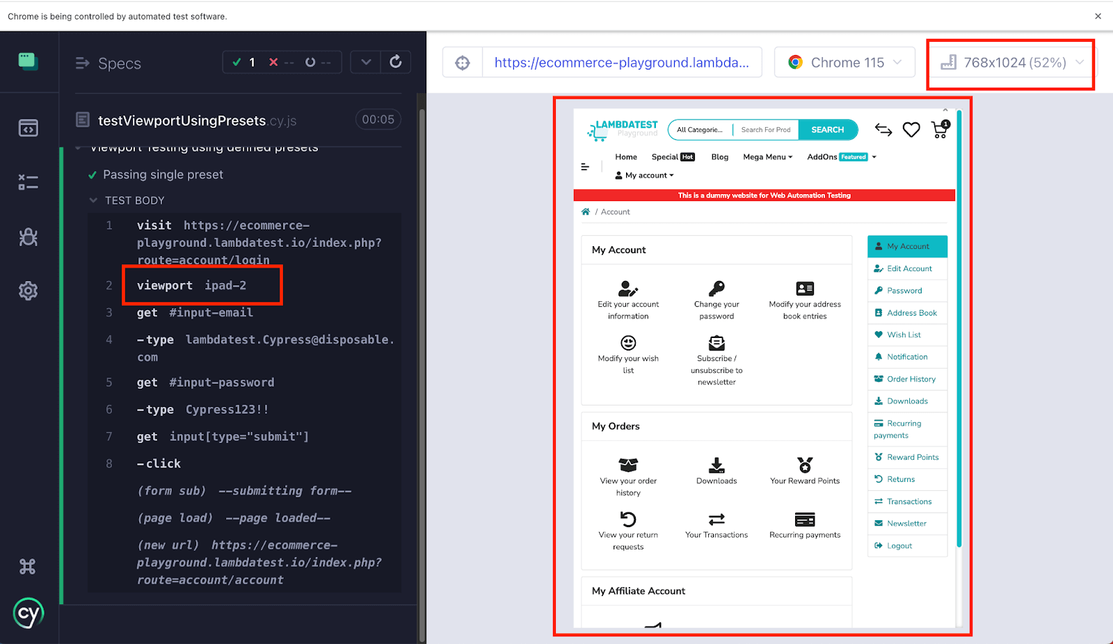
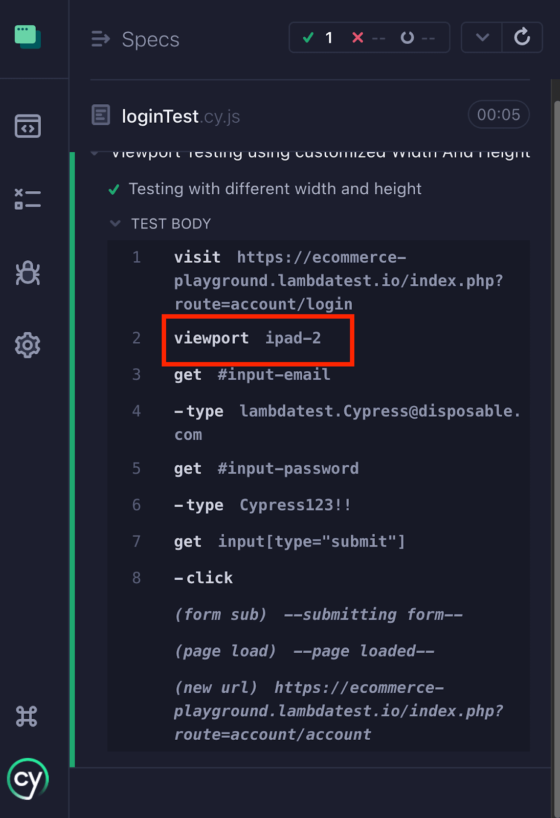
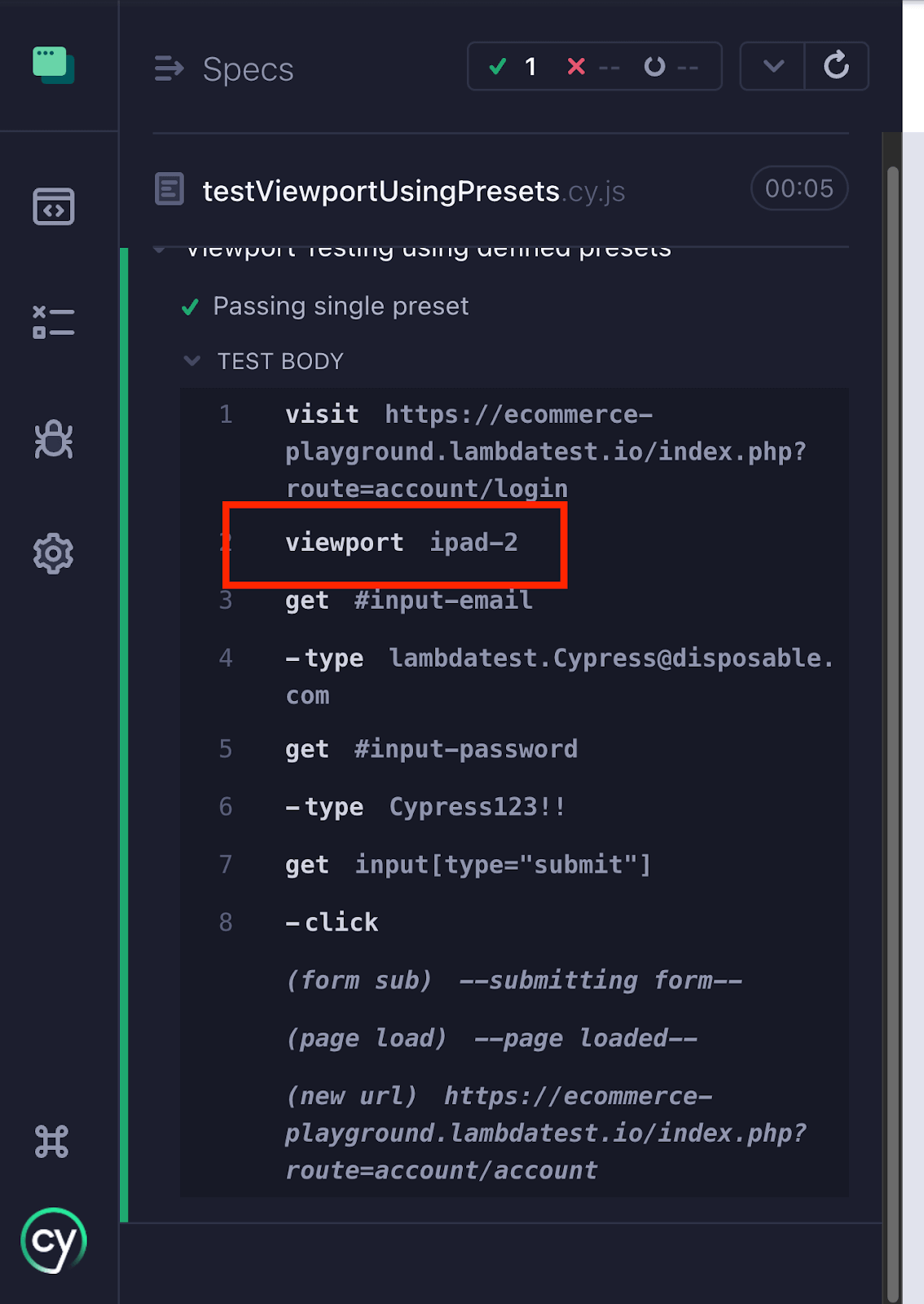
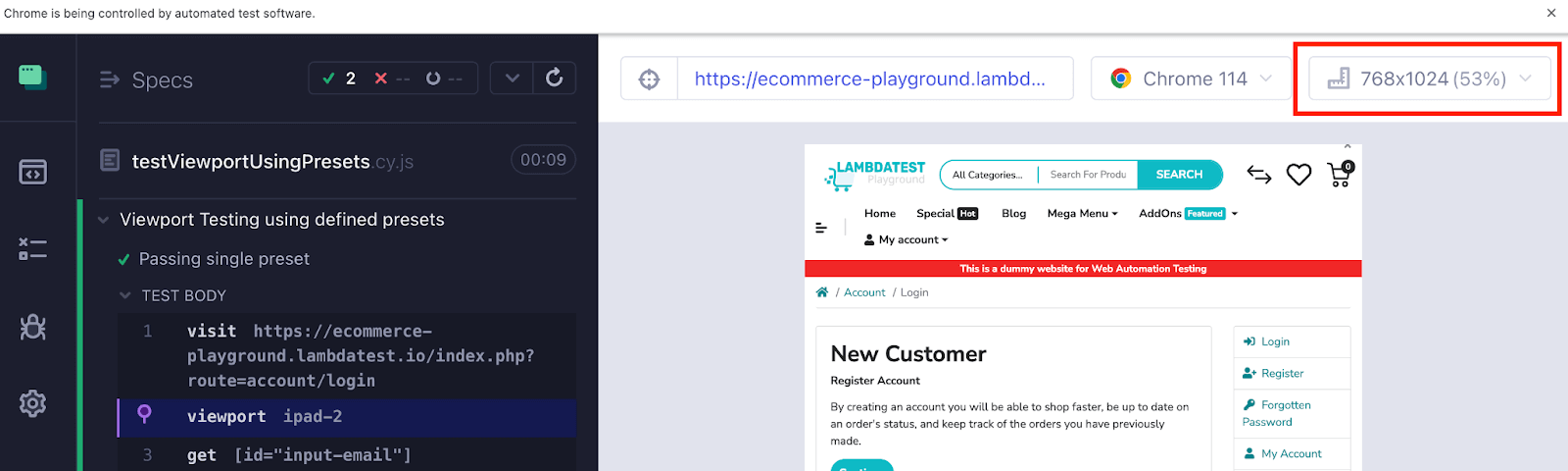
describe("Viewport Testing using defined presets", () => { it("Passing single preset", () => { cy.visit("https://ecommerce-playground.lambdatest.io/index.php?route=account/login"); cy.viewport('ipad-2'); cy.get('#input-emai').type("lambdatest.Cypress@disposable.com") cy.get('#input-password').type("Cypress123!!"); cy.get('input[type="submit"]').click(); }); }); |
Code Walkthrough
Step 1: Open the website “https://ecommerce-playground.lambdatest.io/index.php?route=account/login” using the cy.visit() command.
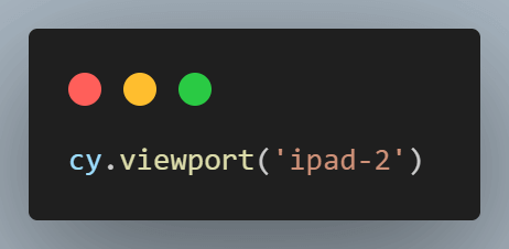
Step 2: Using the below code, you can configure the viewport in Cypress to the preset value of ipad-2, corresponding to a viewport size of 768*1024. As a result, your test case will be executed within this specific ‘ipad-2’ viewport, allowing you to test how your website behaves on a device with these dimensions.
Step 3: Entering username and password.
The below code locates the email input field with the ID “input-email” and the password input field with the ID “input-password.” It then types the email “lambdatest.Cypress@disposable.com” into the email field and the password “Cypress123!!” into the password field using the cy.get().type() command.
Step 4: Click the Submit button.
The below code locates the submit button using an attribute selector (input[type=”submit“]) and clicks on it using the cy.get().click() command. This action simulates submitting the login form.
Execution
Test Scenario 2
As mentioned in this Cypress tutorial, you should not rely on a single viewport in Cypress to release the web applications. Testing on different viewports gives you the confidence that your web application is responsive enough to cater to different sizes of devices.
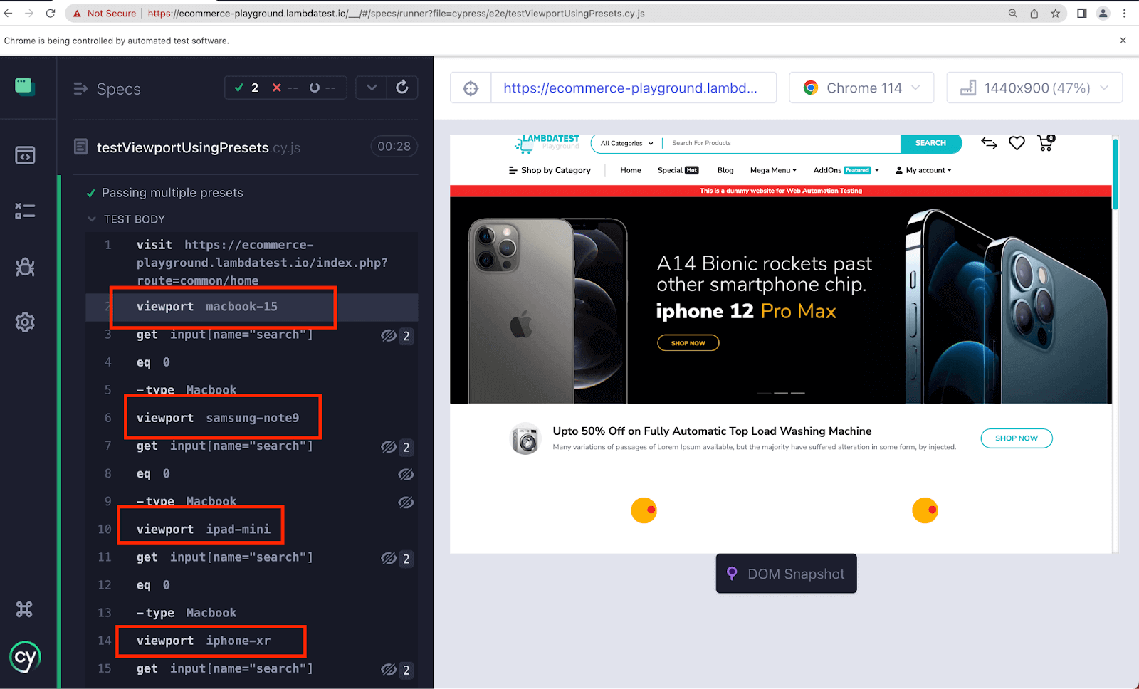
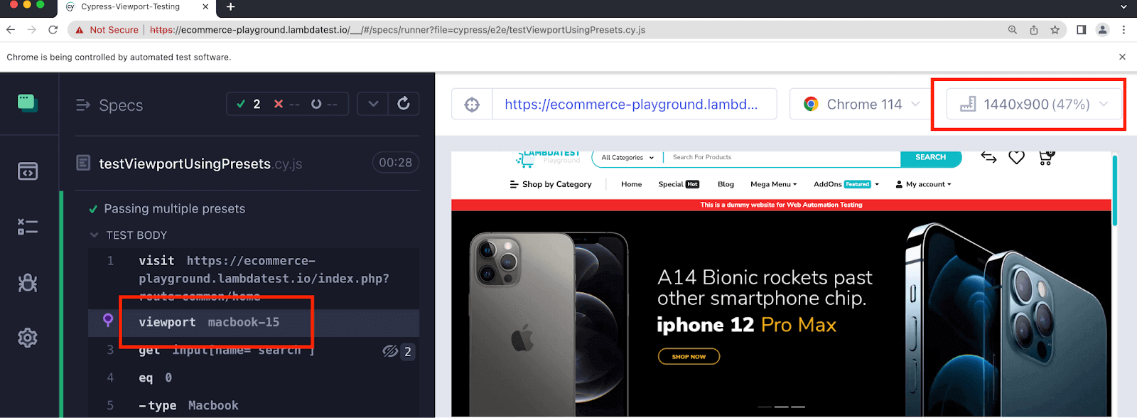
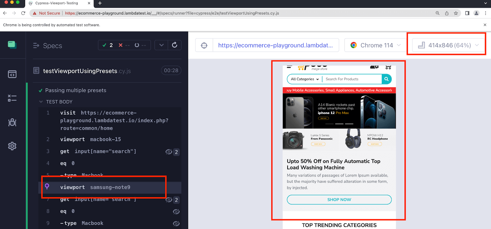
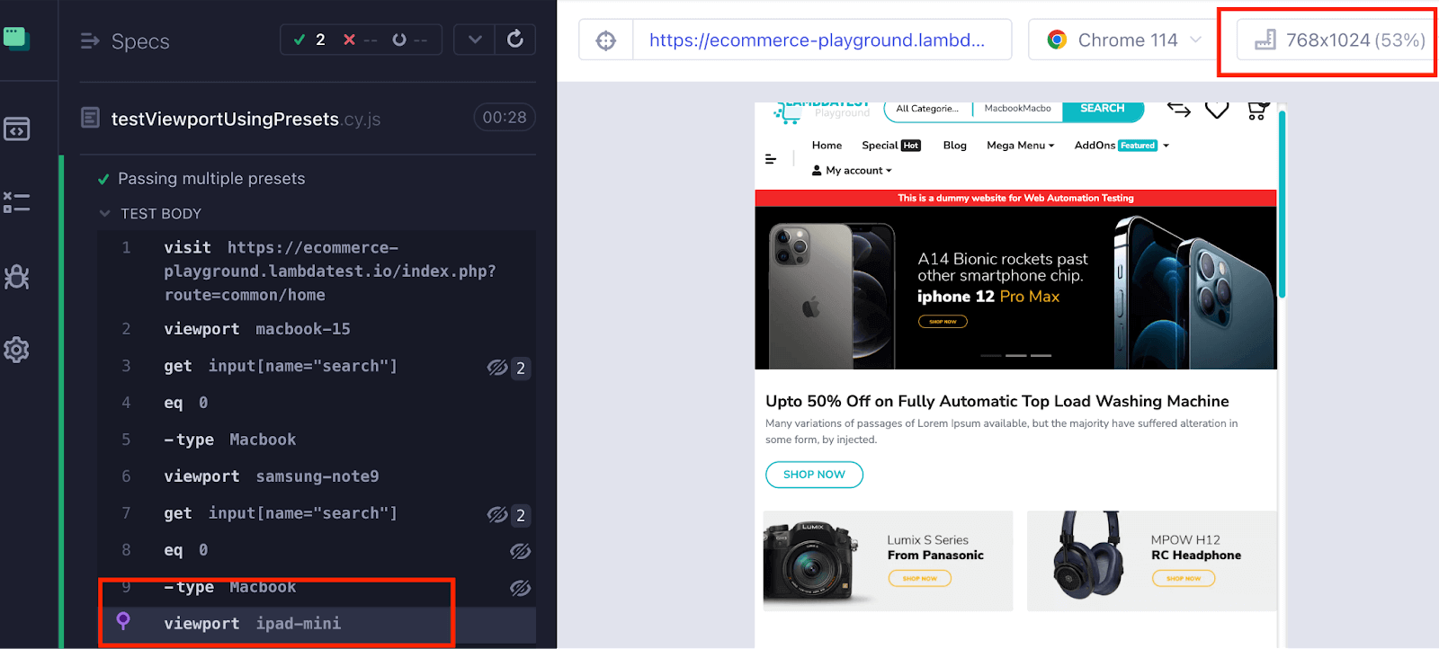
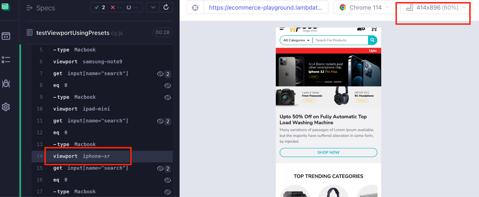
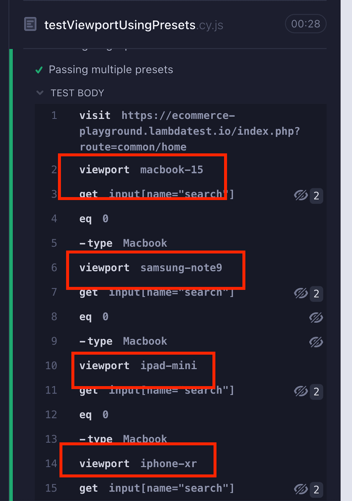
Below is a similar case where a single web application is tested on different viewports in Cypress using presets. The benefit of passing multiple presets is that you don’t need to provide width and height; you can use the string value directly.
- Open URL
- Macbook-15
- Samsung-note9
- iPad-mini
- iPhone-xr
- Search for the product Macbook
https://ecommerce-playground.lambdatest.io/index.php?route=common/home for a set of presets:
Implementation
|
1 2 3 4 5 6 7 8 9 10 11 |
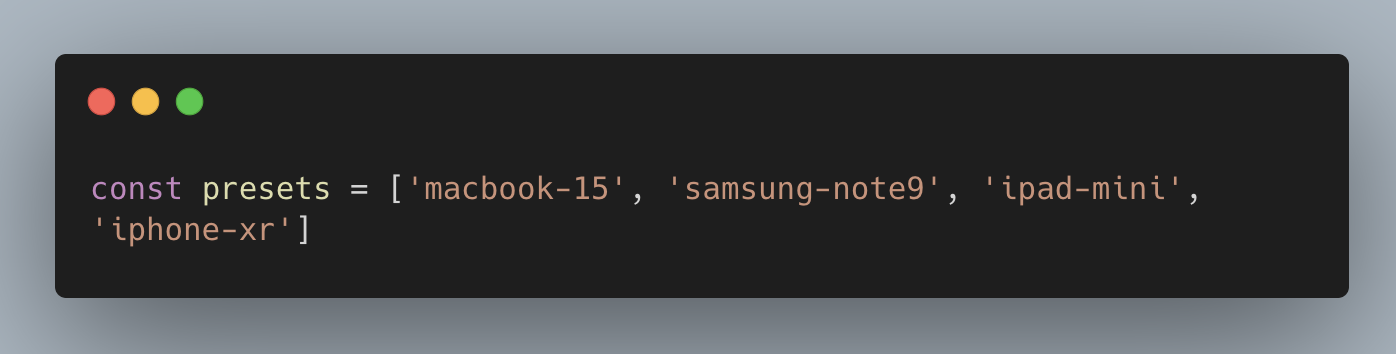
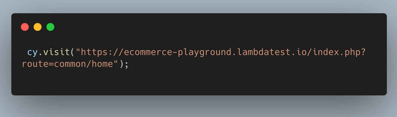
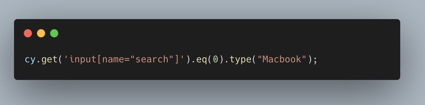
describe("Viewport Testing using defined presets", () => { const presets = ['macbook-15', 'samsung-note9', 'ipad-mini', 'iphone-xr']; it(`Passing multiple width and height`, () => { cy.visit("https://ecommerce-playground.lambdatest.io/index.php?route=common/home"); presets.forEach((preset) => { cy.viewport(viewport.width, viewport.height); cy.get('input[name="search"]').eq(0).type("Macbook"); }) }); }); |
Code Walkthrough
Step 1: The presets constant is an array that holds various preset configurations. In this example, the presets array consists of four configurations: macbook-15, samsung-note9, ipad-mini, and iphone-xr.
Step 2: Open the website using the cy.visit() command. It is the same step used in earlier tests for opening the web application in the browser.
Step 3: Search for the product Macbook using the .type() command.
Execution
Using cy.viewport() with Orientation
Orientation refers to how a device’s screen is positioned on a vertical or horizontal axis. It determines whether the device is in portrait mode (vertical orientation) or landscape mode (horizontal orientation).
By conducting tests in various orientations, you can validate the web application’s accurate rendering, functionality, and behavior, irrespective of how users orient or tilt their devices. For instance, landscape mode is commonly chosen for video viewing, while portrait mode is favored for browsing shopping apps due to its taller screen format.
Therefore, it is essential to thoroughly test your web application in both orientations to ensure a seamless user experience. Doing so lets you observe firsthand how the same application appears differently in portrait and landscape modes, just like the screenshot below.
While performing Cypress UI testing, you can easily switch between portrait and landscape modes to ensure your website adapts seamlessly to different device orientations. By default, it runs in portrait mode, but you can change the resolution to Landscape by passing the landscape parameter to the cy.viewport() command and testing how your application behaves and adapts to different orientation settings.
Here is the implementation of how the Cypress test runs in portrait mode.
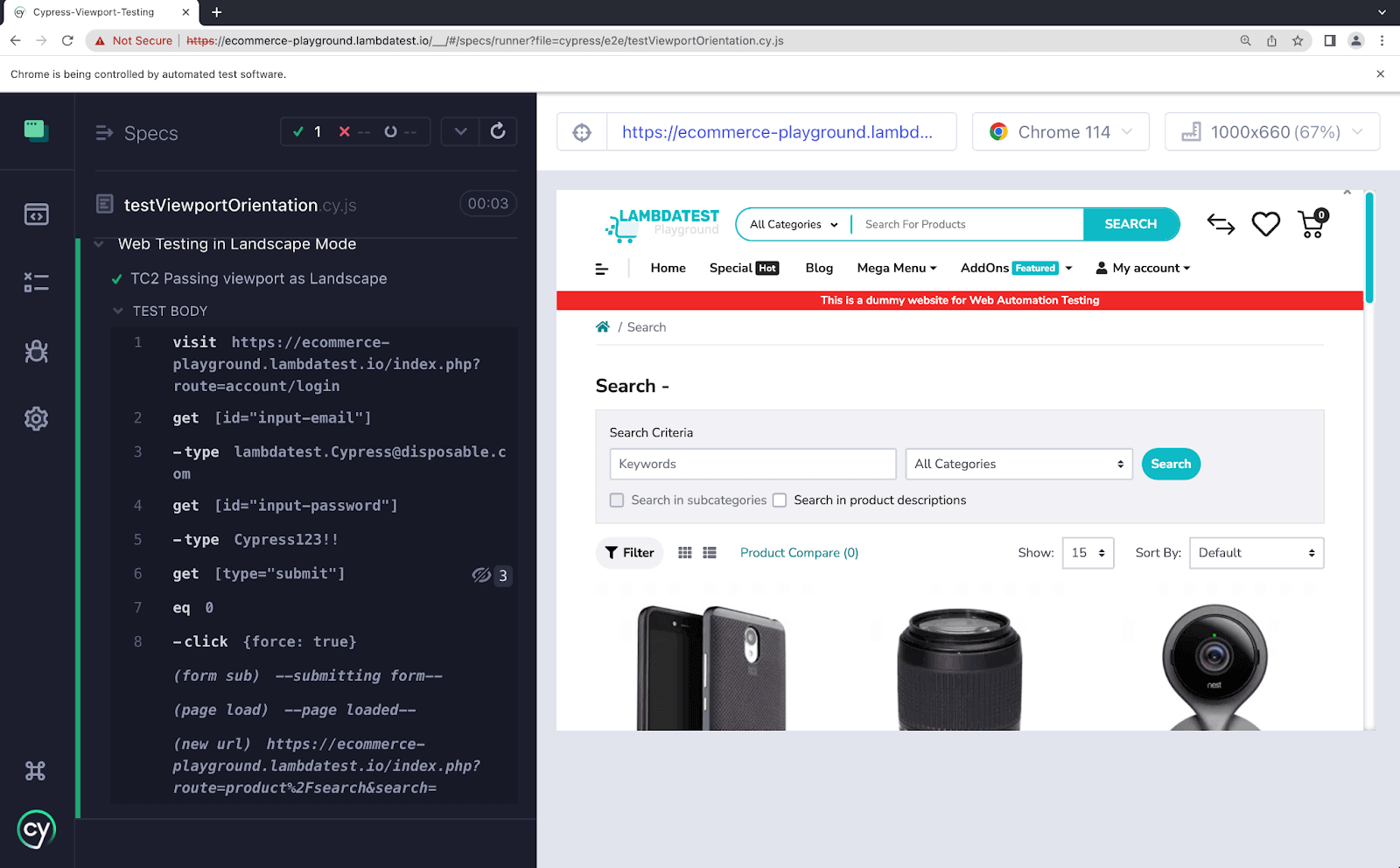
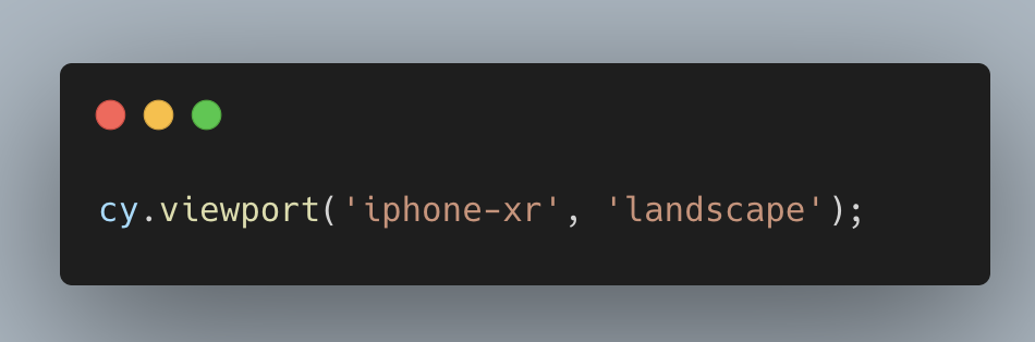
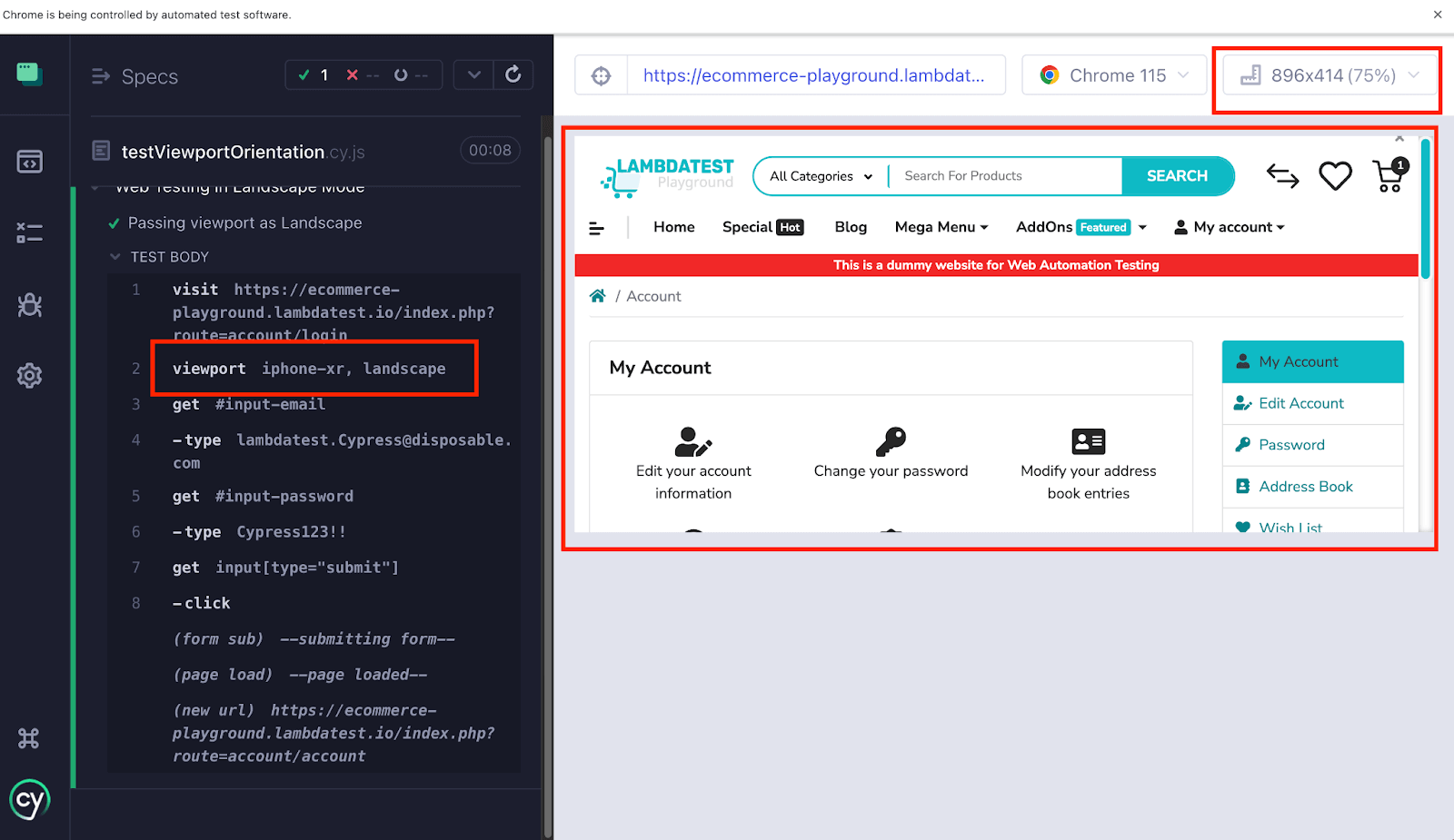
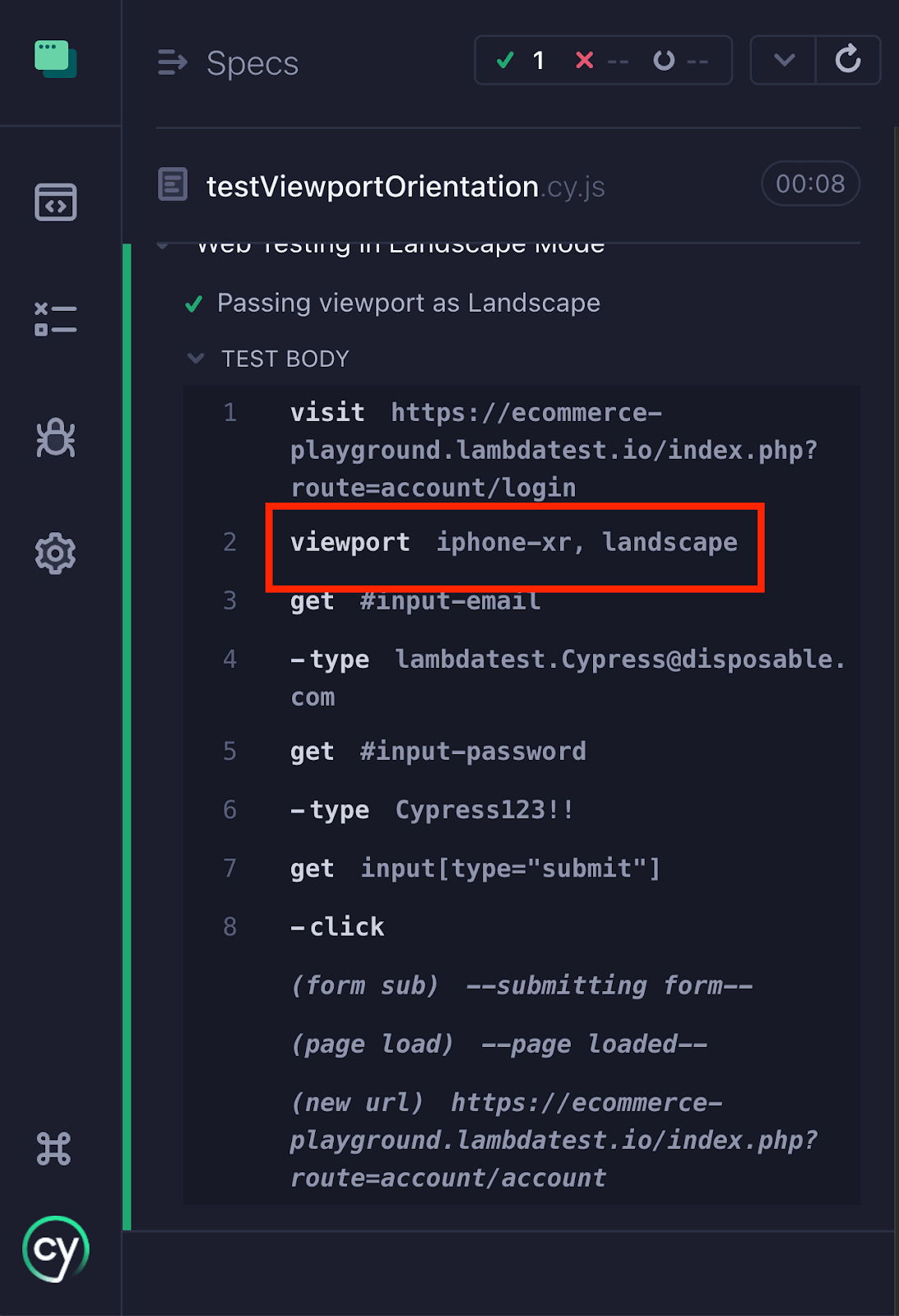
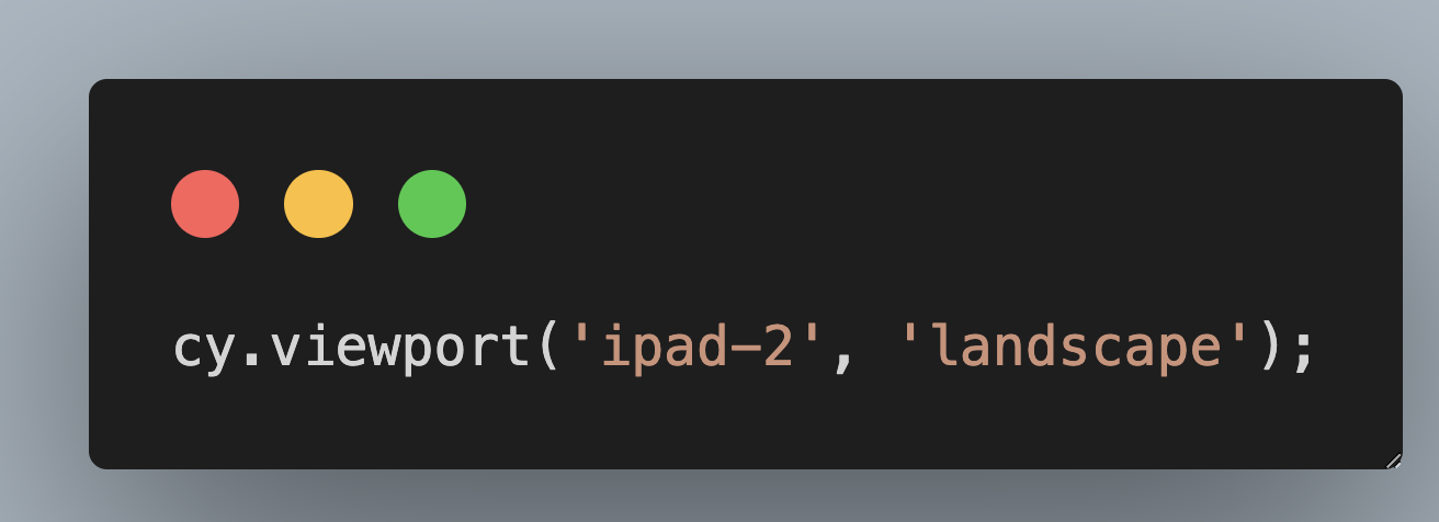
To conduct Cypress UI automation of your web application in Landscape mode, you must modify the orientation value to “Landscape” in conjunction with the preset. It’s crucial to emphasize that the orientation, represented as “landscape,” is specified as a String value.
Test Case
- Open URL
- Enter the username and password in the designated input fields.
- Click on the Submit button to initiate the login process.
https://ecommerce-playground.lambdatest.io/index.php?route=account/login in the landscape mode.
Implementation
|
1 2 3 4 5 6 7 8 9 10 |
describe(" Web Testing in Landscape Mode", () => { it("Passing viewport as Landscape ", () => { cy.visit("https://ecommerce-playground.lambdatest.io/index.php?route=account/login"); cy.viewport('iphone-xr', 'landscape'); cy.get('#input-email').type("lambdatest.Cypress@disposable.com"); cy.get('#input-password').type("Cypress123!!"); cy.get('input[type="submit"]').click(); }); }); |
Code Walkthrough
Step 1: Open the website
“https://ecommerce-playground.lambdatest.io/index.php?route=account/login” using the cy.visit() command.

Step 2: Set the viewport to iphone-xr and orientation as landscape. It will help simulate the user holding the iphone-xr in landscape mode.
Step 3: Entering username and password.
The below code locates the email input field with the ID “input-email” and the password input field with the ID “input-password.” It then types the email “lambdatest.Cypress@disposable.com” into the email field and the password “Cypress123!!” into the password field using the cy.get().type() command.

Step 4: Clicking the Submit button.
The below code locates the submit button using an attribute selector (input[type=”submit”]) and clicks on it using the cy.get().click() command. This action simulates submitting the login form.

Execution
Configuring Viewport at the Project Level
Custom viewport sizes are useful to maintain consistency across multiple test cases using the same width and height. Instead of repeatedly specifying the dimensions in each test case, you can set a global configuration for the viewport in Cypress.
This saves time and effort, ensuring the desired viewport in Cypress is applied consistently throughout your project. By using Cypress’s configuration settings, you can conveniently define the viewport dimensions once and have them automatically applied to all tests.
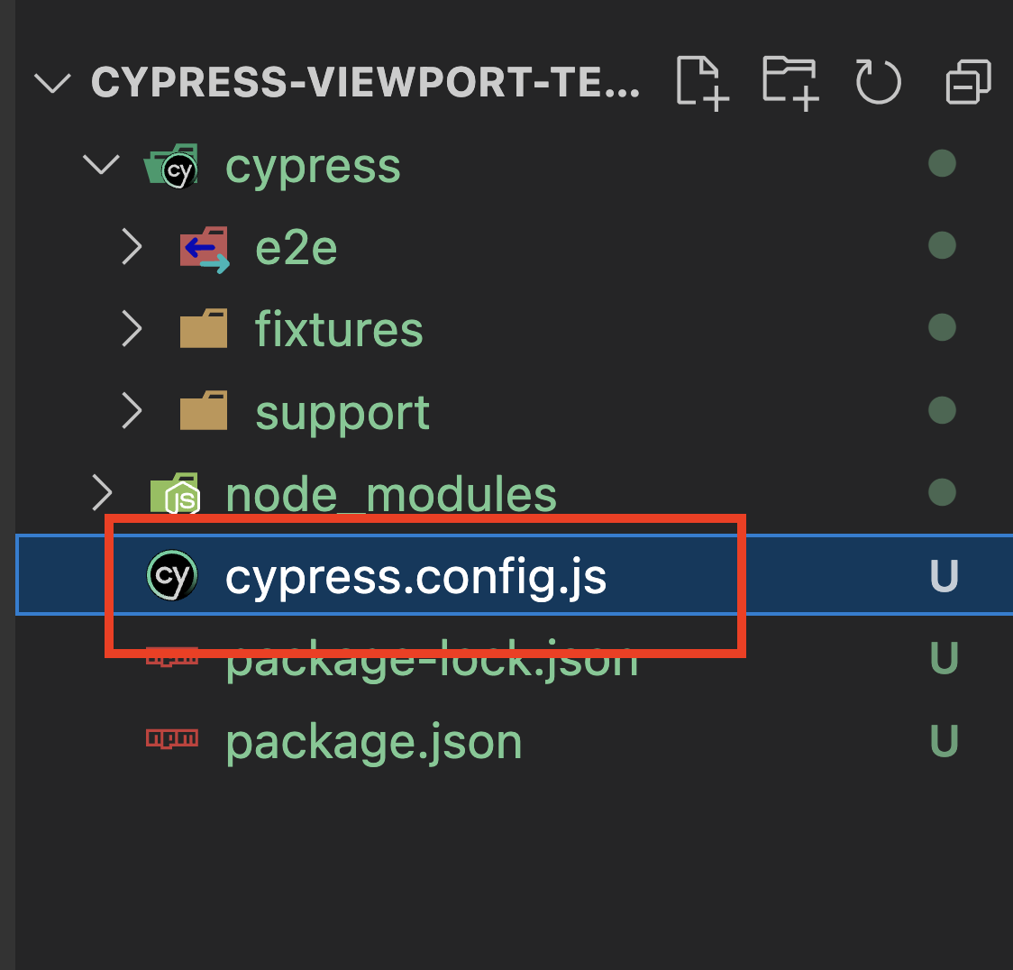
In Cypress, you can configure it by defining it at the project level in the cypress.config.js (version 10 & above). You can also explicitly set the viewport dimensions within a specific test case to override the global configuration for that particular test case.
Let’s understand how to configure the viewport in Cypress globally so that it applies to all the test scenarios.
Implementation
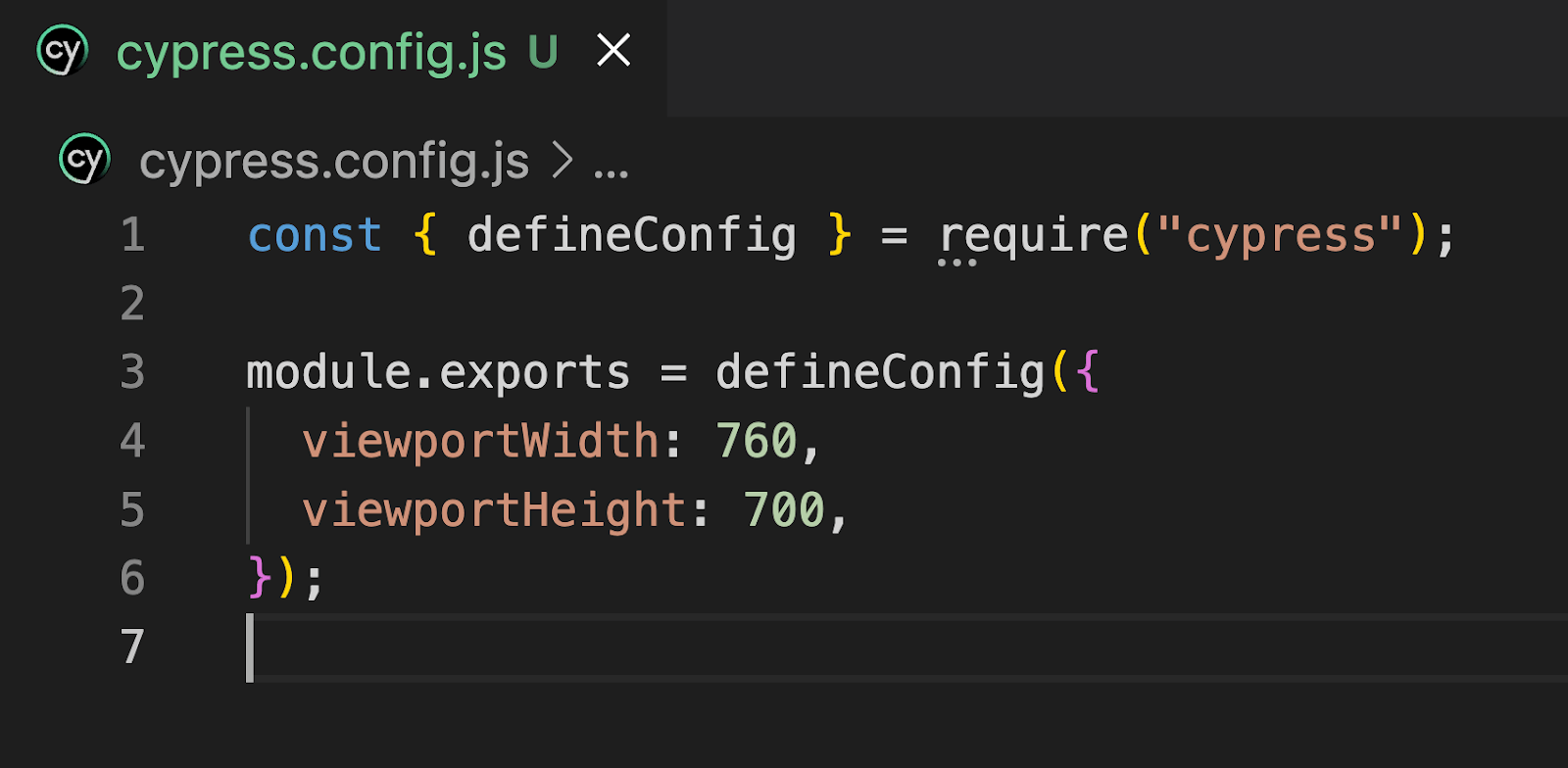
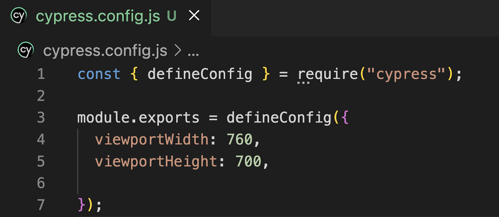
Step 1: Go to cypress.config.js.
Step 2: Add the viewport width and height in the below format. You can also customize it to your preferred viewport size. Make sure you enter the same key name as it is case-sensitive.
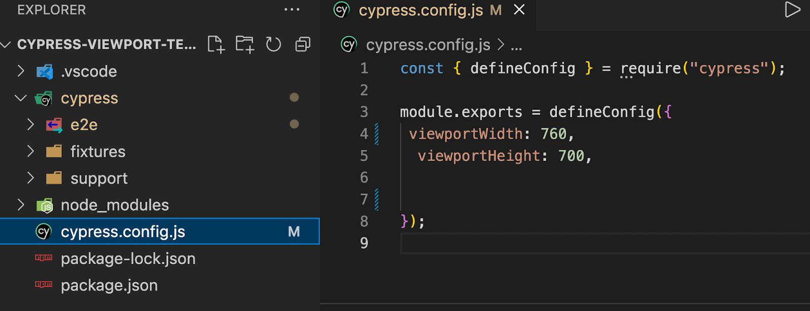
Now, if you run the below test case in your project, it will get executed in width and height as specified in cypress.config.js.
By default, it will run in portrait mode, but you can override the configuration by passing the orientation to the cy.viewport() command in your test case (just like shown below).
Let’s understand with 1 test case and observe its viewport in Cypress.
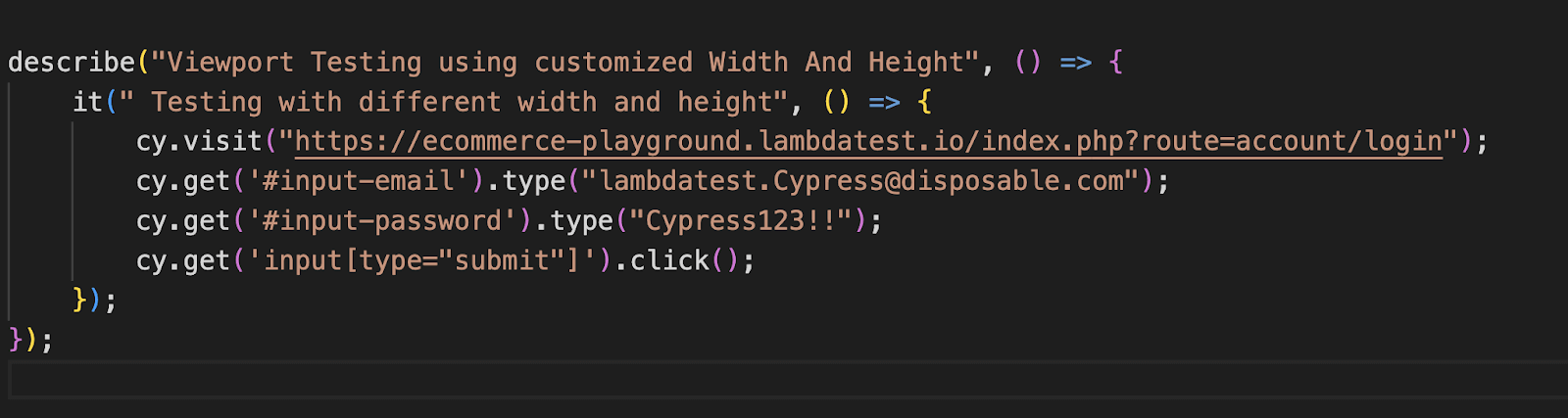
Test Scenario
- Open URL
- Enter the username and password in the designated input fields.
- Click on the Submit button to initiate the login process.
https://ecommerce-playground.lambdatest.io/index.php?route=account/login in preset
Implementation
|
1 2 3 4 5 6 7 8 9 10 |
describe(" Web Testing - Login Flow", () => { it(" Login Test Case ", () => { cy.visit("https://ecommerce-playground.lambdatest.io/index.php?route=account/login"); cy.get('#input-email').type("lambdatest.Cypress@disposable.com"); cy.get('#input-password').type("Cypress123!!"); cy.get('input[type="submit"]').click(); }); }); |
Code Walkthrough
Step 1: Open the website
https://ecommerce-playground.lambdatest.io/index.php?route=account/login using the cy.visit() command.
Step 2: Entering username and password.
The below code locates the email input field with the ID “input-email” and the password input field with the ID “input-password.” It then types the email “lambdatest.Cypress@disposable.com” into the email field and the password “Cypress123!!” into the password field using the cy.get().type() command.

Step 3: Click the Submit button.
The below code locates the submit button using an attribute selector (input[type=”submit”]) and clicks on it using the cy.get().click() command. This action simulates submitting the login form.
Execution
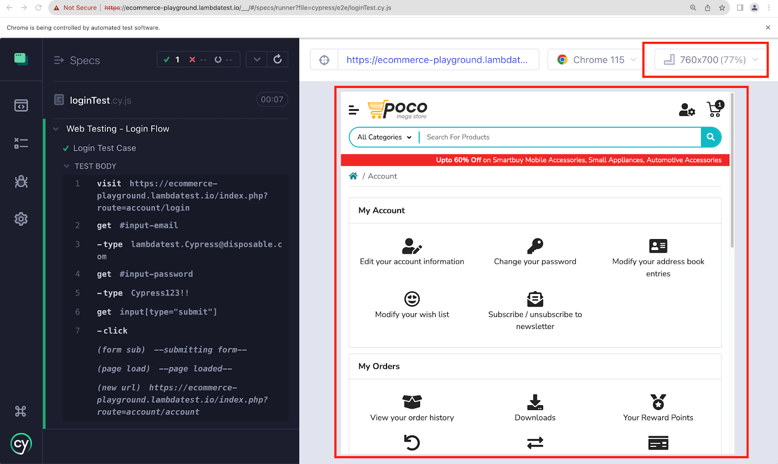
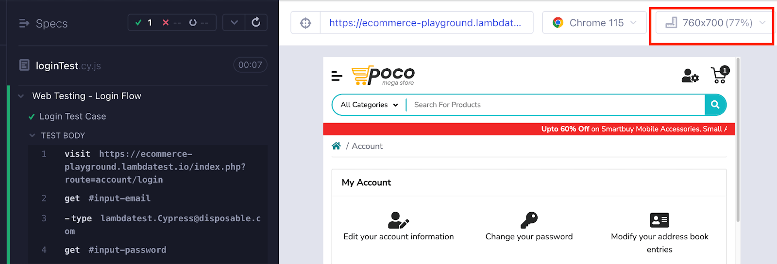
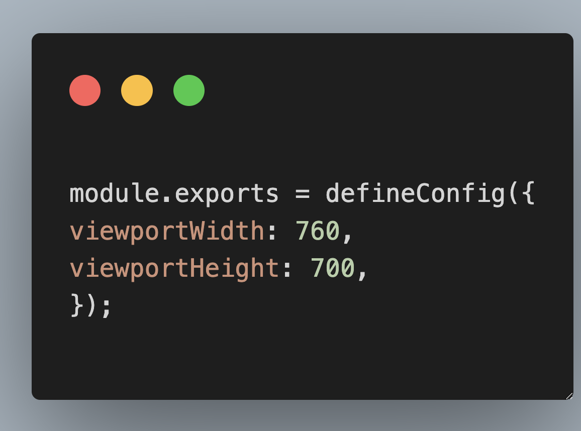
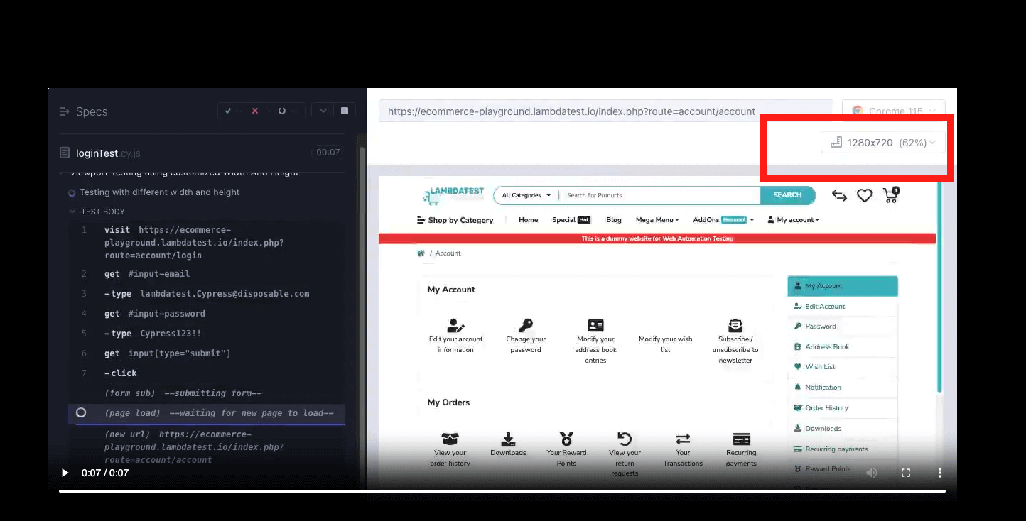
In the above test case, it can be seen that the test case executed in viewport 760*700, which is the value passed in cypress.config.js.
Overriding the Viewport Configuration
Configuring the viewport in Cypress (through cypress.config.js) globally provides a convenient way to set default dimensions for all test cases. However, there may be scenarios where you must override the global viewport configuration for specific tests or test suites.
You can override the global configuration of the viewport in Cypress from cypress.config.js and define custom viewport settings to suit your Cypress automation needs. You can do this by the approach below:
Just set the desired viewport using the cy.viewport() command within the test or test suite. When your page loads on the Cypress Test Runner screen, it will display the global configuration passed in cypress.config.js.
But, as soon as the execution starts, the viewport in Cypress changes back to the one provided in the test case. The viewport passed in the test case overrides the global configuration.
Let’s understand it with the below example.
Implementation
Set the viewport width to 760px and viewport height to 700px global configuration in the cypress.config.js file, as shown below.
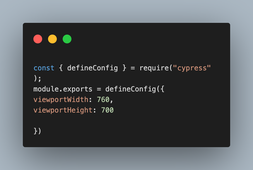
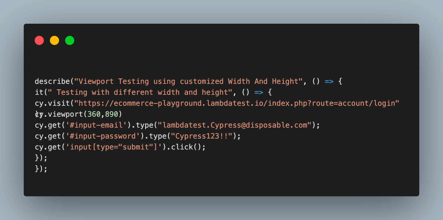
Take the example of the same test case mentioned in the previous section, but now let’s explore the scenario of including a custom viewport width and height within that specific test case.
Execution
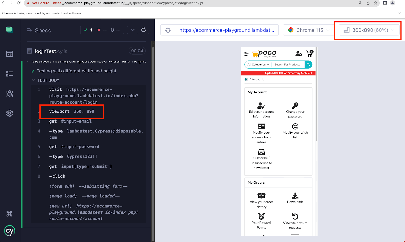
Now, if you run the above test case. It will run in a viewport with a width of 360px and a height of 890px.
Before the page loads, it loads with the global configuration. i.e., 760px*700px.
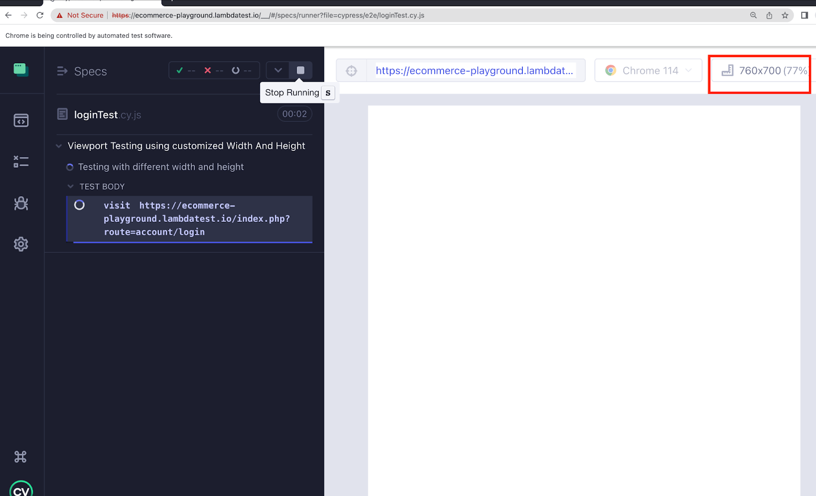
Once the test case starts executing, the viewport changes to the one passed in the test case.
Overriding Viewport Options at the Run Time
Cypress allows you to dynamically adjust configuration options, which proves valuable when working with different setups. Utilizing the –config flag in the command line, you can effortlessly override individual config options, such as viewportWidth and viewportHeight.
This is beneficial when running tests in different environments and on multiple machines. It allows you to dynamically alter configuration options without modifying the actual test code, making it easier to adapt your tests to various scenarios without duplicating test files
To override viewport configuration at the run time, you can use the following command:
|
1 |
npx cypress run --browser chrome --config viewportWidth=1280,viewportHeight=720 |
The above command will run the Cypress test cases in the Google Chrome browser with a viewport size of 1280×720 pixels.
Let’s understand this with an example:
Consider a scenario where you have a test file set with a default browser size of 1000 pixels width and 600 pixels height, and you wish to avoid altering the test code directly. In such situations, you can adjust the browser size during test execution, allowing flexible customization without modifying the test script.
Implementation
If you want to override the viewport width to 1280 and viewport height to 720, then go to the terminal and run the below command
|
1 |
npx cypress run --browser chrome --config viewportWidth=1280,viewportHeight=720 |
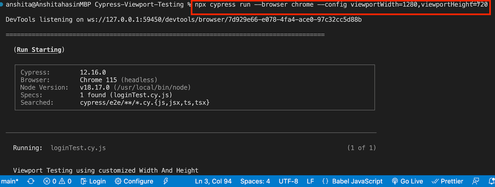
As it runs in the headless mode, you can check the video to verify the viewport on which the test case got executed.
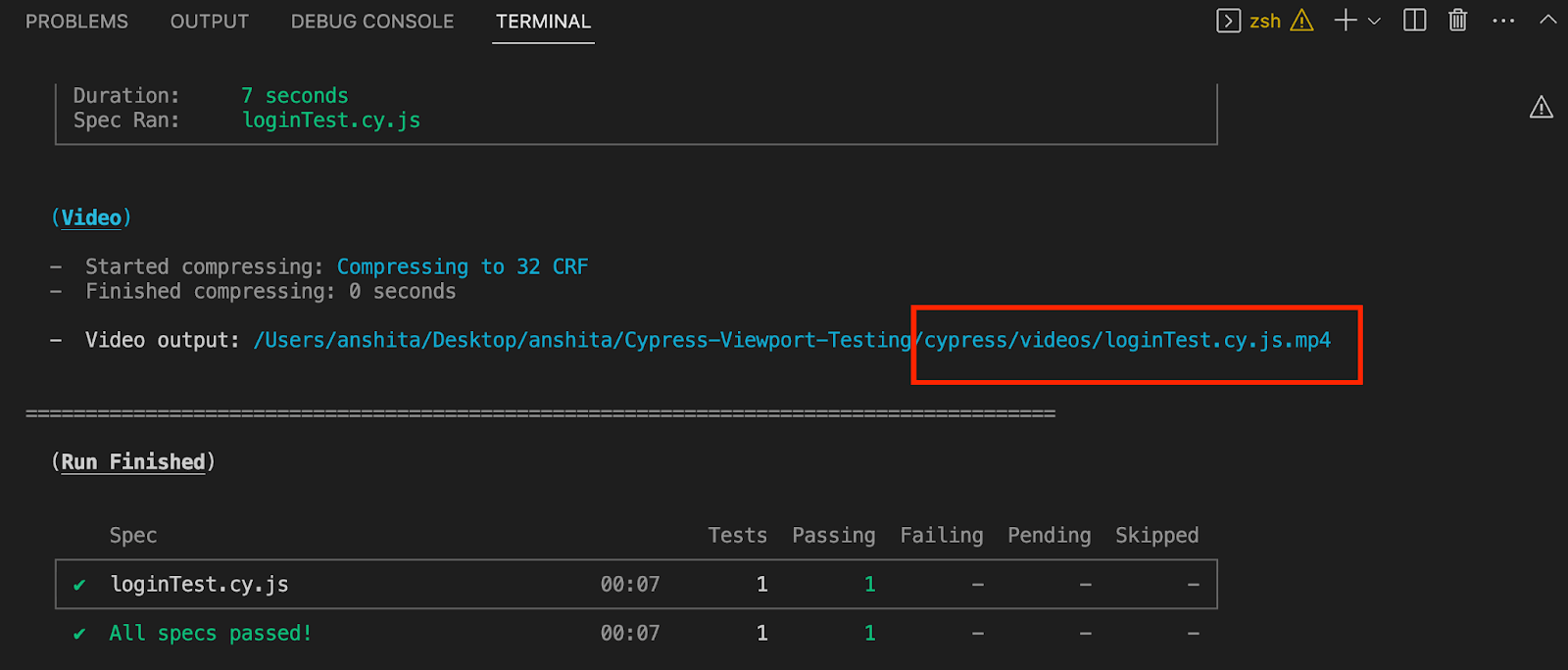
The video shows that the viewport in Cypress matches the values we set in the command using the –-config flag. You can override the individual options passed in your test case using this approach.
Testing Viewport using Environment Variables
Environment variables help you easily override configuration options, providing unparalleled flexibility in the testing workflows. Whether you are working with Continuous Integration or local testing, environment variables are instrumental.
Let’s understand a scenario where you want to change the viewportWidth and viewportHeight options for your Cypress tests. Instead of modifying the Cypress configuration directly, you can rely on environment variables to make the changes.
By setting specific environment variables in the command line, you can seamlessly override these configuration options. This empowers you to effortlessly test your application’s behavior on various screen sizes without touching a single line of code or build script.
The benefit of using environment variables for viewport testing is that it makes the testing more efficient and ensures consistency and accuracy across different test environments. It simplifies adapting your tests to different screen resolutions and requirements, making maintaining a robust test suite easier.
Moreover, environment variables promote best practices in test automation. They encourage you to create test scripts independent of specific configuration settings, making your tests more resilient and reliable. By separating configuration concerns from test logic, you enhance the maintainability and readability of our test codebase.
For example, if you’ve set the viewport width and height in your configuration file, you want to easily override it without changing it. In this case, you can use the below environment variables to do the job effortlessly.

Let’s understand it with the below example.
Implementation
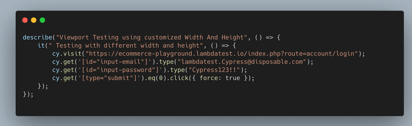
For example if you have already set the viewport width to 760px and viewport height to 700px in cypress.config.js file, just like shown below.
Taking the example of the same test case mentioned in the previous section.
Execution
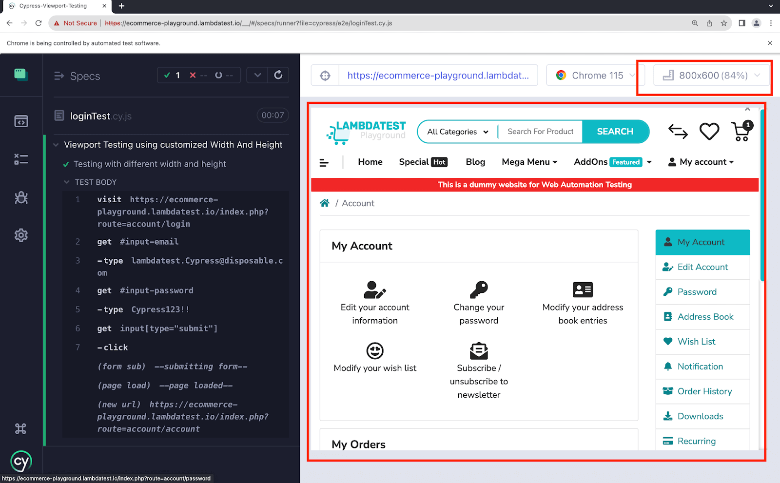
If you run the above test case. It will run in a viewport with a width of 760px and a height of 700px (as defined in cypress.config.js), but you can override it using the environment variables using the below code:
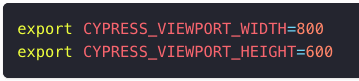

If you run the test case after setting the above configuration, you would observe the viewport width is set to 800 and viewport height is set to 600, which is exactly what is passed in the environment variable above.
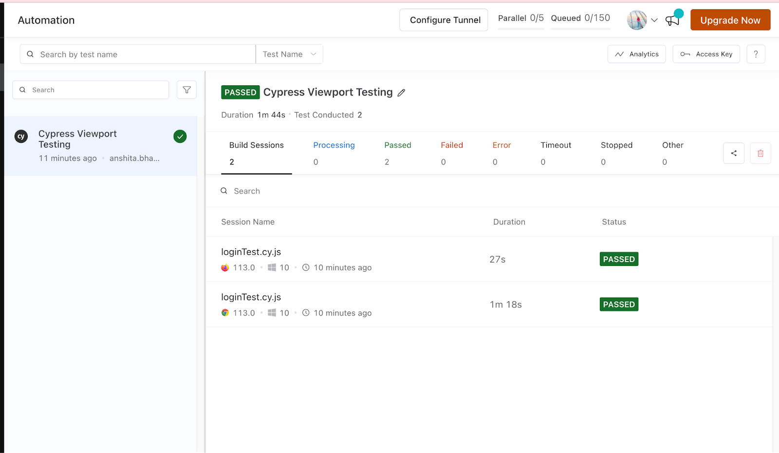
Testing Viewport in Cypress using LambdaTest
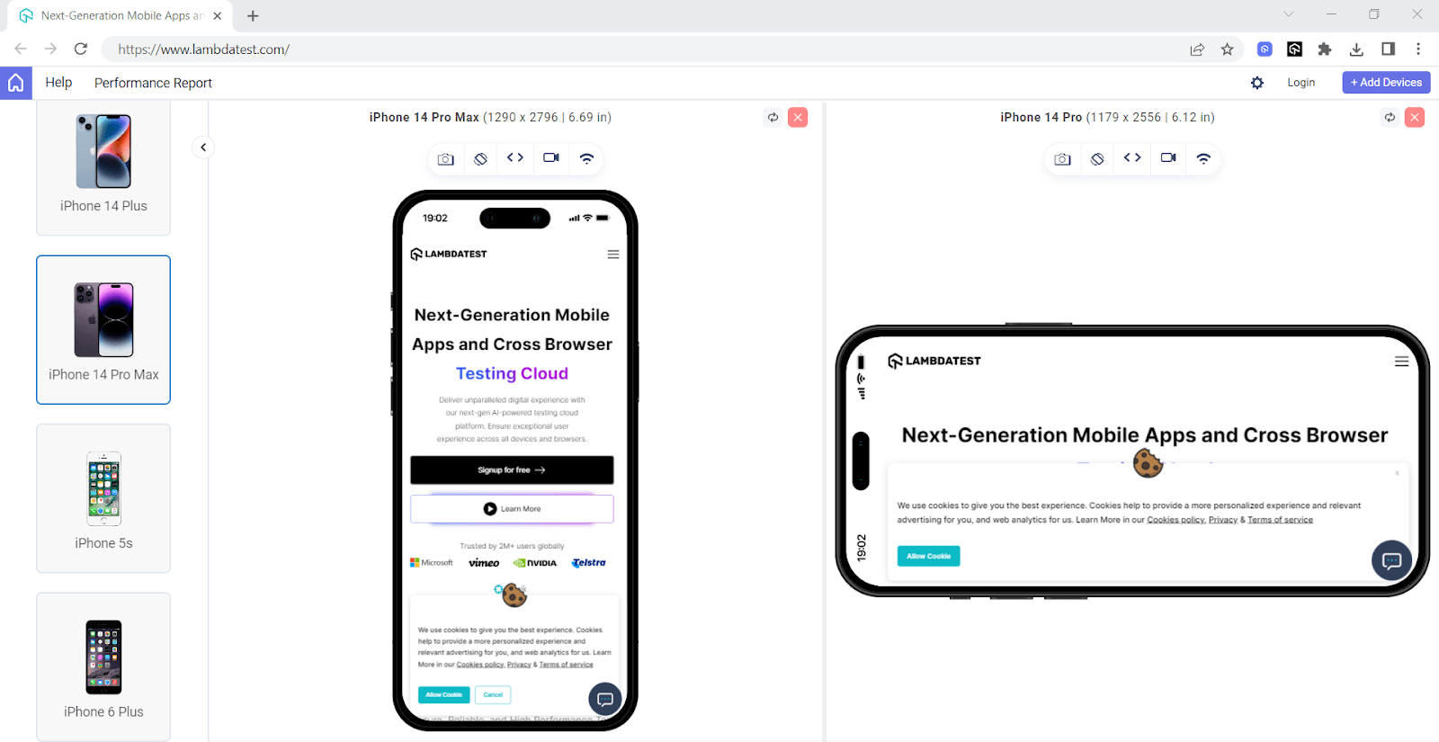
Running your test case on a local machine is limited to the browser version installed on your machine; however, if you want to test the various resolutions across multiple browsers and their respective versions, you can use the Cypress Cloud like LambdaTest
By running your test cases on LambdaTest cloud, an AI-powered test orchestration and execution platform, you can access various resolutions, diverse browser versions, and different operating systems for comprehensive testing. This allows you to ensure compatibility and functionality across a broader spectrum of environments.
To get started, check out the documentation: Screen Resolution Testing with Cypress.
You can test on any below resolution on different browser versions and OS.
- 1024×768
- 1280×960
- 1280×1024
- 1600×1200
- 1920×1080
- 2048×1536
- 2560×1440
Below is the Cypress e2e testing code for the LambdaTest cloud platform.
To run the Cypress UI tests on the LambdaTest platform, we must do the configuration using three steps.
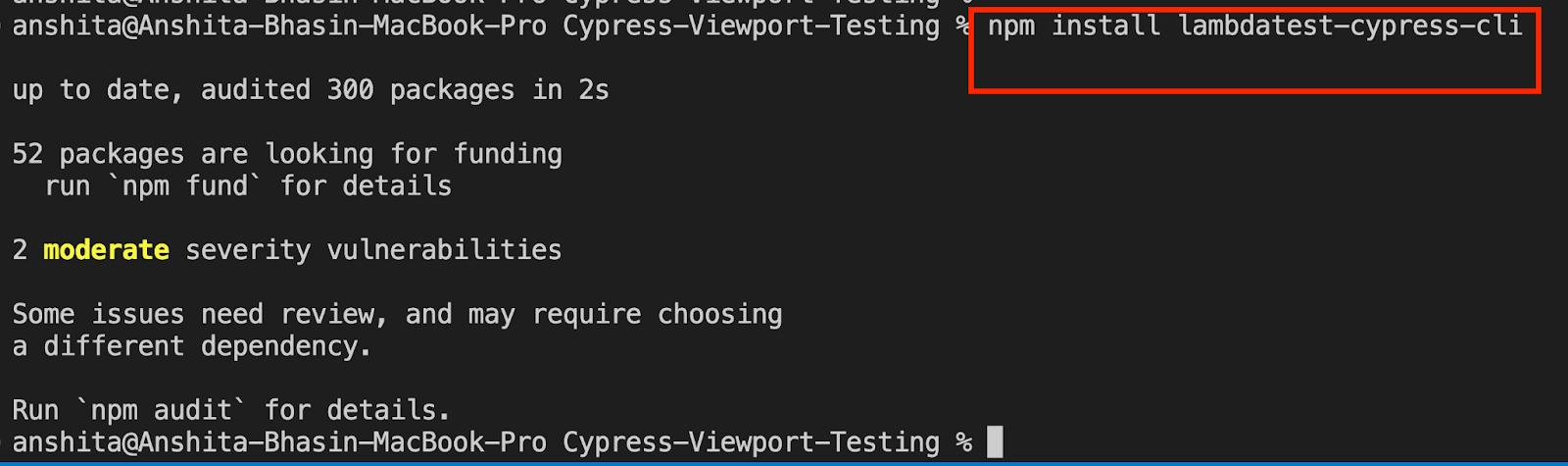
Step1: Install LambdaTest CLI.
Install LambdaTest CLI using npm, use the below command:
|
1 |
npm install lambdatest-cypress-cli |
Step 2: Set up the config.
Once the LambdaTest CLI is installed, we need to set up the configuration using the below command:
|
1 |
lambdatest-cypress init |
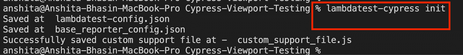
After running the command, a file will be created in your project named “lambdatest-config.json.” We need to set up the configuration to run our test case on different browsers on LambdaTest.
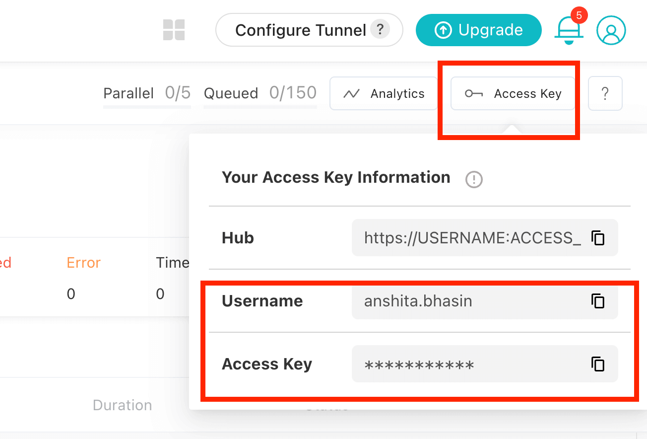
auth: You must set up the LambdaTest credentials, which will be used in lambdatest-config.json to run the test case on the cloud platform.
To get the username and access key from LambdaTest, just sign in to LambdaTest Automation Dashboard with your account credentials and copy the details from the Password & Security section, just like shown below:
- browsers: You need to specify the browser and OS version on which we want our test case to run.
- run_setting: You need to set up the config in run_settings. Set up the config name, which would differ based on different Cypress versions, and set up the spec file.
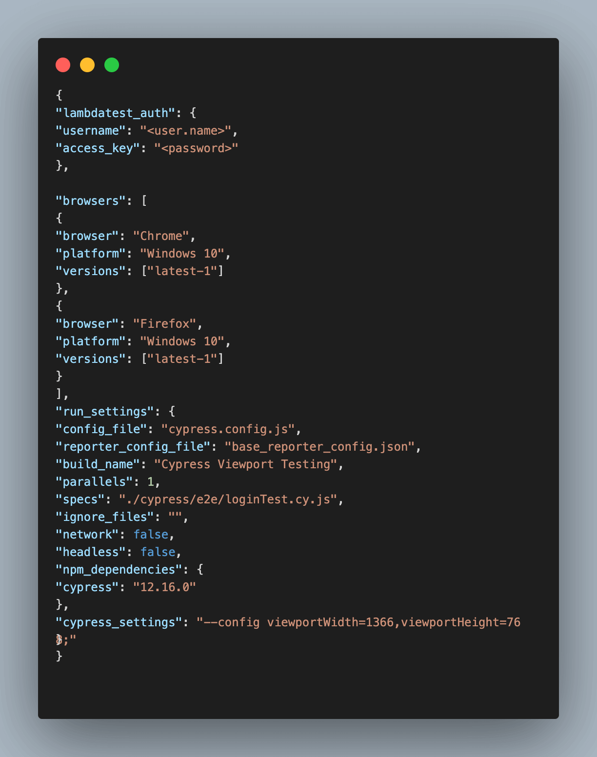
- cypress_settings: To test the web application on different viewports on cloud platforms, use the key cypress_settings in the config.json. For Cypress version 10 (& above), you can follow the below code to set up lambdatest-config.json.
|
1 2 3 4 5 6 7 8 9 10 11 12 13 14 15 16 17 18 19 20 21 22 23 24 25 26 27 28 29 30 31 32 |
{ "lambdatest_auth": { "username": <user.name>, "access_key":<password> }, "browsers": [ { "browser": "Chrome", "platform": "Windows 10", "versions": ["latest-1"] }, { "browser": "Firefox", "platform": "Windows 10", "versions": ["latest-1"] } ], "run_settings": { "config_file": "cypress.config.js", "reporter_config_file": "base_reporter_config.json", "build_name": "Cypress Viewport Testing", "parallels": 1, "specs": "./cypress/e2e/loginTest.cy.js", "ignore_files": "", "network": false, "headless": false, "npm_dependencies": { "cypress": "12.16.0" }, "cypress_settings": "--config viewportWidth=660,viewportHeight=880;" } } |
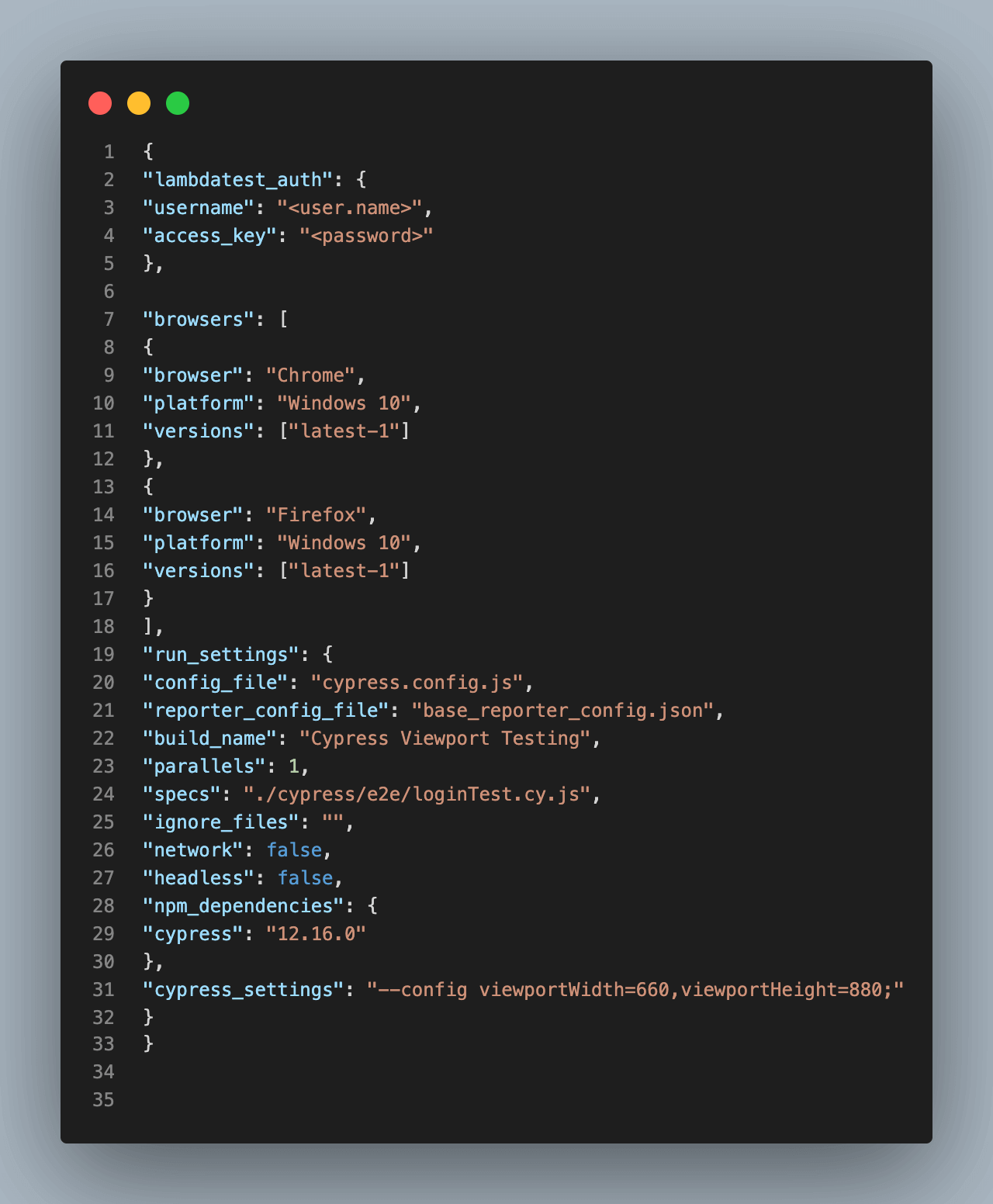

The cypress_settings section can be customized according to your specific requirements, allowing you to validate your application on various viewports across different browsers using cloud platforms.
In the above code, I have passed the viewport width as 660 and the viewport height as 880. So, my test case would only run on 660*880pxl on the LambdaTest platform.
Step 3: Once the config is done, let’s execute the Cypress test case on LambdaTest by triggering the lambdatest-cypress run command on the terminal.
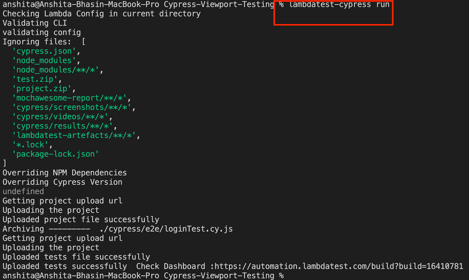
Shown below is the execution snapshot:
As seen below in the video, the test is executed on the viewport size 660 * 880, the same as what is specified in lambdatest-config.json.
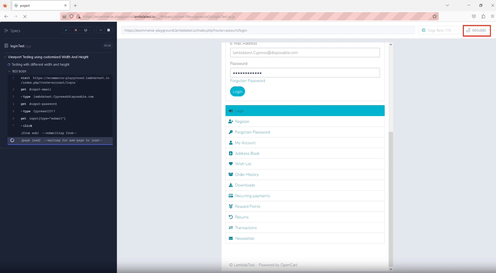
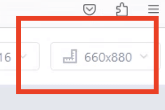
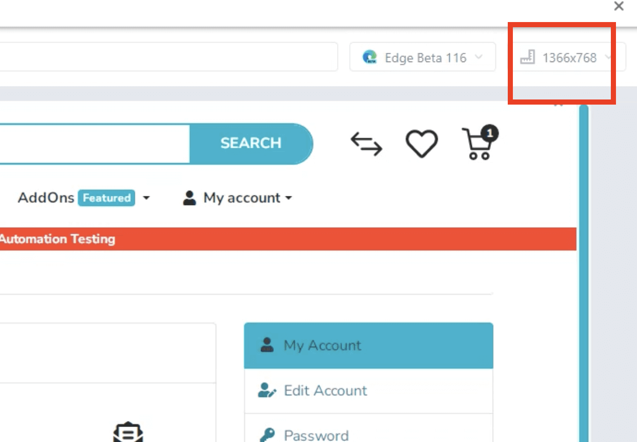
Likewise, you can execute the Cypress test on different viewports using a cloud platform. Below is the sample screenshot for the test running at a viewport size of 1366*768.
By adhering to the steps outlined above, you can test various available viewports in Cypress using LambdaTest. Employing LambdaTest for test execution grants you continuous access to results and logs across different builds, enabling streamlined debugging of any potential issues that may surface.
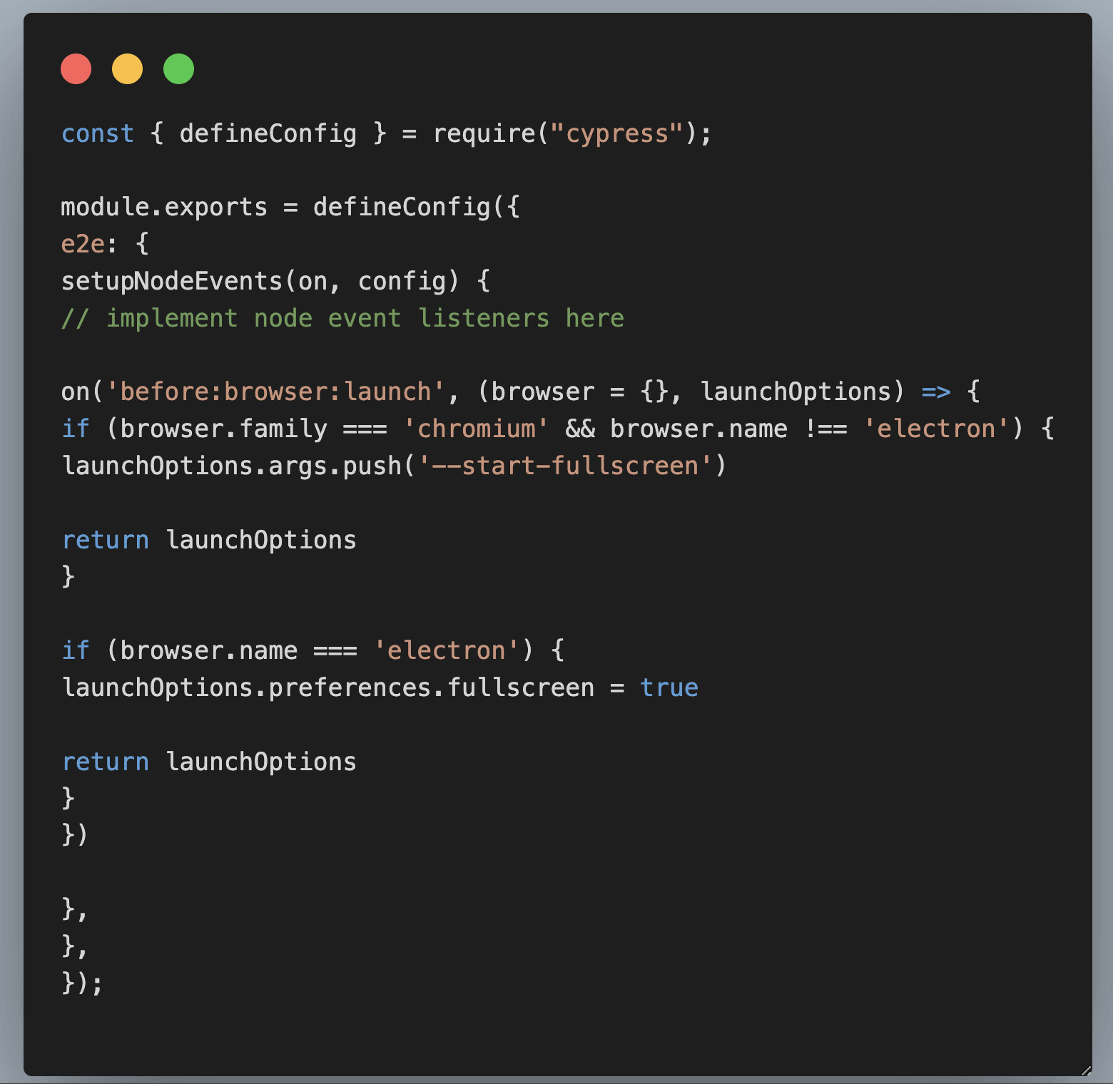
Testing on Full-Screen
Responsive web design is essential for a smooth device user experience. However, testing in full-screen mode is often overlooked. It allows you to see how users interact with your site without distractions. With Cypress, you can easily test your web app in full-screen mode by interacting with the browser’s viewport in Cypress for seamless functionality.
To conduct full-screen mode testing for your web applications in Cypress v10 and above, use the below code to modify the browser options.
Implementation
|
1 2 3 4 5 6 7 8 9 10 |
on('before:browser:launch', (browser = {}, launchOptions) => { if (browser.family === 'chromium' && browser.name !== 'electron') { launchOptions.args.push('--start-fullscreen') return launchOptions } if (browser.name === 'electron') { launchOptions.preferences.fullscreen = true return launchOptions } }) |
Go to cypress.config.js and paste the below code:
Ready to enhance your expertise in Cypress automation? Enroll in our customized Cypress 101 certification program designed for developers and testers aiming to further their skills in Cypress test automation. Acquire advanced knowledge, refine your capabilities, and open doors to many opportunities in your test automation journey
Conclusion
Automating viewports in Cypress allows you to simulate different device sizes and orientations, enabling comprehensive testing of your application’s responsiveness. It empowers you to validate how your design elements adapt to various screen sizes and ensure a seamless user experience.
With the flexibility and power of Cypress, you can easily automate viewports in Cypress and conduct thorough testing to ensure your web application delivers exceptional performance across a wide range of devices and resolutions.
Happy Testing!
Frequently Asked Questions (FAQs)
What is a viewport in Cypress?
In Cypress, a viewport refers to the visible area of a web page displayed within the browser window during test execution. It represents the portion of the web page that is currently viewable without scrolling.
Cypress allows testers to manipulate and control the viewport size and dimensions to simulate different screen sizes and resolutions, facilitating the testing of responsive web designs and ensuring compatibility across various devices and screen configurations. This capability verifies that a web application adapts correctly to different viewport sizes and delivers an optimal user experience.
How to check the viewport in Cypress?
To determine the current viewport dimensions, employ cy.viewport(w, h), and ensure that the Cypress configuration is updated accordingly using a cy.then callback to confirm that the values have been properly configured after executing the viewport modification command.
What is the difference between pixel and viewport?
Pixels (px) and viewports are distinct concepts in web design. Pixels are the smallest units of measurement in a digital display and are used to define the size and position of elements on a web page. However, their size is fixed and can vary across devices, potentially leading to responsiveness issues.
On the other hand, a viewport represents the visible area of a web page within the user’s browser window. It adjusts in size based on the user’s device, screen resolution, and browser window dimensions. To create responsive web designs, web developers often use viewport-relative units like percentages, viewport width (vw), and viewport height (vh) to ensure that web content adapts seamlessly to different viewport sizes and provides an optimal user experience across various devices and screen sizes.


Author’s Profile
Anshita Bhasin
Anshita Bhasin is a Senior QA Automation Engineer with over 9 years of experience in the software industry. Throughout her career, She has gained expertise in a variety of tools and technologies, including Rest Assured, Selenium, and Cypress. Currently, She is working at a PropTech company in Dubai. In addition to her technical expertise, she is also passionate about sharing her insights and experiences with others in the form of blogs and workshops to help guide those just starting out in their careers or seeking advice on their professional paths.
Blogs: 6
Got Questions? Drop them on LambdaTest Community. Visit now


