
A Complete Guide to CSS Refactoring
Adarsh M
Posted On: March 15, 2023
 164971 Views
 51 Min Read

Being a front-end developer is like having the magical power to shape reality after it’s been created. And we can modify and improvise things that have already been published, a luxury only a few professionals enjoy.
In many fields, restrictions exist on what can be changed after it has been written or published. An artist cannot undo layers of paint to improve their work, and a writer cannot modify the sentence of his book after it has been published, but we developers can! Although changing the code might seem simple, it could result in non-favorable results if done incorrectly. For example, an organization lost $440 million due to a minor bug in its new code, which was only one line of code. Whether the change is small or big, it should be thoroughly tested before production.
As a front-end developer, I often spend more time on CSS Refactoring than writing it. Although CSS is simple and flexible, this simplicity invites a lot of errors that may cause performance problems, and in today’s world, we must maintain design as well as performance.
Studies showed that an average user forms an opinion of a business or product within just 50 milliseconds after visiting a website. Therefore, it is essential to maintain your website’s performance to provide a seamless user experience. With the introduction of Core Web Vitals, Google has provided a framework for measuring and improving the user experience on a website.
When the website is slow, it can quickly frustrate users and cause them to leave and seek a better alternative. Here comes CSS Refactoring, one of the best options to improve a website’s performance better than earlier. However, there may be times when CSS Refactoring is unnecessary and does not result in significant performance improvements. What’s your opinion on this?
In this detailed tutorial on CSS Refactoring, we will walk you through CSS Refactoring, factors affecting poor CSS, best practices to follow while CSS Refactoring, and how to improve the overall structure of your CSS codebase.
Without ado, let’s get started!
TABLE OF CONTENTS
- Factors Affecting Poor CSS on website’s Performance
- Understanding Core Web Vitals
- Common CSS Pitfalls to Avoid for Improving Website Performance
- CSS Best Practices
- Auditing the health of CSS code
- Eliminating Render-Blocking CSS
- Optimizing Your CSS Workflow with PostCSS
- Using CSS Preprocessors
- Key Factors to Remember while Organizing your CSS for Large-Scale Projects
- Browser-specific CSS Prefixes
- Role of Testing in CSS Refactoring
- Use Version Control
- Wrapping Up!
- Frequently Asked Questions (FAQs)
Factors Affecting Poor CSS on Website’s Performance
Before studying CSS Refactoring, it is essential to know what are the factors that affect poor CSS on your website performance.
CSS is a stylesheet language since we don’t have to do any logic; all we have to do is select an appropriate style property and use it. But that’s precisely the problem, as there is no standardized way to use CSS. This can cause the code to look messy and affect the website’s overall performance.
Almost all modern websites use web design trends, including various CSS animations and CSS transforms & transitions properties, to make their website look better. However, using lots of animations or transitions may affect the website’s overall performance and make it laggy on slower devices.
Here are some factors affecting poor CSS on a website’s performance:
- Increased Load Time
- Reduced Mobile Responsiveness
- Poor User Experience
- Increased Server Loads
One of the primary reasons to go with CSS Refactoring is due to the high load time of web pages. Today, we all live in the social media era, where our attention spans are short, and we often decide within seconds whether to watch a video or move on to the next one. This is the same case when we visit a website. If our website loads slowly, users will decide to move on.
According to a study by Google, if a web page takes load time from one second to 10 seconds, there is a high possibility that a user will decide to move on with a bounce rate of more than 123%. Even a delay of just one second causes a 20% drop in the conversion rate.
Even though people have access to large-screen devices like laptops, many still use their smartphones for browsing. In fact, as per a Statista survey, approximately 60% of the global population uses smartphones exclusively for this purpose. And we have seen many websites that are not responsive, so the need for CSS Refactoring comes into the picture to make your websites all device responsive.

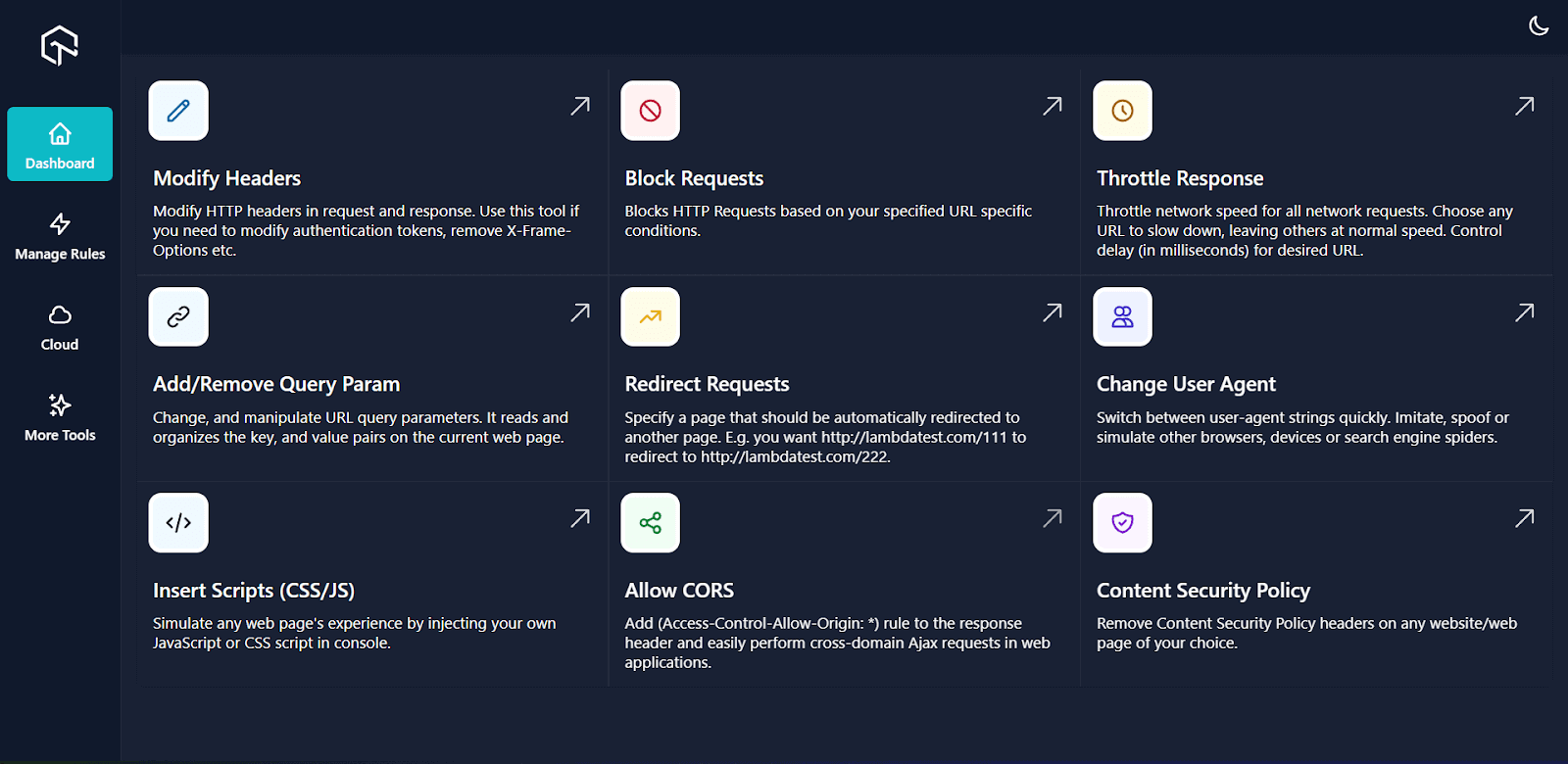
You can test the responsiveness of your websites and web apps on different viewports with LT Browser 2.0, which allows you to select multiple devices simultaneously and run tests on your web applications.
By utilizing LT Browser 2.0, you can assess the responsiveness of your website across 50+ device viewports, including mobile, tablet, desktop, and laptop.

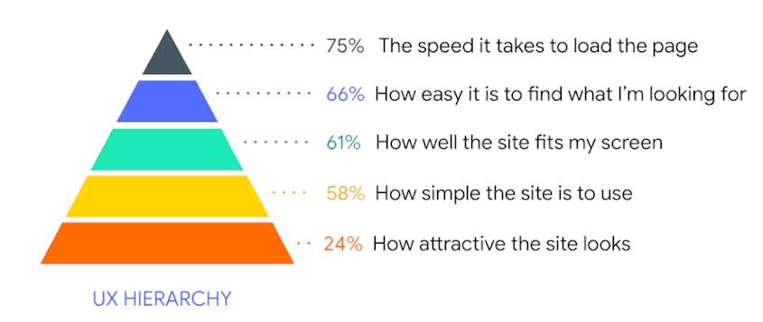
UX designers create complex designs assuming users understand the flow. But that’s not the case every time. This leads to poor CSS and affects website performance. Hence, the need for CSS Refactoring occurs. The meme image below shows precisely how UX designers should consider user intent.
You always have to follow this principle: “Know Your Audience.” Poor user experience may result in users leaving your website and potentially not returning.
When a website receives a high traffic volume, the server must work harder to handle all requests, resulting in an increased server load. Poorly structured CSS can increase server resources and cost a lot of money. Therefore, it is required to optimize your CSS code; thus, CSS Refactoring becomes a vital part of enhancing website performance.
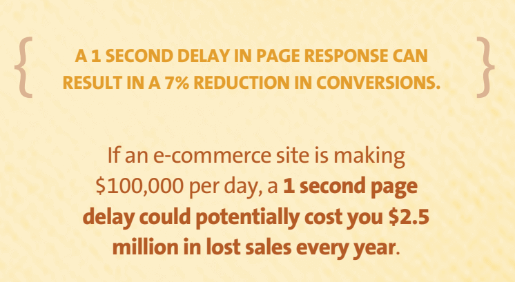
According to Kissmetrics, a one-second delay in page response can result in a 7% reduction in conversions.
Understanding Core Web Vitals
Core Web Vitals are a set of performance metrics that all website owners should measure, and Google will show these metrics in its tools. They are a subset of Web Vitals and represent different aspects of the user experience.
Core Web Vitals are essential because they reflect the real-world experience of users and can help website owners improve their site’s performance.
The Core Web Vitals consist of three specific metrics:
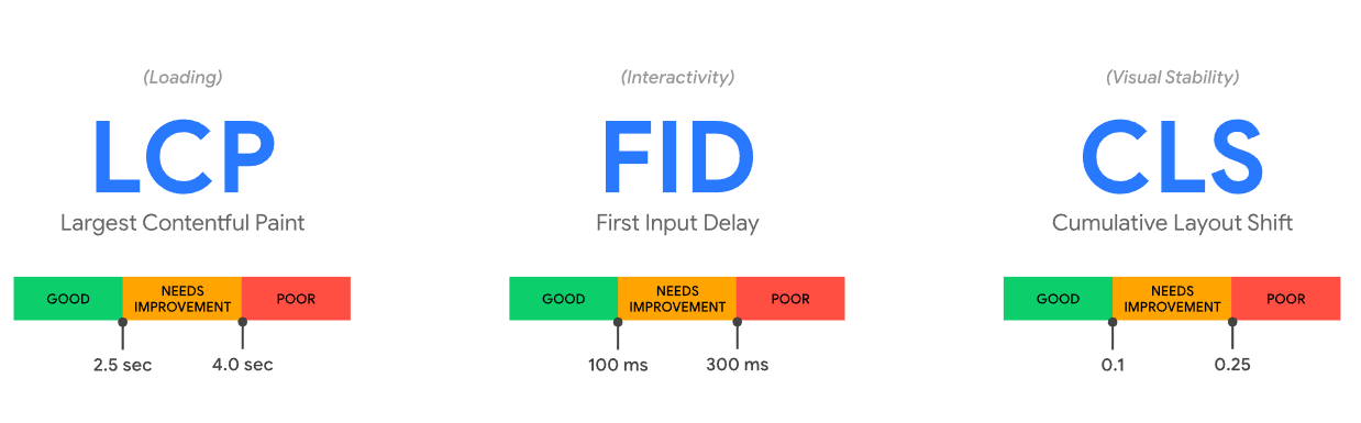
1. Largest Contentful Paint (LCP)
Largest Contentful Paint is a performance metric measuring how fast a web page loads the most prominent content element. This element can be an image, video, or text block, and LCP measures how quickly it appears on the user’s screen.
It is considered good practice to provide a better user experience if LCP occurs within 2.5 seconds just after the user clicks on a webpage and it starts loading.
By optimizing LCP, website owners and developers can significantly improve the loading speed of their web pages, which can lead to a better user experience and higher engagement.
2. First Input Delay (FDP)
First Input Delay measures the interactivity of the website, which means it measures how long it takes for a page to respond to the first interaction by a user, such as a click or tap.
According to Google, to have a seamless experience, pages should have an FID of fewer than 100 milliseconds, and anything over 300 milliseconds leads to poor user experience.
3. Cumulative Layout Shift (CLS)
Cumulative Layout Shift measures the visual stability of a page’s layout as it loads, indicating how many page elements are there when a page is loaded.
It is considered good practice to provide a better user experience if the page maintains a CLS of 0.1 or less. If CLS is over 0.25, it leads to poor visual stability.
"What is Cumulative Layout Shift (CLS) and why does it matter?"
This is probably my favorite example. https://t.co/7tTh8Sodwn
— Lee Robinson (@leeerob) April 13, 2022
According to Google, Core Web Vitals is an elementary part of any search ranking algorithm, that means websites with high vital scores are more likely to appear higher in search results. Because of this, developers need to optimize their sites for Core Web Vitals to improve their search engine rankings and give their visitors a better experience.
Common CSS Pitfalls to Avoid for Improving Website Performance
Most of the CSS issues come when we work as a team or multiple developers push the code to the same file. This can result in poor-quality CSS that can even cause severe side effects that could affect the entire project.
Below are some of the most common CSS pitfalls you should avoid:
- Inconsistent Naming Conventions.
- Block: It refers to a standalone entity. Think of a block as a container that has several children.
- Element: It is part of a block with no standalone meaning, i.e., any element semantically tied to its block.
- Modifier: These are the flags on blocks or elements used to change the appearance, behavior, or state.
- Code Redundancy
- Incorrect Use of Selectors
- Spaghetti code
CSS is about selecting a particular section or element in a website and styling it according to its class name or id. There is a good chance that if we write complex web UI, we may unknowingly create multiple classes with the same name.
To avoid such inconsistencies in naming, it is advised to use a CSS naming methodology or convention such as BEM (Block Element Modifier). Using proper naming conventions will help you with future website design changes.
Now, we’ll look at how BEM conventions are used:
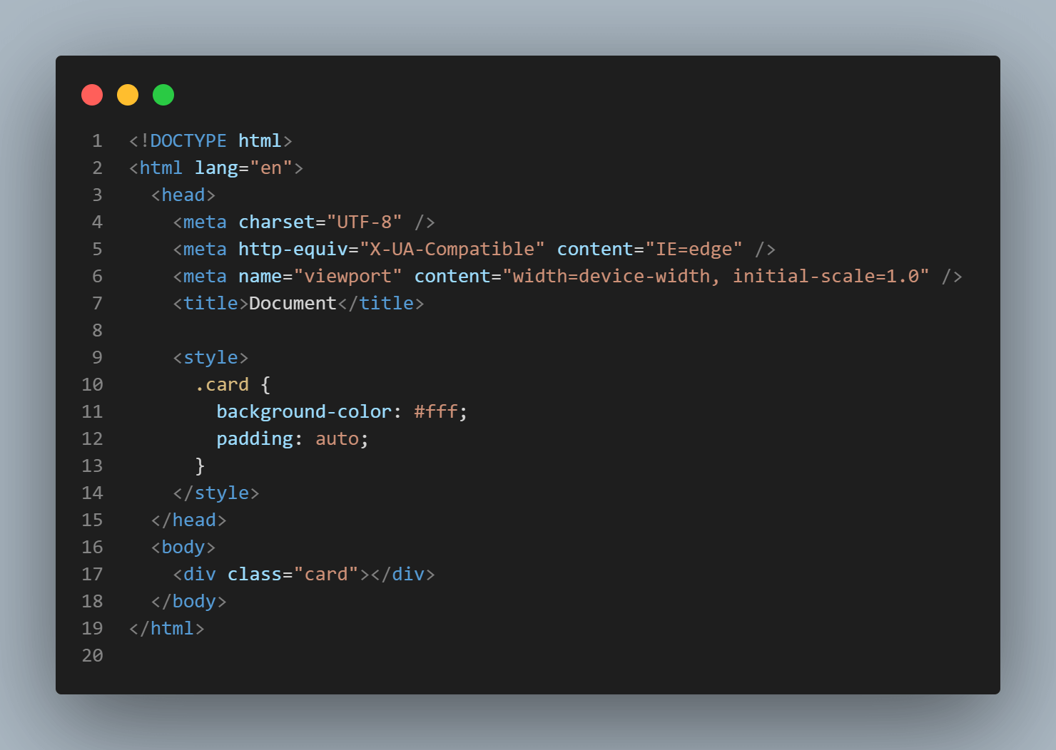
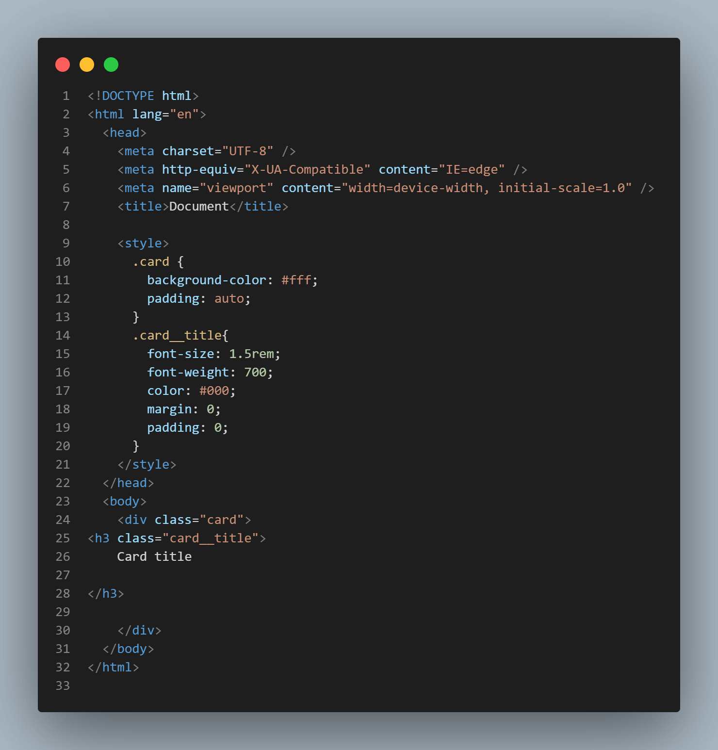
Here class.card__title is the element we are targeting, which is inside the block .card.
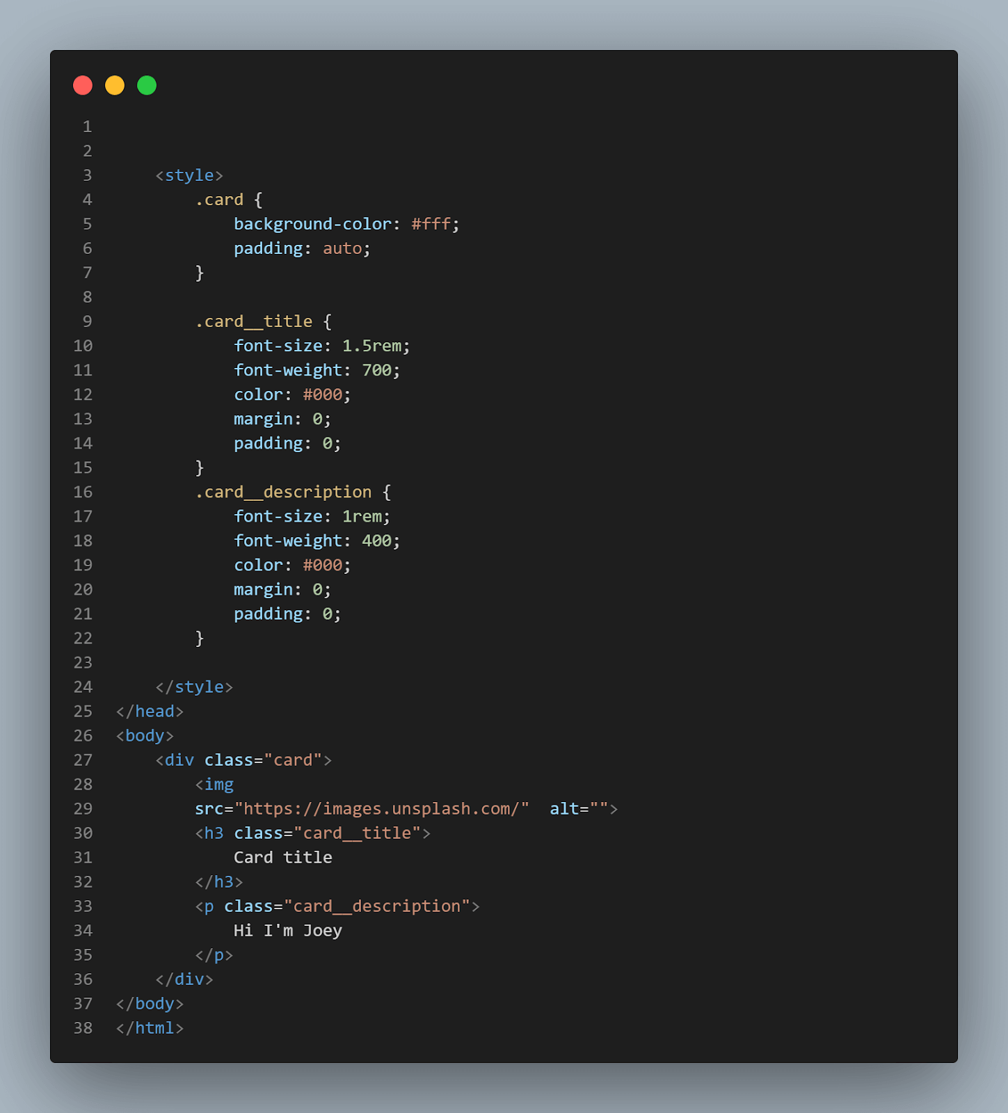
BEM is one of the most commonly used naming conventions in CSS. You can name it according to your logic, but it must follow the block-element-modifier format.
Whenever you have huge codebases, we will probably add redundant code that we will not notice in the first place. The first rule of thumb is to keep the code organized. As the implementation progresses, there is a possibility that the code base might have a significant percentage of code redundancy!
Redundant CSS code is often the result of poorly written CSS that misuses CSS selectors. Consider this example:
|
1 2 3 4 5 6 7 8 9 10 11 |
.container > .header { background-color: blue; color: white; font-size: 24px; } .header { background-color: red; color: black; font-size: 32px; } |
Here, the first set of styles targets the .header class, which is a descendant of the class with name .container. The second set of styles targets the .header class.
Since the (>) selector has a higher priority, only the first set of styles will be applied, and the style applied just to the header class is unnecessary and leads to duplication.
As we mentioned earlier, CSS doesn’t give you logical errors; we are prone to making mistakes due to the incorrect use of CSS selectors. Let’s look at a real-world example. Assume you have a website with a lot of nested HTML elements, like this:
|
1 2 3 4 5 6 7 8 9 10 11 12 13 |
<div> <div class="container"> <div class="row"> <div class="col"> <p>Some text</p> </div> <div class="col"> <p>Some more text</p> </div> </div> </div> </div> |
You might be tempted to style the p tag like this:
|
1 2 3 4 |
.container .row .col p { font-size: 16px; color: black; } |
This might give you an expected result, but there is a chance that it will also give you unexpected output. Here, you must notice that we are traversing through the HTML Document Object Model (DOM) tree in a nested fashion.
It has to go through three levels of nested elements before finding the p elements. This will slow down the rendering process. If we only have a few nested styles, it will make little difference, but as our codebase grows, this could lead to a slower initial page load.
If a website has a lot of nested styles, it could lead to a slower initial page load, which could negatively impact its LCP score. To illustrate this, we can create two versions of a web page – one with nested styles and one without – and measure their LCP scores using the LT Browser.
Can it be any more better?
Recently @lambdatesting announced their all-in-one browser for web developers.
It's the only responsive testing tool that you ever need🤖
Detailed thread🧵 pic.twitter.com/J7rRFtXz2n
— Adarsh Gupta⚡ (@Adarsh____gupta) January 4, 2023
HTML:
|
1 2 3 4 5 6 7 8 9 10 11 12 13 14 15 16 17 18 19 20 21 22 |
<!DOCTYPE html> <html lang="en"> <head> <meta charset="UTF-8"> <meta http-equiv="X-UA-Compatible" content="IE=edge"> <meta name="viewport" content="width=device-width, initial-scale=1.0"> <title>Document</title> <link href="index.css" rel="stylesheet" type="text/css"> </head> <body> <section class="hero"> <div class="hero__image"> <img src="https://lh3.googleusercontent.com/jUoaTIlBn5ibfQcND2n5OMD6Z7xoqNj-ShHlFR6QuLffLXD5pS8V2eNg1rGlrsRrnDkoQ28O8UHzqzBQKAGY4l1CS2NQSq2SkRScK6FOjl82jppyohK-" alt="Hero Image"> </div> <div class="hero__content"> <h1 class="hero__headline">Welcome to Our Website</h1> <a class="hero__cta" href="#">Learn More</a> </div> </section> </body> </html> |
CSS:
|
1 2 3 4 5 6 7 8 9 10 11 12 13 14 15 16 17 18 19 20 21 22 23 24 25 26 27 28 29 30 31 32 33 34 |
.hero { background-color: white; padding: 50px; } .hero__image { margin-bottom: 20px; width:85px; } .hero__image img { display: block; max-width: 100%; height: auto; } .hero__content { text-align: center; } .hero__headline { font-size: 48px; font-weight: bold; margin-bottom: 20px; } .hero__cta { display: inline-block; background-color: #007bff; color: #fff; padding: 10px 20px; border-radius: 5px; text-decoration:none } |
Performance results from LT Browser:
Now let’s try without these nested styles:
|
1 2 3 4 5 6 7 8 9 10 11 12 13 14 15 16 |
img{ width:95px; margin-left:45%; } h1{ font-size:40px; text-align:center } p{ font-size:25px; text-align:center } |
You can see there is a slight delay in the speed index of 0.1 seconds in the website having nested styles. You can now understand how nested styles can impact the website’s performance.
One of the best ways to style nested elements is to specify an ID for the element. ID selectors are faster than class selectors because they are unique to the page. Organizing how you write the CSS code can also improve the rendering time. In the next section of this CSS Refactoring tutorial, we will cover those in detail.
The way browsers work is that they try to get the element we want to style from the HTML DOM tree and style it. When CSS is poorly organized, the browser may have difficulty finding the styles it needs, resulting in slower rendering.
Here’s an example of what spaghetti code looks like,
|
1 2 3 4 5 6 7 8 9 10 11 12 13 14 15 16 17 18 19 20 21 22 23 24 25 26 27 28 29 30 |
/* CSS */ .header { background-color: blue; color: white; font-size: 24px; } .navbar { background-color: black; color: rgb(162, 56, 56); font-size: 18px; } .footer { background-color: rgb(123, 37, 37); color: black; font-size: 14px; } .header { border: 1px solid white; } .navbar { border: 1px solid white; } .footer { border: 1px solid white; } |
In this CSS Refactoring blog section, the CSS is not organized in any particular order. The styles for the header, navbar, and footer classes are mixed, making it challenging to find the styles for a specific element quickly.
To improve the organization of the CSS, you can group the styles by elements so that all styles in a particular element are together. This way, other developers working on the project can find the styles more easily.
In this blog on CSS Refactoring, we have used class names multiple times; now, more clean code with only one class name.
Clean Code:
|
1 2 3 4 5 6 7 8 9 10 11 12 13 14 15 16 17 18 19 20 21 |
/* CSS */ .header { background-color: blue; color: white; font-size: 24px; border: 1px solid white; } .navbar { background-color: black; color: rgb(162, 56, 56); font-size: 18px; border: 1px solid white; } .footer { background-color: rgb(123, 37, 37); color: black; font-size: 14px; border: 1px solid white; } |
Using a single CSS file may be acceptable for simple projects with only a few pages, but as the project grows, it’s good practice to split the CSS into separate files.
The approach I recommend is having separate files for different pages, which will help reduce conflicts in styling. You can also have separate files for typography, colors, layouts, etc.
For example, you can have a folder structure like this:
Now that we know some of the known issues that make our CSS redundant, we can look at the best ways to write and organize it.
CSS Best Practices
CSS is a flexible language; there is no specific way to write CSS, but there are some best practices you should follow to maintain the code. When writing code, it’s important to remember that it should be written in a way that other team members (or developers) can easily understand.
Some of the best practices to follow for writing better CSS are shown below:
Use the CSS selector appropriately.
Red flag: Using selectors in an unorganized manner.
Best practices: Choose the best combination of selectors.
There are numerous ways to select an HTML element, but we should use CSS selectors in such a way that they are used efficiently. You must know about all the basic and advanced CSS selectors for this.
Some of the most common types of CSS selectors are
- Type Selectors: They are used to select elements by their HTML tag names, such as p, h1, and div.
12345/* Selects all p elements */p {font-size: 16px;color: gray;}
- Class Selectors: These are used for selecting elements by their class attributes. The class attribute starts with a dot (.). It can be assigned to any number of elements, such as .header, .container, .active, etc.
12345/* Selects elements with class "header" */.header {background-color: blue;display:block;}
- ID Selectors: ID selectors are used for selecting the elements by their id attribute. The id attribute starts with a hash (#) and should be unique within the document, such as #header, #footer, #main-content, etc.
1234/* Selects element with id "main-content" */#main-content {padding: 20px;}
- Attribute selectors: Attribute selectors are used for selecting the element by its attribute and value, such as [type=”text”], [href^=”https”], [alt~=”dog”], etc.
1234/* Selects input elements with type "text" */input[type="text"] {border: 1px solid gray;}
- Pseudo-class selectors: CSS Pseudo-class selectors are used for selecting elements based on their state or position, such as :hover, :active, :first-child, etc.
1234/* Selects links on hover */a:hover {color: red;}
- Pseudo-element selectors: Pseudo-element selectors are used for selecting specific parts of an element, such as ::before, ::after, ::first-letter, etc.
12345/* Styles the first letter of p elements */p::first-letter {font-size: 16px;font-weight: normal;}
- Combinator selectors: Combinator selectors are used for selecting elements based on their relationship with other elements, such as div > p, .container + .header, .header ~ .footer, etc.
1234/* Selects all p elements that are direct children of div elements */div > p {margin: 0;}
- Universal Selectors: Universal selector is used for selecting all elements on the page, represented by the * symbol.
123456/* Selects all elements on the page */* {box-sizing: border-box;margin: 0;padding: 0;}
One advantage of using IDs is that they are unique, and once we find out the target element, we don’t have to search the rest of the DOM tree. But in the case of classes, the browser needs to scan the entire DOM.
To write efficient CSS code, it is important to understand how the specificity of these selectors works. Four categories define the specificity level of a selector:
- Inline styles
- IDs
- Classes, pseudo-classes, attribute selectors
- Elements and pseudo-elements
Inline styles have the highest priority and a specificity value of 1000. There is a standard value for each selector to calculate the effective specificity of selectors. They are:
- IDs get a specificity value of 100.
- Class selectors(pseudo-classes, attribute selectors) get a specificity value of 10
- Universal selectors (*), combinators (+, >, ~, ‘ ‘), and negation pseudo-class (:not()) have a specificity of 0, which means they do not affect the specificity of the rule.
- Type selectors and pseudo-elements (::before, ::after) have a specificity of 1.
One rule of thumb is that whenever you use the important rule, CSS property will have higher priority over the others.
General selectors in CSS can handle most of the styling requirements, but advanced selectors provide additional flexibility and precision when targeting specific elements. Some of the advanced selectors are
- :not() selector: It is used to select the elements except those that match the specified selector.
- :has() selector: It allows you to select an element based on whether it contains another element that matches the specified selector.
While using advanced CSS selectors, it is essential to note that some browsers still don’t support all of these selectors. Before using advanced selectors, we should ensure that most browsers support them.
Writing simple selectors continuously improves web performance compared to advanced selectors because, when using simple selectors like class or id, the browser only has to find the target elements. In contrast, if you use an attribute selector, it has to search throughout the DOM to target that.
Avoid Using Inline Styles
Red flag: Using inline styles and making code hard to read.
Best practices: Use an external stylesheet to have a maintainable and readable code.
We all start learning CSS by adding inline styles, but this is not the best way to style your application. One of the main reasons inline styles are avoided is because they make our code hard to maintain.
Let’s look at an example (Unreadable HTML CSS code) to see what I mean:
|
1 2 3 4 |
<div style=" width: 100%; height: 300px; background-color: blue; color: white; font-size: 20px; font-family: Arial; text-align: center; line-height: 300px; border-radius: 20px; box-shadow: 10px 10px 5px gray; position: relative; top: 50px; left: 50px; transform: rotate(45deg);"> This is a heavily styled div :) </div> |
You can see the above code makes it hard for developers to understand, which makes it challenging to maintain the codebase, leads to code duplication, makes it difficult to reuse styles, and makes it difficult to use CSS preprocessors.
It’s essential to remember that some JavaScript libraries or JavaScript frameworks may add inline styles. Hence you should review the codebase and identify the inline styles that can be refactored and replaced with classes.
Using Consistent Units of Measurement.
Red flag: Using a mix of CSS units.
Best practices: Using consistent units of measurement throughout the code.
CSS offers a variety of units of measurement that will allow for greater flexibility and specificity when defining the size, spacing, and position of elements on a web page. We will look into some of the most common units and understand when and where to use them:
- Pixels (px): Pixels are a fixed unit of measurement commonly used for margins in CSS. One pixel is equal to 1/96th of an inch on a computer screen.
- Em: Em is a relative unit of measurement, which means it is relative to the element’s font size. One em is equal to the font size of the element.
- Rem: Rem is also a relative unit of measurement, but it is relative to the font size of the root element, typically the
< HTML >element. One rem is equal to the font size of the root element. - Percentage(%): A percentage is a relative unit of measurement, which means that it is relative to the parent element. One percent is equal to 1/100th of the width or height of the parent element.
When to use Relative Units:
There is a lot of benefit to using relative units like em, rem, %, vw, vh, fr, etc. Even though there are cases where px and pt are required, they should be used for static designs. As the browser is flexible, so should our website and units.
Some general guidelines on using relative units are mentioned below:
For Responsive layouts:
Responsiveness is the number one factor we should consider while creating a web design. Desktop users often have multiple tabs open side-by-side, and they don’t want the website to look messy while resizing the window.
To create responsive design layouts, it is necessary to use relative units to ensure that your website is adaptable to different screen sizes and screen resolutions.
For Mobile layouts:
As mentioned earlier, responsive layouts are an essential factor in modern web design, and users of mobile devices should have the same experience as desktop users.
Mobile screens are often small, so it’s essential to test for mobile design to ensure that fonts and other design elements are readable and accessible on smaller screens.
For specifying font sizes:
Fonts and font sizes are one of the most important parts of your content. Using relative units for fonts is recommended, as it allows to scale based on the user’s device and provides a better experience on all devices.
Please read our complete article to master CSS font spacing that covers all tips and tricks for perfect typography.
For element positioning and spacing:
One problem that happens while using static values for spacing and positioning is that, on smaller screens, our content looks congested and makes it hard to read. Using relative units can solve this issue by adjusting the spacing and positioning.
Consistent use of measurement units can help you make your CSS code more readable and understandable. You might be unsure about using a numerical value or even determining the best value for the property, right? Let’s look into that next.
Avoid using magic numbers.
Red flag: Using a random value just because it works.
Best practices: Using keywords or variables or constants to define the values.
Developers like us have this tendency to use magic numbers. A magic number is a value that is used because it just works. It might work on your machine, but for others, it won’t.
Using magic numbers in the code can confuse other developers, and even you cannot explain how or why that works.
For example, instead of writing:
|
1 2 3 4 5 |
div { margin-top: 10px; padding: 20px; font-size: 12px; } |
It’s better to use variables or constants to define these values and give them a meaningful name that reflects their purpose.
|
1 2 3 4 5 6 7 8 9 10 11 |
:root { --header-height: 60px; --header-padding: 20px; --header-font-size: 14px; } .header { height: var(--header-height); padding: var(--header-padding); font-size: var(--header-font-size); } |
In this example, the values 60px, 20px, and 14px are replaced with variables that have meaningful names. This makes it clear that the –header-height variable is used for the height of the header, the –header-padding variable is used for the padding of the header, and the –header-font-size variable is used for the font size of the header.
If you need to change these values in the future, you only need to update the variable once, and it will be applied to all the elements using it. This makes your code more maintainable and less error-prone. One recommended way is to use relative units, as the value dynamically changes depending on the viewport.
You can also use layouts, which we will cover in the next section of this CSS Refactoring tutorial.
Using CSS shorthand properties.
Red flag: Using overly-specific CSS selectors.
Best practice: Use the simplest and most efficient CSS selectors to target elements.
While writing CSS, we have two options: to write specific values for specific properties, for example, margin-left:25px; or use the shorthand margin property for doing the same.
Shorthand properties are just like any other CSS properties, but they allow you to set the values of multiple other CSS properties simultaneously. You can write more concise CSS using the shorthand property, saving time and improving readability.
For example, instead of writing:
|
1 2 3 4 5 6 |
div { padding-top: 10px; padding-right: 20px; padding-bottom: 30px; padding-left: 40px; } |
You can use the padding shorthand property to specify all four properties at once.
|
1 2 3 |
div { padding: 10px, 20px, 30px, 40px; } |
It’s important to note that not all properties have shorthand notation, and some may have different orders of values.
For example, the syntax of the margin shorthand properties is given below:
|
1 2 3 |
*{ margin: <top> <right> <bottom> <left>; } |
< top >is the margin for the top of the element.< right >is the margin for the right of the element.< bottom >is the margin for the bottom of the element.< left >is the margin for the left of the element.
We can follow some practices while writing values for these properties to maintain their readability. Let’s discuss those next.
Use Flexbox or Grid Layout
Reg flag: Using margin and padding for positioning.
Best practice: Using layouts like Flexbox and Grid for positioning.
CSS Flexbox and Grid Layout are simple layouts, but we can create advanced layouts with them. CSS Flexbox is used for one-dimensional layouts, such as aligning items along a row or a column, and it’s best suited for small-scale layouts. In contrast, CSS Grid is used for two-dimensional layouts, arranging items in a grid.
One key advantage of using CSS flexbox and the Grid is making our CSS code more maintainable and concise. Most beginner developers make the mistake of aligning items with properties such as margin and padding, which is a no-no!
Here is an example of how just a few lines of CSS can create a UI-friendly layout, whereas if we use static positioning with padding and margin, it will be hard to maintain responsiveness.
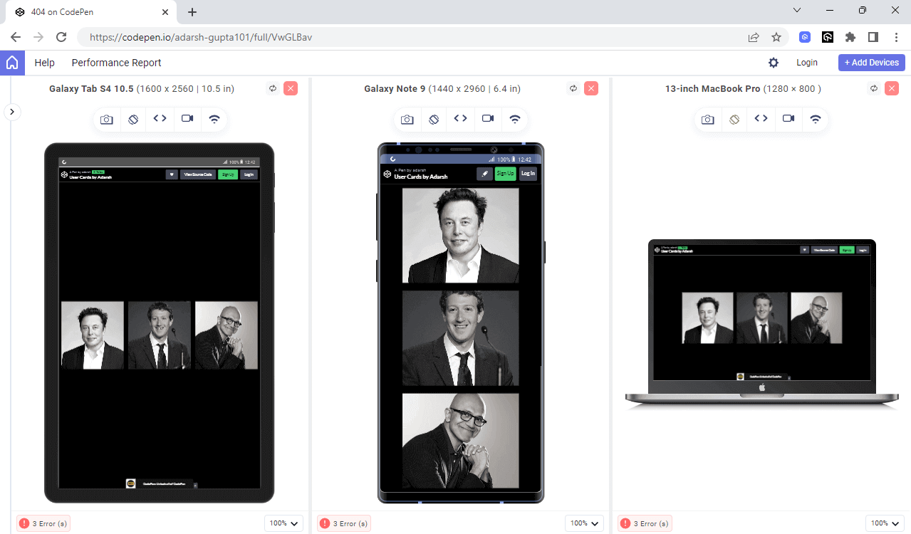
You can perform a website responsive test with LT Browser 2.0 and responsive screen testing using the LambdaTest platform across different devices.
Intuited to learn how to perform responsive testing, watch our video on performing responsive testing on the LambdaTest platform.
Also, subscribe to our LambdaTest YouTube Channel to learn about web automation tools like Selenium, Playwright, Appium, and more.
|
1 2 3 4 5 6 7 8 9 10 11 |
<html> <body> <div> <img src="https://images.pexels.com/photos/9969240/pexels-photo-9969240.jpeg?auto=compress&cs=tinysrgb&w=600"/> <img src="https://images.pexels.com/photos/8717959/pexels-photo-8717959.jpeg?auto=compress&cs=tinysrgb&w=1260&h=750&dpr=1"/> <img src="https://images.pexels.com/photos/9206602/pexels-photo-9206602.jpeg?auto=compress&cs=tinysrgb&w=1260&h=750&dpr=1"/><img src="https://images.pexels.com/photos/9206602/pexels-photo-9206602.jpeg?auto=compress&cs=tinysrgb&w=1260&h=750&dpr=1"/> </div> </body> </html> |
Style.CSS:
|
1 2 3 4 5 6 7 8 9 10 11 12 13 14 15 16 17 18 19 20 21 22 23 24 25 26 27 28 29 30 31 |
body{ background:black; } div{ display:flex; height:100vh; justify-content:center; align-items:center; } img{ width:20%; height:45%; border-radius:5%; object-fit:cover; margin:10px; filter: grayscale(100%); transition:0.9s ease-in-out; } img:hover{ filter: grayscale(0%); width:35%; border-radius:0; } @media only screen and (max-width:600px){ img{ width:10% } img:hover{ width:40%; } } |
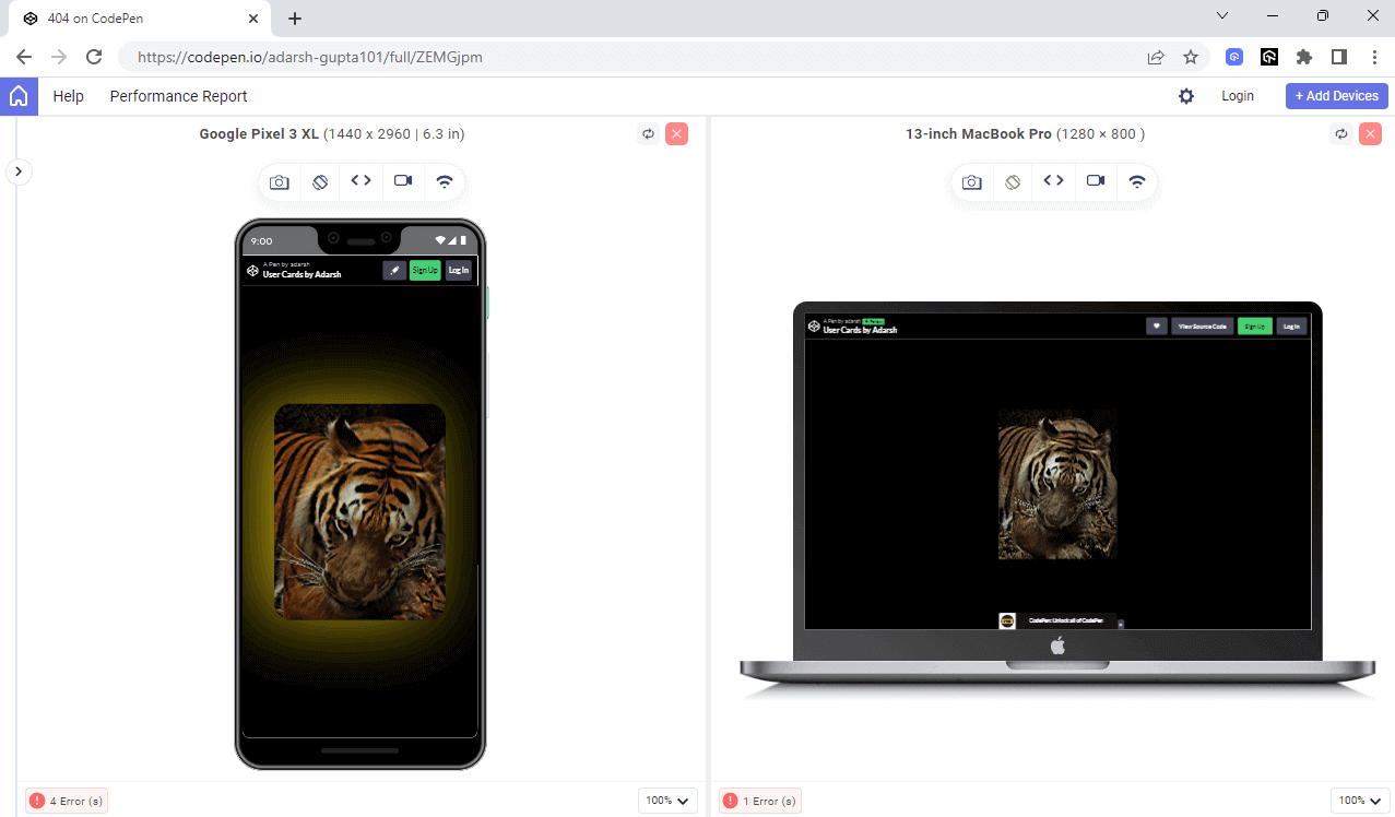
See the Pen
Untitled by adarsh (@adarsh-gupta101)
on CodePen.
Flexbox and Grid Layout also make it easier to create reusable and modular layout components, which is an essential aspect of writing better CSS. They provide a way to create layout components that you can reuse across different pages or sections of a website, which makes it easier to update the code in the future. But how can we use reusable code in CSS? The following sections of this CSS Refactoring tutorial will cover how to do so.
Using Reusable code
Red flag: Using duplicate code in your CSS.
Best practice: Using reusable code in CSS using class selectors.
Reusing your existing CSS code wherever possible can help you avoid code duplication and reduce the amount of code you write manually. Reusing can also make your code more readable, which is one of the best practices.
Here are a few ways to use reusable CSS code:
Use Classes:
Instead of repeating the same code, create a common class name that you can use to define the specific styles you want and apply it to the elements that require them.
In the following example, you can see how using a common class element reduces the duplication of code at least three times:
|
1 2 3 4 5 6 7 8 9 10 11 12 13 14 15 16 17 18 19 20 21 22 23 24 25 26 27 28 29 30 31 |
<div class="container"> <!-- lambdatest --> <div class="element elon"> <div class="social-icons"> <a href="#"><i class="fab fa-facebook-f"></i></a> <a href="#"><i class="fab fa-twitter"></i></a> <a href="#"><i class="fab fa-youtube"></i></a> </div> </div> <div class="element mark"> <div class="social-icons"> <a href="#"><i class="fab fa-facebook-f"></i></a> <a href="#"><i class="fab fa-twitter"></i></a> <a href="#"><i class="fab fa-youtube"></i></a> </div></div> <div class="element jeff"> <div class="social-icons"> <a href="#"><i class="fab fa-facebook-f"></i></a> <a href="#"><i class="fab fa-twitter"></i></a> <a href="#"><i class="fab fa-youtube"></i></a> </div></div> </div> |
CSS:
|
1 2 3 4 5 6 7 8 9 10 11 12 13 14 15 16 17 18 19 20 21 22 23 24 25 26 27 28 29 30 31 32 33 34 35 36 37 38 39 40 41 42 43 44 45 46 47 48 49 50 51 52 53 54 55 56 57 58 59 60 61 62 63 64 65 66 67 68 69 70 71 72 73 74 75 76 77 78 79 80 81 82 83 84 85 86 87 88 89 90 91 92 93 94 95 96 97 98 99 100 101 102 103 104 105 106 107 108 109 110 111 112 113 114 115 116 117 118 119 120 121 122 123 124 125 126 127 128 129 130 131 132 133 134 |
*{ margin:0} .container{ display:flex; justify-content:center; align-items:center; background:black; height:100vh } .element{ margin:10px; filter:grayscale(90%); } .element:hover{ margin:40px; filter:grayscale(0%) brightness(85%); box-shadow: -12px 10px 16px #ffffff; } .elon{ background: url('https://static.dezeen.com/uploads/2021/06/elon-musk-architect_dezeen_1704_col_0.jpg') center center no-repeat; background-size: 300px; height: 379px; width: 300px; transition: 0.75s ease-in; } .elon:hover{ background: url('https://static.dezeen.com/uploads/2021/06/elon-musk-architect_dezeen_1704_col_0.jpg') center top no-repeat; background-size: 600px; background-radius:100%; border-radius:30px } .jeff{ background: url('https://imageio.forbes.com/specials-images/imageserve/5d6ae14f673aa300083caf99/0x0.jpg?format=jpg&crop=2923,2926,x3051,y26,safe&height=416&width=416&fit=bounds') center center no-repeat; background-size: 300px; height: 379px; width: 300px; transition: 0.75s ease-in; } .jeff:hover{ background: url('https://imageio.forbes.com/specials-images/imageserve/5d6ae14f673aa300083caf99/0x0.jpg?format=jpg&crop=2923,2926,x3051,y26,safe&height=416&width=416&fit=bounds') center top no-repeat; background-size: 600px; border-radius:30px; } .mark{ background: url('https://upload.wikimedia.org/wikipedia/commons/0/01/Mark_Zuckerberg_at_the_37th_G8_Summit_in_Deauville_018_square.jpg') center center no-repeat; background-size: 300px; height: 379px; width: 300px; transition: .75s ease-in-out; } .mark:hover{ background: url('https://upload.wikimedia.org/wikipedia/commons/0/01/Mark_Zuckerberg_at_the_37th_G8_Summit_in_Deauville_018_square.jpg') center top no-repeat; background-size: 600px; border-radius:30px } .fa-facebook-f{ color:blue } .social-icons a { display: inline-block; margin: 0 10px; } .social-icons a i { color:#f0ffff; font-size: 28px; } .social-icons a i:hover { color: #ccc; } .social-icons{ position:absolute; display:flex; background:transparent; width:100%; justify-content:space-evenly; align-items:center; border-radius:50%; top:80%; opacity: 0; transition: opacity 0.4s ease-in-out; } .element:hover .social-icons{ transform: translateX(0%); opacity: 1; opacity: 1; } .social-icons a { display: inline-block; margin: 0 10px; opacity: 0; animation: fade-in 0.5s ease-in-out forwards ; } @keyframes fade-in { from { opacity: 0; } to { opacity: 1; } } @media only screen and (max-width:600px){ .container{ flex-direction:column; } .element:hover{ background-size:300px } } |
See the Pen
User Cards by Adarsh by adarsh (@adarsh-gupta101)
on CodePen.
Here in the above example, we have reduced the duplication of code with the help of the element class, or else we will give the same style again and again for the classes .satya, .mark, and .elon.
Use CSS Variables:
We can further reduce code duplication using CSS variables. This makes it easy to change the property in one place and have it updated everywhere it’s used. We used the same property values multiple times in the example. We can avoid that by using the global variable :root like this:
|
1 2 3 4 5 |
:root { --img-size: 300px; --img-size-hover: 600px; --border-radius: 30px; } |
There are many other ways to reduce code duplication, like using CSS inheritance, but we cannot depend on CSS inheritance when we want the same type of element with a few different characteristics.
Use Mobile First approach
Red flag: Designed to only work well on desktop devices.
Best practice: Design a mobile-first desktop that scales well on higher decide ratios.
According to a study by ThinkwithGoogle, people with a bad experience on mobile are 62% less likely to make a future purchase – no matter how beautiful or data-driven your marketing campaigns are.
With billions of people accessing websites solely through their mobile devices, we should focus on building a seamless experience for smartphone users. The study also says that 58% of the users feel more favorable toward companies whose mobile sites or apps remember who they are and their past behavior.
These numbers speak to the truth that having a better digital experience can make your customers remember you, and that’s an integral part of success for all businesses.
The main principle of a mobile-first approach is that the site should be fully functional and usable on a mobile device and then progressively enhanced for larger screens with additional features and functionality. Only optimizing the CSS for different devices can lead to good performance on mobile devices.
Most of the time, we will use some styling libraries to achieve this. Some of the most popular CSS libraries for achieving this like
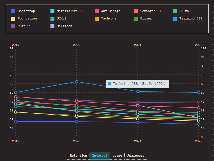
- Bootstrap: Bootstrap is one of the best CSS frameworks that provides a mobile-first grid system and a set of pre-designed UI components. It is designed to make it easy to create responsive applications using mobile-first website designs.
- Tailwind CSS: Tailwind CSS is a utility-first CSS framework that provides a set of low-level utility classes that can be used to build custom designs. It is designed to be highly customizable and adaptable, making it an excellent choice for developers who want to create unique designs.
- Foundation: Foundation is another popular CSS framework that provides a mobile-first grid system and a set of pre-designed UI components. It also includes a set of SaSS variables and mixins, making it easy to customize the design.
- Bulma: Bulma is a lightweight CSS framework that provides a mobile-first grid system and a set of pre-designed UI components. It is designed to be easy to use and customize, making it a great choice for developers new to CSS frameworks.
Mobile responsiveness is also important for search engine optimization (SEO), as search engines like Google prioritize mobile-friendly websites in their search rankings.
You can also use responsive design techniques, such as CSS media queries, to ensure that the website looks and performs well on all devices.
The following are some of the most common media queries for certain device screens.
|
1 2 3 4 5 6 7 8 9 10 11 12 13 14 15 16 17 18 19 20 21 22 23 24 25 26 27 28 29 30 31 32 33 34 35 36 37 38 39 40 41 |
/* Target screens with a minimum width of 600px */ @media (min-width: 600px) { /* styles go here */ } /* Target screens with a maximum width of 600px */ @media (max-width: 600px) { /* styles go here */ } /* Target screens with a width between 600px and 900px */ @media (min-width: 600px) and (max-width: 900px) { /* styles go here */ } /* Target screens with a resolution of 2dppx or higher */ @media (min-resolution: 2dppx) { /* styles go here */ } /* Target screens in landscape orientation */ @media (orientation: landscape) { /* styles go here */ } /* Target screens in portrait orientation */ @media (orientation: portrait) { /* styles go here */ } /* Target screens with a color index of at least 8-bits */ @media (min-color-index: 8) { /* styles go here */ } /* Target screens with a color index of at most 8-bits */ @media (max-color-index: 8) { /* styles go here */ } |
One way to optimize a website’s performance is to split and conditionally load stylesheets using media queries. Depending on the device width, we can create multiple stylesheets for different dimensions and load them accordingly.
Here’s an example with a code snippet for conditionally loading a stylesheet based on screen size using a media query:
|
1 2 3 4 5 6 7 8 9 10 |
<!-- Load small screen stylesheet for screens up to 480 pixels wide --> <link rel="stylesheet" media="(max-width: 480px)" href="small-screen.css"> <!-- Load medium screen stylesheet for screens between 481 and 768 pixels wide --> <link rel="stylesheet" media="(min-width: 481px) and (max-width: 768px)" href="medium-screen.css"> <!-- Load large screen stylesheet for screens above 768 pixels wide --> <link rel="stylesheet" media="(min-width: 769px)" href="large-screen.css"> |
The above code tells the browser to only load the stylesheet when the conditions are met. You can further test the mobile responsiveness of your website using the LT Browser, which allows you to see how your website looks on different device ratios
You can also debug directly from the browser and find the appropriate styles using the inspect tool.
Remove unused CSS
Red flag: Ignore the new code and leave them as it is.
Best practice: Remove the unwanted code, so that the size of the CSS file is reduced.
When you clean up your code (refactoring), you might leave behind old styles that are not being used or add new ones that are not being used. These unused styles increase the size of your file and can cause problems.
Either you can manually remove the redundant code, or you can use libraries like PurgeCSS or PurifyCSS, which analyze your HTML and CSS files and remove any CSS code that is not being used.
Leaving the unused CSS code in your file will unnecessarily increase the file size, which can cause slow page load times, improved bandwidth usage, and negatively impact user experience. But while removing the unwanted CSS, we should be careful enough, or else we might remove the useful code.
Auditing the health of CSS code
To improve your CSS code and avoid bugs, it’s essential to have a clear goal in mind and use objective data to set measurable targets during the CSS code refactoring process. Factors such as target file size, selector specificity, CSS code complexity, and several media queries should be considered to improve code quality.
CSS Stats:
Many helpful tools are available to give an overview and statistics about the CSS codebase when auditing or preparing for CSS refactoring. One of the most popular tools for this is CSS Stats.
While writing this article, I audited my website using CSS Stats and found that the file size was around 74 KB, which is huge even though the website is a single-page application.
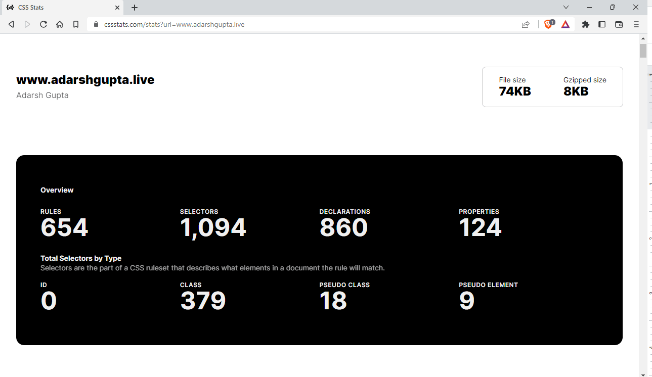
Some key features of CSS Stats are:
- Analyze CSS code: CSS Stats can be used to provide insights about the number of selectors, properties, and declarations used in the code.
- Understand complexity: CSS Stats can show the number of unique font sizes, colors, and other CSS properties used in the code to identify areas where simplification may be possible.
- Compare against benchmarks: CSS Stats can compare the CSS code of a website against industry benchmarks and provide insights into areas for improvement.
With CSS stats, you can analyze where to improve and how to make the code better, and the tool provides a good overview of the CSS quality that is hard to spot manually. Many other tools can be used to achieve the same thing.
Google Lighthouse
A free and open-source tool developed by Google that audits the performance and accessibility of web pages. It offers an audit feature that analyzes the CSS code of your website and provides recommendations on where and how to improve.
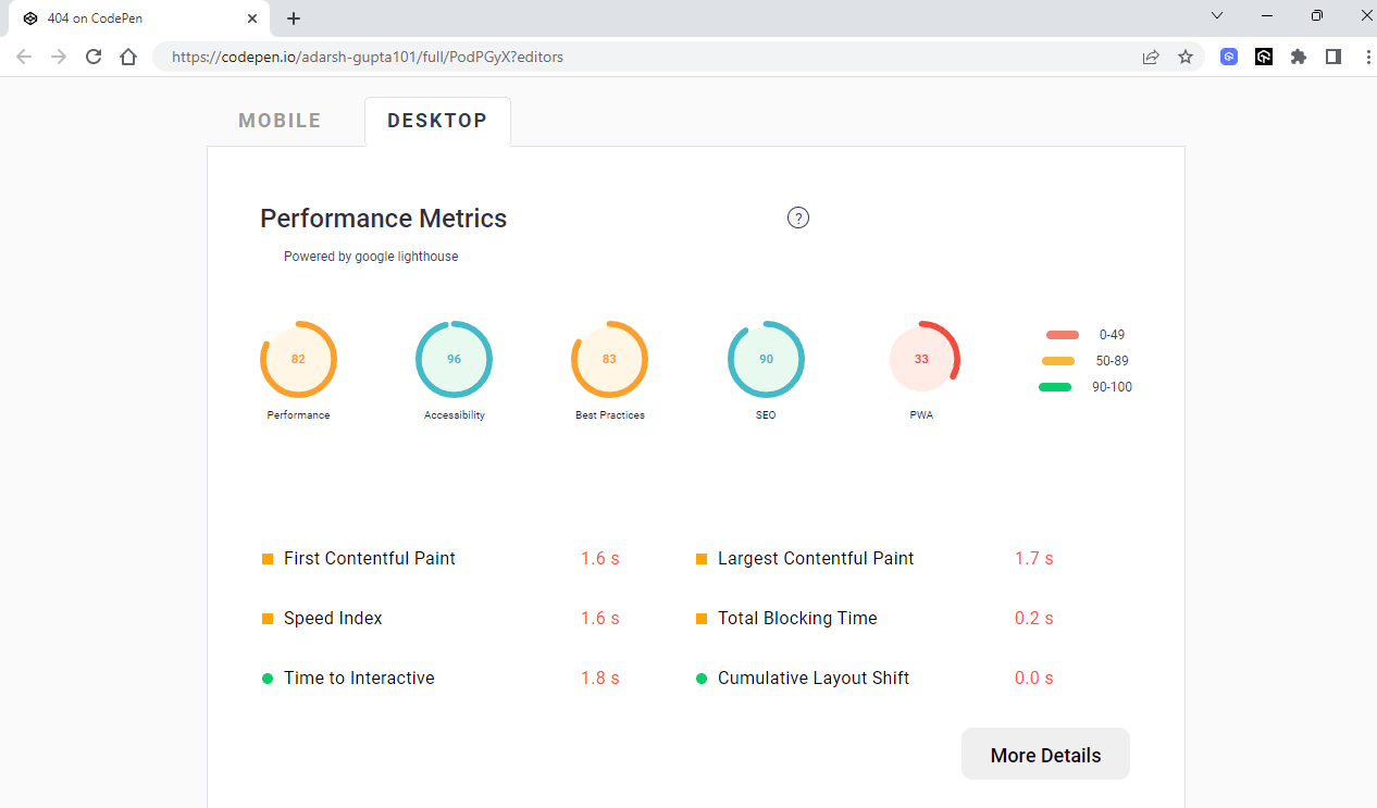
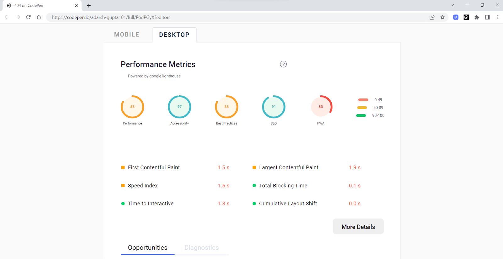
Let’s audit a website and analyze it.
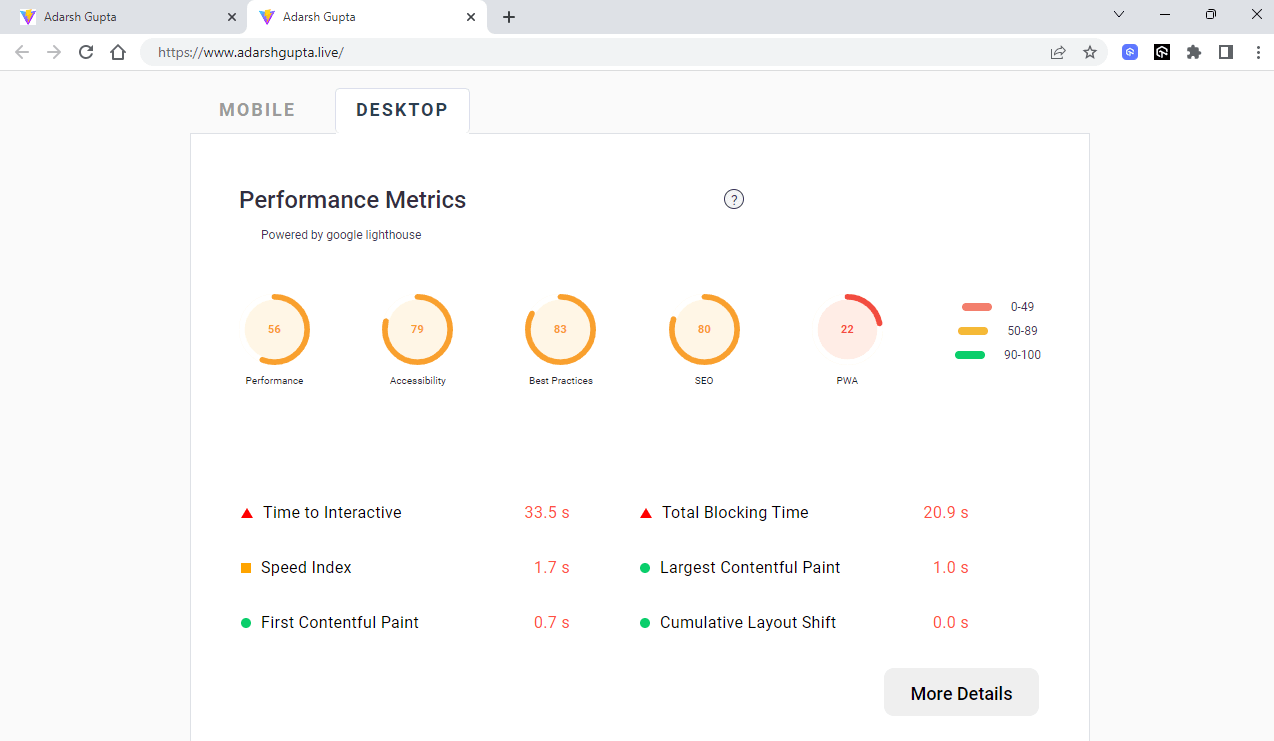
You can see that the performance of my website is only 56%. And this is not good enough, and the reason for this is the assets, such as images, JavaScript, CSS, etc., and styles that are taking a long time to load.
With our LT Browser 2.0, you can analyze the metrics like First Content Paint, Time to Interactive, Largest Content Paint, Speed Index, Cumulative Layout Shift, etc.
PageSpeed Insights
It is a web tool created by Google that helps developers analyze the performance of their web pages on mobile and desktop devices. If you want more data on where to improve, PageSpeed Insights simplifies that with many diagnostic tips.
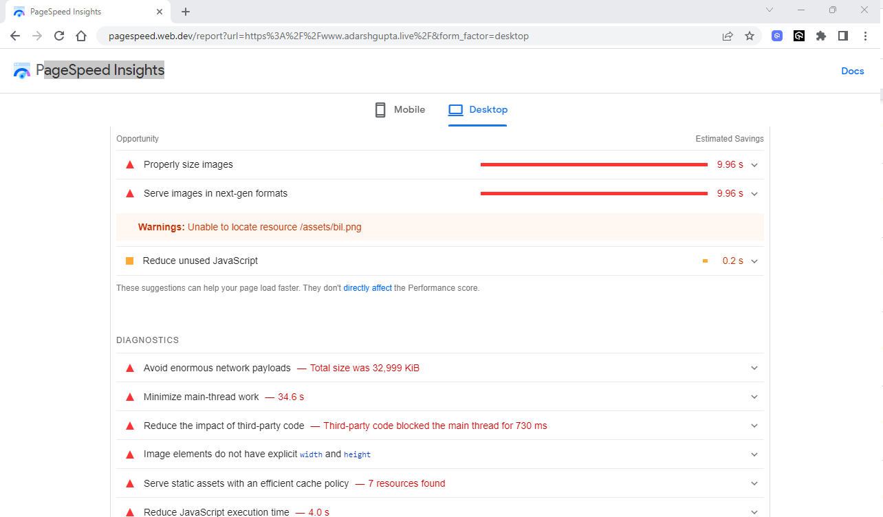
PageSpeed insight suggests optimizing images, leveraging browser caching, and minimizing the number of requests made by the page. It also gives metrics about First Contentful Paint, Largest Contentful Paint, time taken to respond, etc.
Most of the time, we can optimize the performance and page load by making the styles and assets non-render blocking, which we will discuss in the next section.
Eliminating Render-Blocking CSS
By default, CSS can slow down website rendering because the browser won’t show any content until the CSS is loaded. It’s important to keep the CSS code small, load it as quickly as possible, and use media types and queries to avoid blocking rendering.
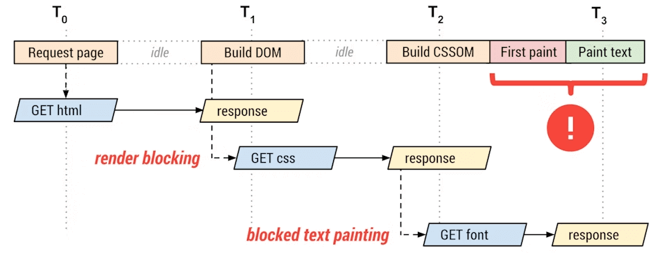
One way to make CSS non-render-blocking is by deferring the CSS, which means making our CSS render only after the HTML content is fully loaded. But this creates a bad user experience because the user will see a styleless version of your website for quite some time, called a flash of unstyled content (FOUC). But the advantage here is that we can improve the core web vital score of the LCP.
An effective solution to managing CSS rendering is to load only the minimum amount of CSS needed for rendering the part of the website that the user sees and then load the rest of the CSS later. This can improve the user experience while optimizing the website’s load time.
You can defer the CSS by using asynchronous loading, for example,
|
1 2 |
<link rel="preload" href="styles.css" as="style" onload="this.onload=null;this.rel='stylesheet'"> <noscript><link rel="stylesheet" href="styles.css"></noscript> |
Here, the link rel=”preload” as=“style” requests the stylesheet asynchronously. You also need to have a fallback for the browsers that don’t execute JavaScript.
Optimizing Web Layout and Positioning
We use CSS for positioning an element to improve the UI, and there are many ways to achieve that. As mentioned earlier, positioning using margin and padding is not the best way, as it breaks styles on certain devices.
Let’s take an example and visualize it:
HTML:
|
1 2 3 4 5 6 7 8 9 10 11 12 13 14 15 16 17 18 19 20 21 22 23 24 |
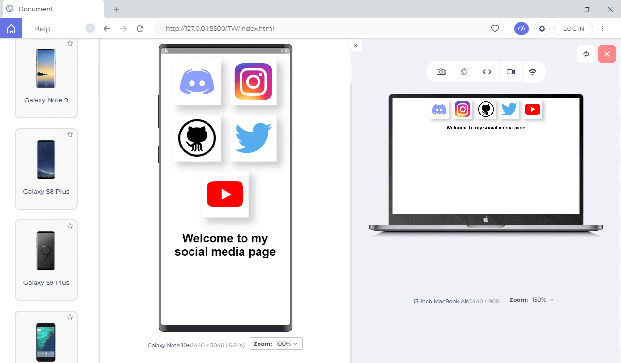
<!DOCTYPE html> <html lang="en"> <head> <meta charset="UTF-8"> <link rel="stylesheet" href="app.css"> <meta http-equiv="X-UA-Compatible" content="IE=edge"> <meta name="viewport" content="width=device-width, initial-scale=1.0"> <title>Document</title> </head> <body> <div class="container"> <img class="social" src="https://www.freepnglogos.com/uploads/discord-logo-png/concours-discord-cartes-voeux-fortnite-france-6.png"/> <img class="social" src="https://upload.wikimedia.org/wikipedia/commons/thumb/a/a5/Instagram_icon.png/2048px-Instagram_icon.png" alt=”instagram”/> <img class="social" src="https://upload.wikimedia.org/wikipedia/commons/thumb/9/91/Octicons-mark-github.svg/2048px-Octicons-mark-github.svg.png" alt=”github”/> <img class="social" src="https://upload.wikimedia.org/wikipedia/commons/thumb/4/4f/Twitter-logo.svg/1200px-Twitter-logo.svg.png" alt=”Twitter”> <img class="social" src="https://upload.wikimedia.org/wikipedia/commons/e/ef/Youtube_logo.png" alt=”Youtube”/> </div> <p class=”paragprah__one”>Welcome to my social media page</p> </body> </html> |
CSS:
|
1 2 3 4 5 6 7 8 9 10 11 12 13 14 15 16 17 18 19 20 21 22 23 24 25 26 27 28 29 30 31 |
*{ margin: 0; padding: 0; box-sizing: border-box; font-family: 'Poppins', sans-serif; } .container{ display: block; width: 100%; height: 100px; } .social{ width: 100px; height: 100px; object-fit: contain; margin: 10px; padding: 10px; border-radius: 49%; /* shadow */ box-shadow: 10px 10px 15px 1px rgba(0,0,0,0.2); overflow: hidden; } p{ font-size: 25px; font-weight: 600; color: #000; margin: 10px; padding: 10px; } |
Output:
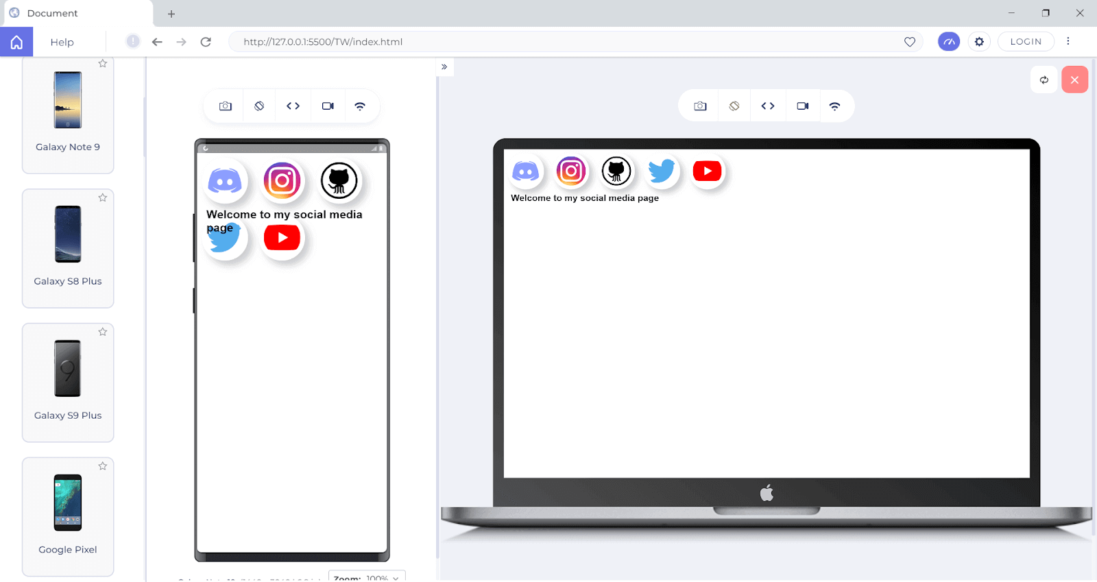
Here you can see that the desktop version looks good, but the UI is disoriented when it comes to the mobile version. Because of this, it is not recommended to use margin or padding properties to make the layout. We can now use the Flexbox layout to make this UI look better.
|
1 2 3 4 5 6 7 8 9 10 11 12 13 14 15 16 17 18 19 20 21 22 23 24 25 26 27 28 29 30 |
*{ margin: 0; padding: 0; box-sizing: border-box; font-family: 'Poppins', sans-serif; } .container{ display: flex; width: 100%; flex-wrap: wrap; justify-content: center; align-items: center; } .social{ width: 100px; height: 100px; object-fit: contain; margin: 10px; padding: 10px; box-shadow: 10px 10px 15px 1px rgba(0,0,0,0.2); overflow: hidden; } p{ font-size: 25px; font-weight: 600; color: #000; margin: 10px; padding: 10px; text-align: center; } |
You can see from the output why using a layout like a flexbox can improve the layout in all dimensions.
These layouts are also more efficient and flexible, requiring less complex CSS and JavaScript. Using CSS Grid and flexbox can also help you reduce the number of elements on a page, improving load times.
We’ve looked at some best practices for CSS, and now let’s turn our attention to some external tools that can assist us.
Optimizing Your CSS Workflow With PostCSS
With the increased demand for libraries such as Tailwind, more and more developers are using PostCSS in their projects. PostCSS has around 70 million weekly downloads from the NPM manager.
PostCSS is a tool for transforming CSS styles using JavaScript plugins. It allows you to use modern CSS features not yet supported by all browsers and adds new CSS functionality, such as variables, functions, and mixins.
Despite the name, PostCSS is not just a pre-processor or post-processor; it is a transpiler, to be specific, that turns a special PostCSS plugin syntax into vanilla CSS.
Some of the benefits of using PostCSS include
- Browser compatibility: PostCSS automatically converts modern CSS features not supported by all browsers into compatible ones.
- Performance: By minifying and optimizing your CSS code, PostCSS can help to improve the overall performance of your website or web application.
- Customization: Offers various plugins that can be used to customize your CSS, such as adding CSS variables, functions, and mixins.
- Maintainability: PostCSS can help make your CSS more maintainable by providing features such as linting and source mapping.
- Flexibility: PostCSS is a highly flexible tool that can be used with other libraries and frameworks such as Tailwind, Foundation, and Bulma.
- Compatibility: PostCSS is compatible with a wide range of CSS syntaxes and can handle modern and legacy CSS. This makes it a popular choice for developers who want to ensure that their CSS code is compatible with a wide range of browsers and devices.
PostCSS can be used with other tools, such as preprocessors like SaSS, LESS, and Stylus, and CSS frameworks and libraries. It removes the extra work we must do while considering cross-platform support.
Using CSS Preprocessors
Nowadays, most developers use CSS Preprocessors to style because it helps them by adding features to CSS that make it easier to maintain and scale CSS code.
Some of the main features of the CSS preprocessor are:
- Using variables: Preprocessor allows you to write reusable code with the help of variables. You can store the value and reuse it throughout the stylesheet.
- Nesting Styles: Nesting is a considerable advantage over CSS because it creates a visual hierarchy similar to what you are used to with HTML.
- Operations: You can do calculations with preprocessors like SaSS and LESS.
- Functions and Mixins: Preprocessors provide functions and mixins, which can help to make your CSS code more efficient and reusable. Functions can be used to perform calculations, and mixins can be used to reuse a set of styles across different selectors.
- Improves Readability: With the help of variables, nesting, and functions, preprocessors can make your CSS code more readable and understandable, which makes it easier to update and maintain.
- Browser compatibility: Some preprocessors, like Autoprefixer, can automatically add prefixes to your CSS, which means that your code will work on more browsers without the need to add the prefixes manually.
While there are many options out there for CSS preprocessors, some of the most commonly used ones are:
SaSS
SaSS stands for Syntactically Awesome Stylesheets, is a CSS preprocessor that gives superpowers to CSS, making it easier to work with, reduces repetition, and saves time, which helps style your pages easily with fewer CSS lines.
Some of the features of SaSS are
- Reference symbol (&): Reference symbol allows you to reference a parent element and can also be used after a selector to combat some IE-related issues.
- Partials and @import directive: Partials and @import directive to make the code more modular, divide it into smaller particles, and group them up for mixins, settings (defined variables), etc.
- Functions: Functions are built-in and can be used for color, string, and number-related operations.
LESS
Linear style sheets, or simply LESS, is another popular CSS preprocessor that provides features similar to SaSS, such as variables, nesting, and functions. It also has built-in support for operations and functions, making it easy to create complex styles.
Some of the features of LESS are
- Real-time file monitoring: Less can display and follow the contents of a file in real-time as it is being updated. This handy feature is used for monitoring log files, for example, as new data is added to them.
- Text search and highlighting: Less allows you to search for text in the file and highlight all instances of the search term.
- Display of compressed files: Less can display the contents of compressed files without the need to decompress them first manually. This is useful when working with large code that is difficult to handle.
Stylus
It is a dynamic stylesheet preprocessor language compiled into Vanilla CSS. SaSS and LESS influence its design.
Some of the features of Stylus are
- Built-in Functions: Stylus provides many built-in functions that allow you to manipulate values in your stylesheets, such as color operations, math functions, and string operations.
- Nested Syntax: Stylus allows you to nest CSS selectors and properties, making it easy to create well-organized and easy-to-read stylesheets.
- Conditional Statements: Stylus supports conditional statements, such as if/else and switch, making it possible to create complex logic in your stylesheets.
Key Factors to Remember while Organizing your CSS for Large-Scale Projects
Once you start working as a team, you will probably work with large codebases, and organizing your CSS can be daunting. But following the right approach can make your code more readable and manageable.
Some key considerations for organizing your code include:
Use a modular approach:
Break down your CSS into small, reusable modules that can be easily managed and updated in the future. You should always start having a modular approach from day one, as it will help you when the codebase becomes large.
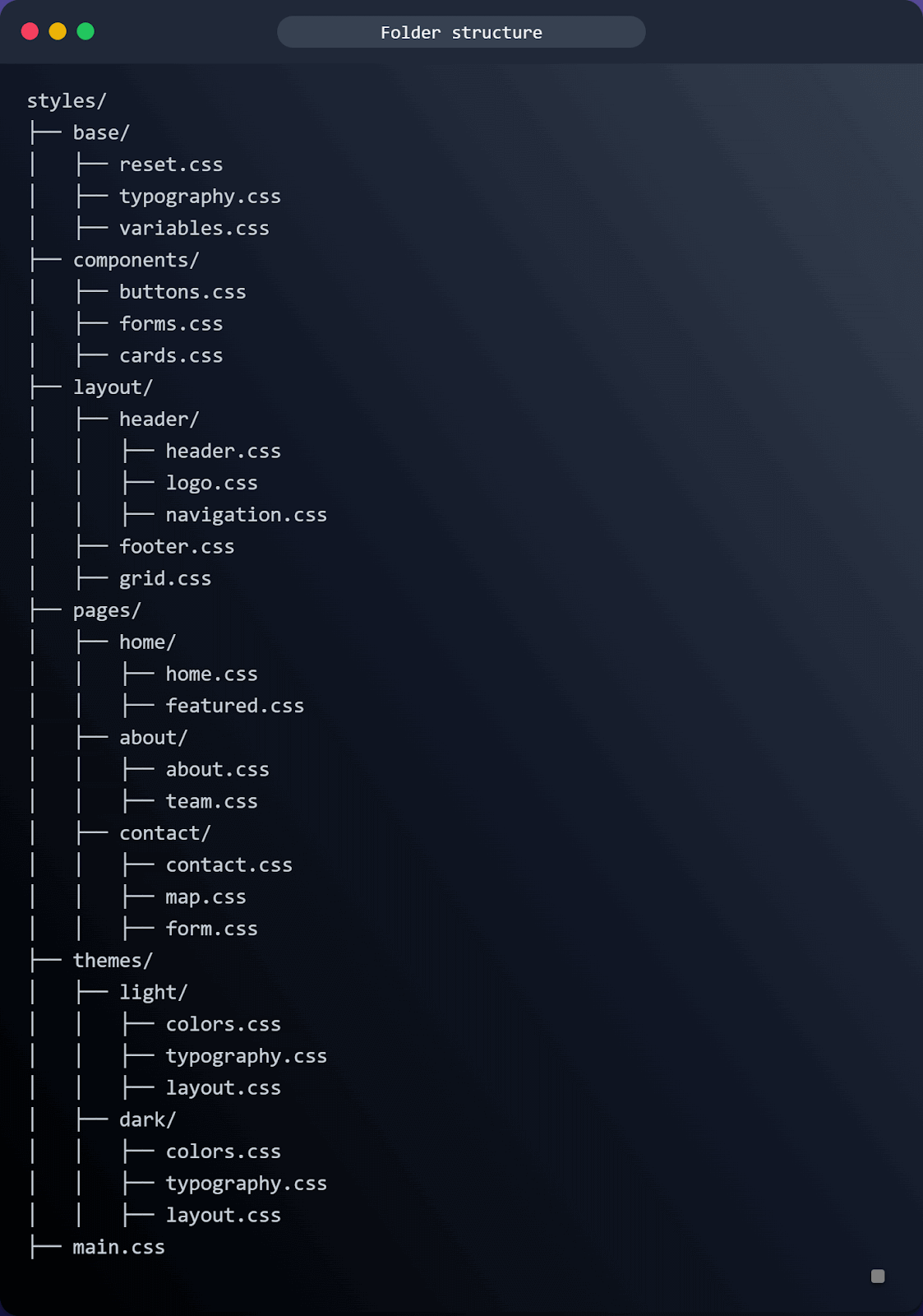
Here’s an example file directory of how you might organize your working directory to break it down:
|
1 2 3 4 5 6 7 8 9 10 11 12 13 14 15 16 17 18 19 20 21 |
styles/ ├── base/ │ ├── reset.css │ ├── typography.css │ ├── variables.css ├── components/ │ ├── buttons.css │ ├── forms.css │ ├── cards.css ├── layout/ │ ├── header.css │ ├── footer.css │ ├── grid.css ├── pages/ │ ├── home.css │ ├── about.css │ ├── contact.css ├── themes/ │ ├── light.css │ ├── dark.css ├── main.css |
In this example, the “base” directory contains the CSS for global elements and variables, the “components” directory contains the CSS for specific UI components, the “layout” directory contains the CSS for the overall layout of the website, the “pages” directory contains the CSS specific to individual pages, and the “themes” directory contains the CSS for different color schemes. The “main.css” file imports all the other CSS files and is the file that is linked to the HTML document.
You can see now that we have an organized structure, and it is easy to update the styles in the future. You can also reuse the component across multiple pages.
Use of Linting tools:
When our codebase grows, it will be challenging to maintain the structure of file directories and CSS codes. This is where CSS linting tools come in. A linting tool is software that checks your CSS code for errors and inconsistencies and can help you catch common issues before they cause problems in your project.
Stylelint is one of the most popular CSS linting tools. It is a linter that can help you avoid errors in your style. Some of the key features of Stylelint include
- It has over 170+ built-in rules for modern CSS syntax and features.
- It allows you to create your own rules using plugins.
- It automatically fixes problems wherever possible.
- It supports shareable configs that you can extend, create, and customize to your needs.
- It has a growing community and is used by Google, GitHub, and WordPress.
You can specify the rules you want to follow throughout the project, and it will throw an error if we try to break those. The below image is the lint tool output:
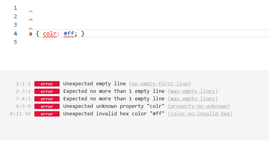
You can see from the example how useful it is! Using a linter like Stylelint can help us write error-free code. Stylelint is a popular tool among front-end developers, and according to NPM JavaScript, it has around 3 million weekly downloads.
Use CSS variables:
Most CSS developers aren’t aware that we can use variables inside CSS. We can use reusable variables, as the name implies, to improve the overall readability of the code.
For example, instead of hardcoding a color value in multiple places throughout your CSS, you can store it as a variable and then reference it wherever the color is used. This makes it easy to update the color in one place and have the change propagate throughout your code.
Here is an example of how you might use a variable to store a color value in your CSS:
|
1 2 3 4 5 6 7 8 9 10 11 12 13 14 15 16 |
:root { --primary-color: #4CAF50; --Secondary-color: #fff0ff; } .btn { background-color: var(--primary-color); color: #fff; } .btn:hover{ background-color: var(--Secondary-color); } |
In this example, we have defined a variable named —primary-color and set it to the value of #4CAF50. We can then reference this variable in our CSS using the var() function.
It is important to note that CSS variables are a new feature, and some browsers don’t support them yet.
Use a CSS framework:
Front-end developers are more interested in using CSS libraries than just writing raw CSS. One of the reasons is that these frameworks provide more features and a more user-friendly approach to styling your element. They can also speed up your development and have consistent styling throughout the project.
Some popular CSS frameworks include
- Tailwind CSS
It is one of the most widely used CSS frameworks. It is a utility-first framework with nearly 13 million monthly downloads. It allows you the flexibility and freedom to select your website’s style.
Tailwind CSS has some default settings; you can override these configurations to meet your demands. Tailwind’s utility classes and components are easily customizable. Tailwind has a good reputation among front-end communities because of its simplicity in styling. Tailwind uses a mobile-first breakpoint system, which means you can specify prefixed utilities like sm: md: lg: that only take effect at the specific breakpoint and above.
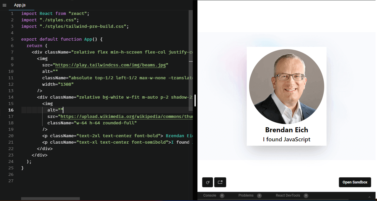
I use Tailwind all the time, and it is a lifesaver. For example, you can create a beautiful card like this with just a few lines of code.
Output:
CodeSandbox Link:
Some of the notable features of TailwindCSS are:
- Customizable: Most frameworks lack this feature, but TailwindCSS is highly customizable. We can modify the default styles and themes and configure everything depending on the project.
- Utility Classes: Tailwind provides a lot of utility classes that we can use and quickly style the application like m-{} for margins, p-{} for padding, etc.
- Mobile-First Design: TailwindCSS follows a mobile-first design approach, where styles for smaller screens are defined first, then styles for larger screens are added as needed. One advantage of this is that responsiveness will be our key priority while building a design.
- Easiness in Integrating with other tools: Tailwind can be used with almost all the popular frontend frameworks like React, Angular, Vue, etc.
- Bootstrap
Another popular CSS framework that can make web development much faster and easier. It allows developers to quickly and easily create responsive and mobile-friendly websites. It was initially developed by Twitter and is now maintained by a team of developers at GitHub.
Bootstrap includes a set of pre-designed CSS classes, JavaScript plugins, and other tools for creating various UI elements, such as forms, buttons, and navigation menus, which we can import and use on our website.
With approximately 3.7 million downloads, Bootstrap remains one of the best CSS framework choices, and many big tech companies still rely on it.
Bootstrap and Tailwind use inline styles, but the significant difference is that Bootstrap has prebuilt components, whereas Tailwind has pre built utility classes. Tailwind is more flexible, as we can control the flow, whereas, in Bootstrap, we have to follow the flow.
Bootstrap features are
- Pre-designed UI Components: Bootstrap provides a collection of UI components, such as buttons, forms, alerts, modals, and more, that you can use to build UIs quickly.
- JavaScript Plugins: Bootstrap has a set of powerful JavaScript plugins that you can use to add interactive features to your web pages, such as carousels, tooltips, popovers, and more.
- Wider Acceptance: Most prominent tech companies still rely on Bootstrap, like Udemy, Spotify, etc.
Debugging and Troubleshooting CSS
Since developers are free to use CSS as they choose, it can sometimes cause problems on a website. With so many different browsers, devices, and screen sizes that a website or web application must support, it can be challenging to identify and resolve CSS issues.
The only way to try out the performance and appearance is to try it on these devices manually, but that will be very hard, right?
LT Browser 2.0
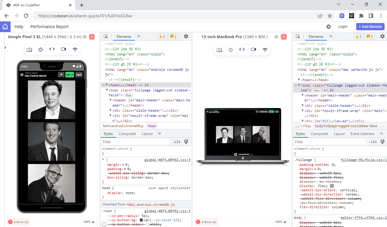
Actually, there is a tool that I have been using recently called LT Browser 2.0 that helps to simulate web applications on different screen sizes. I recently used it to test my website on various dimensions, and it makes developers’ lives easy.
The latest native Chromium rendering engine powers LT Browser 2.0. It will take your responsive testing to the next level. You can now test and interact with up to four devices, with a handful of Android, iOS, and desktop devices to test on. You can view all the changes in real time, and now we developers don’t need to switch browser resolutions repeatedly.
You can also improve your debugging experience by using multiple dev tool options, and the best part is that you can now use different dev tools for each device and debug them all at the same time.
Browser Dev Tools
When encountering a styling problem, we must first determine what is causing it. To achieve this, you can use the browser’s in-built dev tools, like Chrome dev tools or Firefox dev tools, which can help you inspect and modify the HTML and CSS of a web page in real time.
The dev tools allow you to see the HTML structure of a page and the CSS styles applied to different elements. This can help identify where a problem might occur, such as a missing class or an incorrect CSS selector.
Using the development tools, you can tweak the value and find the appropriate one.
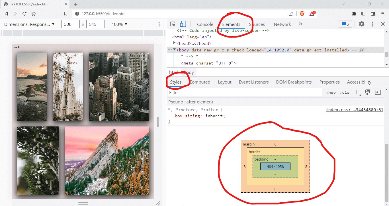
Most problems arise when you forget how the box model works. The CSS box-sizing model refers to the rectangular boxes generated for elements in the document tree and how they are sized, positioned, and layered. Next time you style your element, remember to consider the box model.
You can also use the developer version of Google Chrome, i.e., Chrome Canary, to test and experiment with new and experimental features before they are released to the public so that your application can stay ahead of the curve and take advantage of cutting-edge technology.
You can access new Chrome DevTools features early by using Canary. It offers features like Audits, Request Blocking, and Local Overrides for diagnosing website performance issues. Other recent additions include a payment handler debugger, a third-party diagnostic tool, a bug reporting tool for DevTools, and enhancements to the Timing section.
Additionally, you can use LT Debug, an easy-to-use developer tool with over nine unique features that web developers and testers regularly use during debugging.
LT Debug is free and provides access to more than 100+ free developer tools that developers and testers often use.

Browser-specific CSS Prefixes
These prefixes are used to target a specific browser to ensure that a website or web application is compatible with different browsers and to take advantage of new CSS features that all browsers may not fully support.
The following are some of the most common prefixes:
- -webkit: This prefix is used to target webkit-based browsers like Chrome and Safari. This prefix is necessary because older versions of these browsers may interpret CSS code differently than newer versions. Examples of CSS properties that may require the -webkit- prefix include: -webkit-transform, -webkit-transition, -webkit-animation.
- -moz-: This prefix is used to target Firefox browsers. This prefix is necessary because Firefox may not fully support certain CSS features other browsers support. Examples of CSS properties that may require the -moz- prefix include: -moz-box-sizing, -moz-border-radius, -moz-transform.
- -o- : This prefix is used to target Opera. This prefix is necessary because Opera may not fully support certain CSS features supported by other browsers. Examples of CSS properties that may require the -o- prefix include: -o-transform, -o-text-overflow, -o-border-image.
I know this is hard when writing browser-specific prefixes, but to our aid, we have this tool called Autoprefixer, which, as the name suggests, will add the prefix automatically.
For example, if you give the prefixer some code like this
|
1 2 3 4 5 6 7 8 9 10 11 12 13 |
.social { display: grid; transition: all .5s; user-select: none; width: 100px; height: 100px; object-fit: contain; margin: 10px; padding: 10px; box-shadow: 10px 10px 15px 1px rgba(0,0,0,0.2); overflow: hidden; background: linear-gradient(to bottom, white, black); } |
It will give the following output.
|
1 2 3 4 5 6 7 8 9 10 11 12 13 14 15 16 17 18 19 20 21 22 23 24 25 26 27 28 29 30 31 |
/* * Prefixed by https://autoprefixer.github.io * PostCSS: v8.4.14, * Autoprefixer: v10.4.7 * Browsers: last 4 version */ .social { display: -ms-grid; display: grid; -webkit-transition: all .5s; -o-transition: all .5s; transition: all .5s; -webkit-user-select: none; -moz-user-select: none; -ms-user-select: none; user-select: none; width: 100px; height: 100px; -o-object-fit: contain; object-fit: contain; margin: 10px; padding: 10px; -webkit-box-shadow: 10px 10px 15px 1px rgba(0,0,0,0.2); box-shadow: 10px 10px 15px 1px rgba(0,0,0,0.2); overflow: hidden; background: -webkit-gradient(linear, left top, left bottom, from(white), to(black)); background: -o-linear-gradient(top, white, black); background: linear-gradient(to bottom, white, black); } |
While CSS Refactoring, it is essential to consider the use of browser-specific prefixes. You should look for any prefixes that are no longer necessary, as the browser may have fully supported the feature, and remove the need for those prefixes. As mentioned earlier, you can use CanIUse.com to check whether the browser specifies these properties.
Role of Testing in CSS Refactoring
While CSS Refactoring, it is essential to test your changes thoroughly to ensure that they don’t cause any new problems or affect the user experience negatively.
Some of the tests we should consider while CSS Refactoring are:
- Performance Testing: While CSS Refactoring, there are chances that some code can affect the overall performance. Measuring the website’s performance after refactoring and comparing it to the performance before the changes were made is essential.
- Regression Testing: It allows us to ensure that performance and appearance are not affected while CSS Refactoring. By conducting regression testing, we can identify any issues that may arise due to our code changes and fix them before they cause problems for our users.
- Browser Compatibility Testing: While CSS Refactoring, it is essential to ensure that it looks great and functions well on all popular web browsers like Chrome, Firefox, and Safari. It is to test the website on different browsers to ensure it’s optimized for every user.
Use Version Control
Version control is an underrated way of managing your CSS code, but to be fair, it is the best way to manage your CSS. You can manage your entire workflow using a version control system such as Git. This will allow you to track and revert changes, if necessary, quickly.
You can create a separate branch for your CSS Refactoring work to avoid conflict with the main development branch. By using Git, you can have this history of work so that you can go back and forth to manage your CSS code.
Sometimes, CSS Refactoring can take a lot of time and effort. In some cases, it may not be necessary or practical. For example, if the CSS is already well-organized and easy to maintain, the website has a limited lifespan, more pressing issues, or limited resources. In such cases, you should consider the benefits and costs before deciding on CSS Refactoring.
Finally, remember that CSS refactoring is an iterative process, so don’t be afraid to make changes and continuously improve your website.
Wrapping Up!
Congratulations on reaching this far! You’re a fantastic reader! In this blog on CSS Refactoring, we have explored the various factors affecting poor CSS, different techniques, and best practices for effective CSS Refactoring. Also, we addressed common issues that may arise when working with CSS and offered solutions for troubleshooting them.
We have also covered the best practices that should be followed while using CSS that are relevant for novice and experienced developers in this CSS Refactoring tutorial. Whether you’re just starting with CSS or are looking to refine your existing skills, this post on CSS Refactoring has something valuable to offer.
Happy Testing!
#LambdaTestYourApps
Frequently Asked Questions (FAQs)
What is CSS Refactoring?
CSS Refactoring is the process of improving the readability, maintainability, and performance of current CSS code through optimization and restructuring. For a better user experience, it entails locating and eliminating unused or redundant code, combining styles, and modularizing CSS rules.
Why should I consider CSS Refactoring?
CSS Refactoring can help you reduce the size of your CSS code, improve its maintainability and readability, and optimize its performance. Optimizing your CSS can enhance your website’s loading speed, leading to better user experience and search engine rankings.
How often should I implement CSS Refactoring in my code?
The frequency of CSS Refactoring depends on the size and complexity of your CSS code and the rate of change in your website’s design. As a general rule, you should refactor your CSS code periodically, ideally as part of a regular maintenance schedule, to ensure that it remains optimized and maintainable over time.


Author’s Profile
Adarsh M
Adarsh is a full-stack JavaScript developer based out of India. He loves creating meaningful technical content on Twitter, where he connects with like-minded individuals and developer communities. He shares his knowledge on Twitter through insightful threads!
Blogs: 12
Got Questions? Drop them on LambdaTest Community. Visit now


