
What are Bootstrap Colors [Bootstrap Tutorial: Part IV]
Mbaziira Ronald
Posted On: March 11, 2024
 93855 Views
 27 Min Read
Whether defining styling for elements and layouts or implementing responsive design, Bootstrap essentials significantly guide the development process.
For instance, lacking a solid understanding of Bootstrap color principles may result in choices that impact a website’s readability and accessibility, or ineffective use of margins and padding within Bootstrap may lead to chaotic layouts, making navigation difficult. Moreover, a poorly implemented border can create a complex hierarchy, challenging the understanding of content.
In our preceding Bootstrap tutorial series, we looked at Bootstrap Buttons and Badges, dived into Bootstrap Display and Visibility utilities, and Bootstrap Dropdowns and Collapse. We will use the acumen and expertise from those previous tutorials to navigate more of Bootstrap’s styling essentials and unravel their importance.
In this Bootstrap tutorial, Part IV, we’ll explore Bootstrap colors, backgrounds, margins, paddings, and borders and learn how to use their capabilities to create visual consistencies, responsive spacing, and appealing layouts.
TABLE OF CONTENTS
Introduction to Bootstrap Styling
As a framework, Bootstrap has its own styling nature. We will look at these fundamentals on which the framework is built and the characteristics that may not be unique to Bootstrap but make it stand out.
- Modularity: Modularity is the ability of a structure or software to be easily broken down into smaller, more manageable parts.
- Accessibility: Bootstrap CSS has built-in features that cater to accessibility; hence, websites built with it are more accessible to people with impairments.
- Design flexibility: The Bootstrap CSS framework provides several pre-designed components, such as dropdowns, popovers, and spinners,which can be customized to one’s preference.
- Responsiveness: With a mobile-first approach, Bootstrap CSS is well-made for creating responsive designs. Bootstrap provides flexible classes such as d-flex, flex-shrink, mx-auto, and col-md, a grid system, and breakpoints like sm, md, lg, and xl that can be used to make webpage elements responsive at defined breakpoints.
- Thriving community: Bootstrap CSS is well-documented and has a large community of developers contributing to its ongoing development. The good documentation and large community, combined with 35K questions on Bootstrap v4 and v5 on StackOverflow and more than 167k GitHub Stars, make it easy to find support for any issues and stay updated with the latest changes to the framework.
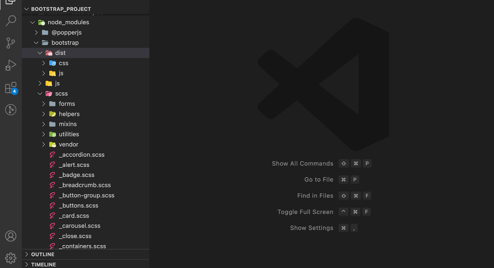
Bootstrap CSS is built modularly, having separate CSS and JS files for different components. This makes it easy to include only files or features you need in your project.
The image below from Bootstrap shows a preview of the file structure when you install Bootstrap using a package manager like npm.
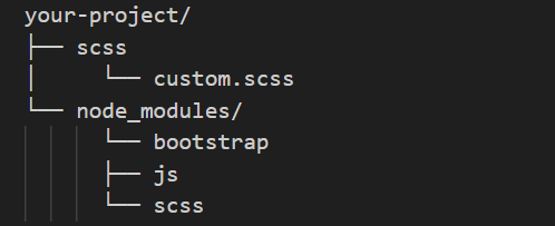
The image shows the file structure of Bootstrap v5.3 installed with npm on my machine. You can notice Bootstrap’s two modules, bootstrap, and popperjs, in the node_modules folder.
Bootstrap uses WAI-ARIA roles and attributes to provide additional information on its components that assistive technologies such as screen readers can read.
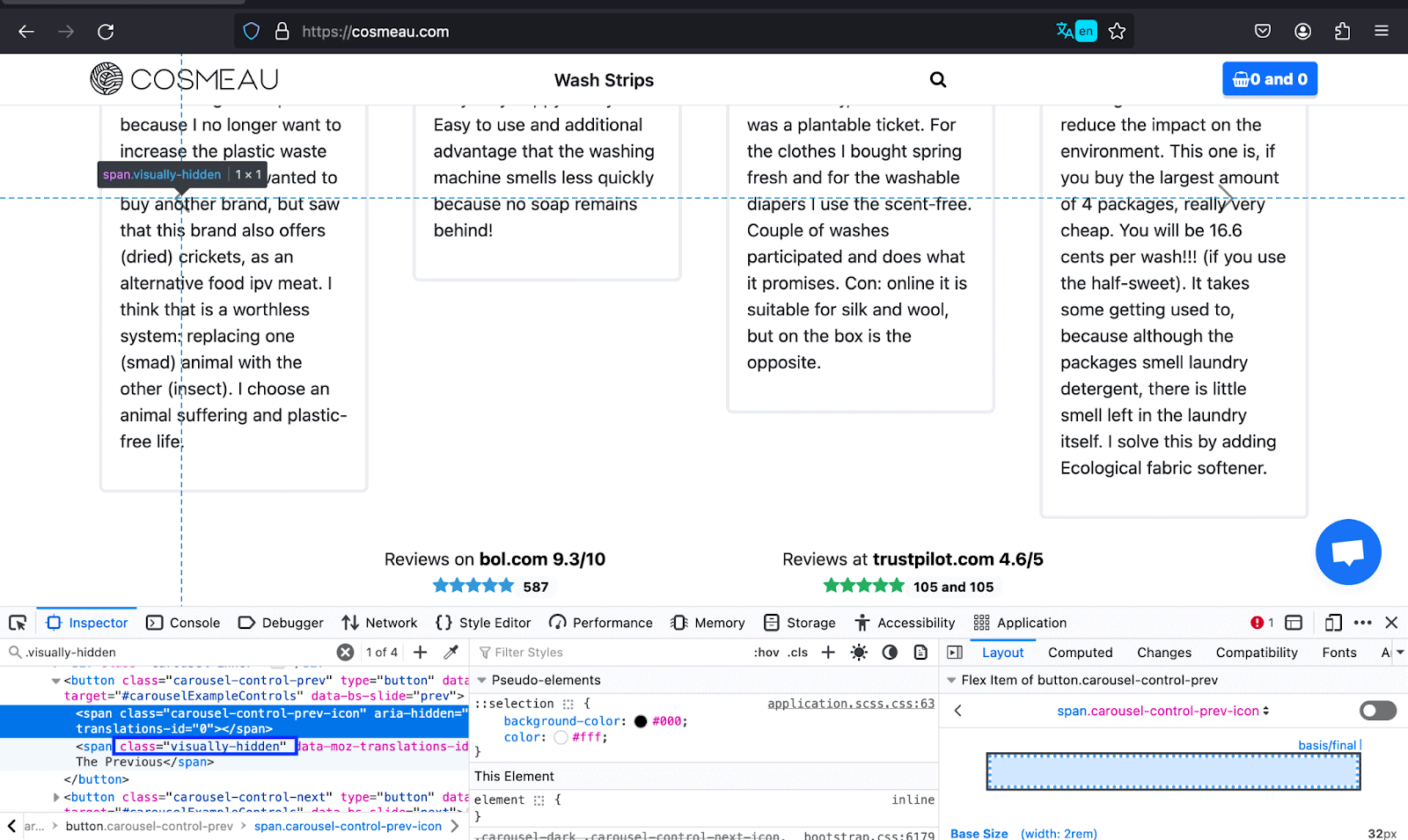
Furthermore, Bootstrap also has a visually-hidden class that makes visually hidden content accessible to screen readers, thus improving the accessibility of the website’s content to its non-visual users.
The example below shows how COSMEAU uses the visually-hidden class to inform differently-abled people of the text previously used for navigation instead of the visible arrow. Thus, a wide variety of people can access the content without hindrance.
In addition, it offers more design flexibility by enabling the modification of default styles through editing the Sass files.
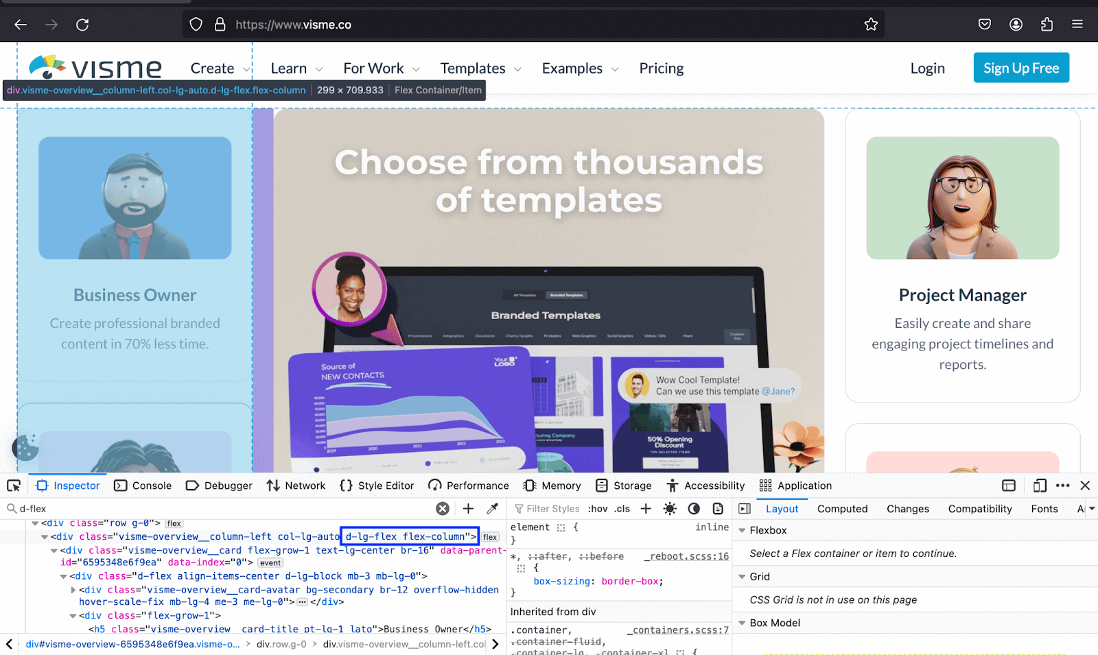
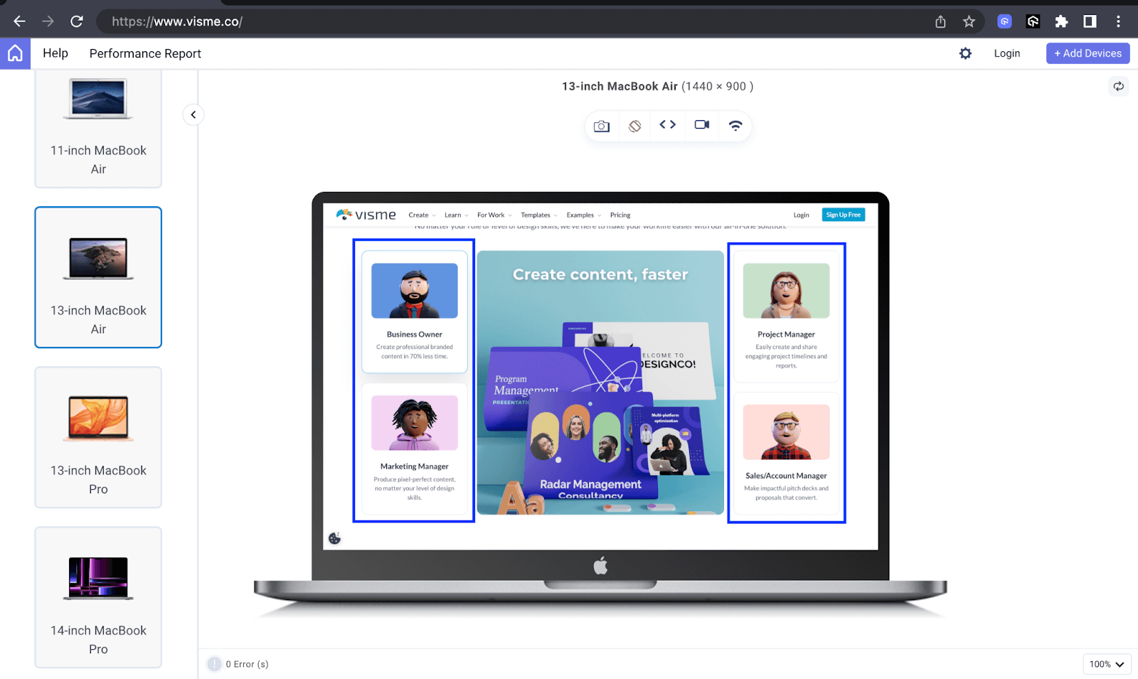
The below example shows how Visme uses the d-lg-flex and flex-column to render the items in the image in a column on the lg breakpoint. The second image shows how the website looks on a MacBook Air.
 Note
NoteTest your Bootstrap websites on real desktop and mobile environments. Start for free!
Importance of Styling in Modern Web Design
In this section on Bootstrap colors, we will look at the importance of styling
in modern web design in relation to Bootstrap colors and backgrounds, margins and padding, and borders.
Now, exhaustively covering all the many styling uses regarding the three would be impossible. We will dedicate two to three uses of each, from Bootstrap colors and backgrounds to borders.
- Enhancing accessibility: Proper styling that creates a high color contrast between the text and the background enhances readability for users with visual impairments and color blindness.
- Improving user engagement: The psychology of color is the study of colors as a determinant of human behavior. Colors can induce emotions and influence human behavior. Warm colors such as red, orange, and yellow give off a sense of power, attraction, urgency, and danger. In contrast, Bootstrap colors like green, blue, and purple are seen as calming, soothing, and comforting, though this varies from culture to culture.
- Feedback and validation: When a user fills a form input field with the wrong information or leaves a required field empty, it usually gets a red border or outline accompanied by red text informing the user that the information given is not the one expected or that the input left empty is a required one. It may get a green border when the information is accepted.
- Creating responsive layouts: You can control elements in and around them by adjusting their paddings and margins to maintain a visually pleasing and organized layout.
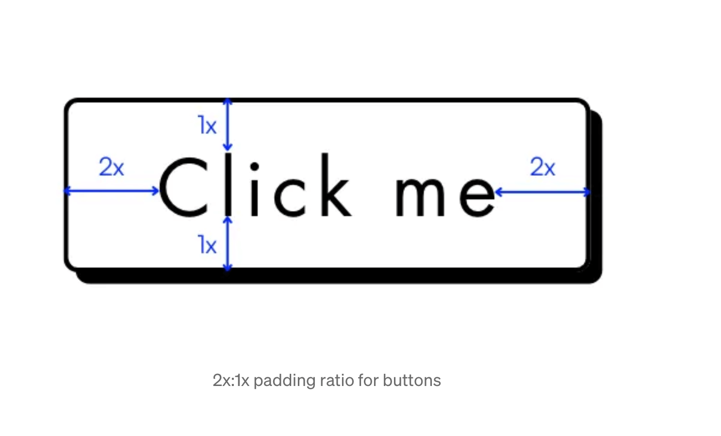
- Eliciting Call-To-Actions (CTAs): To underestimate the value of margins and paddings on CTAs would be a blunder for businesses. As a product designer, Yu She cites in her blog article about designing high convert buttons, “When it comes to spacing, apply the 2x:1x ratio -horizontal vertical spacing.“
- Grouping and organization of UI elements: Grouping different UI elements enables users to grasp the relationships and connections between the various parts of the interface, such as the distinct inputs, labels, and buttons taken to be part of a single form. This enhances the overall comprehension of the content.
- Subtle CTAs: You can use borders to create outline buttons that indicate secondary and less vital Call-To-Action actions. These provide a less assertive way to encourage user interaction.
- Section dividers: The ease of implementing them and the clean, uncluttered appearance on the user interface make borders a desirable option as section dividers.
Also, the dark mode feature, which enables users to switch between light and dark modes, is one of the top CSS trends in today’s websites. Dark mode, where lighter text is put on darker backgrounds, reduces eye strain by lessening the amount of bright light entering the eyes. The feature lets users switch between light and dark modes depending on their needs and conditions.
The above emotions influence the use of Bootstrap colors as part of styling in web development features like Call-To-Actions (CTAs), backgrounds, and cards. According to a case study on Moz, an organization increased conversions by changing its CTA button background from green to yellow.
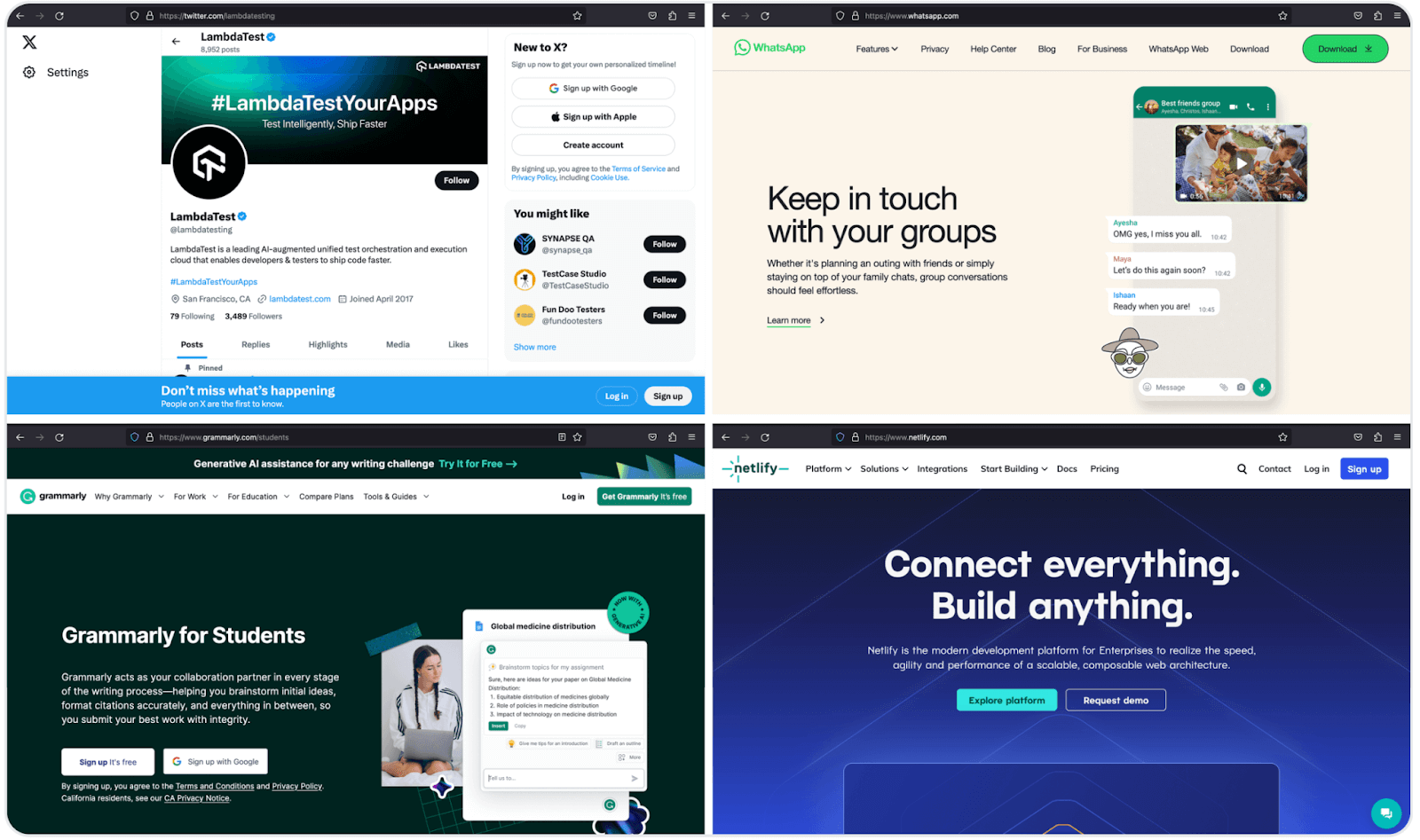
It is also one of the reasons why websites like Twitter, Zoom, Netlify, Grammarly, and WhatsApp opt for Bootstrap colors like blue, green, and orange, and their shades for the website color schemes.
The Bootstrap colors give off a sense of trust and reliability, making users feel safe whenever they are on them. This may cause a user to spend longer durations interacting with the website.
On similar lines, the image below shows major positive and negative traits people associate with the blue and red colors. These associations can influence people’s behavior, including consuming products and purchasing services.
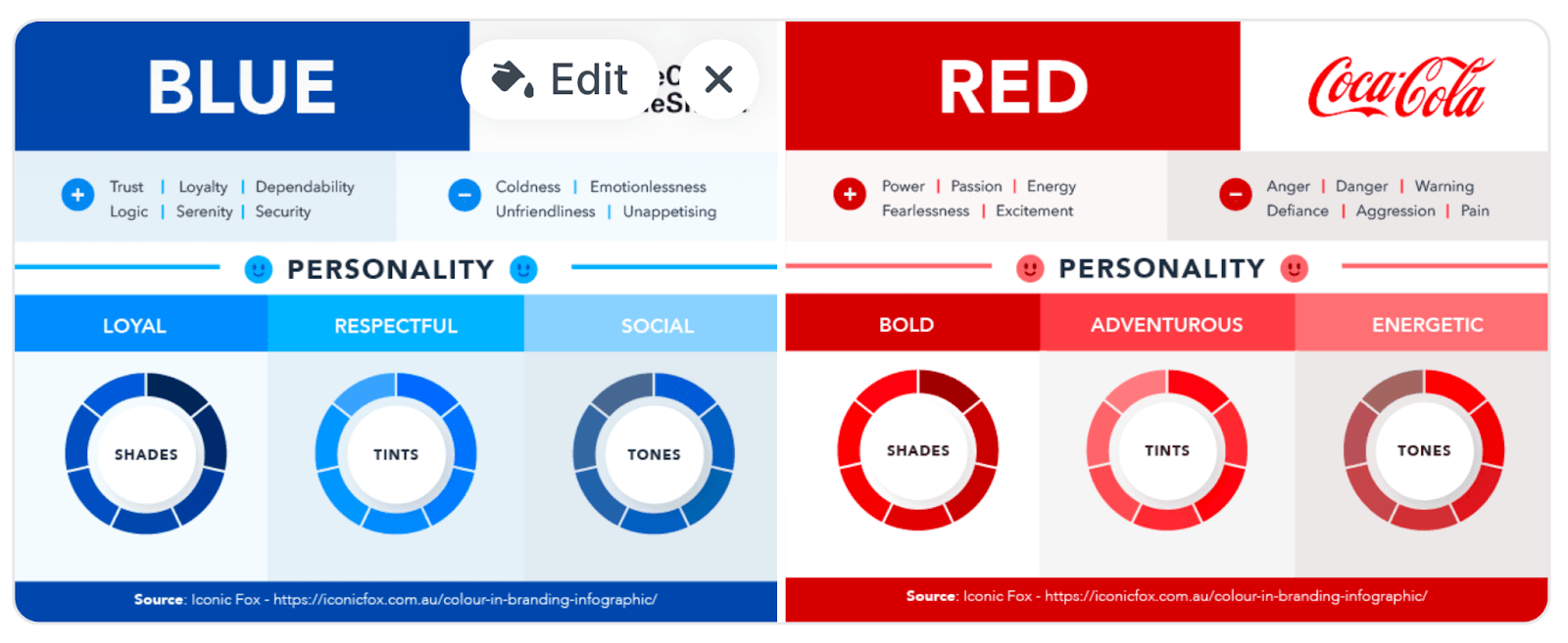
Image 1 shows how Amazon uses borders to create a simple but neat and elegant frame for the items, and image 2 shows how baffling the entire structure of the items would be were the borders absent.
Image 1:
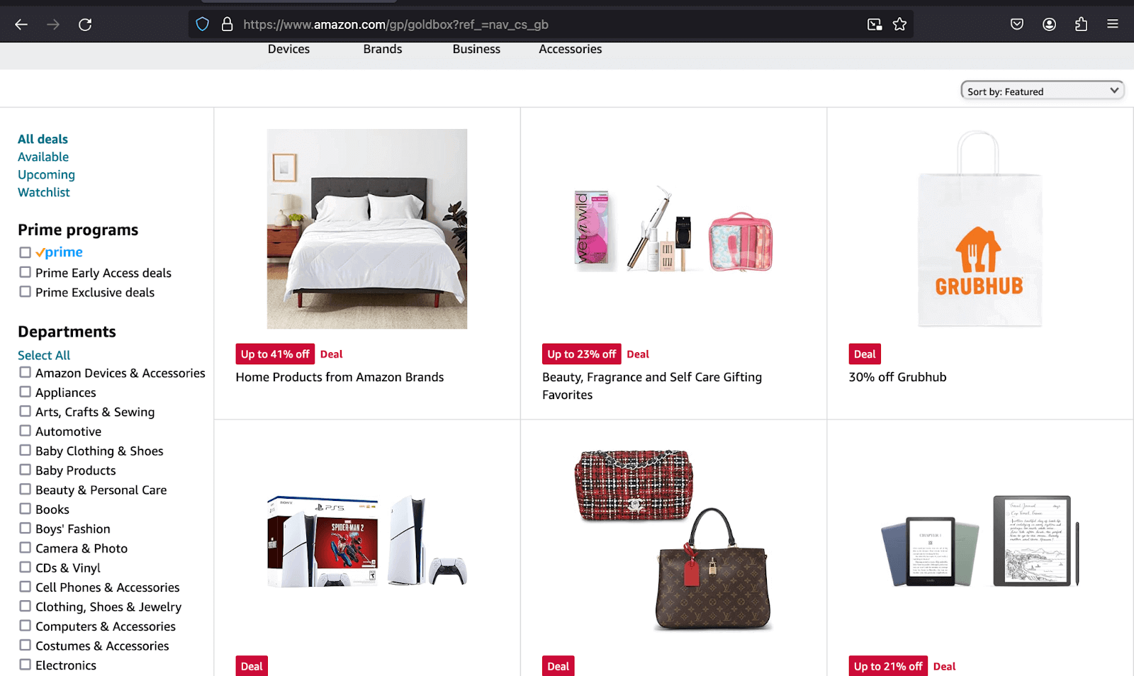
Image 2:
When form validation is successful, a form of notification is shown to the
user to signify it is successful. However, when it is unsuccessful, the user
gets information on what went wrong and what is needed to accomplish the
submission.
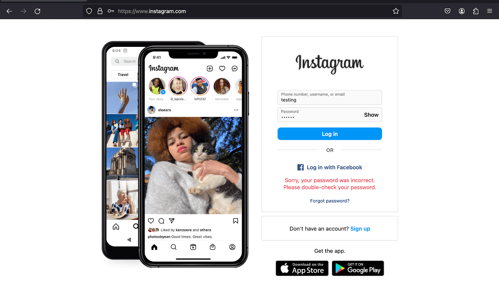
The above example shows the error message Instagram displays when the form submission is unsuccessful in regards to the password and what you need to do next.
Moreover, as the amount of content visible in the viewport varies, ranging from one screen size to another, adjusting paddings and margins can help improve the readability of the text by preventing elements from cramping up or getting overly spread.
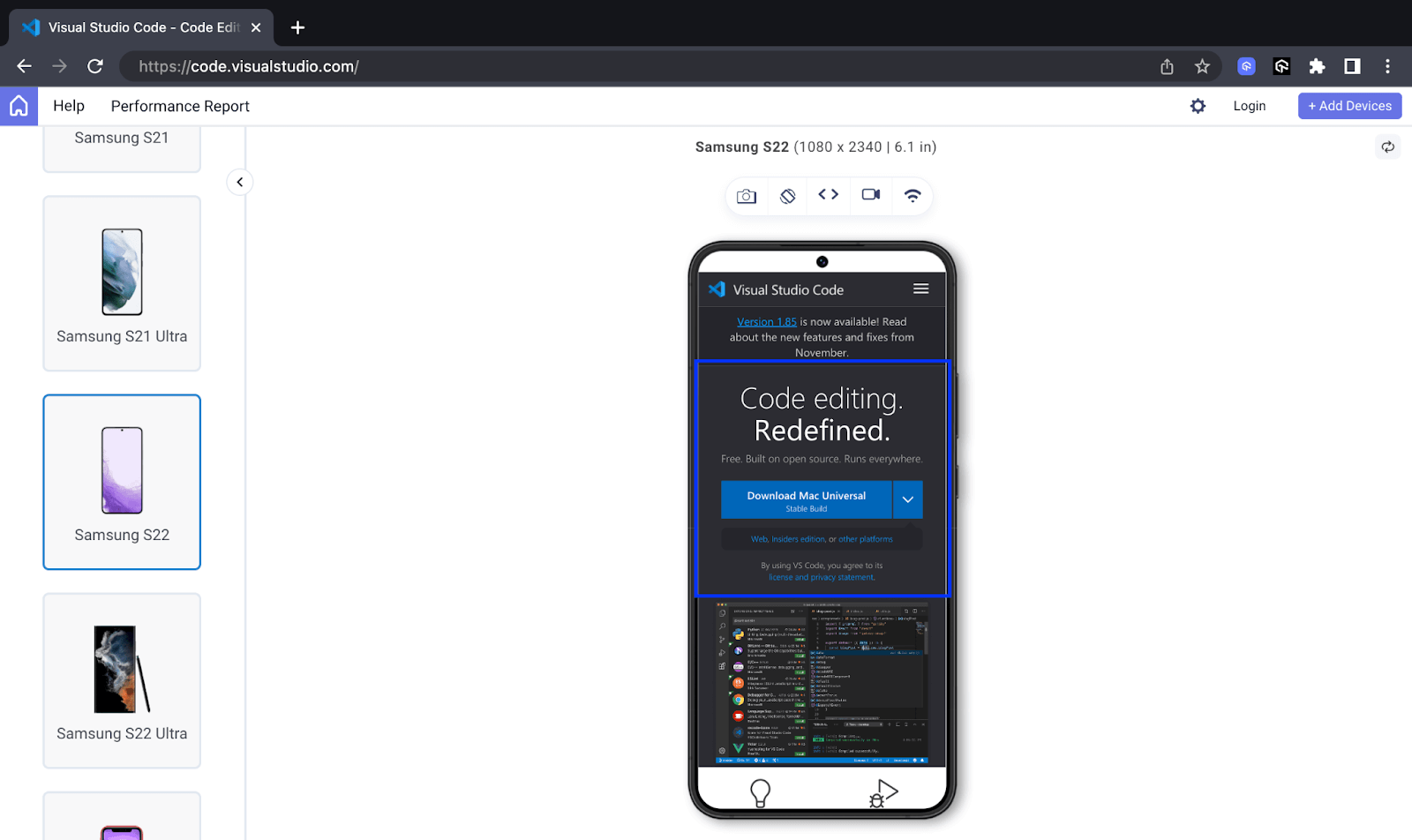
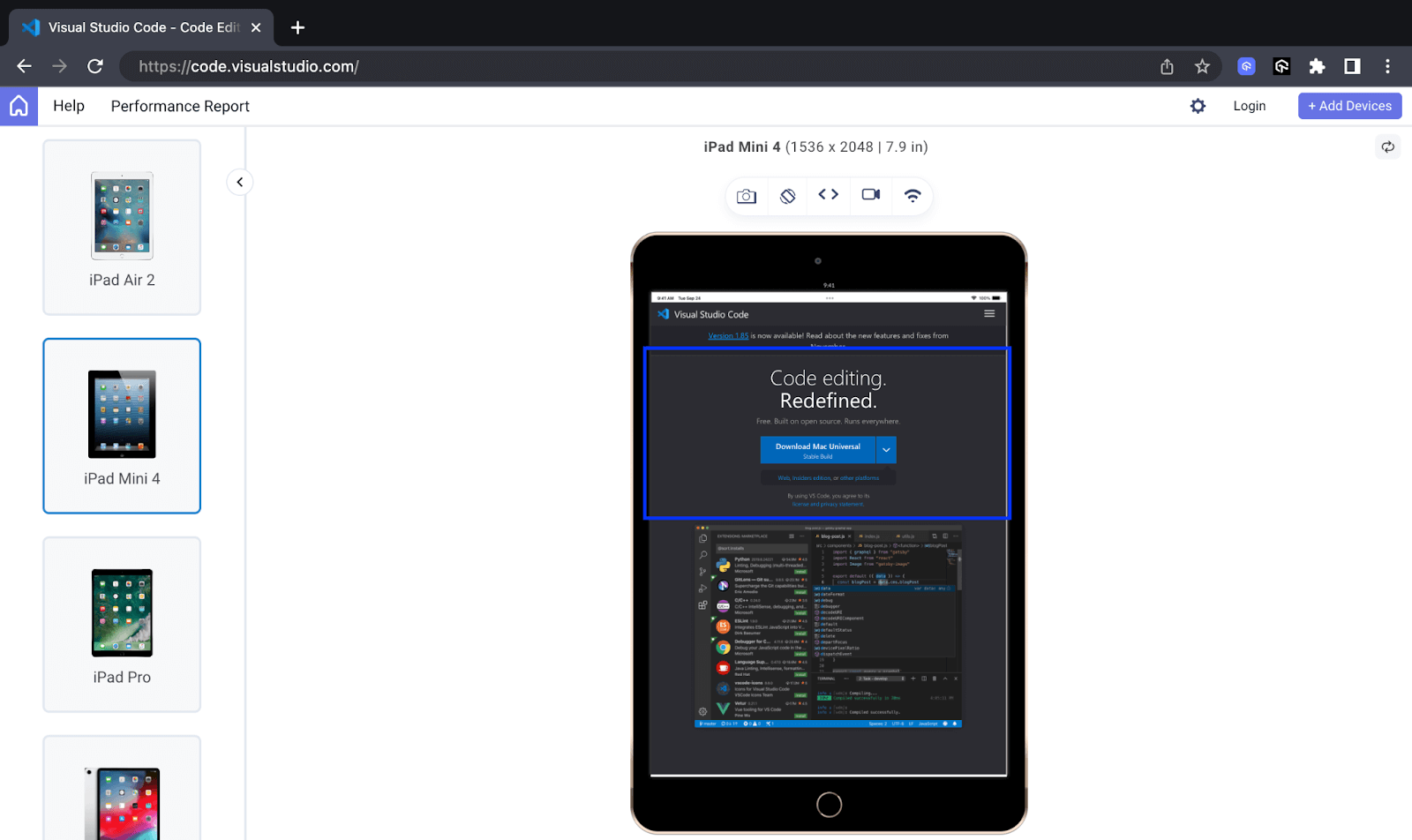
The example below shows a given section’s spacing can vary or change depending on the device or screen size it is on, in this case, a section on VS Code.
Mobile Preview:
Tablet Preview:
Desktop Preview:
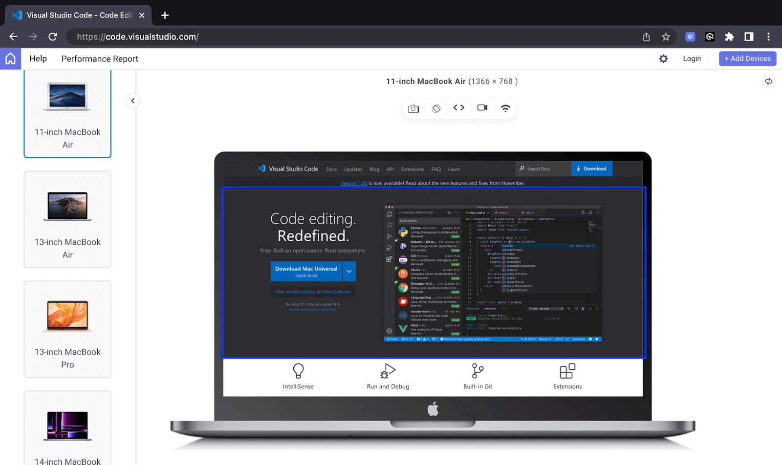
Here, I have used LT Browser to render the VS Code’s website on different device viewports.
LT Browser is a dev-friendly mobile next-generation browser built by LambdaTest to test your responsive web layouts across 53+ pre-installed viewports for mobile, tablet, desktop, and laptops. This lets you ensure that CSS does not break even if the webpage is rendered on various screen resolutions.
Also, subscribe to the LambdaTest YouTube Channel and get detailed tutorials around automation testing, Selenium, Appium automation, and more.
Spacing in and around a CTA can mean the difference between the button getting clicked or not, thus converting a sale or not. This is because, depending on the device or screen size, the button spacing directly affects the surface area of the button on which the user can click.
The importance of grouping and organizing UI elements is further supported by the UX law of common region, which states that “elements tend to be perceived in groups if they are sharing an area with a clearly defined boundary.”
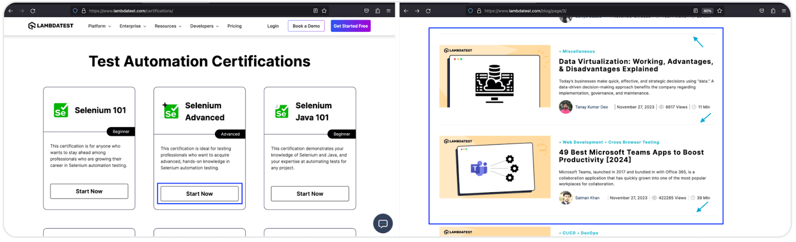
In the above images, the Start Now button, highlighted with the blue rectangle in image 1, is linked with the Selenium Advanced card rather than any other cards, primarily because of the grouping of the items. The same applies to why you view the blog article section as two blocks, each containing its content in image 2. Borders provide a neat and effortless path to categorize items.
Similarly, grouping and organizing content using borders reduces cognitive load by presenting information in manageable pieces. Instead of processing individual elements separately, users can focus on understanding groups and their collective meaning.
In the example below, Udemy uses a solid background for the sign-up to drive website visitors to the primary action it wants them to perform. The Log in button, which is meant to be a secondary action, is outlined.
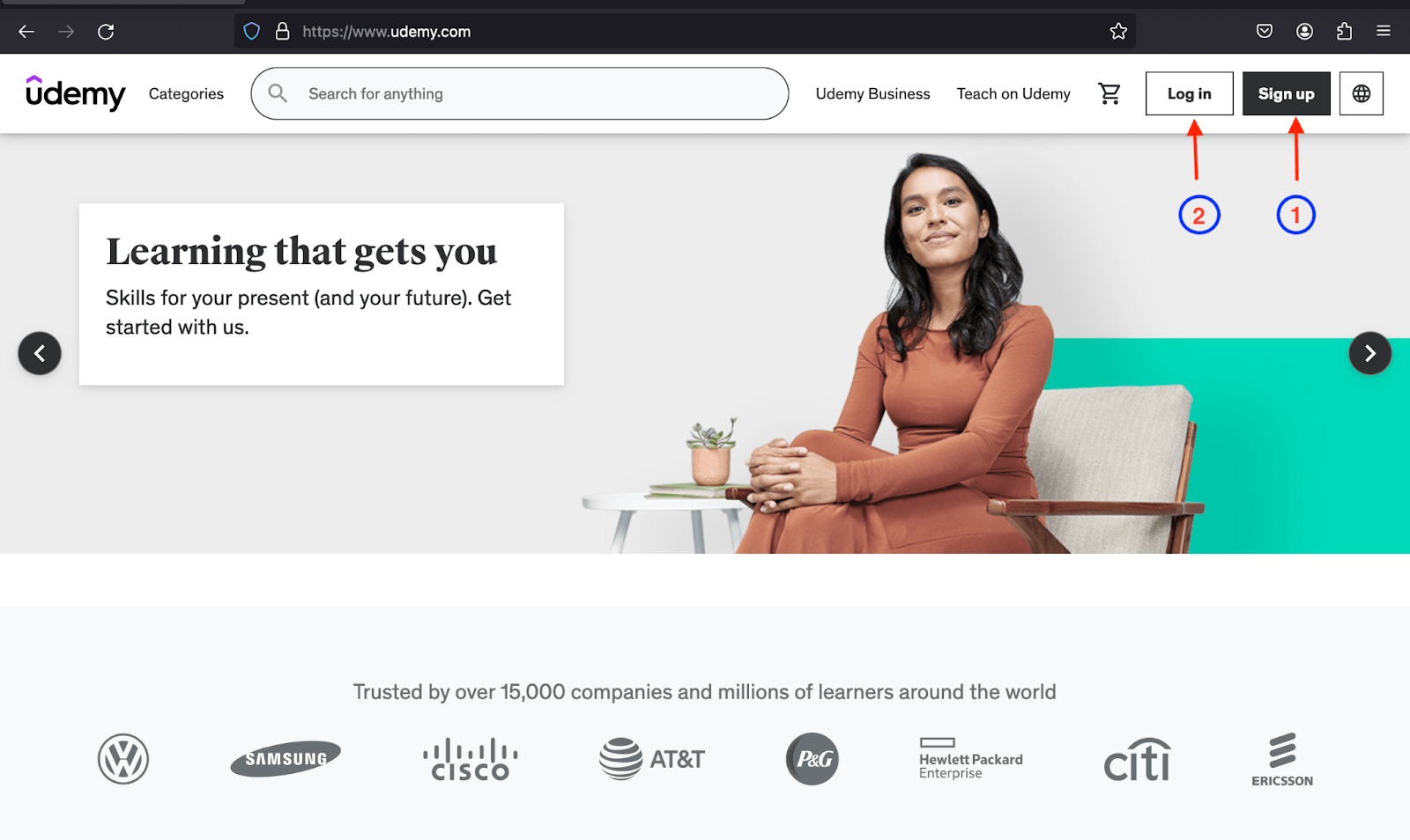
As outline buttons make distinguishing between primary and secondary actions easy, they lessen the cognitive load on the users.
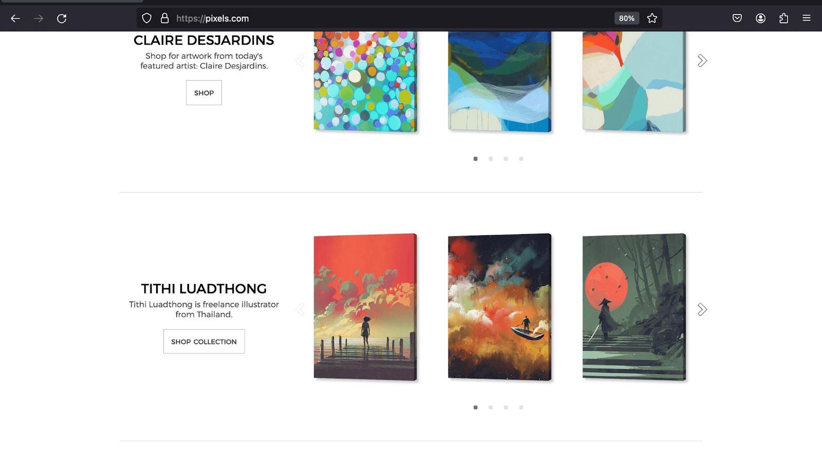
Pixels in the example below use a 1px solid gray border to provide a clean and clear separation between the sections, which all share a white background. This offers a professional look and enables users to scan and comprehend the sections effortlessly.
Overview of Bootstrap Built-in Styling Features
Before going further with Bootstrap colors, let’s first have a brief overall insight into the built-in styling features of these tools. In this, we will learn what they are and what we can do with them.
- Bootstrap colors and backgrounds:Text and background classes like text-primary,text-success, bg-warning, and bg-danger enable you to create text and background with contextual meanings.
- Bootstrap margin and padding: Bootstrap spacing utility classes for margin and padding have a size range of 0 to 5. These classes follow a consistent naming convention, allowing developers to apply specific padding values to different sides of an element.
- Bootstrap borders: Bootstraps offers various classes you can use to style the border and border radius of elements. Similar to the spacing classes, they follow a consistent naming convention, and the border size ranges from 0 to 5.
The classes also ensure a consistent and visually meaningful representation throughout your website or app as they cut across many other Bootstrap components like buttons and badges. For example, the same text color, like text-primary, can be used as btn-primary with buttons.
Example:
Additionally, it offers classes that you can take for responsive spacing. These can be used for specified breakpoints or screen sizes. For example, classes like p-3 or m-4 apply padding and margin to all sides, while px-md-2 applies padding to the left and right sides on the md breakpoint.
Bootstrap Colors and Backgrounds
When it comes to Bootstrap colors and backgrounds, Bootstrap provides predefined classes like text-danger and bg-dark to colorize text and backgrounds. You can use Bootstrap colors to convey contextual meaning, such as completing a task and indicating errors or warnings with the
bg-success, bg-danger, and bg-warning classes.
The Bootstrap color and background classes have the same naming convention and are thus easy to grasp. Both also have opacity classes that enable adjustment of the alpha transparency of text or background between 25% and 75%.
Let’s look at Bootstrap color and background individually and explore them further.
Colors
Bootstrap offers four class utilities to apply color to text. The text-* and text-* emphasis for text and link-* and link-*-emphasis for links.
The text-* and link-* class utilities offer contextual Bootstrap colors, whereas text-*-emphasis and link-*-emphasis offer Bootstrap color classes that emphasize the text you apply to them and are of a darker shade of their primary counterparts.
Let’s look at these class utilities further for a clearer understanding of Bootstrap colors.
text-* and text-*-emphasis class utilities
These class utilities enable you to style text with the color defined in your Bootstrap theme. For example, if you give the text the contextual class text-info, it will get a color of #0dcaf0. The exact color can also depend on any customizations you make.
The asterisk (*) in the class utilities stands for the Bootstrap color name. Below is a table showing some of the contextual Bootstrap color classes.
| Bootstrap Color Class | Color |
| text-primary | #0d6efd |
| text-warning | #ffc107 |
| text-success | #198754 |
| text-danger | #dc3545 |
| text-info | #0dcaf0 |
text-*-emphasis:
| Bootstrap Color Class | Color |
| text-primary-emphasis | #052c65 |
| text-secondary-emphasis | #2b2f32 |
| text-info-emphasis | #055160 |
| text-danger-emphasis | #58151c |
| text-warning-emphasis | #664d03 |
link-* and link-*-emphasis class utilities
These link utilities provide classes enabling you to style your links with various Bootstrap colors, contextual and non-contextual, like link-info and link-dark. The list below shows some of them.
- link-primary
- link-danger
- link-success
- link-info
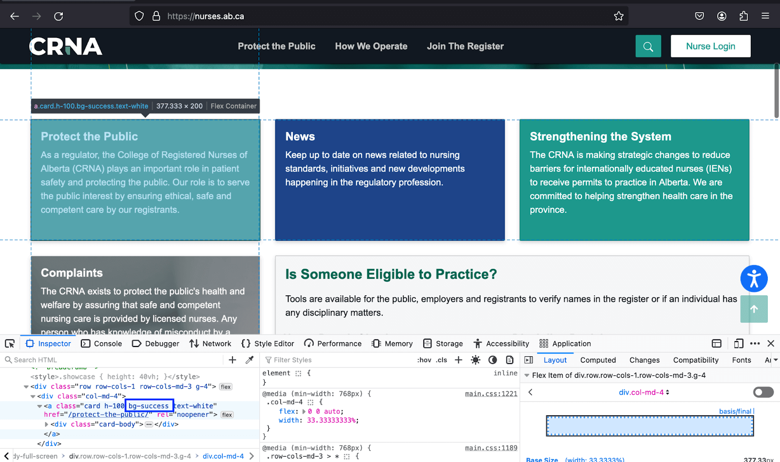
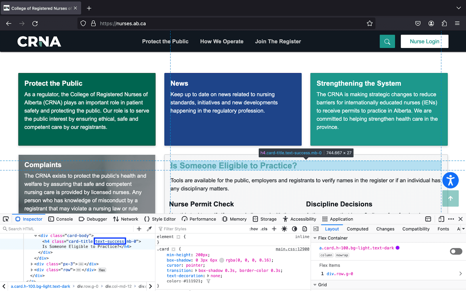
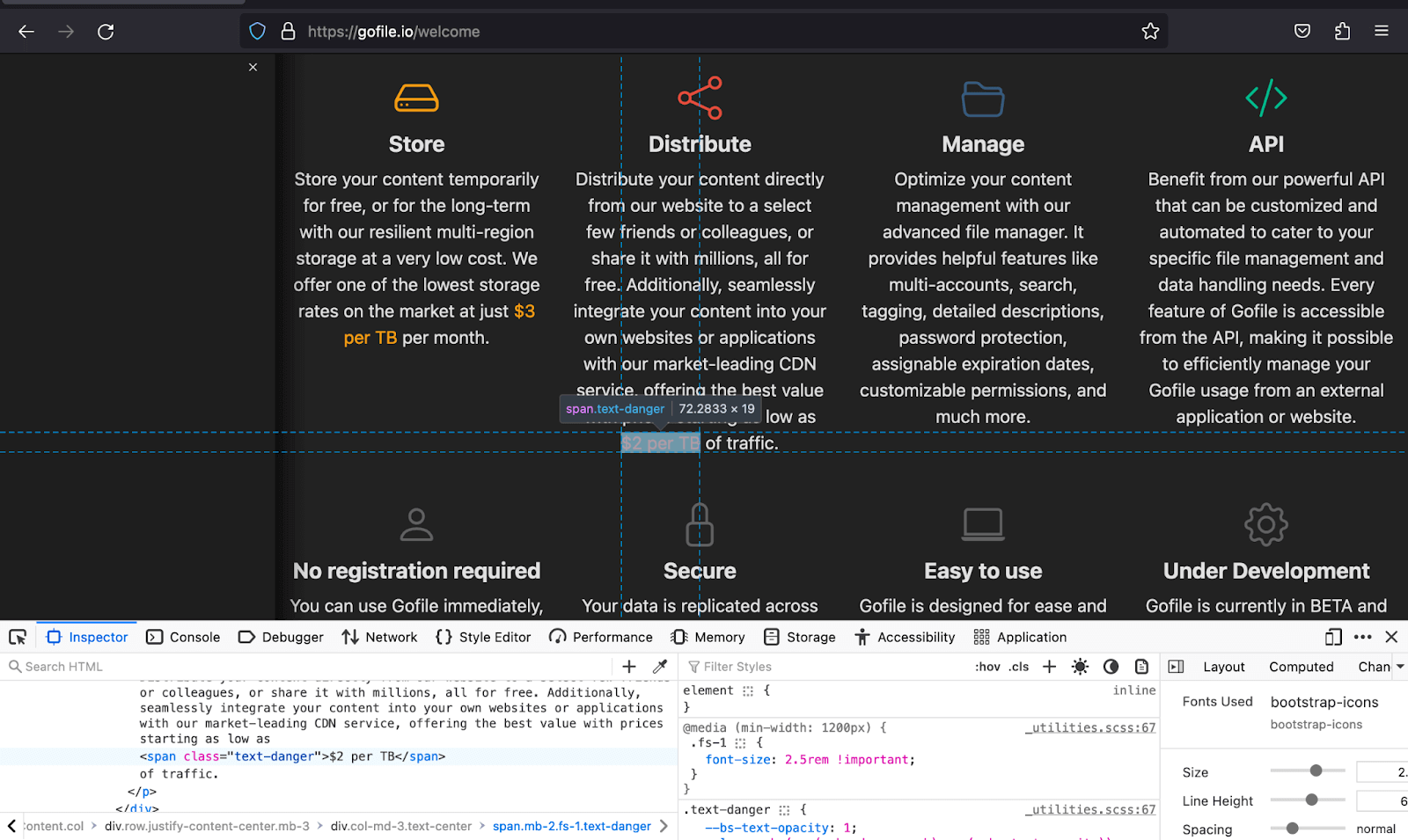
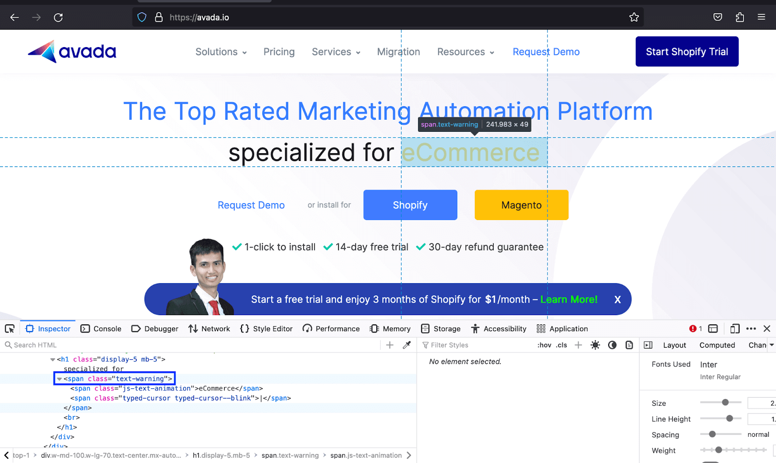
In the below Bootstrap colors examples, Gofile uses different Bootstrap color classes like text-warning to both match the color of the text with the icons and also make the text deemed vital to stand out, whereas Avada uses the same to make the text of the type of businesses they offer services to noticeable.
For the code demo of Bootstrap examples, we will create a section of cards that uses text color to improve the text readability and hierarchy so that it is clear to the user from the card title to its link.
|
1 2 3 4 5 6 7 8 9 10 11 12 13 14 15 16 17 18 19 20 21 22 23 24 25 26 27 28 29 30 31 32 33 34 35 36 37 38 39 40 41 42 43 44 45 46 47 48 49 50 51 52 53 54 55 56 57 58 59 60 61 62 63 64 65 66 67 68 69 70 71 72 73 74 75 76 77 78 79 80 81 82 83 84 85 86 87 88 89 90 91 92 93 94 95 96 97 98 99 100 101 102 103 104 105 106 107 108 109 110 111 112 113 114 115 116 117 118 119 |
<!DOCTYPE html> <html lang="en"> <head> <meta charset="UTF-8"> <meta http-equiv="X-UA-Compatible" content="IE=edge"> <meta name="viewport" content="width=device-width, initial-scale=1.0"> <link rel="stylesheet" href="./node_modules/bootstrap/dist/css/bootstrap.min.css" /> <title>Bootstrap text colors</title> <style> body::before { display: block; content: ''; height: 100px; } .img { height: auto; width: 20px; } </style> </head> <body> <nav class="navbar navbar-expand-lg bg-white py-4 fixed-top"> <div class="container ms-auto"> <a class="navbar-brand" href="#"> <img src="https://www.lambdatest.com/resources/images/logos/logo.svg" alt="LambdaTest Logo" /> </a> <button class="navbar-toggler" type="button" data-bs-toggle="collapse" data-bs-target="#navbar-menu"> <span class="navbar-toggler-icon"></span> </button> <div class="collapse navbar-collapse" id="navbar-menu"> <ul class="navbar-nav ms-auto"> <li class="nav-item"><a href="#" class="nav-link">Platform</a></li> <li class="nav-item"><a href="#" class="nav-link">Enterprise</a></li> <li class="nav-item"><a href="#" class="nav-link">Resources</a></li> <li class="nav-item"><a href="#" class="nav-link">Developers</a></li> <li class="nav-item"><a href="#" class="nav-link">Pricing</a></li> <li class="d-flex gap-3 ms-lg-4 ms-md-0 ms-sm-0"> <a href="" class="nav-link">Login</a> <!-- Modal trigger --> <button class="btn btn-outline-dark" data-bs-toggle="modal" data-bs-target="#bookdemo" type="button"> Book a Demo </button> <!-- Modal trigger end --> <a class="btn btn-dark" href="#" role="button">Sign Up</a> </li> </ul> </div> </div> </nav> <section class="py-5 bg-primary-subtle"> <div class="container mb-5"> <h1 class="h2">Powerful Cloud Testing Platform to Accelerate Your Go-To-Market </h1> <p class="lead text-dark-50">Secure, Reliable, and High Performance Test Execution Cloud Build For Scale </p> </div> <div class="container"> <div class="row row-cols-3 gap-3"> <div class="col bg-white p-5 rounded-3"> <h2 class="h5">Automated Testing</h2> <p class="text-secondary"> Perform automated browser tests on a scalable, secure, and reliable automation cloud. Run JavaScript or Selenium tests at scale on 3000+ desktop and mobile browsers. </p> <a class="link-info link-underline link-underline-opacity-0 link-underline-opacity-75-hover" href="#"> More about Automation Testing <img class="img" src="https://www.lambdatest.com/resources/images/slider/arrow.svg" alt=""> </a> </div> <div class="col bg-white p-5 rounded-3"> <h2 class="h5">HyperExecute</h2> <p class="text-secondary"> Blazing fast test execution on cloud that will beat your local test execution speeds. A LambdaTest exclusive platform that is guaranteed faster than any other cloud grid offering. </p> <a class="link-info link-underline link-underline-opacity-0 link-underline-opacity-75-hover" href="#"> More about HyperExecute <img class="img" src="https://www.lambdatest.com/resources/images/slider/arrow.svg" alt=""> </a> </div> <div class="col bg-white p-5 rounded-3"> <h2 class="h5">Live Testing</h2> <p class="text-secondary"> Perform live interactive cross browser testing of your public or locally hosted websites and web apps on 3000+ real mobile and desktop browsers running on real operating system. </p> <a class="link-info link-underline link-underline-opacity-0 link-underline-opacity-75-hover" href="#"> More about Cross Browser Testing <img class="img" src="https://www.lambdatest.com/resources/images/slider/arrow.svg" alt=""> </a> </div> <div class="col bg-white p-5 rounded-3"> <h2 class="h5">Mobile App Testing</h2> <p class="text-secondary"> Perform live interactive testing of your mobile apps on a multitude of Android and iOS devices. Test and debug your mobile apps faster on both Emulators/Simulators or online real devices on cloud. </p> <a class="link-info link-underline link-underline-opacity-0 link-underline-opacity-75-hover" href="#"> More about Mobile App Testing <img class="img" src="https://www.lambdatest.com/resources/images/slider/arrow.svg" alt=""> </a> </div> <div class="col bg-white p-5 rounded-3"> <h2 class="h5">Test at Scale</h2> <p class="text-secondary" class="text-secondary"> Accelerate your whole pipeline from dev to release. Get faster feedback on code changes, manage flaky tests, and keep master green. Industry-leading test intelligence platform. </p> <a class="link-info link-underline link-underline-opacity-0 link-underline-opacity-75-hover" href="#"> More about Test at Scale <img class="img" src="https://www.lambdatest.com/resources/images/slider/arrow.svg" alt=""> </a> </div> </div> </div> </div> </section> <script src="./node_modules/bootstrap/dist/js/bootstrap.bundle.min.js"></script> </body> </html> |
Browser Output:
Code:
|
1 2 3 4 5 6 7 8 9 10 11 12 13 14 15 16 17 18 19 20 21 22 23 24 25 26 27 28 29 30 31 32 33 34 35 36 37 38 39 40 41 42 43 44 45 46 47 48 49 50 51 52 53 54 55 56 57 58 59 60 61 62 63 64 65 66 67 68 69 70 71 72 73 74 75 76 77 78 79 80 81 82 83 84 85 86 87 88 89 90 91 92 93 94 95 96 97 98 99 100 |
<!DOCTYPE html> <html lang="en"> <head> <meta charset="UTF-8"> <meta http-equiv="X-UA-Compatible" content="IE=edge"> <meta name="viewport" content="width=device-width, initial-scale=1.0"> <link href="https://cdn.jsdelivr.net/npm/bootstrap@5.3.1/dist/css/bootstrap.min.css" rel="stylesheet" integrity="sha384-4bw+/aepP/YC94hEpVNVgiZdgIC5+VKNBQNGCHeKRQN+PtmoHDEXuppvnDJzQIu9" crossorigin="anonymous"> <title>Bootstrap text opacity</title> <style> .card { height: 100%; } </style> </head> <body class="bg-light-subtle"> <section class="py-5"> <div class="container"> <div class="row row-cols-1 rows-cols-sm-1 row-cols-md-2 row-cols-xl-3 gx-4 gy-4 px-4"> <div class="col"> <div class="card"> <div class="card-header"> <h5 class="fs-6 text-success">Selenium</h5> </div> <div class="card-body"> <h5 class="card-title">Eliminate Visual bugs with Selenium</h5> <p class="text-dark text-opacity-25"> Achieve pixel-perfect digital experiences with LambdaTest's Visual Regression Testing and Selenium Automation Framework. Automate detection of visual defects with support for all WebDriver and Selenium-based frameworks and programming languages, ensuring accuracy at every build and commit. </p> </div> </div> </div> <!-- card 2 --> <div class="col"> <div class="card"> <div class="card-header"> <h5 class="fs-6 text-info">Cypress</h5> </div> <div class="card-body"> <h5 class="card-title">Actionable Analytics for Test Automation</h5> <p class="text-dark text-opacity-50"> The LambdaTest Test analytics is a powerful tool that can help you make the most of your test execution data.IInterpret your Selenium test results, identify failure patterns across different types of errors, understand how parallel tests can improve your build efficiency. </p> </div> </div> </div> <!-- card 3 --> <div class="col"> <div class="card"> <div class="card-header"> <h5 class="fs-6 text-warning">Playwright</h5> </div> <div class="card-body"> <h5 class="card-title">Real-Time Visibility of your Test execution Data</h5> <p class="text-dark text-opacity-75"> At LambdaTest, we understand just how important your test execution data is. Our Test Analytics suite provides you with real-time visibility into your testing efforts so you can quickly identify any bottlenecks or high-impact issues. </p> </div> </div> </div> <!-- card 4 --> <div class="col"> <div class="card"> <div class="card-header"> <h5 class="fs-6 text-danger">HyperExecute</h5> </div> <div class="card-body"> <h5 class="card-title">Real Time Console and Execution Logs</h5> <p class="text-dark text-opacity-75"> In legacy test clouds you get separate terminal and test execution logs, stitching them together is an ETL nightmare. With HyperExecute, you get a single automation dashboard view with both terminal logs of test commands and complete test execution logs. All test execution logs like terminal logs, test run video, network log, commands exceptions, and more, all available in a single intuitive dashboard. </p> </div> </div> </div> <!-- card 5 --> <div class="col"> <div class="card"> <div class="card-header"> <h5 class="fs-6 text-black">On-Premise Selenium Grid</h5> </div> <div class="card-body"> <h5 class="card-title">Out-Of-The-Box Custom Reports</h5> <p class="text-dark text-opacity-75"> With LambdaTest Test Analytics, you can quickly and easily generate reports on the metrics that matter most to your business. Choose from a variety of out-of-the-box report templates for quality, coverage, and velocity analysis, or build custom reports and dashboards. LambdaTest Test Analytics quickly identifies issues so you can release better software faster. </p> </div> </div> </div> </div> </div> </div> </section> <script src="https://cdn.jsdelivr.net/npm/bootstrap@5.3.1/dist/js/bootstrap.bundle.min.js" integrity="sha384-HwwvtgBNo3bZJJLYd8oVXjrBZt8cqVSpeBNS5n7C8IVInixGAoxmnlMuBnhbgrkm" crossorigin="anonymous"> </script> </body> </html> |
Browser Output:
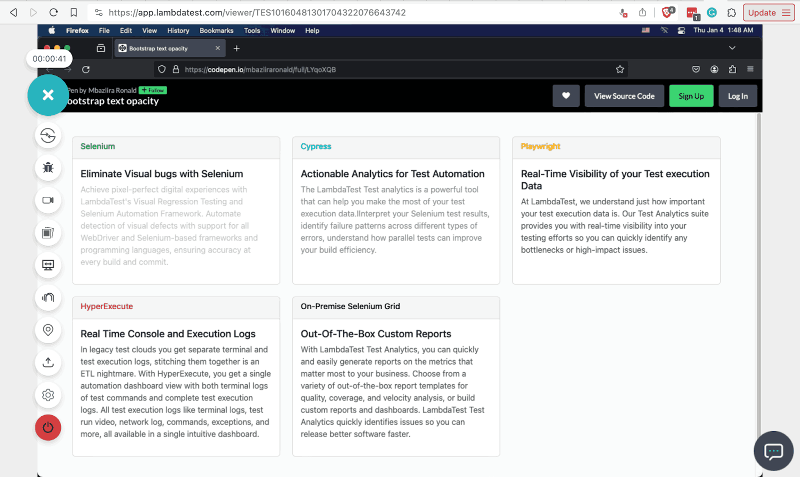
From cards 1 to 5, each has an opacity of 25% and 50%, and the remaining three have an opacity of 75%. This can help you adjust the opacity of text overlaying images or backgrounds without blocking the underlying visuals like in hero sections, thus improving readability and user experience.
Also, I have used the LambdaTest Real Time Browser Testing feature in the above output to know how compatible the text opacity effects are on Firefox v121 on macOS Monterey.
LambdaTest is an AI-powered test orchestration and execution platform that allows developers and testers to perform live-interactive testing across desktop and mobile environments that help simulate real-time environments to validate the functionality and performances of your web or mobile application using Bootstrap colors and other associated properties in those environments. LambdaTest gives a complete Bootstrap testing environment to test at scale.
In addition, you can also perform accessibility testing of your websites and mobile applications across Windows and macOS environments.
See the Pen
Bootstrap text opacity by Mbaziira Ronald (@mbaziiraronald)
on CodePen.
Background Colors
As seen in the text colors above, Bootstrap background colors also use the same class utility pattern and Bootstrap color values. The two utility classes are bg-* and bg-*-subtle.
bg-* class
This class utility lets you style text with the color defined in your Bootstrap theme. The utility works in a similar fashion as the text colors text-* class utility. Below are some of its classes and their Bootstrap colors.
| Bootstrap Color Class | Color |
|---|---|
| bg-light | #0d6efd |
| bg-danger | #dc3545 |
| bg-success | #198754 |
| bg-secondary | #6c757d |
| bg-dark | #212529 |
bg-*-subtle
This class utility provides background colors that are lighter shades of those offered by the bg-* utility.
| Bootstrap Color Class | Color |
|---|---|
| bg-primary-subtle | #cfe2ff |
| bg-dark-subtle | #ced4da |
| bg-success-subtle | #d1e7dd |
| bg-secondary-subtle | #e2e3e5 |
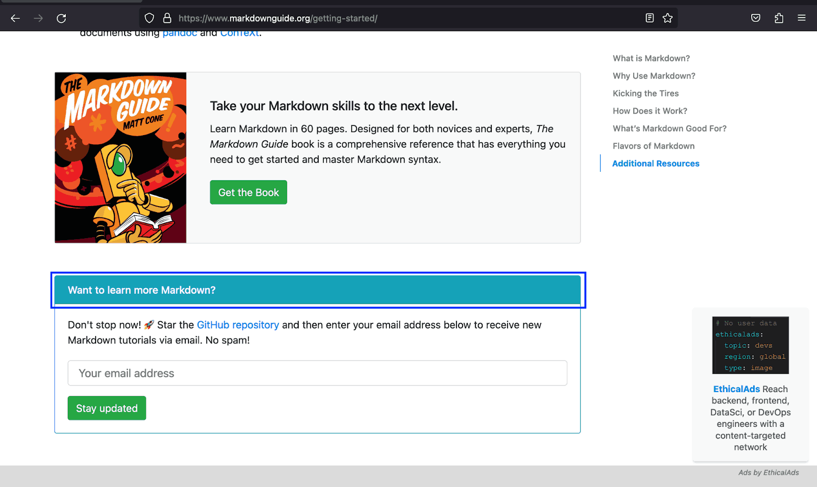
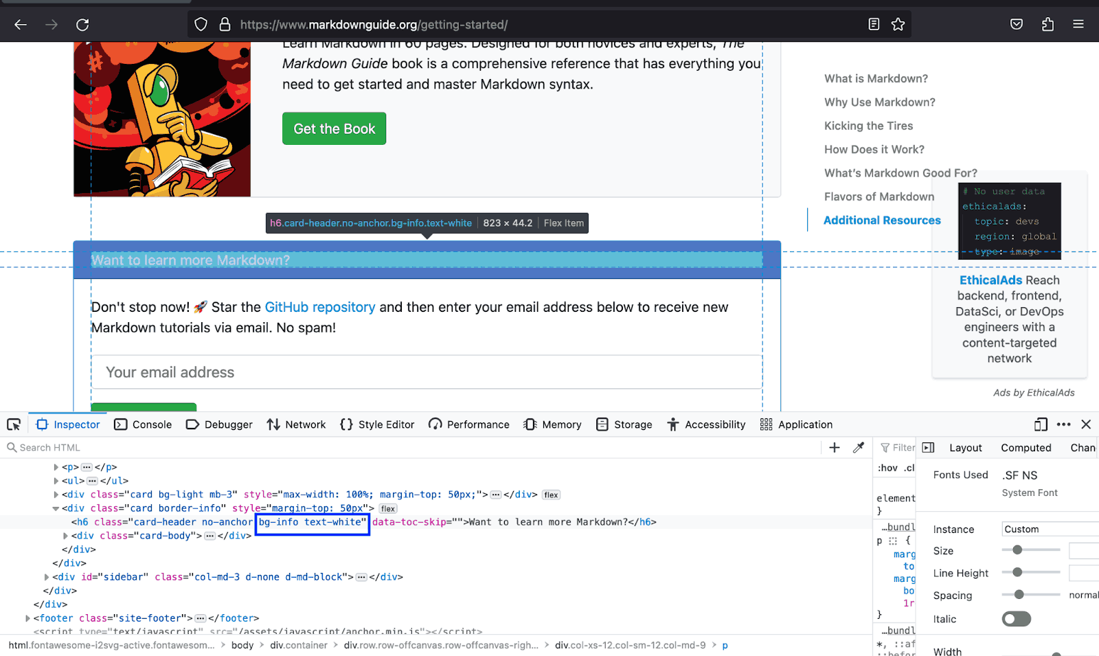
The example below shows how the Markdown Guide uses the bg-info and the text to inform users that there is more information to access should they decide to proceed further.
Let’s create a demo for Bootstrap colors that helps users distinguish the different sections on the page by relating the content to its background color.
Code:
|
1 2 3 4 5 6 7 8 9 10 11 12 13 14 15 16 17 18 19 20 21 22 23 24 25 26 27 28 29 30 31 32 33 34 35 36 37 38 39 40 41 42 43 44 45 46 47 48 49 50 51 52 53 54 55 56 57 58 59 60 61 62 63 64 65 66 67 68 69 70 71 72 73 74 75 76 77 78 79 80 81 82 83 84 85 86 87 88 89 90 91 92 93 94 95 96 97 98 99 100 101 102 103 104 105 106 107 108 109 110 111 112 113 114 115 116 117 118 119 120 121 122 123 124 125 126 127 128 129 130 131 132 133 134 135 136 137 138 139 140 141 142 143 144 145 146 147 148 149 150 151 152 153 154 155 156 157 158 159 160 161 162 163 164 165 166 167 168 169 170 171 172 173 174 175 176 177 178 179 180 181 182 183 184 185 186 187 188 189 190 191 192 193 194 195 196 197 198 199 200 201 202 203 204 205 206 207 208 209 210 211 212 213 214 215 216 217 218 219 220 221 222 223 224 225 226 227 228 229 230 231 232 233 234 235 236 237 238 239 240 241 242 243 244 245 246 247 248 249 250 251 252 253 254 255 256 257 258 259 260 261 262 263 264 265 266 267 268 269 270 271 272 273 274 275 276 277 278 279 280 281 282 283 284 285 286 |
<!DOCTYPE html> <html lang="en"> <head> <meta charset="UTF-8"> <meta http-equiv="X-UA-Compatible" content="IE=edge"> <meta name="viewport" content="width=device-width, initial-scale=1.0"> <link rel="stylesheet" href="./node_modules/bootstrap/dist/css/bootstrap.min.css" /> <title>Bootstrap background colors</title> <style> body::before { display: block; content: ''; height: 100px; } :is(.img, .section2-img, .arrow) { height: auto; } .img { width: 60px; } .section2-img { width: 65px; } .arrow { width: 15px; } </style> </head> <body> <nav class="navbar navbar-expand-lg bg-white py-4 fixed-top"> <div class="container ms-auto"> <a class="navbar-brand" href="#"> <img src="https://www.lambdatest.com/resources/images/logos/logo.svg" alt="LambdaTest Logo" /> </a> <button class="navbar-toggler" type="button" data-bs-toggle="collapse" data-bs-target="#navbar-menu"> <span class="navbar-toggler-icon"></span> </button> <div class="collapse navbar-collapse" id="navbar-menu"> <ul class="navbar-nav ms-auto"> <li class="nav-item"><a href="#" class="nav-link">Platform</a></li> <li class="nav-item"><a href="#" class="nav-link">Enterprise</a></li> <li class="nav-item"><a href="#" class="nav-link">Resources</a></li> <li class="nav-item"><a href="#" class="nav-link">Developers</a></li> <li class="nav-item"><a href="#" class="nav-link">Pricing</a></li> <li class="d-flex gap-3 ms-lg-4 ms-md-0 ms-sm-0"> <a href="" class="nav-link">Login</a> <!-- Modal trigger --> <button class="btn btn-outline-dark" data-bs-toggle="modal" data-bs-target="#bookdemo" type="button"> Book a Demo </button> <!-- Modal trigger end --> <a class="btn btn-dark" href="#" role="button">Sign Up</a> </li> </ul> </div> </div> </nav> <!-- Why LambdaTest --> <section class="py-5 bg-light"> <div class="container text-center pb-4"> <h1 class="display-6 fw-bold">Why LambdaTest?</h1> <p class="lead"> Here's why LambdaTest is the choice of execution environment cloud for <br /> 2 Million+ developers & quality analysts. </p> </div> <div class="container mb-4"> <div class="row row-cols-3 gx-3 gy-4 px-5"> <div class="col"> <div class="card p-3"> <div class="card-body d-flex gap-2 align-items-center"> <img class="img" src="https://www.lambdatest.com/resources/images/eee_velocity.svg" alt=""> <h2 class="card-title h5">Increased Release Velocity</h2> </div> </div> </div> <div class="col"> <div class="card p-3"> <div class="card-body d-flex gap-2 align-items-center"> <img class="img" src="https://www.lambdatest.com/resources/images/eee_feedback.svg" alt=""> <h2 class="card-title h5">Faster feedback to Developers</h2> </div> </div> </div> <div class="col"> <div class="card p-3"> <div class="card-body d-flex gap-2 align-items-center"> <img class="img" src="https://www.lambdatest.com/resources/images/eee_zerotest.svg" alt=""> <h2 class="card-title h5">Zero Test Flakiness Due To Infra</h2> </div> </div> </div> <div class="col"> <div class="card p-3"> <div class="card-body d-flex gap-2 align-items-center"> <img class="img" src="https://www.lambdatest.com/resources/images/eee_reduce.svg" alt=""> <h2 class="card-title h5">Reduced test execution time</h2> </div> </div> </div> <div class="col"> <div class="card p-3"> <div class="card-body d-flex gap-2 align-items-center"> <img class="img" src="https://www.lambdatest.com/resources/images/eee_insight.svg" alt=""> <h2 class="card-title h5">Deep Insights & Observability</h2> </div> </div> </div> <div class="col"> <div class="card p-3"> <div class="card-body d-flex gap-2 align-items-center"> <img class="img" src="https://www.lambdatest.com/resources/images/eee_zero.svg" alt=""> <h2 class="card-title h5">Zero Maintenance</h2> </div> </div> </div> </div> </div> </section> <!-- --> <section class="py-5 bg-primary-subtle"> <div class="container mb-5"> <h1 class="h2">Powerful Cloud Testing Platform to Accelerate Your Go-To-Market</h1> <p class="lead text-secondary"> Secure, Reliable, and High Performance Test Execution Cloud Build For Scale </p> </div> <div class="container"> <div class="row row-cols-3 gap-3"> <div class="col bg-light p-5 d-flex flex-column gap-2"> <img class="section2-img" src="https://www.lambdatest.com/resources/images/community/community.svg" alt=""> <h2 class="h5">LambdaTest Community on Discourse</h2> <p class="text-secondary fw-light"> Join the 100k+ LambdaTest community of testers and developers. Get exclusive access to resources, documents, certifications, courses, and more. </p> <a class="text-primary fw-light link-underline link-underline-opacity-0 link-underline-opacity-75-hover h5" href="#"> Join our community <img src="https://www.lambdatest.com/resources/images/community/arrow-right.svg" alt=""> </a> </div> <div class="col bg-light p-5 d-flex flex-column gap-2"> <img class="section2-img" src="https://www.lambdatest.com/resources/images/community/documentation.svg" alt=""> <h2 class="h5">LambdaTest Documentation</h2> <p class="text-secondary fw-light"> Learn more about LambdaTest products from the knowledge base. </p> <a class="text-primary fw-light link-underline link-underline-opacity-0 link-underline-opacity-75-hover h5" href="#"> Read Documentation <img src="https://www.lambdatest.com/resources/images/community/arrow-right.svg" alt=""> </a> </div> <div class="col bg-light p-5 d-flex flex-column gap-2"> <img class="section2-img" src="https://www.lambdatest.com/resources/images/community/codingjag.svg" alt=""> <h2 class="h5">Coding Jag Newsletter</h2> <p class="text-secondary fw-light"> Supercharge your knowledge of testing, development, CI/CD, automation, and more as we bring the best content in the testing world to your inbox every week. </p> <a class="text-primary fw-light link-underline link-underline-opacity-0 link-underline-opacity-75-hover h5" href="#"> Subscribe now for free <img src="https://www.lambdatest.com/resources/images/community/arrow-right.svg" alt=""> </a> </div> <div class="col bg-light p-5 d-flex flex-column gap-2"> <img class="section2-img" src="https://www.lambdatest.com/resources/images/community/updates.svg" alt=""> <h2 class="h5">Product Updates</h2> <p class="text-secondary fw-light"> Read updates on what is cooking at LambdaTest labs and send us your feedback on new features. </p> <a class="text-primary fw-light link-underline link-underline-opacity-0 link-underline-opacity-75-hover h5" href="#"> Read updates <img src="https://www.lambdatest.com/resources/images/community/arrow-right.svg" alt=""> </a> </div> <div class="col bg-light p-5 d-flex flex-column gap-2"> <img class="section2-img" src="https://www.lambdatest.com/resources/images/community/qna.svg" alt=""> <h2 class="h5">Q&A forums</h2> <p class="text-secondary fw-light" class="text-secondary"> Explore the forum to ask a question or start a conversation with fellow QA, Developers, DevOps, and more. </p> <a class="text-primary fw-light link-underline link-underline-opacity-0 link-underline-opacity-75-hover h5" href="#"> Explore Q&A forum <img src="https://www.lambdatest.com/resources/images/community/arrow-right.svg" alt=""> </a> </div> <div class="col bg-light p-5 d-flex flex-column gap-2"> <img class="section2-img" src="https://www.lambdatest.com/resources/images/community/github.svg" alt=""> <h2 class="h5">GitHub</h2> <p class="text-secondary fw-light" class="text-secondary"> Check LambdaTest's GitHub, contribute to Test-At-Scale (TAS) project, file bug reports, and requests. </p> <a class="text-primary fw-light link-underline link-underline-opacity-0 link-underline-opacity-75-hover h5" href="#"> Lambdatest in GitHub <img src="https://www.lambdatest.com/resources/images/community/arrow-right.svg" alt=""> </a> </div> </div> </div> </div> </section> <!-- More from LambdaTest community --> <section class="bg-white py-5" style="padding: 0 12rem;"> <div class="container bg-light px-5 py-5"> <div class="text-center pb-5"> <h2 class="fw-bold display-5">More from LambdaTest community</h2> <p class="lead">From the community's lenses and for the community</p> </div> <div class="px-5 row row-cols-1 gap-4"> <!-- Card 1 --> <div class="border-start border-5 border-primary rounded d-flex gap-5 align-items-center bg-white px-5 py-4"> <div> <p class="fw-bold"> <a class="link-dark link-underline link-underline-opacity-0 link-underline-opacity-75-hover" href="#">LambdaTest Coding Challenge</a> </p> <p class="text-secondary fw-light"> Put on your 'Coding Hats' and participate in a series of Coding Challenges that will help you learn and grow as a QA professional. </p> </div> <div class="bg-light rounded-circle p-2" role="button"> <img class="arrow" src="https://www.lambdatest.com/resources/images/community/arrow-right.svg" alt=""> </div> </div> <!-- Card 2 --> <div class="border-start border-5 border-primary rounded d-flex gap-5 align-items-center bg-white px-5 py-4"> <div> <p class="fw-bold"> <a class="link-dark link-underline link-underline-opacity-0 link-underline-opacity-75-hover" href="#">LambdaTest Certifications</a> </p> <p class="text-secondary fw-light"> Enhance your resume and flaunt your Selenium automation skills with free certifications by LambdaTest. </p> </div> <div class="bg-light rounded-circle p-2" role="button"> <img class="arrow" src="https://www.lambdatest.com/resources/images/community/arrow-right.svg" alt=""> </div> </div> <!-- Card 3 --> <div class="border-start border-5 border-primary rounded d-flex gap-5 align-items-center bg-white px-5 py-4"> <div> <p class="fw-bold"> <a class="link-dark link-underline link-underline-opacity-0 link-underline-opacity-75-hover" href="#">LambdaTest Cypress Demo | How to run Cypress tests on LambdaTest</a> </p> <p class="text-secondary fw-light"> Watch a a Cypress demo on Automation Step by Step channel and learn from the tutorial on how to run Cypress tests on LambdaTest. </p> </div> <div class="bg-light rounded-circle p-2" role="button"> <img class="arrow" src="https://www.lambdatest.com/resources/images/community/arrow-right.svg" alt=""> </div> </div> <!-- Card 4 --> <div class="border-start border-5 border-primary rounded d-flex gap-5 align-items-center bg-white px-5 py-4"> <div> <p class="fw-bold"> <a class="link-dark link-underline link-underline-opacity-0 link-underline-opacity-75-hover" href="#">Cross browser Testing and Selenium test execution with LambdaTest</a> </p> <p class="text-secondary fw-light"> Catch creators of LambdaTest on EAWeekly as they discuss Selenium test execution, tunneling, roadmaps, and more. </p> </div> <div class="bg-light rounded-circle p-2" role="button"> <img class="arrow" src="https://www.lambdatest.com/resources/images/community/arrow-right.svg" alt=""> </div> </div> </div> </div> </section> <script src="./node_modules/bootstrap/dist/js/bootstrap.bundle.min.js"></script> </body> </html> |
Browser Output:
In the demo above, we have used Bootstrap colors for backgrounds to create clear divisions between the page sections. This enables users to distinguish which content is related to each section.
See the Pen
Bootstrap background colors by Mbaziira Ronald (@mbaziiraronald)
on CodePen.
Combining text and background color classes
Bootstrap also provides a couple of classes that combine the text and background classes, which lessens the markup to write and reduces the file size. These include combinations like text-bg-dark, and text-bg-light.
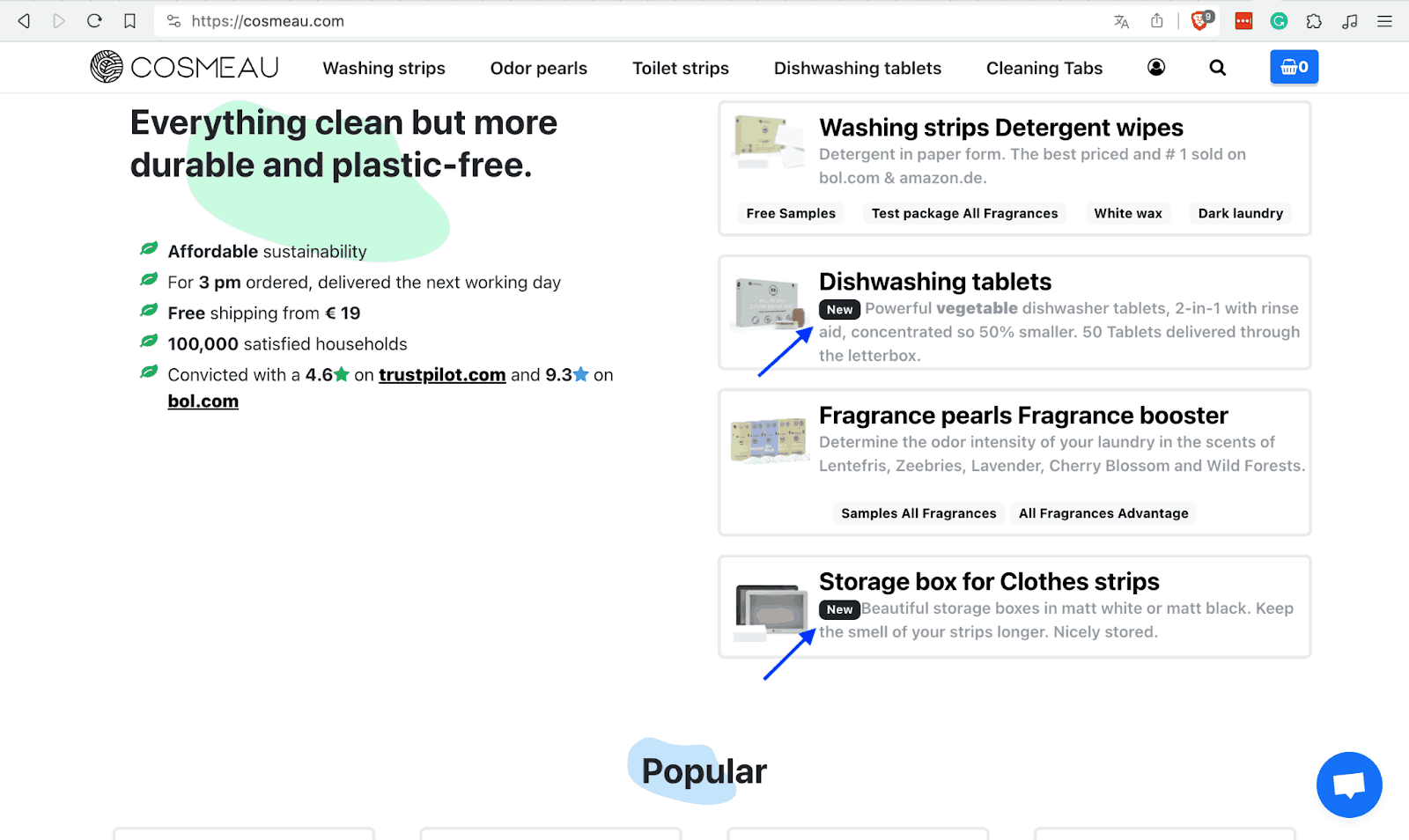
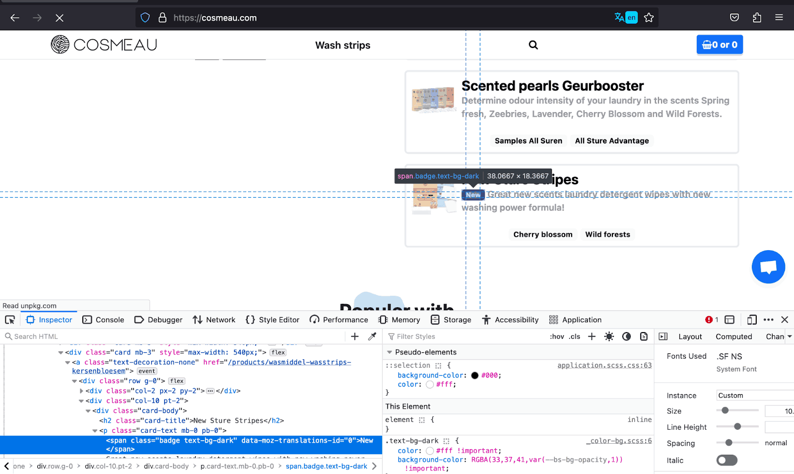
The example below shows how COSMEAU uses this combination on the New badges on the cards in the image below. This is time-saving, especially for such simple tasks.
Let’s create a Bootstrap color example for such a use case of the combination of the text and background color classes.
Code:
|
1 2 3 4 5 6 7 8 9 10 11 12 13 14 15 16 17 18 19 20 21 22 23 24 25 26 27 28 29 30 31 32 33 34 35 36 37 38 39 40 41 42 43 44 45 46 47 48 49 50 51 52 53 54 55 56 57 58 59 60 61 62 63 64 65 66 67 68 69 70 71 72 73 74 75 76 77 78 79 80 81 82 83 84 85 86 87 88 89 90 91 92 93 94 95 96 97 98 99 100 101 102 103 104 105 106 107 108 109 |
<!DOCTYPE html> <html lang="en"> <head> <meta charset="UTF-8"> <meta http-equiv="X-UA-Compatible" content="IE=edge"> <meta name="viewport" content="width=device-width, initial-scale=1.0"> <link rel="stylesheet" href="./node_modules/bootstrap/dist/css/bootstrap.min.css" /> <title>Combination of bg and text color classes</title> <style> body::before { display: block; content: ''; height: 100px; } .img { height: auto; width: 30px; } </style> </head> <body> <nav class="navbar navbar-expand-lg bg-white py-4 fixed-top"> <div class="container ms-auto"> <a class="navbar-brand" href="#"> <img src="https://www.lambdatest.com/resources/images/logos/logo.svg" alt="LambdaTest Logo" /> </a> <button class="navbar-toggler" type="button" data-bs-toggle="collapse" data-bs-target="#navbar-menu"> <span class="navbar-toggler-icon"></span> </button> <div class="collapse navbar-collapse" id="navbar-menu"> <ul class="navbar-nav ms-auto"> <li class="nav-item"><a href="#" class="nav-link">Platform</a></li> <li class="nav-item"><a href="#" class="nav-link">Enterprise</a></li> <li class="nav-item"><a href="#" class="nav-link">Resources</a></li> <li class="nav-item"><a href="#" class="nav-link">Developers</a></li> <li class="nav-item"><a href="#" class="nav-link">Pricing</a></li> <li class="d-flex gap-3 ms-lg-4 ms-md-0 ms-sm-0"> <a href="" class="nav-link">Login</a> <!-- Modal trigger --> <button class="btn btn-outline-dark" data-bs-toggle="modal" data-bs-target="#bookdemo" type="button"> Book a Demo </button> <!-- Modal trigger end --> <a class="btn btn-dark" href="#" role="button">Sign Up</a> </li> </ul> </div> </div> </nav> <section class="text-bg-light py-5" style="height: 100dvh;"> <div class="container"> <div class="d-flex flex-column gap-5 align-items-center"> <div class="text-center"> <h1>Get Started with LambdaTest Playwright Cloud</h1> <p class="lead">Run Playwright tests on the LambdaTest cloud in just 3 steps.</p> </div> <!-- cards --> <div class="d-flex gap-3 px-5"> <!-- card 1 --> <div> <img class="mb-3" src="https://www.lambdatest.com/resources/images/automation/1..svg" alt="" style="height: auto; width: 26px;"> <p class="fs-3">Integrate</p> <p class="text-secondary"> First, point your existing Playwright tests to LambdaTest with minor changes in your test script and declare test configurations. </p> </div> <!-- card 2 --> <div> <img class="img mb-3" src="https://www.lambdatest.com/resources/images/automation/2..svg" alt=""> <p class="fs-3">Execute</p> <p class="text-secondary"> Run your test builds on LambdaTest cloud from your local machine or CI/CD pipeline. Debug with ease using detailed analytics. </p> </div> <!-- card 3 --> <div> <img class="img mb-3" src="https://www.lambdatest.com/resources/images/automation/3..svg" alt=""> <p class="fs-3">Scale</p> <p class="text-secondary"> Effortlessly scale your test execution without worrying about setting up or maintaining an in-house testing infrastructure. </p> </div> </div> <div> <button class="btn btn-dark btn-lg rounded-0" type="button">Contact Us</button> </div> </div> </div> </section> <script src="./node_modules/bootstrap/dist/js/bootstrap.bundle.min.js"></script> </body> </html> |
Browser Output:
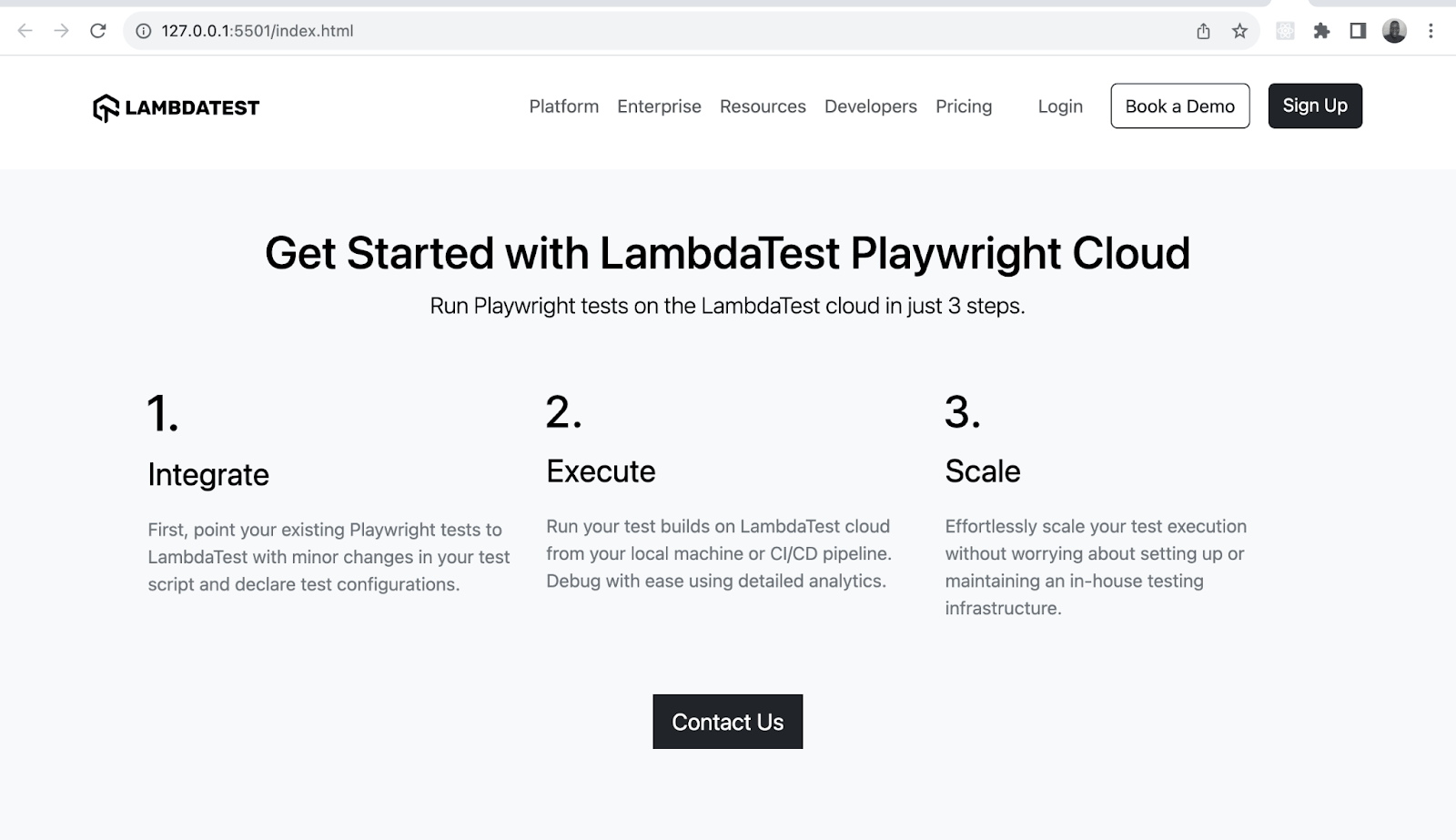
We have used the text-bg-light class to give the page a bg-light background and dark text. This is time-saving when you don’t want to write many style classes.
See the Pen
Combination of bg and text color classes by Mbaziira Ronald (@mbaziiraronald)
on CodePen.
Bootstrap Margin and Padding
Bootstrap margin and padding sizes range from 0 to 5 and are in rem units. You can also define the vertical and horizontal margin using my and mx classes.
The naming convention for the margin and padding follows the format of {property}-{side}-{size}. The below table gives you a clearer understanding of how it works.
| Class | Description |
|---|---|
| mt-1 | Sets a top margin of 0.25rem |
| pb-4 | Sets a bottom margin of 1.5rem |
| mx-auto | Aligns items horizontally in the center |
| pe-2 | Sets a right border of 0.5rem |
| ms-5 | Sets a left border of 3rem |
In addition to normal CSS spacing, Bootstrap enables responsive spacing where you can define different margin and padding values for various CSS breakpoints such as sm, md, and lg.
The naming convention for responsive spacing follows the format {property}-{side}-{breakpoint}-{size}. The table below shows some possible examples of how you implement the format.
| Class | Description |
|---|---|
| mt-md-4 | Sets a top margin of 1.5rem on the md breakpoint. |
| me-sm-3 | Sets a right margin of 1rem on the sm breakpoint. |
| mb-lg-auto | Sets a bottom margin to auto on the lg breakpoint. |
| pe-xl-2 | Sets a right padding of 0.5rem on the xl breakpoint. |
| ps-md-5 | Sets a left padding of 3rem on the md breakpoint. |
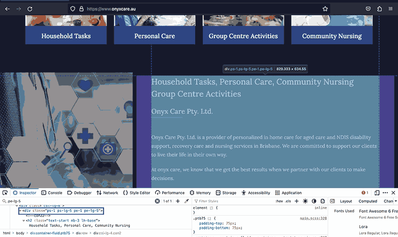
In the below example, Onyx Care uses responsive spacing by giving the highlighted section all but the lg breakpoint a padding of 1px and the lg breakpoint itself a padding of 5px.
We have gone through Bootstrap’s responsive spacing works, but as visuals speak louder and clearer than words, let’s create a visual demo to remove any missing blanks in what we have covered.
Code:
|
1 2 3 4 5 6 7 8 9 10 11 12 13 14 15 16 17 18 19 20 21 22 23 24 25 26 27 28 29 30 31 32 33 34 35 36 37 38 39 40 41 42 43 44 45 46 47 48 49 50 51 52 53 54 55 56 57 58 59 60 61 62 63 64 65 66 67 68 69 70 71 72 73 74 75 76 77 78 79 80 81 82 83 84 85 86 87 88 89 90 91 92 93 94 95 96 97 98 99 100 101 102 103 104 105 106 107 108 109 |
<!DOCTYPE html> <html lang="en"> <head> <meta charset="UTF-8"> <meta http-equiv="X-UA-Compatible" content="IE=edge"> <meta name="viewport" content="width=device-width, initial-scale=1.0"> <link rel="stylesheet" href="https://cdn.jsdelivr.net/npm/bootstrap@5.3.0-alpha3/dist/css/bootstrap.min.css"> <title>Bootstrap responsive padding and margin</title> <style> body::before { display: block; content: ''; height: 90px; } </style> </head> <body> <nav class="navbar navbar-expand-lg bg-white py-4 fixed-top"> <div class="container ms-auto"> <a class="navbar-brand" href="#"> <img src="https://www.lambdatest.com/resources/images/logos/logo.svg" alt="LambdaTest Logo" /> </a> <button class="navbar-toggler" type="button" data-bs-toggle="collapse" data-bs-target="#navbar-menu"> <span class="navbar-toggler-icon"></span> </button> <div class="collapse navbar-collapse" id="navbar-menu"> <ul class="navbar-nav ms-auto"> <li class="nav-item"><a href="" class="nav-link">Platform</a></li> <li class="nav-item"><a href="" class="nav-link">Enterprise</a></li> <li class="nav-item"><a href="" class="nav-link">Resources</a></li> <li class="nav-item"><a href="" class="nav-link">Developers</a></li> <li class="nav-item"><a href="" class="nav-link">Pricing</a></li> <li class="d-flex gap-3 ms-lg-4 ms-md-0 ms-sm-0"> <a href="" class="nav-link">Login</a> <!-- Modal trigger --> <button class="btn btn-outline-dark" data-bs-toggle="modal" data-bs-target="#bookdemo" type="button"> Book a Demo </button> <!-- Modal trigger end --> <a class="btn btn-dark" href="#" role="button">Sign Up</a> </li> </ul> </div> </div> </nav> <!-- --> <section class="py-5 bg-light" style="min-height: 100vh;"> <div class="container"> <div class="d-flex flex-column align-items-center text-center"> <h1> Real Device Cloud with <br /> Android & iOS Smartphones </h1> <p class="lead"> Test your applications using our real device cloud. <br /> Eliminate the need for an internal device library and reduce <br /> operational costs instantly. </p> </div> <div class="container pt-5"> <section class="row row-cols-1 row-cols-md-2 row-cols-lg-3 g-1 g-sm-3 gy-sm-5 gx-md-4"> <div class="col mb-5 mb-md-0"> <h3 class="h4"> Test on Private Real Device Cloud </h3> <p> Dedicated iOS and Android devices, exclusively for your team with 24x7 availability. Highly secure devices behind your own firewall that can be completely customized as per your own workflow. </p> <a class="d-inline-block pt-4 link-info link-underline-opacity-0" style="font-size: 1.25rem; color: #0FBAC5;" href="#"> Signup For Free Now <img src="https://www.lambdatest.com/resources/images/right_arrow.svg" alt=""> </a> </div> <div class="col mb-5"> <h3 class="h4">Visual Regression Testing With Real Devices</h3> <p> Run high volumes of tests with your favorite Automation Framework eg. Appium, XCUITest, Espresso and more. Integrate directly with popular CI/CD tools and deploy faster then ever. </p> <a class="d-inline-block link-info link-underline-opacity-0 pt-4" style="font-size: 1.25rem; color: #0FBAC5;" href="#"> Signup For Free Now <img src="https://www.lambdatest.com/resources/images/right_arrow.svg" alt=""> </a> </div> <div class="col"> <h3 class="h4">Debug Real World Scenarios</h3> <p> Identify and debug web and native mobile apps in real-time using device logs, network logs, app logs, screenshots and videos. Identify UI anomaly and debug then and there with Appium Inspector and DevTools. </p> <a class="d-inline-block link-info link-underline-opacity-0 pt-4" style="font-size: 1.25rem; color: #0FBAC5;" href="#"> Signup For Free Now <img src="https://www.lambdatest.com/resources/images/right_arrow.svg" alt=""> </a> </div> </section> </div> </div> </section> <script src="https://cdn.jsdelivr.net/npm/bootstrap@5.3.0-alpha3/dist/js/bootstrap.bundle.min.js" integrity="sha384-ENjdO4Dr2bkBIFxQpeoTz1HIcje39Wm4jDKdf19U8gI4ddQ3GYNS7NTKfAdVQSZe" crossorigin="anonymous"></script> </body> </html> |
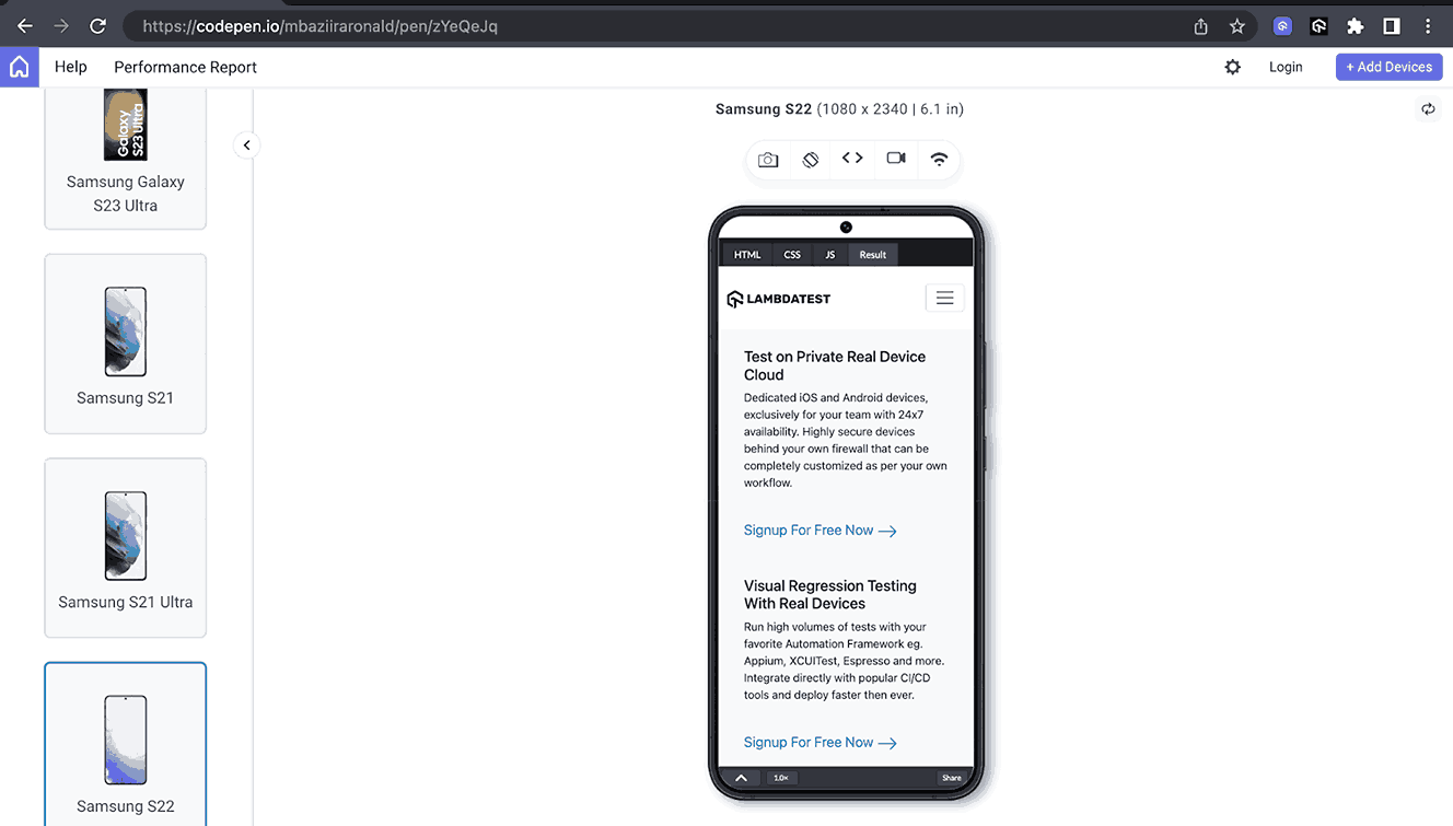
Mobile Preview:
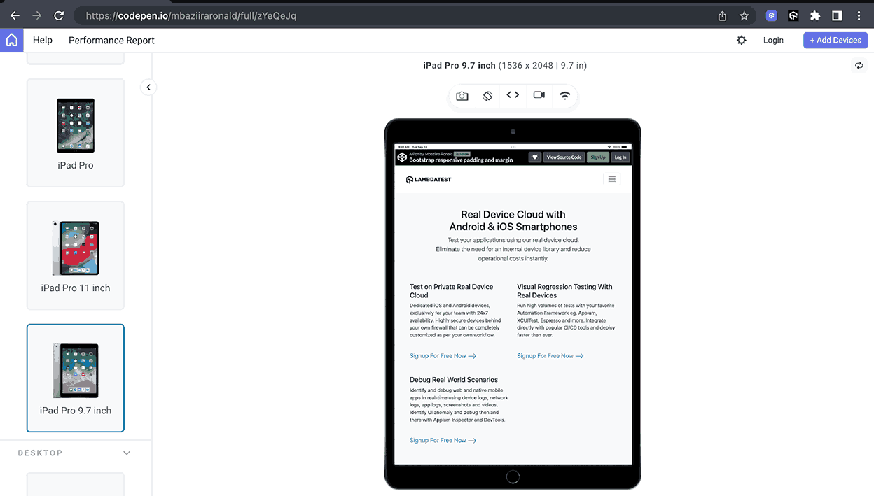
Tablet Preview:
Desktop Preview:
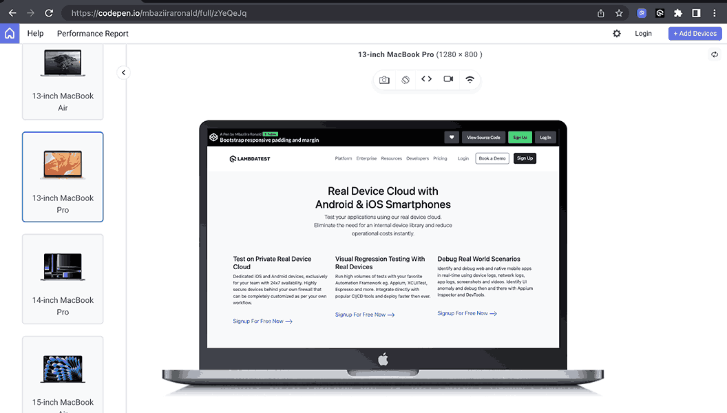
In the above previews, you can observe how the spacing between and around cards varies between screen sizes. This improves the overall user experience as people can access easy-to-read, uncluttered content regardless of their device screen size.
See the Pen
Bootstrap responsive padding and margin by Mbaziira Ronald (@mbaziiraronald)
on CodePen.
Bootstrap Borders
From structuring layouts to helping in responsive web design, borders play major roles in helping us improve the visual outlook of websites. Not only do they guide users by giving them visual cues on the current task taking place.
The example below doesn’t use Bootstrap but exhibits the many roles borders can play. It shows how Microsoft uses a solid outer border and a dotted one to inform the user on which tab they are currently on and a solid gray border to show which tabs are inactive.
In this section, we’ll look at what Bootstrap borders offer and what we can do with them. Let’s dive in.
Border Colors
Bootstrap border colors are similar to the text colors we looked at in Bootstrap colors and backgrounds in the previous section above. What changes is the naming convention, instead of writing text-{color}, we now write border-{color}. The list below shows some of these border classes.
- border-info
- border-black
- border-danger
- border-secondary
Border Sizes
Bootstrap border sizes or widths range from 0 to 5. You can easily set borders to any web page using the border class. The class defines a solid border of 1px in width by default to all sides of the element.
The tables below show how to add a border to an element in Bootstrap. Border width or size as specified using the range Bootstrap provides.
| Class | Description |
| border-0 | Remove the border from all the sides of an element. |
| border-1 | Sets a 1px border on all the sides of an element. |
| border-3 | Sets a 3px border on all the sides of an element. |
| border-5 | Sets a 5px border on all the sides of an element. |
Below is the table for the border width depending on the side of the element.
| Class | Description |
| border-start | Sets 1px left border |
| border-end | Sets 1px right border |
| border-top | Sets 1px top border |
| border-bottom | Sets 1px bottom border |
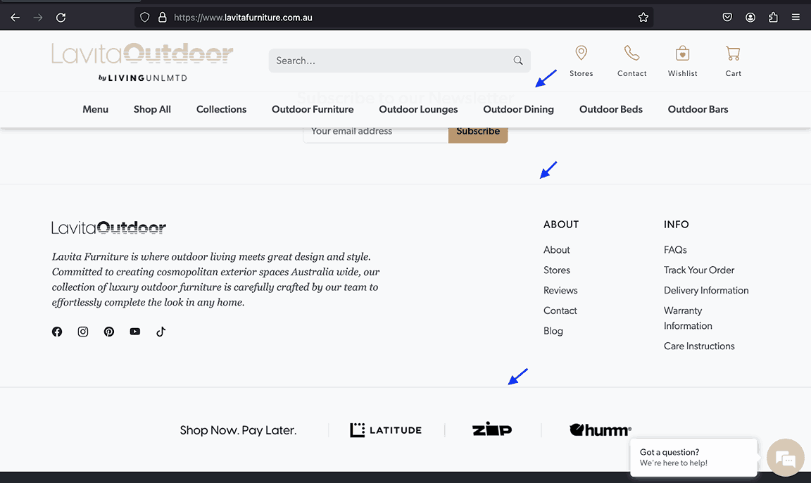
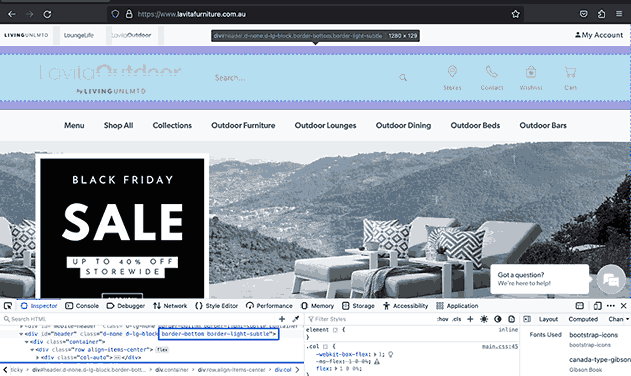
LavitaOutdoor uses a bottom border to set a division between the header section and nav items so that users can easily distinguish between the two and know which content is for which section, as they both have the same white background. The same pattern is repeated with the last section and the footer.
Let’s create a demo example in which a particular piece of content will capture the users attention more than the rest. The goal is to make the user focus on the information we want them to consume first.
Code:
|
1 2 3 4 5 6 7 8 9 10 11 12 13 14 15 16 17 18 19 20 21 22 23 24 25 26 27 28 29 30 31 32 33 34 35 36 37 38 39 40 41 42 43 44 45 46 47 48 49 50 51 52 53 54 55 56 57 58 59 60 61 62 63 64 65 66 67 68 69 70 71 72 73 74 75 76 77 78 79 80 81 82 83 84 85 86 87 88 89 90 91 92 93 94 95 96 97 98 99 100 101 102 103 104 105 106 107 108 109 110 111 112 113 114 115 116 117 118 119 120 121 122 123 124 125 126 127 128 129 130 131 132 133 134 135 136 137 138 139 140 141 142 143 144 145 146 |
<!DOCTYPE html> <html lang="en"> <head> <meta charset="UTF-8"> <meta http-equiv="X-UA-Compatible" content="IE=edge"> <meta name="viewport" content="width=device-width, initial-scale=1.0"> <link rel="stylesheet" href="./node_modules/bootstrap/dist/css/bootstrap.min.css" /> <title>Bootstrap border colors and width</title> <style> body::before { display: block; content: ''; height: 100px; } .img { width: 700px; } </style> </head> <body> <nav class="navbar navbar-expand-lg bg-white py-4 fixed-top"> <div class="container ms-auto"> <a class="navbar-brand" href="#"> <img src="https://www.lambdatest.com/resources/images/logos/logo.svg" alt="LambdaTest Logo" /> </a> <button class="navbar-toggler" type="button" data-bs-toggle="collapse" data-bs-target="#navbar-menu"> <span class="navbar-toggler-icon"></span> </button> <div class="collapse navbar-collapse" id="navbar-menu"> <ul class="navbar-nav ms-auto"> <li class="nav-item"><a href="#" class="nav-link">Platform</a></li> <li class="nav-item"><a href="#" class="nav-link">Enterprise</a></li> <li class="nav-item"><a href="#" class="nav-link">Resources</a></li> <li class="nav-item"><a href="#" class="nav-link">Developers</a></li> <li class="nav-item"><a href="#" class="nav-link">Pricing</a></li> <li class="d-flex gap-3 ms-lg-4 ms-md-0 ms-sm-0"> <a href="" class="nav-link">Login</a> <!-- Modal trigger --> <button class="btn btn-outline-dark" data-bs-toggle="modal" data-bs-target="#bookdemo" type="button"> Book a Demo </button> <!-- Modal trigger end --> <a class="btn btn-dark" href="#" role="button">Sign Up</a> </li> </ul> </div> </div> </nav> <section class="py-5" style="background: #000;"> <div class="container"> <div class="text-center pb-5"> <h1 class="text-white display-4 fw-bold">Test Analytics Overview</h1> <p class="text-secondary lead">Access vital information on tests including test inconsistencies, number of tests, <br /> and tests categorized by their status and environments.</p> </div> <div class="d-flex"> <div class="d-flex flex-column align-items-start"> <p class="fw-bold border-start border-3 border-info ps-2 py-2"> <a class="text-white-50 link-underline link-underline-opacity-0" href="#">Test Case Health Summary</a> </p> <p class="fw-bold border-start border-3 border-info ps-2 py-2"> <a class="text-white-50 link-underline link-underline-opacity-0" href="#">Test Summary</a> </p> <p class="fw-bold border-start border-3 border-info ps-2 py-2"> <a class="text-white-50 link-underline link-underline-opacity-0" href="#">Browser Categorization</a> </p> <p class="fw-bold border-start border-3 border-info ps-2 py-2"> <a class="text-white-50 link-underline link-underline-opacity-0" href="#">OS/Device Categorization</a> </p> <p class="fw-bold border-start border-3 border-primary ps-3 pe-4 py-3 w-75 rounded-end" style="background: #181624;"> <a class="text-white link-underline link-underline-opacity-0 d-inline-block mb-3" href="#">Test trends</a> <br /> <span class="text-secondary fs-6 fw-light mt-5">Analyze the trends of the tests executed on the platform over a period of time</span> </p> <p class="fw-bold border-start border-3 border-info ps-2 py-2"> <a class="text-white-50 link-underline link-underline-opacity-0" href="#">Test Status Ratio</a> </p> </div> <img class="img" src="https://www.lambdatest.com/resources/images/test_trends_ana.svg" alt=""> </div> </div> </section> <!-- Extensive Error Insights --> <section class="py-5" style="background: #000;"> <div class="container"> <div class="text-center pb-5"> <h2 class="text-white fw-bold display-5">Extensive Error Insights </h2> <p class="text-secondary lead">Access all HyperExecute insights in one place. Quick insights on the count of the Jobs, Tasks, and <br /> Stages run on the platform and their insights. </p> </div> <div class="d-flex align-items-center gap-5"> <img class="img" src="https://www.lambdatest.com/resources/images/lt_error.svg" alt=""> <div class="d-flex flex-column gap-3"> <h3 class="text-white">Grouped Error Stats</h3> <p class="text-secondary">Know your bugs better with the LambdaTest Test Analytics. Examine the tests categorized by their Status on LambdaTest Platform.</p> <a class="link-light link-underline link-underline-opacity-0 link-underline-opacity-75-hover d-inline-flex gap-3" href="#"> Know more <img src="https://www.lambdatest.com/resources/images/analytics_icon.svg" alt=""> </a> </div> </div> </div> </section> <!-- HyperExecute Test Analytics --> <section class="py-5" style="background: #000;"> <div class="container"> <div class="text-center pb-5"> <h2 class="text-white fw-bold display-5">HyperExecute Test Analytics </h2> <p class="text-secondary lead">Easy access to information about the count, and type of errors in test analytics <br /> through the highly customizable widgets. </p> </div> <div class="d-flex align-items-center"> <div class="d-flex flex-column"> <p class="fw-bold border-start border-3 border-info ps-2 py-2"> <a class="text-white-50 link-underline link-underline-opacity-0" href="#">Job Insights</a> </p> <p class="fw-bold border-start border-3 border-primary ps-3 pe-4 py-3 w-75 rounded-end" style="background: #181624;"> <a class="text-white link-underline link-underline-opacity-0 d-inline-block mb-3" href="#">Stage Trends</a> <br /> <span class="text-secondary fs-6 fw-light mt-5">Analyze the trends of the Stage for each Job executed on the platform</span> </p> <p class="fw-bold border-start border-3 border-info ps-2 py-2"> <a class="text-white-50 link-underline link-underline-opacity-0" href="#">Task Trends</a> </p> </div> <img class="img" src="https://www.lambdatest.com/resources/images/stage_trends.svg" alt=""> </div> </div> </section> <script src="./node_modules/bootstrap/dist/js/bootstrap.bundle.min.js"></script> </body> </html> |
Browser Output:
In the browser output above, we have used the border colors and border width classes to create a content revealer in which the current tab open is highlighted with the border-primary color and the others with border-info. The user focuses on the tab, which stands out from the rest as its border color is distinct. Thus, its information is taken first.
See the Pen
Bootstrap background colors by Mbaziira Ronald (@mbaziiraronald)
on CodePen.
Border Radius
Bootstrap provides several ways to add a border radius to an element. Before going further, below are some instances where you can use border radius in web development.
- Cards like blog cards
- Buttons and links like pill-shaped buttons
- Labels and tags
- Inputs
There are various reasons why rounded or curved corners are used in web development, but we’ll look at three major ones.
- Natural human behavior: A Neuropsychological study shows that humans naturally tend to like rounded or curved elements due to the association of danger or threat to sharp elements. Hence, users pivot more towards rounded elements as compared to sharp ones.
- Aesthetic-usability effect: This effect states that “users often perceive aesthetically pleasing design as design that’s more usable.” Thus, users are more tolerant of minor usability issues as they find elements with round corners more pleasing.
- Better focus: Content containers with rounded corners are more effective as compared to sharp ones. Because they point inwards toward the center of the container, they direct a user’s eyes to focus on the content inside.
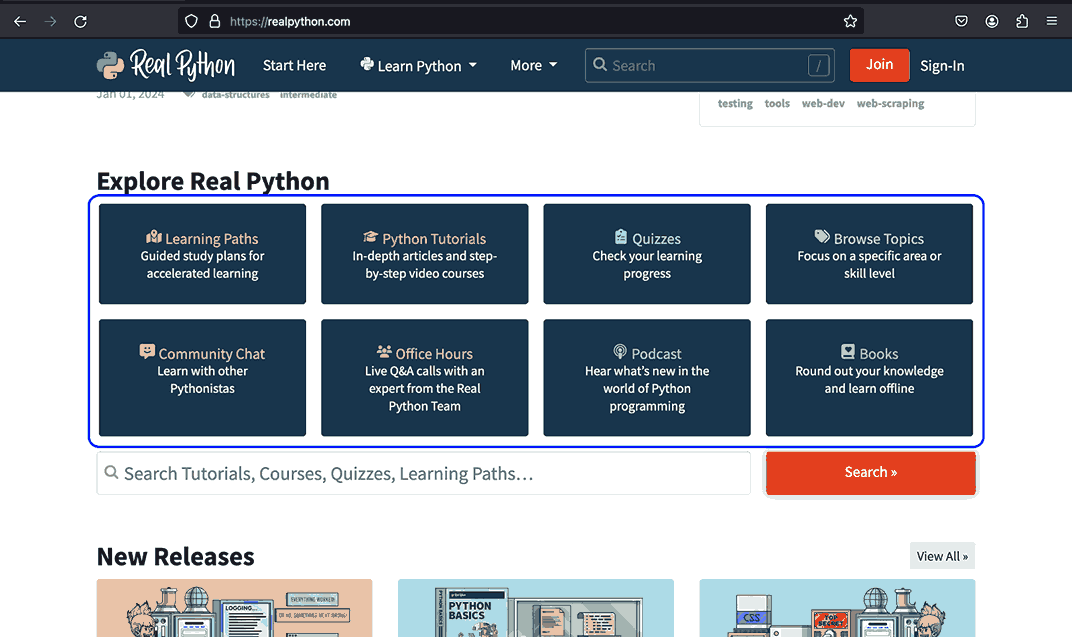
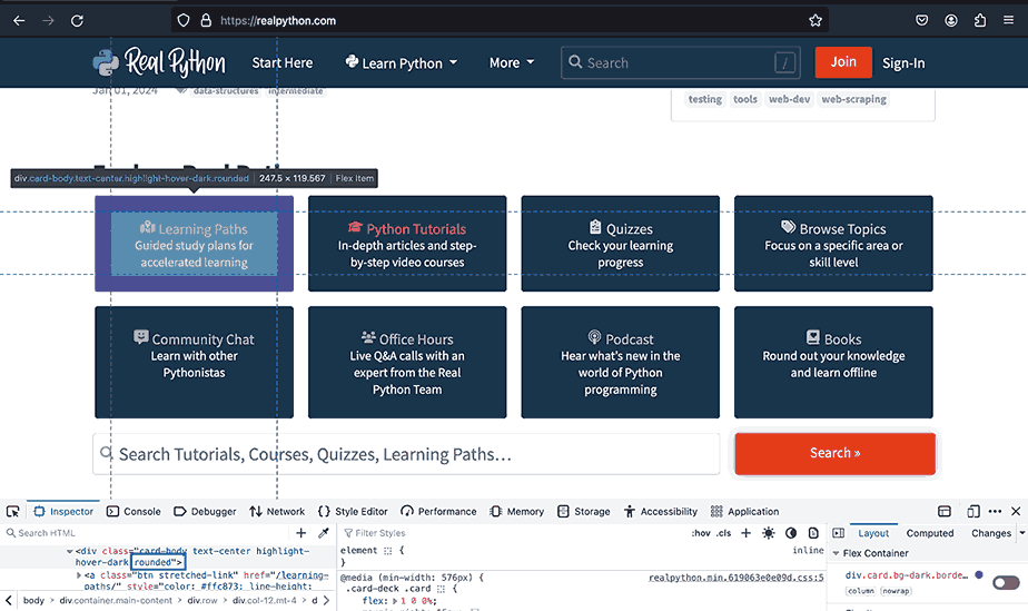
Real Python uses rounded containers on the cards that exhibit the various information on the website. These are relaxing and pleasing to look at and make it easier to focus on the information on each card.
Let’s now explore how Bootstrap’s border radius works. Below are some formats and a table on how to use them.
- rounded-{border radius size}
- rounded-{border side}
- rounded-{border side}-{border radius size}
And the two classes of the border-pill and border-circle fall out of any of the above formats.
| Class | Description |
| rounded | Sets a border radius of 0.375 on all sides of the element. |
| rounded-4 | Sets a border radius of 1rem on all sides of the element. |
| rounded-pill | Gives the element a border radius of 50rem. This makes the element resemble a pill. |
| rounded-end | Sets a right border radius of 0.375rem. |
| rounded-bottom | Sets a bottom border radius of 0.375rem. |
| rounded-3 | Sets a left border radius of 0.5rem on all sides. |
We have seen why border radius is used and when it can be used. Let’s take this to the next level by creating our use case for border radius using Bootstrap classes.
Code:
|
1 2 3 4 5 6 7 8 9 10 11 12 13 14 15 16 17 18 19 20 21 22 23 24 25 26 27 28 29 30 31 32 33 34 35 36 37 38 39 40 41 42 43 44 45 46 47 48 49 50 51 52 53 54 55 56 57 58 59 60 61 62 63 64 65 66 67 68 69 70 71 72 73 74 75 76 77 78 79 80 81 82 83 84 85 86 87 88 89 90 91 92 93 94 95 96 97 98 99 100 101 102 103 104 105 106 107 108 109 110 111 112 113 114 115 116 117 118 119 120 121 122 123 124 125 126 127 128 129 130 131 132 133 134 135 136 137 138 139 140 141 142 143 144 145 146 147 148 149 150 151 152 153 154 155 156 157 158 159 160 161 162 163 164 165 166 167 168 169 170 171 172 173 174 175 176 177 178 |
<!DOCTYPE html> <html lang="en"> <head> <meta charset="UTF-8"> <meta http-equiv="X-UA-Compatible" content="IE=edge"> <meta name="viewport" content="width=device-width, initial-scale=1.0"> <link rel="stylesheet" href="./node_modules/bootstrap/dist/css/bootstrap.min.css" /> <title>Bootstrap border radius</title> <style> body::before { display: block; content: ''; height: 100px; } .img { height: auto; width: 60px; } li::marker { color: #676785; } </style> </head> <body> <nav class="navbar navbar-expand-lg bg-white py-4 fixed-top"> <div class="container ms-auto"> <a class="navbar-brand" href="#"> <img src="https://www.lambdatest.com/resources/images/logos/logo.svg" alt="LambdaTest Logo" /> </a> <button class="navbar-toggler" type="button" data-bs-toggle="collapse" data-bs-target="#navbar-menu"> <span class="navbar-toggler-icon"></span> </button> <div class="collapse navbar-collapse" id="navbar-menu"> <ul class="navbar-nav ms-auto"> <li class="nav-item"><a href="#" class="nav-link">Platform</a></li> <li class="nav-item"><a href="#" class="nav-link">Enterprise</a></li> <li class="nav-item"><a href="#" class="nav-link">Resources</a></li> <li class="nav-item"><a href="#" class="nav-link">Developers</a></li> <li class="nav-item"><a href="#" class="nav-link">Pricing</a></li> <li class="d-flex gap-3 ms-lg-4 ms-md-0 ms-sm-0"> <a href="" class="nav-link">Login</a> <!-- Modal trigger --> <button class="btn btn-outline-dark" data-bs-toggle="modal" data-bs-target="#bookdemo" type="button"> Book a Demo </button> <!-- Modal trigger end --> <a class="btn btn-dark" href="#" role="button">Sign Up</a> </li> </ul> </div> </div> </nav> <section class="py-5 bg-light-subtle"> <div class="container" style="width: 80%;"> <div class="pb-5"> <h1 class="pb-4 h1 fw-bold display-4">Web Scraping with Python Tutorial - A Complete Guide with Examples</h1> <div class="d-flex justify-content-between "> <div class="d-flex gap-3"> <div> <img class="img rounded-circle" src="https://secure.gravatar.com/avatar/2b0ab45992e9a7f49fa7ee0fa0e245d7?s=120&d=mm&r=r" alt=""> </div> <div class="d-flex flex-column"> <span class="fw-semibold">Himanshu Sheth</span> <span class="fw-light">Posted On: November 7, 2023</span> </div> </div> <div class="d-flex flex-column"> <span> <img src="https://www.lambdatest.com/blog/wp-content/uploads/2022/04/blog-view-count.png" alt=""> 148214 Views </span> <span> <img src="https://www.lambdatest.com/blog/wp-content/uploads/2022/04/blog-Clock.png" alt=""> 40 Min Read </span> </div> </div> </div> <div class="d-flex gap-3 align-items-center border-1 border-bottom pb-3"> <a class="link-dark link-underline link-underline-opacity-0 link-underline-opacity-75-hover d-flex align-items-center gap-3" href="#"> Home <span class="fw-bold fs-5">></span> </a> <a class="link-dark link-underline link-underline-opacity-0 link-underline-opacity-75-hover d-flex align-items-center gap-3" href="#"> Blog </a> <span class="fw-bold fs-5">></span> <span class="fw-semibold" style="color: #0EBAC5;"> Web Scraping with Python Tutorial - A Complete Guide with Examples </span> </div> </div> <!-- Article Content --> <section class="container d-flex" style="line-height: 1.7rem; width: 80%"> <div> <section class="py-3"> <p> We live in an era where we are surrounded by data that can be harnessed by extracting meaningful insights from it. As quoted by Tim Berners-Lee, inventor of the World Wide Web - " <i>Data is a precious thing and will last longer than the systems themselves.</i>" </p> <p> If the data is the new oil, web scraping (or web harvesting) is the expeller that helps squeeze more oil.🙂Web scraping can be leveraged for analyzing and deriving actionable insights from tons of information available on the internet. </p> <p> Irrespective of the business domain (e.g., eCommerce, EdTech, Fintech, etc.), scraping can be used for market research, pricing intelligence, lead generation, and sentiment analysis, to name a few! Though web scraping is immensely useful, it comes with a caveat - Scraping should be done legally and ethically, respecting the website's T&C and data privacy regulations. </p> <p> By the end of this blog on web scraping with Python, you will learn to scrap static and dynamic websites using the best Python tools (or libraries) like PyUnit, pytest, and Beautiful Soup. The actionable examples will help you harness the capabilities of web scraping with Python to extract meaningful insights from websites. </p> </section> <section class="container border-5 border-start border-success bg-light rounded py-3"> <p class="fw-bold">TABLE OF CONTENTS</p> <div> <ul class="d-flex flex-column gap-3"> <li> <a class="link-underline link-underline-opacity-0 link-underline-opacity-0" href="#"> What is WebScraping? </a> </li> <li> <a class="link-underline link-underline-opacity-0" href="#"> Prominent Use Cases of Web Scraping </a> </li> <li> <a class="link-underline link-underline-opacity-0" href="#"> Python Libraries and Tools for Web Scraping </a> </li> <li> <a class="link-underline link-underline-opacity-0" href="3"> Demonstration: Web Scraping With Python </a> </li> <li> <a class="link-underline link-underline-opacity-0" href="#"> Web Scraping Done Right! </a> </li> <li> <a class="link-underline link-underline-opacity-0" href="#"> Frequently Asked Questions (FAQs) </a> </li> </ul> </div> </section> <section class="container py-4"> <h3 class="fw-bold fs-1">What is Web Scraping?</h3> <p> To set the ball rolling, let's do a quick recap of the <i>What & Why</i> of web scraping. In simple terms, web scraping, or web harvesting (or data extraction), is the technique for deriving information (that matters) from websites. </p> <p> Shown below is the simplistic representation of web scraping that shows that input is a website that needs to be scrapped by the scraping logic. </p> <img src="https://www.lambdatest.com/blog/wp-content/uploads/2023/11/Web-Scraping-Architecture.png" alt=""> </section> </div> <div class="container pt-3 d-none d-lg-block"> <img src="https://mbaziiraronald.github.io/LambdaTest_Images/LambdaTest_Image_7.png" alt="" width="270px" height="auto"> </div> </section> </section> <script src="./node_modules/bootstrap/dist/js/bootstrap.bundle.min.js"></script> </body> </html> |
Browser Output:
In our demo above, we combined the rounded class and other classes to create an appealing and delightful TABLE OF CONTENTS. This shows you can make many web elements visually pleasing by playing with their border radius.
See the Pen
Bootstrap border radius by Mbaziira Ronald (@mbaziiraronald)
on CodePen.
Tips to Apply Bootstrap Styling to Different Web Designs
Let’s look at some tips that you can use to apply Bootstrap styling concepts like Bootstrap colors, backgrounds, etc; in various situations. These will give you a crucial understanding of adapting Bootstrap styling features to meet and address diverse design challenges.
Responsive Design and Spacing
In cases where you need to adjust the spacing on an element based on the breakpoint or screen size, you can use Bootstrap responsive margins and paddings. You can refer to the previous section on Bootstrap margin and padding. It contains relevant information that complements the current context. Referencing it will help you familiarize yourself with the concept of responsive spacing.
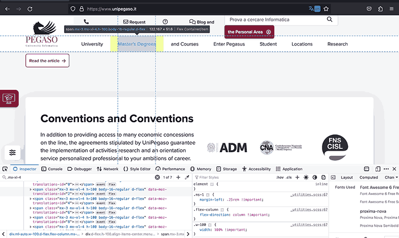
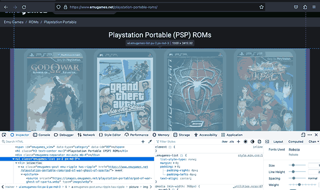
The examples below show Pegaso and Emugames use Bootstrap responsive spacing to adjust the room of the sections to fit clearly in the space the screen size allows to avoid any overhanging or lacking space, which can affect user experience.
Pagination
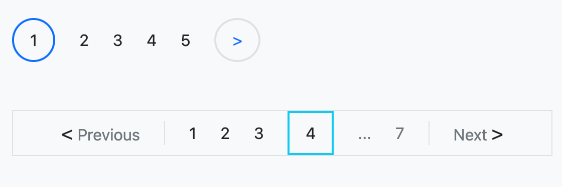
With pagination, you can use Bootstrap borders on pagination numbers as pointers to the currently active tab. Similarly, you can define a frame for the page numbers so that the whole pagination area stands out from the surrounding content.
Let’s say you have a couple of anchor links for pagination that link to the pages, and you want to create some form of indicator to show the user the currently active page, as shown in the images below, as Amazon and Walmart did.
Here is how you could achieve the same results as seen in the images using Bootstrap.
Code:
|
1 2 3 4 5 6 7 8 9 10 11 12 13 14 15 16 17 18 19 20 21 22 23 24 25 26 27 28 29 30 31 32 |
<div> <!-- rounded border indicator --> <div class="mb-5 d-flex align-items-center gap-4"> <a class="text-decoration-none link-dark border border-2 p-2 px-3 rounded-circle border-primary" href="#">1</a> <a class="text-decoration-none link-dark" href="#">2</a> <a class="text-decoration-none link-dark" href="#">3</a> <a class="text-decoration-none link-dark" href="#">4</a> <a class="text-decoration-none link-dark" href="#">5</a> <a class="text-decoration-none link-dark border border-2 p-2 px-3 rounded-circle" href="#"> <span class="text-primary">></span> </a> </div> <!-- With square border indicator and frame --> <div class="d-flex align-items-center gap-4 border px-5" style="width: fit-content;"> <a class="text-decoration-none link-dark text-secondary" href=""> <span class="fs-5 text-dark"><</span> Previous </a> <a class="text-decoration-none link-dark border-start ps-4" href="#">1</a> <a class="text-decoration-none link-dark" href="#">2</a> <a class="text-decoration-none link-dark" href="#">3</a> <a class="text-decoration-none link-dark border border-info border-2 p-2 px-3" href="#">4</a> <a class="text-decoration-none link-secondary" href="#">...</a> <a class="text-decoration-none link-secondary border-end pe-4" href="#">7</a> <a class="text-decoration-none link-dark text-secondary" href=""> Next <span class="fs-5 text-dark">></span> </a> </div> </div> |
Browser Output:
Tab Navigation
As mentioned earlier, you can use the borders to indicate the currently active tab to the user following the same method as in the previous example with pagination or create the tabs structure.
The example below shows eBay uses borders to mark the tabs and define their inner structure.
Conclusion
In brief, Bootstrap colors, margins, and borders unlock multiple paths for creating appealing web interfaces. Colors convey meaning, while margins, paddings, and borders structure layouts seamlessly.
Some essential tools to create a modern, appealing website are colors, margins, paddings, and borders, and we’ve only covered the tip of the iceberg. You can do more with these tools, experiment with different color schemes, master the art of spacing with margins and paddings, and refine your layouts with borders.
In this tutorial on Bootstrap colors, we have looked at and dived into the workings of the colors, margins, paddings, and borders and how we can apply their styling concepts to different design scenarios.
Frequently Asked Questions (FAQs)
What are contextual color classes in Bootstrap?
Bootstrap contextual color classes are a set of classes you can apply to text and backgrounds with different color variations that convey relevant meaning.
For example, when you use the class bg-danger for the background color of a button, it indicates that the action that occurs when the user clicks the button is irreversible or can lead to undesirable changes.
Can I customize the default color palette to match my website’s branding?
Yes, you can. You can change the default color palette to your website’s branding by editing and modifying the Sass color variables to your desirable values.
Are there responsive classes in Bootstrap for adjusting margins and paddings based on screen sizes?
Yes, there are. Bootstrap provides a class format of {property}{side}-{breakpoint}-{size} that enables you to modify the margins and paddings of an element based on the breakpoints of sm, md, lg, xl, and xxl.
What’s the difference between border and border-* classes in Bootstrap?
The Bootstrap border class adds a solid border of 1px to all sides when applied to the element, while the border-* class format enables you to specify the border width anywhere between 0 and 5px.


Author’s Profile
Mbaziira Ronald
Mbaziira Ronald is a software developer and technical writer. He has expertise in technologies like Tailwind CSS, JavaScript, and WordPress. He frequently dabbles with Figma to improve his design skills.
Blogs: 7
Got Questions? Drop them on LambdaTest Community. Visit now


