
A Complete Guide To CSS Container Queries
Aman Mandal
Posted On: December 9, 2022
 35528 Views
 23 Min Read
In 2007, Steve Jobs launched the first iPhone, which revolutionized the world. But because of that, many businesses dealt with the problem of changing the layout of websites from desktop to mobile by delivering completely different mobile-compatible websites under the subdomain of ‘m’ (e.g., https://m.facebook.com). And we were all trying to figure out how to work in this new world of contending with mobile and desktop screen sizes.
But after a few years, in 2010, Ethan Marcotte introduced the concept of Responsive Design. Responsive Web Design is the idea that design and development should respond to the user’s behavior and environment based on the screen size, device, and orientation. And central to that idea was the availability of CSS Media Query, which allowed setting various layout rules depending on the size of the viewport.
The responsive design opened up many more layout solutions with the help of Media Query. Frameworks like Bootstrap rose in popularity due to providing responsive grid systems. As per W3Techs, Bootstrap is used by 21.4% of all websites, with a market share of 26.2%.
Nowadays, component libraries (ReactJS) have gained popularity because of its ‘build once, deploy anywhere’ nature. A component is built once and can be used anywhere in the layout to make complex interfaces more efficient. And those components come together to create a webpage.
So developers are using component-based JavaScript frameworks like ReactJS, AngularJS, VueJS, etc., along with CSS frameworks like Tailwind CSS, Material UI, and Bootstrap to make responsive and reusable layouts and applications.
However, a new approach to responsive design is upon us again and follows a Component-Driven (CDD) pattern. CDD is not a new concept. For decades, modularization has been a fundamental principle of software engineering.
In this blog on CSS Container Queries, we will discuss the latest CSS feature (i.e., Container Queries) and see how they use component-driven development (CDD) to change how we use responsive design.
TABLE OF CONTENTS
What are CSS Container Queries?
In CSS, a container refers to an element that encloses other elements, controlling their layout and styling. It’s a fundamental concept for responsive design, allowing content to adapt to different screen sizes. Containers can be styled using CSS properties to manage width, padding, margins, and other layout aspects, making them essential for structuring web pages effectively.
A Container (also called a Wrapper) is an element that contains another element(s). So in simple terms, CSS Container Queries specify changes to an element in relation to its parent container or element rather than the entire viewport.
When a component is placed within an item, it’s contained within it. That means we can query the width of its parent and modify the component based on that. CSS Container Queries enable developers to approach responsiveness from a component standpoint, where elements on a page are designed to be responsive as individual units. This means that regardless of where these elements are placed on the page, they will adjust based on the parent element’s size rather than the entire page’s or viewport size.
Syntax:
|
1 2 3 4 5 |
// we can also use ‘em’ as unit instead of ‘px’ @container (min-width: 500px) { // 31em .card { // content inside the card } |
As we can see, it’s very similar to the Media Query syntax but let us understand why it’s different and why there is so much hype about it.
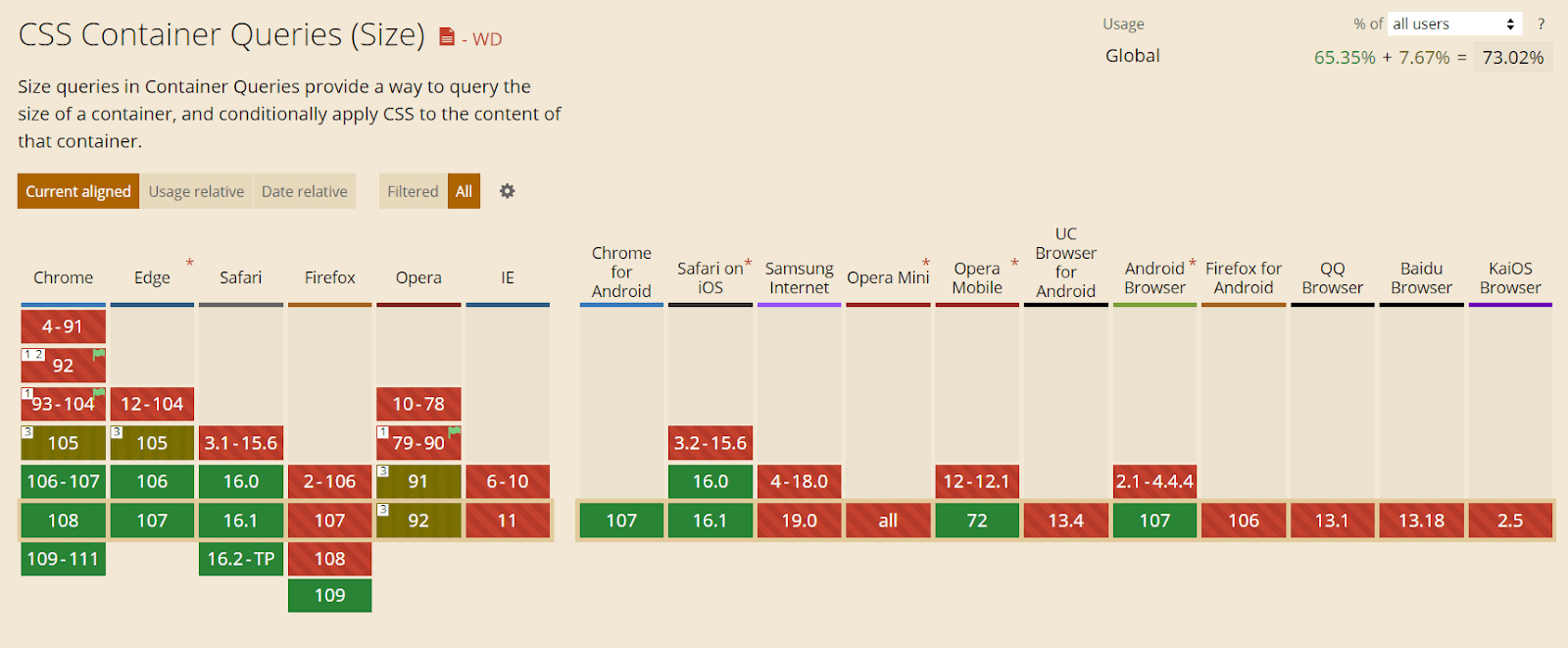
Browser Support
CSS Container Queries are by default enabled in Chrome (the latest version). For smooth and better performance, you can install the latest browser.
Note: If you are not using the above-recommended browser, the following CodePens might not work. So an image showcasing the intended working example will be provided alongside the CodePens demo.
Getting Started with CSS Container Queries
The most important thing to know about CSS Container Queries is that “containers” are the elements being queried, but rules within the CSS Container Queries affect only the descendants of the container. In other words, you may define the ‘body’ element, ‘ main’ element, or perhaps event list items. Then, CSS Container Queries will allow defining rules for how elements within those change across container sizes.
CSS Container Queries are not as straightforward as regular media queries. You’ll have to add the container property to the parent UI element to make CSS Container Queries work, but there’s a reason, and we’ll cover that next.
Contain Property
CSS contain property has been added to most modern browsers and has a decent 90% browser support when writing this article.
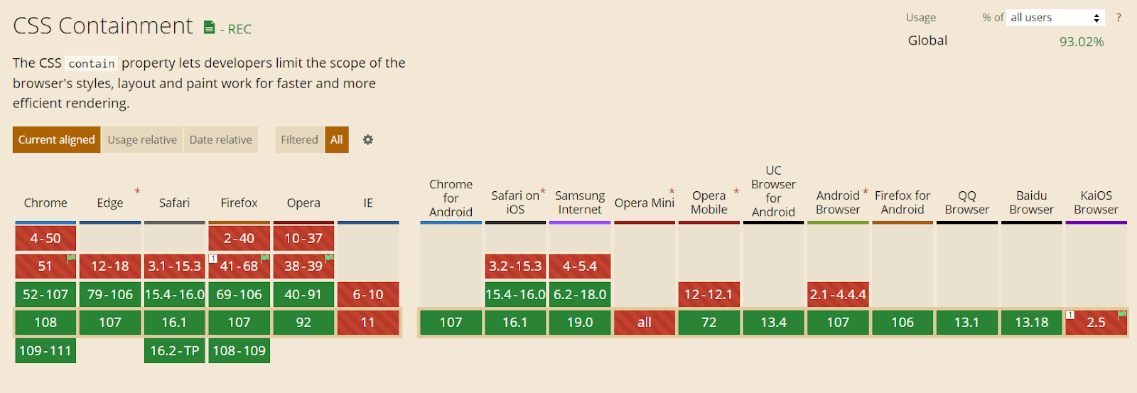
The contain property is mainly used for performance optimization by hinting to the browser which parts of the page can be treated as independent and won’t affect the other elements of the page. If a change occurs in a single element, the browser will re-render only that part instead of the whole page.
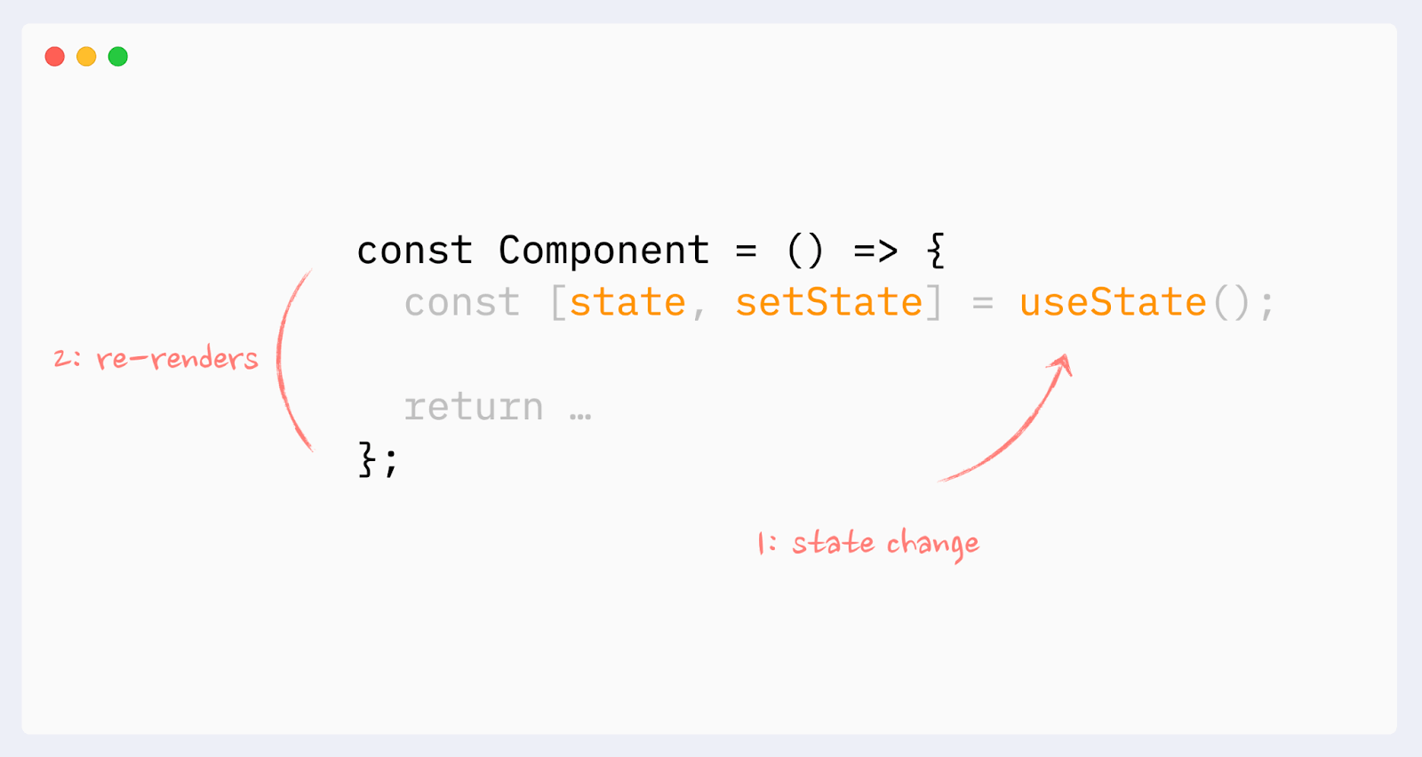
Confused with the word re-rendering? Let’s understand what re-rendering is with some real-world examples.
Rendering a component or layout which is already on screen with the change of state or interaction with asynchronous data is known as Re-rendering. React components automatically re-render when there’s a change in state or props.
Note: We will use ReactJS (a JavaScript library) to understand the concept of re-rendering fully.
Here are the two major stages in re-rendering:
- Initial render – It happens when a component/layout is loaded for the first time on the screen.
- Re-render – The second or consecutive layout render is already on the screen.
Re-rendering happens when React needs to update the application (or layout) with some new data. Usually, this occurs only if a user interacts with the layout or external data via an asynchronous request.
Let’s use the LamdaTest website as an example to understand what re-rendering looks like:
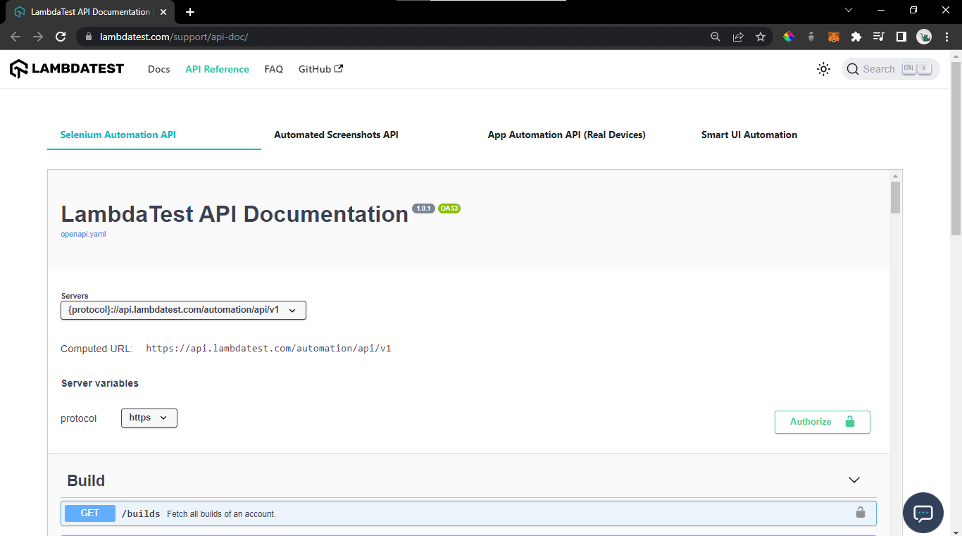
The above image is the layout of the API-documentation page of LambdaTest. As we can see, there’s a tabbed component with different buttons, namely ‘Selenium Automation API’, ‘Automated Screenshot API’, etc.
So whenever we click on a different button, instead of rendering the whole layout again, it will only re-render the parts that need to change.
With contain property values, we can specify which types of containment we want to use – layout, size, paint, content, or none.
The level 3 draft specification adds the inline-size and block-size keywords to contain. In addition, the draft specification proposes some new properties:
Container-type
It assigns a query container to an element. Depending on the value, descendants can query aspects of the size, layout, style, and state of the object. It helps to set the contain property easily with different attributes/properties assigned to it.
Syntax:
|
1 |
container-type: inline-size; |
The container type property can have the following values:
- Size: Creates a query container that supports dimensional queries on both the inline and block axis.
- Inline-size: Creates a query container that supports dimensional queries on the inline axis.
- Block-size: Creates a query container that supports dimensional queries on the block axis.
- Style: Allows for style queries by defining a query container.
- State: Allows for state queries by defining a query container.
HTML:
|
1 2 3 4 5 6 7 8 9 10 11 |
.card-layout { container-type: inline-size; } @container (min-width: 768px) { .card{ display: grid; font-size: 3rem; color: blue; } } |
Container-name
Specifies a list of query container names for @container rules to use to filter which query containers are targeted. It’s mainly used to differentiate containers with unique names. This takes a
Syntax:
|
1 |
container-name: card; |
HTML:
|
1 2 3 4 |
.card-layout { container-type: inline-size; container-name: card; } |
Now, we can just target our container with the name ‘card’ instead of every container that was defined earlier.
|
1 2 3 4 5 6 7 8 |
// using the name ‘card’ with container-query to target it specifically @container card (min-width: 480px) { .card{ display: grid; font-size: 2rem; color: gray; } } |
Container
A shorthand property to set both container-type and container-name together.
Syntax:
|
1 2 |
// first we will add the name of container and then the type container: card / inline-size; |
HTML:
|
1 2 3 4 5 6 7 |
@container card (min-width: 480px) { .card{ display: grid; grid-template-columns: 2fr 2fr; color: gray; } } |
But what does the CSS Contain property used for optimization have to do with CSS Container Queries? For CSS Container Queries to work, the browser must know if a change occurs in the element’s children layout. It should re-render only that component.
The browser will know to apply the code in the container query to the matching component when rendered.
HTML:
|
1 2 3 4 5 6 7 8 9 10 11 12 13 14 15 16 17 18 19 20 21 22 23 |
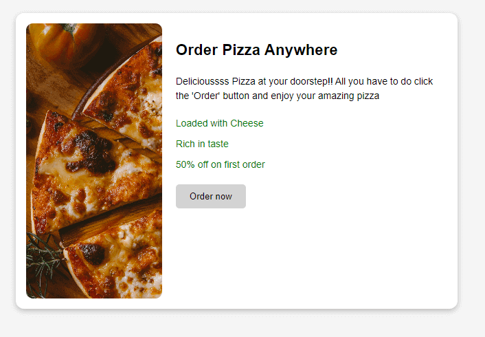
<div class="wrapper"> <div class="container"> <article class="card"> <header> <h3 class='header'> Order Pizza Anywhere </h3> </header> <div class="image"><img src="https://i.imgur.com/F5W5bY6.jpg" alt="a pizza"></div> <div class="content"> <p class='para'>Delicioussss Pizza at your doorstep!! All you have to do click the 'Order' button and enjoy your amazing pizza </p> <ul> <li>Loaded with Cheese</li> <li>Rich in taste</li> <li>50% off on first order</li> </ul> <button class='btn'>Order now</button> </div> </article> </div> |
CSS:
|
1 2 3 4 5 6 7 8 9 10 11 12 13 14 15 16 17 18 19 20 21 22 23 24 25 26 27 28 29 30 31 32 33 34 35 36 37 38 39 40 41 42 43 44 45 46 47 48 49 50 51 52 53 54 55 56 57 58 59 60 61 62 63 64 65 66 67 68 69 70 71 72 73 74 75 76 77 78 79 80 81 82 83 84 85 86 87 88 89 90 91 92 93 94 95 96 97 98 99 100 101 102 103 104 105 106 |
* { box-sizing: border-box; } img { max-width: 100%; height: 100; display: block; } body { font: 1.2rem Roboto, sans-serif; background: whitesmoke; line-height: 1.5; } .header{ } .wrapper { padding: 20px; display: grid; grid-template-columns: 2fr 1fr; gap:20px; } .card { background: white; box-shadow: rgba(0, 0, 0, 0.24) 0px 3px 8px; border-radius: 12px; display: grid; overflow: hidden; padding: 15px; } .card .image { /* border: 10px solid #000; */ border-radius: 10px; } .image > img{ border-radius: 10px; height: 400px; object-fit:cover; } .card .content { padding: 10px; } .para{ font-size: 14px; } .btn{ cursor: pointer; color: black; background: lightgray; padding : 10px 20px; border-radius: 5px; border: none; } .btn:hover{ background: gray; color: white; } .card h2 { margin: 0; padding: 10px; } .container{ container-type: inline-size; } @container (min-width: 500px) { .card { grid-template-columns: 1fr 2fr; grid-template-rows: auto 1fr; align-items: start; column-gap: 20px; } .card h2 { padding: 0; margin: .5em 0 0 0; } .card header { grid-row: 1; grid-column: 2; } .card .image { grid-row: 1 / 2; grid-column: 1; } .card .content { grid-column: 2; grid-row: 1/2; padding: 60px 20px 20px 0; } } |
Output:
See the Pen
Demo 1 by Aman Mandal (@aman-mandal)
on CodePen.
As we can see in the above code block, we are not adding the ‘container’ property to a more distant-parent like ‘wrapper’ and keeping the container as close to the affected element as possible.
That is why we should correctly signal the browser about the change. Wrapping a distant parent element with a ‘container’ property can negatively affect page performance.
After the container property has been added to the card element wrapper in the above code example, we can write a container query. We’ve added a container property to an element with container class, so now we can include any of its child elements in a container query.
|
1 2 3 |
.container { container-type: inline-size; } |
Just like a regular media query, we need to define a query using min-width or max-width properties and nest all selectors inside the block. However, we’ll use the @container keyword instead of @media to define a container query.
|
1 2 3 4 5 6 7 8 9 10 11 12 13 14 15 16 |
@container (min-width: 500px) { .card { grid-template-columns: 1fr 2fr; grid-template-rows: auto 1fr; align-items: start; column-gap: 20px; } .card h2 { padding: 0; margin: 0.5em 0 0 0; } // content inside the card } |
The above code block shows how container queries are written in a general way.
What problems do CSS Container Queries solve?
CSS Container Queries offers a unique solution for developers working on large-scale projects where different components comprise different parts of the webpage. They allow components to modify their appearance to fit the context in which they’re put. This means that the components can be used repeatedly, making them reusable.
Many websites have components that need to change their layout based on the container’s available width. This may not always be related to the viewport’s size but to where the component is placed in the layout. CSS Container Queries provide a solution for developers to change component style and layout depending on the available width of the container or parent element.
Here’s a proper example so that we can see the power of container queries:
HTML:
|
1 2 3 4 5 6 7 8 9 10 11 12 13 14 15 16 17 18 19 20 21 22 23 24 25 26 27 28 29 30 |
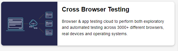
<div class="wrapper"> <div class="left"> <article class="card"> <header> <h2>Cross Browser Testing</h2> </header> <div class="image"><img src="https://i.imgur.com/dV3ywkg.png"></div> <div class="content"> <p>Browser & app testing cloud to perform both exploratory and automated testing across 3000+ different browsers, real devices and operating systems. </p> </div> </article> </div> <div class="right"> <article class="card"> <header> <h2>Cross Browser Testing</h2> </header> <div class="image"><img src="https://i.imgur.com/dV3ywkg.png"></div> <div class="content"> <p>Browser & app testing cloud to perform both exploratory and automated testing across 3000+ different browsers, real devices and operating systems. </p> </div> </article> </div> </div> |
CSS :
|
1 2 3 4 5 6 7 8 9 10 11 12 13 14 15 16 17 18 19 20 21 22 23 24 25 26 27 28 29 30 31 32 33 34 35 36 37 38 39 40 41 42 43 44 45 46 47 48 49 50 51 52 53 54 55 56 57 58 59 60 61 62 63 64 65 66 67 68 69 70 71 72 73 74 75 76 77 78 79 80 81 82 83 84 85 86 87 88 |
* { box-sizing: border-box; } img { max-width: 100%; height: 100%; display: block; } body { font: 1.2rem Roboto, sans-serif; background: whitesmoke; line-height: 1.5; } .wrapper { display: grid; grid-template-columns: 2fr 1fr; gap:20px; } .card { background: white; box-shadow: rgba(0, 0, 0, 0.24) 0px 3px 8px; border-radius: 12px; display: grid; overflow: hidden; max-width:400px; } .card .image { /* border: 10px solid #000; */ border-radius: 10px; } .image > img{ /* object-fit:contain; */ } .card .content { padding: 10px; } .card h2 { margin: 0; padding: 10px; } /* make the two grid items a containment context */ .left, .right{ container-type: inline-size; } @container (min-width: 500px) { .card { grid-template-columns: 1fr 2fr; grid-template-rows: auto 1fr; align-items: start; column-gap: 20px; max-width:100%; } .card h2 { padding: 0; margin: .5em 0 0 0; } .card header { grid-row: 1; grid-column: 2; } .card .image { grid-row: 1 /3; grid-column: 1; height:100%; /* object-fit: cover; */ } .card .content { grid-column: 2; grid-row: 2; padding: 0 20px 20px 0; } } |
Output:
Output:
See the Pen
Container-Query demo by Aman Mandal (@aman-mandal)
on CodePen.
We created a simple card that resizes and adapts to fit any layout and container in our example. Our one container has a width of ⅔ and the other one of ⅓. This means our card component will have a width of 1066px and 534px at a viewport width of 1600px.
We want our container to look slightly different at different breakpoints depending on its available space while remaining responsive. We could do this with a media query, but to do that, we’d have to make changes regarding the viewports information rather than the container itself. This means we must constantly watch for changes to the screen size and adjust our components according to that particular size.
Although this might not seem like an issue, it could quickly lead to the use of too many media queries to target if we had multiple containers because we would need to make sure all elements on the page, not just the card component, are responsive.
This is where CSS Container Queries come into play. Let’s go over our above code example again and see how we can turn this into a container:
|
1 2 3 4 5 |
<div class="wrapper"> <div class="left"> <article class="card"> <!-- Card Content --> </article> |
To query elements, we first need to make the parent element a container by setting the container property on the parent element. The container property takes two values: container-type and container-name.
Notice how the element with the .card class is wrapped by a parent element? This would be our parent container, and our card would adjust its size, layout, and styles based on the meta information of this element.
Let’s go ahead and make our element with the left class a container, so its children elements can be queried based on its meta-information.
|
1 2 3 |
.left{ container: inline-size; } |
We set the container property to inline-size because we want containment to happen on the inline axis.
The container property and value are set on our .left class, which automatically turns the container element into a queryable container. So now, we can change the card element whenever the size of our container element changes.
We can change the style or layout of our card element at certain breakpoints. We can set these breakpoints similarly to how media queries breakpoints are set. You can learn more about it by going through our blog on CSS breakpoints.
Let’s look at the breakpoints in the above example to see how CSS Container Queries handle changes based on our breakpoints and how CSS Container Queries compare to media queries.
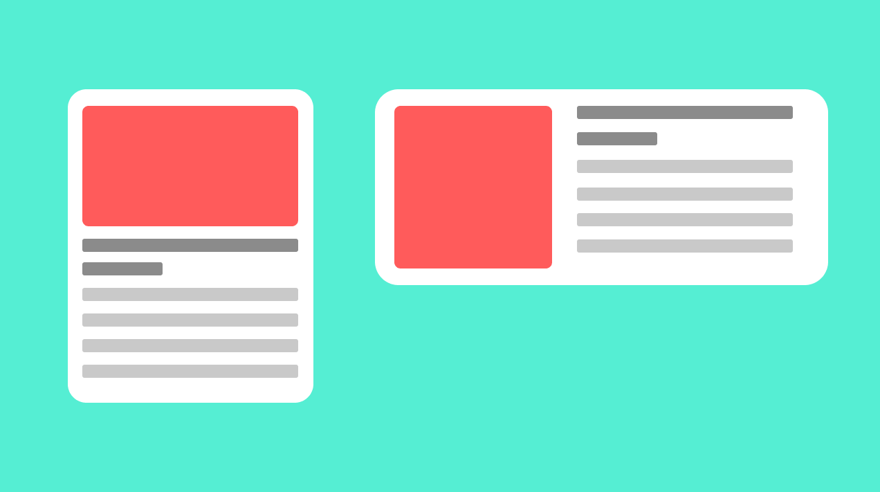
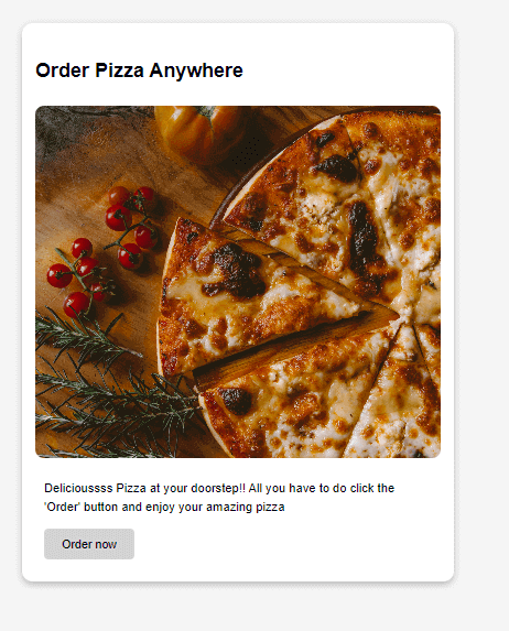
In our example, we started by building out how our card component would look when its parent container has the smallest width, which is any width less than 500px. We want it to look like this:
This would be our starting point for our card component. Since its parent container is now a container that can be queried, we can go ahead and start making changes to the layout and style at different breakpoints depending on the current width of the parent container.
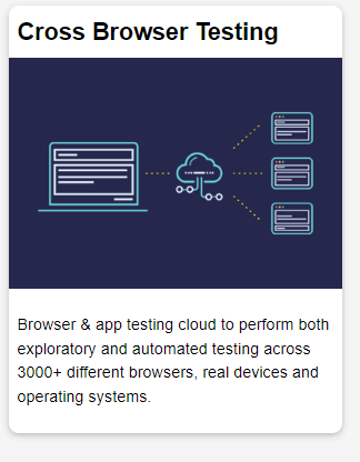
We do that by setting breakpoints. Our breakpoint is when our parent container is at a min-width of 500px (500px or greater), and we start defining a new look for our card container. Here we want our container to look like this:
Code Example:
|
1 2 3 4 5 6 7 8 9 10 11 12 13 14 15 16 17 18 19 20 21 22 23 24 25 26 27 28 29 |
@container (min-width: 500px) { .card { grid-template-columns: 1fr 2fr; grid-template-rows: auto 1fr; align-items: start; column-gap: 20px; } .card h2 { padding: 0; margin: .5em 0 0 0; } .card header { grid-row: 1; grid-column: 2; } .card .image { grid-row: 1 / 3; grid-column: 1; } .card .content { grid-column: 2; grid-row: 2; padding: 0 20px 20px 0; } } |
If we want our card element to look slightly different at another breakpoint, we can simply follow the same process for every new breakpoint.
Container queries allow us to create more powerful and reusable UI components that can adjust to nearly any layout and container, as shown in the above two examples. This would’ve been a lot more difficult with media query because it depends on the information of the entire viewport.
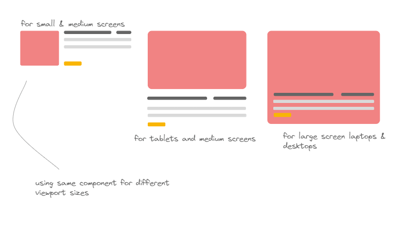
With container queries, the card component could be placed in any part of the webpage, and still, it will look good and responsive. Furthermore, if there is enough space in our container queries example, it displays as a two-column layout. Otherwise, it has a block layout, as shown below.
A block layout for smaller sections of the webpage:

A two-column layout for when we have more space:
The above examples show the power of container queries and how vital they are in the component-driven development world.
But the question is, when and how to choose between Media queries and Container queries? Let’s first go through the basics, then look at the above question.
What is a Media Query?
Almost a decade ago, smartphones were launched, which revolutionized the world, but because of that, many businesses dealt with the problem of changing the layout of websites from desktop to mobile by delivering completely different mobile-compatible websites under the subdomain of ‘m’. Then after some years, CSS developers introduced us to the concept of responsiveness to Media Queries.
Using Media Queries, we can style the layout of any website according to the size of the viewport. It provides a conditional statement around some styles, which are then implemented or not based on whether the conditions are met.
Media Queries Challenges
Although we know that Media Query changed many things in today’s world, they still have a problem: they can’t be reused with different components and layouts. We can create a good, responsive element and implement it. We can use it for standard purposes, but when it comes to making it reusable for other components, it’s too tough and requires a lot of additional CSS properties.
Here’s where Container Queries come to the rescue. As we learned in the above sections, with container queries, you can target individual elements and enable them to adapt to virtually any given container or layout.
Container Queries are very similar to media queries, the only difference is they make a container or an element responsive based on the space available to the parent container rather than the whole viewport. But because of this, a question is raised: Do we even need Media Queries anymore?
The answer to the above question is a big YESSS !!! Container Queries just solves the limitation of Media Query, but it can’t replace it (for now).
When to use Media Queries?
Media Queries should still be used for the page layouts, which are at the very top of the Document Object Model (DOM) and not nested in some other containers. The main page layout should always be adaptive to the viewport and nothing else, and that’s why media query is the best-suited thing for it.
Media Queries also style global elements like font size, colors, letter spacing, line heights, etc. For example, if you are building a web application with a very large font size and different spacings, chances are that the fonts and spacings will be too large for the small screen, and here comes the media query to the rescue.
|
1 2 3 4 5 6 7 8 9 10 11 12 13 14 15 16 17 18 19 20 21 22 23 24 25 26 27 28 29 30 31 32 33 34 35 36 37 38 39 40 41 42 43 44 45 46 |
:root { /* Styling the font size with default values */ --font-size-h1: 24px; --font-size-h2: 18px; --font-size-h3: 14px; --font-size-p: 10px; --letter-spacing-text: 6px; --line-height-text: 4px; --color-red: rgb(195, 56, 56); } /* Media Query for mobile device */ @media (max-width: 480px) { :root { --font-size-h1: 20px; --font-size-h2: 15px; --font-size-h3: 12px; --font-size-p: 8px; --letter-spacing-text: 4px; --line-height-text: 2px; --color-red: rgb(213, 100, 100); } } /* Media Query for medium screen size */ @media (max-width: 768px) { :root { --font-size-h1: 22px; --font-size-h2: 17px; --font-size-h3: 13px; --font-size-p: 9px; --letter-spacing-text: 4px; --line-height-text: 2px; --color-red: rgb(213, 100, 100); } } |
We also use Media Query when we have to remove a certain component from a page with respect to different screen sizes (viewport). For example, look at the homepage of the LamdaTest website.
While using a desktop, the image on the right side looks excellent, but mobile devices don’t have this much viewport, so it won’t look good. With Media Queries, the entire image can be removed, and the same page will look like this.

We can see how useful Media Queries are for the layouts, which are on top of the DOM (Document Object Model). Let’s look at the above example with a mobile-friendly tester like LT Browser, which allows real-time testing without writing a single line of code. It also offers other features like:
- Check the mobile view of websites.
- Compare side-by-side view of the website.
- Generate performance reports of your websites powered by Google Lighthouse.
- Get JavaScript Error reports.
- Test websites across different network conditions.
- One-click bug logging and video recording of test sessions.
You can also try our new Chromium-based LT Browser 2.0, which has several new features and enhancements. Try LT Browser 2.0 now.
To get started, check our support documentation – Getting started with LT Browser 2.0.
Subscribe to the LambdaTest YouTube channel for tutorials around Selenium testing, Playwright browser testing, Appium, and more.
When to use Container Queries?
As we learned above, Container Queries allow us to target specific containers and configure them with respect to their parent container or layout without using Media Queries. It’s mostly used for card components, but you can use it anywhere inside the layout because of its responsiveness.
Container Queries share a lot of similar properties with Media Queries, but as we’ve seen above, it has some unique properties like Container-type, Container-name & Container.
Let’s take a look at a quick example:
HTML:
|
1 2 3 4 5 6 7 8 9 10 11 12 13 14 15 16 17 18 19 20 21 22 23 24 25 26 27 28 29 30 31 32 33 34 35 36 37 38 39 40 41 42 43 44 45 46 47 48 49 50 51 52 53 54 55 56 57 58 59 60 |
<div class="page-container"> <div class="card-container"> <div class="card"> <figure> <img src="https://i.imgur.com/2xiaL5l.png" /> </figure> <div> <div class="meta"> <h2>Cloud Selenium Testing</h2> <span class="subtitle">A cross-browser testing platform</span> </div> <div class="notes"> <p class="desc">In this episode we narrow our focus on user-preference-based media queries, which enable you to create personalized experiences based on your users custom settings and needs.</p> <div class="links"> <h3>Features</h3> <ul> <li>Selenium Testing </li> <li>Cypress Testing </li> <li>Hyper Execute </li> <li>Visual Regression Cloud </li> <li>Automation Testing Cloud </li> </ul> </div> </div> <button>Start Free Testing</button> </div> </div> </div> <div class="card-container"> <div class="card"> <figure> <img src="https://i.imgur.com/2xiaL5l.png" /> </figure> <div> <div class="meta"> <h2>Cloud Selenium Testing</h2> <span class="subtitle">A cross-browser testing cloud</span> </div> <div class="notes"> <p class="desc"> LambdaTest is a cloud-based cross browser testing tool that allows you to perform cross browser testing for web applications across more than 2000 browsers, operating systems, and devices</p> <div class="links"> <h3>Features</h3> <ul> <li>Selenium Testing </li> <li>Cypress Testing </li> <li>Hyper Execute </li> <li>Visual Regression Cloud </li> <li>Automation Testing Cloud </li> </ul> </div> </div> <button>Start Free Testing</button> </div> </div> </div> </div> |
CSS:
|
1 2 3 4 5 6 7 8 9 10 11 12 13 14 15 16 17 18 19 20 21 22 23 24 25 26 27 28 29 30 31 32 33 34 35 36 37 38 39 40 41 42 43 44 45 46 47 48 49 50 51 52 53 54 55 56 57 58 59 60 61 62 63 64 65 66 67 68 69 70 71 72 73 74 75 76 77 78 79 80 81 82 83 84 85 86 87 88 89 90 91 92 93 94 95 96 97 98 99 100 101 102 103 104 105 106 107 108 109 110 111 112 113 114 115 116 117 118 119 120 121 122 123 124 125 126 127 128 129 130 131 132 133 134 135 136 137 138 |
body { font-family: 'Google Sans', system-ui, serif; line-height: 1.5; padding: 2rem 1rem; background: whitesmoke; } .page-container { display: grid; grid-template-columns: 35% 1fr; gap: 1rem; } img { width: 100%; } .card { display: grid; grid-template-columns: 40% auto; gap: 2rem; margin: 0 auto; box-shadow: rgba(0, 0, 0, 0.24) 0px 3px 8px; padding: 1rem; border-radius: 7px; } h2 { font-size: 2.5rem; font-weight: 400; line-height: 1; } h3 { font-size: 1.15rem; font-weight: 800; text-transform: uppercase; margin: 1rem 0 0.25rem; line-height: 1; } li { color: gray; cursor:pointer; letter-spacing:1px; } li:hover{ color: black; } .subtitle { font-size: 1.2rem; line-height: 1.2; font-weight: 300; color: gray; } button { border: none; cursor:pointer; padding: 0.7rem; background: black; color: white; font-weight: 600; letter-spacing: 0.1rem; text-transform: uppercase; margin-top: 1rem; } button:hover{ color: lightgray; } /* Container Queries */ .card-container { container-type: inline-size; } @container (max-width: 850px) { .links { display: none; } .subtitle { font-size: 1.25rem; } h2 { font-size: 2.2rem; } } @container (max-width: 650px) { .desc { display: none; } h2 { font-size: 2rem; } .card { gap: 1rem; } } @container (max-width: 460px) { .card { grid-template-columns: 1fr; text-align: center; gap: 0.5rem; } button { display: block; margin: 1rem auto 0; } } @container (max-width: 300px) { h2 { font-size: 1.5rem; } .subtitle { display: none; } } strong { font-weight: 800; } i { font-style: italic; } |
Output:
See the Pen
Component Query Card Demo by Aman Mandal (@aman-mandal)
on CodePen.
As we’ve seen from all the previous examples, CSS Container Queries are best used for highly reusable components with a layout that depends on the available container space and that can be used in various contexts and added to different containers on the page.
It’s a Wrap!
Once the spec has been implemented and widely supported by browsers, CSS Container Queries might become a game-changing feature. CSS Container Queries are an impending approach for moving beyond media queries tied to the viewport. For many years, developers have desired the ability to change an element’s width based on its container’s width. Therefore, it is only logical that elements have a way to be responsive based on their parent’s container meta information rather than the entire viewport.
As it stands, CSS Container Queries are still in an early experimental phase, and the implementation is prone to change. We hope to see the final draft specifications for this feature soon so we can all start using it. Until then, keep experimenting !!
Thank you for reading.
Frequently Asked Questions (FAQs)
What is CSS container query?
A container query is a query that returns a set of elements for which the specified CSS selector matches. Containers and queries are an advanced concept of CSS. They are not widely used, and many people don’t even know they exist. But they can be very useful when you need to apply styles to a set of elements that are related in some way.
How do I enable container queries?
Container queries are a method of responsive design that shifts the concept of “responsive web design” from page-based to container-based. It allows you to specify breakpoints for elements within a container instead of the whole page. This capability is experimental, so to enable its support in DevTools, under chrome://flags, set the Enable CSS Container Queries experiment to Enabled.
What is a CSS container?
A CSS container is a fundamental component used to group and contain other elements within a web page or application. It provides a way to organize and control the layout and positioning of its contents, facilitating responsive design and enhancing overall visual consistency.
How to add a container using CSS?
To add a container using CSS, you can utilize the “class” or “id” attribute to select the desired element and apply styling rules accordingly. Use the “class” attribute for multiple elements and the “id” attribute for a unique element. Then, define the container’s properties such as width, height, background color, and margins in your CSS file.
Why use containers in HTML CSS?
Containers in HTML and CSS are essential for structuring and organizing web content. They provide a professional and consistent layout, ensuring a visually appealing and responsive design. Containers help maintain code modularity, facilitate easier maintenance and updates, and improve code readability. Ultimately, they enhance the user experience by creating a structured and visually appealing web interface.
Are CSS container queries supported?
Yes, CSS container queries are supported. They provide the ability to apply CSS styles based on the size of a container rather than the viewport. This allows for more responsive and flexible designs, particularly useful for components that dynamically change in size. Container queries are a powerful addition to the CSS specification.
How to center container CSS?
To center a container using CSS, you can utilize the following approach:
Apply the “display: flex” property to the parent container and use “justify-content: center” and “align-items: center” to horizontally and vertically center its child elements. Additionally, you may set the parent container’s width and height as needed.
How to set container size in CSS?
To set the container size in CSS, you can use the “width” and “height” properties. These properties allow you to specify the dimensions of the container. For example, you can use “width: 300px;” to set the container’s width to 300 pixels. Similarly, “height: 200px;” would set the container’s height to 200 pixels. Adjust these values as per your requirements.
What is the difference between container query and media query?
Container queries and media queries are two distinct approaches for adapting the layout of web content. While media queries target the viewport characteristics, such as screen size, container queries enable styling based on the dimensions of the containing element itself. This empowers developers to create responsive designs that respond directly to the parent container’s size, facilitating more modular and flexible layouts.


Author’s Profile
Aman Mandal
Aman Mandal is a front-end developer and technical writer. He writes blogs on front end technologies like HTML, CSS, and JavaScript. When not coding, he participates in Twitter spaces. He is based out of Mumbai, India.
Blogs: 3
Got Questions? Drop them on LambdaTest Community. Visit now