
CSS Image Resizing : Step-By-Step Guide
Peter Junior Ejembi
Posted On: October 23, 2023
 66970 Views
 24 Min Read
In the modern web landscape, the significance of images cannot be overstated. They enhance the aesthetic appeal of websites, captivate users by drawing their attention, convey emotions, and create a strong first impression. They help improve the overall user experience, as users tend to prefer content that includes relevant images, as they can quickly grasp information and find it more enjoyable to interact with.
Images also play an effective role in portraying information, especially complex data or concepts. Infographics, charts, and diagrams can be used to convey information in a visually appealing and easy-to-understand manner.
With all the usefulness images bring, if not presented correctly, they may lose their purpose or value; hence, image resizing is very important. Especially when it comes to website responsiveness, image resizing cannot be neglected. In this blog, we will go through a step-by-step guide on image resizing in CSS.
In this blog, we’ll start by getting to the core of image resizing. Understanding the fundamentals will make all the difference. We will also discuss why it is important to resize images and the different properties, both basic and advanced, that can be used to resize images.
Without further ado, let’s get started.
TABLE OF CONTENTS
- What is Image Resizing in CSS?
- Why is Image Resizing in CSS Important?
- Deep Diving Into CSS Image Resizing
- Scaling Techniques for Image Resizing in CSS
- Resizing Background Images
- Browser Compatibility and Accessibility for Image Resizing
- Creating a Completely Responsive Background Image
- Frequently Asked Questions
What is Image Resizing in CSS?
Image resizing in CSS is the process of changing the size of an image by adjusting its dimensions. This is either done by decreasing or increasing its size without altering its physical appearance or aspect ratio.
There are basically two major types of image sizing, and they are:
- Upsizing
- Downsizing
Upsizing
This is simply increasing an image’s dimension; it is useful when you need a high resolution of an image or an image to be displayed on a larger screen.
However, this advantage also has drawbacks, as upsizing an image can reduce its quality, resulting in blurriness.
Downsizing
This type of resizing is the opposite of upsizing. It reduces the image’s dimensions, making it smaller on display. It also reduces the file size and is more suitable for web pages, social media, or email attachments. When dealing with image formats, various options are available, such as JPEG, PNG, and newer formats like WebP.
Choosing the right format is essential for maintaining image quality while optimizing file size. Each format has its strengths and weaknesses, with WebP, for example, being known for its efficient compression, making it an excellent choice to use on the web. The choice of format, in addition to resizing, plays an essential role in delivering the best visual experience for your audience.
Downsizing helps in optimization as it reduces loading times and saves bandwidth while preserving the visual integrity of the image.
Why is Image Resizing in CSS Important?
When thinking of image resizing in CSS, you may think it’s for the sole purpose of responsiveness, so images look good on different devices of different screen resolutions.
But it goes way beyond that. Resizing images in CSS is paramount when it comes to the overall success and enhancement of the user experience of a website, and not just for responsiveness. Let’s explore some of their importance.
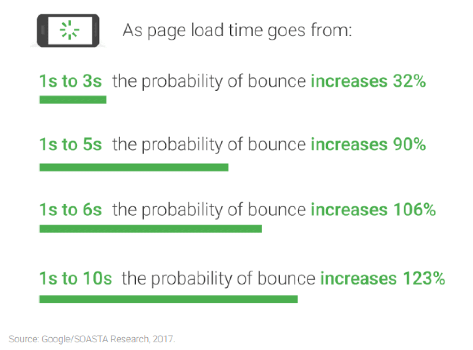
- Improved page load time: Images are typically one of the heaviest elements on a webpage, and if not properly optimized, they can lead to a longer loading time. By properly resizing images, developers can significantly reduce the file size, leading to faster loading times.
The statistics below show image optimization is crucial for retaining impatient visitors and positively impacting search engine rankings, as page speed is critical for SEO. The longer your site takes to load, the fewer visitors you will get.
- Responsive web design: This is the primary reason for image resizing. In today’s digital age, people access websites through different kinds of devices with varying screen sizes and resolutions, including smartphones, tablets, laptops, and desktops. By resizing images using CSS, you can ensure that your websites adapt to different devices, providing a consistent and visually appealing experience for every user, regardless of their device.
- Visual aesthetics: Image resizing plays a major role in ensuring that images fit harmoniously within the layout. This not only helps prevent overlaps and misalignments but also contributes significantly to reducing page load time.
By properly aligning and appropriately resizing images, we elevate the website’s overall aesthetics, giving it a polished and professional appearance while optimizing its performance. This optimization is crucial as it helps in faster page load times, a critical factor for user experience and search engine rankings.
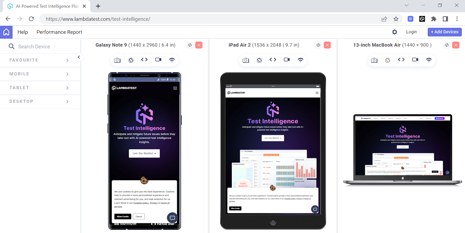
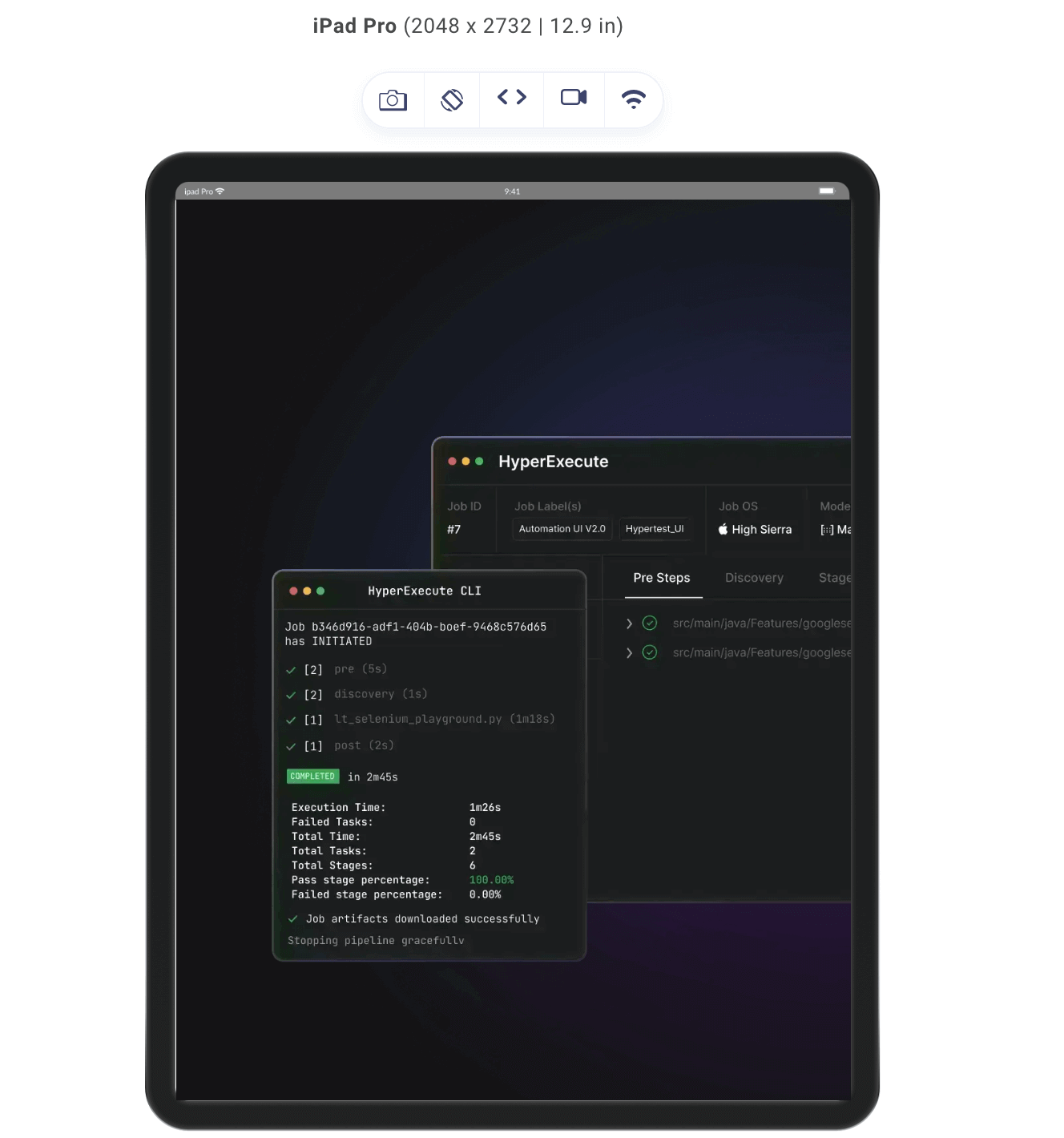
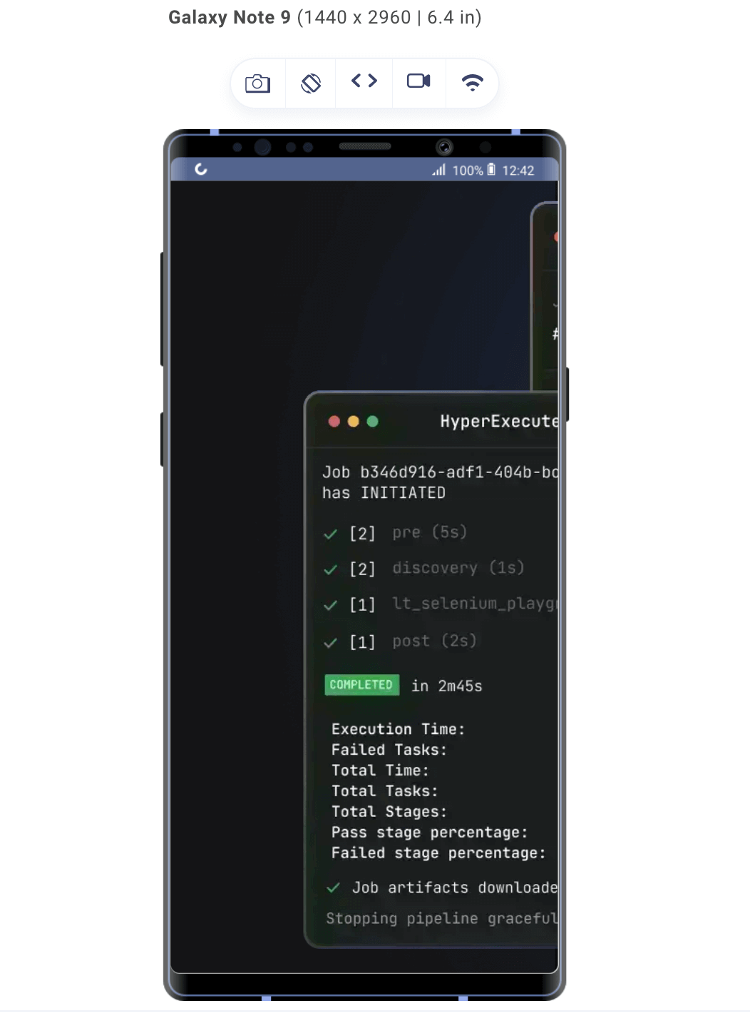
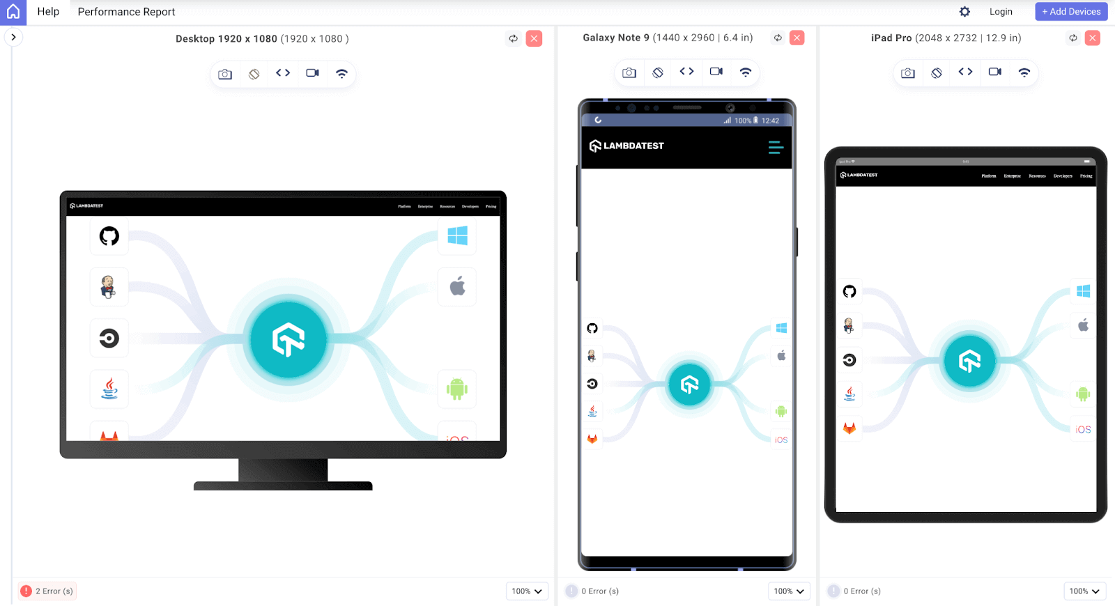
The above preview has been captured on LT Browser – a dev-friendly browser built on Chromium by LambdaTest. It lets you perform responsive testing for your website on 53+ prebuilt device viewports, including mobiles, tablets, desktops, and laptops.
To get started, check out the documentation – Getting Started With LT Browser.
We also have a video tutorial on LT Browser to help you get started.
Ensure you’re up-to-date with the latest tutorials on mobile app testing, automation testing, and more — Subscribe to the LambdaTest YouTube Channel.
 Note
NoteTest browser compatibility of your CSS websites across 3000+ real browsers. Try LambdaTest Today!
Deep Diving Into CSS Image Resizing
To understand CSS image resizing, you need to understand the basic properties that can be used to control an image size. Properties such as width, height, max-width, and max-height.
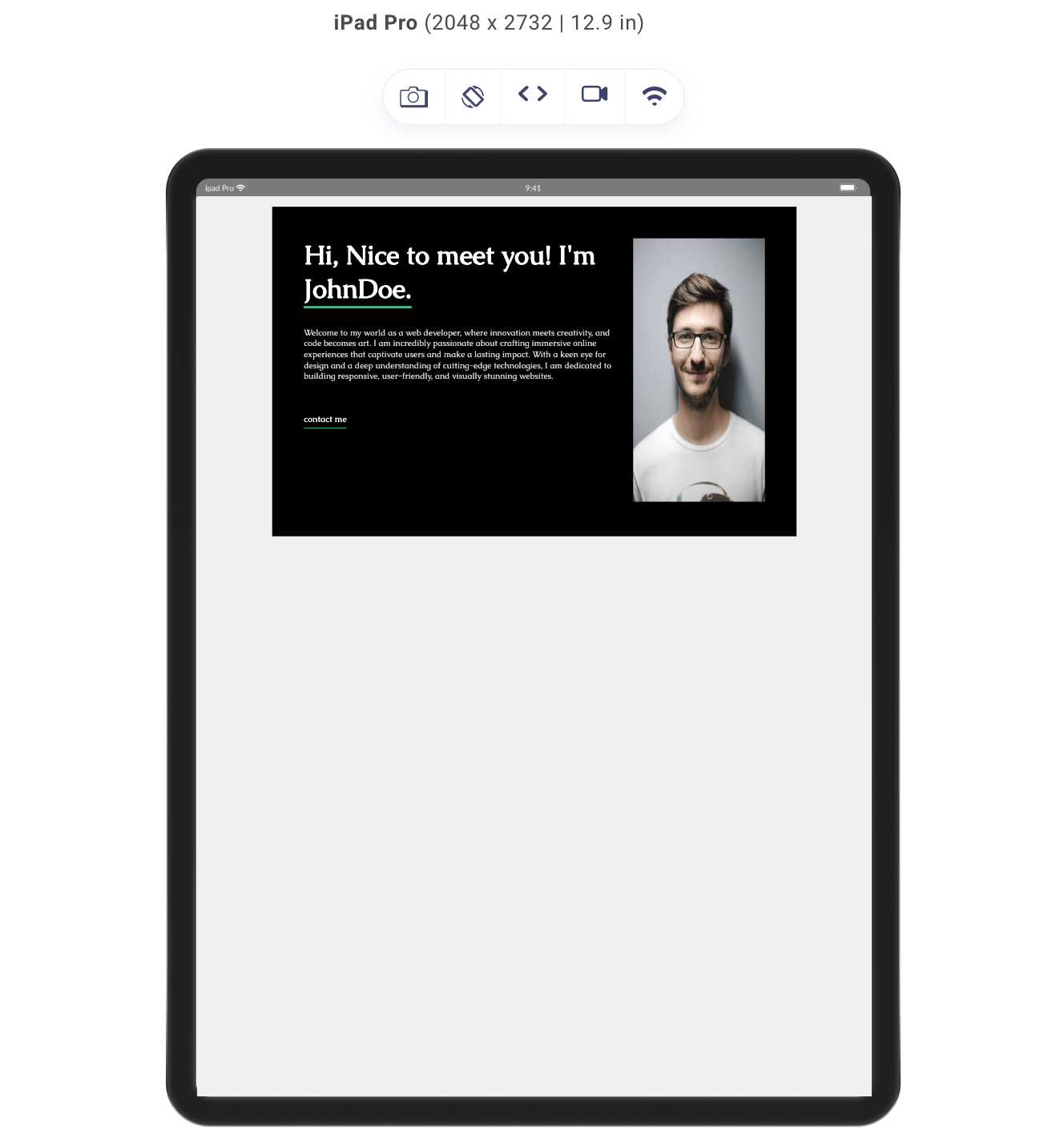
To explain all these properties for CSS image resizing and see them in action, let’s consider this code snippet of a simple design.
HTML:
|
1 2 3 4 5 6 7 8 9 10 11 12 13 14 15 16 17 18 19 20 21 22 23 24 25 26 27 28 |
<!DOCTYPE html> <html lang="en"> <head> <meta charset="UTF-8"> <meta name="viewport" content="width=device-width, initial-scale=1.0"> <link rel="stylesheet" href="style.css"> </head> <body> <div class="card"> <div class="card-info"> <h2>Hi, Nice to meet you! I'm <span>JohnDoe.</span> </h2> <p>Welcome to my world as a web developer, where innovation meets creativity, and code becomes art. I am incredibly passionate about crafting immersive online experiences that captivate users and make a lasting impact. With a keen eye for design and a deep understanding of cutting-edge technologies, I am dedicated to building responsive, user-friendly, and visually stunning websites.</p> <button class="contact">contact me</button> </div> <div class="image"> <img src="https://images.pexels.com/photos/220453/pexels-photo-220453.jpeg?auto=compress&cs=tinysrgb&w=1260&h=750&dpr=2" alt=""> </div> </div> </body> </html> |
Above, we have the markdown of a simple contact card, with an image we will be resizing, some text, and a button for extra aesthetics.
CSS:
|
1 2 3 4 5 6 7 8 9 10 11 12 13 14 15 16 17 18 19 20 21 22 23 24 25 26 27 28 29 30 31 32 33 34 35 36 37 38 39 40 41 42 43 44 45 46 47 48 49 50 51 52 |
@import url('https://fonts.googleapis.com/css2?family=Caudex:wght@400;700&display=swap'); *{ margin: 0; padding: 0; } body{ background-color: rgb(239, 239, 239); color: white; font-family: 'Caudex', serif; } .card{ background-color: black; display: flex; width: 700px; min-height: 300px; margin: 1rem auto; padding: 3rem; gap: 2rem; } h2{ font-size: 2.5rem; margin-bottom: 2rem; } span{ border-bottom: 3px solid #48d6b0; } p{ font-size: .8rem; font-family: 'Caudex', serif; color: rgb(211, 211, 211); } .contact{ border: none; border-bottom: 1px solid #48d6b0; background:none; color: white; margin-top: 3rem ; padding-bottom: 5px; font-family: 'Caudex', serif; } .image img{ } |
The CSS code snippet above gives the style of our card, excluding the style of our .image img, which we will use to resize the profile image.
Here is a preview of the result of the code above in the LT Browser.
Resizing Image Using CSS width property
The width property lets you specify the horizontal dimension of any element. In CSS, images can be added using the img tag; therefore, we can adjust the width of the image to suit our preference using the width property.
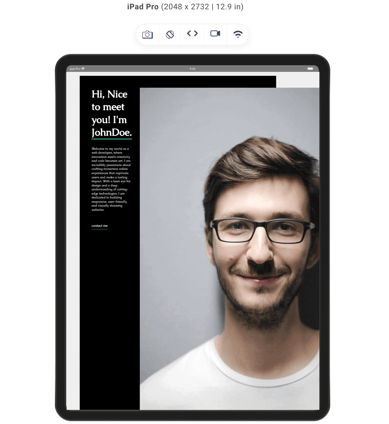
In the code snippet above, we have set the width property of the image to 200px, and here is the result of our image:
When we set the width property, the height also changes. This is because the default behavior of images follows the aspect ratio principle. The aspect ratio is simply the ratio of the width and height properties of an image.
For instance, if we have an image with a height of 200px and a width of 100px, the aspect ratio of the image becomes 2:1.
This helps improve the composition of an image. When the width and height of an image are in a specific ratio, and either of the properties is adjusted, the other property follows suit unless it is assigned a fixed value. This helps create a more balanced and visually appealing image.
However, avoiding fixed values for width and height is generally recommended because it allows for greater flexibility in adapting images to different display sizes and devices. Fixed values can lead to distorted or poorly displayed images on screens with varying dimensions, hindering the overall user experience. Therefore, it’s advisable to maintain aspect ratios while keeping the dimensions flexible for better adaptability across different platforms and screen sizes.
Resizing Using CSS height property
The height property controls the vertical dimension of the image. Let’s add some height to our CSS and see the outcome.

We gave the image a height of 400px, making the aspect ratio of our image 2:1

Using Relative Units for Responsiveness
Previously, we used the width and height properties for resizing images in CSS using absolute units like pixels. We can use this for responsiveness in many ways, but in this section on resizing images in CSS, we will focus on what is referred to as relative units.
Relative CSS units are units of measurement that derive their dimensions based on the dimensions of other elements. These units are employed in a way that expresses their size in relation to other elements on a webpage. This makes them dynamic and responsive to changes in the layout or viewport. Unlike absolute units, relative units adapt and scale with the context in which they are used. Some examples of relative units are rem and %.
Relative CSS units, such as rem and %, are measurement units defined in relation to other elements on a webpage.
- rem: The rem unit stands for root em and is relative to the font size of the root element, typically set at the document level. When you use rem to specify dimensions, it adjusts based on the root font size. This is beneficial for creating consistent and flexible designs across the entire webpage.
- %: A % unit is a relative unit that represents a percentage relative to the parent element’s size. For example, setting an element’s width to 50% means it will be half the width of its parent element. Percentage units are widely used to create responsive and adaptable web layouts that scale appropriately on different screen sizes and devices.
Using Relative Units for Resizing Images in CSS
To demonstrate the use of relative units in CSS image resizing, let’s consider this code snippet.
HTML:
|
1 2 3 4 5 6 7 8 9 10 11 12 13 14 15 16 17 18 19 20 21 22 23 24 25 26 27 28 29 30 31 32 33 34 35 36 37 38 |
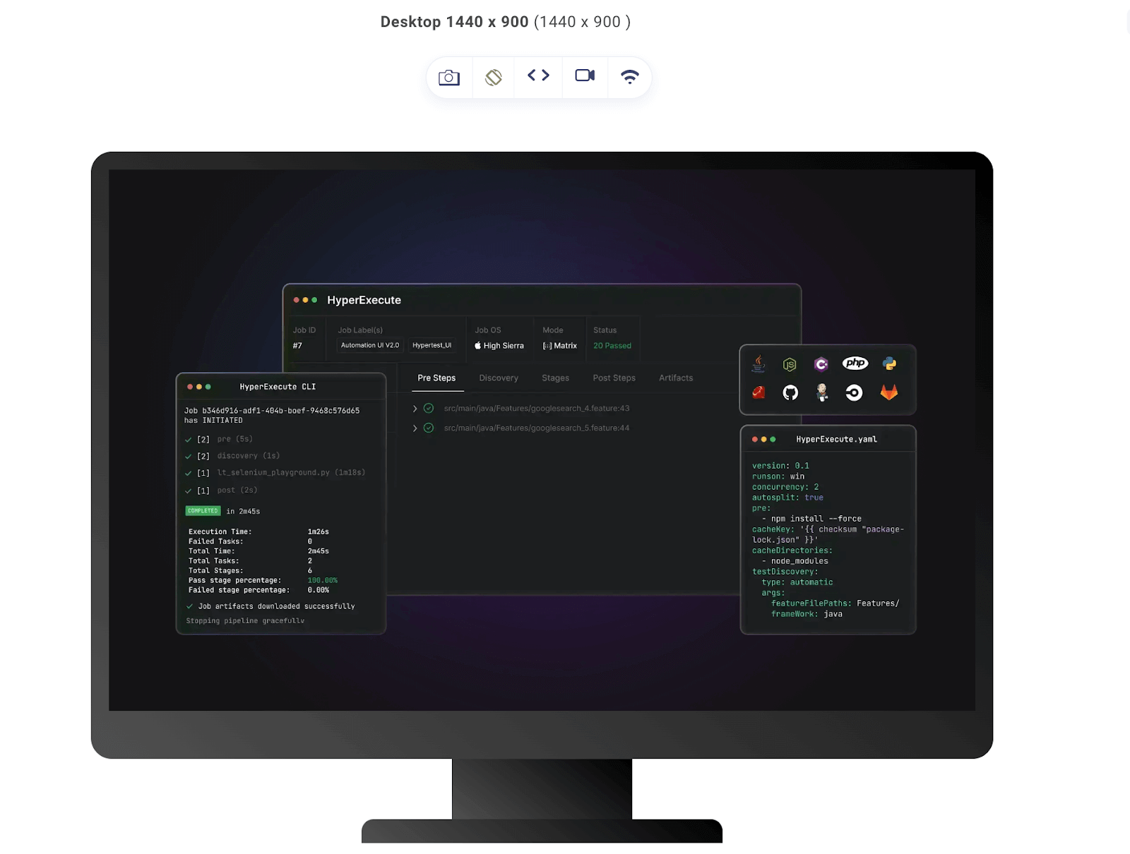
<!DOCTYPE html> <html lang="en"> <head> <meta charset="UTF-8"> <meta name="viewport" content="width=device-width, initial-scale=1.0"> <link rel="stylesheet" href="style.css"> </head> <body> <div class="design"> <nav> <h3><a href="https://www.lambdatest.com/"><img class="logo" src="https://www.lambdatest.com/resources/images/logos/logo.svg" alt="logo"></a></h3> <ul class="nav-items"> <li><a href="https://www.lambdatest.com/feature">Platform</a></li> <li><a href="https://www.lambdatest.com/enterprise">Enterprise</a></li> <li><a href="https://www.lambdatest.com/blog/">Resources</a></li> <li><a href="https://www.lambdatest.com/support/docs/getting-started-with-lambdatest-automation/">Developers</a></li> <li><a href="https://www.lambdatest.com/pricing">Pricing</a></li> </ul> <img class="hamburger" src="https://www.lambdatest.com/blog/wp-content/themes/blog/images/sticky-humburger.png" alt=""> </nav> <main> <h3>Hyperexecute</h3> <h2>AI-Powered Blazing Fast, End-to-End ochestration Cloud</h2> <div class="image"> <img src="https://www.lambdatest.com/resources/images/icons/banner1.webp" alt="image"> </div> </main> </div> </body> </html> |
In the above HTML, we have a div with a class of card as a parent div and two children, one h1 tag, and a div with a class of image, which we will be resizing with the CSS.
CSS:
|
1 2 3 4 5 6 7 8 9 10 11 12 13 14 15 16 17 18 19 20 21 22 23 24 25 26 27 28 29 30 31 32 33 34 35 36 37 38 39 40 41 42 43 44 45 46 47 48 49 50 51 52 53 54 55 56 57 58 59 60 61 62 63 64 65 66 67 68 69 70 71 72 73 74 75 76 77 |
@import url('https://fonts.googleapis.com/css2?family=Inter:wght@400;700&display=swap'); *{ margin: 0; padding: 0; } body{ background-color: rgb(0, 0, 0); color: rgb(255, 255, 255); font-family: 'Inter', sans-serif;} a{ color: white; text-decoration: none; } nav{ display: flex; justify-content: space-between; align-items: center; } .logo{ filter: invert(180); } .nav-items{ list-style: none; gap: 2rem; display: flex; } .design{ background-color: rgb(20, 20, 20); height: 100%; padding: 1rem; gap: 2rem; } .hamburger{ display: none; } h3{ text-transform: uppercase; text-align: center; color: rgb(55, 163, 182); margin: 1rem; letter-spacing:3px; } h2{ font-size: 2.5rem; text-align: center; } main{ margin-top: 3rem; } .image{ margin:0 auto; max-width: 100% } .image img{ width: 60%; min-width:300px ; display: block; margin: auto; } @media screen and (max-width:712px) { .hamburger{ display: block; } .nav-items{ display: none; } } |
Above we have the code snippet for a minimalist design, which we will use to explain responsive image resizing.
Above, we have the code snippet for a minimalist design, which we will use to explain responsive image resizing.
Here is the initial result of our code on different devices before resizing.
Desktop Preview:
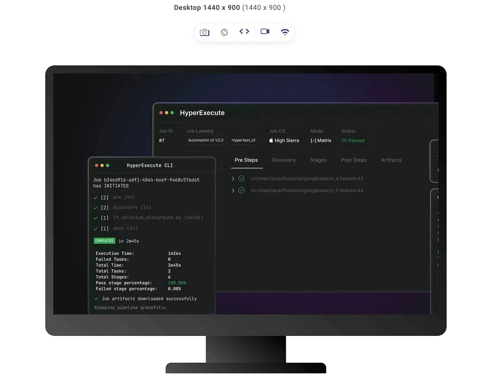
Table Preview:
Mobile Preview:
From the images above, we can see that the image in our design needs resizing. Even on a desktop with a large viewport it still doesn’t present a good user experience.
Rendered with image resizing
Let’s add a CSS style to adjust the image.
|
1 2 3 4 5 6 7 8 9 10 |
.image{ margin:0 auto; max-width: 80% } .image img{ width: 60%; min-width:300px ; display: block; margin: auto; } |
In the above code snippet, the class image class, which is the container for the image, is placed at the center of its parent element using the margin property, which sets the top and bottom margins to 0, evenly distributes the remaining horizontal space on both sides of the element, and then gives it a max width of 80%.
As for the .image img, the width property sets the width of the image to 60% of its parent container (.image). This means the image will take up 60% of the available width within the container, allowing some space on the sides. We used the min-width property to make sure the width of our image didn’t go below 300px.
Lastly, the img tag is an inline property. For the width property to be recognized, we set the display to block and then our margin to auto so it has an equal margin all around.
Desktop Preview:
Tablet Preview:
Mobile Preview:
Scaling Techniques for Image Resizing in CSS
CSS scaling is yet another way of resizing images in CSS. It is a relative method of resizing that allows us to adjust the size of images to fit various screen sizes and layouts, ensuring a consistent and visually appealing user experience.
CSS offers several techniques to efficiently scale images, increasing or decreasing image dimensions. Scaling can be done using relative units, the transform property, and the object-fit property. We have previously discussed resizing with relative units, so in this section, we will discuss the transform and object-fit properties.
Scaling Images with transform property
One of the ways we scale images is by using the transform property.
The CSS transform property allows you to apply transformations to HTML elements, from element repositioning to size alteration. In this section, we will demonstrate how the transform property can be used with different CSS scaling techniques and how it can affect images. By applying various scaling factors, we will observe how images change in size while preserving or altering their aspect ratios.
Let’s consider this example:
HTML:
|
1 2 3 4 5 6 7 8 9 10 11 12 13 14 15 16 17 18 19 20 21 22 23 24 25 26 27 28 29 30 31 32 33 34 35 36 37 38 39 40 41 42 43 44 45 46 47 48 49 50 |
<!DOCTYPE html> <html lang="en"> <head> <meta charset="UTF-8"> <meta name="viewport" content="width=device-width, initial-scale=1.0"> <link rel="stylesheet" href="style.css"> </head> <body> <div class="design"> <nav> <h3><a href="https://www.lambdatest.com/"><img class="logo" src="https://www.lambdatest.com/resources/images/logos/logo.svg" alt="logo"></a></h3> <ul class="nav-items"> <li><a href="https://www.lambdatest.com/feature">Platform</a></li> <li><a href="https://www.lambdatest.com/enterprise">Enterprise</a></li> <li><a href="https://www.lambdatest.com/blog/">Resources</a></li> <li><a href="https://www.lambdatest.com/support/docs/getting-started-with-lambdatest-automation/">Developers</a></li> <li><a href="https://www.lambdatest.com/pricing">Pricing</a></li> </ul> <img class="hamburger" src="https://www.lambdatest.com/blog/wp-content/themes/blog/images/sticky-humburger.png" alt=""> </nav> <h2>Transform Property : scale()</h2> <div class="test-images"> <div class="image-container"> <img src="https://www.lambdatest.com/resources/images/icons/banner1.webp?auto=compress&cs=tinysrgb&w=800" alt="Image" /> <p> No Scale</p> </div> <div class="image-container "> <img class="image1" src="https://www.lambdatest.com/resources/images/icons/banner1.webp?auto=compress&cs=tinysrgb&w=800" alt="Image" /> <p>Scale(1)</p> </div> <div class="image-container"> <img class="image2" src="https://www.lambdatest.com/resources/images/icons/banner1.webp?auto=compress&cs=tinysrgb&w=800" alt="Image" /> <p>Scale(1.3)</p> </div> <div class="image-container"> <img class="image3" src="https://www.lambdatest.com/resources/images/icons/banner1.webp?auto=compress&cs=tinysrgb&w=800" alt="Image" /> <p>Scale(0.5)</p> </div> </div> </div> </body> </html> |
As you can see from the code above, we have a div with the class test-images. This div contains six child divs with the class image-containers, which in turn hold the same image with a different class name for each image. With this, we will see how these identical images are resized using the scale function of the transform property.
CSS:
|
1 2 3 4 5 6 7 8 9 10 11 12 13 14 15 16 17 18 19 20 21 22 23 24 25 26 27 28 29 30 31 32 33 34 35 36 37 38 39 40 41 42 43 44 45 46 47 48 49 50 51 52 53 54 55 56 57 58 59 60 61 62 63 64 65 66 67 68 69 70 71 72 73 74 75 76 77 78 79 80 81 82 83 84 85 86 87 88 89 90 91 92 93 94 95 96 |
@import url('https://fonts.googleapis.com/css2?family=Inter:wght@400;700&display=swap'); *{ margin: 0; padding: 0; } body{ background-color: rgb(0, 0, 0); color: rgb(255, 255, 255); font-family: 'Inter', sans-serif;} a{ color: white; text-decoration: none; } nav{ display: flex; justify-content: space-between; align-items: center; } .logo{ filter: invert(180); } .nav-items{ list-style: none; gap: 2rem; display: flex; } .design{ background-color: rgb(20, 20, 20); height: 100%; padding: 1rem; gap: 2rem; } .hamburger{ display: none; } h3{ text-transform: uppercase; text-align: center; color: rgb(55, 163, 182); margin: 1rem; } h2{ font-size: 2.5rem; text-align: center; margin: 2rem 0; } main{ margin-top: 3rem; } .test-images{ display: grid; gap: 1rem; justify-content: center; grid-template-columns: repeat(auto-fill, minmax(350px, 1fr)); } .image-container { box-sizing: border-box; width: 350px; padding: 3rem; background: black; border: rgb(41, 173, 180) solid 15px; } img{ width: 100%; } .image1{ transform: scale(1); } .image2{ transform: scale(1.3); } .image3{ transform: scale(0.5); } p{ color: white; font-size: 2rem; padding-top: 2rem; } @media screen and (max-width:712px) { .hamburger{ display: block; width: 30px; } .nav-items{ display: none; } } |
In the stylesheet, we started off with some basic styles for the parent element, Then added a grid layout to our test-images container to make every image-container lay well so they don’t interact with each other when they scale up. Then we added different values to our scale function, and here is the result:
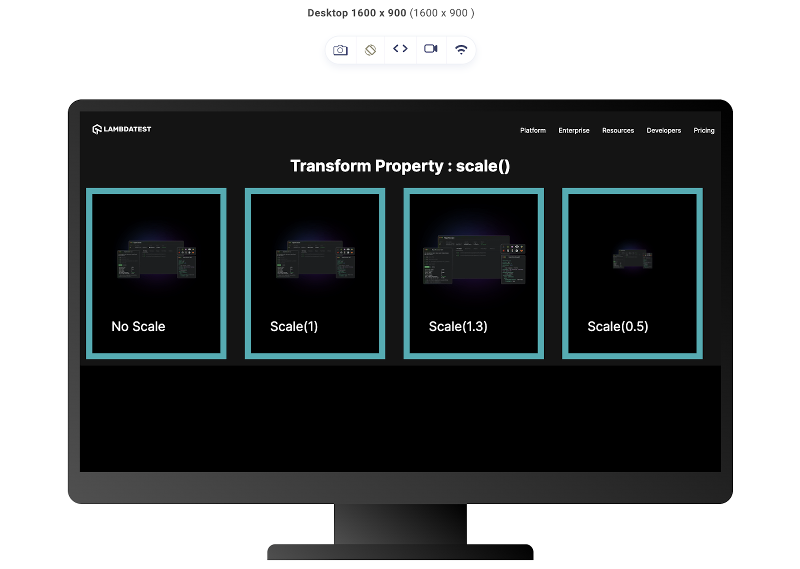
From this image, you can see how the different parameters of the scale function affect the image. The first image had no scale function, which is the default look. The second image has a scale function with the parameter value 1; this means that the image will retain its original size, and its dimensions will not change.
The third image had a parameter value of 1.3. In this case, only one argument, 1.3, indicates that the image will be scaled to 1.3 times its original size on both the X and Y axes.
The fourth image with the parameter value (0.5) specifies that the image should be scaled down to 50% of its original size. In other words, the image will be half its original width and half its original height, maintaining its aspect ratio.
Scaling Images with the object-fit property
Scaling with the object-fit property provides control over how an image fits within its container. This property lets you specify how the content should be resized and positioned. Just like the transform property, it can also alter the original aspect ratio of the image depending on the value used. This is particularly useful when you have images of different sizes and want them to fit uniformly within their containers.
The object-fit property accepts different values; here are the most commonly used ones:
- contain: This value scales the image proportionally to fit within the container while preserving its aspect ratio. It makes the image fully visible within the container. Still, there might be blank spaces around it depending on the aspect ratio of the image against the aspect ratio of the container.
- cover: The cover value scales the image proportionally to cover the entire container while preserving its aspect ratio. The entire container will be filled with the image, but some parts might be cropped if the aspect ratios of the image and the container are different.
- fill: This value scales the image to fill the container without preserving its aspect ratio. The image might appear stretched or squeezed to match the container’s dimensions. This is the default value of this property.
- none: This value displays the image at its original size and ignores the container’s dimensions. The image might overflow from the container if its size is larger than the container.
To demonstrate these values in use, let’s consider this code snippet.
HTML:
|
1 2 3 4 5 6 7 8 9 10 11 12 13 14 15 16 17 18 19 20 21 22 23 24 25 26 27 28 29 30 31 32 33 34 35 36 37 38 39 40 41 42 43 44 45 46 47 48 49 |
<!DOCTYPE html> <html lang="en"> <head> <meta charset="UTF-8"> <meta name="viewport" content="width=device-width, initial-scale=1.0"> <link rel="stylesheet" href="style.css"> </head> <body> <div class="design"> <nav> <h3><a href="https://www.lambdatest.com/"><img class="logo" src="https://www.lambdatest.com/resources/images/logos/logo.svg" alt="logo"></a></h3> <ul class="nav-items"> <li><a href="https://www.lambdatest.com/feature">Platform</a></li> <li><a href="https://www.lambdatest.com/enterprise">Enterprise</a></li> <li><a href="https://www.lambdatest.com/blog/">Resources</a></li> <li><a href="https://www.lambdatest.com/support/docs/getting-started-with-lambdatest-automation/">Developers</a></li> <li><a href="https://www.lambdatest.com/pricing">Pricing</a></li> </ul> <img loading=”lazy” class="hamburger" src="https://www.lambdatest.com/blog/wp-content/themes/blog/images/sticky-humburger.png" alt=""> </nav> <h2>Object-fit Property </h2> <div class="test-images"> <div class="image-container "> <img class="image1" src="https://www.lambdatest.com/resources/images/auto_robot.png" alt="Image" /> <p>Contain</p> </div> <div class="image-container"> <img class="image2" src="https://www.lambdatest.com/resources/images/auto_robot.png" alt="Image" /> <p>Cover</p> </div> <div class="image-container"> <img class="image3" src="https://www.lambdatest.com/resources/images/auto_robot.png" alt="Image" /> <p>Fill</p> </div> <div class="image-container"> <img class="image4" src="https://www.lambdatest.com/resources/images/auto_robot.png" alt="Image" /> <p> None</p> </div> </div> </div> </div> </body> </html> |
In the HTML code snippet, we have a div with the class test-images. This has four child divs (image-containers), each using the same image with a different class name. With this, we’ll see how these similar images were scaled using the different object-fit values we discussed.
CSS:
|
1 2 3 4 5 6 7 8 9 10 11 12 13 14 15 16 17 18 19 20 21 22 23 24 25 26 27 28 29 30 31 32 33 34 35 36 37 38 39 40 41 42 43 44 45 46 47 48 49 50 51 52 53 54 55 56 57 58 59 60 61 62 63 64 65 66 67 68 69 70 71 72 73 74 75 76 77 78 79 80 81 82 83 84 85 86 87 88 89 90 91 92 93 94 95 96 97 98 99 100 101 102 103 104 105 |
@import url('https://fonts.googleapis.com/css2?family=Inter:wght@400;700&display=swap'); *{ margin: 0; padding: 0; } body{ background-color: rgb(0, 0, 0); color: rgb(255, 255, 255); font-family: 'Inter', sans-serif;} a{ color: white; text-decoration: none; } nav{ display: flex; justify-content: space-between; align-items: center; } .logo{ filter: invert(180); } .nav-items{ list-style: none; gap: 2rem; display: flex; } .design{ background-color: rgb(20, 20, 20); height: 100%; padding: 1rem; gap: 2rem; } .hamburger{ display: none; } .logo{ width: 150px; height: 50px; } h3{ text-transform: uppercase; text-align: center; color: rgb(55, 163, 182); margin: 1rem; } h2{ font-size: 2.5rem; text-align: center; margin: 2rem 0; } .test-images{ display: grid; gap: 1rem; justify-content: center; align-items: center; grid-template-columns: repeat(auto-fill, minmax(350px, 1fr)); } .image-container { box-sizing: border-box; width: 350px; padding: auto; background: rgb(255, 255, 255); border: rgb(41, 173, 180) solid 15px; } img{ width: 100%; height:400px; } .image1{ object-fit: contain; } .image2{ object-fit: cover; } .image3{ object-fit: fill; } .image4{ object-fit: none; } p{ color: rgb(0, 0, 0); font-size: 3rem; padding-top: 2rem; } @media screen and (max-width:712px) { .hamburger{ display: block; width: 30px; height: 20px; } .nav-items{ display: none; } } |
As seen in the above CSS, we began by giving our parent element some simple styles using a grid layout for the test-image container. We set a fixed width and height of 700px for each image, which originally should have made the aspect ratio of our image 1:1. But with the object-fit property, we can manipulate the image’s scaling.
Here is the result output of the code:
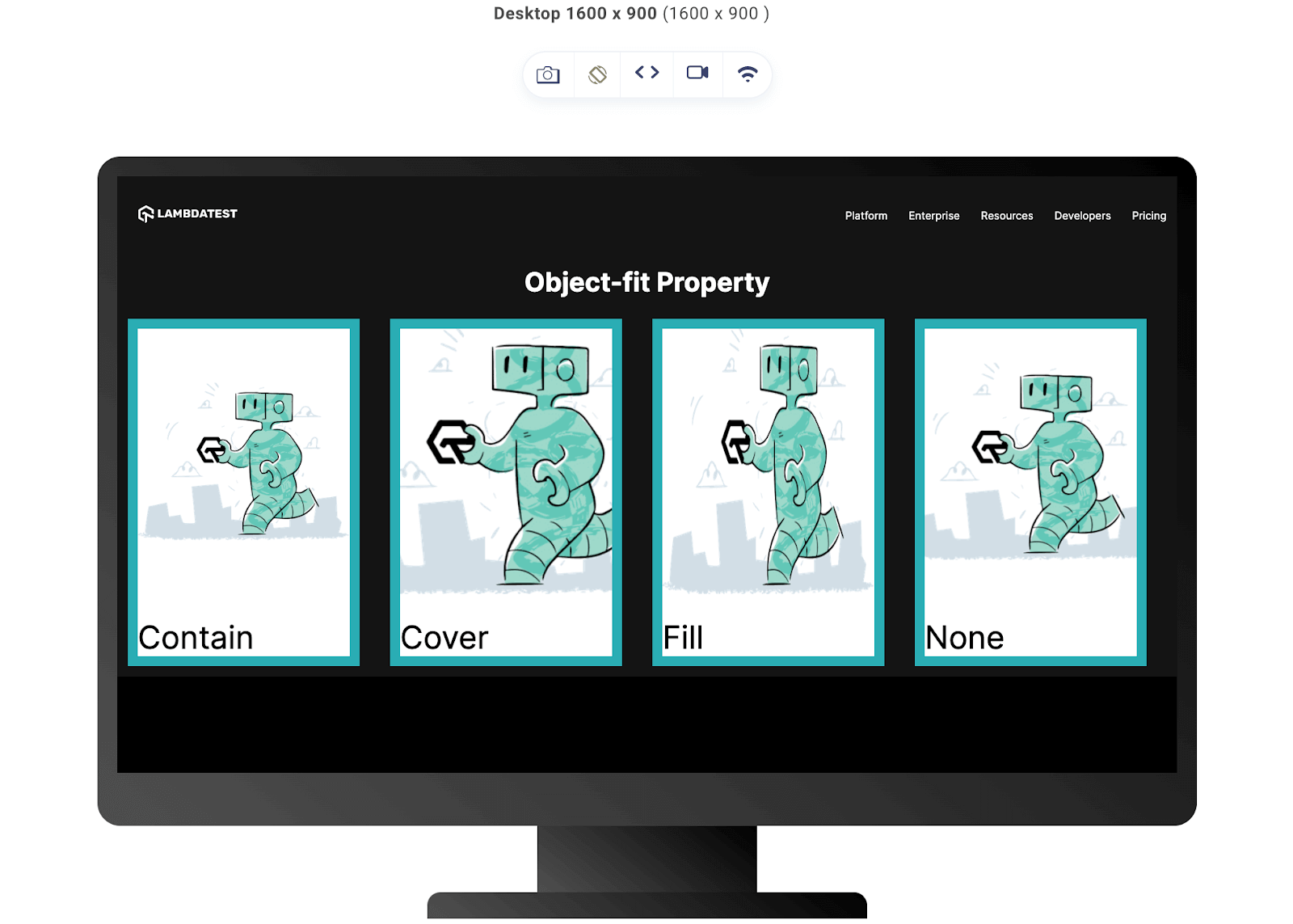
In the above output, you can see the role of the different object-fit values on the image.
The contain value maintains the aspect ratio of the image used while adjusting to the size of the img element. The cover value adjusts the image to occupy the dimensions of the width and height properties to attain an aspect ratio of 1:1, thereby cropping the top and bottom of the image. As for the fill value, it is as good as not adding the object-fit property because it is the default value of the object-fit property. It stretches and squeezes the image to cover the height and width of the image element without cropping any part off. Lastly, the none value which doesn’t shrink or stretch the image but rather lets it overtake the dimension of its container and crop out parts from the edges.
Resizing Background Images
Background images in CSS are added differently from the regular images we add to our code using the img tag; hence, they are resized differently. Background images are added with the CSS background property and have a series of properties used to control the size of the images.
In this section on resizing images in CSS, we will discuss the different properties used in resizing background images using practical examples. Here are the three most important properties used in resizing background images:
- background-size
- background-repeat
- background-position
To illustrate how these three properties and their values affect background images, let’s consider this code:
HTML:
|
1 2 3 4 5 6 7 8 9 10 11 12 13 14 15 16 17 18 19 20 21 22 23 24 25 26 27 28 29 30 31 32 33 34 35 |
<!DOCTYPE html> <html lang="en"> <head> <meta charset="UTF-8"> <meta name="viewport" content="width=device-width, initial-scale=1.0"> <link rel="stylesheet" href="style.css"> </head> <body> <div class="design"> <nav> <h3><a href="https://www.lambdatest.com/"><img class="logo" src="https://www.lambdatest.com/resources/images/logos/logo.svg" alt="logo"></a></h3> <ul class="nav-items"> <li><a href="https://www.lambdatest.com/feature">Platform</a></li> <li><a href="https://www.lambdatest.com/enterprise">Enterprise</a></li> <li><a href="https://www.lambdatest.com/blog/">Resources</a></li> <li><a href="https://www.lambdatest.com/support/docs/getting-started-with-lambdatest-automation/">Developers</a></li> <li><a href="https://www.lambdatest.com/pricing">Pricing</a></li> </ul> <img class="hamburger" src="https://www.lambdatest.com/blog/wp-content/themes/blog/images/sticky-humburger.png" alt=""> </nav> <h2>Background Property</h2> <div class="backgrounds"> <div class="background-container"> </div> </div> </body> </html> |
For this HTML, we have a grid of four background containers, which we will be using to demonstrate the different values of each background property.
CSS:
|
1 2 3 4 5 6 7 8 9 10 11 12 13 14 15 16 17 18 19 20 21 22 23 24 25 26 27 28 29 30 31 32 33 34 35 36 37 38 39 40 41 42 43 44 45 46 47 48 49 50 51 52 53 54 55 56 57 58 59 60 61 62 63 64 65 66 67 68 69 70 71 72 73 74 75 76 77 78 |
@import url('https://fonts.googleapis.com/css2?family=Inter:wght@400;700&display=swap'); *{ margin: 0; padding: 0; } body{ background-color: rgb(0, 0, 0); color: rgb(255, 255, 255); font-family: 'Inter', sans-serif;} a{ color: white; text-decoration: none; } nav{ display: flex; justify-content: space-between; align-items: center; } .logo{ filter: invert(180); } .nav-items{ list-style: none; gap: 2rem; display: flex; } .design{ background-color: rgb(20, 20, 20); height: 100%; padding: 1rem; gap: 2rem; } .hamburger{ display: none; } h3{ text-transform: uppercase; text-align: center; color: rgb(55, 163, 182); margin: 1rem; } h2{ font-size: 2.5rem; text-align: center; margin: 2rem 0; } .backgrounds { display: grid; height: 70vh; } .background-container { background-image: url('https://www.lambdatest.com/resources/images/Playwright_Automation_analytics.png'); display: flex; align-items: center; justify-content: center; text-align: center; border: 3px solid white } h1 { color: #fff; font-size: 3rem; text-shadow: 2px 2px 4px rgba(0, 0, 0, 0.5); } @media screen and (max-width:712px) { .hamburger{ display: block; width: 30px; } .nav-items{ display: none; } } |
Above, we have the default CSS we will be using to demonstrate the background properties.
Here is the result of our code with no background-size, background-repeat, and background-position properties used.
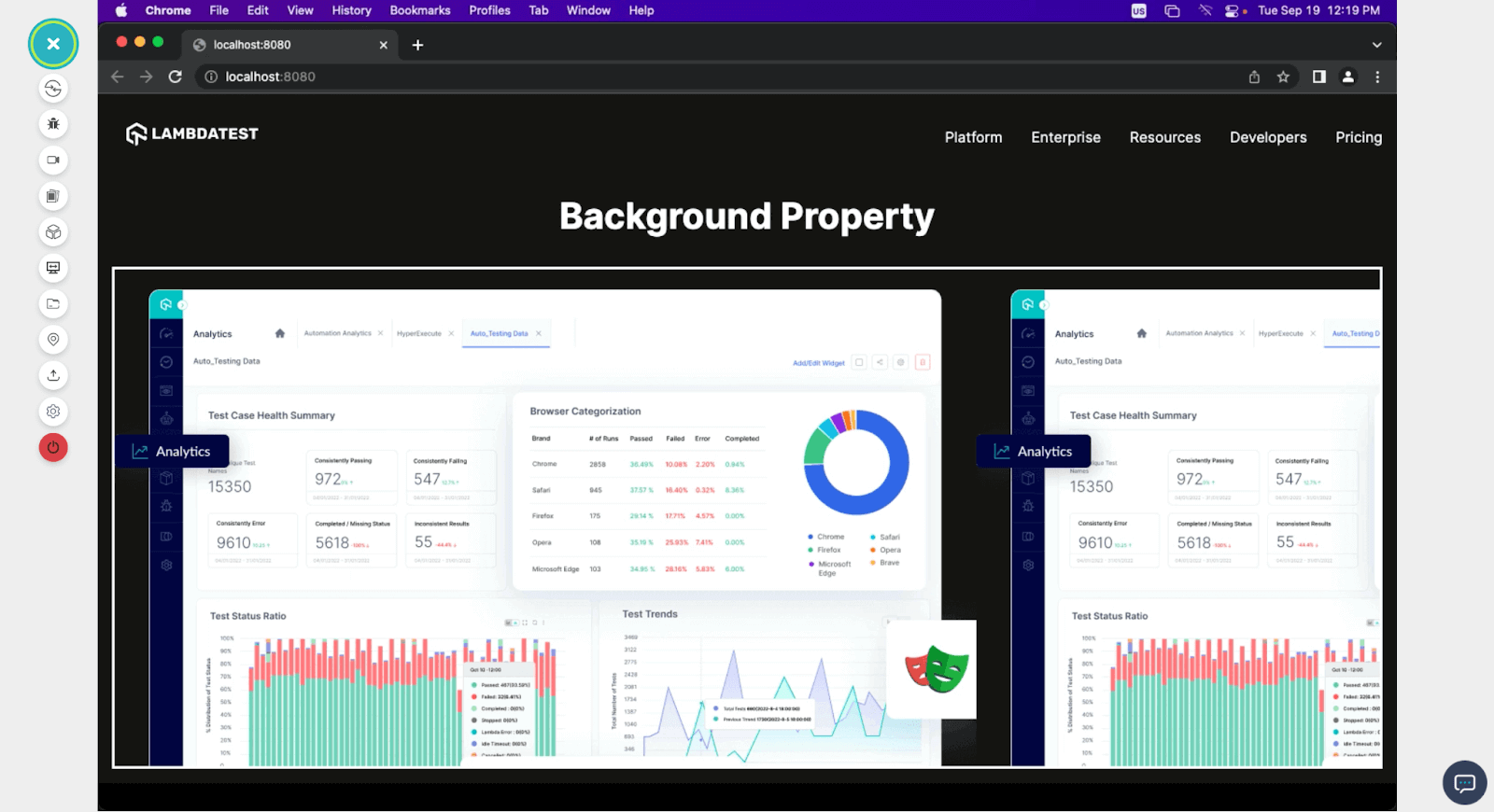
From the image above, you can see the four identical background images. You can also see how the image is repeating and isn’t at its best. Let’s see how the different properties affect this.
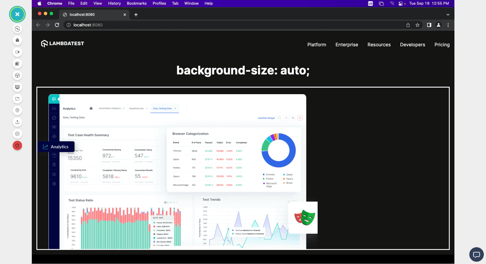
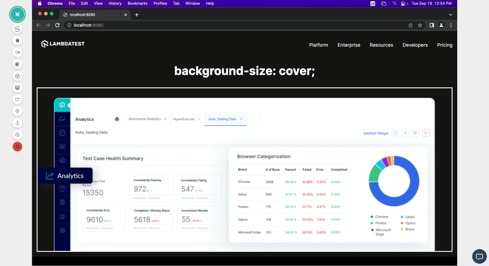
background-size
The background-size property is used to specify how the background image should be displayed within an element. We use this property when we want to resize background images to fit our container in a specific way. This property can take on values such as:
- auto: This is the default value of this background-size property; with this value, the image won’t be resized.
- cover : With this value, the background image will be resized to cover the content box of the element. However, the aspect ratio of the image will not be maintained, as some parts of the image will be cropped.
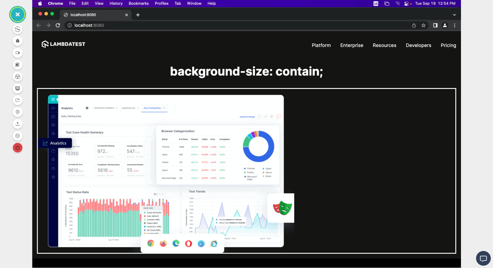
- contain : This value resizes the background image to fit entirely within the content box of the element while maintaining its aspect ratio; if the aspect ratio of the image differs from the aspect ratio of the content box, there will be some white space around the image.
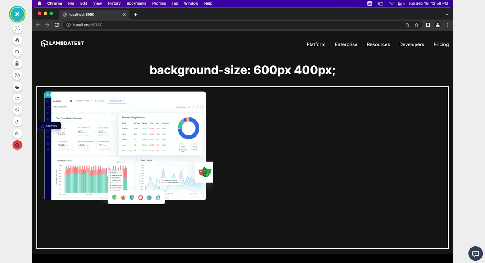
- < width > < height > : you can also specify the width and height values for resizing your background image.
Here is how these different background-size values would affect the background image.
Auto
Cover
Contain
< width >< height >
As seen from the images above, assigning different background-size values can change the background image to suit the preferences.
background-repeat
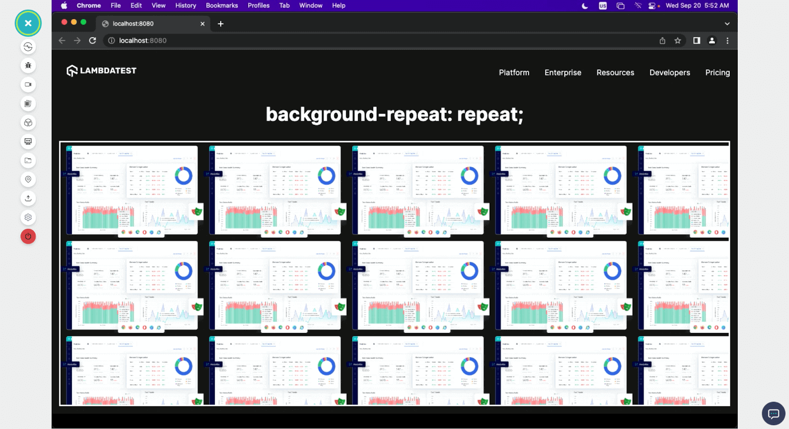
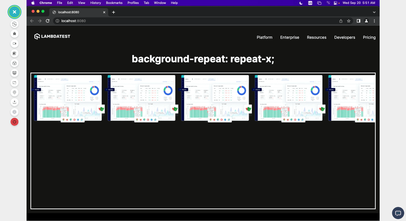
Just as the name in the background-repeat. This property controls how background images are repeated within the content box of an element when the image’s size is smaller than the element’s size. With this property, we can specify whether and how the background image should be tiled or repeated to fill the entire content box. There are four main values we can use to specify how the background-repeat works, and they are:
- repeat: This is the default value of this property, and it repeats the image vertically and horizontally for as long as there is space in the content box to contain it.
- repeat-x: This repeats the image horizontally to fill any space left in the width of the content box without filling the vertical space.
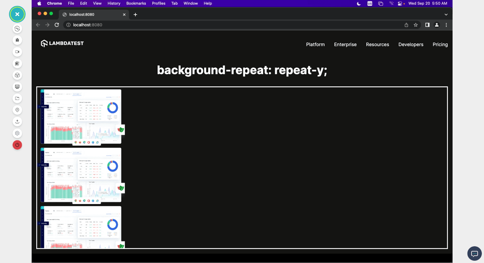
- repeat-y: This does the same as the repeat x but in the vertical direction.
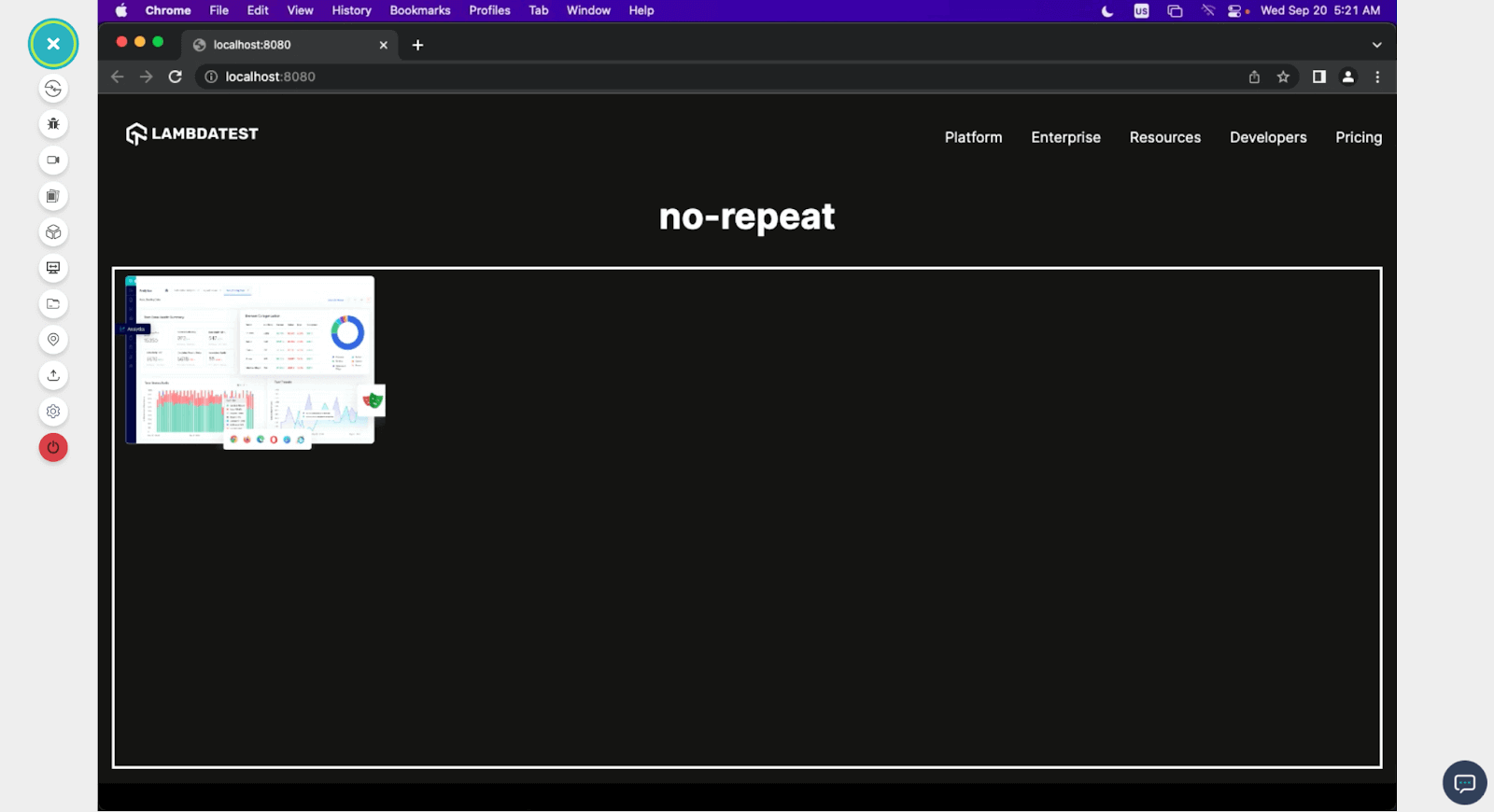
- no-repeat: with this value set, the image does repeat. Instead, it leaves any excess space the content box has empty.
repeat
repeat-x
repeat-y
no-repeat
background-position
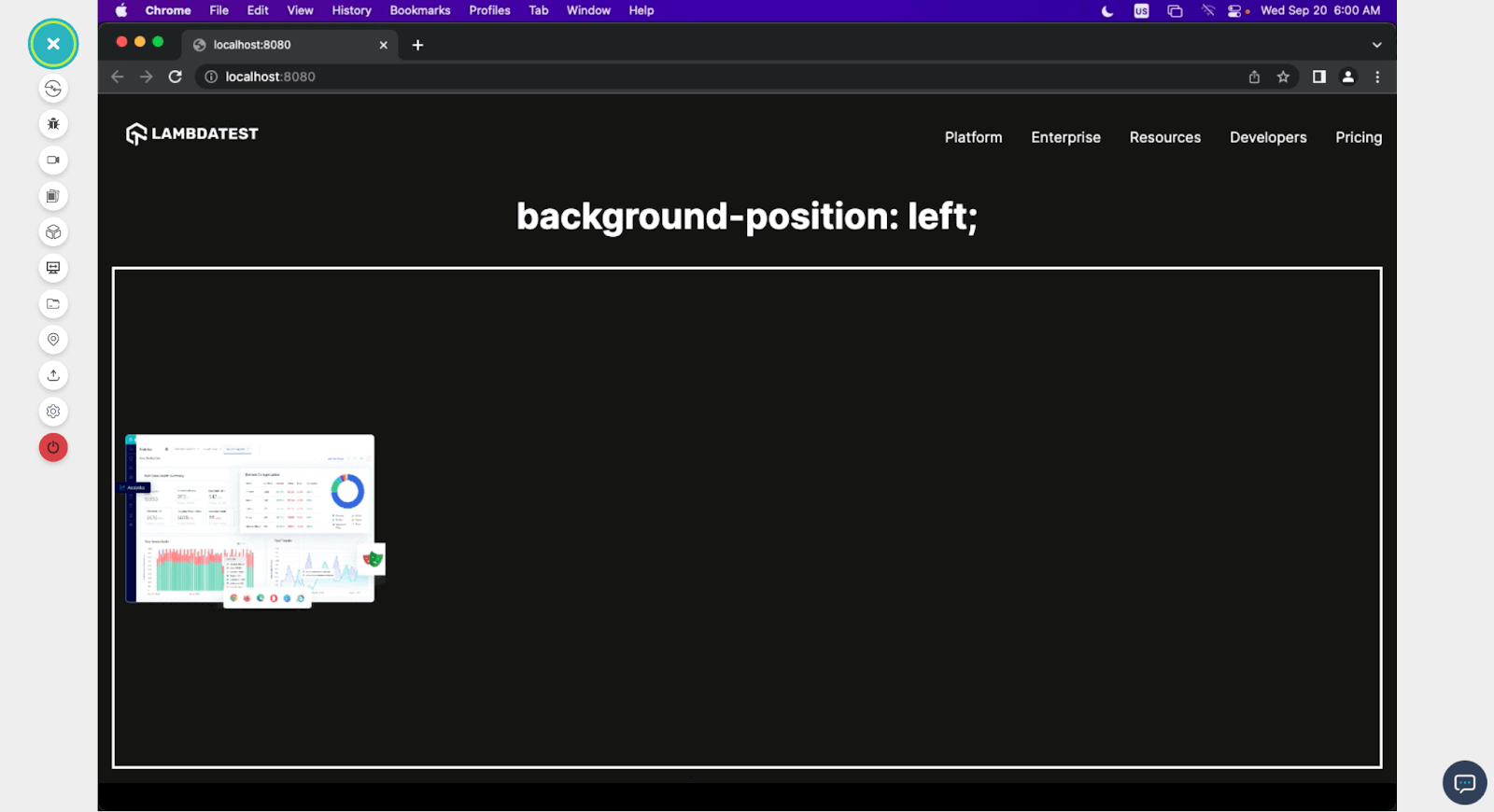
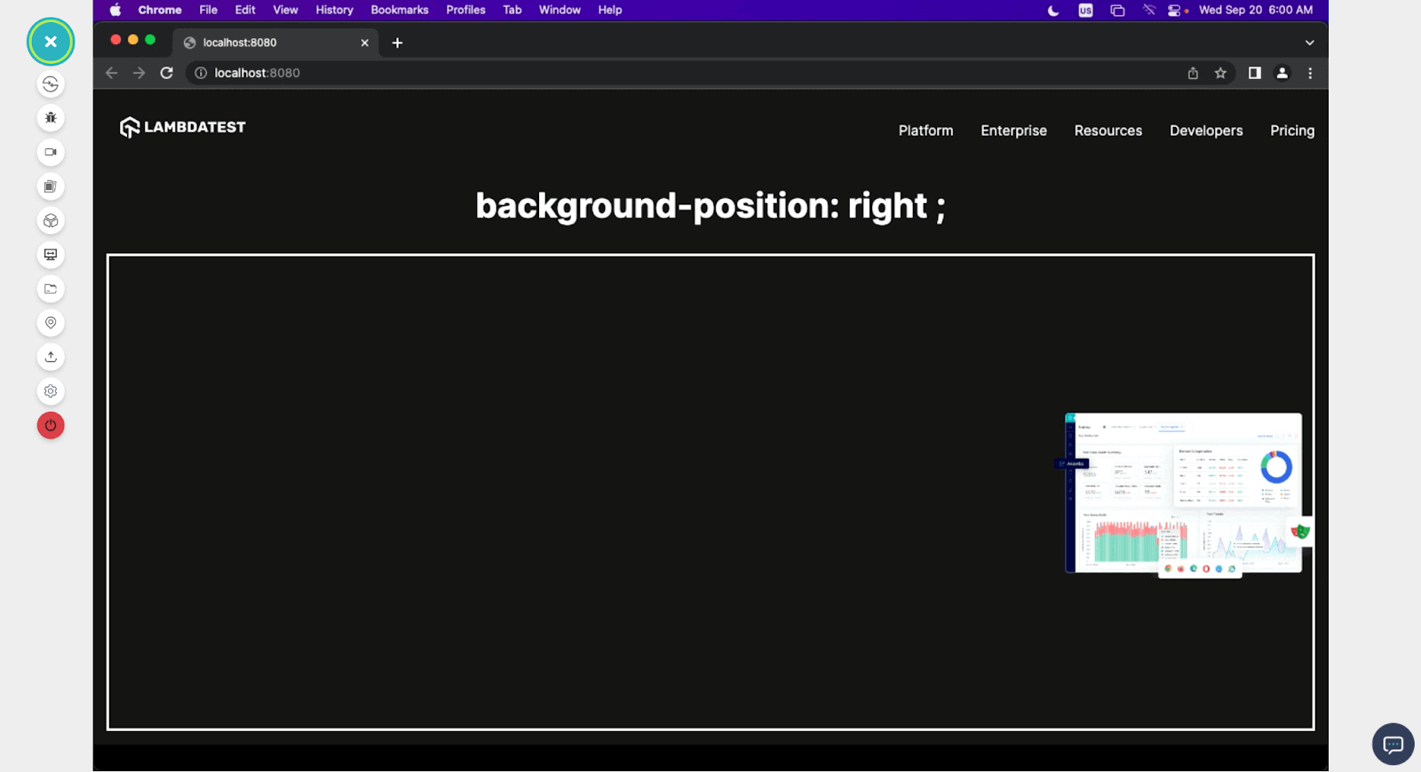
This property is used to specify the position from which the image starts within its content box. There are five possible values for this property: left, right, top, bottom, and center, and they position images accordingly.
left
right
center
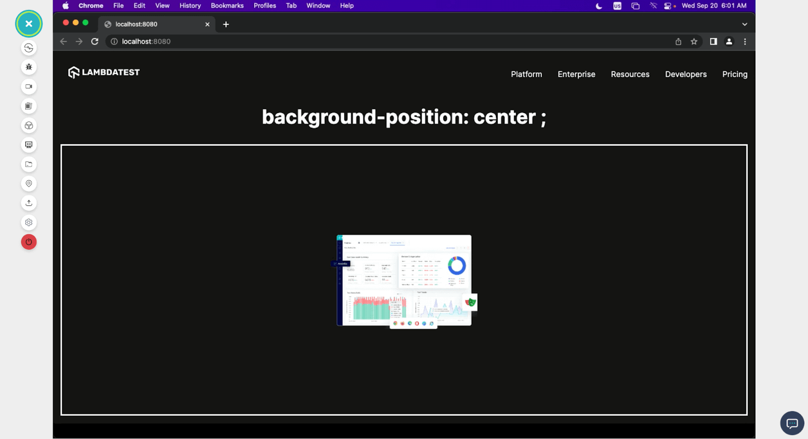
top-left

Browser Compatibility and Accessibility for Image Resizing
Ensuring your website’s images are compatible with different browsers is crucial for delivering a consistent and visually appealing user experience. While working with various image file formats, it’s important to consider how different browsers handle these formats.
When resizing images for your website, consider the browser compatibility of your image format. It’s essential to choose the appropriate image format based on your specific requirements and ensure that your images resize and display correctly across a wide range of browsers.
Additionally, be ready to provide fallbacks or alternatives when working with formats like AVIF, which may not be supported in all browsers. By conducting thorough cross browser compatibility testing, you can ensure that your resized images look and perform consistently across various web browsers, providing a smooth user experience.
On a similar line, web accessibility is crucial to ensure that all users, including those with disabilities, can access and understand the content on your website. When it comes to image resizing, it’s important to consider the accessibility of images, especially images containing text. When testing the accessibility of images with text, ensure that the alt text accurately conveys the textual content of the image. Conduct tests with individuals with impairments to verify that the images, including any resized versions, are presented in an accessible manner.
For this, you can leverage cloud-based testing platforms such as LambdaTest. It’s an AI-powered test orchestration and execution platform that lets you perform browser compatibility and accessibility testing of the images used for resizing across 3000+ real browsers, devices, and operating systems combinations.
Creating a Completely Responsive Background Image
In the previous section of this blog on CSS image resizing, I demonstrated how different background properties affect our background images, but in this section, I will show you how you can make your background image responsive on any device, regardless of the screen resolution, using the background properties.
Let’s consider this practical example.
HTML:
|
1 2 3 4 5 6 7 8 9 10 11 12 13 14 15 16 17 18 19 20 21 22 23 24 |
<!DOCTYPE html> <html lang="en"> <head> <meta charset="UTF-8"> <meta name="viewport" content="width=device-width, initial-scale=1.0"> <link rel="stylesheet" href="style.css"> </head> <body> <nav> <h3><a href="https://www.lambdatest.com/"><img class="logo" src="https://www.lambdatest.com/resources/images/logos/logo.svg" alt="logo"></a></h3> <ul class="nav-items"> <li><a href="https://www.lambdatest.com/feature">Platform</a></li> <li><a href="https://www.lambdatest.com/enterprise">Enterprise</a></li> <li><a href="https://www.lambdatest.com/blog/">Resources</a></li> <li><a href="https://www.lambdatest.com/support/docs/getting-started-with-lambdatest-automation/">Developers</a></li> <li><a href="https://www.lambdatest.com/pricing">Pricing</a></li> </ul> <img class="hamburger" src="https://www.lambdatest.com/blog/wp-content/themes/blog/images/sticky-humburger.png" alt=""> </nav> <header class="background-container .container-contain"> <!-- <h1>Background Image </h1> --> </header> </body> </html> |
For this demonstration, we have a simple markup with a header tag, from which we will make our background image.
CSS:
|
1 2 3 4 5 6 7 8 9 10 11 12 13 14 15 16 17 18 19 20 21 22 23 24 25 26 27 28 29 30 31 32 33 34 35 36 37 38 39 40 41 42 43 44 45 46 47 48 49 50 51 |
body { margin: 0; padding: 0; } a{ color: white; text-decoration: none; } .logo{ filter: invert(180); } nav{ display: flex; justify-content: space-between; align-items: center; background-color: black; padding: 0.5rem 1rem; } .nav-items{ list-style: none; gap: 2rem; display: flex; } .hamburger{ display: none; } .background-container { background-image: url('https://www.lambdatest.com/resources/images/Seamlessly.svg'); /* background-size: contain; background-repeat: no-repeat; background-position: center; */ height: 100vh; width: 100vw; display: flex; align-items: center; justify-content: center; text-align: center; } h1 { color: #fff; font-size: 3rem; text-shadow: 2px 2px 6px rgba(0, 0, 0, 0.739); } @media screen and (max-width:712px) { .hamburger{ display: block; } .nav-items{ display: none; } } |
For CSS, we add the background image and make it cover 100% of our viewport height.
Preview:
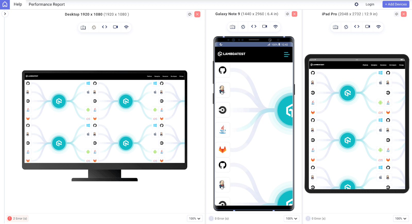
This is how the image looks on different device viewports on LT Browser. As expected, depending on the size of the image and the resolution of the screen, we expect the image to repeat and not be positioned properly. Well, let’s change that.
Updated CSS:
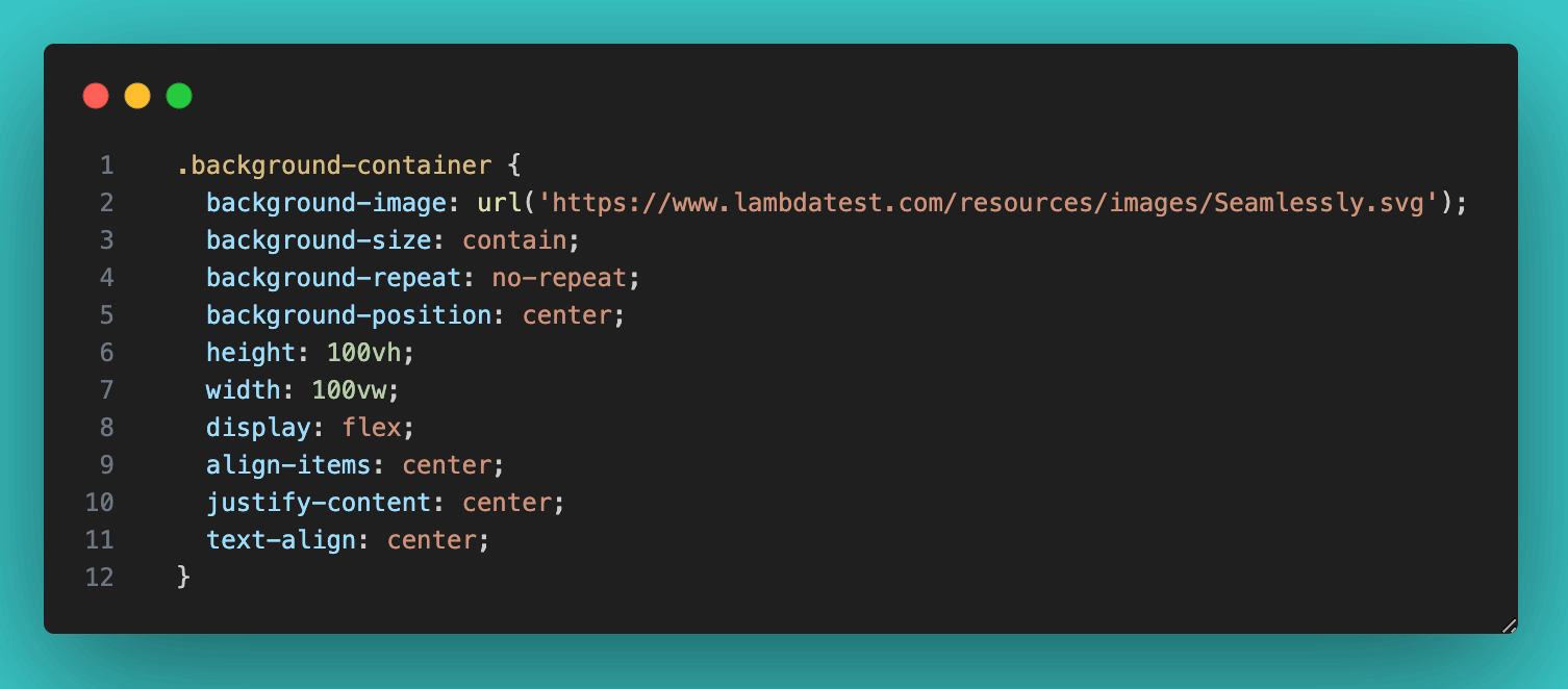
In the above updated code snippet, we set the background-size to cover because we want the image to take up all the space of its container, which is a 100 viewport. Regardless of the size of the image, we don’t want to see the image twice in the container, so we set the background-repeat property to no-repeat. And lastly, we set the background-position to center so that the image origin can be at the center of the screen and span across the viewport.
This is the output we get.
With identical HTML and CSS, even when viewed on devices with varying screen resolutions, you can discern that the image has been appropriately resized for all three devices, achieved through implementing three background properties.
Conclusion
In conclusion, resizing images using CSS is a great skill every web developer can learn. Throughout this step-by-step guide, we have discussed various CSS techniques that allow us to control image size and concepts such as aspect ratio.
As a powerful styling way, CSS enables us to scale images effortlessly, ensuring a seamless user experience across various devices and screen sizes. From using basic properties such as width and height to more advanced transformations using transform and object-fit properties, each technique serves a unique purpose in crafting stunning layouts that capture attention and convey the intended message effectively.
We also discussed how background images are resized and arranged using the three background properties (background-size, background-repeat, and background-position). We also saw how these three properties are used to make a responsive background that looks great on different devices regardless of their resolution. And lastly, we discussed some best practices for image resizing.
So, let your creativity soar, as your potential is limitless when it comes to image resizing in CSS.
Happy coding!
Frequently Asked Questions (FAQs)
How do I resize an image in CSS?
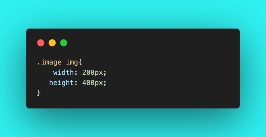
To resize an image in CSS, use the width and height properties like this: img { width: 200px; height: 150px; }.
How to resize an image in CSS without losing quality?
No matter how big or small the screen is, just using max-width: 100% won’t make the image fill the entire area. But to keep the image from getting stretched or squished, you should also set height: auto. This way, the image will stay within its original size.
How do I fit an image proportionally in CSS?
To fit an image proportionally in CSS, set the width to a percentage value, like width: 100%, and adjust the height automatically to maintain the image’s aspect ratio.


Author’s Profile
Peter Junior Ejembi
Peter is passionate about crafting exceptional digital experiences through the art of web development. With a keen eye for design and a knack for transforming creative ideas into beautiful, functional websites, he is dedicated to enhancing the user’s online journey.
Blogs: 3
Got Questions? Drop them on LambdaTest Community. Visit now


