
How to Set Transition Height in CSS
Alex Anie
Posted On: November 14, 2023
 199681 Views
 17 Min Read
Web design revolves around the central focus of user experience. Websites that offer a positive user experience captivate visitors during their initial interaction, increasing the likelihood of these users returning to the site.
To achieve this, a lot has to go into designing, developing, best SEO practices, and, most importantly, testing, as this ensures your website runs seamlessly on multiple browsers, devices, and platforms.
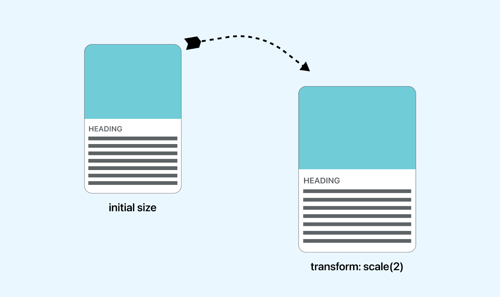
Considering this, developing an engaging UI can significantly enhance the overall user experience. Interactive user interfaces leverage visual elements such as typography in CSS, images, and videos to grab users’ attention effectively.
Moreover, incorporating good animations and transitions for web elements can also capture users’ interest. For instance, applying transitions to web forms can indicate to users which form element is being clicked, facilitating an interactive and focused user experience during their tasks.
Transition height in CSS helps developers create engaging, smooth animation to element height using the transition property. This property gives the ability to control the looks and feel of element transition heights. A good transition on element height draws users attention, makes them feel a sense of engagement as they interact with elements on the web page and making websites perform better, drive more engagement and improve interactivity.
By the end of this blog, you should understand what are CSS transitions, how to set transition height in CSS, and other CSS properties that correspond to the height and vertical coordinates in element size.
We also look at best practices to follow when using transition height in CSS for your web project and how other CSS properties can be used on the vertical axis to improve web performance for optimal result.
TABLE OF CONTENTS
- Working With CSS Transitions
- How to Set Transition Height in CSS?
- Specifying the height Property
- Using the min-height Property
- Using the max-height Property
- Using the flex-grow Property
- Using the translateY() Property
- Best Practices for Setting Transition Height in CSS
- Conclusion
- Frequently Asked Questions (FAQs)
Working With CSS Transitions
Setting transitions to CSS properties are very common, from changing background color from its initial state to a specific state to rotating web elements, changing the width, and other forms of web elements. Transitions help with smooth animations to CSS properties using the transition shorthand property.
However, another form of setting transition height in CSS is applying the transition to the height of a specific element. This can help improve user interaction with web elements. Increasing the height of an element when a user clicks on or hover on a particular element can give a user a sense of interaction that the user is interacting with that specific element.
For example, if we have a card displayed on a webpage with links pointing to an external source, we can simply apply a transition height or scale to increase or make the card bigger when a user interacts with it. This will help give the user a good sense of interactivity.
How to Set Transition Height in CSS?
Setting transition height in CSS using the height property will increase the size of the specific web element on the vertical axis.
HTML:
|
1 |
<div class="size"></div> |
CSS:
|
1 2 3 4 5 6 7 8 9 10 11 |
.size { width: 250px; height: 250px; background-color: #00ffff; transition: height 0.5s linear; } .size:hover { height: 500px; } |
Preview:
From the browser preview, the web element is increased from height of 250px to 500px on transition. So when the element is hovered on, it transitions to 500px height. This makes it more interactive when a user hovers on it.
See the Pen
Transition-height[1] by Ocxigin (@ocxigin)
on CodePen.
Specifying the height Property
By default, block elements are set to width auto, which takes the entire browser viewport when a fixed width value has not yet been set. Also, the element height will take the content size in the box. If the element has no content, it will not display on the browser even if a background-color is applied.
To make an element display on the web, sizing is essential. The height of the element has to be set, or the element should have text content that will determine the height of the element.
HTML:
|
1 2 3 4 5 6 |
<div class="box"> This element has a defined height </div> <div class="content"> This element takes the content of the box as the height. </div> |
CSS:
|
1 2 3 4 5 6 7 8 9 10 11 12 13 14 |
.box { background-color: cyan; width: 200px; height: 220px; font-size: 2em; } .content { background-color: darkcyan; width: 200px; margin-top: 2em; color: white; font-size: 2em; } |
Preview:
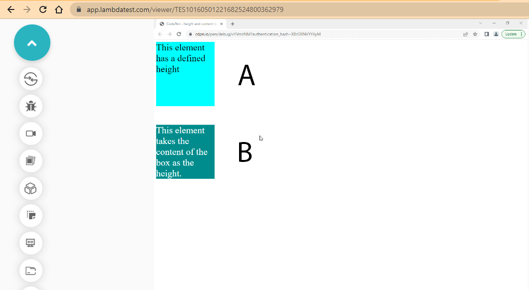
For example, element A has a defined height of 220px set on the element, while element B takes the element content as height. And as a result, element A has more space than element B, which helps with the readability of the content.
However, CSS transition height can take different forms; we shouldn’t explicitly set it to the page. We can apply the CSS transition height to an element so that it increases in size vertically when users interact with it, which leads to more interactivity.
See the Pen
height and content box by Ocxigin (@ocxigin)
on CodePen.
Specifying the min-height Property
The min-height CSS property is used to set the minimum height of an element. The min-height takes a length property as a value, and this value determines the minimum height of the element.
When an element is set to a minimum height that is smaller than the content of the element, then the minimum height will not be applied, whereas if the minimum height is larger than the continent of the element, the minimum height is applied.
This means that your min-height value should be greater than the content of the element. If not, the min-height value will not affect the element.
HTML:
|
1 2 3 4 5 6 7 8 9 10 11 12 13 14 15 16 17 18 19 20 |
<main class="main_card m1"> <div class="wrapper"> <h1>Enterprise</h1> <p>With LambdaTest Enterprise, your organization has access to solutions built on Enterprise Grade Security, Privacy, and Compliances</p> <button class="btn">Contact Sales</button> </div> </main> <main class="main_card m2"> <div class="wrapper"> <h1>Enterprise</h1> <p>With LambdaTest Enterprise, your organization has access to solutions built on Enterprise Grade Security, Privacy, and Compliances</p> <button class="btn">Contact Sales</button> </div> </main> |
CSS:
|
1 2 3 4 5 6 7 8 9 10 11 12 13 14 15 16 17 18 19 20 21 22 23 24 25 26 27 28 29 30 31 32 33 34 35 36 37 38 39 40 41 42 43 44 45 46 47 48 49 50 51 52 53 54 55 56 57 58 59 60 61 62 63 64 65 66 67 68 |
*, *::before, *::after { margin: 0; padding: 0; box-sizing: border-box; } body { width: 100vw; height: 100vh; display: flex; flex-direction: row; justify-content: center; align-items: center; gap: 20px; } .main_card { border-top-width: 10px; border-bottom-width: 10px; border-left-width: 1px; border-right-width: 1px; border-color: #0ebac5; border-style: solid; width: 350px; min-width: 288px; padding: 1em 2em; transition: min-height 0.5s linear; } /* This is the first element*/ .m1{ min-height: 300px; } /* This is the second element */ .m2{ min-height: 100px; } .main_card:hover { min-height: 400px; } .btn { border-radius: 5px; border: 1px solid #0ebac5; padding: 1em 3em; margin-top: 1.5em; background-color: transparent; font-family: calibri; text-transform: uppercase; font-weight: bold; color: #0ebac5; cursor: pointer; transition: background-color 0.5s linear; } .btn:hover { background-color: #0ebac5; color: #fff; } p, h1 { font-family: calibri; } |
Preview:
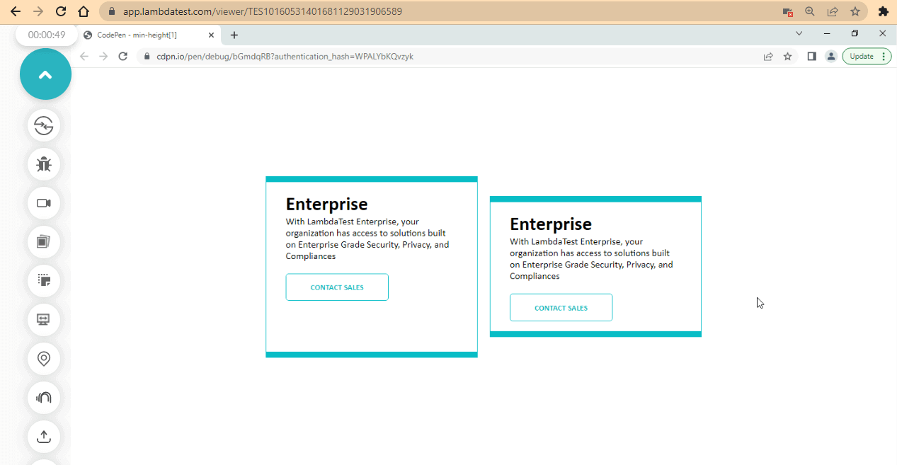
From the browser preview, the two elements have the same content with a height of 180.656px. The first element is set to a min-height of 300px, which is larger than the content of the element, and as a result, the min-height property takes effect. On the contrary, the second element is set to a min-height of 100px, which is smaller than the content of the element. As a result, the min-height does not take effect.
The two elements grow on hover because the min-height is 400px, which is bigger than the content of the element.
See the Pen
min-height[1] by Ocxigin (@ocxigin)
on CodePen.
Specifying the max-height Property
The max-height property sets the transition height in CSS where the element’s height is maximum. The max-height takes a length property as a value, and this value determines the maximum height of the element.
However, when an element is set to a maximum height and the content is larger than the maximum height, the content will overflow without displaying the rest of the content. Still, when the content is smaller than the maximum height value, the maximum height will not take effect.
HTML:
|
1 2 3 4 5 6 7 8 9 10 11 12 |
<main class="main_card m2"> <h1>LambdaTest Enterprise</h1> <div class="wrapper"> <p class="para">With LambdaTest Enterprise, your organization has access to solutions built on Enterprise Grade Security, Privacy, and Compliances</p> <p class="para">With LambdaTest Enterprise, your organization has access to solutions built on Enterprise Grade Security, Privacy, and Compliances</p> <p class="para">With LambdaTest Enterprise, your organization has access to solutions built on Enterprise Grade Security, Privacy, and Compliances</p> </div> </main> |
CSS:
|
1 2 3 4 5 6 7 8 9 10 11 12 13 14 15 16 17 18 19 20 21 22 23 24 25 26 27 28 29 30 31 32 33 34 35 36 37 38 39 40 41 42 43 44 45 46 47 48 49 50 |
*, *::before, *::after { margin: 0; padding: 0; box-sizing: border-box; } body { width: 100vw; height: 100vh; display: flex; flex-direction: row; justify-content: center; } .para { font-family: calibri, Arial, sans-serif; font-size: 2em; line-height: 1.3; } .main_card { width: 60%; height: 100px; position: relative; top: 2em; } h1 { background-color: #0ebac5; font-size: 2.5em; text-transform: uppercase; font-family: 'Trebuchet MS', Arial, sans-serif; padding: 0.1em 0.5em; text-align: center; color: #fff; } .wrapper { background: rgb(236, 235, 235); padding: 1em; max-height: 100px; overflow: auto; transition: max-height 0.5s ease-in; } .wrapper:hover{ max-height: 500px; } |
Preview:
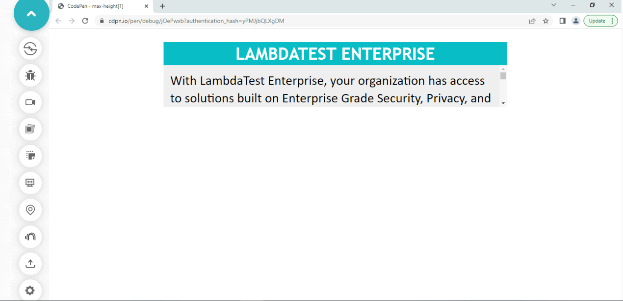
From the browser output, the content of the < div > tag with a class if the wrapper has a computed height of 207.969.
However, when the value of the maximum height is smaller than the content of the element, it overflows, but when the value of the maximum height is larger than the content, no effect is applied.
The element grows when we hover over it. This is because the element has been set to a max-height of 100px, which overflows the element. However, overflow auto is also set so the content overflows with the element.
Lastly, the setting transition in CSS using the max-height property moves the element from 100px to 500px in a smooth, easy manner in 0.5 seconds.
See the Pen
max-height[1] by Ocxigin (@ocxigin)
on CodePen.
Specifying the flex-grow Property
The flex-grow sub-property of the flexbox model can be used to set transition height in CSS. The flex-grow property takes a value that determines the amount of space that should be distributed among each flex-items minus the size of the flex container. The flex-grow property expands based on the direction of the flex-direction property.
HTML:
|
1 2 3 4 5 6 7 8 9 10 |
<!-- viewport --> <main class="viewport"> <section class="container"> <aside class="group_items"> <div class="grow city"><p>City</p></div> <div class="grow mountain"><p>mountain</p></div> <div class="grow road"><p>road</p></div> </aside> </section> </main> |
CSS:
|
1 2 3 4 5 6 7 8 9 10 11 12 13 14 15 16 17 18 19 20 21 22 23 24 25 26 27 28 29 30 31 32 33 34 35 36 37 38 39 40 41 42 43 44 45 46 47 48 49 50 51 52 53 54 55 56 57 58 59 60 61 62 63 64 65 66 67 68 69 70 71 |
*, *::after, *::before { padding: inherit; margin: inherit; box-sizing: inherit; } html { padding: 0; margin: 0; box-sizing: border-box; } .viewport { width: 100vw; height: 100vh; } .group_items { width: inherit; height: 100vh; display: flex; @media(max-width: 500px) { flex-direction: column; } } .grow{ cursor: pointer; opacity: 0.5; filter: grayscale(3); transition: flex-grow, filter, opacity 0.5s linear; } .grow p { font-size: 2em; writing-mode: vertical-lr; color: #fff; text-transform: uppercase; text-shadow: 5px 4px 2px rgba(0,0,0,0.4); } .grow:nth-child(1){ flex-grow: 1; background-image:url('https://source.unsplash.com/-4pZ_YqcSFc'); background-position: center; background-repeat: no-repeat; background-origin: content-box; background-size: cover; } .grow:nth-child(2){ flex-grow: 1; background-image:url('https://source.unsplash.com/hOhlYhAiizc'); background-position: center; background-repeat: no-repeat; background-origin: content-box; background-size: cover; } .grow:nth-child(3){ flex-grow: 1; background-image:url('https://source.unsplash.com/oxQ0egaQMfU'); background-position: center; background-repeat: no-repeat; background-origin: content-box; background-size: cover; } .grow:hover{ flex-grow: 6; filter: none; opacity: 1;} |
From the code example above, each flex-items takes a flex-grow property value of 1, as a result each flex-item has equal space distributed among them and stretched to the viewport width.
However, on hover, the flex-grow, which has a value of 2, takes the largest space, and the remaining flex-item takes the remaining space in an equal distribution.
Desktop Preview:
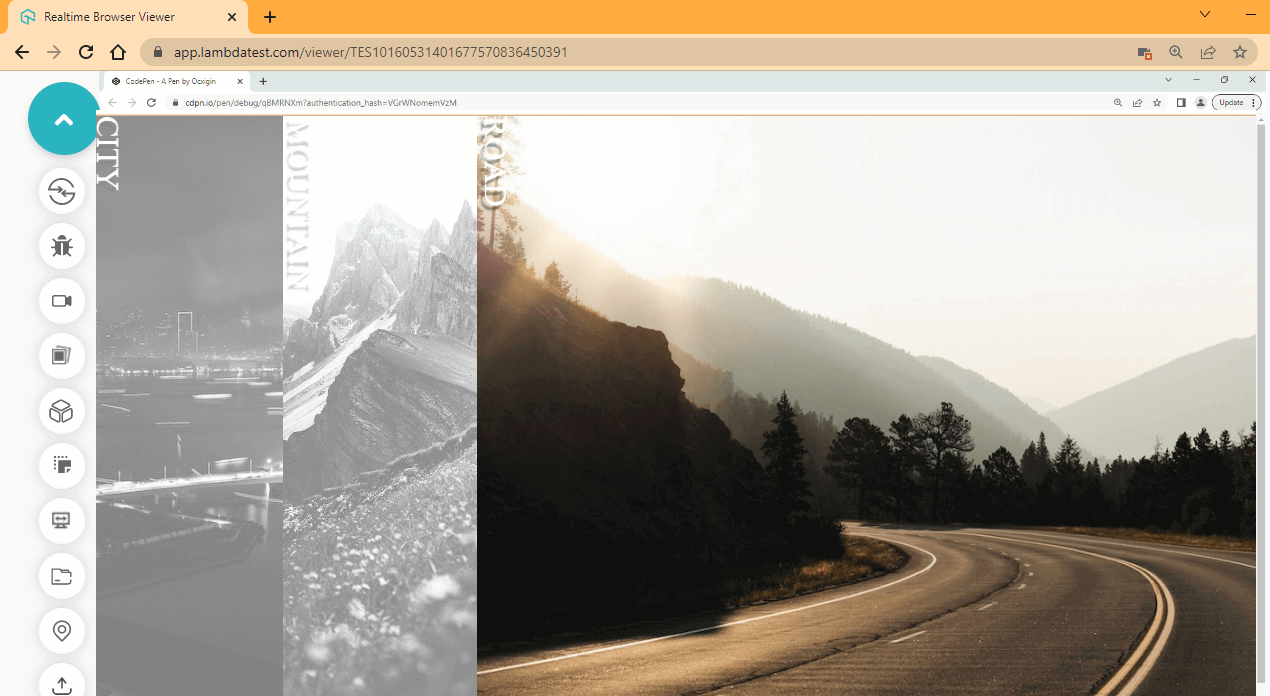
From the desktop preview above, the flex-grow moves to the row direction. That means it grows horizontally. To see how the effect grows, hover on individual image items.
Mobile Preview:
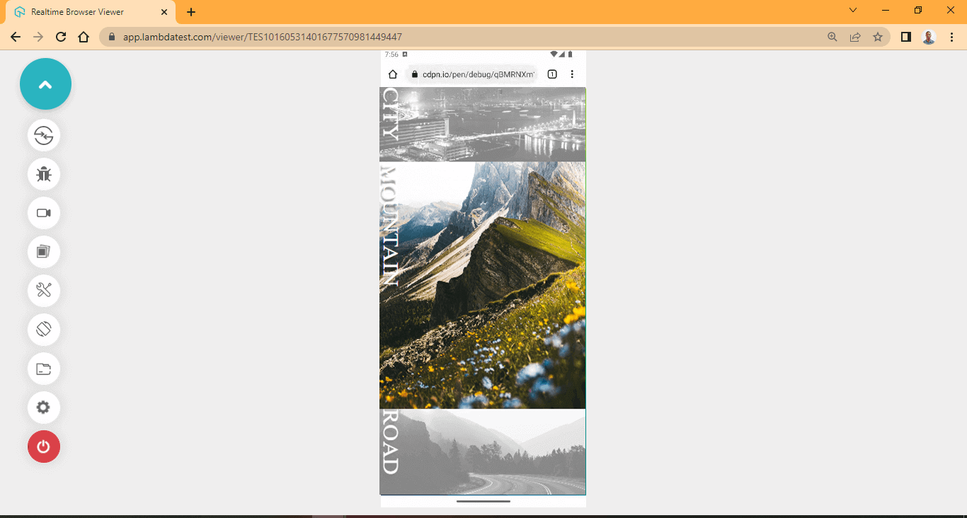
From the mobile preview above, the flex-grow moves to the column direction. This means it grows vertically. To see how the effect grows, resize your browser and hover on individual image items.
Using the flex-grow property effect can help bring a particular element to focus when users interact with it.
Specifying the translateY() Property
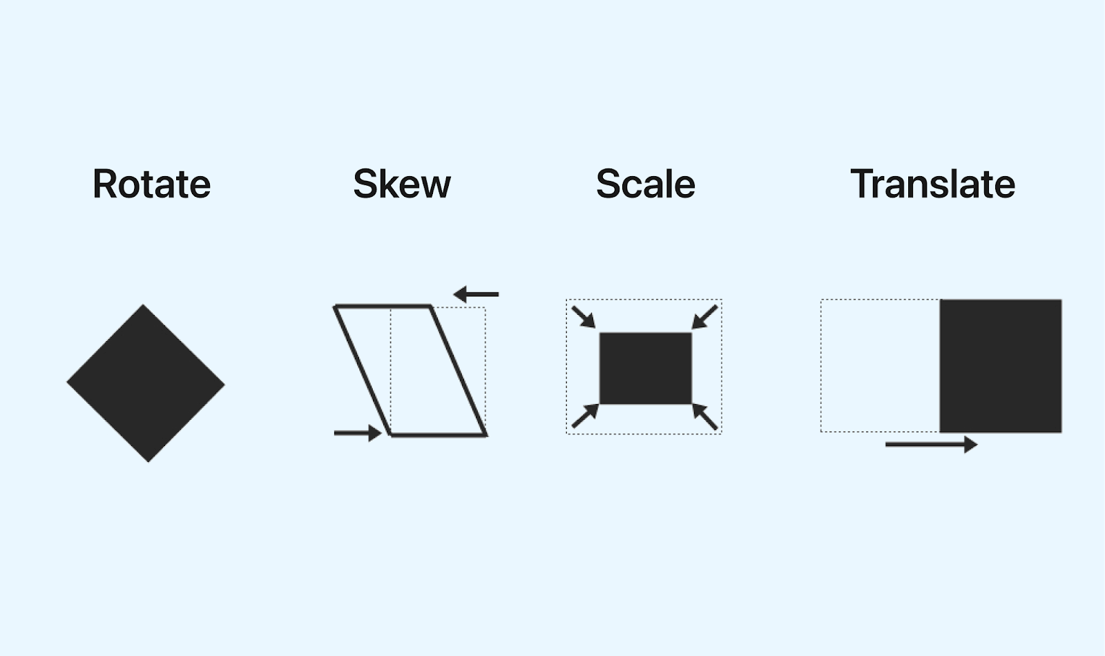
The translateY() is a sub-property of the CSS transform property. This can be used to set transition height in CSS. The translateY() is closely related to other transform properties such as translate(), translateX(), rotate(), skew(), scale(), and matrix(), which are used for positioning web elements around the web page.
The translateY() is a transitional property that can be useful when positioning elements with defined height.
In this blog section on setting transition height in CSS, we’ll only look at the translateY() sub-property used to move elements around the Y (vertical) coordinates.
With the help of pseudo-elements, we can use the translateY() to add effects to elements with a defined height. Depending on what you are working on, how you choose to implement translateY() may vary.
HTML:
|
1 2 3 4 5 6 7 8 9 10 11 12 13 14 15 16 |
<main class="root"> <section class="container"> <section class="card"> <aside class="img"></aside> <div class="group__items"> <h1>[Free Summit] Join 10k+ testers/developers for one of the biggest online testing conferences!</h1> <p>Register Now to Testμ (TestMu) Conference 2023! It is by the community, for the community! Be it sessions on trends, hands-on learning sessions or talks on building the right culture, we keep 'you' at the center of it all. 30+ sessions, 40+ speakers, workshops, and more!</p> <a href="https://www.lambdatest.com/testmuconf-2023/" class="group__btn" target="_blank"> <button class="btn" >Register Now</button> </a> </div> </section> </section> </main> |
CSS:
|
1 2 3 4 5 6 7 8 9 10 11 12 13 14 15 16 17 18 19 20 21 22 23 24 25 26 27 28 29 30 31 32 33 34 35 36 37 38 39 40 41 42 43 44 45 46 47 48 49 50 51 52 53 54 55 56 57 58 59 60 61 62 63 64 65 66 67 68 69 70 71 72 73 74 75 76 77 78 79 80 81 82 83 84 85 86 87 88 89 90 91 92 93 94 |
*, *::after, *::before { padding: inherit; margin: inherit; box-sizing: inherit; } html { padding: 0; margin: 0; box-sizing: border-box; } .root { margin: 4em 0; width: 80%; margin: 0 auto; } .container { display: flex; justify-content: center; } .card { width: 18.75em; /*300px*/ box-shadow: 0 22px 24px -3px rgb(0,0, 0,0.1), 0 7px 9px -5px rgb(0, 0, 0, 0.1); border-top-right-radius: 0.625em; /*10px*/ border-top-left-radius: 0.625em; /*10px*/ transition: all 1s ease-in; } .card:hover .img { transform: translateY(5px); opacity: 0.8; } .card:hover .btn{ text-decoration: underline; } .card:hover { box-shadow: 0 22px 24px -3px rgb(0,0, 0,0.1) } .img { height: calc(31.25em / 2); background: url('https://drive.google.com/uc?export=view&id=1_Wmn9sgIFZ73VT79RX2aX9Ke8Cwhto-6') no-repeat center center/cover; border-top-right-radius: 0.625em; /*10px*/ border-top-left-radius: 0.625em; /*10px*/ } .group__items { padding: 0.3125em; /*5px*/ margin: 0 0.3125em; } .card h1 { font-size: 1.4em; font-family: calibri; } .card p{ font-family: calibri; padding-bottom: 1em; } .btn { background-color: transparent; width: 100%; color: #0ebac5; border: 1px solid #0ebac5; cursor: pointer; padding: 0.625em 0; transition: background 0.5s ease; } .btn:hover{ background: #0ebac5; color: #fff; } .btn::after { content: "→"; position: relative; top: 0; right: 0; } .group__btn { text-decoration: none; display: flex; justify-content: center; } |
Preview:
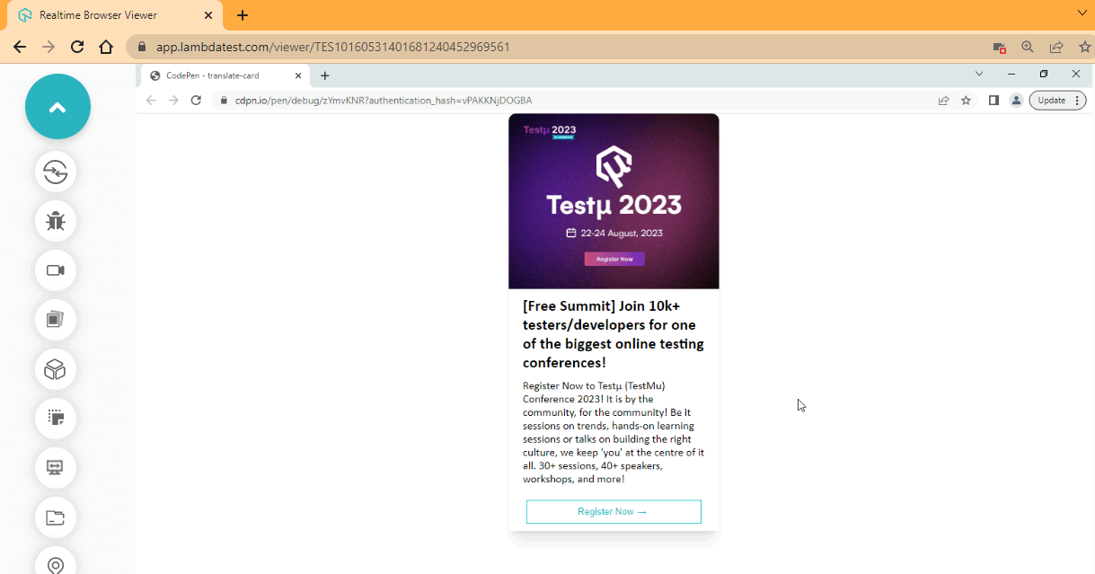
From the browser preview, translateY() is used to nudge the image down a bit with a transition effect.
See the Pen
translate-card by Ocxigin (@ocxigin)
on CodePen.
Let’s look at another example.
HTML:
|
1 2 3 4 5 |
<main class="root"> <div class="wrapper__btn"> <button class="btn">Dropdown</button> </div> </main> |
CSS:
|
1 2 3 4 5 6 7 8 9 10 11 12 13 14 15 16 17 18 19 20 21 22 23 24 25 26 27 28 29 30 31 32 33 34 35 36 37 38 39 40 41 42 43 44 45 46 47 48 49 50 51 52 |
*, *::after, *::before { padding: inherit; margin: inherit; box-sizing: inherit; } html { padding: 0; margin: 0; box-sizing: border-box; } .root { width: 100vw; height: 100vh; display: grid; place-content: center; } .btn { background-color: transparent; padding: 1em 3em; border: 2px solid #0ebac5; color: #0ebac5; position: relative; cursor: pointer; } .btn::after{ content: ""; background-color: #0ebac5; width: 100%; height: 100%; position: absolute; z-index: -1; top: 0; left: 0; transition: all 0.7s cubic-bezier(0.63,-0.02, 0.06, 1); transform: translateY(-40px); opacity: 0; } .btn:hover::after { transform: translateY(0px); opacity: 1; } .btn:hover{ color: #fff; } |
Preview:
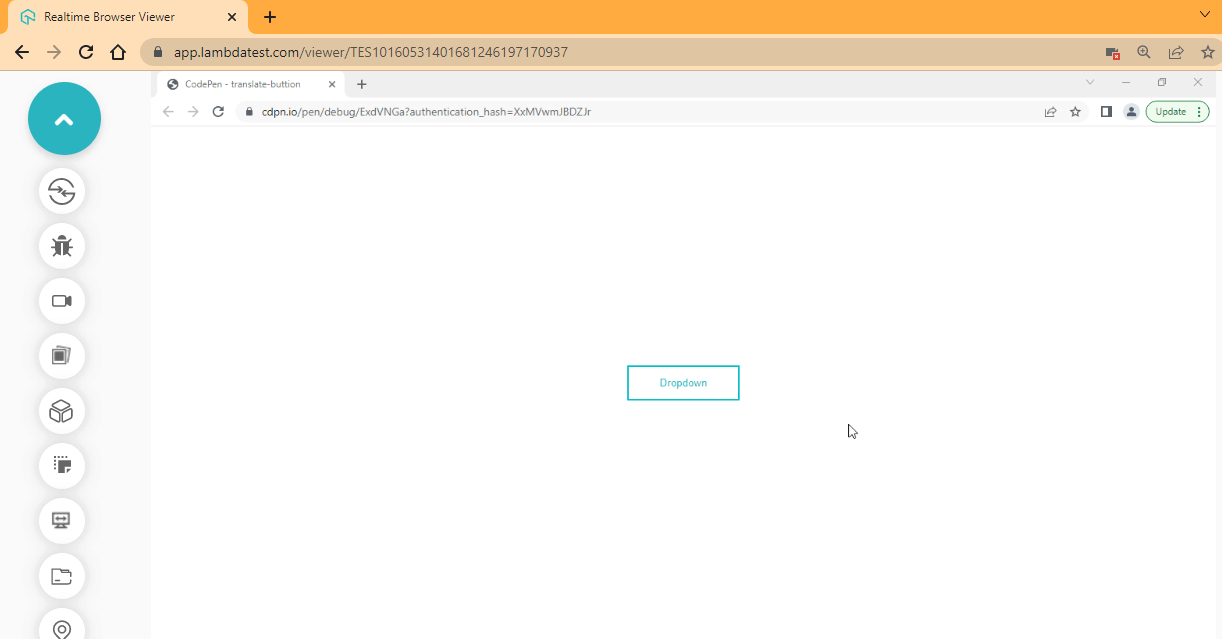
From the browser preview, a transition all is added to the button to apply the transition to all the CSS properties assigned to the button.
The button background color created by the pseudo-element is offset by -40px by the translateY() property, and it is returned in place on hover by the translateY(0). Move over to the button to see the effect.
See the Pen
translate-buttion by Ocxigin (@ocxigin)
on CodePen.
 Note
NoteTest your web applications on a real device cloud. Try LambdaTest Today!
Best Practices for Setting Transition Height in CSS
When working with transition heights in CSS, it’s important to know how they can be implemented properly to get the element to display properly on the web page.
Here are some ways you can consider when applying transition heights in CSS.
Keeping the CSS Transition Height Consistent
Consistency is crucial when styling web elements, especially when styling elements with the same class or are meant to do the same thing. For example, CTAs buttons (Call To Action), cards, etc, can have a consistent transitional height set on them. This will help improve as follows:
- Keep transition height in CSS consistent across the website.
- Contents are well organized.
- Website becomes easy to navigate.
- It improves readability.
HTML:
|
1 2 3 4 5 6 |
<div> <button class="btn window_slide">window slide</button> <button class="btn popup">pop up</button> <button class="btn slidein">Slide in</button> <button class="btn burst">Burse</button> </div> |
CSS:
|
1 2 3 4 5 6 7 8 9 10 11 12 13 14 15 16 17 18 19 20 21 22 23 24 25 26 27 28 29 30 31 32 33 34 35 36 37 38 39 40 41 42 43 44 45 46 47 48 49 50 51 52 53 54 55 56 57 58 59 60 61 62 63 64 65 66 67 68 69 70 71 72 73 74 75 76 |
*, *::after, *::before { padding: inherit; margin: inherit; box-sizing: inherit; } html { padding: 0; margin: 0; box-sizing: border-box; } body { --color: #03ffff; --hover-b: #000; --hover-w: #fff; display: grid; place-content: center; background: linear-gradient(174deg, #233333 0%, #040404 100%, #190101 100%); width: 100vw; height: 100vh } .btn { background: none; border: 2px solid var(--color); padding: 2em 4em; margin: 1em; user-select: none; text-transform: uppercase; color: var(--color); letter-spacing: 2.2px; cursor: pointer; transform: translateY(0); transition: all 0.5s linear; } /* the inset brings the box-shadow from the inside */ .window_slide:hover { box-shadow: inset 8rem 0 0 0 var(--color), inset -8rem 0 0 0 var(--color); color: var(--hover-b); transform: translateY(-0.5rem); } .popup:hover { box-shadow: 0rem 0.99rem 0.43rem -0.33rem var(--color); transform: translateY(-0.5rem); } .slidein:hover { box-shadow: inset 0 0 0.5rem 4em var(--color); transform: translateY(-0.5rem); color: var(--hover-b); } .burst:hover { box-shadow: 0 0 1.1rem 1rem var(--color); transform: translateY(-0.5rem); } @media only screen and (max-width: 1080px) { div { display: grid; grid-template-columns: repeat(2, auto); } @media only screen and (max-width: 600px) { div { display: grid; grid-template-columns: repeat(1, auto); } |
Preview:
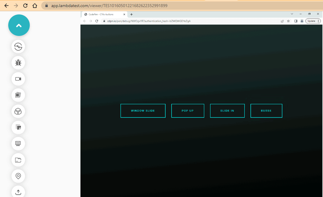
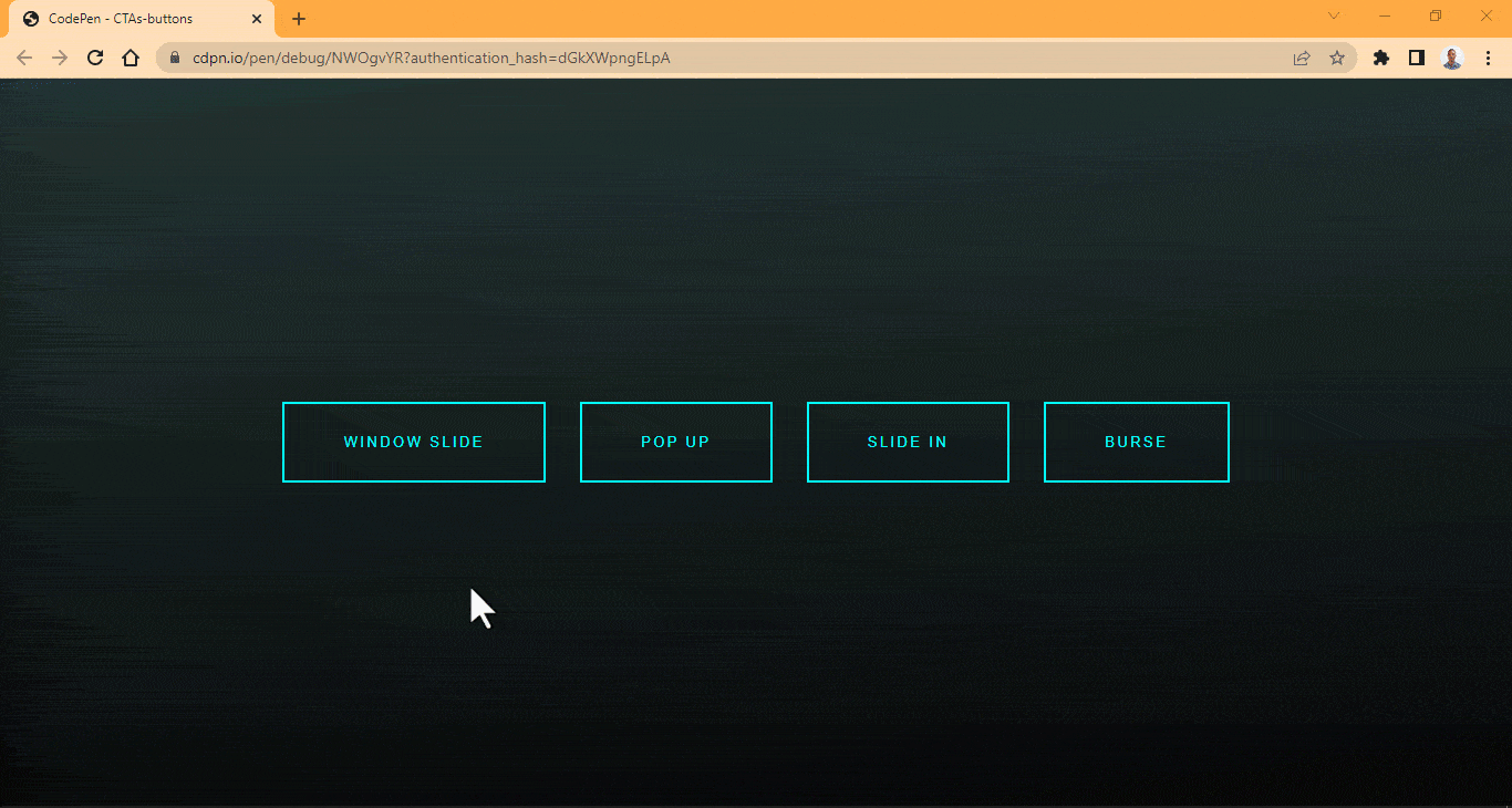
From the browser preview, we created four buttons with four different effects applied to each button.
The window slide effect is a box-shadow effect with inset value, which brings the shadow from the inside. The effect is split into two, coming from the left and right sides of the button. Note that the window slide effect value is repeated and separated with a comma, and to make the other value come from the opposite side, a negative (-8rem) is added to the last value.
The popup effect is a box-shadow effect that is applied on hover. The slide in effect, on the other hand, is also a box-shadow effect; an inset value is applied to bring the box-shadow from the inside while the burst effect, which is the last effect on the list, takes 1.1rem of blur radius (to reduce the intensity) and 1rem of spread radius (to increase the size of the box-shadow).
However, one thing the CTA buttons have in common is the translateY(-0.5rem) that is applied on hover. This demonstrates how consistency can be applied when creating a CTA button. These buttons are meant to draw attention when a user hovers over them.
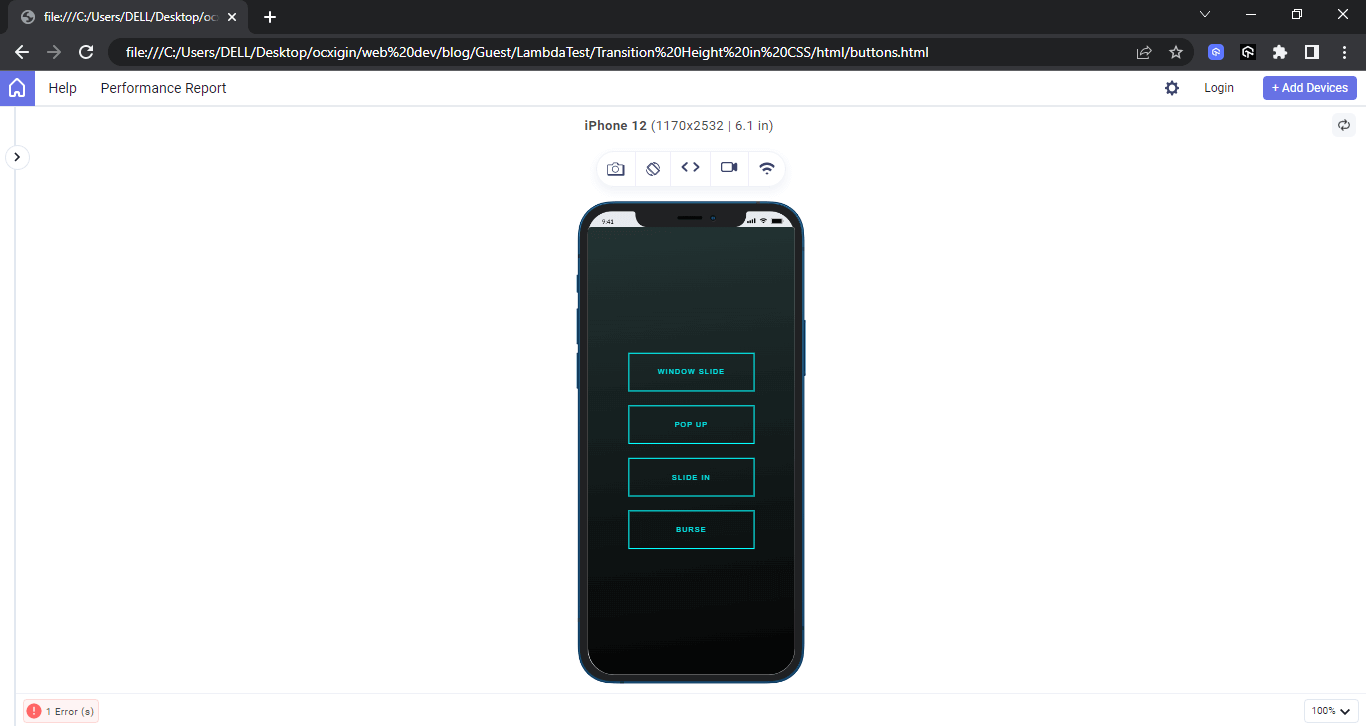
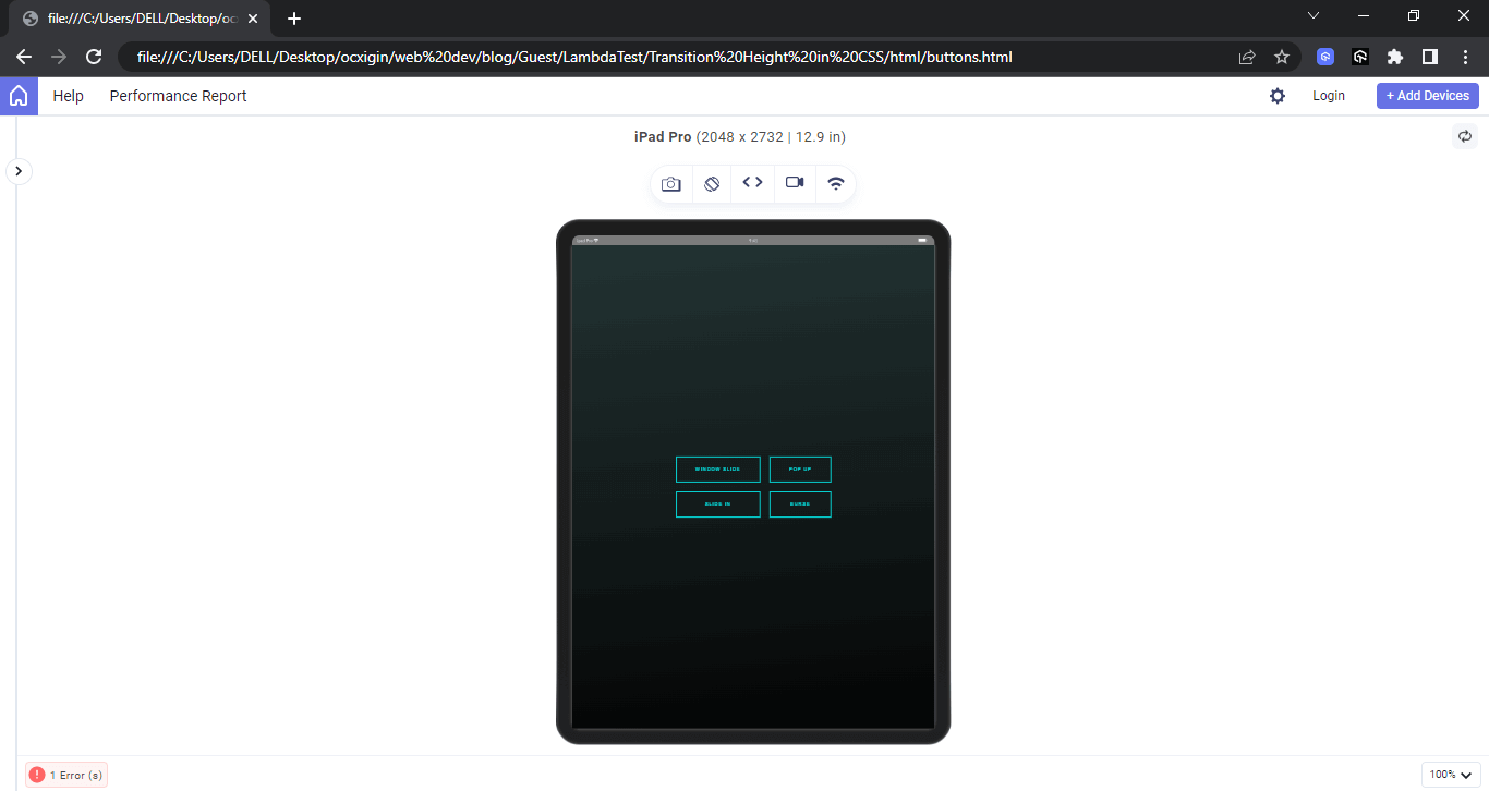
Also, browser and device compatibility should be taken care of while trying to maintain consistency with design. Here is a cross-platform preview of how we can use CSS media queries to create different breakpoints for a website.
Desktop Preview:
Mobile Preview:
Tablet Preview:
Laptop Preview:
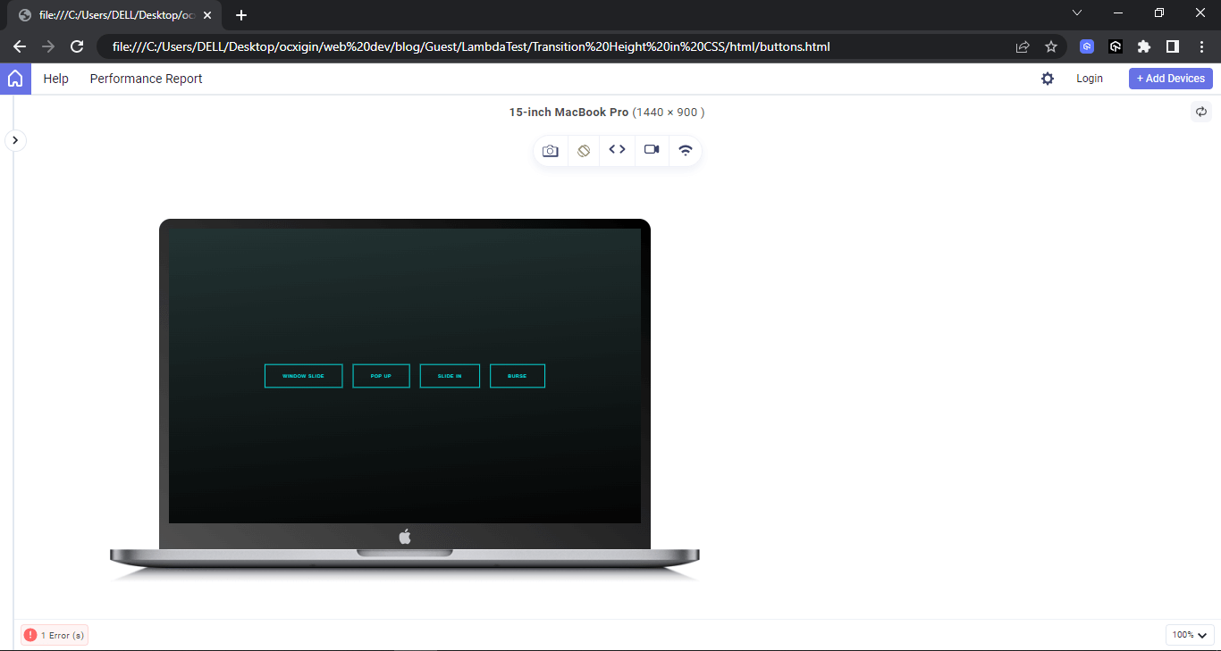
From the preview above, the website is set to 100vw (viewport width) of the browser width on the laptop device, which is the largest. The buttons on a large screen are set on a single column. To avoid the buttons colliding with each other when loaded on a smaller screen, we set the buttons to a two-column grid on a medium screen (tablet), while on an even smaller screen (mobile), we set the buttons to a single-column grid.
Cross-device compatibility and responsiveness in websites or web apps improve user experience, as seen in the image above. Also, since cross-device compatibility and responsiveness are essential for any website or web app that wants to reach a wide audience, performing responsive testing is crucial.
Built by LambdaTest, LT Browser is a dev-friendly browser that can help ensure your website or web app is cross-device compatible and responsive. It provides access to a cloud of over 50+ device viewports to test your website or web app on different screen resolutions for mobile, tablets, laptops, and desktops.
Also, with LambdaTest, an AI-powered test orchestration and execution cloud platform, you can test your websites and mobile apps on an online browser farm of 3000+ real browsers, devices, and platforms. It also provides a mobile device testing lab of real and virtual devices.
Catch up with the latest tutorials on mobile app testing, real device testing, and more — Subscribe to the LambdaTest YouTube Channel.
See the Pen
CTAs-buttons by Ocxigin (@ocxigin)
on CodePen.
Setting the Height to Match the Content
There are cases where the specified height will overflow the text content and result in extra white space below the content of a box. This usually happens with block elements.
It is always best for the content to fit in with the height of the element to prevent extra whitespace, which can lead to unwanted vertical scrolling of the overdrawn page.
The fit-content value of CSS helps prevent this extra whitespace by fitting the content with the height of the box, which gives a better user experience.
HTML:
|
1 2 3 4 5 6 7 8 9 10 11 12 13 14 15 16 17 18 19 20 21 22 23 24 25 26 27 28 29 30 31 32 33 34 35 36 37 38 39 40 41 42 43 44 45 46 47 48 49 50 51 52 53 54 55 56 57 58 59 60 61 62 63 64 65 66 67 68 69 70 71 72 73 74 75 76 77 78 79 80 81 82 83 84 85 86 87 88 89 90 91 92 93 94 95 96 97 |
<main> <section class="card_parent"> <!-- CARD ONE => [This here the card section. everything within the <aside> tag but not outside.] --> <aside class="card"> <div class="card_hero"> <img src="https://drive.google.com/uc?export=view&id=17YXwv7wWlcNGNEgyj8e_GSweOBY_Qtwz" alt=""> <div class="event_toggle_btn" id="collapsOne">></div> </div> <!-- body of the card --> <div class="card_body"> <!-- Card Heading --> <div class="heading_wrapper"> <h1>The 'New Tool On The Block' Playwright!</h1> <p><span class="event_info data">Date:</span>Wednesday, 26th April 2023</p> <p><span class="event_info time">Time:</span>8:30 - 9:30 PM IST | 11:00 - 12:00 PM EST</p> </div> <!-- Paragraph for the card body --> <div id="details1" class="close_div"> <div class="para_wrapper collaps_close1"> <p>Join Butch Mayhew as he talks on the topic, 'The 'New Tool On The Block' Playwright!' on his learning journey in building automated tests with Playwright in a new episode of Voices of Community by LambdaTest.</p> </div> <div class="btn_wrapper collaps_close1"> <a href="https://www.lambdatest.com/webinar/" class="btn" target="_blank">Register Now</a> </div> </div> </aside> <!-- CARD TWO => [This here the card section. everything within the <aside> tag but not outside.] --> <aside class="card"> <div class="card_hero"> <img src="https://drive.google.com/uc?export=view&id=14GXnQni42MnSxAhvs8_mqY-ud0LUQjPb" alt=""> <div class="event_toggle_btn btn_middle" id="collapsTwo">></div> </div> <!-- body of the card --> <div class="card_body"> <!-- Card Heading --> <div class="heading_wrapper"> <h1>Clean Coding Practices for Test Automation: Part 2</h1> <p><span class="event_info data">Date:</span>MARCH 23rd, 2023 </p> <p><span class="event_info time">Time:</span>9:00-10:30 AM EST</p> </div> <!-- Paragraph for the card body --> <div id="details2" class="close_div"> <div class="para_wrapper collaps_close2"> <p>In this webinar, we learned about the clean coding practices with real-world scenarios and showcased the implementation of various design patterns</p> </div> <div class="btn_wrapper collaps_close2"> <a href="https://www.lambdatest.com/webinar/clean-coding-practices-for-test-automation-part2" class="btn" target="_blank">Learn More</a> </div> </div> </div> </aside> <!-- CARD THREE => [This here the card section. everything within the <aside> tag but not outside. ]--> <aside class="card"> <div class="card_hero"> <img src="https://drive.google.com/uc?export=view&id=14tcXKD_iy0AadNqzS-hSBN0DHqese8RS" alt=""> <div class="event_toggle_btn btn_last" id="collapsThree">></div> </div> <!-- body of the card --> <div class="card_body"> <!-- Card Heading --> <div class="heading_wrapper"> <h1>From Chaos to Control: Observability and Testing in Production</h1> <p><span class="event_info data">Date:</span> FEBRUARY 21, 2023</p> <p><span class="event_info time">Time:</span>10:00-11:00AM EST</p> </div> <!-- Paragraph for the card body --> <div id="details3" class="close_div"> <div class="para_wrapper collaps_close3"> <p>In this webinar, we explore the concept of observability, and how it facilitates the concept of testing in production.</p> </div> <div class="btn_wrapper collaps_close3"> <a href="https://www.lambdatest.com/webinar/from-chaos-to-control" class="btn" target="_blank">Learn More</a> </div> </div> </div> </aside> </section> </main> <footer></footer> |
CSS:
|
1 2 3 4 5 6 7 8 9 10 11 12 13 14 15 16 17 18 19 20 21 22 23 24 25 26 27 28 29 30 31 32 33 34 35 36 37 38 39 40 41 42 43 44 45 46 47 48 49 50 51 52 53 54 55 56 57 58 59 60 61 62 63 64 65 66 67 68 69 70 71 72 73 74 75 76 77 78 79 80 81 82 83 84 85 86 87 88 89 90 91 92 93 94 95 96 97 98 99 100 101 102 103 104 105 106 107 108 109 110 111 112 113 114 115 116 117 118 119 120 121 122 123 124 125 126 127 128 129 130 131 132 133 134 135 136 137 138 139 140 141 142 143 144 145 146 147 148 149 150 151 152 153 154 155 156 157 158 159 160 161 162 163 164 165 166 167 168 169 170 171 172 |
*, *::after, *::before { padding: inherit; margin: inherit; box-sizing: inherit; } html { padding: 0; margin: 0; box-sizing: border-box; } :root { --Roboto:'Roboto', sans-serif; --color: #3fe1dc; --color-dark-h: #04a5a5; } main { display: flex; justify-content: center; width: 100vw; height: 100vh; } .card_parent { display: grid; grid-template-columns: repeat(3, 1fr); place-content: center; gap: 4em; } .card { width: 20em; box-shadow: 9px 9px 29px rgba(0, 0, 0, 0.2); height: fit-content; } .card_hero { position: relative; } .card_hero img { width: 100%; } .close_div { display: none; } .event_toggle_btn { display: inline-block; background-color: var(--color); position: absolute; font-family: var(--Roboto); font-weight: 200; font-size: 2em; transform: rotate(90deg); user-select: none; cursor: pointer; text-align: center; width: 50px; min-height: 50px; padding: 5px 5px; border-radius: 50%; top: 4.2em; right: 1em; box-shadow: 5px 9px 9px rgba(0, 0, 0, 0.2); } .event_toggle_btn:hover{ background-color: var(--color-dark-h); color: white; } .btn_middle { top: 4.2em; } .btn_last { top: 4.8em; } .card_body { margin: 0 calc(00.1875em * 1.8); /*3px*/ } .card_body h1 { font-weight: 900; font-family: var(--Roboto); line-height: 1.5; /* text-transform: uppercase; */ } .card_body p { font-weight: 500; font-family: var(--Roboto); line-height: 1.5; width: fit-content; } .heading_wrapper { margin: 1em 0; } .event_info { background-color: var(--color); padding: 0.0625em 0.1875em; /*1px 3px*/ border-radius: 0.1875em; /* 3px*/ margin-right: 0.1875em; /* 3px*/ } .btn_wrapper { margin: 1em 0; } .btn { width: 100%; color: black; font-family: var(--Roboto); display: block; background: none; border: calc(0.0625em * 2) solid var(--color); padding: 1em 3em; user-select: none; text-decoration: none; text-align: center; transform: translateY(0); transition: all 0.5s linear; } .btn:hover { box-shadow: inset 0 0 0.5rem 4em var(--color); transform: translateY(-0.5rem); color: var(--hover-b); } footer{ margin-bottom: 4em; } /* MEDIA QUERIES */ /* Tablet */ @media only screen and (max-width: 1080px) { .card_parent { grid-template-columns: repeat(2, auto); } } /* Mobile */ @media only screen and (max-width: 800px) { .card_parent { grid-template-columns: repeat(1, auto); } } /*JAVASCRIPT TOGGLE SECTION */ .toggleBtn { background-color: salmon; transform: rotate(180deg); } .collaps_open { display:block ; transition: all 0.5s linear; } |
JavaScript:
|
1 2 3 4 5 6 7 8 9 10 11 12 13 14 15 16 17 18 19 20 21 22 23 24 25 26 27 28 29 30 31 32 33 34 35 36 37 38 39 40 41 42 |
//Buttons const firstBtn = document.querySelector('#collapsOne'); const secondBtn = document.querySelector('#collapsTwo'); const collapsThree = document.querySelector('#collapsThree'); //Collapse Elements tags const details1 = document.querySelector('#details1'); const details2 = document.querySelector('#details2'); const details3 = document.querySelector('#details3'); // The first button firstBtn.addEventListener('click', ()=>{ if(firstBtn.classList.toggle('toggleBtn')){ firstBtn.textContent = 'x'; details1.classList.remove('close_div'); } else{ firstBtn.textContent = '>'; details1.classList.add('close_div'); } }) // The second button secondBtn.addEventListener('click', () => { if (secondBtn.classList.toggle('toggleBtn')) { secondBtn.textContent = 'x'; details2.classList.remove('close_div'); } else { secondBtn.textContent = '>'; details2.classList.add('close_div'); } }) // The third button collapsThree.addEventListener('click', () => { if (collapsThree.classList.toggle('toggleBtn')) { collapsThree.textContent = 'x'; details3.classList.remove('close_div'); } else { collapsThree.textContent = '>'; details3.classList.add('close_div'); } }) |
Preview:
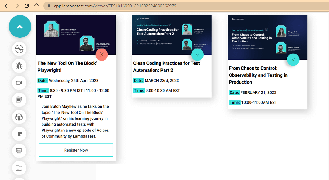
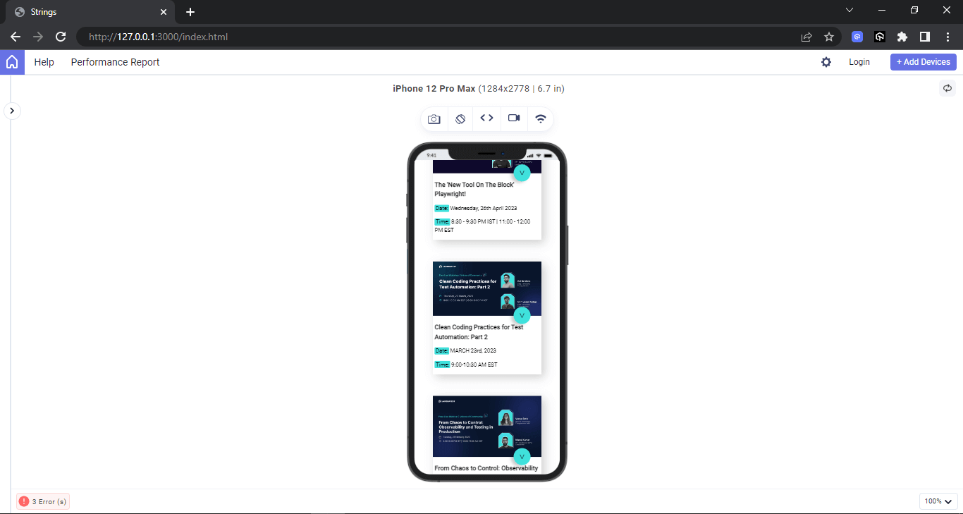
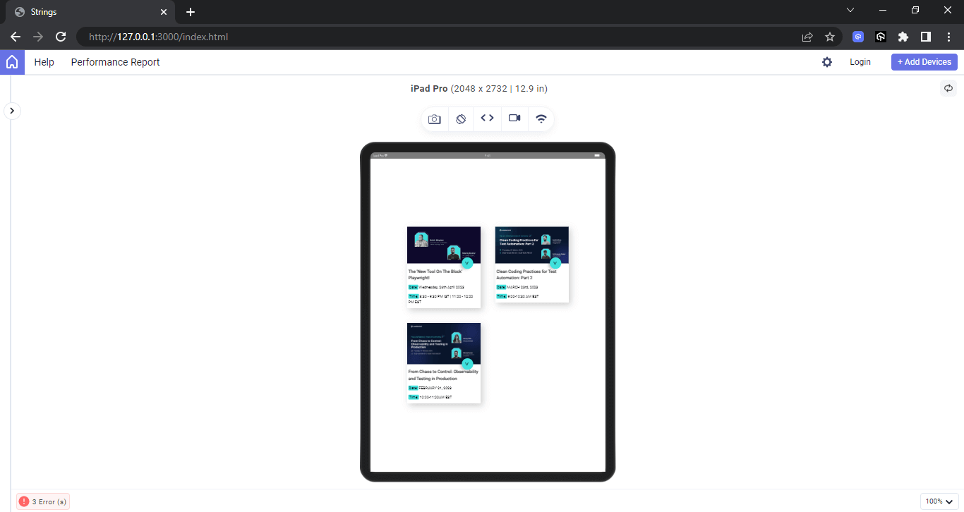
Here, from the browser preview, we have three cards displayed. Each card has a toggle button that displays the event information on click and closes the same information when we click it again.
The cards above have no extra whitespaces because we use fit-content CSS value on the height of the card. If the fit-content value is omitted, the cards and other card siblings will have extra white space because they are grid items.
The images below illustrate this point.
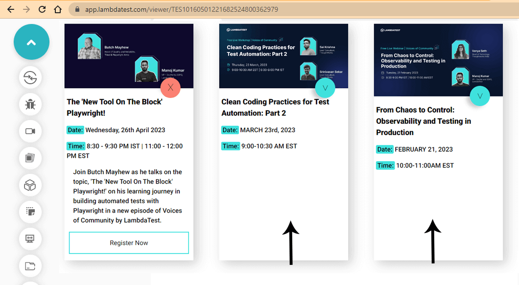
However, the fit-content CSS value can be used to achieve a situation where all text content on the card is well-fitted.
See the Pen
drop-dow-card by Ocxigin (@ocxigin)
on CodePen.
Avoiding Changes in Abrupt Heights
By default, block elements take the full width of the browser viewport and the height of the content in the box. If no content or height is set, the element does not display. And setting a transition height in CSS with a fixed height might cause the content to overflow if the content is greater than the specified height. This is where the fit-content CSS value can be helpful, as explained above.
However, if you are working with flex or grid items, things can get completed if spaces are not well distributed among flex items.
To fix this, you can specify different values to either flex or grid items to distribute spaces among flex items evenly. For example, we applied different CSS breakpoints using media queries to realign elements along different viewports.
Mobile Viewport:
Tablet Viewport:
Laptop Viewport:

From the above preview, mobile view is set on a single column, tablet is set to a two-column grid, while laptop and other larger screen sizes are set to a three-column grid. Notice how spaces are evenly distributed between the grid items, that is, top to bottom and left to right.
This will help make the website responsive on different device screen resolutions.
See the Pen
drop-dow-card by Ocxigin (@ocxigin)
on CodePen.
Transition height in CSS, as we’ve seen, can be handy to make elements move smoothly from one point to the other. However, ensuring text content fits the element’s height well can improve user experience.
Conclusion
We’ve just completed an article detailing the process of setting transition height in CSS. The topics covered include transitions, setting transitions for height, utilizing the min-height and max-height properties, employing the flex-grow property, incorporating the translateY() value, maintaining consistent transition height, aligning height with content, and preventing sudden height changes.
Frequently Asked Questions (FAQs)
How do you change the transition height in CSS?
To modify the transition height in CSS, follow these steps:
- Adjust the target height property in your CSS code.
- Update the transition duration to control the speed of the height change.
- Optionally, apply a different easing function for a specific transition effect.


Author’s Profile
Alex Anie
A Front End Technical Writer. I write blogs on Front End Technologies, such as HTML, CSS, JavaScript. When I am not coding, I enjoy watching tutorials and listening to twitter spaces. I live in Lagos, Nigeria
Blogs: 16
Got Questions? Drop them on LambdaTest Community. Visit now


