
Centering an Image in CSS: A Detailed Guide
Alex Anie
Posted On: February 26, 2024
 87648 Views
 23 Min Read
Images are widely used on websites and play an important role in helping users understand and find different types of information on the web. Therefore, proper alignment of images on the websites is crucial to avoid issues like overflow or unnecessary scrolling caused by large images.
When it comes to working with images, primarily centering an image in CSS can be a challenging task, especially for beginners. This is due to the fact that the < img > tag works as an internal element; it behaves differently compared to block elements, which complicates the process of centering an image in CSS.
In this guide, we will explore different methods of centering an image in CSS.
TABLE OF CONTENTS
Why Centering an Image in CSS?
Centering an image in CSS is very crucial to the overall layout of the webpage. Depending on the approach used, images can be embedded on the web using an HTML < img > tag or CSS background-image property.
When an image is embedded on the web due to its large size or repeats within the parent element. To enable the image to fit well on its defined element, it has to be resized to prevent it from overflowing and to take the size of its parent element.
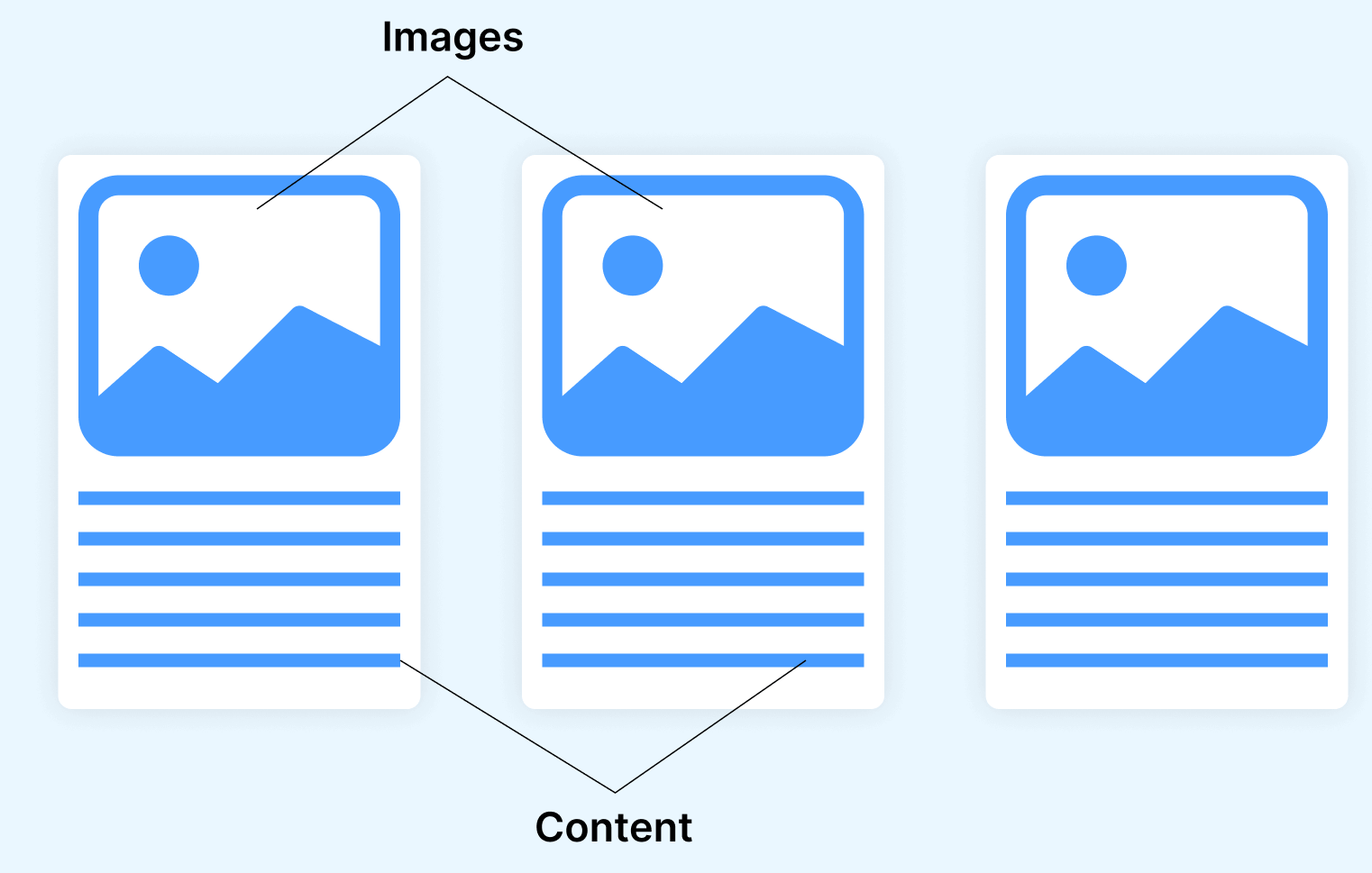
With this, images can be properly centered and positioned. For example, the illustration below shows how this can be done using three card elements on the web page with the image as a header attached to each element.
Another example can be seen from Etsy, where images are categorized into different sections, each with a fixed width and height of its parent element. This makes it easy to center and position the images across the web page.

The above Etsy website shows good consistency across all elements, contributing to more responsive content, cohesive layout, readability of text, and no overflow of text and images.
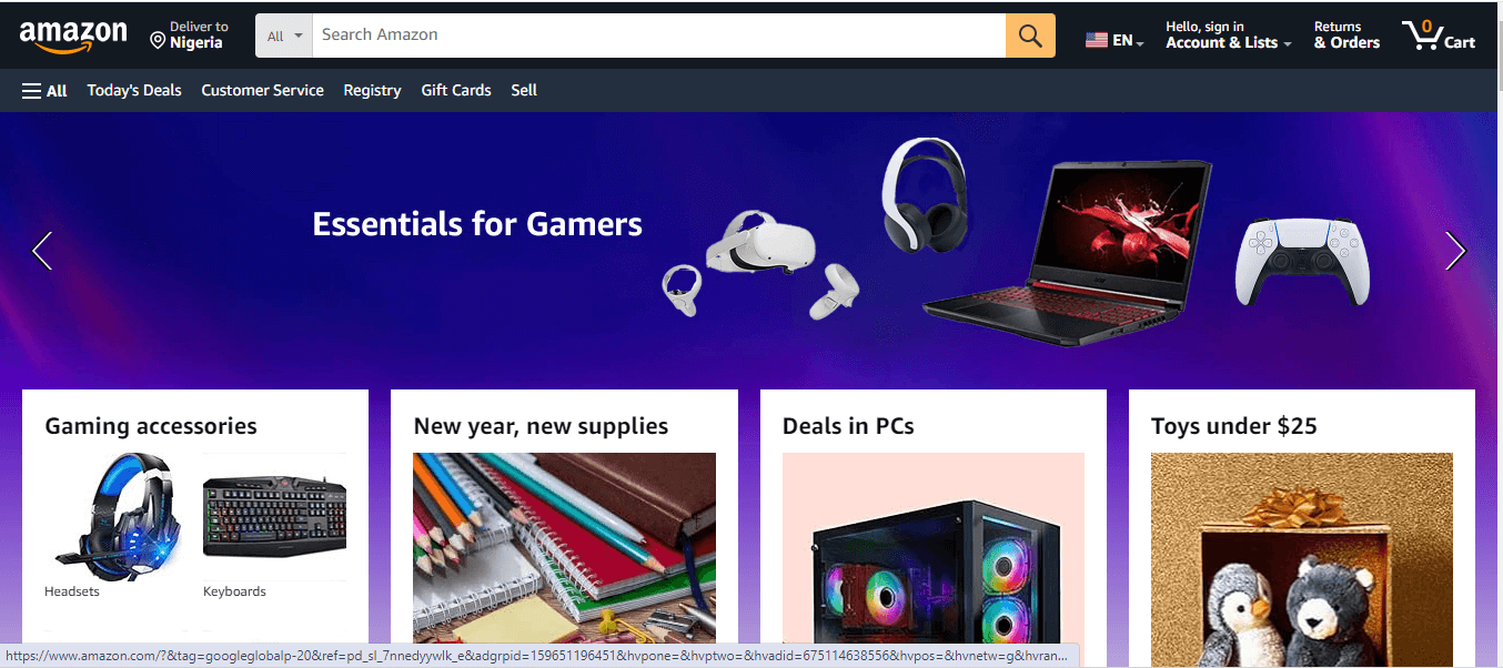
From the Amazon website below, you can see good use of CSS grid in centering images around the webpage. This is very useful as it improves the website layout system and aligns the image element in a cohesive and responsive manner.
When images are well-centered, it leads to a structured layout of responsive elements across different viewport sizes. This improves UI aesthetics, cohesive layout, and seamless user experience.
 Note
NoteTest across 3000+ browsers and devices instantly. Try LambdaTest Today!
Techniques for Centering Images Within the Page
Centering images on the web varies depending on the block level of the containing element (parent) of the image you are trying to center.
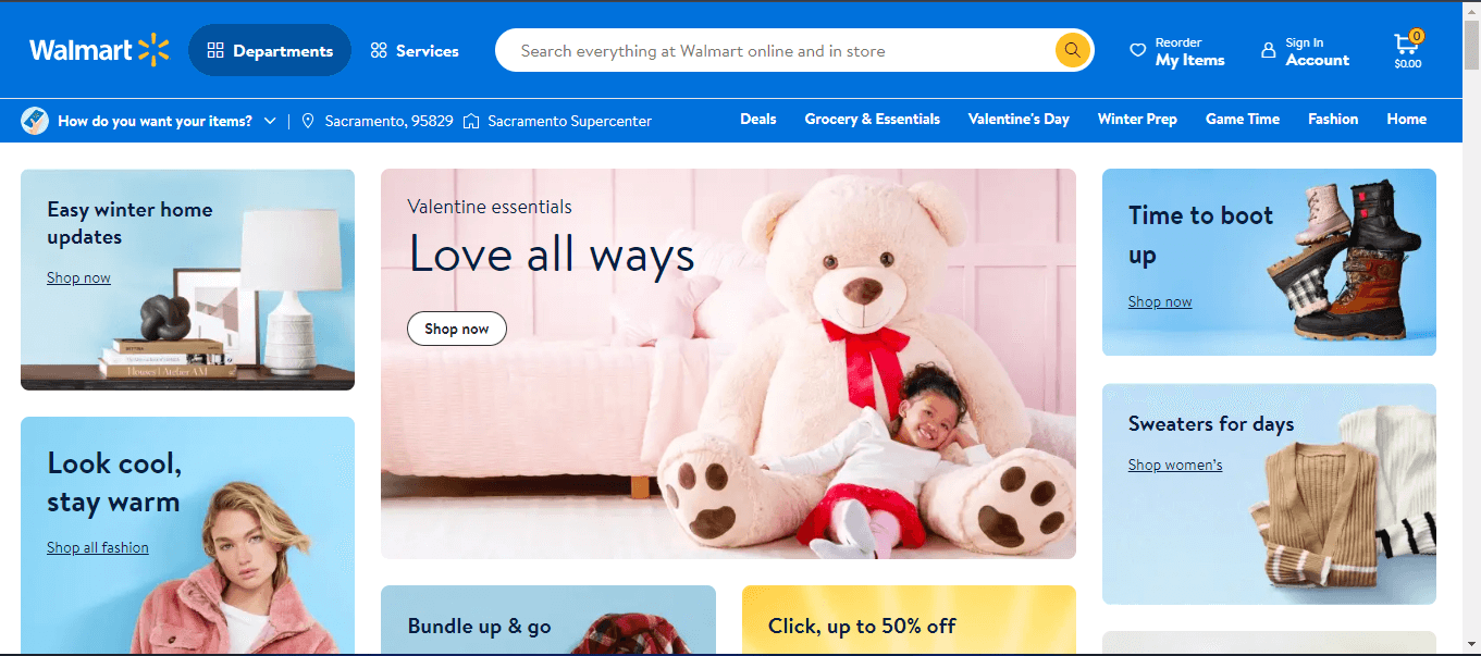
For example, a website like Walmart uses a CSS flexbox and grid to center multiple images on its platform. This makes it more responsive and allows each image to maintain its aspect ratio within its element.
However, other methods such as CSS position, transform, and margin: auto can also center images across the web page. Depending on how the image is included on the web, such as the < img / > tag or the background-image property, we could use the grid, flexbox, CSS position, margin: auto, or the translate property to center images around the web page.
In the next section of this blog, we will learn different techniques for centering an image in CSS.
Centering an Image in CSS Flexbox
CSS flexbox is a one-dimensional layout system for positioning elements in rows and columns. With flexbox, elements (flex-items) can be positioned within the flex container. The flex container, in this case, refers to the containing element the flex-items are nested in. To position images to the center, justify-content and align-items are used on the container.
justify-content and align-items
It is a common practice that images are set to inherit the size of the parent element. This makes it easy to center it across other elements within the webpage.
With justify-content, flex-items can be centered horizontally within the parent element, and with align-items, flex-items can be centered vertically.
Here, we combinedjustify-content and align-items to center the flex-items on the horizontal and vertical axis.
HTML:
|
1 2 3 4 5 6 7 8 9 10 11 12 13 14 15 16 17 18 19 20 21 22 23 24 25 26 27 28 29 30 31 32 33 34 35 |
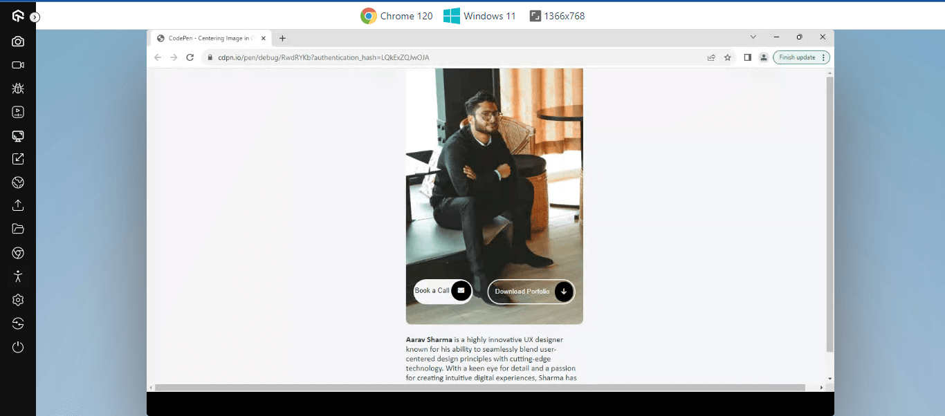
<html lang="en"> <head> <meta charset="UTF-8"> <meta name="viewport" content="width=device-width, initial-scale=1.0"> <title>Centering Image in CSS: Flexbox -- flex-item</title> <link rel="stylesheet" href="https://cdnjs.cloudflare.com/ajax/libs/font-awesome/6.5.1/css/all.min.css" integrity="sha512-DTOQO9RWCH3ppGqcWaEA1BIZOC6xxalwEsw9c2QQeAIftl+Vegovlnee1c9QX4TctnWMn13TZye+giMm8e2LwA==" crossorigin="anonymous" referrerpolicy="no-referrer" /> </head> <body> <main class="container"> <section> <div class="img-wrapper"> <img src="https://user-images.githubusercontent.com/78242022/283794539-fc01d463-7bad-4887-a02a-2b9c3eed891f.jpg" alt=""> </div> <div class="btn"> <aside> <button> <span">Book a Call</span> <i class="fa-solid fa-envelope"></i> </button> <button> <span>Download Porfolio</span> <i class="fa-solid fa-arrow-down"></i> </button> </aside> </div> <div class="content"> <p> <strong>Aarav Sharma</strong> is a highly innovative UX designer known for his ability to seamlessly blend user-centered design principles with cutting-edge technology. With a keen eye for detail and a passion for creating intuitive digital experiences, Sharma has played a pivotal role in revolutionizing user interfaces across various platforms.</p> </div> </section> </main> </body> </html> |
Here, within the HTML tag, the following tags performed the functions below
- < main >: With a class of container, this tag serves as the parent tag of the card element on the webpage.
- < section >: A nested tag of the < main > tag that serves as a wrapper for both the image, buttons, and content of the card element.
- < img >: Here, we parse in a user profile as the hero image of the card element.
- < button >: We implement two buttons to serve as a call to action on the card element.
- < p >: The paragraph tag contains the content on the page.
These HTML tags are used to structure the page content, while the CSS below is used to style it.
CSS:
|
1 2 3 4 5 6 7 8 9 10 11 12 13 14 15 16 17 18 19 20 21 22 23 24 25 26 27 28 29 30 31 32 33 34 35 36 37 38 39 40 41 42 43 44 45 46 47 48 49 50 51 52 53 54 55 56 57 58 59 60 61 62 63 64 65 66 67 68 69 70 71 72 73 74 75 76 77 78 79 80 81 82 83 84 85 86 87 88 89 90 91 92 93 94 95 96 97 |
body { width: 100vw; height: 100vh; background-color: var(--gray-1); } :root { --transparent: rgba(1, 1, 1, 0); --black-0: #010101; --black-1: #111317; --black-2: #22262e; --black-3: #2b2f39; --gray-0: #6e7a92; --gray-1: #f4f5f8; --gray-2: #d3d7de; --gray-3: #a6aebc; --gradient-1: linear-gradient(90deg, rgba(2,0,36,1) 0%, rgba(9,9,121,1) 50%, rgba(0,212,255,1) 100%); } .container { height: 100%; display: flex; justify-content: center; align-items: center; } .container section { position: relative; width: 22em; } .container img { border-radius: 10px; width: 100%; height: auto; } .container .btn { width: 100%; position: absolute; bottom: 30%; left: 0px; } button { display: flex; justify-content: space-between; padding:3px; line-height: 3em; background-color: var(--gray-1); border: none; border-radius: 100px; cursor: pointer; color: var(--black-1); transition: 0.5s all; } button:last-child { background-color: var(--transparent); border: 2px solid var(--gray-1); color: var(--gray-1) } button:hover { background: var(--black-2); color: var(--gray-1); } i { display: inline-block; padding: 1em; border-radius: 100px; line-height: 100%; background-color: var(--black-0); color: var(--gray-1); } span { display: inline-block; padding: 0 10px; } aside { display: flex; justify-content: space-around; } .content p { font-family: calibri; color: var(--black-3); } |
To center the card element from the horizontal and vertical axes, we do the following.
- The body element is set at a width and height of 100vw and 100vh, respectively, providing enough space for the element to be positioned around the container.
- The < main > element with the class container is set to display flex to help center the entire content to the center of the page.
- The < section > tag is set to relative and a width of 22em to serve as the width of the children element.
- The < img > tag takes a width of 100%> to inherit the parent default width size and height of auto.
- The < button > tags are styled as CTA buttons with a transparent background and a background of gray on hover.
Each element within the parent card element is styled to fit into the parent container for easy alignment around the webpage.
See the Pen
Centering Image in CSS: Flexbox — flex-item by Ocxigin (@ocxigin)
on CodePen.
flex-self
From the previous example, we learned how justify-content and align-items are used to center flex-items within their container. When in use, justify-content and align-items affect all flex-items within the container.
However, where a particular flex item is required to be repositioned aside from other flex items within the same container, flex-self is used. The flex-self helps reposition each flex item within its flex container.
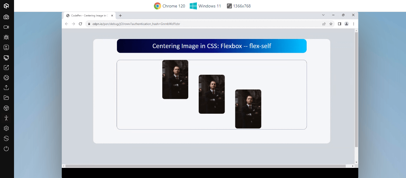
Here each flex item is repositioned using the flex-self property.
HTML:
|
1 2 3 4 5 6 7 8 9 10 11 12 13 14 15 16 17 18 19 20 21 22 23 24 25 26 27 28 29 30 31 32 33 34 |
<html lang="en"> <head> <meta charset="UTF-8"> <meta name="viewport" content="width=device-width, initial-scale=1.0"> <title>Centering Image in CSS: Flexbox -- flex-self</title> </head> <body> <main> <aside> <!-- Header --> <section> <p> Centering Image in CSS: Flexbox -- flex-self</p> </section> <!-- Body --> <section> <div> <img src="https://user-images.githubusercontent.com/78242022/283794566-f2111e6a-b8be-47c0-a12f-d4db30793ebf.jpg" alt=""> </div> <div> <img src="https://user-images.githubusercontent.com/78242022/283794566-f2111e6a-b8be-47c0-a12f-d4db30793ebf.jpg" alt=""> </div> <div> <img src="https://user-images.githubusercontent.com/78242022/283794566-f2111e6a-b8be-47c0-a12f-d4db30793ebf.jpg" alt=""> </div> </section> </aside> </main> </body> </html> |
CSS:
|
1 2 3 4 5 6 7 8 9 10 11 12 13 14 15 16 17 18 19 20 21 22 23 24 25 26 27 28 29 30 31 32 33 34 35 36 37 38 39 40 41 42 43 44 45 46 47 48 49 50 51 52 53 54 55 56 57 58 59 60 61 62 63 64 65 66 67 68 69 70 71 72 73 74 |
:root { --transparent: rgba(1, 1, 1, 0); --black-0: #010101; --black-1: #111317; --black-2: #22262e; --black-3: #2b2f39; --gray-0: #6e7a92; --gray-1: #f4f5f8; --gray-2: #d3d7de; --gray-3: #a6aebc; --gradient-1: linear-gradient(90deg, rgba(2,0,36,1) 0%, rgba(9,9,121,1) 50%, rgba(0,212,255,1) 100%); } body { width: 100vw; height: 100vh; background-color: var(--gray-2); } aside { background-color: var(--gray-1); width: 80%; margin: 1em auto; border-radius: 1em; padding-bottom: 2em; } section:first-child { width: 80%; border-radius: 1em; margin: 3em auto 0; line-height: 4em; background: var(--gradient-1); } p { color: var(--gray-1); text-align: center; font-family: calibri; font-size: 2em; } section:last-child { display: flex; justify-content: center; gap: 3em; width: 80%; height: 20em; margin: 2em auto; border-radius: 1em; border: 1px solid var(--gray-0); } div { width: 120px; } img { width: 100%; border-radius: 10px; } div:nth-child(1) { align-self: start; } div:nth-child(2) { align-self: center; } div:nth-child(3) { align-self: end; } |
From the code example above, we have a parent container (< section > tag) with three child elements (< img > tags). The parent element is set to a display of flex, and each child element is set to start, center, and end, respectively, within the flex-container.
The black solid border around the parent element (< section > tag) serves as a visual reference to the amount of space within the parent element and how each flex item (images) is positioned with the flex container.
See the Pen
Centering Image in CSS: Flexbox — flex-self by Ocxigin (@ocxigin)
on CodePen.
Centering an Image in CSS Grid
The CSS grid system is a two-dimensional layout method for positioning elements around the web page. The CSS grid is the most powerful CSS layout system that enables web elements to be positioned between rows and columns at the same instance.
place-content
The CSS grid system comes with lots of properties, such as ways for positioning grid items within the grid container. One of which is the place-content property. The CSS grid place-content property is a short-hand property for align-content and justify-content properties.
This is very useful when you need to set grid items within the grid container. The place-content property aligns the grid items with the grid cells in a horizontal and vertical direction within the grid container.
Here, the grid place-content property is used to position the grid items along the horizontal and vertical axes.
HTML:
|
1 2 3 4 5 6 7 8 9 10 11 12 13 14 15 16 17 18 19 20 21 22 23 24 25 26 27 28 29 |
<html lang="en"> <head> <meta charset="UTF-8"> <meta name="viewport" content="width=device-width, initial-scale=1.0"> <title>Centering Image in CSS: Gird - place-items</title> </head> <body> <main> <section> <div> <img src="https://user-images.githubusercontent.com/78242022/283794558-047ca72b-9fe0-42f7-8d8e-09c77d48d3c0.jpg" alt=""> </div> <div> <img src="https://user-images.githubusercontent.com/78242022/283794595-9f1358ea-5af5-4b69-8295-bde8961fed84.jpg" alt=""> </div> <div> <img src="https://user-images.githubusercontent.com/78242022/283794606-8b10b1c2-16e0-431d-88ca-3d6c9fca4839.jpg" alt=""> </div> <div> <img src="https://user-images.githubusercontent.com/78242022/283794613-9a465af6-5635-4a85-badd-42c94a2c4bda.jpg" alt=""> </div> </section> </main> </body> </html> |
CSS:
|
1 2 3 4 5 6 7 8 9 10 11 12 13 14 15 16 17 18 19 20 21 22 23 24 25 26 27 28 29 30 31 32 33 34 35 36 37 38 39 40 41 42 43 44 45 46 47 48 |
:root { --neutral-200: rgb(229 229 229); --amber-200: rgb(254 243 199); --amber-600: rgb(217 119 6); --amber-800: rgb(146 64 14); } body { width: 100vw; } section { display: grid; grid-template-columns: repeat(4, 200px); gap: 5px; place-content: center; height: 100vh; } div { width: 20em; height: 20em; position: relative; border: 2px dashed var(--amber-800); padding: 2px; border-radius: 100px; } img { width: 100%; height: 100%; object-fit: cover; border-radius: 100px; } @media screen and (max-width:1160px) { div { width: 10em; height: 10em; gap: 20px; } } @media screen and (max-width:800px) { section { grid-template-columns: repeat(2, 200px); } } |
The code above can be broken into sections as follows.
- The section tag is the parent tag, nested inside this tag are four < img > tags. The section tag is set to display a grid and a place-content property to center the content around the webpage.
- The image tags are set to a width and height of 20em and position relative to the section tag.
The section tags contain four direct children elements; using the place-content helps align all items around the container.
See the Pen
Centering Image in CSS: Gird – place-items by Ocxigin (@ocxigin)
on CodePen.
place-items
The CSS grid place-items property is used to align the grid items in a horizontal and vertical direction within the individual grid cells in a grid container. The place-items property is a shorthand property for justify-items (horizontal alignment) and align-items (vertical alignment) used to control the alignment of grid items within their grid cells.
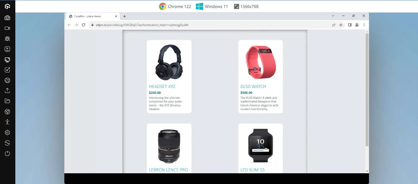
With the place-item property, each grid item is aligned within its grid cells. The grid cells are single-units of boxes arranged in a row and column layout within the grid container. When a grid is defined as a container, each grid item is assigned a cell. However, the place-items property lets us align the grid items within their cells.
To see a visual reference on place-items alignment on the cell, We can turn on the Chrome DevTools and click on the small grid icon on the element tab as indicated below.
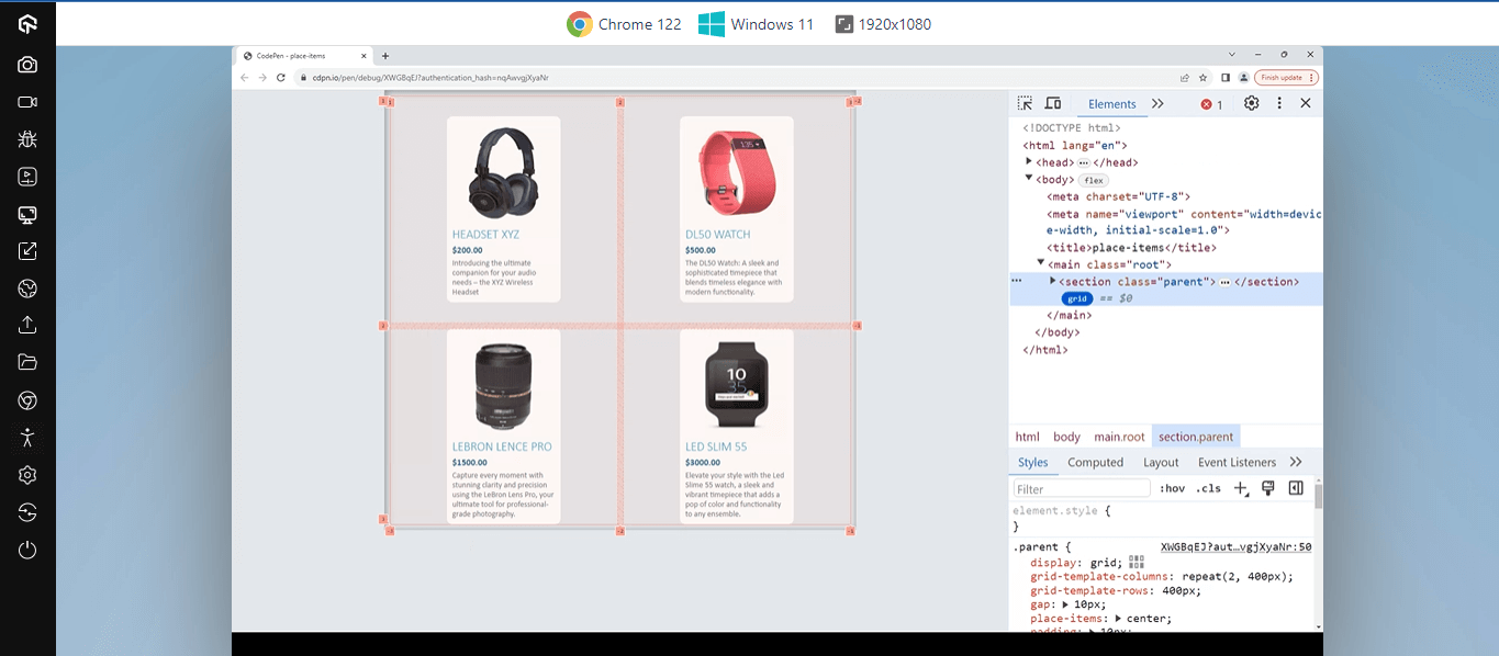
The grid cells are the square boxes around the card elements; from the image above, you can see how each card element is aligned to the center of their grid cells.
HTML:
|
1 2 3 4 5 6 7 8 9 10 11 12 13 14 15 16 17 18 19 20 21 22 23 24 25 26 27 28 29 30 31 32 33 34 35 36 37 38 39 40 41 42 43 44 45 |
<html lang="en"> <head> <meta charset="UTF-8"> <meta name="viewport" content="width=device-width, initial-scale=1.0"> <title>place-items</title> </head> <body> <main class="root"> <section class="parent"> <aside class="child1 children"> <img src="https://user-images.githubusercontent.com/78242022/273371544-42088786-8e9b-4561-8b3c-b45b16093516.jpg" alt="XYZ Wireless Headset"> <h1 class="product">Headset XYZ</h1> <p class="price">$200.00</p> <p class="description">Introducing the ultimate companion for your audio needs - the XYZ Wireless Headset</p> </aside> <aside class="child2 children"> <img src="https://user-images.githubusercontent.com/78242022/273371547-5e8ba9ec-cf60-4c0d-b69e-a6a1f49baea9.jpg" alt="DL50 Watch"> <h1 class="product">DL50 Watch</h1> <p class="price">$500.00</p> <p class="description">The DL50 Watch: A sleek and sophisticated timepiece that blends timeless elegance with modern functionality. </p> </aside> <aside class="child3 children"> <img src="https://user-images.githubusercontent.com/78242022/273371531-3aef1f6a-b2a9-4ec8-adec-7a7f768e9aa6.jpg" alt="LeBron Lence Pro"> <h1 class="product">LeBron Lens Pro</h1> <p class="price">$1500.00</p> <p class="description">Capture every moment with stunning clarity and precision using the LeBron Lens Pro, your ultimate tool for professional-grade photography. </p> </aside> <aside class="child4 children"> <img src="https://user-images.githubusercontent.com/78242022/273371561-4e52a851-cc0a-4a41-ba6e-c3dce14c73de.jpg" alt="LeBron Lence Pro"> <h1 class="product">Led Slim 55</h1> <p class="price">$3000.00</p> <p class="description"> Elevate your style with the Led Slime 55 watch, a sleek and vibrant timepiece that adds a pop of color and functionality to any ensemble. </p> </aside> </section> </main> </body> </html> |
CSS:
|
1 2 3 4 5 6 7 8 9 10 11 12 13 14 15 16 17 18 19 20 21 22 23 24 25 26 27 28 29 30 31 32 33 34 35 36 37 38 39 40 41 42 43 44 45 46 47 48 49 50 51 52 53 54 55 56 57 58 59 60 61 62 63 64 65 66 67 68 69 70 71 72 73 74 |
*,*::after, *::before { margin: 0; padding: 0; box-sizing: border-box; } :root { --lt-lightColor: #0ebac5; --lt-darkColor: #09777e; --gray-03: rgb(229 231 235); --gray-05: rgb(107 114 128); --gray-08: rgb(31 41 55); } body { background-color: var(--gray-03); display: flex; justify-content: center; } .parent { display: grid; grid-template-columns: repeat(2, 400px); grid-template-rows: 400px; gap: 10px; place-items: center; padding: 10px; box-shadow: inset 2px 2px 15px rgba(0, 0, 0, .4); } .children { background-color: white; width: 200px; height:-moz-fit-content; height: -webkit-fit-content; height: fit-content; padding:10px; border-radius: 10px; } .children h1 { font-size: 22px; font-family: calibri; text-transform: uppercase; font-weight: lighter; color: var(--lt-lightColor); } .children .price { font-family: calibri; font-weight: bold; color: var(--lt-darkColor); margin: 5px 0; } .children .description { font-family: calibri; color: var(--gray-05); font-size: 14px; } .children img { aspect-ratio: 1/1; width: 100%; border-radius: inherit; } @media screen and (max-width: 800px){ .parent { grid-template-columns: repeat(1, 400px); } } |
From the code sample above, we have four < aside > elements with classes of child1 to child4 and children and an < section > element with a class of parent.
- parent: The parent class is set to display a grid to make the element a grid container, then a grid-template-columns is set to repeat(2, 400px) and a grid-template-rows: 400px; this will provide more space for cells within the grid container and split them into a two-column grid. The gap of 10px creates a space between the cells, and the place-items property sets the grid-items to center horizontally and vertically within the grid cell.
- children: The children class is the grid-items. It takes a width of 200px each within the grid container.
When centering an image, the place-items align the image within the cells of the grid container, which is very useful for websites with multiple images.
See the Pen
place-items by Ocxigin (@ocxigin)
on CodePen.
justify-self
The justify-self property functions the same way as the flex-self property but for the grid system.
With the justify-self property, individual grid items can be re-aligned within the grid container.
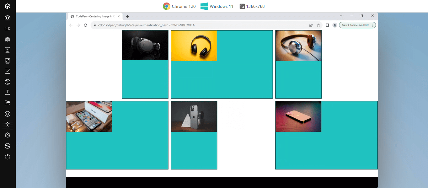
From the example above, the first grid item is set to align to the end of its appropriate axis, while the third grid item is set to start from the appropriate axis.
HTML:
|
1 2 3 4 5 6 7 8 9 10 11 12 13 14 15 16 17 18 19 20 21 22 23 24 25 26 27 28 29 30 31 32 33 34 35 36 37 |
<html lang="en"> <head> <meta charset="UTF-8"> <meta name="viewport" content="width=device-width, initial-scale=1.0"> <title>Centering Image in CSS: Gird - justify-self</title> </head> <body> <main> <section> <div> <img src="https://user-images.githubusercontent.com/78242022/284007720-d35c5f72-8d64-4ed8-8afc-f539a2a53d7e.jpg" alt=""> </div> <div> <img src="https://user-images.githubusercontent.com/78242022/284007721-72475fa5-bf2c-4689-85fb-42afc1ac05ae.jpg" alt=""> </div> <div> <img src="https://user-images.githubusercontent.com/78242022/284007729-f1549eaf-fb3b-4bbb-99c2-a9d51f7e25d0.jpg" alt=""> </div> <div> <img src="https://user-images.githubusercontent.com/78242022/284007728-51f5c876-537d-4fd7-aaca-cac078ff718b.jpg" alt=""> </div> <div> <img src="https://user-images.githubusercontent.com/78242022/284007726-7bfc1eaa-4536-480c-a017-4977b5f43fca.jpg" alt=""> </div> <div> <img src="https://user-images.githubusercontent.com/78242022/284007732-459ad872-1f92-45d9-aa6a-7b9010f7645b.jpg" alt=""> </div> </section> </main> </body> </html> |
CSS:
|
1 2 3 4 5 6 7 8 9 10 11 12 13 14 15 16 17 18 19 20 21 22 23 24 25 26 27 28 29 30 31 32 33 34 35 36 37 38 39 40 41 42 43 44 45 46 47 48 49 50 51 52 53 54 55 56 57 58 59 60 61 62 63 64 65 66 67 68 69 70 71 72 73 74 |
* { margin: 0; padding: 0; box-sizing: border-box; } :root { --teal-400: rgb(45 212 191); --teal-500: rgb(20 184 166); --teal-600: rgb(13 148 136); --teal-700: rgb(15 118 110); --teal-800: rgb(17 94 89); --teal-900: rgb(19 78 74); } body { width: 100vw; height: 100vh; } section { display: grid; grid-template-columns: repeat(3, 1fr); grid-auto-rows: 300px; justify-content: center; align-content: center; gap: 10px; } div { border: 2px solid var(--teal-900); background-color: var(--teal-400); transition: all 1s ease-out; } div:nth-child(1){ justify-self: end; } div:nth-child(3){ justify-self: start; } div:nth-child(5){ animation-name: roll; animation-duration: 1s; animation-delay: 0s; animation-timing-function: linear; animation-iteration-count: infinite; animation-fill-mode: forwards; animation-direction: alternate; } img { width: 200px; } @keyframes roll { 0% { justify-self: start; } 50%{ justify-self: center; } 100% { justify-self: end; } } @media screen and (max-width: 600px){ section { grid-template-columns: repeat(2, 1fr); } } |
Here, < section > tag serves as the parent tag with six direct < img > elements. The < section > element is set to a display of grid and grid-template-column of 3. With these, each grid item is split into 3 columns around the grid-container. With justify-self, individual items are re-aligned within the grid-container.
For example, the div:nth-child(1) is set to justify-self: end to reposition the image to the end position with the grid container.
See the Pen
Centering Image in CSS: Gird – justify-self by Ocxigin (@ocxigin)
on CodePen.
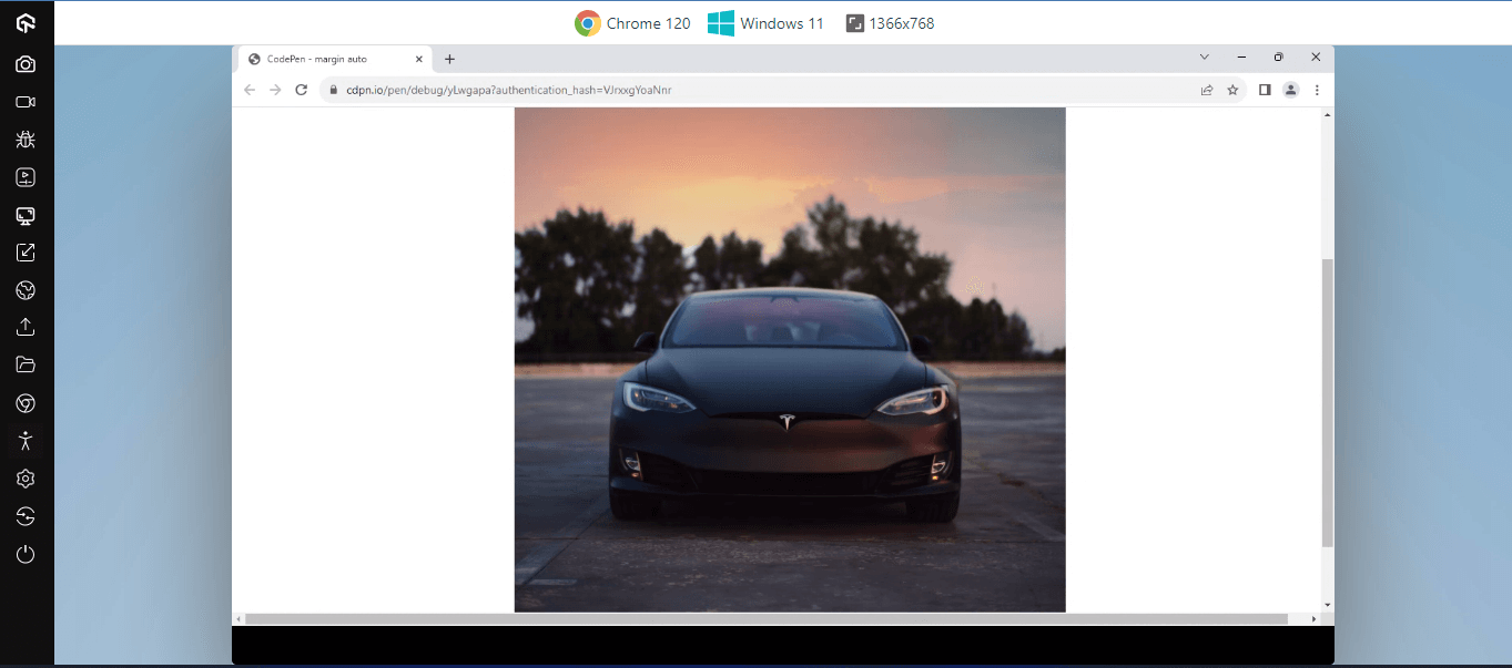
margin: auto
The margin property can be set to auto to automatically align an image in a block container to the center, based on the size of the parent.
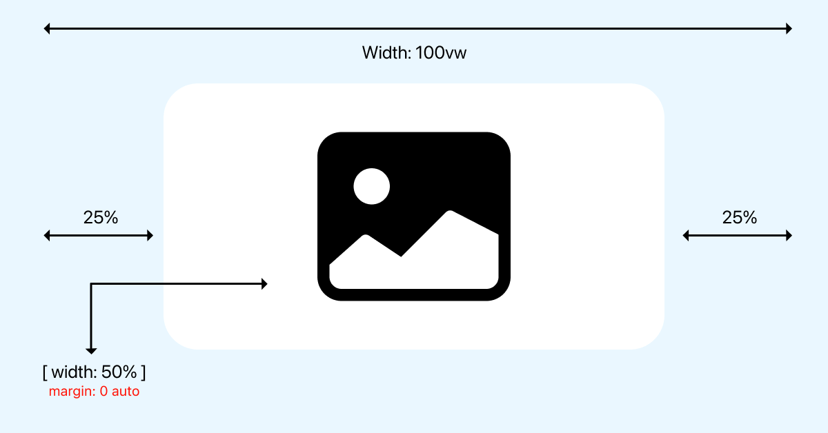
Specified element will occupy the space set by the width property and minus its width from the parent width.
The element will then be positioned in the middle of the page or containing the element, leaving the same proposition of space left and right of the element.
HTML:
|
1 2 3 4 5 |
<main> <section> <img src="https://user-images.githubusercontent.com/78242022/285645398-c1c1eec5-4e16-4a68-9216-b555264e7c10.jpg" alt=""> </section> </main> |
CSS:
|
1 2 3 4 5 6 7 8 9 10 11 12 13 |
main { width: 100vw; height: 100vh; } section { width: 50%; margin: 0 auto; } img { width: 100%; } |
The margin: auto is mainly used for block elements. As you can see from the code sample above, the < section > tag is set to occupy 50% of the parent container within the webpage. A margin: 0 auto is set to push the child element to the center of the page.
See the Pen
margin auto by Ocxigin (@ocxigin)
on CodePen.
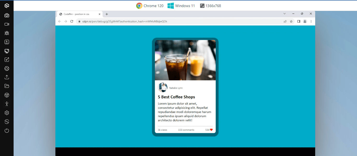
position
The position property is an effective way to center an image. With the position property, images or elements can be centered or positioned around the document using the position properties such as left, right, top, and bottom.
position: absolute property changes the stacking context of the document. Adding position: relative can help images or elements be centered around the parent element.
HTML:
|
1 2 3 4 5 6 7 8 9 10 11 12 13 14 15 16 17 18 19 20 21 22 23 24 25 26 27 28 29 30 31 32 33 34 35 36 37 38 39 40 |
<html lang="en"> <head> <meta charset="UTF-8"> <meta name="viewport" content="width=device-width, initial-scale=1.0"> <title>Centering Image in CSS: Position</title> <link rel="stylesheet" href="https://cdnjs.cloudflare.com/ajax/libs/font-awesome/6.5.1/css/all.min.css" integrity="sha512-DTOQO9RWCH3ppGqcWaEA1BIZOC6xxalwEsw9c2QQeAIftl+Vegovlnee1c9QX4TctnWMn13TZye+giMm8e2LwA==" crossorigin="anonymous" referrerpolicy="no-referrer" /> </head> <body> <main> <section> <aside class="card"> <heading> <img src="https://user-images.githubusercontent.com/78242022/286496886-005700e0-daf3-4029-ad07-8d69f94f143a.jpg" alt=""> </heading> <article> <div class="profile"> <figure> <img src="https://user-images.githubusercontent.com/78242022/283794643-4cea087e-3214-4331-84f8-fde21a8f22db.jpg" alt=""> </figure> <p class="para name">Natalie Lynn</p> </div> <div> <h1 class="heading-post">5 Best Coffee Shops</h1> <p class="para-content">Lorem ipsum dolor sit amet, consectetur adipisicing elit. Repellat repudiandae modi doloremque harum repellendus ipsam aliquid dolorum architecto dolorem velit!</p> </div> <hr /> <div class="reactions"> <p class="para view">3k views</p> <p class="para comments">153 comments</p> <p class="para likes">534 <i class="fa-solid fa-heart"></i></p> </div> </article> </aside> </section> </main> </body> </html> |
CSS:
|
1 2 3 4 5 6 7 8 9 10 11 12 13 14 15 16 17 18 19 20 21 22 23 24 25 26 27 28 29 30 31 32 33 34 35 36 37 38 39 40 41 42 43 44 45 46 47 48 49 50 51 52 53 54 55 56 57 58 59 60 61 62 63 64 65 66 67 68 69 70 71 72 73 74 75 76 77 78 79 80 81 82 83 84 85 86 87 88 89 90 91 92 93 94 |
*, *::before, *::after { margin: 0; padding: 0; box-sizing: border-box; } main { background-color: rgb(161, 99, 5); width: 100vw; height: 100svh; position: relative; } .card { width: 20em; background-color: #fff; border-radius: 10px; position: absolute; top: 50%; left: 50%; transform: translate(-50%, -50%); box-shadow: 0px 3px 2px 15px rgba(0, 0, 0, .4); } heading img { border-top-right-radius: 10px; border-top-left-radius: 10px; } img { width: 100%; } .heading-post { font-size: 1.5em; font-family: calibri; margin: 10px 0; } .profile { display: flex; justify-content: start; gap: 10px; } figure { display: block; width: 50px; height: 50px; border-radius: 50%; background-color: red; } figure img { width: 100%; height: 100%; object-position: left bottom; border-radius: 100px; } .para-content { font-size: 18px; font-family: calibri; padding-bottom: 20px; } .para { font-size: 14px; font-family: calibri; color: rgb(94, 94, 94); } .name { transform: translateY(20px); } .reactions { justify-content: space-between; display: flex; gap: 20px; margin-top: 10px; } article { padding: 0.5em 1em; } i { color: red; } |
From the above code, the position property effect can be seen from the position: absolute, top: 50%, and left: 50%. This helps reposition the card element at the center of the page relative to the < main > element.
See the Pen
position in css by Ocxigin (@ocxigin)
on CodePen.
transform: translate
The translate property sets how elements can be repositioned from their initial layout or document flow. For example, we could reposition images or elements around the document. To do this, we use the transform: translate property.
The transform: translate property has both X (horizontal) and Y (vertical) coordinates for horizontal and vertical positioning.
By default, elements are set to translate: 0px, meaning no translation is set. Using the length CSS units like px, em, rem, and %, images can be repositioned around the webpage.
HTML:
|
1 2 3 4 5 6 7 8 9 10 11 12 13 14 15 16 17 18 19 20 21 22 23 24 25 26 27 28 29 30 31 32 33 34 35 36 37 38 39 40 41 42 43 44 45 46 47 48 49 50 |
<html lang="en"> <head> <meta charset="UTF-8"> <meta name="viewport" content="width=device-width, initial-scale=1.0"> <title>Centering Image in CSS: Transform</title> <link rel="stylesheet" href="https://cdnjs.cloudflare.com/ajax/libs/font-awesome/6.5.1/css/all.min.css" integrity="sha512-DTOQO9RWCH3ppGqcWaEA1BIZOC6xxalwEsw9c2QQeAIftl+Vegovlnee1c9QX4TctnWMn13TZye+giMm8e2LwA==" crossorigin="anonymous" referrerpolicy="no-referrer" /> </head> <body> <main> <section> <!-- One --> <aside class="card one"> <div class="img-wrap"> <img src="https://user-images.githubusercontent.com/78242022/296800486-ffbf5777-4874-48c1-a162-31ee0f9ed7c8.jpg" alt=""> </div> <div class="content-wrap"> <h1>Fujifilm X-T10 Camera</h1> <p>$350</p> <button>Book Now</button> </div> </aside> <!-- Two --> <aside class="card two"> <div class="img-wrap"> <img src="https://user-images.githubusercontent.com/78242022/296800474-7f5d69c1-1829-414c-a8d3-0479b6b8697c.jpg" alt=""> </div> <div class="content-wrap"> <h1>NIKON D7200 Camera</h1> <p>$500</p> <button>Book Now</button> </div> </aside> <!-- Three --> <aside class="card three"> <div class="img-wrap"> <img src="https://user-images.githubusercontent.com/78242022/296800461-933e65ef-705c-42c2-adf5-0e04053bcfec.jpg" alt=""> </div> <div class="content-wrap"> <h1>NIKON D810 Camera</h1> <p>$230</p> <button>Book Now</button> </div> </aside> </section> </main> </body> </html> |
CSS:
|
1 2 3 4 5 6 7 8 9 10 11 12 13 14 15 16 17 18 19 20 21 22 23 24 25 26 27 28 29 30 31 32 33 34 35 36 37 38 39 40 41 42 43 44 45 46 47 48 49 50 51 52 53 54 55 56 57 58 59 60 61 62 63 64 65 66 67 68 69 70 71 72 73 74 |
*,*::after, *::before { margin: 0; padding: 0; box-sizing: border-box; } main { width: 100vw; height: 100svh; background-color: rgb(87, 87, 252); } .card { padding: 10px; display: flex; width: 20em; background-color: #fff; border-radius: 5px; box-shadow: 2px 2px 14px 2px rgba(0,0,0,.5); transform: translate(150%, 100%); } .card h1 { font-family: calibri; font-size: 12px; } button { background-color: #000; color: white; padding: 0.5em 1.5em; border: 0; cursor: pointer; transform: translateY(30px); transition: 0.5 opacity ease; } button:hover { background-color: rgb(87, 87, 252); } .img-wrap { width: 130px; } .img-wrap img { width: 100%; } .content-wrap { margin-left: 1em; } .card.two { margin: 2em 0; } @media screen and (max-width:820px ) { .card { transform: translate(100%, 50%); } } @media screen and (max-width:650px ) { .card { transform: translate(50%, 50%); } } @media screen and (max-width:500px ) { .card { transform: translate(30%, 50%); } } |
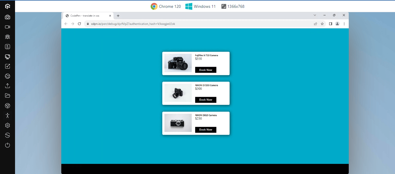
From the code sample above, the section element contains three card elements, and each element is set to a transform: translate of 150% on the horizontal axis and 100% on the vertical axis to realign the element around the webpage.
See the Pen
translate in css by Ocxigin (@ocxigin)
on CodePen.
Techniques for Centering an Image in CSS Within Container
Depending on how the image is included on the web, such as the < img /> tag or the background-image property we could use object-position or background-position CSS property to center images within its container. The image container refers to the element in which the image is embedded.
In this blog section on centering an image in CSS, we will learn different techniques that can be implemented to center an image within the container of the image using CSS.
background-position
The CSS background-position property is used to position images set by the background-image property within the element container. With the background-position property, we can specify the image’s position within the element container based on the value provided.
These values, however, consist of keywords top, button, left, right, and center—length units like px, em, rem,and %.
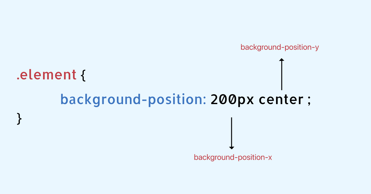
Additionally, the background-position property exists on X (horizontal) and Y (vertical) coordinates. With this, images can be positioned on a single coordinate or both (axis).
HTML:
|
1 2 3 4 5 6 7 8 9 10 11 12 13 14 15 16 17 18 19 20 21 22 23 24 25 26 27 |
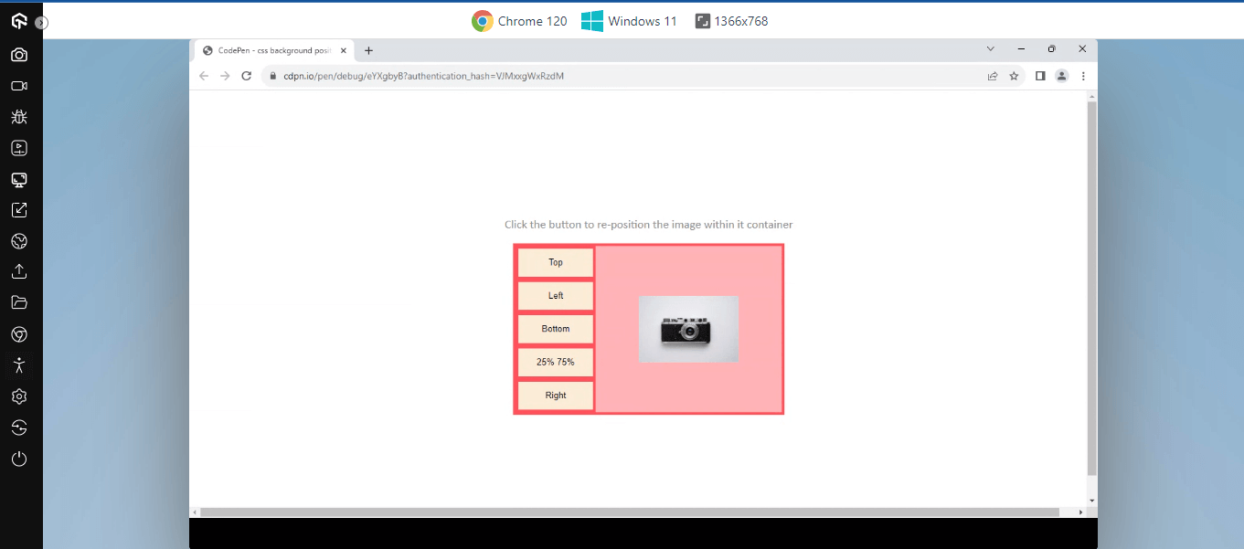
<html lang="en"> <head> <meta charset="UTF-8"> <meta name="viewport" content="width=device-width, initial-scale=1.0"> <title>CSS Background position property</title> </head> <body> <main> <section> <p>Click the button to re-position the image within it container</p> </section> <section class="container"> <aside class="btn"> <button>Top</button> <button>Left</button> <button>Bottom</button> <button>25% 75%</button> <button>Right</button> </aside> <aside class="bg-img"> </aside> </section> </main> </body> </html> |
CSS:
|
1 2 3 4 5 6 7 8 9 10 11 12 13 14 15 16 17 18 19 20 21 22 23 24 25 26 27 28 29 30 31 32 33 34 35 36 37 38 39 40 41 42 43 44 45 46 47 48 49 50 51 52 53 |
main { width: 100vw; height: 100svh; display: flex; justify-content: center; align-items: center; flex-direction: column; } .container { width: 400px; height: 250px; border: 4px solid rgb(252, 60, 92); display: flex; } .btn { width: 30%; height: 100%; background: rgb(255, 225, 230); } button { width: 100%; line-height: 40px; background-color: antiquewhite; border: 4px solid rgb(252, 60, 92); transition: background 0.5s linear; } button:hover { background-color: rgb(252, 60, 92); } button:active { box-shadow: inset 2px 2px 2px 2px rgba(0, 0, 0, 0.5); } .bg-img { width: 70%; height: 100%; background: rgb(255, 169, 183); background-image: url("https://user-images.githubusercontent.com/78242022/296800461-933e65ef-705c-42c2-adf5-0e04053bcfec.jpg"); transition: all 0.5s linear; background-repeat: no-repeat; background-size: 150px 100px; background-position: center; } p { font-family: calibri; font-size: 18px; color: #8d8989; } |
JavaScript:
|
1 2 3 4 5 6 7 8 9 10 11 12 13 14 15 16 17 18 19 20 21 22 23 24 25 26 27 28 29 30 31 32 33 34 35 |
const bgImage = document.querySelector('.bg-img'); const allButtons = document.querySelectorAll('button'); allButtons.forEach((button, idx)=> { if(idx === 0) { button.addEventListener('click', (e)=>{ bgImage.style.backgroundPosition = 'top'; }) } if(idx === 1) { button.addEventListener('click', (e)=>{ bgImage.style.backgroundPosition = 'left'; }) } if(idx === 2) { button.addEventListener('click', (e)=>{ bgImage.style.backgroundPosition = 'bottom'; }) } if(idx === 3) { button.addEventListener('click', (e)=>{ bgImage.style.backgroundPosition = '25% 75%'; }) } if(idx === 4) { button.addEventListener('click', (e)=>{ bgImage.style.backgroundPosition = 'right'; }) } }) |
Here, from the code above, we have the following functions
- The bgImage variable is used to store the background element. With this, an element can manipulate the background position of the image parsed to the element.
- The allButtons variable is used to store all the button elements.
With the allButtons variable, we added a forEach function to loop through each returned element (node list) and add an eventListener.
Using the if statement to check and change the background position of the element, if the index of the element clicked on is equal to the value parsed in.
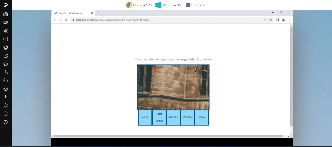
object-position
When images are included using the < img /> tag, using the object-position property can be very useful to reposition the image inside the parent box.
The object position property takes keyword values like; top, bottom, left, right, center, and length units such as px, rem, and em to position the image to a specific area within the parent box. It also takes % values to specify the position of the image relative to the parent width and height.
HTML:
|
1 2 3 4 5 6 7 8 9 10 11 12 13 14 15 16 17 18 19 20 21 22 23 24 25 26 27 |
<html lang="en"> <head> <meta charset="UTF-8"> <meta name="viewport" content="width=device-width, initial-scale=1.0"> </head> <body> <main> <section> <p>Click the button to re-position the image within it container</p> </section> <section class="container"> <aside class="bg-img"> <img src="https://user-images.githubusercontent.com/78242022/296851660-8ef8d6fc-49a8-40cd-bd99-cc1fc78f0020.jpg" alt="" id="image"> </aside> <aside class="btn"> <button>Left Top</button> <button>Right Bottom</button> <button>50% 50%</button> <button>25% 75%</button> <button>100px</button> </aside> </section> </main> </body> </html> |
CSS:
|
1 2 3 4 5 6 7 8 9 10 11 12 13 14 15 16 17 18 19 20 21 22 23 24 25 26 27 28 29 30 31 32 33 34 35 36 37 38 39 40 41 42 43 44 45 46 47 48 49 50 51 52 |
main { width: 100vw; height: 100svh; display: flex; justify-content: center; align-items: center; flex-direction: column; } .container { width: 400px; height: 250px; border: 4px solid rgb(2, 93, 129); } .btn { display: flex; height: fit-content; } button { width: 100%; line-height: 40px; background: rgb(149, 221, 250); border: 4px solid rgb(2, 93, 129); transition: background 0.5s linear; } button:hover { background-color: rgb(2, 93, 129)); } button:active { box-shadow: inset 2px 2px 2px 2px rgba(0, 0, 0, 0.5); } .bg-img { height: 100%; background: rgb(149, 221, 250); } p { font-family: calibri; font-size: 18px; color: #8d8989; } .bg-img img { display: block; width: 100%; object-fit: none; object-position: left; } |
JavaScript:
|
1 2 3 4 5 6 7 8 9 10 11 12 13 14 15 16 17 18 19 20 21 22 23 24 25 26 27 28 29 30 31 32 33 34 35 |
const image = document.querySelector('#image'); const allButtons = document.querySelectorAll('button'); allButtons.forEach((button, idx)=> { if(idx === 0) { button.addEventListener('click', (e)=>{ image.style.objectPosition = 'left top'; }) } if(idx === 1) { button.addEventListener('click', (e)=>{ image.style.objectPosition = 'right bottom'; }) } if(idx === 2) { button.addEventListener('click', (e)=>{ image.style.objectPosition = '50% 50%'; }) } if(idx === 3) { button.addEventListener('click', (e)=>{ image.style.objectPosition = '25% 75%'; }) } if(idx === 4) { button.addEventListener('click', (e)=>{ image.style.objectPosition = '100px'; }) } }) |
See the Pen
object position by Ocxigin (@ocxigin)
on CodePen.
Tips for Centering an Image in CSS
CSS properties play a huge role in how images are centered and positioned around the webpage or within the element container. However, other factors such as the image container, image size, scaling, and image data determine how images are positioned on the web page.
In this section, we’ll explain tips for centering an image in CSS within the containing element to create a structured and responsive layout.
Image Container
The image container plays a huge role in how images are centered on the web. The image container is simply the direct parent element that the < img /> tag is nested in. For example, if you create a < div > tag and place an < img /> tag inside the < div > tag, the < div > is the parent element (image container), not the < img /> tag itself.
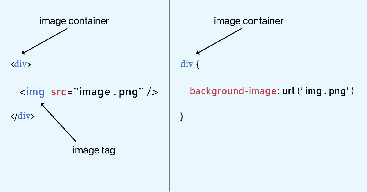
However, if you import the image with the background-image CSS property on a < div > tag. The < div > that received the image as its background image is the image container.
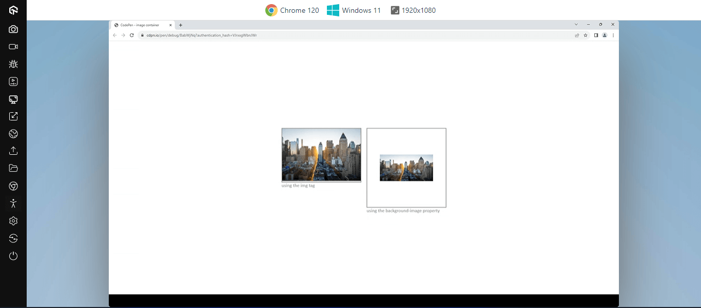
From the image above, we have two image containers, the two image containers are centered around the page using flexbox. However, the second image on the right is centered within its container using the background-position property.
HTML:
|
1 2 3 4 5 6 7 8 9 10 11 12 13 14 15 16 17 18 19 20 21 22 23 24 25 26 27 |
<html lang="en"> <head> <meta charset="UTF-8"> <meta name="viewport" content="width=device-width, initial-scale=1.0"> <title>Document</title> </head> <body> <main> <section> <aside class="card one"> <div> <img src="https://user-images.githubusercontent.com/78242022/297184236-b744205c-36be-4162-a1d9-e390102dd462.jpg" alt=""> </div> <p>using the img tag</p> </aside> <aside class="card two"> <div> <!-- we are using the background-image property to import image --> </div> <p>using the background-image property</p> </aside> </section> </main> </body> </html> |
CSS:
|
1 2 3 4 5 6 7 8 9 10 11 12 13 14 15 16 17 18 19 20 21 22 23 24 25 26 27 28 29 30 31 32 33 34 35 36 37 38 39 40 41 42 43 44 45 46 47 48 49 50 51 52 53 54 55 56 57 58 59 60 |
*, *::after, *::before { padding: 0; margin: 0; box-sizing: border-box; } main { width: 100vw; height: 100svh; display: flex; justify-content: center; align-items: center; flex-direction: column; } section { display: flex; justify-content: center; align-items: center; gap: 20px; } .card { width: 300px; height: 300px; } img { width: 100%; } div { border: 2px solid #8d8989; width: 100%; } .card.two div { height: 300px; width: 300px; background-image: url("https://user-images.githubusercontent.com/78242022/297184236-b744205c-36be-4162-a1d9-e390102dd462.jpg"); background-repeat: no-repeat; background-size: 200px 100px; background-position: center; } p { font-family: calibri; font-size: 18px; color: #8d8989; } @media screen and (max-width: 650px) { section { margin-top: 2em; flex-direction: column; } } |
This CSS code includes styling for a responsive layout with flexbox and card dimensions. Each card is styled as follows.
- Card one: From the first card element, the width and height are set to 300px, respectively, and inside this element, we nested a < img > tag and set the width to 100% to inherit the default size of the element.
- Card two: From the second element, the width and height are set to 300px, respectively. With the background-image property, we specify an image and set the size using the background-size property. The image is then centered with the background-position property.
The containing element is essential and plays a huge role in centering elements on the web when proper sizing is implemented.
See the Pen
image container by Ocxigin (@ocxigin)
on CodePen.
Sizing Images
Images come in large file sizes, making it impossible to center on the web page. Unsized images can lead to unwanted scrollbars and break the page layout. Most images pop out of the element box when it is not size.
The essence of sizing or resizing images in CSS is to ensure consistency across multiple and different elements and for images to take the shape of an element or layout.
CSS itself does not directly handle the content of images, but it does provide properties and rules that allow you to control the size of images within HTML documents.
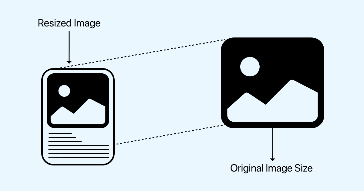
With the width, max-width, min-width, height, min-height, and max-height properties, we can resize images with CSS to fit within the image container.
From the browser output above, each image is resized to fit into the container of the image element, making it easy to position around the webpage and within the image container.
HTML:
|
1 2 3 4 5 6 7 8 9 10 11 12 13 14 15 16 17 18 19 20 21 22 23 24 25 26 27 28 29 30 31 32 33 34 35 36 37 38 39 40 41 42 43 44 45 46 47 48 49 50 51 52 53 54 55 56 57 58 59 |
<html lang="en"> <head> <meta charset="UTF-8"> <meta name="viewport" content="width=device-width, initial-scale=1.0"> <link rel="stylesheet" href="https://cdnjs.cloudflare.com/ajax/libs/font-awesome/6.5.1/css/all.min.css" integrity="sha512-DTOQO9RWCH3ppGqcWaEA1BIZOC6xxalwEsw9c2QQeAIftl+Vegovlnee1c9QX4TctnWMn13TZye+giMm8e2LwA==" crossorigin="anonymous" referrerpolicy="no-referrer" /> </head> <body> <main> <section> <aside class="card card-one"> <div> <img src="https://user-images.githubusercontent.com/78242022/297385859-05ce3e2a-d20d-4390-a4eb-d2aea03ceb87.jpg" alt="" class="head-img"> </div> <div> <h1>New York</h1> <p class="street para">Street</p> <p class="save para">Travel now</p> <div class="circle-dots"> <span class="circle circle-red"></span> <span class="circle circle-blue"></span> <span class="circle circle-orange"></span> <span class="circle circle-purple"></span> </div> <div> <button class="btn"> <i class="fa-solid fa-cart-shopping"></i> <span>add to cart</span> </button> </div> </div> </aside> <aside class="card card-two"> <div> <img src="https://user-images.githubusercontent.com/78242022/297184256-d7d58744-1082-4567-9d1e-3f9569894783.jpg" alt="" class="head-img"> </div> <div> <h1>New York</h1> <p class="street para">Street</p> <p class="save para">take a trip</p> <div class="circle-dots"> <span class="circle circle-red"></span> <span class="circle circle-blue"></span> <span class="circle circle-orange"></span> <span class="circle circle-purple"></span> </div> <div> <button class="btn"> <i class="fa-solid fa-cart-shopping"></i> <span>add to cart</span> </button> </div> </div> </aside> </section> </main> </body> </html> |
CSS:
|
1 2 3 4 5 6 7 8 9 10 11 12 13 14 15 16 17 18 19 20 21 22 23 24 25 26 27 28 29 30 31 32 33 34 35 36 37 38 39 40 41 42 43 44 45 46 47 48 49 50 51 52 53 54 55 56 57 58 59 60 61 62 63 64 65 66 67 68 69 70 71 72 73 74 75 76 77 78 79 80 81 82 83 84 85 86 87 88 89 90 91 92 93 94 95 96 97 98 99 100 101 |
*, *::after, *::before { padding: 0; margin: 0; box-sizing: border-box; } body { background-color: rgb(122, 12, 224); } main { width: 100vw; height: 100svh; } section { display: flex; justify-content: center; align-items: center; height: 100vh; gap: 20px; } .card { width: 200px; background-color: #fff; padding: .5em; border-radius: 5px; } .card .head-img { width: 100%; height: 200px; border-radius: 5px; object-fit: cover; } .card-two .head-img { border-radius: 100px; } h1 { font-family: calibri; margin: 0.2em 0; } .para { font-family: calibri; font-size: 18px; color: #8d8989; } .street { color: black; } .circle-dots { display: flex; } .circle { border-radius: 100px; width: 15px; height: 15px; margin: .2em .2em; } .circle-red { background-color: red; } .circle-blue { background-color: blue; } .circle-orange { background-color: orange; } .circle-purple { background-color: purple; } .btn { margin-top: .9em; background-color: black; color: white; border-radius: 5px; width: 100%; padding: .5em; border: none; cursor: pointer; transition: all 0.5s linear; } .btn:hover { background-color: wheat; color: black; } .btn:active { transform: translateY(4px); } |
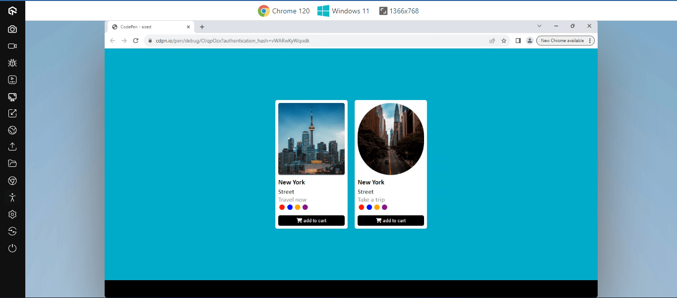
From the code above, the < img > element with a class of head-img is set to 100% width and 200px height. This enables each image to fit into the parent container. However, the second < img > is set to a border-radius of 100px to round the image to a circle.
See the Pen
sized by Ocxigin (@ocxigin)
on CodePen.
Scaling Images
The best way to scale images in CSS is by sizing, but sometimes this is not enough, especially when the image aspect ratio, resolution, or orientation does not correspond to the width and height of the image-container. The image can easily become distorted or compressed.
This is not good for readability purposes as visitors might find it difficult to read the content on the image.
To fix this, CSS provides properties such as object-fit, margin: auto, aspect-ratio, background-size, flex-grow, and flex-basis.
These properties are very useful for creating and developing responsive layouts. This ensures images are responsive relative to the device or screen resolution that loads the image.
When the aspect ratio of images is maintained across different viewports, it prevents distortion and leads to more fitting looks on the webpage.
HTML:
|
1 2 3 4 5 6 7 8 9 10 11 12 13 14 15 16 17 18 19 20 21 22 23 24 25 26 27 28 29 30 31 32 33 34 35 |
<html lang="en"> <head> <meta charset="UTF-8"> <meta name="viewport" content="width=device-width, initial-scale=1.0"> </head> <body> <main> <section class="viewport view-1"> <aside> <img src="https://user-images.githubusercontent.com/78242022/297184256-d7d58744-1082-4567-9d1e-3f9569894783.jpg" alt=""> </aside> </section> <section class="viewport view-2"> <aside> <img src="https://user-images.githubusercontent.com/78242022/297184256-d7d58744-1082-4567-9d1e-3f9569894783.jpg" alt=""> </aside> </section> <section class="viewport view-3"> <aside> <img src="https://user-images.githubusercontent.com/78242022/297184256-d7d58744-1082-4567-9d1e-3f9569894783.jpg" alt=""> </aside> </section> <section class="viewport view-4"> <aside> <img src="https://user-images.githubusercontent.com/78242022/297184256-d7d58744-1082-4567-9d1e-3f9569894783.jpg" alt=""> </aside> </section> </main> </body> </html> |
CSS:
|
1 2 3 4 5 6 7 8 9 10 11 12 13 14 15 16 17 18 19 20 21 22 23 24 25 26 27 28 29 30 31 32 33 34 35 36 37 38 39 40 41 42 43 44 45 46 47 48 49 50 51 52 53 54 55 56 57 58 59 60 61 62 63 |
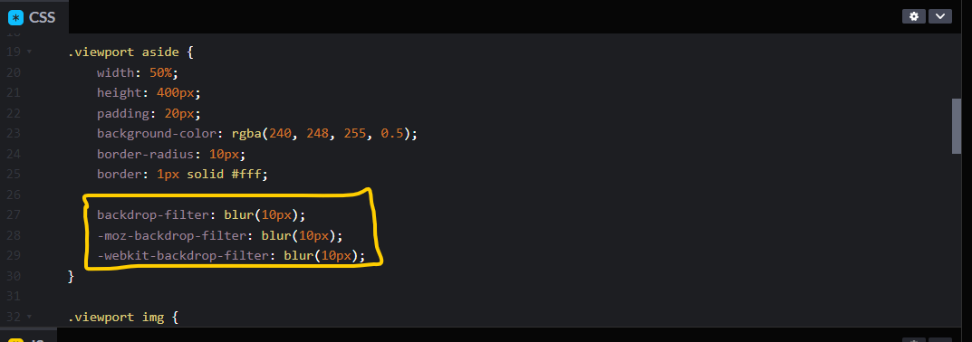
*, *::after, *::before { padding: 0; margin: 0; box-sizing: border-box; } body { background-color: rgb(43, 43, 255); } .viewport { width: 100%; height: 100svh; display: flex; justify-content: center; align-items: center; } .viewport aside { width: 50%; height: 400px; padding: 20px; background-color: rgba(240, 248, 255, 0.5); border-radius: 10px; border: 1px solid #fff; backdrop-filter: blur(10px); -moz-backdrop-filter: blur(10px); -webkit-backdrop-filter: blur(10px); } .viewport img { width: 100%; height: 100%; border-radius: 10px; } .view-1 img { object-fit: cover; } .view-2 img { object-fit: contain; } .view-3 aside { aspect-ratio: 16 / 9; flex-grow: 1; } .view-3 img { object-fit: cover; } .view-4 aside { aspect-ratio: 1 / 1; width: 30%; } .view-4 img { object-fit: cover; } |
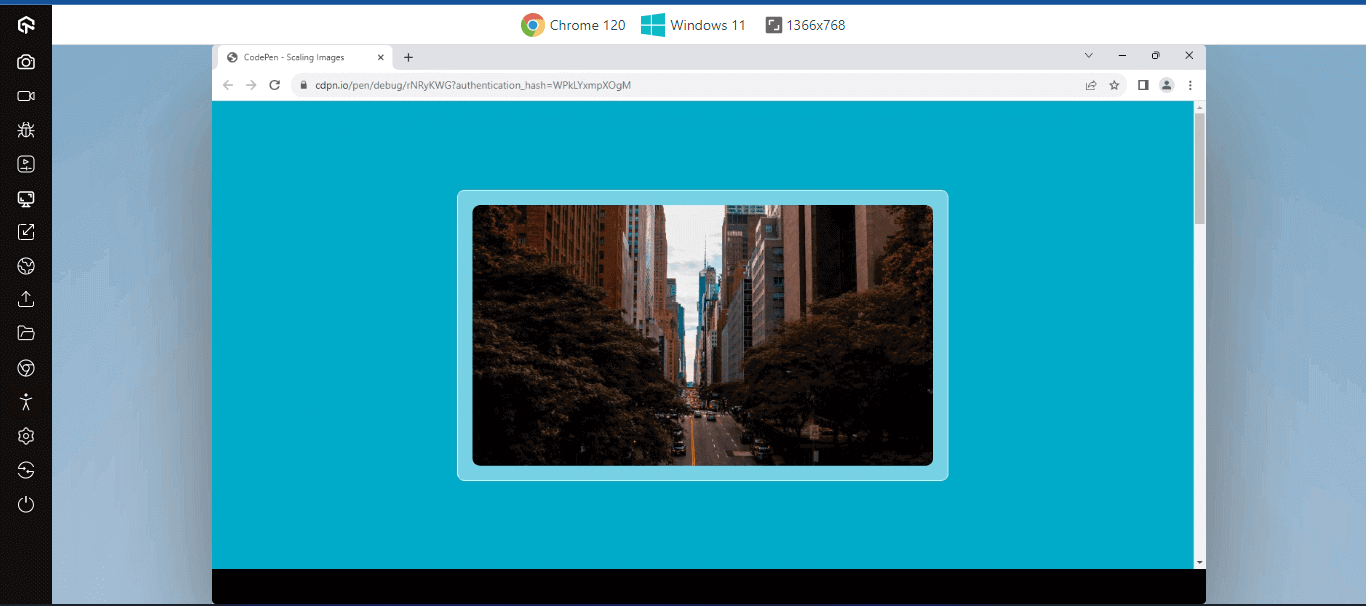
From the code above, object-fit cover, object-fit contain, and aspect-ratio property is used to set the four < img > elements to scale relative to the parent element, creating a responsive layout across different viewports.
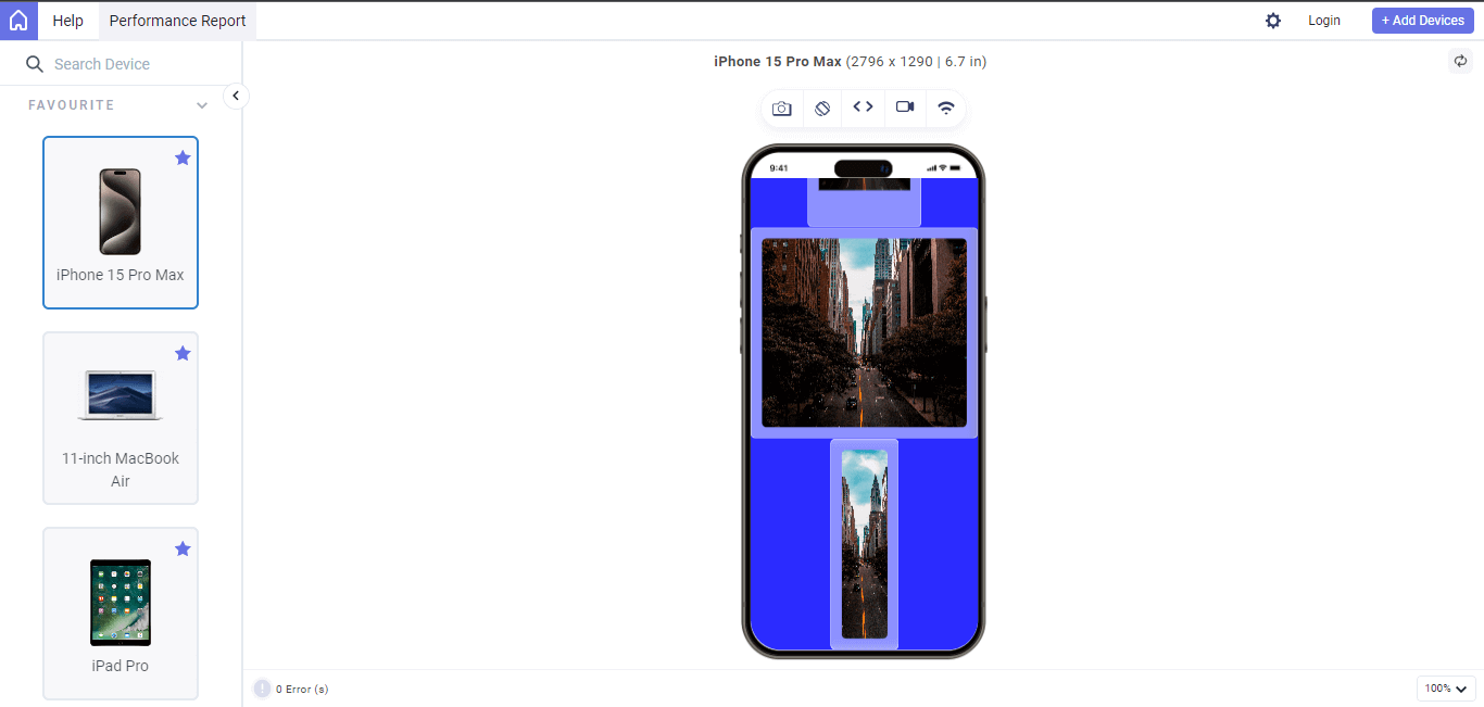
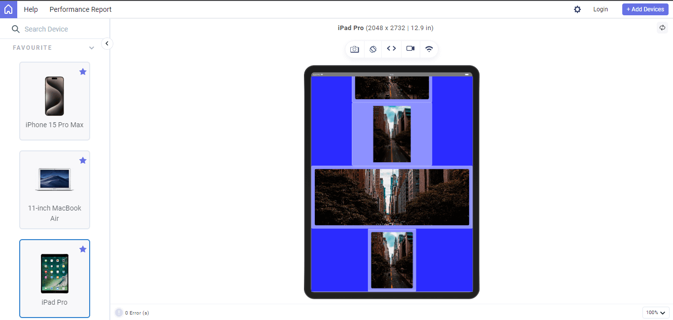
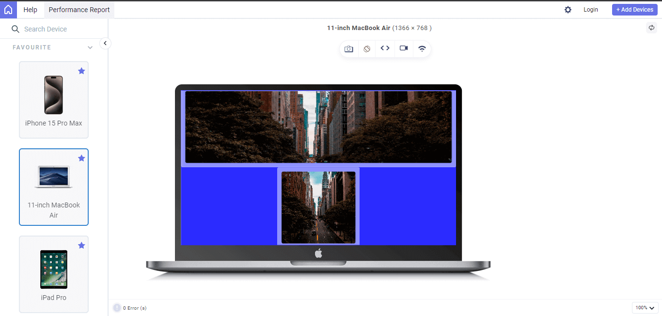
For example, the images below show a good use case using the LT Browser. The scaled images display responsively across different screen sizes for better navigation.
LT Browser is a free, Chromium-based web browser specifically for web developers. It excels at responsive testing and debugging websites and web applications across different screen sizes. This makes it an ideal tool for ensuring your image centering in CSS works flawlessly on all platforms.
Loaded with 53+ pre-installed device viewports, LT Browser includes popular mobiles, tablets, and desktops. It allows you to see how your website reacts across various screen sizes and resolutions. This lets you instantly check if your CSS image centering adapts properly. You can identify issues like images overflowing the content area, cropped unexpectedly, or inconsistent spacing on different devices.
Mobile:
Tablet:
Laptop:
Get to know the different features that LT Browsers offers. Check out the tutorial below:
Catch up on the latest testing tutorials around Selenium automation, Cypress testing, and more. Subscribe to the LambdaTest YouTube Channel for quick updates.
Image Data/Metadata
Image data refers to the data that makes up the content of the actual image, such as pixel information, size, orientation, resolution, RGB color mode, etc. The image data determines how the image in the browser is rendered and how it will be affected or positioned with CSS styling.
However, in the content of the image metadata, which differs from the image data, the image metadata deals with the extra text information that describes what the image is about. For example the name of the image, the date and time it was taken, and the name of the software or camera used to create the image.
The image metadata is very useful and can improve search engine optimization, making images easy to discover and providing accurate details to protect an image against copyright infringement.
Browser Compatibility
Centering images on the web heavily relies on CSS. It provides properties for styling and controlling the appearance and positioning of images on the web. However, due to browser incompatibility with some CSS properties, certain browsers might not load some properties, leading to unexpected image breaking.
To check and fix this, we can use AI-powered test orchestration and execution platforms like LambdaTest to test how the images on our websites are centered across multiple browsers such as Chrome, Firefox, Opera, Safari, Brave, etc. This platform offers an online browser farm of real desktop and mobile environments. Cross browser testing gives visual feedback on how web elements render on the web pages. This makes it easy to visually test and debug web elements on the web page.
Also, CSS properties browser support can be checked via CanIUse to understand when and how to implement such properties for better optimization.
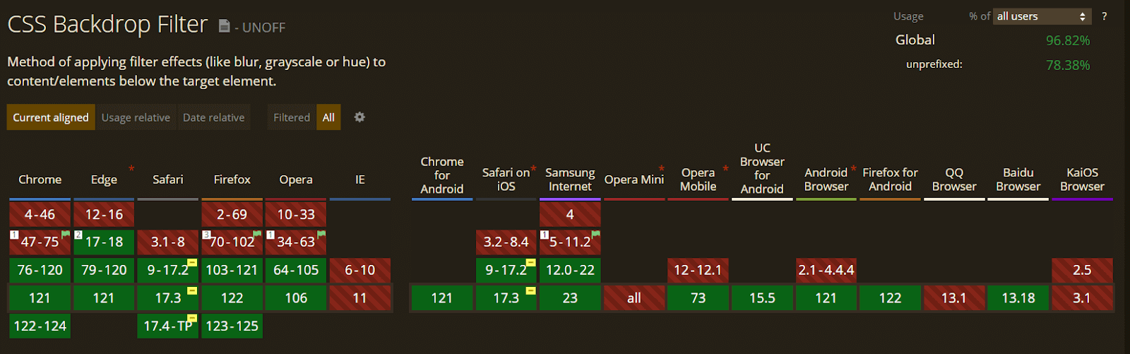
For example, the background-filter used in the last example is partially supported in Safari and requires the use of -webkit- prefix for rendering the background-filter property.
Ensuring CSS properties used in centering images are well-supported or prefixed can help prevent unwanted or poor image rendering.
Conclusion
In this guide, we explained how to center images in CSS and its significance.
We also discussed two techniques of centering an image in CSS: within a page and in a container.
In the technique for centering an image in CSS within the web page, we explained using properties like flexbox, grid, margin: auto, position properties, and transform: translate property and how they can be implemented in centering images around the web page.
And in the technique for centering images in CSS within its container, we highlight the use of background-position and object-position properties as a method for positioning images within the element container.
We also touched upon other important factors that affect centering an image in CSS, such as the image container, sizing, scaling, and browser compatibility.
Frequently Asked Questions (FAQs)
How do I center an image in CSS?
For horizontal centering, wrap your image in a div and set text-align: center for the div. Alternatively, use margin: 0 auto on the image itself, but remember to set a width if needed. The flexbox approach involves setting the container’s display to flex and justify-content to center.
How to position an image in CSS?
The test automation pyramid is a graphical strategy model for automating software testing. The model divides testing types into three layers based on the return on investment (ROI) provided by automating that specific type.
How do I center an absolute image in CSS?
To center an absolute image horizontally, set position: absolute, left: 50%, and transform: translateX(-50%). For vertical centering, add top: 50% and transform: translateY(-50%). Remember, absolute positioning removes the image from the normal document flow, so it won’t interact with other elements as expected.


Author’s Profile
Alex Anie
A Front End Technical Writer. I write blogs on Front End Technologies, such as HTML, CSS, JavaScript. When I am not coding, I enjoy watching tutorials and listening to twitter spaces. I live in Lagos, Nigeria
Blogs: 16
Got Questions? Drop them on LambdaTest Community. Visit now


