
CSS Form Design Elements: How to Style Them?
Aakash Rao
Posted On: March 26, 2024
 101321 Views
 29 Min Read
Forms are the building blocks that allow websites to interact with users. They collect information, from email addresses for subscriptions to feedback on software products, which is necessary for the websites to function. But a broken piece of form can be a real turn-off.
If a business form doesn’t work properly due to browser compatibility or other technical glitches, it can hurt the business by reducing sales or sign-ups and affecting its reputation. This is where Cascading Style Sheets (CSS) come to the rescue. CSS provides powerful tools for editing and customizing CSS form design elements. Styling elements of CSS form design allows developers to bridge the gap by integrating forms with the entire web design.
This blog will help you cover the styling elements of CSS form design. From text input and selection to checkboxes and radio buttons, we will explore different techniques and best practices, equipping you with the knowledge and skills to take form designs to the next level.
TABLE OF CONTENTS
- Importance of Styling CSS Form Design Elements
- Prerequisites for Styling Elements of CSS Form Design
- Common Issues with the Native Styles of the Form Elements
- Styling the CSS Form Design Elements
- Applying CSS Media Queries to CSS Form Design Elements
- Responsive Testing of CSS Form Design Elements
- Cross-Browser Compatibility Testing of the Form Elements
- How to Make Accessible Forms With Custom Form Elements?
- Frequently Asked Questions (FAQs)
Importance of Styling CSS Form Design Elements
Other than cross-browser compatibility, the rendering speed of a CSS form design also matters. This can directly affect a business by impacting user experience, conversion rates, and search engine rankings. A slow-loading form that is not properly styled can lead to frustration, lower conversions, and reduced online visibility.
Another good reason for styling forms is the (default) form elements that come with the native styles across different browsers. Each browser integrates the default form element styles separately, resulting in a fragmented user experience.
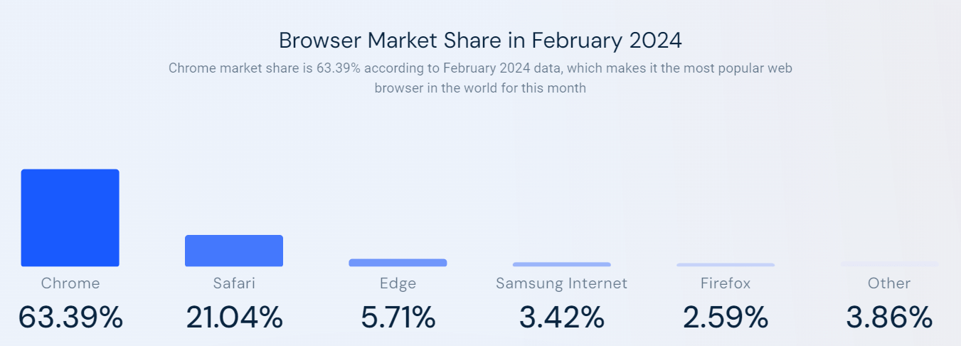
According to SimilarWeb, the market share of Chrome is 63.39%, making it the most popular web browser. It is followed by Safari (21.04%), Edge (5.71%), Samsung Internet (3.42%), Firefox (2.59%), and others.
While Chrome may have the highest market share, it’s also essential to consider users’ experience on other browsers. CSS form design styling elements are important for businesses because they help create a unified and visually appealing interface. Users’ trust and confidence in a brand increase when they see well-designed forms complementing the website’s aesthetics.
This, in turn, encourages more participation and increases the likelihood of completing the forms, whether submitting feedback, placing an order, or applying for a job. Therefore, it is crucial to ensure cross-browser compatibility of the elements of CSS form design while developing it for websites.
Prerequisites for Styling Elements of CSS Form Design
Before diving into the exciting world of CSS form design styling elements, it’s important to consider the prerequisites for achieving the desired results. Firstly, having a solid understanding of HTML and CSS will be helpful.
You should also be familiar with the basic structure and properties of CSS forms. This knowledge forms the foundation for customizing and styling form elements effectively. Depending on the level of control you require, you can take several approaches.
One common method is using CSS frameworks or libraries that provide pre-styled form components, which can be customized further to match the design. Another approach involves using CSS pseudo-classes and pseudo-elements to target specific elements of CSS form design and apply custom styles.
See the Pen
CSS Form Design Tutorial – Custom Form Elements with CSS by Aakash Rao (@aakash_codes)
on CodePen.
Common Issues With the Native Styles of the Form Elements
A typical CSS form design includes text fields, checkboxes, radio buttons, and dropdown menus. However, it may appear differently across web browsers due to the default browser integration of the form elements.
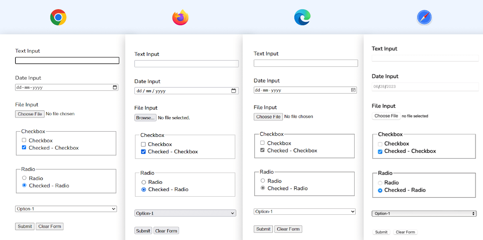
This inconsistency can affect the overall user experience and make maintaining a cohesive design across different browsers challenging. With custom styling of the CSS form design elements, developers can overcome browser-specific quirks and inconsistencies in how form elements are displayed.
Adding custom styling to CSS form design elements gives developers more control and flexibility over how they look and behave. Let’s explore some additional reasons why custom styling of the form elements is beneficial:
- Consistent User Interface: Custom styling of form elements allows developers to achieve a consistent look and behavior, ensuring the forms maintain a unified user interface regardless of the user’s browser or device.
- Accessibility: By applying specific styles to focused or active states, using appropriate color contrasts, focusing on CSS form design accessibility with internationalization and localization, and providing clear visual feedback, developers can enhance the usability of form elements for individuals with visual impairments or motor disabilities·
- Visual Hierarchy: The styling elements of CSS form design establish a visual hierarchy within the forms. You can use different colors, typography, and spacing to emphasize essential form elements, such as required fields or form submission buttons. This helps users understand the purpose and significance of each element.
- Improved User Experience: Customizing the appearance can enhance the user experience by making your CSS form design more visually intuitive and easier to use. Custom styles can provide visual cues and feedback to guide users through the form-filling process·
Implementing these accessibility features benefits users with disabilities and enhances the overall user experience for everyone. Improved color contrasts make form elements easier to identify and interact with, even in different lighting conditions or on various devices. Design that is inclusive benefits all parties involved by making the digital space more accessible and welcoming·
Now that we’ve explored some of the importance of styling the CSS form design elements, let’s now dive deeper into the custom styling of individual form elements.
Styling the CSS Form Design Elements
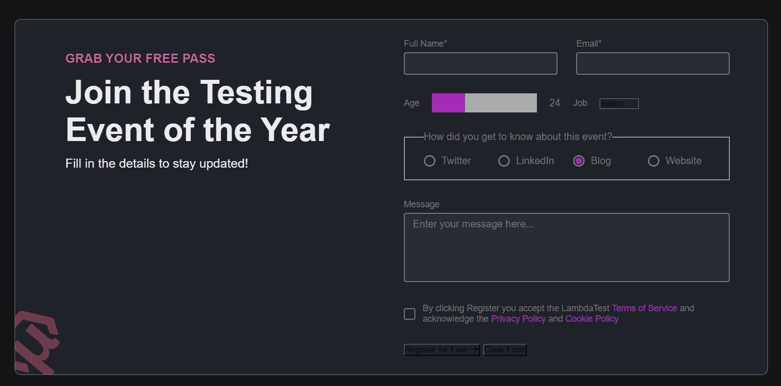
By applying the magic of CSS, we can transform plain input fields, buttons, and more into visually pleasing elements that effortlessly blend with the website’s design.
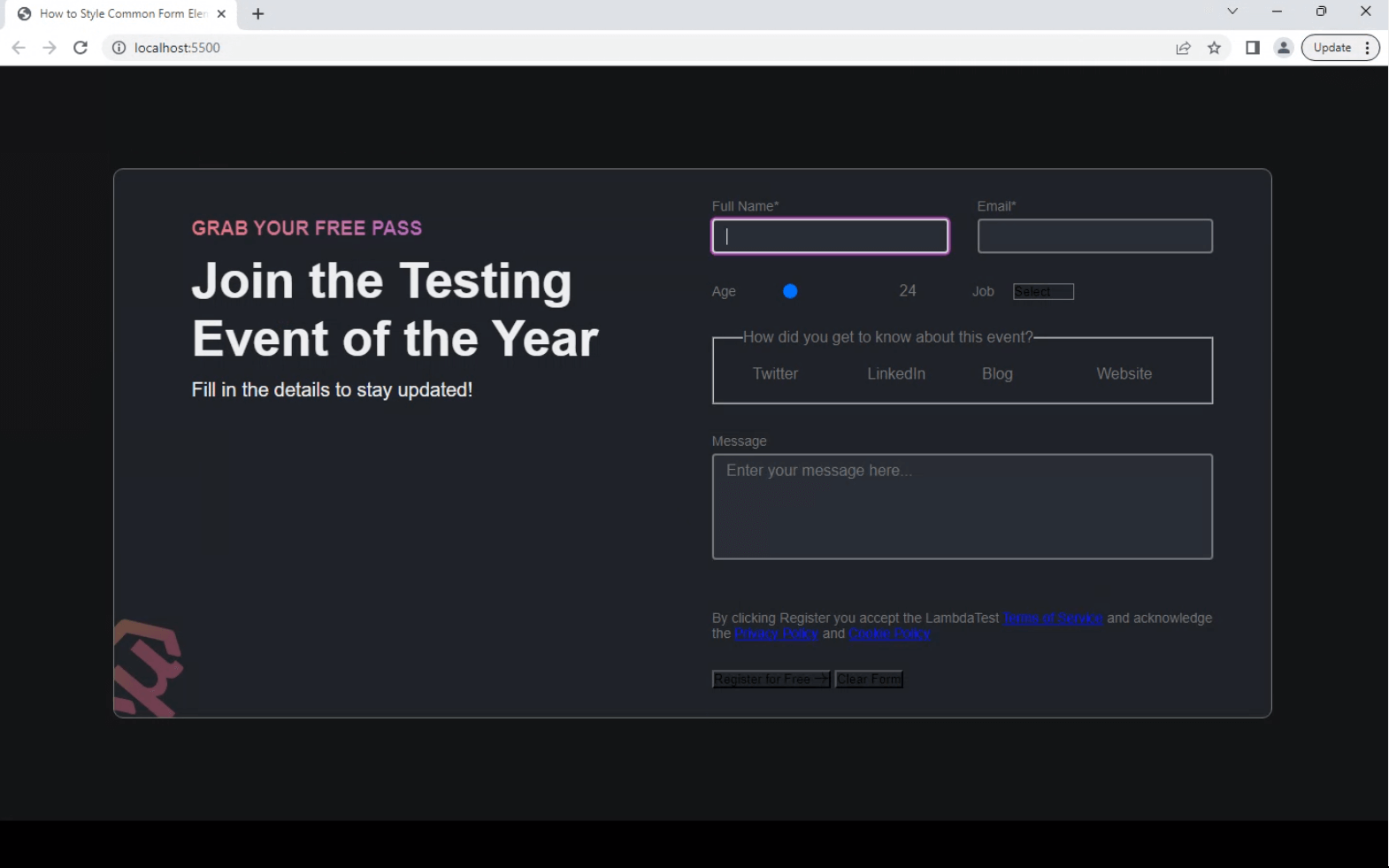
Create the Base HTML for the Project
|
1 2 3 4 5 6 7 8 9 10 11 12 13 14 15 16 17 18 19 20 21 22 23 24 25 26 27 28 29 30 31 32 33 34 35 36 37 38 39 40 41 42 43 44 45 46 47 48 49 50 51 52 53 54 55 56 57 58 59 60 61 62 63 64 65 66 67 68 69 70 71 72 73 74 75 76 77 78 79 80 81 82 83 84 85 86 87 88 89 90 91 92 93 94 95 96 97 98 99 100 101 102 103 104 105 106 107 108 109 110 111 112 113 114 115 116 117 118 119 120 121 122 123 124 125 126 127 128 129 130 131 132 133 134 135 136 137 138 139 140 141 142 143 144 145 146 147 148 149 150 151 152 153 154 155 156 157 158 159 160 161 162 163 164 165 166 167 |
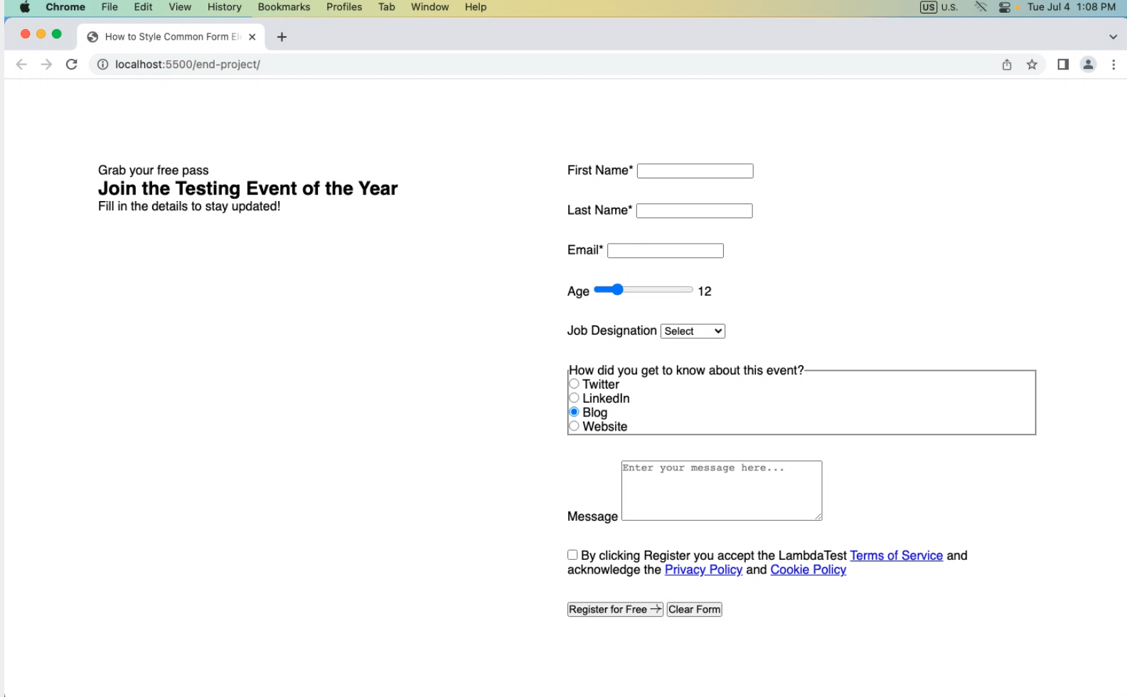
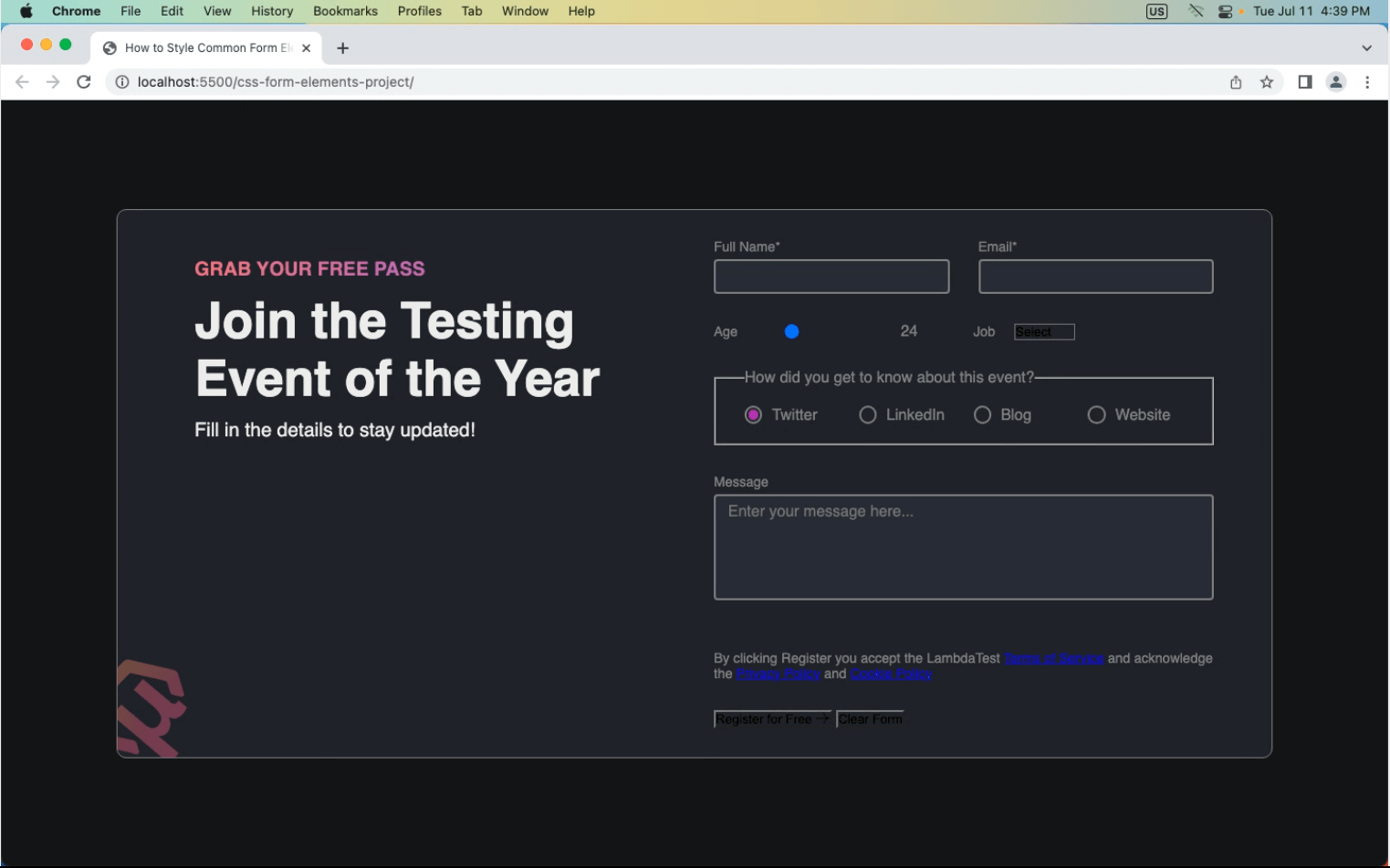
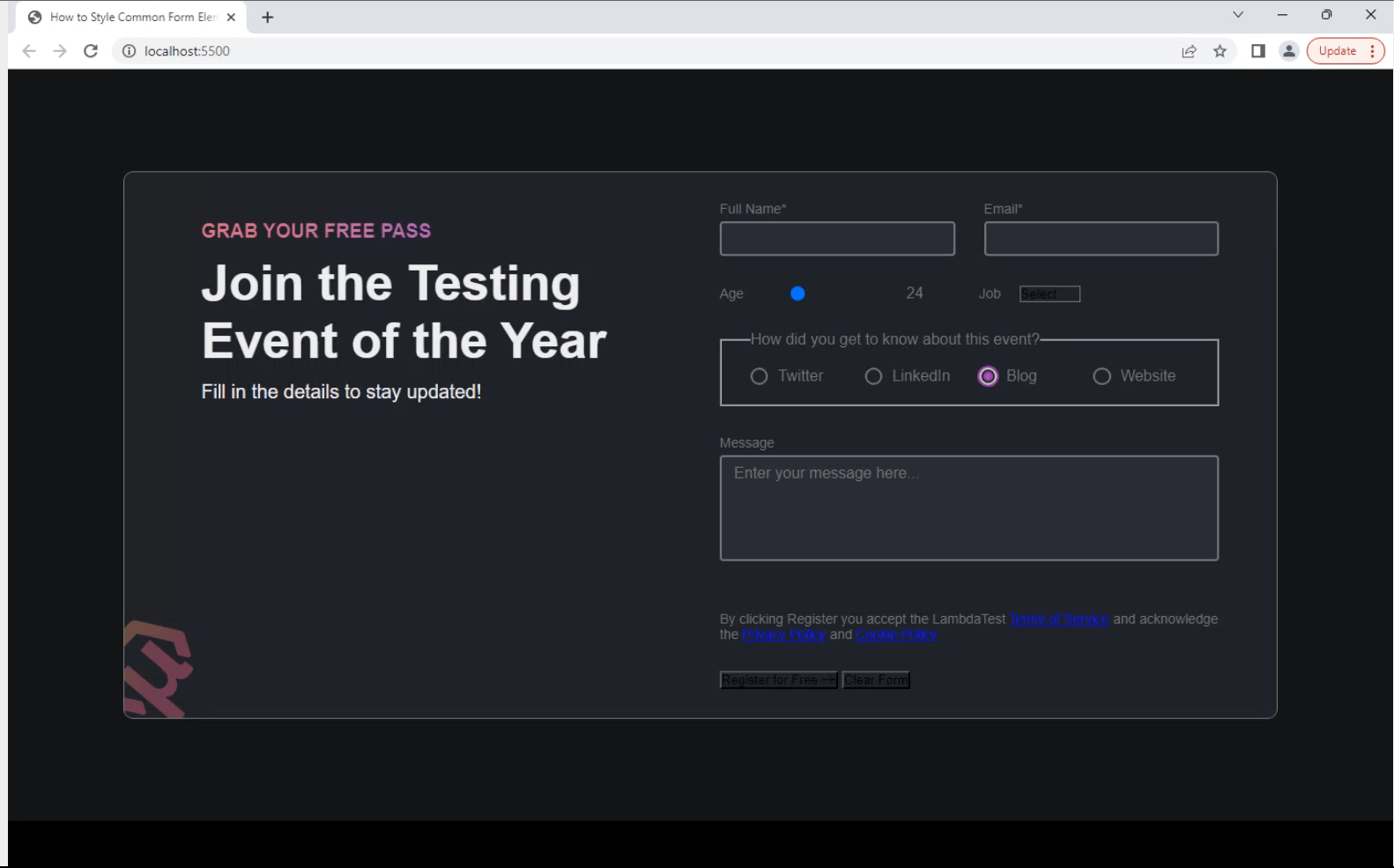
<!DOCTYPE html> <html lang="en"> <head> <meta charset="UTF-8" /> <meta http-equiv="X-UA-Compatible" content="IE=edge" /> <meta name="viewport" content="width=device-width, initial-scale=1.0" /> <link rel="stylesheet" href="./style.css" /> <title>How to Style Common Form Elements with CSS</title> <link rel="stylesheet" href="./styles.css" /> </head> <body> <main class="form-container"> <!-- EVENT INFO --> <div class="info"> <p>Grab your free pass</p> <h1>Join the Testing Event of the Year</h1> <p>Fill in the details to stay updated!</p> </div> <!-- FORM --> <form class="form" id="form"> <div class="col text-input"> <!-- NAME --> <div> <label for="name">Full Name*</label> <input type="text" class="input" id="name" required /> </div> <!-- EMAIL --> <div> <label for="email">Email*</label> <input type="email" class="input" id="email" required /> </div> </div> <div class="col range-select"> <!-- AGE GROUP --> <div class="range-container"> <label for="inputAge">Age</label> <input type="range" id="inputAge" min="12" max="60" value="24" /> <span class="range-value">24</span> </div> <!-- DESIGNATION --> <div class="select-container"> <label for="basic-select">Job</label> <div class="select"> <select class="basic-select"> <option value="select">Select</option> <option value="designer">Designer</option> <option value="developer">Developer</option> <option value="tester">Tester</option> <option value="manager">Manager</option> <option value="other">Other</option> </select> <span class="focus"></span> </div> </div> </div> <!-- GOT TO KNOW? --> <div class="radio-container"> <fieldset> <legend>How did you get to know about this event?</legend> <div class="radio"> <input type="radio" class="input" id="radioTwitter" name="social" /> <label for="radioTwitter">Twitter</label> </div> <div class="radio"> <input type="radio" class="input" id="radioLinkedIn" name="social" /> <label for="radioLinkedIn">LinkedIn</label> </div> <div class="radio"> <input type="radio" class="input" id="radioBlog" name="social" checked /> <label for="radioBlog">Blog</label> </div> <div class="radio"> <input type="radio" class="input" id="radioWebsite" name="social" /> <label for="radioWebsite">Website</label> </div> </fieldset> </div> <!-- MESSAGE --> <div class="textarea-container"> <label for="inputMessage">Message</label> <textarea class="input" id="inputMessage" cols="30" rows="5" placeholder="Enter your message here..." ></textarea> </div> <!-- CHECKBOX AND TERMS --> <div class="checkbox-container"> <input type="checkbox" class="input" id="inputCheckbox" /> <label for="inputCheckbox"> By clicking Register you accept the LambdaTest <a href="https://www.lambdatest.com/legal/terms-of-service" >Terms of Service</a > and acknowledge the <a href="https://www.lambdatest.com/legal/privacy" >Privacy Policy</a > and <a href="https://www.lambdatest.com/legal/cookie">Cookie Policy </a> </label> </div> <div class="buttons"> <button type="submit" id="subbtn"> Register for Free <img width="15" src="https://www.lambdatest.com/resources/images/testu/testmu_arr.svg" alt="arrow" /> </button> <button type="reset" id="rstbtn">Clear Form</button> </div> </form> </main> <script src="./script.js"></script> </body> </html> |
Now that the starter HTML code is ready let’s look at how to reset the default styles applied by browsers.
Reset the Styles for Form Elements
Resetting the default styles applied by the browser allows developers to start with a clean slate and apply their own custom styles to achieve a consistent design across different browsers and platforms.
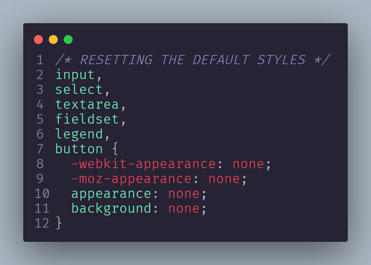
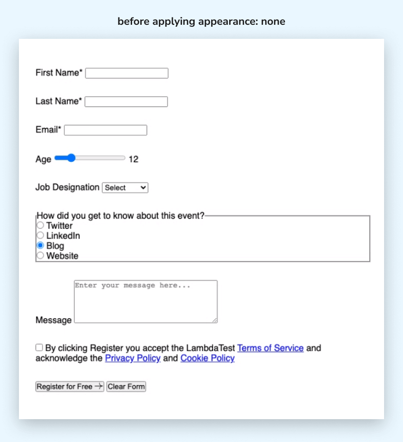
You can reset the styles of form elements with properties such as margin, padding, border, box-sizing, and background. As the starting point for applying all the elements, you can use the appearance: none; to remove the default borders and browser-specific appearances. To make sure that this property works on all different browsers, you can use the vendor prefix.
A vendor prefix is a unique identifier for a particular browser appended to the property name in a special code. That prefix is -webkit- for Chrome, Safari, and more recent iterations of Edge and Opera. The -moz- prefix is used by Firefox.
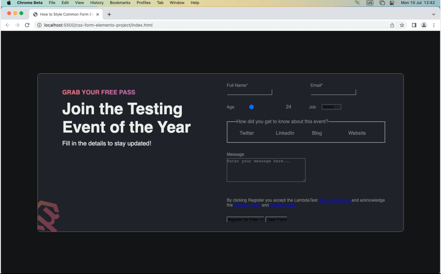
Before applying appearance: none
After applying appearance: none
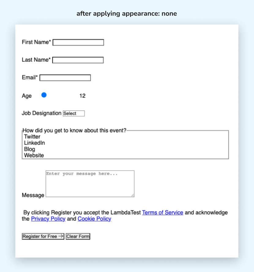
You can notice the changes in the two examples above. We removed the default border, background, and other visual styles from the text input and textarea fields. We also hid the default checkbox and radio buttons for the checkbox and radio button elements.
For the <select> element (dropdown-list), the default dropdown arrow and styling were hidden, and the default button styles were removed. For the range slider the default styling of the range slider was hidden.
Another reset that is popularly used by all CSS developers is often referred to as CSS normalization or normalizing.
It helps to improve cross-browser consistency in the HTML element default styling of the browser’s user agent. Using the universal selector that matches any element on the webpage, we can add a basic normalization to reset the margin and padding to 0 and box-sizing with the value of border-box.
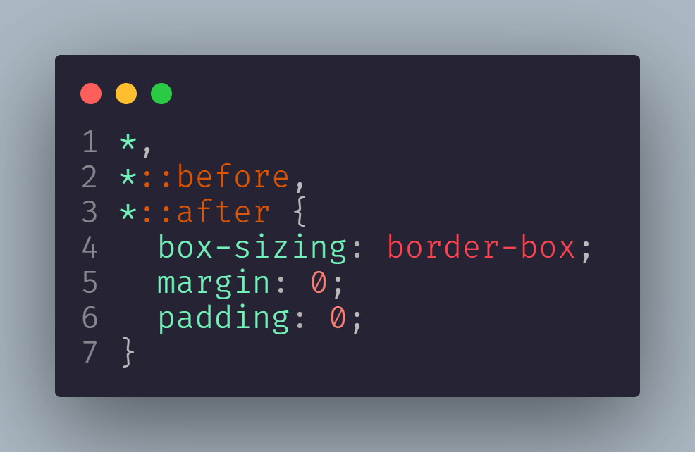
You can also use Normalize.css, a complete stylesheet containing all the styles for normalizing CSS. After resetting the styles, we can apply the custom styles to the form elements.
Set Base Styles, CSS Variables, and Spacing Between Form Elements
Let’s start by setting some CSS variables for the theming of form elements.
We will use hsl(), one of the CSS color functions, which provides a more intuitive and flexible way to specify colors.
You can also use RGB colors, which add additive color mixing by combining different intensities of red, green, and blue light to create colors. I prefer to use HSL colors, as they allow developers to easily adjust hue, saturation, and lightness independently, resulting in greater control and simplicity in color manipulation.
CSS:
|
1 2 3 4 5 6 7 8 9 10 11 12 13 14 |
:root { --color-primary: hsl(210, 5%, 8%); --color-secondary: hsl(220, 13%, 14%); --color-text: hsl(0, 0%, 93%); --color-accent: hsl(292, 61%, 44%); --input-border: hsl(0, 0%, 46%); --input-border-focus: hsl(0, 0%, 80%); --gradient-1: linear-gradient( 90.11deg, hsl(351, 68%, 66%) 0.04%, hsl(256, 98%, 66%) 98.71% ); --gradient-2: linear-gradient(90deg, hsl(10, 66%, 66%), hsl(292, 61%, 44%)); } |
For the base styles, you can use the HTML selector to reset the font size of the document to 62.5%. And to place the form container at the center, you can simply use the CSS Flexbox.
HTML:
|
1 2 3 4 5 6 7 8 9 10 11 12 13 14 15 16 17 18 19 20 21 22 23 |
html { font-size: 62.5%; } *, *::before, *::after { box-sizing: border-box; margin: 0; padding: 0; } body { font-family: 'Roboto', sans-serif; min-height: 100vh; padding: 2rem 1rem; display: flex; place-items: center; background-color: var(--color-primary); font-size: 16px; } |
Now that we’ve covered some base styles, let’s focus on the layout structure. We will use CSS Grid most, as it gives us the flexibility to define the size of columns to better control our layout structure.
CSS:
|
1 2 3 4 5 6 7 8 9 10 11 12 13 14 15 16 17 18 19 20 21 22 23 24 25 26 27 28 29 30 31 32 33 34 35 36 37 38 39 40 41 42 43 44 45 46 47 48 49 50 51 52 53 54 55 56 57 58 59 60 61 62 63 |
/* body {} ...existing styles */ .form-container { display: grid; grid-template-columns: 1fr 1fr; justify-content: space-between; gap: 4rem; max-width: 1200px; margin: 0 auto; padding: 3rem 6rem; } /* RESETTING THE DEFAULT STYLES */ input, select, textarea, fieldset, legend, button { -webkit-appearance: none; -moz-appearance: none; appearance: none; } /* FOR FORM ELEMENTS STRUCTURE */ .col.text-input { display: grid; grid-template-columns: 1fr 1fr; gap: 3rem; } .col > div { width: 100%; } .form > div:not(:last-child) { margin-bottom: 3rem; } .col.range-select, .range-container, .select-container { display: flex; align-items: center; gap: 2rem; } .col.text-input > div > label, .textarea-container > label { margin-bottom: 0.5rem; } form > div > label, form > div > div > label { display: block; font-size: 1.4rem; } |
Output:
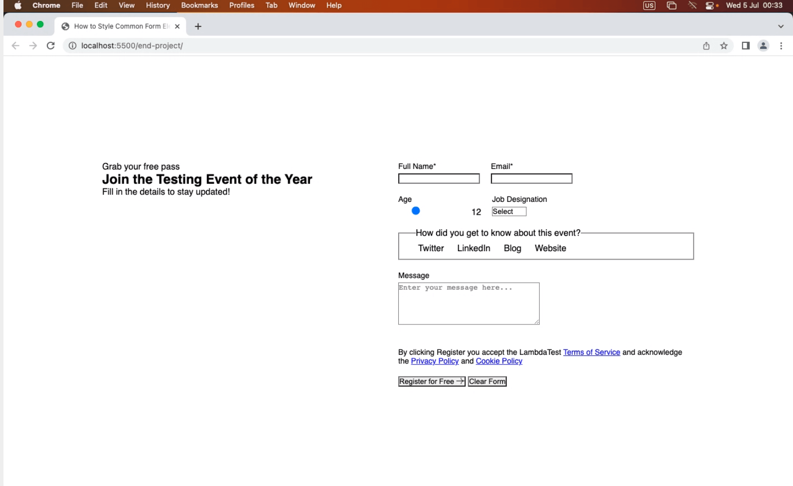
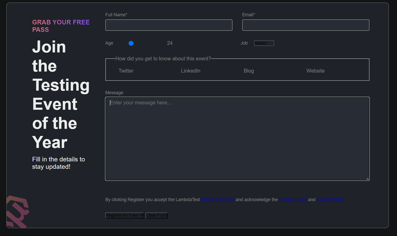
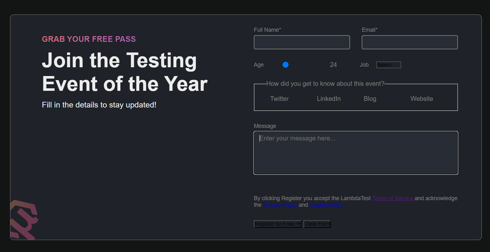
Now that our layout structure is ready with the spacing, we can finally work on adding the styles for our theme and the info container and its text.
CSS:
|
1 2 3 4 5 6 7 8 9 10 11 12 13 14 15 16 17 18 19 20 21 22 23 24 25 26 27 28 29 30 31 32 33 34 35 36 37 38 39 40 41 42 43 44 45 46 47 48 49 50 51 52 53 54 55 56 57 58 |
body { /* ...STYLES ... */ background-color: var(--color-primary); } .form-container { /* ...STYLES ... */ border: 1px solid var(--input-border); border-radius: 10px; background: var(--color-secondary); position: relative; } /* INFO SECTION */ .info { margin: 2rem 0 0 2rem; color: var(--color-text); } .info p:first-child { font-size: 2rem; margin-bottom: 1.2rem; text-transform: uppercase; font-weight: 600; background: var(--gradient-1); background-clip: text; -webkit-background-clip: text; -webkit-text-fill-color: transparent; } .info::before { content: ''; width: 120px; height: 120px; position: absolute; bottom: 0; left: 0; background: url('https://www.lambdatest.com/resources/images/testu/testuicon.svg') no-repeat; background-size: contain; } .info h1 { font-size: 52px; margin-bottom: 1.2rem; } .info p:last-child { font-size: 2rem; } |
Output:
Now that we have our layout and base structure ready with the theme and background, let’s finally explore the styling of individual form elements.
Input and Textarea Fields
Input and textarea fields allow users to enter and submit textual information. They can be used for various purposes, such as collecting names, email addresses, passwords, or messages. Let’s explore how to apply styles to make them look consistent on different browsers.
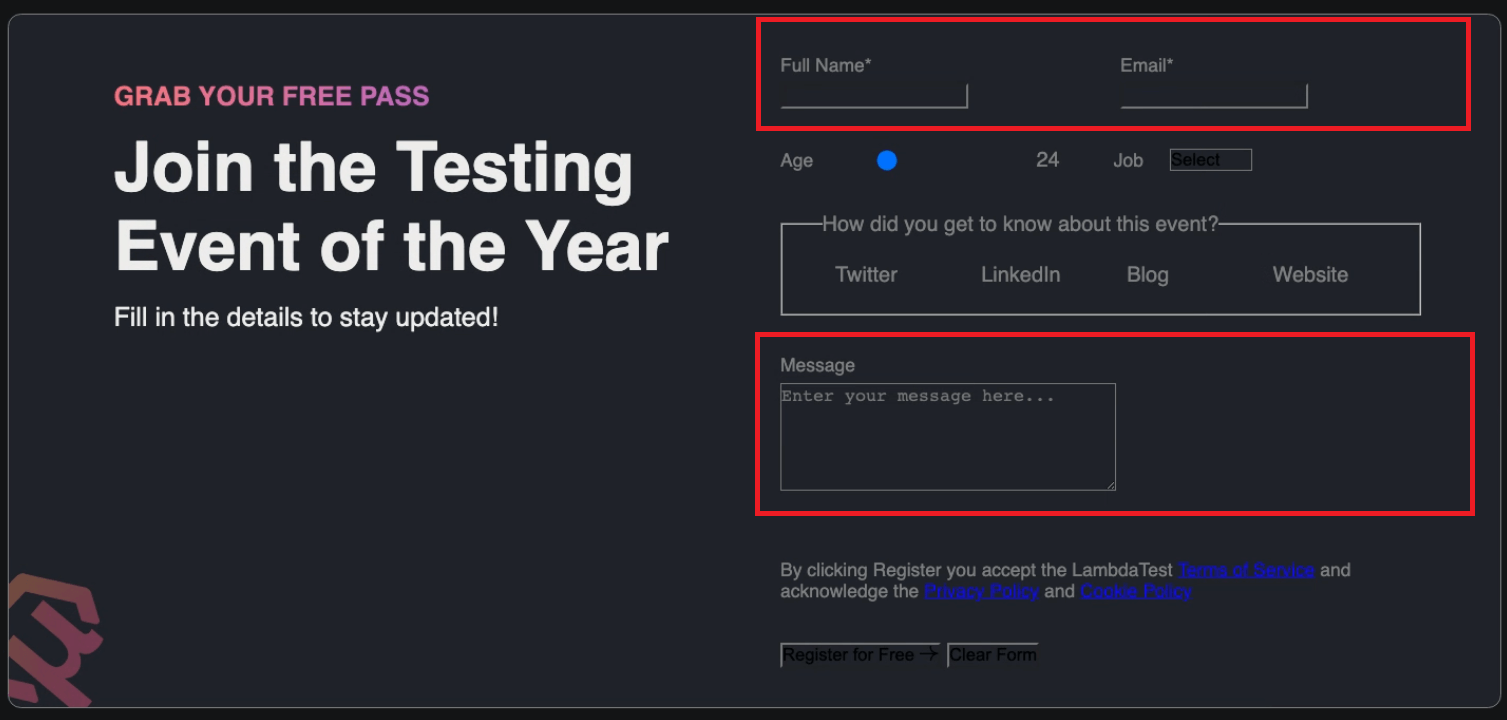
The input fields text, email, and textarea—do not have any styles added yet. Let’s give those fields some styles to improve their appearance.
CSS:
|
1 2 3 4 5 6 7 8 9 10 11 12 13 14 15 |
/* ... existing styles */ input[type='text'], input[type='email'], textarea { width: 100%; font-family: inherit; font-size: 16px; padding: 0.45em 0.8em; background-color: hsl(220, 13%, 18%); color: var(--color-text); border: 2px solid var(--input-border); border-radius: 4px; } |
One important thing to notice here is that the textarea field is resizable. This can cause an issue when a user accidentally breaks the layout or structure of the form elements with a few clicks. This issue can be easily fixed using a simple property called resize by setting its value to none and giving a min-height to the textarea element.
|
1 2 3 4 |
textarea { min-height: 110px; resize: none; } |
Before setting the textarea to resize:
After setting the textarea to resize:
Now, let’s add some styles for the focused state for both the input and textarea fields.
|
1 2 3 4 5 6 7 8 9 10 |
/* ... existing styles */ input[type='text']:focus, input[type='email']:focus, textarea:focus { border-color: var(--input-border-focus); box-shadow: 0 0 0 2px var(--color-accent); outline: 3px solid transparent; } |
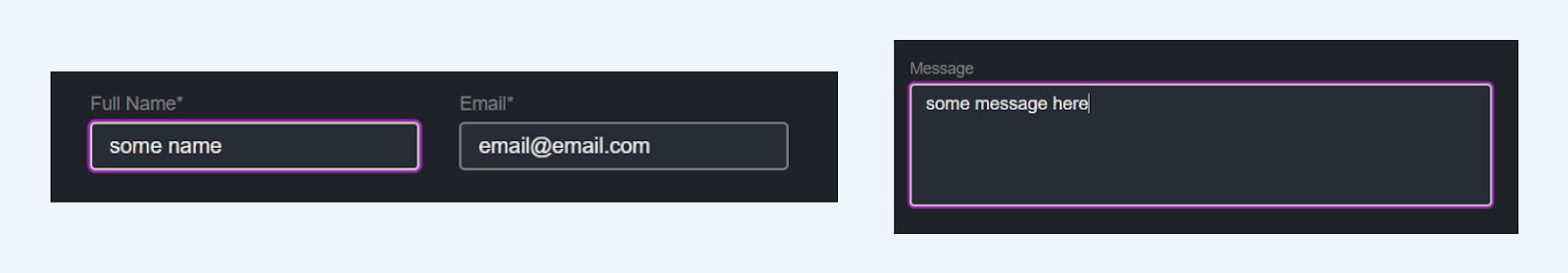
Output:
See the Pen
CSS Form Design Tutorial – Input and Textarea Fields by Aakash Rao (@aakash_codes)
on CodePen.
Checkbox and Radio Buttons
Checkboxes and radio buttons are common elements used in CSS form design. Checkboxes allow users to select multiple options from a list, whereas radio buttons allow users to select a single option.
These interactive controls visually represent choices and enable users to make selections easily. Styling them significantly changes the overall CSS form design. Let’s explore how to style them individually.
Starting with the radio buttons – for now, they no longer have their default styling, such as the circular shape and the dot indicating selection.
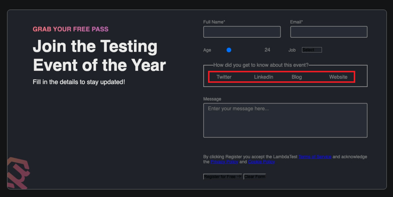
Let’s start with styles to bring the ring back by adding width, height, and border to the element and making the font and color inherit from the parent.
|
1 2 3 4 5 6 7 8 |
input[type='radio'] { font: inherit; color: currentColor; width: 1.15em; height: 1.15em; border: 0.15em solid var(--input-border); border-radius: 50%; } |
You can notice that we got our ring back for the radio input, but there is still one part missing: the circle inside the ring in the checked state. For that, we can use the ::before pseudo-element, and displays it when a user tries to check a radio.
The ::before pseudo-element is typically used to insert content before the content of an element. It creates an imaginary element that comes before the actual content of the selected element in the document tree.
|
1 2 3 4 5 6 7 8 9 10 11 12 13 14 15 16 17 18 19 20 |
input[type='radio'] { /* ... existing styles */ display: grid; place-content: center; } input[type='radio']::before { content: ''; width: 0.65em; height: 0.65em; border-radius: 50%; transform: scale(0); transition: 120ms transform ease-in-out; box-shadow: inset 1em 1em var(--color-accent); } input[type='radio']:checked::before { transform: scale(1); } |
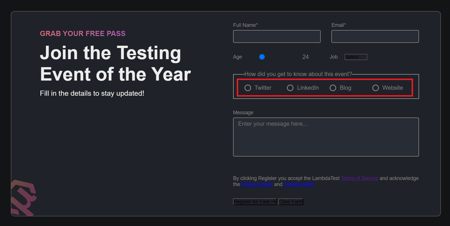
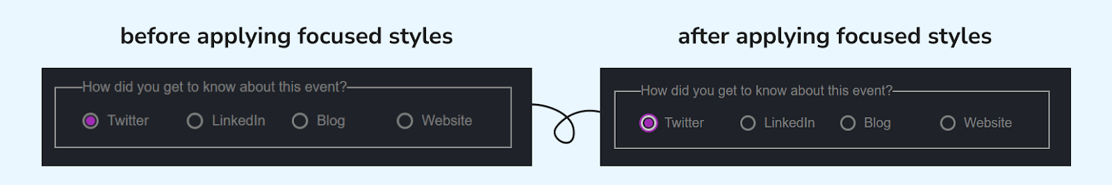
Now, we have the radio element perfectly looking with the custom theme required for the design. Let’s now add some styles to the radio element for the focused state using the :focus pseudo-class. Also, make the cursor pointer for the label of radio elements.
|
1 2 3 4 5 6 7 8 9 10 11 |
/* ... existing styles */ input[type='radio']:focus { border-color: var(--input-border-focus); box-shadow: 0 0 0 2px var(--color-accent); outline: 3px solid transparent; } .radio > label { cursor: pointer; } |
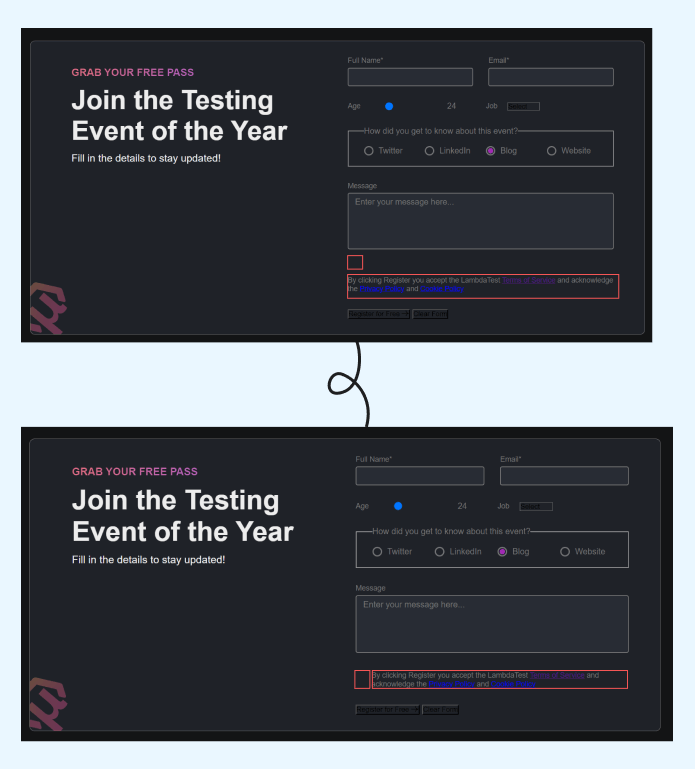
Moving onto the checkbox element, first, we need to structure its label to make them look side by side since we have all our <label> elements set to display to block. We can achieve this with a CSS Grid and apply two columns to the checkbox container.
|
1 2 3 4 5 6 |
.checkbox-container { display: grid; grid-template-columns: 15px 1fr; gap: 1.5rem; align-items: center; } |
Next, we can add some styles to bring back our checkbox element. We start by applying some specific resets, including inheriting the font styles to ensure em produces the desired sizing outcome and adding the border for our checkbox along with some border-radius.
|
1 2 3 4 5 6 7 8 |
input[type='checkbox'] { font: inherit; color: currentColor; width: 1.15em; height: 1.15em; border: 2px solid var(--input-border); border-radius: 0.15em; } |
Next, to prepare for the incoming pseudo-element (checkbox-tick), you first need to change the display behavior of the input to use the grid since it’s the quickest way to make them align the ::before to the horizontal and vertical center of our custom control.
|
1 2 3 4 5 6 |
input[type='checkbox'] { /* ... existing styles */ display: grid; place-content: center; } |
It’s time to bring in our ::before pseudo-element, which will be styled to represent the :checked state. We create the ::before element, including a transition, and use transform to hide it with scale(0).
Finally, when the input is :checked, you can make it visible with scale(1) with a nicely animated result with the transition applied to the pseudo-element.
|
1 2 3 4 5 6 7 8 9 10 11 12 13 |
input[type='checkbox']::before { content: ''; width: 0.65em; height: 0.65em; transform: scale(0); transition: 120ms transform ease-in-out; box-shadow: inset 1em 1em var(--color-accent); } input[type='checkbox']:checked::before { transform: scale(1); } |
As you can notice, our :checked state inside the border looks square. For changing that shape into a checkmark, we can apply the clip-path property to define coordinates to redraw the shape.
|
1 2 3 4 5 6 |
input[type='checkbox']::before { /* ... existing styles */ clip-path: polygon(14% 44%, 0 65%, 50% 100%, 100% 16%, 80% 0%, 43% 62%); } |
As the last step, for the focused state of the checkbox and :checked state you can apply the same styles that we’ve applied earlier to our input and textarea fields.
|
1 2 3 4 5 6 7 8 9 10 11 12 13 |
input[type='checkbox']:focus { border-color: var(--input-border-focus); box-shadow: 0 0 0 2px var(--color-accent); outline: 3px solid transparent; } /* FOR LABEL LINKS */ label > a { color: var(--color-accent); text-decoration: none; font-weight: 500; } |
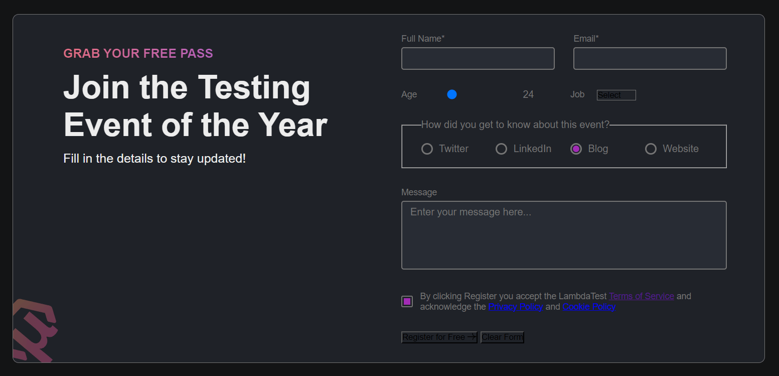
Output:
See the Pen
CSS Form Design – Radio and Checkbox by Aakash Rao (@aakash_codes)
on CodePen.
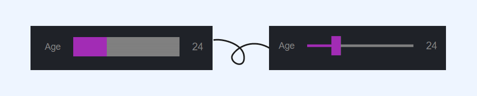
Range Slider Element
The next element in our CSS form design is the slider for selecting the range. This element is used in this form for demonstration purposes, but you will find this element commonly used on media players, and eCommerce websites for selecting the price range or in the settings panel for changing the brightness or font size.
It enables users to select a value within a specified range by dragging a slider handle along a track. It also provides a visually interactive way for users to input numerical data or adjust within a defined range. Let’s learn how to add custom styles to change its look and blend it with the CSS form design.
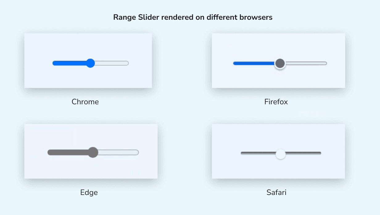
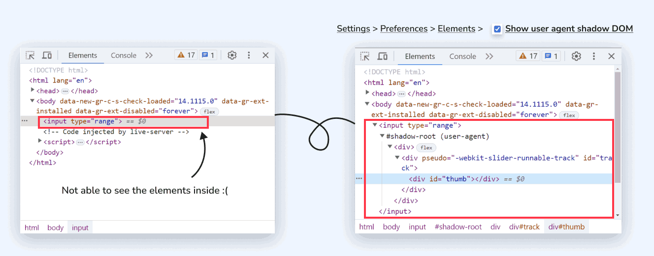
This element is a little challenging for styling as it has some tweaks and aspects to explore. You can explore the differences in browser integration by looking inside the elements on different browsers.
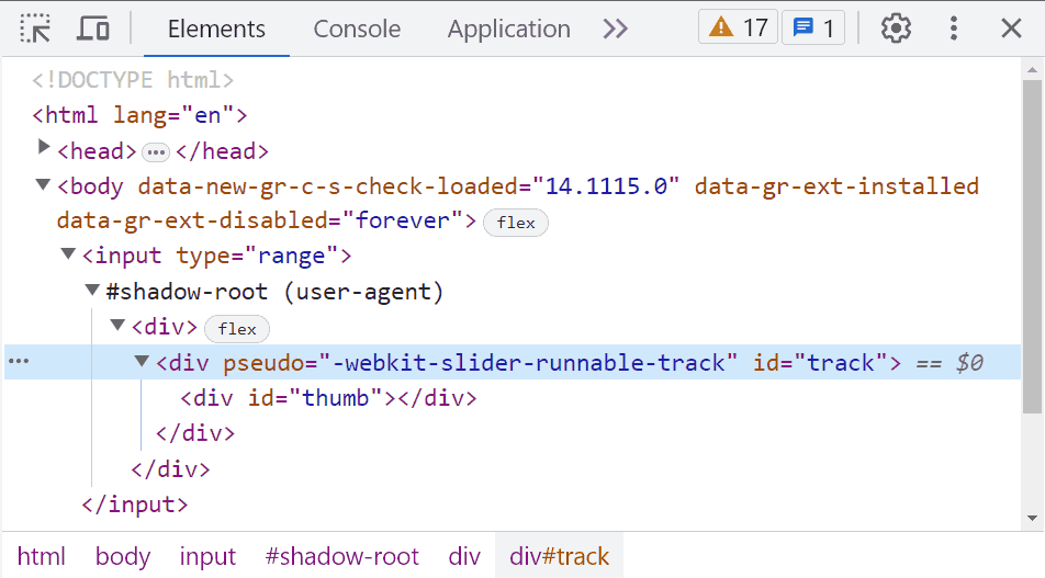
For Chrome, you can do so by enabling the Show user agent shadow DOM option to explore its element implementation structure, as Chrome doesn’t allow us to see the Shadow DOM elements by default.
Shadow DOM is a web standard that allows developers to create encapsulated web components. It creates a hidden sub-section of the Document Object Model (DOM) attached to a specific element in the main DOM. This hidden DOM, called the Shadow DOM, has an internal structure and style separate from the rest of the page.
We can mainly divide its native structure into two parts:
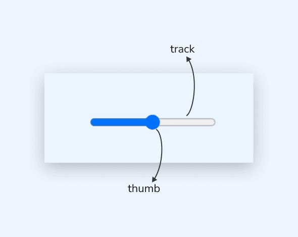
- Thumb: The draggable handle that indicates the current value of the slider. It is represented by a small draggable element, such as a circle or a rectangle.
- Track: The track represents the entire range of values the slider can span. It is the area over which the thumb moves.
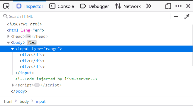
Since it’s a native element, each browser has its own implementation. We can consider its two main different browser implementations. One is for WebKit and Blink browsers such as Chrome, Edge, Safari, and Opera, and the other is for Firefox.
There is another implementation for the IE browser, but we’re only going to focus on two main browser types for now. The primary challenge in styling arises from the necessity of providing unique styles for each implementation, driven by the inconsistencies present across different browsers.
Let’s add styles to our main <input type=”range”> element. You can also declare some CSS custom properties or variables associated with this element.
CSS:
|
1 2 3 4 5 6 7 8 9 |
input { --line-thickness: 5px; /* line thickness*/ --height: 30px; /* thumb height */ --width: 15px; /* thumb width */ width: 100%; height: var(--size); cursor: pointer; } |
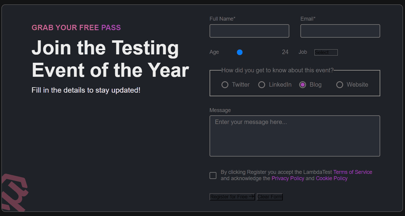
Only the thumb is visible at this stage with its default styling, as shown in the image. We can start customizing those two elements (thumb and slider) of the range input to make it look good with the CSS form design. Starting with the thumb element for keeping it simple, let’s use <thumb> for now and understand the properties we’re trying to target.
|
1 2 3 4 5 6 7 |
<thumb> { width: var(--width); height: var(--height); box-shadow: 0 0 0 var(--line-thickness) inset var(--color-accent); border-radius: 50%; appearance: none; } |
Now, you can replace that <thumb> with the actual selectors for different implementations of browsers, as we talked about earlier.
|
1 2 3 4 5 |
/* For Chrome, Edge, Safari and Opera Browsers */ input[type="range" i]::-webkit-slider-thumb { } /* For Firefox */ input[type="range"]::-moz-range-thumb { } |
Now, we will use a CSS trick to complete our slider. It involves using the border-image property.
|
1 2 3 4 5 6 7 8 9 10 |
border-image: linear-gradient(90deg, var(--color-accent) 50%, var(--input-border) 0) /* Slice Width: 1 pixel Number of Rows: 0 (no vertical repetition) */ 1/0 /* Horizontal Fill Width: 200 pixels */ 200px/0 /* Vertical Fill Height: 200 pixels */ 200px; |
The border-image property is the shorthand (border-image-outset, border-image-repeat, border-image-slice, border-image-source, border-image-width) to specify an image to be used as the border of an element instead of the regular solid color border. It can also be written as
|
1 2 3 4 5 6 7 8 |
border-image-source: linear-gradient( 90deg, var(--color-accent) 50%, #ababab 0 ); border-image-slice: 1; border-image-width: 0 200px; border-image-outset: 200px; |
- border-image-source: Sets the source image used to create an element’s border image.
- border-image-slice: Defines how the border image is divided into nine regions: corners, edges, and the center. It specifies the size of the border image slices and determines which parts of the image will be used as the border.
- border-image-width: Sets the width of the border image area. It defines the size of the border area that will be filled with the border image.
- border-image-outset: Specifies how much the border image area extends beyond the border box. It sets the outset or offset of the border image from the element’s border.
- border-image-repeat: Determines how the border image is repeated or stretched to cover the border area if the image is smaller than the border box.
See the Pen
Using border-image for range slider element by Aakash Rao (@aakash_codes)
on CodePen.
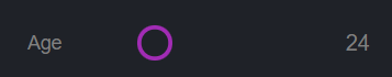
Returning to the actual form range slider element – the image will have a gradient of 2 colors — the main (defined by –color-accent variable) and a gray (defined by –input-border variable). We need the border image to cover the whole space of the input horizontally, so we use a big value for left and right widths (100vw) while we keep the top and bottom at (0).
However, the border-image width is limited to the element size. To overcome this, we also need to use a large value for the border image outset to increase the space available for it.
The parts of the border image that are rendered outside the element’s border-box with border-image-outset do not trigger overflow scrollbars and don’t capture mouse events. When we first see the slider, it looks like we’re increasing the main color on the left, but in reality, we’re sliding a fixed gradient that’s overflowing our element.
By adding overflow: hidden to the input element, and using a big value for border-image-width and border-image-outset, we can create a perfect illusion.
|
1 2 3 4 5 6 7 8 9 10 11 12 13 14 15 16 17 18 19 20 21 22 23 24 25 26 27 28 29 30 31 32 |
input[type='range'] { /* ... existing styles */ overflow: hidden; } /* For Chrome, Edge, Safari and Opera Browsers */ input[type='range' i]::-webkit-slider-thumb { /* ... existing styles */ border-image: linear-gradient( 90deg, var(--color-accent) 50%, var(--input-border) 0 ) 1/0 100vw/0 100vw; -webkit-appearance: none; appearance: none; } input[type='range']::-moz-range-thumb { /* ... existing styles */ border-image: linear-gradient( 90deg, var(--color-accent) 50%, var(--input-border) 0 ) 1/0 100vw/0 100vw; -moz-appearance: none; appearance: none; } |
The last step you need here is to decrease the size of the bar to match the size defined by the variable –line-thickness. For this, we’ll be using the clip-path property. It creates a clipping region that sets what part of an element should be shown. Parts inside the region are shown, while those outside are hidden.
|
1 2 3 4 5 6 7 8 9 10 11 12 13 14 15 16 17 18 19 20 21 22 23 24 25 26 27 28 29 30 31 32 33 34 35 36 37 38 |
input[type='range' i]::-webkit-slider-thumb { /* ... existing styles */ clip-path: polygon( 0 calc(50% + var(--line-thickness) / 2), -100vw calc(50% + var(--line-thickness) / 2), -100vw calc(50% - var(--line-thickness) / 2), 0 calc(50% - var(--line-thickness) / 2), 0 0, 100% 0, 100% calc(50% - var(--line-thickness) / 2), 100vw calc(50% - var(--line-thickness) / 2), 100vw calc(50% + var(--line-thickness) / 2), 100% calc(50% + var(--line-thickness) / 2), 100% 100%, 0 100% ); } input[type='range']::-moz-range-thumb { /* ... existing styles */ clip-path: polygon( 0 calc(50% + var(--line-thickness) / 2), -100vw calc(50% + var(--line-thickness) / 2), -100vw calc(50% - var(--line-thickness) / 2), 0 calc(50% - var(--line-thickness) / 2), 0 0, 100% 0, 100% calc(50% - var(--line-thickness) / 2), 100vw calc(50% - var(--line-thickness) / 2), 100vw calc(50% + var(--line-thickness) / 2), 100% calc(50% + var(--line-thickness) / 2), 100% 100%, 0 100% ); } |
Output:
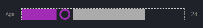
Now, you have our custom range slider element ready with a few lines of code that can be easily controlled by adjusting a few variables. Feel free to make some changes and add tweaks to understand the behavior of different properties.
Output:
See the Pen
CSS Form Design Tutorial – Range Slider Element by Aakash Rao (@aakash_codes)
on CodePen.
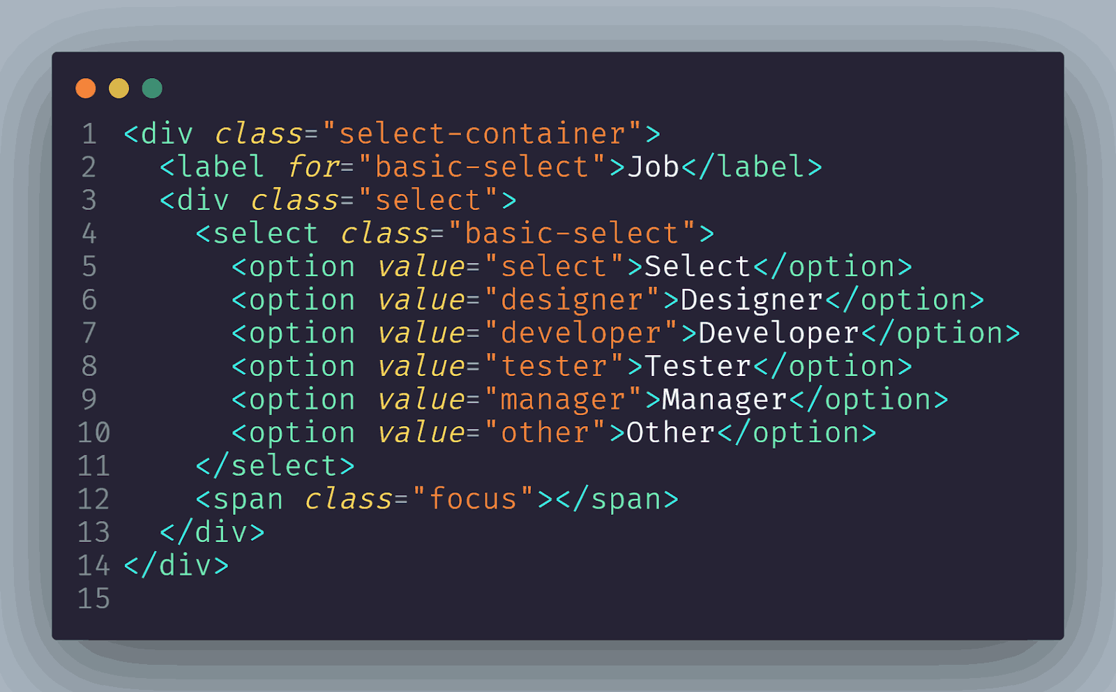
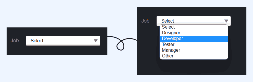
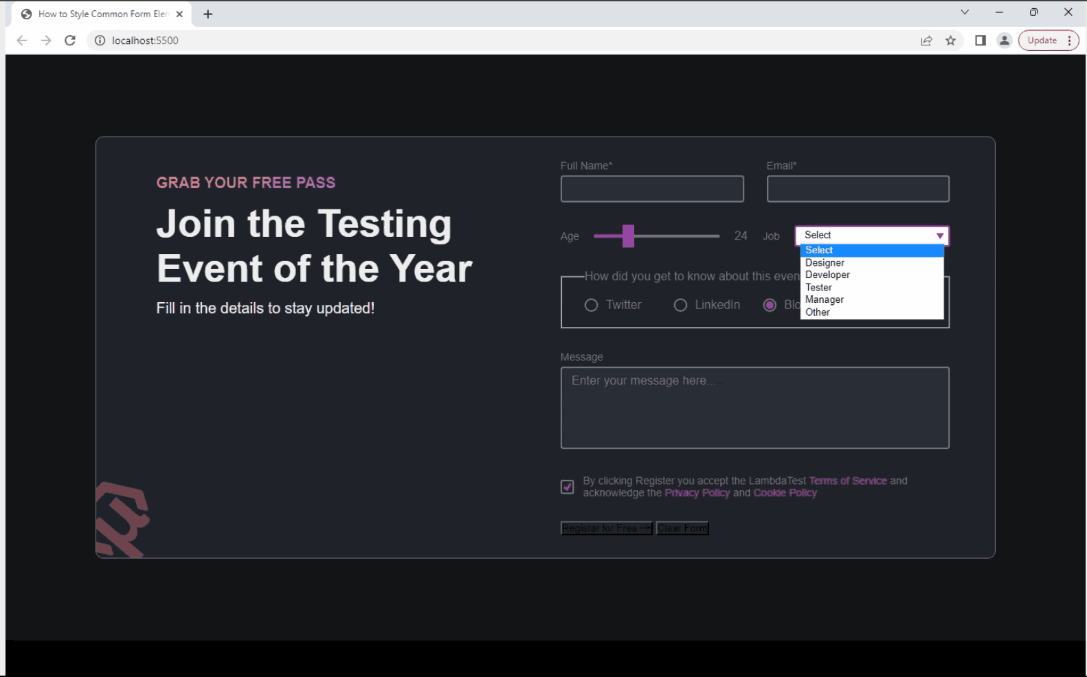
Select Element
The <select> element is a fundamental HTML form element that allows users to choose an option from a dropdown menu. It presents users with a list of predefined options and enables them to select a single value. It provides a simple and intuitive way to gather user input, especially when there are multiple choices available.
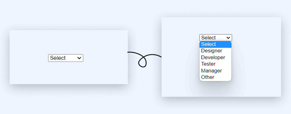
Taking a quick overview of the structure of <select> element, we have a <div> with a class of select that holds <select> with all the <option> elements.
Let’s explore how to make our <select> element accessible and cross-browser compatible by adding some CSS style resets.
CSS:
|
1 2 3 4 5 6 7 8 9 10 11 12 |
select { /* resets for further consistency */ border: none; width: 100%; outline: none; background-color: transparent; font-family: inherit; font-size: inherit; line-height: inherit; padding: 0.25em 0.5em; cursor: inherit; } |
Next, we will target the <div> with the class select that holds our main <select> element and apply styles.
|
1 2 3 4 5 6 7 8 9 10 11 |
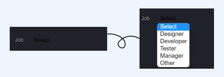
.select { width: 100%; border: 1px solid var(--input-border); border-radius: 0.25em; padding: 0.25em 0.5em; font-size: 1.25rem; cursor: pointer; line-height: 1.1; background-color: var(--color-text); background-image: linear-gradient(to top, var(--color-text), #fff 33%); } |
For our dropdown arrow, we will use one of the most exciting modern CSS properties: clip-path. To create the arrow, we will define it as an ::after pseudo-element.
|
1 2 3 4 5 6 7 8 |
/* select arrow */ .select::after { content: ''; width: 0.9em; height: 0.7em; background-color: var(--color-accent); clip-path: polygon(100% 0%, 0 0%, 50% 100%); } |
For now, our arrow is still not going to appear despite defining width and height. When inspected, it found that the ::after is not actually allowed its width. We will resolve this issue by updating our .select class with a CSS Grid layout.
|
1 2 3 4 |
.select { /* ... existing styles */ display: grid; } |
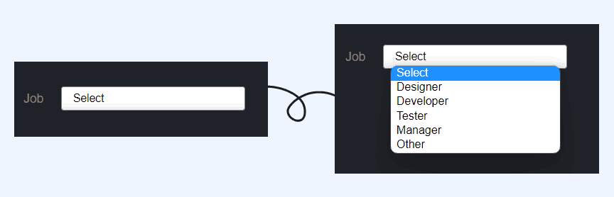
At this stage, we can verify that we have certainly created a triangle. To fix the alignment, we’ll use the CSS Grid. First, we’ll define our area, then define the select and the ::after pseudo-element. The name is scoped to the element it was created for, and we’ll keep it easy by calling it arrow-place.
|
1 2 3 4 5 6 7 8 9 |
.select { /* ... existing styles */ align-items: center; } select, .select::after { grid-area: arrow-place; } |
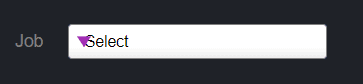
This gives us an overlap of the arrow above the native select due to stacking context via source order. We can quickly fix this by using the justify-self to horizontally place it to the (right) end.
|
1 2 3 4 5 6 7 8 9 10 |
.select { /* ... existing styles */ grid-template-areas: 'arrow-place'; } select, .select::after { /* ... existing styles */ justify-self: end; } |
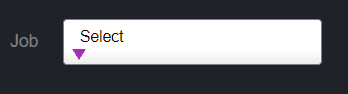
Finally, for the focus state, we can apply the styles by selecting the :focus state of <select> element and applying it to <span> with the class focus using the adjacent-sibling (+) selector. And for this, we will implement using the position: absolute.
|
1 2 3 4 5 6 7 8 9 10 11 12 13 14 |
.select { /* ... existing styles */ position: relative; } select:focus + .focus { position: absolute; top: -1px; left: -1px; right: -1px; bottom: -1px; border: 2px solid var(--color-accent); border-radius: inherit; } |
Output:
See the Pen
CSS Form Design Tutorial – Select Element by Aakash Rao (@aakash_codes)
on CodePen.
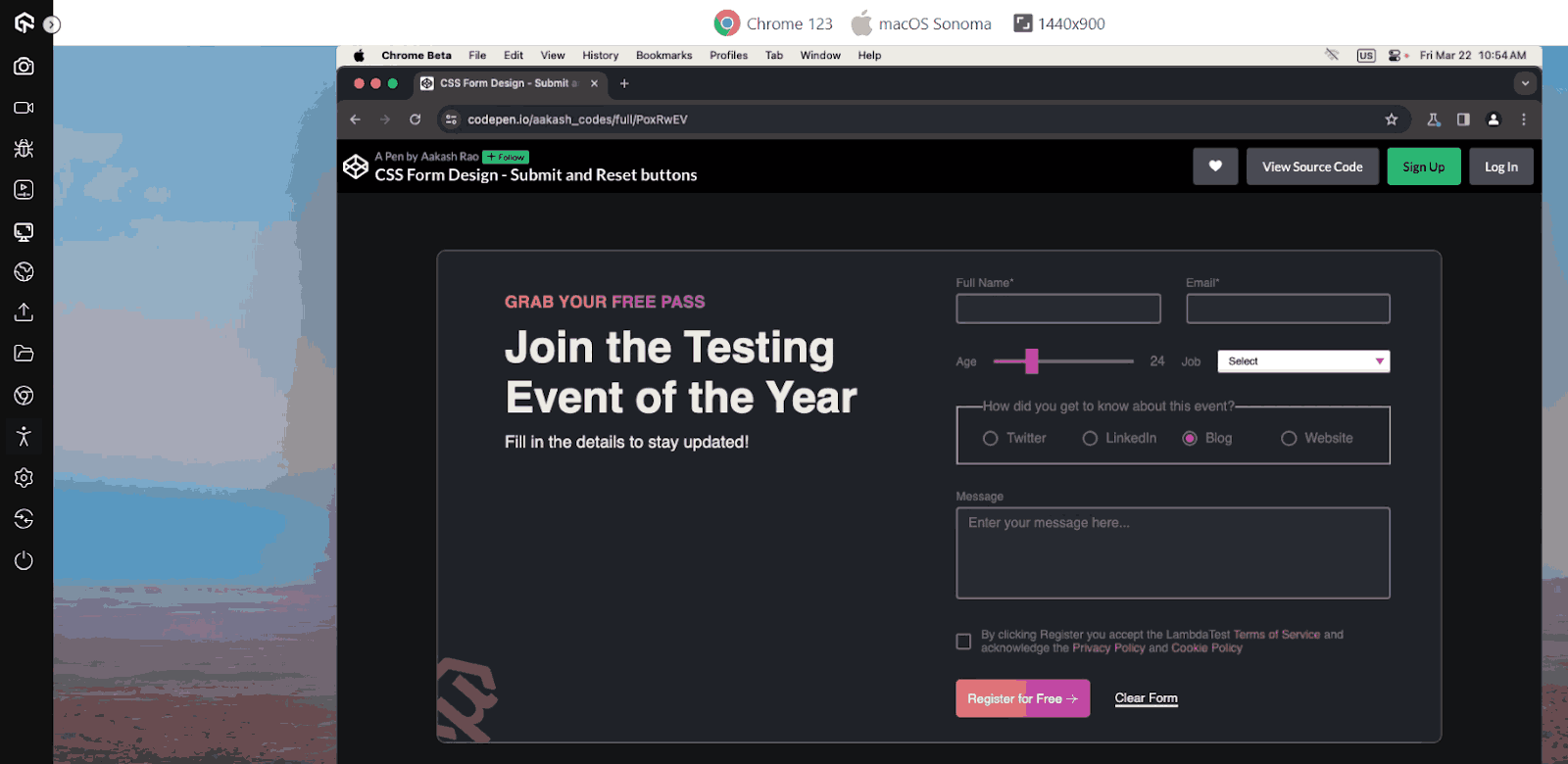
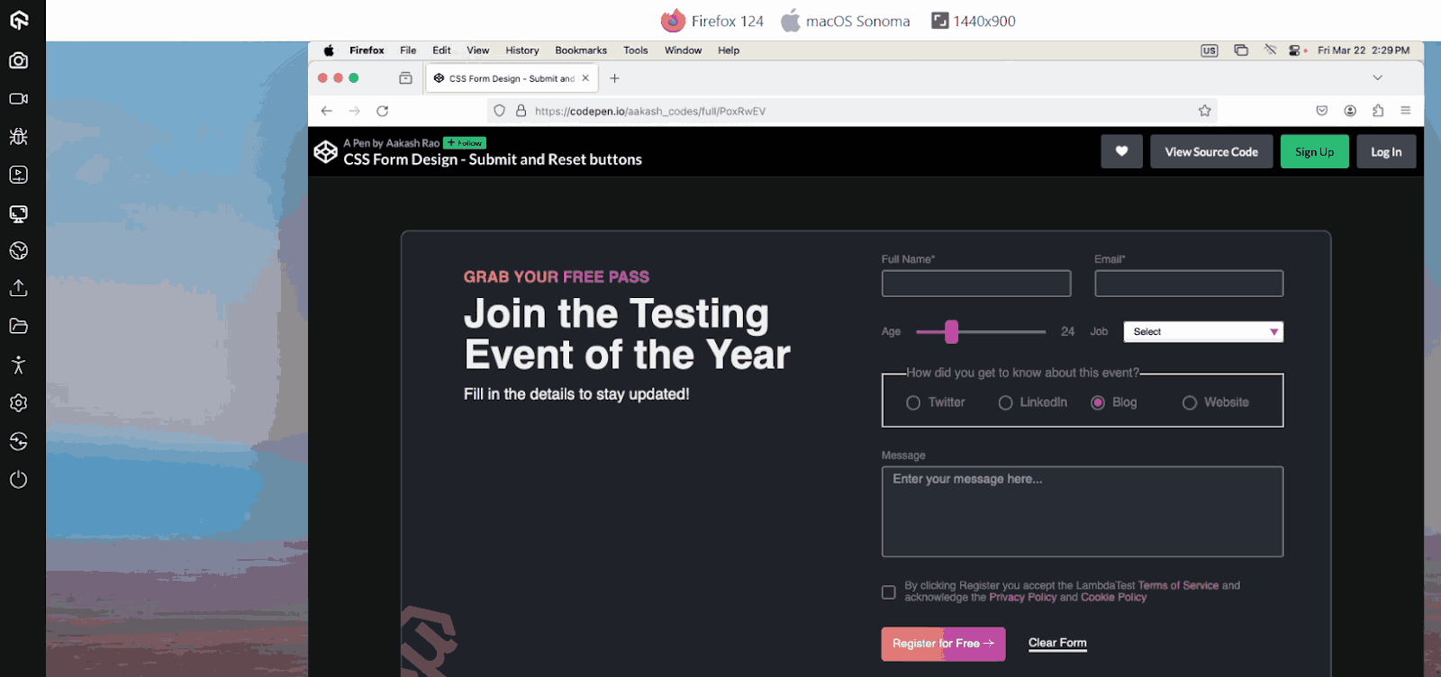
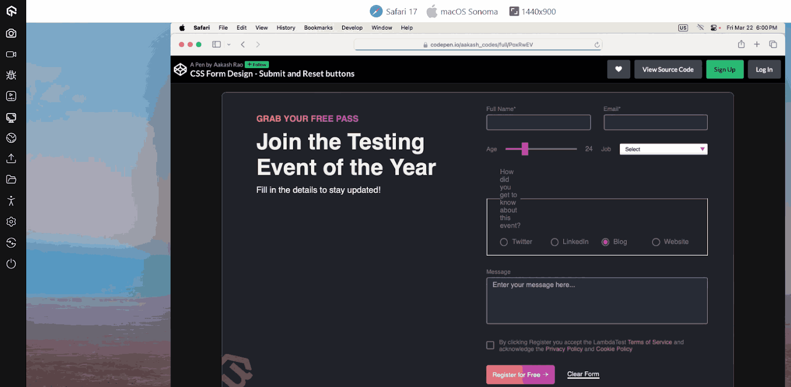
Submit and Reset Buttons
Submit and reset buttons are common elements in web forms that facilitate user interactions. The submit button triggers the submission of form data to a server, while the reset button clears or resets the form. Styling these buttons is relatively simpler than other CSS form design elements.
Let’s start with adding some styles for resetting these buttons.
|
1 2 3 4 5 6 7 8 9 10 |
button[type='submit'], button[type='reset'] { border: none; background-color: transparent; font-family: inherit; padding: 0; cursor: pointer; font-size: 1.5rem; } |
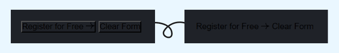
For structuring the buttons we can apply flexbox for vertically centering and adding a gap between the two buttons. And for the visual styles of the buttons – we want to display the reset button similar to a link for which we can use the border-bottom property.
|
1 2 3 4 5 6 7 8 9 10 11 12 13 14 15 16 17 |
.buttons { display: flex; align-items: center; gap: 3rem; } button[type='submit'] { background: var(--gradient-2); color: var(--color-text); padding: 14px; border-radius: 5px; } button[type='reset'] { border-bottom: 3px solid var(--color-text); color: var(--color-text); } |
Output:
See the Pen
CSS Form Design – Submit and Reset buttons by Aakash Rao (@aakash_codes)
on CodePen.
Applying CSS Media Queries to CSS Form Design Elements
Now that we have our custom CSS form design ready with all the elements, it’s time to make our form layout responsive that adapts to different screen sizes and devices. We can achieve this by applying CSS media queries to set specific styles and layout rules based on the device’s characteristics, such as screen width.
Let’s add some media queries styles to make the form layout responsive:
|
1 2 3 4 5 6 7 8 9 10 11 12 13 14 15 16 17 18 19 20 21 22 23 24 25 26 27 28 29 30 31 32 33 34 35 36 37 38 39 |
@media (max-width: 900px) { .form-container { grid-template-columns: 1fr; gap: 2.5rem; padding: 2rem 3rem; } .info { margin: 2rem 0; } .info h1 { font-size: max(32px, 2em); margin-bottom: 1.2rem; } .col.text-input { grid-template-columns: 1fr; } .col.range-select > div:first-child > input, .col.range-select > div:last-child > .select { width: 100%; } fieldset { grid-template-columns: 1fr 1fr; } } @media (max-width: 500px) { .col.range-select { flex-direction: column; } .col.range-select > div { width: 100%; } } |
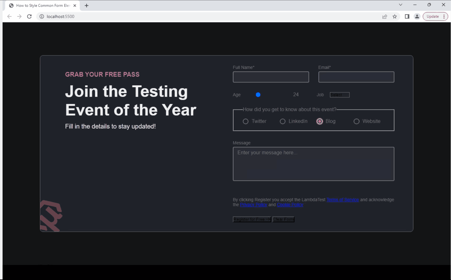
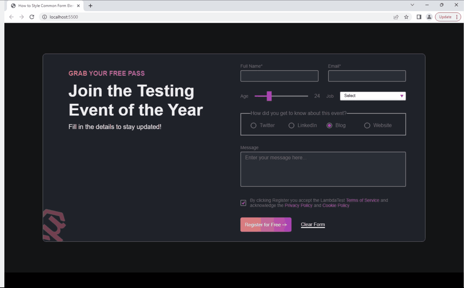
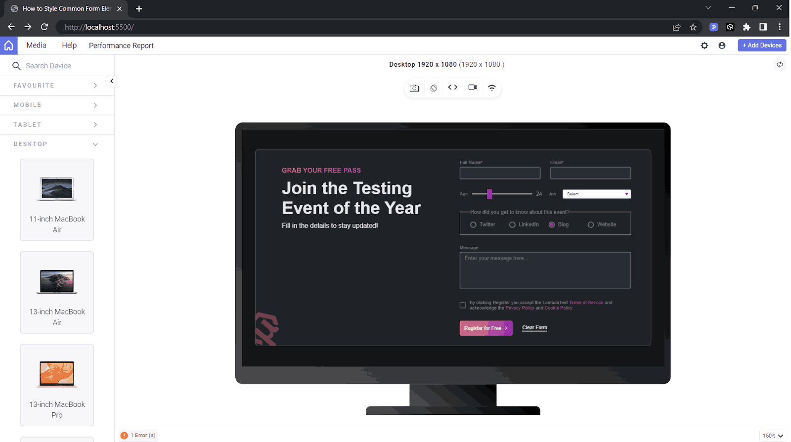
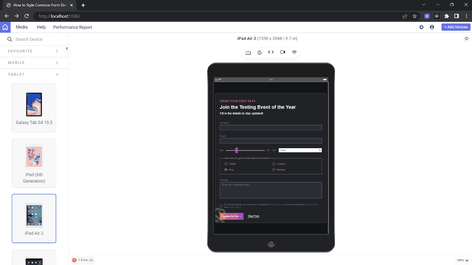
Now to check the responsiveness of layout you can use browser developer tools, but there’s a better option like LT Browser with which you can check the responsiveness based on different screen sizes.
Responsive Testing of CSS Form Design Elements
LT Browser is a responsive testing tool for web developers and testers to test and debug how their websites look and function on various mobile device viewports. LT Browser comes with a lot of developer-friendly features that ease responsive testing such as
- Test on multiple device viewports.
- Use dedicated DevTools for different viewports.
- Network throttling to test websites in different network conditions.
- Generate performance reports powered by Google Lighthouse.
Let’s start testing the CSS form design using the LT Browser to test on different device sizes:
Now that we have tested the custom elements of the CSS form design project. It’s finally time to test our custom CSS form design elements across different browsers to check compatibility.
Cross-Browser Compatibility Testing of the Form Elements
As discussed earlier, CSS form design elements may look different across web browsers due to their own integration of the form elements. This can affect the user experience and make it challenging to maintain a consistent design across different browsers.
However, we can solve this issue with the custom styles of the CSS form design elements. By performing cross browser testing, we can ensure they look the same and are accessible across different browsers. You can also perform accessibility testing to ensure your CSS form designs are accessible to all users.
We can manually test the web forms using AI-powered test orchestration and execution platforms like LambdaTest which offers a remote test lab of 3000+ real environments. It allows developers to test websites in different browsers and operating systems.
Subscribe to the LambdaTest YouTube Channel and stay updated with the latest tutorials around mobile app testing, real device cloud, and more.
By utilizing Real Time Browser Testing, you can test elements of CSS form design and identify any inconsistency or styling issues specific to particular browsers.
By now, we have almost covered every aspect with our custom styling of the form elements. But there is still one more important part we haven’t talked about which is the accessibility of forms.
 Note
NotePerform web accessibility testing across 3000+ desktop browsers. Try LambdaTest Today!
How to Make Accessible Forms With Custom Form Elements?
In this section, we will explore some of the best practices for creating user-friendly and accessible CSS form designs. With these best practices, developers can enhance user experience, improve accessibility, and ensure that the forms work perfectly across different languages and devices.
Setting Accessible Contrast Ratio – The 3:1 Rule
The 3:1 contrast ratio rule is a WCAG Guideline that ensures sufficient visual contrast between the foreground and background colors of form controls, such as input fields, buttons, and labels, to ensure accessibility for visual impairments.
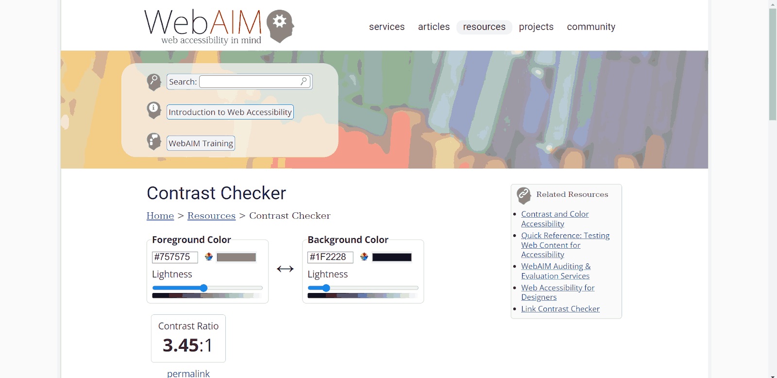
To ensure that the contrast ratio between the foreground and background colors of the input field and the submit button meets the 3:1 rule, we can use tools like the WebAIM Contrast Checker or any other online contrast ratio calculator. These tools analyze the color values and provide feedback on whether the contrast ratio meets the recommended level.
Adding Labels to Every Form Control
To ensure accessibility and provide clear labels for each form control, we use the element. Associating the label with its corresponding input field using the for attribute, which should match the input field’s ID. This association allows users to understand which label corresponds to which input field, even if they cannot visually perceive the label.
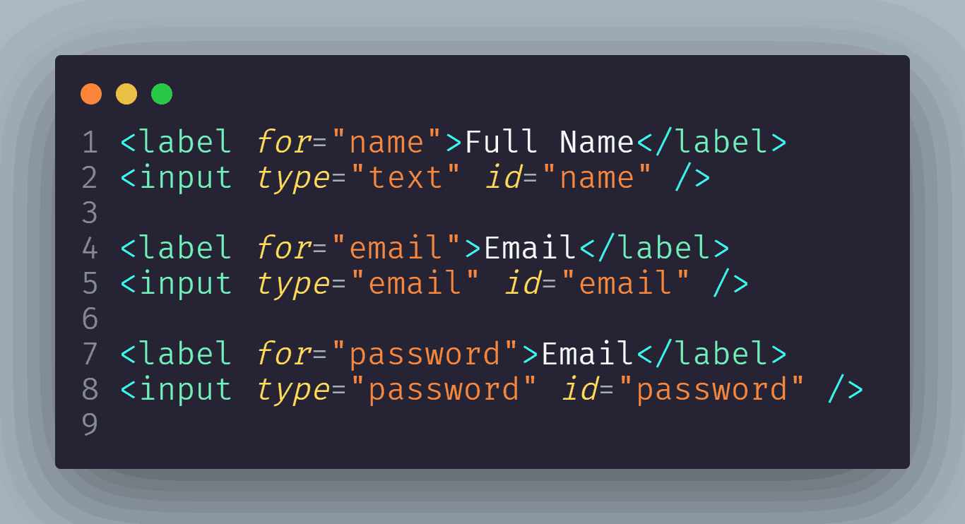
It also helps to provide transparent information about the purpose of each form field, especially for users relying on assistive technologies like screen readers.
Helping Users Find Error Messages
When a user encounters an error during form submission, it’s important to provide clear error messages or user notifications that are easy to locate. Displaying the error messages near the respective form controls or providing a summary of errors helps the user understand the issues with their submission and allows them to quickly identify and correct the errors.
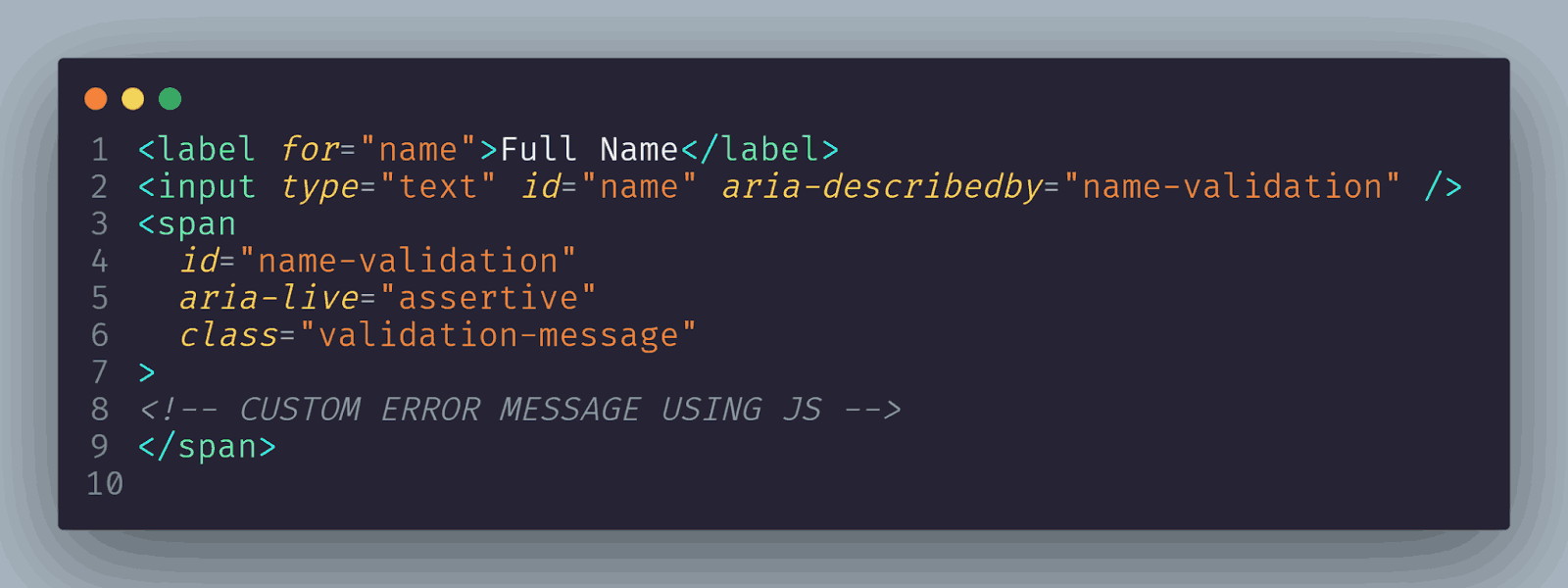
A simple approach to improving accessibility is to use the aria-describedby attribute on the form control that matches the id on the error message element. Then, use aria-live=”assertive” for the error message. ARIA live regions announce an error to screen reader users the moment the error is shown.
Internationalization and Localization of Forms
Internationalization and localization play vital roles in web development, helping to create a global impact and enhance user experience. Internationalization (i18n) ensures the design and development of websites that adapt to various languages, data formats, currencies, and cultural preferences.
It involves character encoding, adapting layouts for text variations, and supporting multilingual content. On the other hand, localization (l10n) involves translating content, adapting images, and aligning functionality with local norms and regulations.
Let’s explore how to craft CSS form design elements for internationalization and localization.
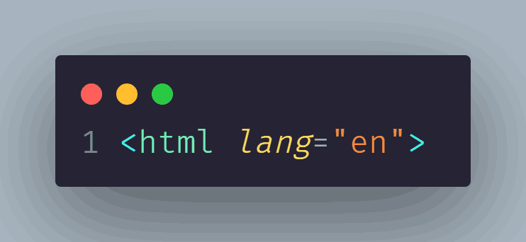
To ensure the form works smoothly in different languages, we can use attributes such as lang to specify the language of the form.
As per the WCAG Success Criterion 3.1.1, a page language needs to be specified in a way that may be programmatically determined. The WCAG Success Criterion 3.1.2 requires that pages with parts in different languages have the languages of those parts specified, too.
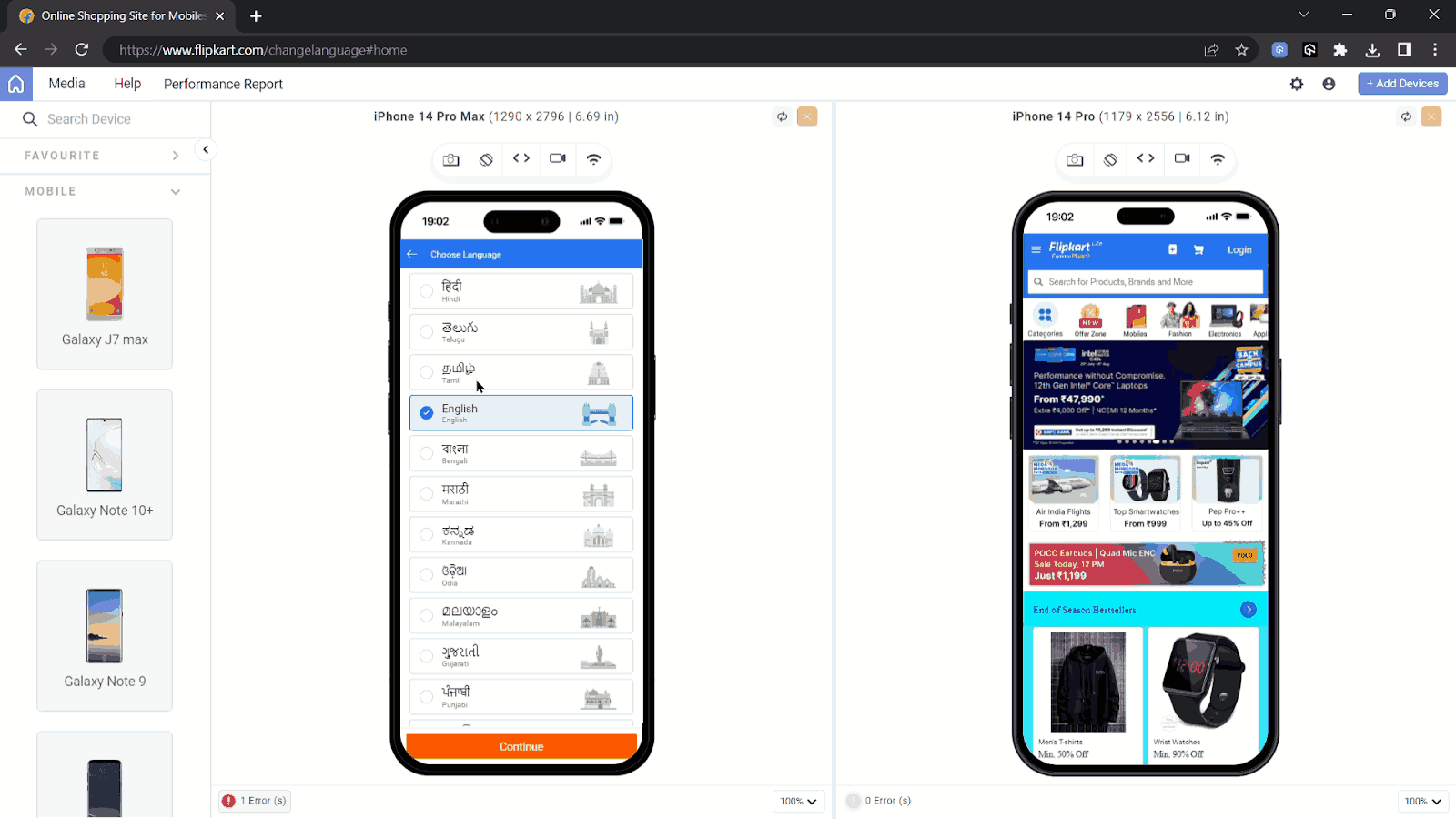
Businesses like Flipkart, which primarily operate in specific regions, prioritize localization to cater to their local customer base effectively. By adapting their websites, apps, and services to the language and preferences of each target market, they can offer a more personalized and seamless user experience.
By setting lang=”en” for English or using other language codes such as lang=”fr” for French or lang=”es” for Spanish, we indicate the language of the form content.
To ensure that the search engines and browsers know about the translated version, we can add <link> elements in the site’s <head> describing the alternate versions.
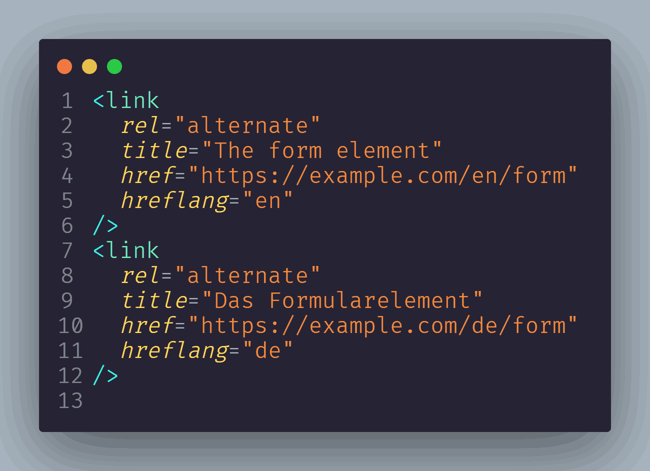
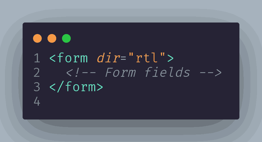
Some languages, such as Arabic or Hebrew, are written from Right to Left (RTL) instead of Left to Right (LTR). To support RTL languages, we can apply the dir attribute to the form or specific form controls.
By setting dir=”rtl”, we ensure that the form elements are aligned correctly and provide a better user experience for users who read RTL languages.
Conclusion
The art of styling elements for CSS form design can elevate the overall user experience on the website. By understanding the fundamental concepts and techniques discussed, developers can easily transform boring and generic form elements into visually attractive and user-friendly components.
In this blog, we learned about the foundation of resetting and normalizing the default styles across different browsers to provide a consistent starting point for styling efforts. Then, by taking advantage of CSS pseudo-selectors such as pseudo-classes and pseudo-elements, we also learned to target specific form elements and apply custom styles.
We also discussed prioritizing cross-browser compatibility and accessibility, which helps us ensure that the custom styles work perfectly on all browsers and don’t hinder the functionality or readability of CSS form design elements for different users. We can create amazing user-friendly CSS form designs by applying these techniques and keeping user experience at the forefront of design decisions.
So go ahead, experiment, and unleash your creativity to style common form elements with CSS.
Happy Styling!!
Frequently Asked Questions (FAQs)
Why need to style form elements with CSS?
A typical form consists of different form elements, which may appear differently across web browsers due to the default browser integration of the form elements. By custom styling the form elements, developers can overcome browser-specific quirks and inconsistencies in how they are displayed.
Are there other methods to achieve custom styling of form elements?
Yes, there are several approaches to custom styling the form elements. One common approach is using CSS frameworks or libraries that provide pre-styled form components, allowing you to customize them further to match your design.
Another approach involves using CSS pseudo-classes and pseudo-elements to target specific form elements.


Author’s Profile
Aakash Rao
I am a Frontend Developer and Technical Writer based out of India who loves to create and share knowledge on Twitter with the community. I am a community guy who loves to connect and interact with fellow developers and enthusiasts. Alongside, I love to listen to podcasts and read books with a keen passion to explore other fields such as Graphic design & VFX.
Blogs: 6
Got Questions? Drop them on LambdaTest Community. Visit now


