
CSS Inherit Demystified: What It Means for Your Styling
Adarsh M
Posted On: March 12, 2024
 79607 Views
 35 Min Read
Good design is good business – Thomas J Watson
The key for a business or product to stand out from the crowd lies in improving how it expresses itself, and this is where good design plays an important role.
While designing a website, it’s important to use CSS in a way that is easy to maintain and update later. Instead of repeating the same properties, making CSS style rules reusable and well-organized helps, especially for large codebases with multiple pages.
This is where the CSS inherit mechanism can enhance the maintainability and reusability of your codebase. It also helps to eliminate much of the code repetition, as styles can be inherited from parent elements directly. This way, you can reduce the risk of inconsistencies across various sections of the webpage.
This article will look at the CSS inherit property, including which properties are inherited by default, how they affect your styling, and the mechanisms that govern this behavior.
TABLE OF CONTENTS
What is CSS Inheritance?
When it comes to web applications, CSS is the core of modern web design. It’s not just about making the website look good; it’s about telling a story that resonates with users and leaves a lasting impression.
CSS inheritance involves understanding how styles are applied to a single element and how they are passed down or inherited by child elements within the HTML Document Object Model (DOM). To know more about inheritance, you have to shift from styling individual elements and adjusting them to considering how styles can cascade through the document’s hierarchy.
Inheritance is the default behavior of most HTML elements. Certain styles applied to a parent element will cascade down to affect all child elements unless the properties are overridden. However, some properties, like margin, padding, etc., do not inherit the values by default.
HTML:
|
1 2 3 4 5 6 7 8 9 10 11 12 13 14 15 16 17 18 19 20 21 22 23 24 25 26 27 28 29 30 31 32 33 34 35 36 37 38 39 40 41 42 43 44 45 46 47 48 49 50 51 52 53 54 55 56 57 58 59 60 61 62 63 64 |
<html lang="en"> <head> <title>LT Browser Card</title> <style> body { font-family: Arial, sans-serif; display: flex; justify-content: center; align-items: center; height: 100vh; margin: 0; background-color: #f4f4f4; } .card { width: 300px; border-radius: 8px; box-shadow: 0 4px 8px rgba(0, 0, 0, 0.1); background-color: #fff; overflow: hidden; line-height: 1.8; } .card-header { background-color: #0ebac5; color: white; padding: 20px; text-align: center; } .card-body { padding: 20px; color: #333; } h1 { margin: 0; font-size: 24px; } p { margin: 0; } </style> </head> <body> <div class="card"> <div class="card-header"> <h1>LT Browser</h1> </div> <div class="card-body"> <p> Efficiently test and debug your websites across various devices and screen sizes with LT Browser from LambdaTest. </p> </div> </div> </body> </html> |
Output:
The body element’s font family of arial, sans-serif is inherited by all text within, including < h1 > and < p > in .card-header and .card-body.
The color: #333 set in .card-body is inherited by the < p > tag inside it. The line-height: 1.5 in .card is inherited by the < p > tag, affecting line spacing.
You can see that the CSS inherit feature helps to reduce the code and makes the code more maintainable.
Writing less code can also lead to performance benefits, enabling the browser to download and parse the CSS more quickly. If the loading time exceeds 2.5 seconds, optimizing your CSS is necessary. One of the best ways to do this is using the CSS inherit mechanism.
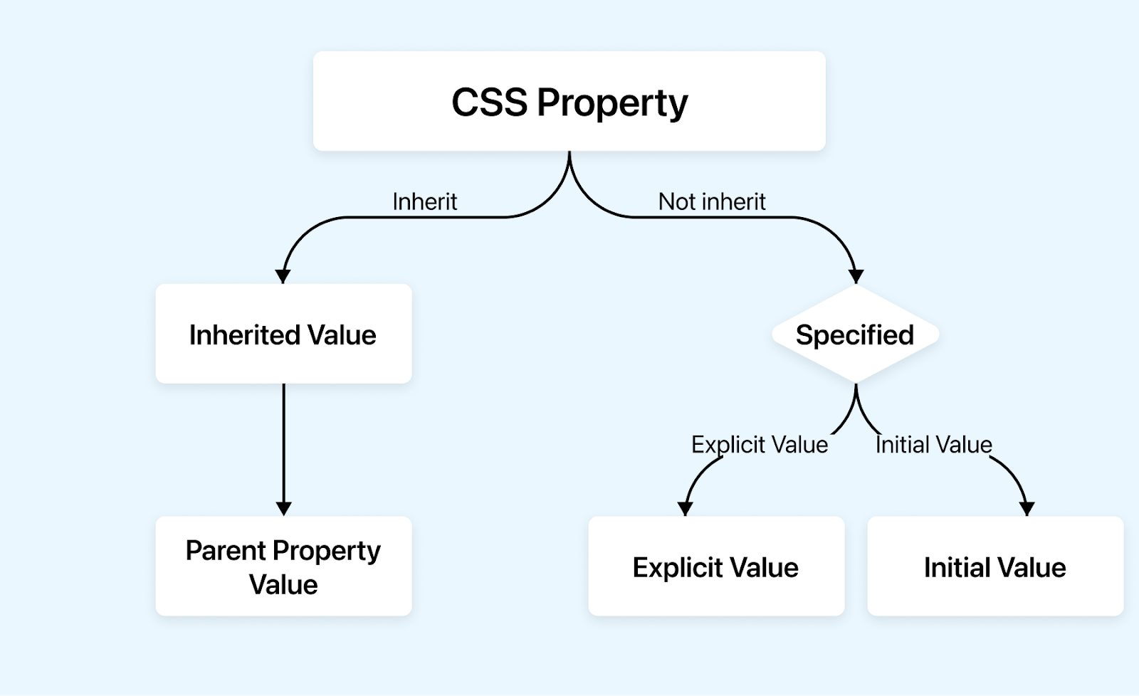
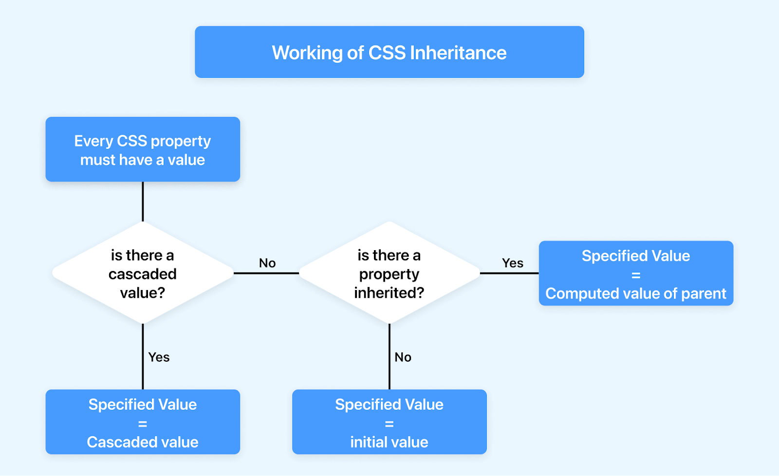
Before understanding the CSS inherit concept, you need to understand the different stages of values and how they are calculated. These calculated values are later passed down to child elements if they are to inherit them.
Run your browser compatibility tests on the cloud. Try LambdaTest Now!
Understanding CSS Value Processing
In this section of the CSS inherit mechanism, we will understand value processing in CSS.
The browser takes out all the CSS rules and processes them through a well-defined series of steps before anything appears on the website.
When a property is set to be inherited, it’s not simply copied directly from the parent element to the child. Instead, it is subjected to the same process as any newly declared value. It must be computed considering its surrounding context before it can be used and ultimately displayed.
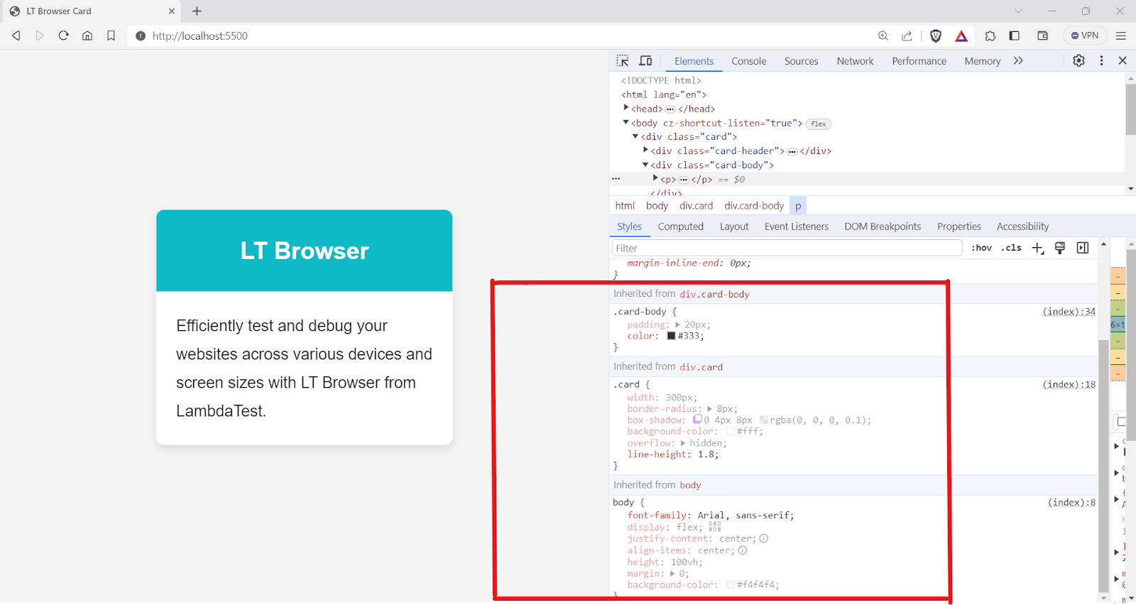
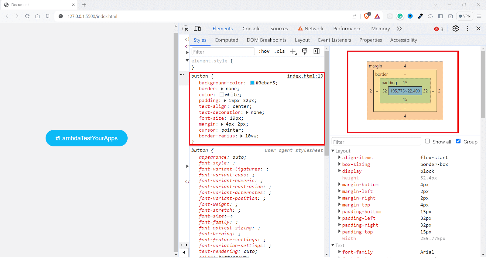
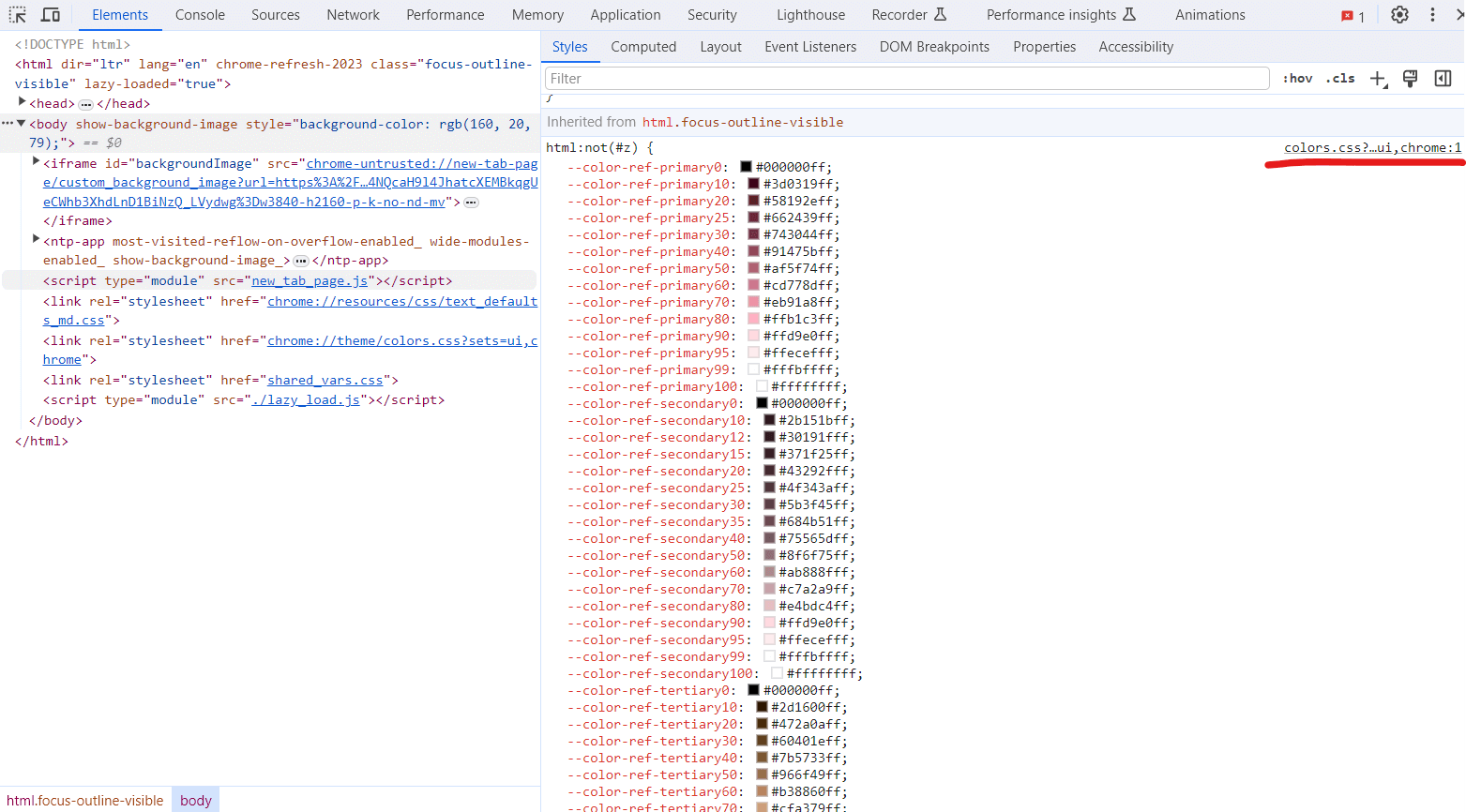
To dig more into it, you can use the computed tab inside LT Browser DevTools to see how the values are computed, including padding, margin, and all other properties.
You can also select from various device viewports in LT Browser to view the corresponding computed values.
LT Browser is a dev-friendly browser that allows you to perform responsive testing of websites that use the CSS inherit mechanism across 53+ pre-installed device viewports, including mobile, tablet, desktop, and laptop.
Here are its essential features:
- Multiple viewport testing: LT Browser lets you see how your website looks on up to six devices simultaneously.
- Chromium-based with DevTools: Built on Chromium, LT Browser provides familiar Chrome DevTools for each device viewport, speeding up debugging.
- Network throttling: LT Browser lets you test your website’s performance under different network conditions, including fast 3G, slow 3G, offline, etc.
- Recording options: LT Browser allows you to record your tests for the entire screen or a specific LT Browser tab. This can help share bug reports with your team.
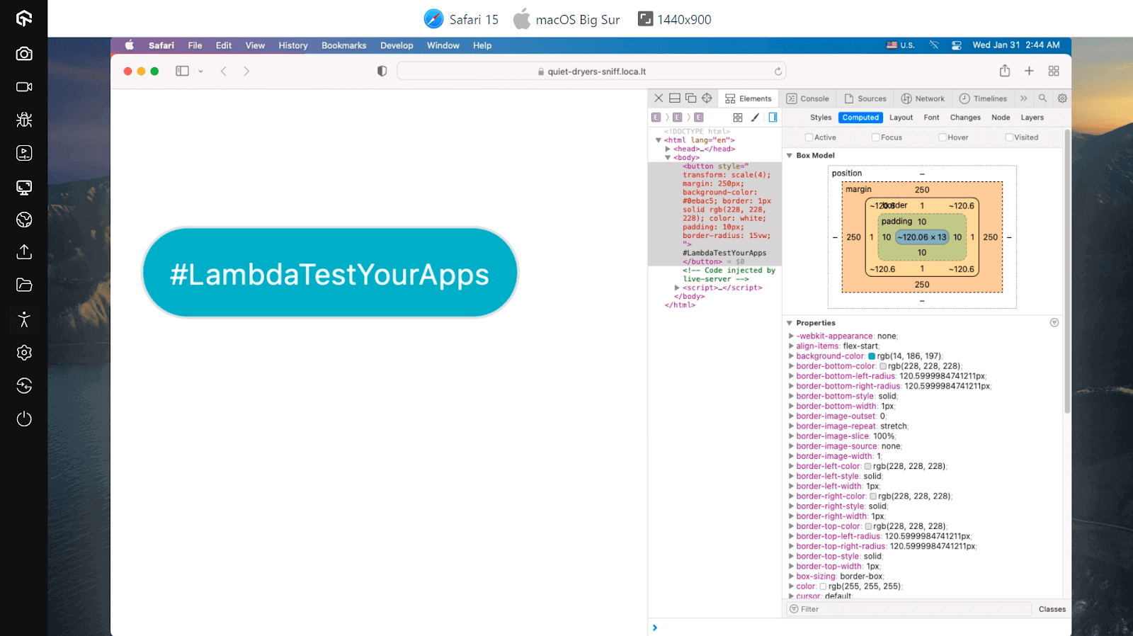
The inherited values here are not static; they’re actually dynamic. They are recalculated in the context of the child element with respect to the viewport size.
As shown in the above image, the margin value on mobile screens is 46px, compared to 64px on the desktop version. Thus, the final value, which is the actual value, considers all device properties, such as viewport and screen pixel density.
There are mainly four types of value preprocessing:
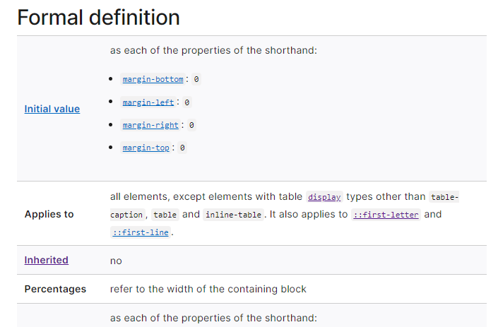
Initial Values
Initial values are the default values that CSS properties revert to if no other overriding styles are specified. These values are clearly defined in the CSS specification of each property.
If you do not explicitly set a value for any CSS property and no value is inherited from a parent element, the browser will use the property’s initial value when rendering the element.
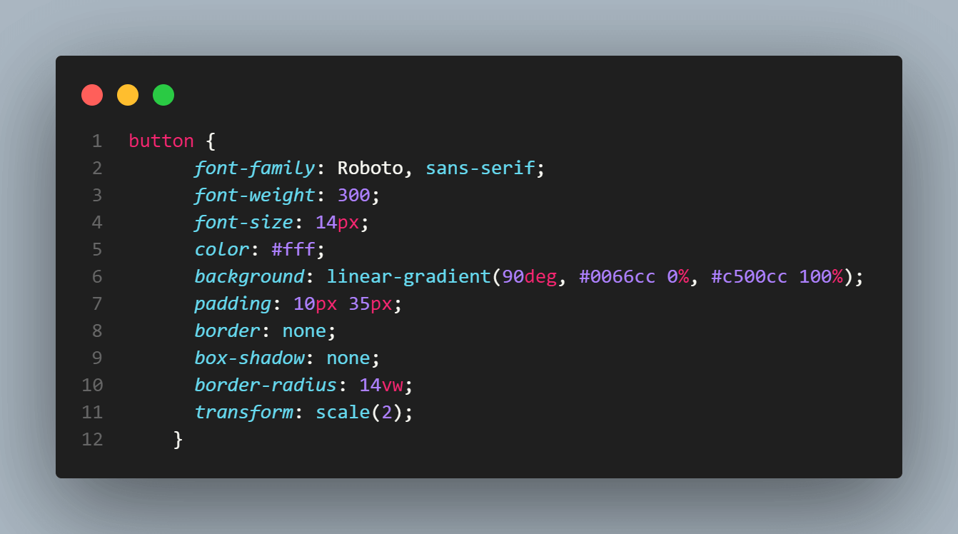
For instance, a simple < button > element has many default styles set by the user agent, i.e., the browser.
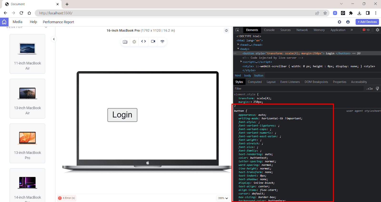
The initial value ensures the browser has a predefined way to display an element, even without explicit styles.
Computed Values
The computed value is what the browser uses on the rendered website, as shown in the computed tab in LT Browser. Next time, when you face issues in your styling, checking its computed value can help you understand the reason.
After the browser reads the declared values, including those inherited from parent elements or set by the user, it calculates the computed values. Computed values consider cascading and specificity rules, determining which declared value is the most relevant for an element.
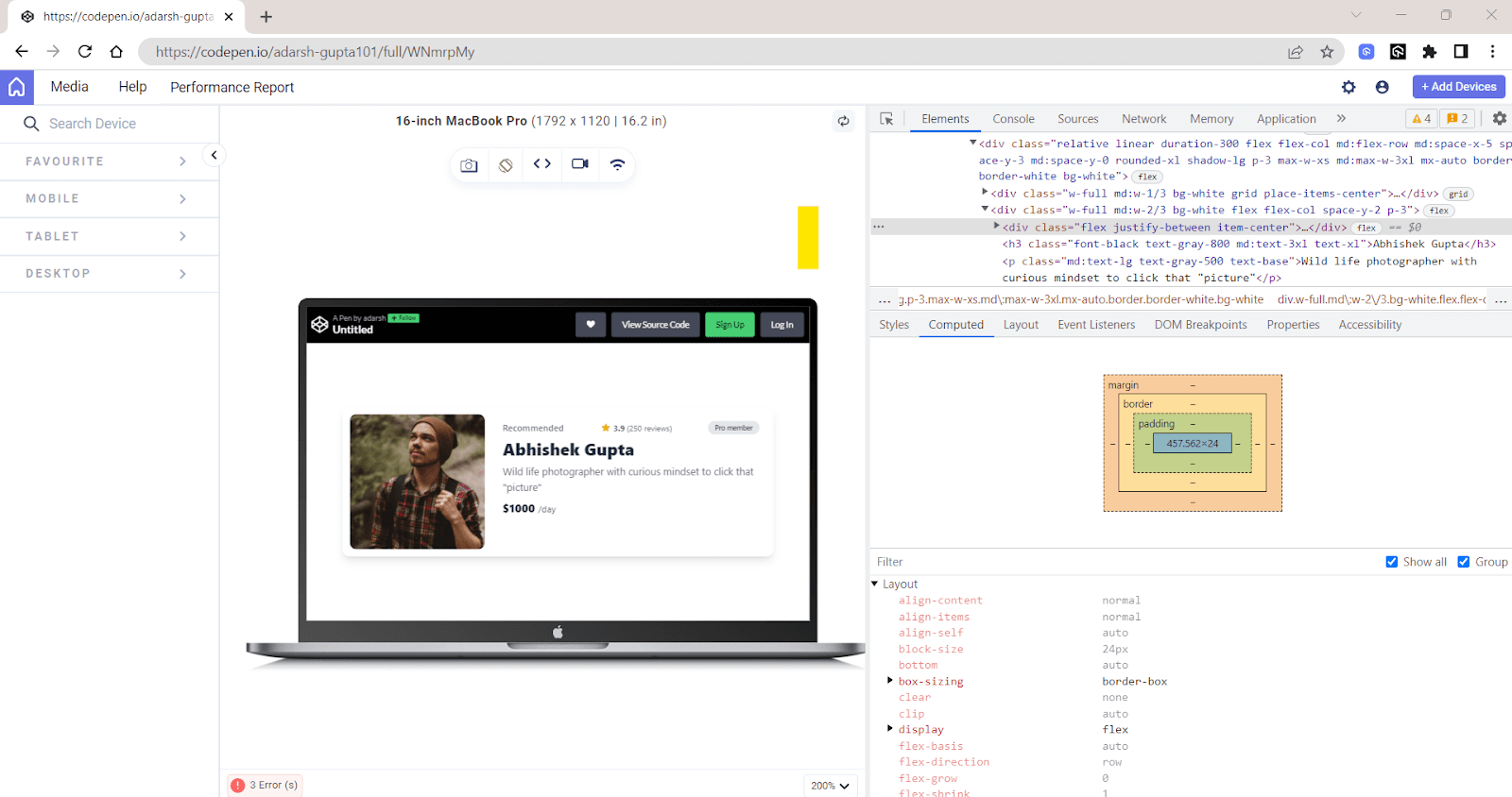
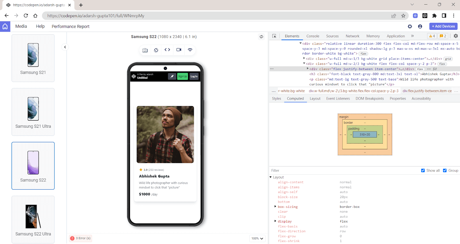
The process of computing values involves resolving any relative CSS units like percentages based on other properties or the element’s context into an absolute value.
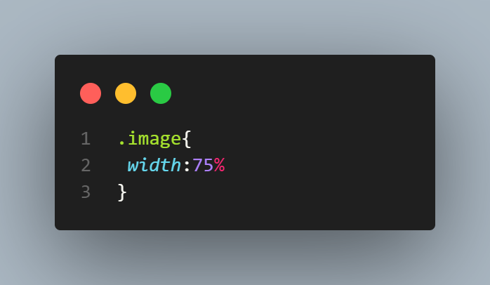
For example, a width set in percentages is computed based on the width of the parent element, turning it into an absolute unit, like pixel value, that then the browser can use for the layout.
Output:
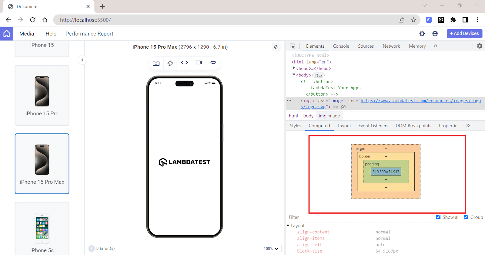
Even though percentage values are assigned for the image’s width, the browser ultimately calculates these values in pixels to use in the layout.
Used Values
The used value is the final result after all the computations done on the computed value. It includes the layout model and the dimensions of the device’s screen or browser window.
Used values come into play during the actual layout of a page. While computed values are theoretical and might include relative units like percentages or ems, used values are always in absolute units like pixels the browser can render.
Used values can also change with respect to the viewport size. As the viewport size changes, these relative units are recalculated, leading to different used values.
When an element on the webpage doesn’t appear as expected, used values can provide insights for debugging that computed values cannot. By looking at the used values, developers can understand how the browser has resolved style calculations in the context of the actual layout.
You can see the used value in the styles tab, the box model at the right shows the dimensions and spacing of the selected element. These measurements are the used values calculated after applying all layout rules.
Actual Values
Actual values are the values after post-layout adjustments and any other modifications done by the rendering engine or the device’s capabilities. Most of the time, the used values are rounded off to their nearest whole number. For example, borders are usually in a whole-number pixel value.
The actual value is relevant when considering the physical constraints of the device or screen, like the pixel density. Let’s now look into how actual value is calculated.
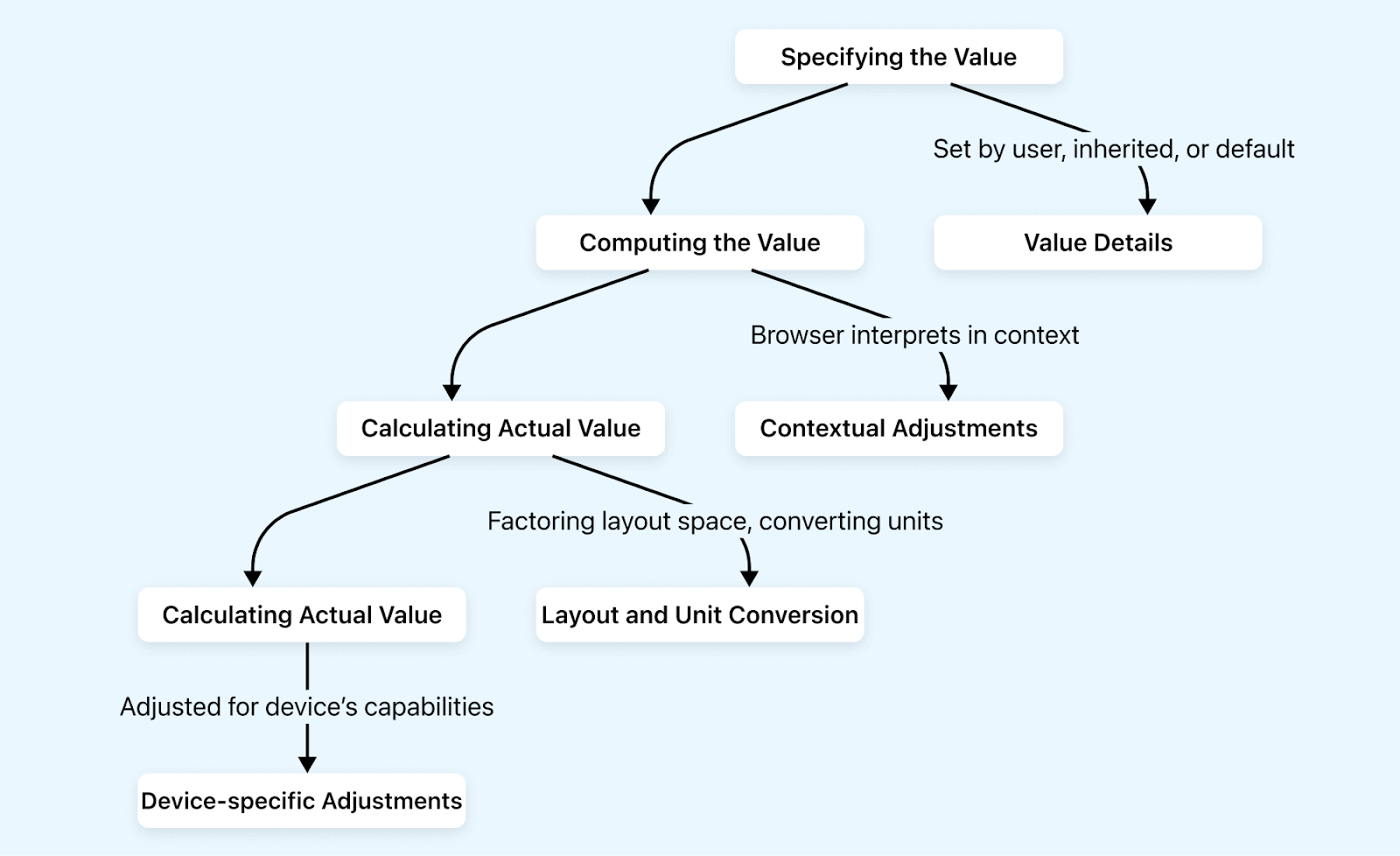
The actual value is calculated in 4 steps:
- Specifying the value: CSS properties start with a specified value you set, inherited from a parent element, or taken as the default CSS value.
- Computing the value: The browser interprets this value in context, adjusting properties as needed based on other CSS rules.
- Calculating the used value: The computed value is then converted into a used value, factoring in the actual layout space and converting relative units into absolute ones, i.e., pixels.
- Calculating actual value: The used value is adjusted for the device’s capabilities, leading to the actual value displayed on the page.
When no value is specified for a CSS property, the CSS inherit mechanism comes into the picture. Inheritable properties will take their values from the parent element.
Here, the child element inherits the computed value, not the actual value. This inherited and computed value then undergoes a similar step to the one mentioned above, through which the actual value is calculated.
How Does CSS Inheritance Work?
When designing a website, it is important to find the best layout that converts visitors into users. Your web design should resonate with the user, but finding the best design that converts viewers into users requires various iterations.
We often run A/B tests to analyze which design elements most effectively engage users. In this process, we might add CSS rules that override the current style rules, which may not be intentional.
Let’s say you have a call-to-action button with a gradient background.
Output:
Later, you decided to change the background-color to a solid color and use a class selector to target it.
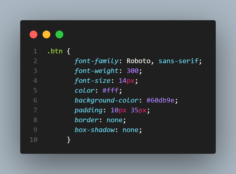
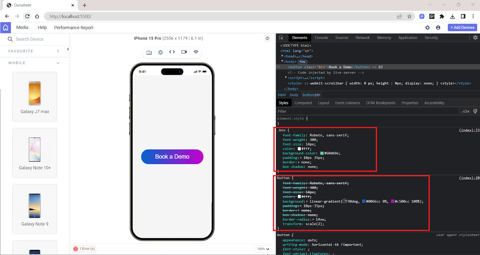
In the output, you can see that some style rules are selected from the .btn class, and the style rules are defined in the button tag selector. This kind of situation is expected when you’re constantly tweaking your CSS.
But for your aid, three important principles—CSS cascading, CSS specificity, and scope-based CSS inheritance—will help the browser decide which CSS rule to apply when there’s a conflict like this. We will understand these principles in the next section of this article on CSS inherit.
CSS Cascading
Cascading is simply the logic that defines how the styles are applied to an element. If multiple rules target the same element, the one defined last in the CSS file usually takes precedence.
• The workings of the Cascade algorithm pic.twitter.com/0NyYvKx6d9
— Adarsh Gupta ✨ (@Adarsh____gupta) January 31, 2024
But if you have two different selectors targeting the same element, it also takes into consideration the specificity of the selectors. The browser uses specific rules to determine which CSS rule takes precedence when multiple rules are applied to the same element.
Let’s take a scenario where you first set the text color of < p > tag to be red and later set it to blue. The browser will take blue as the color value. The reason for this is cascading, but it also follows a specific order based on the importance, specificity, and source order of the rules.
The cascade works on a principle that involves using different origins of style sheets. These origins play an important role in how a browser ultimately displays a webpage.
Let’s look into these origin types:
- Author origin: It refers to the set of styles that developers like you define in a CSS file. It contains all the CSS rules and styles explicitly defined to control the website’s appearance according to the author’s design.
- User origin: These styles originate from the preferences set by the users in their browsers. Many browsers offer options for users to define default styles, such as font size, font family, and color.
- User-agent origin: This user-agent origin is the default style the web browser applies. Each browser has its default style set that is used when neither author nor user styles are specified.
In simple words, it is the styles that you define in your CSS files. They can come from either external stylesheets or internal or inline styles.
Also, many extensions are available on the Chrome Store, like dark mode extensions, split screen extensions, etc., which override all the default styles.
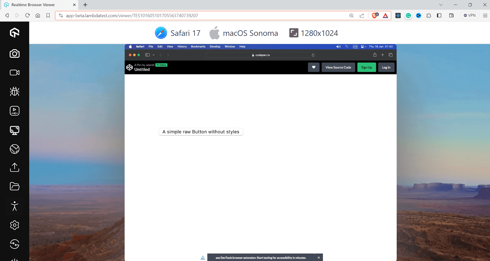
Take a look at how the < button > element is displayed on different browsers.
macOS + Safari:
Windows + Opera:
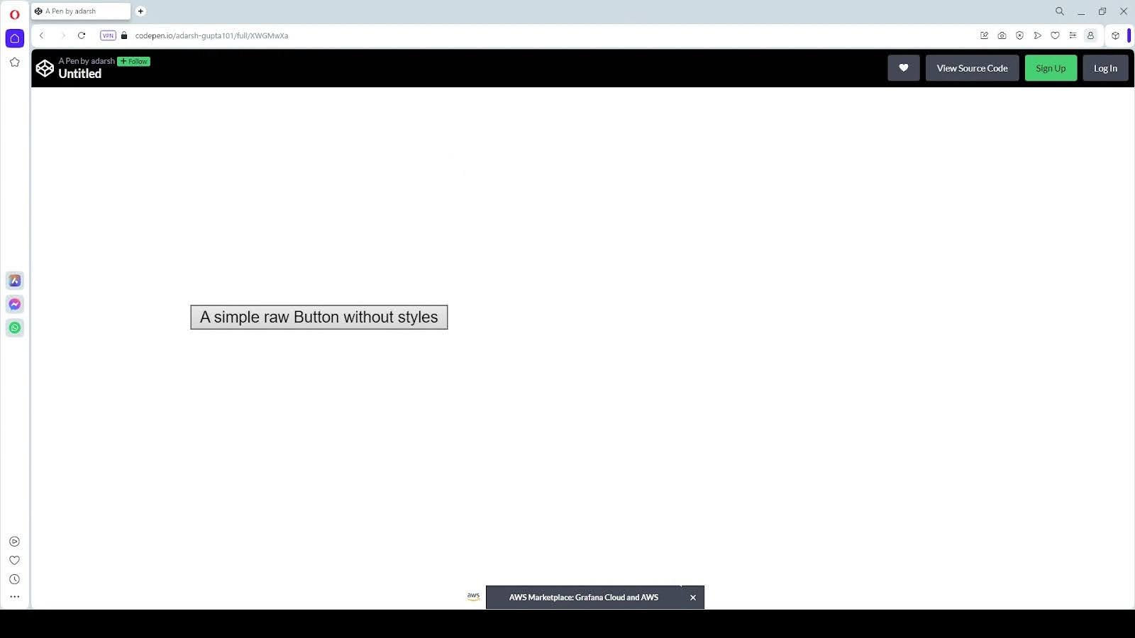
You can notice the difference in the appearance of the < button > element with various browsers. These browser default styles ensure web content is presented, readable, and organized without explicit styling.
These origins are layered and considered when the browser composites the final styles for a webpage.
Note that when some properties are marked with the !important flag, it will alter the conventional priority order, giving precedence to !important declarations in lower-priority origins.
The order of precedence in CSS when considering the !important rule and the different origins of styles are:
- User origin with normal importance: The styles that users can set for their browser, which can override browser defaults.
- Author (developer) origin with normal importance: The styles defined by the developer.
- CSS @keyframe animations: These are the styles within @keyframe animations, which can override normal importance styles.
- Author (developer) origin with !important: The styles defined by the website’s developers with !important have high priority over normal styles.
- User origin with !important: The styles the user sets with !important will override the author’s !important styles.
- User-agent (browser) origin with !important: This is very uncommon, but if the browser default styles were set with !important, they would override both author and user !important styles.
- CSS transitions: These are styles applied during CSS transitions, which can also override @keyframe animations.
CSS also recently introduced cascade layers, which allow you to group CSS rules into distinct layers.
How to Create CSS Cascade Layers?
Cascade layers make it easy to define a clear hierarchy and organization for different sets of rules. They also reduce style conflicts and make maintenance easier. There are various ways to create cascade layers in CSS, and they help you manage the overall complexity of overlapping styles.
Here are three methods to create CSS cascade layers:
The @layer statement
The @layer at-rule allows you to define a named layer without assigning any styles directly to it. It’s like creating a new container where you can later have your CSS rules.
|
1 |
@layer framework, components; |
You can enclose a set of style rules within an @layer block that assigns all those styles to a particular layer. This method is beneficial for grouping related styles and keeping your stylesheet in an organized manner.
|
1 2 3 4 5 |
@layer components { .button { /* ... */ } .navbar { /* ... */ } .card { /* ... */ } } |
You can add almost every CSS property inside an @layer block, including all CSS selectors, CSS media queries, and more. However, you can’t add imports or namespaces inside a layer block.
The @import rule with layers
You can import external stylesheets into a specific layer using the @import rule combined with the layer name. This is especially useful for integrating styles from other sources while maintaining control over their cascade order.
|
1 2 |
@import url('typography.css') layer(framework); @import url('buttons.css') layer(components); |
If a layer with the given name already exists, CSS rules are added to it. Omitting the layer name creates an unnamed layer or anonymous layer.
Let’s take this example:
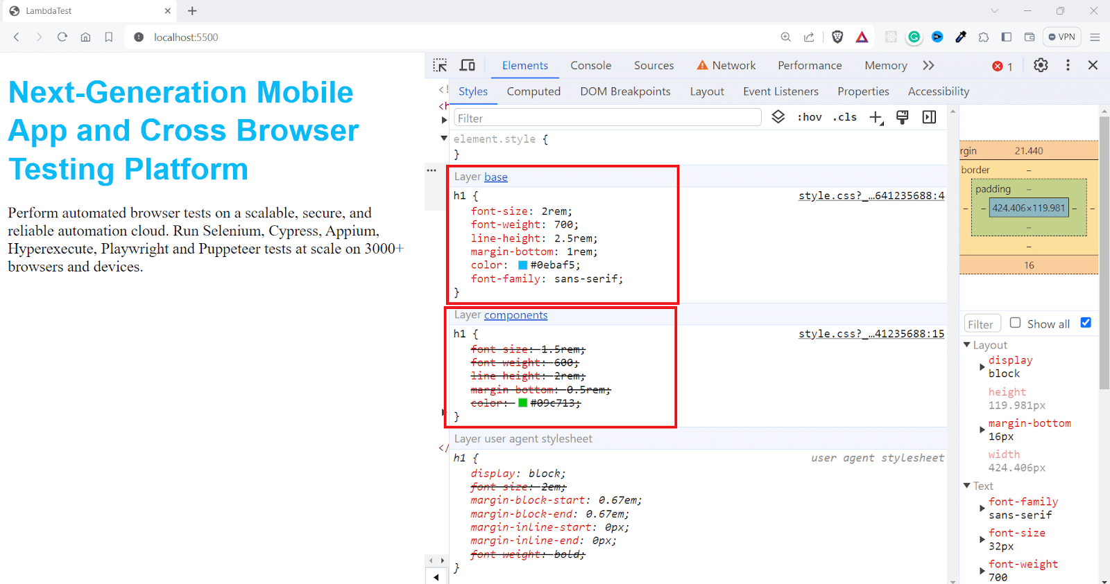
There are multiple layers here, including the base and component. When multiple styles conflict, the order of the layers can be used to determine which styles take precedence.
Since we have @layer components and base, the one in the base will have more priority in our code as the styles in later layers can override conflicting styles from earlier layers.
If you want to learn more about layers and cascading, check out this detailed article on CSS Cascade Layers.
As we mentioned in the earlier section, you also need to understand how CSS specificity is calculated. When dealing with the CSS inherit mechanism, specificity determines whether to override inherited styles.
CSS Specificity
Consider the situation where you add a class name and an id for an element and then specify styles using both selectors. This can lead to conflicting style rules.
Suppose you have the following element on your website.
|
1 2 3 4 5 |
<body> <h1 class="heading" id="main_heading"> Next-Generation Mobile Apps and Cross Browser Testing Cloud </h1> </body> |
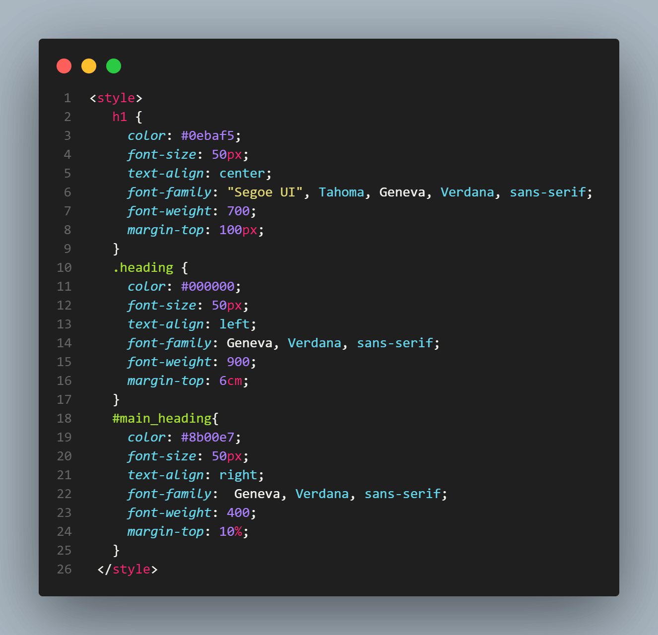
Now we can style the element, let’s first use the element selector.
|
1 2 3 4 5 6 7 8 |
h1 { color: #0ebaf5; font-size: 50px; text-align: center; font-family: "Segoe UI", Tahoma, Geneva, Verdana, sans-serif; font-weight: 700; margin-top: 100px; } |
Output:
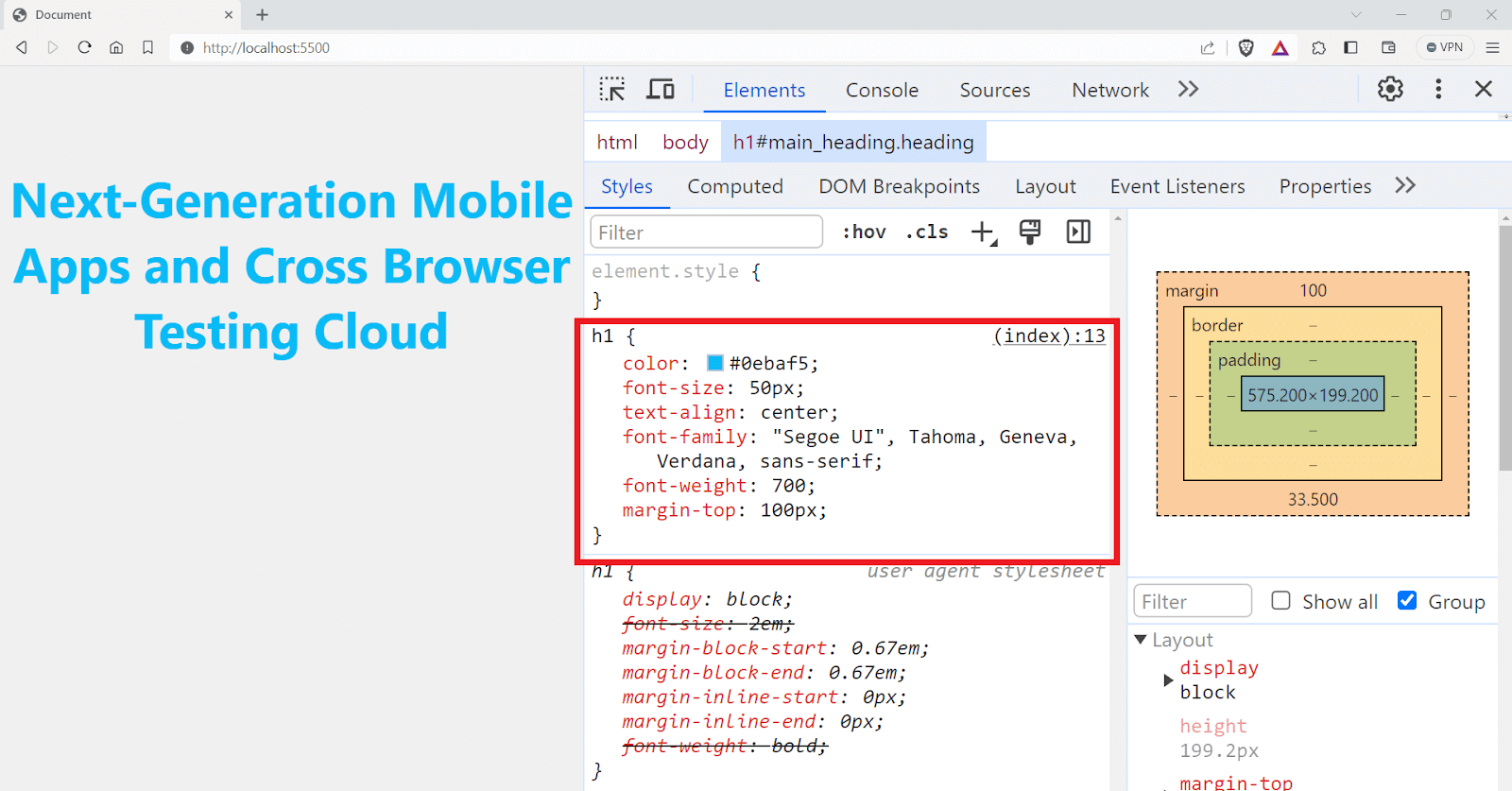
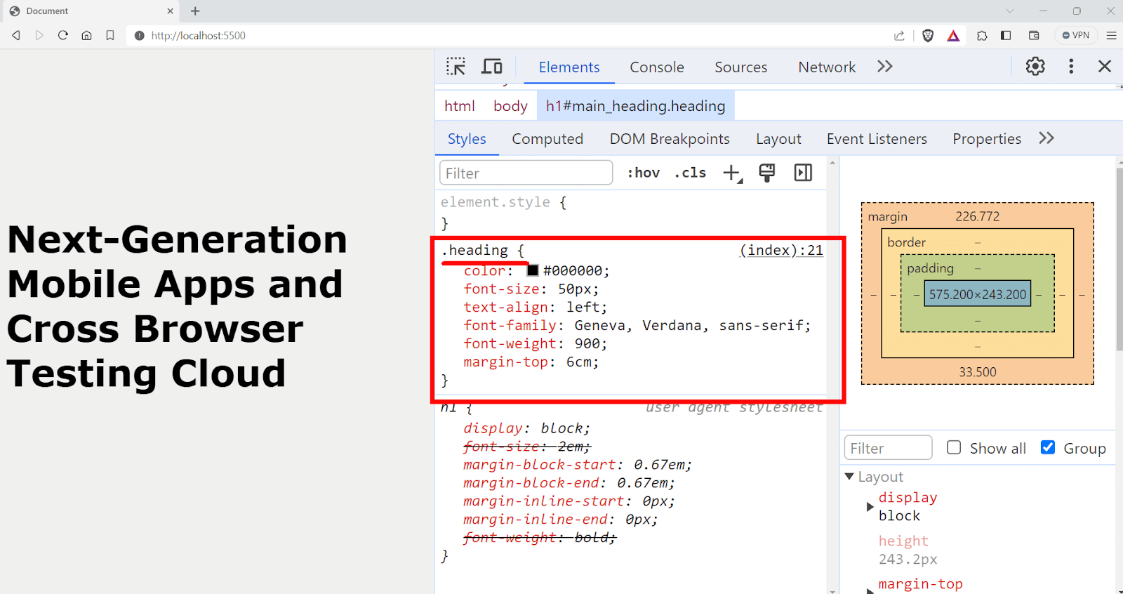
Since it also has a class name, let’s use the class name for styling instead of the element selector this time.
|
1 2 3 4 5 6 7 8 |
.heading { color: #000000; font-size: 50px; text-align: left; font-family: Geneva, Verdana, sans-serif; font-weight: 900; margin-top: 6cm; } |
Output:
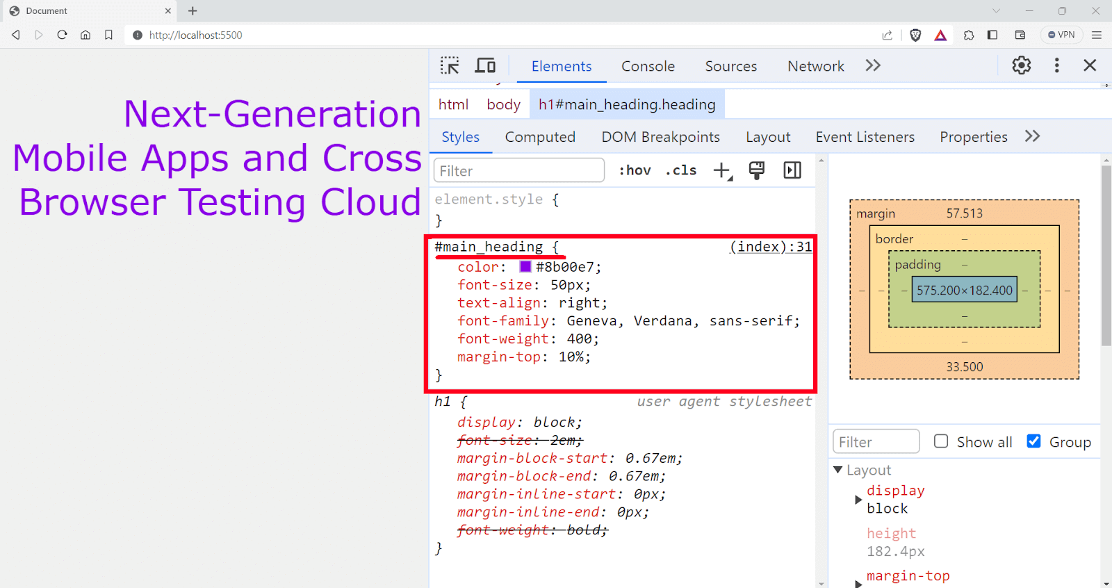
Since we also have an id specified to the element, instead of a class selector, let’s use the id selector.
|
1 2 3 4 5 6 7 8 |
#main_heading{ color: #8b00e7; font-size: 50px; text-align: right; font-family: Geneva, Verdana, sans-serif; font-weight: 400; margin-top: 10%; } |
The id selector has a higher priority; the CSS rules defined in the id selector will have higher priority here.
Output:
But what if you specify all these selectors together, as shown in the snippet below
Let’s check it on the Chrome DevTools and see what happens.
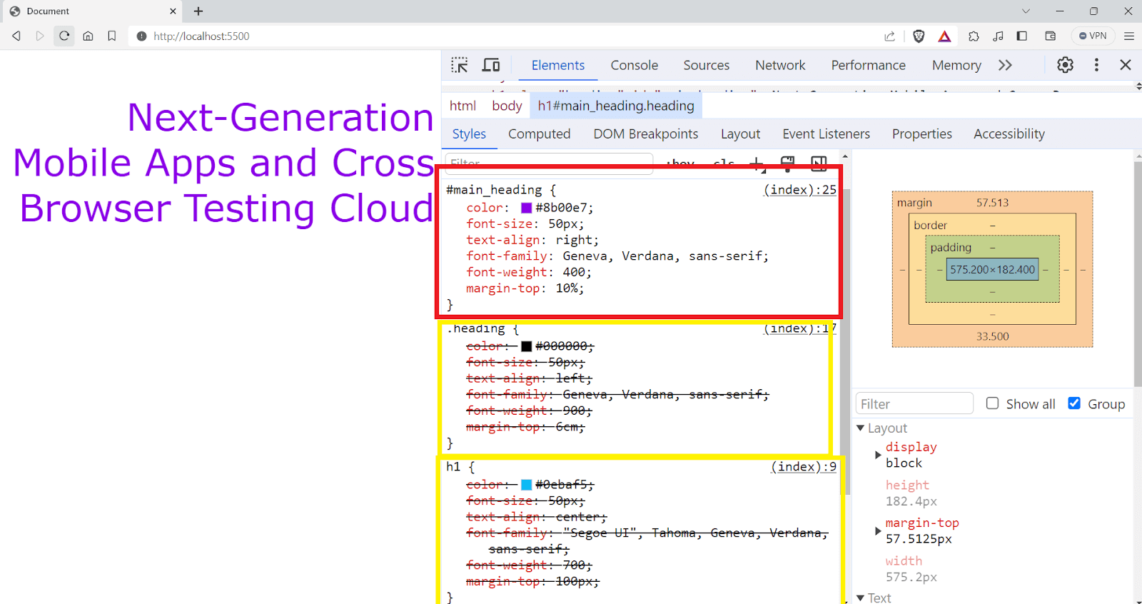
You can see that the styles defined in the id selector are being applied to the element, and all other styles are overridden.
This is a common issue you face while developing the website, and that’s where CSS specificity comes into the picture.
Browsers check the specificity value to decide which rules to apply when multiple conflicting styles exist. The higher the specificity, the more rules are applied and override other rules.
How to Calculate CSS Specificity of the Style Rules?
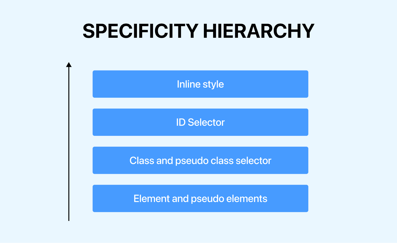
As mentioned in earlier sections of this article on CSS inherit, the specificity score is calculated based on the types of selectors used in a rule. It is generally calculated using a weighted system that considers the different types of selectors.
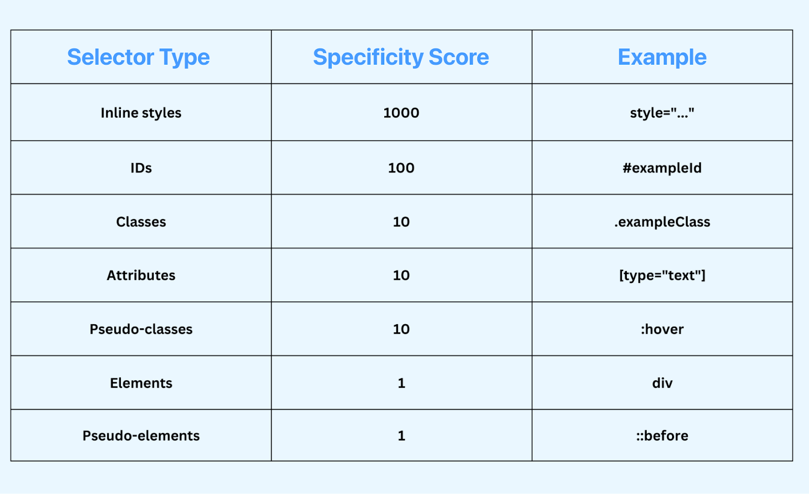
- Universal selectors: Universal selector has no specificity and adds 0 points. Every other selector can simply override the styles defined inside the universal selector.
- ID selectors: Each ID selector in the rule adds 100 points to the specificity score. The most specific ID selectors are denoted with a hash (#), like #menu__bar.
- Class, attribute, and pseudo-class selectors: Each class selector (.classname), attribute selector ([type=”text”]), or pseudo-class (:hover) adds 10 points to the score. These selectors are less specific than ID selectors but more specific than type selectors.
- Type selectors and pseudo-elements: Each type selector or pseudo-element contributes 1 point to the specificity score. These are the least specific selectors. They target HTML elements directly, such as < p >, < div >, < h1 >, or parts of elements like ::before and ::after selector.
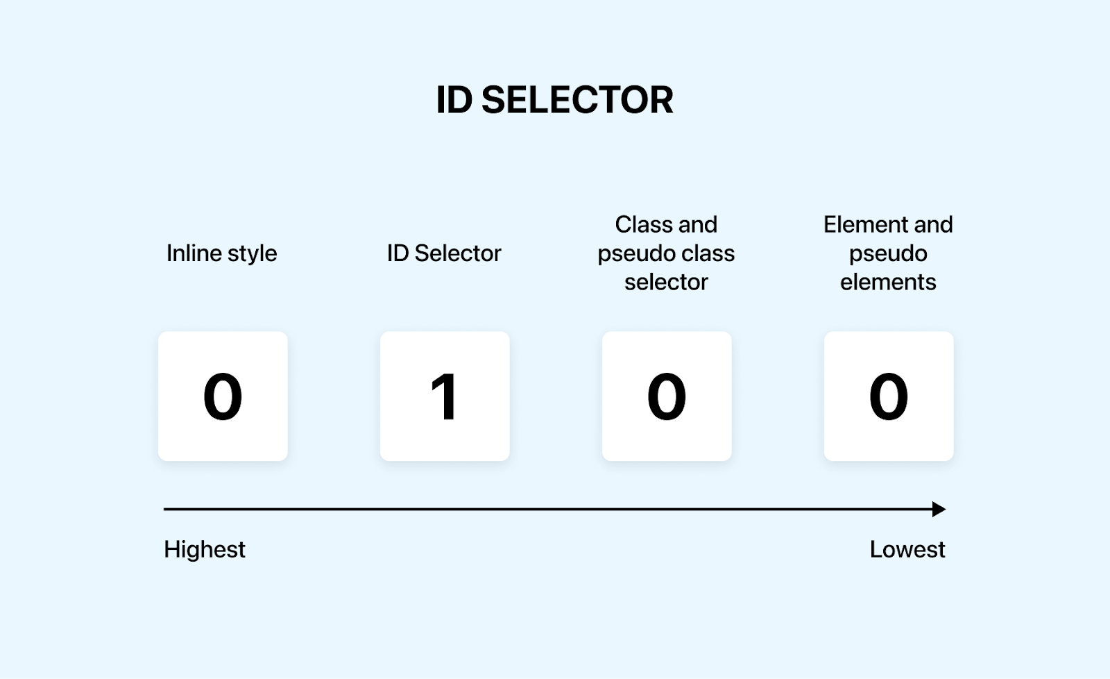
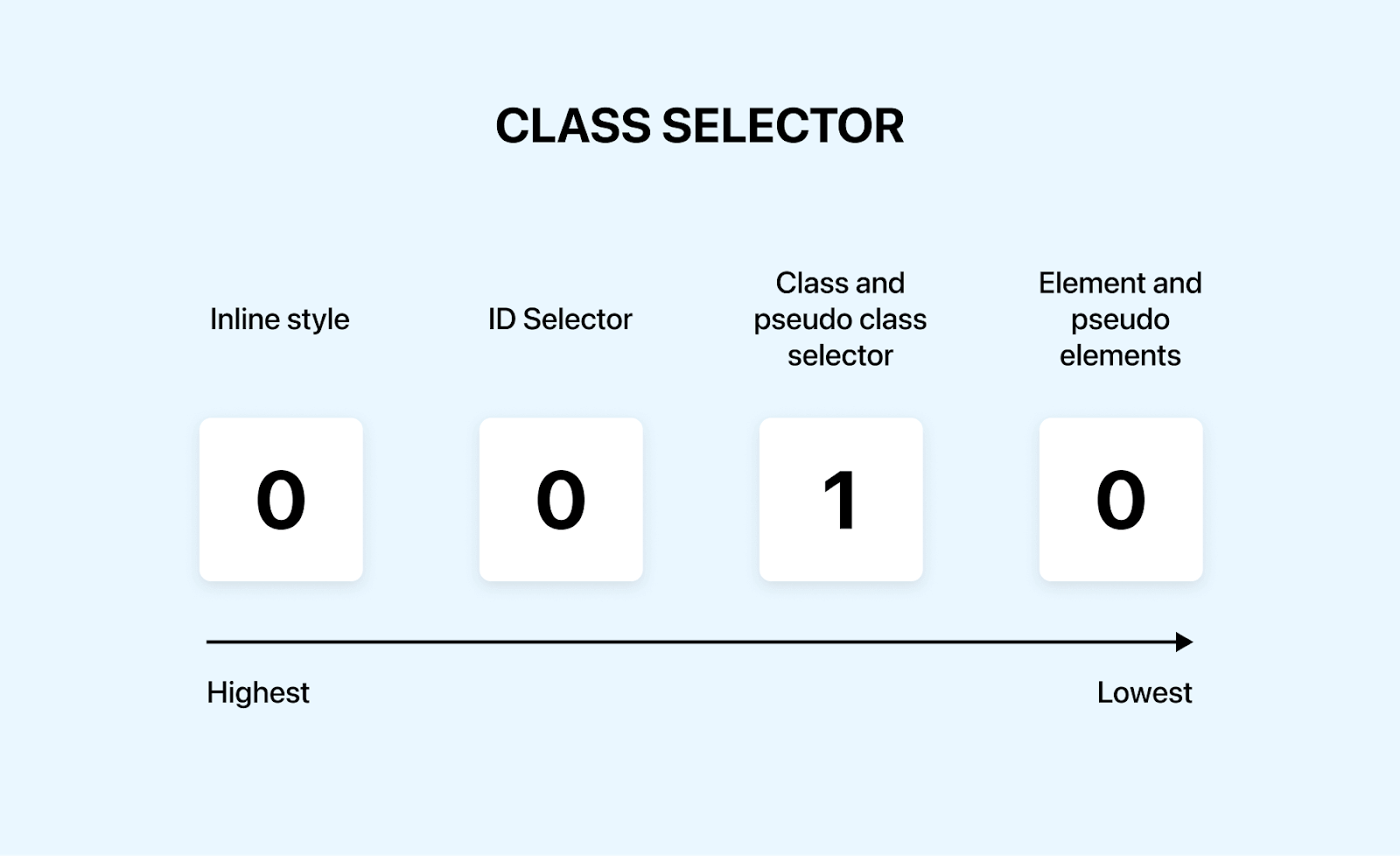
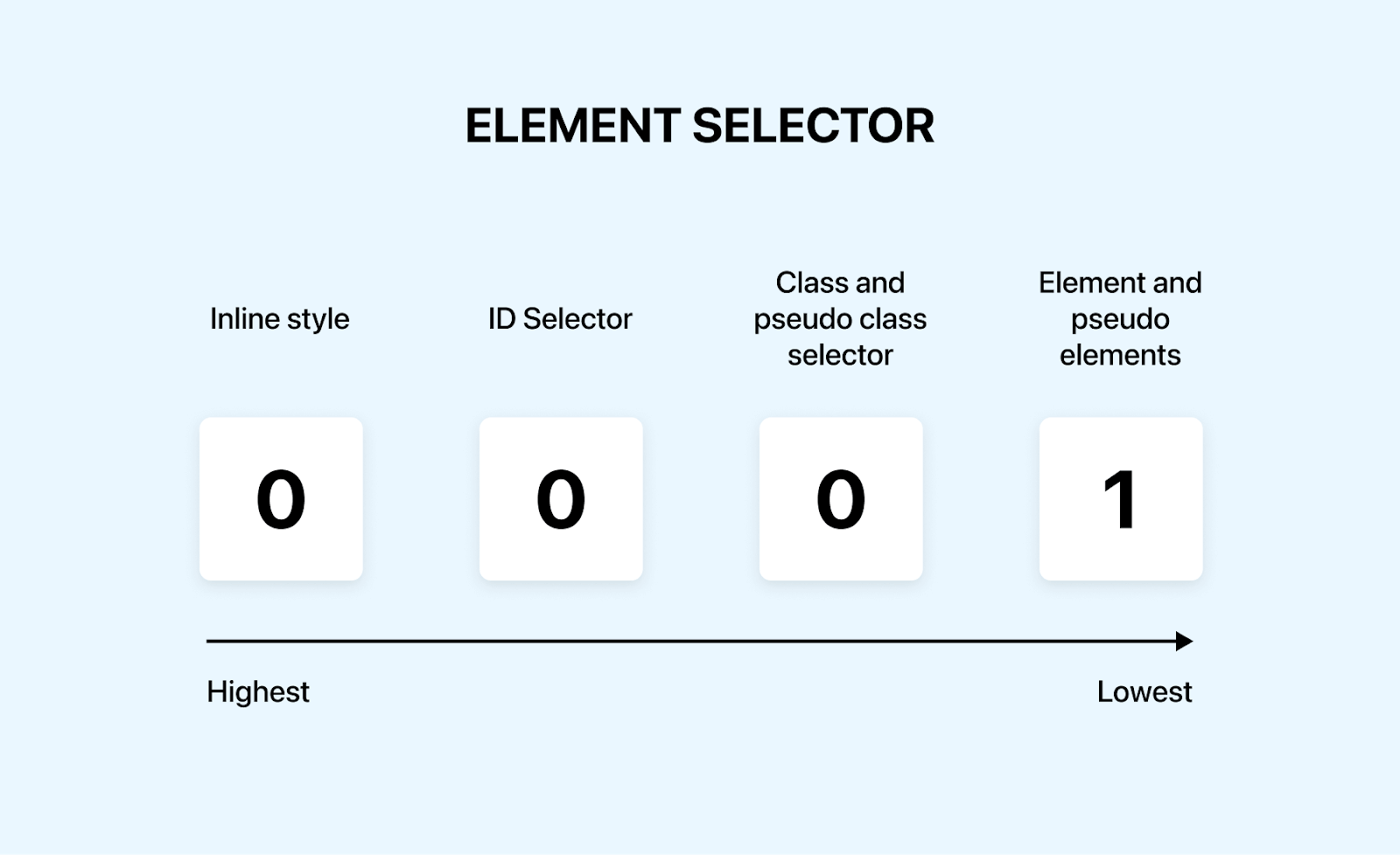
The specificity score is typically represented by three or sometimes four numbers, such as 0-0-0, corresponding to ID selectors, class selectors, and type selectors.
For instance, a rule with one ID selector, two class selectors, and one type selector would have a specificity score of 1-2-1 in total.
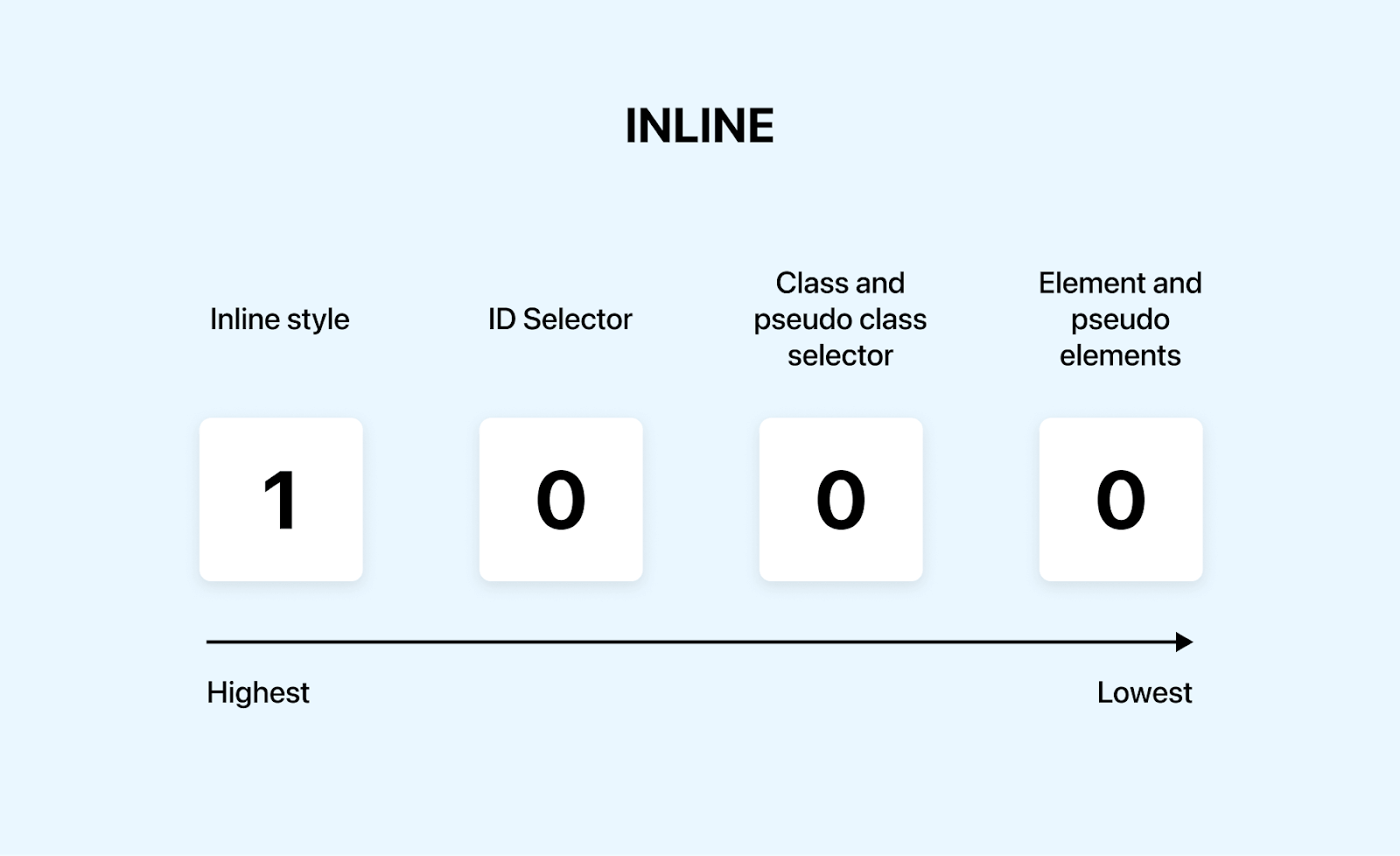
When an inline style is used, its specificity score is 1, and others have a score of zero. Thus, the total specificity score is 1000.
When the browser renders a page, and multiple rules target the same element, it compares their specificity scores. The rule with the highest specificity score takes precedence.
When both have the same scores, the last rule defined in the CSS determines the style.
The !important declaration in CSS is used to override all other styles regardless of their specificity. For instance, p { color: red !important; } will override other color properties set for < p > tags, even if they have a higher specificity.
The !important gives a specificity score of 10,000 points, and it is the highest specificity a particular item can have.
Combination selectors don’t add any value to specificity. Let’s take this example:
CSS:
|
1 2 3 4 5 6 7 8 9 10 11 12 13 14 15 16 17 18 19 |
.description { color: #272626; font-size: 20px; text-align: center; font-family: sans-serif; width: 50%; margin: auto; margin-top: 50px; } section div p { color: #000000; font-size: 20px; text-align: left; font-family: Arial, sans-serif; width: 80%; margin-top: 50px; } |
Even though combination selectors appear more specific, they don’t add value to the specificity weight.
Output:
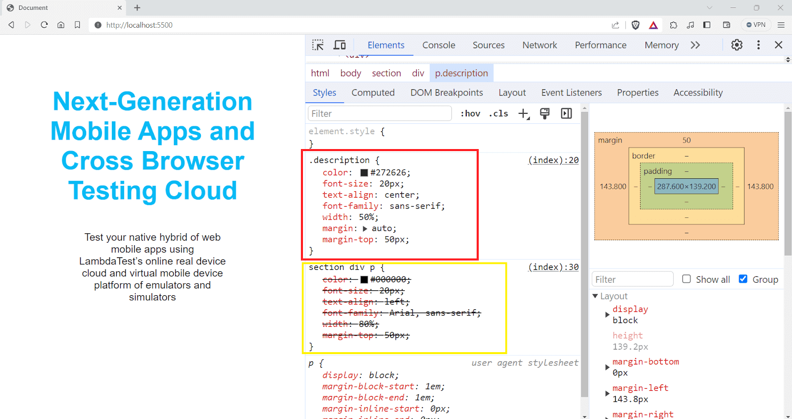
You can see that the styles declared in the combination selector are overridden by the styles in the class selector.
To understand more about the specificity, refer to the article on CSS Specificity.
Now that you understand how specificity and cascading work, let’s dive into the scope-based CSS inherit mechanism.
Scope-Based CSS Inheritance
CSS inherit mechanism is helpful when we need a consistent style; for instance, setting a font style on a parent element ensures that all text within that element shares the same font characteristics unless explicitly overridden.
✩ CSS Inheritance Example ⇩ pic.twitter.com/DsszTQN2an
— Aakash Rao (@Aakash_codes) March 15, 2023
CSS provides two types of scope, the global scope and the local scope. This is the main reason why we have an inheritance in CSS.
Elements in the local scope can inherit styles from their parent elements. If a style isn’t explicitly defined in the local scope, the element looks up to its parent element. If the parent has a style defined for that property, the child element inherits it.
Local scope styles can also be accessed through global styles. If a property isn’t defined in the local scope or any of its parents, the element will use the style defined in the global scope.
Take a scenario where you are applying the same font properties to different elements like < p > and < h1 >. This approach often leads to redundant code.
|
1 2 3 4 5 6 7 8 9 10 11 12 |
p{ font-family: Poppins, sans-serif; font-size: 16px; font-weight: 300; } h1{ font-family: Poppins, sans-serif; font-size: 16px; font-weight: 300; } |
The better way is to lift up the styles to a parent element or a root element. In that way, both the < p > and < h1 > tags have access to the font properties.
|
1 2 3 4 5 |
div{ font-family: Poppins, sans-serif; font-size: 16px; font-weight: 300; } |
Which CSS Properties are Inherited?
Several properties are inherited by default, and unless they are overridden, the styles applied to the parent element are passed down to the subsequent child elements.
Some of the commonly used inherited properties are
- font-family: This property determines the typeface. When set on a parent element, like the < body > tag, it’s inherited by all descendent elements, ensuring text across the page has a consistent typeface.
- font-size: Similar to font-family, the font-size property is also inherited. Setting a base font size on a parent element can standardize text size throughout the page unless specifically overridden.
- color: Used primarily for text color, this property is inherited by child elements. Setting a color on a parent element can standardize the text color for all children.
- line-height: This property, which controls the spacing between lines of text, is also inherited. It is particularly useful for ensuring consistent text readability.
- text-align: Text alignment (like left, right, and center) is inherited, allowing consistent text alignment across different sections without repeated declarations.
• Which all CSS properties are inherited? pic.twitter.com/y45DgSwQpa
— Adarsh Gupta ✨ (@Adarsh____gupta) January 31, 2024
Which CSS Properties Avoid Inheritance by Default?
Certain CSS properties do not inherit from their parent elements. Instead, they keep their default values unless set explicitly on the child elements.
- margin: Margins set on a parent element do not inherit to child elements. Each child element’s margin is independent, allowing for individual spacing adjustments.
- padding: Similar to margins, padding defined on a parent element is not inherited. This allows for specific spacing inside each element, which is necessary for layout design.
- border: Borders are not inherited. Each element can have its border style, width, and color, independent of its parent.
- background: Background properties, including color and images, are not inherited.
By default, the non-inherited properties are set to the initial value of the property, but it can be overridden by using the CSS inherit keyword.
• Which all CSS properties do not inherit by default? pic.twitter.com/bNRAxAgVwZ
— Adarsh Gupta ✨ (@Adarsh____gupta) January 31, 2024
What is CSS Inherit?
The CSS inherit keyword causes the element to take the value from the parent element. The inherit keyword in CSS specifies that the browser should look up the DOM hierarchy to the parent element and use whatever value is defined for the same property.
The CSS inherit keyword will only take the value from the immediate parent, not from any further ancestor or from a more general rule. The immediate parent may or may not inherit the value from its parent.
Let’s take an example.
HTML:
|
1 2 3 4 5 6 7 8 9 10 11 12 13 14 15 16 17 18 19 20 21 22 23 24 25 26 27 28 29 30 31 32 33 34 35 36 37 38 39 40 41 42 43 44 45 46 47 48 49 50 51 52 53 54 55 56 57 58 59 60 61 62 63 64 65 66 67 68 69 70 71 72 73 74 75 76 77 78 79 80 81 82 83 84 85 86 87 88 89 90 91 92 93 94 95 96 97 98 99 100 101 102 103 104 105 106 107 108 109 110 111 112 113 114 115 116 117 118 119 120 121 122 123 124 125 126 127 128 129 130 131 |
<!DOCTYPE html> <html lang="en"> <head> <meta charset="UTF-8" /> <meta name="viewport" content="width=device-width" , initial-scale=1.0"> <title>CSS Inheritance Example</title> </head> <body> <div class="main-content"> <div class="main-content__header"> <h1>Lambdatest Blogs</h1> <p>Here are some blogs I wrote recently.</p> </div> <div class="blogs"> <div class="blog-post"> <a href="https://www.lambdatest.com/blog/best-css-frameworks/"> <img class="blog-post__image" src="https://www.lambdatest.com/blog/wp-content/uploads/2021/04/image5-81.png" alt="image" /> <h2>24 Best CSS Frameworks To Look Forward In 2023</h2> <p class="blog-post__posted_on">Posted on 15th August 2023</p> <p class="blog-post__text"> If you are into software development, one of the most common pieces of advice is to Don’t Repeat Yourself (DRY). This is the same case in front-end development, and there is no need to start everything from scratch when you develop the application. </p> </a> </div> <div class="blog-post"> <a href="https://www.lambdatest.com/blog/best-css-frameworks/"> <img class="blog-post__image" src="https://www.lambdatest.com/blog/wp-content/uploads/2021/04/image5-81.png" alt="image" /> <h2>A Complete Guide to CSS Refactoring</h2> <p class="blog-post__posted_on">Posted on 15th August 2023</p> <p class="blog-post__text"> Being a front-end developer is like having the magical power to shape reality after it’s been created. </p> </a> </div> </div> </div> </body> </html> .main-content { font-family: sans-serif; color: #0EBAC5!important; line-height: 1.6; margin: auto; } .main-content__header { text-align: center; margin-bottom: 50px; } .blogs{ display: flex; flex-wrap: wrap; justify-content: center; } .blog-post { background-color: #f4f4f4; margin-bottom: 20px; padding: 15px; border-radius: 8px; width: 25%; margin-right: 20px; } .blog-post a { text-decoration: none; color: inherit; /* Inherits color from .main-content */ } .blog-post__image { width: 100%; border-radius: 5px; } .blog-post h2 { font-size: 1.5em; line-height: inherit; color: inherit; } .blog-post__posted_on { font-style: italic; color: inherit; /* Inherits color from .main-content */ } .blog-post__text { font-size: inherit; /* Inherits font-size from .main-content */ color: gray; /* Inherits color from .main-content */ margin-top: 10px; } |
See the Pen
Untitled by adarsh (@adarsh-gupta101)
on CodePen.
The color: inherit; style in .blog-post a ensures that all < a > tags within .blog-post inherit the text color from their parent element. In this case, they inherit the color #0EBAC5 from .main-content.
Similar to the anchor tags, the color: inherit; in .blog-post__posted_on and .blog-post__text classes ensures that these elements use the text color defined in the parent .main-content class.
If the parent element doesn’t have a value explicitly set for that property, it inherits that property. Similarly, the child element will also inherit the value from its parent. This CSS inherit process can extend up the hierarchy, with each parent potentially inheriting from its parent, and so on.
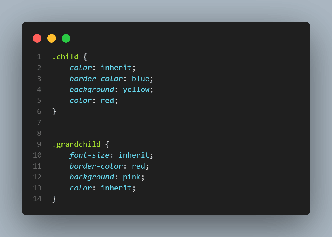
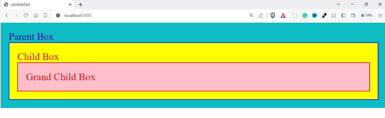
The example below shows how elements are inherited from the parent elements and even grandparents.
HTML:
|
1 2 3 4 5 6 7 8 9 10 11 12 13 14 15 16 17 18 19 20 21 |
<!DOCTYPE html> <html lang="en"> <head> <meta charset="UTF-8"> <meta name="viewport" content="width=device-width, initial-scale=1.0"> <title>CSS Inheritance Example</title> <style> </style> </head> <body> <div class="box parent"> Parent box <div class="box child"> Child box <div class="box grandchild"> Grandchild box </div> </div> </div> </body> </html> |
CSS:
|
1 2 3 4 5 6 7 8 9 10 11 12 13 14 15 16 17 18 19 20 21 22 23 24 25 26 27 28 29 30 |
.box { padding: 20px; border: 2px solid #ffffff; } .parent { font-size: 25px; color:darkblue; background: #0ebac5; } .child { color: inherit; border-color: blue; background: yellow; } .grandchild { font-size: inherit; border-color: red; background: pink; color: inherit; } |
See the Pen
Untitled by adarsh (@adarsh-gupta101)
on CodePen.

You can see that the font-color of both the text, child class, and Grandchild class is the same as we inherit the value from the parent.
If you change the color property to red in the .child class, the .grandchild class will inherit from its immediate parent, the .child class.
As you can see, one of the main scenarios where CSS inherit property is particularly useful is when you want to ensure consistency in styles across various web page elements. It is especially handy where you want to override styles that are otherwise not inherited by default.
There are certain styles that inherit the value from the parents without even specifying it, like the font-family and color properties.
The properties, such as margin and padding, do not automatically inherit values from their parent. To inherit the values from the parent element, they must be specified using the CSS inherit keyword.
When the CSS inherit keyword is used on non-inherited properties, it can sometimes lead to unexpected styling consequences, especially in complex layouts with deeply nested elements. The initial value provides a solution for that. Let’s look into it.
CSS initial Keyword
While CSS inherit concept simplifies styling by reducing redundancy, it can sometimes lead to unexpected layouts. For instance, adding a specific font-size or line-height on a parent element can adversely affect the layout of child elements if these properties are not explicitly set for them.
The initial keyword negates inheritance and previous declarations, providing a clean state for specific properties. It is used to set the default value of the given CSS property. Every property in CSS has a default value, not the styles inherited from browser agent styles. For example, the default value of color is black.
HTML:
|
1 2 3 4 5 6 7 8 9 10 11 12 13 14 15 16 17 18 19 20 21 22 23 24 25 26 27 28 29 30 31 32 33 34 35 36 37 38 39 40 41 42 43 44 45 46 47 48 49 50 51 52 53 54 55 56 57 58 59 |
<!DOCTYPE html> <html lang="en"> <head> <meta charset="UTF-8" /> <meta name="viewport" content="width=device-width, initial-scale=1.0" /> <title>CSS Inheritance with 'initial' Example</title> <style> body { background-color: #ffffff; text-align: center; margin: 10%; font-size: 24px; } .main-content { font-family: "Arial", sans-serif; color: #0ebaf5; line-height: 1.6; padding: 20px; margin: auto; width: 50%; box-shadow: 1px 10px 8px rgb(218, 218, 218); } .special-section p { font-family: initial; color: initial; line-height: initial; } <style> </head> <body> <div class="main-content"> <h1>Next-Generation Mobile Apps and Cross Browser Testing Cloud</h1> <p> Deliver unparalleled digital experience with our next-gen AI-powered testing cloud platform. Ensure exceptional user experience across all devices and browsers. </p> <div class="special-section"> <p> Perform automated browser tests on a scalable, secure, and reliable automation cloud. Run Selenium, Cypress, Appium, Hyperexecute, Playwright and Puppeteer tests at scale on 3000+ browsers and devices. </p> </div> </div> </body> </html> |
Output:
See the Pen
Untitled by adarsh (@adarsh-gupta101)
on CodePen.
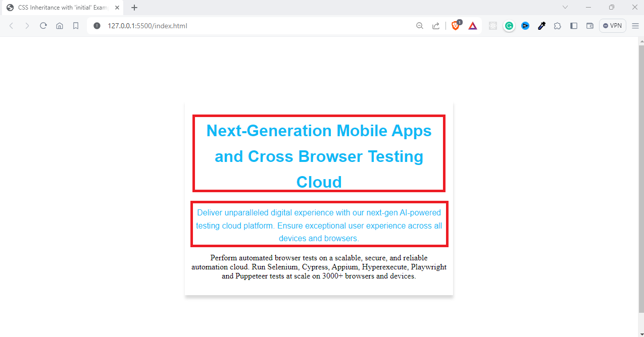
In .main-content, we set the font-family, color, and line-height. These styles are inherited by child elements, including paragraphs within this section.
Inside .special-section, < p > tags are styled using font-family: initial, color: initial, and line-height: initial. This effectively resets these properties to the default values specified by the browser, ignoring the inherited styles from the .main-content class.
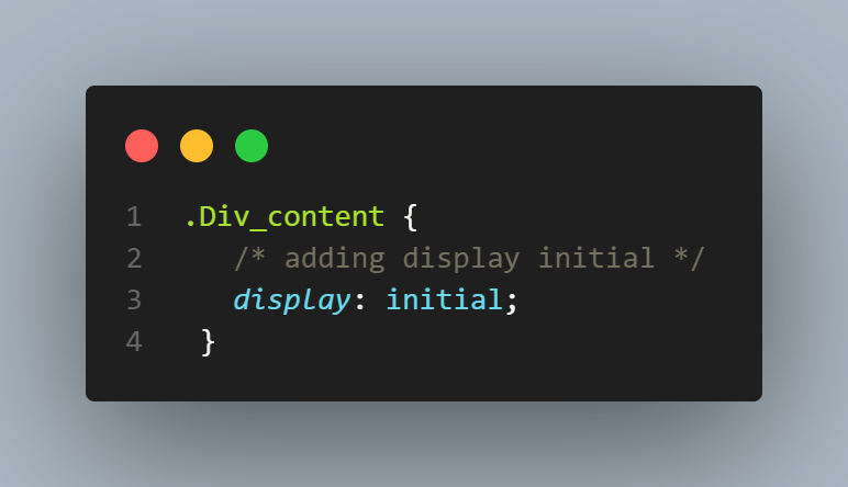
Sometimes, you might see unintended layouts, such as when applying the initial value to the display property of a < div > element. This will result in the < div > being rendered as an inline element.
|
1 2 3 4 5 6 7 8 9 10 11 12 13 14 15 16 17 18 19 20 21 22 23 24 25 26 27 28 29 30 31 32 33 34 35 36 37 38 39 40 41 42 43 44 45 46 47 48 49 50 51 52 53 54 55 56 57 58 59 60 61 62 63 64 65 66 67 68 69 70 71 72 73 74 75 76 77 78 79 80 81 82 83 84 85 86 |
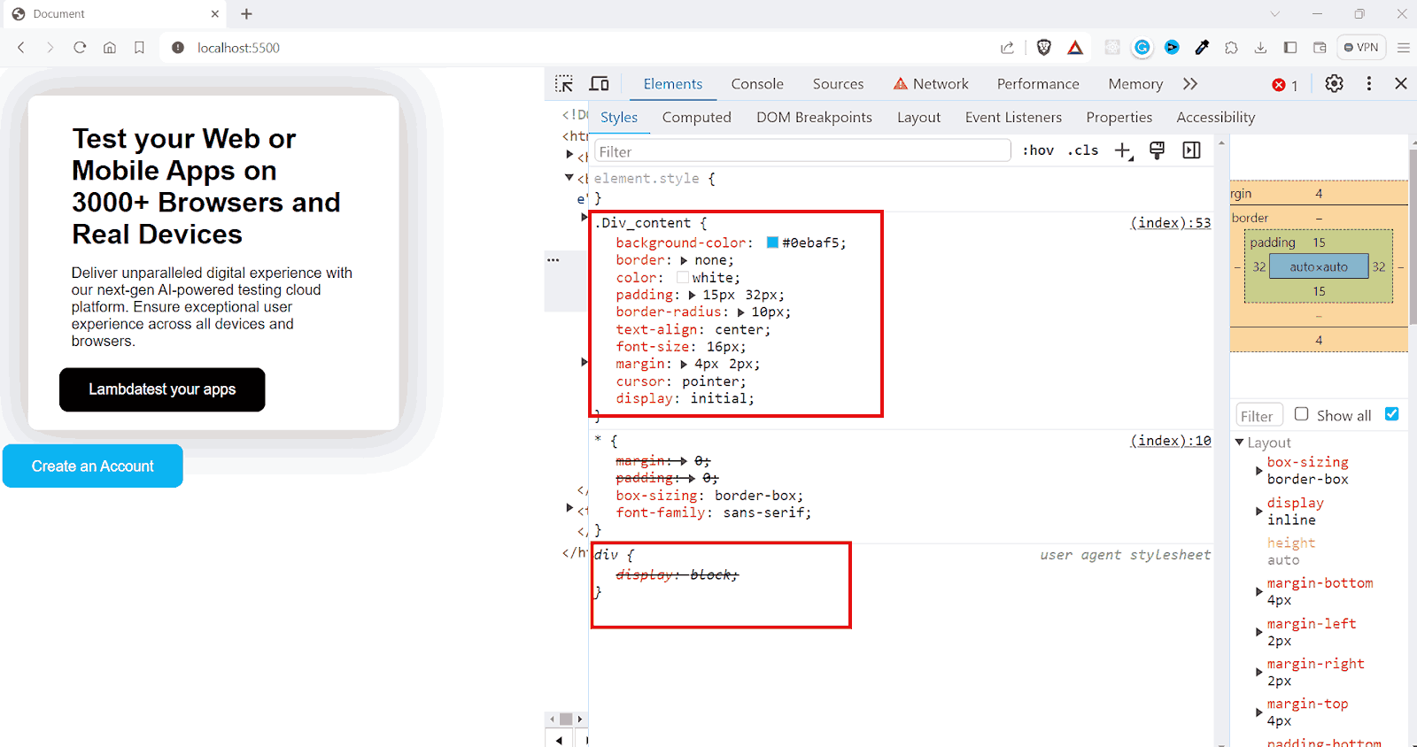
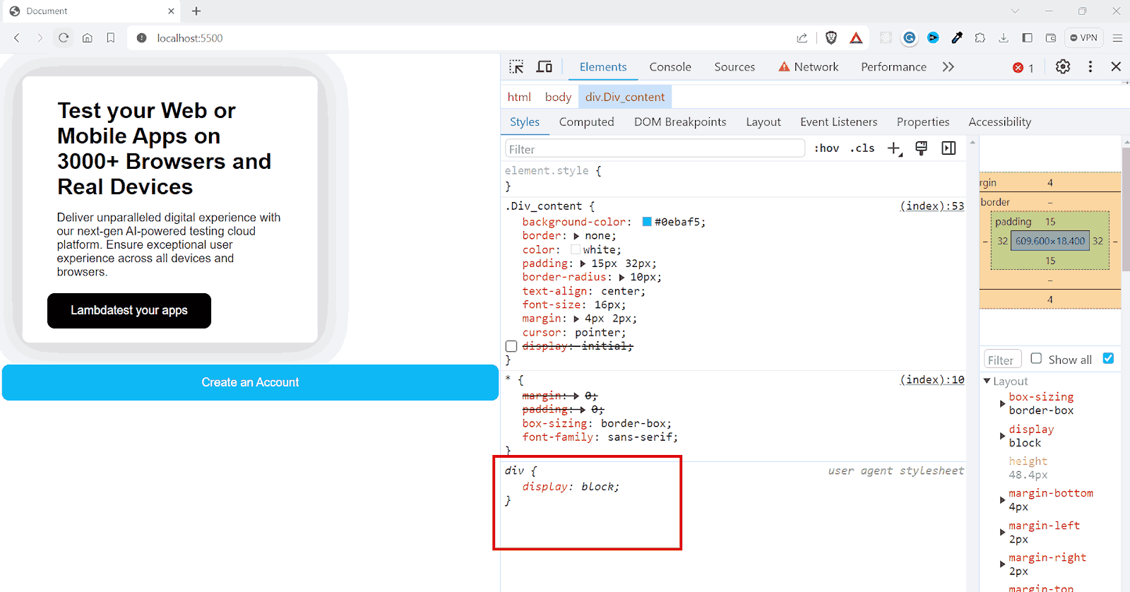
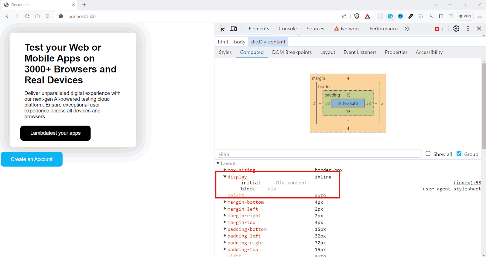
<!DOCTYPE html> <html lang="en"> <head> <meta charset="UTF-8" /> <meta name="viewport" content="width=device-width, initial-scale=1.0" /> <title>Document</title> </head> <style> * { margin: 0; padding: 0; box-sizing: border-box; font-family: sans-serif; } .container { background-color: #ffffff; border: none; box-shadow: 0px 0px 48px 13px rgb(206, 206, 206); color: rgb(0, 0, 0); padding: 15px 32px; border-radius: 10px; font-size: 16px; margin: 30px; cursor: pointer; width: 400px; } h3{ font-size: 30px; font-weight: 700; margin:15px } p{ margin: 15px; } button { background-color: #000000; border: none; color: white; padding: 15px 32px; border-radius: 10px; text-align: center; font-size: 16px; margin: 4px 2px; cursor: pointer; } .Div_content { background-color: #0ebaf5; border: none; color: white; padding: 15px 32px; border-radius: 10px; text-align: center; font-size: 16px; margin: 4px 2px; cursor: pointer; } </style> <body> <div class="container"> <h3>Test your Web or Mobile Apps on 3000+ Browsers and Real Devices</h3> <p> Deliver unparalleled digital experience with our next-gen AI-powered testing cloud platform. Ensure exceptional user experience across all devices and browsers. </p> <button>Lambdatest your apps</button> </div> <div class="Div_content">Create an Account </div> </body> </html> |
See the Pen
Untitled by adarsh (@adarsh-gupta101)
on CodePen.
Output:
In the example, you can see that the < div > element takes full width and acts as a block-level element, meaning it takes the entire width possible. But when you set the display as initial, the current value of the element will be altered.
Output:

This is the default behavior of display elements. The initial value of the display property is inline according to CSS specifications.
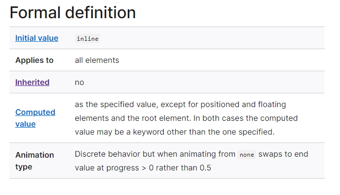
Since < div > is a block-level element by default, the browser-specific styles define it as a block-level element. That is the reason why < div > elements take the entire width.
When you explicitly mention display:initial to a < div > element, it will get a value of display:inline and act as an inline element rather than a block element.
As you can see, the initial property resets both inherited and browser default styles.
However, what if you need more precise control over styles and properties to make decisions based on inherited and non-inherited elements? That’s where the CSS unset keyword becomes useful.
CSS unset Keyword
Unlike initial, which always resets a property to its default value, unset acts differently based on whether a property is naturally inherited. The unset keyword works with both inherited and non-inherited properties.
- For inherited properties:
- For Non-Inherited Properties:
- CSS inherit: Takes the exact computed font size from the parent element.
- 100%: Sets the font size relative to the parent’s font size.
- CSS inherit: Inherits the computed value of a property from the parent.
- auto: The browser sets the property to its default value based on the element type and context.
When applied to inherited properties, such as color or font-size, the unset keyword causes the element to inherit these property values from its parent, similar to the CSS inherit keyword.
This means that if you apply color: unset; to an element, and the parent element has a color property set, the child element will take on the same color value as its parent element.
If the parent element doesn’t have a specific value set for the property and uses the CSS inherit mechanism, the child element will continue inheriting this value up the DOM tree until it reaches an element with a defined value.
When an unset property is applied to non-inherited properties like margin or padding, it resets the property to its initial value, the default value defined by the browser’s CSS specifications.
For example, applying margin: unset; to an element will reset its margin to the initial value, typically 0 in most browsers. This is the same as applying margin: initial to any element.
This unset keyword can be used to strip away specific styles applied earlier in the cascade, effectively returning the element to its default styling for those properties.
The unset property is useful in scenarios where you want to set a bunch of properties all at once to initial or inherit. You can use it with the all property, which is one of the CSS global keyword values.
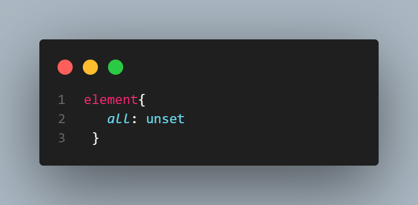
With the above line of code, all properties of the element will be reset. Properties usually inherited will default to inherit, and all others will revert to their initial values.
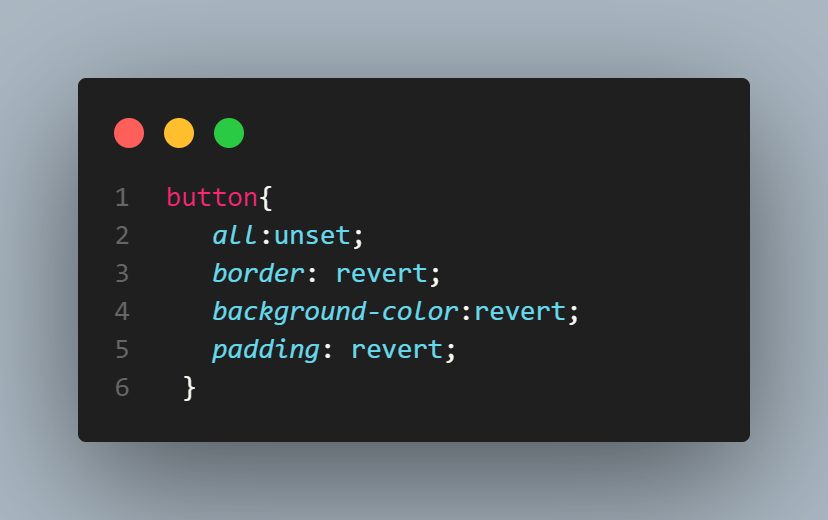
CSS revert Keyword
The revert property is similar to the initial keyword. However, the difference is that instead of setting properties to their initial values as defined in CSS specifications, it reverts them to the browser’s default style.
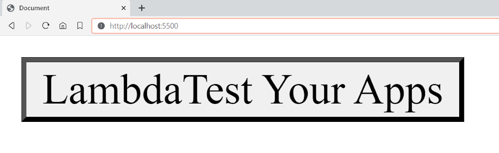
In the example below, you can see the browser-defined styles for the button element.
|
1 2 3 |
<button> LambdaTest Your Apps </button> |
Output:
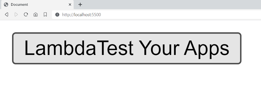
Some default styles are applied to the button element, like the background-color, border, etc. The styles are the default user-agent styles set by the browser.
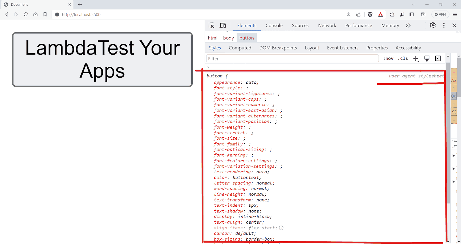
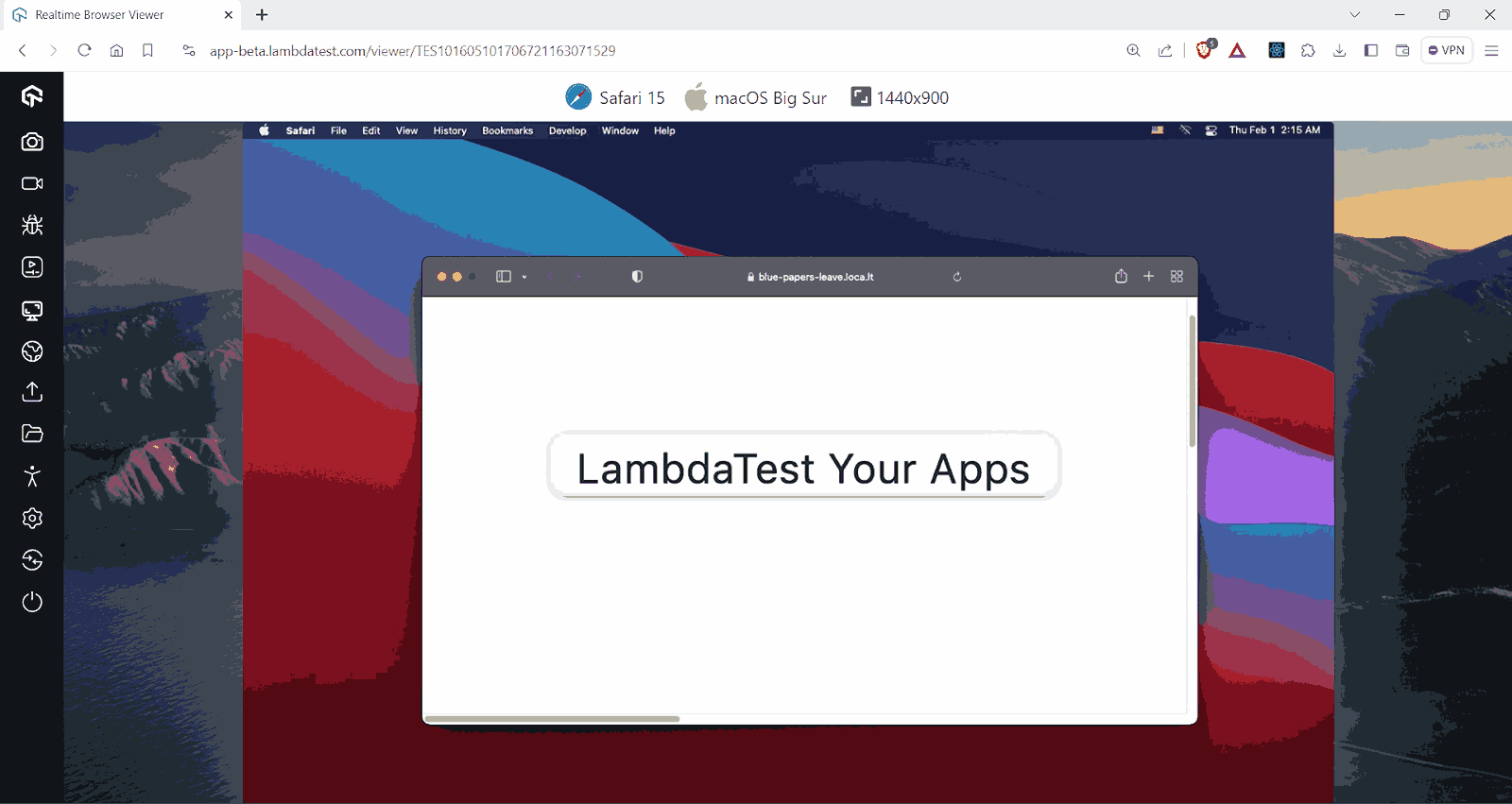
Each browser displays the same elements, such as buttons, with a unique style. For example, on Safari, you can see that we have an entirely different style for the same button element.
Now, when you add the revert property to the < button >, you can see that the < button > will revert to its plain old style.
Output:
On Safari:
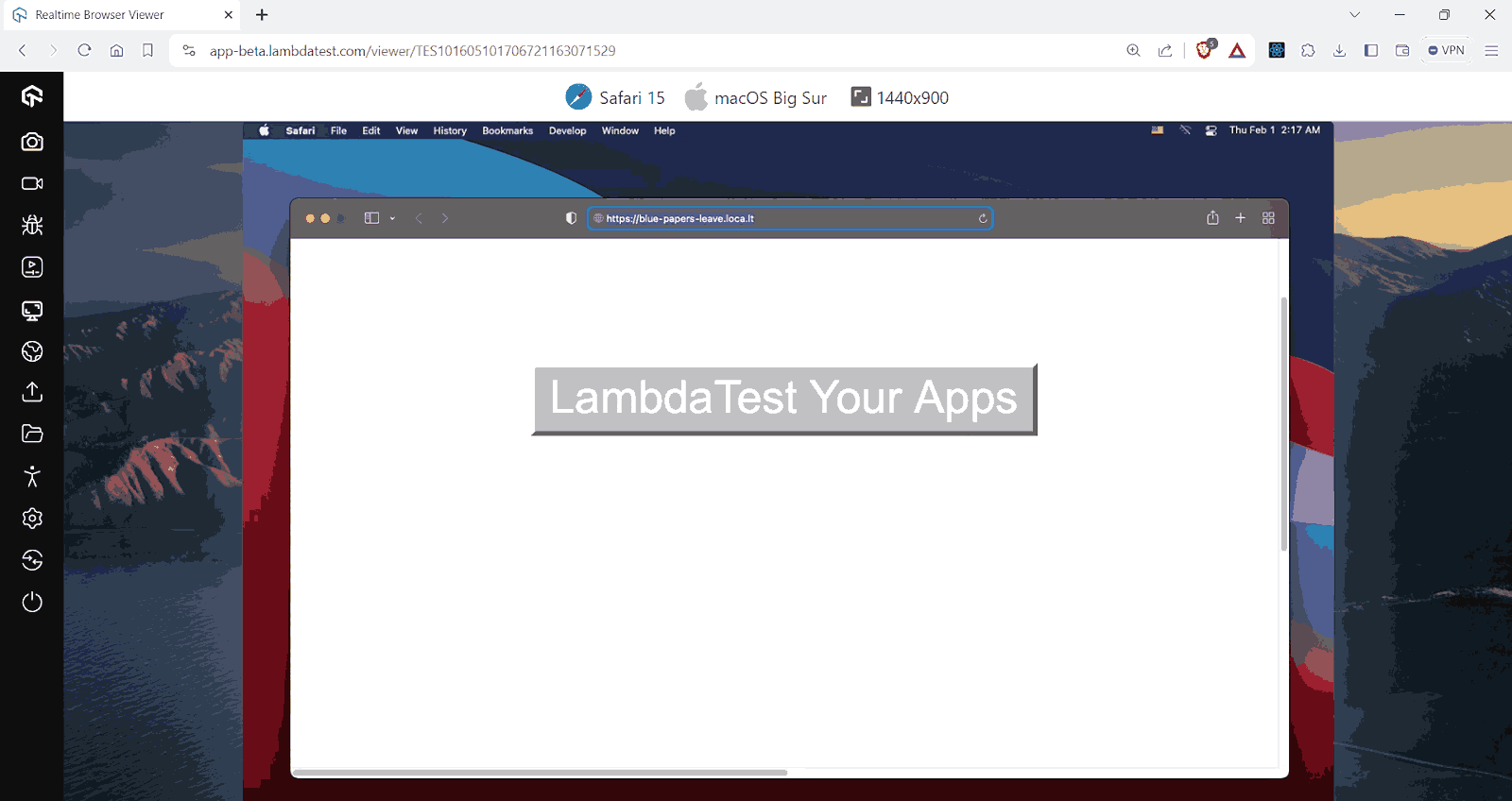
Since different operating systems and different browsers interpret elements in predefined ways, there is a need for cross browser testing to ensure that the website provides a uniform experience.
You can also use the cross browser testing feature provided by cloud testing platforms like LambdaTest to test your website in different desktop and mobile environments. This is necessary because specific browsers don’t enable new properties or selectors straight away. Instead, they typically offer them as experimental options before officially adding support.
LambdaTest is an AI-powered test orchestration and execution platform that allows you to perform real-time browser testing of your websites on an online browser farm of 3000+ real browsers, devices, and platforms.
Subscribe to the LambdaTest YouTube Channel. Get the latest updates on various automation testing tutorials covering Selenium testing, Playwright testing, and more.
Here, in the example, the revert keyword resets the property to the value it would have if the current style origin hadn’t applied any changes.
In simple words, revert essentially reverses the cascading effects of styles, returning the property value to what it would be if the current cascade levels, author styles, or user-agent styles had not applied any styles to it.
When used in a website’s styles (author origin), revert resets the property back to the user’s custom style if available. If no user custom style exists, it defaults back to the browser’s or user agent’s default style.
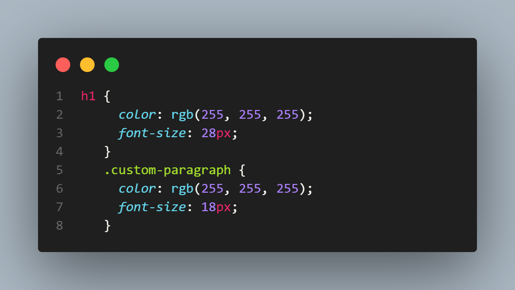
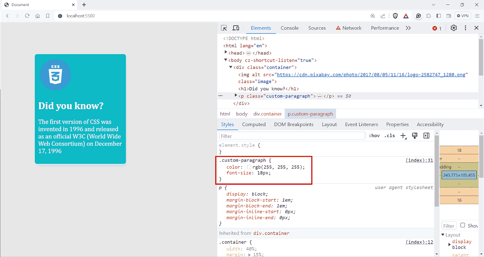
Suppose you have a < p > tag with a custom font-size as shown in the below image.
Output:
If you update the CSS for .custom-paragraph to use revert:
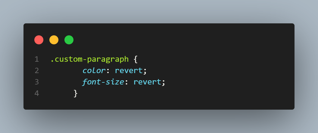
Output:
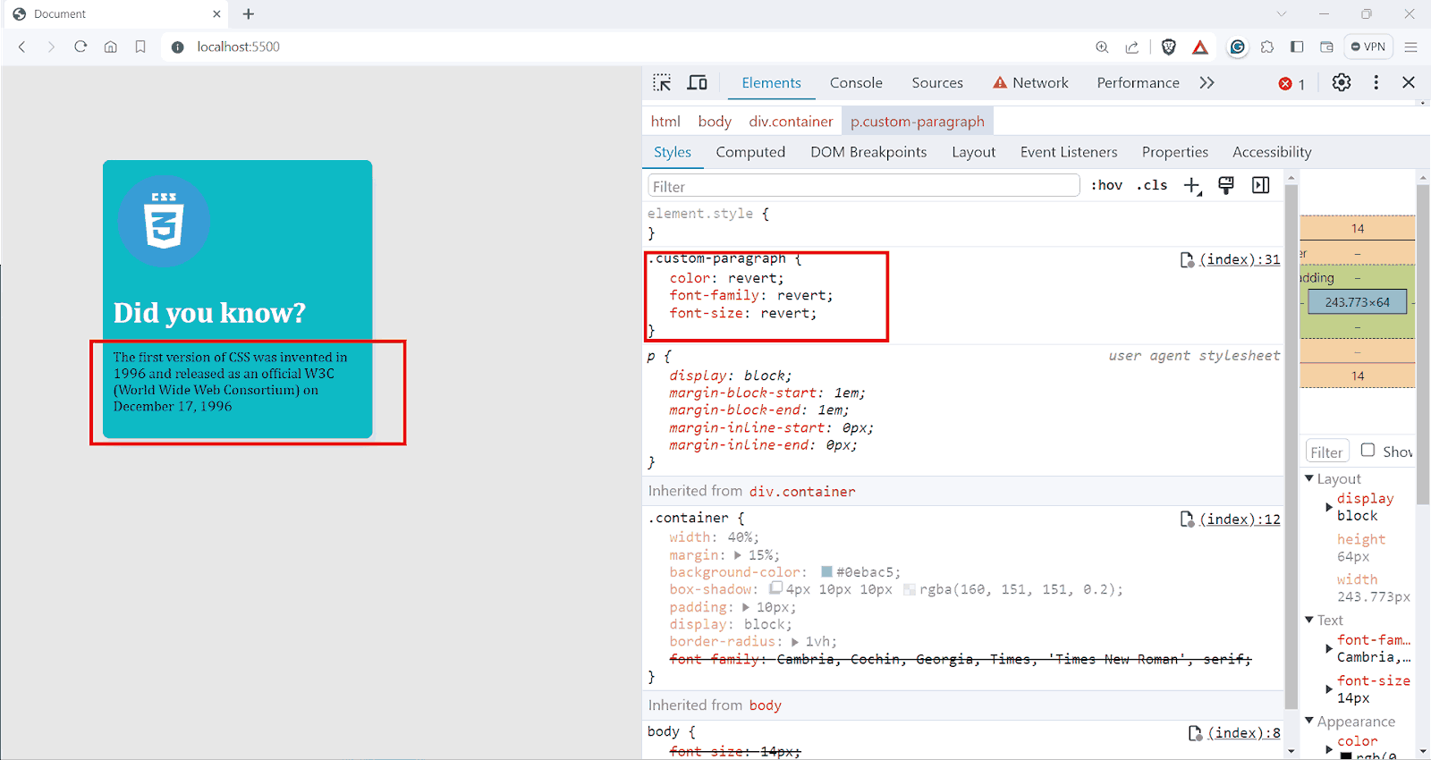
Here, the color and font-size properties will revert. Since these are author styles, revert will roll back to the browser’s default styles. The < p > here renders with the default styles.
In a user’s custom stylesheet, or if applied by the user, revert resets the property to the browser’s default style. If used in the browser’s default styles, revert acts like the unset keyword. In practice, this usage is less common, as browser stylesheets typically don’t use the revert keyword.
Benefits of CSS Inherit
The CSS inherit mechanism simplifies global adjustments, allowing these changes to be reflected automatically in child elements across different screen sizes. This section will explore some key benefits of using the CSS inherit mechanism.
Consistency Across the Website
Having a uniform user experience is much needed in this era because most of your users now tend to care more about user experience than ever.
According to WebFX, 94% of first impressions relate to website user interfaces.
With the help of the CSS inherit feature, we can ensure a consistent look and feel throughout the website. For instance, if the font-family, color scheme, text alignment, etc., are defined at a higher level, these styles are effortlessly inherited through the entire document structure.
Ease of Theming and Re-Theming
CSS inherit property allows us to remove a lot of redundant code in the codebase while adding a new theme or updating the previous one. You can change how the whole site looks by tweaking a few styles at the top level.
HTML:
|
1 2 3 4 5 6 7 8 9 10 11 12 13 14 15 16 17 18 19 20 21 22 23 24 25 26 27 28 29 30 31 |
<!DOCTYPE html> <html lang="en"> <head> <meta charset="UTF-8" /> <meta name="viewport" content="width=device-width, initial-scale=1.0" /> <title>Lambdatest Navbar Example for Inheritance</title> </head> <body> <nav> <img src="https://www.lambdatest.com/resources/images/logos/logo.svg" alt="Lambdatest Logo" /> <ul> <li><a href="#">Platform</a></li> <li><a href="#">Enterprise</a></li> <li><a href="#">Resources</a></li> <li><a href="#">Developers</a></li> <li><a href="#">Pricing</a></li> </ul> <div> <button>Dashboard</button> <button>Book a Demo</button> </div> </nav> </body> </html> |
CSS:
|
1 2 3 4 5 6 7 8 9 10 11 12 13 14 15 16 17 18 19 20 21 22 23 24 25 26 27 28 29 30 31 32 33 34 35 36 37 38 39 40 41 42 43 44 45 46 47 48 49 50 51 52 53 54 55 56 57 58 59 60 61 62 63 64 65 66 67 |
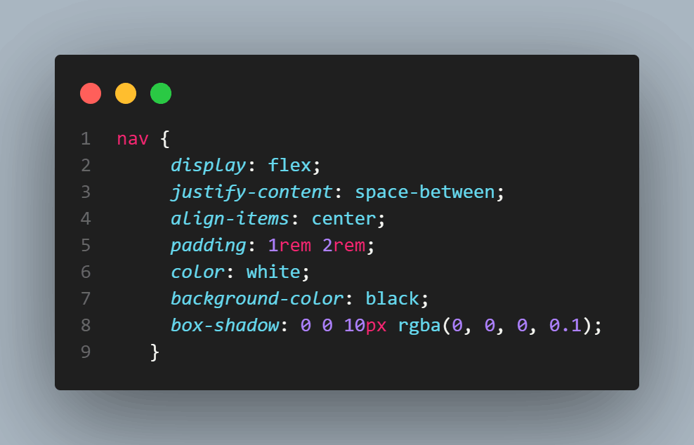
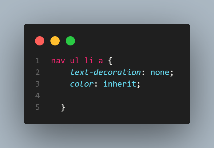
body { margin: 0; padding: 0; font-family: "Arial Narrow Bold", sans-serif; font-weight: 500; } nav { display: flex; justify-content: space-between; align-items: center; padding: 1rem 2rem; color: black; background-color: #fff; box-shadow: 0 0 10px rgba(0, 0, 0, 0.1); } nav img { height: 2rem; } nav ul { display: flex; list-style: none; } nav ul li { margin-left: 2rem; padding: 0.5rem 1rem; border: none; border-radius: 5px; background-color: #fff; } nav ul li a { text-decoration: none; color: inherit; } nav ul li a:hover { color: #f00; } nav div { display: flex; } nav div button { margin-left: 2rem; padding: 0.5rem 1rem; border: none; border-radius: 5px; color: #000000; font-weight: 500; } |
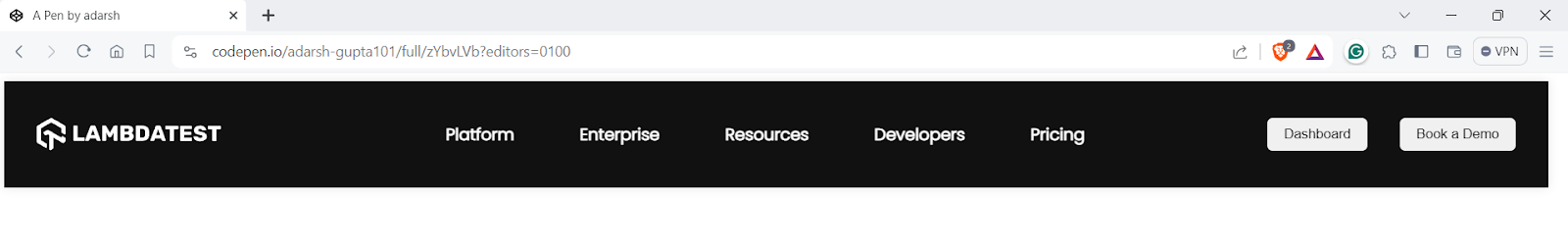
Output:
See the Pen
Untitled by adarsh (@adarsh-gupta101)
on CodePen.
What if you wanted to change the font family of this entire component?
If there was no CSS inherit concept, you would have to manually add the new font-family to each element like the < buttons >, < li >, < a > etc. Thanks to the CSS inherit mechanism, all we have to do is update the parent element.
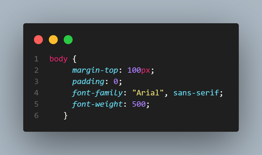
Here in the styles for the body element, just update the code to font-family: Poppins, sans-serif; and you are done with that.
|
1 2 3 4 5 6 7 |
@import url('https://fonts.googleapis.com/css2?family=Nunito:ital,wght@0,200;0,300;0,400;0,500;0,800;1,200;1,300;1,400&family=Poppins:ital,wght@0,100;0,200;0,300;1,100&display=swap'); body { margin-top: 100px; padding: 0; font-family: Poppins, sans-serif; font-weight: 600; } |
Take another scenario where you now need a dark-mode version of it. All you have to change is the parent element. Here, we are setting the background color to black and the text color to white.
The child elements will inherit the properties. Now you can see in the above output that the color of the items inside < a > tag is now white.
Since the < a > tag has a default color of blue, adding color: inherit will inherit the color from the parent and override any other rule from any origin.
Reduced File Size and Improved Performance
Lesser code means less time for the browser to download the code. This leads to faster page loading times, which is essential for improving user experience, especially on mobile devices with limited bandwidth.
CSS inherit mechanism simplifies updating styles, as changes made to elements at the top of the hierarchy directly impact child elements. This reduces the need to apply the same changes repeatedly throughout the website.
Scalability and Modularity
One of the important features of the CSS inherit mechanism is that it allows you to create modular designs. For example, consider the need for consistent and reusable buttons across a website. CSS inherit mechanism can simplify this by creating a modular component and later reusing the same.
HTML:
|
1 2 3 4 5 6 7 8 |
<html> <body> <div> <button class="Upgrade__button">Upgrade</button> <button class="BookDemo__button">Book a Demo</button> </div> </body> </html> |
For the main button element, let’s add some styles.
CSS:
|
1 2 3 4 5 6 7 8 9 10 11 |
button { border: none; color: white; padding: 10px; border-radius: 5px; text-align: center; text-decoration: none; font-size: 16px; margin: 4px 2px; cursor: pointer; } |
Now, we have an outline for the < button > element.
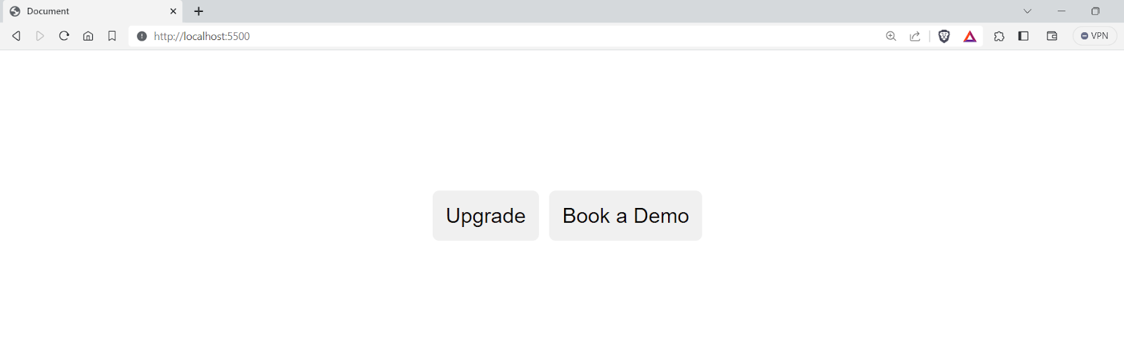
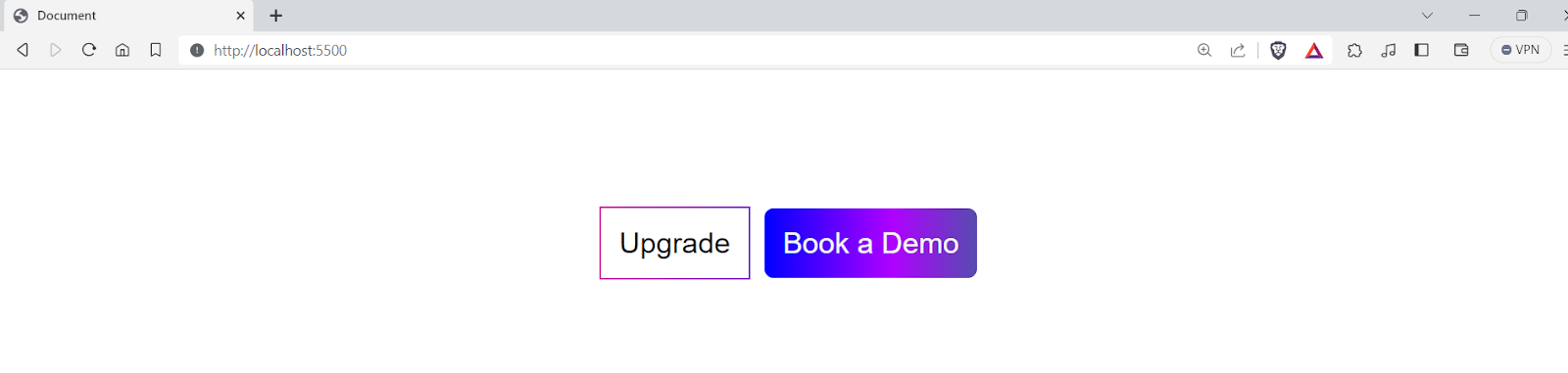
Now, if you want a custom < button >, all you need to do is add the custom styles for the button, and it will still have a default style unless overridden by the new styles.
|
1 2 3 4 5 6 7 8 9 10 11 12 13 14 15 16 17 18 19 20 21 |
.Upgrade__button { background-color: transparent; color: black; background-clip: padding-box; border: 1px solid; border-image-slice: 10; border-width: 1px; border-radius: 1em; border-image-source: linear-gradient(to left, #743ad5, #d53a9d); } .BookDemo__button { background-image: linear-gradient( to right, blue 0%, #af01ff 60%, #564caf 100% ); color: whitesmoke; } |
Output:
See the Pen
Untitled by adarsh (@adarsh-gupta101)
on CodePen.
You can see that the buttons share a common base style, ensuring a consistent look on the webpage. You can also effortlessly add new button variations without duplicating styles. Similarly, you can create reusable modules with the help of a CSS inherit mechanism to enhance your website’s overall scalability and functionality.
Browser Compatibility of CSS inherit Property
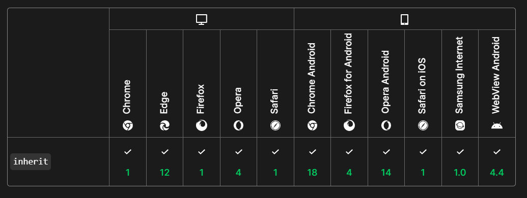
The CSS inherit property enjoys excellent browser compatibility across all modern desktop and mobile browsers. All major browsers, Chrome, Firefox, Safari, Edge, and Opera, fully support CSS inherit keyword for all its properties.
However, while developing your web applications using the CSS inherit property, it’s recommended to test your websites for cross browser compatibility so that you can always ensure your websites run smoothly when using the CSS inherit mechanism.
Wrapping it Up
Congratulations on reaching this far! In this blog on CSS inherit mechanism, we have delved into topics such as the specifics of CSS specificity, the cascade, and the importance of understanding CSS inherit feature in styling.
We’ve also looked into the mechanisms of CSS value processing and CSS properties like the initial, unset, and revert keywords. We have also taken some examples to break down some important topics here. Whether you’re just starting with CSS or are looking to refine your existing skills, this blog on CSS inherit has something valuable to offer.
Frequently Asked Questions (FAQs)
What is inherit in CSS?
The CSS inherit keyword instructs a child element to adopt the computed value of a specific CSS property from its parent element. It’s essentially a way to force inheritance for properties normally inheritable by default but might have been overridden higher up in the style hierarchy.
What is inherit font CSS?
You can use the CSS inherit keyword with any property, including font-related properties like font-family, font-size, font-weight, etc. It allows you to propagate font styles from parent to child elements, ensuring consistency or selectively overriding specific styles.
What is the difference between inherit and 100% in CSS?
What is the difference between auto and inherit in CSS?


Author’s Profile
Adarsh M
Adarsh is a full-stack JavaScript developer based out of India. He loves creating meaningful technical content on Twitter, where he connects with like-minded individuals and developer communities. He shares his knowledge on Twitter through insightful threads!
Blogs: 12
Got Questions? Drop them on LambdaTest Community. Visit now


