
CSS Font Spacing Tips & Tricks For Perfect Typography
Dun Yan
Posted On: January 27, 2023
 20891 Views
 25 Min Read

Typography and font spacing in CSS are important for creating a visually appealing and easy-to-read website. Typography refers to the art and technique of arranging type on a page, while CSS Font Spacing is used to establish an information hierarchy and convey the importance of different elements in a webpage.
Many web developers forget font typography and spacing in CSS styling. This would be less pleasing to the eye of the audience and likely much more complicated to navigate for the audience. The arrangement and structure of the fonts used and other minute details provide a way of communication between the visitor and the website owner.
As per the study, in just 15 seconds, the average person forms a first impression of any website design. Here is an example of how letter spacing can change the atmosphere of a website:
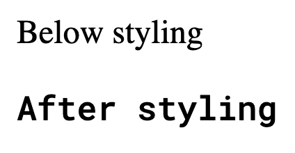
Text with normal letter spacing:

The title “Cross Browser Testing Cloud” with normal letter spacing looks balanced and easy to read, as the letters have a moderate amount of space between them.
Text with wide letter spacing:

The title “Cross Browser Testing Cloud” with wide letter spacing looks more relaxed and casual, as the letters have a lot of space between them.
As you can see, letter spacing can significantly affect the look and feel of the text and contribute to a website’s overall design. It is important to choose the appropriate letter spacing for the tone and style of your website. If you are looking to design your website, you can learn more about it through this blog on the best 23 web design trends to follow in 2023.
This blog on CSS Font Spacing will cover everything you need to know about typography and font spacing in CSS and the different ways of achieving that.
Let’s dive in!
TABLE OF CONTENTS
- CSS Font Spacing: Common Terminologies
- Getting started with CSS Font Spacing
- How to change the CSS Font Family?
- How to alter CSS Font Spacing?
- Shortcut: CSS Font property
- How to add external CSS Fonts?
- How to add direct font links?
- Tips and Tricks for good CSS Font Spacing and Typography
- Browser support for CSS Font Spacing and Typography
- Frequently Asked Questions (FAQs)
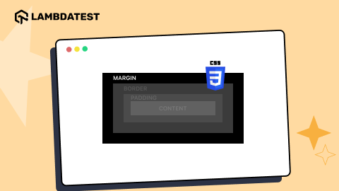
CSS Font Spacing: Common Terminologies
CSS letter spacing is a property in web design that adjusts the space between characters in text. Using the letter-spacing property, designers can modify the default font spacing to improve readability and aesthetics. It offers precise control over typography, enabling designers to achieve both compact and spaced-out text styles, ensuring the content is clear and visually appealing.
When it comes to typography, font spacing in CSS is just as important as font choice and size. In CSS, several different properties and terms are used to control text spacing, including letter spacing, word spacing, line spacing, kerning, tracking, leading, baseline, cap-height, and x-height. Understanding these common terminologies is essential for creating visually appealing and easy-to-read text on web pages.
In this section of this article on CSS Font Spacing, we will take a closer look at each of these terms and explain how they can be used to improve the overall appearance of your text.
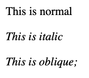
Font Style
A Font Style describes the basic attributes of fonts such as normal, italic, and oblique.
The code snippet below may help you to visualize better.
CodePen:
See the Pen
font-style by Dun Yan (@dun_yan_)
on CodePen.
Output:
Font Family
A Font Family represents a collection of all the fonts with the same design characteristics. They can vary in size, weight, and style but share the same fundamental design characteristics.
The font family you choose for your brand can greatly impact how your audience perceives your business. From the font’s style and readability to its personality and tone, the right font family can help to communicate your brand’s message and values.
Let’s look at some real businesses and how they have used font families to enhance their brand image:
- Tesla
- Coca-Cola
- Nike
Tesla is a tech company known for its innovative electric vehicles and renewable energy products.
It uses both Futura and Tesla Sans, modern, sans-serif fonts that support the company’s brand message of driving progress in the tech and energy industries.
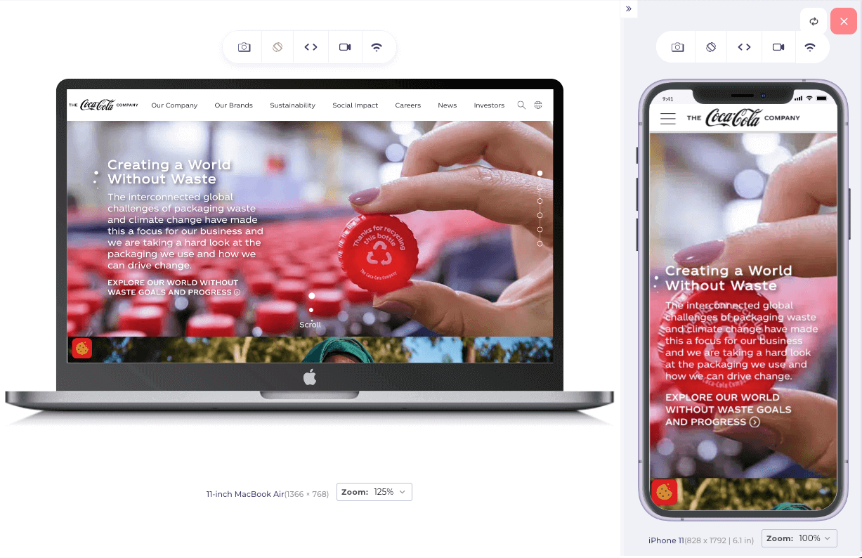
Here, I am now using the LT Browser to experiment with the responsiveness of different websites. This allows me to perform responsive testing to ensure that the website is tested on various devices and screen sizes.
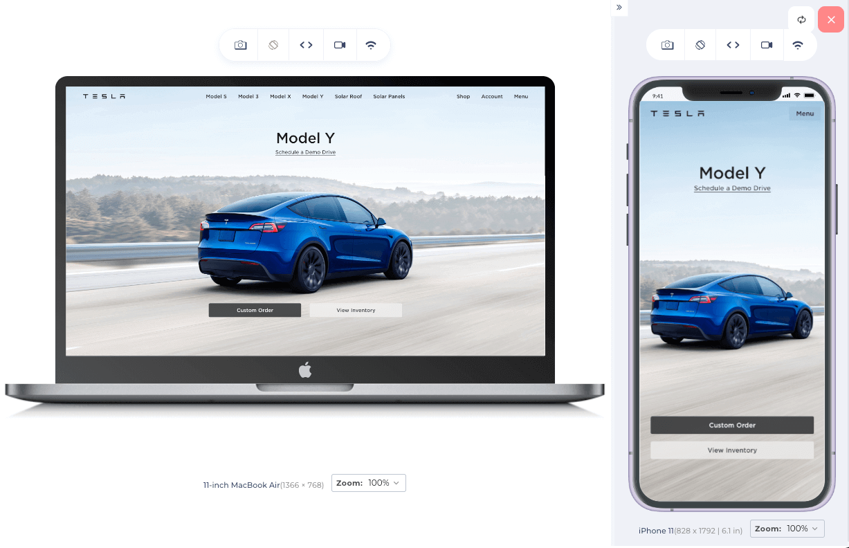
LambdaTest’s LT Browser is a mobile-friendly test tool that allows you to ensure your website’s compatibility across multiple devices and viewports. With LT Browser, you can check your website’s responsiveness on over 50 different device viewports, including mobile phones, tablets, laptops, and desktops.
LambdaTest recently went live with the beta version of the all-new Chromium-based LT Browser 2.0, which has several new features and enhancements. You can refer to this support doc to get started with LT Browser 2.0.

Coca-Cola is a well-established brand with a long history, and its font choice reflects this. The company uses a proprietary font called Spencerian Script, created in the 19th century, and has a vintage feel.
This font helps to evoke a sense of nostalgia and tradition, which fits with Coca-Cola’s classic brand image.
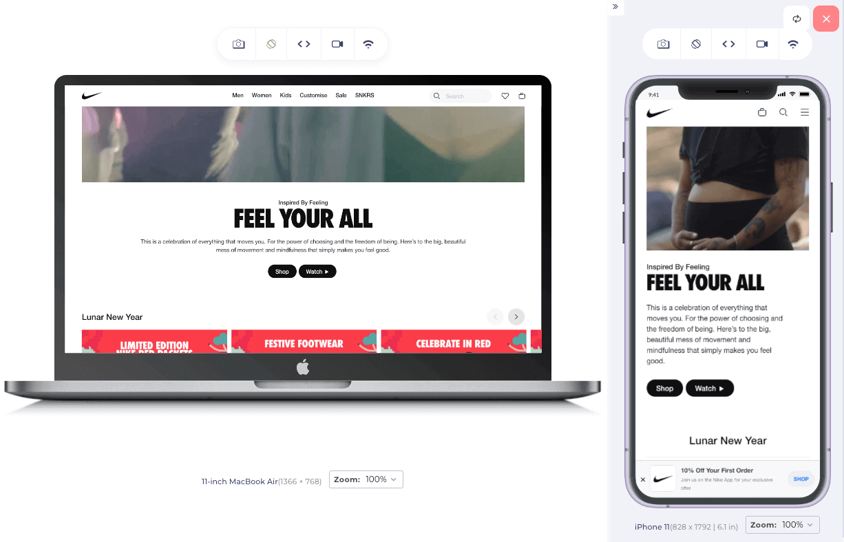
Nike is a brand about athleticism and performance, and its font choice reflects this. The company uses Futura, a sans-serif font that is sleek and modern.
This font helps to convey a sense of speed and forward momentum, which fits with Nike’s brand message of “Just Do It.”
Font Variant
The font-variant CSS property is used to specify a font variant, allowing for greater control over the appearance of text on a web page.
One of the primary uses of Font Variant is to enable small caps or all-small-caps. Small caps are uppercase characters slightly smaller than the full-size uppercase characters, and all-small-caps are similar, but all letters, including lowercase, are converted to smaller uppercase characters.
As you can see in the image below, small caps can help make text look more distinct and make headings and subheadings stand out more on the LambdaTest website after I added the font variant attribute.

Here is how you can change your CSS Font Variant by using the following CSS code:
CSS:
CSS:
CodePen:
See the Pen
small-caps variant by Dun Yan (@dun_yan_)
on CodePen.
Output:

Web Safe Fonts
Web Safe Fonts are a set of fonts that are widely available on most devices and computers. Some common Web Safe Fonts include Arial, Times New Roman, and Verdana. This means that when a website is designed using Web Safe Fonts, it is more likely to display correctly on most devices.
This is important because it ensures that the website maintains its intended design and layout, regardless of the device or operating system used to access it.
Web Safe Fonts are typically used as a fallback option when a custom font is unavailable or when it is not practical to use it due to slow loading times or other technical issues.
Root Font Size
The Root Font Size is the base font size for a webpage and is set in the browser’s settings. It is the starting point for all other font sizes on the page and is usually expressed in pixels. The default root font size for most browsers is 16 pixels, but it can be changed by the user in the browser’s settings.
This can be useful for people with visual impairments who need to increase the font size for better readability or for people who prefer a smaller font size for a more compact layout. To learn more about it, you can read this blog on accessibility testing.
Getting started with CSS Font Spacing
CSS Font Spacing is an essential aspect of web design that allows you to control text spacing on your website. It can improve readability, create a consistent aesthetic, and make your website more visually appealing.
In this section, we will look at how to get started with CSS Font Spacing, including the different properties and values you can use to adjust the spacing of your text. We’ll also cover some best practices and tips for using CSS Font Spacing effectively on your website. Whether a beginner or an experienced web developer, this guide will provide the knowledge you need to create beautiful, easy-to-read text on your website.
What are CSS Font Weights?
Font weight describes the boldness of the font. The greater the magnitude of font-weight, the thicker the fonts get by default. CSS font weights can be specified using a keyword or a numerical value.
It is important to consider the readability of your font weights, as using extremely thin or thick font weights can make the text difficult to read. It is also a good idea to consider the tone and style of your website and choose font weights that are appropriate for the desired look and feel.
Font Weights in numerical values
Each weight value corresponds to a specific level of thickness, with higher values indicating a thicker font and lower values indicating a thinner font.
For example, a font-weight of 100 is extremely thin, while a font-weight of 900 is extremely thick. The most commonly used font weights are 400 (normal) and 700 (bold).
HTML:
CSS:
CodePen:
See the Pen
Font weight values by Dun Yan (@dun_yan_)
on CodePen.
Output:
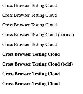
Font Weights in keyword names
The common keyword names and their corresponding numerical values are as follows:
- Normal: This is the default font-weight and has a value of 400.
- Bold: This is a heavier font-weight than normal.
- Bolder: This is a font-weight heavier than bold.
- Lighter: This is a font-weight lighter than normal.
Below is the source code for a demonstration of font weights in keyword names:
HTML:
CSS:
CodePen:
See the Pen
Font weights name by Dun Yan (@dun_yan_)
on CodePen.
Output:
Different ways of changing CSS Font Sizes
There are several ways you can mutate a font size in CSS. Typically, the units are grouped into one of two types which are absolute and relative.
Absolute Units
Absolute units are fixed and related to some physical measurement. Even though the width and height of the screen change, the value will remain fixed.
Examples of absolute units are:
- mm (millimeters)
- cm (centimeters): 10mm makes 1 cm
- in (inches): 2.54cm makes 1 in
- pt (points): 1/72in makes 1 pt
- pc (picas) – 12pt makes 1 pc
- px (pixel)– 0.75pt makes 1 px
Relative Units
Relative units work with proportions or ratios. They are not fixed and are “relative” to another value. When that other value changes, the relative unit value will also change.
One of the main benefits of using relative font units is that they scale according to the parent element’s size or the viewport. This can make it easier to create responsive designs that look good on various screen sizes.
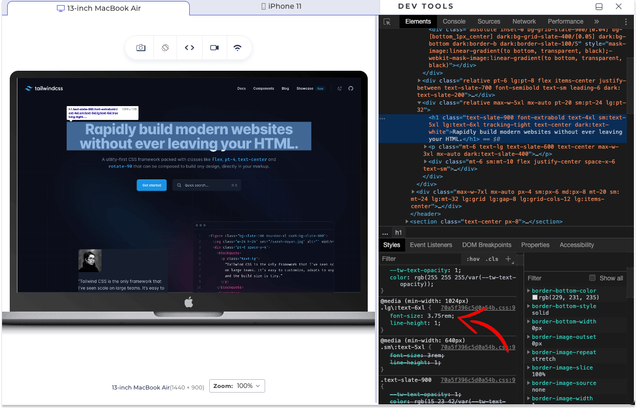
In the official documentation of Tailwind, a well-known CSS framework, they used rem, which is a unit of the root element’s font size. This allows for a seamless experience across different screen sizes and devices, as the elements will adapt to the viewer’s screen without breaking the overall design.
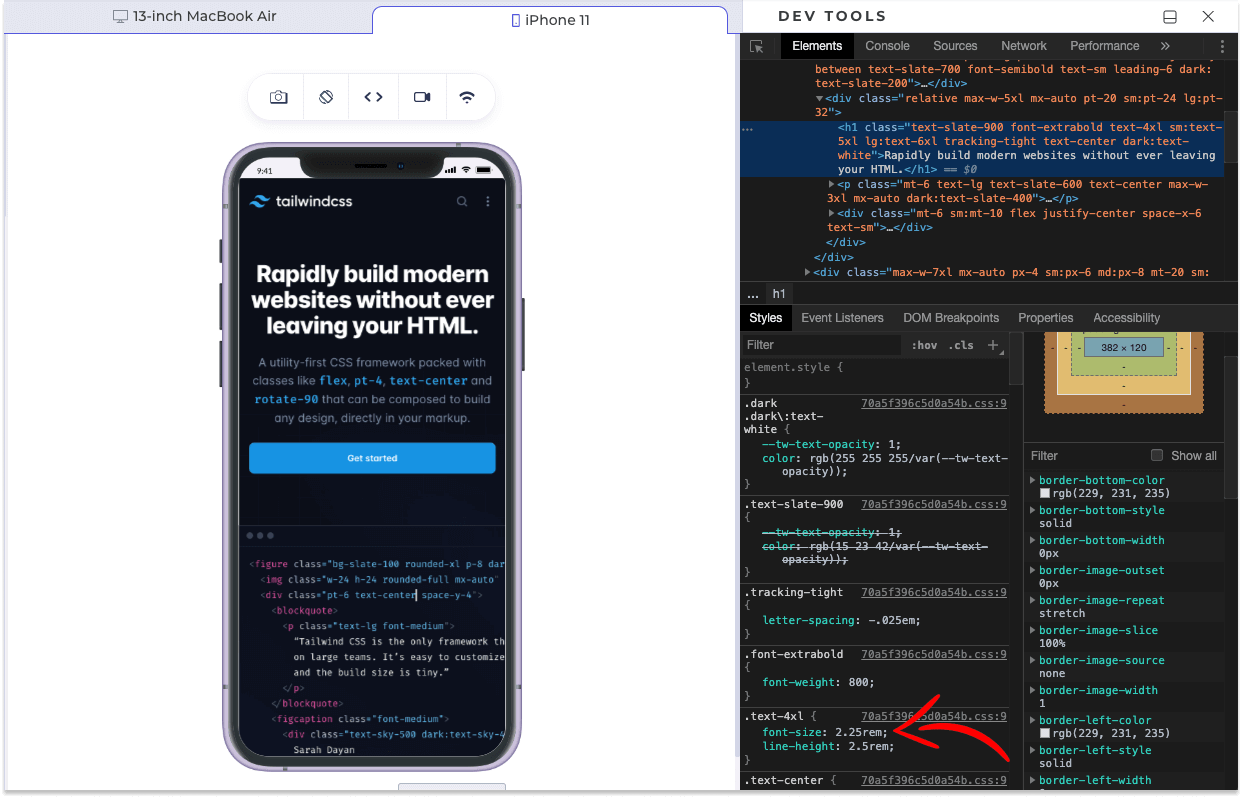
The devtools from LT Browser below show a web page designed with Tailwind CSS on a laptop screen, with all elements scaled relative to the root font-size.
The image below shows that the same webpage adapts to the smaller screen size while maintaining the relative sizes of all elements, resulting in a responsive design.
Examples of relative units are:
- % (percentage) relative to the parent element’s size.
- em (font size): relative to the font size.
- rem (root em): relative to the root element’s font size.
- vw (viewport width): relative to the viewport’s width.
- vh (viewport height): relative to the viewport’s height.
‘px’ vs ‘em’ vs ‘rem’
In this section of this blog on CSS Font Spacing, we will focus on the three most popular and practical units: px, em, and rem.
Pixels(px)
Pixel is fundamentally the most used unit in CSS and is very popular when setting the font size of text on web pages. One pixel (1px) is 1/96th of an inch in print media.
em
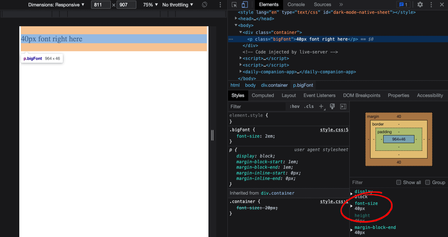
It uses the current font size of the parent element as its base. It can be used to scale up or down the font size of an element based on the font size inherited from the parent.
Let’s say you have a parent div that has a font size of 20px. If you create a paragraph element in that div and give it a font size of 2em the paragraph font size will be 40px.
See the Pen
em by Dun Yan (@dun_yan_)
on CodePen.
To prove it, we can use the dev tools on your browser.
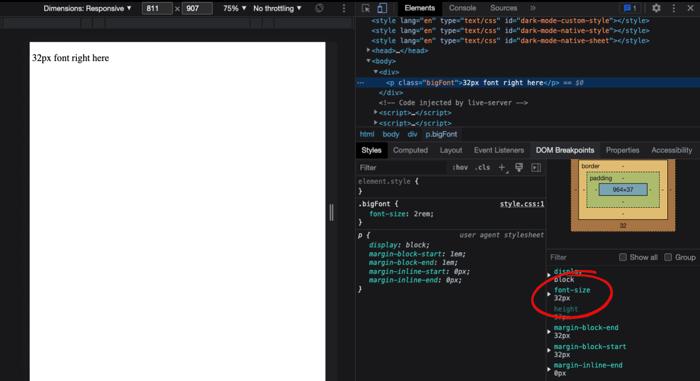
rem
rem stands for root em. Similar to em, the main difference is that rem only references the font size of the root element on the page, which is the browser, rather than the parent’s font size. If you are unsure about your browser’s default font size, check with your browser’s settings.
In this example, the font size is set to 16 pixels. The font size given is 2 rem. Hence, the resultant font size is 32 pixels.
See the Pen
REM by Dun Yan (@dun_yan_)
on CodePen.
We can use the dev tools to prove it again.
How to change the CSS Font Family?
To change the CSS font family, you can use the “font-family” property in your CSS stylesheet. You can specify a specific font by name or a generic font family (such as “serif” or “sans-serif”) as a fallback. You can also specify multiple font families, separated by commas, as a fallback. You can also use the @font-face rule to import a custom font and use it on your website.
Font Family Syntax
Here is how you specify a font family for your CSS class. You can customize the font family to suit your preference.
Multiple Font Family Syntax
When specifying multiple font families for an element using the font-family property in CSS, the values are separated by commas.
The font family listed first has the highest priority and will be used by the browser if available. If the first font family is unavailable, the browser will move on to the next font family listed, and so on, until it finds a font that is available and can be displayed.
In the example below, the font ‘Times New Roman’ has the highest priority, and the font serif has the least priority. This way, the browser will always display the most suitable font for the user, regardless of the user’s device or system.
CSS:
The fonts, except for the first font on the left, are called fallback fonts, also known as backup fonts. It is imperative to add a generic family name as a fallback font for every specific font that you desire to use.
How to alter CSS Font Spacing?
Adjusting the spacing of your text can greatly impact the readability and visual appeal of your website or application. Properly spaced text can make it easier for users to read and understand the content on your site, leading to a better overall user experience.
In CSS, there are several properties that you can use to control the spacing of your text, such as the letter-spacing, word-spacing, and line-height attributes. By using these attributes in combination, you can fine-tune the spacing of your text to create a more visually appealing and user-friendly design.
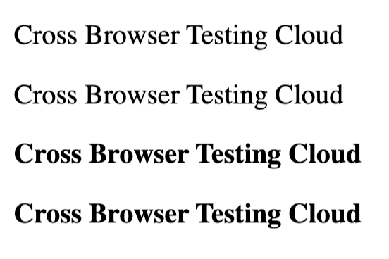
Letter Spacing
To adjust the spacing between individual letters, you can use the letter-spacing property. This property sets the amount of space between each character in a text block.
CSS:
CodePen:
See the Pen
letter-spacing by Dun Yan (@dun_yan_)
on CodePen.
Output:
Word Spacing
To adjust the spacing between words, you can use the word-spacing property. This property sets the space between each word in a text block.
CSS:
CodePen:
See the Pen
Word Spacing by Dun Yan (@dun_yan_)
on CodePen.
Output:
Line Height
Also known as light height, is the vertical height or vertical space between lines in a paragraph. To adjust the spacing between lines of text, you can use the line-height property. This property sets the distance between the baselines of consecutive lines of text.
CSS:
CodePen:
See the Pen
Line Height by Dun Yan (@dun_yan_)
on CodePen.
Output:
Shortcut: CSS Font property
One of the most important principles in coding is DRY (Don’t Repeat Yourself). We can apply this principle using a trick – the CSS Font property.
The font property is a shorthand property that allows you to set the font-related properties for an element.
It can be used to set the following font-related properties:
- Font style
- Font variant
- Font weight
- Font size
- Line height
- Font family
It has the following syntax, do keep in mind that the sequence does matter.
Instead of doing this:
We can do this:
As you can see, the results are the same for both code snippets. The earliest snippet used 5 extra lines of code, which can be done in a single line of code.
CodePen:
See the Pen
Font fast vs slow by Dun Yan (@dun_yan_)
on CodePen.
Output:
How to add external CSS Fonts?
In the examples below, we will be using Google Fonts. This website contains more than 1400 open-source and free fonts. Click here to learn more about Google Font: google-fonts.
We can import fonts from other resources to add fonts unavailable in the browser by default. There are two ways to do it:
How to download CSS Fonts online?
The developer will download the fonts online and include the font file inside the project’s root. Next, the font file will be linked to the CSS stylesheet.
The major advantage of using the “download online font” method is the availability of the font, even when your machine is not connected to the Internet. Yes, it is accessible in offline mode as well!
You can follow the below-mentioned steps to download the CSS Fonts online:
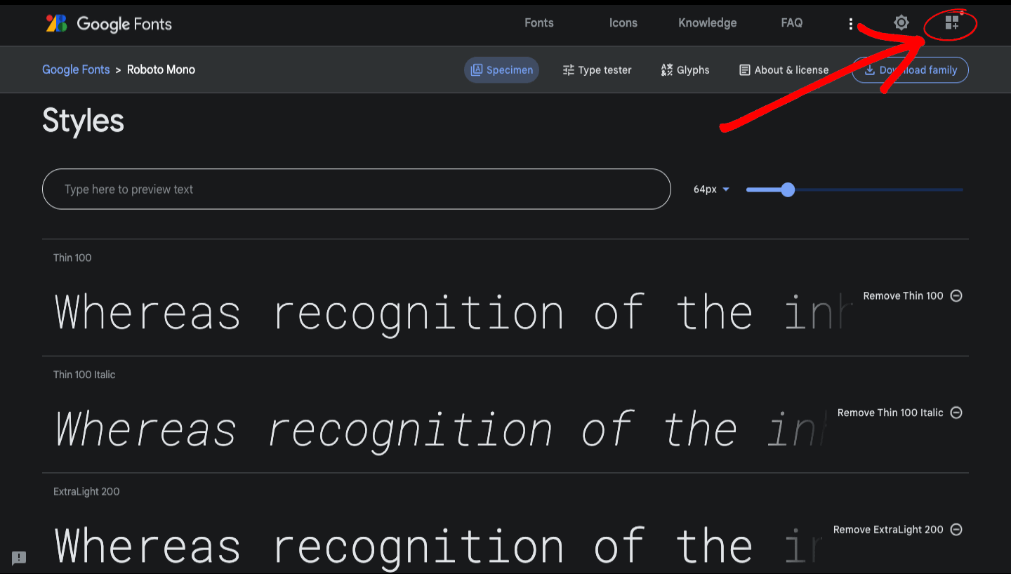
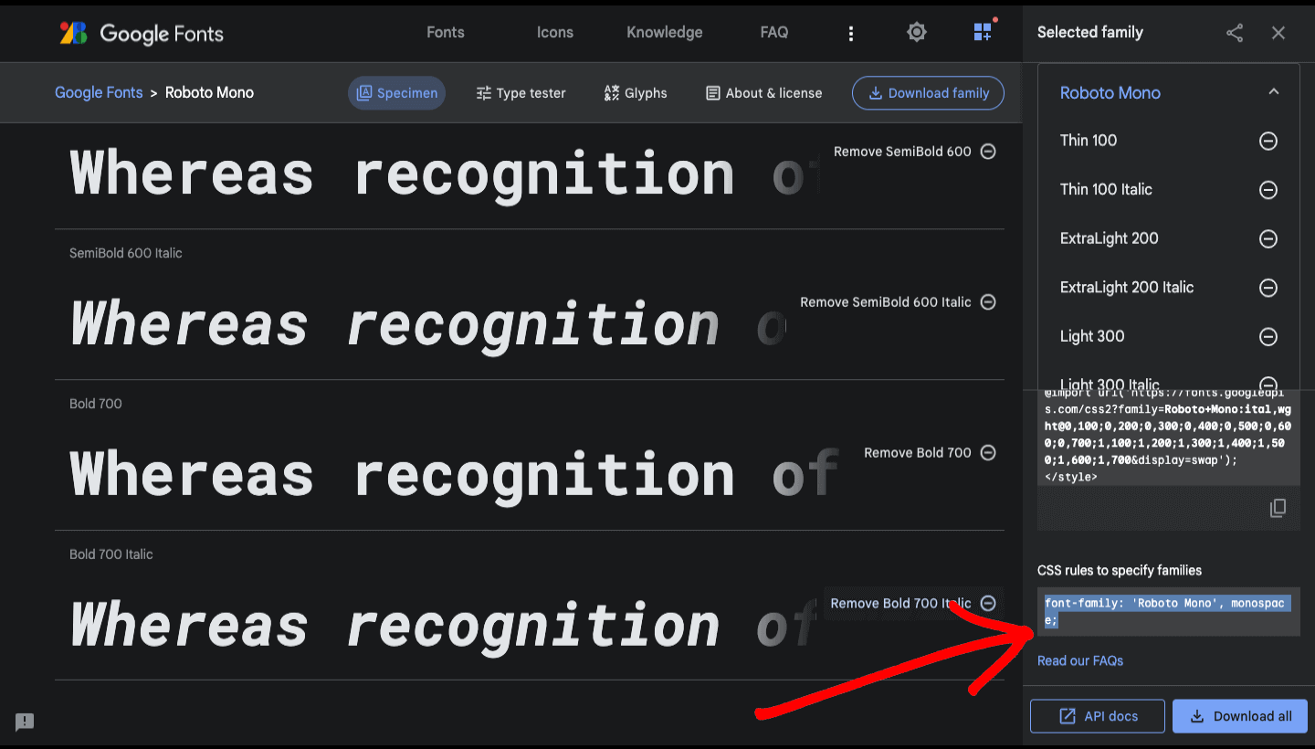
Step 1: Select the desired font. After doing that, you will get to this page.

Step 2: Select the sizes of fonts you desire. It is recommended to select all of them to make things simple.
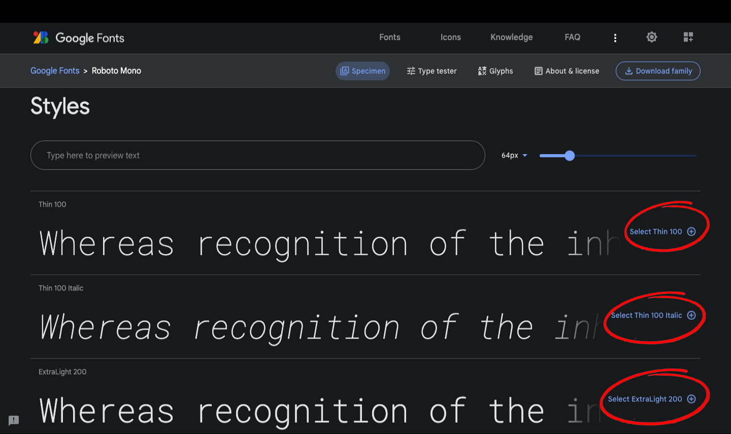
Step 3: Click the icon “View selected family”.

Step 4: Click “Download all,” and you will get a folder named after your font.
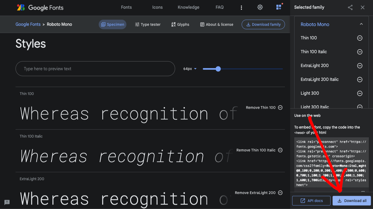
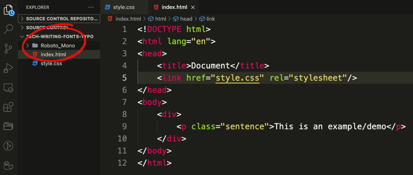
Step 5: Drag or move your folder to the root folder of your project.
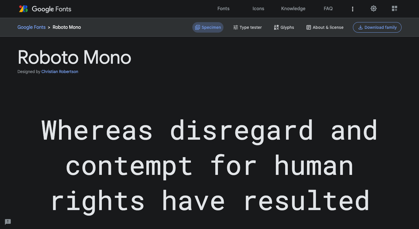
Step 6: Pick the desired font style and copy the filename. In this example, it is RobotoMono-Medium.ttf
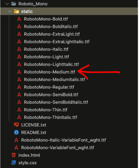
Step 7: Pick the desired font style and copy the filename. In this example, it is RobotoMono-Medium.ttf
Step 8: In your CSS stylesheet, we can link to the font by writing the CSS snippet down below.
HTML:
CSS:
Full Output:
How to add direct font links?
The developer will connect and add an imported online link to the CSS stylesheet. The major advantage of using the “direct font link” method is that the fonts will load more quickly on the webpage, making it more convenient for the developer.
You can follow the below-mentioned steps to add direct font links:
Step 1: Select the desired font. After doing that, you will get to this page.
Step 2: Select the sizes of fonts you desire. It is recommended to select all of them to make things simple.

Step 3: Click the icon “View selected family”.
Step 4: Copy all of the link tags.
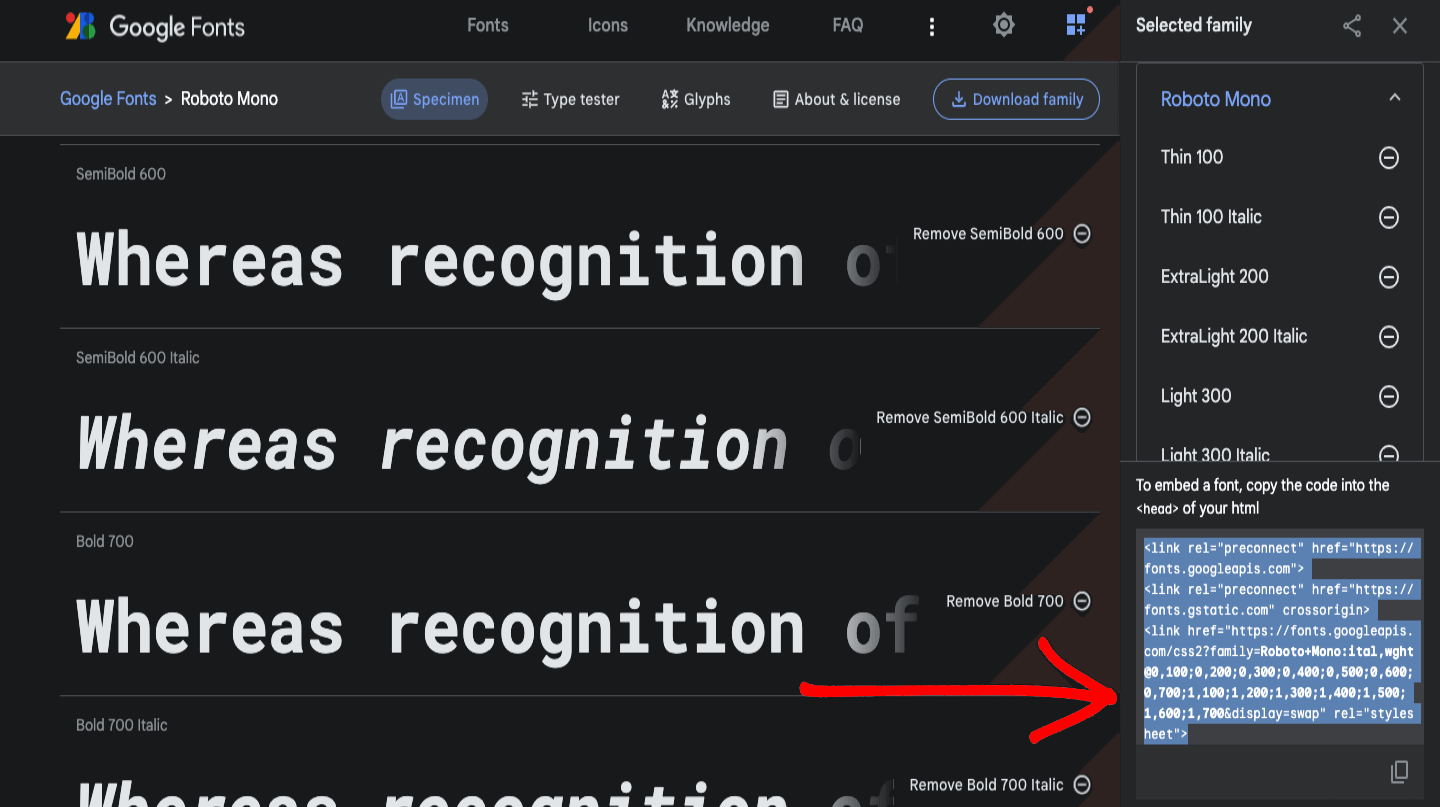
Step 5: Paste the links in the head section.
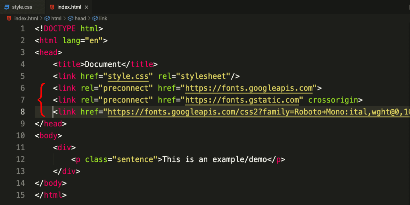
Step 6: Copy the CSS code snippet and paste it into your CSS class.
CodePen:
See the Pen
google-font-font-family-link by Dun Yan (@dun_yan_)
on CodePen.
Tips and Tricks for good CSS Font Spacing and Typography
CSS Typography is a great way to make your web page look appealing, but we can easily overdo it, which can backfire on the appearance of our website. That is why keeping a few points in mind while working with fonts is imperative.
Let’s get down to it:
- Limit the number of words per line.
- Avoid animations or blinking texts.
- Be consistent
- Choose a limited number of fonts
- Use font stacks
- Use font-size consistently
- Use font-weight consistently
- Use appropriate line spacing.
- Experiment and refine
- Responsive Font Size
When writing for the web, it is important to pay attention to the word and character counts of individual lines. This is because online readers tend to skim through text, making long lines more difficult to read and understand.
A good rule of thumb is to aim for around 50-75 characters per line on a desktop computer and approximately 35-50 characters per line on mobile devices.
As you can see, this website demonstrates the opposite, with long, rambling lines that can be difficult to follow.

A better way to do it is to use the rule above: “50-75 characters per line on a desktop computer and around 35-50 characters per line on mobile devices”. Medium blogs demonstrate this principle well with short, concise lines that are easy to read.

In addition to being distracting, animations and blinking text can also be annoying and cause frustration for the user. If a user has to look at flashing or moving elements on a page constantly, it can be overwhelming and lead to a negative user experience.
Another reason to avoid animations and blinking text is that they can be hard to read and make it difficult for users with visual impairments to access the content on your website. Some users may have difficulty tracking moving elements or may not be able to read flashing text due to conditions such as photosensitive migraines.
By using static, non-flashing text and avoiding animations, you can improve the accessibility of your website or application.
Consistency is key to creating a cohesive and professional-looking website or application. When it comes to font typography, there are several ways that you can ensure consistency in your CSS styles. Here is a checklist to remind yourself from time to time:
Line spacing helps make the text easier to read by providing space between lines. In web design, it’s generally recommended to use a line spacing of around 1.5 times the font size.
When working on CSS Font Spacing and typography, it’s important to experiment and make adjustments to find the best look and feel for your project.
This means testing out different font sizes, line heights, and letter spacing and making changes until everything looks and reads right. This experimentation and refinement process will help you create a polished and professional design tailored to your specific audience and content.
Additionally, continuously testing and making adjustments over time can ensure that the design remains consistent and maintains its aesthetic appeal.
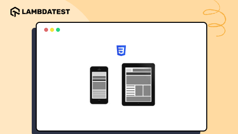
Responsive design has become increasingly important as more and more users access the Internet on various devices with different screen sizes. One crucial aspect of responsive design is ensuring that the font size is appropriate for the device it is being viewed on. In this blog section on CSS Font Spacing, we will explore the importance of using relative units with media queries regarding responsive font size.
When designing a website, it is important to use relative units such as rem (root em) and em (em) to set font sizes. These units are relative to the root element (usually the element) and allow the font size to adapt to the user’s device. This means that if the user increases or decreases the font size on their device, the font size on the website will adjust accordingly.
Media queries in CSS are a powerful tool for responsive design, allowing designers to apply different styles to a website based on the screen’s width. When used in conjunction with relative units, media queries can be used to change the font size of a website based on the screen width.
For example, the code snippet provided uses a media query to change the font size of the < h1 >, < h2 >, and < p > elements when the screen width is 600px or less. This allows the website to adapt to smaller screens, ensuring that the font size remains appropriate and easy to read.
CSS:
CodePen:
See the Pen
Responsive fonts by Dun Yan (@dun_yan_)
on CodePen.
Output:
In conclusion, using relative units with media queries is crucial for creating a responsive font size. Using these techniques, designers can ensure that the font size remains appropriate and easy to read, regardless of the device or screen size. This improves the user experience and ensures that the website is accessible to all users.
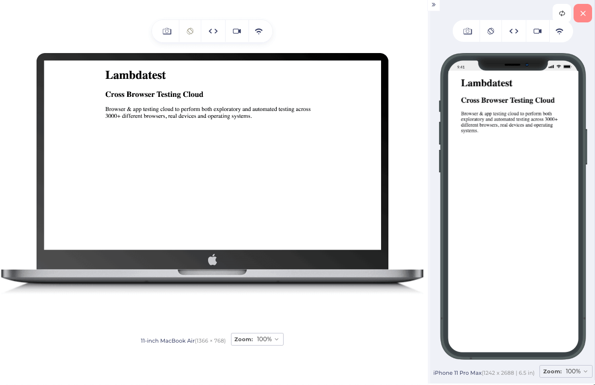
To give you a real-world business that demonstrates responsive design well, I will use LT Browser. The official website of LambdaTest, a cross browser testing cloud, displays well-sized fonts and is responsive when tested on the LT Browser.

Browser support for CSS Font Spacing and Typography
All modern browsers generally have good support for CSS typography. This includes Internet Explorer, Microsoft Edge, Google Chrome, Mozilla Firefox, Apple Safari, and others. It is always a good idea to test your website in various browsers to ensure that the fonts look decent.
Fortunately, cloud-based testing platforms such as LambdaTest can streamline the process by providing access to a vast online browser farm with over 3000 real browsers, devices, and operating systems. These platforms also allow for convenient automation testing procedures and the ability to conduct accessibility testing for web apps utilizing CSS Font Spacing and Typography.
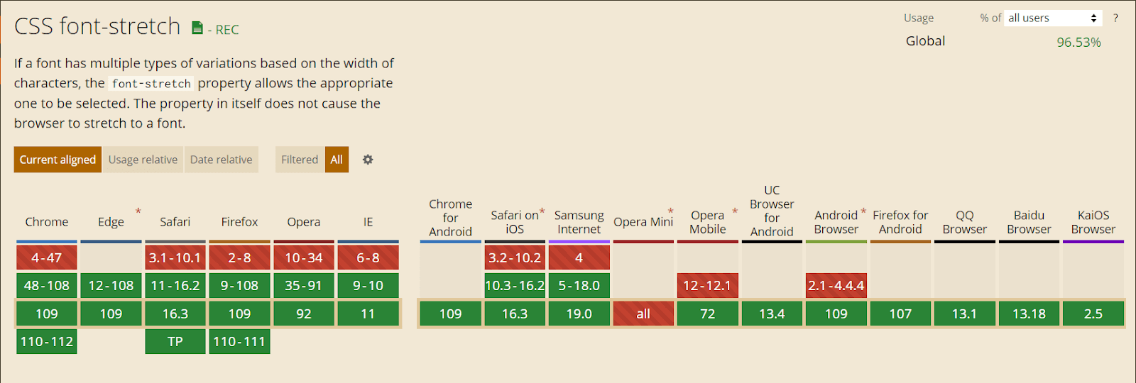
The image shown above is the cross-browser compatibility of the CSS font-stretch attribute.
Conclusion
In a nutshell, CSS Font Spacing and Typography are important factors in website design and layout. They help improve readability, establish the tone and brand of the site, and contribute to the overall look and feel. Proper implementation of these elements can create a visually appealing and easy-to-read website.
We are now equipped with the knowledge to optimize CSS Font Spacing and Typography.
Happy styling!
Frequently Asked Questions (FAQs)
What is letter spacing in CSS?
In CSS, letter spacing (also known as “tracking”) refers to the amount of space between characters in a text block. The “letter-spacing” property can be used to adjust this spacing. The value can be specified in length units (such as pixels or ems) or as a percentage of the current font size. A positive value will increase the letter spacing, while a negative value will decrease it.
How do I change the spacing between letters?
To change the spacing between letters in CSS, you can use the “letter-spacing” property. The value can be specified in length units such as pixels (px), ems (em), or rems (rem) or as a percentage of the current font size.
How do I set the font spacing in HTML?
In HTML, you can set the font spacing using the “letter-spacing” CSS property by applying it to the specific HTML element or class using a style attribute or a stylesheet.


Author’s Profile
Dun Yan
Dun Yan is a developer based in Kuala Lumpur who specializes in NextJS, JavaScript, ReactJS, and Tailwind. He also has experience with NodeJS and Express. He is always looking for new challenges and opportunities to grow as a developer
Blogs: 3
Got Questions? Drop them on LambdaTest Community. Visit now